Transcripts
1. Introduction: If you hit play, there are pretty good
chances that your into arts. And for this class, this is basically all that you need. because all the rest, is gonna be on me Hi guys, I'm Nissam, And for me, Arts are what make life beautiful And bold. I'm formally an architect
and landscape designer And I absolutely love
sketching and most of all, sharing. So let's get straight to it. If you love to
draw our sketch And want to learn
more about how to sketch things like
buildings, streetscapes, landscape design, basically anything
related to architecture This class will give you
a lot of tips and techniques You can start with. There are no prior needs, but you will have to practice
more than once to catch some fundamentals In this class to learn some
principles such as proportions, perspective, schale,
Hierarchy, vegetation drawing,
shadowing, color choice And so much tips. when we'll be sketching
to give your drawing dept And soul.
2. What you'll need: For this class, you
won't need much. I will be using a pencil. This one is an F, but you
can use an HB or 2B This is a Lyra but it
doesn't really matter. And ink pens, I'm gonna use two different brush sizes So I have an 0.1mm, and an 0.5mm. The idea here is to
create a contrast. So I can use an 0.1mm and an 0.3mm just one needs to be bolder than the other one. And for this particular class, I'm going to use brush pens. You can also use Architectural Pens, Marker pens, color pens with two brushes This one is a bit different
because it's a brush pen. Instead of the tiny, you have a brush here
instead of this. Instead of this. But boths are working just need to blend one with each other. And we're going to
see this later on. Let's go.
3. Perpective Principles: So before starting
to actually sketch I will need to
explain to you some principles that are
very, very important. And the first one is the nasty perspective
that you all hate. And I know it, but
you don't have lot of choices, but I promise you, it's not as difficult
as it seems. You just need a bit of practice. So perspective is
basically the art of, Let's say the art, of representing something
that is in 3D Let's take for example, this cube, okay,
I see it in 3D. How can I presented in a paper, a plan
surface And you have three
ways to do this, depending on the position of
the object and your position. And this is what we're going
to see just right now. Let's talk about perspective. So we have three
perspectives you can do. The first one is when you see
an object from the front. Okay, so you see a
whole face here, what I called the front face Now, the first thing before this is to draw
your skyline, your eyelevel, it's just a
line that you draw. And this is where your
eye level, is looking And on this line, you're going to draw your
vanishing point Here I draw it in the middle, okay, just in this point, you can draw it anywhere and your drawing is going to change depending on where you put
your vanishing points. Now you draw a face. I drew one. *your face* I mean you draw your front
face of your object, which is going to be a cube. So I put one above, a one under, because depending on
if it's above or under, it will change the
way you see it. So if it's over Then you're going to
see it's from under. And if it's under the sky level, you're going to
see it from above. We're going to see this
and the next slides. So this is the first step. The second step is
that you're going to link all the corners of your
face to the vanishing point. And this is going to
give you the sides the edges of your
objects, as you see here. So this is the first step. Right after this,
you're going to choose the thickness of
your object as you see here. So you draw just another line depending on when you
want your object to stop. And this is where I told Now you can see, your object in perspective. And this is when I told you. You can see, depending
on the position of your objects
is going to be under or above, depending
on if you put it under your skyline or above. And this is your final object. So this is one vanishing point, we're going
to see some examples. It's not very difficult, just have to practice it. So just try to redraw this sketch and
try to follow the rules. The rules, I'm going
to give you at the end of this video. The second thing
we're going to see We're not gonna see it Today we're going to practice
the One vanishing point. But you can also This one is popular the next one is the most used one. So when you have two vanishing
points. Two vanishing Point is when you see
your object from the side, okay, as you see
here in this sketch. So this is the edge You're seeing. Now how can I draw these
object in perspective? Now I'm going
need two vanishing points because I have
two sides of my objects. Again, I draw one above and one under so you can
see the difference. So the first step, draw your line and then your vanishing points
right after this, the same step, I'm going to link the top of my corners with
my vanishing points. So this is the first step. Right after this, I'm
going to choose again where my objects
is going to end. I mean the cube or a
rectangle or whatever. So here in the red tick lines, you can see that I stopped my
object here.
Right after this. I'm gonna link again my edges, the new edges, with
my vanishing point. And now you start seeing that
the object is drawn. And again, depending
on the skyline, you define if you see it from
under or above and this is the final object you're having. And I just want to say that
depending on where I put my edge or my face or wherever in the drawing is going to change the perspective. And you can try
this with putting your objects in all the places over and try to link everything
and see the differences. I'm just going to talk
quickly about the third one, which is the Three
vanishing points. And this one is not very
much used unless you want to do some 3D from above, like a city from above or something More "Cartoon" So the steps are the same, just that you have
one vanishing point Added It can be over or under again. And I put to you two examples. So same thing. You see something from the side So you have an edge
and you link it first, like we saw in the two
vanishing points But after, instead of just choosing where
you want it to end, you choose, but
you have to link it to the third vanishing point
above or under. And after this, you Link this one with the
vanishing point and it's gonna give you
something like this. And you can use it
to do, as I said, buildings from above;
or things like this. So this was a quick review of perspective and we're going
to practice it with examples.
4. Perspective Principles : Exemples: So the first example we
have is one vanishing point. It's a building a picture I took from Pinterest and you see
it from the front. Okay? So if I, if I, if I want to find where
my vanishing point is, so I can draw this image. You can see that you have a lot of lines going to
the same points. If you follow all the
edges of the buildings, even the inside
of this building, you can't see the inside of it, but you can see the
wall going there, the ceiling And also this one, you can see that
they are all going to the same point, which is here. So this is my vanishing point. So if I want to draw this image, I'm going to take my paper
and first define where is my vanishing point so I can draw everything
correctly So this is an example. So look, try to look at the picture to find
your vanishing point and look for clues. So my clues
here were, definitely
the other buildings. Okay. Let's take another image
which isn't a building. She's just Fountain here. And same thing. If I want to analyze this image, you can see that all the lines, all the lines are going to
the same point, the walls, the pergola here,
everything goes to the same line to give
me my vanishing point. So even if I want to add
something to this image, I'm going to use it with
the vanishing point. If I'm going to add
something, for example, here in the floor
or another wall. I'm going to use my
vanishing point. Okay, So this was for
one vanishing point. Now lets look at some examples for the
two vanishing points. This building, for example, you can see now
that you see it from the side because you have
like a clear corner here. Now let's analyze this image. This is my corner. I have my corner
right in middle. And I'm just going to
link the two sides, you know, where my
lines are going. And this is going to give
me my two vanishing points. And this is a start to draw
if I want to draw this image, okay, so I have my
vanishing points I can do, I can try to, in my paper, I'm going to look up all
my paper and try to do approximately the same positions for the vanishing points. Another here, another example. Here I have two buildings,
again; vanishing points. You can see that this image
is slightly different because the position of the vanishing points
is different. So if I want to analyze it, I have two edges here. And the first vanishing
points is at your left. If I want to link the two sides. The other side is
more tricky because it's way too far from the paper. But I just want to show you that depending on where your edges
and when your vanishing point is, the building looks different. So it depends on
what you want to. I mean, if it's a drawing, it depends
on what you want to show. And if it's something
you want to draw, then it gives you clues from where you can put
your vanishing points.
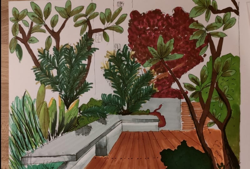
5. Drawing from a reference : Analyzing your image: Okay guys, so here
is our picture. That is gonna look like this So here, let's practice
what we just saw. So we have one vanishing
point in this picture. If you follow the lines here, you're going to see that
all the lines are going to the same point somewhere here. Okay? And this is what
we're going to try to do in the white paper. So And we're going to try it, we're going to first start by defining
our vanishing point, which as I said, is somewhere in the middle
of this picture. I know it because if I, let's say tried to make all
the lines converge, it's going to be somewhere here. So can be here or here It depends,
it doesn't matter if the point is in this
exact same place. But this point is going to define where all my
lines are going to be. So if you see the
actual drawing, it's not the same one
mine is someone here. So my bench looks a bit bigger, bigger, and bit longer. Different but still correct. So the point is not to do exactly
like the same picture, but just to have the rules. So let's say my points is
going to be somewhere here. Okay? First thing, I'm going to
try to draw those lines. Picture here. I'm going to try first. to draw, the first lines. If you want to have
like a reference, you can still change it to
approximately same angle. At this point in the drawing. You don't need to have like a bold lines because
it's going to be difficult to erase them. So just a light, just a sketch for now. And after all, we
are going to redo all of it with ink. So we're gonna erase it, so light lines. Okay So it's okay for me. I'm going to, after this
first lines, I'm going to try representing So we have all the
lines going there to the vanishing point and all the other lines are
going perpendicular. So let's say for example here I'm going to
try some proportions Here, I can see that this bench is taking
approximately double of this. This is approximately this, and this is in the middle. So I know that I'm going
to take half of this. And this is going
to be my bench. that is going to stop somewhere here. And same thing here. It's not going till
there because vanishing points in here, somewhere here. So I have to go a bit of, and you can see that here. I think my bench is a bit small. I'm going to stop it here. Okay. You can still change
this if you want. I can make it bigger this is what I'm gonna do. Actually. I like it this way. You're free to change
anything you want. As I said, you don't have to do exactly the same thing as
the picture. Just following some rules. Drawing my perpendiculars This one is going there. And after So this one here is
following the vanishing too So it's going to go this way. And then I can stop it here. Perpendicular. I can see here, I think
this is too big, so I'm going to make
it a bit smaller. So always look at look at what you are
doing before moving forward. Do something and
then have a big picture and see if this
is what you want. If you want to change something, if you like the proportions So always have this this perspective of view. So if you can see, I draw all the first
lines of my bench. Now I'm going to draw
this thickness of it, okay, so I'm gonna go with
my perpendiculars this way. I can choose how
bigger I wanted to be. I think this is
going to be okay. This line is not going
to be perpendicular, is going to follow
again my point. So you can, again, you can, you can
use the ruler here. If you have troubles, you can use the ruler
in is going to be easier to follow the lines. So here, I
don't really care about making a lot of lines. I'm going to erase them after. Okay, so I have my shape. My shape is done here. it's all this. if you see my bench doesn't look exactly like
this one, but I don't care. I think is nice. So I'm going to keep.
Details Are the last ones. Again. Same thing with what's here. So this step here, we're going to follow
the same rules. But first, I'm going to draw this thickness too. This volume. So I'm gonna go perpendicular. Here it as you can see It's a bit under it. So I'm going to go a bit
more over it. I think here is fine So I'm gonna draw here. And again, every line
here that is not particular is going to
follow the vanishing point. Here. I think somewhere here, again, a bit more
than the middle. So I'm gonna go there and
draw my perpendicular here. And then my thickness here. After this I have a step here. So it's going to be my next
step. I'm gonna do this. I'm going to follow
the vanishing point - I have my step, which look a bit bigger So I'm going to make
it a bit smaller. Thickness is going to be good. Even if it's not
exactly the same. I don't really care. Just wanted to be
correct and to look nice. So here's my step.
Again vanishing point - - OK. Now that I
put my step here. I think this is not
as thick as I want, so I'm just going to make
it a bit bigger this way. And after This is my first, let's say, big lines of the hardscape,
the actual structures. I still have here, a line. I have a door here, but it's just some
perpendicular lines. Actually, I'm going
to draw the tree. It's not, doesn't really matter. So I'm just going to
draw some shape here and I'm going to see
after. And what is actually
also important here is this square that is here
that I'm going to draw now, as you can see, it's going approximately in the middle
going from here somewhere. And following the
vanishing point again. So I'm gonna go there. And I think I want it to
be somewhere here. So more here looks nice. And it's going somewhere here. And I have my square. And now, actually the
most difficult thing about this drawing is done. So this was the first step. Okay, so we did our first lines. Okay, this is our shape. Like the skeleton. Can you say a skeleton?
Whatever. I said it. And now we're going to draw those lines on the floor before moving onto the actual vegetation. So it's going to
be the same thing. I'm going to follow
my vanishing point. And you can start, you can maybe start by drawing maybe just the
thickness you want. - And once you do this, again, you can use a ruler if
you think it's easier, and I think for this one
is going to be easier. So for this, for this stage
we're going to use earlier, I'm going to use it to just to show you that we can
actually use it. And we're going to have
some straight lines. But after, as we're
going to change them, With Ink, we can
change how the line work. And again, Don't do bold lines. So we did our lines. that are pretty nice. And now I don't need this point anymore,
because I draw all my lines.
6. Vegetation drawing principles: Hi again guys. Let's
talk about how to draw vegetation,
trees or shrubs. In our picture, we have
two types of trees. You have this one and this one, and we have this one we also
have a palm that is the same. And all the other
things are just shrubs. So this is pretty basic. Let's learn how to draw a palm
and how to draw some trees. Now for the trees, you need first to know the shape
you want to draw. In this image Our tree has a lot
of branches and we don't see the trunk, but there's a lot of
branches and big leaves. And this one is just more
likely a shape. We're not going to draw every
detail of this tree. Now just for concepts
of drawing trees, you need to know the shape
you want to give to the tree. Now I have this book, A nice book for everyone
to learn how to draw vegetation in
plan and section. So it's for landscape designer. But if you're interested, I think it's a nice a
book for beginners. And also for more than
beginners. It can Give you tips on how
to draw surfaces, how to use your pens, a lot of things. But what we're
interested in now is those shapes and in
nature, if you look around you You will see that every
tree has a different shape. And you can simplify this shape in simple, mathematic shapes. It can be a triangle
or an, oval. Sometimes you have a round. Sometimes it is something that is not really defined. But you can have a
lot of options and I'm just going to show you
how I draw a simple tree. But you need to know that in Internet and
YouTube and Pinterest, there are a lot of
tutorials and you just need to practice
how to copy first. Copy first with proportions. And then it would
be easier with time. So for a normal tree,
you have the trunk. You always have the trunk. Okay? And for the trunk,
I'm not going to try to do like straight
lines because it's, you probably never
see some strait trunks. But it depends on the type
of drawing you want to do. Sometimes you'll find something quick and it's
something like this. And it's just straight
and it works. So it depends. But for this drawing, just for drawing a tree, just, I just try to
let my pen goes. - to have something
irregular because in nature everything is irregular. And then I draw the
shape I want. So basically for
the shape, I just, for example let's say, my tree is an oval, And I have, I decide my trunk is taking this height. Again, now I don't have a reference So this is my trunk, and this is my tree, but my tree will
never look like this. in real life. And now I decide that I
want something irregular, but I follow my
shape I'm not following it
100% because again, there's nothing
regular in nature. - So this is the first step
drawing the shape, my shape. So I do first how my trunk, how big my trunk is, how high it is, and then how I want
my shape to be. I have, I think I have some
examples to show you here. And it's a simple tree and
then it simple shrub. And as you see, I have a shape then I work on the
volume inside. Here also. here wee have some trees again. - Again, same thing.
I have a trunk. I gave him some lines to give him volume and
some depth and character. And then I have a shape
that is kinda oval, round. And then I play with it. And I
give it some depth or some wounds
depends on what you want. Just practice this.
Now for the palms, those are two palms, but we're
going to practice only one today. So for the palms, this one
and this one, you have normally,
this is a small trunk here. Yeah. And after you have some lines
going there. -
00:05:50.795 --> 00:05:52.790
So they're going down. So I'm just going to draw some lines this way and
some lines this way. It's basically I'm
just doing this And this, and you can have a really nice shape just
going this way. I'm not trying to be regular
again because it's nature, but you can try to copy
as close as you want, because at some point
you will stop copying And you will just know
that it's working. So I'm not doing the same. I did not
do the same at all. But I copy it. Just the shape. And normally the trunk, I give it some texture.
This one is too big but this is the principal and we're not gonna see
it here. The trunk. - And for this tree it's just
going to be branches. I'm going to draw branches
again, not regular ones. I'm going to try
to follow a bit Where are the trunks, but I can still add some or not do, exactly the same,
but same idea. And I'm going this way. - So I have my trunk
and I can go there not trying to be super precise - In our drawing. We will mind
placing things we will have references.
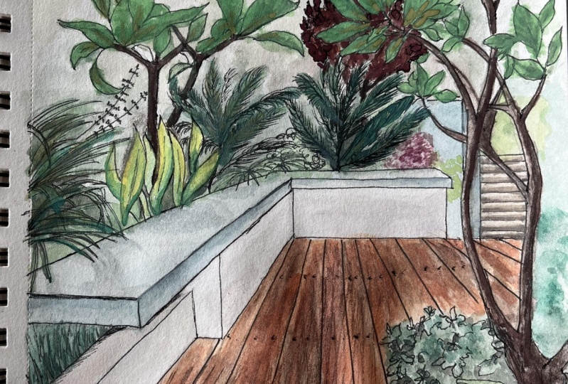
7. Drawing from a reference : Vegetation Sketching: Okay, So following some
principles that we just saw, you have this shape here. You have a shape here that is
a bit like hair, whatever. So I'm just going
to follow the same way, I'm just gonna draw some lines here. Just a line. And then it's going to be
better with colors. But for now, just
some lines The shape. And then here I have another
shape that is like a leaf. So. What you need to do
first is define the place. For example, I know
this is taking this place, so I brought it here, but it's not really important. And here I have another shape. And behind another shape. And here another shape again. So again, proportions and, basically just
need to look closer. I'm going to draw
some leaves, again, I'm not gonna follow exactly the drawing.
I think I'm okay with this. And here I have a palm. So let's draw one of
those we just saw before. Have some leaves here. I just want a shape, so okay, some shape here. And I don't really
care because again, I'm going to draw with ink later. And it's behind Just to see what I'm doing. Here. I have another one here. So let's draw a
smaller one. Here, I have some shrubs. So let's just draw
a volume here. A volume. And here I have a big, palm. So let's draw some
leaves this way. - Here I have a volume. I just want to continue
it which shrubs. I'm not doing exactly
the same thing. Because it's a real picture.
I still have some shrubs here, just a bit of shrubs. And I have some Ivy here. So just draw a shape this way, just a shape basically. I also have a tree here. You can see that my drawing
is basically taking, slowly, taking some "deepness". - And then after, I can change it
the way I want I can draw leaves. You have multiple ways to
draw a tree depending on what you want the
tree to look like. As we just saw some examples, I have my shape of tree. I have also a tree here, bigger so
I can focus on it. it's big. It's going as you can
see here somewhere here. So yeah, drawing some lines. - And I have some leaves
going this way. - -
8. Shadowing principles: So, hi guys. Let's talk about shadowing. First of all, the very, very, very simple theory of shadowing. I have light that is going over an object and so some places
be darker than others. So this is the basic principle. Now, if you want to practice
it, Let's take a cube. For example. I have a cube and let's say I have a
light coming from here. So the phase that is directly under the light is
going to be the lightest one. Logic copy. And then the, the one who is behind and the one behind
is going to be the darkest. So this is the basic principle. Now, we have two
types of shadows. You have the shadow that is on the object and
you have the shadow, what we call the cast shadow. Okay, that is a projection
of the objects on the floor. And this one is drawn in a certain way
depending on the object, but we're not gonna
do this today. You can find a lot of things, a lot of tutorials and information about
this on any platform. So they're going to, I'm just showing you the
principle of shadow, shadowing so that you know that some places are going
to be lightened other dark and also how to
draw this shadow. Okay? And we're gonna
see this right after. So how to draw, how to draw a shadow. I have some few examples here. And we are going to use ink. But dependent on
media you're using, you can have different
ways to draw it. For example, if you use
an only pencils, here, I'm using different pencils, different size, say had
to be the one to be F HB. So this is and then the lighter
I want to be delighted. I use more likes. Bad. Okay? For example, if I'm using ink, like we're gonna do,
for example here, I used, what I'm going
to show you here is the grid method of
shadowing or going for here. But also at some point, I'm only using coloring, so I'm not always using grid. So you can also do
your drawing and then add some gray to it
to give it shadows. This one. This is what I was
talking about. So my shadow is obviously
going from there. I'm in my life is
going from there. So all these bars are shadowed, every right bark of a tree and also under it because
I have my shape here, my volume under it, the light is not going through. So I have a light
coming from here. So it's from here and
it's going there. Okay. So all this part is kinda lights except
under the volumes. And all this behind is more. I have more, I created
more depth by adding more shadow and playing
with the volume. So you play with the volume
by adding shadow and some texture in here,
colors as well. So let's try to practice it. I'm going to show
you the grid method. Let's draw a simple shrug. Our example. I'm going to draw
a shape. A shape. My light is coming from here. Okay? So first of all, I know this place is
going to be dark. And I know I have a
cast shadow here. Okay? So what I'm gonna do is, as it's, an irregular
object, is not, it's not a cube, it's not something with
mathematical shape. I can do whatever I want. So I can shape it
the way I rent. For example, I want this
place to be shadowed. Of course here I was
using a reference, so I kinda copy it, but even if I change
it a bit, it's not. So difficult. Here is shadowed. The grid method consists of doing some
straight lines from one way and then doing other ones in a perpendicular
way or the other way. Okay? So always perpendicular, this is the way I use it. So here I followed it here
I pay attention to not, never draw a line here. To say, oh, this is my shadowed part
because if I do this, if I draw it, then I'm going
to see what it ends up. I don't want to I don't want
it because it's irregular. And the same for
the shadow cast. Shadow costs. So I'm going to draw
some lines this way. And this way. And what you need to
know is that the more I come closer to this part
and the more it's dark. So I can make it a bit darker. Yes. And also this one I can
see I can still add here some places I want to be
darker because maybe the shrub is has a lot of homes in nature. I guess it's this way. And I can add some
texture to SRO. Okay, I can do pretty
much whatever I want you to practice this, okay? And then I can use colors to create contrast between some yellow and more greenish,
one and more dark. So this is a step, and after I add another
step with colors, if you were to use
only black and white. Then there are another
other techniques for this. And you can find so many. I can also use only lines. If you see here. I used
the Greek, right here. I used the creek. But
then here just like. So let's practice this one. This practice another one. So I'm going to draw a shrub. This way. Sunlight
is coming from here. Texture here. Displays is going to be darker. And then displays
two is works too. So it depends on what
you want to draw. A shadow that is too small. For example, if I draw
a small from here, I have some shadow here. I cannot do a small
shadow this way, a logical and I cannot do as big shadow bigger than i object, such as pay attention
to this for now. Yeah, the grid. You also have that
chin technique, but I don't use it much
because it takes so much time. So for example, instead
of doing agreed, I'm going to just put
some dots everywhere. And the closer I
come to the object, the closer my dots are. So this is the principle. And this is something,
a huge thing, this glowing you can see here. So a lot of dots. And the more you go closer to
where the darkest part is, the more dots are dark. And those are some
principles of shadowing.
9. Drawing from a reference : Shadowing: Now I'm going to
take my 0.1 This one is a
Steadler, I like those two brands
(Unipoint and steadler) 0.1mm for all the first lines Don't press on the pen,
it's just a sketch And what I like to do is, I'm not going to try to
do a straight line. I'm just going to let my fingers goes, my
hand goes with the pen. And you have nice lines. Actually, it's concrete, so it's
not supposed to be straight Here Try not to follow the lines. if I start with the line, I cannot erase it. So always look at
the first objects in the picture Before drawing the rest. We did the first
layer with ink. Now I'm going to
add some details. And there is no rule like to add them now
or after coloring. But just know that if you add them after coloring
is going to be, bolder I'm going to add some
details and then after I add the colors, I'm going to see more
clearly if I need to add more again. So I'm going to add some details here on
the leaf There is the spine and some texture - So I added some
details to the leaf. I'm also going to add some volume here This is done. So I was going really
sketching on this one. But know that even if
you add a lot of detail, but if you just draw some
lines, not the way you want. So you can always
correct it after and here's why you
have two or more ink pens thickness Ok Here also some
details to the leaves. And we have here, we have some shadow we're going to make it
more obvious with colors, but we can still add
some shadow with ink If you want to something to be
seen more just outline it with ink - - And also here we have a line. - Yes, I'm guessing all
the rests, all the shadows, I'm going to show them
with darker colors. - We have some reflection here. You see, we have also here some dark and
shadow in the tree. I'm going to just
do some lines here to
show the trunk. For now I'm just going to leave
it this way and then I'm gonna show it more colors. - - - - ready for the next step.
10. Drawing from a reference : Coloring the hardscape (Floor & bench): Hello back guys, so this is our, not final but almost
final step wich is the coloring, bringing to life, I like to call this
bringing the drawing to life because this is
what it feels to me After putting some colors. So I did choose some colors depending on
this reference I made. that I
recommend you to do. So you take all your pens, and you put the colors
and the reference, and then after it's
much easier to choose, according to (the color pallet in the reference)
in this case,
we're gonna try to, we're not going to do
exactly the same, but we can try to make it
closer to the reference. So I chose a pannel of colors, depending on
what I have here. So I went for some
gray/green tones, and some different ones. As you see here, we have a reflection of
yellow and a dark green. Dark green, Let's
call it "herb's green". Also kinda the same here. We have a lot of shadows that we're going to
adjust with gray. And here we have
another type of green. So I have, I think three greens, I had three
greens to play with, and one yellow for the light
for the lighting effect, and also for the floor I took two I took a brown one and
then more orange one. And also always the gray one. And what else? I have another brown
for this tree. I'm going to play with this two. And I think that's it. I have A very, very light gray for the bench here that
I actually forgot. So I'm going to add
it So we're going to add
some shadow to it too. And and yeah, I think that's it. We can start coloring
our drawing. So I'm going to put this aside Know that you can do these
choices with any media. Okay? You just need to choose some
colors that works together. So let's start with the floor. I'm going to make
sure that I removed every pen lines because after you can't remove them,
(after you put markers on it) And I'm going to
start with the floor. I'm going
to apply first the lighter tone
and after the dark one. So I'm going to
start with yellow. - - - - - For the ending of the drawing. Some people choose
to have See here I went over the bench
but I don't care Of course try not to do it, but it's not very
important to me. So I was saying some
people choose to end the drawing with
some specific limits and sometimes it looks good, but it depends on which
style you want to have. I like the messy one, messy style, because
that is what a sketch means to something messy but still something that has some spirit. Okay, so here it is
for the lightest tone. Now I'm going to go
back with this one. I'm going to Forget some places. I try to follow The perspective And for this one I went
with the other brush. I went with this brush and not the other one because
I want the lines. To follow the wood lines also to follow the floor. - - - that's it for the floor. And now let's add a
gray tone - Because we have some reflection of shadow and
reflection of light. And we have some darker places that Most likely are gray. So I'm going to do is just going to add here
some gray tones. And I can still make them blend together by adding
the other tone that I just put before. When it's wet, it's
easier for them to blend. here some dark Let's keep it this way. Now. Let's move on to the bench. I'm going to use a
very light gray. And I'm going to leave
here when there's lights, I'm going to leave it blank. So this is going to be gray.
until there because if you; and I do always this mistake, I color
it and after I forget. But actually you can't have this light effect if
you color it first. And here just a bit. Also here. There everything. And that's it. - And this is my first layer. We have also this wall
here that is gray. So this is my first layer. I'm gonna take
another gray, darker gray. And I'm going to do
the shadows here. - - - - - - - - -
11. Drawing from a reference : Coloring the Softscape (vegetation): I'm going to start
with the trunk. And I take my other brown. The trunk is pretty dark. So I'm going to put everything
in brown and then add gray That's it for the trunk now leaves.
This is the first layer. And then I'm going to
add details and is going to be way better. You have two choices. Either start with the yellow, but I won't do this because I don't want all my
plants to be yellow. Or you take your green. And you leave some
parts for the yellow. I think this
is what I'm gonna do. - - - - - - - - - - So as you can see, we
have put our colors, but we still have
some details to add. These leaves,
there is no depth. It looks flat. So we need to add more
shadows, more details. So I'm going to add more
shadows. contrast and shadows. to those leaves by
adding a bit of gray, - - And you can see now
the difference. You can also make it even
darker by adding another layer. - in the picture, the darkness comes from down. Yes. Everything is . Lighten up from the top. And so the shadow is this way - Now, the truck, for the trunk, I'm going to
play again with a gray, a darker gray actually. And I'm going to create some
contrast as you see here. You have some light
in some sides. I'm just going to play with this. Don't bother going
over the line because I'm going to correct
it with the ink later. Normally if you have
the lights this way, so this is going to be darker. in one side. What I'm gonna do now is I'm going
to create, the last thing I'm going to create with colours Is a touch of black, you know. And it's the shadow effect
and also the contrast effect. to give dept to the drawing. And this is all the
black you can see here. And to do this for
this special one, I'm going to show you
something I like to do. I'm going to use a marker
that is starting to dry. And it gives me a special effect because I
don't want something bold. So what I'm
gonna do now is I'm actually going to create my
contrasts with this pen. it is giving me exactly
the effect I want to have. So actually, I don't
throw the pens. And I can use them for
doing nice things. - - - - - -
12. Drawing from a reference : Adding details & Hierarchy: Okay guys, for the last step
it is going to be ink again. So basically my drawing
is done, but I still want to add some
depth and also I want to correct these little guys here
that are going everywhere. So you can use 0.1mm or 0.5mm. But now you should know that because we added colors
it's going to be bolder either way. But for the things that I
really want to be bold, I'm going to use 0.5
and it's going to be the frontline things. So maybe this lines
I want them to be shown more So again, don't try to
do something straight. I'm going to stop here
because after this, it's too far for it to be seen, - I'm going to use my 0.1 for the rest because
it's too bold. And it's still going to be bold with
0.1 because it's over the colors. Here I'm going to add
some textures. I usually use 0.5 to outline and usually, you use
the thicker one For the outlines
and for the details you use a less thicker one
like a thin one. You can see how the
difference is made. Also here I'm going
to outline this. maybe those two. - What I want to outline too but I'm going to do it with an 0.1 is
my floor, my deck floor. And I'm just going to follow the lines - - You can also always
correct the outline. Because when you add color, you kind of put it everywhere. If you do like me. And after what I
like to do is I'm just correcting the
outlines of the color So the color is not what
actually outlines my drawing. And I'm going to do the
same thing for this trunk. But for the trunks I like
to do it with the 0.5. - that tree is behind, it's really far. So I'm going to outline it
with the 0.1 this is how you
create the hierarchy. What is behind is less obvious
than what is in front of you. And finally, I'm going to shadow a bit the darkest
parts of my tree. And that's it guys. My drawing is, let's say Done.
13. Your project: So for your final project guys, I'm not going to ask you to
do exactly the same drawing, but it would be, I mean,
if you're a beginner, try to practice this drawing with the principals,
with everything. Try to practice
perspective first. And try to redo this drawing. So maybe if you don't have
medias, you can also, you can just practice, in black and white
and just for the perspective methods and everything. And then after, you can play
with media you have. If you are more than a beginner, I invite you to choose
another image of your choice and practice the principles
of perspective and show me, show me what you've got
and tell me everything about your struggles and if I
can help you with anything, don't hesitate and post
everything here. So I would be very, very happy to see all your projects and thank
you everyone for watching and see you
for a next class.
 Nissam Fassi Fihri, Award winning Architectural Illustrator