Transcripts
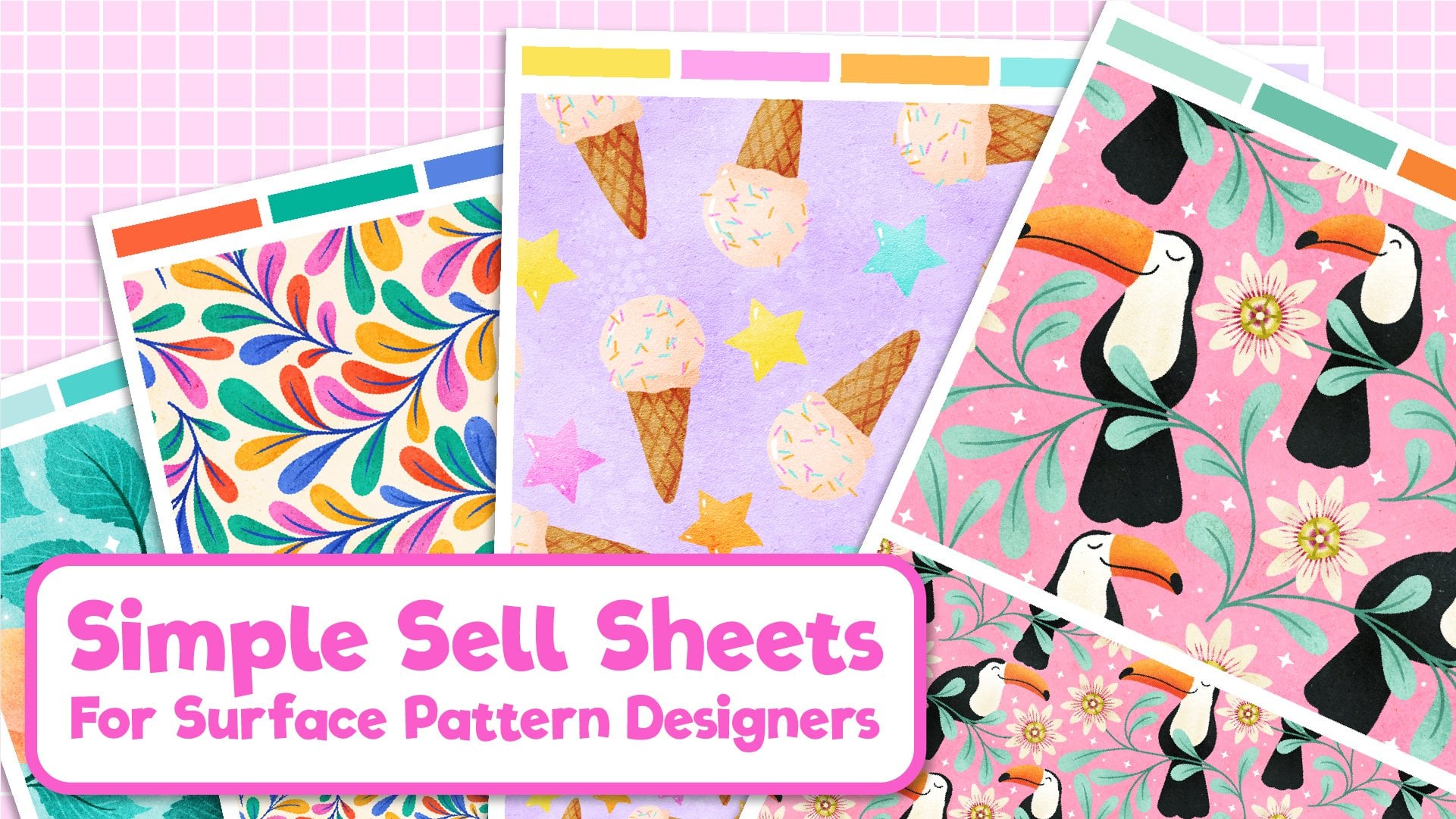
1. Trailer: Hi, I'm Becky Flahertzy, I'm an illustrator and
surface pattern designer. I sell my work through online
stores such as Society6, Redbubble, and Spoonflower. I love to paint with traditional mediums
such as watercolor and gouache but I also love combining these with
digitally applied graphics. In this Skillshare class, I'm going to teach you
how to use your iPad and Apple pencil to enhance painting techniques that
you're already doing. I'm going to teach
you how to use side to change your iPad into a pen display tablet
that you can use to illustrate directly
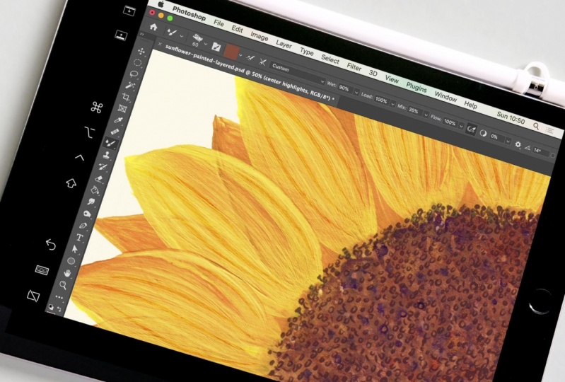
into Photoshop. Your class projects
will be to create a simple painted illustration
which we will bring into Photoshop and add some
digitally applied linework. I'll teach you all my tips and tricks and shortcuts
along the way, including how to remove
the paper background, changing the colors, and even adding some cool
metallic effects. This class is for anyone
who loves painting and wants to add a few new
tricks to their skillset. A very basic knowledge
of Photoshop will be useful but don't worry if you're a
beginner because I will be explaining
everything as we go. I'll see you in class.
2. Class Project: [MUSIC] Hello. I hope you're as excited
as I am to get started. Let's have a look at
what we are going to be making for our class project. We're going to be painting
a simple illustration like this one so that you can easily follow along and learn all the new workflows that
I'll be teaching you. I'm keeping the project super simple so that you
can just focus on the new techniques rather than worrying about having to
create a masterpiece, although feel free to create
a masterpiece if you want. You can use any paints
that you already own and enjoy working
with more on this later. You can, of course,
paint in your own style, you don't have to copy this same illustration
style that I'm doing here. Some other ideas you could
work on are painting individual elements for
surface pattern designs such as these ones here. Believe it or not, I
turn these simple shapes into nail polish bottles
for this fabric print here. Using that combination of paint and then digital line work on top is something
I quite often use in my surface pattern
design projects. Please feel free to paint
whatever you would like for the class project and give
it your own unique twist, or if you want to just
follow along with what I'm doing and paint those
three cactus shapes, that is absolutely fine. I'd love you to take lots
of photos and screenshots along the way of your process and add them to the
project gallery. I'll let you know at the
end of each video what to add to your project
gallery as we go along. Don't forget to
stop by and check out other students' work and share the love by leaving some feedback and
helpful comments. I can't wait to get started, so let's jump right in and take a closer look at what materials
you're going to need.
3. Materials: [MUSIC] Let's talk materials. You've probably guessed
that the first thing you're going to need is an iPad. You will also need an
Apple pencil and you will need a MacBook or iMac. The reason for this is I'm
going to be teaching you how to use Apple's Sidecar feature, which allows you to
use your iPad as a second screen
for your MacBook. You can check
whether your iPad is compatible in the list below. You're also going to
need a drawing app installed on your iPad. I'll be using Procreate. But if you don't
have Procreate and prefer it to another app,
that's absolutely fine. You're also going to need a
scanner and Adobe Photoshop. If you don't currently have
Photoshop, don't worry, you can get a free trial
for this and I will post the link for that
in the class resources. You're also going
to need some paints to create some artwork with. Since this is a class geared more towards teaching
you how to use your iPad alongside painting techniques that
you're already doing. I'm not going to go
into a whole bunch of detail about the different
products that I use. However, if you're new to this, I will walk you through
the basic supplies that I'll be using to create
the class project. I'm using watercolor here, but you can really just
use whatever you've got. Gouache or even acrylic
will work well. High-quality paints aren't
super important if you're just starting out on a simple
students, that is fine. I use a mix of student and artist grade paints and
they all work well. You also don't need to worry about paints being
light first if you're not planning to sell
or display original pieces. Paintings that we hung
on a wall will fade over time if the paint
isn't light fast. But since we will be
scanning these is not a consideration we have to
make when choosing our paints. Again, I use a mix of student and artist
brushes and to be honest for this
illustration style, I actually find these cheaper student quality
brushes are the best. You want a smallish
pointed brush for doing the detailed work and medium, this is a number 6 round brush, for doing the larger
areas of colors. To keep your brushes
in good condition and to keep the points
nice and sharp, always store your brushes
with the points upwards. I'll be using A4 just because that's my
preferred size to work on. But I'm guessing
most of you will probably also have A4 scanners. However, if you have
a larger scanner and you would prefer to work on larger paper, that's
absolutely fine. You want to look for something
that is around 250 grams per meter squared to 300
grams per meter squared. That will make sure
that it's thick enough to hold up
to the watercolor. This paper holds the water well and it has a slight
texture, but not too much. If you use something
with too much texture, it can make it a lot harder to remove the paper
background or Photoshop, which we'll be doing later. You also want a
rubber and a pencil. You may also want a
black fine liner pen for adding the details, but this step is optional
as I'll explain later. Once you've gathered
all your materials, join me in the next
lesson and we'll talk about planning
out your design.
4. Gathering Inspiration: [MUSIC] Let's take a quick look at places you can go to for inspiration to paint
for your class project. I am going to do some cacti in pots because I really
love heist plants. I think these shapes will lend themselves well to the style of illustration that we're
going to be doing. I'm just searching
on Pinterest here. You can also look at photos
of things you've taken. You can take photos of
things on your own eyes. I'm just going to
quickly look through Pinterest or I really like these tall
cactus shapes here. I think that these
little star shapes will be good for drawing
in the ink afterwards. I also really like
bunny hair cactuses, these type of ones here. I think I'm going to
put one of those in and these patterns that are
on the pots will be good for adding in
detail later as well. There's another one
of those tall shapes which has the pink
flowers on it. I think I'm going to try and
add that into my design. I think I also like these
aloevera-type plants. You'll notice that lots of these things are laid
out in sets of three, like these here and
these ones here. Objects often look good
in threes or odd numbers. I think I'm going to do three plants
side-by-side like that. Whatever it is that you decide, you're going to draw
half a quick search and lookup some reference
images for those. You can either
follow along with me and draw the same thing
that I'm drawing, or you can choose completely
different images, whether it's different plants or something completely
different altogether. Once you've decided what it is that you're
going to be painting, the next thing to do is
to pick a color palette. My favorite way to do this is to have different swatches
of all the paints that I have so that I can choose which colors look good together. I prefer to have
them on separate cards rather than just on swatches in the lid
because it gives me the opportunity to
move things around. [NOISE] The way I make my swatches is to get some small pieces of
cut-up watercolor paper. Then I just paint a little bit of each color onto the paper. You'll then need
to make a note of what colors on each square
so you don't forget, you can either write
the name of the color. This one is yellow ocher. Or you could do what I've
done and make a note of a number for each color, and then assign that
number to the color. I also have them swatched on the top here
so I can see what they look like with different
amounts of water in them. These are the colors
that I've chosen for my final illustration. Once you've chosen yours and you have your reference images, post a picture of them
in the Project Gallery and join me in the next video where we'll start sketching.
5. Sketching: When I realized that I could use my iPad for sketching out work, that wasn't necessarily
going to be digital work finished
on the iPad, but it was going to be painted. When I realized I could
still do the sketching on my iPad I do not have
to go through sheets and sheets and sheets
of paper for revisions. That was a game-changer for me, felt so good to
not have to throw away so many wastage
sheets of paper. Always remember
that you can still start sketching on your iPad, but then take that
design onto paper. You can use any drawing
app that you like. You might prefer Adobe
Fresco or Adobe Photoshop. I prefer drawing in Procreate, so that's the one I'm
going to use today. I'm just going to
open an A4 document. If I was doing a
full digital design, I will make sure this
was a lot bigger canvas and for 300 pixels
per inch resolution. But because this is
only a sketch layer, we don't have to
worry about that. I think because I'm
doing three pots, I think I want to turn my
canvas around this way. Make sure I've got
a pencil basic HB, and I'm going to start
off in a light color. Yeah, that's perfect. I think I'm going to start in the middle with the
bunny ear cactus. Just going to sketch
out a simple pot. I think I want to take
it up there like that. Actually, that might
be a bit too big. Let me move this down a bit. To move something in Procreate, we need to do is hit
this arrow here. Then you can drag your object around to where you
would like it to be, and then just hit the arrow again to set the transformation. You want to use the whole of
the area for this design. It's nice and big
when we scan it. I'm just going to draw
some simple shapes. Maybe another one there. Then the pot on this side, I think I want that to be a
bit bigger for some balance. Let's draw that one in. Remember these
shapes are going to be just loose watercolors, so we don't have to
be precise with this. You don't need to worry
about perspective is meant to be slightly stylized and a bit
higgledy-piggledy looking. I think I'm going to
make this one more like an aloe Vera plant with
some spikes coming up here. I love this style
because it really don't have to the
precise with it. This style draws on that
gestural motif style. I think I'm going to
do this one as one of those taller cacti like that. The ones that had the
little stars on it which will be adding on later. I put a flower on them. I know at this stage it
does look like something that a five-year-old could
draw, but that's okay. It's going to look
great when we've got the watercolor and ink layers. Always remember to step
back and have a look. I'm thinking this is
just not quite working. So just going to rub that night. I think I'm going to make, I want to big leaves
and let's do on there and one there and then
maybe a smaller one there. That's really all there
is to it for this stage. These are all going to be
filled in with blocks of color. Then we'll put our
linework over the top. Another way, you can
use your iPad to streamline the drawing process, even though we're
not going to be completing the final
piece on here, is to bring your color
swatches into procreate so you can play around and see
which colors look best. If you come up
here to the palate and you select new pallet, you'll see they
have the option to create new from camera. You can lay these swatches out, take a photo of them, and it will create a palette for you. You all need to do is position your iPad camera above the
palette and just take a photo. This will then capture
your new palette. So you can set it as default. You can then create a new layer, drag it underneath
your sketch layer. We're going to choose
an inking brush. I think we'll just
use the inker brush. Then you can pick your colors. I'm going to go for
the dark red first, which I think would be good
for one of the plant pots. Let's go for this one here. You can just lay your colors
down for light to one here. Then maybe like one over here. Dark color there, medium one in the middle. This one I have here. Then a pop of pink up here for this flower. This will give you
the opportunity to visualize how your colors work. Do they work for
this illustration? Does it give it balance? I think, yeah, that looks good. Now, we're going to trace
our design on our paper. I've got my iPad
here in front of me. It's really just
the case of copying the proportions onto here. [MUSIC] Want to work quite lightly with the
pencil will not go too dark. Now make it easier to Rabbi. Normally, when I'm doing
this kind of thing, I use a light pad, so I'll print the
design off from my iPad and then use a light pad underneath
to trace through. But I wanted to keep this
as accessible as possible. This is quite a simple design. This is a quite simple
and two copies, I want to show you
that you didn't need a light pad to do this. When you finish your
sketch out a photo of your iPad color layout to the project gallery and then
join me in the next lesson, where we'll start adding
some paint to our design.
6. Painting: [MUSIC] I'm going to start off with the
cactus shapes. I think some of these need
thicker brush for this. Go ahead with a
nice green color. Now, you want to paint inside the lines here. Make sure to leave some
white space there as well. You can drop some water in. The reason we want to
paint inside the lines is because if we
go over the lines, then we won't be able to rub that pencil out once
we've painted over it, but if we keep it
inside the lines, we can easily remove
that afterwards. Just decently drop
your color in around. You notice I'm not going for
perfectly smooth edges here. I want this to look
quite jaggedy and loose. Drop some more water in there. One thing I do want to do
is keep these edges hard. You can see here where I've
got a soft edge of water, that's fine inside the shape, but I want to keep these
outside edges quite hard. The reason for that is that
when we come to scan it, it will be a lot easier for
the Photoshop software to recognize the difference between the paper and our paint if
there's clear edges there. Again, put some more
paint in there. I like all these little pieces where there's plenty of
paper showing through. I think it adds a lot
of texture and dynamic to it. This one. A trick you can do
to add a texture to this otherwise flat color, is to drop water into it, and you'll see that it
spreads out and you get these lovely textures in it. I'm just going to put some
water in there and drop more concentrated areas of
paint back into the design. I'm going to put some
down here, I think. I think that's done for them. Move on to this one now, which I'm going to
do a lighter green. I'm going to go for sap green. I think I might actually keep some of
those stripes that were in the reference image. This is quite a rich design. I think I might leave those
white areas in there. [MUSIC] Again, drop some of the
darker color at the bottom, and then I'm going to dot
some water in up here. These will leave some
really interesting textures when they dry. I think I'm also going to do this spiky part in this
color just because I think it will add
some balance to have the same thing here
as we have over here. Don't be afraid to move your
paper around as you need to. You don't have to
keep it one way up. Just move around as
you find easier. I think I'm going to drop some more color
in the bottom here. That's it for the greens. I think now I'm just
going to refer back to my sketch for the colorings. I'm going to use the
darker color over here. I'm going to use this one. I'm going to switch to
using my clean water for these brown shades so it doesn't look too muddy with the
green mixed in with it. I'm going to use the
side of my brush to have a nice jagged effect. [MUSIC] You can see why this is such a great painting technique for beginners because we really are just laying
down shapes here. If you haven't let the
paint dry, which I haven't, you want to be really careful
not to let these two colors touch because the
color will bleed, so you've got bits
of green a bit running into this and bits
of orange running into that. When we come to change the
colors around in Photoshop, it will make it a lot harder
to do if you've got parts of one color in another, so just bear in mind
as you're working. If you're not confident in
not letting them touch, then I would let these
dry first, but otherwise, just be careful to
not let them bleed. [MUSIC] The last of all, I'm going to do this flower
up here. A bit more water. There we go. That's pretty
much it for the painting. What you need to
do is let that dry and then scan it
in the next step. When your painting is dry, take a photo of your design, and add it to your
class project.
7. Scanning: [MUSIC] Let's get started scanning our artwork
into the computer. You're going to need to open
up your scanning software. As it starts to load, you'll hear the scanner doing
an initial overview scan. You have a blank screen here. We're going to open up the scanner and put
the out working. Once you've put your artwork
into the scanner overview, it will do a really quick
initial scan just so you can get the layout
and test everything. The first thing you'll notice is that this is in
black and white. We want to change
it to a color scan. Next, we're going to
set the resolution. You will have different
settings here depending on how high
your scanner can go. The minimum you want
to use is 300 DPI. By scanning at 300 DPI, you will be scanning at
the right scale for print. If you scan it at a higher DPI, you will be able to print
your final image much larger without losing any image quality or seeing any pixelation. I'm going to go
ahead and scan at 1,200 which we want to
use a custom size here. If you don't see this
image bounding box, pop up when you click
Use custom size, you can just click on this image and drag out a box like that. Just going to delete that one. Let's drag this in to just around the edges
of our artwork. The reason we want to keep
it quite tight around it is it will help to
keep our file size down. When it rescans this
it will only be scanning this area
inside the box. If we were to leave the
whole area checked, we'd be saving data for all of this area around here
and taking up file size, which really isn't needed. We want to keep
the rotation angle of zero and we don't want to auto-select it because we have already told it where
to scan with this. Before we go any further down, I'm just going to show
you a quick trick to get rid of the
shadowing here. I don't know if you can see
the slightly darker areas here and here where the paper
is a little bit buckled. If you take your
paperback out of the scanner and put some other sheets
of paper behind it, [NOISE] that will increase the thickness slightly
and you'll be able to press down on top
of the scarlet and effectively iron those crinkles. I'm just going to press
down and hit Re-scan. Another overview scan. You'll see these dark areas have gone and the image
is mostly flattened, which need to readjust
our edges around them. This section here
is referring to the location filename of
all type of our scan. I like to keep my projects
organized right from the beginning and set a proper folder and keep
everything all in one place. I'm going to choose Other. I'm going to make a new folder called
cactus illustration. I'm going to choose that one. File name, I'm going to give it cactus
illustration as well. I'm not wondering which scanner
is, and for the format, we're going to choose
PNG because that will give us a better quality
image than a JPEG. Then we come down to
image correction. You'll notice that the colors
on here a pretty flat and dark compared to the nice fiber and paints we were working with. We'll be adjusting the
colors in Photoshop. We can get a head
start on that here by adjusting the colors a
little bit before we scan. I normally like to drop
the brightness down a bit. I think the tint is probably okay where it doesn't look too
green or too purple. Just right in the
middle where that was. Temperature probably
is okay as well. I'll take it a
little bit that way. For the saturation and that tells us how bright
the colors are. We can take it all the way
down to black and white, or all the way up
to crazy levels. Think I'm going to increase
a little bit too about there that looks brighter
but not overblown bright. Then we're going to rescan, pressing down on the top
of the scanner again. [NOISE] Depending on what
resolution you scanned in, you'll find that this will
take a lot longer than the initial overview
scan that we did. I'm going to go ahead and
speed this up a bit for you. Then you'll see your
scan window pop up. You can locate that in
your finder by clicking on the little magnifying
glass. There we go. You see it's in our folder. File size is a 150.8 megabytes. If you've scanned
lower DPI heels will be a smaller
file size than that. One thing I am
going to do before we close this window is to just rotate it because it
will save doing it later. [NOISE] Then that's how scan saved in our file, ready to open in Photoshop.
8. Removing the Paper Part 1: [MUSIC] Here we
are in Photoshop. The first thing
I'm going to do is rename this bottom
layer original. I'm going to make a copy of
it by hitting "Command J". Then I can lock
this original layer and make sure that I don't make any changes to this that
I can't go back from. If we zoom in here, you can see that there's
this texture showing, which is the paper. It will be a lot
easier to remove this paper background if we can smooth out the appearance
of our texture. We're going to do
that by putting an adjustment layer
onto this one. Go to your adjustments panel. If you don't have your
adjustments panel showing, you can get to that by going to Window and choosing
adjustments here. Then we're going to go
and click on levels, and I'm going to select
this eyedropper tool, the white one at the bottom. By clicking on this
white area of the paper, we're telling Photoshop,
this is white for our image. If we click on this
slightly gray area, it will adjust the rest
of the image for that to be white. There you go. You can see that smooth
side, all of this, and that will make
it a lot easier for us to select the white
area and remove it. But you can also see that it's thrown these
colors off here. If I hide this one, you can see that it's made that go a strange
bright yellow color. We don't actually want to
apply it to this layer. I'm going to make a
copy of this one, and then I'm going to
shift click onto levels, and I'm going to right-click
and choose "Merge Layers". We have this one
where it's applied, but then we still have
this working copy to go back to and make
the selection on. Now, another thing I like
to do at this point is to add a layer underneath
this one I'm working on, and hit this little
circle icon here and add a solid color
layer of black underneath. You'll see where I'm going
to do that later on. Let's go back to this layer up here with a level
adjustment on it. Let's show this one again. I've got my magic wand
tool selected here. You can get back by
clicking up here or you can use the
keyboard shortcut, which is W. When you use
your magic one tool for this work settings that
I like to have our point sample a
tolerance of between 15-30. You can experiment to see
which works best for you. You want to have
contiguous selected. I contiguous means that
when we select white, it will select all
other areas of white that are also
touching this area. For example, if I de-select it and I click this area here, it will select all
of these areas. If I have it selected, and I click this one, it will only select this area of white. Now, you may be thinking,
wouldn't it be easier to select all the white
at the same time? But the problem is, it will
select all of these areas, but it will also
select tiny specks of white in this area as well, and it's much easier to go through one-by-one
selecting the areas we do want than to try and de-select all these other
areas that we don't want. I'm going to hit "Command D" to get rid of that selection, Command 0 to go back
to full screen view , and select "Contiguous". Let's click on this area
up here, see what we get. I think that's a pretty
good first selection. Now, what we need to do is add these other areas
to our selection, and we do that
holding down Shift on the keyboard with
our magic wand tool and you'll see a little
plus sign come up. Then if we shift click
on these other areas, it will add them
to the selection. You don't need to hold
down shift the whole time. You can let go and it will still keep your selection
in-between clicks, but if you've let go and you
forget to hold down shift, and you click on an area, that will then only select the new area that you selected. You can hit "Command Z", which is undo to go
back and then hold down shift on the area and
then you can carry on working. Then it really is a case of going through bit
by bit zooming in. You can use the command plus and command minus to zoom
in and I quickly, and then selecting
all these areas that we want to get rid of. Where we have some areas like
this that are quite light, but they're still
part of the drawing, I'm not going to
worry too much about these for now because
we're going to go in with our Apple pencil in a second and edit
these areas by hand. [MUSIC] I think that's nearly all of it. I'm going to show
you now why I put this color fill layer in. If you think you've got everything and you
hit the "Delete" key, that will take out all
of the white you've selected and you
can quickly see, like I come here if there's
any bits that you've missed. Then hit "Command
Z", and then you can go and add those to
your selection as well. I think that should be everything that I
wanted to get rid of. Let's hit "Command 0" to go
back to our main screen. What I'm going to do
next is to modify the selection and
smooth things out. If you can see when we zoom
in here where it's selected, there's still some bits of
white showing around the edge, which if I delete that, you get this white halo
effect around the edge. What we want to do is to take our selection
in a little bit. You can do that by going
to select, modify, expand, and I normally expand my selection by two pixels. You can see that's taken it in, and we have a much tidier edge. Then I hit "Command
Z" to undo that. Then one more thing I like
to do is to go to select, modify, and put a feathering
of half a pixel on the edge. This will create a
slightly softer edge, which I think looks
nice when you're working with paints
and watercolor. Again, hit "Command Z"
to remove deleting that. Great. Now, we could hit "Delete" and get rid
of that white paper, but then the problem is
that's gone forever. When we come to
these parts here, where we want to add
some of it back in, we won't be able to do that because we've deleted
it and it's gone. What I'm going to do
is use a layer mask. Now, a layer mask will only show the areas
that we have selected. At the moment, we have
the white selected, so if I hit this, it will get rid of
all the other parts. What we want to do is
invert our selection, so we press "Command Shift", I switched to having everything except
the white selected. Now, when we create
a layer mask, it only has our
painted areas showing. Now, I've created this on the levels adjustment
layer we were working on, which had the blown
out colors on it. What I want to do
is hide this layer. I'll drag this one underneath, and we'll go back down to
this original layer here. We've still got this
selection here. If we hit the layer
mask on this one, that will apply it
to this layer here. Now, if we zoom in, I'm holding down the Z key
here and dragging with the mouse to zoom
into a specific area. You can see down here we've
got these ragged areas which I want to go in with a
brush and clean up by hand. At this point, we're
going to switch to using our iPad to work on.
9. Setting up Sidecar: [MUSIC] Let's get started
using Apple Sidecar. To use it you'll need
to have your tablet on the same Wi-Fi network or
connected via a USB cable. You go up to the control
center and click on the Display Icon and then you'll get the option
to connect to your iPad. Then you'll see that what is on your screen is also
mirrored on your iPad. You will need to resize
the windows a little. I'm just going to on my Mac, drag Photoshop so it fills
this window. There we go. Once you've got it so you
can see everything on the screen it should look
a little bit like this. Let's have a look at the
tools on the interface. You've got these keys here which show and hide the menu
bar and the dock. I prefer to still use the
keys on my keyboard as I'm working but if you want
to use the Command Option, Control, or Shift
key on the keyboard you can use the shortcut
keys here for those. This one is useful as well, it's the shortcut for the undo button but
more often than not I still use Command Z on
the keyboard for that one. Then this one brings up the
keyboard on the screen and this icon will disconnect your iPad from the
sidecar feature. Let's go over some of
the basics of using the brush tool in Photoshop
with Apple Sidecar. Hit B on your
keyboard to bring up the brush tool and let's
zoom in a bit here. You can literally just draw on the screen in Photoshop
using your iPad so you have access to
all the same tools and everything but you can draw
with your Apple pencil. We go to our brush tools here, I'm going to use this
hard brush and you'll see that I have a slight
jagged edge on there. That is because if we
go to Shape Dynamics I have a size jitter
set which means that you get a more
natural pen effect than if we change it to off and change the size
jitter to naught percent, you get a smooth line. I like to have it set to
about 20 percent and change this to pen pressure and
then we can use the pen to press harder or softer in order to change
how much jitter we get. When you're using this
to add line work it just looks a lot more natural to have the variants and pressure. If you don't see pen pressure as an option here you can
fix this by going to Wacom's website and downloading their latest drivers and installing them
on your computer. This should then give you the option to choose
pen pressure.
10. Removing the Paper Part 2: [MUSIC] Let's address this area here. First of all, I'm
going to delete this leveled layer because we don't need that one anymore. Because this is a layer mask, we can add and delete
bits of the mask as we need to hide or show bits of the
illustration underneath. You need to make sure
that you're clicking onto the layer mask and
have that selected. Then, you can go to your
brush tool by hitting "B". You'll see that depending on what color you
have selected here, either black or white, you can draw on to
your layer mask, you can erase with black, and if you press "X", it will switch to
the white color, and you can add
that selection back in by painting in
with the white color. For these small areas here where it's quite light but
not quite white, what I normally do is just draw the mask back in until
I get to the edge. There we go. We can
see the edge now. Then, I'll make the brush
a lot smaller using the Open brackets key, that's about the right size. Then, I'll go back to my black by using X to
change the color. Then, you can just draw
the line that you want, and with your pencil like that. This is so much easier than trying to do
it using the mouse. You can use a graphics tablet
to do this, of course, but if you don't have a graphics tablet and
you have an iPad, there's no need to
go out and buy one. Then, to get rid
of this area here, we can hit "G" to switch
to our paint bucket tool, and we can just click
on the area there. You see that I
switch between using my pen on the screen
and using the mouse, sometimes I'm looking at the
screen and using my pen, and then I'll have my head up and be looking at the
screen and using my mouse. I just find that some jobs are easier with the pen on here and some jobs are easier with
my mouse on the screen, and that's why I
like us to being able to switch between the two. Now, we're just going to
go around this area here. I've got the brush
tool selected again, and we're just going to clean
up this little edge here. These small bits here,
which we haven't got, we don't have to
worry about those because I'm going to
show you a shortcut for cleaning up all of
these little bits that we've missed in just a second. Just go around all
the areas that you feel need cleaning up a bit. As long as they're separated from the main drawing,
that will be fine. I think I'm just going
to take all of this off, so I'm just going to trace
around this line here. If you want to make your
brush bigger and smaller, you can use these
Open brackets and Close bracket tools to adjust
the size of your brush. Then, here's just a case of
panning around our drawing, and using the brush tool to add or take away from the
selection, as we want to. For example, the part here, I think I'm going
to zoom in on that. Hold on Z, and click and drag, and I'm going to
clean this part up. We zoom it again, see what else we can find. I think I might clean
this part here up. When I'm panning
around, I like to use the mouse rather than
fingers on the iPad screen. [MUSIC] Let's see what this looks like with
the white background. Let's change this
part to white by double-clicking. I'm
going to zoom out. Here, I think I am
going to remove that. Let's change this back to black. [MUSIC] Go back to
our layer mask, and remember to
click on this one, not on the image itself. If you accidentally
have this selected, you'll just be
drawing pen lines on the layer, which is
not what we want. You need to make sure you're
always drawing on the mask. [MUSIC] I think that should be everything
that we wanted to get. Now, I'm going to copy this
layer by hitting "Command J". I'm just going to drag that
on underneath as a backup. Then, we're going to
right-click on our layer mask, and choose "Apply Layer Mask". From that, layer
mask is now gone, and the changes are permanent. Now, I'm going to show
you how I get rid of all these little extra bits, the small bits that
we've trimmed off here, and these little areas up here where there is still
small bits of pencil marks. I'm going to make
another copy of this layer by
hitting "Command J". I'm going to go down here to Fx, and I'm going to hit
"Color Overlay". Then, you'll see that's
applied a color to everything we have
on this layer. Let's make it a bit of a
brighter color so we can see easier against the black. There we go. At the moment, this is just an effect. We're going to apply
it by right-clicking, and we're going to click
"Rasterize Layer Style". We now have a layer that is just these light
green pixels. As before, we're going
to get our Wand tool, W on the keyboard, and we're going
to go through and select all of the areas
that we want to keep. We know these big areas are
the ones we definitely want, so we're going to
hold down Shift , and select all of these, and you'll see it's
missing these areas that we've trimmed off,
which is what we want. Just go through here, Shift clicking on everything. Then, again, we want to invert our selection, so
"Command", "Shift", "I", and that now has everything except these green areas
that we want selected. Let's hide this layer, go back to this one, and when we hit the
"Delete" key on this one, I'll zoom in so you can see, it will then take away all those small areas
that were left in there. Now, we have this layer with only the areas that we want, and we've removed
the background. Let's make this area white. There you can see we have
our nice illustration with the background removed. At this point, I'm
going to save. I'm going to hit "Command", "S", and I'm going to call
it Cactus Illustration, save it as a PSD, I'm
going to hit "Save". Before we move on
to the next step, I'm just going to
do one last thing and re-size the canvas. I'm going to select
my Crop tool, I'm going to choose an
eight by 10 ratio for this, as that's a nice size to work
with, with illustrations. We're just going to
drag the corners, and I'll put it in the middle. I like that size. I think we might need to do a
little bit of centering. This is the layer that
we want to center, so I'm going to rename
this one, illustration, just for keeping the file tidy, and I'm going to delete
that adjustment layer. Now, if you go up here
to your Move tool, which you can get up by
hitting "V" on the keyboard, and these three little dots, and choose Canvas, you'll then be able to click on these and center the image. I think I might want
to do a little bit of moving around here, so I'm going to use my Lasso
tool, and drag around. Then, I'm going to hold down
Control on the keyboard, which will bring up this
little scissor icon. By holding Control and clicking, you can drag things around. I can move this one down
a little bit, I think. I think that looks okay. Then, I'm just going to
select the whole image again, and then re-center it. Then, at this point you can
resave your image again. Then, in the next lesson, we'll start adding
some line work.
11. Adding the Line Work: [MUSIC] Now, let's add some line
work to our illustration. We're going to create
a new layer and we're going to draw directly onto
this layer some pen lines. I'm just going to make
my brush a bit smaller. Let's see what that looks like. Yeah, I think
that's a good size. Now, I'm going for really loose and gestural effect here. I'm not trying to
match the lines. In fact, I want them
slightly offset, so I'm going to try and not
hit the lines too much. I'm going to start up here trying to vary the
pressure as I go around. I'm going to go over a couple
of times and zoom a bit. Then I'm going to
go over this line. Sometimes it's actually
quite hard to not hit the lines. Here we go. Over here we take this one. Forgetting the
flower on the top. Actually, I'm going
to undo that. Come up a bit higher
with that one. There we go, to the flower. There we go. Some
things I like to do, sometimes just to add a
little bit of interest is to do a [NOISE] little
dots here and there. Feel free to add
these or not add them if you like
[NOISE] them or not. Just think they give
it a bit of interest, a bit of texture, and a bit
of hand sketched for you. Then we can go in and add
some details onto our cactus. Can I put some spikes on here. Then on this one,
if you remember, this had the little
star-shape spikes. [NOISE] I'm going to try and create those up
along these ridges. [NOISE] Then this one might be just some simple lines
up through the middle. Then I'm also going to add some detail to these
pots because I liked that in the
reference illustration that we were looking at. I'm just going to maybe do
some wavy lines on this one. Then maybe some multiple
lines on this guy. Then on this one, I think I might do
some triangles. Maybe we'll not turn it up. I think I'm happy with that. As you can see, we've now got our illustration on this layer and our line work on this layer. By having the two separated and by having drawn
this digitally, it just makes the cleanup so much easier than
if we were having to clean up this because
we've done it with real pen. Anytime I'm doing an illustration
which has line work, nine times out of
10 I will do it this way rather
than using real pen on the paper and then scanning it because it
just saves so much time. I actually prefer this
more bold line work style. Even though this image is only going to be used digitally, I do still like to finish off my illustration on the paper, add the line working
with a pen so that I can post pictures
of it on Instagram. I'm just going to go round
and rub out the pencil lines and then add the details
in with a fine liner. [MUSIC] After you've
finished adding your line work with the iPad, add some ink to your
paper sketch and then take a picture that you
could post on social media. Don't forget to
share your picture in your project gallery.
12. Fixing the Colours: [MUSIC] Now that we have the bones of our
illustration in place, we have our cleaned
up water color, we have our line
work over the top. I'm going to get to work
on adjusting these colors, brightening them up a
bit, and then playing with some new color
combinations. First of all, I
think I'm going to hide my line work layer, and then we're going to
use the same trick we used before for easy selection. We're going to duplicate this layer by
hitting "Command J", we are going to add a color
overlay to this layer, hit "Okay", I'm going to
rasterize this layer style. Now, I'm going to drag
this underneath our layer, so it's still there underneath, and we're going to keep
this layer selected, and then we're going to
hit "W" for our one tool. What I want to do is to pull
different parts of this onto different layers so I can easily select different
elements of it to edit. I think I'm going
to start with this. Now remember we're working
on this layer underneath, which is all flat color, so when we select it, even though it's underneath, we get all of that
blue selected. If we were to be on our
illustration layer and select, we wouldn't get the
whole thing selected, it's only selecting
similar greens to the area that we're in. Let's go back to this
layer with the blue on it, and just like we did
before we're going to select and then hold down shift, and get those three green
areas that we want. We're going to come
to our illustration layer and we're going to press "Command
X" to cut that, and then I'll press
"Command Shift V" to paste that back in place, and I'm going to rename
this layer Bunny Ears. Then we're going to go
and do that with the rest of the elements of
our illustration. We're back to this layer, hit "W" again, and we're
going to select the pot, go back to this
illustration layer, "Command X" to cut, "Command Shift V"
to paste in place, and then we'll name this
layer, Bunny Ears Pot. It's always a good idea to
name your layers as you going, because even though these are quite big blocks of color and they're easy to see in these thumbnail previews, when you're working with
much bigger documents or much smaller elements, it gets quite hard to see
what you have on each layer. Let's go back down to this one, select the pot, go to our illustration layer, "Command X" to cut, "Command Shift V"
to paste in place, and we'll call this Tall Pot. Go back down here to
illustration layer, select that, "Command X" to cut, "Command Shift V"
to paste in place, and we'll call them Tall Cactus, and then we'll
select the flower. Reason I'm not selecting
the flower and the cactus and all the
pot together is because, each one of those is
a different color, so we want each color
on a different layer. Let's go back to the
illustration "Command X" to cut, "Command Shift V"
to paste in place, and we'll call this Tall Flower. Back to our overlay layer, select, back to
the illustration, "Command X" to cut, "Command Shift V"
to paste in place and I'll call this Aloe Pot, and then let's do "Command X", "Command Shift V'
to paste in place, and then we can get
rid of this one, and we will call that, Aloe. There we go. We now have each of those elements on
a separate layer. We can get rid of
that overlay layer. Let's start by working
on the color for this middle cactus here. I'm going to select our layer, I'm going to come up
to our adjustments. Remember if you don't
have adjustments showing, you can go to Window and
select adjustments there, and we're going to hit the
"Hue Saturation" layer. Now this will add
an adjustment layer to our layers panel down here. If we slide the
hue slider around, you can see it adjusts all the colors for
the whole document, and that's because
this is applied to everything underneath here. If we only want it to work
on the layer beneath, we can hit this little icon here and it will clip it
to the layer underneath, and then we can just change the colors for
that cactus there. Another way of doing that is, if you hold down the option
key and click on that layer, it will clip it
towards underneath. Let's have a little play with the hue and saturation
for this layer, I think I'm just going
to reset that there. I don't think I want to
change the color too much. You can click into the
number box here and use the arrow keys to move up
and down a little bit, and if you hold down "Shift", it will move up and down
in increments of 10. Let's get back to
zero. I'm happy with the color that
we've got there, so I don't think I want
to change the hue at all, but I think I do want to
put the saturation up. Let's try 20. I don't normally adjust
the lightness because it can make it look a bit blue now, then we can come down
to our bunny ears pot, hue and saturation layer and
clip it to the layer below. Let's bring this saturation
up a little bit. Let's leave it on 20. I don't think I want to
change the hue on this much. We'll leave that
where it is too, and then we'll go
to our tall pot, and I do want to adjust the hue of it on this one because, it just bring the saturation up. I want to make it
a bit more yellow, so it's more similar
to the yellow ocher. You can see this as changing the colors for things over here, and that's because I did
not clip it to the layer. There we go. That's fixed and that's only
changing this one. Let's bring that back down. Let's keep that on 10.
I think that's good. Let's again create another
layer for this one. Let's bring the saturation up. It's looks good. We
could just have done a hue and saturation layer for the whole document
and just brought the saturation up
for everything, but by doing each
layer individually, it gives you the option to adjust each color
as it's needed. Let's bring up the
saturation for this flower, and I want to make
it a bit more pink, so let's bring it down this
way slightly maybe to that. Then lastly, we've
got an aloe vera, let's add hue and saturation adjustment to
this one, and we'll clip it. Let's bring the saturation
up. There we go. That looks nicer. Again, I don't think I want to
change the hue much here. We'll keep that
as it is on zero, and then let's do the aloe. Let's bring the saturation
up on that. Too much. I think maybe make
it a bit more green, so it matches more
in with this one. Yeah, I'm liking that. I think that's pretty good. One thing I'm noticing is that, this is now looking a little too saturated in comparison
to everything else, so let's go back up there and maybe bring
that down to 10. Yeah, I think that's better, and that's why I prefer to do each element on its
own rather than the whole document
because you'll find that some things need
more work than others.
13. Recolouring: [MUSIC] Now that we've got
our color corrected copy, I'm going to play around
with the colors and come up with some new
color combinations. Now I don't want to lose all of these adjustments that
I've made already, so I'm going to hide it and then create a new
layer above it. I might just rename
this one original. [NOISE] There we go. Then I think I'm going to
make these blue maybe. Then we'll go for blue
cacti and red pots. When I'm recoloring,
I like to use the colorize tool rather than dragging the
hue slider around. You can see when we
get to some parts, the colors just get blown
out ever so slightly. But if we use the colorize, you'll need lead bring
up the saturation, it gives them more even
recoloring effect. [NOISE] Let's go for
saturation of about 70. I think maybe a nice teal color. I'm liking that one. Again, let's hide this one and add
a new layer of saturation, and we'll go to colorize. Bring the saturation up. I think I'm going to go for
a reddish pop on this one. [NOISE] I'm liking that. Let's do the other cacti. [NOISE] Let's go to this one, colorize, bring
the saturation up. Let's go for this teal color [NOISE] and then go down here. [NOISE] Hide that layer. [NOISE] Add another one. [NOISE] Clip that one. [NOISE] Let's colorize. [NOISE] Bring the
saturation up first. [NOISE] Let's go for a nice teal color for
this one as well. [NOISE] Now you'll see this
area here is quite dark. We can fix that by adding
levels of adjustment layer. I'm clipping that down and
this middle slider here. I'm just going to
slide it to the left slightly and that will
even add that darkness. Now let's do these other pots. [NOISE] That one [NOISE]
I wanted to colorize. Bring the saturation up. [NOISE] I think I might adjust the levels on this
one slightly too. [NOISE] Here we go. [NOISE] Maybe bring the
saturation back up. Then let's do this
one over here. [NOISE] Make sure to clip
it to the layer. [NOISE] I'm liking that. Now this pink flower here, if I was changing the color to something quite different, then I would use the colorize, but because I'm only going to adjust it ever so slightly from what it was in the first place, I'm happy with just using
the hue slider for that one. I think this might need
a bit more saturation. Let's just go to that one again. [NOISE] Bunny ears pop
and this is where you'd be glad that you've named
each layer for what it is. [NOISE] I'm liking that. Let's have a look at some
other things we can do by having a line work
on a separate layer. The first thing we can do
is to change the color. Just as we added a
color overlay earlier, we can also add that
to our line work. Let's go down to our
layer effects down here and add a color overlay. You can see it's added that light green color that we have before to all of this
line work in that layer. You can choose any
color you like. Go back to black,
or if we wanted to go for a nice
dark blue color, something we can easily do. [NOISE] That's something we can easily do by having all our line work on
a separate layer. Another thing we
can do is to add a metallic texture
to this line work. With the class resources, I've included a swatch file for a seamless copper texture. To download that,
you'll need to go to the Skillshare website, not the app, and go to the class resources and
download the materials there. Then you can open that file [NOISE] and you'll see
this copper swatch tile. You will need a seamless
tile to do this, which is why I've included this one for you
to practice with. We're going to go to Window
and open our Patterns Window. Let's drag that up there. Now, if we hit the Plus
icon here and hit Okay, it will then add
this as a pattern. If we make another layer here and apply this to
the layer, double-click, and if we change the
scale here to 50 percent, you'll see that no matter
how small we make it, you'll see that it
tiles it seamlessly and so we can use this
to fill larger areas. Let's cancel out. Just delete that layer. Now if we go back into
our cactus illustration, let's just clear
this layer style. [NOISE] If we click on the
copper texture up here, while we have this
layer selected, it will apply this texture
to all of that layer. You can see if we zoom in, we have this nice copper
texture applied to it. [NOISE] I'm going to
change the scale to 50 percent because I think
the scale of this is a little too big and it looks
a little pixelated. But I think the scale
of 50 percent matches better with the rest
of the drawing here. That's another effect
you can get by adding your line work
on a separate layer. [NOISE]
14. Saving & Exporting: [MUSIC] Now we have
our finished work. We want to share
it with the world. I'm going to show you
two ways to do that. The first, I'm going
to show you how to save it as a high res
image which you could use for either printing or uploading to a
print on demand site. We are going to go to
Save As by hitting Command Shift S. We want to save it as a PNG file. We're going to name it
cactus illustration print. We're going to hit ''Save'', and click ''Okay'' for large
file size, that's fine. This will save a high
resolution image which you can use to upload to sites like Society6 or Redbubble
and sell it as a print. If you wanted to put this on a T-shirt then you need to
save it as a transparent PNG. We're going to take
out this color fill and then we will also need
to hide what's behind it. That move you can see this grid area behind here that's showing
that it's transparent. We can again, now we've got
the color fill taken out. We can hit Command
Shift S to save again. We can put transparent in the title and we
can save it as a PNG. Hit ''Save'' and you could
then upload this to a print on-demand site to go
on a T-shirt and you would only get these
cactus printed out. You wouldn't get the big
white box behind it. As you can see, this is
taking quite a while to save because it is a very
large document size. When we're sharing on
social media we don't necessarily need or want
to have high res images. When you share your work on social media you mostly want
to stick to saving it at 72 pixels per inch which is
fine for viewing on screens. The risk with sharing high
resolution artwork is that somebody else can download
it and upload it themselves. By keeping the resolution at 72 pixels per inch
it will ensure faster loading times and also protect your artwork
from being stolen, downloaded, and then
used by somebody else. To share this on
Instagram it would be better if we have this
on a square background. Let's go to our crop tool and we will change
the ratio to square. Now, we're going to need
to drag this out a bit. Hit ''Enter''. We want
to center this again. Let's select our top
layer and then hold down Shift and select
our bottom layer and that will have
selected everything there. Then we're going to hit this
file icon here to group it. Then we can select
the Move tool. Go back here and
make sure Canvas is selected and we can use these
tools to center it again. When I'm sharing my work on social media I always like
to put my name on it. Let's hit T for the
text tool over here. We'll click down here in the
corner and I'm just going to type Bekki Flaherty. Then I'll move tool and we'll
just drag it over a bit. Let's double click
on the text to select it and then I
think we'll make it. Actually let's use
the eyedropper tool and pull this color
out of there. Then there we go. That's how to add your text. Then we're going to go up to file export and we're going
to go to save for web. You'll get this box come up. We're going to go down to
the image size down here. You can see this has massive, this is files and pixels. Yours will be bigger
or smaller depending on what resolution
you're scanned in. But I'm just going
to change it to 1080 by 1080 which is the size
recommended for Instagram. We're just going to hit
''Save'' and then that will save a 1080 pixel
square of your drawing. We're going to go to
cactus illustration. Let's click on here
to get the filename copied and then
we'll put Instagram. Then if we go to our files you'll see the file
size for this one is only 209 kilobytes
and the file size for our print is 77 megabytes. Yeah, much better
to be working with these small file sizes
for social media. Save a low resolution image of your own work and add it
to your project gallery.
15. Final Thoughts: [MUSIC] Thank you so
much for watching. I hope you find this
class useful for getting yourself set
up with Apple Sidecar. I've enjoyed following along
with a fun class project. It's such a great
way to use your iPad alongside your favorite painting techniques that
you're already doing. I hope you'll come up
with more new ways to use your pen display tablet you
didn't even know you had. If you do a lot with
some new workflows, why not share them with
us in the discussion tab. If you find this class useful, please take a moment to rate
it and give it a thumbs up as this really helps
other students to find it. Don't forget to post
your finished work in your Project Gallery
and if you'd like any feedback or
have any questions, I'm available via
the Discussions tab. Please follow me on
Skillshare to be notified when I
publish new classes. In the meantime, if you would like to connect on Instagram, my handle is @bekkiflaherty. If you post any work, please use the
#bekkiflahertyskillshare. Thank you and I
will see you soon.
 Rebecca Flaherty, Surface Pattern Artist & Content Creator