Transcripts
1. Introduction: Ever wanted to make
cute digital art that was also positive
and affirming? I'm, itshunnib an
Illustrator that has been freelancing for two years and
illustrating for over five. I love shining a light on
things like body positivity, affirmation, hair love and more. I'm known for my enemy
inspired style and using different color
themes where they are bold and bright
our new palettes. I love the expressive eyes
that come from this style of, this type of portrait
is different because it says salinization, creating a more frontal result. I'm super excited to share how to achieve this result with you. In this class, I'll
be sharing how I stylized art and
Clip Studio Paint. I'll also be sharing
lessons such as body positivity and art. How to create reference
boards in Pinterest, how to get an anime
inspired style and more. This class is perfect for
any digital art novice. Or if you're already a
digital illustrator, how to create a portrait in
a more anime, stylized way. By the end of this class, you'll have created a
cute digital portrait. Let's get into it.
2. Class Orientation: Now let's talk about
the class project. We're going to be creating
a portrait of ourselves, a friend, a family member, or a cute reference. No matter where you're
at in your art journey, you too should be able
to make a cute portrait. The supplies and
materials you'll need for this project vary. I'm personally using an
iPad Pro and Apple pen, but any device that takes
a stylist should work. As for the program we're using, you'll need to have
Clip Studio Paint available in the App
Store or Google Play. If you don't have it, you can do a 30 day free trial whenever you start the class. This is my favorite app for
creating quick, clean pieces. With vector lines, a
perfect erase function, and more, it's
definitely my go-to. You will also need a
Pinterest board if you're using a reference
that isn't yourself, a family member or friend, etc. Semi realism, cartoon style, and anime style are quick
ways to get cute portraits. Today, we'll be going with
our anime-influence style. I would love to see
your initial sketches and Pinterest boards. Please drop those in
the project space and I'll make sure to interact. Also, I'll be sharing
my students' work on my Instagram story that
will turn to a highlight. So make sure to drop your
Instagram handles as well.
3. Body Positivity, Representation & Affirmations: Body positivity, representation and affirmations
are all important to me. So I typically try
to incorporate them into my art every so often. Lack of characters that
look like me growing up influenced me to draw cute alternative
black characters. As I grew up and started getting down about things about my body, I started surrounding myself with more positive media and making art that related
to that as well. I choose different body
types as references, or build upon a base I draw. I usually make art
featuring affirmations when I'm feeling it,
reflecting on it or is an event that is
currently happening. When people feel seen in my art or they tell me it made them feel better about something they disliked about themselves. I strongly encourage everyone
to see beauty in things the world views as
not as "beautiful."
4. Building Pinterest Boards for References: This lesson will cover how
to make Pinterest boards. So you can have those references to break apart into shapes. I'll also be sharing
my Pinterest board below in the projects and
resources section of the class. If you don't already have a
Pinterest, setup is easy. Now, let's get into
reference choices. I personally like cute, or a motive references. You'll want to head over
to the Search button and use it to find
inspiring images. I love drawing Afro hair. So I'll be looking up
Afro shoot with flowers. I found the first one I want. So I'll click Save, create a new board, and title it Skillshare
class references. Now, I'll pick out
a couple more. I love these so far. As long as you have
at least three to pick from, you
should be good. Looking at these images, which seems the most
fun for you to draw, or the easiest to start with. I really love this one. Did you pick yours
too? Cool. Now, that we've picked our
references to use, let's break them
apart in to shapes. What shapes do you see
in your reference? To help with this process, if you can't visualize, you'll want to
save the image and import it into
Clip Studio Paint. Click File, Import
from Photo Library. At this point, you can
size your image up or down depending on how you want it for breaking apart such shapes. Now, we're going to
drop the opacity of this photo layer down. Click this button to make a new layer on top
of that layer. Now, you can pick either a pencil or a pen
to make these shapes with. I'm going to be using a
pencil called the Remy pencil that is available
in Clip Studio assets. We will be going over that soon. Again, what shapes do
you see in your image? Let's start with the face. For her face, a basic
shape I see is an oval, so I'll draw that out. Very rough. Next, I sketch in the second
largest shape I see, which are her Afro puffs. When drawing the eyes, I draw the whole orbital area. So we're going to draw a large oval or oblong
shape around the eye. When it comes to
noses I typically notice diamond
shapes and circles. So let's make that diamond
shape for the bridge of her nose and the circle
shapes for her nostrils. Going back up to the eyes, I'll draw in two
circles for the pupils. Since this is an
influence style, the pupils are often larger. The ears, depending on
reference or stylization, are typically oblong
shapes as well. Just like you would see
the cheeks of a skull, I draw that in and I
draw the mouth area. I draw the lips
around that line. These are oblong shapes as well. But depending on your
reference or stylization, again you can add a cupid bowl or different
styles of lips. I'm quickly drawing
in blocky shapes for the eyebrows just to have
a semblance of such shape. Now, let's see what the
sketch looks like alone. Go to your layers and
hide the photo layer. Going forward, let's note some things we saw
in the reference, such as an oblong face
with a defined chin. For the ears, they are ovals
as well, or oblong shapes. The nose again is
a diamond shape, including two circles
for the nostrils. For the lips, I draw an a square like line
for structure. The basic shape of
the eyes are circles. As I go forward, I'll define the circle shape
and make it more angled. The pupil in the middle or wherever is pointed
is also a circle. This face typically
surprises people, but it makes it easy to
draw in an eye line, eyelashes, and already
have an eyelid. We have our shapes. Save this and minimize
and keep it in the upper-left corner to view with your reference as you draw. Next, we will be
going over choosing a style and getting in your initial sketch
and Clip Studio.
5. Initial Sketch: First, let's go over the
digital tools that we will be using to
complete this sketch. Clip Studio Paint already comes pre-loaded with pencil
tools and more. I love Clip Studio because
you can easily import assets. If you want to use the
pencil I'm using today which is the Remi pencil,
follow along. First, let's go over the digital tools we'll
be using for the sketch. Clip Studio comes pre-loaded
with pencil tools and more. I love Clip Studio
Paint because they have assets that you
can easily import. If you want to use the
same pencil I'm using which is the Remi
pencil, follow along. I love the flow of the
Remi pencil for sketching because it feels like I am actually sketching
on a piece of paper. To download this pencil, open your option bar, find the button
that says Window, click Material, Click ''Download'' and now click Search for materials
on Clip Studio assets. Clip Studio assets site
will open and you'll see so many cool things and so
many of these assets are free. Make sure you log in to your profile and then
hit the Search bar and type in Remi
pencil, R-E-M-I pencil. Here we have our asset
that is free for download. This area here talks about
the tool and you'll get to see the various tools in the file that you'll
be downloading. I use two of these pencils. You're going to want
to hit that Download button that is red. Now you can open Clip Studio. Your material should be open. Select your brush. This will always be on
the top but you can also search the
brush in this box. You're going to want to
hit the Clipboard button that is located on
the bottom left of this menu and it
will register it to your sub tool palette which is the one that is highlighted. Upon clicking into your tool, you'll see the Remi
pencil is now downloaded. Since I had this before, I have two versions. Let's start. This area will allow you to play with
the settings for your brush. For sketches, I
typically go with the mid-size but depending on the resolution of your Canvas you may need to go
larger or smaller. This is a 1080 by
1080 Canvas which is great for apps
such as Instagram, Posting, Facebook, etc. There's different textures
for the brush to be used with but I stick
with the default. You can also play off stabilization which will
smoothen your lines. I like to go for
somewhere around the mid point for sketches. When I finish up
with my line art, I will definitely
do around 90-100. Now that we've got our
sketch breast selected, let's get to sketching. Looking at my reference and
the plotted points I marked, I'll start with the face. We're going to go in with that basic face shape
we saw earlier, which was an oval with
a defined jaw and chin. Now we're going in with the
shapes we saw for the eyes. During my second sketch phase, I tend to sharpen the front
of said circles for the eyes. This creates an almost
semicircle shape. Now we can draw the pupils in the
direction they're looking. Again, since this is
animate influenced, the pupils are often
much, much larger. Going on with the nose, you're either going to draw
a diamond or a triangle. To finish it, of course the
two circles for the nostrils. Now, let's draw that oblong
shape in for the ear. An important
distinction here is to make the back of the head behind the ear and the jaw sitting
in front of the ear. I stylize and simplify
a lot of things but this definitely helps
make it look better. Again for the lips we're
going to still draw in that cheek shape
that is skull-like. Then of course we
draw in the lips which are half circles
or oblong shapes. The structure of the skull
helps me draw them in easier, especially when it comes
to different angles. Now, let's add in her neck. The base of the face is done. Now, let's work on the hair. I block in shapes like this
so I can go over them later. Again, the basic shapes I see
for the hair are circles. The shape row for
me even applies to accessories and her afro pics, icy circles, squares,
triangles, and rectangles. We're again blocking
out the iris shape. Also for future portraits, eyebrows hold a lot of the
emotion of the character. Whatever emotion the
character is feeling, if you're wanting to express it, make sure you really push it
through with the eyebrows. Next step we'll be
refining our sketch. I draw an eyelash line in
the middle of the eye. You can do a strike-through
of an eyeball halfway to get where
this would sit. We're going to go over that
line and define our pupils. We continue refining the rest of the eye through the eyelids, the bottom lash line, etc. Now we're doing the
same on the other eye. Let's draw in those eyebrows. The lasso tool
that is located up here is great for moving around certain objects or pieces of your drawing that
you think would look good if they were just
nudged a little bit. I often play around with features including
eyebrows, eyes, noses, etc, just for
it to work better. Now, we're drawing in the nose, so we have the nose bridge. We can now define the nostrils, so let's draw that
shape in there. Now, we're going to
define her lips. She has a noticeable
Cupid's bow, so we're going to make
sure to draw that in. Let's see what it looks like
without the base sketch, just hide that layer
by toggling the eye. I'm adding a bit of
smirk to the character. Now I'm focusing on the
angles and the face. We attempt to mimic it over
here but in a softer way. Some artists draw sharp, some artist draws softer. My features are usually
soften out somewhat. Now let's look at
our reference again. We're doing curly hair, so we're going to keep
the liner pretty loose. I join a curve, our angled hairline
depending on the reference. This is just a starting point
for me to draw my lines. Now finally drawing,
and those afro puffs with quick squiggly lines. Now again, let's see what the sketch looks like
without the base sketch. Looking good. Important thing to do is look at your piece when it is marred, so you're going to want to
hit that option bar again. Go to edit, which is on the top-ish area. Click that and then go to
rotate our flip canvas. Flipping canvas has allowed
me to see that I did not like where the eye is
positioned or the size of it. So we're going to
make that smaller. We're also going to
reshape the face to look closer to the reference. We're bringing out the cheeks and bringing in the jawline. Let's use the laser tool
again to now bring in the rest of the face since
we have redefined the jaw. We're finally done
our sketch face. Let's move on to the liner.
6. Vector Line Art -- and why it's amazing!: Clip Studio has special
layers for vector lines, which are vector layers. Click the New Layer button
that has a 3D cube. Now that it is clicked, you should have a new layer in your layers that has
that same 3D cube. You can now use any pen tool, our pencil tool, etc. And it will be a vector. Pros of vector layers are
having a perfect erase ability, the ability to change the width of your line or after drawing. and more. I'll show you a couple now. So let's say you're
drawing and you have some lines that
go out of bounds. or you fix your lines and you
want to go back and erase, but you don't want to
mess up your line art. Vector eraser will erase
those lines perfectly, as long as it's on
a vector layer. Another one of the
awesome things is the line width changer. You can change your
lines from narrow, to thick and thick, to narrow. Just like this. You just take the pen and go right over whatever you
want to thicken or narrow. If you don't roll
the pen over it, it won't thicken, et cetera. This is very good for adding
line weight at the end of more dramatic images or if you want even more
stylized lineart. For my line art, I'm using
the brush called G pen. This comes with the
Clip Studio Program. I personally turn
my stabilization up to 90 or a 100 per cent, just so my lines flow smoother. When I'm building out my
layers for the lineart, I typically try to have the
facial features on one layer, the face shape on another, and sometimes the
hair and accessories, et cetera, on its
own layer as well. A quick tip for lineart is
to make one smooth line. I noticed a lot of
people will have these jagged lines because they keep picking up their pen instead of following
all the way through. So you don't want to
make these little, little stops while
you're drawing. You just want to run all the way through as smooth as you can. And it will produce like
an awesome finish. Once again, I do put
most of my accessories, et cetera, on its own layer. So when I come back to erase, I can take care of
the stray lines without worrying
about my other lineart. Now, we can finally finish
the rest of the lineart. For the hair depending on
what texture you are drawing. I would definitely look back at the reference for curly hair. It's more free, squiggly shapes depending on the
texture, of course. So if you have your
stabilizer up to 90 or a 100 lower that so you can get
these free flowing shapes. And just like that, we're
finished with the lineart. Now to the fun part, coloring.
7. Coloring Your Portrait: Now we're to my favorite
part in the process. We're at the beginning of my favorite part of
the process, coloring. Let's get into coloring. We will be using the Magic
Wand Tool for this section. Click the Magic Wand Tool here. In this section, you will find
the settings of the wand. Depending on if my liner has open spaces or if it
is completely closed, I'll adjust the settings
of the gap closer. I have put all of my
liner into one folder, as you can also do by clicking
the folder button and dragging all of your line
art into the folder. I'll also made a new
folder for my coloring. We're going to be using
the Magic Wand Tool and the paint bucket
to do our flats. If I'm drawing someone
straight from reference and not just using the
reference for a pose, I will sometimes use
the color picker to help me do my flats. Of course I don't use
the exact color picked, but I will use
something that is close to or up against the color
that was originally picked. With our Magic Wand selections, if something was originally missed by the Magic Wand Tool, you can quickly select
and paint bucket fill those spaces via the bar
that pops up beneath. You can also use
the Magic Wand Tool to select spaces of color you don't want and pick
the best option. Well, it looks
like a best to be. That'll help you identify it, and it'll erase whatever
is in that space. We're just going to
continue the color picking Magic Wand Tool and paint bucket fill process throughout the rest
of this piece. The skin, the hair, and the accessories are all on different layers color wise. I do this because it allows quick changes to
just that layer. You can hit selection from
layer, create selection, and pick a color that you
want it to change to. You can use this to play
around with colors to see which colors work best together, and how everything
look on your Canvas. Another quick way to color is using the Alpha Lock button. Clicking this button means
that anything you color or draw will be only
on this one layer. I use this a lot when I'm doing vitiligo pieces, freckles, etc. Another cool way to
change colors is using the Select Color gamut and using the color picker tool to select which colors
you'd want to change. Now that we're done
with our flats, let's head on to
rendering our image.
8. Shading, Highlighting, And More: There are several styles you can use when rendering your art. Today I will be implementing
three layer types to shade, highlight, and add dimension. We will be using the
layer mode's screen, linear burn, and multiply, all available in this box. Let's set our new layers, Layer Mode to Linear Burn. Now let's change the color. I like to use pinks, purples or somewhere in between
to shade my characters. I just like the way it looks. Using the method
we learned before, let's go to select
the skin color. Select from Layer
Create Selection. Go back to that new layer. Click your pencil that you're
going to be using to shade. Make it to a width
that you would like. Now you can start shading. I always shade underneath
the neck unless there is a light coming
from below or behind. That is also the
thickest portion of shade that I usually
have on the face. We're going to continue
shading under and behind because the light is coming from the right
side of the image. I shade underneath the ear fold. I shade on the backside of the ear and around
the accessory. I shade the lip lines
and under the nose. Now on the next new layer, you want to still select the skin tone and
set it to Screen. Now you're going to use
the Color Picker tool and use that as your
highlight color. I go again to the right side of the face because that's
where the sun is hitting. I personally stylize my art by having the nose highlights
around the nose, I highlight around the eyebrows. Then I'll also highlight
some of the neck, just a small bit. After this, you can play with the opacity of the
layer by going back to Layers and dropping down that opacity until you get to somewhere that you
think it looks nice. Now, I can tell you to
shade and highlight the hair, flowers,
accessories, etc. I also use a multiply
layer for the top lip that is 65 percent and the bottom
lip that is 45 percent. For the eyes, I use the lower percentage multiply
to make the pupils. I then use the higher
opacity multiply to create arcs over
both of the pupils. I create a screen
layer and select the lightest color to make
sparkles in the eyes. I make an add glow
layer above that to add extra sparkles for more pop. Finally, I create another
screen layer with the same color and use the airbrush on the
bottom half of the eyes, making white highlights
on the upper layer. If you want further rendering, you can keep on adding
layers and layers. We're going to pick
the skin color again, and we're going to
make a new layer. I'll select a layer
that already has the Multiply Layer mode. When it comes to the
further rendering, I typically think of
makeup tutorials honestly. I'll take the airbrush
in the same skin tone on multiply, contour
the forehead, shade underneath the jaw, and shade underneath
and around the nose. For highlighting,
you're going to get that screen layer
and you're going to select the skin color again. Same thing with makeup. I take an airbrush and I highlight the areas
that I usually see, which are the middle
of the forehead, the bridge of the nose,
the tip of the nose, and the under eyes. Then you're going to take your blending tool and
blend all of this in. If it looks too
bright to you, again, just play with the
opacity of the layer, and this is me seeing
it with and without. I'm going to bring it
down a little bit more. That looks better. One of the things I love that
adds dimension is blush. Picking a skin area
that has already been shaded by the multiply and moving your cursor over to red makes for a great
blush for the skin tone. You're just going
to use the airbrush to apply the blush to her cheeks and possibly
eyes and blend that out. Sometimes I also
apply it on the nose, the forehead, the
chin, and the lips. Again, you can create several
layers for rendering. I like to make my
highlight around the eyes and nose very bright. I also love using the gouache brush pen
because it creates texture, but that is all up to you. I also do just like using the airbrush sometimes
for a great soft effect. But if you're using
the gouache brush, make sure you're also
using the gouache blender. I think I'm going to add a little highlight
to her cheeks over here to make them
pop a little bit. Highlights on the eyes also make the eyes pop forward as well, so that's a cool
thing to add in. Now we're going to highlight
the lips just a little bit. That's too bright for me, so I'm going to bring
the opacity down. I'll also be making a
note of each brush I used for you guys to
look at just in case they aren't in Clip Studio Paint so you can download
them in Assets. Now that we're finished
with our piece, we can move on to final touches.
9. Final Touches: [MUSIC] That's your golden star. Because you finally got to
the end of lessons. Good job. Let's hear it,
round of applause. [APPLAUSE] For you. You should have a
cute portrait by now, but we have some final
touches that can make it even cuter. Let's go. You thought we were done?
No, I don't think so. This piece deserves
to pop a little more. What can we do to make
this more interesting? First let's put
everything in one folder, making new folder, and put each folder underneath
that folder. Everything is N1.
Just like that. Move your character
into center frame. Make sure you have white or a color you like that goes
with the image selected. Now experiment with
different background colors. I have a light brown, I
think I want to keep brown, but we're also
going to try blue. The blue is too bright for me, so we're going to
stick with a brown, but we're going to try
out different browns. I like this brown.
Now we're going to select and create selection from that new folder we made
that contains everything. We're going to create a
layer over it and make it pink or purple,
or pinkish purple. Now make sure you have that photo with everything
in it selected, and make a layer above it. Use the paint bucket
tool with either pink, purple, or somewhere in-between. Change the opacity and pick
a different layer mode, such as soft light or overlay. We're going to be using
a bit of both this time. For this layer
we're going to have overlay and keep it
on three percent. Then we make another fill layer
above that, use a purple, pink, make it soft light and set it at four
percent opacity. Now we're going to
select that folder again so we can have
the whole image. We're also going to make
a new layer underneath that folder so it goes
underneath the image. Let's pick the color white. Make sure you click
white as your color. Hit "Edit". Then click Outline Selection. We're going to choose
the first option here. We're going to see
how this looks. Let's bump it up a little bit. That is a little
too thick for me. We're going to go back. We're going to pick
the same option, but we're going to turn
down the size of the white. Take that 20 and make it 10. Hit "Okay", and
that looks perfect. I'm making one more layer
with that same whit, e and using my G
pen that I use for line art to make sparkles
around the image. Finally, add that signature. I usually like to add mine
close to the figure just in case it gets somewhere
and it gets cropped, etc. I tweak it until it flows
with the piece more for me. I may also change the
opacity or the color, so it flows more with
the piece once again. Now we can remove
the reference image. We can have this as another
slide on Instagram, but this would probably
be the first one. Now we're finally done,
our finishing touches.
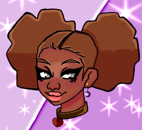
10. Conclusion: And just like that
class is finished, I can't wait to see all
the amazing work you've done and I hope you've
enjoyed the class. Make sure to upload
your projects to the project gallery and add your Instagram
handles when you post. Since I'll be sharing, all of my students work on
my Instagram @ItsHunniB
 ItsHunniB, Fulltime Illustrator and Content Creator