Transcripts
1. Welcome!: Hi friends, welcome to animal
textures and chalk pastel. My name is Diane and I've been teaching art for about 18 years. I love teaching and I
love making art and I'm so excited to share
this journey with you. I hope you're ready to make
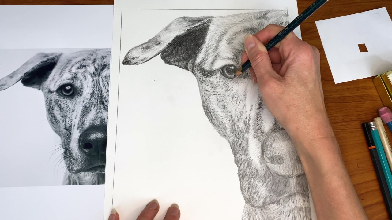
a beautiful picture today, we are going to be copying this photograph and it's going to end up looking
something like this. You'll notice the
difference in color in these two. And we'll be talking. One of the things we'll
be learning today is how to adjust the color from a
photograph or from a reference into something
else that you'd like to do. So you don't have to do this. You are welcome to copy the
colors in the photograph, but I'm gonna be talking
about how to make that leap. If you would like to
learn how to do that. We're also going to
be just talking about how to build a good
base layer of color, how and when to blend. Creating richness
and texture with our chalk pastels and
specifically with animal textures such
as the software and the shiny little eyes and
the rubbery little nodes. We're going to be learning
how to control the pastel for desired effects or
continuing to learn that, assuming you've had
some experience with chalk pastels before, we're gonna be talking
about navigating subtle color differences. This class is meant
for people who do have some experience
with chalk pastel, not the complete beginner. And it's just for people who want a few more advanced
techniques further toolbox. So you're ready to dive in. I am as well. Grab your cup of tea
or coffee and set your scene for a joyful
experience today. And let's get started.
2. Materials: So now we're just
going to walk through the materials you'll
need for this class. First, you'll need a
piece of paper to draw on eight by ten or larger. I just ripped out
of a sketchbook designed for chalk
pastel drawings. Make sure your paper is meant
for use with chalk pastel, whatever brand or size
you end up buying. You'll need a printout
of your reference photo. You can find the link to this in the resources section
of the class. Just download it and
print it preferably on photo paper because photo
paper mix your colors, pop more and you'll
be able to see the fine textures and
everything better. If you use photo paper, you will need a pencil for drawing and
drawing your frame. You will need a ruler
to draw your frame. You will need a variety
of other tools. This is an eraser in
the shape of a pencil. It's wonderful to have
for erasing fine details, not terribly essential,
but highly recommended. A white charcoal or
chalk pastel pencil. A black charcoal or
chalk pastel pencil, and a blending stump, which is used for
blending fine details. All of these are not essential but great to
have and I think you'll find yourself very
happy that you do have them for doing little
pieces of fur and things. You can also have
a separate eraser if you don't happen
to have one on your pencil and you can have a pencil sharpener just in
case your pencil breaks. No big deal if you don't
have a cloth or paper towel nearby to wipe your
hands because you do get dusty and dirty
during this class. And then finally
your pastel set. So you'll need a
chalk pastel set. I happened to have new pastels. I don't think there are any better or worse
than other brands. I love many brands with pastels, so use whatever brand
you like or have. This set, as you can see,
is pretty expansive. You don't have to have a set
this large for this class, but I do recommend it because it's especially
if you're serious about getting into pastel. It's just lovely to have such a wide array of
colors to choose from, rather than having to
mix colors a whole lot. If you do have a smaller set, you are more than welcome to just use it and mix your colors. E.g. if I'm using a golden brown sometime during the class, you can use yellow
and brown and a little white together
to make that color. It's up to you if
you want to do that. It's also handy to have
pastels that are in square shape because
they have points on them more easily
than the round ones. And for this class
you'll need a lot of pointy corners to do little
fine bits of fur and things. You can totally use the
round ones too, that's fine. These are just a
little bit easier. So with that said, we can get onto the class.
3. Mindset: So before we get on to
actually creating our picture, just want to help
you get into a good mindset for this class. It is meant to be fun
first and foremost. So do relax, have a
great time with this. Understand that you will make
mistakes just like I will. Chalk pastels very forgiving
so it's easy to erase. Don't worry about it.
You can always just erase mistakes and go
back and go over them. It is a class that's meant to load you up with a whole
bunch of new skills. So that's great, but
that doesn't mean it can't also be
fun and relaxing. Also don't stress
about it if it feels imperfect or if it looks too
blocky in the beginning, especially it's a
process of layering. So we go from very rudimentary
layers where things are looking chunky to very fine for and textures
towards the end. So just know that that's
kind of our trajectory. And lastly, if you do feel concerned about
anything before you do it, just have a piece of scratch
paper nearby so that you can practice a technique before
you apply it to your picture. So that's it for mindset. Let's take a deep
breath together. My favorite, and
let's get started.
4. Drawing the Frame: Okay, so we're going
to start by just drawing a six inch by eight
inch frame on our paper. So just grab your
ruler and measure. I'm going to start across. I have my, my papers
8 " long, 8 " wide. So I'm going to put
a couple of marks, an inch in on either side. That'll be my six inch length. And then I'm going to move
it up and do the same thing. Make a couple of marks up here. And you can make several. The more you make
the straight or your lines will be generally, but three is generally
really adequate too is sometimes not because if one is wonky,
you won't know it. So then I'm going
to connect them. Draw a straight
line on both sides. And those are my vertical edges. And then I'm going to
do 8 " on the height. And I'm just going to
pick a place here. I'm going to line my
ruler up at 10 ". And that leaves me
a little gutter down here and a gutter up there. If I go eight, whoops, wait, I guess I
should line it up against my vertical line. So you have some space. So just make sure you
have an eight inch tall or excuse me,
eight inch tall frame. There we go. And then same
thing on the other side. And just make sure you
use the same unit of measure on the bottom of your page that you
did over here. I'm using number ten. So I'm gonna go to
eight until, well zero. Then I know those
will be parallel. Also. If you have a T-square, you can certainly use that to make it even a little
easier than this. I'm stuck on the periphery. There. There we go. You can feel free to erase marks or the lines if you want,
but you don't have to. That's all scratch paper. And now we can get
onto the drawing.
5. Drawing the Head & Body Shapes: So now we're gonna get
onto drawing the head and the body, just initial shapes. And for the head we're just
gonna do a basic round shape, kind of wider at the forehead
and thinner at the chin, but we're not going to attempt to copy any
of the fair at all. So the first thing
you wanna do is approximate how big the head is. And I'm not going all the way to the very outside of the for, nor am I going all
the way to the where I imagine the
skull actually might be. I'm going to go
halfway in between because I don't want my
pencil line to be inhibiting. Like if I go all
the way out here, sometimes you follow your
pencil line too closely and the fur goes over it and
the face gets really wide. Or if you go too far in, sometimes the opposite thing happens and you end up
with a really skinny head. So because we have
a very fluffy dog, we're just approximating
halfway between the two. So I'm going to use the tip of my pencil and my thumbnail to see how wide the head
is at the widest part. And then I'm going to see how that compares to the
sides of the page. Coincidentally, it's just about half the width of the page. So about that does not
have to be perfect. And it does look about centered, maybe a little closer to
the left and the right. But I'm not even going to bother checking it because I don't
want to be that exact thing. If you want to, you can
certainly check your sides to see if they're exactly
equal or if you want it off centered a little
bit, Go right ahead. Then I'm going to see
how tall the head is and compare it to the width and it's
just about the same. The other thing is, since
these two are the same size, you could just measure from here and move it
directly over here. Really either way is fine,
but it's helpful, I think, to train your eye to
see how shapes compare. Dimensions, compare
themselves to one another. So it's nice to say, Hey, this is how high is that
compared to the width? Because you might guess that
it's a little longer because it kinda looks like a little longer to me anyway,
but it's not. So it's nice to break those visual judgments we
have by actual measuring. I'm going to make a mark
where I think the top of the head should go
and where the chin. And it does look
like it's a little closer to the bottom
than the top, so it's kinda more significant. And I need to make really sure I have enough room
for the body there. So I am gonna make sure I have less room at the
bottom than the top. I do, but not quite enough. So I'm going to move
it down a little bit more. There we go. And that means I'm going to move these marks down a little too. From there, I'm
just going to draw my approximate overly circles with a pointy illusion
to a pointier chin, but it's still extremely round. Make that a little center. Good enough. Since it's so
approximate, that's fine. Now we're going
to draw the body. Just imagine there's
no ears on this dog. So imagine where the
body would touch the head looks like
it's about here. And then maybe here. So really on the extreme
outsides of the head. And then we're going to
see how tall the body is from the approximate
top of the head. Looks like about right there. And then we're just going
to draw a rounded shape. Body and the tail,
as you can see, are blurred out and
also very approximate, which gives us a lot of freedom. So that's really
all you need to do for this first part
of the drawing. And then in the next section
we'll move on to the ears.
6. Drawing the Ears: So now we're gonna get
onto drawing the ears. And same thing as we
did with the face. Just a very approximate sort
of wiggly triangle shape. I'm going to start by seeing how wide the ear is approximately. And I'm just going to, oops, that's not the head that I want to make the mistake of
putting on the body there. The ear goes on the head. It looks like it attaches just really on the
far right side there, which means the middle will go, the left side will go there. And then I'm just going to
see how big this spaces. It's about that big, which looks like it's going to
throw this ear off. So that means I need
to take this here and move it over a little bit to
make room for the left ear. Let's try that. Now I'm going to check the
middle space again. That looks, that
looks better like that space and that
space are about equal. Close enough. And then the left ear will be, wow, that's pretty low though. That tells me that maybe that's still needs to
move over a little bit. Another way to do this is
which I probably should have done is check the right side
is bigger than the left. So I'm going to take this
center space and move it so it's centered and then
I'll reposition the ears. And that way I know I'm kinda
working from a good point. That is illustrative of, there we go. Now
those are equal. So I'm going to measure
those ears again. That's the beginning. So that's gonna be the
end of the right ear. This is the beginning. So that's gonna be the
end of the left ear. And now that's a
little more equal. That's illustrative of there's not one right way to do things, but sometimes there's
a quicker way. We have the width of each year. And now I'm gonna do the length from the very center to the tip. And I'm just looking at where the tip of that IRR falls
relative to the body. It's sticking out to
the right a little bit. And almost the same height
as the body, but not quite. So I'm guessing it's
going to be right there. But I'm also just going to
put my pencil right through the center of the ear to see what direction it's pointing. It kinda goes off the page right next to the corner there. So I'm just going to see
did I do that about right? Yeah. Close enough anyway, then let's check out the
other ear out of curiosity. Yeah, the left ear is
longer than the right. Just wanted to see
how they compare. The tip of this year.
It looks like it's just about it's a little closer
to the body than the right. So about right here. And I'm going to check
that direction angle. Where's it pointing? If I put my pencil directly in the middle of the ear base
and go through the tip. That looks about right to. So from there I'm
going to draw just approximately what I see,
something like that. And it's a little
rounded at the tip. It curves in, goes out quite
a bit, something like that. On the right side. It's going to do
something like this. Kinda looks more like
a cat right now. And goes away out, way, way out, something like that. Then we can erase our lines on the insides of
the ears entirely. Don't need that anymore. Okay. And now we can move on to
the tail and the muzzle.
7. Drawing the Tail & Muzzle: So let's start with
the tail that's going to be off-center
on the body. I can measure from the
ear actually to see how far it's going to
start right here. And then if I use the body has a starting point and see how long the tail is. It looks like it sticks
out to right here. And I'm going to
check the direction pointing right to the
corner of the page. So that's right. And it goes off behind the ear
right about there. So from there we're
just going to draw a basic kind of loop shape. By the way, in case you haven't
already figured this out, this drawing is going
to look really funky. It's not going to look
amazing like this dog until we really start
adding the pastel. So don't worry, it's supposed
to look go a little bit like an alien. And it does. So let's move on to the
muzzle. From the chin. I'm going to measure
up to the top where the muzzle meets the eyes and just see
how tall that is. I already know
where the chin is, so that means the eyes are going to be
right at that level. But I'm also going to just
double-check like how tall this space is
above the muzzle. And that looks about
right just to make sure that we're
placing it correctly. It's pretty much dead in
the middle of the face. And then the left side of the muzzle is much
more well-defined. You really can't even see
much of the right side. But there's a little
bit of a pinkish, yellowy edging right here. So we can just draw almost
a ball for the muzzle. Let me see how wide it is and just out of
curiosity, yeah, it's the same width as height, so we're actually going to
draw a straight up circle. Well, maybe a little heavier
on the bottom than the top. So overly circle. So that's the left
and that's the right. Just kinda making it right
in the middle of the face because this dog is
looking directly at us. So it's not going to be closer
to one side or the other. And then very lightly, I'm just going to draw kind of a whitish on the bottom circle
with a skinnier top. And that's it for that. So take your time adjusting it however you need to and
whenever you're ready. We can move on to the next
section, drawing the eyes.
8. Drawing the Eyes: So now we're gonna move on
to the eyes which are very elusive because they're so buried in for
especially this one. We'll start with the right one. It's the dog's
left on our right, it's a little easier to see, so we'll just start
with that one. And we're going to
draw the outline of the black part of the eye. So not including this
gray fuzzy stuff on the left, the shadow there. We're just going to do the very extreme outside
edge of the actual eye. So I'm going to
first see how big it is and then move it over here and just guess
where I'm putting it. It's very close to
the muzzle for sure. And I'm going to put a couple of marks and
then I'm going to see, did I even place that correctly? So because this measurement
of the head was approximate, this space is not going
to exactly equal this, but I want to be
in the ballpark. So I'm going to see how
big my spaces here. And I feel like it might
be just about right. But let me also check from the inside corner of the eye to the other
side of the face? That looks about right? Actually, I am I think, you know what, I'm
also going to do that. So I'm gonna put my pencil
against the edge of the muzzle and
against the edge of the outer eye to see the
direction my pencil is pointing, make sure both
papers are parallel. And then just move
it over and see if that matches up pretty well. And it does. So I think that's good. Now I'm going to see
how tall the eye is and make marks for that. And again, I'm guessing
there's the top, there's the bottom, and I'll see if it needs to move up or down. So I'm going to see how close
the bottom is to the chin. Seems like that could
move up a little bit. Excuse me, move
down a little bit. So I'm gonna do that. Moves a top-down a little. And then I'm going to check
it against some other stuff. Especially when you have a
situation like this where your lines are placeholders
there approximate. It's really great to check it against as many
things as you can. So I'm going to check the angle against the top
edge of the muzzle. That works. I'm going to check the angle from the base of
the imaginary I, which I haven't drawn yet
to the corner of the ear. That works. And the other side. Nope. Oh, I'm too far over here. Let me do that again. Yeah. It seems like that I wants to be closer
to the center. So regardless of the fact that this and this were
approximately right, I'm going to take this and
move it over a little bit. Because the ear is a more definitive thing
to check against. That tells me that this eye, the whole thing needs to move
a little bit to the left. Raise my old marks, and let me check
that angle again. That works much
better and let me double-check the
other angles to see. Did I mess that up or
is it gonna be okay? Yep, That will work. I was checking this angle
between the corner of the ear, the approximate corner
of the ear and the eye, and the eye and the muzzle. And that will still
work because this can just be a little
bit extra fluffy. So I feel like I've got that I in the right
place and I just need to lower these a little
bit so that I can make more of a rounded top edge. And then I'm going
to draw my eye. It's got just a
hint of a corner. But really it's almost
a complete circle. Not at all shaped
like a human eye. Human eyes are much pointier in the corners and erase
all those marks. Okay. That is good for that. I
know the left I should be much easier because it's
much less specific. So I'm going to take the
distance between the two, make a mark and don't worry, this is going to look funky
because that left eye isn't so much shadow that it is not going to look
like the right eye. It's gonna look like
a giant enlarge blob. I just measured the
distance across and I'm going to
see top to bottom. The bottom is lower
than the right eye. The top is higher. And I'm just going to check
the angles between the two. That looks right. So then I'm going to draw my
super funky, weird left eye. And there we go.
9. Drawing the Nose & Mouth: Now we're gonna get onto
drawing the nose and the mouth. So I'm going to see
how wide the nose is. Just looking at about
where it's placed in here. It looks like it's slightly closer to the bottom
than the top, but it looks like it's in the middle of the
muzzle, left to right. So I'm gonna guess
right there and there. And then I'm just going to check both sides are a little bit
or both sides are equal. That's about right and
a little bit smaller. The sides are a little
smaller than the nose itself. Then I'm going to see how
tall the noses move it over. Looks like here and
here, guessing. And then I'm going to
check the spacing. Looks like it might
be a little bit low. Let me check the top space. Yeah, I could afford to
move that up a little bit. So, you know, what I should be doing is measuring
the space first. I know exactly where
to move it to there, and then taking
the whole nose and moving it up that much. That's much quicker
than guessing. And I'm also going to just
double-check the top. Yeah, that works better. The sides. Mark's needs to move
up a little bit. Otherwise, I'll be
inclined to draw a nose. It's more shaped like a
Hershey Kiss and I want one That's more like a
mushroom wider on top, center on the bottom. So for right now, just kind of a similar
shape to the head. Wide on top, kind of
goes to a really, really rounded point
on the bottom edge. And then I'll erase
my long marks. Put the nose back. The mouth looks like the right edge is directly underneath the edge of the nose. The left edge is
more to the left, so I know how that's
going to land. So I'm going to just put
my pencil right there and see how wide Actually,
you know what? This looks like,
more of a shadow. I'm not going to measure
that, I'm just going to measure the actual mouse. So the left edge of the mouth is still just beyond the edge of
the nose about right there. But I'm gonna check and see. Did I make that the right size? Yeah, that looks about right. And then it's very
close to the nose itself, about right there. That was a guess, but
I'm going to check it. Now. I could go a little lower. Then it's so thin. I'm not going to worry about measuring that. I'm just going to draw a line. And I want to remind you again, this is going to look funky, so don't worry about it. Just draw a little smile. Because that's just
what it looks like. We're just copying what we see. Then we'll erase marks. And further, we can also just look around and see if anything
else needs to be added. There is a bit of
fluff right here on the right side
which I'm assuming is part of the
palm or the chest, maybe it looks like both. So I'm just going to add a
little extension out here to the side, something like that. Then that looks good. The last thing I'd
like you to do is just go over all your lines, are erase any dark marks, like get rid of
them all together. We don't want those
showing up later. Around the black stuff
like the eyes and nose. It won't matter that much,
but you definitely don't want them showing up in
your beautiful white fur. And then go around and lightly erase all your pencil lines so that you can barely see
them because this is a white dog and we don't want pencil lines showing
through the fur. But we do want to be
able to see our drawing, so don't obviously
erase it entirely. Just very much lightened
what you have. Wipe off any dust. And then we are good to
start adding some color.
10. Coloring the Dog White & Grey: So now we're just going to
put a base coat on the dog. And it's fairly straightforward. We're just going to
use white and gray. So grab your plain white, have your scratch paper nearby or you can
just use the side of your page to just rub it a little bit, make
sure it's clean. And then go to town, go ahead and color and
you can see even though your pencil lines
are mostly erased, they show through with white. So you can color right
over those pencil lines. And you're just going to apply medium pressure so that
you're getting a nice, pretty thorough base coat. I'm going over my pencil lines
into the dirt a little bit because I just want to lay the groundwork for fluff later. Coloring the entire dog white except for the
eyes, nose, and mouth. But that being said, it's totally fine
to get some white into those parts
because it's erasable. And even if it wasn't, you are putting solid black
over that at some point so that will easily defeat
any white residue. As you can see, hopefully if you're
taking this class, you've worked with chalk pastel at least a couple
of times before. So you'll be very familiar with the fact that it's very dusty, leaves a trail of dust behind. And I'm going to shake that off into my nearby garbage can, which you can do
also if you have one or you can just blow it off. Let me do a little of both. And now I'm going to
just use my finger and go around and rub it to get the color very even and
really solid as my base. This is one of only
a few times we're really going to do much
rubbing in this class. We do that on the base coats, but most of our
blending is going to be with the body of the
chalk pastels themselves. Oh, I forgot my rag. I want my rag to
wipe my finger off. Then I'm gonna go in
with my gray and just color the areas that
have any shadow at all. And this is where
you as early as this start to put in the
direction of the fur. So even though this is just
coloring big chunks of color, we're not concerned at all
with adding for texture. Do start coloring
in the direction of the fur because you're
laying groundwork. So I'm going to color
the entire left side, left ear gray, leaving just this part white, left side of the face, making sure I'm coloring in the direction that the
firm is growing there. And now I'm starting to
mimic the shape of the face, the shape of the fur
on the face here. So I'm going way outside
of my pencil line. I'm gonna go up to the muzzle
in a very haphazard way. I'm starting to cut
into it a little bit and just use that or initial muzzle line
as a very loose guide. I'm gonna go right up to the edge of the
eye with the gray. And now I am being
careful because if I get great inside the eye, I'll lose my eye shape because gray will cover
the pencil lines. So I'm being careful
to just go right up to the edge. Where else? Let's see, under the, under the nose is quite
gray. It looks white. But if you compare
it to this white, it's certainly quite a
bit darker than that. So this is going to lead right into this shadow
I just put down. And the whole left side of
under the mouth is quite gray. And then here a little bit, I'm just going to put a hint
of gray to suggest that it's going to be
darker at some point than the right side of the face. And notice this is not the
first time you'll see this. I'm really exaggerating
how much gray is there, because once you
put the gray down, you're going to
layer over it a ton with whites and pinks
and other things. So It's going to
lighten naturally. So you really can exaggerate
how dark you're going. In fact, do exaggerate it. Because that's a good
way to get contrast. And that's one of the, it's not a huge mistake, but that's one of the things
I find people are least satisfied with is they end
up with a little bit of a, with a white subject
like this kind of a cartoony look but
not quite realistic. And it's usually
because there isn't enough contrast between
dark and light. So really go on your darks here. Knowing that you will
lighten them later or not. Some of them you
won't, but a lot of them you will add lights too. The tail, I'm just
coloring entirely gray until it gets to the body where it gets a
little bit lighter. And then I'm gonna put some gray here behind the left ear. And a little bit on the
inside of this, I, again, being careful not to go
beyond my pencil lines, so kind of turning the
pastel so I'm using a corner of it so that I can keep it
sharp against the eye. There, even though
that's just a hint, I'm going to put a
little dab of it right there for funds ease. And I'm gonna get
rid of the dust. And we're done with that.
11. Coloring the Background Dark Grey: So now we've got our
rudimentary code on the dog. We're gonna put our rudimentary
code on the background. So grab your solid dark gray and we're literally just going to color
in the background. So the only thing to be careful over aware of
is around the dog. You're not trying to
replicate the for exactly, but neither do you want
just a solid dark line. So you do want to start
when you're coloring, start getting real
shaggy and leaving. Even if you're not getting right up to the white that you left, you can always put more widen leaves space around
the edge of the dog. It's better to leave a little bit more space than you think you
need because you can always feel more in with
dark gray then going to tight on a dog because it's hard to erase a dark color. So as you're going
just pay attention to the direction of the fur
and be real loose with it, but leave, leave that room for the
fluffiness to come out. As for the tip of the tail, I'm just gonna kinda
whisper around that. That's pretty straight
right there as well as the back of the body
is fairly flat. Then I get to the ears, I'm going to start getting
kinda coloring out away from it again in the
direction the furs growing. That I'm turning my
pastel as I go when I need a sharper edge
and a flatter edge, like the flatter
edge is good for filling in larger areas. The sharper edge is good for really mimicking
that fur texture. So I didn't get the
white out far enough. Here are the light gray, but
I'm going to leave space for that kinda cut in there and
then I have a beard here, which I also didn't really get the light gray out into enough. So I'm leaving some
more space for that. Alright, so once you've gone
around the dog in this way, you can kinda look
around and see if you need to do anything else, then it's just coloring. So you can go in and
really color pretty solid, but don't feel you need to
colors completely solid, much like the white
on the dog's see all those little white specks
of paper showing through. That's fine. That's expected, that
shouldn't be there. It's part of coloring
with chalk pastel. And when you're done,
you will rub it together to blend at all. So don't worry about it. Just get most of it covered. So do you use the wide side
of your pastel at this point? And just go to town. And I'm going to fast forward a little bit
through this section because you don't really need
to hear me color so much. And that way you can just pause the video When you're
needing more time. You can also skip ahead to the next section is you need to. But we can go ahead
and just fill it in. Okay. And now that we're
done coloring, I'm going to dump the dust into the garbage and go
ahead and blend. And you can always
add more color. So if it feels like you
didn't color enough and the blending isn't
covering very well. You can always add more, but keep in mind this is
just your first layer. So I'm seeing lots of little white spots
showing through mind, but I'm not going to go
back and add more because I know I'm gonna be
adding more color later. We're going to put
all the gravel in and layer in some
shadows and stuff. So this is just really
fine for a first layer. Now it'd be a good time to just start the conversation
also about color. So you may notice that
my gray is a little bit browner than the
one in the photo. That's because my
printer printed my photo a little cooler than it showed
on my computer screen. My computer screen
showed a warmer picture, warmer browns,
yellows on the dog. This dog is more pinkish, more definitely blue-gray
haze, which is lovely. But part of what I want to
show you in this class, since it's a more
intermediate class, is how to interpret color. So we're not going to be
copying this color exactly. Unless you want to
go right ahead. Totally fine. If you would if you'd like
to choose to do what I'm gonna do and warm up your
picture a little bit, then you can follow along
with the colors I'm using. I use a more brownish
gray, a warmer gray. And as we go through the dog, There's ours is going
to be a lot more. Mine is going to be a lot
more yellowy and brownish. And this one's more
pinky in blue. It's just another skill you can choose to acquire
in this class or not. You can totally just copy
the colors there, your call. And with that, we can move on to building color on the dog.
12. Building Dark Colors on the Dog: Okay, Now we're going to
build color on the dog. Still not attempting to do for actual for texture, but paying, still paying just as
close attention to the direction that
we did with the light gray when we laid that in. We're going to start by
darkening grays and browns. I'm going to take the
same gray I used in the background and because it's a warmer gray
and like I said, I am attempting to make my
picture warmer than this one. This is a cooler blue or this one's going to be
warmer and yellower. And I'm going to
start putting in dark grays where
I see them again, not worrying about actual for
just kind of coloring and the approximate
direction and paying a little more attention
to the specifics. So e.g. here I call it that whole thing
light gray very quickly, but the darkest part of that section is kinda
down to the left here. And then along the beard. There's a little bit
of darker color. And since this is the same
color as the background, I'm being careful
not to color as hard so that it can stand
out against it. There's somewhat going
into the muzzle here. Remember to be bold
with your darks. You can always erase if it
happens to be too much. But in my experience, people tend to be
much Shire with the grades and end up with
not enough contrast in there, or sorry, with the
dark colors and end up with not enough contrast
in their final picture. So really lay those
in around the mouth, seems to be pretty dark
on the left side there. And I'm starting to color like little lines, beer lines there. That's definitely very pink, but gray is a good
base for that. And then under the nose will be darker to I'm
just going to put in a bunch of little lines
using a corner of the pesto. I'm kinda starting to
lose my mouse shapes, so I'm going to
underline it right there so I don't lose it entirely. There we go. Then just a little bit right
here, mainly for variety. A little bit on the
inside corner of the eye. Definitely the tip of
this ear is quite dark. Kinda coming down into the ear. I'm going to put chunks of it on the back and a
bunch in the tail. Curvy lines going
over the top there. A little bit more in the back. Just there's a
hint of a presence there and somewhat in
the base of this ear. And then kinda coming into the body a little bit
more on this side. I'm satisfied with that for the dark gray and I'm going
to do some browns. So those will layer
into the grays. And this is where it
really starts getting much warmer than the
reference I'm copying. The trick here is value paying attention to the
value more than the colors. Since we're changing the colors. As you're going, just make
sure your darks are in the same place as
these darks and that they somewhat match up. Then you can, you could do a
purple dog if you wanted to. You could interpret this into any number of colors,
schemes you want. But if you're paying
attention to the darkness and lightness being matching
between the two. You will be fine. I'm not putting Brown
everywhere I had the gray but most places because I do
want the gray to exist, have a life of its own. But the brown is the warming
factor in these shadows. So I want quite a bit of it. I'm going to add a few
of my own brown spots on the back just for fun these a little bit right
there to warm that up. Okay. And that is good for the dark
parts of adding the color. And in the next
section we're going to add some light colors.
13. Building Light Colors & Features: So now we're going to
focus on the lighter areas of the dog and go in with the gray
first and just kind of put lighter kind of suggestions of it along
the side of the head here. And a little bit over the eye. And I'm going to pull
some more gray from the dark place into the
light area on the left side. I'm going to bring
that up a little more. I'm going to color
some around the nose. The nose has something
to kinda nestle into their sum under the mouth. And over here I'm going to press pretty hard
and get some grades. Going out into the background. Not too concerned about
the exact shape of the firm because we are
going to be going over the background a bunch anyway, which is going to negate
any fine detail here. But just to cover up any
white that's still showing. And over to the right
that's a little bit wider, so I'm going to
leave that alone. And over here I'm going to put a bunch of gray
because that side of the ear is much darker
than actual white. But again, not
worried about making those fluffy is look perfect. And some light gray
on the back here, noticing that the
entire back of the body is darker than the
widest part of the face. So really we don't want any pure white showing because we are going to put pure white over it anyway at some point to blend. But for right now we
want it to read a little bit darker than the face. Let's see anywhere else. A little more right here. And just a little
bit at the top of the muzzle kind of
fanning out into the, into the pink and
yellow on the face. And then we'll move to
another light color. So this is another part
where you're going to see a lot of warmth added. That is not in my photo. Another caveat, your
printer may very well have printed your
picture out warmer. I didn't even think
of that until now. So maybe you are copying
this one-to-one and just using the same colors
you see in your reference. Which is totally fine too. But if your printer
did like mine and I couldn't convince it to print warmer no
matter what I tried. And I thought what a great idea to introduce to this class. Let me just roll with the fact that my printer
isn't cooperating. Use it to teach this concept. So that's how we got here. So I'm adding yellow wherever I see those lighter
pinks actually, and I am going to add
some pink, but my, even my pink is going to
be warmer than this one. A little bit. Flamingo, orangey, rosy pink
is what I'm going to use. Yellow goes dark on
the base of that, are heavy on the
base of the ears. And then I'm going
to add some tan. So this is going to
warm it up as well. And I'm kinda adding this
where I see the darker grays, some of the darker pink just
to give it some dimension. And I'm also adding a
bunch where I see yellow. Because this is, this is kind of acting as like the
shadow of the yellow, like the dark relative. Not to vilify the brown, brown is totally lovely color. And then we're going
to add some pink. So this was the rosy kind of warm pink I was
telling you about it. It's like a dusty rose color. And there's quite a bit
of pink in this dog. Here. I'm going to just do slightly less in mind
because I also have the yellows and the
browns that I don't want to overshadow with pink. But it is nice to have
this rosy blush in here. I'm just dabbing that in randomly over the back
and I'll put a hint of it in the tail
just to give it a relationship to
the rest of the dog. There we go with
the light colors. Now, the last thing
we're gonna do is just put in a dark place holder
for the eyes and nose. You can use that same dark
gray that we were using for the background and just fill
them in pretty loosely. Blow off, whoops,
blow off the dust. Try as much as you can
to keep the edges sharp. Any edges that are sharp, don't worry at all
about the fuzzy stuff, but this outside edge, use the corner of your pesto. Same with this one. You can fill in the
center fairly, roughly. The reason we're doing
this kind of last is because it's easier to not have to dance around them or be very ginger with the lighter
colors in the beginning, it's just nice to
have those be vacant. And don't worry if it gets a little misshapen, you will work. You will refine this
later in the class. Right now. Just placeholders so
that we don't lose them. And we're done.
14. Building Color on the Background: So now we're going to add
some color to the background, not worrying at all about any of the gravel or leaves or
sticks, any of that texture. Yet we're just kind of darkening the most obvious
shadow which is here on the left and lightening in some patches just to
give it some variation. So we'll start with the dark. Just pick out a darker gray
or if you don't have one, just use plain black color, a big patch on the
left to the dog. And you can probably see this
doesn't show up very well. And there's a good reason
for that is because I'm coloring a dark color on
top of another dark color. But it is subtle, so
don't worry about it. This is just a layering process. I'm going pretty big, like a little wider than I
think I need to because it is competing very much with the background color and
I'm going to blend it. So now I'm gonna get
rid of this dust, shake it off into
the garbage can, and go back and just rub
it in with my finger. And it almost disappears,
but it is there. It's creating some
sense of difference. So now I'm going to
just go in and put in some random chunks of it, making sure that some of my chunks actually
touch the dog. This is also a
common thing that I see is people will tend to, when you're doing
a background, stay away from your subject. And what you end up with
is like a halo around your subject of the main color. So what we want is the
all backgrounds to look like it goes underneath
or behind the figure. So really make sure you
get some chunks right up next to the dog and
blend those in. And that's just really random, like there's very little
roadmap here in terms of where large dark chunk should
go except for that shadow. And that is good for the dark. So now I'm going to pick
out a lighter color. And I'm going to do kind
of a light cream color. And this is going to show up
much more than the dark DID, but still not very well
and I'm not pressing hard. I'm just kinda going in and
out of where I put the darks, leaving plenty of the
base color showing two. Just to give this a
sense of undulation. Again, getting right up next
to the dog in some areas so that it does appear to go behind the dog or
underneath the dog. And then I'm gonna run those in. And that should
probably take care of most of any white paper that was showing through from that first pass with
the darker gray. And then we just have a
very subtle variation of color on the ground. So you can do that to
your heart's content. And then we'll move on
to the next section.
15. Defining Dark Greys in Fur Texture: Okay, Now we're going to move into getting more
specific with the fur. Still not worried about all
these fine little hairs. But now we're going
to start defining the fur texture more
starting with the dark gray. So I'm not going to use the
same dark gray I did before. I'm going to use the one I
just used to darken the shadow around the dog because I want it to show up
a little bit more. So I'm going to just
start on the ear and start coloring a
little more precisely. So I'm using a
corner of the pastel now and I'm going to vary the direction it's
going because the fur is going in many different
directions there. I'm also, instead of just
coloring haphazardly, I'm going to plant my
pastel and flick out. And that's going to start
to define for texts like actual fur texture,
something like that. And then there's
little bits of it on the outside of
the ear itself. So I'm just going
to put some lines. Don't worry if it feels like see how it's getting really dark
here and that's very white. Don't worry about that. We're going to put some
white on it later. And we can always erase out. I expect I will have to erase
out because I've really gone to town layering
my colors there. But I'm just gonna go
around the dog and pay close attention to where
those darkest darks are. Here. I'm going to put
them all in here. I'm gonna do the opposite. I'm going to plant my pastel
and flick into the white because I want the blunt end of the shadow to be on the left. And the more kind of pristine little wispy
corner to be the white. So I'm, I'm almost doing
a negative color addition here where I'm leaving space
showing for the white. Here on the left, I'm
going to actually take this color and
color into this dense on the face
because there's this dense right
here that I kinda went right over or never rectified with the
lighter color earlier. So I'm going to put it in now. And especially since this is the same color as this shadow, it's just kinda easy to do. I'm going around and putting in darkest darks around
the muzzle there. Those dark darks
are really going to help these light lights to pop out later once
we put those in. So I'm doing my best to not color in where
I see white here, even though I was kinda sloppy about
earlier with the brown, just so that I'm not
putting black where I want white because black
will compete with it. It's pretty dark, so we
want to try to avoid that. One trick you can use also
if you're having trouble deciphering where to put this as squint your eyes when you
look at your reference. Because that helps, tends to
help you see value better. The darks pop out more of
the lights pop out more. It'll help you to identify
where you need more dark. Right above the nose for sure. Mouse looks fine. There's not any dark over here. I'm gonna put a little bit
on the tip of the ear, a little bit into the tail. Just to give it a little
bit more dimension. Tiny bit right here and there. And then lastly, just
right over the eyes. I'm going to dab it in. I'm just kinda tapping the paper with the
tip of the pastel. And over here I'm going to
find a really sharp corner. I'm one of my Ns and
kind of pull from the eye into the
white so that I get the very beginnings of these little white hairs showing up over the
I blow off the dust. That is good enough
for dark gray. You can go to your
heart's content. And then we will meet in the next section where we'll
put in some dark browns.
16. Defining Dark Browns in Fur Texture: So now we're gonna
go into the fern, do exactly the same thing we
just did with the dark gray, but now we're using dark brown. So I'm going to put
the dark brown in where I would like to see it. Again, there's really very little brown in this reference. So I'm just going to add over the dark grays
in some cases, in addition to the dark grays
in some places like here, I want a little more dark brown defining the shadow on the
left side of the face, a little bit more on the side
of the nose. And the chin. Little hairs a little
bit in the tail. Not going to go crazy with the dark brown because I really did a pretty good job of being thorough with it the first time, but this is just
going to help to augment however
much you want to. A little bit on the back, a little on the
inside of the eyes. Just a little bit over here to help the right side
married to the left. There we are good with
dark browns and we can move on to the light grays.
17. Defining Light Greys in Fur Texture: So now we're going
to do the same thing with the light grays. We're just kinda moving from
darker to lighter stuff. So grab your light grays
same when you used earlier or you can even use a slightly
lighter or darker one. If you feel inspired. And I'm going to start from
the outside and pull into the darker grays here to create some fur texture between
the light and the dark. Again, I'm planting my pastel and with each stroke picking it up and pulling it in
with a wispy stroke. Then I'm going to
do the same thing but going out because I want wispy strokes both on the inside and the
outside of this year. So I'm starting to get a sense of thrill for going
into the background, but again, not too
concerned about it. We are going to be adding more detail in the
background so we don't want to go crazy with
making this perfect yet. I know it's tempting
and you certainly can, but you may end up
going over it by mistake with your pebbles later. Right here, my main focus is gonna be kind of
shaping the outside of the face pretty accurately to the reference
because this is all lighter gray against
that darker gray. So this is my opportunity
to start making that shape more like what
I see in the reference. And if you have any
blunt ends, um, where you started
and flipped out, go back and just
dab at them with a light gray and they'll
disappear into the darker gray. I'm also starting to
focus on getting rid of any whitepaper
little bits that are showing through whatever
color you're using, whether it was the light
gray to dark gray, you're going to use pinks and yellows and browns and whatnot. So you can start to just
get rid of all of that. A little bit on the lip
there, the upper lip, I'm just dabbing at
it with a corner to blend the darker grays. Then here on the right side. And by the way, the
white is coming up, we're going to blend
with white and it's gonna be so satisfying
because you're gonna add all these
lovely creamy white and all this color that we're
putting in is going to blend and just
becomes so gorgeous. So sit tight. It's going to happen and
you're going to love it. Put a little bit of gray
into the middle of the face, just so that the pink
isn't so lonely there. And just dab it into the
muzzle a little bit. My main function with
this light gray was to define the outside
edge a little bit more, get approximately
the right shape. And I feel like I've done that and then I added a little bit, so we're done with that. You can go to your
heart's content. And then we will meet in the next section where
we add some tens.
18. Defining More Lights in Fur Texture: So now we're gonna go in
and just add any last tans, yellows and pinks we want
there's very little of each, so that's why I kinda lump
them all into one section. I'm going to add a little
bit more yellow right in the center of the face, kinda going up
toward the forehead. Again, exaggerating the
amounts because the white is going to come in and
just lighten everything up. So this is where we really go heavy with whatever colors we want to dominate
in a section. I'm going to add a little
more yellow in the back because I don't feel
like I did that justice. And a little more at
the base of this ear. Little more down here. And then I'll add some tan. Not a lot or I want to put ten it just kinda where
the yellow where I want the yellows to be
a little darker like on the right side of the
muzzle here over the I. In my picture it
looks very pinkish, but I'm just adding a ton
of yellow because I really want that to dominate. And this is, it's
not really yellow, it's a mustard color really, but the yellowish
thing around in here. Okay. And then these pink that I want to emphasize
a little bit more along this edge the same
way I did with the yellow on the top of the
head, back looks good. A little bit more in
the tail wouldn't hurt. I feel like that's pretty good. So once again, I'd like to emphasize how much darker this dog looks in
this one right now. Like look at how
much white there is everywhere and how
little white I have. That's absolutely on purpose because once you
put your white end, it's going to really
brighten everything. And these lovely yellows, pinks and grays and browns
and every theory and kinda show through and
inform the white. So take this opportunity to
go heavier with your darks. Don't worry if you don't, if you really feel like, wow, I don't wanna go there. You can put in your
white and then decide you can always
put more of these in. This is just the more, I guess, efficient
way of doing it, but it doesn't have
to be efficient. You can layer until
the cows come home. And I encourage you to do so because that's where
you find your joy. So with that said, we will go on to adding
darks in the eyes.
19. Adding Darks to the Eyes: So now we're gonna go in and
just add black to the eyes. And this is going to
give it both depth, darkness and dimension 0 3Ds. So at first I'm going to zoom in a bit so that you can
see better what I'm doing that over so that it's really in
the middle for you. And I'm just going to find the pretty sharp corner
on a pure black pesto. And I'm going to color. You'll notice there's
a little bit of white showing on
the left side of this dog's right eye or the right eye for
us, the left for him. The inside edge, there's a
little bit of light showing. So what we're gonna do is try to outline the actual
edge of the eye outside of the white part and dab at it to create
that little corner. Blow off the desk frequently
so you can actually see what's going on because the dust can obscure what's happening. And then go down. Don't worry about the fact that there's four in
front of the eye. You can try to leave
space showing for that, but you are going to erase
later and put in white. So it's okay if you
accidentally cover that up, then on the top edge
of the eye were basically outlining
the whole thing, giving it a black eyeliner. On the top edge. It's going to be more
in shadow because the white fur is
covering the eye. So it's kinda shading
the eye from the light. So you can go a little
thicker there with the black. Try not to color where you see this bright whitish blue
highlight in the middle. That very odd shaped just
leave an approximation of what you see there and
kind of color around it. And then also try
not to color in the little white edge of
like right next to the iris. If you can, but if
you can't, it's okay. That's why we have white chalk
pastel or charcoal pencil, and also why we have
an eraser pencil. So that's pretty
good for that I, for the left eye, it's even easier because there's no highlight
to go around. So just redefine the
left edge by coloring pretty hard with the
corner of your pesto. And then do even though
there's very little light showing you or hopefully
looking at your reference, but there's very little light
showing their highlight, but you can try to leave
it as much as you can. And again, don't worry
too much about the white for coming over here, but do don't color it solid. Like make some attempt to
leave little lines of darker gray showing so that when you erase out those white edges, white pieces of fur,
it's not as hard on you. But for the most part
you can color this I pretty solid dark black. And I'm just dabbing
around where I see that miniscule,
a little highlight. So I can hopefully leave
some areas showing for that. Okay. So that's just
our next coat of darks. And then we can move on to
adding darkness to the nodes.
20. Adding Darks to the Nose: So we're gonna do the same thing on the nodes that
we did on the eyes. We're going to take
the black and color where we see at darkest. You can also take
this opportunity. And actually we did it
up here at the eyes. I just didn't call it out. You can take this opportunity
to reshape your nose too, if you see anything like
mine is sort of just a blob. So I'm going to use this to make the left edge stick out a little bit and then dip in
where there's a nostril. Whoops, I got big crumb
that just came off of my pesto, which does happen. They are crumbly. Then I'm darkening the
whole bottom edge of the nose and the
whole left side. And I'm going to
define the nostril on the right with the dark. Just sort of finding a
sharp edge and coloring. We're kinda grinding
the color into the paper and then dabbing at it where I feel like
it's a little too sharp. So I just want to make it a little bit softer right there. Then I'm just going
to take a last look and see the shape. I feel like I could add a
little bit the top right side, almost as an outline
and to define the shape a little bit more solidly
against the face. Okay. There we go with the nose. And that's again, just
a basic black coat. Don't worry, you
are going to refine this more in later sections. And now we can move on to
adding darks to the mouth.
21. Adding Darks to the Mouth: So now we're going to use
our charcoal or chalk pastel pencil to add darks to the mouth
because that is so tiny. We could use our chunky pastel
that we were just using. And in fact, you'll probably find if your case is like mine, that your charcoal
pencil is a little bit lighter than the
black we just put in. If that's the case,
you can always go back with the chunky
black pastel, but we're just going
to start with this as a way of trying to get most of the definition and just
color where you see it. On the left there. I'm pressing pretty hard to
get that to show up because this indeed is lighter than
the black I just put in. Then under the fur on the
right, it's very dark. Don't worry about the
little white highlights. We'll put those in later. So that actually will make
it very difficult to see any darks you're doing
right now because the light is what's really
going to help those pop out. But for now, just put in
the dark as best you can. I left a little strip of lighter colors
showing right there. And I'm just outlining the
lips almost like lip liner. And I'm going to dab it over to the left and pull some lines down into the shadow to
make it blend there. Same thing here on the right. Dab it over. Makes it look like he's
smiling a little bit, which he does in the photos. So we want that. Then from there, grab your black pastel that you
use on the nose and the eyes, find a sharp corner
or create one by coloring really hard until
you get a sharp corner. And just use that
sharp corner to further define your blacks. You can just dab it into
the corner of the mouth. Corners of the mouth and pull it into the lines you just made with the
charcoal pencil. And don't worry,
of course we will be going back over this later. Eyes, nose, and mouth are
some of the last things we're going to refine after we've
done most of the first, so we'll come back
to those in awhile. And now we can get on to adding some chunks to the background.
22. Adding Chunks to the Background: So now we're going to start
putting chunks of rock, dirt, gravel, sticks, et
cetera, in the background. Not being at all specific about where and how big
and everything is. Just use this as a loose guide and you can make it
up as you choose. So start with the
lighter colors. So I'm using the ivory
color I use on a dog. And I'm just going
to start with that big leaf or whatever it is there because it's the
most obvious and easy. I'm also not
concerning myself with making everything as
bright as I see it here. Although if you wanted to
do that, let me show you. You can certainly
use your eraser and pull off most of
the darker color. I'll just show you what this one leaf so that you can
understand how to do it. Or not all of it's
going to come off. But erase out a big section. And then when you
put your pastel in your light pastel see how
much brighter that goes on. So if you want to put on some brighter chunks of
gravel, That's how you do it. But for my purposes, I'm just going to put on a
whole bunch of dabs and dots. And the tendency, as you'll see, my tendency is to make
them very evenly spaced, but we don't want that
because it's not organic. So we want some right
next to the dog. We want little ones,
we want big ones. We want them all over the place. We want some in some colors in greater
concentration in certain areas. So I'm sort of grouping
these ivory ones. And I'm just going nuts
trying to make some big ones and little ones going
all over the place. If there are two evenly
spaced or two evenly sized or if you're coloring
all in the same direction, it'll end up looking like a pattern and not
like an organic, just ground full of gravel. So take that for
what it's worth. And just add a ton
of this stuff. Here. My pastel kinda
squeaks on the paper because I'm pressing really
hard to get it to show up. Little ones. Big ones. Corner one's going out, definitely go off the
edge of the paper. Also, if you intend to
frame this picture, you do want your
background going beyond your pencil lines. I should have mentioned
that in the first section, but I forgot. So if you haven't yet, make sure your dark gray, it goes all the way
to the pencil lines and beyond that so that
when you frame it, your frame has a
little something to overlap and there
won't be this kind of raw edge showing unless you like raw edges
and you want it to show. That's okay for the ivory, I'm going to switch colors. Do some of the brown,
knowing I can always go back for more with
other colors if I want. And I'm going to overlap some. Don't worry also about
the fact that you can see your strokes right now
it looks very stroking, but you're going to go
back and blend it by dabbing and see what
happens to the strokes. There they go. Good-bye strokes. So for right now you're
just putting in color. So I've jumped
ahead a little bit and added some more chunks. We're going to add some
blues and some pinks. Just a few here and there
to give it some variety. Pink. Now that we've got enough
confetti after parade, it kinda looks like
at the moment. We're gonna go
back and blend it. To blend this, don't rub because you'll just rub it all into
one giant color instead, just go around and dab. In fact, you can even
use multiple fingers, give it a little massage. This is all we're
doing in this section. And then we're going
to add some shadows in the next section
to make it look a little more like rocks and
less like dabs of color. And that's it.
23. Adding Shadows to the Background: So now we're going
to take your darkest black and probably, well maybe we'll see your
second darkest black and add some shadows so we're
not going to go around and put a shadow
around every single one, but I'm going to show you what
one is going to look like. So I'm just putting a little bit of a thick line around one and dabbing at it and you see
that makes it pop out more. So we're doing this to several, not all and all on the left side because the light source is
coming from the right. So we want any shading, any shadow to fall towards the left to make it
look cohesive and believable. The ones you don't put
shadows around are gonna be the ones that fade
more into the background. So definitely pick the larger
ones to put shadows around. And then multiple small ones. And every once in awhile stop and go back and dab at them. That way you can kinda see if you're needing to press harder, you need to make thicker lines. Or if it looks pretty good. Remember this is not
gonna be photorealistic, it's just an approximation. The background is nothing
but a background, so we don't need to make it precise or particularly
well finished. We just need to make it look interesting enough
to where it's not just a solid color
so that our doggy has a nice back
backdrop to sit on. So once you've gotten most
of your lines are lines, your shadows and around
your larger objects, your larger chunks, and
some of your smaller ones. Then we can go back and
add some patches of dark. That's good enough for now. Now I'm going to
take the black and a really dark in this shadow on the left that I had put in before with a darker
gray but not a black. I'm going to attempt to go
around some of the chunks, but don't worry if you color
over some, that's fine. You can even make
chunks up out of a completely gray area
that had no chunk in it. And just approximate the
shadow shape around the dogs. So it's gonna kinda
come around in like a half moon there. Oops, I got into
some crumbly action happening on my pesto there, right under the chin,
sticking out here. And this added bit of darkness will make the
dog really look like it's anchored to the ground
and having it'll help the light source coming
from the right to read correctly
throughout the dust. Then once again, I'm
gonna go in and dab with my finger so that I don't get
rid of all of the texture. I do want some of it to
look kind of textured. And I also don't want to
get rid of all of my color. I don't want to lose
any of my chunk, so I'm just dabbing
at the black. And then if that's not dark enough or you want to add more, you can go back and do it again. And then once you're
done with this shadow, blow off the dust and just
go back and look around, see if there's any other
dark areas you want to add. You can really do this for quite a long time
if you want to. I'm going to stop pretty soon and move on to the next section. But you do this until
you're very happy with it. And then whenever you are ready, you can meet me in
the next section, which will be adding
some dark grays in the first four, final for texture.
24. Adding White: I know I just said that
we were going to be doing dark grays and the
final third texture next, but I forgot maybe the
most important thing. One of my favorite things
which is adding the white. So we're gonna do that first because that's going
to really help us to understand where
we need more darks. And it's also going to get the fur texture really going on the light
parts of the face. So this is gonna be awesome. I have a little bit
of green on my white, so I'm just going to
rub it out here on my scratch paper side, get rid of that green
and go to town. So I'm going to start in the
widest part of the face, which is over here on the right. I'm just going to color in the direction of
the fur and watch those darks just yield to
the pressure of the white. You can see How nice that fur texture looks
because of those dark. This is exactly what I was
talking about earlier, why we made everything
exaggerated the dark so much because the white is going
to dominate somewhat. But we want those, those yellows and
pinks and greens and all those colors underneath
to have a voice. We went heavier with those, but look how much they're
lightening up with this white. And now I am paying attention absolutely to the for
going off the side. You'll notice as I'm planting
my pastel and flicking, it gets dirty with the
color in the background. And the more I do that, the more it happens
and it kinda gets muddy on the inside of the dogs, that's actually fine because
you do want a little bit of the background color
blending into the dog, but you can also just wipe
it off on your paper, on your cloth or on
the side of your page and go back and brighten it
a little bit if you need to, if you need to get
rid of those little dabs, it's your call. And I'm just going to keep
on going down the face here, approximately the direction of the firm coloring
now because I'm not worried about the little
wispy ends right here. So I'm not picking, picking up my pastel
with every stroke. Wipe it off so I can get into this really white part here
and keep it nice and bright. And then got some crumbs
color out into the phase. Not going to worry
too much about that. I'm not gonna do that
for over the eye yet because I still have to
go back and refine the eye. Here I'm gonna get into squiggly for because that's
where it starts to get currently is on the
side and I'm even going to use the wide
side of my pastel because there's chunks of for not just little hairs kind of going in all
directions. Real curly. It looks like this
dog is a little wet. It's a nice renamed,
beautiful day wherever this dog is the world. So that makes its first
clumped together, which is another fun thing
to try to replicate. What was the pastels got this big chunk of for
coming off the left there, few more coming off the nose
into the darker areas of for wiping my pastel
off as I need to. Adding those lighter wisps that are now going to really pop out over those darker grays. Lots of crumbs because
I'm pressing so hard. And on the left
side, same thing, just kinda going over in the
direction the fur is going. Coloring up from
this fountain shape in the center of the face, over the top of everything. And here it gets a little
wavy at the top of this ear. I'm going to be a little more
deliberate with my strokes. This ear, same thing,
a little wavy. And very bright on the
right side of this here. I'm turning my
pastel is I need to use the flat edge when
I want big chunks. The corner of the pastel when I want wispy little fine hairs. And then there's some of those
little black or dark ends I was talking about
earlier that you can just color right over after you clean your pastel back definitely
has lots of white in it. So I'm going to color
in little circles here to get the texture
to look fluffy. And also blurry. I'm varying the pressure. So in areas I want brighter and pressing a little harder
and where I'm just trying to get a
presence of the white over darker colors
and pressing very, very lightly on the
back edge of the body. I'm going to dab a
little bit to make it blurry into the background. And that's going to help
with the sharp contrast against the ear there. And then there's
some in the tail, some white and the tail got these wisps going
out into the mud here. And there we go.
25. Dark Greys in Final Fur Texture: Okay, now we're gonna get into some darker grays and
the final third texture. So grab the same one of the
same dark grays you use, preferably the darkest
one that you used earlier and just go
in kinda carefully. And anywhere you see
darks needing to happen, just put them in as carefully
as you feel you need to. So I'm using the
corner of the pesto and adding a few little
lines in the ear. Just to help make those
whites pop out a little more. I'm going to add some
at the tip of this ear. Dab at it a little bit. Where else underneath
the eye lid, for lack of a better word and
it gets dogs have eyelids. Yeah, of course they do, but this one is kind
of hidden by four. We're gonna get a little bit
in-between to the corners. Between those little
white wisps I just put in just sort of dabbing at it and
then coming up from the lip into that
for over the lip. Just adding a few little dabs there, darkening this shadow. A little bit of a kind of a dark hair right there that's
actually kinda pinkish. It'll start by
putting gray there. And then a little bit more
into the tail in the back. Just dab at those. And I'm feeling pretty
good about that. So I'll add a little
bit more here too, just to make that
for more furry. On the left side. There we go. And now we will move on to dark browns in the
final third texture.
26. Dark Browns in Final Fur Texture: We don't have to
add a whole lot of brown or at least I don't
maybe you want to add more, but I'm going to take mine and just kind of add a
little bit more dark brown where I want both
darker and warmer areas. So right over here on the left, I'm kinda putting it
into my dark gray. And that's going to not that's not going to make
it any lighter. It's just going to make
it warmer and browner. Little bit here on the ear. Little bit at the top. A little bit over here just
to kinda divide the face from that puff of foot or whatever that is
right there just barely. It's not like we have
to actively define it, but just trying to separate
them a little bit. Okay, Now, let's move on
to graze tans and yellows.
27. Light Colors in Final Fur Texture: So now we're going to
add whatever grades, tans and yellows
you want leftover. So I'm going to take
the gray and just add a little more
definition here because it still looks a little crumbly. I'm just going to use
the very corner of the gray and add a little
bit more line, a little few more lines there. I'm also going to use it to get a little more definition to this for in particular
going off over the dirt. So I'm adding some squiggles
and curly curly or hairs, tiny little hairs coming off the left there that'll look a little bit more organic. Same thing on the
bottom edge here. And coming off to the right. Just a few larger clumps to make it look less
perfectly round. Anymore over here. A little bit in the ear to
lighten that up right there. And I'll end up putting
some white over that again. Some more in the tail. Feel pretty good about
the back and the phase. So add some ten. Now anywhere we want ten, little bit more up here, even though I've already
got a good amount, but it looks like I kinda spaced on putting enough white there. I'm going to use
this opportunity to warm that up
with a little tan. Anywhere else you see
that you'd like to put it by all means go right ahead. A little bit of yellow for
the same reason. There we go. Just going over the
top edge of the eye, right edge where there's lots
of pink and this reference, but I'm adding quite a
bit more yellow there. And then finally
we can go back in with the white to
blend what we've just done and sort of just finalize anything that
we want brighter. Or we want to use the white
to soften edges or get rid of the crumbly texture of the pastel on the paper like up here what I was
talking about. So I'm going to
really push hard with the white and go over that part. This ear needs to be
brightened up quite a bit and the lovely for texture
there needs to be emphasized. Get a little bit more white fur sticking out into the dirt here. Now that I'm adding a few more individual strands that will make it look more. I guess paid attention to. So I'm just putting
a few strands on this ear and you can see
how that really brightens up that area and add
some life to it. Same thing here, and I'm going to blur out the tail
a little bit more right there and then take my white and put some
lines at the top of this year because you're lost quite a bit of
definition there. Brighten that up. So really at this point, anything you see that you want to go back
and add more to, you can go ahead and do that. You need to add some more
flyaway strands to this ear. So it looks a little
more organic. Like this puppy did not
just step out of a salon. And then just look around as
much as your heart desires. Like I've, I've got
some little holidays up here where you can see
paper showing through. So I'm going to
take whatever color seems appropriate for
that and go over them. I want to use my
background color here actually an add some more between those
strands of tail. And we'll do some
more of this in the finishing
touches section two, I just happened to
see it right now. Yeah, Go ahead and monkey
with it until you're happy. And then we will move on to refining the eyes and
the next section.
28. Refining the Eyes: So now we're going to
make this dog look less like a zombie and
more like a dog by adding the lights
and the sharp edges and refining them basically. So start, we're going to put in that little white section of
i on the left side there. I'm going to zoom in so you can see this a
little bit better. So this little crescent moon
shape on the left side, start by just using your white
charcoal or pastel pencil. Make sure it's clean.
Oh, mine wasn't. I'm really glad I'm
coloring over here. Then just try to draw
it and if it shows up, great. Oh, mine shows up. If it doesn't show up, That's where you can
use your eraser pencil. Make sure it's clean also by just erasing on
the side a little bit and pull off
some color first. And that it doesn't matter
if you do both either. I'm just doing that
to show you how. And then when you
put in your white, it will show up better. And keep in mind, we don't want that to actually look white. We just want it to be lighter, like a dark gray, lighter
than the eye itself. Don't worry if you pull
off too much, It's fine. You're going to put it back in. Now, use your charcoal
pencil and put it back in. Like I went way too
high above here, which makes him look
like his eyes wide open and he's very
surprised he or she, I'm gonna put that black
back in over the top. And that is the shadow that the lid is casting
onto the island. Now see how much more relaxed. Not that the dog isn't excited. It is excited, but
we don't want it to be like that exciting. So I'm going to make that little white
sliver a little skinnier just by coloring into
it with the black pencil. Blowing off the dust. Then I'm going to use
the blending stump, which if you've used yours like I've used my
He's probably dirty, so just rub it on the
scratch paper to make sure it's not the wrong
color or too dirty. And you can use it
to smear around the dark edge into the fur. If you haven't already, if
you've already done this, you can skip this part. But really your eye may look
very different from mine. So I'm just doing
things that my eye needs and hopefully you can
use some of these in yours. But you go ahead
and refine yours, however you think
it needs to be. Once you feel like
you've finished refining everything but the
brightest highlight, then use your pencil eraser and erase as much as
you can with just kinda putting the eraser down
and just pressing hard but barely actually moving
it geographically. You just want to kinda
pull off a bright spot, one bright spot in the middle. And you may as well do
this to the other I also while you have
the tool in your hand. So this one I'm doing
two because it's like it looks like it
has two or maybe not that I was looking
at it. That's okay. We're going to make
them smaller anyway. So now the highlight
looks pretty blue. So I'm going to use my bright, my light blue that I used
in the background and use just the corner and just dab in some little dots of blue in the approximate
shape I see there. Same thing on the left. And it's okay if
it gets too big, what you don't want is
for it to be too small because we're going to cut
into it again with the black. Then grab your white, find a corner and sharp corner and just
sort of plants it and twist just in one or two spots
to get it the brightest. And you can do that maybe
once or twice, whatever. Just a little bit
on the left side. Now those highlights
are too bright, which is a good thing. It's better to be
too bright than not. So I'm just going to
dab each one with my finger a little
bit to soften them. And then I'm gonna
go back in with my black pencil and cut into them to make them the size I want and
even the shape. You can even reshape
it a little bit. There's one, and this
one's way too big, so I'm going to dab into it
and notice I'm making dots. That's because I don't want
it to be a solid shape. I want it to be sort of speckled like it
is in the picture. So that's good for those. And let's see on that. And I'm just going
to go back and refine this I a little bit. The top edge needs to
be a little sharper. Bottom edge is good. And that is good
enough for the eyes. We will put the
overlapping for over the eyes in a different section. So don't worry about that. That's coming up.
29. Refining the Nose & Mouth: So now we're gonna
do the same thing on the nose and mouth that
we just did to the eyes. We're going to
refine them so you can use your black pencil and add any adjustments. I'm going to just reshape my nose on the outside
a little and make it a little bit wider
on both the top edges. And then on the bottom I'm
going to put a bunch of little dabs of
dark kind of going into the fur on the upper lip just to make it soft and a
little bit right there. Same thing on the left
where it looks like there's these little lines from the
nose going out into the fur. Just barely noticeable. But it'll create a
real nesting effect of the nose just
really nestled into that for same thing
going up into this shadow on the bridge
of the nose of the muzzle, made a little
triangle out of it. And then I'm going to
pull some little lines with the charcoal pencil
out into the surrounding for and that looks a
little too refined. So I'm going to take
the white pencil and go back the other way, starting in the white and
pulling down into the dark, coloring over those little dabs. Here we go. And then actually I'm going to use
the blue again because there's this reflection
on the top of the nose and just kinda
put in a bunch of little dots on the
lightest part of the nose because that nose
is rubbery in texture. So we want it to look Saudi. And that's really not showing up very well, but that's okay. That's just brightening
it a little bit. And then just like in the eye, we put the blue first and then we're going to use the white. I'm going to plant it and twist and see how bright
those dots are. When I twist. You don't want them
all to be that bright, so I'm just dotting
some of them. I'll twist a few, make a little area of it stand out a little
bit more than the rest. And that looks pretty
good for the nose. So we'll move on to the mouth. And I'm just going to
put this highlight in on the right side
with the white pencil on little tiny dabs
above that highlight. Pressing pretty hard
right here to get it pretty bright and it's
too big, but that's okay. Just like the I, we're
gonna go back in with the black pencil and cut into it to make
it a little smaller. So the bottom is thicker, the top is thicker. Then there's a teeny little line going right through
that highlight. I'm gonna see if I can
get that to show up. If I can't, not the
end of the world. That's okay. As long as it looks
like a believable dogs live, you're fine. I'm also going to add
little tiny lines of black coming out from the lip into the fur for the same
reason I did it. So the nose just to get
the lip to look like it's nested into that area. Then I'm going to
take the white pencil and try to brighten up the bottom right side
a little bit of the further below the lip and that'll help the lip
to pop out more, actually on the left
to a little bit. So I've brighten that up
and then I'm going to pull some lines
down from it into the surrounding for to get
it to look like it really meshes with that for okay, and we are good to move on.
30. Overlapping Fur Onto Finished Eyes: So now we're going to put that overlapping for near
the finished eyes. So once again, use
your eraser pencil but rub it on a clean
area to make sure you get all the stuff off from
previous erase things. And you're going to
plant it in the white and rub over into the black. Don't worry if this see how the black smear it into the white. Don't worry if that happens, you're going to get rid of it. Just kinda focus on the
major strands of white. Don't try to get every
little strand taking care of here and there. That's where I erased out the black that just
accidentally got on there. And it's also not
going to look very sharp, so don't
worry about that. That's what the pencils,
therefore, the white pencil. Got that. So that's pretty good. That's just basic. Then any dust, blow it off and rub your white
pencil on a clean area. And you can kind of put some lines in by planting
your white pencil and just flicking it over the black area and see how the blacks kinda
blending into the white. Once again, don't
worry about that. Just go back and you can either color over it or if
it's really dark, you can erase it and then
color over it with the white. Blowing off the dust. I'm going to refine the lines
over the top of the eye and really just try to get
some fine white lines on their coloring every
once in a while on the scratch paper to
clean it if you need to. I'm going to put
some going over the dark gray on the left there. I'm also since I have
this in my hand, just going to put a
few more lines into the dark over there on the left. And down here. Same thing on the right. This one's a little
more straightforward. There's only a couple of
really big chunks here. So there's one
going there and one kinda cutting across the
bottom edge of the eye. So I'm pressing pretty hard with the eraser pencil
there to remove, really remove the dark
color as much as possible. And then planting the white
in the white part of the dog, just kinda flicking
over to the right, they're cleaning
the white pencils. I need to either on the cloth
or on your scratch paper. And getting rid of
the black chunks that naturally come from flicking
into a dark surface. And there we go with
that section of fur. And now we're going to do some refining of the firm
near the nose and the mouth.
31. Refining Fur Near Nose & Mouth: So I'm going to now refine the firm near
the nose and the mouth. So on. Around the nose in particular, it looks like I need
to add a little bit of blue actually. Just to kinda, even though I'm not copying the colors exactly, they're blue is great for shadowy areas because
it makes them look a little cooler,
more shadowy. I'm going to put some blue
down here on the left. Just the same blue I
used in the background. And I'm also going to add some brown to these kind of wet strands of fur
around the mouth. And then a little bit
of pink on top of that. So I'm just kinda putting
in some thick lines coming down and going up
into the beard here. Very thick, very unapologetic. Something like that. Then I'm going to grab a
dark purply red and go over those just
to give a hint of that color to these so that they're not
just pure dark brown. It'll help make them
look a little bit rosy, like they are in the picture. But because it's adult purple, it's not going to overdo it. Then I'm going to take the white and help to refine that area. So I'm going to start in
the white and pull down. It's going to cover
up a lot of what I just did at the top, but the bottoms are
what I want to show up. So I'm just kinda planting
the white and flicking down. And then on the left
I'm going to use gray because that's in shadow. So I don't want it
to be as bright as it is on the right side. Something more like that. And I'm dabbing a little
bit of gray underneath those clumps of fur also to further define them against
the fur underneath the lips. So that's kind of your
background for then lastly, because I just
accidentally went over it. I'm going to take my black and put my shadow
back right here. And dab at that. Kinda going into the
fur on purpose a little bit to make it look
kinda blurry right here, because that's what the
photograph implies. There we go.
32. Adding More Chunks to the Background: So now we're gonna go back
and just add more chunks to the background
because we can or not, if you don't want to, if you like your background
the way it is, leave it totally fine. But you can also choose to
go back and add even more. The reason to do this
in stages is because you're building up the dog
in stages to naturally, as the dog becomes more refined, your background might seem a little more rudimentary
than you would like, so you can go back
and just add to it. So I'm purposely focusing on the right lower corner because that's where the light
is really coming from. So that's kinda naturally where there might be
more noticeable detail. Not that anybody is
focusing on the background, but that's where I put
all my lights and then I'm gonna go in and
put some browns. And I'll spread the
love around with this one because it's a
slightly darker color, so it's not as noticeable. But it's just going to give
me a little more texture. Sort of randomly
putting it everywhere. I have to remember to make some bigger in some smaller chunks. I'm not gonna put any
more in the shadow because I don't want
to lighten my shadow. Then you can just choose
which colors you want to use. Or maybe you want to add
a few different colors that you hadn't used the
first time. That's fine too. Remember to get some right
up next to the dog too. And then I'm gonna go around
and do the same load off. We'll also does get through the same kind of blending
I did the first time. And then add a little bit more black shadowy stuff
in for a few of these dab at those. A few more. At this point, you're
probably extremely diverse and comfortable
with chunky background, so you can just go to town. I'm going to actually
add some more black patches up here towards the left because it's
the opposite corner from the brighter area. So that makes more sense
to have it a little more shadowy, a little darker, little bit more of that. And I'm feeling pretty
happy with that. So I'm going to stop there. You can continue as
much as you want. Next thing, we will add some small bits to the
background in the next section.
33. Adding Small Bits to the Background: Now this is optional,
but if you want to, you can go in and add a really tiny bits
in the background. And I'm just gonna do a bunch in this foreground part because that's the foreground
right corner because that's like saying
where it was most focused. But see how I just naturally tend to make them
really evenly spaced. So we don't want to do that. I just like as long
as I'm talking, I'm not paying as
much attention. So I tend to evenly
space everything. But I'm gonna go back and add a bunch to make it very uneven. And then I'm going
to dab at them. And I'm gonna do a
different color. I'm just kinda planting a corner and wiggling it a little bit. I guess I need to go a little
bit more to the left here. Not quite as much as I did here. I like that really
concentrated look, but I need to make it look
like it fades off a little bit more like it's not just
a section of small bits. You use the pink down at those. And I'm gonna put a few. I should have done this
with the other colors that originally, but I didn't. I'll go back for those. I'm going to put a few just
way back here so that there's some suggestion of a marriage between the background
and the foreground. Even though this area, I want a little bit blurrier
than the front area. So go back and put some of
these other colors back here. Just a few little dabs. There we go. So go ahead and again do it until you're totally
happy with it. And then we will work on some
finishing touches together.
34. Finishing Touches on the Dog: So now is your opportunity
to look at your dog and do anything you wanna do
to make it different, better, add stuff,
take stuff away. So I'm going to use my
black pencil and just add a little bit more black
at the tip of the ear. There it is. I was looking for that kind of definition and I just
wasn't getting it earlier. So I'm adding little
bit more edging along that year to make
it pop out a little more. And then I'm going to grab
the white and go back and pull into that
black a little bit. I would use the pencil
because it's skinnier, but the pencil doesn't go on as richly as these pastels do. So I prefer the pastel is if I'm trying to really
get the color to pop more. There we go there. Same thing for the,
for in front of the, I feel like I want a little
more richness there. So I'm going to use the
pastel stick even though it's thicker and try to find a corner to make
thin little lines. There we go. And then color white
over the black part. That got stuck there. Pull up some more lines
into the phase out, a little bit more white on
the bottom edge lip and pull some lines into the
further below it. And a little more, a few more kind of random
furry things sticking out from beneath the dog and dab at them because
I want them blurry, but just a little more for
then up here on the tail, a little more brightness. So you kinda get the idea. Just pick whatever
thing you want, things you want to refine and go back and mess with it
until you're really happy. Feel free to erase,
add takeaway. Just kind of work it
until you feel like, wow, I can't believe I
did this. It's beautiful. I'm really happy with it. I'm proud of it. And then when you're done, you can be done and we'll
move on to signature.
35. Signature (optional): So if you would like to sign it, you can try the black pencil. Just make a mark and
see if it shows up. Really doesn't show up. So I'm going to try
the white pencil. That's better. So I'm gonna just write my name very tiny in the bottom corner. And notice it's
not that obvious. We don't want it to be obvious. We want it to blend
with your background. So don't try to make it
too big or too dominating. And use either black or white, whichever one seems to show
up the way you want it to. But it should be subtle. And
within about a half inch, quarter inch of your
side of your page so your frame will
not cut it off. And then that's it. My friends. I hope you had as good a
time with this as I have. I'm so happy to have been
on this journey with you. Let's move on to preserving our picture in the next section and then we'll wrap it up.
36. Spray Fixatif (optional): Alright, so now we're
going to talk about how to preserve your
picture if you would like. This is optional, but I
do recommend it because it will help your chalk
pastel to not smudge as much. It will still be smudge tool, so do protect it. But after you put
the fixative on it, it won't be as module. So you can get any
brand of fixative. I happen to have this one. It's called workable fixative, and that just means that
it's not super permanent. So you could go back in
and rework the chalk pastel again if you want to
after you've sprayed it. So what you do is
hold your drawing up and hold the cane about
18 " away oh, excuse me. Before you spray on the drawing. Definitely test splits a
little bit out into the air and definitely be
outside for this because it stinks and it's
not good for you to breathe. The test spreads is so that it doesn't get little
drops on your picture. So you just want to make sure
that it's nice, fine mist, then hold it about 12 to 18
" away and just in a circle, kind of allow the
MIS to blow onto the picture and wave
it around to dry. You can do a couple of passes. I usually do two to three
just to be extra thorough. And that's it. Then you can even leave it
outside to dry if there's nothing that's going to drip or land on it if it's a nice day. And that way you won't
have it outgassing in your house or you
can bring it in. It's up to you, but that is
how to preserve your picture.
37. Congratulations!: Alright, We did it. I hope you had a great
time taking this class. I really had a great time teaching it and drawing
right along with you, just to recap things we worked on and
learned about today, we're building a
good base layer and when and how to blend on the base layer and
subsequent layers. We talked about layering
for texture and richness, how to kind of emphasize
the darks and then have faith that the lights later would brighten up the picture. We talked about replicating
different natural textures, such as the softness and
fineness of the firm, rubbery little nose, the
shiny little black eyes. We learned something about
controlling the pastel like when we want it really soft and blending and
when we want sharp, little pointy edges and lines for creating
different effects, we navigated subtle
color differences and talked about how to
interpret one of the colors, the cooler colors from the
photograph that I had, to warmer colors in
the finished picture. If you chose to do that. Again, totally
fine. If you copied whatever color is your
printer gave you. And hopefully we
had a great time. Thank you so much for
joining me today and I wish you the best on
your artistic journey. If you are interested. I also have classes
in charcoal, oil, pastel colored
pencil, watercolor, or acrylic or oil paint, just a variety of other mediums. And I do encourage you to take classes from as
many instructors as possible because I personally feel that the more
people you learn from, the richer and more in-depth your artistic education
and experience will be. So I wish you all the best and thank you again
for joining me today.
 Diane Flick, Artist & Art Teacher