Transcripts
1. Welcome to Realistic Oil Pastel for the Curious Beginner: Hello friends, welcome to realistic oil pastel for
the curious beginner. My name is Diane. I've been teaching art
for about 17 years and I've been making art my
entire life and I love it. I hope that you are inspired to love it as well through this or any other courses you may take or just
personal experience. Welcome, I'm super excited to
get started with you today. In this class, we are
going to be practicing and learning how to draw using
simple measuring techniques, replicating a realistic image from a photograph
onto our paper. We're going to be copying
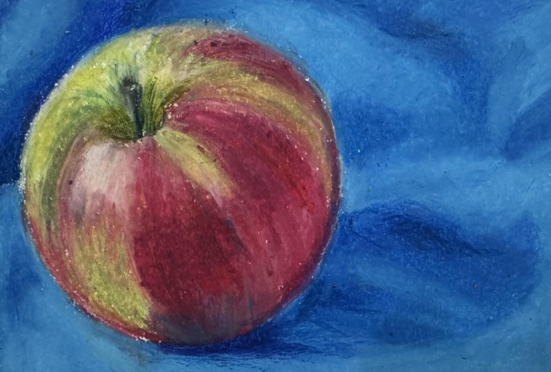
this apple into oil pastel. So we'll end up with something
that looks like this. We're going to learn how
to layer oil pastels, how to apply soft pressure
or hard pressure, when to apply more
or less pressure. How to blend colors to
create other colors. How to create sharp edges, soft edges, soft blends. How to make sure you have a
finished look to your piece. How to go back and add
textures, highlights, shadows. The works. We're gonna
do a whole bunch in a small period of time
with a very small apple, and I hope you're
going to enjoy it. So grab your cup of tea, light your candle,
get your coffee, whatever suits your mood. And let's get ready
to make some art.
2. Materials: Okay. So before we get started, I'd like to walk you
through the materials you're going to need
for this class. First, you're gonna
need a desk or a table, or a flat surface in a
well-lit area somewhere, you don't mind getting a
little dirty or that's covered with paper or
cloth to protect it. You can have scratch
paper that's optional. As you can see from my sample. I used the edges of my paper if the gutter for my
scratch paper where you can have extra sheets
if you prefer. You will need to have
some drawing paper. So get some paper that's
suitable for oil pastel, or sometimes it'll just
say pastel on the cover. If you're buying a sketchbook, you can certainly
ask an associate in an art store what's
a suitable paper, but there's plenty of different
types of paper that are suitable for oil pastel because it's a very
versatile medium. You will want to have a
pencil and an eraser, just a regular old
pencil for drawing your Apple before we
begin and the frame, you'll need a ruler
so that you can measure out and draw the frame. And you'll obviously
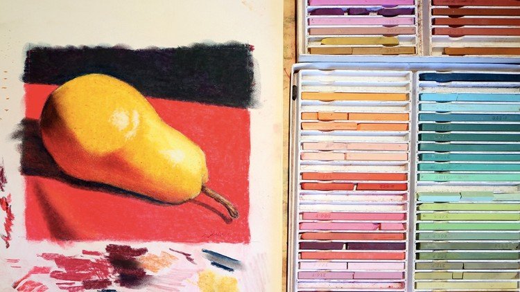
need oil pastels. The kit I have is Pentel brand, which is a very,
very common brand. You'll find it in any art store. It's very inexpensive. It's really a student grade, great for introductory,
but also very versatile. I really enjoy these
old packaging, so you won't see this exact
look in the art store, but the name is the same Pentel. And you slide it open and
there's your lovely set of pastels minor, slightly used. You'll want to have
a nice set of those. They do come in
different amounts. Pentel makes a 1216 twenty five, thirty six fifty set. This is their 25 set, which is perfectly
adequate for this class. If you have fewer than that, you can mix and match
colors as we go. I'm gonna be talking
as though you have all the colors here. But if you don't happen
to have all of those, then for example, if I'm
using the Great Green, which it looks like that, you can use gray and a little bit of
this light yellowy green and you'll get a
very similar effect. Those are in one of
the smaller kids. I'd also like to mention
that you can go with really any brand of oil pastel. There's lots of different
brands out there. Lots of really great
quality products. If you happen to
have some at home, just use those, that's fine. This is just if
you want to follow along exactly with
what I'm doing, you can have this
particular kid. You will also need a
printout of the apple photo, which you'll find in
the resources section. You can have this, you don't need to print it out. I'll be talking about this. It's just kind of
what I like to call the anatomy of light and
shadow on a round object. Which will help you to
understand what we're doing when we're putting
the colors on your Apple. Anyway, you can print
it if you want, but you certainly don't need to. Another optional saying
is a palette knife, which looks like this. It's actually used for mixing
paint in oils or acrylics. But in oil pastel, it's useful for scraping off color that you
don't want anymore. So if I'm a kind of
lightening an area, I can scrape off some color. But your fingernail
also works really well. A penny, a credit card, anything was kind
of a hard edge. Anything you might
scrape a lottery ticket with will be fine. Lastly, you can have an apron or old clothes on if you care
a lot about your clothes. Oil pastel isn't very messy, so you probably don't
have to worry about it. But if you're wearing a
nice silk white shirt, that's probably not
the best option. So use your judgment on that. Otherwise, let's get
ready to get started.
3. Mindset Plus Light & Shadow: Before we get into the drawing, and now that we've talked
about what materials we need, I just like to talk to
you a little bit about the mindset of this
class and also orient you to how light and shadow play on a round object. As in terms of mindset, it's just nice to
have an open mind and be open to making mistakes and getting back on
your horse if you fall off and writing into the sunset, if you make a mistake,
don't sweat it. You can usually fix
it or go over it or turn it into something else that you like
even better maybe. Or you can always start over. You can take this
class multiple times and just do it to
your heart's content. With that in mind, just to have a great time and don't
worry about mistakes. And then I also wanted to
show you this little map, sort of The Anatomy of light and shadow on a round object. This is available in
the resources section. You can download and print it out for yourself if you'd like, or you can just look at it here. But we have a highlight which is the brightest part of
the light on the object. That's where your light source
hits the object directly. You have a mid tone that is just sort of a
medium area of color, the main color of the object. You have a core shadow, which is the darkest part. And that is usually right
next to the reflected light, is always written right next
to the reflected light. But the core shadow sometimes
will go right to the edge, but it makes it look much
less three-dimensional. And it's usually because the lighting conditions
are so bright, you can't see the
reflected light, but in most cases you'll
have a reflection. And we definitely
want to include that because it makes the object look really three-dimensional on a two-dimensional surface. You also have the cast shadow, which is the light
casting the object, casting the shadow of the object onto the surface that
it's sitting on. You have an occlusion shadow, which is the darkest
part of the cast shadow. That's where the object
is actually touching the surface and where the
shadow will be the darkest. So that's just to orient
you a little bit, kind of wrap your mind around the anatomy of the
structure we're going to be replicating
before we get started with that said, it's time to pick up our
pencil linked get going.
4. Measuring & Drawing Your Picture: Okay, Now that we have
introduced all the materials and talked about how to get
our minds ready for this class and learned a little bit about
light and shadow. We're going to start drawing. So we're gonna start
with the frame. The frame is going to be six inches wide by 4.5 inches tall, which is the same as
our photo reference. So just get your ruler parallel to the top or
bottom edge of your paper. You can center it or
put it off to the side. It doesn't really matter.
You'll have kind of a gutter of space around the matter
where you put it. And that's great
for scratch paper. As I mentioned in the
material section, I just drew a six
inch long line there. And I'm going to draw a 4.5 inch long line
right next to it. And I'm just eyeballing to make sure it's
parallel to the edge. But if you want, you can
really measure it to make sure that you've
got it exactly parallel. If you care. That's 4.5 by six. For this one. Just to make sure this line or that
line didn't get crooked, I just made a dot and I'm
just going to check to make sure this is 4.5 this way. Yep, it is. So we're good there. 4.5 by six. You could also use a T-square
if you prefer to make it really parallel and make all
your corners 90 degrees. But there we have our four
by six rectangular frame. And now you can put your
ruler off to the side. And now we're going to talk
about drawing the apple. Grab your photo
reference, have it handy. And what we're
gonna do is measure off of the photo reference and transfer our measurements
onto the paper. I'm going to show you how to
do that with your pencil. Use the tip of your
pencil and line it up against the
edge of the apple. And then use your thumbnail and line it up against
the right side of the blue ends, the
edge of the photo. That is the same amount of space as you're going
to have on your paper. And I started here because
it's the largest space. It's usually best to
start large and go small. And I'm just going to align
my thumbnail up here, tilt my pencil down and
make a little mark. Now I know exactly where the right edge of my
apple needs to be. And from there I can
measure everything else. Now I know where
the right edges. So I'm going to see how far
across it is to the left. And I'm measuring at the
widest part of the apple, right through the center. And that'll help me to get
the most accurate drawing. And then I'm going to
transfer it over here. And sure enough there
should be just a little bit of space there. There's a little
bit of space here. We can measure it if we want. That looks right.
You don't have to. It's your call. And now I'm going to measure
the largest space from the bottom of the frame to
the bottom of the apple, and do the same thing. And then from the
bottom of the apple to the top of the apple to
see how long that is. Tilt down to make a little mark. Onenote, I'm making
my marks fairly dark, should probably make them darker so that you can see them. And I'm gonna be drawing very dark so that you can see it. But when you're drawing, make sure I'm press very lightly with your pencil so that it doesn't show through
your oil pastel later. So that's really all you need. If you want, you could draw any number of
measuring marks. Say you wanted to
find out exactly how low this corner is. I'm going to measure from the edge of the top edge
of the page here down, make a mark there. And I know how far it is horizontally, excuse
me, vertically. And then I'm gonna
measure the horizontal. And where those two meet should be where that
edge comes through. You could do that 30
times if you want to. You certainly don't need to. Four is adequate. If you don't want to do
any of this measuring, you don't have to
do that either. You can just skip
it and eyeball it. It's totally up to you if you
want to learn this method. And if you've taken any
of my classes before, you will have seen
this in just about everyone except probably
the color mixing classes. But I show this method quite a bit copying from a
photo reference. Now I'm just eyeballing
the shape of the apple. I'm going to cut off a
little bit on the bottom. You can adjust it if you want. If something seems
wonky or savory to you, it is an organic shape, so it's not going to hurt
if you change it a little. Now I'm going to measure down
from the top of the apple to where this little
belly button is, or the stem comes out. That is that low. From there, I'm just going
to eyeball the shape. It looks like kind of
an eyelash on its side. Then I'm going to measure how tall the stem is sticking
out of the hole. And it looks like it starts
a little to the left of the whole and leans a
little bit to the left. I'm going to do that. And from there, I'm
just going to draw kind of a bulbous tip and a
straight shaft. The stem.
5. Testing & Matching Background Colors: Okay, so before we
begin testing colors, you can erase any marks, stray marks that you
don't need anymore. You may have already done that. If your lines are
as dark as mine, go ahead and lightly erase so that you can
just barely see it. I'm not going to continue
that because like I said, I want you to be able to
see my Apple really well. I'm going to put my
dark lines back in, but you go ahead and lighten
your lines if they're dark. Now we're gonna talk
about how to figure out what colors to
use for our picture. So obviously the
background is blue. We're going to start
with the background. I'm going to figure out what
combination of colors or what colors to use
for that space. It looks like the dominant
one is definitely this blue, which is called cobalt blue. These particular
pastels are labeled on the bottom and this one
says cobalt blue here. I don't know if you
can see that very, very tiny black type. But anyway, on your set you may or may
not be able to see it. To test the color,
just either use your scratch paper
or the edge of your paper like I'm using here. And color a little patch. Color actually kind
of color a big patch because you want to try
different colors in it. Now that looks pretty darn
close to what I've got there. So I may just end up using that. But this seems a little
bit turquoise E2 me. So I'm going to try and put a little bit of green and part of it and see what happens. That's a bit much so maybe
if I go back over it with the blue oil pastels is
a lot about layering. Know, I really think it's
just best as it is purely. Then I'm going to try some
lighter blue over it. This is pale blue. And see how that
works really well for these lighter highlighted areas. So I'm gonna keep these two out. Then for the shadowy parts, I'm certain that one of these dark blues will work
or maybe both of them. This one is Prussian blue. We move these out of the way. And this is ultramarine. It is more of a purply blue. Those look great. I'll just layer those right
onto the cobalt as I'm going. But as a test, let's see what happens
when I have cobalt first. Then put some ultramarine over. That's pretty weak. It doesn't show up very well. Prussian is a little stronger. That's better. I may
end up using both. Actually, I probably will
in these shadowy areas. That's pretty much
all we need to get started for the background. So we can get to that. Now.
6. Applying Base - Cobalt & Pale Blues: So now that we have figured out what colors to
use for the background, we can start
applying the colors. I'm going to put the dark
ones away for the time being just to get them out of the way because we don't
need them right now. We're going to start
with a cobalt blue just coloring over the
entire background. But I want to talk a little
bit about pressure first. When I did these samples, I was pressing pretty hard
because I wanted to see what the color would look
like, kind of finished. But as a first layer, you can color fairly lightly,
something like that. You see some white showing
through, that's fine. That's actually
preferred because if you put it on too
heavy at first, then it becomes very
difficult to adjust later. I'm going to be very
careful around the edge of my apple to try to not
get any, get any inside. But if you do, it's not the end of the world. You're going to color
over it anyway. And you are going to
get some blue into your apple no matter how
hard you try to keep it out. Because the fact
that it's touching the edge is going to mean that later when
you color the apple, it's going to blend
into it a little bit, and that is actually
a lovely effect. It's going to make
your app will look more realistic because it reads as sort of a reflection on the Apple of the
background color. So try to keep it sharp, but don't worry if you
get a little bit inside because like I said,
it's a good thing. So as I get to these
lighter areas, I'm going to color even lighter, just very light
pressure over here. With oil pastel pressure
is pretty key to achieving the colors and the density of color
that you want. I'm also kind of loosely
starting to color more horizontally here
because the fabric is going in that direction. And really anytime in art that you're trying to
replicate something, it's best to try to replicate it from the get-go because it just, each layer will lend itself
to subsequent layers. And you will end up with a more accurate product if
you start from the beginning. The colors a little
darker down here. So I'm pressing a little bit harder and feel free by the way, to go outside the frame. I encourage it. It's also fine to stop
right at the edge, but don't leave any space showing on the
inside of the frame. Because if you want to
frame your picture later, you want the frame to have
some color to overlap onto. As you can see, I
just completely covered up that line
I drew earlier. If you want to
leave your showing, then just don't quite color
all the way up to that edge. But it really doesn't matter. You can absolutely eyeball that. Maybe you didn't draw it in the first place and that's fine too. So there's our first
layer of cobalt. And now I'm gonna
go in with the pale blue and brighten the
lighter areas and what? The pale blue, I am
going to press hard. And that is going to
create that opaque effect. Part of the reason
I'm pressing hard is that a lighter color will be less dominant than the darker colors
that it's going over. I'm doing this in order to give the pale blue more of a voice, which it needs because we're coloring in
the lighter areas. And I'm focusing
mainly on all of these lighter wrinkles
that I see in the photo. There's some here and I'm
following it loosely. You know, it's
never going to look exactly like the
photograph because this is my interpretation as yours will be your
interpretation. I'm getting into the
darker area here, so I'm going to lay
off on the light. I'm gonna put a lot
of light right here. This dark area, excuse me, in this light area
in the corner. That's sort of shaft of light. And right at the top edge. Sorry, my hands in
the way I suppose I'm going to try to lay it down
so you can see better. Top edge of that light
wrinkle in the fabric. Then color down here, lots of light down here. There's still some
white showing through. I'll go back and
cover that up later. For right now, I'm
just focusing on getting large areas blocked in putting large blocks of color in going
around that dark part, the cast shadow,
which is that part of the shadow that's being cast onto the mat that we
talked about earlier. Then I'm going to go
back with the cobalt and really darken those
parts a little bit more. And again, I'm not focusing too much on getting rid
of all the white. I'm just kind of
creating a roadmap of darks and lights right now. And I can go back
and adjust shortly. There we go.
7. Blending & Enriching Blues: Now we're going to go back
and blend a little more and kind of enrich
the backgrounds, the blues that we've
already put in. So I'm going to go in with a cobalt again and
now I'm pressing more purposefully trying really
to get rid of those whites. Now, at the end of this section, we don't want to have
any white showing. That's my primary
focus at the moment. Actually, Let's get
rid of the white here. I was gonna say I'll
put darker blue there, but we're gonna do that
in the next section. So I don't need to do
that at the moment. Some of you may have noticed I did tape my paper
down to the table, which I probably should've
mentioned earlier. I just do that to keep it really stable so that it
doesn't move during the filming of this and that way it's not distracting to you. You don't need to tape
your paper to the table unless you find it helpful. You certainly can or tape it to a drawing board
or something like that. I'm getting into that
dark shadow now. I'm going to go back and
put a little more cobalt over this right corner because it's slightly darker over
here than it is on the left since that's the area of the
light source is coming from. But I'm not trying to
get rid of all the white with the cobalt
because I know I'm gonna go back and blend
with the pale blue in a minute and that's going
to get rid of all the white. Now I'm going to take
the pale blue in color and press pretty hard to both get rid
of all the light, the white, excuse me, and to blend the
colors together. Oil pastel is so nice because
it's so easy to apply, It's easy to adjust and it
feels so nice and soft. I like to think of it as when
I feel like oil painting, but don't want to
take the trouble to mixed paints and squeeze
everything and all that. This is just an
instant gratification. I'm keeping this edge sharp by not going into the dark
blue so much here. I was coloring a little more
loosely and just kind of drifting in and out of the dark blue and softening that edge. But there is a sharper
edge there in the photos. So I'm trying to just be a little more
deliberate about that. Getting rid of any last little
bits of white showing in the light areas, lighter areas. And that looks pretty good in terms of getting
rid of white. Now I'm going to look
back and focus on edges. So I'm just going to look
at each edge and say, does it need more blending
or more sharpening? Here, I feel like it
needs more blending. Blending, as I showed
you down here, just color very lightly
with the lighter color. Anytime you're
blending, it's usually good to use the lighter
color to blend. Just press really lightly
and do little circles right over the edge where
the two colors meet. And go over and over it
as much as you need to. In order to get the
effect you want. Here. It needs to
be a little softer. Here needs to be a lot softer. Look at that hard edge I
made completely by accident. And I'm going to press
pretty hard here and do big circles because I want
to blend it much more here. I was just trying to
soften the edge here. I want the light-blue to disappear pretty seamlessly
into the dark blue. So I'm pressing a
little harder and doing dark, bigger circles. The reason I'm doing circles
is because they tend to leave less impression of the
direction you were coloring. Whereas if I wanted
a straight edge or a hard edge, I would do, I would be coloring and
more of a line like here, it's a little harder,
some coloring, more of a line down here. I want it softer, but not as much of a fade there. So I'm going to color sort
of medium-sized circles. You'll get the, a feeling
for this as you go. Like how big should
you go in order to spread the color the
way you want it spread? I'm going to put a
little bit more cobalt here because it feels
like that got too light. You can just kind of go through this and nitpick
as much as you want. Or maybe you don't want
to nitpick it off. Maybe you're just
happy with the way it is and that's great. So as soon as you're happy with the overall effect
and don't worry about the fact that these
aren't dark enough. We'll get to that in
the next section. Just sort of the effect of the cloth and how
things are blended. Whenever you're happy with that, then you can stop.
8. Adding Shadows & Adjusting Blues: Now that we have gotten all the whites taken care of and blended fairly accurately, we can move on to
the dark colors. And I'm going to start with the, excuse me, the ultramarine blue, which is the purple layer one. And just see what happens. It's, like I said back here, it's very weak, so probably
not much is going to happen. It does darken and add some
a little bit of purple, but not that much, not as
much as I'd like it to. That's where you can scrape. You can go in with
your palette knife, your credit card,
your fingernail, your coin, whatever you want to scrape with and kind of
scrape off the cobalt blue. And of course initially because you're scraping
off the color, it's going to look
lighter, but don't worry, that's the reason we're
scraping it off is because the oily kind of bulk of it has built up and it's not allowing the new
color much traction. We wipe off the earliness, but it leaves the
base of the color. And then we can go in with a darker color and
color fairly hard, and that shows up much better. Oil pastel is often
about layering, but also removing
and layering again, removing and layering
again to some degree depending on how
deep you want to go, how sophisticated
you want to go. This corner seems to have
darkened fairly well. There wasn't very much pastel with the cobalt
there to begin with. So that's probably why
that worked better. Going to put a little
bit more here. And I'm going to soften that
edge with the pale blue. One thing to mention,
you may notice that oil pastel kind of
gathers up on the edge. You can wipe it off on
your scratch paper. You could even use it, wipe it into the pastel itself
and keep coloring. That's sometimes
useful, especially if you want a big blob
of it somewhere. You just spread it around. And then there's paper
which eventually you'll run into and you'll
just need to peel it. It's best to just peel off
a little bit on the top. And that way you can still have the paper to hold onto and your fingers don't get
all full of oil pastel. But if you want to peel
the whole thing off, that's totally your call
to now I'm going to go into the cast shadow
and scrape off just the bits where
it's really darker. There's a couple
little patches here. One, this bottom one is kind
of shaped like a triangle. Then this part right next to
the occlusion shadows, dark. Wipe that off on my scratch and fill it in with ultramarine. Ultramarine is actually
a really good match for this particular dark blue. It's just not very strong. So I think we will
use some Prussian blue to help give it the, oops, it's looking for, I've got three stripes
are three patches. One big 11, smaller
triangular one, and then this little one here. I'm going to put a
little bit next to this edge just to darken that a little bit here because that seems to be a darker part and
a little bit here. Then I'm gonna go back and
use my lighter color, very, very lightly coloring
little circles around the edges to blend them. That's pretty well blended. This could use a little
bit more over here. That's a fairly sharp edge, so I'm going to keep that lend out along the
bottom edge though. Then I'm going to use the cobalt inside the shadow
because the cobalt is sort of the lighter of the two between ultramarine
and cobalt. I'm just very
lightly going around the edges of the
ultramarine with the cobalt to soften
very, very lightly. Then I'm going to scrape
again in the darkest areas. They're a little
tiny bit right here, right next to the
occlusion shadow, which we will come
back with black at the very end of the
picture and put that in. I'm going to scrape a little
bit off in the center here and add some Prussian blue to all those places I just scraped. As you can see, the
darker the color, the less I've scraped
because the less I want those colors to dominate, they're just sort of
hints of darkness, which will help to round out the three-dimensionality
of this image. Not sure if that's
really a word, but we'll call it one. Here. I'm going to use
the pale blue to blend bottom edge of this. I'll use the pale blue. Then. I'll use a little
bit of cobalt inside the shadow just so it
doesn't get too light. At the top edge over here. It looks like that's it.
9. Testing & Matching Apple Colors: Now that we have our
beautiful background put in, by the way, we
will go back later and adjust the whole picture. So don't feel it has to be
to a level of perfection. At this particular moment. It's just mostly done. Now that we've done that
we're going to test colors for the apple itself. So we're gonna start with the yellow, yellowy green parts. Looks like. Why not start with the
yellow green pastel? By the way, if you have dirty pastels like a
little bit of color, kind of on the tip
from previous uses. Just use your scratch
paper to wipe it off before you put
it onto your paper. I'm sorry, I didn't mention
that with the blues, but blues typically don't have that problem anyway
because they're darker. Anyways, just a good
practice to get into. Let's try the yellow green. And it's definitely way
too bright for this. So let's add a little bit of
gray and see what happens if we add that gray has
got a lot of black on it from another thing. Wipe that off. Put a little bit of gray
over the yellow green. That's just kind of muddy. Maybe if we put some yellow
on it to brighten it back up. That is okay. But I think I can do better. Actually, let me just
try and see what would happen if I put some
white over it now. That's actually pretty decent. So that's a good, that's
a good combination, but that's four colors. Let's see if we can knock
that down a little bit. Let's try the gray,
green, green, gray, whatever, because
it's already got gray in it and maybe that
will be a better match. So I'm going to put a
patch of that here. And then let's
just try the lemon yellow over it and see if that kind of achieves the same
thing with less layering. Then I've got some white that's
probably going to do it. Yeah. It looks like I made
pretty much the same color, but this one only uses three
colors, the gray, green, and lemon yellow and the white, instead of four colors
for that patch. So we'll go with
that combination. Then the red, there's only
two reds in this kit. One is an orangey red and
the other is a deep red. And it's pretty obvious that the orangey red is
not the best match. So let's just try the deep red. Yep, that's gonna be it, but it's obviously very bright. We're gonna be working with
that too. Dull it down. In order to adult a color down, you can use gray, but you
can also use its complement. So in this case, I'm
gonna try this really dark green, It's
called deep green. I'm just going to
put a little bit. I'm not pressing very hard. You see how much of an
effect that had already. Then I will blend
it with the red. Just not really blending it, but just doing another
layer of red to see how that matches up. And that looks much
more appropriate. It's not quite perfectly enough, so we can probably add
a little bit of purple. Yep, I think that's
pretty good match, at least for the
main local color. And then the dark green
we'll put in where you see the core shadow on the red. We will, as we go add blues and other
things into the apple. But we just wanted to
get the main colors, which are the red and the green. So we can put a first layer of color onto our
beautiful apple.
10. First Layer of Greens & Reds: We're going to start in
with the first layer. Greens and reds are not gonna be too
particular about this. We're just kind of like we did
with the background blues. We're just blocking in colors, putting colors where we see
them so that we can kind of create a roadmap for
layering down the line. I had mentioned
before, you could clean your oil pastels on your scratch paper if they
were dirty, This one's dirty, but I'm going to use yellow is gonna be my base
color and then I'm gonna put the green
right over it. I'm not going to clean
it because I actually want there to be green
in my yellow anyway. So there's no point. I'm going to start by
coloring kind of a curvy and in a curvy direction, because that's the direction
the apple's going. And just like I was talking
about in the background, when you're coloring, adding color even from
the very beginning, if there is a
direction involved, which they're usually is, things are very rarely just
smooth and flat color in the direction you
see because it will lay the groundwork for
everything you do after that. You can see I'm kind of
Acts I accidentally got the yellow into the blue and the blue streaks
into the yellow. That's fine. Actually,
enjoy that. Use it. It's going to make
a lovely reflection from the background
into the apple. I'm coloring just yellow, where I see yellow
going into the apple. I'm being fairly liberal
with the yellow because yellow is the weaker
color I'm gonna be using. I'm going to be
layering all sorts of stuff next to an over this. It's other things are
going to dominate. So I want them to have more
of a presence right now. That doesn't mean
I'm pressing hard. It just means I'm creating
larger areas than I think I might need or that I
see in the photo rather. Over here it gets
modeled with both greenish, yellow, and red. But because the yellow is
the less dominant color, I'm going pretty wide with
that large area of yellow. And there's a big
patch of it down here. And that's probably
good for the yellow. So now I'm gonna go over that very lightly with the green. Again, just a first layer. Not too worried about making
it thorough or in any way. Perfect, just trying to get a presence of this
color down here, there's really no direction. So I'm coloring in circles. Then coming from the
inside of the apple, the green is a little darker, so I'm going to press a
little bit harder here. Gets lighter around
the outside edge. Very light inside
into these patches. That's pretty good for the
greenish, yellowy parts. And now I'm gonna go in
with the red same thing, just coloring in the direction
I see pretty lightly, casually, not too concerned
about making it perfect, going very light
around the bottom edge because that's where that
reflected light is going to be. And I want there to be. I'm going to put light blue
there later and I don't want the red to be
impossible to cover. I do want it to show, but I don't want it to
compete with the blue. I'm pressing a little
harder with the red and the darker areas of red where the core
shadow is going to be, and where it's just plain red, where the mid tone is
or the local color. Local color is kind of
a word for mid tone. When you're looking
at a colored image, mid tone is more of
a value based word. And value is referring
to darks and lights. Like in the black and white. Or if I showed you
earlier the sphere. Here we're getting those
curvy strokes again. Going into the mouth
of the volcano, the belly button, the DIP
or the stem comes out. I don't know if there's
a name for that. There probably is. If
you're an Apple person. Now I'm just getting a
little more specific. I'll finish this off by coloring that part light
red, light with a red. There's our first layer.
11. Next Layers on Greens & Reds: All right, So now
we're gonna go back in and do another layer. I'll start with lightening
up or lightening and sort of dulling the yellows and greens
by adding that white, especially in these
brighter areas. And I'm going to start
to kind of cut into the edge of the apple
because it's very crumbly around the edge. I can just find a sharper
edge on my white pastel. Let me see if I can show
you this where I've been coloring it's eaten away. I'm going to try to
find a sharper edge. There's one right
there or a corner just from having created
one by accident. And I'm going to use
that corner and just go back and forth of going into the blue and
you see what a sort of ghostly sharp
edge that creates. It's really a lovely effect. We're gonna do that around the entire apple at some point, but I'm just sort of
starting to show you that. You can also do it intermittently
as you're coloring. If you get into wanting
to do an edge, go for it. You can always do
more later too. I really like that. Now I'm being much more
careful about coloring the direction I want to
go because I'm going into the red with
the white and out. And you see how that's
causing the red to bleed into the
yellow a little bit. And that is a perfect
effect like so perfect. It makes me giddy that, that it just really creates that same texture
on the apple skin. So we're gonna keep
going with that up here. Pressing fairly
hard with the white so that we get nice blends. Inside these yellowy
green parts. Still following the direction
of the apple texture. Then I'm going to go down here. Do the same in the yellowy
green patch there. Coloring in circles. Because there really isn't
much direction there again. But then as I'm
coming out of it, I'm kind of going
in the direction of the lines of the road. That's pretty light, so I'm
going to add some gray to it because that particular
patches in shadow. So we want it to be a
little more subdued. That worked well, I'm
actually going to do the same here and here. Because those areas
are in shadow too. Now I'm gonna go back and
add another layer of red, pressing a little bit harder, going in the same direction and not so much over the reflected, not at all over the
reflected light, but more in the darker areas of red and the brighter areas. And then in order to adjust that color
because it's too bright, I'm going to add that purple
we talked about earlier. Now we're gonna get
into the dark green, which is going to
be the core shadow. Not that easy to spot
in this picture, but it's kind of
going right through here like a half-moon shape, pretty thick band of color. And I'm not pressing very hard, it's just a very dominant color, so it's coming out very dark, all up into that band
and right until I get to the very edge of this
light yellowy patch. Then down here for
the reflected light, I'm going to start with gray. Blend into the dark
green I just put in. Then on the bottom edge I'm
going to put a little bit of dark green blend with a little purple because there's a
very purply reflection here on the very
edge of the apple. I'm going to also
go back with the red now and blend
in the dark green. That is good for the
adjustment part. And now we'll get into
some more details.
12. Adjusting Greens & Reds: Then we're just
gonna go in and make some final adjustments
to the color. I've still got a lot
of kind of dabbled paper showing through here,
yellow showing through. I'm gonna go in and adjust that. I'm going to put a little bit
of gray down in this area because that's modeled area and I don't want the red
or the yellow to dominate. I'm not pressing very
hard with the gray. I'm just using it as a
blending tool to try to nullify some of those little white
specks popping through. Another thing is
you may actually enjoy those white
specks because there's these specks on the apple itself so you can leave
them if you wanted to, but it tends to look more finished if you
don't have those. I would like to personally
get rid of mine. The other additive
effect to this gray is having on the bright
reddest part is it's making it a little more
dull so that it's just not quite as glaringly red. I'm going to use it
down here where I have kind of a sharper
edge that needs more blending over here. Now that my yellows are next to the reds, you can see
how bright they are. So I'm pressing
really hard with the gray to kind of get
those into shadow. And then I'm coloring into
the red on purpose to force a blend between
the red and the yellow. Same thing here. I'm going to come
across the top and create some lines going into
the direction of the stem, curving from the right
into that stem hall. And then on the left here, just creating a little
bit of a ring around the top edge. Ring of gray. I guess. That's not quite getting
dark enough for me actually. I'm gonna put a little
green gray and see if that works better a little bit. But right here where
it's especially dark, I'm going to put some
of those really dark green, the deep green. Since it's definitely not
supposed to be actually green, I'm gonna neutralize it by putting a little bit
of read over it. Then it should, they should
greet each other down. Back, got nice and
dark, so that's good. And now I'm gonna go back
with the gray and just blend. I'm kind of coloring and
little strokes out to the edge of the green
red patch going in the direction of the
lines and coming into that little hole there where there's
a little bit of lighter color next to the stem. So I'm pressing
harder with the gray to make that pop a little bit. Then here on the right, there's that green
gray little shadow right at the base of that hole. And I'll use the gray over it to neutralize
that a little more. Then very softly color around the edge to soften it
out towards the yellow. I didn't get quite
as dark as I wanted. I'm going to put a little bit of the deep green there too. And I'm just literally
tapping the paper with a deep green just to get
a hint of it there. Because I don't want
it to dominate. And then I'm going to do the
same kind of tapping with the grade to blended.
That's pretty good. Now I'm just going to
look around. I feel like the core shadow could be darkened and purples. I'm going to add some
purple which isn't going to help much with the darkening, but it's just going
to add to the color. Then a little bit more green
for the darkening effect, just in the very darkest
parts of that core shadow. And then read to blend. Same thing on this bottom edge, I'm going to add
some more purple. Then in the reflected light where had colored gray earlier, I'm actually going to
put a little bit of the pale blue because the reflection is
coming from the mat, which is very blue. So we do want a presence of
blue in that reflection. And you can see just by looking at its very blue in the photo. There's definitely some along the bottom edge
here on the left. I'm getting these
crumbs into it, getting a little bit
muddy, but that's okay. We're in shadow, so muddy
is actually a nice thing. If you don't want that effect, just get rid of your crumbs
and don't blend them into the color that you already
have and you'll be fine. Now I'm very lightly coloring
around the outside edge of the pale blue reflected light so that it
blends into the red. Still doesn't feel
blue enough for me. I'm gonna get the
cobalt blue back and kind of go in and
attack with that, particularly right here
at the bottom edge. And then I'm going to
spread that around with the pale blue color
along the edges. Blend it more into the reflected light
that I just put in.
13. Coloring Stem & Surrounding Area: Now before we get into the stem, I'm just going to have
you look around at the shadows around the stem
and the surrounding area. Make sure it's just about
where you want it to be. It doesn't have to be perfect, but the more you can
get it to where you want it to be before
you put the stem in, the less you'll have to work on it after you put the stem in. And it's very difficult,
not very difficult. It's just harder to work
around a really precise thing. So the stem is going to
be very dark and precise. And working around it
after you're done will be more challenging than
it would be now. So if there's any
adjustments you want to make there,
go ahead and do it. If not, you can start
testing colors. So I can see already there's a light brown, very light brown. So we have this
pale brown color, which will be great for
the light and then just a regular brown for
the medium color. That's gonna be pretty warm, pretty orangey in nature
compared to what we see there. We're actually going to
use a little bit of black, which I use very sparingly. But because black tends to make things look
a little dead, but actually that stem is dead, so it's appropriate
in this situation. But it's also going to
help deaden the warmth of these browns without
taking away their lights. As I mentioned earlier
with the white pastel, you can find a kind
of a sharp edge on your pale brown pastel. And as best you can
color in the stem. You can also technically sharpen oil pastels in a tiny
handheld pencil sharpener, but they are so soft,
they break really easily. So be very careful when you do that or you can use like
an exact dough knife and chisel away a little
bit at its very malleable. So that's very quick
thing to do if you prefer or if you just
can't find a sharp edge. I'm going to zoom in a bit here. You can see better
what I'm doing. I'm going to take the darker brown and just kind of dab it into the center of
the stem and the top, there shouldn't be much of the
light brown showing still. And then lastly, I'm
going to take the black, find a sharp edge on there. And the black is
what's really going to help to find things. I'm going to dab some into the top edge and you
can see already, wow, that really
popped that out. And then I'm going to dab some
into the body of the stem, kind of starting at that fluted top and coming down
the right side. And I'm just putting
little tiny dabs of it. It's so dominant and strong, it won't take much to
get that on there. And to get the stem to look like it's actually really
going into the hole. I want the bottom edge to
be pretty blunt where it meets the comma stroke. The other thing I'm
noticing is now that I've got that
stem in there, the shadow behind
it seems to light. But first, in order to make sure I'm doing
the stem justice, I'm gonna take a
little bit of white. Take a sharp edge there. Oops, I put it in the middle. I meant to put it on the left. It's so tiny that
could easily happen. Fine. I'm sure we've experienced
that throughout this process because I put it
too far over to the right. I'm going to put the
black back in here. The key to getting the
stem to pop is making the shadow dark enough and
the highlight light enough. And the shadow next
to it dark enough. So I'm going to go back
into the shadow next to it and put just a
little bit of black. Like I said it dozens things. So you don't actually want
this shadow to look black. All you're doing is putting a presence of a
darker color there. It helps that the white edge
of the stem pop out more. And then I'm going to use
my gray green to blend it. Barely, barely
touching the paper. Lastly, I can take
my palette knife or your fingernails
such as the case may be whatever
your sharp edges. And scrape a little bit
where I want the highlight. Oops, I scraped too much there. That's okay. I'm going to scrape
a little off the top because I scraped
too much on the right. I'm going to take
my black and go back in and dab that in. A little bit darker there. Now I'm just gonna
noodle a little bit. So I'm gonna scrape
some more black off the edge here I'm using the
flat edge of the knife. So I can see a little
better what I'm doing. I'm gonna scrape a
little bit more off of the left side here to
emphasize the highlight again, because I really dug into
that with the black. There we go. You can just noodle it
as much as you want. But I'm pretty happy with that. I'm going to move on
to the next section, which will be coloring
the highlight and the darkest parts
of the shadows.
14. Highlights & Occlusion Shadow: So now we're gonna put it
in the bright highlight here and a little highlight
right there next to the stem, as well as the occlusion shadow. Start with the highlights
and start by just using your scraping tool to scrape off a large patch where
you see the highlight. Again, don't worry
about the fact that the color isn't actually
mostly coming off. It's just the kind of oily
residue you're scraping off so that the white has
something to grab onto. And I guess I should
scrape back here too. These will be less obvious. That's fine. They're just sort of
subtle hints at light. And my white is very dirty, so I'm gonna mostly clean it. I'm not gonna be too particular about it
though because I am coloring into a reddish
yellow surface. But I definitely
don't want blue on there and there was
blue on my white. I'm going to color a little
more down here to make sure I don't have
blue in my white or any other really dark colors. That's pretty good. Now I'm going to go
in color pretty hard. Let me zoom in here again. You can see better color
pretty hard with the white. I just get a nice big
white patch there. Then using little circular
motions coloring very lightly around the outside of the highlight will help blend it into the surrounding color. And just do that until
you're happy with it. And then same thing back here, but I'm gonna wipe
my white pastel off because now I have
pinkish color all over it. And I'm going into
a yellowy area. I'm going to press pretty
hard with the white here. And these two little
highlighted areas, again, just go around the outside
edge of each highlight with little tiny dabs in circular motions to soften it
into the surrounding area. There we have our highlights. For the occlusion shadow, you can actually use black
even though it is deadening. But again, we're using
it very sparingly. And just put a little thick line right where the apple
touches the ground. Don't make the thing kind of follow the curve of
the apple because it'll look like it's underlined. What we want is just where it's actually touching the
mat, a thick dark line. It's gonna get
thinner as it goes to the left because that's
where the light's hitting. And as it goes to the right, it's going to open
up a little bit and get a little bit thicker. And I'm using very
light pressure now, I'm just dabbing at it so that it blends into the
dark blue there. And then I'm going to
get my ultramarine blue back since I want it to
look very purply there. And that's gonna be my
blending tool for the black. I'm just coloring very lightly
on the outside edge to soften it into the dark blue
shadow that's already there. Then on the very bottom edge, I'm going to use it just to barely soften the bottom
edge of the black. That is it for highlights
and occlusion shadow.
15. Touching Up & Optional Signature: Now that we've finished all the major parts
of our picture, it's just a good time
to go back and reassess and decide where you want
to make any changes, adjustments, lightened,
sharpen, smudge, etc. So I'm gonna start here. I want to have a
little bit more of a bluish reflection on
this edge of the apple. I'm gonna go in with my pale
blue and press really hard, see if that does
take really well. So I don't think I need
to do any scraping off of color next to it. I'm going to color
lightly just to blend it into the color
that's already there. I'm gonna go back with
a little more cobalt. This whole area. For the same reason
just to kind of add more of a blue presence
to the reflection. Then I'll use a little bit
of red to blend it on, just on the edges. Coloring very, very
lightly here with the red. Just enough to soften that blue. I kind of lost my edge here. That's not necessarily
a bad thing, but I think I want
to get it back. So I'm going to put
a very light line of red there just to redefine the edge of the apple
against the background. Looking around, what
else do I want to do? Feel like my blue got a
little too dominant there. I'm gonna grab my
yellow and go back. Blend that a little bit more. Soften the edge of the
blue a little down here. I want to clean up
that bottom edge of the occlusion shadow. So I'm going to use light-blue, the pale blue since that's more dominant in that area
than the cobalt is. And just kind of
go over that edge. Yeah, That's softens
it much more nicely. The further away from the
occlusion shadow you get, the softer the shadow gets. So I'm going to kind of blend
in little circles out here. And as I get closer to it, I'm going more horizontally to try to keep the edge sharper. Up here, I'm going to
sharpen the edge of the apple against the
background a little more. Get rid of some crumbs. I can't get rid of those crumbs. So I'm going to
use my ultramarine to go back in and kind
of go over those crumbs. I'm pretty happy
with the sharpness of the edge, the stem, the shadow inside,
like the highlights. Think I'll blend
out a little more here. You get the idea. Everything I'm doing is probably not the
same stuff you're going to choose to do because your picture is probably
not going to look. It's definitely
not going to look just like mine or anybody else's because we're
different artists. And even if I tried
to replicate this, it wouldn't look the same
because each time you do it, it's gonna be different as part of the beauty
of the process. Just make your heart
contents and you can adjust things as
much as you'd like until you're very happy with it. Then if you'd like to sign it, you can just use
a regular pencil. I've got my pretty
rainbow pencil here. It's just a regular
writing number two pencil. It's best to sign
in a bottom corner because it's not as noticeable. And you want your signature
to be pretty subtle. You want to sign inside
the edges of frame a little ways so
that if you imagine, if you frame it, your frame is going to overlap
a bit of the blue so you want it so that your signature isn't
covered up by the frame. You can sign your initials or your full name or just
your first name or however you want to sign or you don't have to sign it at
all, It's totally your call. But whatever you want to do, you can go ahead and do that. Now. I'm just going to
assign how I usually do, which is my full name and
the year. We're done.
16. Congratulations!: That's it, friends, We did it. Thank you so much for
joining me today. I hope you had a great time. I had a great time. Just to recap the things you picked up today, the
skills you learned, you learned how to layer with oil pastels to create
natural textures. You learned how to
press lightly and press hard and when to do that
in different situations. How to make colors mix
to create new colors. You learned how to add
shadows and highlights, how to remove oil pastel and add more oil pastel in
order to build up the color and create more
nuanced textures and colors, we also learned how to draw using simple measuring methods, copying from a photograph
onto our paper. If you're interested in
learning other media, I have graphite class
classes, colored pencil, charcoal, chalk, pastel,
watercolor, acrylic, just a variety of
other mediums if you're interested in
learning other things. I also hope you take from
as many instructors as possible because the more
people you learn from, the greater your
breadth of skills will be, in my opinion, the more kind of joyous your
art experience with that. Thank you again
for joining me so much and I hope you
have a beautiful day.
 Diane Flick, Artist & Art Teacher