Transcripts
1. Class Introduction: Hi, I'm Amy. I'm a surface pattern designer and illustrator. I began drawing at a very young age, and I went on to study fine art in school where I focused on oil painting. But not long after graduating, I found it difficult to keep up a painting practice due to limits on my space. Discovering iPad Pro and Apple Pencil completely changed my workflow. It's a portable sketchbook, canvas, and every tool or brush that I could want, all rolled into one. Over the last five years, I've developed a workflow on the iPad that has increased my productivity tremendously. Now, you've probably heard a lot of people talk about the iPad Pro and Apple Pencil, along with some of the most popular drawing apps. If you're itching to get started, but you have no idea where to begin or which apps will suit your project, I'm here to help. In this class, we will focus on learning Procreate. This class is part 1 of the three-part series where I will be teaching Procreate, Adobe Fresco, and Adobe Illustrator for the iPad from start to finish. I use all three of these apps in my workflow. I want to help you get started on your journey to creating beautiful works of art on the iPad. Whether you're hand lettering, designing a logo, painting a digital portrait, or creating a repeating pattern, you will learn tips and tricks to make your project shine. We will go over the basic tools and features, talk about vector versus raster, and go over some quick gestures and shortcuts to make your workflow faster. We will go step-by-step through Procreate, starting with a sketch and finishing with a final piece. At the end of the class, you will have completed a greeting card that you can share. So if you're ready to get started, I'll see you in the first lesson.
2. Class Project Introduction: For the class project, we're going to be working on a greeting card. At the end, you can print it out or share it digitally. This could be a thank you card, a birthday card, or a holiday greeting. It's your choice. I encourage you to work on the project as you go along through the course. We're going to start with a sketch and work through all the tools necessary to complete your project. At the end, you can export it and upload it to the project gallery. By working on the project as you go along, you'll have hands-on practice to get familiar with the tools and get comfortable working on the iPad. This course will walk you through the step-by-step process to create your project, starting with a sketch. It's always good to start with a sketch because it's the time when you can be loose with your pencil, play around with your composition, and try out ideas. We will be learning how to import images to be used as a reference source. If you don't feel confident in your technical drawing skills, you could bring in an image to trace over. I'll show you how to use masks and blend modes to add effects to your work. We will discuss how to add a clipping mask and a layer mask along with using Alpha lock and reference layers. To add text to your card, you can either hand letter or use the type tool. Finally, we'll walk through how to export your project in various formats for your use. You can export it as a PNG to upload to the project gallery. At the end, you will have a finished product that you can share with your loved ones. I can't wait to see what you create.
3. Why the iPad?: Why the iPad in digital art. I get asked this question a lot and here are my top reasons. You can go from a sketch to a finished project all in one device. It contains every tool you'll need. No more sharpening pencils, carrying around paints and pens. No more carrying different types of paper for different projects and no more finding space in your home or studio for all those practice pieces. You have more flexibility and freedom to try something new or to make a mistake because it's easy to undo that stroke and mark. Your work is saved to the Cloud so it's backed up automatically and it's easy to export to your desktop when needed. The Apple Pencil is an amazing tool and it's such a natural feel. But if you don't like the pen-on-glass feeling when you draw or paint, then you do have screen covers to make it feel more like paper. It can go everywhere with you. I've drawn on planes, in waiting rooms at the park, anywhere I have 10 or 15 minutes I can pick up and put down my work. There are some incredible apps to open up your artwork install. We'll be discussing three of those apps in this series. Next up, we'll go over the difference between Raster versus Vector graphics.
4. Raster vs Vector: What's the difference between raster and vector graphics? Raster graphics are made up of tiny rectangular pixels. When you zoom in, you can see these pixels and the variation in color that they create. Raster image file type examples are JPEGs, PNGs, TIFFs, GIFs, and bitmaps. Procreate uses raster graphics only. Vector graphics use mathematical formulas or vectors with anchor points to create paths. When you zoom into a vector image, you'll see a clean line. SVG or scalable vector graphics are vector image files. Adobe Illustrator is a vector graphics app. Adobe Fresco combines both raster and vector graphics. This allows for some interesting tool capabilities in working with digital mixed media. Because raster images are made up of pixels, they have limits on how much you can resize them up or down. They will lose clarity and become fuzzy the more you resize them. Setting your project size correctly at the start is very important when you work with raster graphics. Vector images, on the other hand, have clean edges, and because they are vectors, they can be scaled up or down without losing quality. Notice the difference between these two sets of leaves after being resized. The raster image becomes very fuzzy while the vector image remains the same quality. To recap, Procreate is a raster graphics app, Adobe Illustrator is a vector graphics app, and Adobe Fresco combines both vector and raster graphics. Now that you know the difference between vector and raster, next up, we'll get started in Procreate.
5. Getting Started in Procreate: Let's open up the app. I'm working on a 4th generation iPad Pro 12.9 inch with a 2nd generation Apple Pencil in Procreate 5X. The first thing you're going to see in Procreate is the Gallery. First, we're going to talk a little bit about the Gallery before we set up our new canvas. You can organize your Gallery by single canvases or into what they call stacks. To reorder any canvas or stack, you just move it and it'll reorder. To add a canvas into a stack, you're going to drag the stack over the single canvas and when it turns blue, you let go and it will be included. You can also drag the single piece over and let it drop-in, and let go. You can remove that canvas if you didn't want to do that by dragging it back up to the corner and let go. To rename a canvas or a stack, you can tap on the name, and then you can actually write a name for this with your Apple Pencil. Let's call it Patterns for this one, and it will convert it to text. You can also tap on the little keyboard icon here and you can type in your thing. Hit "Done", and then you've renamed your stack. That also works for any single canvas. If you do a quick pinch outward, you'll go into preview mode, where you can let someone view your work without the ability to alter it. If you pinch back out, it'll bring you out. If you're in a stack, it's going to bring you out to the stack, which you can go out to this. Up here in the top right, you're going to see a little sub-menu at Select. You hit "Select", you can tap on the little circle next to the name, and whatever you select, you have a few options. You can stack them, you can preview them, you can share your work and it'll give you your options for sharing, and then you can also duplicate or delete. To exit this little menu, just hit the "X" symbol. You can also import from a file, and then you can import a photo directly from here. If you hit this little plus symbol, you'll pull up your New canvas menu. You'll see several standard sizes and then any custom canvases that you've already set up. To set up a new canvas, you're going to hit this little plus symbol and it'll bring you the Custom Canvas menu. The first thing you're going to be able to change is the dimensions. Up here, you've got your width and your height, and then you've got your DPI and your max layers. Right now this is in pixels. If you want to change that, you can just select inches, centimeters, or millimeters. I'm going to go with inches today and you can start typing. I'm going to do a five, hit "Next" or you can tap that little box, seven, and then I'm going to leave this for now at 450. Remember that raster images are made up of little pixels, so they don't resize very well. So you need to make sure that you set your canvas size to the quality that you need for your project. The Procreate app will go on ahead and tell you how many max layers you have based on your size and your DPI settings. Let's, for instance, just change this to 250, and you'll see I get a lot more layers. You can sacrifice some layers and work around that to get the dimensions that you need; that's more important. Next, you're going to select your color profile. RGB, this a color mode for screens, so it's made up of pixels that are red, green, and blue. If your project is made for the web, this is the color mode you're going to choose. CMYK is the color mode for printers. If you plan to print your project out, you're going to need it to be in CMYK. Time-lapse settings. Procreate will create a time-lapse of your work. You can turn that on and off. But these are the default settings. I find them to be perfectly fine, but if you want to increase the quality, you can do so. Then lastly, the canvas properties: the background color white, and the background hidden. You can actually change these in the canvas itself, so this isn't that important. Once you have your settings ready to go, you can hit "Create", and it'll create your first canvas. Next up, we'll do a quick tour of the canvas in Procreate.
6. Canvas Tour in Procreate: Now that we started a new canvas, let's take a look at the tools in Procreate. First up, we have our Actions menu. Here you can set preferences, update your time-lapse recording settings. When we go to Export, we'll share from this menu and we can also set our Canvas settings like adding drawing guides or cropping and resizing, and then we can also insert a file or a photo and add something to our canvas. Next up is the adjustments menu. You can set things like the saturation and the brightness, create a blurring effect and other effects with your work. Next up is your Selection menu, which opens up a sub-menu at the bottom with various options and we're going to use this in-depth in a future lesson, so I'm not going to go in detail right now. Make a quick mark so we can open up our Transform menu, which also opens up a sub-menu at the bottom with various options, and again, we're going to go over this in a future lesson, so I'm not going to go in-depth right now. Up next we have our Brush Library, which comes with quite a few options and their set up in categories. Now you can purchase more brushes, but Procreate comes with quite a few already. You can also edit and create new brushes for yourself. We also have the Smudge Brush Library and the Eraser Brush Library. It contains the same brushes, but when you smudge or erase, you use the effect of each brush on your project. Next up we have our Layers panel. To add a new layer, simply hit the Plus button. The layer that you have selected will be in dark blue. I'm going to write on this so we can see the difference between the two. If you swipe left, you'll see the options to Lock, Duplicate, and Delete the layer. This checkbox is about layer visibility. You can turn that on and off and if you hold this checkbox down, it will turn off all other layers but the one you've selected. To regain visibility of all the layers, simply hold the checkbox down again. If you tap on the layer, you'll get an extra fly-out menu of options and we're going to talk about things like Alpha Lock, Clipping Mask, and a few others in future lessons. To group layers, swipe left and you'll see that you have your original layer in dark blue and all other layers that you'll be grouping with it in a light blue color and you can hit "Group". To merge a layer, simply pinch the layers together. This little n here opens up the ability to change the opacity and also to adjust the Blend Modes. Up next we have our Color Picker menu. We have a future lesson all about color palettes in Procreate where we're going to go more in-depth on how to use this menu. Over here, we have our Brush Slider, so we can change the size of our brush with this top slider. The bottom slider will change the opacity of our brush and this little icon pulls up a Color Picker menu. You can see the original color that we have on the bottom and our new color that we're picking on the top. Lastly, we're going to talk about quick gestures. A two-finger tap will undo any action. Tapping with three fingers will redo those actions. To clear the layer, swipe with three fingers. You'll see that the layer is now clear. A four-fingered tap will bring you into full-screen mode. To come back out, you'd simply tap again. To resize and rotate, you're going to pinch with two fingers and you can expand or contract the canvas. You can also rotate the canvas with two fingers so you can turn it on its side. A quick pinch will fit the canvas to the screen. You can customize all of these settings under Preferences and Gesture controls. That's a quick overview of the tools and settings in Procreate. We're going to go more in-depth into several of these in future lessons. To recap, we learned where to locate the Actions and Adjustments menus and the Selection and Transform Tool menus along with our Brush Libraries, Layer panel, and Color panel. We also learned how to modify our brushes using the Brush Slider and lastly, we learned some quick gestures to speed up our workflow. Next up, we start sketching out our card in Procreate.
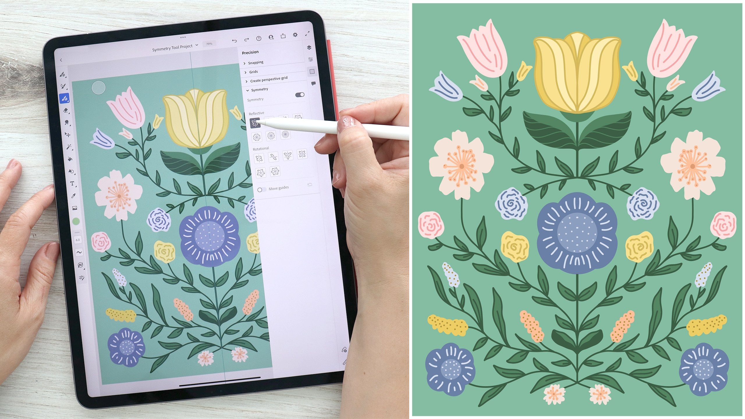
7. Sketching in Procreate: In the class resources, I've included a list of card ideas to get your creativity flowing. You can use this as a starting point or come up with your own ideas for the theme of your card. I've also included some layout templates for your car to get you started, but feel free to create your own designs from scratch. These are just meant to help you get started in case you're stuck. I like to start with a sketch when I work. Sketching allows you to be loose with your pencil and play with your composition and forms. I always start with a pencil in black and white. Up here under your brush library, you'll find a sketching category. I tend to use the HB pencil or the technical pencil, but you could play around. You can see they have multiple options. Here's a pro tip. If you're somebody who tends to sketch in pencil and paper, you can actually do that right in the iPad and save time importing your sketches into the apps. You can use your iPad as your sketchbook. You can either start sketching or bring in images for reference. To do that, go to the "Actions" menu, "Add", and "Insert a photo". We'll just select this guy here. Now you can use this image as a reference or you could use it to trace over. To use it as a reference, you can just resize it. You can either pinch and resize or resize using one of these little nodes here. Then I would just pull it up to the corner of my canvas. Then I have an area to sketch around and do that. If you're going to use it to trace over, I would come up to the "Layers" panel and I would change the opacity so that you can see your stroke a little easier on top of the image. Another handy tool in Procreate is the reference tool. If you go up to "Actions" and then go to "Canvas", you can turn on your reference window. You can pull down on the gray line to move your reference window around your canvas. Then move your canvas where you need it to go. The first option down here is to see the canvas. This is actually mimicking the canvas itself. If I draw, you'll see that it's here. You can either zoom into the canvas and make little edits, and you'll see how it's affecting your overall composition. Or you can zoom in on the canvas reference window and as you're making changes, you can see them in greater detail on the reference window. The other option is to use the image section. You can import an image and it'll show up in your reference window. If you tap, you'll get full screen. Then you can use this over here without taking up space on your canvas for your reference image. Just tap once to bring up your options, hit "Clear" if you'd like to change your picture, and then hit the little x to minimize the window. If you've downloaded my layout templates in the resource section of the class, you can insert it by going to "Actions" menu and "Insert file", and then select. Let's choose this one. Now, it's automatically going to come up with the transform tool and you can resize it to fit and use it as a guide. Once again, I could come up here and change the opacity on this layer to make it easier to see my stroke. Then I'll add a new layer, and I'll start sketching over this. I could just use this as a guide and start sketching out my motifs. Maybe I want this to be like a wreath shape. I can just be starting to loosely sketch out what I want it to look like. Then I want to put maybe some text here and some little decorative element. You could use these corners or you can leave them blank and just have the center section. Another handy tool are the drawing guides. I'm going to turn these layers off for now and add a new [inaudible] you can see these drawing guides. You can go up here to the "Actions" menu, "Canvas", turn on your drawing guides, and then we're going to edit the drawing guides by tapping here. Now you have a few options for drawing guides. You have your standard two-dimensional grid, which just gives you vertical and horizontal lines. The isometric grid, which gives you a more three-dimensional guideline. You can set a perspective drawing so you can tap to create vanishing points. You can do a single vanishing point, two vanishing points, or even three. To change these, you're just going to hit "Delete". You also have the symmetry guidelines. Down here on symmetry, if you click "Options", you'll see that you have the vertical, horizontal, quadrant, and radial. You also have rotational symmetry, which you can turn on and off. Rotational symmetry mirrors your marks in a circular motion instead of reflecting them on either side of the guidelines. They all have something called assisted drawing. If you turn on assisted drawing, it's going to match your stroke to the drawing guides. This would be the difference between using drawing guides as reference points and actually having them assist you with your drawing. Lastly, you can turn down the opacity of your guides and the thickness, as well as the color. If you want to select a different color, you can use this slider up here. Once you've selected the guide that you'd like to use, just hit done and we're ready to go. If I go back here and I turn on this template that I've pulled in when drawing assist is turned on, you'll see the word assisted under your layer name and there'll be a little checkbox by drawing assist. Now, if I start drawing, I have rotational symmetry on, so if I start drawing, it's going to mirror my linework around the canvas. I'm using this template as a general guideline of where I want to put my strokes. If I didn't want the elements of my wreath to be repeated around the symmetry guide. I would just turn the assist off. Now I don't have the assist on. If I start drawing, I can make unique little sections of my wreath. Sometimes it's fun to turn assist on and off with some of these symmetry tools. Because you can get a mix of symmetrical and asymmetrical sketch work. One other thing, notice you have the guides here. If I come up here and I turn off the drawing guides, but I leave my drawing assist turned on, it will still assist my drawing whether the guides are visible or not. To turn that off, just tap again in the drawing assist [inaudible] on, and now I can draw like normal and it won't be symmetrical. As you sketch your design, I encourage you to consider including elements to practice the tools you've learned in this course. These include basic shapes, a few hand-drawn elements, some text, and some symmetrical elements. To recap, we learned how to insert an image into Procreate. Use the reference window for sketching. Insert a file, turn on the drawing guides, and use the assisted drawing function. I'll finish sketching out my card, and in the next class, we'll talk about the color panel and creating a color palette.
8. Color Panel in Procreate: Now that we're done sketching, let's talk about picking colors for our project. We'll come up here and tap the Color button. You'll see that we have a few different options at the bottom. The first is our disk option, and this has an outer ring where we can change our color, and an inner disk where we can change the saturation and value of that color. If we pinch outward, it'll bring the inner disk to full screen and we can see it in greater detail. We can just move this little nod around to select a new color. We can also double tap and it'll find the nearest perfect color to that area that we selected. This is the purest saturated version of that color. If we want pure white, we just double tap over here, it'll give us pure white. We double tap down here, pure black. Then even in the center, it'll give us that half tone. We can just pinch inward and bring it back to normal size. Next up, we have the classic option. You can change the color with the top slider, the saturation with this middle slider and the value with the bottom slider. You can also move it around and it'll change the saturation in value sliders accordingly. Next up, we have our harmony selection. You can change the value of that ring down here. To change your harmony type, just tap on this name right here. You can select between complimentary, split complimentary, analogous, triadic, and tetradic. Next we have the value option, which allows you to input specific values if you need to match a certain color. You can set hue saturation and brightness. Setup the RGB value or the CMYK value, and even set up a hexadecimal value. In the history section, you're going to see the last 10 colors that you've used. Then down below is your default color palette. To change the default color palette, we'll come to this last option which is palettes. To change the default palette, simply tap Set Default on any other palette and it will become the default. To create a new color palette, tap the Plus symbol, and you have a few options here. Create new palette will create a blank palette for you to fill in. You can also take a photo with using your camera. Insert from a file or from your photos. To do that, just tap new from photos, and let's pick this photo here. You'll see that it comes in and it auto-selects the colors for the palette from your photo. To rename a palette, simply tap and it'll pull up your keyboard. You can actually erase using your Apple Pencil and either hand-write in with your pencil or use the keyboard to name it. If you swipe left, you can delete the palate or share it. If you come down here to any of your color options, you'll see that default palette and you can make little changes, like if you tap on this little color here, you can slightly tweak it. Let's say you wanted it a little wider. Then come in here and long hold, tap, delete it, and then simply tap in that box again and it'll fill it with your new color. You could tweak any of these colors that you'd like. You can also reorder the colors in your color swatch by simply dragging and moving them around. If you would like greater control when selecting your colors from a photo, you can come up to the Actions menu, tap insert a photo, and then use the Eyedropper tool to select specific colors from that photo. If we tap, it'll bring up the Eyedropper, and we can just drag it around our Canvas. When we find a color we like, we let go, it'll come up in our color button. We tap. Let's add a blank palette by hitting the Plus symbol. Create a blank palette. It's our default. We'll go down to disk. Then we can actually just tap on this little square and it'll add that color to our palette. We can go back out and continue to use the Eyedropper tool, drag it around, find a new color. Come in here, tap and add it to our selection. You can also long press on the screen with your finger and then drag it around and find a new color. Let go and add it to our color swatch. If you long hold the color button, it'll take you back to the previous color. You can also drag from this little gray line, and it'll shrink the color menu into a little reference window that you can drag around your Canvas and keep open for quick color changes. Simply tap the X to exit the color window. Now that you know how to create color palettes, go ahead and use your favorite mode to select your color palette for your card. To recap, we learned all about the color panel, its various interface options, and how to set up a new color palette. In the next lesson, we'll learn all about creating quick shapes and using the transform and selection tools.
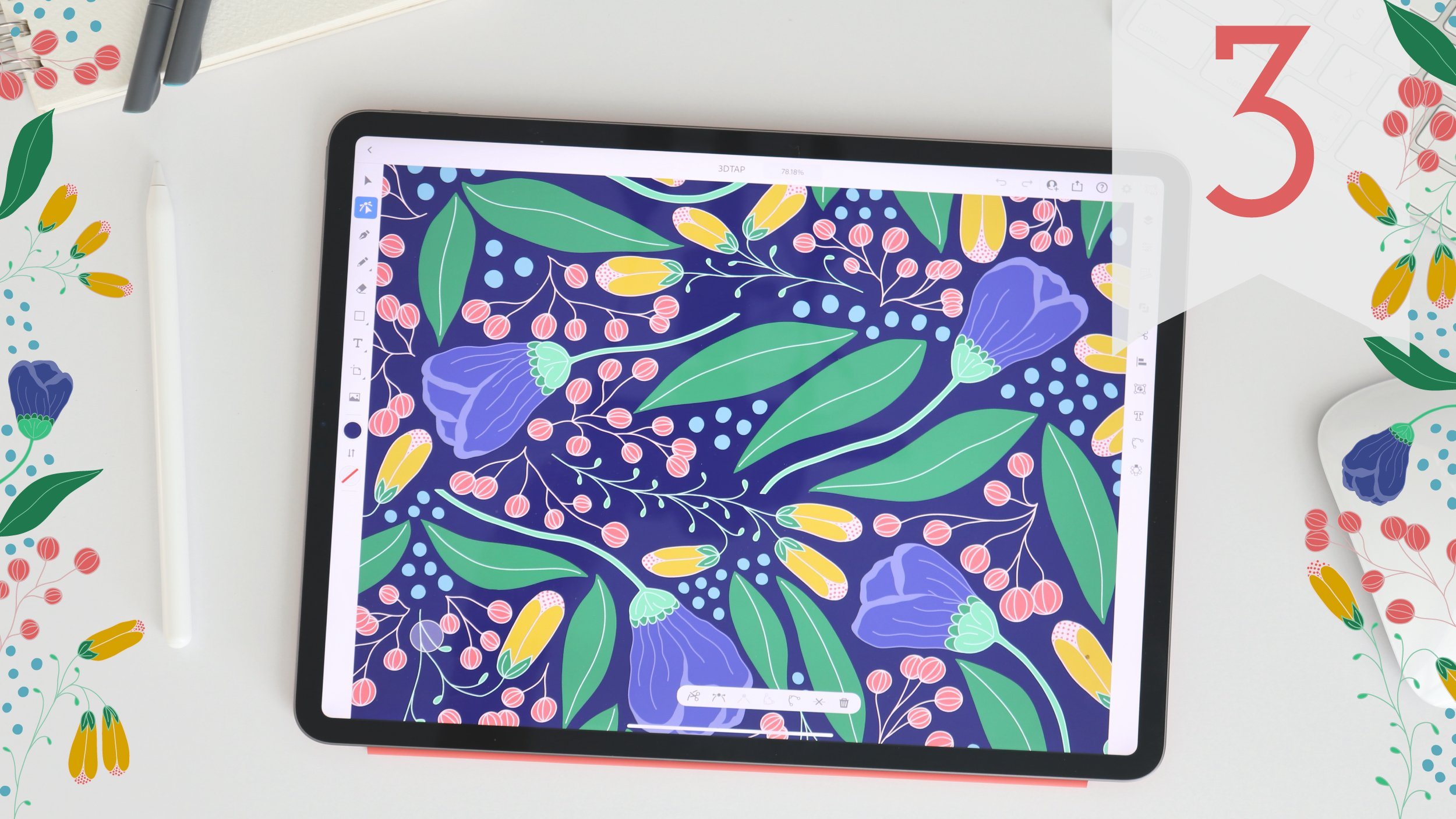
9. Quick Shapes & Transform in Procreate: Now that we have sketched out our idea and we've created a color palette, let's start to fill out our shapes and apply some effects. Now, I've sketched out a couple of different card ideas. The first one I did was a birthday card and just decorated it with our floral wreath motif. My second card idea was a thank you card with some simple shapes. I'll add some dimension by adding a shadowy effect and some radiating line work. First, we need to pick out a brush from our brush library. My favorite brush for this work is the monoline, and it's under the calligraphy category. But you pick your favorite brush or I encourage you to try out different brushes if you're new to Procreate. Next up, I am going to select a color from my color palette. Now, I created a little color palette here, and I'm going to go with this warm grayish-brown color. I'll come up to my layer's panel and I'll add a new layer. I'm going to take the opacity down on my sketch layer. Maybe about 25 percent is a good amount. With my new layer selected in blue, I'll come to my canvas and I'll start to create my shapes. I'm going to zoom in here so you can see this a little better. Now, I could just start drawing this square. You'll see that my line work isn't perfect. It's got some squiggly shakiness to it. If I was drawing an organic shape like a leaf or a flower petal, I might like this organic line work. But in this case, I really want a streamlined perfect shape, so I'm going to tap to undo. Procreate has a handy tool for snapping hand-drawn lines into a perfect shape, it's called quick shapes. If I draw a line, and at the end, I just hold down for a couple of seconds, it's actually going to create a perfect line. I can move this line around the canvas until I get the right angle. If I hold one finger down on the screen, you'll see that it snaps to perfect 15-degree increments. I'll come down here, and I want it to be just like that. Now, I could keep drawing my lines this way and create a shape, or I can come in and I can actually draw my square, and when I get to the end, I can let go. If I tap this edit shape, it gives me options based on the shape that I created. If I want this quadrilateral, I can take these little nodes here and I can actually stretch them into the shape that I want. I can also come from the side here and stretch the entire shape out, same with stretching it this other way. This also works with circles. I draw a circle and I hold. I can edit my shape as an ellipse or a perfect circle, and same with triangles. Hold and edit my shape and I can choose triangle. I've gone ahead and I've drawn up all of my shapes. I come into the Layers panel, you'll see that I can turn this on. You'll see that I've gone through and I've done that on every single one of these shapes, and I've gotten ready to go. Next up, I'm going to come up here to the transform tool and I'm going to make some adjustments. The first option I have done in my little sub-menu is free form. The free form option allows you to make small adjustments that aren't restricted to any proportions or dimensions. You can also move it around the canvas. If you just tap to the side, it's very hard to tell, but you are nudging it slowly. Let me see if I can zoom in and you can see this easier. If I tap, it nudges it pixel by pixel. This works by tapping at the bottom on either side and even diagonally in the corner. Whatever area you tap on it, it will nudge it. You can also rotate it using this little node up here. If you hold your finger down, it'll snap in 15-degree increments around. Uniform allows you to shrink or expand the selection according to their original proportions. Distort helps create a three-dimensional effect. If I take these little nodes down here and I stretch them out and shear them, you'll see that it creates a 3D effect. It's receding into the background there. I can also do the same thing with these, shape them and create an even stronger effect. Come back out of that. Then warp creates a wrapping effect. If I take these little nodes, I can stretch them back behind. When I'm done, let me come out of there. You'll see it looks like it is wrapping around an object. Next up, let's look at the selection options. Let's say that like this, I have all these objects on the same layer. I want to adjust just one of the shapes and not the entire layer. I can use my selection tool to select the object that I want to adjust. If I choose automatic, Procreate will determine my selection based on the pixels on the layer in the area that I touch. If I tap here, you'll see that it selects that area because it's got these little pixels drawn in. I can come in here and use the transform tool and move it around or resize it. If I choose freehand, I can come in and use this Lasso Tool and make my selection. Again, it'll select this one object and I can move it around and resize it. I can also use a rectangular shape, which may be helpful, and I can select an ellipse, all of which will select that area. Let's say that I want to duplicate these shapes so that I can make this 3D shadow effect. One thing that I could do is I could come up here, and I could swipe left, and I could duplicate my layer. Now I have two of the same layer. Another option, let me delete that, is to drag the layer onto the canvas and it'll duplicate the layer for me. Now, I could take this bottom layer, go up to my transform tool and I'm going to use uniform and I'm going to adjust it. You'll notice that it's snapping to specific angles because under snapping, I have magnetics and snapping selected. If I turn these off, I can move it around without any restrictions. Turn snapping and magnetics back on, and now I am restricted to specific angles. I want it to be just about here. When I'm done, I can just tap out. Now I've got the same shapes duplicated and transformed at an angle to create a shadowy effect on the shape. Now that you know how to create some quick shapes and use the selection and transform tools to modify your layers, you are ready to add some effects to your motifs. Next up, we will discuss how to use color fill, mass, and blend modes.
10. ColorDrop & Masks in Procreate: The next thing I want to do is fill in my shapes, and I have a few different options for doing this. If I tap here. Let's turn off this top layer so we can see it better. I have my bottom layer selected. I have a few different options. I can come in and color drop. If I drop this color into the shape, it will fill the shape for me. If you come up here, you'll see this color drop threshold. That determines how well it floods the shape. If I take that color threshold down pretty low, then when you come in, you'll see that there's a few little pixels that it didn't flood completely. Let me come back out and it will remember the last color drop threshold that you used, and so I want to slide it back up, and this time when I let go, it should fill it in completely and flood the entire shape. Also, if I color drop and when I let go, I have this option to continue filling with recolor, and then you'll see this little bullseye shape that comes up. If I tap, it will fill in whatever area that I select, and you'll see this little bullseye. I can also drag the bullseye around and recolor. Then down here, I can choose how well it floods the area that I've selected. Let me come up here and show you. Again, this way it has no flood and it leaves that little border between the line and the fill, but if I pull it up, it'll fill this shape completely. Max will actually fill the entire canvas. All you need to do is come down to about 99 percent and it'll just fill the shape completely. Lastly, I'll tap on that last shape and now I have filled in all my shapes very quickly. Another option to fill my shape is to create a reference layer. If I tap on my layer and I click "Reference", it turns this into a reference layer. Add a new layer and I put this one on top. The layer underneath will fill according to the shape of my objects on my reference layer. I'm going to come in here so you can see this a little easier and then we pick this gold color and now with my blank layer selected, I am going to fill the color in to each box. I can also continue with recolor and fill in all my shapes. Now, if you come up here to the layer, you're going to see that my fill is actually on a separate layer than my line work. I can turn my line work on and my fill off and they're two separate layers. If later on, I want to create some special effects on my fill layer and not my line-work layer, I have them on separate layers. This is going to be a handy tool. Next up, I'm going to turn off my line-work layer and I'm going to use this fill layer and we're going to talk about some masking effects. The first option is to tap on the layer and select "Mask", and it automatically creates a layer mask on top. Layer masks use black and white to reveal and hide areas of the parent layer underneath. If I come up here and I select pure black, I'm going to go in on my mask layer, and I'm going to draw some zigzag lines. It looks like I am erasing the area of my shape, but in actuality, if I turn off this layer mask, nothing has happened to my parent layer. My original layer is perfectly fine. A layer mask allows me to create some interesting effects and test them out without destroying the original layer. I can turn it on and off. Black hides areas of the layer underneath and white reveals layers. If I come back in and I draw, I'm going to come back in and reveal those hidden areas of the layer underneath. Grayscale just works in varying levels of opacity. If I come up here and I choose a mid-level gray, it's going to hide areas of the layer based on the opacity of that grayscale. When I'm done, if I didn't like what I did there, I can just delete the layer mask and my original layer is perfectly fine. I'm going to come in here and I'm going to add a new layer and I'm going to select "Clipping Mask". You'll notice that there's a little arrow that pops up and is pointed down saying this is your clipping mask layer and it's clipped to the layer underneath it. If I come in and select a different color, let's choose maybe this blue color, I can come in and create these zigzag lines, and the content on this layer, on the clipping mask layer, is contained by the shapes on the parent layer. You'll notice that if I release the clipping mask by tapping there, my zigzag lines are fully shown, but if I add the clipping mask back, they are cut off and contained by that parent layer underneath. I can actually come up to "Transform" and I can move this parent layer around and it'll reveal different areas of my clipped layer based on the shape underneath. Again, it's just a nondestructive way to try out some effects on my original layer without destroying it. I come in and then I delete that, I have my original layer intact. Next up we have Alpha Lock. Once you've drawn objects on a layer, you can use Alpha Lock to restrict any additional marks to the filled area of the layer. If I tap on my layer and I select Alpha Lock, you'll know that Alpha Lock is on because you'll see this little grid line in the background of your layer. Another way you can get to Alpha Lock is a two-finger swipe. If I take two fingers and I swipe right, it turns on Alpha Lock. You'll see if I tap here, Alpha Lock is turned on. I can also two-finger swipe to turn it on and off. With Alpha Lock turned on, I can come in with my brush and I can draw on the layer, and no matter where I draw, it's only going to be contained in the objects I've already drawn on the layer. It's restricted to these squares. But unlike a layer mask or a clipping mask, I'm actually drawing directly on the original layer, and I'm altering it in a way that I can't change unless I hit undo. These are permanent, unlike clipping masks and layer masks, which are non-destructive. If I don't want those, I would have to double-tap "Undo". Lastly, we have our blend modes. I'm going to come up here and I'm going to create a clipping mask and I'm going to do my little zigzag lines, and you'll see that it's like a faint blue color on this gold. Normally, when you draw on a layer, the layer contents are opaque and it covers up the content of the layer beneath it, but blend modes allow the content to blend with the layer beneath it, creating some interesting effects. If I come up here to my layers and I tap on this little n, the default blend mode is normal, which is that opaque line work over the layer. I can scroll through these different blend mode options, and you'll see as I scroll through, the color changes and it's interacting with this layer of orange squares underneath and the blue layer on top. Understanding how each blend mode works could be its own class. I'm not going to go into depth on what each mode does, but you can play around with these blend modes and have a little fun with it. You can scroll through and find something that you think looks cool, like that. I like that tone on tone, and you'll notice that the letter here changes to an L for Luminosity. Now that you've learned how to quickly fill your shapes and use masks and blend modes to add effects to your objects, you are ready to finish drawing the motifs for your card. Next up, we will talk about adding text in Procreate.
11. Adding Text in Procreate: Now that we've drawn our motifs and applied our effects, let's add our message to the card. As you can see, I've finished filling in all my shapes and adding my masking effects and I'm ready to add my message. First I'll come up to my "Brush Library" and I'll select a brush. Now I really like in the calligraphy set the brush pen, but I encourage you to try out all the different brushes and see what you like. Feel free to play around with it. With my brush pen selected, I'll come up to my layers panel, add a new layer, and then I will start writing out my letters. I'm going to use this quick shape function and snap to some straight lines. You'll see that I still have this hand lettered touch to it that just smooths out my letters and make them a little cleaner. With my letters hand-drawn, I could come up to my layers panel and I could treat them like any other hand-drawn objects and add effects and masks and change them up and edit them in any way that I want. The other option would be to add text using the text tool. I'm going to come and turn this layer off and I'll come over to my "Actions" menu and under "Add", I'm going to hit "Add text". It will immediately come up with a text box and the word text and it'll be in the color that I've got currently selected. If I go to my layers panel, you'll see that it's a text layer because the letter a in italics is in the thumbnail and the word text is in the layer name, and whatever you have typed into your text box will automatically be the name of your layer. So I come here, I'm going to zoom in a little bit so you can see this a little better. I can change the size of my text box by dragging these little nodes around on either side and it will resize my text box but it won't actually change the size of my font. If I shrink down too much, it'll just add another line off my text. Now to edit my text, I can scribble out the word with my Apple Pencil and erase it and then write in my message and it will convert it to text, or I can tap on the little keyboard symbol down here and type in my message using the keyboard. To edit my text, I'm going to select and it'll pop up this little menu option. So I have the option to open up the keyboard and type, I can clear my text layer, I can cut, copy, and paste, I can select all. The other thing I can do is make it vertical orientation. I can adjust the alignment and then if I want to edit the font, I can tap on the font name and you'll see that it brings up a style panel for me to edit. Now I want to make sure that my text is selected. Make sure that it is outlined in blue. On the far left, I can select my font and you can scroll through and see what fonts are available. You will see that with each font name, it actually shows you a little brief example of what the text will look like, so you can pre-view it without having to select through. The next column offers up style options, and the options available in here will be based on the texts that you select. Right now I have "Menlo" selected, but if I choose "Marker Felt", my style options change accordingly. I can also change the design. I can make my text larger, change the size, I can change the kerning, I'm actually going to change the text box size, and then I'll come in here and I'll come and change the kerning. I want them spaced out a little bit more. I can also change the opacity. Under attributes, I have the option to change the alignment. I can underline my text, outline my text, so that little option is outline, I can change to vertical alignment and I can also make my text all caps. Let me actually move this down so you can see that; I can make it all caps. Up here in this little top-left corner, I can open up the keyboard again, cut, copy, and paste. I also have the option to import fonts. I could cancel these changes, and when I'm ready, I can hit "Done" and my changes will be complete. As long as my layer is a text layer, I can come back in and update the font style and any of the design and attributes. If I decided that I do want this to be all caps, I can come in and change that, hit "Done" again and my changes are complete. I also have this option to rasterize. If I rasterize the layer, it will become a pixel based object, just like any other hand-drawn object on any of my other layers. If I tap "Rasterize", you'll see that this little red bar comes up and it lets you know that you have rasterized the text because it is now changed to an object and you won't be able to go back and change any of the style or design attributes that you could when it was text. If you didn't want to do this and you did decide that I need to go back and make some changes, you could quickly hit double-tap and undo and I'm back to editable text. I'm going to come in and going to take my text down to two columns, and I will come in and transform my text, adjust it so it generally fits over these little boxes. Now as a single layer, I can't make fine little adjustments to each individual letter. To do that, I'm going to come up here to the selection tools and I will select my T, and with a three-finger swipe down, I'll pull up this little copy and paste quick menu. I can move this little menu around my canvas where I need it, and you'll see that I have some quick options here. I can cut or copy the selection that I've made, I can copy all, which will copy all visible layers, I can duplicate just this selection, and I can paste over here or with this little option here, this cut and paste option, I can actually quickly cut the object and paste it onto its new layer all in one tab, so I'm going to tap that. If I come up to my layers, you'll see that the T is now separated from the other letters. You'll also notice that it's no longer a text layer. So the minute I made those changes, it automatically became a rasterized layer. I'm going to go through and do the same thing for each of these individual letters, and now I have each of my letters on their own separate layer. From here, I can select the T, go to the transform tool, and I'm able to just edit this T. I'll use the distort and I might distort this and change the shape, match the angle of the box that I've got it contained in. Now I have transformed each of my individual letters and I can go in and make further adjustments or I can come in and create some effects with masks and blend modes just like any other layer that I've got a hand-drawn object on. To recap, we added a hand-lettered message to our card, we also learned about the text tool in Procreate, and how to rasterize our texts for editing. Next up, we'll learn how to export our card in different formats.
12. Exporting in Procreate: Now that we've learned about the tools and features of Procreate and we've designed our card, we're ready to export our project. The first thing I'm going to do is come up to the Actions menu under Canvas and select Canvas Information, and I'm going to rename my artwork. I'm going to call it, "THANKS", and I will hit "Done". Now when I export my work, it'll have that name instead of untitled canvas. There are a few options for sharing. First up, let's pull up slowly from the bottom, which will reveal our doc and I'm going to select the Files folder and I'm going to drag it over and release. It'll open up in Split View. This is a cool feature of the iPad that makes working between apps really easy. You'll see that I am in my iCloud Drive and I have a folder in here called Procreate. If you have other Apple products, I think iCloud Drive is one of the easiest places to save your files so you can access it across all your devices. I'm going to slide over using this little bar so I can view more of my canvas. I'm going to go up to my Layers panel and I'll open up this group. The first thing I'll do is drag and drop this layer over into my file folder. This is now saved as a PNG file. If I want to select more than one layer, I'm going to drag and drop and you'll see that the little green plus symbol comes up and I can actually tap and select more layers. Then you'll see that the number of layers here in the little green plus 4 tells me how many layers I've selected and I'll drop it in, and now each of these layers is its own PNG file. You can also drag the file back into the Layers panel and create a new layer. This also works with swatches. I can drag a swatch over and it'll create a swatch file and then as with the layers, I can drag a swatch into my palettes. The next option is to come up to the Actions menu under Share and you have a few different options down here. The Share Layers section exports each of your layers as different pages or files, so as a PDF, it will export so that each layer is its own page in the PDF and the PNG files will also do the same. If you plan to export a lot of layers as PNG files, this would be the faster way to go. The other thing to note is that it will only export visible layers if you're in this category. If you come up here and you see that I only have this set of layers turned on, these will be the only ones that export if I choose PDF or PNG under the Share Layers section. You can also export to animated GIFs, PNGs, MP4s, and HEVCs. This would also apply where each layer is its own frame in the animation. Next up, we have Share Image. The top two, Procreate and PSD, will actually export all of your layers, whether they are visible or not. The PSD file, of course, is a Photoshop file and this can be opened in any Adobe Photoshop or Illustrator, whether your desktop or the iPad versions, as well as Adobe Fresco. The PDF, JPEG, PNG and TIFF options under Share Image will export as a flat image. This PDF option will export it as a PDF where your image is a flattened layer in a single page. At this point, I would encourage you to export as a PNG so you can upload to the Class Projects page so we can see the progress that you've made. With any of these options, you'll simply tap on it and select where to save your files. I'm going to save to Files. I'm going to save it in my Procreate folder. I'll hit "Save" and replace that. You'll see it ends up over here in my Files folder and it's ready for sharing. To recap, we renamed our canvas. We learned how to share layers by dragging them into our Files folder. We also learned about the sharing options under the Actions menu. Next up, we'll wrap up the class and talk about final steps.
13. Final Thoughts: Thank you for joining my class. Today, you learned all you need to know to get started working on the iPad with Procreate, you can start with a sketch, bring in an image for reference, and use the many tools and brushes to create a beautiful design. We also know some tricks for a faster workflow and how to export your work. I hope you'll take what you've learned and explore more on your own. This class is Part 1 of a series focused on getting you started creating art on the iPad. If you enjoyed this class, please be sure to check out the rest of the series to round out your skills and to learn additional tools. I'd love to see what you create. Please be sure to export your project as a PNG and upload it to the project gallery. It's intimidating to share your work so be sure to check out other student's work and give them some encouragement. It's been an honor to teach you. I hope I'll see you in my next lesson.
 Amy Bradley, Surface Pattern Designer & Artist