Transcripts
1. Introduction: Painting rain can be
challenging because it requires an understanding
of how rain behaves, how it reflects slight, and how it interacts
with the environment. Overcoming these
challenges can be a satisfying experience
for an artist. Rain can create a unique
atmosphere and capturing this mood in a painting
can be a rewarding experience. But how to create a feeling
of rain in watercolor? How to express the rain drops smoothly falling from the sky? Would you like to know how fast you have to paint
the scenery before the paper dries up and how to avoid the
cauliflower effects. Hello, I'm Evgenia Cordie,
watercolorist, coffee artist and
art instructor, the owner of Belivart Magical Watercolor. As a professional artist I daily use the magic of
watercolor techniques. And I'm grateful that my
watercolors and coffee artworks are in private collections
all over the world. My watercolors won in 2021, the watercolor competition of
Royal Talents and Helvetart. Several works were
marked and selected for different competitions
and exhibitions. I started to paint
when I was a child. And over the years exploring
watercolor techniques, I began to share
watercolor tutorials and process videos on
YouTube and Instagram. I've been painting for over
20 years and Skillshare gives me a wonderful opportunity to share watercolor secrets with you. In this masterclass,
we will start with exercises to learn
the rain technique, which is also interesting
for watercolor beginners. Step-by-step and in real-time we will start building
up the painting. Learn when the paper is
right to paint on it. What are the differences between painting on wet paper
and damp paper? Learn about natural greens and why painting on wet
paper is so unique. You will learn how to express rain and when using blotting and sponging to achieve
different effects in your watercolor. Join me today for this watercolor masterclass -
painting grain in watercolor. That will give you knowledge
and inspiration to improve your realistic painting skills
literally within hours.
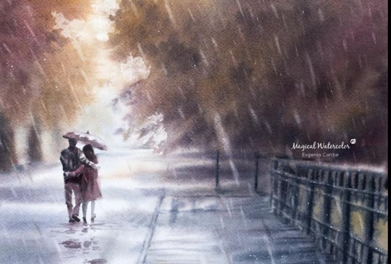
2. The reference photo, importance of making a sketch: Before you start to paint, make sure you have a reference. While it is not
always required to make a sketch before
starting to paint, it is often a good idea
to test the colors, study light and shadow
and plan a composition. For this painting, I used my own photo and figures
from another one. I made a collage in Photoshop
and printed it out. As you see, my original
photo is almost monochrome. Today, I would like to paint something happy and spring-like. I Looked for a rainy
scene with sunshine. These couple of
photos will serve as a reference for
the color scheme. You can also collect a variety of materials to use
in your collage, such as magazine
clippings, photographs, colored papers, and any other
materials that inspire you. Choose materials that reflect the colors and themes you
want to use in your painting. Because I'm not sure
what colors and color mixes will be the
best for this project I made several sketches. This one is to just
tell the colors. In the other one, I tested the composition
and the rain. I have also tried
the other colors, but they seem to be less happy in spring-like
than the other. Using a reference
while painting can be a helpful tool for the
artists of all levels. It can lead to more accurate
and consistent artwork, provide inspiration and
learning opportunities and help an artist to understand the context of the
subject they're painting.
3. Painting exercises, difference between painting on wet and damp paper: Watercolor is a
fascinating medium, but sometimes you can
feel it is unpredictable. That's why when you try
out a new technique, it is a good idea to do painting exercises before
starting to paint. Let's take two pieces of
cheap watercolor paper or some scraps of watercolor paper you
don't need anymore. A high-quality paper can handle the heavy application
of paint better. It is also less prone
to buckling or wrapping. But of course you can use the same techniques
on both papers. However, you get more
beautiful and satisfying results on the high-quality
watercolor paper. For painting rain, we have to wet the paper on two sides. You can do it by brushing
it with a wet brush on two sides till the
paper feels flexible. Another way is to put
the paper in a basin of water to soak it thoroughly. Look how flexible the paper is when wet. When painting
with watercolors, the wetness of the
paper can have a significant effect on the final outcome
of the painting. Now, you will see the
difference between wet paper and damp paper and
how it affects the color stains
and the rain The first piece of paper
we will brush with a wet brush to flatten
it on the desk. A dry brush will
absorb some water on the surface and make the
paper slightly drier. We start to paint with
watercolors on wet paper. And notice how the colors
spread quickly on it. When painting on wet paper, the colors tend to spread
and flow more freely, creating a more diffused
and blended effect. Let's see the difference
on damp paper. Painting on damp paper allows for more control and precision. As the colors are less
likely to spread as much. Painting on wet paper requires quick and decisive
brushstrokes. The paper can quickly
become over saturated and the colors can bleed
too much into one another. Painting on damp
paper allows for more time and control
over the paint. The first paper is very
wet, the paper glitters. The other paper is damp. It doesn't glitter. So when can you start
painting or better to say lifting the color to
create the rain effect? To paint the rain, you
have to use a dry brush or a slightly damp brush without
any dripping water on it. For the rain, it's nice
to use a flat brush. Make a stroke. On the wet paper it will quickly disappear. Just make a second one
and at the same place. After every time
you lift the color, make sure you dry your
brush on the paper tissue. Make a series of short
strokes that represent rain. When the paper is
still very wet, the strokes will
begin to disappear or will become narrower
and disappear partly. It's nice for making
the rain look more 3D so that some of the strokes are more
blurry than the other. On the damp paper, you have more control
over the strokes. They will stay almost
exactly as you make them. They will stay light and
have more defined edges. If you like to clean your brush after a couple of strokes, don't forget to dry your
brush on the tissue. If you start painting with a wet brush on wet
or damp paper, you will create rings
like cauliflower effect. You can adjust the strokes on
wet paper again and again. If the paper is
still wet or damp. When paper dries up, it's difficult to
leave the color. When the paper is dry, you definitely see a
difference between the strokes on wet paper
and on damp paper. The color of the color stains and washes will
also become lighter. So try to use more pigment and less water while
mixing the colors. Painting on wet paper tends to create a more diffused
and blended effect. While painting on damp paper allows for more
control and precision. The wetness of the paper
can be used to create different effects and achieve different results depending
on the artist goals.
4. Get started, making the paper ready to paint on it: You can find a stencil for the drawing of this
particular painting in the attachment
of this class. Of course, you can use your fantasy and choose
another subjects to paint. For inspiration I
added a link with different rain
subjects like florals, cityscapes and so on. If you would like to know three fast ways to
make a drawing, please watch my previous class. Learn to paint a dreamy sunset
landscape in watercolor. Because we will paint mostly
on wet and damp paper. I like to protect my desk with
a plastic coster. Above it I lay a wet tea/dish towel to ensure my paper will
stay damp longer. It is nice to use a kneading eraser before
you wet the paper. The kneading eraser will
lighten up the pencil lines so that you can erase them easily when your
painting is finished. Then I wet my paper
under the tap on two sides till the paper
gets very flexible. It is best to use a high-quality
watercolor paper that can handle the heavy
application of paint. It is less prone to
buckling or wrapping. But you also can try
this technique on a cheaper watercolor
paper that is sturdy. Put the paper on
the wet dish towel. Now, we have to flatten
the paper on the surface. Therefore, it's nice to
use a broad flat brush. I could brush the
paper with a dry brush, but because the papers is big, I would like to stay it wet longer. Just wet the brush and squeeze the water out of
it with a tissue. With this damp brush start to brush the paper
with slightly pressing on it. Test the paper to see if
it's ready for painting. Lightly touch the surface of the paper with the
back of your hand. If the paper feels evenly
down but not overly wet, it's ready for painting. You can also look at the
paper to see if it's ready. The paper glitters. And if I test the
paper with my hand, it leaves a puddle. If you start to paint now, the colors will flow quickly and blend to
much with each other. Let's wait a couple of minutes.
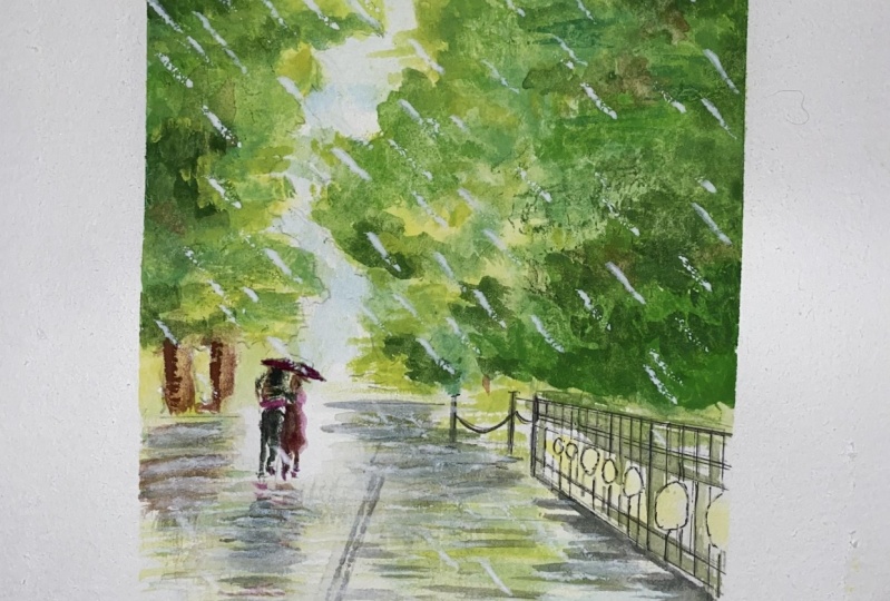
5. 1st layer, wet technique, tips & tricks: This is the biggest part
of the masterclass. By during this time you
will get many tips and valuable information about watercolors and the techniques. The first layer of
watercolor painting can be compared to a watercolor wash
or a watercolor stain. Watercolor wash is
typically a flat, even layer of color that covers a large
area of the paper. It is often used as a base
layer for watercolor painting and can provide the foundation for subsequent layers of paint. A watercolor stain,
on the other hand, is the more textured and
organic application of paint. It may be applied in a more
irregular pattern, allowing the paint to
flow and blend naturally. Both of these
techniques can create a beautiful and
an expressive first layer in a watercolor painting, providing a starting point for further development and
refinement or the artwork. I have waited a
couple of minutes. I'm brushing my
paper one more time. Let's have a closer
look at the paper. You see that the paper is
faster drier on the edges. It looks too dry here
for the wet technique. The rest of the
paper is quite good. It's damp, not too wet, and not too dry. I will brush the edges with
a wet brush again to get them wet and spread the
moisture all over the paper. Now it is ready. Before we start to paint, Let's moisture the watercolors. I do it with a spray. I will use watercolor pans
and tubes already squeezed into the palette. To mix the colors it is nice to
use a ceramic palette or a plate. Ceramic feels very soft
and creamy when you mix the colors without
separate puddles of paint. The brush size will depend on the format that you
use for a painting. Some round, flat and fine
brushes are very useful. You can mix olive green with a bit of burnt
sienna and indigo. Some yellow and green for
the leaves in the sunshine. Green is a color that appears
very frequently in nature, and it is rarely pure
single hue. Greens in a sunny spring time landscape
may have more yellow in them. By mixing different
colors together, you can create greens
that have a more varied and nuanced appearance, which can help to
make your painting looks more realistic
and believable. E.g. mixing yellow and blue paint together will create
a basic green color. But this green may appear flat. And uninteresting, by adding small amounts of other
colors such as red, brown, or black, you can create green that have more
depth and complexity. This is because these colors contain pigments that are
found in natural greens, such as the brownish
hues found in leaves, or the bluish undertones,
found in shadows. While the first
layer is still wet, you can add another layer
of color on top of it, allowing the colors
to blend together. This helps you to build
up the intensity of the colors and create depth and complexity in your painting. It's important to note
that layering wet on wet requires a bit of practice
and experimentation. The amount of water
and pigment you use will affect the final
outcome of your painting. However, with patients
and practice, this technique can yield beautiful and dynamic results and your watercolor paintings. Let's use a paper tissue
to blow the excess of paint and create light
places between the leaves. Simply place the tissue on the wet area and press gently. This can help to absorb
some of the excess water or paint and prevent it from spreading or bleeding
into unwanted areas. Using a paper tissue while
painting with watercolors can be a helpful technique for creating a variety of effects. To remove some of the
paint from your paper, you can use a damp paper
tissue to lift it away. Place the damp
Titian press gently. This can help to
lighten or remove the paint without
damaging the paper. You can also use a
paper tissue to create interesting textures or
patterns in your painting. Crumble up the tissue and press it lightly onto
the wet paper. This can create a
variety of effects from soft and subtitle to more
dramatic and rough textures. Using more pigment
and less water while painting with watercolors
can help you achieve richer, more saturated, and
vibrant colors. The amount of water and
pigment you use can significantly impact the
appearance of your paint when painting wet-on-wet. Experiment with different ratios of pigment toward to find the balance that works best for your painting style and the effect you are
trying to achieve. Paint with quick
decisive strokes to avoid the paper
becoming too wet. I add different greens
to the back trees. It will give more variation. When pain dries up, it will become lighter. That's why it's nice to use darker colors and layer them up. Like for these trees. Blot to the paper a couple
of times to prevent the color from going
into the light areas. You can add additional
layers of paint on wet paper as long as the
paper is still damp. I add a couple of water
drops in the light areas. The water will spread and create a nice effect of light
coming through the leaves. Painting on wet paper
with watercolors is special because it
allows the colors to blend and flow together in beautiful organic ways that are difficult to achieve with
other painting techniques. A few reasons why painting
on wet paper is so unique. Soft blended edges. When you apply watercolor
too wet paper, the colors will
begin to bleed and blend together, creating soft, beautiful edges that are
perfect for creating a sense of atmosphere and
depths in your paintings. The way the paint interacts
with the wet paper can create unique textures and patterns that add interests and
depth to your painting. You can use this technique
to create beautiful washes, gradients, and
other effects that are difficult to achieve
with other techniques. When you paint on wet
paper with watercolors, you have greater control over how the colors mix
and blend together. You can use this technique to create subtle color variations, or to create bold
saturated colors that stand out against
the background. Painting convert paper with
watercolors allows for a greater sense of
spontaneity and experimentation
in your painting. You can take
advantage of the way the paint moves and
flows to create unexpected effects
and happy accidents that at interest and
depth to your painting. With gentle quick strokes add some ochre and olive green
mix to the ground. Spread the color with the brush touching the paper horizontally. It feels like slightly rubbing the paper to spread the color. A lovely mix for "violet gray" from yellow ocher
and permanent violet. Apply the color with the
belly of your brush almost horizontally to create
more flat strokes diffused in another
color already applied. Take very little water
to prevent water drops creating a cauliflower
effect on the paper. Therefore, it is nice to use a brush that holds less water. Generally, synthetic
brushes tend to hold less water compared
to natural hair. This is because synthetic
fibers don't have the same level of
absorbancy as natural ones. However, there are
synthetic brushes that are almost identical
to natural fibers. Some bright yellowish
green between the stems. Now I would like to use the cauliflower effect
by adding a few water drops between the three stems to make the light coming softer
between the trees. Adding the same green
on the ground to bring harmony in the different
parts of the painting. Some more color
to the ground and the reflections of the figures. I lightly rub the color
on the damp paper. The amount of water
that a brush can hold also depends on
its size and shape, as well as the density
of the bristles. E.g. a smaller brush with
densely packed bristles will be able to hold more
water compared to a larger brush with
sparse bristles. When it comes to
watercolor painting, the amount of water that a
brush can hold can affect to the density of the pigment and the amount of blending
that can be achieved. When you add a
stroke on wet paper, you can easily adjust it if
you don't wait too long. Just rub on it with
the damp brush, blot it or add another color to mix this directly
on the paper. It is nice to
experiment sometimes. By wringing all of the moisture from your brush with
a paper tissue, you can use the same
brush to leave the color. Here I do it between the
shadows and between the foliage. Blot the paper to
lighten up the figures. The three outline
has become blurry. Let's add darker and
thicker paint above it. The paper is still damp, so the edges of the strokes
will partially be defused. With the tip of the brush paint some horizontal lines
with short strokes. It feels like first
you press on the paper and at the end of the stroke
you slightly lift the brush. A brush that holds
less water can create more precise
lines and details. While a brush that
holds more water can create softer and
more blended washes. Ultimately, the choice
of brush will depend on the desired effect and personal
preference of the artist. The three outlines need some more defined edges with
the dark green mix of sap green, black and a bit of viridian. The last one to make the
color cooler in the shadow. The paper is still damp, create a series of stains
to build up the foliage outline. Blot the paper underneath the foliage to lift the color and create more shape. Add more weight with some
different darker green hues. Congratulations, you're ready to begin
with the next lesson - Painting the details. If you still have any questions, don't wait to start
up a discussion and I will be happy to
answer all your questions.
6. Painting the details : Because of the wet
tea / dish towel underneath, the paper stays longer damp. Blot with the tissue to reveal white paper if you
color spreads too much. And now the water has
soaked into the paper, we can paint the details or
subjects that have to be less blurry and diffuse like
the trees in the background. With a fine brush and a thick creamy color mix of
black with rose-red and blue paint
long lines of the fence. The lines will not flow on damp paper like the
trees on wet paper, but will stay more outlined
with partly diffused edges. I look regularly at
the reference photo. While it is important to use a reference photo as a guide when painting with watercolors. It is also important to not simply copy the photo exactly. This is because a direct copy of a photo can sometimes
result in a flat, lifeless painting that lacks
creativity and originality. Instead, it is important to use the reference photo as a
starting point, and to make creative
decisions based on your own interpretation
and artistic vision. This may involve making
adjustments to the composition, simplifying or exaggerating
certain features, or changing the colors to create a specific mood or an atmosphere. By using the reference
photo as a guide to, rather than a strict blueprint, you can create a watercolor
painting that is unique and expressive and that reflects your own personal
style and vision. Rather than painting
an unbroken line, I marked some parts
with the color. Broken lines can create a more dynamic and interesting composition
in the painting. Straight, unbroken lines
can appear static and an interesting while broken lines can create movement
and a sense of energy. Using broken lines can allow for great expression and
creativity in a painting. Blot to the paper one more
time to lighten it up. I'd like to add darker
stains to the trees. When the paper is dry, the color will always
become lighter. Have this in mind when
painting on wet paper. I add more dark greens on the trees to have enough
contrast for painting rain. Have a closer
look at the paper. Most of the painting
is damp to almost dry. It is a good time to
start creating the rain.
7. Painting the rain: Let's have a look at
the reference photo. The rain is falling
with random lines. Some of them are
light and blurrier, the others are brighter
and more in focus. If you just lightly
touch the paper, the stroke on damp paper
will almost disappear. Tried to use some more pressure
for brightest strokes. It's nice to have
different kinds of rain lines for a
more natural look. Always dab the brush on the paper tissue after
making the stroke. If your brush becomes too dry, wet it but then directly dab it on the paper tissue
to prevent the water drops falling on the paper and creating a
cauliflower effect. When working on a large
watercolor painting, it is important to keep both the big picture and
the details in mind. While it can be tempting to
focus solely on the details, it is important to regularly
step back and evaluate how those details fit into
the larger composition. The fence became too
light, in my opinion. Before we proceed with
the rain look your whole picture over by
standing in place of sitting, or go to a distance
from your artwork. Add darker details here and
there with a fine brush. On this step, the
painting has to become drier to prevent the detail
spreading on wet paper. Take your artwork gently, remove the tea / dish towel and dry
the surface with a tissue. Now, make some rain
lines further. As paper dress up, the lines will stay
more outlined.
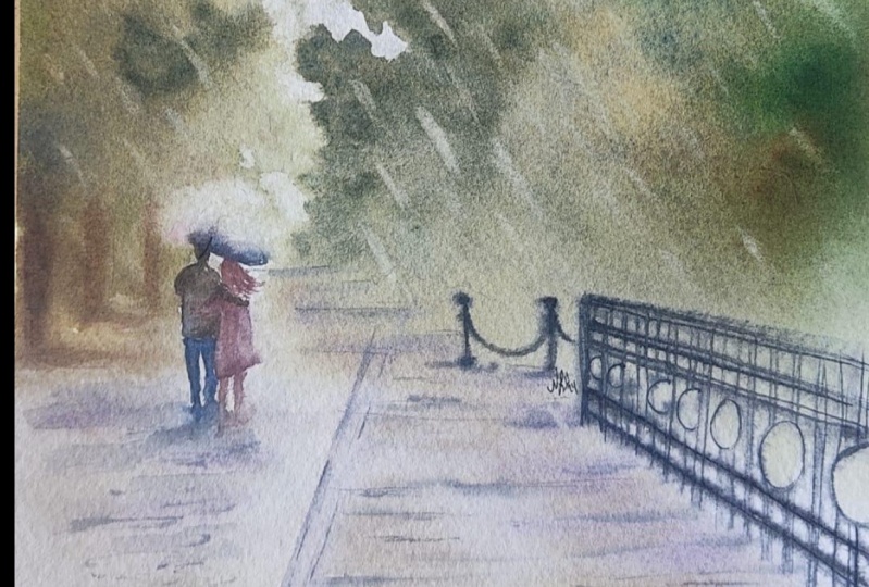
8. Painting figure and finishing the painting: We will not wait
till the paper is absolutely dry to
paint the figure. If the paper feels almost dry but still contains
a bit of moisture, the strokes will look outlined, but itsy-bitsy diffused
and I love it a lot. It gives such an
artistic magical touch, then when the lines and objects
are perfectly outlined. To discover tips and tricks
follow my other class, Watercolor Robin
birds, mastering painting skills from
easy to advanced. Achieving harmony in
watercolor painting is about creating a sense of visual balance and
unity in your work. Use a limited color palette of colors that
compliment each other. This will help create a cohesive and
harmonious color scheme. Pay attention to the values of your colors and use
a range of light, medium and dark tones to create depth and dimension
in your painting. Use contrasting values and colors to create interests
and focal points, but make sure they're balanced
and not overwhelming. The compositional techniques
such as the rule of thirds, leading lines and
symmetry will help to create the balance and
harmony in your artwork. Use consistent
brushstrokes and vary the size and shape of your brush to
create texture and interests. But make sure they're not
too distracting or chaotic. Remember that achieving harmony takes time and practice. So be patient and keep experimenting with
different techniques and styles until you find your own unique voice and approach to watercolor painting. By crumpling up a
tissue and using it to dab and sponge the surface
of the watercolor painting you can create a variety of textures from rough and jagged, too soft and subtle. Add more rain lines if you'd like it and finish the painting. In this last step, I evaluate the painting, adding some darker details for more contrast and
shape definition. The wet-on-dry in
dry brush techniques are fine for the details. There are several
techniques that can be used to add details to a dry watercolor painting. Use a small fine tip brush to add
details to your artwork. This will allow you to
add precise lines and details without smudging or
blending the existing paint. Splattering can also add interesting texture and
depth to your painting. Deep a stiff brush into
some paint and then tap it over your painting to create
small splatters of color. You can mix a small
amount of paint with water to create a
very thin wash. These glazing technique is
nice to apply over the areas of your painting to add subtle
layers of color and depth. I add some tiny bright strokes for the rain with
a white gel pen. You can also use a
fine acrylic marker. The other technique that I
explained in detail in my Robin Birds class is using a knife to scratch on the paper. The texture that
appears is very unique. I use it here to give the ground a random feeling of
glittering from the rain. Thank you for joining me today! I hope you have discovered and learn something more
about watercolor. Feel free to experiment. And if you have some struggles, you can always post your
question in a discussion or message me on Instagram
or email for a quick reply. I'm looking forward to your
artworks! See you soon!
 Evgenia Cordie, Professional Watercolor Artist, Belgium