Transcripts
1. Introduction: Quite CDS on one of
the most beautiful, colorful, bright, as well as the orange flowers in
the Christmas season. So many of us think that the red leaves of the
CDS are the florals. But all the yellow box in
the middle of the points, the ideas are there. Whereas the red, the
green, or the news. Hi guys, I am
pretty good enough. They're not as instructor or
mothers Skillshare teacher. I'm Brian donor
or five imbeciles by the manufacturer,
handmade sketchbook. I guess big banks
kind much more. Many of you already know me, but to the people who are
joining me for the first time, I go by Vinny watercolor
illustration, not later on Instagram, most of my artwork
displayed over there. Today, we, we're going to do a watercolor painting
of poinsettia, is going to be typing. And you're going to have
tons of every lesson, whether it be drawing
or painting in layers have been explained
in terms of sliders, which you can always refer back once you are done
with the painting, I have uploaded them in
the resources section. Along with the sliders, there are few examples
which we have covered. It really is interesting
and you can practically understand each concept
much more detail with emphasis on light, shadows and negative painting. One city us, bring
back a lot of joy, energy, laugh, happiness
in this Christmas season. That's one of the reasons you can give them to me on
your and your wants. This class is more suitable for intermediate to
advanced level lattice. But if you are just starting
out and want to gain some knowledge
about heavy washes and fundamentals of watercolors. This has a lot to offer. So let's think when CPS and
start with our first lesson.
2. Class Overview: Let me give you a quick review of the glass and how we
are going to progress. The first is all the
videos array at a time. So you can paint along with me. After every layer is complete, you can drop the class and
get back to it later on, wherever you get some time. Each of the videos
are short span so that you can draw paint. Hi, do your final detailing. Do watch the class on a
bigger screen because status not only going to help you
to see that I have done, but it also helps you through step-by-step to
understand how we are going about through the
entire part of the course. It starts with how and what you need in
terms of the material. Whether it be brushes,
paints, watercolor, anything that you need, how to go about the
drawing process. There are three basic drawing
process that you have. Freehand drawing, grid drawing, and tracing the sketch method. Each one of them is
explained in detail. Once that is done, we will go over the initial
washes of the background. That is a flat wash, gradient wash and a variegated
wash. Once these are done, we are going to understand the negative painting in
detail with a few examples. After we finish all of this in terms of
the technique, you, we will start with the final painting on the techniques that
I have discussed. The forehead is actually segregated into
various sections. The drawing part,
which is the part one, covers a lot of these methods. And then we start with
the final sketching part. Similarly, the
background washes. We'll go with a2. A3 is about understanding of basic aspects status you're
layering and glazing. I'm part four moves on to one of the very important concepts
about negative painting, which you can observe over here. Not only we get to
enjoy and understand all these concepts
of our watercolors, but also have a beautiful
painting of points CTO, which goes with the
season of Christmas and New York Yankees U2 are enough
for the Christmas season. I want to find points CTS
meet you in the next lesson.
3. Materials Required: Cisco's a bit about although requirements that we have from
the materials perspective. Because starting out
with two jars of water, one is blue water and an adult
for washing our brushes. What are the kinds of brushes
that we made? For me? I have kept, these are the essential brushes and
others is always good to them. This is a one-inch Princeton
Neptune wash brush, not really needed for our paper. The paper size is 30
innervating centimeter. We will talk a bit more
in detail as we progress. Is quota size one,
size two brush, whichever you have,
the Vinci mop brush. And this one I have as a
Skoda size zero brush. I will need, of course, op-eds cell phone doing
the freehand line drawing. Though there are
other options too, which I have discussed
for growing. This is the scale. The scale is always great. We have just in case you
are cutting your people or anything else you want to measure like the grid method, etc, which you want to apply for your drawing and sketching. This can really help. I haven't eating,
so not this gating. So of course you can
have for other biases, It's great to have even on kneadable eraser like this one to take off all the
extracting them. And so I would
leave it up to you, which kind off an eraser. Let's discuss a bit about
colors from the green part. You can have olive green,
indigo, greenish yellow. For the rejects. I am going ahead
with my cadmium red. Quinacridone, gold, compostable, para any kind of yellow that's
available on your ballot. You frankly do not
mean only gambled, yellow or something that's
not there with you. It can be any Arlene, yellow or yellow that's
available, Indian yellow, etc. That's one of the reasons
I have not shown you any one single color
of yellow dots there. You can always keep this
scenario or yellow. I think that's this pastel,
like how you do it. Yes, you can have a tube
like this one for yourself. And see what we mean. The people's point of view.
I have told you the size, the size is 13,
indicating centimeter. I'm using a 300 GSM,
hundred percent cotton. One-fourth of the people. Now, this is very important
as such because we are going to have heavy wash.
Now for heavy washes, I do not prefer going
ahead with 185 GSM people because that might buckle or bed and Menon stick
to the surface. We have by our side about
which I will discuss the cost. This is the size that are if
this is the people that I prefer and the sizes to lean into 18 cm, as I have told you. This has got two sides. One is a bit more
grainy and another is Would you can
use both the sides irrespective of which one and which side is true fuse and beside you should not use
water equally possible. And this one in particular is my base where I would
be sticking my paper. It is an acrylic board. It's pretty easily available
anywhere in the market. Want to fly or by something like this,
that would be great. It actually helps the paper to stay wet for a longer
period of time. And that's really
important when you want going ahead with any
kind of heavy washes. I always prefer one single
kind or something like that, but I would really tell
you to get one partner's, your people might dry off. In the meantime, you paint that. I really don't want a
situation like that. Okay? Liquid masking, fluid. This is very important
for the middle part, where majorly then
are the flowers. So hence. So keep this handy. It is very, very small area, so you do not need to worry. Now is power of tissue. Digital is very, very important
for any kind of painting that tissue really
helped solve everywhere. And that's one of
the reasons I always always asked you guys
to keep that handy. You can have with kitchen towel, you can have known the towels, whatever is available
with you guys. Keep it handy for yourself. You want to pick up
the colors, etc. You'll find one of the CVA. We have discussed
everything that is needed. Let's now jump on
to our next lesson.
4. Poinsettia Part 1 Drawing: Let us first discuss freehand
line drawing with pencil. You can choose any
pencil of your choice. Just start. Try to
have an HB pencil. It could give you like
the graphite max. Watercolor is a
transparent medium, and therefore we should get very light rough bite marks so that it becomes really easy for us to have a clear
picture rather than having any kind of
provide marks beneath it. We start by using a pencil, drawing the middle part, and then going over with our free hand line
drawing for the leaves. You can either use
this method or co-head with the second
or the third method. So many of us have
this misconception of not using the tracing
method for our painting. But for me, it's more like understanding the
techniques of watercolor. Rather than think
much about tracing. In case you want a
bigger painting, just take a printout of the size that you choose
and have a better outcome. The scanned copy of the sketch is provided in
the resources section. You can go ahead and download
it for your reference. Trace. This with a permanent
marker on the backside, apply the pencil mark and go over it with a ballpoint pen. The ballpoint pen helps to get the darker graphite
masks which you need on top of the paper that you're using for the final painting. Finally, the last
one is grid drawing, which is majorly dividing your paper into
nine equal halves. Now this nine equal halves
really helps you to place your subject in the
place where you want. It is also willing to help you to understand the
golden rule of thirds, where you practically divide your paper into
nine equal halves. And then let your subject
line in the focal point, which are basically the
intersection of these lines, rather than placing it in
the middle of the paper. The focal point really helps any kind of a painter to have all the energy as
well as the attention into those areas where you
have added the subject. And it is really
great outcome for all the spectators
who are watching you painting or who
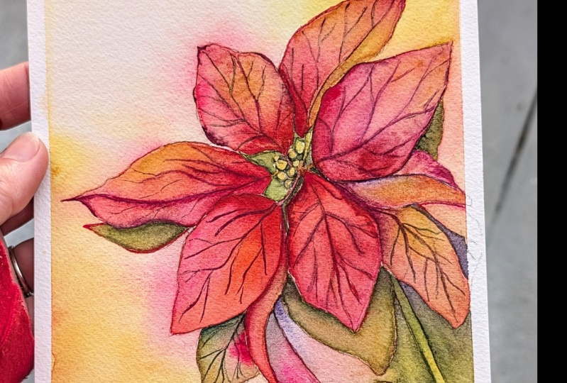
are really watch it. You're fine. Lockdown. Hi guys. I'm super excited to
teach you poinsettia, which is the Christmas plant. And we are going to do
all kinds of techniques. And this one starting
with a background wash, which is like a heavy wash.
And then going on well with some of our most important
techniques like glazing, negative painting,
background washes, darkening of various layers,
learning and whatnot. So let's jump one with our first part which is
measured either drawing, I'm going ahead and drawing
a few smaller circles, which is basically
the middle part of the poinsettia plant. Once I'm done with this, I would extend towards
the left, right, and all the parts for
adding the lease, as well as the red filter. We need to extend it on all sides now as we had already done with
the melody part, where half made about
eight to nine small, small circular kind
of structures. And these are basically for showing the middle
part has happened. Only. Once this part is done, we will go ahead and start adding leaf kind
of structures now, once it is something which has leafy structure
on all the sides. So just try to add
it in a way that the whole of the plant is basically pleased
towards the ripe. I do not like to place my
subject just in the metal hand. Some, I like to do it this way. According to various people
and various artists, they like to actually have structures in different manners. So I would leave that decision
up to you if you are more happy or placing it towards
the center of the school, had an Android,
according to mean, just adding some bigger
leaves would be great. Once you are done with
these bigger leaves, a very simple structure
of going ahead with this. Part of the point here
is to add layers. Now, letting would be
structural, in this case, the Viewers of the leaves
which are towards the bottom, they are more on the green part, whereas what comes towards the top is more on
their head side. That's the main structure
which we are going to follow. And I guess that would be
pretty easy for all of you. Now, since this is heavy wash, I'm going to go ahead
with variegated wash. It's important to always have an acrylic
sheet by your side. Acrylic sheet would really
help you to stick with the particular people with that and even allow paper to remain wet for a
longer period of time, as we have done for all
the earlier illustrations. Yeah, This is the most complicated out of
them all because we are going to actually learn a lot more like
negative painting. Or if you say lifting
up the colors, all of it is done in this particular part
of the illustration. Hence, it is Last one. Okay, I guess I have spoken enough about
what we're going to do, how you're going to do what
you're going to attempt hand. Now, I am pretty sure
you are all geared up to start painting this part. Let's just finish off
the sketching first. Another aspect which I can tell you about the
sketching is just Rho. So go and then just
try to add these leaps that would be more
easier for you to do it. Few of the people even like
to do poinsettia by layering. I think there are various
ways of doing it. But this is one of the more
prettier race did the word. So let's keep on working
through the sketch. I will keep layering on some word lease
wherever necessary, and then draw the stem of
this point, CTL, land. Once I am done with the stem
of this poinsettia plant, then we can start by
applying or clean layer of wash on the top as well
as on the backside. Backside is most important
because we need to go head and stick it to
the acrylic board.
5. Poinsettia Part 2 Background Wash: Most of you will know about
these basic three washes, but let's go through each
one of them a bit in detail. The first is the flat wash, which is basically
equal pigment spread. Similar value of pigments
on the whole paper. This is one of the
easiest washers if you were doing on a
smaller size people. But in case you are going
ahead with a large size paper, you have to have a
bowl of color and then start applying the
color on the people vote. This is one of the basic
starting points and you won't have come across it
at some point or the other. But it's important to
always know how to have concrete wash that as the
first and foremost flat watch. The next is the
gradient wash. You can do it with one single color, which is moving from darker and lighter tonal values from top to bottom of the paper. This can be done two ways. What flat wash as well
as gradient wash, wet on wet as well
as wet on dry. Next comes the variegated wash. Applying various pigments in different tonal values
across the people. Again, it can be done both ways. That is wet on wet
and wet on dry, but might be preferred
method to go ahead with is the wet on wet method. We will be using this method for our initial background
wash. And hopefully you can find It's important as
well as you can really see a lot of usage even in
your future projects. Once we have applied the
water on both the sides, it's time to start with
a variegated wash. Variegated wash is something
that you already know and I'm pretty sure invited
you guys might have done earlier or you might
not be willing to say name. As such, the variegated wash, but you all have used to
during our watercolor journey, I would really tell you that this variegated wash is going to be very simple way we are going to use all the warm shades. I love to use warm
shades for my painting. Though many might
feel that there should be a balance of
cool and warm black. I just feel for the bank run when you add these warm sheets, it just adds so much
more bling, warmth, and beauty to your painting that you'll see is they can't
take your eyes away from it. I'm taking off all
the extra water that I feel is there
on top of the paper. What happens is that
you will really find the background to be pretty
common in these cases, which is absolutely fine. We're not here to just take away or cauliflower effect
or something like that. It's cool to have those quality Florida effect for these kinds of paintings. Going with my most
beautiful color, that is Indian yellow. I have been actually using the scholar or the
permanent yellow light. Both of these colors are
almost similar and they both actually gives such
a fantastic combination. You will see that I've
started applying to clean. Now this is basically the
lighter value of cream or more of the greenish-yellow
that you usually observe? I would be going ahead with some of my red and applying it towards the top
area of the leaves, as well as I will leave
some white spaces. As you observe. This whole painting is not about to fill up all the spaces. And it's more about it. Go ahead and add colors and
few and leave a few spaces. That's more about
variegated wash. We're not going ahead with
a single color, flat wash or agreed hated wash, which is more about two colors. So you create a
gradient out of it, or one color, you create
a gradient out of it. Variegated wash goes all way. You can have more than one
color to color, three color, whatever way you want to achieve your particular job
background, you can do it at. This particular
thing I have been using in many of my colleagues,
your paintings too. They have retreat or not so beautiful throughout.
Not due date. Though, it took
me a long time to understand how I
really want to apply this variegated wash. You will even seen me
actually pulling off some of the veins
from the middle of the part of the
poinsettia plant. This is majorly to just take away the red spot as these
are more on the yellow side. And hence, I am not applying
some of the masking fluid. Now, if you are going
ahead with wet on wet, what happens is that for shade, which comes once your
paper is dry off, is way more lighter
than what you observe when you are
doing a wet on dry. So be very sure
whenever you are going ahead with a wet on wet
technique, you are. Colors would be lighter. And it's time to go with one
of the fantastic sheets, one of the most pretty shades
and sorting doctors shades for this season. To celebrate this season
it has to be red. I am going ahead with some of my thread and
the quinacridone. This is one most beautiful shape that I've come across
with Daniel Smith. It is a combination of
red and very light base. I would say it's one of the most pretty colors
that are being used. Smith has ever come up with. You already know what are the two sheets which
has been used? Jeannette, who go there
is only one single shade. But yeah, it looks like
it has two shades in it. Oops, I dropped my
brush right now. It's absolutely fine. Just pick up the color. By the way, the shade
is PR 209 or so. In case you want to go ahead
with any shade of this, please go ahead and just
turn purchase that. I think this is one of
the best sheets for florals for any kind of laurels that you want to paint and
paint are on the warm side.
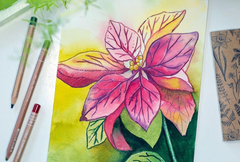
6. Poinsettia Part 3 Layering & Glazing: Here we are going to learn
about the major washes. The passcode is applying
a light wash of pigments on top of the entire paper
or on the selected space. As you can observe what
I'm doing in my video. The second is all about glazing. Now, before we go ahead
with the glazing lectures, jump on to the learning. Why, as we have already
applied our first layer, It's important to
understand a bit about layering more in detail. Planning is the first step
and this is practically, I would say the
beginning or you can say the foundation of any kind of painting that you want to do. In case you are letting, you can say that you
are adding depth. As you can see in the video, we are slowly progressing
and we are coming one after another layer as we move from the left
towards the right. Whereas leasing is
a bit different from letting in
terms of it's also about applying another layer on top of the first year
that you have attic, either to create the
depth or the luminosity depending upon what you are trying to paint
in terms of the area. But for me, glazing is kind of an uneven wash.
Come back to the larynx, which is more often even wash. Whether you do
layering or glazing. Usually what I've seen is
there are two to three washes, which is quite enough for any kind of a learning exercise. In case you are going into more realistic
painting where you are creating shadows
as well as depth. You might need four to six
major washes for layering. Though this is not a
mandatory approach. You can have even
eight to ten washers depending on the kind
of paper you are using. But 300 GSM arches, 100% cotton paper
can easily take about six to seven washers
without any difficulty. In case you are creating a huge painting where you
want to have more washes, please go ahead and switch
to a thicker paper. Either it be 620 GSM or full 40 GSM depending
on what you need. One important aspect of even or gazing are going ahead with
the second year where when you are painting is to not have seen Carlo kind of similar
intensity in all the places. Now, similar intensity, I mean, you need to change the values. If you are going ahead
with one single color, I have chosen two
colors in this case, one is my quinacridone coral, and another one is red. But both of them
are pretty dark. And hence, when you
are working with the shades to make sure that you do not forget to add water. We want the places
I drew clean up, then pick up my brush at the beta sheets or just go
ahead with the same brush. Washing and adding
water on the sides. This is a very important
aspect of painting. Florals or row with the
kind of leaves point CTO, or anything that you paint. It's important to
understand that we are not going ahead with the oldish similar
shades and flat washes. We are always going
to change it and you're always going ahead
with eradicated cautious, even if it would be crazy. So that's how it is going to be. And let's go ahead with
the top part of leaves. This part is majorly
the red side, and you will observe
that now I'm going ahead with some of my Compose Opera. Now composer brands again, one of my favorite
colors that I have been using for various
of these paintings. It has PB 19, W6, NPR one, W2. Yes, something that I have
discovered very simply. It's a beautiful shade of opera, pink and you can really use it for many
of your paintings. I'm adding some amount
of yellow and then, and just extending it. This is simple, easy, and very, very interesting. So let's continue with it. Something that I have
learnt in this painting is not to apply a lot of
colors where it is white. Just going ahead with very, very light shade and
letting it blend with the background is again, a very good idea of how we should proceed
with our paintings. Okay, it's time to switch on
to our thinnest brush and just blend it with some indigo and add the
darkest value on the sides, as well as you can draw
some of the parts. Even with this, the
various shades that I get, I think is one of the most interesting
aspects of painting. This point cdr, you can
seriously create our various ID of colors only by mixing some
video fit here and there. And that's it. I am not using pilot in particular
for this painting. I am going ahead
with only indigo to create darker values
which I need. So one thing that you need
to understand, vigorous, this particular
technique will only pull up your paper
is wet enough. And secondly, we are not
working on answers and battles, or else the colors move from one particular battle to
another particular battle. And really we do not want that, whether you call it a bedroom
leaf, whatever it is. But we are not going
to allow the window, the panels from one to another. This is something that is very, very important when
you weren't going ahead with our painting. Either at the floral sleeves, anything which is more precise, and we really want
to add those layers and it's important
to let it dry. And then we go ahead with
the next TO, particularly. This is a one-step
ahead of glazing. I would say we are
going ahead with another layer on top
of the second year, but we have added, it really helps us to define that depth that
we need in the painting. As well as I am not going to add this color
towards the top area. Heap and blending brush handy. And we are going to just
add some of the wins into the fee part or
the floral part of it. It's going to be simple, yet very, very pretty. I am always, always so happy
to do these kinds of simple, yet quick and easy techniques
which can really add value and more expression
to your painting. Now, expression is
something that always lies in the eyes of the
spectator really see. So I have always have to
look at your painting. So changing your style, just adding a bit more, I would say flavor to
your painting would really add on that
aspect for yourself. Okay, going ahead
with some more of our darker values are on the left side as well
as on the right side. Once this part is done. And you can see that
most of the parts of your red area is dried off. Just go ahead and start adding the colors on the
adjacent leaves. Now, over here, as we laid it down and go towards
the bottom area, it's important to start adding a bit of green
here and there. I'm going ahead with the
greenish yellow for now. I will use it for this part of my leaf and then go
ahead with the top part where I just adding some of my pinks and then just blending it
with the background. The work is so much
reduce now and yet it looks so effective and so interesting that I am just filled with joy in my
heart as well as in my eyes. Something that I'm always, I'm always proud of is teach
you various techniques and the various ways in
which you can reduce your work yet have a
very beautiful outcome. This is not a big nose or
an absolute beginner spot. I would always say that, yes, it's great to have an initial learning
before you go ahead with this particular
class are together, but you can always
give it a try. It's a bit more advanced. I would not deny it, but if you have attempted
all the audio paintings, I think it would be easier for you even to go ahead with this. I'm to go along the sides
and just highlighted a bit, add some color. And that's it. Not going to touch
each and every part to make it more differentiated? I am going to just add three drops of colors
here and there and define the boundary of the
particular beautiful leaf and fluoro of the
poinsettia plant. Minimum work is always, I think it gives you
the maximum outcome. And towards the top where
you have more of whites, It's great to do
minimum work pictures, even by doing that
minimum value, you can get a great outcome. But this particular path
might not work when you are going to watch the bottom
part of the point C DR. Plan. That's one thing which
I want you guys to understand it when
there is a light side, which you want to show
it, minimum is maximum, whereas when you are on the darker side or
towards the shadow, but you have to go ahead and
apply the darker values, as well as the added ward
wherever it is necessary.
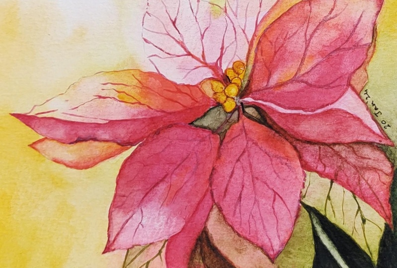
7. Poinsettia Part 4 Shadow Leaves: There are majorly
three rules which I have followed for
negative painting. First of all, let's just understand what is
negative painting. Negative painting is when
you are actually adding darker values in and around the subject rather than
painting within the subject. Now, the kind of
negative painting that can be done fosters
a flat wash lattice. You have a particular
object or subject like a circle or
any kind of leave, any kind of structure,
whatever is there, you go in and around it
and give it a flat wash. That is going to be
one negative painting. The second one, which I use the most is the inconsistent wash. This is usually
one single color, but in various
values in and around the subject or create the
focus on the subject. Which means that you are
changing the values over the wet place here and there so that you get are
defined subject. But in the various values of the background
which you want, it is very much used in any kind of a loose
floral painting. Oral status, even
used in any kind of floral painting where you have
defined shapes and sizes. Anywhere you will
find this use of. It is really on a high
note that you use it. The next one is blending. Now I am really into the spot. Now applying the
inconsistent wash can then blending it with the background with the help of clear water. It is majorly to
create various values. It helps to actually write another layer where you create the depth for the bottom
part of the point CTOs, as you will observe when we
progress in this painting. As well as it helps
you to even add or change the values
wherever you think you did not add the correct
color or it is lighter. In the second goal, you
want to add a darker shade. It helps you to add that
with the help of a wash. It's another kind
of variegated wash, but you are not painting
within the subject. You are painting
outside those objects. Hence, this is most used method that I have for my
negative painting. You can absorb on
the right-hand side, we did lead net worth only TO water while we were working
on the negative painting. Over time. What I have
understood through my watercolor journey is it's not an important
aspect to apply. Flat wash. What's important
is create that atmosphere, to create that depth, to create that expression. Which is really a way
to better painting and which really
gives a weight and a better understanding
of watercolors. Wherever you will see that
I have left some white. I'm trying to keep
that light intact. And wherever you
are observing me, hiding the darker values, it's mostly towards the bottom where majorly there are shadows. This is something that you
have to understand and always keep it in your
mind while you are adding your colors,
light and shadow. Expressing it to
your watercolors is a very important aspect and it will not come on the first day. Or there are various
ways to also show it. It is not going to work just through like the
spark in the first go. It takes a while to understand. And once you get
to understand it, it's important to
realize that yes, you can show it in various
ways to, as I have told you, sometimes leaving
the whites is great and sometimes even
blending your colors, but the white is great. Another way of working
through it as false, going ahead with this point c, d up part of the plant, and then going with
the background. As I say, there are
various ways to do it, but since we are working with the heavy washes in
this particular case. So going ahead with the
background wash was the first and foremost
important aspect that we did apply
to our painting. I need to tell you
one thing that this particular
leaf is to instead, which means that we
see the front as well as the back part
of this leaf. Hence. I need to alter both the shapes. One of the pot I'm
applying in red and coral, whereas the other part or the other side of the leaf I
would be applying in green. This is something that
you can use even in your future paintings if you weren't doing any
kind of florals. And it will really, really help you
with projects that has different kinds
of light and shadow. Oral steroids are
twisted leaves. There are various phases of the fat you need to
show so all that it can be used or pretty efficiently going with some green
and then blending it. Now the screen is majorly the
olive green that I'm using. I am using it to width read
as well as the boardroom. I would leave that
decision up to you which color you want to
go ahead and use it. But yes, these are the sheets that I love to use
and practically showing that tip of the shadow area is very
important in this case. I think that part is shown up
pretty clearly. Right now. Let's paint another part of the leaf towards the top area, again, in the darker value compared to what
we have applied. It would be more
on the green side compared to the red
that we have applied. It's a mix of red and
green to be more precise, so that we can see that
there's a differentiation. It's important we will
apply some darker value of green on the backside
of the leaf area. And you can see I'm using a very thin brush to go
ahead and apply this. Once I have applied it, I would even add some things on the other part of leaf area that is towards
the right and I don't, some of the darker vine use it. Again, all very thin brush I have taken
for doing this part. So go ahead with a size zero
or size one brush maximum. You can also go ahead
with liner brushes, whatever is available with you. So if I see so many of us
do paint from life span, I would say that you'll
just see them pain. That's the best way
to go about it. But for flow rules, some, I would say flowers, some, he's going to die,
they are going to work. And hence, having good reference
photograph always helps. In this case, good
preference for grabs Kohn, like those assets, which you can always refer back
to and from them, flowers and every season
to have an impact on the plurals and
the pleural sac you paint like during
the winter season, we see in India
more of roses, etc. Whereas when we go
on the summer side, we see other kinds
of florals saw coming up heads as to whether changes theta different kinds
of florals and hence them might be an intent even in
summers to paint roses, which we see in the window. And how do we do it? We do it when we capture
it with photographs. I would always tell you to capture these photographs
at various stages. When helpful, if you have a
plant at your house which is flowering maybe
arose points into any kind of flowers or
plan that you have. Do capture various photos of. Wet violet is growing
while it as blossoming. That can really help you to understand not only about
that particular floral, when light falls on the petal, how color works, and how
the shadows work when the various kind of firm light and shadow
effect that follows. So many of the people initially, when we started off,
don't mean yes, you have to apply the darker
values for the shadows, but what are the values? How do I get to
understand those values? Do I applied or darker color like black,
indigo paint screen? No. That's not the case. Always. Never ever tried to apply the black shade for the shadows. Do try to apply to cooler
shade for the shadows, along with a drop-off
some point sheet.
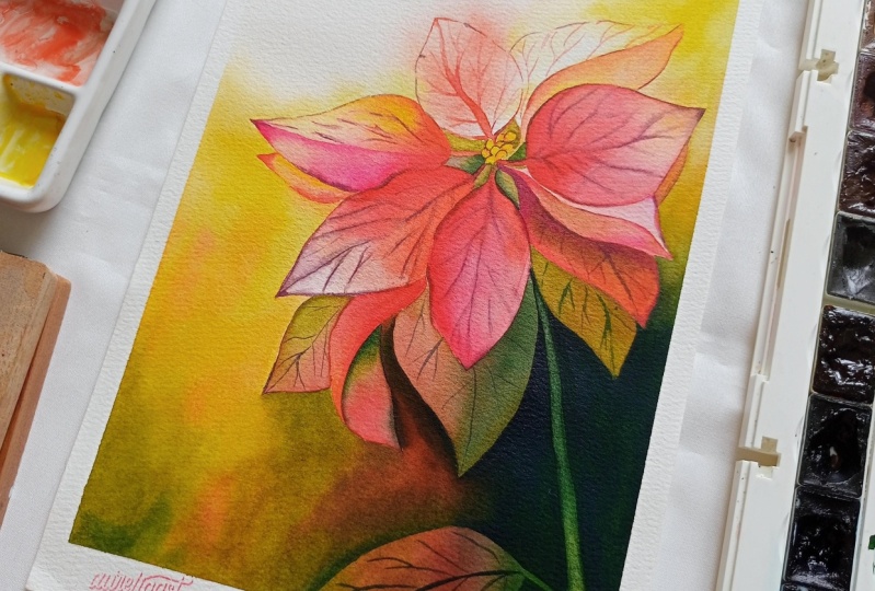
8. Poinsettia Part 5 Final Details: I really don't have
much of sliders, pointers, videos to
explain any photo. The techniques we will be using the same techniques that
we have known every day, which is glazing, layering, negative painting, et cetera. For completing this
part, Let's start now. We have the law
applied. Use colors. So cream, it is greenish, yellow or the green. And when Nike queen. But how, and what's the value that you
should use as something that needs to be
always directed. And I guess this is one of the most important
aspects which I should discuss with you while you paint the leaves to make
sure that you go ahead with the light value of the olive green or the greenish
yellow that you are using. Whereas when you are going
ahead with this part of the painting where
you have to go ahead and add the shadows. It's mostly your olive
green and the Nike Green. I am truly going ahead and applying the
colors in real time. And once you have a look at it, you can understand that color
mixing is happening with the similar kind of
sheets that we have used for the plant area. Now, this is something
that I have learned. Never go ahead and use
the darker shades. Use the same sheets that you
have used for the plant, even for the shadows, just change the value
of it and use it. This is something I think
comes with aligning. As you paint more and more the amount that
you should apply, the lighter values,
the darker values. You should use water
and just blend it. I'm using some greenish
yellow now and then I would use some yellow to blend it with the
background absolutely. Orders. You can also go ahead with only simple
water to blend it. I am practically using the
glazing technique right now to go ahead with another
layer for our background. Let me tell you a bit
more about pleasing. Leasing is a technique that is used to either
warm up or cool down various areas of the
painting whenever it is needed. And it is mostly
transparent washes. Now these transparent
washes on majorly, either with the warm colors, cool colors as I've told
you, initially be happier. So cool colors for
the shadow area. And now we're using the
warm colors for dog, ADL where we have more of light. When we went ahead with the glazing technique
for the leaf area, it was more to understand
the shapes and sizes. Whereas when we are going ahead with it right now
for our background, it is more to define the
shadows and the darker areas, which is actually
completes our painting. Hence, Some keep adding
some more of our own lives. And once we are done with it, go ahead with some
yellow and blend it. Yeah, that's what we have
done even while we were going from the left
side towards the top. That's what we're going to do. Even on the right side
where we could do it. Always keep two which
are support our handy. Though you'll see me typing it more in the garden char read, I'm washing the brushes, but another jar would
really help you improve, wash the brush and clean water which was
needed at that stage. We're going ahead with one more layer of
darker value of green. If you see the other
layer has already dried off and now I'm going ahead
with the darkest value. As I feel I was not satisfied with what
we did come up with. Adding some shadows
was important. I'm going to do that. Laurel for I would
say it's in progress. So every painting that you do doesn't come with
any rules as such. As you progress, you do
change a lot of rules, etc, that you have made. As I am now, adding one more leaf
towards the bottom. And you can see, I did
draw it right now compared to what we had in
our initial been. Yeah, that's what it is to continuously adapt change
as part the dynamics of the watercolor paint
in watercolor painting into one of the most
dynamic mediums that I have come across. Ignored only gives us
a lot of surprises, but it also teaches us how to change
ourselves depending on the needs and requirements
of that particular painting. The only important
aspect of keeping now two jars handy
with loss office. Anytime you need clean water, like I will need. Now, I can go ahead and just blend it
with the background. I really do not
need to think again about getting that fresh
source of water or apply to all water
which is really not in good condition as we
wash our brushes on it. I'm going ahead with my
darkest value of the green. And this is majorly
my Venn Dicey green, which we are going ahead
with, the Van ****. A green looks very pretty. In case you have this green, you can always go ahead
and apply some glue or indigo into your
old queen and get a color that is
close to this one. I guess. That's it, just that
I'm not very happy with the stem with the negative
painting which we did. So there will be a bit of change that I'm
going to do in terms of lifting up of the colors
from this particular space. And we'll use a flat brush exactly the way you saw
me doing it right now, and use it in an absolute
perpendicular manner. And now it happens because of this absolute
perpendicular manners that you can pull up
the paints very easily, take it off on the tissue
and again repeated the brush right now is in our semi
wet clinical condition. You can say it doesn't
have a lot of water but it's wet enough to
pull up the paints. That's what is most important. Just one aspect. If you go towards the middle, you will see that there is
load of lightest value. Or the first quote, Woolf colors that pitted apply. We might have to go over it
with some darker values. But before we do that, it's important to add the yellow is yeah,
for the real part, we have to apply the
yellows and they will make the whole painting
stand out altogether. I can guarantee on that. We did add some
subgroups in the middle, not the point CTO plot. The important aspect of it is
either you can leave it at this stage where
it looks more like a flat wash or add
some depth into it. For me, adding some depth really adds flavor to the
painting which I want. If you observe closely, I'm using a size zero brush
to add the step gets wet. Beriberi simple
process, only a very light color that you need. And if you see closely, not that I have added
it in a lot of amount, but a bit of it here and
there would help you to get that that that
UT which you need. Finally, I'm cutting the side. So many of you asked me, how do I get this
kind of postcard, the shape and just
cutting the sides here. It's very helpful and it makes the painting look
so much more pupil. When I see it, I am myself Stan, do please. So short that it came out so well known that you have to have a very beautiful
painting always, but sometimes it's an
add-on, unmute yourself. Surprised with QP and the softness as plus the hard
edges that we get in it. I initially only told you
that two of the paths have to be darker compared to few of
the parts which can be like. Now, this is something that
I have observed over time. We really need some
darker values in some of the places or else it will not yell up with the
background that we have added. Putting off the paints
wherever it is necessary, you can use a size one, size zero brush for doing this. Assigns to size zero
brush is also fine. See, it all depends upon the size of the
paper that you use. This is something I have always, always toward each one of you. Go with those sides of the paper that you
want to work on with. Forming, working with a file size paper
comes really handy. And I have been working
with a five sides people. I don't know for how long date, whether it be painting heavy washes like
these or whether it be some landscapes or any kind of sketching painting
whatsoever. I do. I am so happy with using
my if I size people. Okay. I guess that looks fantastic now and we have to just finish
it off in a few places. Have a finding look
at the painting because this painting
doesn't meet the boots. So that's the best part
about the painting. You can go as you want. There are some patrons
in bottom area. But when you are doing
these kinds of paintings, it is bound to happen. We cannot control the
water in these cases. If you are going
ahead with deep, then it's easier
to control where sometimes even if
you clean the sides. Yeah. What it does
grandma work as we even have water on the
backside of the people? Overall, it is competent. Want the copy in terms of judging how to apply that light? That's absolutely okay. You will understand
more of a dime. I guess. I am super happy, excited with the final outcome. Let's just finish it off, let it dry and have
a family look.
9. Conclusion: I hope you have enjoyed
painting along with me. I am painting for each one of the optimal your projects
in the project gallery. I would love to have a look at each one of them can
give valuable feedback. Usually I conclude one or
two tips along with it, which can help you in your
future projects and what a college in case you have like
anything about this class. Do we pass? It is a great source of
motivation for any teacher, mentor from whom you
have taken the plus. It really helps me to not only understand what are the
highest total video, but it also helps
me to understand what I can improve in
the next few lessons. Can't wait to see you
all in the next class. So good, but half of fantastic Christmas
and Happy New Year.
 Dhritikana Nath, Watercolor Artist and Instructor