Transcripts
1. All Hail Snail Mail!: You remember the first
piece of mail you got not addressed
to your parents, not adjust your
household but to you. How cool is that? I loved that I
felt like that was my initiation into
the adult world. And part of it was that
it was handwritten. I thought that I grew out of
loving male as I got older, but I think that it's just really boring male that
started coming to me. And it's all typed. So impersonal and it
just doesn't let you up. My name is Brittany
Warner Smith. I also go by art
by BW Smith or by Britney W. Smith smithereens
get lots of names. I have been
hand-lettering male and sending it out
professionally since 2009. But really it's been a
lifelong thing for me. I have loved sending letters, a little folded up notes
with bubble letter script, all kinds of stuff. Ever since I was a kid. Do I honestly believe that snail mail could make the
world a cooler place. Yeah, I do. Clearly do look at my face as I am dropping
off this envelope. What is the face of pure joy? My friend and I'm not
even the recipient. Grab some supplies,
pencil that you have. It could be a mini golf
pencil for all I care. It can be crayons. You have kids around. I'm sure they have lots of
fun goodies to play with. But if you're a professional,
grab the paintbrush, grab whatever you have, whatever skill level you have. This is not at all an
exclusive type of art. This is for everyone. Anyone can make this. I'm going to teach you my ways, but I want you to take it
and run with it and meet me back here with your goodies
and your enthusiasm. And we're going to start
hand-lettering envelopes
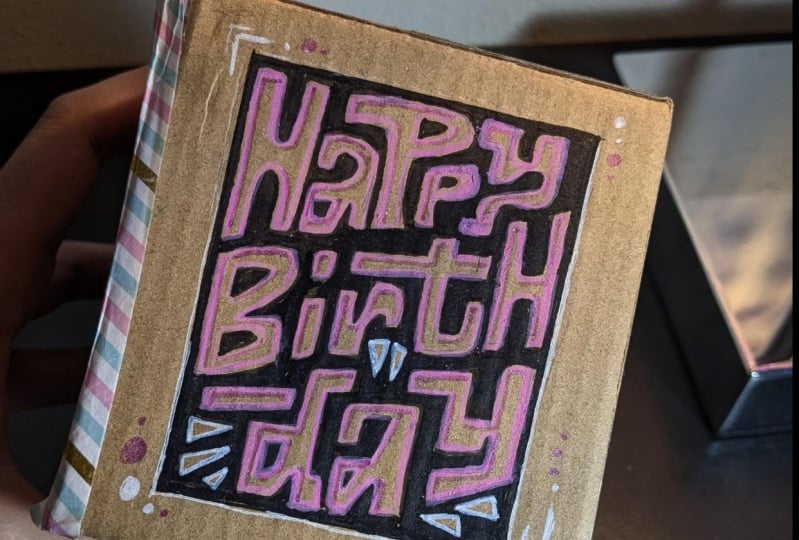
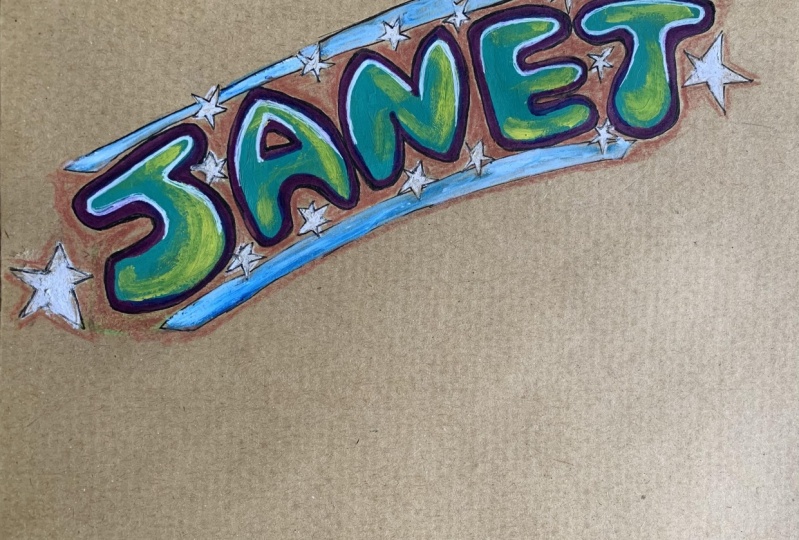
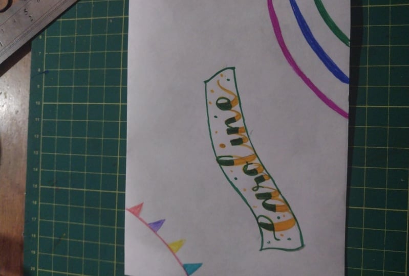
2. Project: Making Magical Mail: For your project in this class, I want you to make
some snail mail of your own and
send it to someone. So first step,
choose someone who deserves some happy
meal in their mailbox. Add some lettering to an
envelope using your new skills, take a photo of the envelope before sending it
out into the world. Make sure you obscure any
addresses just because you never know who's creeping
around the interwebs, upload this masterpiece
to the project gallery. Bonus points. If you share the
recipients reaction to your snail mail
once they receive it, mega bonus points if you
share it on social media. So let me see it. I want to share
it and I want to, I don't want to
catch some of those good vibes you're spreading. Speaking of spreading
good vibes, check out the project gallery, look at what everybody
else is creating and how many different
ways of doing this. There really are infinite. You can really individualize this any way you want
to. And I hope you do. I hope you take this and turn
it into a regular practice. Comment on each other's pieces. I'll be in there commenting on your pieces to give
each other feedback. Feedback is another way
to connect through this, connect with people who like
doing what you like to do. Alright, now that
you've got your head wrapped around your mission, let's get into it.
3. Before We Begin: Since this is an art
form that's completely unexpected and most likely free, I'm sure you can upsell this. I know that you can. I have. But really, I do it just on the house a lot just
to show some gratitude. The pressure is so low and
the impact is so high. There's no, I ordered script lettering and you
gave me bubble letters. I've never had anybody say I hated the way
you lettered my name. I hated it. And I am never not surprised by the
response that I get. It makes me feel like I am impacting people in a
way that is just pure. Like, I know it sounds corny, but it really is just putting that ripple effect of
positivity out into the world. It's just paying it forward
because if somebody is having a bad day
and then they go out to their mailbox and
they get this letter, that's enough to pull
them out of a pit, and then that's going to impact every person that they come
into contact with the rest of their day because
if you're carrying around positivity
rather than negativity, that's what you're going
to give out to people. And I mean, I'm
not going to lie. I am a little bit of a hippie, but I think that we all could do worse than being a
little bit of a hippie. So embrace it. If you're somebody who will
tend to overthink this and you feel like you're not a creative person or
an imaginative person, one way to get around that is to collect
reference material. So find something that inspires you, whether it's the color, the shapes of the letters, anything about something
that inspires you. If you see a logo that you like, don't copy it, but find out what you like
about that specific thing. And copy that, copy the
thing, not the piece. So if you like a certain logo and you're
like, I really that G. Oh, that G is gorgeous, then you probably like something specific
about that G. If it is a certain swirl or curve or squash,
whatever it may be. Try to include that
in your own piece. Doesn't have to be in a
G. It could be an L in a. It could be in anything.
Find out what you like and apply it
to your own piece. As far as style goes,
Sky's the limit. There are really so
many different styles and subsets within those styles. We could totally nerd out
on this and trust me, I'm surrounded by books that
help me nerd out on this. That's not what you're
about right here. Unless the way that you want to practice
this is you're like, I really want to learn how to
do a reverse contrast lab, S type of field. Okay, do that. Practice that. But really, it's not
about that at all. You can do so many
different things and just by changing one
little thing about it, it changes the category. So don't worry
about the category. Worry about making
a cohesive piece. I love inspiration. And I want to have
the ability to not realize that
I'm being inspired. I've designed my studio in such a way that I'm
just energized by it. I love when I'm looking at
art from tons of artists from all over the world,
my vintage pieces. I have different types of
art all over the place. And that helps me. That
helps me because I'm not consciously seeking out the inspiration
and the reference. It's just in me
on a daily basis. I'm looking at disco
balls and beer labels. I'm not even a drinker. I just saw these bottles, thought that they
were beautiful. K somebody who loves
to drink beer, so they were happy to take on the task of the drinking for me, and I happily took
on the task of keeping the empty
bottles. Be inspired. Be inspired by the things around you, whether it's nature, I have tons of plants
and bo plants around me, as you've seen, Toys from
my youth, books, galore. Try to cultivate that
so that it's just happening naturally
for you at all times, but also do it consciously. Have it be something
running in the background, and then also something
that you tap into when you're ready to find a piece
that inspires you directly. Know what you're doing when you're collecting
this reference, know what you're inspired by, what you're enjoying
out of the piece, color palette, shape,
style, anything like that. Be really mindful of what it is that you're
getting from it. Really try to analyze it and
think about it critically. A lot of times with art, you don't stop to think why it's making you
feel a certain way and you're surrounded by art that you don't necessarily
even consider art. If you're walking into
a department store, you're surrounded and you don't really stop
to think about it. You might when you're
in an art museum or in a gallery, be like, Oh, yeah, I think the
artist intended this, but there is an artist behind Pretty much everything. The signs that you
see, t shirts, people are wearing shoes, plants, landscape
design, everything. People have chosen
to do something for a reason and know what you like and what you don't like and why you like
or don't like it. You have to really, really try to get in touch with yourself. You have to show your
work more or less. Instead of just knowing
that it's four, know that it is two plus two, and that is what got you there. You have to know that
in order to really tap into what it is that you like so that you can
make more of that. Now, a lot of people get
self conscious about their studio space or the
supplies that they're using. But I literally have been
an artist my entire life, and I have used nearly
everything as a studio. I am extremely privileged
to at this moment, have a studio that I
love. But I'm nomadic. So this is not going to
be my studio for long, and who knows what
storm will be? I have created as many pieces
in really uncomfortable, really, less than ideal studio
spaces as anybody else. I mean, way more uncomfortable, unplanned, not
their intended use spaces than actual
studio spaces. So Don't overthink it.
Don't overthink it. It doesn't matter if you
are in a very professional, like, well stocked studio. That's not most
people's reality, and it really isn't
necessary unless you're doing it professionally
and need those things. You can if you
really need a space, find one, go sit outside, go sit outside and all you have to do is have a
clipboard or a book, anything that is
just a flat surface. This can be on your
dining room table. This can be on your lap
as you're watching TV. This is just a doodle, more or less. Don't
overthink it. Don't overthink it.
Don't overthink it. It does not matter.
It does not matter. Just play. Let yourself go. So just have a flat surface and have any kind of the
fancy word to substrate, but just a piece of paper, something to draw on basically. I'm going to mostly show
you some of my favorites, what I do professionally. It's a rigid mailer.
I have these. I put my promotional sticker so people know where to
find my shop and my social media handles to let people know that this is
something that's special. Because, as I said, it is
touching people along the way. It's not just you
and the recipient. It's every mail carrier. It's every person in line. It's their neighbors if they get so lucky to see their mail. And it's just a way to
leave people back to you. So do that if it's
your business. If it's not your
business and it's just if it's not your business. If it's just something personal, if it's you sending it to a
friend or family member or somebody you're
thinking of you know, just add the address. You don't have to add any kind of promotional stuff.
They know you are. They love you already. So you'll see me go through the
process with that. So first pencil, I
sketch things out. Might grab a ruler,
might just free hand it, might add a wavy banner, might add some straight lines,
might add none of that. And then I go through king out the different shapes
of the letter so that I can make
sure everything fits, whatever kind of message I want. And if you can't
really make it fit, I'll show you some
little cheats to add. Sometimes I do them on purpose. Sometimes it's because
I made a mistake. And then once I do that, I go about preparing the letter. So if I want to do normally
it's a sharpie first, I'll do that and then
I'll fill them with marker or color pencil or
sometimes color pencil and then go marker over top to make it have a little glow. But really, I'm showing
you one way of doing it. I'll show you a few
ways, don't worry. But that does not mean that that is the way
that you have to do it. This is meant to be I'm
your little trampoline. I'm your little diving board, take this and launch off from it and use whatever tools you have in whatever
styles you like.
4. Let the Magic Begin: One thing that people,
including myself, occasionally, tend to get hung up
on is wanting a piece to look good from
start to finish, and that's just not realistic. That's not how it
works. There's going to be the messy middle, the ugly parts, and
that's not because you're a bad artist or you're not creative or you're
not good at this. That's because it takes
time to make something. A cake doesn't look like a
cake when you're making it. It takes the entire
process to get to that. If you gave up when
it was batter, You wouldn't have a
delicious cake at the end. So get messy, then get clean. So go in there and
make things loose, make the shapes of
the letters first, or if you're doing
illustrations, plot out little pieces and
then go back and refine. It does not have to look like what it's meant to look
like from the beginning. You're going to have it in
your head and you're going to continue to just whittle away until it becomes
what you want it to be, but it can't be that
from the beginning. If you know you have a
box letter, make a box. If you know you have
a circular one, make a circle and build it out that way and then cut away, cut away, cut away until
it is what you want. One good way of doing this if
you're not really confident in your lettering skills
is to do block letters. So you actually legitimately make blocks and then carve
away the little shapes. So if you have a rectangle, you're going to
go ahead and take two little cutouts to
make an so that it has it makes a little
three pronged shape of an E. It does not
have to be perfect. It doesn't have to be
as if it's printed or, you know, typed in. That is exactly
what we don't want. Perfection is boring,
and it's not reality. You want to see that this
was made by a person, by you, by you specifically. It's a signature, it's a style, and you might not think you
have one, but it's in there. It's innate. It's the way that you do things and
you can't help it. I love the lettering manual
by house industries. They mentioned that in there. Ken Barber, a genius. He talks all about
how you can't help. But to have a style.
You don't have to try to have a
style, you have it. So just do it. Another piece of wisdom
from that that hangs on my desk is the process
is the inspiration. You can't have it figured
out before you get in there. You have to do it and
figure it out as you go. The process will inspire you. You'll do something that
you didn't mean to do, and that'll become
the whole focus of the piece if you want it to. Happy accidents
are a real thing. Happy accidents don't happen. If you don't start doing, you have to do in order to be getting these happy accidents
to happen. And Okay. Artistic license
is a real thing. It doesn't have to look
like somebody else's A. It looks like yours. You get to choose
what it looks like. The in line doesn't have to be the exact way that the piece that you're inspired
by looks like. It shouldn't. You are inspired
by it, not copying it. Do not copy. What a
disservice you do to yourself and the whole world and
the piece that you're inspired by, by just copying. It really is the best thing you can do to just
infuse your style, your flavor into this. It's not about perfection. Perfection is not attainable, is not real, is not appealing. Okay. Now that
we've gotten all of that talking out of the way, grab your pencil
and an envelope. It is time for you
to start drawing. So here are the steps that I usually consider
the beginning steps. I'm going to show you what
it's like to not copy, but be inspired by
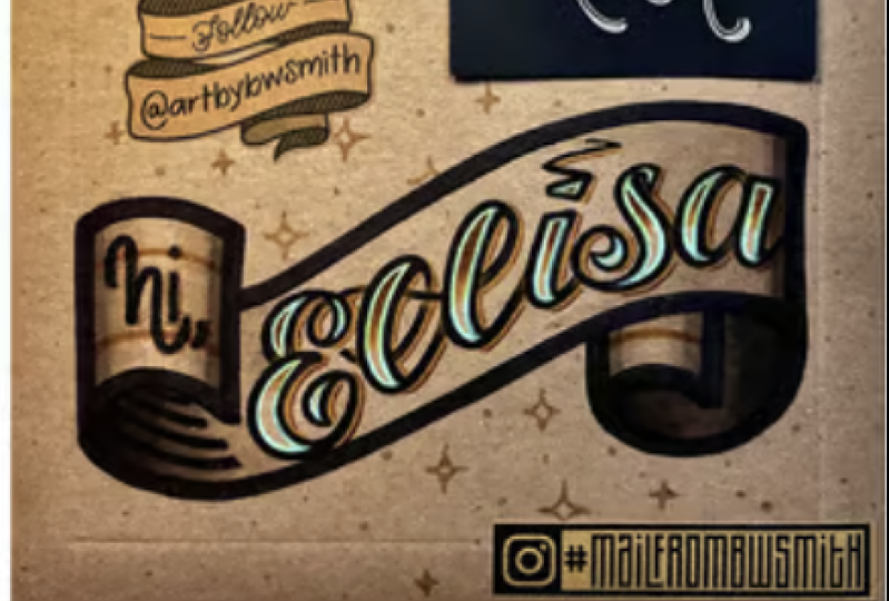
that Alyssa envelope. So here I am doing a different
take but a similar vibe. So I'm not going
to do the banner, the wavy banner, like
I did for Alyssa. I'm just going to do a diagonal with some lines on either side. So this admittedly is not my
favorite I love a banner. But here I am putting
my guides in first, and then I put the skeleton and the shapes of each letter, and then I go back
through, bulk them up, make sure that there's
enough room for their thickness on
the down strokes. I have taken the little connecting
loop de loop from Alyssa, the E that went to the L in the L and done the C
going to the T and the H. Then you can
see me here doing little circles in
the downstrokes just to make sure
that it's consistent. It's not perfect. It's eyeball. It's roughed in. It's
a human doing it. Then I'm doing these
little bits here also roughed in which I then end up as I put the
marker in, didn't love them. But it's all good. It's not that big a deal. But I didn't put enough energy
into measuring things out. You can see the spacing
isn't consistent. Not a major downer, but still not my favorite. But if I'm going to tell
you to let things go, I have to let things go myself. But since the first
letter is Curvy for SCs, s, things like that. I often will start with the
second letter in the word or the name just to make sure that everything fits
together nicely. I feel like it can
get away from me if I start with the capital with
the first letter first. Doing a little p print for her e. She ordered a dog print, so I am doing something that relates to the artwork
that she purchased. So she likes dogs,
she gets a paw print. Okay. Now I'm going through and
doing an interior outline with my favorite colored pencil
for doing this technique. It just has it's subtle but also fluorescent
quality to it. I'm not really a
fluorescent girl, not really a pastel girl, and this is kind of
both and neither. I'm into it. I dig it. So really, you could call it
done here if you wanted to, even could have before the
color pencil came into play. But follow along to
the next step to see some extra little bits that
I like to add to add aleph.
5. Snail Mail Sorcery: I've spent decades putting together this collection
of art supplies, so don't feel bad if your
studio does not look like mine. Slowly build things up, but don't break the
bank because of it. As you can see, I don't use all the tools and all of
the pieces all of the time, so that means that
you don't need them. Use what you have,
B resourceful. There are tons of ways that
you can make your lettering have a little bit
of extra something to give it some more fun. I'm going to show
you a couple of examples from my
past of envelopes. I've done that. I feel
really exhibit that. So first up, we have
this one for Veronica. Now, for this, I did lines
similar to a banner, but made them really thick so I could add little flowers inside. I made the end dip
down a little bit below so that it goes
on top of the banner, and then I added, you know, an outline around all
of the letters and cute little straight lines
and squigglies on the inside. For Hannah, it was so architectural and so
linear and jagged. I didn't want to
take away from that. So I just made a little
double line, kind of, you know, shadow
to the side of it, just to enhance it rather
than to take away from it. Now, for Nicole, I did these interlocking letters that were really, really funky. So I'm like, What's
funkier than tie dye. Let's give her some
tied die on the inside. I use markers to go in and do something similar
to a tie dye effect. I mentioned that I prefer
uncoated surfaces, but I think it's
important for you to see how I would work
on a coated surface. So sketching with the
pencil, it's not too bad. It's, it's not as forgiving and the stark white always
bugs me. But hey, whatever. But now putting
this marker down, that's where we
start to feel it. So there's less of a
tooth to the coated side, so you slip and slide around more than you do on
an uncoated one. Also, you see the strokes
of the pen way more. So it doesn't lay
down a flat color. You kind of have to go
over it a couple of times, which also leads to
getting lumpy bumpy lines. So now with this smaller
one, it's still, you know, it doesn't
have the tooth to it, so you're not and the white's
less forgiving for sure. But figured, let's do a little interlocking
here to make it fun. Using colors and using
all of this stuff. But you'll see how
even with the coating, you would think that
that would sit on the surface more,
but it doesn't. It soaks in, but not
in a way that I like, not in the way that an
uncoated surface would. And then I went back
in with gel pens. That's really a non issue
at all with the coating. They sit exactly
the same for me. And you can see, at the end, I add a little is the coolest. I like to do that if here
I did it on purpose. The arrow and is the coolest
cap it out on each side. But those are tricks to add if you have not spaced
things out well. I like to add like hey, or a hello, where the
arrow is for this. Or is the coolest or
a little message, is a little rebel,
is a little cute, something like that at the end, depending on how well you know the person and if
there's some reference. Okay, let's pick up where we left off on
Katherine's envelope. I'm now putting marker on top. Since this is the darkest color. I try not to hit too much of
the color pencil with it. It does resist it,
but, you know, still. So now I'm using
this lighter color. It goes over top of
the color pencil, and you can see it
changes the effect. It kind of glazes
it to some degree, and then this one
does the same thing. This one kind of takes
it off a little bit, kind of makes the color pencil
come a little bit clearer. Since the color
pencil lines kind of made the sharpie,
a little fuzzier. I'm going back in just to
crisp things up a little bit. So not too much, not going
all the way through it. Just cleaning things
up as much as I can. Now I'm going in with
a smaller size for the little toe beans just
because they're so itty bitty. And then taking it upside down just because
sometimes it'll help you see things that
you wouldn't necessarily, your eyes get used to
seeing it this way. Now I am adding a bit of a shadow with a different
type of marker. I like to have something that is related to the color family
of the rigid mailer itself, just so that it's there, but it's not in your face. Then here I'm taking just a t
bit of color pencil to make little marks where the lines
would go behind the letters. How it sweeps around the C, how it sweeps around the
R and the H, doing that. And then now taking a darker brown colored pencil to just hit that outer edge of the shadow just to give it a little more,
just a little something. Add as much or as
little as you'd like. This is not looking
like too much, but it is I mean, you
see, it's a lot of steps. And then I missed my green. So I'm going back in and you can leave it glazed as I have it, but you can see the difference
between the T and the age. It's really a different effect. It's really just
whatever you want for, whichever colors, whichever
style that you're going for. For this one, I really
wanted to put this green. It just makes me happy. So now I'm taking just a
little bit of darker pencil to blend that color pencil line for the strokes go
behind the letters. Okay. Then now I have broken
out my clear glaze gel pen. So carrying this
Paul print theme, I'm adding it was stars
in Alyssa's envelope, but I'm doing little Paul
prints and hearts for this one. As you can see, it relates, it feels like it
could be the cousin of the Alyssa envelope, but it is definitely not copied. It is its own thing. It just took the parts that
worked from that most for me. I like the top loops, the color choices,
and the glaze, and there you have it.
6. ...You Made That?!: Chances are people are going to be wowed by what you created. You're going to get
lots of z and z from the recipient,
from people in line. The amount of times I've
been asked, you made that. It's become a running
joke now in my life. So prepare yourself for that and all of the warm fuzzies
that come along with it. There are lots of ways to
incorporate hand lettering envelopes into your life and lots of reasons
why you would want to. Personally, I use it
in a number of ways. One is to practice. If there's a lettering style that I'm not quite
comfortable doing yet, or I'd like to just
try something new, have something not just live in your sketchbook, gratitude. Expressing gratitude
for friends and family, expressing gratitude
for a customer supporting your small business. Friendship is along those same lines, but a
little bit different. It's just connecting, letting someone know that
you're thinking of them and giving them
something tangible. Business. It's promoting
your business along the way. As people see it, you're having your promotional materials on there and they're
wowed by your skills. It's also something that
people are going to want to share with others because
it makes them happy. People love it. Then also, it's a meditative
practice for me. It's a bit of meditation
where I get to shut out the world and really just
focus on the task at hand, making something fun,
making something beautiful, and just pouring
myself into this. If you have all of the
time in the world to go and play and do
this, then do that. But if this is something
that you're doing for your business and
it's going to cut out time that you could be using for other things, time is money. I mean, as much as I
hate that, it's true. If you have time to do this and it's just
a personal thing, have fun and play forever. But if not, keep an eye on
time because you might be devoting more time to this than you actually have to give. See what you can create in
a limited amount of time, 5 minutes, 15 minutes,
whatever it may be, and see what the difference
in your style is between those so that you then know what you want to
devote going forward.
7. You Heart Snail Mail: All right, new friend. Well,
if I have done my job right, you are now madly in
love with snail mail. You can see here, send
it off my goodies. Oh, here we go again. Oh, back at the post office, and now it is your turn. Please make some mail. Please upload it to
the project gallery. Please make the world
a cooler place. You have everything you need now in order to
make that happen. But if you want a little
supplemental learning, I also have my little book here. If you scan the QR
code to the left, it takes you right
to a link for that. If you scan the
one to the right, it takes to all of the links
you could possibly want. But here are the main
ones that people ask for. So Instagram, my
shop, and my website. Well, I had a great time
and I know that you will to jump into it and I can't
wait to see what you create.
 Brittany Warner-Smith, I make weird things & make things weird