Transcripts
1. Class Overview: Hi, my name is Shay Maven, and I'm an artist, graphic
designer, and content creator. I used to struggle so much with figuring out
how to color my art, but I don't struggle
with it as much anymore because of the tips I'm going to share
with you today. Color is something that
is somewhat intuitive, but you can find more success if you have the right
knowledge and tools. It's my hope that you'll leave this class feeling
more confident about how to color
your artworks and that it'll help you
speed up your workflow. In this class, we're going
to start with how to use Procreate's color
panel so that you can jump right into learning the different
coloring techniques. Then we'll briefly go
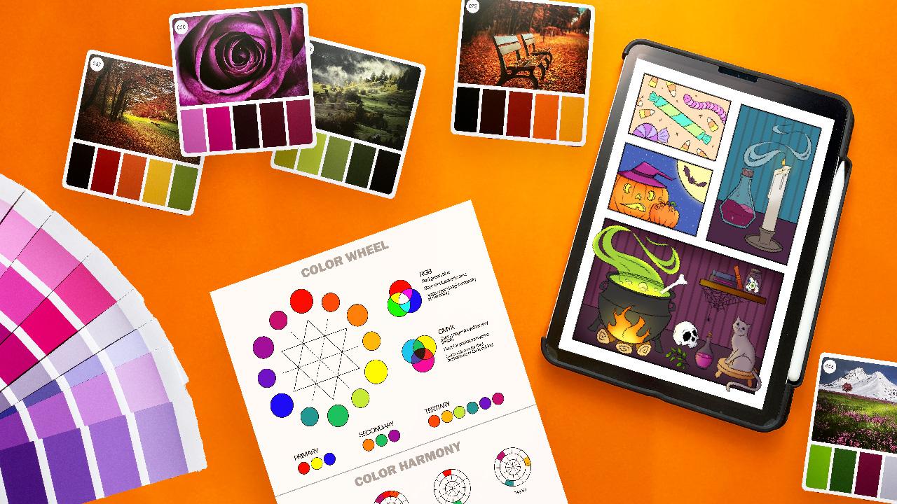
over color theory, and I'll show you where to find color inspiration so you can make your own
color palettes. The class is designed to
be beginner friendly, and to make it more
interactive and fun, I've created some worksheets that we'll complete together. If you'd like to learn even more about how to use Procreate, you can check my
Procreate basics class, which includes free
digital brushes. So now that you know what
you're getting into, let's go ahead and get started.
2. Class Resources: For this class, I've created
some resources for you to download that we'll use together as we go through some
of these sections. To download just scroll down to the Project and Resources tab and select them to download. In addition to class resources, please help yourself to all
of my freebies over on KOFI, which includes several different
coloring page options. Make sure to follow me
there as well because I will continue to add
freebies there for you guys. Once you've downloaded
your class resources, head to the next section
where we'll get started.
3. Color Panel: The color. The first thing I want to do is show you
how to use the color panel. So let's go ahead and
open up Procreate. And then we're also going to open up our coloring worksheet, even though we
don't need it yet. If you look here
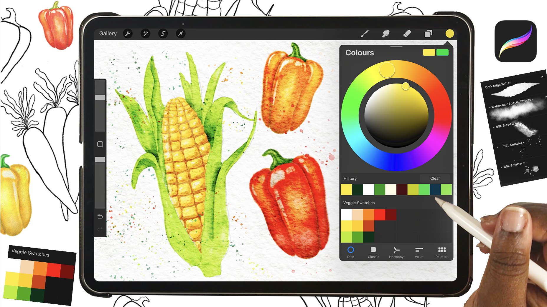
on the top right, there's a color dot. This is your active color. So just go ahead and click that and it'll open up
your color panel. From here, you can
move around on the color wheel and select new colors that are
active up here. And then you'll have
your history and you'll also see your
current color palette. So if I want to use one of
these and make it active, I just have to click on it, and then it becomes available for me to use on my artwork. And then if I decide that I want to go back to my other color, I just click and hold it
until it changes again, and then I'll have my previous
color option as well. We don't need this anymore, so I'm just going to go
ahead and delete that, and then I'm going to go
back into my color panel. Under Classic, you select your color by moving
around on this panel, but then you also have the hue, saturation and
brightness sliders, as well as your history
and your current palette. The next panel is Harmony, and if you click
on complimentary, it'll open up the different
Color Harmony options. You click on one
of those, it will move around on the
color wheel for you, and it will give you
a new active color. What's different
here is that I can have three different
active colors, and then I can use
this slider to change the brightness of
those active colors. You also have your history and your current color palette. Under value, you have hue, saturation and
brightness sliders, as well as RGB sliders. But the best part of this panel is that you can
change hex codes. So if you have a hex code
for a specific color, you can enter it in here. I'll explain later in the
class where we can get these codes because
we don't need them yet to get started
with the class. And again, just like
the other panels, we have our history and
current color palette options. Last panel is palettes. So if you go in here, you'll see all of the palettes
that you've created, and you can also choose
one to work with. So today, I'm going to have use the one that I had you download, which is the Procreate
Color class, and just click on
the three dots on the side and set as active. So now it is active on any of your panels
that you choose. At this point, you don't have to pick any of your own colors. So let's just select
the disc interface, and then we'll move on to
the next section where we'll get started with
the coloring Wheat.
4. Base Colors: For this first panel,
I'm going to show you how to add just
a simple base color. There's actually more than
one way that you can do this, so let's jump in
and get started. The first way we can color is
to just color like normal. So we need to change our
color to the first color in the first row and then make sure your brush is set to
inking and studio pin. Then from here, let's go
ahead and add a new layer. But we want our linework
layer to be above that layer. Then you can just go ahead and color in like you
normally would. So there are some
issues with this. Like, it's not always easy to ensure that you've got
everything filled in correctly, and you could end up outside
the lines doing it this way. It's not necessarily
wrong to color this way, and sometimes I prefer it, but there are faster ways
to color and procreate. So let's try out the
fastest way now. So we don't need this. Let's go ahead and erase that, and then we're going to go
in here and we're going to double tap on our
linework layer, and we're going to
choose reference. So now you can see it
says reference here. Then go back to the
layer underneath and then tap and drag onto your artwork to
add color directly into the spaces that you
want filled with that color. So see that was a lot
faster and easier. So let's go ahead and change our color to the second
color in the first row, and then we're going
to add another layer, and we'll drop in this new color in the other sections
of the candy. You can quickly fill in
the whole panel this way, but you'll run into a problem. So let me show you
what the issue is by coloring in
the gummy worm. Again, we're going
to need a new layer, and then we're going
to switch to the third color in the first row. Then we're going to
go ahead and drop in every other section of
this gummy worm. Mm hmm. Okay, so you can see that we've actually run
into a problem here. This is because we don't have our linework completely closed. So any of the sections
that aren't closed off, it will fill in the
whole panel like this. So go ahead and undo this, and then let's go
ahead and go on to our linework layer and
switch our color to black. Then just zoom in and let's close off these open sections. So now if we go back to our pink layer and switch
to our original color, we can drop that in,
and it isn't an issue. I personally don't like this
method because it's a part of my art style to leave
those sections open. So what I do instead is shut
off my reference layer, and then I'm going to go
back to my pink layer. Then I take my brush and I just outline around the section
that I want to color, and I will drag and
drop the color in. Alright, so let's
finish off our worm. So just like before,
we need another layer, and we're going to turn our
reference layer back on. Make sure that you're
on the layer below it, and then we're going to
switch to the fourth color in the first row and drag and
drop that in just like before. And same issue. So let's go ahead and shut
off our reference layer. Make sure on that
layer below it again, and then trace around your
outline and fill it in. So now I have a little
trick I want to show you. So let's go ahead and switch to the fifth color
in the first row, and then we're going
to add a new layer and switch this layer
back to reference. Make sure that you have the
layer below it selected, and then we're going to
drop in our purple color. We want to do this with
the other section, so we need a new layer, and we're going to select
the other purple color and then drop in those sections. Now, I've forgotten a section, and I actually want it to
be this light purple color. So let's go back to that layer. And then instead of switching our color in this color panel, we're actually just
going to tap and hold until we have the
light purple color again, and then we're going
to drop in that color. This would have been easier
to add to begin with, but you'd be surprised how often you want to use
your previous color. So I wanted to make sure
to show you this feature. Now let's go ahead and add a new layer above
our candy layer, and then we're
going to choose the tenth color in the first row. Then we're just going
to go ahead and drag and drop that
into the background. And as you can see, that's caused a problem
here with our worm, and that's because our
layer is at the top. So we actually need to
take this layer and move it to the bottom of
all of our other layers. So now that issue is fixed. Coloring the rest of this panel should be a
breeze for you. Just make sure that each of these sections has
its own layer, and then you're
going to want to use these three colors right here. So I'm just going
to go ahead and speed through this
section right now. Alright, so we've got
everything filled in now, and we can move on
to the next section.
5. Adjusting Colors: For this section,
I'm going to show you an easy way to
change your colors. We'll just use the same
panel from the last section, so you don't need to
color a new panel. So let's say that
you decide that you don't like the
colors that you chose, but we don't need to
change all of the colors. This is why having multiple
layers is a good idea. So let's go ahead and choose
our dark green layer, and then let's go into our adjustments and then choose hue saturation
and brightness, which brings up this
window at the bottom. So if we move the hue slider, we can see that this miss So
if we move the hue slider, we can see that this
changes the pure color, so like red, blue,
yellow, green. And then our saturation
is a intensity of light intensity of color. Yeah. So if we move around
the hue slider, we can see that this
changes the pure color. And then this changes the
intensity of the color, and your brightness just
adds black or white. If you're not sure if
you like your new color, just tap on the screen
and a menu will come up and press
and hold preview, and you can see which
option you like better. You also can apply, undo, reset or cancel, and I am
going to cancel these changes. Now, let's say that
you wanted to make multiple color options
of the same artwork. The first thing you need to
do is combine your layers. So open the layers panel and select the top
color layer first. Then, starting from the top, pinch your layers
together until all of your color layers are
combined into one layer. Just remember, if you do this, you cannot manipulate
individual layers anymore. If you want to keep a copy
of the individual layers, you can make an extra copy. So to do this, you would actually need
to group your layers. So just swipe right on these and get all of your color
layers to where they are blue. And then group is now
an option at the top. And then you can swipe right on this and you have a
duplicate option, and then you can just
flatten it from here. And then you have your separate layers and
your flattened layer. We don't actually
need the group layer, so go ahead and delete that, and then we're going to
duplicate this layer twice. Let's go ahead and shut off this top layer and then
pick the middle layer, and let's go into
our adjustments and go back to hue saturation,
and brightness. Now we can change the
entire thing all at once. And let's see. I think that's
a good option right there. And I will go ahead and do the
same thing with this other one and pick
something different. That's fine. Now you have three different options
of the same artwork. This would be great
if you needed to do a poll or if you
wanted to make prints, and then you could
have different options based on what your
customers like. Another thing I want to
show you is color balance. This just kind of enhances
colors in your artwork, and it could be a good
option if you needed to spice up a little bit
of color in your artwork. Once you're done playing
around with the color balance, go ahead and delete these extra layers because
we won't need them, and then we'll move on
to the next section.
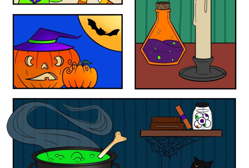
6. Blending Modes: In this section, I'm going to show you how to use
Blending Modes. But first, we need to
drop in our base colors just like we did in
the first section. I'm going to show a sped
up portion of me adding the colors so you won't
totally be on your own. Just remember that you want
each piece on its own layer, and then we're going to use
the colors in the second row. A Okay, now that we have
our base colors in, I want to show you what
blending modes do. I'm going to be honest, I usually only use a few
of these regularly, and then occasionally, I will play around with
some of the others. I won't be explaining
how to use all of these, but I will include a
Lincoln Procreate in the description where it
better explains each one. So let's choose our
background color, and then we'll add
a layer above it. Then you'll see this in here. If you click on that, that
opens up your blending modes. So go ahead and set
that to multiply, and then we're going to change our brush to airbrushing
and soft brush. Now just tap and hold
on the blue background, and then just make a small
dot, like anywhere is fine. So because we have
this set to multiply, even though it's the same as this background color,
it appears darker. Let's go ahead and add
a couple more dots. We're going to add yellow. And then we'll use this orange
from the large pumpkin. Alright, now I'm
just going to move this off to the
side a little bit, and then we're going to go into our circle layer
and select the M. So let's just go through and
see what all of these do. Like with darker color, it doesn't show anything at all. And to be honest, I'm
not entirely sure why. But you'll see that
these lighten, darken, show contrasts. There's a lot of interesting things that
you can do with these, and you just never
know what you're gonna end up using them for. So it's kind of fun to play. Anyways, let's go ahead and actually put some of these
blending modes to good use. So let's start by deleting this layer because we
don't actually need it. And then we're going
to go ahead and choose the pumpkin face layer
and add a layer above it. And then we'll turn that
into a clipping mask and switch our blending
mode to multiply. Now, let's change our
brush size to size eight. And then we're going to switch our color to the same
color as our pumpkin. Now just add a little bit
of shading to your pumpkin. And as you can see,
I'm kind of working outside of the drawing so
I don't go too far in. And then just add a little
bit under the hat here. And I actually want to darken
that one up a little bit. So let's change
this to size two, and then we'll add a
sharper shade right there. Now I want to add a
little highlight. So let's add another
clipped layer, and then we'll change
this one to screen, and then we'll change
our brush size to six. And then just add a little bit of highlight on the
edge of that pumpkin. Now we're going to do the
same thing with this pumpkin, so let's select that color. And then we're going to add a layer above the other pumpkin, set it to clipping
mask and multiply. And then change your
brush size to four. And then just add
a little bit of shading to the edge and bottom. And then, again, we want
to add a highlight layer, so add another clipped layer here and change it to screen, and then just add a little
bit on the edge and top here. So that looks a little
bit harsh to me, so I want to change the
opacity to about 90%. For the leaf and stem, we can just do some
quick shading on those. So just switch to multiply, make sure that's
a clipped layer. And then let's switch our
brush size to size one and add just a little bit of
shading on the edge and bottom. And then we'll do the
same thing with our leaf. Okay. And that's good
enough for those. So we can actually do the
same thing with our hat. So go in here and find
the hat and band layer, and let's pinch those together, and then just add a little
bit of shading to your hat. And then just like before, we're going to add
another clipped layer and turn that to screen
to add our highlight. And then we'll just add a
little bit to the edge here. And then a little bit here
on the brim of the hat. Now we're going to
do something fun, which is make the face glow, but I actually
reversed these colors, so let's go ahead and
switch that real quick. Alright, so let's go ahead and choose our interface layer, and then we're going
to duplicate that and switch our blending mode to add. Then we're going to go
into our adjustment layer, and we're going to
choose Gaussian blur. Now you can see it says
Gaussi and blur at the top. And if you just drag your
pin across the screen, you can see that changing, but you can also see
your glow changing here. So I think we're going
to go with about 12. I think that looks good. We can do the same thing with our moon, so let's find that
layer and duplicate it. We're not actually going to
change the blending mode, but we'll go into our adjustments
and do Gaussian blur. And for this one, I think maybe 13, I'll do. This is going to blur
outside of your panel, so just use your eraser tool and clean it up as
best as you can. That's all we want to
do for Blending Modes, but I do want to
add some eyes to the bat and some
stars to the sky. So let's go ahead and
add a layer above our bat and then choose the
pink color of this hat. Then I also want to switch to our studio pen under inking, and then switch your
brush size to size five, and then we'll add a
couple of dots for eyes. Now let's do some stars. So let's add another layer, and then we're going to
select our moon color. And then you can just add as many stars to the
sky that you want to. If you're happy
with your artwork, let's go ahead and
group all of these, and then we will flatten it. This is just your color layers, not your linework or
your other candy layer. So go ahead and group that. And then we're going to
go ahead and flatten it. And that's it for this section. So let's go ahead and move on.
7. Selection Tool: In this section,
I'm going to show you how to use the
selection tool, which is also known
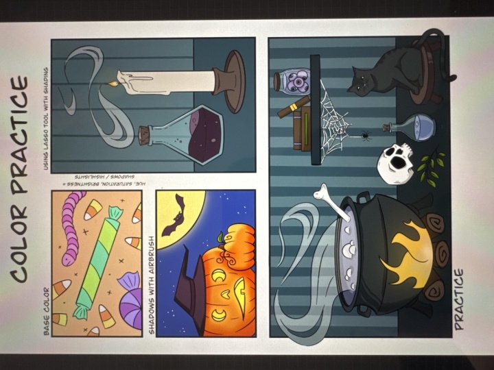
as the Lasso tool. So again, I'm going to start by quickly adding the base colors, and I'm going to speed
up this portion. You'll notice that
I didn't color in the smoke and you'll
see white later. Okay, so now I want to add some stripes to our background. So let's go into
our actions panel, make sure it's set to Canvas, drawing guide, and then
edit drawing guide. So these are the same
settings that you'll need. So choose Tut grid, opacity 50%, grid size 115 pixels, and then thickness of 70%. Make sure that
assisted drawing is shut off and then
just click Done. Now we're going to change our
brush to cigraphy monoline, and then make sure
it's set to 30%. We also need to add a clipped layer right above
our blue background layer. So now just draw a line straight down
from your guide here, kind of extend it past the bottom and press and hold here. And then if you press
and hold your finger, it'll straighten out that line. So if you couldn't
see that very well, we'll do it up here. So now it's a little
bit straighter, but it's still kind of crooked, and now it's straight
up and down. So just do that for all
of your guidelines. Once you have all of
your stripes done, you can go back in and shut
off your drawing guide, and it'll get rid of that grid. Now we're going to make the
top of the cork lighter. So let's go in and
choose our cork layer, and then we're
going to choose the selection tool at the top. Make sure that it's
set to freehand. You could use ellipse here, but I do feel like it's going to be easier to use freehand, so it's up to you
what you want to do. And then zoom in and try to follow your black
guideline here. If it takes you a few tries,
don't get discouraged. It's kind of tricky
to do selections. Now we're going to go
in and we're going to choose hue saturation
and brightness, and we're going to change
our brightness to about 60%. And to exit this selection, just go ahead and
click on the S again. Now let's go in and
choose our potion liquid, and then we're going to choose
our selection tool again, zoom way in, and then
we're going to make a selection of this small
portion of our potion. Again, take your time. If you need to pull your pin off and then go
back at it again, you can absolutely do that. Whatever is easiest for you. Now let's go into our hue
saturation and brightness, and let's change our
brightness to about 60%. And let's change our
saturation to 55. Alright, now let's add
a layer above that, and we're going to select
our light pink color now. And let's switch back
to our studio pin, and then we're going to
color in all of our bubbles. And then we're going to change our saturation to about 35%. I want the glass jar
to look transparent, so let's go ahead and click
on this blue background here, and then go to your background layer and then drop your color right
here on top of the jar. So when you go to your preview, you can kind of see that that
section is filled in now. Now let's go back to our
jar layer and switch our opacity to about 65%, and then we're going to
change our brightness, too. So let's change
that to about 53%. So now you can actually see the striped background
through the glass. Now if you want to
get extra fancy, let's add some shine to
the edge of our glass. So make a selection really
close to the edge line here. Again, take your time. And then just make sure
you close it off there. And then let's change
our feather to just 1%. Now let's change our hue
saturation and brightness. So let's do our hue at 20, our saturation at 25, and our brightness. Let's do 70. So it just gives it a
little extra something like the glow from the candlelight is on the edge of the glass. Now for the smoke, we're
going to need a new layer, and then we're going to make
three separate selections. So just select this first
one like you normally would. And instead of just closing it, we're actually going to
tap on the gray dot. So we can see that our
selection has been made because we have these striped
lines in the background. Now we'll be able to select
the other two the same way. Just make sure
that you close out your selection when you're done by tapping
on that gray dot. I'm going to go ahead
and zoom through mine, and then you guys can
do yours on your own. Once you have all three of
your smoke selections made, let's go ahead and choose the seventh color
in the third row and then just drag and drop
in each of those sections. You'll notice that there are some open sections
on your smoke. We want it to be that way.
So just leave it like that. And then let's go back
to our layer and change our opacity to just 35%. So now our smoke is transparent, just like our glass jar. Now I want to work on my flame. So let's go ahead and choose that layer and then get
your selection tool. And then let's just
make a small selection inside of our flame
about like that, and we'll change our
feather to about 3%. And invert your selection. So now your wavy lines are inside of your flame
instead of outside of it. Now let's change our hue
saturation and brightness. We're going to change
our hue to 48, our saturation to about 63, and our brightness, let's
do that at about 45. I think that looks pretty good. I want to add a little glow. So let's add a layer below our candlestick layer and
then use our selection tool. And instead of free hand, let's switch that to ellipse, and that's drag and
drop a circle in. Press and hold your finger on the screen to get
that perfect circle. And then let's
switch our color to the eighth color
in the third row and drag and drop that in. Now that's a little too bright, so let's go ahead and change
our opacity down to 8%. Might be a little hard
to see this on camera. Now let's make a
selection at the top of the candle that kind
of follows that glow. And we're going to change
our feather to about 10%. And then in our adjustments, we're going to change our hue to 53 and bump our saturation
all the way up. Now let's make one
more adjustment and go to color balance, and let's just bump up
this yellow a little bit. Now let's make one more
selection just below the flame, and we're going to change
our saturation to about 80%. So when you're done, it should
look something like that. And now we need to choose
the candle holder layer, and we are just going to select
these two back sections, and don't forget to tap on the gray dots so we can
make our second selection. And then for our adjustment, we're going to change
our brightness to 45%. If you're happy with everything, go ahead and merge your
layers for this panel. You can get really fancy with the Lasso tool and keep
going with this section, but we're going to move on
since I think I've given you enough of an understanding of what you can do
with this tool. So I'll see you in
the next section.
8. Color Theory: It may seem strange to do color theory towards
the end of the class, but since I had
already picked out the colors for the
class worksheet, we didn't need it before. Now that you're about to
do your own assignment and pick out the
colors for yourself, learning color theory could
make it a lot easier for you. So for this section,
we're going to need to open up our Color
Wheel worksheet. So you can see here
that I already have the RGB and the CMYK
colors filled in, so you don't need
to do that part. RGB stands for red,
green, and blue, and you would use this
for digital artwork that we don't intend to print. CMYK stands for cyan, magenta, yellow, and key,
which is actually black. We would use this color mode for artworks that
we want to print. So let's go ahead
and get started with filling in our color wheel. So the first thing we need
to do is add a new layer, but we want this layer to be
underneath of our worksheet. Go ahead and turn on
your reference for your worksheet and then go back to your other
layer underneath. Now just go ahead
and press and hold your red color and drop
that into the top one. We're actually going
to use the yellow, not the green because we're
using primary colors, and then we're going
to use our blue. So go ahead and drop that in
the other largest circle. So now we have all of
our primary colors. Now we need to create
our secondary colors. So let's go in and
switch our brush to calligraphy and mod line. And then we're going to select
our red color again and just put a little bit
in this circle here. And we're also going to do the same thing with the yellow. Now we're going to
use our Smudge tool, and we're going to blend
these colors together. Be careful not to
add in white from the background
because that is going to add to the color,
and we don't want that. So try to just mix the
yellow and the red together. Then just press and hold, and you'll now have
your orange color that you can drag and
drop in your circle. Now we're going to do
the same thing with our other secondary colors. So just take a little bit of
red here and a little bit of blue back to the smudge tool, and then mix these
together until you get a nice purple shade. And we'll do the same thing
for our last one here, so a little bit of blue and some yellow and our smudge
tool again. Alright. And you can see
this didn't really create the prettiest
shade of green. It's not going to be
very good for mixing. So what I recommend is actually color dropping in the
green from our CMYK, and that will mix a lot
better from here on. So easy enough, right? Now, I think you guys can handle to mix your own tertiary colors, so I'm going to go ahead
and speed up this portion. So once you're all done, yours should look something like mine. So let's go ahead
and divide these out and just drag and
drop your colors in. It makes it a little bit easier to see what
is our primary, secondary, and tertiary colors. O. Okay, so the top
portion is completed. And I just want to say,
understanding how to mix colors digitally is more fun than
practical in most situations. If you're doing a
traditional painting, knowing how to mix these
colors would be more useful. What will be more
helpful to you in both traditional and digital
art is Color Harmony. All of these are really easy. You just need to match up the
circle placement with what you have above and then just drag and
drop your colors in. So we already know
our primary colors, so this one is really simple. This is the only Color
Harmony that doesn't change. It will always be red,
yellow, and blue. Again, we're just
going to match what we see in our circles
to the color wheel. So analogous is just a group of three or more colors that
are next to each other. That could be anywhere
on your color wheel. It doesn't have a fixed point
like the primary colors. So it could be these
three or these three. It doesn't matter as long as they are right
next to each other. So let's just keep going
and fill these out. Complementary
colors are anything that are directly
across from each other. So it's the opposite
of your color. And now we have
our triad colors. Triad colors are that that are equally spaced
apart from each other. So technically,
your primary colors would count as triad colors. For monochromatic, it's going to be a little
bit different. So go ahead and
select your red color and drop that into
the top section. Then we're going to
lighten our color about midway and we'll do
that one more time. So basically, monochromatic is just different shades
of the same color. Moving on to our tetrad colors, these are just basically two pairs of
complimentary colors. Split complimentary
uses a base color, and then two colors that are on either side of the
direct complement. And then we have square, which is just four
evenly spaced colors. So why is this important? Well, this basically tells you what colors will
go well together. It really makes it
easy to know what will pair well together
or give contrast. So there is something
that I want to show you here with our
complimentary colors. So we know that our
complimentary colors look good as opposites
from each other. Think of Christmas. Red
and green go together. However, if you take these two colors and
you mix them together, you get a brown color. Now, that might be okay if you're trying to
get a brown color. But if you didn't want brown and you wanted
to use red and green, you would want to be careful
about mixing them together. That's true with any of
your complimentaries. You're either going
to get a gray or you're going to get a brown. So just something
to keep in mind, while they work together, they also might not work very well together,
if that makes sense. That's it for this section. I hope that you found it
helpful in understanding color better and that
it'll guide you to make better color
choices in the future.
9. Color Inspiration: If you're struggling to
decide what colors to use, there are lots of resources
that can help you. Some resources come in
physical forms like books, pantone swatches or color cubes, but you can actually find
several resources online. So let's go over
some of them now. So let's say you know
a specific color you want. You can
just Google it. For example, if you know a
specific color like silver, I would just type
in Silver Hex code, and I would find one that feels close to what I'm looking for. And if you guys
remember, you can enter these hex codes
in your Color panel. Interest is another
great resource. So we can type in something
like Halloween color palette, and you can see that we'll
get several swatch options. Sometimes you'll get hex codes with these and
sometimes you won't. I'll show you how to make color palettes in the next section, so you know how to
get colors from images without hex codes. You could also use Color Hunt. Here you can choose
from categories like this fun space option, or you can use the search and
type something like skin, and you'll get lots
of options for that. You can even tap the search bar and just choose a color theme. Another option is Adobe color. You can actually use most of the features of Adobe
color for free. So you have where
you can create your own and play with
different color harmonies. You can explore where you
will find color themes, and you can use it kind of
like we did Color Hunt. You can also see
what's trending. And let's say, for instance, you wanted to see what was
hot and graphic design, you could choose
to view more and click on the image to
get the hex codes. Lab is something new that
I haven't used before, so I can't really
say much about this. And libraries can only be used if you have a
creative cloud account, but if you have it, you can
store color themes in here and access them on
Photoshop or Illustrator. Another thing you could do is
get inspiration from life. Take pictures of anything that has colors that
catch your eye. Again, this is something
I plan to show you how to use the colors
in the next section. The last thing I want to share is that you can use
your intuition. I often use the hue, saturation and
brightness option to just play around until
I find colors that fit. Do whatever you're
most comfortable with. I'm sure that I didn't
think of everything. So if you have any good ideas or resources you'd
like to share, please do so in the comments. I'm always excited to
find new color resources, and I'm sure other people in this class would
appreciate it, too. Anyways, that's all I
have for this section, so I'll see you in the next one.
10. Color Palette: Color palettes are a
great way to manage the colors you want to use or
have used in your artwork, so I'm going to show you
how to set them up now. So let's go into
Pintrist and then search for fall Color Palette. You're going to specifically want one that has a hex code, so I'm going to select this one. For the sake of this video, I'm going to save this and I'm going to bring it in Procreate, but you can just
use another device to view it and pull
the hex codes. You can also just write
them down on a piece of paper if you don't have
another device to view them. So now that you have
your hex codes, let's go back and approcreate, and I'm just going to add
a new blank document, and I'm going to
put my hex codes in so you guys can see those. So now let's go into our
Color panel and then tap on the plus sign to
create a new palette. Then click on Untitled and
rename it to Fall Colors. Now we're going
to go into value, and we're going to
change our hex code, but I just covered that up, so let's move it down a little bit. Hopefully, that'll
work. There we go. And let's change to this 201724. So we have our new number here, and it changed our
color at the top. So we can now take
this active color and add it to our color palette. And then we can just do the same thing with
the rest of these. I'm not going to do
all of them with you. I think you get the gist of it, but it's just really easy
to add in your new colors. Now I want to show you how
to get colors from an image. This can be an image you took or an image you found online.
It doesn't really matter. I'm going to use an
image that I got from Invado and you can find
lots of great images there. However, it's not free, but you can really find lots of free images to get
color inspiration from. So don't stress about
where you get it from. You can pick colors from an
image two different ways. One way is a bit harder, and the other happens
almost instantly. The first way you can
do this, you need to add an image to your Canvas. Let's go into the
actions panel and select Insert Photo and select
your photo of choice. From here, you can
just tap and hold the color that you
want from your image, and then you can go in and
create a new palette for it. This is a time consuming way, but it's not always
the bad option. If you see specific
colors you want to use from the image,
this is the way to go. The other much faster
way to do this is click the plus sign and then
click New From Photos. Select that same photo
and then you'll see it created a palette based on
the colors from your image. You'll notice that
the color that I hand selected is not in that. It can't select
all of the images in this photo because there
are just way too many. So this option is great
if you want the vibe of an image to give you a
cohesive color palette. If you have an image with
less color variation, though, you'll get closer to
the specific colors you want for your palette. Of course, you do have the
option of doing both and just creating two palettes if that helps you with creating
your artworks. So now you have everything you need to do your class projects, so let's move on to
the next section so I can tell you what it is.
11. Class Project: For your assignment,
you have two options. You can color in the panel at the bottom of the worksheet, or you can use one
of the coloring pages I have over on KOFI, which as a reminder
is completely free. You have total creative freedom to color these however you want, using any or all of the methods
that I taught you today. There's no right or wrong
way to do this project, so just have fun
and be creative. I'm really looking forward to seeing what you
all come up with. So make sure that
you share it in the project section so that we can all see your masterpiece. Thank you so much
for taking my class, and I'll see you in
the next one. Bye.
 Shay Maven, Artist + Designer + Content Creator