Transcripts
1. Welcome to the After Effects Course: Hello. Thank you so much for enrolling in the after Effects CC course. I'm so excited to have you here in this really quick video. I just want to welcome you talk about how this course works. Talk about the project files you're going to be working with and just have a quick, important message about how you can help me make this course even better. First, how is this course laid out? Well, it starts as if you are a complete beginner. I assume that you know nothing about after effects. So in the first sections of the course, we walk through some of the basics just getting started with the workspace, using the basic tools. But we do jump pretty quickly into how you start animating. And then each section tackles a different aspect of using after effects, starting with the more beginner things like motion graphics and kinetic typography, moving to more advanced things like visual effects, rotoscoping, character animations and expressions. In this first section of the course, you will have access to all of the project files. And so in that lesson, download all of the project files will include videos, photos, graphics and the after effects projects themselves. Now I'm using at this time the latest version of After Effects, which is the 2017 version. If you have a previous version, that's totally fine. You can build all these animations from scratch, but the project files won't work if you are using a previous version, especially if you're using a CS six CS five or something from before. Even if you're using a future version of after effects, it should be completely fine. Off the project file should work. And all of the things we teach in this class are still applicability to you, too. If you ever have a problem or a question, feel free to post it to the class. I'm here to help you. You can post it directly to the class page or send me a message myself. Or a ta will get back to you usually within a day or two. The last thing I want to mention in this video is that I know when I launch. Of course, it's not going to be perfect, and I need feedback from students like you to make it even better. So if there's something that I miss, something that I went over to quickly something that I didn't cover the right way. Just let me know. I want to make sure this is the perfect course for you. So send me a message and let me know how I can improve it. Thank you so much for enrolling in this class. I'm so excited to have you here. And the next lessons, you'll download your product files and then you're going to actually jump right in to doing something really cool with after effects animating your name. Thanks so much. And we'll see you in the next lesson.
2. How to Download Course Files: The first thing that you should do before moving on is download the course project files so you can find those in the your project tab. And there's a this link right here that takes you to a Google drive page, and it will show you these five zip files so you have your project files. It has your music, your photos, your video, your graphics to go ahead and download those unzipped them. Learn how to do that with a quick Google search. If you don't know how it ends up files on a Mac or PC yet, but typically you just double click it once it downloads and you'll find all of the project file is the graphics, music, photos, videos, etcetera. Now these project files are for CC 2017 version of after effects and newer so they won't open in any version previous to that version. But they will work for both Mac and PC users, even though I create them using a Mac cool. So again, that's in the your project tab of the Skill Share folder. Just click that link, download the projects, and we'll continue with the first course. First lesson thanks
3. Dive Right In - Animate Your Name: welcome to the first lesson where we're going to dive right into after effects. What I like to do with my courses is to show you one really cool trick that you can do rather easily to show you the power of the application we're learning. And then in the following lessons, we're going to back up. We're going to learn everything from scratch. But for now, what I want you to do is open up this project file called Write my name. This would be in the project files, folder of the downloads that you just downloaded. So just double click that and that will open up after effects in this project that I've set up for. You know, in this lesson, while this opens up, I'm just gonna tell you. Don't worry about anything. We're gonna go over all the menus, starting new compositions, everything in future lessons. Right now I just want you to follow exactly what I'm doing. Just click where I'm clicking. Click the buttons. I'm pressing. And don't worry too much when you open up after effects. This is what it should look like. You'll have what's called the composition in the middle that has my name Phil. And then you have your timeline down here with Phil's name and then name practice. And these are two different, basically projects again. We're going to cover all of this later. But two different timelines that you can work on your going to be working on the practice one. And then here is my one. So if we go in our timeline and we click up here in the timeline or take this blue bar and move it to the start and then press the space bar, this is what you should see, Phil being written on the screen. That's what we're going to do with your own name right now. Cool. Okay, so all you have to do is click over to the name practice and then click this icon up here. The pen tool. Everything should be set up. So you should see right here next to fill it should have this red slash stroke should be this blue, and then it should say 10 pixels, which is the stroke with the goal with this quick little project is to create something cool that's animated that you can share on social media. That's why we have this square composition, which is 1000 by 1000 pixels. I've already set it up for you again. We're going to cover how we do this in a future lesson. To use the pen tool and to write your name. Basically, what you're going to do is just start clicking within the composition and draw your name. You're not going to click and drag, but you're going to click and then let go and then click and then let go. So, for example, for Phil, I started with the bottom of the P. So I clicked and dragged a little bit to create a curve. And then I clicked and dragged Teoh curve when I clicked and dragged to create more of a curve. Then I click down here. Then I clicked up here. So you're gonna have to think about how you're going to write your name because it all has to be connected. So sorry if you haven't I in your name like me, you're not going to be able to dot your I's so sorry. Third grade teacher, we're not going to be dotting our I's in this one. So notice how I created this. And when I click off of it, we've created this shape layer down here, and that's what we're creating. A shape layer. It's basically a line. Now, if I want to undo this, I can either delete it or what I want to do is turn this off really quickly so you can practice this with your own name. But I'm gonna turn this off and show you what happens when I'm not clicking and dragging. So if you just click and then click, then click, then click, then click. What happens is you create a line, but it's just a square without any sort of curves. It's just right angles, and that might be fine for you if you want that style. But if you want curves, you have to kind of click and drag, so just play around with it. I'm going to delete this shape layer to by selecting it and pressing the delete key on my keyboard. And then I'm going to turn back on this name layer with that little eyeball button. Okay, so now we have our name, but it's not animated, so follow exactly what I'm going to do after you have written out your name. Click this drop down button right here. Click. Add this little button next toe ad click trim paths. Make sure that the timeline marker is at the very beginning. At zero seconds, drop down this menu next to trim paths, click the 100% next toe end and type zero and press return on your keyboard and then click this little stopwatch next toe end, Then go to four seconds. So drag your timeline indicator to four seconds. Click the zero next to end and type in 100. Then press return on your keyboard or enter. Now, if you press the space bar, it will play through this composition and your name should animate on the screen. If you want to change the color of your name with this layer selected so the shape layer one click the stroke color. So the color next to stroke. And then when this color picker pops up, you can change your color to really anything you want. Okay, I think like OK, so now you have your name animated within after effects. Pretty cool, right? This is just the beginning of what you can do in after effects. If you want to export this so that you can post it to social media right away, go to the export section of this course and watch that very first lecture, which is how you basically export an H 264 quick time version of any project. And then that will be great for posting online men. If you do, make sure you tag me at Philemon ER and at video school online. All right, I know you are probably confused. You're probably like Phil. I don't know about this. You went a little bit too quickly. But don't worry. We're going to back up. We're going to learn about the workspace. We're gonna learn about how you create projects and compositions. We're gonna learn about layers and everything in the next sections of this course. But I hope that this was a fun lesson to show you the power of what you can easily do in after effects. Thanks so much for watching and we'll see you in the next lesson.
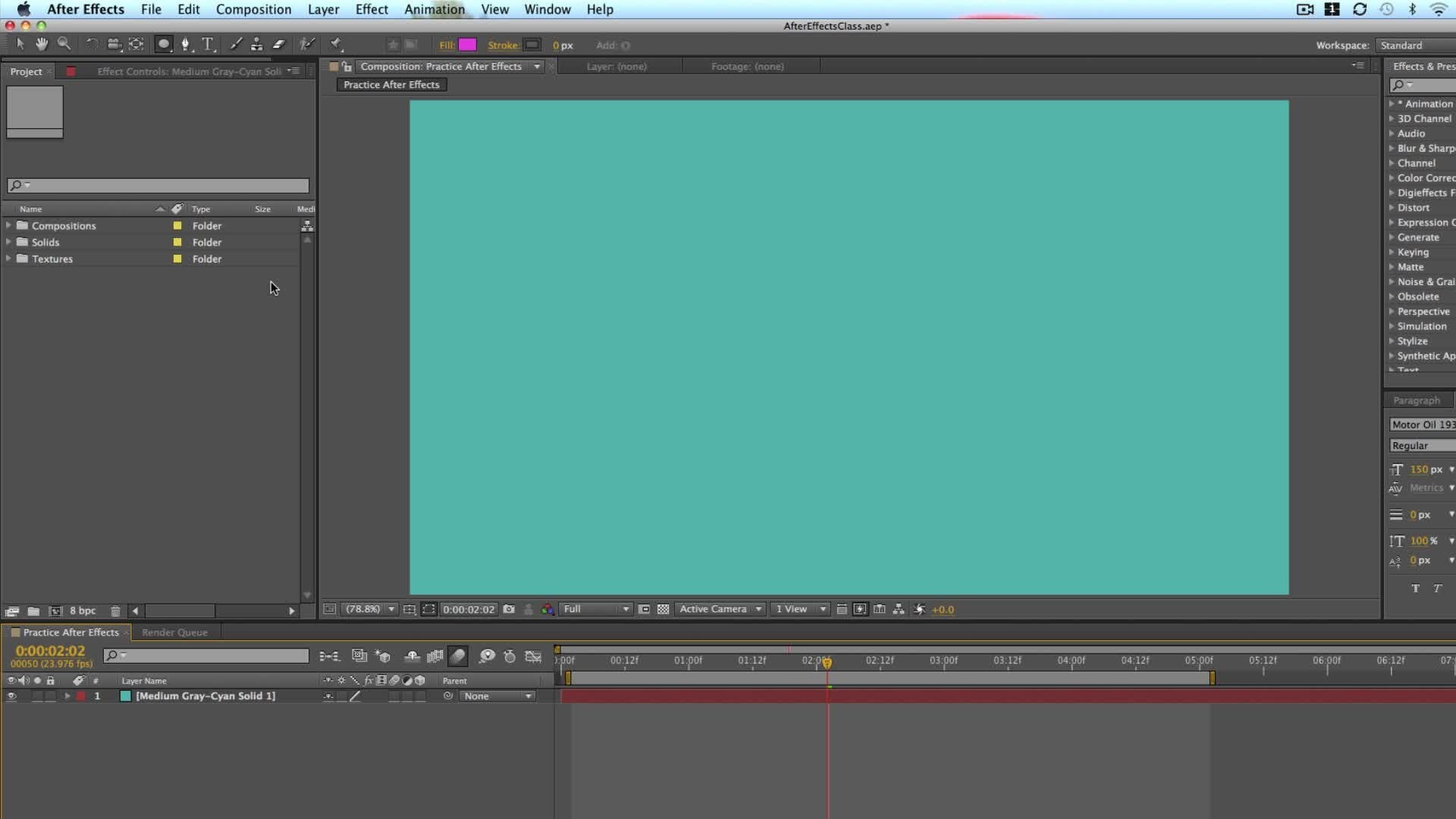
4. Understanding the Workspace: you and I are going to dive right into after effects now, and we're going to take it slow. But the way that I have laid out this course is to really make it practical. So in this lesson, we're going to work our way around after effects. I'm going to talk through the different panels so that you feel a bit more comfortable. I know how daunting it can be when you open up after effects for the first time. There's so many buttons and titles and panels that are confusing. But I'm not going to make this course one of those courses where I just sit back and tell you. Okay, this button does this. This button does that. This button does this this But it does that because that's not a great way to learn. Throughout this course, you're going to be working on many projects and then full real world projects. And throughout that, you're going to be learning different tools, different effects. And so I really encourage you just tow work through each of the lessons they build upon each other. And so by the end of this course, you should feel comfortable working on real world projects in after effects. If you come across a button or a panel that you're confused about fuel for you to let us know and to post a question in the Q and a tab of the course. Otherwise, we might answer that question later on. So just keep working through when you open up after effects. For the first time, you'll probably get a pop up the start module that ask you to start a new project. You can see here that I have a number of projects that I've worked on in the past. Once you've been using after effects for a while, you'll see all of these projects appear here first. When we're starting, we're just going to click New Project, and that's going to open up after effects like this. I'm using the Adobe 2017 version Creative Cloud version of After Effects. If you go upto aftereffects up here in the title menu and you click about after effects, this is how you can see the version I'm using. Version 14.2 point 1.34 It's the 2017 point to release when aftereffects updates, as they usually do once or twice a year, they add new features. All be updating this course, really, though no matter what version you're using, especially if you're using a creative cloud version, your aftereffects is going to look very similar. So just click in the middle to get out of that menu. The next thing you want to understand is the layout. One thing to know is your after effects layout might look a little different than mine right now, and that's because there are different work spaces. If you go up to a window and then workspace, you'll see that there's different work spaces because there's different panels that you might want to use to do different effects. But you might not necessarily need them open all the time if you're not working on that kind of thing. For example, if I click motion tracking, it will bring up this motion tracker panel on the right hand side. But if I'm not doing motion tracking, I might not need that panel open. So to get on the same page, goto window workspace and then go to default. This will be the default view that will be working through in this lecture and moving on. All right, let's get acquainted with after effects in the top left, you have your toolbar and your menus. A lot of the things that we do in after effects with buttons within the actual program down here can be done through the menus up here. A lot of these options are grayed out right now, and that's because we can't do much without starting an actual project. Below that we have the toolbar. You don't see all the tools right now until we start a composition and a project. But you'll be using a lot of these different tools in this class, most of them actually. And this is really what we use to create our own effects and animations. On the left hand side is the project panel. This is your Basic Documents folder for your project. If you've used Adobe Premiere Pro in the past, it's very similar. This is where you can import media and graphics. You can organize things you can add. You know everything from music to illustrator files, everything you can organize in your project. And this is also where you'll be creating different compositions, which, and after effects, a composition is basically an individual video that you're working on an individual graphic and individual sequence. So if you are accustomed to Adobe Premiere Pro, think of a sequence as the individual video you're working on in after effects. It's a composition. The way that these panels sometimes work is that you have the main tab, and then behind this you have another tab. So here we have the effects controls tab. This is where you'll be adjusting a lot of effects once they're applied to your footage. So that's the project window or panel in the middle. You ever composition. Once we started new composition, which will be doing shortly. You'll see. This is where you actually have your project. On the right hand side, there's a number of panels just by clicking on them, you can open them or close them, so we have the effects and presets preview audio. These are all things that will be looking at in the future and then down below. You have your timeline. This is how you start creating your actual projects to take it to the next level and Seymour of the options. We're going to have to start a new composition, and we're going to do that coming up next
5. Starting a New Composition: let's start a new composition. There's multiple ways to do everything in after effects. Usually there's a button in the interface. There's often a keyboard shut shortcut, which you can get to if you go to help and then click on keyboard shortcuts. This will take you to the Adobe website, which has shortcuts for both Mac and PC users, which is really helpful. And then, lastly, there might be a menu option up here in the top. So if you go to composition, for example, you'll see the new composition button, which will also show you the keyboard shortcut. I'm using a Mac, so it's going to be command and or just click this button down here in the project panel. This brings up your composition settings window. Remember, think of this as an individual video or maybe an individual clip that you're working on. You can always rename this later, but for example, I would just call this after effects one. You can name it whatever you want, Then you have all of your sequence settings. Under the basic settings, you have different presets, so if you're using a particular type of camera or footage, you would just select this one of these presets, for example, a lot of videos that I create. I'm shooting at 1920 by 10 80 pixels. This is what you your standard HD footage is, and I shoot at 29.97 frames per second so I could find one of those presets that matches those settings, such as this one. HD TV 10 18 29.97 That changes the width and height to match that. It also changes the frame rate down here. And you can customize this stuff yourself, for example, if you want to create a square graphic. For example, if you're putting on social media like Facebook or Instagram, which like square graphics, you can just click in the with or the height and type in the pixels that you want. So if we want to square weaken, do 1000 pixels by 1000 pixels, and that would work fine. Typically, you're pixel aspect ratio should just be left at square. If you run into an issue, or if someone wants you to do it differently, you would select these. But for most of the projects you're using, just leave it at square. Next you have your basically your timeline window options. The duration is an important one. This can also be changed later. But this is where you set the duration of your composition, which is different than again referring to Premier Pro where if you started new sequence, it can basically be as long as the video you add. You can keep adding clips. It could start out as a minute, but then, as you add more clips, it turns in two minutes 10 minutes an hour with the after effects. You set the duration in the beginning, so if you want a clip or an animation to be five seconds long, then you would set it as five second long like it shows here. If you need it to be 10 seconds, you would change this to 10 seconds. For example. There's gonna also be changed later, but it's good to start out with something shorter, like so background color. This is the background of the composition. This just depends on how you want it to look while you're editing. This doesn't actually change. The background of the video itself will be showing you how to add a background color in a future lesson. This is Just think of it as the transparent background so that you can work in your project . Some people like a white background just to see what that looks like. Typically, I'm just going to leave it as black when you're happy, just click, OK? And now you can see two things happen. One in our project tab Over here we have this composition and then down here, our timeline has sort of opened up, and you can adjust your timeline to zoom in and out. You can see now that our timeline goes from zero seconds 25 seconds and then you have the frames in between 10 frames 20 frames than one second to zoom in. You can take this top bar the time navigator, and zoom in by dragging to the left. Well, right. There's also this little slider at the very bottom for you to drag in and out, and that allows you to zoom. And then now you can also use the plus or minus keys on your keyboard. Just a few more things about your composition panel down here at the bottom. You have different ways to adjust the view on the left, you have this percentage. This will depend on the resolution of your screen. You can zoom in according to a percentage, and this will zoom into your composition at that percentage. So if you would just want to set it at a smaller percentage, you can choose like 25%. So this is moving your 100% resolution composition and shrinking it to 25%. If you wanted to just match the size of this panel, you can choose fit upto 100%. And now you can adjust the panel size by clicking on the edge and dragging up or down. And this is helpful because often times I'll find myself adjusting the size of these panels so that I have more room in the timeline, for example, and that way the video or the composition adjust while I change that panel. The other thing I want to mention right now is this resolution. Right now, I have it set for full, and this is the playback resolution, not necessarily the export resolution of your video. And this helps if your computer is a little bit slower, often times my aftereffects students us. My computer's running slow. It's it's lagging the video. It plays back. Choppy. How do I make it playback smoothly. Usually the issue is that you don't have enough memory or ram processing power in your computer. I recommend at least 16 gigabytes of RAM on a Mac. You can see that information by clicking the apple button and clicking about this Mac. You can probably find a similar setting on your PC as well on in your computer settings. So here you can see that my memory is 16 gigabytes right here. Even still, when I'm using with using high resolution footage like four K footage, I do get a little bit of playback lag. And so to fix that, we can actually decrease the resolution of our playback. This will play back at a lower resolution, so you're seeing a little bit lack of quality. But that's better than having a choppy playback. In my opinion, the last thing I want to talk about right now with this composition panel is this button right here, which is the toggle transparency grid. But it so see if I click that you get this checkerboard of you when you see the checkerboard think transparent. So if you actually wanted to export this video right now with transparency, what you would get is just a blank video with nothing. It wouldn't even be a black background, even though the background of our video is set to black. Remember what I talked about in the composition settings, which you can get back to if you go to composition, composition settings or command K on your keyboard. See the background color is black. If I set this at White, for example, click OK and then click. OK if I click the Transparency grid, but and again it still shows that it's a transparent background were going toe. See how this comes to play when we create graphics like titles, and we want to put them onto other videos in the future. But just know that you can click this button to see what in your composition is transparent . That's the basics of starting new compositions. In the next lesson, we're going to be importing graphics into our project panel, and then we're going to be moving on and actually working with our composition and adding new layers
6. Adding Media to your Project and Timeline: a lot of what we'll be doing in after effects. We create from scratch right within after effects, so creating things like titles and motion graphics. You can build most of that right within after effects. Other times, though, you'll be using after effects to apply visual effects to video clips. Or you'll be using photographs that you created and you'll be adding effects to that. Or maybe you'll even be adding music and sound effects right within after effects. I typically do that in Adobe Premiere Pro because it's a little bit easier and more efficient for me, but you can still do it in after effects to import media into your project toe work on. Just go to your finder folder or your documents folder, and then you can simply drag any asset into your project. Been So. For example, if I wanted to bring in this picture of a King ARU that I shot in Australia, I could just simply drag it and drop it in after effects. And you can see that when I get that plus green button, it means that I can drop it into my project panel and then the other ways you can import are just by right clicking shoes import and then choose file. And then you could go to your folders through this. So, for example, if I wanted to bring in some music can pick this music Click open or I could go up to file import Again Import file. Let's import of video. For example. Do this video sample and click open once it's imported. I definitely suggest organizing your footage. I typically create folders or bins for the different types of footage. So, for example, I can create a new folder by clicking this new folder button and then call it Video, for example. And then I would put all of my video clips in this video folder or if I'm working on multiple compositions within the same project, which all tend to do. I have many compositions, right within one project. I might separate them into different folders. For example, I would typically have a name for these graphics, but I would call his graphic one, and then within this graphic one folder, I would put all the music and all the photos that I used for this graphic. And within this folder, I might even create sub folders four photos, for example, and then put the photos within that folder. I find it is going to help you a lot. If you learn to organize your footage, there's no right or wrong way to do it. I think you've just kind of have to figure out what works best for you. And it might change depending on the project. But please keep everything organized as you work through your projects. It will just make you a better after effects user in the long run. How do you actually work with this footage or all of these assets that you're bringing in while you basically add them to your timeline? There's different ways to do that. Let me take this photo, for example, and drag it into my composition. There's two ways to do it. You can drag it right onto your composition window itself or down into the timeline. Now let me show you what happens when I drag it onto the composition. See, it just pops in right there and you'll notice that this layer has been added to our after effects timeline down here, and it's been added to this entire sequence or this entire composition from start to finish for all five seconds. Now let me take the same photo again. Drag it into the timeline. But you'll see now that as I drag from left to right, there's that little icon that moves left and right in the timeline bar, and this is where it's going to start. So if I wanted to start one second, for example, I'll just drop it right there. And now you'll see that this photo starts at one second. I can move the current time indicator to the right and see where this one starts, but you'll see that I don't see that photo that I just added down here, and that's because it's beneath this other king room photo. So if I want, I can drag this second King room photo this layer right here above the other one by clicking on it over here in the left hand side of the timeline above our other king room, and you'll see that it actually added it to sort of a different position. This 1st 1 it added to where I dropped it. Let me delete that one more time to show you so if I want to move, drag it and drop it in over on the right hand side. I can do that. Now again, I'm going to move this beneath my other king Guru layer and you'll see if I scrub through just by clicking and dragging through this composition. It goes from this photo to that photo. So think of after effects as layering different media assets on top of each other. Whatever is on top will show, and the next lesson will be using and looking at some of the most important tools up here in the toolbar.
7. Basic Tools: I'm gonna go ahead and delete these two folders and media assets because that was just for example, so I'm just going to select them in my project panel and then click delete. And now let's go over the basic tools. If you hover over them and just pause for half a second, you'll see the name of the tool pop up with the keyboard shortcut. This first tool that is sort of your standard mouse tool that you'll be using for most things you do in after effects is just the selection tool. This allows you to click on things, and then once you have different assets, shapes, titles, layers in your composition, allows you to click on them and move them around. The next is the hand tool, and this actually moves around the composition window itself or the video itself in your composition window. For example, if I said this to 25% and then I take my hand tool, I can actually move this composition around, and this is beneficial if you have something that you want to zoom in on and then you want to move around your composition so that you can see it more clearly. Speaking of zooming, you can zoom in with the zoom tool so I can zoom in. Now, zoom out. Once you have the zoom tool selected, which is keyboard shortcut Z, you can press option on your keyboard and then click to zoom out Option on a Mac. And then it will be Ault on a PC for PC users. That's another way. Other than using this drop down menu here to zoom in and out of your composition, I'm actually going to bring back my King Roof photo show so I can show you kind of more what this looks like and what these other tools do. I'm gonna drop this and on my composition. And I wasn't going to show you all of these things until next lesson. But let me just show you a quick way to zoom in and out of a an asset that you've added or to scale it up or down. If you press s on your keyboard, that brings up the scale property. You have these percentages here. You can just click and drag to the left or right so you can see I can zoom in and out it's not necessarily zooming into my video. It's just scaling up or down the asset that I'm using. So if I want to fill the frame, will put it at about 49% now. You can see more clearly if I zoom in, for example, and let's change the resolution to full so we get the highest quality possible. And then I take my hand tool, which another quick tip is. If you just press the space bar on your keyboard, you temporarily get the hand tool. And then when I un press the space bar, it goes back to the tool that I was using. So, for example, if I'm using the selection tool, I can use the space bar to move this around. Let me zoom out really quickly is only zoom out of 50% and then I'll just space bar hand told to move this around with the selection tool. If I click and drag this photo, it's actually moving it around the composition. So if I want it on the right hand side, I can do that on the left, up, down, etcetera. That's different than the handle, which is actually moving just the composition window around. Same with zoom Tool. You're not actually zooming in on the video or the media is just zooming in on the window. The playback. The next tool is the rotation tool, and so if I click that and then I click on a layer, so I have to have a layer selected. Then I click and I drag around. I can rotate this image left or right. Say you do something and you don't like what you did. You can quickly undo by pressing Command Z on your keyboard. We're going to skip the camera tool, which will be covering in the three d section of this course. And then there's the pan behind tour. This is a little bit confusing, so I'm going to try to explain it as clear as possible. But this has to do with the anchor point of each layer. The anchor point is symbolized by this little circle with the lions coming out and sort of a cross section. You see that it's right there. It's kind of hard to see, I know, but it's right there in the middle of this layer, and what this does is it anchors all of your different properties to this point. So remember when we scaled this photo up and down down here with the scale property? So if I zoom in and out, where is it zooming in and out from our Skilling up and down from its scaling up and down from that point right there in the center, the anchor point? What if I move this point down to the left, which I can do by clicking on our pan behind Tool or the anchor point tool? I can drag this anger point down to the left, and now, if I scale up or down its scales from that point, see how that works. And so the anchor point is going to really come in handy later on when we're changing how we animate different layers. This will also affect the rotation. So if I go back to the rotation tool, it rotates from that anchor point. In the rest of this lesson, we're just going to go over these three other tools. The rectangle or shaped tool, which is also the mask tool, the pen tool and the text tool or the type tool thes. Other tools are a little bit advance and will be going over them in a later lesson of this course. First, the rectangle tool the rectangle tool. Or, if you click and hold it down, you can see that there's more options, such as the rounded rectangle tool, the lips tool, the polygon tool or the star tool. This allows you to create shapes. You will be able to create a new shape if you don't have anything selected in your timeline . So what does that mean? If I click on this king ruler, it highlights this layer. You can see that when I click it, it's this sort of bright purple. If I click off of it just down here in the timeline, it sort of becomes a little bit darker. If I you have that rectangle tool and then I just click in my composition window and drag. You can see that it creates this rectangle, and I can change the shape and size, and eventually we can change the color as well. And when I do that, this new shape layer appears in our timeline. Okay, let me delete that. I actually believe that layer. Now I want to show you what happens when I have the Kinga Reus layer selected. And then I have this rectangle tool selected. And then I try to create a rectangle. What happens is I'm actually creating a mask of this layer that selected cool, right? So if you want to crop or quickly cut out a piece of your photo or any of your media assets , you can do that with with this shape, tool or what becomes a mask tool. Let me undo that and say, We want to create a circle or an ellipse, as they call it. We can choose that tool and then just drag around our king or his face. I'm going to show you how to create perfect squares in the next lesson. Let me undo that. The next tool is the pencil. While this is selected, what I can do is just click around, and it basically creates a custom shape. So every time you click, it creates a new point, and then you have to complete all of the points in a complete circle for it to actually become that shape again. With the king grew layers selected, it creates a mask for this king rule air let me undo that on day one. Do if I click off of the King Guru and then I click with the pen tool, I do the same exact thing. You can see that without the king grew selected. It creates an actual shape layer. So you're now learning that these two tools the pen and then the shape tool they have to things that they can do. They can either create masks or they can create shapes. Let me delete that one. Lastly, we have our type tool, so with the horizontal type tool or free click and hold. You have a vertical type tool. You can select that, and then you just click in your of composition, where you want to add type. Click. It adds that empty text layer down here. And then if we start typing hello, you can see text over on the right hand side. You'll also notice that the character panel popped open, and this is where we have all of our text options. You can change the font. You can change the style, you can change the color, and we're gonna be going over more of these options in a future lesson. but feel free to play around with these settings now. It won't change anything unless you have your text highlighted with your text tool or your type tool selected, or if you go back to your selection tool now that selects all that text and you can change these settings. So if I want to change it toe white text, I can click the text color, which is this window right here that brings up our color picker. And then I can drag around and change to wait, for example, if I want to change the font and just choose a different fight if I want to change the size via this method, which is different than the scale method that we showed you down here and then changed the text pixels or the font size pixels, those are the basic tools in after effects. And as you can see, there's so much in after effects, and I hope you're learning. So far it may seem like we haven't covered that much, and it's true. There's so much more to cover, and this course has already been, what, 30 40 minutes long? So I hope you found it beneficial. So far these lessons are really the basis the foundation. And as we move forward, we're going to get more into the real world aspects of it. But hopefully this has been helpful. And in the next lesson, we're gonna be going over mawr of these different options in the timeline.
8. Create a Perfect Shape + Colors: Before I move on to the timeline, I promise that I would show you how to create a perfect square or circle. So first I'm just going to delete these layers by selecting them here in the composition panel and just deleting them to create a perfect square. Take the rectangle tool, and then, while you have it selected, just click the shift button and you can see that as I drag out, I create this square. You can see that it's being created from the upper left corner. What if I want it to be created from the center? Well, let me delete this Italy this layer now with the same tool selected. If I click and then I hold shift and then I hold command, which on a PC would be the control button. You can see that it creates, and it grows from the center from where I clicked. Cool. Now, how about a circle? It's basically the same thing. So if you go to your lips tool and then if you click and drag, you'll see that now it's just an oval. But if I hold the shift button, it's that perfect circle. And remember what we did Teoh create the circle from the center from where we clicked, we held the shift button down and the command button that's on a Mac. It would be the control and shift buttons on a PC. Okay, so now I have this shape. I'll go back to my selection tool, and I can move it around my composition. Here's another quick tip if you want to align it to the center of your composition, so you wanted to be perfectly in the centre, horizontally and vertically. Go to your align panel just by clicking online and click vertical center alignment and horizontal center alignment. The's buttons right here allow you to adjust where your layer is according to your composition. Now, how do we change the color of our shapes? Well, there's this Phil button up here, So with this shape layer selected, I can click the fill color right here, and I can now change it. So if I want a light blue circle, I can do that. You also have this stroke option, so right now the stroke. You don't see it because it's set to zero pixels. But if we want a stroke, which is a little hard to see right here. I said it's to 15 pixels. And now, as a white stroke, I'm going to turn off the transparency. How do I do that? You might have got saw me going over there is this button right here? So let me turn off the transparency. So now we have that black background, and this is great, because now we can easily see this image in our shape with the stroke. If I want to change the color of the stroke, just click the color next to the stroke. And now I can change it. Maybe I want that sort of red and blue look super cool, right? And now you have a red stroke. So those are just some basic things to know about using the shape tool, how to align layers to the center. And now, in the next lesson, we're going to be going over more of the options down here in our timeline
9. Working in the Timeine: next. Let's look at the timeline. So I have that perfect circle that we created in the last lesson. I'm actually going to turn off the stroke just by changing the pixels to zero. And I'm also going to add my King Room photo back onto the timeline, just dragging it beneath my circle. Cool. So we already learned how to zoom in and out of our timeline just by dragging this top bar or by zooming in down here. You'll also notice that there is this other work area bar. If I press the space button, it's going to play through all five seconds of this composition and you'll see that aftereffects is automatically set up to just repeat toe loop the play so it's gonna continuously keep playing. And that's because in after effects, often we're creating these little animations, and we just want to see it over and over to see how it looks instead of having to press the play button over and over. What if we were creating some sort of animation at the very beginning of this and say, this is just a basic animation where our circle pops on? Well, how do we do that. We can just drag this shape layer over to the right and you'll see that now it's off at this time. And then if we dragged through, it's on. Now that's not really an animation. We're going to be covering how to actually anime things in the next section. So coming right up. But now if I play through this is going toe pop on right there. Let's make it a little later at 10 frames, for example, go back to the start. Okay, play there. Now it takes a while for it to go through the five seconds and then go back to the start again. Say, we want to zoom in on this time frame, for example, the 1st 2nd more easily take your work area bar, and now we can drag this in toe one second, for example, and you can see that it's highlighted. Now if I take my time indicator and I move it into this work area, then I press the space bar. You can see that it loops the play just for this area of the workspace, which is super beneficial as you create your more intricate graphics. One other use for this. Let me bring back our video clip. So let me bring in this video sample and then a quick way to create a composition based off the size and settings of your actual media asset is just a drag your media asset into the composition button. Right here, you'll see that it created this video sample composition and then down here it's the right size, so it's the same aspect. It's also the right length. So it's all two minutes and 20 seconds of this video, which was a video for another class of mine. Say you have a video clip, but you only want to add graphics to a certain part of it. Say I want to add a title graphic right here between five seconds and 15 seconds. Well, I can take my work area bar, and I can move this to around five seconds. Then I could take the end of it and move it to 15 seconds. And now if I zoom in just with this bar right here and now I have this set up so that my work area is going from six seconds to about 15 seconds. You can see that If I click in the middle of this work space bar, it moves the whole work area to move the end inner out. You have to click on the end of the work area and then drag. So that's how you can sort of zoom in and work on a specific part of a clip. What if we want to actually just trim this whole composition to this specific part of the clip? Because as you're working on this project, you might not even need everything that's to the right of this sort of work area. If you go up to composition than choose trim comp, toe work area, what happens is it trims it to that work area that we had set up. So now it's just that six seconds to 15 now, we can't go ahead and zoom back out from this. You see that now are Zoom Bar. If we use this, it just allows us to zoom in and out from that six frame six seconds to 15 seconds. That's one thing to note. We can't, of course, undo this, or we can go back to composition and our composition settings, and now you'll see that the duration is nine seconds. Say we want this to go for 10 seconds. If I put in 10 seconds and then click. OK, then I zoom out. Okay, Here's another thing with your timeline. Look what happened at the end of this video clip. You'll see that. Oh, this video clip actually disappears. You can see that there's this little cut point right here. And that's because in the previous part we went to composition trim to Compton work area. It actually trimmed this media clip or the video clip to the cop area as well. So to extend this, what we can do is just hover over with our mouths over this end of the layer and drag to the right. Now, if we go through and scrub through, this video plays through till the end of our work area. One keyboard shortcut that I like and is really helpful is the command left or right bracket shortcut For Windows users, it would be control left a right bracket. So if I press command and then I press right bracket with the king grew layer selected, it actually moves this layer up. I can choose the command left bracket to move it back down. So this is how you can reorder layers just on your keyboard. All right, that's a lot with the timeline over here on the right. But there's all of these buttons over here on the left, and we'll be going over all of these things in future lessons as they become more applicability. But the things I want you to know our first on the very far left, is this little eyeball icon. And you have these different columns with these buttons where if you check on or off, it includes that little icon. So turn off this layer, which is what the eyeball icon is for it. You can just press that I am all for the layer, and it makes it basically disappear. It turns it on or off. We don't have any audio in these clips, but we do in the video sample, and that's what this next column is the audio. And so if you want to turn on or off audio for a specific layer, just turn that on audio honor off with that column back to our other composition, gonna move my time indicator to this point where we have both layers. This next column is to so low layers, and this might be more beneficial or easier to understand if we have more layers. So let me duplicate this shape. Layer one to quickly duplicate it. A layer instead of going up to our shape to one, creating another layer. Weaken. Select it in our timeline and press command, D or control de for you Windows users. Or you can also copy and paste by selecting it. Pressing command See and in Command V that's control for PC users. So from now on, if I ever say command, it's typically going to be control for PC users. Sometimes it's different, and so you might be confused and you'll have to go up to the Help Keyboard Shortcuts menu. Just find out what it is, or you can always ask me in the Q and a tab, and I'm just going to move this layer over to the right. So now we have three layers, and this solo option allows us to basically make only one of those layers appear. So if I click solo shape layer one Onley, this layer appears same if for the kangaroo, it makes all the other layers disappear automatically. And this is beneficial. If you have projects where you have dozens or hundreds of layers in a single composition which actually has happened to me and in the past and you want to really just see one layer , you can use that solo button. The lock button right here locks this layer. So now I can't move it around. You'll see that it does this little highlight when I try to click it and I can't do anything to this layer, and that's beneficial. If you're done with the later and you don't want to do anything, mess it up, move it around. Just click the lock button to the right. You have this drop down arrow and so you see that if I click this drop down drops down more options, we're gonna be covering thes things, which are more properties for each layer in the next lesson. So I'll just skip over that for now. The next is this color option, and this is the color of your layers. So you see that the photo layer was automatically this purple color this violet and then the shape layer was this blue. If you want to customize the color of your layers, you can click that color block and then change the color. And this is helpful for organizing your compositions. Say you have again a bunch of layers. You want to make sure that you can easily find the right layer. And if you know that, hey, all my red layers are text layers, for example, which this isn't, then it's easier to find that the source name is the name of your layer. If you click that source layer text up here. It changes to the layer name, and this is how you can actually rename your layers in your timeline to be more organized. So instead of shape, layer at one and shape layer to which can get confusing in the long run. What I would do is I would select shape Blair one and then press the return key on your keyboard that highlights this title, and now I can call this Circle one or Blue Circle. Then, if I go to this second layer and I changed the color by going up to the fill, changing it to read, clicking on the title pressing return, then call it Red Circle. This is just an easier way to again navigate, making you more efficient. And that's pretty much as far as I want to go today. In this lesson, I know that this lesson in the past lessons it's more of that. Hey, Phil, we're just gonna go around, go through all the menu options. This is boring, but don't worry. The next few lessons are going to get a little bit more interesting. We're going to start animating very soon. We just have to cover the basics right now, So I hope you're learning. Help your understanding. If I'm going too fast, please let me know if I'm going to slow, please let me know. But also be a little patient because there's other learners who are starting from scratch and need a little bit more information. Thanks so much for watching and in the next lesson will go over more of the layer options that are within each of these layers
10. Layer Properties: let's talk about our layer properties to do that, I'm going to delete this red circle. But I'm also going to just leave this blue circle on and our photo I'm just going to extend this one to the left and extend this one to the right. You'll see that when we created the shape layer that we automatically have some of these options already opened the contents and the Ellipse option and the transform menu. Every layer has the transform menu. So if I go into art Kangaroo later and I click this drop down button, you see this transform menu that pops up to open up this menu? All we have to do is click this little drop down and you'll see all of the transformed properties. Anchor point positions, scale rotational and opacity thes are transform properties for every single after effects layer. We already looked at scale. This is how you scale up or down a layer anchor point. We already kind of saw that with the pan behind tool. This is just the representation of it in pixels based off of where it is on your composition here. So if I take my pan behind tool, and then I click on the anchor point and I move it around. You can see that it actually moves. The anchor point number is down in the timeline back with my selection tool. If I move this photo around my composition now, you can see that the position is also changing. We can also change these things just by clicking and dragging these numbers here in our timeline, or by clicking the number and actually putting in the exact number that we want. So if we want this to be at 100% scale, we can put in 100%. If we wanted to be at 25% 25% you'll see two percentages for the scale, and that's the width and the height percentage. And these air typically locked, which you can see with this little link icon, which is the constrain proportions option. If I want to be able to edit the scale of the width and height individually, I can click on that to unlock it, and now I can stretch this photo with the different scale. It's for with and height so you can see this is also scaling from the anchor point. So it's killing from this point, and you'll also notice that I can go negative. And so when I go negative, it actually flips the image. If you wanted to flip exactly from the centre, an easy way to put the anchor point in the exact center is toe. Hold the command and shift buttons down, and you can see now as I drag the pan behind to around you see these crosshairs pop open, and this helps you and it kind of locks the anger point to the center horizontal and the vertical center lines. If we wanted to be in the center, weaken, drag it and it snaps to the center. Now you can see if we flip the scale. It flips exactly from the center of the an image, which makes it a little bit easier. We have rotation, which we also saw before with the rotation tool. If we rotate that change of that and then the other thing we didn't see is opacity. So this is the transparency of this layer, also known as opacity. 100% opaque means that it's fully there. None of it is transparent. If we put it down to say 50%. And then we toggle on the transparency of this composition. You'll see that there is some transparency. Say we move this kangaroo above our blue circle and then we turn on our blue circle again. Now we can see the blue circle behind our kangaroo. That's because we're at 50% capacity for this photo layer. I can turn off the truck toggle transparency grid, and you can still see that this circle is behind this photo layer. So let's bring that back up to 100%. All of these transform properties have their own keyboard shortcut, and by the end of this course, you will be well aware and fluent in using them. So for anchor point, it's a for position. It's p for scale. It's s for rotation. It's our and for a pastie, can you guess what it is? It's actually not O which would make so much sense, but it's actually t, which you can think of as transparency. So, with any of these layers selected, you can bring up those different properties. And if you want to quickly close down this layer instead of just clicking this triangle but in which is relatively fast. But I think keyboard shortcuts make everything faster. You can use any of those buttons, for example, s to bring upscale. And then when you press s again, it closes down the scale property so none of them are open. T t again closes it down. You can also select multiple layers in your timeline by shift, clicking them or by control, clicking them or command clicking on a Mac. And then you could bring up any of the properties together. So scale TVA, rapacity a for anger point and so on and so forth. So if I drop this down and open it up again for the king grew image, we've gone through all of the transform properties in the shape layer. You'll see that you have your transform properties, but you also have this contents drop down. This is different for shape players, and you'll see this with Shea players. You won't see the contents for layers like photos. And here is actually the ellipse and let me turn off our kangaroo so we can see the lips. This is the lips shape that we created in this layer. The confusing part is that we can create multiple shaped within this one layer. We're gonna be going over shapes in much more depth in the future. But let me just quickly take the lips tool with this layer selected. If I click and drag, you can see that I'm creating another circle. It doesn't create a separate layer. It creates another ellipse within the contents of this one shape layer. So if I turn this on and off, it's both of those shapes in one, and underneath this ellipse layer, we have more options. We have the Ellipse path that stroke the Phil and transform properties. So there's individual transform properties for each shape layer within this shape. Clear, confusing, right. And within these transform properties, there's more options for shape players such as skew, which skews a shape or skew access, which changes where it skews from confused. I know it is confusing, and you're going to learn these things as we go on as we use them. But just note that while all layers have the basic transform properties, some layers have different properties. For example, the mask layer. So let me delete the blue circle, which leads both of those circles we created, Actually, I mean, undo that and show you that you can drop down our contents folder. And then if you want to just delete one of these ellipses weaken, select that ellipse and then delete it if you want to delete the whole layer entirely, just like the layer itself and not the content layer down below and delete. So if I turn on the king room, then we create a mask. Do you remember how we did that? We went up and used the shape tool, such as the rounded rectangle tool or the pen tool. Let me show you the polygon tool because that's a good one to know, too, with this layer selected. Now I click and I drag and I have this polygon. It starts out as a Pentagon with five points. Now we have this mask, which is another option underneath this layer. So if I open up the mast tool, we have masked properties, feathers, opacity, expansion, all these things you can adjust the same way by clicking and dragging to the right or left or by clicking and in putting a specific number. I think that's a lot to grasp right now, Go ahead and play around with your layers. Play around with your timeline. Play around with all these properties for your different layers, and in the next section, we're going to jump right into animating in after effects. It might sound confusing, but once you know the basics of it, it actually is relatively simple. So get comfortable with everything that we've learned in this section so far, and I'll see you in the next one.
11. Animating in After Effects: welcome to this brand new section we're going to be animating in after effects. So throughout this course, what I want to try to do is challenge you based off of what we've learned in previous lessons. So sometimes I might ask you to pause the video and do something. A lot of what we're doing in this section and in future sections were building completely from scratch. And I want you to get into the mindset of I can build it from scratch in after effects. I don't need a template. I don't necessarily need the project files while we do have project files for some of the projects so that you can see exactly what I'm doing in this section were creating everything from scratch. So what I want you to do right now is to start a new composition and make it 1920 by 10 80 pixels and make it five seconds long. So go ahead and pause this video. Do that and then I'm going to show you how to do it. If you forgot. All right. Hopefully you paused the video to create a new composition. Remember, we create click this, create a new composition. But in we said our settings 1920 by 10 80 then for the duration. I'm just going to choose five, and I'll call this animations next. What I want you to do is create a perfect square and center it toothy composition. So again, we've learned this in the past section, so you can do this on your own. So pause this video, create a perfect square. How about you make it a white square and put it in the very center? It doesn't matter how big or small it is for this example, though, so pause and do that all right. Hopefully you pause. So to create a perfect square, choose the rectangle tool from up top under Phil or next to fill, click the color and select white, so it's going to be white. Now click in your composition and drag while holding the shift button down, and that creates that perfect square right to center it. We have our ally in panels over here on the right hand side, so click horizontal and center alignment for vertical. So now we have our perks. Worry. Let's talk about animations. Two. Enemy in after effects. We use what are called key frames. Key frames is related to the word frames. And, you know, with video we have frames. We set our composition to 29 97 frames per second. So in every second of our video or our composition, there are 29.97 frames. So if you zoom in on our timeline really far, you can see each frame. 12345 get it. So a key frame is telling after effects that at one point in time, we want ex whatever type of property to be this. So, for example, let's bring up opacity. Remember how to do that? It's t on your keyboard. Or, if you drop down your transform properties, you can see it under opacity. I'll just bring up it with tea, so ah, rapacity is set at 100%. Let's go to one second on the timeline, so let's go all the way here to set a key frame. You can click the stop watch icon, this little stop watched next to opacity and you'll notice if I bring down all of the transform properties. And even if I dive into contents, you can see that some of these things have those stopwatch icons, and that's because you can set key frames for many, many different things in after effects. Again clicking T To bring about pastie, click the opacity stopwatch, and that creates a key frame. You'll notice that on our timeline, right at one second, this little diamond appears. Let me move my indicator over to the right. You see that little diamond? That's a key frame, and that's telling aftereffects that at one second we want this square layer to be 100% opacity. Let's go back to zero frames or zero seconds. If we click on our opacity and say we choose, set it to zero press return to lock that in place. What happens is we're telling aftereffects that at zero frames we want, though pastie to be 0%. So what happens between zero and one seconds? There's this animation or this transition from 0 to 100 so if I scrub through this, you can see that it creates this fade on effect. That's what opacity can be used for for fading on objects or layers. I can move around these key frames, so Aiken click them. I can move them around. So if I want a longer fade for it to go two seconds, we can move the distance between the two key frames from 0 to 2 seconds. And now our fade is longer. See that, or if I wanted a lot shorter, we could make it half a second. Like so I can delete key frames so I can just select one and delete. Or let me undo that Command Z and select both and delete one thing you'll notice. Let me undo that. Let's go back to where we had just are one key frame at one second, you'll notice that as soon as I change the opacity to zero that a key frame was automatically set. I didn't have to click the stopwatch to do anything. In fact, if I set art, opacity does something different than the 100%. And then I clicked the stopwatch. What happens is it deletes all the key frames or if we go back again and ah, rapacity that 100% and I click this now it again deletes everything that we've done so far . So to create a new key frame once you've set one key frame on any individual layer. All you have to do is change the value of that property. So if I drag this down to zero, that is set Now I say we want this toe fade on and then fade off. Let's go toe two seconds. We can set this to zero and now we have our object fade on to 100% then fade off to 0%. How do we get this to fade on and then pause at 100% and then fade off to zero present? Well, we can either go in between these second and third key frames and either change the opacity to 100%. Or I can copy and paste key frames so I can select this key frame. Copy it on a Mac that's command, see on a PC or to be control, see and then paste it. Command V. Now, between these two key frames, nothing happens. It just stays at 100%. That's the basis of most things were going to be doing in after effects. And the next lesson we're going to take it a step further and start animating other properties, and there are some key things that you'll need to know, especially when animating things like position that's coming up next, and I hope you enjoyed this lesson.
12. Position, Scale, and Rotation Animations: let's move on to some other properties. So to get rid of all of these key frames, remember, we just clicked the stopwatch again. But once we do that, it actually stays at the value where our timeline indicator is basically. So if I click this there, it's going to stay at 0%. So I'm gonna move that back up to 100%. So let's bring down all of our transform properties. Let me just make this a little bit bigger fit up to 100%. All right, so now you know how toe set key frames. So it's rather simple to create a position animation. So say we want our square to end up here. Let me take my selection tool. We'll set a key frame for our position, so decide what time you want it to end at this position. So we'll do one second and said a key frame for position there. Maybe we wanted to pop up from beneath this composition itself, So I went back to zero seconds, and I'm going to drag this down and you'll see as I start dragging because I have a position key frame, we give this sort of lying with little dots stretch between the two points. You'll also notice that as I drag down, it's kind of hard to make it precisely going perfectly vertically up without going from side to side. Will the lock it in place press the shift button? And as I do that now, it's kind of locked in place like so, and it locks her horizontally or vertically. So now, if I drag down below are composition, then let go and then let me bring in my work area so we can see this animation and then press the space bar bar. We have this animation of this square popping up cool, right? We can actually add multiple animations to the same object. And that's how we get things to B'more. Intricate. So maybe we wanted to grow while it's moving up on the screen. So at one second, let's set a key frame for scale at 100% and then go back, and sometimes I like toe. Leave it on. I don't want to go back to zero seconds because I can't see the square, so I'll just go somewhere right here in the middle where I still see the square. I'll decrease the scale toe where I think I want it. And then because I don't want to just go like pop up and then all of a sudden grow, I want to be growing the whole time. I'll just drag this key frame for scale all the way to the left, and I did that just so that I can see what I'm working with. So let's play through this. So it's growing as it's appearing on the screen. And let's just add rotation. So let's rotate. So this will be the final resting spot at this rotation. We'll go back again and let's rotate to the left. Now. The problem that I see is that our anchor point isn't in the center of this object. So what happens is it rotates from the anchor point, which is a little off center, which actually looks kind of cool. But if we wanted it to be from the center, you're gonna have to do a little extra work. We'll take this pan behind tool, so let's move this back to the center, and then what we'll have to do is see where the position starts. So if we'll go down to where the position starts. We have to put our timeline indicator over this key frame or it's not going to work. And then we take our selection tools and let's move this down. So now it's rotating from the center and it's moving straight up. And remember what I just did. I press the space bar to move my composition up or down. You'll notice that outside of our composition that we still see the outline of our square. And this is just a way that, after effects lets us sort of see what's happening outside of our composition. When we have a layer selected when I don't have that layer selected, you see the square, but you don't see the path that it's on. A good rule of thumb, though, is if you want your animation to be from the center of an object, make sure that you set your anchor point first. All right, now we have this pretty cool animation of this square popping up. What if we want to change the rotation? This is just a reminder that if we want to make it rotate even Mawr and we want to change this 1st 1 Remember, we can't just go in the middle of these two key frames and change the rotation. Say we want it from negative 36 to negative 94 because what's happening is now it's going from negative 79 to negative 94 then back to zero. You'll wanna go all the way to the first key frame in now with our time indicator on the first frame key frame. Set the rotation to whatever you wanted to start at like 94. Another way you can do that is just by deleting this key frame and then moving the one that you just set all the way to the left, where it started, or really wherever you want. So that has a little bit more of a rotation. And that's how you change key frame values after the fact. In the next lesson, we're going to be making our animation look better and a little bit more natural.
13. Animation Tips: to make animations look better and more natural. There's a couple things we can do in after effects. One thing I want you to do is wave your hand in front of your face Right now. I know it sounds a little silly, but just wave it in front of your eyes and do you notice anything about the motion of your hand? It's really blurry. That's called motion Blur, and it's just natural that things in our natural environment when they move the way our brain processes them, there's a little bit of blur. What's different in this animation is that at every single moment at every single frame, our square is perfectly sharp, and that's not natural when it's supposed to be moving so you can add motion blur in after effects. And that's one of these other columns in the timeline. Is this one with these three little dots, and if you hover over it, it's called motion blur, and all you have to do is check that button and enable it for our entire timeline. And that's what these buttons up here do. So you see this three little dots, one that's enabling motion blur and So now you'll notice that as soon as I check that on, you get a little bit of blur on the edges of this square. And as I go through and Scripture, you see that little blur, and that's a little bit of motion blur that makes it look a little more natural if I make this animation even faster. So I bring all of these key frames in to half a second, which I can do by selecting all by clicking and dragging over and then selecting one of them and dragging them to the left. Then play through this. You get even more motion blur because the faster and animation, the more motion blur you get off on. I typically like toe add motion blur to most of my animations. The other thing that you can do to make your motion look more natural is playing with this speed right now. Between these two key frames, this square is moving and rotating and scaling up at the same speed throughout this entire animation. So from this frame to this frame, it's moving at the same frame speed as from this frame to this frame. But in nature, things ramp up. If you bounce a ball on the floor, it starts off slow, and then it will speed up, and then it will go slower as it reaches its resting point. If you start running, you don't start running at your top speed. You ramp up and so to ramp up animations. What we can do is called Eazy e's and after effects. Let me just do that with position. So let me press P to bring up position. And now I just have my key frames here toe. Add Eazy E's to a key frame or to a set of key frames. Select those key frames or just for one right click the key frame, go to key Frame assistant and then choose Eazy E's. Or you can just select them and press F nine on your keyboard. So that's what I'll do now with that Eazy E's. You get more of a pop to it. It's that speed ramp, but it also has a sort of like pop action that I think looks pretty cool and looks a little bit more natural. If we extend it to one second, it'll look a little bit better, but you'll also know that now, when I extended the position to one second, I didn't extend the scale or rotation to one second. So I want to do that. So what I can do to quickly bring up all of the key frames for this layer is press you, you on my keyboard and that brings up all the key frames. Now I can take my scale in rotation and move it to the right toe one second. And if I want, I can Easy's these other key frames so I can select all of these press F nine or right click and choose Eazy E's Now with that motion. I think it looks a lot more natural and you can see it can't slows into that final resting spot in the next lesson will take it one step further, using an advanced technique that I think you'll understand. You just have to dive right into it, and it will help you change up the speed ramp of your Eazy E's
14. Using the Graph Editor: to play even more with the way the speed works with this animation will use what's called the graph editor. The graph editor button right here opens up what's called the graph editor. Obvious filled. Right? But we don't see anything down here. Let me just extend this panel. The timeline so we can see a little bit more. We don't see anything. And that's because we have to choose our key frames that we want a view on the graph editor first. You can also do it later. But with these selected and then clicking the graph editor but and we see these lines and these lines on this graph represents the's speed of this value change. So for the position you can see and if I want to just highlight one of them, I could just choose that property over on the left hand side. I can see that the position starts at zero pixels per second and you have the values on the left on the Y axis of the graph, and then it ramps up all the way to the middle or it's at 1000 pixels per second. So remember how he was talking about with Eazy E's, it ramps up and without Eazy E's, it's sort of this linear. It's always moving at the same pace. If I check off of the graph editor, then I choose my position, key frames and then click command. Click them Teoh, clear that Eazy E's. Then go into the graph editor. You can see that the speed is this flat line right here. It just is always about Well, it says exactly what it is. 767.43 pixels per second for this entire animation. Let me undo that. So we have our Eazy e's. This is the speed graph. If you don't see the speed graph, you might have to go to this button, which says Choose graph type and options and select speed graph because you might be on value graph. This is another graph that shows the value of your property. So over here you have it starting at 13 8.919 and that's right here in our position. And then it goes down all the way to 5 40 There's lots you can do with the graph editor, but in this course were mostly going to be looking at this speed graph. So how do we change up the speed? You'll notice that we have the key frames down here, which, when selected, they have these handles these little yellow handles coming out from them. If we click on the yellow handle, you can see that I can drag it around. I can drag it up and down, but I don't necessarily want to do that. I just want to dry it to the right or left. And if I drag it to the right, what's happening? It creates more of a ramp, and so it starts out even slower than before. So for the first half second, it doesn't ramp up to speed as quickly as before when the handle was back here. So now we're ramping up the speed from zero. It's on Lee going around 500 pixels per second at half of frame, and then it really spikes up to 2500 pixels per second. What does this look like through that little pop at the end? So it kind of slows in and then it pops up at the end. Let's reverse this. So let's take this first handle and put it all the way to the left. And then we'll take this second handle for the second key frame and dragged to the left. So now it's gonna go really fast and then really slowly go into its final resting spot. One thing I like to do to give it just a little bit more of a pop is grab the handles and drag them both in. So let's drag both these handles in. So now it's going to go all the way up to 5000 pixels per second in the middle. And you can see this creates this sort of cool pop effect, and we can do this with the scale to or with rotation. So maybe we want most of the rotation toe happen at the very end of this animation. Just select rotation. Click on your key frame down here in the graph editor to get those handles and drag to the right. So now there's not going to be much of a rotation here. But at the very end, there will be this fast rotation kind of cool, right? Or maybe you want it to be the opposite, but you can play around So the graph editor is a cool way where you play with the speed of your animations. Now, if you've gotten this far and you're mostly comprehending what I am talking about Bravo to you it took me years before I even started working with the graph editor. So you're learning things that professionals are using all of the time in their animations . And I wanted to just dive right into this topic because I want you to be making animations that look professional right now. Ah, lot of newbies. When they're starting out with after effects, they create these motion graphics and effects. But they look so simple, the motion doesn't look natural, and that's because they're not using things like Eazy E's or the graph editor. So I hope you feel proud of yourself. I'm proud of you. And in the next lesson, we're going to be creating a bouncing ball effect. So this is more of a real world application, putting everything that you've learned so far in this class putting it together, and we're going to create that animation coming up right next
15. Challenge - Bouncing Ball: with all the skills you've learned in this class so far, you can put together an animation like this, this bouncing ball animation. So I challenge you to do that right now. In the next video, all be following up with the answer. I'll be going through how I did it. But I'm only using skills that we've taught in this class so far, putting it all together to create something that looks like this. If you don't get it exactly right, that's totally fine. I'll show you what I did and it's okay to be a little bit different. You get a sort of preview of what I did here. I've got multiple layers. I've got these clouds in the background moving to the side and got this sky the ground. And then, of course, this bouncing ball. One clues that I'm using a lot of easy easing and the graph editor to make this motion look more natural. All right, so that's my challenge to you. Go ahead and try it. And then in the next video, I'll be showing you how I did it.
16. Solution - Bouncing Ball: Let's build this from scratch, So the first thing I'm going to do is create a new composition. This composition is 1000 by 1000 pixels wide. The time could actually be four seconds. My animation is a little less than four seconds. I'll call this bouncing ball to, so that's pretty good. Frame rate. 23 976 That's fine. And then I'll click. OK, first, let's just set up the background. So what we'll do is use our rectangle tool to create the sky, and so I'll choose my fill color as sort of a light blue. And one thing that I don't know if I taught yet, but if you want a square or a rectangle to fill your frame, all you have to do is double click the rectangle tool up here, and that creates a new shape layer, and it fills the frame cool, right, and I'll rename this sky, so clicking on the shape layer pressing return, then calling it sky. Now let's go back to our rectangle, change the fill to gray whips. Now, actually, that's a good lesson for you. If you have this Skylar selected, and then I changed the color. It's going to change the color of this layer, so I have to actually select off of that sky layer. Now choose Phil Color and change it to like a gray. Then I'll just create a rectangle for the bottom. I'll rename this ground. So these are our two background layers, and I'm going to lock those so I don't move them. Don't do anything to them. I'm going to wait to create this clouds. So now I just want to create the ball so I'll take the lips. Tool, click filled changed the colored like this bright red than to create a perfect sphere. Shift click and drag came, so it doesn't necessarily matter how big it is, but something like that looks pretty good. I want to make sure that the anchor point is in the center, because I'm actually going to add a little bit of a stretch to this ball when it bounces. So choose the pan behind tool. It's kind of confusing because this looks like it's the anchor point for the layer, but it's actually the anchor point for the ellipse itself, so make sure that you don't have the lips selected but the shape layer itself. Now you see the anchor point. Now I can click it and then using the control button on your PC or command. But on a Mac, just drag and it locks it to the center when you kind of drag it to the center. Now let me rename this ball, and one thing that will help me out is just to color this red, so change the color. So now I know that this layer is the red color. Awesome. So the first thing that I want to do is add some motion to this. So basically, it's going to start up from above the frame, balance down, hit the ground and then bounce up a few times, so I'll show you the original in one more time. So it starts out. Drops one. Bounce 234 then kind of like a little tiny bounce at the end. So let's use our key frames to create this animation for a position. Bring a position with the keyboard shortcut P. Now let's move this up above the frame of our composition holding shift so it locks it in the vertical or the horizontal axis. So it doesn't move to the side now, once it's above frame. Just said a position key frame. Now I want to start out doing this kind of orderly. So what I'll do is go to 12 frames and now drag it down, holding shift again until it reaches. And it's just touching the cement. So if it goes a little bit over, it's fine because that kind of looks like it's on top of the cement and not just like hitting it. And your view is completely vertical with it. So that looks good. And then we'll go back upto one second. And I'll just use this number right here to drag up the vertical position, something like So we can play around with the positioning later because if it goes too high , it looks a little natural, unnatural, depending on the speed. Now I'm going to go to 1.5 seconds, which is basically where this 12 frame mark is, and I want to move it exactly where this key frame was, so I could just copy and paste this, So copy it Command C on my Mac control, see on your PC and then command V to paste. Now I'm going to go to two seconds and I'm going to move it up. But not as high as we went before. And the cool thing is that you can kind of see the key frames. It's kind of hard for you to see. I know, but there's these little squares. Those are where the key frames are that we set. So if we go here, that square is right there on that key frame and you can see it. So I know I don't want to go above there. Go to 12 frames. I still have that key frame copied so I can press command V and paste that key frame. Now let's go three seconds. Let's go up just a little bit back to 12 and then we'll just do like a little bounce at the end. It doesn't have to be as long. Just up. Go forward and paste again. Now let's play through this and you can tell me what you think is wrong with this. The motion is all wacky. The way that a bouncing ball bounces and the speed of it does not look like this. We can add motion blur which will help a little bit. So check on motion blur for that layer and then also for the timeline itself. Still not great at all. Another thing we'll do is add Eazy e's. So select all of these right click key frame assistant Eazy E's. So that ramps the speed. But it doesn't ramp it the right way. If you think of a bouncy ball, what it should do is should go down really fast, hit the ground really fast, and then when it goes up to this point, that's when it slows down. It slows at the peak of the bounds, and then it goes down in it, gain speed, and it's gaining speed until it hits the ground and then it shoots back up. And so what we're going to do is at thes key frames where it's at the top. We're going to go into the graph editor, so click graph Editor. If you don't see this and it doesn't look like this, make sure you're on the speed graph, not the value grass. And now with these key frames, weaken, select them and take the handles and drag out. So for both handles of this key friend. We're gonna drag to the left and to the right, so that eases the motion and it kind of hangs there in the air, bounces down and then go to that next key frame. Then let's drag out those handles. Go to the next one where it's up in the air, drag out the handles. It doesn't have to be perfect. We can play around with speed later, and lastly for this very last one, got the little handles over there. So let's play through this, okay? It's getting better, right? It's not perfect, but it's getting better. One thing that I don't like is that it comes down to slow and so there's different things. Weaken Dio. One thing we can do is shorten the distance between this key frame and this one. So if I move this over here to the right, it speeds up. Another thing we can do is actually move the ball further away so that the distance that it has to go is further meaning it will go faster. So let me zoom out and show you what I'll do. So if I change this to 12.5% then I go on this first key frame and I drag up. I can actually start the ball from way up here. Now if I show you it goes a lot faster. All right, so this looks good. But the motion when it bounces on the floor doesn't look so good. It's still sort of ramps down. We don't want it to ramp down. We wanted to spring back up automatically. So with the graph editor selected, go into your position now for these handles for each of these key frames, where it's bouncing on the ground dragged them in. So it's an even faster bounce so good the next one. Drag it in like so this one. Drag it and and then for the last one right here, we'll drag it into Okay, so now if we play through this one nice, it's looking better. Okay, there's one more thing that's kind of a natural, and that's the fact that between each balance, it's the same amount of time. So it's one second from the time it goes down, imbalances to the top, and then from this top to when it pops up again. And that's not natural, because when the balancing ball bounces. The amount of time it takes for each balance gets shorter and shorter and shorter. And you can see this if you bounce a ball outside. So what we want to do is make these key frames for each bounce shorter. So for this 1st 1 I think it's fine. But for this 2nd 1 we should make it a little shorter. So let's take all of these key frames, drag them in a little bit, take all of them, drag him in now. We could keep doing that for all the key frames, but let me show you a quicker way to do that. It's a little bit better, so on. Do what we can do is I select all of these key frames, not the 1st 2 Then I clicked the last one holding option down on a Mac or alter. If you're on a PC, click the last one and draggin, and now that squeezes all of these key frames together, and it keeps them uniform. So those last ones. Even though these ones are a little bit closer together, it's still squeezing them together at the same sort of rate as these ones are being squeezed together, so that looks good a little bit faster for this bounce. Now let's select these ones, not the 1st 4 now and again, holding option down. We'll click the last one and squeeze it in. And now let's just see what this looks like. Okay, this last bounce right here is definitely a little too long. So let's actually just take these in Dragon them quite a bit. Probably this last one to just drag these in. So it's a combination of using that all click and just moving things around. That's how I use aftereffects anyways. Okay, maybe it's a little bit too short for this last one, so we'll just extend it. Sort of a dramatic bouncing ball effect. Cool. So this looks pretty cool. I think the motion is very close. You can go in and tweak it and keep playing with it, but I want to move on to another technique that I did, which was actually adding a little bit of a squeezed to the ball. You can see here when it reaches the ground, it kind of squeezes, and then it bounces back up, and that's to show the impact of it hitting the ground. Okay, so we'll use a scale animation, so bring up the S or scale key frame, and we want to go to when it hits the ground right there. How do we know that's when it hits the ground? If we actually bring up P, we should actually put our timeline indicator there first and then scale. So let's first just set a key frame. So now if we press you, we can bring up both key frames or all the key frame set for this, and we're going to start out at 100% so we can move this key frame over to the left, but here we want it to be squeezed. So let's unlock the constrain proportions lock. So now we can change the with or the high individually, and then let's just squeeze the height to something like 70. What this does, though, is it also moves the ball up, or it doesn't look like it's hitting the ground so well, just actually, with the selected, we can just hit the down arrow keys or shift down to move it even further. One click at a time or one but in press at a time. Make sure you're on the key frame where this position is, though. So now let's go to this next one and up here. It should be at 100%. So let's just copy this first key frame. Paste it. Let's go to this next one and you'll see that there's sort of an error. I can't move my time indicator right on this key frame. And that's because when we use this little trick where we selected multiple key frames and we did the option or the Ault squeezing of these key frames, sometimes it moves the key frames off of the exact frame of our composition. I know that's a little confusing, but what we can do is just take this key frame and just move it to the side slightly. Now let's squeeze it. I'm gonna squeeze it a little less. Last time it was at 70. This time I'm going to be a 80 again. I'm going to move it down, though, so it's hitting the ground at this key frame. Let's make sure that we have our scale selected and then paste it so it's at 100% again here. We can't get to this key frame. Exactly. So I'm just gonna go close to it, move this key frame to the side. And now I'm going to set our scale squeezed to 90% and then just make it go down this a little bit Another way. You can quickly go from key frame. Two key frame is the J and K buttons on your keyboard. If I press k, it goes to the next key frame. If it I pressed Jay, it goes to the previous keep bring so I can just scan through these And now here I can with my selection tool selected. I can set it at 100%. So make sure I have it selected in an impressive command pace because I stubbed that selected que to go to the next key frame. This one will just set to 95%. We went down slightly, okay again to go here and select the layer and press paste, and now I'm just going to leave it at 100% because for that last bounce, there's not as much pressure and it's not going to really bounce that much. Let's Eazy e's these bouncing, so are the scale. So it's select all of them F nine on your keyboard. Now, one thing that looks a little funny is that it starts to squeeze before it even hits the ground, Which doesn't make sense. Why would a ball squeeze while it's in mid air? So we're going to have to go into our graph editor for scale. So select scale key frames. Click the graph editor and now we're actually going to go to the value graph. This is how we adjust the value so you can see that here on this first key frame, the height of this ball is 100% here, and this key frame is down to 70. So we don't want it to be at 70 at this point. So I'm going to take this handle and drag it up, kind of like so So it actually doesn't really squeeze until it hits the bottom. Then it bounces up, reaches full peak size. Then again for this one going to drag its like that key frame, drank this handle up so you can see that we're actually staying at 100% until right about there, where it balances on the ground. And lastly, for this key frame, same things like that key frame point dragged the value up for the beforehand of this animation. Awesome. I really like how this is coming out. I think it's even better than the original one that I made. Now let's add just that last detail of the clouds. So take your rectangle tool. Make sure you don't have anything selected on your timeline. Let's change the fill to white, and actually, it's the lips tool. Sorry, not the rectangle tool. Now let's just click and create one circle. Remember how I talked about shape layers? You're actually creating individual shapes within this one layer. So if I just keep creating circles, I can create sort of a cool cloud. And it's all within this one shape layer that we can enemy. But it has all of these different ellipses. So if I closed that down and let's rename this cloud one and I'll drag this down beneath this ground, or at least beneath the the ball so that the ball goes in front of it and now is at a little bit of motion Press P to bring up the position, said a key frame wherever you want, and now I'm going to drag that keep them to the very beginning of this composition. Now we're just going to drag the left just a tiny bit. Subtlety is really good with animations, and now I'm going to move this key frame all the way to the right. See how I did that? Sometimes, instead of moving my timeline indicator all the way to the end or to the beginning to set my key frames, I just said it. And then I moved the key frame where I wanted to go. So that cloud is moving. You know, it's it's moving, actually relatively quickly. Let's create another cloud. So with the lips tool with no layers selected down here, I can just again click here, and I'll make one for this one a little bit smaller. So it looks like it's more in the distance, and in fact, when you have a cloud or something moving in the distance, it appears as if it's moving slower. So I want to make sure that I make sure that the position animation is slower than the cloud 11 is, and by slower. I just mean it moves less so at the beginning. Press Peter, bring a position, said a key frame. Let's go forward in time. Now let's just move it. I'm just gonna move it to the right a little bit. It creates a little bit more of, ah, dynamic effect where the clouds are kind of parting. I thought that was cool. And so now that last cloud in the behind you know, it looks like it's further behind, Really, it's, you know, it's not a three d space in this after effects composition, even though we can do three D work in after effects, and we'll go over that later in this course. But here we have this cloud moving in the background cloud moving a little bit faster in the foreground and are bouncing ball. Awesome. What do you guys think? Were you able to get something relatively close to this? I know there were a lot of sort of more intricacies that I went through with these graph editor and the scale in the squeezing, but I hope that you were able to follow this project. You know, maybe this isn't something that you're going to use in a real world situation for your own brand or company or one of your videos. But knowing these techniques and knowing how toe be intricate if it have those little subtle motions, have the little subtle sort of squeezing of the ball after it bounces, Making sure that the timing is good. Making sure that you have that motion blur is all good. We can turn on motion blur for the clouds as well. But since the clouds are moving so slowly, you're not going to get much motion blur. If they're moving faster, you would awesome. I hope you enjoyed this lesson and this section of the course. If you have any questions, please let me know. Otherwise we'll see you in another one.
17. Solid Layers: Welcome to this new section of the after effects course. This section is diving deeper into shapes and solids. In the past sections, we've looked at shapes, and that was when we used our shape to up here. And we created shapes so you can see that we create shapes down here. Solids are a little bit different and they have different properties, and you can do different things with them to create a solid go upto layer, new and solid. Also, just take note. While we're here that this is a cool way to create some different types of layers, such as a light layer or I camera, these air things will beginning to in the future. So if I choose solid, it brings up this window where we can choose our solid settings. You can give it a name. You can also change the color, and this is going to be a full frame sort of color or shape. It typically matches your comp size, or you can just click this button to make it the compass eyes. Then click OK. When you do that, it automatically pops up in your timeline, and it also pops up in this folder over here, which is a different kind of cool thing compared to your shape players. Because if you want to reuse these solids in different compositions, you can actually do that right from your project. Been rather than recreating it as a shape layer. All right, so let me actually rename these. Just so you know, this is solid. This is shape. So we also learned that with the shape players that if you double click the rectangle tool , it creates this shape layer that's the full size of your composition. So, actually, I'm gonna delete this original shape we created. And now call this one shape because you might be wondering, OK, we have a shape and a solid. What's the difference if I turn off and on the shape you're like, it basically does the same thing, right? Well, they do play different purposes. One of the reasons why I like using solids is that sometimes when you apply different effects to a layer, if you want it to be applied to the entire composition, you might need to use a solid layer. Something will get into in the future as well. Another thing is that the way that you create masks. So with a shape you can't really create a mask. If I take my for example, Star Tool and I want to create a star mask with from the shape it doesn't do it, it just creates another shape. Yes, I can turn off the rectangle, and now I have a star. But it's a little different than creating a mask with a solid. If I do that with a solid, let's turn off our shape and let's take our polygon tool and I have my solid layer selected and I created a mask. You can see that I create this shape, but what's actually happening is it's just sort of a cut out within the salt layer. Think of it as if you've ever baked cookies and you've ruled out your dough, and then you get those little cookie cutters and you, like, stamp it onto your dough. It's basically stamping this shape onto it, but everything outside of it is still there, and we can actually delete this mask if we want to undo it. Or if you see now we have this mask within our layer, we can invert it so just by clicking this invert button. Now we have this solved layer with this cut out beneath it and let me just show you how that works by bringing in our kangaroo photo and that's in the background. Let me just make sure it's the right size turning off the solid scaling down our king Aru Let's turn back on our sod So now we have this mask and we can take this mass We can move it around and there's also different options within the mass properties that you don't get with a shape layer such as If you see when I drop this down you have feathering and you also have mask expansion which expands the mass using the same sort of shape that you created it with earlier. This is a great way to create a quick vignette in after effects. Let me delete this solid to create a quick vignette. Just press command Why? Which is your new solid button or control? Why? If you're on a PC, make it black click OK, and then click. Ok, now we have this solid that's the same size as our composition. And if we want a perfectly oval then yet choose the lips tool DoubleClick, which creates this oval mask. We'll need to invert it. So we're getting closer, and now it's just sort of this frame. And then we can use feathering to feather out the edges so we get more of oven yet and then depending. If you want it brighter or darker, you can decrease the opacity of the mask itself. Or you can decrease the opacity of this entire layer. It's the same thing you're doing. But see this opacity is just for this mask. But if you bring up the transform properties of this entire layer, you also get the opacity of the layer. So let me just turn this honor off. It's a quick way to create that vignette, and adding vignettes is a cool style. Don't go overboard with it. I know some people tend to add vignettes, toe everything they do, but it is a nice sort of cinematic style. Then, of course, we can animate all of these properties as well. If we want it to expand out, we can set a key frame for the mask expansion as it is. Then we go back in time, then we can shrink her mask expansion. Let's actually make our opacity 100 so we can see what's happening numbers, drinking it all the way till it's completely gone. Negative. 528 pixels. Now let's play through this and then you have this nice sort of reveal nice sort of reveal one quick last thing. This doesn't have to do with vignettes or solid layers, but one way to create a more sort of dynamic look with photos is what's called the Ken Burns Effect, where your photos sort of subtly grow or shrink or move from side to side. And you can do that with an easy position or scale animation. So I'm going to with my king, grew, Bring Upscale, said a key frame for 49%. Put that at the beginning now said another key frame for just 2 53% but that later on now we can play through this. It's a little fast, so I'm just going to extend that a little bit. That's a nice little opening animation with the vignette, and that's done with the salt layer than a little scale animation cool. So that's a bit about solid layers in the next lesson, we're going to be going back to shape players because there's Mawr, things Hagen to with shape players that we definitely need to cover.
18. Shape Layers: Let's talk a bit more about Shay players. So I have this new composition gonna take my rectangle tool, and I'll just create this rectangle in the middle. I can align it if I want in line a line. We've seen some of these options before, but if we drop down under contents and under rectangle, you can see that there's more intricate stroke and Phil options. Here's where you could change the color. So if we want to change the color down here, we can and you can see that it's changing up here. Another thing you can do, though, is drop the opacity of this individual shape. So why would you do that? If you want to create a more intricate shape, it might not make sense to have a bunch of different shape players, but rather to create your entire shape right here under this one layer. Now I can go in with my rectangle tool. Let me just click contents to get out of the rectangle one and say we want to create a house so we can add a door right here. If we want, we can change the color of that door. We could add a roof if we want. We can use the pen tool to do that, because using the pen tool were still creating shapes in this layer. And let's make sure that our opacity is up for these two. So let's go under the oh pastie for the roof. No, this is just really quick stuff. It's not the best house ever, but you can see that now, instead of having a bunch of different shape layers. We've created this basic house all within this one layer. And what does that mean? While we can control it all at one time, we can make it grow or shrink. We can move it around. We can rotate it rather than rotating every single individual layer and repeating to move this entire house all at once. Another option that you'll see is the stroke option. And to really see this clearly, I'm going to delete this layer, and then I'm just going to take my pen tool and then I'm just going to create a simple snake shape. So I'm just going to click Click, and I'm also going to drag while I click so that I get a curve in my shape so you can see that curve. If I didn't click and drag, I just get a straight shape with sharp edges. So I want to undo that. I'm just going to click, click, click. Now you'll see that this doesn't look like a snake, and that's because it's using a fill. But it does. Emma stroke the stroke is what happens along the edge of your shape, and you don't have to complete a shape if you don't want to. So if I want to, I can go into the fill options and we could turn off our Phil and now appear weaken. Turn on our stroke. Okay, that's cool. But snakes or while if we wanted a gray snake, they don't have these sharp edges where their head or tail is. It's kind of rounded so we can go into our contents down to our shape one and then into stroke one, and we get changed the end of this stroke. So that's where this line cap is changed that from but cap to round cap. So you have now a rounded edge. What if we want a dotted line? We can do that with the stroke down here we have dashes. Click the plus button toe, create dashes, and then play with these dash settings to create larger or smaller dashes. And you can see if there's they're really small than it ends up being coming one line. But if you want them smaller, you just have decreased the stroke with. Now you start to see the little dots, so that's kind of cool, too. Click plus again, and you can adjust the gap in between the dots. And this could create some sort of neat animation. If you want. By animating, you can animate the offset. So let's clicked the stopwatch icon for the offset at zero seconds and then go upto 1.5 seconds and then just move it forward a little bit. Now let's play through and you have this sort of motion going through cool way to create sort of a wave effect. You can also animate the different points in a shape, and that's the path. So let's close down, stroke and bring open the path. So here, if we click the stopwatch next to path, it tells after effects that at this point we want all of these points that we've said it's hard to see, but we have 1234 We want them to be right there. Let's go forward to a little under a second. Now let's take these points and move them around. You'll notice that if I just click right now and drag one, the whole path moves. And that's because both the path one and path down here selected Just uncheck that and click path up here. You don't want this paths like, Did you want just this path once elected? Now we can move these points up and down. Now, between here we have this motion. If we wanted to go back to where it was originally, legis copy and paste this first key frame. And now we have this sort of wave of facts kind of weird, right? You can even go into this point right here. Let's make sure we're just on path one. It's like the point, and we can play around with the way the curve works by choosing the handles for each point and extending them, rotating them, moving them around. Weird, huh? So this is how you can create some really organic intricate motion with after effects. And that's all just using a single shape layer a stroke, adding some dashes and using a path animation. In the next lesson, we're going to learn about layer styles.
19. Layer Styles: another cool thing in after effects are layers styles. I quickly created this composition with a background solid white layer, a Thiel rectangle and then this text layer on top. You can add layer styles, toe any layer, even shapes or images or video. Just right. Click the layer goto layer styles, and you can see the different layer styles. So you've got your traditional drop shadow, which is cool. And when you do that, if you open up your layer, you'll see that there's this new layer styles panel or option down here. Drop that down. You see the different layer styles you've applied because you can apply multiple. Drop it down and you have the different options. So with the drop shadow, we can play with opacity. We could play with the distance from the letters. We can play with the spread, size, the angle, all kinds of things. And we can also enemy this kind of stuff. So if we want to animate the distance, let's set a key frame there. Actually, let's move this key frame to that end of where we're at. Then let's move it a little bit further away, and we create that other key frame. Now, if we play through this, you get this sort of cool shadow effect. We can apply different effects to the shape layer itself. So right, click that layer styles. Let's do a bevel and emboss So you get this sort of babbled look around the edges and we can go into our bevel and emboss settings, play with size or if we want them, that going to be a little bit bigger. We could also change the angle of the shadow, which is kind of cool again, creating this sort of three D effect. Now, this is, you know, you got to go back to your graphic design principles. This doesn't look terribly good, but you can see all the kind of cool things that you can do with all of these effects. The ones that I really like are the drop shadow I still use drop shadows sometimes and then also inner shadow is pretty cool too. So let me delete the drop shadow. Let me show you what inner shadow does in her shadow, and it creates this sort of cut out look. So it looks like these letters are being cut out from the background, and that's because the text color itself is the same as the background color. If I change the text color of this character to something different, it doesn't really give that sort of look. But it's because the background and the text is the same color. You can also add a Grady in overlay, so goto layer styles greeting overlay. Let's go into our grading overlay menu. And then here we can change the colors by clicking Edit Grady in. So here we have our ingredient editor, and the way that this works is that you choose your colors and you put stops. So here we have white and black. You can see the bottom is white, the top is black. So if we want it to go from maybe sort of like a red to a blue, we can do something like that. And then we change the way that the Grady it looks down in this menu so we can change the angle if we want. We can change the style from Lanier to radio, for example, and then we'll go back to the angle and play around with that a little bit more more of an actual Grady int. And so you can see you can do lots of things with layer style, so I'm not going to go through all of them. I think it's best for you to go through them yourself. But if you have questions about any of them, don't hesitate to post a question in the course at all. Stroke is another one color overlay. These are all great effects or layer styles that you can use.
20. Shape Effects: if you thought we were done with shape players while you're in for a surprise, because there's a lot more that we can do with shape layers, and that's under this ad, but in their kind of these shape effects, like I like to call them. So I've created this circle and I want you to do that right now. So go ahead and pause the video. Do it and then I'll tell you how to do it. If you forget composite video, create it. Okay, let's go. So hopefully you created it. I just added this background. And then with the shape layer, I created this circle using the shift click to create the perfect circle. And then I turned off. The Phil and I have the stroke set. Lincoln said. 25 awesome. So in our contents we have our lips, which we've seen before, but we also have this ad button. If we click that, we see a bunch of different options. We have things that we've seen before, like Phil and Stroke. But there's also these ones down here. If I click wiggle past looks what? Look what happens as this animated sort of wiggle effect and we can go in here and make it even more wiggly. By changing the size we can change the details of, there's a lot more of them. We can change the points to that smooth instead of that sort of sharp edges, and we can play through it. So you get this sort of organic wiggle to this shape layer and let me delete that wiggle pass. Another one is this zigzag, which is similar, but it's not animated. So with the zigzag A you can go in here, we can create some zigzags. We can also animate these things. So if we want, this sort of pau sort of look can create more ridges, create sort of a gear type thing that's pretty cool to now. This doesn't change with time. It's not animated, but it's just for style, one that I love, that I'm going to use a lot in this course and for a lot of my projects is trim pads to go ahead and click. Add trim pas. Now nothing happens when you do that, but what you'll notice is that when you drop down trim pass. You have this start and end percentage. Click the end percentage in just drag, and you can see that we have this circle growing on with their percentage. This is how you can come up with some really intricate animations. So say we animate this the end from zero than toe one second to 100. Now we have this circle being drawn on, and this will happen for any type of stroke or any shape that you create with the pen tool using the stroke. If it had a Phil, let's just turn on a fill. You'll see what happens. I typically don't do this because it looks kind of funny, but maybe for one of your animations that you might. I want to use that. But I typically turned the fill off. When I'm using trim pads, I'm going to Eazy E's, these key frames selecting them right clicking key frame assistant Eazy E's. So we get more of a little pop. Let's even go into our graph editor. Make sure we're on the speed graph. It's like these key frames and drag them in to create more of that little pop action. Cool. That's pretty cool, and we can add some motion blur, make it a little bit more organic. That's pretty cool. Okay, so that's cool. But let's make this really intricate really fast. There's another thing in the ad, but in called a group, and that allows us to group multiple shapes or multiple effects into sort of a folder. So if I take the Ellipse and drag into the group and I also take the trim paths into the group now those two things are combined, and we can actually copy and paste this group right within this shape layer so I can duplicate it by present command D or Control C Control V to copy and paste on a PC. Let's open up Group two And now let's go into our Ellipse in Group Two under the Transformed Properties for the Ellipse and scale it down. Okay, so now we're skilling it down. We have two circles. Let's also play with the stroke of this one, so it's dropped on the stroke. Let's make it even skinnier. So now if we play this, you can see that it's starting to get a little bit more interesting. Okay, that's cool. Let's duplicate this group to again and let's go into our lips one, and actually let's make this a little bit bigger. So into the transform Ellipse one make it a little bit bigger, like so. This looks kind of cool, but let's reverse this animation. So let's delete these key frames. Now let's set the start to 100. So now we're going to animate the end from 100 to 0. So at this second point, we're going to set a key frame for the end at 0%. Now let's go to zero frames and set this to 100%. So now it's animating on the opposite way, like so, let's play through this pretty darn cool. And of course, you can keep going. Keep animating, keep duplicating. And that's how you get more intricate effects like this. We're going to continue on. But we'll also be covering some of these other effects in future lessons and real world projects. Feel free to play around with them and just start creating your own motion graphics using things like the trip has animations
21. Track Mattes: welcome to this brand new section of the AFTEREFFECTS course. In this section, I'm going to be going over a number of skills and effects that you should know how to do in after effects because they come up so often they don't really fit in with other sections about shapes or starting out your animations or three the year things like that. So I'm putting together them here because before we move on to those more advanced real world situations, I want you to know these ones. So the 1st 1 we're going to be looking at is how to make objects or text really any layer appear out of thin air like this. And by knowing this sort of effect, you can do something like this where it appears as if it's coming out of a line and you actually know how to create a line like this, and you actually already know how to create the animation for the line like this. It's a little bit trickier than what we've done before, but let's walk through this entire animation. What this is basically called is a track matte animation. All right, so starting new composition, you can name it whatever I'll call it Track matte 1920 by 10 80 pixels Duration. Five seconds is perfect. Let's start out with our background command. Why for Mac users control Why for PC users call his background. And so now we have this background layer, and I'll just lock it so we don't do anything to it. Next. Let's add some text, so I'll just take my text tool type in the middle. Say hello now with this. Let's make sure that it is a lying to the center, horizontally and vertically, and you can see that I'm using Open. Sohn's and bold open songs is a free font you can find online before we actually animate this text. I want to talk about track mats, so to explain this, it's best if I just walk you through it. So take your rectangle tool, make sure that you have a fill set. You don't need a stroke so you can turn stroke 20 and create a rectangle that covers your text like so doesn't matter what color it is. All right, so this is basically a shape that we're going to have our Hello text appear into. There's another column that I want you to look at in your timeline called track matte. And if you don't see that, it might be because your screen is too small and there will be a button down here that says toggle switches modes. Click that button to make sure that the track matte column appears. Change that for the hello layer from none Toe Alfa Matt. And make sure that your shape layer is above your hello text. So select Alfa Matt Shea Player one and I can just rename this actually track matte. All right, so what happened was the track matte actually turned off, but we're still using it because if we take our text with our selection tool, click on it and move it around. Look what happens. The text appears where this rectangle is, but not where it isn't. So now you can imagine we're just going to animate from down here toe up here, So let's do that. So bring of your position for the hello at one second, let's set the position key frame where it is now and then say Let's make it slide in from the left. Actually, if we want so Let's drag to the left and I'm holding shift down so it locks to that sort of line. Now we can play through and we have this text popping on. We can do our things. Like adding motion. Blur enabling motion Blur F nine for Eazy E's Go into our graph editor at our pop. You're all very accustomed to this these air just the techniques that I used to make my animations look a little bit more dynamic. So now you can see that text popping in cool. So how do we make it poppin from a line? Well, we just have to put a line right at this point over here, So the easiest way to create a line is with the pen to also take the pen tool. Set the stroke to, say 10 pixels. And now just create a line click at the top and then shift click at the bottom so that it creates a straight vertical line. And now we have that line going across there. If we want to make sure that it's perfectly horizontally centered or vertically centred, rather click the line tab and click the vertical center alignment. So now we have our text coming out of this line, which is a pretty typical effect. You see, in modern commercials and modern videos. How do we animate this line on? Do you remember what we did in the last section is called a trim path animation. So under our lines. So let's just title this line, go in and add trim paths. You dropped on the trip as men. Yoon, we have our start in in possess percentage instead of animating from 0 to 100. What we're going to do is actually set a key frame right now how it is for both the start and the end values. So that's that One second. And then if we go back in time and actually we're gonna play around with the timing of this . But if we go back here, let's move the end percentage to 50 which moves the line to the midpoint between these two points and then the start to 50. So now in between here, let me just turn off our text so I don't see that for a second. We have this line growing on. I'm going to add Eazy e's make these a little bit faster add motion blur to this, then I'm also going to see when our tech starts to appear. Oh, let's turn on our text layer So our techs appears right as the line is growing. Maybe I wanted to go a little bit later. Oh, I'll just click the text layer and drag to the right a little bit upsets the track. Met the text later. Track to the right, just a few frames. So now we have this line popping on and hello, text sliding on, and we can quickly maybe make this line disappear once the Hello text has gone through the line by copying and pasting are starting and ending key frames. Copy paste. And now let's go forward. We can copy and paste thes second ones. You'll notice something that's a little weird with the motion with the 2nd 1 and we'll see if we go into our graph editor that the timing is a little off, and that just happens when you copy and paste key frames. So if you want to add that pop weaken, select the key frames, drag them in, make sure that we have them both selected for both the start and the ends. I'll just click the start ones at a little pop, just dragging in the handles for both key frames. Okay, so if I select both of them by shift clicking, they should look pretty similar. Now, if we play through, pops on, pops off, pops on, pops off, you'll notice, though right here. It's kind of weird that you have. You probably can't see it, but I can see the line right here. You know, that's just a little glitch. And after effects, if I turn off motion blur, it's not there. But with motion blurts on, don't know it necessarily why it's still there. But to get rid of it, I could just trim the right side of this layer. I can either click and drag this to the left. So then it just disappears after this frame right here. Or if I undo that, there's a keyboard shortcut that I want you to know. Option right bracket. So option right bracket or all right bracket for Windows. Users will trim the clip from the right side if I want to trim from the left side. Aiken do option left bracket. See how that worked a new option left bracket. That's a quick way to trim layers. So now we have that animation cool, right? That's a track matte animation. You can do a lot of cool stuff with that. In the next lesson, we're going to learn about pre compositions.
22. Pre-Compositions: in this lesson, we're going to learn about pre compositions, which is basically a way to group multiple layers together. To see this in action, go to your documents and go find the drone shot that's available in the downloadable project files. So that's under the video folder. Bring that into after effects and then let's drag that into a new composition. So now we have this composition that is just this drone shot. Then let me just trim it to this area Ryan around nine seconds when the drone is flying over the ocean or the hill and we're seeing the reveal of the ocean behind. So about eight seconds or so and I'll go up to composition trim, come to work area. So now we have this nine second clip. OK, so that's ready. And the reason why I did that is because what if I create a title like this that has multiple layers? Shea players, a track matte layer, a text layer, and I want to be able to put all these layers onto another clip? Well, I could actually go in. I can select all these layers by clicking one of them and then shift clicking the top one or by control or command, clicking the individual layers and copying them. Command, See going to my new composition and pasting command V. So now I have all these texts. But look what happens when I copied and paste them. The order is all off, so we need to move the trackman above Hello, the line above everything and now it works. But if I want to move these things around, if I want to make everything smaller, say I want this text toe, just be a little smaller. Or maybe I want to add a drop shadow toe everything instead of going in and right clicking , going to layer styles and drop shadow for each layer. There's an easier way to do this, going to delete all of those. So I'll go back to my track man, and what I can Dio is pre compose this. Select the layers you want to put in one group, right click and choose pre compose. Now it's going to pop up with a window that I asked you to name your pre composition all call this hello title and then just click. OK, what happened in this composition that we're working on the track. Matte is those three layers became one and you'll notice that the hello title became its separate composition in the project panel. I can open it up by double clicking it there or just double clicking this pre calm player here in the timeline. So here we have those three layers that we pre comped. It doesn't include the background. Now, if I go to my drone shot, I can take this pre comp the hello title drag into my project and see here we have the hello tax appear now. Hey, I can say, Oh, well, I want it all to be a little bit lower and smaller so I can move it down here where the hill is so you can see it better. I can bring up the scale of this entire pre composition, scale it down and say, OK, maybe that's good, But ah, let's try it up here. Oh, I actually like it up there. But now I want a drop shadow. So here I can right click, go to layer style, had a drop shadow and now we can see that there's the drop shot applied to everything the line and the text, so I'll go in. All adjust the drop shadows. This is just sort of a a more stylistic thing for me. With drop shadows, I typically like to increase the spread and the size and decrease the opacity, so it's a little more subtle. I don't like those big, hard drop shadows, so something like that is typically what I like. That might be a little too harsh, but I you can change it according to whatever you prefer. So that's basically what a pre camp is. Well, run into this issue or this strategy of using pre comes and future real world projects. So just keep that in mind. One other thing to know is that the keyboard shortcut for pre composing is command shift, sea or on a PC control shift, see, and you can actually pre comp pre cops. So here I could take this drone shot and the hello title, and now I can command shift, see pre comp it. I'll call this drone with title. Okay, so this is getting pretty mada, But I have this drone with meta title and now I can change this pre come. So I can make it smaller. I can duplicate it. Command d could move it around, duplicated Gan moving around. So now I have these three shots three little screens because it's all in one pre comp. So I'm gonna undo this So we get back to this point here where we have the hello title on the drone shot. And in the next lesson, what I'm going to show you is how to easily and quickly reverse this animation without having to go back in and key frame all of the different individual layers.
23. Reversing Animations: there are multiple ways to reverse an animation. We could go into this composition and weaken, bring up all the key frames for all of these layers by selecting them all. That's command A to select all the layers in your timeline and then pressing you to bring up all of the key frames that we've adjusted. We could go through in enemy all of these key frames individually for each layer, but there's an easier way. So let's go back to the drone shot, and the way we're going to do this is through time remapping and reversing layers. So let's actually first cut this layer at the point where we wanted to start the reverse animation. So let's go here it goes on. And then maybe around here is when we wanted to start reversing. So let's trim this composition. Remember the keyboard shortcut for that option right bracket or ault right bracket for Windows users. Now let's duplicate this layer so command D to duplicate or control de for windows, then right click this top layer, go to time and time reverse layer. So this actually reverses the animation. It's hard to see. So what I want to do is drag this top one. The reverse, Which Aiken title reverse. So I know what when I'm working with but it up right next to the end and now animates off. So let's just play through it so you can see exactly what's happening. The top hello Layer is with the rivers, so everything is going to happen backwards. So it pops on. Now it pops off. So that's the quickest way to reverse an animation by pre composing first duplicating your layer and then reversing the top layer and then, of course, putting them together. If I wanted to extend this, I can just move this out to the right. Extend this right here until it meets up. And now we have a longer pause before the animation starts. Okay, cool. Thanks for watching in the next lesson will die of a little bit deeper into playing around with time in after effects
24. Time Effects: Let's dive a little bit more into time and see what you can do in after effects. For this video, used the puppy shot that I've added to your video folder. Add that to a new composition just by dragging it in. So first, let's talk about freeze frames. So if you go to a point in your video and you want to freeze the frame, for example, maybe you want to add a title or, you know whatever you want to do. Good at that point, right click good a time freeze frame. So this is going to create a freeze frame for this entire layer at this point. Now what if you want it to play up until this point and then freeze frame, let me undo this. There's a couple ways to do this. One would be to literally just duplicate this layer like so command G. Take the top one good a time freeze frame and then trim it to this frame. So this bottom layer is playing, and then when it gets to this one, it pauses. So that's one way to create a freeze frame group. There stops the other is through time, remapping so time remapping. If we right click a layer and you could do this for video clips, you can do this for compositions, for animations, for pretty Com's Click time enable Time Remapping. What you'll see is we have this new time remap option, and there are key frames and you know what we can do with key frames. We can change the speed of things. We can animate things, so there's a key frame at the beginning and at the end. So if you want to actually speed up this clip, you can take this last key frame and move it forward or earlier. So now what it's telling aftereffects is that from this first key frame to this second key frame, we need to play the entire video clip, and so that's speeding it up. If you want to create a freeze frame, where you can do is go toe the frame that you want to freeze, said a new key frame. Go forward until you want the freeze frame to stop and then copy this key frame and paste it. So now it plays, got our puppy jumping around, it freezes, and then it continues to play now. The only issue with this, though, is that now the distance between this second Keefe key frame that we set and this last one is actually shorter than the actual time of the clip between this one. And let me delete this and this one. The timing is the original, so this clip is actually in slow motion, so it's a little bit slower. But by setting this key frame the same one over here, it's actually speeding up the rest of this clip a little bit. So if you wanted to be the natural sort of speed for this rest of this clip, you'll have to move this last key frame to the right. The same amount as this key frame is from this run one. I hope that makes sense. If it doesn't, please let me know what if we want to slow down time while to see that let's go to our finder, bringing Arby's clip that I just added to the folder. Drag that into a new composition, right click good a time than time stretch. So now you can stretch according to while of the stretch Factor 100 is basically going to be no stretch. So if I click OK, nothing basically happens. This is just at the normal speed of the clip. Let's go back right click time, time stretch. If I put it at 50 you'll see the time change. So if it's out 100 the new the the duration of this clip is 10 seconds. 50. Well, actually, speed it up. Over 100 will multiply it. So 200 will be two times the speed. So just click. OK, so now every play This our clip plays even slower. So a little bit of slow motion and aftereffects does a pretty good job at slowing down footage. So if you're looking for a way to slow down footage even at lower frame rates, it does a decent job at doing so without getting that sort of jittery stutter relook the other way. You can do this, and I'm just going to undo what I just did. So we have the original speed is with time remapping, and so that's basically enabling time remapping and then extending the distance between these key frames. So let me just go to the point where I want this clip to stop so say there said a key frame and then extend the distance between this first and second key frame, and now it slows it down so you can see there's lots of different ways to do sort of the same effect and after effects. Some are more efficient than others, and sometimes it's just a preferential thing. Those were some cool time tricks. It also works for animations. So for this hello title, so let's go back to our drone shot. If you wanted to slow this down, you can do a time stretch. You can do the time remapping and make it slower. And it works really well with animations and motion graphics built within after effects because it knows exactly how to slow it down without getting that jittery stuttering a look that you might get if you're slowing down video footage from a faster frame rate to something that's really slow, Awesome. If you have any questions, let me know otherwise will move on to new and more important things that you should know with after effects
25. Blend Modes: Another stylistic technique you're able to do and after effects is with blend modes. And this is similar in photo shop or even Premiere Pro if you're aware of those there. So bring in the fire and ocean video clips and then dragged the ocean into a new composition. So it creates that perfect calm for that video and then dragged the fire clip on top of the ocean. You'll notice that the fire is a little bit smaller, is a little bit of a whiter aspect than the ocean, so just bring up the scale and increase it. So s to bring upscale and then increase the scale until it covers. So a blend mode is basically affecting how two layers interact and how they appear, so you can see all of your blend modes under this mode column by dropping it down and choosing your different blend modes. If you don't see that calm, there will probably be a toggle switches mode button down here. Just click that So you see the mod column. Another thing and what I like to do because it really depends on what the mode is for what it looks like and what clips you're using. You can scroll through all of these different modes by clicking shift and then the plus and minus keys on your keyboard that are right next to the delete key. So as you can see, I'm going through the modes changing, and you can see what's happening when I do that. The way these two clips are blended changes. Now some are different than others. There's some like screen enlightened that get rid of a lot of the blacks in the image. There's others like Multiply that get rid of a lot of the light. So what happens is the top image when we'd choose Multiply the bottom image appears through the highlights of the top video, so the brighter parts if we change it to, say, screen, it's kind of the opposite. The back image of the bottom image shines through the darker parts of the fire shot, and the lighter parts are still there. Scrolling through these, I found that for this clip, stencil loom A is a really cool one. It basically makes the bright, completely transparent in the dark's completely not transparent for this top layer, so the flame actually shows what's behind and I thought that was a really cool technique. You know, fire and water. Who knows what this video would be of? But I just wanted to show you how cool that actually could be using the blend modes. It will also look different if you put the ocean on top. So if I put the ocean on top and I use the same thing stencil UMA, it's different. You get the orange from the fire, you don't get the color from the top layer. So how is this actually practical? Well, say we put the fire on top. Let's change it to How about something where it looks like the flames are on top of the water, something like lighten. And if we make this smaller and we put it on top of the horizon, you know, this could be some sort of apocalyptic scene. It looks like the flames are coming from the edge of the horizon. Now. It's not perfect because as this moves, the horizon changes. And also there's this hard edge on the side. So to combat that what I would do is create a mask. So take our rectangle tool and let me just show you by changing this to normal so you can really see what I'm doing and then make a mask around the edge and through the rest of this clip and then feather it So pressing F you can bring up mask feather, or you can drop down the mask and the mass properties and feather the edge like So now if I change the blend mode for this layer back toe, light in the edge doesn't look as bad. We can also just duplicate this and move it to the side to drag it over the side and may 1 more time. So we have it going across the entire frame and you can see me. We can even overlay these on top of each other, duplicated again. Put it on top, duplicated again, put it on top. So we're getting even Mawr flames, and actually, on this case, we'd probably want toe create that feathering effect on the right hand side of the clips, too. So it's not that hard edge. The last thing I just want to show you is the blend mode of a solid shape layer. So if I take our shape, layer tool and Let's just choose like, let's choose a blue, actually. And then let's put this down here. Maybe we're gonna put a title card on the bottom, get rid of the stroke. And let's just change the blend mode to maybe, like, overlay. I like that one. I mean, if we move this up here, you can see that we can create this sort of bar across. That is, that's cool kind of effect. And maybe add text over here. Overlay? I think so. Center that up. Maybe change the overlay texts blend mode to overlay itself. You can get this kind of cool effect. Or if you want the video of the background showing through this text layer, let me delete the shape layer. What I can do is change the blend mode of the overlay text to stencil Alfa. So now the bottom video layer is actually shining through the white text. Cool. So that's a lot you can do with blend modes. It's often a cool thing to play around with, So if you have any questions, let me know. Otherwise we'll see you in another lesson
26. Stabilize Shaky Footage: after effects has a great built in a stabiliser. Here's this video clip shaky camera that you confined in the project files, and I'm just looking at the 1st 5 seconds of it, and you can see that it has that sort of hand held quality to it. Some people like that, but oftentimes I get a little bit annoyed with it. I'd rather have it to be a little bit more stable and smooth. If you want to stabilize video footage like this, just right, click the layer and choose warp stabilizer vfx. This is the same type of warp stabilizer that's available in Premiere Pro, so if you know that you'll know how this one works. Once you apply, it's going to initialize and analyze the video clip that you've added. So the shorter the video clip the batter actually, so that it doesn't have to analyze everything, and also you want to clip where the shot is relatively the same. You don't want the camera to be panning around changing the shot within this exact same shot because it's analyzing everything, so it's good if it's in one sort of location, and then once it does that it will actually go through each frame and stabilize. And if you don't want it to have toe, actually stabilize everything, What I definitely recommend is trimming in to your comp work area. So if I cancel this the night reanalyze, you'll see that it's only going to stabilize frames one through 1 27 so you can see it's kind of shaky right here. And then let's see what happens. After this stabilizes, you'll see the orange bars stabilizing Now. If we play this through, look that smooth, buttery. I love it. You get rid of those little hand jitters that you get when you're shooting hand held. You can control the amount of smoothing and stabilizing through this smoothness percentage . It automatically sets the settings to what typically works best with the warp stabilizer. The result is smooth motion and not know motion. If you want absolutely no motions, sometimes it can be done. It depends on the clip. Like this one is pretty good. See, look at no motion at all. And what's happening is it's actually sort of warping the image. It's rotating it. It's changing the position at scaling it so that there is no motion. Let me just show you what happens when I change the method from subspace warp two position , scale and rotation. And then I changed the framing to stabilize on Lee. So this is actually what's happening. You can see that the frame your video composition is actually moving around. It's rotating. See, look how it's rotating around. So what it needs to do, or what this effect does, is it scales it. It crops it if necessary. And so you will be punching in a little bit on the clip, meaning you will zoom in a little bit more. But the result is you get this more stable look if the no motion doesn't work for you, or even if the smooth motion looks a little bit wonky because sometimes, depending on how much camera shake there is, it can look a little bit digital. You can decrease the smoothness, and that will make it a little bit less stable. But better than having something that looks sort of distorted and then just play around. If subspace warp doesn't work for you, try these other ones. Typically, this is going to be the best option, though, to do an even better job. Click under the advance and do detailed analysis. And we'll go through all the frames with more detail and try to stabilize it even better. But usually without this, it does a decent job. But even without this, it does a decent job. So that's the stabilizer, right within after effects.
27. Intro to Motion Graphics: welcome to a new section of this aftereffects course. I'm really excited about this section because we're going to put together all the things that we've learned so far and creates a more riel world projects. I'll leave it up to you whether you want to complete all of these projects or not. I'm sure some might be more interesting to what you want to do with your own videos. If you go to each lesson, just play the 1st 10 15 seconds or so and you'll find and see what the graphic is that we're going to be creating. And then, well, I'll walk you through exactly how to do it. But that will give you a chance to just go through all of the projects quickly and see what you're going to be getting into. And this is also a section where I'll continue to add more lessons as time goes on and I just create more tutorials for you. So thank you so much and have fun with the section
28. Clean Lower Third: in this lesson will be creating this simple, clean lower Third. You can have access to this project violets called Clean Lower Third, or you can build it from scratch following these instructions. So first, with most titles, I like to build out the entire title before I actually animate it. So let's go ahead and start a new composition. We'll just call this lt Phil. That's my way of just writing out lower thirds lt. Phil Duration. Five seconds is fine. So first, let's create our text. So taking the text tool, choosing a font, I'm good and choose Helvetica bold for my name. And I'm also going to choose all caps. Make sure it's white. Then I'll just tape in. Phil Abdennour looks good now to change with size. Let me select it the selection tool, then increase the size. Cool. Now let's add the other text and so I'll take my textile again. Click down below Philemon er and put a little description, you know, for lower thirds, this could be anything. This could be a website. This could be, you know, a description of who you are. And usually I like toe change up the size so that the description is smaller than the name I usually put it below like so cool. Now let's add our background shape. Players taking our rectangle tool. I'm going to change the color so that I could more easily see it because White would just match with the text. Let's just pick something like blue for here. It's kind of gray blue. I like that. And now let me zoom in here the 100% pressing space bar to move my composition in place. And now let me just create this bar behind the Philemon or text or in front. But now I'll put this behind the Philibert and text while I create real work world projects . I really like to keep things organized, so I'm gonna rename the layers name description just by clicking onto the layer scrip shuhn and then pressing the return key on my key word or the enter key name Bar. That's what I call that one all. Align everything in just a minute, but let me just create one more shape for behind the video school online text, so that pops out a little bit more. You don't necessarily need that, though. and I'll just make sure I'm not clicking any of these layers so that I create a brand new shape. Let me put it behind the description and also slick both the description and this shape layer and put it behind the other text and let me slick that shape layer and make it a little bit darker so it stands out or stands apart. I'll rename this description far school. So now let's align things and I could use the align panel over here on the right hand side to do so. So if I select the name and the name bar I can vertically aligned so that it's a line better for the Description bar and the description text, I will do horizontal alignment. So there's equals space on the left and the right for this one, and then I can select thes and move it up or down, depending on what I want to dio cool. So that is the basics of setting up our text. We can see it there. We can select all of it, and we could move it around, depending on what we want. We can change the size next. What I want to do is pre composed the different aspects of this graphic so that I can animate it separately. So if I goto my original one, I have the fill Abner text pop on, and then the video school online text pop down, and those are two separate pre camps. So let me take the name bar in the name text, right click pre compose I'll call this name to. So that's just the name. If I turn that on and off, you can see and then same thing for the description and description bar free composed description, too. And the reason I do this is because once I animate this which I'll be animating the pre compositions, not the actual layers within the pre camps, I can go back and change the name and description more easily. All right, so when I anime things, I like toe put key frames for the final position and then go back and animate how I want it to appear by going backwards in time and moving it off the screen. So let me go toe one second. For both of these, I will select both and then press P on my keyboard to bring a position setting a position key frame by clicking the stopwatch icon right there. Now, if I go back in time, I can go back to the beginning or in the middle. Depending on how fast I wanted to go. I'm going to drag the name all the way to the left. Okay, so this is cool. And then here, after the name comes on, I wanted to start the video school online text to start going down. But one issue I have is that I want my videos go online text in the bar to be attached to this name. So whatever happens to the name happens to the description, and that's through parenting. And that's this column right here. If you don't see that parent column on your timeline, just click the toggle switches modes button down here if you see that. So for the description tool, I will drop down this parent column and attach its name to now. Whatever happens to name two, which is this motion happens to the description as well. So here. Now I can take this key frame, which I'm gonna move over to the right and then maybe go back right around here and dragged the position up. Okay, so it's off the screen. So now the bar comes on and then the lower bar coming down looks pretty good. But we can make the movement in the motion look a little bit more dynamic by selecting all of these layers, right clicking, going to keep frame assistant and easy easing them. That's pretty good. Let's make it have a little bit more pop with these key frames selected. Click the graph editor button. Make sure we're on the speed graph. Trump's not the reference graf. I want the speed graph. I'm going to select all the key frames by clicking and dragging over all of them here and then click the Handles to pull them to the right and the other handles to bawl them to the left. Now, if I play through this, that's pretty darn cool. It has a little bit more pop. Let's add some motion blur to both layers and enable the motion blur for this composition With this button here, let's render it out, and that's looking pretty darn cool. This last little graphic might come down a little bit too quickly, so let me draw this out right here. That's pretty cool. Maybe we wanted to go a little bit earlier, so let's drag it back. So we wanted to come popping down right there, so yeah, that looks pretty good. Awesome. So this is a clean lower third that now we can take and add to our other video projects in the exporting and saving section of this class. I go over how you take graphics like this, the lower third graphics, and you work with them in other video project. So if you're curious about that, check out that section as I mentioned, though, before you can go in and now easily change all of this stuff so I can go into the name to change the name to Ashby Pup, who is my dog, who is sitting right next to me. I don't know if you can hear. She's hitching a little bit Ashby pup, and maybe I want to move it to the right a little bit. And then for the description and change the description to my brand new dog. Maybe you want to change the spacing. Or maybe you want to change the size of this shape by clicking and dragging in the sides. What I did, there was just I double click the edge of the shape layer and brought it in. And now if we go back to our lower third now, we have this brand new graphic for Ashby pup. My new brand new dog. Awesome. I hope you enjoyed this lesson and we'll see you in another real world project.
29. Logo Reveal Animation: Here's a little logo animation with a title reveal using a lot of the cool techniques we've learned, including some position animations. Track Mack Matt animations, some feathering in mask animations. So a lot of cool stuff going on in this composition. As always, this project is available for you to follow, along with simple logo reveal. The original one is called Logo and logo reveal. And then I'll be putting all of what I'm working on right this second into a new folder that you can fall along with two. Awesome. So first, let's create our basic logo. And if you open up the original logo, you see that it's just a square comp. Now you can do anything with this logo you can bring in your own logo, and that's why I like creating a separate comp for the logo so that you can quickly replace it. And no matter what you replace it with, it will still be be animated in this fashion. So I'm going to click, create new composition, and first I'm actually going to call this logo Animation. Five seconds is fine, 1920 by 10 80. So that's gonna be our full animation Then I'm going to create another composition called logo, too. And this one I'm going toe make it 1000 by 1000 pixels, and then we could just create a simple logo. So what I did was I used the Ellipse tool. I made it white, and I just double click the lips, which created a perfect circle within this perfectly square composition. Then I just added a text layer on top with a V which let's make it black for now, dark gray and make it really large. This is for video school online. This isn't really my logo, but I just wanted to create something right within after effects. So it was easy for you to recreate as well. You could put a picture here, you could do whatever and let me actually just use the line told online it, and I'm actually gonna move it down just a little bit cool. So now we have our logo. Next, let's take our logo to or the logo you created in it and add it to our animation comp. Here, let's out a background. So I'm going to press command. Why? To create a new solid layer and for this one. I will pick some sort of like orange color. Cool. Okay, orange solid. Put this behind. Rename it BG for background. Looking at our logo reveal what I'm going to do first is just this animation of the logo being sort of faded on like this, expanding on. So to do that in our logo animation, let's put it right in the middle. Let's bring down the scale so pressing as to bring down the scale. Put it at 50% Now. I want to create a mask, a circle mask around this, and I'm going to do a mask expansion. So to create a perfectly circular mask, I can just select this logo layer and double click the Ellipse tool, which is now the mask tool when I have a layer selected. The cool thing is that because this composition, the logo to composition, was a 1000 by 1000 pixel composition, the mask is also going to be a square, not an oval. If I did it on the background, for example, it becomes this oval mask. But because it's on the square comp, it becomes a perfect circle. If I drop down my Mosque One properties and then I play with the mask expansion. You can see what I'm going to dio. I'm basically going to fade it on and reveal it like this. So let's go toe one second, set a key frame for mask expansion at zero pixels and then go to half a second and drag it down all the way until it's off the screen. Okay and negative 500. That makes sense that this would be it because the mask or the size of this is 1000 pixels . So if it's decreasing by size by 500 pixels on each size side of the composition, that would mean it would disappear. Let's go in the middle, and ads and feathering Teoh make it look a little bit more organic. That looks pretty good. One thing that I noticed, though, when I expand on the feathering once that it's already expanded on the feathering effects still is in effect. So what I want to do is go to this first key frame, set my mask, feather there, say let's just make it 1 50 to make it little Niedere, go to the next one and then make the mask. Feather zero. Let's bring in our comp time so we can play through this. Yeah, that looks pretty darn cool, actually. So that is cool if we go back to our logo reveal we see what happens, though, is this little ball drops down and then it becomes this sort of logo, and that's actually two different layers. It's this drop layer, and it's just sort of a an illusion that it looks like the logo itself drops down, then expands. So what I did there was I just created a little circle, which Aiken do with my lips tool. Make sure I don't have any layer selected shift, click and drag to create a perfect circle. Something like this. I'll rename this drop with the line panel, Just align it to the center center, horizontal and vertical. So at this point, right when the logo starts to expand, I want it to be here at this position, suppress p to bring a position said to keep him there. But here at the start, I wanted to be up above our composition, right. So I'm gonna drag the y axis up until it's off. So now it comes down and while that was really fast, so we needed this to go slower. So let's move this to the right to maybe like one second, which means we'll need to move these key frames to the right or just this entire layer to the right boom. Yeah, that looks pretty cool. Maybe I'll add a little bit easy ease F nine on my keyboard. Boom, boom. Maybe I want to start expanding just a little bit earlier with the easy easing. Since it gradually goes into that fate, I need to bring this a little bit earlier. Cool. I like that. We can add motion blur to the drop flowing down, and I'll put this behind our logo, too. That's cool. Then, after the logo expands on, I'm just gonna cut off. The end of this drop layer is by dragging this in, like so. So it's off completely, even if I don't see the logo. So that's really cool. The next thing I want to do is add our little text kind of pop out, so see how those text pops out like so. First I want to create my text, so let's go here around two seconds. Take our text tool, you know, type video school online. Wow, this is really, really large because I'm using the same settings for that V. Let's just play with the size of things and the spacing. I'm gonna actually make it left aligned on the paragraph. And I'm going to change the font toe white. Actually, for this one, I'm gonna Yeah, I looks pretty good. Okay, let's make it a little smaller. Cool. So the ending spot here is going to be vertically center, but just over to the right of the screen. Cool. With this logo, it's going to move over to the left. So before remove it, though, let's set a key frame here when it expands at a second and 1/2 for both scale and position , because I'm going to shrink it just a little bit. See how this shrinks down while it's moving over to the side. So back in our logo come position. So there is there, and then here we want to shrink it. Let's just bring upscale toe, maybe 40 and then for a position press P to bring a position, drag it over to the side like that Now, once it's over the side. I have a better idea of what our text looks like. So let me actually, just using scale. I'm just gonna bring it down just a little bit. Make sure it's vertically aligned again. Okay, so that's kind of our final look. And also, what I'm going to quickly do is make the V inside the logo the same color as this background. What I can do is get this orange color by President command shift. Why? Or selecting this layer and going toe layer solid settings. If I click this color, the color picker pops up and I have this hex code, which is the color exact color of this orange F e 9814 If I copy this and let me cancel out of this, then go into logo too, and go into the V and then into the character settings and into the color. Now I can paste this color right there into this hex code, and that's how you pick and save colors and reuse them over and over and easy way anyways. Now I like that because it looks kind of like this V is cut out from this This white little circle, which I think looks a little bit better. This text also has a little bit of animation to it in the original logo animation. See, it pops out from behind our logo. So we wanted to be its final position right here. So it's press P instead of keep him there and also for s for scale. If I present you with that layer selected, we see both of those key frames. Now, if I go back here when the logos in the center first, let's put this behind our logo. Then let's drag it to the left and make it a little bit smaller, just like so and now it pops on from behind our text top. Do. Of course, we need to get rid of this text before here. Okay, now let's add some Eazy e's for all of these key frames for both the logo and text animation and then go into the graph editor. Select all the key frames and drag handles in to give it a little bit more of a pop and add motion blur to both layers. Awesome, so you can play around with speed the size of everything but This is our basic logo reveal I actually did this easier than how I did it in my original one. I used a track map, which isn't really necessary for this layer. So what I did here was I added this track matte layer, which I basically just duplicated the logo now for the bottom logo. I called this track matte, and then for the video school online text, I changed the track matte to Alfa inverted map. So Alfa Inverted Mat means that this text will appear wherever this logo or this track Matte is not. So let me turn off the logo and you can see what's happening. So it's coming from behind that. So it's a kind of for sure way to make sure that your text, no matter what the size or position is, it's not going to appear when it's behind the logo. The track matte is just there to ensure that this video squalling text Onley appears where the track matte is not. And that's the inverted Matt. If I chose Alfa Matt Track matte, it would only appear where that track matte is inverted means where it's not awesome. So this is a cool little intro. I hope you enjoyed this one. It's just another real world project that I think knowing all the skills you have, just putting them together. It's like little building blocks. You can create these sort of more advanced animations, and it's just going to get more advanced as we go along with this class. Thanks so much for watching.
30. Colorful Transition: you can create some really cool transitions using your motion graphics techniques in after effects like this one, this sort of circular around radial transition. And this is done with some trim path animations all within one single shape layer, which is really cool. So let me get out of here, and I'll show you that the way that you would use this is you can export it and you can use it in a program like Premiere Pro or within after effects. You can line it up so that you have two clips. Right now. I'm just using this puppy and then the drone shot from the video folder, and it cuts from one to the next. Cool. So let's go ahead and create this from scratch. So start a new composition. We'll call this transition to, for the width and height 1920 by 10 80. For this, it's very important to make sure that it's the right size for your composition for the video that you're working with. The way that this works is that we go ahead and create one of these sort of reveals of this circle on and then off, and then we duplicated So how we do that is by taking our ellipse tool, turning off the fill so that there's no Phil. So click the fill text right there, turn the fill to none, turning on the stroke so we can play around with the size of this later, and we can change the colors to. So for this one, let's start with sort of like a highlighter green. And then let's just create a perfect circle so it doesn't have to be too big. That's pretty good. Let's put our anchor point in the middle. So take the anchor point, make sure we select our shape layer and then drag, and I'm holding the command button down so it snaps to the center. And then let's put this in the center using the line panel of our composition. So to create the trim paths animation go into the add button under the shape layer. Click odd and choose trim paths, and let's move this trim path into the ellipse by clicking and dragging it into the ellipse . Now open up the lips and open up the trim pas. Now you can see if I drag the end percentage. It reveals on or off. So let's go back to our transition, and you can decide if you want it to rotate on counterclockwise or clockwise. If you want it counterclockwise. Just set the end to 100% and in the start percentage set to 100 then we'll anime the start from 100 to 0. So said a key frame here at the very beginning for start at 100 and then let's just go toe one second an enemy on 20 Another thing I want to do is going into the stroke options of this ellipse. I can change this stroke line cap from a but cap to a round cap that makes the end of the line round, which I think looks a little bit more fun and a little bit more funky. I'm gonna increase the stroke with, just like to 50 or so. So now we have this animating on, but we wanna have it enemy off as well. But for our transition toe work, we need to complete this circle before it starts animating off. So the way we're gonna have Anna Mae off is the end. So it's going to go from 100 to 0. Okay, so here at one second once animates on, said the end percentage to 100% and set a key frame, then go to two seconds and then animate the in percentage to zero. Let's bring this in, and now it animates on and then off. Let's Eazy e's thes, so select all of them, right click. Choose Eazy E's going to the graph editor. Make sure you're on the speed graph. Select your key frames and then drag the left ones in and the right ones in as well. So now it pops a little bit more, which I just tend to like. So one thing that you can play around with is if you shift the end percentage key frames to the left, you can get some really cool animations. So it pops on, and while it's popping on, it starts to pop off, which is kind of cool. But because we have to complete the entire circle, basically, we need everything to be all the way on before, before we start revealing to make this transition work, we need it to go to 100% and then start revealing the other way. Okay, so now we have our one ellipse, and then we just basically have to repeat this. So let me show you a quick way to do that. So let's go toe one second. Selector lips and then press command de control de, If you're on a Mac or on a PC rather Now, open up your ellipse, too. Options. This is very important to understand. What we can do is decrease the size of this ellipse. But I don't want to do that under the Transform properties. I want to do it under the Ellipse path properties. Now, let me tell you why. But first, take your lips tool. Make sure you have the ellipse to selected Click the stroke color and let's just change it to something else So pink. So now the Ellipse to is on top of the lips. One. If I decrease the size in the transform properties, look what happens. The stroke becomes skinnier as well. I don't want the stroke to become skinnier. I want the stroke to ST stay the same. If I bring down the size of our path, the stroke stays the same with Let me zoom in here and basically what I want to do is I want to decrease the size until it's just barely overlapped. Just like so cool. So now both of these, I zoom out again, both of these air animating on kind of cool, right? Okay, so let's duplicate this again. I know this is a little tedious, but it's gonna get quicker as we select a lips too. Or three rather. And let's change the color something like me, like a blue go into the path settings, decrease the size and does barely off. Cool. Okay, so now we have our three colors that are repeating and same here we have the three colors. What I want to do now is group these three layers into one group. So by clicking the add button, we can create an empty group and then put thes three ellipses into this group so I can take thes three ellipses, drag them into the group. And now what I can do is duplicate the group. Boom. Mind exploded, right? So let me duplicate the Group One Press Command D. And now if I take the now transformed properties of the group against scale it down, what's but scaling down from the right hand side, I want to make sure that it's scaling down from the center. So let me make sure that the anger point of this group itself is in the center. So I see that if I click the group, it has this anchor point over here, which I can click and drag. The problem is that with this anchor point of the group, I can't press the command key to snap it to the center of this layer. What can help me, though, is if I bring up the title action safe. So we know exactly where the center of this composition is, because I know that the center of this circle is where the center of this composition is. So again, let's take art pan behind Tool and now, for the group would put that right in the center like so. So we zoom in here as much as possible. You can see again. He's in the pan behind till I'm gonna put it right in the center. See, now let's see what happens when I scaled down. So it's 100%. If I scaled down the group. Ah, that now we're talking. I'm just going to scale it down right there. Cool. So that's gonna be group to let's duplicate this one. And for this one, I'm going to make it even bigger. So it's scale up. So now the strokes of these outer circles are a little bit bigger because we are expanding the scale of them and not just the path, but that's OK. So again, I'm just duplicating. And until we cover the entire frame for five and with group five, we will be good except for the center. So, you see, we have these all coming on pretty cool. What I did with the original one is in the very center. I just created one little circle. That kind fades on. Right. So instead of just creating a bunch of little circles until it goes small, small, small, I created one. Let's just do one more. So let me actually do pretty duplicate group to That's gonna be group six, but then most inside one, and then bring up the properties and scale it down. Let me zoom in here. Okay, That's pretty cool. Maybe just a little bit bigger. Now with this one, I'm going to go into a lips. What is it? Three. And I'm going to bring up the stroke size. I'm gonna increase the stroke size. I'm also going to take down the Ellipse path and make it smaller until it's a full circle, like so and then increase the with and of the stroke until it fills that hole circle like so. So now it animates on like so cool. So I hope you got that. Basically, what I did was I decrease the size of the stroke path. But I increased the stroke with sin, as is just this very thick stroke that is kind of overlapping itself and becomes that solid circle. So now it's fit up to 100% and see what this looks like. Awesome. So in this original one, the strokes kind of come on at different times, and then they come off at different times as well. The other thing that's happening is the whole thing is rotating. So if I go into our transition, let's close this all down. Just rename this transition. If I bring up our for rotation, let's go one second or let's go toe like half a second, so you can see what's happening. And if I rotate this, the whole thing rotates. So from the very beginning, I'm going to set a rotation at zero. And then at the very end, I'm going to set a rotation at Let's say negative 90. Just see what happened. That looks like Okay, that looks pretty cool. I like it. OK, but now I want to stagger each line. So it's coming on a little bit, one after the other. Okay, so what I'll need to do is play with our key frames. So I press you to bring up all my key frame. Now, this is gonna seem like a lot of work to you, and it kind of is, but basically, we have all of our key frames for the start and then our end over here. So what I want to do is just stagger them one at a time. Now, you could be very specific and say you want the middle one going on very first and then the 2nd 1 going on second. I like it being a little bit more organic. So what I'm gonna do is just start from the top. Now, if I zoom into my timeline. You can see a little bit better if I take and I don't want my rotation open. So don't worry about this rotation right here. But if I take all of these start key frames like this one, except for this top one, then move it over one frame. That's what I'm gonna do. So then I'll take all these other ones. Except for those top two. Drag him over one frame, take all of them. Except for those top three. I'm just going through and staggering them all on. So each one goes on one frame at a time, que selecting our composition window and the tilde key again. See? Kind of that's kind of cool. It starts with the ones on the inside, and then it starts from the outside and goes in. And that's just the way that I had the group's layered. So if I press you again and then I open up my contents, you see that Group six is the one from the very inside. Group five is the one on the very outside Group. One is the one on the next inside. So that's how I have him staggered Okay, so now it's press you again. Goto outside key frames or the n key frames. Make sure I can see them all. And this time, let's do the opposite. So taking all the ones on the top, except for the one on the bottom, drag in one frame and continue and do the same. Just leaving the one staggered like so kind of a cool piece of key frame artwork. Right there. Okay, so here we have everything enemy on and then off. Now, if you think this is too fast, what we can do is play with time remapping, or we can select all these key frames and then take the last one on the far right. An option click and drag to the right. So maybe we want that, like, something like that. And Alex Pretty durn cool. Okay, so now we have this transition, and basically, how it works is we take our video clips down here, and then we want to, and I could drive my transition to the right a little bit until where you wanted to actually appear. And what we want to do is have it all go on and then right when it all goes on before it starts revealing. We want to cut this clip so I can just do option right bracket and then take our next shot . Say this drone shot, for example, and that's gonna be underneath, and that's going to start revealing. So let me just drag this to the left to a point like where I want it. So now it's gonna be revealing. So puppy transition reveal to our drone shot cool. So again, like I mentioned in the Lower Third Project, I'm gonna show you how to export projects like this with a transparent background. So if I turn off of our puppy and drone, turn on our transparency, you can see that this has a transparent background, which would be important if you want to just take this transition and be able to use over and over and over again in, say, Premiere Pro, rather than having to bring in your two shots with into after effects and exporting it from after effects. That's a lot of work. I would much rather just have this transition as its own quick time file that I can place over any cut that I want in my other video editing application. Cool. But I hope you enjoyed this. It's us, you know, a very intricate effect. But all in one layer. Isn't that incredible? I think it is. Thanks so much for watching and we'll see in another project.
31. Mask Animation: welcome to this new project. This one is about using a mask animations to do cool stuff like this, where you're having parts of the actual video environment sort of interacting with your text layers or really any other layers that you have. How this saw kind of covers up the D. I Y text. And of course, I added a little animation after this video text falling over to the side after it gets chopped off. I thought that was pretty cool. So you can use this project files called text with Mask Animation, or you could just bring in the saw and P four file. So once you do that, drag that into the new composition window and then let's find the part of this where we want to enemy. So it's gonna be right here around six seconds, and then it's going to go to around 13 seconds, dragging our work area of the composition trim work, come to work area. Now let's add our two text layers. So let's actually what I'll do is just press t. I'll set my text toe white and what did I call this out? D I hate video. Yeah, so I'll type in D A Y video. Okay. And let's make this a little bit smaller. Actually, What I'm gonna do this is gonna be two separate layers. So let me take out video One is gonna be D i y. And let's add a stroke to it. So clicking this button right here for the stroke, we can add a stroke. Okay, Make it a little bit smaller. So it's about the size of that pipe. Cool. And then also, let's just rotate it a little bit. Press are for rotation, so it's kind of more aligned with this horizontal line on the the tool, the saw itself. Now what I can do is duplicate this just by pressing command d, dragging it over and just double clicking in typing in video. So now we have our text now its position it so it's going to be in the right position. So I want the video actually to be a little bit to the right more so it's more in front of the saw than D I Y. Over here. So it's completely covered by the saw and then this sob blade cover. Okay, cool. So first, let's animate the D i Y text, so it's sort of disappearing with the saw. So what I want to do is zoom in first. So I have a clear picture. What I'm doing, then go to right before the saw would start to cover it. And then here with the D i Y text selected, I'm going to take the pen tool and I'm going to just mask around this saw. So just clicking over around Belaid, cover something like that around the blade and that up and around, up and around as I am to be perfect. Once I closed this mask, what happens is the text disappears because this is saying that I want the text appear inside this mask. Let me drop down the mask properties and change it from add to subtract. So now it appears wherever the mask is not okay, so So now it appears outside of the mask. So let me drop down the mask and let's add just a little bit of feathering. Do like five points or something like that. And here I'm going to click the stopwatch next to mask path to set a key frame. They're telling after effects at this point, I want the path to be right there. Then what I can do is just go either one frame at a time. Or sometimes you can jump ahead a few frames and I want to move this mass along with the saw. So if I go forward in time and then with the mass path selected them with my selection tool , you can just move this whole mask down just a little bit. No, let's go forward to about a second forward. Move it down. So and if you want to make any adjustments to the individual points, because you can see here and now when I zoom in, the blade goes a little bit lower. Instead of clicking, mask one or mass path, just click masks. And now I can take the individual points and bring them down. Okay, so it looks a little bit better. You mean put that up like so cool. Now let's go forward and they're half second. Select the mass path again to bring everything down a little bit, but now again, clicking Mass to just bring down the blade part just a little bit more for even more. It's like mass path. Drop this down like so Then here we go again. Go into our masked points and bring that up just a little bit and then go to the very end, take a mass path and bring it all the way down. Like so. Okay, so if I play through this close up, you can see Oh, that looks. That's pretty darn cool. I think it makes it disappear. Now you can play around with us, and it looks like it's actually going behind the blade. Now I noticed that right around here it gets a little off, and that's because the speed is a little off, so I might have to set another key frame. So here, let's make sure that it's not too far down and then go for it a little bit and then just bring it up a little bit for again, up a little bit at the end. It kind of goes down a little bit faster, so I think that looks a lot better. Cool. So now it's zoom out and, of course, zoomed out with not as much detail. It'll look a lot better. Cool. So that's how you get that look of the text kind of being cut out from the back with this saw blade. Now, what about this video? Sort of being sawed off and then dropping. Well, that's just with a simple rotation animation and then a position animation. So let me close down the D I Y text. And right around here I want the video to start sort of being sought off. So their own nine seconds for video press are first. I want to make sure that my anchor point is in the bottom left hand side of the video text . So if you take your pain behind will make sure that the anchor point is over here so that it rotates from that point, not from, say, over here on the top left. Okay. So make sure in that bottom left hand corner said a key frame right around here and then go about to where it would be completely cut off like so and then start rotating it just down , as if it was starting to bend or something you can play around with. This looks like it's pushing down so that let's see what it looks like. Ah, and then right around there it's going to drop. So here let's press P to bring up position and then go forward and it's gonna drop because it's already gone through and we're gonna drop it down. Let's add motion, blur and then let's just bring in our playback area and then we can just play with the speed of this. So if we wanted to go faster, we can bring those together. But I also think that it needs to rotate a little bit more after it drops. So press you to bring up both the key frames for position and rotation, and I'll go here and just rotate it a little bit more like 37%. Maybe even more like 53. Let's try that. Yeah, that looks pretty good. So that looks a little bit more natural, like it's heavily weighted on the right hand side of the text. And as it starts to fall, it continues to fall that way and rotate that way. Cool. So let's play through this. That's pretty cool. You know, a lot of people use this kind of effect, Um, when with titles, you know, having their titles interacting with the scene itself being revealed when people walk by when cars go by when all things kind of move throughout your frame. And that's one thing that you can do to make some more advanced graphics, have them interact with the video itself, not just have them on top of the video, but interacting with the video. Cool. Let me know if you have any questions about this project, otherwise we'll just see in another one.
32. Text Bubble Animation: in this project, we're going to create this animated text bubble that is Ah, very, very popular affect people use when showing what people are texting on screen so you can follow along with his project called Texting. Or you could just bring in the texting video file and created from scratch. So to start, let's just bring in that texting dot mp four file and drag it into a new composition. So what we want to do is first create this first sort of bubble, and then we'll add our text to it so that create a bubble. What I'm going to start out with is the rounded rectangle tool Click off of any layer in your timelines or you're creating a shape and let me change my stroke 20 and change my fill to white. And then let's just create this nice little bubble. Cool. So to create that little you know, the little tip of the bubble Well, I'm gonna use is the pentacle. Let me zoom in so I can see a little bit better and just using the pen tool. I'm just going to click and create sort of another, just little tip like that and close it down. It's fine. Cool. So that looks pretty darn cool. I can go in here. And if I wanna make any changes to the path I can you get a little bit more rounded, perhaps. Yeah, that looks I like that a lot. Cool. So let me just rename. This adds bubble, and then let's add some text. So using the text tool can type in. What did I say in this other one? Mimi had the donut shop at three. I was guessing what this guy was texting from this video clip. Okay, so meet me. Ah, the donut shop at three dot dot dot And Alex, just change this. Make this smaller. Gonna make it black. Going to turn off the stroke by just clicking and dragging this, making sure that zero and let me see for this one. Yeah, I used upper and lower case, So turn off all caps and put it serving the center and may make it a little bit bigger. Cool. Okay, so now we have our text. It's making a little bit closer together. Yeah, that's good. Cool. So the first thing that we can do is enemy this being popping on like so? So that's just a rotation animation in a scale animation. So first I want to parent the text to the bubble. So take our parents, pick, whip and drag it to the bubble and then for the bubble, if we rotate it by pressing, are we can rotate it down. But I want to make sure that the anchor point is at the very end of this little tip. So with the pan behind Tool, let me find my anchor point. It's kind of hard to see. It's right here. Let me just put this down at the very bottom of this tip. Okay, so let's set a rotation for zero right here one second and then go back in time and rotate down. I think so. And Press asked to bring up scale, said it at one second, set a scale to 100% and then go back and set it to zero. That kind of pops on, but it doesn't pop on with as much possess as this one. See this one? It kind of balances on. So first, let's president you you twice to bring up both key frames. Eazy e's them by pressing F nine on the keyboard. That helps, but it's not amazing. So click graph editor with speed graph. Let's just select both key frames and drag them in. So this adds that pop that I'm always adding. But I also wanted to kind of pop on and then shrink so see others pops on it, over, rotates and over scales and then rotates back and scales down. And that's can be done with the value graph. So if we click on scale, we click on the key frame on the right. What we can do is take the handle and drag it up. So this is going to actually make it go bigger than 100% and then scale down. And then, if we take the rotation, click on the 2nd 1 and then we click the handle and dragged down. It's going to rotate from 107 degrees to negative seven, then back to zero and Alex Pretty during cool, I think. Okay, so that is our animation of the bubble. Then we want to enemy on our text, and that's actually very simple to do in after effects that is using the type writer effect so type writer. So we have typewriter right here under enemy in. So go to right when this pops on around one second and drag the typewriter effect on here, if you present you on your keyboard with this layer selected, you see two key frames. For this animator that was just added for the range selector. So it's going from 0% to 100%. And basically what that saying is that it's animating on from 0% of the letters to 100%. So if I change this 100 at the end, So let's just move that key frame right there and turned it to 50 it would only animate on 50% of the letters, right? So I undid that. So this is pretty cool. I might want to start sort of animating on a little bit earlier. So let me take them, move them a little bit earlier, so they're animating it on as the bubble pops up. One thing that I don't like about this, though, is that the text goes on all at the same pace. And when you're texting, you know, it goes on sort of sporadically so you might text me me at the donut shop, and then there might be a pause. And then at 33 and then a pause and then dot, dot dot. So what we can do is basically animate the time. So let's go to right when the donut shop is on set a key frame. So that that 76% let's take this to the left and then copy it and paste it. So now there's this pause. So meet me at the donut shop. Let's actually make it even foster stragglers to the left. Meet me at the donut shop, pause, pause a little bit longer, and then at three, then we're gonna It's another key frame. There's gonna be another pause. So let's copy this key frame at 91%. Paste it. So now there's these pauses that make it a little bit more organic. Yeah, see, I like that. Meet me at the donut shop at three dot dot dot This guy's like totally picking his beard or his nose was just kind of funny. Cool. So that is cool. And then what we did here was we just had it fade off. Rise up and fades off as another text comes in. And I thought that was just kind of a cool way to transition to the next text. So first, what I'll do is go after this text goes on. Press p for our position of the bubble said a position key frame there, then go forward about a second and then move it up. And what I'm gonna do is also for press T for the bubble. At the very beginning of that position, animation set the opacity at 100% president to bring up all of our key frames so that we can see where it goes all the way up. And then at this key frame, decrease the opacity to zero. So that's cool. But when you parent things, opacity doesn't affect the parenting. So even though the position of the text moves, the opacity of the text doesn't change. So I'm gonna have to copy Thies to opacity key frames by dragging over them, copying them command, see then clicking on my text and pacing them. Cami NV now both of them paid off at the same time. And if I press you on my keyboard, you can see those two key friends for a past. Er there. Okay, so when this pops up, we want our other bubble to pop on with whoever is texting back that says Sounds good. Num num num. Okay, so, home, What we can do is just duplicate the bubble, so duplicate Put this on top residue and what I'm gonna do is delete the scale and rotation keys at the beginning. Okay, then I'm going to drag this over to the right and press you've or P when I have bubble selected because I want this to rise up as the bubble is rising off. So here, when the bubble one is off, let's in a position key frame for this, This one and then over here, let's drag it down, okay? And we're gonna fade it on. So said a key frame for 100% here and then 0% at the beginning. Okay, that's cool. But this thing is not the right orientation. So we wanted to be flopped. So to flop it so that the point of the bubble is on the right. Right? Click, go to transform and click Flip horizontal. So now it's Horizonte. Antley flipped. Now the problem is that because we flipped it now, the position is all out of whack. What I can do is use the anchor point, which is our saving grace in all of these situations, and drag over to the right. So, using the anchor point, I can drag this over to the right, and then maybe I want to just drag the whole layer over to the right so it's staggered just a little bit suppressed you. So see how that keep frames air now staggered just a little bit and then change the color of it so that it's something different. Maybe like a blue, so that we see that's different than him texting so we can see that's from someone else. The other thing, too, is that I want to drop the opacity actually of this bubble. So here the bubble is a little transparent. You can see the background. I like that a little bit. So, actually, what I'm gonna have to do is press T and for this key frame right here said it at once. Try 75. Yeah, that works. So now for this bubble, we'll set this key frame where it's 100% to 75 and this one as well to 75. Okay, so it stays at 75. And then let's add our text. So take our textual sounds good. Um um Nam. And for this one, I didn't have it typing on because it makes more sense that it would just appear with the text. You don't see someone writing to you, typing it out. So here, when it's already on the screen, let's parent it to the bubble to. And then let's copy and paste all of this opacity. So all four opacity key frames copy them, paste them to the text. Maybe let's make the color of this shape a little bit lighter. Still wanted to be blue, but just a little bit lighter. Meet me at the donut shop at three. Sounds good. Nom, nom, nom. You know, maybe you wanted to be a little bit more of a pause. Something like that. You can play around with it. Cool. So this is a basic sort of text animation, something that a lot of people you'll see in real world projects in rural world TV shows, commercials, really everywhere you're seeing these kind of text bubbles. Now you can get fancy. You can add different effects, change the bubble style. So it's a little bit different change how the text appears, the fun, everything like that. But now you know the basic process and how to come up with something that's fairly clean and professional. Thanks so much for watching and we'll see you in another project.
33. Weather Phone App - Part 1: in this project, we're going to design this mobile app with these flat animation sort of a user design, simple user design animation. And there's lots of aspects to this. So I'm going to break this project down into several videos, one where we're building out the AP one where were animating it and then one where we're adding some more effects like this cool little reflection down below so you can follow along with the weather app animation project, or you can build it completely from scratch. So let me just break down what's happening in the so first within the phone sort of itself . You have this op where this weather app has the morning, day and evening, and each of these has a little pulled down where you can find more information like the temperature. If it's sunny or cloudy, the humidity you could add any information that you want, and so this runs through a couple of different options, pulling down to see the morning and also the evening. Then also with the morning you see that we have this animation of the sun, it's spinning around and then you have, like a cloud here and then the night. Okay, so lots of cool stuff going on. So the first thing we want to do is build out the app. So to do that, let's start a new composition. Now for this one, we're going to make it the size of a typical screen on a phone. And a lot of screens nowadays are the 16 by nine format, but vertical so far with we would choose something like 10 80 by the height, 1920. And now that's a vertical nine by 16 aspect ratio. So now if you click open, you see what that looks like. I'm gonna turn off the title action safe. Just we have a clean project. So let me set up our background layers. That would be these four taps. Basically, let me rename this to APP. So first choosing our rectangle tool and then choosing the colors. So I kind of went with this sort of orange sort of read look with your timeline selected DoubleClick, the rectangle tool and that will click create a full rectangle, go up to the view options and click show grid. This creates a grid on your composition that's not in your video. itself, but it just helps you align things. And if you go to view and make sure snap to grid is on, that's going to be helpful to. So I like naming these background layers to the name of the tab itself that will help us. So for this one will call it morning. Then I will duplicate it. Call this one day. I think that's what I called up day, and I will change the color just something a little bit, a little darker and maybe a little bit more orange. Now let's move this down and you'll have to count it out. But if you move it down six spots in the grid 1234566 blocks, then it's going to be evenly spaced. So let's duplicate this call this evening and change the color to maybe something even more red, a little bit darker. We were down six holding the shift key down. 123456 There it goes, and with snapping on it, it does help duplicate this one more time. Call at night, change the color to maybe something like a little bit more purple. Something like that, drag it down. Six 123456 And there we go. Sure, it's lined up. Okay, there we go. So now we have our four tabs, which is cool and weaken. Turn off our grid Now. Next, let's add our text. So for the top one, I will just She's our text tool. Click here. Make sure we have it set toe white. I'm going to use regular Helvetica and I'll call this day and then let me just remember what information I have. I have the temperature. So within this text layer, I'm just gonna press return and add a new line 56 degrees and on. Ah, Mac, that's option zero. So, on a PC, it should be, like all to zero, I believe. Then I'm gonna press enter a couple times sunny and humidity. So sunny humidity at 25%. And for these two things, I'm going Teoh make them smaller and a little bit closer together. And with these top two, I will add a little bit more space. So I want what I want is that the sunny and the humidity tax to be below this line. Let me just bring up the scale just a little bit. Make this a little bit bigger. So you can do this with the sizing of the text. Or you can do this with the sizing of the layer itself. So, like that. So now if I put this below the morning and this should actually say morning, what am I doing? That looks pretty good. Okay, so that looks pretty good. So now that's behind all these other tabs. Except for the morning in the degrees. Let me duplicate this and put it in front of everything at first and drag it down right there. Call this day and I could make up everything from scratch. So 78 degrees sunny humidity will put at 10%. And then put this behind our evening and night tap. Duplicate this in the front, drag it down. Evening will make this 63%. 63 degrees, cloudy humidity at 34. With this beneath duplicated one more time. Bring on top. For now. I'm just gonna leave it here. Change it in night, old dudes. 53. Her. Yeah, 53 listed. 52 clear. Humanity will be at nine. And let's just drag this down and then I want a parent the text to the different layers. So I want the humidity text to be parented tonight Evening text to be parented to evening the day text to be parented today morning to morning. So now if I bring up the position of morning, I can drag this up or down and that works well. Now let's create the different icons. So one is going to be the son. One is the cloud and one is the star and the moon. So starting with the cloud which is the easiest one because we've created this so many times. Take your ellipse tool, change the fill toe white and let's just create clouds. So let's just create our little cloud. This might be too big. Renamed is to cloud bring up scale and make it smaller and then put it right there. And I'll put this underneath our night tab. I was just trying online it It's pretty good and I'm going to bring up the evening text that looks good. And then I'm also going to press t and drop the opacity toe like 25% so you don't really see it until the tab is opened. See how the sun kind of pops on until it's opened. Cool. All right. Next, let's add the night. So to create a star, we actually have a star tool, which is cool. It's just like that and just click and drag and create a couple stars. However many you want and then to create a moon. It's fairly simple. So I zoomed in here. Let's take our It's a lips tool and what I'll do is just I'll create a quick circle like this, and then I'll take another circle like this. So it's kind of overlapping. And with this one, what I'll do is change the color to the background. So now it just looks like it's a moon, because the ellipse one is the white one, and that lips, too, is on top. Now this created new shapes, and let me just cut these Command X and paste them into our other shape layer and make sure that they're behind are other star layers, which is good. I might need to move this start layer up just a bit. Okay, cool. Now let me rename this to Moon, then delete our shape player. So now if we move this here and press t and drop the opacity to 25% I'm gonna parent this to night with the cloud. Make sure it's parented to evening. One thing that will also help organize these is by keeping everything the same color for each tab. So if I select moon night text and the night, then change the colored, I'll just start with Rad. And then for these next three, I'll change it to lavender. And for the day text and day tab does make orange morning or ah, let's do science. Okay, so now it's a little bit easier. Next, let's create our son. Now, this is gonna be a little confusing, so you need to follow along precisely with what I'm doing. So first, take your pen tool. We're gonna create the sun rays first, turn off the fill, so make sure that Phyllis set to none and set the stroke toe white and eight pixels is fine for now. Now, with no layers selected, let's go in, turn on our title action safe and zoom in to our composition and just create a son Ray just clicking once and then twice. So we have this little line coming from the center. Have our screen OK, It's a little rename this to be son. So what we could do is just repeat that and create a bunch of different rays, which might be good. But I want to teach you how to use the repeater function, which is another tool that you can use to do all kinds of cool stuff and one we're going to be working on in the future. Project Tool to To to create fireworks So underneath your shape players. You have this ad, but in that we've seen before, and there's this repeater option when I click and turn that on. What happens is we have repeater one added to the contents underneath Shape one, and you'll see that two other lines were added, and so this is an easy way to copy shapes or repeat shapes. The key is that you have to make sure that your original shape is in the center of your composition or this is not going to work, so make sure it's perfectly centered or it's not going to work. I repeat, perfectly centered or it's not going to work because let me show you. What I can do is change the number of copies. So let's say we want eight sun rays. And then we dropped on the transform properties of our repeater and noticed that we have these settings for things like position, rotation, and what I'm gonna do is first said the position to zero and then the rotation to 45. Now that creates a circle of all of our son race. And why does that work perfectly for our eight little lines? It kind of gets a little confusing, but if you divide 360 degrees by eight, you get 45. So, for example, if I wanted nine Rays, then I would change this to 40. If I wanted 10 raise, I would change this to 36. You can see if I increase or decrease this. It can fan out. So divide 3 60 by the number of copies. And choose that as your rotation. And it will become a perfect circle on Lee if it's set up in the middle of your composition at the start, though, now what I can do is under my shape. One layer not under the repeater settings. I can take my transform tool and move the position out. Who? Crazy? You can see how many cool types of effects we can create like this. So let's move it out. Like so. So we create this sun rays. Now I can take my regular ellipse tool. Turn off the stroke, change the filter, white, and create a perfect circle and put this right in the middle. Cool. So now we have our son. And let's take this ellipse, cut it and paste it into our son layer on. Delete this shape, layer one. And now we have our son that we can put on whips we can put on our morning and day and let's make it a little bit smaller. And then, of course, with our opacity, drop it to 25 and then for the day, What we're going to do is just duplicate this and put it And actually for the sun one we're gonna put under morning and parent to morning change the color to science now for son to I'm gonna put this above our day, gonna move it down, and I'm gonna make this partly cloudy, so I'm gonna attach this to our day. Make it orange. And I'm also going to duplicate the cloud. Put this down here, tab it up, make it a little bit smaller. I think so. And make it orange as well. Comparing this to our day Cool. And then for our day text. I wanna make sure and let me solo this so I can see what it says. Make sure it says partly cloudy now on solo it. So now we have the basic app designed and set up, ready to animate. So I encourage you to follow along, get to this point and then in the next few lessons will start to enemy and then build out the actual project that looks like this phone right here with the reflection in the animation. Thanks so much for watching and we'll see you in that video.
34. Weather Phone App - Part 2: in this video, we're going to animate the APP portion of this project. So what I did in the original one was have the different tabs sort of open and close. And as they open and close, the different sort of icons in the background became more opaque. There's one tool that I want to mention or one column that we haven't gone over before, and it's this column right here called the Shy Guy column. And if you click on this, nothing's going to happen right now. But you see that this little icon of this little shy guy thinks high person hides, and this allows us to clean up our workspace when we have layers that we don't necessarily need to see anymore. And so, for example, this text information right here is great. It's already parented to the night layer below, and we really don't need to see it anymore. So if I click that off and then I enable the shy layers up here, it makes it disappear. It's still here. We can still see an arc in our composition, but it just cleans it up a little bit. So if I click this off for all of our text layers and even for now, we can do it for our son and our moon in cloud layers. What happens is we get a lot. Ah, much cleaner timeline. And once you see if it's enabled and you click something off that it automatically disappears. So we will have to turn it off and then turn it on and then re unable to get it back to how it waas. Except I don't want that cloud. I want the night layer. Okay, so now for the first animation, I'm just going to animate the position of thes different layers. So select all command a press p to bring a position. Then I'm going to start around one second and set a key frame for all of these just by clicking the stopwatch icon, and that sets a key frame for all of them. And then I'm going to go forward to 1.5 seconds and let's decide which ones we want to bring down. I think let's pull down the evening and the night tab. So if we take the evening and the night tabs select both and drag it down, that's pretty cool. so that's gonna pull down. We wanted to pause, and then let's copy these key frames for each of these layers, and I do that individually. And then let's go forward and actually here. Let's set a keeping for everything because right now we're saying everything is right here and then at three seconds, let's decide what we want. So let's set everything back to how it was originally. So I'm copying and pasting this first key frame. But now I wanted to decide what we want. And maybe what I want to do is actually bring everything up. So we see the night, So select all these key frames and drag up until we see the night. So now everything let me click off so we can see it better and let me turn off our title action safe so we can see it even more clearly. Everything drops down, it pauses, and then everything pulls back up as if you were swiping up from the night. So you swiped down for the day, swept the evening down to see the day, and then you pull up the night glory and then, at the very end, let's just copy and paste all these key frames and notice that I do them individually because if I grab all of these key frames, copy and then paste, what happens is it duplicates the layer, not the key frame. When copying and pasting key frames, you have to do it on an individual layer basis. So copying and pasting, let's let me get that one. And then at five seconds, let's just copy and paste the first key frame. And the reason why I want to do that is because I want to create a perfect loop so I can loop this animation of the app working. So you see how it loops at the end. It's the same as the beginning. Now let's just select all of these. Let's add motion blur, enable motion blur and add Eazy E's. So select all F nine on my keyboard. Go into my graph editor. Make sure I'm on the valve on the speed graph, select all of them and then take the left key frames drag to the right, right key frames dragged to the left. Let's see if that looks good, though, because sometimes the popping effect doesn't necessarily look as natural for these kinds of things. I think that looks pretty good. I think this goes a little too fast right here. So I'm just going to extend this like, 1/4 of a second. And I'm happy with that. Okay, So the other thing that's going on is when the tabs are opened, the icons in that tab you can become a more opaque. So what I want to do is dis enable shy guy. I'm going to turn on the cloud and the sun for the day tab, select both those and then press T when it's closed, I'm going to set it. Keep praying for the opacity right here at 25. And while I'm at it, I'm just going to set it here at the end for 25 as well. And then I'm going to go to the middle and bring it all the way up to 100 then at this key frame all the way at 100 and for this all Eazy e's. But I don't need to necessarily go into the graph editor, So f nine. So that's good. And then on the evening one. So here, let's go to our evening moon, Presti said. A key frame there, one at the end. Then in the middle, we'll bring up all the way to 100% for both of those key frames than F nine. Cool. The other thing that was going on in our original complex that the sun was actually just spinning the whole time, which I kind of like. So let's go into our app and go to the very beginning, closing down everything. It's fine our son press are for rotation, said a key frame, then go forward and then just rotate not too much, maybe like 45 degrees, and then dragged that key frame to the end. Then I'll copy these key frames. Go to our other son, which is on the top in the morning. I still want that to be rotating and paste it. So now if I pressed t her are rather you have those rotation key frames for both of these layers. So let me render this out and let's play it with space bar. All right, Here you go. So many of the sun rotating. Okay, this is pretty cool. What I noticed, though, is that the rotation and jumps when it gets to here. So we're gonna have to find a spot where rotates here, where it matches the first key frame and it's right in the middle. So 36 should look good. Yes, 36. So it's right where the Rays are, one of the raises perfectly up and down, so that last rotation key frame should be 36. And that looks good. Cool. So that's how you animate the app, the user design part of it. In the next lesson, we're going to put be putting it all together in this little iPhone screen. We're going to be adding the background and the reflection and the motion as well. Thanks so much for watching.
35. Weather Phone App - Part 3: first, let's create a new composition. Now, this could be whatever you want. I'm going to do regular 1920 by 10. 80. But say you want to put this Actually, you know what I'm going to do? I'm going to do 1000 by 1000. As if we were gonna post this on something like Instagram. I'm going to add my white background command. Why control y for you PC users and make it wait And that looks pretty good. I want that clean white background that we all see in, you know, modern sort of design and app and tech stuff. Then I'm going to take well, first rename this to Ah, All right, We'll just call this iPhone that I'm going to take the app and drag it in here on top of our white solid and drag it down or make the size smaller. Something like 30 is pretty good. Next, what I want to do is create the iPhone outside layer. Now I know the new iPhone 10 that's coming out, which by this time it's probably an old phone. They probably like an iPhone 25 by the time you're watching this, but I know they're getting rid of the home button, and that's why I don't want any more home button. So what I'm going to take is the rounded rectangle tool. I'm going to change the color to sort of a dark charcoal color. And then what I'm going to do is just click and drag around, and I'm gonna have to edit this and I rename this to iPhone. Okay, so let us zoom in. I'm gonna lock my apple air so I don't touch it. Take my selection tool. And I was just trying to make it so that the edges are the same with, and I can align this center horizontal and vertical, and that looks pretty good. Maybe the top and bottom is a little bit bigger. They want everything to be a little bit bigger. Actually, actually, now they're trying to get rid of all those edges on the on all these phones. So let's do something like Alex Pretty darn good. Okay, so now we have our iPhone. The next thing I want to do is pre compose this. So it's just one thing that I can control and move around. So select the AP and the iPhone right click pre composed. We'll call this phone with AP, and now I can create my reflection so well, What I want to do is duplicate this. Just command D. Well, I select it. Let's rename this to reflection. Let's rotate this 180 degrees and then drag it down. And when I'm actually going to do is parent this to the phone so that if I moved the phone up or make it smaller, which I'm going to do, it looks good. Next, let's drop the opacity of the reflection. So press t on your keyboard to bring up a pastie. Let's drop it to 50 maybe even see what I use here. 50. Yeah, so 50 looks pretty good. And then the thing that I think makes this sells it a little bit more is this sort of fade off. And I did that with a simple mask animation, so her mask mask and feathering. So with reflection selected, I can take my pen tool. Then just click. Actually, may just click, Click and let's extend this and cool Alex pretty good getting change it later. Press after bring up feathering, Let's feather this out. Now it's actually just move this up just a little bit, so we just get a little bit. And the cool thing about this and again, why I think it sells it is that you see the animation in that, and it makes it so easy. You don't have to, like, animate this separately, create some sort of custom shape. You're just using pre com's rotations, hat masks and opacity to get this nice reflection. Okay, so toe add make this a little bit cooler. What I'm actually going to do is add a three D rotation. So if you want to make it like this, all you have to do where it's going across the frame, it just do a position animation, make a go left to right Pretty simple, right? And do that to the phone with AP Layer. But what I'm gonna do is enable three D for both layers. Press are What I'm gonna do is a simple y rotation. Now I don't want to go too far because this is after facts and these air to t layers. But if I just go to, like, negative seven or something like that, said a key frame for negative seven, then go to the end and set one for positive seven. I think it sells it pretty well. That's very subtle. Maybe we want to go a little bit more, and actually, it's Rocchi the other way. So 10 to negative 10 and maybe let's just do a little scale animation to so scale. We're gonna zoom in so scale right there, the at 85. And let's move that to the end, actually, and then in the beginning, let's go down to 80. So it's just slowly zooming in. And it's got this subtle rotation, which I think is another sort of cool way to animate this clean, nicely designed. And can you believe that this is something that you could do yourself. You have all the skills and the tools to do something like this, and we did this in less than an hour. You can, you know, imagine if you spent a day actually working on an aftereffects design or a user design animation for a real world app or something that's a little bit more complicated. You could imagine how cool that you could make something. But in this class, I just want to show you the basics, give you the tools the basic steps, toe get to those more advanced features and projects, and then I'll let you take it from there. Thanks so much for watching. I hope you enjoyed this one. I really enjoyed teaching this one. And I'm gonna go and impose this on social media. I hope that you enjoyed it. And if you can post it on social media, post your project, maybe change it up a little bit, At least change the colors and tag me at Philip Bitter and at video school online on all your social media platforms. Thanks so much. And we'll see you in the next lesson.
36. Flat Animation Challenge: Now that you're becoming a motion graphics master, I want you to put your skills toe work by creating a simple little graphic that weaken turn into an animated GIF GIF, however you call it and you can share online. What I want you to do is think of a special moment in your life, one of your favorite memories, and create a simple, flat animation in this style with some sort of subtle motion to it. This little animation that I've created is one of my favorite memories. I was in Switzerland visiting relatives back in 2014 and I proposed to Isabel, my wife, who at that time was my girlfriend, and she said yes in Switzerland, and I actually proposed to her the same place where my dad proposed to my mom in a town called Sione, and it's also where my great grandfather is from. So there's lots of special, ah specialness to that place. And so I clearly remember that trip, and the next day was Swiss National Day, basically there for US Americans. Their Fourth of July August 1st, and we met our relatives in there's with Swiss Shell A in the Swiss Alps, And it was just this magical moment where we were watching these fireworks. We had just gotten engaged and we were literally on top of the world, and it was just so amazing. So I created these little animated fireworks, and what I like about these kind of little animations is that they're not very, you know, advanced in the sense that the what we did, what I did in this isn't that advanced. But it just looks supercool. And it's something that is a style that I think works. And even though now that you know how these things kind of work, the animations, it might not seem that advanced to you. To someone who hasn't seen this, I think they're gonna think that it's really cool. So these fireworks, actually, we've played around with the repeater effect, and that's what we're going to be doing to create this and I'll show you how I did that. So that might be a little bit more advanced than where you are at today. Enough chitchat. Think of a special memory, create some sort of animated version of it, and then I want you to export it as an animated Jeff and I show you how to do that in the saving and exporting section of this course. So you might have to go to that one to know how to do that. And I'm going to do that with this animation that I'm doing right here. So you'll learn how to do that. Um, and then just posted to the course, and in the follow up to this assignment, I'm going to be showing you exactly how I created this whole animation myself.
37. Phil Designs his Flat Animation Scene: the first thing that I did when creating this animation was just create the layout. And so that's what I'm going to do it. I'm going to try to replicate this. Let me just put all of these files into an original folder which you'll have access to so you can follow along and see what I did then all creative for lesson folder. All right, so let me create a new composition, and I'm gonna walk through everything. So this is going to be a little bit of a longer lesson. I'm just called this with Alps. Okay, so the first thing that I like doing is creating our background so that I can kind of tell what I'm working with. So I'm just going to press command. Why? And she's sort of a dark blue because it was that night when we were doing this and yeah, that looks pretty good. And I really want to make sure that I'm naming everything so that I'm very organized. Next, let's create our cabin. So let's go to our Alps composition. And actually, first I'm going to create the ground. So I know where I'm working with, and I use the pen tool to do that. So I created sort of like a dark brown. It's like so and then click, click, click just to create a little bit of difference coming in a little hilly something like that and actually use sort of a dark blue, which, actually I think, looks pretty good. So maybe I'll do that. So change this to me. I dropped the blue and then go from there to create sort of a gray. That's kind of what you see at night. You know, with the blue sky, the moonlight, everything is a little blue, it's not. Looks pretty good. I'll rename is to be ground. Okay, so now let's work on our cabin And I used the rounded rectangle tool, and I use more of like a lighter brown to create that. And I just did sort of a typical log cabin shape. So I created sort of one log like so, and what I did was I just duplicated that log, which is rectangle one in this shape layer. So it's like that rectangle one duplicated comedian D. And then if I pressed down on my arrows, it changes the shape layer position But if I go into rectangle to going to transform and then dropped the position, that's going to help me. So now let's just duplicate rectangle to go into the position. Drop it down. Now, if I want to speed this up, I can create a group. Put that outside of all of the rectangles and put all three rectangles in the group, duplicate the group, then take the group properties and move the position down. Okay, so that creates a sort of log cabin structure, then to create a rectangle or a triangle or rather, basics shapes. Phil, we actually have this to shaped Will that we haven't really used the polygon tool. So if I take that and then I'm just going to create change the color just subtly so there's a little bit of a difference. And then if I just click and drag, what happened is we have our Pentagon shape in within the shape layer. It's called Polly Star. If we drop down that if we drop down and Polly Star Path one we see the points of this path is five. That's why we have a Pentagon. If we changes to three, we have a triangle. If we change it to six, we have a hexagon, etcetera, etcetera. So we wanted to be three points. And then we can change if we put the anchor point with the pan behind tool for this layer itself right there, then if we rotate this around so it's perfectly flat, then we changed thes size, which is going to be under transform. And let's just decrease the scale, unlike it, make it a little fatter. Then with the R selection tool, we can put it here, and we could just increase the size. Put it on top like so cool That looks pretty good. Now let's take this polly star, cut it and paste it into shape. Layer one, and I'm going to rename this cabin and then we could delete shape Layer two. I like to have everything organized, and then I'll put Polly Star one on top of our two groups. Then I added a door frame and then these two little windows. So for the doorframe, I just used the rectangle tool in a chose, even like a darker brown. So with cabins selected but in a creative doorframe, then a little handle so with the lips tour. I'm going to select the brown of the cabin itself. Whips. I don't want that. Let me actually just create the circle first, Then change the color to the brown Nice. And now let's create our windows. So with the rectangle tool, let's create a window. Change the color so it looks like you know someone's inside. It's like a nice orange glow, something like that. And then I want that to be duplicated. So just duplicate that ranked rectangle, and then with one of them, I will just drop it down. Cool. So now we have art cabin. Next, let's add our flag. So with the rectangle tool again with our cabin, this could be a separate layer if we want. But I'm just going to create our little flag. Change it to Swiss flag red, whatever that is. Something like that, Alex. Pretty good. It might be a little too big, so we can change the size and the position if we want. And then within a rectangle to let's create a little square, actually, not within rectangle to, but within the cabin that change that toe white. That's pretty good, and I could rename all these if I want, but I don't really need to. If I was going to be doing a lot of changing, I would let me just read duplicate rectangle to a rectangle five rather and then rotate it 90 degrees, and that will create our little plus sign. Nice, Cool. So now if I want a group, these three So let me put this group on top in group rectangle. 56 and four. This is our flag, which I can rename. And now I can move this around if I want. And I could make the group smaller or larger. Cool. I don't want it up there like that. Yeah, that's pretty cool. Little different than my original one. Cool. So now we have our cabin. Let's add our hills and trees in the background. So for the trees, I just use the pen tool. And then again, I chose this blue, but made it even darker, more of a dark gray. And this is one of the things I just totally remember from the Swiss Alps was just the mountains behind the cabin, which was just insane. Insanely beautiful. Let me just do that. So I just create these sort of spiky trees. And let's put these behind our ground trees. Let me actually just make it a little bit darker. Yeah, that looks pretty cool. Really simple. And then our hill. What I did was sort of this Philip here. So with a new pen tool, unq, looking any layers is create this sort of big mountain. Okay? And I want to make this a little bit darker. Maybe maybe lighter might work, actually in light grey and put this behind everything. And then to make that little sort of peak, I'm gonna take my pen tool again and then create another sort of shape at the top for the snowy top. Oops. Okay. Like that. And then change it to, like, a lighter grey. Alex. Pretty good. What I can do is take that shape and move it down if I want something like that. Cool. So that looks pretty good. Now it's a little different than our original, but, hey, I'm just playing around, okay? Another thing I did was created this sort of path up here. And so let me take my pen tool, and what I'll do is just create a simple path. I think so. And I want whiter when it's at the front of the composition and then it goes up to the door . And if I put this behind, are cabin looks like a path kind of gives that more three D effect and let me rename that and change the color to s'more like a brown dark brown. Something like that looks pretty cool now for the stars. I just create. Use the rounded or the Ellipse tool, and I used to color. So one is white and it just literally just clicked and dragged. And I it was holding shift down. So they're perfect circles. See how I'm doing this and is clicking and dragging. No, I'm not doing anything in front of the trees or in front of mountains, but if I did, I could just put this layer behind those other ones, and it would be fine, so to say, stars. And then I'll create another layer. So click off this and changed to more like a yellow just really settled yellow. Just Teoh make it a little bit more different, a little bit more different. That doesn't make sense, Phil. Just a little different. I hope you guys have been enjoying this class. If there's anything that you would do to make it better, just let me know. Now put this down here and I'll call this stars too cool. So now we have our different layers. And if we want everything to be in this comp, I'm gonna use this shy guy tool just toe close some of these things down. So, like, for example, the path, the ground, the trees, the mountain, um, everything I can actually close down. Actually, I'll just close on the path, the ground and the trees and a what the heck, I'll just do all of these for now. We just have our cabin and maybe art sky. So now we have our basic design. The next thing I'm going to do is create our firework, and that's going to come up in the next lesson. So that's a little bit more advanced. What's gonna take a little while longer? But now we have our simple design. 01 thing I didn't add was the moon, and a quick way to do that would be to take our lips tool, make it white, and let's just create, um, circle right here and then another circle. Whoops. Like so. And they make that second circle the same color as the background. It's like the quickest way to make the moon. And if I put the anchor point in the middle, take my rotate tool. I can rotate around moving around wherever I want. Maybe I want to appear to kind of balance out this composition with the mountain over here in the moon over here. And then the fireworks were gonna come up right here. Cool. Thanks for watching. And in the next lesson will create our fireworks.
38. Animating Fireworks with the Repeater Effect: Now let's create this little firework, and I'm going to do it in a way where it's actually not as much work as you would think. So here is actually what the firework looks like. And I just used one of these. And then I used a hue and saturation effect to adjust the colors in this original one and the size so that, you know, I can kind of just duplicate it, and it looks better. Okay, so let's create a new comp. We're just gonna make it a square comp. 1000 by 1000. And I'll call this firework too. Okay, so these are all going in the four lesson folder for you to fall along if you want. Do you remember using the repeater tool earlier? Well, if you didn't let me show you how to do it. So the first thing I'm going to do is use my pen tool to create a little line. So I'm gonna turn off my fill. I'm going to turn off my fill. So click Phil and choose none. And then for the stroke, I'll start with 10. We'll see how that goes. I want to make sure I create this line in the very center of this composition. Salami. Zoom in here really close and with the pen tool, just click once and then shift. Click up and there we have our line. I think it's a little bit too big. So let me set this or too thick something like five and then let's just tab it over. And if we zoom out? Yeah, that looks pretty good. Okay, so now when I do this and I dropped down our shape contents click, add and then click work, Peter. What happens is it adds thes three points of our firework. For this 1st 1 I'm going to drop down the repeater and add eight points. Then I'm going to drop down are transformed properties changer position to zero. So it's all starting from the zero point, so that's all right there. Then I'm going to change the rotation and rotate it around 2 45 And if you remember from the other lesson when you're using the repeater effect and you want things to spread out like a fan perfectly around the same point like this, you want to make sure that you create it along and in the center of your composition. You change your position to zero and then you change your rotation to 360 divided by the number of copies or hate. So 360 divided by a is 45. Now what happens is if we animate are shaped one. That same animation happens to all of these other points. Let me just show you. So say I take my my transform properties for shape one and I move it out Well, that is pretty cool. So let me fit this up to 100. So what's gonna happen is we wanted to come out from the center and pop out like that and then fade away. So let's set our position to zero and set a key frame, then goto one second and take our position out to say right there. So now we have this animation. Now we just have faded on and off. So said a key frame for zero opacity. Here we can set a capacity for 100 of maybe just a couple friends later, so comes on and then it fades off. So at the end it's going to be 100 to 0 so maybe here will set it to 100. So see that the position goes up and then the fades on stays on and then it fades off. Now we can play with the motion of the position in the speed by adding Eazy E's, selecting those key frames and pressing F nine and then going into the graph editor. And then when you think about a firework, how does it move? The explosion is really fast, so it goes really fast from the start, and then it sort of slows down into the end motion. So let's take this last one and drag it to the left so it ramps up and let's take this one and even further, See that it's more of an explosion like that. I like that a lot, and maybe we want our fate to be a little bit longer. So let's bring in this like, half a second. Nice. I like that. So basically, do this and then we replicate or duplicate these things. And so first, let's actually change the color of the shape one. So if we select shaped one and choose like a highlighter, so the red that looks good And if we group these so click add group, make sure this group is outside of the shape one and put shape one and repeater within the group. And now we can just duplicate the group. So if I duplicate this group right now, it's happening at the same time. So I have to shift these key frames to the right or another thing I could do first, though, just to see how it looks is going to the group to settings go into the repeater settings. And for this one, I want to have more things. Shootout. So maybe I want 12. And when I changed that to 12 I have to change the transform properties of the repeater. So 3 60 divided by 12 is simple mass. Simple math calculator. Simple math. Not my cup of tea. 3 60 Divided by 12 is 30. Duh. Okay, and then let's change the color. So if I select the shape in Group two and change the color, too like green, something like that, that's cool. So that's cool. These come out at the same time, and that actually looks pretty pretty cool. All happening at once where I can rotate it or I can rotate the group itself. So if I go into the Transform Group two settings, I can rotate it to make sure I see all of the green, because before some of the green was hit it hiding the red so I might want to rotate it just a little bit like so that's pretty cool. Okay, so that's cool. But maybe I don't want to stagger it a little bit. So what I want to do is present you on my keyboard. I know that the shape one down below is the 1st 1 and this top one is the 2nd 1 So if I take these key frames from the top one and drag them to the right, I can offset just the love it. Maybe a little bit later. That's pretty cool. Okay, so let's close this down and go into our groups, duplicate group to one more time, go into the repeater settings. Actually, first, let's just praise you and offset just a little bit more and then go back into this settings and we're gonna change the color of the shape. Let's change the color toe. Maybe like a blue late highlighter blue kinda very saturated. And then let's go into the repeater effect. And let's do How about 24 lots? So then 3 60 divided by 24 would be 15. Some of the repeater of settings. We want the rotation to be 15. So now that's lots. That's pretty cool. It happens a little late, so let's drag this in cool. So that's pretty cool. Now you can adjust the length of this. You can repeat this. You can create more, maybe make it a little slower. Let me take all of these key frames, drag to the right just a little bit. That's pretty cool. Maybe I want to stagger them just a little bit more. That's pretty cool. Maybe I want to add rotation to the whole thing. So if I rename this firework, then press are This is the rotation for this whole composition or this whole shape layer itself? So if I said a key frame for zero and put that at the very beginning and then I change it and drag this to after everything fades away, the whole thing rotates, which is kind of cool as a little bit more to it. Cool So now we can take these fireworks and put them in our Swiss Alps composition to take firework to put it behind our cabin. And then if we drag through, we can see when it happens and depending on if we want to in front of the trees or not, we would actually have toe dis enable the shy guy but in and put this behind the trees. Maybe we wanted behind the trees that might look a little bit better. This is the moon. Let's rename this the moon. Okay, It's a little too big, though, so let's scale it down. And now it's in the sky like that. That's pretty cool. But we want to see it kind of fly up. So see how this one you see, the little dot it flies up. I think that's important. So what we're gonna do in our firework is actually tab this over to the right or move the whole fable er to the right and then before the starts to explode on, and we just want a little dot in the middle of this frame. So I'm just gonna take our lips tool set the fill option to white turn off the stroke, then create a little circle and center it using the line tools. Okay, so that might be a little too small, actually convey really, even see it. So let's go in here and press scale bring up the scale. It's coming from this anchor point. So I need to realign. That's pretty good. And then I want to take it off as soon as everything explodes. So right here, when things start to explode, I'm going to cut this so option right bracket and put this beneath our firework layer. So it explodes. And as it explodes, it disappears. And I might need to actually take this over to, like, one second. So I have more space toe work with because we're going to animate the position of this. So it's flying up. So here is where it starts to explode at one second. So we wanted to be in the air at this point. So press p on your keyboard to bring a position, and then I'm going to go backwards, toe 10 and drag it down. I'm going to drag it down below our ground so it comes up and explode. So let's play this to see how the speed is. That's pretty cool. But I want to easy, easy these and ease it into the top part, because again it's shooting off like a rocket. It's really fast in the beginning, and then it slows down to its final spot. Boom. Yeah, that's what a firework looks like. Cool. So now we have this all animated what I can do to quickly duplicate this is duplicated. So command G. I can offset it just a little bit. So drag this layer to the right and now to move it. I can't adjust the position easily because I would have to adjust both these position key friends. But I can use my anchor point for this layer pressing a to bring up anger point and dragging it to the left or right. Now that looks cool, but I wanna, you know, just make it a little bit different. Saw dragged down and also make it a little bit bigger, for example, so playing with the size and the position, So that's cool. But it's the exact same colors, so let's change up the colors and easy way to do that is with the hue saturation effect. So if you type in hue under color correction, you have hue and saturation and I'll drag that onto firework and then drag the hue. Master Hugh, dial to the right. Maybe I want to bring up all my colors right there. So I see them until I get something I like. Maybe something like That's kind of cool. Boom, boom, boom! So that's pretty cool. And let me just do this one more time. So I'm going to duplicate this last one I did, which already has the hue saturation filter on it. Drag it to the right, the layer. So it happens a little bit later. Then press A to bring up our anchor point. Now, let's put this behind over here. Actually, I'm gonna put this in front of the trees. Let me dis enabled the shy guy put it in front of the trees, make it a little bit smaller A and bring it up higher. Something like that Boom, boom, boom Kayla me play that extend this. So I see the whole firework show that we're creating nice and let's change the hue and saturation of this So change the huge is something different. Nice that is looking pretty darn cool. Now it's a little different than our original one, but that's OK. This one's a little slower. This one had, I think, four explosions. 1234 Yeah, had a four explosions for the fire work. So you can see how you can quick, quickly add that, though, if I wanted to add another one in here, and that would affect everything in this layer because it's all pre comped. Cool. So that's how we create this layer. And then the last thing we're gonna do is export this, which is I'll show you in the exporting and saving section of this class. So I'm gonna take this composition that I created the cabin one and actually export it right within that section. So go ahead and watch that lecture so that you know how to export your own video, and then you can post it online and share it with us to see thanks so much for watching and we'll see you in another lecture
39. Removing Green Screen: in this section, you're going to learn how to remove green screen background from green screen footage and also composite video clips together. So this is more the visual effects side of after effects. And so here we have this footage of this dog and this is actually green screen footage. And I put it on top of this background, which you see, it has a little bit of motion to it. It's painting across the screen. You got some motion and the leaves. It's very settled, but you got some motions and little leaves back here on the ground. The cool thing is that this is actually just a photo, and so I've been able to manipulate it to have some very subtle motion, because when adding this green screen footage of the dog on top of the photo, it looked too static and to still so with this section. This is one of the projects that I actually provide for you. So in the downloads, there is the project folders download and you'll find the Green Screen project, which looks like this, and you have the original project that I was working on. Now I'm gonna go over working on it from scratch with you. If you want to follow along, the first thing you need to do is download the green screen footage. There's free green screen footage online that you confined, and I provided links in the lesson before this. So if you didn't do that already, go to that video and it's totally free. They've given us permission, but they don't really give a direct download to this. So I'm using Keep bid to download YouTube videos. So copy the YouTube Ural, go to keep the dot com paste the Link click download and then go ahead and download the 7 20 p version. That's should be fine for working with this video clip in after effects. Let's import that green screen footage and at the same time, let's go to our photos folder and bring in the grassy Hill. Photo dragged the green screen clip to a new composition, and we're going to be applying an effect to this green screen. We haven't looked too much at effects yet, but we've done a couple and you'll see that there's a folder for King King is what we're doing with green screen. There's different effects that can clean up our key and stuff like that. But key light 1.2 is the main effect we're going to use to apply any of these effects to any layer. Just click and drag it onto the layer in the composition or onto the layer in the timeline in the effects controls. Window up. Here you have your different settings, so the first thing you'll want to do is if you can mask this clip so you can get rid of as much green as possible. So you don't have to make after effects. Do extra work to remove it. So I'm gonna take my pen tool with this clip selected. I'm just going to draw around this husky dog and close our mask. So now Aftereffects doesn't have do any work. Well, look, I see looks up. So let's make sure this point is up above his ear. Her here. Now let's get now with the key light 1.2 effect. Choose this little color dropper. There's eye dropper next to screen color and then click somewhere close to the dog. Usually I go for somewhere in the shadows, so this darker part of the green. What happens is it will automatically try to remove the green screen can art for you to see . But there is this sort of cloudiness up here. In the darkness, you see the background, and so we're going up to clean this up a bit to clean up green screen footage. There's a few things you can do. You can increase the screen screen gain, which might help, or you can go into the screen, not options. What happens when you remove green screen is you sometimes get these little white dots or these little black spots that are left over, and that's where we can use these clip black and clip white sliders. So when I drag up, clip black. What happens is it removes off those spots in the black area. So I want to do that until all the spots are gone. If I go too far, I start to make my puppy disappear, so I don't want to go too far with Clip White. If I drag down, it brings back some of those highlights that might have got lost within our puppy. So if I, you know, put it at zero, there might be parts of our puppy that are actually lost. So I'm gonna bring this back down a little bit. Can also use this screen, shrink or grow to expand the edges. If you expand, maybe want to add a little bit of softness is well says, Well, basically, feather the edges if you're playing through your video. I don't have too much of a problem with this one. But if you're playing through it and you're getting this sort of noisy nous in it, you might want to increase the D spot Black or these D spot white. Maybe both them and you can see as I increase this it kind of get rid of those highlights spots where the details are. And so I might want to do that just a little bit. Bringing up the D spot. Black brings back some of those details as well. With green screen, it's all about playing around. I don't like this highlight around the pups ears, and I think that's from this grow shrink. So I'm gonna actually just put this shrink this down a little bit, decrease the softness as well, something like that. That's the basis of removing green screen from your background. Now, if I add a background color, for example, by pressing command y to bring up a new solid, let's make it red control. Why, if you were on PC now, if I put this beneath a green screen pup, you can see our pup is on top. You'll also notice that we have some red shining through our pup. And this is important to look at because this allows us to again play with our settings to make sure that we're not having any white spots that are being clipped. So if I drag down the white even more, we see that now we don't have any of those red spots coming through cool. So that's how you remove the background in the next video. We're going to be starting our composite, and I'll be walking through some things that you need to keep in mind when you're layering different layers with green screen
40. Adding a Background: unless you want this sort of unrealistic look. A lot of times when you're using green screen footage, you'll want to add a background and put the foreground element whether it's a dog, it's a person, whatever it is in that situation and try to make it look realistic. So let me delete this red solid. Go back to our project, take the grassy hill J peg image and drag it beneath our dog. Okay, so that doesn't look too good. So we want to move this around and reposition it. Let me take art selection, tool, bring up skill, drop the scale. Something like so And now we need to adjust the size of the dog to match the size of our background. So I'll take Art Dog, which I can rename dog here, bring up scale, drag it down something that looks a little bit more natural, and then bring this down so it looks like pup is sitting on the ground. Something like that looks pretty darn good. So that's the first thing is just playing with the sizing of your background and foreground elements to make sure it matches. This is another area where I see a lot of beginners making mistakes. The next is playing with the color correction of our foreground or our background to make sure it matches this foreground element. The lighting wasn't perfect, and so it's really orange. So if we go into our effects controls, there's actually some foreground color correction tools within the key light effect that we can play around with. So first drop that down and then click enable color correction. We can decrease the saturation, which that in itself seems to be helping a lot. It's not too warm, and we're still getting sort of like that color. This husky is mostly sort of a black and white brown dog. And then the contrast. We want to make sure that we're matching the contrast of our foreground to the background and the background looks a little bit more contrast, even our dog. So I'm going to just bring this up just a little bit in this situation. I've placed this dog in this shadow of the tree, so decreasing the brightness can kind of give that look as if it's in the shade. But I'm going to show you a different way to do that to make it look a little bit more organic in just a second. The last thing you might want to do is open up the color balancing tab, and this is how you can play around with the color balance. So if we increase the saturation just a bit and I just decrease it, but just increase it and then we play with the hue, let me just go crazy with it. So if I increase the saturation a lot and then I play with the hue, you can see what's happening. So I might want to add a little bit. It was a little too warm, so at a little bit of coolness to it. So something like blue like that. But I'll bring back our saturation. Maybe a little bit too cool, just rotated to warm. Now something like that looks pretty darn good to 31 5.1. So that's how you concolor wrecked your foreground footage right within the key light. 1.2 effect. What if I want to add that sort of shadow to the front of this dog? Here's what I would dio there's different ways to do this, but here's just what I would do. Duplicate your dog. I'm going to call this shadow. So remember, Duplicate is command D right. Click, go to layer style and choose color overlay. This basically makes this dog all red. Drop down the cover color overlay settings change the red to black. Now what I want to do is drop the opacity. Not here under color overlay, but of this shadow itself. So with shadows selected press t to bring up a pastie and drop that opacity. So now we're getting a more natural shadow on top of the dog that matches the shape of the dog. But I want to actually bring in this mask a little bit more to make it a little bit more organic. So if I take the mask path or click on the shadow, I can bring in this mask so you can see maybe I want the shadow toe start right here. You know, you see the dog, you see the shadow from the tree. It kind of comes along here, so maybe something like so might be good. Now, this is a harsh shadow, so I want a feather out this mask, something like so the cool thing is now as the dog moves up and then if they dog puts his head down, There we go. It looks like it's coming in and out of the shadows, which just looks a little bit more natural. Okay, so there you see, the dog head is down in the shadow up, it's in the sun. And that kind of makes sense. If there was light shining through the trees right around here, one thing that I haven't touched upon yet in the class is parenting. And this is a wayto basically lock one layer to the next so that if you move one layer, it will also move another one. And because the shadow we want to lock to the dog if we move the dog, I want to parent these shadow to the dog. So you have this parent column right here. If you don't see that, click the toggle switches modes button that will be here to expand your timeline. And you can do one of two things. You can either go to the drop down and select which layer you want it to parent too. So I would select dog. So now if I say, Take this dog and I want to scale it up. It also scales up the shadow. Another thing you can do in the easier way to parent and object to another one is to take what's called the Pick Whip, which is this sort of twirly gig thing for the shadow, and then drag it to the layer that we wanted to parent, too. So again, I'll drag it to dog. Which changes of the column. It's just an easier way. So again, if we move the dog layer, the shadow layer will change as well. Because later on, maybe we were like, Oh, it's a little bit too big. So let's make it smaller. Let me just bring in this clip. So we're just working in the 1st 8 seconds or so, or even like the 1st 5 or six seconds and then go to composition trim, come to work area. And now, if we play through this, which because we're doing green screen, we're adding a lot of mass. We're doing a lot of effects. It will slow down your playback. So remember what we learned earlier. If you want to speed it up, change the resolution to like half or 1/4 if you really want and you can see that it gets pixelated. But it plays back Smoot more smoothly and more quickly. So now we have our green screen footage. We have the background. Let's add a couple of those details to make it look even better, because right now, to be honest, just this dog sitting on this image, it looks a little fake. So we're going to do as much as possible to make it look like and natural environment, and that's coming up in the next lesson.
41. Adding Motion to a Still Photo - Puppet Tool: The first thing we're going to do is add a little bit of motion to this photograph, as if the camera was panning across the scene. So what we can do is basically do a position animation of the background. But if we do that and we move the background from side to side, our dog is left in the middle, floating there, so toe lock the dog to the grassy hill. So if we move the grassy hill, what do we have to do? We can parent it to the grassy hill. So now if we take the pick whip for the dog layer and attached to the grassy hill, when we move the grassy hill from left to right, it moves as well in the shadow. Since it's attached, the dog also moves. So now, with that all set up, let's set a position for our starting point, and it's made just move it over to the side, and then let's go to the end of our composition and dragged to the left. So if we play through this, we get a little subtle motion, and I love that set in motion. I don't really need to see the dog right now and is taking a lot of band with from my computer. So just to make things speed up, I'm going to turn off those layers. So cool we got a little bit of motion, But in a natural environment, if you were looking at, you know, if you're sitting on this hill, this tree wouldn't be completely still. There would be a little bit of wind might see a little rustling in the grass down below a little bit of movement in the leaves. So let's add some movement to add motion to something that is still, we will use the puppet pin tool. First, let's duplicate the grassy hill, and the reason is just so that if I do something to this layer, I can always go back and delete it, and it just makes it easier to manipulate the puppet pin area. So choose the puppet pin tool and now start placing pins around these branches. So I'll put one here, here and again, make sure that you have this grassy hill layer selected, and then here, then also along here, and I'll explain why in just a second, maybe here in here, if you press you on your keyboard, you find the key frames for all of the puppet pins that we've selected or added. And we have this puppet with the mash and all of these pins. And so what is happening is we've told after effects that at this point we want these pins to be here. Let's zoom in. So it zoom in on these leaves so we can see a little bit better. Okay, so what happens when we move one of these pins? So let me go forward in time. So we're creating a new key frame. Use the selection tool and I move this. See what happens. The entire photo kind of warps. If I actually zoom out, you'll see that the entire photo itself is warping and we don't want that. We just want this area of the photo to move. So to do that, we're going to create a mask, and we could have done this first, but I just wanted to show you how that works. So let me just create a mask around these branches, like so just around the edge of this branch as well. Okay, complete our mask. So if we turn off our bottom layer. This is what we're working with. I always like adding a little bit of feathering. So press f on your keyboard and increase the feathering just so it's a little bit more natural when it's blended with the image in the background. Okay, back to our pin tool press you on the keyboard. What we want to do is move all of these key frames to the very beginning of our video clip . Then we'll go forward, and this has got to be very subtle. Let me delete this one that I had created, and let's just move these pins from side to side. So now, because it's mast out, the entire image doesn't move. Just move it just ever so slightly and go forward and we'll move it back just ever so slightly. The reason why I put in all of these other pins is think of them as joints of your body and think of these as your arm. If I didn't have these pins set up, then the entire image would move. But these are locked in place, so you have your shoulders locked in place. Here is your shoulder. Here is your elbow here is your hand or your wrist so you're able to move your elbow up and down or your wrist around without actually moving your shoulders. So these are kind of your anchor points, and we need those to make sure that this part of the image isn't being worked. Because if this image warps something like this, then it looks weird with the background. We don't want that. We just want this part of the image to move just these branches down here. Let me extend these key frames just so that's really long. Then play through and this is going to be render intensive. The puppet tool is render intensive, so if you have a slower computer, this might take a little while for it to render, so I'll render out. Then we'll see it play through. All right, now it's rendered through. Let me close this layer down. I'll just rename this leaves and now just select off of that layer so I don't see the pins or anything or the mask. And now, just playing through. You see, just subtle motion is as if you know, the wind blew that branch, and maybe it's a little too much. Actually, we might want to make it a little bit more subtle in a future lesson will be diving into the puppet to a little bit more and showing you how to use it in another real world project . But this is just sort of a teaser into how that works. All right, so that's enough for this lesson. We added the motion to the photo painting across motion to these leaves. Now, in the next lesson will use it a cool effect to add a little bit of motion to these leaves in the background.
42. Adding Motion to a Still Photo - Ripple Effect: I wouldn't recommend using the puppet tool to add motion to this grassy area right here. It's just too small to intrigue. It's gonna look really warped. The puppet tool works up here because it's the leaves on a white background, and so you're not warping that background, and so it looks pretty good. So for this grassy area, we're going to use what's called the ripple effect. So let's first turn off the leaves layer, duplicate the grassy hill layer, call this grass, go to your effects and presets panel and type in ripple Under distort, you have ripple, not cc Ripple pulls, but ripple. Drag that onto your grass layer, and the best way to visualize this fact and many effects is to take it to an extreme and then come back first. Let's set where the center of the ripple will be. So click this little target arrow right here next to center of ripple. Then go over to your composition and just click anywhere around this grass. Then crank up the radius. You can start to see that the ripples go out. Think of this as like rippling water. Then to really see how this looks increased the wave height and even the wave with. So now you see what's actually happening. And if you play through this, you get this sort of water like ripple effect. We're going to use this. The fact make the width and height really small so that it's just kind of making the leaves and the grass flutter in the background. So let's decrease the wave with two about eight or so something like that. Then let's decrease the wave height to like four or something. Now, if we play through this, let's just put our work area to, like two seconds so we can see this. It looks a little bit unnatural. It's It's moving a little bit too fast right here. So let's decrease the wave speed. Teoh. Something like 0.5. Remember, subtlety is the key, with most things in after effects, especially with visual effects. Okay, now, with the playback, you just see a little subtle motion of these leaves, especially if you look at these ones. Let me zoom in even more. It's kind of hard for you to see, because the quality is pixelated now, but it's just if your following along, hopefully you see just that little bit of motion. If you want more motion or you want more exaggerated motion, you could make it faster with the wave speed or increase the wave height like so. The problem right now, though, is that we have this ripple that's affecting the entire image. So even the hills back here and this poll right here and you know, the trees in the background. We don't want that. So we want to create a mask just round thes leaves right here. So first, I'm going to change the height back to five because I like that better. Then take our pen tool, make sure our grass layer is selected, and then just click over our grassy layer like So Okay, so now if we play through this and if we turn off our back grassy hill layer, this is all that's being affected. And again, it's probably a good idea to add a bit of feathering just so it blends in to the background a little bit better. Another thing I would want to do is actually Adam, ask around this little grassy area over here so we can create another mask. Just select the grass layer. Add a little bit of a mask around thes leaves over here. I think so. Press f f again to make sure we have that mass feather. Now, if we turn off Grassy Hill, you'll see that we have these two spots selected. But this ripple isn't really affecting this grass over here. So what we can do is duplicate this effect, suppress command D to duplicate it, and then change where the center is for this second part. So click the little target area and then put it right in the middle right there. So now if we play through this, we get a little bit of motion for both parts of the grass. So if you're happy with your settings now we turn on all of our layers and then we play through, render and play. All right, Playing through this, you get a little bit about motion in the trees. We could continue working on this outing motion to these leaves over here, but you get the idea for how you can make sort of a non organic photo a still photo, have some motion and then, of course, adding our dog to it. Looking like it's just sitting right there in the field. One quick tip for playback is if you want a full screen playback, just select the panel that you want to make go full screen and then press the tilde button , which is the one next to the number one on most keyboards, right to the left of the one below the escape key. And that makes it full screen so you can play it back full screen. All right, I hope you enjoyed this section. You're really learning some real world applications of what you can do in after effects. I'd love to see your own compositions and see if you did anything differently. If you were able to do some things better than me, or if you have any questions, of course, post them to the Q and A tab. Thanks so much for watching and we'll see you in another section
43. Intro to 3D: three D in after effects. That's what we're going to be covering in this lesson, of course, you are awesome, and this is a quick example of what we're going to be showing you how to do. Creating this animated swinging text that's actually swinging in three D space. You can see that the text kind of flies on it, swings forward and backwards, and then it rotates around and spins around as if it was rotating in three D space. This project file is available for you to download in this section so you can follow along or you can build it from scratch. The other project will be working on or the composition is this three D space composition. And this is using cameras Noel objects, which will cover in just one of the future lessons and multiple layers to create this three d scene. How does three D actually work in after effects? Because we're not actually creating three dimensional objects. That's not what after effects is four, but we can place two D objects in three D space and do animations and movements like this to make it look as if we are building a three D sort of set or three decomposition. All of these different icons and graphics are also available in the download folder if you want to follow along. So first we're going to look at text to show you how three D actually works in after effects. Create a new composition. We'll just call this three d text 1920 by 10. 80 is fine. Five seconds. Perfect. I'm going to take my text tool and I'm going to type and I'll just create some new text. Hello? And let's make this a little bit bigger. I don't see my tools. So let me click this button. So I see the edges and then I'll make this bigger. So see this button right here. This is the toggle mask and shape path visibility. So those are the edges. So to make sure I can see these little points to control it and the anchor point as well. Let me align it to the center just cause I like doing that. All right. So up until now we've been able to do different animations. We've been able to move our position to the left or right up or down. We've been able to rotate around just in this flat. It's not three D World, but there's this three D Cube icon that enables three D layers for your composition. So check that on for this layer and you'll see that a few different options pop up for his press P, and you'll notice that 1/3 number pops up well, the first in the 2nd 1 Those are for our horizontal and vertical space, So that's our X and R y axis. The third number is rz access, or RZ space, so if I click and drag this around, you can see that it's actually well. It looks like it's just growing and shrinking, but it's actually moving forward and backwards. Think of as you. This composition is your camera frame and the hello Tex is moving forward or backwards. If I duplicate this, you'll understand this a little bit better. So let me just duplicate his text President Command D. Now let's just change it so it's easier. Double click it just right, Phil. Now, if I take the position the Z position of the fill text and drag it to the right, it's actually pushing it back in three D space. Let me change the color so you can see it a little bit better. Something like this pink just so you can see. So now this Phil, Texas actually sitting behind the hello text we can actually move the it forward to If we want for me, set it back to zero. Let's put it to a negative number. And now it goes in front of the Hello text. So you could imagine using key frames. You can create some pretty cool animations. Just with that. Let me turn this off for just a minute and then show you about rotation Press are with the helo tech selected, and you'll notice that we now have X and Y rotations. The rotation is just that typical rotation. Of course. This is according to our anchor point to, and then we have our ex rotation. So this flips it around that way around the X axis. And then why around the y axis? So if we move our anger point, so take our pan behind tool, move this up. Let's center it. Suppressing the command key on a Mac. I lock it to the center or it snaps to the center now we'll take our ex rotation and it rotates like so So you can create some pretty cool animations for having text pop on this way as well. And this goes for every layer, not just text. But if we put an image here, if we put let's just take this actual Earth graphic that eight provide So they take this earth scale down press s to bring upscale scale it down to, like, 24. So it's all in the frame. Take our selection tool, Put it right here in the middle Turn on our three d layer press are to bring up our rotations. And if we rotate, you can see that this is just a flat layer. It's nothing more than just a flat layer. You can can I see that it's split between our hello text. Cool, right. Okay, So I'm going to do one more thing just to show you toe help you visualize what's actually going on. I'm going to add a camera, so go up to your layer new menu. Remember, we uses menu to add solids in the past. Well, let's add a camera. This pops up with this cameraman menu. This goes a little bit more in depth and is very advanced. You could basically change your camera lens that you're using. Change all kinds of things about your camera, your focal length so that if you want a blurry background, you can do that by enabling depth of field, all kinds of stuff that we can go over in the future. But for now, just click. OK, nothing happens. But now, because we have this camera layer on our composition, we can use our camera tool up here. We haven't used this before, but now we can actually click in our composition and we could move around. So if I'm clicking and dragging, I'm just clicking, dragging. You can see that I'm moving around with a camera around our text. So this is again. You can see how this three D text kind of works. Let me undo that. Our camera tool has different properties, so if I click and dry, you can see that our position is changing and we can animate these things. But there's actually a better way to animate your camera using a knoll object, which will go over in a future lesson. Another thing you can see once you have, you know, three D enabled is a different view. So right now we have the main view of our composition. So this is how it actually will look for the video. But just for setting up your composition, you could change your view so we can go on this menu where it says active camera to the top view. So now we see what's basically from up above and you also see this red line appear. Let me zoom out to, like, 25% or even further, 6.25%. So you can't really see It's kind of hard. But you see, there's this triangle right here. This is basically the view of your camera. Imagine this at this point down here. This is your camera set up over here and it's looking this way and this line right here this is what's in view of your camera. We can also add to views. So right now we're just seeing the one where we set right here. But if we choose to views, for example, we can see our main composition, the active camera, plus the top view. And this view is helpful, just in case we want to move our earth and be able to do it a little bit easier. So let me actually zoom in fit up to 100% now using these arrows that were coming out of the anchor point. So you can. It's kind of hard for you see, but there's a little why. And then there's an axe that pops up and there's even a Z two. So if I take the why, I can move it back like so. So now it's behind the Hello text. Now, if I take my camera tool and I rotate around our composition, you can see that the Earth is now behind our Hello text. I know this is kind of confusing because you might be thinking, Well, what is this view over here? Is this what is going to look like when I export? No, that's not what is going to look like when you export what it is actually looking like is the active camera. So make sure that if you don't have the active camera up, say you have the back camera or something like this, which shows from behind, make sure your understanding that this isn't what is going to actually look like? You can even have four views if you want. So if you do four views, let's do that. So now we see the vertical. We have the right. We have the front, the active camera. We can change these if we want. Just click on each box and then on this drop down, you can change it. So maybe we want the bottom view. Or maybe you want some sort of custom view. So I take my custom view and then I take my camera tool, I can rotate around. And now this is my custom view. At this point, you're probably really confused, and we're going to take a step back. We're going to animate, are swinging text, and then we're going to move forward with our three d space animation. So let's back up just a little bit. And in the next lesson, you're going to be following along with this project right here, which is a really cool effect for introducing and exiting text
44. Swinging 3D Text: Let's create this swinging tax animation, creating new composition. We'll just call this one swing text. Five seconds is fine. 1920 by 10 80 first, I'm going to create a background. So command why? To bring up our new solid settings or layer in new solid and choose whatever color you want . That's our background, and I'm going to lock that in place. Next. Let's add our text. And when I build out my connect typography or just my titles, I like to build out the entire scene with all the text and then enemy everything. That is just how I like to work under characters. I'm using the Futura font. It's make it white. Then let me just create our text. You. I think this is a little too big, so let's just take that dragon down. Then I'll duplicate it, making sure our shape path visibility is on. Drag it down and I'm holding the shift key toe locket as I drying it down so it stays straight lined with this top one you are take my selection tool again, then duplicate, dragged down and awesome. So build that out and then I also want you to move the anchor point to the top of each text layer because we wanted to rotate from the anchor point. So taking my anchor point holding the command button to bring it to the top center for all these cool. So what we can do is actually animate the 1st 1 and then copy and paste those settings to the 2nd 2 layers. So with the U Tech selected, let's turn on three D Actually, let's do that for both of these other layers and press are we're going to be rotating the X rotation. So like I always like to do, I like to set my endpoint first. So let's go to say around four seconds and set a key frame for X rotation. This, as is our landing point. Then go back to zero seconds. Let's rotate this backwards now. This is a little confusing for some people, so typically you would think that rotating at 90 degrees would be perfectly sort of straight, and you wouldn't see it because if you rotate 360 degrees, it rotates completely one full turn and then splitting that by four is should be kind of perfectly horizontal. But that's not how it works. With an aftereffects composition, depending on where a layer is, you might have to adjust this starting rotation point, so I'm going to rotate this to something like about 98. So our 1998 to start out with and we'll start from there because we want to swing in, like so, But we wanted to swing in up and then back and forward. So let's set another key frame around one second, and we're going to rotate it all the way up to, like, Negative 40 which is actually bringing in front of the camera or tours you as the viewer. Then let's go back to two seconds rotated back to something like 25 and you can play around with these numbers. But so I'm swing up to 40 back to 25 up to wants to do negative 10 and then back to zero. So if I play through this, you'll see it swing on and okay, it's kind of lame. What we have to do is add some easy easing and play with the timing, so select all of our key frames F nine on our keyboard and now let's go into our graph editor. So just like we did with the bouncing ball, what needs to happen is it needs to sort of hang up in time when it reaches the peak of its swing. So it's swinging down. It gets faster, faster, faster, and then when it goes up, it slows down. So make sure we're on the speed graph, and then let's select all of these layers or all these key frames, and we're just going to drag them in. So you can see now if I select all the layers are all of the key frames and then take the points are these handles. It affects all of the key frames, which is a quick way to effect the speed of multiple key frames. So that's pretty cool. The one key frame that I don't need to do that on is this 1st 1 because it's going to be going fast already. It doesn't have to slow into this animation right here, so I'm going to take this first handle dragon to the left. That's pretty cool, but let's go back to our regular view out of the graph editor, and let's just make this a little bit shorter. So this 1st 1 about their take these ones in, like so with the swing. Unlike the bouncing ball, it kind of gets slower and slower and slower. The bouncing ball. When it balanced, it got faster and faster and faster until the last little bounce. But now kind of swings fast, slow, slow, slow. So let's make this 1st 1 a little bit less fast or quick, and we'll also add motion. Blur all these layers. So for all these layers, select the motion blur and enable it right here for our timeline. Cooled Alex Pretty darn good. We can play with this. Finesse the speed. But now you have your basic three D swinging text animation. I can take all of these key frames. Copy them just command. See Control, see if you're on a PC. Then it's like both of these other layers, selecting one shift, clicking the next one and pasting it. It's a command V. So here's what I was talking about. With the rotations off, I bring up the X rotation by pressing you for all my key frames. At 98 degrees back. The awesome text is really on the frame So I wanna bring this down to something like 86 then for the our tax, probably something like 92. What's swing that on? And that looks pretty good. Loop it a little bit quicker so I could just watch. Yeah, that looks pretty good. One thing that makes this animation look better is staggering the animation. So the 1st 1 comes down. And then as soon as the U Tech swings down, the R Tex starts to fall down. So let's stagger it. So with my selection tool, just drag this layer to the right. Let's go to where the our text swings down right about there, and then start the awesome text right there, too. You can kind of see that it staggered and it looks like it's flopping down. That's our basic swinging text animation and the one that I created. Originally, we have this sort of exit where they all swing around the vertical or the y axis, and they disappear that way. An easy way to do that is with a knoll object. A no object is basically an invisible object that you can use to affect other layers that are parented to it. So let's walk through that to explain a little bit more clearly to create a null object. Goto layer new. No object. Now, When I did that, nothing happened. You see this little mark up here that shows where that quote unquote anchor point is for the null object. But there's really nothing there. When I export this, you're not going to see this little red square, which is for that Noel object. It's just this sort of invisible layer it think of it as an adjustment layer if you've worked with adjustment layers in photo shop, not that adjust everything beneath this layer, but that you can parent things to it. So instead of having to rotate all of these three layers individually and also instead of having to pre comp them, which we could do, we could pre come these three layers and then spin that pre comp out with a rotation animation. On this composition, we compare int them, so let's take thes three layers, apparent them to the null object, make the no object of three D layer, bring up rotation by pressing our And now when I spend the Y rotation, you can see that is rotating our text. And actually, because our text is still swinging down, it kind of looks pretty cool. It's kind of like this Matrix e kind of effect. That's kind of cool, actually. But what we're going to do is just rotate them out once they get down. So, around 3.5 seconds, let's set a key frame for the UAE rotation. And then at 4.5 seconds, let's rotate to the right. So we're gonna go to the left, go negative. Actually with are dragging and about their it's a negative 90. So now if we play through this end part, just show you what happens. So it rotates and it rotates off pretty much completely, which is good. But just to be safe, I'm going to trim these three layers to this point. So selecting these three layers, I'm going to press option right bracket. So that's all right bracket for Windows users, and now they are off completely. Let's Eazy e's, this text or this these key frames. So right Click Key Frame assistant, Eazy E's or F nine. And then let's play with this speed because it doesnt part so Let's go into our graph editor. Drag the two points in, like, so that has more of a pop. One thing that I did with this text, actually, which is pretty cool, is it's sort of rotates back, and then it rotates off. So it wrote to just the left, and then it rotates right and it disappears. There's different ways to do that. I could create another key frame here where it rotates to the right. Actually, it's writing taking to the left, but are why rotation number is dragged to the right and you could play around with the speed of that, and that could work. But there's an easier way to do this, and that's with our graph editor. So again, going into our graph editor this time, we're going to our value graph. So we see that our value graph for the X rotation goes from zero to negative 90 and that's that number right there, that green highlighted number. If I select this key frame and take this handle and drag up, what happens is that now it's rotating up, says, rotating to positive like 15 and then back to negative 90. So that's how you can quickly get that sort of opposite rotation before it rotates off. And doing those little subtle animations like that makes it look a little bit more professional. Makes it look a little bit more dynamic. So let's increase just a little bit cool. It's kind of like revving up to go. It starts, then it speeds up and gets off our frame. Let's go back to our whole composition. Play through this. And this is a really great animation that you can use for all kinds of kinetic typography, for all kinds of professional motion graphics for your own projects. It's one of the most frequently used text animations that I use for introducing new text to my viewers. Awesome. If you have any questions, let me know. Otherwise. In the next lesson, we're going to be moving on to this other composition, working in three D space, literally creating this three d space scene
45. Build Out a 3D Composition: and the next few lessons we're going to build this three D space scene and then this one. We're going to start by just building out the composition within the three d space. So create a new composition 1920 by 10 80. We'll just call this one space scenes, and we know what one we're working with. Five seconds is fine. Let's actually make it a little bit longer because I think a little more slower animation might work better for this. Okay, so now let's bring in our different graphics so we can bring them all in at once. So our sun or moon, our earth and our asteroid drag him onto our timeline. And I like toe order them in the way that they're going to be positioned in three D space. So in the back is the son in the front is the earth. The moon is behind the earth, and then the asteroid is behind the moon. Right now, though, the sizing is all off for all of these files. And that's just because the file sizes for these images or off. If I bring the son to the top, you'll see that it's a lot smaller than the Earth. But obviously, in reality, the sun is many, many times the size of the Earth or the moon or the asteroid. We can play around with the sizing of things both with the scale properties, but also with where it is in three D space. Select all of your layers and turn on the three D but in so that we can play with them in three D space. I like to start with one object and then kind of move from there. So let's start with the sun. So I'm gonna turn off all my other layers and now with the sun, bring up your position and I'm gonna just drag to the right now. I already did this, so I know that around 20,000 is where we're going to start. So I'm just going to type in 20 1000. So now this son is really, really far away from our camera. Depending on the size of the image, though it might look smaller or bigger now for you. It should look like this if you're using the same settings. But a different object might look different. For example, if we bring up the Earth really quickly. Bring up the position and typing 20,000. You'll see that it's still bigger than the sun, which doesn't make sense because if it's in the same position, the same distance from you should be a lot smaller. And that's why when we actually do this, we might scale it down. But the earth isn't going to be 20,000 points away from us. Let's next bring up the asteroid. So let's press P to bring up our position, and I like to do these things fairly uniform and then play around with them later. So just from what I'm thinking, I'm gonna put this at 15,000 Okay, so that's still pretty big, So I'm going to bring up the scale and then scale it down. So I put it at 15,000 which makes it smaller. But if it's not small enough, Aiken, you scale to adjust it now with the moon, bring a position with the moon. It's a lot closer to the earth. Then the sun is, or maybe even this asteroid. So I'm gonna put this at just 5000. Then let's bring up the Earth position and we'll just leave this at zero. Actually, the Earth, though, is really big, so I'm going to bring up the scale, drag it down so we'll put the Earth about this size. So, like 27%. And then using these tools, these arrows that pop up from the layer Aiken drag it to the right or left, and you'll see if I bring up the position and then I click this X zero. It had just just the X axis, so I can't even move it up or down if I tried, which is a good way toe work with your three D compositions. If you don't want toe accidentally move it or up or down. If I just click this earth itself without clicking when these arrows and I try to drag to the right or left it, adjust both the X and the Y. So let's just adjust this to the last just a little bit, and now we see that the moon is really big, so we're gonna make the moon a lot smaller. So let's take the scale. Make it like 50% and we'll drag the moon a little bit to the right, something like So now if we take our camera tool will be able to see this a little bit better. But remember, if I just click on the camera tool and try clicking around, nothing happens because we don't have a camera layer. So go upto layer new camera. That's fine those settings. And now I can click around and you can see you know, kind of what's happening with our layers in three D space. We can also change our view to say the top view, and if we zoom out, just do 12%. Actually, let's go to, like, 3% where you can see if I use my hand told Drag up is that you see the different layers you can see our son, our asteroid, our moon, those air. Just those lines that right now are out of frame. And then our earth is in our composition itself. It's go back to our active camera fit up to 100%. So now we have set up our layers in three D space. Let's make sure that the earth is extended all the way. Next we're going to add an animation, so that's coming up in the next lesson.
46. Animating in 3D Space: not a animate our three d scene. You noticed earlier that the camera tool has transformed properties so we can enemy these different properties. But there's a better way in an easier way to enemy the camera. And that's through a no object. Let me show you, though, just to explain why we're doing this. So I'm just gonna create a quick new composition going to add some text. Hello? Let me also add a background perfect. Well, at our camera. Okay, so let's make sure that our hello text is three d perfect. So if I bring up our camera and say I want to just do sort of a position animation of the camera where we're panning across this hello text well, you would think that if I just take the X axis position of the camera and drag it to the left or right, we would just get that sort of subtle pan. But you'll notice that when I do that, it doesn't look like it's panning. It does this sort of weird sort of rotation, and it's not a direct sort of pan across. We want to use a Newell objects. So if we go to layer new. No object let just like we did before with the three D animated text. Now let's parent the camera to the null object and turn three d on for the no object. Now, if we bring up the position for the no object, you can see that if I adjust the position the X axis position we are now actually just panning across there's other is sort of intricacies for why we use no objects for cameras. But basically, it's just because it's easier to animate and it's just a little bit more intuitive than using the properties within your camera itself. Plus, I like being able to sort of undue things quickly. So if I want to go back, I can always just delete Arnel object and get back to where we're started. So in our space, seen, let me add another object layer new. No object. I'll rename this camera control and then three d enable it and parent the camera to the camera control. So remember what we did before. So with the camera, if I just do a position animation, it's not really panning. It's kind of rotating, which might work well for some animations. But if I just want to do sort of a pan across, I want to use our camera control. Null object. See? So this is a pan across and you can see this isn't three D space. Now you know the objects sort of our layered. And then depending on where the camera is, you see the different objects behind Pretty cool. You could create some cool animations that way, but we want this sort of zoom in and zoom out effect. So what we're going to do is take the Z space and really Dragon, Actually, let's set a key frame for this point right here, and we'll move that to the very end, and then we'll zoom in. So taking the last Z space I'm holding the shift button down to speed up are zooming until right about there in front of the the sun. Something like this. So if I play through this, we get this kind of cool space scene. And maybe what we want to do is add some animation to the asteroid May we won't. We want Ashwood coming across the frame, so let's take our asteroid. Let's add some rotation first and This is just gonna be Z rotation because X rotation will look kind of funny, since it's like a flat object, maybe a little subtle x or Y rotation. But with Z rotation, let's just set it right there. Put that at the start, then we'll rotate it counter clockwise. Something like that. Put that at the very end. Just so it's rotating throughout the whole thing, and we want this asteroid flying across the frame. So bring up the position. Let's actually take art X axis position. Drag it to the right and now let's go. So our cameras moving and maybe we can see. Okay, so at this point, it's flying in, and then at this point, we want it across the sun already. So we will drag to the left and we're going to drag even further because we're going to drag this key frame to the right all the way. So we want to actually make it even further, something like that. So now when we dragged the key frame all the way to the right, what happens is it goes across the frame spinning. It's still spinning, still moving because we don't want to just stop in the middle of space while the cameras moving backwards. Now let's play through this. That's looking pretty cool. The one thing that I note is that the moon, it takes a while for it to sort of come up after the Ashland flies across. So I might want to move that a little bit backwards in space. So what I can do is just bring up the position. So around here we can take our moon set disease based around 7000 or so compared to what it was on the 5000. So now when we play it out, the moon comes a little bit earlier on the other reason I like using a Noel object is if we want to add another subtle motion to the camera using the position. Well, if we do that with the Newell object now, we would have to redo all of these key frame because, say, I wanted toe sort of rotate a little bit in between or move left right. If I do that with the camera control, what happens is it just creates another key frame right here, which it's sort of changes the whole animation. It it goes to this key frame. Then it goes to this key frame rather than having sort of a subtle camera turn or something like that throughout the whole composition. So now I can go under my camera tool, and then I could change the position of it. So say we want to start here and move that to the start of our composition. But then throughout, we want it to rotate to the right just a little bit, something like that. So now let's move that key frame to the end. So now it's sort of rotating away. If we want to go to an extreme, what we can do is rotate until the sun is behind the moon, which is actually pretty cool. With that, you can kind of tell that these layers are more of just like these flat later layers. They're not really three D layers, especially with the Earth at the end. To combat that, what we could do is just rotate the earth. So bring up the Y rotation and rotate backwards just a little bit so that it looks flat to the camera. Now we have our basic animation. In the next lesson, I'll show you how toe easily create a star field that's going to go behind all of these other layers
47. Creating Stars in After Effects: we ever spacing, but it still looks a little bare. And that's because we don't have any stars. Of course, we need some stars to create stars. We're going to use a solid layer and an effect. So go create layer new, solid and make it white. And I don't know if you remember this, but a while ago when we were learning about solids, I talked about using them with effects. And this is an example. Find the CC starburst effect in your effects and presets and drag it onto your white solid automatically. This solid turns into this sort of star like field with all these little circles. But if you play through it, you can see that the stars are actually moving. So if I turn off all these other layers, play through this, you know, this is a cool effect in itself. But I actually don't want our stars to be moving because we already have a camera move that will make it look like we're moving in space. So there are some settings that we want to play around with. One is the speed. So I'm going to set the speed to zero. So now these dots Just stay still the next time I want them to be smaller. So with the size, I'm just gonna make them really small. Some like 20. It doesn't even let you go below 20 but 20 is perfect. Next, I'm gonna put this beauty behind all of our other layers. Now, this is cool. But if I play through this, it doesn't necessarily look that good, because the stars would probably be moving a bit. Wow, we're zooming out from the sun. So what we can do is just a quick scale animation. So bring up the scale for this solid at the end, we will set it to 100% and then at the beginning will make it like 1 20 or so. And by doing that, it looks like it's shrinking. Or it looks like you're sort of zooming out. There's a different way we could have done this by putting in three D space, which will show you in just a second. But just that simple scale animation, I think, looks fine. So let's actually delete that key frame that both those key frames and turn on three D For this layer, you'll notice When I do that, it disappears. And that's because won't be seen until at the very end, when we see the Earth because it's on the same sort of plain as the Earth at the same point in Z space. So if we bring up our position for the Earth and for our white solid, which all rename stars, we'll see where at zero z space, we want our stars to be behind the sun. So if I go forward, or even if I stay at the end and I dragged us down or if I type in behind the sun, which is what, 20,000? So let's just put it at 21,000. So it's behind the sun, but now we don't see it. If we go to the start of the composition, we see it, but at the end, it's so small it's on. Lea stars in this little rectangle, so let's bring up the scale press as to bring up skill. Drag it up all the way until it's filling that complete frame at the end of our scene. So now you have your stars and you can see them from the beginning to the end of the composition. Both ways look pretty good. I actually like the first way that I added the subtle motion with scale animation just because the stars are a lot further back than the sun, and I'd want them to look like it's animating a little bit different. Here are both options. Here's the one with the original scale animation. I like the subtlety of it. There's not too much motion. Even when you were zoomed in on the sun. We know those other stars are really, really far away, and so they should be moving more slowly compared to the other option, which we did with the three D layer. There's no right or wrong, and you can kind of see which way you like better. But this is also a good example of how you can use both three D layers and non three D layers in a single composition and just to clarify. So if I have the other stars, the non three D stars, the three D layer this layer doesn't get affected by the camera motion at all. What's being animated is the scale with key frames, but none of the other camera animations with Noel object or anything will affect what this layer looks like. Onley layers that are enabled for three D are affected by that. All right, I hope you liked this section of the course about three D animations. Now you can use these techniques and all of your other motion graphics and projects. We will be diving into using lights and building out even more advanced three D compositions in a future lesson. But for now, you know the basics, and we're gonna move on to some other effects that are important and just kind of understanding how you can work with more effects from the effects and presets. Tab. Thanks for watching and have a great day.
48. The Rotoscope Tool: welcome to this brand new section of the AFTEREFFECTS course. In this section, we're going over a new tool called rotoscoping and after effects in the latest CC versions has really updated this tool to make it easily. Teoh separate different aspects of a screen, including parts of a screen, even when it's moving. This is a sample shot, and I'll play through this from a commercial that I helped work on for a local business. And what I was able to do was segment out and so low this cup of it's like a fresh squeezed juice and that has color and in the background we separated it so it was de saturated, and then we were actually able to separate the boy here, which we added color to first. And then we brought up color in the background. And so there's lots of different things you can do with rotoscoping. You could do something like this, or you can take out an element from your screen completely and put it in another video. It's another way of doing so, sort of like green screen work, so we have the project file for you to work on, so go ahead into your computer aftereffects folder and find this rotoscoping dot M o V file import that into after effects and then just drag it into a new composition. Go up to the road. Oh, brush tool up here, then, toe. Actually, start using this tool you'll need to double click this composition window. What happens is you open up the layer window, which is when you're dealing with Rhoda Scope, Tool and some other tools like tracking. You actually go into the individual layer within the composition and you have them in panels right here. So when you're looking at the layer panel up here, you're just looking at this individual layer up here. Now you'll notice that my mouse is this green little circle and this is where we can make selections. So what you want to do is drag around the edges of whatever you want to select. So first, let's actually segment out this boy, and then we'll segment out the cup later on. So to make a selection, you just click and drag and typically all just drag around the edge of my selection and doesn't have to be perfect because aftereffects is pretty smart at making a selection based off of the edge of things. And we can make adjustments afterwards, too. So once you'll see that I'm dragging and all unclip. What happens is you get this pink line surrounding our boy. But you see also that there have been some selections that I don't want like this little bit right here in the bottom left. So let me actually make this panel a little bit bigger so we can see a little bit more and you'll also notice. Take note that my time line indicator is at the very beginning of my project or my composition. Soto de select anything. Just press the option key or Ault. If you're on a PC to get sort of an eraser, Rhoda, scope, tool, and then just click within any area where you don't want to make that selection. So just like so when I did that, a little bit more of his shirt that I do want got deleted, so only go back here with my green to a win, I stop pressing the option key. I get my green tool back, and that looks pretty good. So here's the thing we've made this selection, But this is the selection just for this frame of the video. When I move forward in the video, say I just take my timeline indicator moving up here. What happens is we don't get anything as our selection. If we go a little bit forward after effects, tries to do a decent job and here it actually did a good job and it continued to make this selection. But sometimes it doesn't make the perfect selection. So you have to go frame by frame literally and edit your selection, and we'll get to that. It will be a little bit more difficult when we're soloing out this cup down here to go frame by frame. What I'll do with rotoscoping is put my time indicator at the very first frame and then go literally one frame at a time by pressing command right arrow. So that would be control right arrow for PC users. And as I do that, I can pay attention to what this selection is doing and making sure that it's selecting everything I want and you want to make sure that from the beginning it's perfect because if you make a mistake and later on, You realise? Oh, his I wasn't selected or something crazy like that. If you make that selection at that point, it only effects from that point forward. It won't select all Affect all of the frames before that. So what I noticed right here, quickly. Is that his arm? Right here? His shirt doesn't have a little selection. And I noticed that up here around this fifth or sixth frame. So I actually have to go back to the very beginning, make sure his sure is selected properly, like so and then go forward. So now I'm just control or command, right? Arrow and literally I just go through this one frame at a time. This is a little bit tedious, but I would go one frame at a time. Another thing you'll notice is this little timeline here in our layer window right now. And then there's this little bar down here, which is the road. Oh, brush and refine edge span. What? This is aftereffects automatically trying to figure out what to select in this time frame. But it on Lee picked the 1st 17 frames. So to extend this for the whole clip, I'm going to take this little part right here where you can see there's little arrows to the right and then it stops. And then it's just this black bar. Click that and drag it all the way to the right. And now, after effects is automatically going to try to make this election for me. When I undo this, let me show you. At this point in time it makes that selection. But on the next frame, it doesn't have a selection. So I want to make sure I extend that all the way. So after effects knows to automatically try to make that selection so literally, just going through all the frames. So what do we do with this now? If we go back to our composition, you'll see that our boy has been selected from the background and you'll see that there's some menu options in the effects controls panel to adjust how this selection works. And that's what we're going to be covering in the next lesson to make sure this looks as clean as possible.
49. Cleaning Up the Edges: after going through your entire video clip that you want to make a selection for and then going back to the composition window, you might see that you know, some of the edges are a little imperfecta. It's a little jagged so we can use our road a brush. Matt options over here on the left to make some adjustments. It automatically has a couple things set, like the feathering in the contrast. But if I increase feather for example to 25 it gets rid of a lot of those jagged edges. Now we also get a little bit of parts of the image or the video that we might not want, such as this little highlight in the back of his right here. So we can either go back into our layer by clicking the layer up here and making sure that we don't have this part selected so again, going back to the very beginning of the frame, impressing option and making that selection to erase it. And we could also decrease the size of our brush as well. The keyboard shortcut for changing the size of your brush on a Mac is command option clicking and then dragging to the right or left. So for a PC that should be control, Ault clicking and then dragging to the right or left So I might have to go really small and then getting in there and making sure it's deleted. So again I would have to go through all these frames, make sure it's perfect. So that's one thing with the feathering. Another thing we can do. So let's put our felling back up to 25. Another thing we can do is increase or decrease the shift edge, so by increasing were expanding. The selection by decreasing were decreasing in a bit. So we want to make sure it's not too far, because then you start to cut off his ears and parts of his body that he don't want necessarily to cut off. So that's one other tool. Weaken Dio. Reduced chatter is another thing. So if you play through this video, or if you're using another video and you get some sort of distortion around the edges, even through this one can clip. We get this little chattering around the edges, little motion, and we want to reduce that. So what? I'll typically do is just test out. A few different numbers go up 25%. See how that works. If it helps, then maybe I'll increase it and then play around with it till you see what works best. We also skipped over contrast, So this looks at the contrast of the edge compared to what is next to so, for example, a lower contrast greeted them or blurred edge feather look because it doesn't isn't making a selection based off of the hard edge. As much as something like 100% is so, 100% will really make edges nice and sharp, but sometimes that doesn't look as good compared to something like lower. But of course it depends on what you're working with. It also will depend on what your background is. So let me just turn down our road a scoping. If I duplicate this layer by pressing Command E and then you take the background layer, delete the road of brush tool and then say we want to just quickly make the background black and white with the foreground in color, I'll take my hue saturation effect in my effects and presets panel. Drop it onto the background rotoscoping layer, then drop my saturation. Now this doesn't look too bad. This it looks really good. And that's because the background is the same as what the actual background is. What if I add sort of a color background? So let's make a red background something like this with the new solid that was just command . Why to bring up your new solid and put it behind here. Now the edge looks a little funny, so depending on what you're doing, you might play with these things. So, for example, I might shift the contrast. Upto 80 might decrease the feathering to, depending on what looks best with my background. Another quick option to look at is this invert foreground background. So if you want to make a selection action and actually delete what's on the inside, you can do that. Remember those old Apple commercials for I think it was the iPod where the people were, you know, just a silhouette. This is a quick way to make that color silhouette of a person just by inverting the foreground and background. Another way we can refine the edge of our selection is with the refined edge tool, which is also underneath the rodeo but brush tool. Select that, and this is great for the edge of people's faces and hit head, especially because you have their hair and what I would do is just paint along the edge of this guy's hair. And it does a better job at separating the small areas. And you can see as I paint along that the white part is the hair that is the selection and the dark part is the non selected part. And so I should actually start this from the beginning. Always start from the beginning and do that, so go along like so. And so it's making that selection of the hair a little bit more precise. So if we go back to our composition, you can see that his hair is selected a little bit better, and now we have these options in the road. A brush and refined end edge effects control is Teoh. Refine that refine edge, Matt. So you have smooth feather contras shift edge for those specific things, so we want to add feathering just to that little selection. We can increase the contrast to try to make a better selection based off of the edges and the contrast in color from the hair to the background, and you couldn't can also reduce chatter for the hair. And they have two options more detailed or smoother. This is gonna be slower. It's going to take a lot more RAM and memory power. But if you're having a really tricky instance and someone's hair, you know you got wispy hair blowing in the background, it's really having a hard time making that selection. You might want to choose that. We can even go in here and use the refine edge tool for the part of the ear right there to get rid of that little white spot. And so now, going back to our composition, you see that that has been removed. So using both of these tools and these settings over here, you can really get a nice selection from your image. Now that we know how to make that selection, let's put this to use. I'm going to show you how to make that next selection of the cup down here, which is a little bit trickier in the next lesson that I'm going to show you how I created that actual graphic right here with the color sort of blending on as this boy sips his delicious drink.
50. Finishing the Rotobrush Animation: So to create this kind of animation where the drink is in color, we actually see the drink going up the straw. And that's through an animation that's not actually the drink going up through the straw. And then the boy appears in color before the background is actually a simple sort of mask effect mask animation. But first we have to make that selection of the cup. So let me duplicate this middle layer. Let me rename this cup. The middle one will be boy, and then the last one's background. So with the cup selected, let me delete the road. A brush tool to start from scratch with Rhoda Brush tool selected double click on this layer. I'm going to zoom in just a little bit so I can get a little bit more close to my cup. Go back to the very start of this composition and then just make this selection of the cup and we'll do the straws. Well, get in here between the fingers and, as you see when I do this, because the color of the boy's skin and the drink is more similar than compared to like his shirt in the background a lot of his hand and arm gets selected, so I'm just going toe option click to delete those parts of the selection. One other thing you can do before you start making all of your selections is play around with these settings right here. If I know that I'm going to add more feathering, I might want to increase my feathering now or shift the edge now. So I know when I'm making these selections what it's actually going to look like. Another tricky spot was this logo right here next to his fingers because the lighting isn't perfect. We're getting a lot of these colors mixed together, so you have to go in. And when I was actually editing this commercial or this graphic for the commercial, it took me hours going frame by frame to make sure that it's perfect. Because even as I'm clicking there, you know it's a little difficult getting his finger right there. So I'm gonna go through frame by frame. I encourage you to do the same. Make your selections. I'm just gonna do it for the 1st 21 frames or so and then we're going to meet up and we're gonna add that animation. All right, this is by no means perfect, but let's go back to our composition. And now if I turn off the boy, you can see that we have our our drink roughly selected. So to create that sort of animated straw drink going up the straw effect. I just used a simple mask animation, So I took my rectangle tool. I made a selection with the cup selected around the entire cup, and then I went into our mask path and I said a key frame for this right here as our final spot. And then I went forward in time or earlier, and I moved this path down like So. Once that renders out, you can see that now this part is deleted, and if I turn back off the background, you'll see what is actually happening. So the masses moving up and so is our drink, and it takes a little while for the render to catch up. Let me just add just a little bit of fathering, just so it's not this hard line moving up. And so that's a cool way that I decided to make the animated drink go up the straw because at this point, when it goes to the top, let me press you to bring up my key frames. I want the saturation of the boy to start expanding. I was having some trouble with adding a mask animation to the boy, which is basically what I did. And sometimes when I have trouble, I think what we'll saw This may be a pre composition will, because sometimes when you add multiple effects such as the road, a brush tool and the mass tool, it doesn't work perfectly. And so what I'm going to do is actually pre compose the boy. So make sure that the boy is on and then pre composed right click pre compose was called his boy. And now, if I sold this let layer, it's still just the selection of the boy. But what I want to do is take our lips tool, create a little circle around where this tries go under our mask properties and set a key frame for mask expansion here. And actually, I'm going to decrease this to negative 10 until what's inside disappears. I'm shrinking the mass, so actually a little bit further negative 15 still see a little bit right there that works . And then I'll go forward in time and then expand this mask So it goes from his mouth basically all the way, and it doesn't have to go as fast. So I think I can decrease the pixels. Add some feathering. So now I have this animation from negative 15 pixels to 872. Let's turn off the soloing. So now we can see what is happening. We've got the cop in color. We've got the boy fading on. It's really a lot fashion than what I did in the actual ad. Then we'll just animate the saturation on this background layer. So what we'll actually do is I realize that I can't animate saturation. This is one of those instances where I don't have a stopwatch icon next to saturation. What I can do is just fade on and off this layer. So what I'll do is just press T to bring up a pastie, said, a key frame, go forward in time and drop the opacity zero. Of course, that gets rid of the black and white version, so what I'll have to do is actually duplicate this layer. Take the bottom layer, leave it at 100%. Delete our hue saturation. So now it's kind of subtle, But when this top layer right here fades off this little animation right here, you can see the background layer starts, stays and color. So now this layer appears from the background. Wow. So I know this is kind of a shortened condensed version of the actual effect that I did for the commercial. But hopefully by now you get the process. You understand what I was doing? You understand that you can work with both masks and wrote a rush together. Sometimes it gets a little wonky, so you have to use things like pre compositions. Make sure sure, your selections are done properly. You got I spent a lot of time tweaking. I can see you know, his finger right here selected. So I would have to go back and make sure his finger isn't selected. Make sure this full cup is selected. All the juice you can see clearly. But these air the real world skills that you're learning that you can apply to day you can go out to day. You can start practicing with this by yourself and you Congar out to people and say, Hey, this is what I can do in after effects. And if you can create animations like this, you can get a job with your skills. Thanks so much for watching this section. If you have any questions about this or anything else related to the rodeo brush, please let me know. Otherwise we'll see in another lesson.
51. Easy Screen Replacement: welcome to a new section of the after effects course. In this section. We're going to learn how to do screen replacements like this one that I recently did for a short film, and we're going to be using three different ways to do it. We're going to be doing one way and easy mask. The next way is with a mask as well, but it's a little bit more difficult. It's actually going to be this shot, and we're going to be using three D rotations and adding reflections to make sure it looks proper. Then, lastly, we're going to be replacing a screen. It's actually this screen right here, a phone. We're going to be using mocha, which is another ad on tool that you can use in after effects, which is great when you have a moving phone replacement like this, and you need Teoh quickly and easily replace a screen that's moving in your frame. So first, let's start out with our TV replacement one. All of these shots can be found in the video folder of the project, so we've got TV replacement one to the screen, replace it minute clip and then I'm going to use this ocean clip as what's going to be on the screen itself. So for this 1st 1 take TV replacement one added new to a new composition. Next, we're going to add the ocean and let's just add it there and we're going to put it behind our screens. So starting out we can put it above. We can actually kind of place it where we want, but it doesn't really matter much right now, because let's just put it below. Now I'm going to take my pen tool and I'm going to cut out this screen, and this screen is rather simple, but it's a little bit more difficult than a modern screen because it has these rounded corners. Let me zoom in just a little bit so I can see more detail. Then I'm just going to select this TV layer and then go around the edge. So clicking here in the corner, once dragging a little, going around the corner and dragging a lot. So we get this curve going here, and I can adjust these curves later. So basically what I'm doing, though, is clicking twice around his corner to create this curve. We want to try to make sure that the curves match around every corner. Cool. So what happens when I complete this mask? It selects the inside of the mass. So let's go under our mask and choose. Subtract. So now this is quickly replacing this screen. But it's not perfect, and it doesn't look very natural. So first, let me actually turn off the ocean so we get a better sense of what our mass actually looks like. Then just click the TV replacement layer to go into our different points and see. I'm going to add more curve. You can see the top of the screen up here, so I want to make sure we don't see that. Then when I do that, I got it kind of adjust back this curve on the left. You can use both these to affect it. Make sure this one is going out, and this one I might actually just bring all the way to the right. There's this sort of edge that isn't part of the TV necessarily. But I do want to get rid of it. Something like that down here. Drag it down, drag it down. Okay, so that's a quick at it. I also want to add a little bit of feathering. Not much, but just a little bit because the edges might be a little bit blurry. Now let's close this down and bring back our ocean. So if we play through this, let me just zoom out to fit to see what this actually looks like. This is your basic screen replacement, but it doesn't look very natural. It doesn't match what it would actually look like on a TV screen, so there's a couple things we can do to make this look better. First, let's add a little bit of darkness to the screen, which weaken do, using the original screen itself. So if I duplicate this top layer and then I reverse the mask or just set it to what it used to be by changing the mass from subtract toe ad. Now we get this screen itself. Now let's play with the blend mode to see what looks good, so pressing shift and then the plus or minus button on your keyboard. Next to your delete key, you can go through all of your different blend mode. What I want to do is make it a little bit darker and have a little bit of that reflection coming from the screen. So something like hard light actually looks a little bit more natural. So let me show you this on off on off. So with the on that looks pretty good. I might want to add a little bit more feathering to this, something like that, and they expand just a little bit. So we're not getting some weird, funky hard edges around the mask, so that looks a lot better to me. So that's one thing we can dio. Another thing we can do is with these old TV's thesis. Creen actually had a little bit of a bulge coming out, so we have a bulge effect in the effects and presets pants of typing voltage it's under distort and drag that onto our ocean. You can't see it at first, but these are your settings, and if you increase the radius, you'll see that this is the part that's affecting the bullet. So let's increase it until it's about the size of the screen. But of course we're gonna have to move it. So with the Bullets center, just click this little target button, and now we can go over to our image and click right in the center of the TV itself. And then we can click and move this around and we can adjust how big this bulges, so bold height could increase it and you can see that's a lot. We don't want that, and you could actually decrease it if you want. That can give you a cool effect, I think a little bit less than what it was originally, which was that one would be good. So maybe, like point five or so, we'll test that and weaken, turn on and off effects budget. Just clicking this little effects button next to any effect and that allows you to see you know what it looks like. And when I do that, I can really compare the before and after. So I still think that's a little too much. Let me just put down a 50.3. That's pretty good. Also, the radius will also affect how big it looks or not. So maybe increasing the radius a bit might make it look a little bit better. So playing through this, I think this is starting to look a lot more natural with these old TV sets, though it's doesn't come in clear that often. So we can add a bad TV effect, which is under one of your animation presets. So if you just type in bad, you have these three bad TV effects. So if I dragged that onto our ocean, you can see what is applied. You get all of these different effects in our effects and presets, and you can actually turn these on and off, see if maybe some are what you want. Some maybe you don't want. Maybe some are too much, and you can adjust those. So that's the bad TV one, which adds some grain noise and green and adds a little bit of banding. Let me undo that. Let's take TV, too, so you can see that this as a little bit more warp. Add some saturation, which actually might look good for this TV itself. And lastly, bad TV three. This one it's even worse. So it's de saturated. You get a lot of noise. This is, you know, bad, a weak signal coming through so you can play around with those to see if you want one other thing you can do if you want to be able to adjust. This is added to an adjustment layer. So go up to layer new adjustment layer. Put that between the TV replacement and the ocean. So just on top of the ocean, because whatever you apply to this adjustment layer will apply to the layers beneath it. Now, if we add this bad TV to to this layer, it still applies to the TV. But instead of adjusting all of these effects weaken, Just address the opacity of this layer. So say we bring this down to, like 50. For example, it decreases the overall effect that was added with this bad TV to without having to go in and decrease each of these effects individually, weaken quickly. Do that with opacity, even with 16 gigabytes of RAM, adding, all of these effects can slow down your computer. As you can see, I'm trying to play this out, but it does take it a while to render out all of the frames. So you got to be patient or you got to get a better system. I'm using an I Mac that's a little bit older to record these videos. It's from 2013. I think it's an Intel I seven processor. I have a newer MacBook Pro laptop, which still has 16 gigabytes of RAM, but as a better processor and it does work a little bit foster. So when I'm adding a lot off effects like this, I tend to use that. So anyways, that was just a little side tangent so lonely. I just want to play this through for you so you can see what it looks like so that I think , looks pretty darn cool. Pretty darn realistic. Of course, this is very simple. This shot is still. There's no motion, so we don't have to actually move the screen itself. We're going to be showing you how to do that in a couple lessons when we use mocha. But in the next lesson, we're going, Teoh still use this set up. It's the other shot, though, and I'm going to show you how toe basically create a replacement for this screen right here , which is rotated. It's a little bit more tricky, and so we'll get into that in the next lesson.
52. Intermediate Screen Replacement: let's move on to our TV replacement to by taking that clip and dragging it into a new composition. Let me just organize this a bit more video and drag all of these video clips into that folder. So I'm going Teoh. Actually, you're gonna have access to this project file, and it's gonna be the final project file. But as I'm working on this, I like to make it sure that it's a little bit more organized for you. Okay, so now with TV replacement to we are replacing this t same TV. One thing that the director did when they were shooting. They used this green screen tape, which sometimes can help. But it's more beneficial when the shot is moving for a static shot like this, which is just still, you saw in the last lesson that it's very easy to just mask out a TV and add, you know, your replacement. So they didn't really need to do this. And this actually created a little bit of extra work for me because it's harder to get that perfect edge. Either way, let's get on with it. The first thing we're going to do is mask out this TV screen like we did in the past, but we're going up to zoom in quite a bit more to get close details. I'm at 200% and then again with our pen tool just gonna mask around this screen. But of course, I want to make sure that I select the tape as well, something like So it's going around, going around, going around, and that's pretty good. Let me reverse this mass, press em on my keyboard, subtract we add a little bit of feathering press F on my keyboard, drag up the feathering, Teoh. Something pretty small, I think like five pixels even would be good. This is four K footage, so it's pretty good for working with, you know, screen replacements and green screen and all of this kind of stuff. All right, so that looks pretty good. I want to take that same video clip the ocean, put it behind our clip, and actually, let's put it in front to start. Let me zoom out to 100% so we can see it a little bit better. I'm gonna shrink down the ocean clip so press scale to bring up scale put it right in front of our TV, and we're going to use a three D rotation to match the rotation of this TV screen. So let's enable three D by checking on this three D Cube and then with the why rotation, I'm going to rotate until it matches. Sort of how this green looks. Now. I can actually put the ocean layer beneath our TV layer so we can see. And when I do that, I might be able to see better. What matches? So it's almost like 90 degrees from the camera. And so, as I do that, I want to make sure that whoops I don't want to move my TV replacement. I want to make sure that it's the right size, so I'm gonna bring up scale is covering the whole edges. So I'm gonna increase the scale to make sure it's covering all of those edges, so that looks pretty darn good. So if I zoom out fit up to 100 you'll see that looks pretty good. I'm going to do the same thing that I did with the last one. By adding a little bit of darkness to the screen itself. Duplicate this top layer. Press em to bring up your mask, switch it from subtract to add and whips. I forgot. I realized that I couldn't do that with this one because we have this tape on it. So let me delete that. And what I'm going to do is add all of our effects, too. A pre composition, slummy right click our ocean layer pre compose it. I'll call this TV screen for a TV, too. Double click it. And now what you see inside of our composition is just the video itself. So back on our TV replacement to if I bring up our the pre composition is what's actually rotated, which is good, because now, if I go into this pre come for the TV, I can add all kinds of effects that will appear on this screen. So what I actually did was I went into this pre comp I added the TV replacement one screen , so I dropped this on here like so and then I Let's zoom out just a little bit so I can see everything. Then I increased the size of this screen, so the TV replacement until it covered the whole screen, moved in place. And then I changed the blend mode. Let me remember what I did. Hard light. So I always like matching. So it was hard light, so that looks pretty good. Now, if I go back to TV replacement to you can see that is applied in that screen. Awesome. Right? So I can add the same sort of effects as well. I can take this adjustment layer, take to TV screen to paste it. Make sure I extend it throughout this entire clip. And one thing I notice is that with the TV replacement layer, it's only four seconds long. It's not gonna go through this whole clip. So right here, it's going to turn off. So it's gonna get a little brighter so I can create a freeze frame for this layer. So right click time, freeze frame. And now, since this is a freeze frame, I can adjust it and just extend it to the very end of this composition. I want to make sure the adjustment layer is beneath that TV layers, so that looks a little bit better, so that looks pretty good. One thing, though, that I did in the original is have this sort of TV turn on effect. It started with some fuzz, and then it turned into the TV screen itself. And you also knows I added this reflection, which I'll show you how to do to. But first, let's add the actual fuzz. And so to do that, I use a cool trick. So let's create two solids. Command why one is going to be white Click OK, then command. Why again? That's control. If you're on a PC and that's going to be black, put the black solid beneath the white and then with his top white layer, you simply change the blend mode to dancing. Dissolve, then decrease the opacity. So press T to bring up a pastie in decrease, and you can see that it creates this sort of white noise. And depending on how you want it to look, you can increase or decrease the opacity. So I have those two layers now, and I'm going to pre composition those into one that's called static or white noise or whatever. So now I have to make sure that I time the white noise turning on after she presses the button. The cool thing in after effects when you're working with pre compositions is if I go to this point in this composition, So right after she clicks, the button starts walking away. So around right around here, then I double click into our TV screen replacement. It goes to the exact key frame that I want. So now if I drag this to the right until it's off, you'll see if I go back to the TV replacement that it's off. Then I go one frame over and it's on. So just know that when you're working between pre camps, that's how the timing works. So I just want to actually fade this on. So press Tito, fade on set teeth, keeping for opacity. Move that forward, just a handful of frames, then set it to zero. And of course, I want this to be black for, so I don't want this ocean on it. So let me drag the ocean on over here. So now the ocean is off, so it goes from a blank screen to the static. And then up here. Let's fade from the static by setting a key frame for 100% going forward, decreasing to zero. So it fades onto the ocean, going back to our TV replacement, I realized that it doesn't come until too late. So let me go forward to where I want it to fade on, or me right around here. Go back into our pre comp and move these key frames up. So it's just a quick sort of white noise. And then to the TV program of choice, our ocean shot. So now we have the full calm turns on one thing that I think it the white noise looks a little bit too bright right here, so I can go in and decrease the opacity of these two key frames. So let me go here and decrease. That's, like 80 maybe even, like 50. Copy that over here and now here it's a little bit darker. Cool. So we're getting there. The one thing that I did in the original was I added this sort of reflection right here, which I thought was pretty cool, because when you look at the original clip itself, this one right here Now, this one right here, you do have this reflection of the window. So I was trying to figure out how can I match that. So what I did was I actually went into the composition. I added the TV replacement shot again. Then I created a freeze frame where this window is completely visible. Right there. Let me create a freeze frame right there. Right click time freeze frame. Now let me extend it and then let me just drop the opacity a little bit to see what I'm doing. So let me drop the opacity to 50 and I'm gonna move this top layer over the TV, some dragging over to the right, using my rotate tool to rotate it, scaling it down, which you can do by clicking the edge and holding shift toe lock. It's aspect ratio and just shifting it down. If you don't want to go into the scale property down here, that's pretty good. And let's put this below our original comp so we can see what it would look like. So something like that, I'm trying to match the original ones. Let me open up our original. So that's kind of cool back into our composition. Maybe a little less of a rotation, maybe a little bit bigger, So this is pretty cool, but you'll notice that in the original video that the reflection is only on the left hand side of the TV. It looks like probably this part is reflecting. This part of the windows frame is on the right hand side of the TV. So let me create a mass for this silly me. Zoom in. Take our pen tool. Make sure make sure we have our TV reflection selected. So let me call this reflection. So I know what I'm working with Now mask around this like so add feathering press f to add feather increased the feathering. Something like that. You bring in these points like so And then let me also change the blend mode. So I'm gonna scroll three These until looks more like a reflection. Something like screen might look good. Let me go forward to see what it looks like over the video itself. And that looks pretty good. I can also let me see what I'm at 50% opacity. I can decrease the opacity if I want more or less of a reflection. So now if I zoom out Hey, that looks pretty good. I don't know about you, but that if you're watching this. It looks pretty darn natural to me. I don't think many people would get second guess what that looks like if they're not looking very, very closely. So in this lesson, we did a lot with the screen replacement. We use three D rotation to make sure that the screen match the rotation of the TV. In the frame itself we used are different layer adjustments that we use before we created white noise with a cool, simple effect. The blend mode dancing dissolve. Then we also added this reflection to the TV, getting creative, using the original shot and actually using a part of the original shot, which was this window in the background to create that reflection, playing with blending modes to make sure that it all looks good and using those freeze frames to make sure that our different clips are extended throughout our entire compositions. I hope you've enjoyed this lesson. You're learning how we can use our skills in the real world. And in the next lesson, we're going to go over one more way to replace screens with mocha, which is an add on tool that you have with Adobe Creative Cloud
53. Advanced Screen Replacement: Are you ready to take it to the next level? Because this lesson hopefully will blow your mind as much as it did when I learned this skill. So for this lesson, we're going to ever be replacing this screen right here, which is a moving device. The cameras moving, the hand is shaking. And so in the past, if we were trying to figure out how to replace this screen like we did with the last two TVs, well, we wouldn't really know where to start. There'd be key frame animation, all kinds of stuff, but there's a much easier way to do it with a tool that's built in to after effects. So goto after effects and take your screen replacement video clip and drag it into a new layer. This works best with any footage of this kind of green screen on a device, so it is beneficial toe shoot or record your video with the device that has a green screen image like this that has these little targets or something similar. So there's a little bit more detail, not just the green screen. You can do this for computers, greens for TV screens, mobile devices like this. Now with this layer selected, go to the animation menu up here and choose track in mocha E, which is this ad on tool I've been talking about. So this is going to open up another program. So wait till that opens. What happens is it starts a new project in Mocha, and it will mash the settings of your video clips. So unless you want to change the location, which it will save the results the data from what you're doing in this program to the same location as where the video clip lives itself, just leave everything the same. If you want to change that location, it's this option right here. So I just click. OK, though there's lots you can do in MoCA, but all you need to know is this workflow. So first click the little pen tool with the X icon right there along the edges of the screen. Click and you don't have to drag. Just click once and then click around the corners. And as you can see, I'm just clicking 123 four times. It's not perfect, but that's OK, then, right click when you're done so just right click anywhere, so that's our first sort of selection. Then we have to go in and select the corners and fine tune it. So click this little s but in show plainer surface. Now you get this blue rectangle, and we're going to take the corners of this blue rectangle and move them to the corners of our screen. So I like to put them just a little bit outside of the screen because you get a little bit of that glow from the green screen along the edges, and this is going to remove that. It's going to actually remove the entire screen, plus a few pixels out the edge. So go around each corner. Make that selection, and you have that little pop up that helps you see what's happening. And it's good if the screen starts where there's not a finger across the screen. So if you see that you need to move things out just a little bit more, that's totally fine. Next, we're going to let Moka do the work, but there's a few settings you can change down here, so under pre processing for minimum percentage pixels used if you wanted to do a little bit more work and have an even better result type in 100 under motion. Make sure you check perspective because with this shot, there is a perspective switch with that screen moving around, even though it's subtle, and then just click this track forwards. But in its the one on the far right that has the tea with the play button. So Mocha is going to go through this entire shot frame by frame, and it's going to track the motion of the screen. So let's let it do that. Once it's done, you can go scroll back through the timeline and see if it works so you can just play through and see if it was tracking properly. If you need to make adjustments, just go back to the start. Move your points around, but if you're happy with it, which you should be because it does a really good job, click the export tracking data. But and down here from this menu, it gets a little confusing. What you'll want to do is just click copy to clipboard now. It doesn't seem like anything happen, but if we go back to after effects again, this is a confusing workflow, but this is what you want to do. Go upto layer new, solid or command. Why create a blink solid and call this screen or whatever you want and then press paste. So Command V on a Mac or Control V on a PC and you'll see what happens is that it basically moved this white screen to the screen itself. If we scrub through this now that white screen it has replaced the green screen. Now the next thing we want to do is pre compose this so right click pre composed screen replacement and then make sure it's leave all attributes in screen. Replacement Click. OK, if we open this now, we have this full screen, and this composition is where we put any asset we want to add to the screen. So if I put in the ocean video, for example, what happens when we go back to the screen replacement is that it actually squeezes the ocean to this size so this ocean screen is now squeezed, so we don't want that necessarily. So we want to find some sort of image or asset, or you could build a complete motion graphic composition within the screen that matches the sort of aspect ratio, so it's not being squeezed. One example of this is if you go to the graphics folder, I've added an APP screen image. This is just the screen of my home page for video school online. And if I bring that down here into the composition, Well, look what happens if we go back to screen replacement. It looks all funky, right? But if I go back here, right click, go to transform and go to fit to comp what happens is it stretches this image to this full composition. But when we go back to screen replacement, it squeezes it back to the right aspect ratio. So you know what's really weird, how this works, but that's what you're going to want to do when you're replacing your image. So here in the screen replacement, make sure that whatever you add, you right click, go to transform and choose fit to comp. Or you can find that from the layer transform fit to comp menu. So that is basically how you can replace this screen. Of course, this would work, too, if you had a shot of this person clicking on the app and then So if you want to animate the APP itself, what you would do is animate whatever is in the screen replacement. If you think this is too bright, for example, what you can do is add a little bit of, you know, darkness, add a new solid, make it black, and then decrease the opacity. You could find something from within this shot or from another shot and add some sort of reflection to make it look a little bit more natural. You could do all kinds of things within here to make it look better, But now you know how to use Mocha to replace a screen, a green screen that is moving It doesn't actually have to be a green screen as long as the corners of the device are clear. Cool. So if you have any questions about that, please let me know. I know this is a confusing lesson, but just rewind and follow the steps. Step by step and you'll be able to get it. Thanks so much for watching and we'll see you in another lesson.
54. The Puppet Pin Tool: welcome to this brand new section of the after effects course in this section, we're going to be learning the puppet tool and animating this graphic right here. So I've included this project file. If you want to fall along and see what I've done, or you can build it from scratch using this owl dot ai, it's an illustrator file, and we'll be walking through this complete project. So find that and import it into your project. Create a new composition 1920 by 10. 80 is fine, and I'm going to call it owl. Now bring in this owl dot ai file. Place the owl in the middle of your composition. Just by putting on the timeline, you'll notice that it's kind of small, and when I increase the scale, the resolution doesn't look that great. Well, after effects has his great thing when you're working with vector files or illustrator files and it's called continuous raster ization and it's this column right here, it's the one middle that we haven't talked about. Yes, this little it looks like a little star. What happens when I turn that on is all of the edges becomes sharp, So if you're using vector objects, you can actually scale up past 100% and still preserve the quality. So the first thing we're actually going to do is put this owl into another composition because we're going to be using this as a pre composition where we add the blinking eyelids , which is going to be better if we put it in a pre comp. But let's do that later. So first, take the AL Comp that you just created and drag it into another composition and just call this owl flying. I'm just gonna call out flying to so I can separate from the other one. Next, we're going to take our puppet pin tool, and we saw this in an earlier lesson, but I want to go over it in just a little bit more detail. So when you click on that and then you hover over and select one of your layers and then click on one of your layers, you actually put pins into your layer and think of these as pivot points where if you select a pin, you'll be able to move it around now with one pin and just moves the entire owl around. But when I put two pins in and I try to move one around, the other pin is stuck. So it's kind of like a puppet where you are attaching strings to different parts of your image. And this works good for this kind of character, icons or graphics where it has a transparent background. So for this animation, we can literally do it with four pins. So to on where the owls kind of shoulders are, where the wings attached to its body and then one on each wing. Like so. Because we're going to be on a and make these pins and you can see just by clicking and dragging, we can move the wing up and down, and now the rest of the body kind of stay days where it is. You do get some subtle sort of distortion in the eyeball, and in the year when you do that, especially when you go to an extreme. So to combat that we can put more pins around our owl's face so that when we do move the wing, just the wing moves. If you really want to get intricate with how wing can move, you can put pins say here and here. And then you can move them kind of separately So you could animate this end of the wing and then also move this part of the wing up and down. If you want to do that one thing you'll notice, though, if I move this wing like so it's kind of it for you to see. But you see this little little brown spot right there? That's just a distortion that we don't want. And that has to do with this mesh right here. So let me actually under that move and you'll notice if I zoom in really far on my mash and I go down to where that little spot is, it's like a little cut out. This mesh isn't covering it, and we want the mash to cover all parts of our Allan. You can see it down here as well. And if I move this pinup whoops, part of its body gets left behind. So we don't want to expand the mash and you have this option right here. It's set to three, but we can expand it. Teoh 10 or so. So that's the first thing that I do When I look at the mesh, I make sure that it's covering our entire object cool. So now I can turn that off, and that's pretty much setting up our pins. And the next lesson we're going to be animating our owl and creating that flapping motion.
55. Animating the Puppet Pins: to animate these first. I'm just going to delete this pin in the middle of that I sat. So now I actually have set eight pins, press you on your keyboard and you find that all of the pins that we have set, they have key frames. And so it's telling after effects at this point in time, at zero seconds, we want these pins to be at this position, so we just have to animate them. So I'm gonna go forward. I'm going to find this pin just by clicking on it and drag down. And I can use my pin tool or my selection tool. And I'm also gonna find this pin tool and move it down about the same distance just like that. Now, I'm gonna look at my timeline, and I want to clean it up a little bit. So I'm going to close down all of these puppet pins that I'm not animating because I'm not really gonna anime any of those other ones, just the ones that have the motion. So that looks a little bit better. So we just have pin three and four, as though one were animating and actually at the very beginning. I want to move this initial position just up a little bit. So I'm gonna go to zero seconds and move these up. Now I can literally copy and paste thes key frame so I can take both of these copy and paste them copy and paste, and you see that I'm going equal distances half a second till the first key frame than 1/2 a second until the wings air up than 1/2 a second till they're down. And then I know that they have to be up at two seconds so I can copy all of these. So now I copy four. Paste them, copy all four, paste them and then I can just go forward to four seconds paced again and take these four and paste again. So now we have our wings going up and down. One thing that looks a little unnatural is that there should be some subtle motion to the bird going up and down. And I'm also going toe Eazy e's. All of these key frames just toe make it a little bit more natural looking. Also be adding some motion blur to it, but that's a little render intensive with the puppet tool. So I'm going to do that last. So when the wings are up and then they're pressing down, the birds should move up subtly because the wings pressed down on the air and the body goes up. So what I can do just with the body of the owl? Just with the position of this layer, I can set a key frame here and actually move up, just impressing shift and up key on my keyboard. They don't go back to zero seconds and go back down, and then I'll copy and paste thes every half second. Like so and now, it should look a little bit more natural, with the bird moving up and down as if it was actually flying awesome. So that's how we animate pins. In the next lesson, we're going to be adding the background and then also adding the blinking eyes
56. Animate Blinking Eyes: Okay, so let's take this animation to the next level. So first, let's add a background. So in this composition, Al Flying gonna press command why? And choose sort of a light blue for the sky I'm gonna rename it sky Click, OK, And put this beneath the al and then lock it because I'm not really gonna do anything with it. Okay, Next, let's actually add the blinking eyes so we're going to go into our owl pre composition, and I'm actually not going to do this with the puppet tool. But we're gonna use, um, skills that we've learned in the past lessons to do so. So zoom in pressing Z to get the zoom tool clicking and using the space bar to get my hand tool to move in in this center so I can work with it properly. We're going to use the shape tool to cover up the I. So take the lips tool. It doesn't really matter what color this is because we're going to use it as a track matte so. But just click the brown right there to make sure it's the same color so we can cover the I completely now I'm going to click in the center, then holding command and shift down. I'm going to create that perfect circle that we all know how to create. Now, until it's about the same size as the I pressing V to get my selection tool and then putting it over the I that seems perfect. If I need to increase the size, I can go into scale pressing up s and bring up the scale just slightly Cool. Now I'm gonna call this right eye or left. I actually, actually the I was right high, but to me it's left high. So this is gonna be a track map for the blinking eyelids. So we have to create the blink the island. So let's take the rectangle tool. This time it is important that it is the Browns. Just use the color pickle picker toe, choose the brown, or you can make it sort of like a slightly off brown, and then let me turn off the left eye lid. And then I'm going to just draw two rectangles, one I'm gonna draw. It's gonna be the lower half of this eyeball, and then the next one I'm going to draw It's gonna be the top half, and you notice that I just clicked and dragged. I didn't create a new layer for each rectangle. There are two rectangles on this one shape layer, and that just makes it easy to work with left eye lids. Let's put the eyelids underneath the left eye for the track. Matte option for left eyelids. Choose Alfa Matt Left eye. If you don't see the track matte option, click the toggle switches modes button that's right down here now. The Left Islands Onley show where this left eyes, so let's animate these islands up and down, so drop open the rectangle one and rectangle two options. Go down into transform and go about half a frame for half a second and set a key frame for the position. For each of these, for the transform rectangle to and then the transform rectangle one. Then to make it a little cleaner, press you just so we have those two key frames open now go back about five frames, so I'm just pressing command left arrow on my keyboard about five frames, Then take each eyelid and move up. Announced over the top one. I'm going to move up for the bottom one. I'm gonna move down now. This closes like so then go Five frames forward command. 12345 That's control on a PC, And I'm gonna copy this first key frame that I had just created. So that's the up position. So now we have our basic blink. So let's keep easy Easy's. So select them press F nine R keyboard going paragraph editor. And for this one, we're just going to go into the middle key frame. And I could zoom in on my timeline so I can get the handles and to take those handles from the middle one out because it really kind of slows into that one. That looks pretty good. Okay, let's get out of our graph editor. And now what I'm gonna do is just copy and paste thes key frames kind of sporadically. So I'm gonna just go up here, paste them, go appear, do one that's kind of quicker. So again, right there, one right here and May 1 at the end. Then maybe I will speed some of these up these blinks and kind of it's a funny out to cartoonish also look funny of summer faster. Some are slower. So for this middle one, I'm just going to select all of these three key frames, press option on my keyboard and then dragged the last one in. That would be all for PC users. Same for these ones. I'm just gonna make a little bit faster, just like so. So now if we play through this, we have our eyelid kind of going in and out, opening and closing. I think motion Blur would will really help. So click that on for this layer, then also enable it up here now to easily make this do this for the right eye. What we can do is just like both of these layers duplicate them by pressing command D. Let's rename them so we know what we're working with, right? I and then for this one right eye lids. And now, if I press p, what's cool is you know, we animated the position of the rectangle within the right eyelids, but we didn't animate the position of the actual layer itself. And that's what this position is that I just brought up. So now I can literally just move this to the side, and it actually probably helps. If I go to the key frame where the eye is closed on the timeline, drag to the right, and now you can see that I can position exactly where I want it. What I thought look kind of funny is staggering. The high blinks with the Al just a couple frames, so I'm selecting both these layers and dragging to the right. So now the left eye closes before the right eye. So let me zoom out and let's see what this looks like. Awesome. So the reason why I did this in the pre camp is it be a lot harder to do on this layer that's already having the animation with the puppet pins and the position. And you might be saying, Well, Phil, you could have done it here in this sequence or this composition and then just parented the eyes in the eyelids to the owl layer. So even if you move it around, what happens to the owl layer happens to the islands. Well, that's true, but not for the puppet pin tool. So when you affect the puppet pin tool, it doesn't affect things that are parented to it. So that's why I do it in the pre cops of that. Now, when I puppet pin the pre comp say that 10 times fast, everything within that pre cum is affected. So hopefully that makes sense. So now if I add motion, blur to the owl and see what this looks like. All right. Bringing this up full screen with the tilde key. All right? I think this looks pretty darn cool. We're gonna add some clouds in the next lesson to give some more perspective to this animation. But this is awesome. This is what you can do with free images that you find online. If you search for free icons or free graphics, there's lots of sites out there that give you free. You know, graphics like this. I didn't design this out. This is something I found for free a creative Commons animation or graphic, and were ableto animate it like this, which looks pretty darn natural. So in the next lesson, I'm gonna add those clouds. But hopefully you've been enjoying this. I think this was a very fun project. I've had fun and I hope you're having fun learning
57. Adding Perspective with Clouds: let's add some clouds to give this more perspective. So first I'm going to turn off the enable motion blur so I can work through this a little bit faster. Then I'm going to create my clouds. Now, this is one instance where I like using a solid layer and not a shape layer so that I can add some feathering to the edges of the cloud, which, you know, clouds don't have sharp edges. So I want that feathering. So press command, Why? To bring up your solid settings. Choose white unless you want a different color and I'll just call this cloud one. Then take your shape tool. I'm going to use the lips tool and create your clouds. I'm just clicking a few times to create a few different circles like So Now I'm going to select all of these masks by shift, clicking the top one press F to bring up feathering and just increase the feathering to get that soft edge. Okay, so there's a couple of different ways that we could animate this to make it look like the owl is flying in sort of that three D space. The easiest is if I drop this down below the owl, and then I just do a position and scale animation, so let me do that. So let me bring up P for position and scale with s and then set those first key frames, then present you to bring up those and let me actually just move it into the place. So with my selection tool gonna move it over here. That's the starting place. And then at the very end of our composition, I'm going to drop this to, like, 50% and move it up into the left. So now, throughout this composition, it looks kind of like the owl is flying away from the cloud. Right. Okay, so let's do this one more time. So let me command why I didn't know the cloud. Okay, Lips. I'm just doing this really fast because you know how to do it. And I don't want to waste your time selecting all the mass press f to bring up feathering. All right, let me put this beneath our owl p for position s for scale. You to bring up those key frames, drag them to the front, and then let's go to the end and we will put the scale is just do, like 60% which makes a little bit of of a difference, and we'll move it up and just a little bit to the left. All right, so that's pretty cool. Those clouds in the background Let's add one more cloud that it will look like the owl is actually flying through the cloud, and we'll do that with a three D layer. So the same thing. Let's actually weaken. Just duplicate this first cloud pressed command D and then let's put it above our owl, then press you on our keyboard. And let's just clicked the stopwatch icon to delete all of the key frames that are on this layer for both position and scale. Then turn on three D now with one key framer. Just with position, we can create this animation, so let's bring the position forward. So with that, the space, it's actually just bring it down just a little bit. And then with disease space, we're going to drag to the left, and I'm holding shift down until it's off of the frame. Just like that, said a key frame. Move that to the beginning and Now I'm going to again move that back just like so. And what you'll notice is it's not going through. You are. Well, why is that? That's because our AL isn't three D enabled either. So let me undo that. Select our AL and turn on three D for the AL. Now back to our cloud one. If I take the Z space for the position and drag, you'll see that once it reaches zero, it goes through the clock, the owl, which is pretty darn cool. So we're gonna just do that like so maybe tous like there, maybe move it to the left a little bit. Now let's just see what this looks like. So it's going over there through kind of through the AL's wing. So now let's take this last key frame and move all the way to the right. Okay, so let's play through this and see how it looks. It looks pretty cool, but it kind of gets small. And if it's that close to the AL, it should be a lot bigger. So we can just take the scale, actually bring it up really big. But now when I play through this, the cloud kind of comes out of nowhere, and it goes right through our all, and I want to move it to the left a little bit. But moving it to the left with the position key frames now will take a little bit of too much time. And it's kind of hard to judge where it's going to be if I go here and move the position. Because remember, I can't just go here and move the position to the left, because then the cloud is going to do this kind of funky turn, which doesn't really make sense, but instead what I can uses the anchor point. So if I press am my keyboard, the anchor point is another way to move around a layer after you've set key frames for the position. Now with the anchor point, I can just click and drag and move this. Keep this layer over to the right, right here at the start of the composition, maybe even a little bit more Alex. Pretty good. So it's gonna fly through and still pretty large here on the screen, but it doesn't fly right in front of us. So remember that you always have that anchor point as sort of your backup plan. If your animation starts to look a little funny with your position and you want to move things around now, I would make a few tweaks to this. I think the clouds in the background are moving a little too fast now compared to the cloud in the front. So quick way to fix that is let me just closed down all of our key frames by selecting all and then pressing S s. Then let's bring up the key frames for the white solid and the cloud with you. Now let me go forward to about one second, set key frames for the position scale for both of these layers and then replace these ones at the end with those new ones I just created. So this is kind of just lengthening out the animation, making a little bit slower for those clouds in the background. You see what I just did there? We had that whole animation. That was kind of fast over five seconds. So I just expanded that first, basically, second of the animation which makes those clouds in the background move a little bit slower . Awesome. So this is the animated owl tutorial. I hope you enjoyed it. Let me know if you have any questions and we'll see you in another lesson.
58. Text Animation Presets: welcome to this new section of the after effects course. In this section, I'm going to highlight a number of effects that I like using and basically trying to give you the know how on how to apply effects and how to adjust them once you have been have them applied. So first in this video, there are a number of character and text effects presets that you can apply to your text, which makes it super easy to animate your text. Doing this individually with thousands of different layers, twirling them out and on with key frames that would take hours upon hours to do likely, there's some presets to do it quickly. Those are under your effects in presets panel and under animation Presets under that option go under the text effects, and you can see that there's a number of text effects. So when we actually just turn this layer off, creating new text layer, yes, I do. Yes, we want to learn new effects. Well, it's just a line into the center awesome. So back in our effects and presets, you have a number of folders under the text folder to apply any of these effects just take one of them, so let's go under three D A tech text. Do three D line. Zoom in and apply it to your layer. Now I will note that it will apply where your time indicator is so usually they have key frames that are automatically applied when she would drop them on the layer. So if I want them to apply at the very beginning, put your time indicator at the start. If I want them to start at one second, put your time indicator at one second. Now place this effect on, and now if we scrub through this, you can see what happens. So let's just play through it. Quick, little three D line Zoom in. This one's pretty simple. If I select this layer and president, you on my keyboard, you can see the key frames that are set up now. You don't necessarily have to understand what all of these key frames do, but you want to know how you can adjust it if you want it to go later or earlier, you could just like thes key frames, dragon to the left or right. If you wanted to go slower, just drag them further apart or closer together to make it faster. Now what do you do if you want to get rid of a text effect? Well, sometimes a text effect will ah, pop up in your effects controls and you can delete it. If not, what you want to do is delete these key frames. First, though, I'm just going to close our yes, I do text and then open it up so you can see that we've added to animators and remember how we were doing the shape effects where there was this little ad but in well in the text layers. You have this animate but in so you can add these different animations to text and those air these animals. So if I click animate, you can see there's a line spacing animation. There is a blur. There's a character offset all kinds of different things. So to get rid of this text, I have applied or this effective applied, just select the animators in delete. So now our text is sort of back to normal, and we can add another one so you have your enemy in. You have your enemy out. These air fade on and fades off basically or some way of appearing or disappearing your text. And then some of these are more just styles to text that's already on your screen. So, for example, under Fillon stroke, if we take something like flicker green, apply it. You'll see that it takes each letter, and it has this like, flickering effect to a stroke that has been added so under that I'm just going to present undo wiggly stroke with Take that another way to sort of add style to your text. I'm at half resolution, so it's a little kind of lower quality. But now I'm at full. So these are just things that you can do to quickly animate your text. You know I can't go through all of them because it would take too long. But if you have questions about a specific one, please let me know. But basically, when you add one of these, so let's just take one more. It's taken anime out to slide off right by character, and this is a good one to look at because see what happens is it slides off each character . But what happens is it doesn't slide off the entire way, So sometimes we actually have to go into our animation and see what's happening. So let's go into our animator and you see under the Animator one, we have the range selector and the position and arrange selector. We have TheStreet art percentage that's being animated. What we really want to adjust is the position of the this animation. So this position here is where they end. So let me zoom out just a little bit so you can see a 25%. So if I take this exposition and drag to the right, you can see that now everything moves off the full frame so it moves it a little bit further. Let me undo that. Go to the start so you see that this text is just moving a little bit. There's the stopping point, but if I take the position and drag it to the right a little bit more with enough space to make sure that all the text flies off the screen, that's good. So you can see that there's different things that you'll have to do when you apply these effects. Sometimes it's just changing the speed of these effects when it comes on when it comes off . Other times you actually have to go in and play around with the individual settings. And that's why I say Play around with these. If you have any questions about a specific one, please let me know. Awesome. Thanks so much for watching and in the next lesson will move on to another one of my favorite effects.
59. Page Turn Effect: in this lesson, We're going to create this page. Turn of fact, What you see is this page being sort of picked up and wiped over. Let me just turn off the background page that you kind of see what is going on a little bit better. So flips over just like so. Looks pretty cool for creating an animated book like this. Or you can use it as a cool way to transition one video frame to the next. You're gonna ply this effect to really anything. So let's build this from scratch. So I'm gonna open up a new composition or start a new comp called his book Whatever You Want. 1920 by 10 85 seconds. First, let's build out our book. So take the rectangle tool, gonna choose a background color for the finding and the cover. So let's just do that when the brown create this rectangle cool. John Allen just called us back. Next. We want to add pages, so click off of our layer changed the fill colored or white with a rectangle tool selected . Let's create our page. You'll notice that I have these little guides on my composition, and that's under this button right here, which is the title. Actions save proportional grid and guides and rulers option. So if I turn off title actions safe, I don't have that guide. I turn this on so I can see these center of my composition. So with that on, you have this little plus sign and that's the exact center. And that helps me create a rectangle like so by clicking and dragging, going perfectly to the center. Cool! Awesome! So that's one page and we'll call this left page. We can duplicate this just by pressing Command D and then with the selection tool, which I get to by pressing V on my keyboard. Drag to the right, holding shift down just like so. And I'm gonna put a little bit of space between the two pages like So I want to make sure that, well, first, let's call this right page, and I want to make sure that the anger point is on the left hand side of this page. So that's pretty cool, because now, if we want, we could create a simple page turn with a three D rotation. So if we turn on three D for this later layer press are and then do a Y rotation. You can see that we can flip this around, which is kind of cool, but there's a more organic way, and that's through our cc page turn effect. But first, let's continue by duplicating our right page, we'll call this right page top and then add some text to this page. So let's just click off of our layers. Lo select our text to make sure it's black so we can see it. Okay, I'm just gonna put this on the middle of the page, and I'm going to pre comp both the Hello Tex and the page so that the fact that we apply to it is applied to both. So selecting both of those layers pre comping command shift see or right clicking. Choosing pre compose, we'll call this page turn. So now the patron has that top layer or that top right page and the text so you can see. And I turned off that right back page. And let's just add some text on top of the right page. Cool, Nice. Okay, so that's gonna be on top of our back page, which will appear after our page turns So let's put that underneath our page Turn cool I mean, closed down everything. Just select all press s s on our key war Just close everything down now under effects and presets Type in cc page and you'll see the cc page Turn and let's apply that to our page Turn pre comp You'll see in our project Taber and the Effect Control Tabs we have these new options. What we're going to be animating is the fooled position. So if you click on this little icon right here, this brings are a little target to our composition. And if we have our mouse over now, we can click where we want this page to start folding from. Let's just click in the middle over to the right. Now we can click that point and drag around and you can see that are hello, Paige is folding over. It's a little hard to see right now, so let's actually turn off our right page and are cool text so we can still take that point , which is this little circle right there. We just have to sort of figure out where we're going to animate it. You'll also notice that the back of this page, it automatically sort of takes what's on the front of the page and makes it a little transparent on the back. And those options are right here under back page. I don't really want that to look like that. So I'm going to turn off the back page, and you can basically reference any other layer you have on this timeline around this comp to appear on the back page. So if I want the cool tax, for example, we can have that hello on the front and then cool on the back. Now it's backwards, and that's because it's a Ziff. You're flipping the page over. I'm gonna turn that off, though. And now when I turn that off, it chooses a paper color, which is sort of this gold ish. I'm gonna make it more of a white but little off white. So it's a little different than the original whites, which makes it easier to see. And I'm also going to turn the back opacity to 100%. So now we can see that the pages turning it's not sort of a clear page, so we just have to animate this position. So let's take this point over to the right, said a position for the key frame for the fold position. Then go forward about a second and then take that position point and drag to the right to somewhere like there. Okay, If we present you on our keyboard, we can see those two key frames we can play through it. That's pretty cool. Weaken Eazy e's if we want. It's a sort of ramp up, make it a little bit more natural. And then if we turn the cool and the right page on in the back, we can see that appear. That's pretty darn cool. So you can do cool things like what I've done in the past is multiplied this effect so that the pages air flipping over really quickly, and then it lands on on a title card or a title page or something like that. Really very cool things you could do with this cc page turn. You can also affect the radius, so let me turn off the cool in the right pate age, so the fold radius shows how big it is, and again kind of hard to see if I change the paper color the back of the paper color, you can see a little bit better, so the fold radius makes it sort of more rounded or less rounded. So with more rounded, we might want to change the position of this to do something like that. So it's not folding over the front left page, something like that. So that looks kind of cool to, and we might have to start changed. The front one now, too, will bring the front one down here, so changing the fold radius will affect the fold position than the light direction. If you rotate that, you can see, it adds, there's glint to the background, which kind of makes it look more realistic to say You want to copy this to the page behind ? There's something to keep in mind. So first we would have to pre compose the right page and the cool tax, so select both of those recomposed right click pre compose cool page. Awesome. So it's easy, because we can actually just select the page, turn, click the cc page, turn up here and copy it. So command, see which copies everything we've changed here, plus the key frames. And now if we go after the hello, text page flips over. Maybe we wanted to start flipping right here. So put our time indicated right there and then paste it. Command V. So now this page starts to flip over. But what happens is it flips over underneath our other page, and that's because this layer is underneath it. And that's because right here we do need it to be underneath. But here we needed to be on top. So what do we do? We just split this player in to split a layer. You can either go up toothy edit menu and go to split layer or command shift d so similar to duplicating. But with that shift, it splits it. And we put this top cool page, the one that has the animation on top of our page during. So now here it's underneath, but here, with the animation, it's on top. So if we actually go in here and we change the page color, for example, just change it. Teoh blue So we can see more clearly what's happening. It folds on top. Okay, so that's just one thing to keep in mind when you are doing multiple cc page turns that you have to play around with the layering. Awesome. I hope you enjoyed this lesson and we'll move on to another one of my favorite effects in the next one.
60. Radial and Linear Wipe Effect: another effect that I really like are the radial and linear wipes. So the radio wipe is this sort of pied cut sort of circular animation. You can see 7% of Americans think the moon landing was fake, and I just looked that up online, so I have no clue that's true or not. But to apply either the radio or linear wipe, it's pretty easy. Let's actually just turn off our moon icon. Then I've brought in our moon's Let me place it on top. Let's make it a little bit smaller, covering our text like so now in our effects and presets. If we just search for radio, you'll see lots of different radial things. There's some presets, so if we want a preset, you can just take this radio wipe bottom preset. You can see what that does, but that doesn't look so good. So what we're gonna do is use our transition radio wipes under the transition. When you apply that, let me just delete this top moon actually up in our effects controls, you can see the completion percentage, so here you can animate the completion percentage. Say we wanted to go from 0% complete. Two, we're gonna go to 93 because if we want to show that 7% that's a 7% pie wedge right there. That's what we want to do. We can add feathering to this. So as animates off, we have a little bit of feathering. If you like that, you can change the white from clockwise to counterclockwise. So that's a quick weight. It reverse this animation or both so well, kind of split and go around like so. And of course, if repressed you, you can see your key frames. You could make it longer, shorter at ease, ease whatever you want. The linear wipe is very, very similar. So here we have this linear wipe wiping on this photo. It's a great way to reveal layers or take layers off of an image. So I've already applied this linear wipe. Let me go ahead and add another one to show you how you animate off inner effects, controlled type and linear under transition. Take the linear wipe added to this layer. So now you see that I have to linear wipes with the 2nd 1 We're going to leave the transition completion at zero now and said a key frame and then go forward in time, said to 100%. So it goes off and that works because it animates on for this first linear wipe. I said the angle to 270 which I keep for him, but I don't need a key frame. So the angle adjust if it wipes on from the left from the top from the right from the corner out. Really, whatever angle you want. And for this 2nd 1 we wanted to be at 90 degrees and we want to match the feathering so the feather for the top one is to 27. Let's do the same for the 2nd 1 so it animates on in animates off. That's the linear wipe.
61. Color Correction in After Effects: another set of effects. I want to show you are all of the color correction effects here. I have this video clip that you have access to its called travelers and under color correction in the effects and presets window, you see all kinds of different ones. Now these canoe everything from adjusting the exposure, the color balance with white balance, the saturation. But there is one that is sort of a catch. All that does all of this, and that's called the loo metric color effect. So take that and drop it onto one of your video clips. If you've used Adobe Premiere Pro, this is basically the same thing. So you have your basic corrections, which include white balance and your tone, which is affecting exposure. So if I want to make this warm, nice video clip look cool, I would take my temperature and drag it to the left. So now if I drag it to left, I can make this look sort of dreary and cold rather than that nice warm look from before undertone, you can address the exposure of a clip. Now this clip is only a 7 20 p clip. It's a compressed clips of It's not going to work as well as if you have a raw file that you're editing yourself. But you can address your contrast here if you want it super uncontradicted or the individual parts of your image. So just the highlights. You can do that to bring down the highlights, to bring back some of that information in the distance. Or, if we want to adjust the blacks, bring up those blacks, get that nice flat look that people really like now or drop down that blacks to get it more contrast. E Under creative There are several looks, so if you drop down looks, you can go through all of these. And it kind of applies a specific type of look as L. A Noire is a nice sort of film noir look turning on and off with this active Bunin. You also have under creative, sharpening, vibrant saturation. So if we want to make it black and white here, we can. If we want to add more color to it, we can there, and I'm just going to jump quickly to the vignette. Here's a quick way to add have been yet to a clip so earlier, we learned about using ah sol layer to creative and yet which applies to your entire composition. This vignette will just be applied to the individual layer. But, hey, if you're just editing a single video, you can do that with the Lou Metric color effect. With the amount changed the midpoint. Change the feathering. If you wanted to be harder or softer, I don't do much color correction and after effects. To be honest, I do most of mine in Premiere Pro, which, if you have after effects, you are probably a creative cloud user, which means you have access to Premiere Pro and with the loo metric color effect. Do you have a great low metric color panel and premier pro that makes it easier to use all of these effects and all linked to at tutorial that shows you how to use that. If you are curious on how to use all of the other options within the loo metric color panel , such as curves, color wheels, hs else secondary. But for now, all I want you to really realize is that if you want to make basic corrections to a clip, the loo metric color effect is a great one to use. Thanks so much for watching. If you have more questions about color correction, please let me know. And like I said, I'll be linking to some more. Resource is to expand upon this later on in this section.
62. Motion Tracking Basics: Welcome to this new section of the aftereffects course. This section is all about motion tracking. What is motion tracking? Well, basically, it's attaching effects graphics titles, really any layer that we want in our timeline to something moving inside of a video clip. So take this as an example. We have this text that's moving along with this moving little bottle little bird feeder thing, and it's attached to this so it moves with it. No, I didn't do anything manually. I didn't add position, key frames or anything like that manually to track this and move it in this manner. I just did let aftereffects do the work. Another example is like this one where the text is actually moving along with the video clip. It's in the environment of that video clip in the camera actually pans over this title as if it's panning over this Ferris wheel or going across this Ferris wheel. So both of these are things we're going to learn in this section, starting with more of a simple position tracking like this so you could open up this project file if you want. It's called motion tracking, and it has the two projects that I've already set up, or you gonna follow along and build it with us just by importing the bird in Ferris wheel video files that are available in the video folder of the Project Resource is First, let's take the bird and add it to a new composition, like a do with any video clip that I'm adding to after effects. Then I have to decide what part of this clip do I want to track? I'm just going to take the 1st 5 seconds, so it's a little bit more manageable. Gupta Composition trim, comp toe work area. Now we just have this five second clip you'll notice on the right hand side that you have this tracker panel, so go ahead and open that up. If you don't see that, go up to a window click on tracker without anything selected. You can't really do much with this, but when I click the video clip in our timeline, all of these buttons are clickable. Now, this is a quick way to warp, stabilize or stabilize the motion of your camera, which is what we did through the effects and presets earlier in this class. But what we're going to be using in this menu is the track motion button. So with your clip selected click track motion, you'll notice two things. One. It opened up the layer panel. This is similar to the rotoscoping lectures of this class, where we're diving into this individual layer. It's not the composition, but it's kind of like you're diving into this individual layer to do some more work. You'll also notice that this track 0.1 has appeared and I'll zoom in so we can see clearly what is going on. So in this track 0.1, you have two boxes, and then this little plus sign, the inner box is what we're going to put on our video clip to track. We can move this track point around by clicking inside the inner box and moving it around. Notice that if I click the little plus sign in the middle, we can't move around the box that moves around that track point. So to move around this actual tracker click on the inner side of this box, but not on the plus sign. And if you're zoomed out, that could be really hard to get right in there so I do encourage you to zoom in to a point where it's a lot easier now the inner boxes, what we're going to put on the aspect or the point in our video that we want to track. So let me zoom out really quick again so we can track a lot of things. We can track this bottle. We contract this wire up here. We could track parts of the bird we could try to track really anything. But the way this tracker works, and what we're doing right now is that it is able to track points that have a lot of contrast in them. So what does that mean? It has a lot of bright and dark spots. That's how it tells if it's moving or not. So if we go through this clip, you'll notice that if we're tracking, let me actually just zoom in and show you as I do it. So if I take this square and when we put it over here on this point, say we want to track this edge of this little bird feeder and you'll notice that when I click and move it, you get this sort of zoomed in version of the square to make it easy to see what you're tracking. Now we're telling aftereffects, We want toe track this point, and so when we move forward, it's going to see that this point is moving. And it's easy to see that because there's a lot of contrast. There's some bright parts. There's some dark parts. Also, the background is very clean. There's no camera movement, so it's going to be able to track this very easily. The other thing you can do with this is you can make it larger so we can increase the size of the track. Point the inner square by clicking the inner edges or the corners and dragging out, and you'll notice when I do that, the outer square also increases in size. Now, why would we do this? Sometimes when you're trying to track something, the small square just doesn't work because it's not getting enough information to be able to track. It's literally look at all the pixels with inside this little square, and it's seeing how things air moving from frame to frame to frame. And that's how it tracks. Increasing the size of the square will help, but it will also take longer to process because it's looking at more pixels. So it's a balancing act, and you do have to be patient Sometimes. If you make this rather large now, that's the inner square. What about this outer square? Well, this outer square helps the inner square figure out where it should go. So think of the inner square as the specific point you want to track with that little plus sign in the middle. Put that where you want it to track, and then the outer square helps tell the inner square where to go. So when I move this, the outer square sees that. Okay, well, part of this has moved. We need this to move to the right, and that's just because things are changing in this outer square as well as in the inner square. I know it's a little confusing, but as you play around with it, you'll notice that if the outer square is really small, the tracking won't be as good as if you make it a little bit larger, especially if you have camera movement and there's not. There's a lot more detail. This is very, very easy clip to track because the background is all blue. The other thing to note while you're trying to track things, is that it's easier to track things when they're in the frame the entire time. So you might be thinking, Well, I want to track this bird's eye. Well, that's gonna be very difficult. You can do it manually. You could try to do it, but because the bird is moving its head around and here you don't even see the eyeball and the colors while there's contrast right here with the dark of the eye, and then the outside is bright with the motion, and it's just gonna be a lot harder. Having higher resolution video helps like four K, but it's still going to be difficult. So when you're starting out, try to find something in your frame that stays in your frame for the whole clip and is not covered up by something. It's not covered up by anything in the foreground. It doesn't turn around that kind of thing. All right, so enough sort of preface ing all this. Let's move this to the point we want to track. So say we wanted to track the edge of this like so we have moved my square over that. What do we do? Well, we go back to our tracker section two of these things weaken Skip for now, the current track, which is tracker one. You can have multiple tracks tracking points on any video clip, the track type, which is transformed, which is what we're gonna leave it, how this changes. And then there's the three check boxes for position, rotation and scale. Right now we're just tracking the position. The motion of this little bird feeder. If the camera was moving either zooming in, moving in or out or kind of rotating left or right, we would have to do this rotation in scale. But we'll get to that in a future lesson. And then for Editori in and options just leave that. Now we get to the guy, just tough. Analyze. So you have these four buttons. One is to analyse one frame backwards. The next one is to analyze backwards and it automatically goes through your whole video. The next one is to analyze forward the whole video, and then the last one is analyzed one frame at a time with this clip weaken. Just analyze the whole thing at one time and you'll see what happens when I click this button. Notice what happens with this box. You'll notice that it moves along with this point and you see at its doing a really good job sticking with it. And that's because it has a lot of good information to track. If I was trying to track just a part of this bottle a part of the sky, something like that that doesn't have as much contrast or data, it would be a lot harder. Awesome. So now we've tracked the motion. What do we do next? Well, that's coming up in the next lesson when we apply what we've just tracked to a new no object and then we apply that to any other layer.
63. Attaching Text / Visual Effects to Tracked Video: now what do we do? We're going to use a knoll object. So goto layer new and click Noel object. We've used these in the past, and this is basically an invisible object that we can attach properties, too. In our tracker panel, Click Edit Target and make sure that it's applying to the null object that we created. So for you, it might say no one for me. It says no. Nine just because I've been working on this project file, so I've created a bunch of other Noel objects. But make sure it's on the knoll object that you created in this timeline and then click OK , once you have that target selected click apply. Now, before you do that or before I do that, I'm going to show you that if I dropped down our bird settings, you have this new motion drop. Trackers drop down. If I drop that down, we see our tracker, one that we've done. If I drop that down even more, we see all of these key frames. These are key frames for the position and all kinds of things of this track point. Now, if I click apply, we're gonna say apply dimensions to X and y. Yes, because I wanted to apply to the X axis and the Y axis. You'll notice the keep frames turned red because in my no object now, if I open that up under transform, we have key frames applied to the position of this. No object. Now nothing happens. If I play through this that you know nothing is going to change. What can we do it with a new object, though we can attach things to it. So if I go and I add some texts, tweet, tweet little bird and let's make sure that's a good size. I'm going to make it wait using the Garry Mahon fault font. Don't use that that often. Put it right here. And let's just go actually to the very beginning and position it where we want. Maybe we wanted up here right now. Now, if I play through this, nothing happens. But if I go back to the very first frame and I parent the text layer to the no object using the pick Web tool and dragging two know nine or this drop down menu under parent, if you don't see that, just click the toggle switches modes button down here. Two know nine now, whatever the No. Nine does happens to our text layer. That is pretty incredible, right? Really cool. So what you can do? If you had any sort of mistakes in the tracking, you can go in and we can move this around. So say I go to this frame and it I thought, Oh, it didn't move enough. I can move our not our text. Actually, we want to move the knoll, and we can do that just by clicking and dragging the position key frames. So let me just go crazy. Then put it over here and you'll see what happens. Whoops. That frame goes all the way over here, but then this next frame goes back to where it was tracked. So you gotta be careful. You gotta be subtle with it. If you move one frame, you might have to move all of the frames after that. A little bit, Um, depending on how it was tracked. One thing I did Teoh make this look a little bit better. Was at a little bit of motion blur to that the text itself and enable it on our time line right there. That motion blur just helps a little bit, makes it look a little bit more natural to me. So that's the basics of motion tracking. So you could imagine you can attach text to a train going across your frame or to, you know, really anything moving in your clip. We could also attach sort of effects. Say we want to change the color of this bird food or this treat that's the bird is getting . What we can do is go upto layered new adjustment layer. Now, if you don't really care about this, go ahead and move on to the next lesson. But I wanna just go through the visual effects side of things more than just the motion graphics side of things and then go into your effects and presets, got a hue in saturation and add this hue saturation color correction, toothy adjustment layer. I'm gonna put that right above our bird. Now let's change the hue and you'll notice that everything changes. Not just this. This little bird food. So what we want to do, right? Let's go back to the very beginning is create a mask around this address mint layer. Father's going here, and I'm just doing this really quickly. But, you know, you can do this a little bit more slowly. If this was for a real project around here, it's press F to add some feathering, and there's different ways to do this. This mask is just that easiest way the quickest way. Now, if we parent the adjustment layer to the no object when we play through this, this adjustment effects this area and it sticks with it. If it wasn't attached to the null object, I would just stay in that one area crazy. Right? So this is how you can, you know, you can imagine if you wanted to add like flames or something on someone's hands. You know someone's moving around and you attached the flames to the emotion of the hand or the person running by or or if you want it to be on a house on five car on fire, you can attach it to the house, and even if your cameras moving, the flames will be attached to that house. So let me just delete that because I don't really want that. And so this is the basics of motion tracking and the next lessons, we're going to get a little bit more in depth with the other versions, which include both rotation and scale tracking.
64. Tracking Scale and Rotation: Let's get a little bit more advanced, take our Ferris wheel clip, drag it into the new composition button. And now let's just select the part where we want to track. So we're just gonna go until the Ferris wheel is almost out of the frame, right? We can go after the Ferris wheels out of the frame. Actually, that's fine right there. And then for the beginning. Let's just start around five seconds that work. Oops. Take the end draggin trim. Come toe work area now in our tracker Click track Motion. Okay, you can see that this video clip is a lot more complicated than the other one. First, the background isn't a clean blue sky. There's lots going and then the cameras moving. So we're moving in space. Things are getting larger, so that's going to affect how we're tracking. And that's why we have scale. And there might even be some subtle rotation of the camera. It looks pretty clean, but it's hard to see from, you know, the naked human. I let me just show you what not to do. So if I zoom in and what's zoom in just a little bit, let's take our track point. Let me just put it say, I want to track the middle of this Ferris wheel right there. Now let's zoom out and let's just analyze. Okay, that actually did a very decent job of tracking that middle point I thought it was going to do is get a job, but you'll notice. Now let's actually create our new Noel object their new knoll. Let's edit our target to make sure the no object 10 that's good and then click Apply ex and why, yes. Now let's just add some text. We'll just say movie title and let's just change this toe Helvetica Standard and make it bold so we can see it a little bit better. What's also so at a stroke just by clicking this stroke pixels to the right. And if you want to change the color of the stroke, just swap this fill stroke over here if you want, click the stroke color and we can change it to really any color we want. But I'm gonna leave it at Black now. Let's go. We're out. Start. So let me put this right here at the front. Let me attach it to the Newell object and let's play, so that doesn't look that good, to be honest. So it works, but it doesn't look like it's actually in the space of the video. And I want this title to actually look like it's sitting right there in front of the Ferris wheel. And the reason why it doesn't do that is because it's not affecting thes scale of it. It's staying the same size here and here before it goes out of frame. So that's why what we want to do when we're tracking motion like this, we want to make sure that we have the rotation and scale selected. So let me just turn off the title right now and I can leave that no object or Aiken delete it. I'll just delete it Now. If I click Ferris Wheel, let me just click track motion again. All right, so let me zoom in 100%. We can put this back on the middle of our fares. Well, I'm gonna make the box just a little bit bigger, so it has a little bit more detail, and then I'm going to click rotation and scale. You'll notice that what happened when I clicked either one of those. Is that a tracker? Two point popped up. I know it's hard for you to see. There's lots of detail here, but we have tracker 0.1 that I said and then tracker point to when I click and drag this. There's this line that's attached to the track 0.1. The way this works is that by tracking two points in your video, aftereffects is able to track both rotation and scale because it's seeing what's happening between those two points, comparing those two points to each other. So what I found that works well is if we wanna have this text or layer within your video clip and your cameras moving. I like to find two points that are in relatively the same same plane of field, so the same distance from the camera. So I'm not going to pick something in the background like this building right there unless I want to put my text back in the building and track the motion of the building. Then I would put both points back there and add my text back there. But if I want to put the text right in front of this Ferris will. I'm going to track the motion of this Ferris wheel and then maybe let's find something else that has a lot of sort of contrast. This car right here has a lot of contrast. See, that car is white, there's dark, there's also some green, so that helps with another kind of brightness. And then let's zoom back out. So now when I analyze this and let me actually go ahead and just click and add a Newell object, usually I like adding the new no object beforehand. It doesn't really matter, but when I click at it, Target now it's selecting the movie title. I want to make sure it's on the knoll. 11. Okay, let's analyze. So it's analyzing both points. Seems like it's doing a relatively good job. Now. You'll notice right then. Whoops. OK, right there, too. Once this car was out of the video frame, it stopped working. The tracker point just stuck at the bottom of the frame, and then right here, right when that middle of the Ferris wheel is out of frame, it just sticks at the bottom of the frame to, and that's just because outer affects does not know what to do at that point, it's out of the frame. It doesn't know what a track. So all of these track points after those are out of the frame are kind of worthless. And I'll show you why in just a second. So now let me turn on my movie title, Go back to our composition. Actually, let's go into our layer. Make sure we apply this tracker to our target. So click apply both X and Y. Yes. Okay, so now we're back in our composition. Let's parent our movie title to knowl 11. Let's make it a little bit smaller, so I'm just going to go into the character, make it a little bit smaller, and we'll just set it right sort of in front of the first. Well, like so maybe just kind of hovering tins, sort of open field area. Now, when we play through it, it actually gets bigger as the camera gets closer. But look what happened after that point. So after that car leaves the frame that we were trying to track Whoops, this goes haywire. Okay, So what we're going to have to do is manually adjust these things or if we want, we can move this title closer to us. So if we move it closer, stay right there and then we play through. It's going to be off the frame by the time that this car right here is off the frame. So now it should be flying. But after that it goes haywire. So we'll make sure that we clip this clip of the text to this point. So after that it's gone for good. So that's pretty good, right? So there's two different ways you can do that. You move the text up but say we don't want to do that. Say we want the text to be sort of back closer to those cars like so then what do we dio while at this point right here when it goes haywire and I can start to see it go haywire right here? What I'll do is go into the null object, press you to bring up the key frames and C. We have key frames for position, scale and rotation, and just so you know that the scale is increasing here, it's at 100%. Here it's almost at 200% so it really is growing. Wow, the camera is moving over it. So here it is. All right. There is where it goes haywire. So what I'll do is just delete all of these key frames up to that point. So I'm dragging over all of them and deleting them. And then what I'm going to have to do is frame by frame. Or sometimes you can just go like a few frames ahead until you think it would be off camera and move it down with position. So if I just zoom in here really close, so that moved too fast. So I mean, extend this and you can see it starts to get smaller, which I don't want. So here I'm also going to set a key frame for just a little bit bigger. Maybe like 200%. That's pretty good. Maybe a little bit bigger. 25 Okay, Alex, pretty good. So you're gonna see that I don't necessarily have to add key fridge for every position to get that motion. Now, one thing you might notice, as you work on your own projects, is that there might be some subtle little movements that you don't like now there's a couple things you can do. You could either try re tracking the motion to see if you can get a cleaner motion. Or you can go into the individual, keep dreams and fix it or sometimes deleting key frames works. So sometimes as I'm going through this, I might see that there was one little spot where it jumped to the left a little bit. Maybe you just delete that key frame. No say I wanted a title back here in the buildings in the background. Or maybe I decide. Oh, I actually want this movie title just to be up here, and I wanted to kind of move with the building. Well, when I do that and I play through, it doesn't look that good because it looks like this title is in. The plane of the Ferris wheel is not growing at the same rate, is growing faster than the buildings are growing in size in the background. So if you want to move your title, make sure that you're tracking points in this space where you want that title to be. Does that make sense? I hope it does. If not, just ask me any questions in the Q and a tab of the course. So let's put this back here in the next lesson. What I'm going to be doing is adding that shadow and making this look a little bit more riel. But hopefully you've enjoyed this lesson. Now you know how to use the tracker to track both position, rotation and scale.
65. Adding Details to Motion Tracking Scene: we'll make this look more like it's in the environment. You see the shadows coming from the trees. We can see that the sun is probably somewhere behind the camera because of the way the shadows are so an easy way to do that is just take the movie title, duplicate it. So I'm just present command D Now, for now, I'm just gonna work with the top one. What I can do is just change the character color to black. Or if you want a quick and easy way to do it, go to your effects and presets. Type and Phil under generate Take the generate Phil effect, apply it to the movie title and then up in the effects controls. You can change the color of the filter, whatever you want, but for me, I'm gonna use black. Now it looks a little too blocky. So what I'm going to do for now, go back to character and take off the stroke to get it to look a little bit more like a shadow, We want to add a little blur to it. So, again, under effects and presets, type and blur, there's a blur and sharpen folder There's lots of cool blurs down here. I like using the gouge in Blur. Drop that on that title. Let me turn off the movie title underneath it. You'll see here that this is just the title we're working with an increase. The blurriness. Something like 18 or 19 looks pretty good. Okay, now let's turn back our other movie title. Let's put the movie title to below and rename it to Shadow so we know what we're working with. And then we're going to zoom in and do a three D rotation of the Shadow. So if I click on three D enable, I make sure my anger point which it already is. But if it's not for you, make sure it's at the bottom of the layer. Now I'm gonna bring our to bring up rotation, and I see that my rotation is kind of funky, so I'm gonna have to play with both the ex rotation and the UAE rotation toe. Make this look like it's on the ground, something like that that was playing around with it. I don't know why my Z rotation was all messed up initially. Now if I position this around us by clicking and dragging it around. Something like that might look good. So zoom out. It's still parented to the knoll. So now when I see my I can see it looks a little bit funky, like That's pretty cool. It's parented to the knoll, so it's still tracks with the motion of the video. Nice. It's a little harsh, So let me press t to bring up opacity. Drop that down to, like, 50 or 60. Something like that. Now let's see. And that looks pretty good. Looks a lot more like it's in the environment of her video clip. Cool. So there's a lot that you can do with the Tracker, And I bet you that when you start using the tracker on your own footage, you're gonna get frustrated. It's not going to work properly. Remember the key things that I talked about earlier in these lessons? Make sure that you're choosing a point that has a lot of contrast. Make sure that it's not moving around too fast, that it's clear that its in the frame the whole time. Of course, there's ways to get around that by manually addressing the key frames of your clip but it's going to be a lot harder if there's things passing in front of it. That's going to be difficult if there are subtle things that are passing in front of it. If there's moving around turning a little bit, just make sure that outer box of the Tracker is really large. Be patient because it will take time to go through your clip and analyze it, especially if you have a slower computer. And if you have any questions, please let me know and I'd be happy to help out. Thanks so much, and we'll see you in another lesson.
66. Intro to Character Animations: welcome to a new section of the after effects course. This is the character animation section, and we're going to learn how to do basic character animations like this one, a superhero flying into the sky. A lot of lessons and tutorials if you take other aftereffects courses will teach you the simple character walk cycle, which is rather easy to do once you understand the basics of putting together character and moving their arms and legs. But I want to do something a little bit more fun and creative. So what we're going to be doing is designing our own superheroes and making them fly like this so everything is coming up in the next few lessons. First, we're going to design the character. Then we're going to rig it. Then we're going to add the motion of the character itself. We're going to then at our background and things like buildings or clouds or really whatever you want to give it a more realistic look. And lastly, we're going to add this subtle texture. It's just a little construction in paper texture. Teoh make it look a little bit more interesting, so get excited. The project file is available. If you want to follow along with this one that I've already created, I'm also going to be working on a brand new one. Sort of based off of this one. Ah, but we're gonna do a little bit of a different motion for the arms and legs and everything so you can follow along and build from scratch if you want, so let's get straight to it.
67. Design Your Character: Let's first design our superhero, and I'm going to do this straight within after effects. That's another thing that other people will teach you, that you can do this an illustrator and bring it into after effects, which actually is a great process to know how to do. But I want you to be able to do this all within after effects as well. So first click create new composition. I'm gonna call this hero, too. 1920 by 10 80 is great and five seconds you can see in the project file that I have the hero layer, which is just are simple superhero. So let's try to replicate something like this. So what I'm actually going to do is take our superhero and I'll just take the draft version and place it into this composition and then drop the opacity down to something like 25. And I'll actually turn on Trump Transparency. Bring up the capacity to, like 50 so we have that sort of as a template toe work with which sometimes health, so sometimes I'll go online. I'll find a character that I'm trying to not copy but use as inspiration, and it just helps me draw the lines a little bit straighter because I'm not agree artists myself. So I need a little bit of help now before I just dive into this, I will say that these lessons in this section in particular are going to be longer just because it takes longer to do all of this. But I wanna walk through everything that I'm doing so that you can learn properly. But just you're forward, so let's dive into it. A lot of this is going to be created with the pen tool, so I can just take my pen tool and let's start with the torso. I'm going toe lock our superhero layer on the Lummi. Zoom in just to the torso just a little bit more. All right, that's pretty good. So with the pen tool, let me change the Phil to We can change the colors of our superheroes. So let's just start with sort of a red, okay, stroke at zero, just going to start clicking and creating our basic shape, going around the shoulders, making sure I'm clicking and dragging wherever I want. They're to be curves. You can always go back in here and addressed these things too, clicking around and connecting to our final spot. Then once we have finished it, we might have to go in here and make some little changes. Like so. Okay, so that's the top of our torso. Now, what I'm going to do is just start clicking to create our next little layer of his suit, his or her suit. So when I do that and I click around here, there's going to click above the first part, like so Now I can change the fill color. Once I've completed that, you'll notice that if I do it beforehand, what will happen is it will change the color of that first shape. Now in our shape, layer one, which I'm going to rename Torso. We have these two shapes under content say one shape to want to put shape to underneath shape one. All right, so now if I go back, I have my pencil. You'll notice that, Okay. If I change my color, what happens is it changes the color of the shape I just created. So I don't want to do that. I just want to create another shape from make this triangular body. Now I'm going to change the color. Let me pick that red with little I picker and then just drop it down to something a little bit darker. Now again, with my pen tool, just create the bottom part and just like so, then make it like a gray. Then let's reorder these layers. So shape layer one's gonna be on top for at the bottom and yeah, 1234 Okay, that looks pretty good. We can go in here and adjust things. Notice that when I take my selection tool and I click on the shape, I can adjust the individual points. If I go in here and I click on the path, I take the entire path. So make sure that you're just clicking on the shape itself. Just ease. So it's online properly. Make sure it's a perfect line. Okay, so we don't have to be a perfectionist, necessarily. You and I, with Alex pretty darn good. So that's gonna be the torso. Next, let's create the cape. So let's take our pen tool. I'm gonna actually zoom in here quite a bit, so I'll take my pen tool. Let's change the color. And now I don't have anything selected in my timeline below, and now, by changing the color, it's fine. So let's pick something like blue. Let's just create these little triangles or like the shoulders like this. Now I can come down here, and that's fine, because I'm gonna put this beneath our other layer. And here I'm just creating these little triangles right here on the shoulders. I'm not worrying about the keep that's below fluttering behind him. Well, now let's rename this cape and put this behind. So now that looks like two little triangles. Now let's create the rest of the cape. So select the torso or select the cape. Actually, take our pen tool. Now I'm going to start again and it has the same color, which is exactly what we want. Couldn't make it whatever shape you want. No, I don't necessarily have to connect it up here because if I do that, it's going to create this shape over here, which I don't necessarily need. So I'm just gonna go back over here and finish it off like so I can go back in here and adjust these if I want doesn't need to be perfect, but they have the cape. Now let's do make his head his or her. Whatever you want. Pen tool. It's kind of a masked superhero. Just create this head like so And you can add more detail. You, you know, you can add a neck if you want. I'm gonna not click there and something Click here. Down, down, down, down Just like so it's going here on a bit more curve. It's got more of a round head So cool we named this toe head. Then I'm going to put this below are cape now I don't really see what the head looks like or the face. I'm gonna actually move the superhero draft on top now and lock it in place. And now with the head selected, I'm going to take my pen tool. I'm going to create another shape before changing the color, though just going to create the shape and for the Phil, I'm going t make get something like have a tan. Okay, now there's this other shape right here. That's kind of makes it look like they have, like, a chin just to give another texture. Perhaps think that I'll just make it a little bit brighter. Cool. Let me just turn off that top layer that looks pretty good. Now let's create the eyes. Zoom in here with the head selected. I still want this to be in that head shape layer. I'll take the Ellipse tool, and I will just click and drag over the eye holding shift to create perfect circle. Or, if you want something a little bit more oval like so we can do that and let's make it more like a light gray. Now I want a another ellipse that looks exact. Same. So I'm just gonna take this ellipse that's within the head shape layer that I just created and duplicated. Command. D. Take my selection tool President V on my keyboard. Select a lips to in my head layer whips. Make sure it's selected. Click on it and drag to the right holding shift down to make sure that it is on the same Y axis. And then, lastly, we have the mouth. So again, with our pencil, just click click shift click, actually, and for this one, I'm going Teoh critics stroke and turn off the Phil for the stroke. Let's make it. You could make it read Whatever Dark ride. Something like that with the stroke. Very skinny like that. Okay, I know this is pixelated, but when we zoom out the 100% and won't be as pixelated Okay, cool. Let's turn off our superhero. So this is what we have so far we're getting there last. We have our legs and arms and these air created with strokes. Now, there's different ways to create a character. If you want more detail, if you want hands and different colors, there is effects you're gonna ply. You can use the puppet tool to animate it later. But I'm gonna do it with just a simple stroke because it's the easiest way to enemy. And I just want to show you the basics and you can create these really cool, simple characters like this. So with your pen tool, you might wanna increase the stroke a little bit, but not necessarily. Ah, we can address it layer later, Then just click up in the shoulder area and drag so that we have the curve and then click down here. So we have the curve and I'm going to increase and then change the color too. Just like a gray, something like so click OK, and then I want to make the ends of the stroke round. So drop down the shape layer properties going to contents shape, stroke change the line cap to round cap. So now it's rounded, which I think looks better for a hand, and I'll type this. I'll rename this arm left, and now it's his actual right arm. But to me, it's on the left. I'll put this behind the torso. Let me just turn off our superhero draft. I think I can take it from here. The easiest way to create his left arm or the arm right, which has the same curve initially and is the same length is to duplicate this one right click. Choose transform and flip horizontal that flips that horizontal. We might have to move it over to the right a little bit, which is fine. This one I might actually move down just a little bit. Something like that doesn't necessarily have to be exactly the same. An exact mirror image, but that's looking pretty good. And let me rename that arm right? Okay, Click off of that and take our pen tool for the leg. I was going to clip, click and drag. Click down here. You get a little bit longer. Make sure I'm clicking and dragging. Rename this leg left, Go down. Change the stroke settings to make sure it's a round cap toe under stroke. One change the line cap from but capped around cap. No, I mean, make our timeline a little bit bigger. Drop this beneath our torso and we'll make it a little bit bigger to something. Zoom out. Not too much bigger, but just a little bit bigger than the arms. Cool. That looks good. Duplicated right. Click, transform, flip. Not vertical flip, horizontal transform, flip horizontal. And then I could move it to the right. Okay, Leg. Right. Okay. Looks a little funny. His legs are a little too close together as feet. There's going to click on the leg. Take my selection tool. I got to get into the shape itself and into the actual path itself. And I'm gonna move this here and then into the leg left, Go into the path and click and drag to the left. Okay, Right. Left. Whatever it is. All right. So here we have our basic super hero. So go ahead. And if you're not following long, create something similar, You get changed the shape, size, whatever you want colors, but create something similar where it has these different layers. You have a torso, legs, arms, a cape and the head. OK, so this is our design. In the next lesson, we're going to rig our character, which will help with all of our animations.
68. Rigging Your Character: Now that we have our design, it's time to rig. And basically, what I mean by rigging is putting the anchor points where we want them. Because if we want to wrote, rotate the arm, for example, we wanted to rotate from the shoulder, not right there in the middle of this composition. So for each of these layers, let's add the right anchor point. So with the pan behind tool selected and then selecting any of these layers, find the anchor point and move it around for the torso. We're just gonna put it right in the middle, sort of where his belly. But it would be for the leg. We're going to put it where the joint would be. So for the leg right up there, the leg left. All right there for the arm, right Right here in this shoulder socket where the arm left. Same thing up there for the cape, which we might rotate. We're going to put up here. And actually, now that I think about it, I need to move these this top part of the cape to the torso because now, if I rotate the cape, I don't want to rotate sort of the cape on the shoulders. See that? So let me actually go into the cape, go into the contents, take shape too, and shape one. So I'm shift clicking both of those. I'm going to cut those. So Command X and then I'm going to paste them into the torso, which is the actual layer. I want them to be on paste them and I'll put them. Yeah, actually, underneath the top layer. So that looks good. Okay, cool. So now if I take my cape and I rotate it desole like that, it'll look better with head. We might do a little bit of nodding action. So let's take the anger point and put it right here at the bottom so its head might move around just a little bit Cool. Some people, you know, you might have a separate neck layer and a separate head layer, and that way it looks a little bit more natural to So that's the first thing we're going to do. And then next we're going to parent all of our layers to the torso. So if I select all these layers except for the torso, take our Pickwick for one of them and then drag it to the torso. All of them are now parented to the torso. So if I move it around, it looks good. Even if I take the scale of the torso and drag it up or down, it increases the skill of the rest of the elements just as well. All right, So for this layer and now I can delete our superhero draft. We have our character rigged and ready to enemy.
69. Animating Your Character: now let's enemy. So what I like to do when I create my character is to duplicate this composition. Just so I have another draft of it if I ever want to go back Refresh, restart. I can do that. So I'm gonna take the hero to Layer duplicated, and I'll just name this one hero to draft. Okay? And I'll just put that in the compositions folder if you want to look at it too. Okay. So for a hero, too. No, we still have our here, too. I'm actually just going to close out all of these other tabs, and I'm closing those out by pressing command W That's the shortcut for that. Let's enemy. So in our other one actually let me open that back up the animated, the legs. So he sort of kneels down and gets ready with his arms, and then he springs up and there's also a little subtle, like, deeper little push. And then he jumps up. We're gonna do something similar, but he's just gonna sort of do a squat and then lift up. So what we need to do is enemy both the legs in the arms right now. So starting with the legs, which seems to be the most obvious thing to animate. First, let's open up our leg. Well, right and leg left going to contents, and we're going to be animating the path, so no, open the path of both of these. So we have it easily accessible. Okay. Zooming in. Okay, So to get that squat action first, we want toe set a key frame here at the beginning, so he's gonna be standing there for just a moment. So set a key frame for path for both leg left and right. Then go forward. Maybe a second or so and now in the path we wanted create sort of a bend. So we're gonna take this point, we're going to bring it up a little bit, so it's a little bit shorter, but then take the extension in drag up. So we get that sort of bend now for the leg left. Let me just show you something so that you understand what's going on. If I just click left leg and then I try clicking on this. Whoa, That's not exactly what I want to do. You got a click into the path. Okay? And so we're gonna bring it up to about the same point on and bandit, just like so, kind of matched the bend, something like so we can even bend inside to if we want, But I'm not gonna do that. So that looks kind of clothes, but you'll notice something funny happening. He's bending his legs, but he's not squatting down. What the heck? So what we need to do is enemy the torso as well. But how do we know exactly where we want him to squat down to? That's where we use rulers. Now, you might have noticed that I have these rulers open. If you don't have those open, go to view, show rulers or press command are. See you now what I can do. And if you've used Adobe Illustrator or Photoshopped, this is similar. We can click within the ruler on either the top or the left and drag into our composition. And this creates sort of an invisible just for our reference a line that we can use. And I'm gonna put that right there at the bottom. That's where his feet are, right? Okay, so now what? I can dio with the torso. Press p to bring up position. I can set a key frame right there where our first position key frame is for the path of the first path. Key frame is I'll go to the second key frame just by pressing K on my keyboard and I'll drag down. Okay, so now it looks like he's actually squatting down. Now we might want to make us a little bit more extreme, actually. So what I can do is bring him down further closer to the ground, and then that gives us a better reference for how much we need to bend our path. So let me go again into our path. One. Not just the path. Because if I take the path and are take my selection tool, it moves the whole path. Click path one. I know it's confusing and I keep repeating myself, but I know this is confusing for a lot of people. Let's take our leg up like so and then make even more of a bend now with our other one. Take our path, our like left just like that May Let's take this one. We can even take this one. And for the other one to that might actually look good. Let's rotate this like So Okay, so now if we zoom out, we get more of a squat. Okay? The one thing is that the legs kind of blend in with the arms. So, actually, for the leg, I'm going to change the color. So I'm gonna select both leg right and left, take the not the filled with the stroke and make it a little bit darker. So we just have a little bit of a difference in color from the legs and the hands, in case they cover each other up like so awesome. So that looks pretty good. We actually, one thing I realize is that I don't want the feet to move apart. You know, this is just playing around with it. So I'm gonna move this point in just a little bit at this point in, okay, Alex better. And we'll play around with the speed of this stuff to which will make it look better. Okay, so the legs go down, and maybe when the lights go down, the arms kind of go up in the elbows like point up. Let's close her legs. Okay. Now, go into our right arm and left arm. Go on the contents, shapes, path, shape, path. Go to the first key frame, said a key frame for path. So we'll start there. Then. If we go into here, zoom in, click on our path. You can bring this up like so. Ah, bring the elbows in something like that. I think that looks pretty good. Take your other path. Bring it up. Rotate our arm around. Okay, Something like that. Okay, that was pretty kid. Crotches down. That's pretty good. Okay, let's play through This crouches down and then he needs to spring up, so we'll send another key frame for around here a second later. So let's just copy all of our key frame. So press you on our keyboard and then you again to see all of our key frames. Let's just copy them copy, paste, copy paste or just click this little key frame, but in on far left, which creates a key frame based off of the other key frame that was previously set. So now it sticks down there, and then we'll have a shorter sort of jump up. So what we can do is just actually copy thes first key frames. But we might want to I don't know if our I think our arms, I guess our arms when we jump, we probably put them down. But a superhero is gonna put his arms up, right? So instead of these key frames for the arms, let's make our arms go up. So again, we have to go into our arm path, layers itself, move him up. Sure, the rotation is right. Just like so. Okay, maybe one arm is up, one armors down. You can do whatever you know kind of motion you want. Okay, so now let's zoom out and see how this looks. Yeah, that looks pretty good. Arms go up? I think so. So let's play through this Crouches down, springs up Cool. OK, so now let's play run with the motion or the speed. So again, prez, you you again select all of these key frames F nine on my keyboard or right click key frame assistant Eazy e's. Now, when he crouches into this key frame, we want to slow it down. So let's go into our crap graph Editor. It's like this point which is now select for all those key frames I've selected. I was going to slow into that crouch and then it's gonna be like a pop. So let's take both these key frames and at the end, yeah, that's good. That's good. Looks like he's popping off the ground. So now this looks like good motion. He's jumping up, but we need to add some context to it, and that's what we're going to be doing with adding a background.
70. Adding an Animated Background: Let's add a background to give some more contacts so I could add this background to this composition. But to keep things a little bit cleaner, I'm going to take this hero to drag it into a new composition. And now that's a pre comp within this hero three comp, which I'm going to re title into our hero comp version two. First, let's add a background so I can take my shape tool. Change it to the rectangle. Turn off the stroke changed the filled to sort of like a light blue for the sky, something like that, and then double click. And now this is a shape layer. You could do this with a solid layer as well. I'll just rename this to sky. Next, let's add a ground. So taking the rectangle tool changing the color. I don't have anything selected in my timeline, so I can change the color, too. So, like a brown or grey or something like that. And now let's create a rectangle down here. I'll rename this ground and let's just put it. I'll put it behind our hero. Something like that. You'll notice that in my original version, there's like these stripes, which I thought just at a little bit more texture minute, look a little bit more well designed anyways. So what I can do is just take my rectangle one. Duplicate it. Let's change the color with that selected just to something a little bit lighter. And then now, with this selected again, just present down on my keyboard, shift down to move it down just a little bit. I mean, duplicate it one more time. With that selected, I won't change the color again, something maybe even darker, then with it selected Shift down on my keyboard. Okay, so now we have sort of a layered ground, which I think looks good. Then let's add the buildings in the background. So take my rectangle tool. It's just pick gray Hamlet's create sort of these buildings, and we can actually, you know, change the colors and shapes. But we could make our superhero a little bit smaller if we want something like that. Looks pretty good. Seems like that. Okay, so now for some of these, let's just click in, change up the color just a little bit to Yeah, it looks pretty good. Let's put these behind our ground called his building. Okay, now let's make her a superhero just a little bit smaller. Suppress scale changes to 75%. Don't put him on the ground still, So if we scrub through this, we can still see does is sort of squat on the ground. And next we have to animate our background. So we wanna have the ground and the buildings move down after he jumps up, and then we'll add some clouds to see that he's like flying through the air first. Let's parent the buildings to the ground. Just take the pick, Whip parent to the ground. So whatever happens to the ground happens to the buildings. Let's go right when he starts toe lead, like when he would leave the ground like something like there, said a key frame for position. Then go forward, depending on how fast our superhero flies and dragged down. And we can change this up. So let's play through this little bit. That looks pretty good. We can add some Eazy e's just toe. Give it a little bit more of a pop. That looks pretty good, actually, and let's also add some motion blur to the ground in the building layer and enable it once the buildings in the ground leave the frame, though it's kind of hard to tell what this Superman is doing. Is he flying is he's just stuck in the middle of the air. That's why we need to add more context with clouds. So what I'm going to do is take our lips tool and we've created closet before in this class . You know how to do it. I'm not gonna do it with a mask of a solid layer. Actually, I just want them to not be feathered. I just want them to have solid edges. So I'm just going to take the Ellipse tool tree, our cloud just like so we'll call this cloud one. Now let's animate it. So this one we can have right about here, press P to bring a position, move it up above our frame, then go down, are just forward in time just a little bit until you think it would be below our frame and drag it below our frame and we can play through it and see it go too fast. Yeah, I went way too fast. Let's extend these key frames cool. Now if we think Oh, well, we want that to appear a little bit earlier. We can just take this whole layer and dragged to the left. Cool. Right. And we probably want to add some motion blur to it. But while I'm building it out, I'm just going to leave motion blur off so that I can work a little bit faster. Okay, cool. So now what I can do is take my tool, my lips tool, and create another cloud. So let's just create maybe something that's a little bit bigger that will appear in front of our superhero again to give him just a little bit more context. Call it cloud too, in front, like so I'll put here Cloud one behind our hero and actually behind our buildings to Not that it necessarily matters. Yep. No, it won't matter. And I can actually just copy and paste the position key frames for this other one in front on this cloud. So here again, paste. So now I might have to adjust them. So if I press p go to this 1st 1 I gotta make sure that it's off the frame. Then go to this last one and yet off the frame to So it's just play throughs that looks pretty good now. The fastest way to sort of create more clouds based off of these two is to duplicate them. So if I press command D for Cloud three and then I press A to bring up the anchor point, I can move it to the left. And that doesn't mess up my position animation. Then I'll just take this layer and drag to the right, so it's happening a little bit later. Then I'll just duplicate Cloud one. Press a to bring up the anger point. Drag it to the left. This one should be happening a little later, so I'll just drag the whole layer to the right on the timeline, moving around like so awesome and then just keep doing that. Alright, so I've added a bunch. I think that's pretty good. Maybe we end our animation a little bit earlier. Let's just go in and I'm going to close everything down. Make sure I have motion blur enabled for everything, except I'm not going to actually enable motion blur for our hero itself and Alex pretty good. After watching this I realized that is he stands in his squad a little bit too long. So what I can do is go into our hero, too. Open up our key frames and let's actually take thes 1st 2 key frames and drag them to the right so that the squad happens and it's a little bit shorter. Yeah, may even kind of the squats and then goes right into his leap. So we might want to just start this comp a little bit later. Something like this. Awesome. Now we have the basic motion of the background of our superhero. We're getting really close. Hopefully, by now, you understand? If you want, you can anime, you know, and kneel down instead of the squad. That's perfectly fine to me. You could even anime walk cycle of him walking in. You just have to animate the legs that way and move torso from left to right. However you want in the next lesson. What I'm going to do is add a couple more details, a little bit of movement to the cape and then add that texture effect to make it look a little bit more designed
71. Adding Details to Character Movement: There's a couple more details I can add. Teoh make this a little bit more realistic. One has to do with the Cape movement, so I would imagine that after he jumps, the cape sort of would go directly behind him and flutter in the wind a little bit. So let's go into our animation, close everything down and then with the cape, What I'm going to do is let's bring up the key frames for just the arm left so I can see what's going on, where those key frames are. So I'm going to set a key frame for rotation of the cape here. Then let's go down to the squad and the cape is going to rotate just a little bit up like so. But what happens is now it's going over his shoulder like this, which I don't like, but that's OK. We'll just that in a second we'll copy this key frame right here and then at three seconds we will rotate back down, maybe even just like uh, yeah, that looks pretty good, actually. So now cool. Now let's Eazy e's. These so after nine on your keyboard and it would probably be good to match the speed of the other key frames, but it doesn't necessarily have to match. And that's one thing with character animations changing the speed just a little bit. Making subtle differences so that this graph editor doesn't look exactly the same can make things look a little bit more organic. But what I don't like is how this sort of pops up over that corner, and that's what the path of this cape. So let's go down, open up our contents, open up shape, layer three path and said a key frame right here. Now let's zoom in here, go to our next key frame, click on path. I'll take this down like so and maybe we want it might even, you know, move this up just a little bit. Move it around just to get some sort of organic movement. Then go here. Copy and paste this key frame good or next one. And here we might want to change our path a little bit, too. Click on path, Bring this down. You know, you would imagine that the cape would change just a little bit, something that that looks pretty good. So let's zoom out and see what this looks like. Awesome. So that's looking pretty cool. Let's add some Eazy e's looks like it's blowing a little bit in the wind while he's, you know, stomping down on the ground while he's crouching. But we want to add a little bit more fluttering effect while he's going up and down. And we can just do that with the path animation. So let's go up, you know, just half a second. Let's change the path just a little bit. So let's take all these key frames. So what I can do is just click and drive over them. So again, what I did was click path down here with my selection tool, click and drag over all of these in drag to the right. So those were just dragging those ones on the bottom, not the path one path points up here. So now if I go back to four seconds, I can drag these to the left, go to 4.5 seconds, tragedies to the right. So now that gives a little fluttering effect. And so if I play through this at the end, okay, it's a little bit too slow, so I can just make these faster. I don't. I like making a little organic, so you can copy and paste some of them. Just repeat. Yeah, that's looking pretty good. Okay. It'll look better in our other composition with background to give us more context. And now we have this keep Oh, yeah, that looks good. Okay, cool. So now we're getting that more flying effect. Nice. One other detail. I'm gonna go in and add a little bit of a head rotation. So here, let's again bring up our rotation for the arm or are keep rooms for the arm for rotation, for the heads of press are click the stopwatch to exit a key frame. Then when he goes down to his crouch in a rotate just slightly back, just like so on, copy this key frame there. Go here and copy this 1st 1 and add Eazy e's my favorite Eazy e's. Now, if we play through, he has just a subtle head tilt back, which I think works good as a little bit more detail. Nice. I am really enjoying how this looks. I'm going to do one more little detail and that's what the mouth so if I go in what I'm gonna try to do with the mouth and I'll have to go into my head, I have to go into my contents and find the mouth, which I think is so the shape four. Yes, it's shaped for so I can turn that on and off. I want them out that kind of white in and then pursed up while he flies. And so you make that sort of more like grimaced when you crouch down or when you're working hard. So that's what it's going to look like here when he's crouching down, and the way I'm going to do it is add a trim paths animation so I can click this ad. But in here, go to trim pads. Make sure that it's in our shape, for if it haven't outside of Trump shape for just make sure you drag it into shape. For now, I'm going to set a key frame for the start and end here, go to the top where he's standing up, and then I'm going to drag the start into, like 20% and the end into 80% so the mouth gets smaller. It gets a little whiter copies. Keep rooms here, and then when he jumps up, copy these first key frames, his mouth is going to get a little bit bigger. See that early saddle not necessary, but just makes it a little bit more dynamic. Cool. Let's add Eazy e's. I liked all of them. Easy's now we've added all these little details, and I'm actually gonna wait until next lesson to add the texture, because I think that's a completely different type of lesson. But we really have our basic character animation, and you can see that it's all about these little details animating, stroke, animating rotation using what we did right here. Trim has to animate a line that is the mouth of our character and, of course, adding the background to which gives more context to our motion. I hope you're enjoying it, and I'll see in the next lesson for adding that texture
72. Adding the Paper Cut-out Look: Sometimes when creating these little animations, I like to add a little texture to everything. So one thing I'll do is add a sort of construction paper texture. So within the graphics folder, there is this red paper and paper texture. So import those if you're not using our project file, and what I basically do is just take this paper texture. I'll put it over everything, and then I'll change the blend mode until it's something that I think looks good. Usually it's something like Multiply like that color burning can look cool. It can be a little intense, depending on the color of the paper, too, and might change. But for me, I'm just gonna do a multiply. That's kind of cool, but it looks like the texture is just like over laid on everything which it is, which is kind of cool. But what if I want to add this texture kind of a separate look to our character itself to make him pop out from the background a little bit more? Well, I can go into my hero composition, add that texture or maybe a different one. Playing with the size of these images will also change how the texture appears Now. What you'll notice, though, is if I change this to multiply, for example, we still see the background of this paper, and it's a little intense. So, Aiken, drop the opacity, which helps. But when I go back to my main video, I have this red composition which looks so funky I don't want that. I want the layer are texture to just apply to where our superhero is. How are we gonna do that with track mats? So what we need to do is actually create another pre composition of our superhero. So select all of our superhero pre compose it command shift. See, we'll call this hero for texture Now with our red texture let me just bring up the opacity So we see it a little bit better if I put this down below our hero texture, take the track matte and change it Toe Alfa Matt Hero What you see is we just now have this red textured version of our hero. So what I want to do now is duplicate our hero for texture layer. Put this beneath our red paper texture. Make sure I turn it on and then Now I can play with these settings of this paper texture itself. So maybe I drop the opacity, something like so Or maybe I replace it with the paper texture. No, I haven't taught you this cool trick yet. I don't think, but to quickly replace any layer with any asset up here in your project file, click that layer with it. Selected. Make sure you have the layer selected that you want to replace in your timeline. Then take your asset from your project folder. An option. Drag it onto the layer down here and you'll see what happens is automatically replaces it. So now let me bring up the opacity. Play with the size. Give me, Make it like. So Now if I go back to our hero, practice our full comp now. The texture for a superhero is just a little bit different than the texture for our other Come Now I noticed that when he brings his hands up, the texture doesn't apply. So let me make sure that this texture maybe if I rotate it around like so you'll notice it's hard for you to see. I know. But if I put it normal then I rotate it to make sure it's covering the whole thing. And then let's change the blend mode to multiply like it was cool. So that adds a separate layer of texture to our superhero itself. If you really want to make our superhero stick out just right, click the superhero here and add a drop shadow layer style to the superhero. It creates that sort of construction paper cut out look, which is kind of cool. And you can even do that for all of our layers so I can copy this drop shadow copy it added to all of our other layers, selecting all of them and then pasting. So now we have this sort of construction paper cut outlook, which is a cool sort of said I'll to cool. So that's a little bit about playing with textures. Toe. Give your designs a little bit more sort of more sort of pizazz. So if you have any questions about this or anything, I went over in this sections. Please let me know. I would love to see your character animations, so please save them. Save them as an animated GIF if you want, or Jeff or movie file, which I show you how to do in this class and then upload them to the class, post them online, share them on social media and make sure to tag me in there at video school online and at Phil Evan, ER, thanks so much for watching and will seem in another lesson.
73. Exporting from After Effects: welcome to this new section in the AFTEREFFECTS course in this section, we're going to learn how toe export your videos from after effects. We're going to learn how to do this in a few different ways. One just a normal export, one with a transparent background, and then also how you enemy an animated GIF or GIF from after effects, which actually uses photo shop because you can't do that straight from after effects. So to do a basic export, what you would want to do is take your composition that you want to export. Open it up, set your work area to where you want to export. So, for example, with this lower third, maybe I wanted to go to this point in an expert there and then go up to composition. Add to render queue. Now there are two options for exporting. By adding to the render queue, you can export right within after effects. If you want, you can add to the adobe Media encoder Que, which opens up a separate program, which comes with your creative cloud subscription, and I'll show you how to do that in the next episode or next lesson. So click add to render queue. Now that opens up this render queue tab, which is where your timeline usually is, and it has your lower third comp right here. The cool thing about aftereffects is you can add multiple compositions two year render queue at the same time and export them, said them all up for exporting and then export them all at once. So starting from the left, you have some settings. Typically, you actually just leave the render settings as best settings and then under output module. This is where you select the format and quality and things like that. If you click this drop down arrow, you have some presets or you can create presets, so I have some like for H 264 pro rez transparent. That's my aftereffects export with the transparent background, but you might see some here if you just leave it at lost list. It's going to export a full quality sort of like the maximum quality Max resolution, which matches the size of your composition as possible. So that's a really good one if you're exporting and you just want a full quality. But if you want to change it just click this text right there for lossless, and you get your output module settings from the top. You can change the format. Most of us are going to want to export a quick time format project. If you have a specific other thing, such as at an image sequence, you can also export just as audio. But most of us will be using the quick time format and then changing our option down here. So over here, let's jump over here to format options and clicking. That brings up another window. And here is where you change the Kodak. Now this is a little bit more advanced. If you don't know much about video, then this might be a little confusing. But the video format is kind of the container, so quick time is going to be the container, the type of file, and then the Kodak is the process for how it's sort of compressed. And so, if you dropped on the video Kodak you have here animation, you can see of pro rez. You have H 264 Down here, there are different ones, and for different reasons, you might want to choose a different option if you want. Full quality animation is a good option. A lot of video editors will want pro rez versions, So if you're working with other people, or if you're working with these effects and you want to add them to a video that you're editing in Premiere Pro, for example, you might want to choose a couple pro rez 4444 is sort of the max quality out of the prayer as options or, if you just want to quickly export, um, more compressed version but still a high quality version of her file. Choose H 264 That's going to be the smallest file size or one of the smallest file size Kodak's, but still have a great quality. You can decrease the quality here if you want to make it even even smaller size, but you're going to lose some quality so it might get more pixelated by doing that. So I leave that at 100. If you want to limit the data rate, which is another thing you might do. You can click this button right here and limit it to a specific data rate, but I use usually leave that unchecked so I'm getting the full H 264 quality and then just click. OK, all of these should stay the same for just exporting in. H 264 file RGB Millions of colors pre multiplied If you want to change the size of your export, for some reason, you can click this resize button and then change the resize to to another with and height. But if you're just trying to export the same size as your composition, leave that unchecked. And also, if you want to expert audio, you can turn that on and off. I usually have it off. Or just leave it at auto, which won't export value if there's no audio in your actual aftereffects project. Here, you can click format options to change the audio format to okay, so once you're happy with all of those, click OK. And now, while I'm here, let me just tell you so say you set that up. This is the H 264 setting. If you want to create a preset for that, just click the drop down button and click make template and then just name your template. I already have one, but I would call this H 264 and then click. OK, and now, whenever you want to export anything from after effects, you can quickly choose that age 264 template To choose where you save, click this output to click that text right to the right and just choose where you want a Shane. Save it and click, Save and give it a title when you're already to export, click the Render button, and this is going to walk through our work through your composition. It's going to give you a little ding when it's done, and then in your finder, you should be able to find the video clip that you exported. So now we have this full resolution. 1920 by 10 80 h 264 file of our lower Third. Now this file, though for this Lower Third has a black background. It's not transparent. If I bring this into another program like Adobe Premiere Pro SE, I import this into Adobe Premiere Pro and then put this on top of a video clip onto a new layer. What's gonna happen? And here's just a quick little video I made recently is and let me turn off this audio. It goes from the video to this blank lower third, and that's not what we want. So for most animations, where you have a background and everything, you can just export it that way as an H 264 file. But if you need a transparent background, I'm gonna show you how to do that in a couple of ways next.
74. Exporting with a Transparent Background: Here's how you can export your video clips with a transparent background, which is very beneficial for graphics like this with titles. So if I click on the toggle transparency, you can see that this actually doesn't have a black background. It's transparent. So go up to rent composition, add to render queue, click on lossless. And there's one thing that we have to change to make this a transparent background, and that's under channels. Choose RGB plus Alfa so it actually saves the Alfa Channel, which is the front layer separately than the back layer under former options. Not all of these work with the transparent background. So H 264 won't work, but animation or pro rez will work so I can choose Peres and then click. OK, then, okay, you can play around. Some animation is a really large file size, so Perez will be a lower file size but still a great quality. Now let's change the output to and just call this transparent so we know what we're working with Click Save and then render it out. Now, once it renders out, we'll see that when we play this, at least on a Mac I'm just pressing space bar to play it. You can already see that the background has this kind of transparency versus the lower third. Here is the lower third transparent, so that's what we want. Now, if we go back to that premiere Pro Project file and bring in this lower third and then dragged this on to our video clip, we can see that now it has a transparent background so I can put this over our video clip. And this is perfect because if I want a lower third and I want to use it over and over and over for all of my videos, then I can export it and save it and reuse it. There's another way that we can bring in any sort of transparent composition or really any composition into Premiere Pro. And that's using Adobe Dynamic Link, which is the sort of automatic process that happens in the background where you can use multiple adobe products at the same time. So say I find my lower third composition in our project would know. What I could literally do is choose this, click it and drag it, and I'm still holding it down and then tab over to Premiere Pro and to Tab on a Mac. It's command tab. So I believe on a PC. It would be something like Control Tab, and then I dropped this composition. I still have it. I'm clicking it and I drop it into our project. And look at that. We have this composition. It's an after effects project composition inside our office, this project. And if I take this now, I can put this on top of any video clip. And the cool thing about this is that it's a live project. So say I make some change in after effects. So let me go to the lower Third and change the name. Maybe I want it have my middle initial, which is John. If anyone is curious, then if I go back to Premier Pro Wow look at that, it automatically changes. So this is great for lower thirds. It's great for any sort of titles. It's great for any sort of animation in after effects when you're working together with Premiere Pro. And as I've mentioned before, I really believe after Effects is a great program for building at out complicated graphics but not editing an entire video. That's what I use Premiere Pro for. So that's how you can export your project with the transparent background and also how you can use after effects compositions in a premier pro project. This doesn't work with other programs, like if you're using another video editor. But it does if you're using working with Adobe Premiere Pro. So I hope you enjoy this lesson, and if you have any questions, let me know. Otherwise, we'll see you in another lesson.
75. Exporting through Adobe Media Encoder: in this lesson. I want to show you how toe export your videos from after effects using adobe media encoder , which gives you some extra options for your export. So choose the composition. Set your composition in an outpoints your work area, then go up to composition. Add to adobe media encoder que, and the reason why you might want to do this is because since it's a separate application, it can be running at the same time as after effects. So if you need to continue working in after effects on your project, say another composition are working on. You can do that while your project is exporting from Adobe Media Encoder. When you're rendering out from the render queue of after effects like we learn previously, it shuts down after effects. You can't do anything until that's done. And sometimes when you're creating these really complicated graphics that take minutes or even upto hours to export, you might not want to waste your time. So that's why you would export using adobe media encoder. So once I click that it takes a little while, but it will open up the media encoder. So here there's a couple of windows that you should pay attention to the project or the composition that you bring in comes in right here, and it will probably bring in the settings that you use the last time for your export. But to change your settings, you can either use a preset, which you can choose one from your Precept browser. And this is another benefit of using Adobe Media Encoder because there's all sorts of other presets that you don't have within after effects. So there's an entire Web video folder, and so if you want a perfect video that's going to work well on YouTube, you can choose one of these presets and to actually use that. Just click and drag it on top of the composition right here, and it changes those settings. Or you can choose your settings yourself. With this drop down menu on the left, you can choose the media format over here in the middle again. You have your presets or to customize it. You can click on this setting right here, and it will open up the traditional export settings window of adobe media encoder. So over on the right inside, there's a lot you've got your form at the top. You've got your preset again. You can choose the name and the folder where you're going out, port out, put it here. You can choose whether to export video and audio or just video or just audio, then down below. Here's where you change your settings, kind of like we did with the render queue. Here is where you can change the format. I'm using the age 264 setting. Um, you can click the match source button to adjust. Match your source setting so the frame size, the frame rate, etcetera. Or you can change this if you want to resize or change anything. If this is on another settings a quick time, then under here you have video Kodak options. So here's another option where you can find age 264 But you also get your pro as your tiff sequence your animation. All of those other options, too. So I'm just gonna use that h 264 format, though here's where you can change your bit rate settings here, which gives you both your target and maximum bit rate and the cool thing about using this export settings module is, you can see the estimated file size and to decrease the file size. One of the easiest ways to do that is by decreasing the target bit rate. The max bit rate is it just won't go over that bit rate no matter what the target is, where tries to stay around, and the bit rate is basically how much information per second is included in your file. I typically like to check the render at maximum depth and use maximum Render quality options right there to make sure it's the maximum quality. Then click OK and then just click this start Render queue right here here started cute and it will pop open right here will start rendering. And then, like I said, we can go back here. We can start working on another project while it's rendering, and we're good to go. Once it's done, just click the output filing and will open up that folder where it exported. And here we have our lower third Now. This wasn't rendered with a transparent background, so you'll have to use the same settings as we did in the other lesson with the transparent background. But that's how you export with the adobe media encoder. Thanks so much for watching, and we'll see in another lesson
76. Create an Animated GIF: let me walk you through exporting your video and turning into an animated Jif. And so this is a project that I created earlier for a flat animation challenge. So hopefully you followed along and welcome for those of you coming from that. So if you want to enemy in our export as a Jiff, you can't actually do that straight from after effects. When you first have to do is export a video and then bring that into photo shop. So I know that's a little tricky. But if you have created the creative cloud version of after effects, most of you will also have access to photo shop, which comes with your creative cloud subscription. So, first, choose the composition that you want to export and go to composition. Add to render queue. This is how we exported earlier, so you already learned that in a previous lesson. But if you're coming straight to this one, just click this lossless button down there and we want to change. Our format is something that's going to be a little bit smaller, so easier to work with. You can do that by clicking format options and changing the video. Kodak from animation to H 264 which is a high quality, quick time file. Leave the quality at 100 click OK, click OK, and now to choose where you're going to save it so you can find it after exports. Click on the Output two and then the composition text and just name it and choose the folder where you want to export it to and then click Save Now to actually render it out, click this render button, and that's going to actually export it. So rendering and aftereffects means export, basically. So once that's done, we can go to that folder and we have this quick time movie file. So this is just a video, though It's not an animated Jeff, and we want to create that enemy Jif that we can post online, and it loops forever, basically, so to do that, we need to open up this movie file in photo shop so you can literally just take this video clip and drag it into your photo shop app, or you can right click it and say, open with photo shop, so right click and open with now. This might look different on PCs But on a Mac, you would say open with and then click other and then choose photo shop. When you open up a video in photo shop, you're going to have this timeline tab down here, and so this is good if you want to make it shorter. So I exported this entire video, but maybe I want to make it a little shorter. So maybe four seconds so I can take the end of this and drag it in like that. That's your sort of play area, your work area and photo shop, and now it's only going to export that area to save as a Jiff. Go up to file export, and I still use the safer Web legacy option because it's an easy way this. Choose your Jif settings or gift, however you pronounce it. It might take a few seconds to load because it's bringing in all of that video data, so just be patient and let it load. But while we're letting it loaded, you can see all of our settings on the right, so down below you have. Actually, this is good to start from below. We might want to change our animation from looping wants to looping forever and then the image size. We typically don't need it to be 1920 by 10 80 for online. So maybe we just want to set the with 1000. And once we do that, nothing happens. But if we click anywhere else, if we click onto another setting, it's going to process that, and then it's going to change the image to 1000 pixels wide, and you see that this is linked. So because we said that with with 1000 the height is going to be 5 63 it automatically decreases that the right amount. While this is processing, you'll notice that the size of the Jif is down here in the bottom left. And so this is 523 kilobytes, which is pretty small, which is good. You definitely want somewhere below one megabyte, if possible, below two is even better. And so if you're animation is too big, you can either change the size of the canvas or you can change the quality up here. So here you ever Jif settings, and you can also from here this menu, you can change it to J. Peg PNG And if you didn't? Actually, the thing is you should change to Jif. That's the first thing you have this save it as or choose. It might have been on J. Peg, so make sure you change that to Jeff, and then you can play around with these settings. The color setting is an important one to look at because basically what this is doing is allowing a certain amount of colors to be in your your image. Because this animation we created has very few colors. We can actually drop this down, and it will still look good because literally there's only like 10 or so colors in this, from the background to the cabin color. So if we drop this down at 32 it's gonna process it again, but it still looks pretty good. You get a little bit of that enemy, and Jeff picks elation in there, but the size of the Jiff also in decrease, which is nice. So this is one thing that you can do. Teoh increases the quality, but it also increases the the size, so you have to kind of balance what you want. So if you want to be really small, maybe choose something that's a little bit lower. You can also change the dither percentage, dropping it down a lot. You'll see it kind of decreases depending on what your video looks like. It will decrease the blending of the colors or increase if you're making an animated GIF of a video clip. This will look a lot different than this sort of flat animation to preview how this is going to look. Just click this preview button and it's going to open up your Web browser and show you what this looks like. Now. I actually realized that once I change these settings, it changed the looping options back toe ones. So let's check forever and now preview again. Nice. So that's looking pretty darn good, you know, But with only eight or 16 colors, you see that we don't get that the difference in the color of the hills and the trees and this path up here. So I'm gonna increase the colors. I think actually to 56 is fine, because under one megabyte is perfectly fine with me and dithering. I want to set back to 88%. So now let's preview this that looks pretty good, and it's looping infinitely. So once we're happy with all of those settings, click Save. It's going to ask you where you want to save it. Set your settings and your name and your folder and click Save. Now you can take this animation and upload it to really any website. So if you're watching this course on you to me, wherever you're watching it, please share your own animation with us as this animated Jeff Cool. Thank you so much for watching. Let me know if you have any questions and we'll see you in another lesson.
77. Audio Tips: in this lesson. I want to talk about working with audio in after effects. Now. My first piece of advice is that you really shouldn't be doing a lot of audio editing in after effects. While it's possible, it's going to be a lot easier to edit audio in a program like Premiere Pro or if you're doing more advanced editing in Adobe Audition. But you can do some audio editing in after effects. The first thing you want to know, though, is when you have a clip that has audio on your timeline. Pressing l will bring up the audio levels. So this is a slider for the decibel level, which is the way that you basically calculate the loudness of your your audio in video editing and so you can decrease by dragging toe left or right. This is also key. Frame a ble so you can decrease. Set your audio level and then bring it down or up for specific points. And then you can also drop down the wave form to see the wave form of your audio. Another quick way to get to the way form is by pressing L L. On your keyboard quickly on that just brings up the audio than L again will bring up audio levels than again closing it down. And so those air basically the two things I wanted to talk to you about. You also have, in your effects and presets some audio effects under the audio folder so you can do things like affecting the base in trouble. You can do ah, high and low pass, which is a basic effect. And whenever you apply any of these effects, the options will show up in your effects and effects controls. Panel up here. And so, with the high and low pass, you are basically allowing the sounds either above or below a certain frequency. But I don't really want to dive too much into specific audio editing. Um, because you really should be doing this in another program. If you have any questions about specific things, were guarding audio. Please let me know, but you can find these effects here, play around with them. But the main things again are just pressing L to bring up your audio levels, and you can decrease her increase there. You also have this option just to mute audio here on the left or right. One other quick tip. If you are scrubbing through your video clip and you want to hear the audio while you're scrubbing through, press the command key. Hold that down. I know it's hard for you to hear, but by holding that down, I hear the audio that would be the control key for PC users. So in after effects, one thing that I like to do with my motion graphics is make the graphics work with audio. So when there is a change in audio, I might change the motion or move something around, especially with music. You know, if you have beats of a song, you might want to have the motion of your graphic go with the beats of a song. And so, by opening up the wave form, you can see where those beats are, and then you could add your motion to the specific point. So these are just some tips to keep in mind while you're working in after effects. If you have any questions, let me know. Otherwise we'll see you in another lesson
78. After Effects + Premiere Pro Workflow Tips: If you're creating graphics and after effects, there's a good chance that you also work with Adobe Premiere Pro. And in this lesson, I want to talk about how you can have an efficient work flow. Using both premiere, pro and after effects. In one of the earlier lessons about exporting with a transparent background, we learned about Adobe Dynamic Link, which allows you to work with both applications at the same time. So not only from after effects can you bring in compositions that you've worked on into Adobe Premiere Pro, but from Adobe Premiere Pro. You can also send compositions or sequences or parts of sequences right toe aftereffects to work on. So say, I'm working in Adobe Premiere Pro and I have an entire video. Imagine that this has a bunch of video clips I've edited altogether. And then there's just one part of the video clip that I want to add graphics to what I can do and okay, so let me just add a couple cuts right here, you know, just imagine, use your imagination, Teoh. Imagine this as a bunch of different clips, and so I have this one clip right here that I wanna edit in. Add graphics to what I can do is right. Click this clip in the sequence and click replace with after effects composition. Now this is going to open up after effects, and it's going to ask you to save the projects. All call this working with Premiere Pro. Save it, and what happens is it brings this drone shot into after effects and odds it to a new composition. And then back in Premiere Pro, this clip turns into a composition. It's no longer a video clip, so if I add a title here, drone shot, change the color so we can see it a little bit bigger. You know, your daughter grabs you, do anything you want to this clip, and then we go back to aftereffect or Premiere Pro Rather. And now all of those things are applied here. So it's a live way of editing graphics in after effects, so this means that you don't have to import the video clip into after effects, edit it perfectly to the time exported from after effects, go to Premiere Pro and imported that export into Premiere Pro. You can just simply take clips. Any clip you want and add it to after effects. Now let me show you one important thing, though, because now this clip that we had here is now a composition. So if I want to go back to that original clip, I have to undo this. And now I lost that connection. I still have the shot that I edited here, but I've lost that connection. So a batter workflow is actually to create an adjustment layer. So in Premiere Pro, if you click the new button down here and choose adjustment layer, click. OK, add this on top of your graphic. So this is good if you're adding titles or something on top of your video clip. Not if you're doing visual effects. But if you're just adding on top and now make this the right size. So for the length of the clip or the length of the graphic that you want, then right click the adjustment layer and say, replace with after effects clip. Now what we can do is at our titles, drone shot or whatever it is, and then we can go back to our premiere pro project, and now we have this title, which is just this after effects composition up here now you might be saying, Well, that doesn't make a lot of sense. Why wouldn't you just create this title within Premiere Pro? Well, that's true. I would just create this title in Premiere Pro. But if you're doing motion tracking your adding all kinds of motion graphics or things like that, that's a lot easier to do in after effects. And so that's why this is a better way to do it. But remember, if you're doing this now, then what you need to do in this outer effects shot is you'll need to bring in the drone shot. So you know where things are going to be and so you're gonna have to adjust the timing of that. So there's one last tip that I'm going to show you. Another way to do this is just Teoh duplicate this shot so same starting from scratch and say, Hey, I want to add some graphics and change this shot up. What I would do is just duplicate this and to duplicate easily, just press the option key and drag up. That would be all, too, for your for PC users, and now I have two clips of this shot and right click this top one saver place with aftereffects composition. And now we have this all timed out properly. Now I can add my title drone shot. Hello. I'm not getting annoying. Put that there. You know, do my color correction do my motion tracking whatever I want to dio. And now this is a separate clip. So if I want to go back to my original one, I can always go back to this original clip here. I can read, Do it, change it up. And so if you are editing a shot and after effects that actually has the video clip in it, then you might want to do this version of duplicating and then replacing within after effects composition rather than the adjustment layer that I showed you previously. The adjustment layer version is fine for just simple motion graphics, but not when you're really working with video clips from Premier Pro. I hope this all makes sense. If you have any questions, let me know. Otherwise we'll see you in another lesson by
79. Expression Basics: welcome to this new section of the AFTEREFFECTS course. In this lesson, we're going toe, understand expressions and how you apply expressions to your layers in after effects. Basically, what an expression does is it's a mathematical way to adjust layer properties anything that is key. Frame a ble, basically, and you can add expressions to those key frames. So with this sort of wiggling ball right here, I added an expression that tells it to do this wiggling. It's sort of a random amount of wiggling, and I'm not using any key frames whatsoever. Another example that you conduce with the wiggle effect is this flickering light bulb, and that's what we're going to be doing in the follow up lessons. We're going to be creating this flickering light as well as the camera, and we're going to be adding lights, which is something we haven't touched upon in this class. So this is all done with wiggle expression, and expressions are hard, a very advanced part of after effects, and you can go and look up lots of different types of expressions. My goal with this class is to help you understand how expressions work, how you apply them and then give you sort of an introduction to the ideas of what is possible with expressions. And then if there are things where you think, Oh, can I do this with expressions? There's lots of tutorials online. There's lots of expressions you can find online, and there's actually lots of references within after effects that you can use. So first, let's explain by actually doing so. First, let's explain. By doing so, let's create a new composition at a white background so command wide at a white solid, gonna lock that in place and then just create a little ball. So I'm creating a perfect leave Spiric ALS blue ball, and I'm putting that in the middle of the layer using my align tool. If we wanted to get this sort of moat motion before, what would we have done? We would have opened up the position properties. We would have set a key frame here, gone forward in time, moved it here, moved it here, go forward in time, move it, etcetera, etcetera, etcetera and we would have got some sort of motion. And you do have a lot of control over that motion. But what if we wanted toe sort of wiggle randomly. Well, what we can do is instead of setting key frames, press the option button and then click the key frame stopwatch, and that opens up this entire new system within after effects. So when you option click any stopwatch, what you'll get is this text box where you can type in an expression and think of it's an expression as sort of a mathematical formula. So going back to our Googled algebra days, that might help. There are also a few different buttons down here, and this last one right here, the expression language menu is a cool one to dive into because you can see all of the different expressions that aftereffects has to use right here. And if you have one that you specifically think you want to use, you can find it within here. So, for example, you might have an expression that you want that deals with the height of a layer or or here you have interpretation. So the easy easing of a layer. Now, I know this is really advanced, um, so we're not going to dive into all of these, but here we have one that's called wiggle, so you can choose one from that menu. Or there's also a reference up here. Help in the help menu. So if you click on expression reference, that will take you to a adobe reference with a lot of help for expressions. But I'm just going to create one from scratch because it's called Wiggle, So I'm not actually creating this from scratch. It's within the program itself. You can just type in a random word and hope that it works. But if you type in wiggle, then left parentheses than in the number, let's just put two comma another number. Let's put 50 than endure parentheses. This is the wiggle expression. Now I want you to get used to pressing the semicolon after any expression, because as you start to add multiple expressions to the same layer or the same property, you'll need to separate them with semicolons. And then when you're done, just click off, okay, and that implements this wiggle expression to this layer, which is the position, and you could do it to the position or the opacity, and we can see what that looks like to. But now, if I play this our ball starts to move, so this expression is saying and you can just click into it to get back to it that twice per second we want this ball to move the position by 50 pixels. If we wanted to go faster, we could put in 10. So 10 times a second we wanted to move 50 pixels. If we wanted to move it more, we can increase the pixel amount. So let's put in 500. So it's moving 500 pixels on this composition. Now, let's make this a little bit more organic, so I like that, too. And then let's just do 100. So this is gonna move it around so it looks like it's kind of floating in space. Let's copy this and let's paste it to another property of the shape layer. So what if we want it to also change in scale? So let's option click scale and pace this. So right now it's changing the scale both properties at a rate of 100 two times every second. Okay, so that's pretty interesting. And that's also going to depend on where the anchor point is. What about opacity? Let's option click opacity paste. So right now it's changing the opacity twice a second somewhere around up to 100 points for opacity. So if we do this at, say, 20 it's only going to go up to 20% or down to 20% capacity. And this is all random, and you can see the numbers changing. So this goes down. Sometimes it goes down to 80 sometimes 83. If we put it at 100 then you would see that sometimes it goes all the way down. You know it's going down to 10. It goes back up to 100 it's all random. So this is how you can create sort of some organic motion or organic movement with an expression. And that's the wiggle expression. There's other ones that do all kinds of other things. So hopefully understand the basics of using an expression, because in the next lesson, we're going to build out this composition, which is this flickering light using the wiggle expression. You can do some cool stuff like this without any key frames
80. Animate a Flickering Light: in this lesson, we're going to recreate this flickering light bulb effect using the wiggle expression that you've used before so you can follow along with the flickering light aftereffects project or build it from scratch using the lightbulb J peg image. So the first thing you want to do is create a new composition. I'll just call this light bulb to 1920 by 10 85 seconds. You know the drill by now and then bring in our light bulb. I'm just going to decrease the size and put it more in the center like so. So when you think about a flickering light bulb, what's actually happening? Well, the filament inside the light bulb is flickering on and off, and so that's what we're going to have to really intensify or turn on and off for add some sort of effect to make it look like that. Also, what's happening at the same time is the image or the view, the room or wherever you are in the with. That light bulb is getting brighter and darker, so the first thing we want to do is separate this filament so that we can apply an effect to it. So let's duplicate our light Bill Blair and then turn off our background one. And we're just going to be working with this filaments. So let's just take our lips tool and draw whoops with our light Bill Blair selected draw around our filament press have to add a little bit of feathering so that whatever we do blends in with the background and I'm gonna rename this to be glow. Okay, so there's one effect that we haven't used before, called Lou McKee that I want you to apply to this layer. So type in Lieu MMA. And it's actually under the obsolete folder, which is means it's an older effect that might not be with future versions of after effects . But for now, I'm still going to use it. Um, if you don't have access to this, just skip this part and it's going to be fine. So once I apply this to this layer up in our effects controls, you see the loo McKee effect, which is similar to the key light effect that we used to get rid of all the green screen background. But the Lewicki actually keys out instead of color by color, it keys out by brightness so you can key out darker or Chiat brighter. We want to keep out the darker because we want to keep everything except for this bright filament within this light bulb. So let's crank up our threshold until everything disappears, except for really just our filament that looks pretty good. Then we can play with the edge thin and the feathering toe. Add a little bit of feathering. This we can increase or decrease the edge thin if we want to add a little bit more. Well, I just a little bit more like that. Crank up our threshold a little bit to get rid of any of those spots, and that looks great. So if we turn on our background image and then turn on and off our glow, nothing happens because it's just the same image. We have to apply another effect to this filament to make it look good. So typing glow and apply the glow effect under stylized to this layer, you can drop it on the layer or drop it in the effects controls window. As soon as you we do that, you see that there is this glow applied and it's pretty darn bright. We can play around with how this affects the spill, meant with things like the threshold, the radius and the intensity. So if I bring up the radius like 50 or so, or even even more, what happens is it spreads out the glow, which I think looks a little bit more natural. The glow intensity. If we drop this down to zero, it means nothing is happening. And then if we bring it back upto one, it means that it has. Whatever one pixel or one point is for the glow intensity. It increases a lot with glow intensity. This is what we're going to be adjusting with our expression, and it has the stopwatch icon so we can add expressions to it. So if we option click that stopwatch, we see that we have our text box down here, and what we can type in is wiggle. Then we have to decide every wet four times a second. We wanted to adjust by 10 points, parentheses, semicolon and let's just click off. So if we play through this, let me turn down our qualities so we can play through a little quicker. We see that it turns on the glow. It's it's probably a little too bright, and it doesn't really flicker that fast, so I think we need to increase the speed of this flicker. So let's go in here. Let's do 10 times a second, maybe five instead of 10 adjusting by 10. Alex Pretty good. I think that's more of a flicker, maybe even a little faster. So let's do 15 and maybe a little tiny, bit less to. That's really flickering on and off, which I think looks pretty good. So that looks good. But the other thing with our light is that if this is flickering on and off like this, we need the whole composition to flicker on and off. And we're going to do that with a new tool that we haven't used called lights. So if you go up to layer, then new, then click light, you know, opens up the light settings, and we can call this light one. We want to make sure it's on spotlight. You have different lights, but typically I'm going to use spot and ambient lights, and this is think of it as like a spotlight. You can shine it on a specific part of your composition. Leave all of these settings the same. We can adjust them later and you'll be able to see what it's actually doing then and then click. OK, now nothing happens. And that's because lights on Lee affect three D layers. So let's enable the three D layer for both of these players CLO and light bulb. And when we do that, you can see what the light bulb is doing. We turn this on and off. You get this sort of spotlight effect, and within lights, you can make all kinds of changes under the light options you have. Like the intensity you have the cone angle, which will make it whiter or smaller. The feathering, which will increase the feathering or decrease the feathering of that cone, all kinds of things, and then under transform. You can adjust how this is positioned so you can adjust the position of the light itself further or closer to your composition. Up or down, you can put the light up or down at the bottom, and then you can also change the point of interest. So this is actually changing where the light is But where it shining is the point of interest so I can put this down like so, which I think is pretty cool. So we put the light up, and then we drop the point of interest. So it looks like, you know, it's a light shining down, which I think makes sense now with the light options. It's the intensity that we're going to add the wiggle expression to because we want this to go on and off. So if we go down to glow and we find our wiggle expression, which is wiggle 15 comma to and copy this and paste this to the intensity by option, clicking the stop watch for intensity and pasting it, what happens is not much. And that's because the intensity of this light isn't changing much. It's only changing by two points, and so since this is a range of 10 to 100% it's not gonna work. So what if we wanted to be 100 so it flickers on and off? Well, that's good. That's more like what we're doing. But there's another problem. While this is flickering on and off at the same rate as the filament inside. It's not doing it at the same time. Sometimes when the filament is bright, the light is dark or when the filament is dark. The light is the light itself is bright, and we wanted toe happen at the exact same time. We can do that by tying this part of this affect the intensity to the intensity of the glow . How do you think we're going to do that? Similar to parenting. When you add an expression, there's this pick whip tool right here. So let me open this up just a little bit. So we see both the glow intensity down here and the intensity of the light here. If I first let's delete the wiggle and then let's option click intensity and dragged the pip pick whip of the intensity of the light to the glow intensity. What's going to happen is, well, it's goingto go with the intensity of the light. But again, it's not that much because Onley by 2% points because it's right here. So with expressions, we can do a little math. You could do subtraction, addition, multiplication division so we could say, Oh well, this is affecting by two so maybe we just want to do, plus 90. But that's not going to look that good because it's only staying at 90 and then 90 to 90 92 . So we want to do a multiplication. So let's delete that plus 90. And for multiplication, you used the asterisk, and that's the multiplication sign in after effects. And so let's do times 50 and then let's do a semicolon click off. So now it is increasing or decreasing the light intensity at the same time as this glow intensity and multiplying it by 50. So see, you can do a lot of stuff with the after effects expressions, which is pretty cool. But there's one other thing I don't like about this, and that's that when the light is completely off, I still want to be able to see are seen a little bit. I don't want it to be completely dark, like right here so we can add another light bulb. So let me go here where it's like completely off somewhere right there, okay, and let's add a layer new light. And for this one, let's add an ambient light. Leave the settings as it is now and click. OK, now what happens is this ambient light. It adds to the other light. So when you're adding multiple lights together, they kind of multiply the effects. So you have to be careful because it could get too bright. Could get overexposed, like I think that's a little too overexposed. So let's go to that point where it was dark. Let's turn off the ambient light. So this is where it's dark, turn on the ambient light and then dropped the intensity of the ambient light Teoh, where it's more natural. Something like that, Alex. Good. Okay, so that looks pretty darn good. So that's our flickering light, which I think looks pretty good already. There's one thing that also bugs me a little bit, and that is the fact that when this filament is off, when the intensity is not high, you still see the filament of the background. So the filming of this background is always happening, which I don't like, So what we can do is actually use another tool that we haven't used the clone tool. So let's go to the start of our composition, click on this clone stamp tool and then double click our light bulb, and that takes us into the layer settings We can zoom in here. And if you've used the clone stamp tool in Photoshopped, this is going to make a lot of sense. If you haven't when you click on the clone Stamp tool, you can change the size by pressing command and dragging to the right or left clicking and dragging. And then what you need to do is tell after effects. What do you want to stamp? And you do that by option clicking. So if I opt, hold option down. You have this little target, and that's the selection I'm going to make. So I want to make a selection around this light bulb. So click option click. And then if I take my regular brush without the option button and then drag over, then we get it's copying what I selected over here now, just for example, if I option, click over here, then paste over here. It's copying what I pasted over here. The other thing to know is that say I pick something on the edge, closer, like often click there and then I drag and then I keep dragging. Well, what's going to happen is it's just going to copy this area over to the left. So it's calming the edge of the libel, which I don't want, so you might have to just option and then click and drag and then do it a couple times, see what I'm doing. I'm just option clicking and pasting over option clicking, pasting over option clicking, pasting over little by little until it looks a little bit more natural. Now, since this is a still image, it works flying, and it's going to stay the same throughout the entire video. If it's a video clip, the clone stamp tool only applies to that frame, so just be aware of that. Now. If I go back to my composition, this is what it looked like with it off. And now if we turn everything back on, we can see that when the filament intensity is lower, it looks a little bit more natural. The background is a little bit more natural. What we could even do is add a sort of black filament. So if we duplicate the glow layer and then put this down below, call this filament. I'm enough. That's how you spell it. I think it's may filament Correct me if I'm wrong and then delete our glow. And then, instead of our glow effect, add a Phil so generate Phil effect dragged on there and then change it to be black. Okay, so now you don't see anything, but let's turn off our glow layer. So now you see that this is just black and let's thin the edges quite a bit. So something like that and maybe we don't want it to be completely black. Let's change the color. Something like that. Maybe something a little bit more natural, like a dark brown. OK, so that's our light bulb off. Then we add our glow. So when the glow goes down, you can kind of see those filaments down in the background. Cool. So now we have our light bulb all set up looks more proper. The last thing I'm going to do is add a camera move so layer new camera click OK, and then layer new. No object, because I always like my Noel objects in parenting my camera to the null object, which I'm going to make a three d layer and then I'm just going to do a subtle push in, so I'm going to click here, said a key frame, Then go forward and drag to the right to push in and for that key frame at the very end. And now we have our moving composition with this flickering light. The cool thing now is that if we think, oh, man, it's going too fast is going to intense. What we can do is go into our glow settings and change the wiggle setting. Say it's going too fast and maybe it's too intense. Let's just make this one so 10 1 This is cool because it adjust both the glow itself, and it affects the light automatically because the light is parented to this. The only thing we might have to do now is adjust the ambient light itself. Or if again, if it's not enough, we might have to multiply this by something a little bit brighter. But I think this looks pretty good. Maybe increased an ambient light, like 60 years, something like that. And I think that looks pretty darn cool. So now you know how to use expressions. You know how you can parent different properties to expressions to match the animation to that other expression. Now what I'm going to do is I'm going to link to some other resource is and tutorials that I think will really help you with using expressions and taking it to the next level. Because once you start using expressions, you know it's a you're becoming a more advanced user, which I applaud you. But for this course, I really just wanted to help you understand how you apply expressions and understand what they are and hopefully have done that so far. Thank you so much for watching this lecture and we'll see you in another one.
81. Thank You: Well, what do you think? Did you enjoy this class? I hope that by now you feel comfortable using after effects to do all of the basic animations, visual effects and techniques that I taught in this class. If you have things that you want to be able to do that I didn't cover in this class, please let me know after effects is an amazing program. And even after using it for 10 years, I'm still learning new things about it too. So if there's anything that you wanted from this course that you didn't get, just let me know if you haven't left a review for this class. I do appreciate all of your reviews. And if you're interested in taking your skills to the next level, I have dozens of other courses that can help you become a better motion graphics artist, photographer, video creator, or start your very own business. You can check them out on this platform wherever you're watching them, or head over to video school online dot com. Thank you so much and have a beautiful day
82. Fade Up Words with Motion Animation: There's this text animation
effect that I keep seeing. And I want to show you how
to do it in After Effects, because it's actually
rather simple to do. A few of my favorite YouTubers
including Yes Theory, Nathaniel Drew and others, have been using the same
style of animation. If you get close
to what you love, who you are as revealed
to you, and it expands. And it's a great simple
way to introduce text into your videos that
looks very professional. See the texts fades up. It has some motion to it. There's a couple of other
elements such as some glow. And in the theory video, you can see that there's a
little bit of wiggle as well. I actually used it in a
video that I just put out on my trip up to Big
Sur, California. So let's dive in to After
Effects and learn how to do it. Here I am in After Effects
in the default workspace, I have a new composition open. I'm just going to
take my text tool, click in there and I'm going
to type in some texts, wiggle fade on Pop text. That's what we're going
to call this effect. Then I'm going to use the align tool panel right
here to just center. It doesn't really
need to be centered, but I like my
things symmetrical. Next, we're going to
go into the effects and presets panel drop-down, the animation presets folder, the text folder, the
animate in folder. And then we're going to add the straight in by word effect. So if we do this, what
you'll see is that two keyframes have been
added to our text. If you press U on your keyboard, you can see that
those keyframes, now this isn't moving our
text on the way we want. It's moving from the side and
we want it to move either top to bottom or bottom up
or maybe side works for you. But for this effect, we're going to change the
position under the animator. So I opened up the
text drop-down. Under this text layer, I'm going to reset
the position to 0. So if the position is at 0, we don't have any motion. But if we take the y position, because this was the x
position on the x graph. If we take the y position
and move it down, you will see that this is the
starting point of our text. And so now it's
going to move up. Pretty cool, right? Alright, so that's one step
to having this move on. The other thing we want
to do is ease it on. So right now it's sort of moves and it stops rather abruptly. So what we're going to do, and I'm just going to
take this in like so, so we can loop our animation. We're going to go
under Advanced. And then we're going
to ease the low, which is sort of the last
part of the animation. Let's just ease that
all the way up to 100. And so it's, this animation is a little too quick for
you to see that, easing that well, but if we extend the length of
this entire animation, let's make it three seconds. Then we'll be able to see how it sort of fades on or it slows on. Sort of like an easy
ease to a keyframe. Now we have the pop on effect. The next thing we have to
do is add another animator, which is the fade
on words animation. I was trying to
figure out how you do this with this effect. To fade each character
on or each word on, as well as have it move on with one of these
preset effects. And this is the way
that I figured it out. So when I added that onto this, if I press U on my keyboard, I can see that there's another
Range Selector animation, and I know that's the fade on. And what I wanna do is now match the keyframes for both
of these effects. So you can see that
I'm literally just moving these keyframes on. And because the percentage
moves at the same rate now, each word fades
on while it pops. Cool, right? So one other
sort of advanced thing to know is if you need to time this two words that
you are saying, you can keyframe
this differently. So right now it goes
from 0 to 100%, just sort of equally. But if you need to pause, say we say wiggle, and we're going to pause
right before it pops up. We can set keyframes
here. For 16%. We can go forward, say we have a beat, a pause, and then we're
going to copy and paste these keyframes, 16. So there's nothing happening
between these keyframes. And now there's a pause before the rest of
the texts pops on. Now you might want to
extend this so that the speed is a little
bit slower throughout. But that's how you can
actually speed the, match the speed of the
audio with this animation. Alright, so now let's add
a little bit of wiggle. So if we click this
Drop-down again to get our main text option, we need to add an animator. We're going to
animate the position. So if you click this little
play button, click position. And then we're also going to. Add a rotation as well. We'll see how that
works in a second. But if we click Rotation, it adds that rotation under this animator makes sure
it's under that animator. Now, nothing is happening
with this text as so. If we take these
parameters and we move it, it's moving the entire text. It's not actually animating. So what we wanna do is go
under the animator three and click Add selector, wiggly. Okay, so now it's going to wiggle each
parameter individually. And so if we change the
position to say like ten, and then the rotation, I'll just go crazy so
you can see what it would look like with 28 degrees. See how it's animating the
position and the rotation. If I go crazy with the
position, you can see it. This is where you can get some really organic looking text. But if you want just like
a very subtle animation, something like five. Maybe it will do like 55. And then one degree
is pretty good if you want it to wiggle
more under wiggly, selector, open that up and
go to wiggles per second. You can increase that. See how that sort of makes
it even more organic. And there's lots
of other effects. Here are settings that you can use to customize how it looks. But the main thing is, the more position you change
here and the rotation, the more it's going to move. And then under wiggly selector, it's the faster it's
going to move or the more times it's going to
move per second basically. So that's how we add a little
bit of wiggle to this text. So now our texts
looks pretty good in terms of the animation. The next thing we're going
to do is add a little glow. So under our Effects and
Presets under Stylize, we're going to take this
stylized option and click glow. Now that adds sort
of a standard glow. I'm going to pause this
so we can kinda see it. You just want to play
around with this. Increasing the intensity
can make it brighter. The radius can also expand the feathering
almost of that glow. So it's going to depend
on the size of your text. This radius will
change depending on how big your text is, what resolution you're filming
at or shoot creating it. If you want to add a
little bit of color, you can change the
colors down here. Let's say, let's make
this more like a yellow, yellowish glow and
then glow colors. You change from a and B. And there you get some color. Now that is a
little bit intense. I think using the
original colors actually works pretty good for
what I'm trying to do. So now we have our
wiggle fade on pop up texts with a
little bit of glow. The last thing that
we're going to do to really sell this is if you're putting it over video clips of you talking or something
like that, that will work. Or if you're just trying to
create a stylized effect, then adding some
background is nice. So in this original
clip right here, I use a couple of layers, this tree and waves. So if I take out the waves, you'll see that I actually
have this tree texture. And I changed the blend mode. And if you don't
see blend modes, you can click this
Toggle Switches Modes, button to dodge, Color Dodge. And so it's two video
clips combined. Another texture based video that I downloaded
from story blocks. Hashtag, not
sponsored, but I love the hair site is
this cloudy texture. I'm increasing the size
because it's not for k. But this is a
cool texture effect. It not really the colors
that I want those. So if you ever have a
texture that you want to quickly change
to another color. One way is just to Command Y or Control
Y if you're on a PC to create a
new solid layer. So we want that red because
that's our brand color. If we drop that underneath the cloud texture and then just simply change the blend
mode of our cloud texture. You could do that with
the Shift plus or minus buttons or this drop-down menu right here as we saw before, to select a specific blend mode. Something like,
something like that's pretty cool and very
subtle texture. I like the subtlety
and textures a lot. Maybe it's a little bright, so maybe let's see something
like hard light might work. That's kinda fun. So it's not exactly a red, but the blending
between this texture and the red solid works pretty good for
what I'm going for. So adding backgrounds,
adding textures is something that will
up your video game. And then lastly, we can really sell it with
some sound effects. And I know as a video
editor creator, it's the last thing you
want to spend time doing, but really taking the time to add some sound effects
will really sell. The effects that you have. Something like a whoosh
sound might work good. These are also
from story blocks. Hitting L. L on the keyboard will
bring up the waveform, which is great because then
I could match the volume of this or the sound
effect to the motion. Let me move it a
little bit sooner. And usually I add these sound
effects in Premier Pro. I find audio editing a lot
easier in Premier Pro, but I just wanted to show
you so that you can hear. Adding some sound effects
were really helps. Something like
that's kinda cool. And then I would add and repeat them for the
rest of the words, make them super subtle. Again, decreasing
the volume over whatever music or talking that I have on the actual video. So that is not too over the top, but I think subtle
whooshes to click doesn't really work
for this video. Although sometimes adding
a little bit of a click. And I would drop the volume
on that. Let's just drop it. Something like super subtle
might be kinda cool. Command D to duplicate that. I don't know, probably
would work better for a type on sort of effect. I think the whooshes by
themselves work better for this. But what do you think? Let me know in the comments
if you like this effect, if you think it's a solid one. Thank you, Nathaniel Drew Yes
Theory for the inspiration. If you haven't gone through yet, watch my Big Sur video. It's a fun little video montage, a little poetry that
I wrote after a trip, doing some photo and video
with a couple of friends up there in Central California. So go ahead and check that out. And if there's any effects or
styles of motion graphics, texts, animations like
this that you see. If it's a YouTube
creator or a film, send it over my way. And perhaps I can create a tutorial to show you
exactly how to do it. Alright, if you use
this effect in a video, tag me on Instagram, share it with me on YouTube, send it my way so I
can check it out. Thank you so much. And as always, subscribe hit that like button and leave a comment if you
haven't done so yet, that really helps out
with the algorithm. And we'll see you in
another tutorial. Cheers.
83. Map Animation Drew Binsky Style: I want to show you how to create a simple and effective
map animation. Animations like
this have been used in movies and
documentaries for years. And some of my
favorite YouTubers, including drew Minsky
and Johnny Harris, use map animations
all the time to help explain what is going
on in their stories. So this is going to be
a complete tutorial from finding the maps, downloading them
to your computer, creating the animation
in After Effects, and then exporting
them and being able to use them in
a video of yours. So let's dive right in. So there was an animation from a recent video I saw
from Drew been ski. And here is the final
video that I have created. So very similar in style in terms of how
the line is drawn. We have a couple of markers. So I've broken down this
process into six steps. Step one is to download
the map image. There's several
different ways to get images of a map to animate. One is simply going to
Google Maps and zooming in on the location you want to use, and then take a screen
capture of this. There's different applications
and tools on a Mac, it's simply Command Shift four
that allows you to select an area of your desktop
and take a screenshot. I'm sure Windows has
something similar. And the resolution,
depending on the resolution of your actual computer monitor will look actually pretty nice. There are some
copyright things to be aware of with
using Google Maps. And depending on how you use it, you might have to just
reference that you're using the Google Map information or you might not
be able to use it. I'm not exactly sure
on copyright law, educational purposes
are generally fine. The other thing to note
too is how this looks. You might not like the look of the basic terrain or traffic
layers that Google Maps has. There is a cool site
called snazzy maps.com, which uses Google Maps as
the back-end Map itself, but it applies all of
these different styles or looks to your map. And what you can do is you could either create
a style your own, and it goes super intricate into how you can add
different markers, street names, the
color of the water, the color of land, all
kinds of different things. Or you can browse some of
their most popular ones. So here we have this style
with my Big Sur location, which we're going
to be animating. This is where I went on
a recent little getaway. And to download them, you can just click
download images. You have to set the
size and download it. The one thing I like about snazzy maps is that it
does allow you to do a rather high resolution map. So you can see here
under scale factor, you can actually choose
three times scale factor and that will actually increase
the size of the image. As you have an account
which is free, you can only download
ten images per day. Per day. There might be a paid option where
you can download more. Alternative to Google Maps
is OpenStreetMap.org. This is a collaboration of people who just put together this map site
and it's free to use. You do have to give them credit when you
are using their maps, which could be like
a little title or something in the animation. And I'm going to be
using this for my maps. I also like OpenStreetMaps
because they have some cool different styles of maps here that are a
little bit different. You can even go in if you have
an account and click Edit. And they even have more styles
and you could do all sorts of specific things too similar
to snazzy maps as well. And so if you find one you like, you can use that one. You can turn on or
off things like the locator overlay and get
a pretty cool looking map. And we'll be able to customize the colors and things later on in After Effects
a little bit. Here in OpenStreetMaps, there is a display option
which is kinda cool if you want to decrease the
saturation and things like that. And as I mentioned,
if you want to get super detailed about it, there are some custom options, but I haven't played
around with those. Really. All we wanted to do is
download the image of the map. So if you're here with me still. Thank you. And I'm
sorry that I'm taking so long to get to the
actual animation. So once you have your map, what you can do is
it's not a screenshot, but you can actually click Share and then download the PNG. Now, depending on how high
resolution your screen is, actually taking a screenshot
might be the better option. But this is another option
to download the PNG, which is a great file
type for animating. Or JPEG is okay, but I would recommend PNG. Make sure you have the full map that you want to
animate in your image. Otherwise, if you need
to have a bigger area, you will have to stitch
together those images later on, which you could do
in After Effects. It would be easier in Photoshop. But basically you'd
get different tiles, basically of a map and
you'd have to put them, edit them together,
which is kind of a pain. But of course, if you're
animating something that needs the
detail of the map, when you're zoomed in and not when you're
zoomed out like this, then that's what you're going
to have to do if you're using this free method
of downloading images. Let me just make sure
that my two points of interest are in here. Big Sur point, sir. Then on their scale, I'm just going to
type one-to-one because that
automatically adjust it to the largest resolution
that you can download here. And so I'm going
to click Download, and it's going to
download to my computer. I have a few previously
downloaded images while I was playing around. And now I have that
image in my finder, which is pretty cool
and the resolution, it looks different than
when you have it here. It's a bit higher resolution, which is nice, and a
little bit bigger area. So if you don't need
that full area, you might need to zoom in
here and then download. Alright, so now we
have our image. Let's get into After Effects. I've moved all of my
previous work into a folder. So imagine I'm
starting from scratch. What I would be doing is click
create a new composition. I would set the resolution. So for me, that's 1920
by 10802997 is great. Ten seconds is fine. For now. I'll call this full
map animation. I'm going to bring
in my map for PNG. Just drag and drop that here. And instead of actually dragging this into
this composition, which might be the thing you
think you're going to do. I'm actually going
to drag this map for into a separate composition. We're going to add our line
animation to this one here, which is a full resolution of this image, full
resolution comp. And then we'll bring that final animated map
into our full map animation where we'll add our camera move and our map markers
and things like that. Alright, so now in map for, we'll call this map line
animation or whatever you want. Alright, so we're
going to zoom in here and let's go ahead and
style this a little bit. To style it. There's different color
correction things you can do. I'm just going to add a
new adjustment layer. So right-click, Add new
adjustment layer. In here. I am going to go to effects. I'm going to add hue saturation. So under color correction, hue saturation, apply
that to that top layer. I'm gonna go ahead
and click colorize. And down here I could change
the color hue that I want. Saturation, lightness, I can
actually make it darker. So this isn't exactly what
Drew Minsky was using. He had some sort
of stylized map. I don't know what tool he uses, but the colors could have been
something that you created with snazzy map or even
with OpenStreetMaps. Next, what we're going to
do is add our route line. Okay, so the way I'm going to do this is with the pen tool. Make sure with the pen
tool you have the fill turned off. The stroke. I have sort of orangey yellow, mostly kinda yellowish actually, I'll make you this a
little bit more orangey. Something like that
looks pretty good. The pixels, I'm at ten pixels, but we will see in a second
if that's good or not, you might have to make that bigger or smaller depending on the resolution of your image. So I'm just using keyboard
shortcuts like Z to zoom in Z and kick and then click to
move around and zoom in. And then the hand tool,
which is spacebar, to move around my composition. I'm not moving around the actual image on
the composition, which would happen
if I was using the regular selection tool. But I'm just kinda moving around the comp to work the work area. Alright, so back
with the pen tool, I'm going to click right
where my Big Sur starts. Actually, it doesn't really
matter because when you click once it just creates
a new shape layer, then I have to click again. And I'm just going
to follow this road along where I'm
driving basically. And to create a curved line, you click and drag. And you'll figure it out
pretty soon that where the best places to click are, but you can click and drag
and just follow that line. Now I'm pressing the space
bar to get my hand mover and clicking and moving my composition
so I can continue with my pen tool to go
up this highway. Oops, that was a
little bit much. So I'm going to
either control Z or what I can do is you do have these handles that are created. And you can kinda
move them around. You can click on the point, each point that you've
created with the pen tool. And obviously if you
want to be perfect, you can just kinda
continue that. Then I'm going to select that
last point and continue on. So it's just sort of a trial
and error as you keep going. Something like that. And where am I going? I'm
going right here. We got off. Point, sir. Alright, so now
we have our basic line. And again, you could spend
more time perfecting that. One thing I don't like
about this line is the end. If I click off of this, you
can see is like a hard edge. Okay, so what we're going to do, let's delete that extra
shape I created is go into our contents of our shape layer
and I'll call this route. And under contents under
shape, under stroke, we're going to change
the line cap from butt cap to round cap. So now if we fit our screen, our line follows this
route. Pretty cool, huh? Something that I noticed in Drew Minsky's line was there was a little
bit of a drop shadow. I'm going to right-click
the root line, go under Layer Styles
and go to drop shadow. That drop shadow the
standard settings for me or a bit much. So I'm going to drop down
those drop shadow settings, drop Opacity down to like
twenty-five percent. The distance to
something like three, and the size to three as well. So a little bit more subtle. Drop shadow,
something like that. Looks pretty good, cool. So now we have our line route. The next thing we have
to do is animate it. Okay. So you followed my
tutorials before. You probably know
how to do this. Under the root line, we're going to click, Add
and choose trim paths. Trim paths allows us to
animate the path of a line. If we dropped down
those settings, you can see it goes
from 0 to 100% for the start and endpoints, the endpoints at 100%. And if we drop this down, you can see that it actually disappears from 0% to a 100%. How are we going
to animate that? We're going to use keyframes. So at 0 seconds or
maybe like 2.5th or so, we're going to set that
end keyframe to 0%. Let's go to about 5.5 seconds and we're going to go
all the way up to 100%. Now it draws on and it starts
and ends at the same speed. So let's select both
these keyframes. Right-click, choose keyframe
assistant, easy ease. And that allows us to sort of ease on the animation
of this line. It slows to the end point. If you want to make
it even slower, like ramp up or ramp
down even more. With those keyframes selected, click the graph
editor here and make sure you are on the
Edit Speed Graph. And this is what the graph
looks like for our speed. It goes from 0 all the way
up to this speed right here, 29.77 per cent per
second, back down to 0. We can take the handles of
these points and drag them in. And that eases, make sure you're not going up or down just
left and right on that graph. It eases that
animation even more. That might be a little bit
too fast in the middle. So you'd either have
to reduce that easing or make this whole animation
a little bit longer. So although that does probably match with
our speed of our car. So now we have, with just two keyframes. We have our root being animated onto this
map, which is pretty cool. But let's take it up a notch by adding a little map marker, as well as some 3D
camera animation to make it really look cool. There's lots of ways to
create a map marker. I'm just going to copy what
Drew Minsky's look like. So I'm going to create
a new composition. I'm going to call this
marker one for the size. I'm just going to put,
it probably doesn't even have to be
this big but 1500. Then what I'm going to
do is use my Shape Tool. So I'm going to take the
rectangle tool stroke. I'm going to turn off the fill. I'm going to set to a gray. And then let's actually turn off the transparency so I can
see better what I'm doing. I'm just going to
create a rectangle. Alright, then what I'm
going to do to create a, that little point
and the bottom, there's lots of
ways you can do it. But to create a
perfect triangle, I'm going to create it
with the polygon tool. I'm going to click and create a polygon ope that's a pentagon. So I'm going to go down to here, poly star, poly star path and
change the points to three. Then let's see. Let's line this up
with the middle of this shape and let's rotate it, the rotations at some
random rotation numbers. So we need to rotate it to 180. And that's pretty good.
Alright, let's zoom in there. This is probably
like super small for you guys watching this. Alright, so now we have
our little MapMarker. Move that up just a little bit. Cool. Then we're going
to add our text. So just take the text tool. I am already on this text. I was using Avenir
black with yellow, and I'll call this Big Sur. So this is our first. And actually what
I need to do is now make our rectangle
a little bit bigger. Click into the rectangle
and select the outside of it and hold the
Command key and drag. It actually stretches
both sides. Something like that
looks pretty good. So now we just have
our MapMarker, but let's animate it. I'm just gonna do a simple
animation for the Shape Layer. Press Y on my keyboard. Nope, scale. I don't even know
why I said why. We're gonna do a y-axis
animation for scale. So at 100, at, let's say 1 second or so, we're going to
uncheck this link. Click that keyframe, stopwatch
to add a keyframe at 0, we're gonna go with
our Y percentage. Take that all the way down to 0. Okay, so now I just sort
of pops on like that. Now there's different
ways to do this, but maybe even cooler
animations you can think of. But I'm just gonna
do that for now. Matching droop Minsky. And I'm going to easy ease. Remember a select those
keyframes, right-click. Easy ease. This one, I definitely want to have a little bit more pop. So I'm going to bring in the keyframe ramping
with that graph editor. It's kinda cool. Alright, so similarly,
we are going to just, I'm actually going to hit Y on my keyboard to get my anchor
tool, anchor point tool. And I'm going to put that
to the center bottom. Holding Command key
allows me to lock that point to sort of like
the edges of our layer. And I want it to scale
from the bottom. That's why I'm using
the anchor point tool or the pan behind tool, which is Y on your keyboard. And then I'm going to
use a scale animation. So at 1 second,
setting it to 100%, at 0 seconds, setting this to 0. And let's actually
easy, ease them. And you'll see that it kinda
starts to appear bigger than our actual marker itself. So I can actually move this
over just to the right, just a little bit. Something like that. Maybe even doing a
little bit of ramping with our Graph
Tool graph editor. Then I'm also going to select the motion blur here under
toggle switches modes. If you don't see that
column for motion blur, it's the three dots.
That's pretty cool. I like how that sort of pops in. Now you might be
thinking, Oh Phil, That's kind of a
basic animation. That's fine. There's things we could do to make it different,
more advanced, but when you add
it all together, That's where it starts
to look really cool. So then the next thing
I'm going to do is duplicate this marker just
by selecting it here. Command D, go in here, and we're going to call this, we're just going
to edit the text. Call this point. Sir. And I should have had
the paragraph settings for this centered because now
when I sent her this, I have to move the
pan behind tool. Use the pan behind tool
to move the anchor point. We're going to center this
here to our rectangle. Then I have to go into my
rectangle and change the size, the width, which is fine. Something like this. Give
it a little bit of space. Still, pretty cool though. So now we have our markers. It's already animated, and now it's time to start
putting it all together. So I'm going to go back to
my full map animation page. Here. I'm going to add my
map line animation to this composition. Then what I'm going to
do is I'm just gonna, it honestly doesn't
really matter where I put it in the frame, because once I add a camera, it's going to change it. But for now I'm just
going to put it here. Let's say fit. So we see our whole composition. And then I'm going to
add our two markers. So I'm going to add our
marker for Big Sur. And that one's going to pop
up right at the beginning. And I'm going to
move it right here. We're Big Sur is, so scale S on my keyboard and
maybe like 20% or so. That might be a
little small, 30%. And that's going
to go right there. That might even be a little
too small, but that's okay. Now I'm going to add my
second marker point, sir. And I want that to
pop up right when the line animation
is coming to an end. So I'm going to scoot it
over about like this scale. I'm going to have the same. So 30%. Then I'm going to move it
up to the right location. Cool. Alright, so now we have
our line animating. Let's, I'm just nudging back the animation for the Big Sur. So it pops up just as the
line starts to animate. To point, sir. Cool. Okay, basic animation. Let's add a little bit
of motion with a camera. So right-click New camera. The basic settings are fine. Although you can adjust this if you want to do
things like if you want to make it have a shallower depth of field
and things like that. You can do that. Maybe we'll play with that. Let's do 4. Okay? Then what we wanna do actually, we also want to make sure
that all of these layers are 3D enabled, which is good. Then we're going to
right-click and choose New Null Object if you're
in my After Effects class. This is how we do
things with our camera. We're actually going to pair the camera to the null object. Now. And I did that with
this Parent Link option. You could drop down or you could click this little
twirly gig thing, drag it over to the null object. Now with the null object, what we can do if
we dropped down our transform tool is you see all these different options. There's a couple
that you can use, some do the same sort of style. But I'm going to actually zoom in by decreasing the scale, which is kind of
counter-intuitive. And then I'm going
to take my position and just move it around. So you're kinda moving around
the null object until you get to sort of where you want to start,
where you want to end. This is where we want to start. And I'm gonna go ahead and I'm going to just set a keyframe for basically all these
options because I don't know if I might actually
change those later on. Then I'm gonna go to
my final position. And actually at the
beginning position I want to change one,
a couple other things. I'm going to change the
angle over the map. So for orientation, I might just rotate a couple
of these settings. So that kinda looks like
we're hovering over the map. So start like this and then we're gonna go
to the very end. So with position, we're
gonna go to the end. And you kinda have to know
your way around the map. Something like that. And maybe here at this point, we're going to rotate a
little bit differently. Some of them like
that's kinda cool. So it goes from here
all the way up to here. But we don't see our
animation the whole time. So in the middle what
I'm going to do, actually first I'm going
to easy ease these. Since our line animation
is easy eased, I'm going to easy ease
our camera animation. In the middle. I kinda
want to zoom out just a little bit so we can
see more of the map. So right in the middle I'm going to zoom out with the scale. Go out to like 50
per center. So. And so now if we play this,
oh, that's interesting. So my scale didn't go back to my scale to go back
down to 22 at the end. So it zooms in. And I was
kinda cool how it zoomed out. We see the whole route and
then it zooms back in. That's pretty cool. And the timing is pretty
good for the position. I might go in and
select those keyframes. Go to our Easy Ease settings. I'm not seeing my
select position. There's our position graph. And then easy, ease
this just a little bit. So it ramps up. Prevalently similar to
how I easy ease and I adjusted the timing
of the root itself. So now it matches a
little bit better. Now you could do all kinds
of different things. You can have it maybe rotate even wilder, like different way. Now you'll see if I go too far, you start to see the edge of things and you don't
necessarily want to see that. One quick thing you
could do if you have a map that's
clean like this, you could add a solid
and the background. So I'm going to say Command Y, set the color to this greenish teal and just
put that in the very back. So it's a quick trick that
like no one would notice, that's the edge of the map. But obviously, if this was like a realistic map with
the ocean and land, you would notice that
a little bit more. And so maybe that rotation
was a little bit intense. Yeah, I don't like that at all. It's a little bit bouncy. I don't like that at all. But you get the idea that you
could do things like that. So orientation,
I'm just going to delete that keyframe
in the middle. That's looking pretty good
and it's just playing around. Maybe I want to have
the map start to move before we see it's
moving the whole time. So I'm going to move these
keyframes all the way to the very beginning and
then move these last ones, 2.5th or so later. Now the map starts to move even before we see any animation. Big Sur to point, sir. And that's pretty dang cool. One other thing we can
do that I thought look, kind of cool, is I can
go into my markers. I could go to their
transform tools and I can rotate these. I can rotate or with the
orientation, it doesn't matter. It's kinda the same
thing I could rotate. Let's see it up a little bit. But now you see
it's kinda cutting through the plane of the map. So I'm going to take my
position and raise it up. So now it looks kind
of like 3D almost. Right? That's pretty cool. Then the same thing
with the point sir. Maybe I would go in and change. Similarly, the orientation
and the position, move it up. Maybe rotate it
just a little bit. Something like that. It's just a lot of
tinkering basically, you could even animate this. So at the end you
see this point, sir, kinda coming on and it has like a subtle rotation
as you come in. That's kinda cool too. Alright, but hopefully now
you can see that creating an animation like this is
actually pretty doable. The other thing I would
do is make sure that my map line animation
is motion blurred. So my root motion blur that animation on just makes it look a little
bit natural to me. I like to actually just turn all my motion blur on for
the layers that I see. Maybe not maybe not the
map in the background, but definitely for the
markers popping on. And it just adds a
little bit more realism to the animation. All right, so there we have it. This animated line
looks pretty dang cool. And we did it probably in about 20 to 30 minutes if
I wasn't talking over it. And it will be a great way to really make your videos pop. Now there's a couple
of ways to bring this into a project of yours. One is by simply
using the connection, the Adobe Dynamic
Link connection you have with After Effects
and Premier Pro. So you can literally
just drag and drop this full map animation and
tab over to Premiere Pro. If you had that
open and drop it in your project panel and
it will bring it in there and you could
edit it live and see it in your project live. If you don't have enough fast
enough computer to do that, or if you just want to
export this just with the full map animation layer, select Open or the comp opened. Go to Composition. And we're going to go
into Add to Render Queue or add to Media Encoder Queue
if you want to do it in Media Encoder. But in, right, within
After Effects, you can choose the settings. So I'm going to
choose click where it says Lossless and change the format options
to Apple ProRes 444, which is a great, clean,
high-quality format, a little bit smaller
file size than the animation codec that
it was pre-selected to. Click Okay, select your output. I'm going to add that to
our desktop and just click Render and it'll start
rendering out this map for us. Alright, thank you so much
for watching this video. If you have any questions, if you want to see this, It's the other tutorials or
effects or things like this. You can go ahead and just comment below if
you have questions, if you have videos or YouTubers that create
things that you want to see, just let me know. I'll try to come up with
a solution for you. Alright, thanks so
much for watching and we'll see you in
another tutorial. I
 Phil Ebiner, Video | Photo | Design