Transcripts
1. Intro to Typographic Design in Affinity Designer: Hi guys and welcome. My name is Dolores
Nazareth and I'm coming to you from sunny,
Manitoba, Canada. So today's class is part two in the series for teaching
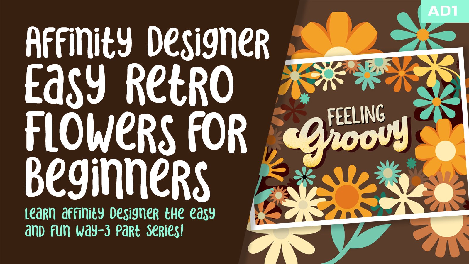
you Affinity Designer. As you recall in part one, we created a beautiful
retro floral layout. And we've made real good use of the symbols studio to
save our flowers and be able to reuse them either in multiple documents or in multiple locations
in this document. So we've got that
under our belt. In this class, I plan to expose
you a little bit more to some of the other settings
and things that we can use the symbol studio for. But I really want to introduce
you to the pixel persona. So we're going to use the
pixel persona to help us add texture to our layout. We're going to add it may
lead to the lettering, but I'm going to show you also how you can add
texture to assemble, because there's a few
tricks there that I think I forgot to share with
you in the first-class. So you could add to the power
of that symbols studio. I've also figured out a bunch of other little things that I
can tie into this class. So you can have a few more of these studios and
tools under your belt. Now if you haven't
done so already, I'm going to
encourage you to hit that follow button up there. That way you will get any information about my
classes when I post them. I also encourage you to get into my website and add your name to my mailing
lists there too, because I posted them are
collection of the class there. So it would be a good idea
for you to get your name on there to get announcements
about those things as well. So are you ready to
dig into this project? I sure am. So let's head into
less than one.
2. Lesson 1 Overview, Installing Type and Inspiration: Hi guys, welcome to lesson one. Lesson one here, I want to
give you some inspiration. So we're going to have
a bit of an overview of what we're going to be doing. Then I also want to explain
how to install a font. I brought in a
specialty font for this project and you may
want to do that as well. Let's get started. I'm really hoping you've
been having some fun with this retro kind of a layout that I came
up with for this class. So if you finish the first part, you have a nice floral frame and you're ready to
add your lettering. So let's get started on that. I wanted to talk a little
bit about typography and fonts and how to get a font
that works for this layout. I just did a quick search
here for 70's lettering. And you can see
here that there is a huge range of retro
kind of stuff available. Now, if you're like me, fonts are like Procreate brushes or the like where you just
can't get enough of them. So I've caught, I
probably have hundreds of fonts and some of them I
use on a regular basis. Some of them I've only
used once or twice, but I really love this
sort of a retro look. So I personally went out and purchased the
font that I used, and I found that one
on Creative Market. The creator is this
Hendra practicum. I guess it's the pronunciation. And this is the
one that I bought. I don't know if you use
Creative Market much, but they've just
recently switched to a subscription based
purchasing system which you may like
or you may hate. I find it a little bit frustrating that I
can't just hit Okay by now and grab the font without having to have
the subscription. But I do sell a lot
of brushes here, so I always have credits and
I decided I would go ahead and purchase the subscriptions so I could download more
easily when I want to. I've got credits here. You can see 300 credits. I can't remember how
much that actually cost, but it's just an
easy way for me. I know I will
download enough from here that it's worth it. So this is the one that I did
download to use for this. And it is a throwback font. This is one I remember very
clearly when I was in school. I use this one and back in
the day it was lecture sets, so I don't know if you remember, but it was kind of like
a rubbed down lettering. So I'll try to find a
couple of pictures of that just to throw in
here for you to see, but times have changed. Things are a lot easier
and you can download the font and then install
it into Affinity Designer. Now for myself, if I didn't
want to spend the money, if it was something for a class or I didn't think I
would be using it again, I would probably be
searching for free fonts. So I did a search
just like that. I did retro lettering free and there were a
few that came up. But I also find that it's
kind of frustrating to try to navigate through trying
to find a free font. A lot of times you do end up on sites that aren't exactly free. So it can be a pain
in the pituitary. For my free fonts, I always go to this place here, this site called duff font. The font is a place
where you can download free fonts and use them
for your projects. I think that most of them, you do have to buy a
commercial license if you plan on using it for
more than just personal use. But if you're using
it for a class, you can get away with just
downloading the free version. So these are just a bunch
of free ones I just found by doing a search for a retro. So that's what I typed
in here is retro. I'm not sure if seventies would be category appears that it is. So you could go here to the
seventies and check it out. But it looks like the retro gave me quite a bit more
to choose from here. One of the things that's really
cool about this font too, is that you can type in your word or phrase and
see a preview for it. So if you type in the
word and hit Return, then you'll see
that word is what appears as your sample
here for the font. I knew I was going to
use the word groovy. Looking through here was great. I should have put a capital G. You can get a better look
at how it would look. There are some that are really
cool here and some that are quite similar to
what I use for free. So I think it's
gonna be fun that we can all kind of choose
something different, whatever appeals to you, and create your
layout based on that. And there's a 103
retro fonts here. So you've got plenty
to choose from. Once you do choose one, then you hit download here and
it's going to download it. I'm currently on my desktop, but when you are
in your browser, on your iPad, it'll download all your iPads so
that you can install it. And I'll show you the
procedure for installing it into Affinity Designer. So that's just the
first step there. And let's hop into
Affinity Designer now and get that font
or a font installed. Maybe I'll download one on my iPad so that I can
show you the steps. Alright, so here it is on my iPad and I can easily
just download it. Approved. And it should have
downloaded it. Yes, there it is. So point to that little icon there at the magnifying glass, and you'll see the zip
file here in my Downloads. So first of all, I need to unpack it. So if you click on it, you'll get the unpacked
version to install it. What we need to do
is install it here into the system for the iPad. So what I wanna do is find
my font management software. So you should have this
on your iPad already. I think it's called iFont. Here it is. This is going to be installing
right onto my iPad here. Let me just see if it's
coming up here at all. You can see
experimented with a few that were possible
for this class. So I thought this
one vintage king, I don't see that one
that I'm talking about. So I'm going to hit Import here. I'm going to go to my
files or my downloads. So it's the top
download folder there. And here's that groovy font. And here's that retro sonic. So this is the one that
I need to install. So click on that. I'm searching for it here just to make it a little bit faster, it comes up, then I hit
Install and hit allow to this. So you open the settings, It's tells you exactly
what to do here. Tap on profile downloaded, it comes up here, put in your passcode if
you've got one hit Install, hit Done, and then
you can go back to iFont and hit Install. So let's see if it is here
and available in affinity. And I see it right here. I note it's available if for some reason doesn't
come up here, It's suggested that you
restart your program. And then sometimes that's
all it takes for it to be then available for you
here in your software. So now I have that
lettering selected. And so all I need to do is type out the word and we would
be able to get started. That's not the one I'm
likely going to use for my class demonstration. But I wanted to show you
that whole process so that you wouldn't be
held up in any way.
3. Lesson 2 General Typographic Overview in Affinity: Hi guys, welcome to lesson two. In less than two here I want
to explain a little bit more about the type tools
in Affinity Designer. Mainly we're gonna be
using the art Text tool, but I also want to
explain a little bit about the frame text tool. Let's get started. So let's take a look at the layout should that
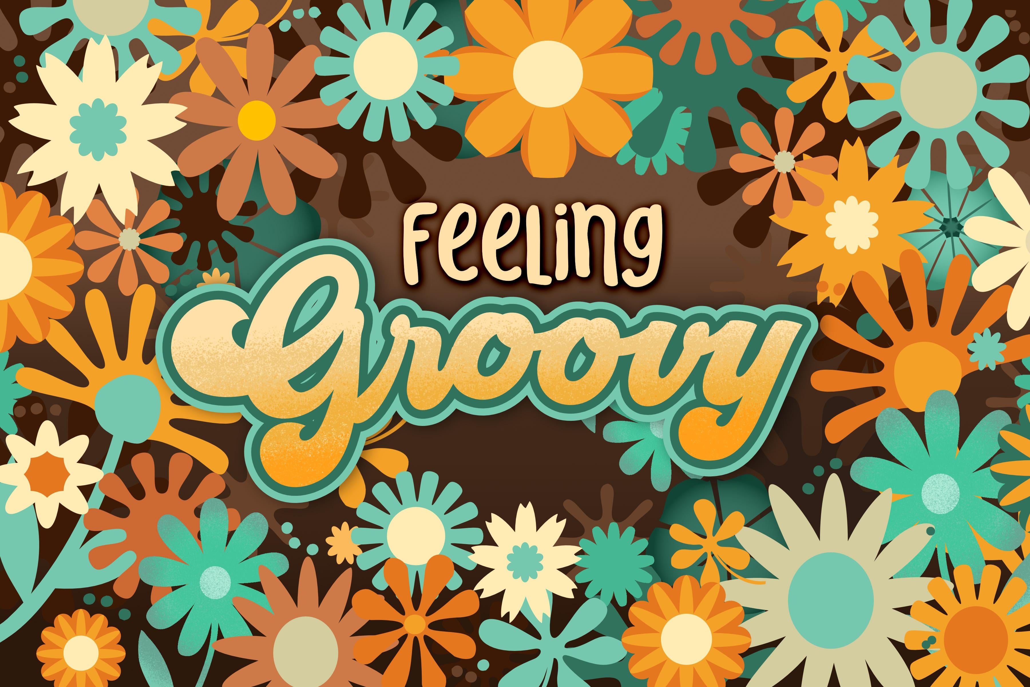
we've been working on. So it looks pretty much the way I showed it to you last time. In fact, this isn't the
one that I did in class, so that border
will be different. When we get into
my main document, I want to show you what
we'll do with the type. So we've got a bunch of layers that are
related to the type. So here you'll see the
deep shadow that I put on. Then of course there's
the main lettering. And then within the
main lettering, we have a pixel layer, which is what I used in order to make a really simple
texture gradients. And then of course, the
first word, feeling, feeling groovy, first word
is much plainer font. I usually find that when
we're trying to combine two font styles or two
typographic styles, that it's best to have
your big display type as your main focus
and then something like this as a
supporting that style. A big mistake I see a lot of inexperienced typographers do is combine two or three
display types. And what I mean by display type, anything that's what
you would call fancy. So the key when doing typography is to actually
keep it very subtle. Don't put a lot of
different typefaces in. The Common Rule is
really not to put more than two typefaces
into any document, and especially
with display type. The other thing that here or you'll sense even just
by looking at it this way, is that one of the fonts or typeface's is bigger and bolder and the other one
is a little bit less bold. So that's another
thing that you can do to make two different
typefaces work together. You could try doing
both words and the same type style and you'll find right away that
it just doesn't work. So topography is one of those subjects that has
so many ins and outs. You could study typography for two years and still
not know everything. I took a ton of typography
classes when I was in school and my teacher was what
you'd call a real experts. So we really learned what to do and what not to do because
he didn't mince words. He definitely told
you if something look bad and you just have to
go back and adjust it. Now you've heard me use
both the word typeface. So this is a typeface
and the word font, and almost everybody
calls them fonts now. But technically, a font is just the one size of that
particular typeface. Using the word typeface
is actually more correct. You can feel really smug. Next time you hear somebody
say the word font. Because fonts, unless they are specifically describe
a one part of the typeface in one
particular size than they're using
the word incorrectly. And then as far as typefaces go, you know that there
are thousands and thousands available. The one that I have
chosen here is one called groovy script. I've found it and imported it as you know in
the first lesson. And so now that we
have it and it is, I've got it installed and you probably at this point have
installed one of your own. So groovy script is right here. I haven't done a
lot of importing of fonts into my iPad as of yet because I haven't really
been doing a lot of type related projects in either Procreate or
Affinity Designer. So for the most part, if I had anything
that had epigraphy, I would finish it on my desktop. At this point. I haven't
imported too many, so I might do that in the next few weeks as
we start bringing in a few more pieces
that I might be able to use in future projects. So are you ready to
get right into it? I'm going to switch to the
other document that I have, which is this one here. So this is the one
I went through and really worked on
the actual layout. Way more flowers, as
you can see here, showed you the gradient
to the background there. And it might be fun if
you're into it to go through and do that on some
of your flowers as well. And then when it comes to
actually setting your type, there are type tools over here. I remember that you
can always hold down that question
mark there to see it. But this is the Artistic Text
tool that you're seeing. And that's what would be
considered the display face. That would be how to
insert a display face. You also have framed text here. So the art text is going to be the one that we're gonna
be playing with today. We're gonna do a couple
of experiments first, and I wanted to show you some of the really cool things that
you can do with art text. We'll just kind of ignore
frame text for today. I think. Just know that that's more for use when you're doing
full paragraphs of type and keeping the texts and
a frame allows you to make the text box the size
and shape that you need it. You can adjust it even after
the ties in the frame. And it's more likely
that you're gonna be using that for page layout and possibly some kind of catalog or page in a portfolio
that needs some texts. Those would be the kind of
uses you'd have for that. But art text itself, you simply click
on your layout and you'll get your first little
insertion point there. And when you start typing, your word is going
to show up here. So I'm gonna do
capital G, R, O, VY. And you can see how
absolutely tiny it is. You can, of course, just grab the handles
to enlarge it. So that might be a way
and I forgot that I had installed that other one too because this is another one of those very
quintessential 70s type. So that was one of the other
ones that I had chosen. Now, you can see down
here that my move, that little guy and let me
actually dock my keyboard. You can grab this and move it to the left-hand side
if it's in your way, because this becomes, you're kind of a context menu
for your PayPal graphy. Here I could go in and
then just change it to the type that I want. And Holy Hannah,
that is a big one. And let's just bring that in. And so there are a few things here that we would
want to adjust. You can grab any of
the handles to adjust. You can still triple-click
or double-click in here to select the type. You could put your
cursor in between letters if you need to
eliminate a letter, or if you want to adjust some of the other typographic
adjustments, which we will definitely take a look at in the next lesson, we're going to go into this
typographic studio here. I'm not sure if
they call it a type studio or typographic studio. And we're going to be
making some changes. And in the next lesson, and I'm also going to be
showing you how we can actually curve this text before we do too
much more with it, we're gonna be creating
layers, duplicates of this. We're going to be
changing the color. I want to even show you things
like adding the outline, even though I didn't
have that on my example. Okay, So let's meet
in the next lesson.
4. Lesson 3 Typographic Terms and Adjustments: Hi guys, welcome
to lesson three. And less than three here, we're gonna kinda
go over some of the typographic terms and
settings that you can adjust, as well as putting
some text on a path. So we're going to
be just drawing a regular path to
add the text to. And we're also
going to try adding the text to an ellipse. I'm going to show you all the various adjustments that you can make when you do that.
Let's get started. Okay, so I've got my type there. I'm going to just
show you a couple of different things with
putting text on a path. Let's just actually
copy this word. Or maybe I should
even make it smaller, make it 60 for now. And then I will copy it. And I'll put it on the side and move this off so
that I can keep it for when we need it for the
actual layout that I'm doing. I just wanted to show you
text on a path and I wanted to start with a shape because I thought that's the best way to show you all the different controls that are available. So let's just pull
out an ellipse here. Don't worry about the field
because the color will be eliminated as soon as we change
this into a text objects. So OTA, Artistic Text tool. And you'll see that if you go to the ellipse and you go to click, you will be inserting
a flashing line here, which is your text
insertion point. As you can see, the color
has left the building. And now we can put
our type here. So I just copied and pasted. You could just literally
just start typing. I mean, that would
be just as fast. Honestly, don't know why
I was being so lazy. Maybe because it's Saturday. I actually am having my granddaughter here for
awhile this afternoon, and my daughter across the way has her three kids
there at the moment, I'm gonna get granddaughter, which is awesome with last
time we were together, we play literally playing
Barbies for eight hours. We had a complete
operating room setup. Hand, went through most of
a roll of masking tape. She was a very injured Barbie. Anyhow, let's go back to this. Okay, so I've got my type here. I can of course, still go in and change the typeface and do anything
like that that I want to, so that's ready to go. And I'm going to actually just closed this
little keyboard. So I wanted to show you some
of these controls and it's the same controls that
we're going to have on our path when we do our type, we can still go and enlarge
our type if we want. So I could go to, let's see, 72 and
that has enlarged it. But what I want it to
mainly show you are these controls here that
we have on the oval. So you can see that I can go right down
to the bottom here. There's a little bit of
a red line that comes up and it snaps there. So you know, you're
perfectly in the center. You can use all of the
same actual settings like for centering and
whatnot that you see here on your control bar. So we could I don't know what
that doesn't seem centered. I guess if this was right here, doesn't seem to
make that much of a difference if you
use the centring. So you really don't have
to because you're going to be using this for doing
your positioning. And it's almost really the way I would have done it on my path, but we've got it
here on the oval. So I'm just going to
follow through here because I want to show you
a couple of other things. You see that once I
brought it over to the end and it hit that
other little arrow there. Then it popped the
text into the inside. So that would be how you would
work it if you wanted to have the type on the inside
or the bottom of the curve. So something like this is great. If you have a
circle, for example, and you're doing a
circular logo that it has type at the top and
type at the bottom. I see a lot of sports
teams have that. It's just a really common
way of setting type. I'm going to bring
it back around and flip it back to the top. So you saw I grabbed that
other little triangle and I flipped it to the outside. And I also want to show you
here that we can do things like adjusting the spacing
between the letters and so on. So if we go into spacing here, actually that's paragraph
yes, Here we go. If we go into texts
to positioning, so they're calling
it positioning here, we can make adjustments
between the letters. So if you wanted to let say, a little bit less space here between the R
and the goals so that you don't have the notch
there, it's not connected. That's another pet
peeve of mine, is that when you have
script typography, each of the letters should look like they run into
the next level. A lot of people just are
never told that I guess. And so they have
a word in script that is not properly connected. So just think about when
you're handwriting, you don't stop at the
end of each letter. So let's make an
adjustment there. Now with these, you can just drag to make your
fine adjustments, which is absolutely awesome. I love this about
Affinity Designer and people putting my keyboard because I keep hitting
that spot there. You can go through now and adjust each letter accordingly. I think the O's are fine, but you see how we can get everything looking
like it's connected. There is that little notch
here on the top of the V, but I wouldn't worry about that. It's something if you
are really hating it, you could also get
rid of later on. Let's not worry about
that right now. So I'm going to
actually cut this. Oops, I think I just
duplicated and I want to do my text on a path instead. So what I would do here
is to get my pen tool. And I know you haven't used
the pen tool very much, but you could draw a path. And remember that these are
non printing guides here. Those are just handles
that for adjustments. So when I put that first down, I'm also pulling
and I'm pulling in the direction that I know
my next point will go. So I want my line to follow
that and come back down. So now I can click
over here and pull, and you can see that I
can create the path. Now, if you find that to a cumbersome and a
lot of people hate it. I also have used the
pencil tool for this. So with the pencil
tool, of course, you can make a really
shape the path. So depending on how you want to arrange your type
just there'll be too crazy because you'll
find that width larger type. It's hard to have it
go around these bands. So let's just, I can just get rid of this because
it's almost harder to keep it and cut and
paste than it would be to just retype my
word as I need it. So where did that curve goal? There we go. So it's invisible here
because it had no stroke. But if you look in your layers, palettes are your layers studio. You'll usually find
it at the very top. So let's grab that
Artistic Text tool. And again, let's just type
on or click on the line. And you'll see as soon
as I click on the line, I get, that will control. And I can also just go straight to my keyboard and start typing. So I will type in my
word groovy capital G, and close my
keyboard. It's there. It's tiny. I think it's still in
that other type style. So let's go into this. And yes, it's on rest tonic. So I'm gonna go
to groovy script. And of course for size, I can just type
in a larger size. So I'm just going to guess here, I'm gonna go to hundreds, probably going to be too big. Yes, it is way too big. Let's go 100, not 1100. Thank you. As you can see, it's popped it already
over to the other side. So there was, it's
still too big. But of course, we can
make adjustments here. So we can do things
like we could lengthen the path,
which sometimes helps. And I immediately
did help. Also. Maybe I need to get rid
of some of these points. So I'm gonna go to this
one here and get rid of it and just lengthen
that a little bit. And you can see that every time I make an adjustment here, It's repositioning my
lettering accordingly. So I want just a
slight curve on mine. And I think that's
pretty darn good. I'm going to go in and
change the spacing like we did just submitted to go by
going into the positioning. I don't know why they
call it position. That seems weird, but alright. And I may also change the shape a little bit so that I don't have that y
at such an angle. Having it like this, you see
how it's an angle downwards. I would prefer that it stays
at the same angle there. So that's how I am
going to do it. I think I'm actually
ready for the next step. No, it's not as big
as I want it to be, but rather than make
it bigger on the path, I'm going to enlarge like this. And now that it's got
more space over here, I know I can make it bigger. I don't know why
they don't have this as a dragging enlargements. So I guess you have to
guess at your type size. I'm going to go 120. And anyways, I can mess around with
this, I'll get it perfect. And then in the next lesson, we'll meet and
start talking about our next steps with getting the font to that look
that we were after. Alright. I'll see you there.
5. Lesson 4 Creating and Applying a Style in Affinity: Hi guys, welcome to lesson four. Less than four here
we're going to talk a little bit about styles. So it's gonna be part
of the effects palette. And I'm gonna be talking to
you about adding outlines, but not just a regular outline. We're gonna do a double outline. Let's get to it. This is how I have my
final word layout. I think this is going
to work to screech. So I want to show you a few of the other things that
we're going to do here. The first thing I
wanna do, of course, has changed the
color of the type. So here I can just go
into my color picker. I've only got black as my foreground and
nothing on my outline. So I'm pointing to change it to a creamy, light, light yellow. So it's almost the color of those lighter flowers might
be a slight bit more yellow. And I am going to also add a
stroke now on my original. So the one you saw
as the titles in my last class didn't
have a stroke on it. But this would also
be a great time to explain a little
bit about strokes. And it's very interesting with strokes on lettering
because you can do, first of all, do it so
easily in comparison to what you could in a program
like say procreate. Also, you can build
stroke on stroke, so you can have
additional strokes on here using something called
the appearance panel. And the appearance panel we
haven't talked about before, of course, because like I said, I just want to only
be teaching you the things that you need to know while we're going
through projects. That way you're not overwhelmed
with me going through every individual tool that
would be such a law in class. And it would be so
boring because we wouldn't have a fun
project to work on. I am going to put, I don't know what
color should we put as our first outline,
maybe an orange. So why don't we match one
of these oranges right now? So I'm going to grab the
eyedropper tool here. Or you can draw, you can
use the one from over here. So I'm going to take that
eyedropper tool and sample. I'm thinking this darker
orange here would be good. Now it has applied it. You can see here that
the stroke has a color, but there's no thickness
to the stroke. So that's why we're
not seeing it here. So as soon as I start
moving this around, you'll see that it
does add the stroke. So there's a couple
of problems here. First of all, it's filling
both sides of the line. So instead of just putting
the outline on the outside, it's putting it on the
center of the line. And that doesn't work
for lettering because you don't want to be
distorting the lettering. You see that I'm doing here. That's one of the problems. And the other problem you can
see is that we're getting these little overlapping
bits that we don't want. And that's because
this lettering is currently still lettering. It's still adjustable,
it's still on the path, all that kinda stuff, but
all of these are individual. So I'm thinking that
the best thing to do right now would be before applying the stroke is to
create curves out of this. So let's go back to the text tool or their
artistic type tool. I've got the word selected. You don't really have to have the word selection selected. I guess I should
say that I am going to just have it selected like this and then go into this menu here and convert to curves. Now, it's not editable
anymore as letters, we can't put the cursor in there and adjust anything
like the kerning. We only have these
actual finished shapes which affinity calls curves. In Adobe Illustrator, we'll be calling these closed shapes. That's okay, Everybody
has a different way. So we're going to now select all of these and
make them into one. So I've got the
first one selected. I put one finger down that allows me to select
the rest of them. You want before
that, I am going to, That's just my little
y here a little bit and adjust my
v because that's a perfect way to get rid of that little notch that
we had hanging above. And a nice way for me to get my y a little bit more
aligned the way I want it. So in the end it looks like you haven't really gotten
much of a curve here. I guess I could pull this down, curve out a little bit. But I think I'm happy with this, so I think I'm not going
to sweat it because at this point I
just want to move on and do all the
other fun stuff. So I've held down one finger so that I can
select all of them. And now we're gonna go to one of those boolean geometry things. So we're going to hit Add. So now we've got one shape. So now we can go in and
let's add an orange color. So I'm going to sample, I think it was this orange. And now when I
enlarge my outline, I don't get anything
between the letters, which is exactly what I want. I do, however, still need to balance that line
to the outside. So that's why I've
enlarged here. We can go into the advanced
and then this row here is how you adjust alignment so that's fully on the
inside as you can see, and then that's fully
on the outside and that's exactly what I want. I love that I think
that's perfect. That really makes it
look very vintage. And I want to show you now how
to add an additional line, because I want to put a second
line on the outside there. So here we would go to
the appearance panel. And when you have
made changes of any kind and your shape
is still selected, you're going to see those moves that you made right up here. So it's really cool
because you can add additional things to be
done to that particular font. If you look closely up here, this plus sign is
for adding a stroke. That's why it's just
kinda got an outline. And this one is for
adding a new field. We don't need to
worry about the fill, but let's do the stroke now. I want to make it
a different color, so we're going to add. And now of course we can go
into the color picker here. And I think I will add
my super dark brown. Maybe it's totally up to you
when you are doing this. I, you know what? I think
I'm going to add a teal just so that it's a little
bit more obvious to you. We don't need to worry
about the fill here. Let's go back to the
appearance panel here. So if we were to take a
look at this right now, it is way too small
for it to show. So what we'll do here is
increase the width of it. And you can see here pretty much I've made it pretty much
the exact same size. I'm going to go a
little bit bigger. And what we wanna do
here is go into the advanced and change the order. So can you see that there now? Maybe I'll change it to the lighter teal so that you
can see a little bit better, but you see how it's added
an outline to the outline. We could continue to increase
it if we want it to. I mean, it's totally up to you. In my opinion. I think that yellow color is now looking just
a little bit weak. So I might go into the appearance panel
here and grab that one here and maybe change it to the darker green
or even the brown. I think I like the green better. Can you get to the
Brown makes it looks to me like it's kinda see-through
around the edge there. So I'm going to do
the darker green, totally your call, you
can do whatever you want. But the cool thing about this, now that we've got this setup, we can take that appearance that we've created here and
apply it to something else. What I wanna do here is to
save this as a new effect. So here at this effects
menu is something that allows you to add all
these different things. We're going to check these out. Eventually. Maybe we'll
even do one of these today. But for now, what I want to do is go into this styles here. And you can see all
these different styles that have already been created. I guess these are all
the default ones. I want to add mine though. So what I'll do here is
add style from selections. So it's going to copy exactly what I have
here as a style. It adds it in here, so I guess that's
one at the bottom. And the cool thing about
that is I could use this to apply a style to something
else in my document. I'm not gonna do that
for this lesson. I'm going to show you
that at the beginning of the next lesson because
I want to talk to you a little bit more about the whole styles
and effects pallet. Alright, I'll see you there.
6. Lesson 5 Using FX, Assets and Symbols: Hi guys. Watched less than five. Less than five here
we're gonna be talking a little bit more about
the effects panel and also the assets of the
symbols. Let's get to it. Now. Let's talk a little bit
about the effects in order to add that effect to my, to anything else on the page. In fact, let's just draw a new line here that we
can use as an example. So I'm gonna be using that. I want it to look like
this line or like having a double stroke
or double outline. So what I'm gonna do here
is select this lettering. So that's the one that has the style or the
effect that I want. What I need to do here is go
into this menu and hit Copy. Once you have that, select your other object and
go back to the same menu. But this time instead
of just doing a paste, what you're gonna do is you're
going to paste the style that we've created
are really ugly line. But I mean, the idea
is they are right. You're, you're getting that idea that you've got the double line. Now the reason this
is happening here, that we're getting
this weird fill and it's not perfectly filling. Yeah, This one has a field right now that we would
want to get rid of. So you see that Phil
that's there in this case, we want just the lines we
don't want or just the stroke. So let's just take
that feel right out. And then you see that that's
exactly what we would have had going on here
if this had no fill. So if I was to take the
Fill out of this lettering, you would see that it's
green light green, dark green, light
green, and that's exactly the effect
that we have there. So if you ever think
that you might use an effect over
and over again, we can actually, these are, at this point now two
different effects. We've got the one that has
the fill and the two lines, and then we've got the one
that is just the outlines. Either of these we could
save as an effect. So this menu here, as long as you've got
something selected here that has a style to it, you can just go to this little sub menu
and say add style, and it adds it here. And we can go back to this
one and do the same thing. So it's gonna be two
different styles, technically speaking. So here we'll add
style from selections. So we've got the two. We had that one already, so that's probably why
it didn't just pop up. But now we can use this two. We can get rid of this
line, for example. And then let's say in
the future or even choose something
else that you've got on your screen here, you can add the effect. Just didn't show up because we don't have a thickness
on the stroke. So as soon as we add
thickness, it shows up. So we just have
to go in here and physically enlarge the stroke. And of course you
could change the order here so you want
it to be behind. So that works perfectly. So anytime ever you want to apply that effect
to any document, It's also going to
always be visible here in your styles
are effects pallet. So that's a kind
of a cool thing I know in a way, when
you're first learning, you're thinking while big deal, I doubt that I'll
ever use that again, but it's just the idea now
you know how to do it. And anytime that
you ever want to, you can add that effect. The neat thing about this. I don't know if you can or
if you would've noticed, because remember, originally we had created those as symbols. So now that particular
flower is this one here. And because it is a symbol, and because we've now changed
one of the instances of that symbol that is permanently changed
here in our samples. If we wanted to change it back, we would just have to undo and go back to where
it was playing. And then we can see here
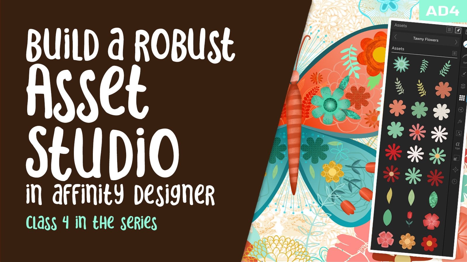
it's playing. Again. I haven't really
explained too much of a difference between the
symbols and the assets. So this is probably the perfect
opportunity to do that. So remember, in the last class, what we had done is
gone through and created all of these symbols. The difference between
symbols and assets is that the symbols which only be
tethered to the one document. So remember when we
went in here and what we did is we
duplicated the document. So the one that I'm
working on right now, if I were to duplicate it, I can go in and get rid
of everything here. So just trash it. I guess I've got a couple
of things that are locked, but that background is locked. But I have gotten rid
of all of the symbols. And yet, remember
that we duplicated the document so we have
the symbols here so I can easily start and completely new version of this layout
by using the symbols, but I would have had to
or you saw that I did have to duplicate that document in order to have that
symbols Gallery. Well, the cool thing
about the assets gallery, so that's a completely
different thing, is that if it's part of
your assets gallery, it will always be there. So I've thought tons of
assets that I've added here. For example, here's
a whole bunch of my flowers that I have, butterflies, stems,
that sort of thing. And that helps me to create
patterns quite quickly. So for example, this one here, all of these, We're assets. And even though they're
here in cream color, once I drag them
out onto my image, onto the art board, then that can be
colored any which way. So we haven't talked
about pattern design yet because we're gonna be doing that
in the next class. But the cool thing
about it is that if you move an object, one of the art boards, it will move on all
of the other ones. So that's something that we're
gonna be working towards. And for me, the cool thing
about having this Assets panel is that I can then use
these in multiple. If I was to open
up a new document, I can go into my symbols. There's no symbols there. So it didn't copy that
simple as gallery. But if I go into
my assets gallery, all of them are here
and then all I have to do is insert it and I can change the fill and I've
got the start of whatever, some kind of a layout or
my surface pattern design. So when we are working on the repeat pattern that we're going to be doing
for this class. So in this case, it wasn't assets that I had. It was because I duplicated that original document
that we've been working on and I have
it here in my symbols. This is before I had
as many as I do. I actually have a lot
more than this now. So when we do the patterns
class, of course, we are going to tap into the
bigger one that we have, which will be a duplicate of what we've got
going on here today. Both are just a little bit of a quick rundown
on the difference between the two and on the
value of creating effects, I would probably go into
the effects that they have and get rid of a
whole bunch of them because there's a bunch
there I would never use. And then that way I can
build up my own effects. Now, the other thing
is, as far as effects, let's just take a look at what we could do here
with this lettering, just applying a
different effect. So in the next lesson, let's cover a few
of those effects. We're getting close to the
point where we're going to be adding some
additional shading, which I'm gonna do in this case, I switching the persona and
going into pixel persona. And we'll use some
of the resident brushes to add some
interests to our layout. Okay, so I'll see you
in the next lesson.
7. Lesson 6 Using the Pixel Persona for Texture: Hi guys, welcome to lesson six. In this lesson, we're
going to be finally exploring that pixel persona. We're going to use that pixel
persona to add texture, and we're going to do that
to both the regular texts. So irregular curves
kind of shape. And also I'm going
to show you how to add texture to assemble. Let's get to it. The next thing I want
to do here is add some cool texture of some sort onto my
main lettering here, which is different than adding
things like the outlines. I want something that looks
a little bit more organic. So I'm thinking that this point we could switch
into the pixel persona. Everything is going
to change here. So these are all the
things that have to do with the vector persona. So all of the tools
that we could use when we're
working with vector. And you know, it's funny,
we've actually used quite a bit of these already. So it's kinda neat that as we're working
through these projects, different things present
themselves and become important. I want you to pay attention
here because when we switched to the pixel
persona, everything changes. So again, if you ever
wanted to find out traffic or I need to plug
in, sorry about that. But of course, you
can still go to this question mark here and find out what all of these
different things do. And some of them are going
to make perfect sense. So things that you've learned in other pixel-based programs and other things are going
to be different. So of course, there
are a couple of common things like the Asset
Studio is still there, the Symbol Studio
is still there. Strokes, that sort of thing. But we've got some
completely different things that we're going to play with. I'm going to keep it
really simple for this first exposure
to this persona. And I want to point out to
you this Layers palette. Let's just can't
remember what these are. These are probably those dots. Yeah. So I'm gonna go through
and I'm going to put all of those little dots
into their own group. You saw that I had the
first layer selected here. So I guess that
was probably one. If you go to the very first
one and then you go down to the very last one and
tap with two fingers. Everything is
selected in-between. I want to make a group out of that by hitting
this button here. And now that's a little
bit more manageable. I guess I missed that one, so let me just drag
it in manually. I want to add a texture layer. Now we're going to pick a brush. So over here we're on the brush, the paint brush tool. And now when we go into the
brushes studio over here, we can scroll through, take a look at the different
brushes that are available. I'm gonna go for shader brushes, but I just wanted to show you all the ones that are built-in. Now if you have an
addiction to bind brush sets and you're going to probably have the
same problem here in Affinity Designer
as in Procreate, because there are
hundreds and hundreds of brush sets available for
Affinity Designer as well. I'm going to scroll through to these pixel shader brushes. There's some great ones
to choose from here. And I would suggest
that you just kinda do a test document just for fun, go through and try all of these. But I think the one I use was probably just one of
these at the top. And I want to add
a gradient effect. So I want to go
from this sort of light yellow too,
a darker yellow. Let me just first
sample that color. So I'm going to
grab my eyedropper and click within the letter. And so my yellow shows up. So now I can go back
to my color wheel. So you see that if
you're in swatches, you have the arrow here to
go back to your color wheel. I want to go to deeper, brighter version of yellow. So that's what I'm doing here. I'm sticking kinda
close to what I had there and I'm just
going to start painting. Go to the paintbrush tool and I don't know why
that's happening. It's switching it back so that color picker I won't
be able to use. I'm going to use oh, I see. I'm on the stroke here, so I want to be on the fill. And now you can see
that I can change my color so I'm going
just a little bit darker and I'm going
to start painting. So you see what it says here, the assistant added
a new pixel layer. So if we were to go
look at the layers, you can see that
it's added it here. Now for now, I don't
have it clipped and I also know that I
want to have it bigger. So down here these
controls are now for enlarging the brush and you can see that's happening there. So I'm going to go about
that big and I'm just going to add a little bit of texture that will kind of go
around the middle of it. Then I'm going to go
a teeny bit darker. Start working my
way from that light yellow to the deeper
yellow that I want here. And I'm gonna go to the full depth of the
color and I'm gonna go with a little bit
more orange so that I'm adding an orange
at the bottom. You're probably looking
at this and thinking, oh my gosh, what a mess. But we can click that to the layer that we want
it to be clipped to, which is this one
here really easily. So we just have to open it up until we see
those curves there. And this is what we're gonna be adding it to is this group. And this is how simple it is. You just drag it and when
you are at that layer, you want to stop in the middle
of it and you can see like it's a blue line
and it's bisecting. When I let go, you'll see that it has clicked
it perfectly. So that's how a clipping mask is created in Affinity Designer. And they don't call
it a clipping mask, but, oh, well, it does
what we need it to do. So you can see how
gorgeously it's worked to add the texture
and it's so cool. There's no program that
I've worked with that allows you to combine
pixels and vector art. So for example, Adobe
Illustrator is strictly vector. Adobe Photoshop you can bring
in the vector texture is, but they changed to pixels. So it is a really cool thing that we can do here
in Affinity Designer. I love that effect already. What do you think? I mean, groovy. Now if we were to add, so let's say I wanted
to go even a little bit redder down at the bottom
now, but it's clipped. It is clipped. So I can make any adjustments or
changes and beauty. I just love how that's looking. I just wanted to show you this because it's just so
darn exciting and we can go nuts now and start doing that on some
of our flowers. If we wanted to, we could take something
like assemble here. So let's, let's do this one, that one that we were
working with before. At the moment, remember
that it is a symbol. So if we were to select it, you see that it says symbol and that if we go into
the symbols gallery, you'll see this symbol here. Now, if we make changes to this, it's going to change
it everywhere. So let's take a look at adding
some texture to this one. We have to make sure of
course it's selected. And remember that we've got
that same one over here. Actually, I'm going to, this little guy
is something that I placed just in front of it, just to add a little
bit of interests to it. But I want to show you now if we add texture and how
exactly to do that. So you would think that
if you started to paint. So let's grab a brush and
we'll go into the brushes. And let's just choose a different brush just
for the sake of fun. I'm going to grab this
pressure brush here, and I'm going to stay with
that darker teal color. And I just wanted to
point out something here. So when I have the
shape selected, one of the options that I have
here in this context menu is that I can choose to
do the painting inside. So I'm going to select that
and back to the brush here. I'm going to make that
brush quite a bit larger. So I'm going to,
that's about 270%. Of course, make sure
that you select it again if you did de-select it, and I'm going to choose to
paint only on the inside. So I've got that selected
inside and back to the brush and see how
as I'm painting now. And it says here that
it's added a new layer. Let's take a quick look at
that in the layers panel. And you can see,
yes, it did do that. So in a way, it did exactly what we
did when we grabbed the layer and drag
it onto the curve. Well, we didn't have
to in this case because it did it for us. It clipped it for us. So that's a really cool just to be able to just go for it. And as soon as you hit Draw inside it actually
does that step for us. So this particular flower, I had a center in it that
you wouldn't have seen. I just wanted to
show you two that this pixel layer
is still movable. So if I've got it selected, I can then use my selection
tool to move it around. Now, I'm going to
actually delete it because I'm going
to pick a better color and a better brush. You can select the layer here and use the garbage
can to get rid of it. And you'll see it
comes off of there. And so it would come off, well, let me go back.
So you see it here. If we go into the symbols, you can see that
the changes have been added to dissemble there. And of course the other
instance of it there, I'm going to, like I said, go back and take that
pixel layer and trash it. And I'm going to see what else. I could use a brush that might be a little
bit more interesting. Maybe I'll go back to one of these noise brushes or shader
brush and just go a little bit lighter so
that I'm not quite as like this is the
actual color that I used, this light teal here. So I can go back to the color picker and
go just a bit darker. And I'm just going to work with that. I'm gonna go bigger. And so I'm just kind of shading
around the outside of it. And then on the next step I'm gonna go a
little bit brighter. And you can see how
it can really add some dimension to one
or two of the flowers. And you see now that as I've built up that
color a little bit, then that inside circle shows if you wanted to do something
different with that circle, and I would suggest you go into your Layers panel,
find the circle. And actually there
is that pixel layer that I had made and you could paint some texture
onto that circle as well. So it's currently
not clipped to it because I didn't select it. And now I can go select inside and paint that later texture. So you see that, and of course, it will have done it not only on that instance of it over here, but it will have changed it
forever in our symbols here. You could go ahead and continue. I need to fix that shading on. You can see it's a little
bit off on that part there. I guess on the other side it
was hidden so I didn't go through and perfectly
positioned this. But you can select that layer there and continue to
make changes to it. You can even, we're over here, you could even enlarge
that shading or change things like
the blending mode or the brightness or the color, anything that you want to do. I just wanted to touch
on that really briefly. You can go nuts. You can go and change a whole bunch of
the stock and the layout. Really the only thing I would
do here now, at this point, just to finish
everything off would be to add that lettering, the additional line of
lettering that I had. So I'm going to move my
word down a little bit. Your boat here. It's not as
curved as that first one. I don't mind. I liked the difference
that we've done here with the
additional drop shadow, that Gaussian Blur,
and then adding the texture here
so it's different than the first one I
did, but that's okay. Is set additional type here. Now, we got to switch back
to the vector persona. Go into our artistic type tool. I'm going to put
the lettering here, go into my fonts. The one that I had
chosen to use last time was sacra or sacred, I guess it's sacra and
typed in the word feeling. It all in lowercase. Lowercase for this
font actually has a lot of what would look
like upper and lower mix, but that's just the style, whereas we can make it smaller, move it into position. And of course, all
the things that we did to this one
we could do to it. I personally think it's better to be a little bit restrained. This is our display type, this is our focal points, so this is just basically
a compliment to it. So I think it's okay
leaving it that color. But you can definitely
go into the effects and go back to something
like one of the glows, adding an outer
glow, outer shadow. I think I'm going to do shadow and I'm going to put
this on Color Burn. The color is good. The quite high just because
we have a dark background. And then I can start
just how quickly? I mean, it's just easy. It's really great. But you see how you can just so easily add the thickness
that you want. Move it and control
the intensity. In this case doesn't
show very much because it's on
such a dark color. But just like that, we've added the shading and I'm feeling like
it's pretty darn good. I may do a couple
of quick additions, maybe fill in some areas here. So easy when you've
got the symbols, you could just insert. Let's try this one here. Move it into position. I think I would likely move
it behind this orange one. So I would go into this and move it down and maybe
add a couple more. I want to add that one
since it's right there. So I'm just kinda deciding which ones would
look good there. Maybe this one, we don't have that in this particular area. So we could go in and
just continue to add until you feel like your layout looks the
way you want it to. So quick and easy
to draw and I might go in and just make
something else. So we'll start with
the cog, pull it out. Here. I'm going to make some changes. So this is run, if you remember, that's the one that we used when we were drawing this one, and that's why we got
that inner circle. I'm going to have this
one with fairly long, not quite as apportion the same as this one,
but I don't mind. I'm going to curve
those a little bit now and maybe move those,
change it to curves. So now it's converted
to curves, remember? And then we can go in and we could select any of these
points that we want to change. And I'm holding down
one finger so that I can select all of
these on the outside. And I can smooth them out. Just like that. I've made another
very quick one. Now remember with this one,
with the inner circle, we had to go in here and separate them like this so that we could alert the inside. So I'm gonna do a
few little bits and pieces to finish off my layout and I'll
come back to you in the last lesson for our wrap-up, and that'll be it
for today's class. Alright, so I'll see
you in the wrap-up.
8. Lesson 7 Conclusion and Wrap Up: Hi guys, welcome
to lesson seven. So this is the wrap-up
and I wanted to show you that final layout. A love, of course, showing
it to you on some mockups. So that's what I'm
gonna do here. And you can see that
this kind of a layout is so adaptable to so
many different things. And I can definitely imagine
this being used to create greeting cards if it was done in portrait rather than
landscape layout. Now that you've learned a
few things about both of the vector persona and
the pixel persona. Doesn't it just make you excited about learning this program? Very few programs that actually allow you
to work in both. I don't know of any. And I
have the Adobe Creative Suite. I don't have one
single program that combines the two in
the same program. I do a lot of this
kind of stuff, but I'm flipping
between programs. So this will be really nice
to be able to stay right within the Affinity software and do all the work
in the one document. I'm definitely going
to be exploring this more and I hope that you do too. The last thing that we have
left to do in our trilogy is to use the symbols that we designed to create a pattern. So the next class is going to be the follow-up to this
and the first-class. And in it, we're going to
create a full pattern. Repeat. Now the other
thing I wanted to mention, if you didn't do so already, please hit the Follow
button up there. That way you're
informed a video of my classes as I release them, as well as getting any of
the posts that I send out. And of course, go to my website
and add your name there. And while you're there,
you might as well check out my artists resources. There are some freebies. If you haven't been
there for awhile, you may want to check it out. If you have been there recently. You'll see that I'm adding
to it all the time. Also while you're there, check out my learn with
me area of my website. There I have alternate
courses that I don't post anywhere
else, so check it out. One of the things
that's really cool about my learn
with me is that we also have artists community there that you can be a part of. I guess that's it
for this class. And I look forward
to seeing you in my last class in this series. So bye for now.
 Delores Naskrent, Creative Explorer