Transcripts
1. Intro to Affinity Designer Robust Asset Creation: Hey there, welcome. My name is Dolores ask
Grant and I'm coming to you from sunny,
Manitoba, Canada. Today's class that I'm bringing you is another in a series of Affinity Designer
class is that I'm producing Class number
four in the series. You might want to go back and do the previous classes if you
haven't done so already. Because we definitely
build up skills. As we go along. We fully explored the use
of the Symbol Studio. And now it's time for
the Asset Studio. We're creating a bunch
of assets that we can use in a project that will take place over the
next two classes we are going to be
producing eventually have really fleshed out design using a ton of the assets that
we create to explore a really intricate
illustration process with tons of layering
and lots of interests. I hope you'll be
interested in this. I was blown away by what I could do here in
Affinity Designer. And I definitely want to share everything that I've
learned with you. A lot of what you learned in the other classes will be
fully applicable here. We can even take some of the symbols and change
them into assets. So if that sounds
complicated, don't worry, because I will be
explaining everything, every step of the way. As with all of the other
affinity classes I'm doing, I'm definitely going
to be touching on both raster and
vector elements. Are you ready to get into it? Alright, let's get started.
2. Lesson 1 Examples, Inspiration, Overview: Hi guys. Wanted to less than one
and less than one here. I just wanted to
give you a bit of an overview and a
bunch of inspiration. As always, let's get started. I wanted to talk
to you about how I go about planning a
project like this. I am interested in
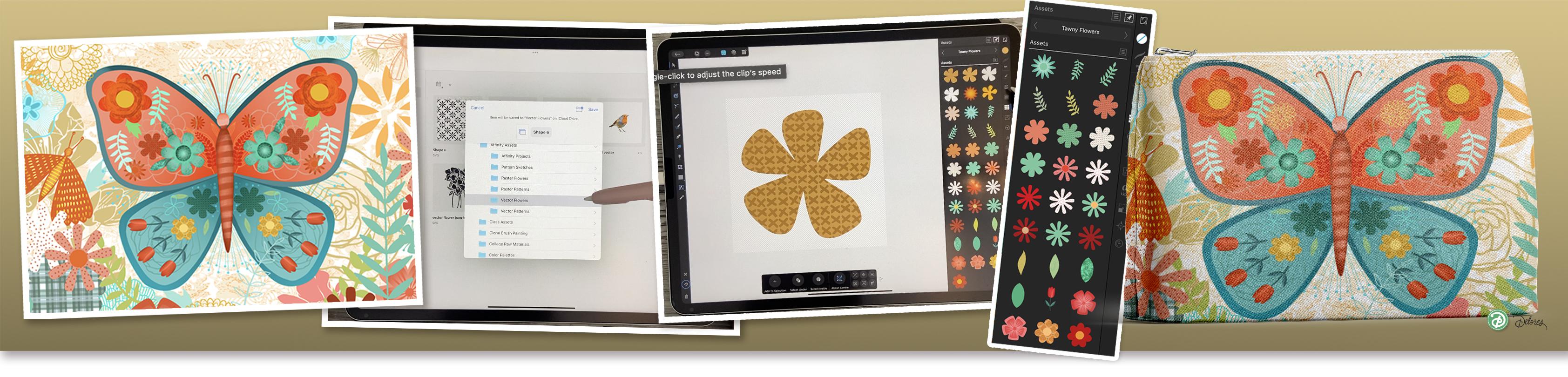
doing a butterfly. This is the one that I've
chosen as my inspiration piece. And you're going to see
a lot of similarities. What I wanted to do was to go
through this whole project just to be able to
tell you the things that I think you should be
creating in the form of assets to help you get to this sort of a finished project. In the end, we are going to be taking three classes
to get to this point. And don't let that scare you
because each of these are really important steps that I think you should
learn how to do. And it's not just
because of this project. I think overall, there is something truly
powerful about having a ton of assets available when you're setting out to
do a design project. And a design project
could end up being just the
single illustration, or it could be a series
of illustrations. I brought this earnest into focus here,
Jennifer Brian Lee, because she is such a
super successful artist. And you can see, I haven't
even scroll down here, but you can see that she
has a distinct look that she has developed and you can see that she
works in collections. So that's one of
the things I want to talk about today is not just the creation of assets that we're going to use
for this one illustration. It's for that
possibility of using it for multiple illustrations. So if you're thinking of maybe producing a greeting card line, maybe lags, possibly fabric
design, repeating patterns. Any of those things
could really use the assets library to help
you create them efficiently. So this is one of
the artists that I was wanting to show you. And then the other
artists I wanted to show you was Ophelia. So Wash, wash. I don't even know
how to pronounce it, but it really is a
fantastic artists. And I first got introduced to her on and on
about four or five years ago when I needed to produce some artwork
for a calendar, I was producing a calendar
for trend international. And when my agent asked me to produce some artwork
for that calendar, if Helio was who
he talked about, and yet it's also represented
by the same agent as I am. Here. Again, you're
going to see work that is very similar
in the sense that it's got a ton of different motifs that are
built up in many, many layers. I can see that her design style has really evolved since
I first saw her work. If I can find some of
that old reference, I will definitely
show it to you. But look at this
exceptional work here. And this is done in
many, many layers. And obviously a lot of texture has been added
to each of the layers. She has all these different
motifs in the background. Some of them so light, they're just like watermarks. This looks like an
almost sketched element, like she had this rough sketch that she was using
in the background. You can see a year
and she painted directly on that sketch, but then kept some of the
motifs just in outline form. I love it. I really
think this is gorgeous. I love her use of the borders. And I did notice when we
looked at Jennifer's work too, that she had numerous artworks with either a border at
the bottom like this. And sometimes it was actually an element that she illustrated. Here's, here's a
really good example with this kind of a
border on the one side. And you look down at some of the other pieces that
she's done and you can see that she uses that idea
over and over again, right? And then really in comparison to Achilleus work very
similar where we've got a bunch of motifs and
the background, very subtle. And then just a really, really cohesive color palette. So color palette is
definitely going to work itself into these three classes. Like I said, for today's class, we're going to focus
on creating a bunch of useful elements
that we're going to add to our assets library. I'm going to be explaining
some of the things about an asset library that's
different from the symbols. Both of them have really important powerful
features with the symbols. What we found that was
really useful was that we could alter one of the motifs and they would be
altered everywhere. You can't do that with assets. Assets are basically Azi, as you bring them in, you can change the
color and so on. You can change the fill. But if you make those changes, they don't update in
the Assets Library. By all means you can
resave them into the Assets Library with their
new sort of fill or look. But generally assets
in your library, something that you can
use over and over again. And you'll see that you could
set up the asset library so that you can bring
that asset library from one document to the next. So every time you open
the asset library and when you're creating elements to put into your asset library, you can specify whether or not you want it to be an
Application Palette. So I would love you
to take a look at these different
artists and think about some of the assets that
you might want to produce. And don't stop with those two. Of course, you can go on
and check out some of these other art
pieces that I've got. This is my butterflies, dragonflies, and B's
Pinterest board. And this is another artist. I don't know who this one is. But look at that art and
then look at the ones that come up as examples. Now this is very, very different than the two
girls we just looked at. But this one is also really
gorgeous, really effective. And one of the things I'll
point out with this one, and probably the
other ones we could have found the same thing. But I want to point out that this type of asset
could easily be made in Affinity Designer just
because we can combine vector and raster
elements so we can be adding texture or doing some of this
painting or drawing, right, in Affinity Designer. In this class, I'm
also going to be showing you how to
tie in procreate. For those of you who are
big fans of Procreate, I am definitely going to be
importing some stuff that I created there and even patterns. So when we're creating
these assets, we're going to be creating in several different categories. We're probably going to
do a flowers category, a leaf or fern, leaves and ferns combination, and a pattern gallery. And then we're gonna do some
just sort of filler objects. And by filler, I mean, taking a look at
this one here is little tiny elements that have gone into add a certain
texture to the document. So we will be producing
a bunch of those. So very similar are a lot of the similar techniques
that we used when we were creating
the symbols. And the thing is, we
could even use some of those symbols and add them
to the Assets Library. Just because there's
a completely different purpose for them. I would love to see you
really develop both of those when you're doing
this class today. Alright, so that's it for this
first Inspiration lesson, and I will see you
in the next lesson. We're going to start
doing some work right there in Affinity Designer. See you there.
3. Lesson 2 Using the Asset Interface Overview: Hi guys, welcome to lesson two. Lesson two here I'm
going to explain the whole interface
for the Asset Studio. We're gonna be creating
our first little asset and adding it to the studio
there. Let's get started. Alright, I want to
introduce you to the Asset Studio here, and I want to show you
a bunch of the stuff that I have now
accumulated in here. Now this is not
something that you necessarily can get
done in one day. But I've got a
category for patterns. This is a pattern that
I was working on, a repeat pattern,
and so those are the elements I needed for it. And I have used them in
other layouts as well. So having it here
was very helpful. Then I've got, this is for
a different project and I've got all kinds of
different firms and flowers. If I was doing this over again, it would actually make
his second category so that I could have all flowers in one and then all leaves and foliage in another. But that's something that I
have learned since using it. This one is a built-in one. It's called artistic textures. You can't see them here because
they received in black. But if you were to insert one, you would see the texture
and these are neat. I've actually used them on two or three projects that
was handy to have in there. And if I was to import it any more of that type of texture, I could maybe change the name of adhere to just texture
and add it in. I've got some butterfly parts here that's not completely
filled out yet. I was starting some
gradient flowers here. So I've caught that one
is colored flowers. I've got some small pillars, this flowers category
that I have, this is my flowers, so I've got a ton of those added and you
can recognize these. I'm sure I've used them
many times before. And here's a bunch of outline versions of
the same flowers. But some line art
fillers in here. I've got butterflies and
I've got some other fillers, and I've got leaves
and stems here. So I could probably grab some of those other ones and
put them into here. And then I've got, like I said, the patterns and these
patterns are quite varied. So I've got some that
are just simple, like this polka dot pattern. I've got some that are textures. And remember that even if
you save them in this color, it can be changed in
the software so it doesn't matter too much how you, or what color you save them as. That's one of the
reasons why when I am doing the flowers, for example, I keep them in a very light
color so they show up really nicely here
in the studio. I wanted to briefly
touch on some of the other settings here for
adding assets to your studio. So you've got this menu here, which will allow you
to add a category. Once you have a category, you can add a sub category. You can import and export. That's something that we'll
maybe touch on in the future. I won't be doing that
in today's class. Then of course you can
delete the category. One of the main
things I use here is this renamed category
and add category. Those are probably the
top two that I use with subcategory as probably
right up there too. So these will allow you to
make these new categories. When I want to add something, just quickly go in
and create a shape. We can actually do a similar
thing to what we did in that last class where we created flowers based on the shapes. Remember this. This would be a
really fast way for you to create some assets. For this one, I often just
grab all these endpoints, so I'm just single
clicking on them. And then I'm changing
it to a smooth point, makes it into a flower. And so let's just add that
one to this category. So we've got the category open
that we want to add it to. And here we have
a little sub menu as well, or flyout menu. And here I would just add
Asset From Selection. And then you can see that
it's added it right here. So if I was to delete this, I want to insert this flower. I get the exact same thing, but now this is
saved so that I can use it anytime, anywhere. Okay, so this is a
great thing that, I mean, depending on the
design you want to do, this is something that you
could do in an evening, probably just creating a
whole bunch more assets. Now if you've got
symbols that are saved, you could, let's just do
that same process again. I've got that there. I can go into the symbols
and add the symbol. Just remember this doesn't
travel with the applications, so this would not
open with these. The next time I make
a new document, the symbols won't come in. But I just wanted to
show you if you do have your library of symbols, you could insert the
symbol and then you could go into your
Assets Library. And now I'm going to, well, I'm going to
have a duplicate here. It's no big deal. I'm going to add the asset to the selection and now I've got it here
as an asset in instead. So don't forget to do that if you are interested in some of your symbols as possibilities for this project. This is that. Jennifer, friendly design
that I experimented with to try to figure out all of the
ins and outs of the project. I want it to be able
to explain to you all the different things
that can be done. And so I've done it with
her pieces and inspiration. I would never use this piece for any sort of distribution. I would never try to sell
this piece or use it for any other purpose
other than to just demonstrate to you all
the different things that I did for this project. So I'm going to break
it down for you. I've got some of those individual elements
that I created. One I imported from an
Illustrator file that I had. You'll recognize this
flower because I've used it a ton in different projects. You've seen that, and I
imported those as well. So you can take line art that
you've created in a program like Illustrator and import it individually and then add
them to your Asset Studio. So that was a piece
that I did that way. This one flower in the background
was one, this one here. So I was able to build up
my library quite quickly. This one here I created
right in the program. So I just drew a kind
of a petal shape and then I duplicated it
to create the flower. You can see in the
background here, I've got some textures. So those are textures
that I imported and applied and extras can be saved
into your assets library. So these are assets that I've
got in this studio here. I think that's one
of them right there. I have also used pattern. Now this plot here is the plot that I used
within this flower. So that's something I'm
going to be showing you how to do some of
these flowers I built completely with
the use of the shapes. So I went into here and did exactly what we
did in the last class. So I've produced a flower and I was inspired by
some of your work. I saw some beautiful flowers that were done with gradients, so I decided to
experiment with those. And the cool thing is once
you've got it drawn and yes, it does take a bit
more time and work to create a really intricate
flower like that. But once you've got
it, you've got it. So you could use it again
and again, changing colors, perhaps using them as little tiny filler elements
in a bigger layout. But why not? Why not use some of the stuff that you've
already created. Other things that I've done here that I'll point out quickly, but we're going to be
covering in later classes, not necessarily this class. Things like adding the gradient,
gradients and textures. This gradient was a texture
that I put on that wing. And this one here was a pixel layer that I put in
as well as this one here. These little flowers got one of the textures
that I brought in to make them
more interesting. This one is pattern
you haven't seen yet, but it is a class
that I've created. At some point, you'll, you'll see that class. So you may have seen it. I don't know. I never know what order
I'm going to be putting these up in my school
are on Skillshare. But I think I've covered all
the different things or is that polka dot
pattern that I showed you at the beginning? And overall, you can see
a ton of texture here. I think I've just
displaced my wing. But what I've done
is I've also created the document in such a
way that this butterfly, that whole layer is
assemble and that has given us the ability
to do the reflection. So if I was to go into
my Symbol Studio here, you would see that if
I was to insert it, you can see that half wing. Okay, It's even got the
texture in the background. The whole thing is saved
in the Asset Studio. Not that I would
ever use it again, but at least it's possible
you can see how complex the acids can be and still work absolutely beautifully
in something like this. So I'm meant to be actually drawing elements at this point, and I've dropped the ball there. So in the next lesson, we're going to start
working on some of these, importing some of
the other textures and things that
are going to help. So you can have your, both your affinity designer
hat and your Procreate hat on for this first class in
this three-part series. Alright, I will see you
in the next lesson.
4. Lesson 3 Raster and Vector Pattern Import: Hi guys, welcome
to lesson three. Now, many of you are well-versed in the use of
the Procreate program. We create roster images
when we use that program. Now to convert them into vectors that we can
use in our assets. We're gonna be using the
program called Adobe Capture. Now, don't worry, this
is an Adobe product, but it is completely free. I would suggest that you
download it unless you have another vector tracing program. It's up to you. I'm going to walk you
through all the steps of creating the vector
in Adobe Capture. Let's do it. I thought for the
first motif that we create that it might be kind of fun to do it in Procreate, since you're also comfortable
with using Procreate. And I think I want to produce
sort of background tile that I might want to use in my composition
that I'm creating, that tile or that pattern
that we create could then be used for filling in another
object or whatever. But I just want to
create the tile first. I've gone into my drawing guide here and edited so that
I've got a radial. I'm going to thicken
that line up a little bit so you can see it on camera. And let's just
quickly create this. We're not going to stress
about this too much. We're just creating what
will be a repeating tile. So I'm just going to create just something off the
top of my head here. And I think that's fair enough. Let's go a little
bit smaller here. And I've got my snapping
and guides on so that I can snap right into the
position that I want it in. So I've got that
perfectly centered. I'm going to duplicate it, grabbed that one
and move it into this top corner just to check. And I think that
size will be good. So now I can duplicate,
duplicate, duplicate. And we're going to drag into
each of these corners here. And now I've got
my initial tiles. So let's just group all
of this, flatten it. And now I want to just make
the repeat a few times here, so we're going to duplicate. And remember to
always look out for those yellow guys as you're
repeating this initial tile, merge it down, duplicate. And now I've created a
very, very quick pattern. You could even go
one more step if you wanted to merge it down. Again, duplicate or actually
you don't need to duplicate. While if you did,
it's no big deal. Select them both,
bring them down to the corner without one over, merge it down, duplicate it
again, and bring it down. And I think this is
going to be perfect. We're going to make sure
that's merged down. Let's just save
it out as a JPEG, and I'm going to save
it into my files. And I've got a folder
that I've created for affinity, Affinity Designer. And I'm going to put it
into my raster patterns here because this is not
a vector at this point. Okay, so I'm going to call it flower tile so that
I can remember that in five-minutes when I needed
to go ahead and hit Save. And so we can go into Affinity Designer and
actually import this. But it's gonna be
a raster patterns. Interesting. I think if we do a copy of this one as a raster
and then one is a vector. So you can see if there's any
advantage or disadvantage. The main advantage with
vector patterns over raster patterns is that vector patterns can
be scaled infinitely. So if you're gonna be doing
something really big, this is only a ten by ten
tile that I've created. So it might, if you were
going to use it large, let's say in the background, it might pixelate a
little bit on the edges. If we do this as a vector, then it won't do that. I'm going to import
both of them. Now, at this point, you could colorize it, but you can also color rise in Affinity Designer and I think you need more practice
with it there. So let's just save
that step four. When we do that, now, I'm going to create a vector
from this vector tracing. And in order to do that, I want to use Adobe Capture. I've got my one of my
practice ones there. What I wanna do here and now Adobe Capture
is a free program. I would suggest that you check it out, you
can download it. You might have to
make an Adobe ID, but it won't cost you anything. Having capture as your
means to trace is great. If you have something else
like you could possibly have something like
vector Nader as well. So I'm going to open
up my Adobe Capture. I'm going to do an import here. I'm going to import from files. We know that we put that
into the Affinity assets, raster patterns and there's
the flower tile there. So I'm bringing
it in and it does a ton of the work already
just in the background. You won't have seen
anything happened, but it actually has
already done the tracing. You're keeping it
on the Shapes menu, and that's all you need
to do at this stage. We don't need to do any of these adjustments at this point. I'm going to hit, okay, here. You often will get this message because
at this point it is trying to get the best
possible quality image here. So it's putting in a 100 or more points around
a little shape like this, just to make sure that
it's perfectly accurate. I don't need it to be that accurate because of the way
I'm going to be using it. So I'm going to say, Okay here. And then with the simplify, I'm going to bring
it right down to the very, very bottom. So that should simplify
it considerably. I'm going to hit Done here, and I'm going to hit Save. Now, if it was a problem, I would have gotten
that image warning again about the vector
limit being reached. It seems like it's
fine at this point. I'm going to be just
saving it into, I've got Adobe folder just
called vector flowers. If you don't do a lot of this, don't worry about setting up this really elaborate system
for saving your patterns. I don't use that often
for auto tracing, but I just wanted
to give you look at this software because I know in the past I think I've
done vector Nader, and possibly even Adobe
Illustrator for audit tracing. If you don't have
those programs, that's where Adobe Capture
comes in because it's free. Now here, once you have the shape showing
up in your library, you hit the three
dots menu here, you're going to export. And the important
thing is to export as an SVG that is going to give
you the paths that you need. So the nodes in the past, like what Affinity
Designer would create in the vector studio
or vector persona. I'm going to save
it here and it's at the moment called shape six. I'm going to rename this
as flower pattern too, because I know I
have when they are already my bullet practice run, I'm going to hit Save and now it has saved
it into my files. If I were to go and look
in my Affinity assets, I have it here in
my vector flowers. You won't see a
preview of it here. I know it's here because there
is shape six and there's also flower pattern
to that I just saved. Now we can go into
Affinity Designer here. Let's go into this, my patterns. I'm going to create
a new document. I'm going to change
that to inches. I want my document to be 20 by 20 and I'm going to
change the DPI to 300. I'm making the document really large like this
because we are going to be adding some raster
elements like textures. So I want to make sure
that I have it nice and big to ensure that I can
enlarge it if necessary, or at the very least, it will be 20 by 20, which is a nice big document. Say, Okay, here, this has
created a new blank document. So you can create
yours to this size. It doesn't matter really
what size you created at. If you want something
a little bit longer, that's up to you. You can do that, but just make sure that you
make that measurement quite high and you make
the DPI quite high. So here now I'm going to
import my two flowers. So I'm gonna go into the
application menu here. I'm going to go to Place
image import from cloud, and it was in vector
flowers that I saved that. So I'm going to grab
that flower pattern too. So this is the vector, so I can just drag to place
it so that you can see it. I also want to import the
roster one that I did. So I'm going to do
the same procedure. Place image import
from cloud is Tom. I'm gonna go to the
raster flowers or no, it was raster
patterns, flower tile, drag that out and
they look identical. But they are different. I'm going to show
you that right here. So now as I get bigger
and bigger and bigger, you can see that the raster
pattern is big bitmaps, but the vector, no
matter how big I go, is still super-duper sharp. So that's the importance of the difference
with these two. Now, I'm going to create
or add these to my assets. Point to save these two as
is into my patterns here. So I've got the raster
ones selected first. I'm going to add
Asset From Selection. Now you see it here. And then the vector, I'm going to first
convert it to curves. So I want to insert
this whole file, this whole pattern here. So before I recolor it, I'm going to go into my layers here and make sure
that it is groups. So looking at it here, you can see the
whole set of curves that makes up that pattern. So I'm going to make
it into a group. I missed a few here, so
let's try that again. So what I wanna do
is get rid of this, which is the white
square in behind. So I am going to
hit the trash can. Now I can see that
the background is transparent and that's gonna be really useful when we're
using it as a pattern. And now all my individual
elements are here. If I was to select
this now and drag it into the assets folder, in fact, let me do that. But what I wanna do is make a new category just to
point something out to you. So I'm going to add a category. We're going to put
this in temporarily. I'm going to show it
to you or show you what happens if I drag this in. I need to have a
sub-category here. I'm not naming these
because I'm just going to get rid of this. Here. I would add Asset From Selection and you're going to
see what it does. So it visually added
every little part here, so we definitely
do not want that. So I'm going to
delete this category. I'm gonna go back to my patterns here and make sure when
you have that selected, that you go into
the layers here so everything you can
see it's selected. I'm going to put
it into a group. So if I was to turn
it off and on again, you can see that
all of my elements are there. At this point. I could do the recolorings, so I would select, I'm going to do a soft, creamy, beige color that I can see when I have it in
my assets gallery. It doesn't really matter
because I could change it when I am using it in my designs. But now I can go into this menu and Add
Asset From Selection. And you can see it here. It shows up with a black
background because that's the background
of the assets panel. If I was to just eliminate this here and go back to
my main document, let me just eliminate
that completely. Then if I was to insert this, it comes in and look how
beautifully large it is. So no matter what
size we make it, it's going to be the
most incredible quality so we can enlarge
it or reduce it. And at this point, now
that it's placed here, I could change the color of it. Okay, so that's the
advantage of doing a vector pattern,
the raster pattern, when we use it, if we wanted to have it colored, we'd have to do some
stuff with layers. It's a little bit more
complicated, it's doable. I'm gonna be showing
you how to do that, but I wanted to point out the main differences
here in this lesson. So in the next lesson, what we'll do is
another method for adding assets that we've already got created
in other programs. All right. See you there.
5. Lesson 4 Flowers in Procreate vs Affinity: Hi guys, welcome to lesson four. So now you've had the
experience of converting a raster image into a vector
image using Adobe Capture. I'm going to show you a
different method here. I want you to definitely
have that feeling of whether or not it is
feasible to do it that way. Does it take more time
or is it better to just create the elements here
in Affinity Designer? I'm going to let
you be the judge. Let's get started. Okay. So let's just get rid of these two or three things
that are on this document. And this is one of
the things that you need to decide after a while. You may not want to be working in two programs
just because there's that extra step in
there of auto tracing, that is definitely
one of the things I like about Adobe
Illustrator is that I can just bring in
whatever raster image and do the tracing right
there in the program. I don't have to do it
in another program, so I don't have to know
how to use capture. I just can do it
straight in Illustrator. There's that step which
is for vectorizing. You might want to
think about the fact that your time might
be better spent learning how to use this
program a little bit better so that you can do things
like create quick assets. I just drew that with the
pencil tool, super quick. I'm going to delete that extra little point in
there and drag that one. And I mean, it's not
gorgeous, but it's there. So I'm going to switch
to the node tool here. Note that when you select it with the moving tool
here or the Move tool, I don't remember what
they call it here. The selection tool. You're moving the
whole image and you're not able to do any sort
of correcting with it. If you go to the Node Tool, then you've got the
ability to do things like select the point and delete
it, make adjustments. Personally, I find that
the best way to get smoother curves is to
delete any extra ones. And I could drag
over like this and delete and then take that
and correct the shape. I usually find that the
best thing is to have 1 at the end at the
top of your curve, like this one is a good example. I would leave that one. I would take this one away and this one away so that
I'm left really with just the one at the bottom
and then the one at the end to get a really
nice smooth shape. So once I'm happy with the shape and I know how frustrating it can be to learn
this pencil tool, but adjusting nodes and so on. Here I could use moves to make sure that it's
perfectly straight. Now what the smart
node adjustment does is it tries to figure out what you are trying
to do with the line. And if you had something like
this that was really off. If you hit smart point, it takes on both sides and tries to figure out what it
is that you're trying to do. So here, for example, that one's not the best example, but it does, sometimes
works, sometimes it does. That's the way I find
it. I'm going to delete that one and delete this one. So you can see that you
could go through a lot of time to do your motifs. This is just a freehand
drawing that I did. You know how to do flowers
if you took my other class. But now we've got a shape
here that we can select. We can go into, maybe I would go to that 20 flowers and then
Add Asset From Selection. And now that's added so I
can get rid of it here. The other way was to create your flowers based on
some of these shapes. And you can make
these super detailed. You can do things
like add gradients, which I saw some of you do, which was so beautiful
on that other project. Here's the elliptical,
radial gradient. You can go in and
make adjustments to the colors and create some
really great motifs like this. Once it's drawn or
into your assets, Add Asset From Selection. And the thing is
you never really know until you're working on your composition what it
is exactly that you want. I definitely went
through with some of my collections and was very
consistent with my colors. For example, like this one. I knew that those are the
colors I wanted to use, so I kept it in that color range here
I've got quite a variety, but remember that you
can always drag them out and change the
color if necessary. I want to go back to
procreate there real quick. And let's just see
about drawing a flower. I'm gonna do ten by ten. Again, I'm going to draw
just a really simple flower. I'm using my posca pen
marker, not the greatest, but it's going to work for my demonstration here
if you wanted to, before taking it in and
tracing it in Image Capture, if you wanted to correct it, that might not be a bad idea because It's easier to
correct at this stage. So I've got a shape here, a flower like did
that really quick. So it depends on how quickly you are able to draw these things. I'm going to share it as a JPEG. It's going to go into
my Affinity assets, raster flowers, and I'm going
to call it chunky flower, one, Done, Save quickly
going into capture, importing from files, raster
flowers, chunky flower one. I'm not doing really any,
any major adjustments. So there's the shape, we've got it, we're
going to save it here. I'm going to export. As an SVG, we're going to put
it into the vector flowers and say save it as the same name just to make
it easier on yourself. I hope nobody is judging me on my penmanship tend to do this
kind of stuff really fast. It doesn't really
matter as long as your iPad can discern what
you're trying to say. Okay, so I'm going to
delete that one here. I'm gonna go to place
an image from cloud. I'm going to go to
vector flowers, chunky flower one, drag it. And it's a beautiful vector. So it's nice and smooth. We can change its color. Okay, I forgot that one step. So what we have here is
the vector I want to, Let's see, the more
times you hit it, the less points there ends up
being to a certain extent. Now we're getting to
the point where it's probably not going to
take very many more out, sort of trying to
decide whether it wants to take some
out or add some in. But I think we've simplified
it quite a lot here. We can definitely go
in and select points to delete and save our image. So you can see here that the
actual flower I can isolate. So that's, I'm actually
going to cut it. I'm going to delete everything
on this document here at this point so I can just reduce it this way too much
to select here. So I'm doing it like this. As long as you drag and get everything within your selection,
you can get rid of it. We're left with just a
transparent document. If you look at the layers here, There's absolutely nothing. Now we can paste. And all we have is
that one simple curve. That curve is what we would use. We could then add
it to our assets. We can colorize it, we can do whatever we want. So I just wanted
to kinda show you the two different methods. And depending on how
proficient you are, not the pencil tool here in Affinity Designer might
be the deciding factor. I mean, I still encourage you to get to know it, kinda learn it. Because the more you
know, of course, the more you use it as the more comfortable you will
be with using it. So you can go through and do
all those same corrections. I don't think you have to
go crazy because you can, this isn't that many
points at this point, we can take this shape
and add it as is here to our collection of flowers
that we're creating here. And then I want to
show you something else that might be fine for you. And that's the creating
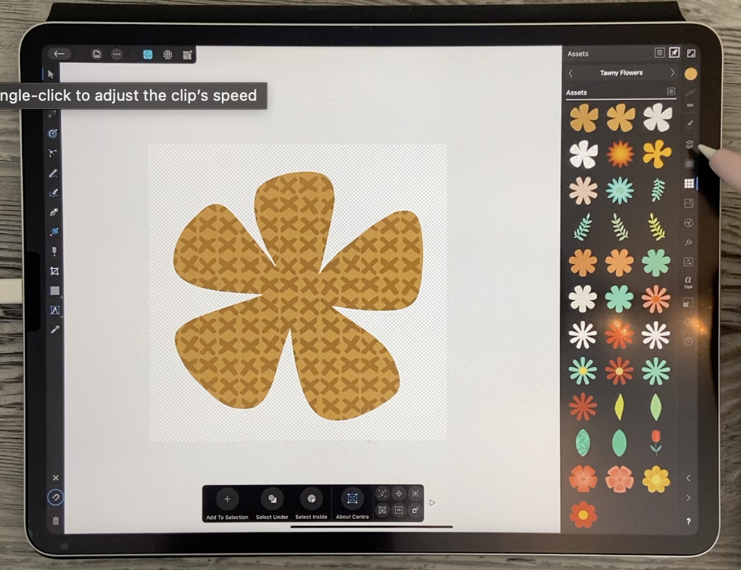
of elements like this. So that's a flower
that I filled with a pattern and then I
added it to my assets. Let's grab one of
the patterns that we already have
here in our assets. I've already saved this as is. So now I could grab a
pattern that I've created. This is a nice clean
vector pattern and you can see I produced at
very, very large. So we could take that and we could apply it
to our flowers. So what I'm gonna do here
is I'm going to copy it, or I guess you could cut it. Then when you have
your selection, make sure it is
selected your flower. Then you can go into this
and do paste inside. And you'll see that you have pasted your flower
with that pattern. And now that can be
added as an asset here. And you see here, we have both of them. You can do additional things
as if that isn't enough. We're going to have that one. We're going to duplicate it. We're going to drag
our pattern out again. Maybe let's try a
different one this time. I'll insert this one. Okay, so as long as it's
big enough to cover, we can cut it, paste inside. And now I've got the two. Remember that if it's not
positioned correctly, you can just double-click and you'll be able
to move it around, then we can bring this
one to the front. So go into your layers and
put it a top, the other one, Let's select them
both here and go into our alignment options. Align vertical and horizontal. And then let's go to
that top layer there. What color do you
think we should do it? Let's do it kind
of a golden color. Of course, it's still blocking out what we want to see there. So what we would do
is go in here and experiment with
blending modes until we get something that works. That one's kinda nice. I don't mind that one. Linear Burn multiply is also good if you want
the color to show through and add to whatever's
underneath that works. You can also put
snapping on, by the way. Just do if you want to line
them up, That also works. If you don't want to
go into the alignments that's snapping to the
middle of the document. So if we do that
with both of them, we can also get them to
align perfectly here. Now remember, when you select this and go to add
it to your assets, It's going to add
them in separately. You see, we've got the two
of them separate unless we go in here and put
them together. So group them, then go into your assets and now
you get them together. So if you want to get rid
of those two, you can. I'm just going to keep
them because I might possibly will actually this one and this one
will be the same. So I'll delete this one. So now we've got a solid one
with the x's, this pattern, one with the x's but on a cream colored background and one of them
with the circles. And looking at this one here, I think I bought two the same, so I'm going to
delete one of them. So the long and the
short of it is, decide what the
best way is for you personally and create as
many assets as you can. I myself, created most of the assets using these
shapes just like last time, and I was pretty happy with the shapes that
I came up with. Also take note that we've got right now two vectors
put together. If we were to delete this one or fill it with
something raster, that's another possibility. So in the next lesson, I'm going to show you how to take a flower or
any other object, add a raster texture to it, and then create
an asset from it. Alright, I will see you there.
6. Lesson 5 Other Asset Creation Strategies: Hi guys, welcome to lesson five. And less than five
here I want to explore other asset
creation strategies. Let's figure those out together. For this lesson, I brought
in a few examples or inspiration pieces
that we can use to create some of our
little assets. Now, looking at this, I can immediately see that
that little flower can easily be created using
the Cloud tool here. So there's an idea right
off the hot for you. I think most of the flowers and this one would be really
quick and easy to create. I'm also looking at the
leaves on both of these. I'm going to show
you how to do that and this repeating
element, I like you that. And I want to show you how to quickly create those as well. I'm sure you're going to
end up in a frenzy of creating all of
these little assets for your future project. Remember there are
future project can be anything like this. The one I did as a
butterfly that reflects, so something like
that would work. But really this could work
equally as well for this, if you don't want to do
any reflecting whatsoever, you could do
something like this. So I'm basically giving you
all of the instruction, the tools that you need in order to create any one of these
or any number of these. Well, let's start by and I think maybe some of you have
done this already if you are in the symbol
creation class that I had, but I'm going to
show you anyway, so we've got a
single ellipse here. So I may just a perfect
circle by holding down a finger on my
screen as I did that. And I'm going to duplicate
it and a fast and I find the fastest way to
duplicate is to start dragging, but then put two fingers down and you're gonna
get a duplicate. And what I'm paying
attention to is the shape that's going to be formed when those two overlap. So you can decide on that. You could move it over a little
bit if you want a taller, narrower shape, we can
alter that of course. But having the two shapes here, what I want to do is go in
here and hit Intersect, and there's white could be either a leaf shape
or pedal shape. So let's just leave
that for now. We'll put that to the side
and we're going to talk about different things
that you can do there. I'm going to show you
right now how to do a repeating duplicate like
this that we see here. So I've got the single
teardrop shape. What I wanna do is rotate
it around this point here, you can see the rotation point is currently in the middle here. So we want to go to
that little tool on the context menu here and
drag it down to the bottom. So now we've got it
right in the point, and that's what I want. I also want to duplicate it, but I want to rotate it as well. So I'm going to duplicate here. So I've got the duplicate
right on top of the original. And when you rotate here, you can see that's going
to rotate from that point. What you wanna do is have it
at probably exactly a 120 or any other measurement that
will divide evenly into 360. So 12 works great,
120 works great. That would give it at a 30
degree interval, right? So what we wanna do is go into
the transform studio here, and we're going to set this
at a 120 and click, Okay. You can see that it's duplicated it with a very nice
amount of spacing there. So you can experiment
that's 12060 also works. Let's set this original
one here at exactly 180 so that we know exactly
what we're working with. So like I said, it
was a duplicate. I'm going to delete that one. We know that this one is exactly at 180 when we look at it here. The duplicate on
top, as you can see, now what I wanna do is just start the rotation and
it doesn't really matter where you end up because you're going
to make the adjustment actually right here in
the transform studio, you're going to type in the
amount, so there's your 120. And now if I was
to duplicate this, it's going to
continue to duplicate it around in a radial formation. That's the basic steps for
creating something like that. We could do that
with that shape. And that's one that we could now RUP and add to our assets. We've got it in
here, it's gotten no fancy fail or anything, but we can always do that later. So let's get rid of this one and attempt that with
this one as well. So let's, I'm going to make
a duplicate of this because I actually may use it for
several different things. So this flower,
we'll just do this with our rotation
point here and here. Again, we're pointing
to what end one. Let's try one AT
this time and that's reflected it completely
to the opposite side. Now, the thing I forgot
to do was duplicated. The rotation point
is still here. I'm gonna put in 120 again and
then duplicate that again. Now what I'm gonna do
is grab those three. I'm going to first
group them here, then I'm going to duplicate it. Right on top of itself, they're forgot to change
that rotation point. I wanna make sure that's
right in the middle here. And let's just do a
manual rotation there. One of the things I
like about doing it manually is that you don't necessarily have to make
it quite as perfect. It looks more
hand-drawn that way. And I often even go in and just slightly change
some of the petals so that it's not so
symmetrical that it looks like it's been really
manufactured, so to speak. So then I'm going to
make sure that all of them are in one group is group. I can now delete. Now I can select this
group there altogether. You can see because there's only one selection bounding box. And now I can go in here and
I'm going to convert it to curves and fill it just
with a different color. So I have an alternate use that green wrote a lot of that
design work that I'm doing, selecting all of the
different ones here. And I'm going to add
them altogether just so that they're
one single flower. And I've got my nice
clean motif that I can now add into my library. Now the other thing I haven't
showed you how to do is to add a raster image to
that, like a texture. For now, let's just add
that in here though. It's just a plain flour for now. I'm going to keep it
though and then we'll use that with a texture. So in order to
import the texture, you do basically the same steps as placing any other image. I'm going to import
it from the Cloud. Roster textures here they are. I've done ten
different ones here. I will probably do
these on my own time, but I will import a good
graphic texture here. Now when you are going to
use it for doing an object, when you bring it
in, bring it in big. You can always make it smaller. And that way you're ensuring that your quality
is going to be good. That's one of the
things you want to be sure is that you always have a good quality texture if it's going to be
a raster texture. So you want to start big, angle small if anything. Now I'm going to just cut
it and then I'm going to use my node tool to make sure that that's
what's selected. Then I'm going to
do paste inside. There we go. So now we've got a nice
textured asset that we can add. So make sure that again,
you check it out, make sure that everything
is in one group and it is because we
did the paste inside. So now we can go into the Assets panel and Add
Asset From Selection. Now, only going to be showing
you how to tell her eyes. Basically you need the curve, copy it or duplicate it. So it's right on top. We will take that texture
out of that second layer. And then we're going to go into the layer options
here and experiment with different blend
modes until you find something that you like and how something like overlay. It often works. That's one of my gotos. Another one that works
quite nicely is multiply. So it kinda depends on the look that you're
trying to get. But I'm going to do the overlay. I kinda liked that
soft kinda look. And then here you
want to make sure that you select
your entire group. And that's going to be
what you're going to add. Man, I just noticed here. Oh, yeah, that's right. I have the plain colored one. I've got the one with
the black kind of a texture and then I've
got the colored one. Now the neat thing about it too, is that if we were
to insert this one, it still looks exactly the
same as what it did before. So we can go in here. And for example, if we wanted to change
the color of this, we could just go ahead
and change the color. So that's gonna be
really helpful. I can already see that
in our composition. Now the last thing
I want to show you, and I've been
waiting to do this, I'm going to eliminate
this right now. I don't need it. I wanted to show you. I'm going to actually,
you know what, I don t think I'm going
to use that leaf. I'll leave it there for now. But I wanted to show you how to draw a nice for any branch, like I'd say like this one here, I'm going to have my leaves
connecting to the branch, but maybe more like this here. So I'm going to first
of all draw the stem. So what we need there is
the pencil tool again, we're just going to, let's
change this to green, actually about them
both to green. I should be taking my
colors that I want to use. That's a green that I have
been using of a brownie green. And let's just use
that pencil tool to draw a stem that has no thickness to it so
you can't see it at all. One of the things I wanted
to show you here is how you can change the
profile of your stem. So right now we've got
that line selected. One of the things we can do
is we can mess around with these controls to change
the shape of our stems. So we can have something like this that gets thin and thick. We can have something that tapers so it goes
from thin to thick. So depending on how you
want yours to look, you can make those
adjustments in here. I think it just makes
it more interesting. Remember that once
you've drawn this, you can still make
alterations to it. We could, for example, take out that point and
this point and then just use the handles that are here
to smooth out the shape. It's really up to you. You're gonna get used
to doing it a certain way and that's the way you're
going to want to do it. Now I want to add
some leaves to it. So I know that I need to
expand this stroke first. So I'm going to go here
to expand the stroke. And now it's made it
into an actual shape. So it's called an outline. We can't edited like
we could a minute ago. But that's gonna be
how we're going to be able to attach our leaves to it. So I'm going to draw. A bunch of leaves just
freehand with the pencil tool. So we're obviously going to have to take that stroke off of it and make sure that we haven't filled with the
color that we want. Now the one thing I didn't
do there was to put a stabilizer on my drawings. So I'm going to put it
to a rope stabilizer. That's kinda what I've
gotten used to using and I keep that rope really
short so it's still, it's dragging, but
you can see that it's creating a
nice smooth line. Now I also want to use fill here when I'm creating
those shapes. So I'm going to delete
that one and that one. Now I can go ahead
and draw the leaves. So for now I'm just
drawing the leaves. I'm not doing the
little stem part. We'll do that in a second with, with the, it looks
like we just did. So I'm just kind
of going through and quickly drawing
my leaves here. I'm sure you're going to
take a lot more time and care and see you that I didn't close any of
these shapes yet. I kinda like going through and doing my drawing first
and then I'll go through and for each of my leaves here and make sure
that the shape is closed. So all you need to do is drag that open point and put it on top of the beginning
point here and there. I'm doing a little
bit of clean up. Nothing major. Okay, so all of those
leaves are now closed. This one doesn't need to necessarily be closed
because we're going to join everything in a second and it will blend
into that stem there. And now I'm just going to
switch back to doing a stroke. So I have to de-select first. I don't want that to be
selected while I do this. So I'm going to flick upwards to get that color out of there. Then I'm going to grab that
color again for the stroke. I'm going to go back
into the strokes and that's gonna
be way too thick. And I don't mind the profile. That's the profile
that you see there. It goes from thin to thick, so I'm going to be drawing
them in this direction. So I'm just going along and
kinda dragging right into the leaf so that it'll blend in nicely when I
do the expansion, gonna go into the
Layers palette, I'm going to swipe
to the right on each of these so that
they're all selected. Then I'm going to
expand the strokes. So now they're a
shape and now we can take a should've
kept them selected, then take them and
drag them down here. Although it doesn't
really matter because what I'm gonna do now is drag over everything. I'm not sure what
that line is there. So better get rid of it,
drag over everything, and then go here to
geometry and hit Add. And now I've got
one please shape. That shape is perfect as is. I can add it here. You don't have to worry
about grouping it because it's all one shape
at this point. And for the fun of
it, what we can do is important to their
texture and add that. So any of those other
little things I'm gonna be showing you
in the last lesson. I think that I've probably overwhelm you with so
many different ideas, but definitely take some time, try each of those techniques
so that you can end up with a really diverse
asset library here. That's going to be what
makes it so much fun and so easy to create
your final projects. And literally, you could
do six birds using the same assets and have a beautifully
cohesive collection. So let's meet in that
next lesson there were, we're going to tie
up some loose ends. I'll see you there.
7. Lesson 6 Rounding Out Our Asset Collection: Hi guys, welcome to lesson six. And less than six
here we've just got a few other things to cover. And I definitely want to
explain a whole bunch of other things that I do when I'm preparing for a big project, like what we'll do in the
next couple of classes. Let's get started. Okay, so I was looking back at the previous lesson
with Adobe Capture, and I thought I should
show you a couple of other methods for
creating your vectors. So one of the things I did was just create a quick document with some of the motifs that I might be
interested in doing. As a matter of fact, this one is going to be layered flowers. So two levels, front and back
of a flower, for example. I'm just going to show
you with one layer here. And the other thing I thought
of was that there are other alternatives
besides Adobe Capture in case you didn't want
to use Adobe Capture. I wanted to show you also
the alternative method for creating vectors that I figured that I
should include here. You might want
something really easy, even easier than that. So here's a document
that I've got with a bunch of images here. So let's go to the Auto Trace. And I, when I searched it out, searched for a free auto trace or vector tracing
online program. I didn't want to have to pay into some kind
of a subscription. So here we can choose the file. I'm going to go
into folder where I put that and I had named it
for online conversion demo. So I knew that was correct. And this is what I want is a scalable vector graphics, SVG. That's something
that I can import into Affinity Designer. I guess I could bring
it down to two colors, so that would be the
black and the white. There are advanced options. I haven't done any testing here, so you and I are doing
this together for the first time and I'm
just going to hit Start. Now it usually
takes a few minutes to go with you a
bit of a process here that was a pretty
large image physically. That looks really good to me, as good as what we had
in Adobe captures. So I'm going to download the results and it's asking
me do I want to download it? Yes, I do. So I know that the document is called for online conversions, so let's see which
one it goes into. Yeah, it came into my regular iPad's
download folder and so we could check it out. It looks pretty nice and clean. So this would be one that
is also now in SVG format. And I'm going to drag that into my iCloud Drive into
my Affinity assets. I'm just gonna leave it
loose in the folder here, so it's quick and
easy for me to find. We'll go in here
open from Cloud. I can go into the
Affinity assets, and here it is right here. So let's open that up. And I can see that each of these is beautifully converted. So this is a really
decent quality, just as good as what I
did with Adobe Capture. And I'm gonna check
this out in the layers. So right now all of
these are curves. What I need to do here is to separate them so that
they're individuals. I don't want them to be one group because remember
what happens when we do that? It'll go in as if this is
a pattern or something. So I'm gonna go in here and
go to separate the curves. So then we end up
with them each on their own level and same
with this one here. So we have all
these separate ones and you see when
I select it now, only one of them gets
selected, not all of them. So then I can go
into here, actually, let's take them and
make them into that. I guess I got a big rectangle in the background here
that I can get rid of. And now you can see
that all my assets are that cream color. That's going to work
better in my Asset Studio. So I'm going to actually add a new category here because I've already added
this set here, I want to be able to get rid of the category really easily
after I've already got them, so I don't need them twice. And then what I would
do is go in here at a subcategory and then
Add Asset From Selection. Now I've got that one. I can just go through and
add them all in here. Or let's try this because
they aren't grouped anymore. I should be able to Add Asset From Selection and they
come in separately. So that's perfect. That's one of the things I really wanted to
show you because look how quickly we were
able to create that. So when you draw
it in, Procreate, make your document large, draw a whole bunch of them, what you think you
might want to use and then go through that
process and do it online. Why not? I also want to show you
the vector Nader workflow. And I'm want to
use this time some of my little flower
brushes that I have, this is just gonna
be the fastest way. So these are stamps. Let's just stamp a
few of these on. I'm going pure black. Who was a big one? I want to fit a few of these on here because I
think that would be a nice quick way to get
a few more elements. I bet you, these swirls
will come in handy. I'm just going for
solids right now. I'll get more organized
and do this really methodically liter when I don't have you
watching every move, I make sure I've got
enough here to convert. And this time I'm going
to save them as a J peg. And I'm going to go
straight to that pronator. So I'm gonna hit more here. We're going to go right
to vector Nader app. As soon as it opens up in here, I can select it and as soon as it's selected and
I go into this, I can go to Auto Trace. So we'll let it go
through its process. That's how quick it was. And now each of these is
an individual vector. So now we'll export it. Now here it says I can set it to Illustrator if that's
where I was going now, I'm going to save
it as an SVG file. Hit Export, save to files, put it into this, this vector, I guess flowers is fine here.
Let me rename it. I'm going to call
it random stamps. Done, hit Save. And now let's go into Affinity. Get over this one. I'm going to import it and I put that into
vector flowers, random stamps, open
that puppy up. And you can see
here that I've got all my individual stamps that I could add worse
now there are curves. So what I need to do is go up here to
separate the curves. Now, that's giving
me a couple of little challenges here that
I will have to correct. That's something we could do, but I want to take
this class to do it. We know that once we
have them here and we want to add them individually, they each have to be
converted to a group, something like this, where
there's a bunch of parts. I'll make sure that I select the whole thing
and also group it. This one here is
another example, and so on and so forth. And then you know
that as soon as we have that as a group, we could select all
here on this document. I'm just going to ignore
that one for now. But here at this point, we would then go and change it to somewhat
of a cream color. Now this one here is because it had centers
in the leaves. I'm going to take those out
for now because like I said, this isn't, this isn't a
class about vector Nader. So we can hit that
some other time if you guys end up
wanting to use it. This last one here,
I have to group. And so this one here, it's a curved still here, so I want to name it or
turn it into a group. So now I've got 123456789
new elements to add. I could select them all
again and go into my assets. What would I add this into? Let's put it into
this fillers and I'm just going to add
assets from selection. And you see now that
they're all here. Oh, and I just remembered
one last thing. I don't know. If you are an illustrator user, you could go in and export
any of your files here. Come on. So something like this. These are all separate
little vectors. I could take this, go into the Export
here, Export As, and make sure that
I specify SVG here, export it, save it to whatever file it is that
you're working with. In this case, I would
put it into my patterns. I'll call this one raw
patterns Done Save. And now I can just go here
to Affinity Designer, add from cloud, go into my vector patterns
and add the raw file. And you see I've
got these already. There must have been grouped
and the other program, and so these would
be ready to go. I could change the
color and then make sure they're all individually
grouped which they are. And I've got that pattern
category in here. I would just hit Add
Asset From Selection. So now we've got four little
vector patterns here that we could add at any point and
these can be duplicate it. You can have four of
these together to create larger pattern area. We'll get more into
that in the next class. But for now I think you've
got everything you need to really beef up
your assets library. So I've showed you
several different ways of batching your process
and doing it in this way. A whole batch at once is definitely what I would
consider the fastest way, whether you use vector Nader, whether you use the
online conversion tool, Adobe Capture, whichever
method that you use. Having a whole
bunch of them here together is by far
the fastest way. Definitely don't
ignore the fact that some of these might
need to be touched up first because he'd
want to do that before adding into your library. But the wonderful thing
about them is that no matter how large we make them after we bring them
into our documents, the quality is going
to be fantastic at whatever size you can see
here, they've really enlarge. This one has got to be well, this is an eight
by 12 documents, so this is over ten inches and all the edges are
still a really sharp. If I was to have done
that in Procreate, if I was to grab that one image and then
try to enlarge it, That's the result I would get. That speaks for itself. I think now you've got
everything you need, your armed and dangerous. You can really get at this process of creating
all of your assets. I'm super excited to see how this all turns out for you all. And I guess that's
it for this class. I mean, my whole purpose for this particular level and
this three-part project. This first part is, I wanted you to be able
to create a ton of assets quite quickly so that you
could fill out your library. So now I've got tons
of colored flowers. You can roll through this and take a look at everything
that you've done. But you'll see that
within a couple of hours, you could easily fill
up your library. So I will see you
in the wrap-up.
8. Lesson 7 Game Plan for Next Class and Wrap Up: Hey guys, welcome
to the wrap-up. So we've gone through a
lot of different things in this class and I feel like
this was a really heavy class. As far as information, you've learned so
much and there are so many things that
could confuse you. So I really welcome you
to ask any questions, post them in the
community if possible, or in the discussion section so that we can sort out
those problems together. Remember that when
you ask a question, it really helps someone else
who's confused as well. Sometimes it just takes a
different way of explaining it. And I know that in classes sometimes there's
just so much it's so overwhelming and
I just want to be sure that nobody is
left in the dark. It's also very common to feel confused when
learning new software. A lot of times just
remembering all of the little shortcuts
and where to look for things can be super confusing. I know that it takes me a while sometimes before I
get it under my belt, I often have to google the
answer and figure out, okay, what am I doing here? Why is this not working? Sometimes when I'm learning
from another teacher, I will replay sections
over and over again until I get
that a-ha moment. So feel free to do that. And like I said, lean on us, lean on the
community, lean on each other. And that way we'll learn
much more thoroughly. Now if you didn't do so at
the beginning of class, I'm gonna suggest that you hit that follow button up there. That way you are informed
of any new classes I post. And you'll get all of the
other classes in this series. Also visit my website and add your name to my
mailing lists there. I send all kinds of different
things from that location. Don't worry, I don't overwhelm
you with too many emails, but if you add your name there, you'll get more access
to the free goods and so on that I share in
my artists resources. I'm so glad that you
hung out with me today. Thank you so much for hanging in there learning this
difficult program. I really hope to see you and all my other classes as well. Bye for now.
 Delores Naskrent, Creative Explorer