Transcripts
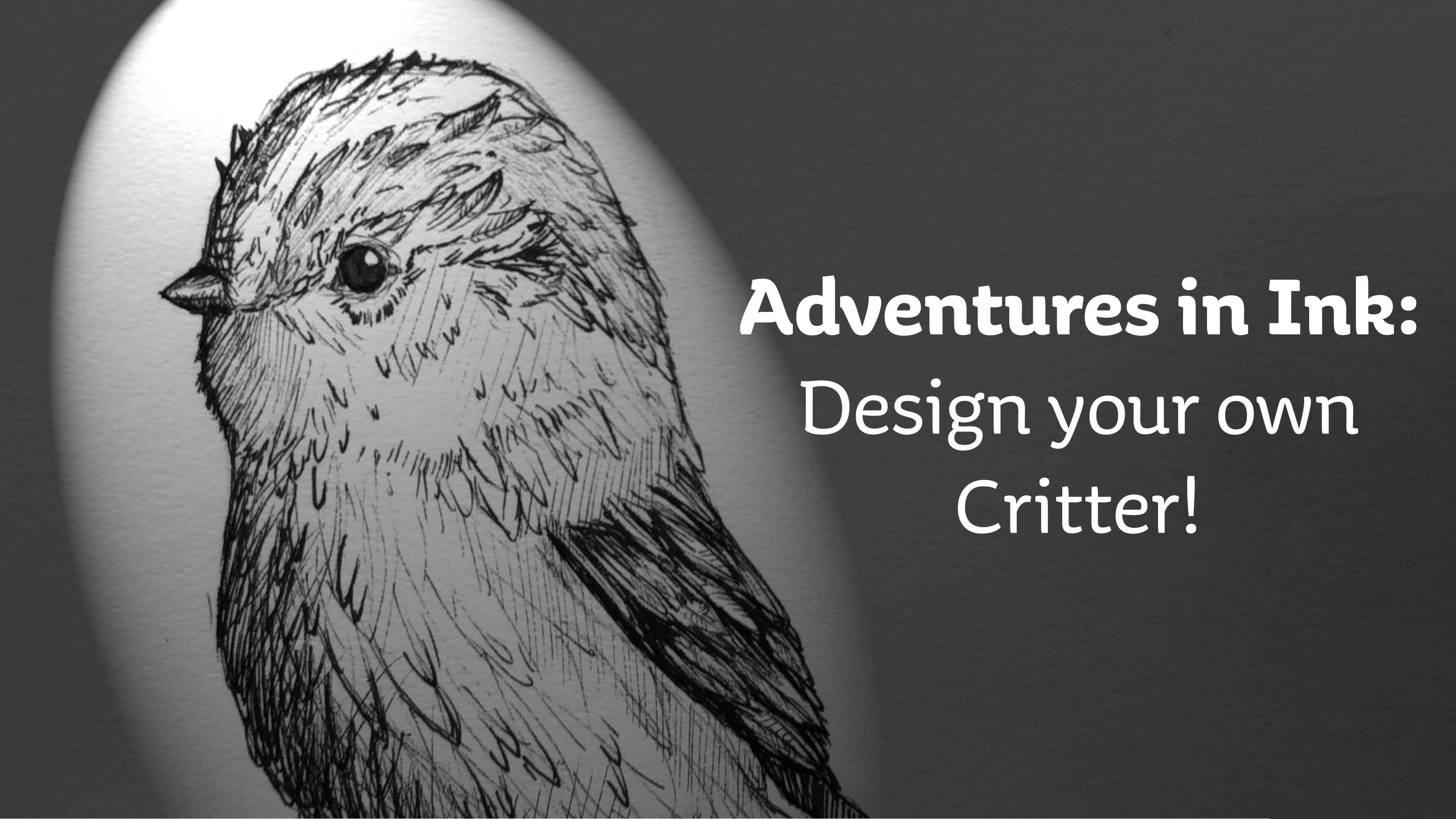
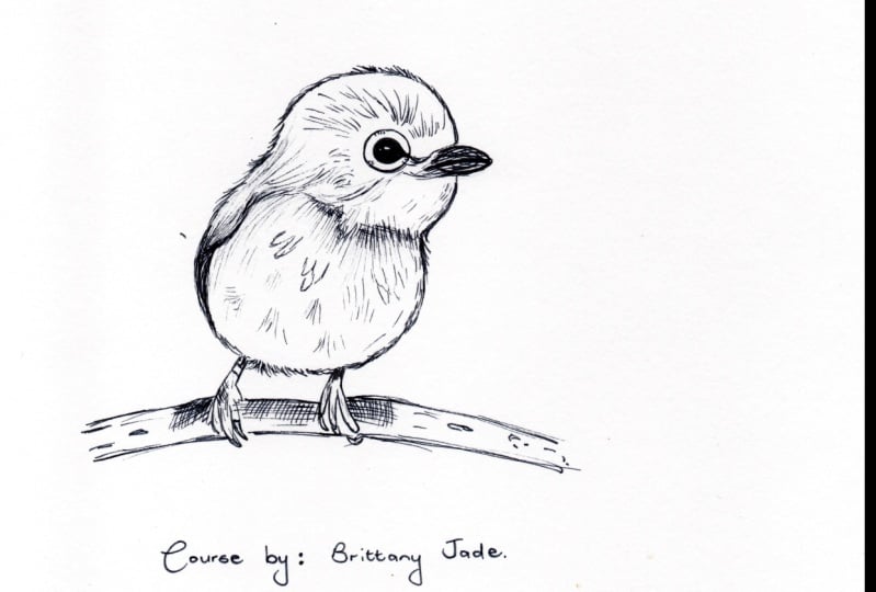
1. Introduction: Welcome to the adventures and ink. I'm Brittany Addison, designer from Melbourne. Today, I'm gonna show you how to create your own untested critter in this class, I will teach you some simple pen in ink techniques that will enhance any of your drawings and guide you through my process as we create your an tested credit best. I will go over some materials you'll need for the class no more. You can find the materials anywhere hurt, and then I'll walk you through to basic techniques for working with pen in ink and then move on to some more advanced techniques such as have to make for. And scales will be doing this first so that when you go to choose your reference photo, you know a bit more about what sort of credit you would like to draw. I will show you how to create a solid base for your during. So after that, you can put it all together and create your own fantastic red pen and ink illustration I believe was one of the easiest ways to express yourself and develop your own style. I found that's even helped me overcome creative block. So with that in mind, I hope you enjoy this costs and let's get to it
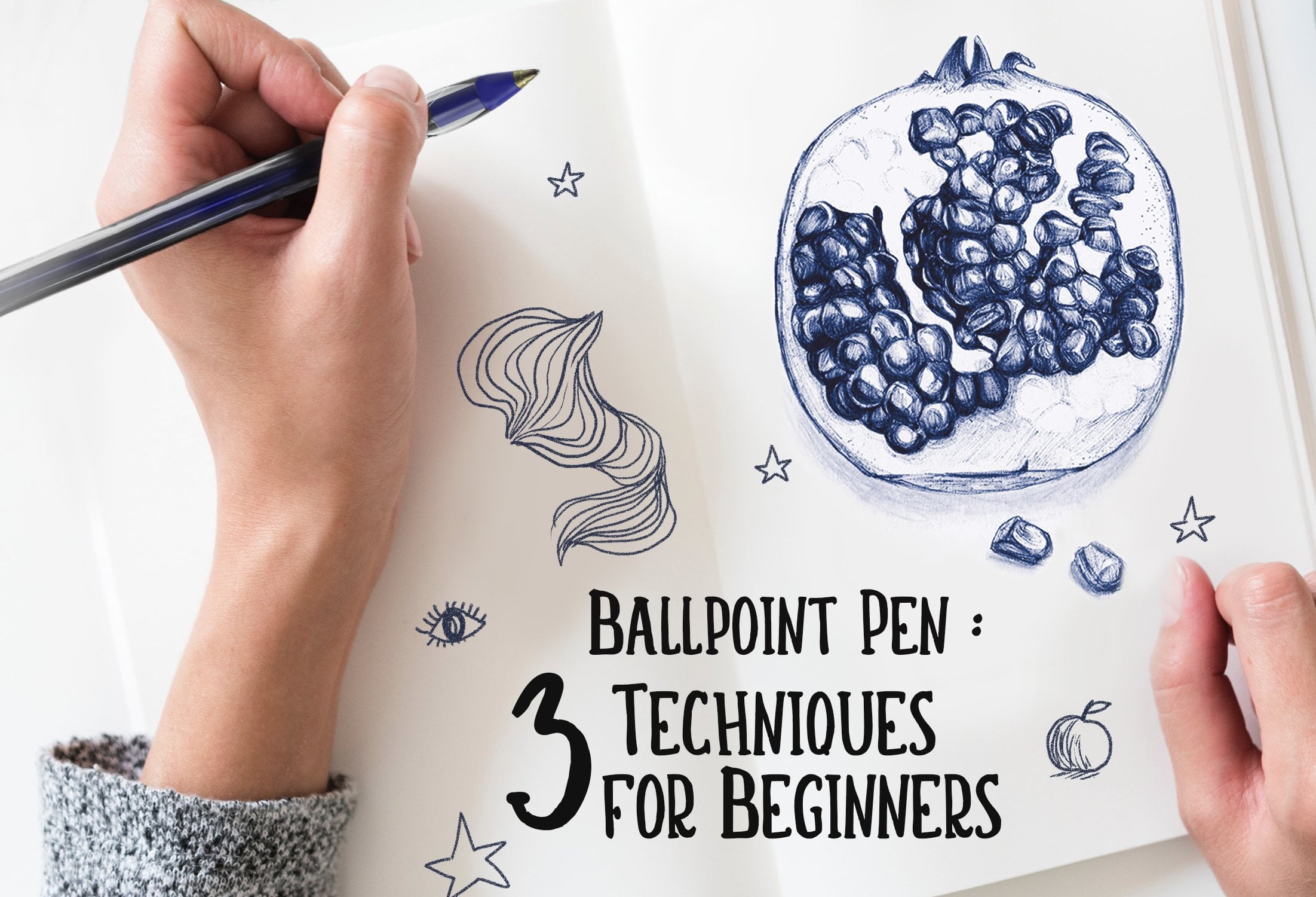
2. Materials: today, Marshall, You want materials? Who gonna need it so fast? You're gonna need a pencil and then a razor. And I like to use a couple of find Lana Pence when I'm doing my thinking work. It is This is election. All you can also choose to use any pets that you find around the house. So just around my room, I found this buck pen and this slightly FICA blew up in just a regular ball point also. Then this class I made Selves. Gill, she's for you to try out at Herms. Or if you have a printer printed out. If not, that's OK. Just use any copy paper or sketch pad paper. We have her. All right. See you in the next close.
3. Hatching & Shading: welcome back. So with materials up the way, let's get into the nitty gritty and learn how to spot hatching and using hatching to shed. So to start off with, I'm going to use my 0.2 fine liner to show you the basics patching tohave you start with during some straight parallel lines, then go over them with straight lines running in the opposite direction. This is used to create turn and drawings and illustrations in the top section. I would recommend using this area to test out any pens you have before moving on to the shading exercises, just to see which sizes work for you. - So I finished testing pens out that I have, and I found that the white ball point pen is surprisingly fun to use. I noticed it's include better than the previous one, which took a bit of scribbling start off moving on to the shading exercise. The festive high find useful left. Creating an outline is to decide what direction you want the light to be coming from. If you're working over reference Friday, then this is a matter of pinpointing weather. Light hits the subject for the spec sheet. I've drawn in a little something Udi's with some guides. But please feel free to choose your own direction if you want, as this pot is for you to get comfortable with using your in pen. So using my 0.2 pen since I like the consistency of the lines of the hip, I'm going to start off by loosely Drawing lines are the shadows to be making the lines fiber apart. The light of it gets. Make sure you turn the paper to find was most comfortable for you hands when during I find turning, it helps me get the curve I need when doing around that shape as well. So just keep cross hatching until you get the desired darkness in your shadows. But be careful not to overbite the light areas because you can't come back and put more light. And afterwards we can always put more dark in for the next circle. I'm going back to the White Ball point pen, since I really enjoyed using it when I was testing, starting with the same technique, laying out those loose lines to indicate where I want the shadows to be, then going back through these of upset lines to create the nice textured cross church. I'm gonna speed this one up. What style you choose to do is up to you. Most people like to keep their cross hatching meat, but I like to have some more loose, messy line to my drawing. The last two circles, I decided to show you what would happen if I used my two tipped shop E because I know that this will bleed through the paper. I've put a sketchbook underneath just to stop it from touching my work desk. A start, first of small tits. It's much more in key and free flowing than the other pence. So I'm trying to be careful and not to go into the white space too much of the big attempt . Instantly. I know this is gonna be a very dark spear, so I'm trying to get that shape still by curving my lines rather than keeping straight in the end, I think I prefer my ballpoint pen, but they you have it. That is how you cross hatch with pendants come into the next year and I'll show you one of my favorite techniques.
4. Stroke Weight & Shading: Welcome back in this video, I will be showing me how to use your pen to change the way diffuse jerk and create really effective but simple mocks. First, choose your fest, penned to test with like in the previous video and starting off the Penn family on the paper. Gently flick up. This will create and sort of eyelash looking mock that I find is integral to shading in my ink illustrations. This is really useful when you want to make a curved shape. The creek EU do this technique, the smaller the flicks, you can get the slowly eager the longer you're black lines will be opposed to getting very quick ones like this. So use this area to practice with any pens he have. So I'm switching to my ballpoint pen now because we already know what the pencil click from the other worksheet. This time I want to use the pence that I like to previously and practice with the weight of strikes. It's easy to get carried away and to press too hard on your pen here, but try not to lose. It may actually damage the lip. Instead, try holding the pin that for a little bit longer to let more in count before flicking it away. Now you can see that I am Bailey pressing. It's really light here. This will let me get a faint shatter when I go to illustrate and you can even crosshatch like this a swell they go hand in hand. The same goes for doc areas. You do this just by pressing a bit more into the paper. So now it's Hilton. Try practice your flicks and practice your light and dark strokes until you think you've gotten the hang of it. So, using this technique, I'm gonna show you how to shade. I am going to go around the edge where I know the shadows will be on. Remember, you can change the light directions if you want to, so I'm following the edge on what shape I think the ball will be, some giving my strikes a gentle cove to give the impression that it's free date to the next full. I'm going back to using my trusty ballpoint pen again, doing the same technique of gently curving the line to create the bull shape. It's okay if it looks a bit sketchy right now, You just need to make sure that you leave the light areas light so that you dark areas can make the light pop out and shine. I think my wife looked really good. Okay, so the next bit is a bit optional, and you can move on to the next video if you want to. However, I just want to show you how effective using these tricks can be for even a simple illustration full of flour. I'm just going to use a simple, straight flick. Not going to worry too much here about whether life is coming from Thank you. See, when you use waited strikes, it could make anything click right. So for the next one, I'm gonna try pushed the shapes and use different stroke directions to make maybe some different three D shapes for the circles. I want nothing to look a little bit like gems, so I did a lot of little round circle movements to emulate the reflective flight of the General. - You've learned how to use flicks and strict weight as well as cross hatching. So now I think it's time to get into some more detail ing stuff. Next class, we're gonna learn how to do favors for and scales see you there
5. Feathers, Fur & Scales: time to go over how to sketch Bevis for and scales in this pen style starting off with feathers. Feathers as a rule of thumb are laid very similar to scales. When doing one on its earn, it could have a much details you'd like or be a straight as you want. So when you're doing a bed, for instance, feathers are generally smaller on the top and get bigger and longer Steger down. You don't want to use the wrong sides pen for detailed areas. This one was too big, so I'm going to find one that's better size for what I'm looking with. I'm gonna be using a very small pin. Syrah points ever fight for this, but when we go to our final during, it will be bigger and less of a hassle to get those details in. For now scale. You test to match the pen size you're using textures like feathers for and scales Orel about implying, at least in this style, give indicators that there are feathers and that's what the I will see. So I recommend starting off with a few loose strokes to indicate feathers like I did to begin with, then go back over later and add in some more details. If they need to see up close, they look a little sketchy, but the further back you go, they look like feathers. I like to add a bit of extra shading between the layers of Evas, and they look pretty much done. The best part about illustration with pens is that you can stop it any stage. When you decide that it's right for you, you can stop moving on for convey. Be many different types that could be short. That could belong. That could be fluffy. That could be slick. The 1st 1 I want to show you is how I do a small tougher I might draw these scattered across the credit to give the indication of being super fluffy. For example, I'll draw a small bed. Don't show you what I mean. So now we got a bit to do the beds for. I'll start with defining areas. I know where bears will have the most fluffy's. You want the points of highest focus to be raised with the Tufts of the If in your reference photo, the bear has the tough of first sticking up on its head, for example, you can come from, and at that end you don't need constant reminders that does for for the style. Anyway, you just need indications. There you get there is my bear. Another way you can do for is to indicate it with many strikes. Think like a shaggy dog on this foxy looking outline. If it was covered with for this way, I would use the flicks stroke technique to make for as long as you keep your hand and penlight on the paper. You can always change how it looks with scales, like I said before, a very similar to feathers and that they lay in the same way. The only difference is the shape, and this is a very basic scale town on a fish, for example, you can lay the scale strategically toe, add character and uniqueness to the illustration. I had a bit of shading to increase the depth, and that is a very quick lesson on how you can draw Febreze for and scales. Test out these techniques and don't forget to share them to your class project
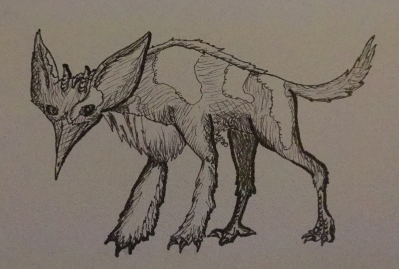
6. Wings, Tails and Ears: Hello. In this lesson, I'm gonna show you how to in cup wings, tails and ears for this lesson, it's really important to always have a look at a reference. Further, if you're not sure about the shape of something, there's a bit different to the class we did before, where we were learning how to add texture to an outline that's already there. This time I'm gonna be teaching you how to create those shapes. Okay, so I'm during a bed and its wing is close to its body. I'll allow some extra space when you're in the back of the bed and raise it a bit too look like there is a wing there and it is a part of the bed, so it's always important to keep an eye on your reference photo. If you're not sure about the shape, the next good has its wings outstretched. So keep my panel I on the paper so I can change the position if I need to, and I'm lightly sketching out the wing and following the reference fighter. I don't want to spend too much time on the details, especially since it's just in outline as I know I'll be able to go back over them later. Right now, I just want to get the foundation out. The tales again. Nothing's where reference photos come in Very handy. Followed the general outline and shape of the tail. You want to be able to capture the mood of the credit through its tail. See if you can guess what critters I'm sketching for the years. I want to show you how a rough sketch with your pin can be made to look much more finished after you've added in some details. Just so you don't worry about whether or not the outline looks good, because when you add details later, it changes the way ever. Fanx. So always stick to your illustration, don't give up on it. - And so, if the rabbit accidentally made the nose to dock, was able to fix this by changing the direction applied on his face. No, I think ab's key character, but even so they have it. You should know now how to draw the Bevis scales, wings, ears and tails in loose pence style. Have a go at each one and upload it to your project. Would love to see how you go
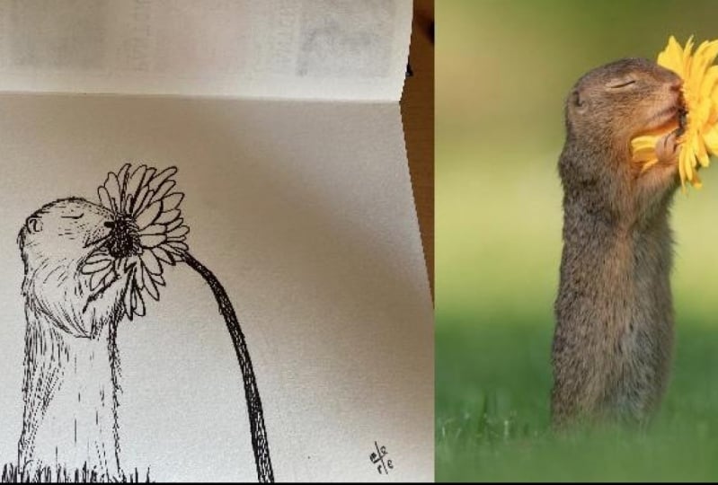
7. References: many people think when the first starting out that they don't need references. While it may be really tempting to not use a reference, I highly encourage you to don't skip this step References. Help us keep our image looking like we intended to. So until you're a little bit more advanced and you've had lots of practice and you can draw Anoma Diller onto a blank page without any problems, then I would recommend using references. You can get references from anywhere you can get them from books for magazines, but I just like to use the Internet first, decide what sort of critique you would like to draw. This could be any animal I think I might do. But when you go to pick your reference image, make sure that you're able to see clearly what the animal is. If the angle is off, it may make it difficult to create an outline later. Okay, so I have gotten a couple images that I like together I've added in a cat on some dogs just so I can show you at the end how I find the basic shapes in different types of critics. Just want to say that this is an optional step. I like doing this so I know where the basic shapes are, but you can skip this step and move onto the next video. If you already said starting with the bird, I'm going to use my pencil to just circle around some basic shapes. Stop the heads. Big circle on the body. It's just another big circle, adding in some extra details, like the eyes, the beak, the feathers, even the feat in the two. And you don't have to worry about being too neat when you do this using a different color. I just like to outline Where will the extra details are? So this next part I am going to go through and just make a quick guide for myself to the show where all the different colors are. This comes across when you're doing your thinking. So it's nice to know whereabouts. All those really dark spots are and where the different shades are. It looks a little bit busy, but don't be intimidated. I'm going to get rid of mist of this anything, and that's my bad done. I'll just take those off and put it somewhere where I can see. I'm just going to quickly run through old the ones. So we got the dogs just running for some basic shapes and outlines and then just want to show you how simple and easy it can be. Okay, we got a cat, so you can take a few tries to verify it. And you don't have to do this step. This is just to show you where all the basic shapes are in animals. It's time to eat, but printed out for public. Oh, no. Screen somewhere you can see easily. And now you're ready for the next stage. See that?
8. Preparing your outline!: well done. You made it this far announced. Finally, time to stop during your fantastic critic Festive. Make sure that your reference photo is nearby and where you can easily see it. If using a laptop or a tablet make sure that the screen wiper doc while you're Doory. Okay, let's have a look at our reference. Further. Mine has a small body and a small head. So I'm gonna draw in loosely where all the recognizable shapes are so that they easier to transfer down onto the page. So I'm going to stop my pencil fest to get the general shape of the bed, feel free to raise any of the parts that you can not quite the right shape. I'm getting rid of the lower branches as I want the main focus to be a little bit. Now I am starting to drawer in a most solid out. I'm doing this by lightly going over the initial shapes of the bet. At this stage, we can change how it looks by slightly raising over the original lines, but not enough that you can still see them if you want to keep. And slowly the form comes together and there is my workable bed outline. You can continue to make this outline even Nita, but I'm gonna take it to the next and final stage.
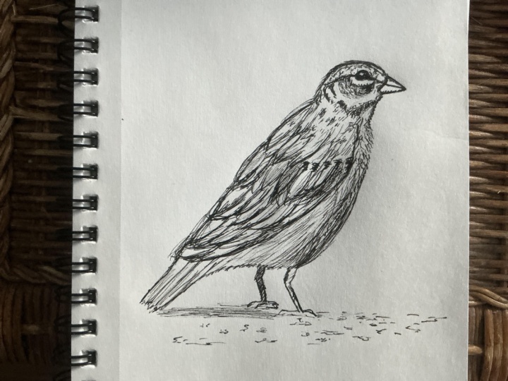
9. Finale: Inking your Critter!: welcome to the final stage. In this course, it's time to in cup your critic. So in the last lesson, we made a solid, workable outline for our credit to being done Now. This may seem daunting to start on, but I recommend starting off the eyes. I like to make my eyes look a little bit cartoony. I think it's kind of keep next. I'm gonna outlined the beak and shape it slightly, so it's go appointed tip because it wasn't there during the pencil stage. But I think it looked nicer if it did. On my reference photo shows a very fluffy bed, sir, I'm going to try my best as I go around the outside. Teoh, make sure I have some feathers poking out that makes it look like he's a little bit fluffy . Don't forget, you can turn your paper any time is important that your hand is comfortable when working as you're going along. You can make some changes to your credit whenever it seems like he might need them. I wasn't too sure about the headline where should sit, so I made it nice and light so I could go back over it later What I'm going to do right now is stop and raise all those pencil lines I made before. I think that all the outlines, so I want to keep the rest so I can go on. I'm starting a small places fast, then working my way around the edges again to make sure that the critter has an even amount of detail. It's always important to stop what you're doing. Every so often, look back atyou illustration doesn't look too heavy and one area that move on and work in another spot, then come back. Don't forget to look at your reference photo as a guide toe where the patterns and colors and main feathers are. I use the term guide. However, that's once you have put the shape down and basic features set out, you can go ahead and make this critic unique. The there's a big blank spaces. I like to fill them in with some waited districts. I can always add more detail later if I need it. All right, so I'm gonna speed this up for you now. But remember, when you're during your own Krieger, you can stop at any stage during this process and say I love it. I'm going to keep going. So you can see the full scale of the techniques, actually new in this class, - it And they haven't won. Shaggy, Fantastic critter. Ready to be hung up on a wolf or tend into a gift I really enjoyed during this little critter. And I hope you enjoyed during your own. Make sure you post your progress on the cost Project will always hear the Hansa. Any questions you might have? I can't wait to see what you draw.
 Brittany Jade, Artist