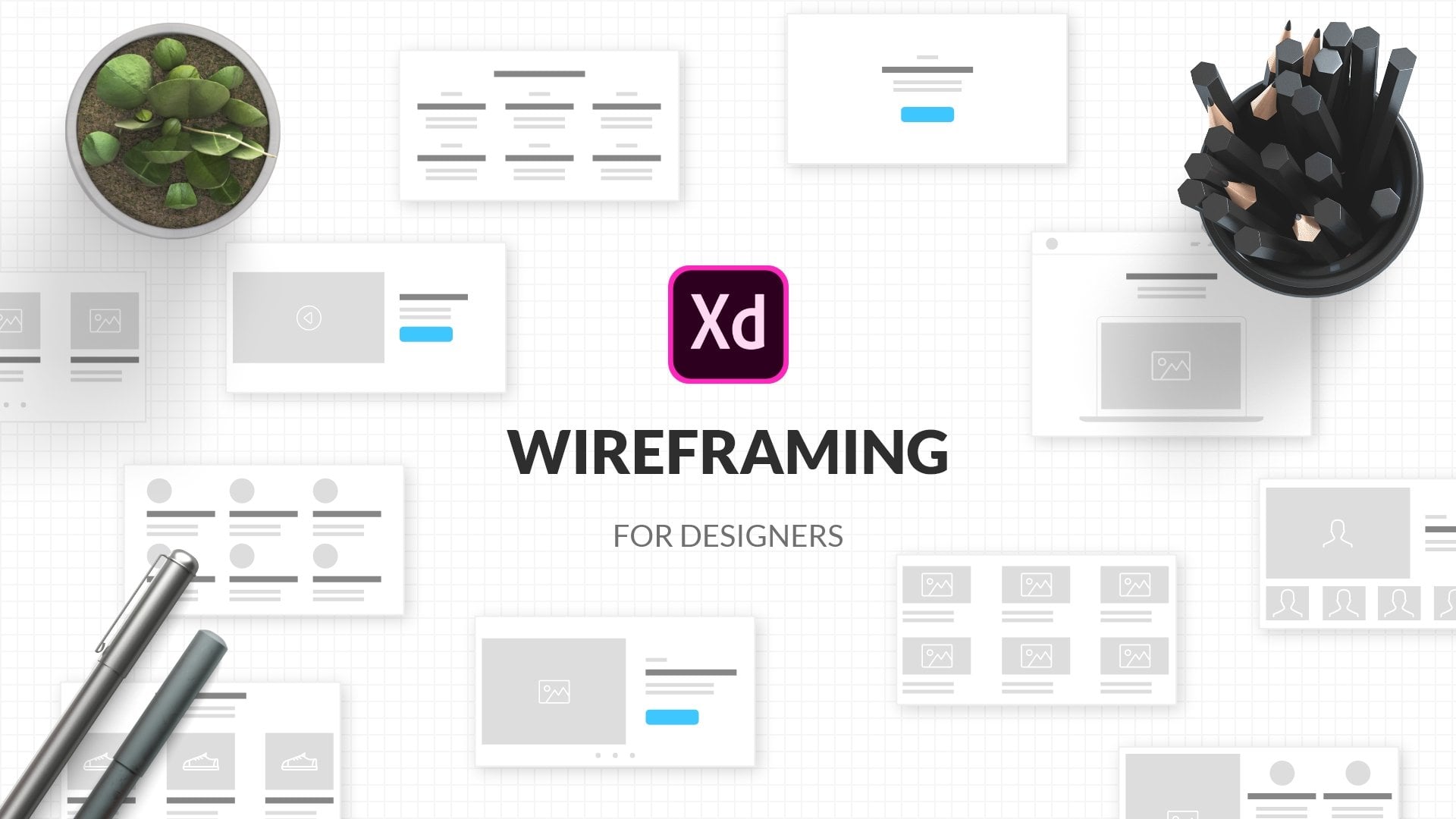
Transcripts
1. Class Intro: Hey designer and my name is Alex and welcome to this skill share class. I'm the founder of web donors, very creative design products for creatives like you, I'm also a teacher and so far over 30 thousand students have completed my courses. In this 20 plus hours logged master class, you are going to learn basics of Adobe XD and what it can do, how to create great design, brief. Create website architecture. Draw your wireframes on paper, then import and creates them in Adobe XD. Create complex designs by adding colors, images, and animations. Share those designs with clients to get feedback. Create responsive design with multiple sizes. Present your designs in a portfolio. And finally, how to export your assets for developers using industry standards. This class covers everything you need to know to get started in UI UX design, or to improve your skills, no matter the level you are at the moment. You don't need any previous knowledge of UI, UX or Adobe XD, we are going to cover it all in this course. Your class project is to create a website designed using the tips and techniques you learn from this class. So if you want to employ your skills and productivity, save a lot of time and money on V iterations and changes and create designs foster that I'll see you in class.
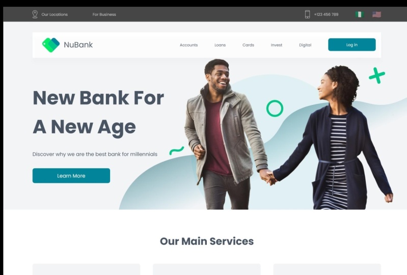
2. Class Overview: Hey designer Alice here and welcome to the course. I really hope that you will find value in it and I really hope that you will learn something new or that you're going to improve your knowledge of Adobe XD or of the design process and creation of website design. So in this first video of this course, I would really like you to introduce you to the course, what we are going to do, and how we are going to get started. And the first thing I'm going to show you is the overview of our project. And I'm going to walk you through really quickly what we are going to be doing in this course. Why is it so long and why I took the time to create it? So first of all, we're going to explore our design brief. I'm going to show you the design brief after the introduction to Adobe XD part of discourse. So if you're familiar with dx, dy, if we know how to use it, you can simply skip these lessons. But if don't, I really encourage you to walk through these lessons and just to familiarize yourself with Adobe XD as a tool, what it can do and how it can help you elevate your UI and UX design game. Then what we are going to do is read that design brief that you regard from the client. I will also show you a template which you can use for your own projects. I will tell you and explain to you how did we get all of that information? And then we're going to walk you through how can you explore a different persona's? How can you explored different use cases and different audiences and debt are going to be using your product, in this case, website design. And then we're going to get started with paper wireframes and we're going to create things like these. So we're going to start with just plain piece of paper and we are going to draw on it using simple pen or pencil. We can also use these colored markers as you can see right here. And then I'm going to show you how you can bring all of the doors pay provide frames into Adobe XD. Now you might be wondering, why should I drop paper wireframes and then do all of the same in Adobe XD, it's quite simple. Perhaps you need to share this file with some other designers. Perhaps you need to share this file with your clients and it's all well and good having these pieces of paper like this line around next to you. But for example, if you need to share this with some teammates with the clients, in any case, perhaps even with the developers just so that they can check it out in this early stage of the project, then you will need something to share them width so you can either took, uh, take a picture with your phone and then bringing those pictures inside of your computer, drag and drop them in Adobe XD. Or even better, if you have a scanner, it's not mandatory, but if you have it, it's great. You can scan it and simply bring it inside of Adobe XD. I'm going to zoom in just a little bit in our Adobe XD file, which is what this is and what you can see right here. So I'm going to walk you through the steps and we're going to take throughout discourse to achieve the final result. So first things first, we are going to start with paper wireframes and you can see them right here as I said. So these are all our paper wireframes. And we're going to draw all of these wireframes on a piece of paper. I'm going to explain to you all of my decisions why I have chosen to do these things. I'm going to show you how you can write notes down just to remind yourself or to explain to her teammates or to client some of your decisions and why have you chosen those decision over song else, something else, for example. Then we're going to create this website architecture. We're going to connect all of the pages between themselves. And I'm going to explain to you the flow of the website where the users are going to click rich pages, they're going to visit, where they are going to go from there and so on. After that is completed, we are going to move on to wireframes in Adobe XD. Now you might be wondering to yourself, Why should I create wireframes twice? Well, it's much easier to put ideas just on a piece of paper and just quickly draw them down, just Sukh and get the overall sense, an overall picture of your project and offer a design direction, for example. And then once you have debt, once you've shown that to your client in either jpeg, like these ones are right here, or as a PDF for example. So you can combine all of these inside of Adobe XD or any other software into a big PDF. And you can send that PDF to your client so that they can check it out and see for themselves if that's something which they would like to proceed with this project after all of that is completed and your Fourier example get a green light from your client. Then you are going to move on inside of Adobe XD and then start creating wireframes. As you can see, we are going to create all of these wireframes in Adobe XD. I am going to show you how you can use and reuse certain icons. How you can create font styles, how can create custom colors, make them as a component, and then apply those colors throughout your design. I'm also going to show you some plug-ins to create these flags right here, for example, I won't go into show you some different plugins later for some other things. And after we have completed website design, we're also going to create a dashboard screen because users need to login from this website and go inside of the dashboard where they have all of their personal information. And because this is a bank project, they will have access to their accounts, they will have access to their cards, loans, and so on. So we are going to create debt. Now, importance of these wireframes in Adobe XD is because you can share them with your client for feedback. When they provide you feedback on these wireframes, then you are able to make a certain changes to these wireframes. Dense sand them that back for revision. They can either provide you more feedback and you can move on with feedback on these wireframes. Or you can apply the feedback that you've got and start creating designs. Now when you start creating designs, as you can see right here, you're going to start including different colors because if you glance right here, you can see it's just grey on White, perhaps even some darker gray. So those are just your basic color to get your ideas across to your client and perhaps even to the developers, maybe teammates, so that you can gather all of that feedback. I'm telling you all about feedback in the sharing part of this course. So I really encourage you to jump back to debt part of the course. So you can watch entire course or you can jump straight to that part just to familiarize yourself with debt. So it's really all up to you. How do you want to watch this course? Finally, we're going to start designing. We are going to design all of these pages, and we are also going to add some nice and custom animations. We are going to divide them in flows. That's what you see right here where it says website design, dashboard design, and so on. We are going to connect all of those pages. And as you can see right here, we just have one dashboard screen inside of our wireframe because we are going to continue building from there on. And we're going to create all of these other dashboard screens. Now, if I take you right here and hit this preview button right here, it will open up at the external window. And then I can show you what we've done right here with this design enriched the animation. So we included some custom animations and some really careful a plant placing of those animations. So if I hover, you can see these hover effects on these buttons. You can see that this menu is following us. As we scroll along. You can see these horror effects. These cards, for example, you can see how that works. We included some effects later with this part as well. There is some horror effect here and this navigation works. So if I click on my accounts, for example, is going to take me to the accounts page where I have all of these icons, for example, which when you click on them, are going to change. And all of this information is going to change as well to correspond better with all of this information right here at the top saying the selection that you have chosen. We also have our effect on these buttons. We also have Q and a. We have this nice little folder and so on. After that, I'm going to show how we can create these login and sign up pages, which you can see right here. And then after you login, it will take you to your dashboard where you have all of these pagination effects to these cards. For example, you have these effects right here at the top. And I can also take you to pages like this where I'm going to show how we can create these animated charts. How you can create these buttons, how can create these scrollable groups and much, much more after the design is completed, after you gather enough feedback, after you've done all of these and emissions, which I'm going to walk you through step-by-step, how we can create them in a smart way using components, and how you can then reuse those components later, you're going to move on to responsive design. I'm going to share with you what the responsive design is. I'm going to show you all of these different grids and grid types, how they are going to work inside of our design. And I'm going to show how we can create this homepage, which is this page and adjusted in four different sizes. And Dan, I'm going to do the same and show you how you can do exactly the same thing using the same principles on the dashboard design screen as well. We are not going to create a responsive design for all pages just for the time sakes. But if you want to, I really encourage you to test it out into try for yourself with all of these pages which we're going to create in this course, because that's the best way you are going to learn. You're going to apply these principles anyway when you start working with your clients or if you're already working with your clients, this is a great way just to brush up on your knowledge or to pick up some new techniques that Adobe XD can provide to you. Finally, after we have completed this responsive design, we are going to move on to the project style guide. I'm going to show you how you can share your designs with your client. How we can gather feedback, Coke, and share designs with developers, giving them assets which then they can download and use in code. How can share customized CSS code? How you can use and create all of these document assets right here. So when the load, you can see that we have created these color tokens. We create a different character styles. We created a bunch of these different components. So I'm going to show you how you can share all of those things with your clients and with your developers. We are going to discuss how we can gather feedback and how you can take that feedback in any part of your project. So whether that's in this part, in this part, in design Barth and responsive part. Or finally, when you start with the project style guide. Finally, it, we're going to wrap this project to a close. We're going to create the project style guide. And I'm going to show you how you can manually export all of the assets from this project to show them to your developers and clients, I'm going to show you the folder structure. I'm going to show you different asset export techniques, different file formats, how they correspond with each other, for what you can use, which file format and much, much more. I'm also going to show you different sizes and how can you work with different sizes. So for example, for all of these and how can you export assets quickly? How do, do not repeat asset export? And how can you improve that process even more, speed things up a little bit. So basically that is our project and you can see how much there is in white. The course lasts for so long. I really hope that you are going to learn something new from discourse. And I really hope that you are going to apply the knowledge from discourse in your future work. So as I said, first video after this video is just walk you through of the project itself. So if you want, you can watch that after that video comes the introduction part or for Adobe XD. So once again, if you're not familiar with Adobe XD, if you don't know what is possible into, there'll be UCSD. I really encourage you to watch that part of the course before you actually move on to this part of the course when we are going to start with the project design. So I'll see you there.
3. Introduction To Adobe Xd: In this section of the course, we're going to explore Adobe X, these basic tools and features. And I will really recommend for anybody who is just getting started with UI UX design or with Adobe XD itself to check out this part of the course because it really contains some of the most valuable information about all of the tools that Adobe XD has to offer. Tools about design because prototyping tools, we are going to explore them a little bit later in the course, once we actually start prototyping our designs and adding some animation and some spice to it. But before all of that, once again, if you're just getting started, if you don't know what Adobe XD is, if you don't know what you're in UX design is. And then I will really recommend for you to check out this part of the course to get yourself to know some of these shortcuts. Because there are going to be really valuable tools to understand, especially once you start moving on and on through this course. And we are going to get some to some extremely complex stuff later on down in the course bug. Before all of that, I would really recommend for you guys to check out this section of the course, because as I said, it contains some of the most important tips and techniques of Adobe XD and about all of its basic tools for design. In the next section of the course, we are going to start actually designing, are going to plan. We're going to process everything from the design process itself. So once again, if we know how to do all of these things, you can simply skip this part of the course. But if you don't, I really recommend for you guys to check out and to familiarize yourself with all of these tools and features. So I'll see you in the course.
4. Install Adobe Xd: In this first video of this series, where I walk you through the Adobe XD, its features and all of its functions. We're going to explore creative clouded desktop app. So you can go to Adobe's official website, Adobe.com, If you don't have this Creative Cloud desktop app. And it's basically used for all of the updates and all of the installations of each and every software that Adobe has to offer, including a Adobe be x D. So this is how it's going to look like. So you can create your free account and you can access it from here. You can also connect your Behance account if you have one, and it will be displayed right here. And those of your notifications here, right here you have desktop apps, you have mobile apps, and you also have web apps. So majority of these desktop apps have at least mobile version. And if not, some of them can also work on a Web. For example, Adobe fonts where you can download fonts, Obviously, Adobe Stock where you can get stock photos, portfolio, Acrobat, and so on. What we are interested is desktop apps and Adobe XD. So here I have it installed, as you can see, and it is up to date when it's not up to date, you can simply, like it says, right here, click update. You will see Update progress bar right here. It will update itself to the latest version and then it will display this message visitors up to date. How can you actually install it? Where it's quite simple from this list, right here, you have this install button next to Adobe XD, as I said, already have it installed so you can't see it, but simply click Install. It will ask you to install it like any other software on your computer. It works both on Mac and PC. And once it's installed on your machine, it will say installed an up-to-date. And basically to open it up, you can simply click right here. And when you do this, screen pops up and let them quickly hide discipline out of the view. And in the next video we're going to explore this green, which is called home screen. And this is basically the first thing which you see once you load Adobe XD from this Creative Cloud desktop app, you don't have to load it from there. There is also a desktop shortcut to can open it like any other software. But I really recommend that you check from time to time if there are any updates because that's the easiest way to launch it and to access all of its features.
5. Home Screen: So here we have the Home screen, as I mentioned in the previous video. And here on the home screen you can access all of these mean features before you actually start working in Adobe XD. So below the home screen we have the Learn tab. And once you click it, it will bring these tutorials from Adobe XD steam. And you can see how our bins Q0, which is basically their evangelist at Adobe steam, you can see about getting started, about design, prototype, collaborate design systems, all of these different tutorials to help you out once you getting started or when you get stuck, for example, it's the easy way to access all of these tutorials, but all that we have cloud documents, and these documents are obviously uploaded to the cloud. And because Adobe XD is mostly cloud based, you can use it just as a desktop app. If you, for example, don't have access to the internet or you don't want to upload your files to the cloud. But if you do and if you choose to do so, you can see your cloud documents right here. And as you can see, I am on a starter, a plan for a discourse because I want to show you all of its features once you are on a starter plans. So you don't have Adobe's Creative Cloud paid or you didn't purchase the app itself for a year. So basically this is what he says, upgrade. So that's what you are going to see. If you're using the free version of Adobe XD, you can click that button. Dare to upgrade if you want to, but if you don't, you can simply continue using this free version. So inside of a free version, you have some limited cloud storage. And if I click right here, you can see how you can work with your cloud documents. And you can click right here to add additional cloud documents if you want to share it with you are the documents which are shared with you via the cloud and deleted are obviously the deleted documents which you have gone ahead and deleted because you need that additional space in your cloud storage. Below that you can see managed links. And these are the links for the sharable prototypes. So they are taking space as well. And because on a free plan, which is the startup land, obviously right here, you have just one shared link. Then if you're on another project, you might want to delete that shared link if it's no longer necessary. For example, you have completed that project with your client and they don't need to see this shared link anymore. So you can go ahead and delete it if you want to. Let's go back to the home by clicking right here. And what you can see right here is their slogan. So design prototype share, that's all Adobe XD can't do. Below that. We have some are more sizes and our boards are basically, if you've never worked with a vector file before and vector program before. Basically, those are your file dimensions inside of Adobe XD. So here they have introduced some of these shortcuts. So basically this is for the mobile and tablet, this is for the web, and this is for the social media, and this is your custom size. And if you click this arrows on any one of these, you have this drop-down with some major sizes which are used. Across the industry. And these are basically industry standards if you're working with these sizes. So as you can see, we have mobile and tablet versions here, we have a website versions Here, we have social media versions here. And if we click it, it will actually take you to a new document. So let me quickly go back and show you all of it. And finally, we have discussed them size, which you can open and you can enter your values. So for example, let's use 1920 by 1080, like so, you can simply enter your numbers on your keyboard. Simply press enter or click right here. Before we do that, we load that you have your recent files and these are basically your files which you have opened previously. So these are accessible from here. And you can also open your Adobe XD and open them from there. And I will show that as well. But basically these are just some of your most recent files. And it's handy to have them here because for example, these are my mockups which I am using in Adobe XD. And I can simply click here and it will open that file without me a browsing for it on my computer. Finally, before we move on to actual art boards, and I'll show you the XD from inside. These are just some basically newsletters that they are including right here. So some helpful advices or resources and so on. So you can click right here to explore some of their tutorials. And you can do that by clicking here as well as already told you. Here we have some brackets which are obviously helpful if you want to download and explore some your kids that other people created. And we're going to mention them as well a little bit later. And finally, what we have right here is daily creative challenge, which I really recommend that you join, especially if you think that this career path is for you there daily creative challenges are awesome and you can access them by simply clicking right there. And they are versatile. So they are including new challenges all of the time. So I really recommend that you guys check them out. And did you try your luck at some of their daily challenges? Finally, let's go ahead and open our custom size that we created. But you can also access these exact dimensions from here. So you can see 1920 by 1080. So it's really up to you what you want to do. But because I already created that, let me quickly click there. And as you can see, it's going to open this new rpart, like me scale it up. She had control of the command is 0 to snap into position. And this is basically how it's going to look like. So this is your airport, this is your working space. And inside of this whitespace, inside of this art board, you can draw, you can put some text inside, you can create graphics. You can do all kinds of different stuff, which we are going to cover in this course. But basically, this is your working space. All around. This working space is basically this empty space which you can go up and down. As you can see, there is plenty of space for all your additional airport which you are going to create. And I'm going to show you in this course how you can do that. And we're actually going to go through the entire design process. And I'm going to show you a lot of different details in this course. But before we do, I just want to cover these basics for all the people who have never used Adobe XD before. So what you can do is you can click right here to rename this document. As you can see by default, it goes by to date, solids quickly rename it to my first project, for example. And click Save. And as you can see, this cloud icon right here, because it's updating to the cloud and you can see that it's saving. What's it saved? You. You don't have this progress anymore and you can always hit Control or Command S to save it out if you want to. Finally, our board names can be changed from here, so you can double-click right here. For example, call this one Homepage. Let's say if that's something that you want. So in the next series of videos, we're going to explore all three tabs that Adobe XD has. So it has this left tab, it has the stop tab, and he has this right tab. And all of these tabs are doing different things and I'm going to explain them in next videos. So I'll see you there.
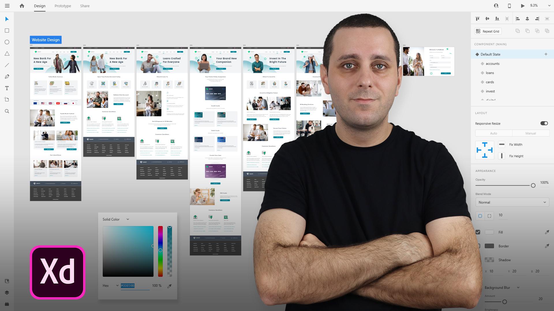
6. Get To Know Adobe Xd: So let me quickly walk you through these tabs of Adobe XD. So on your left you have the tools tab. Right here. You have the Properties Inspector. And right here you have these main tab. Difference between Windows and Mac versions of Adobe is the are quite simple, actually just the mean. And the only differentiating factor is the navigation. So on a Mac you'll have navigation right here at the top, like you usually have on any other app, on your Mac or on Windows, you have these options here, and you also have this hamburger menu here. So once you click there, you have all of your options here. And you also can right-click on majority of these tools and these options. And you're going to get some additional features, whatever you are doing. So that's the main and key differentiation factor between Mac and PC versions. Now it right here on your left, once you hover, you have all of these different tools which you can use to create different designs. And let's start from the top down. So this is your Select Tool and you're usually using it to select any object you might have inside of your arboreal. Below that we have some shape objects. So you have Rectangle, Ellipse, polygon, and a line shape. And you can notice, once I hover over each of these, you have a shortcut key. And I'll also provide you guys with a PDF with all the shortcuts. Or you can simply go to Adobe XD website, type in shortcuts into the search bar and you can find them there, or simply Google, Adobe XD shortcuts, whichever is easier to you. Alternatively, you can also click right here and go to the help. And from here you can access it, for example, XD help. You can click there and you can find all of these shortcuts. Below that we have the pencil and pen tool is used to create complex shapes. And you are going to see that in the next video. And below that we have textual obviously for creating and managing text. Below that we have our board tool. So if you want to quickly add multiple R boards without going to the home screen, you can simply click there. And inside of your properties inspector, you can see everything which is on the home screen, but from here accessible so you can easily, for example, I want to create this one. You can click it and it will add it right here on the right, as you can see right there. So I can go ahead and delete it by simply hitting my delete key control 0 to snap into position. And finally we have the zoom tool. So like any other tool below that, we have assets panel. And when I click it, it will expand to the right. And you can add your different acids. So you can add different colors which you are working with inside of your design. And simply by clicking these colors which you have previously added there. It will apply to whichever one you selected. So for example, if you're editing text, it's all black and you want to create it, for example, to be blue and you have blue color right here. You can select the text click right there, and it will apply. I'm going to show you all of that later in this course. Below that we have character styles. For example, you are creating. H one let c and h one let it be, for example, 36 bold. You can simply click on this plus and it will add it there as a character style. Later on you have another one which is 18 irregular. You can click right there and it will add it there. Then later on, if you want to change any character styles that you might have inside of your airport, you can simply select it, navigate here, click on it, and it will update to that character style. Finally, we have components, and components are a little bit complex topic to discuss, but we are going to discuss it throughout this course because you're going to see we're going to use a lot of different components. And let's say that you have a button which you want to use across your design. Maybe it's a blue button. Let's say that the width is 76 pixels, something like that. And it says, for example, learn more. You can hit control or command K to add it as a component, or you can navigate to right here to our acids battle. Click right here on this plus symbol, and it will add that component here. Then you can simply click, drag and drop your component throughout your design. And it's much easier, faster and more streamlined way to create your designs then to recreate or copy and paste that button. All of the time. You don't have to use components just for buttons. You can use them for all kinds of different things. For example, images. You can use them for different shapes, you can use them for icons and so on. But as he said, I'm going to explain that in a lot more detail throughout this course. Below that, we have Layers panel. And obviously once you start using these, you're going to see that it populates with your layers right here. You can reorder them and reorganize them, recipient clicking and dragging them. And you also have bilayer groups. While before I show you that you have some options right here. So you can mark for export any layer, and then you can just hit Control or Command E. And it's going to start exporting all of these layers which we have marked for export. Or you can simply manually select them like so, hit Control Command E And they will export like that. You can lock your layers so they cannot move. And you can also hide certain layers by simply clicking right here and it will not be shown. So let me change the color. And if I click right here, you can not see it anymore because it's hidden. Finally, you can add your layers through group and you can select multiple layers, bucketing, click and a shift. So if I click right here Hall my shift key, click on this one, I'll select all of them. He'd controller command G to group them. And you can double-click and renaming of group solidarity group. And you can also right-click and you can see all of these different shortcuts right here. So it's really important to learn at least some basic shortcuts. If not, you can simply right-click on group and you can rename these layers as well. So I'd say first, second, and so on. So that's basically your layers. And to delete the layer simply selected, hit Delete on your keyboard and it will delete it from there. You can also reposition that. I already told you that. And that's basically it about layers. And we're going to explore them in a lot more details throughout this course. I just wanted to quickly show you what the two. Finally it right here at the bottom we have plugins, panel. And plugins are used to help you design a more efficient and more fast manner. So for example, as you see right here, I have my angle plugin which is formed my mockups. I have my arranger plug-in and all of these plugins are different. So once you click install them, they do different things sort. Let's see this lorem ipsum, I can select the text, select the text area and type something. Let's see, maybe decks. Click somewhere outside. Click lorem ipsum, fill the placeholder text. Insert text, as you can see, instead of me going to some website hearing copy and paste and so on, in just a few clicks inside of Adobe XD, I managed to include some dummy text right here. So as you can see how a lot of them, and to add more, you can click this plus icon and you can see discover, browse and manage. So here we have Editor's Choice and what they think the most important plugins are. And you can see them by categories. So for example, if you want to song for reusability and testing, you can click right there and they will assure you the most relevant and important plug-ins for that particular category. You can also click Manage, and these are all my installed plugins right here. So I know that this maps generated does not work anymore sadly. So I can click on Install from here, click on Install, and you can see that it disappeared from here as well as from here. If you have an update for your plugins, you can click update all. And as you can see, depending on how fast your internet connection is, you can see that it updates really quickly. So those are your plugins and that's your bar right here on the left. So under top we have designed prototype and share options. So what those are? And basically in the Design tab, you are doing, all of your designing, wants to click prototype tab. You can add all sorts of different animations to your objects, our board, or to the airport itself. You can create multiple flows and we're going to go into all of those details. And you might notice once a click some of these things, these property inspectors are on the right are changing. So you can see for these two, it's completely different when I switch between them. And that's really on purpose because especially in design and prototyping tabs, there are doing completely different things. And finally, we have the Share tab, which are actually going to use once you finish your project and you want to share it with stakeholders, with clients, with developers, with your teammates. And you can set everything up right here. So you can choose design review, which actually your client is going to review and leave your feedback. You can do the same for a development. So developers can see CSS snippets. They can see all different assets which you use. They can see different margins, paddings and so on. Presentation, user testing, name says it all. And finally, costume. If you want to adjust some of these things, if your audience is custom audience, which is not represented here. And as you can see, a link is called My First Project because our project is called My First Project. But you can obviously rename it from here. And let's give it some don't know project name based on the company itself and so on. So you can access all of that there. So that's basically it for this video. And I'm going to show you a property inspector and how it changes in the next series of videos, once we start exploring all of these different tools, right here in I'll Tools panel. So I'll see you there.
7. Shapes: In this video, we are going to explore some shapes which are here on offer inside of Adobe XD. So let's start with the rectangular shape. And you already saw that i created some of these, but let me go ahead and delete everything so we have a nice clean slate. So you can click on it or you can use our shortcut for it. You can click and drag and create whatever you want right here using this rectangle tool, you can click the Select tool, which is v, as a shortcut and you can position it wherever you want, right here. And here. As I mentioned in a previous video, property inspector changes based on whatever you have selected from here. So here we have some options and let me walk you through all of them. And basically they're quite similar for all of these shapes. And actually let's explore and debt really quickly. So I'm holding shift to scale properly. And if you don't hold shift, this is what's going to happen. So you can see that it doesn't scale as it should. And let me use this to create my rectangle and let me use this to create my line. So basically this is how it's going to look like. Once you create all of these different shapes, LET them quickly give them a color. So we can give them one color, one by one by simply clicking right here and then choosing whichever color you want. You can use a solid color. You can use linear gradient, which you can see how that looks like. And we're going to explain that a little bit later in this course. And you can use a radial gradients, which is basically from this circle. But let's go with solid color. And you can use this hex code, especially if you have a custom hex code. So let's use mine three, C6 ff, which is a nice blue. Once you click enter or return, it will apply. And you can then use a discolored to apply to all of your objects by simply clicking here and then here. And you can see that it applies to all of them. Now, the other function is the border color. As you can see, it's on all of these shapes but difficult right there. It will remove that border color from all of them. Let me select my line and let him bring it back because it only has the border color. And let me increase the size of this border to, let's say ten, just so that you can see it a little bit better. And now let's walk through some of these options here inside of our properties inspector. So at the top we have positioning icons. So right here you can pin it to the top, to the center like this, to the bottom, to the left, to the center like this, and to the right here you have evenly distributed. So if you select all of them, you can distribute them like so. And you can distribute them like so. So basically whatever you select right here, it's going to show inside of your property inspector below that we have repeat Grid option. So once you select that, you have these two handles and you can repeat on the right. And you can also repeat on the bottom. So if you have multiple of these shapes, you can position them like so. And it's really extremely easy to use and to work with, especially if you have repeating shapes like image grids and so on. You can ungroup it and you can work one by one or you can if you don't want to do it at, he'd Control Z to still have them in the group. And if I select this first one, and if I scale it is, you can see all of them are scaling. You can hover right here in between them. And you can adjust the spacing between them. And you can also always extend and have as many of them as you want. Basically whichever change you're making to this first one is going to apply to all of them. So let's quickly changed a color. You can see that it updates in real time. And you can also add all of these additional features which we are going to explore. But for now, let's quickly click Ungroup grid and let me delete all of them just so you're not confused with what's going on. Below. We have all these different options. So if you ever use tools like Photoshop, Illustrator, or whichever other design tool before, basically what you have here are add. So it's going to add to the shape. Subtract, intersect, and finally exclude overlap. So it's shown right here what they do. You can play around with these different settings, but we're not going to do that at the moment. Let's quickly run through everything. So have width and height and you can adjust it manually and the obviously change as you work on them from here, you have them on the x and y axis. You can rotate them solid, say 45 degrees. That's how it's going to look like. You can flip it left to right, top to bottom. And here we have horizontal scroll, we have vertical scroll, and we have scroll in all areas, so horizontal and vertical. And these three are going to make a lot more sense once we start designing. But basically, they are there to help you with your design process to speed things up even more. Here we have fixed position when scrolling. Obviously, if you extend your arm board, which you can do by clicking here. And then once you draw below, you can see this fault line. Basically everything you see right here is going to be visible on the screen. But below this fault line is where your reserves are going to need to scroll. So let's undo that. Let's go back. You have responsive resize and you can use this responsive resize feature by simply clicking here to enable it or to disable it however you want. And we're going to get to responsive resize later on in the course when we actually finish our webpage and we start designed for responsive. But basically you have auto and manual options there. And I'm going to shoot that was we started designing. You have your obesity slider. You can position it wherever you want or you can use keyboard shortcuts. So for example, if I use five with full auto 53%, it'll go to 30% or 0, it will go to 100%. Below that we have blending mode. So if a position these two here, and if I click dark and if we click screen, if I choose between all of these, as you can see, it changes. So you can play around with these settings, but they're mostly used and better used with images rather than with these shapes. Below that we have corner radius. And you can adjust corner radius or also, for example, 50, as you can see, it rounds all sides. Or if you click right here. However, you have top-left, top-right, bottom right, and bottom left, and you can access these. So for example, let's use ten for this one. As you can see, this is Dan and all of the other ones are 50. Below that we have the Fill Color and I already told you you can choose from these different cars right here, and this is your opacity here. And let's quickly go back to this same color. So simply click right there and you can see these are your color pickers. This is your border and you can obviously increase the thickness of your border already showed you that with the line. So let's say 20. And you can see that this border is at 20. You can add dash solids if 50, you can see how that looks like. And all of these different options which are basically better used with pencil. But we're going to get to it in a second in the mental video. But basically you can hover and see what all of these are. These are your strokes. These are your caps. So you can click around gap and see that these dotted lines are no longer straight, flat, rounded. And finally you have joins right here. So how you want them to be joined. And below that we have the shadow but me quickly removed border. Once you click shadow, you have it on the x, y, and bluer. So x and y are axes, and blue is how much blue you want in your shadow. So let's see 2020. And you can see that it goes 20 down and 20 to the right. And if you want to increase blurred because for whatever reason this is too strong of a shadow. Let's use 50 for example. And you can see how that looks like. So basically now this element looks like as it flows into mid air. So you can adjust the shadow, you can choose its color. By doing this, you can also select this same shadow from the color itself and the lower its obesity like this to whichever one you want to use, 40 for example. And now you can see it's kind of pulsating shape right here. Finally, we have the background lawyer and that option is better used with images. And I'm going to show you that a little bit later in the course. And finally, you can click Mark for export as already mentioned, or you can jump right here, two layers panel. Whatever is selected here is marked here, and you can simply click here to mask for Mark for export. So that's basically it for the shapes. Let's quickly go through some differentiating factors between all of these different shapes. So I already showed you this, this one. You have some more options here, but basically everything else is same. So what this is is coroner count. So how many quarters you want Currently we had three. If I increase this to five, you can see that we get these different shape. If I say eight, for example, you can see that we get this. This is the corner radius and you cannot do that. For a likeness right here to change corner radius for each corner, you have to do it for all corners. So if I choose ten for example, or maybe even something bigger so you can see it so 40. And you can see here that we have now these rounded corners. And what this is, is the star arrayed here. So for example, if I want to hover right here, and to decrease this to 50, you can see that we are getting some different shapes right here. So 45. And if I bring it back to 100, it will go to the original shape and it will obviously change with whatever you change right here. So if I go to five, now change it to 50, you can see that now we get this different shape. So it all depends what you are selecting here. If I choose three, for example, and then go to 15, you can see that now we have this sort of Mercedes Benz logo. So basically it all depends on what you are doing right here. So that's basically our triangle and I'll polygon tool for the circle. Basically nothing changes here. And you can obviously increase it to decrease it. And if you want to decrease it or increase it a evenly in all sides, you can use Shift and drag one of the corners and it will increase in that size. If you want to increase it evenly on all sides, you can hold Shift old and left-click in one of the corners. And you can see that it increases and decreases proportionally because you're using that Charcot. Finally, for the line, you can see that we only have the border. We don't have the fill colour like we do with these ones. And basically you can do all of the same things. So let me show you caps. You can see that now is square. But if I select this round cap, you can see that now we have this roundness here. And you cannot extended, you cannot change it. So you cannot change corner radius like you can't right here. But you can actually do is simply increase the size of this border to 50, for example. And you can see that now it changed in size. This basically if the doors are your shapes and I think I covered everything, when it comes to these different shapes, you can play around with them. You can do all sorts of different things and you can use them for whatever purpose you want. Let me quickly show you one quick example. So let's say that for whatever it is, you want to add images to your designs. So let me quickly grow and find one images. Let me use this one for example. You can simply drag and drop it. And you can see that once you do, it highlights your shapes. And once you drop it, it's going to populate. And Adobe XD is going to do its best to find the middle of your image. But if you double-click inside, you can see how that looks like. So if Adele click one more time and extend my image, now, this is going to be the focal point of this edge so you can position it wherever you want. You can see how that looks like. If you obviously want to update your shadow, you can do that as well. And let me lower the opacity a lot. Let me see, for example, I can use five and actually use five for this one as well. And now you can see that we have the software image. You can obviously change corner radius or Let's go with ten on this one. And now you have this nice image here. So those are your shapes basically in the next video we are going to cover parental, what it can do for you and your project. And I'll see you there.
8. Pen Tool: Alright, so let's now move on to the pencil. And mental is located right here, just below all of these shape tools. And to access the pencil, you can use a shortcut b, as you can see right here. Simply click on it. And what the Pen tool does basically, is you can create all of these basic shapes. They're already told you and explain too. And you can access all of the same settings right here in the Properties Inspector. But what it also does is you can create complex shapes using the mental. And how it works is basically you have these anchor points. So whatever you are doing and wherever you are clicking, as you can see, XD is showing you guides so that your lines can be straight. For example, if that is something that you want. And once you close the part by simply clicking where you left off, where you get started. And on the first one is actually your last one so that you close the path. What you can do is actually hover. And as you can see, it gives you the option when you click to add more of these additional anchor points. So you can really create complex shapes from these basic shapes. So as you can see, we have started with just the basic rectangle tool and you can use it right here with a pencil. You can add all of these additional functionality to your shapes. So how can you do that? Where there are two ways to do that, you can simply click on any of these anchor points and extend them. And as you can see, it's moving in a sort of linear way. So as you can see, these lines are really straight and you're getting all of these straight angles. And if you're holding Shift while you are doing it, it will snap to the original position where you left off. The other way is simply to double-click on this anchor point. And now once you extend it, you can see that this line is now curved. And you can change the angle of this curvature by simply using these two handles if we zoom in a little bit closer. So once you click on them, you can see that now you are getting all of these different complex shapes. And if you go in, it will go to the original position like so. And if you go out all the way out, you can see that this curvature is getting bigger and stronger. You can also use shift to snap to different angles, like a C right here. So depending on which kind of shape do you want, you can also call Shift key while you're dragging it, to drag it straight. And you can access all of these different settings by simply using these anchor points and these handles like so. So as I said, you can do this with any of these. And if you want to delete that point, you can simply click on it here to delete, and it will delete that point. So now we're just left with just one of these. And you can see that now these two are getting these handles so that we can extend the curvature of our shape and change its position however we want. If we want to go back, you can simply double-click on this point. Double-click on this point. And you can see that now we have a straight, but like we used to. So that's basically it for the Pentaho. But let me now go ahead and show you how we can create some more complex and font shapes. So let's say that we want to isolate this part of our report. So how we can do that is simply, let's click, then click and hold. As you can see, you can change this angle however you want. And let's say that I want to click somewhere around here. Then I can click outside and close my shape. Now that I'm, my shape is here, I can simply use this move tool and simply selected, or you can select it like this. So simply click and drag to select it. And now in the Properties Inspector, you can see that we have exactly the same settings as we have with all of our other basic shapes. But now we can access them for this more complex shape. So what we can do is, for example, add a fill color. Let's use this color. We can remove the border. We can, for example, includes shadow and everything which I showed you for all of these basic shapes. Mc Now we have this more complex shape. And because we isolated just this part of our design when I hover, you can see it and you can access it. And if you want to change it is to put double-click on your shape. It will show you all of your anchor points and you can then click and for example, change this shaped to be something like this. I don't know, maybe this is something that you are after and you can see how that looks like. So that's your pen tool in a nutshell. And as you can see, you can access all these basic shapes, especially this one. And if you remember from the previous video, you can change it in the corner count. You could change corner radius and you can change this tirade she ratio to access all of these different shapes. But if you want something completely custom, then a really recommended use parental because as you saw, there is really no limit to what you can create. People are using this pen tool to create, for example, icons inside of Adobe XD. They're using it to create illustrations in tools such as illustrator. They're using it to cut out different shapes in Photoshop, for example. So there is really no limit to your imagination and you can do whatever you want with the pencil. In the next video, we are going to explore next door. So I'll see you there.
9. Text Tool: In this video, we are going to explore the text tool, and here it is, and the shortcut is t. And before we do, let me go ahead and remove this mental shape just so that we have a little bit more space to work with. And let me move this here, for example, just so that I have this blank space here. So you can click your text tool. And there are two ways to include text in Adobe XD. First of all, there is points, texts and whatever we write right here. So for example, this is our text. And when you click outside, it will complete that. So this is our point text, and there is also one more texts which is called area texts. And to include that, you have to select the area where you want your text to appear in. So let's say that this is our area once you start typing. So this is our text area. And if we continue typing down, it will continue here. And let me quickly show you that as well. So if I select that hit control C, control V, control V, control V. And you can see that it's wrapping around in this area because this is our text area. But if I do that with this text, and if a heap missing spacebar, you can see that it just goes right, right, right, right, right all the way, right. And nothing really happens. So whatever your area is, you can point your texts to be there. But if you're just using this pointer text, it goes wherever you want it to. So this text is really useful for, let's say, titles, soil, say H1, H2, H3, and so on. Subtitles and text which does not, or at least wraps around just a little bit. While this text is perfect for paragraphs and big areas of text, descriptions of your product, product features and so on. So I will, I would really recommend that you guys use the texts like Dat, especially in UI and UX design because these two tools are really go hand in hand with one another. So I would really recommend you guys to check them out and to explore them for yourself. So let's now dive deep into this right here. So you can change a lot of the properties here in the properties inspector for the text. And the main ones are you can select the font itself. So if you decide to use a font family, for example, Open Science, which is a free Google font, and you can find for free on Adobe fonts as well. So I chose Open stands for this. And let me choose Open stands for this as well, like that. And now you can see, when I click, you can see that it's opened sense. But for example, I want to change this one to be a little bit bigger. So let's choose 26, for example, press Enter. And you can see that now the, there is a differentiation between these two. I will also use bold for this one. Like this. So depending on which one you are using, you will have various weights right here. For some fonts, you have 12, maybe three for some fonts like this one you see, you have a lot of them from light. All the way down to extra bold, italic. So you can see how that looks like. You can also combine text and it's really up to you and up to your design. But I don't generally recommend using more than two font families for your designs because then your design just looked too scattered and too different from one another. What we also have right here, our character spacing. So this is the spacing between each of the character. And if I click right here, and for example, type-in, No. So let's see. Maybe I can write in 50. You can see that the spacing between each character is just more different. Line spacing is basically spacing between each of these Alliance of texts. So this is your line one. This is your line to, if I click there and increase this and maybe, let's see, maybe I can type in 90 something stream. You can see how that works. And what this is, is paragraph spacing. So if I take 50 for example, you cannot see it because this is the paragraph with just two lines of text. So I will really have to have more lines of text and then it will use that spacing between each line of text. What we have below that is alignment tools. So for example, let's say that this is our header text. So H one, it's currently at left aligned and you can see how that looks like. If I type in center, you can see that nothing changes. But now once I start typing, you can see that it goes from center, left, and right. But if we choose left align, you can see that it stays pinned to the left. And also if we choose right aligned, you can see that it's going to stay pinned to the right. Like so. Finally, let me change it back to here and let me click hold the shift key and align it here. What we have here are point texts and area texts saw outage. Explain that to you. So this is our point x, this is our area text, but you can change that at any time. So for example, I can select this area, click right here, and now I converted it to point texts. So it's exactly the same like this one and vice versa. You can do the same for this one. You just have to extend your area for your tags. As you can see, it shrinks and crops back to these two lines of text. But I can obviously extended to wherever I want to enter more text. So that's basically it for this. And in the next part you can see uppercase. So if I click here and click uppercase, it converts all of my characters to uppercase or lowercase, title case. So first letter of every word is a title superscript. So you cannot really see it right here, but let me add a number to, for example. And now added here you can see that it goes right here. We have subscript, so it'll put it right here. If we select aerating and click right here, you can see that we have this underlying. And finally we have strikethrough as well. So you can see that you have a lot of different options. Right here in Adobe XD. There are not future Rich, for example, like the applications. Let's see word for example. Because Microsoft Word is designed for typing from the word go, while Adobe XD is designed for UI and UX design from the word go. Therefore, you have a lot of these options, but they are not really future rich, like Word for example, or Google Docs or something like that. Or Adobe has their own software for print. So they're not future edge like that. But you can get a lot of these options as you just saw below that we have all of the usual stuff like we do in the Properties Inspector. So we have appearance. You can lower or increase the obesity. We have the blend modes which I showed you with this image. We have the fill color, which is the fill color for our text. We also have the border color. So let's change the fill color to something a bit darker so that it differentiates between these two. We have the water color so you can add your border if you want to. Let's go with something extreme. You can see how that looks like. But let me undo that. And Jaime border. You have the shadow so you can add your shadow to your texts on say, 55 and 20. You can see how that works. And finally we have the background blur so you can use their feature like you can in any of these other tools. So that's basically it for the text. And you're going to see throughout this course how we are going to use the text, Javier going to adapt it and how we are going to use it in, for example, some of these. So we're going to use it in Scroll groups and we are going to use it in stacks and also show you what stacks are later on in the course. And you're going to see how amazing death feature is to use in Adobe XD. In the next video, I'm going to run through our boards a little bit more and show you additional features that are boards have an osteoderm.
10. Artboards: Alright, so now let's run through some additional features that are boards have. So as I already showed you, a is the key word for at the airports, you can also click right here. And to add a different airport, you can click right here. Now, if I select my tool and I'll click right here to change it, for example, let's call it just example. And if I selected, you can see that we have different features right here. So you can rotate it to be a landscape or to be horizontal. You can change its size. So let's say 400 by 500. So you can add all of these additional features like you can when you click on the home and go to the custom size right here. So you can do all of that here. You can do responsive recites as soon as you create an airport. So you can start creating responsive designs from the word go. You can include scrolling, so vertical or none. Or if I switch right here, you can see that it still gives me the world tickle because I created this art board in this aspect ratio. So this one which is the original one. And if I create this until I this, then it will give me the horizontal scroll and that ability, viewport height is this one. So if you remember from the previous videos, if you extend this, as I said, this is the fault line and everything above the fold will be visible straight away while users have to scroll down in order to see the content which is just below this fault line. So that's basically your viewport height. If I extended, you can see that it goes, it stays at 812. But as you can see now we have this line, which is basically the fault line for the phone. So let's say that this has the form screen and users have to scroll down in order to see the quantum below this fault line. So basically, mobile phones have it too. Below that, we have Phil and basically you have this fill colors same like for all of these other shapes. So you have solid color, you have linear gradient and you help radial gradient. You also have the opacity slider and you can choose any of these colors and include the hex code as well. What they didn't explain about the colors is this. So you can add different swatches. So let's say that I really like this color. I can click on it. I can click right here and it will add it to my swatch. If I go right here to my acids panel, you can see it's not in there, it's just in my swatches panel. So that's, uh, for example, if you want to change some of these objects separately and you're using the same colors, but you don't want to apply them to hear. So if I want to, I can simply click right here and it will apply there. And if I right-click, let me select all my objects. Click right here. And if I, for example, right-click and go to edit and edit the color here, you can see that it updates in real time. But if I click right here and then right here and change my color, it will just change the color of this object alone. So finally, what we also have right here in our airports property inspector is the grid. And I will show you the grid right here because this represents the basic Web page size. So if I click right there, we have the layout and we have square. So under the layout you don't see anything because I have to select it. But if I select my square, you can see that we are having all of these squares and these are great, especially if you're using grid systems. So for example, 8 grid system or a 16-point grid system or something like that, where you actually have these square sizes. So if you're using 8, you will obviously use the size of eight for each of these squares. But if we use a layout, you can see that we have now the column design. So for example, we have 12 columns for this design. Maybe we want to change it to eight. You can see that now we have eight columns. Gutter width is basically this spacing between each of your columns. And calm wit is obviously the width of each of these columns. Now, you can change all of these properties here, and these are your margins. So margins are these white spaces on the left and the right. So basically this space between the edges of your rpart and your grid layout itself, and your columns itself. And you can also change that here. So you have different margins for the top, right, bottom, and left. So if you want to change all of them, right here, so left and right, basically, you can do that by simply selecting this and choosing 120, for example. But if Adobe XD cannot calculate it on its own, then it's going to give you all of these different properties here. But you can also do is, for example, increase the gutter width to relative 40. And you can see that now we have a lot more space between all of our columns. Column width is, let's see, 120, but it's going to lower the gutter width to 18. So you really have to play around with all of these different settings to achieve the perfect result that you want. And basically, that's it for these are boards. I really hope you see how easy it is to work with them. And one final thing that I didn't mention is if this is too distracting for you to work with. So you can see that all of these elements are now snapping to our grids really nicely. So you can really count and position them wherever you want on your page. So if this is really distracting, you can select your RPL. You can click right here and you can lower the opacity of your grid to something like this. So it's still going to snap, as you can see to all of these different positions. But now you can just see it a lot better. You can also change its color if that's something that you want. So increases just a little bit, change the color to red and now decrease the obesity all the way to something like this so that you can see it a little bit better. So you can really play around with all of these different settings. And you can go into, in depth to find something which is going to work for you and your overall flaw.
11. Guides: Let me now show you one more feature. We charge guides. And for them, I'll simplified man grid layout told position this right here. And guys are located on the top of your airport as well as on the left of your keyboard. So if you hover right here, you can see that you can extrude a guide from here and from here. So let's say that I want to include guides on the top and on the bottom side of my image. So you can simply how are right here, then click and position the guide and it will snap into position here. And because you cannot do that from the bottom side of your airport, you have to do it from the top side as well. So you can do that for top, bottom, left, and right. And why this is useful if for example, in some area of your rpart, your positioning qualities elements. So let's say top-left, top-right, whatever. You can position these elements to snap to a grid like this. And you can position them to be wherever you want them to be. And they will snap nicely to your guides. So if you want to use guides, you can, if you want to use grid, you can do that too. And guides are also useful. For example, we can use this grid layout for the vertical layout, but we don't have anything for the horizontal rhythm of our design. So in order to do that, let's say that we want to have an unknown. Let's see 18 maybe. Or Let's go with 60. And we want to have this vertical rhythm everywhere. So we want to have 60 here, 60 here, 60 here. If you don't want to measure this spacing between each of your elements. So like this, you can include different grids to 60606060 just to keep that horizontal rhythm, if that something that you want, it really depends on you and how you like to design using Adobe XD. But as I said, these grids are really helpful and to get them out of your way and to remove them, simply click on them and drag them outside, basically the same way you got them in. So those are your grids in Adobe XD and those are your guides in Adobe XD as well. One more thing. If, for example, let's say that I want to dry this here. You want to copy this in Guide to this, our ports so that kid Control C click right here, hit Control V. And let me reduce the size of my shape. Let's say that I want to copy this guide. Right-click. You can go to guides, copy guys. Click right here, right-click guides, end based guides. This will obviously work best if you're, airports are exactly the same size. So let's say that you are using, this is the homepage and maybe we have blog about services pricing and so on. And all of those pages are exactly the same dimensions. So this guide, once you copy and paste it to the next time, it will based in exactly the same location where it is right here. So that's really useful if for example, you want to align some things to the left, to the right, to the center of whatever you want to do with these kids. That option is extremely helpful, N extremely powerful.
12. Repeat Grid: Let's now dig a little bit deeper into the repeat grid because the function itself is really important and extremely powerful. So let's click right here and delete this. And let's create a quick layout from here. So two panned left and right. I'm just using my spacebar and my left mouse click. So at nucleate image like this, for example, I'll position into the center. I will remove the border and just to see it over here legally. Then I'll hit my Tiki for my textual and click something. For example, like Rider Number one. Let's call it that open says but it's still 26. Let's use something like 80. And I'll position it. Hollering may shift key, and I'll have 20. Like this, hit control D One more time. Ship 12, and I will use 14 For this one. Instead of bold, I'll go with regular. So just make sure that we are 20 everywhere instead of point text, we'll use area texts and extended to the edges of my image like this. And I'll also go ahead and use my plug-in. So I'll use the same plugin like I showed you. So Lorem Ipsum, so if you want to install it, click right here, type lorem ipsum, install it and then click feel, replace all the text. I'll use this one, but you can use whichever one of these ones you want. Click insert text and it will insert right here. Let's have, for example, three lines of text like this. And you can also extend all of this down and then reduce the size of your area for your texts. And obviously let's change the color so you can use this color just to have it be a little bit lighter. And instead of regular, you can also use light if that's something that you want and if that appeals to you. Now for the images, I don't like this to be like this. So maybe I can use ten if that's too much, maybe a five just to increase some corner radius. Now to use repeat grid, simply select all of your items, hit repeat grid. And what you can do is simply extend this down and you can see how powerful and important repeat grid is. Now to show you that even more, I have some of these images right here. So I'll drag and dropped him inside of my design. So simply drag and drop him onto the first one. So just the first one and let go. And you can see how that works like so it's extremely easy, extremely powerful to do. So what I can also do is create my text document, and I can simply use one text document, which is just a basic document. You can see that I'm using notepad here. So instead of Ryder on one or either to write or three, maybe we can call it an anomaly, James may, Tyler. And for example, let's call this one choosing morals or whatever. And you can close that. And similarly in drag and drop that document name onto the text itself. And you can see that it fills with text. So this is extremely important and powerful thing to do if we want to get to rich data into your designs. So you can really play around with how all of this text is going to look like. Obviously, you can do the same for all of these. So instead of just this plain old basic lorem ipsum, let's say you can include some real texts like for example, you have the man an old portfolio, or in real information about all of these people. You can copy and paste that information in to create this rich and designs. Once again, we'd repeat grids. What we can do is if we change the first one. So let's say that we want to add a shadow. You can see that it's going to add the same chateau to all of these other ones, solid, say 5515. And if I click outside, you can see that it cuts right here, but I extend it to here. Now, we have these nice in great shadow. So we can also do is change the color. So let's say click here, click my swatch. You can see that it updates area in real time. And that's basically it. Whatever you want to do with your repeat grid. Just remember you are editing the first one. You can't added the second one. So if I want to reposition this image, I can simply double-click and reposition to here. I can also do this with this first image, solid C here. And this last image may be somewhere around here. So you can see that you can change all of these details independently. Finally, if you want to increase the size between your elements in European grip, simply quicker repeat grid, hover and then you can extend where all of these elements and go. And for example, if you want to preview how this app is going to look like, you can click right here where it says desktop preview. And you can also do Mobile Preview via USB cable. If you go ahead and install Adobe XD app on your iPhone or on your Android device. You can do that as well just to see if you're, for example, designing for the iPhone ten and you have iPhone ten in your hand and vice versa with all these different Android sizes. So you can do a live preview dare and directly see how it's going to look like once it's coded and finished inside of your mobile device. But if you just want to preview it for the web, you can click right here. This additional window is going to pop up. And when I scroll down, you can see how that looks like. But as you can see, because we have to enable this to be scrollable area. So if I click right there, use, you can see that we have fixed position whens crawling, but I have to extend my our board in order to be able to scroll. So if I keep extending it, you can see that this repeat grid is showing us a reading, but I just want to see these three. So 123. And you can obviously have as many as you want, but I will extend just to here. And now if we click my preview, I'm able to scroll down to see whatever I want to see. So you can see that I extended my airport up to here and that's my scrollable area. If we want to extend it all the way down into add more additional elements. And then I will be able to scroll down further and to see all of that additional information. So that's basically it for your repeat grid. Finally, if you want to ungroup grid, you can do that too. And go back to a Layers panel. You can see that now we have three groups. So this is the first group, this is the second, this is the third one. And I like to order them like this, so I don't like the other way around. And inside of your group you can see that you have all of these different elements and all of these different design things that you included in your designs. So it's really easy to work with. It's really fun. And once you get used to it, it will be extremely helpful to have distributed grid function in your design process.
13. Design Process Overview: Alright, now that you are familiar with Adobe XD, now that you know what the tools can do, let me quickly introduce you to the project we're going to be working on induce scores from which you're going to learn all of these advanced techniques that Adobe XD has to offer. So first things first, we are going to start with the design brief. And I'm always recommending to my students and all the people who are asking me where to start with the project. It is always the design brief. Because from the design brief, you can always understand what the client wants, what the budget is, what's the timeline is. Are you doing the redesign? Are you doing the complete overhaul? Are you doing the work from the ground up, what you're actually doing on this project. So I'm always recommending to students and people who are interesting in design to start with the design brief, because that, in my opinion, is the fundamental of any project. And design brief can basically make or break the project. Because if you don't start with the high-quality design brief, which you need to make yourself, then the whole project can fall apart immediately, basically because the client can then ask for some changes which were not agreed upon in the design brief. They can ask for some things which you are not familiar with. So you have to higher some other people to help you out with that because you don't know how to deal with those problems and you don't know how to fix them. So design brief, as I said, is essential basically for any design project. Next up, we're going to move on to paper wireframes. Now you can do wireframes directly in Adobe XD, which we are going to do as well. But I really like to start with the paper wireframe because it gives me this freedom to just use pen and paper. And everybody has pen and paper lying around in their home. So basically you can start with just pen and paper and you can create these wireframes from scratch. After the paper of wireframes comes the wireframing process in Adobe XD. Basically what we're going to do is we're going to take those wireframes and we're going to put them inside of Adobe XD. And then we're going to start by just recreating in Adobe XD what withdraw on piece of paper. Once again, if you think that this step is unnecessary, I really urge you to watch the entire process and just to see the thinking part behind the paper wireframes. Because as I said, it's much easier to create these wireframes on just a piece of paper. You can easily use any ban, any paper you want, or you might have edges, get some ideas out of your head down on a piece of paper. And once you are in Adobe XD, then you can, for example, make doors, wireframes just a little bit more complete, just a little bit more polished and finished. Then you can present those wireframes to the client, which I obviously recommend because Adobe XD has these great sharing options and functionalities. So your client can leave feedback directly onto those wireframes before even move on to the design process. Wanting in-between basically is we're going to do the website architecture. We're just going to list some basic pages and we're going to link and see vetted those pages are going on our website. So basically, if people click on the homepage, there are on the homepage. Where can they go from there and from there on if they click on additional pages, for example, about us page, where is that page taking them in? Where do they need to click to go back to the homepage, to go back to the product pages, and so on. So that's where Website architecture is important and we're going to do that in between all of these wireframes. So basically we are going to finish paper wireframes. We are going to scan and bringing the paper in Adobe XD. If you don't have a scanner, that's also fine. You can simply use your phone to snap some pictures if you want to have those wireframes inside of Adobe XD, it's not necessary because you are drawing these wireframes on a piece of paper. So you can always just glance at that piece of paper and see where those elements are, where you need to make some changes, how you structured everything. Because just remember, you might do these wireframes on, let's say Monday and then next Monday, EUR starting the project in Adobe XD. So there is a chance and possibility that you're going to forget some things from that best Monday. So that's why it's important to have them on hand. I will scan them and bring them inside of Adobe XD so that we can together glance at them and see what we sketched on a piece of paper and what we want to bring in next in Adobe XD. So once we've finished paper wireframing, once we've finished website architecture, once we finish the wireframes in Adobe XD and make the project more complete. Then we're going to move on to the design stages. Inside of the design stages, we are going to include color. We're going to switch from Lorem ipsum text to some realistic text that the copywriter from this company brought to us. And if they don't have the copywriter on hand, you can be the copywriter. You can write a copy for them. If you are a skilled, unqualified edit, if not, you can outsource that to somebody else. So somebody else can right, to copy for the website for you and you can beat them. If not, you can simply leave the lorem ipsum dare. And with the Adobe XD co-editing feature, you can share the code editing link and then client can bring in the text inside. Or once they finished the text internally, they can send you the texts. We're just a regular text file, PDF, email, whatever they like. And you can then bring that text in Adobe XD file and bring it inside of your design. Once we start with the design, once we bring all of these details in, once we start polishing things here and there, we are going to also start with the animation, microtransactions, big transitions, and so on. So animation is really the key important feature of Adobe XD of any modern project. Because if you just share static image with your client that they might not understand where those pages are leading. If I click here, what's going to happen if I click there, where is going to take me? So animations are really key and important factor of Adobe XD, as well as with the UI and UX process of today. Because Adobe XD has all of these great features built in, we're going to explore them together. We're going to link different pages. We're going to create components. We're going to create component's states. Once people click here, once people hovered there, what's going to happen? So I'm going to show you all of that once we get going with this project. Finally, we're going to finish up with client. Once we get the final goal, then we're going to package all of those, all of these files in such a way that it's going to be easy for developers to access them, is going to be easy for developers to use them later in code. And finally, it's going to be easy and glanceable for the client to just check quickly and see if they have any additional revisions. If they have any additional requests or changes they might have for this particular project. So that's why file structure is really key. Towards the end of the project, I'm going to guide you through all of these stages. And I really hope that you're going to like and enjoy discourse. And what's even more important that you are going to learn something that you didn't know before. Or if you did, that, you kinda elevated your design skills and knowledge throughout this course. So I'm really looking forward to seeing you in this course. And as I said, first stage of this course is just to show you the design brief. I'm going to share with you some templates that you can use for your own design brief and is going to be a lot easier for you to do this with your own clients. So I'll see you there.
14. Our Design Brief: In this video, we are going to move on where we left off in the previous one. And I'm going to speak about the design brief. I'm also going to show you this design brief for this particular project and discourse. But you are going to be able to use this template for your own projects big and small, because I'm giving you an empty, blank template just like this one to fill it out with your own information and use it for future projects. So to get started what we have right here, as you can see in Adobe XD, our brief essentials, and our brief, brief essentials is basically what it says. It's what you need to feel for this design brief. And our brief is basically our design brief for this project. And I left some information on purpose. I'm going to show you just because so you can understand what we need to use in this project. So let me zoom in to brief essentials are little bit more. So what we have right here is the company profile and I already wrote down all of this information you can read in details. But basically what we need under this company profile is what the company is, which industry is it in? Which products does it have services it has to offer? And someone unique selling proposition, which is basically demeaning key important feature which you're going to use to design your website and your design around. So what differentiates them from their competition? You are going to follow that once you start designing key stakeholders and people who are you dealing with in this organization. So for example, if it is, if it is a small business, you are usually going to deal with the founder, with the CEO. If it is a big business, then you're going to usually be talking with some manager or some even Art Director, for example, if you have the design department and so on, a list of direct and indirect competitors so you can draw your inspiration from and see what the other players in this industry are doing. So you can know what the follow, what to avoid, but basically do not copy. You're going to use a unique selling proposition for a debt, but you're going to just inform yourself about the competition, what they are doing, what they are not doing. So you can know what you need to follow and what not. Below that we have project or real. So basically this is where you will create a detailed description of the project, has as much context as possible. Try to ask your client what they're doing as well as what they're doing and and what are you building something new? Audio designing something from scratch? Or are you redesigning something that they already have? This is obviously important because if you are dealing with something from scratch, then you have a much greater freedom to explore into develop your concept, your ideas into this product. But if they already have something, and then you need to follow some guidelines and some key principles which they already have in place. But you need to redesign on top of debt, which is obviously much more difficult, and dental gets started from scratch. Next, we have the WIP, try to identify the problems they have. When you understand the problems, you will find the solution more easily, sort what are their problems? Obviously they want to redesign or they want to complete the design from scratch, but which problems you are solving with your designs. So basically, design is all about solving problems. User experience is solving problems that users might have once they are on the website, once they are in the app. Which problems is this design solving? There is no point of design just looking pretty. It needs to solve concrete problems. So that's why you need to ask yourself and your clients, which problems you are facing. Is it a bounce rate? Is it messy navigation? Are people leaving your website too early? Is it a responsive design? So all of these are different problems which you are trying to solve with your design. So once again, he does look pretty, needs to look pretty and compelling to the eye, but you need to solve certain problems. I'm going to share that once we move on to art design brief. So next up we have goals and objectives. So goals reflect the origin purpose off your project and goal example is client wants more traffic on their websites, which I spoke about just before. Objective Example, is increased the amount of weekly sessions by 20% by debt specific date. So you can see how goals and objectives, objectives are different, but they are key to this project and design brief. By establishing goals and objectives upfront, you're not only suited to make more informed decisions around your design, but you're also better armed to prove your value and worth to the client outside of the visual aesthetics of their website, basically says it all. Goals and objectives are extremely important and you need to know which goals you need to follow, in which objectives you need to follow in order to deliver to this client. Next, we have target audience. So who are you designing for? Because as you might know, people are different, but they are the same Daron, a creature of habit. So basically different people in different age groups, men and women. People from the US, people from Europe, people from India, people from China. They're all basically the same, but they are different. So you need to make those differentiations work for you and for this particular project. So let's say they are age from 20 to 35, for example, those people do not like the same things that people in the age group of 45 to 65 might like. Also younger people alike to use technology more older people don't. Younger people like to keep up with the trends. Older people don't. So you get my picture here. Next. Gender, male and female genders do not like the same things usually. So you need to design with this in mind. If you're designing just for women, you might need to do certain colors. You might need to use certain topography because once again, what is your goal? What is your objective? So you need to make those work for you and for this specific age and gender groups. Country of resonance. Obviously this is important because different countries have different customs, different people like different things and so on. So we need to design for debt in mind. You might need, you might live in India for example, but people in the US might like different things then in your country. So you have to keep that in mind. Workplace, where do they work to the work in large organizations, do the work in small teams and so on. Media consumption habits. This is obviously important for design, but more important for social media and for marketing teams. But you might also designed with that in mind. So if people like videos more, perhaps you can include videos in your design because obviously they liked videos more if they don't like to read, but like videos more simply use that text converted into video. You are not going to do that obviously, but people from the team and from the client made and do that for you. If you're good with video editing, then fine. But in this example, people do not like to read. They like to watch videos, so give them what they want. Basically. Finally, we have David daily habits such as travel, eating our socializing and so on. Which is obviously important when people are going to visit this website, when they are going to use it, are the creatures of habit and I'm going to use it on a daily basis, for example, into evening, around midnight, 12 AM, 12:00 PM. So you need to basically interviewed those people and find out about their daily habits. Below that, we have designed requirements. So this is obviously for developers, what developers are asking from you, what they want from you. So acid dimension, error resolution, for which resolution you are designing. If it is a website for which resolution and resolutions. If you are designing for tablets performance for which forms, which sizes. Obviously, you're going to ask developers all of these questions. When developers get back to you, then you can know to start designing, never do this before. You ask developers because you need to know which sizes they are going to support later on in Cote, When I ask clients this did just looking me blindly and then I break it down basically for them. And I asked them, are your users going to use this product on large devices, for example, smart TVs and let's say 15 desktop computers. They said No. Okay, so are there going to use this on our full HD screen for example? So 1920 by 1080 and they say yes, okay, are they going to use this product on a laptop? Yes. Are they going to use this on a tablet perhaps, but not a great amount. Are they going to use it on a phone? Yes. So now you have four sizes and did you can design for which you previously did not have n. You did this before you even turn on Adobe X, Z and start designing. So this is really, really important to understand before you get going. Also, for the file formats, you need to know which file formats developers are going to support because different file formats suit different people and different developers work in different ways. So basically you need to know what they're going to use, what they're not going to use in order to understand how you're going to structure your work. Because if for example, they might work with B and G icons and they send European Jacobs, Let's it, you cannot change PNG icons anymore because basically those are just JPEG images without background. So you might want to speak with them about working in SVG because SVG does not lose any quality, it's much easier to export and it's much easier to work with in quote. So all of those things you need to ask them before you actually get going. We have image assets to be included, color palettes and associated copy documents. So. Have all of these things, or do they not have all of these things? Because debt basically means more work for you, and that basically means increase in price for them. So you need to ask all of these questions before you even get going. And before you structured the price, speaking about the price, we had the budget and schedule. So basically how their budget looks like, how they broke it down, how you break it down? I do charging them all up front, 50% now, 50% at the end, are you charging in stages and so on, and also schedule for the project. How long is this project going to be? So now let me quickly show you our brief. So we have new bank website design. This is the name of the company. This is a fictitious company, but I am basing all of this project experience from the previous experience because I worked for real banks before, for their website and app designs. So here we have new band Corporation is the name of the client. June sixth, 2021 is the date which this project needs to be finished. Company profile salt. Let's not waste any time you can jump inside this file because I'm giving you this file and you can read all about this. But basically the gist of it is dare Bank and they have a large amount of clients who are younger people. And they want to focus all of their efforts on younger people. They're not going to turn down older people, but younger people and millennials especially are their target audience because they found that these people are spending most of the money upfront, didn't care about costs of organizing their accounts and so on. So it's a lot easier to upsell them different services in debts. Why did like these people so much also day like younger people because they are keen to change technologies. They are key to try new things, virtual reality in reality and so on. So we have project overview here. They want to redesign for there current website. And they want to make that design more user-centric, more user focused, and make a user experience of the entire design more approachable to these younger people. Because what they have at the moment is really old, really old-fashioned. Let's see India on something new, something fresh to attract those younger people to the platform. So we have goals and objectives. So mingle or this project is to attract more users to the website and by having the rate user experience, making them stay there as a customer. And goal of this project is to attract people with great offer, make them dictum away from the competition. And once they become a customer, making them stay one by upselling them other services and offers. So basically in a nutshell, if you come to this website by having the great user experience, great design, if you are in their target audience, so millennial, older, younger people, then they're going to attract you, sign you up for their services and then upsell you in the background, additional services, some you might sign for one specific service. But once you in, once you're logged in, they are going to attract you by offering you different services which you can use. This bank and on this website. So objective is to decrease the bounce rate by 40%. And they bounce rate is so high because their website. Is so old, so they want to decrease debt in the first six months once and psi goes like additional objective is to convert 50% more people in that time in combination with the marketing strategy that they will launch along with this site. So basically in a nutshell, once the site goes live, marketing team is going to publish all the marketing material. They're going to attract more people to the website at the same time decide goes live. They want to decrease this boundary bounce rate by 40% by having the great user experience, great design. And they also want to convert 15% more people from that new traffic that they have. So they might run Instagram mad, they might run Facebook, I do two beds and so on. To attract additional people to take them away from other banks, to dare bank and to that upsell them all of these additional things in futures, we have target audience sought 20 to 45 year olds and gender, 40% female, 60% male. So we might want to experiment with some colors here and they're serial resonance. So basically we have Belgrade and London because as I said, this is a fictitious project, but I did work in the past about the projects similar to this. And we also have Serbian and United Kingdom as me, meaning key demographics. Basically, you might need to adapt this to your own personal preferences. So for example, if you are from the US, as the US and for example, let's say Mexico, if you are from India, do the same but for your own personal demographics, just to explore additional things in features that you can use and do with this project. Workplace, so mostly lower-income jobs and but small business owners as well, especially freelancers. And freelancers, are the key demographics for a future for this company, media consumption habits, as you can see there 60% on Instagram, 20% on Youtube, Dan present on Twitter, and 10% on tick tock as well. Daily habits or social media consumption, deal commute, eating healthy, working out in the afternoon. Below we have designed requirements. So this is what I was speaking about before. So we have acid dementias day want to have basically desktop, small desktop, tablet and forms to those four sizes. I'm also going to show you once we design oldies, how you can adapt the phone size to the iPhone. So basically have an iPhone app which they're going to later on develop in a React, they're going to use React same like my actual client did before. Because React is really easy to adapt all of these sizes for different devices. File formats or Adobe XD as the main project file, SVG 40 echoes PNG and JPEG for images because we are going to have some images without the background on them. So we might want to export them as PNG, so it's easier for developers to use them later. And we have PDF for design brief which we're looking at now and additional project documentation. So basically, all I'm reading to you right here is you can collect, combine and create, and then exported as a PDF, send it to your client. And then they can go over this end, basically agree with you or disagree with you. If they disagree, then. Include the dose changes which they require. Send them this again until you reach the full agreement before actually signing the contract and starting to project below that require call it pallet. So D provided this onRequest images are provided on request. I'm going to speak about images in separate video, associate a copy documents, so they provided it onRequest with their copywriter. So we're not going to just use lorem ipsum. I'm going to show you a lot of mips, some in and wireframing process of discourse. But later on inside of the design process of discourse. And going to actually show you how real copy is going to look inside of the design budget and schedule. So total budget is $15 thousand 5K before the start of the project so much you actually agree on all of these terms. And then you charge 5K. 5k when we start with the design. So once we've finished the wireframing part, a website structure part, once we actually finish all of that, start with the design, then we are going to charge additional 5K. And finally, final five gave before you deliver the files to the client and to the developers. Timeline breakdown sort. It's basically all in six months plus any additional Diane for revisions and acid changes for developers after those six months are expired. And here you have this right here below. So you can change all of these things. So you can, for example, hold control and click inside. And as you can see, you can change whatever you want and you can adapt this. Any of these basically do your own personal preferences. Below, you can write your name or your company name and your name or company email. Or you can also additionally add your phone information if they want to contact you by phone. But basically you read all of the clients I'm working with. They're usually using email because it's a lot easier and faster. And finally, if you open up Layers palette right here, you can see that all of these are in layers. And you can also, for example, let's go to this budget icon right here. You can change it. You can change the color, as you can see now, it's red and you can adapt that color by adding heat right here. And you can change and adapt this basically to your client liking. You can also change the color of the airport itself by clicking here, then here. And as you can see, you can change this also make it a dark mode sort of and basically duties for the clients and basically export this and showed them kind of a branded design brief while you actually use this template. And it kind of looks branded, but it really isn't. It's just a template. In order to export this as a PDF. Let's say that this is the final design brief. You can simply hit Control E and use the PDF feature from here, kit export. And you can obviously change where you want to export your files. In this case, it's a desktop for me, simply hit export. It's going to export it as a PDF. And basically you can share then that design brief with your client. Obviously, you are going to remove some details which I didn't spoke about before, but they're left him for you guys. So basically, write about your target audience here. You don't need to include that. Write about design requirements and budget schedule here you can remove that decks simply selected from here, and simply deleted like so. And then send that to your client. And then they're going to be happy with that. So basically this is our design brief, or really hope you guys liked this video because as I said, it's really important to have design brief in place because majority of times you are going to use this and clients are going to ask you, for example, for some different changes. But if those changes are not within the required design brief, if they're not in the contract, and then feel free to say no. Or if you want to work on those, feel free to say yes, but make sure to always charge additional for a dose because they were not into design brief, they were not in the contract. So why you should work on debt? Basically, this is dated for design brief video. In the next series of videos, I'm going to show you a paper wireframing process. We're going to start drawing on a piece of paper. I'm going to explain my design process might design thinking behind each of these website or app designs. I'm going to show you some additional thinking about design for certain people, design for a certain demographic, certain countries and so on. But all of that is going to be explained in those wireframing videos. So make sure to watch those if you are interested. If not, you can always keep through this course and go through different lessons. What interests you, what you'll find more interesting, what you need fine. What do you find more helpful and so on. So make sure to explore discourse fully. And because I structured this way, so you don't have to watch all the lessons if you want. You can simply skip to design part if you want. But I included some key and important information in every single section of discourse. So if you want to learn the most and take the most out of this course, then make sure to follow all those lessons. It's going to take longer, but I promise you benefits are going to be a lot bigger. So in the next video and in the next series of videos, we're going to start designing wireframes on a piece of paper. So I'll see you there.
15. Find The Target Audience: In this video, we are going to talk about audience research and what you can do to research your audience. So there are two types of researchers want which is already completed. So that means if your client already know who their customers are and if they are already done the research, then you're just going to take that research and for example, polish it a little bit or refine it a little bit if they, for example, want to expand to additional audience. So you can know from their previous targets and a previous examples what you can do with the design and where you can go from there. If you need to research new audience, If for example, D Just know roughly who their audience is, then you need to do the research when you need to understand who the target audience is. So in our design brief right here, I'm looking at it on my screen. Rehab, the age of 22, 45-year-olds. So that means, for example, because this is the bank Project. The bank already knows from the account they already opened and they can check in their system that this is their target audience Because in this age range, majority of people are there. And then we have gender, 40% female, 60% meal. Once again, we know this from the data bank already has country of residence. So Serbia and United Kingdom city resonance Belgrade in London, because that's where they have their location is on. We have workplace. So mostly lower-income jobs. What small businesses owners as well, especially freelancers. So this is what they asked when they open their accounts. So they know that from debt, debt experience, media consumption habits. So Instagram, YouTube, Twitter, and tick tock, daily habits or social media consumption. Dealing with commute, eating healthy, working out at the afternoon and so on. Bank can alert about all of this information, principally asking Derek clients. And you can learn from data information what you need to do for the design. So because we have more male than female customers here and we are at yank audiences. So 22, 45-year-olds, we can know instantly that we don't need to use all of these premium and sort of old aging colors like real dark black color, literally gold and so on. Also, we are not going to use those colors because this bank is not. How can I say this really customizable banquet? I don't know how to say this, but it's not for high-end customers and clients who are already on yaks, Dionne super cars. There aren't many different houses in Mencius zone. And this bank is for regular people. Therefore, you need to structure your voice debt way so those regular people can understand what you want to tell them. So they don't want to see images of yaks and mansions and so on because they don't own those things. And therefore, you're going to use the colours which are appropriate to your audience. In this case, 60% male, 40% female. So we are going to put some spice to her design, let's say in like that. So let's say that we are going to use some rounded corners and make it look soft. Perhaps we can use some background shadows later, may be even background blur. Just to give this modern and soft look so that we can accommodate both male and female audiences. Once again, you need to look at a country of residence and city of resents. So you need to look at the culture of those people. You need to understand what the culture is, especially local culture, especially in these cases where they are just focused on, for example, Belgrade and London. So you need to understand a culture of dose to cities and you need to adapt your designed to those cultures. So once again, if a certain culture or religion are using one particular set of colors, you're not going to use those particular sets of colors. Other religions, cities, countries, and so on. So you need to think about all of those things. And how can you think about that is simply by doing your research, by simply understanding who is your target customers, who is your target audience? And if, like in our case, we already have this information and we have it by asking the bank to provide this information to us, then we can easily structure that information into our desire. So once again, using the color, using the topography and under topography front, if your audience are older people, you're generally going to use bigger typography because people's site is really bad at certain age or they're starting to going bad. So therefore, you're going to use bigger typography. You're going to darker typography just so it's more accessible to those people. If younger people are in question like they are in our case, then you can, for example, use some smaller size topography. You can use lighter colors just to give this overall well-being feeling to your website. Because as you can see from the daily habits, social media consumption daily recommended eating healthy and working out in the afternoon. So perhaps these people are eating out at some healthy place and they're checking their bank account while on debt place. So if they are at that state of mind, you don't want the bogged them down with bed topography, with bad colors and so on. You want to get that overall feel of well-being and being KLT and being green and being in one with nature and with the community and so on. But using those certain colors though, the topography and imager, which is especially important if you're talking to younger people like we are right here, then you are going to use younger people imagery. Because once again, the imagery is really important because it's pointing people to the direction where the business is going. So once again, if our age demographic is 22, 45-year-olds, we're not going to show some older people in that Windows images, but younger people, for example, using their mobile phones, using the tablets, hanging out, maybe drinking coffee, bushing bicycles around, maybe hanging out. It's some nice place and so on. So you just want to focus who are you speaking to? Throw your imagery through your fonts and through your colors. So that's where this target audience really comes in handy because you just need to research and debt. If like in this case we already have that. And because bank is provided all of this information to us, what happens when you don't have any of these information? Well, you simply need to sit down with your client 101. Simply ask them who dating dare target audience is. And then you can ask them series of questions like we do right here. What is their age, what is their gender? Where are they located? What do they like to do, and so on. So you can list all of these questions which already have indice template which I'm giving you, ask those questions to your client to understand who their target audience is. Den, once you follow that target audience, you can make your own decisions by simply incorporating that into your design. If you need to do a target audience research and then obviously are going to charge more for dad. And that's more UX field based sort of thing. How do you do target research? For example, they are telling you that they think that these people are, let's say, working at a local bank, for example. Then you are going to go to that local bank and ask those people if they are available for some sort of interview. Dan, you're going to form the list of questions which are going to ask to these people. And the best thing you can do is get all of those people in a group, in a room at the same time, if it's possible, during two, this worldwide pandemic and so on. You can do this online. You can obviously scheduled Xun calls, Skype calls, Google Hangouts, and so on. So you can ask all those people at the same time even, or you can prerecord your questions. You can send him Dad, they can send you an email bag so you don't really have to sit with them if you don't want to, or if you are shy or if they don't have time and so on. People like to get paid for this sorting. So this target audience research obviously takes a lot of time. So it's going to be best if you can pay those people. And how can you go get p? How can you pay them is by simply asking your client to pay you up front in we've already spoken about this before, because if they pay you up front, for example, let's say 30% or 50% or whatever. You can use that money for this target audience, you don't have to pay massive amounts. And just some basic, I don't know, regular amount to these people because they are using their time with you. And then once you form your opinion about this target audience, you can then use it in your design work and later on, when the work is finished or almost finished, you can go back to these people and now ask them to test your product and how you can do that. There are many different plugins inside of Adobe exceeded you can install to test with real audiences. See what dating of the product before the product goes into code and goes live. Because we are going to use prototyping techniques, micro interactions and so on. So you can show them how the product is going to look like in real life once it's coded, before it's actually coded, which saves time both for you, your clients, developers and so on. Because you are going to test these solutions on real people. And you can understand if real people who are actually our target audience are going to like this product before it goes live. If they don't, obviously, you're going to write down all of their answers and you're going to incorporate those answers into your design so you can change it. You can go back to them. Simply ask them those questions again or some different questions. Like, for example, how did you find the navigation? Do it think it's too cramped? Are you able to click on any of these things? Do like these animations? Do think they take too much time. How do you find that the colors do, do you find distinct distracting to find it easily to click on these buttons so you can format all of those questions and ask all those questions to those people who you and your client think are the target audience. If you have the target audience. So we are going back to the story from the start. So we have our target audience because bank already provided these options. Download you can do is when you get to the sharing part of your project and testing part of your project, you can then form your target audience using the information that the client provided you. In this case the bank, you can get all of those people into a room or Skype call the zoom call and everything else I spoke about and ask those people these same questions. Then you can get their answers. You can format them and you can think like for example, if two or more people said that this button is too distracting, I'm changing it. If three or more people said they did, they cannot read the text, I will try to improve the colour, may be make something darker and maybe change the color altogether. So you get what I mean. You have to test these things with real people. And that's the real UX process of design. So dusting, changing, implementing, destined again, and it's basically a fault circle and you're doing this circle for the entire project lifespan. So from the point you get started to the point you finish and the product is life. That's not the end of the design process. You're going to do this all over again and all over again. But I'm just showing you the project base structured project-based format. So basically, for each and every one of those tests, for example, after the product is live via designing the website here. So when the website is live, perhaps in a three month period, may be you can collect some data from the bank and you can sit down with the bank person and then speak we to them. Perhaps they have a project manager for this project and so on. Or if the client is smaller, you can sit with clients directly and then inspect all of that information. For example, if they think that the page is really important for conversion, and you see in Google Analytics, for example, that the conversion is really bad, then you can sit down with your target audience, speak with them about what would they like to change with that particular page, then you can apply those changes, Send them to developers. Developers can implement those changes because it's much easier now because they have a live website working. And then you can give it to one more month or three more months and see if the conversion has improved. Obviously, you can set these deadlines with your client and see, for example, if they want to achieve something in a shorter period of time, let's say they want bigger conversion in three months. Then for example, maybe you can make two of those changes after each of the months. So I hope you understand. After one month, you get one more time with your target audience. You speak with them about these changes, implement the changes, and developers implement the changes. And then after one more month, you explore and see if they reached the target audience. If they reach their target goals, if they have, then that's fine. Maybe you can do something to improve a little bit more. If they didn't reach them, then you can go back to a target audience with some new questions, new changes and so on. So it's really the whole circle process because it starts and then it never finishes because you always make these changes. Once again, it's not your responsibility to make these changes after the product is live, but you can offer that as a service to a client and then say to them, Okay, you have these targets may be, we can meet them. If we don't meet them, perhaps we should meet again. We should speak again about speaking to the target audience so that we can try something else. We can try something different and perhaps improve the chances of getting to that target goal. So that's it for this video, and I'll see you in the next one.
16. Paper Wireframe Resources: Alright, so let's now start with paper wireframes. But before we do, I just want to quickly show you the resources I'm using you can use and resources that you basically need for paper wireframing. So what you actually need is paper. I'm using just a regular printing paper. You can use any paper you want. It can have lines and dots, it can have squares. It's really up to you. And what kind of paper do have, what kind of paper do you like to use? And it really doesn't matter. Disordered thing like thickness of the paper, grading of the paper and so on. You can just use plain sheet of white people like I'm using right here. This is just a basic printing paper or you can buy at any shop. S4 depends. You can use wooden pencils, you can use pens like these. You can use ballpoint bends. It's really up to you once again what you have lying around your house. If you want to get fancy, you can buy these rulers. You can buy these rulers that have icons embossed inside of them. So you can basically lay down the rule, a ruler like this, and then you can simply draw an icon on it. So I don't really like to do that because it slows me down. But you can use it, you can purchase it online, you can basically find whatever you want. You can also use different color markers. I'm not using them today just to speed things up a little bit. You can use pens like DES. As I said, it's really up to you what you have, what you are most comfortable with using. And this process is basically all about ideas. So you just want to flush ideas out of your head, down on a piece of paper and just sorted. You can see where you can take this process tool and in which direction. So to get started, what I want is to list down all the services that the client gave me. So once again, Client is a bank and they have all of these different services which they want included in their website. They have all website which they want to redesign. And the navigation on top is really cluttered. It's really not that great to the eye. It's really difficult to understand. So the first thing in UX design, which we are going to do for this particular website is to fix their navigation. So basically their navigation is stopped now right here, just imagine on the top of the page. And it's really cluttered with a bunch of these different services which they offer. I want to fix that because I want users to easily navigate this website to reduce the bounce rate. Because if you remember from the previous video about design brief, bounce rate is one of their main requirements. So to get started, I'm just going to list the pages which they basically want done for this website. So they have accounts, they have loans, cards, invest, digital, and dashboard with additional services. So if I take my camera and zoom in a little bit closer, just so did you can see what I'm doing a little bit better. You can see right here that we have accounts, loans cards, invest, digital and dashboard. So all of these has different services inside. So basically under accounts you can open different accounts like checking out, saving account and so on. You're going to see that once we actually start with the design process and wireframes and so on in Adobe XD loans, basically the same thing. So all of these has different services, cars, you can imagine debit cards, credit cards and so on, invests. So they have different investment packages. So for example, held scholarship invest in the future and so on. Digital is basically dare AI helper tools. They have online banking, banking and so on. And under dashboard, once you actually login to this website and go under the dash board, you're going to be able to access all of these different additional information. You're going to be able to see your spending your day limits your cards, your lungs, for example, that you have under this bank and so on. So to fix all of this, what they actually asked me to do is to include the metal cations. Rent is going to be pop-up basically of their locations under a Google map. There asked me to include for businesses. They asked me to include our mobile phone number and different languages. So let's write that down. So locations, business, phone, and languages. So all of these things need to be included inside of our navigation. D need to be uncluttered. D needs to be easy to read, easy to understand on both mobile and web. So this is our first challenge basically, because as soon as you land on this website, you're going to see this top navigation. You're going to ask yourself, okay, I'm on a bank page. Where do I need to go? Perhaps you need to open an account. Perhaps you need to take a card. Maybe you are thinking about investing and so on. So you need to be able to easily navigate this website. So to do that, what we're actually going to do is we're going to draw the outline of a website. So you can just imagine that this is the outline. When you land on a website, what you are going to do is include a top bar like this, which is going to run a full width of our website. Inside of there, we're going to include our locations here. We're going to do for businesses here. And I'm actually going to write it down. Then on this side we are going to include a phone number. So let me quickly include a phone icon. And this is what I was speaking about before. You can just include a basic scribbled like this. And you can also use arrows from ICN. So for Nikon, if you're sharing this with another designer or a developer or whoever, they are going to be able to understand. Ok, this is a foreigner IC and this is a location icon. And you can write all of these things down. For the languages. I'm going to include two flags, basically UK flag and Serbian flaring because these are our languages. Let me write it down. Languages. And what we're going to do is include another navigation, but inside of this website, so it's not going to be full width, it's going to be a boxed navigation. So basically from here to here, because we are going to use the grid once we actually start with the design. So this is going to be our boxed navigation. Like this. It's going to have a blurred effect, is going to have a drop shadow. You're going to see later on when we actually start with the design on this left side. And we are going to deal with the logo. So we're going to include the logo there. And then accounts. And I actually asked the client the real one, which I did previously. How can a list d's because you need to list these in order of priority. Because, for example, these digital services are, may be secondary to dam or tertiary or whatever. And these are counts in loans perhaps are the min, there means services. So you need to list the services in your navigation in order of priority because majority of people, especially in West, read from left to right if it's another markets or Middle Eastern Market, for example, the read from right to left. So you need to include your menu items in order of priority from left to right for these Western countries in Western audiences. So accounts, loans, cards, invest, and digital. And instead of the dashboard, I'm going to actually include a button right here. And it can be a login button, which is actually going to take us to the dashboard section. So they're going to be able to click on this login button and go to the dashboard. So let's write that down. And I actually prefer to write all these things down, especially maybe you're creating this wireframe now, but you're going to go back to it in a month, let's say, or in a couple of days or in a few weeks. And perhaps you're going to forget what this is, what this is where this is taking you. So it's really extremely easy as you saw, just put down the arrow for example, this is our location icon. So let's write it down. Occasion I CAN just so did you can see what it is. And let's see that for now. It is just an icon, but perhaps you are going to write it down. Locations here. This for businesses are going to move to the right. So you need to have all of these things down written down. Just saw did you can remember later on when you go back to it, what it is, what it does and so on. So that's basically aren't navigation. And I'm going to leave it here for this video. In the next video we're actually going to go back to it. I'm going to show you some different wireframing styles, what you can do. And then in video after that one, we're actually going to finally start with wireframes. And we're actually going to draw all of our elements down on a piece of paper. So that's it for this video, and I'll see you in the next one.
17. Paper Wireframing Styles: Alright, so let's now continue where we left off in the previous video. And in this video, I'm going to show you a different wireframing styles that you can use for your wireframes. So I'm going to use this same piece of paper. And I'm actually going to zoom in just a little bit closer. So you guys can see all of this a little bit better like this. So basically, does styles vary from designer to designer? The key factor here is time. So how much time do you have on this project? And another key factor is obviously clients budget. So if they're paying you low monthly salary or low fees or whatever, you're not going to invest a lot of your time in this process because as I said, they're upping your little to no money. So you're just going to basically scribbled down some ideas and move onto Adobe XD. But if they're paying you good money, if you have a long enough time to do this and you have talent and you have some ideas that you need to show them. And then you can invest a lot of your time into this process, especially if you're sharing with it with other designers, on debt team or with the client who wants to be hands-on and so on. So basically these two factors, time and money, are what differentiates these different styles. So afforded the style number one, basically, I'm going to draw three cards like this. And on these three cards, I'm going to show you these three different styles. So this is the image and in the First Style, which is just basic style, to show that this is an image. You can just do this and showed them that, OK, this is an image. And you can point your client and say, wherever you see this sheep, it means it's an image. And then in the second style, if you have a bit more time and on budget, is a bit bigger, and then you can do something like this. Everybody has seen icons like this for the images. So you can point them and say whatever, we have an image, and this is the actual image, dent in the turnstile. What you can do is actually draw in a beautiful mountain. If you know how to draw, you can use different markers. You can use shading. Let's say that we have woods right here. So you get the idea and you get the picture. We can also draw clouds here or we can use different colors and so on. So basically the key differentiator here are details. You have a limited amount of time. If you have small budget on hand, then you're going to use this one. If you have everything I said a little bit bigger, you're going to use this one. And if you want to, and if you have a lot of time, a lot of money on your hands, and then you can use this one. You can use different color markers. You can do whatever you want. But here, and let me actually show you because I have some markers on hand. So let's say that you're going to use this style or have this marker right here. And I just want to quickly show you how much time this is going to take us. And just to illustrate my point, and just so that you can see the difference here. So I actually did one project like this in the past. Client had massive budget and they want to show that to the stakeholders just so that everybody can see. So I used this method, but that was just one time, majority of times. I'm actually combining this and this style. So depending where you are putting your images, especially for the avatars. So $40, you can do a circuit like this. You can do like this. So basically debts your avatar. Or for sometimes you can even go like this. So you can paint in the parts of your avatar just to make it stand out a little bit on the page. You can do different colors. So depending of your avatar, obviously, you can paint an end. So it's really up to you or your clients, your budget and so on. I don't want to drag out for much longer. I think you get the picture. So let's now more one. Let's imagine that we have a title right here just below this cart. So for this first style, I'm actually just going to draw a nice thick line like this. So this is our title. This is a subtitle, so it's a little bit smaller. And finally, for the paragraph, we can just use lines like these. So we have our image, title, subtitle, and a paragraph. You can also use something like this. So you can take an int down just a little bit to differentiate these. You can use different colors and so on. But the quickest method is this method. And let's say that we have a call to action button right here below. What we can do is actually draw a button like this and call it a day. Maybe you can do this just to indicate that this is a button for the style number two, what we can do is write down title, subtitle, paragraph. And finally do a button and writing b n. So you can see the difference between these two. This is obviously, once again, a lot faster, a lot quicker. This is just a little bit slower. Button gives us more information and you can combine these two. For example, you can write title, subtitle, and then duties lines. And for the btn, use this style if you want. Now finally, for this last Style, obviously you're going to use a real information inside. So let's say Mountain. Let's see, Yellowstone Park. We are going to write down real paragraphs, so real text goes here and I'm not going to waste your time too much with this. But you can imagine you're going to actually writing real text, which is going to go here. Now for the btn, let's give it a like this. And let's see load or read more. And I'm actually going to use my marker once again right here. I'm going to call it my button in like so. And I'm actually going to use another pen just to illustrate how much time this is taking me. So this one just to add under OK shadow around my button. So you can basically see just from these three examples, what you can do with these and how the differentiate between each other. So we have simplest version, fast storage and the one you are going to use most of the time. Now we have a little bit slower version, but you can use some of the elements from dispersion in this version. And we have the slowest version, but the most detailed version and the one you're probably never going to use. But I wanted to show you that, that one anyway. For the avatars and images of dead sort, I recommend using some sort of icons. Let's say that you have features on your page. And instead of just including a circle like this and call it a day, perhaps you can do something like this. Maybe you can include a star, our icon of different sort, and pointed out in one of the wireframes that this is a feature. Let's see. So you can know, your clients, can know developers and designers and so on, what that actually is. So that's it for this video. I really hope you understood some differences between these wireframing styles. In the next video, we're actually going to start a using this navigation. And we're actually going to start designing some pages and laying down some elements. So I'll see you there.
18. Paper Wireframes 1: In this video, we are going to start with our wireframes and we are going to start with the homepage. Homepage is basically going to be our basic lending page, which is going to show a majority of the information which they are offering, as well as with some kind of a blog post or news or something like that. So to get started, I'm going to quickly draw an outline you are noticing I'm not using any ruler. You can use the rulers if you want. I think it's faster like this, especially history or naughts docking like me. But if you want to use rulers to make it fancy, if you're sharing this with your client, if you want to look a bit more professional, I recommend using a ruler just basically for these outlines. So if you remember, we have this top navigation and we have this bottom navigation. Now, I'm not going to waste too much time and writing all of these down. So I'm just going to draw in lower, I'm just going to draw in log in. Because we know what these are already from this previous example which I showed you. And because I have it on hand, I can always check it and see what everything is. So instead of writing anything down because this is our homepage, we're just going to live this blank because users didn't click anywhere. So if they click, for example, on accounts, let's see that we can use this selector right here at the bottom. So they can know that the clicked on accounts and they're currently on that particular page. But because nothing is clicked, let's just leave it blank like that. So let me draw another outline on this side like this. And I always like to do this because I have an empty space on this side so I can use that space to remind myself and to give myself notes of what all of these things are on this side of the page. So to get started, I'm going to draw in a hero image. So I'm just going to draw it like this. And here are images, basically something which draws attention of your users. So in this case, we are going to use image and a text. We're going to use image on the right-hand side. So here, and I'm actually going to draw an image like we did previously. So let me do this. Let me do dirt, and let's call it a deal. Let's give it an image. And perhaps we can use people image. People are mg because D want dis website and their main focus is on younger people. So perhaps we can do a couple of people here. Maybe we can do a group of people. Maybe we can do male and female because they are not gender specific client. They want male and female clients as well. So what we can do here on the right-hand side is title, text or a subtitle, however you want to call it, and a city. So it's going to take us to some part of the website which is important to them. So you can see a little bit better now as a zoomed-in hub, all of this kinda look below this, we can meet some services. So let's write down Services. And obviously copy is going to depend on a few things. Did Client provided you with the copy REO making the copy, but for the wireframe part and For the sake of the project and this part of the project, you don't have to be too specific. You can always change this tags inside of Adobe XD once you actually bring these wireframes in. So for these services, we can use some boxes. So let's give it three boxes, for example, like this. And for the boxes, Perhaps I can use some icons. Right here on the top left. I can give it a title. I can give it a paragraph like this and perhaps read more. So users can then click right here and let's give it. I see. And because sometimes these are just too small to draw any kind of icons inside. So you can just point your arrow and said this is ICN. Let's do these other ones. So I induce read more, read more. And as you can see, I'm just writing down basically and you can clearly see how fast this is. And one also, one thing is you can see that I'm aligning them on one side. I'm lining them on the other side because I'm actually going to use a grid inside. And that's why I'm drawing my wireframes like this. Below. What we can include is because it's a bank, we can include some exchange rate for example. And maybe we can do a strip like this. Change rate. Date is going to be right here. You're noticing I'm just writing down date. I'm not going to include the real date at this point. We can do flag and information right here, so this is our flag. And we can do some major currencies like Euro, USD, Japanese yen, and so on, whatever in this market and at this bank in a requires, you are not seeing, I'm not wasting time but by writing down everything. And this is our first style which I showed you previously. So you can see already I'm combining these two styles, this style for the image. And you can see it's right here. And basically this other style for all of these other elements, because I just want to do this quickly. I wanted to be fast and flushed down some ideas I have already. What we can do right here is drawing an image because they want to include some of their mean features that they're using. So Let's call it title. Let's give it a paragraph. Elements, give it btn. And because perhaps this is their servers, this is their promo, this sometime I debt. Below that, what we can do is use another box or perhaps toolboxes and include additional services and that they have. So let's give it image. So I mg. You can also do this. Or you can do this whatever you want, whatever it's easier. And then perhaps title, maybe paragraph. And we can include a button below. This btn just so you know what it is below that news. And what we can do is include three GridLayout here. Images. You can see how fast and messy this is home not using straight lines. I'm just drawing down what I have in my head currently. So we can have a title, subtitle and perhaps a read more. On all of these. Below that what we can do is have an information strip. I'd say perhaps I can include a logo right here just to remind people. So here we have a phone number. For example. Here we have, let's see, locations. And finally here we have an email. So they can quickly reached this company and they can get in touch with them. And finally, what we have at the bottom is the footer. And footer is going to be basically a large one because this bank has a lot of different services. So these are our main services from our navigation. And I'm going to show you that in just a second. So if I bring this back, you can see the video. We have accounts, belongs, cars and so on. So this is what's going to be this. So this is going to be accounts, lungs, cards and so on. And under each of these, we're going to have additional navigation items. I, photo items. Because for example, let's say that this account is this one. And as I mentioned, they have checking accounts, savings account and so on. So these are what, these are just right here. We're going to write in or typing logo or whatever n, let's call it a day. And this is basically our home beach. So what you can also do is you can write on top or feature of them. So induces home page. As you can see right here at the top. So we have homepage here just so that, you know, designers, clients and everybody else knows are on the same page. So everybody knows what this is, is you can see this process didn't take us really long, ten minutes because I'm talking too much. But you can just imagine if you're flushing down ideas, you can do something like this into 3-5 minutes. It really depends how big the pages, how many elements there are and what you want to include. One final thing I want to do because as he said, I'm leaving this space right here. So for this one, I don't need anything because it says services this as exchange rates, so you know what it is. But for this, maybe I can see promo or something else, perhaps offer. And we can see with the client what's actually important to include right here. For this one, perhaps packages or accounts or combined like dirt. And these are just news articles. One other style you can do is put your wireframe in the center of your paper and then have empty spaces on left and right. And you can use those empty spaces to write down all this additional information that you are going to use on your page. That's basically it for this video, I'll see you in the next one where we are going to start with the accounts and we are going to basically use the same layout, but some differences. And I'm going to explain that in the next video. So I'll see you there.
19. Paper Wireframes 2: So in this video we are going to start with accounts. And if you don't want to waste too much paper, you can do what I did with these examples. So you can use one side for one phage, you can use other site for other pages and solid. But because I have this sheet of paper and I'm going to use it on some other future projects. You can just keep an eye on wasting paper and spending too much money basically. So let's start with the accounts, if you remember, and I'm just bringing this into keep you up to speed. We have accounts right here and I'm going to write it down. So we're going to do the same like we did for the previous one. This week. We're going to include the top. Now, we're going to include a nap side. So basically this box style nav, logo button, btn and accounts like this. I don't know how to spell today him that don't pay any attention to that. So if I remove this to decide, you can clearly see, if I zoom in just a little bit closer, it's accounts and just for your sake, and we are going to write it down here, so like that. So it can know on top of the page what it is and what you need to draw in on this one. And I really recommend that you do this for all your pages. But let's now move on. So I'm going to extend this down just a little bit. What we're actually going to do is basically use the same layout like we did right here with the homepage. So I'm going to use this same hero section for all my pages because it gives me great opportunity just to show some key differences between all of these pages. But Let's give it some twist. Instead of doing it like here on the homepage where the image is on the right-hand side. Text is on the left-hand side. Let's flip it over, and let's do that. So let's draw a line like this for our hero section. And let's do an image hero. So basically the same thing. And I'm going to put it here so people, i am G. As you can see, let me zoom in just a little bit closer. So people image and just so that I can not what this is. And I can put the title here, text and CTA. Now, this call to action does not actually have to take you to additional pages like it is on the homepage. Because on the homepage you want to promote what's most important for your project or your brand or whatever. But on these inner pages, which this actually is because we are on the account speech. You want to actually promote sections of that page so you don't want people to lose and waste too much time. You want to take them straight to that section. So we have an account, we know, for example, from banks experience. The majority of people open up a checking account. So you can, when you click there, it can take them straight to the checking account section. So what we're actually going to write this below is perhaps open your perfect account or your account or whatever. Today or however you want to structure deaths are written on how to write Daisy and Tom fear. Then the attention that, so what we can do is use a row of icons saw, let's say did they have for services? So we can use for different icons like this. So this is i, c, n. And here you can actually draw because these ones are a little bit bigger, you can draw stars, for example, just to indicate that this is your icon. You can use any other mattered you can draw like this. So it's really up to you how much time you want to invest in this one obviously saw that can quickly scribble and you can see right there. So these accounts are basically different accounts and I'm actually going to write the names of these accounts. So for example, tart, foreign, millennial, and premium. I'm actually writing d account names that the bank has provided me so that I know which one is which. Now these icons are going to be a little bit different from each other because we want to illustrate what's the user has clicked. So when the user has clicked something, perhaps the icon goes black and whites. And all of these icons are in color. So let's write that down. So ICM, black and white. When clicked, color, when not. You can see right here on this side. So this section here, as I keep saying, is obviously really helpful because you can use it to your advantage. You can write some notes down. Once again, if you go back to this project, let's say a week later, if you show these wireframes to a client, perhaps you're waiting for the response, maybe they get back to you in one week, two weeks or whatever. You will be able to understand and to know what was your thought process when you actually created D. So that's why I keep saying this space is really useful. And now below desk, but see that this icon is selected. Let's take it a little bit. And just to show that it is selected, Maybe we can do a drop shadow around it just so that we show that it is selected. Below that, perhaps we can include an image. Maybe we can include, so let's say Start account. Because it's what it is. We have a paragraph right here and we have a call to action. And perhaps it can say apply now. And when a user clicks on this apply now button, it's going to take them to the online forum which a bank already has prepared. We are not going to design this because a lot of the times you're going to speak with your clients, what they have prepared, what they do not have. I'll give you an example, a quick example, and the one you see most of the time, our maps, a lot of the businesses are using Google Maps because integration with the website is extremely fast. It's extremely easy. Anybody can do it, especially smaller businesses with plug-ins, if people are using WordPress websites, for example, plug-ins everywhere. So why waste your time, waste client budget by redesigning a map, what you can do in Maps case is simply do rectangle and write down map. In that particular case. A lot of the times clients also need some media players. So once again, integration is basically dare. They just integrate dare to media player. And in this case they are basically using a form. They're using an online form which they already have, which already works. And it basically doesn't matter how it looks like. So when user clicks here on this supply now button, it's going to take them externally to a form which they're going to fill in with their personal information. And perhaps it can bring them to the confirmation page which you can lead to design and see with declined to if that's necessary. If they don't have the Confirmation page, is going to take them back, for example, to this page once they actually fill it there. And let's say our small pop-up can pop up and let them know debt, the bank teller is going to get back to them as soon as possible. Below this section, what we are actually going to include and destruction is going to be on all of the pages is common questions. So common questions. And for this one, let's give it division of three. Like this. As you can see, this is extremely messy, extremely quick. But that's the point of these paper wireframes. So we are going to use ICN. I see, and I see n right here. So we have title, we have a paragraph explaining, for example, the section of this one. So let's say that these are our account questions, banking questions, helpful tools, whatever, and links can be here in form of the text. So let's write that down. I see title plus paragraph and then answers. Clickable answers like that. Below that, we're going to have our infinite strip. So logo. What we did is firing member Location, phone, and email here. We're actually going to include information here, but don't waste too much time on this section. And finally four term right here below. You can just write it down footer because we obviously created it in the previous example here. And if you want, you can invest time, you can put in the effort and do exactly the same on all of these pages. I'm not going to do that. I just want to speed things up a little bit. But once again, if you want, if you have time, if you have budget, you can do that for all of your pages. So let me zoom a little bit. Like so just sort of you can see how our page is looking at the moment. So as you can see, everything is taking shape nicely. Everything is looking as it should be, are already starting to get some sort of a layout which we are going to use on all of the pages. So as I already mentioned, we have our top nav. We have this box now, which is our mean f. We have the hero section which we are actually going to copy paste on all of our other pages. We already have some layouts which we can explore and use in additional pages in form of these icons. We already have these images would text and a button so we can flip them. For example, we can put an image on top, we can put text below and then button on one side. We also have these cards which we can explore. And for example, in some of them, we can maybe include images right here. We can maybe include different style of buttons and so on. So we already start to have these layout examples and these layout ideas. So in the next video, we're actually going to move on to loans. And I'm going to show you basically this same dengue, but in a different package just so that you can see how you can explore descent concept on other pages. So I'll see you there.
20. Paper Wireframes 3: So in this video we're going to continue where we left off in the previous one and we're going to start with the Loans page. You can see I already included all of this information to save a bit of time. So basically same thing as with these other ones, but just right here, it says a loans. If you can see it a little bit better. Here. And below that, what we can do is use the same layout we did in the previous one. And I'm going to write in, I need a long too. And you can see I'm starting to use a real text here. And I already said that in the previous videos you can do a combination of real and fake texts. And I just think that this is appropriate to have something similar on their website at the moment already. But I'm going to write down I need a loan to and then you can give them basically the same layout like we did in the previous video. So for example, you can include and these information. So quick cash. And we can also use icons here, like we did in the previous examples. Biochar, house and finance or whatever. So we are going to obviously change this in the wireframing session, but this is just a quick example. So let's say that this is what they selected seen in the previous example. So quick cash loan, and maybe we can write it down and get a cash long in 20 minutes or 30 minutes or whatever. Like that. This is going to be centered obviously in descenders. But because I'm just doing it freehand, you can see a little bit off here. You can also pointed that out. Center text like that, just so that you can know. And then I went to a similar layout. So image on the left hand side. But instead of just the text, we can create some sort of features. So let's give it ICN here. And let's see cash in 30 minutes with a text like that. Right? Skew it. Icm documentation. Perhaps they need to prepare some documentation because you cannot just show up at a bank and ask for a loan deal. I'll ask you for some information. For example, your driver's license, you are presently information prairies banking information and so on and so forth. Let's see. Online, because perhaps you can do this online. So if I compare this with our previous example, you can already see what I'm doing here. So I'm using this previous example with an image, text and a button. And you can see I implied all of those similar principles basically to this example. Just instead of text, I'm using icons and the text image is still on the left-hand side, but perhaps now it can be a little bit taller to accommodate all of this information. This can be narrower depending of this text, you have to think about all of these things because of responsive design. So unresponsive later on, perhaps this image on a phone, let's see, can go full width. And then all of these can go one on top of each other like they are here, but in the center of your screen because you are on the phone screen. Now, let's move on and designed some other things. So let's see debts. I can write here, for example, response in 20 minutes. Because they are really quick with these loans. Perhaps I can put a paragraph of text here and call to action which says apply now. Like that. Instead of drawing all of these other additional things, if you remember from the previous video and sorry, this nice, I'm just pulling papers in and out. So instead of drawing this entire section, let's just write com questions and put three boxes because it's going to be a lot easier for us to understand what it is. So common questions. I will put three boxes like this to save space and time. This is our info strip. So logo, because these icons are really simple, you can easily draw them in. And finally, we have email, as you can see. And finally, we can write in footer and logo at the bottom. So you can see that this process does not have to take you too much time. You can really easily do it and in a fast manner. So you can see that we basically have similar layout toward the previous beach, but we're exploring it in a different sort of way. So instead, as I said, an image and text and a button right here we have an image icon, text and button has moved below, which it is applied now call-to-action button, this and this and this, basically the same. This and all of this top parts are basically the same. So we're just going to continue where we left off with all of our next beaches and debt are going to come after this one. And we're going to basically use these elements in different sorts of ways. So that's it for this video, and I'll see you in the next one.
21. Paper Wireframes 4: Now let's create a page for the cards. So for this speech, deacon, use different cards or credit cards, debit cards. They can create their own cards and perhaps even gift cards so they can explore that option as well. So we can have a title here, perhaps it can write down daily companion. Let's see. Sorry about the dogging and background if you can hear it. But he cannot do anything about it. Perhaps we can do our paragraph right here. And let's see that we can include our current image right here. So perhaps this is a carts or 1-2-3, 4-5-6. And I can even write it down here. Card to save a bit of time. Logo can go here, Visa can go here perhaps. And the Kingo right here. Like debt, just so that we know that this is a cart. Perhaps we can put it in some sort of shape. May be we can use Adobe XD to include some different animations inside of it, but it's really up to, once again, time budget and everything else we spoke about before. Well, it's a dead below dat. We can use credit cards. And perhaps we can grow with Visa and MasterCard. Maybe they have some other ones in option, but we don't know at the moment. But if they do, we can include different sort of sections right here. So for this section, we can include a current. And I'm actually going to write down. And let's see, Visa, credit currents, muster current. And basically the same thing. We can have a description and perhaps we can have apply now as a link, which is actually going to take them to the external apply forum that we spoke about in the previous videos. So perhaps they can just click here and go to that outside form. So this is just our graphic. This is just to show them how some cards in the bus may look like. How some custom cards might look like just to give them some visual interest. But here, as the Scroll down, they can see credit cards and on offer our Visa and MasterCard, perhaps they can include some other like American Express or whatever other manufacturer of cards D can't conclude, dare. So dissections are unjust to guide users to whatever is available at the moment. So we're going to include the same sections, but for debit cards, we're going to have the same thing here. So two card current. And Let's not waste too much time because these sections are the same, same look and feel. Different. Card design. So for example, we can include a different car design inside. Just to illustrate that debit and credit cards are different so that they can see, for example, if you have them in their wallet, they can see which one is debit, which one is credit, obviously, middle, that we can have a section, for example, create your own like that. And maybe we can include another current with some design may be we can put a drop shadow, maybe we can put a background shape or some sort or whatever and just custom current like that. So we're actually going to design discard later on in a site off Adobe XD. And perhaps we can put a call to action. Create yours. This CTA is actually going to take them to the form d need to fill up the form that the bank already has. They can then start creating their perfect current. Let's say that they have this cart creator inside of the bank, so they have to grow in store and see different options. But they're planning to bring these options online so people can choose from different shapes, colors, they can choose Visa, MasterCard, are there manufacturers? They can, for example, include different images inside and so on. But that's all with the bank, that's all with them. What they want to give a D option to the users for this one. Finally, below that we can include a section with an image and call it and gift cards. We can include a paragraph and for example, and yet yours. And they can apply for the gift card. They can put the money on the car at ending, can then give it as a gift to some of their family members, friends, or whatever. Below that, we are going to have common questions. We're going to do the same as we did on the previous page. We are going to have Info strip, so logo, Location, phone, email. And finally footer at the bottom. You're going to notice, if I zoom a little bit like this, you're going to notice that especially this section at the bottom is really squished. But that's really on purpose because the main and differentiating thing about this page is section from here. So just below hero image, up to here, just above common questions. And because we already have this, basically this is the same thing debt we designed on previous pages. So how will show you on this example? So this is our homepage. We're going to use basically this same exact layout with an image text and a button. Just narrowed the image a little bit. For example, maybe include a little bit less of text. Maybe this paragraph is a lot bigger than this one and so on. So don't waste too much time in your wireframes that we're drawing same elements over and over again and tried to make them look perfect. You already know that this is an image. Image can be taller and wider or narrower, whatever. It can have, a drop shadow and so on, so forth. So don't waste too much time on it, simply draw it and move on forward. This part, as I said multiple times, is just a flushed down all of your ideas that you have in your head. And you want to put them down on a piece of paper just so that you can show it to the client or to other designers. This is our cards beach. And basically we are narrowing down to the end of our wireframe process. So we have invest digital login and I'm going to show you one dashboard beach later. So I'll see you in the next video where we move on to invest beach.
22. Paper Wireframes 5: Let's now move on to the invest beach. And once again the same as before, everything is the same right here. So let's now move on and that's the writing I want to invest in. And we're actually going to have the same layout as before. So we're going to give them four different options, Soul and see that this first one is education. I, this, this second one is real estate. So third one is family. And finally, this is for retirement debt. And we're going to include different icons here. I'm going to make sure that this one is selected same like in all the other examples. And below that, we can include another title. So invest in a brighter future or in future. Copy. We're going to deal about it a later women want to Adobe XD. So we're going to have a little bit different layout this time. So you're going to have two images. So you're going to notice basically, as I am keep speaking, this is exactly the same, just positioned a little bit differently. So we're going to have a title here. Text and a button. Call-to-action, perhaps learn more. So title and unbutton. Perhaps CTA. Below that, we are going to have another image so it can go from here. And let's see, it's going to write in secure your future. But we're going to have a paragraph of text and call to action button, for example, learn more. And what this section does with an image. And you can see this same section in other Bart's just for example, in some places images cut out here to fit to the grid. And in some cases it's extended to the site of our page. And basically what this is, is this whole section is about all of these social security or future. You can do it by investing in education, investing in real estate, investing, in family, investing in retirement. Basically, all of these are for your future. So this section is telling you how important it is to invest in any of these. And you can obviously pick and choose whichever one of these you want invest in the future because it's education. And it's going to give you two different investment packages for the education package. So that's why I was saying before about the footer, for example, we are going to move all of these clutter from the top, which they have a currently at the current web site down to the footer. And we're actually going to distribute all of these unnecessary items from main navigation to here. So instead of having, let's say invest and then drop down education and then drop down, let's say two of these. So perhaps this can be education fund, this can be another fund, Legacy Scholarship for node, whatever. They have six different options. So you can just imagine the calendar right here inside of the navigation. So it's much easier to the eye. It's much faster for people to understand if you put everything from the navigation which is not necessary. So invest is necessary because that's one of their key services and key offers. But all of these other functions and other stats are not necessary to be inside of the navigation. So that's why it's important to declutter your nav and you can put all of that information down in the footer. If there is too much information in the footer, nobody cares because the forum is always at the bottom of the page, but you can always need it down a little bit and include some dropdowns for the footer as well. But that's the main point of this wireframing process, just to flush your ideas down on a piece of paper and see everything you have in front of you belong here. They're going to include seem section. So common question. With three boxes seem as before, we're going to include info strip here. So logo, those three icons, so same as before. So like this. And finally footer right here at the bottom. And that's basically it for this speech. As you can see, I don't have any notes, but perhaps later on, if I remember something, maybe I can include some nodes. So let's see, maybe include a box around the icon. Just to indicate, perhaps, maybe we can include a box like this. If the AIG money selected, perhaps the box can have an outline. It can have a drop shadow, it can have something else just to indicate that this box is selected and all of these other boxes are not. So you can always play around as it keeps seeing with this section of your paper. And just to include some additional information here on the page. If not, you can leave it blank, and that's basically it. In the next video, we are going to finish off this by adding our digital peach. And I'll see you there.
23. Paper Wireframes 6: So let's now finish off our website with the digital age. And as I said, at the beginning of this digital Bij is going to have all of their digital services that people can use from home on their mobile phones, laptops, computers and so on. So Daryl have title. So services for modern future. And we're actually going to use the same layout we did on all of these pages. So let me find accounts for each, for example. So I'm going to use this to my advantage and basically use future call stacks in Adobe XD, which I'm actually going to show later on when we start designing. Because I do this from time to time. When I start planning, I already start seeing features I can use inside of Adobe XD to speed things up on a little bit. And in my advantage, basically, there is a feature called stacks in Adobe XD. I'm going to show you that later. But basically what it does is you can switch between these. So on one hand you can have a left-hand image, on the other you can have right-hand image. So basically we're just a click of a button and a switch. You can flip these around to speed things up a little bit. We can also make this as a component and adapt that component throughout our design. So on one hand it can be full width. On one hand it can be like this. So doors can be our component states. So I'm always do this as a desire. Always plan ahead our stink ahead. What I can do with my designs later on when I bring them in Adobe XD debts, just what I do. And I really recommended that you guys do as well. If you're just starting out with this, don't worry, you can just start like this and then plan out as you go along. I'm just trying to speed streamline my process as much as possible and to increase my speed as much as possible because as soon as I finish this, I can take more money home. And then by wasting my money, my time and my clients budget on some unnecessary things. Let's get back to this. So for this first one, I'm going to do image right here. So let's call this E banking. Let's give it a paragraph. Let's give it button. And maybe it can say learn more or wherever. I'm just going to put CTE. Now on this next one, we can put an image right here. This can be m banking, so mobile banking. Same thing, paragraph, CTA. Lets more one. This can be QR code payments or cure could be whatever. And obviously we are going to deal with details when we actually move on to Adobe XD. And this is our final one, soul virtual assistant. My dad. We're going to have a paragraph call-to-action. And finally, below, we are going to have the same as always. So common questions. Those three boxes in for stripped. So these three icons and our footer at the bottom. So you can see from not talking too much, how quick and easy this is. So basically I can leave myself a note, use stacks in Adobe X. And so what this basically means, once again, is I can create one of these. I can make a stack. I can then duplicate it using Gary bid grid function or whatever function. Otherwise he has to offer and then simply switched them around. So left one right, one left on right ones simply with a click of a button is going to be a lot of fun and really super simple. You're going to see it once we actually get to the designing part. So that's basically it for this one. In the next video, I'm going to show you a login and sign up forms how we can design dose. A video. After that, I'm going to show you how you can create these dashboards pages once again on a piece of paper. And because it's important, because it's going to be different. And we are going to move our navigation to the left-hand side. You're going to see that in that video. And after those videos, we are going to scan these and move them to Adobe XD, where we're actually going to turn them into wireframes. So I'll see you in the next one.
24. Paper Wireframes 7: Alright, let's now move into the login and sign up screens. So what I'm actually going to do here, as you can see, I flip to my paper. So I'm going to do this in a bigger way. On this side, we are going to have an image. You can also do this. And on this side we are going to have information. Obviously, let's call it Log In and Sign Up. Sign-up is obviously going to have a little bit more information than the login, because login just requires your email and password. For example, maybe some coordinated You need to enter with really varies from client to client. What they want to include inside. When you are signing up for an account with the company, you need to bring in additional information. So for the login and sign up, we can use exactly the same layout, just a little bit different between them, as I said, because sign-up has a little bit more information. So for example, for login, Maybe we can write in Welcome back. And login to your account. And let me zoom in just a little bit closer so you guys can see this a little bit better. Now we can have a form, so email and a forum can go right here. Obviously it can be full width. Your email and password. Fast-forward can go alright here. Like that. And maybe we can write in, don't have an account. Counts. Create one here. And this can be a link. So collegiate couple link. And it takes them to the signup page. So this is our login Wendy clique. There is going to take them to sign up. And on signup Perhaps disk in writing or already have an account log in here and then takes them to the login screen. So that's basically it. And those are all the changes and death need to happen between these two because other information is basically the same. What we can do right here is add a nice big call to action, which can right in login obviously like that. And maybe we can write in forgot password. Because people usually do. And they can click dare. It could take them externally to additional page where they can fill out information, security questions and so on, so dead they can recover their password and their account. Perhaps we can even include some shapes here. So maybe I can include the shape like this. Maybe it can include a circle shape may conclude some different lies and so on. But we are going to see that when we move on to design. One final thing about this before we move on to the dashboard and final video from our wireframing on paper series is, I'm going to stick to my grid. And let's say that this is six columns wide. Perhaps if we are on the sign-up screen, this can be three columns wide for email. So four, sorry for the first name and the last name. This is six columns wide just to fill the space. And you can obviously adapt these form fields as you go along. And depending on what you need users to input inside of them. So that's basically it for this video. I'll see you in the next one when we are going to start with the dashboard, I'm going to show you some key differentiating factors between all of the pages that we draw so far and the dashboard page and why it's different. So I'll see you there.
25. Paper Wireframes 8: So finally, let's now finish up with our own dashboard. And sorry, I have to use a different setup because I had to move my camera because of the barrier issues. So finally, I'm going to write in dashboard right here at the top. So it seemed like when all the previous examples I'm going to draw in outline like this. All once again, seem like in the previous examples. But in this case, because it's a dashboard and we need to show additional information on the page. We're actually going to have a different sort of navigation. We're going to have instead of the top navigation, which is going to contain all of our mean, an important navigation features. We're going to move it to the left and the whole point of the dashboard, if you look it up on dribble or on weekends, you have all of these different examples is to show as much data as possible, as much information about your account, as much information about and you're a different spending, for example, your cards, latest transactions, expenses, and so on. So instead of cluttering the main website with it, that's why we have that a Login sign up button, which is going to take us to the dashboard where we actually going to present all of that information in a nice and easy to understand way. Now in terms of the navigation, we are actually going to have to. So we're actually going to have the top strip right here with the logo. We are going to have Avatar with the name right here at the top. And then right here on the left-hand side, we're going to have our navigation. It's going to be around ten or 15% of the overall width of the page. And instead of having our navigation on the top, we're going to move it to the left, which is the basically majority of times you are going to access these dashboard. You're going to see the navigation here. But what that does to our layout, we are actually going to move our grid from here. So from here, this section, let's see from logo to here. Instead of lines running down here, we're actually going to move it to this section right here. So this 80 or 85% is going to be included in our grid system like this. While this is going to be empty, we are going to achieve that by increasing this left margin of our grid system. I'm going to show that in Adobe XD. And we're actually going to just use this for navigation for a desktop sizes and for tablet and mobile sizes. We're going to do the same like we always do in those sizes. And you see that on line is basically we're going to move this navigation to the top or use some key important negotiations as a sticky note down at the bottom. So here we're going to have an dashboard. And all of these are going to contain icons. We are going to have a count. We're going to have transactions. We're going to have loans. And I'm going to show you all of this in a second. We're going to have cards, investments in digital. And finally, a log out at the bottom. As I said, you can use a logout and position it here. So for example, if users click on this image, perhaps it can be a drop-down, maybe logout can be there. Perhaps it can take them back to the homepage, maybe could take them to some offers which the bank has at the moment. So it's really up to you and your client to agree upon death in terms of this navigation right here, you can see, so we have an dashboard, we have account transaction loans card. So basically all these same things instead of the dashboard. So Dashboard is going to be our home screen for this dashboard section. Like we have home for the home screen for the website section. And we have a logout here. I purposely spaced it out like this for UX purposes because you don't want users to accidentally click right here and to logout readout wanting to do so. And as I said, we're going to use in this section right here for the information. So let's say that this user is named Michael. So we can write in, welcome back Michael. Michael. And here are your stats for that particular date. So let's see for indeed. So he can know or she can know that these are the stats for that particular date. So we can have those states like this. So let's say mean account. And let's say that they have 30 key in their count, like this. Next, we're going to have cards, let's say. So they can choose different cards like this. If there are multiple cards, we can include pagination. So they can see which card is selected from here. We're actually going to include another section here for the problem with the pagination like this. Or it can be a help section. So instead of the promo, if the bank doesn't have the promo at the moment, perhaps they can help them out and guide them through. So for example. What is the long section? What is the carts section and so on. They can quickly access it by simply clicking or tapping their. Now and below that we are going to have transactions for example, because that's why you came here basically. So latus transactions. And those transactions can be something like, I don't know, today. Coffee category is food with ICN and spending so minus, let's see, $15. So basically, you can imagine how this is going to look like. And we can obviously include in this section to repeat and down. And I'm just going to end here. And writing a load more. Alright, here at the bottom. So they can click on a tab there to load more of these transactions. And for example, we can include a slider right here on the right-hand side, and they can slide up and down or digging simply use the scroll wheel on their mouse to scroll up and down to see all of their transactions. But because we already have transactions here, they can simply click Lord Moore Any can take them to the transaction speech where they can actually see more details. Finally, we can maybe add expenses. So let's see all expenses. So maybe daily, weekly, and monthly. So like this, maybe we can include them. So daily, weekly, monthly. And maybe we can have actual amounts. So it selling this. So obviously daly is going to be lower, weeklies willing to be higher and monthly is going to be the most. Finally, maybe we can include some chart here. So I'll simply type in chart. And maybe I can include something like clothes, food, utilities, and car payments, perhaps. Just like this. So in this chart can show these separately if they click on them, or it can show all of them right here. But you can just imagine that it's going to be a bit too much if you have a lot of these items right here. So iter user can tap all of these separately and it's going to show them here. Or they can actually include them all in this one chart. And it can actually show them that there. So that's basically it for this wireframing section. I really hope you enjoyed it. And sorry for this last video for being legged this my camera and decided to tie on me. So I had to use external, external battery and angle of view like this. So if I can simply show you like this, so you can see how this looks like. In the next series of videos, I'm actually going to scan all of these wireframes, bring them inside of Adobe's D. And I'm going to actually show you how you can start creating your wireframes inside of Adobe XD, and how you can actually move on from wireframes to design. So once again, if you don't have a scanner, you can simply snap a picture with your phone. Of all of these, bring them inside of Adobe XD, as explained in one of the previous videos. If not, if you are alone working on this, you can simply have them by your side, like I have with all of these previous ones that we designed in this section of the course. So you can keep them candy by your side and you can simply move on to digital right inside of Adobe XD. But I just want to show you this approach as well that you can do it as well. Simply snapper butcher or scandium, important in Adobe XD. And you can have them handy by your side for all future references. So I'll see you in Adobe XD.
26. Importing Our Paper Wireframes: Okay, so now that we've finished wireframing process on piece of paper, and now that you scan your papers in which your scanner or took the pictures in which your phone. Now we can finally open up Adobe XD and start bringing all of that information. And so what I have right here is the starting screen of Adobe XD is going to look a little bit different for you depending on what you haven't opened previously. You can see my design files right here that I have open previously. It's going to look a little bit different for you. It's going to be blank if you just open it for the first time and you never opened anything up. But right here we're going to use this standard web 1920, a dashboard. Simply click on it. It's going to open a new tab. It's going to open a new window. And this file is the file that we actually are going to use for this course. So I'm going to click right here and I'm going to save it out first, things first. So if I click right here, you have saved as a local document. I'm going to click right there. I'm going to give it a name and simply hit save. Now that we've done that, we can go ahead and start renaming these art boards. We can start creating other art boards. You can see right here at the top we have new bank website design. And that is the name which I have decided to give to this project. But you can also go ahead and give your project any other name that you might want. Now, next thing I want to do is bring in my wireframes. And you can see wireframes here. I went ahead and scanned them and rename them for easier understanding and for easier import and later on export if necessary. So the first wireframe I drew, I renamed it number one, and then from then on, I moved on to a number and 09. And you can see them right here. Now to import them, you can simply select them all. Go back to Adobe XD, hold your alter Option key and scroll wheel on your mouse. And then you can unzoom all the way out just so that you can give yourself some space. Then I can bring this back and simply bring them inside so you can select them all, drag and drop them inside of your Adobe XD document. So all of them are going to be right here and all of them are going to be in the wrong order. So you can see right here that login and sign up screen is all the way here. We don't want that. So what we want, and that's why you renamed all of these, is we want to organize them a little bit. So this was our first one Homepage was our second one, accounts and I'm simply holding Shift and you can see the space between them. And you can clearly see that's based, these are images, but that's base is there and it is the same and the same for our boards. You're going to see that a little bit later. So as I said, accounts are a Next, let's see, loans and you can always go back to here and c, So we had a homepage, accounts, loans. So cards invest digital and dashboard loans. Let's see, cards invest digital. And finally we have dashboard, but before that we have a login and sign up like this. So now that we have ordered all of these, what we can also do is we can select them and move them right here all the way to the top. All of this space that you see right here, this grey space is the empty space that you can use for your document. So inside of there you can keep a text, you can keep images like we do right here. You can keep our boards in here is R, R port right here. You can simply click on the name of the airport moving around. And I always like to do this just to free up some space and just to leave some space for my actual project. You can also see this star right here at the top, which means that you fiddled around with your document. If you saved it as a local document like I did, then you can hit control S. Like this is going to save and that star is going to disappear. Like you can see right here. If you're saving it as a cloud document, then as a cloud document is going to do this auto saving feature, but you can disable it in the settings so you can be able to save it out yourself. So that's it for this first video. Basically, I just wanted to bring this in. Now that we have a file, we can actually start working on this project. So if we zoom in a little bit closer just to take you in. And this was our basically exploration screen. And here we did all of the pages that we wanted. We decided on how done navigation is going to look like the order of our navigation dock now, top nav and this boxed nav. Then we moved on to the homepage. And now you can see how the homepage looks like, counts and so on. So now we have this general idea of how our project might end up looking. And as he said in the video, I always like to do this because now I have all of my wireframes here inside of Adobe XD. As I said, you don't have to do this. If you don't want to, you can simply keep the stack of papers with you like I do right here. So you can simply flip through all of these papers and you can decide which elements do you want to include inside of your project. So that's basically it for this video. In the next video, we're actually going to start with website architecture. We are going to connect some of these pages. We're going to just play around with it and see what it needs to be done with the navigation, how it's all going to connect between each other. We are going to reposition some of these elements inside of our document. And then after that, we're finally going to move on and start designing wireframes inside of Adobe XD, using these references that we made on a piece of paper as just Blaine ideas. We're going to use some elements from these and then move on into real digital wireframes in Adobe XD. So I'll see you there.
27. Creating Website Architecture: In this video, we are going to start with website architecture. And website architecture basically is when you boiled down to the greedy bits, is connection between all of the pages that you have on your website. You can also use website architecture as mobile app architecture. And some people like to call these flowcharts. We actually are selling the products on our website, web donut.net. And I will leave the link to these products along with some discounts for you guys as students if you want to purchase these products. So first one is flowing. And flowing comes with 108 screens, 128 elements for websites and to printing papers for a four, as well as the US letter size. You can see how some of these look like in basically these are just cards of different elements that you can use to connect your screens between each other. And then you can use this brings ready templates if you want to print them out and show them to your team or your clients. As you can see, if I start my fast scroll on my mouse, you can see how many of these elements there are. So this is the flowy. It also comes with all of these additional elements such as mockups, such as numbers, such as most crucial and important icons, these arrow connectors, and as I said, these files. And you can see once you print them out, you can see how they look like. So that's flowing. We also have wire flow, flow charts which are a lot larger than flowy. You can see we have 200 screens, 200 elements as well as two papers. We also have with this one, our light and dark versions. This one is much more detailed if you're into that sort of thing. And they are coming in Photoshop Sketch in XD versions, both of them. So you can see how they look like. And if I start my fast scrolling, just so you can glance at how many different elements they are right there. And if you want to find that out on our website, so it's web nano.net. Once again, I believe the link and the discount for you guys if you want to check it out. So you go to Web nano.net products and then let it load for a little bit because we have a lot of different products and just under UX gets, you will find all of these different products. So along with flow charts, as you can see, we have wireframes. So you can fully build your wireframes using these products. We also have UIKit is right here, so ready made us kids. You can just swap them around with your images and so on. I'm showing you this and just so you can see how detailed you can get, but we are not going to get detailed with this. I can simply go ahead and use my products and cheat like debt. But I want to show you guys that you don't have to use this. If you want to, you can purchase them other live to discount for you guys as well. But you don't have to use them Here we are in Adobe XD and all you need to do is simply rectangle and some text. So I will go ahead and zooming, called him my old and my scroll wheel on my mouse. Mouse. I will simply create a rectangle like this. It really doesn't matter how big or small it is. You can make it. However you want. So this rectangle, I can also do a corner radius of 25 onto, just to give it to some spice. You can also include a shadow just so it can stand out a little bit from this background. So let's give it a shadow of tuh, tuh and perhaps 15, just to make it a little bit of bigger. Okay? And now we can start typing in. So I can type in home page, for example, whether it be from the center and I'm going to use for toppings for this. And I'm going to use Poppins as my font for this entire project. And Poppins is a free Google fonts of Aleve and a link to every single material I use in the last lesson of this course or in a course documents. And depending on where you are watching this course. So you can simply access it or you can simply type in Poppins on Google or whatever you are using as a search engine and sibling grow to the Google Fonts page and start using this Poppins font. So what we are going to do is simply hold the Shift key and select these two. Click here, down here, hit Control G to group it and call this website architecture. Current. Like this. I'm doing this because I want to create a component from it. Simply hit control or command key to create a component. And you can see this diamond right here which is filled in, which indicates that this is our master or main component. If a hallmark alter Option key. To duplicate this one, you can see that now this diamond is kind of hold in or empty inside while this one is filled in. And this is because this is the child component of this master component. So if I had that basically works. If I, for example, decide to jump inside this one and increase this corner radius 250, for example, you can see that the change applied to child component as well. But if I jump inside of here, change distal 50, you can see it only applied to this one because this is the child component, this is the master component. So I hope you understand the differences between these. And we're going to end up using all of these components throughout art and designs. So as I said, you can use complex and designs like these ones I showed you, but you don't have to. You can simply use in Des Moines, which are really quite simple. So what we are going to do with these ones is we're just going to list the names of these pages. So we have accounts here like this. And then we're going to duplicate this one once again. So simply holding your Alt or Option, what do we have next? These loans and Dan records. So let me duplicate this one. So lawns cards, why do we need invest digital? So inversed and digital. And we're going to duplicate it later for that. So we have, once again, accounts belongs, a SIPOC holding my control to jump inside and then double-clicking on a text to edit it. So long as we have current. We have invest, we have digital. And finally, we can go ahead and duplicate this one because we are going to end up using a login. And I'm simply going to move it here. So Login. I'm going to position this one down here. 65 I think it was ballots. Live it like this. Sign up because we are going to have these two pages. And finally from this one, I'm going to position it right around in the middle of these ones. Now that we have these, we need to connect some pages to the dashboard. But because we know which of those pages are because I covered them in paper wireframe section. So I'm going to reposition them just a little bit different from here because if you remember from our navigation, we have this login button on every single page so from every single page right here and they can access this login page and then from a login page, we can go to the dashboard home. And I'm going to position here because once you're inside of the dashboard home, you have account transactions, lawns cards investment digital and logout. If you're jumping side right here where we actually drew the dashboard and that's why we have ON handy these wireframes inside of Adobe XD. So you can see that dashboard, home accounts, transactions, loaned cars, investments digital, and log out. So to save a bit of time, I'm going to duplicate these ones. So hit control D to duplicate it or you can simply go ahead and hold your alter Option key and simply duplicate it like Dad, I'm going to move it. What do we do next? Like that now final thing that we need to do is I'm going to simply select all of these and position to be in the center. So let's see, like that, something like that now finally you can group them. So he had control G And you can group all of these you can hit control G to group all of these. You can hit control G to group all of these. And now it's going to be a lot simpler. Simply select them right here and it's going to make them nice and organized. You can position them right here Now one final thing I want to do with these ones is I want to create arrows like you saw are right here in this example. So if we scroll all the way down, you can see that here we have these connecting arrows. And you can really easily go ahead and create those in Adobe XD without the need of using any other external template. So what we need is simply in this rectangle. And I'm noticing that this shadow is a bit darker here. So I'm going to remove this one. He had because we had an extra copy, the tweeted, neat. So what I'm going to do is create a rectangle, perhaps like this here. And I'm going to remove the border. Next thing I'm going to do is create a polygon holding the shift key. Rotating it while holding the shift key. So it can snap to the position like this. You can position it here and remove your border. And you can also give it a spice of color if you want to, soil can go hurt and for the fill color, simply click this and use these ones. So there we have our arrow. I'm going to select it, hit Control G and call it Arrow or website architecture. Arrow, just so that we can know when reheat control and command key created as a component and go to our components. Now we can see when you hover, okay, so this is our website architecture arrow. This is our website architecture cards. And we're keeping it nice and simple, easy to understand, especially if you send these to your clients. So what I want from these ones is I want to connect these cards between each other. So I'm going to position it in a group. So in this group for example, like that. Or autumn quickly see which group is which. So let's call this one mean website. Va. Because that's our main website. This is going to be our login section or logging Ba, However you want to call it. And this is our dashboard wheel, like this. So I'm going to reorganize them just a little bit, see how much space we have. Let's give it a 100 for example. So shift 12345678910. And let's do the same for this one. So 12345678910, I'm using shift and bottom arrow to nudge it down. And what I want to do finally, we does once I want to include it inside of this folder so I can reposition it. I can bring this in like this. I get home or shift gear to bring this in. And that's why we created it as a component. And you can simply nudge it left or right. Hurry want. As you can see, we are lacking some space. And that's why these components are fantastic. And what we want right now is to simply hit control D. To duplicate it and to position it here so you can align it, for example, to this edge and left edge, that is of the your card like this. I'm going to solve this one, hit control D and do it like this. Now, what I want is to hit control D, move it outside of the folder. Like that. I'm going to click on it positioned right here. So what I want is to rotate it. So I'm holding Shift and going to position it right here. And I'm going to do shift 123 for example, of two whatever you want. Just to indicate that from any of these pages, you can go to these pages. And what I need right now is to duplicate another time, position, this one right here, and go to my login. And what I'm doing right here is extremely simple and simplified version of what I showed you. Because if I go down one more time, you can clearly see these connectors which are extending to left and right up down, you can see how these cars look like. So from 1, let's say one page you can go to a number of different pages. You can interconnect all of these dots and arrows and so on, just to create a really complex image of your connections between pages. But what I'm doing in our example is once again, extremely simple because I want to keep this nice and slow, sorry, nice and quick for you guys to understand. And what I want from this one is to make a duplicate and then click auto rotated like this. And position it here. And I can make, so 1234, just to give it some space. Hold molto, Don't make sure they are in the center. And what we did right here is indicating that people can go from a login to sign up and back again on that link debt, they can click. So if I go back here and show that one more time, I'm using space, took pan, left and right. You can see in that we did that here. So clickable link to sign up and on signup, clickable link to go back to login. That's why we are using paper wireframes and these arrows, and I already told you that. So you can indicate this to your team or your client and also to yourself. Just told that you can know what's going on. So from here on, I can use this one. Control D was a shit, let's say 20-30 wherever you want. And then once again, I can use some of these. So for example, it's used this one just to save a bit of time. Position it outside, and I'm going to use it inside of our dashboard. I'm going to click on it. Is it this one? It is. While it quickly hide this. And then simply click on this one just to position it down a little bit like this. And bringing this back because we had the debt overlap. And that's why it showed us that. It's in that first folder or while we are located in our second folder. So what I'm doing right here is using control command d, using the shift key to position it left and right. Right in the center, just so to keep things nice and clean. And there we have it. We have completed our website architecture or our navigation. And why this is important once again, is you can show this to people, you can show this to your team, your clients, and people can look at this and understand where they can go. Now one final thing that we can do is from this logout scream. And because when people click there, and if we go back to our dashboard, you can see that if we put our logout right here. So just imagine when people click there, it's going to take them back here to the home screen. So what we can do in this case is do a little fun and games. So I'm going to use this arrow, CTRL D, just to show you some possibilities with this one. I'm going to position it and just right here, make sure it's in the center like this, and then move it outside of our screen. What we can do in this case is simply jumped inside position our arrow all the way where the home screeners. So right around here. And now I'm going to go back to this line and extend it. So simply click right here, extend it. And you can really play around with it like this. Now you can duplicate it, or you can simply see that this is the height of nine. So you can do this. You can go to here. Make sure you are height of line like this. And which is like this. So if we flip it, this should be the same. So let's see. Like so. And simple positioning, their positioning, dare make sure you have no border fill color is this one, and then simply extended. So you need to zoom in just a little bit. Once again, use the space to pan around this, like so. And just to give you one trick, what you can actually do is jump inside of this polygon and rotate it using this one. Like so, positioned to here. And then what you can do is hit Control C. Jump inside this mean website, control V to paste it in position just so that you can find the middle of this home page. He'd Control X to cut it. Go back to here, control V, and then delete this one. Because now you are in the centre of here and now you're back in your component. So what we can now do is jump inside of here, create another one like this, but remove the border. Use in this same Fill Color and rotated like this. Position it in place. Make sure you are in the center of your of your sorry, of this shape like this. And Terry Herat. Now we have connected this logout that goes all the way up to here. So you can clearly see how with just a little bit of Dutch ups, you can get to this website architecture looking nice and connecting between all of these different pages. As I said, you can use templates, you now have to use ours. If you don't want to pay. You can find some free versions online with just a few of these shapes and you can spend time like that. Or if you want to use it to get one of our products and get this massive a library of shapes that you can use in your projects. One final thing I want to do is select all of these shapes because I want to keep things nice and clean. Hold Control G, coldest website architecture, like that. And one more time, I'm going to use our wireframes. He had control g, n quality paper. Just so if I choose, I can move them around like this. I can do the same thing with our website architecture. And because the logical thing is to have paper wireframes on top of real wireframes and a real wireframes on top of the design. So that's what we're going to do right here. And we're going to simply click and move these on top. Let's give it something like 600. I think it will work just fine like this. And I'm going to also move from this one to be at 600 like this. And that's basically it. If you hit control 0, it's going to snap you into disposition, hit control S to save this. And that's basically it for this video. In the next video, we are going to start with wireframes in Adobe XD. Now that we have aerating. And I'm going to show you how you can utilize these paper wireframes to actually start creating real wireframes that you can show to your clients and you can share them using a prototyping and sharing functions of Adobe XD to your clients for some actual feedback. So I'll see you there.
28. Wireframes In Adobe Xd 1: Alright, let's now go ahead and start with wireframes in Adobe XD. And the first thing I'm going to do is tell you a little bit about the resources that we are going to use in this course. So this file that you're looking at right now, this Adobe XD file, you are going to get this file. This file is going to contain every single thing that we are going to create in this course. I'm also going to give you resources I am using here, so icons, images, and so on. But the important thing you have to understand is you can use these resources for personal projects only. So you cannot use these for clients, you cannot use these for sale. You cannot use these for anything else other than personal project as learning. So you can use this to learn, to understand everything, how everything works, to follow along with this course. And that's it because these resources are premium, you have to pay for these resources in order to use them commercially in your projects, for your clients and so on. I am going to leave links to every single thing I am using. So once again, that resources are premium. You are using them just for personal project, for learning purposes and for nothing else. Just remember, if you are using these resources for client projects and for commercial projects, it is on you. So if any of these companies decides to sue you to go after you on court, then it's all after you don't come back to me because of these resources, it is all up to you. So now that we get that out of the way, I'm going to start by simply selecting my colors for this particular project. So to do that, I'm going to come right here and we're going to call this first rpart homepage. So we can come right here and double-click right here, Palm Beach. And first thing I'm going to do actually is to create a grid. So I'm going to come right here. And you can see these columns. So right here on the left and right here on the right are these margins. So these margins are from the edge of the page on both left and right hand side. These blue bits are columns and these white bits in between our gutter. So gutter is basically despised between the columns. And columns are these space where the content is going to go. Content are basically text, images, icons, and so on. And so every single thing that you are including in your design, that is the content and gutter width is basically disk space between your content. So we're going to use 12 columns, so same like it is right here. For the gutter width, I'm going to use 60. I'm going to use 82 for the column width and 138 on both sides. As you can see. Now we have a little bit less space right here, and we have a little bit more space in these governors. And our columns are a bit narrower, so everything is a lot cleaner. So you can see it a little bit better. One more thing I'm going to do is lower the obesity of our columns. So to do that, simply click right here. And then a lower this slider however you want. You can lower it all the way down, or you can come right up to here, for example. So you can still see them, but they are not dat, distracting. You can also change and Derek color, we simply clicking right here, but I'm not going to bother you with that. So one more time, we're going to just create these boxes, for example. And I'm going to use these boxes for the colors. So first color is going to be white, so it's this one. And then I'm going to hit control D more with somewhere around here. And then I'm going to use in disk scholar. So f two, f four, F6, so a light gray color. And if I remove these columns, you can see clearly harmed at looks like. So I can duplicate it one more time. Position. It's somewhere around here. Because this step, you don't really need columns for this. We're just choosing these colors into two are going to use. So this color is going to be c2e, c2e, c2e. So a little bit darker, grey. You can see the difference between these. And I'm going to position them evenly between each other. I'm going to duplicate this one more time. For this one, I'm going to go with really light green. So 0-0, ED seeks five. I'm going to duplicate this one. Now. A little bit darker green, so 0-0, C6, and then 89. Now we are going to move on a little bit further to the dark blue. So 00859 V. Now we are going to go even darker, almost dark, agree. So for 495463, So as you can see, it's really almost a dark grey. Now this is going to be really dark grace of 46, 4646, like that. And finally, we are going to create a road color. So ff 4376, like that. Now that we have all of these colors, we're going to select them and add them to our colors right here as color searches so that we can use them throughout our project. So you can simply select these colors, click right here, and it's going to add your colors here. You can organize these a little bit differently, so you can add them as a grid or as a list, whatever it's easier to you. I like to use them like this. And you can also extend this if you want. So you can just imagine when you start feeling these components, they're going to be a lot of them. So you can quickly extend this left and right just to see your components are you can always go back to this view if it's easier for you. One more thing I'm going to do is also create my character styles, but I can deal with that a little bit later. So I can go ahead and delete these. So they were just a place holder in order for us to create this. We went ahead and created our grid, so we have it here. Now the next thing I'm actually going to do is to include my logo. I'm going to paste it in from my original document. And you can see this link because throughout this course I'm going to use my original document I have created as a reference file. So you're going to see these linked sets icon. You can see it right here. So this is a linked component because it's linking back to the original design or have created. But to fix that for this particular file. So for example, if I go ahead and edit this logo in original document, it will show me an update right here so I can go ahead and update it. So I have both instances in both files having this same update and latest updates. So they will look exactly the same. Or what I'm actually going to do throughout this course is copying to this document or right-clicking and simply clicking make local. So what this means basically is now this is our main component here on this document. And you can see that it has two states. So it has this default state and he has this great state. And I went ahead and created that. Now to do that, you can simply go right here. Click Edit main component is going to take you right here. You can add a new state. So let's call this black and white state, just to show you how I went ahead and created that. So we have this nice logo. And for example, let's say that I want to take this text so I can hold my control click inside, go to the color, turn it into white. And because we have all of these colors, let's say that I want to use, I don't know. Let's see this color simply called Control click inside, and then you can choose any of these colors. So I can use this for example. And we also have this shape. So we have this dot inside, but let's leave it there. So if we go back, you can see that now we have this black and white state. If I click, this is our default state and this was my original great state. And now we have black and white state. So you can switch between these states at various different points of your design. So for example, if you need to present this logo on a darker background, as you can see, this color will not work on their darker background. Therefore, you need this black and white state. So instead of creating another copy and then editing that copy, you can simply create a new state, turning it into black and white. So wherever you need to switch between these states, you can simply go ahead and turning back wherever you want. You can write here, right-click and click delete as I am going to do that, basically it, I can go ahead and remove this because I have it right here as our original. So to get started with our wireframe, The first thing that we are going to do, and that's what I was speaking about. Wireframing section is basically, you can see these pages that we drew on a piece of paper. If you have them beside you, then you can use them like that. If not, you can bring them into Adobe XD like we did for this particular course. And you can always reference back to them, for example, the idea that you had. And because we created our main navigation right here, so you can see that we have a location icon here for business here and so on. Then we can do that. So let's go ahead and get started with this really top navigation. So we have an icon for business. We have a phone icon, symbol languages right here. So I will go ahead and do that. I'll click on my airport because we need to create a long page. You can see it. Or you need to do is click on this dot in the middle and extended all the way down. No, let's just leave it right there. So we will leave our logo, Reddit is for the moment. Then we are going to use our rectangle tool extended all the way to here. And let's see, maybe we can use this as our background color. We can remove the border. And for the size 1920 years for the width, death's final, it's used 70, for example, for the height. And you can click right here, it will pin it to the top. Now what we are going to do is actually start with the text. So this is where we need our texts. And as I said, I'm going to use Poppins as our font. So what I'm going to do is click tea and simply click right here. And now I can write something like for business or our location. That and I'll put it right here. I will choose Poppins and let's see, I can use 18 for this one like that. And let's see, perhaps I can use this color. We can position to be left aligned. And we can hold Shift select these two. Click right here to position it in the center. And then I can go ahead and click right here to add this to my character style. And you can see it's showing me irregular 18. If you want to edit it at any point, you don't edit it right here. You go, right here, right-click. And you can edit and then make changes from here. Now that we have that, I'll go ahead and duplicate it and typing or business. Because if I jump ahead and show you, you can see that we have a location icon and we have four business. Then we're going to have the form text right here because we have enough space on this desktop size. So I'm going to duplicate my text and add my phone number here, which is just going to be some dummy phone number. So let's see, for example, plus 123456789 or 0. Well, let's just leave it like this. So now that I have and that what I need next, our languages. And you can see that we have these two flags right here. Now for the languages, I'm simply going to use a plugin. So you can click right here. And I'm using this UI logos plug-in, and it should work. Let's just look for it right here. So you can click dare to search for your plugins. So let's see UI logos. It should be there. Here it is. So I'm using that one, but for some reason it doesn't show. And the logo off itself there. But as you can see, a habit installed. So what you actually need to do is to create some boxes. Now to create these boxes, we are going to use Rectangle Tool and you're going to use them right here outside. You need to create 194 of them. So for the sizes, so I'm going to use 40, width 27. So really small. I'm going to remove the border and as I said, I'm going to create 194. Now to do that, I'm going to use the repeat grids are simply click right here. So we have one. And simply go ahead and extend to 345678, 910. So let's count them one more time. That's it. And I'm going to go down 20 basically. So and that's basically it. Now that we're done that simply could ungroup grid. As I said, you need 194. So I'm going to delete six of them. So 246, hit Delete on your keyboard. Now you can go ahead and select all of them. Go back to a UI logos. Click there. You have country flags. So have black logo mark, color logo marked black logo type color logotype. But we are interested in this country. Flags. Simply click there. It added 194 flex. So you can locate your flag. As he said, for this particular project, I'm using Serbian flag and I'm also using United Kingdom flag. You can use American flower, you can use your own country's flag. So it's really all up to you, whatever you want to do with this particular project. So what I need right now is to locate my two flags. So here is the British flag. And let me quickly go ahead and find the Serbian flag. Here it is. And now that I have located these two, all I need to do is simply select all of the other ones. Hit delete, because I only need these two. I will go ahead and drag and drop them inside of my document and reposition them just a little bit. So let's see, maybe I can have them be at 40. So like this, 1234, like this. And I will click right here and type two on my keyboard to lower this down to 20% obesity. Or I can go ahead and more it back to 30 or whatever, just to indicate that in this British flag is selected as an English language is selected here. So what I need next are those two icons for location and for the form. As is said, I'm using these icons and these icons, I'm going to show you our big icons. And you can get them via the link I'm going to provide you. So one more time. These icons are free for you for learning purposes only. You cannot use them for clients, you cannot use them for commercial work, you cannot use them for resale. If you do all legal requirements and every single condemnation basically is on you. So if any of one of these companies goes up to you, if you are using them, once again, it's all up to you. So let's get back to it. This is our location icon, this is our phone icon. If I go back right here, you can see that these two icons and components are transferred basically formed the original document. Right-click, meek local, right-click make local to make our life easier. Now that we've done that, we need to reposition them just a little bit. So what I'm actually going to do is start with this one. So positioning 20, like data. And I'm going to position this to be here. So to align with this, for the form c, I can click on it and position it. Let's just see me. Bu we can put the text on the right-hand side and make it double this. So AT 1234. So if I hold my old key and hover right here, you can see it's 80 from this flag. And I can position this to be 20, like so. And what I'm going to do finally is go back to my layers panel. Select everything except for the logo and click right here, just to position them all in the center. I like how that looks like. And I'm also going to rename this to top. Now, BG. And I'm going to organize things just a little bit better. So we're going to start with location icon. Our locations then goes for business like so, foreign icon and then phone number, England and Serbia, top now BG and you can hold Shift, select all of them, and call this top now. Okay, so now that we've done that and this video ran for 19 minutes because we need to pre-prepare aerating. Basically, I'm going to end this video here. And in the next video we're actually going to start with creating our wireframe for this home page. So I'll see you there.
29. Wireframes In Adobe Xd 2: Let's now go back to it and let's start with the main navigation. So if we zoom back in, what I'm going to do is click on my logo and then click right here to use my rectangle. And I'm going to draw a nice big background for my logo. I'm also going to quality nav, Vg, and I'm going to move it somewhere around here, but let's first and give it a height of 1-20. And finally, let's more with 50 from an desktop near like so. Then I'm going to position the logo right here, inside. And for the logo itself, I'm going to position it 40 pixels to the right. So ship 1234. So again, like this, and you can hover and see that you are 40 from the left and 26 and almost 26 top and bottom. Now for the nap BG itself, let's give it some styling. So let's see, for a color, let's leave it white. We're going to go without any border. For the corner radius, we are going to go with ten. Now for the shadow, I'm going to go with sang 2020. And let's see, maybe we can go something a little bit lighter. So let's give it some time. Ten for example. And I'm also going to include a background blur. And for the background blur values, let's go with 2015 and finally, 50 for the 50%. If I hide in disagreed for, just for the moment, you cannot see it at the moment. But once you actually start scrolling down, you are going to be able to see how this blur is going to act and how it's going to look like. So let's just leave it there for the moment. What we need next is some text. So let's go ahead and right in some texts because if I take you back right here, you can see that we have all of these pages. So accounts alongs, cards, invest digital. And finally, we have this login button, which is going to take us to the login and sign up screen. So let's start with that. I'm going to click right here. And let's see, accounts like dirt. So we have Poppins, 18 irregular left analysts Choose Color. And let's add it straight away to here. And let's see what we can do next. We can continue and add more of these items. So let's CEO position this in the center like this, control D to duplicate it and our typing belongs Control D and I will type in current. This is going to be inversed. This next one is going to be digital. And I'm also going to duplicate it one more time for our button and typing and Morgan leave it like that for now. And I will just position it to be center aligned. Now for our button itself. I'm going to draw a rectangle like this. And let's see for the width, let's use two to 44 to hide. Let's use 64, the corner radius, let's call it sand. Because if you remember, we did the corner radius of ten for snappy g, o position it in the center. And let's see, I'll mixture it's 40 from the right-hand side because we did this painting for the bank. And if you position it like this, you can see that it's taking two columns in width. And that's the main point of our columns because we want everything to be nicely structured and organized. I'll go ahead and go back right here. I'll name this btn G, for example, and position it all the way up to here. Let's organize these layers just a little bit better. Solo position my logo right here to the top. I'll move my top now all the way to the top. So logo. And then from left to right, we have accounts. We have alongs. We have cards, invest, digital, login and BT and B, g. So I will select these two. Click right here and then right here to position this in the center and my button, I will go ahead and select a color. Let's use this one. For example, I'll hide my border. I'll click right here and change my color to white. And then I will go ahead and select these two, hit Control G and called them to log in. And you can go ahead and make a component if you want to. But I will just leave this as it is. I will organize it, of course, but leave it as it is without any component a, so we can get to the design stage. And then later on in design stage, I'll actually go ahead and create a component, component states and so on and so forth. So from here to our digital, we are going to have it at 80. So 12345678, just to give it a little bit more space for the click position, this to be 80 as well. And this to be at 80. So like this, this is going to be obviously the same and account is going to be the same. And that's basically it. So we can go ahead now and group all of these, control G and call it main. Now, when we actually get to the design part, I'm going to do some more styling to desegregation. I'm also going to add selector, which is going to appear on some selected pages. So for example, if users click account, then selector is going to appear below dat. If they click cards is going to move right here and we're going to add some animation to it and so on. But we are going to get to all of that a bit later on when we actually start with that. Now, if I take you right here, you can see that on the homepage we have this hero image section with Digital text and call to action button on the left, while the image on the right, we're not actually going to use any images as of now because that's where the design part comes in. But I can start by creating my rectangle. Now, I'll position my rectangle all the way down here. We'll call this hero. Do like dirt. To separate it a little bit and make it stand out. I'll click right here to add our color. Or a Skinnerian, go ahead and use these color for my images. Let's use this one. Just to make it a little bit more obvious. I will go ahead and remove the border in 1924 and the width and the height. Let's use 900. And I will simply position to be right here. Now, if I take my main nav, you can see that when I start moving up and down, some effects are starting to happen. And you can see, especially if I move this and that's where that blur comes in. But don't worry about it just now. We are going to use it a little bit later. And I'll simply go ahead and use this one because we need to include some text and button and so on. So let's not complicate things too much so far our text, let's see. I can go ahead and type in. This is the title or title. Here, let's say. So we are going to use toppings and we're going to change this to be left aligned. Let's go with bold. So find it here. Once again, if you don't have Poppins, go to the Google Fonts page, or you can go to the PDF I have provided in this last lesson of discourse or in the course documents depending of where you are watching this course, you can simply open a PDF up, click on the link. It will take you there, download and install that font like usually do with any of your fonts. You should be able to use it in this project. Now for the size, we are going to go with huge 190 like that. And I'm going to position it somewhere around here. Let say. I will go ahead and select this one. Gold back here to my character styles. Click right here to add it and old position it down. And I'll click right here, because it's much easier to reorganize this just a little bit right here. Now, I will go ahead and click here. So on my subtitled because if we take you back, you can see how it looks like title text, which is going to be in just one line of text and call to action button. So what, what we can do it with this one is type in something like this, is one line subtitle. And for it, let's use 24. Let's also use irregular. Let's see. Like Dat, analytes more width. Let's see, maybe I can position to be at 50, like this. Move this just a little bit down. And what we now need is a button. So instead of recreating a button or simply hit Control C and go outside, click right here, hit Control V, and then simply reposition it in down. Let's see, maybe I can also make it to be 50, like that. And let's simply select all of these. Click right here to left align them, and just make sure that you are left aligned to the edge of our grid. Finally, I'm going to extend our button and position it to be three columns wide. And I will double-click inside, inside KPN, learn more. And you can see that everything fits nicely. And because Adobe XD is thinking about responsive resize as you just saw. So because our texts a central line, if I go ahead and extend this button, you can see that the text follows really nicely and it's going to always stay in, into the center, like you toggle it to. So I will organize these just a little bit better and group these heat control gene colon text like this, position them here. And then I'll use my rectangle tool. Go from here to the bottom edge of our hero. Use the text click right here to position it's centrally in there. And Derek habit, this is our hero image. We're not going to bother with image at this point, obviously because this is just a wireframe. What you can do is put an image icon right here just to indicate to your team or your clients that that's going to be an image. But because I'm showing this to you, you guys know that, for example, for all images out there, this is going to be our color. So let's now go ahead and move on with our design. So if I take you back to our wireframe, you can see services are there with three cards, solid. Start with there. I'm going to R, T. For example. Our services. Let's see. We can position it to be in the center and we can make something larger like 48, for example. Instead of irregular, let's go with bold, like this and make sure it's in the center. It's this colour, it is simply click right here. And let's see, we can position to be 100 for example. So just give it a bit more space from our hero image. And right here below we're going to start with by creating our cards. So these cards are going to be our content cards. So to do that, we're going to simply count the columns because we have three cards we're going to use for columns like this because we have total columns of 12. So if I duplicated, you can see in that, because they are four columns wide, we can fit three. If you, if you need to fit four, then there will be three columns white like this. So for these content cards, let's go ahead and start by creating a first one and then we're going to move on and create other ones. And we're going to also make 100 spacing. So 1020. Let's see 90 and this is 100. Now for it, I'm going to do a corner radius of 20. Let's see. I can use that fill color that we used for images. So this one, and let's see, I can make some changes to the Height. So let's say that it's going to be 546, for example. So like this, without any border. Let's not include the shadow for now, perhaps we can use it later on, InDesign and one quick tip, you don't have to go all the way back to here to click and then remove the grid. To see your design, you can always double-click right here in the empty space, and then simply click right here to show your InDesign. So what I'm going to do at this point is simply use one icon. So let's see, I can face it him. And this is also big icon. And if I click right here, you can see it's not a component, but let's make it a component. But before we do, perhaps we can put it inside of a circle just to show it up a little bit better like this. Selected these two positioned in the center like this, and group them. So this is going to be our star. I seen him. I'll purposely leave the white background here. He'd control key to create it as a component. And we're going to use this component throughout our design. Let's position it. So 12341234, for example. And leave it there because we want to indicate that our icon is going to go right there. Now below there, we are going to type penal it. See, this is our card, B, G For example. This is our star icon. Position both of these down. And we're going to use my text tool and type in something like count one, like that. Now I'm going to go ahead and make sure it's left aligned, position it here, or even better go right here. And let's see, we didn't create style from this one. So I'll created here. So as you can see, 24. And I will jump right here, click right here to use this as 24. But because this is regular, I want to create it to be bold, just to stand out a little bit better. Now because we have regular click here to add bold. So a general character style you go ahead and create. You can jump inside of here and then simply add a new character style. So I'll make sure it's aligned and all go ahead, hit control D duplicated. And I will create a paragraph of text here. Now to do that, I will simply select this one at 18. Looks fine. And I will move these two down like I did with this 91. So once again, 80. And to create a paragraph, you can create a fixed size and simply extend in this text box to here. 1234. So we have 40%, sorry, 40 pixels here, and simply move this to here. Now for the height, you can simply extend this however you want. And to fill it up with text, I'm going to go right here and choose lorem ipsum. So once again, you can click right here, search for all m ipsum as your plugin, click, feel the placeholder text and you can choose whichever one of these you want. And I'm simply going to use this one, insert text and dairy cow it. Now we have the text. Now below dat. We are also going to learn more. So I'm going to go head back to my layers palette. She'd control D to duplicate this, move it down. And let's see, maybe I can make a 40 spacing between all of them. So something like this, like this, and we have 32, so let's position to be 40. I'm going to remove in this fixed size and make it auto Whit. And I will simply type in, learn more a writer. And that's basically it. What I'm also going to do is include one more icon. And I have this icon already prepared, but before I do, I can maybe change in disk to some other colour, this one for example. And maybe we can use that color for all the links. Because this is a link, people are going to click on it. And let's see for this one, perhaps we can, I don't know, positioned it to be 20. So let's see 12. So 20. I can go back to here. Right-click, make local, same like we did with all of these other ones. And that's basically it. So what we can do now is select all of these. So we are at 40, failure at 40 and position all of them down 1234 because we have 40 from here, 40 from here. And we are going to include icon, which is going to be a little bit bigger later on when we start with the design. So if we take you back to here, now let's go ahead and organize all of these. So we have star icon, and let's move all of these down like so. So star icon, account one. Like that, Learn More arrow icon is going to go here. And let's group disk and call it card one. Like that. Now you can use a repeat grid function, really easy. Simply extent, create three. But I'm not going to do that. I'm going to simply duplicate them all lined up like so. And the reason is because later on I'm going to delete these, create one design and then create a component and from that component edited to all of these other designs. So that's basically it. The only thing that we can perhaps do is give ourselves just a little bit more space. So for example, one more line of space. Go right here and fill the placeholder text. So let's see, we need to extend it to bitumen writing. I don't know why. It's not giving me any more room. So I'm just going to fill it out myself. Like so. And then I'm going to give myself a spacing of 40 between all of these like this, like this. Because I'm going to add some real information later on. And I really think that I need a bit more space for all of these. And you can always align this center card like that. Now let's rename them some. This is the card number two, and this last one is car number three. I'll group them a little bit differently, so like this and let's see, we can call this services. And we can call this service one, control a control C, control V. And finally control V for this third one. And that's basically its services section is completed. If I take you back, what we need right now is this. So we have Homepage and we have exchange rate here. So to save a little bit of time, what I can do is simply use indies Flags Great here. Or we can actually go ahead and start by creating our exchange rate section. So to do that, I'm going to select this position, it like so. And let's see, maybe I can call it exchange rate, BG. My dad. And let's see, 1924, the height for the width. Let's go with 240, like that. For the color, let's go with the same color as we did for our images and for the spacing glitzy. Maybe we can go with something a little bit bigger, like 150, for example. Like that. And now what we can do is actually dig in and start by adding our texts. So without any border type in. And let's see, 24 bolt works well. Let's see me recomposition it to be here. 1234 and down Control D. And position this debris here. Let's see, left the line and this is going to be four. And indeed, like Dad and let's see, this is going to be 24, irregular like that. Let's see, we are at 40, so everything looks well. Now to add all of this information, let's see what we can do. Perhaps we can duplicate these two. Hit control D, position and down positioned is to be here, make sure both of them are left more to them, our center and for example, discipline to be euro. And it's going to be some value. So 1.58917, For example. Let's see, maybe we can give it 15 spacing and that's basically it. All we need to do is to create these, these flags. So to do that, I can create a grid one more time and show you that one more time. So let's see. Let's go with something a little bit bigger, like one line, nine weeks AT that remove the border, used the repeated grid. And I'm going to pause the video here because I'm going to create that same process I already showed you. And now that I've done that, you can see that all of them are selected. And I also went ahead and pushed aside these ones, which I'm actually going to use. So I have united states dollar, United Kingdom, and Swiss Franc, Russian Ruble, and Japanese Yen. And you are not seeing that we're lacking euro. That's because there is no European Union flag here. So we'll go ahead and remove all of these. Click right here. Could control D position in right here. And the tingling going to do is drag and drop an image of an EU flag. And you can find these images on Wikipedia. They are free to use for these purposes. So I will go ahead and select, drag and drop them inside. And what I'm actually going to do is let's see position and this to be a left align, make sure it's at 40 like this. Should that these two are in the center and position them to be right here. Let's see. So maybe 22. I think that works well. And now let's go ahead and start by adding these. So I'll hit Control G group this quality text, like so. And then simply make few more copies and position them. So I'll go ahead and position my US flag here. You somebody. Yeah, let's give this capital. Or you can go ahead and click right here to add a capital color. It's easier for you. What do we need? Next is a UK. So position it here, measure it in the center with all these Control D position here. This is a great British pound. Make another copy, and make another copy right here. So what do we need next is Swiss franc and name is c, h, f. So position it here. You can see when you have your copies, it's much easier to deal with all of these because it's just basically a drag and drop situation, as you can see. So for this X, U, B, and finally, and Japanese yet, and call it a day. So this is our section later on weekend, go ahead and make some changes, adapt this, but basically this is irritating. So let's go ahead and organize everything. So move aerating right here from the top. I'll put exchange rate right here. I'll put forward the date also right here. And then I will go with euro. So it's this one position into here. And make sure that a handmade text, USD with this text and group needs to call it congruent British. You can see with some of these, it can take a little bit of time and it's beating and laborious. But as always, you can speed things up a little bit by talking, first of all, like I am doing. But basically you can increase your speed. Now finally, let's go ahead and group all of these. I'm not going to bother with the actual values at the moment. We're going to leave that for the design like that. And now let's go ahead and move on down. So if I take you here, you can see that we have a left-aligned imagery, have title paragraph and the text. So what we are going to start doing now is actually perhaps copying and pasting some of these items. So for our image and let's go ahead and use a rectangle tool. I will go ahead and remove the border. And let's see, let's use that color for our images. So it's this one. For this facing glitzy. Maybe we can go with 150 from here, like this. And let's see for the width, maybe we can go with six columns wide, so 246, so to align with this one. And we have six more for the text and for all of these other elements. So the first thing I'm going to do actually is copy this button and we're going to rename it. Learn more. Btn, good control. Sue. And let's see, position. It's somewhere around here. And I'm going to actually make additional space. So if I remove my grid, you can see that I have one column in between, which is the empty space. Just to give myself a little bit more breathing room so I can see all of this a little bit better. Now, I can click on my texts and see. And I can type in something like Service will go here, our service name here. And this is just because and to show to your clients and what's going to be possible, what they can include right here. And we're going to do something a little bit different here as well. So we are going to go with bold. We're going to go with 48. Text color is going to be the same. Simply go rec here character style and more width right below here. Next, let's go with a paragraph of text. And let's see, 24 is going to work. Well here, Extended. Let's see, maybe five lines of text like this. Like so. And I'm going to close it off here and go back to my plugins, fill the placeholder text just to fill the entire thing like so. And let's see for the spacing, we can go with 40 all around like we did before. And now you can start seeing these repeating changes. So speaking about multiple times. So this spacing or 40 and so on and so forth. So all of those things are going to happen more and more as we start moving throughout our designs. So here's going to be our image. And let's call this, let's say service name. For example, just for now and later on when we actually have real content to put in here, then we're going to change and update its name. Now, I can hit control S, and I can go ahead and show you what you can do with this. So you can click on the airport name and click right here just to enter the preview mode. And you can see how that looks like because we extended our rpart, we can go ahead and scroll down. And now you can see that this starts to look like an actual website. So you can always go ahead and share this with your client by simply going to the share. But I'm going to explain that a little bit later. Let's now go ahead and, and basically round off this design and finish it off. So now let's start by creating our current. If we take you back one more time, you can see that we have these two cards, saw, image and text and btn is below. So Packages are accounts combined. Let's go back and let's start by designing dose. So because we have to, we can go with 16 width like this. And let's see what we can do with them. So let's call this big card, for example. And like that. And let's give it that same color. So into S1. And let's go ahead and change the size. So we can go with 7-0 for, for example, like that, corner radius of 20 is going to work well, remove any border. And what we can do is duplicate this one. You've controlled d. We're going to call it big current image. Because it's going to be the image which is going to go right here at the top. So let's see. We can enter right here, 20, 24 the top left and top right, 00 for the bottom left and bottom right. And to show you what I did, I can click right here. And let's see, we can do 368 for example. And now you can see that this is our background for the text and this is for our image. So we're going to include our image a bit later. And I'll leave it at this. So to put our text, let's see here. And we can go ahead with 24 volt for example, for this one. Yeah, I think that works really well. And let's see, we can go with 40 all the way around. So 1234. And we can do the same here, 1234. We can go head control D1 group, sorry, duplicate this, position it down. And let's seem maybe we can make this 18 irregular like this. And we can extend it to be, let's see, like this, 1234 and then position it here. And I'm going to give myself four in a row like this. And make sure that this fits here. Go ahead to my plugins. Lorem ipsum, click rate. Dare. I don't understand why it did that. For some reason it doesn't work. Maybe we can switch this off and go with fixed size. Yeah, it works now. I don't know why they did that, but it really doesn't matter. So what I'm going to do next is use this button and actually put it inside. So I'll put it right here. Make sure that the center of the button is lining up here. And I'm actually going to position it 40 from the right. So 1234. And adjusting debt, it gives it some visual interest rather than position in the button right here and having all of this empty space. So now it kind of looks like one. You can also position to be in the center left aligned however you want. But I think for the variation purposes, it's better to leave it here, but it's really all up to you. You can go ahead and experience, sorry, experiment with this however you want. So it will position this here. And See, so we need to group this two texts, image and learn more button should control g, called this big current. Like this, hit control D to duplicate. And let's see, maybe we can position these to be 150 so that we can have the same spacing that we had between all of these. Now that this page is coming along nicely, what we need to do lastly, basically is create and blog. Because if I take you back, you can see that we have news and we have these three sections with news articles. So what we can do is actually use in this same current hit control D molded and bit down. I'm also going to use this same texts. So hit control C, control V mission. It's in the center. And maybe we can call this our latest news or whatever. Our latest blog posts or however you want to make sure it's 150 as well. Make sure it's in the center. And what I'm actually going to do with this one, let's see. I can jump inside and it'd be, I can call this small current or something like that. Or even better, we can actually use these. So let's see. Control C. We'll write here deleted this one. Control v position is here. And because we have three of them, so it's going to be basically the same as this one. So more with all the way down. Now, what I'm actually going to do right here, let's see. Let's call this small current. Because for we're going to actually create it later to be a component. What you are going to do with this one is make sure that we have just two lines of text, like so. So 40, once again, hit control D. We're going to put the date here because you obviously need a date for these. We're going to go with auto width. And let's see 1012, 20-24 example. And we're going to give it this color, for example, just to differentiate a little bit, this can stay the same. And instead of this Ikhwan, let's see, we can get this control D. And let's see small part like this. Now for the height. And let's see what we can do. Perhaps 300, I think it's going to work well like that. And they're going to change the color to discover. What we are going to do next is extend this in height. This original card. So let's see, 631. I think it's going to work well. Yep. So I'm going to select these ones using the Shift key, positioning them down 1234. Let's see. And let's see what we can do with this one. So position it up from here. Maybe let's see, maybe I can up these changes just a little bit. Or even better, I can move this just a little bit down. So like 20, this is going to be 40. And let's see, 1234. That's fine. So what we actually need is to position this down. So it's going to be to 87, reached far 50, seven. And let's make some final changes. So we need these two bottom ones. So bottom right and bottom left to be at 0 like this. So when I click outside, you can see how that looks like. So finally, we have 40, we have 40 from here, we have 20, we have 4040. So let's go ahead and group this. So we have current one. I can hide it here. And let's organize things just a little bit. So service one, see more admits it. And just here we're going to write in something like Article one. Just to differentiate things a little bit because this is going to be our latest news. Let's see where we are like that. And hit control D to duplicate it. And duplicate it one more time. This is event a, B, Article Two and discipline to be Article three like this. And simply organize these. So this is two, this is current three. Position them just a little bit different. And finally, we can call this our latest news because we already have from that title like cell. Now, last two things we are going to create our info strip here and the footer background. I'm just going to basically have it as a foot to background because I'm going to explain to you how you can edit these photos as you go along a bit later. But for now we're just going to have the footer background, Derek. But before that, let's give it an info strip. And to do that, we're going to use a rectangle tool once again. And let's position it to be 150. So seeing like all of these, now, for this, let's call it strip. Bg is going to contain basically the mean in key information that we want to portray to our visitors. So let's give it a height of 180. Let's check on 50. That's fine. Let's give it this color, for example, nice and dark. Let's remove the border. And what we are going to do now, we simply use our logo that we have right here, top now. Or we can actually go ahead and drag and drop it from hero. Were actually position it here. Use the gray version or black and white version, like I explained to you. And this is what I was saying because you need to position these indifferent on top of different colors. That's why we have logos in different versions, different variations and different colors. Now finally, what we need is the text. So I'm actually going to go ahead and copy this and copy this. So locate, position this logo down, go to my top. Now, use locations. Hold might control our locations. Use phone and discipline it. Control C, to copy it and go all the way down. Click on my BG control V and move parroting down. I'll hold my shift and more aerating. And now what do we need to do is basically a reorganize these. And just a little bit, Let's see, maybe I can put this and this to be somewhere around here, for example. And I can put this, and this might seem to be here for now. And what I need finally is text for my email. So they have an email, so it's had a loan at the bank.com. You're obviously going to use your own, put it on clients later. And what do we need finally is an email icon. So I'm going to use one which I already have created previously. And here it is. I'm going to go back here, located here, right-click make local, same like we did for all of them or can quickly check. So this is at 20, if I recall, Yes. So go right here. Shift one to make sure that this is in center like this. And this is in centralized. So we're going to call this email like this. And let's do some quick alignments. So I'll position this down. We can call this phone and locations. And I'll actually use a real location here. Might see, because I'm a little bit lazy to type, I'll simply endowed the gray here control V. And let's see, I can reposition these. That's why you're putting them in folders. I'll select this to be here. And then I'll select all three and click right here, which is going to position it evenly in dissenter from here to here. Now let's do some reorganization one more time. So we have Logo, Location, phone, email. One final thing and we'll select all of them. Click right here to make sure they're in central. It does hit Control G and call this info slipped. And because this section is really quite simple, we can end up using it in our final design. Finally, we are going to create a footer. And to do that, I'm going to simply use a rectangle one more time. So, let's see. Let's give it some day. Mencius of 19-21 And by 5-6, five, for example. I'll make sure it's in the center. I will go back here and use our darkest color, which is this 100 will actually move it below. I don't know why Adobe st is doing this from time to time, but it keeps showing me these variations. I want to do this here, positioned this here. And now I have all my colors are positioned evenly. Now that I've done that, I can call this footer BG, position it all the way down. I'm actually going to go ahead and close off RR board. So double-click and make sure that your zoom all the way in nice clothes, we have a border, you're going to remove that. And basically the only thing which I'm going to do is use and d up items from our navigation. So if we take you back here, we have accounts belongs, cards, invest digital. That's what we are going to actually use and finally use either links. So I am going to use the text from our main now. So simply selected hit Control-C. And let's see, I can zoom in position adhere Control V. Now what I'm going to do is use a white color, like so. And finally, I'm going to use something like 24 bold for these years away color. And now I've reorganized them just a little bit to soap. Let's see. Maybe I can position it to be 100 down from the top. So 12345678910, just to give ourselves a little bit more space and make sure that this is positioned to the grid. Make sure that you have to columns of separation because we are going to actually include some additional information later. But see like there's treat Control D and type-in ardor links here. That's basically the last thing we're going to do is duplicate this one. And let's see, I can create something small. So 18, make sure it's white, make sure it's center. And let's see, I can, faced in this text I previously already created. So let's see. I can position that there'll be 40. Untill 3-4. And later on when we start the design start filling in all of this additional information with pages, then we're going to position that to be there. What you can do actually is start by adding these links. So let's see, I'm going to duplicate this, make sure it's left aligned this time. And let's see, I can make sure it's 4D in-between. So 1234. And call this, let's say accounts one. For example, hit control D. Count too. Counts three. Finally, accounts for, and that's basically it. So when you actually start importing real data inside, when you actually start bringing in real data. So what is the name of this account, how this account is going to look like, and so on and so forth. So that's where you are actually going to start bringing this information. The last thing I wanted to do for this footer and for this video is changed the color of indies items from pure white to a discipline. Just a separate, separated, Just a little bit better. So users will be able to tell which is domain one end, which are the secondary ones. So let's quickly organize and desk texts. So let's see, we have accounts. Let's actually move all of it and down is going to be a little bit quicker. We have alongs cards in West. Where is our digital and underlings aligned this way or went organized and deaths a little bit better. Hold shift more with under accounts and create a group because we are going to create these groups for all of them. Later. Finally hit Control G and call this footer. Now if we hit Control 0, it's going to take me back to here. And now I can actually show you how all of this looks like and what we did so far. So if we click right here to enter our preview mode, you can see what we've done. So we have created this top navigation. We have created this box navigation with a nice background shadow. We have created it to have a background blur. I'm going to show you that effect later on in the design stages. We entered this title subtitle bottom. We left this huge space for the main hero image. We have our services, so nice, One, Two, and Three exchange rates. So we've done all this. We don't have to do anything to this section except change the Turiel values to this particular date and that date. Here. We have the service name here. When the client tells us which servers they want, we can change all of that. We have same ones for four here. Finally, we have latest news. We have Article 123. And we have this info strip with a footer at the bottom. So that's basically it for this video. In the next video, we are going to move on and designed some other pages. And you're going to see how much faster and how simpler that is going to be. Because now we have all of this information, we have all of this stats, we have colors, we have images, we have icons. So it's going to be a lot faster to design and these later pages. So I'll see you there.
30. Wireframes In Adobe Xd 3: Go ahead and continue with our wireframe. So if we zoom in a little bit closer, you can see that the next page that we have to create accounts. And what I'm going to do is click right here, hit control D to duplicate my rpart. And then what we're going to do, as I explained in previous videos, we are not going to touch this main nav. We're actually going to adapt to it. We are going to animate it later on in the design stages, but for now, we're just going to leave it here. Now, when it comes to hero image, as you can see from these wireframes that we drew. So on the homepage, which is this one right here, we have the title text and call to action button on the left. But on each and every one of these, After that, we have it on the right, as you can see, just to give it some sort of distinction between these two pages. So what we're going to do first is we're going to jump inside. And I'm just going to double-click because we put it in a folder. I'm just going to position it somewhere around here. So let's see 246. So let's line it up to the sixth one. So if we zoom in just a little bit closer, you see 1-2-3, 4-5-6. So it's covering six of indies lines, gridlines. Next, we're going to double-click right here and type in accounts because we want to give it a name. And one more thing about Adobe XD if we want to show flows. So let's see if I hit control a 0, that this is our wireframe, These are our people wireframes in this is our website architecture. So you can give it a flow and to show a flow to your customers, your clients, or other designers in the team. Simply click right here on a prototype. Click on this one and click right here. It's going to show flow one, simply double-click insight and give it a name. We're going to call it wireframes. And why Flo is important. If I go back to my design, you can see that this name is sticking right here. Well, later on we're going to actually give ourselves a lot more of these design elements. A lot more of these are boards. We are going to include the responsive design, we're going to include dashboards and so on. Finally, I'm going to show how it can adapt all of this to apps and app sizes we're going to design for the iPhone. So all of these instincts are going to take us a lot of space. And when you send this file to your clients and to the developers, they want to know what everything is. And finally, it's a lot easier for you as a designer. Know what everything is because you're going to see you by the end of this course. We are going to have a lot of this information included inside. So that's why it's important to show your flows. Either benefit about the flow is and these wireframes are just going to connect between each other. So if we zoom in a little bit closer, you can see that here we have a front page or a website or however you want to call it. But then after the login page, we're jumping inside of the airport. Sorry, inside of the dashboard. So dashboard can be as separate flow. It can be our wireframe dashboard. It can be dashboard wireframe, however you want to call it. And we're going to see a bit later. Are we actually going to design all of these pages inside of our wireframes? Or are we just going to design this first dashboard and then jump into design and then add up all of these other pages. Not waste too much time. So now that, that's covered, let's jump back in. And what we want to do for this one is, and once again, this is why you have all of these. So you can see we have a text right here, open your account. So we can simply Double-click right here. And we can ungroup services. So you can right-click on group or shift control G, Shift Command Z. And let's call it open your account. And what we are going to have right here, if I once again take you here, we are going to have four different icons. So we're basically going to have four different boxes with the text inside and on these boxes we're actually going to include icons and the text. So let's see, maybe we can start by adding this. Maybe we can call it a selector. For example. Just below here. I can jump inside this card number one. Let me go ahead and delete these two so I can open it up. And instead of current BG, maybe I can call this selector like this. And if we zoom in a little bit closer, I can change its they mentioned because at the moment it's way too big. So let's go with three 66 width, 312, like this. So you can see that it's taking three columns in width. We're going to get rid of this. We are going to get rid of this. And we're actually just going to leave our texting, just this one. So I'm just going to remove this as well. And now we have these two. So I'm going to call this Start account because if you remember, they actually gave us these accountant names. So start the count is our first one. And let's select these two star account and this one, position it in the center. Let's position r, star icon. Position it in the center like this, and leave it like that for now. But I'm going to do next is create this shape. And perhaps I can even extend it just a little bit to something like this. Maybe I can flip it around because I want to show that distinct is selected. So let's select these to make sure that they are in the center position, this polygon down selector up, and let's call it arrow. Let's see. Let's zoom out just a little bit and see how it looks like. I think it's going to work well, it will switch off my grid for a second. I think it's going to work well, I just need to position it up and just like in disk perhaps. And then I'm going to give it the same color and that I did with this background. So I'm going to select these to click right here to combine in this shape. So now we have one single shape. So you can see if I change these colors, you can see how it changes and updates to this one single shape. So we're going to leave it there. And let's see, we can call this Start account like that. And I can bring my grid back because I'm going to need it. I'm going to duplicate this one position here. A position this one here. Once again, you can use the repeat grid function if you want to buy the once again, because this is just a wireframe. And later on, I'm actually going to create this as a component and add some additional elements to it. Then I'm just going to leave it like that. This next one is called foreign foreign account. And I'm going to simply double-click right here. As you can see, we have some glitches and this is going to be millennial. So millennial account. And the reason I'm renaming all of these is just, it's simpler it later on to understand what everything is. And this last one is premium. So I'm just going to select my start writing Freemium and call it a t. Next, I'm going to delete this, and I'm actually going to use this to my advantage. So let's see, maybe Aiken a position that at 60, maybe, let's see. So 1-2-3, 4-5-6 perhaps. Let's see how that looks like here. And I can also prove it just to show you how it's going to look like later on when it's live. So obviously you cannot tell at the moment, but this one, let's say is selected. So with every one of these, when you select them disdain fois going to update and this image is going to update as well. So let's switch it back. And for this image, let me quickly choose this color because I need to adapt some of these coordinator radiuses. So let's see. I'm going to update my top left and added 20. This is going to be 20. So if we click outside, you can see that this and this are around it. What I'm actually going to do next is include mangrove back. And I'm going to jump inside my image. And I'm going to position it just right there. So I'm going to make it just a little bit narrower than it originally was. Just so dare, it fits our grid and our structure a little bit better. So if we see we are at 100 here, we are at 60 right here. So that all looks fine. What I'm going to do next is add a common questions section just below dissection. So I'm going to hit control D and position it to be at 100. And let's see, I'm going to leave it here and let's see what we can get rid of. So we can get rid of all these things. So what I'm going to do for this one is, let's see, I need, I need this section for example. So let's jump inside of here. And you can always go back and forward between all of these and take these different elements. I'm also going to take learn more hit Control C. And I'm also going to go back right here and position at right here. So let's now organized them just a little bit. So because these are going to be common questions. And we can actually go ahead and finish up this section because it's going to be a lot easier for us later on. So this is 24 volt. I will actually going to increase this to 24. I will increase this to 24. And a mixture that this color is selected. And let's see, I can give them spacing or 40. That looks fine. Let's see, this is going to be at surgery or for perhaps something like this. And let me go ahead and copy and paste the original text that we are actually going to use here. And I'll jump here and make sure that this is 40. And this is going to write in common account questions like so. And I'm actually going to drag and drop my icons here, which I have prepared. So I'll jump here and position my icon here and align it to the left. And let's see, I can position it to be at 40, like this. I will jump right here or right click make local, and this is my icon. Now all of these premium icons are now taken from invites or elements. And you're going to see these icons throughout our design, especially when we touch upon these ones. And I'm also going to leave links to these icons and these icon packs. Man, not to repeat myself, you cannot use them for anything other than learning purposes. If you do decide to use them, then it don't be surprised if some of these companies tried to sue you to go after you. So if you want to use them for premium projects, for your client projects and so on, you have to purchase these icons. Now I'm going to make three more of these. Let's see, control. Do you make sure that this is 41234 and Control D one more time. So let's see. I don't know why it's giving me 39.8, but it doesn't matter. I'm also going to copy and paste some of these from my original design just to save a bit of time. Because as he said in this section, is going to appear throughout our pages. So if we zoom in here you can see common questions come, questions, come questions and so on. So on, all of these pages, it's going to appear, so it's a lot easier for us to fix it now and to get done with it now than to wait for it later. Now, let's jump inside and organize things a little bit. So we have account information, icon, icon questions, we have the text. And let's organize these three a little bit like this. And I'll jump inside group d's hit Control G. And I will call these common count questions like that. And let me position it just above info strip like that. Common questions like this. And let's jump inside instead of the service name. Let's see what we can do. We can just rename this information or info. Because as I said, this is going to contain information which is specific to each of these accounts or whenever a user clicks on these and this information is actually going to change. So when we get to the design stage, I'm actually going to show that we are going to prototype bed, add somebody mentions, add some spice to it. And there is when this information is going to change along with these images. So for now, let's just keep it at one. So let's go from open your account and I'm going to select all of these. So open your account. Debt. Below that we have come questions and we have a common account questions. So let's seem recomposition deserves to be at 140 from here. So let's see, we are at 140. I'm just using shift and my bottom arrow. So I'm going to duplicate this. Hit control D. Position it here. Control D, One more time. Position this one to the bottom, this one to the center. And let's see, center one is going to be common banking questions like that. And finally, we have this one which is going to be helpful tools like that. Now, let me jump inside and select my other icons. And I will copy and paste them right here from our original documents. So you can see, I just went ahead and named them helpful tools, icon and banking questions icon. So if we jump right here, I can do right-click and make local ME Klocal, and that's about it. Now, auditing left for me to do is to bring them inside. So here we have banking questions I'm just going to use in this one and simply position it at 40. And to the left, I'm going to go ahead and delete this one. And we're actually going to do the same for helpful tools. Drag and drop it inside cloak position at here at 40. Make sure it's left aligned and delete this one. And dairy herd. Now, only thing left for me to do is simply copy and paste my texts so not to bore you with those details, I'm going to pause the video here. And now that I've done that, I can go back and explain some of this a little bit more. So at the moment we're just designing these pages were actually going to bring in all of these additional dashboard pages. And we're going to call it that for now. And you can also see in the website architecture, these exact beaches which we are going to design. All of these additional pages are secondary pages to our client, which means that they are important, but they're just not as important as these pages that we are designing at the moment. And you're going to see this throughout your design. So your job as a designer is to see, for example, if you're doing a redesign of a website like we are doing with this example, your job as a designer is to give your client to the solution they are asking from you. So your job is to solve the problems that they're having. See who the target customer is in how you can adapt your design, existing design, and your design that you're going to design for their needs. But your job is also to see all of these additional pages and to ask them, do you need them redesigned as well? Because all of this varies. For example, with your budget and the time you are going to spend on this project and so on. If in reality we are going to do this website for real and we're going to redesign all of these pages. It's going to take us about four months to do it. So you can just imagine how huge this task is. But with some pages like Ubuntu maps for example, like with about pages and so on. All you're doing is simply using something that somebody else already created. So for example, with maps, majority of businesses are using Google maps or just integrated those into your design. And developers are just going to use either SDK or some kind of cold connection. So they can integrate that into the website. Same thing with the forums. If they're using customer forums, then fine. But majority of businesses, especially small businesses, are using something like a forum plug-in or external forms or google forms and so on. So you don't have to design those pages now for these pages, you can clearly see that these are just FAQ pages. So basically questions and answers in a text form. So you can just design one single page, which is just going to repeat over and over again, but with different information, which is the developer's job to enter all of that information in. But for example, here with helpful tools, you can see that they have universal online money calculator. Which basically means if you, for example, want to convert Euros to US dollars or whatever, then you have to go to this money calculator page, which they already have. So you are not redesigning debt. Current online exchange rates are, for example, you're not going to redesign that either because they are updating debt every single day. They already have it. And it doesn't really have to be in sync with other designs from the page. Monthly long calculator tool is the tool which they already have. So you don't have to redesign that page either. You have to keep all of these things in mind. Do you have to do everything yourself? Do they already have something designed? Do you have to prepare something, and so on. And out of all of these things comes the budget and comes the time for this particular project. So let's now go ahead and group all of these because I'm not going to invest too much time in it because it's already finished. And we can call it common questions. And I'm just going to quickly show you one tip that you can do, especially for responsive design. So here you can see that we have 12 different columns, but you can just imagine and debt. When a website is going and responsive, it is reducing in size. So this airport is getting smaller like disk for example. And the thing you can do in Adobe XD is use stacks. And here is how the stacks work. So it automatically indeed decks and that your stack is like this, so horizontal. And you can also create a vertical stack, which is a fantastic function to have in Adobe XD when you're doing responsive design. So let's say that I want to position them not like this, but one on top of each other. You can simply click right here and it's going to reposition them, but the order is not corrected moment. So all you really have to do is simply a reorganize some of these. And I can add a position like this. And now if I reduce the size of my art born, you can see that it fits really well. It keeps all of the spacing which we originally created in, so everything looks nice and clean. So those are the stacks, and I'm going to show you how you can play with them a lot more later on in the design process. For now, let's bring this design to a close and let's give it 100 here. Like this. And quickly check, do we her one or 150. So I'm going to select these two-hit 1-2-3-4-5 to increase it to 150. And I'm going to close this off right around here. So let's zoom in a little bit closer like this. I'm going to close it off. He'd control 0, and that's basically it. Now that we have our page, instead of copying this one going forward, we're just going to copy this one and simply add it in debt for later use. So that's it for this video. I'm going to see you in the next one when we get started with the lungs beach. So I'll see you there.
31. Wireframes In Adobe Xd 4: Let's now continue where we left off in a previous video. And let's duplicate this one. And this next page is going to be for the loans. So let's double-click right here. Lungs like so. So if you remember from Adobe wireframe, you can see I need along two. And now we have this text right here and get a cash loan in 30 minutes. So let's quickly change deaths or I need a loan to and you can simply select the loan that you actually need. So we get a quick SHE And I'm going to also rename it here. In this second one is going to be called by a car, buy a house. And refinance my depth. Like so. So one more time. And this is going to be buy a car, buy a house. And then you financed by debt. Like so. Now finally, I will go ahead and close all of these like this. And now what I need to do is actually work on this image. Because if you see right here, I drew it with a space in between this left edge and the image itself. But I'm actually decided, and this is where it, these wireframes come in handy because you can always go ahead and change them. I'm actually decided to extend my image up to here and around these two corners. So top left and bottom right. So before I do anything, let me go ahead and extend my airports down. And I will move these three down like so. So they are not in my weight as I design. I'm actually going to duplicate this info like this. So hit control D and move them outside. Like this. There will actually be a separate and grew. So I'll call this I need alone or yeah, let's call it I need alone or simply loans because we have different types of loans obviously. And this text right here, let's quickly hide this so I can move this. This text is going to be called get a cash alone or get a response. And let's add it in debt now. So I will actually copy this text to make my life just a little bit more difficult. So I'll copy that text and I will jump right here. Make sure this is centered. R will open dislike this, make sure it is centered, button is centered like this, and instead of 40, I will increase it to 80 like this. And I've also make sure that I have two lines of text here instead of four, like this. And now girls are heard. See by dust or wrap the text around. And let's see 41234. So we are now at 80. And I will call this and gets a response in 20 minutes. And I will actually jumping site and change this text. So I will base the text of which I originally created mixture. It's in the center. So basically, our operators are working around the clock to deliver responses Antonio minutes or less. Click apply it now to see Forget, get along today and this is going to write apply now, but not for now. We're just going to keep things nice and simple one. So this is going to be an get a response like that. I'll move this out of the waist slightly because I'm now going to move and work on my image. So once again, this is going to be Info section and disinfection is going to change depending on which of these loans the user actually clicks on. So for the image, lets start with 930, with 950. As I said, I'm going to move it to the left edge, and this is going to be 02020. So this is going to be around it and this is going to be rounded. Now for this one, I'm actually going to jump in right here and use 24 bolt. Let's see, position it at 40. And I'm actually going to leave two lines of text here, like so. And I will click right here to cut it to that line. So two, I'm going to delete this text and I'm actually going to paste in some icons I originally used in the original design. So let me go ahead and select those icons here. And these icons are basically the same thing as all of these other icons. So I'm going to show you how I did that first things first, cash in 30 minutes. Because once again, the user has selected GET a quick cash. So obviously they need to get it quick. Get it internal minutes, position this right here and make sure it's at 40 and just let me see, and they are outside of the folder. That is why you cannot aligned improperly. So let's try one more time. I do this and 234. And I'll once again jumping right here, right click may Klocal, me Klocal and make local jump back. So i will align these three lake cells are stopwatch. Next up I'm align and this one. Move this one out of the way. So align this to here, make sure it's at 40 as well. And I will then jump inside, duplicate these two, end position them outside of here. And make sure that they are 40 like this. And this is going to be minimal documentation like so. And finally, positioned this at 40 as well, make sure a duplicate these positioned him down and simply nudge them back down. This is going to write completely online. And later on in design stages, we are going to use some additional icons here. When users click between these, because when they click biochar, it's going to appear as a Car icon and so on and so forth. But as he said, Just for now, let's leave them as they are. So let's group these completely online. This is going to be minimal documentation. And finally, disk into B cash in 20 minutes. Finally, I will select all three and make sure that they are in the center of our image like this. And that's basically it for our lawns. One more thing I can do is actually bring this getter response inside of our info. So I will open lungs, open info, open get a response and drop it in position. All of this on top because this getter response is actually going to be in all of our sections. So whenever a user clicks on any of these depths is going to, sorry, any of these loans is going to show this, but just a little bit different information for each of them. I'm also going to show you that inside of our design part. So we are at 150. What's going to close it? Because obviously let's say that user wants to buy a house. They cannot get a response back in 20 minutes because obviously documentation is a lot larger than to get a quick cash long, or especially if they want to refinance their debt. Bankteller obvious needs to look up on all of that information in order to provide them with the response they wanted. So that's why they need to wait a little bit longer and they need to provide additional documentation. So let's now finish off this page. Select aerating, position it here, makes sure that we are at for 150, like this double-click right here. And we're just going to close up our page. At the bottom, like this. He had control 0 and that's basically it for this page is you can see it's a lot easier now to work with all of these elements, especially because we have all of these elements at the top already finished. We have all of these elements at the bottom already finished. So basically we are just editing dissenter portion of our pages. So that's basically it for that one. In the next one we're going to design cards section. So I'll see you there.
32. Wireframes In Adobe Xd 5: Well, it's now more wind and design our current screen and a cart page. So I'll hit control D to lubricate this one and call it cards like that. And once again, let's quickly class at our wireframe. You can see that this section is basically a card inner circle with the title and three lines of text. Below that we have credit cards. So with two cards, it's repeating itself or the debit cards create your own is basically in this section copied right here. And finally, we have a section which is quite similar, so we can actually use the one from the homepage itself. So the first thing I'm going to do is extend my our board down because it's going to be a lot larger, is going to take up a lot more space than all of these other ones. I will also move these sections down. So select all their hold Shift, move them down. And what I would like to do now is actually use this section perhaps. So I can move it outside so and get a response. I can move it all the way to here. And let's see. I can position it here so lined up with this text, I will hide the lungs. And we don't need a button right here, but we are going to need it later. So I'll hide it and perhaps even position it up so we don't get it confused. Or let's see, we need the dead button all the way down. So maybe that's, and that's what we will do actually. So positioning it all the way down and leave it there for now. Now here I will write in your Perfect ideally Campanian. And actually jump inside, copy and paste the text from my original design. So you can see how that looks like. And I'll jump ahead, Ungroup this text and just for now, move this all the way down. And for the long section, I will actually go ahead and delete editing. So if I take you back to here, you can see that we have a circle and we have a current inside of that circle. We are not going to design a card for now. So prickly position this like this. And let's see, maybe I can even give it a bit more spacing. Let's leave it as it is. So first things first I'm going to create a circle. I'm holding my shift key as I'm doing it, and I'm simply using this ellipse tool to create my circle. Six sixty, six sixty are going to be dimensions. And I will position it in the center and make sure it's at 100 from our texts like this. Next up, I'll call it circle or a BIG circle. Because it's going to be in the background of our card. For that circle, let's apply in this scene color analytics to remove the border. And now when I create my card, I will actually use in this color. To indicate that this is our current. So let's start with our cards reduces our current position and just inside of our circle. And let's see for the card itself, we can use something like 776, week five, or nine, or 510 however you want. And I'll hope position to be in the center of our circle like this and like this, I can also select both of them, click here than here, make sure that they are in a perfect circle. Now for the card itself, as he said, we are going to leave it like and debt. And let's have it cleared at 15, for example, on all sides, just to indicate that this is our cart. Let's now go ahead and select all of this. He had control g called this perfect and relief companion because it is what it is right here. Next up for the card. If I take you back one more time, we can see that we have in this whole section then a current text and title three lines of text and applied now, so we can actually use this which we already created for him before here. So I can hit control C and then I can jump right here. He had control V positioning to right around here and move this down. Now, what I actually need is this text and so title and subtitle. So hit control C, control V. And let's see, maybe I can position it to be at 100 this time instead of 150. Like now. And we're going to call this credit cards like this. And actually one more time I'm going to copy and paste my original text and I will move it just right here. Now, the next thing I'm going to do is actually move this to be at 80. So 12345678. And now let's go ahead and create our content card. So for our content card, what we're actually going to do, it's going to be quite similar to this one actually. So, yeah, let's let's actually use this one. Because if I take you back instead of the icon, where are there? Here they are. Instead of the icon, we're going to have this card, illustration or a graphic or lever. So I'm going to remove this one based in this one. And once again, make sure that we are at 80. So 1234. Position it here. And let's see, because we have our grid line of 12, we can actually extend this background to be at six in weight. So like this, then now we have a lot more space to play around with. So this first one, I'm going to call it a Visa. Credit cards like this. And let's see, maybe I can extend this. So on to shoot for, I can have two lines of text. I can crop it like this. Instead of tool, we can have three lines of text I'm going to paste in my original texts. And let's see. We can be at 60 from here. So let's move this down just a little bit. So, just so that we can have a bit more space to play around with it. We can position this to be at 40, so like this. And now let's jump inside and create our cart. So we're not actually going to design the whole graphic. Now. I'm actually going to use this car backgrounds. You'd control a D. And I'm going to call this curated current BG like this. And for its dimensions, let's use 300 width one 97 for example. So something nice and small. And we're going to use this darker color. And let's see, maybe we can leave it there. I'm not sure I'd see. So 1234. And let's align editing here. So let's see. For this content, maybe I can leave it like this. I'm just trying to figure out everything, how everything is going to actually look like. So this can be with 40, this can be at 60. Let's see, this can be at 40. And finally, this can be at 40 as well. I think that works fine for now. I'm just going to actually increase the height of this background walks so that I can have myself a little bit more space from five 46 to actually 567, like this. Just so that it gives me a little bit more space. I will align it with the top edge of my card, hit shift 1234. And now let's see what that gives us. So we are at 40, we are at 40 right here, we are at 40, we are at 60 and we are at 20 right here. And so let's see, maybe we can actually move this. Let's see what I can do because I need a little bit more space and down, I can actually nudge disk down just a little bit. So let's see 234. So like this. And there we have it. We have our content card. We're going to play around with it, obviously a bit to later. So we're going to call this current moral it see, yeah, current info. I think it works well. And let's see. Now what we can do. We can move this to be a DT, so 12345678 down like this. And I can hold control and D to duplicate it, position it here. And this is going to be MasterCard credit cards like this. And I'm actually going to copy and paste my info here as well like that. So instead of personal Visa credit cards, we have personal MasterCard credit cards. I'm going to move this info down. I'm going to group all of this, call it credit cards, like this. And finally, I'm going to have exactly the same section, but called debit cards. So hit control D on this entire section, position it down. I'm going to call this debit cards obviously. Like this, I'm going to call this debit cards, like so. And I'm actually going to copy and paste the text from here like this. So result debit cards instead of Rostow credit cards, guardian for card info. So that's going to be the same. Instead of gray cards, we're going to actually give it a name of debit cards. I'm going to select this text, copy it, and select the word credit, replace it with a debit. And finally, I'm going to take my text from here and do the same for this and pasted it in. Basically, it's exactly the same text which the client sent. And I just replaced credit cards, debit cards, and that's basically all I did there. Now that that section is completed, basically, we have great guards, we have debit cards. Let's quickly reposition it. So we're going to have it be at 100 like it is. And I'm going to actually duplicate this section. So hit Control C or a controlled Dee hurry, want to duplicate it, position it down annelids. The ICANN position is to be at 100 once again, like this. So I will call it create your own. Because this section, if I take you back to here, you can see create your own. We have card and we have create your slides going to describe how you can create your own card and then button which says create yours. And that's why we pasted this button right here. So we're going to bring it inside of this section. And let's see, I can perhaps position it to be at one hundreds, like this, 100. And that's basically it. Now for this section, I will simply copy and paste the text in. So let's see, we can give it 100 with all of these shapes like this. And as you can see right here, you can create a custom card and add your personal touch to it, choose from colors, shapes, and even images. So these are basically all the elements that users can create and adapt to. Create their own. And going to change the name to create your own like this. And I'm going to move it just below my debit cards. So we are gray cards, debit cards and create your own and on top perfect daily comparing. Finally, we need this section right here with the image. When it is here is soil left image and it's going to be gift cards. So let's find that section here it is, Control-C, Control-V right here. Now let's see that section. We can, for example, position at 150. So let's see like this and simply position it to the left. Now, we're going to give it a name of gift cards. And we're going to keep it like this at the moment. So service name, we're going to call it a gift cards because we know what it is just above common questions. And finally, all these sections, we're going to select them and move them be at 150, like this. Finally, I'm going to round off our our port here and close it off here and see if that's correct. That is, you'd Control S or Command S on the Mac to Save. And that's basically it. For this page, you can see how simple it is and how some of these elements are repeating themselves. I'm purposely not using these custom elements and these components and so on here inside of our wireframes, because this wireframe stage is still about ideas when client confirms your ideas. And I'm going to show you later how you can share these wireframes with your client. But first things first, let's quickly go through all of these pages. I'm going to show how we can design all of them. And then I'm going to show how you can share these with your clients to get feedback. You can also export them as images, send it like that. But why would you do that when you have this great option to share them as a link. So client can actually leave your proper feedback from down on. You can apply that feedback to the design. And then you can start by creating these components. All of this is just ideas. So this was just to show yourself how all of those ideas can be transferred and two pieces of paper. Then from here, you are creating something a little bit more realistic. You are already using some of these elements which are basically predetermined and, and they are coming in basically like this. So we can simply move on with the design, especially here with the navigation and hero section and so on. So basically that's, that's it. Now you can share these wireframes. When you have some feedback from your client, you can go back to them and then you can start working on a finished design. So that's it for this video, and I'll see you in the next one.
33. Wireframes In Adobe Xd 6: Let's now continue with the invest page. And if we zoom in a little bit closer, you can see that invest is basically really similar to all of these other pages. It just has this pattern here. So we have imaged title text and call to action button here. And we have two of them, which basically means they are six in wit. So instead of copying this one, let's jump inside n, For example, copied this one. So I will hit control D is willing to position two right here. And we'll call this invest. Like this. I will all also jump inside, extend this down, move all of this infinite down just so that we have a bit more space to play around with. So instead of open your account, I will call it i want to invest in. And now I should actually gone ahead and copy some other page, but it does matter. I will actually use this information which I already have. So i'll simply move this down, hit control D, because I need a text right here. And I will position that text. Let's see perhaps 100 from from the page up. So let's see 12345678910 like this. And I will then position this as additional ones. So 100 width that let's see. Yeah, I think that works fine. And let's go ahead and rename all of these. So education is our first one. And let's rename it here as well. And then the second one is real estate. So once again, users can choose what they want to invest in. And depending on what the clique, this information is going to change obviously to correspond with their choice. Family safety. Comes next. I accidentally clicked down and this one is fine. So family safety. And the last one here is a retirement. This and that's basically it. So if they have selected this first one, It's going to be writing in a brighter future like this. And we're actually going to move it down into the info folder on top. Then what we're going to do is actually create these two sections. So I'm actually going to move this down to here. And I'm actually going to see so 246, we are already at the correct width just for the height of our images. So let's position them to be at 500. And this text is way too big. It does not need to be in that large. So let's see, we can play around with 24. So go right here, 24 bold. This is 24, irregular. And let's extend it to fit to here. And let's see, we can have three lines of text like this and crop it to the height. And finally, we can position the button to be not 40 but 60. Let's first bring does seem to be at 40 and this can be at 60, like this. Finally, text itself can be at, let's say 60. And just so that we can ourselves a bit more space. So let's see something like this. And I think that works fine. Now, I will jump inside and actually copy and paste my original text. I have included inside of our, of my design. And this is going to write learn more, so that is fine. Next up. So I'm going to actually group these HD controlled g and call this new bank education fund because it is what it is right here. And one final thing I want to do is actually let's see. I can get 20 on all corners like this. Just so did I have a, just a little bit of a differentiation between all of my images in our design. So this one is going to be called Ute for brighter future font. And I'm going to do the same thing. So I'm actually going to copy and paste text in from my original design. And this is basically the information you are going to receive from your client, especially if they have all of the services. So you can actually play around with them and reposition them however you want. Now, this is going to be called, I want to invest in or even better investments. Because we are going to have all of these different investments. Now here in between, if I zoom in just a little bit closer, you can see that we have this section with the image going all the way to the left, secure future and learn more button. We have that image is this one right here. So control C, control V, physician adhere. And just above common questions, let's see securing your future. And we're going to call this section like that grades. And one final thing is to position and sold its position to be at 150. Like this. And finally, let's simply select these ones, position them to be at 150 as well. Double-click here and reorganizing our, our board height. Simply crop it in like this, and that's basically it. That's our beach completed. Now, if your client asks you why some of these images are a little bit darker than these other ones. Simply tell them that those are the images. You just wanted to bring some focus to specific parts of your design. For example, we have discard with a credit card inside. So you wanted to bring to focus down on debt car for example. And you don't want them to strain too much. They just need to understand that those are the images and that's basically it so that we can move on with that design. So we're just left with one page to design for our website before we move on to login and sign up screens. So I'll see you in the next one.
34. Wireframes In Adobe Xd 7: So the next page and final one for our website is the digital. And if we zoom in a little bit closer, you can see that basically rehab one section which is repeating itself all the way down. So we already have this section. We're just going to utilize it for these services. We're just going to quickly replace some of these titles. And that's basically it. We can call it a day. So we can use any one of these. I can use this one selected hit control D, duplicate it. And I'm going to call this digital, like this. And finally, I'm going to simply move this out, delete this, and here is our section here. So what we can do with it is we can actually position it up like this. And I can maybe move at 100, like so. And let me quickly check. So I can make this B 600, for example, just to differentiate it a little bit. And then I can select these and move them in the center. Make sure that it's at 100. It is. And the first one is, you can see, let me scroll up. We have E banking and banking, QR codes, pay and virtual assistant. So let's do that. But before we do, I'm going to show you stacks one more time. So they're going to come really handy in here. Simply select your stack. That's basically it. You have done it. Now, I'm going to change this to banking services like that. And I'm going to have 150 spacing between all of these. So you can call this in four or text or hardly want. Because stacks is creating these additional folder, you can simply rename it or leave it as it is. So I'm going to rename it here. So E, banking services hit control D, position it 150 down like this. And I'm going to position it here. And I'm going to call this one m banking. So one is E, one is m. I lose. And you're auditing you need to do with your stacks is simply select your image and position it to decide. And finally, move this to align our writting. Like. So. That's basically it. You can simply switch them around. So let's position no, 1-2-3-4-5. Basically, the only thing we did with this one is we switched places in between them. And once again, this is going to come a really in handy once you get to responsive design, because you can simply click right here is going to position it down, and that's basically it for your design. So let me check my margins. What's again, everything looks fine. So E M banking and I'm going to make a duplicate of these two. So hit control D and position them down 100. So 150 like this. And I'm actually going to extend my airport even more. So these ones position them down just to give myself a bit more space. And let's see, we can position this to be 150 and we can close it right here real quickly. So you can see as soon as you start designing, as soon as you have some elements, as soon as the elements are repeating themselves, it's a lot easier to make all of these changes and to adapt their mental, apply them to your design. So this is going to be QR code payments like this. I'm going to position it down here. And finally, I'm going to position this down here, organized this here. So let's run through. So we have E banking and banking QR copayments. And this last one is going to be virtual assistant. Let's change the name here as well. And one neat thing about stacks. If I open up this one, you can see the text because it's under lived comes to the top. And here because text is on the right, it originally comes on the bottom. So Adobe XD already organized them in a nice and clean way because we organized editing here. That's basically it for our Beijing. Simply hit control S to save it out. And just like that, we have finished our website wireframes. And the only thing which is left for us to do now is to design this login and sign up screens. I'm going to show you the difference between them. And lastly, we are going to design this dashboard page before we move on to the actual website design, where we're going to actually create a new flow. So here we have a wireframes flow and then we are going to have into design flow. So that's it for this video. And I'll see you in the next one where we are going to tackle login and sign-up screens. So I'll see you there.
35. Wireframes In Adobe Xd 8: In this lesson, we are going to continue where we left off and we're going to create this login and sign up screen. So let's get started. I'm going to first things for us, duplicate this one, call it a login. And I'm actually going to delete everything which is located inside. So I can just have an empty our port. And then I'm going to cut it in height to attempt AT like this. And now I can start with my design. So first things first, I'm going to create my image using my rectangle tool. I'm going to use this color, so same like we did previously. And for our image, I'm going to use the height of 1080. So it's going to go from top to bottom, like this. And for the width, let's use 708, for example. So as you can see, it's going to take us a five of Andy's columns in space. So now let's use this text and let's position at here, make it left aligned. And for example, say Welcome back. And because this is a login screen, you want to introduce somebody back to this page. Let's see, we can have a spacing of one, so we have an image, we have one empty column, and then we can bring it back and say, welcome back. I'm going to position this down. I'm going to make sure it's 24. And we can simply write in a log back into your account like this. And let's see, we can make this to be at 40. Like this. Well positioned here just to give myself a little bit more space. And now I can duplicate this one, position it down, go back here. And I will write this to be email and duplicate it and typing your email. Or let's use your email at email.com just so that we can be a bit more precise and a bit more specific with this one. Now let's create our input field, and it's going to be six columns in width. Let's give it a name, input field. And like this. And let's see, we can give it the same color as we did with our image. We can position it and back behind our email. And let's see, for our email, we can make it be 24 regular deaths. Fine. I just want to change its color. Not let's leave it as it is. So let's position it in the center. But before we do actually, let's give this a height. So input field should be at 70, like this. And now let's group these two, position it in the center. Let's see. That looks fine. And just let's see, first things first, I can give this a coronary is of ten, remove our border and that looks a lot better. And now finally, I can position it to be 40, so 1234. And now this is going to give us a bit more space. So let me hide my columns to see how that looks like. I think that works really well. Yep. So let's organize these a little bit. So this is our email field. Or no, let's, let's group aerating. Controlled g, quality, email Control, D, position into down analysts. C, I can position it to be at 40 and call the bottom on password. Change this. Like so. And now I can jump inside of here and simply write shift a ten, for example, eight times or whatever. And then I can change that to be 48, for example. And now I can go back and group these two and make sure that this is in the center. I don't know why it's cutting like this. So let's see if we can bring it up just a little bit. I can I just need to organize this to be in the center like this. So obviously this is just an example to show to your clients that this is actually going to be our password of some sort. You can also use dots if you want to, but I think stars are going to work just fine. Now that we have done that. Now we can organize these two so I can make sure that they are at 80, just to give ourselves a little bit more space between these two. Now, I can duplicate this text position and here, and let's see, I can position it to be at 40, like this. Position it and just a little bit down. And I'll write, don't have an account. Create one here. And because this is going to be a link, I'll lose this color. So people can know RK, I can switch between login and sign up Mississippi clicking right there. Finally, I will duplicate this one more time. So hit control D and writing forgot password. Question mark, use this collar now, make sure it's right aligned and I need a button. So I will use this one. Hit Control C, close all of this right here, control V, and I'll bring my grid back one more time, make sure that this is centered. And let's see, we can position it to be at 80. That's fine. Position at here and a line this right here. And make sure that these two are centered. And that's basically it. We now have all of our content old group. It simply click right here to make sure it's in the center position at just below our image. And once again, organize everything one more time. So we have learn more button is going to work down. We'll comeback email, password, forgot password. This is going to go here, and that's basically it for our login screen. Now for i sign up, I'm going to simply duplicate is. So hit control D on our board. This is going to be signup, like so. And we're going to, instead of welcome back, going to write welcome two new bank, because this is for the users who are visiting this page for the first time. Creates an account and get started today. Like so. Now we're going to leave these two. We are going to write here, I'm already a member. Log in here. Once again, this is a link. So when they click there, it's going to take them here. When they click here, it's going to take them dare suggest switching between these two. And because there is no buzzword, they're creating an account we don't need in this one. So finally, what we need are first name and last name. They're going to be the weight of three. So let's give ourselves a little bit more space. So I'm going to position this here. I'm going to position this guy right here. I'm going to duplicate this one. Make sure we are at 40. I'm going to call this lastName. Hit control D one more time. This is going to be first_name. Like this. I'm going to hide this one and this is going to be name. And it's going to be width of three. So let's see 123. And we're going to give it the name of Jacob's, for example. Does. And finally, nudge it back to here. Firstname, same thing. So we are going to give it three and when to give it the name of Michael. For example, firstName. And that's basically it. We have completed this. Let's bring this back to 80 years it was. And let's group all of this one more time. He'd control G, make sure it's in the center like this. So we have exactly the same spacing as before. If you think it's a bit too much up there on the top, you can reduce the spacing. You can reduce the spacing on the bottom here. But I think this layout works really well. Just make sure it's centered, ungroup it, And that's basically it. So these are our two pages. Obviously, you can switch these images between each other. You can have one image here for the login, one for the sign-up, but it's really all up to you. In my design, in, in my case, I'm going to leave them as they are. So that's basically it for the front website B, just in the next and last video of this wireframe series in Adobe XD, we're going to create this dashboard screen. We're going to create only one inside of our wireframing session. Inside of the design section, we are obviously going to create all of these additional pages. And I'm going to show you what's the difference between the layout, between the grids and so on. So I'll see you in the next video when we are going to start with that.
36. Wireframes In Adobe Xd 9: In this last video of the wireframing section in Adobe XD, let's finish it off by creating our dashboard screen. If I zoom in a little bit, you can see that the main difference between dashboard screen and all of the other website pages is dashboard navigation is here on the left, while all the content is on the right. So therefore, we have to create all of these columns for our content to be on the right. And this margin should be wider to accommodate in this menu. To explain what I'm talking about, if we jump right here to the sign-up screen, you can see in that our margins left and right are basically the same. And all of our columns and gutters are right here in the center. For our dashboard. We're going to shift all of that to the right and we're going to free up this space on the left to accommodate all of our navigation items. So to get started, I'm going to simply duplicate this page and move it just a little bit. Like so. Then I'm going to call it Dashboard. And I'm going to jump to my prototype. Click right here to create a new flow. And I will call this flow dashboards. Like this. I'll jump back into my design and now you can see we have wireframes and we have dashboard. Now we can call this website wireframes and website the dashboard. But I think you and the client will be able to understand it easily. Now going to give myself a little bit more space later. And because if you see when we zoom out, we have all of this bunching up basically. So the best and easiest thing to do is simply to move these up like this. And now when you zoom in, as you can see, we have a lot more space for it to breed. I'm going to hit control S to save my file. And I'm going to then jump inside my dashboard and start working on my grids. So first things first, I'm going to remove all of these elements because we are going to go back to these elements a little bit later. But before we do, I just want to quickly create my columns and migrate to look a little bit different. So to get started, what I want to do is I want to use 12 columns, so that's going to be the same. I'm going to use 49. And you're going to see Adobe XD switching and acting like crazy here. Because as soon as you start playing around with these, it's going to give you different values. So what right here on the right margin, I'm going to use 20. I'm going to use a big margin on the left. So for 01. So this is going to be 12 and this is going to be 49, this is going to be 80, and discipline to be 2401. So what we did right here, as you can see, we have on the right, just a space of 20. We can increase that to the space of 40. If you think that it's just a little bit too small and too narrow, while here we have 401, so 401 pixels to accommodate our navigation. So if I take you back to here, you can see that we have this space for our nav and we have this other space for the content inside. So let's jump right here. And the first thing I'm going to do right here is I will go ahead and create my top navigation. So to do that, I'm going to simply use my rectangle. I'll go full width. So 19-21. Position it left top. So Pinot and I will have a color. Let's see, maybe I can have white color, so I will leave it there for the height. Let's go with 1-20, like this. Let's go with a small shadow because I want to separate it from this background. So let's go with 1020 and then 20 once again. And let's see, maybe we can go with something a lot smaller than this, so perhaps five. So it's nice and light. So if I click right here to high my columns, you can clearly see that it's nice and light. It's not intrusive in any way. Let's also add a background blur. So let me quickly click right here, background blur. And for these values, let's see, maybe I can have something a little bit smaller. So 20. We can go with 1550 for the obesity. So now basically you almost cannot see it. But it's still there and it's still looking nicely. Now for our background color of our dashboard, I'm going to simply go back and click here. So now you can see in debt, color, background color of the art board itself for the dashboard is this color instead of white color. What this is going to do, it's going to allow us to separate all of these elements which are going to be white on the page. And this main narrow right here on the top. And it's going to stand up basically a lot better. And now you can see this drop shadow working even nicely then before. So the next thing I'm going to do is actually copy some micros I've used previously. And I'm going to paste them in right here. And as you can see, they are all linked. So I'll go ahead and right-click to make local, make local on all of them. And once again, the benefit of this is instead of updating them in my main file, I can simply go ahead and update them here. Adobe XD is going to recognize them, like I really update them here. So that's going to be a lot easier for us to work with. Now, let's go ahead and order them. So I'm going to position them like this. And if we jump back, you can see we have dashboard, account transactions, lungs, cards, investments, digital, and logout. So let's go ahead and ordered them like that. Let's first use some text. So let's use a text Poppins regular, and that looks fine. And let's see, I can type in dashboard. Make sure it goes from the left. Make sure it's in the center of our icon. And you can also select both of them. Simply click right here. And let's go ahead and organize them a little bit. Solid C, Maybe I can position it to be at 30. So 123. Let's go with 44 now. Let's go like this. Make sure they are in the center. They are. And I'm going to simply duplicate this few times. So this going to be account. This is going to be transactions alone cards. So I am just using control in D to duplicate it in digital. And finally, we are going to position logout right here at the bottom. So the next thing is to position these icons next to our items. Solver left align them like this. Then I'll position disk to be right here. And once again, I will give you all of these icons, but if you want bigger packs to use them in professional projects with your clients and not the just for learning as these ones are provided for you, then you're going to be able to purchase them if you so choose. And all of these icon packs, I'm going to show you that in a future video just to see how massive they are. So decide compact, for example, is big icons. There are 2400 different icons included inside. They are coming in various file formats so you can get them in Adobe Illustrator file formats, catch file format, Photoshop, PNG and so on and so forth. I think they have EPS as well. So there is that we have digital. Let's select these two. Let's see, select these two. Everything looks nice. And finally we have this logout positioned right here. Now what I can actually do is use these ones. Make sure they are left aligned, like so. And let's see, perhaps I can position them with C may be 40. So do like this. Shift 1234, like this. And then I can select all of our text, make sure it's left aligned. It is. I can nudge him here. Shift 123 for example. I think that's going to work just fine. And now let's go ahead and organize them because you can see that these items are grayed out. So we have this collar and we have it right here. So what I'm actually going to do is select all of my text. Click right here to make it this color. And this first one, I'm going to use this color because that is the color of my airport, which indicates that this one is selected. Now the next thing I'm going to create is the selector. So whenever a user clicks on some of these items, selector is going to show behind the selected item of viciously. So to do that, I'm going to simply use my rectangle tool. I'm going to position it here. I'm going to make sure it's white. It is. And for the size, let's see, 302, width, 80, like this. I'm going to call it selector. Like so. I'm going to position it all the way behind. This is our top now, like this. And we're going to deal with it in just a little bit. Actually know what we can go ahead and finish this one before we move on to this. So what we need right here is the logo. If I take you back to here, we haven't logo, we have named an avatar image right here. So let's take a logo from somewhere. We can take it from here, actually control C. We also have a copy in our assets. Here it is. So we can actually drag and drop it from here if we want to. I can make sure it's in the center with this one. And let's see, I can position it to be at 40 like this. So it's nicely lined up with all of our navigation assets below. What I'm going to do next is use the text on the right-hand side. So I'm actually going to copy one of these position here. And let's see, because we gave it a name here. Where was it? Michael Jacobs. So let's use the same name for consistency. Like this. I'll make sure it's a right aligned to here. Now, let's go ahead and create our ellipse. For the ellipse, let's use 60 by 60, like so. I'll go ahead and make sure it's this color to indicate that image needs to go there. I'll make sure it's in the center like this, and I'll position it all the way up to here. I'll position my text at 40. So like this, and that's basically it. We have our top now completed. Now what we can do is actually grouped this. So I can select my logo, text, our tar and background, hit Control G. I'll call it, let's see top now I think it's going to work fine. Like this. And I will organize things inside. So this is our DAR, I'll position it here, and that's basically it. Now let's organize these as well. So this is our dashboard. Let's select it. It controls you. Because later on, inside of our design, we're going to actually use these to animate them. They're going to change color as you click on them. So I will actually show you that from my original design because I intended to show you original design a little bit later, but I'm going to show you that now just so that you can understand it. So this is the final design. And when you click between them, you can see in that these are changing color. And users can actually click on them. And you can see that icons are changed color, as well as the texts and all of this content right here on the right. So let's now go ahead and organize them. Simply select them, call this account. To go below dashboard transactions. So in order to create those animations, you have to group these to be easier for XD to understand and for you to actually organize these animations and those transit transitions. This is cords investments. Like so. We have digital is going to go down. And finally we have logout. A selector is going to go right below all of these because it's going to go below and behind them. So for the selector itself, let's quickly around it up just a little bit because I don't dig this corner because it's just too flat for me. So I'm going to go right here and give this 2020. So top, bottom left, and top right. So if I can zoom a little bit, you can see how that looks like while these two are completely flat. So what we are going to do is actually give this the spacing of 40, so 1234 and position our dashboard inside in the center like this. So from here to the next item, we're going to position it at 40. So 1234. And from our next item down, we're going to give it the spacing of 60. Like this because when you transition this, you want to have enough space between all of your items. As you can see, that's why we are giving a bit more space. You can also give it the space of 80 if you want to. But I think 60 is going to work just fine between all of these different items. So let's give it a spacing of 60. Adobe XD picked up really nicely. What I actually want to do with it. That works just fine. Let's see 60. And finally for the logout itself, we can position it to be at 40. So shift 1-2-3 for now, what I'm going to do is actually select all of these should control G and call them sidebar. Like so. Because I want to position them to be inside of my sidebar. That's how you call this bit. And this bit is actually going to be our content area. So for our content area, we want some text right here at the top. And then we want to create all of these other elements. So to do that, I'm going to actually copy this text and districts control C, control V. So I'm going to make sure they are left aligned like this. They are positioned in the same height as this duct. So 40 from our nav, we are going to write here, welcome back, Michael. And here that for conditions like this, and it's going to contain the date itself. So let's change the color. And for this text right here, maybe I can go with 36. I think this is too big. So 36 bold. I'm going to add it right here to my character styles. Musicians that are right here. So just below an in-between these, because I think 36 will work a little bit better. And then 48. And it's going to give me just a little bit more space to play around with. Our position is to be at 20 left aligned to this edge. And now let's go ahead and start by creating these boxes for our content. So let's start with a rectangle tool. This is going to take four columns in width and dimensions are going to be 467 weeks, 231, like this. And let's see, I can give it a corner radius ten. And for the spacing, I can go with 40. Like this. I can also add a shadow, small shadow, so 55 and 20. And let's see, this is just too bright. Let's go with six. Yes, I think that works a little bit better. I'm going to duplicate it. So Control D, position tool more right here. And if I take you back to our original sketch, you can see we have three right here and we have to write here. So what I'm going to do is duplicate this one for example. And let's see, I can position it to be at 40. It is. And simply extended all the way down because this is at 40 is going to nicely round up here. I'm going to extend this to be at seven. So 4567 columns wide. And we're going to duplicate it and simply calls off and this one like this. So it's going to be at five columns wide. So if I included here and preview it, and just so you guys can see it a little bit better, you can see how that looks like. Once again, if you think that this is too narrow, you can increase it to 40. I think it really doesn't matter and it looks fine as it is right now. So I'm just going to leave it there for now. So what we are going to do next is include some text. And I'm going to write in something like count. I'm actually going to go with 18. And it works fine. Let's see if I can do it. 123412, for example. And you can position it a little bit down. Let's give this 48. Let's give it some numbers. So let's, for example, 34 to 5.186 because you want to be exactly to these numbers because that's your account. After all, shift 12. I am going to give it discover for example. And let's see. New bank account. Because this is the main account that the user is using. Position it in the center like this. Then you can obviously add an icon here if you want to. But I think it's going to work just fine, like it is. So this is our account Vg. And I'm going to select all of these. He'll control G and call this main account like this. So what we are going to do next is move on to some of these. So this, for example, can be about your cards. So let's quality that really do, for example. And well, let's see, maybe I can copy and paste. So does text in like this. And I can save something like your current. And let's see, maybe I can position to be at 40 once again, so shift 1234 and c, and this can be VSA current. Let's change its color to this text. Yeah, I think that works better, but I don't think this size works. So let's change it to 16 and let's add it straight away. It goes to the top, which is fine. So this is 18 deceased? 16. I think that works well. Let's see. I can position it to be at $20. And this can be at 20 as well, valid until C, nine of 21. So nine months of 202120 everywhere. And that's fine. And let's see, maybe we can create a pagination right here at the bottom, just so that users can switch between all of these cards. Because for example, you might have a debit card than you have credit card and so on, salt whenever they are clicking this pagination, this information is going to change. So for example, muster car at a debit card or whatever. And the card itself is going to change right here. So let's go over to those circles. So I'm going to simply create a circle which is going to be 15 by 15. That's fine. Use this color like this. And let's see, maybe I can position it to be at its warranty. So 12 like this, control D And let's see, maybe I can also give it the spacing or 15 because it's 15 by 15, like this. And these two can be discolored because this one is and the one which is selected, or we can actually select DS1 and then give it discolored, let's say just to indicate that it is selected. Now I am going to group this text. I'm going to use my rectangle tool like this from here to here. Use it and text, make sure text is centered. Then deleted this rectangle, going back to my layers panel and call it text. Because once again, once you start switching these, this text is actually going to update and change. Let's call these. So these are going to be our circles. And I'm going to simply copy and paste that text in. This is going to be our pagination. So more with just below the text. And what for you are left with is the card. I'm going to duplicate this background. And let's see for the card dimensions, I can use something like two to eight with 149. Something nice and small. I'm going to use this color just to indicate that this is our card mixture. It is in the center and let's see, I can position it to be at 40 from here. So 1234, like this. And I think that works just fine as our layout. So as I said, you can just imagine that it is going to just rename this to Carter PG, like this. And let's group of these. So let's call it your current, like this. So once again, you can just imagine that when users start clicking between these and change this pagination, this information is going to update. So for example, from VSA to MasterCard, whatever a valid until different dates and then discard graphic is going to update as well. So once again, if it think that this is just to, why'd you can space them out a little bit more to give yourself a bit more space here or here, like this, for example, then you can accommodate MasterCard text and so on. But I think that works just fine. Finally, what we're going to do right here for this top guard, I'm going to also use my pagination. I'm going to use my text control C, control V and position it here. So 1234 and went to lead a pagination. And what we're going to do there is we are going to call it a Help tab because it's going to show users some tips. So how tab, Vg, like this? And it's going to show them tips. As I said, I'm going to simply go ahead and copy my text here. Just to show you, I'm going to delete this one. And finally, let's see. Maybe I can give this like this and spacing like this. And I'm going to close it off to here. Let's see, I can position to be at 20, which already is. And that's fine. Position fine. And that's basically it. All. Only thing we can do is in design later add some graphics. And I'm going to show that one more time just to see what I mean. We have these graphics care and later on we're going to add them. And you're going to see in the design section of this course what they actually are solving. Users start clicking between these. As you can see, these graphics are going to change and update wherever they click and show them these haplotypes which when they click, they can take them to different pages. So for now, let's leave it as it is. I'm going to select the next generation, all of it and call it. Let's see, Help tab, like this. Now finally, let's organize things just a little bit. Or we can even more and create these two and then we can organize them. I think that's a lot better. So let's see, we can call these transactions. So like this. And then I can move this to here. Let's see, I can give it the spacing of 40. So 1234, your transactions. And let's see, once again 40. Like this. This is going to be Indeed and this is going to be new business name so that you can know which which business you spend your money would. Now, this can be a service and this can be dollar amount. Soe seen me before this 1234. Think that works fine. Goes from the right, and let's give it some random numbers. So C minus 15.14, For example. Let's organize these just a little bit better. So we have the date first, then we have a business name, we have the service and we have this. So let's call it data. Below your transactions. I'm actually going to copy and paste this text with an arrow where it is, here it is. Instead of learn more, we're going to rename it to see more. Right here. I'm going to position it in the center like this. I'm going to position known. Let's see, maybe I can give us basing of 20, so shift 12. Let's zoom in just a little bit. By this. I'll position it all the way down. And this data folder, I'm going to simply use a repeat grid for now. So I'm going to make sure it's there. I'm going to increase the spacing to, let's, let's actually leave it at 20. I think that works just fine. And as I said, we are going to leave it like that for now. Now. I'm going to group them. So learn more than data and transactions. We are going to call this latest transactions, I notice. And finally, we are on a left width with this one. So in this video went a little bit longer. But I really like to go in details so you guys not miss out on anything. So I'm going to copy this text-based did in position at, at 40, so 1234. All expenses like this. And let's see, maybe we can call this call expenses BG. I did this. And what we can also do is duplicate this one and give ourselves a bit more spacing. So for example, 40, I'm going to make sure this is 16. I'm going to call it daily. And then what we can do is typically this, make sure it's at 20, make sure it's at 18. Like this. And I'm going to give it some random numbers. So let's see 2.4875 for example, because that's our daily spending. And then I'm going to group them. First of all, let's go back to the layers panel. So this is going to be ideally positioned. This here. Let's organize in this, in the other way around like this. So this went to beat weekly. And make sure we create another one does need to be in monthly like this. So for the monthly, change it to some bigger numbers. So a thousand to five points, 13, for example. This is going to be something a little bit smaller. So 1.4 to 0.64 at the daily and weekly is going to stay right there. So what I'm going to do is positioned is to be at 40. So 1234, because this is at 40, if you remember. Now I am going to select these three, like this. And click right here to make sure daily is in the center between these two. This is going to be in weekly. And finally, this is going to be monthly. So you can see how easy this is to organize and to keep it simple. So what I'm going to do next is actually create my circle. So I'm going to start by adding a circle right here, because it's going to show us the chart of all the spendings. So I'm going to call it server for now and we're going to deal with it later in the design part of the course. So go we'd want 86 with 186, like this. And let's see, we can add a ticker border. So first of all, let's change this to a disk column and let's give it a border of sand, for example, just sorted. You can see it a little bit better and you can actually click on it. And let's see. We can position to be 42, this is 36. So let's see, maybe 40 from the bottom, like this. So we have 40 here and we have 38 here. So 39 here, turning, I hear, that's about fine. What I'm going to do next is actually duplicate this section. Position it here inside of our circle. And we're going to call this, for example, in November. And give this. Some spending of, of c 82513 to correspond with this top number we have. So with this one, I'll make sure that both of these are centered. I'll make sure that they're centered like this. I'll selected like so. And I will call this text that I'll give this a name of chart. And obviously this is going to update as soon as people start clicking on them. So what I'm going to do next is actually add some basically text tags. Let's use this text of 16 duplicated, morbid outside and when to position all right around here. So let's see what we can actually do it, it perhaps we can add some random things that people are buying. Yeah, let's just leave it here for now. I'm going to give it some name like clothes. Now I'm going to duplicate it called this food. And this is going to be utilities. And finally, this can be car payments are entitled whatever you want to include there, give it a spacing or 20 or think it's going to work fine and group them and make sure they are in the center of our circle and position them here for now because I think it's going to work just fine. But later on in design, we're going to actually add some icons there. So I think it's going to work just fine for now. So let's see. All expenses position to the top. We have daily, weekly, monthly positioned here. So daily, weekly, monthly. And then we have the chart and we hurl it, see clothes, food, utilities, and car payments. And finally we have this background which is going to go here. I'm going to group all of these and call it all expenses and call it a day. Actually, we need to put in this inside position to the bottom like this. And it's basically at, the last thing I want to do is to organize things just a little bit. So adopt nav and sorry, sidebar going to go right here. All expenses is going to go to the bottom. And this and this are going to go right here. So we have main account, your card's held, dab, latest transactions and expenses, and that's our dashboard completed. And when we get to the design part of it, and when we get to additional pages of this dashboard, you're going to see how easy this is just to copy paste and adjust some of these elements, especially with these wants, we are going to actually create some tags for them. We are going to replace this when it says service with those tags. It's going to be really simple and all of them are going to have an Darrell different color. So you're going to see how easy that is going to be. So hit control S or command has to save and debts are wireframing process in Adobe XD completed. I really hope you guys learned something new. I hope you enjoyed with this creation process. With me. I really hope you are going to recreate this or do something a little bit different for yourself. And to explore this wireframing process because you can see it can be extremely simple depending of which technique you can use. You can use a repeat grids for all of these elements. You can use components for them and then adapt those components. You can copy and paste. You can use Grid to position these left and right however you want. So there really is no limit to what you can do in Adobe XD. Their limit is just your creativity basically. So I really urge you and go ahead explore Adobe XD and start by creating these wireframes. And start by exploring what you can do for your project in Adobe XD. So that's it for this video, that's it for this series of videos for wireframes in Adobe XD. In the next video, I'm going to explain just a little bit where I got images for this project. Because in the next stage of the project, when we get to the design part, we're actually going to start using images. So I just want to show you where I got those images, what you can do to get them as well. And difference between free and B8 images, as well as these premium icons where I got them, how you can get them as well, as well as the limitations of licenses for this particular project. So I'll see you in the next video.
37. Free VS Premium Resources And Licences: When it comes to using items in your designs, whether it that our icons, images, mockups, and so on. There is always these two parts. First part is using free items. So Free Fonts, free images, free mockups and so on. And the other part is using premium ones. Difference between Dose two is obviously variations because for every single free item you found online, there is a good chance that you will not have enough variation. So for example, if you download the free font, chances are if you're not using Google fonts, for example, you will not find enough font ways. If they're using icons, you will not find exactly the same icons from the same set. So you will have to end up purchasing those icons if you, for example, are using for breast teams, there is a good chance that you will find a team with just two or three pages and not all the pages you need. Same story with mockups, same story with images, especially. So I will show you images example in details, but value and variations are what separates free and premium resources. There is always this other thing which is every single designer out there who's using free items, is going to end up having basically really similar, if not the same design as you do, because you are using the same free items that you find online, whether those are fonts, images, mockups, and so on. So in this video I'm going to show you items which I have chosen to use in this course. I am giving you these items, but once again, the premium items are just for learning purposes. So you do not have the permission to use them for your client work. If you do choose to use them, make sure to understand that in case of somebody goes after you for our lawsuit, whether those are these websites or original author's, It is all up to you. So make sure to understand that this is really serious. Don't use these premium items if you don't have permissions to do to do so. So make sure to understand that for premium items, debt is the case for free items. You are obviously allowed to use them. So let's get started with fonts. And the first website right here is Google Fonts. I'm using Poppins font throughout this course. You can obviously go to this link, click Donald family, and it will download in dire font family. So all of these links, which I'm going to show you in this video are going to be linked in the PDF. So please download the PDF and click on all of these links which you want to visit. So those are the Google fonts. And obviously you can, if you want to use any other font, you can go to the Google fonts, you can click right here. You can choose by categories, you can choose by language. So which languages are supported? Font properties. So if you want, how many number of styles, thicknesses, slant, width, and so on. So you can do anything you want right here on Google Fonts. And once again, this resource is completely free. If you choose to go with premium resources, then I really recommend Creative Market. Because Create your market is really this nice resource for premium fonts. You can also find any other sort of resources here. So from photos, graphics, templates, web teams, fonts, add-ons, even 3D. You can find premium ones here. Also, the Dinka mentioned at the beginning of this video. The key reason you weren't going to do this is because you want to differentiate your designed from all of these other designers. You want to give your clients that premium experience, especially if they have the budget. So you can always go right here and purchase these fonts so your designs don't end up looking the same as all of these other guys who are using free resources. So that's the main keef point right here. I'm recommending creating market because some really creative people have created fonts right here. And I really recommend you guys to check them out. Next up we have icons. I was using these icons, so big icon Steyn, and this set was updated. Kinky tile has 2400 icons, something like that. And you can click right here to go to the premium and sorry to preview. And you can see how many different icons in different styles in this back actually contains. So this is the one I'm using, its premium as you can see. But if you want free icons, once again, you can go to websites like flat icon.com. And for every single icon you're using right here, you have to link back to the original author, solid and shape. If you, for example, choose, I don't know, this icon pack. And let's say I want to download this icon. You can see that when I click PNG option or SVG option, I will always recommend SVG if possible. When you click SVG UC, you have premium dialogue. So you have all of these icons for this price of month nor attributional required. But if you choose to download free version, then you have to attribute the original author. So you have to copy this link, you have to base it on your website and so on because you are using somebody else's resource for free. So that is the drawback. You have to link this guy. So this is Gregor Krasner, I hope I pronounced that correctly. So those are the limitations of free icons. You can always go to the websites like material design, which is Google's own icons. But the trouble with this is these are the icons use in Android I operating system. So basically every single phone now there which has Android operating system, is using these icons. So once again, chances are that your design is going to end up looking quite similar to all of these other designs found online, especially if you're doing mobile app design, especially for Android users. So those are your limitation. If you want, you can obviously download and use these icons, same like with Google fonts because Google created them. They are basically almost open source, which they are right here. But you still have these licenses right here, but you can use them for free without any attribution required. Next up we're moving two images, and this is really the key resource are found online that you have the most limitations width. Because especially with people, if you are using images of people you want image sets and the chances are you will not find image sets as free images. So that's where a premium images come in play and premium images SET come in play. The other way is resolution, especially if you're creating work for print. Chances are that those resolutions are not enough for your print work. So you will still have to end up purchasing those image, image sets. You can use them later on in your print work. Solids. Take one good example. Let's see, maybe we can type something like, I don't know. Man, just to see some images. And we have this image right here. So let's say that we want to use images from this set. We can click on the photographer and you can see that they have variation of these different images, but there is no set of images of this particular model. So that's what I was saying. So if you want to use this for a team for example, and you have, let's say four people on your team. Maybe we can end up using this image, may be this image, but That's basically it. We're stuck. So we have to find online images which are really similar to these, which are free, which have the same lighting, which have the same sort of background. So those are going to look coherent on our website. And then we're stuck. We're wasting our time looking for these images online in good chances are you will not end up finding those images online. So that's where a premium image backs come in handy. And website I am using is and vital elements because they have all of these different images right here in image sets. And they also have this website called 20-20, which they have purchased. So if I choose, for example, photos right here. And if I click on them, you can see that we can refine them by landscape portrait, square background, which is isolated, which basically means if we want to find images like this, it's really quite simple. So I can type in man Search. And then I can also click isolated. And you can see straight away that we have these isolated images. So either on white background, gray background, dark background, and so on. So it's a lot easier than for you to jump inside, for example, Photoshop or any other online tool which can be used to cut these backgrounds for these images. And just with one single click, you are going to be able to remove backgrounds from these images. So let's take, I don't know, this image for example. And we can see similar images. So here they are. So you can straight away, just look from these images and remove the background as if we use them in your designs. Or if you don't want to remove the backgrounds, you can simply use them like this. So that's where these premium images come in handy because they come in sets. So let me show this image as well. If you, for example, wanted to check it out, you see that we have this model. And you can scroll down and see that we have similar models from this sort of setup. And you can also click on the photographer. And you can see that they have 3 thousand images. And you can then search for that particular model and see other, for example, poses or other things that that particular model has done. And you can clearly see, let's say that this man, you can locate it in majority of these images so you can see him in various different poses. You see that we have children, we have older people, we have call subs, we have details and so on and so forth. So basically debts, how easy this is to use. And the thing I wanted to show you as well as photos. So when you click right there, you see that we have 50 million different images on this website, 20-20 dot com. So when you click right there is going to take you to this website and it's much better organized than and Watteau elements, but it's still part of inverter elements. So when you want to purchase and water elements subscription, you still end up with this particular website. So you can use both images in your projects and boat images are basically really high-quality professional and so on. So you can see right here that you can set them up by sets. And basically the same thing once again, when you want to use them, there is just one caveat. You can choose different sizes of these images. So for example, let's choose this image. And you can see, you can choose small, medium, or large, and then you can download them. But wit and vital elements, you have to download the largest possible image and then end up optimizing it. I'm going to show you Optimization I'm using later, but you can always drag and drop it inside Adobe XD like debt. But there are good chances, especially if you're using these premium images, you're going to end up with really large file. So your system might lag. So I'm always recommending optimize your images if you can. Or if you choose to use these premium images, you can use something like 20-20 and then download these smaller versions. They're going to be saved to your collection and you can still end them as collection. You can add them to your favorites. And then when you end up sharing those resources with your developers, then you can go ahead and download bigger versions if they so choose. For example, your client might end up having website design, app design, but print design as well. So they might need huge versions for print. Therefore, you can go back and send them those resolutions. While V8 fray images, there is a good chance that this is basically it. This is how the photographer halfs provided it. So perhaps you really like this image and maybe it's 1920 by 1080. Your client requires something bigger and you cannot provide them something bigger than you are stuck. So that's how easy it is to use these premium images. And really quite a simple thing, width and VO2 elements is, for example, if we choose to use this image, and if we choose to use large, because I'm already logged in right here as a premium user, I can simply click Download. Great choice. And you can see right here in the left-hand corner, my download is going to start right away as soon as I click disconfirmed download button, and you can see it right here. So it always started downloading on Eduardo elements. However, for every single resource you end up using on and Watteau elements. You can simply click download and then you will have to choose whichever project you want. So I have this Bank Project, but for example, I can call it new and bank projects. I can create that project and I can add and dialogue. And straight away, I have a commercial license which I can then give to my clients. And they are not going to be worried about somebody suing them for using this image and so on because they are covered by license. One marketing about images really important. One is, for example, that if this photographer for whatever reason chooses to go out of on splash, let me not just choose this photographer. So for example, this one, if they choose to go out of our splash, entertain their images down. You still end up using their images. There is a good chance that they can change their mind later and go from free to premium images and end up suing you for using those images. So there is always death. While with this one's read these premium services, you end up having a license written document which you can then share with your client, and then your client is really covered if some of these people try to go after them, which is not really going to be the case while we these free resources for images, mockups, icons, whatever free resources, there is a good chance somebody's going to do that. Finally, I'm going to show images I was using and these are premium images. And you can see right here when I click how easy these are to work with. And you can see that you end up with these images without any colour and these ones with color. And if I close this preview, you can see the Adobe Illustrator types. You can see that we have file types, Adobe Illustrator, EPS, PNG, SVG. You can see that dimensions which these icons are coming in, they are vector and layered. We have commercial license and you can click to load and see further information about commercializes. But basically, I already covered it. And you can always reach out to this person and asked for, for example, custom icons. You can ask them to change a particular colors if they have something like components built-in inside of illustrator or inside of x D, or inside of sketch, whatever tool you are using while it free icons, you're basically stuck with whatever they are giving you. I am because I am using is R, R from just icon. As you can see, they have 955 of these premium icons. And you can scroll through and see all kinds of different services that you can use these icons for. You can see they have Startup education working from home networking, sport and so on and so forth. And you can basically see variation in these different icon packs to show you once again. And vital elements is basically a subscription service. So instead of buying from creating market every single elements separately or from UI aid, you can buy a subscription to this inverter elements website. And you basically have unlimited downloads for one year and then you have to renew your subscription in debt one year, you can download as many items as you want. And you can see you're even covered with video, video templates, even with music, sound effects, a graphic templates, graphics presentations, photos, fonts, add ons, web templates and even more categories. So you can see you have 3D, you have eBooks and courses. So you can go to and Watteau dots plus n even learn in your subscription. So basically they have covered it all. And really if you're looking for the best resource for premium resources, I cannot recommend and Watteau elements enough. I also have a YouTube channel, so I end up using resources from underwater elements all of the time. I'm using resources for these courses is you guys can see, and I'm also using them for my business. So they really covered all the bases and are relating that there is no better alternative two and vital elements out there. So basically that is a wrap-up for this video. I really hope I covered everything and I really hope you guys understand how important it is to understand which items you are using. So once again, if you're using free items, you are really limited with whatever the original author and designer has provided you, especially with photos. I already explained that if you're using premium images, you are covered with license. So you don't have to worry about anybody suing you. You are covered by their license and you can always give them license to your clients so they are covered as well. In the next video, I'm going to show you how I end up optimizing my images, especially the ones I'm dialoguing from an motto elements because as I showed you, Jarrod huge. So let's check that out. Maybe I can click on this one for example. And you can see it's 6 thousand by 4 thousand in height and width. So it's really important to optimize those images for use, especially to keep your Adobe XD file as low as possible in size, because that's going to be then easier for your computer to work on. And it's going to be easier to share it with your developers and clients. So I'll see you there.
38. Optimizing Your Images: So when it comes to using your images in your project, as I said in a previous video, it's really important to optimize those images. Optimization really means that you can do, you can use that same image, but just with smaller file size, which then means your computer is not going to lag. Your XD file is going to be smaller. Your preview for your clients online is going to be faster because their internet connection does not have to load all of these huge images. And then finally, for developers, it means that you can then simply send them those optimized images because they have to optimize those images as well at the end of the day. So if you optimize them, it will save them time. Devil load for it. Client will love it for it because the project is going to be alive sooner. So I'm using Windows and on Windows, I'm using a tool called a riot. And you can see it right here. It basically means a radical image optimization tool. And what that means is it's using this same image data is just making it smaller. So to show you in real example, these are the two images, premium images I downloaded from the previous video. So here is the one I downloaded for 20-20. And as you can see, it's 55 00 in height and 3-6, 67 in, sorry, in 55 00 in width and 3667 in height. So it's almost 6K an image, and you can see it's 7.3 megabytes in size. All you need to do is simply drag and drop it inside of this top. You can see it contains a high resolution image. Arrived can handle such images, but processing can be quite slow in this situation. Do we want to resize it first recommended, the original images will not be modified. Which basically means It's going to basically scale it down in the percentage. So 100% keep acts aspect ratio and you can hit OK. You can see right here, initial image is 7.3 megabytes. Optimized image is of 1.8 megabytes. So you can see right there how easy that was, how fast that was, and how much in size. And this gave us, you can see that the quality is basically unchanged. And if I click right here, once again, 55 00 with 3667, when it click Save, it's going to replace that image. And then when I click one more time, you can see 55 003667731 in size. And basically, I now have to locate it where it is. Sorry, it was on my desktop all along. I just have to check the part for the file. But when I do a refresh right here, you can see 5000306, 6-7, But now 183, so same like it is right here. So basically, you can scale down all of these massive images, make them smaller, improve the speed of your Adobe XD, improve your computer speed because it's not going to lag with these huge images. And basically what that means is going to work a lot faster. Let me show you in one more example. So this example is from invite two elements. And you can see 54723648. So those are the resolution. And you can see size almost seven megabytes. If a drag and drop it inside. Do the same thing. So yes. Okay. You can see initial image was almost seven, optimized. Image is 1.32. So if I hit save, so remember, almost seven megabytes. Do a little bit of a refresh Like this. You can see it's now 1.32. So once again, dimensions are the same. Resolution is the same. The just lowered the size of the overall file by compromising all these pixels and comprising them and making them smaller in the initial image. So that's basically how image optimization work. Once again, a riot. It's free tool. I will link it in the PDF as well. If you're using Mac, you can use something like image optimum or you can find some additional image optimization tools online which you have to pay for. But image optimum was always free and riot was always free on Windows. So that's basically it for this video. In the next video we're going to start by importing world these images to our designs. I'm going to show you how you can optimize those images further by making them even smaller in XD and how you can then present those designs to our clients. So I'll see you there.
39. Creating Design 1: Let's now go ahead and start with Dart designed. But before we do and assume watched the previous two videos about resources, Let me just add a quick caveat to that, because a lot of the times when you are designing, the most time it takes you actually is to find those resources. So to find images, to find icons, and it really doesn't matter if you're using free or paid versions. You're still going to end up using majority of your time to find those resources. So that's why I'm saying to you, organize yourself in such a way. So it's a lot easier for you to find those resources. So for example, if you're using premium resources, let's see from in Watteau elements, then, I will always recommend that you, in your free time, explored those resources and see where you can save yourself a lot of time. Basically, you can create collections when you find some images for future projects, you can name collections that will just improve your speed in next time you start with the project. So just keep all of those things in mind. You are going to use your time a lot by just researching and finding those resources. Then actually creating the design. That's at the end of the day, really easy part. If the client already has all of those resources and you're just using them, then that's fine. It's a dream for you. But at the end of the day, That's really not the case in vast majority of the project. Now that that's out of the way, if I take you back to our project file, you can see that we have a website architecture. We have paper wireframes, We have a website wireframes, and we have a dashboard wireframe from which we are going to build on later when we get to the designing part of debt and dashboard section. So to get started with Dart design, what I'm actually going to do is move all of these up a little bit. So let me quickly move indies up. Let me move these up, like so. Let me select these and see I can actually just select all of my airports. I don't know why it doesn't give me deft option. Let's see, maybe if I can select him like this. No. I don't know why. It doesn't give me the option to move all of my art boards. All of a sudden, here we are. So you have to use shift and you have to click on those names in order to select all of your airports and move them. And the reason I've done this is because if I switch back to the design mode, now we're going to copy, these are boards based in right here. And later on we're going to do responsive design. So then we can base dots down as well. You can also do is, as you can see, we have a lot of empty space right here. You can do them next to each other. So let's say that I can hit control D duplicate this one, and then simply move it all the way to here. And then I can create my design, create my dashboard here, and then use this space for responsive design. So it's really all up to you how you want to do this. What I want to do is actually click on this one. So on our homepage, hold my Alt or option, and then simply create a duplicate of it, position it here, and then simply makes sure I position it down a little bit. I will click right here and call this website. Design. So now that we have three different flows. So just remember once again, you can share these three flows with your clients who can share wireframes for feedback. You can share it dashboard for feedback. And finally, you can share website designed for feedback. I will explain sharing later. And you can then retroactively apply that knowledge you're going to gain from the share by simply following those lessons. But for now, I just want to keep things simple and not confuse you further. So let's get started with our website design. So if we zoom in a lot closer, you can see how that looks like. And I will rename all of these pages too, design. So we will have a homepage design accounts design and so on and so forth. Just because when we start connecting these pages later, it's going to be a lot easier for us to understand. Ok, I just need to connect them to design abbreviation at the end. So let's get started. The first thing I'm actually going to do is work on my main nav. And to do that, what I have to do is zoom in. I'll click on it. I will open it in my Layers panel open-end right here. Because now I want to create a component from this main nav. But before I do, I want to work on my login button because that's basically really simple. So to create a component, all you have to do is simply hit control or command key. And you can see that it always show as a default state. What I wanted to do for it is simply create a Horus state. So I can click right here where it says AND state. You can add a new state or a hover state. I will choose hover, quality, hover. And now on May Horace state what I want to do is go inside. So click right here to open it up. Click right here. All I want to do is simply changed the color of my button on the hover state. So the way you can do that is basically two things. So you can select a color here, or you can choose other colors and so on and so forth. You can also change its size if you want to on hover, you can change the color of this text and so on and so forth. I don't want to do that. I want to keep things nice and simple and I will use this hover effect throughout my desire just to keep parroting, looking organised. So if I take you back to the preview click right here. And when it opens my preview, when I hover, you can see how that looks like. So it's really nice and simple, really easy, and it looks really good. Okay, so now let's go ahead and move on back to our main nap. What I want to do, first of all, is create a tap point for my logo. Depth point is basically where users are going to end up clicking later in order to access the homepage. So from all of these old pages, so accounts launched cards and so on. If people want to go back to the homepage, they can simply click right here. But instead of clicking on the logo itself, there are going to click on this invisible tap points. So let's give it a name, logo, DAP point. What I wanted to do is remove the color, removed the border, so you cannot actually see it, but it's still there because it's obesity is at 100% and it's only functionality is basically adapt point. And I'm going to show that a bit later when we actually start. With creating all of these. So let's now create a selector. And selector is going to go down here on this bottom page for the account. So whenever a user clicks on some of these, the selector is going to appear showing that you actually clicked on any one of those pages. And to do that, I'm going to use a rectangle. And I'm going to create a rectangle like this. So let's see. We can give it 112 with eight. So really smart rectangle like that. And basically, I want to create our main color. So I'll choose and discover. And let's see, for the corner radius I can use something like five. I think it works well without any border. I can position it to the bottom edge like this. And I can also make sure it's the size of the text itself, like that. Position at below all of our items, quality selector. And what I'm going to do is allover the obesity of it. So hit 02 times like this. And let me lower the obesity of mine grid just a little bit so you guys can see it a little bit better. So now that we have all of this, we have our button, we have our logo. If I double-click, you can see that we have, these two states are defaulting gray for our logo. We have Horace state for our button. Now it comes the time to create our main nav as a component itself. So you can select a feud control key to create a component. And what we're going to do actually is create some different states. So to create different states, what I'm going to do is click right here new state and call it accounts. So if we can see on default state we don't have anything selected. But on account, this selector is going to appear right here. And we're actually going to change accounts text's name to this color just so that we can indicate that this is selected if I take it to the full screen. So you can see how that looks like. You can see it's a lot cleaner and it's a lot more obvious now that we have the selector and this changed the color, that this is actually selected. So we can now move on and go back to here. I can close this click to add a new state. And this state is going to be called belongs. And on launch, what I'm going to do is I can simply select this. You can see that this color is selected. So 495463 for all of them, which is this color. And if I take you back here, you can see that we are on loans. So now longs is going to be in this color and accounts is going to be in discolored and holding control to click on different items. And I will also move the selector here. And I'm also a reduced its size to fit my loans text. So basically, that's how that works. Click to add a new state, call it cards. And you can see that basically this is this repetitive state, but you really have to do it. And you have to do it only once, which is great thing. And then later on, when you start selecting all of these different states from neural navigation, it's going to be a lot simpler and a lot cleaner. This is going to be invest. So select our invests, use this color silica card, use this and move our selector two here and two here, so it fits really well. And final state for our nav is digital. Like this. I'll select digital. Go right here, choose this color, investors choose this color. Move this right here, increase two here, and there we have it. We have completed our main nav. So if I switch between my states or let me close this so you can see it a little bit better. So if you go to Default State vino have anything, accounts, loans, cards, invest, and digital. We are going to start with default state obviously. And default state is going to be located on the home page. But for every one of these pages, it's going to change between all of these different pages, n names. So nowadays we have completed that. Let's move on to hero section of our website. And I'm going to give this a name. So I'm going to call it new bank or a new age like that. And I'm also going to reorganize my text a little bit. So let's see. I can give it a spacing of one turn for example, I think it's going to work fine. I'll position to be at 50. So shift 1-2-3-4-5. Like this. I will copy and paste the text here. And I will still keep this. Learn more for the button. And let's see, it's at 60, will increase this to 70, like this. And let's see, learn more texts can be 24 irregular and whites. And I'll also positioned here. And let's see for our main button for the login, I think it's going to work just fine at 60 and yeah, let's keep it at 60 because it's a little bit smaller and it fits right here, but this is our main button. It's going to be seen throughout our website. So let's just keep it in there for now. So let's see, we can position this button to be 50, and this is at 50. Instead of learn more, I will call it main button. So mean BTM like this. And what I'm also going to do is create a components. So hit Control key, default state, we have. Not instead of new state, right-click to delete, I'm going to choose Horace state, call it hover, and basically create the same thing I did for the top nav. So I'm just going to use in this color like so. Where to go back to default state hit preview just to see how that looks like. So here we have a hover, and here we also have a hover. So I think that looks just fine. What I'm going to do next for this text is used stack. I'm also keeping it like this and I'm using stack for later because it's going to be a lot easier for me to work on responsive design. I'm going to space this out a little bit better from here to here, select this and the text, make sure text is in the center. Delete this, and that's basically it. Now you can see it all starts to take shape. It all looks a lot better now. And the next thing, and next step I'm going to do is basically bringing an image. I'm using a PNG image for this one. So basically this is the image from invertible elements. And all I did, I went inside Photoshop and I cut all of these are corners out and exported it as B and G, which basically means that image does not have any background color or background shape on it. So now that I've done that, what I can do is basically position it however I want, maybe something like this. I think it works fine. And you can already start to see that we now have this website design starting to take shape. What I'm going to do next is create some shapes. So to do that, I'm going to use my pencil, for example. Click, click, hold and then click for example right here, hit escape. And what I'm going to do is actually choose a boiler color of green. So I will choose this color. And I will increase the size of my border to ten. I will also around the camp. So it's nice and round like that. So you can see how that looks like and you can obviously reposition it wherever you want. I think dare, it looks fine for now. We're going to move it just a little bit later. I can call it a line or a part. However you want. I'll position obviously inside of our hero and I will move my image behind my decks, lay this, and I will also move my line behind the text. Next thing we're going to do is create a circle. And I will use something like, I don't know, 70 by 70 for example. I think that's going to work fine. Maybe 80 by 80, just to give us a bit more space. Without any field. I'm going to use that same color for our border. So this one. And for the size cobbled use ten. So to keep the same thing like this 11, final thing I'm going to do is use my A line song. When to use a rectangle, I want to create a cross like this. I can bring this in ten and let's give it, for example, San Juan not marry at 15 with 80. I think that's going to work fine. I'm going to rotate it like this. Hit control D, flip it. So click right here. And I will select these two, merge them, and then remove the border. And for the fill color, I'll use this one. And basically now I can flip it around. I can position it wherever I want. And for example, I will keep it right here while keeping the so-called little bit lower. And this is just a bank's way of being in time with these minimal designs and dismembered and designs and so on. So now the final thing I'm going to do for the hero is actually add a background shape. And to add that background shape, I'm actually going to use my mental. So let's go back to the layers belt. Let's call this cross. It's called this circle. And I will group all of these, called him a hero. Elements. Positioned behind my text. And I'm going to click right here. Then click right here, and simply use my pen tool to create this shape soil start from here, for example. And simply click right here. Sorry about that. My phone went crazy for some reason. So you click here, then you click here, and then you can extend this. So you can click here, perhaps here, and here. Then you can hold Shift until this line shows, which basically shows that you can close off and disk shaped like this. And you can obviously play around with these ones so you can click right there, you can reorganize it. If you double-click on it, you are going to get this external part. So you can play around with it even more like this. And you can obviously reposition these however you want. You can change the angle of these anchor points and create them however you want. So in this case, I'll just lower this down a little bit. Perhaps position this to be right here. Because I don't want it to block myText because obviously text is much more important. Then this background shape you are playing around with. And I can also double-click right here and position this here, and then double-click once again. If I want to change this shape a little bit further so that seal like this. And now that I've finished playing around with it, I can obviously positioned here. And it's always kind of tricky with these shapes because you always want to achieve the best possible result without wasting too much time. But it can always get a little bit more tricky than you thought. Finally, what we are going to do is I'm going to position this just a little bit here. And as you can see, we have this weird. Shape. So I'm going to double-click on my part. And I'm going to simply do this so I can connect it and create distributed just a little bit better. But that really doesn't matter because what we are going to use is a linear gradient. So for our gradient and when to choose my butt and load stay on top for now. What I'm going to do is remove the border, include the fill click right here. Instead of solid color, I'm going to use a linear gradient. And for my darker point, did you can see it's down there. I'm going to rotate it. So I'm going to Marie position it like this. And then I'm going to move this up. It's playing things on me for some reason. But let's include the color for now and then we can play around with it a bit later. So for the lighter color, I'm going to lower the obesity down to 0. For this darker color, I'm going to simply select this color. And now that we have our gradient, we can obviously give it a name. So let's call it Hiroshima, like this. And I'm going to move it just below our image so you can see how that looks like. And if you don't like and desk set-up, you can obviously change this morbid up. And you can click on this one position in there and organize them however you want. But if you don't like how this one looks like, you can obviously claire right here, then you can reposition these and I don't know why. It's sending me all the way to here for some reason. But obviously you can play around with them and you can click right there and lowered the obesity of this one. If it think it's too dark to something like this, let's keep it around at 40% like that. And I think that looks a lot better. I still don't like this shape right here. So if I click on my hero, I will hide me image just so that I can get to it. I still don't really like how that turned out. I think it's better now. And you can always go back and change it if you don't like it, and so on. So that's basically it for the hero. One last thing we want to do is add a circle behind them. And to add that circle, what I am going to do actually is use my lips to hold the Shift key. Create my circle position. It's somewhere around here because I want to create some sort of unity between users and a bank. And younger people are in focus here. So position itself around here. I will call it Hero circle. Like this. Position it right here. Now for it, I will remove the border. I will include the same fill color. And now we're going to play around with background blur. So I'll click on my background blur options. I'll give this 50 and give this 50, give this eight. And now you can see it just there in the background, especially if I remove these. So it's really, really, really late, but we are going to play around with it even more. So here are our circle, we have it right here. What we can do is actually increase the obesity. So let's keep it, let's see at ten, I think it's good. Perhaps 12. Yeah, I'm happy with this result. Now, what I'm going to do next is duplicate my hero BG. So hit control D. I'm going to position it just above my hero so-called. I'll select both of these, hit Shift Control M or Shift Command them on a Mac to create a mask. And I'll call it musk. And what this does is basically masking the bottom portion of our hero. So when you click on the hero, you can see how that looks like. You can obviously bring in this hero shape even more if you want to simply click right here. But for now, let's just leave it there. And that's basically it. That's our hero image completed. If a click right here for the preview, you can see how that preview looks like. I think it looks nice. And now let's move on to some other sections of our website. So for this surface, what we are going to do is I'm going to actually create this main component. And then we're going to move on and copy and paste it to other components. So what I'm going to do first is I'm going to copy and paste the text in. I guess. I'm going to use the real copy I'm going to use anyways. And what I'm going to do is include my icon as well. So I'm going to drop my icon in here. And I'm going to position it 40 from my texts. So 1234, I'm going to remove this star icon. And I'm also going to make it the main component, make it local. So we're going to call this content current, like this. And what I'm going to do next is create basically two states. So what we are going to do is use the shapes from our hero. So these three shapes, and we're going to use one circle. So let's go and click on our hero. Use, let's see where they are. Hero Elements. I'm going to copy all three of them. Close all of this. Zooming right here, hit Control V. And I'll jump inside and select all of them. Positioned them in the center so you guys can see them better. So what I'm going to do is position my cross up here. For example, position my line somewhere around here. Position this circle somewhere around here. If you hit control D to duplicate and increase the size of this one. Position somewhere around here. And what I'm going to do is call them elements. I'll duplicate the cart VG, position it inside of my elements and just right here. So I needed to be basically the same as we did with the previous one. So I will hold Shift Control M to Mascot, quality mask. And what I'm going to do finally is for all of these elements, I'll just make them wait. So I will use an white border for the line of a also use white border. And finally, for the cross, I will simply use white collar like this. And that's basically what I'm going to do. First of all, is I'm going to position them right here to the background. Hit 02 times. And I did all of that. So now I can create a components hit Control key for the content card. And I will click new state, which is basically color. Sorry, I need hover state, not news date. So I'll call it hover, like so. And on hover, what I'm going to do is use the cart Vg and make it this green color. Expose my elements. And but i will lower down the obesity of them. So let's see. For example, I can Lord them down to, let's see, I don't know, 10, 20%. So let's see how that works. I think it looks fine. And what I'm also going to do is reposition them a little bit some of this year and NormDis here maybe even rotate this a little bit and positioning up. I'm also going to use this icon. And I'm going to hide my colors solid C where it, it rather they are. So let's see p sub t. I just need to see where those colors are. Here they are. So I'll Laura down these. So these are the colors of the icons like this. And I will also move it up. Let's see, 12, no, ten pixels. I think it's going to work just fine. Now for these personnels accounts, I don't like this color, so I'm going to switch it to disk color. Like that. I'm going to change a learn more ND arrow. And I'm also going to move Arrow 20 pixels like that. I think that's all. We're going to leave this text as it is content cards. So that's basically the same, will go back to the default state. You can see how it looks like. And if we hit preview, scroll down. If we hover, you can see how that looks like. It's obviously going way too fast. So we're going to change in debt and go to the prototype. And right here we already see that we have hover or to animate is in, out. And let's give it a duration of 0.06 seconds. Go back to the design. Hit preview. Sorry, it keeps launching on my other screen. So when I hover, you can see how that looks like. I still don't like the background of this. So what I'm going to do now is I'm going to go back to my default state. I'm going to duplicate card BG and call it color or current color. And I'm going to give it in this color in the default state, but I'm going to lower the obesity down to 0%. And now if we go to the hover state, it's still there. It's going to be at 100%. But a card bg color is going to be this color. Or I can simply click right here. And what that's going to do is it's going to allow us for a much better transition. So if we hover, you can see how smooth it is now. And you can see how great aerating looks like. What I still don't like is this name, so personalized accounts in this case, I want it to be discoloured so it doesn't change the color that way. So I'm going to go to the Default State click right here, and I'm going to select this color. And let's do one final preview. So when you scroll down, you can see how that looks like. So it all looks rather nice. Now what I'm going to do next is actually duplicated this content card in order for me to continue and making these elements. So how can I do that? I can simply click right here, deleted this one, click right here and delete this one. And I can create additional child components. I can hold my old queue, click and drag to make a copy. And I can also hold Alt and drag to create another copy like this. And now I can go ahead and change these out, but before I do, I just want to order them. And you can see that this is main component and diamond is full. Well these two are holdout and you can see them here as well. And these are child components. So first things first, let's change some texts so you have to change the text on both main component, sorry, on board default state and hover state. So I am going to change it here. Go back to the default state and double-click to paste it in. I'll go to Horace state based at in there as well. And let me quickly go ahead and change the text of this turn one. Like so like that. I will go ahead to the horror state based debt in and let's see, I tinker didn't paste him in for some reason. Yep. Like that. Looks great. And finally, I'll just choose this for my horror state. And now finally, I can go back and change icons for these ones. So to do that one more time, what you can do is use your icons so I can copy and paste my icon from my original document here. I'll position it in place. Solver right here so you can see it's 40. I will delete original one and I will right-click. And sorry, not here, but here. Right-click make local. And what I can also do is select another one for our third one. So I can open it up. Position it in place. Like this. Let's see how far we are that. Select these tool, make sure they are aligned. Deletes the original one, gold back here, right-click may Klocal. And now what I can do is play around with them. So I can click on this one, go to the hover. But before I do, I can click right there and copy my icon. Then go to the hover. Opening up kit-based, position it to the same position. Deleted the original one, and then go right here and locate my color. So let me quickly see, this is one issue with not just this icon back, but with majority of off all of these items you are going to end up using one line is people don't name their items as they should. And that's why I really like to name all of my items. So not just me, but all of other designers. And you can see that in our products that we sell on web donut.net, you can see that we always have or all of our items named, all odd layers named so on. So people can find them and organize them in a way that they want. Finally, what I want to do is double click right here, call it tailor-made services just to give it a spice. And now we can hit preview, just see where we are at the moment. So we have hover here, hover here we have this nice background shape with a circle, nice couple. And you can see when I start hovering, how all of this looks like. Just make sure that your text is there. And it works with this. So that's basically it for this section. We have completed this section knowledge work on this section. So if we zoom in just a little bit and you can see this section here. And all I wanted to do basically here is import my image. So I can use an image like this. Maybe, let's see, maybe I can double-click and position it just a little bit to the side. And you can always, they'll click hold Shift, Alt and left-click to increase it. If you want, you can hold Shift and left click to increase it to one side, whichever side you want. And you can always, as I said, Shift old and left-click to increase it in all sides. And you can also move it left and right however you want. So for the text itself, let me copy it. So it's going to be called youth week festival. And let's see, I'm going to give this here. And final thing I'm going to do is remove this button. Because now we have our button here. I'm going to bring it from here. Or you can also go to the hero section and use it from there. So go to the texts, mean button, hit Control C. Go back here, he'd control V. And you can see it's holdout, which means it's a child component. So what I'm going to do is positioned at 40. Make sure this is 40. So what I'm going to do is simply position into the center and call it a day. I can also group these color text. And I can also create a stack just so that I can later on work on this as a responsive. As I said, if you want to switch it, you can just do it with a single click. Next up, let's move on and work on these ones. So basically, these ones right here are quite simple and quite similar. All I did is I created our component from one of them and then I created another one right here. So you don't have to create the component if you don't want. But I just simply wanted to create one because I find it's going to be a lot easier to adapt at components. And you can always create various states for that component, for responsive recites, for example. So that's where that comes in handy. So I'm going to reposition this right here. Click, delete this one. And I'm also going to jump in right here and delete and desk button kid Control V took based in our amine button, which we have just created physician at 40, so 1234. And what I'm going to do is hit Control key to create a component named Big card. I will move this down a little bit and a rook on my image first of all. So I will drag and drop my image inside. Double-click, hold the Shift key to position it in place like this shift, all ten left-click may be positioning here like that. And finally, I can bring in my real copy inside like this. And now that that's completed, what I can do is simply hold Alt and make a copy of it positioned right here. Open it up and I'm going to drag and drop a new image inside. I'll also copy and paste text, which is going to go there like that. And now that stage is completed. So if I click right here, we tested out all of this. So it works nice and simple. You can see that this hover effect works as well. This works, and this works. So we have that same hover effect everywhere. And that's why we have created it so that we can use it over and over again throughout our design. So finally, what we can do is create new components for this last state. And what I'm going to do is jump inside and do the same thing. So I'm going to delete these ones. I'm going to jump in right here and hit Control key to create it as a component. And I'm going to simply added this text here. So let's see. The only thing which I really want to do is create a hover and move this arrow. So let's actually undo that. So hit Control Z. And let's first add it, the information that we have right here. So I will drag and drop my image inside. I will give it a text name. Like this. Date can stay as it is based descent blur more, can stay where it is. That's basically it. And now I can go ahead and create a horror estates who'd control key on my horror state, which I'm going to call hover. Obviously, the only thing I want to do is basically move my arrow. So shift 12k, and that's basically it. So next Im going to do is hit Alt position this here. Alt position this here. And now we have to edit these for the main components as well as for sofa means date, as well as Florida heuristic like this. And this. And learn more because we are on the hover. Let's see, I can bring this in, ringing my new image. So basically what I can do is select all of these she'd control. So you go back to my default state, select all and delete. He'd Control-V and position them cure. So now when I switch between my hover and default, aerating looks as it should. Now, let's go to our third one and let's organize these a little bit. So disciplined to be card three, car and one, and this is going to be card to obviously like that. So on the car three and let's bring this to a default state. On the card three. What I can do is change this image. I'll change this text, change in this text, change this text. And finally, on the horror state, let's first go ahead and copy that. Go to the default state. Delete and paste. And now we'll switch between Horace state and default state editing stays exactly the same. So we are at our state here, state here. And that's basically it. I'm not going to work on a footer just yet. I'm going to leave it as it is for now because I'm going to show you that a little bit later. When we actually get to these pages, how you can work on it and how you can change it. And then you can create a component at any stage of the design and then go back to it and work from it. But for now, let's click Preview to see what we've done so far. So once again, we have a login. We have learned more here. We have hover effects here, looking really nicely slowly. We have this right here, which we are going to create as scrollable group later. And we left the date here. So I'm going to go back to it just after this preview. Learn more. So what works just fine? As you can see how power is really nice and fires because we don't need anything fancy here. Because just this arrow is moving. One final thing. So let's go ahead and change that date. So to change that date, the only thing I want to do is basically copy and paste the text from here to my date and dairy habits. So we have completed our website design. I really hope you guys liked it. Sorry, the tutorial went on for a little bit and it's a little bit longer video, but I just wanted to show you in as many details as possible, what's possible with Adobe XD and actually combined design and prototyping in this same section. So I really like doing that as a goal along because I think you guys are going to get the most value out of it when I do it at the same time. So there we have it. That's our website design completed for our homepage. In the next video, we're going to move on to accounts page, and I'll see you there.
40. Creating Design 2: Let's now get back to the design and before we move on to the account speed reaches the next page, I just wanted to make one quick change right here. So if I select my navigation, which is my mean. Now, right here, I can click this button right here, which says fixed position when scrolling, which basically means when users scrolls down, this navigation will stay pinned to this position. So if I click right here, then click right here to preview my website. You can see that when I start scrolling, my nav stays right here at the top and nothing changes. But when I click right and error. So here, fixed position when scrolling. Then click and preview it one more time. You can see that when I start scrolling, my nav is going to stay right there. And because we included in this blur effect on the background, you can clearly see what difference does that make because it just shows that with all of these interactions and bluer stays basically the same and stays put. And you can clearly see that there is some information on the background, but you can still see all of these navigation items. You can see this button, you can clearly see the logo and so on and so forth. So I really like how that looks like. N we're going to run with it and we're going to leave it as it is there. So the next thing we're going to do here is I'm actually going to click right here. And I'm going to hold my old or Option key. I'll position this copy right here. More with the place. And you can always go back here and see the distance you have. So it's 70. So we can have a nice distance for both design and wireframes. So 70, and we're going to do the same. So homepage design is going to be accounts design like that. And the first thing we're going to do is actually copy this NAV. So hit Control C and delete this one, control V, because I'm going to use it throughout my design. Now. The next thing we're going to do is actually copied my hero image. So hit Control-C. Delete this old ones. You control V and position it right below my main nav. And the reason I've done that is because now we have in this graphic, we have this illustration, and we're just going to move our text and replace the position which these. So let's go ahead and do that. I'm going to select my text and position it or right here. So just make sure it's right here. So let's see 245 columns. And what I'm going to do is remove this image because I'm going to bring in my new image in. And I'm going to bring it somewhere around here. Here it is. So once again, it's from invertible elements. Image is the premium image. And I just used Adobe Photoshop to cut the background out of my image. So I'm going to position it's somewhere around here, let's say something like that. And I'm also going to flip my mask. So into something like this. Then I'm going to jump inside and reposition may hero circle. So these two people are in the center of my circle. So perhaps something like this. Yeah, I think this works fine. I will also flip my hero shapes are simply click right here. And then reposition it as well. I can more with somewhere around here because I don't want it to hide my button at this stage. I will also flip my hero Elements and reorganized them a little bit. So something like this, I think is going to work fine. Double-click to jump inside and then simply double-click to reposition DES. And I will also move my image right here so that I can add it these elements and reposition them around. Finally moved this one right here. And I think that works just fine. What I'm going to do a Lastly is I'm going to give my texts the space of six. So 1-2-3, 4-5-6 columns. I'll bring it to this one right here. And I will then jump inside and add it to my sheep. So I will position this one right here, perhaps this right here. Or even better, I can simply move this one up. Move this one. Let's see, maybe it can still cut total my button. So something like a disk perhaps. Here. Just lower it down a little bit so that we can avoid the text as much as possible. And then I can move on with the next one and simply a reorganize that one a little bit. I can even click on this one and reposition it here. And as he said many times, you can always jump back and reorganized these, these shapes however you want. We can also perhaps do this. Yeah, I think that works much better. I'll double-click right here at a position and here, and that's basically it for our hero section. I can simply close it down and then move on to these other sections. So what I'm going to do next is actually used some icons right here. So you can see that because start accounting for an account, Melanie, and so on, so forth. So I will jump to my open your account, or let's call this section accounts because it's going to contain different accounts. So I'm just going to jump inside and paste my sequence in occured AR. And I'm just going to position them down. So the meat right here with this background icons, let's see 1234. Perhaps. Let's see maybe you in just a little bit more pneumonia. And 40 pixels up. I think that works just fine. And then what I'm going to do as I always do, simply jump back to your assets and we want to make all of these and just our local component. So MC, local, local, simple right-click and click Make Local, jump back. And, and now I'm going to include them in their places. So for each and every one of these, I want to put it in its own place. So let's see. We have this Start account. I'll position it right here and remove the star icon for an account. I'll put it here and do the same thing. Millennial account put a cure, nearly this one. And finally, premium account and deleted this one. Once again, all of these icons are from invertible elements. Now I'm going to include back my color just so that you can see how this one looks like. And what I'm going to do is actually create the main component. And I'm going to duplicate this info section and put it inside of all of these. So let's now do that. I'm going to make four copies in total. And i'm going to open up my Start account and drag and position this in. And let's see, I'm going to call this one selector, this background. And I'm going to rename all of them. So we don't have this union. We know what? It is. Simply double-click and based in your name there. So now that we have this info section, I can actually hide it down completely. I will drag and position another intersection to the foreign account. Drag and position another to my millennial account. And finally in drag and a reposition this to my premium account. I will now show my Start account. And I will actually start by including the real information here. So let's double-click inside and the position, all of these like this. And I will also jump inside of here and jump inside of my text. Control-c on Domain button. Click right here. So I will close my icon and click on My Info position there. And let's see what it is. Mean button, hold your shift and down arrow so you can nudge it down into position like this. I'll position it right there and let's see. So we are at 40, which is fine. And I will simply deleted this one. And I will change this text to apply like this. And I'll double-click, hit control C to copy this text. Because when I change to hover, you can see it still says Learn more. So I need to change it to apply now for this particular instance. So once again, if I take you back here you can see Maine and original button still says learn more. And all of these instances still say learn more. But here it says applied. Now. Now once again, this actual page is going to be quite easy because as I said in the wireframing session, we're going to add it, just disbarred this middle part and this, and this is going to stay the same. But we're finally going to start with to the footer because now we have our accounts and I'm going to show you how you can edit to the footer and make the changes to reflect across your design. So let's start with this. As I said, we have an arm main button, we have the horror state finished. So I'm just going to do control C to copy it. I'm going to hide, start to count. Show foreign account jump inside info hit Control V is going to be in the exactly the same location. Simply switch it back. If we check, you can see it's left aligned to the grid and it's 40 pixels from discipline. Hide for an account, open up millennial account, go to the info and do the same thing. So once again we are at 40, but simply positioning and down. And finally, let's do the same for a premium account. So delete this one control V. Let's check. And I always do these checks just to make sure that when I start working, everything looks nice and clean and everything works as it should. Now let's jump inside this image and I will drag and drop my image inside in position at their like. So I'll double-click Hall my shift key, my alt key just to increase this guy a little bit old, position him in the center, something like this. And basically that's it for the Start account. Before we move on to different sections of this, let's simply change this text. So it's going to say Open your perfect, like this. So we're just going to give it just a little bit more of, let's see, different feel. So it kinda looks more friendly this way than simply open your account. He kind of looks like the order. So let's go to the foreign account and let's change its name as well. So I'm going to double-click right here. This we have apply now decks, which is fine. And I'm going to double-click inside of my main file, copy and paste this information in. I'll also drag and drop my image inside. And let's see. I think that's fine, but they can always increase it down a little bit like this, just to bring these guys more into focus. So now that that's completed, I can hide this section and I can always go to the millennial section, open that up. And let's see. I can now well and copy and paste my original information. I'll do the same for the text. I will simply drag and drop my image inside like this. And I can always double click and expand this image just a little bit, just so that we can get her in focus a little bit better like that. And instead of start account, it should say millennial account, like this. And let's see. I have to change this text as well, so it writes, it corresponds better with this actual account. Alright, so now that I've pasted that text in, let me quickly just check with to foreign account. I don't know what really happened, but there is obviously some glitch right here. So I'll quickly zoom in and retype all of this because it's using the same text for the start. The count. As you can see, the text doesn't change right here. So I'll pause the video or here really quickly and then retype all of that. Okay, and now that I have completed, Dad, let me go back and check these other ones. So we have new bank start to count for an account, millennials account. And finally, let's deal with this premium account. So let's see. All we need right here is typing premium package. Then what I'm going to use is more premium, so sort of the image. So in these two people are basically young business people that I think that works fine. And first things first, I will need to let me quickly check with all of these curators. So net, uh, now that I have copied and that text, what we have to do is basically create a component. So let's jump ahead and start with this first one. So I will create a component for it here. And the first account which is going to be shown is start to count because that's their basic account and it's going to be shown and as the default option, if you like, for people who are just coming to this bank. So I'm going to hit Control key. And this is going to be our default state. And inside of the default state, let's quickly do something different. So I will actually further default state hide all of this information below. So what you can quickly do is open up all of the folders, choose info on all of them. Like this, using your control key and simply Laura duplicity down. And this is basically our default state. It's close on this. Now let's add another state. And this is going to be called Start account. So I'm just creating this default state. You can see we have this empty space and obviously encode calm question is going to be right here. So if I show you that this is going to be like in code. And then when users click. For example, on start account, which is what we are dealing with right now, information for the storage account is going to show like this and this bottom information is going to be pushed down. Now because this account is actually selected. Let's play around with the icon. So I have color and I have outlined. So I'll simply lowered the obesity of my color down to indicate that this is clicked. So simply you lowered the obesity down like this. Now that we have completed that, we can move on to the foreign account. So click right here, new state fluorine count. And we're going to basically do the same. So jump inside the start the count. We're going to bring the colour back. We're going to hide the disk info. We're going to go to the foreign account. High the color of it and show D for close all of this. At another state. This is going to be called Millennial count. And basically you see what's coming. We're basically going to do the same thing here as well. So hide this, show this, go back to your 400 account. Show this, and hide this. And finally, let's create one for the premium package as well. Like this. And I'll jump inside the millennial account. I'll show this height, this height, this. And I will finally show this. And that's basically it. Now what we can do is actually tap between them so that we can animate them. So on the default state, what we need to do is actually use in this, which is our selector as a mean selector. So let's prototype it. Simply click on your prototyping tab, double-click inside to choose the selector, then simply click. And what we're going to use a step. We're going to use Auto animate. We're going to use is in, out and let's use 0.4 seconds. I think that works fine. So if I take you back once again, you can see we are at default state. So at this state, nothing is opened yet. So once again, nothing is opened, everything is closed. And if you remember, I mentioned that encode, this common questions section is going to go back to the top. And it's going to be somewhere around here. But because we cannot show that at the moment in Adobe XD, because it's still cannot be live, let's say then we can do something like this. So I will show you inside of the design, the first account which is going to be opened and showed is start the count always. So let's go back to the prototyping. As I said, we have selected this. So once again, we are at default state. So I'll double-click right here, tap or to animate easy and out 0.4 seconds. And you can choose the destination, which is going to take us to the state, which is start account. And you will get it as a goal along. So double-click right here. Click is going to have all of the same information. So tap auto enemies, easy, not 0.4. and in this case, we are going to go to foreign account. Close this click. We're going to go to Millennial account. And finally click, you're going to go to premium package. Now we have to do the same thing but with start account. So you will notice start account is opened. So what we need to do is I'll click on foreign count and basically do the same thing. Adobe XD is going to keep all of these settings, so don't worry about them. The only thing you really have to do is simply click between all of these. And once again, because I am talking, it's taking me way longer than it should. But when you're not talking, when you're focused, this only takes a few seconds. So start account. This is going to be millennial account. It's going to be Premium package, like so. And finally, I'm going to close all of these. We are at foreign account. Click on the millennial, do the same thing. So start foreign premium. I'm going to close all of these down. And finally, we are at premium package. This is going to be start foreign. And finally millennial and dairy. How it, we have completed that. You can go back and watch the timestamp, but I don't think it took me more than like a minute or two. So as I said, we're going to start with the start account. So this is what's going to be shown at the beginning. And if I take you back to the preview, click right here. When it opens, let me bring it here. Once again, we have these hover effects when we start scrolling, this navigation scrolls with us. And here we have it. So we have our start to count for an account millennial and premium. When it click foreign, You can see that it changes and switches between all of these. And you can see how nice and subtle this transition is between colored icons and the ones without any color on them. So as I said, we are going to keep the start the count, and you can jump between them. So from start to premium and so on. And you can see that this nicely changes applying our works, but it doesn't work right here. So it doesn't work on this inner states. I really don't know what is the case. I also contacted XD support. So you can see on this first one it works, but on these additional ones, it doesn't work. So if you know what the issue is, let me know and I will make an update or if I figure out the issue, I will make an update as well and let you guys know what you can do to fix that. So it works on all of the states. Perhaps I have to create multiple components of this button. I really don't know. But let's just leave it like that because in this first one, it works and you can show that to reclined below that we have common questions. And finally, let's go back to our account. So now that we know the names we know start foreign, millennial, and premium, we can jump to this first one. Double-click right here. So call it start. And let's see, maybe I can. Yeah, let's give it a name of start count. This is going to be foreign. This is going to be millennial. And this is going to be Premium like that. And now that I've completed that, what we can do is hit Control key to create a component. And now what we can do is simply delete this one. Click this one Control-C, Control-V. And you can click right here to position it into position. And now every single time that you add it, this first one, which is the original component, It's going to reflect here as well. So if I take you back to our loans, here they are. You can see that we have and get a quick cash, buy a car, buy a house, refinance my debt. So once again, this second one is, you can see it's completely empty. So if we go to the main component of our footer and I jump inside, I can go right here, copy these. So hit Control-C, Control-V, and position them in line with our loans. Like this group, all of them. What I'm going to do is double-click right here and get a quick cash. This is going to be Viacom and buy a house. And that he find dept. So Dario it. And now if I take you back to here, you can see that we have that same section. So that's the magic of components. That's how powerful they are. And to show that even further, I can take you back to here, which is our original button, if you remember. So for example, if I choose to, for whatever reason, change this color to red, you can see it updated not just here, but on all of these additional buttons. I can also increase the corner radius to 60, for example. And you can see that it applied that same change across all of my buttons. So that's really the magic of these components and the magic of Adobe XD. And I really enjoy working like this, seems the same story for the footer, for example. So if I choose to change the color, you can see it's going to update throughout our design. Great thing about this footer. If you choose to use it as a component. Same thing here for navigation and is stop now and so on, is you can always create additional components states for responsive design. And I'm going to show you that later when we actually get to the responsive design section. So that's great. You can simply click and it will apply that change across all of those states and across the roof, responsive design arrange. But that's it for this video. I'll see you in the next one when we are going to continue with our design.
41. Creating Design 3: Let's now move on to the next page. And the next page right here is loans. So I'm going to do the same thing. So all my old Q and drag it down. We are at 70 here as well. Does we're going to call this lungs design. And I think I forgot to show you in the previous video, is because this is the accounts page. We're going to select the account. And now what we can do is use this hit Control-C, click right here. Or actually even better, we can select both of these. So may now and hero Control-C, click, click, delete these two Control-V positioned in place. More dock now on top and may now right here is going to show belongs. So here we have it. And now only thing which we are going to actually change where here are the text and the image. So I'm going to delete our image, and I'm going to drag and drop my image inside of here. Here it is. And I will hold Shift Alt and left-click on my mouse to skill it down evenly. Position it down to under a line like this, C like that. And I can position this to be a right here. And you can play around with these elements. You can reposition them. I can, for example, rotate this, they can move this up. I can flip dislike. So move it just outside. And there we have it. So now let's go back and start by changing the text itself. So I'll double-click inside. I'll double-click inside of here, change this text and call it a day. That's our hero image completed. And that's the advantage of having D's already made sections. And I can then jump inside and tweak my image or just a little bit, for example, I can move it right here. If I want to position it just a little bit differently around this circle, maybe I can put this here. You can even switch these shapes around if you want to, but I'm just going to leave it like that. So the next thing we're going to do is change these. And this is basically going to be exactly the same section and exactly the same settings as this one. So I'm going to jump in right here and I'm going to choose these icons and paste them inside. So I'm going to jump in right here, Double-click, and based in here, I'll based Him in exactly the same position. And I eyeball deaths as well like it did with the previous one. So somewhere around here, 123440 pixels up and dense, basically it jumping right here. I'll right-click, make local, ME Klocal, make local, and finally make local jam back. And what I'm going to do is basically the same thing I did with the previous one. I will open up all of these folders and drag and drop the icon Very should be and simply deleted the start place holder. Like this. So biochar and buy a house. And finally, refinance my neck. Now what I'm also going to do is call this selector. So like I did with the previous one, I'll hit control D, move info inside, close it called this selector as well. Control D move to info inside, like so. And finally on this first one, more deep original info insight. But I'm going to do next is actually start with some changes right here. And I want to create everything like I did before. So if you remember, first we did the entire design, all the information and then created components or for the loans and so on. So I'll jump inside and start from here. So I will lower the obesity of all of these and start with my quick cash. So what I'm going to do is drag and drop my image insight for me quick cash like that. So what do we have is gash in 30 minutes. And I will simply copy this text here. And I will do the same for these are the text fields. Just do include the information that the client has provided me. And you can always get this information basically because you're getting it from your client. And the client always has, at least in this information. Now that we have done that, lets more want to buy a car like that. And we do biochar, basically it's going to be the same thing once again, but we are going to have some additional information included, as well as width icons. So these icons are basically going to be a little bit different than these ones. So for us, let's jump inside and actually change this text. So in this first text is going to be like this. So a wide range of chorus, minimal documentation is going to beat into same. I'm just going to change in this circumstance. And finally, we have this last text, like debt. And now I have two icons which I'm going to copy and paste inside. So I'm going to paste them right here. I'm going to jump back, right-click, make local, right-click, make local. Jump back to my layers panel. And I'm going to position this first icon all the way to the top. And o position it right here in place of this stopwatch icon, delete and my stopwatch icon. I'll close this for a moment. Documentation is going to be the same and this eco-friendly icon is simply going to go into position of disciple. Like so. Delete the previous icon and that's basically it. The only thing which is left for us to do right here is to include a new image. I will drag and drop my image, dare. And I'll simply move it and perhaps enhance it just a little bit in size. So you need to see this coupled choosing a car basically. So that's the whole point of this section. And finally, we are going to change this section at the bottom. Because as they said in previous video where we worked on wireframe, it's going to obviously look a little bit different. For a loan to buy a car, to buy a house, or to get a quick cash. What we are also going to do is jump inside all of them and change, change the button. So what I'm going to do is perhaps click on this one. Choose this button. I could use this one, but whatever, I can change this. So jump inside of my info and get a response. Jumped. So right here, click on the Apply Now position it in a place like this. And I'm going to remove this and change it to apply now. It's already at apply now. So let's leave it there. We are at 74, the spacing in this time, but it doesn't matter. It looks fine anyways. And from this section down we are still at 150, so that's fine as well. Control C to copy it and hide it. Go to this section info, get the response control V to paste it into place. So let's see, we are at 70 here as well. I will delete the old one, simply replace it here. And let's go ahead and edit. All of these other ones. See delete this 170, hide it and click right here. Position into 70 and nearly, and this last one as well. So let's check one more time. So we have same-day or response. Afford a car. We have response in 20 minutes for a cashflow. And now we can go ahead and work on buy a house. So let's do that now. So what I can do with that actually is I can include the text right here at the top, or I can simply leave it like that. Let's see. Yeah, let's just leave it like that. Because we are going to have this text right here. And this first one is going to write in, let's see, by your dream house, like that, minimal documentation is going to stay the same. But just this is going to change. Completely online and we are going to change this right here. So the only thing which we are going to change is we have one icon here for the home. So let's change the name of this to buy your dream home. Instead of the stopwatch icon, o position this Home icon position into here. And these are big icons thin. So wherever you see these icons, they are big icon stand. And wherever you see icons in color, they are from just icon on and vital elements. So before we want to hear, I just want to make a quick change here too, the folder names. So wide range of cars, documentation, same. And here we are going to writing like that. Okay, so now that that's completed, let's go back to buy a house. We have changed the text and the only thing which is left for us to do is the image itself. So let's see, drag and drop it inside. So we have a realtor and we have a couple buying a house. It looks really nice. Position it into police like this. Networks, fine. And now this section is completed. We can move on now finally, to this last one which is refinance my depth. And let me straightaway and jumping site and add my image. I'll move one disk coupled. So somewhere around here. Or perhaps even a little bit more, something like that. And let's now move on and see how that's going to look like with our information added. So let's see. We're going to call this a little bit different and we are going to give it some other icons as well as text. So calculation in 20 minutes. Let's see. Documentation is going to stay in the same. I'm just going to change this text completely online and we are going to change this to here. Now what I just noticed is I'm using a dummy text for this first one. Let's see here quick gosh, we change it, that's fine. So let's go ahead and now turn this back on. Like so. And let's change this first icon. So calculation in 20 minutes. Let's change it. Control VP sit in. We have this nice little calculator icon. And you can see the power of icon sets. Because all of these icons belong together. Basically, they all look the same style deal had the same thickness of the lines. So they all work well with this design. Finally, I'm just going to rename this to calculate deletion in 20 minutes. And that's basically it. This section is now completed. Or finally, it has changed the text below to get a response in 20 minutes. Let's change the text here as well. My dad and I think I forgot to change and that for a buy a house, buy a car. We changed it. And buy house. Yep. So we have to change in debt now. So let's see. In this case we're going to have quick today response. Way too many clicks to jump inside. Like this. So today responses, and that's basically it. We have now completed all of our sections. So finally, what we are going to do is create our components. So what I'm going to do here is for this first component, let's hit Control K. Once again, same like here. If you remember, this bottom section with common questions is going to move right here to the top because all of this information is going to be hidden on default state. So let's open editing and hide all of the info. Double-click on me 0 key or you can simply Lord obesity down to 0. I will close all of the folders. Start by creating a new state, which is going to be get a quick gash like that on the getter CPU cache, what we are going to do is change the icon, song going to hide the color. And this one as well. I'm going to show my info. And that's basically it. Let's now move on and create another state which is going to be biochar. On biochar, we are going to go back to quick cash. We're going to bring the color back in like so. I'm going to hide this information. Go to buy a car. Height, this height, this colour as well. Go back and I will show my info right here. Now, let's move on and closed this. I can create a new state. I'll call this state and buy a house. And on it, let's go back and buy a car. Let's bring all this back in. So I'll bring back this colour, this colour. Close all of it, hide this sinful. Showed this info. And finally, let's see. Hide this color, double-click to hide this color. That's it. And finally, let's go ahead and create a new state for a refinance my depth, like this, and do the same thing basically. So open this up. Let's see. I'm going to hide this information. And I'm going to show color back in on both of these so that it financed my debt. And I'm going to hide discolored hide this color. Let's see if I did it. I did. And finally show my info. So that's basically it for the creation process. Now comes the fun part once again. And we are going to jump into prototyping mode. In the default state, we are going to do a selector. And if you're wondering why we are still doing this selector on the default state is to show to clients and to developers how all of this is going to look like once it's in default state. So you can show them that all of these icons have color as you can see. And you can show them that this bottom section with the questions and footer is going to come right here to the top. So let's get started. So as I said, we are at a default state. I'm going to double-click right here. Click as you can see, Adobe XD kept all of our settings from the previous one saw tab or to animate easy. Now 0.4. which is important for consistency because you want to show it to your clients and to developers and your team members. For example, just a how consistent this website IS entity you're using the same animation, which is going to reduce the time which developer needs to develop this design at the end of the day. So I'm going to choose get quick gash required here. Buy a car, buy a house, and finally, refinanced my debt. I'm going to close all of these folders. If you're wondering why I'm causing folders, is because I just like that. I want to keep things looking nice and clean and either wanted to distract me liter. So this is going to be buying a car. If you're hearing some hitting on the outside, is just somebody preparing good for the winter. So sorry if you can hear that, but I really don't. I cannot do anything about it. So just tried to ignore it. Get a quick gash. So once again, get a quick cash via house. And finally, we have refinanced my depth because I chosen to have my office outside of the city. So instead of cars running outside, you can hear something like that. Get a quick cash. But at least air is cleaner and it's much quieter most of the time. Let's get back to our design clothes, all of that. And finally we are at refinanced, lay dead. So I'm going to choose this, get a quick cash is going to be biochar and buy a house. And we call it a day. Now that you know how to work with all these, as you can see, it's much faster. Again, default state you are going to show is not the default state, but rather get a quick cash. So the first one which is selected, and that's basically it. I can go back to my design kit preview just to see how that looks like. Enlarge it, go fullscreen. When it starts scrolling, you can see that we have loans selected. Everything looks nice and clean. And when it starts scrolling down, you can see this section nicely. So when I click between them, you can see that this information changes nicely. And we still have this nice-looking animation and these transitions between our icons. Once again, our first one works, but if I click the biochar, you can see the hover effect doesn't work here as well. So once again, if everybody knows, what is the reason for that, let me know and I will gladly fix it. Now, we have to adapt this so we have loans in cards. So let's go ahead and paste the original one in. I can always do this so I can hit control C on this copy of the original, position it down, switch it back. And now that we know which of these are included. So we know we have these lungs and we have included them. That's basically it. In the next video, I'm going to show cards and we're going to include two cards here as well. But as you can see, already, we have finished it. So me have credit cards, debit cards, custom cards, and gift cards. Perhaps for the custom cards. We here where it says create your own. We didn't fill that out, but we still have gift cards and so on. So that's basically it for this video. As I said in the next one, we are going to play around with these cards. I'm going to show you some advanced animations. And we're going to finish that page as well. So I'll see you there.
42. Creating Design 4: All right, so let's now start with the cards. And this is going to be the most tricky one because we are actually going to include some animations here on all of these and on this one. So let's get started. I'm going to show you all of that simply fall alt and are the same like we did for all of these other ones, are 70 right here. They're going to do cards slashed, nine here, like this. I'm going to also do the same thing as I did previously. So copy this, delete these two. So I use my men now hero could control V to paste them in on my mean, now, moved them for us below top. Now, my main nav choose cards obviously. And here, let's get started with the editing. So first thing I'm going to do is actually spice things up a little bit. So I will switch places for the circle and 4dx does. I'll also rotated just a little bit, and I will rotate this one as well to like this position to solve around here. I will then go ahead and include my image. So we'll drag and drop my image inside. Once again, image is from an vital elements and I just went ahead and used Photoshop to cut out the background from this young lady. Saw position somewhere around here. So look my hero, BG, my image position at dare, move my image, dare remove my old image and use my new image to position. It's somewhere in the center of my circle. Somewhere around here or two. I think it's going to work just fine. In note, let's get started with editing the text. So I'll double-click, change the text here, change the text here as well, and you're not losing death. We are still using stack, which is going to call come really handy later when we actually get to the responsive part of this design. Now that that's completed, I can quickly move on to the second section because we already have completed this part of our design. What I'm actually going to do right here is jumping to this part of my design. Use my BG circle. And I'm actually going to use in this color. And let's see. I can then lowered the obesity, for example. Or I can even do one better. Choose a background blur and then go with 5050. And then eight in wit and sorry, in obesity. And what's that going to do? Is it's going to bring just a little bit of differentiation between the card, the circle, and all of these other elements. So I think that's going to work just fine. Checkpointing anti-hero, heroes shape. That's fine. Mask is below. Okay, so now let's go ahead and move on to our cart. So to do that, I will need a logo right here. I will need our Visa and MasterCard logo right here of a need some numbers, some name and a date right here. So let's get started with all of those things. So to get started, I will jump right here, locate my logo, drag, and drop it into position. And let's see. I will position it here, make sure it's in my card. Like debt. I'll position it there. Paul shift, 12341234. I think that fine. Yep. And now I'm going to export it from here. So to do that, I will hold Control or Command and E, and I'll export it as B and G. The reason I'm doing this is because I am going to scale discard design and use it throughout these designs. So we are going to basically have the same design, but this logo is not really good with scaling. So if I show you that, you can see that it's changing right here. And if I hold the Shift key and this shaped distorts and so on. So that's not really all that. Well. I will also go ahead and rename it on my desktop. So I will rename it to log-log slash Color. And then I will jump back right here. Choose to gray version exported. So he'd Control or Command E exported as PNG. And I will adding debt to a logo, black and white. And then I will select the dose to a drag and drop them right here. So you can see this is logo color. This is Logo at black and white. And obviously when you scale this down is going to scale nicely. Without any issue. Obviously the quality is not that great, but you are going to be able to work with it. Nevertheless. Replace those. I'll make sure that they are in the center like this. I'll position them in the original position right here. And you can also use the default version right here. So as VG version if you want to, but I'm going to simply hide it for now. I'm going to hide dark black and white to logo. And here we have our original logo. What I'm actually going to do for this big version is used the original one solid me hide these two. Local Pushkin White and I'll use my middle logo. Hide all these other ones. And there we have. So the first thing I'm going to do is actually use my card logos. So I will use Visa and MasterCard logo. So I did basically the same thing. Sorry. That's what's happened when you drag and drop it into position. I want to drag and drop it in there. So here we have all of our logo details. So you can see we have must have current black and white and in color we have visa in color and white. I also download these from and water elements. So there you have it. As you can see, I'm using all of these assets. Nice limb. So shift, make sure you're on the line. Shift 1234. Let's see if we are there. We are now, so we are at 40. And what I'm going to do is group them. So I'm going to have, must have gotten group. And I'm also going to have the SAR group like that. And I'll make sure to make my changes and make my states. But before all of that, let's now go ahead and let's. First lowered the obesity down of these black and white mergers. And for this first one, I will hide my MasterCard altogether, so I'm just left with the visa. What I'm going to do next is I'm going to make the same for the logo, so I will make these changes. So call it Logo. And what I'm going to do next is use some text. So let's go ahead and for example, duplicate this text. Position it in down here, make sure it goes from the left. And I'm simply going to use some numbers there just to indicate that this is actually a card. So 367 to make space, or 282 to 938 to 90372, or you can just use any old numbers. It's really all up to you. So we are at 48. If it think that that does not work real well, you can try with 90, but I think 48 works well with this case position. It's somewhere around here or we can snap it into, into middle like it is right now. And we can also move this information down even further if we so choose. But for now let's just leave it there so that we can finish this bottom information and see how that's going to look like. So I'm going to duplicate this one, position it just a little bit down. And let's see, for this one, I can use something smaller, so let's call it 36. Well, let's see how 24 it looks like. Yeah, 18-24 is going to be much better. So let's see. It expires on ninth month of 2021. I'm going to duplicate it. Make sure it's right aligned and let's give it a name of what was the name that we actually used there. So let's check it out. We used Michael Jacobs. So let's use the same name on oldies. Like that. I'll make sure to position it 40 from my card. You can also select like this, well depth 1234. And you can see we are at 40 on all of these. So what we can also do is make sure we are at 40 down to shift 123456. And let's now see with these logos, make sure you select MasterCard as well. So six, now we are at 60, we are at 60. And I can also do this trick which I already showed you. So make sure you use Rectangle, go from top to bottom of the text. And now position this text in the center between your logo and other texts. And there we have it. We have our card design completed. Now what I'm going to do is actually group all of these. So I'm going to position this here, card BG, let's give it that name. Like that. I'm going to group them. Call it credit card or simply card. Yeah, let's give you the name of prey occurred because we already have cards so we can differentiate them. So let's see, we have background circle here, we have a cart. We have this text, your daily companion, and become Michael Jacobs for some reason going outside on us. That's fine. Here, reordered. So that is our current. Now what we can do is actually use some other colors which are not part of our design. So I'm going to simply use one of those colors. So I'm going to actually go to the gradient just to make it a little bit more fancier. And let's see, I can rotate this to here. I can rotate this to here, for example, make some two like this. On the darker color. I'm going to apply this color. On the lighter color, I'm going to apply the same column. And then on a lighter version, I'm simply going to do something like this. And darker version. Maybe I can even go a little bit darker to achieve this sort of glowing result or however you want to call it. I think visa is going to work just fine here, but as you can see, our letters need to be white. Let's try it with this color. I think it works well. And for our logo, what we can also do is simply jump inside this original state and change this to here. So we can still read our logo, but now the text is white. And that's it for the first version, I will now go back and hit Control or Command K to use this as a default state. So once again, we are at default state for our Visa card. Let's now go ahead and create another one. So this is going to be in default state for the visa card, but black and white, so v sub w. So black and white. And I'm going to jump in right here, use my Visa, Black and White hide, discipline. And there we have it. And we can change the logo at will if we need. What we are going to do next is create another state. We're going to call it MasterCard. And basically do the same thing. So show MasterCard hide visa, makes sure that black and white version is hidden. And that's basically it for the MasterCard. And now let's go to the new state quality Master Card. Sorry, MasterCard. The W for the black and white, jump inside MasterCard and give this to fall and give this 0 and Terry Earth. So those are our cards. And now we have completed debt. Now what I'm going to do next is actually I'm going to group these two and create a component from them. And then when person hovers, it's going to be quite simple actually to show that. So let's do that. So what I said is when they hover and we're going to use first one. So default state for this one, when they hover is going to basically increase a little bit and show a little bit more in size. So let's do that. So let's group these two. So control G, we're going to call it card hover, just so that we know what it is. Hit Control key. And the only thing I'm going to add here is Horace state, call it hovered or current hover hurry, want to call it. And now on hover, I'm simply going to increase my credit card and just a little bit. So two, something like this, for example, I'm going to make sure that I am still inside of my center points, something like that. So we can go to the default state, to the horror state, and we can check between all of these numbers if everything looks fine, I think it does. And one more thing I'm going to do is on the default state, I'm going to add a drop shadow on my card. So let's see, we can open it up. We can go to the background circle and we can add this nice little drop shadow. So 20 to 2050 for example. Let's see how that works. It's not showing me anything because some are hand doing it under circle. So I'll choose the car BG and then do the shadow. So it's 10x 2050, I think looks well. And let's see. I will reduce the obesity down to 0. And then we can go to the cart hover, credit card, card, the bg, and increase this obesity back to, let's say 20% to see how that works. Or maybe something less. So perhaps 12 or ten. I think ten works well. Now finally, let's go ahead and test it out. Before we do, we need to switch back to the default state. And click Preview. So now that the preview is open, you can see we have selected the cards button still work well. Everything looks nicely. So now you can see Discard looking really nice. But when you hover, you can see it increasing and these numbers are changing. We also have this nice background shadow appearing out of nowhere. You can also reduce the size of the circle if you want to. But it all looks well when users crawls down like this. So this pops out interface basically. So nothing inside really changes. Everything that changes is the card itself. So I think it works well. Lets now go ahead and edit this card to just a little bit more. So what we can do is we can jump inside of our card itself. And we can go ahead and add some shapes just to spice things up a little bit more. So I can add shaped like this. I can use a repeat grid like this. I can remove the border and I can rotate that repeat grid. But first let's ungroup it, call it rectangles that are rotated to something like this. Let's say. Writing death works fine. Positioned to somewhere around here. Just so that you cannot see in this angle. Maybe rotate it just a little bit. See player on with the position. And I think that looks fine. I'll then jump insight. He had control x two position that inside I will hit control of v, position it all the way down, hit control D on the current BG. So I can position it up. And then what I'm going to do is use my mask. So select these two Shift Control M. And what that's going to do is it's going to mask these shapes. So I'm going to call it lines. All rectangles. However you want to call it as simply, I can now go ahead and ungroup these if you want to, but I can still leave them inside of that folder. The only thing I'm going to do is lower down the obesity. So for example, 10%, I think it works quite well. What I'm also going to do is hit Control C and go to each of my states to base it in. So position it all the way down. Make sure it's down in all of the states. So car BG and then rectangles. So first layer on top, as you can see, go to the MasterCard and do the same things. So right here. And finally MasterCard, black and white, click right here. And there we have it. We have completed. And that I think it works quite well. Well, it's now the preview button and see once again how that looks like. So we can see we have these nice lines, but as you can see, they are not here anymore, So we need to paste them in, in this state as well. So let's jump back hard hover credit card, and we'll use these rectangles. Jump inside my card, horror clicker idea, credit card rectangles. There's, you can see, dare, Dare, but they're not showing for some reason. I don't know really why. Let's try it again. Here they are. So rectangles. And I'll positioned him there and make sure they aren't in line. Should they are enlightened Lindert, and we'll delete these ones. So into dirt. And anyhow it so default state, harbor state. Let's bring you that one more time. So as you can see, they are increasing nicely. They are moving quite nicely and everything works as it should. You can always jumping side and add some background texture here if you want, you can add a more complex gradient. It's really up to you and what you want to do it. So domain and important factor here is, is that we finished this grade card, so it fits on all of these because we're going to jump inside a news this credit card for all of these cards and down. So what I'm recommending for you now is to hit control S to save your design. And what we are actually going to do next is jump inside an added all of these cards. So what we are going to do when it finishes saving line now is jump inside of here. So we're going to drop our card here. So here we have it, the credit card. I'm going to drag and drop it here into position. And I'm going to play around with the name mentioned. So that's why we included these PNGs just so that we can play around with the position like so. So I'm going to hold the Shift key and drag it all the way down to here. And what I'm going to do next is jump inside with credit card. And I will simply reorganized some of these details. So I'm going to start with the logo. I'm going to hide my original Logo and include logo color, for example. Or let's call it log of black and white. Let's see. How can we do this? Let's see, because I'll need the version with this and with this white text. So perhaps I could export that one, but let's cheat a little bit. Let's first position our logo color here. I'm going to reduce its size and position it to be at 40, let's say like this. Now let's more words for shift 1212, maybe 20 is better. Now Visa and MasterCard, we're going to select them, make sure that they are in the center. All of them and mature, we lower and decides, OK, don't solid, see, see how can we do that. And they are still not by jinx or Let's go with indies ones. First. Like this. Now jump inside a must-have current like this. So just make sure that dutch, which decides like self. And you're always going to have some of these issues. So just make sure that you select them and that you know what you are doing basically. So what I'm going to do is actually dropped both of these into the logo folder just so that I can align them with the logo, dry them Alto real quickly. Position my logo folder, opt for example, Dan o, position them to the left edge, make sure they are 20. And I'm going to hide might MasterCard folder. You can always extend this if you want to, like this. But I don't think it's necessary to do that too much. Lord obesity. And what I'm going to do is actually use my logo, Black and White. Position it till position here. Or size, double-tap. And I will use my mean logo. I'll hide my wallet and simply use my text to reduce its size. And to position it in place right here. So you can simply click on this dot and you can reposition it however you want. Let's see, I think this is fine. Perhaps just a little bit down. Yeah. We can call it that. So what we can then do is hit control C to copy it out of our original Logo, Control V. And now you can go ahead and position it there like that. And I think it's going to work fine for our example. What we are going to do next obviously is work on the ducts or let's close all of these ones. So as I said, we finished this, we prepared everything. We hidden the logo, we hidden everything. So I'm going to simply jump right here. And let's first position these two download See. So if they are now at 24, let's lower them down to 16, for example. Make sure they are white like that. And I'm going to position them down. So let's go down and down. Let's see, we are at, I think 20 year, so 20 on all sides. Right here. And if a hallmark old you can see we are 20 area. Now I can click on this 124. And does that work? Well, let's see. No. But what we can also do is lower the spacing between them. And now it's going to work just fine mixture. You just use bold, you just use white hand debts basically it we're going to do the same trick. So position are a rectangle to the top. Make sure you slow Both of these. Click right here and then jump inside a remove your rectangle. And what we are going to do next is you can see we now have our card. It's looking nice. What we're going to do next is basically use these same, this same information on all of our states. So to show you how that's done, you can simply select all of your information instead of card Vg. So we're not going to change it. Click Control C. Like that. Go to the visa, black and white, for example. Delete all of your information, use your card Bg. We could've actually copied that one as well. So let's go back to the default state and select everything. Hit Control C. Go to the Visa, Black and White, open everything got delete everything. And simply based parroting back in. Let's see, that didn't work. Let's just leave card VG, control V, and now delete the current BG so that we can have it as recent Black and White. The only thing which we are going to do now is actually let's first run between all of them and do the same for them. And then we can simply jump, change and bloggers inside. And finally MasterCard black and white. And remove all of these and remove this. And now, because this is MasterCard black and white, I can simply leave in debt in lower and this original one, I can simply lore Visa logo is going to stay the same. That's it. Mastercard. So do the same thing here. So show this and remove this. And this is at 0, that's fine. Let's move on to Visa, Black and White. So Reesa, we are going to show this hide and thus, And we are on default state with visa. That's fine. So there we have it. We have completed in these ones. So as you can see, we have visa credit cards. This text is basically the same as it was, so everything looks nice and clean. What I'm going to do next is actually copy discard and based it to some of these places. So I can simply hit Control C, or what I can actually do is make additional component of this, but I'm not going to play around with it here. So I'm just going to use Control C because this is the child component of this master component anyways. So I can jump right here a cartoon form, good control V and move it into place like this. Thank you. Zoom back in. And what I can do is simply leave it at the top card. Vg are deleted, and I will then move on to my debit cards and basically do the same tanks or CU Control V, position it into position like this great garb EEG and remove it and move on to the other one. Control V. Position it into place. And there we have it. I will remove this one as well. And what I need finally, fraud here is I'm going to use this same card before we go back and work on our illustrations and animations, let's go back to this same card. Credit card hit Control C. And I will jump into this section, could control v. Make sure I'm in the center of my cart position here that remove this and that's basically it. So now let's go ahead because we have exactly the same cards. We actually want to make some changes to them. And because as I said, this is the master component, all of these are child components. So as you can see, everything works nice and seamlessly. So what I'm going to do there is basically make those changes. So let's start with Visa credit cards, for example. I want to add some different color here. So let's jump right here. And let's see, did I want to add our original colors? So perhaps this one. So I will jump right here, click right here, and add our original color. Click on this lighter one. And I will add original color as well. I'll then jump back right here and increase this to here. I can maybe decrease this a little bit, something like this, just to make it look a little bit more interesting. Obviously, if you don't like this Visa logo here, you can always jump inside and simply use into white one. So I can, for example, copy this. So he'd Control C or a right-click even better copy. And then I can go to Visa, Black and White. Select my current VG, right-click based appearance. And you're just going to paste in that appearance to this component's state. I can close it because I'm happy with it. I'm happy how'd that looks like? And I can simply move on to my MasterCard. So I'm just going to double-click right here. Credit card, use my MasterCard. And now you can see the power of components right there. I'll do the same thing. So I'll jump insight, MasterCard. Let's just see if I selected it. I have some great cars, BG, right-click. We'll paste appearance. So make sure that they are the same because they are credit cards. Or you can even go on further and make some additional changes to this one. So let's jump back to our colors, for example. Or even better, you can simply jump right here and make this one even a little bit darker. Click right here. This one a little bit darker, or even go the other way around. So perhaps for something like this, maybe click right here, make sure you go the other way around to something like this. And I think DO they work quite well? I can go ahead and close this and we can work on our debit cards. So on our debit cards, basically what we're going to do is actually exactly the same. I'm just going to include, include some minor changes in minor tweaks to here. So I'm going to once again select my background for the darker color. I'm going to actually select Disk color now. And four into lighter color. I'm going to select the same color for the darker color. We're obviously going to go the other way around tofu, for example, to somewhere around here. And for the lighter color, we can move on to somewhere around here. I can right-click copy so that they can be seated to my other garden as well. Click right there. We're going to choose a MasterCard. Right-click based appearance. I think India look quite well. But once again, let's now go ahead and make some of these additional changes. Perhaps this really nice blue, perhaps even lighter blue, all the way to white or something like this. I think it's going to work quite well. So now that we have completed, that, we can now move on to discard. But before we do, maybe we should go ahead and finish these sections. And for D sections, all I really want to do is basically create components for them. And I'm going to create different components with basically the same, the same hover effect. And basically we are going to have similar sort of hover effect to here. So we are actually going to use these elements. So I'm going to jump inside right here of this content card. I'm going to use elements weed control C. Take them out, go back here and open up this card info PID control v. I'm going to include my or basically back positioned and two here. So I didn't remove protocol BEG from here. So select these to make sure they are down. I'm not really sure whites moving disc down. So it's good to change this color to this, just so that I can see my elements a little bit better. So one pixel down, that's it. And what I'm going to do is simply jump inside of them and it's located. So here it is, circle. I'm just going to increase the size slightly and make sure it's here. Card BG makes sure that you are the same size as this new one is. And you can always check, so 792587700 to 587. So like this. And as you can see, we are basically dare, I'm just going to move it down slightly like this. And that's fine. I'm going to do I'm going to Lord, you're basically down of them later. So let's not play around with all of these elements because obviously now we have a little bit more space. Perhaps I can even increase the size of D, So 20. Let's now go ahead and rotate to this, for example, to here. Where is our line? Curious? Let's locate debt as well. See 20. Now, Dan works much better and increase the size a little bit. And you can obviously play around with these elements as much as you want. But just don't get too caught up into them because they're just secondary elements because distinct happening right here is your main concern. What I'm going to do next is simply lower in the obesity down. But before I do, I can maybe copy and paste these elements to all of these. So hit Control-C, jump right here to carve BG control v. I'm going to position it all the way to here. Let's see. Make sure they are aligned like dirt on all sides. They are. And if we once again change in this background, we can check and see that everything looks nice and clean. So I can once again jump back to my car BG and do the same for the first ones who carved BG car VG. I'm going to change the color to this one. And I'm also going to copy and paste these two. So now I'm going to select both of them. Hit Control-C, just sorted, I can see myself a bit more time go to debit cards. Somewhere around here he had control V. And I'm actually going to select those elements, hold the Shift key, and simply nudge damped out. And to see what I did, I will again change the color of my car BG I did. I'll select both of my elements and nudge them up until here. And then I'll change these elements back. And let's see, position discarding for where it is. So DES elements o position in my first one. So here. These elements o position in my second one here, what we can do now is simply lower the obesity of all of them down like this. So if you can check 00 and I can do the same for the credit cards. So where they are elements positioned just below our arrow, Lord obesity down and do the same for these ones. So now that we have completed that, all I basically want to do is add some hovers to them. So let's see, we separate cards, MasterCard credit cards. Maybe we can change those names because we're going to create components. So let's see. So credit card info. And we're going to copy it. And this is going to be MasterCard. Then for this one we're going to, instead of credit, use debits and copy and design because I'm too lazy to write down some MasterCard and debits. And there we have it. Now, we can simply hit Control K, Control K, Control K, Control K. So that we can create all these additional components. So what we can do on this first one is we can actually, let's go back and use the color like we did with the original one. So hit control D. And when to call this color, or let's call it card bg color. Let's do the same for all of them. So let's close this one. Controller D, card, bg, color, Control D, like this. And finally for this one, what I am then going to do is simply select them at sea. I cannot, I have to select one by one. I'm going to use let's see, desk scholar. Yep. And I'm going to lower it down to 0 in our default state. Click right here, use this color chloride down to 0 using my 0 key on my keyboard. Right here, 0. Jump back to here. And finally this one, change the color and all it back to 0. And those are all of our changes on our main states. Now what we are actually going to do is simply create cover states for all of them. And I'm going to simply show you how you can add just a little bit more of interest to your design. So to create these Howard states, the only thing which I'm going to do is really quite simple. So create a state quality power. Copy this text so I can use it later. And on our credit card, let's see, maybe we can jump to the credit card background. We can add a little bit of shadow. Let's see. So 5510, for example. Oh sorry. Once again used this wrong one. So let's go to our cart. So card Bg, we already have that shadow, but we are going to change it. So 55 and Sen, and let's see, ten in obesity. So we just wanted to stand out just slightly bit. So I'm going to let's see, just to remember that five, 5-10. Next thing, I'm going to use my arrow and move it 20 pixels down, like that. Next thing, I'm going to include my elements back. And finally, include my color back. And the elements are actually going to be ten. Let's see, 20. Let's find ourselves at 151815 is going to work quite well. You can still read all of this. And, but because I just wanted to make a quick change, interchange this to white. Just so did you can see it a little bit better because it's still call to action at the end of the day. So default state, Horace state. And we can always jump to prototype and hover out dynamite hover. Easy note. And let's see 0.4 seconds. Let's use that. And let's use ease in out instead of a result. That's basically it. Let's test it out and see if this first one works. And before we applied it to all of these other ones. So here we have it. As you can see, it works really well. We have all of these shapes. But what we can also do is perhaps in our original state, maybe we can nudge these shapes. So there's, we can animate them just a little bit. So let's do that. So in our default state, what I can do is simply show my color, show my elements, just sorted, I can see them. So in our default state, let's simply move our cross hmm. Let's see. 20 pixels, right? Line 20 pixels, right, circled 20 pixels down. And this mosque circle, let's see, 20 pixels down. So this is down, this is down, this is right, and this is right to have to remember that. Let's lower them back plus lamda collar back. And let's check our results. Let's see if that's and giving us some sort of visual interest. Let's see. Nothing really happened with them. So let's explore a little bit more and let's see what we can do. So let's see on hover, perhaps we can try to move them there as well. So elements, let's see, cross 20 pixels and this 20 pixels left induced 20 pixels up. And this background so-called C 20 pixels up as well. So let's see if that made any difference. See how that looks like. Here. As you can see, it's added just a little bit of motion in the background. So this left, this, left this up and this up. So let's do that for all of them. So let's now move on to this one. And let's basically add the same thing. So remember phi 5-10. So we have the default state here. Let's see credit card, BG, shadow 55. And going to lower the shadow here. And I'm actually going to do in the same for the default state here. So car B, G, I learned by 5-10, just so that I can make that animation a little bit smarter. In previously it's printed out. You can see it. It's not the smoothest thing in the world, but it's still smaller than it was with that background shadow. So let's now go ahead and edit this one so we can. First of all, let's see what we can do right here. We have our color, we have our elements. And let's quickly create a horror effect. So hover states, and this is going to be called obviously inside of the hover or we are going to include this color. We're going to include the elements, but let them be at 15%. We're going to let C move this circle up 20. Move on this circle up to 20. And these two are going to be moved left 20 pixels as well. Next thing, credit card, BG. We are going to make sure this is at ten. And finally, we are going to change indies to, to white. And we're also going to move the arrow 20 pixels to the right. So let's check it out and let's see how that works now that we have two. Let's see. So we have this one and we have this one. What we need to do for this second one is actually jump inside and change the duration. So if you remember this is 0.4. let's check it out. Prototype. So if I click on this one, so we have a hover. Easy now, 0.4. while on this one we have our ease out 0.3. So that's the difference is in our 0.4. and now if I test it out, and maybe it's a bit boring, but you still have to test out all of these things all the time. So now you can see they look exactly the same and they look really nicely. So now that that's completed. And out of the way, we can now move on and finish these two as well. So let me quickly do that. So once again, let's start from the top credit card, BG. And I'm going to include a shadow by 5-10. And I'm going to reduce the obesity more one. And let's see elements. Everything is going to stay in the same. And dare, let's create a hover. Sorry, in that new state, but harvest date, when you tried to work fast, sometimes you have quintile end up with all of these different issues. So let's change this to white. Move this 20 pixels to the right, go back to our credit card, BG. And I'm going to increase this to ten, like so. And then I'm going to close it. And this is already changed. Elements are going to be Dare, but at 15%, let's change dose or these 220, right? 20 up, open this to any up. It's basically it. Now that you can know what you need to do, go back to the prototype, hover, autonomy, easy nouns, and 0.4. seconds. Go back to our design and choose this card. So gray card, card BG include the shadow Firefly or lower the obesity down to 0. That's all for here. And now what we can do is click right here at hover. Hover. And on hover, No, the same thing. So here we are going to be at ten. I think that this is going to be 20 pixels and both of them are going to be White's. This going to be 0 dismissed, we're 15. So these two left, this is up. And this is up as well. Let's bring it back to the default state. And finally, let's go ahead and preview the entire page so far for now. So both of these work would a nicely, this works really nicely and outward like how it looks like. Annelids go with some of these cell. As you can see, they all work really nicely. This is just a little bit quicker. So we're going to go ahead and change that. So we have hover, hover, easy and out 0.4. I'm going to click on this hover, autonomy DC, not 0.4. and now all of them are completed and all of them look exactly the same. I'm going to hit control S because now what's left for us to do is simply to finish discard up. I'm going to also replace this button with our new buttons that we have created. And basically include image here, finish up the footer, and that's basically it. So we can now move on and create discard. So let's first jump inside and unwilling to simply choose this button from our info. Control C clause on leaves and jump inside of here, control v. I'm going to position it into place. Make sure it's here. And let's see what we have right here. We have 101100 and let's see. And delete and we have create your TSCA that change it into Horace state as well. So now that when you cover it in this text stays exactly the same. So for this one, what I'm thinking is maybe we can just leave all of these things in. But we can perhaps copy and paste these shapes on here. So let's use this one elements and went co-opted these three. Instead of domain circle. I'm going to go right here. And let's see, jumped side heat based. So just based DES elements in. And I'm going to lower this circle down back to tag. And perhaps position into swung around here. I'm going to position this to be, let's say here. No line can be here. And we can always ungroup them, call them shapes. Floridly obesity down till 15% for example. And let's now finally go ahead and change the car bg color. So finally what we can do is perhaps see used this green color,
43. Creating Design 5: Let's go ahead and continue with our next page. Next page is invest. So once again, same thing like we always did with these pages. Make sure that we are at 70. Zoom-in, double-click and change this to enlist design. Let me move my mic just a little bit further. And I'm going to do the same thing once again. So use hero main nav, coffee. Select these two, delete u to control V8 based position m here. And I will change in deaths once again, so it needs to be invest. So click right here. And let's now go ahead and start working on our design. So let me quickly jump inside and copy and paste my new texts right here. So investing in bright future. Let's see like that. And let's see, maybe we can even add some spice to it. So instead of just scrolling down, we can click right here. Any can take us to here. So let's see inside of it a hero, we have the text and let's see main button. Us choose hover. And let's go to a prototype. And inside of the horror state, we can click. Trigger is hover, type, auto, animate and choose a destination. Or we can change this to scroll too. So when user hovers, they can click and it's going to scroll to this next part. So we are going to choose investments. So it's going to scroll to there. So if I take you back one more time vector the desire and go to the hero, go to the text. I want to switch back to the default state of my button. And I can click preview, enlarge it. So in a hover and click, it's going to take me to this space. Obviously this navigation is like this because we cannot adapt it. But you can imagine that it can be, for example, somewhere around here encode. So users will be able to see this part a little bit better. And of course, that's where you come in as a designer, you have to explain these things to developers so they can understand it a little bit better. Now let's jump inside and I want to change this image. So I'm going to drag and drop and new imaging of this guy smiling. And once again, as you can see with all these images, are, have chosen young people because that's the focal point of this bank. They really want young people to be there mean customers. So I'm going to delete this old image, move this right here. And finally, let's play around with these even more song way to position this write here, for example, I'm going to switch into places of these two. I'm going to click right here. Like this, for example. Yup. And I'm going to position desk to be right here. Learn more is basically going to stay the same. And that's our hero section completed. Now, let's move on to the next section. And basically this is going to be the same like we did with all the previous ones. So basically I'm just going to use some icons. So let's see. I can copy them and can jump right here into my investments. I can paste them in here and AR, and let's see, I can, because this wasn't a component, I can create a component and retirement icon. And I can jump for all of these gray click me Klocal, Klocal and make local. I can go back and basically do the same thing. So I'm going to select them. I'm going to Niger DEM and I bullet from here, 1234. And now I can go and start including these icons inside. So I'll put education here. I remove this one and outline color and shapes. Let's see. So I just going to Florida resolution of this later. But as you can see, it, it's befitting. And this was, let's see our selector. So let's rename it. And you can double-click control v, no clique control V. Press Enter to confirm. And that's basically get education is completed, real estate or drop it in. A remote r-star. Family safety troponin, removed the start and retirement and do the same thing basically. So now that that's completed and we'll go ahead and do a quick save. So control s. And now what we want to do, as you can see, we have this text right here, and it's a little bit different section than the previous sections. But basically, as I said, almost exactly the same. What I want to do first is to use a button for these two, because as I said, we're going to copy this information is same like we did for the previous examples. So what I'm going to do is locate my buttons or for example, what I want to learn more buttons. Let's see, maybe I can even use this one just so that we don't scroll down too much. And jump inside of our info section. Open both of these up and I'm going to jump in right here. Learn More position it here. I will remove this one, should control seep. Jump into the next section. Control V to do more with outside of the way they do this, make sure it's aligned and remove this one. That's basically it for this one. And now let me jump inside and start editing these. So actually, let's do it the other way around on its open up all of these folders. And let's start with this info. Drag it inside of here. Control D, drag this one here. Control D drag this one here. Control do you direct is one here, right here. Okay. So now I can close all of these high DEM completely. And now I can jump inside of my information section. I can open all of these and let's see. I already edited these two, so I just need images. So let me open up my images folder and let's see, I can drag and drop my image inside. That looks fine. Yep. And I'll drag and drop another image here, like this, but I'll double-click and I will enlarge it using my shift key. Somewhere around here. I think it's going to work fine. So like this. Or perhaps I can even more with up just so that we can cut this portion of our image. I think death works well. And now because that's completed, I can hide my education. I can move on to my real estate. And let's see, for the real estate, what we can do is we can play around with these even more. So let me quickly jump inside of there. And I can start by copying this top texts or let's see, like this. Obviously it's a much harder for me because I'm using to her to Adobe XD files. So that's why in this takes a lot longer than it should be. But basically, all you need to know is you will get this information in some sort of a Word file or a text file or something like that. So it's going to be a lot easier for you guys to edit this than me. And obviously you're not going to talk to the camera or to the microphone. So all of this is going to be a lot faster for you guys than it is for me. So I'll write here, I'm going to continue where I left off and I'm going to change all of this. Like so. Next up, I'm going to include my images in. So start with this one. I'm going to perhaps more with just a little bit down. So there's guys head is in the frame like this. And finally, I'm going to drag and drop this image inside of here. I'll double-click inside, hold Shift Alt and left click so that I can scale it up, positioned them into frame, perhaps a little bit down, like this. And that's basically it for this section. I can close all of these. It all looks really nicely. I can hide this one, showed this one. And I can then jump back and start editing dead next one. So let's see. This next one is family seed tip. So they're going to call it invest in your family. But before we move on, let's go back to real estate and let's rename these. So inside of our info, we have Newark real estate fund. And this is going to be called new non-bank Euro cash. And just so that we can keep eating mice, Lee and consistently. So let's showed this back. And let's see, let's now continue adding the information. Obviously this part for you guys is the most boring to watch, but what you can do, it's part of every single design I do. So you always have to work with this sort of information and it's always best if you can show to your clients to real information rather than just that boring or Lorem Ipsum text that they see. Perhaps some people don't really understand what that is. Maybe didn't think there too, you used some sort of either language that they don't understand. I actually had one client which was offended by lorem ipsum because he taught that I am playing some kind of games with them, but I really wasn't. So you'll have all adults king. So this is going to be num blank sleeve t, find plus. And this file one is going to be spurred drawn fund like that. And finally, let's now go ahead and change this to retirement and work on debt. Let's see. So inverse the inner peaceful tomorrow like this. And let's see, this is going to lead called new bank future. I'm willing to also copy and paste this text in. I tried to work as fast as possible for you guys and to talk at the same time. What? Because I don't want you to get warring with this section. But as you can see, this is the part that actually last longest. So let's see. I can drag and drop my image in here. And final image is going to go right here. And finally, let's go ahead and rename this sort of, this is new bank future. And this is your euro feature like this. And that's basically it. Now let's go ahead and start working on these. So basically, what I want to do with these ones is I wanted to first hide all of the information. So same like we did for all of these other ones. So I'm just pressing 02 times on my keyboard. We have investments obviously, so he'd control key, convert that into component. First, state is going to be education. So for the education, I want to hide my background color. I want to show my information. And let's create a second state, which is going to be called Real Estate. For the real estate, same thing. So I'm going to hide these. Actually showed them back. Sorry. I'm going to fight this information. I'm going to go to my real estate icon, hide my colors, and show my info. Click right here, a new state. I'm going to change this to family safety. Then in that, I'm going to shill back my real estate. Hide my info, or back to family safety, hide this, show this. So as you can see, as you start working and you start repeating Baldi's tasks, everything sort of gets a lot faster because you are repeating these desks or an Oregon. And let's hide this. Let's show this. Let's hide dose, and that's basically it. Now, let's go back to the default state and let's jump inside of our prototype. I will now click right here, choose this and use tap or to animate is in our 0.4. seconds. Chosen onboard is going to go to education. Choose this same one, real estate, family safety, and finally, a retirement. I'm going to close all of these points again and go to my education. Real estate. This is going to be autonomy to family safety. And this isn't going to be a retirement. So you can see sometimes you can have all of those glitches like so far. It showed us dead it want to scroll to a section for some reason and we didn't wanted to. So we just have to take a look at those. So autonomy education, this is going to be family safety, this is going to be a retirement. Let's close oldies. And finally, let's work on these two, which are our last one. So this is education, real estate, and at retirement. And finally, let's go to our last state which is retirement analytics work on dead. So education, real estate, family safety. And that it lets close all of these, go back to our education state, or we can even go to the default state, hit preview to see how that works. Actually, let's jump from here to here. So you can see it works. Click on the education, real estate, family safety, and retirements or editing works or well as it should. Yep. And all this looks nice. And in this first one we have Horace states. But as I said multiple times in the second ones, in the inner ones, we don't have how to states. So once again, if anybody knows the solution for that issue and let me know and I will fix it and make an update for all of your guys. So what we have next one, secure your future. We're obviously going to work on that. And let's see. Let me first copy N3C and desk text in other, then jump into my investment education in four. I'll use this Watson because it's sort of the closest one. Control V. And let C position down, Lindert. Learn more is going to stay. So let me select this text. Fine, close it off. And this is at 40 indices at four, disappear future is what's going to be written right in there. Let me quickly take my image, drag and drop it inside a lifestyle that looks like. I'm also going to take this four decks because I'm going to use this as a stack later in my responsive design. And it's basically, it's the only thing which is left for us to do for this particular page is to work on our footer. So I'm going to hit Control C, delete control v, Make sure it's down, position it all the way down. And then I'm going to go back to my original state and my original footer. So let's see, we have invest next. So I'm going to open up in this cards, I'm going to choose all of these. So hit control C, control V. Make sure it's right here. News shift and a right arrow positioned him right here. So under invest we have all of those, so we have education, we have real estate, we have family safety. And finally we have retirement. Like so. Finally, I'm going to group all of them called this Invest. And once again, the reason I am working on this first one is because as you can see, it translates nicely into all of these. So in the next video, we are going to work on the digital beach and draw disc two are nice and swift conclusion. I will also include in some of the other videos other links which are going to go right here. And then finally, if you're going to work on to transition between these pages, as soon as we complete this next one and move on to the login sign-up page because right now we did not include any transition. So if you tried to click on any of these items, it will not take you anywhere because these clicks were not connected as they are, for example, with this beach. So that's it for this video. I'll see you in the next one when we actually start working on this digital page. And we are going to include some more images. And I'm going to show you some more tips and tricks. So I'll see you there.
44. Creating Design 6: Let's now go ahead and start working on the final page, which is displayed right here for the digital. So I am going to hold my old key position at or at here, zoom in. It's going to be digital design like this. We're going to do the same thing like we did for all of these previous one. So positioned him here, move this down. And finally, I'm going to choose my main nav, choose digital, and that's our last state, as you can see. Finally, I'm going to replace this text as they always do. So mature. And did I replace it like this? Learn more is going to stay the same. And you can also connect it if you wanted to do next section, but I'm not going to bother you. So you can always explore dat if you want to. Finally, I want to quickly switch these shapes. So perhaps akin position this one here. I can position this one right here. I can rotate this one a little bit or maybe like this, just so that we can spice things up a little bit. Let me include my image there up, so it's in this one. I'll position here. Once again, image is from invited elements. I used Photoshop to cut it and export it as PNG. And it's what you see right here. And let's position it and behind desk guy. Let's see, maybe we'll get to here. Yes, I deleted the old one and that's basically it for the hero. Now let's go ahead and move on to these next sections. So it says, I want to invest in, but actually what it should say is a services for modern future. So because I already went ahead and added an indies titles, The only thing I need to really do is in this, and I will also choose my button. So Control C. And buttons are going to basically be the same start and they are going to be learned more like this. Deleted this old one. And I'm going to basically do the same for all of them. So I'm going to delete this fold one he'd control V to paste in a new one like this and make sure we are at 40, like we did with this one. So 40 everywhere. And to close these, jump inside of here control V. Once again 40 delete this one that he organized them and do the same for this last one. Like this control V. Right there. Delete. Then now let's go ahead and start with our texts already. Go ahead and finished this one. Let me change this next one. Baghdad. Let me know. I'm finished these two like that. And let me finish this and last one. Once again, you're going to do this a lot faster because I'm copying and pasting from two different XD files. And that's basically the only thing which is left for us to do right here is to add images. So for this first one, I'm going to add in this image, close it. And this next one is going to be in this image. I'm not really going to change them too much because I found him to work like this. So I think this is going to be good. Finally, choose this image for virtual assistant. But what we can do with this guy is simply enlarge our image a little bit. Make sure we position it's somewhere in the center, something like this. I'm going yeah. Perhaps a little bit more it down so that we don't see this front edge of this desk. And that's basically it. That's it. This page is completed. As you can see, some pages Degas less dire, so pages take us more. What do we need to do now is jump back to here to the footer. And we're going to choose MDs control V. And I'm going to position them here. So this, I'm going to dry them outside, moved them down or I can simply can organize them in this way, like so positioned and down and group narrative to digital like that. And now finally, I'm just going to go ahead and replace the names, obviously all these. So these are going to contain these names at the top. So let's go ahead and add the banking. Let's add em banking. This is going to be QR code Bay. And finally in this last one is meant to be real or virtual assistant. Like that. Now that we're here, we can quickly add either links to our footer. So I'm going to once again copy these ones. So hit control C, control V, positioned them or right here, positioned and down. Select group of other links. And these are going to be about us, contact us. This is going to be complaints. And finally, the protection like that. Now that's completed, let's quickly check. As you can see, they are located everywhere on each of these pages instead of this last one. So let's quickly fixed data. Make sure it's at the bottom positioned their hand. Terry Howard, we have completed our anti-Zionist all of these pages. In the next video, I'm going to show you how you can create these tombs. And they're really quick because the only thing which really we have to do, or let's do it in this video. Simply use your old key. Positioned like this. Zoom in. We have a login design. We have sign-up design like that. And that's basically the only thing I'm going to do is include my shapes and include my images, India. So let's quickly jump in. I'll drag and drop my image inside. We'll double-click or reorganize it. Dare like that. He'd Control C. Delete to control v, Just so that I can make things faster. Images still goes on top anyways. And what we need is our button. So let's use it. Hit Control-C. Jumping right here, deleted this old one, control V. Makes sure we are in the center here. See 75, we want it to be at 80, so 12345. Let's see why that. We're going to position this and down. We can select all of it and group it. More. Witness center, ungroup it. Control C to copy this button right here and delete control V. And let's see, 345678. I think it's going to work quite well. On let's see. Yeah, let's group them. Let's see what we've got. And then perhaps we can play around with the spacing and a bit more. I think it's going to work quite well. Yeah, I think 80 is going to work really well with this hip. And finally, let's Ungroup this. And the last thing I want to do for these two pages is to include these shapes. So I can simply jump into here and I can copy it and these two shapes basically. So let's go ahead and do that really quickly. So I'll jump inside of my hero, locate my hero Elements, hit Control C, and jump back into, let's say login page. So this one, control V to base my hero Elements old dropped them somewhere just below aerating. I'll positioned in right here. And let's see, maybe I can double-click position this circle here. I can position this X right here, rotated a little bit. Where is my line here it is. I can position, it's somewhere around here. Let's see. I can rotate it a little bit to somewhere like this. Hit control C on all of my elements and jumping right here. You'd control V, dragged him all the way down. And what I can do is actually rotate this X position here. I can then move on and deaths to be somewhere around here, perhaps even rotate it a little bit more like that. And I can also move my circle a bit more into somewhere around here, for example. And that's basically it for this beach. What do we want to do? Let's see. I don't really like this. Cross maybe here and maybe it can go here a little bit. Yeah, that's a little bit better. What we are going to do now is actually interact between two, these two links. Go to a prototype. Click right here on this one. Drag it. So we're going to use step or to animate easy note zero-point. Let's see six seconds. And I'm also going to do the same for here. And let's see how that works. So they are going to be able to swiftly change between dont have an account and have an account. So you can see how that works. And all of these shapes are taking place really nicely. So you can see the cross and the line morphing really nicely. Everything jumps into position and it works really nice. So that's it for this video. In the next video, I'm going to show you how you can start with the dashboards and before we start with the dashboard, so I'm going to show you how you can actually connect this navigation and how you can further interact between all these pages. Because now we have a login and sign up page completed, and we have this login sign-up button at the top. And these two buttons which are going to take us actually to the Dashboard itself. So I'll see you there.
45. Creating Design 7: Alright, let's now continue with the dashboard screens and let's do the same like we did so far. So whole your old key, position in terror. And dashboard design. Like that. Or jumping to prototype, click right here and call this Jewish boy. My dad. Jump back to design. And before we actually start the dashboard design, I will finish up our navigation because we want to connect all of these pages and make sure that they work. So right now at the moment, if I select any one of these, if I hit my desktop preview, you can see that when we click on any of these didn't work. So we have to connect all of them and make sure that they do work. So how we are going to do that is quite simple actually. So we're going to jump between all of these states. So if you remember from this video, let's say you have to add it for every single state in order for everything to work properly, because this is the original state or a default state of this main. Now, this is the account State alone stage cards and so on and so forth. So we need to add is that for each and every state. So how do we do that? It's quite simple. Actually. Just go inside your prototyping mode and you can open it up and edit from here. Or you can simply copy to all of these separate items and drag and drop these arrows so you can do whatever you want with them. We're going to choose transition. Destination is accounts designed. So that's why we use this abbreviation of design. We're going to use animation dissolve. And I'm not using auto enemies for these ones because unlike a login and sign up, these ones, they do have different elements. These two basically have exactly the same elements. So the transition between each other nicely, but all of these other ones have completely different elements. So for example, this page and this page. So auto animatable not work as it should. Instead of ease out, I'm going to use Easy and out. And I'm going to use 0.4 seconds for the duration of my transition. So if I take it to the preview, click on the account, you can see that it does transition nicely and the transition doesn't last an eternity. So what we can do next is actually quite simple. We can jump to Lawrence and as I said, I can select it from here. And instead of dragging this arrow, I will simply click. And I will need to choose from this right here. I will need to choose alongs and design. And it's going to keep all the same settings. So card click right here, choose where it here, Cards design. So here we are. Invest. So once again, we're going to do the same thing. So inversed and went to click locate invest designed here it is, digital seem tick and digital design. Finally, what we're going to do for the button is select our button and instead of default state go to the horror state because you want people actually to hover and then to click. So they're going to click on the horror state and not the default state. So basically the same settings, but this donation is going to be a login design. So our first page right here, so discipline. And I'm going to go back to the default state, and that's basically it for this state of our navigation. We are going to edit the law with that point later because we are now at the homepage and logo type point is taking us to the homepage. So unfortunately we have to edit data on every single screen, but not all of these other things. So let's jump into accounts. And from the accounts basically, you're going to do the same thing. So our current is going to stay the same logo at that point. Let's try to edit it, but I don't think it's going to work. No. As you can see, we don't have Homepage designed here. So you can simply click and drag it outside. And that's going to basically negate your selection. So once again, alongs choose from right here. So that's where we are launched. Desire cards, right here, Cards design, invest, basically the same thing. So invest, design digital right here. And let's see digital design. Next up. Let me quickly check my login button, see if the hover works. It doesn't. So we have to basically do this for all of them. So where we are logging designed Harrier. But once again, you are going to do this on just this airport and then we're going to copy and paste this navigation throughout our, our boards. And basically it's going to work just fine. So I'm going to double-click choose my accounts from this and where we are on our count and design cards, design to choose him burst design, digital, digital, InDesign, where we are career. And finally, once again, our button Horace state. We're going to choose a log in InDesign, go back to the default state. And now let's move on to some of these other ones saw, I'm going to pause the video here and do the cards, invest in digital and then come back to you guys tomorrow. Information. Ok, now did I completed all of them here I am at my default state, as you can see, which is our homepage state. So what I'm going to do next is jump back to my design tab. I'm going to copy this navigation jump here, delete this one, hit control V to paste this one in. And I'm basically going to select the account from here. And if we go back to the prototype, you can see that we have all of these selected. The only thing which we don't have is the logo tap point. But let's quickly jumped or design so that we can based all of these in. So I'm going to delete this one, keep control V took piece that m position at just below our top. Now, like we always did. I'm just going to quickly go ahead and base, base based so we don't lose too much time. We quote here and area it. And now let's go ahead and this is digital, so select Digital state. This one is inversed. This is Cards. This one is C, lawns. And finally, this one is accounts and it's already selected. Now what we can do is jumping to prototyping mode. I can zoom in a little bit so that we can see all of our, our boards. And what do we want to do basically is used a lot with DAP point, which is this right here. Click and drag it to the homepage and that's it because it's going to contain all of the same information. So what we have to do that right here because we were on the homepage and you're unable to select the homepage from the homepage. So that's why we have to do it, it here. But as you can see, it's really quick and easy and shop just couple of seconds. So that's the key thing with this navigation. It keeps repeating and repeating, and that's the basic principle of UI and UX design is repetition. So everything repeats itself all of the time. So Dairy, how it's now did we have completed everything and could jump back to the design state. I can click on my desktop preview to jump inside of my preview and show you how everything works. So as you can see, we have all of these states that we've worked on. So now added cyclic accounts and click loans, click cards, invest digital, everything works as it should. And I can also click right here to go back to the homepage. So you can see how this transition works with the dissolve. I think it works fine. And reform right here when you hover and click right here, it's going to take you to the login screen. From here. You can check these two. And you have this nice animation. And I just noticed that we didn't fix these buttons to login and sign up. So let's do that now. So I will jump in right here. Jumping to our text, disgruntled writing Login. I'm going to copy it and go to our horror state, like this default state. And on this next one, I'm going to write him sign up. Like this, go to our horror state, selected sign-up, dairy out, and go back to the default state. So one final thing which is left for us to do for this video, and we are actually going to start with the dashboard design in the next video is to connect the login and sign up with this dashboard screen. So let's jump to prototype. Click on this one. I'm going to go to the horror state and drag it because it's right here. And I'm going to basically use the same settings debt we used. So I'm going to move back to the default state. Click right here. Go to the hover, chained like this, and change it back to the default state. So let's preview it and see what it looks like. So I'm going to click right here to preview it. Once again, our animations work really nicely and everything works as it should when you, however, it's going to take you back to this screen. And let's test it out right here. So let's switch to sign-up hover. And it works like this. So in the next video we're going to start working on this. And we're going to connect all of this so that we can switch between all of our different screens, which we are going to design later, just to show you how this animation is going to look like, how it's going to work, all of it. And I'll see you in the next video.
46. Creating Design 8: Now that we have completed our navigation, let's jump inside of our dashboard design. And I'm going to zoom in a little bit closer just so did you can see. And basically, desk dashboard design is going to reflect to what we already done so far. So basically, we are going to have exactly the same settings here in terms of color, in terms of images, in terms of styling and so on. We are just going to basically adapt that to the dashboard design, dashboard principles and so on. So let's get started from our navigation. So we have decide bar right here. And the first thing I'm going to do is actually on the selected items. So we are selected right here on the dashboard. I'm going to change the dashboard icon color. So I'm going to use in this color right here, I'm going to apply it. And let's see if it did apply. It did. And I'm going to leave the dashboard text as it is. I'm going to also click right here so that I can change this to look like this. And perhaps we can work on our navigation a little bit later once we actually have some more of these created. So I can go ahead and make this into a component for now. So hit Control key, and this is just going to be our default state, but we are going to work on the other states, liter. Or I can even do that now and then we're going to do animations later. So let's actually do that now. So as I said, we are under default state. Let's now switch to the new state. We're going to call this account data. We're going to open up deep account. And we're going to move this Selector down in the center of our account. We are going to switch this back to this grey color so I can select both of them into simply click bolt on the grey color. I'm going to select my account. And if I take you back right here, and we can go to the default state, I can click right here and see this color. So this is my collar which I'm going to end up using for all of them. So let's now go back to the Account section and we're going to select it and choose this color. And for the icon itself, let's select it. I'm going to use this color. So I can go back, create a new state and I'm going to call it transactions like that. And in this one, I'm simply going to jump in right here. Select this grey color. Click here, click here. So now that we have data, we can move on to the next state. And this state, I'm going to call it lawns for the loans. Once again, n sorry. We can go back to the transactions and I forgot to move desk selector. I guess. We can go back to the lungs and on longs, I'm going to make sure that I change these. So once again, this is going to be, this icon is going to be discolored. And finally, we are going to move on from here. Transactions is going to be created out. And let's quickly see what we have so far. So we are at default state, account transactions and lungs. Let's now move on and create a new state. We're going to call it current. And on cards we're again going to change this. Let's go back to our colors. I'm going to choose this color and for my icon and going to go with green. Close this. And let's create a new state. We're going to call it investments, like that. For it, I'm going to move this once again. Go back to my colors. Select this one. Once again, we have this repetition, but what you can do it of UI UX Design as a whole. So let's go to the digital, which is going to be our final state. My debt investments. Make sure it's grayed out digital. And let's click right here for the icon. And that's basically it. Let's now quickly run through. So we have digital, we have investments, cards, loans, transactions, account, and default state is going to be our dashboard. If you're wondering why I didn't create it anything for the logout. Basically, when users click on the Logout, they're going to be taken to the home screen. So that's why the logout is there. You can also work out with your client and with your developers if you want to take them back to here. But for example, in my case, I think it's much smarter to take them back to the homepage because perhaps they want to explore some additional services that your client has to offer. And when they are here on the login and sign up pages, and they are simply no navigation, so they cannot go outside of their, they can simply log back in. So that's the benefit. If you take them back to the homepage, they can navigate today where around and simply choose whichever service date wanted. So let's now continue and I will quickly add my image here. So I have these images on my computer. I was simply drag and drop one in from my computer inside. You can see it right here. And I'm using these images and these ones are actually from an splash. And I did this years ago, I actually cut them down, included them here, but you can also use plugin settings. Ui faces is the plug-in where you can take these images from us pleasure and so on. N d already done the work for you. But I have these images on my computer and once again, they are free from US. Blush, and I created them years ago Would I think something like 50 male faces, 50 female faces, something like that. So let's now move on and start by including our information. And let's change this to diarrheal DTT. So here are your stats for, let's say December 222211, for example. Welcome back Michael. I think that works fine. Main accounts all we have created that. So let's go now to the cards. So we are going to call this debit card. And this is the state it already shows, so while it until this date. So we actually need a card here. So let's go and take one from the current section. So I'm going to call this, so I'm going to hit Control-C to copy this card. I'm going to jump. Our dashboard, jump inside of here, lead control V to paste in my card inside. Like that. I'm also going to hold my shift key to reduce it in size. Or I can even do it like this, like that. So what we can do a next obviously is reduced the size of these ones. So I'm going to go back to recent black and white for example. I think it works fine. And let's now go ahead and start by editing our logo. So let's use the law wall. It's the new bank, that's the text logo color. So let's scale it somewhere around here. And let's simply zoom in so that we can move our attacks to somewhere around here. I think it works fine. Recent logo, let's reorganize it just a little bit. So for example, something like this. And you can also make sure you are in decentered dissuade. So you can basically eyeball it if you want to. Then I'm going to position my logo. Let's see, 1010 pixels works fine with this case. Tank pixels. Going to select my text and let's see where we can go with. Let's see 18. I think it works fine. Let's go with white angle. I'm going to add bold here. So bold, and I'm going to add it to my styles. I'm going to move it down below here. Sorry, not, not 16, but this bolt 18, I'm going to move it here like that. I'm going to also make sure it's located here. For this one I'm going to use, let's see 16 white. 16 white, and that works fine. Ten, let's see. Ten like dirt position and ten down. They're going to do the same for these two. Like this. Maybe 20, Yep. And let's also position and so we can eyeball it from here to here. Select these to make sure they are in the center. And now we can delete this one. And that's basically it. Now, all I need to do is go back to my layers panel. So once again we have our gray card. I'm going to remove discard BG and you can obviously go ahead and create the pagination on emission if you wanted to switch between your cart. And we can perhaps do that here as well. So let's see. Yeah, let's do that. So I'm going to duplicate my card and one more time. So we are going to have visa current. We are going to have MasterCard and Visa it one more time. What quality solid, see, credit. Like that. Reason I'm having these three is because I'm going to create a component. And let's jump inside and let's see what we can take from here. So we can jump right here, hold control and click, right-click copy because we just want to have disc style for our card. So I'm going to go back here, hide our first car because we have completed it. I can click right here, right-click based appearance so that we can take debt. And what they want to do is simply use my MasterCard logo. I'm going to scale it down just a little bit. I'm going to make sure it's ten spotlight that I'm going to hide my visa. And that's basically it. We have created the second card. Now let's go ahead and hide this one. We have recent credit. Well, let's see what we have done so far. So these ones are actually credit. So let's just take and this one for example. So right-click copy. So I'm just interested in colors and nothing else. So I'm going to select this one right-click based, right-click based appearance actually not based. And that's basically it. So now we have our three cards. So what I'm going to do is actually start by creating our component. And to do that, I'm going to first things first position these now below our text. And we're going to group editing. So he had control in g and I'm going to call it card. Or let's see, Dashboard cars even better so that you can know in your components what everything is. So from here on, what we can do is actually click here and see how this looks like. Or actually let's leave it there. Perhaps we can even go one better and have this one as selected in these ones are not selected. I'll like that even more. So let's close it and hit control, kay, just to create a component. So that's our default state. This is our next state. So let's call it, I don't know state or Cart. Two. Like that. What we are going to do in this one is click right here, and then choose this color. Click right here, choose this color because they will change. Then we are going to lower this obesity down to 0, just so that we can switch to this card. And then what we can do is basically change in this. So we're going to just give it a name of master card debit. And you can change this if you want to, but I'm going to leave it there because it's just for the example anyways. So let's now close it and create a new state. So card three, like that. And on this new state we're basically going to do exactly the same thing. So I'm going to click here, change in disk scholar to green, click here, change this to gray. I'm going to lower the obesity of discard. So I can see Discard. And I'm going to call it, Let's see, Visa, credit card. And I'm going to remove from this one. So we have debit and we have credit. And this basically it, the only thing which is left for us to do is obviously prototype it. So I'm going to click on this one and we're going to go to the state. So card to auto enemies is in, out and 0.4 seconds, I think it's going to work fine. And we're going to go to cart three. Go to the next state. So this is going to be current one or a default state, sorry, this is going to be current three. And finally, as you can see, it's much easier when you don't have too many of these states to animate. So let's go to the default state, and this is going to be our card too. So let's jump into preview mode just to see what we have so far. So I'm going to click right here. You can see these nice transitions between our cards and you can see how all of this works. I think it really looks nice. So let's now go ahead and do basically the same thing but with this one. So what we need for that is let's jump inside of it. We actually need this to be called help tabs. And it is. So let's see, we can jump inside and onclick, we can select all of these. So let's do the same like we did. So this is going to be our first and original state. So I already copied this text. I'm just going to change it to discover. And I'm going to change this to white because in a minute I'm just going to quickly make some changes to this background. So first thing I'm going to do actually is, let's see, close this kid Control D. And I'm going to give this a color. So let's see, Help Tab Color. My dad, I'm going to actually apply this color. And because now we cannot use these, let's go with white and let's go with or even better, maybe we can go with this color. Let's see. Yep. And these can be white. So just to indicate that this is selected, as you can see, we now have some changes here. So these ones for selected are green, this one isn't. So what we can actually do is jump inside right here and choose this color. And now for this, we can actually go green, just so that we can have consistency between these elements. So what we can do right here, if you don't fancy in this text color, you can change it to this color. I think it's going to work just fine. Let's jump inside a preview mode and see how that looks like. I think it's going to work pretty well. And what I need right here are those elements that we use throughout our design. So you can actually jump in and see where you use them. So let's see, we have used them here. So let's go back to our Layers panel. So I can jump inside, use my elements. We hit Control C just to copy them. And go back all the way to here and jump inside, positioned right here. So he had control V and make sure that they are at 100% just so that you can see them. I'll position disarray right here because if you remember, we have that mosque. I'll position all of these elements to the back. Let's open up our Mars klutzy car BG is way too big. So I'm going to organize it a little bit like this. And let's see. I can even go to the help tab color and see-saw for 6723110. So 46123110. Like that. Now it fits perfectly. And I'm actually going to just reduce the size of this circle to something like this. I think it's going to work just fine because once again, you're going to lower the resolution. I'm sorry, the obesity of these elements. I'm going to make sure that this so-called is smaller. And we're going to view it at ten. I think that works fine. Where is outlined here it is. We're going to position it there or we can reduce its size as well. Let's see, we can change it to be so around here I think it's going to work well. And finally we have this cross and all its position it, let's see what we can do here and maybe we can move it out to the top. For example, right here. And on our elements, let's lower the obesity down to 15 because that's what it was. And now let's go ahead and created this helped dap as a component. So he'd control key. I didn't do this for this one because I just included a component inside with a car's BG background, I couldn't do that. So it's really all up to you. If you want to do it like this or like this, I just want to show you different options that you have. So for the help tab, we have default state. We're going to have a new state, solid C, option one or Article one or help one or however you want to call it. So I'm actually going to copy that information. My dad, like dad. So basically this is to help your users navigate the website. And on this option one, we are going to play around with pagination obviously. So we are going to choose this to be green and this is going to be white. And just let me check if this is white. It is. And let's close this and move on to the next and final state. So we are going to give them an option to buy this. In the option to, obviously we are going to change this to green, going to change this to white. And I'm going to also change the text. Don't match. So based in districts, based in this text. And you can also integrated the click if you want to solve, for example, they can click this text and it will take them. So we have the choose the perfect card. So disconnect them to the cart section of the dashboard. You can integrate the click obviously, and when the click, it's going to take them there. But I'm not going to do that. I'm going to simply show them what they can do. Because they are looking at this page from here and it can read it. All creatures, the perfect carbon by going to occur at step. Here it is. So they can click there and go there. One final thing I want to do is basically play around with these elements. So here they are in the default state. And I'm going to start moving them around just so that we can have dat and emission. So I'm going to rotate this a little bit, position it here. I'm going to rotate this a little bit, position it here. I'm going to move my circle till here, for example. And I'm going to also move this oracle tool here and may be up. And finally, let's do the same for option two. So I'm going to move my cross-linked disposition and they're more my Laila disposition ID in there more than my so-called down even more. And I'm going to go back into this circle and move it up and perhaps even enlarge it just a little bit like that. So now let's preview what we have done so far. Click right here. So once again, they can switch between these cards and you can see cards changing grueling nicely between these different states. Now we can click right here and we have to prototype it first. Sorry, I forgot that stage. So when they click here, they can go to Option one. Click Dare is in out option two, so it uses the same settings from here, which is a great option one, basically the same thing. So simply choose Default State, choose Option two. And finally, auction to. We're going to go to a default state from here. We're going to go to Option one from here. And now let's preview aerating. So let's simply check it out. Everything works fine here. And you can see how these elements are basically jumping around, enlarging. And I think they look quite nice and they look quite engaging. So they can bring to users and more joy by using this app. So what I'm going to do next is actually bringing some more realistic detail right here to your transactions. So let's see. First things first I'm going to Ungroup this grid and I'm going to call it, let's see. We need something like transaction. So let's give it a dat. So this is the first one. They're going to call it Transaction one. I'm going to duplicate the text. I'm going to give this transaction to and positioned here. This is going to be transaction three. More wet right here. Transaction for and if you know what these are, you can give them a names right inside a wireframe section. So if you know that these are transactions, you can call them straight. There. But I didn't want to waste your time too much, so I just put it here. So let me change the amounts here. So let's say 47.20. This next one is going to be 270.73 because basically with these numbers you are never around it. So you are never $270, for example. You're always point something so just to keep it looking realistic here. So let's see 9.43 for example. And let's give this last 171.18. If you're honest seeing why all of these are minus it's because you paid for these services. So that's why they are minus something. So let's see, we can give this today. I'm going to give this today as well. This is going to be, let's see, 14th of December 2020. And if you are a Westerner American, UK, you can switch this around SAW 1214. So we in Europe, right? Like this, you know, you write the other way around. So just not to confuse myself further, you can switch these around to fit your needs. So ninth of November, 2020, and I'm just going to change this to 2020 as well just to keep things a lot more consistent. As you can see, we are going down. So this is the newest transaction and this is the later transaction. So let's actually use this same data twice. And let's give this 24820. Like that. I'm actually going to copy and paste some business names right here. So for example, you can imagine you bought coffee. Curio bought some clothes. Here, u, for example, paid for some utilities. Maybe this was your car payment, let's say maybe this was food. And the same day you pay your car, perhaps you waited in line. So you have to think about all of these things to make them look more realistic. So once again, I'm going to write him food. I'm going to write enclose. This is utilities. And this is going to be food or card payments, sorry. This is going to be food. And finally in this is going to be close. So I'm now going to change the colors of these just to indicate how users are going to see them so they can recognize them a bit easier. So for the food and lucky to default here as well, we are going to change it to desk darker green for the clothes. For example. We can choose this and go with, I don't know, let's see, lighter green are if that doesn't make too much sense, perhaps we can do a bit darker. So maybe this one for the close. Yep. For the utilities might see maybe we can change this to red, for example, and Florida car payments, we can go with this color just to indicate different options and what users have already clicked. So what I'm going to do now is copy and paste some icons here, just so that we can place them in the right position. So now I'm going to paste them back in. Missy, and I'm sure that I be stem inside of here just so that I can order them a bit more nicely. So I'm going to position this food right here. I'm going to make sure it's ten pixels. Here. For example, on 15, let's see, 12345, year 18, death works better. I'm going to do the same for under close. So let's zoom in a little bit. Make sure I am in a center and make sure that I go 15. So ten into 2.5 utilities. So I have this icon of position here. Make sure I am in a center like this. Sorry, 12345, so 15. And finally for an a car payments. So don't do it right here. Make sure I mean, as center 12345. I think that works quite well. Now, let's change their colors. So for the car payments we have discovered, for the utilities, we have this color, for the clothes would have this color. And finally for the food, we have desk color. What I'm going to do next is create some additional components. So let's use the food so I can use Control X to cut it, go to my food, hit control V to paste it in position. I can group these and call it food label. On foot tag. I really want he'd controlled key just so that I can create my component. And then what I can do is use this icon. So click it should control x one more time. Locate my clothes. So here they are. And do the same thing. It's not quotes, tag, control key. And we're going to close these two. So we get our car payments next to hit Control X. Sorry, we have utilities, but let's be wasted here. Write this control k. And finally, let's drag our utilities here and grow pits like this hit Control K. And now finally, because we have these two repeating, so food and clothes, what we can actually do is go right here. Click on our food and located the food tag. Here it is. Drag and drop it and simply position and in place. So what I'm going to do is actually just align things right here. Because I want my text to be aligned up with our grid. That jumpin, move it here and remove deepwater general food. My Dad. And you can always jump insight and see if you are lined up. So let's see like this, because I wanted to be lined up with my grid. That's it. And finally for the clothes, loginData, same. So drag our tabs are closed up here. Here it is. Yup, like that. And I'm going to position it right here and make sure it's in the center once again, and make sure I am like this. And that's basically it. We have completed this section. Once again, when they click, learn more, they can go to the transactions and then they can view more of those transactions. So they can see them in details. For example, Starbucks coffee. And then you can integrate location of your transaction. You can integrate a bit more wheat, which card, for example, deep paid and so on and so forth. So you can really dive deep into all of those details. Now what I don't really like about these is the spacing. So perhaps we can work on a spacing a little bit better. And perhaps I can move all of these tags to correspond with my grid lines. So let's do that. So what I can do is, let's see, move my food tag to here. And can move and my clothes to act or hear, utilities, car payments, food. And finally, quote, just so that I can keep things nice and organized. And obviously if you have the larger number, if it ended, it's not going to fit, then you can move DES just a little bit, for example, to line up to here, but it's all really up to you. And you can see with your client, what kind of transactions do they expect? Because majority of people actually make these small transactions like 1597 and so on. But if they think they're going to make larger transactions, then you can work out with them and then adapt your layer Adaptive Layout to that. What we are going to do finally, right here is work on this section and we don't have too much to do here is simply replace these tags and width, the ones we just created. So let's drag and drop them so we have clouds. And position it here like this. Make sure you are in the center here. And I'm going to move it here. Next up we have food, so same thing. Make sure you are in the center of this food. And we're going to work on a spacing in just a little bit. So let's quickly position then. We have utilities. So I'm going to position it or right here. Make sure I am lined up. And finally we have car payments are basically the same thing. I'll show you a lined up and that's it. What I'm going to do next is removed and these texts from here, I'm going to position my tags here and I'm going to organize them once again. So clods comes on the top and then comes the food, utilities, after-death car payment is at the bottom end, basically in that it. Now I'm going to select all of them and move them right here just a little bit closer to my chart. And speaking of chart, let's quickly work on it. So now we have four different colors here, and we're going to integrate those four different colors inside to indicate how big of a spending the item is. For example, the clothes might be under one of the bigger ones, especially with the food. Utilities are second place in copayments are perhaps the third because car payments usually don't take too much money away from you each month. So let's now work on that. How I'm going to do that is obviously we're going to leave this text on Dutcher. I'm going to make four copies. So hit control D, D, D. I'm going to call this one close circle. Just so that I know what it is. I'm going to call this one food. And this one is going to be utilities. And finally, this last one is going to be car Feynman's I, that obviously we are going to give them and their colors. So for the close circle, you can simply click right here to select your color. Or you can zoom in however you want. Let's go outside. And I think these two, Yep, they are different. So let's now jump into the close tag or right-click edit to mean component. Here it is. On this main component inside of her clothes, we are actually going to select, let's see. I'm going to select this color. And now it matches, as you can see with this t-shirt icon. So if I double-click and move it outside just a little bit. Let's see RB the same. They are not the same. So I need to use this color, ok? So now they are completely the same, so I'm using this same color for both of them so far, 606406. And that's once again, the advantages of these components and components dates because you can always go back to the main component edited. And now if we close this, take you back to disclose. You can see that it is the same and take you back here and you can see that we change the color. So let's now go back to our circles. So we have closed circle. I'm going to zoom in a little bit and I'm going to make sure that I select this color. And then we have food circle. I'm going to make sure I select this color. Utilities, we're going to select this color. And car payments, I'm going to select this color. If you're wondering why I am choosing my motor cars like this, is because. You cannot apply border collars by simply clicking here and then clicking on one of these colors because they are only applied to the fill color itself, not the border color. So unfortunately, you have to create a border color using that option. So next thing, what we are going to actually do is start with our chart. So basically how we're going to do is we're going to basically create some sections using the pencil so that we can mask them. So let's start with the closed circle. So I'm going to use my pencil. I'm going to hover right here so that it can show me that that's the middle. I'm going to click hold the Shift key and go all the way down to, let's say somewhere around here. And I'm going to click here and then here to have this sort of triangle. I'm going to move it there along with the Claude circle. So I'm going to hold Shift Alt and sorry, shift control and amp so that they can mask that abortion. And I'm going to call it close. Just so that I know what it is. Next up is food. And as we said, food is going to be the biggest expense of probably. So hit p or click right here for the parental, once again, hover to the center, click, click somewhere in the center. And I'm going to, for example, click somewhere around here. Click outside more wood on the top of our food shift control m so that we can mask that park. This is going to be called food. We have utilities. And once again, utilities can be expensive, but they don't need to be. So let's see, maybe we can give them something like this. And let's go outside. Let's go to here, or you can go the other way around however you want. Position limb right here, hits shift control, air quality utilities. And if at any point, for example, your client wants you to reduce the size of these utilities. You can jump back to here. You can double-click inside and you can position this however you want so that you can increase or decrease disk space for all of these. So for example, like this. And let's position it like that. I'm not going to do car payments because car payments is already there. So let's just leave it there. And that's basically it for this design we already applied in reframing section information for DES. If you want to make this to be ticker so you can jump inside all of these circles. Let me quickly show you a debt. So we have the chart and you need to select all of these circles. And you can, for example, make it to be 20. And now you can see how that looks like. Let's go with 20. And you have to actually set select all of the separately, or you can do that from the start just to see what you have. So now we have much dicker circle. So if you're into this, you can do that. But I'm going to stick width into temp just so that it gives me greater consistency with the rest of my design. So there we have it. We have completed our first dashboard screen. And I'm going to simply hit control D and call it Dashboard accounts or dashboard design account however you want. And I think that's basically it. I'll see you in the next video where we are going to tackle this dashboard account screen. And we're going to work on it later. So I'll see you there.
47. Creating Design 9: Let's now start working on and dashboard design account. And first thing obviously is to select our account here just to indicate where we are. Next thing I'm going to delete this one and this one because we don't need it. Help tab, you can leave it there. Next up. What I'm going to do is your account information like that. And let's see, memory can position it to be at 40, for example, I think that's going to work just fine. So I'm going to move these three. Make sure we are at 40 because we are at 40 right here. And what we're going to actually present on this account information is user is going to be able to see, for example, which accounts they have opened. So if you remember, we have started to count and so on and so forth. How much did they spent since opening? So they can see all of that. And they can, for example, click there and go to transactions to see their past transactions. They are still going to have this helped dab because it's helpful to have it there obviously. And finally, we are going to have these fields so that they can add it there information, for example, they can change how they name displays on the card. They can change the address if, for example, d moved and changed the address, they can change the email and password and so on. So let's now do that. Let's now quickly deal with this one. So I'm going to, let's see. I can remove these so that I can have myself and empty tab. And let's call this total spent. Like Dad. I'm going to jump inside my main account and choose these two. For example, hit Control C. Click right here, could control V and simply position and also on the shift key to position them there. Now what I'm going to do is make sure both of them are center aligned. And let's see, I can position these two to the center and these two to the center like this. And let's give this. So for example, total spent since opening. And let's see. Let's give this some other number. So for example, 96,507 tool for, let's see. So some big number. And this is the number that they spent since opening. I'm going to make sure that they are boating center and I'm going to position them right here. And we're going to call it a day. Once again, they can click right here, go to the transaction step later, and explore all of their spending since they're opened their account. What I'm going to do next is jumping right here. And let's see, we're going to call this Start account. What I'm going to do is jumping right here and locate my Start account icon. So I'm going to located here it is, and drag and drop it into position. And where do more with here. And I'm going to position it in the center like this. And let's see, maybe, I don't know, 12 to the four. For example, I'm going to remove this number and I'm going to position these two right here. Make sure they are left line, make sure they are positioned left to write this. We're going to call a disc start account like that. And let's see. I'll pinned on 23rd of April of 2020, once again, America's British people, whoever is using the other way around. So 0-4 dot 23, you can do in debt as well. So 40, let's see see how that works. I think it works fine. Let's see where we are. So 1234. Yeah, I think that works quite well. What I'm actually going to do is perhaps make this and greyed out a little bit. So give us color. And I don't really dig this spacing. Perhaps 20. Yeah, I think that works much better. And directorate, we have completed these sections. Now what's left for us to do is to complete the fields below for the forums. So I'm simply going to copy all of these. So firstName, lastName, email password, and a button hit Control-C. And jumping right here had control v. So I'm going to paste them all n. Now I'm going to do is basically reorganizing them a little bit. But before I do, because you cannot see any of these form fields. If you can see, because this is the color of the foreign fields is the same color of the dashboard. So let's first move them all below helped out because there are going to go there anyways. So I'm going to open up all of these foreign fields, input fields. And that is select them, choose white color just so that you can see them on the board a little bit better. Next, I'm going to organize them. So first and last name are going to go right here. So let's see, maybe we can position this to be 40 as well, just to keep the consistency. So like this, you can position them down even more if you want to, but I think they are going to work just fine. Next up, I'm going to position my e-mail here, make sure it's at 40. And we are going to play around with some spacing. But let's first finished this right here. So let's see. We are going to be at 12345678. Let's position this at 80 just a little bit. And what I'm going to do with the button is because these grids are changed. I'm going to change the size of the button slightly so it can accommodate three columns here and three columns here. So let's switch between them. It works nice. And the text in here is going to write in edit information. I do this. And I'm going to jump inside my house, state based that text in, jump back to the main decks and Harrier. So what I'm going to do actually is to position Ds are like this. Let's see, 246. So here we are. Right here. I'm going to do the same for this one. And I'm basically going to jumping and adapt my fields to migrate. So like this. So all four of them are going to be six columns wide, like that. And when to do the same for the name. And basically here we are. We have completed our Design account for the dashboard page. So what, once again, what they can do right here is to seed the account they are on. So opened on this date. If for example they have multiple accounts open. So for example, one is checking, one is saving, one is for debt, credit and so on and so forth. Then you can go ahead and include the pagination and do it the same like we did for this and for the cards, if you remember. So they can quickly click on the pagination and change between all of their accounts or bristly Dan, and this information is going to update as well as the icon itself. Then we have total amount since spending. So this is the amount that they spent since they opened the account with the bank. Once again, they can click there and go to the transactions and explore all of their transactions going backwards, we still have the Help tab. And finally, we have all of this information solids group it just so that we can keep things simple. So for example, personal information like that. And they can add it that personal information. So once again, if they, for example, moved so they change their address. So we don't have the address right here, but we can include it. Let's see, maybe we can put the address right here at the top. So let's see, we don't have it here, but we can quickly included. So let's do this. Instead of using six, we can use a for, for example. So I can jump in right here, 1234, firstName, lastName. So I can position it to be right here. Let's see, 1234. My dad and I can hit control D and MODIS. And this can then be our address. Or I'm thinking because we have this address, so let's quickly change it. So undress. Because we have address. Maybe we can extend it so we can play around with our columns even more. So let's see, maybe instead of four, I can give them three because I don't need too much space for the first and last name. So let's see 33 like that. And finally, I can give this the spacing of six for example. So 246, because I want to include a bigger address, for example, just so that I can indicate this interests. So there were how it, and now we are completed. So once again, if the user wants to change their personal information, so either their first or last name, if they somehow changed it and want to change it here, they can they can change the address or loosely, if they moved, they can change their email address and the password. And they can do that all by simply clicking add information. So edit information. So let's for the end, quickly preview this, see how everything looks like. And you can also include hover states for all of these if you want to. So you can, for example, include this background shadow which we already have. You can, for example, make it a bit stronger when the hover here. So you can indicate that they did, but for now, let's just leave it there. So here we have this or it obviously works fine. We have the hover effect and we have a current selected. So basically that's it for this video. I'll see you in the next one. And let's see what we have next. Next our transactions. So I'll see you there.
48. Creating Design 10: Let's now go ahead and continue where we left off in the previous video. And instead of copying this one, I'm actually going to select and copy in this one. So let's see what we can do here. In this one, I just want to keep your transactions because we are actually on the transactions screen. So let's call it that. First of all, let's change this to a transactions jumping right here, and let's call it the transactions like that. And as I said, inside of the transactions you can click right here to, instead of learn more, let's change it to a lot more. So let's see. Load more. And let's see, I can move this six. So 123456, like diffs, I'll make sure it's in the center of my background like this. I'm going to hit Control C. And I'm going to go back to here. So I'm going to hit control V to paste it in. I'm going to delete these old ones. And I'm going to simply, and jumping right here, select these two, positioned them down a little bit. So two here. And I'm going to once again make sure that they are a centered like that. So once again, you can click load more and you can extend all of these so they can make a scrollable area. So let's actually do that. So I can jump inside and I have all my transactions here. So I can group terms. For example, let's see, I can hit control and G, and I can call this transactions like this. And I can also click and make a repeat grid. And let's see, I can extend this to, for example, and I don't know, let's say here. And what I can do with this is right-click ungroup grid. So we have three of these transactions. You can hit control G If we want to, or you can simply move these transactions inside of this first one. So this is our first one. This is our second one, then this is our third one. So what we actually need to do is to rename these. So our last one was six. So this is going to be seven. This is going to be 89101112. I dat. And I'm actually going to hit Control X to cut them out. And I'm going to drop term right here. True, movie positioned is all the way down right click Ungroup component, sorry on group and our group. And perhaps we can even leave it there. So I'm not worrying you, but you get the point. What I'm going to do next is click right here and you have these three right here. So this is a horizontal scroll. We're actually going to use later on when we start with the responsive design. This is the vertical scroll, so up and down, and this is the scroll in all directions. And basically debt one is most useful if you're creating a map, for example. And you want to show map in all directions. So for this case I'm going to use vertical scroll. So I'm going to position this area down to here, for example, just sort of I can indicate where users can screw. And I can jump right here, hit preview. And inside of our preview, I just want to show you that when you start scrolling, you can see how that looks like. So basically, they can click load more. It's going to load more. And they can start scrolling and go all the way down. Obviously, we can change the deeds to make the things more realistic, but let's not get bogged down with details. So obviously these dates are going to go from here down. So this is the August month of the year, perhaps this is August two, and then they're going to go down towards January and beginning of the year. But as I said, Let's not bogged down with those details. What I am going to do next actually is perhaps we can even extend this. Well, let's see. We have 245. I don't know. Perhaps we can lower this down and maybe extend this just a little bit. Let's do that. So I'm going to make this a bit narrower. And you can see the responsive design in action right here. But we're going to talk about responsive design a bit, a liter. So I'm going to position all of these down here. And inside of us crawl group, what we have to do now basically is I can jump in right here and see did I am at 40. So I'm going to reposition somebody's So I'm 35 here, so 12345. So I'm at 4041 on top. I'm going to position it in Dare to be at 40. And finally, I'm going to move this to here. And you can obviously increase the spacing between all of these. So what do we need to do is actually open up all of them and start organizing them one by one. So I can use today to d and a d and then scroll down. So date, date, date to kind of see where we are. So two d. D. I don't know why it keeps bringing it back, but I'm going to scroll down anyways. So once again, we need to be at 40. So we're going to move to here 1234, so that we are in line with our texts. Next up, what we can do is actually align all of these items to this grid point. So let's choose these are the companies. Starbucks are this one where we've king and then more one and select all of them. I'm holding my control key and clicking so that I can obviously select multiple on them. So blue King, and finally, this last one is polymer. So actually simply align them to the grid like this. Next up, we're going to move in these numbers. So simply select your numbers. Go up from here. I'm going to select all of these numbers and move them to the right and 40. So go all the way to hear 1234 because we now have a bit more space. And what we can do is we can leave these items like debt, but I just want to quickly align them to the grid just so that we have a bit more space. So what we need to do is actually select our tags. I'm going to select temp blackness. So simply select your tags and we are going to be finished in just a second. So Auditing is to align them to the grid like this. So now it looks nice and clean. And what I also noticed is disclosed stack should go right here. And let's find another one. Food heritages, because we use the repeat greater duplicate them and everything else looks fine. Let's now close our scroll group and let's maybe tested out one more time and see what we have right here. We have 41, so we can move one. So we are at 40 and we are at a nine here. So let's see, maybe I can close them like this or I can even reveal them to. Here. We are at 19 and we are at 19 here. So let's see, maybe we can position this just one down so that we are at 20 here. So up to our scroll group and we are 18 down. Let's do it one more time. See how that looks like. Let's see so I can scroll down and everything looks nice and clean. Now that that's finished, let's move on to the stop sections. So I'm actually going to remove this one. I'm going to position this one right here. And I'm also going to make sure that I selected to be at six. So let's see, we are now at four, we are now at six solidus. And finally, I'm going to do the same for this one. And just to give myself a bit more room, when I'm actually going to do next is deleted this type in your transactions right there. And then I'm going to select these two and position them to be at 40. And went to increase the height of both of these. So let's select account VG cards, VG. I'm going to increase it to 291, like that. And now we are at 39 down. Let's see, we are at 41 with these ones. So we can actually move these two, just one down. So we are at sea. We are at 40 and we are at attorney nine here. Let's see. So then we can change this to be 290, like this. And now we are at 40, we are at 40. So everything looks nice. But I'm going to do is hit control S and explain what's going to happen right here. So right here we are going to include some charts and we're actually going to show your transition transactions. So basically these transactions are going to be divided by income and expenses. And they are going to go one week back. So users will be able to see these transactions one week back. And they will actually be able to check between income and expenses and basically to her and to see where the spent the most money on which day and how much in total. Right here on the right. And we're actually going to give them some Utility Tablets colored by DADT or we're going to see some serious steps, for example. So there are going to be able to transfer money. So let's say that you have your wife or your girlfriend broader mother doesn't matter. And you want to transfer them the money from your account. So they will have the option there. Then they will have the option to pay the bills. And they will also have the option to convert money. So for conversion, let say that your account is in US dollars and you want to convert that money to Euros, either to spend or to send to somebody else. And that's basically what this is going to be. We're not going to create those pages, are just going to create those options because those pages are already created by the bank. And those are basically just a pop-ups of just basic code. Below that right here. We're going to have balance content. So we are going to have income and expenses. And these are going to be basically total for the month. So now let's get started by creating all of these. So I'm actually going to start right here so we can go from left to right. I'm going to type in your sections like that. And let's see, we can call them transaction beauty like that. And what I'm going to do, let's see, perhaps I can move this up a little bit. Let's see Suwanee spot. Let's see where we are right here. 12, we are at 20, we are at 40. So I'm going to leave it like that. I'm also going to position this down a little bit. I'm going to delete this text, hit control D and this one and give it income. And on this one, I'm going to give it expensive. Like that. I'm going to position them both to be right-aligned. So it's going to be easy for me to organize them. Move this for the green, move this for the red. Obviously, we are going to explore these expenses a little bit more. Make sure that we are at 40. So 1234. And once again, make sure that we are at 40 with this one as well. And right here we are going to use these sandwiched took me sure. I'm 20 down 40 right here. And I'm going to type in from the left alignment, so mod for the Monday. And you can obviously spaced amount evenly if you want to sue can control D. You can use the repeat grid and it's much faster. But you can also do this so you can position them like this. So make sure you are right aligned. It's not going to show is that. So let's do it like this. 1234. Now we are aligned and this is obviously going to be Sunday. I does. And you can duplicate this and call it Saturday. This is going to be friday. This is going to be Thursday. This is going to be Wednesday. And this is going to be 2Z. I guess. So basically we are now going to have the distance between them of 60, for example. Let's see how Earth works. 60. And let me quickly organize them. So I'm going to select my Monday, move it all the way up Sunday is right here. As a said, you have the option of repeat grid, but I'm just showing you both ways so you can do that as well if you want to. So I'm going to position this to be at 60. And now let's try something else. I'm going to select all of them and simply click right here just to see what Adobe XD gamey. So it gave me 707070707070 here. So that's fine because it's separated all of them quickly and you saw that option as well. So I can go ahead and group them, called them days. And now what's left for me to do is basically create my chart. So I'm going to, for example, duplicate this one Control D and type in plus see for 25. Or to make sure it's from the middle. And you can of course, play around with these. I make sure that this one is left, this one is right aligned just for the alignment purposes. But you can make sure that this is center, for example. And now it's going to show you a 69 or 70. So let's not bought bogged down with that and with those necessary unimportant details, let's move on. And what I'm going to create right here is and tooltip. And to create a tooltip, I'll simply use my Rectangle Tool and drag my rectangle more width right here. I'm going to call it tool to do what I did. And I'm going to make sure that these two are centered. And I can also extend my cornered by simply holding my old key. I can extend board corners at the same time. I can go ahead and type in, for example, five, just to give it Indies around corners and round edges. I can also jump inside and use my polygon tool to create this rectangle. I'm going to flip it up and make sure that these two are centered. Like this. Polygon is obviously going to go down. And I'm going to included, for example, right here, I'm going to call it tip. Like this, I'm going to remove the border. And let's see, perhaps I can choose this color. And let's see for the text, you can leave this color if you want to. I think it's going to work quite fine. But you can also destined out with white. This works fine as well. And let's, you know, let's just go with white. I think that's why Finally, let's merge these 2k. So I'm going to click right here to create one shape. And we'd call it Tooltip, like this. And now you can move it around. Let's simply group it. I'm going to give it a name like this. And let's leave it there for now. What I'm going to do next is use my pencil and my mental on when to align right here. I'm going to align it right here and hit escape. And just want to make sure that I am centered. We all these. So what I can do is obviously used my rectangle tool right here. I can simply extended. And you can also hover right here on top of your keyboard. And you have these guides so you can draw a guide wherever you want and align things to it. And you can do the same from the left edge. And you can simply align a guide, unlike in debt, and then simply followed in debt and guide for alignment. I think that's going to be fine. So when you want to remove it, click and drag it outside. Okay, now so I'm going to give it a name. So this is going to be our income line. I did change that. I'm going to duplicate it. This going to be our expenses line or no, let's first created and you're going to see what I mean. So first things first, let's change the border color to this color. I'm going to around the cap. So both here and here is going to be around what I'm also going to do. Let's see. I can increase the size of resemble to five. I think that works well because now you can see it. And what we are going to do next is jumping side at add some points. So you can double-click and click right here. So for example, we can create one additional anchor point for all of these different days. So that we can then present all these days in such a way that we can organize these animations so that we can, for example, show to the users where they can click. We're not going to deal with sunday and monday because those are obviously are starting points. But I'm going to do next is simply moved them around just to try to eyeball it. And you can be extremely specific if you want to by using those guides, for example, but I'm not going to bother with that. We're just going to leave it here for now. Now what I'm going to do is simply increase it like this. Maybe I can decrease this two here. This two here, here, and maybe here. Maybe this can go up a little bit. And we can position all tooltip here. And for example, if you want, you can use these lines, but you can also use curved lines. So to do that, you simply have to double-click in order to create all of these to be curved like this. So you can show, for example, much more realistic flow of these charts. So for example, somebody like desk. And finally, what we need is the circle so that we can choose our point. That users can click. For example, right here, let's say, I think that works fine. Let's say that we just want to keep it in the center, keep it nice and clean. And this is going to be our tool tip point. And what I'm going to do is actually give it this color removed border. And it's basically, it can also include some sort of drop shadow. So to 25 maybe. I think that's worked fine just to separate it basically form our background. Now that we have debt, what we can do is duplicate this one and call it expenses line. I'm going to remove my income line from view. Click right here, select this color. And what I'm going to do basically is the same thing, but I'm just going to, for example, increase this one, decrease this one down. Perhaps move this one up a little bit. Maybe here. Perhaps positioned this right here. Maybe this can jump all the way and it can go down. So now did I bring my income line? You can see that. So that's basically it. You can click income and expenses to show those different things. So we're going to bring in income to the highest point actually. So I'm going to move with right here. So it's more the tool tip up and tooltip point. So both of them to the highest point. So this is our highest point. This is a highest point actually. So we can, for example, more wit, I don't know. Let's just leave it here where it was in decentered just to show to the users and be a bit more precise and bit more matter no, just clear it with it. I'm also going to duplicate our tooltips. So let's group this quality tool. Tip like death or income tooltip and duplicate it, call it expenses, like that. And obviously with expenses and this is going to be in this red color. So I'm going to select it and make sure we are on the red, jump inside the tooltip BG, and give it in this red color. So there we have it. And I'm also going to remove this plus quote minus. And let's see, I don't know, nine, 4-6 maybe. I think that's fine. Make sure we are in a center. And that's basically it. So I will position it to be, for example, here n. Now let's go ahead and make our component. So this is going to be here, for example. And we can create a component from this entire section. So quality your transactions. If you'd control key to create a component and this default, for example, can show income may be. So we're going to hide expenses tooltip. We're going to high expenses align. And here on the expenses we're going to grayed out. So I you this just to indicate that income is selected. What we're going to do next is create a new state. We are going to call it expenses. My dad. And for expenses, we're obviously going to do the opposite. So here and here, as increase, expenses are going to be discoloured, income is going to now meet this collar so they can switch between income and expenses. So now let's go ahead and prototyped it. So we're going to choose tab for the expenses. Transition auto animate state is going to be expenses and easy and out and zero-point, let's see. Six seconds. They think it's going to work fine. Let's go back to expensive, select our income, do the same thing, and let's go back to default state, hit preview, just so that we can see what we've done. So, so far, we have a scrolling group right here. We're going to obviously have animations here. I think that looks fine. And now let's test this out. For some reason. It doesn't want to click. Perhaps I didn't set it up, so let's go to expenses. Click right here. And I didn't chose the state, so a default state. And let's preview that one more time. Let's see. So I don't really like in this transition. But let's leave it there for now. Perhaps any selector right here below, but let's leave it there for now. I don't like to transitions between these two disappearing. So perhaps just a tooltip can show or something like that. But let's not bogged down with details because we are already 25 minutes in and we still felt a lot more work to do. So I'll jump back to the design and what we need right here. As a mentioned soil, it's called this finished and I will go to Default State. What do we need right here are those icons which I mentioned. So I can call it, for example, Services. I dead. And I'd see I can delete corrupting just the texts to hit control C, control V to paste it outside, delete everything. So instead of cards VG, I'm going to call it services, BG, my debt. And for the text, I'm going to ungroup it really quickly. And let's see, I will delete these two. So this and this I leave just this one. I will call it transfer. Make sure it goes from the center. So X2 can transfer money. I'll call this next one pay bills. And finally, this last one conversion. So what we can do now is actually positioned them. So this can go to the center. And let's see, this can go right here. So let's actually go ahead and create our circles. So it is going to be a lot easier for us. So let's see, circles can be, for example, something easy like 100 by 100. I think that works fine. Let's position them to be at 40 from here. So 1234, and I'm going to call it a circle like that. And let's actually duplicate them. Positioned him right here and right here. And next thing we're going to do is actually copy and paste all of those icons so that I can include the down inside. So let's see. Let me quickly find him right here in my other design. So I'll do the transfer icon like this, baby's icon like this. And finally conversion icon like this. Let's quickly change the color of our circles so you can see the icons and make sure we removed the border because we don't need it. And finally, I can jump right here and see my icons. So here they are. And they are not components. So I'll position does to the center. And let's see, I can select this. And does he had control G is soon to be transfer, ripen. All dense like this and this hit Control G, D is going to be paid bills icon. And finally, I'll select this one and this one, control G, this is going to be conversion icon. And then I will make sure I positioned them in the center like this. Do the same for this one number is once again, these are big icons, tin icons. So you can just make sure that whenever I'm using these icons, I'm using big icons. And those filled out ones are from invite elements. And I think just icon was the name of the creator. So once again, we are at 40 right there. And what I can also do is bring these into the folders themselves just so that we can organize things just a little bit more. See transfer, I dat. And because I am OCD lie Dad, I'll simply moved them down. Like dad. There we have it in knowledge quickly, organize them. So this is obviously in the center. Let's first select all of them and make sure that we are in the center like this. So we are at 60 down, 61 up. So that's fine. And what I'm going to do next is positioned at evenly here. So simply use a rectangle once again, positioned in here. At this end, this measure, it's in center, noticing for him this side. So these two in the center. And now everything looks much more cohesive. But I'm going to do next is simply create my hover effects. So to do that, I'm simply going to basically use the same effect for the button. So if you remember, this changes to green, and we are going to do the same. So hit Control key on this, on drug control k, we're going to add a hover. Our next click right here. Add horror. Click right here at a horror. So instead of inside of our harvest state, and I should say. So as you can see, whenever I select one, we are at hover. So I'm going to select my circle and make sure it's green. I'll select my circle, make sure it's green, Make sure it's green and debts basically it. I can go back to these original states. So default state, you fold state and default state dairy herd. And now when I hit preview here, we can see how that looks like. So basically we have these nice horror states. If it didn't dare to short, you can obviously change them. Income and expenses works fine. I still don't really like this design. I'll think of something perhaps and then come back. And finally we have this scrollable Group. Finally, let's work on this section and let's finish up this video because we are at half an hour already. So let's rename this. Let's see, maybe we can call it balance or balance content or something like that. Let's call advanced content. And I will call it. Here. What I need is I'm going to change this to content. And we're basically going to use these two texts. I'm going to delete this one, and I'm going to delete everything else like this. So basically, let's align these two. And let's see maybe before the text we can actually use, I don't know, 48 maybe. So let's first start with this. This is going to be income. And we are going to leave it grayed out like this and decides this is going to be expenses. Bonds content. Let's see where we are. So perhaps we should I don't know, in December, november where we were let's see. So it's he we don't have any date now, but because here we have today and this is in December. So we can have balanced content, December, for example. Or maybe it's obvious because we are in that month. Let's see here. So December 22nd. So Wendy land right here and they go to this page, they're going to still be able to remember that they are at December. Obviously, they will know what month it is. So this is the bounds content for the current Hunt. So let's go ahead and change this text. So I'm going to choose 48 bold. And when to do the same for this one. So 48 bold. And let's keep this as it is. Annelids simply change this income to, let's see, four to 7504018. Debt works well. And let's see, maybe I can position it to B2 and so on to I can make this to be twenties until like that, and I will change their colors. So this foreign income in this for the expenses, that works well. And let's see, separation between those two can be at maybe 40 because 40 is for everything else like this. And let's see, perhaps we can move it just a little bit. And all we need is two icons right here to indicate the income and expense. So I'll select and base dose two icons. I'll then jump right here and make sure they are local, like this. And let's see, income is at the top and expenses are down. So this going to be income. This is going to be expenses. Obviously try to rename your layers as much as possible just to keep yourself organized. Because you can see at this stage we already have way too many layers, way too many options here and there. So that's why we need debt. I'll make sure that this icon is centered with our content. So I can do that by simply holding the Shift key. Or even better, I can group my text then select this click right here, and then ungroup my texts because I really needed to be in a group. So for now, I'll do the same for expenses and drop it right here. Ungroup it. And what we can actually do is perhaps position them with our texts like this. 123456, for example, may be that's going to work well. And then align. All of this content width are taxed at the top. So there we are it. Let me quickly preview this one more time to see where we are. So once again, we have income and expenses, once again, are already like how this works. So I'll make sure to try to figure out something else and tried to change it. We have transferred pebbles and conversion horror states. We have scrollable groups right here, and we have this bonds content. So there we have it in the next page is alongs. So I'll see you there.
49. Creating Design 11: Let's now continue with our next page reaches the long song, going to click hit control D to lubricate this, our board. Instead of transactions, let's give it a name, lungs. And basically for dispatch, we just want to present the loans that the user has already taken. So they can add new loans from here. So for example, they can click, do need an long wanton, no long or something like that. And they can get in touch with somebody from the bank and then they can reach out and offer a damn New along using the information that they already have about this user. So what I'm going to do is delete this and delete all of these sections actually. And let's see, I can delete desk as well. What do you need right here is an image. So let's see, perhaps they can use the one I already have enough. Let's go ahead and create one. So I will position in this to be, let's see 4335, let's see 725781. So length that I will also give it a rounded corners 20. And let's see, we are 3545, so we need to go ten down. So like this, 4040. So that's fine. And all I need to do right now is to include my image. So to include your image, you can use the same images from your design. Simply copy and paste him if you want to. But I'm actually going to bringing the image from my folder. So let me quickly locate that image because I already have a bunch of these images right here. So I'll quickly use this one. So basically it's the same image we already used. Let me remove the border, double-click inside, hold my shift key so I can scale it up a little bit more for exemple until I do this. And let's call it a day. Instead of transactions, we are obviously going to write a loans. And what you're going to do is use the Ikhwan here. So I can take you back to here. Analytes located doors, icons, saw lists, for example, use disk cache alone icon. And I will make sure it's in the center of these. So we have six right here, 614 image. So select this and just make sure it's in the center. And that's basically it. So what I'm going to do next is write a bunch of texts and down. So let's see. Let's use some text blocks from these previous ones. Let's go to here. Select these two. You can obviously start the new textblock, but this is just much faster for me. So I'll make sure both of them are centered, centered like this. So what I'm going to do is double-click and type in quick. Cash alone. Like that. And let's see, maybe I can make it a little bit bigger. Let's see this. I think that works well. And let's see, I can also position it like this. Now we have it and just make sure that this is centered. It is. Let's delete it and let's see, maybe we can position it. Let's see 40 from here. So 1234 down. And let's see, maybe I can, for example, make this 24. Let's go back to here. And that's fine. 24 irregular. And see maybe we can write something like long taken on 23rd of May 2020. Networks. Well, make sure it's centered with their stop text like this. And let's see, maybe I can position it to be 40 as well. So 1234, like this. That's fine. He'd Control D And maybe I can make this to be 40 as well. Let's see. First payment, 2352020. So you made the first payment when you took the long obviously. And then the last payment is going to be on 23.52021. So let's say that this is just one of those smaller loans. So that's why it's called quick cash loan. Just to take this loan, for example, is going to take you a month or some tie that to give them back, or in this case, a year. So it's position it to the center, 404040. That's fine. I will duplicate this one more time. We sure. It's at 40. And I will writing and download your payment statements. So this is obviously going to be inside of a PDF. And because it's a link that we're going to use this colour. And this beam in statement is basically to show to them, for example, on which date they paid which amount. So let's say that this month you paid $100, next month you paid $200 and so on. Just want to keep track of all of those payments and to see if you are on track and if you can rely on that. Finally, I will hit control D on this one, this time. Positioning down and right here and call it need a new alone. Makes sure it's left aligned and align it to here. Because right here I'm going to include a button. Let's use a button. So this one, for example, you could control, see what position it right here, control V. And on this button we're going to write in, make payment. Because once again, if for some reason you want to finish in this along quickly. So let's see that you've got some money, you got the promotion, you've got some loan from somebody else, I don't know, whatever, then you can quickly finish this payment by paying the rest of your amount now. So that's why we have this button right here. Or for example, if you want to make manual payments, you can do that as well. So you can click right there. Now we have default state, Horace state. That's fine. We're going to position this to be in the center. This is it 80. And the last thing I'm going to do is simply select all of these items and make sure they are in the center like this. Obviously, we are going to change in desktop loans and dairy have it. We have finished this screen. Let's click right here. When you hover One, One, One more time so they can download their payments statements in PDF. They can click to ask for a new long, which is going to connect them with the bank stuff. And they can finally horror right here to make a payment. And it's going to take them to the external payment section. And debt to Bank has. So that's basically it for this one. I'll see you in the next one when we are going to start with the cards and we're actually going to do a bit more work there. So I'll see you there.
50. Creating Design 12: Let's now go ahead and continue retired design. And the next page, which we are going to create a SD cards. So I'm going to do this thing one more time. So hit control D. Instead of loans, we are going to write in cards right here. I'm going to select my cards, states. Instead of your loans, we are going to obviously writing your cards. And I'm going to keep this text for now. I'm going to delete this image. And what you're going to portray right here are the cards. So these are the cards that user already has. So perhaps they have one Visa debit card may be in one MasterCard credit card. We are going to show the funds available and we're going to show the option for them to deposit funds to this cart. So let's say that they have their checking account or credit account or whatever, and it's not connected with the card directly. So they can, for example, deposit more fonts onto the card from one of those accounts. Or they can, for example, choose to deposit funds from the other card. So let's say that they have the credit card, they have to debit card. Maybe they want to deposit funds from one chord to another. So let's do that. I'm going to leave all of this, I'm just going to delete this. So quick cash. And while we're at it, let's quickly organize these things because I forget to organize them before. So I'm going to move on top now, right here, I'm going to move the sidebar here. Next I'm going to take your lungs text position it right here. And I'm actually going to do that for all of these screens. So let's go from here. This one is organized. Let's go here. And this one is organized as well. Because as he said multiple times throughout discourse, I really encourage you to organize your layers here. And this one is organized as well. So it's just this one. I really encourage you to organize your layers. And just because you aren't going to save that out for later, you're going to share it as fire with your clients and your developers. So it's really important too, organized all of these files soon, rooms in which let's call it that. And let's organize these things. So I'm going to organize dislike. This button is going to go all the way down. So long. Taking angles here, quick, cash along goes here. I'm going to position this right here, and I need new long can go all the way down. Finally, let's do this here. So we have our top now, right here, sidebar, right here, your cards right here. And now when we started developing this in designing more, we're going to position more elements in there. So let's, for example, start with the left card. So it's going to be right here. And we can, for example, quality, let's see. For example, Visa debit card. And let's make sure it's left aligned. I'm going to position it all the way right here. And let's first drag our card here just so that we can have something to work with. We can use this one to scale it up. But I'm going to move on just holding my spacebar obviously to more around the screens. And we're going to take this card, so card hover, Control-C. But I'm going to jump inside and actually used credit garden. I don't need entire hover. So control C on the card itself. Let's go back to here. Click undo control V to position it in. I'll make sure it's 40. So 246, that's way too much. I'm going to position, for example, at five. So 12345. Let's see this one more time yet. Just because I want to have this column empty and I want to give it some spacing there. So once again, 12345. So it's going to end up here at this one. So I'm just going to move this right here. And in size, let's see, perhaps we can have it be at 391 or something like that. So as jumping side 391 and height, Yup, that looks fine. So let's see rectangles. We can move them up like that, or we can select these two. Click right here. See rectangles in there. I'm going to move this down like this. And I'm actually going to jump in and let's see car BG. Let's see and rectangles going to position my rectangles and manually. And what I can also do is actually, let's see, you're homeless Shift key to scale them down like this, for example. And then simply moved them out of the way somewhere around here. Next up, I'll position myText up for a little bit. So like this, make sure it's down here. Sure it's 20. I'll select my logo and my lisa cart logo. So 1234, I think that looks fine. I'll position this to the middle and let's see, it's at 48 now. Let's give it 36. So like this, make sure it's white. And let's see, was this white? No, it's this light gray color. So we can do that here as well. And let's use a rectangle. So position in Deir on top of the text. Select these two positioned in the middle, and then remove my rectangle. Now I just want to make sure that this is all aligned. It is, is this aligned? It is anterior habits. And now we have our current completed. You can do because when I click right here you can see it goes back to this state. So you can apply a discharge to all of the states, but I'm not going to do that. So I'm just going to simply position it here and I'm going to make a copy. So Control D. And I'm going to position this one right here. So now you can see that we have this and we're going to have one empty on this side. So I don't really like that. Let's see prescript say can even increase it to six. Let's see how that's going to look like. Not unlike how that looks like. So let's leave it there and we are going to have this column all the way to the right to be empty, just sorted, forgive, have some space. So I am going to position this right here. So you can see we have this column empty, so we can have more space here, and we're going to have this column empty as well. What I'm going to do right here is jumping side. I will hide my research, show my muscle guard. And let's see, I'm going to position it to be in the center of my logo, to be right here. So I'm going to position it, dare. And we also want to make sure that it is right here. So let's see, this is 37, this is 40. So let's move this original one. So let's see, it's 37, so 123, and we are now at 40. And if we jump to this one, you can see we're still at 37, so 123. And I'm going to move this to be 40 as well. So 1234. And I'm going to see where my research is. It's at 40 and this is at 40. So everything else is fine. Let's see this text. Yeah, everything else is fine. So what I'm going to do, I'm going to leave this one as it is, and I'm going to quickly change the background color of this one. So let's quickly go ahead, jump inside of here. So both of these are the MasterCard's. So I'm going to jump inside of here and I'm using control and click. So I can click directly on to this one. So I'm going to right-click copy. I'm going to close this and go back to our current. Once again hold control so I can click directly onto the car BG layer, right-click and Paste appearance soya, they can get the same gradient effect that I have on that one. I'm going to position it right here. And now let's start editing our information. So for this first one, let's see where it is going to move my mean button down, Visa credit card and when to position down. And let's see once again. So we are at 40 here, which is fine. It's position does so it's aligned with our card like this. So let's see, maybe we can position to be 40 as well. So 1234, what we need next is available funds. So let's see. We can type something like find, for example, for three to four, let's say. And we're also going to position this to be left aligned and position it all the way to here. So let's see, maybe we can give it the same spacing of 40. I'm going to then use this text. Make sure once again it's left aligned, position it here. I'm sure we are at 40. And let's this something like deposit funds to discard. So once again, users can simply click there and it will take them to the default deposit funds option. So they can from there on go and deposit funds to that account. So let's quickly organize these. So you have credit card, we have a research. Let's move this card out of the way for now. Funds available, go to here and deposit funds. That's fine. What we need next is the button, perhaps here. And maybe we can position this text right here, make sure it's left aligned. And say something like I need a new car. So I'm to my dad just so that we can have a debt spacing there. So let's see 24. And that's final left-aligned. And I think that works well. What I want is, for example, to make a payment so you can make a payment with this card as well. Let's see, we can position it here we are at 61, that's fine. So for example, we can make a payment to our electricity bills, to our car payment bills, food bills and so on. So everything else that we spoke about before in that we designed before, just now, you are at the cart section of your dashboard and you can obviously make any of those payments directly here. So when you, for example, hover and click on this Make Payment button, it will take you to the external screen where you can enter the information. So for example, a count off the cardholder or of the account holder. So for example, the electricity bill company or car payment company or whatever. And then you can use that information to make a payment using this concrete card. So either Risa card or this MasterCard, we see this text right here. I'm going to remove it. So let's organize this just a bit better. So I'm going to call this credit card or a visa current. Then I'm going to simply use all the same information Control D, move it outside. And I'm going to simply shifted all the way down. Use may shift and right arrow key just so that I can nudge of my information that way. And this is why we have this empty column, because you can see that we have a lot more space there. You can obviously switch these two so the button can go right and the texts can go left. If that's something that you want. You can also group them control gene and make sure they are stack. And you can simply do it in this so you can double-click and reorganize them this way. So you can see how your layout can look like. So I'm going to ungroup them because I don't want them to be in a stack, but you can keep all of this in a stack. Sue can organize dat, dat way. What I'm going to do now is use this. So MasterCard, credit current, like debt, funds available Attila choose some smaller amounts or for example, 2417 or whatever, and deposit funds to discard, it can stay where it is. Let's quickly see if all of this is nicely organised. It is, it's aligned to our grid, so that's fine. And that's basically it. What I wanted to do is make sure that I have all of them grouped. So I'm going to call them MasterCard credit card. And let's jump inside and make the preview. And you can see it all works really well, and both of them work as they should. Discards is selected. So that's basically it. In the next video, I'm going to show you Investments and I'm going to show you empty screen because you need empty screens for all of these. And we can, for example, show that on investments just to display how all of it will look like without any information. So for example, user is just going to go to those investments without ever making any investments. So we need to show them what they can do in order to make the investment. So I'll see you there.
51. Creating Design 13: Let's now go ahead and make the investments page. So once again Control D. Once again click right here, and let's see, I can click on my sidebar, select my investments just to show that that selected. And let me quickly go back and see if I organized all of these have. And finally, what we want right here is I'm going to remove this. I'm going to Ungroup this. So once again, I can take the text that I need. I can delete this. I can delete this text and let's see, maybe I can delete all of these. I can just leave this text. So right here, as I said in the previous video, we want to show the empty state. And the empty state basically is the screen users are going to come to if they didn't select any service or they didn't purchase any product or whatever. So you just want to show that empty state and show what's possible. So you'd have to explain to them what they can do from there and where they can go from there. So just imagine that you didn't take any investment, but you are interested in taking an investment. So you can go back to here, Let's see where they are. So here are these investments. So investments in education, in real estate, family safety, retirement, and so on. And you can see and remember hopefully from these videos that all of these have these two services connected and they also have this service right here. So we have a lot of these services to show to them, so we can organize them like this on our dashboard page. But first of all, we have to show an empty state. So I'm not going to design all of these. You can just imagine that you can use them like they are right here. But I will also show you four our last screen for the digital. A possible layout solution for that and possible variation of that. So that you can take the inspiration from that and move on and design this page if you want to. And I really encourage you guys to explore all of these layouts and to come up with your own, because that is the best way that you can learn and you can explore and improve as a UI UX designer, there is no point of view just watching these videos and copy every single step. I do. Don't incorporate something of your own. It doesn't really matter if you make a mistake. That's why you are learning from these courses. It's really important that you try, that you tried to perfect your craft. And did you explored all of these layouts on your own? So don't just go ahead and copy, tried to make the thing your own. So without any more talk, let's go ahead and change this. So your investments like this, I'm going to make sure it's center aligned and position roughly around here. And then I'm going to use this text and for example, write little quick coffee actually from the original document. I'm going to select it. Missionaries here, positioned right here. So we can see, for example 40. So 1234, like that. And you can see you don't have any investments at the moment. Contact us if you would like to start your investment baggage today. So once again, if we go back to here to these investments, you can see that all of these are packages. So under education which is selected in this case. We have these two packages. So for example, you can give them the option like we did right here to select a certain categories. So either education, real estate, family safety, or retirement. And under that category, they can then select one of these two options. If you think that there is too much information, you can create a scrollable group like we did for this one right here. So if I take you back one more time and show you that. So this is the scrollable loop and they have the option to scroll all the way down. So you don't have to put them on the white background like we did with that example. You can create this entire section, so this square as a scrollable group. So you can give them massive amount of options. For example, if you choose to position this your investment text here, as we did for your cards, you can then just imagine that all of this can scroll down. So that is another way that you can show massive amount of information just by allowing this to scroll down. Next up, I'm going to simply change this bottom up positions right here. And let's see, maybe we can give it something like 60, just so that we can give them a bit more space. And what I'm going to type in is contact us because we want to give them the option to contact the bank. Because perhaps they want to choose one of these investment packages. So they can contact the bank and bank can then explain to them that investment baggages are all of these. They can explain to them all of these. Or they can, for example, contact the bank in say for example, like, hey, I own my own real estate. I wanted to make one of these real estate packages and I want to invest in real estate. How can I do that? And then they can simply agree with them and sign contracts and whatever else comes from debt. Finally, I want to include one icon here and I'm going to copy and basis from my original document. I'm going to right-click on it and make local. And this icon is from invertible elements one at a time. So just without any color on it. Because I like the added complexity that it adds to my desire. So 123456. So we are at 60 from this text. What I'm going to do next is simply organize all of these. So I'm going to group them, control g. And I'm going to basically create a rectangle that goes all the way to here. So I am covering this area. I'm going to select my rectangle, select my group, click right here, and then right here to position it in the center of that space. And now you can see how that looks like. I'm going to ungroup it. Well, you can keep it in a group if you want to. And finally, our writing investments right here. This l, It's HD premium. So one more time they landed right here on disinvestment page. They can read this text Hubbard and click contact us so that they can go there. It doesn't take them anywhere, it just takes them back to this page. But you can just imagine how that flow would work and how that will look like. So that's it for this video. In the next video, we are going to work on the digital. I'm going to show some possible layouts for this page as well. You can then go from there if you want to design that page for yourself. And after the digital, we are going to finally move on and connect all of these and navigation items in the sidebar. So everything works as it should. We're going to run through that one more time. And after we're done with that, we're finally going to move on to responsive design. I'm going to explain to you what responsive design is, what you need to look out for and all the rest of the information. So I'll see you in the next video. Where are we going to tackle the digital?
52. Creating Design 14: Finally, let's start with the digital services. So let's duplicate this control D. And it's called this digital. That I'm also going to select my sidebar, select main digital. And I'm going to delete all of these. Idat. Next up, I'm going to choose from, from here for example. So let's choose this one and this one Control-C. And just need in debt to paste it right here, because it's already in the correct position. Let's see, 4040. That's fine. And I'm going to jump in and move all of these down. Next, I'm going to write in digital services here. And I'm going to open this one up and I'm going to delete all of this information. Actually, I can even ungroup it and I can call this, for example, E banking region. Because I'm going to list my digital services here. Next up, let's make some changes to the sizes. So seven to five with 371. And now you can see we are at six, so 246, we are still at 40. And going to duplicate it position at are right here. So we are at six here. So 246, I'm going to call this next one M banking Vg. Then I'm going to duplicate this one, position it all the way down to here. You can see we are at 39. So if I move this up one, and then we'd want to have 40. So sometimes you have to deal with these pixels because we are at 40 from the bottom and we are at 39 from here. So I'm going to move this down and I'm going to call it QR, code, pains and MEG. And finally I'm going to hit control D on this one, position it all the way down. And I'm going to call it virtual assistant in Bejing, like that. And then what I'm going to do is jump inside all of these sections so I can even do something like this. So I can hold the Shift key Control C and can move all the way to here control V, so they can paste them below. And what I can do is simply use them to my advantage. So let's go ahead and Ungroup this first one. I will use my image, so control x, I'll click right here, control V to paste it right here. And what I'm going to do with my image is news some other dimensions. So to recreate with 371. So I will position it to be three columns wide basically. Then what I'm going to do is make some changes to the corner radius. So we're going to have Sam and tank. So top left and bottom left are going to be around it as you can see. And these two are going to be straight. I'm going to double-click right here and I can enlarge my image just a little bit. Something like this. Make sure that these guys are in focus. Perhaps a little bit more like this. Now that I'm happy with it, I can simply call it E banking, IMG, say banking image. And let's go ahead and do all of these. So I'm going to hit Control acts on this one and I can ungroup it. So let's see, we are at M banking, so control v. Let's give it the same dementia. So 338371. I'm going to position it here to the left. Make sure we are at ten and we are. I'm using tab to switch between these. So you can see that this and this corner are rounded. This image is fine because it's centered and I like how it looks like salt, we are not going to do anything to it. I can then more won this text right here so that we can have a bit more space. I can right-click on this one, ungroup it so that I can use my image. So control X, control V and C one more time. So 338 with 371, position it in down here. See, to the left. And let's see, we are going to call this, SO position to banking like this. So we're going to call it an Ben King IMG. They're going to position this image down. So QR code payments, IMG, like this. Make sure we are left aligned, we are centered. Let's see, something is not right here, so like this. So 3940 down. So that's fine. And we're going to round the corners here as well. So to turn and sand here, that's fine. She's in the center, so that's good. And finally, let's use this one. So I'm going to position this text right here. I'm going to group this one ungroup Control X to cut its position does right here. Click Control, reposition it all the way down. So IMG. And let's give it something. 338371. We're going to use that one more tires or sand. Sand. And finally move this image down to here and position it to here. So now that that's completed in a canoe and double-click can move this guy just slightly to the left, like this. Now that that's completed, I want to basically a select these services and moved them to their original places. Or just want to make the text smaller. And I'm going to change what it says right here in these buttons. So for each and every one of these, something different will say on the buttons. So users can then or read about service here directly inside of the dashboard. They don't have to go back to the webpage and to read information dare. And they can directly select to activate their service, for example, there. So our first one is E, banking solids using that one. And let's see, I'm not going to actually use these buttons, all its ungroup, these. And I can delete this one because I already have all of these buttons. So I can position here, because if you remember, we have a little bit of a different grid right here. Now what I'm going to do is click on this one and let's see, maybe I can use something smaller like 24. I can do this at 16, and I can lower the size of my text to something like this. Let's see, maybe we can be at solenoid C And we can be at 20 here as well. Does this fit our Watson? It does, and we are at 17 down. So That's actually cut this simplicity of use. Let's cut it. Dare. Let's see where we are at 30 forests. So let's give it some spacing of two when c, like that, let's see. With an internet connection lists actually cut it there. And let's click right here to cut our texts. And let's give this to 14, because we don't need too many of these. So let's see. We are going to have the text in three lines. Perhaps I can even give this a bit more space so that it can read a little bit better. And I like how that looks like. Now what I'm going to do is actually double click on the button. And let's do this so actively so that they can activated directly. I can go to my horror state, back to it now. And what I'm going to do is actually make sure that this is two columns wide now. So like this. And what we can also do because this is 24. Now we can make additional changes and make sure this is, for example, 18 irregular and white. We can make sure it's in the center of our buttons or activate. Now, like that, you can make a new component out of this and call it, for example, it see digital services button or whatever you want. But I'm going to still leave it there. So once again, we are at 182 columns wide and to use the hover state like this, activated now, we are at 1800 whites. Make sure we are in the center. We are like this, here, like this. And that's fine. When I close it and move it to here, you can see how that looks like. So you can still leave it to three if you want to, but I'm not going to do that. Let's align it to our grid. We still have a little bit more space right here. So we are going to use it. And I think it looks fine if we jumped to a quick preview. You can see that the button still works. You can make it narrower to the top into the water. But as I said, I'm not going to bother, I'm just going to leave it as it is, just a little bit narrower. You can obviously exported that for later for developers, but we are going to speak about it later. For now, let's quickly group all of these. So I'm going to select my text and my buttons, move them below my image. Reorganized them IDAT group all of these and call it Eden banking. And let's now move on to the next one. So now we have m banking. So I'm going to actually delete button. I'm going to move my texts in. I'm going to ungroup it. Position at just below our banking image. Align it to the grid. And if we check we are 24, We are 16 in three lines. So let's do that here as well. So let's see. This is going to be 24 and bolt, and this is going to be 16 and in three lines. But let's cut it to something like this. What space do we have right here? So we have eight. Let's position that in there. So let's see ten. And then let's see how can we do this? So maybe we can use a rectangle or a guide. So let's use a guide actually. So 1012, so that we can go back and I can unzoom hover right here, choose my guide position, it's there like that. And then I can move my texts and extended to here. And now I can end it, for example, manage your finances and and more. No, it doesn't work. So let's first cut it here. One Bella location for new can access your account. You get access. You can see manage your finances and more or let's say that you can yeah, like that. I can cut it back. And let's see what we have right here. So we are at 42 right here. Okay? So let's give it that 123412. We are at 40 here. So let's see 40. And I'm simply going to copy my button position. Here. We are at 40 and simply makes sure we are in a center. We are. So that's fine. And let's position this button right here. And I can, for example, type in download now instead of activate now. Because they can click and download the app for iOS or Android. Instead of activate now, because this is M banking and they need to do that. So let's group all of these. So he'd control g and when to call it M banking my debt. And now what we can actually do is, for example, position all of these down. Hmm, let's see. Yeah, actually I can hide this image. I can hide this image. I can delete these two. And then I can group these two just to keep things just a little bit quicker. 123439 from here. So that's fine. I'll position both of them down. So this is going to be my QR code, code, payments. And we can give this its background like this. Vg. And I'm just doing this to improve my speed a little bit. This is going to be virtual I system and Vg N being given this like that. And instead these two, we're just going to switch the places. So I'm going to delete this, show. This works completely fine. And I'm going to do the same thing for my QR copayments. As you can see, it's perfectly aligned. Everything is in place where it should be because we just replaced the position of these. So finally, let's move all of these. I'm going to write him QR code payments. And I'm going to write in virtual assistant and Adobe XD, correct me. I'm going to delete this button and delete this text, delete this and this. So for a QR, let's double-click coffee and want to delete this text and double-clicking side and based. And let's see what we are right here. You can access QR code payment future. Simply open the app to turn a camera on. Let's start from there. So it can run point in the geocoder and he's going to transfer funds. To transfer funds, let's see instantly. So as you can see, we are changing copy on the fly. We are still where we need to be with the dimensions. And we can writing for example, open app. Now, we can go to the horror state. Because as you can read right here, simply open the app, turned the camera on point at a QR code and the app is going to transfer funds instantly. So either you're making payments, you are transferring funds to somebody else using that QR code. So that's why I did this, that's why I copied them because it's much faster. Next, let's finish up with the virtual systems on copying the text using control. See, I'm using control veto paste it in and let's see what we can use from this text. So save time and money. Yeah, let's do that. Let's got it. Let's see, 4040, We are 42, so everything is fine. And how can we do this? Maybe activate now or start the chat. Start to chat now. So you can start to chat with the virtual assistant, obviously. And it's basically it. Now we have completed our design. Let's preview it. And as you can see, all of these separate states are working fine. So all of these hover effects are working fine. As he said multiple times, you can include the separate hover for these cards if you want to. I'm not going to do that because we already have this nice hover effect and everything looks nice already in my opinion. But you can explore that and turn that into a component for the hover effect obviously. So I think we're going to call it a day here. And in the next video, I'm going to show you how you can connect all of these and connect to this navigation. And we're going to explore all of these a little bit more. I'm going to give you a bit more of my opinions. And finally, what I wanted to say for this video is you saw how we incorporated all of these for digital services. So these form. And if I take you back to this one, so investments, you can use a layout similar to these. So just imagine that, for example, if I take you back to that screen where it is, here it is. So it was again, education, real estate, family safety, and retirement. So instead of writing something like digital services, you can type in, for example, something like education. And you can show dose to right here like this, in this exact layout if you want to, you can change the layout or whatever. Next up, you can copy that layout. So just imagine these three elements. So the text and these two, you can based it below. And you can create scrollable group already. If that's the layout you want. You can also duplicate a layout. So you can, for example, use the same layout, but for example, writing education right here, use the two options for the education. And then you can type in real estate here and use the two options for real estate, and then you can duplicate debt, drop it down below, and you can create all of that to be scrollable group so users can scroll down and see between all of those. Saw what was it? Education, family safety, and retirement? Yep. And because they all have two of these options, you can do that. And finally, you have this option right here, so secure your future. You can create that as a separate option. So those are just some of my opinions and how I will do that. Let's quickly remove this guy because we don't need it anymore. And you can do whatever you want with this layout. And once again, I really encourage you to test it out, to try it out, and to see your ideas come to life. You can obviously make those changes as you want on the fly. You can apply them however you want. You can do whatever you want with this design. As long as I said, it's in the learning purposes, you don't have permission. I cannot stress this enough legally to use any of these assets for premium purposes, soil for either your clients or whatever rook otherwise, just for learning purposes. So I encourage you, if you choose to use this same layout, this same structure, editing the same. Please replace these images with your own images, and please replace the copy, write your own copy. And that way you can avoid a possible lawsuits from me or from other resources like and Watteau elements and all of these premium resources that are used them from. So I really cannot stress that enough. Practice as much as you want, but when you want to use this for commercial purposes, so into for clients or later four, resell tried to incorporate your own copy and your own elements. Saw icons and images, as it said in the next video and final video from this design section, we are going to run through the navigation. I'm going to show you how you can connect everything. So I'll see you there.
53. Creating Design 15: Finally, in this last video of our design section, let's quickly go ahead and connect all of these navigation items. So as you saw, we already have our states, so everything is nicely connected. So let's get started with the connections themselves. So what I'm going to do is jump inside of the prototype and I will click on my account because it's in the folder, it's much bigger tap point. And that's really important when you're doing all these things. You want to make sure that users can actually tap on whatever you want them to tab. So that's why we are putting things inside of these groups. So when your users, when your client, your developers, whoever explorer and interacts with this prototype, you can actually share, share this with them and you can show them how they can use it. And they will much more simply be able to click on these items when they are in the group. So there are much bigger tap point. So instead, just imagine they can click right here or to this tiny, tiny little icon. So Let's click drag to this point. And I'm simply going to drag because of we are like this, so it's much easier to do that and then go through all of them. So for this first transition, what we are going to do is use auto animate. We can use something like snap because I want this background, this selector to be able to snap into position. And I'm going to use something like 0.4. And let's do the same for this one. So I can actually click and we are going to go to transactions. So Dashboard transactions, it's actually easier in this way because they are located all the way down. And you can see them all right here. So this is going to be loans. And once again, you can see what you have selected here. This is going to be cards. My Dad. This is going to be investments. He investments. I don't think we selected this properly, I didn't. So cards, yup. And digital. Digital. The digital and this is good to be a logout. And logout. He's actually going to take us here to the homepage. So homepage design is where we need to go. So click right here and locate the homepage in design. Here it is. And instead of this one, we're going to use something a little bit different. So let's go to the homepage design. So instead of auto animate, I will use transition into o instead of snap DZ and out in 0.4. what that's going to do is because all of these are auto animated because the contained mostly the same elements. So at least these cards are the same, this text is the same, buttons are the same, and so on and so forth. So everything's going to look nice and coherent, but with the homepage, once again, is completely different. So you don't really want to use auto animate. So let's now go back. And what I'm going to do is perhaps go from here on. Let's go to the account. So we can do the same thing. But let's see, how can I do this? So perhaps I can go back to my design. He'd Control C, jumping right here, control V, and use my account. Move it down just so that I can select a dashboard on all of these because our count is already created so that phi. So let's now go ahead and jump back to our prototype. Double-click on our Dashboard, drag and drop. And when to use auto animates, I'm going to use snap and 0.4. So now let's go ahead and move on to the rest of them. So this is going to be transactions. Let's see, Dashboard, loans. So all the way down cards, same thing, all the way down. Investments like this. Digital. And finally, logout click. And instead of auto animate, transition, destination is going to be homepage design. Dissolve. Instead of Snap, let's go with easy and out 0.4 seconds. Now, let's go ahead and change this to transactions like dat. And we can do the same thing. So Dashboard and drag and drop account. Here we are. So VR selected, dare, and let's see transactions. Loans to adapt right there. Let's see loans, no cards, investments in digital. And I just noticed that I am simply using AZ and out. So I'm going to use snap. And to change them, simply click on them. Go from easy enough to snap. And do the same for all of them like this, where we are so count because we are on the account, we cannot change that. So let's see, perhaps we can do the dashboard on all of them and then bring it back to home. So let's do it at so loans. I'll click on my dashboard. My dad. Let's go back. So we have cart dashboard, investment, digital, like that. And that's basically it. Let's now use this one so we can go back to our default state. Let's see. Let's see if it updated here. No, it didn't. So we are still at default state. So let's bring this back to here. And let's work on from there. I don't know, maybe we can even continue from here, but on this one I cannot change the account. So perhaps I can copy that back. Let's see how can I do that? So Control C, I can bring it right here. And from Dan, Dan, I will be able to copy and pasted error wells. So our count is already completed. So if I click right here and go to my account, go to the prototype, you can see it's completed. Transactions is completed. Now. Simply connect our accounting transactions, loans, it's completed, cards, investments, and digital. So it connected all of them, which is great. So I can now go to my default state, go back to my design. He'd Control X. So because we are already connected on this one, let's bring it to here. So this is going to be our transactions. Let's check it out, see if it's connected wherever it is, except for the logout and the dashboard and the account. So let's connect it in there. So I'm going to click there and go to my account. I'll use this snap and click right here and go to my dashboard. So let's see. And this is going to be and dashboard design like debt. Let's go back to this IQ Control C. Click right here, control v. I'm going to select the lungs prototype. And let's see. For some reason it didn't show me this from narrow-minded. Let's go ahead and connected everywhere. So in dashboard, design, dashboard, account dashboards, transactions, and there's more cards. What? Investments? And dashboard and digital. And I'm going to leave the logout for later because it's much simpler to click between them and to connect them that way. So let's do it the same sort. I'm going to hit Control C, copy it or right here. Positioned just below on all of them sorted see below my top nav. And below mater, below. So up now and that's fine, that's fine. Okay, let's now move on. So very left off is, let's see, longs we did them. Here we are on cards. Let's go back to the prototype. So double-click Dashboard and I'm going to do all the same. So design, account, transactions, loans, investments in digital like that. And finally, let's hit control C and go back to our investments control V. And I'm also going to paste it in right here. So control. Now, let's, let's first do it with this one. So we're going to go to investments prototyped dashboard. Click OK. I'm trying to do this as fast as I possibly can. So account let's see. Actions. We are at loans. Cards. Digital is selected, or back to the design control c and control v right here. Sorry, like this. This is digital. So finally, this is the last one. Let's choose digital. It see if we select investments, cards, loans, transactions, where we are right here, so we need to be at account. Are we connected the SPR, okay? And this first one is dashboard. Okay, so everything works fine for now. Let's click right here and explore this a little bit more. So we are a digital prototype dashboard and let's finish this up quickly. So Dashboard Design is going to be dashboard account. So open dashboard transactions and dashboards for lagoons. And there's more to current dashboard investments. And that's it. Let's now quickly go ahead and connect these logos. So I'm going to choose what we said, homepage and design. I'm going to go with easy note 0.4. seconds and transition Dissolve. So that's fine. I'm going to do the same for discipline. So let's see homepage and design and way to proceed for a discipline. So homepage design on Page and designed. And I'd see homepage design. I'll be connected here. Uh, yes we are, yes, we are here as well. And finally, let's go ahead and preview and see what we have so far. So when you click right here, you can see that the selector moves nicely. And everything works as it should. Everything changes nicely. For some reason we cannot go to Digital here. So let's see, this is second to last, so it's this one prototype. Yup, we didn't connect it. So we're going to go here. Auto animate. Instead of easy note, we're going to use the snap. So let's quickly hit preview from there. Sorry, I lost it. Here it is. So now digital works as it should. So we can go from here. Everything works nicely from here to here, from here to here. So everything works as it should. And finally, let's click logout and it takes us back to the home screen. So now that we are here, we can actually explore all of these a little bit more and remind ourselves what we've done so far. So you can see all of these work really nicely. All of this is connected. And one more thing that I didn't tell you about, these is you can link these. So you can link account. It can go to the accounts page, loans, it can go to the launch page and so on and so forth. You can obviously link these pages when you create them, but you cannot link these. So when you go to the account, and if I scroll all the way down in accounts, we have started our foreign car millennial and milling of bucket. So you cannot do that. So you cannot click on the Start account. And it takes you to start the count. You cannot link this, and it cannot link to that one because Adobe XD is just not that advanced yet. You can link those pages. So I think we've done it for cards or loans where we have connected it, invest. Yeah. So you can do this and you can link them to take you down to whichever section of the page. But once you are on the page itself, you can now go from the footer to that particular section of the particular page. So once again, let's switch between them and see how they work. Sorry, my computer is a little bit slower because I'm running to Adobe XD files at the same time and I'm recording, so I apologize if anything goes up, it's slower. A digital. So I think with LinkedIn dare as well, no, just for that one. So you can see how that works. And for example, if you see something like, I don't know, QR code payments Yep. Give you write something like you can pay with QR copayments law. And then when they click on this button, it could take them straight to the QR code payments section. So just keep that in mind because for the invest where they click right there or just took them to this section where I can take them to deception. I connected this section, simply link this button to whichever section on your page you want him to go to. Finally, let's check this out. So login, it takes us here. We can switch between login and sign up. When we click here, it takes us to our dashboard. And from our Dashboard we can explore these. So we have these different cards. We have these different sections animating really nicely. We can go to the account. So we can link here as well, edit information, transactions. We can switch between income and expenses, and I still don't really like this, but let's just keep it there. Actually, you guys can explore that further and you can make sure that you create a better version of what I did. So we have a scrollable group here. We have hover effects for these, right here. We can go to the lungs. You can make payment here. Cards. We can make payment investments. We can contact them for investment. And finally digital. And we have these buttons different for all of these sections. And at the end, when I click logout, it takes me back to the home screen. So that's it for design section. I really hope you guys enjoyed it. I tried my best to give you as many different opinions, options, layout techniques, formatting techniques, and so on as possible. In the next section of this course, we're going to talk about responsive design. I'm going to tell you what responsive design is, how you can use it in your design. How we're going to end up using it here on our design. And then later on, I'm going to show you how we can actually create a page to be responsive. So I'll see you in the next section of this course about responsive design. And I really hope that you will learn a lot so far, and I really hope that you will like that section as well. After a responsive design is completed, we are going to cover sharing with our client. And as I said at the beginning of the course, you can share on air in any stage you want. So you can share it right from here and you can get the feedback. And that's actually what I want from you guys to do your real clients. So to start with Adobe XD wireframes and then share from Deir, gather feedback from your client and then adapt that feedback. Once they approved the wireframe, you can move on to design. You can share the design obviously with your client. And then once you actually get to the responsive page, you can share a responsive design as well. So that's the intent here to design, prototype and share all at the same time. So you have all these options here, but I just wanted to save a little bit of time. So instead of sharing all of these options and getting some feedback, we can share. Finally, right here when we are at the design section. But once again, and finally, I really want you guys to start sharing from here and then move on from there once you gather enough feedback. So that's it for this video. Finally, I've really to confer too much for talking. I will see you in the next section when we start working with responsive design. So I'll see you there.
54. What Is Responsive Design: Now that we have completed the design part of our project, we are going to move on to a responsive design part. And I just want to quickly tell you what the responsive design is, what we are going to use, and how we are going to use it. And then what you can do from there and move on from there to practice your responsive design skills. So first of all, we are using responsive design as a design, not as a code, but we still want to prepare it for developers when they join into code and when they start actually creating responsive design to be live. So how we are going to do that? We're going to use the Bootstrap. Bootstrap is basically this already premade set of components in code, but we're going to use the design part of those components. And when we actually get to the next video, I'm going to show you how that's going to work inside of Adobe XD. And because if remember, each, our Board has its grid, we are going to apply this same structure to the responsive design. But for each particular size, we are going to adapt the grid size. And when we adapt the grid size. And then we're going to adapt the elements to that grid size, N to the size of the airport itself. So let's say that we have, for example, image on the left, texts and the bottom on the right. Instead of simply shrinking them like this, we're going to flip them. So image is going to go to the top. Text and buttons are going to go down. And then they're going to start narrowing from there as smaller and smaller screens you go towards. So that's how responsive design works in theory, practice, I'm going to show you some more options that Adobe XD has natively that can help us work with responsive design. I already showed you those scroll groups. How really show you the stacks. But I didn't speak about the responsive resize function that Adobe XD has natively Soviet are going to talk about dad, how Dad can help us speed up the process. And we're going to talk about the components because we have to reduce the size of our components. And you already saw that buy those credit cards because we applied some of those changes to our credit cards and go from these big cards to the smaller cars. Texts also needs to change. Images also need to change. So we're going to speak about all of those things. As I said, I'm going to use the Bootstrap sizes if you're using something like Angular or something else. And this principle is basically going to be the same, is going to apply to you as well. But you need to find your own sizes. Because as I said, I'm using bootstrap, I'm going to use bootstrap sizes. And you, you can usually find those sizes onto websites of these creators. So for example, you can go to the Bootstrap website and find it there. If not, you can find online designers who already created dose using the principles from code. Because in majority of cases, these platforms and these websites are just thinking about decode. They don't think about the design. So therefore, designers have to create resources from themselves. And because a majority of these are open source like Angular and Bootstrap bar, then you can take resources from those designers and use them in your own designs. And that's what we're going to do because I used these from dribble and I found that these grids sizes on dribble, they were sketch files, but I just applied those same techniques and sizes to my Adobe XD file. So I'm going to show that later. One more thing I want to mention is, do you have to go from mobile size to desktop size or the other way around. In my opinion, it really doesn't matter because you're going to scale these components year the way if you are working with complex illustrations which we are not at this project, but you can just imagine that for example, in hero sections, you have these complex illustrations, then you are going to use fewer parts of your illustration or no illustration at all at smaller sizes. And then as soon as you start growing, either these elements are going to appear out of nowhere. But you have to think about how that's going to work. If some, for example, somebody is using tablet in a landscape size and then flip to portrait size. So you have to think about all of those things. You have to speak with developers obviously to see which sizes they are going to support because there is no point of view of designing, for example, I don't know a smartwatch size when they are not going to use debt smartwatch size, it adds the time to the project. It adds the cost to the project, to the client and to you because you're going to waste your time on the size which they are not going to support and they're not going to use. If you are thinking about browser support, that's not your issue. That's the developer's job because they are doing that in code. You're just doing the design part in Adobe XD. Once again, a WASD is all about the design. You have some code export functionality, but it's so basic, it's not even worth talking about. There is something called anima under market and you can use that to export code. But I have found that these major developers on line said that that chord is really not that clean. And they're just using some techniques to copy and paste lines and blocks of code. So really completely coded from scratch is the best way to go from Adobe XD to the life product. Finally, when it comes to responsive design, we also need to think about typography in how it scales. We're going to talk about that obviously. So in my case or tried to use the same topography and just with a bit more spacing or a bit more line-height or sunlight that throughout my responsive design. But when I come to the smallest part, I really like to lower it down, especially if you are designing for a mobile screens which are really extremely small. So I'm trying to reduce the size as I go down. And I always like to go from the desktop all the way down to mobile. So as I said in the next video, we're going to start with responsive design. I'm going to speak about these grids, grid sizes for the bootstrap. I'm going to show you how you can apply those and how you can create them as well. One more thing I would like to mention is I'm going to create one, a responsive page for a website and one for the dashboard. I'm not going to waste your time by going through all of these and then doing all of these for those. You can do that if you want to, just as a practice. And to apply the knowledge from that one page and one dashboard page to all of these other pages. And especially later you're on personal pages if you want to design dose. So basically that's it for this video. And I will see you in the next one.
55. Creating Responsive Design Grid System: In this section of the course, we're going to finally start working on the responsive design. And I'm going to explain to you what responsive design is through just this example. So I'm not just going to talk interior, I'm just going to show you how I do it, how you can do with what Adobe XD options are there for you. And some advices I can give you from all these years in working with responsive design. So as I said in a previous video, we are going to use the Bootstrap grid system. And as I said, I found these online on Dribble actually. So we're going to actually use five sizes in total. So this is our mean size. So this is for a large website. Look, so it's for large desktops and for example, for screens. Let's see, from 24 inches up. And they are going to adapt that way so they can be viewed on large TVs, for example, and so on and so forth. And that's what the client chose to support. We are going to design for smaller sizes. And in order to save time, it would discourse because it will literally take us like $100 or something like that to cover every single page and every single detail. So that's why I said I'm not going to do the wireframe for all of these dashboards to save time. That's why I said about all of these additional pages, like about us page and so on and so forth. I'm not going to design it because you can do that yourself if you want to, if you want to practice, if you want to learn new things, using the tips and techniques that you'll learn from discourse and apply them to those pages. Dissenting applies to responsive design. We're just going to do responsive design for this homepage and for the dashboard page. Because dashboard navigation is going to change as well as with this navigation, I'm going to show you how you can adapt components, how we can make them smaller, and all of those things. So without any further ado, let's get started. And in this first video of the responsive design series, I'm going to show you how we can create grids and enrich sizes we're going to use. So to get started, I will click right here where it says art board. You can also hit a on your keyboard. And when I do that, it gives me all of these options right here. So if you remember from the introductory videos, if you watch them, you can also do that by kicking, hitting home screen and then choosing from the pre-defined templates. But if not, you can click right here and it's going to show you all of those templates plus more. I'm just going to do this. So web 19-22. I can also copy and paste one of these, but I'm not going to do that. I'm going to position to right around here and go into prototype mode. Click right here and call this flow but responsive design. Or even better, a responsive website redesign. Because later on we're going to do the same and do a responsive dashboard design. Now that I have created dad, I can simply move. It's just up a little bit to somewhere around here, for example, when you zoom out, it looks fine. And in terms of organization, we can, for example, fruit desk dashboard right below here. Then we can move website design right here instead of the dashboard. We can position this dashboard to the right if we don't have enough space. We can position it below. So it's really all up to you and what you are trying to do. We can also position these wireframes and dashboard right here. And then design below that, and then Responsive Design below that, it is going to save us a little bit more space, so you don't have to scroll all the way down. Your clients, teammates, and developers don't have to scroll all the way down to see all of these. In our case, I'm just going to do it like this. But once again, you can do it however you want. So I'm going to zoom in really closely on this one. And I'm going to call it, for example, or large desktops. Over 1200 pixels. So that I can show to my developer what I'm trying to achieve with this one. So what I'm going to do with it is first things first I'm going to reduce the size. So the height is going to basically stayed the same, but the width is going to change. So this is going to be 1440 pixels. So if you remember in this one is 1920, this is 1440. I can move it just a little bit up like that. And I'm going to obviously adapt the grid so it fits with this size. So we're still going to have 12 columns, but gutter width is going to beat tardy like DAT. Column width is going to be 65 and see if we can apply that. No security. And we're going to use 165 right here. So let's check it out once again. So 12365165. So obviously this is going to be margin. So these are margins left and right. You can obviously increase these. So if you, for example, wanted to make columns wider, you can, if you want to make gutter width wider, you can do that as well. I'm just going to leave it like that. What I'm going to do next is hit control D to duplicate this our board. And I'm going to call these, for example, in desktops, or let's call it, I don't know, enlarge devices. So these are, for example, laptops, which are just larger than the smallest laptops. So they go to up to 902 pixels. And once again, obviously, if you are doing something else like Angular or something like that, you're going to have different settings than me. If you're doing Bootstrap, you can also use other settings. So as I said, you don't have to use these columns. You can use eight columns for whatever. You can use different gutter width in different column width and so on. So the best thing you can do right here is speak with your developers about how they like to work, in which sizes and how can you implement that into your responsive design? Obviously, you have to speak with them about which sizes they're going to support. So for example, if they don't need the size digits need in this size. So 19-22, then you can support that. Now for this one, let's move on. And 19, so 1080 is going to stay, but we're going to reduce this, for example, to 10-24, for example. Like debt. So we're going to leave it at in debt. So large devices up to 992 pixels. That's basically the size you're going to support and that's the size of your grid. So as you can see right here, we are at 1440, but our grid, so white writ of our grid is 1200 pixels. So this is 992. So it's going to be a width of our grid of 9021024 is the overall width of our airport itself. So let's move on down. We're going to make some changes here as well, solid to use. Let's see 47 for our margins. So something like that. And you can see straight away that we have a smaller margins here and then here. And this is obviously starting to take shape tablets. So the next one is going to be tablet. But before we move on to that, let's quickly check. So we are going to have 12 columns. Obviously, if you want to use, you can have eight columns or four columns, even six columns. So once again, speak with your developers about what they would like you to implement and how they would like you to create this. So it's easier for them to develop this website. Later. We're going to have gutter width of 30, column width of 50, and margins are linked left and right or 47 control D to duplicate this one. And this is going to be median. And devices. So for example, tablets and up to 768 pixels in width. So once again, 76 eight is the width of our great, and we're going to apply that to adapt. So once again, as I said, multiple times you can use eight column grid system, you can use six, you can use for whatever you want, but I'm just going to use 12 for the consistency sake. So we're going to lower this down. So we are going to keep it at, let's say 76 seats. Like debt. Next up we're going to have 12 columns, 30, we're going to have 30 right here. And we're going to have, let's see, 39 here, like that. And let's see, it's giving me 44 for some reason. Let's see, Australia again. So once again, Adobe XD is playing games on us. It doesn't let me finish this up. 30. Let's see, 44. So actually, yeah, let's leave it like that. So let's leave it at 44. So basically that's it. Let's desktop out a few more things. So I'm going to duplicate this. I'm going to call this extra small devices. Let's see. Phones and below five, 76 in pixels. So let me check this out like this. And this is actually going to be, let's reduce its size is going to be 375. So really small. We are going to have just four columns. We're going to have the gutter width of 30. And let's see me, we can reduce this down to 20. This is going to be 61. This sturdy and columns are for, once again, because we are doing this, maybe we can deduce and distal eight. Let's see, just so that we can give ourselves a bit more space. And between these, this is at four, and that's basically it. We have created our responsive design and grid system. You can see it. I don't really like these big margins on the side. So perhaps we can reduce those later. But for now, let's just keep them lie there and see what we have with our design once we get going. So that's basically it for this first video. In the next video, we're going to copy this page, sorry, this page with the design down and we're actually going to start adapting it to our grid system. So I'll see you there.
56. Responsive Design 1: We are now going to start finally working on our responsive design. And to get started, you can tackle this two ways. First way is to simply jump inside of your art board. And because we are going to be doing this homepage design screen, you can simply copy all of that content and pasted here and simply extend this rpart down that we just created for this first size. The other way to do this, and I really preferred this method, is because it's keeping cuttings really nice, clean, easy to see, easy to understand is simply to hold your old key. Duplicate disarmed board position. It's somewhere around here. So if you wanted to be close to your airport with your grid system in place so that you can check it out and see for yourself what you need to scale for, where you need to scale it, four and so on. So it's much easier this way in my opinion. But once again, you can do it the other way around. So the other way, as I said, is simply to jumping in right here. You can select all of these items, hit control C. You can also group them and then extended this are born all the way down, for example, like this. And then he'd control V to paste in all of that content. But as I said, I like to do things this way. So it's really all up to you to decide in which way do want to move. So to get started, what I wanted to do is basically to adapt my layout to these sizes. So I wanted to reform it in 40 in width. I want it to be unlimited in height. So basically whichever height it takes, because on all of these websites where they are on Manuel, on desktop and tablet, whatever you are scrolling down. So it's really the wit of DES, elements and width restriction, which changes, which you can see right here through these are boards. So basically, height can be as much as you need, while the width is simply restricted with your content. So as I said, multiple times, this content can simply change. So for example, for the smallest sizes, you don't perhaps need all of these background elements because they, for example, might or might not be easily readable on a mobile phone screen size while on desktop there beautifully presented, clean, easy to understand, easy to see, and to absorb. So what you can do is remove some of those elements as you go down. But I will try to keep as many of these elements as possible so I can keep my experience consistent throughout my website design. So let's get started with our responsive design. And to do that, I need to do a few things first. So what I need to do is I need to create groups for these separate elements because I wanted to be scalable down. So for example, for this group right here at the top, perhaps I don't need to do anything. The only thing I wanted to do and is actually to group them like this. So we'll go ahead and hit Control G. And typing location. I'm going to leave for business as it is because it's just a text on its own. For this one, I will hit Control G and type in phone. And finally for this one, I will hit Control genotyping flags. And what this is going to allow me to do is when I start scaling, elements inside of the folders are going to stay together and there are going to scale with each other. While if you leave them outside of your folders and start expanding this and start scaling it. So if I start scaling it like this, you can see that things are moving together because they are inside of the folder. But for example, if I say Ungroup my flags and my phone. So let's do that on group. And then when I start a resizing this, you can see it almost looks the same. But as soon as things come this far, you can see that the phone and the phone icon are overlapping with each other. And the more and more you reduce the size of this, you can see the bigger the problem gets. So let's undo all of those things. Let's go to here. So we had the phone and the flags. Basically we need to do, think. We need to do that for all of these groups and layers. So here we have the text, which is fine. We also position it in a stack which is also fine and great for positioning later, I'm going to show you that later, Hero Elements should always be inside of a data folder. Happy couples. So this is just our image. We are going to position it Hero shape, basically just a shape. This mask is inside of a group. So basically a mask is a group of these two elements and just hiding each other. So we're going to leave it as it is and we're going to scale this mask as needed. And finally, hero bg dt can stay like that. Now for the services, we can leave it like this because you can see we have these content cards and we can rename them. And I obviously forgot to do that. So instead of a continent card, you should write something like personalized accounts, Dan customized savings Dan personalized debit cards. So you can do that for all of these things. Now what we can do with this one is we can create a stack. And if I open it up, you can see that it positioned to this middle one into a stack. I don't know why stacks are doing this. So instead of simply using this text outside or whatever, it's just position this things in a group. So I'll right-click ungrouped at, and I will actually go back not selecting my stack. I can also do this. Now. I can ungroup this. And now if I position this text outside of my folder, click right here, position it in a stack and open it up. You can see that they are all outside. So if I choose to position my stack like this, you can see that it automatically positioned all of these cards on top of each other. So I'm going to actually do that. I'm going to remove my text, position it outside or the folder because it's much easier that way than to adapt all of these changes. Now let's move on to exchange rate. So I'm going to position this text in a group. So like this because that's just the only text that we need. And what I'm going to do is I'm not going to position in a stack. And what I'm going to actually be doing is select all of these. Quote, For example, currencies like this. And then simply use this option, which is horizontal scroll. And you can show with these outlines where you wanted to horizontally scroll to start and end. So I'm going to adapt it to here and two here for now. And obviously once we start scaling down, you can then move on just all of these settings. So I'm going to copy my text pasted here. So it says currencies and not vertical or horizontal scroll, service name. As you can see, it's already inside of the stack. We have the image, we had the text, which is fine. We are going to leave it like that. Now for these cards, I can position them in a group and call it cards. And then I can put that grew up in a stack. You can see they are still like this. And once again, it's going to be much easier for us simply to click one button. It's going to position them down where needed. So we're going to leave it like that for now. Our latest news, I'm going to do the same thing. So I'm going to remove my text outside, position them in a stack. If I click right here, you can see what I mean. So it's positioning them down. Finally, info strip and we're going to do the same thing. So I'll actually already did so we have Location, phone and email, and we have infrastructure, BG. So we're going to leave it like that because it's much easier to adjust. These elements are sending look good to top. Now we only have basically if you look at it for different elements. So we have logo, we have the street name, we have the phone number, and we have the email. So I'm going to actually remove this information later and just leaving the icons in place. Now when it comes to footer, if I opened the Photoshop, you can see that we already have all of this information inside. So what I can do is I can, all I can just use the stack if I want to, but I'm not going to, I'm going to leave it like this because it's going to be much easier for me to reposition all of these later. So I'm going to show you that as well. And that's basically it for the settings. Now let's start with our responsive design. So once again, we need to reduce the size of this are or aren't worth. Because you can see it's at 1920 now, we need to reduce it to 1440. And let's click right here and rename this homepage responses like this. And once again, to take you back, I'm just going to do responsive design of this one page because once again, is going to take me hours, if not days, to talk and create this responsive design for your guys, it's going to take you like one day, for example, for all of these pages. And may be half a day for all of these pages if you want to be completely precise and so on. If you want to cut some slack in a few corners just to create responsive design. You can do all of these pages in like 67 hours, so one working day, for example. So make sure to charge your clients. Additionally, if you are creating responsive design for them, just make sure it takes time, it takes planning, it takes thinking. So you can always apply these principles. So for example, the scroll groups, these stacks as you design. So practice through this course, see what works for you the best and then apply those techniques later on when you start actually working with real clients. Or if you're switching techniques with your existing clients. So let's jump back to it. If I click right here once again, so 1440, I'll click right here, 1440. And as soon as I press Enter, you can see that it cuts all of our quantum, but that's fine, that's supposed to happen. Now the next thing is to copy all of these elements. So you can right-click right here. And you can see that you have all these options. You have copy, you have arranged, you have aligned to pixel grid, you have guides and so on. But you don't have the option to actually copy disagreed layout to here. You can make it the default here, but you can use default, which Is there a default, but you cannot apply it as a separate template, which is actually the update I would really like to see from Adobe XD team is, for example, let's say that this is the desktop, this is smaller desktop, this is even smaller. This is her tablets and phones. Let me create additional grid layouts for all of them. So if I click right here, you can see that I have my grid layout in place because I already entered manually all of these values. So let me create those values as a template. And then when I copy and paste this right here, I can simply use one button to apply that template to my existing artwork. I hope did make sense, but sadly, we don't have that option for now. So we have to use these options for that. So once again, we have it right here. I'm going to use all of these options below. So we're going to use the 12 columns. We're going to use 30 right here, where we're going to use 65 and we're going to use 165, Miller, like this. So it's going to give us some more issues. So once again, 3065165. So Dairy, how it now we have this exact layout for our grid, mirrored to this page right here. So we can now go ahead and get started. We are responsive design. So first things first, I can go ahead and jump to the top and adjust all of these elements so you can see where our grid is now. Soaps, we still have 12-column grid. So let's just go ahead and adjust all of these elements to it. So I'll jump in right here. For our location, I will simply move it right here, align it to my grid or position this right here. I'll learn more and click on my phone. Click on my flowers, and just need to see where am I phone can get mannequin position and here I think it's going to work just fine. You can also position for business, for example, right here outside, but I like to leave it there for now. And that's basically it. That's what we're going to do with all of these different elements. Now with navigation is going to be a little bit different because we already have our navigation selected. So you have basically two options. One option is to use the one you already have as simply go ahead and adapted to all of these status. Stop. Let's see. We have large desktops so that one. So what I would need to do is inside of my main nav for this one. Because as you can see, this is the hollowed out diamond, not filled in diamond, which indicates that this is not the main component, but the child component off the main component itself. Which means that we can make any kind of changes that we want and it will not affect our mean component is just affect this gel component and child component of there's so I hope that makes sense. But because I'm just doing this one page to save a little bit of time. I will just adjust this for the default state itself. Basically, if you want to do this for all of the pages and inside of the projects, you obviously have to, then you can jump in. After you adjust this one, you can jump into account, adjusted that one, you can jump into loans and so on and so forth. You get the point. You have to do this all of the time. So I will jump inside and group all of these together like this and call them, for example, menu or nav items like that. Just so it's a little bit easier for me to work with. And then I will click right here and adjust the width two here. And as you can see, we already have some issues. So we have to adjust those issues as we move along. So basically, if I double-click now, you can see we are at Poppins 18. So what I'm going to do first is basically adjust my button because I will need it to be to this size. So I'll click something like this. I'll go to the hover and do the same thing. Go to the default state is simply move it. And let's see, Maria can position to be 20. I can do the same for my logo. So 20, just to give myself a bit more space. Now with this one, if you're using a repeat grid, you can automatically adjust the spacing between them. But because we are not and these are created as separate items, we have to adjust our space manually. So what I can do is basically click right here. And let's see, position this 1234 maybe. And then go ahead, select all of these. And let's see, move them to be 40 as well. So 1234, you can deselect this one and then move on and create a spacing of 44, all of these. And as you can see, it's now starting to give me that spacing. So dairy habit, if I hide my grids for a second. Just so that you can see it better, you can see what we did. So you can see where this is going. You have to jump in, adjust all of these sizes, are just all of these spaces for all of your pages. And that's why this is really important. So let's go ahead and move on. A really don't like this spacing, but let's leave it there for now. So I'll click right here to bring it back to my grid. So what I'm going to do is I will actually jumping, move my image in and I can scale it down, for example, just a little bit, just to see where this is staking me. I can then position my text right here. I can jump inside and move my button to this size. So I can adjusted obviously. And then you can copy and paste this button if you want, for all of your other buttons. So for example, for this one and these two, just so that it looks the same across your design. What I can do next is if we see right here we are at 90. So what we can do is we can around our texts. So for a new page, I can click outside. You can see how that looks like. If you're happy with it, you can position it. I can also write this text below. And you can see because they are in a stack, everything is adjusting fine. So we are 50 here, 50 here. I can simply hold my click and it's going to adjust to hear. Or if you're holding your shift key, it's going to adjust both of these. And that's the benefit of using stacks because it's going to allow you to easily adjust for all of these changes. Let's now move this just a little bit up, for example here. I can then reposition might image, for example here. And you can cut portions of your image, something like this if you think that that's appropriate. But because I don't, I will simply adjust my size of my image. Something like this, for example, may be a little bit higher. Somewhere around here. I think it's fine. And I think that works a little bit better than that. You can also do a rap like this so you can leave the age word down, but it's generally not recommended ever to leave just one word down. But in this case, I will leave it because it really fits our image and it really fits our layout. So the next step, RDs shapes. So let's go ahead and adjust all of these shapes manually. Soil position, this one here. Let this one be right here. And whereas are aligned here it is manually simply positioning and perhaps even right here. And you can also play around and adjust for rotation, let's say like this. So the next thing is our mosque sought o simply adjust the width of my mask like this so it fits the root of my board. And I will then jump inside a moon myCircle to somewhere around here, for example. Finally, we are left with Hero shape, and we're going to position our hero shape somewhere around here. What you can do is also scale it down. So hold your shift key and you can adjust it to dare. And from there, you can simply expand this. Like so. And I can jump inside and move my shapes around. So basically dairy herd, what we are left with is the hero BG. I'm going to simply more with right here. Or you can use 1444, the width. And basically the more elements you have in your area, as you can see, we forgot to move the Vg. So I can do a doubt. 1440, press enter, enter, going to cut to the overall width of our page. Basically the more elements you have in your page, this is going to take you more time. So for example, let's leave this like that. And I'm just going to go back to that previous layout because I don't really like how that looks like. For a new age. I like that just a little bit better. Abbas still don't find it too happy. So because we put this text outside of our group who can simply click right here and position it. And as you can see, it's still keeping 100 for the spacing. Now comes the time to adjust all of these. And the difficult thing about these is because if you remember for each of them we have the hover. So we have to adjust these two states separately, which is going to take us obviously in just a little bit more at time. So I'm going to position it to our grid like this. I'm going to jump in right here and adjusted. So once again, we have three elements. So you're going to take four columns for each element. Because we have 12 columns in place, I'm going to try to keep the height in place. So basically the height should stay the same. If not, we can change the height as well. So once again, simply click right here, adjusted to form. You can see it adjusted really nicely. And I can jump into my horror state and adjusted to four as well. What I'm going to do inside of the horror state is simply click on these shapes. I can reorganize them. And that's the magic of responsive design future for you. If I click right here to the default state, you can see how that looks like. So basically how responsive design works is you can take it for either your art board. So when it is here it is, you can ticket for our board and then your whole report is going to scale responsibly. But you then have to jump inside entering for yourself what XD thinks it's the best for your design. You obviously know what is the best for your design because you're the one who's done it. So basically, I'm recommending you this method, which is what we are doing right here, is jumping inside an editing all of these elements separately. For click right here you can see that we have responsive design turned on right here. So now that we move in this group and that we organize it, you can see that it moves responsibly. But because we are still in a stack, you can move them to move responsibly on all of these different pages. So what do we need to do right here is to move our arrow because you can see, because it wasn't in a folder, you can see learn more and arrow are separate. And let me show you that as well. So OK, let's go back all the way back. Our original position. So on More like this, now I can jump inside and group this quality, Learn More. Control C. I will jump assigned mahara state. Group these to learn more. And now when I start a responsibly resize these, you can see that learn more and arrow state where they should be so they don't move at all. So that's what we're going to do for all of them just to save ourselves a little bit of time. And that's why groups are really important. So wherever you can put items in a group, because they will come to bite you later. It's like they are doing right now. I am usually putting them all in groups. But for discourse, I decided not to head. It was really difficult for me to adjust to that because as I said, I usually do that just to show it to you guys how important it is when you get to this stage, which is a responsive design stage. Now as I said, what I'm going to do is adapt them to this Fall columns wide. So like this, I'm going to move this right here. So you can zoom in all the way clothes and see the spacing which is 30, simply adjusted. So 1234. So up to here, we're going to go to the hover. So 1234, once again, jump inside and change all these elements wherever you think it's necessary. So you can even position This right here, for example, and rotate desks like so. Like that. Let's see, no-fault state. That's fine. And finally, I'm going to adjust this to Turkey as well, like this. And if I show you, we are 30 here, we are 30 here. Simply hover your mouse over it and it will show it. And then finally for this one, simply clip it right here. Go to Horace, state, clip it right here. And then let's go ahead and adjust all of these elements. So I'll position this one right here, perhaps rotated a little bit, and move this one just right here. What we are left with is this circle, as you can see it. It's now just an ellipse because it wasn't in a group. So what you can do is simply make one copy from here. Position it, for example, somewhere around here. And I can hit control C to copy it. And then jump right here to this one, to the horror state located where it is. So elements and a mask Control V. I'll place it somewhere here for example. So you can even be precise. You can, for example, position 20 from the left. So it's going to be much easier than to positioning into all of these. So 20, I'm going to remove the original circle. I'm going to hit Control C and go back to this one, to the hull like this. And for some reason it's, we didn't change this hover. So let's do it at 1234. And because you can see we are on. Responsive design for this element, for these elements as well as the stacks, you can see that all of these elements are adjusting nicely. So let's first fix this. I did more to the outside, should want to. I'm going to remove this circle and dairy habits when I'm going to do is also adjust these elements. So right here, right here. And that's basically it. I can already see you asking about this one, but we are going to come to it. But first, as you can see, our text is a little bit cut off. As you can see, we have way too many options right here. So what we can do is simply lower the size of the text at this point. So what I can do VR, it's 24. What you can do is go back to 18. But let's quickly go back to the original states for all of these. So let's select them from here. So default state, no-fault state, default state. And let's now work on our text because as I said, text is one of the major key important elements. Rich you're going to include in your design. So as you can see, we are at 40 right here. What we can do to get started with this one is to move exiting at 20. So I can select all of them. Now because this isn't a group, it's much easier. So shift 12, you can then jump to your harvest date, select all of them like this. Shift 12, and then I can go ahead and do that for all of them. So let me know. Click right here. So I've told it I wanted to go back to my horror state. So I'm just giving myself a bit more space from left to right. I lose 12. And you can see that the text fits now. And in the later stages we are going to wrap the text around. But because we can still use it like it is right here. And then we are going to work with it that way. And you can see that everything works as it should and everything looks nicely. So let's do that for Horace state. And once again, we're going to remove the horror state once we get to this point, because on the tablet and on a phone, you don't really need higher estates, but when you are on desktop devices, so just imagine this is just a smaller desktop. This is the largest desktop. This is smaller and this is, for example, a small laptop. You still have a mouse. You either have a real mouse or a mouse pointer or attract bed or whatever, but you still have a mouse, therefore, you still need the hover state for all of these elements. Later on we move, move on to these ones. You'll really need hover state and items can basically shift and adjust to these different positions, which I'm going to show you later. Once again, we are at 100. We didn't change anything basically. So now we can tackle this texts. So what's again, we are at 18. If we check we are at 20, but 60 on this side, which means we have a lot of space to play around. So what I can do is click 16 and you can see to choose from a wide range of account options. So basically what we can do is cut it. For example, right here. We are at 11, so we can adjust these to be at 20, like that. And what I'm going to do is basically see which color is this, it's this one. So I'm going to jump in right here, choose this color Control C for my text. But before I do, I can actually expand this as I said, 2020. So like this. And then I can cut it like this. Let's see. Yeah. It was just leave it like that. So he'd control seem. I can go back to my horror state, jumps inside, click Control V and dairy herd. Or you can more easily go to the default state because the text color is the same. I can double-click right here, Control C. And I can go back to my horror State. Click right here, delete Control V is going to paste it in the same place, but simply more with right here. So we are at 40. And if we are going to move this, so we have the spacing of 20. And let's check that out one more time. Yeah, we still have the spacing of 20. So if I click preview on this one and scroll right here, you can see that we still have this one. We still have our hover effect on our buttons. We still have this background blur when we scroll down, so everything works fine. And finally right here, you can still see that these work and they work fine. We just need to adjust like we did with this text. We need to adjust for all of these other texts. So let me quickly do that. Once again, we're at 16. We are the same color. We are 20 on this side, 20 on this side. So let's quickly do that. I'm going to jump in right here. And I'm going to first things first adjusted to 16, use this same color position and right here, so shift 12, and then I can position this left edge. So basically I have 20 here, 20 here. And I can jump inside and adjusted this text a little bit. So let's see. I can click outside and then click right here. I can position this to be at 20. So what we can see, 12345 lines of text, 12345 lines of text. So try to keep that consistency if you can't hear as well. So control C on this state for this text, jump inside Horace date, click Delete, control V to paste it in movies just below. And move this to beat 20, like this. Then close this, go back to the default state. That's fine. And finally, let's move on to this one. So once again, first things first change it to 16, this color. Go back to Layers panel, which 22 here, so 12 and then extent this left edge all the way to here like this. Finally, let's adjust our text on our desires. You chose prints and more. So it's 12345, which is fine. Click here, and then extend this to 20. Copy this text and go to harvest date. Then removed the original one, pasting the new one, move it just below here. And Terry how it simply go back to your default state. And if we hit preview now and jumping right here, you can see that the preview works really well with all of these. What I'm noticing is that this circle is expanding, so this circle down, you can check it out. If I hover over and then hover back, you can see that it goes from the original circle down to this circle. So what we can do is close this jump inside of our design, once again, jumped to all of these. So first things first I'm actually going to do because we adjusted it to hover. So I'm going to go back to hover like this for all of them. So what I'm going to do here is jump inside this first one, elements mask, circle Control C. Then go back to the original state elements, mosque circle control v. So I can paste it here, deleted the old one like this. And I can see in debt, my elements here are lowered, the obesity at 0. So this element is going to be 0 as well. So now that we've done that, we can do that for all of them. So let's see quantum card elements, Mohr's circle Control C, clothes, all of them go back to the default state elements, mosque control V, and delete this old Seroquel like this. So now the animations are going to work beautifully as you move along. Let's quickly check it out and see if those elements are at 0, they are. So we are not going to see them well before we move on to the higher state debt is. So once again, elements so-called control see, go back to the default state elements, mosque control V, and we have it. So now that we covered all of those, let's go back to default state we are. And let's preview and see what we have so far. So just pay attention to that circle at the bottom, you can see how much nicer this animation released now. You can play around with the position because it's in the same position for both this horror state and default state. So you can play around and see what you want with it. See right here, I actually forgot to change in position for learn more. You can see how it moves up when I hover. So let's go back to this one to our harbor state. And let's change the text here to 20. And that's really the boring part of this responsive design is making all these changes and then making sure that they work on all of these animations like they do right here. So everything works nice. Let's just move on to the next section. So once again, because we didn't Dutch in the section, height. It's still the same as it was. You can see simply that it still contains the same spacing between all of these different elements. What I am going to do right here is really simple. So I'm going to select the boat of these. I'm going to position them to the grid. Then I'm going to jump inside my text position my texts or right here. And then I'm going to adjust this scroll group. So I'm going to adjust it to here like that. And then basically when we preview, I'm using my mouse to scroll left and right. And you can see how that looks like. So basically, that's it. That's really dead simple. And you can, for example, show just a little bit. Let me show you that. You can show just a little bit. So for example, something like this. And then click preview just to show to the people that, okay, there is something here I can perhaps click and scroll and it will still keep that consistency between all of these elements. We just have these glitches, for example, this number nine. But you can also extend debt, for example, to cover the entire, for example two here, so to the edge of the board. So obviously you will have to explore with all of these, but now it positions us to hear. So therefore we have to adjust for more. The other option is to add a text, for example, scroll left and right, or to add arrows or whatever. But you can see that with the developers what they like to do. For example, I can add left arrow here, I can add right arrow here. And instead of them scrolling left and right, they can click on these arrows left and right and achieve basically this same result. Let's now move on to the next section and you can see how fast you can work with these. So basically what I can do right here is simply adjust my image. So let's see two form. Perhaps 52345 and you can see it adjusting really nicely. I can adjust this text even more. Or example two here so I can align it to my grid. Everything works nicely and I can adjust my text even more. I can click right here to expand it. And then what we have right here, so we have 40, we can move our button down to 40. This wasn't in a stack or originally. So let's change that real quick. So this one is in a stack but the text isn't. So I'm going to click that. Let's see, we adjusted the width of our image. We can organize it just a little bit. I did. And I can now go ahead and reorganized my texts. So let's go with this one. I can click right here, and as you can see, it automatically expands myText, sorry my button down. So what I'm going to do is basically use these two elements. Click right here to position my texts in the center, and then finally, adjust the width of my button. I can also copy from the one above, but as you can see, it's extremely simple. Simply makes sure it's three columns wide and that's basically it. So let's go back to the main State. This click on our preview, see if that works. And it does, you can see how that looks like. So basically everything works as it should here. Let's now move on to these ones. And because they don't have any horror effects on them, except for the buttons, they are going to be really easy to adjust. So what I'm going to do is simply adjust the discard solid C. We can have it be at six, so 246. So at the end of this line. Let me check one more time. So 246. I can move this to be right here. So to be at 30, like it was up there with all these other elements. And you sometimes have to zoom in a little bit closer just in order to be more precise. But you can see that we are lined up with our grid lines. Finally, I will adjust this one to fit so it's six as well. And you can leave it like this or I really like this image. So 368. Let's see. I just need to move my image now and actually, I don't need to expand anything like this. That works. And what we can do is adjust our texts because you can see that our text is moving down right there. So let's see what we can do. We can leave all of these things as they are, but we can just, for example, make images smaller. Let's actually extend our texts from. So let's see, it's rapping. You want to open? Let's see, maybe we can actually cut it. Let's see like this. Do we have too much space between? Perhaps we do. So there are basically two options. So I'm looking at right here at one is reducing the text as I did. One is reducing the size of our images. But because we still have a learn more button and you're still going to take them to additional pages to explore these options, Let's just reduce the size of our texts. So I'm going to, for example, position all of this right here. And just so I can see what this says, so I can cut it down to three lines of text. I'm going to copy this word so it can wisely adapt to your demanding the lifestyle. I'm going to cut it there. And then click right here and make sure I'm in the same height, 73. And now let's work on our buttons. So once again, let's see, first of all, we are at 40, so let's adjust it to desert. So let's see, 123 will to the horror state on to three, moved to the default state. And that's basically it. So I'm going to hit Control-C, Copy data Watson from here and go back to here, control V. Let's see where we are and their position it's there. I'm going to remove this main button, use my new Button. And C position at 40 hit Control C. Go back to my, sorry, we don't have to just have hover state for the button. So that's basically fine. We have completed this section. We can now move on to the next section. So to do that, I'm going to simply click on the latest news click right here. And as you can see, we still have to adapt some things here. So let's quickly do that. So what I'm going to do is click right here. As you can see, we are in a stack for these ones and basically we have the hover effect for all of these, just for this one. So let's adjust it. Let's jump inside and select lease to control G. Learn more. Control C, to copy it. I can go to the horror state group for these to learn more just so that it stays in exactly the same position that I wanted to be. Because in they will not move the arrow in a text separately, they will move together. So let's do the same for all of these. So I will group these two control V. I'll go to these two control V to paste it in. And then I will simply change this to hover, changed this to hover. And let's see, arrow. Like this. I can go back to the default state. First one is a default state, and right here control Gy or more. Now that I've done that, I can simply check, yep, that's fine. And now we can work on dem, soul once again because we have three cards, we can have four columns in width. So first things first, let's adjust to our grid like this. I can then click on my first one and let's see, simply adjusted. So 1234, like this. And I can then move on all of my elements like I did with the previous one. So shift 12 for example. And I know why they didn't move me to here. So 12 and we are at 20, which is fine, that's what we want. And I will simply expand this text tool here. And what we can also do is let's see. First things first, let's position into 20 like this, and then move this to here. We still have a little bit of space. So we're going to position this here. But as I said one word and looks really ugly. So I'm going to put it there. And I'm going to move this down. Let's see where we are from here. So 3015, let's see you in 2345. So 2520 from here. So what we can do if we jump back to our horror state, you can see that in a hover state, everything looks exactly the same. So what I'm going to do is actually copy and paste editing except for this one. So to show you what I mean, and to speed things up a little bit, I can go right here at, so I'm going to copy my cart.
57. Responsive Design 2: Let's now move on and create our next size. And to do that, instead of doing what I did first. So instead of copying and pasting in below, I'm just going to simply control a D on this one and paste it because we already made these changes to our design. So once again, let's get started and this is Homepage responsive. We can create it like dirt or I can actually jump in right here. And typing this name. I can do the same for this, which is going to be much easier for developers later to understand which one of these it is. So first things first is 1024. Let's do that. So 1024. And the next thing is, I want to use these values. So 12305047 on this one. So to go 123050. And finally in this going to be 47. So once again 305047. So it understood. Finally now let's go ahead and do the same thing like we did before. So I'm going to move this to here. I'm going to move this a little bit closer to here. I'm going to move this out of the way for now. I'm going to move my flags here. I'm going to position this right here and tell you how it finally, let's adjust this one real quick. I that now let's go ahead and adjust our navigation. So I'm going to move parroting right here. And let's see, all of this works fine. I'm just going to make sure that for example, I'm at 40 here, so 1234, but I am at 24. All of these other items, so one to 212. And finally you want to, so you can see already how this is much faster than on the first one because we already have this one in place. So now let's go ahead and move on to our hero section, which is obviously going to take us way too much time. So what I'm going to do with this one is actually adjust how my text looks like. So first things first, I'm going to click right here, make sure it's in the center like this. And then I'm going to make sure it's at 48, so it's a lot smaller than it was. Then I'm going to adjust it slightly to make sure it goes full width like this. I'm going to do the same for my other texts. So make sure it's like this. Make sure it is in the center. Make sure this is in the center of those. And to do that, simply select all of them. Click right here and make sure that all of them are in dissenter. Next up position, this entire group of texts to the center like this, for example. And what I'm actually going to do is make sure that I move it up. So let's see, from here, 123, maybe four, let's see how that works. And I can, even, because this is in the stack, as you can see, I can then adjusted. So if I click right here, it's going to move them. I don't want that. I want it to be like this. So I can simply adjust my stack. So if I hold the Shift key, it's going to adjust everything. So maybe we can have it at 24 disc case. Let's see how that looks like. It's fine for now. Now, let's move our image. And first things first, let's move the hero BG to adapt to here. So 1024, I can select it and my image position them in the center. And let's see what I can do it right here. So I can, for example, move this up a little bit like this. Perhaps I can scale my image down just a little bit more. Maybe like that. And then I'm going to make sure it's in the center. It is. And perhaps I can even put it a little bit offset. Sometime I this just so that it button, that this button goes in-between these people. So perhaps something like this. I think it looks fine. I'm going to leave this as it is for now. Let's see, maybe I can nudge it down a little bit like this. I like how that looks like. And let's more width to be tardy From our top navigation. So let's now deal with Hero Elements. Same thing, positioned him in the center. And now I can simply adjust these at well, so I can position this in this circle. I don't like how that looks like. Perhaps I can even switch to places. Maybe I can position this to be right here. Sometimes dirt may be, I can put my line here or I can rotate it a little bit. Maybe put out and position my circle to somewhere around here. Now let's move our shape. So I'm going to position it right here. And now that we don't have any instructions, it really doesn't matter. You can even go ahead and extend it if you want to. But I'm going to leave it right there. Finally, for our mosque, let's use the hero BG, crop it in. So 10-24, and then use our hero circle. Like that. Let's see where we're at. So I don't like hard disk looks like so I accidentally already positioned it before. So let's see here RBG now it's fine here a circle. Let's make sure it's dead in the center lie dead. And you can also reposition the circled down a little bit if you want. Just so for example, it goes from the center of your button or it goes to somewhere around here. I like how that looks like. And because it's in a mosque, it's going to cut right there. So it's not going to distract us in any way. I like how that looks like. So let's now move on to this one. I'm still going to position this in a center like this. I'm going to move this to be like this. And now we need to do, do, we need to do the same thing that we did previously? So once again, as you can see, we have the same spacing as we did before. We just need to jump inside and now adjust to four columns wide scene like we did before with this one. So let's do that. And I'm not really going to do anything right here. I'm just going to position this to be in a two line like this. And perhaps I can maybe reduce the size of this one. Let's see. So let's go with, let's see something like this. You can make a tailored account. And it says Learn more. So basically it's something like our blog post or something like that. Let's not adjust these so I'll make sure that this is at, I don't know, 30 or 40. So 1234. Let's see where this is. So 40, I like how that looks like n. Once again, what I'm going to do here is basically do the same thing like I did before. So I'm going to use my elements. Let's first see what we can do right here so far. Estate mixture debt, we are at four right here. So what I'm going to do is actually use this and this text and I'm going to leave everything else the same. So let's go back to the default state. So this and this Control C, and go to the horror state, find them control V, and then simply remove the old ones from here like that. And finally, I will make sure that I am at 40 here. So when I do the Hummer, it's still in there like that. Finally, what I'm going to do it with my circle is adjusted a little bit. So I'm going to make sure it's let's see, two hundred, two hundred. Then I'm going to position it to be 20 and something like this maybe. And hit Control C So I can copy it. Then go back to my default state, jump inside, opened the elements up. So where we are, elements mosque and went to control V and remove my old circle once again, because these elements are at 0, you will not be able to see them. And before we do the other ones, let's test it out and see how it looks like. So as you can see, this looks really nice. This still works nicely. This looks really nice. This works. So when I hover and down, you can see that Learn More stays in exactly the same position. These elements are the same. And we can even play around with the position of these three elements. But as he said, I'm just going to leave them as they are. So let's now move on to these are the ones. So let's click Hide disk. That's more here. And let's see where we are. So we are at the line actually reaches Great. So let's adjust debt to four columns wide like this. Once again, we are going to have three lines of ducks, which is great because it ends right here. I'm going to cut it. Make sure it's the height. And let's see. What I can do right here. First of all, is position this. Now, if I take here, you can see we are at 40 here. So let's do the same for this once which were anti 30 onto the fork. And let's do the same for our texts. So let's see 234. So there we have it. Now what I'm going to do is basically the same thing with this one, but before I do, I will jump in right here. Let's see where we are. So let's go to the horror state. Adjust that 1234 like this. I will then move on these elements. So position this one right here, maybe this one here, this here. Let's see. I'll position this down. And it can do the same for this one because it's much faster than before, or really know what I wanted to do. So 1234, and I will move this to be at 40 as well. So that's basically it. And the last thing I want to do is jump inside of here based in that circle, position it right here. So if you remember 12x, I'll remove my old circle, hit Control C, and jump back into my default state. Go back to my elements mosque Control V, I remove the old one. And now let's close all of this. Let's test it out. See how it looks like. So we are at original one. Everything looks nice. Everything looks as it should right here as well. That can quickly check and the spacing on the right for that circle. It looks well. This animation works really well. So I really like how this is turned out and you can see that it's much faster this time because we already have some of these elements in place. We already know some of the things that we want to do. For example, here we are going to cut it at three. So you can see you have the option to personalize your cart more on squalor dat let's see, I can make this like so, or I can even position these like this. So precise debit cards, maybe it's even better than it was. Let's see. Let's go to 44. Move this to 40 as well. So like this, and it's basically it. Lets now go ahead and adjust to Horace state as well as from winter position these right here. I'm going to move these elements like so. Move this up and I'm going to move this, for example here. I'm going to adjust and dislike. So I'm going to actually move us a little bit right there. And then I'm going to make sure I'm at 40. So 1234. What we had right here, let me go back and check because I forgot default state. Let me actually copy my text is much faster. Hover Control V there, we have it. Go back to here, so 404040 everywhere. And finally, let's do the same for this circle. So I'm going to jump in right here and give it. Let's see, from actually, no, let's go back to here. Elements a, mask, circle Control C. I'm going to go to this one. Here, control V. And simply hold shift and right arrow key to positioning in place. I will delete the old one, makes sure I am lined up and then 22 the left Control C. Then I can go back to my default state, narrow, behave it, open it up, elements mosque or draw V to paste it in place. Remove the old one. And Terry had, finally, let's desktop all three. Let's see how all of them work. So if I scroll right here, you can see that this works really nicely. If you think that at this point this text is getting a little bit too big, then you can reduce it. But I think we are going to reduce it in the next stage when we actually get to tablet size. But I think for now it works fine. Let's check it out. All of this looks really nice. And just remember because we are going to move on to the tablet stages, we are not going to have this animation later, which is going to save us a lot of time because you cannot hover with your mouse in tablets date because you don't use mouse on a tablet, you use your finger. So we're going to have these as a tap points. So everything right, you see right here is going to be a tap point actually. So we're just going to, as you see them right now, they're going to stay like that. So you can simply tap on their more or on this entire card and then go on to learn more. It's not edit this real quick. Sorry, once again, positioned at texts are right here. Move this text right here. Move this entire section right around here. And then we can cut it, for example, to hear what's moved the entire background. Now when I click right here, go all the way down, tested out. You can see how fast that was. So we can now move on to the next section. Because when you do these things, you find yourself working all the time with the same elements. So get quite well Ed to reading all of these different elements. So what we can do right here is actually do something a little bit different. Perhaps we can make in this image on top, but I'm not going to do that at this stage. I will do that in a later stages when we actually get to the next state. For now, I'm going to leave it as it is right now. So let's see, maybe I can have it be at five once again. So 245, let's reduce the size of our image like this. So 245, I think it works well, perhaps somebody can nudge it just a little bit. Let's see. Maybe I can position it's just a little bit to something like this. I think that works fine. I'll then simply move my text. For some reason. I have to select it like this. It will not recognize it. So let's see where we are and where we are. And what I can do right here is simply arrived my text around so I can based and let's see, I can click on this text expanded. And because we are in, let's see, here, we are in a stack, everything expense nicely. The only thing guy and onto really like is this text. So we are going to increase the line spacing to, for example, 74, this title. Yep, that looks much better. Now select both of them. Click right here. But no, I don't want it to move my text. I just wanted to move this. So now I was tested out the aerating works as it should. You can also expand this image if you want to, to take up six columns. Like this, and now simply moved a text back to here. By doing this, make sure you are 30. So zoom-in a little bit if it starts playing around with you. So right here. So if you're like how that looks like you can leave it there. If you don't, you can move on from dairy can also increase the line spacing for this. But just for the sake of time, I will have it be like that because I think it works well enough. Now let's move these two here. Once again. Make sure it's 6246 right here. Make sure you do the same for this 1s 246. And basically you don't need to do anything, but R will simply move them to here. So 12, make sure I'm 20. Like so let's see where we are with the button. We are still at 40, so we can leave it to their images look fine, so we can now move on to the next one. Obviously in next stages we're going to wrap around these and we're going to position them actually to be wider, but you're going to see that a bit later. Finally, let's play around with these ones so I can click right here. And once again, we need to make them be four columns wide. So 1234. And you can see how smartly they are adjusting to our layout. So let's see we are at 30, but I need to adjust my text inside. So let's see a routine NOW. Move all of it to here. So 20. And I will obviously move this r to the bottom to give myself a bit more space. Let's see what I can do right here for excellence and ready for Excellence Award in, let's see, maybe for banking excellence award for 2021. Like that coated. And let's see, we are at 20, which is fine. Once again, we are going to have three lines of text here. What I'm going to do, first of all, is select all of this except for the Learn More obviously, control, see, go back to my horror, state. Control v. I'm going to delete everything except for the learn more controlled, deleted and their heritable position. And here I'll make sure it's a 20, which it is, and it's fine. I can simply move on to the next. So I can go here. We are at 30, which is fine. Let's check it out. It's aligned to our grid, as you can see on both sides. So let's now work on that one. So we are at four, like this. I'll double-click to adjust my image just a little bit. Position these two level Boolean center. So this is fine, this is fine. I'll simply adjust this through our initiative. So simply used this last word here. We are at 20, which is fine. So what I'm going to do is once again, select everything except for the Learn More. Go back to the Horace state and you can't see in this is what I keep talking about how much faster this is when you already have these elements, you just simply move on and remove them. And where you need a Justin, where you need and everything works as it should. So 20, everything is fine. You can also position this 20 up if you want to. So perhaps we can do that because we are low here and we are really high here. So inside of our default state, and we can simply jump right here, 12. So we are now at 20 here. Let's see. We are at Harvard. That's fine. I can double-click 1-2, enclose it, go back to my default state 12. Because we are on a default state here, we can go to the hover 1-2, and that's basically it. Go to the default. You can see how it looks like and we're going to test it out a bit later. Let's now quickly finished a third one. I just want to check things here. Yep, that's fine. You can also position this text and you can play around and see what works the best for your layout. But I think this is going to work just fine for now. What let's see. Is this correct? So let's see 294 and her weight. Something is not quite right or it in this one. So let's see. Yes, it's not wide enough here. So I'm going to expand it to here. I'm going to expand my image as well to hear. And I think it's going to be fine. And now let's test this out. Let's make sure we are in the default state, which we are, which we are here as well. So let's see. The width is still 90, the weight is 289. So nine. Now, it's fine. Let's see if we are 30 here we are. Crf, we're 30 here, who we are, which is fine. And let's see, this is 90 as well. So now everything should work. Yeah, no, everything is fine. So you obviously go need to go ahead and check all of these things. So what I'm going to do is go back to the horror state for this number two and change this to two nine-year, changing my image to 29, like this. And now this should be fine between states. You, everything works as it should. Finally, let's go ahead and change this last one. So aligning to our grid, I can leave it right here. So what I can do is actually, let's see where we are. So Yar 24 from here. So I can align it to be 20 from here. And then let's see. Maybe I can copy and paste the position of this text Googlers to hear and paste this. So let's see. I'm going to simply use the text here. I'm going to make sure it's here just so that I know where is the position. So I'm going to copy in this text deleted. Go back here based in dairy herd. And what I want to do next is once again, make sure I'm three. If you want to work in New York and the gnomic environment. Let's see my route and do some time this. Yep. So 20 here, let's check it out. Yup, That's fine. And once again, I'll simply copy and paste everything except for the Learn More. Jump inside of here. Copy-paste, delete everything except for the Learn More positioned or Learn More on top. And I just want to make sure so to 90, that's fine. To 90, that's fine. So everything is fine with this one. And let's see. I am here on Howard and wanted to be on default state. On default state. I am here on default state, which is fine kid premium. Because once again, I just want to make sure that everything works as it should. I really don't like this layout too much. So perhaps I can even reduce the size of this text so it's 24, maybe it should be a teen. So it takes a little bit less space here. So that's really all up to you and how you want to adjust for all of those. And that's fine. Because you can see how it works really nicely. So everything works as it should. Perhaps we can even just a little bit. And just this image, something like this. Maybe, maybe a little bit less to hear. Control C going to the hover until I read this one. And I think that works a lot better. So default state Horace state, everything works as it should. Or it'll like Houghton distant layout is turning out to be. So let's now move on to the next section. And in the next section, we're going to scroll a little bit down. Because we are here with our infrastructure. And what it can do is simply do this to adjust all of these elements and then double-click and reorganized them just a little bit like cell. And to position this here, and I can make sure that this is somewhere around here. It cannot be in the center at the D state, but it can be at a later stage. Sorry. Sorry for that. So it can be at a later stage, but it cannot be at this stage. So at later stage perhaps we can remove the text and just have the icons instead, which is going to show our, our layout a lot better than it is right now. What I'm going to do next is actually adjust these. So if you see we have 246. So perhaps we can have three inline and then three in line below so that we can adjust that. So what I can do is double-click on my rpart and extend it all the way down. Then I can click right here, extend my footer BG. Just so did it gives me a little bit more space to play around with. I'm going to do is align this here. I'm still using the same height from here to the info strip, so it's not going to change. But I'm just going to reorganize some of these. So I'm going to position this here, make sure it's in a centroid away. And I'm going to use accounts, lawns cards in the same line, invest Digital, other links on the other line. So we can see where we are right here we are at 100, so we can position these to be at 100 as well. Like this. So it gives us enough space. It's not too cluttered because we are at 12. So we have 12-column grid. We can position these like we did with these ones. So each of these texts groups is going to take up four columns. It doesn't need to, but it's still going to take up four columns just so it gives us enough space to breed and it uses enough space to read this text a little bit better. And that's basically it. I'm going to make sure that this is 100 as well. Let's see 100. And I'll see what I can do right here. So we can, for example, position this to be, I don't need it to be 100. Let's see, perhaps it can be 40. So where is my middle, 0.123. There it is. And I simply move my mouse to adjust to the height of this text position here and Terry habits. So as you can see, footer is still looking clean as it is right here. It's still readable, it's still breathable, is still has enough space. But now we are just positioning it, dissuade. You can just imagine on a smaller screen, you can do something a little bit different. You can either scroll left and right. You can position these in two blocks. So accounts and lawns are going to be on one next to each other. Cards and investors are going to go down and b1 next to each other. Finally, digital and other links are going to go down or you can go the other route. You can create these as a separate step points and you can then expand and show that and see how that's going to look like. We are actually going to explore with some of these layouts are a little bit later once we actually get to the tablet and font sizes. But for now, I think this is working just fine and I think it looks just fine. Let's quickly review one more time and guarantee even speak. So here we are at the login. Everything works nice. And just remember we are still on a desktop, just a really small desktop saw maybe over the small laptop like something like 12 inches or even less. So we still have the option of using a mouse. So everything works as it should. Everything is nice and smooth. We can still scroll left and right. Once again, you can use those arrows which I spoken about. And you can, for example, in this case, positioned them somewhere around here and here, let's say so they are really small. Or you can write a description, for example, click left and right or scroll left and right positioned at description here. For this one, I still don't like this text. So perhaps in your case, maybe you can practice around and reduce the size of this text just so that you can have a little bit different outcome that I did and see how that works like. So it's going to take up less vertical space. Then in my case, here we still have this still looking rate without too much change. Latest News or lack how this is turning out to be so which is fine. Finally, new bank. So this all looks great and now you can see the folder. It gives us a lot more breathing room and everything is looking nice and readable. So that's it for this video. I will see you in the next video. We are going to tackle medium devices or tablets. And we're going to make a lot of different changes because once again, we are going from clique based screens. So big, large desktops, smaller desktops, and finally, a lot slower, smaller desktops, like for example, laptops and so on. And then we're moving on to a tablet devices and form devices, which are tappable devices where you don't have your mouse, you are just using your fingers to navigate around. And that's where the difference is. And that's why we need to adjust for all of these different changes. So I'll see you there.
58. Responsive Design 3: Let's now move on and design our tablet size. And to do that same as always, I'm going to hit control. D goes once again, we already designed this one. And you can see that a place ID right here, i will simply more wit and down are right here. So 70 scene, like with all these other ones. Although click right here to control C, So I can copy it locally crate here. I'll remove undue Stokes good control VK to beast it. And now we can get started with adjusting our sizes to these ones. So you can see 76, eight is the width of our arboreal soil. It's changed at first 76 eight. And now you can see right here that we have eight columns. So I'm going to change that first. So let's jump inside me, get II columns. And you can see that we have got through it to 296042, solids change in debt. So one more time. Let's see 8296042296042. Let's see 602942. That's wireless checker one motto. So 8296042. That's why. Now let's go ahead and start adjusting DCE. First things for us because now we are on a tablet, we are started going to adjust some of these elements and make some tapping points. So first things first I'm going to adjust this one real quick. Like Dad, I'm going to jump inside position my flags here. And then what I'm going to do is double-click insight and delete myText because I just need my icon. I can then ungroup bits. I can do the same for my location. I can remove my location, and I can simply zoom in real close, adjust my icon to here. I can position for business here, just sort of OK, you have a bit more space. And I can position my icon right here. You can also play around with these elements. For example, position to phone allocation right here. But just for consistency sake, let's just position it where it was. Now let's move on. And I'm going to move this here. And what I'm going to do for the main nav actually is I'm going to Ungroup this component. And an old way. It's here. Yeah. It was you're a hockey, which is confused myself. So what I'm going to do actually is ungroup it as a component. So we're not going to have all of these because we're going to create it to be a separate component. So I'm going to right click Ungroup component. But before I do, let's first move it inside. So it's not messing around with our spacing. So now I can ungroup it so it doesn't go outside of our airport. So now that we have it, I will make it one monotone. So call it to me now once again, you can call it a tablet or however you want. So its core, for example, tap main nav tab so that we know that it's for the tablets and it's for the mobile devices. So what I'm going to do in this one is actually create two states. One which is stable, N1, which isn't. I'm going to hide my hero. Just sorted, we can nicely focused on this one. What I'm going to do is create two states basically. And I'm going to start with the first state, which is this default state. So I'm going to duplicate this nav BG, and I'm going to hide my background one like this. And then I'm going to, for example, hide this one instead, showed this one. So just showed this background one, extended all the way down, just so that I can have my original one so that I can see where it's supposed to go and what are the dimensions and so on. So let me quickly hide it so I will extend this and bottom one just a little bit more. And what I'm going to do is use my nav items, position them right here. And I can organize them a little bit so I can put them in a stack. I can click like this. You can see they are nicely organized. I can select all of my text, make sure it's left aligned like this. Make sure it's left aligned like this. And I can click and extent just on this one. Or I can hold Shift and extent on all of these. So for example, let it be at 40, just sorted. We have just a little bit more space for our tapping points. So you can just imagine that we are going to include an icon in just a second. We're going to position it right here. What you can also do is you can position them in order or in line. So let's see, we have 24 or five. Maybe you can put one next to each other. So x3 in this line, to this line. But for just for consistency sake and for the simplest does sake, I'm just going to position it and leave it like this. So let's see, we are at 36, I'm going to position it at 40. Let's see. Yeah, I think that will look just fine. So let's see 1234. And I'm going to use my button. But before I do, I will hit control D on this one. Just to have a coffee, I will use this copy position and all the way down like this, make sure it's aligned with my texts. So let's see where my text is. It's at 20. So position to be 12, like this. And let's see, maybe we can position to be 40 like all of these other items. And finally, I will extend this to here and simply increase the height to 40. So if I use my calculator, which is simply the easiest way to do this and bring it back from this screen so you can see that the height currently is 539. So 539, you can add 40 because we want to move it down like this. Its 579. This is obviously really simple math, but just so I just want to show you that you can use these basic tools like calculate areas to improve your chances of being a little bit more precise and to improve your speed just a little bit. So once again, 579 is our target for the height like this. And because it kept the disk spacing, so 50 right here. And let's see what it is right here. So we are at 50, the same. Let's go to this default one. We are at 50, and if we go arrived here, we are at 50 still sort we are leaving that same spacing. We are using those same numbers to achieve these goals. So what I'm going to do basically Is mixture debt. I have my login button, which is this one ungrouped. So I'll select this one ungroup because remember, we don't have any hover effects. So I'm just going to make sure it's a folder and not actual button with hover, because once again, we don't have any hover. This is the tablet version. Next up, I will Ungroup this as well because I just want to create my menu icon here. So to do that, I'm going to simply use this height. So I'll delete this. Here it is. Control D. I will call this menu line, for example. And let's see, because this is 60, perhaps second position to be at ten. Let's hide this for a second. Let's see how that looks like. I don't like it. I think it's way too big. So maybe we can make it five. I think that's much better. Also for the width I can position. It will be here like this derek habit. And now what I can do is bring my button back, hit for, for example, on my keyboard to lower the obesity to 40 or three, just so that I can see the spacing for the height, how that is going to work. So let me hit control D to duplicate my line position here mod ten, Control D position it here, move it to ten. So now we have ten and we have ten. I can position Dose three, make sure they are in the center like this, and see how they look like in relation to my logo. I are the two big, are they too small? I can also click right here to enter the full preview mode. And I think for example, maybe we can reduce the size just a little bit between these lines to something like eight for example. And obviously move it just a little bit more to the right as well. So let's now go ahead and do that. Let me close this. So once again, I can click right here 12. So more ways to be a date. Click on this last 112 movies to be a Tate, bring my button BG back because I just left it there for spacing sake. And I will also more width right here to align with my original Button position. I didn't get no looks a lot better, but let's go ahead, click on the preview is you can see it looks much better. What I don't like now is the width of these lines. So perhaps I can narrow the width down a little bit, but just remember, this is the width of our column. So perhaps we can leave it dare or maybe we can just squeeze it down a little bit more. So we are at May 60, R3 can be at 50. And I really like how that looks like a tink. It's now starting to take much more sheep. So let's group these. I can now remove this one because I don't need it anymore. And let's call this something like if I can menu, I CAN. Or main menu. If I can just spell correctly like that. And what I want to do is hit Control K because I want to create a component from it, because this is the default state and you need to show to people when they clicked something what's going to happen. So now we're going to create the clicked state. I'm going to call it clicked or a tap. Tap it however you want to call it, it's really all up to you. And what I want to do in this one is to show what's going to happen once they click in there. So what I'm going to do is click on this first one, lower it down to the center, like this. Click on this last one, position it up to here. I'm also going to go back to my default state just to make sure that they are ordered correctly. So this is going to be the third one, like this. This is going to be the first one. So now when I go to my tab states, move it up, move it down. So everything is working correctly. But just to make sure I can delete this, add a new state quality tab. And now I can start working because they are ordered correctly. This is extremely important, obviously because of the responsive resize later and also for the auto animate because we want to make sure that this function is working. Well. What I'm going to do is rotate this. So for example, I can rotate my first one to something like this. So 45 degrees. And I can rotate my last one to other way around, so minus 45 degrees. And I will also click on Mate middle one and bring it all the way in. So I'm holding Alt while I'm doing it, to hear just a dissenter, to create a nice little circle. So for hide this, Anders, you can see what we've got, basically an ellipse, not just the Rayleigh, so-called. So here is how it's going to look like once it's clicked. So there you have it. So now that we have completed that, let's quickly go ahead and check if this x is too big. I don't think it is. I think it looks well. So now let's go ahead and create this mean nav tab as a component itself. So what I'm going to do is bringing this original one back like this. And I'm going to hide all of these additional elements. So this, let's bring this back to the default state. So there are basically two ways that you can do this. You can do it like this. So you can position this where it is right here. And you can, for example, use a guide. But I'm not going to do that. I'm going to basically use a mask for this bottom one. So how that is going to work, you can simply move this all the way up to here, for example, because we don't need a selector anymore, we can remove it. I'm going to move my main icon and move this down like this. Like so. So basically, I'm going to have my nav b, g, which is this one right here. I'm going to have my items, my login button, and this nav BG down here. And what I'm going to do is duplicate this now BG One more time. I know it's complicated, but it's going to make a lot of sense in just a second. Hit control D. I'm going to position it up to here. Then I'm going to select these three. So this, this, and this hit shift control m, So I can mask them. And basically what I can do at this point mosque is I can close this. So I can locate my mask and I can close it to here. Then what I can do is basically reduce the size of this one, sorry, not the size but the obesity because we don't need to see it obviously. And then once the user's step, this one is going to disappear. So let's quickly create our component. So hit Control K. This is the default state. Let's create a new state, call it tap. And inside of the tap, what we are going to do is basically go to our mask nav BG and extend it so it reaches this point. So you can even go ahead and check. So this is 579 in height. I can click right there to go to the 579, like that, just to make sure that we have the same height. And this nav BG is going to reduce in size like so. And this main menu icon is going to go to the tab. So now let's go ahead and prototype all of this. So let's go to the prototype. Once again, once the users click this, we are going to go to the state of tap. But we need to create a tab point actually. So let's go ahead and do that. Let's go back to the design. So we are not going to do this. So let's create a tab point. Seemed like we did with the logo in original navigation if remember. So let's bring this two here. Let's call this step point like this. Make sure you don't see anything so not feel, not stroke. Let me just simply positioned is to the center. So remove both of these. Let's go back. Let's go to the prototype. So I'll select my tab point where it is. Here it is, we still have a logotype point here real loosely. Don't need it now, but you are going to need it if you want to design all of these other pages. So let's leave it there for now. So once again, if you want to, you can't do that. I'm going to use this one click right here. So let's choose the tab state. Like that. We are going to use Easy and out. Or you can use something like snap. So it's going to snap into position. Go with easy now to see how that works like zero-point, let's say six. Let's test it out. Now let's go to the tab state. Once again, DAP point click. We can go to the default state easy and out 0.06. And let's see how that works. So let's quickly go to the Default State. Click preview. I will enlarge this so you can see it better. So when you click there, you can see we have this nice little animation. And everything is expanding nicely. This is reducing in obesity, so it's growing out of the way. And this is showing aerating debt. It should. We still have that nice background shadow around. So I really like how that looks like. Everything is as it should. So just one more thing. And I jump right here to this narrow BG. You can see we have shadow background blur. Here. We still have shadow and background blur, but the obesity is at 0. So I don't like how that looks like. So perhaps we can go from, let's see, maybe we can bring this back actually. So let's see, we are at phi 79 at the original one. So let's change in debt. We can go to here. We are at 0 Bay City. Let's go to the tab state. Change this to 100 and change it to 579. Like that. So it's actually expanding with the rest of our design. So let's see, this is at 0. Let's test it out one more time because less time you cannot see in this background shadow. So when I click right here, and now you can see the background shadow and it's disappearing from here. And you can see this nice little animation for our icon changing nicely. Everything looks as it should. I really liked that animation and we still have this nice little drop-down state in which we can work for. Now what we can do later is obviously use this component and adapted to multiple other sizes. And we still have this size to work with. So I'm going to show you a little bit later how you can do that. But for now, let's quickly move on to this next stage. So we're going to do is actually use myText, position it in the center. I'm not going to edit it too much. I can also reduce the size of my image to, for examples, until like this, I think that works nice. Let's change the hero image size to this. Let's go to our mosque. Change the size of our mask to this position, the circle in the center, like we did before. Just make sure it's a rider on here. You can also move it just a bit down. In this case, I think that's fine. Hero shapes or that we can do is we can skew it or you can simply move it. So I'm going to do that actually simply move it inside. And I think it looks a little bit better than. Just skewed for the desk particular size. That works fine. That looks well. And perhaps for this line, we can maybe position it to be somewhere around here. Let's see. I think that's fine. And finally, what I wanted to do for this button is Ungroup this component. But still call it main button. I don't know why this happened. For some reason or no, y. Let's see where we are. A 59. Perhaps we can be at 50. I think that works a little bit better. Move this out of the way. Let's see. Maybe 40. Yeah, 1940, it looks a little bit better. So we still have to Ungroup this because we don't need it to be in a horror state because we cannot hover if you remember. So that's basically it. We have completed this and once again, you can see how faster this is. Once you start working down with D sizes, you can easily adjust and make all these changes. So we'll make sure this is centered. Now what I'm going to do is simply click right here because I want to reposition DES. Then what I'm going to do is make sure that this is inside of her group and group. Group. And I will jump inside and Ungroup my component. I am group Maya component. And finally, ungroup my component here as well. Because once again, we don't need hover states, we just need these irregular states. What I'm going to do next is give them names. So this is personalized accounts. Next one is customized saving. And finally, we have personalized and debit cards like that. And now that that's completed, what you can do is simply expand these cards to the right. So I'm going to select all of them and click right here so I can expand them to the grid. Make sure that you are lined up here perfectly which we are not. So I'm going to position there to fix it. There we have it. And now simply extend this to fit to your grid. Let's see rotor graders narratives. So I'm going to make sure that it is right there. You can go back and check. So we have 150, so we are going to include that a little bit later. But what we can do for his wall is expanded. The overall height of R are born all the way down. I'm going to select my footer and this, this text, this section above. So it's service name, exchange rate. I'll mode all of them down, all the way down to here, just so that I can play around with this text a little bit more. Just so did I have a bit more space to work with? So what I can do for his wall is double-click right here, position it here because now we have a lot more space. I can do the same here like this. I can do the same here. Like this. And now what you can do is go back to your first one where we actually had the most information. So this one, control C. And go back right here. Control V. Let's see if we have more information here. We don't, so we can clip it into position. Then we can do the same for this one. Because where you have more space, you can obviously go ahead and show more information. Why not? Like death? And let's see, Optimize account and create your account. Because I don't want it to run one word down. That's just pointless to Dat. Like dirt and more like that. So there we have it. Now we can play around with these other elements. So I can first go ahead and close Ds. Do so they don't bother me later. So what I can do in this case is, for example, adjust for spacing. And how I can do that is simply by going inside. And let's start with this first one so you can experiment a little bit. So we are at 40 here, which is fine. We are at 20, that's all fine. But I just want to make sure that I still have more spacing here. So 1234, do with this. So let's see. 1234. I can even, for example, position is to be here. So did that it wraps around, around this last one and I still have just a bit more space here. And what we have here is, let's see, 40 down 1234. I think that's fine. So let's do that for all of them. So let's see, in this one we're returning nine or it's a rapid around with this one. Let's see here we are 40. So let's position that to be 40 as well. So 1234. And what we did for the learn more, let me check 40. So we do that here as well. 1234. There you have it. I'm going to remove elements card color because those elements we don't need anymore, because we don't have any hover effect on these dare habit. Now what I can do is maybe we can also give this card 60 from the top. Let's see how that is going to work. So 60, right, think that's work in debts working even better. So let's check this this and this one to 63 from here. So same. Yep. And what you're going to do is do the same for this one. So let's see, we are at 40. Reduce in size to here. Make sure we are at 40. So 1234, select these 360 lag this, and make sure this is 40 Tao. So 1234, I'm going to remove elements, color, pen debts. Basically it we have completed in this service where you can do a liter is located this, see that it's 150 from here to the next section. Then simply bring in the next section. Like so. So 123456789101234 Five and see that you are at 150. You can obviously reduce it if you want to, but I'm just going to keep it as it is for now. I'm going to double-click inside. Make sure that I positioned to width right here. Make sure you're a position might texts where it needs to be so to the grid. To the grid as well. I'm going to position this to the grid, and I'm going to locate this to be down here. This can be down here. And let's hit preview. Just sorted. We can check what you've done so far. So this is fine. It obviously looks really nice. Transition is really good. But you can also do is perhaps inside of here in the default state. So this one, make sure that you have all of these at 0. We don't have them because they are under unmask. So maybe we can have them just to have that additional element and additional spin to them. So let's check them out here. So we are at default state. We can go to our mask nav items log, login, button, click right here. And I didn't really explain all of these elements. So let me quickly do ahead and show you those. So for all of these responsive resize elements, wherever you select them, you can use these atomic resize contraints, Which is basically Auto any does everything on auto and this is what you've done so far. But you can also go ahead and choose manual if you want to, wants to responsive resize is selected. So wherever you are making some changes, you can see where you want these elements to be fixed. So we can fix them to the top. You can fix them to the left, fixed stem to the right, and fix them to the bottom or any of these combined. So all of these or just two or three or whatever, what that means is basically, if I show you that on a real example, so let's before that, quickly preview this and see how it looks like. So now when I click it, you cannot see them for some reason. I don't know why. Let's go back to the tab state. Go back to our mosque and show them like this. Let's go to the default. Click one more time, enlarge it. N. Now this animation is just a little bit smaller, smoother. So this accounts is disappearing really nicely. And I really like how that looks like. So once again, if I take you back to here, you can see a responsive resize is on auto for this main nav tab. So when I'm scaling, if you remember, this logo is staying pinned to the left. This is stained pinned to the right. So it was the button in this case. And let me show you in that case. Now you can see how that looks like here. So when I start scrolling, sorry, administered, resizing is going to state pinned to this size. So you can see that logo position doesn't change. Menu, icon position doesn't change. So it stays basically where it was as middle back. But if I click manual, I can adjust the so you can see it stays fixed the right, fixed to the left, and fixed to the top. But you can change all of these once again to adjust for whatever you need for your own project. So. Xd is going to automatically adjust once you are in auto, both in manual, you can play around with all of these. You can also say fixed height. So whenever I'm resizing these, you can see that the height stays the same. But if I uncheck that and start resizing, in some cases, especially if you're using shift, is going to adjust the height as well. So once again, play around with these settings and see what works best for you. Usually, auto is your best bet. But in majority of cases, you have to make some changes like we did so far with basically all of these elements. So make sure that you are making changes which are needed for your design and your purposes. So let's now move on. And I didn't actually explored this exchange rate and see if it works correctly. So now you can see we don't have any hover and these cards are really nice and easy to read. Now from here, you can start scrolling and you still cannot check and this enough, but I think it's enough because you can see these two, these two digits at the end. So like this, I think that actually works. Good. Let's scroll down and let's see, from here on to this next section, we're still at 150, so let's do it at as well. So we'll make sure that I am at 150 like this. And what I'm going to do that now is click this to vertical stack. Dem. I can jump inside, so we are still at 150. I can expand my image like this. So it's taking the full space. I can also reduce it in size just a little bit to something like this. And you can see because we are in a stack, these elements are moving nicely radar image, I can double-click to reposition it, perhaps reorganize it a little bit. Maybe we can zoom in to their faces just a little bit so you can really play around with the position of these images. And I really like how that looks like. Now the next thing is to do the same for the text. So I'm going to wrap my text around like this. I'll make sure it's in the center of this. Then I will position myText in the middle. But before I do, make sure this is center aligned as well. And because now we have a lot more space to play around with it. Let's first position this 40 town. So let's see, like this. This is at 150, so that's fine. We can now position this in the center, like this. And what I can do is obviously make sure that this is expanding. So to do that, I can go from this edge to this edge. As you can see it, text is adjusting really nicely. And we can select these three, make sure we are in a center. And what we can also do is ungroup our components, make sure that they are lined up. So we can give them a group called this mean btn. Like it always was. Make sure they are in a center like that. And now simply make sure you still have 40 everywhere. Like we do. And finally, this should be 150, but it's not so make sure your fixed dead and dairy have it. You can see how easy this was. So next time when you start adjusting for mobile, for example, simply start adjusting and you can see how all of these elements are changing. Once again, if you don't like them to change like this, you can go back to the manual and fix them, for example, to the top and to the left. And now start to changing and you can see some different elements. So let's now move ahead and start with the cards and below. So let's see, these are at 150 still. So this is 150, this is 150. So keeping that consistency nicely. So let's move on and let's see where we are on 33. I don't know why. It doesn't show us, but it does matter. 150. Let them quickly go ahead and position it right here. Because we are in a stack, click right here. And now we can go ahead and adjust both of them at the same time. So simply expand to hear. And what I can do is basically move my buttons. So this one, and this one, I can move it where I want to, but I'm going to keep it where it is. But I'm just going to do is right-click on the hover or add my default state, which is this one. I don't like Carlton debt position changed. So let's see. I can go back. I still need to ungroup and that component. So right-click on glue component, control G. All it mean btn drawer see, do the same for this one. So right-click on grub component control g, like this. So Dario it, if you want to adjust this to add a bit more text to it, you can. What I can do, for example here is, as I said, I don't like to have just one word down. I don't think it looks dead professional. You can also adjust the width of this text and so on and so forth. I'm not really going to bother with it, and I think it looks just fine. Finally, what we are going to fabric here is we are at 150 and generally, so let's do that. Make sure it's in the center. 123456789105. So there you have it. Once again, if you want, you can position this button to the center if you want to, but I think it works just fine this way. We are going to have the same spacing here. So 150, I can click right here and we can jump inside. And now we're going to do the same thing. So group this group, this group, this, this is going to be card number one. This is going to be card number two. This is going to be card number three. And inside all of these cards, we can right-click on group component. On group component, and finally on group component. What I'm going to do here is I'm going to keep all of these elements because we don't have any color or anything else. And which is linked to it. And finally, let's expand these cards to reach full width. Make sure you are aligned to the grid here. Let's see. And we are. So I'm just going to quickly expand them to fill in this space. And finally now we have to make changes to our cards. But you see how easy that was and how quickly. Now you can change all of these cards by simply enabling this stack and responsive resize in our case on auto. So let's now jump inside in edit all of these. And the first thing I'm going to do is make sure that I changed this text to go here because we have enough space obviously, and I can even move it 40 down it think it's going to look much better than the same for this one. So shift 1-2 and I'll do the same for this one. So shift 12. What I'm going to do next is adjust these images so I'll make sure I am full width here and that's looking fine. I'll do it into saint for this image. So I'll make sure I shifted over. And perhaps a can you enlarge it just a little bit position in just a little bit to hear. I think that's fine. And finally, do the same for disk image here. So make sure I position this around here just so that you can see that they are shaking hands and position it right there. Now the best thing to do is to position this date. So let me select all three of my dates. I can't because they are in a stack, so let's do it like this. Make sure this is 20 town. Make sure this is 20 town, and make sure that this is 20. Like Dat. Next up, let's work on our texts. So I'm going to use a distinguisher had the most texts, which is this size right here. So I'm going to enjoy champagne or right here, and I'll click on my texts expanded to hear. And perhaps it can cut right here. And just so that we have enough space, so this is at 40. And let's see, in this can be 40 now, so 1234. Once again, we're going to cut it right here. So let's do the same for the other ones. I'm going to copy this text. Move took here. Card it to here. Make sure I am at 40. Make sure I'm at 40 as well. Close this one. And finally, and do the same for the third one. So whenever you can show more information because why not? You still have that space. So why not use it to show that important information so people don't have to look for it elsewhere and waste their time. So Dario, at the nowadays we have completed D's. We can leave them like this. Let's see, this is at 150, this is 50, which is fine. Now let's go ahead and move on with our next section. So let's see, we are at 150 here as well. So let's choose this and this, make sure we are at 150. So let's see, like that. First thing I'm going to do is I reduce my info strip width. I'm going to select it and my logo, make sure they are in the center. And what I'm going to do next is I can't organize these elements a little bit differently, but I'm actually going to ungroup these three like that. And because you are on your tablet and some of the tablets already have the options to make a phone call, especially to 4G ones. So why not utilized debt? So let's remove all of these. N, For example, if you want to send an email, you just stop and it takes you to your email client. If you want to location, you'd stamp any day shoe to a map clients or for example, Google Maps or Apple Maps or whatever you are using. So position this right here, position our map are right here. And finally, select it and a phone, make sure it's in a center like debt. And you can obviously bunch these up a little bit if you want to. So for example, you can move this to be here and moved to the last one to be here if you want to, if you think it makes more sense, what you can also do is locate the logo here, located these three here. But just for consistency sake, I'll just leave it like that, which leaves us finally with the footer. So let's bring the footer in right here. And what you can do with the footer is basically expand like we did with the menu right here at the top. So with this one. So you can cause all of the icons and you can click and expand on top. Or what you can do is layer at the dam in such a way that they will still be easily readable and understandable. So let's do that for this case. And perhaps I can show you how you can do that in the later stages. I'm just thinking how I can do it at yeah. Let me show you that later once we get to the mobile version so you can decide whichever version you want to use for yourself. So first things first, let's order them. So let me select on don't try it like that. Make sure we are in a stack like this and that works well. And Dan, I'm going to perhaps ungroup them. Let's see. Knowledge just leave them like the R. So first things first I'm going to move all of these. So I'm going to position all of them for us to all to align to the left like this, are going to also reduce the size from here. So 123456, for example, just so that we don't take too much space. And then I'm going to double-click inside of all of them, make sure that they are positioned like this. Like this, and like this. So let's see. Yeah. Let's leave it like that. I think it's fine. Let's see what we have right here. So perhaps we can have it be at 40 or whatever. But I'm just going to leave it like this for now. Let's close this. Move onto inversed. So what we had is 60. So we can have 60 here as well. Like this. Make sure you are aligned with the grid like this. With c, I can move the Real Estate to hear family safety, to hear that retirement to here. And you can see because we are in a stack, it already lines up nicely with Eric that what we are doing. So more whittled down to 60 like this. Mesure your left aligned with all of these. So let's try to do that like this. No. Okay. We can adjust them a bit later. So position this one here, position this one here. This one is going to go right here. And then move on to the next one, which is digital in this case, make sure you are 60. Like this position. And here in this one is going to go right here. And finally, virtual system is going to go right here. Now, let's move on to the current, which is induce one or more with here. And make sure I am at 60. Like this. Then more onto the debit card and basically do the same thing. So custom current. And where it was my last one here it is more we adhere. And are the links simply moved them right here. And make sure you are at 60. For some reason. You always have to adjust these. So let's first expand our footer background just so that we can see what's going on. I'll also position described here. So make sure that I choose Quantic task for example, position right here. Complaints and data protection, leave it there. Finally, what I'm going to do is now that I have created all of these, I can ungroup them. I can ungroup all of these. And now what I have is a count inversed alone, digital cards and other links all in order. I can select this and my footer BG, make sure it's in the center. Make sure this is at 60, like all of them are. And finally, moved this 60, so 123456 and adjust the height and back to its original place. So let's zoom all the way. And just so that we can be precise, moved him one pixel down. There, we have it. So that's basically it. One way to do lastly is cut my airports or double-click on it and simply adjust the size to here. Because we have it at 40 at are the last ones. What you can do is for example, position this logo, sorry, this text at the bottom to be 40 down to correspond better with the other ones. But I really like how it looks like now, so I'm just going to leave it at that. And there we have it. We have completed our tablet version. I really hope you guys liked this process so far and that you understand how easy it is to adjust all of these once you get going. So before I leave you, let's quickly do one preview like that. So we have these ones and these are obviously going to be tappable points and these flags click right here. We have this nice little animation for our menu icon. Everything looks nice and we'd produce background blur. I really like how it looks like. So we now have hover effect anymore. We just have a regular button. We still have these sections which now have a bit more width to them. And there are a lot more like easily readable than before because we have a lot more space for text to breed. We have this section so we can scroll left and right.
59. Responsive Design 4: Let's now go ahead and finish up our responsive design with the mobile size. So hit control D, lubricate this one as well. Let's position it and down to be right here, so 70. And let's rename it. Double-click right here. Let's reduce the size and is going to be extra small devices. So let's quickly change that as well. So you see that this is 375. So let's change in debt. So 375. Let's change this to four columns wide. So from eight to four. And what we're going to do is actually use these settings. So for 306120, so for 30 to 6120, S4 to early 6120, like that. And finally, let's go ahead and adapt all of our elements like we did so far for all of them. So what I'm going to do is jump inside and adjust some of these icons and elements. Move it right here for business more throughout Europe. And you can also wrap the text around if you want to, to give yourself a bit more space. I can also aligned in this two here, perhaps 1234, just so that I can give myself a bit more space. Make sure this is at 40 as well. And finally, because we are on a mobile, we can simply leave and this one as a selected country. Let's adjust it to here. And then once user stamp, for example, the disk and expand it down and show that they have one more option. So I'm going to hide this country and when to adjust in this to the height. And now we have a lot more cleaner navigation than before. So for example, I can align this to here. I can move this to here if I want to, but I'll just leave it as it originally was. Now that that's completed, what we can do is work on our navigation. So I can position it to here. Again, make sure that it goes to here. Now, I need to make my logos smaller. So what I'm going to do is import one of the logos I previously exported. So let me drag it from my desktop here. Here it is. I can do a control x to copy it like this. Then I can jump inside my main nav. I can do control V to paste it in, and can position it in a place like this. And then I can remove my old logo and use this logo because you remember what a spoken about previously about this logo, distracting you and making these changes to it. So I will select these two, make sure it's in the center. I will expand this and perhaps from, let's see, maybe I can leave it here for now just so that we can see what it looks like. And let's make sure that to also make changes to these other ones. So now BG is here. Yup. Let's jump inside a mass. It's dear. These are here. This is here as well. So let's now go ahead and use the tap. But before we do, what I wanted to do is copy my logo. Go back to the tab state. Makes sure that I make changes like this. So make sure they got to hear. What I also want to do is actually from let's not, let's actually do auditing. So let's use Indies. So now BG, Let's just to them to hear. Let's move our tap point and our logo inside to here. Let's see where we are in default state, so 20. Okay, let's go back to the tab. Let's see. So simply more with 20, so 12. And we're going to move my tap point as well or simply leave it there. I think it doesn't matter too much. And then I can based my logo, sorry, which I created. Make sure it's in the center. It is. And now I can go ahead and make some of these changes. So let's see 2 now BG mosque. So I'll make sure I change this to this like so nav items or dare, logging his dare. So everything is where it should be. What I will do as well is hit Control C for these elements. So nav and login Control-C. I'll hide everything else. Go back to my default state, jump inside my mask right here and you'd control V to position them there. I'll then delete these ones because I reduced the size of them before. I will now reduce the opacity to 0 at these ones. And now let's test it out and see how it looks like. So when I open it, click right here. Everything works as it should before and everything is looking nice and clean. So now let's move on to the hero section. Now that we've finished this. And for the hero section itself, what I'm going to do is actually, let's see if I position everything in a center. Let's see how that looks like. I'm just worry about the disk button because I think it's way too book. So let's position dat really quickly to hear that it decides to here, jump inside and from 24, go to D, 18. Like this, but make sure it's white. I think that works fine. What I can also do is jump inside right here and make sure it's, for example, 60 because we don't need it to be 70 anymore. I think 60 is just fine. Next, one way to do is reduce the size of this text from 24 to, let's see, 18 or perhaps 16, like that. But just make sure it's discolored. And I'm going to wrap it around, for example, like this. And then finally for desktops makes sure it's, let's see, 24 bolt. And I think that works just fine. Now let's go ahead and make sure it's in the center of our airport. Make sure it's, for example, at 41234 like that. I think that works fine. And now let's go ahead and adapt to other elements. So I will jump inside position. May hero BG here, jump assigned my mask position, my hero BG here, and then jump inside my circle, make sure it's in debt in a center like this. I can even increase the height of my circle. Like this or something like this. I think it works fine. Then let me position might couple into center. Make sure they are somewhere around here, for example, I'm holding Shift to adjust them. So somewhere around here I think it's going to work well, then I can make sure they are here, which is fine. Then I'll position may hero BG align with my image like that? I will do the same for my mask. So sure, it's in terror like that. So it cuts off at this point. Then what I'm going to do is use my hero shape, position it here and then scale it down evenly. So holding Shift, positioning it to right here. Make sure it's down. Like indice, and made sure that my image is down in the same, so everything looks correct. What I can do next is obviously jump inside and reduce the size of my heroes because I don't need it to be too big so I can make it smaller than I can reorganize it. So select it and position it somewhere around here, for example, I think that's fine. And what we can also do is use our hero Elements. Make sure they are all in a center like this. And then we can jump here and reduced the size of data as well to somewhere around here, for example. Then what I can do is use my cross, maybe more, we adhere position like this. Use my circle may be more of it right here and simply use my line position at right here, for example, if we think that that's a little bit too much, you can organize it like this. And let's see, Laura does down to five. I think it works better. And this can be a five as well. And you can leave the acts as it is. Or you can jump inside and reduce these if you want to Seoul it see like this and like this. So 79479, four hundred fifty three fifty three. That's fine. You can leave it like that. Let's now move on. Death. We finished this and because we are on extremely small size of the screen, I can even reduce this and move it up a little bit so I can select all of it like this and go like this. 1234, for example. See where we are and can eyeball it. So I want to line up my navigation with this one. So 1234, you can position it there. Then jump inside of your hero position hero and VG to be here. Position, your mask to be here as well. Like this. And there you have it. We have completed this section now we can move on to the next section. And obviously this is way too book Soul. It's Experiment 3624. I think 24 works well with this case. Make sure you're in the center. And then what I'm going to do is make sure I use a some smaller distances. So 12345678, perhaps 80 works fine. So wherever it was 100, we can, for example, put it at 80 and forget about that 150. So we can have it be at 80 area where so you can see we are at 80 everywhere. And now let's go ahead and make some adjustments to these ones. So I'm going to click on them, adjust all of them at the same time, make sure I am aligned to migrate here. I am. So same thing right here. And that's fine. But I'm going to do next is perhaps a rap myText around, like a direct way to do it that like so. Then what I can do is extend this text a little bit down and then cut it. So 12, I like how that looks like. Let's see, we are at 20 here, so 12, position it here and perhaps cut it 23 lines of text, like we did before. Taylor, an account to suit your needs, are going to end the sentence there. Let's see, we can be 40 down, that's fine. So three lines 20, and now let's outline all of them. So I'll do the same for this one. So 12, like this, let's check it out. We are 20 down, C aligned on two. So three lines is going to cut right here. And let's see 40 down. That's fine. Let's now move on to this one. So extended like this one to align it to here. E12 with one of our, let's see, can designs like that. This is at 48 debts, fine. And now that section is completed. We can now move on to the next section. And you can see that this is 24. This is 24, so everything is still looking nicely organized. We are at 80 here, so we are going to be at 80 year as well. So 12345678. Let's see, there it is. And what I'm going to do for these ones is obviously make these changes here as well. But let's see, maybe I can position them one on top of each other. So this is 24. This is 24. Let's make sure it's here, at position it in down here. And let's see, we can make sure it's 16 for example. Let's see the spacing. So one, yeah, let's give it a spacing of ten. Let's go back with that text. We're 16 heres, 1234, just so that we can be 20, makes sure we are aligned, we are, and make sure we are 20 here as well. So 12 and we are 31 down there, which is just fine. And final thing to do is to adjust this to here like that and exchange rate BG, bring it all in, inside. So now that a hit preview, I can show you what I meant. So once again, this is working really nicely, showing everything. This is looking really nicely because it shows all of this information. I really don't like how this tax stand out. So just see which are developers and your client about the copy, what you can change about your copy because you just wanted to wrap at certain stages. So c, which are developers and clients, is it possible to have a completely different copies or the same one just in other order afforded these other sizes. So you've have to seed it with your client. And finally, let's check this out. As you can see, it's looking really nicely and showing the information as it should. Let's now move on back and let's see what I can do right here. So perhaps I can jump assignment currencies, position this here. And let's see if that is going to make any additional change to it. When his crawled way down, everything is looking nice. So I like that. You can even go ahead and reduce the space and given more and between all of these. So for example, between here and here, you can reduce the space, but not to waste too much time. I just I'm just happy with how that looks like. So we can now move on. We can reduce this spacing to 80. And I'm going to reduce this even more like this. What I'm going to do next is jumped side image is just fine. We can just order it right here. And let's see me. We can reduce the height tool. See 300. I like it. I think it's good. Next, let's jump here. So we are at 40, which is fine. Let's adjust our texts. So this one is going to be, let's see, 24. But who bald? I like how that looks like. This is that we're going to fix that later. Now for this text, let's first go ahead and expand it to the edges of our grid like this. And like this. Next up I'm going to use 16. I'm going to use this color. I think it looks good. Then I'm going to adjust my button and use the same one like I did previously. So two columns and let's see actually mirror, we can copy this one so we are not bothered with these details. Control C can jump inside of here, double-click to jump inside Control V. So I can paste my texts in, deleted this button to make sure I'm at 40. I'm at 40. I am in 40 with this one as well. And that's your section completed. That's basically it. That's all you need to do. Now finally, positioned is to be at 80. That's fine. If you think that this is still too big, you can reduce the height of your image even more. But let's check the preview, let's see what it looks like. And you can also download the app for both iOS and Android. So whichever device you are using connected with your USB cable, and now you can launch it and preview it directly on your phone and see how it looks like. Maybe I can even show that later just so that you can see how it looks like. But basically because you're designing for this specific forms, It's best option to use that Adobe XD function for actual mobile devices. So if you're using, if you're designing for iOS, for example, for iPhones, then I really recommended that you download that and try it out if you are designing for Android, same thing, but just make sure to use the device which has these properties. So this is at 375. So if you have a mobile phone which is 375 in width, then it's going to look just fine. If not, it's going to look skewed and not really all that relevant. So let's scroll all the way down and see. So we tested this out groups. Well, we use that button and I think this works fine. Maybe just a slight reducing height, but it's up to you and decide whatever you want to do with it. I went to position this here and to make sure it's at 80, so 12345678, I'm going to jump in straight away and reduce it like this. I'm going to jump in and copy this button's who control C. I'm going to go inside of my card. So I'm going to go right here, Control-V to based in my new button, delete my old one, and went to jumping right here based in manure button. Right, that delete my old one mixture. This is in the center and it's 40, so 1234, make sure this is the same. So center 1234. And obviously you can increase the spacing between your cards were simply hovering right here. I'm going to make sure it's in 40. That's fine. So what I'm going to do next is make some changes to these texts. So I'm going to put this like this that see, we are at 22 for this one. Let's move it to be 20 exactly. And to do the same for this one, so 12. And just for consistency's sake, we can move it down like this. Then I can expand my texts 20. Make sure I am doing the same here. So let's see, we are at ten, we are at 20 here. And I can reduce it down to, let's see, four lines of text. Let's see what we have right here, 33, that's fine. And I can do the same for this one saw expand into more width right here. Make sure we are at 21234 lines of text. So I'm going to position my dot right here, delete this and we are at 33 as well. What I don't like about these cards is the height of these images. So for example, I can reduce the height to somewhere around here. So let's see 220. I can do the same for disarms. So this image can be where it is. Here it is 220. I guess I can double-click. That's fine. And now we have a bit more space to play around with our elements. So all position into right here. So 1234, make sure you're at 40. Make sure you are at 40 as well. Click on this one and make sure that you are in the center of your button like that. So do the same for this. So 1234. Make sure you are at 40 here as well, like dad. So let's see where we are with this one. So let's see 40. Let me quickly go ahead and check right here. So I'm 4040 because I'm easily losing things in easily to forget about things. And let's see 1234 lines of text. So we are at 21234 ones again, I don't like how this looks like, so let's see a state of the art. Hmm, if technology word would go right there, but they eyes really important. King release. And I think it's something like that. And let's see, we can position this to be at 40 as well. So 1234, early death. And finally, move this to be in the center here. And let me do one quick expect inspection finally. So from here to here, 404040, this is in the middle, 404040, and this is in the middle here as well. And there you have it we have completed in this section as well. Let's now move on to the later sections. So if I take you back one more time, you can see that this is 24 volt. So we are going to apply those same settings to this text. So scroll all the way down. So make sure it's in the center of our airport and jumping right here. So 24 bold like that. 12345678, like dead. Once again, make sure it's in the center, it is position distiller left. Make sure it's 80. Adjust all of these like so. Let's see, something is not right, right here, but backgrounds are fine. Let me check the other ones is just aren't dx x escaping us. So we're going to fix that. Let's call it inside of here. So let me move this image to the top. Silane deaths. Okay. I just need to scale it up inside. So like in this position it here, or even better like a disk. So we can see both of these guys like so I think MIT looks a lot better. Now what I'm going to do is jump inside of my text, do the same thing. So let's see. We are at 20 here, 12 and more it are right here. And worldwide banking for 2021. And let's see whether we can do right here like this. Let's see where we are here. So we are at May 14, recombine at 20, or variate at 40. And here we can be at 20 just so we can give ourselves a bit more space. We are, let's see, 1234, like this, 25 down. And I think that looks fine. Okay, so now we can more wanted this one. I can double-click inside a reorganized my image to hear. I think that's fine. One I'm going to do with this one is adjust my texts. So 20 given back. We can move these towards down to community. Move this up a little bit. So we are at 20. Let's see what we did here. So we are at 40 here. More with, at 20, we can more riffs and 20. I can do this. So let's see. As you can see, you have to make all of these changes and adjustments. So it's you from here to here I am 100. From here to here I am at 100, so it has to stay there. So let's see, let's just move this community work and down like this, just so it's a bit more readable than before. Next on it, see this is at 20. So first let's expand it to here. 12x, like this. So let's see, this is at 20. We had three lines of text here. So I'm going to simply move this up like dirt and finally learn more and was 40 like this. So 1234 like that. And finally, let's go ahead and finish up this last one. So let's see, spacing is tardy between them. So you can increase that by holding Shift and it's going to increase to this and this next one like that. And when to jump inside my image at each position might image a little bit to something like this. Let's see, height is 631. Is this the same as this? It is, is it the same as the original one? So height is 631, but this is 287 to 87 and finally to 87. So that's fine. Let's now jump back. So once again, let's check. This is 212. This is going to stay where it is. And this is going to be 20 from here. But let's first expanded and it's going to take up three lines of text. So a desk to like this, two, and this is going to be at 40 like that. And there we have it. We have completed these sections. Lets me quickly checks or OTUs in lines and that's fine. Let's now move on with our info strips. So I'm going to make sure it's at 80 as well. So 12345678. And you can, for example, jump inside and group these like this. And then they are going to scale to decenter proportionally and look as they should. I like how that looks like. So we can now move on to our Fuller. And four is what's going to take us the most right here. So to speed up this process a little bit more, I'm going to copy and paste where already did in my original design. Just to show you what I meant. So if mean, jump inside of here and move this photo beauty all the way down. Just to show you these options as well. So you can then decide which one you want to create that more disk down. So it can quickly jump inside my original design. Jump inside the my footer. And let's see. Ok, select my Text. Select and these ones. I'm dat hit Control V. So I can paste what I already did with my original one. So let me jump inside of here. So tourney, Let's see spacing between them. This is at 40. So let's select all of them under 40. And basically you can see what I've done right here. So I included this arrow, which is basically just to shapes like we did with the menu icon combined together. And you can also use any ROI conduct you want basically. And what I've done right there is positioned all of them like this. So you can see that these menu items are below each other with 40 between them. So you can see how all of that looks like. So everything is nice and clean. Everything is easily scrollable. N unreadable. Soap. Let me move down this text up to be 40 as well. I can position this. Let's see where it is. We can position that to be 40 as well. Like this, like so. And I can also close my art board down. And I will explain what is the issue here with Adobe XD. So basically what you need to show right here are all of these different states. So from your footer items, so all of these items, loans cards, invest Digital, other links, the song, you will have to group them like this, control G, and basically create a component. And what you will need to do is create component states. So you will have alongs, closed lungs, opened. Lungs closed is going to be a default state and open is going to be unio State Cards, default cards open. So and this is the open. Once you start showing all of these items enclosed, is this arrow is going to flip up obviously, and you're going to hide all of these. So seem like we did with the menu navigation at the top. So basically you will need to create. So state like this for each and every one of your menu items of creations. So for example, accounts here on the left. This is the arrow when you click down is going to expand and show all these. And the issue with that, why you cannot show that in XD is because we still don't have dynamic art boards. We have dynamic our boards. So for example, you can see that if I select my airport by clicking right here, you can see the responsive resize is turned off. If I turn it on, this entire art board can resize up and down easily. But what it cannot do is it cannot deal with multiple components. Because, sorry, multiple component states, because you're going to have this as your component. So all of these footer items, just first component and then for each of them, you will have to create component states. Or hub did make sense like we did throughout this course so far. So Adobe XD still cannot cope with all of those components dates in order for it to expand down. It can't cope automatically, readjust one state, but it still cannot cope with multiple states. So if we want to show it to your client, you can, for example, keep all of these open or all of these closed except for the first one. So each can cope with that and you can deal with that. Simply leave it responsive, resize in click right here to be fixed to the top. You don't need to do all of these other ones. So you can do that. But just make sure that you select the our board itself, like this, switch on responsive resize. And when you do, make sure you make those changes to it. So that's basically it. You have to make these changes. You have to keep it looking like this. So I'm bit messy if I can say so myself. So you cannot do in this nice little hiding like we did with our main nav right here. You still have to keep them in place like that. So that's basically it for this video, and that's basically it for this part of the course. We have now completed our responsive website design. Once again, if you want a really encourage you to do this exactly the same process for all of these other pages. And for every single page you do up or from their own, because this is your job as a designer, you still have to do all of these responsive website design pages because in developer and does not know on its own or what you had in your head and what you want to do with these pages. Because sometimes they can understand, like for example, if we jump to this page right here. So it's quite obvious, let's say that we, if we include a stack like this, we can show it to them. It's going to be like this on the responsive. It's going to be like this on a desktop devices and test basically it. But they don't know what to do with these pages, for example. So they don't know if you want this girl to be centered. If you want it to be left to right where he wanted text. If you want the text to be left aligned, earn just by like this. Or if you want this text to be positioned in a center like this. So you still have to create responsive design in order for both clients, your teammates, If you have one and developers to understand where you want to go with this design, what you want to create, which changes we want as screens start going down and down in size. So that's why responsive design is really important. But just in terms of size of discourse and length of discourse, I explained everything I know basically about responsive design, drought these pages. And now I will do the same for this page for dashboard design. I will show you how we can adapt this because as you can see, we have in this margin right here, which is much bigger than this margin on the right. So I will use basically these same settings, but just tweak them a little bit because of those margins to show you how this page is going to look like once users start using that responsive design. So that's what's coming up next. And I'll see you there.
60. Responsive Design 5: Let's now go ahead and start working on the responsive design for our dashboard. And basically what we're going to do is exactly the same process like we did for a website. But the main difference is that left margin that will left for our navigation. So what I'm going to do is basically duplicate this, our board position in all way down. And I will try to align it with these are boards, most simply holding my shift key like that. And then I'm going to select all of these are boards like that. Make an obligates or Control D positioned right here. And then I will jump inside of my prototyping mode. Click right here and call this, let's see dashboard that responds to that and see where we are. Responsive website design dashboard responsive design. So that's fine. Go back to Design and let's make some changes. So let's see, we can call these as the were originally, because it does matter. These are adjusted to pointers for us, which we're going to use for actual responsive and design and just going to remove one from each of them. And now what we're going to do is experiment with some of these layouts. So here we have the column of 12165 on each side. And if I click right here, so we're going to call this, let's see. Double-click right here. And dashboard design. And this one, so large desktop. So if we look at it right here, i presume in just a little bit closer, you can see in debt we have margin to the right, which is this one of 20 in margin to the left, which is this one at 401 pixels. But if we take a look at here, what we have is 165 on left and right. So what we can actually do right here is, for example, and give this left 1200. And you can see it's already started adapting Marika position does to be 20 like this. Now we are at two or two and we already see some changes happening right here, which is fine, which we are going to do anyways. So what we can do is move on from there. So let's see that we are at, let's say 14401024. So perhaps because this is 202 with 20, let's see, we'll keep it at 20 here, so let's open them up. So, right one is going to be 20, but let's keep this at 180, for example. See how the data looks like. 2182, for example. We can position them like that. Now we can, we'll want, and for the tablets, we don't have to change anything because what are the tablets? We're still going to have our navigation right here on the top. Which is going to expand down. And for these extra small devices of busily situation is going to be exactly the same, suggests that these two are the ones you have to worry about if it think that these columns are too wide or Indies gutter width are too wide. You can obviously play around with them. So for example, I can lower down the gutter width to 20. I can increase the column width to 60 or whatever, but it's all up to you. I'm just going to use these options. So first things first, what I'm going to do is basically replicate what I did right here. And we did the same with these ones. And obviously space wise. And what you can do is when you start doing responsive design, like we did right here, you can organize them here. So from left to right with all of these pages, as you can see right now we have 246 pages with these ones which are eight. And you can position these two like this. So they are, they will go just a little bit to here, or you can swap them and position some of them right here on the top. And then when you run out of space, you can position them. Now, obviously we have the dashboard design. You can move it to the right. You can more responsive to the right as well. So it's really up to you. This is obviously going to take us a lot less space than this because the content is not going so much to that site. Solids. You started once again 1440. So let's start with that. So go right here, 1440. And let's see what we have right here. So we have 123074. So let's try to change that. 3074. Let's see what we have down at the bottom. So 220 into two. So let's open dose. So 2222 to try debt. Let's see one more time. So 30-70 for turning 7422 or two, and that's basically it. So let's check one more time just to make sure. So 12307422 to 12307422 to N, That's fine. What I'm going to do next is basically do the same adjustments as it did previously. So what I can do is make sure that this goes to here, like so I don't need to make any changes to DAD. Basically. What I can do next is basically adjusted to wit of all of these. So what I can also do, he's basically hide my text like this. So I'm just left with these icons and perhaps that is your best bet anyway. So when people hover over it, for example, you can then show them that. So let's do that quickly. So for the account I'm going to hide it, transactions, loans, and was again because I'm going to do just this one page. I am leaving it up to you guys. If you want to, you can explore and create additional pages just so that you can practice a little bit. And now you can see that we have a much cleaner look. And if I enlarge it just so you can see how it looks like. We now have extremely nice and clean look right here, while still keeping all of this intact. So let's now work on these other elements. So I'm going to select my text positioning here. There is no need to change anything. I'll position disk here. And let's see. Once again, we're going to keep it at four columns wide. And when to jump in right here. Once again, because of we have these Dashboard cards. We can obviously adapted. So 1234, so it's going to be right here. What we can do with dose is I can move this information, for example 12, and then I can scale my card. So I can jump inside where it is. Here it is. I can let see, delete or simply hide these ones like this. And now I can simply adjust this one, SOT 12 for example. And then I can make changes to these texts. So they are at, let's see, 16. We don't have any smaller size. So what you can do is actually adapted, so debit card. And you can call it, for example, until 921 because it shows right here and you know what it is basically. Now that that's completed, let's work on the next section, which is the help sections and comorbid here, I will adjust the width of my card like this. And I will simply jump inside and reposition some of these elements or put this here. I'll put this here for example. And I think it looks or write something like this. You can also reduce it to here to eight maybe just to give yourself a bit more space. And let's give this and this are 20. So 12. Just to keep with this one as well. We can do the same for this text. So on two, just to keep everything looking coherent and nice. To her right here with C is same height, same width, which is fine. That's great. Now let's go ahead and work on these other elements. So let's bring all of this information in. So if we jump inside our original one, we can see that 1234567. So this is taking us seven columns and this is taking us 1-2-3-4-5. So let's work on that as well. Let's see 12345. So let's reduce it to that. So let's quickly hide in this 1 first 12345. So it has to go here. And we still have plenty of space to work around with our elements, so I don't need to make any changes. Basically, Adobe's de did everything for me. All I need to do right now is more than disks to here for example. And you can see that I didn't really have to make any changes here at all. So you can, for example, just leave it like deaths. And that's basically the only thing which I really have to change our d spacing because you can see it right here that they are not in line. And I really don't like that, so I will quickly jump inside to all of these. Let's see, and I can align them. So for example, I can perhaps, let's see, select this position here and then move it, for example, 40 pixels. So you can go down, select the business names like this, then simply positioned them until you align with the text 1234. Maybe. I think it's going to work fine. And then do the same for these ones. So right here, here, here, and here, let's see if we can align them. We can, which is fantastic. Moved him here. 12, maybe. I think that's fine and it's going to work quite well. When you actually start getting smaller and smaller, which you can do is you can leave this, you can leave this, you can leave this. But for this simple use icons because they are showing the users what they have selected. So I'm going to show that in the next section of the course. But for now, for this video, I think we are done. I think this is looking really good. So let me do the final preview for you guys. So dairy Howard, I think this looks really nice. I think this looks really coherent. And it really shows what you can do when you are using this smart layout to research, for example. So I think this looks nice. And the final thing which I'm going to change is this right here. I don't really like it. So perhaps I can move this text just a little bit right here. For example. Or perhaps we can even cut this. So let me show you that. So instead of 2020, I can simply show to whiny like this to give myself enough space. So obviously people are going to know what this is. So let's start with selecting these ones. So once again, use these business names. Like so we didn't select and this one. So let's do that one more time. Like that. Make sure you align them like this. Positioned him here, 123, so maybe 30 pixels, that's fine. And now all of these are positioned correctly and they are all in line. So I really like how that looks like. So that's basically it for this video. In the next video, we close all of these folders down to keep things consistent. In the next video, we are going to jump on and move on to these large devices section. I'm going to show you how we can further adapt this obviously. And perhaps we will need to go a little bit more in height, but we are going to see what's going to happen once we start scaling all of these down. So I'll see you there.
61. Responsive Design 6: Alright, let's now move on to this one. So once again, Control D duplicated, all jumping right here to the top Control C, and jumping right here and delete from here on control V, like that. And now let's go ahead and adapt some more. So what I'm going to do is first of all, we're going to reduce the size, so 10-24. Let's do that first. So 1024. Now the next thing is to obviously adapt these. So 123041, buddha taught attorney 41. And we are 2182 down there. So it's either 21822082 and this is going to be 3041. So let's see, 30412182304121 H2, 30412182. Derek, how it's 1230 forty one twenty one eighty two. That's fine. So what we can do right here is basically two things. What you can do is position this Help section below these sections and make everything right here scrollable area, which I'm actually thinking about doing. So basically we are going to leave this top text and let's start from the top. So I'm going to position this URL right here. I'm going to leave the law, whereas it is, I'm going to leave this as it is. I'm going to move this text a little bit to here. Then what I'm going to do is position this here, makes sure AM to 46 wide, like this. And I'm going to make sure I am doing the same here. I'm also going to move my card and a little bit, so 12, just to give ourselves a bit more space here. So that's fine. Well we can do is move this Help section. So I'm going to extend it all the way to here. And let's see, make sure that our circle is something like, I don't know, 300. With 300, maybe we can position it here. We can position, distribute right here. Easily edit your information. We can move this down here. We can position this to be in one line of text. But first we have to expand it to, let's see right here. One line, lie dead, Cotard's. And let's see, we can position this right here. So let's see where we are. We are at 20, we are at 35. So let's see 123420. We can do 20 here, so 121234. So we can cut at this point. So let's do that. I'm going to make sure to select these two. Positioned him down like this. And then let's see, this mass can stay where it is. I can move this so-called here. I can move this here, and that's basically it. For this particular section. That's fine. Now what I'm going to do is actually move on to these other sections. So let's hide this. Your cards. What is this Help tab? Or some reason in moved over to the top would see why it's cutting. So element's mass gap, we need to adjust into mosque to hear and that's fine. Now it's good. And let me organize things a little bit. So here we have the top nav on the morbid to the top on Bruce Lee sidebar is going to go after that. Text is going to go after that. You're going to have our main account after-death, your cards after that. Now comes the tabs. We're going to have a latest transactions and all expenses. Let's quickly hide all expenses. Latest transactions I can show dot's. So let's see where we are right here. So we are at 40 mesure. We are at 40 here as well. So 1234, I'm going to be 40 here as well. Will I do this? Make sure I'm left aligned, make sure I expand this to here. Dan, what I'm going to do is quickly jump inside and organize them a little bit better. Because now I have a lot more space to work with. So let's see, let's start with our tags. Like this. Food tag. Make sure you're aligned like that. There is no need for spacing. So we're going to leave it as the R. Select all of these like so. And I didn't select the number five for some reason. So I have to do it in that one more time. So let me select my food, utilities and close by dirt, aligned them. Now it's fine. Now let's go back to brand names. My dad. Now it's fine. And as I said, I will not adjust anything. I will just leave everything as it is. And finally, I will hide this, bring this back like this. Position it here. Make sure it expands all the way to here. I'll jump right here. Make sure that all of these are selected like this. And to save a bit of space, what I'm going to do is actually positioned them next to each other. So let's go from an unknown, have to eyeball it because mosques are a deer. C, like this, 1234 for example. And then I'm going to position it here. Let me actually bring all of this year. Hide my health tab just so I can see it a little bit better. So what we can do is move all of these to hear like div we're, and that's it. And instead of this one moved a chart. Like so we need a car payments as well. 40, so 1234 like that. And I'm just going to organize these a bit better. So for example, something like induce should work, monthly should work as well. And there it is. There we have it. Perhaps we can even position does to beat 20. Let's see where we are at the top. Yep, let's position everything to be 20, so on two. And that's basically it. You can make sure that you have selected this. Or we can position all of this to the center. It's all really up to you and what you want to do with it. So let's actually do that. Lets do this like this. And let's make sure that this is in the center. Let's see like loose. So in the center of our circle, and now we can simply close off our background BG. So let's see, we are at something like, I don't know. Let's see Control D So I can duplicate it. Or example to hear one more. So 37, Watson, I can move this down to here like that and simply make sure that I close my original one to this new one. I remove it. And there we have it. Our expenses are completed. So bring back to help dare bring back the latest transactions. And what I'm going to do is obviously position all of those into a group. So every single piece of content you see right here is inside of a group. Call it content like that. And what I'm going to do is move on all expenses all the way down like this. So it's position it and let's see where we are. So 1234, like that. And dairy cow it, if you want, you can create a stack. And then you can change these elements. Who can position this right here and this right here if you want to. I'm not going to do in debt. So you can use a stack, but what I actually want to use is a vertical scroll. So as you can see, it's smart enough to cut it right there. So if I click to preview, and this is what we are going to get. So you can obviously click these menu items and this height obviously stays the same. But now you can start scrolling through this area and you can see quite nicely that it cuts off right here, which is just fantastic if we used the animated version of this. So it can actually scroll inside of this group as well, inside of scrollable group. So you can have groups inside of the groups which scroll. But for this particular need and purpose, I think this really looks fantastic. You can also extend this up so you don't have this weird glitch once you actually start scrolling. So you can see the color right here instead of right here. But actually don't mind it because we have this top panel right here which stays the same. So I really like how this is turning up. And that's basically it for this video. In the next video, we are going to start with the tablet version. And basically you can start already seen where this is going. We're just going to align all of these elements to our grid. And I'm going to show you how you can create a tappable navigation and where you can put it. So I'll see you there.
62. Responsive Design 7: Let's now start working on a tablet version. Once again, I will quickly and duplicate this. So Control D. And let's give this a name. So double-click inside. Sorry. I'll simply remove and this information control V to paste it in like so. And let's see. So we are at 76 eight. So let's go ahead and 768. We are at eight columns, like dat. So eight columns. And let's see what we have right here. So first things first we have 296042 for both of them. So now we don't need this. So let me remind myself one more time. So 296042. So two running on 6042. That's fine. So dairy herd. And what I'm going to do right here is actually use the same options I have at the top. So let me quickly adjust my top now alike. So my dad, what I can do is perhaps load this guy right here. Maybe I can show all of this right here. Let's see what we can do with our navigation. Basically, what I wanted to do is expanded all the way down and then show all of this information from the sidebar itself. So let's quickly, let's quickly move on to sidebar inside like that. And let's see what we can do. We can perhaps use what we use right here. So I can double-click right here, control C. So I can use this exact menu icon. Jump in right here, control v, position it to the center here, makes sure we are on the left, sorry, right aligned here. Dairy habit. And now let's work on our navigation. Some would hit control D. I'm going to expand this and background one. So all the way down like this. And then I'll jump inside of my Sidebar and lets you load all of my items vacuum. So hit 0. Sorry, I hide it here, so I will show them right here. So simply click on these eyeball icons, which is all fine. Like in debt. What I'm also going to do is we are going to leave this as it is. We are going to remove the selector because we don't need it at the moment for this particular screen. So we're going to remove the selector. And I'm also going to change some colors of these items. Just leave this first one in place because we want to show we are on a dashboard after all, but it just includes a little bit darker colors to these other ones, just so that we can see them a little bit better. So let's now go ahead and do that. I will simply click on each of them. And I will apply this color. Just so that we can see them a little bit better because you can see, especially here with this helped app, you cannot see them really all that well. So I'll simply apply it in this color to them. Like so. And to show that this is selected, I will apply this color just to differentiate adjusted a little bit so that you can see them a little bit better. So there we have it. This is an debt. What I'm going to do next is move in this or right here, for example. And c, I can scale it with my own avatars. Let's see that. 1234, for example. And I can move it and the sidebar all the way down. Let's see, 1234 dead. And I can obviously move my logout up 1234. So like that, I like how that looks like. Finally moved Michael J. Egos, make sure it's left aligned, make sure it's centered, right to dare. And dairy herds. I think that really looks nicely. Let's enlarge it to see how it looks like, and that's fine. What do we're going to do is basically exactly the same thing like we did previously. So let's create a tapping point right here where our main menu icon news. So let's call it that point. Main Menu, Tab point. Like that. Position it below main menu or remove border and the color, and that's it. And then what I'm going to do is basically saying like I did previously. So I will duplicate this one. So Control D, I'll position it on top of all of these. So like that. That's fine. Then let's see. I can move it down just a little bit too here. Or no, let's leave it up all the way up like that. And then select all of them like this. Let's see where we are. That's it. Hit Shift Control M, So I can create a mask like debt. And i will move all of that down here because this is my top nav VG after all indices this background altogether. So finally, and let's put this mosque to the test, and let's bring this up to here. That's fine. Well, let's bring this up as well. And that's fine. Or reduce its visibility to this. And now finally, let's go ahead and play around with our content. So I can click right here to remove it from a disk section. So I'm going to still call it content, so that's fine. But I can also do is expand this all the way to here so I can see what I'm doing. And what I can do is basically adjust all of these to fit so we can put them inside of the stack. Put them on top of each other of an expand this to go to here. While expanded this to go to here as well. I'll move my card to hear, for example, let's see where we are. Small. 23, let's see 1234, because obviously we have a lot more space now. I can position these to be centered and I can make sure they are centered late, Dennis. And I can position them to hear. And so now they look a little bit different. I can put the text much closer. Same liquid to pagination. So let's see 1234 maybe somewhere like dare. I don't really like this section. So perhaps we can go and see for, with this one, for, with this one. Let's see how that will look like. So for position or card to here. Let's see, perhaps we can make some changes to this text. So like this 1212. And let's copy this text card until position it here on to, let's see, 20 distend. I'll put my card in the center or you can do is make sure that this and this are in the center. This is 20 down. Make sure it's in the center as well. So let's position it here. Yep, I will expand my cards BGN down a little bit. Position into here. And let's see. So right here we are at 20. And let's see, we can give this to be right here. So that's why. And finally, I will position this right here. Let's see. So I will actually need to move them outside of my stack. So i'll remove this stack. And then o position disk right here, sorry, we are still in a stack so for the content. So I'll let him all estab for it. And then later on perhaps we can bring it back. So would, I dare, I will ungroup all of these position does here, like so. Because now actually we don't really need any cutoff point. We can simply positioned these items where you should be anyway. So like deaths, we can bring all of this to decenter. And your, let's see, like this. Okay? And I can scale the width of my text, perhaps to the edges, something like this. Bringing this back Gleick. So make sure this is centered. Make sure you position it are right here. So 12. And this is in the center of our BAG, like that. Position it in a little bit. See like this. And that's fine. Position our pagination to the center. Let's see what we had right here. So we had it be 28 down. So this is too much 12312, so 28, so it's exactly the same position as this one. Let's put this down a little bit. So 1234 maybe, and I can quickly go ahead and organize these elements. Let's see where it is. So circle. And we can even remove this mask because we don't need it anymore. Perhaps we can just have these three filling out our space because I really think it's too much. Sometimes with these elements you can if you want to, but I think it, it's going to work just fine like this. So we are at 30. I'm going to move them ten down like this. And let's see, it is going to be 40 like this. I'm going to position all of these like so. So everything is looking in nicely. We just need to reorganize things just a little bit. So 35 alerts positioned these to be, let's see, 20. Like this. And let's see I can now jumping and make changes to all of these. So let's start with the numbers actually. So I can put the numbers to be at 20 as well, all the way to here. So I like this 12. Then what I can do is align my tags like this. Make sure they are aligned and they can position them. For example, C 123, that's fine. Now let's align our businesses and see where they can go. Me Should they are aligned and see, for example, 123, that's fine. And I think there is quite a lot of breathing room, so that's all looking fine. One more thing is with the load more. So actually reorganize it a little bit. So arrow icon and see 20 pixels and make sure it's in the center like this. So now it's fine. And I just want to check out if I made a mistake on the previous one as well. Where it is, here it is. We do this. So look at this node, it's fine. You can see that the arrow is right here. But I did made a mistake here. So let's organize this a little bit later too. That's fine. Like so and make sure it's in the center like this. Directorate. So known that that's completed. Let's now go back to the disk section. And finally, let's work on this last one. So we are at 40. Like so. And I'm going to adjust for our new grid layout like this. I can actually leave them like so. Or I can have my own separate layout, which I am actually going to do. So let's see, we are at 20. We can now organize dS to be like this. So 20, let's see lambdas. So 20, I can expand this to go down. This can be at 20 I dat. And let's see where we are here. So 22, let's select all of these, 1-2. I'll put this down 12, so 20, and I can bring it all in. Then what I can do is make sure this is centered. I can select all of these, make sure they are left aligned. They are centered within the circle and the artwork itself. Maybe to hear, and that's basically it. We have now completed this, the state of our design just more with a little bit like so. And that's basically it for the tablet version. I'm just going to cut off this point to somewhere around here. Let's see 1234. So that's perfect. And what we can do is hit preview just to see where we are because of the turbulence, you can obviously scroll down. So I think this information looks a lot neater and lot more better organized like this. So perhaps we can even remove this information because it shows the validation right here. So it's just going to say your cards and I think that's going to be just fine. This is also fine. This is looking great. So let's now quickly into that. So it gets this information and that's fine. I will ungroup it because we don't need it as a text and group anymore. And that's basically the only thing which is left for us to do right now is to create this navigation. So let's do that. I can, for example, call this tablets top now. Or I can even call it mobile top lab, however, like this. And let's see what we can do with this. So we can hit Control key. We can go to the tab state. Inside of this top state, we are going to expand our mosque where it is, here it is. So I'm going to expand it all the way to this cut off point here. So I can zoom in a little bit closer. Like so. That's all fine. I'm also going to do the same for this top now Vg, so it's going to be at 100. It's going to all the way to here like that. And finally, our main menu icon is going to be in its tab state. So debts it. Now let's go ahead and quickly prototype it and see what we've got so far. So I'm going to locate my Main Menu Tab point of a click on ads. I'll choose Auto animate. Choose the state is in out 0.6 seconds because that's what we use the previous time. And then I will go to the tab state, open up main Minitab point click. I will go to the default state and let's quickly see what we've got. So let's go back to our default state. Hit preview, enlarge this click here. Enter, we have it. We have this nice little animation showing us everything that we need to see. And I really think it looks nice because in dashboards show us that it is selected. All of these are grayed out. You can see it's you, Michael Jacobs. You can even position described here if you want to. But I think it's fine. We still have this nice and emission because we used the same icon. I think it's looking great. And I've really taken delta, this design came out to be really nice and really happy with it. And that's basically it for this video. In the next video, in the last video about responsive design, we're going to work on the mobile size. And basically what we are going to do is use exactly the same settings. We're just going to make some changes. So you can see how all of that is going to look. So I'll see you there.
63. Responsive Design 8: Let's now go ahead and finish our responsive design for the dashboard. And I want to apologize in advance for the employees in the background, but I cannot do anything about it is just some noisy neighbors knowing some work. So final thing that we need to do is once again click right here, control D to duplicate this dartboard, double-click right here. Copy this text. I will jump in right here and double-click and I'll delete all of this information and simply control V to paste in that text. Again, now the debts completed, what we need to do is obviously reduce the size of our our board to decide or 375. And let's quickly do it adds or 375 like so. We're going to use for columns like that. And let's see, we have 306120, so let's use those values. So 306120, let's do it again to early 6122. And there you have it. I really don't know why Adobe XD does this weights keep Y keeps bringing up these Berlioz, why we want to change the first time, but it's doing this complex mat in the background. Perhaps for that reason it won't do it. Let's now go ahead and firstly, deal with our navigation. So to do that, I'm going to have to lower down all of these. Because if I start lowering down my logo, but you can see how that looks like. So I will go ahead and drag and drop my logo inside like this. And I will position it right here. So this is my PNG logo and I'm basically doing the same thing like I did previously when I show you that. Yes. Previously. So let's go ahead and hide. And this perhaps lower it down to something like this maybe. And what I can also do is jump inside our mobile navigation right here. And I can copy my logo from cure, and I can copy this from hero. But because we already created that here, let's not bother. Let's actually just take the logo because it's the same. So I will jump in right here. I'll use the logo and let's see main menu icon, control soo. Let's jump back to here. Jump inside Control V. I'll positioned them in place like this. I will delete this one. I'll delete my main menu icon, Main menu, tap point. Let's see where it is. So let's position it here. For example. Let's check in the color just so that I can click on it by debt and I will increase it to something like this. I think it's fine. And let's see. Top now BG is this one dot. Now BG is discipline solids bring both of them in like this. Let's position our logo and our navigation icon, something like this. And I can simply select those two. Select this one and make sure all of them are in the center. Like that. I'll make sure that my menu icon is lined up with my logo is lined up, which it is. And that's fine. Dot now BG and let's now deal with tar mask. So talk now BG, I will bring it in all the way to here, like debt. And let's now deal with all of that other information. So let's see, we have this sidebar. And as you can see, sidebar works well. So everything works fine. Avatar is there. Michael Jacobs is Derrida's find top now BG. So if I uncover it, as you can see, we can clearly see all of that information, which is fine. Let's simply deal with top now BG and I think it's going to work quite well. So what I can do at this point is actually copy all of this information to get Control C. I can go to the tab state, jump inside, hit Control V. I would delete this, this, this, this, this, and just leave this in. Like so. I'll change my main menu icon to tap like this, because we already tapped it. I will expand my mask so it can go all the way down to here, like this. So it covers the entirety of this. What we also can do is choose all of this information and nudge it to the left. Two are grid so it can align to our grid nicely like this. I don't know why Al-Azhar isn't aligned as it should like doubt. And perhaps I can align my text to a discrete point, which is just fine. And that's basically it. That's our tab state. That is go back to the default state. And what I want to do is adjust that here as well. So let me move my sidebar here to the grid. Let me move my avatar. And Michael Jacobs should go right here. Dairy habit. So now that all of that is aligned and working well, it's now deal with our content. So first of all, we can align our content like this. And as you can see, you can straight jump inside and deal with these ones because they are really the easy ones. Card. There is really nothing left to change. But let's first jump inside and deal with our texts. So if I take you back to our website dashboard, sorry, website responsive. So here we are at 24 bolts and this text is 16 irregular. So let's now do the same here. So we are at 24 volt for this one. So let's find it here. Dario it. And this is going to be 16 irregular. There you have it. Now the debts completed. I don't think that I need to make any further changes because it cuts the text right on the line. But if we if it were to go any further, then you're going to wrap the text around, for example, like this so we can put December and down on this line. But I think it's fine for our case for now. Let's now deal with the spacing real quick. So if I take you back to here, if I remember correctly, it was 80. But let's check. And Yup, it's 80 all around. So let's do the same ploy to this one. So I'm going to select my content and let's see where we are. We are at 50, so 123, we are at 80. I'm going to position this will be 35 but 40, like this. This is 40 from it as well. And now let's deal with our content. Now what I'm going to do first of all is simply extend this card. So here I'm not going to change the content and not going to deal with any old dead stuff. What I'm going to do next is use all of those. So let's see, this is guards. Use these two on the bottom. And I'm going to also expand my our board so it can go all the way down. And just remember, this is your scroll point or you're above the fault wind for example. So it's just going to go all the way down. So let's see, maybe this 80 does work, maybe 4234, because I think it's much better now because we have the same spacing between all of these cards. And if we check right here we have 40, which is a great. And now let's quickly go ahead and move all of these down like this. I'll move my help tab to be aligned to here. Let's see, we are at 40, that's fine. Simply adjust in this like so and you don't have to do anything else. That's also great. Now what we're going to do for the transactions and for this stuff is we have to plan a new layout because obviously this will not work like this. So we cannot change it, we cannot edit it at this stage. So what do we have to do is simply adjust how all of these things will look like. So what I'm going to do first is actually deal with this one because it's much easier. So I'm going to jump inside. All expenses beauty. I'll expand it to hear of a position desk to hear. And what I can do is simply use this and this, position it like so position dislike. So I'll position my chart right here in the center. And let's see, I can now deal with these ones so I can make sure that this is in the center. And I can use my rectangle tool and position it from here to here. Use it and this text to make sure it's in a center. Then position my rectangle from here to here. So from this edge to this edge, makes sure that these two are in a center like this. And then I removed my rectangle. Now, what I can do with this chart is I'm going to leave it there, but let them quickly deal with these ones. So what I can do is basically put two right next to each other. So I can put food, for example, right here. Utilities and let see car payments can go right here. So it's positioned them to be, for example, 40 from each other. Let's see where we are. And a one desk to mess up my spacing like this. So 1234. And you can position needs to be in the center. Then I can position close right here and food right here just so that we have. Roughly the same spacing. So I'm going to put these two together like this. And then make sure I do 1234, like so. And dairy have it. I'm going to position them 40 down. So at 1234, I'm going to close this off right here. You can use guides, but I found this, this much simpler, much faster, and I can get done with it and more one. So all expenses is completed. Now comes the most complicated part basically, because you still want to present all of this information to your users. You still want to tell them where they spent that money. But just to remember, this is your basic dashboard. So if I take you all the way to here, to our menu, to the depth state, you can see we are at the dashboard. So we are at the basic dashboard showing just the basic information for additional information about your transactions. You are going to go to the transactions tap. So you're going to tap than menu navigation, you're going to go to transaction tab and then you're going to be able to access your transaction and basically apply it to whatever you want. So how we're going to do this is we are going to make some changes to our layout right here. So first things first, I'm going to jump inside and extend this all the way down, like so. I'm going to make sure position this right here like that. And what I'm going to do is figure out a layout which is going to be the best for these things. So I'm going to move this here, make sure it's in a center, 1234. I think we are going to have enough space, but if not, we're going to deal with it later. So let's start now. Let's see. We can, for example, choose this eats at 18. So we can adjust dad. But I'm not going to do that. I'm going to simply move all of these down. So it gives me enough space. I'm going to move my price in like this. I'm going to make sure it's lined up. Dan 20. Let's see, this is at 20, which is fine. I can position this to be below here. Make sure it's ten. And I can, for example, let's see what I can do right here. Perhaps I can position this to align with this and align my food like so and dairy habit. Now we have completed this section. So now let's move on and deal with other sections. You can obviously explore it with these layouts as much as you want. But I think this one is just fine for our purposes. So ten, I'm going to position close to be 20. So I'm going to put the price down like this and let's see 12. Because obviously these companies can cutoff. So for example, maybe it can just see zara, maybe can just say Starbucks. When you don't have enough space and you go even lower down with your, with your sizing. So let's go with. I'm going to move this once again is going to be ten down, like so. I'm going to put two utilities here, make sure they are 21. More reason I am putting the price and down and the name of D, So utilities and so on up is because if I want to, for example, add more to this. So for example, let's just imagine that this expenditure was not $270.73, but let's say for $1000 or $20 thousand or whatever, then we are going to expand this price to the left and reduce this to the left. I hope that makes sense. So once again, in this case, instead of 0 and I store, it will just be Zara. So it gives us more space and it can go automatically. So encodes, it can automatically cut this name while expanding this price to the left. I hope didn't make sense. Finally, let's deal with these other ones. So I'm going to position this and down to here and make sure it's at ten. Like this. I'm going to see more of this right here, so 12. And you can clearly see why I did this, so it doesn't cut with the name right here. Let's quickly position this to be here. Make sure it's set to 20. And let's close these. Make sure this is at 40. I'm going to move this on the way down to here so it gives us enough space. Positioned is here, like so, and make sure food is lined up here. And once again, if you don't want this to be like this, I can quickly position due so I can explain. What you can also do is switch these places around. So what you can do is instead of positioning car payments, what you can do, for example, is put the car payments logo next, sorry, car payments icon next to this name. So next to Mercedes Benz for example. And you can put the price up debt way. You're going to be able to have much more space to play around with. So you can position the price here. Instead of car payments, this space is going to be empty. So no matter how long the name of the company is, it can expand to the right. While this law, this icon can go next to the name of the actual company. So you can do that as well. You can also color coded to correspond with that. So we can just to quickly show you that, let me quickly go ahead and finish this layout. So you can choose how you want this layout to look like. So T2. And let me position my price like that. This is a 20. Let me more these two. So 2341234. I'm going to choose this moves to here. Like that. What I'm doing right now is simply using exactly the same information like we do throughout our design. I'm just already ordering in different way. But what you can do is look and give you an example for the food, let's say. So what we can do is simply positioned this here. Use the food tag, but delete and food text. So we are just left with the icon basically. And you can position that icon here. And moved a name like this, for example. Then select these tool, make sure they are in the center. And now what we can do is simply apply this same colour to our text. Like this. And dairy herd. This layout is much cleaner, it looks much nicer. And what you can also do is for example, switch places, saw Starbucks coffee can grow on top and below can go for exemple today and the price n, whatever else you want. But if you find this layout to be better, which actually do so let's run with it actually. But you have to speak with the developers about this. So you'd have to export these separate layers and I'm going to share it DAT later on with you. But first, let's complete DES ones. So a transaction, let's see Claude Stagg and we're including all workloads text. I'm going to make sure that this icon is lined up with my text like this. My dad deuces ten, was it to ten? Here? It was. And just make sure that this Zara text is this color. And simply position your price up. That's fine. Let's deal with all these other ones. So I will use my utilities tag, remove my text, position my utilities icon here. Make sure that this text goes ten, price goes up. This text goes to this color. And this layer already looks much nicer math. As I said, I just wanted to show you guys what is the optimal way for developers not to change too much. And this way, design and actual user experience is going to be much better, much cleaner. But developers are going to sadly have that extra job, which they will have to do. And you're going to have the extra job because you're going to export these tags separately and willing to share that with you later. So let's deal with the food tag and went to remove the text. Position might icon lambdas, moved to here. And green center, like so. And finally, let's deal with the clothes and lets finish off. This is I. I need to move my entire icon that use this text more with ten. And finally, move this up as well. And there we have it. We have completed our mobile. For it and and dashboard, but positioned is to be 40. So 1234. I will close off my arm or to dare. And see 1234. I'll close it there. Once again, you can use guides, but in my case, I found it much simpler. I, this I should get is 40 endearing habit. Now it's quickly preview this, see what we have done so far. And let me actually show you in this way. So if I tap right here, I have to prototype it actually. So I've been do that quickly. Once again, we're going to tap on our logo. It's going to take us to, let's see, autonomy tab. And let's go to, let's see, let's see, let's see what I've done. So terribly easy. Note 0.06 seconds, my dad. And let's go to the tab state. Their pride here. Default state. Let's see if we did what I think we did. Let's see, TAP. I knew it because I have to create the tap point for our menu icon, icon. So let me jump right here. And that's why you have to create these boring depth points. Because if you click on the icon as you just saw, and let me show you that one more time. So if I click on the icon is going to animate the icon, not the entire menu animation. So that's why we need to sadly put these Main Menu Tab point. And I'm going to include the template here behind Main Menu icon. Go into position to decenter. Like this. Make sure it's somewhere around here, which is fine. Dan, let's go ahead and click prototype. So on the tab point itself, Click on It. Autonomy is in our 0.06 tab. And go to your tab state like this. Find it here. And I have to paste it in here as well. So you move it to here and move it to here, just below my icon prototype, click on it. Tap point. And we're going to go to Default State. Let's check it out and see if it works. And now let's hit preview. It still doesn't work. Oh, there it is. It just takes too much time for some reason. I don't know why. Perhaps my computer is just lagging. Let's check it out one more time. Okay, so nothing really happens. Oh, I see why I need to click somewhere outside. It's my mistake. But anyways, there you have it. You can see how nice this looks. So I have to click somewhere just here because if we click on the icon itself, it will animate the icon itself. So you can see how that works and you can see how it looks like we still have this nice blur effect. If you think it's too much in this case, you can lower it down because of all of this white color. It just kinda makes it got all too much perhaps. But I think it works just fine. One more thing I want to show you is we still have this navigation, so we are at the default state. I can click right here. So fixed position whens crawling because when I preview and start scrolling, you can see, we don't see the navigation on top. So what you can do is select that navigation area. You can do that for both tablet and mobile because you can see this is our cutoff point for the tablet. So I'm going to click Fixed position vans crawling. I'm going to do the same for this one. And I think I didn't do that for the mobile at all. So let's see. I can do it for all of them. So this is fixed. This is fixed. But this isn't because we changed it. So let's go ahead and back to the dashboard and see how it looks like now. So now when you start scrolling, you can see that it's fixed to the top and it still has this nice glowing effect. But I have to remove the color from my tap point for the logo because you can see that color here. But basically you get the gist of it. You can see how all of this works. So let's go ahead and quickly fix that. So it is it Main Menu Tab point. You can see we have the color. Remove it. Let's go to the tab state and see if it's still there. It is. Default state. And now when I hit preview and start scrolling, you can see through and everything works as it should. Navigation works just fine. Right there too. Can this and remove the animation from it because you can see, let's go ahead and fix that so it does not confuse us. So prototype. Let's select this and see what it is. And I'm going to simply tap outside. What is this? Each 4R Tab point. Okay, so that's fine. I can actually jump inside and extended this step point all the way to the edge. And I can do the same in a tab state. So I can find it here. Tab point expanded to here. And let's see, when I tap on my icon, it will not go anywhere. So let's fix that dairy habit. Now. Let's test it out and see if this works now. Or maybe even better because it's transparent just to remove any doubt. Let's see where we are in the default state. I can use my depth point and move it on top of my main menu icon. That way I'm actually going to tap on my tap point. Let's change it here as well in sort of the tab state. So let's see where we are at that point. Just more return top, dairy out. Go back to the design and default state. Click preview. And now when we click there, as you can see, everything works as it should, as it was intended to do. And I think this speed of 0.06 easy and lt works really well with our design. So dairy habit, a bit longer radio, but I still had to explain everything else that was there to explain one more time and final time. If you want to organize, these are boards a little bit better than I have in my case. Please do. But once again, I did this because I did not design the rest of the pages for discourse. And that's why I left myself some more space here in case of a design them ever. But if not, if this is your project, then simply make sure to organize these a little bit better. You can click and drag, reposition these as the same way I did throughout our design. You can, for example, position these wireframes indies right here, then your entire design in one line, it responsive in the other line, so on. So it's really up to you how you want to organize these. You can see, you can scroll up and down to have more space and XD real add more space. So basically, no matter how many pages you have, you can still have that scroll and add as many of these pages as you want. So basically that's it for this part of the course. We have completed our responsive design. And once again, for responsive design, if you want. I did this for the time sake and time purposes. If you want, please go ahead and make a responsive design for all of these now you know how it can be completed in how I liked to do things. And I showed you for website design as well as responsive design for dashboard. In the next section of the course, we are going to start talking about sharing and feedback. I will tell you what you need to ask your client for feedback, for sort of what you should be looking for in a feedback, not just what do you think of this design, how you can further improve the design, and how you can get things done in as little revisions as possible. Because you're going to set up your client that way. Next up, after that comes exporting. So I'm going to show you exporting structure. How can share acids with clients and developers and how you can best utilize the space so you don't waste the space on your computer for any of these projects because after they completed, you still have to keep those file for some time in case client wants some additional changes done to them. So you now have to ask them to send you back to files and lose time that way. Finally, we are going to wrap up this course. We're going to come to a conclusion and resources. I'm going to show to you very, you can get all of these resources I spoke about in the course, premium as well as free. So I'll see you in the next lesson where we're going to start talking about sharing.
64. Importance Of Sharing: Now that the design is completed, let's go ahead and talk about the sharing. And obviously, as I mentioned multiple times throughout this course, you are supposed to share as soon as you start with wireframes. But once again, I didn't do that because I wanted to show you everything throughout the process and then start sharing. So I don't confuse you further with much more information than you need to know at that particular stage, especially if you're getting started. Because once again, all of this can take too much for some people. And for some people, this can all be just too complicated. But as he said at the very beginning of this course, if you already know some of this stuff and you just want to learn additional things that you didn't know before. Or it just need to brush up on your knowledge of Adobe XD or of this design process, then simply jump ahead and watch all of that I structured discourse like this. So for whatever reason, if you want to jump between the sections of the course. So whether that's paper wireframing, wireframing in XD and design responsive design and finally, sharing. You can jump between all of these sections and simply learn what you actually need to learn from that particular section. So as I said in this section of the course, we're going to talk about the sharing in Adobe XD. Sharing option is fantastic. Annex D, because they have these three options, design, prototyping and share. And because share as its own is really one of the most important things of the design process. Because at that stage, you are sharing your design with the client and asking for feedback. And feedback is extremely important, obviously because it shapes the product is shipped to design in such a way that it needs to go. Because sometimes you will have that clear vision in your head where you need to go with this design, but other times you don't. And that's why you need the client in order for them to approve this design, in order for them to disapprove. As soon as you get it, as soon as you can get the proper feedback from your client, the better, because sooner or can you shape the product and the design in such a way that both parties will be happy. Both you and the client, just make sure to understand that you will never be 100% satisfied with your design. Client might not be 100% satisfied with the design, but it's also fine because as I said, this is a continuous process. You are going to invest a lot of time throughout this process, exploring then refining. If you, especially if you're dealing with focus groups, especially if you're dealing with people who are giving you feedback outside of this project. So as I said, you're looking for a target audience in your interviewing those people, whether in person or online, then you are going to focus all of that feedback you got from that focus group and from those people onto this design. So that's why it's really important to understand how sharing can shape the project and how sharing can shape the product overall. So the thing that you need to ask your client when you start sharing is all of these focused questions. So the number one mistake designers make is, what do you think of this design? Client is not a designer. If they were, they will design this without you, so they will not need your help. They do need your help because you are the designer and not them. So you need to point them in a specific direction about your design. So for example, when you are starting with wireframes and when you're sharing wireframes and let them know in advance, this is not the design, this is not the final layout. These are not the final colors. This is not the final typography. This is not the final style of this design. This is just the basic layout. Make sure to tell them that debt way. They are going to start thinking about the design differently. And they're going to say, okay, so this is just a structure. What we need to change about the structure. And then once they understand that, made sure to ask them specific questions. So for example, what do you think about the spacing between these two element? And I do think it's fine. Do think we need more duty in cadet. This white on gray, for example, works well for you. Do you think it will work well with the audience? How do you like this setup? For example, if the text is on the right, images on the left, do think this looks good, or should you think that we should switch them? Doing that, we should put the image on the top, text on the bottom. So that's the feedback you need from your client. When they say, Oh, okay, maybe we should make those changes, that's fine. And once you start getting that feedback, you can start applying it to your design. Then once you share your design, st ing, make sure to focus their attention on some of these details because majority of times clients will not like to color for some reason. That's why we are using these components. That's why we are using these connected colors in XD. Because if they don't like to color for whatever reason, you can change it with just a simple click. Alleviating the text is just a little bit too big, you just a little bit too small. Make sure to tell them that it's going to look just a little bit different later in code that will save you a lot of time with them changing all of those little things. And it will show two DEM, del, while the design is going to look like that, in quote, youth can never be 100% accurate just because the way the code works. So it will be something like 9697%, but not 100. So just make sure to tell them that also for the responsive, if they like, how this responsive design looks like, but they are not certain about some sort of things. Make sure to tell them that you will sort it out with the developer in the best way possible for the website itself. That's why I was saying in the last responsive design video, for example, for those icons, you can hide the text from those icons and those labels. But you need to speak with your developers and you need to tell to your client. So this is going to be like this. And because of this, so you need to make your reasoning, not just make the design and send them a hope for the best. So you need to explain to them why you chosen these certain types of decisions and why you did things the way you did. Because that way they will look at a design differently because you're approaching it from the logical point of view, not just to make things look pretty. So I hope you understand how important feedback is, how important is sharing is. And in the next video, we're going to jump inside Adobe XD. And I will show you all of the functionalities that Adobe XD has in terms of sharing bought for clients as well as for developers. So I'll see you there.
65. Design Sharing Options: Finally, let me now show you all the sharing options that Adobe XD has. So once again, if you look at right here we have design, prototype and share. And if I hide my layers right here, you can see that even better like that. So we have designed prototype share. And once again, design is where you are doing all of these changes to your design, where you're creating, where your lading Now all of these elements, prototyping is where you are connecting all of these different elements, which I showed you throughout this course. And finally, sharing is if you want to share those designs, creations, prototypes with your client, developers or team of testers. So let's quickly run through that. So once you click on the share, you can see that it's giving you all of these different options. So when I click on my website design, eat full Know that we created that flow and it will show me that the debt flow is connected. That's where you can start sharing. So that's why we have all of these Homepage icon. So if I zoom in all the way close to here, if I navigate zooming like this, you can see that we have this little homepage icon right here, which basically means that that is the flow for your wireframes. If I click on that one, you can see that nothing really happens. But if I click on my wireframes, you can see that we can share just one option, which means if you want to share this with your client, at this stage, you can share it because that was the only design that we actually had in our report. If you remember, we just had these 2468 different pages. So we just have those. We didn't have any dashboard and especially we didn't have any website design at all. So just make sure to understand you can share these flows. So that's why I created all of these separate flows for separate parts of discourse and of this project. But if you want to share all of the screens with your client, then you don't create any flow at all. You just keep creating, creating, creating without labeling all of these flows like we did throughout this course. And that way you can share it your entire process with your client and without making them notice all of these other things. These flows, are extremely useful, especially if you're sharing specific parts of your design. Like for example, if I click my responsive website design right here, and if I click on my page right here down below. So you can just imagine that you can share those specific parts of your design with your testers, for example. So I can share my responsive website design with them and so on. I cannot share these right now, as you can see, because first of all, I created for this page, which is just our layout page, so I cannot share them. But if you are connected with who have connected all of these pages. Like we did, for example, with our dashboard design, then you can share them with your clients, desktop developers and so on. Speaking of sharing, I can click on my website designs so that I can start from here. Because remember, this entire process is connected because we have started from the homepage and then moving on throughout these pages to the login and sign up pages. And then we moved on to here. So which is dashboard design. More, We go through all of these different pages. So let's see, we have the link. So we have website design. We can then call it something else. So for example, this was new bank, so I can call it new bank. Website design like this. And what you can do right here is document settings. So you can share design review, which is basically how it's going to be reviewed by your client. In debt mode, client can leave you feedback, you can reply to that feedback. You can point them to the specific parts of your design by dragging and dropping these comment pins. And then you can leave comments in specific places throughout your design. They can reply to those specific places. So both of you, you and your client can be always at the same track. Ok, what we need to do right here, what we need to make some changes right here. So you can be specific with the part of your design which you want to change or which they want you to change. Below that we have development, which is sharing for developers. And in that mode, they're going to be able to see all of these different colors that you use, all different fonts and different font sizes that you've used. And they are going to be able to see all of the images that you use in that particular moment. They cannot see the code. Once again, you can use something like Anima, but personally I would not recommend it because it's not perfect it enough. And you are actually going to give you a developers more job. And because they will have to go into code and then start refining and refreshing your code, which is basically just a waste of time. There will have to code all of that from scratch. Below that we have presentation. So for example, if you're presenting your design to a group of people, if you're doing something like a skype Roll, zoom presentation or whatever, then you can go into debt mode and it removes all of the distractions. It removes all of the icons, it removes everything, and it just focuses on presentation itself, user testing. So once again it removes everything else. Users cannot click anywhere outside where you set them to click. That's that way. You are going to test the usability of your design. Is it easy to click on this tab points? Is it easy to understand where should they need to go? It is the navigation easy to understand. Dude, animations last too long and so on and so forth. So that's where user testing comes into play, and that's where you can use XD to start user testing. You can also find different plug-ins in the plugins panel, specifically made for user testing by external companies. Integrated in Adobe XD. So for example, if you're using any of those, you can find a plug-in there and then you can start user testing directly from Adobe XD, gather feedback in Adobe XD and apply it straight away. So that's the main point of Adobe XD is how can you optimize everything to be as smooth as possible, just so that you can start working really quickly. Custom is what it says. You can customize all of these things. And right here we have anyone with the link. So who can access this project? Anyone with the link server getting this link, shareable link, which you can share with your clients or a developers, they can access it. So anybody who then they send that link to can access that prototype as well, which is great for sharing inside of the company. And everybody inside of the company can be on a centric and access that prototype and maybe make a comment on it if they need to. We have only invited people. So only people who are invited via email can access this prototype and basically do the same thing like anyone with the link. And finally anyone with password. So you can password protect all of these. So for example, if somebody sends this file by mistake to anybody else in the organization who is not supposed to see it. Or for example, your competitors, competitors get in hand with this file. There will not be able to open it because it's protected by the possible. So lets see we can share it with design review anyone with the link. And now what you can do is simply hit create a link right here. It's going to start creating end depending of the number of our boards you have and depending of your internet connection because it's uploading all of this to Adobe's clouds debts way. And that way it's going to take more or less depending of these two things. So how big your file is and how fast your internet connection is. And now the two link is uploaded and now you can start sharing. I purposely am using free version of Adobe XD because I already have a premium plan. I'm using a free version just to share this with you so you can see it right here. Unlimited unlock, limited sharing links. You reach the capacity for link sharing with your plan upgrades to publish more links and use premium features so you can click upgrade here. What this means is if you're on a free version of Adobe XD, you just have one link available. So if you're working on two projects at the same time, you will not be able to share those with your clients. You just have one on a free plan. If you upgrade to premium Dan, you have unlimited number of these sharing links. You have unlimited number of options and so on and so forth. But I'm purposely using this free version throughout this course to show you that everything I am creating red here is possible on a free version as well. So if you're working with multiple clients, then by all means upgrade to the premium plan because they really do have a lot of these options, especially cloud documents, which is going to be a lot faster, especially if you're using Cloud libraries. But if not, if you're just working with one client, if you're just starting out, then you simply use free blend because Adobe XD is a fantastic learning tool and a fantastic way to get inside of this UI UX design world. Now finally, let's finish this up. And as you can see, a link is created. You can click right here to copy this link. And you can click right here to copy the embed code. So you can embed in that code, for example, inside of your beacons presentation. So people can scroll through your beacons presentation and click through your presentation just to be able to understand what you've done with your prototype. So if you make any changes inside of the design or prototyping tab, you can go back to the share and click update link. It's the same link, you share it, you just meet the update to that link. So don't worry, you will not cross this part of one link per account. But you can simply update that link to make sure that the client has the latest changes. A link itself, so the name of the link address and so on. So you can see right here, so all of these numbers, 90 dots, 918 and so on, will not change. Content of the link will change and it will update to the latest version. So once again, you can click right here. It will open that link in your browser. You can copy this link right here and go to your browser and open it up that way. So it's really all up to you how you want to interact with this link. So now I will show you its opening right inside of my browser. Once again, depending off your Internet connection, depending on how many screens you have, how many animations you have. This whole process can take longer or shorter, depending off all of those things. So when your screen loads and when you upload it to the internet, this is what it actually looks like. And to cover all of this information, I think it's best to make a break right here and to come back in the next video so that we can explain what all of this information is, how you can interact with your client. And finally, how can interact with your developers. So I'll see you there.
66. Sharing The Design With Client: All right, so here we are, where we left off in the previous video. And in this video I just want to cover everything that you see right here. And I just wanted to explain all of these options, debt you have. So first things first, let's start from the top and more ROA around. You have your work right here. So if we click your work, it will actually take you to Adobe Creative Cloud and it will take you to your work. So you can see because we are on a free plant on this account, as I said, you just have this one prototype. And it says right here, it's a prototype and this indicates that anyone with the link can view. So basically all of those settings which you have created when sharing your file, it will appear at right care. So if we go back to our prototype and to the published prototype view, we can go back and you can see right here. So we have new bank website design, homepage dash design. So that's why I was mentioning drought discourse. How important it is to name your layers, to name your airports, so everybody involved can understand where they are. So this is the clear case right here. It's so new bank website design is the name of the project that we gave just before, link sharing. And finally, we have homepage design, which is actually this particular homepage. You can click right here. And it will take you to the list of all of these separate pages. And you can show that to your client or developers so they can be able to understand, OK, this is accounts design, not wireframe but design. And that's why I said it's important if you're doing things like this and like we did in discourse, to name your files appropriately so everybody involved can understand where they are in a specific set of time or in a specific point of time. So it says 15 screens updated on this date at this time. So when I click back on a homepage design, it will take me where we left off. This is our actual design. And you can see when I start hovering qualities, horror effects already work. So basically this is your design in a browser. This is how clients can be able to see them. And there are some commands right here that we need to run through quickly. So basically discard off part right here is for your design. And when I start scrolling, you can see where the design and n, where this right here in navigation shows this negation is the home. So when you click right there, it will take you to this page because this is the homepage. And you can also click on these arrows left and right to interact between all of these different screens. Also, if I use my arrows or make keyboard, as you can see, it will take me to the different screens left and right. And if for example, I just want to click right here, it will take me back to the home page. Make sure to understand that this is going to work a lot slower than on your computer. So for example, when I started scrolling, you can see that Scrolls give, gives me this sort of gyrus. So you can see I'm scrolling, so here is my mouse, but it doesn't move all of that quickly. What needs to happen is Adobe XD needs to run through all of these pages, scroll through all of these pages in order for it to work. So don't worry if it doesn't work the first time you open this, it will work the next time or the time after that in the speed which is intended to. So just make sure to tell that to your client. Because sometimes, especially if your client has slow internet connection, this will not work as it should, as it works in Adobe XD directly when you design it. But for example, scroll maybe works slowly, but you can see that these navigation items and in these icons work just fine. So you can see we have the hover effect and so on. And we can click right here, and the navigation works just fine. So if you remember 0.06 was here, he narrating works as it should. As you can see, when you click where you cannot click, basically like this one, it shows you where you can actually click on the page. I don't understand why he doesn't show me that. I can click here, but perhaps I need to hover, then it will show me. So let's check out the discard. As you can see, animation works as it's intended. It's just this scrolling part, which is just a little bit Too much. And for some reason this text is jumping up and down. I really don't know why. Perhaps we can check that in our design. But I think is just obliterate here. So how can it jump up and down in the same state? So that's probably a glitch because you can see, for example, here, it's standing. When a hover it goes to horror effects up, down and then up, down again. And you move it up and down as you saw. So that's probably just a glitch right here. If we check this out, it works. So everything works great. And let's quickly jumping to login. See how this works. So everything works fine. Go to the login and go to our dashboard. There you have it. Let's quickly check between all of these. So ferritin works as it should. As quickly check Ds. I still don't like this, but you heard me say that many times. Let's see, does scroll group works just fine. Let's see loans, cards, and every time a user clicks outside, so for example, if I click right here, you can see that it's showing me where which items are actually linked with some clickable areas. So I can click on all of these, but I cannot click right here. So as soon as I click there, it's showing me in this blue color, where can I actually click in order for it to take me somewhere? So we have all of these completed and when I click logout, it will take me back to the home page. Now let's cover what you see right here on the right. So you can see right here, got something to say. Comment to start the discussion may connote or annotate the dashboard. What this mean basically is you can make a comment right here. So let's say, welcome to Design. I really hope you will like it. And you can click submit. And this is just going to be general comment on this particular art board and on this page. So you can see homepage desire, which is obviously this page, is where this comment is located, but it's not located anywhere inside of the actual design. So what you can do for debt is here you have this mentioned a user which is this at sign. So you can mention the user inside of your document solid say that you're a client is called RNR, John Doe for example. And they have Adobe account. You can mention at John Doe and it will notify them every time that you make an upload that you make a link change, Did you make earn HCUP data, I should say, make any common Did you make any change? It will make the notification onto their account and it will not find them about that change and it will jump in and check it out for themselves. So that's what, that's easiest for. You can see right here that we have one comment, which is this one, and this will update as you add more and more comments. And the thing I wanted to show you is for example, this. So let's say that the scrolled to disposition, you have this spin. You can click on it hold. And as you can see, you can place it wherever you want. So for example, I can place it right here and say something like, what do you think about induce Harvard? Perfect duty in the green color is too strong. For example, should I reduce obesity and make it less direct, glitzy or lighter or higher? We want to phrase it. Click submit. And once again, we have this. So we have homepage design. It's showing us two comments. One is the general comment, One is the specific comment. And when you hover right here, you can see that this turns blue and you can hover it right here and you can click on it and it will take you to that specific area. So once again, you can do this in any area of your design and your notice when it starts scrolling, it's not there, but I have to move up. And here it is actually so they can click it will take them to that comment. And what they can do is click reply. And you can also place a bin to specific parts of your design for this specific comment and so on. And finally, what they can do is if we choose to click reply and that is fine. One for example, click submit. And what we have right here is I can delete this, I can edit this comment, but the option which is lacking on this is complete. So they can, you can, you are able to complete certain tasks inside of here. So let's say that you made that change. Let's say that you uploaded the new version of your design and prototypes are updated, delink, change is made, client is notified, they are happy and you can click resolve option, which you are going to have. And it's going to remove that comment and he's going to make sure to understand. Did you guys resolved that, let's call it issue, but let's say design change, design change is made. This is the new version. That's fine. Let's now move on. So you will have that resolve option. I don't have it because I just share it with you guys basically with just myself. So that's why you cannot see it there. Next what we have is this right here, so you can invite people. You can click right here, invited them via email or invite them via their Adobe account, which is even better because they have more options than just to come to this prototype. And one important thing here, your clients do not need Adobe account in order to access this prototype or in order to live comments, they can simply jump in right here and leave comments straight away. Which is, I think the great thing that Adobe team made because those people are not that their customers anyways, so they will not use these products like XD, Photoshop, Illustrator and so on. You are their client. So as a designer, and therefore you need that account, they don't, and that's fine. Right here we have the zoomed in level so you can go to the default, for example, you can see how that works. Right here you have the full screen option. You have questions. These are notifications for your account and you can access your account right here. We have all screen comments right here below. So I can hide them, for example, show them. I can hide annotations. So if a jump right here, this is the annotation. So you can see these orange circle. I can simply hide it and I can filter comments. So I can filter, for example, by who posted by the day and so on, n by the airport as well. And finally, I can flag inappropriate comments right here. If I want to. Let me quickly show you just for the end and this, which is the full screen option. Sorry, my camera went a bit wonky there, but I think it works now fine. So once again, this is your full screen option. So when you click there, you can see how it works and you can then show to your client enforced screen when this website is actually published how it could potentially look like when it's published. So as you can see, all of these options work. Every single thing right here works. And you can jump to whichever page you want. It will take you there and you can show to them how all of this is going to work and look like once it's actually coded and live, what you can do to go back from here is hit escape and your keyboard. And it will take you back to this previous page. So that's basically it about the sharing with your client. In the next video, I will show you how sharing with developers work. So I'll see you there.
67. Sharing The Design With Developers: So here we are back in Adobe XD and I just wanted to quickly show you how it works like when you share with developers. So basically they have all the same functions as clients, but they are a bit more advanced because they are developers after all ended need different things. Then clients. Clients need a visual design and that's why you shared them with this designer review. They need to provide your feedback and review on your design in order for you to make those necessary changes to achieve that certain golden both you and your clients have while developers have other goals. That's why when you click development right here, you can see export for web, export for iOS or export for Android. So if you choose export for a web, which is what this basically is because we have created a website design right here. You can include downloadable assets, but I didn't mark any assets by using marc for export. And I can quickly show you that right here inside of our design. So if a jump inside of here, and let's say that I wanted to export this image directly. I can go inside of my Layers panel. So here we have a happy couple and you have this option. So you can use shift E or you can click right here. And it will include that image insight. If I go to my hero shape, for example, I can click on it as well. And let's use these Hero Elements just as an example, just so you can see what all of that kinda look like. And you can obviously do that throughout your design. I'm not doing that because I like to export my assets later. And I will show you how that works as well in the next section of discourse. But for now, let's just make them exportable here, go back to the share options development. And now you can see that we have five assets. So if I hovered right here, you can see that we can include SVG B and G, one and 2x as well as PDF. So once again, five assets. If I jump to my design, if I show you what I included, so I included this image, does shapes, so that's 2345. So it knows how many items I have included for sharing and for a downloadable. So we're gonna click their developers will be able to download these assets straight from the browser. So you will not have to export them later and then share with them that way. So I just wanted to show you both ways. I like to do the second way, which is manually export all my assets because I will then create a liter, the style guide. And inside of the style guide, I will list all of these items, just not images. I will list all of these other items, but you can do that this way as well. So once again, anyone with the link, you can choose whatever you want right here. You can add different people here so you can click Derek, they need to have their own Adobe account in order to access this option. But as I said, you don't need another link. This is basically the same link. You can simply click update link and it will stop, start updating. And once it updates and reaches 100 here. And then I will show you how that looks like inside of the browser. And now that it's finished updating the link, I can simply call right here to my browser. I can click Refresh, or I can go back to the XD and I can click copyright here and I can share it that way with my client. So now you have these options here, which we didn't have before, which are for development. So I will simply let it load for just a second, and I will then explain to you what these two options are. So now when it loads and you hover right here, you can see that it says, if we just think it's, so let me just click it. It's design specs. So basically took band, use a handle to zoom, use Control and mouse wheel, or use a drop-down if you want to zoom. Basically what this means is whenever you hover over all of these elements, you can click and it will show you all of these different options. So you can see the width of the text, you can see the height of the text. You can see the distances between all of these. So if I hover like this one for example, you can see we are to 91 from the top. We are to 71 from the right. And we are 3.3.2 from the bottom of our hero image. If I choose my button, you can see it's 366 with 70. And you can hover right here and sees 296 from the end of this text. It's what it says, 140, it's 50 here. If I click right here, it's 50 here and so on. You can do the same basically for all of these elements. And when you click on any of these, you can see the name. So Launch crafted for everyone, that's the text, but let's just use image for example. You can see image. So happy man, this is the width, this is the height, this is the appearance. Opacity is 100%. This is the heck. So we don't have any eggs because it's the image and we have this CSS code. So they can select this CSS code and copy if they want to use it in their development process. So basically they can do that too. They can click on this and you can see we have the border of this color. And we can name the color and then give it this design token variable. So it's much easier for developers then to work with these design tokens. I didn't do that because he didn't want to further confuse you with all of these options, which is basically just a little bit more advanced and all this. But basically they can simply use this color. And because we are going to export all of our colors later, then they can choose those colors, put them inside of the CSS and then simply use them like that with their own name. So it didn't have to use any design tokens. Here. Once again, we have circle, we have in pixels, so basically 8080 and we have x and y-axis. They can click right here and use points or use DP if they want to. We have the 6x variable here, but they can also use RGBA. They can use a. We don't have an dash, we don't have any gap in a stroke bought Gapminder joined to Festival high percent. So all of these options are included inside so developers can easily access them and simply copy these options, based them inside of their quote, it's much faster for them then to work like that. If I click right here, we can see that this is our components. So basically main nav, its lungs state. So we are at that particular state on that particular page. And then they can see all of the options inside. So we have wrapped rectangle called nav Bg, we have appearance, so 10101010, round on all corners, if you remember. Obesity is 100% color. Is this fff, once again unnamed color because they didn't give it the design token. But once again, you can do that too if you want to. It has this shadow. So when you hover, you have this color. So you can click on that color, it will copy it and then you can pasted background blur, brightness obesity. And finally we have CSS for that. So you can select to copy, and I can click on my CSS to copy it. And can, for example, select this one. Css copied, and they can simply pasted to their code editor of choice. Once again, you have these distances, so we are 50 from the top, 138, both left and right, and 70-30 to the bottom edge of our design. You can also scroll down and do this for any of these you want. So if I hover right here and move it, you can see that for this one, we are, let's see 100 from here. We are 100 from here. And you can, you get the picture, you can get this for all of these. Finally, let me click right here to show you these variables. So you can see, let me move myself hub to the way you have all of these variables. So root colors, font, text values, character styles, unnamed character style to style F3, so on software. So they have these variables and they can copy and use them in their code work. So that's basically it. Right here on the main screen. We are screened details, so we have every single color used and just make sure to understand it's not sampling just the colors that we used. So these are our actual colors right here on the top. All of these other colors are basically sampled from this image, these icons, this image and so on. So basically just to understand, those are all the colors used throughout our design, but you're going to send them our main colors. So they are going to use those main colors instead. This is the viewport size, this is the design size. So 1920 by 4959. So that's the overall height of our actual design art board. We have character styles, so we have them right here, and you can click right here to access. So font-family Poppins, font-weight, regular font size 18. This is the colour, character spacing and line spacing, which is once again really important for the CSS because they can, straight from here, use all of those settings. So once again, if you want, you can select every single thing up the uploaded here and they can download it straight from here. But if not, I'm going to show you in the next part of the course, which we're actually getting to later. How they can, how you can organize, editing, export everything, and send them that for a later use. Layout grid. You can see that we have even the grid. So columns gutter width, column width, margin n. Obesity. Obesity is basically the obesity of those grid lines so that you can see them better once you start designing. And finally here we have different interactions for different pages. So we have action is transition, destination is card design. If we click on that, it will take me to that page. And I'm able to see all of those things here. So that's basically it. Let's quickly go back to the homepage. If I can go from there, I can click on menu bang into taking to the homepage. And then if I click right here, you have these assets right here. So they can simply click on the assets. It's showing the download button, I hope you can see it. And then once you click Download, As you can see, it already started downloading. It's going to download it as an SVG, which is by far the best format to work with the coders later, finally, if I click on it, it's showing me what it's selected, Show me to download and so on and so forth. But if I want to hover over it, for example, right here is going to show the appearance, is going to show the gradient because this is the gradient direction, percentage or basicity asset. And finally, they have the option to download. So once again, if you plan to make them download these assets straight from here, then you can, as soon as you position something inside it affects D, you can mark for export later on when you upload your design for review and for a development, they're going to be able to click here and download the assets straight from here. But once again, remember if you are just using this one single project on a free version of Adobe XD. Developers need time to develop this. By that time, you have moved on to the next project and you need to delete in this project from your account and from your computer. And therefore, they will not be able to access this project anymore. So the next option I'm going to share with you is permanent. And you will be able to share that option with your client and developers. So they're going to be able to keep the file indefinitely. So for example, if they choose to develop that file, let's say two years from now, they will still have it. But this way, you will have to keep this prototype online in order for them to be able to download and develop all these things. So that's it for this video. I really hope you understand how easy this is to share, how easy it is to access your clients and developers, how simple and streamlined everything gives. So all of the animation works nicely, all of the interaction work as it should, and everything is in one place. So design development share, so everybody on the team can access this nicely and everybody can work together on this particular project. In the next section of the course, I'm going to show you how you can extract all of these assets, how you can structure them, package them, and then send them to your clients and developers for later use. Because as I said, sometimes these, these projects can take months to develop. So this way is not the best option for anybody who's using the free plan. If you're using paid plan offered obesity and you have unlimited storage, you have unlimited sharing options for the links and so on. Then who cares? You can simply leave that link and they can access it later if you want. Once again, you can password protected it. So every time somebody has to access it, they have to use the password and so on. So everything that we spoke about in these lessons about sharing. So once again, in the next video, we're going to move on to sharing and packaging structure and then finally, delivering your assets to developers and clients. So I'll see you there.
68. Creating Design Tokens: Before we actually jump into exporting, and I show you how you can export assets directly to your computer and then share them with developers and clients. I want to quickly cover two things. Number one is design tokens and number two is design systems. So both are really important. Both are basically critical in the design system. If you want to implement them, I purposely didn't want to implement them in this project and I will explain why. But I just wanted to show you that you have those options as well, especially if the project is scaling and getting bigger and bigger. So as you can see, I'm back in my Adobe XD file and I will jump in right here. And as you can see right here, we have just these basic colors. And these basic colors are done like this on purpose, just to show you what you can do with designed Tolkien's now. So design tokens are basically names of your colors, names off your fonts, and so on. So design tokens are going to be used later by developers. And nobody showed you that in the previous video in sharing with developers. So now I'm going to show you, if you remember, we had the debt unnamed color and so on. I'm going to show you how you can fix that and some tips and tricks to improve your roof floor even better and sharing with developers even better. So let's get started to change the color of your font. You can, sorry of your color. You can simply right-click and you can rename or you can double-click right here, and you can see it's called item name. We can just call it, for example, plain white. And they'll use Candice dash. And I'm using dashes basically because of the code. So if you know anything about two code, you cannot use capital letters, you cannot use spacings. So therefore, you can either use dashes or those bottom dashes. So either this one or let me show you this one. So either a straight one or this bottom one. So it's really all up to you. I use the bottom one throughout my design, but I just want to show you that you have this option as well. Next up we can double-click right here and call this one light gray. We can call this dark gray. Now we can call this, for example, mean green. And this one is Secondary green. And this one because it's in-between of green and blue. We can call it something like, I don't know, mean color. We can call this, let's see. Dark gray. We can call this one almost black. And finally, we can call this one danger red. I purposely gave these colors, these names instead of simply white to gray and so on. Just because you, developers and the clients will be able to understand all of these colors. In some cases, for example, if your client already has some of the brand, brand board integrated or they have something like a brand guidelines. It's great because you have all of these colors or ready. And in majority of cases you already have color names, so you're just going to use those color names as these ones. And therefore, it's going to be much simpler for you client end developers to work from Dana because they already have these colors. If they don't have the colours, like in our case, we're going to create the colors from scratch. And I already showed you that by some, sampling other colors by copying and pasting similar colours to these ones and then simply giving them names. Once again, these names are really important as design tokens. And once again, I purposely didn't create them at the start stood a deck is show you how we can create them here and how it's easier for developers to work from here. Also, later on, when we start with the style guide, instead of simply putting white, gray and so on, we are going to put these exact names plus the hex values. And I'm going to show you that later in later video when we actually get to the style guide. Now comes the part of sharing this with developers. So now that we have created this, you can go ahead and hit save because you can see that we have this right here. I'm going to actually move on to share. Click on my website design. We already have the link which we have previously created. I'm simply going to hit update link. And now when the link updates, I will come back to you and I will show you that in developer spec share option, what has change to the previous versions. Okay, so now that that's finished, you can see that it's updated. Let me quickly move you onto the prototype itself. So here we are. If we want right here to the developer specs, you can see that we have all of these assets. Now when I hover over this, you can see straight away that we have the hex code, which is all Fs in this case because it's simply plain white. And we have the plane whitening which we gave to our original color. Next to that you see we have dark gray. Light gray, almost black and mean color. Now if I hover and click right here, for example, on this button you can see it's the main color. If I click right here, you can see it's plain white. If I go more one and for exemple click right here and go in deeper. Let's see. Can I do that? So we have an amine green here it is light great when I click on this background. And if we move on further, and for example, click right here, you can see we have the light gray, but this button, for example, is our main color. If I click on the hover and click directly inside of there, you can see that we have that mean green and under default state we have the main color instead. So that's it for this one. And here you can see that we have inside of the CD, CSS, all of these values changing. So for example, if I go back to my variables, you can see that we have dangerous and the hex color next to it, almost black, dark, racial. All of those colors which we renamed are right here on the left side. So these ones are also appearing right here in the d's options for sharing. And developers will be able to simply find these variables and simply select, Copy and paste them inside of their code. So it's much easier for them to globally change colors when you have those color names instead of four DEM, giving those color names of later on when you're actually further inside of your design and development process. So that's it. Those are your design tokens. I hope you understand how important they are. I hope you understand how easy they are to implement. Basically, the tip right here is as soon as you start working, as soon as you start applying these colors, give these colors names because it's going to be much easier later to work with these colors as soon as you give them names. So that's basically it for design tokens. In the next video, we're actually going to move on to design systems. We didn't create any design system for this project, but I will show you a great example. Show you why they're important and how you can go ahead and create one. So I'll see you there.
69. Creating A Design System: Finally, let me show you the design system, what they are. Why are they useful in what you can do to create one for yourself? So here I have opened up this free design system I have found online. It's called carbon design system. And it's created by IBM. And if you know anything about technology, IBM is this huge global brand working around technology for decades. And you can see everything right here. So you can type in carbon design system.com. And you can open up all of these panels and explore what it is explored, different data explorer and different components, different elements, data visualization and so on and so forth. So basically, what a design system is, it's a language of the brand. So everything you do around the design, not just all of these elements, but how design is going to speak to your customer? How it's going to adapt to different screens, hides go into position on the market next to the competition. How is going to look like in, for example, five or ten years, how it's going to scale. So let's say that now you have five pages, but into next year, you're going to add 100 different pages. So you need all of these different elements to scale proportionally, to scale evenly, and to adapt to all of these markets changes in all of these positions. So therefore, that's why design systems are worded and that's why I always recommend that you start with design systems. Design systems are not just for big brands, they can be used for smaller brands as well. But just make sure to understand that for smaller brands, there is obviously smaller amount of all of these components, smaller amount of story and so on and so forth. So if we take it back just one more time right here, you can see designing, developing, contributing what's happening. So you can check out their guidelines. And you can see, for example, dare using this 2x grid. And you can scroll down and see and play around with these videos. Was hill ax greater is the organizing framework for how it works and how it adapts to all these different pages. So you can read more about that. If you're not using this grid and you're using Bootstrap grid for example, like we are, you're going to make this documentation, not in this case obviously, but you can create it, for example, as a separate eggs, a file, as a PDF. You can create an online webpage, for example, for that brand and so on. Next up we have accessibility, so-called easily inaccessible. Your website is to people in need, for example, content. You can see voice and tone, conversational levels, less conversation, more conversational, so on. Color. What did the colour represents in this design system? Icons, how you are going to use these icons, you can see there or not. There is no variation of icons here. They are all looking similar to this. Pictograms, motion spacing deems typography. So obviously, a lot of these different things are what makes the complete and full design system. Now don't be afraid of everything you see right here on the left because as I said, this is IBM. They have thousands of thousands of different people working for them. I really encourage you to explore design systems online which are a little bit smaller than this one and easier to understand, easier to consume. But I'm just showing you what the giants of the industry are doing so you can understand better what's evolved in this design system data. So you can see, for example, let's use motion. And you can see all of these different motions and how they are comprised in this complete package of design system. So you can see this motion right here. So tapping points, expanding points, navigation points and so on. So everything goes to one dot, dot is exchanging its changing circles and so on. And just notice that we have and this outline right here, so we don't have any filled shapes. We have the outlines. These are Bayesian curves, so how they are moving and so on. So all of that information is included inside of the Design System. So to avoid me sitting here talking to you for hours, you can simply go to carbon design system.com and I'll make sure to leave a link in the PDF so you can click and access it that way as well. So you can check it out. And now let's go back to the file and see how it translates to Adobe XD file itself. So as you can see, we still have these colors. And you can see that they call IT grade 20 hover, which means it's gray, 20% opacity and it shows on hover. So you can see how they deal with design tokens. So this is purple, 60, this is blue 20. But basically they are simply moving throughout the design and you can see all of that. And there we have character styles, a lot of them, we have different components, also, a lot of them. So basically they are creating components for every single step of the design journey. So if I take you here, this is the Getting Started file. Obviously read this if you want to. How can you use this file and so on. Next up, we have type tokens. So type tokens are not supported in XDS off yet, but they will be in the future definitely. So just color tokens are supported. And I showed you that in the previous video, these deep Dawkins are going to be definitely supported later. So you can might as well familiarize yourself about that. So instead of your font looking like this, you can rename it. And then it's going to look something like this. So you can call it, for example, code 01, code 02. And you can give them these sort of hashes and these sort of, let's call it names. So developers are going to be easier being able to use them inside of the code rather than simply like this. So for example, you can see the imitation. So it's mono type slash, mono type slash mono, IBM type slash Mano. So all of those are type tokens. Next up we have colored tokens, and those are the ones I already showed you. So these are the hash values are at developers are going to use them. This is the role, so default page background, this is the value, so white and the fff is also hex code. So you can go through all of these and you can dialogue. This is free, so you can explore it in more details. We have components, components, accordion and so on. So if I click on my component and go back to here, and let's see where it can show you that better. Let's see. This is probably somewhere down the bottom. Here it is. So as you can see, we have this skeleton. We have disabled, opened, focus and hover. So basically they have created one single component for this particular element and then gave it all of these options. So at default state, this is how it looks like. So this is some drop-down. So accordion item hover. So how it looks like when people hover, focus how it looks like, for example, when you click and you want to type something, that's the focus state, open state, obviously when it expands disabled. So when people cannot click on it, skeleton, which is just a basic, basic wireframe and skeleton open. So you want to show open state for your wireframe as well. They have distinct for all of these other items. So you can quickly jumping right here and see, for example, let's see four buttons for example. Or if we can find some forums, Let's see debt. So let's see what they also how right here, let's test it out on these ones. So here we have, for example, this nice drop-down. So we have hover, focus, skeleton and open. And you might notice a four as of now, they're using the same colors day using the same techniques. They're using the same overlays, they're using the same outlines, so everything is the same. Throughout your design. That's where a design system comes into play. And in the bigger picture, when you start using this product as a website, has a mobile app as a dashboard, whatever, it's going to look as it is belonging to the same product. So you can see these here I am on default state. Here we are on hover. So basically you can see that they created all of these states and basically presented all of those options right here inside of this art port. So here we have default state horror, focus, which is this one, skeleton, which is this one, open, which is this one. So you can clearly see what they've done with this design system. Again, this is a fantastic option to show to your clients and developers all of these different options. And it's also a fantastic way. For example, you have completed this project. You took your money, you finished it, you send it to the clients and developers. That's fine. Everybody's happy. But in a year's time, for example, if somebody else comes here and wants to edit this file, is going to be a lot more difficult for them to do that. Readout any design system in place or at least design guidelines. So. Having a design system in place, even for smaller projects and products is a fantastic way to do things. Here. Next up, I can show you this so you can see that we have modal, so different things popping up here and there. We have notifications. So for example, something goes wrong error here and so on. And you can notice for all of these, they have included these different styles. So everything works as it should. Everything looks like it's belong to this same project. So you can see they included all of these different components for all of these different styles. Later on, developers can then integrate that encode. For example, let's go here and let's see. So for example, focus per page. So you can see we have this blue outline developers can use, for example, thickness of deadline, color of deadline, a rounded rectangle or not. In this case, it's completely straight and they can straight away, adapt to those changes in cold. So every time there is focus, as you can see right here, and those changes are going to apply. But you still have to show them in design and you still have to apply them throughout all of your elements just to show to the client, developers and then users, perhaps even teammates how it's going to look like when it's here. So basically that's it. You can check out all of these things, all of these changes. And now let's minimize this so I can take you to our file and explain to you how all of this can be done in our file. So basically, if I take you back to our original button, for example, which is this May 1 be Rican, give this button all of these same settings so we can show hover, which we already have. We can show focus disabled. But here we don't have any disabled state because we cannot disable login. They have to click there. So you have to think about all of those things as well. For some things like for the forms, for example, like day showed in the IBM example, you have to do all of those things because not all of the times you can click, let's say that you want to click Submit button, but you didn't enter email address, for example, inside of the form, then that form should be, for example, disabled until you enter that required information here. So you see where this is going. You have to present all of those different styles. So in case that, for example, in one year's time, clients decide that they want to change this login button to a form on whatever. You still have that disabled state, you still have that focused selected hover and so on. So you can do that for all of these different things, not just these ones. You can do this for these types of cards. For example, you can do this for these cards, for this Q and a for example, and so on. So you can create all of those components with all of those states applied. Just make sure to use exactly the same settings. So if you're using outline, make sure to use exactly the same outline everywhere. If you're using hover like we did right here, make sure to use exactly the same color throughout your desire. And that's how your design system is going to grow. And that's how you're going to develop and become even bigger and bigger and even more useful in the years to come. So that's basically it for this section. I really hope you enjoyed it and I really hope you learn something new. And if you did a rule, really recommend that you check out this IBM Design System. So once again, carbon design system.com, because it gives you many, many different options and insights into what all of these big companies are doing, how they're scaling their products. And you can see it in action because this is live on their website. This is their design language. And you can understand from what these big players are doing and what you can expect from smaller projects. But later on if you jump into beer company, what bigger companies are doing as well so that you can know where you can apply your knowledge. And if somebody else, for example, says, Okay, give me type design tokens, you will not be lost. Now you know what type design tokens are, how they are used, and how you can use them as well.
70. Create A Project Presentation: Okay, so now, now did all of this is completed. I have just two more things to share with you. Number one is presentation, and that presentation you can use on your website or in your beacons profile on dribble. Or you can create a presentation for your clients to show to their stakeholders, to show to their business partners, to show to their team members and so on. Just so that people can understand in, let's say a PDF form or on a web page based forum, how this project can look like and how this design came to be. So you can use the presentation to show all kinds of different things. You can start from your thinking. You can start from your paper of wireframes. You can start from website architecture, from exploration, from talking to people. So there are many, many, many different ways that you can create that presentation, as well as how professional do want your presentation to be. So the lowest level is basically just laying down all of your pages one on top of each other in a day. You can do with the presentation like dead if you don't require any additional elements inside. But I would really encourage you, if you are creating these presentations to show at least your thinking behind the project. So person who is watching those presentations, for example, on your website or on your beacons profile, dribble or whatever, can understand your logic, your thinking, and your organizational skills behind these projects so they can understand better how did you arrived to those conclusions and why did you make things look the way you did? So in this video, I'm going to first share with you some backends, examples. I'm going to show you what some other people are doing. And then I'm going to show you where can you get mockups to use in your Adobe XD projects? And I'm going to show you those mockups. And how can you work with those mockups to create just the starting point of presentation? Because presentations can take hours, sometimes days, even weeks to create, depending on once again of how complexity one tend to be. So let's start with beacons, examples, and I'm going to show you where it can you take your presentations to. Okay, so here we have some Behance examples. And as you can see, I simply typed in bank website design because we did the bank website design and I just wanted to show you some examples. I sorted right here by curated, which means that it has all of these tags. And because Website Design is usually in UI UX design, you should look at things like this. You can also sort it out by recommended. And it's going to give you some different examples right here. It's going to be a bit more precise, but you're not going to be able to seek curated all of the time. But you're still going to be able to seek curated like this. So this person created their design in Adobe XD is shown also in this member gallery, and finally featured in USA in UX design. So let's start actually with this design. I opened it right here and you can see they're starting with illustrations. We didn't create any illustrations for our project, but you can clearly see what they did right here. They did complete brand identity, which we didn't do because our project already had some branding inside, like the logo, colors, fonts, and so on. So they did all of that. They did the logo exploration. They did all of these cards and card layout, so did just imagine how these cards are going to look like once they are completed. They did some of these basic animations and they created disorder of wireframe is style. And you can see some cards flying in and out and how all of death can be completed. Obviously, they're using some more advanced tools like Adobe After Effects, for example, for all of these animations. But you can also do this in Adobe XD and you can record a prototype and you can export that as a video and then show it like this. But you still need some tools like after effects, for example, just in order to put these inside of these animated mockups. Or you can use online tools or some other paid tools, especially if you're a Mac user, because sometimes we're Windows user, it's dare not that many options available. But basically you can see what they've done right here at the listed up all of their map screens and website screens and so on, customer illustrations. So they presented dad. And you can also click right here to watch this video and to see all of these animations. And basically these animations are done in some, a bit more advanced tool, like once again, after effects. Or you can do something like this in fill Mora from wander share. So here is their website and they laid it out like this. And you can see they're using these background elements just to make the design standout a little bit more. And they're using this angular approach. So instead of putting them like this, they simply angled it towards one side just to create a bit more visual interests. And you can see that the combined mobile pages as well with the desktop pages inside. And they created this nice animation for the end. You can also create something like this to use real mockups or real devices forms in this case. And you can start with typography. What's topography? Did you use branding and hard to branding looks like, especially if your client has the branding online, so brand website and you can see that they used, and this mock-up off our laptop right here at NDI have created this longer presentation with these background elements. For example, dan, they have presented this app and you can see that everything is in branding, everything is in style. And to create something like this, you really need to practice. You really need to explore all of these professional examples. And you can see some animation is done right here as well. So you can see they're using aftereffects, Adobe Illustrator, InDesign, and Photoshop. And finally they have complete concluded it with this. So to use mock-ups, ladies, I'm using angle in Adobe XD. It's APEDE mock-up service. So you can be in this amount of money to get all of these mock-ups. So you can see they have 2800 and mock-ups at the moment. They're available for Sketch XD and fig Maya as well. And if I start scrolling down, you can see how all of those mockups look like. You have clay version to have real versions, dark versions, lite versions and so on and so forth. And you can see what they have done right here. So you have 1620 iOS devices, 780 Android devices for 30 desktop devices and so on. And you can see the quick preview or right here. All of these devices. Now you can see the included iPhone 11 and pro. Pro displays, DR. iMac and pixel Samsung devices. Because iPhone 12 has launched, they will update this back to include iPhone 12 as well. And once, what's great about this is they included these wall papers in 5K resolution. So you can use them as desktop backgrounds. You can use them as some sort of overlays and so on and so forth. These are the companies which were, are using this project. Some testimonials from the user's right here, frequently asked questions and so on. So if you like this, you can't be deaths. And they also have a free version so you can try it out, but it's really limited and you can download the sample right here from the top. I will also leave the link so you can access it really quickly. So when you do pay for it, or if you download a free sample, you're just going to get a few devices. But if you decide to pay, this is how they look like in Adobe XD once they are opened. So you can click right here on your Layers panel and you can see how many of these different devices there are. I'm actually showing you a bit older version, but you can see angled mockups were XD. And if I launch here you can see angled mockups were XD. So this is a bit older version of width, older devices, but it still works nevertheless. So in order for you to use any of these mockups, whether they are free version or this speed version, which I really recommend. By the way, you have to click the plugins and you have to install angle plugin from their store. So basically you can click right here and type in angle from this search bar. So click right here, type in angle, press Enter or Return. And daring Howard. So we have this angle plugin right here. I have it installed. You can simply install it and then you can use it. So how can you actually use these solid me show you that as well. Here we are in our project. And for example, I'm going to use this project style guide. So let me navigate to it. I'm going to hit control D to duplicate it. And let's see, it's going to position right here, which is great. And I'm simply going to call it project presentation like that. Then I'm going to jump inside and delete all of these items because I don't need them anymore. And now I can start building my presentation. So once again, you can jump to be hands and you can explore all of these different presentation examples. But I'm just going to start my presentation and I'm just going to show to you how can you build your presentations right inside of Adobe XD so that you can have every single thing that you have created right inside of Adobe XD. So first of all, click right here and then prototype and do the same thing like we always did. So quality project, presentation like that. Jump back to the design. And for example, I can drag and drop my image that I used in this project right here. Then I can position it to here, for example. I can make it right there. And then what I can do is use something like a rectangle. Or let's see, maybe I can do something like this. Linear gradient and then rotated a little bit. Make sure that my top is darker. Make sure their position dislike. So for example, then I can click right here. Make sure I'll already obesity all the way down. Make sure I lower the obesity of this one as well. And then what I can do is bring that image back. I could position it right here on the top Hall. My shift key, go back to my layers panel. And I can, for example, call this z gradient. And I can lower the obesity of my image to, let's say 40%, something like that. And then I can go ahead and extend my gradient so that it covers my image. I can jump inside of it like this. And I can adjust where distinct. And so for example, if it goes like this may be like this. So you get the point. You can also mask these two. So you can create something like this. So gradient goes on top, obviously Anakin Laura does down even more to 20% maybe. So what I can do next is I can jump inside of here. I can copy this text. So new bank for New Age. I can jump to my presentation. I can visit it in right here. It's going to position it nicely here. And then what I can do because we have created our logo, I can simply drag and drop it right here. I can expand it like this, but I will recommend that you use and PNG version like we did. So you can position it like this, or 1234, for example, just to keep things nice and simple. Now because this is 1920, you can simply use all of the assets that we did for this project. And you can also reduce the size of this, for example, now let's move on. And if you want to create that same layout that we have right here, you can simply jumping right here and go to the Layers panel and use this text to simply copy it. Go back to our presentation jumping right here, for example, pasted in. And I can remove our button and call this for example, I don't know, let's say new bank for a new page. And let's see, because we still are in a stack, you can also jump inside of here and increase or decrease this of basically I can jump in right here, increase this to, I don't know, 58 for example, or 68. Just to make it look a bit nicer. And deadwood I could do is I can also replace this text obviously. So it's not exactly the same text like this one is, but I just wanted to include a quick mockup right here of our page. So to do that, I'm going to jump to my angle mockups and when to use a laptop. So I can use something like this, for example, Control C. I can drop it in right here, control V. And as you can see, it's extremely huge. You can turn off the responsivity size. You can hold your shift key and reduce it in size to something a bit nicer like this. Maybe you can zoom in a little bit and you can position it right here. I'm going to position disk right here. And then what I'm going to use is perhaps create a shape which is going to go in a background. So I'm going to use my parentals start from here and then simply draw a shape like this. Or I can go back. Let's actually start from the top. So I'm going to click right here and delete all of it, and start once again. So start with the P. Click right here, and then right here, just so that we have a better looking curve. And then that one was like this and down like this and then simply Kahlo's demand like soap. Now what I'm going to do is jumping right here to my shape. I'm going to select it from here. So my hero shape, I'm going to right-click on it, copy and then go back to my shape. So you can see how this is really simple. Click on It, right-click and Paste appearance. So as you can see, it's going to paste that gradient N. So I'm going to position my text on top like this. And you can already see where this is starting to take some shape. So we can position disk right here. You can make this even larger. You get the picture. What I want to show you actually is I can also reduce obesity of this one if I don't like it to something like this. So what I wanted to show you is this. All you need to do is select your screen. And then what I'm going to do is actually use some of these songs. Because if I minimize this and go back to my angle mock-ups for the Mac Book. You can locate this and these are the art boards for the mockup MacBook. So 1440 with 900, you can actually copy this art board. Jump back to your project and pasted, for example, somewhere around here. And then what you can do is actually use this. So Control C or you can hold your old key or whatever and position all of these elements inside of your rpart. So let's do that. I can, for example, select my hero and select these are the ones, SO Control C. And then I can jump in right here. And I can delete all of these elements. Should control V, for example, to position it in. I'm going to remove their original background. And what I can do is actually apply just a little bit of change. So for example, I can jump inside of here. Laura, this lower this just so that I can bring it in more closely. I can move the entire text up just a little bit and I can move this coupled to here, the root position, some of these elements. So this can be here and this can be here. This is fine. And that's basically it. What you need to do next is this is called MacBook. So we need to select the screen layer as I did right here. You can jump to plug-ins, jumped to angle, hit, apply mockup, and simply locate the MacBook from your airports. Now because we have many different our boards, perhaps it's going to be a little bit difficult to navigate, but simply find it and it's conveniently at the end, so selected and you can choose all of these different options if you want to. I'm not going to, I'm simply hit apply and wait for it to do its magic. And it's going to apply debt mockup in just couple of seconds. Obviously, the bigger your project is, this is going to take a bit more time to apply, but give it just a few seconds. And as you can see, it applied that mockup really nicely. You can also remove this MacBook branding if you want to from the Layers panel. But I think it looks really nice. Now what you can do next is simply start growing this. And once again, if I take you back to these presentations, you can see what they've done. So they used this phone. And if you're wondering how they did that, let me quickly show you that as well. So all you need to do is, for example, select, I don't know. Let's say this iPhone Control C, jumping right here, control V. And you can simply go into your Layers panel, located the shadow here it is a remove the shadow and is just a flat mock-up now so you can hit control D, make copies of it and position it in space like this, and then populate these screens with your screens. So this is how they do it. This is how you can do it. Obviously, the more time you spend with this, the more it's going to look professional Dumouriez going to look better. So obviously, I would recommend that you spend as much time as possible with your presentations. If you need to do something like this, if you just wanted to present, for example, this webpage, all you can do is hit Control E, Select a desktop, for example. From here I'm going to simply select my JPEG, hit export. It's going to export. And what I'm going to do is simply bringing in from my desktop and position it right here. So that's how you can show your pages completed. So for example, I can present another page right here. And when users scroll on beach hands for example, like in these examples, you can show them that so you can show how longer pages, all of these different elements. And you can populate parts of your design by using stuff like d, so you can use these mockups and so on. One final thing I want to show you with these project presentations is 3D. And 3D is some new option in Adobe XD. And you cannot really call it a real 3D, but it's going to mimic 3D. So I'm going to show you that in the next video. So I'll see you there.
71. 3D In Adobe Xd: When it comes to 3D, Adobe XD is not really built for 3D, but recently they included this 3D option. And you can go ahead and play around with it if you want to add a bit of spice and a bit more visual interest to your projects. And I would really recommend it in some places, especially when you're creating these presentations. Because you can then show how your elements might look like in 3D and simply give them a bit more visual spice in a bit more visual interest than usual. Once again, Adobe XD is not a 3D software or 3d2 by any means, you can use something like 3D Max. You can use something like a blender. B also has their own software. I think it's called something like it's called i dot adobe dimension. It's also a bit delimited sought. If you want to create a true real 3D, I would really recommend for you to use something like a blender, which is free, or to use something like 3DS Max or Autodesk Maya or stuff like that. But you don't really need those tools to work as a UI UX designer. Those are just if you want to expand your knowledge and expand your area of work and field so you can test out dose. Right now, I'm going to show you what's possible in Adobe XD. Once again, make sure to understand this is extremely limited, but it has some uses. So I'm going to show you those here, especially in presentations. So here we are back in Adobe XD where I left you in the previous video. So once again, you can imagine you can build out this presentation and you can double-click your art board extended all the way down as much as you need. So let me quickly show you what you can do with 3D in XD. So let's start with one of these cards. For example, I can choose this one, kid Control C. Or you can select it from your acid panel. Obviously if you want to and simply drag and drop. I'm going to copy it this way. I'm going to jump right here, kid control V to paste it in here. Here it is. I can position, it's somewhere around here. And I can also enlarge it just a little bit if I want to, but it's going to scale out like this. So if you want to do that, I would really recommend that you export it as a JPEG or a PNG. So to create it to be a 3D, what you will notice right here is we have this 3D transform option. So when you click on it, you get this tool right here. So you can add it manually, all of these different options. So for rotation, if you hover, you can see what it does. So exposition, This is going to be wide rotation and this is going to be z rotation. So on all three axis, or you can simply manually do something like this. So you can rotate it like this. You can rotate it like this. And this is what I will actually end up using. So you can create a background shadow, for example, in your main component, and it will show as a shadow right here on this component as well. What I'm going to do is actually position this somewhere around here. I will hit control D. And I will make sure that I position this duplicate right here in the background. So let's align it to our group, for example, that's position, it's somewhere around here. Let's position in the background. And I'm going to click on the horror state. And you can see that it presented me with the horror state in 3D. So you can simply position any of these you can work however you want. And what's great about it is if you click on a card vG, you can, for example, include a shadow. And let's include some nice big shadow. So 20-20 and 50 for example, something like that. And if I drag out my complete card, you can see that the shadow is nicely in 3D and it's applying to discard as well. So what you can do is create a nice little sections like DES. So maybe sometime this, and then let's use a text once again. So I'm going to hit control D on this text position, for example, right here. And you can just imagine how certain disc and end up looking as a separate sort of section in your presentation or in your design. You don't need to do this just for components. You can create 3D elements using all sorts of different images. You can create designs like DES. So let's find another one. So let's use, I don't know, just this image or let's use something. Yeah, yeah, let's actually use this image. So I'm going to jump in. So mean for control C, I'll jump back to my presentation. Jump in right here. Control-v position may image there. I'm going to include the shadow straightaway. So 202020. So this one is a bit darker and because my 3D transform is included, I can simply rotated in other direction. So something like this. And you can see how that looks like. So you can position it to the grid, which is fantastic. Then you can do Control D and include boxes of tax like DES for example. So you can see where this is going. You can also increase the size like this, so it increases in 3D. And if you want to shut down this option because you can see whatever I select, it shows me that in 3D you can simply click right here and then you can start editing it in real time and in real sort of look and feel if you want to. So that's the look and 3D in Adobe XD. Once again, as you can see, it's really limited, really basic, but you can use it for some basic things. And if you want some more advanced things are really recommend something like a blender, because once again, it's free and you can find a bunch of these different tutorials on YouTube, especially so you can learn a bit more about blender there. But once again, point of this video is just to show you how you can add some spice to your design. How you can improve your presentation skills, and how you can take your design to the next level. Because perhaps some other designer might not use animations. You do. Mother designers might use 3D. You can. So you can elevate yourself on top of all of these other designers and improve your chances of getting a job, for example. So you can do all of these things right inside Adobe XD, like I showed you. So you can get started from planning to website architecture, paper wireframes, wireframes in egg dxdy design and animation, responsive design, project style guide to finally presentation. You can do all of these things in Adobe XD. And if you're using a free plan, you can do all of these things for free. So that's it for this course. This is the final video of this course, and I really hope you enjoyed it and I'll see you in the next lesson. We are going to explore a bit more things from Adobe XD.
72. Folder Structure For Asset Export: In this part of the course, we're going to talk about exporting goal of our assets for clients and developers. And I'm going to show you how you can do that the safer way. So basically in the previous section, I explained to you how you can share that. All of that in Adobe XD when you upload it to the cloud and developers can basically then download all those acids. But once again, if you're using free version of Adobe XD, you just have that one project. So as soon as that project is completed, you no longer have the option to share those files. So basically you have to wait for them to develop that product so that in tern is forbidden you in creating any new files, in working with new clients. So to avoid that, what you can do is export to your desktop and then simply put all of those files inside of a zip folder and then share that zip folder with your clients and developers. Now there are many different options you can share this, but I'm going to show you my way. And basically we are going to export all of these assets as either JPEG, PNG, or SVG assets. Pdf facets are basically just for all of those files. And as I already showed you, as, for example, for a design brief, for example, for some project proposals and so on. So all of those things you can do in z and those are great to export this PDF. But basically these three file formats, so JPEG, PNG, and SVG is what you're going to be using all the time. So once again, we have a new bank website design. That's the name of our project. So I can create my folder. Toilet, for example, real bank, website, design, assets. Quality that inside of this folder. And let me bring it right here. You are going to place your Adobe XD file, obviously when client be x2. And inside of this main folder, we're going to place some additional folders where we are going to actually include in these assets inside. Also, in this main folder, you can include something like a PDF where you created links for those fonts that you use or you can download a font, put it inside of the package. For example, for the Poppins font, it comes inside of a zip file. You can put that zip file here inside of this folder. And then developer can use debt font straightaway. So let's get started and I'm going to show you how I like to do things like so. So if we jump inside of a website design like this, we have all of these different pages. So if we click right here to select this page, you can see we have homepage design. So first folder which we are going to create, and I'm going to label them in numbers because we go from Homepage onwards is number one. Home page. Then we're going to move on. And if we zoom in a little bit so that we can see all of these different page names. Number two is going to be accounts. Number three is going to be a loans. Number four cards. And let me Control-C, Control-V. And this is going to be five inversed. Let's do that one more time. This is going to be six digital. And because if you remembered, we have the same assets basically on login and sign up. So what I can do is actually combine those two pages. So I can do something like seven login slash Siam. And just so that we can round dose to pages at the same time, then we can move on to the dashboard design and see what we have right here. So we have dashboard design. So that's going to be our number eight dash warrant. To design. Next up, we're going to have a count. So we can select this nine. This is going to be in dashboard account. Like that. We are going to create one more. So this is going to be an dashboard transactions. And it's going to be number ten. And let them quickly pause the video here so I can do all of these and then we can move on from there so I don't bore you further. Okay, so now that that's completed, as you can see, we now have 14 of these folders. Inside of each of these folders, we are going to include different sizes. So let's now explore debt. If I take you back to our homepage right here, you can see that we have this one size, which is our original size, and then we have all of these other sizes. So let's create those folders. So for jump into my valence structure, once again, you're going to put your XD file here. You're going to put the zip file, which the fonts for example, here, you are going to put in design brief here, project proposal. So all of those documents, you can put them here or you can call them, For example, documents, and then put all of those in a separate folder right here with all of these other folders, it's all really up to you. So inside of her homepage, we're going to create a list of different folders. So I'm going to call this main create number two. So that's our main size. Number two is large and desktops. Number three is a large and devices. Number three is, for example, tablets. Or we can give it exactly the scene named higher or you want. So medium devices slash doublets. My dad. And finally, we have these extra small devices at the end of five extra small devices. So what you are going to do is basically I think you'll get the picture. We are going to separately export all of these sizes. Obviously, what you can do is simply select all of these folders Control C, go back here, control v, go back to this one, control V, and do that for all of these folders obviously. But because we just have these sizes for the page, we're just going to do them for a homepage. I'm also going to show how you can export the dashboard. But basically we just have one page which has homepage in our case. But you can just imagine when you do all of these other ones, you're going to export those as well. So basically that is our structure. In the next video, I'm going to show you how you can start exporting which file formats are important and how you can decide which file format you want to export for which one. So I'll see you there.
73. Exporting Your Assets: All right, now let's go back to it and I'm going to show you how you can start exporting these. So obviously we're going to jump in right here and start exporting all of these elements. So Layers, panel is obviously quite important. I'm going to jump in right here. And to get started with exporting, what I can do is hit control ie. And the first thing I'm actually going to do is change where my export files are going. So you can hit this change. And from your desktop or wherever it is, you can select this folder which we already created, which is this folder. And we want to basically position this inside of our main folder. So this is our homepage. It is our main folder because it is a mean size and you can simply select that folder and then all of the assets your export from this speech are going to go to that particular folder. So what I'm going to do for this one is choose SVG. And you obviously have all of these different settings which you can use. You can see with your developer if you need to adjust any of these a bit more, or if you can simply use these ones as default, I almost always use them as default and I never had any issue. So basically when you do hit export, it's going to start exporting. And that's it. We gave these names. That's why they are important to export. We have phone icon, we have location icon, and we have these two flags. So foreign and location icon, I'm going to export as SVG as well. But these two flyers, for example, I can export as either PNG, which you can, there is really no issue, or you can export it as GPX. So there are these settings for JPEGs and PNGs, and let's quickly run through them. So format is JPEG quality is 100%. You can lower down the quality to optimize your image and make it smaller if you want to. You can export for design, which is basically just this one size. Or you can export it for web and it will export in one size, n double the size, which is going to be easier than for developers to use later. So let's do that. Export it like so. Now let's move on to our hero section N for the nav. Basically what you can do is export the logo. So hit control ie. We are going to export it as SVG because we want to keep the quality as much as possible. And for the button, basically, you are never exporting to button like this because developers are always going to include the font themselves inside of the button. So basically you are never exporting it just as the plane button like it is right here. So basically what you need to do is export this button as in its default state, like it is right here, and exported in hover state. So here we have login button. So what I can do is simply hide login text, click on it. She'd control ie. I'm going to export it as SVG. Click right here. And I'm going to go back to my folder located when it is open, click View, large icon so you can see it. So Login button here it is. I'm going to change its name to default. Because that's the default state. And now if I switch to Horace state, I can hide my text once again, exported once again, once again as SVG. And if I jump in right here and refresh this, you see that we have a login button now. And I'm going to change its name to hover, just so that developer knows which state it is in question. So I can go back, bring this back, bring this back as well. And that's basically a two. We can now move one, but before we do nav, BG needs to be exported. So hit control, ie, I'm going to export it as SVG. And once again, because I exported this nav and the bottom as SVG files, which you can do is basically select multiple files and that you want to export as SVGs, which I'm going to show you now. So I'm going to select my hero Bu Jue, hero shape. And I'm going to select multiple of these elements or all three, hero shape and hero BG. I'm going to export all of them as SVG. So he had control Lee, I'm going to keep all of these settings hit Export. And that way you can export them much faster then to export them one by one. Here, I'm going to export just this hero circles. So he'd controlling as SVG, I don't want to export the mosque because developers can understand where I put the mosque and they can then exported like debt. If they want to use the PNG version, you can hit Control E, and you can then select this as a PNG for web. So 12 sizes, it's designed at one x, so at this particular size, so they can know how to export it and how to move one from there. You don't export the text. Developers are going to use the text. We're going to export this as a PNG. So he had control li, choose PNG here, choose the web hit export is going to export it as 1X and 2X. And finally, we need to do the same thing for our button. So just remember, because we used this exact same button throughout our design, we only change it here later inside of our dashboard. We're going to call it main button, like it already is right here. So I'm going to do the same thing. I'm going to hide myText hit controlling, exported as SVG hit export, jumping right here and see what it is. So him for main button and rename it to default, which is our default state. And you can see it's right here where we can type in default state however you want. I'm just going to keep it like this, which will bring this back, go back to hover, hide this, hit Control, Lee, hit Export, and go back to here. This is going to be mean button hover. So once again, developers can know which one is, and that's basically it. That's how you go about and keep exporting all of these. Now, when it comes to these, what you can do is select your content card and exported like this, just without any texts. So you can hide all of the texts. You can even hide, learn more. You can even hide this arrow and you can export it like this. Then you can go to the horror state in exported the same way. But what I actually recommend is that you export all of these elements separately. So once again, you can bring in this text in. And because we want to export all of this as SVG, what I'm going to do is actually select my card BG, select my arrow, arrow and select my icon. I'm going to shit, hit Control E SVG. And then I'm going to go back to the horror state. I'm going to go to the card BG current color because we needed now. And I'm going to export arrow icon, but I'm going to change its name. So once again, you can do this. You have to do it like this otherwise. And auto animate function will not work. So because we exported DC-3 from here, developers can use it straight from here and they don't have to copy and paste whatever. Because we have this circle. They can use that same circle, but here it's a bit different. So because this is called content card, perhaps we can give it the name of content part circle. So deadly, they're going to be able to understand arcade dices, debt. Or if you want, you can do that for all of these shapes. So instead of cross line circle, you can call them content card, cross content current line contact card circle, and then do it like that. Let me hit control D to explore this circle, because as I said, I'm going to simply use these ones. So let's see, content card circle and truly mass guess, would you saw it exported as a mask? So you have to Ungroup this mosque and then group it once again in order to export this. So let me show you that ungroup mosque, hide this content card circle control the SVG, that's fine. Then you can show this shift Control M to put it back inside of the mask, mask, and that's basically it. So what I need to do right here is export this icon like this. So how can I do that? I can create a different state for it, which is going to be a lot faster, a lot simpler than you can simply switch those states. But finally, I cannot export it like it is right here. So I can change its name here. But once again, it will not work under auto enemies. So you have to do that mattered. So you have to find it here. Let's see what it is. So P for personalized accounts icon and change its name to a default like that. And then go back to here. He'd control ie one more time. Svg exported, and now we're going to call it hover. Let's see what it is. This is the default decision to hover. And now, once again, developers will be able to access this massive high-quality, as you can see, without any worry, because we export it as SVG. And that's basically it. I will not bore you with doing all of these elements or recently because now this video is going to take us siren on how many hours. Let's now go back to this. And for example, for this exchange rate, I can select all of these flags and export them as jpegs. Because we already have England, because we took it from here. We don't have to export it, but I'm still going to export it. But before I do, I can jump right here and call this, let's see England top now. Because I want to make sure that the developer uses correct size. And this is going to be England 2x top nav, like this. Because in the top nav we have one size and here we have other size. So if I select him from here, control ie, I can choose SVG, but I will go with PNGs, hit export. It's going to export all of those at the same time. As you can see if I hit the refresh, you can see that, for example, Switzerland is in two sizes, surveys into sizes, because Serbia's not repeating here. We can still keep it like this. But for example, I can also do the top nav tank. So Serbia, top nav. I can select these and change this name as well. So once again, developer knows where it's supposed to go. Let him quickly close all of these and we can move on. So once again, this has the name of image. So this is the week festival. So I will recommend that you call it that or you can give it a shorter names. So for example, like this. So you'd wake festival image. You can keep things simple like that if you want to. Once again, this image right here, as you can see, it's just called big card image, but you can call it, for example, amazing. In investment. Back. Just image, which I know is a bit much. Or you can do something like, for example, modern services image. So now you shorted that or you can do it like this. So it's really all up to you. Make sure to agree with clients and developers how you want to export those images. And finally, once again, images, you can export them as JPEG or PNG. Png is generally recommended if you have an image with a transparent background, like we do, for example, like me export this one, like we do here. This is the image without any background, so is generally preferred to export that as PNG either way it's recommended. But with all of these other images who don't have any cutouts around them, you can simply export them as jpegs. So that's basically it for all of these lasting or what to show you is for the footer, The only thing I'm going to export here is the background. But here I will export all of these as SVGs, solars jump inside of there, I have my logo exported already. So if I jump inside, click L To find my logo. Lets see what it is. Curious. And we can call it logo color, for example. Because here we have the logo black and white. So now if I select all of these, so let's select the logo, location icon, form an icon and email icon. Once again, I have this, so I have my location and foreign icons up top. They are the same size, so I will not select dose. So location in the font, but I will select my email icon and I will select Info strip BG controlling. I'll choose SVG from here, where it is, hit Export and it's going to export those as SVG. So there you have it basically debts your export. That's how I do it. That's how I've always done it. So basically in a nutshell, wrap things up when you are exporting these icons. For example, if you have multiple states, you need to tell your developers through the file names that you have those multiple states. So like we did here in Logo and logo color. Same thing for the buttons. So main button and main button hover. What you can also do is create a design system as you're working as a showed you an adult example. So in that example you saw that they laid out all of those different elements on top of each other. So you can simply select the element which already has that name. So for example, logo color or black and white or whatever, and then export those different elements. I forgot to rename this to logroll, black and white for example. So then when you start exporting all of these four developers, they will be able to understand what everything is. So when they open it, it will be exactly the same size as it is in design. It will have exactly the same colours. It will have exactly the same options. And finally, the same names that you intended for all of these different elements. So that's basically it for exporting. You can just imagine that this entire process I showed you, you will do it for all of these different pages. But for example, here we have, what is this account? You will, instead of in this folder, Choose Accounts folder main, and then export all of your assets. They're from this particular page. Now, let's move on to responsive. And inside of responsive, you will do exactly the same thing. So for example, let's say that you have completed everything. You have completed all of these in this size than all of these in this size, all of these indecisive, basically you have all the pages in all the sizes. What I would recommend you to do is really simple. Go to the homepage, export. All of these then can go to this homepage size, export, this homepage size, export this and this. And then after you're done, move on to this next page. What you can do is instead of wasting time of exporting all of these, you can simply export, lets say this once. This main, lets see how we call the nav BG. So you exported just once and then you can simply copy and paste those elements between folders. So we have this exact same thing on the top. We have this exact same thing with the top. We have exactly the same hero with exactly the same elements. Do you only thing which is changing is this image and the location of all of these items by developers will align all of these items later in code. You will not export this button one more time because you already exported it. So you can simply go right here where we are to the homepage. I mean, you can find your button. So Login button hover and login button default. You're going to go to Control C, for example. Then you are going to go to Accounts May and Control V. So make sure all of the elements which are repeating. So for example, right here below, we have this new bank and all of this information. Copied that information from your main desktop homepage from here, and then simply go inside of all of these mean sizes and hit Control V. You are going to do that the same thing for all these other pages. For this section, especially, you can see that we have these three icons that are repeating themselves throughout all of our pages. So why would you waste your time and go and export all of them between all of these pages, you can if you want to. But why would you waste time when you can simply go ahead and copy and paste all of those elements throughout your design. So basically the same thing applies with exporting as it is with design. When you're getting started, it's going to take you a lot of time to apply all these principles, elements, colors, sizes, and so on. But when you get going, especially with this example and this example. So basically, as I said, when we were designing these, this section in the middle is what's going to change. Basically, all of these organizations are going to stay almost exactly the same. What you are doing here in the hero is changing the text and this image, that's basically it. It's all up to you if you want to adjust the position of these three elements, for example, in this background elements. But you generally want everything in the middle is what's going to change. So why would you export everything when you can export it once and then simply copy and paste throughout your desire. So that's how I do exporting, and that's why I like to do exporting this way because it's much simpler for me to export it for developers. And they are going to be able to access those files a year from now, two years from now, ten years from now, it doesn't matter. I exported all of those files and then I send them dose files. Before I wrap up, I want to finish up with this. So you can export these if you want to simply as a JPEG, but they will not have too much sense. But as I showed you in the sharing videos, developers, when they click on one of these art boards are going to be able to see all of these are grid layouts for themselves so they can apply them straight into code. What I wanted to show you is this. So basically, you can export all of these like this, because this is just a text. You are not going to export the text. As for these labels, you can export them like this, or you can simply jump inside of here and export them just as this icon. So you can export them as the brand. But obviously brand is going to change all of the time because users are not keep going to the same brands. For example, one day you might go to Starbucks coffee, Next day you might go to cost the coffee are the day after Dad, you might go to coffee dream. So all of those different coffee shops are not going to appear right here as logos, but is just plain texts. So therefore, you are not going to export that. You're just going to export this icon for the food, because the food comes into play for both eating and drinking as well. For the clothing. Perhaps you went to buy the shoes in, let's see, IT does, but it's still going to keep in this icon because it's the clothing. So it doesn't matter if it's xydA added AS H&M, whatever, it's going to still keep this icon. So therefore, simply export just this icon. As with these background shapes, you can, for example, export them if you want to, let's say from this first page where it is up top. So from here, you can export them from here and then leave them like that. You can do the same thing for pagination and simply copy and paste throughout your design. What you're going to be doing for this actually is you can jump inside of this chart. And you can go ahead and hide your masks. So you can either do this and then export your circle like this, or you can simply ungroup the mask like I already showed you previously. So right-click on group mask, then hide this part. Click right here, control P, and then export it as SVG. I'm going to export it to the same folder, doesn't matter. So click right here to bring it back. Or you can simply hit Control Z three times to go back and then move from there. You're going to export these as SVGs as well. And that's basically it. That's all I wanted to tell you. This is going to be J Berg logo. You just export it once and copy and pasted throughout your design because it's exactly the same. You can export these icons ones and that's basically it. That's it for exporting debts, it for sharing. One final thing I want to show you is creation of the style guide. And in the next video I'm going to show you how we can create that style guide, how you can customize it. And then finally, how can share it with your clients and developers. Saw, see you there.
74. Creating Project Styleguide: So now finally comes the time of finishing up this project and finishing Graham discourse basically. And now is the time of creating the style guide. And I will show you what the style guide is, how you can use it and how we can create it for your project, no matter how big your project is. Basically the style guide is the collection of all of your elements and guidelines for your design. So style, style guide can be extremely huge with thousands of different elements. And that's where it's better to create that desire system, which I already showed you. But if you're creating a small project like we are right here, you can simply create an art board and you can put it inside of your file. And then you can share that style guide with your clients and especially developers. So how can you get started? Simply click right here to create a new airport. And I will create this large one, so 19-21, And it positions it right here, but I'm going to put it all the way down below everything else. So right around here, I'm going to move to my prototype. I'm going to click right here to create another plot. And I will call it stylobate or project style guide. And now I can move it just a little bit more down. Go back to my design, give it a name of projects style guide. And now because it's created these values which I don't really want. What I'm going to do is use my old key to copy my rpart to here. So what I can do is basically see these values which I have created. So I'm going to use the same values. So I'm going to put this down to 7% right here. So we're going to have the same obesity off our grid. So 12 columns, 6080 to 1038. So let's do that. So 6080 to 138, which is fine. Now I can go ahead and remove this because I don't need it anymore. And now let's go ahead and get started with our style guide. What I can do is basically list all of my items. I'll first expand this and move this up or down however you want because I don't need it anymore really. What you can do is jump inside of your libraries, inside of your assets panel and see what you have right here. So you have colors, you have character styles, and you have all of these different components that you created throughout all of your design process. Now what you can do is go through here and simply drag and drop these elements here. Or you can go throughout your design. So right here, for example. And then select and copy elements from here, and then base them to your style guide. So let's get started. What I can do first is I can, for example, list all of my colors. So you can hit t for the Type Tool, Type in colors. Or I can go all capital. However you want. You can select it and apply, for example, this 92, it like that. Just so that it's nicely visible and it goes well with our text. So old position that right there. And let's see, maybe I can position so 12345678, let's say for example, then over he'd controlled you, positioned is down and used. Let's see. I don't know, 24 regular. Make sure it's like this. Make sure this is like this as well. So what I'm going to do is let's see, 123456789. I'm going to create a rectangle. For example, like this may be. So two to four width, let's see two to four. So just a basic square and what I said nine. So repeat grid and create nine instances. So 2467. Actually it's way too big, so let's go back to that original one and perhaps make it a little bit smaller. So something like this, I think is going to work well. I'm going to remove my border. He'd repeat grid and now create nine overdose. So if you cannot see them, you can simply finish them up like this ungroup grid and C, so 24689. So I'm going to remove these two. So actually these two. And now you can start by applying your colors. So I can click on these, so I can click on this one. This is plain white. Click on the next one, light gray, next one dark gray. And then simply move on from there and apply all of my color swatches to nice. So like this. What I can do is also give them names here, but I'm going to simply organize them in a different way. So I'm going to position them like this. So once again, from left to right, maybe there's just making collected do stuff in really organized way, but it's all really up to you how you want to do that. So now that you have presented all of these, what you can also do is change the color of your of your style guide. Our report. So you can click right here and go all the way black, for example. And now you can present it like DES. So in sort of a dark mode if you want to, you can use a neutral color that you didn't use. For example, this one because it doesn't appear anywhere in our project where we could simply use white. It's all really up to you and how you want to structure deaths. Next thing what you can do with your colors is quite simple. You can do Control D, position districts here, more. It's all the way right here. And basically make sure that this is in the center of this. And simply use the hex code for it. So go back to a colours. Right-click. You can copy or you can right-click. Let's see, it changed the colors so. I can right-click Edit. And now you can copy the hex code itself, jumping right here, control V. And now you can base that hex code in. So you can more wine you can to control the position disk right here. Right-click Edit. And you can copy the hex code from this one. And let them quickly pause the video so I can go ahead and finish all of these just to show you how that looks like. And now that I've finished dose, what I can do next is jumping right here. Make sure, for example, that this is in the center of my square like this, and call it plain white. I can make sure that it's x 16 for example. So a lot smaller so you can fit and I can use this color for example. And you can position it here like this. Control D. And to make things faster, you can double-click control CDO Club control V, and simply change this to induce colored. Make sure they are in their control D position into the center. Make sure this is disk goes from the center and it's not left aligned. So it doesn't give us those glitches. Change it and we should discolored and shall DIE. And actually you can go ahead and make those changes for all of them. So this is our mean green because whenever you click on this text is going to apply debt color to it. So Control D, I'm sure it's here. I can do is secondary green, like this. And let's quickly do the same for all of them. Saw admin positioned him here. Like this main color, this dark gray. I can do this. Almost black as you can see, if you're Tom talk like me, then you are going to be able to make all of these changes faster and finally changed it back to here, align it and dairy herd, we have completed all of our colors. Now you can position them to be, for example, 40. Let's see where we are, 123, Dario it. And you can select all of these good epidemic and position this to be, for example, 81 where we work here, 80. So same Witten discipline to solve like this. And then when you finished your colors, you can simply move on to the fonts. Position is known here called this colors. Then you can make a duplicate of this one, make sure it's at 80 and quality fonts or topography. And how can you deal with typography is actually quite simple. So let me quickly show you that as well. So you can actually go to the Wikipedia, for example, and find English alphabet. And what you can do is actually select all of these letters, hit Control C, for example. And then you can duplicate this one, position it down there, and locate the lowest size. So this one is, you can see we have these glitches here. Make sure it's left aligned and double-click inside Control V. If we zoom in, you can see that it made all these changes, but sometimes you can see that it flipped them for some reason. So control x and then you can position them like this. So obviously a debt capital lower comes first and then smaller letter comes secondary. So let me pause the video while I do that for all of them. And so now that I've done that, you can see where this is going obviously. So make sure you're annotating Control D, position it down. You can click on this one. Make sure it's at 80 as well. Like this control D position disk down in 80. And then you can click between all of these different states. Did you have created? And if you don't like debt, this is spaced out so much, obviously, miniature 80. And let's quickly go ahead and finish up all of these so that we can jump and create additional silence behind this. So if you don't like that, this is a day too, you can obviously switch it down to, for example, 40 so that you're going to have enough space for all of these. So 40 everywhere. Like this. I don't know why it's giving us. So we showed this is 40 as well, because it goes all the way to here. What you can do is obviously cut it here and then increase the spacing to Arno known seeks for example, or, let's see, 60. Kid, it's fine. And finally, do the same thing here. So 40, I'll cut it here. Let see credit here as well. And let's call it a day. Let's give this one. A, for example, I think that's looking fine. And basically debt is your typography. You dont have to do this for every one of these, but if you want to, you can, and those aren't your solutions. So I will simply group all of this quality topography. And now I can move on to the next thing. And the next thing can be icons. So I can position this to be at 90 or 80. I can call it iconography, for example. And if it think that these are just a little bit too obvious, you can change the color of these. So let's give them this mean color, for example, just to differentiate them for all of these. Now for icons, what you can do is simply go right here, go all the way down, and locate your separate icons and drag and drop them into position. So for example, rehab this arrow, but we're not going to use them because we use them for website architecture. We are actually going to start location. So drag and drop it in police where it is. Here it is. Phone. So once again, we use this star for our wireframe, but we can position it here if you want to. Arrow icon, email icon, on-line, recommendation, stopwatch. And now we have these icons solid Missy, If I can select older C like this and try to drag and drop all of them in place. I can, as you can see. So you can do that as well. You get the point. So you start with these and then you start ordering damp left and right. So how can I do that? I can simply copy, sorry, position disk 80, position and this one to 80 as well, like this. Make sure that this one, for example, is in the center because it's way smaller. Position it to hear me, we made sure that this is organized to here, let's say like this. And then what I can do is do the same for this one. Or I can position this one below, for example. And then make sure that all of these are here, because these ones are the same size as Ds. I can position them here and I can space them out even more. So for example, I can give them, I don't know. Let's see. Maybe I can select them. Time to three, for example. Then select this 1123. The selected this 130. Those same four D's are the same for reduce. Same for these two. Finally seen for discipline like so. Now you can put these three at the end here. As you can see, sometimes it can be a bit tricky to select them. So make sure that these are, for example, 30 as well, and you can make sure they are lined up correctly. Now you can position these to make sure they are in a center like this. And we are, let's see, at 34. I can de-select it. I can position it here. Then overall, you get the picture where this is going. Now next, what you can do is actually we still have these. So I don't know why it keeps jumping up and down when I select News. It's really annoying. So I can position them here because they are the same as these ones. So obviously you can position this right here, the select this one. And let's see, I can position it to be 30. I can make sure that this is 30 as well. And these select this one and make sure this is 30 as well. And let's check it out, see if we have any more of these icons that look the same. We have these two. So let me select Disk spenders. I can drag and dropped him here. Let's see if they can fit here a daunting task well, so I can quickly position this too beaten down. And then I can select these to make sure I am at 40, for example, from DES or even more, let's say 80, like this. And then make sure that this one is 30 from this one, like so. And you can obviously space out all of them, but you get the point. You get to picture, you're going to drag and drop all of them inside. Next, I'm going to do the same with these three, for example. And I can select them positioned here. Let's see. Charity is going to be 30 as well. This is going to be sovereignty as well. And you can jump inside all of them. So conversion, for example, I can delete the text, beta bills and transfer. You can even hide desk background if you want. So leave just the icons, but I will leave with like dirt. And I will now position my circle here because it obviously fits this picture all at Batalden before make sure it aligns to the centre with these ones. And basically indoors are your icons. Maybe we can check to see if we have any other. We have this was so for example, I can click right here. I can position it to the center of these, like so make sure I am at territory like this. Control D. I am at 30 once again and hit this. So I can know that I am met this state. Finally, you have my investments icon, which is quite a lot bigger than all of these other ones. So for example, I can position it here or I can make it the first icon or whatever, but you get the point. Finally, what we can also do is hit control D to make sure we are at 80 from this one. So and what we can do right here is include these components so you can simply drag and drop these components. So for example, like this, you can position it hero. So let's call it components, or main components or navigation components or however you want. You can position it here, but let's call it navigations like this, for example. And then go from bottom to the top. And let's see, where was our first navigation? So let's see. We can find it mean nav here it is our position at here. And 80. We can use these contact cards. For example. I'm not going to, I can include the footer, but I'm not going to quarantine for investments. Sidebar. Maybe we can put the sidebar in just to show that as well. So at 80 and you can obviously extend your arm down even more like this. Let me go to here. So let's see where we are. We have mean top now I can drag it and position it to be somewhere around here, for example. And we have mobile top now, so I can position it here as well. There we have all of our navigations. What we can do next is deal with the shadows, for example, and a blurs. We can include that. Finally, we can include all of these colored icons. So let's do that. Let's actually move all of this and down. So this is iconography. And we can, for example, position that dose in the same folder so we don't complicate things way too much. So what I can do is zoom in a little bit and I can find where these icons are starting from. So they are starting from here. So I can drag and drop it here. Drag this one here, make sure they are aligned. Or we can simply drag and drop it here. And let's see, make sure that we are 30, for example. Like this. Make sure your attorney here as well, like this. Select all of them. Make sure they are aligned, position them to the grid. Make sure you are 80 from here. So like this, now B are 80. And now I can go through and drag and drop all these other icons so I can position this one. You can even make spaces to show that these icons belong together, while these ones are similar, but once again, a little bit different and did on belonged together. But you can also do for these ones is show different states. So it can hit control D, position this at territory like this, and then show the different state of that icon because we didn't create it different state. What I can do is simply go ahead and let's see where my color is. If I remember from here. Was it this one? No. So let's see where it was. Here it is. So this is the color. So you get the picture. You can show variations of these different icons by showing their styles. By showing there are different variations with color, without the color and so on. This was the one it was positioned as here. Control D. Literally open this up. Dairy cow it. And now you can do the same for the rest of them. So let's jumping side. I'll select this one. Select this one. I don't know why it keeps jumping up and down. It's really annoying. But let's power through. So it's he need to do is make sure that this is 30. And make sure that this is 30 as well. Like so. And finally, move this to be 30 as well and you get the picture. You can do the same thing like we did with these walls. So move this control D more disk to be at 30. Jump inside of your layers and see if this is the color it is. Select the rest of them. Make sure they are utterly Control D, like so. And I'll hide the color of this one as well. Like so. And I'll duplicate this last one. And I won't bother with showing all of the icons. Looks, just close it there and call it completed. But you can see the point and you can understand what I was trying to show you anyways. So let's give this to be a T6, 80. Perhaps we can even position is to be at 100. So 20 down for Ds. I can move this 20 down. Then I can move this 20 down, and I can finally move my colors 20 down as well. So everywhere we have 100. But you can also do here. He's include additional elements. So additional elements or even additional styles can be, for example, blurring effects can be drop shadows and different variation of drop shadows. So for example, the one which has 20% obesity, one has 41%, has 60%. So I always recommend that you show them dare in-depth way. Now once the developer can do with these is quite simple. You can select, for example, these icons. So let's go right around here. And let's say that I want to select and export all of these icons. I can do that. Simply select all of them. Hit control, ie. Perhaps you're going to have some issues here because we have these ones already exported. So perhaps I can change my folder. Allready did. Well, let's see. For example, I can use this one just, just to show you. So as SVG hit Export and it's going to export all of those icons, SVG. And obviously this is going to be a lot easier for developers to access because they have them in the folder like debt. All some you can jump inside of here, for example, and give this personal as a candidate account icon, black and white. And you can do that for all of these other ones. So you can then, after you are done renamed, you can simply select them. He'd controlled e in export, all of those icons so they can access them like that. They can also open up this file. Click right here and see for example, okay, this is ba pins 24 irregular, it's left aligned and it has, for example, obesity or 100 and it has this college. So they have the option here as well. To explore all of these fonts that you used. They have the options of seeing these colors. They have the options of seeing these hex codes and say r k. So this is this hex code. They can jump inside of here, hit Control C and applied straight from here into code as this hex code color. So that's basically it. That's how you are using this project style guide. Let me finally select these. Call it and navigation components. Move disc group all the way to the top, select my icons and see where all of these arrows are. So here, control g, called these icons and move them right here, or iconography like that. And what I want to show you for the end is you can also export this as a PDF. So they can copy this PDF values. They can see it from here. They can see all of these icons, navigation components, how they look like. Obviously you can export it as JPEG, as PNG, but you can also export it as PDF to do that, controlling, choose the PDF from here. So here it is. Hit Export and he's going to export it to this folder. So let me see it. Was it here? Yes, it is. Here it is. So project style guide, double-click and let me open it up to show you how this PDF is going to look like. So here it is. If a good control is 0, it's going to unzoom and you can see how it looks like. But if I zoom in just a little bit, you can see that they can still select this text if they want to, and they can access it and edited at will if they want to. They can quickly glance at the topography, at the colors, at all of these different icons, navigation components. And they can see all of these different elements, how they look like. And you can also include any other additional elements that you want in your design. So that's basically it for the style guide, and that's basically it for discourse. I'll see you in the next video where I will talk about the outro, what you can get outside of discourse. And I'm going to also talk about a resources which I have used in discourse once again and show you where you can get it for one more time. So I'll see you there.
75. Conclusion And Resources: You've reached the end of the course. Thank you so much for watching this course and I really hope that you got some value out of it and that you understood how easy Adobe XD is to use and how easy is to use this design process as soon as you get to FANBOYS. So just remember, you're not going to use this exact design process for every single project. But for example, if you're working on a bit larger project like this one is, then I really recommend that you use this design process, which is also going to elevate your earnings because you can justify money that you are asking from your client simply by showing them this design process, what's involved inside and all of the steps that you need to take in order to finish it and in order to complete it. So once again, thank you once again for watching. And I really hope that you are going to use at least some of these techniques in your work when it comes to links and resources already mentioned a few times throughout this course. So you can use free resources as much as you want, as much as you need. They are free after all. But as I explained in some of the videos, for some resources you have to link back to the original author. Otherwise you might have some issues later. But for premium resources which I'm sharing with you right now, I just wanted to stress out one more time because it's extremely important. Please, please make sure that you use these resources just for learning purposes. Do not use these resources for client work because this can end you in a serious trouble later, if any of these creators or invited elements decides to sue you because you are using them without permission and without a license. Once again, if you'd like to website, if you like in VO2 elements are relieved a link for you guys to check it out. And I think the pricing is really not that expensive considering what you have to download on that website and there are no limits. For example, there is a website called White, and I showed you that I got my pick icons from the usaid website and I purchased them there. And they also have these membership types for the product downloads, but you're limited with daily amount of downloads. So just make sure to understand that if you need certain types of downloads Today, you are going to use and vital elements because it's just a much better investment, because you don't have any of these limitations. You can simply download and use as many of these as you want. And the key reason why is a lot of the times in you're going to see that you will think that the resource is going to fit well.
76. Skillshare Class Project: What would a skill share Class B without skill share class project. So for your skill show class project, I would really like you to create either the same design like we did throughout this course. And you can post an image to the skill, share project files, or you can create something your own, which I actually encourage you to do because that's actually the better way to practice what you have learned throughout this course. So make sure to publish an image in a skill share class projects or other students can see it. So I can see it. And I can, for example, give you some further feedback. How can you improve that design and your design style oral. So I really encourage you whatever you make from, from discourse mixture to publish it to the skill share class project. So both me and other students can see it so that we can build this community that way. Don't worry about somebody else judging your work. We're just friends here and we just want to help each other out with this course. So make sure to post to skill show class projects. So me and other people from discourse can see it as well.
77. YouTube Channel For More Content: Hey designer, Alex here and I just wanted to say a quick thank you. Thank you for taking this course and I really hope that you got as much value as possible out of it. If you want to check out more content. I recently launched my youtube channel where explorer some topics that might interest designers from freelancer to passive income techniques from web design, app design, UI design, UX design. So if you're interested in any of those topics, head on over to my YouTube channel. I will link it down into PDF and you can simply click there and it'll take you to my YouTube channel. If you like that content, make sure to subscribe and make sure to follow up, because I'm going to try to be really irregular with that YouTube channel and applaud as much content as possible. So thank you once again for taking my course and I really hope to see you on my YouTube channel, daycare.
78. Join My Free Facebook Group: He's a designer. I really hope you enjoyed the course and the target as much value as possible out of it, if you want to receive even more value from me and from the design community, I started a Facebook group where you can join is just a Facebook group for my students along. So you can join by clicking the link down below. Ordinate, of course is a Facebook account and it's a free group to join. The group is formed in order to provide you additional feedback so you can attach your designs by following this course and using examples from discourse or any other of my courses. Or if you have your own examples of design works from the past or from the present, you can upload those works to Facebook group and then receive feedback either from me or from other design members. I also encourage you if you have a job, positions available to share them in that group. So everybody can benefit from that group. Once again, the group is free, it's easy to join. Simply click the link in the PDF. And I really expect to see as many of you as possible in that group just to share our experiences as designers and I will try to post some additional videos, some additional tips and techniques into that Facebook group. But for now we're just getting started. We're just going to form it. And I really encourage you to join and to share your best work there, to inspire other designers or to ask for additional feedback. Just make sure please, when you're asking for feedback, as for a specific things, don't just as what do you think of this design, because nobody is going to reply to that. If they do their own thing, they're going to say to you, is it looks nice or it doesn't look nice. Make sure to ask for specific feedback on your designs. For example, do like this color combination, do you think I should use a different font? Do think that these images correspond well with the background color, for example, things like that. So make sure to ask for specific feedback on your designs because it's going to be a lot easier for me and for other designers in that group to give you specific feedback that you can improve a lot quicker then by just asking, what do you think of this design? So thank you once again for taking my course and I really hope to see you inside of my Facebook group. Daguerre.
 Aleksandar Cucukovic, Improving lives, one pixel at a time.