Transcripts
1. Introduction: Hi everyone, and welcome to my brand-new Skillshare course for Adobe XD begins. By everybody. My name is Sam Harrison and I run a web design and development business based in the UK. And in this course I want to teach you how to design websites by using Adobe XD soon the key points that we'll touch on throughout this course is how to use all the different shape tools. How to use an important video and Lottie files. How to use various different keyboard shortcuts, the speed of your work process, and how to just generally get the best outcome ABX day to make your workflow as smooth as possible. Ways that by the end of this course, you will have a good grasp of how to use Adobe XD. Our class project is basically where we create a landing page for which you can then start building upon the knowledge you've gained for your own work. So if you're just getting started and you want to get learning how to use a web design specific program like Adobe XD. This course will definitely help you get started. And as a beginner's level, kind of entry into the tool and getting you started in creating websites. Okay, So if that sounds good to you, we'll get started.
2. Learning The Essentials: Okay, so for the first part of this course, I'm going to be taking you through lots of different aspects of the day, the next day. And basically I'm language get you used to the interface and yeast to overhaul the corn, how to use them. Now there are a fair number of different things to learn about ADHD and not everything is coded in this course. I am kind of specifically targeting things to do with web design and all the things I think you'll need to learn to use XD and how to get started creating websites by using this tool. We're now going to cover everything in terms of graphic design. Are we using shapes and kind of manipulating them around? But this course is specifically aimed at getting started to create websites with XD. So for the first few videos, we're going to get started on how to use art boards, how to manipulate artboards, how to manipulate different shapes, how to import images, and how to import a video on Lottie files. Okay, so let's get started with the first set of videos.
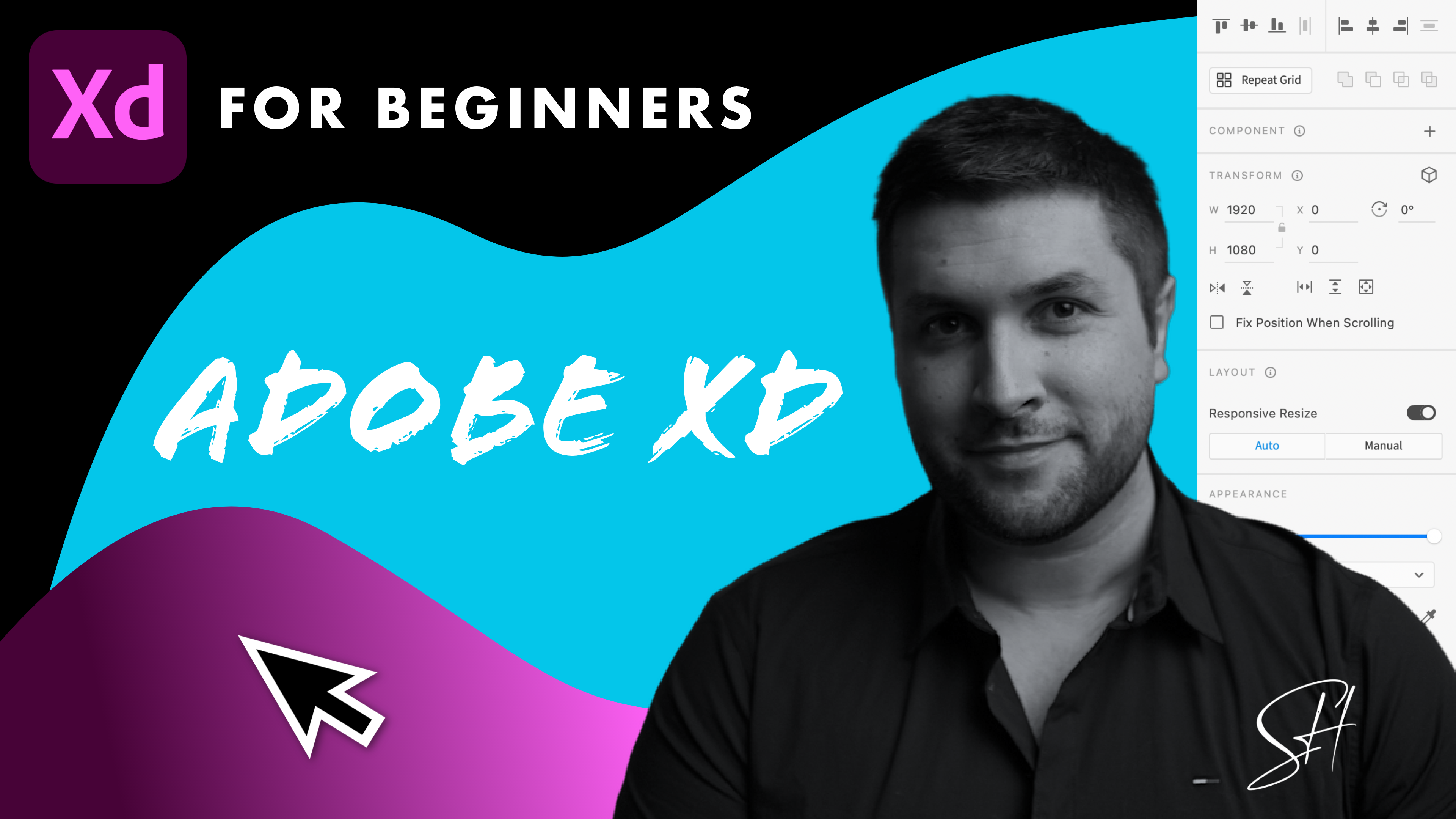
3. Artboards: Okay, so once you've signed up and logged in, you'll be faced with this home screen. So first of all, we're going to talk about our boards and screen sizes and some basic fundamentals of how to use maneuver certain elements within Adobe XD. So first of all, you're going to be offered four different options for different screen sizes. The first one is lots of different phone and tablet sizes. So you call again popular. I find sizes gigapixel, iPad. From there, we've got different desktop sizes. So you got HD, you've got 1366 by 76, eight, 1280 by a 100. And again, so you can sort of choose a predefined defaults for different screen sizes. You then got different social media types of screen size as well. So if you're creating like a Facebook cover, it hasn't sort of preset or each year from now we'll have that there as well. Well, sensitivity is going to be a maverick and create your own thing in create custom size. But what we're going today, since we are going to be focusing on creating websites on this tutorial, we're going to click on Web 1920 by 1080. And this is going to give us our artboard. So again, just to reiterate, think of your art board as your blank canvas for your projects. And this is basically just the Canvas that you can be working off. So a populating with content. And you can drag the canvas around by just clicking on it. Yourself. Hold down your space bar and it will give you the little hand symbol where, which means you can move it around. If you have a trackpad, you can also just pinch and zoom. And speaking of zooming, if you want to zoom into a particular place on the art board, you can do that by holding down Control or Command if you're on a Mac and it will hover in if you scroll on your mouse wheel to wherever your mouse is currently residing. So if I go to the top right, hold down Control or Command, and then zoom in with my scroll wheel. You'll scroll into that point where your mouse is. So that's a very useful thing that you're going to be using quite a lot throughout your time with XD. So that's kinda the fundamentals of what an art board is. If he want to start changing the size. So you change your mind. You don't want it to be 1920 by 1080, you can change it. You can just drag this around however you want to when it's selected. Obviously, if you're creating a website, you're going to need more screen real estate unnecessary rather than creating a new artboard for each section or you have to do is just drag this down and it will go down as far as you want it to go. You may see we have this kind of blue dotted line. You don't necessarily need to play around with this. This basically is just letting you know the viewport height. So the viewport Heights, in this case, extra 1920 by 1080. So basically think of this as like your hero section of the website. And everything below here is below the fold on your design. So the viewport height is 1080. So that's basically what we're working with. But again, you can change that if you want it. But let's say also you want to work on multiple projects all in one go. You can do this as well. So let's say you want to see the list of balls that come with the next day. If you click on the letter a on your keyboard, you'll see then on the right-hand side, we now have all of those things that we had at the stars, the cheese farms. If you want to add another artboard, you can very simply just click on one and then I'll have it right next to it of security and other one, you can do the same sort of thing again. You can make sure if you press the letter a, it will give you all of them here and you can just choose as many as you like. Now there's also an option if he want to create your own size, you can do that. If you hold down the letter a, you will see that the cursor has changed a little bit. If I let go, if I go back off family when he sees now attend to the pointer, if I hold down a, you'll see the cursor has changed and this will allow me to draw my own artboard to whatever size I want that to be. So again, they're sort of the main few ways in which you can control our boards. Again, you can have as many as you like. You're not limited at all, so how many you can have. And obviously later on down the line, if you're creating an entire website, you want to use some point the prototype option, which lets you basically link pages together. Again, we're going to go into that in more detail a little bit later on. But I just first of all wanted to just give you a basic introduction to how our bodies work, what they are, and how you can manipulate leaves all around. Okay, So the next video, what we're going to talk a little bit about how to use grids and how to work within a maximum width container, which is going to be very useful for designing websites.
4. Grid Layout: Okay, So next up I want to talk a little bit about how to use the layout grid within XD. So since we are creating websites, most websites tend to have a container size. So if we just have a quick look at a website now, look at the Webflow website. You can see if I hover my case, I have the edge here that all of the content you can see is coming to a maximum width. Now, this isn't necessarily the case for every project you'll have awake on. But it's pretty common to see that most of your content is going to have a maximum width so that it isn't sort of sticking right to the edge of the screen. And if you're creating websites by using XD, this is something you'll want to try and kind of follow. And you wanted to try and get all your designs to work within a certain container size. Because we've chosen 1920 by 1080, you wouldn't want all the content right to the edge of the screen. So the way to do this is by using the grid option down here. You do actually have two different options for this. You have what's called the layer option. And we have squares as well. So squares we're not going to cover too much in this course. So if again to use squares, it's more likely you use this for something like creating icons. So you can sort of make sure they're all the same kind of XYZ. But for this course we're going to be presumably looking at the layer option where we have columns. So if we just zoom out just for a moment, you'll see now that we've selected that option by default. We have 12 columns and we have some defines sizing for the width and the column width. And we have these sort of 12 columns here that are currently kind of like a tail color. You can change the color of these by just gains your color picker here. You can make it whatever color you like. Personally, I prefer to have it as like sort of just an off white gray. Obviously, this will depend on what kind of website color scheme you have and what you're designing. And, and that the idea of this is that it allows you to align things to certain columns. If you've got a very particular design that has to be completely even in a certain respect. This is something you can basically use as a guide to help you do that. Now, personally, I don't often find myself using this all that much when it comes to having 12 columns. I personally for most of the time like to have it so that I can have a set contain a width like we were just discussing. So rather than having 12 columns, why I tend to like to do rather than 12, I just type in one. And that gives me just one big sort of gray square. And at the moment it says Column Width is 1640, what we want is 1200. And that is going to give us a maximum width of 1200 pixels from here to here, which is going to echo something similar to what we have in Webflow website, have the main canvas, which of course is full-width, since it with a white background, but the content is fixed within this maximum container. And that's the idea of what we're doing at the moment. So this is basically a fixed width container of 1200. And you can now start aligning things to this. If I was to drag some of the OEM very briefly, we're going to come over to this in just a moment. But if I just delete that and I kinda immediately the hair you'll find it will want to snap to that, that you hopefully you can see if I do that again, if I zoom in as I get close to it, it automatically snap to the side. And that will be the same for anything you throw it in. So it's just a really useful way of kind of guiding everything inside your design. Okay, so that's the different types of layer you can have. Again, if you change your mind, you can always go back. So you want to get back to 12 columns, you can do that. And of course it will have that setup for you. But again, personally, I don't like to have it as one is kind of a personal thing. They, you might like having multiple columns to align things to me personally most of the time I find myself just using one big column that allows me to align my legos to your content to a maximum width. So that is the basics of using this lamb, and that's what we're going to be predominantly using throughout this course. Now, let's say you don't want to have this on all the time. So you might be a bit distracting. You can just get rid of it. And you can do it by using, by just clicking on that again and it'll get rid of it. But sometimes if you've got lots of things going on and you can't necessarily with select the artboard. So what you can also do is use a keyboard shortcut, which will be shift control and then apostrophe, and that will bring it back to get rid of it, shift control apostrophe again. If you're on a Mac, it'll be Shift Command apostrophe, and that will do the same sort of thing. I'll make sure I have an animation on screen to show you all the different keyboard shortcuts as I use them throughout the course. Okay, so that's the basics of using the layout grid. Again, have a play around with it yourself. You kinda decide for yourself what you like best. And in the next part of the course, we're going to start looking at all the different shape options that we have within XD.
5. Shapes Part 1: Okay, so now onto the fun part, we're going to start looking at all the different sort of shape tools that we have within XD. Now I'm gonna go through these one at a time and also show you how you can sort of Gemini control ways. So just before we do that they own to just point out that we have the Select tool. So the Select tool, again, as the name suggests, lets you select things and that's kind of the default option that you have the next day. Now quite often, whenever you are using some other kind of tool. Obviously the case, you can see it right here, has actually changed to like a crosshair. Let's say you don't want this anymore and you want to get back to the selection tool. Obviously what you'd have to date, I'll go back to it over here. Or you can see once I've hovered over that, it says Select and then there's the letter V in brackets. And that basically means is a keyboard shortcut. And we actually have keyboard shortcuts for all of these different options all the way down. So this is something you want to start by having a look at and kind of getting used to, to make your life a little bit easier whilst using XD. So I think the select one, maybe of all of them is the one you want to be using a keyboard shortcut for the most, just to save you kind of doing something and getting old way of hair and all the way back. Now, again, it's not a huge deal. But just for speed's much easier, just to click on the letter V and you'll see my cursor changed my mind it that if I go back to the 2-way the hair, my case is commonly across a if I just type on that TV, it gets rid of it and it automatically goes back to the Selection tool. So we'll get rid of that for now, but we will now just go over to the rectangle tool and we'll draw it within our art boards. Or you have the day it was drawing these closed hold down your left mouse button. And then you'll just drag this to whatever size you want it to be. And obviously as you'd expect, you can then manipulate this however you want to. You can change the height and width however you would like. Now obviously this is kind of me sort of free forming in the sizing of this rectangle. If we get rid of it, again, make sure it's selected. This time. If we hold down Shift and then drag, you'll see it'll create a perfect square. So if you want something that'll be perfectly square, you hold down Shift and it will do that. Obviously if you change your mind afterwards, if you then click on the letter V to get your selection tool back, you can then start dragging this however you want to k. So since we're on this first one here, I'm going to take you through a few options over here as well. And obviously there's a lot of these options of suddenly now appeared, right? She guarantees of work through these as we go throughout the course, is going to be easier to demonstrate all the different options on particular elements. So if the rectangle one will, I think I'm going to show you is the border-radius and also how to use the fill and border. So by default in XD, everything you have, everything you drag onto the canvas is gerunds actually have a border which you may not necessarily want. So if you don't want it to have a border, you can uncheck it. And obviously the moment the Fill Color and you can say, Hey, is white. So what we'll do is we'll just make it black for now so that we can say it. And also, they're going to be obviously times where you don't want to have a perfect sharp angled rectangle or square. What you can do is obviously affect the border-radius. Now again, there's a few ways you could do is if we zoom in just foramen, you will see here just underneath, we have this option. And if we click that and then drag it, you'll see it's actually curving the corners. So by doing this, it's actually possible to make kind of ellipses and circles with this tool as well. But if you don't want to do it that way, what you can do is go to this option here and then just type in maybe 10. And that's going to curve f. Is this only if we type in something more extreme like a 100, you'll see is chaotic by quite a lot. So you have sort of microcontroller the hair, and you can also control it by clicking and dragging this particular option there as well. So that's one way you can author the curvature of the corners of a square or rectangle. Something else that's worth mentioning as well. If you want to do one corner, you have this option here. So you can apply a different radius to each corner as well. So if we wanted to say a fat, maybe just the top left and the bottom right, we could do that. So if we wanted to maybe a 100 for this one, you'll see it's only donate for the top-left and also everyone to affect the bottom right as well. If we go on this one here, type in a 100, you say it's only affected the top left and the bottom rights. And that allows you again, more control over the curvature of your borders. Okay, so that's pretty much it for the rectangle tool. Again, we're going to go into all of these as we go. So we'll get rid of that for now. And what we'll do next is go on to the Ellipse tool both circles. So same kind of thing applies if I just start dragging. You'll see I can control the kind of shape is wants to be, doesn't have to be a perfect circle. It can, can be an evil as again, the same kind of thing applies. But let's say once again, if we wanted to have a perfect circle, you would make sure it's selected. And then you'll just hold down Shift and then drag. And no matter how big we make it, always be a perfect circle. Okay, so again, the same things apply to the Ellipse tool as with the rectangle tool, you can have a border if you want, see what you can change the color of. You can have no border and you can also have it say that this is going to be a different fill color. So let's look at different fill colors now as well. So currently it's white, so we can say, let's make it a dark color. This obviously is just a solid color by default. And, but what if we wanted to have some kind of gradient for this? So you do have these options as well. So you just select this option here. We then get a drop-down which says solid color, linear gradient, radial gradient, and angular gradients. So let's just take you through these options. So a linear gradient is going to give you an option sort of end to end or the element that you haven't screen. So if you want to change the colors of either side, you can actually maneuver whereabouts the gradient is from until. You didn't have to have it right that way end to end. You have it sort of in the middle. You can actually add gradients in the middle too. If you wanted to see then got three different colors. So I'll uncheck that just for now. But in order to change the color for this, if we go on to the far left here, Let's have that maybe is like a dark blue. Then on the right-hand side you can see now what we can choose a different color and we'll have it sort of like a tail color. So that's linear gradients. And again, you can maneuver this however you want to. You can switch them around. You can do pretty much anything you want with that. But let's say you once again, we want to change the type of gradient that we have and we want a radial gradient. So a radial gradient is pretty much, as it suggests, a kind of radiates outwards. And again, you can have multiple different colors within there as well. So let's say we wanted to have maybe a lighter color in the middle. We'll have like a light blue and on the outside wherever actually getting darker so you can see that there. And you can effect to what position you have that you can make it wider or smaller depending on what design that you'd have. A UK. So again, you can have multiple different types. You want to add one in, you can choose whereabouts that appears on the line. You can, again, is kind of obvious stuff already. So you can choose many different types of gradient as you want. So let's just undo that for now. Okay, and the last one is going to be an angular gradient. Again, as the name suggests, the kind of creates a gradient base on an angle. So again, just like before, you can choose all different colors. That's a very different color for that one, so it's brighter. You can then have another one in there as well. So if you want to make this one slightly different, you can say this one for example again to be is make it yellow. So again, you're all manner of different control over how these different gradients work. And there's all sorts of infographics type things you can make with this. I guess that's the basic explanation of what gradients. I'll come back to these a little bit as we go throughout the course. So for now what we'll do is we'll get rid of our ellipse tool and we'll have a look at our polygon tool. So this is the last one of the shapes for now we're going to cover it. Then we're going to cover line, pen and texts in the next few videos. So for polygon, by default, we have a triangle. Now again, this is kind of me sort of free forming this. You can kind of create any kind of shaped by dragging it to however you want to. Just like before, if we hold down Shift and then drag, it will create an equilateral triangle, which means obviously all the sides are the same length. Now, again, if you change your mind, you can. Obviously then once you've done it, make it bigger and smaller. And you're not just stuck with a triangle too. So you'll see here what we have is the amount of corners that we have. The cornea is three columns which will create a triangle if we want to have it. As for Tao of the greater rectangle or rhombus, we can then go off whatever kind of different size that you want, hexagons, octagons, whatever you want. And that creates all manner of different shapes, as you would imagine. The same kind of thing here with the board of a corner radius, I should say. This was sort of basically soften out the corners of the particular object that you have. So if we make it back to maybe five just for now, and we'll zoom out just a touch. If I then select a border-radius for this or something like 20, you'll see it's just so soften the edges a little bit on the shape. You then also have this stall ratio two. So if we go back to maybe something like four, and then we apply a star ratio to this. It will be something like 50. You'll see what it's done is essentially created a star fours. And you can change this ratio. It's whether you want it to be so it's more extreme. And again, you can have up to 100 percent so it gets larger again. So again, have a little play around with it yourself and see what you come up with. And this will work, of course, for any sort of a shape that you have. So if we go back to maybe 10 sides, you can see that's changed a little bit. Make it sort of the less percentage you have, the more extreme they're sort of the integral leaves get essentially as if I'll make it even more mass than 25 percent. You see there we have this kind of shape. So again, it gives you lots and lots of control a for all the different kind of shape that you can create with this tool. So it's very, very malleable and you create lots of interesting things with it. Okay, So that I think for now is going to pretty much cover all the different shapes that we're going to use for this first part of the video. The next video we're going to look at is going to be using the line tool, the pen tool, and also how to get text on the page.
6. Shapes Part 2: Okay, So the next few things we're going to look at is going to be the line tool. We're then going to look at the dreaded Pentel and then the text tool option as well. But let's start out with the straight line. So the line tool and maybe often is used as much as maybe the pen tool because with the pencil you have sort of mall flexibility in what you can do with it. This is literally just to draw straight lines or not even straight lines, just lines in general. So if you wanted to then actually draw a line can affect it how you want to. You can move it around any kind of angle. If you then start drawing another line and then try and connect it to some degree it will. But if we zoom in, you'll see it's not actually perfectly aligned. If you want this kind of thing, we want to sort of anchor points to each other. So you want one line to join another one. The better option to use is the pen tool, which we'll come to in just a moment. So really you want to think of the line tool for really just drawing straight lines. They don't necessarily connect to another one. If you want to create sort of and yes, certain kinds of icons or maybe, maybe across the kind of thing you might want to try it with the pen tool. You can do that and you can see that the lines are letting us know when something is aligned correctly. If I just move this one as well. You see now all of these lines are actually properly aligning with each other. And that's basically how you use that tool. So again, it has no fill option for this because it's just a straight line. You can of course, change the color of the different lines that you have. A king increase the size of the border. This incidentally applies to every item on here as well. So all of these options have a boarders, you will get full the other shapes as well as for making ten of the Omeka a lot thicker. You can then have a dash as well. So if we type in the number five, we'll get again a loss of dashed lines. The gap we can increase as well as make it 10. It'll make it more spaced apart. So again, all of these options, hey, you actually do have them also for rectangle ellipse, and for polygon as well. So that's a basic overview of the line tool. Next up, we have the Pen tool. The Pen tool. Now if you're familiar with using Photoshop or you're familiar with Illustrator, you'll be pretty familiar with how this works. The pencil in XD works in a pretty similar sort of fashion. Now, the Pen tool could be a course all on its own because it's very complicated. It can get very complicated, particularly if you're getting into graphic design and you're creating lots of different types of shapes. This course isn't really about that. So I'm going to just give you sort of a basic overview of what the Pen tool can be useful. Think of the pencil really as a way of joining various different lines to each other that are perfectly connected. So on my previous example, you'd have seen that when I connected or try to connect the lines together, they actually went perfectly joined. But if we zoom in here, you'll see that these ones actually are perfectly aligned as a kind of weird gap there. So all of this is joined together. And if you want to create and a fill for this, you can defer the shape. So at the moment we just have a border which is creating that shape. Again, you can change all of this to whatever you want it to be. If you want to get rid of the border, you can do I don't have it just as a fill. You can do that as well. So that's the best way I can describe how the pen tool works for sort of joining lines together. So you can imagine all the different kinda crazy shapes you can create with this one, she created the shape and you go back to your selection tool. You can manipulate it however you want to. Something I haven't mentioned yet is the rotation tool. So you'll see as we hover over, we get an icon that changes to rotation. So if I go back just a little bit, you see as I move outwards, it changes to that symbol there. Now if I click and drag and rotate, it will spin the item around. Of course, this also applies to all the other shapes that we have as well. So the rotation tool, you'll get an option for that for rectangle ellipse, and for polygon as well. So that's the basic overview of how to create different shapes with this. Now where it gets more interesting is if we start creating curves. So if you just kind of keep clicking and then stopping at certain points, it will create straight lines. But now, this time if I click, if I hold down, shift it. But this time if I hold and drag, it's going to bring up a curve or a Bezier curve. Now again, this can get very complicated. And the, basically think of this as a way of curving lines is the best way I can describe it. And you can imagine all the different colors, shapes you can make with this. And how do you manipulate this sort of bar here will manipulate the intensity of the curve that you have. And as you can see, this is just creating a curve on the left-hand side here. If we keep going, I click somewhere else. You can say it's still going to curve to the next place as well as found to join the opsins into my hair. We can do that. And then that curve will align with that box there. If I come off that tool now and you click again, is going to go back to go into straight lines. And so that's basically how that works. Now again, this can be very complicated. I'm not going into too much depth for this, but let's just do it one more time just to show you. So if you hold down, we slept in pencil. And then if you click and then go to another point, and then you hold. And then drag is going to create a curve is the best way I can describe it. So if we then let go and then go to our first here and then join that. Ok, we can do that by clicking again. And then we've created a curve. I'm creates this kind of curvy shape. And if we come office and just go back to our selection tool, you'll see now if we zoom in, all of these points are perfectly joined together. There's no sort of awkward gap. So you can imagine all the different kinds of shapes you can create with this. If you want to get more into graphic design. If I, if you're interested in me creating another course on that, let me know. Again, this course is about UI moving as graphic design. But that's a very, very basic overview of how the pen tool works and allows you to create shapes that you wouldn't otherwise be able to create with just the single line tool. Okay, one other thing before we start meeting on something else. And let's say you have changed your mind and this shape isn't quite what you want it to be. And in fact, we'll just give it a fill. Let's say you actually want to change this. If you double-click it, you can actually create a different point. You can see if I hover over it, we get a circle that appears. And if we do that again, and if I click and then drag, you can see I can go back to it. An auteur. Well, I've already done. So if I pull this out a little bit, so that's fine. Lesson I want to do the same thing over here. If I click and I drag it out, I can then manipulate it once again and then create a different kind of shape, even when she finished the original shape by you done. So hopefully that makes some kind of sense. This is just a brief overview of how you can use the pen tool for creating all manner of different shapes.
7. Text: Okay, So next up we have our text tool. So if we select this and then we just click on the canvas UNC, we get a cursor, which point we can start typing whatever we want. And you'll see if I just hold this down. If I keep typing is usually just keep going and going and going. So there is no sort of defined width at the moment and it will just keep typing as much as you wanted say. Now obviously this isn't particularly useful. You're going to want to kinda contain it to some degree whenever you're typing text on the page. So there's a few ways in which you can do this. First of all, I'll just show you how you can alter what you've already done. Let's say you wanted what I've just done right now, but you didn't want it all the way across. There are a few ways you can manipulate this. And the main one here is to have auto height. So if you click on this option here, now we get an option to basically drag this box around, however we want this, and now you'll see the cursor change at the end. If I start dragging inwards, you'll see is now automatically scaling in such a way where the text is now dropping below. So if you've done the way I did it where you just through text on and you want to change the width of it. You can do that. You can also have it in such a way where there's a fixed size for as well states will never go past a certain point. Again, the similar kind of thing. So hey, you then have the option to a little bit further down and I will never go past a certain point. Okay, So if we just put this back to auto width for a moment and we'll actually just get rid of this. If we try this again, make sure we text all selected again, you can just click on the letter T as well. If you then click and drag, you can actually create an area we'll reach that text won't go beyond. Now if we start typing, you'll see when it gets to the edge of this box, it will also start dropping below. So again, both of those things that I just showed you do the same kind of thing. So it just depends if you know in advance how you want your text to be sized. So that's kinda the basic way of that. So if I just type something over them, sort of nonsense, we just put, this is an AB XD course for beginners. All the texts options you'd expect to see with any kind of program or this, or here's obviously then can change the different types of fun we have here. You can actually upload your infants as well. But we have again, access to a baby funds and all manner of different things that you can have an S If we just try something different that we are anything to do with fill color. Again, I would have seen me to expect to see as kind of thing. You can change that. It can give it a border as well. You can change the opacity of the text itself or the alignment. You'd expect to see it here so you can't send it on to the right. And again, certainly also heighten and what have you. We also have lattice spacing. We have line-height, we have paragraph height as well. Okay, so there's just one other thing I want to talk about when it comes to text and how you can manipulate it. Sometimes you'll want to be able to adjust how text actually looks on the page. Maybe you want to adjust individual characters and you can't do this by default. So because of that, this is a, this is actually text. It's not technically a vector file as of yet, but there is a way that you can make it so much. So the way you would do this, make sure your text is selected. It's your object. And you go to path. You can then convert the path. There's also a keyboard shortcut for this as well. And now, if we zoom in and zoom in, we can actually select individual paths of each of these letters. So if we want to change something about how something look, we can do that and we can manipulate it in the same kind of way, make you manipulate any of the shapes that we have. So now this is essentially kind of a, a vector file which you can now change and manipulate it however you want to. So if you're designing a Lego, let's say you're using XD, you can kind of user base font and then you can sort of change it however you want it to make sure that your rain. And again, there's all sorts of applications that you can use this for. Anything. Basically you need to just change something ever so slightly with text. This is the way that you would do it.
8. Images: Okay, So next up we're going to talk about how to manipulate and how to import images. So obviously you can't be using images quite a bit throughout your time designing sites with XD. So let's go with So the two main options in terms of importing an image. First of all, most important thing to learn is a keyboard shortcut, which is Shift Control and the letter i or Shift Command. Or if you're on a Mac, if you did that, it will bring up your panel where you can choose obviously from all the different folders that you have. Then after you wanted to apply it one inch, click on one, and then click on Import. If you were to click on all of them and import the whole lot, you can also do that as well. And XD will automatically import all the things you just select it. And then you can use that however you want to. You can drag them over to one side. If you think, again to sort of use them all individually a little bit later on, you can do that, but let's just only that for now. So that's one way of doing it. The other way of importing an image is already having a folder open where you can just simply drag on images however you want to. Obviously you can drag and select as many and drag them on this way as well. So that's again hopefully to fairly obvious ways of importing images will just undo that for now. So we're back to square one. So there we are. And then, as you would imagine, all of the things that you can do with some of the shape tools can also be done with images as well as if you want to care the borders. You can do that by simply just dragging. You can also alter it in terms of individual cone is to, if you want to, you want to just have one curve on one corner. You could do that as well. In terms of things like fill the calm color on this, it will just kind of turn a completely solid color. So the film really is just the image itself. Economy did that. You can have borders. So if you want to have a big thick border on you candy, again, all the same controls of the other shapes as well. So everything that we've just done so far is also available for images I, k. And in terms of drop shadow, again, all of the same things are available so you can have drop shadows to control the amount of blur you have and all the rest of it. So all of that is available. Okay, so that's kind of obvious power out of the way. So now let's talk about how to actually kind of use these things in a more sort of more obvious way for designing websites. So quite often, what you're going to be using images for is kind of background images and just facility images with an Info blocks within, within your design. The first thing we'll show you how to do is create a hair image with sorry Harry section with the image. Now if we just kind of pull this out to the edges here, you see it snaps in. But this is where our sort of below the fold point is here. In fact, if I just put this a little bit lower, you see here, this would be our hair section of a website. And quite commonly you have an image as taking up the full width of that. But if we do that, you'll see with this particular image is actually, it's actually not going to cinco properly. It's going to be below the fold, which we don't actually want today. And what you could do, I suppose then kind of put it into the box over it, the COVID up. But that's not the most effective way. The better way of doing this is by using a shape. First of all, so what we're going to do is we're going to use our shape tool, rectangle tool. And we're going to just draw a rectangle right up to a point where it's below the fold, right, to assert a breakpoint. And then we're going to do is thrown image within this square. So that's what we're going to do now say I'm going to pull open my my window here. I'm going to just pick up an image. I'm going to drop it inside and you'll see it has automatically scaled to that shape. And this would work for any other shape that you have as well. So if I double-click on the image, you can see is actually still kind of above and below. So it's actually not a perfect fit, but we are actually automatically cropping a portion of that image away. So this is kinda perfect if you're designing something like a header image. And if he wants to maneuver around, you can do that by simply double-clicking. And then whenever you let go and click off, it will then remain heavy left it. Let's say you want to extend this image out quite a lot more. And you only want to have maybe sort of the bottom corner of the image is big enough and it allows you to do it. You can do that too. And when I click away from it, you see it now disappears. So that's how you would start using images to design sort of hero sections or website. And we're gonna come back to this a little bit later on in the course as well. So that's kind of the most obvious way of doing that. I'm going to just delete that for a moment and you'll see once I did that, it also deleted the shape at the same time. So basically Mass them both together. So I'm gonna just show you one more example. So I did mentioned you can do it with any of the shape as well. If we just draw a circle perhaps, and we'll just pop this sort of to the side here. And then once again, what we're going to do is just throw an image within that shape and it will automatically fit the image to the shape you've drawn. And if you want to then move it around, we can do. And obviously, it's not just the Ellipse tool is also for the polygon tool as well. So that's basically how you do that. And that's all manner of things obviously you could do with this super, super useful tool to have. Okay, So that's a brief overview of how to import images into your design. Again, if you want to just import a load of images and have more on the side ready for you to use. You can do that. We're going to come back to manipulating images a lot more throughout the course. Go instead of more details and how you can kind of use repeating grids which began to come to in a moment where you can kind of copy and paste elements quite easily. But in the next video we're going to talk about how to import videos and Lottie files.
9. Video and Lottie: Okay, So next up we're going to talk a little bit about how to import videos on Lottie files within Adobe XD. So I'm recording this course at the end of 2021. And this is actually a pretty brand new thing that we just introduced. So I'm gonna just show you how you can do this. A very simple similar to how you'd import an image. Or we have to do essentially is drag on or just shift Control and Alt or Shift Command I. And then just video. Or we can simply just drag it on as I mentioned. And now we are, we have a video. Now it doesn't play until you actually preview the canvas itself. And there are a few settings you can have for how actually acts as well. So you can see here we have a new sort of setting option here where it says Play on tap, which is what it's currently on, Plato's monthly or no playback, or you can then edit aspects of how it plays. This is more to do with the post typing part. Bolus have your own play automatic because the chances are if you're going to be using a video, chances are fairly high is going to be some kind of background video more often than not. So now, if we preview this, you'll see as we do that, it then immediately starts playing mommy preview. So that's basically how Mackenzie's video. And obviously you can resize however you want to. We're all the same kind of controls you have with anything else. There are some of the things that you don't automatically have, like drop shadows won't have you. You are a little bit more limited when it comes to that. So just like going to images, you can actually sort of mascot to a shape as well. So let's just show you that. If we just draw a triangle, perhaps will then just throw our video into the triangle. Double-click and then you'll get an option to see how it plays. So they play automatically again. I can come off that and then hopefully we can extend that to whatever size we want to. And then if we preview, you'll see will automatically play within that shape that we've masked it to say dead simple, this is exactly the same kind of thing that you do with images. Again. So that's that for video. And again, there's probably a few more things you can do with it. But again, I wanted to show you the basics of how this works. You can manage all the different types videos you have in the left-hand panel, we're going to go into the document assets assets in just a moment. But let's just say you latae files. So latae files if you're not aware of them, or basically after its After Effects files that have been converted to heat and on websites is very, very popular on Webflow and things like element or the moment. The reason being is much smaller file size and something like a video or GEF. So there's, there's flowers are quite large. And obviously, the larger the file size for a website, the slower the website will load. So the smaller the file size, the better and these file size of a very small, which is why they are very, very popular. So I want to just download one just to show you how this works. Again, super simple. A lot of these are free. So if you want to have a look at all the different ones that you have here. If you go to Lottie files.com, you can then softly through a load of different free animations that people have a few to use however you want to. They also do have a marketplace as well where you can sort of purchase maybe more advanced ones or certain animations in a specific topic. So let's download this one, I think. And all we have today, you can actually download these in a few different formats. You can actually have them as a gift for or in a video. If we download this topology is locked adjacent file, you'll see that it does that. And then all do is just drag it over to our Canvas, drop it in. And just like a video, you've got a few different options and how it will play a play on tap or you can have it play automatically. So I think what we'll probably do is have it play automatically. And so let's just pop this in somewhere. So again, you have to actually preview it. It's actually see the animation working. And then what we'll do is choose play automatically. And also we didn't want it to just stop after, after playing once. So this puts in hair on the left-hand side, and this is also true for video should have said this is going to loop the playback. So now when we preview this, it will play continuously overtime, which is probably what you would have if you use this on a website. So there we go. So yeah, Again, that's basically how you're going to use Lottie files and video files. It just gives you a little bit more sort of design freedom. And that will let you see what a website may look like or one application may look like as a more of a finished product, so that's updated. That's the whole point. Sometimes you'll have to have waited until the development process to see how it actually looks. You can now have lots of files and videos is a really great thing. So that's the basic overview of how you can use videos and Lottie files in your designs.
10. Keyboard Shortcuts: In this video on SOC, very common keyboard shortcuts that you're going to want to learn. I'm going to provide you in the course materials a complete list of keyboard shortcuts available phrase, they can have a look at your leisure. There's quite a lot. So I wanted to, however, I wanted to just kind of go into why I use quite a bit and just kind of the, the absolute fundamentals of using shortcuts for certain things. Okay, So the most obvious one is copying. So let's just say we want to have this square. I'm going to copy it over somewhere else. You can just go and control C and control V. And it will automatically give you another version of what you've just done. So that's one way of copying. Another way is if you slightly element hold down Alt and you can then move it as you hold this o, as you hold it down, I will create a duplicate of what you already have, the SR. So another way of doing that. Another thing about when you hold down Alt as a kind of something else quite useful if you're selecting one element and you just hold it down, but I'm dragging. It shows you the distance from one element to another. So you can see here, it's showing you the distance from this point to the top, either side, the bottom. So if you don't drag is another way of using that control where I can tell you, sort of give you an idea of spacing. So it's very, very useful to kinda do that. That's how you can use keyboard shortcuts for duplicating items. Another keyboard, Shoko, of course, let's say we want to get rid of everything we've done. Just Control and Z, undo everything we've just done. Okay, So just like you do it for any other useful for you when you're using a PC or Mac. Okay, so the kind of the obvious ones from there, we're going to be obviously going through a lot of these different symbols here. Our try and actually not use these two modes just so you can see better what's going on. But every single one of these do have their own keyboard shortcut, as I've mentioned earlier. But you want to particularly get used to using the selection tool at the VA. Because whatever you are doing currently at a time, if you look at the case of now press the letter V and we're back to selection. So that's going to be used quite a bit throughout the course. I'm not going to constantly go back to this one a the hedges, a socially just I would say for ever eat, I want to do that using keyboard shortcuts to manipulate elements. Again, we probably touched on this a little bit already. But if you hold down Shift on any element that you have or any shape you have, it will create. I will just kind of scale exactly as it is without adding any kind of science into the either side. If you let go of it, you can size it however you want. If you want to elongate. But top and bottom. And if you hold down Alt, as you do that, you'll see is moving it and scaling it, but only this way and that way. So top and bottom, if he did it the other way as well, hold down Alt again, it will only grow either side that way as well. They're pretty common things that you're going to be using. Things like Bring to Front is another very common keyboard shortcut. So if we just give this a fill color so you can see better what we're doing. And we'll just draw something else as well. And we'll get a fill and fast already got film as fine ash now we'll give it a different fill color otherwise and get confusing. So let's say obviously we want to get this box behind that box, you can just right-click it, sends back, or you can use a keyboard shortcut for as well. So they're the ones that you're going to be using. Quite a bit. Block is say, have a look through the key, the list of keyboard shortcuts that you provide a foil and you really want to eat as much as you can, just try and use them. So it gets to a stage where it's almost second nature. And after you've been using this for a while, it will become second nature, particularly things like battery selection tool by selecting the letter V. That kind of things obvious, obviously doing Control a, Control V is going to be very obvious to you. It works. You're probably used to using things. But again, have a scroll through and find things that you like to use. And it will make your life a lot quicker when using this program.
11. Controlling And Locking: Okay, So next up, how to control and manipulate elements within XD. So I'm going to show you this in a sort of a more usable way. So let's kind of create a Basic Nav Menu just very quickly, less giraffe, the rectangle. And imagine this isn't enough money or get rid of the border and we'll give it a color. So let's do maybe dark blue. So there we go. We have the workings of nav menu now on an app menu on the website, obviously you'll have generally a leg on the left-hand side. Then you have the nav menu items either in the central to the, to the right-hand side. So let's kind of just do that now. So if we want to start building things on top of this, sometimes you don't want to accidentally move this, which is very easily done, especially if you're trying to resize elements or trying to select other items, it can be a paints. You actually want to lock this in position. I'll actually just show you this how it can be a problem. I will just create a very, very basic logo. So let's just make this circle red just to show you. Okay. So we'll have this over on the left-hand side and then we'll create some as nav items over here. So if we get on the Text tool here and we start typing in, maybe we'll have love home. And we'll click off that and then we'll kind of just duplicate this a few times. So if I did play that, now, I'll just do this just free-form phenomenal very neatly. But let's say we want to kind of readjust what we have here. So the spacing is just about rights or I got it just about a moment ago. Let's just do that again. Okay, So you can see that evenly space. But what if we want to adjust these? If I want to sort of select all of these together, you will see as I try and do that, it just moves the nav bar because it's not locked in position. So if you want to try and select all of these which are underneath this navbar. You can't do that without affecting this nav bar. So what you can do to get around this problem is lock it in place. So two ways you can do that. You can right-click the element you want to lock. See an option for a which has lot. So you can just click that alternatively, always shows you're a keyboard shortcut, which is what you want to try and get used to using as much as you possibly can just for speed. So you control an l or Command and S on a Mac. So if we do that, you see now we have this lock symbol on the top left. And this means no matter what we do, matter what we try and click on this, it will not move matter what, even if we try and delete it, it went later is locked in place. It will not move it all. To unlock them, you can just click on the icon itself or you can once again hit Control and L and unlock it for you. So that's basically how that works. And again, Control and S, or Command and L. Try and use keyboard shortcuts as much as you possibly can. It just saves you a lot of time. So now as in place though, this means now when I try and drag and click, I can easily select my nav items and it doesn't make any difference. I can then resize these however I want to do whatever I want with them. I can do it freely without affecting any other element on the actual menu itself. So that's kind of an obvious use case for this kind of thing. You will find this is very, very common. And as you start getting to use x day, you'll find this kind of happens a fair bit and you'll just get into the habit of looking things off while you're trying to build on top of it. So that's a very, very common use case. Say let's get rid of all this for now. And what actually if I will keep the shapes, we're going to use that just to demonstrate something else. I'm just unlock that. I'm going to actually just re-purpose this just for a moment. So now we've got two shapes. So if I drag this over the top of my rectangle, you'll see it's automatically gone over the top. Now, it doesn't necessarily mean you want to always have an order. Sometimes you may want to have this circle underneath the rectangle. So how do you do them? A couple of ways where you can do, once again is click on the item you want to manipulate. You can right-click. And you see here we have some options. We have bring to the front, bring forward, send backward, or send it to the bank. Bring to Front is bringing it right to the front and send back is sending front to the back as it will be obvious. Bring forward and backward means it will, it will move within the layers panel that we have hay which we haven't gone into. Yeah, we'll come to this in the next video. But basically, you can also manipulate this over here. I'll just show you very quickly. So if we did drag this above, you see now is affected area here. So you can affect this that way as well. Or you can also right-click and then just click on the option you want. Or you can just use the keyboard Shoko that's listed there as well. So there are two different ways that you can manipulate these items. So this is going to be super, super common and you're going to want to manipulate these items quite a bit. Whenever you are designing websites, this is something you're going to use a hell of a lot. So it's worth sort of remembering keyboard shortcuts for this. Or if you just prefer dragging these things around, you can do that as well. Of course, this varies for text as well. If we had texts on here, you can manipulate that however you wanted to. So hopefully, that makes sense. So you fall again when we start designing our class project a little bit later on, we're going to make use of all of these different techniques as we go. Okay, so that's a basic overview of how you can bring items closer or further away from the screen, and how you can reorder them in their position on the axis. And also how you can lock items in place so that you can then build things on top of it.
12. Selecting And Grouping: Okay, so now let's talk about how to select and group various different items on your canvas. So again, this is going to be super common. Plenty of time, you're going to want to select multiple items together. So let's say we want these two items to move at the same time and keep the same amount of distance that they currently have. So if we were to do that, if we just click and drag and select both items together, if I now try move this, it will move them both the same time. The moment I click off and try and do it again, it will kind of own group the items. So that's a quick way of meeting items, but you don't want it to always be in the same group. But there's going to be plenty of times when you want, maybe say, maybe create some kind of card of some kind. You may be always wanted to have it elements grouped together and they kind of become their own thing. You can do that as well. So rather than just selecting, just meeting, if you will, and to always behave and react together. You can do that because again, at the moment, I click off, it will stop that. So once again, select both of them together, right-click and then you'll see it says, Hey, group, which is also a keyboard shortcut, which is Control and J, again, this is a keyboard shortcut. You want to remember as much as you possibly can. It's going to save you a lot of time, but if we do that, you will see is now grouped together. And even if I click off it and come back to it, it'll now let me meet these items and they're always going to be grouped together. So if you wanted to undo the gripping or you have to do is right-click and then go on and on grape. If you start clicking off, you can now move over different items individually once again. So that's kind of how you would group items together. And again, there's no sort of limit on how many of these you can do. You can add text. They worked with text, it works with everything. So that's how you group items together. Again, this is something you're going to be using quotes above. And you will see if we keep it on our Layers panel here. At the moment, these two items have their own individual thing going on The minute we select both together and then click on GREP, you say it creates a folder for these items. If we now double-click that, you will see that we have within that folder itself. So if this was kind of element, you're going to use a lot throughout your website. You can then just give that a name and call it whatever you want. Again, we're going to come back to this Elements panel and just a little bit just to kinda show you in more detail where you can deal with it. Again. But that's the basic overview of how you can group items together. And then whenever you kind of move them with a mouse, it always move them together at the same time. Also, it's worth mentioning is you want to scale these items monophyletic group, you can do that too. If that always a group, it will only move the item you'll clicking on. If you hold down Shift, it will make both of them grow at the same kind of level. So that's basically how you grep items and how you manipulate grouped items together.
13. Hiding Elements: So just before we move on, I want to show you one more thing when it comes to manipulating different items. What we also sometimes want to do is hide items. So let's just suppose for a minute we want, we've designed some things such a way where we have something that's kind of intersecting these two items. But whatever we want to edit is maybe underneath there so it could do is ungroup them, move out of the way, but a better way and may just be too high the item just temporarily. So why you can do is right-click it and then just click on hide or you can use the keyboard shortcut. And I will get rid of it just for now. And then you've got full control of element as well underneath. And if you want to unhide it, you can just control Z. Or you can see on your layers panel here, you'll see the Ellipse 1 is currently blank towel and it has this kind of eyeball with a cross three, which means it's hidden. So what you can do is simply click on that and it will bring it back to where it was a cane. Say that is a basic overview of how to group items and how to manipulate them together, and also how to hide items temporarily and then bring them back. One she wanted.
14. Combining shapes: Okay, So next up we're going to talk about how to sort of combine an intersect different items together. So this is maybe more common if you're kind of using shapes a little bit like this. Maybe you created some kind of graphic. This is something maybe you would use for that specifically. So this is not as much related to creating a website per se. More maybe to do with graphic design bomb will just show you anyway because it will obviously come up. I'll show designing sides. So let's kinda start by actually giving these two items together in this kind of imposing, say, I'm first of all going to kind of overlap this circle over here like this. Make sure it's nice and even. And I'm going to group these two items together. I'll just kind of select them like that. And then now you see once we've done this, we now have this panel over here. So we're gonna come back to Repeat Grid in just a moment. But we now have these different options that we have ADD, we have a subtract, we also have intersect, and we also have an exclude overlap. So that might mean nothing is a bounty. So I think the best way of just showing you this is to just show you. What we'll do initially is click on Add. And what you see happens here is basically you just added the shape that was on top to the shape that's here. And it's also changes color as well. So if you want to just basically just add whatever you have to another item, very simply, this is the way that you would do that and it will automatically take on the same color of the object below if we invert this slightly. So we were saying before, if we want to have the circle sort of deeper on the axis, we can do that as if we just right-click and go. Maybe just send backward and do the same kind of thing. You'll now see a different thing happens. We now have, the item has coined, looks the same, but it's taken on the properties of the element nice furthest away on the access point. So hopefully that makes some sense. And obviously you can create all manner of different shapes by doing that is by adding items together. The next one is going to be subtract. Now this one is very, very useful, particularly joined to create unique shapes. So now what we're going to do, again, make sure that both selected will then click on subtract. And you can see that now was there as a circle has now been basically bitten out of the item that was underneath there. So this again, the only way you can maybe do this without using this tool, but to maybe put a circle that was also white with a white background, you could do it that way. But in this way, this is actually S3. So if I know the shape underneath it, just to show you, and I'll give it a background color. You see, if I try and move this over it, you say it is completely transparent. There is now nothing in this space. So that's subtracting one element from another. And let's just invert that once again. So if we now will have this send backward and we'll do the same kind of thing again. We'll click on subtract, and now it's subtracted the other item away from NUS elements. Sorry, this is important when it comes to what an item is higher on the axis point. So first time around it was the, the rectangle. This time it's a circle. So that's basically how you use the subtraction. Again, I'm not gonna go into creating lots of different shapes for this. I'm just showing you the basics of how this works. So once again, to make sure I have selected and we now have the intersect tool. And if we click on that, you'll see now we just have that part there. So it's intersected both items together. They're sort of contact point. And then if I just click on that again and you'll see how that works. So again, not the most usable for this particular one, but very useful if you're trying to combine certain elements together in a particular shape. And the last one that we have is going to be exclude overlap. And you can see now a similar kind of thing to subtracting this part where it intersects is now completely transparent. So just to kinda prove that, so if I put something underneath that once again, if I just draw a circle, I'll give it a fill color. If I move this item over, you'll see it will show. If I will actually just make this. I will bring this to the front. And you'll see now as I go over it, underneath will actually show through because this is completely clear now. And that is basically how you would use these tools. So that's the exclude overlap tool. Now again, this is not a graphic design course, so I'm not going to guarantee all the possible use cases for it, but hopefully can sort of see how useful this could be if you're trying to create very specific shapes that may not be possible as easily by just using the shape tools on their own. So that is a basic overview of how to use this kind of intersection tools and how to kind of subtract and add different shapes together to make different shapes.
15. Repeat grid: Okay, So next Oprah and just using random shapes rushing in to create something that looks more like a pod or a website. So we're now going to be looking at this option here, which is Repeat Grid. So what we're going to do is create a card section or a card item. And then we're going to use the repeat grid to repeat the item rather than just duplicate the end. So we could just duplicate it by holding down Alt and then dragging. But you can also use the repeat Grid, which makes life a lot easier and just makes it easier for sort of spacing things out easier. So let's start out by having a right angle. And we'll just kind of free, free fall on this for the moment as a something like that looks fine to me or get is something like in the middle of the screen. We'll just round the edges off a tiny bit just for the sheer front of it. We'll get rid of the border and we'll give it a maybe a slightly light gray. And then I think we'll do from there is pamps will just lock this in place. Now we'll start building things on top of it. So again, this is now completely in place. It will not move. I can start building things on top on it won't kind of interact with the other items I put on until I allow it to. So what we're going to do is throw on an image now. So we're going to shift control I. We're going to just choose a random image, which is this one here, will just resize a slightly, just so it kind of fits within our code section and we'll just zoom in ever so slightly as well. So yes, so we can see better what we're doing. So let's just see how far that is. So that's 13 pixels on the top, and it's currently 15, sorry, 16 from the side. So we need to just punch it out a little bit more and get more central. So that would leave now doesn't have to be pixel perfect just for the moment. And we'll just perhaps get a title and hair as well. So click on the Text Line icon, we could've just click the letter T as well. And we'll make sure you can see here is letting me know by this line that it aligns correctly to this edge. So we'll do that. And we'll just call this photography. And we'll just zoom out for a moment. Okay, that's all fine. We'll go back to my selection tool. Actually, before we do that will make this title a little bit smaller. Let's do something like 30 probably would be about right. We'll make it slightly bolder as well just because why not? Okay, so we'll also maybe put a paragraph on here as well. So again, we'll make sure all of this is aligned correctly. So we'll just pop this here and we'll just put on, this is a paragraph icon spell of his thing. And we'll make this much smaller of course. So rather than bold will have that as regular and we'll make it something like 18. Okay. And then from there we'll just add one more thing. We just made this up slightly so it's a little bit sorry, a little bit closer to the title. Okay, that's fine for now. Let's just add a button on as well. So we'll just use our rectangle tool. And we'll have this towards the bottom. And you'll see the line has appeared once again, just to let me know that this is now correctly aligning to the edge of the image. And then we'll just draw this out. Something like that. We won't have a border. And what color should we Let's just have a dog. That's fine. And maybe just slightly higher. And then will actually lock that bond in place. The reason being open to now put some text over the top of it. So just so I can maneuver around easier, it's just best to do that way. And then we just add on, maybe we would do learn more. And also make sure we can actually see it as well. So rather than being dark or have it as light, and we'll make it a lot smaller. So let's do something like 16 pixels, maybe smaller than that. Ok, and then we'll get into the sensor. Okay, so we created a sort of very basic card section. Now again, our sort of backgrounds all locked together. What we could do because we want to have it's called section all as one thing. If we start moving this around, you'll see now it's kinda just move random parts of it around and not at the same time. So just make sure I've unlocked. And then what we can do now is select everything and make sure everything is selected together. And then if you click on Control G or Command G, This is now a grouped items or all of these items altogether. And you can see in my layers panel here, all of these are within its own folder, which is commonly called Group 1. Obviously want to do is rename that merely card section. But again, what we'll touch on that more, we get to our Layers panel a little bit later on. So how do we duplicate this? What you'd obviously want today rather than kind of reader. And this again, is basically copy what you have here. And maybe just change out the text and change out the image. So what if we wanted to duplicate this? You wouldn't want to. Usually card section comes in at least, usually come in threes most commonly. So what you'd want to do maybe is to duplicate this only summary of it. So the way you could do that is by holding down Alt and then select the item again and then let go, and it will have a duplicate of what you have that then you can move this around, have you want to. That's a perfectly reasonable way of doing it. You could then do that again with this one. And then for all three, what you could do is maybe group them all together if you wanted to. So we could create the whole thing. Or alternatively, you could use something called Repeat Grid. So let's go back for just a moment. Make sure we still selected. And you see, this option now has kind of suggested for this exact thing I've just bill that is kind of showing you a card section here. And we're actually going to do exactly what it's saying. So if we click on Repeat Grid, you see now we have some new sort of icons have appeared. And if we now drag this out, you'll see it's going to automatically create duplicates of what we have. And it will actually keep going and going and going as far as you do that. So even if you have different items on it, we'll kinda repeat it and then start from the beginning. But again, you can do it both to the side and downwards as well. So if you have some kind of yeah, repeating grid, you can use this tool and it's super CB. So, and the main reason this is kind of more useful than say, um, just by duplicating, you can alter the spacing far easier by using the grid. If you were to do this by duplicating individual ones, is not quite as easy. Whereas using the grid, you can get these spaced exactly how you want to say this is a really useful thing when it comes to web design, because most websites some point are going to have some kind of card section. It's extremely common. And this is a really useful way of getting the spacing in between everything exactly the same, rather than having to manually apply spacing to each one. This does it automatically, so supersede, peaceful. And then let's say you got to him place if you want to just ONE group that you can do, your own group, and then you get, and obviously there's a keyboard shortcut for that as well. Again, just our fair you back to the keyboard Shoko option page that I've included in the course materials. Again, say that hopefully makes sense how you do this. Obviously if you went to start changing different item G candy. So if you want to replace that energy could right-click and click on Replace Image and then you can just choose whichever one you want. And then that's a much quicker way of doing it rather than just kind of having to create one and then create another warrior. What you want to do is just duplicate them EVA, and the best and easiest way to control the spacing also is by using repeat grid.
16. 3D Transforms: Okay, So in this video is talk about transforms in 3D transforms. So a couple of things before we get into the 3D stuff, There's a couple of things that I think I want to just mention once again, I may have mentioned, mentioned this briefly earlier on, but you can actually rotate elements, no items as well. So let's just make sure this is all selected. And very simply, if you hover over the corner, hey, you can't just rotate elements or items however you want to. And again, this is super easy and I'll say this will depend on what kind of design you have. Whether you want to do this kind of thing or not. If you want to kind of snap it in degrees, you can gallop in sort of blocks of 15 if you look at this one over here, so it's only 60, the next one will be 75 and so on. And it's just this just kinda just helps you get an angle that's kind of usable. So that's kind of just rotating elements or items. You can do this for anything with the next day, of course. And also kind of inverting images to. We haven't mentioned this yet. So let's say you have an image and you want to kind of invest, say the guy is over to the left-hand side, you can do that. So you have these two options here. So if we click on this one here, it'll say flip horizontal and I'll kind of inverted so that the guys over to the left-hand side. You could do if the entire element, if you wanted to. Obviously, since we have texts that will look very strange, but you could do you can also do it vertically as well. So you could just tell the upside down. So some very basic transforms there. But now we're going to look at 3D transform. So what we're going to do is give this particular card little bit more life to it. And if you're creating a website where you want to kind of have sort of 3D effects. This is maybe how you would do. So we'll make sure it's selected. And then we'll click on this icon here for 3D transform or is control and tail command nc if you're on a Mac. And now we have this new icon as a pairing, which will let us control this on the x and y axis. So if you control either left or right is going to sort of move it so that it's always bringing the edge closer to the screen. So it's moving it closer. On the X or Y axis. You can do this for left and right. You can do open down as well, or of course, a mixture of the two. And this is basically giving you a kind of 3D effect, which again you see on lots of different websites. And it's a really nice effect that's very, very usable. And you also have the benefit of moving further away or closer to the screen on the access point. So again, depending on what you have as part of your design, this can then be combined with all of them. You could do it for every single word together if you wanted to. Let's just say we get it back how it was before I started messing around. If I come off this, just remember if I want to do it all at the same time you can do is if you select all of these together, Try that again. Click on the 3D transform, and now if we did it to one, it will do it. Absolutely all of them, which is probably if you're using this for a col section, that's probably the way that you would do it anyway. So that hopefully will make sense. And again, you didn't have to just use it for cause just the images you can do if a text as well. So all of that is super, super useful and it's a really nice way of bringing some kind of life to your designs. So that's a basic overview of how you can use 3D transform within your designs.
17. Layers: Okay, so now let's finally start talking about our layers panel. So you can access the layers panel by just clicking down here on the Layers icon. Or you can just use a keyboard shortcut, which is Control and y. And now we'll bring it up. And the panel is basically just a collection of all the items that you currently have on your selected Canvas. So you can actually rename these whatever you want. So you can just call that image. Or again, you could have that as maybe learn more texts. They kinda depends what you want cool things. And it's a good idea to, to kinda get used to naming things. Because if you want to revert back or find some thing is when we much easier if you've actually gone and taken the effort to actually call things what they meant to be. Now I've actually all ungrouped these items just for now, which is why we have so many. But if we just maybe group all these items together, so we'll right-click and then we'll just go on group. If you keep an eye on this panel here, you'll see is now turned into a folder. So you could just rename the folder as card. And then all of the things that are inside that will be within the card folder. So generally, whenever you're creating designs, you'll probably find yourself having quite a lot of different folders. You don't generally have everything ungrouped. Quite often you have everything grouped together, sometimes in component form, which is going to be the next video. But again, this is just a basic overview of how you can sort of use and how to refer back to your layers panel. So what you can also do with this layers panel is control the order in which things appear. So I'm actually going to just get rid of two of these, just so we just say we have one and it's going to be easier to follow. So you can see that the element probably at the back or what should be the back is our sort of our main rectangle. So we'll send that to the back and we'll send it right to the back actually. But let's say we wanted to have that in front of everything. Again, you probably wouldn't want to do that. But just so I can show you, if you move this rectangle from the Boston position here and immediate right to the top. You will see now It's right over Everything's you now. Any longer see anything that you have here. And if we move it down one at a time, you can see each of these items is slowly going to start appearing as we do that. So that's the rectangle for the button. And then say again, this is basically a way that you can control all the different elements within your layers panel. Obviously, you can also use things like cent bags and backward or bring to the front. But you can also control the same kind of thing by using our Layers panel. You also have an option for hiding elements on here as well. So you can see this is the image that we have. You have the law is you can lock it from the panel as well, so they won't move on, lochia and off so you can hide it as well, which we did mentioned briefly earlier on. You can also mark if Export as well. So that's a basic overview of layers panel. And again, you want to try and name things that make sense. So again, rather than just having a, a folder that says Group 5, you want to just call this maybe, maybe card block, something like that. Just so certain that makes sense the whole brain. So you know where to find certain elements. Because actually once you've got a template webpage designed is going to be a lot on here. And the more you can, more easily you can navigate your way around the better. Okay, So as a basic overview of how you can use your layers panel.
18. Assets And Components: Okay, So next up we're going to talk about document assets. So if you gave it to your library tab here, and then it, you'll probably be faced with this pages. So libraries, basically where you can kind of use multiple different elements, sort of cross-platform and cross projects. So if you want to have a store of different sort of icons, perhaps so different. So the sections are pre-made or UI kits even you can have that within your library that you can then reuse. But in this video, I'm going to talk about document assets. So this is where we have coolers, character styles, which is basically all topography, adding components and eat any campaigns that you've created, which we'll go into in just a moment. And then videos we've actually already kind of talked about. So let's just start with colors first and actually just make this background darker. Now for a particular reason. But whenever you start making a website, you generally want to have a color scheme in mind. And let's say you want to kind of refer to that and say what we could do is just create our own color palette is or who have AFib boxes will use Repeat Grid. And we'll just have maybe three or four of these. It will depend on how many colors you're using for project. What we could do then is just ungroup that grid and I will give each box a different color. So it will have black to stars and it will have read as well. Again, I'm just, I'm just pulling colors at random is blue. This is not the best color palette. So let's say that's our color palette. What you could do is always have these colors available and easy to access if we highlight this entire law here, go into colors and then click on the plus icon is now created our color palette within our Document Assets. And it means that we can actually now click on these to affect different elements to say, let's just say, let's just make our heading here. Rather than being dark. Let's have it. Light will do the same paragraph. So that's now both lights will also make our button. We'll just give it a border so we can say it in America, we're actually going to change the way this looks. So let's say with a background rather than being like a light gray, which it currently is. If we have Document Assets open and I call a panel, we can now change this to anything that we have quite easily by just selecting one that we have in here. So if we wanted to have it as dark hole and have it's blue, you could do that. So that's just one way that you can use different colors. You don't have to do it that way. You could also just say call it as a swatch. So if you get on the fill color, you can then just click on this button here and then add it as a swat and you'll have them available with your color picker as well. Got it just depends which way you want to go about doing that. And there's no right or wrong way. It's just whatever you want today. But it's nice to have all your colors available to quickly sort of effect different items. As if from there we have character styles. So if we, if we just lock that off for Maman, And then if we select and this boxer become plus, you'll see it's automatically drawn in over efferent farms that we're currently using within this current element. And these are now all available to use if we use, if we start creating text somewhere else. So let's say we throw on a text option here. And when I say we start typing something, and it's not necessarily going to be the exact font that we want. So let's say, let's say for instance, defaulted to something else, say something like PET serif. But we wanted it to be Proxima Nova, we could do that. And all we'd have to do is click on the text element that we have, and then click on Proxima Nova and it will automatically change it to whatever that you have. Now by default, this is going to a dark version. So you could obviously have a dark and the light version and that will show up in January for the clay if you're creating like a style guide before you getting started, That's probably what you do. You probably have by UV light and dark versions over here, it have you so your headings as well as that's probably the way you would. You would store all of them within your character styles. Just so when you're designing, you can quickly edit certain elements and kind of click on the exact Fama you want to use for any particular palm. Components. Slightly different. So let's talk about complainants or campaign. It's basically a way you can reuse an item throughout your entire website. And you can basically just copy an instance of a Ariba. So this is a little bit similar to repeat grids where if you kind of also won a OTC on all of them. So what we're going to do with this selected, we're going to right-click and click on Make components. So you can also do that by clicking on controlling k. And now you'll see that we have this kind of green outline. On the top left. We have this kind of greens with diamond icon, which means now that this is a component, and you'll say in our panel is listed here, is comparing one. So we'll just rename it. Can't block. Now, it means if we reuse this or duplicates it, change anything on a master campaigning on every other one. So I just duplicated it by clicking down Alt or Option if you're on a Mac and it kind of dedicated it that way. You can also just drag it from you're comparing section onto the page and it will have it there. So see if you can spot the difference between these two here. So there is one key difference, and it's basically this icon here. So we do have this diamond icon here. We can see it's not filled in. So this one over here is filled in which basically tells you is the master components. That means anything that you change On this one will affect every other instance of it on your project. So just to prove that if I change the fill color at something over then light gray, you'll see it automatically changed it on every other instance that we have. So if we had multiples of these will change on every single one. And that's the same for any element that you have. So that's kind of the useful thing about complainants. And this is particularly useful if you're creating websites because generally you're using global colors, you not having lots of random colors together. Generally, things are being created in the same way. Wherever you guy. Now, if you want to override it, you can do as long as you're not editing the master campaigner, you can't actually change it. So if I was to change this one, for example, by double-click. If I change it to say maybe a dark blue or light blue, you can see it's not changing master component because that's our master comparing. So it's an important distinction if you want to change everything on all the different instances throughout your site, you want to affect the master component. If you want to override it, you can then just select different colors on the, duplicate, the one that you have. So you can change it, but just bear in mind that whatever you change on this one, we'll change on all of them. So that's a basic overview of components. And I suppose the main use of campaigns will be if you have a like a navbar, obviously your nav bar and your footer is going to be the same on every single page. So that's the kind of thing you want to make as a competitor and just as an example. Okay, So hopefully that will make sense. And generally for UI kits that you have as well, there will be components. Again, it's just super, it's just a super useful way of kind of keeping everything the same and keeping your colors global. Okay, So we're almost to the point where we are going to start our class project where we're actually going to create a landing page. But just before we get to that, we've got a couple more things to cover, which would be how to use prototype and how to use the share option as well. So that's coming next.
19. Prototype: Okay, So next up we're going to talk about our prototype tab. So to demonstrate this, rather than to just use random shapes, I'm going to give you a sneak peek of our class project. So this is basically a free UI kit that you can download completely for free from Adobe XD. I'm also going to provide it within the course description as well. And I'm going to show you how you can prototype and how to make your design interactive. So what do I mean by this? So if we click on an abode and then we preview, it will just come out as a design for a moment. If we preview this, you can see for this particular one, if we click on a button or at least turn the bosons, it will actually go to that specific page. So it kind of is almost like having the website created to a lesser degree. So if I now while did not actually linked to everything, so I can't get back to the main menu, but what you can do is basically link hop over different artboards together by using the prototype optional peer. So if we click on that now, you'll actually see that they actually do have some already set. So abominable show you how you can actually do this. So this is our homepage that we're going to start designing next few videos. And obviously what would want to do is assign our Nav Menu and kind of link them to a specific page. So the About Us link here would obviously want to go to the balance which pays the stories. We go to the stores page over here and so on. So basically you can't actually do this with the next day. You can link webpages and kind of give your clients an idea of how I finished website might actually look and feel to the gray. There's limitations in terms of how you can have animations. It's not really possible to, the same degree is using something like web player for example. But some kind of a basic feel for how website we'll kind of look and kind of a connect together. So now clicked on it. What I'm going to do is just click on this nav icon hand, it seems idea that you can see all these random lines appearing. So this might look a little bit oppressive at first, but it's actually very, very simple. So like I mentioned earlier, if I just zoom in for a moment, this lingo pair is obviously going to the About Us page. And what they've done here is linked the amount was tab there. And you can see that blue line is going all the way to the About Us page. That's all it's doing. That blue line is basically just telling you that when you click on that link, it will take you through to this page. And all these other ones that we have here are linking two different pages. So the next one I think was what was, so it was our stories say that one you can see is jumping over this one here and then going to the stores page. So that's basically what's going on. So a super simple, if I click on this button I have here, for example, I double-click, you'll then see this option to start dragging this out. So I'm gonna just actually back off a little bit and do that again. So I'm going to just click on that and I'm going to drag it to a page of my choosing. So let's say we wanted to go to this page here and then drop it. You will see now that that blue line is linking to this page. So if I now preview and click and click on this button here, you will now see is going to do that. So I'll highlights it and now gone, we'll actually preview the page. And if we go down to that button I linked up, I think it was this one. You will now see it goes to that page that I linked it to. So it's really that simple. And while it looks a little bit complicated, but always going everywhere, just remember, all you're doing is linking a certain button or a certain section to something else within a different artboard. It's really that simple. So this is super, super easy. So you also do get an option for how it acts when you go to that page as well. So you can you've got different trigger options. You can have it, whereas a transition as well. So you can have a kind of ease in or ease out. There's lots of different options here that you can have any kind of bounce as well. So the most common one would probably be sort of ease in and ease out. And you can choose your duration for how it looks. And I think they've already got some of these on here anyway. So if we just pray that again, just the Sheri will just select this one. And we'll see when we click on it, it kind of fades into the next one. So that's basically something they setup to do that, okay, So hopefully all of that makes sense. Again, the main thing to remember is that all you're doing, even if it looks a little bit complicated when you have always going everywhere, all you're really doing is you're linking from one airport to another. And obviously when you preview over here, it will give you an idea of what a lot when you click through to a different page, you also got different options for how these things actually actually kind of effect. So this line that we had coming off selected, you can see we have a transition and it kinda dissolved into it. You can also have its slideUp. So let's preview that now just to show you how that works if I do that again. So this one here, you see our slides upwards. We chosen a different type of animation to do that. So again, that's kind of, it's not that important really, but it just gives you some noise affects the kind of change over the different artboards. Okay, so hopefully all of that makes sense. And on the next few videos, we're going to be starting a class project very soon. There's just one more thing I want to cover before we start doing that. And that is the Share button that we have here where you can start to share your designs with your clients.
20. Share Projects: Okay, so when I went to the last part before we start creating one of these pages. So just before we do that, I want to just show you how you can share projects with your clients. And this is super, super important and it's something I use all of the time because it's the best way to go about doing this if you're a designer slash developer. And you also develop your websites, maybe on something like Webflow. Having you creating your website is in a design software like XD first is super important and it's just much easier to change things and get feedback within next day. So that's why we have this Share option over here. So what you can do, basically, you can create a URL for any of the different options that you have. And you can send this to your clients and then you can give me feedback on the design you create it. So just to show you how that works, if you've got a few different options, you've got design review, which is the one you'll be using pretty much all of the time. You do have a development option as well. So if you want to give your developers, developer and you want to just transport some of the CSS to them. You can do that. Whether or not they use that. I don't know by experience that they often, but without that you see there anything? Personally, I make all my websites in Webflow anyway, so I kind of, I don't really need the option. The presentation option is kinda like a full screen version where there's no sort of design feedback options and customize, you can kind of customer, they want them to lay coins or not. But the main one you're gonna be using is design review. So if we click on that, you can then choose who has access to this link. So if it has anyone with the link, they can access it. Or you can also specify certainly certain invited people. So if you've got sort of C suite of PP1, send this to, you, can only send it to a select few people and only they will have access to it. And so what we're going to do is just keep it anyone with the link. And we're going to update the link. And then once that has finished loading, once we click on it, it's going to take us through to a URL. Web. Clients can start leaving feedback. Say this is the link now being opened. And you will see basically allows feedback. So this is super CB. So, and I always generally do this. I very rarely just start developing straightaway, getting feedback on your design. And the really great thing about this is this option, either hay, which is place a pin so they can make comments, say whatever they want. I don't like it. They can tell you that I don't like it. Or if they like it, they can tell you they do. But also CP so they can make a comment or they can also place the pins. I would just type something in. So if I put if I can't spell So my marks in front of my face. So they can write this comment, which is not very helpful. And then they can also place a pin to tell you what they don't actually like. So let's say this, the text and the person isn't quite centralized, which is not. They can place it there, say I didn't like this and submit it. And then when you go into this document, you're going to see what they've said, which great. It is released for an ALS. Clients. Immediately tell you what the problem is. If they have one, they can you can ask them to read or write as much detail as possible. Don't get him to say stuff like this, which is not useful, again to explain why they don't like something. And this is why I always tell my clients, be brutal. If you don't like something, tell me exactly. The problem is, tell me how you how you think it can be fixed if you've got an idea in your head. And just generally whatever they don't like, it's really useful to have immediate feedback on anything. And you can place as many pins as you want wherever you want. Write a comment that relies to that. Obviously, if you've got lots of people viewing this, they can all add their own comments. You'll have to scroll back through a whole list of comments at intertwining get through Troy. And that's why the incentive to many people, because you've got five or six people all leaving comments at the same time. They're not all going to agree with each other and it can be a nightmare. So I will try and limited to maybe one or two people to give you feedback. Just the people that actually matter whi, while the decision-makers, that's generally why I try and join full it towards anyway. Say that's a basic overview of how you can share your work with your client. Again, I think this is maybe my favorite part of x day when it comes to, you know, how useful is to me and my business. Beforehand, you had to have just sent the designer either. And you'd have to then just chat with them and that try and describe something to you. And because they're not designers or developers, they don't know what things are always cause they didn't necessarily know this is a nav bar or that I always know that this is the Harris action. So this option to just put pins in things. And you can also kind of people as well. So you can mentions and peoples, if you have multiple designers, they can say, they can sort of managing you in the comment as well. But this is a CPC, these will feature and this will kind of be a lifesaver for getting things done quickly when you start presenting your way to your clients.
21. Class Project Introduction: Okay, so well done for getting this far. Hopefully everything with COVID to this point kind of makes sense. Again, re-watch these videos as much as you need to kind of get to grips everything, stopping and places. Make sure you practice some of these things that we're actually talking about in the course. Because this next set of videos is where we're going to start building out a landing page of a popular UI kit and you can download for free within Adobe XD. So what we're going to do for this class project is basically create the desktop version of a website. So this UI kit actually has all the different screen sizes in there. Oh, develops. But what you're going to be creating is the desktop view. Obviously, if you want to then create the tablet and the small firm to you as well, you can do that. And then if you want to share it with the class on Skillshare, that'd be great. Kinda show us what you've done. Alternatively, if you don't want to follow along with what we're going to do for the next part, you can then start creating maybe your own kind of web design. And if you'd like to share that with the class to now be also be great. Okay, So next up is on a class project, and we'll start with the very first video where we give an overview of the landing page we're going to design.
22. Class Project Overview: Okay, So we're now approaching the point where we're ready to start our class project, which is where what you're going to do is recreate the homepage of this UI kit or you can download it completely for free within XD. Now, I'm also going to provide you with sort of my version of this. I've actually got a sort of a starting point for you all ready to go, just make life a little bit easier. But just before we get into doing them, I want to just show you how this has been sort of lay down. So again, this is all free tier next day, but you can see that we have quite a lot going on. So what we have is a desktop version, we have a tablet version, and we have a mobile version as well. Generally, if you're creating a website or you're presenting this to a client, they're going to want to see different versions. I don't always do a tablet version if I'm honest, not always. The reason being is that a lot of the time what you're doing is collapsing columns. So if I show you the homepage on desktop, you can see here. Now we have sort of four columns. Three columns there. On tablet is extremely likely all you want to do is maybe have the sort of two on a row. So you've got sort of two there until underneath. This would probably just go down to one age. If we just zoom out and have look at what they've done, it looks as though that's exactly what they have done. So they've got sort of two columns, put two rows this time. So sometimes is not necessarily worth doing tablets as well. It's up to you if you've got a very unusual design that is going to be half the altered. Specifically for every single device there may be would do this, but I must confess, I don't always do tablet personally, but that is just a personal thing to me. So that's up to you. But I definitely always do a mobile version. So just to show you a bit more of houses had been laid out, obviously, you've got all the different pages here and I should have labeled which part is which. Here we have the UI kit, which is basically just all the typography has been used. A sum of all the different sized IVs as well. So this is cp is what do you want? She kind of got your main design in place and you kinda know and decided what you're working with. You wouldn't necessarily always start out like this. And this is something you do once you kinda got your design in place. They've also got here a component library as well. So this is particularly useful if, say, you present this work to a client and they kinda go, well, we don't like that bit there. Can we sort of switch this around or wait, oh, can we put this bit from this page over here? Having sort of a component library sorted out makes that process much easier. So this is very useful thing to have. So have a look at this yourself just to see how to lay this out. This is a very, very good example and something that's worth sort of copying in terms of how you would start a design process yourself. So that's a basic overview of this project and what we're going to be doing next. I'm going to be recreating this homepage here from start to finish. I'll take you through how to do that. We're going to resist temptation of using any components. So I'm going to do on the version Yoga. I'm going to delete all of this, only going to leave the assets here. Some of the icons. And often what we'll probably do is just for speed will copy the text only when Mesilla copying a point, I'm going to copy sections off the whole point of this course designing yourself. But I think this is a good way to start a, particularly if you're a beginner. This way you can kind of get a feel for something and you can refer back to it by looking at it side-by-side. So that's coming up next. And then once we've done that, what you can do is decide on your own to recreate the homepage of the tablet version or on the mobile version. Then once you've done that, you can share your entire project with a class on Skillshare for everyone to see if there's something you'd wanted ABA have to be really great if you did. Okay, so next up, we're going to start our class project, and we're going to start by creating our Napa.
23. Navbar: Welcome to the very first part of our class projects. So just to reiterate, the first part of our class project is guaranteed to be creating or OS both creating the homepage of this UI kit from XD. The version I've got for you here is a modified versions that I've got rid of all the components just to remove the temptation to cheat. Obviously, the whole point of this is that you're going to sort of recreate this just by sort of looking what they're raised in Canada in your own thing. Throughout me doing this myself, I'm going to type in some of the things myself, but just for speed, I'm going to copy and paste the text layer just so you don't get bored watching me type everything. So the points of this course is just to show you how to structure things, how to use all the different tools. Obviously just typing things in is not particularly interested. Heater watch for, for 20 minutes. So, okay, what we need to do first of all is starts out by creating our navbar. So hopefully kind of make sense what you are going to use our rectangle tool to give us the shape. We then guarantee of serious disease that attacks for the logo and for the nav links. Now if they went to create a button as well, the first thing we were counting today, so I've actually prepared the canvas just start is exactly the same as this. We are also going to use that grid system as well, just because it kinda makes sense rather than me trying to do something clever or different. Sometimes I just use one big block of color. If you're working into a particular grade like they seem to be. Maybe just for this course, we'll actually just keep it to the same. You say. It doesn't get confusing for you. Okay, so let's get started. First things first, let's just get rid of our grids or shift control apostrophe. And we're going to throw on our first rectangle, which is going to be our navbar element. So I will draw a rectangle. And in terms of the height of this, you can copy exactly if you want to or you can kinda be your inversion. I think I'm going to stick to it fairly rigidly just so it looks exactly as it should. They will get rid of the border for this right triangle. That's a feature I hope they introducing where it doesn't automatically come with the board because that is a pain. So in terms of the heights, you can sort of see here, the forest has a 128, isn't quite there, so it's only 95, so we'll just copy that. So it's a 128 and I will automatically make it the same size. So next up, we're going to have our Lego in. So again, what you would do if you Zionist for the first time, it going with your text option here and start typing in whether the Lego is just for speed. I'm actually going to just copy what we have here. Say we'll just get rid of that for a moment. If I just messed up that, get rid of that. So I'm going to copy this over. So Command C or Control C from windows. I'm going to just say the Windows ones just for space. Obviously. It depends what you're using. I'm using PC for this or Windows. So let's get this in place now. So let's get our grid back for a moment and you can see what they're doing here, aligning it to the inside of this column here. So we're going to just copy what they're doing. So let's make sure that we've got the same as them. So at the moment it's on the wrong one. So let's get it over here. And you can see it's snapping automatically in place one to zoom in slightly. You can see here this is where our containers as well. So if we just kinda make sure it snaps in the middle, measure is the same distance you can see there. That's pretty much bank on. Okay, So we'll leave this grid in place just for the moment. I'm actually going to the first before anything else now is actually lock our navbar element in place. Because in a moment we're going to need to start getting on our nav links and I button. And if we start trying to get those equally distance out, we don't want this nav bar to be moving around. So what we can do is either right-click and click on Lock or you can just use the keyboard shortcut, which is Control and L. So let's lock that in place. And now whenever we move anything around, we're not accidentally go into move this napa element anywhere out a position. Let's now start doing that. Because I think we've got our nav links the same distance away from our button that we have here. If we hold down Alt, you'll see that the distance away from this person is 28. And the same is true also for our nav links as well. So just to make life a little bit easier, I'm actually going to make this button first of all. And then we'll do the nav links afterwards because this button is lining all say to the end of this little column here. So let's start by doing that. So to make this bottom, what we'll do is we'll actually use, we actually still use a rectangle tool, even though this is kind of rounded off to the sides, we're going to basically just round off the edges of our rectangle. What I'm saying, Let's do that. Say we actually want it to align to this one here. So let's start by doing that. So we did a quite roughly initially. And we don't want to have any kind of border. And what we want to do now, again, I'm really pressing V quite a lot. Remember, whenever you want to get back to your selection tool, just click on the letter V and now get rid of whatever sort of tool you are using. We didn't have this with a background color, so we want to have it as a green color, and we also want to give it a radius. What you can do by simply just pulling like that. Okay, so that's all fine as our button down and that is pretty much aligned. Just the same way. This one is. How much does it go? It does, okay, so it's literally going from edge to edge on these two columns here, which is totally fine. So that's all good. We're actually going to just copy and paste this text element just for ease and speed. So we will now do that and we'll paste that inside. And we want to get this more in the center. There we go, dies now pretty much spot on. And also, what we want to do now is make this Poston a component. Because we're going to be using that quite a bit throughout this design will say it will appear at least a few more times here for the Read More, There's no point kind of recreating a person every single time. You may as well just have the one button done and then kind of just change the text as on when you need it. So let's do that. So what we'll do to do that is we'll just select both elements together. And if we right-click again, you can just use keyboard shortcuts, but just so you can see it easier, I'm going to sometimes use the right-click. So what we can do now is make a component that's always going to be the same. And if you want to reuse this and you can do of course, but if he then the, then this is basically your master components. So this is what it will always be and if you want to change one, so if I say I didn't get the whole thing, I haven't changed the text on this one. It's not going to affect the master comparing just because that is the kind of the original. So if you want to change the buttons later on, say things like Read More, which you have here. You can basically use the same thing, but then you owe to the ones that you have. So that's the way we're going to do that. So let's just get rid of that for now. Okay, and so that's kinda that first part done. Next up, we need to get our text on for the nav menu over nav links. I'm, I'm gonna just copy this just for speed. This isn't particularly aligned more at all. Why it looks a bit, but we're going to just align it perhaps to this inner column hedge is to help with my ACD. So what we will do then, and it's just paste that here. And in fact, what we'll do initially is just talk about whether to use your pay grade or not. Now, there are two ways we could approach this. We could use Repeat Grids if we did that and click on it, you'll see that we can now sort of just section this out. And then we can use the spacing how everyone say. The issue of course is that when we start changing the text, it's going to alter that a little bit. So even though we've used the spacing is now carnivores QF and it's not going to fit properly. So there's an argument for not doing that. What you could do very simply is just kind of paste your text again. And then you can just duplicate each one at a time. Sure. They're the same distance when she didn't want. So that's why I think we can entity for now, but you could just as easily ease repeat grid. So the first one is bouncers. Then we have asked stories in the news and events. Let's actually just type that in as a basket is fine. And then it was our stories. Do apologize, keep doing spelling mistakes. I've got a massive microphone in front of my face. I can see my keyboard. And then wanting to just move these around a little bit. And then we'll just duplicate that by holding down Alt and dragging. And I will duplicate it. And then we have news and events. News and events. Say, I actually want to get always capitalize as well. So let's make sure we can do that. So rather than having them all lowercase, so we're going to have as capitalised like that. And these ones are all okay already. So again, we could have used repeat grid bubble, I think I'm going to do is just erase my eye. And so I'm going to align it to this one here I think. And we'll just have each of them on a column of their own. And you can see these lines are appearing, which lets me know that they are perfectly aligned. So again, this one, we're probably not going to do it by columns because obviously some of these items are longer than others. So what we're going to save you just choose an amount. So I think what they did was, I think your slide 28 pixels in terms of the spacing. Okay, So in terms of aligning, less just by fail, so I think it was something like 24 pixels from edge to edge. So if we do, we can actually get rid of the grid for a moment. And let's do the distance there. So he wrote to measure the distance. You can hold down Alt or Option key on a Mac. And it will tell you how far away you are from the object that's closest to it. So that's 25. Let's make it the same for all of them. So that's 25 as well. Well, my show bound, so it is also 25 and there we are. So all of that now is perfectly aligned. Our grid. So all of us is now in the middle. If you want to checks in the middle, if you select all the items together, you may want to make this as a group. If we did want to as a group, you could right-click and then just click on grep. And this way, if you wanted to make sure it was all in the center, you could do that on a and this way, you know, for a fact, is perfectly aligned that way. So let's just move this over again. Make sure it's in the center which it is. Okay, that looks pretty good. Okay, so let's get rid of our grid for a moment. And now we can see that we have pretty much exactly the same thing going on here. And that is pretty much our navbar done. So next stop, we're going to look at guessing our sort of hero section salted and all the assets for this. Oh, I got to the left-hand side. So you can literally just drag on your image and install making it. Okay, So next up, we have our hero section.
24. Hero Section: Okay, So next up we have our hero section today. So this one will be relatively easy. All we need to do is get this image in place and ultimately to just create like a rectangle shape for both the sort of textbox. And also if this kind of logical is not really a button, just kind of like a subtotal box. Again. So let's get started. So first of all, we'll drag this image on now is we're saying that this particular image actually has already come scale correctly. So it's actually not any, anything we need to do to this to make it work. This feels a little bit easy. So generally, your images aren't going to fit perfectly. So what you'd have to do is drag them onto a shape like we did earlier in the course. I kind of match them to a shape and then you kind of move them around however you want to. You can see here this is already happening and it's actually been mass to a shape already. We'll do this again in just a minute. We can resize something. But again, challenge, make you aware that's why this is fitting so well. It's already been done. The other ones that we're going to come to hadn't been done. So we'll, we'll come to that. Okay, So that part is super-simple, was already on it perfectly in place. And next to plan what we will do. What I always like to do is lock that background in place. Whenever you've got sort of a background that you don't have things on top of its locket just so this way, you can't accidentally start moving it because if you start moving things around, you will inevitably accidentally click on it. And so media, which of course you don't want to do. Okay, so first up, I think we're going to create this sort of hero text and title. So first things first, let's get our grid on and we'll see how they're doing it. So they're aligning it again to this one here. And it's going across sort of two bars there. So we'll do the same kind of thing, right? So let's get our rectangle tool out and we'll just free form 246. And then something like that. Again, I'm not going to necessarily copy exactly. We'll get as close as we can just by eyeballing it. If you want to be super exact, the exact size they're doing, you can say, well, that's not really why we're doing this. If he were doing it used to be to get used to using XD, but if you want to get to exactly the same height candy, so 416 McCann, just for the hell of it. Why not? Let's do that. Okay. So with that, don't we'll make sure that it's kind of in the middle is now. And there's two lines are telling me that. So again, once again, because we're going to now start putting things on top of this. I'm actually going to lock this in place as well. So that will be Control L or Command L, or you could just right-click and lock it that way as well. Again, the reason for waste is that we're going to put anything, but whenever you put anything on top of something, you don't want to have the danger of moving things around zombie-like, like this, because that's annoying. Okay, so let's get back to it. Right, so make sure it's locked. And you always know it's a lot by having this symbol appear. Okay, so first, let's pop our texts on. So I'm gonna just copy and paste this one either. I will start typing some of these in. But this one I think would just put on as is. And then for this piece of text as well, I think we will just copy and paste that one on this one we'll do differently. So that's paste that on. And again, make sure what's kind of Central. Okay, So that's fine. So with this next one, rather than me just sort of typing and I wanted to just show you what would happen in real life if you were doing this. So we think this is particularly aligned, anything as such. So we'll kinda just, by eyeballing, it will get rid of layer off now our grid. And so let's start typing. So by default, if I start typing something at the moment, is the wrong kind of font for there. So we have to make sure we can find the correct one. Now, the way they've laid this out, such a way where it's relatively easy to see you a G9 with this, it does actually show you that the font to a degree as well. So you can kinda get a fail. Eventually use quite a lot of different font sizing throughout there. So it's a little bit more complex than maybe your initial few designs might be Bothell. I sort of do this just to show you, just kinda see what you might be faced with if you are creating this yourself. Obviously, you could do this in such a way which you would understand better. But just so you know, if the speed is actually this one that we want. So let's first of all just actually type this out. So if you go on Add Text tool and we'll just type out on here so we can say for now, and we'll do so it's hashtag and stop climate change. And what we want to do now is get it over here. And we also want to make sure that is this particular font. And by the folks we're using our character styles within our document assets. It's automatically changed for so again, CPU, so okay, and what we'll do is we'll use this option here, which is the fixed size. And we'll just kind of scale this back a little bit and then drag this down. And then we've got pretty much the same as well they have. So we'll just move as I ever touch. And we'll make that something like that looks fine to me. Although actually it's actually covering the back of the subjects had low base. So I must admit for me I'll actually, if possible, like to try and get it so that the text isn't head quantity, which is the air. So I might just unlock this and I have a little play around and just change efforts are slightly, I might just move wherever tiny bit more. Just so we've got bit more room to play with or may show is comes down like that as well. So I'm just going to ever touch. And yeah, I think we're just back it off a little bit more. Again, I've only changed slightly. Again, it's pretty much exactly the same as what they've done. But again, it just gives you a little more breathing space. Again, this is going to serve contract anyway when you go into different screen sizes, but generally you don't want texts kind of oh, people's heads too much if possible. Okay. So that's pretty much that bit don't always have to do now is get this power on here. So we're going to create a, another rectangle shape here. So let's just have a look at the grid again and we'll see what they are learning. It takes the Lord, they're aligning it to the edge of this first bar, going through, halfway through to the next one. So we'll kinda do a similar thing I think. So let's get our rectangle tool up and started from about there. Something like that. I think. Make sure it's centered. And we're going to have this with nine broader. And we'll have the Fill Color and that sort of dark blue. And then just for speed, I'm going to just copy and paste this text element in. Make sure it's selected. Paste that in and make sure it's in the center. So it kind of snaps to get rid of my grid just so you can see that better. So again, you see that crosshair there. So that's kinda perfectly aligned. Okay. So very honored that it's now pretty much our hair section complete. And then next up, we're going to go to this next part here, which is sort of, I guess you'd call this the take action section.
25. Take Action Section: Okay, So next up we have our sort of thing We'll call this says take action section. So this should be relatively easy today. All we need to get our rectangle tool to give a green background. And then we're going to use the repeat grid to create the sort of four columns here. Okay, so let's get started. And also we're going to repurpose the button that we've already created for hair, which is called the H0. I'm going to just literally just change the text to them, pop it there. So what we will do initially though, is start out with a sort of green background. Okay, so first things first, let's get our rectangle tool and out. And then we'll just draw that directly underneath. So something like that looks pretty good. If we wanted to get the spacing exactly the same we can do says 261. Again, it doesn't necessarily math's team, which there's only 240 ones, this is due to 61. And then what we'll do is actually that looks a little bit different. So that I think what's happening here is this is kind of going underneath that. So it's actually probably better as we had it before. So that's just a T4 one. And that looks better, right? So that's all fine. And then we'll give that will get rid of the border and we'll get that the fill color of green. And again, because it's a background and we don't want to accidentally move this whilst we're trying to move the things around, we're going to lock that in place. So you control an L to lock. So you'll see that the block symbols appeared again. If it was a Mac, it'll be Command. And now that's all fine. Now, what we do then is kind of create one of these and then we'll use the repeat grid to basically do that along the row. So let's do that now. And I think I'm just going to borrow that one there. And we'll paste that in place. And we'll get our grid up just to see where we are. So we need to make sure this is aligned incorrectly. So this needs to be over here. And we'll do around about the F and now perhaps. And then we need to get our texts in place. So, oops, I'll just move that. So again, we'll just borrow this pole here. And we'll copy and paste that in. And we'll just make sure this is aligning correctly. So five with padding. So that's all fine. So what we'll do now is select both of these items together. We'll get rid of our grid. Again. If I was to select this or try to if I hadn't locked this in place, when I tried to drag to do that, it would have moved the background. So again, that's just another reason why you want to try and lock why I generally locked backgrounds in place. What I'm trying to do, this kind of thing. Okay. Say what we'll do, make sure it's all together. You can group it if you want to. You don't have to dTTP grit. So we need to do is click on Repeat Grid. And now we will just drag this out so that we have for you, okay, that looks pretty good. We've got our grid back just for a moment and we'll make sure it is all properly aligning. And I think what they've done, they've pretty much kinda gotta going up to the end of this sort of second to last boss. And we'll kinda do the same kind of thing. So we'll increase the spacing Solids so we can do that says something like just this point my Boolean say something like that looks borrowing semi-annually. So since it's kind of in-between those balls, maybe that's the best way to go about it. Okay, So that looks pretty good. And then what we can do is either on G3P, I'll keep it grape sub t. And then we can just enter in all the different texts that we have. Say this one is going to be volunteer. Next up we have to share and donate. So let's add that on and then donate for the last one. Okay, so that's pretty much most of that section or don't. Again, super, super easy. Using repeat grid if you can imagine what this would be like without it, be real pain. So obviously, you'd have to have kind of made one and then make another. Or you can just duplicated it and say we could have held down Alt and then kind of do it like that. That's one way we could have done it. Tries to align it that way. But again, Repeat Grid is just so quick and easy, particularly since you can kinda move the padding in between. So that that's why I like to use Repeat Grid as much as I can. Okay, So one more bit to do. So we need to make sure we have this button in place as well, which is pretty much smack bang in the centre. Okay, So in terms of the bottom, what we'll do is we'll basically just duplicate this, but now we have here and kind of put it down here and change the text data. So if you had a component sort of already sorted for this, you could then actually just drag it from a component section here. I'm bringing on just because this is so close by, we may as well just kinda do this and we can move this in place so we wanted to. Now obviously at the moment, you can see here that a is falling underneath our section. What we want, of course, is to have it on top. So what we want today then is right-click and then we'll just go on Bring to Front, and there we go. So we'll just use our lines here to make sure it's all kinda perfectly centered. And that looks pretty good to me. Brilliant. Okay, so just to make WHO Office is kinda centered as well, we'll just make sure all of this is selected and just drag it around until we get those lines are telling us that it's kind of all the distances are equal. And there we are. That's pretty much our take action section. Don't want more thing today. We'll just change the text. Say we'll change this to take action. Make sure taxes in the sense it, and there we go. That's pretty much all of that now completely done. Okay, So next up then we have what we do sanction on what we're going to do here is also user a P grade to create this kind of code section that we have here.
26. What We Do Section: Next up we have our what we do section. And as mentioned previously, we're going to use our repeat grid to create this call section with three columns. And obviously what we'll do is just kind of pop in the images that are separate. And I will also, we use our button that we have at the top here and just change the text area to read more. Again, Gemini, if you creating your own project, you would probably just create these components that you can then drag on. We do have all the components here, but we're not paying too much attention for that for now. Because I want you to kinda build all this stuff as we go. But generally that is what you would do. Or you can just kind of hold down Alt or Option and then kinda def capable and across if you want to. That didn't work. This is kind of not grouped together just yet. Anyway, so let's get started. So we integrate our sort of section now as we'll use our rectangle tool once again, I'll make sure it lines up with air. And then our previous looked at the spacing of this, that will do 177. And we'll also get rid of the border. Oops. And we'll give it a blue color. Now, there's one thing I want to mention actually. So in this particular version of this, not all of the spacing is exactly the same. So this is something you'll want to think about when doing your own design. A particularly when you're coming to getting developed to, you want to think about sort of consistent padding for each section. And by that I mean basically how much space there is from the top of this action to the start of the first element. And the same from the bottom of the last element to the bottom of the section, you generally want to try and be as consistent as you can unless it's a particular reason why you're having one section shorter than another. Since we're sort of copying this, it may not necessarily be absolutely perfect. But generally you want to try and keep it consistent and kind of have it. So it's the same throughout the whole of the website too. So I don't know if this one is done, not completely, but that's what we're going to try and do for the rest of the different sections that we have. Okay, so first things first, let's get our button done. So what we can very simply days make sure we go to this button here, make sure it is all selected together. And if you hold down Alt and then drag, you can create another instance of that bone. And mostly what we want to do is make sure it's coming into the frenzy can see at the moment, because we put this new sort of rectangle on for our next section. This is coming underneath this I once again right-click or you can use a keyboard shortcut. I'm bringing that into the fronts and now you can actually see it. However, we want the background to be white and the text to be blurry. So let's now change that. So make sure the background selected first, we'll have that white. And then the text will just have as our blue circle. So that's all fine. And in terms of the spacing, again, sort of depends. It's different from project to project. There is no sort of one thing. That's correct. And so looking at this last D, something like 200, I think for this particular section that would look, we can all alter that once we've done it so we can decide what we want the pattern to be. Again, even if you're developing this yourself, you can kind of, when it gets to the actual development, Paul II, you can decide for yourself what you want it to be. Okay, next up we are going to just copy and paste this text. They've just to save time. So copy and paste it over. And we'll again, we'll try and have consistent spacing from elements t. So we'll probably have this is 40 from the button. Okay, so that's all fine, right? So now we need to create our card here. So again, meet these I Rectangle tool to have to run main called elements in place. And then also you need to sort of just slightly offset our images ever so slowly. And we will use the grid to try and get them much stuff as well. Okay? And obviously after that we'll then use our Repeat Grid option. So first things first, let's get our rectangle tool. We'll make sure it is at least roughly aligned. And then we'll create our card. If you want to be exact with the version that is done, we can just have a local latency or the width of that 320, so we can do the same. Okay, and then the height is probably a little bit different. So what do we have? Say height is five to eight, so that's D, That's D the same a k. Since we're doing 40, 40 is 80, since this image is going to be slightly higher up. So let's just do that again. Okay, So first polygon, also something I always forgot today, is you actually want to lock this blue background in place so you make sure it's selected. And then Control and S or Command. And now, and then now when I move this around, it's not going to move the background also. Okay, So the first image we need is how plants, so that's just fine that, so let's now get that in place. So let's bring up our grid. So that's your keyboard focus. So what we'll do here is we'll try and match it up tall. They've done so. Okay, so it looks as they were aligned with the col section. So it looks as though this is kind of going halfway through that ball. So we'll do the same kind of thing then. And that actually is pretty much perfect and say, yeah, that's all good. And obviously when we repeat that is going to do the same for each of them. You need to make sure your images are all the same size. I luck would have it because I've given you the images sort of the correct side. This wouldn't be an issue for me. But again, just bear in mind if you're creating your own project, you're going to have to make sure that everything is the correct size you want it to be all. You can mask the shape of the image and kind of yeah, you can alter how if you want to. Anyway, say that's all fine. Now let's just pop on our text. So we all going to just borrow and paste it over. And you can see that we are aligning the text with the edge of this image. So that's what we'll do for this one as well. Scientists Putnam back in. So we've been doing 40. Stick to that. And then again, we'll borrow this dummy text. Just copy this over. Just get this aligned. So it looks correct. So I will do. So in terms of the spacing within Nessus, a few ways you could do it. It looks as though they've got a tank slightly lower, which my dignify would do personally, I think what I would do is have the text little bit slice to the title, then maybe have the boat and towards the bottom. That's kind of a personal app is kind of a personal taste thing really. But I think what I'm going to, yeah, I think I'm going to do this. And then the button, we're going to repurpose from the top here. So we're going to just zoom into our donate button. Make sure this is again all grouped together. At the moment I have this as a component. So I'm going to just hold down Alt and then I'm going to just drag over and that will let me create a copy of it. Obviously, what we're going to do is change this slightly. I and you can see it's actually coming underneath the sanctions. So same thing again. We need to make sure it's brought to the front so we can actually see it. And then we'll pop it on the bottom here. Okay, so you can see that we have an issue here with this little box is not quite the end. That's to do with the option that we have here for the fixed size. So if we just put it back to here, you'll see the boxes and uncomment the edge. And then now we can align it a lot easier. So that's how we'll do that. So Something like this. I want to try and make sure the padding from the bottom is the same as this one is from the top. And so let's make sure that's selected. So that's 40. So we'll do the same for the button as well. So we'll make sure it's 40 pixels away from there. So we'll just move this up slightly. Tiny bit more. Brilliant. Okay, so that's all done. Okay, So that's pretty much our first card completed. And then what we'll do now course is use our repeat grid to get it over. So actually, sorry, the image isn't quite rise. This needs to be slightly up high. So we'll again, we'll do the same for that, which is make sure this is all aligning properly. So that's fine. And since we've got 40 as the space and we'll kind of do the same for the image as well. Okay, so now we are all good. So what we'll do now is make sure this is all selected and then click on Repeat Grid. And then we can just drag this out three times and then adjust the spacing however much we need to. We'll get our grid back in place. I just said we can align this properly and you can see we're not far off actually. So all we need to do is just drag that spacing until it clicks into place there. And that's now pretty much perfect. I think. That looks pretty much the same as what they've got going on. Okay. So there we are. That's pretty much that done. Let's just get rid of my grid. I will now just replace these images with the correct one. So if you double-click on it, sorry if you right-click on it and go and replace image. And if you have those images on foil, so my close by, you can then just quickly get to them. So in this case I'll actually have, so let's just do that. And so we've got what is that and say that's this one I think. Or alternative eco-city. Distract them from my behavior as well, would use for a minute again to do this way. So I get run again, so we'll call Replace Image. And then we have this one here. Okay? So which then replace the text now. So in fact, similar attacks is missing box. So since that was actually hidden, we need to just read just this is a slightly actually. And so let's make sure that we have this. So again, this is the beauty of repeat grid because we now have to alter something after the fact. Because we have a repeat grid, we can actually adjust the and when we do it just for every single one. So that's why it's super, super, super useful to use is to coordinate what we did with answer. Okay, so that's all fine. And obviously if we need to adjust this dummy text, this will also be the same. So we can do the same with that and make sure it's all equal. And I also think what we'll also do is maybe just move it down a touch perhaps, or is that okay? Now, actually, I'm happy with that. Okay. So all we have to do now is just pop on the correct text, which I'll do off-camera just to save time. You can see have almost got the fourth manometry them want. Okay, so hopefully all that makes sense. Obviously what would have to do now is get the correct target zone. Just change this to read more, which would just be the same as the other ones as well. And then we've got our cause action pretty much completed. And then next up we're going to get onto our kind of, I guess, sort of facts section or DNA section, as we'll call it.
27. Stat Section: Okay, So next up we have our kind of social proof sanction or kind of a status section, so as you call it. Okay, Sorry again, same kind of thing. Again, we have now a background image. We're going to use a repeat grid once again to get all this done. So this is going to say very long. It's all very similar sort of way that we did with our sort of color section. Okay, so let's get started. First of all, we need to get our image on. Again, this happens to be pretty much spot on in terms of sizing. If it wasn't obviously, we could then actually manipulate this, however we would need to. But as it happens, That was pretty good. So in the next couple I think we do it. It's just going to add text in place, Wang, and it just, just copy and paste this into place. Make sure it's all fully aligned. And we also need to get our button in place. So we'll just borrow this one. I'm pop this underneath. You can see the actually we can't actually see anything because that's kind of underneath is sections. We right-click and then just bring to front. We're going to see it again. And we're going to do now is just change the text to take action. So we'll do that now. So take action. Once again, we'll just alter the way this is looking to the ends of the Boston kinda being elongated by the option that we have selected here. So rather than the fixed size, just pop it back to auto width. And that's going to kind of get this more into place so that we go. And some of us have, have 40. Okay, that looks pretty good, right? So next opening, so creating our sort of stat section as some of these, some of the texts Here's repeats is I'm not going to fiddle with texts than Alpha. You can do that yourself if you want to. But we are going to at least create these sort of social icons a little bit. We've gotten them over to the left-hand side table will have to create the circle I go into. Okay, so fine. Let's now make sure our background image is locked so that we can start maneuvering things around. Probably would start out by drawing our rectangle. And we'll try and make sure it's aligned to our grid as well. So you can see this one I have here is aligned to this sort of second 1, second to the last one. So that's what we'll do as well. Start from over here. And in terms of what spanning, spanning six different boss the essay, Let's do the same. Okay, and that looks about right to me. Maybe maybe slightly high rope. Well, to that in just a moment. Okay. So let's get started. So what we'll do it awfully me to just borrow a boasting that we've already created and said We'll probably just take the one that we have over here. So if we just get rid of ionic grid for now, we'll just duplicate that. Once again. Make sure we can bring it to the front so that we can see it. Sounds get that in place. We'll just bring up my grid to see there are alanine it to anything in particular which they kind of say, let's do the same. And this will be now, did you know? So let's change that to AK. Great. And say a spatial on text is actually sent it because we've kind of messed around with that a little bit. Just get rid of our grid for just a moment. Brilliant. Okay, so that's all fine. And let's just now start getting our text in place. I'm going to just borrow that and paste that in there. And I'll maybe show a couple more spacing. Again, will just borrow this text block and paste that in there as well. Okay, So in terms of getting this so spaced out correctly, what we might do is lock this section in place also so that we can get this how we want it to be say as to have this kind of in the middle. Yeah, that looks pretty good to me. Next up, we need to start creating our social icons. So I only need to do is create a circle and then pop and our social icons in place. So super, super simple. So let's get sky cycles on firstname will grab the icons just a moment. Just gets our ellipse tool. And then what we'll do is hold down Shift. So it creates a perfect circle. Looks team, which I can actually say something like that. We'll get rid of the border. It needs to be a green color. And then I, social icons are going to be blue, I think so. Okay. Okay, So we'll just grab those. Just me, There's EVA. So the way I think I'm going to do this, these groups we've just written just for a moment. Okay, so first off, what do we have? So we've got Twitter first of all. So let's pop that on. So if we just grab that and pull it inside, that looks pretty good. Maybe slightly bigger. Yeah. I can say if you hold down Shift. And that looks pretty good. Okay, so next up, what we'll do is simply just a duplicate what we already have here. And then we'll just pop in Facebook icon instead. And we'll perhaps just make this a touch bigger as well to sway kinda matches it's with the size. Okay, Great. And then one thing we'll do is we'll group both of these together like that. And then we'll just get incented. Yeah. I think that looks I can say something like that looks pretty good. Okay. So we're pretty much, pretty much there. The only thing we should've done last, actually, this post-installation, you should move out the way because also we don't want to necessarily duplicate a Boston for every single one. So I've just moved out of the way for now. And let's get rid of that borders. We don't want that either. Okay, so I've now unlocked everything and what we're going to do is just select everything together. When I'm going to click on Repeat Grid, and then we can drag this down. So we're going to have for these so that we get and how these space down. Okay, so we need to be a little bit more, something like that. Try 35. And then maybe that's a little bit too big actually. So maybe we can easily just me this rounded touch. The most important thing is that we get it actually centered within the section that we have. So let's just make sure it does not. So there we go. So that is actually centered. And yeah, that looks pretty much okay to me. Um, we may just have made these a little bit too big. So if that's the case, what we can do is click on them while we're still on the repeat grid. And then if we hold down Alt or Option, if you're on a Mac, you can see as I do that is moving the spacing both above and below the element itself. So if they're a bit too big, That's perhaps the way that you do it. So we'll just make them slightly smaller perhaps to something like that. And then you can say kinda did if all of them, rather than having to just all, all of them individually and say, let's go back, make sure they are all slides together. They say, and we go and then we'll just make sure it's centered. And that will do. Okay, so looking pretty good. And then we'll just pop this button back where it was. Let's get our grid back. I should be doing to make sure that these are aligned in the same way. I think we're pretty much okay. I'm just slightly more to the side. Yeah. Oh, okay. And then once again, this puts in needs to come back to the front. All right. Okay, that I, that okay. Brilliant. So we're pretty much done with that section. Now. Let's have a quick look how we will, we will doing is everything aligned properly? This isn't quite the same. Let's group these together and just move these up slightly. I'm going to align it to the top of this box here like that. Okay, so he's perhaps slightly different to what they've done, but it's pretty much the same kind of thing. And it's not well aligned properly. I think it is. Yeah, that's great. Okay. So that is pretty much it. Let's just change the tech side is the same. Okay, so that means we're pretty much done with that section. So you can see we're pretty much the same, maybe as spacing for this section is a little bit different. But essentially we've got the same kind of thing going on. Okay, So that Paul is now all done. And now next up, we're going to create our slightest section.
28. Slider Section: Okay, So we're getting there. So next up we have our slider section. So again, this will be fairly straightforward to just bring an image into play. And then we'll just have our rectangle tool to create this sort of quotation box. And then we'll bar ableton from one that we've created earlier. And after. We'll just create these kind of slider indicators by using the ellipse tool. Okay, so let's get started. So first of all, we need to create our section, even though it's kinda just whitespace, I'm still going to create a rectangle for this section anyway. So let's try and keep this as pretty much the same. I'm actually going to leave the board on this time. And also I'm going to lock it in place. And the reason being it's just so we can sort of see where our boundaries though. Okay, so now we need to get our image into place. So if we just zoom out and pop this image in, I will also just get our grid back just for a moment so we can see what we're doing. And yet, it's pretty good size in the sensor. And obviously what we need to do now is make sure we get our rectangle tool and just kind of just overlap that slightly onto this section as well. Then we'll use the Ellipse tool to get these done in just a moment. Okay, so let's do this sort of texts or quotation block. First of all, we'll come back to that button, all the postings at the end. I can't say it. Let's start drawing that will bring our grid back again just so you can see what we're working with. And right, let's start it from here, I think. And it's going to overlap as a solely on to that next ball and something like that. Let's just make sure it's in the sensor. I mean, let's just see what size we have for that. 344. Close enough. Okay, say that's fine. I will get rid of my grid to have this with no border and we'll have a fill color of our sort of dark blue. It's not so good. Then we'll just borrow this text element here and we'll copy and paste that in. So that's all fine. And it also would be the same for this one as well, just to save time. So let's have that as 10. Great. So almost there. Let's get our sort of slider indicators, the neck. So again, you can see hex as long as you have green, that means they've also used repeat grids. So we're gonna do the same, similar kind of thing as a let's do that now. So one of them has a fill color, one of them doesn't. We're going to have them all with, uh, with ASA fill color first of all, and then just kind of ungroup the grid and then kinda do one with if that makes sense, it will make sense as we do. So I've got the ellipse tool now and we're going to hold down Shift and then drag it out so we can make a perfect circle. Say something like that looks good. And this is going to have an, a will have a border, but it will have no fill color. The border color will be blue. And then we'll use our peak grid. And we'll just drag this out a few more times and we'll just now it just the spacing so arabic close together something like 10, think will have, great. And then what we'll do is ungroup the grid. The reason being I 0, I now want to kind of select this one on its own so I can give it a fill color now, whereas these ones obviously we wouldn't have done that. So now let's get rid West popping out color for that one. And now you can say that was a quick way of doing it, robinson of doing it one by one. And spacing wise, how far off is that from here? So again, just to reiterate, whenever you select element, hold down Alt. Clicking drag. It will also tell you how far away an element is from the next one. So that's 56, so that's nothing specific. So let's just see if we can make it something actually boost before we do that. This looks a little bit too big, so let's just make it a little bit smaller. So again, they're not on the repeat grid anymore, but how gluten together, I'm going to hold down Shift and then sort of just meet them in slightly so we get slightly smaller. And that looks about right to me. Okay, So how far away is this element from the bottom section? Let's have a look. 25. It actually looks. I find that that but we'll just make it slightly further away. Say just a little bit more prompts. What do you 35? Yeah, I'm happy with that. Okay. So we're very, very nearly there. Next up, we want to just borrow. This, puts it into my VA, so we'll just hit hold down Alt and then drag and then we'll just drop that over here. I make sure it's brought to the front. And we'll just pop that into place. So a loins. So we'll have 50, I think. And then it says read more this time. So let's just change the texts Eva, and then we'll make sure it is properly aligned. Okay, so we now is Appleton for the top of this image, which will just borrow from the one that we did I have here. So again, we just hold down Alt and we'll just move this into place. Say, I'm pretty sure that aligns with these appear. They've not. Doing that message isn't necessarily matter. When we resize is going to move anyway, but just for now, let's align it with that. Okay, Um, what was the text for that part? So stories and it's just now texting me, just zoom in. So again, zooming you can do if you've got a trackpad is obvious, you're going to pinch and zoom. If you've got a normal keyboard, you just hold down Alt or Option and then just kind of go in with your scroll wheel. I can say let's just make sure it's the middle. And there we go. Okay, we've now got our slider sanction or completed. Now that we've done that, we can actually click on it again and we can just unlock it for a moment. And we'll get rid of our border. Just because next what we're going to start putting on a blue background for our next section.
29. Save The Future Section: Okay, so on to the next section. Say what would he, first of all is get our sort of blue background section on by going into AI rectangle tool. And we'll make sure we find the edge of this one hand and then start drawing that on. And then we gate will get rid of the border and we'll give it a fill color of dark blue. So that's all fine. And then once again, we will lock that in place. We call accidentally move anything. Okay, so first of all, we need to get our text into play. So I'm gonna just copy and paste this whenever for speed and then this guy into place. So let's go back just for a moment so we can make sure it's all aligning correctly. A guy. Right? Okay, so that's all fine. Okay, so let's get our image into place nouns, which is very there. It will just grab it from a selection. And then which can show us is 0 properly aligned. So she's got a great back just round to make WHO were all good. And we'll just make that a little bit so the rice will make it 50 away. I can say that. So we'll find a nice opening to get our boson and all my texts on. So I am going to just copy and paste this. I am just because it kinda makes sense to do that. I'm going to just drag this a behave like that. And then we'll just have this slightly below. We will just actually did our inversion, so we'll just copy that one as well. We'll just need to perhaps get out brought back to the front again. So if we just right-click on that, Bring to Front. So we still have a slight offset, so it's not quite aligned to it, it's just kind of in the center of it. So we'll do the same thing again. Let's get a great bank and have it on this one here. And then we'll do the same for that as well. Okay, great. And then we'll get our dummy text on which get rid like grid for a moment. We'll just bar this once again, this around by here. So the way they've space this out, we'll kind of copy ice plays. I don't know if I do it quite the same way myself, but I would maybe either elongated over the whole box itself or maybe have all kind of sonic place together. Again, personal preference. So I'm going to just do what they've done just for, just for ease. I'm going to just borrow this button here. Again. I want you to just make sure we bring to the front so we can say it. And what do they do? So if they're not ready, got it aligned that way. So I'm going to have it a little bit clay, so we'll have is 40. So everything kind of matches and is already read mole. So that's all fine. So what we can do an amendment to save time, we're going to copy all of this together. What we have here, I'm paste it down here, so we'll do that. First of all, say let's group all of this together. You could make it a group if you wanted to. And then what we'll do is we'll hold down Alt and then we will duplicate that. And we'll just bring over this way. Worry about spacing in just a moment. Okay, obviously need to just change the text in just a moment. And then we'll get our last remaining image for this section in place, which is mu that down now. And let's get our grid back so we can start aligning things correctly. So just kinda copy what they're doing here. They're aligning it once again as the start of this in a one here. And it's kind of just coming to the edge there. So that's fine. Let's do the same kind of thing. In fact, we're not far off anyway. So let's just move that slightly further in. And so good. And then for this one, this one is still going to be aligned to this one over here. So we'll do the same kind of thing. And let's have a look at the edge of this. Yeah, that's fine. Okay. So we're looking pretty good. So lastly, what we need to do then is just make sure that we've changed our text over. So I'll do that off screen just to save time. So again, hopefully all of this is making sense and this is relatively easy to follow. I'm, I'm gonna just move this around a little bit. So where kind of not be a gap with these two satellites, just group-based together and move them slightly closer. Let's just zoom in and touch just to make sure they're aligned properly. Okay. That looks about right to me. And then we'll think will do is then we'll group everything. I will make sure everything is centered perfectly. Just pop back right back on. Make sure we're on to the edge there. I can say we're looking pretty good. That's actually didn't take too long. Great. So I'll update the tags off screen. And then next up we've got sort of I2 last little bits to do, which is our call to action section and our footer. So this one we very quickly in fact, what I'll probably do is do both of these things together because this way it's a very long and so I, okay, So onto our last part of this class projects, our call-to-action and our footer.
30. CTA And Footer Section: Okay, So onto our last part of this class project. So hopefully you might have to follow the serif on hopefully all of this making sense. Now if they've had it slowly, easy so far because we've had all our assets kind of already in place or the size, but I just thought it made sense to do it this way to kind of get you used to using it. And so the emulating something else initially, I think, is a good way of learning. As one thing, just to mention now, make sure that you're dragging over text down. So all the text is in place. On the previous video, I think didn't have all the texts kind of fully sharing. Say if you kinda thinking, Oh, it is a little bit of a weird gap, just make sure that textbox is fully long, elongated so you can actually see everything. So that's maybe Y0 to be strange before. Okay, So here we go. We need to make our call to action section and then our footer. So we'll do this actually all as one video just because this won't take you very long at all. Okay, so first things first, let's get our rectangle tool and draw out our call to action section. Get rid of the border and we'll have this green fill color. Will lock it in place again, sorry, after accidentally move anything. And what we'll do is get our text elements first of all in place. So we'll copy that over here and make sure it's all centered. That's all fine. And then we're actually going into gradients that we could just copy this and actually make some of the things that we have is we're going to just make this kind of address both for your NTC e-mail address failed. So let's do that. So how can you do this? So you've made me think, oh, maybe you could just use the ellipse tool. I'm kinda like that. No, you don't do that. You're actually enter your rectangle tool again and then just round off the edges, just like you do with the Boston. So let's do that now. So let's draw that out. So something like that. Looks about right to me. So I'm just slightly taller. Whoops, that rotates it. Okay. That looks good. We don't want the border, but we won't have a radius for it. So we can just drag that inlet that and I will pretty much do is super, super simple. I will actually just make it slightly longer think. And just for speed, I'm going to just borrow that text and pop it in. So that's centered. Let's just zoom in and touch. And yeah, something like that looks pretty good to me. Okay, So what we need now is a dark version of this button. So what we'll do is we'll just duplicate this over. We will bring it to the front. Once again. We'll make sure it's aligned in the center grid back as well, just so we can make sure it's lining up properly. And this one, of course we want to change. They want is to have dark blue. And then the text in the center is going to be white. Weeps, make sure your text is selected, and then choose a k. There we are. And then what we'll do is make sure it's aligning correctly to our grid. Okay, so looking pretty good, That was quick. So that's that part now we'll done next up. Oh, sorry. One more thing we need to make sure our text actually is not warranted, as the Green says, My show that we're doing that. There we go. So we'll just get rid of my grid from it and have a quick look. And yeah, that looks pretty good to me. And let's just make sure we essentially as aligning correctly so it's the same distance away. That's all good. Right? So our last part of them, which is going to be our footer. So what I'm going to do a few ways you could do this. You could literally just type in a text box. But I'm actually going to make one of these. And then once again, I'm going to use the repeat grid just to give us the same for each. So we're looking pretty good. So let's just zoom out and see what we've done so far. So again, we're pretty much exactly the same as what they've done. Again, don't worry too much if it's not exactly the same spacing, what have you? This course is just to get you used to using XD and get each to sort of how you go, how you'd approach. So the creating certain sanctions. So what we do need to do is just kind of borrow our logo from one pair, will just duplicate that. And we'll just bring it all the way down and say, Let's have a look at that. So we're not actually centering everything here. So let's just get this a bit more height. Say something like earn about that will be good. And then we're going to have this section where we have our tags. I'm going to just borrow this and we'll paste this into place. And this guy grid back actually just so we can actually learn it with something. And so we'll have it around. So, so good. Okay, so now we just need to get ala sort of our line in place. So let's do that now. So again, we could use the pen tool, we could just use line to where things, since we're doing just literally a straight line, we will just use this. So let's hold down, hold down shift to make sure it draws a completely straight line. And we'll have these two here. And the size, I think we'll have it something like something like 399, definitely A3, others too. And that looks about the same, I think is Toulon they've got there maybe slightly thicker. Whatever that, that's all good. Okay, so that's all fine. But my selection tool, and I see this is going to be rather than gracefully blue, kinda makes sense. And then I'm going to just, I'm just bar this text and copy it and just speed down to watch me typing our texts for evermore. Okay, so we're getting very close now and wonder today from here is make sure that we have this selected. And I'm going to use our repeat grid once again, I'm going to drag it out, so we've got two more. And then I'm going to just adjust the spacing. Russia probably comeback that spacing in just a moment. So we need to get this part on as well. So we'll just click off for a moment. Okay, so I'm gonna just click on this one over here. I'm going to just ungroup the complainant so that when I try and bar this is not going to take everything with me. So I'm going to duplicate it by holding down Alt and then dragging. I'm going to drop it over here. Okay? So then we'll get our grid back and make sure the edges are lining to this kind of n one just here. And we'll make sure it's in the center as well. Great. So that's all fun. And might not be T far off actually is okay, so we need a little bit more. There'll be less even when it comes to the spacing essay. So something like this, I think is what we want. Berlin, I think we are there. Just make sure I've selected the end. Yeah, happy with that. Brilliant. Okay, so all we have to do now is make sure all the appropriate text is in place, which of course you can fill in if you want to. And we are essentially completed. Everything is now pretty much done. So let's just zoom out and see what we have. So again, we've maybe straight a little bit from their version ever so slightly. When it comes to the different paddings and what have you. But we have, for the most part still built out most of this ourselves with sort of copy and paste that text in just for speed. But again, the whole point of this class project is to just get you starting used to using XD. So I always think the best way of getting started lens something is just by trying to emulate something else. So hopefully you've found this useful and hopefully it's kind of inspired you to start maybe creating your own projects, which is what you're going to hopefully do for the next class projects, which hopefully you will share on the Skillshare class project section. But hopefully all of that looks good to you. Hopefully you enjoyed doing that. And I will see you in the last video.
31. Try My Webflow Courses On Skillshare: Okay, So if you've reached this video, it means you're once again at the end of the course. Now with your new found skills with web design, you may now be thinking, well, how do I actually get these websites created? And as it happens, I do have two other courses on Skillshare, which are about Webflow, a tool called Webflow, which is basically a web development tool where it lets you create website is visually now Webflow is a little bit different to something say like Wix or other drag-and-drop builders. You can drag-and-drop elements, but it's a professional web development tool and it's the closest thing to a hankering you can get to without the need to actually know how to code. So if you create a design that you like, the look of, this course has helped you do that. If you now want to start developing websites, you can now combine the two skills together by watching my overtake courses on Webflow. So head over to there and have a look and let me know what you think and give it a try, see if you can get it developed by using your new found skills from design. And then the website courses may, will help you develop the websites as well. If you want, see more for me, I have a YouTube channel. If you just type in some Harrison Webflow, the chances are you'll find me there. I hope you found this course useful, and I hope it's given you at least a starting point to start creating your own designs. Okay, thanks once again, taking the course, let me know and review what you think of it and I'll see you on the next course.
 Sam Harrison, Webflow Developer, YouTuber, Teacher