Transcripts
1. Introduction: In filmmaking, the
thing which makes the difference
between a beginner in they put on his colorful. This process transforms as Indian art is letting us
play around with colors, making our videos pop out
and telling a story today. Hello, I'm Alex, and
I'm a filmmaker with over six years of
experience in these gunman. I have worked on many
projects ranging from films, documentaries, in commercials
to travel videos. And what made my videos thing in front of others
was my color grading. In this class, we are going to launch Adobe Premier Protein, going to go first of all over the basis of
the Lumetri panel. After that, we are
going to have a look at the Lumetri Scopes in the more advanced part
of Lumetri color. Lastly, we are also
going to discover how to tell a story to color
grading and make our videos. So join me and let's become pros at color grading in
Adobe Premiere, Pro.
2. Temerature & Tint: Color grading it just like
with the painting, the artist, I'm a filmmaker, wants to tell a story it for the
colors of their field. But first of all, we must
understand how to color grade. But before all of that, first of all, let's color
correct our footage. Usually, always when
we're shooting, we might sometimes need to
fix some little errors. For example, you might have your white balance
a little bit of, maybe the exposure
is a little bit. Maybe your shot is a little bit overexposed or underexposed
or something like that. Such things can happen always
if we are shooting manual. But also these things can happen even when
we're shooting auto. The camera chooses
some wrong settings. Also, there are
some other choices which a filmmaker can do. Some filmmakers
prefer to shoot their seen a little bit
underexposed and only post-production being bring
the exposure up so that they have as much
detail as possible. But first of all, let's
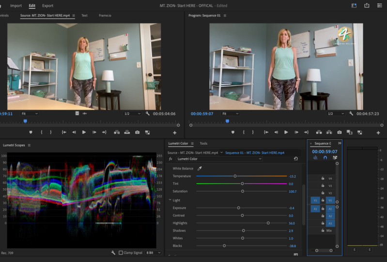
open up Lumetri color. In Adobe Premiere Pro loci, the Lumetri Color panel, or if you can see it, go to Window and
choose Lumetri Color. From here. Let's hit two basic correction
for the first lesson, let's focus on the
temperature and tint. These are the first
settings which we see. If you go further into the details of the
camera white balance, you can see that you
have an option to choose the right white balance
in forward direction. You can choose either that the white balance is shifted
between yellow and blue, but also between
green and magenta. These things we can find
also in Adobe Premier Pro, everything what we need to do
is on the white balance to just move the lever if you want to make a much
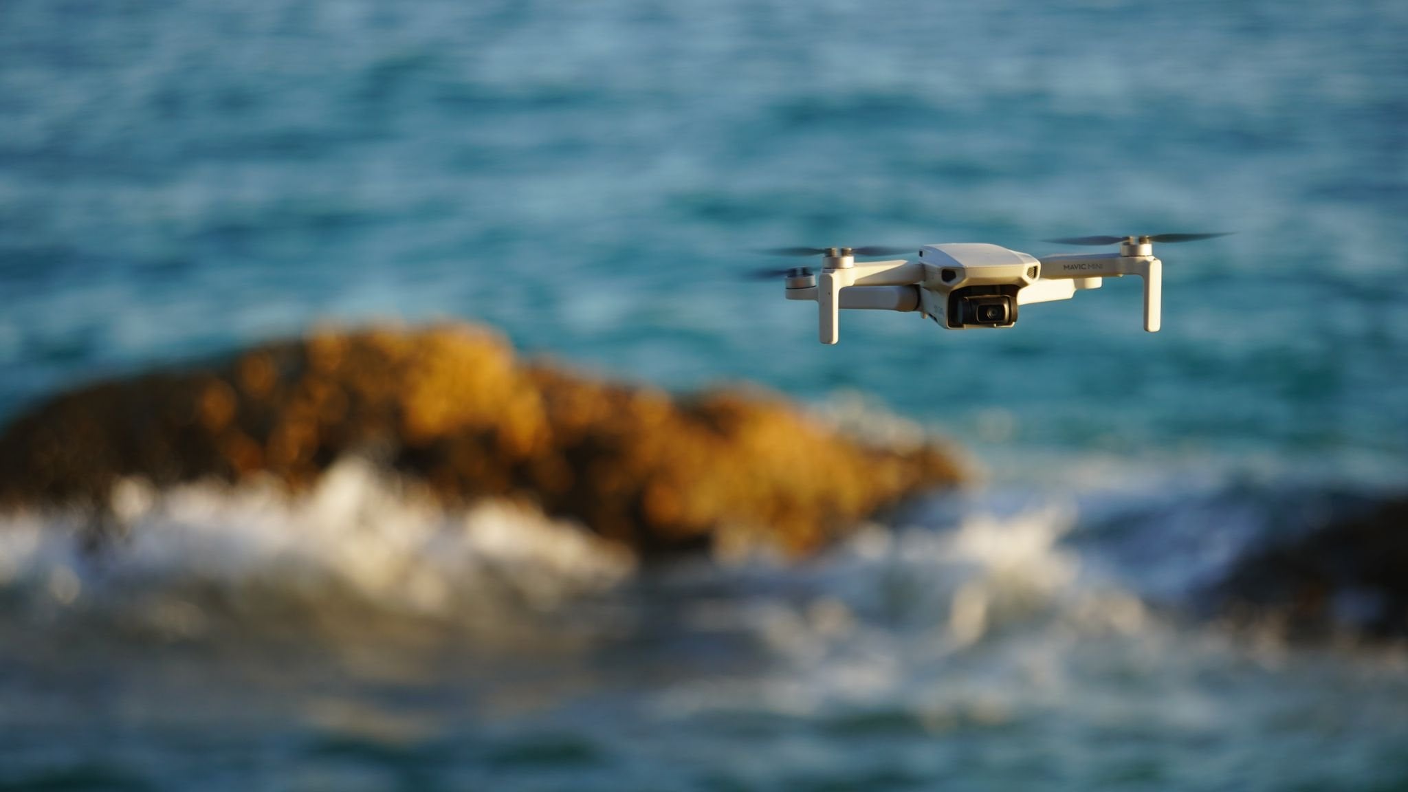
more warmth for them. But I have here shot
with the drone. Shot was made on
an overcast day. And maybe I want to have a
little bit more sunlight, although there wasn't
any sunlight there. So what they can do is to increase the
temperature so that it looks like I have filmed
it onto a sunny day. But this isn't really
the right thing to do, because if you overdo this
yellowish color grading, you're going to make
your shots look bad. So these aren't
really color grading. Neither color correction,
the white balance, in my opinion, because the white balance has a rule
that the white looks white. And yes, this, this can, if you want to fix
that, if you're white, doesn't look really wide, then the fixing of debt in post-production is
called color correction. But if you want to do like me to make a much more sunny shot, then it is called
Color Correction. This what I'm doing right now
is a little bit in-between because all the shadows
are a little bit too blue. Also the thing that does the same thing as
the temperature. And because I have here
a bunch of nature, I would like to go a little
bit on the green side so I can bump up those grids. Yes, this is the
way how to color grade using the
temperature and tint, but there are some
other things we can do. Like you see, we
have a color picker, which is the white bands. And what you can do with this is to go and find a wide surface. For example, I have here a little sign with
something white on it, and I can click it here. And Adobe Premier Pro will automatically make
the decision for me. Like you see, I am still
at 0 because these shots, white balance was named from the beginning and the
white looks white. But for example, if something else I would
like to be white, I can choose it from here. And Adobe Premier Pro
will automatically change the temperature and
the tint in such a way that, that part, which I
select, it looks white. Let's about
temperature and tint. In the next lesson,
Let's expose further the secrets of the color
correction at the Exposure tab.
3. Exposure: Now let's talk about exposure. Exposure is a really, really important thing to nail when it comes to
color correction. Because I would expose shot has enough details
so that it looks good. If you're sat is overexposed, you're going to have little to no detail in the
over-exposed places. And doing the opposite, Andrew is pulling the shot. You're going to
have deep Blake's, which are not good to retain
details from your footage. These things can be fixed
somehow into Adobe Premier Pro, but about fixing bet footage, you are going to talk
later in this class. Until then, let's focus
on to the exposure. Exposure of the shot. It can be tricky
because you need to respect some little twisty. And for this, let's head to the Lumetri Scopes in
Adobe Premiere Pro. Let's go to Window and
choose Lumetri Scopes. Into the Lumetri Scopes window
from the Settings icon, choose the waveform luma. And if you see other
type of a waveform, for example, RGB, then go into the workforce time
and choose luma. Here you can see how the
exposure of the shot looks like. If we have a white area
around the 100s place, this means that we have
over-exposed parts. And doing these things at 0 means that we have
underexposed part. And these are called
whites and blacks. If we have too many of his dose, This means that our shot is
overexposed or underexposed. And this means that we
have no detailed out of those spots because there
are black or white. Let's drag the Lumetri
Scopes next to the Lumetri Color window so
that we have them together. Now, the exposure
for this shot is run because it was
made when it was made. But let's change something here. For example, I would like to underexpose a little
bit of the shot. If we go too much, you can see that also our waveform goes
down tremendously. If we double-click
on the exposure, this, it will go back to
its original position. But let's see how
the wave form works. If we go into the whites
and crank them up, This means that here we have a line when onto the 100s place. This means that some part of
our footage is purely white. And you can see here the place. Let's go back. The same thing can
happen to the Blake's. If we go really, really dark, then you can see we have some dark tones here at
the shadows of the trees. So when it comes to
exposing the shot, what you need to do is to have the waveform stretched
as possible. So let's increase
a little bit of the highlights that we have, our our scope, our waveform
stretched up to 90. This also decrease a
little bit of the shadow. So that's the same thing. It is perfectly bands. Also, one more
thing I like to add is a little bit of contrast. And that's it for
the color grading. But like you see, we have some parts
touching the 0. So it's time to bring
up those blacks. This is how we can do a
color grading with exposure. But also Adobe Premier Pro has some interesting features
which can help us. Let's reset what we
made and choose auto. Auto exposure correcting is perfectly for most of the cases, except if you want to make some color grading
with the exposure, for example, some
creative choices. If you want to have
a more darker scene, brighter and so on. And for this, you can simply
move the levers around. That's it for this lesson. In the next lesson, let's
talk about RGB Curves.
4. RGB Curves: In this lesson, let's
talk about RGB curves. Let's jump from the basic
correction to the curves. Tap in here. The first curve we can
see is the RGB curves. From here. What we can do is
to change how it, how the exposure lays
on certain levels. Here on top we have
the white down here, the Blake's here a
little bit higher. We have the highlights, the midtones, and
then the shadows. Here we can manipulate
how much of the RGB colors are set in
those different parts. First of all, let's go into the most easiest way to
color correct your shot. If you have a
really fast project which you need to
finish immediately, this is the best way to
color correct your shot. Just go onto the highlights
and bring them a little bit up and bring the shadows down. This will create some contrast, and this is enough for
some basic color grading. And this is how I also
usually use the curves. But if you want to
go more advanced into the curves, Let's go. These curves are
called RGB because you don't only manipulate
the luma channel, but also the red, green, and blue color. So let's go, for example, in this chart, I have
here a bunch of blue. So let's go into
the blue section. From here, I would
like to bring a little bit more of blue
in those shadows, so let's bring it up. But here I have too much
blue in this highlight. So let's bring the highlights
a little bit down for blue. The same thing can happen
for green and red to, for example, I have
here in the mid-tones, here a little bit of red. So let's go into
the array tab and bring just a little bit up. These are the basics of curves, but let's go into some
more advanced curves. The hue and saturation curves.
5. Hue & Saturation Curves: Now it's time to go into
some more advanced curves, the hue and saturation curves. From here. These are some more
interesting places to change the colors
of your, of your shop. But here we aren't talking anymore about color correlation, but more about color grading. So let's go over the first
one, Hue vs Saturation. Up here we have a color picker, and from here I want
to choose field card. Like you see, Adobe
Premier Pro has created some key frames which
represent those colors. The middle one is exactly
the color I have peaked in. The sideburns are the range
where this color can play. If I go with this level up, you can see that
the color I have selected is much more saturated, but doing the opposite, it gets Grenier and up
to black and white. So from here, you
have the option to set Rick just a certain
color to your likings. After it, we have the
Hue vs Hue from here. Again, we can take
the color picker, again, select the field. From here, Hue vs Hue does another thing that
the saturation, and it changes the color of
the color I have selected. For example, I can
turn this into a blue field instead of red or to green or to a Greenfield, or any color I like from the
hue scope, like you see, we can see here a line representation on which
color I can change it to. After. We have the Hue vs Luma. From here, the Hue vs
Luma curve will change how exposed or unexposed our shot will be
on the Luma curve. So I can make it really
wide or really dark. After we have the luma
versus saturation in here. And here you can see that
we have no more colors. Here. We need to use the color picker. Again, let's select the field. And luma versus
iteration will saturate the luma channel of the field. So for example, if I go up, we're not going to see
the same saturated at S, at Hue vs Saturation. But here we are going to see more saturated colors when it
comes to whites and blacks. The last one is saturation
versus saturation. And let's select
also here the field. When this thing we'll
do is to saturate the colors but different
than Hue vs Saturation. It will not say treat every single color
which I have selected. Like, for example, when I
have selected the red field, it also saturated
the entire field. Here, it will just say treat only the tones which
I have selected. So if I drag this keyframe up, I can see just a few parts of the field or being saturated. This is about the hue
and saturation curves. In the next lesson, let's
talk about the color wheel.
6. Color Wheels: Now it's time to
take color grading further and dive
in into the color with the color wheels are a way of defining how the currents will look on certain channels. And these are highlights, shadows and mid tones. So in Lumetri panel, head down to Color
Wheels and Match. From here we can find the
three color with shadows, mid tones and highlights. Here I have a shot with liquid
being poured into egress. So here I have some highlights. Here, the white, which are some reflex reflections
of my lights. So here I can bring those
highlights a little bit to a more bluish
color just like that. Now you can see that also
the glass and also around here where it is more bright, I bring it to true blue. Now we can see that here. Now the shadows are a
little bit too blue. So let's bring them into
the opposite duration by dragging them a little
bit too yellow. That was a little bit tomorrow because we have now the shadows. So this means that
C behind isn't, aren't the shader, so
there's bring it back. This means that let's change
the mid tones a little bit to yellow to match those. And also the shadows. I would like to bring
them again a little bit to a bluish colors so that
we have that reflection. And this is how the
color will work. Also next to the color wheel, we have some sliders, and this will change
the alpha channel on to the highlights, mid tones and shadows. And this means if I want to have brighter highlights
onto the alpha channel, I can bring this
up the same things from for all the other channels. That's it for this lesson. And in the next lesson, Let's dive in into
the HSL secondary.
7. HSL Secondary: And now it's time to dive
in into the HSL secondary. So first of all, let's discuss what these
settings actually are. The ages and
secondary is made to only cooperate a certain
part of your footage. For this, I have chosen this
example of a paper close-up. I want just to change
the colors on, just on that paper. So from the setColor, I can bring the color picker
and let me select the paper. Now you can see that Premium Pro has already made
some selections. By clicking this checkbox
next to call or slash gray. We can see how much of a selection Premium
Pro has actually made. Now there are two options of selecting more or less
of what you want. You can drag manually
all of these, all of these keyframes
in such a way that you have enough
of what you want. But how I usually
like to work is to use the color picker again, but this time the plus, the add color picker and select multiple points onto the paper. And for this, I
usually select when I first open the
agency or secondary, I first of all said mid-tone color of what
I want to color grade. And then with the color picker, I also add some
highlights and shadows. This is how the
paper turned out. Well, for this selection, you don't need to be really, really precise because it can depend on what
you want to do. If you want just to have some really basic
color correction, then it is okay just to
have those selected. If you want, just to
change it a bit of the saturation of that object. And now it's time to go farther. We have here some options
for the selection, the de-noise and Blur option. These are for the margins so that we have a much more
seamless color grading. Lastly, we have
the same settings as in the Basic Correction tab, where we have temperature T
In contrast, concentration. Lastly, we also have
sharpened to sharpen up those colors only
on that selection. And lastly, we have
also the color wheel, which lets us change the
color of a certain object. For example, I can
make this paper be Something around blue. And let's see how it turns out that it usually when
it comes to HSL secondary, you don't really color, correct? You don't really make
a huge difference. Usually, this effect is used just to change
a certain color, just like the hue saturation, just like the Hue vs Hue does. But here you have much more control over
the selected color. The only downside is that
while on Hue vs Hue, you can change a bunch of
colors at the same time. But in the HSL secondary, you can change this only one time per Lumetri
color effect. Want to calibrate
multiple zones, then just go into, just click on to luma
on the Lumetri Color drop-down and choose Add
Lumetri color effect.
8. Creative Look, Vignette & LUT’s: Now we still have some
painters to discover. First of all, let's talk
about the creative panel. Into the creative panel, we have here some more interesting
and jumps adjustments. And as the name says, says this unjust for the
creative person purpose. First of all, we have
the look top-down, and from here we have
multiple presets already installed with
Adobe Premiere Pro. This just make your work easier, but it is what, it is much more
important to know what each settings that
then using a preset. So let's go down
into the settings. So first of all, we
have the intensity. Intensity is just made
if you used a look and to determine the
intensity of that, look after it, we
have the adjustments. And for first of all, we have faded sphere. This faded film has the
option to make your footage look not like a digital camera does filming with a sensor, but looking like a fear exactly how films were shot before
digital cameras were invented. This filter just add some
green over your shot, which is usually
typical for fear. Then we have sharpened. If you want to sharpen
up your footage, then have Vibrance and Saturation just to
change your color. And this vibrant
and situations and saturation are the same as on any other editor,
nothing really special. Lastly, we also have a
shadow and highlight thing, and these work in saturated. If you want to go with the shadows or highlights
through a certain card. For example, I have
here some highlights. I would like to go them
to a more bluish color. Lastly, we have the theme balanced just to adjust how much themed we want between the
shadows and the highlights. Lastly, we have the vignette, which is also coming in. Any other video editor
or photo editor. Just adding a vignette
around your shot. You can add an amount. If you wanted to
have a dark vignette or a bright vignette, or also some other settings
to play around with them. And that's it for
the other settings. We are ready with the Lumetri. Color Grading has,
hasn't stopped here. We have still a lot to cover.
9. Color Correting bad Footage: And now it's time to color
correct some Bedford. Bedford, these can
usually happen by mistake and some little mistakes can
be fixed in post production. But first of all, you need to think about
if it is possible. So from my own experience, I can say that when you are theorems it on any other
thing that you are filming, exactly after you
finished filming, look really fast on every shot you think you are
going to use in the edit. That you know, if
those shots are perfectly made, bad mistakes, just like a complete
white balance disaster or a really underexposed,
overexposed shots. Shot can be recovered
because they, because the data which is
processed by the sensor isn't, isn't good quality so that
we can do something with it. This can only be changed if
you have filmed row or log. And this means they have a huge variety when
it comes to settings. But now let's see what we can
do if we have bet footage. So here I have an example of footage which is not really
overexposed or underexposed, but desaturated and January
doesn't look pretty good. So first of all, let's go
into the basic correction. Like I said, what I
usually do just to speed up my workflow is
to click on the auto. These already makes
my footage pop, like you see here. It already made the hard work. What I also want they also do is just to bring up a little
bit more of contrast, but not using the
normal contrast slider, but more by adding more by lowering down the blacks
and bringing up the whites. This is the easy way
of really mixing the color grade of this is the
way of fixing bet footage. But let's say that
you will have make, made a really bad white balance
and probably your shot. These are overexposed. This is just to make a test. I'm going to nest the
sequence as an example. So here we have a
overexposed and best shot. First of all, we have
a bed white balance, so what we can do is
to lower it down. But already you can see
that it doesn't look good, different than in
our original shot. It doesn't have the
same quality as before. You can see we have a bunch
of noise here onto the white, different than in
the original shot. So I always recommend that you check your settings
before filming. And also after filming, put the SD card into a laptop or something
so that you can preview those before leaving that location where
you are filming. But beside it, Let's
color correct for it. Then again, Let's try
with the auto settings. Like you see, the auto
setting, the main. This time a little
bit bad because we can still have those
really overexposed shots. So let's bring the
exposure down. Just by bringing the
exposure down isn't enough. Also, the highlights can
be a little bit bigger. Let's increase the degrees also the blacks and
the whites too. But like you see, we have came to a
pretty good result. Just adding a little bit more of just adding a little
bit more contrast. But different than in
our original shot. We still don't have
the same result. Just like here. We have came to the
same original shot like we made without
any mistakes. But you can see that
around here where the bay, where we have a
blurred background, but also around the places
where we have white. Those places are noisy. And also here where we and also here where
we overexpose the shot. We can see it really. We can see that we have, we don't have any more detail. And if you go into the Lumetri
Scopes, bring them here. If you go into the
Lumetri Scopes, you can see that we are almost
touching that line of 0, which is, you can see into the Lumetri
Scopes that we are almost touching this line of 0 and we don't have a really
stretched out image. But if we would change
that a little bit, you can see that we can do
in these kinds of scenarios, we can do too much because if
we increase the brightness, we are going to have
overexposed shot. But in doing the opposite, we are going to have
complete darkness. Darkness. So again, I say it again. They try to make the or in camera shots perfect from there, not do any kind of
post-production because it will add noise or other
things to your shot. And this is how to color
grade bet footage. See you in the next lesson.
10. Color Grading to tell a Story: Now let's talk about color
grading and color correction. So like I said,
color correction is just fixing some
mistakes into the, which were made onto
the feeling safe. But those can be really big
mistakes because like I said, some things will
make just your shot worse by adding noise
or losing details. But also small correction can be done even if your
shot is perfect. For example, just
changing a little bit the exposure whites and blacks, just to make your
footage pop out. But already doing this, we go through there into the world of color
grading. Color grading. It makes us an artist. We can change the
color of our shot depending on our
lives, on our likings. And this can be done
in two scenarios. First of all, if we want
to make, like I said, the videos for this can be
done using the Creative tab, probably the curves tab, and also some of the vignette. These can add some
little things to change how the However shot will look and it will
make it pop out. These are usually used to
make some fast color grading or in social media ads
or anything that don't, that doesn't tell a story. But this is the second thing why we might want to
calibrate our shot. And this is to tell a story. Telling a story
through color grading makes us through artists. And this can be sometimes hard. For example, if you want
to create a horror scene, usually horse in a
little bit weird. That's why onto the set, we create some weird lighting. For example, some top lighting
or weird side lighting. But about those, I'm talking
in some other of my classes, which I'm going to link in the description of
this class below. So after you have
shut your scene, probably you want
to add a little bit more of that
horror weirdness. You might lower
down the exposure, crank up the contrast to
make it a little bit weird, but make sure when it comes to color grading that
you don't overdo it. If you are going to overdo this, you're going to lose details and your shots will
look bad and noisy. So when you're doing any
kind of color grading, make sure that it is, that it is good enough. Even if it is not
really noticeable, you can still make it
because people who are, who have a train
filmmaking guy will notice also though
sudden details. In the example of
the horror scene, what you can do is to also create the
weird color grading. For example, with the Hue vs Saturation or hue versus hue, you can bring some tones
more saturation or less, or maybe change some colors, for example, change the tone of the lighting to something greenish to make
something weird. These things aren't applied
just when it comes to horror, but also to any other genre. If we have I love story, we can make the
entire scene a little bit more yellowish small war. This can be done through
the white balance, but also again to the curves
by changing some colors. For example, if you have a shot with some,
with a landscape, mostly with nature, you
can change a little bit of the green tone into
something more yellowish, changing also the
mood of the scene. For this are hundreds
of examples. And when it comes
to telling a story, every filmmaker has its own
way and you need to develop your own when you want to
start telling your story. But the only secret to tell a story
through color grading. But not only to color grading, but any other domain filmmaking is to try it out, try out. Try out ways to tell the
story through color, grading or any other thing.
11. Match different cameras colors: And now let's do something
using the Lumetri panel. And this is to match different colors of
different cameras. In any projects. When
it comes to filmmaking, you have footage from
a bunch of cameras. You might have footage
from your drone, some from your camera, some from a GoPro, or even multiple cameras. In this sequence right here, I have strictly one
shot with my DJ. I'm a big one with my son and
DSLR and one with my GoPro. Like you see, we have
a bunch of colors, like this tone of the drone
is a really vibrant color. The colors of my DSLR, or a little bit not so
vibrant like with the drug. And the same thing
is with the GoPro, which has even more vibrant
colors. So let's see. First of all, to make the, those cameras, Mitch, what I usually first do is to apply
some basic correction. And here I can just
click on the auto like I did in many
of these examples, just to have everything. All right, somehow in the same way like Adobe
Premier Pro would do it. Now already, we have some would matching
of this saturation. Like you see, those
shots are a little bit. Our last shot with a GoPro
is a little bit too bright. So here I can go and load down a little
bit of the exposure. Now looking back, we can see that the colors
match pretty good. This is the easy way. Of course you can do every
of these settings menu. Also, these two shots
match pretty good. After that, let's see. This sharp with a GoPro is I would like to lower
down the temperature. It's going to be two yellowish compared to our other shots. And also add a little bit of t. Also, our other shots have
a bunch of countries. This one has none. So let's add some contrast
I prefer, like I said, using the lowering
down the blacks a little bit and why in
bringing up the whites. And already we have here a really good matching
between all of these cameras. Also, if you have some
cameras which you shoot a lot width and also have them come in and
to make the image. And also to speed up
this entire process, you can create a lot and
make these just with one click into this drop-down and you are ready with
your color grading. Also, after a blinded loved, They are just some
certain settings which are going to
make. But that's it.
12. Masking: And now in our last lesson, let's take a look at masking. You might ask yourself
why we are taking a look at masking the
color grading class, because masking is usually used for compositing
and doing the effect. But also in masking, we can do something
really interesting. So let's look a little bit. Why we might use masking. The answer for this
is if we want to cover just a certain
part of our footage. And yes, we can do this using all those interesting
tool just like HSL, secondary or the
curves and so on. But what we're going to do with, in this lesson is to, is to mask out just
a certain part. This can be done if
you want to apply a certain way of co-creating, which can be made using the HSL secondary or the
car or the curve. So first of all, let's duplicate the shot by
holding down the Alt key. And let's go into the opacity and draw a mask around the
roof of this house. Just the basic mask
for this lesson. To make it much more easier, Let's track the mask. So like you see, I
have trained the mask. It doesn't need to
be really precise. I haven't just made
it for a few seconds. So now, first, before
doing anything, Let's also feather this mask a bunch because you are going
to see some difference. Now, I want to make this roof
much more saturated so we can hop here into
the creative menu and go to Vibrance
and Saturation. And let's bring it up. So I have done my color grading, and this is the
result we have here, the roof more saturated. Like you see, this mask
isn't really precise because our roof is now
not moving together. But this type of risk
is not usually use, like I showed you here, using just color grading
a certain color. Because for this we can use, like I said, the curves
in HSL secondary. But this I usually like
to use when it comes to color grading
people and faces. I can mask around
the person's face, just a huge circle around
them and track the mask. And at the end, I can
just change a little bit of the skin tones if
I don't have them, right, this is how I
personally use them.
13. Conclusion: And now it came to
the end of our class. Thank you so much for
watching and I hope that you learn something new
for the class project. You're going to find some footage in the
class description below, on which you can try out your
new skills when it comes to color grading and color
correcting for the class project, just send what you have made and you can even include
your own footage. If you have any
further questions, please let me know.
Have a great day.
 Alex Sofonea, Filmmaker & Full-Stack Developer