Transcripts
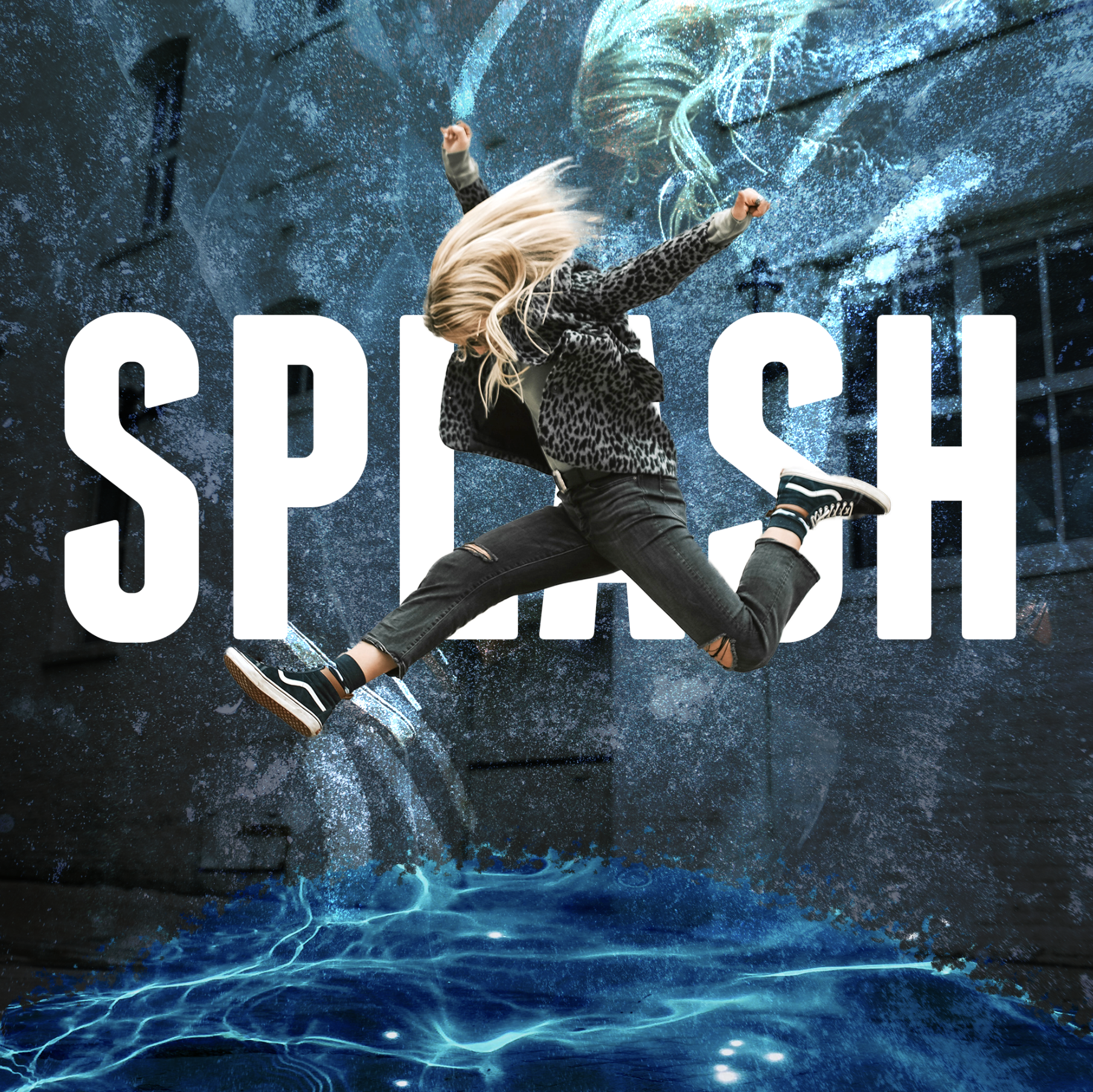
1. 1-Hour Photoshop 2025 Crash Course: Welcome to this
Photoshop Crash Course. At the beginning of
my big Adobe classes, I like to actually do a
quicker crash course for you. If you want to just
get in there and start making things,
start being creative, rather than watching
step by step, the entire process of these
amazing applications. So that's what this
crash course is. And by the end of it,
you'll be able to create your own designs completely
from scratch like these. So what and how are you going to be learning
this in Photoshop? You're going to learn
how to start a project, how to import and resize images, how to understand the interface
so you don't get lost. Working with layers, which is the one panel within Photoshop, you'll be spending a
lot of time this video, you're also going
to learn some of the generative AI features within Photoshop that have been added over the past
couple of years, important tools that you'll
be using often blend modes, opacity, layer
styles, how to save and export your projects to
share them with the world. And as I mentioned, you'll be putting this
all together with these real world project demos. So we're going to start
with the quick ish overview of Photoshop and then move on to putting
it into practice. This is just a number of
additional specific techniques and skills you'll be learning right here
in this crash course. So if you're ready, let's
go ahead and get started. There are going to
be things that I do not cover in
this crash course, that will be covered in much more depth throughout
the full course. My goal is to help
you get started with Photoshop as
quickly as possible, and that's what this crash
course is here to do for you. When you first
open up Photoshop, you'll see their welcome page. It's on the Home tab, which will include
any recent projects that you've worked on, as well as any latest news or features that Photoshop
has added up at the top. If you have never opened a Photoshop project
or created one, you'll need to
create a new file, which is up here
on the top left. Here opens up a window
where you have a number of preset options for
different sizes, for example, for print or different
photo sizes, different popular web sizes, or as you see, as well, if you've created different projects in
the past, recent sizes. Can also customize your size
and shape of your canvas, the project that we're going
to be working on over here. So if you want to create a
square project, for example, a square image,
you might want to create it 2000 by 2000 pixels. 300 resolution is a very high quality
resolution that would be great for both print but also sharing online.
Just a quick tip. If you find yourself creating projects with
the same settings, you might want to save
it as a preset by naming it and clicking to
save that as a preset here. Once you're happy
with your settings, just click Create, and that's
going to open up Photoshop. Now, the layout of your screen should look something like this. If it doesn't, go up to the
Window menu under Workspace. Make sure you're on the
essentials workspace. And if it still doesn't
look exactly like this, choose reset essentials. However, it should
look like this when you open up Photoshop
for the first time. We'll go over this layout in a little tour in just a minute. But in this next section, I want to talk about adding
images to a project. There's several ways to add an image that you want to
work with to a project, but the easiest is
simply to find it in your documents and drag
it onto this canvas. Here are some photos
that you can get from the downloadable resources
of this project. So simply choose one
of these images. These are all
copyright free images that I found from unsplash.com. Thank you to the
photographers for providing these images for our practice. And now you can see
it is on our Canvas. You'll also notice something
over in the bottom right, which we'll talk
about in more depth, the layer panel, it has
added this as a layer. So you might be happy
with where this was placed or the size of
this image, but if not, you can take your
mouse and you can hover over this bounding box, which is this box with
these little squares, and you can resize. So if you take a corner in
or out, you can resize. While you're doing
this, you hold the option key on a
Mac, Alt on a PC. If I ever say option on a Mac, it means it's for a PC. It will scale from the center. You can do this with any of
these parts of the image. Now, if you're trying to
stretch or squeeze an image, you can press the shift button, and that allows you to
stretch or squeeze it. But I'm going to undo that Control Z or
Command Z on a Mac. To rotate an image, hover your mouse over
one of the sides, and you can see
how it changes to this little rotation icon
and you can rotate it. Holding Shift allows you to
rotate it at specific points, 60 degrees, 45, 30, et cetera. And once you're happy
with the positioning, which can always
be changed later, just press the return key on your keyboard and that
sort of sets it in place. I go back to my finder and let's go ahead and choose
one of these other images, you can see that I can
drop this onto my canvas. I can resize it. Say we want this to fill
up the whole project. We can do something like that, press return to place it. But now it's on top
of our other image. And over here on
the layer panel, we can see that it is above
our meditating image. To change the order, simply drag it down below. That you know how
to open and start a project and place some images, let's go over the
interface of Photoshop, so you know a little bit
where things might be. Now, there are so many tools in Photoshop and many that
you might never, ever use. There are going to be
some tools and panels and things that you use on a day to day basis
like myself, though. We'll cover the most
important ones. So in the middle,
this is our Canvas. So this is where we're going
to be working on our image. It's the size of the design
that we created initially. This can also be changed later, but right now it's just that
2000 by 2000 pixel project, which we can see down
here in the bottom left. On the left hand side, we have all of these tools. These are different tools that allow us to do different things. Hovering over them will give us more detail
about what they are. There's tools like text and shapes and clone
stamping and selections, all kinds of good stuff we'll be going over later in this video. Up at the top, we have some
different options that will change depending on what tool
we have that we're using. Now, the one tool I want to mention right now
is the move tool. This is sort of your main tool. It's sort of just
like your mouse that can click and grab
and move things around. And it's the default tool
that you'll want to go back to because if you're in
one of these other tools, then it might make an adjustment while you're clicking around. I have my file menu
hidden up at the top, but if you see this at the top, you will find a lot of different
options up here as well, things like filter, the window that we saw earlier
that allows us to open up all kinds of other panels and options if you want
to adjust your screen, depending on what types
of things you do. Like, if you're always doing
photography or painting, you might want to choose
a different workspace. But for now, we're going to
leave it as the default. Moving around to the
right hand side, we have these panels on the
right that we can't adjust. So some of these we
can make bigger or smaller depending on what we
like to use or what we need, in our view, more prominently. For example, at the very
bottom, we have the layers, and this is where I spend a
lot of time adjusting layers, making adjustments
to these layers, reordering them, and you have a lot of options down
here at the bottom, as well that will help
us make our designs, create new layers as well. Ash layers, all kinds of
good stuff down there. But back up at the top, we have our color picker,
swatches, gradients, patterns. These are how we will choose colors for fonts and shapes
and things like that. Below this, we have properties, which you can see if I change to a different layer.
You can see the properties. I often actually don't really
use this properties panel. So what I might do is
just close this by right clicking and
choosing close that tab. But I do have this
adjustments open. Now. And so that's
how this works. We can also reorder these tabs if we want to by
clicking and dragging. And adjustments is
how we can make different adjustments to layers like changing the brightness
or the curves or levels, and we'll go over
that in the future. I also might just want to have my layers panel open by
itself without these up here. And so having something like this might be a good
default view for me. All of this can be adjusted. And the one other thing
I'll mention about this interface for now is this little tool
bar right here. This has things like the
history where we can jump back in time to a previous
spot of our edit. We can also add things
to this toolbar. For example, if we go
up to Window, we can Add character. And now we have all the options for our text. So we can change
things like font size, and you can open up these little windows with this button, which I think is super helpful. One last thing that
I want to mention, which you might see that I
have turned off right now, if I go up to Window, look and see where a
contextual task bar is. This is a bar that is a
recent Photoshop update. You can move it around, and depending on what
you have selected, it will give you different
options. It's contextual. And so for things
like this photo of this lady meditating, there is an option for selecting the subject, we're
moving the background. This is where we're going
to be doing a lot of GNAI stuff within our projects. And so if you don't see that, make sure you check window and contextual task bar to
turn that on or off. We'll be seeing how that
works in the future. All right, so that's
enough with the overview. We'll learn more as we work
through this crash course. In this next section, I want to talk more about the layer panel. So let me make this
a little bit bigger so we can see more. You'll notice that we have
this background layer that is automatically created whenever
you create a new project. I can turn off the visibility of any layer by
unchecking this eyeball, and we can see that
the background is just this white layer. We don't necessarily need this, and to delete it, what you have to do
is select it and press delete on your keyboard or the back arrow or press
the trash can over here. Can also see that
this layer is locked. For this background layer, it means that if I
unchecked that lock, which you can turn
on again up here, I can now move this
background around, and that's going to be the
same with any sort of layer. So let me delete that
layer right there. If I turn on this meditating
layer and now I lock it, it means that I can't
click and select it. See how I can't
click and select it. And because my cloud
layer is not visible, it's not allowing me
to select it either. But with the clouds layer on, now I can select and
move this around. If you have a layer that
you don't want to touch, you can lock it or you could just turn off
the visibility. We already learned about
reordering layers, but another organization
method is to group layers. Sometimes I end up with a project where I have
dozens of layers, and it gets sort of daunting, sort of scrolling through
and finding the right layer. To organize layers, you
can actually group them. So you can select
multiple layers. You can group them with this
little file group button down here, undo that. We can also do that by selecting these layers
or whichever layers you want and choosing new group
from layers. Select Okay. You can also rename
it if you want. And now these layers
are in this group. You can move layers
out of a group, reorganize them in
different groups, but it's just a way to keep your layer panel more organized. The group or any
of these layers, you can rename them. So you can just
double click into the title or the text and
then give it a new name. So sometimes,
instead of creating a brand new Photoshop project, if I am creating a series
of social media graphics, for example, I might
just put all of my designs into different groups in this one Photoshop project. I'm going to actually remove these layers by selecting
them and taking them out of the group a lot of
other things we'll cover with the layer
panel in the future. But the last thing for now is
how to create a new layer. So if you click this
little plus button, it creates this blank layer, right now, there's nothing
happening with this layer. If I turn off these
other layers, you can see there's
nothing happening. And if you ever see this
checkerboard pattern, it means that there's
nothing there. Right now, it's transparent. But there's lots of ways to add things to this layer that
we'll see in the future. Another way we'll
create a new layer is with certain tools like
our shape tool here, if you select that tool, and then we use it by clicking and dragging on our design, you'll notice that it
creates a new layer. That was an ellipse or like a circular object. I'm
going to delete that. You'll notice that
under this tool, if I click and hover over it, there are other options. So under shape, we
have rectangle. So if we wanted a rectangle
instead of an ellipse, we have to choose
that right tool. With many of these tools, if we click and hold, we'll see different options. So with the shape tool selected with the
rectangle option, now I can click and
create another rectangle, and it appears here
as a new shape, and I can again, drag it down
underneath this layer. Now, creating that opened
up this properties tab, I'm going to go ahead
and close that again. Would want to go back to my move tool to move
things around because if I try to click and drag
again, look what happens. It creates another shape. Once you're done creating
shapes or new layers, you want to go back
to the move tool, and from here, we can then
move this shape around again. And that's a bit more
about our layer panel. In this next chapter,
I want to talk about the contextual task bar and the generative fill AI
features of Photoshop. This has been updated
over the past few years, and I'm sure it will
continue to improve. You can see if I
select the shape versus an image,
the options change. You can see under shape, it has a lot of the same
options that we would have if I had my
shape tool open. So if you don't have the
contextual task bar open, know that you can get to
some of these options for changing things like
the color of my shape. So say I want to pick
a different color. These are recently used
colors or you can open up these different folders or go to a custom color picker by going to this little
box right there. This new color picker
window will open, and then you can change the color completely
to anything up here. Once I click Okay, it's going to change
the color of that. Layer. But now we have those
options here. So same thing. We can get our colors for that shape here
rather than having to switch to the
shape tool to get to them up on this
task bar up here. With the images,
there's a lot of cool features like
selecting our subject, which will automatically find
the subjects in our image. And from there, we
can do all sorts of things such as copying and
pasting to a new layer. So if I press Command
C and then Command V, it will copy just
that selection. That's what that's
called to a new layer. And if I turn off this
background, we can see that. Look at that. I removed
that background. Or I'm going to delete that now. Similarly with this same
image layer selected, I I just click
Remove background, it automatically does that. And it does so by
creating a layer mask. This is an advanced concept
that it's kind of confusing, but it's an important one
that we're going to learn in this crash course more
about in the future. But it's a way of
basically removing a part of an image, not forever. You'll be able to go
back to it and edit it. You can add parts of
the background if you want or add the full
background if you want. But that's what's
created when you just create that
background option. Now, from here, we
have some new options like Generate Background, which is a new feature where if you click
on Generate Bound, you can type in
anything that you want peaceful bubbles in a
cartoon sketch style. You have to come up with
whatever prompt you want, and we're going to choose Generate now it's
going to create a background for
this entire image based off of what
the subject was. So now we have this JNAI
option that it created. Now I'm going to increase
the size of this here so you can see the variations
that it has created. You can also see that it
says one of three here, and we can scroll through these different options and
pick the one that we like. And then once you're
happy with that, you can just click
off of that layer, and it becomes a new
layer in our image. So just like that, we have
this really cool design of our meditating lady on this sketched background
on this yoga mat. Very, very cool. Now, that was the process for when we
remove the background. Let me go to our history, and I'm going to back up before
we remove the background. So that's how you can change the background of
an image quickly. I'm going to remove
this background again really quickly
just to show you another option for using
this contextual task bar. And we have to use
another tool to do this. One that I'm going to
do is the Lasso Tool. If you click and
hover over this, go to Lasso Tool. And what this does
is it allows us to create a selection
on our canvas. And then within that selection, we can generate
any sort of image. For example, if I click
and drag over here, this is where I want
to generate sitting on a photo realistic
puffy cloud generate. Prompt engineering or how we write our prompts is going to change a lot about the types of designs we create in
terms of the styles. Is it photorealistic?
Is it sketched? Is it moody? Is it bright? All kinds of things that
you can play around with. And similarly, now we have
these different options. Now, if we're not happy
with these options, we can click Generate again. And now maybe we've
found one that looks a little bit more
realistic, something like this. Now, if we like this one, but we want maybe something
similar but different, you can hover over
these three dots here and choose
Generate similar. Will generate a few options similar to the one that
it already created. Now we have these three
additional options, and I actually like this
first one kind of the best. You'll notice that what it
created is a new layer based off of the selection or the area we created
with the Lasso tool, and I can turn this on or off. And if I turn the rest
of the layers on, you can see that it
actually generated part of our lady
that's sitting there, part of the background to match the color and what's going
on in the background. I'm actually going to delete this rectangle because
we don't need it now. Now you could just
keep creating things and adding to the design
with the Lasso tool. There are other ways to create shapes like the
Marquee tool up here. And again, you can click
and choose the right one. So if I select elliptical, I can go here and just
say a bright sun. And so here we have
some different options. And because I wasn't too
specific with the style, it gave me one that was just an illustrated
one. These look right. But let's change this to
a photo of a bright sun. And so now we have a couple
more realistic views of what the sun would look like if you had
taken a photo like this of this lady floating
in the sky on a cloud. Alright, so that's
enough for now with the contextual task bar and with the generative
fill options. We'll be seeing a
lot more of this in our projects at the end
of the crash course. In this next section
of the Crash course, I want to go over some of
the popular tools over here. You can also click this
little arrow button to condense this
tool menu up here, and it might be a
little easier to see. I've also added our second image of our meditating
dude over here. So the most popular tools that I personally use
are the move tool. The title tool. So with the title tool, you can just select that tool, click onto your Canvas, and it will create some
just placement text, and then you can type
in whatever you want. Meditation. Now, it uses the fonts and the style
from my previous projects, and that's great if you want to use the style that you've used for your
previous project. However, if I want
to change this, I can highlight this text, and I can go up here, or if you have your
character panel over here, you can open. And you can choose
a different font. So here, open up all your fonts, and if you just
hover over a font, you can see a preview of
what it would look like. If you know a specific
font, you can type it in. For example, I use fat Frank
often for my projects, and so you can choose that. Have all sorts of different
options for your fonts, such as the size, which you can also
change by hovering over the size text here and clicking and dragging
to the right or left. And that's the same with
all of these options. For example, the tracking or the spacing between letters
here, you can adjust that. If you want to get to default, you can just select zero, which is the standard
for any font. Below, we have options. Right now, it's all caps, and depending on the font or depending on
what you typed in, I think I capitalized
it when I typed it in, but now it is not all caps. Now, that's one way
to adjust text, but you can also use the move
tool and select your text, move it around and see how it has a bounding box around it. So here and if you don't
see that bounding box, make sure you have this show
transform controls up here. Now we can just adjust the size here with these transform tools. Right now, I can't go in and make adjustments to
the characters, though, unless I double click
into this text, and I can make those adjustments once you're in that title tool. The text tool, lots
more to learn, but that's one of
my favorite tools. The other is the shape tool. We already saw
this, but I do want to just mention a
couple quick things. So if you select the shape tool, before you create a shape, you can change the color,
which is the fill. So that's the interior color
of your of your shape. You can also add a stroke, which is the boundary
or the edge. So right now we
don't have a stroke, but let me just add
a black stroke, and the pixel width I'm
going to make bigger. We can adjust this later on. But now I'm just
going to click and drag this over our text. I'm going to put it underneath
our meditation text. A couple cool things to note. One is we have this
rounded corners option, so that's this little circle in the corner that we can now take in and quickly create
rounded rectangles. Back here, we can
change the stroke. So if we want to make
it bigger or smaller, we can just actually hover over the stroke and click
and drag right or left. Maybe I don't want
a stroke at all. With the fill, something more of a design theory
thing that I like. I often like to choose colors from within my
photo to use for my shape, at least as inspiration. So to pick a specific
color within my image, I'm going to go to my
color picker here, and now if I hover
over my image, I can see that my mouse
turns into this eyedropper, and maybe I'll pick this sort of blue from his
pants and click Okay. Now image, that shape sort of matches what's
going on in the image, which is kind of nice. Now, after the fact, I can
go in and I can adjust the size of this however I want. A quick tip if you ever want to align two layers
to each other, so I know that this text is somewhat aligned
with this shape layer, but if I want it
perfectly aligned, I can select these two layers by shift clicking
the two layers. If I go to my move tool now, I can choose to
align so I can align them vertically
center horizontally. You could also left
justify both of them bottom left justify if
that's what you're going for. But generally, for
this kind of thing, I would want to center justify vertically
and horizontally. You have a lot of controls
up here for aligning layers if you have your layers,
multiple layers selected. That's the shape tool
where you can create sort of typical standard shapes. There are some
really cool ways to create custom shapes
with the pen tool, but the one I want to mention
is the curvature pen tool. So if I select that, now I'm
going to change the color. This time, I want to keep that color vibe but make
it a little bit brighter. So I'm just going
to take that to the left in this
color picker window. And now what I'm going to do
with the Pen tool is just start clicking and you'll see
that as I start to click, it creates this shape that is naturally curving around
each point that I create. And then once I complete that shape by selecting
the last one, it is now a complete shape. Move it around, I would want
to go back to my move tool, which is also V on my
keyboard shortcut. And so now we have this cool sort of
shape that can create sort of a custom border
around this image. Let me make this image bigger, so I'm going to just
select it option. Drag, go back to my shape. I'm going to
duplicate this layer quickly by option clicking it. Option clicking a
layer and dragging it actually creates
a duplicate layer. If I want to create
another shape, I can go back to my pen tool. Maybe this time I want to have a different color,
something that contrast. Maybe we can start
with his hair, and if that's like a nice
sort of yellowy gold, we can maybe do that. And because I had that
shape layer selected, it changed that shape. But this is where
you might want to
2. Crash Course Project 1: Welcome to these Crash Course projects where
we're going to put together everything
we've learned so far into real world projects. These ones right here that
you actually have access to. I'm including this project
file that you can open up and you can see
exactly what's going on. I'm going to rebuild them
throughout this project, but you can see the
original ones here. We'll be using the
resources that we used in the CASH course
for these projects. I've also included the
project inspiration final PNG files, which will be easy to use as reference as
you'll see coming up. And with each of these
projects we're doing, there's going to be things that are new from
the crash course. So not only are we
going to put things together all the
tools and techniques, but also learn some new things. So starting off, we're going
to create this project. And to start a new project
while in Photoshop, I'm going to go up to File New. Then I'm just going to
create a custom one that is 1,500 by 1,500 pixels. I'm going to place
a couple images, this meditating one image, and then also this clouds image. Now you'll notice
that I can't place this clouds image until I
actually commit and place this meditating image by
pressing the return key and it puts it down in our layer panel,
and now same thing. To put this clouds.
But for this one, I'm actually going to resize it and put it right about there, putting it beneath
our meditating one. I'm going to go ahead and
delete this background layer, and I'm also going to bring in our Design one
project inspiration. This is our goal, and
this is what you can do with designs you
might find online, take a screenshot, put
it into Photoshop, and you can kind of
turn it on and off and use it as inspiration. Thing I want to get across
in this project is that the order in which you do
things is very important. So I like to sort of think about what I'm
going to do first. One is separate our subject
from the background. We're going to add our cloud. We're going to add our text,
and then stylize it with the lens flare and
some glow to our text, as well as behind our subject. Before we do any of our
generative fill work, we need to make sure
that the colors, the removing of backgrounds, the blurring of our clouds in
the background is all done, and I'll show you why that's
important in just a second. But to start out,
let's go ahead and remove the background
from our subject. Now, you might think
that just clicking this remove background
option is the best one, and for some people,
that might work well. It creates this layer
mask, which is good. We can fix this up a little bit. But I want to show you
a more advanced way to select our subject and make
that selection look good. We can start out for this image by just
selecting our subject. If this doesn't work,
you could go into our Quick Selection
tool as we saw and paint over and
create your selection. But instead of just copying
this into a new layer, which we've done in the past, but this creates a
destructive layer. We can't go back and edit it. We can't get any of that
background information back. What we want to do, and
I'm just undoing that with Command Z is
whenever we do this, we want to use a layer mask. And the way you do that with a selection of a layer is just by clicking the
layer mask button here, and you can see now that we've created a layer mask
for this selection. But still we haven't
done what I want to do, which is improve this selection. To do that, we actually
have to select our quick selection tool
with this layer selected. We then can go up to
this option here, which is called Select and Mask, which will improve
this selection. Now we have all of these options that will improve
this selection. I'm going to go ahead with the Zoom tool zoom
in so we can see. And the biggest area that I
want to improve is her hair. So we can see if things like
adding edge detection on, turning on smart radius, maybe feathering or contrast or shifting our
edge in can help. And if I go ahead
and do that with newer with layer mask
output on, select Okay. It's okay, but you can see her hair kind of like it
looks kind of funky, right? It doesn't really blend in. So what I'm going
to do is undo that. I'm actually with my
quick selection tool. I'm going to select more
of her hair like this. So we're getting all
of her hair in there. And then I'm going to go
back to our select and mask. I'm going to Go to our selection tool and I'm going to
choose refine hair. That's the first thing
I'm going to do, that does a decent job
at improving her hair. And then I'm going to go into this refine edge brush tool, and I'm just going to paint
over the edge of her hair. And what this is going
to do is now it's going to do an advanced
look at her hair. It's going to remove parts of that background
that were selected, that gray sky, and it
does a much better job. Found with hair like
this, you definitely want to have your
edge detection on, maybe smoothing
just a little bit, maybe a tiny bit of feathering, depending on the
resolution of your image, and then also shifting
that edge in. If you have the
edge shifted out, it's going to select
parts of that sky. So maybe just decreasing that edge just a
little bit can help. Going to boost that
contrast just a little bit. And now, if I click Okay, it does a much better job. Now, there are still some areas where I might want to get rid of that hair that's kind of
floating in the sky now. But with this layer mask, we can select that layer
mask now with a brush, B on the keyboard. And let's make this smaller. Remember, that's control
option on a Mac, control Command Alt
on a PC, I believe. And then you can just erase the hair that's
kind of in the sky. And then there's also this
part of the background that got selected that I want
to just get rid of as well. Whoops, undo that.
Around her elbow. You can kind of go in here.
There's this little part here that didn't get removed, and that's looking pretty good. Cool. So that's pretty good. Now, one main issue with this photo of her and the background is that
the colors don't match. The sky is very
blue, and the photo, which we can see here is
it's like a cloudy sunset. So the skin tones and all of that are much different
than what they should be. So I want to sort of
match those two things. First, I'm going to adjust
the colors of the clouds, and one of the best ways to
do this is by going up to filter and editing this
with a camera raw filter. This opens up this
camera raw module, which is very similar
to editing photos in something like Light room
or any other photo editor. I'm not going to go through
all of this right now. I have a whole section on this, but we can adjust the exposure, the color, and all of this
in a very advanced way. And so for this
background, really what I'm just going
to do is I'm going to boost the exposure and the
contrast just a little bit. Bring down the whites because I want to still hat
and the highlights. I want those details
of those clouds. One sort of advanced thing you can do is go into color Mixer, take this eyedrop or select the color that
you want to adjust. And now this is just
adjusting that blue. And I might just bring up the luminance maybe
just a little bit and bring down the saturation just so it's
not as sort of a dark blue. Maybe make it a little
bit more greenish by dropping that hue as
well. And then click Okay. And so now we have a background
sky that looks good, but our subject still
doesn't match it, right? So what I want to do is I
want to do the same thing, filter, camera raw
filter to our subject. And we're going to
make some adjustments. We are going to
go down to color. I'm going to try to
fix the white balance. So what I would do is I
would take this eyedropper, try to find something
that's like a white or a neutral gray, something there, and
that looks a lot better. Her skin starts to
look a little green, so I'm going to sort of balance that back by bringing the
tint over to the right. Let's see what happens if I drop the saturation
just a little bit. It helps, but I don't want
to lose all the skin tone, but it just wasn't looking natural or
matching that blue sky. Something like this
might look good. Let's go into our exposure. Let's just bring
up our exposure, especially in our shadows, so we can see more
detail in our hair, maybe bring back down
the highlights and the whites and the Blacks to bring back some
more contrast. And with that, we can see
what that looks like. And I think that looks
a lot better, actually. I feel like those colors match. We can play
around with it. There's also other
filters that you can use. One is an adjustment
filter called PhotoFlter. Here we have different warming filters and
cooling filters. Now it's being applied
to everything. But if we just
click this button, it applies it just to
our layer underneath it. You can see if one of
these looks better, you could adjust the strength. You could go crazy with it, maybe you want to
get super creative, but maybe a little bit
of that cooling filter might make it a little
bit better even. I'm going to go ahead
and delete that though. I don't really need that. Now, a quick
keyboard shortcut to note is the Command zero
or control zero on a PC. That's going to zoom in your
project to the screen size, maximize it so that you can
see it all full screen. Alright, so that is
looking pretty darn good. The reason I did that
all before we added our floating on a cloud
is because of this. I'm going to show you
a thing really quick. If I go ahead and
take my Lasso tool and I take this area, and I say sitting on a puffy
cloud and generate that. It generates a nice cloud. But then what if I
went in and said, Oh, the sky is too dark, and I go at a brightness
and contrast adjustment. Happens is, and I'm just going to push this to the
extreme so you can see, the Gen fill that was created here was based off of all
the layers of this image. And now that we've made an adjustment to the
background, it doesn't match. So before you do
any sort of Gen AI, you want to sort of finalize
the look of your image. And one other thing
we're going to do is we're going to blur
out this background. So with this layer selected, we're going to go up to
filter blur, gaussian blur. And we're going to drop that
down, something like this. And sometimes just
adding blur to the background helps separate it from the layers in the front, which gives more depth and makes it look a
little bit better. Now what I'm going to
do is take my lasso. I want to make sure that
I have my top layer selected because this is now going to create that puffy cloud based off of that top layer and
everything beneath it. And now we can see
our variations. We can see them here
as well in this panel, and we can choose the
one that we like best. Kind of like this one, but I want to see a
few more options, so I'm going to choose
generate similar, and we'll see if it creates
anything better that I like. Yeah, that one's
pretty good, actually. I really like that one. Alright, so now we
have our puffy Cloud, and the next things we're
going to do with this are add our text
and then our style. The other thing we didn't
do is a little different, which isn't necessarily a
problem is the sizing of her. So see how she's bigger here. Now, this is a problem
because if I take her and I make her bigger, it's not matching that
cloud we just created. And so, again, we
can't just take both of these layers and make
them bigger because look, it's still not matching. Now, we could do something where we try to take out the
background of this puffy layer. So let me turn off
this background. And then with this
cloud layer selected, I'm going to use my
quick selection tool and I'm going to go around
the edge of this cloud. Whoops, and see it accidentally selected
that cloud as well. So I'm going to
subtract that with the subtract selection
tool, holding Alt down. What I actually want to do
is I want to invert it. So I'm going to press
this little button that inverts the
selection to the cloud. I could have just selected
the cloud in the first place, and now I'm going to go
up to Select and Mask. I'm really going to feather
out this selection. And let's go ahead
and click Okay. And now that remove
that background edge from the GNAI created image. And now we can do a
decent job selecting these two layers now and moving them around and
making them bigger, and it still somewhat works. This weird line thing going on, so I'm going to go
into this layer, and it looks like
there's this border that was selected probably when I
feathered out the selection, and I'm just going to
erase that with my brush. All right, so that's
how you can kind of get away with moving the
cloud around afterwards, although it's not perfect. All right, so now let's add
our text to this image. I'm going to move it
down a little bit. So with my text tool, I'm going to type in
here and I'm going to chew, right, meditation. Now some of my
settings got changed, but you could always adjust
the size of your font, the style with your
character panel. So things I have, I changed
the font to Gil sons. I changed the tracking to have some more space
between this text. And one thing that we
haven't seen is that while I move this layer around, you see these pink lines appear. This is telling me that I'm aligning this text
to different layers. Some of these layers,
these lines they appear, tell me I'm aligning it
to perhaps the cloud, the right side of that cloud. But if it's that one
that goes through the full top bottom
of this canvas, it means I'm center aligning
it. And same thing. If I go down here, I can
vertically align it as well, but really what I
want, I just want to center align it up at the top. And then what I want
to do is I want to add the text beneath
it that says class. The quickest way to create another layer is to go
back to my move tool, then option click and drag
while holding the Shift key to keep it locked in place in
that horizontal spot centered. Now I'm going to go in here and double click and type in class, go back to my move tool, and option scaling from
the middle or actually, I guess, just from the
bottom, I can do that. And I just want it
to be the same size basically as our meditation
text width wise. And I want to put this
text behind our subject. This might mean I need
to move my subject and the cloud down. And that's looking pretty good. I have this extra layer
here that was from the previous cloud before I made those adjustments
to the selection of it, the edge, and I'm going
to delete that now. Alright, so we're getting pretty far along. How
do we get to this? I think our text is
a little bit big, so I'm going to select
both text layers by clicking one and then shift
clicking the other layer. And I'm just going to make
it a little bit smaller. When things are selected, you can also use the arrow keys on your keyboard to
move them up and down. You could also hold
the shift key to move it up and down
by jumping just a little bit more
in position than just the up and down
arrow, shift up and down. See how that works.
I want to add a little bit of glow to the
meditation text at the top. To do that, I can double
click this text and add an outer glow. Now, these settings were
preset from before, but you can change all of these. You can change the
opacity of this. You could change the color. Maybe I want it to be
a little bit more like a pink glow or warmer orange
glow, something like that. You can change the
elements spread and size, which adjusts how
that glow looks. Different styles
of how you can add a glow to your text,
something like that. Now, we can also edit this later because we have this as a
non destructive layer style. And this might change when
we add our next thing, which is our light leak. So if we take this
light leak and we place this over our image, we're going to make this
sort of like the size or at least a little bit
bigger than our canvas. And I'm going to put this
underneath our text. I want it to blend in. So similarly, as we saw
in the crash course, I'm going to change this to I think I like lighten
actually for this. It preserves some of the color. But I'm going to add
a layer mask to this, and with my brush, I'm going to erase the center
of this just as we saw before so that our subject is standing out a
little bit better. So we can see this on and off, and now that's
looking pretty good. One of the last
things we did with this design is I added a
glow behind our subject. Lots of ways to do this, but
one really cool quick way is to add a shape so you can do a custom
curvature pen shape, or I'm just going to
add this ellipse. I want it to be sort of the
color I want the glow to be, so I might go ahead and take
my color picker and choose sort of Big peaches
color up here. And now I'm going to create
this sort of ellipse about the size of my subject
and put it behind her. Then I'm going to
go up to filter. I'm going to go to
blur, Gaussian Blur. Love the Gaussian blur. And it's going to ask me to convert this layer
to a smart object, which basically makes this shape more into an image layer, which allows us to
apply a blur to it. Now that looks pretty good. And I can still move it around. I can resize it if I
want to be bigger. Now, if it's not exactly
the color I want, because I changed it
to a smart object, I can't go back to my shape layer and change
the color to something else. It's not going to change colors. But a quick way to change
the color of this is to add a layer style and go to overlay. Now I can add a color overlay
of a different color, one that I think looks
better for this glow. And basically, this color
overlay just applies color, a solid color over
whatever the object is, whatever the layer is. If I did this for my
meditating woman, it would apply like that, see. But because I'm applying it
to this blurred out ellipse, it basically does that. I can drop the
opacity just a little bit and that's looking
pretty darn good. So it's a little bit different
than our original one, the sizing positioning,
but in general, it's a pretty good match. So in this project, we learn a lot of new skills. We learned how to improve selections, especially
regarding hair. We learned how
important it is to know the order of how to create
a project and design, especially if you're using
the generative fill options. You want to do that
after you've made all kinds of colors adjustments, exposure adjustment to your
image and sizing adjustments. We learned how to add
some layer style to text. We learned how to
align things to each other and to the entire project, a little bit more about using layer masks and how
to add this cool, quick glow behind our subject. Pretty cool stuff. Alright, I hope you enjoyed this project. I would love to see your work. So if you're recreating
this one on your own or if you're creating something
else using these skills, please share it to the course. Please share it on social media. I'm at Phil Ebiner or at video
School. That's my brand. You can find handles to tag
me on most social platforms. So please do that. Let me know if you are
enjoying this course. If you're enjoying
what you're learning, I know it's quick.
It's a crash course. And if you want to take
things a little bit slower, we have the full course for you. But for now, hopefully, you're feeling stoked about able to do so much in such
a short amount of time. In the next project, we're
going to do this one. Now, this one might look
a little bit more boring, but there's some really
cool stuff going on, including how to use frames, which is another very
important skill in Photoshop. So I'll see you in that next
project coming up next.
3. Crash Course Project 2: In this second crash
course design project, we're going to
recreate this design, and we're going to learn some
new organizational tips. Let's move back over to this project we've
been working on, and our layers are starting
to get a bit much, and we want to organize these. So the first thing we can
do is put them in a group. So I'm going to select them all and turn them into a group. The second thing I want
to do is use artboards. Artboards is a technique taken from Adobe Illustrator
that I love now in Photoshop because
it's a way to create multiple designs right within
one Photoshop project. Let me show you how it works. To create an artboard that's the same size as your
existing canvas, click to add a new layer. This is a blank layer that's
the size of this Canvas. Right click and choose New
Artboard with that selected. Can rename it. We'll see
why that's important later. But for now, we can see that it's the same height and
width and just click Okay. So now we have this artboard, which is almost like a group in itself. But there's
a key difference. We can actually
delete this layer now because we still
have this artboard. Notice that we have this plus and minus on the right
and left hand side. We also have under here, we have this move tool. We now have the Artboard
tool that we can get to. Why are these plus and
minus buttons here? Because if we click
Plus on the side, we now have this second
artboard that we can design in. So it's up to you if you want to have it to the right,
up, down, whatever. You can even move these around. So if I go back to
my artboard tool, I can actually just click that Artboard title and move it around if
we need more space, for example, and remember how I was moving
around my canvas. If I press the space bar, I and move tool. That's also down here
in your toolbar, and I can just move around here. You can also with
the artboard tool, create an artboard
of a different size, and you can see highlighted above my cursor, the
width and height. If there is a
different aspect ratio of a design you want to
create, for example, maybe one's a social media post, one's an email header, one's for a website,
you can do that all in this one area
and we can see it all. I'm going to delete that one. Now we can start designing
our second design. Now I can start importing assets into this second artboard
for our second project. So I'm going to take this
meditating to image, and I'm going to
drop it in here. And as soon as I sort of place it onto this artboard area, it moves it within that artboard here in
the layer panel as well. Let's back up over here and see what we're going
to be designing. We have this text on the
right and the bottom. We have this background color. We have a couple of these
shapes over here that look like they were custom
created with the pen tool. And then we have
this image here, which will learn a couple
ways to crop photos, and one, using a frame, which
makes it super quick to swap photos within a
frame in Photoshop. A quick little tip.
If you press Z on your keyboard and
bring up the Zoom tool, you can actually just click
and drag right or left, and it zooms in or out and
you can kind of adjust it exactly where you
want your canvas. The first thing I want to do
is add a colored background. To do that, I can click on
this button here and choose solid color and then choose
the color that I want. I can change this
later, but for now, I'm just going to create
this sort of brownish, creamy color, and I'm going
to put this behind our image. Next, what I'm going to do is I'm going to turn off
my meditating layer, and I'm actually going to use the curvature Pen tool
to create some shapes. So by clicking around, I can now create this shape. And I can still press the space bar and move
this canvas around. And when I let go
of the space bar, I still have my
curvature pen tool, which allows me to see
better what I'm creating. I'm creating this shape
outside of the canvas, outside of the artboard, which allows me to better create the curve
and the shape that I want. And if I want to move
it within the frame, I can so something like that. Let's change the color of this. To change the color,
I have to go back to the pen tool and then
change the fill color. Let's just pick one of
these pastel colors, maybe, like, this
purplish color. And then let's go ahead and create another one
for the bottom. So back here with the
curvature Pen tool, So I've completed that shape, but say I don't like exactly
how it looks, I can go in. I can move this around. Maybe I can add another
point over here, so this curve is a
little bit more subtle. Something like that.
And same thing. I'm going to change the color, and I'm going to use let's
let's see how that looks. That looks pretty nice. And now let's turn our image back on. We're going to put this
shape layer underneath. So how do we crop this photo so that it fits on the
side as a rectangle. One of the ways is
to use a layer mask. So if I have that selected, click the layer mask button, and then I go in with my rectangle marquee tool
and I hover over that side. I have to switch this
to white and then press the backspace and that's
deleting that white area. I can go over here and do
the same thing, delete, and then go back to
my move tool and then I can move
this layer around. Now, if you ever have a Marquee or a selection and you just
want to get out of it, just select this Marquee tool, click outside of that, and now we don't
have that selection. I can move this around, but
notice that we still have these edges of the photo
that I didn't delete, and I can go in and delete these and that's one way to do this, but I'm going to show
you an even better way. Me undo this.
Alright, a better way to do this is with a frame. This is another newish tool. With this photo selected, and now with this
frame tool selected, you have a circular and
a rectangular tool. With the rectangle or square, I can now click and
drag over this image. Now it doesn't have
to match exactly, but just create a
rectangle about the size that you want,
something like this. And now we have this frame
that this image is within. Now notice that this image
is not centered anymore. The image does not go to
the bottom of the frame, and the frame itself is
not properly placed. So what I'm going to do is
go back to my move tool, and now I have the image
selected within this frame. So see how on the layer panel, we now have this frame on
the left with the image. So now I can select
the image itself and resize and reposition
the image here, and now I can click over here to the frame and click on
the edge of the frame, and I can go ahead
and move this frame. It looks like my image
is still not meeting the bottom of the frame,
something like that. Back to my frame again. And that looks pretty good. Now, let me show
you how easy it is to change the content
of this frame. If I have this frame selected, and then I go to my
finder, for example, and I drag this image into this frame now,
it just pops in there. I can resize it and
move it around. Another way you can do this is if you have this
frame selected, you can go up to the file
menu and choose place embedded and then find the file from your
computer and choose place, and it's going to place
that in there as well. If we want to edit the size
of the frame after the fact, just select the frame, select the edge, and you
can move it in or out. Then we can re
center our image by double clicking
into our photo or selecting the photo part of this layer in our layer
panel and moving it around. Another really
cool thing you can do is, let me turn this off. If I take my curvature pen tool and you want to create
sort of some sort of custom blobby frame or any sort of custom
shape that you want, you can create your shape
and then right click, then choose Convert
to frame. Okay. And now we have this frame and
we have to place an image. So we can do that by dragging
it in from the finder, for example, and just dragging it into this newly
created frame. Whoops. I started
creating another shape. Let me delete that, go
back to my move tool. And now we can move
this frame around. We can double click into it, move our little meditating
friend here around, and we have this really cool
circular blob shape frame. I actually kind of like that,
so I'm going to leave that. I'm going to take a couple
of these shapes over here and just move
them in though, just make it look a little
bit better like that. Alright, so one of the
things that we have here, though, is this drop
shadow behind this image. Now, you can't add a drop
shadow behind this frame. For whatever reason, if you
double click this layer, add a drop shadow,
it doesn't appear. One of the ways you
can get around this is I'm going to actually
duplicate this layer. I'm going to right click and choose Convert to Smart Object. Now, the issue with
this is that we can't adjust the frame anymore and the
positioning of the person. But I actually don't care about that because
all I want to do is double click this layer and use it to create a drop shadow. So let's go ahead and
add a little bit of a drop shadow over to side. You can play around
with your settings as fit. Click Okay. Now, if I turn on my meditating frame
layer and put this above our
drop shadow layer, you have this drop shadow. Lastly, we're going
to add our text. So I'm going to
take my text tool, click in and type in
my meditation class. For this one, I change
the font to Baskerville. I think Baskerville regular. And then I picked a
sort of brown color. Let's just pick a color from his shirt and maybe make
it a little bit lighter. I like referencing
colors within images to make the colors
within our designs. And then I'm going to
rotate this 90 degrees. I can hover over
the edge of this, hold the shift key down, and that helps jump
the rotations by 15 degrees and then go
to 90 and I can resize. Forget exactly how I did it. So it was on two lines. So I didn't lock that in place. So again, let's hover over, rotate, holding 90 degrees. Position this and then press the return key to lock
that text in place. Go into my type tool so that
I can go into this text. Now I want to adjust the paragraph settings
so that it's aligned to the top or to the left side of this text box. So
I'm going to take it. Actually, for both of these, I'm going to left a line and now take my move tool
and I can reposition these. I think there's a space
right here in this text. There. And it might have been easier to create
the other text first, but I can still option, drag this, rotate it back, move it here, and then we had our little class information. I might have used
a more bold font, and see how I can use
those pink highlights to align this text so that it's aligned with
this text right here. And maybe for this one, I do actually want to
write justify it. I'm actually going to go in
here and make it Baskerville, I'm going to choose
the semi bold option. So now we have our design. We still have our frame
that we could adjust. We have that drop shadow that we created with
this second layer. We have our text that we edit, these other shapes, we also
learned how to use artboards. We're going to continue to use the artboards for the last
design, and after that, you'll see why it's really
cool to use artboards when exporting because you can actually save all these
designs in one go. Awesome. I hope you
enjoyed this lesson. You learned a couple new
things, and then the next one, we're going to be
learning how to make this last design right here.
4. Crash Course Project 3: In this last crash
course project, we're going to design this one, and this is basically completely from scratch right
within Photoshop, and it's a lot quicker one. I just wanted to show you a different style of
what you can do with Photoshop for the same purpose of promoting this
meditation class that we're designing for. We're going to go back
here to our project. I'm going to click the
Artboard title up there, which gets us into
the Artboard tool. And then I'm going
to go ahead and just add another project
down below this one. I can go ahead and
move it sort of in the middle so that if we want to see all three
at the same time, we can zoom out and do that. Now we have this Artboard three. We have our layers organized in our layer panel,
and let's get going. The first thing we're
going to do is add a solid color in the background. I have sort of like
this peachish pink in the background
for the other one, maybe a little bit more
orange, something like that. Always can change that later on. Next, what I'm going
to do is add a shape, so I'm going to take
the rectangle tool. The fill color, I'm going to start with this peach
by just selecting it, but now go to the color
picker and just make it a lot lighter of a
color, something like this. With that, I'm going to
just click and drag. I can hold the shift
button down and that locks this tool
into creating a square, which is what I want now. I'm going to create this square. It's not going to
be centered yet, but I will do that
in just a second. Now I can take in these corners
and round them like so. Now with this layer selected, and if I go back
to my move tool, I can actually center
this to this artboard. Think it's a little bit dark, what I'm actually going to
do is go into the color, which you can quickly do for
a shape layer by just double clicking this color here in the layer panel and just
make it a little brighter. Alright, let's zoom in
here just a little bit. So what I want to do
is I want to create some sort of
illustrated cartoon, flat icon type person sitting
and doing meditation pose. But I am not an illustrator. I'm not a good artist that way. But now with the
Gena AI features, we can do that right here. So I'm going to use the Lasso tool to just create
sort of a generic blob of space where Photoshop can
create a meditating person. And the reason why I did
that instead of just created a big square or circle
or whatever is because I don't want Photoshop to fill in this entire
design with it. I want it to be
relatively the same shape that I want the final
design to be in. And the prompt I
might use for this is a single flat cartoon design of a lady meditating. And let's see what
that brings up. All right, we got
a couple options, so let's go in here and see
if there's one that we like. And I actually kind
of like this one. Now, if we want some specifics, we can do something different. So let's go in here
and add to the prompt. She should be wearing a peach colored shirt
and green pants. Her hair is tied up in a bun. And now we have
three other options. Now, again, if we like
one of these options, but we want some variations, we can go into one of these options, say
we like this one, and we can click these dots
and say, generate similar. And maybe one of these is
exactly what we're going for. So now we have that
lady sitting there. Now, because our
background is the gray, we can move this person around. Remember, if you want
to move it around to a spot where the
background is different, we would have to probably
place it beforehand or draw our Lasso selection
area beforehand, or we can go in here and
edit the layer mask, which would be pretty
simple for this layer. I want to go in here and add
these little stars here. So the way that I did
that was I actually took my ellipse Marquee tool, and I just added some circles, and I shift clicked and drag to create multiple
little circles here. You can do however
many you want. And similarly, I'm
going to prompt, which you can also prompt
here in the Properties panel instead of down here in
the contextual task bar. Black cartoons,
stars and sparkles, and we have a few options,
which is pretty cool. Maybe we're happy
with these two stars that it created at the top,
but not the bottom one. We can quickly go in here with our brush in the layer mask. And remember, we can erase
these with our black brush. And then if we want to select
these ones and copy them, here's a cool trick using
the clone stamp tool. So in these little practices, you're learning a
lot of new stuff. The first thing we need
to do is take a reference for what we want to clone. So I'm actually going to
select our stars layer. Option click that star, and now it has that selected as what I'm going to paint.
And I'm going to paint it. I could paint it on this layer or I could paint
it on a new layer. I'll just paint it
on a new layer. And so now we have
this new layer, if I turn these other layers
off of just this star. That's just a quick
way to copy something. Now, you also could
have if I just taken my rectangle marquee tool and copied this and
then pasted it, and it would paste it in a new layer that we can now move, and I can resize it. I can option click it, and that is another
way to do that. The clone stamp tool
works better if it's a more complicated image, a photo or something
that you want to copy, maybe you want to copy some sort of tree that's in the background or something and blend it in. We'll look at the clone tool more in detail in
the full course. But either way, we can copy these stars and
add a few of them, so it's a little
bit more balanced. Now note, though, if we
make these stars bigger, we're going to start
to lose resolution. See how you can see that. So you want to make sure
that you're keeping it about the same
size or smaller. Cool. So that's
looking pretty good. So now we just have
to add our text. So we have our text tool. I'm going to speed this
up because you've already seen me create text before. Notice how I use two
different font choices, one for the website, and
one for the regular text. I would say that two fonts
maximum per design is ideal for websites and core
information like that that you want
to be very legible. I like to use a more sons serif font like OpenSn something where it doesn't
have these Serifs. We'll talk more
about font choice and fonts in the full
course, as well. One thing I added to this design is this little line right here, and that is under
our shape tool. So if I take the line tool, I just click and drag, notice how it's kind
of going up and down, but if I just want a
perfectly straight line, I can hold the shift key down and it kind
of locks it there. Now I can go in and I can
change the color of this line. This line is pretty
thin, though. So to change the line with let me go in
and where is this. It's hard to select
this layer sometimes. Let's go in here,
delete this line. Back in the line tool, I can change the weight of the line. So this is one way you could change sort of the
thickness of the line. And so now I have this line
that's relatively thin. I can center it by going back to our move tool and then aligning it to the
center of our project. Now I do want to make this
probably the same color that I've used before maybe for my text down below,
something like that. Looks good. Now, if you quickly want to adjust
the width of this line, you could also do this
through the stroke option. But the stroke is actually adding a stroke to
the existing line. So the color is going
to be different. So let me go back here
again, change this stroke. And so this allows
you to do that. And so that's a quick way to change the width of this line, but it's actually applying
a stroke around the line. Alright, so now we
have our three design. Let me show you how to export these and use the
artboards features. So if I go to File export as now we have these options for selecting
all the art boards. We can adjust the file
settings for each one if you want them
to be different, if you need different formats or if you want
them all the same, we can choose Export, choose where you want to
save it in your documents. And now we have these
saved and exported. And this is where the naming of the artboard might
make sense to change because you rename each artboard to whatever you ultimately
want it to save as, and it will be the quickest way to save it with that name. Thank you so much for joining me for this crash course
section of the class. I hope by now you feel fairly confident being able
to jump into Photoshop, start designs, and
do a lot of things. Now, throughout the
rest of the course, you're going to learn
everything that we covered in this crash
course and more tenfold. There's so many more
tools, techniques, things that I didn't cover here, and I think that you should
continue with the course. One thing to note is that this crash course was
created with one of the latest versions
of Photoshop CC 2025. A lot of the rest
of the course was created with previous versions, the technique, the process, it's going to be
very similar to what you do now with the latest
version of the class. But I do want to mention that because you might jump to the
next lessons and be like, Hey, Phil, this looks a
little bit different. The interface colors and things are a little
bit different. Do not worry about that. The process for creating designs and using Photoshop
is still the same. And if there are any
important changes or updates to Photoshop, I often add new lessons or updates to those
parts of the course. I mentioned before, too, I love seeing the designs and things you create
with Photoshop. So please share them
on social media, tag me in them at Phil Ebiner
or my video school brand accounts on Instagram
or Facebook or wherever you post your work. And if you haven't done so yet, please leave a rating and
review for this class. You can always update it later. These reviews help me know exactly what you
as a student like about my courses
best so that I can keep making my courses
better and better. Thank you so much, and I'll see you in the
rest of the class.
5. Welcome to the Full Class: Welcome to the photo shop course. Thank you so much for enrolling. My name is Phil Dinner. I'm the founder of video school online dot com and I'm so excited to have you here. If this is your very first course with me, I want to say a special thank you and welcome to my courses. And if you've taken a course for me before Well, welcome back, and I'm glad to see you. You're in the right place if you're looking to learn Photoshopped from scratch Or maybe you know a little bit about Photoshopped, but you're looking to brush up your skills. My goal is at the video lessons. The added guides and the practical projects that you'll be working on in this class will be a great way too easily. Learn photo shop. I don't want to waste much of your time because I know you're ready to get into photo shop , but I really just want to quickly mention a couple things. One in the next lesson, you'll be able to download all of the assets and project files for this course. More information there. I also want to mention, as always, in my classes when I launched them. I know they're not going to be perfect. So if there's anything we can do to make it better, let me know if there's a tool or a technique that I didn't cover that you want to see all. Make sure to create a lesson for you, so just send me a message, connect with me on social Media or send me an email at support at video school online dot com. And that's pretty much it. Thank you again for enrolling and we'll see you in the next lesson I
6. Download the Course Files: all right. Before you move on, make sure you download the course project files in the projects and resource is tab, you'll find under Resource is a workbook. This is a Pdf guide that we've put together that should help you with diagrams and things like that. Definitions and keyboard shortcuts, all kinds of stuff. And then the actual photo shop files you'll be working with are on under this link right here. So make sure you click that it opens up a Google Drive folder. Skill share doesn't allow files that big, so we had to upload them. There You'll find a number of ZIP files that you'll have to download and unzip, and within them you'll find the Photoshopped files and any other assets that you'll need to follow along with off the projects for this course. Anyways, I hope you enjoy the class and good luck
7. Opening Photoshop for the First Time: Let's dive right in to photo shop. So if you go ahead and open photo the photo shop app, you should see something like this I'm using. At the time of this recording, the latest and newest version of Photo Shop CC, which is the 2020 version. You can check out the version of your photo shop by going to the photo shop menu at the top , clicking about photo shop, and then you can see 21.0 point one, which is this current release. If you're using an older version of photo shop or a newer version of photo shop, that should be perfectly fine. Photo shop and Adobe makes some changes over time, and I'll make sure to update this course with any major updates. But the process of using photo shop has stayed relatively the same over the past five plus years, and so you should be able to follow along no matter what version you're using. So the first thing you're probably wondering is, how do I get started? There are a few different ways to open up a project in photo shop. So how do you open up a project or a photo in photo shop. It's actually really easy if you go to your documents and download the supplemental resource is for this course, you'll have a ZIP file, and if you open it up, it should have a number of folders just like this. There will probably be some additional ones that I add to it over time as well. But starting out we're going to work through the projects one through nine and then go beyond that with some additional projects later. If you go under each project folder, you should find the photos that I've used or the assets that I've used for this project as well as the Photoshopped file. So PSD is a Photoshopped file, and within each folder you should find a couple different options. You should find one that is the final version, which is the version that I created myself, so that you can have as a reference for what you might be trying to get to and then also a starter project. So how do you open up a photo shop file? You can right click click open in photo shop or if you only have one version of photo shop . I have two versions on my computer, CC 2019 and C C 2020. So it gives me the option. But if you just double click not project, it should open it up. Now what if you want to just open up an individual photo in Photoshopped toe work with you can go to photos or any photo that you have in your computer. Really? Right. Click that photo and choose open in photo shop, and that's going to open that photo up in photo shop. There are other ways to open a file. You can have Photoshopped open file open and that will open up your documents. And from here you can find either a Photoshopped file or a photo, and it will open it up in voter shop if you click open lots of different ways to open in the existing file. Now you might be wondering, How do I create a file that is an exact square or a specific fixed size? We're going to be covering that in the next section. Don't worry about that, but now you know how to open up different file types in photo shop. I know this might look very confusing to you. And don't worry, we are going to be going over the interface and everything like that in the next lessons. But for now, I think you deserve a round of applause because you can now at least open Photoshopped even if you can't do anything yet if you already are very comfortable with Photoshopped. I know this is probably pretty basic for you, but it is a good first stop for anyone who's just starting out. So I'll meet you in the next lesson, which is going to be a deeper dive into the interface and the workspace and customizing it s so that you can really set it up. Teoh, be efficient as a photo shop editor. All right, See you then.
8. Understand the Photoshop Interface: to start this lesson. Make sure you have Project one. Open. This is in the the PSD Files folder under Project one, not the final one, but just the, uh, other option. Re sizing and placing layers. You should see something like this, and this is the basic layout of Photoshopped at the top. We have our menu with drop down options for all kinds of different things. We're going to be going through a lot of these throughout the course basic file menu, where you can save your project. Create new projects at it. An image menus that allow you to edit the canvas, which is what we call the project itself. Or the specific images that are in your project. A layer menu, which is how you can edit the layers, etcetera, etcetera. This is I don't want to dive too deep into what each thing is, because that's not how I want to teach this class. And I don't think that's the best way to learn. I think the best way to learn is to learn through practical projects and examples, and through the course, you're going to learn what most of these options are. But it's not a course where I'm going to say, OK, the first thing is file knew what does New Dio the next thing file open? What does open to because I don't think that's the best way to retain that information. But just knowing that your top menu is a great place to access a lot of options is good to know. Below this, you have your canvas right here. This is your main photo shop project area, where you're going to be doing all of your editing, your typing out text, adding shapes that this main area where you're seeing your actual images going to the left you have your toolbar. So the the toolbar is where you have all your tools. You have tools that can crop your images, tools that can paint on your images. You have brushes, text, all kinds of things again will be going through these one at a time throughout the course. It's not, of course, where I'm gonna go just start at the top and go one by one. But no, that we will be covering these throughout the entire course. If you hover over each tool, you kind of get a pop up and the name of the tool, and it kind of shows you what it does. And then if you click and hold, you can see that for some of these tools, there's other options. So if you see this little arrow on the bottom right of each tool, if it has that which I think pretty much everyone does now, except for the zoom tool down here, there are other options that you can get to it that are a related tool to the main tool On the top. You have your sort of tool adjustment bar or tool settings bar. So depending on the tool that you have open, you'll have different settings up here that you can adjust to, Ah, change how that tool works. Moving over to the right hand side. You have several panels. Now, the way that this looks right now is what it should look like if you just open up photo shopped for the very first time. I probably should have mentioned this in the very beginning, but if you are using, have used photo shop before, your layout might look a little different, and the panels or these windows, which is what we call panels and Photoshopped. Those might look different for you. What you probably want to do is go either upto window workspace and then choose essentials , which is the default view or set up for this. There's different view options or set ups, depending on what kind of editing your doing. Now there's another place to get to this. If you click this drop down right here, it's this little icon that looks like the photo shop layout itself. And then you can change it. If you're on essentials and it doesn't look like this. Click the Reset Essentials button because you might have moved some panels around, or things like that. And by clicking reset essentials, it will get back to this basic essentials view. And that's important as we move forward so that we're all on the same page. Let me just show you, though, if I goto workspace and change it too graphic or photography, for example, it changes what the windows are up here or say, Let's go too graphic and Web again. It changes. What is up? Here are the panels that are open and you can see as I do that there are different panels for all sorts of things you've got color swatches, Grady in patterns. These are how you select colors that you're going to be using in your project. Below that you have libraries and adjustments. Libraries is something that's really cool with Adobe, where you can save specific color swatches, even things like photos or brand images like logos that you can always have quick access to in your library. Below that, you have layers, channels, paths. So the layer panel is actually one where we're going to be working a lot in. And if you kind of look down below, you can see some layers already that I've created in this project, we have a bird layer, a kid layer and elephant layer. We're gonna be diving into this in more detail in a future lesson. But you can start to understand how Photoshopped works by looking at the layer panel and seeing all the different layers we have. And that's basically how Photoshopped works is. We're layering different images and effects and graphics on top of each other to create a brand new piece of art so these panels can be adjusted and moved around and customized to what you think you're going to need to use, Ah, for your specific project. There's one other bar right here that has more panels. It's kind of a way to hide or minimize the real estate had it takes up in your in your window. But there's different ones, and you can actually move panels onto this bar, which will be showing you in the next lesson. But just so you see these panels that are open if you go up to a window, you can see which panels are open by seeing which ones have check marks next to them. So, for example, if we want tohave our character panel, open click character, and now we have our character panel open on this bar. Character is our options for text, and it also opens the paragraph panel as well, which is related to character. And if you've ever, you know, edited pretty much any text in any sort of application. Even like Microsoft Word, you'll be familiar with what paragraph options there are. That's a lot. I know this is a lot, and this is kind of a whirlwind. If you feel like hey Phil, this is getting a little bit too in depth right this second. Don't worry. We're going to be going over all of these things, and by the end of this course, you're going to be so comfortable with it. Now. If you're like Phil, this is super basic. I know all this. Let's get to the good stuff while just be a little bit more patient because we're getting there. But for anyone who's brand new to photo shop, understanding this stuff is a little bit complicated. I know that. But now you know the basic workspace and also how to change your workspaces here. So in the next lesson, we're gonna be diving a little bit deeper into customizing the workspace and panels to get to a view that I think is going to be perfect moving forward with its class. See you then
9. Customize Your Workspace and Panels: Here's just a sort of quick add on less into the loss, one about customizing your workspace. All of these panels and windows can be customized exactly how you want it. So as you saw, there are different tabs that open up other panels. We can close these tabs. For example, you might not need the library clap tab, so just right click and choose clothes for adjustments. You might not want that as well, so let's just click close there as well. Color, I think, is definitely important. You can also adjust the size of these panels. For example, a lot of times in these projects, you're going to be adding a ton of layers, and you might want this layer panel to be even bigger. You can also drag to the left or right, depending on how much space or size you need there. Maybe you're editing a project that has a lot of text. So instead of having the character panel just be a pop up here, you can actually click and move any of these panels around and add it to a new sort of window so you can see as I hover these different windows or blocks get highlighted. So if I highlight, if you're moving it and it highlights the entire block and you drop it, it adds it to that existing block. Now it kind of made it small or the color bigger because the character panel is only so tall. But if we go back to the layers panel, you can see that it makes this bigger if we hover. Oh, click and hover this over the window again. But we put it just at the top edge or to the left edge. You can see what happens where it actually creates a brand new block or a brand new window . I can then take my paragraph panel and drop it into this block, and you can click and drag them to the left or right these tabs to order them tohave one in front of the other. And that's kind of your default, um, option. So what I'm going to do is I'm going to have my paragraph settings and my character panel set settings, her character settings in this bar because I think that's important. My layers I'm going toe have go make it super big like that. For now, we're going to leave our color and swatches everything like this, and I think that's pretty much good to go. Um, one of the things just so that you're aware of. If you are working with multiple projects open in photo shop, you can see that they have tabs up here in the main canvas window right here. So just so you're aware, if you need Teoh, open multiple projects. You can do that and you can just switch from one top to the next are one project to the next with this tab. One other thing is, if you want your tools to be a little bit more compressed, click this little arrow button and you can kind of see these arrows over here is well, and that's going to typically expand or contract or compress any of these panels. So I typically work with my tools up and down like this. But if you want to see all of them, which might be a little bit easier, it's like that. Otherwise you're kind of losing out on some of the tools underneath. It's kind of cropped off, so actually opening it up like that is probably pretty good for for us. So hopefully you understand about how to customize your workspace and panels, and the gold now is to do the same. So go to your photo shop app if you're following along and make it look something like this , with these panels open and the tools like so and we'll see in the next lesson.
10. Create a New Photoshop File: Now that you know a little bit more about the photo shop interface and how to get around to the different elements, I think it's a good idea to back up a little bit and learn how to open up or start a new Photoshopped file from scratch. So I'm going to exit out of the projects that I had opened before you can also, if you have those open goto, file new and it's going to bring open this window for a new Photoshopped document. Or if you're opening up photo shop and you have this window, just click. Create new. This window has a lot of pre built templates that you can use so you can see any recent documents that you've started. For example, if you are always creating a YouTube thumbnail like Ideo, I have a couple different projects that have those dimensions already so that I don't have to create it from scratch. Or you can go through these tabs up here and you can kind of see some common options. So under print, you have your typical 8.5 by 11 inch paper file. Ah, for WEB, you have different ones for like websites, mobile film and video again, This is a great one to get straight to the perfect size for a thumbnail for your YouTube video or whatever it is or a graphic for your video, depending on the the presets. But if you want to create something completely from scratch, you go over to this panel over in the right hand side. Or you can start with one of these options that you have and then customize it. Either way works. But here we have on our right hand side, we have the different options. So you have a name, so if you want it, call it a certain thing. So we'll call this Ah, maybe you will call this social social. If I could spell Social post a social post, we might want to make a square and then be low the title you give it. You have your options for these size in the aspect ratio, so you have your width and height, and this is an inch is currently but you can change this. So, for example, if you wanna work in pixels, which is common for anything that's going to go on online, you can use pixels and say, We want something to be a perfect square. We would put the with to be 1000 by 1000 and I'm just having through these and using my keyboard. Or you can just click and and type in your numbers. Se Um, So now the orientation for her I Square doesn't matter if it's portrait or landscape, which you can see here. I can't click but say it was inches So say we have and you can see that when I go back to inches, it converts those pixels two inches for us. But say we have a five by seven photo, but we want to change it automatically to orientation or to a landscape orientation. You can just click this button, and it will swap the these numbers to change the orientation. Let's go back to our pixels, though, and now let's go 1000 by 1000. The next option is this Art boards check box. Now our boards is something that is newer to photo shop, and if you've used Adobe Illustrator, you are familiar with what art boards are. But we'll be going into depth about this later on in this section, but basically what this it allows you to do is have multiple versions of of a project that you're working on up at one time. So before we would actually have to open up multiple different Photoshopped files toe have , like two different projects were working on. But now, with our boards, you can actually have, like, 2 1000 by 1000 pixel projects or graphics that you're working on in one project. I know that sounds a little confusing, but for now just leave that unchecked, and we'll go into that later on resolution. This has to do with the quality of your graphic so you can see here we have currently it says 300 and then on the right. It says pixels per inch in the US were using inches by in other parts of the world. Or depending on what project you're working on, you might want to use pixels per centimeter, but really, what this means is it's going to have 300 pixels per inch, which is a lot little individual pixels per inch of a graphic or a project. The higher the resolution obviously means the higher resolution in the higher quality, but you don't really need to go above 300. Typically, that's kind of the upper limit of what you would want for anything, even for print documents. Ah, you can go. Even lower 72 is kind of a standard lower and resolution. Ah, 102 150 is kind of your mid range and so you can play around with it. But typically, um, staying around 1 50 is going to be perfectly fine. If you had literally one pixel per inch, this would mean that for every inch of your project, it would have won pixel, which is a a new individual color, basically. And if pixels are a little confusing to you, something you might want to refer to is the resolution of, like, your television. Ah, lot of televisions. You know, you see the four K resolution or the standard 10 80 p resolution. So for now, we're just gonna leave it at that. The only other thing to know is that if you have a higher resolution, it's going to increase the file size so sometimes you might not need to go higher and might not want to go higher. Even if you could to kind of minimize that that file from getting too big. So let's just leave it at 1 50 for now. Next you have your color mode, so typically you're going to want to work in RGB color. This there's different color modes. A couple are popular RGB and then c M Y K C M y que is popular for print. So if you know you're going to be printing a project out, you might want to work and see him like a Because if you go to a printer and your project is an RGB, then the colors might end up a little bit different than what you were expecting. But for any sort of online graphic, use RGB and, of course, like gray scale that's going to just be black and white. Along with this color mode, you have a bit 16 bit and 32 bit. I would leave it on a bit. The higher the bit means the number of basically shades of color that are available to you in a project or when you're working on a graphic eight bit is perfectly fine for pretty much any project that you would need unless you are more advanced. And, you know, for example, if you're working on some sort of graphic for three animation or for an app or something, and whoever has asked you to create the graphic says, I need it in 16 bit, Um, color. Just you know where to change that. But for now, just leave it at eight. Bit under this, you have your background contents. So right now this is basically what the background of your project will be. Um, so right now it's set toe white, and we'll see what that looks like. But you can change this to a specific color. Or if you click this drop down menu, you can choose a transparent color or lack of color, really just transparency. So if you're creating something like a logo where you don't want a background, you can have it be transparent. Now this is MAWR. This does more have to do with the background of your canvas that you're working on. You can always change the background color or adult layer with the color to a project to have a different color, and that would be done in your project itself. This is Mawr, just in terms of the canvas and how it looks when you're working. And I'll show you this in just a second. And then there are a couple advanced options for color profile and pixel aspect ratio. Again, these air more advanced. You would probably know when you need to change these. Um, if you're if you know what these are color profiles. This will change depending on what monitor you're using. Um, And for the pixels. Again, if you're using or creating something for a specific video project, you might change this. But for you watching this course, I'm gonna bet you that you just want to leave it at square pixels and the color profile at whatever it is sad to right now for you. All right, You still with me? Because now we're going to click create, and it's going to open up this project and you can see that it has a white background really quickly. I'm just gonna click file new. I'm going to change the background to black and click create, and then we're gonna go to file new and change the background too transparent and click create, and so you can see if I tab between these, the different options you have for the background being a specific color and the transparency is this checkerboard pattern. So if you ever see this sort of checkerboard, it means that it's going to be transparent, like has said perfect for editing or creating logos or graphics where you don't want a background. That being said, you can still create graphics in these other projects and turn off your background, and I'll just show you really quickly, even though we haven't gone over the layers panel. If you check on this little eyeball option next to the background at for Actually first we have to turn off the lock, which the background layer is typically locked in the beginning, and then we turn off that eyeball. You can see that it becomes transparent, so this is sort of just a temporary background that's locked. Same here with this black background. Unlock it. It becomes a layer instead of a background, and you can now turn that honor off. So there's always kind of multiple ways to do things in photo shop, and you'll realize that as you go through this course and if you take other courses or watch other tutorials by other people. You'll see that they do things differently in photo shop, and that's completely fine. I'm showing you the ways the I do different things that makes the most sense to me, and I hope that it works for you. Um, but like I said, there's lots of different ways to do the same thing in photo shop. It's such an advanced application. But now you know how to open up a project, any sort of specific size or aspect ratio in photo shop. So congrats to you. That's a big step, and we'll see you in next lesson.
11. Place Photos & Graphics in Your Project: In this lesson, you'll learn how to place photos or graphics into, ah, project that you've created from scratch. So I've gone ahead and closed out those other projects that we started and just have this social post 1000 by 1000 pixel project. There's lots of different ways to add a photo to this project. Probably one of the easiest is if you open up your documents or your finder and you find a photo. And on a Mac I can select photo, for example, and then just tab back over to photo shop, which, for a MCAS command tab and then you can go through for a PC, it's probably control Tab. And then I still am clicking and holding that image, and I could just drop it into my project like So. So now that that photo is in my project, it's still in sort of a temporary place mode. It's wanting me to actually drop it somewhere so I can move it around with the move tool. I can resize it, so if I take these corners and move it up and down, it re sizes or the in any of these sort of handles on the corners or in the center. Click and move it around on Lee until I press the return key on my keyboard. Does it actually place it and kind of like drop it into the project so you'll see when I press return there. It's now on my project, and I can then go about editing it or adding other layers or photos. Another way you can place an image is going to the file place linked Option Click Place Link. Go to your folder. You can find another photo and then click place and again it adds it to the project and you see that it automatically size. Is it as close as possible to the project or the cannabis that you've started so you can see that it matches the width and height of this project. If you want it smaller, bigger again, you can kind of move it around and just press the return key to place it, because now you can see if I'm kind of moving around and I try to go to the the bird, for example. It's not going to let me you see that my mouse turns into this rotate option where I can rotate this image if I want. And this happens when I hover outside of the image, I can press command Z to undo anything. The other thing you might want to know is there are a couple keyboard shortcuts that are handy. So if you are rotating, if you hold the shift key down, it kind of locks it to some specific rotations, and you can see the degree of rotation hovering next to my mouse. As I do this. See, it's 15 goes back to zero negative, 15 etcetera. It locks it to those it's, I guess, every 15 degrees instead of just a free for all. So that's gonna help, especially if you have an image and you wanna rotate it exactly 90 degrees. Another keyboard shortcut to know is the shift button. If you click any of the handles, which are these little blocks around the edge, um, that you use toe resize an image, it allows you to stretch and skew this image. If I'm not holding the shift button, it locks it to the aspect ratio, and you can see that after I kind of squished it and then I undo the shift button and now locked it to that aspect, and you can still resize it. But I'm gonna undo that because I don't want to mess with the aspect of this. A couple more are the option or all key. So if you're clicking any of these buttons, these handles. And if you hold the option on a Mac ER on a pc, see how it scales from the center. That's a super handy one to note. If you hold the command button on a PC, that would be control and you click any of these edges it warps just that handle or from that corner or whatever. So you can get super funky with this. It does the whole side or top if you click the center handle. But if you do click the corner with the command budding selected, it locks the other handles and allows you just tow warp, that sort of side or that corner of the image. So again kidding. You can get creative with that. Ah, the one that I use the most is the option key that allows me to scale from the center and then finally press return to put this photo and kind of actually place it into this project . You'll notice, as I do that are layer panels starts to get filled up. There's a complete section coming up on the layers panel on how toe how to use this. But you can kind of start to see what's happening. The bird is below our boy, and a quick sneak peek is You can move these layers up and down. So now we have our bird on top of our boy. Cool. So that's pretty much how you place photos and graphics. This is the same. If you're adding any sort of logos or PNG graphics with transparent backgrounds, it's the same process of just placing it in the project. Thanks for watching, and we'll see in the next lesson.
12. Moving & Zooming Around a Project: in this video, you'll learn how to move and zoom around a project. Right now we are at 100% view, and you can see this down here in the bottom left of your main canvas panel. You can zoom in or zoom out by clicking in there and changing the percentage. This percentage might look different depending on what you're actual computer screen resolution is. So the higher the resolution allows you to have, ah, higher quality image or a higher resolution image that you're working on. So 100% might look different, depending on one the size of your actual project you're working on and your computer resolution. So if you're looking at your computer and it's a different percentage, don't worry that those are the two reasons why that would beat Ah, quick tool that you would definitely want to know is thes zoom tool. And if you hover over these tools, you can see the keyboard shortcut for the tool. So Z is the keyboard shortcut tool for the zoom Tool. V is the keyboard shortcut for the move tool, which is the tool that we've been using this entire time and probably your kind of your default tool that you're going to go back to whenever you're not using any of these other tools. So you can see now that I praise E, I have this magnifying glass. If I click, it zooms into the part of the project that I clicked towards so you can see if I click. Click now it zooming in 102 103 104 105 100%. So now you can really get in detail. Another tool that you want to know is the hand tool. So you compress the H button, and now this allows you to move the canvas around or the project. I'm not actually moving the bird image or the boy image around. I'm just moving around my canvas. You can also do this with these scroll bars on the top and bottom that appear when you're zoomed in past the window. So we're zoomed out, which is another tool that you want to know. We press Z and R keyboard to go back to our zoom tool, and then a lot of these tools have sort of an alternate option. And if you press the option or alter key get it. Alternate ault or option. You get that other option, so I have zoom out. So the other option for the zoom tool is the zoom out button so I can zoom out all the way until we get back to 100%. Now, you can also see that the zoom tool has the options up here so you can choose to zoom in. Zoom out. You also have some quick buttons up here to zoom to 100%. So say we're zoomed in and you want to go back to 100%. You can do that. You can also fit to screen or fill screen so fit to screen will basically zoom it so that the entire project is in this screen or in this panel. Fill screen will fill it so that the edges fill the entire frame. But if your project or your window is taller or small, more wide or more narrow, it will actually kind of cut off the top and bottom so you would have to move round with the sliders or remember the hand tool. Now, another cool thing about the hand tool that I want you to know is as I zoom in here to our bird. There's sort of a short, short cut short cut for the shortcut. If you press the space bar, you temporarily get the hand or the move tool, and you can move around. And then if you stop pressing the space bar, it goes back to the tool that you were using. So say I was on the select tool, but I want to move over to our boy. Just press the space bar and I can move over there. And then it goes back to my move tool when I stop pressing the space bar. Another keyboard shortcut that I like to use is the command zero, which will zoom out to fit the entire project. So instead of going to your zoom tool and click fit, Screen Command, zero will do the same thing. Basically. So that's how you kind of navigate and move around your project. Um, again, I go back to my selection tool or move tool, and I can go back to editing as I would, um, Z for Zoom, Tool and H or Space bar for the hand or move tool. Thanks so much for watching and we'll see you in the next lesson.
13. Use Artboards in Your Photoshop Workflow: in this lesson, I'm going to show you how to add using art boards in your workflow in photo shop. I briefly mentioned them before, and this is going to be familiar to you if you use um, Adobe illustrator. Basically, what we can do is have multiple versions of this canvas that we're working on in this one project. It's great for creating multiple versions or if you're creating a series of graphics or things that just it makes sense. Toe have the photos, the fonts, the style and, just visually be able to see it in the same project as you're working on it. Art boards is the way to go. If you are using a an earlier version of photo shop, this may not be available to you. This was added in the I believe cc 2019 version. So how do you create an art board? The first way is if you're already have. If you already have a project, open is too. Click on your move tool and go down to the art board tool. Now you'll see that our cursor is now the art board tool and up at the top. You have your options for the size and the aspect of your art board so you can create a custom. Or you can use one of these preset options So say you know you want to create um, this is really good. If you're working on like APS. If you know you're creating an app for the iPad Pro 12.9 inch, for example, or the Apple watch, we can go ahead and select one of these lists a iPhone axe. I'm gonna press the space bar to get my hand tool. I'm gonna move over to this sort of blank space to actually just simply create a an art board that's exactly this size. You click this plus button. This changes our mouse to the create in an art board tool and just click and you'll see there that now we have this art board that is sort of the size of our are actual iPhone. Now say you want to create sort of a custom size. You can really just choose any of these or just leave on custom and then click and drag. Okay, so see now I have to. Art boards say you want to duplicate one of these art boards so that you have the exact same settings and sites. Just click the plus button. You can do it on the top or bottom, and you can see that it adds it above or below, depending on how you want to work. And you also noticed that on the right hand side you have these art boards, which is now a separate group within your layer panel. Again, we're gonna be going over the layer panel in the next section in more depth. But just it's good to know that, and you'll be able to organize your different assets into each art board. Another way to copy and art board is to have your art board tool selected, press the option key on your keyboard. First, select the art board itself for the background or the title up at the top, and then just click holding down option or alter on a PC option on the Mac and then drag it . And now you can see that it actually copies that art bored with all of the assets in it. So pretty cool sort of workflow. I know it looks kind of messy right now. Typically, you'd want it toe stay a little bit more organized, but throughout this course, you're going to see me using art boards. It's also a great way. If you are following along with the projects, you can have one of my final project up and also be using your own project. Um, they're creating your own project so you'll learn more as you practice. But I just want to mention this because it is a cool new feature in the latest versions of Photo Shop for Your Workflow. Thanks a lot for watching.
14. What is the Layer Panel?: Welcome to this new lesson in the photo shop course and this new section on the layer panel . We're going to do a quick, deep dive into this layer panel, and by the end of this section you'll be actually working and finishing your own project using these assets. So again, if you have them downloaded, I'm using the Project one. Re Sizing and Placing Layers Project. If you're using an older version of photo shop and you don't if you're not able to open this project file for some reason, go to the photos and you can actually just start a new project and import the image is the best way to do that is just opening the background in photo shop like so just right click and opening a photo shop. And then what we're going to do is just drag and drop all of the PNG layers, which are already selected, um, sort of cutouts of all these different assets. I'm selecting all of them, tabbing over to photo shop and then just placing them in here. So either way, I just want to let you know if you, for some reason, are having trouble opening the original project file. You can start one from scratch yourself. So you've seen this as we've started this layer panel and this is just all of the different assets that you add or create within photo shop. They are ordered in the way that they are sort of placed on top of each other. So, for example, the bird, if I move it around, is above the boy or this girl, whoever this his the kid facing away the elephant is behind these three and all of these air in front of our background. You can drag these layers up and down to move them around if you want. One other quick thing to note is, if you are having trouble selecting a specific layer, Um, depending on the project you're working on, it may because this is unchecked auto select, and you wanna have it on layer instead of group. And if you're not seeing the sort of boundary box or the bounding box with these handles, it's because of this show. Transform controls is off. Aziz. Well, so you might be like clicking and around and trying to resize, but you don't know how to do that or it's not showing up. Just click that show transform controls. Got it. So the cool thing about the layer panel is there is so much you can do in here, Um, for each layer, there's a lot of different properties that you can get into. A couple of the main ones are the opacity right here. So let's take our little elephant, and you can adjust these in multiple ways. One is by clicking the drop down and dropping down the opacity. So opacity is how opaque it is, how transparent it is. So the higher the opacity means, the less less transparent. There's also these blending modes, which will dive into in future lesson, but you can automatically start to see how you can create some cool, so stylized graphics using these blending modes. It's basically a way to blend multiple images or whatever when you're selecting and changing the blending mode with whatever is in the foreground or really the background. You have these properties for each layer. So, for example, if you hover over these, it shows you lock transparent pick souls, lock image, pixels locked position, prevent auto nesting into and out of art boards and frames lock all. So if you click lock all, it means that I can't click or select the elephant at all. I can click everything else. You see this little lock icon appear next to the elephant, and even if I click the elephant layer, I can't do anything to it. And that's good if you're done within a layer or you just don't want to mess with it. Sometimes you're working on a project, and there's so many layers that are kind of close to each other. Um, and you have trouble clicking the proper one. It's a good idea to know that you can just quickly lock it. These other ones are more specific. Teoh Ah, a specific type of locking, for example. Ah, you might want to lock the position but still be able to edit things like the transparency , um, or or things like that. So see, we locked the position, but we can still drop the opacity with just the locked position on a couple of these other ones will get into probably later in the course. But for now, it's mostly just knowing that you can lock it. His is a good idea and then you can also turn on and off this layer with this little eyeball next to the layer, and that's just making it sort of disappearing. It for now are making invisible. So if for some reason we're working on something in the background, but we don't want to get rid of this layer, we can just turn it off so we can see the background. You see this Phil percentage. This has to do more with paths, shapes or text that you're creating. I'm going to go ahead and jump and really quickly show you what happens if I select are shaped Tool, which has a number of shapes. But the primary one is the rectangle tool. Ah, these options up here will probably look different for you, but you basically have a Phil, which is the color inside the shape. You have a stroke, which is the color on the outside. And so if I click and drag and create a rectangle like So um, and then we drop our Phil, it's going to drop the inside of the opacity of the inside fill color, but the outside stroke color, which is this yellow. And if I boost the size of that. A lot more. You can kind of really see it. It's not going to drop the opacity of that. We're going to dive into shape players in the future. But I just wanted to show you what? That Phil percentages. If you're using a an image like a photo, um, without a an edge, which is something you can do, you can create a stroke or an edge around these images and you drop the fillets. Basically, just going to be the same as this opacity slider up here. Also noticed that when I created a new layer or that rectangle shape, it created this new layer. Cool, huh? So now you know, if you create any sort of new ah shape that's gonna add it to your layers to delete a layer which I'm going to do is just like that layer press the delete key on your keyboard. I'm gonna undo that, or just click this trash count can down at the bottom. I'm gonna say, Don't show again because I don't care if I click that I want to delete it without being reminded that I'm deleting it. So that's pretty much a good precursor intro to the layer panel. We're going to dive into some other things, like grouping and some of these other options down here. The layer panel is something you're going to be working in a lot and don't get too, I guess. Daunted by it because there's so much going on. It's something that you'll get more and more comfortable with as you work on. And even I feel like there's so many things in photo shop and you know you right, click and object and you see all these different options and some things I don't I still don't even know and I've been using photo shop for for over a decade, so don't get daunted, keep with it and we'll just keep going.
15. Aligning Layers in Photoshop: One of my favorite tools to user options with layers is theologian mint options. So if you click one layer, you won't really have these alignment options available there. They're sort of faded out, and whenever you see something that's faded out, it means that it's not available for you at this time. But if we select multiple layers, which you can do by shift clicking the next layer or so you click the bottom one and shift click the top one. It selects all of those in that series that are between the first click and the second click. Or you can select specific ones by clicking one and then command clicking on a Mac control on a PC, the other layers that you want. So if I want to select all these, I select all of them, and then you see that we have these alignment tools up here. So these air pretty self explanatory once you've sort of use them that. But I'm going to just go through them really quickly. So if you align left edges, it's going to align the left edge of all of these images on the left side. So see how they've all been bumped to the left side. The reason why the bird is not on the left side is because this is a PNG image where even though it's transparent on the left hand side, that still is the edge. So the edge isn't specifically the edge of the beak is the edge of the file itself. I hope that makes sense. So, Senator Line gonna put everything in the center or the center of the It's going to center everything together, notice that it doesn't center everything to the canvas. I'll show you how to do that in just a second and then, right, we'll put on the right. I'm gonna skip this one right here, distribute vertically and just show you can align it to the top, landed to the bottom line into the center. So that's just a quick way to align multiple layers. This might be a little bit more helpful when you're creating things like logos or using text, and you want to align them to you know, the exact center of an image or things like that. These other ones are pretty interesting, too, so distribute vertically or distribute horizontally. I'm gonna move these layers apart and say we have these two layers the elephant and the bird on the left hand side and then the kid on the right hand side. If we say to distribute horizontally, what it's going to do is going toe. Put them equal distantly, apart from each other. So it's a little bit harder to see because these aren't like perfect squares. If we want to see it a little bit better, let me just turn these off. We're going to choose our Ellipse tool, and we're just going to create a quick circle so to do that and is going to hold down the shift. But and when creating using the lips tool, and it creates a perfect circle now to create a new version of this or copy it, you can do multiple things you can press command, see to copy and then command vita paste. Or you can press the option key with the move tool and then click and drag to create a new copy, similar to how we created the new art board. If you watch that lesson, the option key allows you to duplicate layers just by clicking a layer and dragging it. So now we have these circles. So let's say we have our circles kind of all over the place, but we want to align them horizontally. What we can do is and space them out evenly. We can do this and then also, if we want them in a row, what we would do is this. Some make sense. Distribute horizontally so they're evenly space left to right, and then we put them in a row. Now let's just do move them back again and say We want them in a row vertical in sort of a and evenly distributed line. So first I'll do the opposite in the steps were going to align horizontal centers and then distribute evenly. So this is going to come in handy when you're creating more intricate graphics logos, that kind of thing, where you have multiple little icons or infographic type things where you have specific images. I've used this. I've done this when I create sort of grids for photo projects. And let me just show you that really quickly. Actually, um, I have my my pictures. We have our Christmas card from this year, so I used that same technique to create these little squares, and then I use those alignment tools to create this grid. So that's how you would do that without kind of meticulously going through and zooming in and trying to mash it up. Um, yourself by your eye, you can do that quickly with these alignment tools. Now, before I let you go their hearts, um, mawr options that I want to show you, and specifically, how you can actually align things quickly to the canvas itself and not to just the layers. The easiest way to do this is say we have one selected. If you click this dot dot die. If you don't see more options up here, if you click dot, dot dot you see there's actually MAWR options. You have more options for distributing the layers. Earlier it was distributing by the center, but you can also distribute by the top or the bottom or the center of the frame to distribute or to align to the canvas itself. There's this line two options to select canvas, and now if we get out of this and we just select one of these layers and click the Align, it's going to align everything or that layer to the center. So if we select all of these, for example, make like a line, it's going to align all of them. Oops to the center. Like so. So now everything is alliance to the center of our image. Okay, so those are a couple of things to note. I know that's something that a lot of people kind of are confused about is how to allying to who, the center of the canvas and that. Now there's that quick option by changing the align to from selection to canvas. Alright, hope this helps and we'll see you in the next lesson.
16. Keeping Your Layer Panel Organized: in this video, I want to go over some basic layer panel organization tips. So if you're working on a project with hundreds of layers, which can be possible, there are going to be times where you are scrolling through your layers and you wish it was more organized. So there's a few different things that you can do to organize. The first is groups. So if you click this little file folder, but in it creates a group, and then you can put layers into that group. So say we select all of our little images except for our background. We can hover over this group, and you see that it kind of becomes a little indented, and that means it's within this folder. Weaken, toggle this down so it kind of collapses. That and now it is all in one group, and it's a lot cleaner. You can copy and paste, so I just press the command, seeing Command V to copy that group. You can also drag this group into this plus button, and you can do that either with a group or a layer. So say I take this background layer. We drag into the blessed sign. Now we have to backgrounds. That's just another quick way to duplicate any sort of layer rather than like a copy paste or the option key that I mentioned. So now we have these two groups, and if we move one up and you'll notice that when I clicked and moved, the tried to move the group, it just selected that kid. Do you remember why that is? It's because up here in our move tool, we have auto select set to layer instead of group. So if you're working with a lot of groups, you might want to select Set that to group. And so now if I click one item, it moves all of them. Okay, so that's just a quick thing, Teoh note. Another thing you can do is merge layers. So let's say you have edited these, uh, these these three images of the bird and ah, the elephant in this group up here, which we can rename by double clicking and call it group to whatever you want. You can give it any name. You can do this with a group, or you could do it with multiple items, but I'm just going to show you with a group. If you right, click right click and then choose convert to smart object. What is going to do is make this object one layer, one object. Now there are different types of layers. A smart object is one that you can still resize and you should have. Of course, it's limited to the quality of your image. But if you're using a vector based graphic, which is one that you can actually scale infinitely without losing quality with a smart object, you can scale it and you don't lose crop quality. There are gonna be times where you're trying to do something to a layer such as painting on it. Um, where are different things where it won't let you do that with a smart object, and you'll need to rast arise it Now I'm getting a little bit deep in this, and I don't want toe, um, confuse you too much, but right clicking and then clicking Rasta Rise layer. It will do that, and now this is an object that if we continue to kind of edit, say we let's make it really small, actually, and then say Let's undo that and it's still the smart object. Let's make it really small. And then I'm going to right click and choose Rasta rise layer. And then if I make it really big again, see how it has lost the quality. And that's because we made it into a pixel. Um, perfect image, meaning those pixels are are locked and rast arised. They're locked at that quality. And if you try to increase that size, it's going Teoh lose quality. So anyways, I'm getting a little bit too deep in here because this is about organization. But these things come up as you're working with layers that I want you to know. So as you can see here, though, this is now one layer. We created that smart object, Um, and we merge them into one layer. So if you're working on, it really depends on what your graphic is. You can always sort of, um, merge things down to stay organized. I would definitely recommend that you save one of these as a second version. So say we had this. We made our our edits. We think we're good with this photo with this group. We want to make it as a smart object. What you might want to do is create a copy, so command, see, and then make this one a smart object, and you always have your back up, which is in a group, which is easy. It's organized, and you could always even have, like a separate folder of, you know, assets or whatever you want to call it, and you can actually put folders within a folder. So create sub folders and really organize it that way. So you always have the individual assets available. But you also have your smart object that you've created and edited that you'll continue working with two ungroomed items. There's a couple ways to do it. You can just right click the group and shoes on group layers that deletes the group. That's probably the quickest. Or if you just want to move things out of the group, you can just click and drag them out of the group, and then you can delete the group if you're done with it. Now, there is one other way of sort of combining layers, and that's through merging. So say you have a layer or multiple layers you can right click and choose merged layers. This doesn't create a smart object. That's just keep that, um, keeps the layers as they were, whatever type of layer they were. And now you have this layer with multiple or with these two objects, Um, in that right click menu you probably saw, I'm gonna undo. There's a merge down and so we can merge down. And what that does is it merges the top layer that you have selected with the layer below it. So if we merge down this layer now, it's going to merge into the elephant layer. And now all three of these are one layer. You can also click right, click and choose merge visible, and that's going to merge all of the files that are visible into one layer. Do that and then, lastly, you have flattened image, and that's going to actually take all of the ass heads that her in your your canvas and actually merging into one layer and make it the background. Now it's a locked background. They call it a background. You can unlock this and it becomes a layer itself. But you can see that it actually adds that white background because it basically saves it as a J not really a J peg, but saves it as an image and as a background, depending on what your canvas background color, um, settings are. And that's pretty much hit where I want to leave off with organization for the layer panel . I know I went down a couple rabbit holes in this one, but I hope you follow it along, and I hope that it was beneficial to you. I know moving forward there's gonna be future lessons like this. So if there's things that are a little bit too advanced or it's not exactly what you're looking for at the time you were always free to skip ahead. Wherever you're watching this, there should be an option to speed up the playback so you can watch it faster just so you can get through some of these longer lessons in, ah, decent amount of time. Thanks so much for watching. See. In another lesson,
17. Linking Layers: Here's a quick lesson. It's another sort of organisational technique but also has to do with, um, actually how you are editing your images. It's called linking, so you can actually link multiple layers to each other. It's different than a group because it's not actually organized as a group, but it allows you to then control those multiple layers with one sort of clicker of movement. So say we were actually moving these images around, making our background bigger to fill our frame. We want to press return toe lock, that in place or set in place, we make our bird a little bit smaller. We put our bird on top of our elephants and then say we want to move our elephant. We realize, Oh, our elephant isn't in the right spot. But when we move that, we're gonna have to move our bird to There's an easier way to do this by linking the bird and elephant layers. So I'm gonna select both of those and then click this link button and you see this little chain link icon appears. And now if I click one of these layers, it moves, the other weaken resize. So what we know. OK, while the bird is proportionate to the elephant Now, um, maybe it's a little bit too big still, but the elephant is a little bit too small. So say we want to make our elephant a little bit bigger. Something like this. It's still going to maintain the proportions and the position to the elephant. For that bird you can on linked by just clicking these multiple ones and then clicking the link button again, you can select them and then right click and go down toe, unlike unlike layers and so linking is just another quick tool for organizing. But also ah, you actually did signing in Photoshop Cheers.
18. Adding Layer Styles and Adjustments: moving along these sort of bottom options. Let's unlinked those layers. There are a few different things down here that we're going to check out One is this effects option So you don't see it? Um, because the bottom my screen is a little bit cut off. But if I scroll down or if you open it, you can see these different sort of effects will go into these, uh, in more depth in a future section. But just know that this is an option to get to these effects. You can also double click a layer, and this opens up this layer style panel and you have these effects a swell. So say we want to add a drop shadow to our elefant. It's kind of hard for you to see, but if we make this move this over to the side, you can kind of see that our elephant now has a shadow behind it, and we turn this on and off. You can see it a little bit more, and you can addressed all the settings here as well. By clicking on that option and then adjusting the settings. Now, we're gonna go into these in Mawr deep detail later on. But that effects button is where you get access to those we're going to skip over this layer mask, but and right there to the create new Phil or adjustment layer, but in which is the circle one and again if you scroll down. We used the solid color layer before, but you have all sorts of different adjustments. For example, if we go to brightness and contrast, you'll see that it adds this layer on top of the elephant layer. And so, depending on where what layer you had selected originally, if you create an adjustment layer, it will go above that layer. You could always move these up or down, though, and then you have your options pop open for the address mint layers, so see we can now increase the contrast, decrease the bite brightness, and that's just affecting what's underneath it. So if we move this up, you can see that it's now affecting everything underneath it, depending on where it is, I often like to put the layer properties up here in this little window right here. If you have enough space, it just makes it a little bit easier toe open up rather than opening up over your actual canvas. Um, so or we can put it up here in front or in this tab with color, and we'll still have room for our our layer panel to be a little bit bigger down here. Now I do want to show you that you can add these layer adjustments from the layer menu. So if you go a layer new adjustment layer, you'll see these options up here. It's just another way to get to them. So, like, always had keep saying we're going to dive into these things later on. But I just wanted to make you aware of what these options are down here. In the next lesson, we're gonna be diving in to this vector mosque or layer mask, but in and I'll show you what that's all about. Cheers
19. Using Layer Masks to Erase Parts of an Image: in this lesson, I'm going to show you what this layer mask or vector mask button does. So first off, I'm going to turn off or make invisible are three layers in the top, and we're just gonna be working on this background image. So to add a layer mask in, select that image or layer and click the layer mask. Or you could just drag one of the layers into that layer mask button. Nothing happened, except we have this white sort of mask or this white box down here. So what this is saying, basically, is that this is a representation of this image or this canvas air layer, and wherever there's white, you will see this image. Wherever there is black, you will. Actually, it will be transparent or disappear. So how do we turn this black? We're going to use a tool called the brush tool so you compress be on your keyboard or click this brush tool and click brush. If you hover over your canvas, you can see it turns into this little circle. You can change the size of your brush up here, and also the hardness, which means like the edge. If you wanted to be a sort of a sharp edge or a softer feathered edge. You can do that. We'll go into this in more depth in the future. But we also have the color selected down here of our brush. So right now it's black. And so remember what I said. If we paint on black to this layer mask, make sure the layer masses selected and not the image itself. It's going to actually make the background transparent or the layer transparent if we paint on white, which you can easily do by clicking this little arrow double arrow button right here for our color selector. And now we have a white brush, and if we paint on here, it paints back. Now, make sure this mode is such normal from you is set to dark, in which, um, wasn't allowing me to paint the white on, so make sure that set to normal when you get started with this, but you can see that now I can paint on. So this is a one way to kind of mask out or pay off parts of an image. The benefit of this doing it this way is that You can always undo this by painting back on right. A keyboard shortcut to remember is X on your keyboard, just x itself and that swaps between these two colors right here, black and white. Now there might be times where you're painting on, and it doesn't look right. That might be because the color is like a gray or blue or something, and you can see if we're at grey. It's kind of a transparent. You can still kind of see it in the background, and that's because it's I had it about halfway between pure white and pure black, and that's going to show in the vector mask of the layer mask as about half transparent. There's other brush things up here. We can turn the smoothing up or down. Ah, smoothing will try toe, make your brush strokes a little bit smoother flow and opacity uphill here will also decrease, so the opacity. So if you wanna have like a lighter in some sort of sense of brushstroke, where you're brushing on multiple times instead of just one fail swoop of white, but just you want to paint on her off. That's what this capacity and flow will do as well. So typically, though, I'll just leave it at 100% opacity and 100% flow. So this, as I mentioned, is good because there's other ways to get rid of parts of an image. So say, Let's actually just duplicate this layer right click duplicate. Or you can just drag it into this new item button. I'm going to right click and choose right click the layer mask and choose dis delete layer mass. So I just have my object. What a lot of beginners do is take our eraser button. So if you press e under keyboard or you go to this eraser tool, you say, Oh, I'm just gonna erase. And here's an example where your layer isn't edible because it's a smart object and not a rasta rise object. If you remember me talking about that in a previous lesson, So we're going to right click that layer and choose rast arised layer. And now it's creditable with our eraser. So we're gonna make this bigger and let's turn off our background so that we can see what we're erasing. So say we're raising this, Okay, so we're erasing the sky This is a very bad racing of the sky. That's way too. May, um, something like this. So now that's a raised. But how do we get it back? We could undo all that, but it completely undoes everything. So using layer masks is a great way to just get rid of parts of an image while also having the ability to bring it back. We'll be using this feature in future lessons. More practical lessons. But now you know where it is. Is that button down here, layer mask. All right. Thanks so much for watching. And we'll see you in the next lesson.
20. Project: Photo Compositing Basics (Resizing and Placing Layers): all right. I think it's time to put what you've learned into practice, and it's your first actual project. So the final project is going to be something that looks somewhat like this. You can, of course, adjust the size and the position of the elements as you see fit. Now, I will give you, um, a couple hints, uh, here, which you can see actually, that these animals actually have. And the people? The kid here and the elephant bird. They actually have a shadow, so you can see this shadow down below. Now, if you're watching this, you can kind of see in the layer panel what might be happening. We haven't really gone over these things yet, So super kudos to you. If you could figure it out, it does have to do with something we've briefly touched upon. But I haven't actually dived into that yet. That being said, I'll be following up this video with my own sort of practice demo showing you exactly how I got to this point so you can follow along. And if you missed any part of it, I'll show you how I did it. Cool. Thanks so much for watching. And as always, if you have the project files, it's this one right here. The re sizing and placing layers PSD file that you should use. Um, And if you have messed up this project while practicing in the previous lessons, or if you just want to start from scratch, you can always go the other route of starting from scratch with the background and then importing these other layers. The PNG layers Cheers. So you in the next video for the solution to this project.
21. Project Solution: Photo Compositing Basics (Resizing and Placing Layers): Here's the solution video for Project one, at least my version of it. Throughout this course, you're going to be working on all kinds of projects. And just like I've said in the past, in photo shopped, there is a number of ways to do pretty much anything. I'm going to show you one way my way. That, I think, is Theo. Easiest. Of course, there's probably other ways that sometimes maybe easier, that you might find out. Um, and the final result is also sort of up to you as the artist, as the creator to determine what you think looks best. But I'm going to try Teoh create something like this that I thought looked good. So the first thing first is I'm going to resize this background. So just clicking in the top, right handle holding the option key down on my Mac, alter on a PC to resize this, I'm gonna increase the size, move it over to the left. Now, the reason why I'm increasing the size so much is because I like seeing that tree in the background. So see that tree in the background. But we've also got our elephants that I don't necessarily want to block the view of that tree. So that's why I had to resize it big enough to not have the elephants completely cover it now figuring out how big the elephants are. This is actually a little bit tough for me, but I think something like that looks pretty good. Now, compared to the elephants, I think our kid is going to be pretty small, smaller than the baby elephants. Something like this is pretty good. And I'm gonna put our kid read about their looks like where he's looking at the elephant. Now, remember, if these control transform controls the bounding box are confusing or kind of getting in your way. You can always just untech this box so you can kind of have a better view of what you're looking at. Now, one thing I haven't mentioned is see these little pink lines that are popping up. Photo shop is looking at your other layers, and it's trying to help you a line. So if we go up here, we can kind of see here's the center of the document so that incline and if we want to go down kind of tough, it depends sometimes if there's other layers visible, it's kind of hard. T get that senator document. Remember, we can always go to align to canvass and vertically aligned. Oh, it looks like we're right right there. Maybe that's why we didn't see it. So anyways, I just wanted to mention that those pink lines that you're seeing it's to help you align your layers with other layers and also with the canvas itself. Now, our bird definitely a little bit too big. Um, let's turn on our transform controls. Gonna put this bird riding on our our elephant like so we put on the baby elephant this time may well put it on the baby elephant. I think on my original I had Yeah, I had a up above. I can already see that my elephants are a little bit bigger then last time and that's fine . Sometimes looking at projects a second time helps you get a better view actually like that , I like how the bird, um, shows up there. Now the lighting of these images doesn't completely match, and that's why this photo doesnt look completely natural. You can see looking at this elephant and the bird that the light would actually be coming from our direction where you're looking from. So like on the the not the back side where the sun is but the front side where you are looking at the bird. And so that's why this doesn't look completely natural. And that's just something to keep in mind when you are creating these photo composites, which is what this is. So if you hear that term photo composite or Photoshopped compositing, that's what this is, creating a new image out of multiple images. But just as I was mentioning, lightning plays a big part in a composite image looking more natural. So this might be a case for picking a different background. Actually, I already did a little bit of editing to the colors to make the colors tone and the lighting of these layers a little bit warmer to match the sunset. That's happening in this background image. But, um, that was something that I just did myself, which you'll learn how to do in the future lesson. So this is looking pretty good, but one thing that I do think we'll make it look even more natural is the shadow. So there are different ways to do this. But one of the easiest ways is just to create copy of our main sort of layer or the person we wanna have shadow for and turn that into, like a black shadow. Basically. So how do we do that? You can if you remember how you duplicate a layer, you can just copy and paste it, but to copy it in its place, we want to drive into the new layer, been or button. If I went, copy and then paste, see how it pace it in a new area. Or you can also right click and say duplicate layer, and it'll save right there as well. But either way duplicate this layer, we're going to take the top layer, and we kind of saw this before. But this effects and we're actually going to do color overlay. Or if you don't do that effects. But you can just double click. Remember, we saw this, and when you do this, it has a color selected, and we're going to make it black. OK, next, What we're going to do is actually bend it or warp it so that the shadow is on the front side of the elephant. So how do we do that? We can press the command key on a Mac or control key on a PC and grab that handle that's in the middle of the top bounding box and just drag it down. So we're gonna drag it down something like this to where you think the the shadow would be actually to match the background. I see the treat. See how this tree is creating shadow kind of to the left. We're gonna do it like that, and then we just want to move it up just a little bit. So that is it is touching the feet of the elephant, and we're going to drag this layer below the elephant copy now because this doesn't look so good. We're going to actually drop the opacity of this to, let's say something like 25 that's looking pretty good. Maybe boosted up to, like, 35. Now a shadow, though, isn't going toe have these hard edges. So what do we need to do to this? Add some sort of blurry edge. So how would we actually blur this? I'm going to be jumping ahead to something that we haven't touched upon. But Photoshopped has a ton of cool filters. So if you have a layer selected and go up to the filter menu, you have these different menus sub menus for different types of filters, and one is a blur menu. I'm going to use the gouging blur, which is kind of a nice kind of typical blur. Um, that blurs things evenly in sort of a natural type of blur. And you can kind of see a preview if you have the preview button checked on on the screen to see what it looks like by increasing the pixels. So something like 47 or so for me at least looks pretty good. So that's something that we haven't touched upon, but a quick trick. Ah, that hopefully will help you out in in any future projects. Now, let's do that really quickly for the kid, so we drag it into a new layer. We can actually go ahead and drop this layer beneath the kid. We're going to double click it, give it a color overlay, and this actually will match the previous color overlay. You did so it's already on black now, instead of white how it was. Now we can't see it because it's behind the kid layer. But if we press command and we dragged that top bounding box down match sort of the angle and you can see there's a specific degree that we are angling at at, and I don't remember what the other one was. But if you want to be perfectly precise, you can kind of make a note of that. So there we have that we're gonna drop the opacity to the same. It was 35 35%. And then filter, Blur, Gagosian Blur. It's going to remember the same settings that we previously used, and you want to use the same just to make it match. And that looks pretty good. Now just to organize this, what I'm going to do is double click the Shadow or the second copying college kid Shadow elephant Kabi, Elefant Shadow. I'm also going to link these layers. I'm gonna link the elephant layers. I'm going to link the kid layer and I'm gonna put the bird above the elephant, but also link the layer to that mean elephant. So now if we move, our elephants are shadow and our bird move. We can also resize it and everything is going to move with it. Our kid, we'll move as well. And you can I don't know if you notice what I did, but I resize this and then when I tried to click off of it, I can't until you place it. And I just did that naturally. But you'll notice that if you're like, Oh, wow, I have this selected now and I can't click off of it to another layer unless I click in the layer panel you actually have toe place it using the return key on your keyboard. Just like when you're replacing an image in a project for the very first time and again that happens when you resize a layer. So return Now I can go ahead and click my kid and I think that looks pretty good. Our background may will move it over just slightly. I love that tree, and I don't want it to be too covered up. Now, this looks a little bit different than are other final version. Yeah, actually, pretty different, but I still like it. So what do you think? Where did you get I would love to see your photos posted to the course and just shared with me on social media. You can post it, tag me in it at fill a burner or at our video school online Instagram Channel, and you can find all those links at our website video school online dot com. Thank you so much. I hope you enjoyed following along and we'll see you in another lesson. Cheers.
22. Intro to the Selection Tools and Removing Subjects from the Background: Welcome to this brand new section of the Photoshopped course. This is a really exciting one. In this section, you're going to learn how to make selections and basically cut them out from the background , which is sort of the first step in creating photo composites. Remember, in the last project, we talked about photo composites, and basically it's a way of combining different images into one while one of the main things you're going to be doing in photo shop is cutting out images and layering them on top of each other, removing images from the background or like the typical How do I remove a white background from an image? This is probably one of the top searched queries for new photo shop users, and you're going to learn how to do it in this lesson. Luckily, there are some pretty powerful tools for doing this in Photoshopped that make it super easy . And in the latest C C 2020. In newer versions, there are some even more better mawr. Incredible tools that kind of automatically do this for you. So go down to this tool that looks like a little paintbrush with a dotted circle. This is your magic one tool or your object selection tool. So if you hold this down, there's different ones under there. The one you want to use right now is just the quick selection tool and up at the top. You have these different options. One is just select subject. And if we click, that photo shop is going to do its best to make a selection of the subject in this photo. If you're wondering where to get this is in your folder under project to under photos. So this is not in the PSD file. You're going to have to open this photo up in a Photoshopped project or does open up in photo shop. So now what do we do with this selection? There's a couple sort of steps or options. One is to copy and paste this into a new layer. So if I have this selection and we have this layer selected in our layer panel and then just press command C Command V, we now have this new layer, and if I zoom in here pressing Z on my keyboard, zooming in, you can see that it's not perfect. There's a lot of background that was selected. There's probably some hair that was not picked up, and that was sort of a sort of quick attempt at making a selection. And to be honest, it does a pretty good job, and this is a difficult subject. Toe make a selection because of her hair, having so many ah wisps and smaller details that are difficult. There's ways that we're going to improve this, though, but the other way to sort of move forward. I'm gonna undo this until we're at the step where we have the's selection. And if you undo too far, you can always redo by pressing command Shift Z instead of just command Z. Or that would be, ah, control shift See. And you can also find this under your edit menu control if you're on a PC. So now we have that select shin just from clicking the select subject. Another option is by clicking are layer mask tool. So now what happens is it makes this layer into a layer mask, as we've used before, and the cool thing about this is we can, as we saw before, take our brush and remember, if we want a paint on we paint with white, so we press Exxon are keyboard to switch toggle between white and black and we can paint on right, So that's pretty cool, because it's a an edit herbal option for you to move forward with. But still, it's the same selection. The edge isn't perfect. Now let's go to our project to file. And I just want to show you another option for making a selection. So we have this floating man, this is gonna be cool. We can do all kinds of stuff with this guy if we take our quick selection tool and we do use the quick selection. What we want to do is like that layer. We can adjust the size of this brush up here. We can adjust the hardness and the spacing. Basically, um, I tend to have my hardness down low that allows the edges of things to be a little bit more forgiving. And same with the spacing. The spacing will also gonna select mawr or less. You notice that we have a couple options up here. One is sort of your standard. Ah, selection one is your plus, and one is your minus. So what? We're doing is adding or subtracting to our selection. So what we can do is click and drag or just click somewhere and you can see that photo shop does a decent job selecting similar colors. Similar exposures to make that selection. Now it didn't select the hands part of the hair, but we can continue kind of going in there, adding more area like so now using my handle. It did actually a pretty good job. I'm zooming in here. It didn't select the background. But if we have our selection tool and for some reason we accidentally touch that background and now that is part of our selection. We can subtract that now. A keyboard shortcut that you definitely want to know is the control option keyboard shortcut. This is one that will allow you to adjust your brush size so that should be command Ault on a PC and 90% sure. But on a Mac, it's control option, and then, if you drag left or right, this is going to increase the size of the brush. And then if you drag up or down, it's going to increase the hardness or decrease the hardness. So we need our brush to be pretty small to get in there. And now we can just click in there. And sometimes once you make a selection, ah, it takes a little bit of extra effort for it to know what to de select. Because it's like, Wait a second, you selected this before. Why are you de selecting it now? So that's why this is taking a little bit more and see. Look what we got part of the leg so we can go back to the plus and select the pant leg. And the other thing you can do is just press the option key when you are when you have the plus selection on and that's going to change to the minus selection. Same with his hair weaken. Try to add a little bit of hair here. We got this, wisps. We don't want to get rid of any of that part of his neck. If you zoom in here really close, you can kind of see that for that background was selected. You can see this is a lot of work, but you can get pretty particular with it. And then again, just like we did last time we can click the layer mask but in and we have this selection and now this selection is pretty darn good. You also may have noticed that let's undo this to our selection. And if we have our quick selection brush up, we have auto enhance checked right here, and so that will actually do some automatic enhancements in the next lesson, we're going to go into it a little bit deeper in these select and mask, and that's how weaken refine this mask even more. But typically, I'll just leave auto enhance on, and the other thing you might know is the sample all layers option is unchecked. The reason for that is because, say, we had this background on which you can't see. But let's move this image over here. So we have this background selection on, and if this is checked off, photo shop is ignoring that background, and so it's increasing the size of our brush. And so if I'm hovering over and clicking over here, it's not going to really matter. It doesn't know what to select over here at all, But if we haven't selected on and maybe we want to select those little Bo K balls These little balls of light right here with all layers on. You can see that now. It is kind of intelligently are trying to intelligently select these balls now ARB Okay, I don't know why I called balls, but it's not doing that good of a job. But I just wanted you to know that if you are having an issue with the selection, if it's like selecting something kind of funky, it might be because this sample all layers. But it is on because basically looking at all layers and trying to find or choose and select what it thinks you are selecting. But really, you're just like I want this layer, not the background layer, right? So typically, I'm just going to leave that off. So that's how you use the selection tool. That's how you remove something from the background. Um, it's kind of the same thing. If you want to just remove the background, it's it's just the opposite. So let me just click off of this, and one way to do this is say you have this selection, but you're like, Oh, I don't want this selected anymore. A quick weight. It de select everything is just go to the rectangle marquee tool and just click somewhere. And that's a good way just to de select. But say we want to select everything except for the subject. You can do that too, with our selection tool. We're going. I'm just clicking and dragging around my subject. Whoops. That got his head. So I'm gonna select his face and we're going to subtract, actually. Oops, add to background. And so to delete this, you would think, Oh, let me just press the delete button. Ah, can't delete it because it's not smart objects. And remember, if we get that error, we have to rast arise. So we're gonna rast, arise the layer and now delete. Now the problem with this again going to my rectangle marquee tool clicking off so we don't have the selection is what What is our problem? It's We don't have that image anymore. It's not a layer mask. We can't undo this and like paint back on the side of his face, which is now kind of ghosting in the air. We don't have that information anymore unless we just completely undo it, undo under and do control Z, but that's not what we want to do. You always want to be working in edit herbal layers, if you can, with layer masks. So if you're tryingto remove the background, the best way to do it is by selecting the subject itself and removing the background. Unless unless you want to keep the background there now, a quick trick for that is say, we select our subject here, and I know this lesson is getting a little long, but I think this is important for you to understand so quick selection. I haven't fixed the edges or anything, but typically what you would do is click layer mask, and now the layer mask has removed the background. But what if we want to remove our subject? What we can do is make sure we have the layer mass selected and press command I and that inverts the layer mask quick way to invert layer mask. Now we can actually move our background images around, and that's kind of cool. We can create these little cutout or stencil cutouts. We can put our paint texture behind, and now we have this floating man silhouette kind of style, so lots of cool stuff, but I hope you are starting to get a grasp for what the selection tool allows you to do and where you would go next with it. But as always, there's more detail. There's ways to make this even better, so we're gonna be going over that in the next lesson.
23. The Magic Wand and Object Selection Tools: before we actually move on to improving our selections, I want to show you a couple other tools that are in this menu the magic wand tool and the object selection tool. All right, let's do what we were doing last time, but a little bit better. Okay, so here we have this image of this lady hair dot j peg. So say we want to remove her from the background, but we wanted to look a little bit better. Remember, we can take our quick selection tool. I also want to mention there are a couple other tools here. The Magic Wand Tool and the Object Selection tool. The Magic Wand tool is sort of an older tool, and what it does is very similar. You click, and it tries to select the everything similar to it. So in this instance, if I select the background color, it does a pretty good job at selecting that background, which I can then delete. And the way I deleted that was because this layer I opened it up in Photoshop. I unlocked. It becomes a regular layer, and then I just pressed delete because it's not a smart object, actually, so that's the magic wand tool. But if I go over to this project, let's just have this paint texture say, I'm trying to select or it Let's just do the photo floating, man say I'm trying to select the the man himself. If I use the Juan Tool, you can see, man. It doesn't do that good of a job at making the selection of the subject. You can change the tolerance and things say of tolerance is a little bit lower. It's going to select even lower color, similar colors. We can make it higher, and it's gonna do even make more selections. But it's not a great tool for selecting a specific subject like a person. It's better for selecting like one similar color. Now the object selection tool is another option, which I think is a little bit better. What you actually do is select that tool, and then you just click and drag around the object that you want it to select. In this way, Photoshopped kind of knows exactly what you're wanting to select, and then it does an intelligent job making that selection. You could change how you make those selections. You can just use a rectangle, for example. I can take this rectangle hover over this guy, and it does basically the same thing. Maybe I want to select this rock. We can hover over this rock and see it does a pretty good job. I can take that rock, copy it and put in a new layer and make it a lot. A lot bigger. Crazy, huh? Pretty cool. So those air just the Magic Juan and the object selection tool to other ways to make selections that I thought you should know about.
24. Improving Edge Selections with the Refine Edge Tools: Let's get to refining those edges. So back here with this hair image. If we have our quick selection tool and we just click select subject, it's going to do a decent job selecting our subject because our background is so clean to take it to the next level. Though, because we saw that this wasn't perfect, we're going to click the select and mask tool here. We have a few different options for improving this mask, and also these view modes that are going toe help us really understand what is being selected or not. If Ewan click this or dropped out, click the drop down for a view. You can see these different view modes to kind of see exactly what our selection is. Onion Ski Skin just has that transparent background. The typical. This is the view we saw before with what they call the marching ants. Selection overlay is the standard look, which I think is pretty good, and you can actually increase or decrease the size or the opacity and culture change the color of the overlay. And then there are a couple other options down over here on the right hand side, like high quality J. Peg Ah, show original. These are things that you don't see any difference because we haven't made any other adjustments yet. So if we continue moving down this properties panel, you see some options edge detection. So if we click on Smart Radius, you should start to see that it's going to improve the edge even more if we increase this radius. So let's zoom in here. So you have the zoom tool over here and you can see as I increase the radius pixels, it does a better job making that selection of the edge Now. It's not going to be perfect, though. And so this only goes so far. And depending on how high quality the images that you're working with, the higher the pixel radius, you're going to have to do the other options down here. Global refinements thes aren't really going to help make the selection better. It's just going to change how the edge looks. One. First you have your smooth, which is going to kind of like smooth out the selection. So let's actually change our view to this black and white view, so you can kind of see now what that smoothing does. If we take it from 79 make a zero. You see how at zero you get sort of these edges that aren't perfect. Feathering is going to do exactly what it says. Feathers the edge. Sometimes this might help. It looked better depending on what the background is. But I think that's also one of those things that can look a little bit amateurish. If your selections are super feathered, Contrast is going to try to look at the contrast in terms of color and light to help make the selection even better. So you can see here that's starting to get it, to make it even sharper. A sharper edge if you increase that contrast and then shift edges is going to shrink your selection or make it bigger. Now it takes a minute for it to process. If I drop the feathering and the smoothing, it'll probably work faster. But see how if we go from 100% shift to negative 100% shift, come on photo shop, it's going to increase or decrease that edge. Now if we look at this is kind of hard to tell, but by decreasing that you're just kind of getting rid of parts of your selection that you want, right? There are other tools that are going to help us, though. So I don't know why I'm scrolling over here, because what I want to do is actually just take my mouse over here to these tools over here . So in this view, you have a typical quick selection tool, which is pretty much exactly what we used before. To make selections. You can change the size of the brush. Remember, With any of these brushes. Control option on a Mac command all on a PC to increase or decrease the size of that brush . This is going to be a lifesaver. Saver Lightsaber. Star Wars is coming out next week. I got to see that light saver and so you could go in here. We could kind of subtract this area. Yeah, this is gonna take a lot of time, so that's not really exactly what you want to do. The next option, though, is the refine edge brush tool. This is exactly what you want. If you are editing a photo like this. So see how this is brushing on and removing that white background. But even here, where the selection wasn't completely made before you see the hair that's not selected, weaken brush over that and it does a really good job knowing that that is hair that we should select. Remember Space Bar to use our hand tools so that we can quickly move around this and even knows in here. If we're painting in here that these that white background is what we want, it's and be getting rid of right and this works really good on hair. But it can also ah, work good on on any other sort of detailed edge. So I've increased the brush size cause this does a pretty good job if you're moving pretty quickly around our edge just to show you pretty incredible what Photoshopped can do. And this is, ah, semi recent addition to Photoshopped. It just got him better and better over the years, so that's pretty, pretty darn good. And now again, if we have our edge detection on or if we want to set, we want to show edge. Now we can choose show the edge, and that's really what you want to do. Just paint over the edge and then with our edge detection and smart radius on, it's going to improve that selection. Even Mawr. Okay, so let's zoom out here. So now we have a really good selection of this, the subject in the background. Now I I don't really think I need to go over these other tools at this moment, but I want to just mention them in case there is something a case study where you're going to be using them. But we also have a object selection tool within this this view. So this might be something where you have a photo of, say, like multiple buildings or something where you made a selection and it or multiple people even and it completely forgot toe. Make a selection that you wanted it to. The object selection tool might do good at selecting a completely new object. In this view, it's not going to help improve the edges of things, though, and this paint brush tool. It's kind of a weird tool, but it's just kind of a paintbrush where you can paint on or off. So if I paint, it's basically adding that to my selection, right Or I could subtract that come up with some kind of cool selections. But this is basically what ah, it's our selection is going to be everything that's white, right? And so that's that doesn't make sense. But in some case studies, maybe you want just a thick paintbrush that's not doing anything intelligently. It's just painting honor off, just just like so, toe undo anything. You do it in here. You can also press this undo button right here. All right, so now we have the selection. What do we do? Well, first, let's go back over to the right hand side and choose output settings. What we can do is output to a selection, which basically what that means is we'll go back to the main photo shop view and this will be selected, and then we can go from there. We can create a new copy. We can create a layer mask out of it, Or you can have this already selected here. Layer mass, new layer. You can create a completely new document or a new layer with a layer mask. So let's do that. Actually, so you see, you can check, remember, remember setting so that it will always do that in the future, which will make your workflow even better. You also see this decontaminate colors. This is, if you have, like some color, depending on your lighting situation. Maybe you're using like a green screen or something, and the edge of your subject has like a greenish glow because it's just reflecting off the green screen, checking on that decontaminate colors. But it will help with that and make the edges or the colors of your subject better. But since this wasn't on a green screen and the colors actually look nice, I'm not going to select that. So now I'm going to make sure we're on new layer with a layer mask and click. OK, so now we have this new layer with the layer mask. We can always go back and make a dress and adjustments to the layer mask. We could add a solid color. Backgrounds they want make the background a different color. Put this in the background. Now we have our lady on a completely different background. The edge. Her hair looks pretty during good. You could probably go in and do a little bit more to make it looking better, But to me this looks pretty darn amazing. And that's just using that refined edge tool in the selected mask tools in Photoshop. Cool. So I hope this helps you when you're making your selections and we'll see you in the next lesson.
25. Selecting a Specific Color: there are a couple other ways to remove a specific selection or toe. Select a specific selection such as by color. So, for example, a lot of times you might be editing photos of model or someone in front of a solid white backdrop. This is so common, and you want to remove that white backdrop. Where you can do is go up to select color range, and now what you can do is actually it turns the mouse into this little eye dropper, and you want to click on the color you want to select. So see how I clicked on this white background and it in here. You can kind of see the A preview of what's selected. If I drive this around, you can kind of see that if I select another area, it makes a different selection. If I select her hair, it's something completely different. You could also add to this selection by clicking this plus button. Click over here. Click up here to get that that highlight appear, make sure it's all selected. You can do a preview over a black man, white Matt, quick mask, just to see what it looks like in your actual window. Now you will see, though, that her eye is selected because her I the whites of her I are white as well. So what you would do is click. Okay, So what this now has selected is the background white, and what you would do is drag this into the layer mass option and then pressed the delete key, and that's going to actually remove the background. But what you would want it then do is goat with your brush and make sure you're brushing on . Let's actually get rid of that selection. And if we add a backdrop, Oops, I want to add that solid color. Make that cool magenta pink, and you would probably want to go in here and brush on using the layer mass white brush brush on over her face because you can kind of see that, um, there were little spots where that kind of came through. Now this isn't the best way to do this. I just wanted to show you that there are other ways of making selections. Maybe there are instances where you just want to select a specific color. If it's more of like a graphic or an image where the colors are more specific. You might want to do that for subjects people. This isn't really what you want us dio. You can also go up here and click focus area. But for subjects like people, that's not necessarily the tool you want to use. I just wanted to show you that as a quick option option to select a specific color Cheers.
26. Easily Remove Objects from a Photo with Content Aware Fill: do you want to easily make objects in your photos disappear like this? With a couple clicks, you can do the same, so there's lots of ways to remove objects. The clone stamp tool is one that will cover in another lesson, and that's that's one semi precise way to do so. But it's more of a manual, time intensive one. There is a new or relatively new, content aware fill option. We're basically what we're doing is making a selection. And then Photoshopped is magically doing the rest and replacing what our selection is with , ah, new background or basically making it disappear. So to do this, you have to make a selection. Now we know that now that there's lots of different ways to make a selection, you have your marquee tools. We also have our last, so here. So if you haven't used the last so you can click the last so and then just drat click and drag around your object. So say we're trying to get rid of this guy right here. We're just going to click and drag. You want to make sure you're not touching the edges of your object, and once you complete your sort of shape. You see these marching ants? That's what these little black and white lines you can call them. The next thing you do, once you have a selection is go up to the edit menu and choose content aware Fill. This will bring up a new window. You can see a preview of what's already happening, and there's lots of adjustments you can make. But basically what's happening is on the left you see this green highlighted area. This is your sampling area. This is what you're telling photo shop. This is the area I want you to sample from and replace what's inside my selection. So if for some reason this sampling area is is selecting something like see how it's selecting these bushes or trees in the background in here and we know like we don't want Photoshopped toe, use that selection at all. Teoh, create this. This ah, this content aware fill. Then let's erase that. So we already have this brush with the plus and minus that ah is on the minus automatically so we can brush off of this. Say there's something that you do want it Ah, sample from that's not selected. Just click over to the plus sign and add that you also have your lasso tool so you can adjust. Ah, your selection. And of course, your move in your zoom tool Over there. On the right hand side, you have your preview area. Ah, and here you have a couple different options for Ah, well, one. You're sampling area overlay. This is just how this green overlay looks. You're gonna just the color and opacity. You also have the sampling area options. So, for example, it automatically created that sample area. You could choose a rectangle or custom shape if you want toe. Um, just do it completely custom. But as we saw earlier, the the auto worked pretty good. Except for this bottom of of it, which we erased. Then you have your fill settings. You have different options for, um, that will kind of make this a little bit more precise, depending on what you're trying to remove. Color, app, adaptation in rotation adaptation. You can adjust thes toe high or very high just to see um, if it helps, for example, if you're if you see something in, if you do this and it doesn't look that great. Adjust thes. Try the scale. Try the mirror just to see what works for you, because every picture is going to be different. Lastly, we have the output settings. I like to work in a nondestructive way, so I like having it output to a new layer that we can work with. You could also output it two of the current layer, so it just kind of saves over the existing layer and that becomes one layer or created duplicate layer. And that's a second layer, but it's still sort of attached to the original image, and you can't just edit that specific part, which you might not need to do. But I'll show you now if I click OK CEO. It creates this new background copy layer. So and if I turn off the background, you can see that it's just this little layer right here. So that's pretty nice to work with. So this was a very easy one, though, and that's because the background was really clean. The object was cleanly over the background, so let's try to make it a little bit harder. So in the Project three folder, you're flying this photo, and I just wanted to choose this one because it is a little bit more difficult. Let's say we want to remove these water towers from this hill. Like I said, you can use any of these selection tools. One of them that you might want to try is the object selection tool where you literally go in similar to the lasso tool. You click and drag around the object, but then photo shop is going toe intelligently. Select the object that it thinks you're you want to select so we can go in here and see that it's selected the water towers. Now it's selected part of the hill down here, and we can actually go in and adjust those things. And you'll want to do that because I want to show you if we go ahead and go straight to the content aware Fill option. If you zoom in here, you can kind of see this sort of like ghosting thing where the edges aren't really Ah ah, the You see the edges of your object. You can adjust these settings and it can help, but what you'll want to do first, though, is actually go back to the select and mask option. I'm actually going Teoh, get rid of this part of the selection down here, Speaker brush a little bit bigger cause I don't want that. And over here is fine too. But then also, I'm shifting my edge up 100%. And the reason I'm doing that is because that will help with the edges of the content aware fill being seen or not. So if we go back and we selected okay for that selection and now we go back to our content aware fill, you'll see that it does a better job. You don't see the edges as much. Now, you might want to play around with this. You might want to go in and make a more precise adjustment. And sometimes that object selection tool isn't the best one. Maybe just using the lasso tool would be better. But here we can set our color out adaptation to very high, and it starts to do an even better option. Ah, a better job and let's zoom out. I know we're selecting some of this this buildings down here, which I don't want, so I'm gonna definitely get rid of the buildings because we don't photo shop to be using those buildings as part of the selection or the replacement. And then we're gonna add some of the other trees and hills over here. Just giving Photoshopped mawr information to work with will generally make this look better . And as I do that you can probably see here on the right hand side the preview looking better and better. Now, of course, this isn't going to be perfect for everything. And I would probably go in here and make a better selection of these towers for the next time. But for a quick edit for something, you know, your postings, social media, this does a decent job If I'm printing this out or something like that, um, I'd probably be a little bit more picky, but then you could also do things like go in and adjust. Ah, use the clone stamp tool later on. Teoh, fix some of the adjustment. So say we go in here now and we see Okay, some of the edges look a little wonky. I did mention that we will go over the clone stamp tool in a future lesson, but basically what this does is It allows you to set your selection and then use it kind of as a paint brush. So we option click over what we want to use as, like, our our fill. Basically. So I'm option clicking this hill right here. Now if I take it over here to this area of the photo and I actually want to do this now, this is where we get tricky. We want to make the selection. Um, we're actually going to make a new layer with both of these. Were just going to select both these, turn them into new layer and merge them really quickly. So now we can actually make our selection with the clone stamp tool, because before, I was trying to make a selection of somewhere over here. But obviously for this layer right here, background copy. There's nothing there. So with this layer selected background copy three. Now we can make our selection over here, and then you can see as I hover over here on the left hand side. Where are towers were? I can click and sort of paint on. So again, we have this, like, very skinny tower thing right here that would have been hard for the content aware fill, um, tool or option to remove. So here's where selecting our option with all right stamp tool and then painting over is a better option. Over here, you can see there's a couple things that we might want to get rid of. I'm just option clicking to select my selection and then unq licking option and then just clicking and dragging painting. So that does a pretty good job at fixing some of those little issues if you might have them after the fact. All right, so this is a quick and easy but also a pretty thorough way. I have removing objects from your photos and Photoshopped. I hope this helps and we'll see you in another lesson.
27. Generative AI in Photoshop - Add Images to Your Projects: Adobe Photoshop just released a Beta feature called
generative AI. By the time you're
watching this, this might be available in the
regular Photoshop version. But I'm doing some cool stuff like this for real
estate photography, where I'm adding art and
furniture to a photo. You can even add
pretty much anything. So here's a photo I took
at the Niagara Falls, added a hot air balloon. This is a crazy photo where this is an old photo
of an alley and Sion, Switzerland where my great
grandfather grew up. And I was able to
take this photo. That's a vertical
portrait style photo. And with generative AI, I extended the edges crazy. Then I added a tattoo to
this portrait of myself. I'm pretty cool, huh? So how do we do this? It's actually pretty simple. If you want to play
with this right now, you'll need to go to the
Creative Cloud app and go to beta apps on the left
side of the Apps tab, and then download the
Photoshop Beta app. Then whenever you're
in Photoshop, you'll need to
create a selection with any of these marquee tools. So the rectangular marquee tool or one of the Lasso
tools as well. You want to do this
in the area you want to add or change
something in your image. E.g. for this image, I took the rectangular
marquee tool. I made a little
square on this wall. And now we have this
new bar that pops up, which if you don't see it, it's up in window contextual task bar has a
lot of different options, but right now we can just click the generative fill and then
type in whatever we want. Abstract art, Canvas,
print, light, pink colors. And then you click Generate. And then it's going to work with the AI Adobe Sensei Firefly
system to generate an image. And here you can see
that it popped up. It pops up with three options. You can click through them here. And you also see a Properties
panel where you see your prompt that you gave
also the three variations. And if you don't like
these variations, you can click Generate
to create new ones. It adds a nice little shadow to it to truly make it
look pretty good. And then you see in the
bottom right that it adds a layer to our layer panel. One thing you'll note though, if I take my move tool now
and I tried to move this, it's the whole marquee selection
that I created before. So it's not just
the object itself. So within this tool though, we can give it a thumbs up, thumbs down, say we like this. From here. If we wanted to just
select this object, we can use any of our other Photoshop tools to select this object and
then create a new layer, copy and paste it. And we can move this around. We might need to
add a little bit of that shadow back to this, but that's how you can work with this new generated image
within your new project. So similar to the, I did the same
thing for this one. I added a little
circular, murky. And then I typed in
hot air balloon. You can be much more
descriptive and you'll see that sometimes prompts
work, sometimes they don't. I was trying to give myself
a man bun and what it returned, which is awesome. And then with that tattoo, I typed in a black
and white tattoo, but then it gave me this option. So it gave me a few options. So what I did was I changed
the blend mode to Multiply, which I thought
looked pretty good. So sometimes you'll have
to do a little extra work. Here. What I did was I started with the image and I'll just do it here to show you what I can do. So maybe I want this to be
a sort of or wide view. I'm gonna go to my crop tool, extend the left
side of this image. Then take my rectangular marquee
tool and just select all of this area of the crop that doesn't have an area,
anything in it. Select just a little
bit of the photo so it has some context and then
choose generative fill. I'm not going to
choose anything. I'm just going to
click Generate. And you can see that it did
a pretty good job at that. I'm going to look
through these versions. That one I like
the clean version. Like pretty incredible. If I'm not happy with
part of an image, there's another way to
erase or add to it. So say, let's go back to this
one right here where let me just get rid
of the background so you can kind of see
what we're working with. If I select the layer mask, there is now a subtract
or add to mass. So if I subtract a mask, I now have my brush
tool which I can make bigger or smaller with the
Control Option key on a Mac. And now I could
just simply erase part of this or I can add to it. If I want to add to
this generative, fill, these options and more pop up in our property
panels as well, including the feathering of
this entire mask that is created from what's generated with that selection
I did before. So that sometimes works if you just need to
erase a little bit, because sometimes it generates like weird objects
in the background. Like I think for this one, like here for this tattoo, it added a little bit
to the right side. That's not the right color. So I'm just going to
take my Subtract from mask and erase that bid. They're not have to be very careful to get
this edge just right. But that's pretty dang. Good. Again, this is available
in the Beta version. Eventually I'm sure it will
be in the full version. Let me know what you think
and if you have questions, let me know as well. Have a great day and
we'll see you next time.
28. Project: Abstract Art Graphic: it's time for another project. So here is project to abstract art. You have the project file. It's this project number two abstract art. You I would suggest using just the non final version. But you can always open up the final one just to see how I did it myself. You can kind of get a preview teaser of what this looks like over on the right hand side, but basically making some selections using layer masks and also using the lips tool which we briefly touched on the shape tool in a previous lesson to create this school abstract art. So in the next lesson, I'm going to be showing you exactly how I get there using these three layers right here. All right, get to work and have some fun.
29. Project Solution: Abstract Art Graphic: all right. How do we get from this to this? Really? It's just a step by step process. So the first thing we're going to do is we're going to make it this paint texture a lot bigger to fill the whole screen and put it in the background. Okay. And I'm gonna turn off this book a texture bouquet is that Ah, blurry background. It's a Japanese term for how lights appear back here. The bouquet. So we're going to turn that off and what we're first going to do is make a selection for our floating man. So let's go in here. I actually liked using that object selection tool with the lasso that I showed you before, and we're just going to click and drag around or dude and I cant see down there. But hopefully that was a good selection. Voter shop knows what we're doing and yet does a pretty good job. I'm going to go into our select and mask. You can see that it selected in between the legs. So we're gonna go in there going to just delete that. Whoops. It was I was a little lazy, so it zoom in there really get our brush Pretty small on. And there we go. That's foods pretty smaller. There we go. If you touch the edge of something, it can can have. Groups can have the opposite effect of what you want. The plus button. There we go. And get the sock in there. I I keep using the ah Zi tool to get to the zoom, but you can't use that when you're in this mode. So this is looking pretty good. Let's make sure that we have are our smart radius is on, so that's good. Let's go in here and clean up his hair. So if we take our edge brush tool are refined edge brush tool. Can we just go over the edge like this? Gonna do pretty good job. We're finding that hair. It looks like his shirt there was not selected. So we're gonna use our regular selection tool quick selection tool color over there. Okay. His hands. This is another area where the, um, edge selection might be a good tool to just brush over there. Think so? Yep, That looks pretty good. Let's go over to his other hand. There we go. Pretty good. Go back to our selection, make sure that his palm right here is selected. It's tough because you're kind of doing opposite things. You're telling Photoshopped. You know, I want this part of the image, but not this part. And Photoshopped doesn't really know, uh, consciously, that this is a hand. It just knows that there are specific colors and exposures that you're looking to get. So let's go here, use our edged brash. Make sure we paint over our shoe. Lace the hair. Maybe right here in the middle. Make sure this pant leg is selected. Well, too much. Undo that. Get a sock now hedged election selection. So it's kind of this back and forth, back and forth selection and making sure it looks pretty it up part of his pants got there . Oops, a little bit too much. I hope you're enjoying these tutorials and especially these projects. I know as when I was learning photo shop, and when I learned any app, I like toe watch tutorials like this fulling tutorials. It's going here. Make sure his hair selected great. Sometimes when you're using the edge selection or edge brush, it removes things that you don't want to be removed. All right, so now we have our selection. Let's go in. And we're just going to turn this into a layer mosque and click. OK, so now we have our dude right here floating in space. We're gonna make him a little bit bigger, though, floating in the middle of our image. All right, the next thing we're going to do is play with this bloke a texture. What I want to do is increase the size of this so that the edges overlap the edges of our canvas. Then what I'm actually going to do is drop this into a layer mask and kind of erase parts of it. So with our brush, I'm going to make it super big. Make sure it's the hardness is at zero. And then just with the black brush o press x or thes, make sure your brushes on black right there with our selection over there, you can brush on like so. And if you got too much, if you are raised too much, I can switch toe white, select on X brush off that kind of thing. So getting kind of texture like that and I want to duplicate this layer, so I'm just gonna drag it down and actually rotate it. So there's different ways you can rotate. Woo. Let's undo that. There's different ways you can rotate. Let's zoom out. One way is dress with your move tool and then hovering over the edge. We saw this. You can actually rotate, and I'm holding the shift key toe. Lock it to the sort of every 15 degrees. Another way to do sort of, ah, rotation or to flip it is to go up to edit transform, and you can either do rotation or if you scroll down, it's hard for you. I know you can't see on here, but down below there's an option for flip vertical, and what it does is it flips completely vertically, mirrors the image. So what you would actually have to do then is go transform flip horizontal as well. Um, but either way, ah, you can kind of get the same result. But I just want to show you under the edit transform tools. You can get these objects options here as well. So I'm just going to rotate 90 degrees up here, and I'm gonna put this one behind his head, so he's kind of floating in space. In between these different brok layers, I'm also going toe erase a little bit more of this one on top. Just so it's not a complete sort of match of what's on the bottom now President Command zero to full match this to the screen size. I think the book a texture is a little bit too opaque. I'm gonna drop the opacity to 75 for both of these thing. That's pretty good. Now I also think we need to add a couple just abstract ellipses. So if we take our ellipse tool down here, if you don't see it, it's probably it probably looks like a rectangle tool. Just click and hover over this and go down to a lips. And before we do anything, it might be best toe. Choose our settings. You can also change these after, but first off I'm going to turn off my stroke. So again, I know we haven't dived into the shape players, but you have a fill which the inside of a shape and the stroke, which is the edge by clicking on the color block next to the text. You can actually choose colors, or you can make it turn it basically off. And that's what this white box with the slash through it is. So that's just not going to appear. And then for our Phil, what I want to do is select some colors from our image to make the these ellipses Eclipsys . So to do that, we can open up our color picker. So click this color picker right here and now if where we can either choose a color over here in our color picker by dragging around this box weaken, drag up the slider to get to a completely different hue or color, or to pick a color from our frame or from our canvas. We have this eye dropper that we can just click on the frame and it selects those colors. So I want one ellipse to be this sort of light, bluish purple. And so if I click OK, turn off that barks. You know, if we just click and drag, it's going to create an ellipse. Okay, so it created that ellipse. It's a perfect circle because I was holding the shift button down. If you don't hold the shift button it's going to create more of like an oval so we can move this around. We can copy and paste it whips. This is a case where I might want to lock This top broke a texture as well as the floating man so I can select the layers behind it more easily. We can resize it and to change the color of a shape. You can either go back to the shape tool and go up to this Phil color up here. Or you can double click this box next to the lips, and that's going to open up our color picker. And with our eye dropper, we can make a selection and say you like this, but you want it to be a little bit different. You can go back in our color picker window and adjust the color here, but clicking a color on your in your image is a good place to start. And this is just a good graphic design practice, too, in color theory practice to be using colors from your images. It just creates a nice mawr. Cohesive graphic. If you're doing that rather than kind of coming up with completely new colors, to use from scratch. So what I'm doing with these ellipse sees is basically creating like a fake brok effect. I'm gonna make this this sort of yellow. Now let's drug this down to yellow. So it is more of that yellow, and that's looking pretty good. Now are our dude right here? He's not exactly centered. So let's unlock him. And the reason why I can't just center him to our our canvas with these align tools is because the it's the whole selection of this, this photo is going to be center, not our guy right here. So what we can do, though I haven't dived into this, but this is a good trick is use what are called rulers. So if we go up to view in turn on rulers, well, you'll see our rulers on the top and left of our graphic and this these air pixels. So it goes from 0 to 2000 and that's how big our project is. And it's a square, so it's 2000 tall 2000 wide. Now, if you click in this ruler and then drag to the right, you have these bars that pop up and you can kind of drive them to wherever you want to use as a guide. These aren't actually showing up in your image there, just guides, and so you'll notice that if you do that and you can move them around, and if you want to get rid of one, just drag it to the edge. It kind of locks it to the center of the frame, which for us is 1000 pixels and you'll see that if you're doing this yourself, you'll kind of you won't feel it. But you'll see that when you get too close to 1000 it kind of locks in frame. And that's good because it helps you adjust exactly where the center of the frame is. So now we can make sure that our subject right here is right in the center. We're putting his nose right on that line in the center, using our keyboard up and down arrows, which help you nudge layers left or right or up or down. So if you have a layer selected and press the right key or left key, it moved up or down left right, and you can also hold the shift key while pressing the left right up or down key to move it at a greater sort of distance. So just one nudge down versus shift nudge, which moves it even more. So now we know that our dude right here are floating. Man is centered in our frame and we can go back to view weaken, turn off our rulers. Or we could also turn off our guides, which, um, are those rulers that we created. So we're gonna clear guides now. This is looking pretty good, but it's not what this looks like. You can see that I have a little bit more contrast the colors exposure of this. This image is a little bit different than here, which is a little bit dole. And you can probably see you see, here in the final project, I have this curves layer. So let's go ahead and at the very top, which we can do by selecting the top layer and then choosing this adjustment new adjustment layer but in and then curves curves is a way of adjusting the exposure. Now, if you're a photographer, you've probably seen this RGB curves before, But basically it is this graph and on the right hand side are the highlights or the bright parts of your image. On the left hand side are the dark's, and you have this line that you can create points in and move up or down to adjust that exposure. So say, I just put a point in the middle and drag up. It's going to make the exposure of everything brighter see there. So only the darkest parts of the image are still visible because everything else is becoming completely overexposed. To create contrast, you create what's called a contrast curve. So what we do is we increase the brights and we decrease the darks just a little bit. You can kind of see how this starts to create sort of an s shaped look, so that adds contrast to our image. Another thing you'll see, though, in our project to is that our guy actually has, like, a similar color to the background. And that's just a filter that I've added to this this guy. Now there's different ways to do this, and in the next sections were going to be looking deeper into editing images. One way is by adding a layer adjustment like this another is by just editing this specific layer itself, kind of burning in and edit. And we can do that by going up to image adjustments, and you have all of these adjustments. But the one that I want to use is called photo Filter, and the reason I want to do that is because we can click a specific color. So say we click this this pink right here in the frame and let's make it even more pink, purple, and we can increase this density. So that is actually adding that filter that color as sort of like a filter to our guy. Now I'm gonna just go a little bit stronger in color and pink, and that looks pretty good. But there's a aton of preset filters. Here you have sort of different warming, cooling feet, filters and then specific colors as well. Now, if I click OK, what happens? Whips. Let's go back to our pink. Something like that. Drop our density. Something like that that add this as a smart filter to this specific layer. Okay, so this is also an update in photo shop. Ah, what this used to do was actually burn in this added to this this photo and you couldn't undo it, really? But now you can actually undo these layers because they are smart layers, which is pretty cool. So now we have a more cohesive image with our our guy with the colors super abstract, as I mentioned. But I think pretty darn cool in t know that you could create this this early on in this course I think is pretty darn awesome. So I think big Congrats to you props for coming this far. T to know that you could do this This early on in this course, I think, is pretty darn awesome. As I've mentioned, we're going to dive deeper into a lot of these other things that I've done like shapes and these filters. But that being said, I think you should be proud of yourself where you've got in so far, and the skill set that you're building is increasingly becoming bigger, and you're going to be able to do more and more stuff in photo shop throughout this course . So I would love to see your project, see how they turned out. As always, you can post them on social media tag me in them at Philemon ER or at video school online, you can find links to all my social profiles on my website video school online dot com. All right, see you in the next lesson.
30. Intro to Editing Photos in Photoshop: welcome to this new section of the photo shop course. In this one we're going to be looking at editing photos, so this is something that I haven't really touched upon that much. But it's a major reason why someone would actually use photo shop to actually edit photos, and not just for graphic design purposes, which is kind of what we've been looking at up until now. I will say that in that in later on. In the course, there are going to be more in depth sections on editing photos such as editing raw photos, photo retouching, which is like more like beauty kind of editing. But I wanted to add this section here now in the course, because I think it's important for you to start to feel understand with workflow and the different options for editing a photo because there are so many different options. Like I've said before, there's 1000 ways to to the same thing in photo shop. And here are the ways that I suggest you do it now to follow along. I suggest going to Project three and opening up the Sand Demons Towers photo. Now I would start out with the J peg image. We're going to look at this dot r a f file in just a minute in another lesson, and that is a raw camera file. And the way you edit those photos in photo shop or can edit those photos and photo shop is a little different. So just right, click and open up this photo in photo shop. Now, this is a photo I shot. Ah, it was actually a recent photo. At the time of recording this, I live in sunny Southern California, but once a year or so, we get this nice snow on the mountains behind us and in Sandy, Miss. Where I live, we have these water towers and this was kind of a bucket list shot that I've been wanting to get for a long time of these water tires with the snowy background. So first things first in this video. I just want to show you the different options for editing a photo. One is with adjustment layers. So if you click on this little half circle icon, you have all of these different adjustments, and we kind of saw these before. But you have basic ones like your exposure or curves or levels, which all basically do the same thing in terms of adjusting the exposure, the brightness or the darkness of your photo. What this does is it as this layer on top of your photo layer, and it actually becomes just an adjustment, and it applies to anything underneath this layer at this time anyways. So if we have another photo ah, under between this adjustment and this background layer, it's also going to affect that layer so you can copy. You can, like layer these adjustments on top of each other. You know you want to bring up the saturation oven image. You can do that and you can see that you can turn them on and off. And this is a nondestructive way of editing in Photoshop. There used to be ways to actually burn in these ad. It's to your photo, um, and not be able to kind of undo them. And I would always suggest doing some sort of nondestructive editing where you can undo and edit with without having to undo a bunch of steps that you've already done. So that's a nondestructive editing. There are ways to edit your image in photo shop that are destructive in the sense that it's actually burned in. And I don't really suggest using these unless it's like a quick at it for a project that you know, you're never gonna have to change. But those are under this image menu. So if you go up to the image menu and then under adjustment chain and then you choose, it's the same sort of effects say exposure. We decrease the exposure. Click OK, that is burned into that image because now say we go into that and we want to add some saturation. We increase the saturation, but then we say, Oh, it's a little bit dark so it's Brighton it back up. Let's go back to our adjustments, exposure, bring up the exposure. What's actually happening is it's like adding multiple effects, multiple layers on top of each other, and you can't undo it. And if you did that back and forth a bunch of times, it would start to look super distorted. Now this might look different. I'm just undoing all that. If I right, click this and say convert to smart object. A smart object is a Photoshopped layer that has and includes additional data in it that allows you to do like nondestructive editing. So if this layers and non is a smart object, I can go up to my image. Adjustments, exposure, increase my exposure. Select okay, and that becomes a smart filter that weaken, turn on or off, and we can add another adjustment. Say we have our saturation and we can increase our saturation. And this photo looks terrible. But you can always get back to these different filters down here and adjust them just by double clicking them, and it will bring that filter settings up. You can turn them on or off, and that's a better way of editing a photo. So I would suggest either doing the adjustment layer route or converting your photo to a smart object before editing your photo. So you're not doing destructive editing, so those are a couple of different work flows for editing photos. I'll leave it up to you to decide which one you want to dio. I find myself using the adjustment layers is is better in the long run. A lot of times, um, but if you wanna kind of keep your layer panel a little bit more organized. Ah, Using the smart filters is also a great option. So in the next, lessons were going to be going over sort of these specific layers that I think are most important to understand. So you know how to fix a photo and make it look even better. Thanks for watching, and we'll see you then.
31. Adjusting Exposure (How Bright or Dark Your Photo Is): in this lesson. I just want to show you how to address the exposure of your photo and the adjustment option that I would recommend first. So as I mentioned, I like using the's adjustment layers. You have a few different options up here for exposure. All these four in this sort of category are for exposure down below. You have more color options and then down below those air just Mawr. Sort of some creative options. Brian is in contrast, and exposure are two that I would really kind of stay away with their pretty basic. And they don't leave you much room for editing specific parts of your image. I much would rather use levels or curves. I like using levels a lot because I find it just a little bit more natural as a photographer to use this. When you have the Levels property panel open, you see what's called a hist. A graham hissed. A gram is a visual representation of the dark parts and the bright parts of your image. On the left hand side, you have your darks on the right hand side. You have your brights so you can see that there's a lot in this photo that are in this dark part of the the history Graham. And there's these peaks over here on the right hand side, you can click auto, and it will automatically try to balance out your image. But when I did it for this photo, it doesn't really look that great. You can also take these little points at the bottom of this, hissed a gram and move them right toe left. So moving this left one to the right will make the dark darker. Actually, because it's in essence moving all of the the hissed a gram. The darks on this hissed a gram to mawr to the left because this is kind of the edge you can imagine as the edge of your hissed a gram that we're moving to the right and same with this right point. This is your white point. And so if we move this to the left, it's going to make everything brighter. This middle one is really where a lot of magic can happen. And the combination of these dragging it to the left will make things brighter. Dragging to the right will make things darker. So depending on where you want to go. I'm gonna actually drag this to the left so that the darks get a little bit brighter. But then I'm also going to drag this left one to the right. Teoh, bring back some of that contrast and it's all kind of a balance taking the mids again. Maybe a little bit to the right again, which brings back down some of the highlights as well. And you can actually layer these on top of each other to, for example, say we we liked what the levels did here. We can then add a curves adjustment. So curves is another one that I like, and we've seen this before. It's this, um, graph where you click on a point and you can actually bring down or up the exposure of a specific part of your image. For example, if I just want to bring down some of the highlights, I can make a point right here on the this line and then bring down my highlights just a little bit, just like so and everything else stays basically how it was. But then we're bringing down our highlights, so we get a little bit more information back in that the parts of the image in the background that are a little bit blown out, right, blown out, meaning a little over exposed. So those are the tools that I would recommend, or this set effects that I would recommend for adjusting Exposure will dive into another tool called Dodge and burn later on. That allows you to adjust just specific parts of your image. But for now, I would just stick to these tools for that kind of stuff, see in the next lesson.
32. Adjusting Colors and Making Your Photos Pop: How do you make a photo more vibrant, typically with color adjustments. So there are color adjustments, like saturation and vibrance, that conduce this vibrance is going to intelligently sort of increase the saturation of an image. So saturation is like how colorful colors are. And when you add this vibrance adjustment layer, you actually have sliders, four vibrance and saturation. So if we bring up the vibrance, you can see that it makes things more saturated. But it's doing so more for the greens and the blues oven image, whereas let's set us back to zero. And if we bring up saturation, it's bringing up all of the colors saturation for all of the colors. Now, for a landscape photo like this, bringing up saturation is a good option because we might want to bring up all of the, um, colors or maybe black and white school, too. But when you start to edit portrait sor pictures of people, if you bring up the saturation too much, it starts to look a little unnatural because you're bringing ah lot of like the orange and yellow and reds in people's skin tones. And that's where you would much rather used the vibrant slider because it will bring up all of the other colors and not so much the reds and yellows and oranges, so skin tones will stay more natural. So I definitely recommend using the vibrance adjustment instead of saturation. That being said, there is a hue saturation adjustment, which has saturation, but it has another a couple other sliders as well. One is this hue, which actually changes the colors of the hue of a color. Eso the the hue of a color is the what you actually perceive the color toe look like and so go. Adjusting the slider can can give your photo kind of a style if you want. You also have this lightness, which will is kind of a quick adjustment for exposure. It's not when I would recommend but one, maybe more, for a stylistic approach rather than actually affecting the exposure. If you want it to look a little bit faded, you can use this lightness slighter so this hue saturation adjustment is better for giving more of a style to your photo. We saw the photo filter before. That's just a quick way. Teoh, give your photos sort of filter. Ah, a couple of these warming filters air nice for giving it more of like a C p a tone if that's for what you're going for, and the last one I want to show you is this color, balance, balance, slider or adjustment layer. This is where you can really get funky with colors. You can do it specifically for shadows, mid tones or highlights. Eso say we want to just play with the highlights, which are going to be mostly the mountains in the background. We can adjust the the Cy into red slider, the magenta to green slider and the yellow to blue slider. So say we want this to be a little bit more blue gente. You can really come up with more of a stylistic look using this color balance adjustment, so obviously this doesn't look natural, but it's just another way of making your photos pop and getting creative with your colors. The one that I would stick to the over really quickly. Making your photos pop is the vibrance adjustment. Thanks so much for watching and we'll see you in the next lesson.
33. Cropping and Adjusting Photo Aspect Ratio: in this video. I want to show you how you crop an image. We've been talking a lot about how to change what your photo looks like. But what about a basic at it? Like cropping? Well, the first thing you can do is if you like the aspect of this photo and you just want to kind of zoom in. Where you can do is just unlock your background, layer your photo. And, of course, you can just zoom in this way and move your photo around. But if you don't want to do that and you want to actually change the crop and make it more panoramic or something like that, make it square. You have a crop tool C on your keyboard or clicking this tool. It brings up your crop edges to this photo we can Then go and adjust this. So we're gonna make this super skinny something like this more of like a panoramic. Make sure, at least for me, I like having this delete crop pixels off. Um, unchecked, because if you have this on, it's sort of a destructive edit in the sense that you can't undo the crop once you've made that. So I like having that off, because now, if I press return on my keyboard to lock this crop But then I say, Oh, wait just a second. I need to kind of ah pan down or make this a little wider. I can still do this if I have my delete crop pixels on and say I do this and then I go back and I want to crop out again. Warp sees that photo isn't there anymore. Okay, so I think it's a good idea to definitely have this unchecked. Okay, Now say you have a specific aspect ratio you're going for. You can click this drop down menu. Say we have a square. We're making this for instagram or whatever. It now has a square aspect ratio that you're working with for this photo. Okay, so say we have a square like this, we're gonna frame up our water towers and sort of that lower third on that intersection in again, press return on our keyboard in that locks it in place. I want to actually zoom this in a little bit, so I'm just going to actually press V on my keyboard, which selects this layer and zooms in. Now I undid that really quickly to show you see straight and option. So say you have your crop tool on and you want to straight in a horizon, for example, you can click this straight in tool. It's like a level, and then what you literally do is click and drag across whatever lying or horizon you want to be perfectly level. And then when it do, does that it actually will rotate this image so that that's perfectly level. Now that was such a minor adjustment. Let me just show you something crazy. Say we want this hill to be level. See how it rotates our image for us. That's what that's training tool does. There are a couple other options up here that you can see here's like the grid, that you can change what it looks like. You can use things like the golden ratio or the Golden Spiral, which are photography, photography terms, Ah, and things to kind of help enhance the composition of your photo. I typically leave it on this rule of thirds overlay, and that's how you crop your photos or just adjust the aspect ratio of your photo
34. Basic Dodging and Burning: in this lesson, I want to show you the dodge and burn tools, thes air tools that allow you to adjust the exposure of specific parts of your image using a brush. So let me just take off all of these adjustments that I've made so far, and the Dodge and burn tools are right here. The problem with the Dodge and Burn tool is that it's a destructive at it, so dodging is going to make your photo brighter. Burning is going to make it darker. So say I take my Dodge tool and you have settings up here like the brush size, the range, which is where this is going, Teoh actually affect your photo if you want it, just affect the shadows, just the mid tones or just the highlights. And then the exposure is sort of how how powerful the adjustment is. So what's going to look pretty dramatic is if we use the Dodge tool to increase the exposure of some of the darker parts of our image, the shadows down here in our trees. Okay, so you can see that I did that once, and with exposure set to 100% it makes it Pretty break. Say you want to maybe do this a little bit more carefully. I might decreased six exposure down. And now, as you do this, you can kind of paint over it multiple times. Now, the problem with this is as you do this, it's actually burned into this layer and you can't really undo it. You can't change a dodge that you made five steps before without undoing all of the other steps that you took. So what I like to do is before we even start doing any dodging and burning is create a new layer or new version of this photo and call it Dodge Burn. Some people go as far as doing one layer, creating copy and dodging and then creating another and then burning and then creating another for every step that you take. But for me, I'm just going to leave this one layer as Dodge Burn, and I'll show you kind of quickly what I might do to this photo. So, as I was doing, I probably would bring up the exposure of these shadows just a little bit in the trees. Something like that. I would definitely dog burn rather the highlights up here in the mountain. So I'm gonna first do the highlights. I'm gonna make my brush pretty big. See what that does Actually, don't want to do the highlights. That kind of makes it look a little bit. Ah, it's like faded. But I'm going to do the mid tones brush over there and then also the shadows, one big brush, and then I'm going to go down a little bit smaller and then just enhance some of these shadows that are already on the mountains to see where the sunlight is. I'm actually playing with the shadows and burning the shadows even more. And what I'll actually then do is take our Dodge tool and enhance Brian enough. The highlights. But instead of the shadows, I'm gonna do the mid tones. Yeah, that starts to build up that contrast there. Gonna burn the shadows of this water tower right here. That was a little too much. You're gonna bring down my exposure quite a bit, something like that. And that's starting to look pretty good. You can create sort of a custom than yet this way. So if we want to make a really big sort of sweep around here, and that's starting to look pretty good. We're drawing the viewers eyes to our water towers and this mountain behind us. So turning this on and off, you can see the before and after what you can start to do with the Dodge and Burn tool just to affect a specific area of your photo. But remember, make sure you're doing this on a copy of your photo because it is burned in literally. It can't really be undone. We'll be using this tool a little bit. Maurin the retouching section of the course as well for more practical applications, thanks so much for watching, and we'll see you in the next lesson.
35. A Note About Editing RAW Images: welcome to this new lesson. It's a quick note about editing raw images in photo. First off, what is a raw image in your project? Folders you'll see under the photos next to the Sandy Miss Towers J Peg image a dot r a f image. This is a raw file coming from my Fujifilm camera. You'll notice that it's a lot larger. 50 megabytes, compared to 13 point 8 13.8 is still a pretty high quality J peg, and you can do a lot with, ah, higher quality J peg for most instances. But there are a lot of times when a raw image is going to give you mawr information more room to play with. In terms of editing your photo, you can at its specific parts, such as just the highlights. Just the shadows. Bring back a lot of missed missed photos where it's too dark or too bright. You can fix that a lot easier when you have the full raw image. So when you are shooting photos, that's if you don't know anything about photography. Um, that's just one thing to note. With most cameras, you can shoot in raw mode, which is going to give you the full UN compressed image, that it's all the information that your camera's sensor is capturing compared to a J peg image, which your camera is actually compressing. And whenever you compress something, you're losing data. You're losing information. So what happens when we try to open this in photo shop, you'll notice that a brand new window opens up with it called Camera Raw. You should have camera raw installed if you installed Photoshopped from Adobe. If not, if you should be able to install for free for through Adobe Creative Cloud your desktop app , it's kind of ah sidecar application that, I would say is definitely necessary. Four. Photoshopped Because you'll want to be able to use this, you will notice that there are aton of options. This is super intimidating for someone who looks at this for the first time, you've got a toolbar of the top Over here, you have panels with a bunch of tabs. You could basically do anything you want to edit this photo. It's very similar to the options you have in Adobe Light Room. If you've used that and in this video, I'm not going to go through all of these different options. I have a full section later on. That goes through all of these options for editing photos and camera raw. But for now, I just kind of wanted to show you what happens when you edit a raw photo and a proper workflow for doing so. But really quickly. I just want to show you these cool options. Now we have not only an overall exposure slider, which you can just adjust by clicking and dragging toe. Undo that. You can just double click the slider and it resets, but we also have these individual sliders for editing parts of your image. So just the highlights. Just the shadows. Just the whites, which are brighter, the brightest parts of your image, or just the blacks, which are the darkest. So instead of using the dodge and burn brushes to try to fix the exposure of highlights or shadows, this is probably a better way to do it, um, or cleaner way to do it. And then you could use the dodge and burn brushes to add detail and contrast to specific areas. But I would definitely recommend using these overall sliders toe Fix your overall exposure first, and you'll see if you compare. I know it's hard to see on video, but comparing the sliders here for the raw image versus A J. Peg image, you have a ton more room to play with. You have a ton more detail. If I bring up the shadows all the way, there's a lot more detail in the trees that you can see with this raw image compared to the compared to the J Peg image, you can really have something that's like almost completely black and bring back that exposure. So what's the workflow, though? Once you have made all of your edits, and here you have two options or a couple options, one is to click open image. That's going to open up this image as a new layer in a new project. And that's great if you are completely done with editing this raw photo. But that is a destructive ble way of editing your your photo, meaning that we can't come back to camera raw and making adjustments say later down the road, you're like, Oh, we, the contrast or the exposure is a little off. You won't be able to get back here unless when opening your image, you hold the shift button down and choose open object. Which makes this a smart object which, if you remember smart objects, hold more information. It's a better way to edit layers and photos because now we can, in our layer panel, double click the photo itself. Not the title, but the photo right here and it's going to open up camera raw again. It saves all of the adjustments we've made, and we can continue editing or tweaking them. So that's the proper workflow I would use for editing your photos in your raw photos in photo shop again. A later section in this chorus. It goes deeper into actually editing photos with camera raw, but I included that later on because not everyone is going to be interested in that section . If you are, though, feel free to jump to that, learn how to do that and then come back to where you left off in the course. Thanks so much for watching. I hope you enjoyed this lesson and we'll see you in the next one. Cheers
36. Intro to the Wonderful World of Shapes in Photoshop: Welcome to this new section of the Photoshopped course. This section is about creating shapes were going to die of a little bit deeper into the shape tools that we've seen before. And we're also going to learn about creating custom shapes with the pen tool and the curvature tool and a lot of cool stuff coming up in this section. So just a brief overview of how to create a shape in Photoshop. You probably saw this, um, in a previous lesson, but you have your shaped tool down here, so if you click and hover over it, you have a rectangle rounded rectangle, which is around a rectangle with rounded corners, an ellipse, a polygon and a line tool, and then also this custom shaped tool. Let's go ahead and take the rounded rectangle tool for fun, and we've got our color up here of the Phil, which is the inside. Our stroke has turned off. Let's actually go ahead and turn on our stroke, and you can see um, as we saw before. We have different views for our colors. So you have previously used up here recent colors, and also you can click in this color picker box toe. Open up the color picker window and you can pick a specific color so say we want a black stroke. We can check that. Also noticed there are a couple other options for the type of color at the top. We saw this white with a red slash Through it, that means no, it's no color, meaning that it's going to be transparent or not there. And you can choose that for the Phil or the stroke. This next one is a solid color, so that's if you want to color. This next one is a Grady int, so we'll look into that in just a minute. And then this last one is a pattern. There are some pre built patterns that you can use Ah, here, but you can also download or create them yourself. So let's just choose. Are solid color are black these settings for the width and height. So if you have a specific with and high in mind, say, 100 pixels by 50 pixels, then you can actually create a shape that it's exactly that shape. So if you just go down into your canvas and click and then click OK, it's going to create that shape for you. Of course, you can also just go ahead and all right, So let me undo that. And you can also create a shape just by clicking and dragging to any sort of custom size. Or with that you want, you'll see the aspect up here in with and height as well. The next buttons are more options. So this next one is the what will happen when you create a new shape. So will there be a new layer? Will it combine with the previous shape that you've created? You can subtract, intersect, exclude. So let me show you those really quick. So if we create a new shape just like so you can see that created this new layer. If we have it on combined shapes, you can see that it actually combines these shapes, and the stroke goes around the edge that you can create some custom shapes that way to say we go to subtract, and if you have a shape layer selected, it's going to automatically actually subtract from that layer. Let's undo that and say we want to subtract from the inside. You can just click from the inside of a shape, and it will subtract from there. We can also show you intersect. So if we have two shapes that are intersecting, it will create a shape within the intersection of the lines or the shapes that you are creating so you can create something pretty interesting there or exclude, which is kind of the opposite of the intersection. So play around with these. You can see that you can create some super custom shapes. That way, there's a couple more advanced options I'm going to skip right now. Radius, though, is important, especially if you're using the rounded rectangle tool. This is going to adjust the radius or the curve of your edges, so higher radius in pixels will have a more curved edge. As you can see. If I zoom in here, you can see that this top shape has a more curved edge with that 50 pixels radius, whereas the bottom one has the ah, 10 pick had it, I believe it was a 10 pixel radius. All these things can be changed once you create a shape by going back to the shape tool, and you can adjust them. So say we want a thicker stroke weaken? Do that. You have to have the shape selected in your layer panel to do that. If you want to change the shape style. Two dashes, for example, you can do that. Um, if you want dashes, but you want more dashes, note that you need to decrease the number or the size. You can also adjust with more hop shins. How it looks So say ah, you want a larger gap between the dashes or a smaller gap you can create dash with you can create sort of a multiple star hell gaps. Let's actually create Ah, higher gap. So now let's do a dash two dash, then a 1-2 dash than a one dash so you can kind of really go crazy with how custom this is . And then also these options above a line caps and corners. This will make more sense if you're drawing just a line in terms of the caps, but for a line right now, it's on the inside edge of the shape. You can see here if we zoom in, see how these dots are on the inside of the shape. If we go back to our stroke setting, I, which you can get two right here. You can put it on the line itself or outside the line. So again, if you want to create some sort of like, this would be a cool little marquee sign. If we change the stroke color to something like a yellow yellowish and then we have the inside of the stroke or the shape be maybe like a white, and then we can type in some text, let's add ah, dark background to this. So it's just at a black background, and there you have our marquee sign in the works. We have to add some texts and stuff, but see, you can get pretty creative with these shapes. Now let's go over the different shape, Phil options really quickly, But let's choose a different type of shape. So we've seen the rectangle and a lips tool. I want to show you the polygon tool, which is a cool way to create a perfectly symmetrical polygon with however many sides you want. So you have all the same sort of options up here, the top that we saw before. But we also have this sides option so If you want a polygon with three sides, what's that? That's a triangle. So if you create that shape right there, you have a three sided polygon. Say we want a hex gone. We can create that just like so And so that's a cool way to, ah, quickly create a custom shape, um, or whatever shape you want with equal sides. Let's look at the Phil options for these shapes really quick. So let's go to this triangle right here and in the fill options. You saw that we have a grading option. So by clicking that, let me move this over to the side so you can see it. You see that we now have this Grady int going from dark to light so black toe white from the bottom to the top of this shape to change the color of the radiant double, click this little box at the bottom left of the Grady int and then choose a different color . So now you have read, and then to change the top one, you can double click that white little box. It was white for me and change it to something else. You could even create a new color point wherever you want in this line. And this will actually make a great a three color Grady in. Right. So it was from red to blue to purple. You also have some presets up here that you can choose. Underneath these folders. You have even more presets. I mean, Grady ants are actually kind of popular. Now it's funny. Up until the past year or so, I would say greetings were seen as something of the past, something from like the nineties. But now a lot of people are using radiance in their graphic design. Now I know there's these other boxes at the top of the this Grady Inbar. Um, if you double click thes you'll see or just click them, you'll see that it's the opacity 100%. And so if we set this to zero, for example, what happens, it makes it white and so kind of like we've seen in our layer masks. Um, the white is the when this is set to white. Actually, it's set to 0% opacity, and when set to black or 100% it's ah, 100% capacity. I accidentally created another point, and to get rid of a point. Just drag it off to the side so you can actually change the opacity. Now, when would that actually come in handy? So say we have some sort of social media graphic. I'm gonna delete these shapes. We're gonna take our rectangle tool, create a rectangle at the bottom of our our canvas. We're going to change the fill to a Grady int and for the top part of the greedy it we want this to actually be opaque or transparent. Rather So we're gonna change the opacity to zero. So now we see that this actually fades and let's turn off the, um Well, first, let's turn off the stroke for this. This layer, we don't want a stroke. And now you can see that without the background on, we have this transparent Grady int from the bottom to the top. So say we had some text. We're gonna look at text in the next section. But say we have some text here for our name, for example, and you're putting this over a video card or something like that. You're creating some sort of video graphic. It might be nice toe. Have some sort of Grady int um, transparency at the bottom that fades into the video so the top is completely transparent, but the bottom has a little bit of transfer of opaqueness, so you can see the title card better. Eso That is a more practical demonstration of why you would use that sort of transparent Grady int really quickly. Just if we go back to our Phil colors and let's set this back to 100 you could change the direction of the Grady int by changing this, turning this dial right here, think of it as 360 degrees and it's the angles. So if you want something diagonal, you can change it. You could also change it from a linear ingredient that goes from one side to the other to a radial, which goes from the inside to the out angle, which kind of is like a clock it goes from It's like a circle, and it goes from one point all around the clock, all the way to the other reflected diamond. They just do different styles now. Also say you have Let's go to this Radio one, but say that this circle is too small you want it to be bigger, you can adjust the scale, so see how we have the scale drop down right here. You can increase your decrease the scale, and you could do this for any of these. So for linear or radio, and this can help you blend the Grady. It make it a little bit smoother, depending on the color choices, I would say like a harsh, radiant Something like this doesn't look that good, But maybe if ah, you have the scale up a little bit, it'll look even better. So that's the option for that. Let me just show you really quick. If we select our pattern, this is pretty cool. You can create patterns or add patterns if there's patterns that you often use. You can actually import patterns by clicking this gear icon right, Hear clicking import patterns and then finding a pattern from really just like an image file from your computer, and it will actually save it and create a pattern for you that you can use. And this is great if you're constantly using a similar kind of style or pattern for your graphic designs. All right, so this is a lot with shapes, but we're going to dive a little bit deeper into creating more custom shapes in the next lesson. And then, of course, at the end of the section will have a fun project to create a social media graphic using shapes. Alright, CIA in the next lesson.
37. Creating Custom Shapes with the Pen and Curvature Tools: circles and rectangles and triangles air cool. But what if you want to create a more custom shape? Well, luckily, we have a bunch of tools that give us that option. So if you go to this tool, it might look like this convert point tool for you. But if you click on it, you have a few different options. You have a pen tool of freeform pen tool and a curvature tool, plus a couple other ones that will help us with these tools. Let me just quickly show you what you can do with ease. So we're going to turn our Phil to blue Are stroke is still black now with the pencil. What you can do is click, click, click, click and now we have created a closed shape. And that's typically what you'll want to do with when creating a shape is close. It created closed shape, so this is a quick custom triangle. Let me delete that. Let me show you what else you can do by just clicking once you create a sharp corner. But if you click and drag, it creates a rounded corner. Now we can close that shape now what you can do with the pencil is if you hover over these points thes anchor points that you've created. If you click on it, it looks are them. If you see the mouse, it looks like a minus point. If you click on it, it's going to subtract that one. Subtract that one. So that's how you can quickly get rid of them, or you can add more back. Now, say you add these two, but you want to move it around. The easiest way to do that is just to hold the command key down or control of your own A PC . And now you can move this around so it kind of changes your your selection tool or your pencil to a direct selection tool where you can actually move these anchor points around. You could actually select multiple anchor points, so I'm holding the command button down and then holding shift as well to select these two points and then, just with the command button down, I held down, I can now move these points and move them around. Now you'll notice that if I click on one of these points, that is a curve. You see these little handles that are perch shooting from it. This helps us create or adjust the curve so you can extend it. You can rotate it to see if I extend and rotate. That creates a pretty incredible shape right there. You also have these specific add anchor point or delete anchor point tools. If for some reason you just wanna have a tool that does those things specifically, you also have this convert anchor Point tool, which allows you to click and drag on a sharp edged corner and turn it into a curved anchor point. Cool, huh? And with this tool, you can also do the reverse. So let's go back to our pen tool. So that's the pen told. So you can imagine creating some cool sort of wave effect. Our waves? I think so. And then you'd have to go in here and adjust the ah angle of these groups. So holding down the option key actually make sure your mouthy Convert Inc anchor point tool , so if you're on here, you don't have to go change it in this man. You can just hold the option key, and that's going to change that into a sharp or a curved edge. So just playing around here really quick, trying to get some cool waves. All right, So you would see this, you'd have toe mess around with this a little, a little bit more to get this toe look like, actually waves. But anyways, I'm gonna show you another tool that's going to make this even easier. So there's our Our waves are weird waves me. It looks like bunny ears kind of to the next tool I want to show you is the freeform pencil . So this allows you to literally just draw, and it will create a shape for you. It will add anchor points wherever it thinks it. You want anchor points, and so that's a quick way to actually custom draw something. This would probably come out a lot better if you had a stylist and not using a mouse. And then the last tool I want to show you is the curvature pencil. And this is my favorite custom tool to use, and it comes from Adobe Illustrator. Now, what it does is it kind of intelligently creates curves for you, depending on where you put your anchor points so you can actually create some pretty custom shapes, and you can see here that depending on where I put ah, the points, it will actually create a pretty good wave or custom shape for us. And it's just better than what I could do freehand or even with the pan tool now, a couple of things to note. If you're just clicking once, it's going to automatically create a curve. But if you click twice or double click, that point becomes a sharp edged point. Okay, so that way let's go undo that. And then you could also DoubleClick points after the fact Teoh make them sharp or curved. So this way you can actually create a pretty dang good wave. So let's actually start from scratch and I'll show you. So if we know this point's going to be sharp edge, then we're going to put a point at sort of the apex of the curve, and then this is gonna be the tip of the wave. So we double click to make that a sharp edge again, we put it, sort out the inside apex. I don't know if that's the actual correct term for it again. Curve, curve, curve apex or not, the apex, but the point of the wave and double click there and that one's DoubleClick DoubleClick double click. So again, this was super super quick. But out of the three of them, I would say that that bottom one with with the curvature tool was a lot easier to use and was way better at creating waves. You know, we can now believe these top ones because those ones kind of sucked, and we can now duplicate these ones and create sort of a cool graphic with these waves going on. Let's put the biggest one in the background, this one over here. And maybe even if we take the stroke off, that might look kind of cool. If we take the stroke off. Let's take all of these. Take off our stroke. We could change the color of some of these. Just make them subtly different shades of blue so that it separates them. Now we're starting to get kind of a really cool wave graphic. Maybe this goes at the bottom of our frame and at the top of the frame, you know, you you had your tax, your graphics or whatever, but those are a few different options for creating custom shapes. And really, that's the best way to learn is just toe practice. Just click around literally. Just take a tool click around, see what happens. Hold the option buttons down, hold the command buttons down, see what's different and and play around with it. Awesome. Thanks so much for watching, and we'll see you in the next lesson.
38. Project: Create a Social Media Graphic: welcome to a new project in this project. I want you to create a social media graphic, something like this. It's something that you could use for, like an instagram live story or something like that, where you're promoting a video that you posted something like that. So go ahead and open up the Project number four, which is a simple project. It's got the aspect ratio of a device like a smartphone, and it's got these two photos in it. Aside from that, you're going to be creating everything from scratch using shapes and come up with something like this. Or you can do come something completely different. In the next video. I'm going to be showing you how I created this graphic using shapes. Ah, and turned these two photos into that. And I'll see you in that next lesson. Good luck
39. Project Solution: Create a Social Media Graphic: All right, All right. Let's go ahead and design our social media graphic. This one shouldn't be too difficult. We're gonna drag this rock texture down to the bottom and increase the size, so I'm holding the option, but and down So it sigh increases in scale from the center of the image. Next, I'm going to take our man on the bridge photo. I'm going to scale that down like this again. It's still in the center of our frame. I might bump it up a little bit in just a minute. Next, I want to create that sort of corner graphic over here that are actually Grady INTs. So let's go ahead and zoom in here, and there's lots of different ways you can do this. The easiest way is just to take a rectangle or a square like so we're going to play with all of our different colors and everything later, but we're just going to rotate it and scale it until it's going the direction that we want . Something like. So now let's play with the colors were going to turn off our stroke, selecting our stroke. Turn that off. And for our Phil, we're going to use a Grady Int now we can't really see what we're working on, so let's move it over there. We're going toe to start with some sort of blue darker blue like this, and then go to a lighter blue. What I often like to do with our Grady INTs is actually start have this color for be our starting point for our next Grady in color. Now, I haven't really dived into colors that deeply, but this number right here is what you call a hex code, and it's the hex code for this specific color. So if I copy this and then I go to this next Grady in point and paste it, it's going to pick that exact color that we chose. You will also see that all of these numbers here are also filled out, and that's another way you can pick a color if you know, for example, the specific RGB numbers are right here. RGB then that's another way you can plug in those numbers and we will pick that color. But the hex code down here is probably the easiest. And then from here, I'm just going to increase go somewhere something lighter like that now, in terms of the angle, actually think that angle is good because it's going from this edge of the shape to this top edge of the shape, the scale. I might increase just a little bit. And I might actually make this top color a little bit brighter, something like that. So that's pretty cool. That's our top corner. Now we want to add another corner to the bottom, right? So the easiest way to do that is just hold the option key and click and drag this to the bottom rate and you can see, actually, as we drag it, there are these guides that are kind of helping us allying it and also base it out. So it's the same sort of spacing as this one up here you can I can see that kind of locks it into place at that point so that the corners are exactly exactly, um, the right position. All right, so those are our corners. Next, what we're going to do is create that play button. So if I take my lips tool and create a perfect shape circle holding down the shift button, you'll see what happens is that I've actually created a shape using original shape settings for Fillon stroke to easily copy these settings from another shape to another from one's. Another is what you can literally do is right. Click the shape you want to copy from go to copy, shape attributes and then on the shape you want to paste them to just right. Click and choose paste shape attributes. And you see, now we have this play button that has the Grady int and I think this looks good in terms of graphic design. Doing something like this where you're matching the style. Ah, you might want to just switch it up and maybe rotate this 100 degrees or 90 degrees or 180 degrees. Um, just so that it's a little bit different and for the play button, and I'm going to drop the opacity to like 75 just toe make it a little bit more interesting . And I think for this one, I actually am going to add a stroke just like a white stroke. Super thin. Something like so. And instead of my overall opacity yet 75 I'm going to change the fill opacity to that and our stroke is still gonna be 100% opacity. And there we have it that stands out a little bit more than what I had created before. Now let's create the rectangle for our play buttons. So to do that, we're going to use the polygon tool. We're going to change the sides to three. We're just going to go ahead and turn off. Our stroke to fill is going to be white, and I'm just going to create a triangle now to get it to be perfectly aligned. Eso that the left side is perpendicular. I'm holding the shift button down, and now what I'm going to do is use our line options to align the polygon to triangle to our lips. Selecting book, selecting both of those with my move tool. I can't horizontally and vertically aligned them. Now I realize I'm doing that to the canvas, So let's do to the selection and let's do that same thing, which it actually looks the same because, um, it's already if it's aligning to the canvas center Santer than it's going to align to each other center center. But this doesn't look just right, actually, because I realize that the center of our triangle is not exactly where we want this it to be centered on the circle. So I'm going to scale this down and just using my keyboard. Uh, left and right, arrows. I'm just gonna move it over to the right just a little bit. And here's another option or example of where I'm going to link these layers, and that becomes our play button. Now I do want to align this to our our canvas center, vertically or horizontally. Rather. So I'm going to do that and let's zoom outs. We see our entire project. I am goingto just bump up are picture there. I'm gonna move. Make this a little bit smaller and that's looking pretty good. Now, the last thing is to create that little rectangle border for our image right here. There's again a couple ways we can do it. We can create a stroke just for this image itself. But I'm gonna do it with a shape. So taking are rounded rectangle tool. No stroke. Phil will change that in a second. We're going to create this shape Now. I realize that this is the edges are a little bit too round. So once you do this, you actually have this properties panel. If you don't see that, just got a window properties. And this is sort of a live look at your shape settings, and you can see here that it has the 100 pixel corners, and if we changes to 25 it will change the the pixel or the radius of our shape. The option up here only applies to whatever new shapes you create. So if you're trying to change the settings for the rounded corners of an existing shape, then you'll have to do that in this properties panel. So that's just another quick tip. So were we already have the color settings for this triangle copied. So if we just right click on a rounded rectangle and choose paste shape attributes, it should paste them, which it does. And if we put this underneath our man on the bridge and let's just go ahead and allying these to each other, so selecting both of them, we're going to center them, and now I'm just going to take my rounded rectangle and make it a little bit smaller. I'm just holding the option key down, so it reduces the size from the center so it still stays centered on this photo. I'm going toe link these now. So if I move one of them, I moved both of them. And the last thing, though, is the grading isn't exactly what I want it to look because these other layers are These other shapes are actually rotated. The Grady int is at a diagonal. And so for our round of rectangle, I am going to go to our grating settings. A quick way to get to that is just double clicking in the shape layer right there. And we're just going to change angle something like so and that looks pretty good. So here we have what I've just created compared to our original looks pretty good. I actually like the play button with the stroke. Um, and it looks just a little bit better in my mind. I might just bump that triangle. What's unlinked this? And then just bump that triangle over to the right, just of home hit right there is pretty good. All right. So hopefully you learned a lot through this project. Couple new things like copying shape attributes to another, adjusting the rounded corners of a rectangle after the fact, playing with the Phil and stroke opacity separately with our play button and ah, lots of lots more. So hopefully you enjoy this project. I can't wait to see what you've come up with, and, as always, you are free to tag me on social media at Philemon ER or at video School Online. You can find our links at our Web sites, video school, online dot com or a new one that I haven't really mentioned. Photography and friends dot com If you're into photography, that's a good website to learn even more cheers and have a good day.
40. How to Add Text to Your Projects: welcome to this new lesson on editing and adding text to your Photoshopped projects. So I have gone ahead and created a new document just 2000 by 2000 pixels with a white background to get to your text editor text tool. Just go to this tea or press the tea on your keyboard. For that shortcut up above, you'll see your basic options for text, including your font font style, your points or the font size. You got your basic paragraph settings and color, and a couple other ones will look at in just a minute. You might not have these fonts that I'm using, so feel free to fall along with any fund that you have open. Sohn's is one of my favorite fonts. You can download it online for free. It's a nice clean font, so I'm going to go ahead and use that and use bold. So what happens when you use the textual? If you click Photo shop is going toe, add some temporary text, which is white on our white background, which we can't see, so I'm going to change my color. My text color to black, which is that button right there. Laura MIPs, um, is just a sort of temporary text that you'll see all over the place just as sort of a temperate. Like I said, Temporary text to add. So what you want to do is select that which I did by pressing command, a control, A on a PC and then typing in. Here is some text, so you'll notice that this text is now centered to where I clicked. And that's because the paragraph settings up here are set to center. You have more options, which we saw earlier in the class character and paragraph panels. So in your care character panel, you have all of your different options. Now what happens when I try to change this? Nothing. And that's because this text is not selected. So if we select part of this text some of his text and then we adjust it, it's just going to adjust what is highlighted. So if you're trying to adjust all of your text, you're going to want to select all of it. Weaken type in a new font size, we can now adjust it. You can adjust the size, you can address the line spacing, so let's go ahead and add another line. Here is another line now to move your text. The best thing to do is either hold the command, but and down just to be ableto briefly. Move it around, or you can go back to your move tool and move it around the If you're in the text tool, though, and you press the command. But and that's nice, because it's kind of like that space bar button for switching over to the hand move tool. It's just temporary, and you'll get back to your textual as soon as you let go of command again. Control on a PC. So now we can have this text and we can adjust it. So if we select all of it, we can address the line spacing the leading the current ing, which is the space between the letters. All of that is here. So if we want ads, um, space in between our letters could make our text increase the scale of our font. So this is kind of creating a custom font with the with or the height said that back 200. You can change the baseline shift, meaning where the where the bottom of the text lies with this option here. And then you have your sort of faux styles here. So you have bold italics. I'm already on all caps. That's why you see that my text is in all caps right here. You have small caps which will make it all caps. But the actual letters that you capitalize on your keyboard using the shift button will be a larger capitalization. Compared to the rest, you have a superscript sub script, um, underlining strike through all of these kinds of things. Now you'll notice, though, that I have a faux bold and then in our font settings, we have multiple versions of this font. So I actually have an extra bold a bold, a light style here which will give you more options for this text. Then this just simple bolding right here. This is kind of a quick, easy way to add bolding to your text. But I would definitely recommend using the font style over here if you want to make your your font bold or italics if you have that option because some funds don't have multiple versions like this one does. Now you'll also notice something that is happening if I'm in my move tool. If I have the move tool and I just select this entire text layer, then if I make adjustments to any of these properties, it will actually make a change to the text layer. And even if I go back to my text tool and I just have my entire layer selected, it will still make changes to our text entire layer. But if we click onto our text and we're just click somewhere and we're trying to make a change, it doesn't affect it. So if you're kind of like adding your tax and you're like, I'm trying to adjust these settings, but it's not working, just understand that if you are in your textual and you're actually clicked into your text layer, these won't affect it unless you click out and you click the layer over here or go to your move tool and then make your adjustments. We also have our paragraph settings, So under this paragraph tab, you have more options than if you're just in the text layer up here. Eso You can left a line center, write a line you can in Dent with all these you're gonna invent just the first line of a paragraph. Now, this brings up another kind of thing that is good to know. How do you create a block of text? So let me just delete this layer degree a block of text. What you want to do is with your text tool, click and drag and create a box. So now this is going to create a box of text and you can see it inserts this temporary text . And now you have all of these options for different paragraph styles we can make the smaller it'll continue to fill in. Ah, with more tax. So here, let's make this a little bit more easy to see. So now you can see that there's a lot more options here. You can indent the first line here with this option. If you have multiple paragraphs, um, you can invent the first paragraph or the last paragraph down here with these settings. You can hyphenate words with this hyphenate button. So a lot of options for editing your paragraphs here to adjust the size of the box after the fact you have to be in the text tool. So say I'm in my move tool. And I'm like, Oh, I want to make this bigger. Nope, that's not going to happen. It's going toe, actually make the entire text bigger, but not the text box. So go into your textual clicking your text box, and now you have the bounding box edges, the handles that you can adjust. So that's a good introduction to the text tool. In the next, lessons will be diving deeper into some specific types of text you might want to create in different options. You have, like curving your tax and aligning text to different shapes and things like that. Awesome. Thanks so much for watching, and we'll see in the next lesson.
41. Warping Text: welcome to this new lesson on how to warp text. So a quick tip, though that I haven't mentioned before, is if you're in your zoom tool and you want to zoom in to a specific sort of size, you can click and drag to the left or right. And so you can really kind of get specific with how zoomed in you are rather than kind of like clicking and then using your hand told to move around. Just simply clicking and dragging to the left or right might help you. All right, so warping text. So with our text layer selected and our text tool, you'll notice this warp button over here. This brings up a little dialogue box with some options for the style you want to choose. There's lots of them arc bulge, fisheye all kinds of styles that you can play with. But basically the way it works is you have your basic style, and then you can adjust how strong it is so pretty basic. You can warp the horizontal and vertical distortion and get pretty creative with this kind of stuff. But I just wanted to show you this is a quick and easy way to create sort of a predetermined style. In the next lesson, we are going to see how to align text to a specific line. For example, if you wanted to go around a circle or things like thought, this is great for creating those kind of badge style graphics, which will be actually diving into a product later on in this course. So I just want to show you that that's the warp tool. The last thing I want to mention while I am going through some of these other options up at the top is this Drop down, which we skipped this. These are your anti alias ING options. Sometimes depending on your font, the edges of your tax can and letters can look a little bit distorted. So these give you sort of options to make it sharper, crisper, sharpening and crisp. Our options are going to look better for fonts that are smaller, whereas smooth and strong are going to look better if your text is really large and again, it depends on the font that you're using. Sometimes fonds that have serifis, which are those little edges to your letters. Let's just show you a Sarah font. Really Quick, Rockwell. See how this has like those little details at the edge Or like times is a classic one that has serifis thes things might look a little weird in your graphics. And if that ever is the case, you're saving your photos and you're looking at it closely or zoomed in and you're like, Oh, it looks a little distorted. Go back to this anti alias ing effect option and see if that makes any difference. So that's how you warp text and a couple other tricks. I hope you enjoyed this lesson and we'll see in the next one.
42. Making Text Follow a Line or Shape: welcome to this new lesson where you're going to learn how to make your text. Follow a line that you've created custom Lee or any shape. So let me actually delete all of this, and we're going to start from scratch. So first we have to create our line or are shape. So we learned how to do that with the pen tool before, so you can use any of the pen tool, the freeform pen tool or the curvature pen tool. Let's have our lying or create a line something like this, which is what we originally created, and then take our textual hover over this text with this layer selected, or this line rather. And when you see that the textual changes to the little textual with wavy line click and you'll see that it adds text to the line. Now this text is super big, so we're going to decrease the size to something that is a little bit easier to work with or really to whatever you want. And now we can bad or text. Now you might be wondering, though, how do I change it so that the text starts not in the center of this line, but at the beginning we have a tool for that. It's called the path selection tool. So if you click here, it looks like a regular mouse. And then if we click on our path, you'll see that it has this little X mark that now we can adjust and move forward or backward around our our path. We can also, if you click and drag underneath our path, it actually makes the text go on the bottom side of the path. So now and you could literally just, um, yeah, click on the path where you want instead of dragging as well. So now we can go back to our text tool and adjust the size of our text so that it follows our path, our shape. Now our shape layer is still there. So we want to actually delete that shape layer. So if we save it, it's not there now. It was white, so it kind of just blended into our background. But let me show you. So with our ellipse tool now let's change the filled to black just to show you what happens to say we create a circle we're going to then take our textual. And again with this Ellipse tool selected in the layer panel, you'll see that there are two options. One is if we click on the line, we have that sort of wavy text option. If we click there, it's going toe. Create text that goes around our circle. Let me undo that. Delete that. Now if I take my textual and you'll see that if I have are inside of this text are inside of the circle, it looks different. And if I click, let me turn off our lips. You'll see that now we have this text that's inside the circle so you can actually kind of create custom sized, um, paragraph shapes to to fit a paragraph of text in a custom shape. And then you could play with your paragraph settings or whatever toe get it centered to, however you want it, so that might be something you do. You can get pretty creative with creating a custom shape and then making this text really small and filling in this shape with more text, that kind of thing Now you'll see, though, that I had turned off our lips and that's because it was black. But just to show you how you make it go around really quickly, it's the same thing as we saw before. Take our text, hover over the edge of our shape. Let's turn off our lips and now we have this text and smaller because that's what we had chosen before. But we can put this text around our circle. You can take your path election tool, and, however, make sure you're hovering over the line itself and then clicking and dragging too rotated and again, you can put it on the inside or outside of the line, depending on where you are clicking and hovering your mouse. It's again one of those things that will feel natural and you'll get the hang of it once you start practicing. But you can do this with pretty much any shape or line or path that you create, just clicking the textual, selecting your layer and then hovering over it and adding text to that line. Thanks so much for watching and we'll see you in another lesson.
43. Project: Design a Poster with Just Text: welcome to this new lesson which is actually a project. What I want you to do is create a poster orographic using just text and the different styles of text. So you can see this one that I created for a fake rock concert trying to get creative and using layering different font choices. And so go ahead, get creative with it. And I would love to see what you do now. A quick note. Just because in the next lesson I will be just walking through this project as I always do . But you might not have all of the fonts that I'm using to follow along specifically. And when you try to open up these project files, you might not have the fonts. Here, you can search through different styles of fonts from Sohn serve to calligraphy, hand ridden. And if you scroll down, you can see the actual font. And then you could test out what the font looks like. So say I want to see what my name looks like in these different fonts. You can see it now. Make sure though, that when you look at it, you can you check and see what the commercial uses are four, or the rights for this one is, for example, just free for personal use, so you can't create a graphic and then sell it. You can also few filter this. So if you choose 100% free public domain and then click submit. These fonts are basically free to use for whatever purpose, so that's just something to be aware of. Just be honest with yourself and and be fair with the creators of these fonts and only use the ones that are free for commercial use. Um, if you're going to be using it for commercial use. If you're just doing it for, like, a personal project, then have at it and download whatever funds you want. You can also find a number of fonts through the Adobe website, and if you have the creative cloud app open, you can click this fonts button or just go to fonts dot adobe dot com, and you can also, you can search through different fonts and see, for example, this Lexus brute is pretty cool, so you view it and then, if you want to activate this fought in your adobe creative cloud app such as photo shop. You just click, activate, and you're going to have to sign into your account. And depending on your, um, depending on your actual creative cloud plan, I believe there's options for getting fonts versus Not so you might not have access to these funds if you if you don't have one of the plans. So now if we go back to our photo shop, we can see that we should have that Lexus brute fought available to us. There we go, Lexus brute, and you can actually filter by adobe fonts by clicking this adobe button right here. So here's all the ones that I've downloaded from Adobe. So lots of different ways to get fonts. But have fun with it and I can't wait to see your own project. You don't have to make it a rock concert flyer. You can do anything you want and, as always, share it with me on social media at Philemon ER or at video school online. Thanks so much
44. Project Solution: Design a Poster with Just Text: welcome to this new lesson. This is the solution video for this rock concert posters. So I'm going to be re creating this. So I've created a new project, just a square image with right now, white background. I'm going to add a new, solid color black background to this. I'm just gonna lock that layer in place. Next, I'm going to add some text. I have my font as bungee, so you might not have this want. But, um, you can if you're following along and want to do the same kind of poster, you can find that online or just use a different sort of bold fought. Now I'm gonna make this bigger. You'll notice, though a couple of things that I want to mention. So let me first put this on two different lines like So Now there's a couple different ways to increase the size of font, and I'll show you the difference. So if I just take my move tool, you can actually resize text this way. So I'm taking my move tool selecting the outer handle, and I'm increasing the size and that's going to take your father and it will actually increase the font size, so you can see here to 19. And if I make this bigger, it becomes to 51. When I'm doing this, though, it's doing everything proportionately say. I go in here and I select my font with my text tool, and then I increase the size of this way. You'll start to notice that the font the text starts to become layered on top of each other . And that's because my leading or the space between lines is set toe 1 85 And when adjusting the font size this way, just with this font points, it's not adjusting the leading as well. And so what you might want to do is set your if you're doing more of a graphic design project like this is set the leading toe what you want it to be. I like how it's touching just a little bit, like so and then using your move tour, you can resize it to be the size that you want, so I like having it kind of over the edge is just a little bit something like that. We'll start from there. We can always change this later. I'm also going to change the color of this to that sort of blue or some sort of blue that we can start out with. Cool. All right, you'll notice that in my original project, I sort of created this three d style that makes the text look sort of three d. I simply did that by duplicating this layer and then moving it, moving the bottom layer, actually, So let's take this bottom layer. Let's change the color and make it a little bit darker so we can see it. And then I just moved it down and to the right just a little bit. I'm gonna make this even darker. Something like so. So I think that's a pretty cool quick trick to make your your text look a little bit three D. You could also go in here and add a drop shadow effect, Um, and adjust those settings. So let me turn off this rock text, and it's it's if we double click our top rocket text layer, you can get your layer styles. We've seen this before, and this is a good point to show you drop shadow now because we're on a dark background. We're going to want to change our color to something else. So when we click that color picker, we have our eye dropper, as we typically do when this color picker window pops up So I can click our color of our text right here to start from there and then drop this down to something like that. You're going to want to change the blend mode to something like normal. And then you play with the distance and spread and also the opacity. So I'm going to increase the opacity up here and depending on if you want it to be blurred , you can adjust the size and spread settings. Then also the angle to put this spink this a little bit further, bigger. So I'm doing something very similar to what I did with the multiple layers using just this layer style and this is is a cool option because it keeps your layer panel rather clean. So see, now, this is an effect that is applied to this layer rather than having a separate layer itself two ways to get a similar effect, right? So either way, you want to do that with this one, I am going to leave that drop shadow effect on and do it that way. Next we have this concert text that's kind of floating up. So remember how we were able to create a text on a path? We're going to use our curvature pen tool and create a line like So, See how it goes up. Take our textual hover over that line jobs. Let's go back to our Let's turn off the rock text really quickly. Take her text tool. Hover over that line was kind of hard to see. Now we'll say concert will change this font to it was bakery. It's get out of that creative cloud and then typing bakery. This is another font. You might not have change the color toe white and then make it a lot bigger. And let's change the path where it starts. So we're using our direct our path selection tool. Let's move it a little bit forward on this path, something like that. And now if we turn back our rock text and put this concert text on top, we can use the move tool to move it around, resize it and again using the move tour to resize The text Now also will increase the path size itself. So once you're happy with how the text is laid out on the path, it might be a better idea to adjust the size of your your text with the move tool rather than going in here and adjusting the font, because that's going to adjust the text based off of where it is on the path and it might change, actually the shaping of the text. Hopefully, that makes a little sense. So I'm gonna delete that shape down below that we created because we don't need it next. I just added these details for where it's at when it is. And this is using a fund called Gil Songs. Spillages Odd, another text layer. Now you'll notice that when I click to add a new text layer, it selected this rock text. So what I might want to do is lock this in place so I can go ahead and click somewhere else , and it's it's It's being tricky with me. It's thinking I want to select that text I don't want to. So what I want to do is just let me just turn that off really quick type in there in the blanks base. Let's change the thief font to Gil. Sons were gonna make it white. I added, These little slash is just as sort of a graphic design flourish. Town square. Let's just make this caps. Is that a little bit of space between these letters was current ing. Now let's put this over a rock concert text put it within the are like So I think light is a little bit too thin. So let's make it regular. That looks pretty good. And to just copy this just holding option. I'm going to click and drag this down here and I forget what it was January 1999 1999 90 Not 1980 1999. And I think that looks pretty cool. Now I'm just gonna take are fought hopes. You'll notice that if you click the tab, but in it kind of gives you a cleaner view of your project. So I accidentally clicked that. But that's just something to note is if you want Teoh kind of you your your project without all the tool bars and panels, click that tab button. I'm just gonna make this a little bit bigger. Something like that. It's a little bit different than my original one, but I think that's pretty pretty close. Pretty neat. Move this down. Let's then move our other fault layers down just a little bit. Something like that's kind of cool. So that's how I created my rock concert. Ah, graphic design poster. You learned a couple new tricks here, that tab, but in you also learned about adjusting font sizes, Um, and things like that. So hopefully this was very beneficial to you, and I can't wait to see your graphics share them with me. Thanks so much for watching, and we'll see in the next lesson.
45. How to Add a Line (Stroke) Around Your Layers: welcome to this new lesson on adding layer styles to your text graphics images. This is a pretty quick and easy section of the course because once you understand how to do one layer style, you kinda can't understand how to do the rest. But we will be going through a couple options and just showing you case case studies of when you would use those first off, though what is a layer style? Well, as it says, it's basically a stylist effect that you applied to a layer. And as I mentioned, it could be text image graphics. So a quick and easy one is adding a stroke or a line to the outside of text. We know that if you're using a shape, you have the option for stroke right within it. But if we are adding text to our our project, say we have some text. It's it's white text, which we can't see right now. So let's just go ahead and change the font color just so we can kind of see it. But say we want to add a line outside of this text. You do that with a layer style. You can either double click the layer to bring up your layer style window or click this effects button down here and then add a layer style from there, which will basically open up this window. So it's the same thing. Stroke is the option, which it automatically added that because I had previously added that layer style to this text down here just to show you what it looks like. But if you don't have that on, you would basically click on the stroke check box, and then you would actually click on the stroke text to get to the option. So here, with the stroke options, we've seen this before. With our drop shadow, you can change the size and the color of the stroke. So say we want the stroke to be a little bit darker than the sort of pink that we selected . I just took my eye dropper selected that pink drop the color just a little bit. I think this is just a little bit too big with stroke. You have the option for putting it on inside the outside or the center of the the text line . So it's that line that's actually on the outside of the text. Typically, you're gonna put a stroke on the outside, and then you have options for blend mode and opacity. If you want the opacity of the stroke to be not completely opaque but more transparent, you can also add Grady INTs or pat patterns as the stroke as well. So that's how you add a layer style. Say you want to copy this to another tax. So say we add mawr text. Make this a little bit bigger, and you want to copy that effect just right. Click your layer with the effect scroll down to copy layer style and then right click the texts that you want with Larry. You want to apply it to and choose paste layer style. Now when you do this, it looks a little bit funky on this one because the text is a little bit smaller. So we're going to actually decrease the size of the stroke to make it a little bit more proportional to the font size kind of cool, right? Awesome. So that's how you add a layer style in the next. Lessons were going to be going through some more of the popular options and showing you more how you would add this to a different type of layer and not just text see then
46. Adding Glow to Your Layers: in this lesson, I'm going to show you how to add a glow effect around an object. So I have this woman here jumping that you confined under the Project six folder in the photos. This is actually going to be used for a project later on in the blending modes section. But it's this jumping woman jumping file and you know how to make selections by now. So if you want to follow along, go ahead and make this selection and mask her out. So add a glow effect. Just double click your layer and go down to outer glow. Now this is going to add the default glow, which is a white glow. Let me click, OK, and then add a black background to our project so we can see what this glow is actually doing. You're starting to see a little bit of a glow. Let me zoom in here so you can kind of get a better idea. Let's change that glow to more of like a gold. So we're gonna change that color. So just going into the outer glow effects, you could change the blend mode. Opacity. Now we haven't covered blend modes yet but this is basically how it appears in combination to the background. So play around with those or just wait until he go over that in the blend mode section so you can actually understand a little bit better the size, the spread so the size is really going to increase sort of the blurriness of this. And then the spread makes it sort of a bigger or smaller, um, glow size you can think of more of like, um, how how far the glow kind of shines versus the spread is the actual size of the the bulb or the or the glow behind it. Just play around with ease and hopefully you can kind of start to see what that looks like . So you also have this option for technique which, softer or precise precise, is going to follow every single edge a little bit more precisely, and then softer is more of just like a general glow, a little bit smoother, and that might look a little bit better. So there you have a pretty cool glow right there. Um, and then you can kind of add this style. Say you're creating this sort of poster for uh, you know, some sort of sports athletic acquistion equipment company. We're gonna add this text jump. Cool, right. And then we're going to copy this outer glow copulate er style from the woman jumping to our jump text paste. Oh, yeah, that's pretty cool. So now we have this sort of matching style for this graphic. So that's how you add an outer glow to any image or text layer. Thanks so much for watching, and we'll see in the next lesson.
47. Adding Bevel and Emboss to Your Layers: a quick way to make your text look a little bit more like three D with nice shading is the bevel and emboss layer style. So this is just another one. So it's pretty easy to create. But say we just add some text here, new text. I'll show you the steps to do it and some of the options. So we have this new text here. We'll put on the bottom so we can see it a little bit better and then double click that text layer. And this very first style is bevel and emboss. No, under bevel and emboss, you have different styles, so this M boss will kind of add a shadow behind it. If we go just to inner bevel, it kind of round. It's just using shading, but it makes the text look like a little round and bulging. You also have outer bevel pillow M boss stroking boss, these air just different options. So this pill, him boss, is kind of cool. Look, this almost looks like it's being stitched onto a pillow or a piece of fabric, and then you have the settings for this. So depth is going to make this sort a deeper or a bigger, more pronounced bevel or M bossed, and then same with the size and the softening. This is going to allow you to change how that looks shading depending on what option you have. Um, boss on, it's going to allow you Teoh change the direction, the opacity and all of your different settings for your for the the shading or the different texture that it's adding. So let me actually make this a little bit more practical. I'm gonna find a texture that we can create, sort of ah, look and a design that looks like something's sewed onto a pillow. I've gone ahead and added this fabric texture to your folder, which you'll see already in the photos under Project six. Gonna drag this into our project like so and just make it bigger. Fill this entire frame. So now let's just zoom out just a little bit. Let's put this underneath our text. We're gonna delete the bevel and emboss text and just have this new text. We're gonna put this here. We'll call this fabric. Let's make it a little bit bigger. And let's also change the color. The original color we might change this later on just to make it look a little bit better. But let's make it white. Now is double click this. Choose Babylon and in Boss for style. We're going to choose Pillow and Boss. Now, that looks already pretty good. But I think the color of this text is what's actually not looking too good right now. We're going to go ahead and change the blend mode. Now, I know I haven't shown you this. Ah, yet we're gonna look at this in a different section. Ah, and go through these in more depth. But you can see as I scroll through these different blend modes, it starts to blend with the background. So a couple of these do a very similar thing. You've got this dark in or multiply. Now, if we do this, multiply that. That starts to look like this is actually etched in. But I also want to change the colors. Let me change the color. Make it something like this Red. Something like this. And now if we go through our blend Moes, it looks a little bit different than if we had the text as white. Now, like an overlay or something like that looks pretty good. And then we could go into our bevel and emboss and change the size and settings until it looks like we want it. Teoh kind of like that chisel hard look. So now almost looks like if you look at it quickly, it looks like some sort of patch or or or letters that are actually sewed into this fabric . And that's just using a layer style called bevel and emboss. So hopefully this give you a good idea for how you can practically ad and use thes layer styles for your projects moving forward. Thanks so much for watching and we'll see you in another lesson.
48. More Layer Styles: all right. In this lesson, I just want to go through and run through some of the other layer styles. Just so you know what they do really quickly. So I just have this text right here. And if I double click this layer style, we have some that we haven't seen before. So we saw a bevel in, and boss, we saw stroke in her shadow. This is something that's kind of interesting. So if we do in her shadow and we increase the distance so you can see it a little bit more and this is going to depend on the size of your your text and the font point itself eso He might need to increase this or decrease this. But you can see that it kind of creates this sort of cut out looks. It kind of looks like there is a red paper behind a wet white sheet, and there's letters that are actually cut out, and it's creating this inner shadow, which I think is pretty cool. Inner glow does what outer glow does, but to the inside of a layer. So again, we're gonna have to increase the size of this, um, to see what it does, But let's also change the color. Let's just make it super Gadi. I don't like that at all, But if you do that green, you can really see what this is doing. So it's adding to the inside of a layer. You can always reset thes Teoh the default by clicking, reset to default. Or if for some reason, you're always changing something, such as the stroke color or size or the drop shadows, size or direction. You can make a new default by clicking. Make default down there unclipped those satin. It just gives the sort of sadden style look to your text so that sort of fabric he nice, flowy, glowy, kind of style color overlay. This is one that I often use, um, especially if I am kind of creating that sort of, um, silhouette. Look. So we did this very early on in the course when we created the shadows for, um, the elephant and the kid in that first project. But you can also do it to text to pretty much any layer. Now you. There's no reason to do this for text, really, because you can just change the color of text Ah, and the color settings or the character panel. But for other shit shapes or graphics or pictures, that's where you do that grating over late does a very similar thing. And this is one that you might want to use for text, to make it easy to add that greedy int pattern. This is pretty cool to add, Ah, pattern to your text. That kind of creates this cut outlook, which is, I think is pretty cool. And then we saw outer glow, and we've seen the drop shadow in the past. Let's reset to default for that drop shadow Drop shadows another one of those styles that I would be careful with. Its a style that I think a lot of amateurs add a drop shadow to to make it look what they think better. But sometimes it can look a little amateurish. But I think this sort of shadow, just something subtle like this, can look pretty cool. It makes this text pop out from the background layer styles, so those are just some of the other layer styles you have available to. You just play around with them, go in play with the the effects again. This isn't a course where I'm going to go through each individual option and tell you exactly what it does. I think it's up to you to kind of go in, play around with it and see what it does for yourself, and you'll learn better by doing that. But of course, if you have questions, feel free to post them to the course about any specific option or layer style you're trying to do and all help you out. Thanks so much and we'll see you in the next lesson.
49. What is a Blend Mode and How to Use Them?: Welcome to this new section of the course on blend modes. Go ahead and open up this project Number six blend modes not the final one, but just the other one so that you can play around with the different blend modes and see how they work. We have seen these before in the class, and when you have a lair selected, you can see the blend mode appear next to opacity and basically what it is, how different layers interact. So it's going to basically make the top layer interact with whatever is beneath it or whatever it later, you choose to change the blend mode to it will interact with whatever is beneath it. So we have these different layers. You can see we have water, water texture. Let's leave this water texture on and then also are woman jumping, and I'm going to zoom in here and just show you with the woman jumping. If we change the blend mode to something like dark in, you'll see what happened that starts to blend these layers together. Now these blend modes are organized into different categories, and you can hover over these blend modes when you open up that menu, and it will give you a preview of what it's going to look like. The this first section is the dark in blend modes, and they all make the image darker. Light in will make things lighter these neck. This next section is the contrast, so this is basically going to make it brighter and darker, depending on what part of the images bright or dark. Initially, you have this next section, which is a comparative blend mode. This has difference. Exclusion, exclusion, subtract, divide. So this kind of combines and can really changes the colors as well as plays around with the exposure of the images Well. And then underneath this comparison, there is a composite mode eso this you can't see on the screen. It's just being cut off, but you got hue, saturation, color and luminosity. These have to do with colors as well, and how the colors interact with each other. Another way to scroll through these, which I kind of like doing, is if you have a layer selected and you press the shift button on your keyboard and then the plus or minus buttons, which are on my keyboard next to the delete key should be to the right of the number zero on your keyboard. You can can just scroll through and see what this looks like now. Notice, though. If I have one selected and I have this woman jumping layer on top of another layer, it's still going to work. Now. If this one is visible, though, it's going to change how it looks. Or if this one's visible and this layer is on 1/2 of the image and then this water. Let's move this water texture to the left hand side of the image that's starting to look pretty funky. Pretty, pretty weird. But you'll notice that the blend mode is only affecting this top image and where it is over this bottom in image. So, as I said in the beginning, it affects this layer that you're changing the blend mode to over any other layer that is visible. So that's what blend modes are, and that's how you change blend modes In the next lessons were going to be looking at some specific case uses for choosing a particular blend mode
50. Easily Remove a Black or White Background with Blend Modes: here's a fun one. So say you have an image like this where it's a black logo on a white background. A really quick way to remove that white background is through the multiply effect or the dark. In effect, you can see that automatically that white disappears. And that's how basically the multiplier effect works is anything that's white is transparent, and then anything that is lighter becomes less transparent, going all the way down to the darker parts of your image that aren't transparent at all. And that's kind of how you can understand what these blend modes do, and the other ones, like screen enlighten, do the opposite. The white parts stay opaque and the black parts stay become more transparent. This will only work for a completely black logo, though. If you have something that isn't black, let me find my view school online logo. So here's my VSO logo, and I just found this camera icon on a website called Icon Fine. Erred finder dot com. So if I change this to multiply or dark and you'll see that it doesn't quite work because the ah, because the color of the logo is not black it's this teal which is not completely going to be transparent than so. There's other ways you can get rid of ah, white background for this object. You've seen that in the past with our selection tools, you can just use the magic wand tool to select the weight and then just delete it. But it can't be deleted because it's a smart object. So we have to convert this harassed, arise this rather and then weaken. Delete that. So that's a quick way to get rid of a white backdrop on a logo that has another color. Now, let me just show you a quick trick to so say you have this image and you use that dark and opt option to get rid of the white backdrop. But say you want this camera to be white instead of black. You can do that by inverting this layer to invert the colors of a layer selected and press command I. And now, since this has actually inverted the colors instead of multiply, we will use screen. So if you ever have a A, um, layer that you want to change from black toe white, you can invert it with just simply command I. But if it does have a background that you're removing via a blend mode, make sure that you change the blend mode from multiply to screen so that that now black background gets removed. All right, hope you enjoyed this lesson and we'll see you in another one.
51. Turn Your Coffee Cup into an Ocean with Blend Modes: Here's a cool trick. So what if we want to make this coffee cup and turn it into something like an ocean cup deep? Right. All right, So let's open this coffee cup in photo shop, and we want to add this water texture that is, from this other project to this new one that we've opened. We can either go back into our finder and find that file and add it as we know how to do. Or you can simply copy it from this project to another one. So just select that layer, copy it and then go over toe your new project and paste it. Command C Command V. So you can see now if we scroll through our blend modes like so just holding the shift button and then pressing the plus or minus keys. We can see how we can turn this coffee mug into sort of an interesting water mug, but still have some of that texture of the coffee behind right. But we just want this the center part, obviously, to be the selection for this coffee mugs, so there's multiple ways to do that. To create a circle cut out one of the easiest is to go to our elliptical marquee tool. We haven't really looked at the marquee tool, but it's basically a way of making a selection for a layer that you can then copy into a new layer or delete or all kinds of stuff kind of similar to our selection tools down here , like are quick selection tool, but it's for a specific shape. So with the lips tool on, there are options up here. Your standard one might be set to this option right here. New selection rather than add to selection or these these options here and your feathering might be down at zero. I'm actually going to leave it at, like, 10 right now, But with our water layers selected, I'm going to actually turn off the view of that layer so that I can better see this cup and starting from the middle of the cup about I'm just going to click and drag out. Then I'm going to hold the option key so that this lips is growing from where I clicked and also hold the shift key down because I know this is probably going to be a pretty much a perfect circle. And so I'm going to get it to be about the exact size of the circle inside the mug and then using my shift and arrow keys. I'm just going to move it right over the center of this coffee mug. Now with our water textures, let layers selected. I'm going to copy and paste, so let's a copy paste Now. If we turn off our water texture, you can see that the edges do blend a little bit because we have fathering. And let's change our blend mode to Let's just scroll through him now see what we like who screen. That's pretty cool, actually. Looks like you're drinking a cup of pool water with some bubble coffee bubbles. Also, linear dodge that looks a little bit more natural. Alex. A little funky Looks like you're drinking some sort of ah bacteria, and that's looking pretty cool, too, so you can play around with this, but again, just trying to get creative, using your blend modes and also these other tools and skills that you know how to use now, like the marquee tool. Thanks so much for watching and we'll see you in another lesson.
52. Create a Spotlight Effect with Blend Modes: Here's a cool example of using blend modes to enhance an image and create this sort of spotlight effect. So first you need to find an image of, like the spotlight Ah, style or texture like this. You can find these online, Ah, search for light leaks or spotlights. Well, lens flare, that kind of thing. I've added one to the photos folder for projects six. So go ahead and bring this into the Project six project, and I put it on top of the woman jumping layer. So say we want to create sort of effect where this spotlight is shining on her. Well, we can go through our blend modes with this selected, and you can kind of see start to see what might happen. First, though, let me change the size of this. So I'm gonna make it bigger. I'm gonna make it the full size of the frame so that it's covering everything really shining on her. But then I'm also going to squeeze it now to squeeze this image. If I take this right handle on, bring it in, it's going toe. Decrease the size of everything. So I have told the shift button down and squeeze this in like this, making that spotlight a little bit more narrow. And even if we make it a little bit taller like this and move it up, that's kind of cool like that. So now we can play with our our, ah, blend modes and see, like the different effects that this will have. You can either do like, ah, a shining light like this with one of the light in ah, blend modes or with one of the contrast ones should look pretty cool, like overlay or hard light, vivid light. Lanier light actually really like that Lanier light. And maybe you want this to be an angle. Maybe you want it to look like she's kind of like jumping out of this spotlight like something like that. She's jumping up. Or maybe it's shaming this way who? That's kind of cool. So I kind of like that and maybe make it a little bit whiter, like so so that she is completely covered. And this also helps because the very edges of the frame are covered by this image is well, if those edges aren't covered than you can add, sort of like a black shape on the edges to cover them. It means fix the rotation. Something like That's pretty cool, all right, I could keep tweaking this, but the thing I actually want to show you is you can actually now make some adjustments to the color of this layer. And it will change how not only the blend mode looks, but also the overall image. And so to make an adjustment, we know we can go to the adjustment layer, but and down here and for this one, I'm going to choose Hue saturation, and I wanted to be more of a warmer yellow light, so I'm gonna take my huge drag it to the left something like So that's looking pretty good . And then saturation, maybe just go down a little bit on the saturation, so it's not as colorful Now this hue saturation effect is being applied to everything below the layer, right? That's what we've learned before, so both spotlight if we turn this off. It's also addressing the hue of this woman jumping, but I don't want it to affect this layer of the woman jumping. I just wanted to apply to the layer beneath it. There's an option for that. So with this adjustment layer selected, you have this option at the bottom of the properties panel to create a clipping mask, basically, so this basically means that this adjustment will only be applied to the spotlight layer. So if I click that you can see that now, it's not affecting anything except for the spotlight. And that makes the colors a little bit more natural. And I think for this image it looks it looks better. There's a quicker way to automatically make sure that your adjustment layer ah only applies to the layer beneath it. I don't know if it's much quicker, but instead of going to the adjustment button down here and going that route, you can just go upto layer new adjustment layer. And then, if you choose one of these, say hue saturation, just make sure that this is checked on use previous layer to create clipping mosque, and that's automatically going to basically do the same thing. And you see here this little arrow on the left hand side of this layer that means that has a clipping mask, and it's only going to be applied to what's beneath it now. after looking at this, I kind of think like I want to rotate it back this way, just coming straight down from the heavens above. Pretty cool. So just another case study of how I would personally use blend modes to create Ah, really cool graphics or a spotlight look. And you can do kind of the similar thing with, um, other light leaks or camera flares. Like I mentioned, I think this color dodge that was another one. That was cool. And last thing I'll mention to is, if it's coming on a little strong, you can always drop the opacity of this layer itself. So of the spotlight layer. And that helps a little bit too. Okay, awesome. Thanks so much for watching and we'll see you in another lesson.
53. Project: Design a Modern Graphic with Blend Modes: welcome to this new project. This is a really, really cool one. This is the project that I came up with for using blend modes. It also combines a lot of other techniques, including some brushes that we haven't looked at yet. So make sure you check out the solution video toe. Learn how to start using brushes in your projects, but super, super cool and amazing what you can do with the skills that you've learned so far. You can do pretty much 99% of this with what you've learned in the class so far. It's just all about layering your skills on top of each other and literally layering different layers on top of each other in photo shop. So go ahead, get creative with it. Used the Project six blend modes PSD file. And of course, you have the final project. Teoh. See what I did with this project and we'll just go from here. Awesome. I'll see you in the solution video, and I can't wait to see your work, too.
54. Project Solution: Design a Modern Graphic with Blend Modes: welcome to the solution video for this project. Awesome. So I just want to really kind of go over, do a brief overview of kind of the layers that I'm using here so you can kind of see what's going on, and then I'll walk through it. So starting from the front and you can do that by going from top bottom in your layers we have this little water puddle in the bottom that I kind of did to thematic Lee Look like this lady is jumping out of or into the water. We have the women in the middle who's flying up. We have our splashed text below that we actually have some detail. We hot a little woman, the same woman in the background, just adding some more detail. We have these little mark brushstrokes here that look like they're coming out of her hands and feet toe. Add a little bit emotion. We have a couple of texture layers, just giving some texture to the background. And then, of course, we have the background layer itself, which is the image of this this lady jumping. All right, so hopping to our Project six. Let's just start working on these layers. So we're going to make this layer of her jumping bigger. So holding the option key down, just gonna put it so that she's pretty much centered in frame. The next thing we're going to do before we actually add any texture is make sure we have the selection of her and we are going to have that, um, Teoh work with later on. So I'm actually going to duplicate this layer. I'm going to put one in the background on the bottom and then for this top layer, we're just going to make our selection. So there's different ways you can do this. I'm just going to do it with our quick selection brush. So I'm just going to paint over, make sure you have the layer of her selected so that photo shop knows where to make your selections. This just kind of a quick, rough selection because I am going to go into our select and mosque tool window panel. Whatever you wanna call it and improve this. This one is a little bit difficult, more difficult than some of the other ones we worked on in the past because the colors of the background of her hair of her hands of her shoes are a little bit more similar. Something like that looks pretty good, though. Yeah, the hair is pretty difficult. So let's just go in and start selecting and masking. Well, see, it's like this whole piece of the wall over here. So first off, we do have our smart radius on radius up. That was a little bit too high. Eight pixels. Looks pretty good. So now with our quick selection tool, I'm going to subtract holding the option key down. Subtract that part of the wall, subtract this part in front of her face. That looks pretty good. Now we're gonna zoom in, get these details quick slash selection. Let's make sure we get her shoe. So the more you do this, the more photo shops gonna know like, Oh, you want this specific color of beige? Not this other very similar specific color of page. Go up to her hand. Same thing I'm right here. And when you have a person in motion like this, it does get a little harder depending on the photo, because there can be photo blur in it. And that kind of is hard to first Photoshopped to know where is the edge of this? We are going to be using our edge or fine tool. So let's go ahead. Go use our edge refined tool. And with this, we're just gonna paint over our edge the edge of our hand that did an OK job. But we're going to go back in here, make sure we select our hand. Let's undo that. Actually, sometimes you just gotta mess around with it until it works. Let's start out with our hairs over painting over our hair. If you're painting on, you're like, Whoa, this is getting too much. But it's when you unclip that photo shop actually finishes the job and actually makes that selection, so that's pretty good. Go down to her feet. We have these shoe laces. Does a pretty good job, too, these ones to down here switching between our edge refined edge tool in our quick selection tool. And you can also do this using a layer mask after we've made this main selection to get super specific and super fine. So you know, if we were actually doing this for, like the cover of a magazine or print advertisement. You would want to be perfect with this, right? We're just doing this for fun. So I think that's pretty good for now, we might just smooth out just a little bit at a little bit of feathering. And then for our output settings, we will choose layer, mask and click. OK, all right, so that's Prady darn good. And so let's actually hide these layers right here. So now this lady is directly over this background. And for now I am going to link these two because if I move the background at all, I want this top layer to move as well. All right, so now let's start adding some texture. So we have this grunge texture. Let's make this the full color or full size of this image, and that's pretty cool, right? Just simply like that is is cool. You could do a lot just with that background texture, but we want to use a blend mode, so I'm gonna go amiss. I'm forgetting what I used for the original project, and I don't necessarily have to match it exactly. I used hard light at 75%. Hey, I was on hard light that looked good to me, but it was a little bit too much. So we're gonna decrease the opacity. This 75. We're also going to turn on our water later. And I think I didn't multiply. And again, let's drop this down to, like, 50% or something. So that's that's pretty cool right now, having that that texture to it. The next thing we're gonna do, let's just go ahead and add this other layer of her in the background. So we're just going to copy and paste this layer and that one that moved from the top. We're going to actually move up and put it in the background. Now. The reason I did that instead of just moving this background one is and we can actually lock thes grunge textures in the background is because if I move this one that I had that I had copied from, that's underneath. It's linked to this bottom one, and I don't want to move that. So we're gonna move this top one, make it bigger, and we're gonna just put it behind. Are women jumping? And let's just change or blend mode screens. Pretty cool color dodge again I can't remember exactly what I had chosen in our original project. Just trying to find something cool. Actually, I use color dodge. That's kind of cool. So just again adding these little details, right? So again, you can kind of just keep working at it. Let's add our text splash case that super small you can't see it, But I did type in the word splash. Let's change the color to white. We have to place it by pressing the return key before we can change the color. So that's something you might run into is if you're moving or resizing your text and then you're like, Oh, I want to change the color. Oh, it's not letting me because you have to place your item kind of like we've seen before with our different images. Now, the font that I'm using is called franchise, and I'm pretty sure this is not one that is available on most computers. So you're gonna have to find it online just for personal use, or just pick another cool font that you like, and I'm gonna put this right behind are person jumping, and this is the kind of cool stuff that you'll get better at as you create more and more graphics. But you know you don't know. You can't see exactly what this says, but you know it's a splash, right, because she's jumping. But maybe you don't know quite enough. So to make it more obvious, we're going to add a little puddle down at the bottom, right? I realized in our other option, it's not the water texture that is this layer right here. It's this water layer right here. So we're gonna make this a little bit bigger and then put this above the grunge texture, put it to multiply at 50%. And then this water texture layer is what we're going to create the sort of puddle at the bottom with. So how are we going to create this sort of circular bit down here again? There's lots of ways, but we're going to use the elliptical marquee tool again, but I'm gonna show you a different option. So say we make this selection at the bottom like so put it down just a little bit instead of doing that whole copy paste thing we did with the Coffee Cup, which ends up not being the best way to do it because then that new layer becomes non edible, double in the sense that we can't get back the rest of the image. We want to use a layer mask. And so, with the selection made, we can just click the layer mask button. And now we have this puddled down at the bottom using that lips mass that we had created. Now what I did with this puddle down here, you can see there's this kind of texture at the top of the layer. And if I change its from hard lights normal, you can really see what it looks like. See how it has this texture. We did that with a brush. And so we've seen this before. When we've edited layer masks, we've used the brush to add white or black. So down here, you see, if we add white, we will ah, back this water. Black will get rid of it, but we can actually change what the brush looks like. So to get to the brush settings, you can go upto window brushes or click this little folder button with the brushes on it. And now there are Aton of different options for brushes. I can't remember exactly which brush I used, but you can just pick any of them here. You can download brushes from online. You kind of get a preview of what the brush looks like down below. So I want one with, like, a lot of texture. Something like that looks pretty cool. And now with this brush set to white or black, it doesn't really matter. Um, I I can either erase with it or add with it. I'm just going to brush over like this. Now that looks a little bit different than my original one. I think I used a different brush. Let me try one of these other ones. Maybe this one's pretty cool. That was pretty cool. Okay, so if we use that one and again, you can use the black brush toe add or to subtract or the white brush to add. So let's do the white brush. Add some to the top edge, and it just gives a little bit of a texture to the top of this puddle. I actually think I like the one from before that I used. All right. I think I found the right one. Actually, I think, is this 306 brush? So let's get out of here. Let's make it a little bit smaller and again with your brushes, you can hold the control option key down on your Mac to make it bigger or smaller. That would be command Ault on a PC. Now you can add some texture. I don't know if that's the right one, but it's just adding to adding some texture, making making a little bit more unique and different. Now let's make this turn this toe hard light how we had it. And I think I want to move up our girl. So we're gonna move all this up like so remover Text Oppa's Well, you might as well link the girl the splash text to the girl. That's pretty good. And then, lastly, we want to add some brush strokes to her hands and feet to really accept you ate the motion . So unlike what we've done before with the brush in terms of editing a layer mask, we want to use the brush a brush to actually brush on something completely new toe. Actually, like paint on our project to do that, we need to do it on a new layer. You can brush on an existing layer, but it can't be a smart object. But for this case, we want it to be on a new layer. So just click this new layer button down at the bottom, right next to the trash can. You can see a layer was created, and this is just a completely blank layer at this point, but we can brush on it. So let's change our brush to something a little bit softer. Something like That's pretty cool. You could change the size, spacing all kinds of stuff here with these settings as well. Something like that looks kind of cool. And there's all sorts of different, um, options here in your ah, in your settings down here that can adjust your brushes as well. OK, so now let's make sure that our color is set toe white, so we have white selected and we're just going to add some brush strokes. It doesn't have to be perfect. If you're using a tablet with a stylist, this would probably come out even better. Something like that, it's kind of cool. All right, so that looks pretty cool. All right, So now let's put this underneath our ah text layer. That's the layer we wanted under. And then let's change the blend mode. Something like overlay or softly is pretty good. Thank overlay. Looks good. Now, if we just compared to this one, we can see our brush Strokes were a little bit different in this one coming from different angles. But you get the point. These are all the different layers were adding on top of each other. To make this a dynamic image, I think that the lady herself could use a quick adjustment layer for ah, contrast and brightness. So I'm going to use the curves adjustment. So with curves, we're gonna add just a little bit more exposure. And we want this just to apply to her. So we choose this clipping mask option, and now that's just going to apply to her instead of the entire any other layers. Kingsholm or dynamic contrast. Something like that is actually pretty cool. Awesome. So that is my project. I would love to see what you do with this project and, as always, tag me in your post on social media shared on instagram or Facebook. Tag me at Phil, Evan er or video school online. Cool. Thanks so much. And we'll see you in another lesson.
55. Using Filters to Add Style to Your Photos and Graphics: Welcome to this new section and lesson of the Photoshopped course in this section. We're going to learn about filters and the filter gallery, so I have this Valley Road photo open. This is going to be under your project A in the photos, so this is used for a completely different project later on. But I want to show you using this photo what the filter gallery does. So if you go up to filter, we've seen the blur options before and you have all these other filters. But if you click filter gallery, you'll see something completely different. So it's soon out from this photo these air more artistic filters to apply, and these are super old school in the sense that these have been around in Photoshop for a long time. But you could make any of your photos look like a cutout, so it takes a little bit of time for it to create this effect. But you can see that there's all sorts of different effects down here, and then, with each effect, you'll also get options for how to adjust this effect. So if you want mawr color levels, if you want edges to be a little more simple or more detailed. That's specifically for the cutout effect. This is going to look different for other effects. Okay, so that's a cool way to create that cool look, we have a brush set of brush strokes so you can kind of make your photo look like it was painted with brush strokes. Pretty cool. And under here, you can find all kinds of other ones as well. Patchwork, super cool stuff. And again, you got all your filters over here on the right hand side. Now, when you're done with this, you click OK, and it will apply to your image. So when I did it, that method where I just opened a photo and photo shopped than applied a filter to the image, which is the background layer. It's destructive. I can't go back and undo that after I've done a bunch of other things. So a better way to apply filters to ah photo is to add our photo as a new layer or just copy our background layer and create a new layer and make sure it's a smart object so you can right click and convert it to a smart object. Now if we go up to the filter gallery, we apply another filter to it. Let's do this stained glass effect, which is kind of cool. Let's make our cell size a little bit bigger. Cool click. OK, now this filter option is sort of like an effect that we've applied to this and we can turn this on or off. So that's a better way to do it than just applying it to opening a photo and then apply it to that layer so we can now do a bunch of things and we could always turn on or off this this filter. The other thing to know is you can actually add multiple filters to an image. So if we go ahead and open the filter gallery by double clicking this filter gallery text or going back up to filter filter gallery, let's zoom out so you can kind of see you can actually click the plus button when you have a new layer or new style selected. So let's say we want it to be sort of like a brushed. I feel it's undo that whips stained glass, so let's actually click. Plus down here to create a new layer and then change that layer. Two angled brush strokes. So now we have an angled brush. Stroke mosaic. Trippy, huh? Pretty wild. So now we can click. Ok, is gonna apply both of those as God as two different effects to the same image. Again, though, we can turn this on or off down here with this little eyeball. Thanks so much for watching and we'll see you in another lesson.
56. Adjusting the Strength of a Filter: say you add a filter, but it's a little bit too powerful, and you want to adjust the strength of it. You can actually adjust the opacity and the blending mode of filter. Gallup filters themselves when you add a got a filter to a smart object. You have this option down here. See this little button on the bottom, right? Double click that that will open up a new window, which has the opacity so you can just simply drop down the opacity so it's more of a It's a combination of the filtered image, plus the original. Or you could also go through and change the blend mode, which can kind of create a super cool effect as well. So this is going toe dramatically change what it looks like, Um, in what each specific filter looks like. So this is one of those things where you're just gonna have to go through, spend some time play around with it. But I just wanted you to know about this so that you know that you can kind of adjust the look and strength of your filters. The other thing you could do is you can just layer your images on top of each other. So say we undo this. So let's change our blend mode and opacity from vivid light back to 100% capacity and normal. And then, if we change this layer itself too vivid light and then 50% opacity, that's completely different. So I just wanted to show you this because it's a great way to control not only the strength but also the look of your filters themselves. Cheers.
57. Intro to Retouching and How to Remove Blemishes in Photoshop: Welcome to this section on retouching photos in Photoshop go ahead. And under Project seven in the photos folder, you'll see a retouching photo. This is a raw image, so if you open this up, it will open it up in camera raw. Now again, if you haven't gone through camera raw yet, which is a later section. Go through that. So you learn everything. But basically, I've made some adjustments here to the highlights and shadows already just to, uh, make it a little bit contrast year. Bring down some of those overexposed parts of the skin or higher exposed parts of the skin , and that's pretty much it. And then I'm just going to open this up as an object. So clicking the shift button and opening this object. Now I'm going to show you my process for doing sort of a quick and easy retouching. And then I'm going to show you some more advanced tools, liquefy tools to really adjust the size and shape of things super powerful, but also not necessarily my style. Or maybe not your style. And so each of the videos in this section are going to be a step by step approach, starting with removing blemishes, smoothing skin and doing other enhancements to parts of your image. So first off, I want to jump into removing blemishes. So when you ever you edit a portrait, what you want to do or do, any editing is do it as a new layer if possible. So what you can actually do is click the new layer, but in and then when you're using some of these tools over here, it will actually affect what's beneath it. But it's not actually happening to the layer beneath it, meaning you can always undo that layer, get rid of it and restart. So if I zoom in here, we can see that this portrait there's some pimples here that we might want to get rid of. So Photoshopped has a tool for that. It's called the spot healing brush tool. So here, if we click simply, just literally click on this image, it's going to remove it. Now. Make sure that your spot healing brush is set to normal content. Aware actually, is what we want and then sample all layers because if it's not on sample all layers, it's not going to know what to replace it with because we're painting on an invisible layer , a layer with nothing on it. So now it's sampling the layer beneath it. So if we're just painting on, you can see simple. It's pretty pretty. Does a pretty darn good job at removing these blemishes pretty quickly, of course, this up to you as the artist, as the photographer, as someone who is hopefully speaking to your models and letting them know if, ah, you know, asking them if they want you to remove blemishes or not. So these air quick sort of bigger, um, pimples or things that you want to get rid of in the next video will go over how toe smooth skin generally to just make it smoother. So another thing I want to show you, though, is a different tool. So say we take this and we're tryingto remove, not a blemish, but maybe some of these flyway hairs we can let's actually create a new layer. So we're gonna name this blemishes. Then we're going to create a new one. Call this hair. If we're using these spot removal tool and we're brushing over some of this hair, you'll see that it does a decent job, but sometimes it doesn't do with that. Get a job at blending in with the background. It's actually doing a pretty good job, but up See, there you go. That one didn't work. If you want to be more particular about what you want Photoshopped to replace your selection with use the healing brush tool. What this basically does is it allows you to make a selection and say, OK, Photoshopped, I want you to take this point here, and I'm holding the option key down to select this point and replace what I'm about to choose with that kind of image or that color. That exposure similar to the clone brush tool. But Maurin an intelligent way. So you always want to make your selection first, and photo shop is going to force you toe, make your selection first and then paint over whatever you want to get rid of. Now, depending on how big it is, how much you are brushing, it may or may not look that great, so you're just gonna have to play around with it. But if you're ever in this situation where you're trying to remove something, even like a blemish on a pimple or something on the skin. And what it's replacing it with doesn't look that just right. You may have to go from the spot healing brush to the healing brush tool spot healing. Think of it as sort of an automatic way to do it Photoshopped as its best, and it often does a pretty good job, but the healing brush tool gives you more control. Now here's a quick pro tip say you are struggling to figure out where the blemishes are. Let's turn off these layers. Let me show you something pretty cool if we create a new adjustment layer a black and white layer and then we actually dropped down the Reds in our properties. It's actually going to make our blemishes stand out because a lot of our blemishes actually have ah lot of red in it, and sometimes yellow. You can bring down the yellow and then maybe bring up the blues. Sometimes the blues and the science can can create this contrast he look and so we can really see where those blemishes are. Now, if I turn off my turn on my blemishes layer, you can really see that I have already gone through and removed a lot of those. So this is something that you would want to do at the very beginning of removing blemishes . But I just wanted to show you that pro tip. It can really help you out. Of course. Delete that layer when you're done with it. All right, so that's how you remove blemishes. And ah will keep moving on with the next lesson on softening skin.
58. Smoothing Skin: in this lesson, we're going to learn how to smooth skin. So first I'm going to get rid of this hair layer because I don't really want to remove that hair. And the next step is we actually need this blemishes layer and the original photo to become one layer. So to do that, we can select both of them, right click and choose merge layers. But if we do that, it gets rid of the original original layers and turns it into a one new layer. Instead. When you right click and choose merged layers, hold down the option key, and that creates a brand new layer. And I'm going to just create it archive folder, and I'm going to put in these older layers when I'm done with them, and I keep them in the same order so that if I ever want to go back and mess with a layer or something like that, I have it available. All right now, this is a kind of a confusing process for smoothing skin. It's one that a lot of professionals use, and there's lots of ways to do it. But basically what we are doing is ultimately blurring out and smoothing out skin. Now you could go in here. There is actually a blur. Tool is under here, blur tool, and you could just click on your image and try to click. Click, click, click, Click blurted out. But that's not going to look good. Is just going to look like you're Photo is out of focus. We're trying to keep our photo in focus but actually blend. Just soften the skin. So here's the process. First, what you want to do is duplicate this layer. So to do that you can press command J, which is the keyboard shortcut in one button. You duplicate it or you can drop it in this new layer button. We're going to call this skin. The next thing you're going to do is actually invert this so press control command I to invert it and then change the blend mode to vivid light. All right, confused yet I bet you are. There are a couple more steps that are going to be a little bit confusing, but bear with me with this layer selected, go up to filter other high pass filter, and now when you see this preview, you can kind of see the details of the skin. So it zoom out here so you can kind of see let's get to her forehead where you can really see the detail. The lower this is, the more details you can see and make sure you're paying attention to the preview on the left as well. So you want to get to this to a point right around 20 pixels or so, depending on the size of your image until it's completely blurred and that looks pretty good. We're going to add another effect. So go up to filter, filter, blur, gouge and blur. And, again, sort of the same thing. Look at both of these images and see when things start to blur. Okay, so if we start at zero and go up up until the details in this window start to blur a little bit for this photo looks like around eight or nine, that looks pretty good. Click. OK, all right, so now you can see actually this layer. If we turn this on and off, it's blurring everything. It's softening everything. We want it to just affect the skin, so we're going to have to actually brush that on ourself. So to do that, we're going to create a layer mask and you can have their drop this down into the layer mask and then invert the white to black by pressing command I or just buy from this step holding the option key and dragging this into the layer mass button. It creates a layer mask that's already black. And then what we do is with our brush tool just that normal. We're going to brush this on. Okay, so we're just brushing this on to where her skin is, OK, so be careful. You don't wanna put this over everything groups. You want this just to be where her skin is. And the good thing about this is is a layer mask, so we can always erase a selection. If we are selecting too much, it's go down here is well, all right. So now it might be a little hard for you to see what we've done. But it will be easier if we turn this on and off. So you can already see if we turn this on and off. How much softer her skin is All those details that we don't necessarily want to see our going away, so that's looking pretty good. But say we want to make this even more powerful. You can duplicate this layer and then maybe drop the opacity just quite a bit until it's at a level you like. You can also brush on or off parts. Maybe it's just hurt her forehead that I think needs a little bit extra. So let's actually brush this off and we're just getting that top of the forehead. Let's brush all this off. So this is just affecting her forehead. If we increase, the opacity, can really start to see what's happening. Just this area up at the top, and I think that looks pretty good. All right, so that's how you smooth skin is one of the many ways you can do it. Um, and this is definitely one of those professional ways that you can do it as well that a lot of pros use. So thanks again for watching and will continue moving on on some more enhancements
59. Removing Bags Under the Eye: all right. The next step in my retouching workflow would be to remove the bags from people's eyes, the darker spots right on the bottom of the I. Now, to do this, we are going to have to edit another version of this photo that has been merged. So what we're going to do, just like we did previously, it's select all of the adjustments we made to softening skin right click holding the option button down click merge layers. This creates a new copy, and we're going to call this skin softened. Then I'm going to create a duplicate of this command J and call this bags. And so I wanted to create a duplicate just so we can see what is happening. And then again, we can actually move these three down here under to the archive so that we are a little bit more organized. All right, so to remove the bags under the I, there are a lot of different ways, but basically we're just trying to brighten up this skin a little bit. You could take the Dodge Tool or the burn tool and just actually brightened up. Just bring it up with the Dodgers tool, But then that doesn't look too great. It looks like she has some weird, ah, makeup thing going on. You're just increasing the exposure of that area. A lot of people might tell you to use the clone stamp tool, so we're going to actually select a part of her skin that is the right color and then brush it underneath her eye. And that starts to look a little funky because it's just replacing this area with this area and the pores, the lines. Everything starts to look a little unnatural. So again, not what you want to do. Another option is this patch tool. This does a decent job. The patch tool is kind of similar to the spot healing brush, but you can actually click and drag and create a custom shape, and then you click and drag this to a new area. So say we put it up on her forehead because that's about the tone that we want and it does . A. It tries to do a job blending what you've selected into that spot so I can turn this on and off and you can see that it does a decent job. Bread ending up, but again, it's taking the pores and information from a pier and kind of copying it down there. Doesn't look that good, in my opinion. All right, so we're gonna undo that. I'm going to show you a better way to do this. And I just wanted to show you those different ways because you might see those options on kind of quick Photoshopped tutorials online. Ah, and it might work in a pinch, but I'm not gonna do it that way. So again, I'm gonna copy this. Call this bags. All right. So what we're going to do is use an adjustment layer. So down here in your adjustment layers, use curves. Now, this again gets a little bit confusing. But just follow the steps, step by step, and you'll see what's gonna happen Instead of selecting the mask, you want to select this little curves icon right there and then double click the eyedropper . Don't just click it once, because if you click it once and then click on the area, it's gonna look really weird. Double click it and it brings up this color picker the target shadow color. So what we're doing is we're telling photo shop were using the curves to say we want the shadows toe look like this color. So we're gonna go down here where it's a little bit brighter on her cheeks. We don't want it to be that pink area where she has some blush, but something with a little bit more natural makeup. So something like that's good. Then click, OK, click. No. And then we're going to click in the area that we want it to replace, So we're gonna click in the shadows. So somewhere in the bags of the I just like so now like we did with ah kind of smoothing the skin, we're going to invert this mass. So select the mask right here, command I to invert it and then use our brush tool to paint it on. Now I have decreased the opacity of my brush to 10% so that I'm brushing this on in layers . If those with that 100% it would brush that on like so, like crazy, which is too much. So I'm gonna drop this down. I'm also going to decrease my flow to 25%. Both of these things will help it look a little bit more natural and smooth. So I'm just brushing this on clicking and brushing, and you might not be able to see really what's going on right now. But when I do the before and after, you'll really start to see it's under knees here and now if I show you the before and after before after before after. But it looks natural, right, because we're using the skin tones, but we still have the details of the skin exactly the same. So zoom out just a little bit and you can really see before after before after. Much better. All right, so that's my process for removing bags under the eye. I hope you enjoyed this one, and we'll continue on moving on with retouching in the next lesson.
60. Professional Dodging and Burning to Enhance a Portrait: this next step in retouching photos is dodging and burning. This is a very important step and one of the most popular for any photo shop retouch er's. So we've looked at the Dodge and burn tool in the past, and if you take this, you can go to pretty much any layer and just start to bright in or decrease the exposure of that layer. That's not how we're going to do it when we're adjusting our photo, we're going to do this in a nondestructive way. So we're going to create a new layer, and then with a brush instead of the Dodge and Burn tool, we're basically going to be dodging and burning. So with the brush and with a white brush with our opacity at 100 our flow at five, you'll see what happens when we start to brush onto this layer. And I'm just going to call this highlights. Or actually, we'll call this Dodge, which is to brighten. So if I brush over parts of this image, you'll start to see that it starts to get brighter, right? So that starts to look a little bit unnatural. If I'm I'm painting over here like this. But if we change the blend mode, too soft light starts to look a little bit more natural now. I just painted all over her face, and that's not what you want to dio. But I just wanted to show you what that looks like. All right, so first, we also want to turn this into a layer mask so we can undo what we've done in the past. So what we want to do, in essence with the dodging and burning, is highlight the highlights and dark in some of the darker parts of her, her skin or parts of the image to really accentuate the contrast of her skin. So for this photo, we would brightened up and see how I have the flow down at 5%. That's good, because it's going to just make sure that this this isn't too powerful when I'm doing one brush stroke and again let me make sure this is on soft light. All right, so I'm just going to paint over the highlights of her cheeks like so over the tops of her eyebrows, little bit on her forehead. Up here, you're really just following the brighter parts of the image. So her chin down here, even down here, some of the highlights of her skin. And don't worry, if you go a little bit too far, you can always bring back the opacity of this entire layer, and that will help help you out. You could also decrease the opacity up there. If you think you're being a little bit too, too pushy with this, there might be parts that you want to bring it up like the bridge of her nose right here. I kind of want to bring it up just a little bit. Just the bridge itself. Now, if I turn this on and off, you can see what this is doing now. It's really accentuating that, and we have a tendency to push it a little bit too far. So there's a couple of things weaken Dio. One is if we double click this layer, we actually have blending options for the layer. We haven't looked at this, but in the main blending options were on the soft light mode. Here are a couple sliders down here and let me just tell you what this is doing. If you hold the option key and click the bottom left little nub down here and start to drag to the right. You'll see in the image, and I'll move this over to the site so you can see it. You'll see in the image, and again I'm holding option down. You'll see that the let's hold option and the right just get the right one. Not both. Just the right one. You'll see in the image that what we painted on starts to disappear a little bit. And the reason is because it's telling Photoshopped that we don't want what we've just painted on to affect the darks or the shadows, which is the left part of this bar. And so for areas like in her eyebrows, we don't want it. Teoh the eyebrow hair. Anyways, we don't want that to be bright, and we just want the top of her eyebrow to be brightened a little bit. So by extending this, this makes it look a little bit more natural. Okay, so we turn this on and off again. It's a little bit a little bit my just so we might drop down the opacity later on, but first I'm going to do some burning. So again we're going to create a new layer Burke called Burn. This time you have the option of switching to a black brush. And also, we gotta switch this to soft light for this layer and you're painting on the darker parts and you can see here. I'm getting pretty dramatic with her cheekbones right there. So I'm gonna undo that. And that kind kind of happened. When you're using black, I want to use a different color. So I'm going to press the option key when I have the brush selected. This is a color picker, and you can pick kind of like a darker part of her skin tone that you want to use. I don't want to necessarily loot use that blush because it's a little bit to read. But down here in her neck area, the shadow looks kind of good. Now let's open up that color picker and let's make it a little bit darker and less saturated. But that should look a little bit more natural when we are burning compared to the black which actually d saturates some of the colors as well. So toe accentuate those these the lines in her her cheek right here. That's often something you typically will do with dodging and burning. You know, the shadows right here underneath her chin, underneath her, her eyebrows on top of her eyes, right here in the bridge of her nose, on the inside, on the bottom of the nose. Even in her lips, you might want toe just in the in the crease. Dodged that a little bit. Is following the parts that are naturally a little bit darker already. Now, this could take a while. If you're really being particular with it turned down my opacity and just do a Let's do 5th 20 fives. Good. And go over her full cheek. All right, so now if we turn this on and off, you can start to see what's happening, and you start to see that much more dramatic Look, OK, again we can double click the burn, and this time we're going toe option. Click the right side to separate this. This point right here. So now we're saying that we want this to sort of pass through the highlights. We don't want this to affect the highlights. We just want this to effect Mawr of the darks. Right? So that's gonna look a little bit more natural that way. So it's Take this, try to the left. Now that looks a lot more natural. Let's go ahead and group these keyboard shortcut for grouping is command G. So if you didn't know that yet, Command G, we're gonna call this Dodge Burn, and here we can now decrease the opacity. Maybe 80 or so is a little bit more natural. We don't want to go completely unnatural. But again, for that more stylized portrait, this is what you're looking to dio. So that's dodging and burning again. This is something that you could play around with a lot going to go into the burn again and again. Some parts of the hair just go in parts of the hair. You may want to just changed that contrast and then for dodge, make sure you're switching over to the white. You can also press X to swap between those two. Now for these parts of the hair that are already highlighted also in the the main parts of the lip, we're gonna highlight just a little bit too. And that's looking pretty good. Cool. So that's dodging and burning. We got a couple steps left just to enhance the eye color and also the lips. But we're pretty much moving forward with retouching and you know a lot by now. So hopefully you feel like you're getting better at photo shop because you truly are. Thanks for watching. We'll see in the next lesson.
61. Enhancing Eye Color: in this lesson of the course, we're going to learn how to enhance eyes. So to me this means sharpening, brightening and adjusting the colors to make them pop a little bit more. The eyes really are going to be the main focus of a lot of portrait's. That's where your eyes are, as the viewer are drawn to initially. So how do we sharpen eyes and then, in an intelligent way? Well, there is something called the high pass filter that we've actually seen earlier in this lesson on the skin, which we kind of use. Teoh blur the skin a little bit. This time, we're gonna actually use it to sharpen, which is typically what the high pass filter is. Four. Let's duplicate this bags layer, which is the first or the top layer of our actual portrait. Call this eyes, and what we're going to do is go up to filter style eyes, not style is other and then high pass and then set it to 30. So we said necessary and say, Hey, that looks great right now, Just kidding. So we're gonna change the blend mode from normal to soft light, and when you do that you can see that everything starts to get a little bit sharpened. But we don't want that affect everything. We just wanted to affect eyes. You kind of know the drill by now dragged us into the layer mask option. But in holding the option key and that creates a layer mask in black, we're going to paint on using our white brush at around 50% opacity, 100% flow. We're gonna paint this on our eyes right here. It's like so And if you turn this on and off, you can kind of see that it actually starts to bright in and sharpen our eyes. Just that little bit makes them a little bit more dynamic. All right, so the next thing we're going to do is actually enhance the color of the I. There are a lot of ways to do this, but probably the easiest is just with a quick photo filter. So this works well because when you're enhancing blue eyes or green eyes, you want to add sort of a bluish filter when you're enhancing brown eyes, you, ADM. Or yellow or brown, And so if you add a photo, filter it, it's a quick way to do both. You can use this sort of any sort of filter or any effect that adds sort of a blue tint to your eyes. But for this one we're going to choose a specific color. So let's go ahead. Actually, let's go ahead and turn this off. But with this select, we're going to select the eye color so you can just drop down and choose one of these cooling filters or alley. Start from there and see. Pay attention to her eyes. See what looks good with her eye color. I think this 82 looks pretty good. You can go straight to blue, see what that does. You could also turn this on and off, pay attention to her eyes and see what this does. You can also increase the density. I think that filter cooling filter 80 to look pretty good. So this is going Teoh kind of start to help. But again, what we're going to do is invert this mosque. So what we can do is select it and press command I and then just with our brush paint over the iris of the eye. So the colored part, we're not trying to color over the whites or even the blacks. Now her eyes are more of like a hazel. I got a little bit too much, so it's make sure we're not painting in the whites of her eye at all. But this is another way to actually change the color of someone's eye. So turning this on or off, you can see what that looks like. You can adjust this, the density or the strength of this. With this density filter up here, you would also just adjust the opacity down here if you want. You could also change the blend mode to something completely different to see what this looks like. Like lighten actually looks pretty good. So that looks pretty good to me. Looks more natural, maybe boost the colors, then are the density a little bit? And I think that looks looks pretty cool. Looks pretty good. All right, so that's how I would enhance eyes with those two options will call this eye color, and we're moving along, moving along. So if we turn this all off, you can kind of see way back at the beginning. Let's turn the very beginning. 1st 1 off. So this is what we were at the beginning, and then turn all these on, and that's where we are now. Last thing we're going to do is enhance the lips.
62. Enhancing Lip Color: In this last retouching step, we're going to be looking at her lips, So basically, what we want to do is enhance that color of her lips. So there's a lot of different ways to do this all show you a couple quick ones. One is simply to create a new layer. Will call this lipstick or whatever you wanna call it with the brush tool selected and then pressing I on the keyboard, actually, or with the brush tool selected and then pressing the option key, select the color of her lipstick. You don't want to do something completely different because it won't look that natural. But now we have this lipstick color selected, and maybe you do want to make it a little bit more saturated, a little bit darker, maybe a little bit brighter. Move your selection to the right a little bit just to make it a little bit more saturated and click. OK, so now what we want to do is actually just paint over our our lips. Make sure we have a new layer. I don't know why that got deleted accidentally and did that lipstick, and so we're just going to paint over and now this is gonna look pretty funky. We can actually set our capacity all the way. Up to 100% were just painting over everything. Maybe towards the edges. It probably is a better idea. Have a lower opacity brush lower flow so that the lipstick kind of blends a little bit more as it would naturally dio on the edges. Now, the problem with this is we aren't using a layer mask, so we can't really undo this that easily. You can use an eraser, but obviously this looks stupid, is terrible. What we want to do is change the blend mode too soft, light. And now we can adjust the opacity depending on how strong you want this lipstick to appear . So just a little bit of enhancement May 25% or something like that looks a little bit better. So you don't want to go crazy, right? You just wanted to enhance it a little bit. You can also do specific dodging and burning to the lips. Teoh make things a little bit pronounced as well. This is something that you would again use another dodge and burn layer to do. You could also do that on the original layers as well, if you want, but highlighting that lighter parts, darkening the darker parts. So that's one method. Another one is using a similar technique that we've been using at a new adjustment layer. Four color balance. Okay, so now we're just looking at our lips, but in the mid tones, let's just the just are sliders until our lips get to a color we want. So maybe we do want it to be a little bit more magenta. A little bit deeper red again. We're going to invert this mask, so selecting the white mask command I to invert it. We're going to paint on this time. Let's put our past yet 50. In this way, we're not just brushing like one color over the lips and giving it sort of like a uniform color, which doesn't necessarily look that natural, were kind of using the color of her lips as it is, and just adjusting the color, too make it brighter or darker or a different color. So that looks again. You go too far, you bring it back with the opacity, right? The dropping the opacity 25. Maybe you play around with the colors again. Maybe it was a little too much. You can also go into your shadows, make the shadows a little bit more red. Maybe the highlights. Maybe you want to make the highlights a little yellow, a little blue playing around with whatever you think looks more natural with these colors. Turn this on and off. Pretty subtle, but a lot more natural than the other way I think. Anyways, even though if you drop that opacity, it can look pretty pretty natural this way too. So I think by now you kind of can't understand the process for retouching E Whenever you want to enhance the color, make something brighter or darker. I think right now you can understand that you can add an adjustment layer. You can create a mask. You could change the blend mode. So actually, changing the blend mode of this lipstick lips layer will also help. So we can bring that opacity up to 50 or something. Maybe a little bit too much. Yeah. I liked that 25. All of this. These steps are very similar and how you do it. But now you know the steps pretty pretty cool. Okay, so again, here's the the after Turn off all of our layers and just go step by step. Show you what you've done. So here we started with this image We removed some blemishes, softened that skin that did a lot. We removed the bags under the eyes. We sharpen those eyes, enhanced the eye color these air the bags right here we dodge and burn the skin. Teoh make it a little bit more contrast, E. And then we added some lipstick gonna delete this one. So I'm actually going to save this file as a final so you can see it and see the different layers that I added and play around with them yourself to Thanks so much for watching. We still got a little bit more in this section, including the liquefy tools that are going to maybe blow your mind. All right, See you then.
63. Using the Powerful Liquify Tool: all right. Are you ready to have your mind blown? If so, while we're going to take it to the next level, If you haven't seen the liquefy tool in Photoshopped, this literally is gonna blow your mind. And it's actually kind of gross. I don't really like using it. And this is why women and people, not just women but a lot of people have such distorted views of what a proper body should look like. But I do want to show you it so that you understand what this tool is because it is so powerful. But with great power comes great responsibility, so use it wisely, so you can use it on either the unedited or edited image. Typically, you probably will want to do this on the edited version. So I've actually saved all of these and merged off our layers into a new layer. So go up to filter liquefy. This opens up a brand new window. There is a lot here. I'm not going to cover everything. I think it's best if you kind of just go through it yourself. But you have brushes and things over here that can do some crazy stuff But first I want to show you this insane filter right here. Face aware, Liquefy. If you have multiple faces, Photoshopped will understand that and you can choose the face you want to add it. But since we only have one, we only have one. Here. You can drop down all of these different options face shaped mouth, and basically it allows you to change the look of her face. So if you want the face with to be skinnier, fatter, you know this is this is exactly what people are doing and on the cover of magazines. And, you know, we're going to go the opposite. We're gonna make you a little bit bigger jawline. We can make you skinnier or have more of a square jawline chin height began. Drop it. Make it a little bit bigger forehead. Let's make your forehead a little bit bigger, too, or you make a smaller whatever you want. And then with the mouth craze death. Want to make this girl smile a little bit more? Give her a smile maker. Frown whatever you want. Let's make her friend upper lip gonna make it bigger. Smaller. It's make your lips lower lip bigger, smaller, right. A little bigger mouth with We're gonna make a little bigger to height. Smaller, bigger, crazy stuff. Right. And this is because Photoshopped can kind of see and analyze the face and knows where the eyes and mouth nose is. And you can edit all this stuff automatically Now, nose height. You may get higher lower with all this crazy stuff. And with the eyes, let's make the eyes bigger, Smaller, You know, just crazy. You change the till, isn't listen, saying, I don't know Does this blow your mind as much as it blows mine. So crazy stuff you can do just with the face aware liquefy options. Let me just go over some of these brushes. I'm just going to reset all this. We're just gonna cancel out of here and then reopen liquefy. And so these brushes do a lot of the similar things but customs. So this 1st 1 is sort of a smudge brush. So you click and you drag and it's going Teoh smudge in or out, right. It's a smudge and smudge, and you can do this for, like, you know, skin. It helps If the background is clean. These next Brushes three Reconstructing, smoothing brush Actually undo what you've done So if you've got a little too far you can use those to undo You got a twirl So say you wanna twirl her eyes is a little bit holding the option key down does it counterclockwise We got the pucker and the bold so or bloat So pucker on a puckered Her lips Click, click, click Bold If you wanna boards the lips or the nose Make those eyes a super big crazy huh? And you can change the settings of all of this stuff Over here on the right hand side in the brush tool option has pushed left tool Just kind of push the things around from where you're clicking this mask tool thought mass tool has to do with these mask options down here. We're not going to go into that. And then you have this face tool down here, which now it allows you to do some of the things that we were doing over here with the face liquefy, you know, we can rotate, we can push in or out. We could make the face a little bit narrow in amore custom way but a lot of the same things . And of course, your hand and zoom tools us to move around. So once you're done, if you're happy with this, you click OK, it's going to save it to that layer, so you'll want to actually do this on a completely new layer if you want to. Pretty wild stuff right, but it is a powerful tool, and it could come in handy not just for editing Portrait's but for other images as well. Or if you just want to do some abstract crazy art, it's there for you. And that's the liquefy tool. Thanks so much for watching, and I hope you enjoyed this section and we'll see you in another one.
64. Intro to Editing with Camera RAW: Welcome to this brand new section of the photo shop course. In this section, we're going to dive deeper into camera raw or the photo shop way of editing raw photos. This section actually comes from my photography masterclass. I did a full section on all the different things you can do with camera raw. And so instead of redoing it, I'm just going to give you guys access to all of those lessons for free in this class. So I've added the practice photos that you'll need for that file before that. The lessons in this section there under Project seven under the Photos folder, you'll see a bunch of them. Some are J peg. Some are raw, and in this section there are some full length edits at the end of the section, and it kind of jumps right into the next lesson is going to be cropping and rotating in camera raw. I'm not, including sort of the introductory lessons on how you opened photos and camera raw versus photo shop, because we've covered that before, earlier in this class. So don't worry if it feels like you're jumping right into the middle of a new section it's because these lessons come from another class. But it's all great content, and it's exactly what I want you to learn in this class as well. And it is using a little bit older version of photo shop, but pretty much everything is the same. And if there are any updates, I'll make sure to update this class with those updates. So anyways, I just want to make sure you know how to find those photos there in the Project seven folder, thanks so much and enjoy this section.
65. Cropping Photos in Camera RAW: in this lesson, we're going to learn how you cropped photos using camera raw in Photoshopped. Now I'm sorry that I've been a little bit rambling or waffling the past couple lessons, but there's a lot of sort of preamble to understanding how Photoshopped works and how to properly how you have a proper workflow as a photo editor. So let's get straight to it, though. Toe Crop an editor in the camera Raw settings. You're gonna click this crop tool, and then you can literally just click and drag over your image to crop. Right now, I'm locked at a specific aspect ratio, and I think it's like 16 by nine or something. But if you click and hold down on this crop feature, you have different presets for your aspect ratio, you could have normal, which just means I can create any sort of shape, a square or a rectangle anyways, and so now I can edit it freely. But typically I want to stick to a perfect aspect ratio, and this depends on what my uses. If I'm doing something for Instagram, for example, and I want a square, I would do a 1 to 1 ratio and then I could move this crop around. I can make it bigger or smaller, and then when you're done with the crop, you can just press the return key on your keyboard. I'm gonna go back into my crop and you'll see that you have more options, like five by seven. And if you want a specific aspect ratio, for example, for a print like 8.5 by 11 or eight by 10 then you can create your own custom crop. So say I want a eight by 10 photo. Then I would create that eight by 10. Now I can rotate this around as well, and I can rotate it anyway. If I hold the shift key down, it kind of locks it to sort of like I don't know how many degrees that is, like 15 degrees or something. And so this makes it easier for me to get it perfectly straight up and down. If I want sort of a portrait style crop. If I click and hold again, you consent to the original crop. You can clear the crop. If you saw that menu right there, clear crop. If you did do a crop, and then you want to undo that exit can say clear crop. So for me, for this photo, I'm going to actually do the eight by 10 and crop like that. Click and drag. I'm going to have a portrait just like that scary portrait of Sam and then press the return key or go to any of these other tools to get out of the crop mode. This magnifying glasses kind of the typical tool that you have in camera raw. If you click, you zoom in. If you hold the option key all turkey on a PC and click, you zoom out. Okay, so that's how you crop in the next lesson will look at fixing white balance.
66. White Balance Adjustments: in this lesson, you'll learn how to adjust white balance in camera raw. I've opened up this image, which is the practice image. Three. Practice photos Photoshopped three and I. I'll let you go ahead and open this one up. Go ahead and close the old one that you were working on last. If you're following along, the white balance settings are over here in our adjustment panel, and just so that you understand how this sort of panel works is there's a number of tabs up at the top that show different kind of styles of editing, different things you can do and then most of them. You adjust with sliders sliding to the left or right. You can adjust these settings. Double clicking will adjust it back to the original that it had, or you can type in a specific temperature over here or number for these settings. So I'm going to go back and for white balance, you have this drop down menu and you have different presets, so you have as shot. And this will depend on if you're editing a raw photo or a J peg photo. If you have a raw photo, you'll have a lot of these options. If you have a J Peg photo, you might not see all of these options. So if you say Oh, my lighting was tungsten, then I would adjust to this preset, and that looks pretty good. If I said this was daylight, it would look really, really off because the light that was actually in my scene was not daylight. It was very much warmer than daylight. And that's why the image now looks a lot warmer than daylight. You can use sort of an auto setting where Photoshopped will try to adjust it to look proper , or you can do custom, and that's usually what I do. I start from as shot, and then I'll adjust this slider up and down. Now the thing is, I know sort of. The temperature of these lights was somewhere between 2700 and 323,200 is your traditional sort of tungsten light, but I think these lights were even warmer than that sort of traditional light bulb. So if I go down to like 20 700 or eight type in 2700 that's going to look pretty darn good , pretty spot on. You also have under white balance tint, which goes from green to magenta. Depending on if you are under sort of fluorescent lights or different types of light sources, you might need to adjust the tent slightly to make it look a little bit more natural. So here it was originally at two, which I think works pretty good. If you want to give it a certain tent you can by just dragging to the left or right. Okay, so that's basically how you adjust white balance and you try to get the most perfect white balance possible. The easiest way is if you know the light temperature of the light source, you can just plug it in right there. I'm gonna cancel this and then I'm going to open up another image. Let's open up this raw image in photo shop, photo file open. We're gonna actually do this J peg choose options so that we can open it the format as camera raw, think like open, and you'll see that the white balance settings are only as Shaw auto or custom. And that's because it doesn't have all that raw data that allows us to choose one of those presets because this is a J peg image in this example, Photoshopped doesn't really know the starting point. So you might be saying, Well, we know the temperature of our light source is the sun. And so we know daylight is around 5600 Kelvin. But if we type that in, Wow, this is not the proper white balance that is way too warm. And when you are editing a JPEG image, photo shop will only allow you to adjust the temperature from negative 100 to positive 100 which is a very different scale than sort of the Kelvin scale that was used for the raw photo. So I just wanted to show you the difference. So you understand that there are some limitations when shooting JPEG, and that's why we recommend that you shoot in raw. Okay, that's white balance in the next lesson will be looking at exposure
67. Proper Photo Editing Workflow: before we get to exposure, I want to teach you how you can reopened photos into camera raw. This is a workflow issue, but if you've been following along switching from one photo to the next, you might be having trouble and getting frustrated about how can I get back into this camera raw menu. So I'm going to start from scratch so that we can kind of see what the proper workflow is. So let me just exit out of this photo. I'm not going to save. So if it's with a raw photo, it's a little bit easier. Open up your raw photo and photo shop, just like we've done before and say you make all your adjustments. We've changed the exposure. We've changed our white balance. Super crazy, Cool. What you want to do then would be potentially opening up this image in photo shop to do other edits. Maybe you are adding titles or graphics. The easy thing is to click open image, but let me show you what happens when we say open image. If we want to go back and make changes to the settings that we did in camera raw, we can't do that because now those think of those settings as being burned into this image and Photoshopped. That's typically how Photoshopped works. It's a raster based application where once you make edits, those edits are sort of burned into that image. So we can't go back and open this image in camera raw. There is a way to go back and open this up in camera raw by going to filter camera raw filter. But this is basically starting from scratch and see how our white balance is back to zero. And now we don't have all the raw capabilities of editing White balance. This is basically like editing a J peg version of this, and if we do this again, we're basically just layering on new effects, which is not the proper way. We want to be able to go back and edit the raw photo in the original state. So I'm gonna cancel this close this out again. I know this is a little bit hit repetitive, but I just want you to be clear. We're gonna open up this photo and photo shop and I'll show you something crazy. So notice right now that there's this practice photos photo shot. One dot ex MP file This is what's called a sidecar file that has been created by the computer that is basically attached to this practice photo. One photo. If I right click and choose to open this up in photo shop, it's going to open up the original image in photo shop with those adjustments that we made crazy, right? So that's one way that you can actually go back and adjust the settings. But we don't wanna have to be doing that over and over closing the photo, reopening it. There's an easier way. Hold the shift button down. Notice what happens to this button in the bottom, right? It changes from open image, toe open object. And so if I do this and click this, it opens this image as a smart object, which means that you can go back and edit things and edit the original photo by just double clicking this image over in this layer panel. Now we haven't talked much about the workspace of photo shop. Yours might look a little different if you go up to a window workspace, Click essentials, which is the default setting, and you should see a workspace that looks something like this. This is your layer panel. And this is this photo layer that we've added Double click that and it will open back up in Photoshopped camera raw. And so now we can make our adjustments. We could change our, you know, white balance or whatever. Make it crazy green. Now, if we click OK, it's a smart object still, so we can always go back and edit this later. That's the process with raw photos. So if I cancel this and let me just close this don't save if I delete this file the sidecar file and then I tried toe open up the original photo and photo shop. It's going to open up the original photo, so if you've made at it and you see that sort of sidecar file in your file structure, leave it there unless you want to delete it and start from scratch. The workflow with JPEG images is a little bit different if we go this route of going file open and we open the J peg image with the option of the format camera raw and open it and then say we adjust things which I actually have the adjustments that I was playing around with before. And then again hold, shift, toe open the object. There we have this image that weaken, double, click and go back into our camera Raw settings, just like we did with Rye Image. But what if from finder you had opened the image, open it with photo shop and now we have our image and we went this route of opening camera raw of going to filter camera raw. If we make changes here, you can go toe. OK, Those changes are burnt into that image. So that's not proper work flow when you're editing a J peg layer of your photoshopped file , so I'm gonna close that out. Let me do show you the proper way. Right? Click or open up your photo in photo shop. What we want to do is convert this image to a smart object. So if we right, click it and choose convert to smart object and then we go to filter camera raw, make our changes Click OK, Now that camera raw edit is applied as a filter to this photo that weaken DoubleClick and get back to and then change and edit the original photo, Then we can continue to make changes and go back and forth again. I know this is a lot of sort of workflow, but these are a lot of the questions that I used to get from students who were confused about working with raw or JPEG images. So now that you know the workflow, if you have any questions, let me know. Otherwise, we're going to continue back with that photo of Sam the scary photo, not this one. We're gonna open the scary photo of Sam, this one right here and we're going to adjust the exposure.
68. Exposure and Brightness Adjustments: After all that, let's get back to editing exposure and actually editing our photos. So below the white balance options. You have exposure. You have multiple sliders. One is for overall exposure, which is the brightness of the entire image. All parts of the image will become brighter or all parts will become darker. And that's a good way if your entire images too bright or too dark to sort of adjust the exposure. You'll notice with this image. And this happens with most images if you bring down the exposure. While parts of the image might look good, say we want the background to look darker or Sam's jacket to look darker. The other parts that we want to be exposed properly, it gets too dark. That's why we have sliders below that allow us to adjust the exposure of all of the individual exposures, have the image, so this latter highlights will adjust just the highlights, just the bright part. So if we want to bring up the highlights weaken, bring up here, say we want to bring up the shadows to get a little bit more detail in Sam's hair or in the jacket weaken, adjust the shadows slider. The whites thes air the part of the image that are even brighter than the highlights. Maybe we want to bring that down. And this is usually where if something slightly over exposed by bringing down the whites, you could bring back some of that exposure in detail. Blacks. If you want to add contrast, you might want to bring down the blacks just slightly. You'll also notice this contrast slider. By increasing this, you add contrast by decreasing this, you decrease contrast. Contrast is the ratio of dark too bright. And so by increasing the contrast, the darks get darker and the brights get brighter. By decreasing contrast, the brights get darker and the darks get brighter. You can see on this hissed a gram up here the top, which is a good thing to look at when you're adjusting exposure, you've got the darks on the left, the brights on the right. And if I take the overall exposure to the left, everything moves to the left. If I take it to the right, everything moves to the right double click that toe. Reset that exposure level. Now with contrast if I drag to the left everything squeezes into the middle and becomes sort of all that mid range exposure. If I go all the way to the right, everything sort of spreads out. The darks become darker, the brights become brighter. What we were doing down below with the highlights, shadows, blacks and whites was also sort of adding contrast to this image by bringing down the brights. By bringing up the highlights, you are creating contrast itself. The contrast slider is just one other way to do so. Cool. So that's how you adjust exposure. Play around with these sliders with your own images or with some of the other sample images to practice. Getting proper exposure with all those photos and also to get creative with it in the next lesson will be looking at thes color options.
69. Color and Saturation Adjustments: to practice color. I'm gonna open up this practice Photoshopped to file. But before I do that, I'm going to open up this practice file as a smart layer that we can go back and edit by hitting shift and choosing open object. Now, if I go to this photo, practice Photoshopped to open it up, you can right click it or you can easily just drag it into the voter shop icon on a Mac and that opens up camera. This photo is cool for color because it has a little bit more interesting colors in it. With these succulents for color, you have saturation and vibrance. Saturation is the overall color of the entire image, whereas vibrance is a smarter way to increase colors. So you can see if I drag saturation all the way to the left, it becomes black and white. If I drag all the way to the right, get super colorful. All the colors get more vibrant. Vibrance will increase the saturation of mostly greens and blues and it won't increase. Is much the saturation of yellows and oranges. Why is that? This is good. If you are editing portrait, let me actually go ahead and open this image is an object. Now, when you have multiple projects open and Photoshopped, they appear as tabs up here in this big window that you can tab between. I actually don't want to open this photo because there's not much color in it. So I'm gonna open up this photo with Sam with some more color in it to show you So in Photoshopped File Open. Choose that photo open as camera. This photo actually has the same settings. We applied to it before that images saved or that information that saved. So let's click this little line button over here and choose camera raw defaults so that it's resets everything. So with saturation, if we increase this, you can notice that while Sam shirt starts to look really nice and blue, Sam's face starts to look really orange. And that's why saturation isn't good to use Vibrance. On the other hand, if I bring up vibrance, his shirt gets really colorful, but his face doesn't get as orange as when using this saturation slider. So that's just one thing that I would know is if you're adding saturation to an image with people in it, used vibrance. Sometimes what I'll do is even increase the vibrance and decrease the saturation a little bit, so that we do lose a little bit of saturation in the face to combat the increase in vibrance. So that's just one note. If you're editing photos of people and want to increase the saturation of those images, use the vibrant slider instead. While we're here, I'll mention the Clarity slider. This will increase the detail of an image. So, see, if I increase this, it's becoming mawr. Quote unquote clear now with Portrait's. It gives a very sort of grungy style, and you can see Sam. You can see all the details, which might be a style you like. Going the opposite way will make everything soft and sort of dreamy. Increasing clarity is usually something that I do with landscape or nature photos, because you can really tell if it is a portrait and you're increasing too much. So I would be careful of increasing clarity too much unless you really like that style. All right, so those are the basic color adjustments in the next lesson will be looking at noise reduction and sharpening
70. Sharpening and Noise Reduction: in this lesson, we'll learn about detail, which is your noise reduction and sharpening. So I've opened up this image. It's the Photoshopped three file because it's a good example of a photo with digital noise . In it, you can see the settings of the camera here. If you shot in raw and depending on your camera, you should be able to see all these this metadata. It was shot at 32,000 I s O which is really high. So if I zoom in here, you can see that this photo has a lot of digital noise. All these little speckles that basically make this photo not so clean looking. If you're zoomed in and you want to move around, the photo clicking and dragging won't let you do that. That will just zoom you in or out. Press the space bar and you see this little hand tool pop up. And now you can click and drag and move around so you can get to the proper spot of your photo. Okay, so click this little tab over here for detail with the two triangles, skip sharpening for now and will move to noise reduction if you slide this Luminant slider up. What happens is it starts to get rid of some of that noise. As it does that, though, as you increase this, you can tell that everything gets a little bit softer, and that's what's happening. It's kind of blending everything together, and so it will become a little less sharp noise reduction and Scharping kind of combat with each other, so you almost have to pick what you want. You want to be sharp or to remove noise, because if you actually sharpen your going to be increasing the noise, which is the digital way of sharpening. But anyways, with noise reduction, it's a good idea to play around with this and see if there's a balance you like down below . Luminous. You have luminous detail and luminous contrast, So if you drag this to the left or to the right, it will try to increase the detail of your image where it will say, OK, we'll give up some of the detail and decrease the noise more so if I want my eyes to be a little sharper, I'll probably drive this to the right and then luminous contrast. It will look at the edges of things, and it will make it more contrast. E. So it looks at exposure and colors, and it will decipher if there's like an edge. See where there's this edge with my hat and my forehead, and it will ADM or sort of detail make it more contrast. E. But in essence, it's adding more noise. So dragging this to the left, actually dragging both of these to the left will beat will have the least amount of noise possible and then dragging them. Overall, Luminant slider is sort of your master adjustment. You'll see here, color color is a type of noise. If I drag this all the way to the left, you'll start to see all this color noise. Now, almost every photo automatically will have some color noise, but your camera, the way that it processes it, or the raw sort of standard adjustments. It already add some color noise reduction. So if you want to get rid of more or you see more, you can continue to drag this to the right. But as you do that, you start to lose some color. Actually, if I go all the way to the right you can see some of this becomes like de saturated, so you got to be careful with this. I usually just leave this at the Standard 25 again like the luminous detail. In contrast, you have color, detail and smoothness, which affect sort of the size and the definition of the the grain or the digital noise. So typically you leave that at 25 for some reason it's not on know that if you get have these all these colors sliding this up will get rid of it. So that's with noise reduction. But say we want to make an image sharper. So this image, when I'm zoomed out, it looks kind of washed out, and I might want a little bit more detail I consumed to fit in this window by clicking this drop down over here and shoes fit in view so it fills this whole window with raw images. Photoshopped will automatically add some sharpening to it, and that is totally natural. And you wanted to add some sharpening because even in your photo when you're shooting in raw, it's going to actually be a little sharp, and you'll need to add some sharpening If you want to add more sharpening, though, just drag the slider to the right, and now this is were zoomed out. So far, it's really hard to see. So I'm gonna go ahead and zoom back in, and if I drive us to the left all the way to the right, you can see that it starts to become sharper. But what's happening? It's adding back digital noise. And that's what I'm saying is that you have to kind of be careful about reducing noise and sharpening because they kind of combat each other but say you don't have any noise to reduce. Say you have a nice, brightly lit, sunny day shot, but it's not as sharp as you want. You can increase the sharpening and add a little bit of grain, but you can live with it. Radius and detail are similar to these detail, in contrast, in the sense that radius will increase the size of the the digital noise that is being added and detail will try to look at the edges of things and make it finer or thicker, basically, so that the edges of things are more contrast. E. If I zoom in here all the way. You can really see what detail is doing. It's adding a lot more sort of grain and making things more contrast. E with radius. If I drag to the left, it makes the green smaller to the right. Bigger with masking. It tries to blend these things to gather, tries to make things that are supposed to be more detailed, more detail, the things in colors that are kind of blending together. It loses that noise as much as possible. So this is a lot of sharpening that has been added. It's kind of to the extreme. But if you zoom out all the way, I mean, we're really zoomed in. You might be able to live with this, but if I'm doing this, I don't want to decrease my noise reduction a little bit. Something like that. And we're looking pretty darn good. So that the detail panel for sharpening and noise reduction If you have any questions, let me know otherwise, we'll see you in the next lesson.
71. Tone Curve Adjustments: in this lesson, I'm going to show you the tone curve. So I have this photo of Sam brought back up one that I want to make a little bit more contrast. E So if you open this curve, you can see that we have sliders down below. But you have this sort of hissed a gram square with this line in the middle on the left hand. Bottom side, you have your blacks on the top, right? You have your whites were in the parametric view, which means you have to use these sliders down below toe. Adjust this line. So if I do bring down the dark's bring up the lights, you can see that it creates this s looking curve. You'll hear a lot about the S curve with contrast and foot photography and s curve creates more contrast. I can do this manually. Let me undo those and go toe point. And here I can go in and just click the curve. It creates a point where I click and drag when I let go. It will lock that point there. Then I can click up here and drag up. So dragging up is increasing exposure dragging down is decreasing exposure. So if you want to add crazy contrast, you can create an S curve that looks like that Right now I am adjusting the entire color spectrum. RGB If you remember our color lesson, you know that one way to view photos is through RGB, which encompasses all the colors. We also have this drop down where we can edit specific channels of colors. So say we want to go into the blue setting and increase the blues. We can click and drag this curve or click and drag it down. You can create an ask her of with the blues to make more contrast with the blues if it's to read you Kenbrell down the reds and when you bring down the reds, what's left green and blue. So you kind of can play around and get some really cool shots with these curves, and you don't just have to do an s curve you can do sort of, Ah, it's not really a Z curve, but it backwards s curve or an upside down, as see how cool that looks. I mean, this is very stylistic, but it's one way that you can address the curve. If you want to undo this, just go up to the curve menu. Click Lanier, and it will set everything back. I like using the point curve because I can really dive in there and make things more. Contrast it. You can also take the white and black points, which are these points in the corner, and drag them. So if I take this black point and drag to the right or up, I can make the black point blacker so everything gets darker or I can make it brighter so all the blacks actually become more gray, more light. If I go all the way up, the blacks become white. Same with the top right with the whites. If I dragged down, the whites became come whiter. If I drag toe left, the whites become darker, cool. So that's the tone curve. And the next lesson. We're going to be looking at vignette and grain to stylistic things, and then we'll be saving our images before going through more of these other advanced features.
72. Effects like Vignettes, Grain, and Dehaze: to Adam. And yet, in photo shop, it's pretty easy, or at least in camera raw. Go to this effects tab. So we're skipping a couple that will get back to in a second. Here you have a few different effects. The one we're looking at right now is post crop vignette ing. So if I slide this slider to the left, it becomes a dark vignette to the right becomes a white vignette, and this is post crop. What does that mean? It's applying the vignette to whatever you crop. So say we go back and we crop this as eight by 10. We have this nice sort of frame. It's going to apply the vignette to this frame or this crop and not the original image. So this is the amount. Midpoint is these size, so you can make it smaller or bigger. Roundness makes it more circular or more oval or actually, more rectangular and feathering will blend it in more or make it more of a hard edge. So usually, if you want a more subtle, natural looking vignette, you'll feather it out more and you won't even have that much of been yet, unless you want to. Extreme highlights will actually allow highlights in your image to shine through the vignette. This image doesn't have many highlights in the background, but if you were shooting a bright landscape or there were bright lights in the background up here, those would shine through the vignette mawr. If this highlights option is up while we're here, I'll just talk about grain. So grain is just another stylistic approach usually looks better for me anyways for black and white images. Let me just make this a black and white image really quick by dropping the saturation when we used to shoot on black and white film. A lot of the that those photos have natural grain in them. Just because of the process and the type of film with different ISOS, and you can change the size of the green to be bigger or smaller. You make it rougher or more unique or blended in, so this is more of a stylistic thing. But if you're going for that sort of old time ease sort of classic feel, adding green is one option. The last effect up here is de hes. So let me click OK, and let's go to one of our photos that will look better for D. Hayes. Let's open up photo shop, five file and photo shop, and I'll show you what D. Hayes does. There's not a lot of haze in this image, but if you were shooting out on the landscape and there's a lot of clouds or a lot of smog or haze increasing, the haze will basically do what a polarizing filter does by decreasing reflections in the sky and decreasing that sort of fuzziness. And it will bring out more saturation and color. Driving to the left will actually add haze, which I don't really know why you would want to do that unless it's a stylistic approach. But by dragging to the right, you can see that the sky there's a little bit of haze. It makes things more detailed and more colorful. Be careful about using this on things like portrait's and things, because adding this filter can make faces and people more contrast e and looking basically unnatural. But this is a cool, quick effect. If you are doing landscape and you want things to pop out a little bit more, just slide up that D Hayes slider just a bit cool. So these air the effects. I wanted to show you in camera raw. In the next lesson, I'll show you how to save photos from camera raw, and then we'll move on to some more advanced features.
73. Saving Photos from Camera RAW: How do you save a photo from photo shop again? There's lots of different ways, but we're going to show you first how to save it from camera raw. So once you've made all of your edits in camera raw, you can save right from within by clicking the save image button. This brings up all of your settings, so starting from the top, you have different presets. If you've saved them in the past, I don't have any presets right now. Destination is where you are going to save it so you can save it in the same location as the photo that you're working on. Or you can choose a new one and you just clicks select folder, and then you can choose all at a photo shop, creating new folder at it and I'll saved in there. Then you have your naming options. So right now it's just going to save as the document name, and it's going to save it as a J peg. You can also just type in a word so say we have photo shop practice. Then it's just going to save it as Photoshopped practice. And then you could add sort of these other drop downs for a series of things. So, for example, if we want to have a Siri's of one digit numbers, then it's going to save it as Photoshopped practice one. If you want to start it as a different number than you would just change the beginning. Number two. Something like 10 This way. If you're saving multiple images, it will save it as a Siri's Photoshopped Proctor's one Photoshopped practiced to etcetera. You could add multiple things so we can do have a number and then the date, for example, so well to the date in numeric format. Okay, so let's just delete. Those were just going to say photo shop practice and that's it. File extension is going to follow the format so you could choose the different format from a photo shop file to a tiff File. J Peg Digital Negative. We're going to be saving as J. Peg because that's the high quality, compressed format that's great for sharing online or even printing below format. You can choose to include data, the metadata or not, or specific metadata, so if you only want copyright if you want the contact information, the raw information and this is going to depend on what metadata is on the photo itself. How your camera is set up. Most cameras will save a lot of that information like the I S o the f stop the lens used some cameras even saved the location. If you have GPS on your on your camera, if you want to remove specifically that location info, you can check this box next. You have quality. Right now, I have it checked toe limit file size, but you probably will see just this, and you have this drop down low, medium high or maximum. So if you type in 12 it's going to be the max quality possible. If you want to save file space and decrease the space of the actual file itself, then you can choose one of these other options medium high. For most online applications, high is going to look perfectly fine for printing out. I would go Max and go with 12. If you are posting online and or if there's some specific reason you want to limit the file size to a specific kilobyte, you would check this box and then type and amount. So say you needed to be under one megabyte, which is 1000 kilobytes. Then you would put 1000 because for some cases, some places you upload they might have a limit. Or if you're posting on your own portfolio or website, and you want to limit the amount of space it takes up so that your website loads faster, you might want to make it under 500 kilobytes. So you wanna sort of balance the size of the file if you're posting online. But for most cases, if you're just saving for sort of your archive, we're putting out. Just leave that off and choose maximum for color space. You're going to leave it as RGB. There's all kinds of other color spaces, but for 99.9% of everything you're going to need to do, just choose RGB unless you know that you need to use something else depending on a specific printer you're using or something like that. But that will come up if someone tells you you need another color space for us. Just use RGB next. You have image sizing, so this is not the file size but the image size itself. So if you have this unchecked, which will probably be what you have. It's just going to say that as the default image, the same size as your image that you shot or that you cropped it, too. The resolution down here is the quality of that size or quality of the print. If you're publishing to like Instagram or social media, you probably don't need to adjust these things because those sites are going to sort of resize your photos anyways, if you do need to adjust the size of the image. For example, if you are posting to your website and you know it needs to be 500 pixels wide, then you would choose resized to fit. The one that I like using is this long side. So if you do that and you set your long side to 500 pixels, then it will automatically adjust the other side, whether it's the height or the with to fit that with the same aspect ratio. So what it's saying right now is that the long side is the height of this image that we're practicing with, and that's going to be 500 pixels to keep this same aspect ratio. The with will be 400 pixels. If I change the height to 1000 then that means the with is going to be 800. Okay, next we have resolution. Keep it at 1 50 You can go down to 72 which will actually save a little bit of space because the foul size will be smaller. Or you could go up to 300 if you want sort of higher resolution. This is great for printing, but for really any online use or even printing 1 50 is kind of standard. Lastly, you have what's called output sharpening. I don't add this because all typically add some sharpening while I'm editing. But if you are printing out, they have these glossy paper and matt paper presets, which add a little bit of sharpening, because when you print photos, sometimes they can lose a little bit of that sharpness. So they add a bit of sharpness to combat that they have a low standard and high amount. This you probably won't be able to tell, especially if you're just printing out, um, at your local printer or Costco or something like that. You really will only see this if you're doing a super duper high quality print, But usually, like I said, I leave that off and they do have an option for screen. That's like if you're posting online, But again, I just choose to leave that off. Then you click save, and it's going to save it. Let's go to the finder. We have our edits folder now and now we have this photo, which we can see is 800 by 1000 pixels. The size is 3 92 kilobytes, and if we open this up just in the space bar, we have this image that we can now share for our next Halloween party. So that's how you save photos from camera raw. If you have any questions, let us know in the next lessons were going to be diving into more of the advanced options within camera bra, and then later on, we're going to be looking at other ways. You can edit photos in photo shop back in sort of our main photo shop window, which you might be working with, especially if you're adding things like text and graphics, and we'll also show you how to do things in Photoshopped specific to editing, like removing blemishes, removing backgrounds and cool stuff like that, which is all coming up. It's a huge program, and like I said before, we have a full class on it. If you want to learn the ins and outs and you're a complete beginner, but we also want to include as much as possible specific to photographers in this one, and I hope you're enjoying it.
74. HSL and Grayscale Adjustments: welcome to this new lesson in the photo shop Sesay editing section in this section. We're going to learn about this Tab H s L and Gray scale HS l stands for hue, saturation and luminous. It's if you want to follow long, go ahead and open up the photoshopped five dot drw file. Hugh, as we've learned earlier in the class about color, is basically the color itself, so changing the hue of a red will change it from red to a different red or to a different color. Completely saturation is the vibrance of that color, and luminous is the brightness of a color. And so with this actual tab, you can edit individual parts of your image. For example, in this image, if we want to make the blues change color, we could take the blue slider and drag it to the left or right. And all the blues in this photo become a different hue. There might even be some aqua or purples in the sky that will change if we adjust the purple slider or the aqua slider very slightly. But actually, there's some aqua in this green sign over here. So if we want to adjust this green sign. We could adjust the greens very slightly. It's a lot of that aqua, actually, and maybe some of that yellow. Mostly that awkward, though, and it had some blues in there. So this allows us to adjust specific parts specific colors. Let's set developed by clicking that. So if I just adjust awkward, you can start to see this becomes a little bit more yellow or a little bit more blue. Double clicking reverts. That saturation, on the other hand, is how we can make the sky. Maybe de saturated mean we we don't want as much blue so that this the sign over here stands out, and in this way we could leave all of the colors except for one. See this red up here? If we increase that, it becomes more read that might even have some magenta in it. If we decrease it, decrease the purples as well. Everything thing becomes black and white, except for the oranges, yellows, greens and talk words. So let's actually make the ark was More greens are good yellows. Let's take out oranges. Let's take out. So now we have a photo with just greens and aqua so you can get some pretty cool photos this way. Reset to default. Last we have luminous and like I mentioned, this is the exposure. So if we want to make the sky brighter, we can increase the luminous of the blues or darker to decrease, which actually gives it more color. If we want that signed to stand out, we can increase the aqua as and the blue or the greens. Rather, it's very subtle for this sign and doesn't have that much color in it already. Maybe we want to make it darker to stand out. And that sense we would make the blues brighter so you can see that again. Using these different tabs, you can really make your photo more creative. Go ahead and set default. The other option in this tab is gray scale. So if you check this box right here, it converts the image to gray scale. But you can still adjust the individual colors of your photo. So if we take this blue slider, for example, we can adjust the exposure with luminess of the blues, which affects how the black and white image looks same with the greens and the awkward. We can adjust how it looks. So if we want to make this sign more contrast, e we drop the greens and the aqua is, and then bringing up those blues makes it stand out a little bit more. The reds. If we want to make that tall scraper over here a little bit brighter, weaken. Bring that up. Same with our magenta is and purples. So this is the way that you can really adjust how your black and white photos look rather than just your overall exposure, but by adjusting specific colors in a photo. And this is how you can take your black and white photos to the next level by playing with these individual colors. So by default it's going to actually auto. Create the settings. So when you turn that on, it's going to set to auto. You can also set it there, or setting to Z fought lets you create it from scratch. All right, so this is just an individual way that you can adjust colors in photo shop. Let me know if you have any other questions otherwise will soon. In the next lesson,
75. Split Tone Edits: in this lesson of the photo shop section, we're going to learn about this tab right here called Split Tony. I'm using the photo shop one file that we edited before with some exposure and basic adjustments, which I still have applied. What split Tony does, which is sort of similar to H. S. L is allowing you to edit a specific part of your photo using highlights or shadows and adjusting the hue and the saturation of that part of the photo. So, for example, for the highlights, if I take this First Huse letter and drag it around, nothing happens. But if I put it to, say blue, or like Aqua and then I increase the saturation, what happens is all of the highlights of the image become more saturated with this you that I've selected. So now, with the saturation all the way up, I can adjust the hue and you can really see what's happening so I can get this really cool . Interesting effect. Now the saturation doesn't necessarily de saturate and make it black and white. It's just adding how much saturation for this hue to the highlights skipping down to shadows. This allows us to add the same sort of color to to just the shadows. So first, let's move this saturation all the way up to 100 to start out. Now let's adjust the hue so you can kind of come up with these kind of dual tone effects like this, where the dark's or the shadows of your image are blue. But the highlights get the sort of pink magenta you can adjust how this is balanced with this balance ladder. Going to the left will sort of wait it to the shadows, going to the right. We'll wait your adjustments to what you've chosen in your highlights up here. So this is again just a creative way to make your photos more interesting. You don't have to go so crazy with the saturation, though, which gives you a more subtle maybe realistic or maybe not so unrealistic effect that still looks pretty good. You know, if we want this image, Teoh have that sort of menacing stare make it a little scarier. Maybe we want the shadows to be a little bit darker blue and, like we have it. The highlights, which is most of Sam Space to be sort of that orange or red? Pretty scary, right? Awesome. So this is the split toning tab. If you have any questions, let me know otherwise. Play around with it. And I'd love to see any image. You come up with it, so feel free to post them to the class or tag us on social media with your photo post and we'll check them out.
76. Lens Corrections: in this lesson, I'm going to show you how to use this lens corrections tab I'm using photoshopped five dot air W The practice file If you want to follow along, so if you go to this tab, you'll have two options down here. Profile or manual under profile. You get sort of an automated way to fix a lens quote unquote fix, because what it's doing is it's going to try to remove any warp in vignette ing that might come naturally from the lens you use typically, if you're using a wider lens than you have more of a warp around the edges, which we were using for this photo right here. The Sony 16 to 35 all the way on 16 millimeters. So it was very wide on the full frame camera. So first, if we check enable profile corrections, look what happens. This is the before, and then the after it becomes a little bit brighter around the edges, and then it feels a little bit like it might be warped. But what's happening is actually unrewarding it. To make everything look a little bit more natural, as if you were actually there, you'll notice that Photoshopped already knows what camera, what model lens and what profile we were using. And this is all automated, and it's built into the metadata of this camera. If you don't have a smart camera, if you're using a manual camera or an old camera or a lens, that doesn't match with the camera itself. In terms of manual camera, I'm and like an old lens or something. You might not have this information, so you can go in and actually find the specific lens and model that you are using, and it will adjust it accordingly. You can also manually adjust a little bit more or less with this distortion in vignette ing option. So dragging the vignette ing left to write will increase or decrease the sort of vignette fixed that it has applied. Say you want to get rid of the door store shin, but you still like the vignette. We can add back the vignette that the lens naturally has. The distortion, on the other hand, will again bring you back to how it was shot to how it was a fixed in the middle. Or if you drag to the right, it will sort of flat in and out as even more so you can adjust this to your liking Now. These corrections are only if you don't like the look of your lens. If you like the look of your lens, then there's no real reason to adjust these things now. What about chromatic aberration? I don't know if we'll be able to see in this image, but sometimes, depending on the setting and situation, you can kind of see it right here. You'll get these sort of purple and green lines on the edges of things. Checking on remove chromatic aberration will get rid of those lines and make it more of the natural color, which you can see here. If I turn it on off, it makes this line more blue, which is probably what it more nationally look like. This photo has a lot of blue. I'm not seeing really much green or purple. Let's see if we turn this off. So this is a good example of lens in a camera that doesn't shoot with a lot of chromatic aberration. But I just wanted to point that out. If you are in a setting where you are looking at your camera and you see, like some weird purple hazy lines on the edges of things or green. That's what chromatic aberration is. And by checking this honor off, you can sort of remove that. Now, the manual tab right here basically allows us to do what is done here on our own. So let me go down here, say fit to view so we can see our whole image, which is important when doing these types of corrections. And so here we can basically do whatever we want. We can make it bulge, which actually gives it you know, an interesting effect if you want that or stretch it the opposite way. If you do the stretch it like this, you'll want to go in and crop so that you don't see these edges. And if you see this sort of grid behind your photo, that means the background is going to be transparent. So you don't want to see that when you're saving your file so you would want a crop in if you do that sort of distortion and then same with D fringe if you have a specific color. So let's zoom in here really quick So this has that sort of purple fringe fringe on this line. This is the chromatic aberration that if we increase the purple amount and then adjusts or the hue angle, you can choose more or less. It will get rid of that. So see if I goto before after see how it got rid of that sort of purple line. This allows you to pinpoint either a specific green or purple to get rid of in terms of the fringing, which is what that chromatic aberration is. Let's zoom out one more time, and lastly, you have been getting so this is sort of a weighted decreased the vignette and also choose a midpoint, which is happening for the entire image itself. It's not like this effects that we added before, which is a post crop vignette ing. This is just fixing the entire image when you're zoomed out and uncrossed doing what is happening here in the profile. But in a manual way, cool. So this is the lens corrections tab, another sort of advanced feature, not one. I necessarily play around with too much, because typically, I like the way my lenses look. Sometimes when I shoot on a very wide lens, though you do get some of that distortion around the edges that I don't like and using this enable profile corrections but and tends to help with that. If you have any questions, let me know. Otherwise, we'll see you in another lesson.
77. Spot Removal and Blemish Removal: in this lesson and the following lessons of this photo shop section, I'm going to go over some of these tools up here that we haven't covered before. We've seen the crop tool, but in the hand tool, but pretty much that's it. I want to start out with removing blemishes, which is something you might be interested in. So say you have a portrait or any sort of image where someone has a pimple or there's a blemish that they want to get rid of. Now I will say that usually I like to be very natural in my editing, and I don't remove a lot of blemishes or, you know, if there's a mole or a beauty Mark, I like to leave those things in. But that being said, I know a lot of you want to learn how to remove blemishes. So say, here this photo of Sam, he has this. I think it was a pimple that day. If we want to remove something like that, click on this brush right here, which is the spot removal brush or press be on your keyboard. What happens over here on the right are the settings for this brush so we can adjust the size by clicking and dragging the left. You can adjust the feathering, which is sort of the edge, how it blends in and you see two circles. The outside circle is that fathering and the opacity. Usually, I would recommend us leaving this at 100 for now, so I got the brush about the size of that pimple. Let's make the feathering a little bit smaller and actually make the whole brush a little bit smaller now. And what you do is just click once or click and drag around the sort of blemish and then latte Photoshopped do the magic work. Right now it is set to hell and you'll see that the red sort of pinpoint is where we clicked. The green pinpoint is what photo shop is using to blend in to where we picked. So to show you what's actually happening, you can click and drag this green sort of spot to wherever you want to sort of use to blend . So if I put this in Sam's hair, this isn't going to look good because Photo shop is trying to blend his hair. The image of his hair into that sort of blemish, which doesn't work. So what you want to do is find a part of the skin that looks similar to this area of the skin, but without a blemish. So if I put it there that looks a lot better. You'll notice over here that you have a hell brush and a clone brush, so a clone brush is similar. It just doesn't complete copy and paste basically into that spot instead of trying to sort of hell it or blend with it. So if I put this around, his eye, for example, is going to copy and paste his eye right there, which is a cool way to clone one part of your image to another. But it's not a good way to remove any blemishes, so I would use the heel brush. All right, so if you are happy with that, you can click off to another tool or you can move around. I'm pressing the space, sparred to move around, and let's just say, OK, Sam doesn't really like this. This Ah, Frankel up here, So we want to get rid of that. Let's just make our size smaller. Click and drag around it and it's disappeared. Pretty cool, right? The other tool just mentioned while we're here is the red eye removal tool. What you would do is just click and drag over the I, and it's going to process it and remove now. Since we don't have right, Iet's not going to work. But if you need to make any adjustments, you can increase or decrease the pupil size here and also make it darker or brighter based off of you still see the red eye, and so that's a quick tool that you don't really see much meeting. But I just wanted to mention it here. So those are two spot and healing removal tools that I wanted to show you will continue going through these tools in the next few lessons.
78. Targeted Adjustments: in this lesson will use a few of these tools up at the top, including white balance, color sample and targeted adjustments. So starting with white balance tool, you know that we learned how to adjust the white balance over here on the right hand side. With this menu, there's actually an easier way to do it with this white balance color picker. If there is something white or neutral in your color, you can just click on this. It looks like a little eye dropper and then click on that part of the image. So right here we have this gray sort of concrete block, which should be completely gray. There should not be any sort of warm, too warm or cool tone to it. So if I click here, what happens? Is it just this gray so that the rest of the image is balanced to that gray? Now I think it took it a little too far, and so we can come back here and, you know, reverse the adjustment just lightly. But this is often a good place to start. Now let's go back to as shot and then try this white logo on my hat that works a little bit better, listens to use the gray. It really depends on what you're lighting. Situation is if you have, like a white card, actually, the look of this white pot right there, that's probably the best option here. This is sort of a cream colored pot that gives me the best overall white balance to start out with. Now, I might want it to be a little warm, because when I was taking this photo, these lights are warm, so you want that to look a little bit natural, But that's a quick way to get an auto white balance. This next eyedropper is the color sample sampler tool. By clicking this and clicking anywhere on my image, I get an RGB sample color. And this is just good to know if you are looking for a specific color and you want to use it for some sort of graphic later on, you have these RGB levels later on. This gets a little advanced with graphic design, So if you're not understanding what this is, that's OK. But basically you can use these RGB values right here to select a color to add a text that is a specific color or a box s sort of like a shape that's a specific color, and that's what you would use that tool for. Lastly, we have this targeted adjustment tool. So if you click and hold, you see that you have multiple options. Parametric curve, hue, saturation and luminous, starting with the Parametric curve. I don't know if you remember where this was, but it was under art tone curve and on the Parametric tab. If I click and drag up or down any part of the image, it will select that part of the tone curve and move it up and down. So if I want to bring up the shadows, I would click in the shadows and drag up and see how the curve on the right hand side gets brought up. Maybe I want to make it a little contrast year, so drag that down. But at the same time, I want to bring up the mid so I'll pick somewhere that is somewhat in the mids like my jacket and bring that up or the highlights again. Click the whites and bring those up or down if I want. So this is a way to sort of pinpoint a part of your image so that you can make those more precise adjustments. Similarly, we have hue, saturation and luminous, which is similar to H. S. L. Here we can go in and pick in our image. Say this like green an increase or decrease this green. To adjust this specific color in my frame, you'll notice that on the right, it's also picking some yellows to increase your decrease the hue because there's more than just green in here. Same with If I pick this sort of wooden fence on the right, it will adjust the oranges and the yellows, and then you can do it with not just you but also saturation and luminant. Maybe, well, we want to de saturate this orange. We can click and drag down. Of course, that makes my skin look a little weird, so we might want to click in a skin, bring back a little bit, which gives us a little bit more of that fence color. But it's just a way for you to pinpoint colors in your image itself, to make adjustments to, rather than relying on the sliders themselves, over here and you can do the same with luminous and then gray scale is the same. You can use the grayscale mix option and increase your decrease specific colors in your image. A really cool way to get specific to come up with a nice looking image. Cool. Thank you so much for watching this lesson on some or pinpoint adjustments we'll see in the next one.
79. Straighten and Transform Tools: in this lesson, I'm going to show you two tools that help you quickly straight and out and sort of adjust your horizons and things in your image to make them look straight. The first is this level tool right here. So instead of cropping and rotating manually, you can use this straight and tool by clicking it, then dragging across the horizon or whatever lying is in your image to straight in and out . So here we have this horizon behind Sam. It might be a hill, but if we want that to be a straight across level in our image, click and dragon when you let go, it creates a crop in a rotation that matches that line pressing return. We can really see now that that crop and rotation made this line in the background more level, which creates more of a balanced image. Cool. So that's this. The level tool. It's very quick and easy when you have horizons. The other one I want to show you is with the Photoshopped three file, and this is this transform tool right here. So click this. This works best when you are shooting an image of a building or or something that you want to have perfectly up and down and sort of horizontal lines. So this isn't the best example, because it's going to warp myself. But when you're shooting architecture photos, this tends to work well. But this is a good example because it has a lot of lines in it. So say we want this per Gola right here, this little structure to have perfectly up and down in straight lines. If we click and drag once for this structure along the top line, and then we go from the top or down of this line right here, what will happen is it will adjust the photo and you'll notice. See how this top line is now perfectly horizontal. And this oven online is perfectly vertical. You can make adjustments over here if you want. By rotating actually vertically, horizontally. You could change the aspect. You can change the scale moving around, but as you can now, this doesn't look good for an image of a person because it warps the person and it stretched. It actually stretches the photo out, but a photo of a building or something where you wouldn't be able to tell so much might be better, and it also depends on the angle that you're taking the photo at. At an extreme angle like this one, it really does sort of warp. But if there's just slight minor adjustments and a look, better cool. So those air, the straightening and the transform tools to help make lines straight and level in your photo.
80. Graduated, Radial and Brush Filters: in this lesson, I'm going to show you what the adjustment brush the graduated filter in the radio filter do . This is another way that you can adjust just parts of your image. I've added this file to your folder, which you probably already have. Now it's the photo Shop nine file, which will be good example, especially for the graduated filter. So let me just quickly make an adjustment to the exposure. If you want to follow long, go ahead. I'm just boosting the exposure by 2.4 or so. So let's first start with this graduated filter by clicking that nothing happens. But we get a bunch of new sort of adjustments over here now. They should probably not be changed. Right now. I have the exposure adjusted, so I'm going to double click that so everything is set to zero. What I want to do is click and drag in the image and just click and drag, and then I'll show you kind of what's happening. Nothing has changed when I clicked in drag. If I check on the mask option and it might help to change this mass to sign light pink, we can actually see the selected part of this image that is going to be adjusted, so I haven't actually added a pink sort of overlay to this. This is just telling me what's in pink is what is going to be changed now. I can use all of these adjustments here to make changes. So let me turn off the mask and let me now make an exposure adjustment. So say I bring down the exposure or up the exposure. It's just affecting that top part of the image. I can adjust the white balance if I want to make the sky more orange or more blue. I can do that. Clarity or D. Hayes. This would be the perfect example of using D. Hayes to just get rid of some of the haze that's in the sky. You have all your other options here that you can play around with that you've seen before you. Do you have one new option called more a reduction? I don't know if you've ever seen before, but when you're taking photos of a really detailed pattern, like a striped shirt or a checkered shirt, sometimes you get a little bit of sort of fuzziness in that shirt. And so what you could do is apply that sort of more a reduction to just the shirt, which might be better done with the adjustment brush or the radio filter, which will show you in just a second. So that's basically what the adjustment brush does. And there are some more advanced features that will go over with all these tools in the next lesson. But let's go move on to the radio filter so clicking that it basically does the same thing . We can click and drag, and right now we have all of the same sort of presets that we use for that last adjustment . So let's delete that and reset all of these. So now if we click and drag, you see sort of it oval, and we can make it tall, wide. So say, I just want to make some sort of adjustment to this part of the image. Well, let's turn on the mass to see what's happening. Well, it's actually selecting everything outside of the circle, so we want to go down here to this effect option and choose insight. You also have a feathering with short sort of blends adjustment in with some feathering. So now if we turn off the overlay, you can also turn off this overlay. But and down here to not see this circle of that helps, we can now adjust this. Say we want to make this part of the hills really warm. Maybe we want to boost the contrast and the sharpness of this part of the image, Maybe boost the saturation. Now, I'm just going through this a little bit quick, but let's go ahead and make boost the clarity as well. So now that works pretty good. So say you want to do two of these adjustments, so either using the graduated filter or the radio filter Now I'm like, Okay, I'm ready to add another one. What you do is just click the new button up here and then you start from scratch, OK? To delete or to move. You can just select it and move that point in the middle of the others that green dot You could also select the edges toe change the size and then to delete just when it selected pressed the delete key on your keyboard, saying with the graduated filter, If we want to go back and adjust it. We can go ahead and click the point or one of the points and make adjustments, or select the new button to create and new adjustment. And you can see that what happens is that it selects the part of the image from where you started clicking. So let me delete this and I'll show you again. So if I click of the bottom and drag up its selecting that bar bottom part of the image if I click from the left and drag right, it's selecting the left side and so on and so forth. Let's go on to the adjustment brush, which is basically the same idea. But instead of using sort of a graduated a radio filter were brushing onto our image. Let's reset all of our settings. Turn on our mask. You can change the size of your brush here, the feathering, the flow and the density. This is sort of like the opacity, and if your flow and if you're density is off anyways, it will sort of only apply it at a more gradual level. You'll have to brush over multiple times to get the full effect. I usually just leave it on full. So say we want to just adjust those things down there. I paint over it, turn off our mass so we can see what's happening. Maybe we want to decrease the saturation, make this black and white make a super creative. Or maybe we adjust here, increased the clarity, so everything's a little bit clear, but we're not doing as much of a warm adjustment. Me. We were making a little bit cooler, actually making a little less saturated, increasing the contrast or decreasing the contrast. You're making adjustment based off of where you brush Now. If I continue to brush, it will continue to make adjustments wherever I brush, unless I click the new button so that I have a completely brand new brush that I can make new adjustments to. So let me delete that. Let me delete this brush as well. Let me just show you what happens if the density is down below. So now let's turn on the masses on see how it's sort of a lighter pink, so whatever adjustments we make aren't going to be as strong. So let's turn off the mask so you can see that I've brought my exposure down really far, but it's not really affecting it that much. But I can continue to sort of paint over it, and it will continue to make it darker and darker and darker until the density of what I'm brushing is basically up at 100%. Or you can increase and brush again and it does it right away. So think of sort of the density as how opaque your brush is. Flo works in a similar way. I've increased flow all the way to 100%. We've got our mass down down here on so we can see what I'm doing. See, it's sort of like a complete big paintbrush. Now, if I decrease the flow all the way P on, you barely get it. So this is great for making really subtle minor adjustments. Sometimes I'll use this brush adjustment to increase the exposure of just faces on a portrait or in a group photo that seems to work really well. So that's basically how you use this brush. I'm going to show you some advanced features for how you edit these selections with the range mask and also with the brushes option for your graduated and radial filters coming up in the next lesson.
81. Range Masks: So I still have my photo that I was working on last time. And if I go back to my radio adjustment and click this, we can see that part of what was edited is the sky above this hill. So it might be easier if I turn this officer. You can see that. See this part of the sea, This guy let me zoom in just a little bit so you can really see Go back to my radio filter . Turn this on, make sure I have it selected. So part of this hill in the background that I had added the graduated filter to to make it blue is becoming warm and I don't want that. So what I can actually do is use a brush clicking this brush tool to add or subtract part of this selection. So I want to subtract. So it has the minus or erase option to make the brush size a little bit smaller. Fathering a little smaller flow will increase something like that. Now, if I brush over here, you can see that I can get rid of some of that selection now. I might have to go in to make my size really small. So I'm not selecting some of these houses up above, but say I go through here looking pretty good, and then I go, Whoops. I got some of that tree. We can just click that plus sign. And now this is sort of an ad brush that allows us to add that make it really small, back some area so you can get pretty precise. You can also just use the option key to switch from the plus to the minus. So holding them the option key gets me my option breast, so I can just quickly move around. Now, this is just sort of a workflow thing. I'm just using this brush. But now I've gone through this whole area, but I want to move the photo to the left or right. Just switch over to the hand by pressing the space bar. Click and drag. Now I can go back here option to get my race brush race all this. So now the background isn't being adjusted by this radio adjustment. Cool. Right now let's zoom out all the way. See what it actually looks like. Turn off our mask. And now that probably looks a little bit more natural, All right, so there is one other option, and that's this range mask. And you have that both for your graduated and your radio filters. Let's go turn on our overlay, go back to edit, and then let's delete this for now because I just wanna have my graduated filter. So, seo, we have this graduated. Filter it, selecting everything. What if we only want to pick a specific color or luminous to adjust what we can dio Travis Mask? What we can do is turn on the range mask for color or Lew Minutes. So if I do buy color, then what I can do is pick a specific color in this image to edit. So click this eyedropper, then click in my image to these mountains, for example. Now if I let me reset these settings, so we're not having any adjustments done yet, So what it's done is selected the original color of these mountains, the gray. If I turn on my mass, you can see that it's more or less selected the mountains without the sky, which is what I want. If I just want the sky, then I would click the color the eyedropper and click in the sky and see how just just the sky now So now I can go in here. I can make the sky really warm. Let's turn off my mass So we can see say, we want this guy to have that D. Hayes, but we don't want the mountains in front of it to have the D. Hayes could make it brighter. Make it darker or whatever. And now that adjustment is just being made to the sky. If I want to go in and sort of adjust how much is selected or not, I can choose this color range decreasing. It gets very precise with the colors that are selected, increasing it. Select s'more. It did a pretty good job when it was at 50 there. Now, if I want to go in and adjust just the mountains now, what will I have to do? I would actually have to go and create a new graduated filter, so let's go ahead and do that. Reset our settings, click and drag over our mountains. Thanks. So let's make this green down here. Turn on the mass so you can see what selected now with the range mass turned onto color. Let's go ahead and pick the blue of the mountains. So now this is cool because it select some of the blue in these foreground mountains in front that we're selecting before. If we want to get more specific weaken, drop down the color range, turn off our mask and now we can adjust the mountains. Say we want the mountains to be more blue or more purple, Purple Mountains. Majesty. That's a American song. If you don't know, turn on some D. Hayes and adjust the mountains separate from the background. Now this is getting a little bit wacky, a little bit unrealistic, but hopefully you can kind of see by now that using the range mass options you can select specific colors and or brightness is so if we take the radio filter three settler settings and then just click and drag around, move this around here, turn on the mass so we can see that we're selecting the inside if we turn on our range. Master Lu Eminence, what if we just want to select the bright part of this image or the selection we can take this left side of the luminous range and drag it to the right. So it's just picking the highlight. If we keep this to the left and dragged the right side down, we're just selecting the shadows of the selection, and the smoothness will sort of blend it in or make it more harsh if you really want to be particular about what you're selecting. And now what we're doing is adjusting just that selection within this radial filter. So if we want to bring up the shadows of just this selection, weaken, bring up shadows with blacks, shadows right there, There it was exposure. You know that doesn't like good. We can create sort of a Halloween effect like so. But you can see that is just affecting that part of the image. Now again, this might be good if you're shooting a photo portrait, a group shot and some people are in the shade. Some aren't. You got splotches of light in the shade, some fully in the sun. You can make a selection of just the bright parts of people's faces and bring those highlights down. Or you could select just the shadows of people's faces and bring them up. It's a great way to be very specific with your selections and adjustments. Thank you so much for watching this tutorial and we'll see in the next one.
82. Let's Put it Together - Full Landscape Edit: welcome to this new lesson in the photo shop section. This lesson is a full demonstration of how I would edit a photo using all of the skills and techniques we've learned so far. Again, this is with the camera row raw option within photo shop CC. We are going to be including lessons coming up shortly about how you can edit photos directly within Photoshopped, not using camera raw. But by now, I think you've learned a lot, and it's time to put your skills to practice. So I'm gonna edit this photo shop four practice file if you want to follow along. I haven't edited this photo, so this is sort of a real world demonstration. You're gonna follow my entire process and so it might be a little bit longer. Feel free to skip this if this is not something you're interested in. So the first thing that I do with all my photos is generally I crop it. This photo is a little bit hard because it's very dark. So what I'm going to quickly do is boost exposure. Now, this isn't going to be my final exposure adjustment. It's just for me to see the photo better. So when I go to my crop tool, I can edit it better. If I want to edit this photo for, say, I want this to be my computer backdrop my desktop background. I would need a crop for vice of 16 by nine. So I'm gonna choose that aspect ratio and then just click and drag out to get an initial first sort of size. So now I'm gonna make it as Why's the photo and drag up or down? I kind of like dragging down because actually, I kind of like seeing that church in the distance. So I need a bounce of wanting to see some of these houses up front, the main part of this images through this river going through. And either I need to decide to just cut off that sort of chap on the background completely or have it completely because I don't Maybe something like that might be good. Sometimes it's a little hard for me to see with the overlay, so I'll just press return on the keyboard, and if you see this photo for the first time, you might not think anything of it. But I think I need to move it up or down. So let's go back to the crop. Move down. Press return. That's not terrible. But let's try up. It's getting more of the background in the distance. I think I like that better. There's more layering to this photo. Cool. So now the next things I would do would be starting with my basic adjustments for white balance and exposure. White balance looks good. The only thing that I would do differently is if I want to give sort of a warmer tint or a cooler tint to it, I would adjust. It may be making it a little bit warmer. Okay, this is for everyone that doesn't know the Los Angeles River folks. It's currently one of the I would say ugliest rivers in the world. Hopefully, they do something about it. I know there's lots of groups that are trying to revitalize the areas around the L. A river, which I would love to see. But yes, this is the great Los Angeles River sitting right next to all of these industrial buildings . It's definitely that sort of gritty Los Angeles vibe. If you've ever been here, all right, so next I would play with my exposure, so I want to actually drop my overall exposure to get it to sort of starting from scratch. Usually, I don't do much with the overall exposure except with this photo. I need to make everything brighter, I think. But before I go too far with that slider, I am going to pick ups, things like the highlights and then the shadows bring up the shadows. Wow, the shadows doesn't do much, so it's a lot of the blacks down here now. I don't want to do that. So what I actually am going to do is bring up the exposure quite a bit. So now it's a little bit brighter than we had before. But make it a little bit more. Contrast it by bringing down the blacks. Yeah, that looks pretty good. I think it looks pretty good and then with the whites, maybe bring down the whites just to get a little bit more information back in some of the highlights of those buildings. Next. I'll look at these three adjustments down here. Since this is more of a landscape, it's very wide. There's lots of detail to it. I didn't Do you want to increase the clarity? Just a bit Going too far. Not my style, Definitely not going to the left, but going with right, just like plus 10 or so helps a little bit. You can always see the before and after by clicking this button down here, the one that looks like the why or pressing que on your keyboard to shuffle through these sort of before and after settings with saturation and vibrance, I might just boost the saturation a little bit to give this image a little bit more color. Sometimes boosting things too much might sort of make it look unnatural. But since it's a landscape I like to boost a little bit, I'm also going to boost colors individually, using HS cell in just a minute. So these I'm pretty happy with these sort of basic adjustments. I am going to skip tone curve for now. I usually like to leave the tone curve for the very end when I just add a little bit more contrast if I want with noise reduction, let me zoom in here really quick. We were using a I s so that's really low, so you don't get too much noise but zoomed in here. There's a little bit of noise, but it's also that balance of Do I actually want to sharpen things? I mean, everything is pretty much in focus. I also add a little little bit of clarity. Zoom out and see what adding some sharpness does, actually adding, adding some sharpening to me. Anyways, I know it's very subtle and hard for you to see if you're watching just the video. It does pretty good. So I'm gonna boost this toe like 50 or so and noise reduction. I'm just gonna leave it because I can live with that little bit of noise that was added. All right, so now let's get to H s L. What I want to do is see if I can play with the colors of these trees that do line the river. So what I will do is use my pinpoint adjustment tool, the targeted adjustment tool for saturation by clicking in the image to increase the saturation or decrease the saturation of these trees. And so when I do that, if I go too far, it looks unnatural because it brings some of the saturation of the buildings up. But what we can do later on is used some of our adjustment brushes or are graduated a radial filter to decrease the saturation up there, which I'm going to do, so I kind of have to live with that unknowing seeing that. Oh, I don't like the saturation up there now, but later on, I might. I also want to get as much green as possible. So I'm gonna bring up the greens as much as possible. Well, not as much as possible, but pretty far up. So right now, it's starting to look a little unnatural to me, and I don't really like it, but we're gonna fix that in a second in terms of luminous and Hugh, I'm not really gonna change anything unless I want to change these trees to be green. Ah, nah, I'm not gonna fake anyone out. I'm gonna leave it as is. All right. So that is the hse l split toning. I'm not going to do lens corrections. I will see what happens, but pretty much nothing, because it's not reading the lens. I think I was using This was Sam's camera, and he was probably using a Nikon lens with an adapter. I don't remember exactly what lens So I'm not even gonna worry about lens corrections because it looks fine to me. Terms of effects. I also add a vignette, usually at the end. Right now, I don't think I'm going to include any sort of in yet, so I'm going to skip that. We're also going to skip these last options there. So let's go in and make our local adjustments. So I'm trying to decide for the top and the bottom or where the buildings are. Should I use a graduated radial or adjustment brush? I honestly think the adjustment brush might be the easiest for this, so I've got my mask turned on its pink. This will make it easier to see everything. All my settings air reset. Let's actually turn our flow all the way up, though. And I'm just gonna paint up here pain all these buildings because I want the river really to be the main focus. Some pain down here. I am paying over some of the trees, but that's OK cause I can erase them just by pressing the option key. Which takes me to the race and Now I'm just gonna erase over these trees that were selected on the river. Sort of Papa, as much as possible might go into the race and decrease the size just a little bit. Get some of these. I don't want to Just to be like a dramatic line. So I just kind of going here, make sure it's a little more organic along the edge. And then let's make it really small Go over here just just following the river all the way up there. What I might dio I'm gonna leave it at that for now. I'll show you what I'm gonna do in a second if I want, so I'm gonna turn off my mask so I don't necessarily see any changes until I had make adjustments here, which I'm going to drop my saturation just a little bit. If I drop completely, you can see that everything starts to decrease in saturation and the river really starts to pop. So let's do the before and after with Q on a keyboard here, you can really see before and after how much that river pops than before. I might also just see what the exposure does, making a drop. Dropping it just a little bit might make that river pop out. Even increasing exposure might. It might be better to do that with the shadows or highlights, which I find actually looks more natural often than just adjusting the overall exposure. I almost liked it when it was dark like that. It really does kind of pop that way. When I increase the exposure, it starts to look a little wonky. Let's bring down the shadows that spring down the blacks. Mm, don't look too unnatural, but I actually think I like it when the overall exposure was just brought back down just a little bit. If you want to get like, super creative with this, this is how you could create some sort of interesting, sort of depth of field perspective. So if I drop down my sharpness, see how that creates sort of that tilt shift? Look, I'm not going to do that for this photo, but that's how you could apply sort of a tilt shell shift. Look to a photo using either any of these local adjustments. My question is, do I want this full sort of field over here to be have the same edits as the river here. Or do I want to also include this within this adjustment brush? Let me just tested out by taking my ad brush, just painting over here really quick to see what would happen if it kind of looks like that we undo. Let's make it a little smaller so I can get a little bit more precise. Something like that. Thin? I don't know. You tell me. Pressing undue control Z on a Mac Manzi or command Ziana Mac Control Z on a PC. You kind of go back and forth. I think I like it on there. Maybe if I decrease the flow just to drop the exposure just a little bit, actually, not the flow of the flow and the density just to drop a little bit. So it's not competing as much. That kind of works pretty good. Okay, so now let's look at our mask. See how it's a little bit lighter here on the right hand side. I think that looks pretty good. Cool. So I'm happy with those local adjustments. Um, there's I didn't show you this before, but is how you can quickly rotate an image If you're interested in the hat, let me just think if I want to add any sort of contrast, it's pretty contrast. He already so I'll just play with this curve. But I don't I don't think so. It's It's crazy contrast he right now, So I'm gonna undo that. I'm actually pretty happy with this image compared to the before and after. I think it looks way better. The colors are a lot better. Maybe going through my low, my overall sort of exposure. Bringing up the black point just a little bit is a little bit better. I feel like it was almost to contrast Ian these buildings down below. Hey, but I'm happy with that. So this is my process of editing. I'm gonna go in and save it just to show you the entire process of clicking Save. I'm going to save this in my photo shop at its folder that I created before I'll just save it as Photoshopped. Practice number one J peg. I'm not I don't need to remove location, information quality all the way to 10. No limits resize to fit in, up. Gonna turn that off. Resolution fit. One fifties sharpening Nope. Click save. Now. Let's go to our folder. Should be in here and there you have it. Here is our practice number one. Hey, this looks pretty good to me. I'm happy with it. It definitely popped a lot more than the original image. Let's look at you Have it Original image before and after. I'm happy with it. Thank you so much for watching this full demonstration. I'm going to do another one with a portrait at it, and then we're going to jump into photo shop to show you how you can edit photos right within photo shop itself, not using camera raw.
83. Let's Put it Together - Full Portrait Edit: welcome to this new lesson in the photography master class. This is a full editing demonstration of editing a portrait. This is more of a creative portrait, but I want to show you some cool effects to get some neat sort of shallot up the field. Some techniques that I typically do when doing a creative portrait at it. So the first thing that I like to do is crop, So I'm going to take my crop and let's see what if I wanted this to be a portrait or a profile pic, it's probably going to be a square, so I'm going to take a 1 to 1 aspect ratio and crop right in there. Actually, let's go back and let's go into our crop. Let's slightly rotate so that the eyes are going to be level. All right. Next we go through our basic adjustments. White balance looks good for now. I think we're using daylight bulbs, so adjusting to daylight actually makes it a perfect white balance. 555,600. Something like that looks pretty good. Next, let's go through our exposure. So with this one, I do want to be a little creative with it, so add some more contrast to it. Make the blocks a little bit darker. The whites a little bit whiter shadows. We'll bring up the shower just to get a little bit of detail back in the hair. The highlights we'll bring down. I can either bring the highlights up and the whites down or the highlights down on the whites up. I think with whites up on the highlights down, it looks a little bit more contrast in the way that I'm wanting it with clarity, vibrance and saturation. I'm not going to do much. There's not anything I want to increase the saturation of in this photo. I'm gonna leave the tone curve for last to see if I want to add any sort of contrast at the end. There's also nothing I want to do with HS cell or split toning here. I showed you how to get creative with split toning, but I don't really want to do that. The only thing I might do is see what this looks like as a grayscale image. Actually, that could be pretty cool if I want to make it a sort of gray scale so stylistic photo. But let me turn that off for now because I'm gonna leave it like that, make my other sort of adjustments and get back to it. One thing I want to do is play with the depth of field. The eyes are the most important part of the image, but sometimes I like to have a little bit more fall off. And this is a way you can create sort of fake shallot up the field, especially with his neck, his shirt. So what I'm going to do is take a radial filter, make sure I reset everything. Let me just creates oval, and I'll put it around his eyes. So for this one, I actually do want to. It's like everything outside of his eyes. So I'm gonna choose the outside option and I'm going to drop the sharpness all the way. Turn off mass so I can see what's happening. So I'm dropping the sharpness just around the eyes and maybe the clarity all dropped just a little bit to something like that. But what I want to do is brush back some parts where I want the focus to be, so I'm gonna choose my brush gonna take the minus. Turn back on the mask. Let's turn down our flow like 25. Increase The brush size increased the fathering 2 100 Something like that. And I'm just gonna brush over his nose, his mouth. Those are things that I I want to be in focus. The front part of his ear, his hair, something like that. Me more around his eyebrows, too. Maybe his chin. But let's decrease the size just a little bit. Something like that. Let's turn off the mass to see what that does so we can see the before and after turn off overly so we can see. See how it creates Sort of a shout, more shallot up the field. Pretty cool, huh? A creative way to do that through editing. Okay, so let's get back to our edit now. I think I want to add a little bit mawr shallot up the field around his whole head, so I'm going to click the new radio filter brush. We can leave the sharpness and clarity, as is. I'm just going to create a circle. It's actually best to go from the middle, create a circle around his face like So let's turn on the mass so we can see feathering. Let's decrease a little bit. Make it a little whiter, little taller, something like that. So now we're getting even a shallower depth of field for his neck and even his ears, which looks pretty cool. One thing that can look good for skin is toe actually decrease the clarity of skin just a little bit. Eso that it softens it up and it gets rid of some of those details. So I'm gonna take the adjustment brush to make sure that all my settings are reset. Except for I mean clarity's find about. Let me just reset that and turn on mask. When we just brush over his skin, we'll send said the flow a little higher. Same with density. So we're just going to soften up the skin just a little bit. Were not making out of focus. It's just making it softer. If we go too much, we can always erase. So let's decrease the size erased by holding the option key. Don't need to get his hair over. There were there looks pretty good. Eyebrows don't necessarily need as well. Okay, so that's like I'm pretty good. So now with that selection made, let's take our clarity and bring it down, saying like, negative 80 or so if we go undo before and after, see how it kind of softens the skin just a little bit. They want to brush in a little bit. Hey, there looks pretty good. All right, so let's make his eyes pop a little bit more. We're gonna use the brush again. Click new, reset our clarity. We're gonna zoom in here a lot, so let's zoom into the eyes so we can really brush and where we want Take our brush, decrease their size. And I'm really just trying to get in his the whites of his eye. Depending on how big your photo is, you might not go down to a brush size to when you're editing a photo of someone's eyes. It might be done 20. And it's the perfect size. Let me just around here. I think so. Looks pretty good. All right, turn off the mask. We'll just bring up the whites just a little bit. You don't want to go too far, especially you don't want to exposure because that starts to look scary. evil Sam, but just the whites a little bit. Now click new. I'm gonna pay over his pupil and his iris. So let's paint over. Let's turn on Mass so I can see what I'm painting looks pretty good being over here. And we're just gonna bring out some that color and clarity in his eyes. Gonna get rid of holding option to paint off that part down there. Okay, let's turn off our mask here. Let's increase the clarity. Let's increase the saturation and maybe bring up the shadows. Yeah, bring of the shadows. It's good if you want to change the color of the I slightly, you can do so with the temperature. Make it more red green. We're not going to do that. So let's reset that white balance back. But I think that looks pretty good. His eyes pop just a little bit more from before, so let's go ahead and see the before and after. See how his eyes pop just a little bit more. I think they do. Anyways. You can go a little bit further, maybe with that exposure adjustment as well. So now I'm done with those adjustments, so let's go back to our tone curve and see if we want to add a little bit more contrast, using the point method, creating just like a little s curve. When you do that, you start to get a little bit more saturation. Then I want because when you increase contrast, the colors become a little bit more saturated. I actually kind of like the image before without that contrast, so I'm just going to select these two points and delete them. And then let's go to the gray scale tab. Convert to grayscale, seen before and after, before and after you lose all those sort of details and color adjustments we made with the eyes and everything is a little bit less detailed and the ADA's we made with Grey Scale So I'm gonna leave. It is colored. The last thing I want to do is add a vignette, actually with this image, so let's decrease the vignette. Slider amount to create a black or dark vignette increased the fathering just the midpoint to go in slightly, which I like Awesome. So that starting look good when I'm looking at now, though, I'm thinking that Sam doesn't pop out from the background enough. So what I want to do is adjust the background. Let's use a graduated filter so you have that selected. Just reset everything by clicking the minus button on one and then resetting that selection if you want or going one at a time and then just click and drag. Now I'm going to use my range mask for color. I believe will work best. Use my eye dropper to select the background and look at that. It did a pretty good job. Let's change the color range. Actually, that looks pretty good. What we can do is just brush out his eyes because I don't want his eyes selected. So with our brush on minus, just brush out the selections on his face, which works perfectly. So now let's turn off our mask and let's increase the exposure of the background. Maybe make it darker. Yeah, I actually like a darker. I thought I was gonna make it brighter to make him pop out a little bit more, but I think making it darker looks pretty good. There's other ways that you could make selections that will learn in a future lesson about removing backgrounds, but this is an easy way toe edit a background, a blank background white right within the camera. Raw. All right. This is the before and after. I hope you liked my edit. Let me know if you have any questions about what I did. What I didn't do. If you have edits of your own, we would love to see them go ahead, to post them to social media. Tag us so we can check him out or post them to the course page so that we can see them there. We love to check him out. Thanks for watching. And we'll see you in another lesson.
84. Editing Together an HDR Photo: in this lesson, I'm going to show you how you can merge together photos as an HDR photo. Remember from earlier in the class that HDR or bracketing, which is basically the same concept, is taking photos, the same photo at different exposures and then combining them to get a properly balanced photo. So I've included in the Examples and HDR folder with the two HDR sort of photos that I took . So we have one that's a little under exposed, one that is over exposed to get the details in the rocks. So in photo shop, if you go up to the file menu, then go down to automate, then choose Merge to HDR Pro. A window pops up where you choose the photos you want to merge. Click, browse, find the photos you want to merge, select all of them. It could be two or even more click open. It's going to appear there and then choose OK, it's going to process those photos and open up this sort of HDR menu. So it's already gone ahead and process both of these images together and you have several options for adjusting how it looks here. You also have presets up here that you can choose. There's custom. There's surreal. There is just different ones, depending on the style you're looking for and also depending on sort of what photos you took. So if you start with the default ah, which is that makes really no adjustments, you can go in. And now in this menu, you can actually make adjustments to things like the exposure with the highlights and the shadows adjusting the vibrance in the saturation, you also have more adjustments. Appear like edge glow tone in detail, which will make changes depending on what your photo is. Of the radius basically in the edge, glow effects, the edge of things and how things are blended together for this image. It doesn't do that much for tone and detail. You can affect the overall exposure with exposure. You could increase the detail this detail slider to give you more of that sort of typical HDR. Look. Gamma is similar to contrast. In a sense, where is making things a little bit more contrast or flat so you can play around with that ? And so go. I didn't play around with your settings. Make it look how you want and then click. OK, and it's going to open it up as a Photoshopped file. This has been a little bit wonky for me in the past where it actually crashed. Photo shop. So hopefully with updates to Photoshopped, this will work properly for you. If it does crash or if it doesn't open, try saving the file as a Photoshopped project and then reopening it. I'm going to show you how to save the project in a couple lessons, so you might have to go skip ahead to that lesson if you don't know how to save a Photoshopped file. But basically now you have your your HDR photo that you can continue to make edits to as you wish. It's not a raw image. It's a rast arise image, but you can go ahead and right click. Choose to convert it to a smart object and open it up in camera raw using the filter camera filter. If you're interested in making adjustments using camera raw, so that's how you combine images into an HDR photo. Let me know if you have any questions, otherwise we'll see in the next lesson
85. Speed Up Your Workflow with the Adobe Library: welcome to this new section of the course. This is, Ah, really quick one, but I wanted to organize it as a new section because it's something completely different. And it's just a quick tutorial on how to use the library's feature in photo shop. So if you go up the window and turn on the library's panel, it will open up your adobe library. We briefly saw this way back earlier in the course, but it's basically just collection of colors, styles, graphics that you use across all of your adobe applications. Or if you're even just using photo shop, it's nice to have it all in one area right here so you can see I have some specific colors that I use some logos that I've installed, character styles that I often used. I need to update. He's actually, but basically the way you use it is say, we are creating a shape, you know, we've just edited this portrait and we're creating a shape, but we want it to be this color up. You just open your library, click that color click what other cut whatever color you want. And now that color is in our Photoshopped project, and we still have to do one thing toe change the color of the shape. We just clicked the fill button. But because it is a is right here in our recently used we can quickly select that and now create our shape. Now, if we want, we can. Also, once we have a shape created, press the i button and just click one of our library colors. So that's another quicker way to change the color of a layer to our library colors. Okay, Now, we also have these logo, so Hey, I got my photo. My ah, video school online logo. Let's place our shape. Let's at our logo to this. All right? It's going to say something about smart objects. I don't care. And here we go. Our video school online logo right here. Easy to use. So that's all great and good. But how do we actually start this? Well, you can click this plus button right here and choose and new color. So what you want to do? Actually, first, let's actually delete this, and I want this to clogs up and you want to change your foreground color, which is the color right here in front of your little color swatches. So let's pick a new color. Let's pick this nice orange and then if we click, plus foreground color. Or you also have a fill color now because it knows the color of the shape that selected what we're gonna choose foreground color. And now this color is there in our color palette. Same thing. You can add content. You can add graphics, and you can add ah, graphic that you have created in photo shop. So it's added this rectangle that I've created as a graphic or let me delete that, cause I don't want here. Or you can simply If you want to do odd, a graphic that you have on your computer or an image on your computer say we're going to use this cloud picture all the time. Just simply drag it, drop it into your library, and it's added as a graphic. Pretty crazy, right? So now if you open up, that'll be Premiere Pro. You're gonna have all these graphics and assets in there for you, and it's all saved to the cloud as well. So if you are using, um, another computer and you are logged into your adobe account. It'll be there available for you. Cool, huh? You could organize by folders. You can view it differently in a list or ah, thumbnail view, and you could also create multiple libraries. So click this drop down click plus new library. You could create a new library for a different brand. Or maybe you have one library for photography. +14 your video work, all kinds of cool stuff there. Cool. So use the library's. It's something that I didn't use, and I still don't use enough to be completely honest. Um, I should use this all the time because it would save me a ton of time. Thanks so much for watching, and we'll see you in the next lesson.
86. How to Save Your Photoshop Project and Export It For Any Purpose: in this lesson, and in this section you're going to learn about the different ways to export or save your projects. So pretty self explanatory. Like most applications in the file menu, you have an option for saving in this. Foul money was very long. Where is it right in the mill saving. So if you click save, it's just going to save this as a photoshopped file. If you use safe as you can, save it as a new photo shop file. But what you're really looking for is more of an option for exporting as a J Peg image or a PNG image or some other file type, so that you can use this to post online or to print or things like that. So to do that, go to file export. There are a lot of options down here to you could do a quick export as PNG, and that's just going to pick standard PNG file settings and that P and G's air great cause they're full resolution, great quality for uploading or printing, but the file size can be kind of large, so if you want to have the Option two x port as another file type, Go to file export as this will open up this new window with all kinds of options for format so you can choose P and G. J Peg gift. We haven't even gotten into this, and we're not really gonna get into this in this course at least right now. But you can actually create videos or animated gifs with this. Jeffs gets whatever you wanna call it S V G, which is a vector file. So if you're creating graphics or something like that that you're going to import or use in like Adobe Illustrator S V, G might be good, but for 99% of us, what we want to do is save it as a J peg so we can post it online. Below this, you have a quality slider, so this is literally going to decrease the quality of your image. If I go really far down, it should give us a preview of what it's gonna look like. Still looks pretty good actually, on this monitor, but you can see the background colors. See how there's waves in there. That's what happens when you decrease the quality of a J peg. Actually, has fewer colors and so smooth single color objects can start to look a little distorted. Typically, you just want to leave that at 100%. Unless you're trying to save file, you're trying to decrease the file size. You can see sort of an estimate of what this file size is going to be, so we can decrease this, say, like, 60 and then you can see that dropped to 1.5 or 1.2 megabytes, which is a little bit better. You can also adjust the image size, so this is a square. But maybe you don't need 3500 pixels. Maybe you just need a 1000 by 1000 pixel image for posting online. You can do that by typing in 1000. You could scale it down with these specific scale presets. You can also do another form of scaling here right here where you say scale and you can scale it by up to three times. It's a quick way to save your photo and or whatever project you're doing as a a larger file size. So say you have created a project at 1000 by 1000 pixels but you realize you want to save it as a 2000 by 2000 pixel project. You could actually use this scale all option, and it will scale everything so you don't lose quality when saving it. This next option for canvas size actually crops the canvas. So say you realize you need it to be, you know, 100 pixels tall. This is like a last minute option for cropping or scaling the actual canvas size. So not the size of your your project, your full image, but the actual canvas you're working on. And then you have options for saving metadata to the image. Ah, you can include some copyright and contact information or just none. So if you're a photographer, it's a probably a good idea to include the copyright and contact information, which will be part of the meta data from your your photos. If you're editing them already or that can be set up in your preferences and then colors base convert toe S RGB is what you're going to want to choose. Then you click export. You choose where you want to export to hit that return, but in and it's going to save it. So we go to our desktop buying this photo. You now have this 1000 by 1000 pixel photo that we can share online however we want and really quickly. I just want to show you where you add that metadata option. If you're curious. Goto file file information. And here's this window where you can add all kinds of information so author information you can add keywords copyright information for if it's copyrighted or not. You can actually create a template if you want, so that this is applied in the future. If you want Teoh to add this to all of your projects, so all kinds of information here that you can add there's different preset sort of information you might need or want, depending on the file type as well. And then once you add that click OK, save it and you have the option for including the metadata that will actually save on the file itself. Cool, thanks so much for watching and we'll see you in another lesson.
87. Quickly Save JPEGs from Photoshop: let me show you another really, really quick way to export or save your projects as another file type, including a J peg. Just by doing the command shift s keyboard shortcut or the save Oz option, it's going to open up your save box or window. And now we can change the format right here so we can save it to all these different options here. If we want J. Peg, put it on our desktop, we're gonna have to call it be click save. You have your image options here a little bit more. Um, basic than the export module we saw in the last lesson. You have some presets for the quality here as well. Click OK, and that's going to save your J peg there. So, as you saw on that menu, there are some additional options. Um, such as ah, tiff is down below. Um, that's cut off for you. These, You know, depending on what you're doing with it, you might end up wanting or needing thes file types for a project of yours. So I just wanted to show you that as another quick way to save a J pick or another file type. Cheers.
88. Exporting Projects Using Artboards: Here's a video about how to export projects when using art boards. This is a project you'll be working on in the full project demonstration section, but it is a little bit different than exporting just a single project or a sink, a project with a single canvas. So if you do this and you go up to file export export, as you will now have an option in this module for choosing the art board that you want to export, so here on the left hand side you have your art boards and so you can choose to export both of them if you want. Um, but you may be making just different edits or different versions where you do want to export both or all of your art boards. Or or not. You can preview them here by going through, um, Or maybe you just want to export one of them because you have multiple art boards, but one is more of a draft or you're just happy with one or the other. You get the point. This is I just wanted to mention this, though, because if you are exporting, art boards are wondering. This is where you choose, which are art boards to export. And you have all your same file settings over here from the typical way that you export a single canvas. Alright, thanks so much for watching and we'll see you in another lesson.
89. Intro to These Additional Project Demonstrations: Welcome to this brand new section of the Photoshopped course. This is a section where I'm going to walk through some full length projects, and what I think is going to be great about this section is you'll really get to see some practical examples of what you can do with what you've learned in this class. Everything that I do in these lessons is going to be based off of what you've learned in the previous lessons. There will probably be a few tips and tricks, workflow ideas and maybe even some tools or techniques that you haven't learned yet that you will learn in these full demonstrations. So if you're wondering, should I watch these or not? I definitely think you should. Right now, I have a few projects set up. But as I continue to grow this course and add more lessons, all be adding them to this section. If it's like a full length project, so go ahead, download the project files, you'll find them in all. Definitely mention which one it is at the beginning of each lesson, but it will be titled Project A, B, C D. Etcetera, and you'll find a Photoshopped file with everything within that project that you need. In these lessons, I'll be using the art boards, which I think is a great way and demonstration of using art boards. So you will have the final version on the left and then on the right. You'll have an art bored with all of the assets that you need to recreate this, and you can just kind of copy what I've done and redo it yourself toe, learn and follow that way. Or you could come up with something completely different on your own. And as always, I would love to see what you do. So post your photos on social media and tag me at Villepin ER and at Phil Video School in line. All right, so let's dive into it. The 1st 1 we're going to be creating is this fantasy adventure poster. Pretty epic. Great, Awesome. I'll see you in that lesson
90. Project: Fantasy Adventure: Welcome to this first full project demonstration. We're going to be editing this fantasy adventure file. Go ahead into your project. A folder under PSD files, you'll find the bonus project. And, of course, as always, if you're using another version of photo shop and you can't open these files for some reason, you can recreate it with all of the assets that I have included in the photos folder. As I mentioned in the last video, I am using a an art board to demonstrate this, which is great because now we can kind of use it as a reference so you can kind of recreate what I'm doing. So in the art board one sort of folder structure, you'll see all of the different layers. And I don't want to really give away everything I'm doing. But basically we are layering this bottom image, which is the mountains were adding. The truck or the Jeep were adding some cool fantasy, fantastical space scifi kind of things going on in the background. So without further ado, let's just start working on it. So we're gonna go over to our art board, too. Open these files, and we're actually going to turn off all of these other layers and just put this Valley Road file on the bottom with my move tool. I'm going to make it the full size of the square. Now. You could make this any size you want, and the cool thing about art boards is we can actually take our art board tool, click on our art board and make it whiter. So click on the art board layer itself. And if you want to make a version of and we'll just go ahead and do that for kicks and giggles will make this a little bit whiter. The next thing I want to do, because I know from my original version that I have these mountains in front of things like the galaxy, the sky, this moon that we've added in the background. I want to separate the mountains from the foreground. How do we do that? There's different ways, but we're going to use the quick selection tool. Make sure this layer is selected. We're just going to click and drag over our mountains. Does a pretty good job. Let's zoom in here. Let's get some of these mountains that weren't selected part of this. This white is really difficult, and it's pretty impressive that Photoshopped can get those the white parts of the mountain . Something like that looks pretty good. I always like to go. I might actually delete this part of the mountain because that's gonna look a little bit funky with the The sky in the backgrounds will just kind of cut out from here. So we'll put the sky and everything in front of those mountains that are in the distance. Next we always go selected mask. See, we can see a better view and we can see that this part of the mountain was not selected. Everything else is pretty good. We're gonna increase our edge radius, make sure that's on that looks pretty good. We're actually going to feather this a little bit because as these mountains are in the distance, I think it'll look better if the edges are a little bit blurred out a little bit faded into the background. It doesn't have to have these sharp edges, and that just will help with the perspective and that sort of shallow depth of field. What which we're going for with the stars and everything in the background. All right, so let's go ahead and output to layer, mask and click, OK? Actually, we're gonna do new layer with a layer mask because we want that original layer behind us as well. So now we just have the mountains in the foreground to work with. Next, we're gonna put some of these layers in the background. So we have, like, this sunset sky. So we're gonna add this. Let's just make this a little bit bigger. We're gonna put us behind our mountains. And it doesn't matter that that son is there because which we don't really want in the in the frame, unless you want a to sun or it could be a moon, even a to moon planet that you're creating, and that's fine. But I kind of like the glow that this sun creates around these clouds. So I'm gonna place this image right around here. So you get that glow coming out from behind the mountain and then also are you know, if our galaxy right here. So we're gonna make this as big as the frame as well, something like this. We might actually make this a little bit smaller. We might cut this out in just a minute, and we're going to put this underneath our mountain now. This is cool, but we want this to blend in, right? So there's a couple ways to do this. Let's turn off our galaxy the sun. We can literally just drop the opacity if we want that to be sort of that style. Or we could change the blend mode. Let's just look and see what that looks like. If we change the blend mode. Sometimes the yeah, that looks pretty good. Hard light looks pretty good when the year light. Yeah, I think I like that hard light. Look, This might be a little different than what I did originally, and then we have the Galaxy. Let's go scroll through them as well. We're trying to get the Stars to pop out. That's kind of cool with those stars. That's pretty cool to maybe hard light as well. But with a little bit less opacity, maybe 50% capacity. I think we're doing something a little bit different than are other image. I think I'm gonna move this over here to the side like so so that we see more of the Galaxy , and it's not covered up by the moon that we're going to create. So let's actually drop this into a layer mask and then we're going to just sort of brush out the outside edges. So with our brush set to black opacity 100 we're just gonna brush over the edges. I think so. I think that looks pretty good. It's actually make this a little bit bigger. Something like that looks pretty cool. Awesome. So we're getting there, we're getting there. Next we're going to do it is at this moon. So we have this red moon orange mood that I got online. I think it's called that a blood moon. So there's different ways to select the moon. But we're just going to use our quick selection brush. We're gonna select and mask. We're actually going to shift the edge in a little bit because we don't want to get any of that black on the edge. But we still have a like a bit of a feather smart radius on. That's pretty cool, and that adds it to a new layer. So we're gonna put this underneath our mountains, but in front of our sky. Now let's rotate this as I did. I think something like that looks a little bit better now. You'll see that there's all these different techniques that I added here to add some glow and stuff were going toe. We're going to continue to work on that, and it's it's going to get There were just kind of layering are are layers right now. Then we're going to play more with colors and things like that. Now I do want to add this glow that I have behind this moon. So what I'm going to actually do is duplicate this layer and just create a glow for the moon behind it. So I'm going to duplicate that layered double click it. We're going to choose Outer Glow, and they were going to choose a color that's similar to this red. So we're gonna just go into that red and then maybe boost it just a little bit, making a little bit more saturated. And then we can change how bright or dark it is. The opacity maybe want to try a different blend mode. Normal overlay. I like overlay. Sometimes. Yeah, overlay looks pretty good. Maybe drop that opacity maybe make it a little bit more yellow, and that's looking pretty good. And let's actually just make it a little bit smaller so you can see that they're still the moon that her. So we're gonna make it a little bit smaller, and this gives us just a little bit more extra room to edit Our our moon compared Toa, adding the actual glow to the main moon layer. We could move things around, making bigger, smaller, that kind of thing. So next let's select our Jeep and we're going to add this G players. So let's take our quick selection brush again. We're gonna make try to get this Jeep selected. This is a little bit of a tricky one because it does have some bars at the top of the Jeep that are a little bit harder to select, and you can see here at the bottom. It's elects a lot of this road because it's such a similar color. Now it's going to be not too big in our graphic so us it doesn't have to necessarily be perfect, but you know, as close as possible. It would be nice toe to get it to be perfect. And you can go in here after the fact with your layer mask and paint stuff our or paint stuff in. We're just trying to get a quick sort of selection. Let's see, this bar has been giving me a hard time and see if we can get rid of that part of the bar. That part of the bar. And it was gonna click in these little holes. This is this is where Photoshopped and creating these images takes a long time. Ah, let's go Over here. This area, this area Oops. Didn't like me doing that. All right. I think this is pretty good. Let's just make sure our general hair, he looks pretty good. Okay, let's get this tire down here. All right, now let's go into select and mask. Let's go up. Actually, let's turn down are feathering. Our smoothing at three is fine. Shift edge. Let's set to zero Lips said that to zero, and that's actually looking pretty good. Now we could go in here and remove those little areas right here inside. Maybe edge detection might help with that a little bit. Yeah, we got edge detection, which is gonna help Thank you edge detection. Cool. So edge detection does help a little bit, so you can see this could take a long time. So I don't want to just spend an hour just making the selection. So I'm gonna be happy with that for now. I'm gonna click. OK, that creates this new layer, and we're gonna just size this and put it down a little bit smaller down the road. Right? All right, down the road, this jeep is headed off for some sort of adventure, trying to make it proportional to the road where it's at. Something like that looks pretty good. All right, so now we're just seeing what we have added to this This layer we've got our jeep, which is cool. Um, let's see, we've got some tire tracks that I've created in a couple little details, like the shadow underneath the car. So remember how we created that shadow before? We're just going to create a copy of this layer. We're going to double click. We're going to create a color overlay. We're going to blur it. So we have that layer selected filter, blur Gaussian blur and see about, like, 15 13 14. That probably is good. They were just going to take our move tool holding the control key down. We're gonna take this top one and just kind of reverse it something like this now, because it wasn't at the bottom edge of this. Ah, layer, We do have to move the layer Upton. Something like that looks pretty good. And we're just going to drop the opacity 50 or something like that, even changing the blend mode, something like overlay allows the background or this road to come through a little bit more too. So I think that's pretty good. We also have these tire tracks, so these were done with a brush. So let's go ahead and create a new layer. So let's zoom in here really quickly will create a new layer. For now, on top of our jeep, we're going to take our brush, and in our brushes, we're gonna take one that looks something like a tire track something like this 80 and you could change the spacing so it looks more like a tire track. This looks pretty good. We're gonna change it to black and we're trying to dry, and we want to change the rotation of this brush to actually see how I'm drawing up, and it actually that looks kind of good. But I think we're drawing this way. That looks better. So let's change the rotation to 90 degrees. That looks pretty good. So let's just do a couple quick and you'll notice that it should get bigger as it gets closer to me. So I'm just going to go over these a couple of times these are gonna be blended into the background, and as I get closer to me, it's going to actually, um, it's actually going to get bigger. So let me actually undo this. There's another option, a thing that you can dio go brush. You can turn on smoothing up here. Smoothing will actually make your brush strokes a little bit smoother. And I definitely recommend having that on if you aren't that good of an artist, which I'm not. So I'm trying to follow what the road would look like, and also, as it gets closer to me, they get further apart, which makes sense, right, because that just helps toe trick the audience or the viewer into thinking this entire track actually comes from this Jeep so I could spend a lot of time doing this. Now, I am not that good at this. This is something that I I admit I'm not that good at something like that. Looks pretty good, though. Pretty good. And now let's put this underneath our car. Let's change the blend mode to overlay again. Dropped opacity this time like 75% or something Looks pretty good. Cool. So we are getting there. The next thing we got to do is play around with the colors and then also we have this sort of cloud effect. Let's see these clouds. Put this on top and you can see that I kind of just added it to the top and bottom of everything on this side, creating sort of like a foggy look. Ah, let's see. So it was this layer right here, so I actually have it over everything. I just used an overlay filter, so I'm just going to do the same. We're gonna do overlay and you can see that it automatically gives the sort of style to this. Maybe if I rotate it, something like that is pretty good. And what I can do to kind of blend it in Just a little bit more is put this in a layer mask and then we're just gonna erase parts of this. Now I want to get my original brush just like a regular brush back. Ah, we're going to That was not the brush original brush like this. I want to turn our opacity down to 50 and just brush in the middle along the mountains a little bit. We kind of want just the clouds to be appearing on the top and bottom. I have this other layer that is kind of giving this glow to the mountains as if there's a lot of light coming from this moon. So I'm going to create that sort of glow layer right behind the mountain layers. I'm gonna have a new layer. We're gonna We can just use our kind of regular brush. This time, though, we're going to choose sort of a orange, maybe start with this orange, make it a little bit more yellow, and we're just going to paint over right over behind our mountains. Now I'm just following the top of the mountains like this pain over a couple times because our opacity is a little bit lower. And now if we put this behind our mountains, you can see that it kind of gives that glow to it, move it down just a little bit. You'd also play with different blend modes again, always playing with the blend modes to see if there's something that looks good linear at Dodge. That looks pretty good to me, All right, so this is getting pretty close to what we had it in original. But you can see the colors are different, and that's because I just added an overall curves or levels adjustment here. You can see that. So let's just do that and let's go ahead curves levels right here. So if I take this levels adjustment will just add a little bit of contrast. Like so you can see that, um, by bringing in the left point and the right point just makes everything a little bit more contrast E. Now, if I drop down this RGB menu, you can actually adjust the contrast and colors for specific channels a red blue green. So if I turn it to read and I take this down, it kind of gives everything more of like a radish magenta tint. And I want that because that helps blend everything together. That makes things kind of look good. If we want to give it more like a purplish 10 as well, we can bring down our blues, maybe bring yeah, we can give Super Super Purple. It's a little bit of a different style, but I still like it. I can see that my Jeep is a little bit further down the road in this one. They got further on their adventure, and just by doing that you can see that we've added quite a bit of of color to our moon back here. Now I think that moon is a little bit dark still. So for our moon over here, let's Where is that moon layer? It's probably better a good idea to name your ears were just going to add a new adjustment layer and just make it right just for this moon. So we're going to make sure it's a clipping mask. So it's just applying to the moon, and we're just gonna increase the contrast and the overall Expro exposure with the little curves layer cool so it looks a little bit different than the other one. That might just be the rotation or the the glow that I had created for this. This moon over here and I think that's pretty good are clouds. There may be a little bit too bright, so let's drop drop the exposure of those clouds. Another thing we can do just toe again help the details. The color of the Jeep is a little off. It's a little bit, uh, unsaturated, so we can let's add a little vibrancy to it. Vibrance layer and again clip it to just the Jeep. Add the Vire INTs a little bit saturation. That's not doing much. Yeah, because that Jeep is Nope, this is to the shadow. That's why the shadow who should be underneath the Jeep. So let's move that shadow underneath the Jeep. And now let's make sure our vibrance is just clipped to our Jeep itself, so it does a little bit. We might want to add a little bit of a levels or curves adjustment as well. Just Brian. In that jeep up, we can go into the red curve as well, similar to with levels at a little bit of red again just trying to make this look a little bit more natural, even though it's of course, it's a fantasy fantasy adventure graphic We're trying to make the different layers were compositing together. Look like they belong together. All right. I think that's pretty much it. I'm happy with this. Ah, as always, I would love to see what you come up with. You can get super creative with the layers that I've given you. So tag me in your projects when you post them on instagram or Facebook or wherever. Thanks so much, and we'll see you in another video.
91. Project: Badge Logo: Welcome to this brand new project. We're going to be creating this badge style logo. These were super popular a few years ago, and they're still pretty cool, I think, um, and definitely have a place in graphic design and branding, and so I have our board set up. All of this is actually created right within photo shop. So you don't need any assets for this, which is pretty cool. And I want to show you a technique that might help you if you are trying to sort of not copy but replicate a style or a different graphic. So if I am using art boards, I can't actually go ahead and let's convert our board one to a smart object. So I want to actually make everything in our board 11 layer. So I'm going to select all the layers in art board one right click holding the option key down, choose merge layers, and that's going to create a new merged layer. And this is just our logo, and now I'm going to put it over an art board, too. Then I'm just going to drop the opacity something like 25 lock it in place. I am going to add a black background to this and put it underneath our shape layer. But now we have this logo that we can kind of add stuff, create our own logo on top of its actually dropped the capacity to 10. So it's you can barely see it and lock. So the next thing I'm going to really do with this is just add my own text. Now I'm going to recreate this. This is a fake bakery that someday I'm going to start. I'm super into baking, getting really, really into it now. And so I'm going to just re create my own logo. But you can. I want you to create a logo or a badge for something you're passionate about. It could be a business of yours and a business idea. Or just something completely fun. Your family name or something like that. I'll do it with the different font so that you can follow along if you don't have the thought that I used in this project. So I'm just going to use open songs and let's just get going first thing first. I'm going to just lay out all my text so I'm just going to type everything. Everything is going to be all caps, so let's just set are character settings to all caps, please. All caps. There we go. Communion, I thought, was a great name for a bakery. I love this idea of breaking bread together. It does come from my roots as being Catholic and growing up Catholic and sharing Brad breaking bread, having communion every week. So anyways, let's just continue with our text. You can add whatever you want. Fresh bread. I made sourdough bread for the first time recently. I usually make like, just like a sort of, ah, typical Dutch oven bread. It's a very easy recipe for anyone who wants to get into baking fresh bread, and it tastes so good, so much better than what you would get from the grocery store. But I've moved up in the world of baking and doing, um, sour dough bread, so I want to make sure these are aligned. They are in all this text is the same size except for our communion logo, right? So I think that's important now. This established 2025. This was literally just me putting spaces between East line. Now you'll notice though I What I was doing is typing press return s return t returned D The reason is because the line spacing is so low. So let's increase this something like that and this is left aligning up. So that looks good. Maybe a little bit more space. You're probably like filmy teaching us this stuff. We will know how to do this. It's true. You know how to do so much. But we got to get this text on here, and then we'll do the fun stuff. 2025. I think that's a pretty good goal. Who knows? Maybe this class will still be up in 2025 and people will be learning photo shop and they'll look at my website and say, Oh, Phil doesn't teach online anymore. He just bakes bread now. Awesome. So now let's just start creating these lines now. There's different ways to do these shapes. Um, we've seen a couple different options in the past. We have our pen tool curvature, pen tool. You don't want to use the line tool, and the reason is because you don't have all the options for curving. Ah, and things like that with line tool. So I am going to use our pen tool for some are straight lines like these ones. I'm just going toe click and then click now. Ah, fun sort of thing to note. Let's turn out for Phil our stroke. We're gonna turn on. We might change the colors, but a fun thing to know about the pencil is if you hold the shift button down when you're clicking, it helps to keep it perfectly level. So now I'm done with this shape, so I'm going to just command click off of this layer. So that's another fun trick is if you click and then again hold shift so that it's perfectly level because if you're not holding shipped down and you're like trying to get it level, you can see that it's not perfect. But when you're done, you just command click and click off of that shape. So instead of recreating this shape, I'm just going to copy this one, so holding the option key, dragging it down and then now I'm going to. It's like both of these layers, each those two, and then click and drag with the option key and we're gonna drag over here. Okay, so that's pretty good. Now, it might be a good idea to center this text to these lines, and you can see when I drag this over to the right of that line, vertical line pops up. And that's how you know that it's going to be vertical or centered to these lines right here. Where is that line? That one is to something else. There we go. There is centered. So you see all these lines popping up because it's trying to center toe other things, too, like maybe the edge of this text layer and things like that. So you might need to turn off some of these other layers if you're using that method of trying to get, um, two of trying Teoh center layers to each other. All right, so let's go. Easiest, hardest. So we're going to just create these these round edges. I thought this kind of looked like loaves of bread, a loaf of bread, even though we have a mini loaf in the middle. So this is just going to be two points like so and then with my let's turn our fill off and are stroke on. We're keeping the stroke on the same with and color as the other shapes because we want the stroke to match. Then just taking our handles. I'm holding the command button down. We just kind of bend that to look good. That looks pretty good. Then we're going to create a new one down below oops, option or command click to create a new layer and click and drag and then click and drag. And now, holding the command key again, we can address star handles that's looking pretty good. Now we can move these around until, you know, maybe we want him down a little bit more for this one. Rotate. Now. What I want to do is copies to the other side. Pretty easy, right? All right. So let's just like these two option click groups. Make sure your option clicking the line, holding the shift button down. I'm holding the shift button while I'm option clicking Oops and I did. It's like both these layers, so let's go ahead. And it's like both these layers. Which ones are they again? It would be best to stay organized. It's like both of these option clicking to copy and also shift holding the shift button toe , lock it to that that, um, horizontal or vertical line and then clicking the edge, rotating with the shift button. Now, that's not going to be a perfect That's not gonna be a perfect flip, right, Because it's actually sort of a mere from the bottom, I rotate it. So a better way of doing this would be toe flip it. Eso If we like both of these, go at it. Transform, flip vertical. And then we rotate. Now, that's a perfect match. Symmetrical match to these lines over on the right hand side. That makes sense. All right. Okay. Next. What should we tackle next? What should we tackle next? All right, let's do this. Um, let's do this loaf of bread. That seems pretty easy, actually. All right, so let's zoom in a little bit, okay? Now we're gonna use the curvature tool with this one, so we're gonna click here. Click here, Click here, click here, click here and then close it off. And these two, we're gonna double click the bottom two lines because we want it to be a sharp edge. And let's go back to our stroke. All right, so that's looking pretty good. Okay, so now we have our loof. Let's create a couple more lines. So really, with any of these tools, we'll just take the pencil, draw this line down the middle, Then it probably makes sense to add these to the same layer. So I'm creating these on all new layers. But it might be better just to set the setting to combine on a layers of combined shapes. So now we can just command click to create a new shape command shift. And these are all going to be added to this the same layer, instead of having a ton of different layers for the loaf of bread and then your love for Brad, it just ends up being one layer. So going a little bit creative compared to what I did before and notice. I'm not just copying and pasting these lines, which you could dio, but I like it being a little bit more organic. All right, we're working towards that. We're working towards it. All right, let's take our curvature tool, which is what we're going to use for all of these other shapes. So let's go bottom Too tough if because the top one is hard So let's actually zoom in here just a little bit. So with our curvature tool, but that that's just at the top were going to set our fill Teoh color air the start to the color. All right, so these are gonna be sharp edges, so double click, double click, double click. Go back over here. DoubleClick, DoubleClick, DoubleClick, and then double click there. Now notice. The edges of our shape are now sharp. So to adjust that we go into our stroke settings, go to corners and round them out. Okay, so that's just in your stroke setting. Now, this little shape right here, this is just a triangle. Weaken. Do that custom. Or we can go to our polygon tool three sides and just rotate it and hold the shift button down toe. Lock it so it's perpendicular up and down at least that one side and again, we're gonna change our corners to round. We're just gonna copy that shape and move it over here and rotate it, holding the shift button down so it locks it to there. So let's see. That looks pretty good. are right. Move it. Interest in it, little squish. All right. Next we have this rolling pin right here. So again, with our curvature tool up here just started the top. We're going to start at this corner. DoubleClick. We're gonna go all the way over here. Double click down just a little bit. Click once at the end. Double click down here. Double click, double click, double click, Click once for a curve up there. Double click in there and then finish with the double click. Now, we need to go into the these points on the end. So we're going to bring out oops. These handles. I think so. Maybe the handles on the inside as well. Okay, that's looking pretty good. Now, we want this to go behind our bakery text. So we're gonna put this a little bit down, and then let's just put it in our layer panel behind our bakery text, which is and again, you want to be renaming all of this stuff. Okay, so that you are organized, but I don't want to waste my time or your time doing that. All right, So now I want to actually just add a quick black shape of black rectangle behind the bakery text. No, I don't want that to be selected, though. It's undo. Click off of that text. Click are shaped tool, Turn off our stroke, a black fill. And then we're just going to create this black rectangle and put this behind the bakery between the rolling pin layer and the bakery text. So now that's just a quick way to create that sort of spacing around the around the text like that. All right, Last thing we got this cool chef hat. All right, so let's go at the top. We're gonna take our curvature tool again. There's gonna be a fun one. All right? So let's just create this early gig at the top. So we're just going to click, Click, click. Oops. We got the pen tool. We want automatic curves. So click again. It's kind of just at the apex. So the circle has basically four. Apex is, and we're gonna change our Phil two black or to nothing and our stroke to yellow so we can see what we're doing. Yeah, So I'm just going to click here. Click here will fix this in a second click here outside and then there. All right, now let's go to our Pentothal. Let's play with the apex. I'm going to actually twist this around like So. Is that what we want? No, that's not what we want. We want to twist these bottom ones. So with the pen tools like that one option or control, click it control. Click it to get the handles, and we're just going to rotate and spread it out. I go to this next one control. Click it, rotate and bring it out. I was top one. We might want to bring out just a little bit. That looks pretty good. You could play around with it, perfected. If you want, we're gonna take our curvature tool. Actually, let's just use our pen tool Click here. Click here with a little bit of a curve. Click here with a little bit of curve and click up change or Fillon stroke. Now we can go in to our settings like that with the command key. We're just going to create a new shape right here. Click and drag, click and drag but the control, but in just adjust those handles control. Click degree new shape, click, click control, click, click, click control, click, click, click. So what you would want to do is go through. Select all the layers for this chef hat, either group them, birds them, create them, put them all in one shape so you can easily move that around. Of course, rename everything. I think I change some of the colors over here, so let's actually change the color. Let's go. It'll be easier for now if we just select our shapes here in our outer little bread loaf, parentheses, whatever you wanna call it. Now let's change the color to something else. I think that's pretty cool me a little bit brighter, but I think you get the point. I hope you had fun following this project. I know these projects are a little bit longer, but I think at least when I was learning Photoshopped, I love just following along with other people and kind of seeing their process. So I really hope that following my process has helped you. I would love to see your badges. This is a product I would really, really, really love if you shared. It's a great visual project to share on social media as well. So posted to social instagram Facebook. Tag me in there at Philemon ER and at video school online. Thanks so much and we'll see you in the next lesson.
92. Project: Galaxy Eye: welcome to this new project demonstration. We're going to be creating this abstract photo composite of this I with the galaxy inside the I pretty cool, right? All right, so we have all of our assets ready here in art board to you also download it all from the project. See folder. All right, so this should be a little bit quicker and easier one than the previous couple projects. Just cause it's a little bit simpler. And I'm going to go through this a little bit faster because I know you're getting more confident, and you're better at photo shop now, too. So we're gonna move our I up just a little bit. Just something like that. Then we're going to turn on our galaxy. We're going toe, move it over our Hi. We're gonna turn down the opacity. Me, like, 50 or something. We're going to try to get into a spot that looks pretty good going to cross that iris and the pupil. Something like that's gonna look pretty cool. And then we just have to make this selection. So there's lots of different ways we can make a selection for, um, the shape of the I probably the easiest one is taking our quick selection tool. We're gonna drag over. I like that. I'm gonna It's like that white bit as well. And make sure you have your eye layer selected when you're doing this and then we're gonna click Select and Mosque. We're gonna super really feather this out quite a bit and smooth it out. We wanted to have, like, a smooth round edge and actually quite a bit of feathering just so it kind of blends in, so that looks pretty good. Um, we're just going to use this as a selection at this point. Click, OK, and then we're going to select our galaxy layer and click are layer, mask, button. And what that does is it actually creates a layer mask out of the selection that we just had. So if we increase our opacity, we can now play with our blend modes. So what we're looking at doing is something I think linear Dodge is kind of cool for this one screen one of these lighten ones. We might just start with linear dot That one looks pretty fantastical. Pretty cool. All right, The next thing we have, our this is the stardust texture. And so I'm going to rotate this to the right. We're going toe, increase the size of it, put it down like this and we're going to change our blend mode. Thinks one of these dark and ones or made the contrast ones. Something like overlay looks pretty good. I want it to be at the bottom and the top of this screen so we could just move it down like this. Or we can add a layer mask and erase part of this. We're gonna set our opacity to 100%. Whoops. Make that black and paint over it like so. So now it's just kind of like this bottom part. I'm going to duplicate this layer. Just drop it in a new layer right there and rotate it 180 degrees just so you can see what I just did. Assume out just a little bit, rotate 180 degrees and then bump it up just a little bit. So now this is kind of creating a little vignette of that broke a texture kind of a story texture going to go back in here to our layer mask and erase the bottom of this layer. Cool, huh? All right, so we're again in there. We're getting there. Are the next thing I want to do is add some color to this. So let's add a photo filter. So if we just add a photo filter with the adjustment brush or buttoned down there, let's choose one of these cooling ones. Really? Bump up that density. You could also pick a specific color. May I want something a little bit darker? Something like That's pretty good. You can see that in this one, though. It's a lot different, and that's because we're not just adding a photo filter right here. We're adding a vignette. No, I haven't shown you this, but this is a quick way to create sort of a nice vignette. Go and create a solid color with this new item adjustment layer button. We're gonna make it black. We're gonna put this on top of everything except our photo filter. And now, in the layer mass, we're going to make our brash, super big something like this and make sure its super soft as well. And we're just gonna brush out in the middle, something like that and that creates kind of a natural then. Yet now comparing it to this art board here, it still isn't as blue as I want, so I could go to my cup cooling filter here, crank that up as much as possible. We can also, um, change the blend mode to see if that helps, or just choosing one of these other cooling filters. Let's see what blend mode does. One of those dark ends might look actually pretty cool, multiply and then drop our opacity just a little bit. So a little bit of a different color. Ah, set of colors, but I like it now. I look noticed this little detail that I had This moon, which is in your photo's been add this to this layer or two. Are our board over here, and we're just going toe. Place this in the pupil of our I. So let's just change our blend mode just so we can see what's going on. One of these lightning light and ones will work for now, and we can just put it. And since the image, the rest of them in just black, actually just leaving this as a lighten is gonna work, you can see what screen does. Yeah, screen might be a little bit better. So it's just these little details that make ah project better. So a little bit different than our original one. Not quite as blue, but actually like it a little bit more like this. The blue over here is a little intense. So that's how I would recreate this. And I can't wait to see what you are going to do with this. Thanks so much for watching and enjoy this and tag me on social media when you post this cheers.
93. Project: Infographic: welcome to this new project in this one, we're going to be creating this info graphic. Now what I want you to do is create this infographic for your town. Sandy, Mrs where I live. And while you could just copy me and do what I dio, I think it's better if you create something for your town so you can go on Google maps. You can take a screenshot of Google and and use it for personal use for a project like this , and you're totally fine. There's also a website called Open Street maps dot org's that is a copyright free, Um, website that you can actually download and take screenshots of the maps and use it for commercial purposes. If you're interested, there's a couple cool things I wanted toe show you in this project that I'm doing that will help with work flows for you. One is that I have this, um, this layer right here with these colors. I think I just searched for eighties neon colors on Google and found this image, and I brought it in, and it's not in an art. Bored. I just placed it to the outside of an art board. The cool thing about this is that it's not going to save in our image when we export these art boards or anything, it will. It will be here if we want to use it as a reference for selecting colors. And this is what I often will do for different brands or my own brand. If I have a color palette, I'll add it to my project and just use it here kind of as a one time thing, rather than adding it to my color swatches up here or in my library, Which is is definitely a great idea if you're using that over and over. But for a one time project, it makes sense just to have it as reference here on the side. And you can do that with art boards. You can't do this if you're not using the art board feature, all right, so let's get into it. This is pretty easy, But, um, there's a couple other things that I think you'll be excited toe learn. So there's two things that I'm doing with this. Ah, this map layer one is it is thesaurus of background layer. It's very faint in the background over here. But let's just create a solid color. We're going to use this blue right here, and you can see that, you know, that's our balloon outlets. Actually, move this over to the right hand side of this art board so we can see it. Now, this Google map, we're going to copy this layer command J just to create a copy. But this bottom layer, we're just going to set it to an overlay and then dropped that. Oh, past Ito 20 and 25 something very light like that. And we're gonna move it there, and then we're good to go. So we're gonna lock that in place. We're gonna lock our background in place as well. Now we have this earth copy here, and what I want to do is create this sort of circle out of it. Now, there's lots of different ways we can do this. We could take our marquee tool right here, make a selection copy and paste it. And hey there. We have a circle, but that's kind of permanent. We could also try to create a a, um, layer mask for a circle. We could again take our marquee tool, create layer mask and then we That's edit herbal. There's a better way to do this. We have this frame tool right here. This is a relatively new tool in photo shop, at least in the past couple versions, and we can create a round frame or a rectangle frame. So what I'm going to do is just with this tool selected and the circle actually let's go back and make this layer a little bit smaller. Something like this is good, so we can see a little bit more in our project right now. Then take our frame tool and just drag over this. Now it looks like a square, but that's because, or a rectangle. But that's just how the tool looks. We actually have the lips or the circle selected, and so now this is our frame. Now, with the frame, we can actually go in. We can move, weaken, resize this actual image. We can move it around if it's not the exact right placement. And so this is much more creditable and easy to use for for this kind of project. So definitely take advantage of the frame tool when you're doing these kinds of layouts. Cool, right? All right, So the next thing we're going to do is add some text, so I don't really want tohave toe type this all out for you. I don't think you need to tow. Watch me type it out for you. But basically, just taking our text tool, we're gonna say Welcome to I'm using Rockwell Font and just you'll kind of see the details that I added, I think adding this background shape layer right here, which is just a pink shape layer. So we're gonna change that to double click this and choose this pink. That's pretty cool. And we can just now duplicate our text layer. Just come in J that put this down and are over Art shape, layer sand. Dimas. Sandy. This is actually a pretty popular, well known town for how small it is. If you ever saw the movie Bill and Ted's excellent adventure from the late eighties, that kind of popular ized Sandy Miss to, you know, in pop culture, um, it's Sandy. Miss is also home to raging waters, which is somewhat famous. Ah, water park in Southern California. And while I'm giving you seeing demons, fax I'm taking this ellipse tool. We're going to change the color to this pink, and we're just gonna created on the lips right here a perfect circle. We're gonna click and drag with our option key to create a new version. And for this one, we're going to change it to that teal so literally just double clicking over here in this window to bring up our color picker. And we're using the same font for all of our projects right here or for all of our our text layers. I definitely recommend not using more than two fonts per project. More than two stars. Tau look a little bit amateur, Um, and so using the same far. And then just playing with the style over the fine is a good idea. Now you can easily just I allying these layers by selecting both of them and aligning them center and horizontal that way, if if that's a little easier for you. Um but anyways, yes. So, Sandy miss, we've got raging waters. And then also the Atari's were a popular band in the early two thousands back in the pop punk era. And they are from Sandy Miss. They went to say, Name is high school and they wrote a song called Sandy Miss High School Football Rules. So pretty cool stuff there. All right, The next thing we want to do is create this map pin. So there's a couple things that you need to keep in mind for this. We're going to create a little dot with our lips tool. So take our lips tool. We're gonna make our fill our yellow that we used and our stroke. Now, the yellow is this one right here that I'm using and we're just gonna create a little circle. But then, for the line coming out of it, I'm going to use the path tool. So the path tool without a Phil but with a stroke. OK, now I'll show you the reason. Hopes that was changing that layer. Let's Ah, go to the path will. Let's just create our path and then we'll address star settings poop. Let's change our Phil to none. Let's changer stroke here and the weight you can change it however you want Now the reason we do this is because now if we say we group these together, put them in a group as pin and we want to add another pin. So let's duplicate this group Command J that group moving around Oops. We wanted actually almost like group so against, like, this group and move it over. But but boop. But if we want to now make this line a little bit longer, we're going to go back. And we could use the path tool to adjust this. Okay, so we're gonna command click this point of the path and now we can move it, and it keeps the the width of the path the same, which is this stroke with, um And it doesn't affect anything else. Now, just to show you what would happen if I take a rectangle tool and did it with a rectangle, which is maybe what some people would dio was under that. So if we're off of here, let's take our rectangle tool. Let's create a little line like so now say we rotate this, we have it like this, and then we want to make it bigger or smaller. You noticed that the whole line gets thicker or not as or skinnier, depending on how big you make it. So using the path tool really is the or the pen tool is really the best tool for creating those kinds of lines if you're going to be making them longer or shorter for a project like this. So I think I'm gonna leave it at that. Um, you kind of know you know how this works. Um, for this text, I used a text box, and in terms of just creating a good looking info graphic things to keep in mind is just having that color palette using the color palette throughout. You can see here down here that I highlight, you know, a couple of words with the same color that I use for these, uh, these circles and so just it's really important for you toe to be cohesive and think about those things. Um, simplicity is usually better, So fewer fonts, fewer colors. Ah, that's gonna make your graphics look even better. So I hope you enjoyed this project. I can't wait to see your little infographic for your town. Make sure to add a couple you know, key points or fat fun facts that will make it interesting. And definitely tag me on social media with this one. Thanks so much. And we'll see in the next lesson
94. Get Our Free Photoshop Brushes: Welcome to this new section
of the Photoshop course. In this section, I'm
going to be giving you some amazing brushes. Now when we first
launch this section, we're still working on
these packs and we'll be launching them
throughout the first year. But at the end of the day, we'll have seven full packs of brushes that you can use to make your Photoshop art and graphic design really
customized and more creative. I've been working with
an artist to create these completely custom brushes, and I hope you enjoy them. In the next video,
I'll show you how you install Photoshop brushes. But I just wanted to just say thank you for
taking this course. And it's from feedback from students like you
and the support that allows us to create free resources that we continue to add to this
course to make it better. So thank you so much
for supporting us. You can find these brushes under the Project
and Resources tab. Click the download our free
Photoshop brushes here link. It will take you to a Google
Drive folder where you can download the pack or a pacs. We'll be adding packs over time as we create more of them. So that's where you find them
in this Skillshare class. Cheers.
95. How to Install Photoshop Brushes: How to install
Photoshop brushes. When you download brushes
from us at Video School, you will have a zip file
that you will unzip, typically just by
double-clicking or right-clicking and choosing
to open on your computer. And then within each
of those zip files you will have an instructions. So this is for both the desktop and the tablet versions of
Photoshop if you need that. And then an ABR file. This is the file that contains the actual brush files
that we'll be importing. Go ahead and open up Photoshop. And then from the window
menu, click on Brushes. This should open up
this fly-out window. And from here you can see all of the already imported
or standard brushes that you get from Photoshop. Click this drop-down menu here, the More options menu,
click Import Brushes. And then from here you want
to find that ABR file. Click Open. And now in the brushes
panel you'll see that you have your watercolor brushes. Down here. You can see all of the
brushes in this pack. The best way to see what these look like or to preview
them is to make sure you have a color
selected that contrasts with your background or whatever
layer you have underneath. Then select a brush
and you can kinda see a preview and then click on it. Now you can see that we have this sort of watercolor effect. Let's change the color. I like using this
pastel swatches panel for these watercolors.
It kinda looks cool. You can see that
depending on the brush, we have already pre-selected different settings for
each of these brushes. I'll go into this pack in more detail in a
coming up lesson. But all of these settings
can be adjusted. You can adjust the size up here, and then up here in the top bar, you can adjust all of your other settings
like your opacity, your flow smoothing,
all kinds of settings that adjust what your
brushes act like. You can also get to all of the settings here in the
brush settings panel. Like I mentioned, we've
created these brushes with specific settings that we
think will work good for you, whether you're using it
on a desktop or a tablet, especially if you're
using a stylus, you'll have more control
over how these brushes look. But you have complete
control after the fact. Alright, so go ahead,
enjoy these brushes. If you have questions about
installing them, let us know. You also have the
written instructions included in the downloads. Thank you so much and we'll
see you in another lesson.
96. Watercolor Brushes | Free Photoshop Brush Pack: Welcome to this lesson on
the watercolor brushes pack. Go ahead and install it. I just want to talk about these brushes that
we've created. This is for the water,
a watercolor style. And so really what we thought we'd look good or
be able to work for a lot of different types of
art or graphics is to create these watercolor splashes as you or splatters as
you go through them, you can see that we have
several different types. They have different shapes, different arrangements, different thicknesses,
different densities. I like using this
pastel swatches palette for the watercolor. And you can see just
like watercolor, it's sort of blends
in with each other. Now you can click and drag, or if you're using a
tablet or a stylus rather you can actually
paint on with these, but that's not going to get
you that typical watercolor effect that we were trying
to create with this pack. There are a variety of them. Some of them are pretty
cool this long one, it actually we created it
so it rotates as you click. It's not just one sort
of same exact pattern. You can use it multiple
times and still get creative with it. I think what I will be
using these brushes for is definitely creating some
background textures and things for my
graphic designs. Now, like all of our brushes, we can adjust things. We can adjust things
like the flow which will adjust how thick
this is applied. Just like if you were painting something
on with watercolors, the thicker you go on are, the more times you
go on with the, the paint or the watercolors, it's going to look a
little bit more vibrant. And also depending on if
you are using a stylus, you can set it up so that
the pressure that you put will actually create
more a darker color. Here, let me show you
that this one's kind of cool because it kind of, as you hold down, it applies more and more. That's kind of a cool option
as well for this basic one, dispersed, this is a
very cool on to this. Sort of starts to work
like a watercolor brush. So let's take, let's
take this pink. And if I just paint with it, this one is actually
a good one for this sort of painting style. If you just click and drag, flowering is another one
that might be a cool one. And this dry on dry
one's pretty cool. It's sort of a
watercolor effect with a nice simple texture. This is the watercolor pack
I would love to see what you use it for if you
do use this pack. Tag me on Instagram
at Phil Webinar, and at our video school page, we would love to see your work. And we just hope you
enjoy this pack. Thank you so much and we'll
see you in another lesson.
97. Charcoal Brushes | Free Photoshop Brushes: All right. Here's another
Photoshop brush pack. This is the charcoal
brushes pack. I'm just going to
kind of show you some examples of what
this looks like. Now I'm just using a mouse, but if you were using a stylus, you can get these to look
very clean and smooth. This is another great pack and I hope that you enjoy using this. We've got a number of
different options, the different styles that
you can use, vertical, horizontal, they look great and got some shading,
different texturing options. And of course, with
all of these brushes, you can change the
size and you can go in and you can change all of
the settings if you want. If you want to change just pretty much
anything that you want. If you are using these brushes
and you're enjoying them, if you create any cool artwork, please, please let me know, share it with me and the course on Instagram wherever
you can find me, I would love to see what you're creating with these brushes. If you haven't done so yet, leave a review for the class. This totally helps us know
if this is the right kind of content you want
for the course or not. And it helps other
students know if this is the right course for them. So you can find these brushes in the download section
of the class. And I hope you enjoy. Go make some cool charcoal art. Chairs.
98. Oil & Acrylic Brushes | Free Photoshop Brushes: Here we have another brush pack. This is the oil and
acrylic brush pack. This is going to be
a very good pack, versatile to use for
all kinds of artwork, just regular painting,
all kinds of stuff. Especially if you are using
a tablet with a stylist, that stuff is gonna be
really good for you. So check it out. It's in the resources of the course now and you
can play around with it. We got different styles. You can see some sort of
fade on and off as if you were painting with a real brush. They layer on each other
and we got wet brushes, dry brushes, all kinds
of different styles. Big shout out to the creator of our brushes artists say lean. She spent a lot of time
creating these great brushes. Just as always, if
you're creating artwork with these brushes, let us know, posted to the
course, share it with us. You can find us
online on Instagram, on Facebook, wherever, tag us. We would love to share
your artwork with our audience and help
you grow your brand. I'm just doodling
around showing you some examples of what
these brushes look like. But if you have
used our brushes, if you're enjoying the chorus, make sure you pause right now and give us a little review. It doesn't matter if
it's good or bad. We just like hearing from you and it helps other
people know if this is the right
course for them or not. As you can see, this is a
very versatile brush pack, supernatural kind
of painting method. Now my doodles don't look great. I'm more of a graphic
designer if you couldn't tell compared
to an artist. But that being said, I hope you enjoy these brushes. Okay, Thanks so much, enjoy. And I can't wait to see
your artwork. Cheers.
99. Marker Style Brushes | Free Photoshop Brushes: Here's another brush pack. This is the marker brush pack. So here you can see
a variety of styles. Sort of looks like a marker, so good for a variety of
different types of artwork. And you can find all of these in the downloads of the course. So we've got some fine
medium style watercolor. So this is going to
layer on top of each other and blend together, which is kind of neat. We've got a brush tip
style highlighter, which is super
beneficial if you want that sort of natural
highlighter style grave. You have some text
on there textured, all kinds of different
styles going on. Let me get a different
color so you can see it. And as always, these
are located in the resources of this
course of the lesson, wherever you find
those downloads. So go ahead play
around with them if you are using these markers, I would love to see what
you're creating with them. Post it, tag us on Instagram, find as posted to the course, we'd love to check it out. Thanks so much and
enjoy the marker pack.
100. Brush Strokes | Free Photoshop Brushes: Here's another paint brush pack from Photoshop and
from Video School. We're so excited about this one. This is a brush stroke
and splatter pack. You can use them both
for just clicking on once or tapping on once and using as sort of like a background or a part of it texture for a graphic design, you can also paint with them. And it gives a nice little
paint stroke texture. As you can see like this. This is a super exciting one. I love these kinds of sort of organic textures
that you can add to your graphic designs. It works in a lot
of different ways. And you can see as I go through
here, pretty darn cool. So as always, these are
included in the resources of the course of the
section or lesson. And you can download them
and play around with them. And if you are creating
artwork with this brush pack, please share it with
us in the course. On Facebook, on
Instagram, just share it. We'd love sharing our
students artwork. And this is a great
example of what you can do with this brush pack. And I'm sure you
can do lots more, so I can't wait to see
it, share it with us. And if you haven't
taken the time to leave a review for the class yet,
take thirty-seconds today, this helps us understand if this is the right kind
of content you like for the chorus helps
other students know if this is the right
course for them or not. Good review, bad
review doesn't matter. We just love hearing from you. Thank you so much and we'll
see you in another lesson.
101. Pencil & Graphite Brushes | Free Photoshop Brushes: Hey Phil here and I have
another brush pack for you. This is actually a pencil
or graphite brush pack. This is a great pack
if you're trying to get sort of a pencil technique. And it will work really well
if you're using a tablet, the Photoshop
version on a tablet, or if you are using a stylus and a tablet on your
desktop computer or laptop, however, you're creating art. And as always, these brushes can be found in the
resources of the class and we love to see your work when you create artwork
using these brushes, make sure you tag us if you're sharing it on
Instagram or online, you can find us, find our email, just somehow find
us and let us know that you're using these
brushes for your artwork because we love seeing it and all we ask in return if you are using these brushes is to let people know
where you got it. You got it from your course, from Video School
and we can't wait to see what art work
you create with it. So enjoy these graphite
brushes and much love, and we'll see you next time. Cheers.
102. Nature Stamps Brushes | Free Photoshop Brush Pack: Hey, what's up here is
another Photoshop brush pack. This one is actually
sort of a stamp pack. We've created a number of different natural nature animals style brushes that you can
use as part of your projects. So here you can see some
examples of a couple of watercolor, flowery type plants. Very cool stuff. We also have some leaves
that looked pretty cool. So this is more of
a brush going on. So here we've got these leaves that you can kinda paint on. And you can see as I
start to paint on, we can create the look
of an actual tree. Very organic. And this is going to, this would take a lot longer if
you were doing one leaf at a time or trying to use other brushes to kinda
come up with this style. So this is very cool stuff. And you can download
these brushes and the resources of the class. And as always, if you
are using these brushes, make sure you tag
us on Instagram. We love seeing your
artwork and it helps us to just be inspired to create more brush
packs like this and more free assets that we
create for our students. We have a grass brush, so this is pretty cool. Then we got some
other ones down here like this deer head right here. So let's find a good dear color. Then using this pack in conjunction with some
of our other brushes, Let's go ahead and use an
oil and acrylic brush. Let's use realistic
textured brush. Let's make this a
little bit darker. This is where you can
get creative with it. What would that super big?
Probably not the right one. Let's do hard brush right here. I mean, this is super quick
and I probably should have put it on a different
layer so I can put it underneath our leaves, but now I can go back
to our leaves and add some more on top here. I mean, super quick. I'm doing this while I'm
trying to create this video. So it's not looking amazing. But you can see all kinds of
cool stuff that you can do. Get creative with it.
We've got a cat here. So if we want to monster cat, shush our cat right there, looking down at our dear. That's pretty
funny, That's cool. We got some seashells down here in the
forest if you want. Seashells, all kinds of
different things going on. So I hope you enjoy this
pack and as always, if you're using it to just make artwork of
your own graphics, tag us in your photos are
in your posts on Instagram or wherever you're
posting these projects. We would love to share
it with our audience. And if people ask
you where you got those brushes, make
sure you let them know. You got them from Video School
and your Photoshop class. Thank you so much and enjoy this pack and we will see
you in another video. Cheers.
103. Thank you: Wow, You have completed this Photoshopped chorus, and I just want to give you a round of applause. Not many people actually finish an online course, so you really deserve some props for completing this class. My best hope is that by now you feel happy and confident using photo shop. I hope you come away not only replicating some of the projects that I've taught you in this class and work through, but maybe you've even created some of your own. As always, I invite you to tag me on social media. When you create or post any projects that you've created in photo shop, you can find me at Philip dinner or at videos full online on the different platforms. As you worked on this course, I hope you've truly enjoyed it. And of course, we would appreciate if you leave a review for our class. Wherever you're watching this, those reviews and ratings not only help us, but they help other students find discourse and know if it's the right one for them. If there's anything we can do to improve this course, please let us know. We're happy to make improvements along the way and of course, if you're interested in other courses related to photo shop design, Adobe APS photography video business, orm or check out my profile, we have lots more courses that you might be interested in. I really hope to see you in another one. Thank you so much as always. Have a beautiful day and live that creative life by
 Phil Ebiner, Video | Photo | Design