Transcripts
1. Kick Your Colours Up a Notch!: Hello everyone. My name is Hayden Aube and I'm an Illustrator and Graphic Designer. Well, most progression in art is a fairly slow game. Every once in a while you learn this one technique that immediately gives you improvement. I like to call this leveling up. So today we're going to take one of the most daunting areas of art, which is color and show you simple but effective ways of leveling up your own ability with it. Now this is not a class on color theory, but instead it's a compliment to wherever you currently are with your own understanding of color. So you will learn a few things about color theory in this class. But rather than load you up with it, I'm going to be showing you step-by-step techniques that you can easily implement into your art today. We're going to be covering three different techniques that can be used at many different stages throughout your own process. The techniques that we're going to be going over will be done in Adobe Illustrator. But there will be one technique that we're going to be going into Adobe Photoshop for. Now if you don't have Photoshop, don't worry about it because there are tons of free alternatives that can do exactly what we're going to be covering today. Once you've learned these techniques for improving your colors, we're actually going to be applying it to one of your previous works through our class project. Now if you don't have an old piece of work to use, I'm going to be providing you with some alternatives that you're more than welcome to use instead. Here's just a quick snapshot of some of the results that you can expect. So if you have a basic understanding of Adobe Illustrator, and want to see your colors taken to the next level. Then this class is for you. See you there.
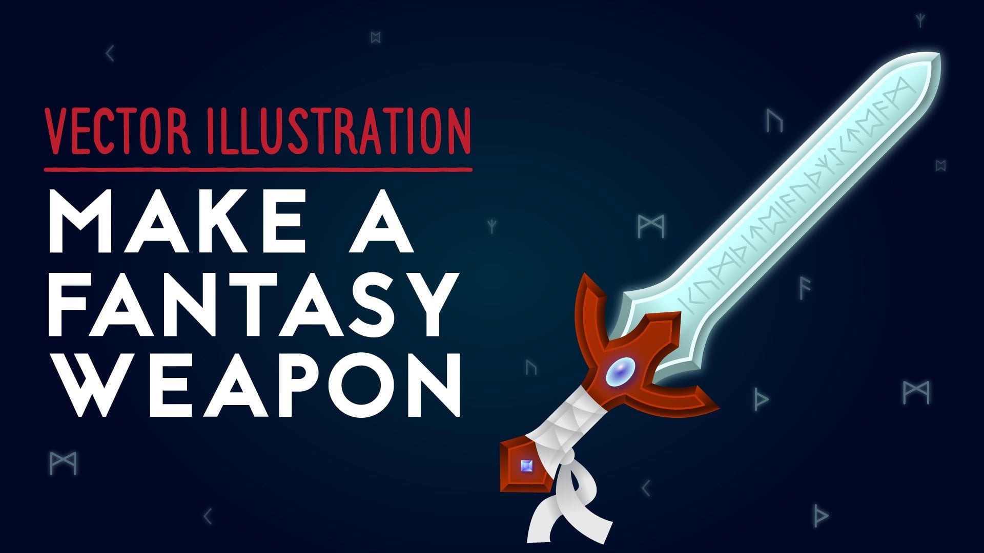
2. Big Changes With Little Effort: If you've taken my class, Make a Fantasy Weapon, then this first technique is going to be familiar to you, and that is Adjust Color Balance. You're going to find that all of the techniques in this class can be used at any point throughout a project, but there will be particular points when it's most useful. Adjust Color Balance is really helpful when you have a specific group of objects and you want to change the color of all of them at once. Let's say that this was an illustration that I sent off to a client, and maybe they got back to me and they said everything looked great, they really liked it. But it needed to be on a teal background instead of this orange one. As we can see, doing that, we completely lose the handle. This handle here is actually quite complex. There's a lot of different layers on top of one another, there are gradients with multiple different stops in it. So making changes to the whole handle actually would take a lot of time if I want to go one by one and change these colors. If I just click on this shape right here, for instance, and go to the Gradient window, you can see that I have four different swatches in this gradient. Like I said, it's quite complex. What I'm going to do is I'm going to select everything that I want to change the color of, because I've separated by illustration into these different layers. Everything that's on the handle layer is really what I want to affect right now.So I'm just going to select all of those, and I'm going to go up to Edit, Edit Colors, Adjust Color Balance. From Adjust Color Balance, we can change all the colors that we've selected, and that is not just going to apply to solid colors, but also any gradients or effects or other things that we're working with. What we need to do is turn the Preview on. If you're just trying to target strokes or fills, you might want to adjust these checkboxes. I'm just going to leave them for now. Depending on if you're working in CMYK RGB, these sliders will look different, because RGB, we have the red, green, and blue sliders. Depending on which color space you're in, they still work exactly the same way, and that is, if you move the slider to the left, you'll get a negative percentage here, and that means that you are removing that much of that color from your selection. So by sliding the red slider to the left, I am taking the red out of what I've selected. By the same note if I slide it to the right, I am adding more red, and you can see that as I started to increase this, we get more and more red in this color selection. This is where some understanding of how colors are made up can be quite helpful, but it isn't necessary. For instance, I know that I want this handle to be more of an orange color. To get that, I need to remove some blue from the selection, and add in some red and green, and that's going to start to give me an orange color, like this. Now if you don't know exactly how red, green, and blue make up different colors, that's fine because you can just mess around with these sliders until you really get something that you want or get what you're looking for. As it's often the case with me, sometimes I really don't know what colors I'm looking for, so I'll just play around with them until I start to get something that looks nice. One thing that you're going to notice is that at a certain point, these sliders will stop making effects when you slide in a particular direction. So if I just to reset this, and if I start taking away red, you're going to see at a certain point, you have already hit it, it's not making any difference. I can keep taking away red and it looks no different at all. What this means is that really, you've taken out all of the red that you can. It's also worth noting that if you want the new color that you're making to be lighter than the original, you're going to want the total of these percentages to be in positive. For instance, maybe this was around 11, this was 17, but maybe this was like negative five or six or something. In total, I've added more color than I've taken away, and because of the way that RGB works, that is going to give me a lighter color. The reverse of that is if I want to make my color darker overall, I want to be taking away more color than I am adding it. So I can bring the blue down a lot, the green down as well, add a little bit of red, but still we're getting a darker color than we started with. But just turn off Preview for a second and you can see that this new colors, it's darker. At the end of the day, the more that you play with this tool, the more that you're going to understand it, and get a sense of what happens when you move each slider in each way. You can also click on Color Mode and switch it to Grayscale, and then by clicking Convert, its just as you would expect, you now have no colors to work with, you're just and working with shades of gray. By tweaking the slider, you can remove black and therefore make it lighter. This convert checkbox comes in when you're switching color modes. If you started off in Grayscale and then you were moving to RGB, you would need to click this Convert box for the effects that take place. I'm going to go back to the color that I'm looking for, which is more of an orange, something that things can stand out quite well against this background. Actually, I think overall I wanted to get a bit lighter. As I said, I'm making sure that I'm adding more color than I'm taking away, so something like that. Once you've got the colors looking how you want, and click Okay. Then as you'll see, it is made those changes to everything that you've selected. I can even go back into this initial shape that we clicked on to look at the gradient, and you'll see that every stop in this gradient has been changed to reflect what we did in Adjust Color Balance. This is a really great tool for selecting a group of objects that have a single color and then converting them into a new individual color. But what happens if you have lots of colors that you're working with at once, and you want to make changes that are going to influence all of them? That's what we're going to be looking at next.
3. Harmonize Your Palette: Now this next technique doesn't always make the biggest change, although it can. But I find that it's most useful when you're finishing off a piece and you want to add a final touch to it. The piece I'm going to be working with for this example is already at a really great place in terms of color, I'm using some of the techniques that we're going to cover in the next section. I have made a palette that I think is at a strong place, but I really feel that I can use a final touch, a final bringing together. This is where I use color overlays as I think that they can make a really big difference at this point. I'm going to create a new layer on top of all of my other ones, I'm just going to name this overlay, and I'm going to create just a rectangle that sits on top of everything. My canvas is 800 by 600. I'm seeing through that stroke, and then I'm just going to put this. Yes, so that it rest on top of everything. A nice way to do this is to use the Align options up here. If you have it as aligned to art board, that you can click this horizontal line and the vertical line. Now I know that this right in the center. What we're going to do with this shape here is we're just going to give it just a flat color. Let's go green. There are a few ways to change the blending mode of an object, one is to come up to "Opacity" up here and just click on it, and then you'll get them all right here. But we're going to use the Appearance window. I already have it open, but if you just go to "Window", "Appearance", you can get it from there. I find this as just an easier way to keep track of all of the effects that I've applied to objects. Once again, here we have the Opacity, and I'm just going to click on here, and I'm going to start off by using the overlay blending mode. Immediately we can see that the green layer that we've made is now influencing everything that's sitting below it, now looks quite drastic right now and we're going to be changing it, especially since I said that the colors in this piece I already feel they are pretty strong point, so I don't want to play with them too much, but this can give you a sense of how big of a change something like this is possible of making. A few of the ways that we can change this, obviously we can try selecting different colors for the fill color, and we'll see that this influences in different ways. If we decide that it's too strong, we can lower the opacity. Just do that here, we just want the effect do a little bit. As you can see, there are a lot of different blending modes to choose from, and over time and through experimentation, you'll start to get a sense of what they do and which ones work best for you. Personally, I find that Overlay and Soft light are the ones that I use about like 90 percent of the time, but as I said, my recommendation is that you try them all out. In fact, I'm going to be supplying a resource here in the class that you can download, and it'll just be an overview of how the different blending modes interact. For this piece in particular, I'm going to be using Soft Light, and for Opacity I'm going to be setting it to 25, it's not a major change. As for the Color, I'm actually going to use Swatch here. This is the color that I've chosen for the sand, so this is an orange color. The reason I'm doing this is that I think that it helps to reinforce the fact that you're in the desert. Taking this sand color and applying it to everything else through this color overlay, gives you a sense that there is sand kicking up in the air and there's light reflecting off the sand and being cast everything else. It really makes it more realistic. What's great about this technique is that it doesn't only have to be done to the entire piece like I've done, if you want to target a specific area to use one of these overlays, that's all that you have to do. For example, I actually want to bring some more color into the sky, and to do that, I'm going to create another new layer, but I'm just going to create it so that it's on top of only my sun's sky layers. That's what you see in the background here. Again, I'm going to take the Rectangle Tool, and I'm going create a rectangle that is the shape of the canvas, and I am going to align it using these tools up here. For this overlay, I actually want to work some pink into the sky, and in fact, I've already created a swatch right here of the color that I want to use, and as for the blending mode, I'm going to be using Color. This is right down here. The reason I'm using Color is because I'm actually quite happy with the brightness and saturation of the sky, it's only the hue that I want to change. Now if you want to better understand hue, saturation, brightness, you could actually open up the Color window, you go "Window", "Color", and using this drop down here, you can switch how you change the colors to HSB, that stands for hue, saturation, brightness. Just by manipulating these sliders here, you can get a sense of what those three different aspects of the color do. Brightness is like it sounds it's making it darker or lighter, saturation is how much of a color is actually getting worked into it. Really, it's like low saturations may quite washed out, high saturation can be quite vibrant, and then hue is the actual color itself like do you want a blue, do you want to purple? What we're doing by using the Color blending mode is we're just focusing on the hue section here, and what's happening is our shape that's sitting on top of the sun and sky, it's taking the hue of that the pink, and then applying it to what the saturation and brightness of what below it already is. I'm just going to go back to my Swatches and choose that pink again. I really like how this color works in the sky, but I don't want it to fill the entire sky. So instead of making it a solid fill like it is right now. I'm actually going to turn it into a gradient. I'm going to open up the Gradient window. Once again, you go to "Window", "Gradient", and actually what I'm going to do is I'm just going to grab this pink swatch and drag it onto the gradient, and it's immediately going to turn that solid fill into a gradient. You can see an example right here of what the fill currently looks like. The fill that I want to make, is pretty much I want this effect to take place at the bottom here, be pink at the bottom, and as it goes upwards it turns more into the orangey yellow, original sky color. To do that I'm going to make my gradient have two stops and they're both going to be the same pink. You can just drag these write-off to get rid of them, and then drag at this Swatches on. I want two of these pinks and nothing else. I want one at each end of the gradient, and I want one to be a 100 percent opacity, and I want the other one to be zero percent opacity. Pretty much that means it's going from completely solid to completely invisible. From here, I can use the Gradient tool, which is right here, and I can draw out how I want my gradient to go. Like I said, I want it to be strongest at the bottom and weakest at the top, so I'm going to hold "Shift", and just drag upwards like this. Just like that, I've made some very subtle but very beneficial changes to the overall color of this piece. To really get a sense of the changes we make, I'm actually just going to show you a comparison between it and how it started. Just by looking at these two, you can see there's a bit more harmony with the changes that we've made, and really that's because we've taken colors and applied it to everything. We took that orange and we added a bit of that orange to every single color in the piece, and because of that, all the colors just naturally work together. The final thing we're going to be doing is looking at what I believe to be the number 1 way to level up your color scheme, and you can use this at any point in your process. We're just going to have to go a bit outside Illustrator to do so.
4. Adjustment Layers, Your New Best Friend (Part 1): The final technique we're going to be covering is going to take us into Adobe Photoshop. If you don't have Photoshop, that's completely okay because there are a lot of free alternatives out there, and the one that I would recommend is Gimp. G-I-M-P, as it's available both on Mac and Windows and I know that it offers what we're going to be covering. I'm going to leave a link to it in the notes as well as the resources section on this class. When it comes to Adobe Illustrator, working with color can become quite limiting, and that's why we're going to be using Photoshop. It's because it's a program that's specifically designed for editing images. Personally, I use this technique probably more than the other two, and I use it mostly at the beginning of the piece and at the end of a piece. At the beginning, I use it to set my initial color scheme and at the end, I use it for any final touches and adding a bit of cohesiveness to the whole piece. Again, just like all these other techniques, you will find that there are better scenarios for you to use it. I'm going to be making adjustments to this hobbit holes pattern that I've made and at this point in the piece, the design is finished, and I have the colors that I more or less will want to use. But right now they're not really working as well together as I would like them to. Similar with the piece that we just did, I feel like there's a touch of harmony that could be added. What I find to be the quickest way of just exporting images from Illustrator, is to use the export for web or save for web feature, and you can find that under file, export, save for web, and really easily here you can just select what you want to save it out as, I'll choose a JPEG. I'm just going to leave it at that. I'm not going to change any settings right now. Let's just call it hobbits holes. Now, we're going to open up the image that we saved out in Photoshop, and from here, we're going to be using adjustment layers. All adjustment layers can be found right here in the Layers Window. As you can see, as you scroll through, there are a lot of different options and we're not going to be covering all of them. In fact, we're just going to be sticking with three today. The first one we're going to cover is curves. Curves can be a tricky thing to understand and it wasn't after I used it for a long time that I finally started to get it myself. But if you don't fully grasp it, that's totally fine because I'm going to give you some general guidelines for working with it, and at the end of the day, just like we've done in the other techniques, you can just continue to play with it until you get something that you like and you think works well. I'm also going to be adding a link in the notes and resources section of this class, if you want to do some further reading on curves and how it works. What you see right here is called a histogram and what it's showing you from left to right is the darkest points of the image, to the lightest points of the image, so what these different spikes are indicating, are really how much of that tone or that shade is present in the image. For example, if we look at the far right here, this is going to be representing the true white, like the whitest white could possibly get, we see a big spike. That is going to be represented by these smokestacks here in the piece. What starts to get a little tricky to understand is that, this isn't just representing shades of gray, so no black through white, but this is also representing colors. Thinking back to when we were working with the hue, saturation, and brightness of colors, you can even go and consider this as a scale of brightness for all colors. For example, the spikes around here that are to the far left, these are going to represent some of the darker colors. It's going to be some of these wood colors here, as well as these slabs of stone right in front of these homes. This being said, rather than working with this part of curves which looks at all of the colors, we're actually going to individually target one at a time, the three different color channels we're working with. Because we're working in RGB, this means we're going to be working with red, green, and blue. I'm just going to start with the red first. This histogram here is only dealing with red and so it's showing you the spikes where the red is most present. Because we have a lot of dark browns in this piece, that is why there is such a big spike here, because there is a lot of red in these browns. What I'm going to do is I'm going to plot three points, relatively equal distance apart here, I'll be putting one here, one here, and one there. They're not exact. It's not a big deal. In fact, you don't even have to structure it this way. This is just a nice way to target the darks, the mid tones, and the highlights of a piece individually. May be I think of all the medium range colors in the piece. I want them to have more red in them. I can take this middle point and drag it upwards. If you look, you're going to see that there's going to be red being added to a lot more of these colors. You can notice it, like the greens are changing a bit and the browns are getting more and more red. This is because I'm adding more red to that range of colors. I do want red to be a strong color in this piece. I primarily want it to be green and red so, I am just going to leave it, maybe not that high, but I am going to increase the mid tones a bit for the red, just like that. Then I'm going to go to the green channel. Again, for the green, I'm just going to plot it up the same way. As I said, I really want green to be really present in the brighter colors. I'm actually going to take this point here and increase it. You can even see the change happening as I'm doing it in the piece, and you can see a lot of the brighter colors are getting more of a green feel to it. I'm actually going to decrease the green in the shadows, just because I want the darker colors to be more of the red and the brighter colors to be more of the green. This is just the decision that I've made. By reducing the green in the shadows, I'm letting more of the red shine through. Finally, I'm going to go to blue and I don't want blue to have a very strong presence in this piece at all. I'm going to plot these points again, and we can see that just by looking at the histogram that the majority of the blue happens in the mid tone range, right in the middle here. That's the point I'm really going to focus on here. I'm just actually going to bring this down because that's going to make the biggest impact here. I could reduce all of it if I really wanted to, but I'm just going to do this. It's important to note that while I'm only changing the blue channel and right now, I'm not just affecting the blues in my piece. Every color that has blue in it is going to be affected. For example, even though these hills here, they look like they're green, there is actually a considerable amount of blue to them. In fact, if I go to Window info and highlight this, you can see in this little info panel here, it'll give you the red, green, and blue values of that color that you currently have your mouse over. We can see that there's actually quite a bit of blue. For more information on this and how it works, I've also added a resource for the RGB color system so you can fully understand how it creates colors just from the three channels. You might find that when you're working with these curves, things can get a little crazy if you push the curve too far. For example, something like this, it does look cool, but it's also getting a little nuts, definitely not what I'm going for. As a general rule, when I'm working with curves, I try not to get the curve as it's going from left to right, to slope downwards. I just find that when that happens, generally it gives you a less than natural looking, yeah less than natural thing. Of course, if that's what you're going for it, then that can be actually a great way to achieve it, but that's where I stand with it. Next up, we're going to actually look at levels. I'm going to go back to adjustment layers, and I'm going to click on "Levels".
5. Adjustment Layers, Your New Best Friend (Part 2): Again, Levels is a tool that's quite easy to use, but it can be difficult to master. For our purposes, we're just going to be using the bottom slider here. Just as we did with curves, we're going to be doing it one channel at a time. So again, red, green, and blue. So this slider here represents the output levels of each channel. So without getting too technical, this means that the more right that we slide the black slider here, it means the more red that we're going to be adding to all of the colors really. By the same token, the more left that we slide the white slider, the more red that we're actually taking away from all of the colors. So a good way to approach using Levels is to use the black slider when you want more of that color and to use the white slider when you want less. So personally for this, I want more red. So I'm going to move the black slider a bit, just a bit. I want more green. I'm going to do the same, maybe a bit more than the red one and I want less blue. So I'm going to use the white slider now and dial that back to there. The final adjustment layer we're going to use is brightness and contrast and in part we're using this because of what working in Levels has just done to our piece. In levels, we were introducing color into the whites and into the blacks of our piece and naturally that just reduces the contrast of it. So that's why it's important for us now to use brightness and contrast to increase the contrast. Of course, at the end of the day, it all depends on what effect you're going for or what look you want. If you want more of a washed out look, then you can just leave it right here. However, I do want my colors to pop quite a bit. So I am going to increase the contrast using this adjustment layer. This is the simplest of the three. All you need to do is drag the contrast until you get into a place where you really like it, somewhere like there. Cool. So sometimes you might want to go back and maybe tweak a couple of things. For example, let me go back to Levels and just maybe bringing the blue back a bit more, maybe not so much red. If you actually want these adjustment layers to not take as strong of an effect, you can actually just lower the opacity. So maybe I don't want the Levels to have done this much. I can actually just bring the opacity down a bit and the effect won't be as strong, something like that. So once you have it in a place where it's looking nice, we can do my favorite part which is comparing. All you got to do is turn on and off these layers and see the difference that you've made. So it's really interesting now to see how even though I started with something that I thought was quite good, after I made these changes, there's such a big difference made and in my opinion, it looks a lot, a lot better. So just from the brief time that we spent in Photoshop, it's really easy to see how much power you can really have there with working with colors. It may seem a little daunting at first, but if you take some time to experiment with these different adjustment layers, you'll get the hang of it quite quickly. If you really want to make the most out of what Photoshop has to offer, there's tons of different adjustment layers and effects outside that that can really help your artwork. That being said, if you never touch anything besides the three that we went over today, you're still going to make really great results. So now that we have a whole new arsenal in dealing with color, next up, we're going to put that to the test.
6. Level Up Your Old Work: Just by sitting here and watching how these different techniques are done, you now have all of the information you need to level up the color in your own work. This being said, right now, while it may seem really fresh in your mind very quickly, the things that we learned can start to leak. The very best way to make this concrete for you is to apply it as soon as you can, that's why we have the class project. We're going to be taking a previous piece of work and we're going to be applying one or more of the techniques to it that we learned in the class. All you'll need to do is post the original piece and then how the piece now looks that you've made the changes to it and then just a brief description of which technique or techniques you used to do it. If you don't have a piece to work with, that is completely fine. I'm going to be supplying a couple in the resources section. Feel free to download one of those and make the changes to that instead. I hope that by taking this class, you now have a new set of tools that can help you with the daunting world of color and I know that some of the techniques may seem a bit confusing at first, particularly the ones that we did with Photoshop. But the important thing to remember is that above all else, the best thing to do is just to experiment. Play around the sliders, try some different options. Eventually you're going to get something that you like and over time you're going to develop an understanding of how the feature actually works. If you have any questions about what we went over today, you can post them in the community discussion and I'll get back to you as soon as I can. I'm going to be monitoring it quite closely. That way if you're stuck anywhere, we can get you through it and onto the next section. If you enjoyed the class, all I ask is that you leave a positive review and if you're interested for more of my classes, all you need to do is click on my name here on Skillshare. Finally, I just want to thank you for taking the class. I have a lot of fun making these, but at the end of the day they aren't for me, they're for you guys and it really means a lot that you guys take the time to take them, to participate in the discussion and it's really exciting to see what you guys come up with. Thanks again. I hope you learn lots and I can't wait to see what you come up with.
 Hayden Aube, Illustrator & Designer