Transcripts
1. Intro to Watercolour Grunge Floral in Adobe Fresco: Hey guys, Welcome. My name is dollar NASTRAN and I'm coming to you from sunny, Manitoba, Canada. As you can see, I'm in my new little studio space. Not a 100 percent setup, but it's working so far. I am using two different cameras here and screen capture. So I'm really hoping that's going to work out and the app that I can edit it to make sense. So I've been working on this new project to do floral, kind of a watercolor floral in Fresco. I'm at the point now where I'm doing some corrections. And we thought that would be a great opportunity to show you a bunch of the functions that I did not necessarily cover in the last class. So we're going to be taking a look at Selections and Masking. So we're going to be taking a look at all of the different watercolor brushes. I'm going to use each of those throughout the class so that you can kinda see what each of them will do. We're just going to be doing some tidying up what I've got so far. So it's a work in progress and you're going to see me go through the process of completing the project so that you can kind of get an idea, kinda steps that might be necessary when you're doing a project like this. We're using Fresco because of the beautiful live watercolor effects that you can get in this. And I'm mainly using watercolor, but I'll be using some other tools like inking and possibly some acrylic paint. I'm not quite sure how this is going to unfold, so I hope you're with me. If you haven't done so, please hit that follow button up there. I love to see you join my classes. I'm hoping to release a whole slew of fresco courses. Now that I've got this app, it's an absolutely amazing app. If you're a Creative Cloud subscriber, you can get this program for free. You can buy it as an app on your phone just separately. You don't have to have Creative Cloud. You can have it for your iPad or your phone. It's a program I strongly recommend that you buy because you're gonna just have so much by using it. It's just so great. I've never seen anything like it honestly with these watercolors. So we're going to cover a whole bunch of stuff like that. And yeah, let's get started.
2. Using Selections to Make Some Adjustments: Hi guys, welcome to Lesson 1. So in this lesson I'm going to show you how to repair flowers like this. Now what's happened is that the water down watercolor paint is a little bit too light, so I want to darken those up. And this is actually, this one here is a duplicate of this one here. So I'm going to show you both of them and we're going to do something different on each of them. So for this one here, I have actually already painted and you edge to it as you can see. So I did this on a separate layer. I did that with the watercolor as well. So for this one, what I'm gonna do is I'm going to move it to be just above that flower. We know that that's the rate flower. If I hide it, well, it's not the right flower. I'm going to move it right above the flower that I want to merge it with. You'll know that that's the right flour because if you hide it, it's gone. Okay, so I'm going to show it to you again. And then we're going to click on this layer, click on this little icon to the side here. This little icon is for all the settings. We're going to go right down to the bottom here to merge down. So now that flower. So now I've got them in the right order. I'm going to hit those settings and go down here to merge down. And now this layer has the entire flower on it. Now you can see that there's this really stupidly dark line here that I can't use. I mean, I really have to work on that. And I'm going to do that actually just using the brush. I'm not going to use the blending tool. The blending tool here is great for doing a lot of this stuff. So that's another option and I will cover that at some point. But for now I just want to show you the watercolor brush to use for blending. So what I'm gonna do is I'm going to put it on this watercolor wash flat. You could probably use any of them for this. What I want to do though, is go in and make sure that I have the transparency completely down. You can actually even just hit that dot there. So if I was here and I hit that dot, you can see that it moves it all the way down to the bottom of the ramp there. That's what I need in order to do the blending because I don't want any pigment. All I want is for the water to be flowing. Okay, so then here I can check my waterflow is at a 100 percent and I think I'm going to make a smaller brush. Not quite sure. Okay. That looks perfect. Now you can see as soon as I touched it and added water to the edge there, it started to mix with the background. Now, isn't that absolutely amazing? I can't even believe it when I, when I use this program, I am it feels like play. It honestly feels like play. I'm not working at all. It's just, it's just so much fun. So I was as we go through and just make sure that that was all done, I could at this point even add more pigment. So here I would possibly change this back to a 100 percent and go into kind of a brown just by using the color picker, I can just slide that around to whatever I like. A tiny bit yellower and maybe I'm going to switch here to my detail brush. It's not set very high in size or maybe change a little bit here. And you can see that if I drop the paint on the edges there, it's going to mix and spread in a very natural manner. Okay. Now, did you notice that when I did that, I had water coming out and pigment beyond the edges of my flower. So if I wanted to make sure that I don't go any further there and I would do is make a selection. So I've been using these a lot of your practicing a lot with the selections and that's why I'm going to cover that quite a bit in this class because It's a really useful way I have found for doing repairs or to do all kinds of different things that the selections are really the best alternative. You could set a mask for this whole layer. But I'm finding that these lectures are just a little bit more intuitive. So here I would just select, and I'm up so large here that it's very easy to trace accurately. Now, as I have part of selection done, I can actually go in, finish it by hitting that dot. And you can see that I didn't get this election all the way to the edges here. Can add to the selection, as long as I'm on this little icon here, this icon is for adding. This icon is for subtracting. I'm on the add function. So here I could just trace and you can see that it's adding to the original selection so you can lift away. Let's just do it just for fun. If you did this in four, we saw, you know, that the selection would be dropped. But in Fresco here it's not. So it's kinda neat because you can go back and just continue with your selection even if you've been interrupted for some reason. So now I've got that edge there. I can take that brush and I can paint and it'll be just within the bounds of that selection. So that's a really nice way to just add a little bit of darkness on the edges. You know that when you have wet watercolor and you drop additional pigment in there, often it'll pool at the edges there. And that's basically the effect that I'm trying to get here. Okay. Wow, That's another thing I just love. So I pretty much repaired that flower and now we can go on to repair this one here. So let's do the exact same thing. So I'm going to switch to that other layer. So that's this one here. We're gonna enlarge quite a ways here. I think I'm going to have to cover a little bit more. Now when I copy this flower here, you can see that it's absolutely identical kind of imposition and stuff. Well, not exactly, but pretty close to identical. I want to flip this around just a little bit. So first of all, I'm going to de-select. So that selection over there is not active anymore than now that I'm on this layer with long as I press the Move tool, I get the transform controls and then I can actually do some rotating here. So I'm going to rotate it a little bit, kinda like that. So it looks different now you could actually flip it as well if you wanted to, you could pull your transformation bounds to flip it. I think I liked it the other way better. See, I've got a couple of floating extra items here that I must have put on the wrong layer when I was working. But anyways, I'll leave it like this and then I'm going to do that selection. So as soon as you've got it positioned, you have to come up to the right-hand corner here and hit Done. Now, I can enlarge and grab my selection tool and just kinda quickly make the selection know what I'm gonna do to is I'm going to slightly change the shape of this flower because I know I can blend so well. And I want to change it so it doesn't look exactly like that other one. So now that has changed the shape. I don't know if you can see it's not a lot, but I've got some changes here and here. So I'm going to go back to my watercolor brushes here, the live brushes or the second one down from the top. And I'm going to grab, I think I'll sample this color in here, so I'm just holding down my finger. You can see that the color gets listed over here and the new color is now in my color picker. Now the beauty of being able to get the hue and saturation and brightness hex code here is that if you ever needed to match this in another program, you've got that. Okay. I would possibly write it down if I needed it. So I've got my color and it looks like it's going to paint on beautifully here. I'm going to go with a flat wash and go a little bit bigger and work my way around the edge with that. Now I'm just doing a little bit at the edge that's darker. And then I'm going to switch to having maybe a little bit of this color, a little bit bigger. And you can see that those original lines I laid down just kinda blend right in, which is super nice. And you can see that repair has been done very, very easily. I'm going to go back and erase that stuff out of there in a minute. But let's go in and a little bit more here to make that edge darker. So here I could go to a really dark spot and sample the color. And then I could go as if I'm painting on the outside of the selection. Let's go even a little bit more intense here and a little bit smaller. So I'm just adding a little bit of darkness in here because I'm not quite sure how I'm going to end up using this. So I just want to make sure that the edges all show up really nicely. I see this area in here. We just hide this, this area in here. I kind of missed a little bit. So I'm just going to go in and add a little bit there will some of this rusty color here too. So I'm going to intensify that a bit. Maybe go a bit bigger, go a little bit less opaque here, and then just drop a little bit of that in there too. So credit fixed up that one area. I think I kids go a little bit darker here as it kinda blends into that area. And while I'm at it, I might as well add a little bit of wet spatter. Now, the wet spatter, because this is all wet right now, is going to just kinda disperse into it. But I like that effect because it kind of makes it look like me to go to a 100 percent. It kind of gives the petals some texture. It's cool, a little bit darker. You notice that if I did it with my stylists, it's very light. But if I did it with my finger, it came up quite a bit darker. So I'm going to undo that and just get a smaller brush and then drop a little bit more in there again. It's a bit bigger. So yeah. You can finger paint if you want. I think I'm happy with that. Now what I wanna do here is invert the selection, okay, So Esau, I hit the three dots here, the ellipsis. And that got me to this additional little menu here. And what I'm gonna do here is invert the selection. So now it means that everything on the outside is selected and the flower itself is protected. Okay? What I wanna do now is just erase some of this stuff that's going on on the outside. Then we'll switch to the eraser. Let's see if this one's adequate. Yep, This one looks great. Right now I've got the rubber eraser. I've got the intensities that are a 100 percent not that it matters because it's an eraser, but you can see that it's erasing that stuff off perfectly. And my flower is a 100 percent protected. Okay. So I've showed you how to do two flowers, how to kind of correct them and make them work. So that's it for this lesson. And in the next lesson I'm going to show you some of these stuff. All right. I'll see you there.
3. Brush Settings and Stroke Controls: Hi guys, welcome to lesson to you. So in this lesson we're going to continue with that repair work that I'm doing or the alterations. But what I wanted to do is show you, first of all how the water affects these brushes. I want to show you painting on a dry surface and painting on a wet surface. So in order to do that, I've made a new layer here and I'm going to lay down water on the bottom half here. And so I've reduced or removed any color from there. So I've hit this transparency button here, so it's at 0%. I've got a full sized brush, the biggest I can do, and it's a wash brush. I've got the flow set at a 100. So that's the amount that's going to be laid down. And you can see that my waterflow is at a 100. So I'm just going to paint that into the bottom here. You're not gonna see anything because it's pure water at this point. Okay. So I'm just filling in this bottom area so that we can take a look at the brushes on both a dry surface at the top and a wet surface at the bottom. So I'm going to use the round detail brush first. So you can see that there's five different watercolor brushes. And it doesn't seem like a lot because if you're used to using Kyle's brushes, for example, he's got a 100 or more watercolor brushes. But you can do pretty much everything that you need with these brushes here. So I'm going to go back into my colors here and put it back to a 100 percent. I'm going to reduce the size of my brush and I'm going to leave the flow here at a 100. So when I draw with that brush, It's just a nice, smooth, hard brush. There's no mixing going on. If I were to put another brushstroke close to that one, you will see the water bleed through between them. I could affect the amount of color and so on. That's on the brush and the flow. But really within the strokes, it always stays the same. Okay, so that's on dry. Now, I'm going to show you the same brush on the bottom where it's wet. So down here you can see that's going to make a big difference. My water, my whole area down here is wet. And when I paint with that detail brush, you see how much it's spreading. Okay, So that's pretty cool. You can also still go back in and change your flow. This is the size, this is the flow. If we were to have less pigment in it, you would get a much lighter version of the line. You can see here, I was kinda freaky MOOC with my water and that's why you've got that weird kind of thing going on. If I were to paint adjacent area because it's so wet you can see all the colors bleeding across eight. So that is the round detail brush. And now I'm going to show you the watercolor wash soft. So this is just as it's described. It's a very soft brush. Again, here I've got a 100 percent color. I'm going to show it to you. That was with a 100 percent flow and I'm going to go a little bit smaller here. And I'm going to show you with a little bit less low pay. And then I'll even show it to you with less water. But that doesn't seem to affect it so much because after all it is a wash brush. Now let's paint that same one in the bottom here. You can see that there's a lot more movement of the water. Here. You can see the movement within the stroke, but it stops at the edge where I've drawn. Here. It spreads beyond the edge of the brush. Okay? Now almost exact same thing is going to happen with the wash flat. And then remember you can experiment with less pigment to make your brush lighter. Now, with the watercolor wash, flat will go to full flow, full waterflow, full color. And you can see that that doesn't move beyond the edges that I've painted. If I reduce the flow, I can create it a thinner wash. So that would be as if I have, I've got more water on my brush than pigment. And this is definitely a technique that you do use when you're doing watercolor. And then I'm going to show you that one down here. So that's the pigment reduced on that one. Let's bring it back up to full. And you can see that because it's a wet it's spreading beyond the edges of what I painted. If they were to join, they're going to bleed into each other. Okay. And the next one I want to show you is this watercolor wet spatter. So let's make sure it's out of a 100 and a 100 and a 100 there. And you can see that when I paint that spatter, it doesn't move past what I've painted gate. If I reduce the Hello of color, you can see that I can make much lighter spatter. Now if I were to overlap these, then you would get some mixing but only within those drops. Okay, Now if I were to paint this down here, is where you see the big difference, you get a huge amount of diffusion. Okay? So put that back to full flow and you can see that you get it a lot darker. Now what I love with this brush is how you can get little blooms that are kinda happening within the color. So that's a great way to make it as if you've added water or you've laid down some ink afterwards. So the cool thing about that is that when you ad, you can really get the effect of having dropped some extra pigment in a wet spot. Or you can get it to look like alcohol has been dropped onto the wet surface. So I use this quite a lot honestly. And of course if you want to, you can dry your layer. So if I was to go in here and drive the layer, then when I put my spatter on top, you see it doesn't blend into that because it's not wet anymore. Okay. I'm going to undo that. But one last one to show you, and that's the basic watercolor. Now in the last version of fresco, there were five brushes are just scores. So that's been added at some point. But yet that's what that's like. So just basic watercolor. This is a really nice one for drawing. A specific shape. Reduce the flow. You can get it lighter. And on a wet surface, you see it behaves a lot like those washes. So again, this is kinda needs for use, dropping into wet areas to create some of those blooms, especially if you were to use a darker color. And I've even done the opposite where I go in and I grab a white, bring the flow out. And you can see here that you can really create some really neat blooms or the look of alcohol having been dropped onto the surface of the paint. Okay. So I just want to point out these few, these different ways that the brush, brushes react to the water or wet or dry surface. Because we're going to be using a lot of that to touch up the rest of my artwork. So let's get back to that one next. I can just delete this whole layer now, and let's just turn these back on. I think the next thing that I want to do is start adding a little bit more detail on the flowers. So I think I'll cut this lesson short actually at this point, It's gone on long enough, and I am ready to start doing some of that stuff and then we'll do that in the next lesson. Okay.
4. Varied Use of the Selection Tool: Hi guys, welcome to lesson 3. So in this lesson I'm going to continue doing some of the repairs on some of those flowers. First of all, I want to create a nicer shape for this one. And then, yeah, we'll see what happens after that. Let's get started. So this flower here, I kind of didn't ugly. I kinda did a terrible job on it. So I think that I can repair this with rather than repaint it. And I could do that pretty quickly with the selection tool. So the selection tool, you do have several options here. I'm going to use this freehand selection. And I'm just going to kind of make sure I'm on the right layer. And I'm just going to trace around and do a better job of this. Once you get to the end and you hit that big dot, then your selection is complete. But I've noticed a couple of things here. I already want to change. So I think I want to add a little bit to the selection. So I've hit this indicator that tells me that I'm adding. And I'm going to actually add a little bit over here. And you see, I've stopped. It doesn't close completely. So it's not done. Once a hit that dot, then it completes the shape. And I think, yeah, I think that's, that's gonna be okay. So once I have an area selected, I can paint within the bounds of this without painting on the outside. So it's kinda like a way of creating a mask. So I'm going to sample this color first. I'm gonna get a brush, and I'm going to start painting. Now I can see that here in this selection that I accidentally have a little bit selected that I don't want. So I'll just undo that and go back to the selection tool. This time I'm going to hit the subtract and I'm going to select in that spot there. I guess it's not surprising. I need to add that. Sorry. I'm going to add and actually let's just subtract just so that you can see how it's working. I'm going to subtract a little bit more over here. So I'm just going to subtract in that area. And you'll see once I hit that black dot that it completes the shapes and I can go back and work on my painting here. I've got the right color sampled and I'm just going to draw or paint within that area. Now the cool thing about it is that that water and paint that was down there before is still active, so it's still wet. There are few programs that do that honestly. So that was one of the real assets of this fresco program. The fact that you could do that. So since it's still selected, I can go in and do things like grab, let's say the detail brush, go into a darker tone, paint around the edges here to give myself some really neat dark edges. And don't worry because we are going to be getting rid of that stuff that's on the outside. But you can see how nicely it's actually blending into what I had there before. So while I'm at it, I might as well add some spatter here. I'm going to I mean, it's wet on wet. So it's diffusing quite a bit. So you see that it hits the water and pigment from below and just mixes in a kind of like that. I think it adds a bit of a texture that is missing otherwise. So I think I've got what I want here. And I now want to touch up this stuff and erase it on the outside. So then I would hit this More button here. I didn't have to select tool because that was already here visible. And what I wanted to do is invert the selection. So now what that does is everything in the background is selected and the flower is now mask. So I can take an eraser and I can go in and erase that watercolor. Now that is something you can't do when you're really working on watercolor is it's really, really difficult to lift any color that has gone into an area that you don't want it in. So it's one of the benefits of digital is that you can do this. So I've got that pretty well erased and I'm pretty happy with that. I think I'm going to go back and invert that selection again. And then just take a little bit more of the dark color and put it in around this edge as well. Now at the moment, my waterflow is only set at 56 if I were to increase that, you can see that the color is a lot more intense or it can be darker. So I'm going to add a little bit of dark in here. And you can see here that I had actually started drawing some of those stamens in there. I'm going to be doing that on a separate layer. But it's okay to have it on this layer because that kind of creates a shadow for the ones that we put there eventually. So just like real watercolor, wet on wet, you can see that the page for the pigment is diffused into the water. So that's one of the things that I wanted to do for this flower here. I'm thinking, I'm thinking that I want to kinda change its position. So I'm going to select that same tool. Okay, it's not selecting or doing anything at the moment because this is still selected. So I have to deselect and then I'm able to select the flower. And in this case I want to transform it. So I just hit Transform and I'm able to rotate or do anything that I want as far as changing that particular one. Now the other thing I don't think I mentioned in my other class, the first class that I did was that you can actually copy that selection if you'd like. So to do that, you still have to hit the layer Actions menu by clicking on that dot. So the layer actions are here. And I know this doesn't seem like a Lear action, but that's where I would go to coffee. And I mean, it's kinda weird to not have just the paste command by histological back into the layer options and then paste selection, and then your duplicate is there. So you can choose to do whatever it is that you want to do with it. I don't find that that's super intuitive. Having to go into the layer settings in order to do things like copying and pasting, but it is what it is and we'll make the most of it. All right, So I've done quite a few repairs here. So for this lesson, I think I'm done. I've showed you quite a few new methods to work with what you've got here. In the next lesson, I'm going to cover some adding some other fillers in the background. And yeah, we'll just keep working on this pattern. I'll see you in the next lesson.
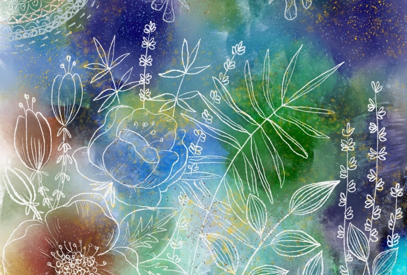
5. Moving Elements and Adding Details: Hey guys, welcome back. So I'm not going to be on camera for this lesson because it's actually the next day. And I didn't feel like do my hair and makeup. So it's yeah, messy hair don't care a day. So I wanted to show you some of the additional elements that I've done are added to kind of fill out my whole design. I did a little bit of work last night, just kinda preparing for this lesson. So I've got some of the things already drawn. Them was still show you step-by-step how I went about and did it. But you can see here that I've got the stamens drawn on a separate layer. And this one here is in the wrong position. So I'm, I'm going to select it, go over here to the layers, cut the selection, and then go back there and paste. So you can see here in the layers that I have now got that as a separate additional layer. The beauty of that is I could go and just copy it to use it on another flower. So now that that's placed when I need to do is hit Done here, and then I can go in and paste again. So I've got the alternate one here, and I think I'm going to rotate it a little bit just to make it look a little bit different than the original, that will actually make it a little bit smaller too, about it in position, and I hit done. And those two are now complete. Now remember this flower here. I had kind of drawn some of the stamens in kind of as shadows. So that was a really nice effect because I thought once I added these, that it really was nice to have that bit of a shadow in the background just to show you as far as drawing those stamens, all I did was add an extra layer. Let's hit Done here. Add a layer. I'm going to hide that one. I can go to that other layer, go into my watercolor brushes. I'm going to grab the round detail brush. I'm gonna set the color to a 100 percent size. We'll see if this one is a little small. And I've got the flow set at a 100, and I've got the waterflow set at 60. So the less waterflow you have is sort of the harder your line will be. That's not exactly what I want. So I am going to increase that waterflow and I think that is a little bit better. So I'm just kind of drawing some very thin lines. And then I simply went back and just added the dot on the top. Now you can really draw it as a dot, you know, going around and round. Sometimes. It's just as easy to increase the size of your brush. And then just dawning on like that. You can see that the water flows from, let me enlarge really big. You can see that the water flows from the other line, so it ties it in beautifully. You can add a little bit more texture down in here. And basically that's how I went through and did those daemons kinda like the ones I did last night better. So I'm just going to delete that layer, turn these other ones back on. And I even have the ones drawn for this. Now this one isn't in the right position because I had ended up moving, moving that around, it must be something else on this layer over here. Then when you're finished, now it's giving me that warning about cropping. And so there must be something down here that's getting cropped. It doesn't matter. So I'm just going to say continue. Okay, So the next thing I want to do is show you some details on the leaves. So within the leaves here, you can see that I have added some of that sort of lighter brown in there, but I want to add some really striking details, something that really stands out. So I'm going to go to my pixel brushes this time, and I'm going to go to the ink brushes. And I liked this really gritty brush pen. I've really liked the natural look of it and I'm going to go into the white. Now you can just dot dot there to get a pure white. But you'll love this brush tool because it's really got character. So I just went through and added some white lines in here because medical little bit smaller here. And you can see how responsive it is to light and heavy pressure. So that's really cool with this brush too. Now, I'm trying to replicate what I had here. But I have to admit that I've gone through and actually finish this illustration. So I'm showing you roughly what I did. I went through and added detail on that leaf and these leaves here. Now you can go in and control the smoothing on that too. If you find you're a little bit wobbly, you can increase the smoothing and then your lines definitely stay a lot more smooth. So it's not quite as natural align. I mean, it works perfectly for this, so I would definitely recommend using it. Now you can see by my layer order here that that's coming out on top. So you could just quickly Gravity Research and erase that out for staff that layer below. Right now I'm working directly on that layer. And you can see that it's above this one, so you can just grab it, slide it underneath, must be this flower, so light it underneath and then that is a little bit less. So you can see how nice that looks to go in and just add some additional detail. Now at this leaf at the top here, I end up moving somewhere else. So encoded that layer, cut the selection and then go and paste to the selection. Now this, I ended up moving down here. One of the things you can see what's happening or is happening is that the transparency on these other layers is not allowing for this to be blocked. So I'm going to show you how to put a solid bite behind those layers. I'm also going to, I'm also going to end up moving this flower down here. I was changing the layout because I wanted a square so that I could use it for each of the lessons. So that's why I was kinda, kinda squish it all into a different kind of layout. I'm not gonna do that today with this new layout so that I also have a nice landscape version of this. So I'll meet you in the next lesson and we'll do some finishing touches.
6. Blending Modes and Other Fine Tuning: Hey guys, welcome to lesson 5. So in this lesson, what I wanna do is open up that document that has all of the layers. Now I had taken it into Photoshop. So I'm going to now open that. And I took it into Photoshop so that I could do some additional manipulating. But I wanted to just do it as quickly as possible and add it to my title. So I took it in there momentarily. And so you can see here that all of the layers are intact. And this is all of the different things that I did to finish off my piece. So I had imported the image for the background in Fresco here. So I'm gonna be showing you that I've got this watercolor layer which I have in progress on the other documents. But I thought that this would be a good way for you to just sort of visualize what it is that I'm after what it is I'm trying to do. One of the other things I did here was add some other brush details. So this area of dripping paint is actually a brush that I imported into fresco here. It's an acute hearing brush and I really actually quite like it. I think it looks quite authentic. I've done before in a different way so I can actually show you that as well. And yeah, so that's the whole document. And PSD files can be imported quite easily here. Now we've got that one we can always refer back to and I'm going to go back to work in progress. Amongst the things that I showed you there that I did was to work on that watercolor in the background. I'm actually going to show this layer. So it looks a little bit more finished. And don't worry about things like this, the overlapping and that we can make adjustments to that. And I'm just going to show you this beginning of my watercolor layer that I'm doing for the background. Now, I just kind of roughly put the colors in, just speed up the process of demonstrating for you. I've just kinda blooded in some areas, I'm never going to get it exactly the way it was in that other one, but I'm going to show you how I did make alterations. Okay. The first thing I did was go to my watercolor brush and I think I grabbed this watercolor wash flat, went into my color picker here and I went right down to 0 as far as the color goes and went to his bigger brushes I could, for the watercolor, double-check that the flow with high and that the waterflow with also high. So now I'm able to just go in and make some changes to my watercolor. I'm painting clear water on here. So imagine that all of these bits of paint that I've put down are still wet. If you were doing this traditionally and what you're doing here then is just expanding that area of water, but it's diluting it because the original would have dried a little bit. And only what's really wet is going to travel into the new water that I put down. I like how it's quite authentically spreading. You can help it along with your brush. Now I obviously had that blob there before. I had the little flower in behind it. I'm going to probably move that flower so it doesn't really matter. I could actually have a hidden all of this stuff to work on the watercolor. But at this point I'm kind of really trying to integrate, get my layouts looking good. So I'm adding a lot of extra water in here. And now I can go in and do some color works. So I'm going to take a wet spatter and I'm going to actually add color back into this. So the brush, we'll be painting this kind of turquoise color at the moment, because it's on the wet layer, it's going to diffuse very quickly. So you see as I'm dropping it in there, it's diffusing and mixing with some of the other colors. So it's kind of helping to get those layers a little bit blended. And the beauty of digital is that you can undo if something isn't, how you like it. So if that was in my national media, of course, it would have been a disaster if I didn't want it there. I couldn't take it out digitally. I can. Now, did you notice that as I was painting in here, that was not blending in with my flower. So that might be something a consideration. I would probably put this layer down at the bottom. Actually, maybe we should just do that. And now you get a better idea of how it works with my artwork. But you can tell here too, that these don't have any sort of masking. So the background is going to be showing through that something will deal with later. Actually, for now though, I'm going to move it back up. I think I preferred working on it when it was at the top. So ever you want to reduce the amount of pigment on your brush, you know that you can go in here and just adjust the transparency. And of course you can go in here and adjust the flow. So now you see that that's a much lighter brush, quite a bit more transparent. And this is how you get that really nice soft blending that happens with watercolor. I think I mentioned before in my other class that the fissure that I had when I was in the trade school, high school that I was in was an expert watercolor artists. And it was amazing to see the control that he had with his brushes and the kinda stuff that he did. He did mainly landscapes and they were, I'll show you a sample of it. He's passed away a few years back, and of course, he was not Mr. digital in any way. So I'm going to also show you this where I go down into the white, bring that up to a 100 percent Flow and 81. And what do you see how that works? So that works to kinda put almost like the alcohol dropped on water technique. So that's kind of a nice way to add additional detail. And of course you can do that with any of the brushes. So if you wanted to get a bloom by adding the white into the color, you see how you get that kind of a nice bloom happening. It's actually really fascinating. And I'm going to sample this color here because I wanted go quite a bit warmer and drop a little bit in. They're going to reduce the flow of color and see how that enhances that area. I'm going to go really bright. And that would be like dropping some pigment right onto somewhat dry area of your watercolor to increase them. And then I'm going to go in with the spatter, which is texturize that a little bit. Just introducing a tiny bit of yellow, kind of a golden yellow. And that isn't the exact one that I did. But it will be sufficient. No, I had noticed that I had that I'm going to hide this layer because I notice there was a layer down here and I can't remember if that was the one they ended up using. What this might have just been an experiment that I did at 1 before I was sure of how I wanted the background to look. But I'm going to keep that because who knows, maybe it is something that could use. So let's show this again. And I guess I wouldn't turn this one off. And then the other thing in this lesson that I wanted to show you was bringing in the graphic that I'm going to be using for my sort of collage that you saw along the edge here. So I'm gonna go to place my document. It's in my files, I have it right here, so it's going to import it, It's loaded the image. And then what I did is just fit it. Now because this is an important image, you can see that I could drag it off. I could sort of keep it there temporarily if I wasn't sure what I was doing or I'm just going to leave it in there because it's the one I want to use. I'm going to hit Done. And I had actually place this higher up in the hierarchy here. So this is something that I would have had in my journal, my art journal. It's the peace batch. It was all done with natural media. So you've got acrylic paint to the background, see even my masking tape there and my gutter. And then I've got collage bit stuck all around here, some wording. And that would be a piece that is basically ready to be used for something else like scandium and used for some of my commercial work. In this case, what I'm gonna do though is show you how I ended up using it. So I went ahead to the blending modes here. So you access that with the properties little icon over here. So I just went through an experimental until I found something that I liked. Let me just get out of here for a sec. I'm going to move my document over. And so the one I use with linear light, and then I eliminated a bunch of the stuff that I didn't need. But I also had this lower down in the hierarchy. So of course this would have been down somewhere. Now what I did for my final collage is I actually erased a lot of this out. You can just grab your eraser, no color and have your flow really big. And you can just go in and just erase whatever you want to get rid of. So of course I'm not going to be able to exactly replicate. I did in the last one, but I just want to show you how that works if you bring in an image. So I'm going to turn that other one back on just to see if there's something I can do here. So of course, I digress into something completely different here, but this is the way this process works when you're doing some sort of like experimental and new procedure, then this is exactly how you do it. You experiment, you kinda go through a bunch of different stages and you know what, if it doesn't work, it doesn't work. So for now I'm going to turn that off. And I'm going to work with my elements that I have in here at the moment. So then let's go into this layer here where I've got like the stem and these little branches and things. I'm going to take this one out for now and paste it. Or just wished it was like a little button up here that I can just press cut paste to mean, why go into a sub-menu? I don't get that, but whatever. Okay. So for this one, you see you've got some paint strokes on there. Let's see, race those before we do anything else. I could have done cut and piece there as well. That's how I chose to do it. And then of course you can do things like duplicate the layer. You can play with the blending modes on this one as well. And I remember doing that in this corner here. So I'm going to hit Done. I'm going to duplicate that layer. Bring this one over here. I'm going to flip it, change the angle a little bit, and I would likely add other leaves or something to make it kind of different from that one. But you're going to see what happens here. It's not going to be in the same color, so it might just work fine. Let me go to this layer here and eliminate that little, little set of leaves. I didn't end up using those leaves anyhow. Now this is a good thing to do every once in a while. Save. So you can either go back into the gallery, which is what I just did kind of accidentally, or you can just go up here and save. Now also, you can rename it here. So let's name it. Layered watercolor for now, hit Save, and now that'll be listed in that way in the gallery and paste. So this is the set of leaves that I want to effect. So that's selected and we're going to go into the blending modes here and try a few. And this is what I ended up doing. If you look back at that other collage, you'll see that I had kind of a light blue version of these leaves in the background. I had just accomplish that with the blending mode. I didn't change the color at all. It was just the blending mode that made it work. And of course, I can't remember which one it was, divide. I think that's six and possibly reduce the opacity of it a bit. So that's a thing that you can do to really add interests to your background. I'm going to take a break off camera and have a snack and a drink, and then I'll come back with a somewhat more finished Leo here, I will inhibit a time off camera to do that before I come back. All right. So I'll see you in a bit.
7. Varied Options for Detailing and Finishing: Hi guys, welcome to lesson 6. So in Lesson 6 here we're probably going to wrap up this design. I think I've got all the elements added that I wanted to show you. And I'm going to show you a few options. Other things that you can do to this to make it more interesting. This is D3 for me, so I hope I can get it done today. You may hear a little bit of noise. We have our grandson here today. We've actually woken up to a blizzard, if you can believe it. I'm going to explain to you the things that I did to really fill out my design. And I thought a couple of ideas that I've got actually hidden here. And yeah, we'll go through all of it. Alright. So you can see here that what I did is I've added a few more elements. Those were kind of kicking around in the background and I hadn't done anything with them. So you didn't see me work on those, but I added a little bit of detail, a couple of buds and that kind of help for me. In this area. I've also duplicated some of these leaves here. I would likely have gone back and redraw and some of them rather than use the same one over and over. But remember that we actually went in and change the blending mode or one of them. So I would probably show you on this one another method for changing the color. So these are used a blending mode for I want to show you with the transparency locked. Go in here and lock the transparency. And then you can go in and really painted it with any color that you'd like. What happens is that we make my brush a little bit bigger. The transparent backgrounds is masked out so you can color it in without getting any of that transparent stuff in the background. So that's another interesting way and a really good method for getting a really opaque kind of a fill. So Let's say in this case I want to kind of an orange and you can also go in and do anything you want. I would maybe go to a brush, reduce the transparency or the flow. And I could use this to go even a bit more transparent, I think. And just kind of additional sort of shading to that particular leaf. So that was pretty cool. You can also go in and adjust the hue saturation and brightness sliders. I didn't do that in this case, another of the things that I experimented with is added some additional details, some outlines. I thought that might be a fun idea to, so that's something you could do. One of them I've done in a different color just to experiment. And then I've also added my logo. So that's something that you could do as well depending on how you're using this. If you're posting to Instagram or Facebook, you may want to have your logo in the corner there. And I got that logo by going to my Creative Cloud into my libraries. And I've got my logo saved here. This one is a PNG, so it's got the transparent background. Okay? So that's something else that you should consider doing. Okay, I'm going to hide these two. And I wanted to point out to you that a lot of these Edges because we used a mask or not that rough. So in Photoshop I've got an automated action to refine the edges, but you could easily go in just with a watercolor detail brush take the color right out of it. I'm still studying the flow pretty high. I'm going to get that brush pretty small and you can go to your flowers. Which one of my On? Yep. That one. You could go to your flowers and just add a little tiny bit of an edge there. That's a little bit more rough, a little bit more natural looking. So that's one of the ways you could do it. You could do it with an eraser. I would suggest that gritty square, you've got to go pretty small without eraser. But you can go along the edges and just refer them up like this. So that might be something that you would consider if you wanted the edges to be really rough? I'm not sure how this would look if it was enlarged really big. I did have a student comment on the fact that this cannot be enlarged to work on, let's see, a mural, a wall mural. So I don't know, I've never tried it. So you'd have to experiments, but we'd have to see how those watercolors translate when they're being printed right now in RGB. On my screen, they look great. I think I could use these definitely for a greeting cards or wall Canvas, but I can't tell you for sure that would work for anything bigger than that. Okay. Now, one of the other things that I had planned to show you and I didn't was the water drops. So I had that on that other layout, the original one, I am going to show you how to import a brush. If we go into the pixel brushes and go down to the bottom here to add. You could go to discover new brushes or you could import them from a file. Now, this is the set that I imported and because it's a Creative Cloud offer you here, you can go through and add any of these, by the way. But Keith Haring was the one that I added to get those water drops. So I've already added it, but that's how simple it would be. Then you would go into your brushes. And down at the bottom here, oops, get out of that category. And you can see here that I've got the Keith Haring brushes. And you go through here and there's a huge selection. And the drips are the ones that I was using. So let's go into I don't know which one. I don't know which one I used a recently, but let's say drip deaths, I'm going to go down so that I'm below these layers here. Let's go maybe just above this colored area here and add a layer. You can see that the brush sizes are really nice and big for this. So you could use those on really big artwork. I thought that was pretty interesting. So I'm going to set the color back to kinda rusty orange. Slide that back up to a 100 percent. I may have to adjust that, get my flow high and I don't need the smoothing and I think I need to reduce the size of the brush. We'll give it a shot. I don't know if I may need to hide these other layers for you to see. The same thing, go bigger. And can you see here if you stamp it? Okay, I see if you stamp it, maybe that's why they're so big. They are. Can you see that? So that adds a pretty authentic looking drip in the background. And what I would do, and I didn't want the last one was to actually go through and add a few. Depending on how much pressure you put in, you can add more than one. And I would change either the color here to get some that are different color. And I like that works behind that flower. Remember we did that mask there, so it is hidden behind the flower. So that's good. Let's try a couple of the other ones so we can see. So that was dripped dance. Let's try drip Gritty. I'm also going to go large, as large as I can go. And this one I'm going to do in kind of a yellow, orange, yellow, greeny orange. And you can see how that's starting to fill out a little bit. Now that really cool thing about it. I think I'm going to shut some of these layers down so that you can really see this next step. Gonna do a couple of just random drips. That beauty of these is that they are all a little bit different. So I've had brushes both here and in Procreate that are drips, but there is a 1s down. So every time you use it, it of course, looks exactly the same. So what I did like was the variety here and the fact that I could change the colors of them. But another neat thing was that I'm going to actually even shut this one down for a second. You can actually go in now with wet media. So maybe the, let's grab the wash flat and take the color out of it. And we could go in and effect, let me get on that right leader. So you see that as I add a bit of water that can diffuse that drip even more and make it look even more realistic. So I'm going to reduce the flow of the water and the pigment at the moment we have it transparent or almost transparent. Let's go full transparency and see what happens. But I want you to see this because it's so cool. So that would be a good way, like if I had those drips on that watercolor background, then this would be fully integrating with it. So that's what's neat. So I think I will do that. I'm going to show this layer, and I'm going to move that layer to be directly on top of it. And then I can click on this one and merge it down. So it's now part of that other watercolor layer. And now if I go in, you can see that I can really blend that talks of those in. So they look like authentic drips that are happening right within that layer. Isn't that just delicious? I don't love it so much. Like look at this area, how that really makes it look like. This. Got super roulette wet lake, the technique of using a little spray bottle to spray the additional amount of water on there, that additional amount of water within interact with whatever was underneath and then would also drip that peed all the way down. So it's just mind-boggling to me. So now we have a ton of detail here. We've got options that we can use to even make it different. These flowers that I've drawn could easily be copied onto other documents. It's just a win-win situation. So I'm super happy with the way this has turned out. And I'm going to show you this used on a couple of mock-ups in the next lesson. So the next lesson, we will just be a wrap-up. And I really want to encourage you to try this out. I know that it seems like a big commitment to spend $10 a month. If you don't have Creative Cloud. Creative Clouds is subscribers. We get this app just for free. But honestly, that $10 a month is so worth it. Just to try it out a few times. Like I said, I could easily copy some of these elements to use in another document. And I'm going to just give you a quick look at some of the other documents that I've been creating in the evenings. Like I said, I've been trying to do this, at least one artwork a day, kind of a process to learn this software really thoroughly. And I, yeah, I want to do one each night at least. And I've been finding now that I am definitely taking pieces from some and using them in others and just experimenting. So I'm going to show you a couple of them. The bigger the document is, the longer it takes to load, by the way, but it's usually not too bad. So there's a really abstract piece where the background is just a lot of big blobs of watercolor. You see I've integrated some of those drips in there. This is a really nice color scheme that I just tried out. So when I'm experimenting like this, I really try to use different color schemes as well as different techniques so that I can really fully develop an understanding of how everything works in the program. I was just working on this one last night, so it's not fully filled out. But you can see that amongst the things that I did was add textural detail. And I did that by locking that transparency on the leaves I had painted in kind of an acrylic paint. Here's another experimental piece, just basically starting out with this one. I'm doing a lot of experimenting with the water and pixel brushes. So in a case like this, for example, I laid down that rake pixel brush and then I went the edges of it. And it's really neat how it kind of has integrated into the drops and just soften the edge of that. I didn't mind this color scheme. I thought it was kinda neat. A lot of times I'll go into my color themes that I created at the end of last year as kind of prediction of what might be used this year. And this was one of the color schemes that I had there. So I brought it in. And, you know, I really love experimenting with that water and mix to the ER with the pixel brushes. That's been a really eye-opening experience. And let's see, there was one, this one here. Now the more layers it has, of course, the longer it takes to open. But this was one that I experimented with. And I had brought in a collage background from one of my sketchbooks. It would be cropped. That stuff on the outside here, right about here would be cropped. But I did want to show you here. I just happened to see this just now that I've got my color swatches here. So if you import an image, you can have it off to the side like this. As long as it's an important image, you can have it off of your image area. And then what I did was just sample colors that I was using down here just easily by the same method that you always would by addressing your finger down on the color. And then it shows up in your color palette and then you can go in and do painting with it. So lots to be learned with this program. I'm still figuring it out. I've still got lots of ideas that I want to experiment with. I definitely want to continue working in this way, this really spontaneous and intuitive way. So I definitely encourage that. All right, so that's it for this lesson. I will meet you in the next lesson and there we'll just wrap things up. All right, I'll see you there.
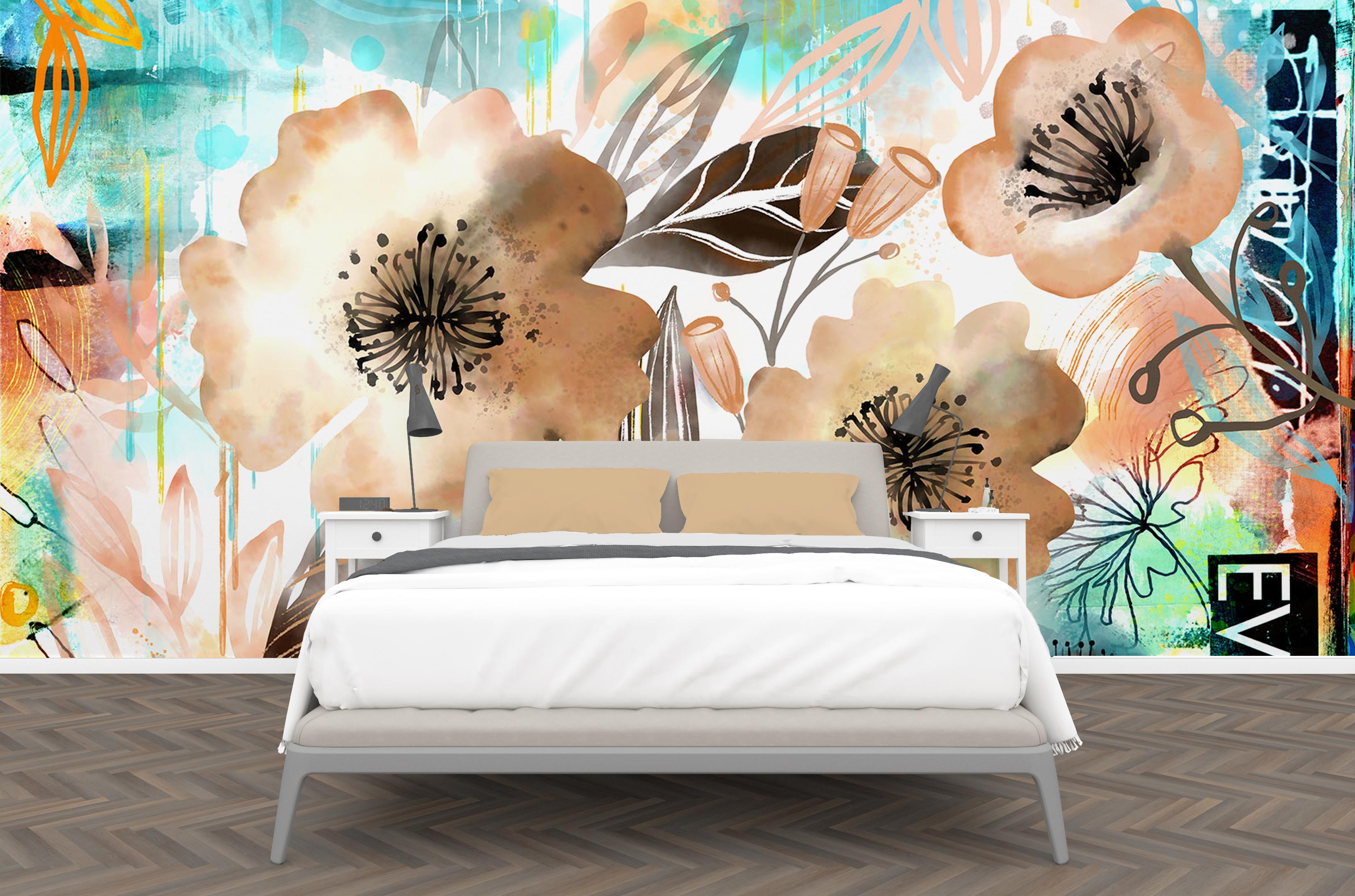
8. Mockups and Wrap Up: Hey guys, welcome to the wrap-up. So I have finished and here are a bunch of the mock-ups that I've done. But I really have loved about this technique is how beautifully it works for all these different items. I'm really glad you took the time to take this course. If you haven't done so already, make sure you hit follow. And remember that I have a ton of artists resources on my to Pinterest sites allow restart the earth now sprint and teacher the worst aspirin. As you can see, we've got lizard going on in the background here. They say, if you don't like the weather in Manitoba, wait five minutes. On Friday and Saturday it was 19 degrees. I don't know what's happening here. Well, it's a good thing. I've got some stuff to keep me occupied. Please stay tuned for a bunch of other courses on fresco and of course on Procreate. Now that I've got these new toys, I'm going to be playing with them every day. I hope to see you soon. Bye for now.
 Delores Naskrent, Creative Explorer