Transcripts
1. What you will learn: Actually painting the use of colors by simple introduction
to the painting process. For a long time,
I had a struggle with acrylic painting and didn't understand why
other painters get great paintings than an icon. Here on my older paintings
you can see how I practically could
not mix the paint. It looks brittle and
cheap and the close-up. In this short hence
on painting colors, I will show you my
absolute favorite colors, which took away my fear of acrylic paint
drying too quickly. This is especially a
problem for portraits with soft edges and nice blending so you get a more
realistic look on skin. There's a method where you
can enjoy glazing painting, similar to early painting. I will show you
my main method of creating beautiful
color combinations. What color I use for shading and what are the
steps of my painting. Also, you will get references that a
credit for this class. You can use them
for your painting. And I'm really looking
forward to see your art work. I am really burn a professional
artist from Germany. For me, painting is my resting place and my
stressful everyday life. I hope you feel
inspired and share your art with me in
the project gallery. I'm looking forward
to your work. Let's get inspired.
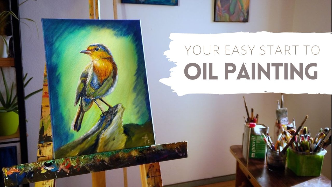
2. Materials and Color Wheel : Springtime is still sleeping, solids, pain. The book. This is a new
acrylic painting on canvas I created for
my new x position, though I will show
the whole process and let's get started. Farther material. I love painting with this golden acrylics,
heavy body colors. I will also link the product
and the description. These colors I normally
mix with mixing and liquid medium to make the layers more
translucent and natural. Here my UV colors, they are from or not. So from Amazon, they are quite inexpensive brand of
colors that works fine. I use it for effect and highlights,
subsurface scattering. And everything you've seen, you will see after, especially for skin, I use
orange to make it more glow. And these are my metallic
colors I also find are okay. But Gordon, our best, and that's how I start. I put it on a mixing palette
like on my color wheel. It's really interesting
because if you want to desaturate your color, just look for the
opposite color on the wheel and you will
get more to gray. Try it out when you need
a more neutral orange, just put more blue
green to it and you will get more
gray. On my canvas. Already set a golden green base, and then I can start
mixing my colors. So I start with gray, and I put orange and blue, and it starts getting more gray, but the colorful gray. And for the skin a little
bit of red and yellow. And slowly you get the best mix. And for making the
color more thin, I add the mixing retire there. And that's how I
make my skin color. To the edges. I always use the mixing median to blend it with a little bit of white so it makes it softer
and not too hard edges. For the outlines, I said the
mixing liquids with brown. And for the brown you can mix the color was blue or red
and a little bit of yellow. The edges blend with the mixing liquids
to make it smooth.
3. Face: Now we are coming to the
body on the left side, you can see in my reference, I created it in mid journey. And soon they will also publish a new class
about creating references with Mitchell
for your art work. So then I start selling
the shadows with some blue and lilac
color because I think that are wearing
natural 12 skin. And the impressionist
already used that color instead
of just black. Taking a sneak to our color, we're saying is that the blue is the opposite color of orange. I recommend you using
that opposite colors of the color wheel for a very harmonic impression
of your painting. That's why it's very nice to use blue for the
shadows of your skin. After painting the skin, I slowly make the contrast
with brown colors. So you get an impression step-by-step of your whole
painting and the framing. Because if you start with
the only no contrast colors, you don't get the right
impression of your hard work, building up the whole motive. And now I let the
whole time that's running until I
have some comments. So if you have questions, please leave me a comment
and I will answer to it. So I leave you with
the time-lapse and have fun of watching me
painting in this progress. Also, you can use my references I credit in MIT
journey for your art work. Just feel free to take
it for your reference and post your result in
the project gallery. I'm really looking forward to see what you're coming up with.
4. Background: And now we start
painting the background. I first start with
the most contrast, dark color of the blue. And I slowly also blended
with the mixing medium. On the left topside, I have some flowers. So I tried to imitate that structure of the flowers with a bigger brush. It's very liquid there
because I use a lot of the mixing medium and I use the direct white
color to blend it and to make it flower
risk on the right side, I do the similar thing. But I tried to do another
pattern of the flowers. It just to get another
interesting structure into my painting. It's so nice to use that medium because it doesn't
dry and you can always mix the color afterwards because the
color is still wet. When you would just use a normal acrylic color
without the blending medium, you would not be able to mix it afterwards
with other colors. So don't forget to use the mixing medium and every
part you want to blend. Afterwards. I got on with the
frame that is quite dark. It's my darkest color
in this pellet with a black car barn of
golden acrylics. And then I paint in
the other structures. Try to save some colors
because the color will dry on your palette and you won't be able to use it
afterwards with oil colors. Different. They don't dry
it off for a long time. But with acrylics,
you have to be careful not to waste
too much color. So I often use just
one color overall, the whole painting until I don't have any more color
on my palette.
5. Details and Finish: I love mixing organic painting
with a graphical shapes. So I also added some article elements into
the painting with gold, because I think it's
very neat to use a metallic effects on
your painting to make it even more expensive and worth
to pay instead of a print. Because normally on a print, you can't do this effect. I'm using a tiny brush
and I put my hand on this painting stick just
to be in months table for this process that needs to
be very detailed and exact. I add all over the painting
and the hair and everywhere these metallic colors to create a harmonic impression
of the whole artwork. Adding shadows to this
golden highlights makes the artwork even
more three-dimensional. Using the mixing liquid for
the blending in the shadows makes it even more
three-dimensional and interesting. And now I will just let it run
for the finishing details. You can watch it until
the end. Have fun. And I hope you
enjoy the process. And now we are
already finished and I'm setting my signature
Under the painting. This time I'm using gold. I hope you feel inspired now and start doing
your own painting. Feel free to use my
references for your art. And I would love to see your artwork soon in
the projects gallery. See you, Bye.
 Julie Boehm, Painter and Filmmaker