Transcripts
1. Intro: Hello, everyone.
Welcome to this class. My name is Karelia, and today I will guide you through
my favorite style of abstract Watercolor painting to create two beautiful cards that explore the
main qualities of feminine and masculine energies. We'll begin with a creative
dialogue exercise. So you can wisely choose two painting templates based
on your current state, helping you connect with
your inner balance and, of course, enjoy the painting. The templates I'm providing
are all related to the body and feature simple silhouettes that can be easily
transferred to paper. Since we are experimenting
with abstract art, you will learn how to
use specific ushros, forms, shapes and colors to
bring these silhouettes to life without painting any
outlines or the fine subjects. Having experience
facilitating spaces for this kind of art
has taught me how important it is
to bring light to certain parts of our body and
letting art show us magic. So this class is perfect for releasing
stress, having fun, and letting your inner child express freely.
Let's get started.
2. Creative Dialogue Exercise: We are going to take
about 15 minutes to reflect on your past week. This is not a meditation, but I do invite you
to sit culturably. I will be asking five questions, and you will answer them by bringing images to your mind by replaying events or memories that are connected
to each question. If your mind gets a little distracted, that's
completely okay. Everything that arises
will be helpful here. Let's begin with
the first question. Which emotions would you say were more common
during last week? Think of the moments you
felt these emotions. What were you doing,
how long they lasted? Replay these moments,
whether they made you feel at peace or
brought discomfort. Next question. Which moments felt like flowing with
ease and great timing? Bring these memories back. Next question. Which moments were challenging and difficult to manage during the last week? Take your time and observe with compassion the
images coming back. Next question. Think
about the things you accomplished this past week,
even the smaller ones. Take your time to replay
the events in your mind and acknowledge the effort and presents you brought
to each one. So The last question. Which of your needs were
satisfied this past week? And which ones were
left unspoken or unmet? Remember the moments
where you took care of yourself or did
something that you enjoyed and recall what you missed and
would love to do soon. Now, let's move to the
final part of the exercise. I'm going to mention
six words one by one. When you hear them, I want you to close your eyes and focus on any area of your body that
resonates with this word. It's usually the first
one that comes to mind. Let's begin. The
first word is soften. Where does it take you? It can be any part of your body. Next word, stability. Go to that place in your
body. Take your time. The next word is flow. Where does flow take you? Next word, create, breathe
in deeply and exhale. Focus only on one
part of your body. Just one. Now, we have
the word receive. Where are you feeling this word? Where exactly in your body. And the last word is nourish. Relax and let your
body show you the way. Keep your attention there
for five more seconds. Great. Now open your eyes. You are ready to choose
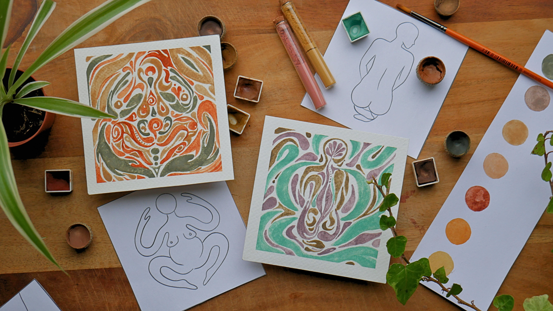
your two templates. These silhouettes
I have prepared reflect different
parts of the body, specific expressions
and qualities. So let me show you
the options you have. The first three templates
belong to the water element. Their feminine qualities
are receptivity and compassion and their
masculine qualities are containment
and reflectivity. Next, we have the templates connected to the Earth element. They all reflect the feminine
qualities of grounding and patience and the
masculine qualities of strength and protection. Now, these are the templates
related to the fire element. They possess the feminine
qualities of rebirth and transformation and the
masculine qualities of courage and leadership. The last three templates
belong to the air element. Their feminine qualities are
flexibility and imagination, while their masculine qualities are communication
and intelligence. Remember, let the images speak to you and choose
from your intuition. You can download all
the templates from the resource section
and print your designs. I'll show you later
how to transfer them onto your watercolor paper. In the PDF, you will find 12
by 12 centimeter templates, which is a size recommended
for this class. But if you wish to paint
a slightly bigger piece, I have also included 15 by
15 centimeter templates. These are the two designs I will be painting
with you later. I can't wait to see the
ones you have chosen.
3. Brushstroke Basicss: In this lesson, we're going to practice some basic brush straws to warm up before painting and discuss color
palettes at the end. So grab a big sheet of watercolor paper and
get comfortable. I will be using a
medium round brush size eight and fine round brushes, size two and double zero. You're welcome to
use a flat brush and any others you like. Before we start painting, I would love to show
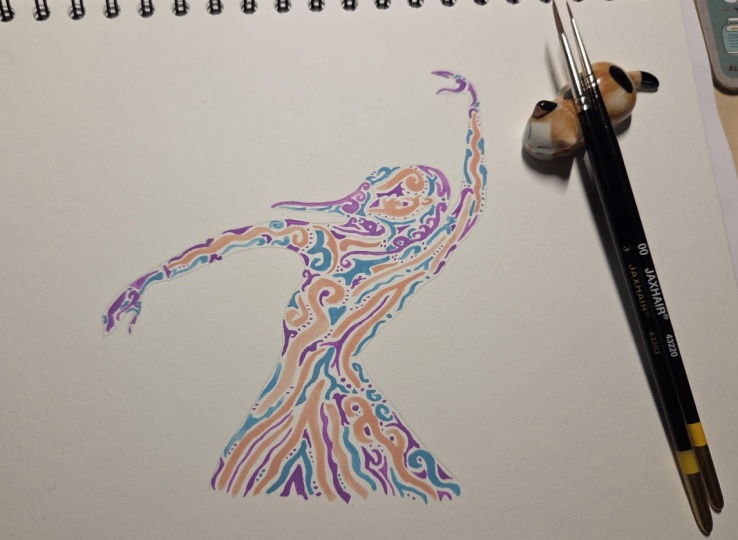
you three pieces I made using the abstract technique we'll explore together
in this class. So let's talk about
the brushstroke that I use for
these compositions. This one contains
many variations of a simple petal brushstroke, also called com stroke. By playing with the width and length of the same
type of strokes, I was able to create contrast and use color to
balance the composition. The next one is a bit different. I use mostly leaf
shapes and lines. I also added some dots and linear strokes around the heels and the bottom of the feet. I wanted to have a
concentric point where the steps are placed. So I painted some
brushstroke emerging from the center to give the
design more movement. And the last one is a mix
of different strokes. I allowed myself to
add more variety here, adding hearts, spirals, and other brush strokes that emerge in the flow of painting, like the shape of these
uterus, for example. Now that we have this
artwork as reference, let's begin with the exercises. Take a round brush size eight, for example, and choose
any watercolor you prefer. We'll start with a simple
shape that you probably know very well, a leaf stroke. The goal is to create a pattern of leaves without
merging the strokes. I'm choosing to paint
a linear pattern, but you can also make the
leaves form a circle, a spiral, or going in
any direction you like. The reason I'm emphasizing
on connecting elements is to put you in the flow of creating movement using
simple brushstroke. Next, we're going to paint
petals or coma strokes. Go ahead and play with
long and short petals. You can also leave holes in your brushstroke
like I'm doing here. We're not aiming for perfection. The beauty of abstract
art for me is appreciating every element
as part of the whole, no matter how imperfect it
looks from the outside. But this doesn't mean that
we can't create harmony. So let's practice
toality balance. What I mean by duality
is that we're going to paint two petals
mirroring each other. They don't have to be
the exact opposite. Give your brush some freedom. You can also create
balance by painting two petals, pointing
opposite directions. This is also another
form of duality. Now let's try something
a bit more abstract. Paint a curvy line. Just let it flow naturally. Now, go ahead and add a bit
of thickness here and there. They start turning
into new shapes. Please allow yourself to make mistakes and exaggerate
if you have to. This is just an exercise, so go bold if you need to. These flowy brushstroke
are a great way to add variety and
movement to your artwork. You can also add a
few small dots to complement your design or
give it a playful touch. Don't be afraid to add some straight lines
into the picture. They symbolize the
masculine energy and also bring visual
balance to our pieces. As you can see, I am painting the opposite of the
previous shape here. So we keep on practicing
mirroring elements. Now, let's talk about creating harmony using what's
called progressive rhythm, which is simply repeating
the same Kirby petal here, but making the strokes
smaller and smaller. You can use this technique
with any brushstroke you like. You can come up with lots of shaves by simply playing
around and exploring. You can make a heart by
merging to petal strokes. Next, we are going
to paint spirals. These shapes help to incorporate even more variety and are great to be mixed with
other shapes as well. For example, we can mix
lines with spirals, paint hearts using spirals, merge petals with
spirals and so on. So take your time and combine any brushstroke you
like with some spirals. Now, let's move on to circular
and half moon shapes. Using a thinner round brush, I want you to paint a few
rings and half moons. So far, we are covering very simple and common strokes you probably are
very familiar with. So now I want you to
create new shapes by combining these circular
strokes with spirals, petals, straight lines and dots. To close this exercise, we're going to paint
straight and curb lines. This last exercise
is about making imperfect marks and letting
your intuition take the lead. Now that you have experienced, how each brushstroke feels, let's talk about color. For this class we'll work with only three
colors per artwork. Limiting your color palette helps you create a closer
dialogue on the paper, but it promotes more
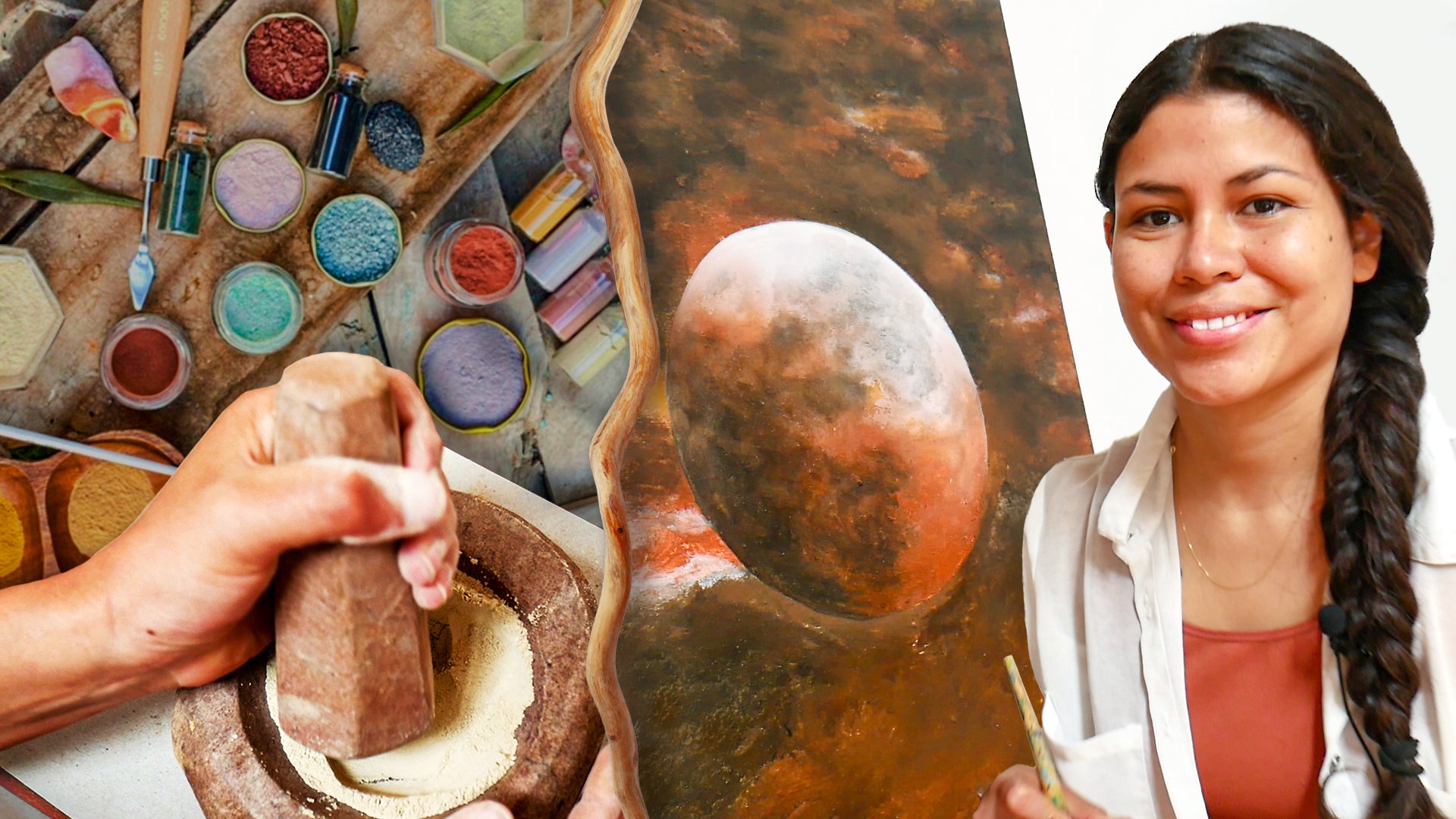
flow and inner focus. Here are a few colors from the palette I recommend
for this class. These are earthy and
mild watercolors that I obtain from
mineral pigments, I gather myself in nature. If you would like
to learn how to make your own watercolors
from scratch, I have another class
where I guide you through the full process of creating handmade paints from minerals. This is a passion of mine. You can find a link in the description if you
want to explore later. I've also put together
a color palette PDF to help you find similar hues with the watercolors
you have at home. You will find lots
of color suggestions for each template category, and you can download or preview this document in
the resources section.
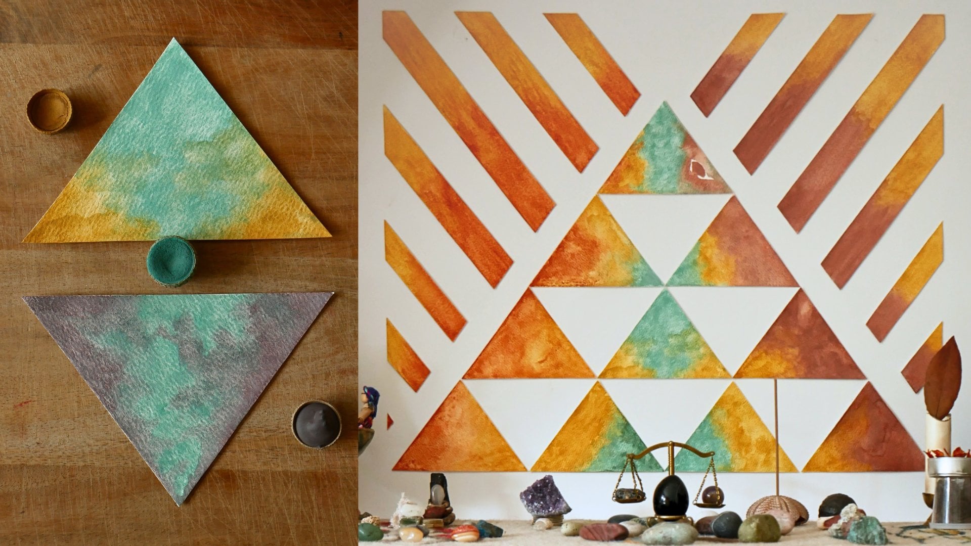
4. Painting Tutorial I: Let's get started with
our first painting. The first step is to notice the natural
flow of your design. What I mean by that is that some might feel more circular. Others have a spiral motion or pull in a
particular direction. For example, I can see a downward triangle
feeling in this design, but it also has a circular
moonl energy to me. It really depends
on your perception. We can use this
information to have a sense of direction
before starting to paint, but it doesn't
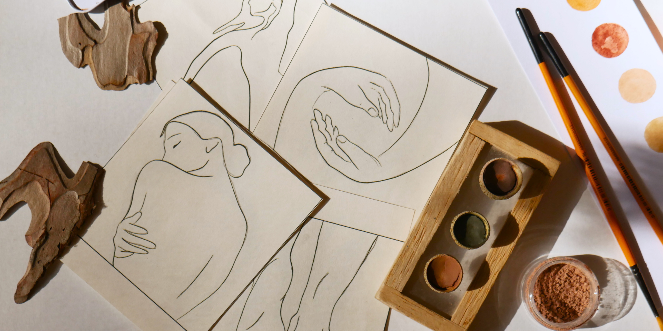
define the outcome. Our watercolor paper is ready, so let me show you how
to transfer the design. The easiest way I have found to do this is to take a piece of charcoal and lightly shade
the back of your template. Then place it the
best you can on your watercolour paper and trace the lines gently with a pencil. The charcoal will transfer
the outline of the design. I want to keep this first
design very simple. I would like to use loose and uncomplicated
brushstroke just to warm up before moving into a more detailed piece
in the next lesson. As I mentioned in
the previous lesson, I suggest choosing three
colors for painting. I have selected turquoise
as my light tone, purple as my mid tone, and a brass color
as my darkest tone. Let's begin the
painting process. I suggest starting with a round brush size eight and work on the
background first. I chose turquoise because I want a light air refilling
around my design. So choose your first
color accordingly. We are going to paint
a long brushstroke. This could be a
big petal stroke, a leaf, or like
mine, a half moon. I am allowing the brush
to guide the length of the stroke as I
move across the paper. To create sun duality, I am painting the same
shape on the opposite side. You can continue painting
very different brushstroke or keep playing with similar straws while adding some adjustments. For example, I am choosing
to paint a similar shape, but stretching it out into a river that flows
gently across the paper. Let your movements
feel natural and make sure to leave space for other
straws to go in between. This is very important. As you paint, I
want you to notice how each stroke carries a
different kind of energy. The firm straight lines evoke a gentle
masculine presence, while the curve shapes flow with a softer, more feminine rhythm. Take your time on each brushstroke and notice how the painting
begins to flourish. I am adding a second
layer of color down here since
it's already dry. So feel free to add more
layers along the way. Before going further, I would like to talk
about transitions. I want you to follow
your intuition on when to change your brush and color and when to move from the background into the
inner part of the design. Whenever you feel
stuck somewhere, it might be a good
time to switch. In my case, I would like to change my brush for a
thinner one size two, for example, and use purple
to work on the inner design. I feel like painting
petal strokes now to follow the
contour at the bottom. You're welcome to start from the top of your
silhouette if you like. I would also like to paint
a linear stroke along the spine and include some elements that mimic the outer shapes
from the background, like a reflection of
the larger half moons. So pay attention to the shapes
that are already out there in the background when
painting the inner design. If you find yourself hesitating or starting to judge your piece, please take a deep
breath and relax. This piece is your reminder
to trust the process. I am switching to a
double zero round brush and adding more delicate
petals inside the head. Using a thin round brush, I feel like adding petal
brush straws and leaf shapes. Now is time for
the darkest tone. I feel like adding petal brush stros
and leaf shapes to fit into the
shoulders and arms. Follow your intuition
if you feel like adding another color
or changing brushes, paint big strokes,
small strokes, dots, curves, whatever feels
right for your design. But be careful to leave
space for the other colors. Here, I'm letting a
thin line go around the head to serve as a connector and give the
design a bit of shape. Don't be afraid to go around the edges of
your silhouette, but be mindful not to
follow all the outline. Remember that this is
an abstract piece. If you see a bit deeper, the inner design symbolizes
the feminine energy, but we feel within the quiet
world inside ourselves. The background in contrast, represents a masculine energy, the outer world that shapes us and gives us a
sense of identity. We want the inner design and the background
to feel integrated. The goal is to fill the space by alternating colors
here and there, connecting strokes, and letting the colors
speak to each other. I'm also using
turquoise to paint a few tiny elements inside to make the whole
piece look more cohesive. Pay attention to the
spaces that need to be balanced and add short or long brushstroke to create a sense of
movement in your painting. This is also a great time to add extra layers and bring
contrast and depth. So go ahead and alternate your colors until your
piece feels complete. Remember to look on your
exercise sheet from the previous lesson to get some inspiration
if you need to. My painting is done, so I'm leaving it to dry. As we carefully remove the tape, we reveal the final piece. When yours is ready, take a moment to really look at your artwork and observe the dialogue between
intuition and structure, the inner and outer worlds
coming together in balance. This piece of artwork
is also a way to honor your body in a different
way and to cherish it.
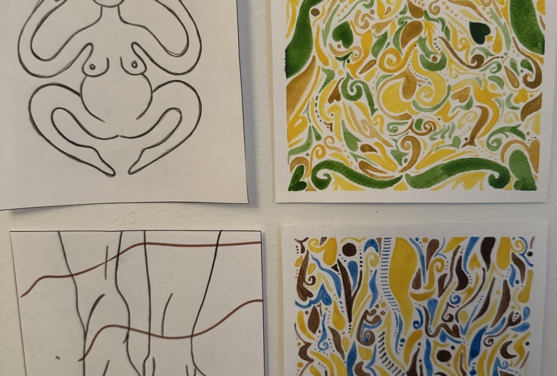
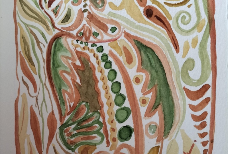
5. Painting Tutorial II: Let's get started on
our second design. I am transferring my
design on the paper using the same technique I explained in the
previous lesson. At first sight, this piece has a very clear circular flow. In this lesson, I would like to include more
strokes and elements. Therefore, it will
take a little longer. I am lightening the darker
areas with an eraser. The color palette I have chosen features this beautiful
dark olive green, yellow ochre and orange. The green will serve
as my darkest tone, the orange as the mid tone, and the yellow ochre
as the lightest. Since this design relates
to the fire element, I am using the yellow
and orange to bring warmth and vivid
energy into the piece. In the previous design, we
started on the background. But this time, I feel drowned to begin
with the inner side. I invite you to
let your body and intuition guide you
where to focus first. So I'm taking a round brush size two and the orange color. I'm going to start by
painting on the legs. Since they're very thin, I'll use small leaf strokes and spirals to go around
almost like tattoos. I also feel like painting
circles and spirals. This figure reflects
a lot of energy. It's more dynamic, and it has
a circular shape in itself. So, whichever is your design, let yourself go around
exploring the curves and edges and playing with
long or short strokes, but always leaving space
for the other colors. I am taking a pause
to switch to yellow. Remember, you can
always switch brush or color when it's a
matter of preference, if you feel a bit stuck or
simply for convenience. I prefer to use this
color on the head, so I'm making long lines
connecting the top to the chest. Now I am changing to a
double zero brush to paint thinner strokes inside the legs where there is a space left. As you can see, I am following the same
style of strokes I painted before and using the yellow ocher to
complement the circular flow. I haven't finished
the inner figure yet, but my intuition tells me it's a good time to move
to the background. Remember, the background
symbolizes the outer world, the energy that meets
you from outside. So I'm going to use
green to create a grounding feeling
and a nice contrast. I recommend using a
size eight round brush for painting beautiful
leaf and petal strokes. When painting the background, you have plenty of options. For example, I'm going to mirror two leaf brushstroke that
are born from the middle, but you can also create
a concentric point on any other side of your painting and make your
strokes flow from there. You could also give
a certain angle to all your brush stros. They can go up or
down if you like. Even though I'm
mirroring these shapes, each side keeps
its own character. Using the same green, I would like to add a
sequence of dots that starts at the center here
and finishes as a triangle. Don't be afraid to include geometrical shapes
in your design. You're always free to
adjust their edges or make them irregular so
they fit your composition. I am switching to orange again, but this time to add a few
shapes on the background. I honestly feel a bit
stuck now with the orange, so I'm going to take jello to
continue painting the top. Here, I allow myself to play, but I'm trying to not
overload the space. When painting, focus on the direction of
your brush straws. For example, these ones on the top are mirroring
the ones on the bottom. Let your brush flow gently to bring balance
in your composition. I like to add these
small circles here, one on each side. They carry a soft
feminine energy while the surrounding longer straws bring a masculine structure. Returning to the inner design, it's time to use green to
complement the colors. I'm choosing to paint very
fine lines with rounded edges, long, elegant petal strokes. I'm doing the same
on the other arm. Remember to use the three colors in both the inner design
and the background. You don't have to force them, but give each color
an opportunity to flow and contribute to
the whole composition. I would like to paint
the area of the belly. Here is a great tip. If you want to keep the contour of certain parts of
your silhouette, using curves and petal like shapes is a great way to enclose these areas like I'm doing with these arcs here
around the spiral. As you progress
where your painting, take a pause to observe where you need to add
your next brushstroke. My approach is to paint every
section gradually moving from here to there rather than finishing each section before
moving to the next one. I invite you to observe
your piece and identify the areas that need leisuring and the colors you
would like to add next. I am taking my time to
bring contrast and to add beautiful petal strokes and other details in
the empty spaces. Relax and enjoy this process. Remember to use a technique
of progressive rhythm, too. Sometimes it's hard to know
when a painting is finished. So I like to ask myself, is there anything
else this piece wants to express through me? Or am I simply letting my mind try to add
more than it needs? I'm adding the last
element to my piece. And as you can see, it complements the circular flow
of the design quite well. I invite you to
identify the elements that are prevailing in your
artwork and play with them. After some time drying, my artwork is ready. It's time to remove the
tape and reveal the piece. I really love the
folkloric style that emerge from this design. And I'm sure your pieces
are glowing as well. Each brushstroke,
whether large or small, carries an intention and energy. And this painting
reflects the fire within the balance
of inner and outer, feminine and masculine
all coming together.
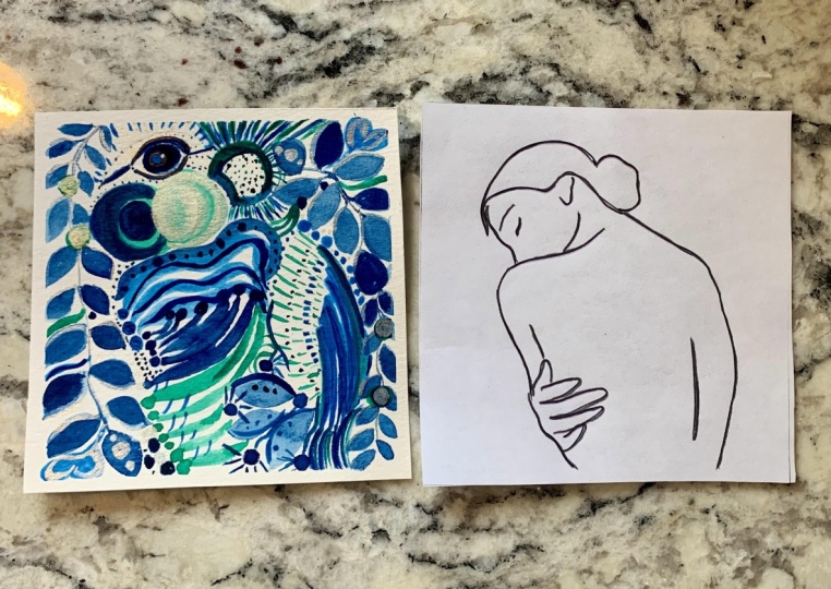
6. Project Lesson: Lesson, you will begin
your class project. The goal is to create two
watercolor paintings, 12 by 12 centimeters each using the templates
you selected earlier. These are the steps
you can follow. One, choose two templates from the resources section
and print them. Two, watch Lesson three to practice the style of
strokes and shapes you can use. Step three, pick the
design that seems more simple to start with and let
the second one for later. Four, transfer your
design on the paper, prepare your colour palettes and brushes and happy painting. The project gallery. This is where art becomes
a collective expression. Take a photo of your
two finished paintings and upload them one by one. Optional. If you
feel like sharing, write a short note
about your experience. Which part of your body
you were focused on, and what this practice
revealed to you. Finally, a gentle invitation, light a candle or place your pieces in a special
place in your home. Give them the appreciation
they deserve. They are now little
messengers of masculine and feminine balance, carrying a connection
to your body. Remember, this project
isn't about perfection. It's about experimentation,
awareness, and visual dialogue with
your inner energies. I'm excited to see
what you create.
7. Outro: Thank you so much for joining. I hope you discover something new and enjoy the
painting process. Take a moment to
look at both pieces side by side and
appreciate their beauty. Perhaps one of them feels
more like you today, or they remind you of the
energy you want to invite. Thank you for painting with me. I love to see your results. Please share your two paintings
in the project section, and apart from that,
I would really appreciate if you leave
a review for this class. Unfortunately, you are watching this class on the Scotia
app on your phone. Reviews are not available there. So you have to log
into your computer or use your mobile browser. Thanks again for your
time and happy painting. Curious about making
your own watercolors, my class Alchemy of Colour will guide you
through the process. You will find a link
in the description. Oh
 Karelia Blum, Artist | Mindfulness Facilitator