Transcripts
1. Introduction: Hey, man, I think
you need to relax. So why don't you
join me for the Part six of abstract
watercolor escape? We're going to paint
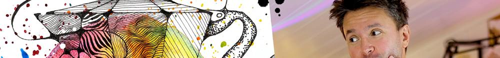
this painting. I mean, this, but also this, let me show you
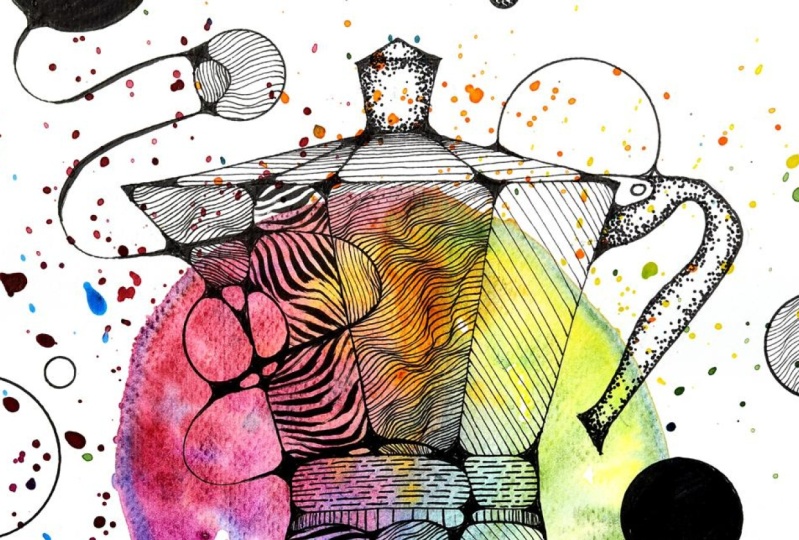
this is a Bica or Mocha Express formal It's a coffe making machine.
And it's iconic. So I decided to bring this iconic object subject
into my abstract painting, and this is how it
looks. Da da da da. If you join me, we're
going to learn how to make this beautiful rainbow
circle in the middle by not even touching
our brush to the paper. Then we're going to draw
this coffee making machine, and after that, we will make it pop from the page
with these patterns. And in this class,
we're going to combine all the things we've been
learning from P one to P five. We're going to use colors, we're going to use splashes. We're going to use
the neurographic art. We're going to use the patterns, and it's going to be beautiful and it's going
to be relaxing, too. If you are looking for a way to wind down after a
hard day at work, if you are looking
for a way to relax, abstract watercolor escape
is perfect for that. So please join me and
enjoy the process. Nothing is sped up. We
do everything real time. You can draw alongside me. We just put a relaxing music on, forget for hour a
bit, our problems, whatever is stressing us, we let them go and
enjoy and at the end, we have something
beautiful to look at. I can't wait to show
you how this is done. So if you're ready, I
will see you there. Jack, please show them the
classroom around the back.
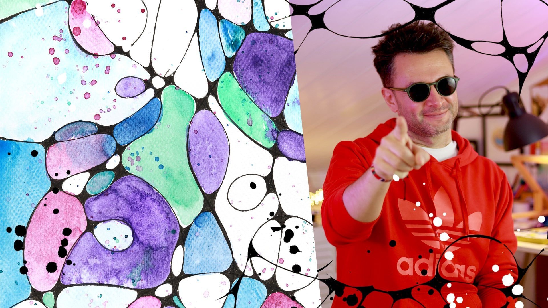
2. Class Project: And this is and video is recording two. Here we are here with Part six of abstract
watercolor Escape. This is gonna be the class
project to warm it up, to warm up to the
recording situation. It's always feels weird after a few months after
a summer break. Okay. So your class project is this. I want you to create your
own semi abstract project. You can choose any
object you want. You can definitely use
the Bica I used or mocha. One of those this
coffee making machine. I'm going to put in
the resource section clean drawing of this. So you can with thick lines. So you can put it
behind your paper and trace it if you want to. Or you can do it on your own, or you can pick
just a coffee mug. You can make it with
okay, examples. Jack, can you think
of anything else? They can do with sun? That's too simple. You can do it with a outline
of a house or a building. You can do it with a face. I will show you later
an example that I did this similar one with a face as well that
turned out beautiful, and I'm very happy with that
one. What else could it be? Like, if you're
into photography, it could be a simple
drawing of a camera. Camera is very similar
shape to this. I would think that
not very angular, but it has a very
recognizable shape. So you can use that a car, if you are into that, a
flower, it could be anything. But this is our project. I use this iconic coffee
machine from Italy from BLT, and another jump is over. So you can do the same.
We're going to paint first. Then we're going to
do our drawing of the object from real life. And then we will bring
in the neurographic art, and then we will finish
off with the patterns. So again, this is kind of combination of the things
we've been doing from P one to P five that
the drawing first, later painting first,
and we brought in the patterns to give
texture to our drawings, and now we are doing
this semi abstract. So what does abstract
vertical escape? O. So this makes it semi
abstract watercolor escape. So that would make what save. Doesn't sound as
good as O series. So this is your class project. I'm looking forward to seeing your paintings, your drawings. And as I mentioned before, this is the part six
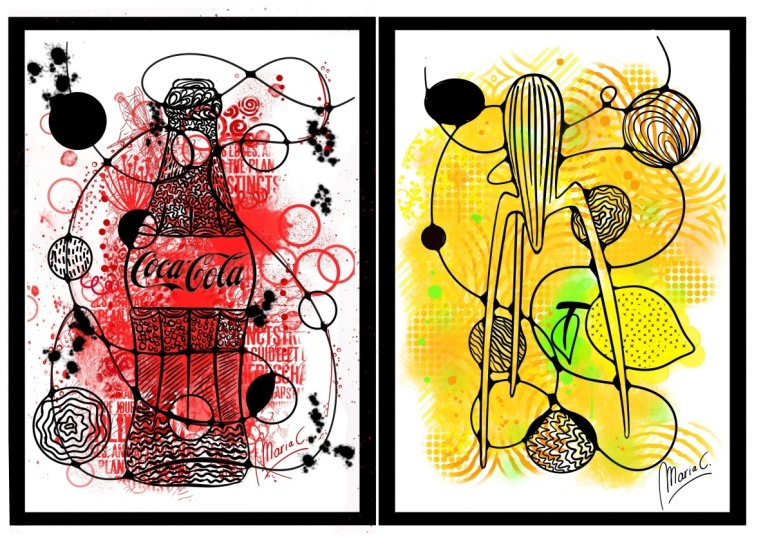
of the O series. There are five more parts. So if you take part one, you will paint this if you take Part two,
you will paint this. If you take part three,
you will paint this. If you take Part four, you will paint all of these. And if you take Part five, you will paint this painting. Now, if you don't mind, we
will go into the materials, and after that, we will
start with the painting. No, we will talk
about the idea first, and then we will start
with the painting. And this is it. See you in the next video. Bye, Jack. Next.
3. Materials: Watercolors, Pen and Curiosity: For this painting,
I'm going to use my Kuretake Ganze
Tambi watercolor set, which is right here. Here's the color
chart from the set. I'm going to use
this and what else? I'm going to use
my number 12 brush from renaissance and what else? Later on, I'm going
to use my pens. Probably I'm going to use I'm going to use my micron pens, this one or five, and the brush pen from micron. That
will be pretty much it. Also, I'm going to use a pencil. I'm going to use a pencil. Because since we move away from full abstracts that I want this object to
represent itself well. It can be more
wonky. That's okay. But for the original one, I used a pencil to make it like in the middle because I felt like this composition wise, it needed to be in the middle. So I'm going to use
a pencil as well. So the paint watercolor
paints from roteke, my number 12 brush, and my water jars are here. Oh, I got it. And
one for clean water, one for dirty water, and always
some kitchen towel handy. So these are the
materials for this class. And now let's go and paint.
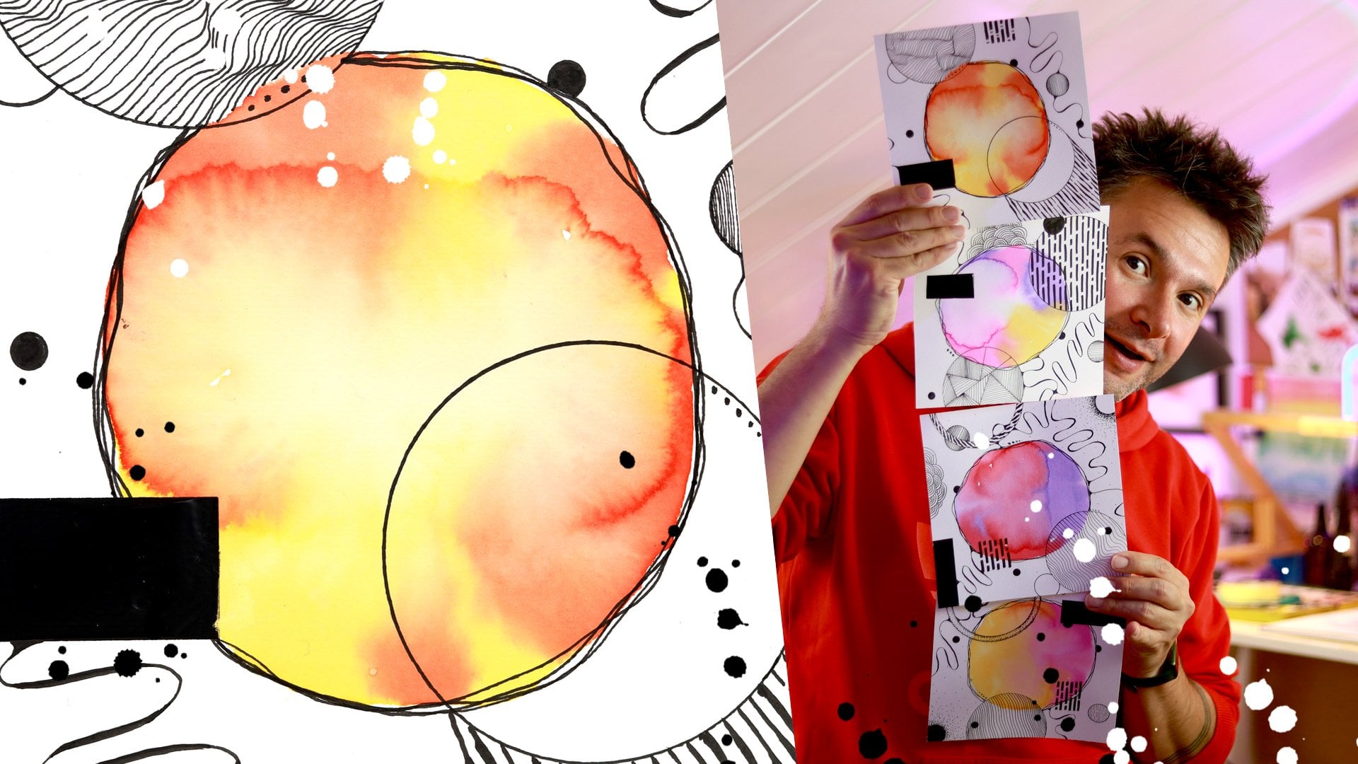
4. The Idea: The Magic of Blending Real Life Objects with Abstract Patterns: And this and the Mm hmm. Hello again, and welcome to part six of abstract Watscame. Today we are going
to do this design. The idea is, in part six, we tried many different things, and we did drawing first,
we did painting first, and we brought in the patterns and line drawing more into
it in the last two parts. This time, we're going
to again stay on the paint first,
draw later style. But the main difference
here that I want to bring into your life
is while being abstract, we will bring a real object into this abstract
universe of yours. And this was actually one
of the first ones I did like I just fell in love
with it immediately. If you don't know
what it is, this is a coffee making machine. It's called Bica from Italy. I think it's called Mocha, as well, but I don't know
which one is which. Maybe it's called Mocha, but this is the
brand Bica, maybe. Oh, no, Mark, the
Brand I think the let. But anyway, this is Brica. If you search Bica on Google, it will count that you put the coffee in the middle
water at the bottom, and you put it on the hop and it just coffee starts
coming from the top. It's beautiful machine,
and it makes good coffee. The reason I use this, like I was looking for a I was
actually at the coffee shop, one of my favorite coffee shops, and this is such a
for coffee lovers, it's like a symbol of
coffee, basically. It's almost like
equal to coffee bean. And I thought, Oh, it has very geometric
shape, which I love. And it has, I think, six or eight sides to
it that usually round, but it's very angular. But those sharp corners are
softened and I felt like it was perfect for what we
do with neurographic art. You can see I brought
it into this as well. Instead of just random shapes and keeping it
completely abstract, this is like semi abstract. We just paint ordinary
object from our real life. In an abstract context. I love how impactful it is, how this kind of
when I look at it, it just jumps at
me straight away. I think that's the power of
the patterns here that I use. I didn't try to do this shading I could
have made more even, but that wasn't the goal here. With these abstract paintings, I always say that never let them know what
your next movies. So in here, as you can see, it's more straight and angular. In here, it's more wavy. It's not about. I'm not trying
to paint the actual thing. This is I just
took a real object and put it into my
abstract painting. I just made a part of it. So that's not the goal here.
I'm not trying to paint it perfectly or as
it is in real life. This I just took the shape. I like the shape and, um, made it part of my
painting and I love it. And I want to share
this with you guys. I'm sure that you
will come up with many other things that you
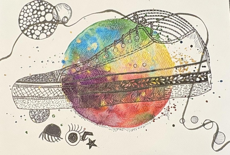
can use instead of Blica. I did a few more
that I can show you that there was one that this is also I think I can call
this auto portrait. This was much more
flowing, sorry. Flowing design
because I didn't use any there's nothing there's not even a single straight
line I think here. That everything it just
kept going one line. I use a continuous
con to draw this. And for the patterns, actually, I thought these patterns when you do it this way,
it looks like hair. That was actually
the main idea here, but I thought for my hair, I could use these patterns, and I love the effect. And then I just did the painting like
we did in the Part two. I painted these gaps partially and added
some more patterns. This is really a combination
of many of the things we did in other classes and I
encourage you to do the same. This is a new project I
haven't it's not done yet. This just came out. I was actually trying
to do some circles, the concentrate circles
going outwards, but it seemed like a
phase. I thought, why not? So this is still in the
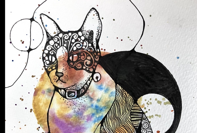
works, but this one I love. For this one, after the Bica, I thought that I want a face. A face is a very strong object. As humans, even as a baby, we are able to recognize
our mom and it's all about the proportions
between the eyes and nose, and we are able to recognize
people with great accuracy. So, we like looking at faces. We like looking at
mirrors, for example. There was a study done.
They put a mirror next to the elevators and to see how
people spend their time. People much more look at themselves and check out themselves than look
at their phone. It was something like that. So we do like looking at face. I thought it would
be more impactful. So I brought this face, another pace than mine, rather than doing an auto portrait. And I use the model
Let Shakasta, I looked at her face, and then I made her
much more geometric. So at the moment, it
doesn't look like her. That wasn't the goal again. But she was a starting point, and that's where I
ended up. I like this. And this was in this community
exhibition we had here. I gave this piece
for everyone to see. And another one I
made for my son, he was really into
bees at the time, and this is a wasp, actually, wasp or a hornet. One of those. One
of the bad ones, not the good ones
that make honey, but probably a wasp. And with this one, Again, I just drew Wp, and then I just turned
it into narographic art by making all the lines by
not leaving any hard corners, I rounded everything
up and then I add more lines and more circles
and then painted like this. And I'm very happy
with this illustrate. It also turned out well. And I think this was the
very beginning of it. If I remember correctly, I want to I was very captivated with neurographic
lines, and I though, Oh, what would happen if I actually simplify something I like, like this building from Wars
I always say Palace couture, I enjoy drawing this building. What if I brought that into my abstracts and end up
with this first one. Then I thought because I made small like this because it was kind of an experiment,
then I thought, Oh, maybe I could make
it into four seasons of Poa ScotiRsorts spring, summer, autumn, fall,
and winter in Warsaw. And I want to make a
class about this as well. Later. Uh let me know if
you would be interested. You could do your favorite
building in your city. But for today, our goal is this. This is the idea,
bringing a deal life object into our
abstract universe. And to do that, I will do the painting first because this is a
paint first draw later, kind of a painting,
and we will do that. I will let it dry, and then we will continue with the drawing Dnographic art and patterns and
everything else. So let's go and do that.
5. The Painting: Creating a Rainbow Watercolor Wash without Even Touching the Paper: So I am back. Let's do this painting. I
did this painting, actually. I remember there's a bit
of a rainbow going on, but it is not so obvious that
colors are very much mixed. And the reason for that
is the way I actually made this round color
wash on this paper. So let's do that now.
I'm going to tell you how I'm gonna put this here. Now, I'm gonna use the paint, so I'm gonna put
this aside for now. Um, I'm gonna take my
water here close to me. And before that, I'm going to because once I put the
water, I want to get going. So I'm going to use my spray bottle
to spray some of the calvis I'm going to use. I managed to spray all of them. It. I'm not sure which
tones I'm going to use. Okay. Let's put it aside. I'm going to use, I think, I want to make a bit
of off a rainbow. Like not like the
most basic yellow, most basic red, most basic blue. But instead, I'm going to use
a bit of a turquoise blue. But let's have it here. Like instead of
using, for example, this very lemon yellow, I'm going to use this line. And instead of this, I'm going to use,
not the sub green, nice green, but I'm going
to use olive green maybe. And instead of these blues, I'm going to use turquoise blue and maybe turquoise green. And for the red, maybe
I can use maroon. Yeah, so it will be I
want the colors to be a little bit of still complementing each
other like a rainbow, wood. I think this is maroon. So at the moment, I'm using
my eyedropper to put some. And then what I'm gonna do
is that I'm going to make a water circle it's
very difficult to see. It doesn't have to
be a perfect circle. Don't worry about that. But I'm putting a
good amount of water. I don't want to
try straight away. Straight away, I mean, quickly. Even it doesn't even have to be perfectly in the
center, either. And then let's think how
does the rainbow go? It's from red to orange, yellow, green, blue, purple. So I'm going to take
from those colors, and I'm just going
to image six parts. But I'm not going to
go with the brush and touch them with the brush, but I'm just going to
splash in these areas. So it will go outside as well. O. This way, this will
be very gentle. And some oh, I didn't
bite any orange. For the orange, I'm
using cadmium orange. And I'm going to wash this, take some fresh water, and now it's yellow stern. For yellow, I'm using this
urolin Now the yellow section, I'm adding some yellow. Maybe later on, I'm going
to add some more red to this spot to bring the pu. Then next would be a green. I said, I'm going
to use saprns So maybe for this actually, I I don't want to move it too much because I don't
want cows to go away. So sap green. I'm going to
add this Turquoise green. I just notice I'm wearing white and I'm splashing
around, probably. I already splashed on myself. And finally, the turquois blue. Oh, and there should be
some purple here, so I'm gonna drop a few
splash of purple as well. Purple, purple, purple. So how did dash for green, I use two different
shades. Okay. That's fine. So this way, the colors
are going outside as well, and lots of splashes. That also gives a
very expressive look. And I'm just going to go back to maroon because
maroon was the first and it just ran wild
in the clean water. So let's bring the maroon back a bit and some splash outside. And o. That will be it. I
love how it looks. It looks like a huge
colorful soap bubble. Now I'm going to let it dry, and then we will come
back and add but one more thing when you make a water circle and
then you keep adding paint, and that paint contains
water as well. So what happens is,
let me take this. You just keep introducing
more water, basically. So then you have a
bit of a puddle here. And usually what I do, I take it away. That I dry my brush
and you can leave it. Usually, it also makes a nice because it dries the slower at a slower
rate than the rest. Slowly, slowly, it creates these concentric lines going towards the center of the water, which is they call them blooms. Yeah, I think this will be
better and more even this way. Now, what happened here is that the yellow and orange went away. Just to finish it off,
I'm going to splash some orange here to
bring it back a little. And I just pressed
my paper down. It was bulging upwards at so all the water
was going to side. And again, don't worry
too much about it. This will be later covered
with our object anyway. Then you won't look
at it directly. So that's it for now. I'm going to see you on the
next part, which is drawing. Bye. Us.
6. The Drawing: Sketching Our Object and Adding Neurographic Lines: And this the Okay. Welcome back. Now that
our painting is dry, you can just go ahead
and start drawing on it. It's fully dry, mine. In between, while
this was drying, I just went downstairs
to the kitchen, made some spaghetti and
polone sauce, and we ate it. Watched episode of
White Lotus Spider. It's such a weird show. From the hype, I thought that this is gonna
be this amazing show, and two episodes in it
is such a slow show. So I'm hoping it will pick up. Anyway. So after
all that, I'm back. Now I'm going to draw this. No, I'm going to draw on this, but I'm
going to draw this. So now, oh, I said, I'm going to use a pencil and I forgot to where it
where it's my pencil. Okay, I found one pencil. Stabil HB 2.5. It will do. What I will do is
I'm going to base it on this. You can do the same. I will put this probably in the resource
section or you can just take it from my
class project and do it. And what I will do, I will
try to take a similar height. I like the proportion
of this one. So the top finishes
here, and this one. The handle. Not the handle. What is this thing? If this
is the handle, what is this? And this finishes here and
this middle part like this. I already worked it out, so
it will be faster for me. This is the bottom of the Breka and swap
this height intels. The handle is finishing
somewhere here. Now I will do the
same with the Center. So the center is actually
here, is that correct? I can check with my pens, and I just check how
long is this part. Yeah, so this is the
center, can see. I check this length that I'm
holding where the pencil reaches the middle
and then check the other side is
the same. Length. So that's the middle. And the width of the Berka here, this comes all the way here. This just to give me some guidelines and
to make it similar. Anything else and here. This is where the middle is is. And based on that
middle bottom of terca finish like this and
over there it's like that, Okay, so then I can just
start drawing it and see how the shape looks
like on our painting. By the way, this turned
out really good. I wasn't expecting even it will be good if you
compare with this one. I guess I splash it less. This is much lighter, but
I feel like this will show through nicely behind our design. I'm
excited about this. Okay. Now, this is
the top of the Preca. Let's call it the top handle. I don't know what else
to call it really. And I should look at this. So this is This is where
we pour the coffee from. And the middle, this is where
the site handle starts, and this is the web
site handle finishes. Okay. One more thing to check. This is somewhere in between. I checked this waste area. Okay, so let's put that down. And from here it
cross down like this. And the bottom is like, Away, it doesn't
have to be perfect. I need to divide this
into three, basically, one, something like this. And this bottom part, it's going to go like this. So this part will
be going like that. Okay. And here you like this? That's somewhat in the middle maybe come a little
bit further than that. And here, it just
goes like this. And this part is just
connect at the top. Okay, that's basically it. There's a little detail here that I like
about this breaka and here's there's normally like pressure valve or something like that that
lets the steam out. And now the handle the
handle is a bit like this. Something like that. I think it should
come a bit closer. So from Sears Okay. I think this is the handle. Now, let's draw this and
then once this is drawn, I'm going to add there is only one line
going as you can see, and then some circles, and we will draw do
the neurographic part, and then we will finish it off with the patterns,
and that will be it. That's actually pretty
straightforward design. I'm going to use 0.5 for that
and these straight lines, I want them straight. Do you know what? This one, I remember I used ruler, and then I rounded
off the corners. But maybe just to see
a different result. I will do it by hand and
see where that gets us. I always say this
that my hand is for straighth lines it works
better from left to right. So I'm going to turn
the paper as I need, and let's see where
it will get us. Let's start. As a result, it might look more organic than such
a geometric shape, and that's tough on us. Okay. I need some space. This this and now the second one Again, I also flatten the
design of this thing very much, because normally, if you are looking at
this from this angle, that this part would
be probably going up a bit and this part as
this part is going down. But I'm making them flat, but this part I want to
show because it's kind of is the whole
personality of this thing, basically this angular
shape, so I want this in. And it's your painting, you can do it whichever
way you want. Let me take a zip off my coffee. Thank you, Jack. And let's continue. And even maybe spit up because Jack is pointing at
his watch again. So now we sketched our design. I'm just following the lines. These, for example, look, they are they
didn't fully align. Don't worry about because we
will run them off anyway. That's Okay. I noticed that if I
draw lines too fast. They appear a bit
thinner because basically it has less time
to distribute the ink. So I will try to draw
it slower because I want these lines to be more visible like
this than this. That is also a sign that
my pen is finishing. That's another thing. But I usually use them
until the last drop. Let's this first. Almost there. I feel like this
should be touch wider, so I will start from outside. Somehow, this design feels a bit leaner than the thinner Bica
machine I came up with. But again, this is abstract
art. No one can tell you. What is what? Now, let's try to get this right. Okay. Well, apparently, you
can also do it by hand. I'm glad that there will
be a bit of variety. The ruler, the ruler. Once you have the guiding
lines, it's not a big deal. On top of this to go to
the neurographic lines. I want to in here,
there's also this I can do this because
it will be like this. Okay, now, a line will
come like this, like this. Maybe, let's change it up a bit. I will do line coming this way, so it won't be the same. Mm. Okay. And let's add some circles. I like this circle here
that I left empty inside, and I'm going to do that again. I like that element of this
design and similar one here there's Yeah,
I will do it here. Okay. And I like these big circles hiding behind the
painting, actually. I'm going to do that again, but on the other side, And somehow it's coming in front of the Brick cupboard
staying behind of the paint. Figure that one out. And another one here. One over here. I will have another one here for balance and some small ones. We and that's I'm just looking if
it needs anything else. I think that's pretty much it. Okay, now next step would be, as you know, from
the other parts. But if you haven't washed,
I'm gonna tell you anyway, to add some weight to the lines. And I do that first
before the connections because then based on the
weight you add on the lines, it might change
your connections, and you would have
to do them again. So this way it's easier. Um And I don't know why I started right
in the middle like that, but I did anyway. Check I need new
Brush pants is dying. Again, I start touching
the line very lightly. Like as I see it
starts making a mark. I just I start increasing the pressure
more and more and then decreasing and leaving
on the way out. I This is not a must, but I like the effect it
gives on simple lines. And don't worry if
you are not a master of using a brush
pen, I'm not either. You can always
even them out with whatever you were using
for the original lines. Just like that. And you know here. As you can see, I'm doing them. They're not totally random. You can do them
randomly as well, but as you can see, I can do them when they
are more longer and flat. I could have done
them here as well, like on these edges.
They're in here. They are more like that
where it's more curvy, I add the weight. But it's fun, I'd
say to go like that. Almost there. I know, Jack, I know,
I need to speed up, but this is a time
consuming process. That's part of it. That's
where the relaxation comes in. We just focus on the lines and enjoy our minds
getting quiet. So I know you have a date tonight,
but you will get there. Oh. I know I called you last
minute and there was no recording scheduled
for this week. But when the inspiration strikes you, what
are you gonna do? You have to respond.
Until this morning, I was thinking I'm making
the class no people. But I felt like this
had to be out first. That might be mainly
Tiffany's fault, actually, because now
I started by the way, the neurographic part of our design that I'm connecting all the lines and getting rid of all
the sharp corners. I was saying it's partly Tiffany's fault
because Yesterday, she asked me if there are any new classes that she's
going through an art lamp and it would really
help her if there was abstract watercolor escape class to help her out, I sent her one of my designs and said that she could try to recreate it
and see where it goes. Then I thought, Okay, I have this one already
locked in in my mind. I want this design to
be the next class. I thought, this can
happen quicker. Maybe I can just put
this out for everyone and because Summer has
been slow, work wise. And then while you guys
are busy with this, I can focus on NI for people. I know when I did
a little survey, many of you said noi for people, you want to see and
we'll make it happen. I was actually
recently in Poznan in Poland where the symposium urban sketches symposium
was happening. And I got a chance
to see other people, how they draw and
drew some myself. I have some ideas, but it
will take longer than this. So check, calm down and
relax, enjoy the process. As you can see that
this thick line is going through and I'm adding the nanographic
connections on them. If it was a thin nine, we would have to
redo it if we did it first because the
thickness changed here. That's why. That's why I do
the adding weight first. Okay. It's going slowly, yes. Quantts done, I feel like. And I think I made
more connections than the previous
one because it's more wiggly line this line. But going back habits
in the background, I'm loving the color combo here, this off rainbow
shade I was telling you that this orange,
it turns mustard, and there's a bit
of green here and the maroon purple coming in, that this is the part of this slushing that when
you do it splash, it just goes everywhere
and it makes a very kind of flowing
wash, and I love that. And you saw I didn't
later do this. I didn't move them around, then we would lose the rainbow. I wanted colours to
stay where they were, but they mingle between
each other more this way. Okay, this part is, we are
halfway through the page now. S. Mm hmm. We're connecting everything. Let's go. Everything
is connected. Here's already rounded. I didn't plan it, but
it happened that way. Okay, we're almost there. I hope your connections
are also going well. Soon we will move into
the patterns part which is now actually
my favorite part. It used to be that paintings my painting part
in my paintings. This is ridiculous about English calling this the
verb and the thing, same thing, painting
and a painting. But yeah, it used
to be painting. Used to be my favorite part. Now I have to say I enjoy
really making the patterns. They really calm me down. And there's a bit of a surprise every time how
they're gonna turn out. There's that surprise
in watercolor as well, but it's a bit different. Almost there. Last four. Okay, I think I got them all. Now I need to fill them in the fastest way to do
that is again with the brush pen that fills
the spaces much faster. But a, if I got a new one, it would be even faster. So why don't you be useful
and order them some. Thank you. Oh, I noticed I
forgot these ones. These corners were pretty
sharp. And here as well. I'm trying to go
from top to bottom. One thing is not to
miss any of them, but the other is I don't want to cause I put lots
of ink in one spot. I don't want to go over it with my hand while it's still
fresh and sumerged. So from top to bottom, I guess Okay. Here, for example, some of
the lines are coming inside. Again, don't worry about it put patterns, you won't
be able to see it. I realized I didn't do this. Okay. Now, stayed under
my hand a little bit. I should have done it later. Okay. And when you are doing this, if your pen goes out
of lines, don't worry. Just make draw a new line. We make the junction bigger, and it will be fine. Is everything recorded? Yes. Whoa, I just saw it's
been 14 minutes so Okay, maybe Jack has a point. Let's spit up a little because we still
have patterns to do. Okay, I think we're at the
halfway point of the paper, so I can assume halfway down. Oh, I think it's
starting to rain here. Here in Warsaw,
it's end of August. It's been a pretty
cold winter, actually. We had a few hot days, but otherwise, it was
on the cold side. And I went to Poznan
literally with a shirt and a tin hoodie,
not even a jacket. And the second day,
the weather literally got stormy and that
wind was brutal. And so I had to do lots of hiding in
coffee shops and warming up before going out again to draw the streets and buildings. Pozan is beautiful, by the way. If I never been to Pozan. That's one thing, even
though I live here, I've been living here for
almost ten years now. Never been there. I'm glad
I went for this symposium. I didn't even have tickets
for the symposium, but just being in the city
with so many sketches around, so many like minded
people it was a blast. I loved it. And I would
recommend anyone to do it. I'm thinking I will make
it happen next year. They already announced
that it will be in Tuluse in France. I would be pretty
sweet to go there. Maybe I would see some of you. Of course, when I'm in
that kind of an event, it's urban sketches,
Symposium, after all, I switch to my no effort sketch
journaling, personality. But maybe now I'm
thinking actually, this could be an
interesting experiment. What if I prepared some pages ahead of time
and when I go there, I just throw on the top of it like this one actually and I produce abstracts of the
city scenes from the city. I could extract abstract
scenes from the city. That would be actually
pretty interesting. I will think about
that. Jack, could you note this down, please? Yeah. The best part is
people are walking around. Everyone is droving everywhere and they just come
and say hi and they ask if they can check out your sketchbook and you
exchange sketchbooks. You just look at each
other's sketchbooks. It's beautiful. I love it. I mean, I already love attention and this was something else. Okay. Now, this is done. Let's give it a break. I mean, this B from editing
point of view, not for you. You can continue. I
will also continue. In the next lesson, we
will do the patterns. But it's already getting
there. Can you see? Look. Okay, I will see
you in a second.
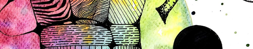
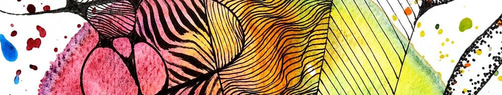
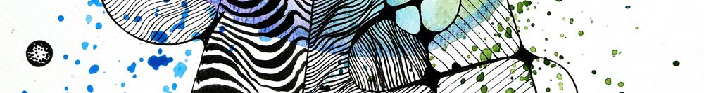
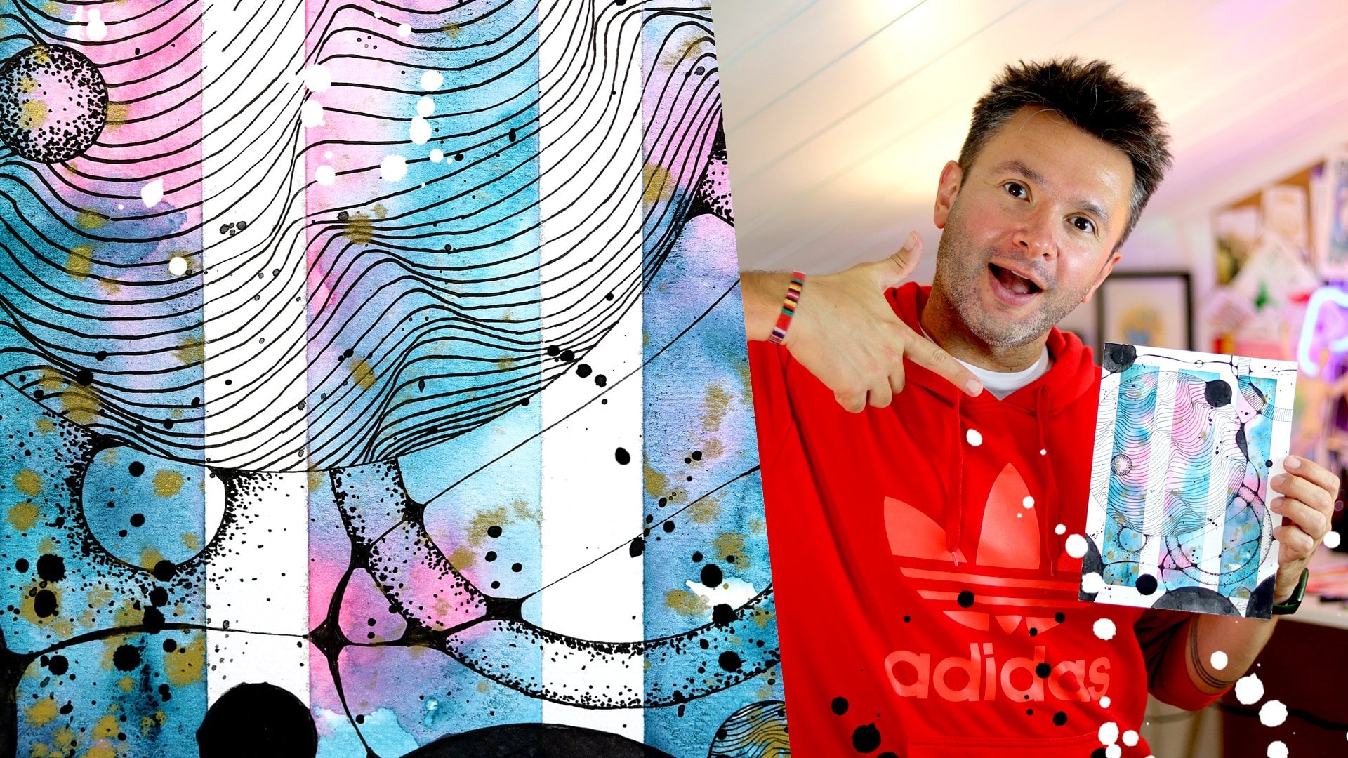
7. The Patterns: Adding Texture to Our Subject and Making It Stand Out: Okay, welcome back.
Now the last part, we're going to add the patterns, and this will be
this will be it. We will conclude our
project like this. I love the patterns
because from this, it's really brings
the object front. At it starts raining here, I will be quiet. But I will continue to draw. Sorry for the noise because
the roof is just above me. But I think it's matching for relaxing art session, some rain. Enjoy the noise of
terrain. Sound of terrain. Noise. When you say noise,
it doesn't sound pleasing. The sound of terrain. Enjoy
the sound of terrain. I will also try to keep the
patterns pretty similar, but if I change my mind
along the way, you will see. That first of all, I like this. I'm using A two, by the way, for these intricate patterns. You can do them anyway you want. I was explaining
before that if you bring them closer
or make them apart, they just really
gives this feeling of texture like waves or, like, the wrinkles on a bedsheet, even though everything is flat, everything is too deep, and I love that. Don't you? And here I will continue. But I will change
the angle of it, so it will be like this. Okay. What would happen if
I like, as a change, keep this pattern
move here and decide, keep it like a bit in the shape. The middle is a bit
more busy and here. So like more like shading. Like, just to see
the difference. Let's do that. Okay. I want to keep doing this changing direction
thing where the line goes. That's a nice effect. Because can you see the
pattern it creates here? I like that effect, so I'm
going to be using that. And this one, I'm going
to leave it empty. I like this effect that is
something standing in front of the object and a lens expanding it in a
way that you can't see behind that
kind of an effect. I like it. I will
keep it this way. Again, I change
direction, by the way, I'm in this rectangle section, but when the line goes over it, it changes the view somehow. I was saying, I think this before that with these patterns, you can just keep
making your own rules and follow them or
don't follow them. It's totally up to you. I don't want to tell you in this way what you should
do or shouldn't do. It's not a bad but it is more like I'm trying to explain how I do things so you
can make up your own mind. Okay, so that part is done. I think we can just
continue with this here. I think since I've been
quiet for some time, I really got into
the lines and I think I was in the
zone for a moment. Excuse me for that. Do you see how I'm
carrying the weight, this heaviness
around like a wave. This is what makes this
pattern so interesting. And as you can see here, my brush pan is finishing.
That's one thing. But it makes these very interesting textures
because it's dying out. Lines are incomplete. I really liked it and
I would recommend it. When your brush
pan is finishing, don't throw them
away straightaway. Okay, so this side
of it is done. I think I will
continue with 0.2. I will do this thing that I draw lines that it's
not going to be wavy. It's going to be straight, but they are more concentrated. And then they will
get less and less. This will give the
feeling of depth. This this one I decide
to do more like I'm doing the objects the
random patterns, let's see. So we can have a look at
the difference between the two and see which
one you like more. I like that. So they start pretty close
almost completely touching. Then I start
separating them a bit. And then not because I put this last line like there should be
another line here. Yeah. I like this as well. This is interesting. Okay, this part is
done like that. I'm going to use the
way we want for this. And I I want to make the
pattern here more dense, and then here is less dense. Like this side is
lighter and this side is like midtones and
this is darker. So it will be like
this one. Yes. Again, I'm going to do the
same trick here that's going to somewhat change
direction, the pattern. So I don't I'm
leaving that part. Okay. I'm not making it too wavy because I want this
pattern to be dense, so I'm not separating
the lines too much not to lose that. Now I will make the wave
maybe change direction a bit. I do that by choosing which
side the lines are touching. There's a curve here. If it's touching on
the left hand side, the wave will continue to left it's touching
on the right side, it will go oversight. Okay. I'm trying to keep the waves
as random as possible, and I'm trying to make the lines also
as close as possible. So then this is
like the mid tone. And with this one, we will be spacing them
spacing the lines. And before that, I need
to so I'm going to turn paper this way and I'm going to do
the pattern like this. Thank you. This also creates a fun effect. What's happening with
this line going through? I change direction of the pattern like an
optical illusion. In the middle, I have these broken lines
in the original one. I want to keep
that. I like that. But this line going through, and I'm going to do something about that like this like me. This is kind of like a
pattern with broken lines. I like this so much that you
just change one thing and just give such a different
feeling as a pattern. And I want to I will try to do kind of shift, where
the lines are going, it will be like these lines here will be in between
those, so it should be So that's the difference
between the two. Because this line is going
through can you see here, you can see that they
are not aligned. They just shifted. I like that. And for this, again, I want to preserve this that this gives the
feeling of roundness, because getting to
the sides it curves away that lines are
getting more frequently. So again, starting
very close then start separating them. Like this. And now I need to do this part and I'm going to leave inside here empty like I'm here. I like this effect. Okay. Now because the line
is going through here, I need to change direction. Okay. And now going back to
the original direction. Thank you all these
imperfections that my patterns were
caring out of line. They are just
getting hidden now. Oh, I forgot to change the pen. I was doing this
with to this so. I thought it felt different. That's because lines are coming attaching faster,
touching each other. Bob Ross would call
this a happy accident. As I start with this,
I will continue. Almost there for
this middle section. Okay. And again, I'm going to change the direction of this and I'm going to
complete this part. A Okay. So this is also done,
as you can see, it's really starting to
pop just like this one. Again, this site will be empty, and now I'm going to go
back to Maybe for this one, I'm going to use
this pattern here. But it's not going to be changing the
distance between them, it'll be more uniform. And I'm going to
change it this way in the direction I want
to do it this way. And it can't be
too close because I want this pattern to
be somewhat lighter. No. Again, I have my plans, and I want things to
go in a certain way, but in the meantime,
I'm not a printer, and my hand doesn't do
exactly what I say always. So as you can see, it's spaced out here a
little bit, but it's fine. And this one, again, I will keep it
this way, and then I will change to direction. I this is also good for the purpose of making a class that goes a faster. Jack seems happy because of that, he never
seems happy but. Something equivalent
to that in this world. Yeah, Jack, I don't know
if you're gonna make it to that date mate. Okay, and I'm going to
do it like this rest. So basically, when the line was going through the
pattern I'm creating, I'm changing like nine degree turn my paper nine degree and change the pattern this way. Oh Okay. And like this, bq not done because I still
need to make this. And for that, I'm going
to use this again. I like this. I'm going
to use it the dots. I'm going to use 08 for that. It has a very thick end, so it makes nice juicy dots. I love the noise it makes,
making this pattern. I think I'm going
to keep it a bit lighter than the previous
version, the original. I'm going to do it on
the edges and give a bit of this rounded effect, but I'm not going to go
as much in as this one. This is also kind of a
pattern you really need to trust your eye, look at it and if it needs more, you add some more. If you think it's
done, it's done. And now this part, this pattern really suits
for this because it feels like it's like these elements are usually plastic in
this coffee machine, and it gives that
feeling the texture. And again, for making class, it's a time consuming
thing to do. But when you are doing it for yourself at home for
relaxing, it's the best. The things I come to
faster than this because then I'm really
shaking the table. And again, I'm trying to
record the class here. So this is as fast as I can go. Just keep adding dots, focus on the dots, but keep
them on one side of the line. If you put on one, it really breaks the illusion. If you even put one
on the other side. And there are also so many
dots here that now just drew my attention that from our painting part that
we splash so much. I also enjoy this as a difference is that this one had less and this one has more. How does this look? I think
it's coming together nicely. Okay. I think it looks good to image to give this effect that
if I had more time, I would probably
play with it more, but I think it's
enough for this. I will try to keep a similar, let's say, the other elements. I always keep three of the
same things. I try to. There's one, two,
three, clack ones. I'm going to do that
now. And for that, I'm going to do this one
and this one and this one. I'll start from the top. First, take care of the edge. Again, if this crash
pan wasn't dying, this could have gone faster. I'm gonna try something. Normally, I wouldn't use
this because this is a water based and brush pan. So when if I use water, it would just bleed out. But here actually for this project done with
the Water, so I can. Yeah, definitely covers the area faster. There you go. So for making cool
patterns, dyeing. Brush pens are good for covering making huge
black dots, not so much. Okay. That's done. Mm hmm. I will let this wavy pattern. That's my favorite to some of
the big ones like this one. I'm using two for this
one, that's in one. Okay. That's done. And next would be I want
to keep this one white. So unleash this one. I want to do a similar pattern on the other corner
of the design. I'm keeping this one
somewhat simple. And, of course, because
the line is going through, I'm changing direction because
that's true, you know? Festival I just made
up for this painting. And what else? In the original, there are also these small elements that
I use this dot technique. I'm going to do that. Which one? I think it can
be this one and this one. I just put a line
of dots around. Because this is a small element. It's important to
do not too much. I'm trying to get rid
of the unevenness. Okay. I think that's enough. And another one here. So I've been coding this. Okay. Because when you also make it too symmetrical
that also doesn't work. So I try to randomize the
dots. Another one here. Okay, and anything else? There will be one difference in this design that I kind of
knew from the beginning. So let's say I have the
three black ones, one, two, three dots, one, two, three empty ones. One, two, I want to add
one more, a third one. Here. Like, I kind
of like it's empty there and maybe here. But like show you only halfway. And a small one showing from here. And I'm going to add the pattern in this because I also
want it to be three. Three black ones,
three empty ones. Yeah. Making those triangles. Okay. And I think with this, I can say I'm done. This was it. Now I just thought I wish along the way I
took some photos. But anyway, um.
What do you think? I think, if I can
compare this with this, they have different feelings that the color is
stronger behind it, that I like how much
is coming through. But this one, it
pops up more because the color isn't that dominant
behind it, the background. I think this my original idea
was to do this actually, like, make the patterns
match like shading. I'm glad I tried. It
actually looks good. I like the feeling that in here, it goes away that this
feeling of depth. Overall, I think I'm
happy how it turned out. I'm looking forward
to seeing yours. You can, of course,
try different objects as well. It's up to you. I'm not saying you have
to make coffee machines. You can even just make a
coffee c or what else? Jack? I will leave that to you.
But that's it for me. I hope you enjoyed this class. I'm looking forward to
seeing your class projects. Don't forget to take a
photo and share them with me and share it on
Instagram, mention me. We'll talk about it
all in the conclusion. So I will see the
conclusion. Bye.
8. Conclusion: Art Is For Our Mental Health: And this the Welcome back. You made it to the
conclusion video. Congratulations on that. It means you have a longer
than average attention span. In this day and age,
it's very important. Since we are just used to
scrolling reels just like that, people spend hours
on 30 seconds, 20 seconds reels, and we're
like, I'm not even looking. So congratulations on
your attention span. Now, let's summarize
what we did. We did this painting. I'm going to check yours and
I'm looking forward to it. This is my favorite part. So please take a photo and
share your class project. This is the most important
thing I would like to say. And while you're at it, you can leave a review. But okay, sorry, I was
summarizing what we did. This is a paint first draw
later, kind of a painting. We discussed this in
the previous parts. You can find it from Part three. We went to wait. Part one, part two. No, Part four. With Part four, we went to because these
are Part four here. We went to first paint, draw later, paint first draw
later kind of paintings. And the benefit of doing this was you can prepare
your papers and leave your paints behind and just
go out just with your paper ready painted paper and your pens and you are free
to do whatever you want. It's much much lighter
way to go around and do your drawing if you
want to do it in a coffee shop or meet
with someone and so on. So this is the first paint. So we painted first
with this buy like this flowing rainbow
circle effect by not touching with
the brush once, but we just splashed
on it with the paint. So it's like paint
scattered everywhere, so it creates the evenly
flowing colors into each other. And so you can do the same or
you can do it differently. I always say, find your own way. This is what I did. And
then I pencil sketch the Bica because I wanted this as a composition to
sit in the middle nicely. That was important.
And otherwise, you know, me, I just
go in with the pen. Then I drew the Bica mocha
with pen and after that, I brought the
connections together and round up and left didn't
leave any sharp corners. And this was us doing
neurographic art. And this is the part
that is very relaxing and meditative for me. I hope it is for you as well. And then even better at
relaxing people, the patterns. Then we edit the patterns, and that was it. So this is what we did. I hope
you enjoyed this process. I will go back to
what I was saying. Please take a photo
of what you did and share in your class project. If you feel like
write a few sentence, how you felt while doing it, if it helped you relax, what were you trying
to escape from? What was your stressor? And right after that, without leaving any break, you can go and leave me a review and tell me and tell the others, what did you think
about this class and if it was helpful
for you at all. This really helps
other students to decide if they should
go for a class or not. And what else? If I needed to summarize
this class and all the series classes,
basically, I mean, one or two sentences
that would be art can be for relaxing and winding down. And sometimes when you do that, there is a beautiful
byproduct like this. So don't focus on
the end result, you can use art to just express yourself and
clear your throats, clear your head, and
get a stress relief. But the good thing
is at the end, you have a beautiful
painting to look at. You could even have a series of them on your wall
saying that, Oh, this wall when I was
fired from this job, I worked for ten years and I didn't know
how to cope with it. Or it could be, Oh, this wall is when I was
going through my divorce, and it's maybe those times wouldn't be something
to remember by, but seeing how you got
over it through art, I think it is a beautiful thing. And art can be helpful in this way. That's
what I wanted to say. So this is it. Let's go to checklist, Jack. We asked about the
class project. We asked about the reviews. We reminded them that don't
focus on the end product, focus on the art
itself and the process and relaxing and
meditative part of art. End result will come.
Don't forget to follow me. Wherever you see
follow button and my name, just press follow up. I will put some links here, and anything else, I
think that's it, right? Now on Instagram,
I have a channel. It's called Fab Spector, and it is basically
bringing you into my studio and let you see behind the
scenes and how I prepare. If you join my
Instagram channel, you get a direct
connection to me. Anytime I post something that you get a message
in your inbox and I share unfinished works
and works in progress, and you get a bit of
insider look to my world. So you're welcome to
join my channel as well. Okay. This was the conclusion. I hope you enjoyed
this conclusion. Yeah, I think we did it. Jack, anything you want to
add, you want to go home. Okay. Let's wrap it up.
You were saying. Sure. Let's wrap it up. I will see on Part seven, or before that, if there is another class, I might go and do no effort
to schon in class as well. I will see you on the next one. Until then, stay creative. Bye. Okay. And I'm doing this completely
without a script, off the top of my
head, which is a mess. We'll see what
happens. I might just pin this whole thing and write down the script
and do this again, but let's see. It's
an experiment. It's funny doing without
script because I don't know if I left out a bunch of important things
I should say, but I said, follow me. I said leave a review, class project, art is important. This is going to be the class
project. Are you ready? Jack? No, not class project. This is the conclusion. Conclusion. It's finished.
We did everything. Like, we did all the
painting and like this. Now, I'm not pretending, but, you know, recording, editing studio, not everything happens as you watch, okay? There is a bit of a
editing happening. Now, let's imagine that we did all that, all classes done. We painted the thing and it's already.
We came to the end. People want to know now like
what is the conclusion? Why did we do all this? That's
what they want to know. So conclusion. I haven't had
breakfast yet, Jack. And I don't have coffee either. I should drink some water. I bought this bottle from idle. It was very cheap, and this is the best bottle
I have ever seen. Like, look at how it's opening. Perfect. And it
has even something to hold here that it
doesn't come on your face. It doesn't fall on your face. And every time you open
it opens with a perfect, like there's a perfect
spring tension. You see that? And then when you drink, It has a hole here. So it doesn't do blo blo blo. You can just keep drinking without swallowing the software. Like, design wise, I'm amazed. Usually, I find problem
with everything. This is perfect.
And on top of that, it has a look additional security if you put
it in your back. I close like that, and everything,
just clicks perfectly. So why don't you join me for the Part six of Abstract
vertical escape? Why is my voice so high? Jack, Okay, that's it again. It says brick on it,
but the one I painted was kind of the original
version, and it's called mocha. What else could I
say? I can't wait. I can't wait to show
you this. I can't wait. I can't wait to show
you how this is done. I can't wait to paint
paint this painting. Again, I can't wait. I can't wait to show you how
we should do some jackpt. Okay? Jack, I quit
sugar, do you know? Since eight of August, it's been almost a month. There were a few breaks,
but it wasn't a break, like, Oh, I have to eat
this. There was an occasion. It was my name day and I
didn't want to be rude, so I ate a punch. Pancake is a polish doughnut. I'm doing really well. It's
actually not at heart. I'm finding it very surprising. I was dreading this. But after the whole
day, I said, Okay, the moment I step on the
plane and we are leaving the border of Turkey, it starts. So I felt like I couldn't
start by myself. I had to happen. And
and I'm just doing it. I'm eating dates next to coffee, and it's fine. It's
actually delicious. And I like chocolate milk. I can't buy a ol chocolate milk from the shop because
it's full of sugar. I just blanted with banana
and it's delicious. So you should, I think, do something like that, as well. You are getting a
little, you know, but I still drink coffee if
you want to get me some. What else? I think that's it. I can't believe I
did this in an hour. This took me three jumps
to do a whole setup. And record three videos. Maybe I'm making things too
complicated. What a surprise. Jack says. Okay. I think
I'm gonna sign off, and I really hope you enjoy this class because this painting is very close to
my heart, right. When I made it, I was
like, Oh, wow, this is it. This is the direction
I want to go. And I want to share
this with you, and then we will bring in more real life objects into
our abstract universe. So I will see you
in the class. Bye.
 Fatih (fab) Mistacoglu, watercolor storyteller