Transcripts
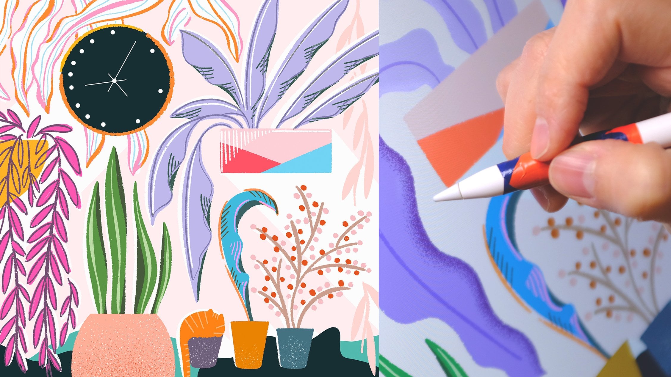
1. Introduction: Hello. I am Jing Jiang, an illustrator and
graphic designer. My work ranges from
illustrations, graphic design, branding,
and packaging design. In this so share course, we will create striking
vector illustration posters with different compositions. You will create two posters inspired by a motif
of your choice, using digital tools that
include drawing functions. First, we will use Procreate to draw free form composition. Next, we will use Procreate to sketch on top of
the composition. Finally, we will draw line art and color in
adobe illustrator. By the end of this course, you will have a clear vision of the vector illustration
process along with some new illustration skills
for your own tool kit. To follow my steps, you will need to have
basic experience using Procreate and
the Dobe Illustrator. Join me on the journey of
discovery and self expression.
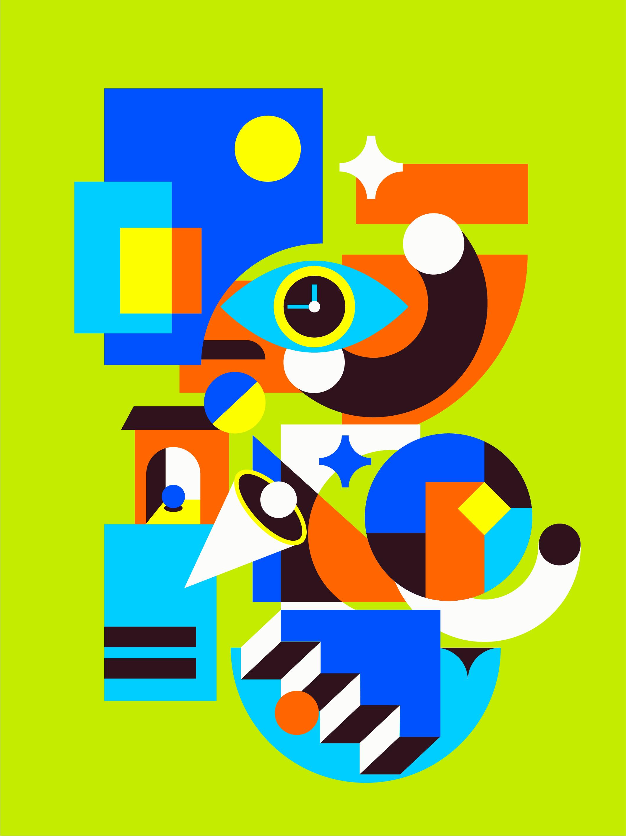
2. Composition: Initialize your idea: Hello. Welcome back to my class. In this lesson, we are going to draw the composition
of a graphic poster. Because the graphic we are drawing this time is
a bit more abstract. It has more to do with the
composition of the picture, so we need to draw the graphic according to the
balance of the picture. Okay, let's start. Let's draw the larger shapes
in the picture first, like a big rectangle. Then has some small
geometric shapes next to it to set it off. Then we'll draw a
relatively large figure. We're going to draw
it in a way that contrasts and
balances the image. Because my graphic posters
are mainly rectangles. I'm going to draw more
rectangles like this one. It takes up a large
part of the picture, so you can add some
circles to adjust it. First draw the big
elements in the picture, then add some small elements. The big shapes are almost done. Now let's draw some small
shapes, enrich the picture. You can have some figurative
elements like me. For example, here are the eyes. Intersperse some small
elements between large shapes to make
connections between shapes. Drawing small shapes
in these places, the center will be richer. Because the viewer's eyes are usually focused on the
middle of the picture. Okay, our composition is
basically almost finished. In order to emphasize the
hierarchy between the shapes, let's erase the lines. This eye is the highlight
of the picture, so I'll put it at the top. It's better to put small
shapes at the top. Otherwise, it will be
covered by the big elements. So it's not as visible
as it should be. You don't need to
erase very cleanly. Just enough to see the
hierarchy between the shapes. Okay, the lines
have been erased. Now, let's draw
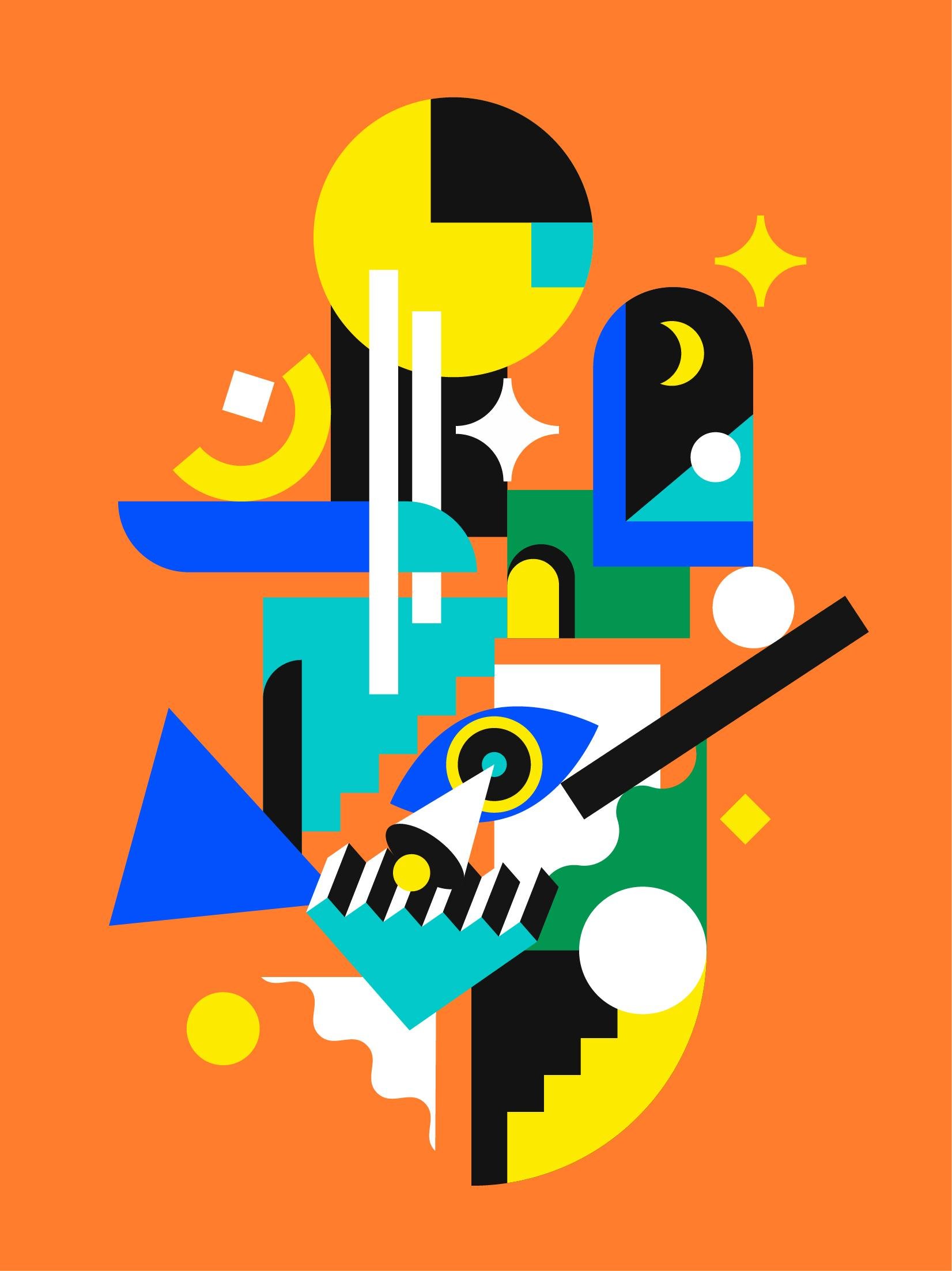
another composition from the same series of posters. Again, follow the
contrast between the size of the shapes and
the balance of the picture. First, draw the big
figure in the picture. Oh, you can do what
I'm doing here. Draw the four corners
of the picture first. It's easier for you to get
the balance of the picture. Graphics continue to be
predominantly abstract. You can make adjustments
as you go along. Since it's just a composition, you can draw it according
to your feeling first. Then you can make
adjustments when sketching. You can draw some big shapes in the background
that are blocked. Because the current
shapes are all square. We can have some tilted
shapes to adjust the picture. Because this poster is from the same series as
the previous one. I'll draw some graphics
similar to the last one, like the ice here and the cones. Where there are empty space, you can draw some small shapes like this to balance
the picture, and it doesn't led to crowd it. Then you can add some obscure
ships in the background. I want to add some lines. Because there's a
lot of surfaces now, this long rectangle can be used as the line
element of the picture. Then it's rather empty here so you can draw a
graphic to fill it. Okay, the composition
is basically ready. In order to emphasize the blocking relationship
between the ships, now let's erase
some of the lines. You don't need to erase to carefully because this
is only a composition, mainly in the drawing of sketches to play a
role in the guide. Okay, check for any adjustments
that need to be made. Here I wanted to make
an intersperse form. So I decided to put this short line behind
this rectangle. It's empty here. So I need
to draw another circle. Okay, we're done. Next lesson. Let's draw a sketch.
3. Sketch: Add elements based on the composition: Hello, and welcome
back to my class. In the last lesson, we've
sketched the composition. Today, we're going
to make a sketch. Import the sketch we
made in the last lesson into the paint program
and reduce its opacity. In order to distinguish it
from the composition below, I've chosen a blue
color for the sketch. Okay, let's get started. Sketching is really about adding elements and details
to the composition. So I want to add a
pupil to the eye. To be more creative, I want to combine the
pupil with the clock. And then the half circle here, I wanted to give a more volume by adding a circular
section here. There are too many circles here, so I replace the circle
here with a star. You don't need to add
detail to all the shapes. For shapes like this, which are hidden underneath. Just draw the outline. And here, I'll replace
the circle with a star. Okay, then let's draw
the big rectangle here. In order to make the picture, the big rectangle here
won't add too much detail. We can draw a gap here so
that it surrounds the eye. Since there are too
many rectangles here, I decided to make
this one around. Okay, I want to
draw a house here. I'd like to add a rectangle behind it to reinforce
the connection. Then draw a door to this house, and inside the door is a space. And add some detail to
the rectangle below. And then the triangle here. I'd like to add a
small circle and the cone here to enhance the
hierarchy of the picture. Then draw the
triangle behind it. Then move to the big circle. Here, I want to make
some divisions in it. Okay, here, draw a circle
with a cut surface. And to echo the con before, I want to draw three
dimensional staircase. I want to interlock the flat and three dimensional
ships in the picture. Okay. Then I'll draw sphere
on top of the staircase. There's a bit of space here so we can make some divisions. Okay, let's hide the
composition. It's not bad. Let's move on to
the next sketch. This one is drawn the same
way as the last poster, so I won't go into too
much detail this time. Draw the big graphics. In the process of drawing, you can make some
slight adjustments. Because I think this
art is like a window, so I want to draw nights
in. That is a moan. You can draw some
stars around it. The stars have the same
shape as the last poster. Here, I'll draw a small arch
as an architectural element. Because of the complexity
of the surrounding shapes, so the circle here can
be simply divided. Continue with the other shapes. The composition below
is just a guide for you so you can change
your sketch a little bit. And here you can draw
staircase as a division. Here I want to draw wavy
lines to echo the staircase. Move to the eye here. You can continue to use the eye shape from
the previous poster. Then here I can draw a con. It looks like the light
emitted from the eye. Yes, I will continue to draw three dimensional
staircase here, just like the last poster. Okay, continue with the
rest of the drawing. Add a little more detail. Okay, hide the composition. It's not bad. That's the
end of the sketch so far. Next lesson. Let's
draw the lines.
4. Linework: Vectorize your sketch 1: Hello, everyone. Welcome
back to my class. In the last lesson,
we've made a sketch. In this lesson, we're going
to make a line drawing. First, select the sketch. Then we're going to
turn the transparency of the sketch up to 30%. This is mainly based on the thickness of the
lines in the sketch. Here I have thicker lines. I'll set the
transparency to 30%. Then press control and
to lock the sketch. This way, we can draw the lines without moving
to the sketch below. Since there are a lot of rectangular elements
in the image, I'll use the rectangle tool
to draw most of the shapes. Selecting the solid
black stroke I prepare in advance and then
start drawing. I'll start by drawing
the rectangles first. The general rectangular elements of the picture have been drawn. Let's adjust the shape
of the rectangles. Just the direct selection tool. Then select the large rectangle. Tap it center point, for dots will appear. Select the dots
here individually. Then hold down the
Lk and tap it again. You can switch between the
types of rounded corners. Then drag the dots inward
and the notch appears. One want to cut this rectangle. Select them and then open up the path finder and
select the split here. The shape will be split. Next is the house here. Select this anchor point and then hold down the shift key and move it into the right distance to the same for the right side. Let's move on to the circle. Select the ellipse to
here and hold down the t and shift keys to
draw a square circle. Let's draw the circle
in the picture first. This is a special case. Draw the outer circle first, then duplicate it, press control and have to duplicate
it to the front. It's better to shrink it. A concentric circle
is completed. The same thing is done
here in the center. Then draw the rest
of the circles. The outline of the eyes can
also be drawn in circles. Duplicate the circle here and enlarge it to this position. Then select the pen toleHld down the K and click on the
anchor points on both sides. Then Zoom in and out like this. The outline of the
eye is now ready. The stars are drawn in the same way as the gaps
in the large rectangle. First draw square. Then select the direct
selection tool. Hold down the L K, click and drag it in. Drag it to this position. This way, the star is drawn. Duplicate it here
and resides it. Next, let's make a split
for the big circle here. Select the pen tool,
draw the lines inside. Then copy the circle below, then select all of them, then find the shape builder. Click on each one.
Delete the access. Then duplicate the
circle below it. Now the graph is ready. Finally, select them and press control and
d to group them. This way, they won't get
separated when you move them. Let's move onto the house. Continue to select
the rectangle tool. Hold down the control
and shift case and individually select the
top to rounded corners. Then drag and drop the dots
and the arch is ready. The divisions in the arch are drawn in the same way as here. Then delete the extra parts. Okay, finally, draw the shadow of the orb. It's like this. Okay, let's draw the cone here. Because it's not easy to draw symmetry when you
draw a tilted shape, so you can draw a
positive one first. Use the pen tool to draw a
triangle. Then right click. Select the transform
transform in the reflect. Select vertical,
and then duplicate. Allign them here, select them. Then find the pathfinder and
merge them into one shape. Then select the ellipse tool. Draw the lips here in the
center and adjust it a bit. Duplicate it again
and shrink it. And then control
and to group them. Move it here and adjust it. Okay, let's move
on to the stairs. Keep using the rectangle tool. First, draw a square. At
the same size as here. Then hold down the key, drag it and duplicate it
here. Then press control. You can move and
duplicate more than one. Next, then select the pen
tool and join them like this. Then merge them. Now you have the outline
of the staircase. Continue to draw straight
line with the penol. Again, press the key, drag and duplicate, align
the end points here. Okay, then use the penol
again to join them. And now the staircase is ready. Group them, move them
here and adjust them. Okay, let's go ahead and
draw the half circle below. Let's start by drawing a circle. Then delete the
anchor point here. Then use the pen
tool to connect. Adjust the size. Okay, draw
the triangles here as well. Use the rectangle
tool to draw to squares. Then merge them. Select the direct selection tool and concave the
corners like this. Finally group them together. Then draw the circle here. Select the ellipse
tool. Drawing a circle. The curvature should be
the same as your circle. Then we find the stroke here and adjust the line thickness
to the same as the sketch. Then align the two n points to the section of
the circle below. Then delete this anchor point. This gives us the
outline of the circle. Adjust the thickness
of the stroke again. Okay, then select the
object extension here. Click Okay. Use the pipe
tool to draw a black stroke. Then use the ellipse tool
to draw its cross section. Still gripping them. And
here we do the same. The upper layer is almost ready. Let's move onto the graphics
hidden in the lower layers. And here's the triangle. Draw another circle to
split the triangle. Delete the excess. Finally,
the semicircle here. Adjust this position. Okay, check again if there
are any missing shapes. The line work is basically done. In the next lesson, we'll draw a line drawing
of another poster.
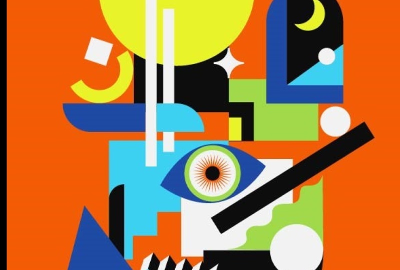
5. Linework: Vectorize your sketch 2: The line drawing of the previous poster has
been completed. Let's draw another one. Drawing method is the
same as the last poster. So in the drawing process we'll not explain
too much detail. First, turn the transparency
of the sketch to 30%. Then find the rectangle
tool and draw the rectangle in the upper
part of the picture first. Okay, then adjust the
shape of the rectangle. The method of drawing the star has been taught in
the previous poster. Duplicate it. The top half of the
rectangle is basically done. Next, select the ellipse tool. Draw the circle in the picture. For a flat circle like this one, draw to concentric circles
first in the pathfinder, click on Strack tap layer, then draw rectangle
on top of it. Select minus tap layer here. Now you have a circle,
adjust its angle. Okay. And here's the moon. Let's
start by drawing a circle, then copy it to the right. Okay, then select here and
subtract the top layer. Right click and select
mirror image in transform. Oh, there's a rectangle
hidden in there. Now I need to fill it in. Okay, select split here, and then copy the arch. Below. Double click
into the group. Then duplicate the arch
and select both shapes. Then select the
intersection here. Then it will be cropped. Okay, then group them. Same here. Here we do the
same thing with the arches. The top half of the
graphic is done. Let's draw the center. Draw the eyes first. The drawing method is the
same as the previous poster. Organize them into groups. The method of drawing the cone
has been explained before, so I won't explain it here. Adjusted. Okay,
let's group them. And then there's the
tilted rectangle. Here, also, very simple. Okay, draw another circle on top and then draw the rest of the
circles in the picture. Okay, then draw a square here. Adjust the corners. Now,
the sector is ready. Next, we'll draw the triangles around the edges of the ripples. Here, use the penal to draw a straight
line with an incline. Select the effect here, distort and transform
ripple effect. Adjust the parameters
according to the preview. Then rotate it by 180 degrees, adjust the parameters again. Okay, then select the extension in objects, then connect it. Okay, and here is
the same shape, so we can duplicate it here. This staircase is the same
as the previous poster. Okay, and then there's
another one here, so we can duplicate it here. Okay, then use the direct
selection tool to select this line and pull it down like this to the
outside of the circle. Again, use the
intersection to cut it. And then here's the graphic. Okay, for the triangles here, use the pantle here's
a hidden rectangle. And then there's a
small square here. Okay. And finally, we'll
draw the stairs here. The method is the same as the trapezoid in the
previous poster. Use the pant to
link them. Merge. To make it easier to adjust, we can click and choose
to redefine the box. Then press down a bit like this to give it a
till to defect. Okay, and then add the ladder. We'll start by drawing a
straight line like this. And then connect them. Okay, now that our two
line drawings are done, next lesson we'll color them.
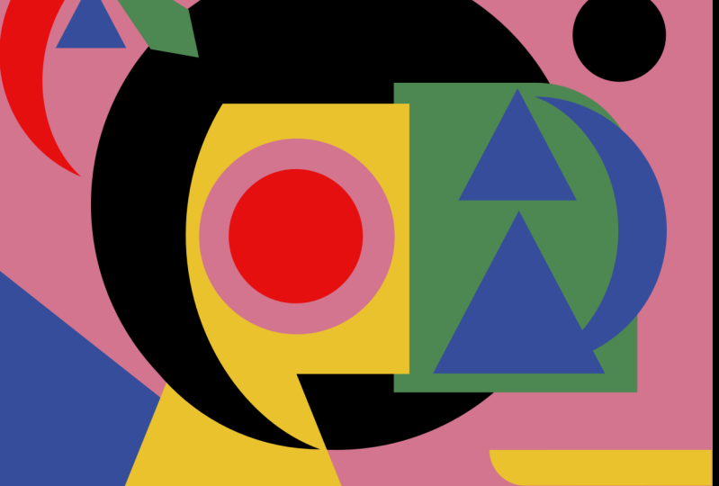
6. Final: Matching colors to the graphic: Hello. Welcome back to my class. In the last lesson, we
finished our line work, and I've been refining
it a little bit. I prepare the color
scheme for the poster. You can also find
different color schemes according to their
own preferences. Okay, let's start. First select the
direct selection tool. Then select the eyedropper tool. This way, we can switch between them by pressing
the control key. In order to unify the
colors of the image, let's start by coloring
the background. Select the background and use the eyedropper tool to add a
greenish yellow color to it. This color will not
be too dark or too bright and will go well
with the other colors. Next, let's color the graphic. Because the rectangle is large and on the
edge of the frame, so it needs a darker color
to emphasize its outline. Then the graphics above and need to be colored
in a lighter color. Here I choose yellow because the colors need to match
each other's shades. I chose an orange
and yellow here. The rectangle here also
needs dark colors. We can use our own feelings
to match the colors first. For example, for the stars here, I usually choose bright colors. If I chose yellow,
it would blend in with the background
and not look as bright. So I chose white, and then the eye for the eyes, I chose for the
white of the eye, I choose a lighter color. Okay, I'd like to go
with a green color here. Since there are a lot
of light colors here, we need to match
the darker colors for the graphics in the back. By choosing the same color
for the hidden shapes, the front shapes
can be nicely set off because there are more
dark color graphics here. To highlight the graphics above. I chose black for
the circle here. Then I need a lighter
color here, like white. The colors for the top
half of the circle are now matched for the circle here to differentiate it
from the one above, you can use the
opposite color schemee. It's both echoing and different. Then we need to use darker
colors for these two areas. Here I want to use a
dark blue coloring. Then a different colors
in turn to go with it. Then we can choose a green
or yellow color here. Choose a yellow
color for the star, but it's blending in a
bit with a background. You could choose the blue
color here to echo it. Then we need a
lighter color here, like yellow or white. Then we need a darker color
here, like dark blue, and here it could be orange red to differentiate
it from here, then we need to choose a darker
color for the transition. The graphic here will have the
effect of passing through. Then choose a darker color
here too, like dark blue. And then the stairs, here, I usually use the
contrasting colors. Because we're using dark
blue and cyan here. The staircase is
black and white. That way, the staircase
will stand out. So the b could be
a warmer color. That's why I chose orange. Here I want to use
cyan and black. To emphasize the cone here, I need to choose a
light color to match. Because yellow blends
easily with the background. That's why I want to use white. The cross section can be the
same color as the pupil. M. Then there's the house here based on the
surrounding color scheme. I chose orange and black. In order to increase
the sense of space, I still use the contrasting
colors of black and white. For the floor, I chose yellow. Then the bowl inside should be a dark color light dark blue. The shadows are black. Then here I use dark
blue and white. Overall looks good so far. Then the color scheme of
our poster is finished. Pay attention to the
contrast between shades of color basically
will not go wrong. With the draw lines open, let's move on to
coloring another poster. The coloring method is pretty much the same as
the last poster, so I won't go into too
much detail this time. Okay, let's get started. Uh. Okay, it's done. And I'll summarize the
color scheme for you. The first step is to prepare your favorite color
scheme in advance. The second step is to color the background to set
the tone of the picture. The third step is to
color the graphic according to the contrast between the shades
of the colors. Okay, that's the end
of our lesson so far. See you next time. Okay.
 Jing Zhang