Transcripts
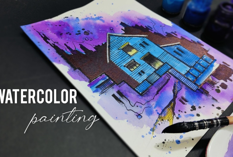
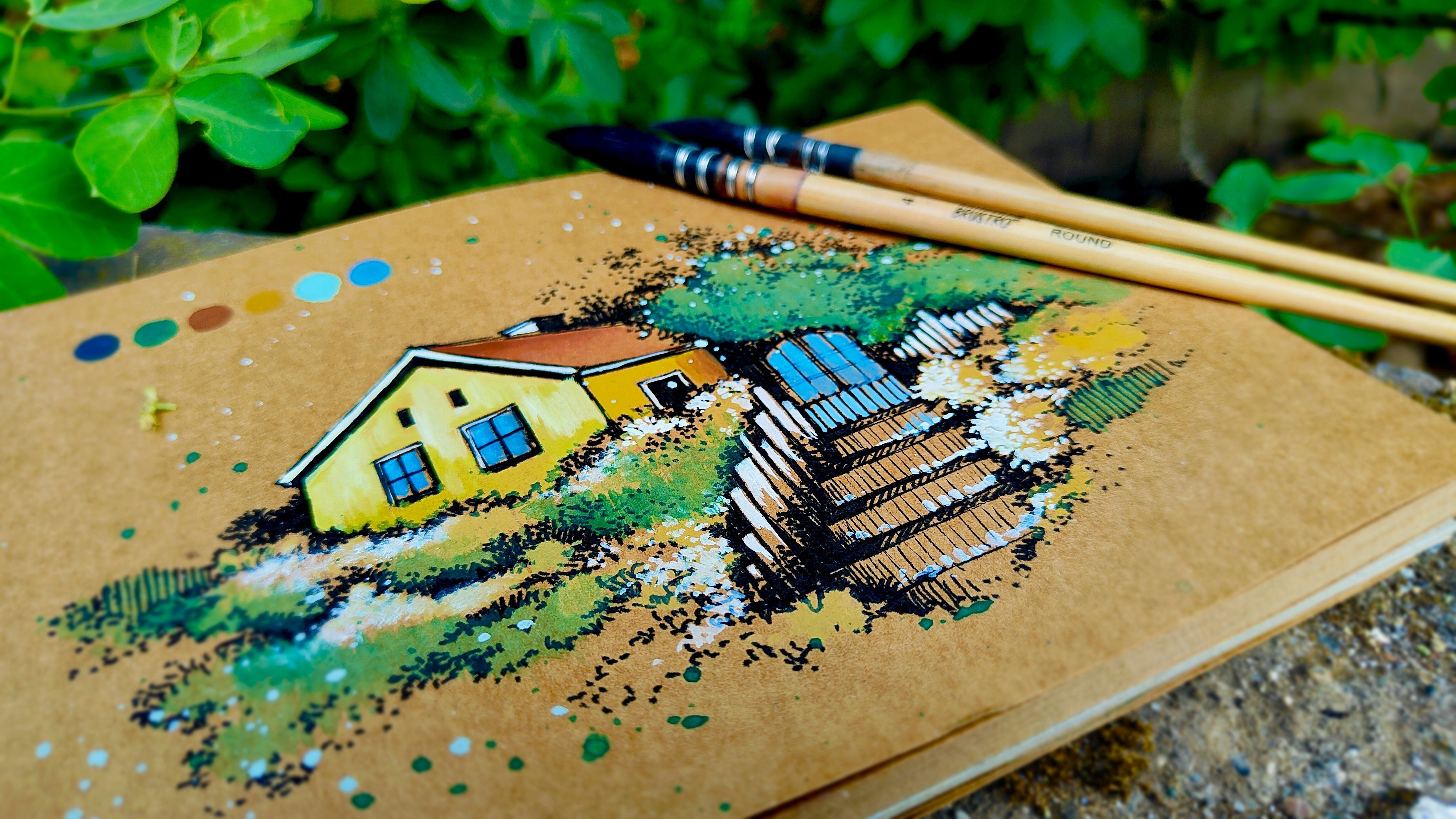
1. Welcome to the Class: When we talk about watercolors, it's one of the most amazing art medium that you can explore. Welcome to a beautiful
abstract watercolor painting, where we are going to combine urban sketching and
watercolors together. It's a very short class, which will enhance your
drawing and painting skills. Hey, everybody.
Myself, Rothwik Patel. I'm a self taught
independent artist and an interior
designer by profession. I personally love to explore different art forms and styles and not stick to
one particular thing. So if you're joining
me, you'll find a variety of classes
that I create. In this class, we're
going to create a beautiful abstract
watercolor painting, which includes a house in it. There are going to
be three basic steps that we are going to follow, which includes basic sketching, inking, and watercoloring. By the end of the
class, you'll have a beautiful watercolor
painting in your hand, following three easy steps. So we're going to start by understanding about
the class project in detail and all the elements that we're going to create
in the entire painting. We're going to talk about
all the art supplies that you will need before you start with the entire class. There is going to be an elegant color palette that
we're going to use, and there are going to be these strokes that we're going to make using markers,
pencils, and pen. The first step is to create a basic sketch of the entire house that
we're going to paint. The second step is to apply
a beautiful black in to the entire sketch to
make it look a little bit more in contrast with
the background paper. And then we have the last step, which is applying
the watercolors in an abstract manner that you're
definitely going to enjoy. Adding minute details
using your brush will help you to improvise your brush strokes
and hand movement. It's an abstract
form of painting, which is a combination of urban sketching and watercolors. So no need to worry
about perfection. Just enjoy the
process of creating. The class is absolutely
suited for beginners and also intermediate and advanced
level artists can try it. So without any delay, grab your art supplies, and join me on this
creative journey.
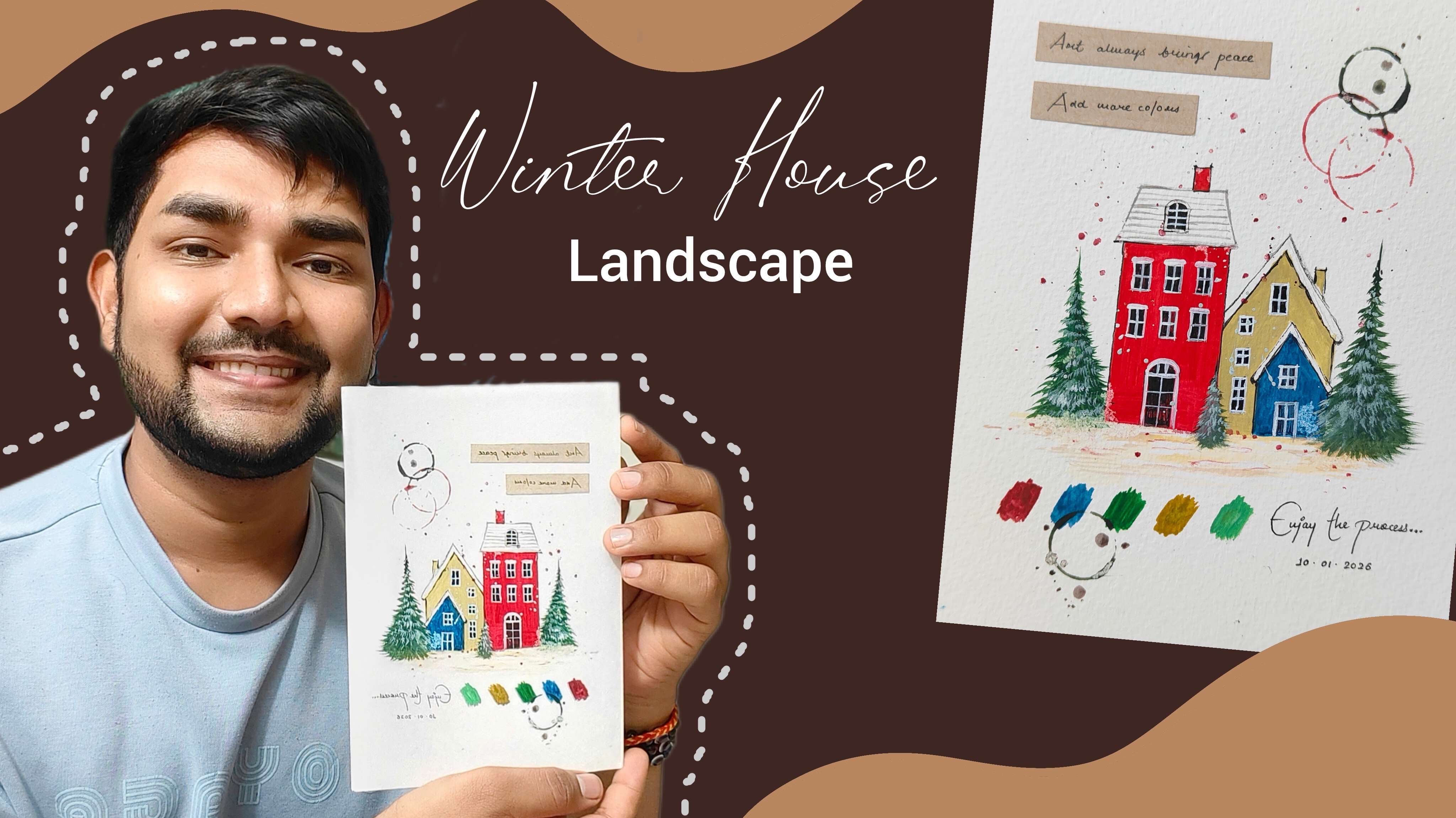
2. Details About the Class Projects: Hey, everybody. Now
let us talk about the class project in
detail so that you can get an exact idea of what we are going to create
in the entire class. There is going to be
this beautiful painting, which is going to be on the format of abstract
watercoloring. There is going to be
a beautiful house in it that we're going
to sketch and in, and then we are going to apply some amazing watercolors to it to make the painting look
vibrant and attractive. I'll take you towards
the painting and give you the details
about it so that you can get an exact idea of what you're going to create
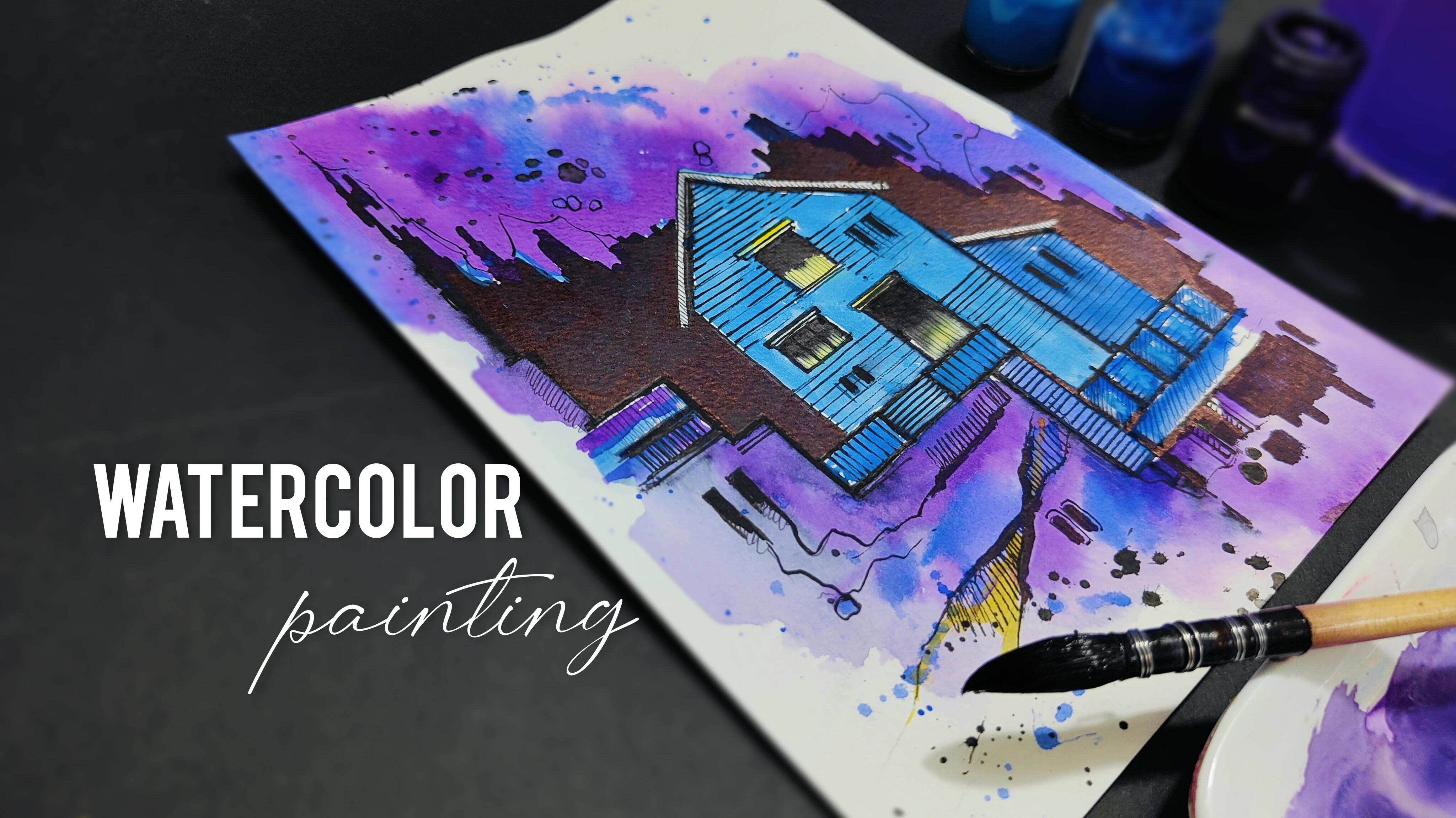
in the entire class. So as you can observe,
I have placed my painting on the desk surface. Now, here is the
watercolor papers that you will need to create the entire
watercolor painting. You can go for any other
good alternative as well. These are watercolor
papers from ansen. It is 300 GSM, and the size of the
paper is A five. In case you want to go
for any other size, it is absolutely fine. Just take care about the GSM. Now you can observe that we have this beautiful
abstract background that we have created
using watercolors. But before applying
the watercolors, there is going to be a basic
sketch that we are going to create of the entire
house that you can observe. Using a pencil, we are going
to create a basic sketch. Then we are going to
apply solid black ink to the entire house and the remaining building
structure that you can observe. You can also observe
these minute details, which is a combination of
horizontal and vertical lines, few random strokes that
we have applied to make the entire painting
look a little bit more aesthetic
and attractive. You might feel that the painting
is difficult to create, but trust me, it's a very simple and easy
painting to create. We are going to use
three basic steps that you have to
observe and follow. So I hope that you
got an exact idea about the class project. Now, let us understand
the art supplies.
3. Art Supplies: Hey, everybody, before
we start with the class, let us talk about all the
art supplies that you will need for the entire class.
No need to worry at all. In case you are missing out
on any particular art supply, you'll find it very easily in
any nearby local art store, or you can go for any other
good alternative as well. So as you can observe, I have placed all my art supplies in a systematic manner so that I can give you the
details carefully. So let us start with the
watercolor papers that is the major element and the major art supply
that you'll need. So the watercolor
papers are from Canson, and it is A five size. You will have to take
care about the GSM, which basically is 300, which is the thickness of
the paper so that you can apply heavy washes of
watercolors on it. You can observe the
class project over here. We're going to
create the project in this portrait manner. Then the next art supply
is a simple tissue paper. You can already observe
the color patches on it. It is always good to
keep a tissue paper nearby whenever you're
working with watercolors. Then next up, I have a
simple color palette. You can observe that I have
used all the colors in it. So make sure that
your color palette is having enough space in it. Now, let us talk about the water colors that you will need. The first one is black. Then we have purple, cyline blue, gambage,
ultramarine, and titanium white. So these are all the
six colors that you will need for this
particular painting. It is absolutely fine if you
do not have the exact shade, you can go for any other
good alternative as well. Then I have a simple container, which is having a little bit of blue water in it,
as you can observe. Of course, we are going to take some clear water so that we can use our brush
and clean it well. Then let us talk about the
brushes that you will need. You will need only
two basic brushes for the entire project. The first one is a quill
brush of size two. The second one is a round
brush of size zero. So it is basically
a detailing brush. These are the two brushes
that you will need. Then next up, I have
a simple eraser, so we can use an
eraser in case we make any mistake while
we are sketching. Then I have a
simple pencil using which we are going to
create our basic sketch, which is the first step
of the entire painting. Then I have a simple black pen. Let me show you the
tip of the black pen. It is going to have a nice, thin, solid black tip. No need to worry
about the brand. You can go for any
good alternative. It is absolutely fine. Then I have another black pen, which is basically a kind
of marker from art line. With a 0.8 tip. I'll show you its nib as well. So you can observe the
tip of the marker. It is a little bit thicker
than the black pen. Then next up, I have a simple calligraphy
pen, as you can observe. It is having a 2.0 tip. You can observe the tip of this particular marker as well. Then we have the last marker, which is from Faber Castle, and it is having an
even bigger tip. So these are all the markers
and pen that you will require for the entire
inking part of the painting. No need to worry
about the brand. You can go for any
good alternative. It is absolutely fine. So these are all
the art supplies that you will need
for the entire class. Now let us move
towards the next part.
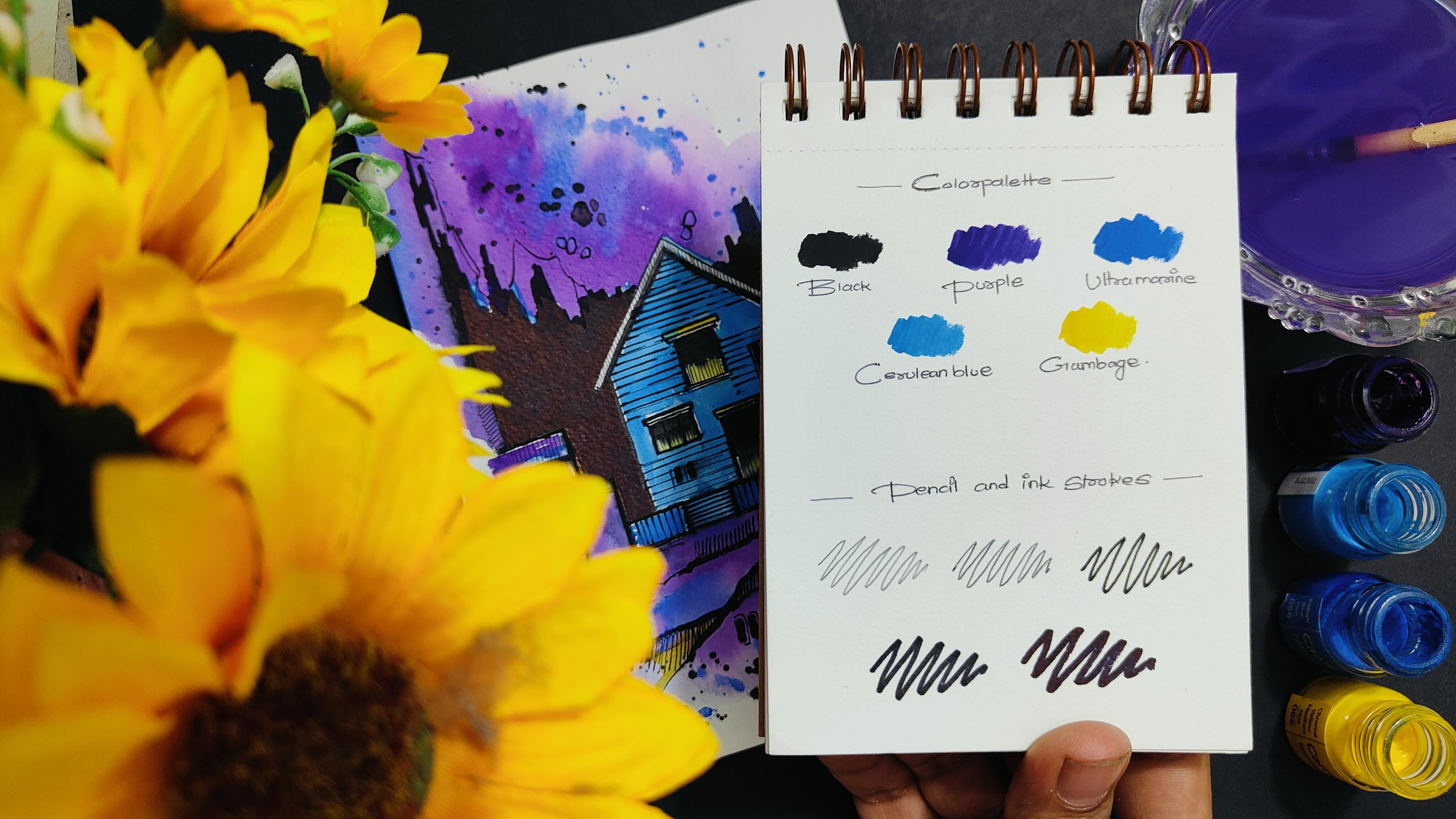
4. Color Palette and Strokes: Everybody. Before we start
with the class project, let us understand the color
palette and the strokes. You can observe I'm having a
simple sketchbook over here, and I have labeled
color palette on the topmost portion with all the five colors named
in the bottom part. And then we are
going to understand the pencil and ink strokes. I'll place my sketchbook in
this particular position, and let us paint all the
colors on the paper surface so that you can get
an exact idea of the color application
onto the paper. It is very important for you to know that the saturation of the color will decrease once the color
dries on the paper. So that's why you have to make a good composition of
color and water together. I've started with gambage, apply a little patch of
the color just above the labeling so that you
can know the exact color. Then we have the next color, which is cyline blue. So I've applied its little
patch just above its labeling. Then I have applied ultramarine. Then we are left with
two more colors, which is purple and black. We are not going to apply white because the paper is already white and it is not going to be visible on the practice sheet. So I've applied purple, and now I'll be applying the
last color, which is black. You have to clean your brush
again and again so that you do not mix the color
with the next color. So make sure about that. And in case you find
that your brush is having x amount
of water in it, just simply dab it
onto the tissue paper. So these are the five
basic colors apart from white that we have
applied onto the sheet. You can compare it with the class project on
the left hand side. Now, in the pencil and
ink strokes section, I have started with
a simple pencil. Then we have a black pen. Then I'll be using my
marker from Art line, which is having a 0.8 tip. Then I'm using my
calligraphy pen, which is having a 2.0 tip. Then we have the last marker, which is having a very
thick tip from fabricase. So you can carefully observe the difference in the thickness
of all these strokes, and this is how we are going to ink and sketch the
entire painting. So I hope that you
got an exact idea of the color palette
and the strokes. Now let us move
towards the next part.
5. Lets Place the Paper: Hey, everybody,
now, let us place the paper on the desk surface. Before we start sketching, it is very important to place the paper properly
onto the desk surface. For that, I'll be using
a simple masking tape. You just have to take
a little piece of the masking tape and
just fold it over. You'll have stickiness
on both the sides. Now, simply apply
some pressure using your finger and place it on
one corner of the paper. Now, similarly, I'll be
taking another masking tape. Just fold it carefully, apply it on another corner. Now we are going to apply two more masking tapes on
the remaining two corners, which are on the bottom portion. So this will help
the paper to be completely stable onto
the desk surface, and the paper will not move while you're painting
or drawing on it. I have placed the last
masking tape as well. Now, simply, you have to flip your entire paper. No
need to hurry at all. Do the step carefully. Flip the entire paper, place it onto the disk surface where you're comfortable
drawing and painting. Apply some pressure using your fingers on all
the four corners. Now you'll observe
that the paper will not move while you're
drawing and painting. We are done placing the paper. Now let us move towards
the first step, which is creating a basic
sketch of the entire painting.
6. Basic Sketch: Hey, everybody, let's
start with the first step, which is creating
a basic sketch. So you can observe
that I'm ready with my watercolor paper being
placed on the desk surface, and the art supply that you need right now is
a simple pencil, and you can keep an eraser nearby so that in case
you make any mistake, you can simply use an eraser to remove the pencil line
and create it again. So you can observe I have started from the
left hand portion, creating these horizontal
and vertical lines together, which is forming
a nice variation. And then as you move
toward the center portion, you just have to create
a long horizontal line. Now, followed by two
more horizontal lines on the right hand side and
one simple vertical line, you just have to create
this entire structure. So if you observe carefully, you don't have to worry
about perfection. It's just a simple combination of horizontal and
vertical lines together. No need to even use a scale in case you are able to draw
it with your free hand. It is completely fine. And if you want to use
a ruler or a scale, it is absolutely okay. So now, I'll start creating a beautiful roof of
the entire house. You can observe we have created a beautiful slant roof
on the topmost portion, followed by two vertical lines, then we have a nice small house just attached with
the bigger one. So just simply attach
a slant line and just connect it with
a vertical line to the entire house structure. Now, one thing that
I would like to tell you all is that no need to worry about drawing the
sketch in the exact same way. In case you want to create your own composition
of the house, it is completely fine. So don't worry about the output, just enjoy the
process of creating. Now, let us add few windows and one door in the entire
big house structure. So I've started with one single window
followed by another, which is a little bit smaller. Then you can add these
little rectangular shapes to create some nice aesthetic
to the entire house. And trust me, there is no specific way of applying
these random strokes. You can create it in
a very natural way. You can add them
wherever you want to. I have also added these little
two rectangular shapes in the smaller house structure to create some nice
window effect. I'll be adding two
rectangular shapes on the left hand
portion as well. So this is how we have created a beautiful sketch
of the entire house. You can observe it carefully, and you can create
your own composition as well without worrying
about the output. I'm adding these
little vertical lines to add few more details. So we are done with the sketch. Let us move towards
the next part.
7. Inking the Sketch: Hey, everybody, you are most
welcome to the second step, which is inking the basic
sketch that we have created. So you can observe that we are done with
the pencil sketch. I'll be using my
marker from Artline, which is having a 0.8 tip. You can observe that carefully. Using this particular marker, we are going to
give a nice outline to the entire sketch
that we have created. Now, there is not going to be this single marker, which
is going to help you. There are going to
be multiple markers and pens that we are going to use to ink the entire sketch and make it look a little
bit more attractive. You can observe that I have started from the
left hand portion, and you just have to simply
follow the pencil line. Now, one thing that
I would like to tell you is that no need to worry in case you move your marker out of
the pencil line. It is completely fine. It is part of
abstract sketching, that in case there
are minor flaws or minor mistakes
in your sketch, it is absolutely okay. You can also carefully observe
the way I'm moving my hand and just creating these
beautiful outline for the entire sketch. You can make the lines
double wherever you want to. You can create some nice
variations as well. Also, one thing that you
can keep in mind is that whenever you're a pen or pencil, whatever it may be, just try to keep your hand very
much lose and free. No need to make it very stiff and try to get perfect lines. It is absolutely fine if your
lines are rough and random. Now, slowly, you can
observe the way I'm creating the outline using
this particular marker. So now you can observe that
we have almost covered the entire sketch using this particular marker
with a tip of 8.0. You can similarly add these little random strokes on the bottom portion as well. So now the sketch
is well defined and it is visible
on the white paper. Let us start adding few minor details
using the same marker. So you can observe
the way I have started from the topmost
portion in the house. Slowly, I'll move
towards the bottom area, adding these little
horizontal strokes. If you observe carefully, I'm just creating a
simple dotted form in the starting part and simply continuing the line so
that you can create some nice depth in the entire house if
you observe carefully. Now I have added the
line on one side of the house and left it
over the right side, if you observe carefully. So it is a completely
random step. There is no specific way of
adding these strokes as well. You can add them according
to your convenience. In fact, in case you want
to create vertical lines, that is also absolutely fine. Now, slowly, I'll be
covering the portion in the right hand side with
these horizontal lines, as you can observe carefully. You can also add lines
in the house structure, which we have attached
on the right hand side. So as I told you, if
you observe carefully, you'll find that it's
a combination of horizontal and vertical
lines together, which forms this entire
beautiful structure. There can be a few
random lines as well to make some more aesthetics
to the entire sketch, and it is absolutely fine. Now, we can create these
little vertical lines to add a nice fence element
in front of the house, which is attached with
the main wall structure. And similarly, I'll be adding these vertical lines in the wall structure on the
left hand side as well. Now, if you observe carefully, there are these minor
lines that enhances the entire sketch and make it look a little
bit more in detail. Now, once we are done, adding an outline using a
thin tip marker, I'll be using a calligraphy pen, which is having a 2.0 tip. You can observe it's
having a nice thick tip, and no need to worry
about the brand. You can go for any
other good alternative, having a nice thick,
solid black tip. Now we are going to just increase the size of
the stroke that we have made so that we can create a nice contrast and depth
to the entire sketch. Now you can observe carefully, I have started from
the left hand portion, slowly moving towards the right hand side of
the wall structure. Now I'm not going to add the thick marker
in all the lines. You have to observe carefully
in certain areas where we want to enhance the lines and make it look a little
bit more darker. Simply apply the marker
in that particular line. So if you observe carefully, the entire thin marker line
becomes a little bit thicker, and it creates a
beautiful contrast with the white sheet
in the background. I'll add a line just in the
bottom portion of the roof so that it also creates a nice shadow effect and some
depth in the entire house. Using the same marker, we are just covering the
window half black so that we can enhance the
entire window as well. Similarly, I have added a nice solid black patch
in the door element, which is on the bottom portion.
No need to hurry at all. Take your time, make
sure that you hold the marker in a
comfortable position and carefully apply these
little solid black patches to enhance the entire
house element as well. Trust me, you'll definitely enjoy this particular
process as well. Now, if you observe carefully, the entire sketch is creating a beautiful contrast with the solid white color
in the background. Now, we are done inking with this particular calligraphy pen. I'll be using a simple
black pen right now, and you can observe that it
is having a very thin tip. Using this particular black pen, we are going to add some minute details to the entire sketch. Again, it's a simple
process of just mixing these horizontal
and vertical lines together in certain areas. You can observe I'm also
adding these slant lines to make the entire
sketch look a little bit more attractive
and aesthetic. Let me tell you this
again that do not worry about drawing it in the exact same way I'm
drawing right now. You're free to do your own experiment and create your own
composition as well. It would be really
great, in fact, you create your own composition. Just observe the steps carefully and the way you
have to apply the ink. This will basically help you to just create a nice
sketch basically. So even if you're
traveling somewhere and you observe a beautiful
building structure, and you're carrying
your basic sketchbook and these little art
supplies like ink pens, markers, pencil, et cetera. You can simply start scribbling
without worrying about perfection and creating
these random lines together, forming a beautiful structure. Now, using the same pen, I'm just adding these
little lines in the roof structure to make the roof look a little
bit more attractive. These minor details basically enhances your entire
building structure, and your painting looks a little bit more in detail and depth. Now, I have added these random
lines in the white area. There is going to be a solid abstract black background
behind the house. So I'm starting with
a simple pencil, creating an outline, which will help us to apply the solid black marker
in certain area. You just have to create
this random outline. Again, do not worry about drawing it in the
exact same way. Your line may have a different
variation of the outline, and it is absolutely fine. So this particular line
basically helps to understand where we are going to apply this thick
solid black marker. So this is basically a thick permanent black marker
from Faber castle. You can use any good
alternative as well. It is absolutely fine. So I'll use this
marker and start applying it in case
you want to apply it on the outline
initially and then fill in solid black color
in the inner portion. It would be really great.
You can slowly apply the marker in smaller portions and complete the entire area. Be a little bit careful near
the roof and make sure that your marker do not move
inside the house structure, that will definitely
spoil your sketch. Now, I'll just apply the outline on the right hand side as well. Attach it with the building structure in the bottom portion. Now, slowly, let us
fill the entire area with this solid black color.
No need to hurry at all. Observe the movement of my hand and carefully fill
in the entire surface. It would be really great if
you start by applying it in smaller areas and slowly
cover the entire portion. Make sure that there is
no space left in between. In case you find that there
is any space left in between, you can reapply the marker in that particular area as well. Now, you can slowly
follow these steps and carefully apply the marker
in the remaining portion. So now you can observe a beautiful, solid,
abstract background, which is completely black, and it is having a
nice composition with the building structure that we have in the foreground. I'll add a little
solid black patch in the bottom right
corner as well. And again, no need to worry about creating it in
the exact same way. You can apply it in
your own way as well. You can add few more random,
solid black strokes, according to your convenience, to make the sketch look a
little bit more aesthetic. If you find that
you want to make certain lines a little bit
more darker and thicker. You can apply the marker in
that particular area as well. So we are done with the inking
part of the entire sketch. You can observe carefully how beautiful it is creating a
contrast with the paper. I'll use my marker
of 0.8 tip again, and I'll add these little
horizontal lines in the house structure that we have in the right
hand side as well. Now let us move
towards the next part.
8. Applying Watercolors: Hey, everybody, you are most
welcome to the last step, which is applying
the watercolors. So you can observe
that we are done with our entire inking part
and the sketches ready. I'll be using my quill brush
of size two and slowly start applying a thin coat of water on the topmost portion. You can come to the abstract
solid black outline that we have created. No
need to hurry at all. This is basically known as
a wet on wet technique in which you apply a thin
coat of water initially. Now, I've taken a little bit of purple in the color palette, simply mix it well with water, and slowly start applying
these little patches around. You'll observe that
the color will automatically spread
in the background. This is basically known as
a wet on wet technique. You can be a little bit
careful near the roof area so that you do not move your brush inside
the house structure. You can observe how beautiful this entire purple
color is looking. You can use a little bit of water to spread the
color naturally. No need to worry about getting
the exact same output. It is absolutely fine. It's a random process
of applying the colors. Now, I'll be taking
a little bit of ultramarine in the
color palette, and you can add a
little patch of ultra marine in this beautiful
purple background as well. You can randomly apply the
brush in certain areas to make a good composition of purple and ultramarine together. So right now, you can observe a beautiful abstract combination of the background
that we have created. In case your brush moves inside the solid black abstract
background a little bit. It is absolutely fine. No need to worry about that. It won't be that much visible. Just make sure that
you do not move your brush inside
the house structure. Now, similarly, I'll be painting the part in
the bottom portion, and you can observe
how easily I am just applying the color
in this random way. You can observe the
movement of my hand as well and the way I'm just adding the water to spread
the color randomly. Whenever you're working
with watercolors and you want a darker pigment, try to have less
amount of water in your brush so that you can
have a nice saturated color. And whenever you
want to decrease the saturation and make the color look a
little bit lighter, you can add more water
So now you can observe that we have created a
beautiful abstract background behind the house structure, and it looks really nice. You'll definitely enjoy
this particular step. Now, in case you want to experiment with
the color palette, you're free to explore and use your own color
palette as well. And I'll be taking
a little bit of ultramarine from
the color palette, and I'll just apply
its little patches on the bottom of the
building structure as well. Now, slowly start applying it in the inner structure
of the wall as well. You can use the tip of your quill brush wherever there is a smaller
portion to paint. Make sure that if you want
a highly saturated color, you have to take less amount
of water and more color. Now, to make the background look a little bit more abstract, I just took a little
bit of water, mixed it well with ultramarine. And simply tap your finger onto the brush to splatter
some color around. You can do this step naturally
in a very random way, and you can observe the way
the color will splatter on your paper in this
beautiful abstract manner. Now, I'll be taking a
little bit of cerlne blue, mix it well with water, make a good combination
of the color and water. Now start applying it inside the house. No need
to hurry at all. Use the tip of your
quill brush and carefully apply the color
in the entire surface. You have to make sure that you do not move your brush inside the window structure
because we're going to apply a different color
in that particular area. You can observe
the way I'm moving my hand to apply the color
in a comfortable manner. So that's what you have to do whenever you're
working with a brush. You can observe
that the house is getting a beautiful
separation from the background because we have used a lighter tone
of cerlin blue. Now, I'll use a little
bit of ultramarine to paint the building
structure in the right inside, having two windows in it. You can slowly apply the color in the bottom fence
structure as well. Now, if you observe carefully, there is no scope for perfection while you are doing
an abstract painting. You can randomly move your
brush in certain areas, so no need to worry
about getting your brush outside the
outline in case it happens. Now, I'll be applying
the color in the fence structure that
is in front of the house. We are applying
some ultramarine, and to get a lighter tone, I'll add a little bit of water and cerline blue in
the color palette. So if I have to
tell you honestly, there is no specific way of applying the color to
the entire sketch. You just have to experiment and randomly apply the
colors wherever you want to and just make sure that
your painting looks a little bit aesthetic with the entire sketch that
you have created. Now, let us paint the
windows and the door. I'll take a little bit of
gambage in the color palette, mix it well with water, and use the tip of your quill brush to apply
it in this small portion. No need to hurry at all. Try to paint in a very slow
and steady manner. Use the tip of your quill brush carefully and apply it
in this little portion. You will also observe
a little bit of spreading of the marker
that we have applied, and it looks really nice, creates the doors and
windows in depth. You can also observe
that I'm adding a little bit of gambit strokes in the bottom portion randomly. You can apply it
wherever you want to. Now, I'll take a little bit of cyline blue from
the color palette. Add it wherever you
find that there is a little bit of
white space left. Now, we're going to add
some minute details using our detailing
brush of size zero, which is basically
a round brush only. You just have to take some solid black color from
the color palette, and simply add these
little random strokes on the topmost portion just above the abstract
black background. You are going to enjoy this
particular step a lot. You just have to take some so, on the black strokes
that we have created in the outline
of the entire sketch. You can also apply it
on the windows that we created using these
little rectangular shapes. It will enhance
the entire color, and it will create a
beautiful contrast with the background
color as well. O. So this is how you can reapply the solid black strokes
using your round brush of. It will enhance the solid black
color in a very nice way. You can observe carefully the way I'm using
the tip of my h, and you can also
observe the way we are adding these minor details. There is no specific way
of applying these strokes. You can randomly apply these strokes in
your manner as well, and it is absolutely
fine if you create your own composition of
these rough random strokes. It will enhance the beauty of your entire abstract painting. You can observe that there are certain splashes of
color in the background. So I'm just creating
the outline of that to define a
beautiful shape as well. I'm adding these random lines on the right hand side to create some nice aesthetics to
the entire painting. You can do this particular step in the bottom portion as well. Oh. Oh. So we are done with the
entire painting. Now, since we have masking
tape in the background, just slowly remove the painting from the desk surface.
No need to hurry. Let me take you a little
bit closer so that you can observe all
the retails carefully. You can observe
the way we combine few minimal elements
together to form a beautiful abstract painting in which the major
element is this house. I hope that you enjoyed creating this particular painting
using three basic steps, which was sketching,
inking, and painting. You're free to explore
and experiment. You can create your own
composition of the painting. Now, let us move
towards the next part.
9. Class Conclusion: When you start working
with watercolors, you'll observe that you can
explore it in a lot of ways. There can be a combination
of a beautiful color palette that you can use to create an amazing painting.
Hey, everybody. So you're most welcome
to the class conclusion. I hope that you enjoyed the entire class and got to learn something
new and creative. While I was creating
this particular class, I made any number of mistakes, and that is something
that I always tell my students never to be
afraid of making mistakes. It is really great
if you maintain an art journal to practice
on a regular basis. This basically improvises
your sketching, inking, and painting skills. I would be really
excited to see all of your class projects into
the project gallery, so do not forget to add them
into the project gallery. It would be really great if you leave a review for
the entire class as it encourages me a lot and my class can reach many
more students like you. At the end, I would like to say, keep learning, keep practicing. Thank you so much for joining the class and happy painting.
 Rutvik Patel, Artist and Instructor