Transcripts
1. Intro : Anyone familiar with
marketing, graphic design, or visual presentation
of a product in general is probably aware
of what topography is. For those of you completely
new who don't know, topography is defined
as the art or procedure of arranging type or processing data
and training from it, or the style and appearance
of printed matter. Basically, it means if
you're writing something, it's how the letters look to the eye,
which sounds trivial. But when used in a smart way, it can subtly convey
a certain feeling to an audience and
different types of font, or more appealing to different audiences
and different markets. So this is the beginner's
guide to typography. So whether you're someone who's completely new to typography or you're someone who has experienced and just wants
to review the basics. This course is perfect for you. Here we learn about the foremost basic types of
font and how to use them, as well as why
topography is important. And single use and mixing font and a class
project where you will design font for a fictional
product to a new audience. Now, with all that
out of the way, let's get into the lesson.
2. What is typography : Now, for what is topography, basically, what it
basically means is certain aspects of font
mean different things. For example, a font
such as this has a very classical old feel. It makes something look
very reliable in sturdy. And it will never
go out of style. Something like this. Looks sleek, modern
and up-to-date. Something like this. Looks really high class. Again, it just spells
out a very high bar. Something like this,
appeals to children. There's also learning
to mix fonts, as well as learning what
things like Bolding, italicizing font can do. If you want to know
what each of them is for urine the right place. So let's go on with what
are called Serif fonts.
3. Serif fonts: The first type of font
we will talk about are called Serif fonts. Serif means little foot. And the serifs in
serif fonts are those little almost dashes that are at the edges of
letters like this. This thing circle
here is a serif. Serif fonts are pretty classic. They show dependability
and are generally pretty safe and work really well
with the written word. So if you're typing out is something that
would be printed, such as a book or a magazine. And newspaper, or
piece of branding on a sign or something
that's sold in a store. Serif fonts will
work really well. Also if your product
is geared towards people who are a little
bit on the older side, serif fonts on your logo and other branding will generally
be very appealing to them. Next, we will talk
about San Serif fonts.
4. Sans Serif fonts: Next are sans serif fonts. Sans serif fonts are
fonts without the serifs, without the little feet at the edges of words,
such as this. San-serif fonts generally
look really clean, really modern, and really sleek, regardless of the time
period, they're used in. A logo with a sans serif font
that was made 30 years ago, will still look
relatively modern today. As a result, San
Serif fonts generally appeal to a younger audience,
not necessarily children, but if your target
audience's younger adults, san-serif fonts generally will work really well and are
probably your best bet. Due to san serif fonts also working really well on a screen. Most things such as websites or any online articles
that are meant to be read as PDFs will also work really
well with a San Serif font. So if you're a digital company or appealing to younger folks, probably your best bet
to go with san serif.
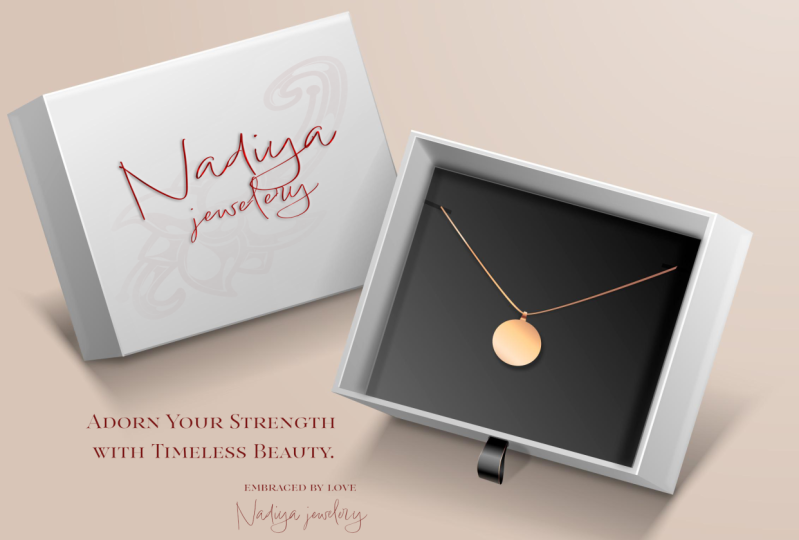
5. Script fonts: Script fonts are the
ones that look like cursive writing, such as this. A script font will generally
make something look very classy or high-end. So if your company is selling is something very expensive, such as a wedding, or just something that's more so geared towards
higher earners. A script font is probably
what you would want to use.
6. Display fonts : Display fonts such as this are often used
more so for headings, large billboards and titles. They are not recommended
for any body text. So the main text of a website, a book, and newspaper, anything that would usually
be any of the other three. Probably not a good
idea for display, but if you want to
have one single word standout on something
like a billboard, display fonts are
probably your best bet. Just be sure to use them very
sparingly because they're difficult to read and can look a little bit awkward
when there's a bunch of them.
7. Bold, Italics, Underline : Now for bold, italics, and underlines, these
three are often used to make certain
words stand out. But it's very important that you try not to use
these three together. And if possible, try to never even use two
of them at the same time. Bold should be used for titles. And drawing attention
to keywords, such as something like this. But if you use it too often
you end up with something like this that is
very hard to read. Italics can often be used to
highlight people's names. Underlines, again are used for titles and often for hyperlinks. If it's something that's online. Again, mixing these too much
or using any one of these, a lot will often have
the reverse effect and dilute their effect or make your text
difficult to read. For example, look at this
ad that's, that's not good. Something like this
is a lot better.
8. Mixing Font: Now, don't be afraid
to mix certain fonts, such as using multiple
fonts in the same logo. This is something
that can be done creatively but carefully
at the same time. Now, I'm about to state a few, quote unquote, rules
for mixing fonts. But be aware that none of these are hard and
fast rules there. More so guidelines as
typography is definitely more of an art than a
science of these will generally be more
true then not true. You'll generally want
to combine fonts that give you the same field. Generally, for example,
too playful fonts that look somewhat similar
will make a good parent. Two fonts that have tall, thin letters will generally
pair well together. But differences are also good. Sometimes combining
a serif and sans serif font can work beautifully. If this is the case, the one that you use for
bigger letters should be the one that is geared towards
your primary audience. Unless it's a title
such as this. If you were looking to
highlight the serif font, this would be a
good way to pair it with a sans serif font. And this is the opposite. This also works for
our script fonts as seen in examples
such as this. Now, when mixing fonts, it's best to take your time
and use trial and error. So take your chances and feel free to
break some of these, quote unquote rules
and experiment. You might find two fonts that work well together
that no one else has found and make your logo really creative
and eye-catching. And that could lead
to a lot of success. And you'll have the perfect
opportunity to do that in our upcoming class project.
9. Class Project : Now, for our class project, I want you to design a logo with whatever fonts in
it that you desire. However, using the
attached sheet, you will explain
your use of fonts and use your target audience, as well as the rules
I've stated in the previous lessons to
justify your choice. And when you're done, that, you're done the course. Thank you very much and
I hope you enjoyed it.
 Chris Viola, Writer and Marketing professional