Transcripts
1. Introduction: In today's fast evolving world, one of the most significant
shifts has been in where and how we shop
and spend our time. With a global
Internet penetration skyrocketing over
the past decade, more and more people
are dedicating a significant portion of
their lives to being online. This presents a huge
opportunity for you to expand your business reach and acquire new customers previously
beyond your reach. For example, if your
business has a website, you can sell your products to people from all over the world. You don't have to sell to
people within your orders. Or if you have web
design skills, you can earn a living
building websites for other businesses or building website templates and
selling them online. But the question is, how
do you build a website? Do you need programming
or coding skills? Well, to develop a website, you have two choices. You can either pay a web
designer to do it for you or you can learn
to build it yourself. In this class, I want to
show you how to build websites yourself
using Elementor. And by the end of the class, you will have a solid
workflow for creating websites without writing
a single line of code. A wait a mini,
what is Elementor? Elementor is an amazing drag and drop page
builder for W press. It's powerful,
intuitive and lets you design and customize
your websites visually. You simply drag and drop various page elements like a graphic designer to
create your layouts. Now, I assume you've never
used Elementor before, so you are a complete beginner. If that's you, this
class is for you. As a prolific entrepreneur, you probably have business ideas that need a website
from time to time, but you don't have
the money to pay a web designer every time you want to build a
prototype website. This class would
enable you to turn your website ideas
into live websites. Starting from scratch, we'll build a real world landing page together as we master the most commonly
used elementor tools. We'll start by learning
how to install were press both online and offline. We'll see how to
install Elementor and other plugins both
locally and online. We'll see how to install a WordPress theme both
online and offline. And then we'll go
ahead and get familiar with Elementas user interface. In other words, I'll take you on a tour of the Elementa editor so you can get familiar
with the tools and features and settings
you need to know. Once you've had a quick tour
of the Elementa editor, we'll move on to build
your landing page, starting from the
navigation bar at the top to the footer
at the bottom. We'll also cover how to
make your page responsive, so it looks great
on all devices. If this is your first time
seeing me, my name is Ken, and I've been using a L
lamentor to build websites for my clients and myself
for the past six years, and I've been sharing
that passion with students right here
on Skillshare. And I hope I'll see
you in this class. And now I'm ready
to get started. I hope you are too. In the next lesson, let's have a look at a demo
of the Landing page you'll be building throughout the
class. Let's get started.
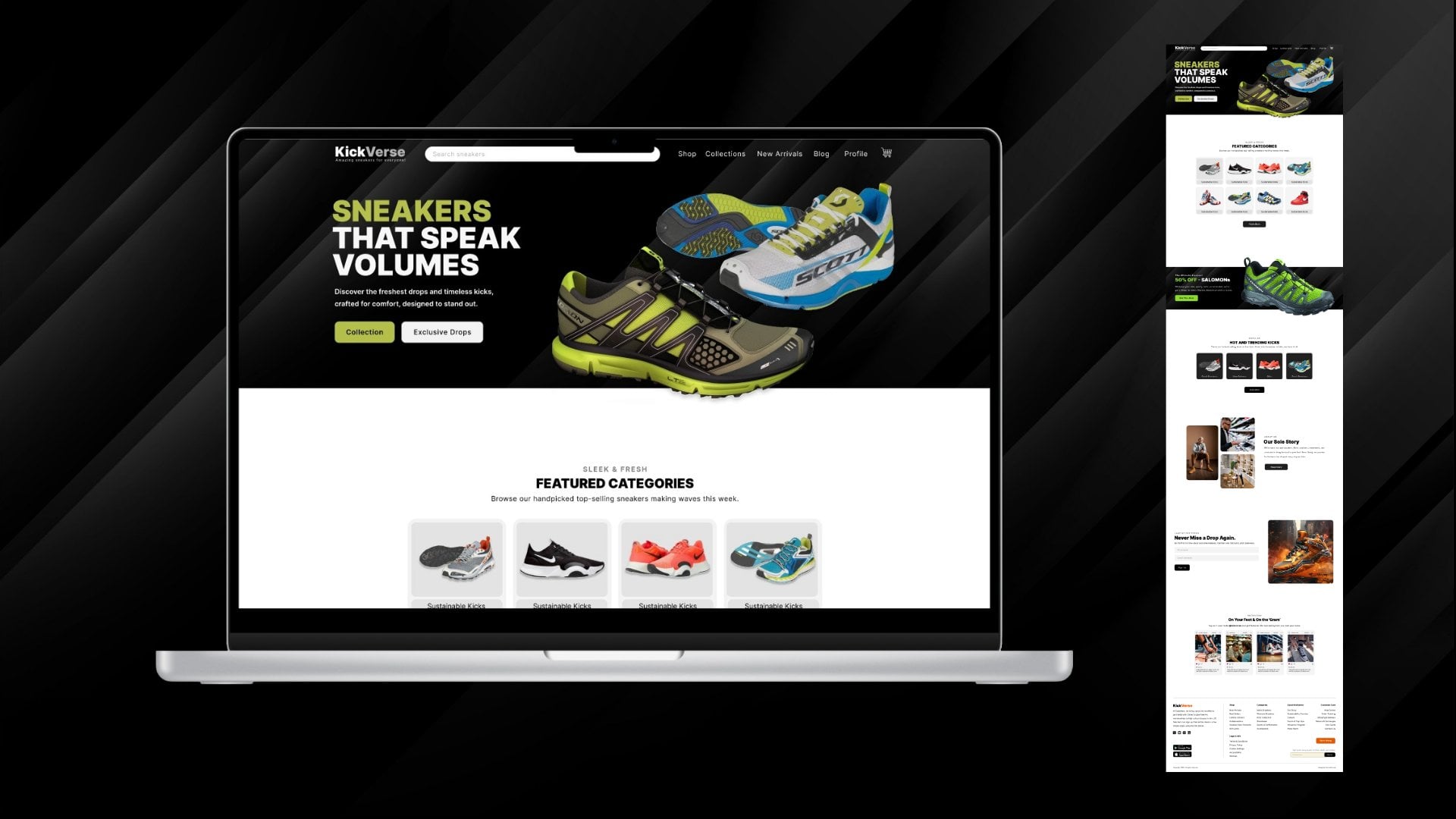
2. Class Project: A, welcome back. So now, as you might already be aware, the best way to learn a technical skill is by working
on a practical project. And now, in this class, we're going to be working on a landing page as we learn
how to use elemental tools. So here's a landing page, and I want us to
have a quick look at it from the top
to the bottom. So starting off here is our
header with a logo, a menu. And a quick call to
action button up here. Next, we have this hero section. This area is called
the hero section. It's made up of a text
block with call to action buttons and
the hero image. Next, we have this anchor
button right here. When we click it,
it pushes us to the next section right
here on the page. And you will notice
this section has some nice animated
particle background. It's a particle system, and we'll see how
to create that. We also have headings that have different colors,
dual color headings. We'll see how to
set the color for a specific word in a sentence
or in a block of text. Moving on, we have
something similar here, but its implementation is different from how
this was implemented. This image is added
as an image element, while this is added as
the section background, and we'll see how
to do all that. Moving on to the fodder, here, we have a footer that looks
like this other section here. You will notice it's also a very simple
footer with a logo, some description here,
icon lists here, and call to action buttons. Very simple, not complicated. I wanted a project that is easy for you to do because
you are a beginner, but also give you
an opportunity to interact with the most
commonly used elemental tools. And so as we build
this landing page, we will get to interact
with those tools, and by the time we finish, you will have the confidence to start working on a new
landing page by yourself. So, that's the project we'll be working on
throughout the class. I hope you're as excited
as I am. If you are. Why don't we move on to the
next lesson where we'll be looking at how
to install W press. I'll see you shortly.
3. WordPress Offline Installation: A, welcome back.
So now that you've seen the landing page of
going to be building, it's time to install Wpress. Now, there are two ways or two places you can
install W press. That's online and offline. In this lesson,
we're going to be focusing on an
offline installation, and in the next lesson, we'll be focusing on
online installation. Another name commonly used for
an offline installation of Wpress is local installation because it's local
in your machine. You don't need an Internet
connection to continue working on your Wpress website and navigating
from page to page. And to set up W press
locally on our machine, we will need to
download two things. Number one, we need
to download shap. Number two, we need
to download W Press. So let's go ahead and
download Shamp right now. So I'll add a new tab, and I'll type Sham. I'll just go ahead and click download and we'll be
redirected to this page, apache friends.org
slash download. You'll be taken directly here, and we can download the latest version that
we work on our machine. As you can see,
we have 8.2 0.12. This is the latest version
because this is 8.0. I think I'll go
with this, but you can go with any of
this if you want. And it should start
automatically. Why isn't it starting? Let me just click here. All right. I do not accept. I don't know why it's
not downloading, but let me just click this. And here we go. So now it's
downloading. And we're done. Now Shap is downloaded. Let me just click Show in folder and drag
this window here. Here it is. I'll just double
click it to install it. Now, don't worry about
this warning right here. Just go ahead and click Okay, and here is our setuiz. So I'll click next. Click next and install
it inside C Sham. So I'll just click next next. So let's so we can just go ahead and allow it
in private networks, and we can go ahead and
start the C panel right now. So keep that chat finished. And it's opened up
in the other window. So here it is. And
as you can see, Shamp provides us with
several tools and features. So what we need to do
right now at this moment, now that we've installed
shamp is to start the Apache server because your workpas website
must run on a server. The server is what
will allow you to navigate from one page to the other to navigate from the from one part of the
dashboard to the other. Then let's also enable
the SQL database. Do you want to allow this? Yes. So I'll just go
ahead and allow that. Now, as you can see, we
have Apache running and my SQL status changed,
and it's running. And now, the next thing
we need to do is create a database because when we're setting up
our Wpress website, we will be asked for the
name of our database. So we need to have
it ready beforehand. So I'll go ahead and
click my SQL Admin. I'll just click Admin. Now it's opened up
in the other window. I'll just drag and
place it right here, and I should switch
to that other window. But here's what you
should have after clicking my SQL admin. Let's go in here and
under databases. Let's create a database. Let me just call it
my underscore DB. It doesn't really
matter. You can just say my database. That's okay. Leave everything else
intact and click Create. So now we have this new my
database listed under here. So I'll just go ahead
and close that. And now that we have a database, the next step we need to do, remember, I said we need
to download two things. The first one we
downloaded was shap. The second thing we need
to download is Wordpress. So I'll go to wordpress.org. And here we are. I'll
just click Get WordPress, and I'll download
Wordpress 6.61, and now it's downloading. We're done. Now let me just open up in folder. Here we are. I'll right click and
go to WR Et here. There we go. Now we've
extracted it here. The moment we open
up the folder, we have to directly
have this content. This content should not
be in another folder. This content should not
be extracted this way. Do not right click and
extract to that folder. Because if you double click it, it will now have the Wordpress
folder inside of it, which has the content. We want this folder itself, not the folder that has been extracted. Keep that in mind. I'll just copy this Wordpress, click Control C.
Now I'll go inside C. Let me just go
inside this PC, double click my C drive, and we will find
this shap folder. Remember this is where
we installed it. Double click that,
go inside HT Docs. Now, in here, this is where we paste our work pres folder, Control V to paste
it, and here it is. Now we can give it the name of our website
because essentially, now this is a website. So let's call it
maybe online shop. So that's the name
of our website. Anytime we want to create a
new Wpress website locally, all we need to do is
come in here and paste another Wordpress that's
downloaded from wpress.org, come in here and paste it. There we go. We can
call this website two. That's website two. Now, if we go to now
remember this name, Online Shop. Copy that. If we go here and type
local host Online Shop. Here we go. This will
start the Wordpress setup. Now, the reason this
has worked so far is because these
two are running. Remember, if you do not have this on your
screen right now, it's because you probably don't have one of these running. So going back in here, my language is English. Welcome to Wordpress. Let's go ahead and get started. Let's go. Database name. Remember we gave it a name. If I just open a new
tab and go to or maybe close that and open
this, go to Admin. Remember, we had my database. I'll come in here
and use that name. My database. The user name is root and
leave the password blank. Leave everything else intact. I'll click Submit.
And there we go. All right, Sparky, you've
made it through that. Run the installation.
Here's where we give our work press
website a name, a title. Remember, it was a online shop. These are the credentials
we will be using to log in to our
WordPress dashboard, so we can update content. So I'll just use my user name. I'll use this password. I'll provide an e mail here, and I will discourage such engines from
indexing this site, and let's go ahead and
install WordPress. So remember your credentials, my user name, Copy this
and put it somewhere. Let me just type t
x t here to open a note pad and put that password there
for a second. Then go. Let me also put this
my user name here. Let's go ahead and install ps. And success, we have now installed our
work press locally. So if I say log in, I can come here and say my username and the
password is this. Copy that, paste it
in there and log in. I can save this to my password
manager, and here we are. So now we have W press
installed locally. We don't need an
Internet connection to continue working
on our project. Congratulations. You now have a local Wpress installation. In the next lesson, let's
go ahead and see how to install or set up WPss online. You will need an Internet
connection for that, but let's see that
in the next lesson. So I'll see you shortly.
4. Buy Web Hosting and a Domain Name: Now that you've learned how
to install Wordpress locally, you might be wondering, how do I do the same thing but online? Because ultimately your
website must go live. It must exist somewhere online. Now, if you've taken any of my most recent
elemental classes, you must have come
across the lesson where we addressed how to
buy a domain name, where to buy hosting,
and how to buy it, how to set up Wordpress once you buy hosting
and a domain name. We covered all that. And
because I think we did a great job of explaining
that entire process, I'm going to borrow that
lesson and slotty teen right here for you to go
through that process. So, here we go. It's time to talk
about how and where to get your web hosting
and a domain name. Now, every website you
visit is stored somewhere online on a server that's always available
to the Internet. That's why you're able
to access a website that's in the
Netherlands or the US or Mexico because it's stored on a server that is always
connected to the Internet. So that means every
time you click a link that leads you
to a specific website, for example, free Peck,
let's say, freepik.com. What the browser did was it sent a request for this
specific page, and this specific page can be accessed through this
address or this URL. And so when it sent the request, that request was
received by the server that's storing the
free Pick website, and the Free Pick website is
made up of many web pages. But because this web page is represented by this
specific domain name, that server will return a response with the
page you requested. So that server is what a
web host provides you with. Your web host provides you
with storage space for your website and makes sure that your website is available to anyone who wants to visit it. Now, the other thing you
will need is a domain name, freepik.com is a domain name, and this specific domain
name is unique to free peek, so no one else can have
the same free peak.com, the same way no one else
can have your phone number. Your phone number is unique, and it's used to reach
just you, no one else. So your website needs to
have a unique domain name, and people will use that domain name to
access your website. So now, going back in
here, I'm at wpress.org. This is the official
website of WordPress. This is where you can
download Wire press. If you want to develop
your website offline, you can install Wire
press in your system and work without the Internet
and build your website. But what we're interested
in is the hosting page. Wire Press has a list of
recommended web hosts, and I recommend you take a
moment and read this page. You can see, they have three
main recommended web hosts, Bluehost, dream host
and wordpress.com. But this doesn't mean these are the only web hosts that you can use for your
Wordpress website. There are other web hosts
who are just as good, if not better than these three. So these are just
wordpress recommendations, but you will find out
here by reading this that there are
hundreds of thousands of webhsts out there, the vast majority of which meet the wordpress
minimum requirements. W Press decided to just
make your work easier and decided to give you the top three that
they recommend. Now, personally, I
have used Blue Host. And I long time ago, when I started using Wpress, I tried wpress.com,
and you should not confuse workpress.com
with workpress.org. Wpress.org is the
platform that is run by the Work Press Foundation because remember
Wpress is open source. And wpress.org exists to
provide you with remember with the W Press download and everything you need
to know about W press. But now when it
comes to hosting, there is a dedicated service called wpress.com.
Let me just open it. This is a platform
that provides you with tools and hosting to build
your website. It's like weeks. If you've seen weeks, you know that when you're
building a website on weeks, you don't need to think
about where to get hosting because they host
the website for you. They just give you
the tools to start building your
website immediately. But of course, it
has its limitations, the same way Weeks has
its limitations when you compare it to installing
Wordpress yourself on a server. When you install W press
on a server somewhere, you have more control to do many more things
that you don't have control over when you're using a hosted service
like wordpress.com. But of course, it's a nice place you can try out if you want. Now, at a personal level, I use name chip. Especially when I'm just experimenting with
some ideas before I commit to buying a dedicated web hosting
for that specific idea. So Name chip has several
services right here. One of them is this managed Wordpress hosting and
migration to Wordpress. But another service here
is called shared hosting. If I open that, we have this Stela Stela plus
plan right here, and I'll tell you why
I like using this. Number one, look at this
unlimited websites. That means if I have, like, ten ideas for
different websites, I have ten ideas. Maybe I won't open up
an e commerce shop. I won't open up a
cosmetics shop. I won't open up a personal blog. Maybe I won't open up
a social community. Maybe I want to create a forum. Those are five different ideas. I can host all those
websites under this plan without having to buy separate
hosting for each website. I can have an
unlimited number of websites hosted under this plan, and I only get to pay
this fee per month. Of course, this is the
first year has a discount, but then on the second year, you'll be paying 68.88 per year. But think about it. If you have three ideas or four ideas
for different websites, and you want to see which
one will work before you commit fully to getting a dedicated web
hosting plan for it. You can create the
website under this plan. Create the four websites. There will be live
on the Internet. You can start sending people to that website through
links on social media, just linked to the
four websites. And if one of the
websites really catches on and starts
attracting a lot of traffic, you can now decide now this website seems
like it's catching on. So let me get a dedicated
web hosting plan for it separately. And then you can
just migrate it to the dedicated hosting because now it's an idea
that's kicked off. The rest can remain as
experimental websites, but they are still live online. But the good thing is you're
paying for one hosting plan. You're not paying
different hosting plans for the different websites. And, of course, because
of those advantages, that's why I'm able to
build a website like this. This is the website
I just showed you. Let me just go to the front end. This is the reference website I built while preparing
this course, and I built it, of course, so we can have a website to look at as we
work in the course. Now, with that said, this is one of the websites I have hosted under this plan. And it's under this domain for. Now, in this class, we will
be building our website, and I'll be using a
different domain name, which will be wordpress
everything.com, and it will also be
under this plan. So I will have
those two websites, demo websites, under
the same hosting. That's why I'm using this. But now I've taken too much
time talking about this. I'm not trying to
convince you to get this. This is just me explaining
the rationale behind what I use and how I work because maybe you
might find it useful, but remember, You can always go here and try out these
other web hosts. They are also good. Go and try them, choose
the one you want. And once you've done that, let's go back in here. As you can see here,
we have domains. Name chip is one of the best domain name sellers
on the planet. You've seen the
adverts everywhere on YouTube and on
different websites. You can search for your website. Let's say charity today.com. Let's see how much that is. All right. Charity today.com
is the premium domain. It's $1,700. But we also have other
cheaper domains, Charity today dot today. It's up to you to
get creative and buy a domain name that
you can live with, a domain name that makes sense. Of course, you want to use the name of your charity
organizations or your startup. If you're looking for funds for technology projects
and not charity, you can also just use the
name of your company. M company today.com. And as you can see, y. So just play around with this
and then once you're ready, you can add to card. But remember, when we go
back to shared hosting, when you buy this plan, you get a free domain name. So that means you have a chance to get a
free domain name for the first year without having to spend this money that
we've just looked at. You won't need to buy a domain name for the
first year, but of course, you will have to pay for the domain name on the
second year onwards.
5. WordPress Online Installation: So now that you've bought
W Press web hosting and a domain name, you can install WPs online because we have access to
what we call the C panel. It's the C panel that gives
us the environment that has all the tools and
features we need to install a Wpress website online. And so let's go ahead
and do that now. So here I am on my
name chip login page, and I'm just going to
log in immediately. So I'll click Sign in. Name chip, we want to verify. All right, so I need
to verify this. So let me just look at
my e mail very quickly. And there we go.
And now we're in. So if you bought name chip web hosting to access the C
Panel Go to Hosting list, that's where you find all
your web hosting plans. And remember, I
bought Stela plus. So let's go ahead and
click Go to C Panel. And we'll be redirected
to the C panel. And here we are. Now, regardless of whatever web host
you decided to go with, your C panel should look
something similar to this. Maybe some of the settings
might be missing, or you might have more
settings than I do, but most settings
here are the same. One of the main tools you will find there is called sftaculs. And Softaculs is
what allows us to install different types of CMSs. W Press is one example of a CMS, so you can click
W press directly here or click sptaculs
apps installer. So I'll just go ahead
and click W Press. And now we'll be taken to
the page where we can manage all the Wpress websites we've installed or install new ones. If I scroll down, you
will notice we have one W press website
already installed. And remember, because we're
using the Stella plus, we can install unlimited number of websites under
the Stella plus. So we can install a brand
new instance of wordpress. I'll go ahead and
click Install now, and we'll be taken
to this page to provide all the details
for our website. Start off with a protocol. I like using HTTPS, make sure there is that S
at the end for security, www website.com, but you can
also use HTTPS website.com. Now, if you don't have
an SSL certificate, you won't have HTPS, you will have only HTTP, but that's not recommended. Make sure you have
an SSL certificate. Now when I choose this
and click outside, It'll do a quick
check to see if I have an SSL
certificate installed, and if I do, it's okay. If I don't, it'll tell
me I can't choose HTPS. Next, I'm going to
choose the domain under which I will install this
instance of wor Press. Because my reference website is in worpress everything.com. I'm going to choose
fX pod.com nothing. Don't add anything here. Otherwise, your homepage
will need to be WWW your domain name slash, whatever you put in here. That's going to
be your homepage. Typically, you just want your
homepage to be wbsite.com. So don't add anything here. Then I'll provide a
name for our website. So online shop. Buy anything from us. That's a description
of our website. And these here are
the credentials you will be using to log into
your Wpress dashboard. If you don't want to go through the C panel to access
your dashboard, you can just go to your
Wpress websites login page and log into your dashboard. So make sure you have
a strong password and strong user name. I'm just going to leave
this at the default. And here are some
plugins that come pre installed with W press. If you check them,
so I'm just going to remove this and this. So I have none of these here. You can also choose to have
backups for your website. Leave it at default. You can choose to
back up your website once a week or once a
month, whatever you want. So I'll just choose once a week. Rotation maybe two. There will always be
two copies of backups, one older than the other,
at any given time. And you can also provide
an e mail here to which an alert will be sent once the
installation is ready. I don't need to do that, so I'll just go ahead and click Install. And don't leave this page until the progress
bar reaches 100%. And there we have it. So now, Wordpress is
installed and ready. Here is a URL to our home page, and here is a URL
to our dashboard. Let's go to the home page. And that's the default theme
that comes with Wordpress, and that's how our
website looks. Here's our domain name. Going back in here, let's
go to the dashboard. Right lik open Link in New Tab, And here we are inside our
Wpress websites dashboard, so we have successfully
installed W press on an online server provided
by our web host. And with our Wpress
website ready, let's see how to install a Wpress plug in offline.
See you shortly.
6. Install a Plugin Offline: So now that we've installed wor press both
locally and online, it's time to have a quick
overview of elementor. Now, for this
lesson, we're going to use the local installation, and that's because I
also want to show you how to install plug ins locally. So now that we have this local
installation of wor press, it's time to install element. So I'll go to plugins, add new. Here we go. And because I'm
connected to the Internet, these plug ins that are in the WordPress directory
will be listed here. But as I mentioned, that's
because I am online. If you're offline, you
cannot click install now. In fact, I don't
think you can see any plugins here because
you don't have Internet. So you will need to come
here to upload a plug in, and then you will need
to choose a file. That means the file you're
choosing is a file you downloaded beforehand when you were connected to the Internet. So L et's download the
file we will upload here. Let's download Elementor. Elemento plug in. Once we click elemento plug in, don't go to the
elemento website, go to wpress.org slash Plug ins. This is where to download it. I'll click that. We'll
be taken to wpress.org. Once again, remember this is
where we downloaded Wpress. But now this time
we're under extend. Let's just wait for
it to finish loading. Right now we're under
extend plug ins. Plug ins element. So in here, I'm just
going to click download. You can read about
lamenta here if you want. We're downloading it,
and now here it is. Now going back in here, I'll say choose file, and I mean side downloads, as you can see here is
lamenta 3.232, then open. Then click Install now. Then activate the plugin. Now, we'll be taken
through this setup wizard. You don't need to create an
account to use elementor, so I'll just skip. You can continue with
the hello theme which is created and maintained by Elementor or the elementor team, or you can use your
own preferable theme. We're going to use a
theme called Astra, so we're going to
skip this part. Now, we don't need these
pro features because we're using elementor
free, so skip that. And now we can edit a
blank Canvas or choose a professionally
designed template or a template we
already created. But now, regardless of which option we choose
here, including Skip, elemento will
automatically generate a sample elementor page, a page that's editable
with Elementor. So let me click Skip. And now Elementa
has automatically generated this page
because it has to take us to the editor
so we can have a quick overview of what
Elemento is all about. So here, they're
telling us about AI features that we can
have access to if we want, but that means you need to have an elemento account.
So skip that. And now here is the
sample page and it's called Elementor
number eight. And let me just publish
it very quickly. There we go. We've published it. Now, before we have a
quick look at this editor, if we want to exit
to the dashboard, all we have to do is click
this and exit to WordPress. Once we exit to W
press will be taken to the Gutenberg editor
for the page. This is where you do some
basic configurations of the page in the back end. We'll see how to do all that. Now, going back inside
Wordpress settings, as you can see, this
is the page that was automatically generated
by Elementor. But these are two
additional pages that came with the new
installation of W press. We don't need these two for now. Select them and then
move to trash and apply. So now we have this
Elementor number eight. So now I can click
edit with Elementor. And we'll be taken back to the elementary page with the editor now ready for
us to have a look at. So I think for now, we're going to stop
this lesson right here. At least I wanted
us to see how to plug in on an offline
installation of W press. This is a good place to stop. In the next lesson now, let's have an overview of what all these parts mean.
What's all these? What are all these settings
as you build your website? Let's see that in
the next lesson.
7. Elementor Editor Tour: So now it's time to have a
quick look at the editor. Let me just close that down. Now, right off the bat, as you can see here, we have
something called structure. Now, this is the new name. In previous versions
of Elementor, this was called
Navigator because it's a widget that gives us a bird's eye view
of the entire page, all the elements we
have on the page, and we can quickly move to
different parts of the page. It also shows us the structure. Let me show you very quickly. While we're still here, if I, for example, add a container. Drag and drop a container there. In the container, by
clicking this plus sign, I drag an image element, and maybe let me
add something else. Let me add another container right below this container.
Now we have that. In there, let me put a video. This is just an example of Let's also add another
container right below that, let me go ahead
and add a heading. So as you can see, our
structure here shows us the structure of the
page, hence the name. But the name navigator
was also very relevant because you can navigate to
any part of the web page. So if I collapse that
and that and that, As you can see, we
have one container. This container, I
I hover over this, as you can see,
it's the container encompassing all these
other containers. Now if I expand this, we have an image, and so this image is inside
the container. But this container also
contains this other container, which we added afterwards. Remember this container, it's inside this
outer container. That's why when
we collapse that, we're hiding whatever
is inside that. But now inside this container, there is a video
element that we added. If we expand that, we have
that video and inside it, we also have another
container we added, and now that container
contains that heading. It's like a hierarchy
or as the name suggests structure.
That's number one. Right here on the left,
as you've noticed, I'm adding elements by
clicking this plus sign. If I want to add anything else, I click this plus, and I can add any element
I want from here. Up here, we have
additional settings. If I want to publish the page, I just go ahead
and click Publish. I can also click this
drop down menu to save this current page as a template
that I can reuse later. If I want to preview
what I've created, I want to preview this page. I can click this icon,
but first of all, let's publish this, and then
let's click Preview Changes. It'll open up a new tab, and there is where we'll see
our page as it looks now. In here, we have some few other
extra things I don't use. Then here we have
responsive design or responsive mode, icons. Once you click this, it
changes to tablet mode and you can optimize your web page to look
good on tablets. You can also click
this mobile screen to switch it to
mobile screen size, and we can adjust every single element to look
good on mobile devices. When we're in a certain
mode, for example, in mobile portrait mode, The changes we make
to the elements will not apply to
tablet or desktop. They will apply to
mobile mode alone. And we'll see how to do
this when we're optimizing our landing page class project towards the end of the class. So we'll get to know how to
use these responsive tools. The other thing you need
to know is if I collapse these panels right here. All these panels
contain elements we can drag into our work
area into our page. If we open up, let me just
all right, let me close that. If we go to layout, we have two main elements,
container and grid. I like using the container. This can hold all these
other different types of elements that
we find in here. The container basically holds other elements of your web page. If we go to basic and
expand it, collapse layout, inside basic, we have the most commonly used
elements like heading, and you can edit edit it here or by going directly in here and editing it right
inside your work. What else do we
have? If we say add, we also have a paragraph, which is called text
editor by elementor. There we go. You can
change this text. And anytime you
add an element to your workspace here
to your editor. In other words, anytime you drag an element and drop
it inside your page. The moment you drop it and
it's still the active element, it will have this sort
of outline around it, and the settings here will be
for that specific element. Right now, as you
can see, it says edit button because I've just dropped the
button right now. Content is the content
of the element. For example, the text content, learn more. That's a content. Now, styling is to change the
appearance of the element. This is to add content
to the element. If it's an image element, adding content, for
example, adding an image. If it's a button,
adding content, for example, the t
of of the element. Then we have the style is
changing how the element looks. We can change the
color and the button. Normal color. We can say this should
be black, and on hover. That's normal on hover. We want it to be let's say red. On hover, it's red and
on normal, it's black. We can also do the
same for the texts. On normal, is the default color, which is white, and On hover, we can say we want
the text color to be let's say light blue. So just like that. The next thing collapse that. Now, inside the pro panel, as you can see, it says upgrade, and you will notice
every element has a small lock icon on it, and that means if you click it, you can't drag it into your work because
you need to upgrade. So everything else here is similar to these other
two we've looked at. Now, there's one
more setting that I like making sure is activated. If you go here and
click user preferences, there's this setting called
show quick edit options. Let me show you what it does. Right now, if I hover
over this corner here, if I want to duplicate,
for example, this text, I have to go here, right click, then duplicate. Go here, right click duplicate. Those are two steps
that I need to take to duplicate an element. But if for example, I
had user preferences, quick edit options activated, If I hover over this, now, as you can see, we have
quick actions here. For example, this is duplicate. So all I need to do is hover
over here and duplicate. So these quick action icons here really help you do
your work much faster. I think right now we've had a nice overview of the editor. Whatever is remaining
is something we can learn as we build
our landing page. But that was just
a way to introduce you to the different
parts of Elementor. Now, in the next lesson, let's get started with
building the header, and the header is made
up of this button, the menu, and the logo. So let's see how to create that in the next lesson.
See you shortly.
8. Install a WordPress Theme: There, welcome back. So now it's time to start working
on the landing page, and the first place is the header. We need
to create this. But before we do that, we first of all need to install a wordpress theme because it's the wordpress theme
that determines how your website or web
pages will look. So going inside a
Wordpress, let me see. So now, we're done with
the elementary editor. So I'm just going to
is not published, so let me just click publish, and then exit to Wordpress. That's element eight,
Exit completely. So this is where
you should be now, because we're going to install a Wordpress theme right away. Now, this is the offline
version of our website. I'm going to show you how to install a Wordpress
theme offline, and then we're going to switch online because
from then onwards, we're going to continue
with the online version. So now we're offline. As you can see, local host. So appearance themes,
And of course, these are the default
themes that come with every new installation of work press depending
on the year. Because we're in 2024, the active theme by
default is called 2024. Last year, it was 2023, and the year before
that it was that. So obviously next year, the default theme will be 2025. But since our theme
is not listed here, we can say add new theme. And our W Press is going to open up the W press theme directory. We're going to follow
a similar process to the plug in upload
or installation. Because we're going
to say upload theme, then I choose a file you
had already downloaded, a theme you already
bought and downloaded. So I had not
downloaded the theme. I'm going to go back
to workpres.org. But now, this time,
go to extend themes. And here I'll search for Astra, but it's usually among
the first three. Here it is, but you
can also search Astra, enter, and here it is. I'll select that, then download. There we go. It's downloading. And now Astra is downloaded. Going back in here, I'm going to choose file, go to download Astra, open, and install now. Packing the package, then
let's go ahead and activate. And now Astro is
the active theme. So that's how to do it offline. Now, I'm going to switch to my online version
of the website. Here I'm on a different
domain name vor. And from now onwards, now we're going to build the
landing page on this one. But now at least you know
how to work offline. So now going under
appearance themes, It's the same situation here. By default, active theme 2024, but we want to say add new. But this time, instead
of saying aloud theme, because you're connected
to the Internet, we can directly install from the Wordpress
theme directory. I'll go ahead and
say install Astra. And then activate. Here we go. So active
theme is Astra. Let me close this down
together with that. And now you have an active theme and you're ready to start
building the landing page. So in the next lesson now, let's see how to get
started with the header. So I'll see you shortly.
9. Install ElementsKit: So let's get started
with the header. But before we do that,
I want to close down all these tabs. Just like that. So we're left with this as
the reference landing page. We'll be coming back to look at the section we're building, just to have a mental picture
of what we're building. Now, to create the header, we will need to use a
third party plug in. So let's go inside
our workspace. I want to go to plug ins. Add new. First of all, let me just click plug ins, so we can see the ones
that are installed. Acis met and Hello Dolly come with everywhere
press installation. So I'll select the two,
then delete them and apply. Okay. And it seems
I also install loginizer while installing
work press inside spectacular. So I'll just also delete it. Right now, we don't have
any plugins installed. I'll say add New, and I'll type Elementor. Because remember,
I showed you how to install elementor offline. Now we're using the
online website, and I have to install
elementor here. I'll say install now. And it's installed. Before I click Activate, just have a look at these other elementor related add ons. As you can see, elementor is
created by elementor.com, but these others are developed
by third party developers. The one we're going
to use to build our header is elements
kit by WP meet. I'm just going to
say install now. There we go. So now, let me
just activate Elementa first. I think we're going
to go through that we don't need to go
through that set up wizard, but you might be prompted
to go through it. So there we go. I'm also going to
activate lamentski light. There we go. Now if I hover
over elements kit light, you will notice we
have header footer, and this is where we're going
to go to create our header. But before that, let me just
click Elements kit so we can go through the set up
Wizard to make it ready. Now, these are basic settings
to determine what will be automatically pre
activated while we're working on our page. For example, these are the
different widgets that will show up on our
page as we edit it. For example, I right click
this open Link in New Tab, open this and open this
sample page to edit it. Et me close all these
and edit with Elementor. Let me close that down. So now, if I collapse this, as you can see, when we
installed elements kit, it was automatically added to this list of panels within
the element editor. So elements kit and elements
kit head of footer. So now, these are elements
that are already pre activated by virtue of having
installed the plug in. But now, if we come here
and say, we want advanced, some more elements will
be activated here, and they will be accessible
to us right here. If we just choose basic, some of these
widgets will be off, and we will not be able to see them here to use
them on our work. So for example, if
I select advanced, look at these widgets
here, There we go, as you can see,
wi get Builder is now activated by default. Next step, next, next,
next, save changes. And now we're done. So we're done with that wizard. And I think we're ready to
get started with a header. So if I click header footer, as you can see right now, we don't have any
header or footer. So what we need to
do is say add new. But that's something we
will do in the next lesson. I'll see you shortly.
10. Create a Header Logo and Button: And we're ready to
build a new header. So let's go ahead and say
add new, and now here, of course, we're going to
give it the name header, and it's a header. When it's time to
build a footer, we will also come here
and select the footer. But now let's go with header, and of course, we want it to be visible on the entire site. If you want it to
conditionally be available or visible only
on specific pages or parts, you have to be on the pro
version of the plugging. Then let's also activate it. That means let's make
it visible right now. When we're doing
some maintenance and we don't want users to see it, we can deactivate it, but we will not
have degleted it. Now that we have it
basically ready, we can say edit content
and we'll be taken to the front end where we
can now edit it visually. But right now we can
just save changes. Even if we click Edit content, the changes will also be saved. No worries. I just
want to save changes so you can see it listed here. But now we can click edit, and now go back here
and say edit content. And now we'll be taken to
the front end where we can now start working on it
visually. Here we are. Remember, what we're creating
is this section right here. First of all, it's divided
into one, two, three. Go inside the structures, can start with a flexbox
container or agreed container. I like using Flexbox containers. So I'll click Flexbox, and here we're going to see different free made
structures that we can quickly start using. So as we've seen, we have one, two, three columns. These
three are okay. The menu will come in the
middle, the logo here. In fact, we can click this
plus sign and add an image. Drop it there, and this
is going to be our logo. So let me go ahead
and select that. D. We don't have anything
in our media library. So upload files from the
device, select files. And I had prepared a folder here called assets, this folder. It has all the images I
used on the reference site, just in case you want to follow
along with these images. So you're going to find a
folder called assets right below this video player in the projects and resources tab. You can download it
to follow along. So I'm going to upload all the images because we'll use them eventually.
And here we go. What I need is the logo. I'll select the logo
and there we go. All right. Now, I've
just remembered. How did I forget? We need to have this
background dark? So let me go back in
here and first of all, let's publish the page
exactly the way it is. Now let's go inside
side settings. Background, and let's give it a dark background by selecting background
type, then color. I want to drag it
to the blue section here and then drag
it somewhere there. I don't want it to be
pure black like that. I want to have some
dark blue vibe to it. Save changes. And now changes have been
updated back to editor. So back to editor,
and here we are. Now, the next thing we
want to add is a button. I'll click here to add a
button, and there we go. Of course, it's
aligned to the left. We can align it to the
right by going to style. Position right. And we can also
change the content. Remember, content is all
about the content itself. So what do we have
here? Get started. Get started. And remember, style is all about changing
how something looks. Now, I want to have a green that looks something like this. So going back in here, while the button
is still selected, I'm going to select undertyle
button, normal color. Let's give it. Let
me pull this green. I want it to have this shade
of green somewhere there. And I want this text to have
this dark blue background. Going back in here and
background, Copy this blue. Close that, select the button, go to text color on normal. You needs to have
that dark color, I just control Vd, and on hover, it can be
white, just like that. Publish, and let's
review the changes. Click in this I. That's
how it looks currently. As you can see this seems to
be more elevated than this. It seems to be misaligned,
going back in here. First of all, I want
to make this smaller, select this button right here. Go to advanced. Let me break the
padding. Margin. Let me also select the
container that's holding it. Every container comes with
default margins and padding. By selecting this container,
going to advance, removing that, as you can see, this has moved to the
corners of the container. I'll do the same
for this container. Advanced. Break that. Select this container
as well advanced. Break that. Publish, review
the changes. All right. So now at least we're
getting somewhere with it. They seem to be
properly aligned. And now, what's
remaining is this menu. And we're going to add that
in the next lesson and then balance everything
out as we progress. But right now, I think this is a good place to end this lesson. The next lesson, let's go
ahead and add the menu. So I'll see you.
11. Add a Nav Menu: So now that we've already
added a button and a logo, it's time to add our Nav menu. So going back in our work
area, so where are we? Be confused, O here we are. So now, going back in here, L et me drag this. Maybe up to that point, Let's publish and
see what we have. All right. That's just pushing
everything to the sides. So now, clicking this plus sign here will
reveal the elements, and I can type NV. You will notice we have
elements Kit NV menu, and we have another NV menu. And this is from elemento Pro. That's why it has this
lock and we can't use it. So dragging elements
kit NV menu. And dropping it in there, it becomes the
active element here. And since it's the
active element, we can select a menu
to display here. If I switch here,
this is a menu, and it's made up of
four menu items. And these four menu
items are pages. They are web pages. They can be other
types of content, but they can also be web pages. Switching back here,
This dropdown menu should show a list of
all menu we've created, but we've not created
any menu yet. We need to go to the
War press back end and create a menu that will
contain menu items, and then we'll come and
find it listed here. Let me publish this. Then go back to exit to War
Press, and here we are. I want to go to
appearance, menu. And here we are, create
your first menu below, so we can give the menu a name. Let's give it, let's
go with my menu. Notice here, we have
add menu items. These are menu items. And so menu items
can be web pages, they can be blog
posts or articles. They can be custom links
that you've created. They can be categories, and in other cases, they can be other different
types of content, depending on the
theme you're using. But now because we've
given our menu a name, and we want to make
it the primary menu, if we say create menu. Now, this area becomes active. It was faded, but
now it's active. And remember, we have
a few pages that were generated automatically
by W press when we install W press. One of them was sample page. If I say VO, we have
home and sample page. So now that means we need
to create a few menu items, and I want to add this
home I want to say, Yeah, let's add these
two as an example. Add to menu. And here we are. It's the primary
menu, save menu. There we go. Now, if
I go to elements kit, header and footer and right
leak open linking new tab, so we can leave this intact. Here's the new tab.
Here let's say, dit with Elementor. Here we are. Remember, we have this Nav
element elements kit Nav menu. Now, if we go here
to select menu, we have the M menu
menu we created, and it has these two elements, Home and sample page.
Let's publish that. While it's still selected, let's style it basically, so we can see that items style collapse menu
wrapper, menu item style. Let's go to no typography,
item text color. Right now it's black,
we want it to be white. O hover, we want it
to be this green. Let me select this button style. Go here. Control C
to copy this color. Select this, this changes
to elements kit menu. When you select the button,
it changes to button, when you when you
select this section, it changes to container,
changes to image. So you active element. So with this selected
style, menu item style. On hover, we want it to be that green color
we've just copied. So on hover, it's now green. And when it's active, we also want it to have the
green color. So publish Let's review the changes. There we go. Now, we need to
push them to the right side. Go here, select this
nerve menu content, horizontal menu position. We want it on the
right. Just like that. Before we move too
far, publish preview. Now, there we go.
But now you will notice they are
still misaligned. We need to do
something about this. Going back in here, while the menu is still
selected, go to advanced. Let's break that and the margin. For the bottom margin, let's reduce it all the
way to let's say 40. The top as well, negative 40. All right. Now let's select the container that's
holding the menu. It's selected. Now
you will notice here, we have the layout, we have justified content, and we can justify it in
the center vertically. We can justify to the
start, that's at the top, as you can see by that
longer line at the top, or at the bottom,
or these others. But the one we're
interested in is this. Clicking that aligns it
vertically in the center. Let's select this as well. This container. Let's do the same here. And this one as well. Publish, and let's
review the changes. So now, everything seems
to be aligned properly. But you will notice
here, it's wide. It's almost reaching the edge, and we'll see how
to do that because ours is too close inside. But for now, we're going
to leave it there. We will resize it when we start building
the hero section. So for now, What I want us to do is
change these menu items. Go back to menu. In fact, let's go back to pages, and these are the
two pages we have. Rliik, add new open
Link in new tab, Rliik, Open Link in New Tab. And now we have these two pages. I want to name this about. Click publish very quickly. Guten Kit Template library. I don't know what this is, but I don't think
it's a problem. Close that. I'll call this
contact Publish, publish. All right. Refresh this page, and now we have these. I want to select these two
and move to trash apply. Let's go to appearance menus. Now you will notice sample page is invalid because
we've just deleted it. So remove that. This home page is a custom link. I'm just going to remove it. It's not a page.
It's a custom link. Let's go here to
the pages and say view about contact. Add to menu. Save menu. In fact, now I'm going to add a page. I'm going to say add Let me call that home
page, push, publish. Going back in here
and refreshing. We also have homepage,
add to menu. Let me drag it up to
there, save menu. Now we have those
three menu items. Go back in here and refreshing. Now we have those three pages. I just wanted to show
you how you can change the menu items if you want. Preview that. There we go. So I think that's
enough for now. In the next lesson,
let's see how to create this hero section. So I'll see you shortly.
12. Set a Favicon: So now that we've
created our header, it's time to create
the hero section, and this is the hero section, what you can see
when you land on the page, this top section. But now, before we move too far, I want us to look at something. For example, if you look at
name chip or spectaculars, you will notice they
have a small icon right here at the top that quickly tells you which website that is if you have
too many tabs open. So that's called a favicon. Some people pronounce it as fav icon, doesn't really matter. Depends on how you
like pronouncing it. But now the most important
thing is how do we add it. And to add it, all we need to do is go
to customize while we're still editing any part of
the website, customize. Here we are, and we'll
go to site identity, site icon, load. In fact, I don't have
a favicon, by the way. I'm just going to use these
two. I don't have one. Select that. Let me
choose that crop image. Now as you can see up here, we have that small icon.
Let's publish that. Now, this is one of the tabs
we have opened for the page. If I refresh this, It also has that if I
refresh this as well. So when we're inside
the Elementor editor, we can't see the favicon, or when we're inside
the dashboard, I think. If I refresh this, inside the
dashboard, we can see that. But when we're editing
the page in Elementor, we can see the favicon. So yeah, basically, that's
how to add the favicon. In the next lesson,
let's now see how to create this block. I'll see you shortly.
13. Hero Text: Now it's time to work
on the hero section. Let's start with this
header text right here. I want to switch to
this space. Close that. In fact, let me just close down everything else
that I don't need. I think I'll close
that close all these. Now we're left with we're
still inside the header, where we were editing these. But I think for now we
can leave this space, so I'll click that icon
Exit to Wordpress. Now we just have the dashboard. Going back to pages. Now, these are the three
pages we have currently. We can have as many as we want, but these are the three
we have right now. And this is going to
be our home page. This is the page
that should show up when someone types
our domain.com. For example, your
domain WW domain.com. So I I copy this, open a new tab and
enter it here, it should take us
to the home page. But we have a problem. It takes us to the
hello world post instead of taking us
to the home page. So how do we sort that out? Going back in here,
we go to settings, reading, Now your home page
displays a static page, not our latest posts. We don't want the latest posts. We want a static page, and the page should
be the home page. These are the three
pages we have currently. Let's set the home
page as home page. Save changes. There we go. Now going back in here
and refreshing this page takes us to the homepage. Now let's go back in here. This is the homepage.
If I say edit. As you can see, these
are pages we quickly created to add as menu items. But we did not make the necessary basic
configurations needed to build the page in
the front end with elementor. So that's what we're
doing right now. So inside home page,
go to template, change this default template to full width because we want the content occupying
the entire width. Go back in here. So Elementor
template full width. These are the word press
and elementor settings. Then remember we
also have Astra. That's the theme we're using. We also need to set up a few configurations
here and there. So under Astra settings, let's make this a full width, and we should not worry about
this because It will only apply because container
style will only apply when layout is either
set to normal or narrow. Ours is set to full
width, so no worries. Collapse container,
expand side bar. We want to say no side bar. We don't need any side bars. Same case applies to
these settings here. Don't change them.
Collapse that. Then we need to
disable these areas. Currently, when we open
this, as you can see, we have a default
footer here from Astra. We can say disable the footer. And save that. Go back
in here and refresh. Now that default
astrophoto is gone because we're going to build
our own with elementor. We should also disable
these other two. Save that. Refresh this
page. There we go. Those are the basic settings or configurations
you need to set up when you're preparing to
build a page with elementor. Now that we have it ready, we can go to edit
with Elementor, so we can build it
in the front end. Here we are. Now,
the header is not editable here because this
is not where we created it. Remember. So for starters, let's add look at the anatomy
of this hero section. It has this side and this
side that has the image. So it's flex box with
double column like that. In here, we can click this
plus and add a heading, which is what will essentially
be this heading texts. Copy that. While
it's still selected, I'll go in here and paste it. Let's click this plus sign to add a paragraph or text editor. Drop it right there. Now I want to
change it to white. Selected type text white, this as well while it's
selected settings, white. While this is still selected, I want to go back to content
and change it to an H one. Now with this selected, I'll go to style typography, and I want to change the weight to black so that
it's super thick, and I want to increase the size. Maybe up to that point and
reduce the line height, maybe up to that point, publish. L et's preview
that. There we go. Obviously, we need
to push it down. So as you can see, I'm unable to select this top part of the section
because there is the header. I'll hit control I to bring
up the structure or gator, and it should show us
everything we have. Here's the container.
I'm trying to select. And it has two
containers inside of it, the one that has the text and the one that
will hold the image. Selecting this, this
changes to edit container, I'll go to advanced padding, remove whatever
padding is there, and then top padding, we can give it maybe 50
or bottom padding 50. Maybe let's say 90 and top 90. Publish that. L et's preview it. There we go. So I think
we're going to add the buttons and then style
them in the coming lesson. So right now, let's go
ahead and add the buttons. S elect that. The button
should be under basic. Drop it right there. In
fact, you know what, Let's work on the buttons
in the next lesson. So let's stop right there. I'll see you shortly.
14. Hero Buttons: This is where we left off, and I had not even
clicked to publish. Let me just publish
that. That's that. Now, we have this
button right here. First of all, what
should it say? Download for IOS. Selecting this on the content, download on on OS. And we have another one here
is download on Android. So I'm going to hover over this. 08. On this online version, I had not enabled user
preferences quick options. All right. Now let me
duplicate that button. Download on Android. Let me just say
Android. Publish. If we switch to the page, we'll notice now the buttons are stacked one on
top of the other, and that's not what we want. What we want is side by side, which brings us to a
very important topic I wanted us to keep
in mind containers. Now, everything we create in here will be placed
inside a container. And containers have properties that we can play around with. For example, if I select this
outer most container here, If we go to the layout
section and the container, we will find something
called the direction. And remember, we used
justified content to align different elements
within the container. In addition to
justified content, we also have direction, and this determines
in what directions are elements arranged
within the container. We can have top to bottom, we can have bottom to top, left to right, and
right to left. So going to this container
right here, as you can see, it's one single container
containing this heading text, this text, and
these two buttons. If we select the container and change the
direction to reversed, Everything will start from
the bottom to the top. The opposite is column. By the same token, if we say want everything to go from the
left to the right, it will be the
heading, the text, and then the buttons, and the opposite is the buttons,
the text, and that. Now, going back here
to top to bottom, that means if we want these
buttons to be side by side, we also need to put them inside a container and arrange
them from left to right. So let's add a container
right below this text. Now drag and drop the
button right there, drag this other button and drop it right below this other
one within that container. Now they're both
inside this container. And since it's now
selected, we can say, let's arrange them
horizontally left to right. We can reverse them
just like that. But let's keep them that way. Publish. Let's review the
changes, and there we go. Now, you will notice,
this button seems to be indented slightly compared
to this block of text. So remember, I mentioned every container comes with some default padding
and margins. So if I select this container
and go to advanced, I can remove the
default padding, and that will push everything to touch the corners and
edges of the container. If I publish it and switch here, this will be pushed to the
edge of that container. Now, another thing I
want us to look at is if I select the IOS button, we can go to style. Let's change the border radius to 20 is too much.
What about ten? I think ten is okay. Select this style
border radius ten. Now, we can increase the padding because you will notice
my buttons are bigger. So with this selected, I'll go to padding
and break that, that will remove everything. On the left, we can give
it maybe 50 on the right, 50, on the top 20 and bottom 20. As you can see it's
a bigger button. In fact, let's give it 4040. Let me select this
right click copy, select this, right
click paste the style. Now it's inherited all the
styles we apply to this. Let's change the
color. This is green. I need to use this green, but I don't have access to it
because I can't edit this. Let me see if I can use my color picker.
Let me pick that. While this is selected,
I'll go here. No. Where is that color? Color copied. There we go. Now it's that same green. For the text color, I want it to have
this background. I should also select pi color. Color code picked. Select this. Oh, wait, let's go back in here. We want the text
color to be that. On hover, we want it to
be white. Just like that. Now, selecting
this, we can change the background
color to white and the text color to this dark color that we've
just picked from here. Let's preview the changes, and now our buttons
look awesome. In the next lesson, we'll see
how to add this hero image. But before we do
that, notice here we have this text, and it's green. So back in here, what we can
do is with this selected, we can go to content and wrap this manage with a span tag. So I'll just say
open bracket, span, closed bracket, open bracket, slash span, closed bracket. Now, with this span
wrapping the word manage, we want to tell elementor, we want to apply these styles to this specific text that we've highlighted
with the span tags. So style equals opening
and closing quotations. Then let's say the attribute
we want to edit is color, and we want the color
to be this green. So I think I had let
me just select this. Control C to copy this. Go back to select this, and going back inside
here, Span style color, we want the color
to be this column, and then close with
a semi column. Just like that. Now, if we want the eye shop to also be green, all we need to do is
take another span tag. I'll copy the entire opening tag up to right before manage, copy that, go to eye shop, right before I, paste it there. And close it. Open
bracket, slash, span, close bracket. Publish preview. There we go. Now, basically, this is advanced customization, and I just want to show
you that you can apply CSS and HTML styling to
your Elementa elements. You don't have to be constrained to only what
Elementor gives you. So there we go. I think we're now ready
to add the hero image, and we'll do that in the next
lesson. See you shortly.
15. Hero Image: So now it's time to add our
hero image and of course, adjust the width
of our web page. So going back in
here to our editor, I'll click Plus, and I'll
add an image element. There we go. And in here, I'll click that and add,
I think this is it. Add that and publish, review the changes,
and there we go. Now, of course, remember, we need to adjust the width. Go back in here, what I want to do is select the container that's
holding all these others. As you can see, it's
what's highlighted here. When I select anything
in the structure, it's also selected on the page. Selecting the container here. I want to give it
a width of 100%. Change the pixels to
percentage and give it 100%. Just like that, publish and preview the changes.
Now, there's a problem. We've pushed everything to the very edge and
we don't want that. So how do we sort that out? Very simple, containers. So going back in here, plus, let's add a container. Now, before we add it, remember, this is a container that
has two containers. This container
contains one and two. Now, what we want is to have just one container
inside this container. Remember we've made
this container 100%. So we want another
container inside of it, occupying 80% of this 100%, and then put everything
inside of it. So we can duplicate this. And now we have
three containers. We can remove all the content
from the first container, remove that and that. And also this container. Now it's a blank container. We can drop it in there and also that
right below there. There we go. Now we have
these two containers inside the other container
we've just duplicated. Now, selecting the
outer container, we can first of all change the direction to left to right. Now everything is side by side. But remember, we want
to make it occupy 80% of the space
that's available, 80%. But now it's aligned
to the left. What we need to do is select
the container that's holding it that's holding
this, which is this. Go here to justify content and put it in the
center, just like that. Publish, preview the changes. There we go. So now
we're going to do the same exact thing for
the menu or for the header. Now, once you've edited any page or part of your web
page with Elementor, you can always access
the editor from up here. So since we already made
the header with Elementor, we can edit it from here. We can access its
editor from here. So I'll click
Header. Here we go. Now I'll select the container
that's holding everything. And remember, these are three containers inside
this outer container. So let's switch this
container to percentage, and let's make it occupy 100% of whatever screen
you're viewing it on. So now it's 100%. But now everything is
pushed to the sides, publish, preview. But what we want is
a container inside this container that's
occupying 80%. Selecting this. First of all, let's hit control
I to open the structure, expanding that, as you
can see, one, two, three. What we can do is
duplicate maybe this first one, duplicate that. Now let's remove the content
from that container. And now let's put
these other things inside that container. Right below, it might be tricky, but let's just continue. Three. Now these are
three containers inside that single container
that's inside the 100% wide container. We want this container
to occupy 80%. But now we also want the
containers inside of it to be arranged from the left
to the right like that. And at the same time, we want to select the outer container and push this inner
container to the center. It seems I put the button
inside the menu container. It should be outside. Let me put it right there. It might be tricky to place it, but just keep trying
until you get it. Publish, and let's
preview the changes. Now it's almost
touching the edges. Now if we go to the home page, enter, There we go. I like it, but this seems
to be pushed inwards. I don't know what's happening
over there. All right. While this is selected, instead of putting
everything in the center, let's say space between, so we can we can place
spaces between the elements, but push them to the edge. I'll select space
between and publish. Now, let's have a look at that. If I go to the home page, in fact, let's go back in here, select the image, give
it a link custom URL, and let's give it
your domain.com. So Copy that, place that
there, publish preview. Now if we click the icon, it's the logo, it will
take us to the home page. Now, everything is
properly aligned, and it's now occupying
a wider space. I think this is a good
place to end this lesson. In the next lesson, let's get started with
the rest of the page. I'll see you in a few.
16. Add a Body Section: Now it's time to start
working on this body section. And going back to our
editor right here, I've just noticed one
thing we forgot to do. You'll notice on our
reference website here, everything seems to be aligned vertically in relation
to each other. So for example, this text block is aligned vertically
in relation to this. So let me just show
you what I mean. Going back in here, selecting this container
that's holding the text. I can go here to justify content and align it
vertically to the center. Going back in here
to this container. I can do the same, but that won't move because the image is occupying
the full space. But if I say that and
preview the changes, you will now notice this
has been pushed down. Oiginally, it was up here and there was a
lot of space here. Let's just undo that very
quickly. It was up there. Published that. Let's review the changes. That's
where it was. But now what we've done is pushed it to the
center vertically, just to align this
proportionately to this. Now, with that done, what we want to do is
add a new section, so we're still on the home page. And I'll just say plus flex box, and I'll take this double
column section once again. And before we move too
far, first of all, I want to select while
this is still selected, go to advanced, margin top, I want to give it 100, so we can space it out
from the hero section. Now in here, we can select
an image, drop it in there. Go here. I think this is it. Yeah, this is it.
This is our favicon, and this is the image we
want to use. There we go. The moment we drop
the first image here. Elementor does some quick
advertisement here, optimize your image to enhance site performance by
using image optimizer. I'll just go ahead
and close that down. Now while this is
still selected, we want to go to let's have
a look at what we have here. All right. We just need
to take this text. What we need to do is duplicate
this heading like that. Then drag and drop
it right here. I'll duplicate these
texts as well. Drag and drop it right there, and I'll duplicate
how many buttons do we have here? Just one. I'll duplicate that and drag
and drop it right there. Now, with this selected, I want to come here and
remove this styling, since I'm not going to be do
we have any styling here? Oh, yeah. Download the app download the app
from your store. So in between the span, instead of shop store. And remember, this should
be H two. All right. So now, moving down here, I want to select this container, go to layout, and I want
to give it a gap of 40 so that there's a gap between the image
and the text block. And I also want to
add an icon list. So going back in here, as you can see, we have
this list right here, and that's what we want to add. So plus type icon and
it's the icon list. Let me just get rid
of that once again. You will notice here, we have this huge gap between the
icon list and the paragraph, and that's because of
this default margin. So with the text selected advanced margin bottom,
just like that. Now, let's select this icon
list advanced margin bottom. We can increase it to maybe 20. All right. With this
still selected, go to style, go to text. Text color should be
white and on hover. We want it to be this green. Let me select this
text and pick this Color code, including
the hash copy. Select the texts here. Text O hover, we
want it to be green. Just like that. Now
let's work on the icon. Icon should be green under
normal circumstances. Then on hover, it
needs to be white. Just like that. Go
back to content. Now, expanding the first one, we can what do we have here. Powerful search
all the features. Powerful search
filterable results. Of filterable results,
download reports, regular add item, regulars, and finally, safe and secure. You can also duplicate
this inst of add item. Duplicate sec secure. Let's say safe and secure,
it can be two words. We can also go inside
while inside style, we can go to least
space between to increase the spacing,
like that content. We can go back to
powerful features and change the icon
to anything we want. Maybe let's say this
insert, Ws that tick. All right. Check. I
think this is it insert. Check and finally, check. Publish, let's
preview the changes. Scrolling downwards. There we go. But now while
we're on the home page, this needs to be pushed down
because we can see this. So going back in here, We can take this advanced. Margin top can be 150. Publish, Let's preview the
changes, and there we go. Basically, that's how
to create that section. But before we go far, we also have this animated
particle background, and I think this is
something we can do starting from
the next lesson. I'll see you shortly.
17. Animated Particles: So we're almost done
with this section, but we need to add this
animated particle system. So let's just go
back to our editor. Where is it? Here we are. And we need to install
another elementor related or elementor based plug in by the name Royal Add
ons for Elementor. So going back in here, plug ins, add new. Now let's go ahead and say
Royal elemental add ons. I think it's Royal
elementor addons by WP Royal install now. And there are different
elemental addons that also have that particle system.
This is not the only one. So let's activate that. Let's go ahead and skip So here are some of the templates and features
that come with that plugin. But what we're looking for
is now to go back home and refresh this page. This editor. Scrolling downwards.
Let's go ahead and select this section. Now, first of all, let's add some padding at the
top and bottom to separate the content in the container from the
edge of the container. With the container selected
advanced padding top, let's say AD, that's
bottom and top AD is okay. While it's still selected,
I'll go to style. And now that we have
royal element add ons, Undertyle, we have
access to particles. We can add particles
to any container. For example, now that this is
selected, we can add this. So I'll say enable
particles background. And as you can see, already, they are showing up, but we need to edit the color because right now they are
black, as you can see. So first of all,
let me say publish. Then to edit the different
properties of the particles, we can click click here. Here we go. This is
what we have currently. I want to go to the
particles themselves, color. Right now, these are
white in the settings. In fact, let me say download current config in JSON format. This current config, so
we can have a look at it. Open it. Now, it's opened
up in another page, so I'm just going to put it up here and I'm going to
select everything. Control A, copy. Close that. Go back to the home page. Select this Control A, delete Control V to paste
what you just downloaded. Now you will notice it's
white just like here, which means we can now
go back in here and change some few items, for example, I wanted this
color to be slightly dark, so I'll go to blue. That's the particle color, and I want it to be I want something that will be
visible on this background. On this dark background. So I think that color is okay. Control C. I want
to go to the lines. Where is the line linked. Enter. All right. Now that's the color
I have right now. If I say download current
config and open it, they'll open up in note
tab note pad, Control A, copy of, go to edit home, selecting here, Control A, control V to paste
what I have now. I think that's a better color. But on our reference website, this is actually even
a lighter background. While this container
still selected, go to style background
background type color, go to the blue. I want to make it slightly
let's say that color. You can just type
this exact code if you like how mine looks. Publish, and let's
review the changes. Scrolling downwards.
There we go. Now, if you think they're too dark, they're too pronounced, you can always go back here and play around
with the opacity. Play around with
all these settings to see what you'll
be able to get. So publish and let's
preview what we have. I think this is looking
professional already. Now, I think this is where we're going to end this lesson, but in the next lesson, let's see how to add
this anchor anchor link. So if I click this, it'll bring our focus to this section. Let me show you how to do that in the next lesson.
Don't go anywhere.
18. Anchor Element: Our landing page is
now taking shape, Now it's time to add
this anchor element. Let's go to our editor. I think this is it. Here
we are. Going back here. Let me close this. What is this? Let's close all these other
tabs. And go in here. So I want to click
this plus sign here to add whatever element or
section we want up here, plus flex, and I'm going to add this single
column container. And in here, I'm
going to add an icon. So I'll just drag and
drop an icon here. I can change the icon to maybe point down
and pointing down. Let's say this one.
Because I want to show people click to go down
or something of that sort. I also want to select this
green style copy control C, because we're trying to maintain that a brand identity,
brand color, 08. With this selected, we
going to go to style, normal green on hover, it needs to be white
color, just like that. Now, when we click it, let's go back to content. But before we go to content, should we push it down
just slightly? We'll see. Publish, preview the changes. I think it's in a good position. It's well balanced in the space. Now, going back in here, while this is still selected, go back to content
link. All right. Click in the plus sign
here and typing anchor. We'll drop that
anchor anywhere we want to be taken when
we click the link. So for example, let's
place it somewhere here. Why can't I place it somewhere. Let me place it
here, for example. Why am I unable to
place it in here? Oh, I think I know why. These particles are
above our content and somehow they're
affecting our ability to drop the anchor there. But anyway, if I duplicate
that and go back in here and say anchor and try
to drop it here. Yeah. For some reason, whatever section has
these particles, let me switch off the
particles from here style. Particles disable that. Now going back in here, anchor. Yeah. Those particles are preventing us from
dragging and dropping the anchor point anchor element inside the section,
but it's okay. Now, if I drop this
here and add an ID. For example, go here, let me just say go here. That's the ID of
this anchor element. And now, when we go to a link, for example, to this link, we can tell elementor, take us directly to the
place where there is an anchor element
that has this ID. Because this has
an D of go here, let me copy that go here. If we come back to this link, we can paste the URL, then say slash hash, then the ID of the anchor point, you want this link
to direct you to. Publish. Let's preview
the changes here. If I click this, it'll take
us directly to this part. I wanted to show you
that as an example. Now, what we want is to be
taken to this one that's right below this example.
Let me close that. What I want to do is
select an anchor point. And drag and drop it right
below itself, Let's go here. Now, remember,
we've just deleted the other section that had
the other anchor point, anchor element,
every anchor element has to have a unique ID. So I'm reusing go here because we no longer
have the other one. But now if we click
this remember, it had already been
given this sh go here, so it'll work for this
new anchor element. So if I say publish, and preview the changes. If we click that, it'll take us to that anchor
element which is here. When you click an
anchor element, it's placed at the very top of the page you're currently at. That's why now we have
this here because the anchor element anchor
element is invisibly here. So if we want to push this up, then we have to put the
anchor element higher up. So Or we have to reduce the margin on the
top of this section. Let's select the section. Advanced. Top margin,
let's say 100 publish. Let's preview the changes. If I click this, we're
getting somewhere. Why don't we get
rid of let's say 50 to bring it closer to
the invisible anchor. All right now clicking that. Now it's bringing us
up to this point. I think that's a good spot, but at least you now understand
how anchor elements work because you might have
something specific on a specific page you
built with Elementor, and you want someone
to click a link and be taken directly to
that part of the page. That's how to do it
with anchor elements. So I think we're
going to stop here. In the next lesson. Let's see how to add
this other section. So I'll see you momentarily.
19. Another Section: We're down with this
particle pattern section. Now it's time to work on this feature Rich
desktop dbo section. Going back in here
to our editor, all I have to do is duplicate this, duplicate that container. Now remember, it has while
it's still selected advanced, remember we've reduced the
margin on the top of this one. In fact, I want to reduce
it further to maybe even none publish preview. If I click that, It
brings this in focus. But I want to push
this other one down as originally
conceived, published. And now if I preview
the changes, clicking that a wait. Let's give this maybe
30 publish update. I like that. Anyway, going down here, while this is still selected, I want to go to style
particles and dis that. In fact, I also
want to get rid of the background.
Going to background. Select that and
click this clear. That will revert to the original background settings
it had when we added it. And when you add a container, it doesn't have a background. So we revert it back. Now, I want to drag this container and
put it on the left. Now it's a bit tricky. So let me see if I can drag this you have to try and force it. So putting it back there. Because my goal right there. So dropping it there. My goal is to
reverse the text and put it on this side and the
image on this other side. What image do we have here? Oh, I've just remembered, this is in the background, not on the right side. So this needs to be gone, and this needs to occupy, let's just leave it at 50%. Then going in here, I want to select background, and this time we're
going to add image. Select this laptop, and let's put it in the
background like that. Now, let's say no repeat, position, let's say right center or center right, like that. We can leave it at
that size or we can say display size cover, no, Contain I think
contain is okay. Publish, and let's
review the changes. Scrolling downwards.
There we go. Now, I think we need to have
some margin at the bottom. Because remember, if we look at the reference, this
is the reference. As you can see, we
have some nice margin separating it from the footer. So going back in here, while this is still selected, let's go to advanced, and I was talking about
padding, not margin. Bottom margin is 100. Let's also update this feature desktop
copy that, select this. Feature ch desktop
dashboard inside the span. Desktop dashboard. U Publish. Preview the changes.
It's up to you to update the content
and use your own. Scrolling downwards,
and here we go. So basically, that's how to add yet another section
to your landing page. And it's a matter of repeating what you've done duplicating stuff without having to recreate and restyle
every element. So, I think that's a good
spot to end this lesson. In the next lesson, let's move on to the photo. I'll see you shortly.
20. Footer Logo: So our landing page is turning out to be something
we can be proud of, but we still have
the foto to create. So it's time to work on that. Switching back to our editor, so where is it here? Of course, remember the
way we created our header. That's the same way we're
going to create our footer. Go back in here. In fact, we're done
with this space, just going to say
exit to word press. We could have gone
here, but we're also done with that other
part, so we don't need it. We're going to exit completely. And now let's go
to elements kit, header footer, and
let's add new. Footer. Fact, let's
just remain consistent. Entire site on and
let's edit content. It's automatically
been saved and added to the list of headers
and footers down there. And here we are once again. So remember, the drill. If we click that
and open flex box, we can use this four
column section. Remember. Our reference website
has these four columns, so this is nice. But I need to mention that
even if you add, for example, this, you can always make
it into whatever you want. If I say plus and add container, I can duplicate this
container, duplicate, duplicate it four times, and now select the container
that's holding them. Go to lay out direction
left to right, and it's a quadruple
column section. Going in here, flex box, adding it, as you can
see, they are identical. Now, on this one,
let's add an image. Element. Select that. Go to the logo, select. There we go. We can also give it a custom
URL to the homepage. Because if someone
presses it or clicks it, you want them to be
taken to the homepage. Next, let's add some texts. I'll just add a text editor. There we go. You can say
style, white. Publish. We can come in here and
say icon icon list. Because essentially these
are icon list. Quick links. I'll go back in here
and say heading, drop it in there, and let's
change it to quick links. You can change it
to let's say that green or they are white. I want them to be that green. Go back in here raise
my eye drop or two. Copy that. You can install
this if you want to be able to sample whatever colors are
on your browser currently. It's called RGB color picker. You can download it as an
extension for your browser. Going back in here, I'll
paste my green color. I also want to make
sure typography is 600 and select
before we go far, let's select the icon
list so we can style it. Go back in here, change this to check insert, collapse that. I don't want to have to
change that icon again, so I'll duplicate that. Now it has that same icon. All we have to do is
change the icon color. No. Let's go to style icon color that green color on
hover. Let's make it. For the text, let's
make it on hover. Let's make it that green. For the lists, let's increase
the spacing slightly. Now we can duplicate, duplicate and maybe
one more time. This can be home. H. Blog privacy. Conditions. Finally,
this can be our shop. There we go. Next thing I
want to do is duplicate that and get rid of this because no need to redo
what we've just done. But I also want to select
this container that's holding the and while it's
still selected, I'll go to advance margin left. Let's push it. In fact, let's go back to zero and publish preview
the changes first. I've just remembered something. There we go. So I first of all, want to add buttons here. As you notice, we have
these two buttons. So I'll go in here and
let me add it here, add it with elementor. I select this Control C, G here. Select here, Control V. Now, it's been pasted outside, so I'll just drag
and drop it there. C, select this right paste. Now it goes below
there. Published. Let's review the changes,
and there we go. But now the problem is if we click this to go home because remember we've given it a link. If we've gone home, if we scroll down all the
way to the bottom. You will notice this is pushed outwards while this
is pushed inwards. These others should also
be pushed outwards. First of all, let's
push out the fo itself. Selecting the container
that's holding everything. Let's change that to 100% width Now let's have a container that's
holding everything. But that container
will occupy 80% of this outer container
that's 100% wide. So we can just duplicate that, remove everything from inside, and then drag and drop
these others inside. I want to put it
right below that. Yeah. Take that, put
it right below that, and finally, put it
right below that. Now selecting this container, arranged the direction
to be left to right, but now we want
it to occupy 80%. This should be 100%
the outer one is 100%, and this inner one is 80%, the outer one needs the inner
one to be in the center. We should also
increase the padding above and below the
foot of content. Go to advanced padding. Top, let's say 100,
bottom 100 publish. Now, you will notice
these quick links is above everything else. It seems I know it's in
line with this button. This can be pushed upwards, selecting the image itself, margin, top, Remember, this
is also too close to this. While this is selected,
this container, let's go to padding left and push it all the way to the publish, review the changes, and I think now we have
a nice footer. If we go home and scroll all the way to
the bottom, there we go. One thing that's
remaining is pushing these texts up to
this spot right here. So I want to go
to the home page. Select this container
that's holding this. I want this to occupy
80% because this is occupying let's say 100%, 100%. This should occupy 80% publish. Now, I think I know what
the problem is right there. Yeah. Wait, we did not even push it while it's still selected, the outer one, let's go to
justify content publish. Review the changes, scroll down. But now this is coming
all the way to the image, which means let's
duplicate this. Now let's just make
it occupy 40% and this other half will
occupy 40% 40% 40%, and the two of them
will make up 80%. But now this one will be empty, remove that and that. And that scrolls. L et's review the changes.
Stroll downwards. There we go. So now it's
properly aligned with this, and it's occupying 40%, 40%. So yeah, I think now we are
done with the landing page, but just one more thing that
I know you're wondering, how do we make it look
good on every device. Mobile phone, tablet, it already
looks good on a desktop. So let's see how to do that in the next lesson. I'll
see you shortly.
21. Finalizing the Footer: A, welcome back. So we're almost done
with our landing page, but we have a few final touches. Now, number one, let's change the color or the
background color of the foota to reflect what we have in the
reference website. Where is it? Yeah, here's our
reference website, and it has the same styling
as this other section. But on the one we're
working on right now, it doesn't have that color. So going to the editor. I want to select this
container, go to style. Color. Copy that. Go back in here to the
editor of the Footer. Select the container style
background type color. Let's give it that color. Particle Royals Royal adds. Let's enable that. In fact, let's go back in
here in this editor. Open particles. Click anywhere inside the code, the JSON code, Control A copy. Let's go back to our editor. Select inside the JS editor, Control A, delete, paste. There we go. So,
let's just say apply. Publish I going back in
here, there is our footer. Now if I click this to
go home, There we go. So that's our
potter. That's that. The other thing we
need to do is make this page look good on
tablets and smartphones. In this lesson, let's work on making it look good on tablets. So let's start with the page. In fact, let me just close
down everything here. We'll be back to
work on the rest. But right now, let's go to right Lak Open Linking New Tab to open the Landing
page. There we go. Now, in here, let's
start from the header. This is the Header editor. Now, let's switch to
tablet responsive mode, and that's how it
looks on tablets. Control I to bring
up the structure. I want to select the
container that's holding everything inside
this outer container. This container here
needs to be 100%. 100% of the available space. This needs to be maybe 20%. Let me select this. The button
container needs to be 20%. The logo needs to be 20%. And so the menu
container needs to be 60% not 60 p cells percent. Publish. Now, as you can see, when I hod over the menu, here is where it's located. Let me just select it. I've selected it, but in case
you're unable to select it, go inside the container
that's holding it, then select elements knave. While it's selected,
go to advanced, break all these default settings we had set in the
desktop version. Because if we switch
back to desktop version, look at the margin, it'll go back to what it was. In tablet mode,
we've reset that. But for the desktop, it still remains what
we had originally. Whatever we set for
the tablet will be the default for the mobile. I want to reset margin and padding for all of
these in tablet mode. I want to push this menu down. Selecting the menu
itself, margin, remove that bottom
margin from the menu, and now here we go. Publish, review the changes. Now, I want to hit Control
shift I to bring up dev tools in my chrome browser. This allows me to look at emulators for
different devices. If I click this responsive Togo, we have different
device emulators here. For example, for iPad mini, that's how we look
on an iPad mini, iPad er and iPad P. Let's just go to iPad mini. And I can't see O
here's the menu. In fact, I think this lesson
is going to be too long. Let's see how to proceed from
here in the next lesson. I'll see you shortly.
22. Screen Responsive Header: Let's resume from
where we left off. As you can see, the
menu is right here, the menu icon, but
we can't see it. The first thing we want to
do is change the color. While it's still selected,
I'll go to style. Menu wrapper. Now we want to
go to the Hamburger style. For the hamburger style, hamburger icon color. Let's see. We want to make it white. Let's make it green. Let me select this button. Copy that. Select the
elements kit Hamburger style. Go here and make that green. That's the icon color. In fact, we're changing
the wrong thing. It's not the
Hamburger icon color. We want this to remain. Let's go back to normal. We want this to be
this dark color. So let's go back to the color picker and I
want to pick this color. Now, for this
hamburger icon color, that is these lines. I want them to be that
dark background color. But now that's here. For the background type, that's where we want to
have the green color. If I select this, that's
exactly what I was looking for. Let me select this
button. Color copy. Select that element the
style. Hamburger style. Okay. Let's go to background
type, not icon color, background type,
green, and on hover. When you're using a tablet, you don't usually hover. But maybe you might
be using a stylus. So let me not assume. Bground type on hover should be white in
color, like that. Now, that's the burger icon. When we click it and
expose the menu, we also have this
togo close button, and that's what we have
down here. Close togo. In fact, let's make this menu. L et's go back in
here and let's make that menu this color
menu background. Go back in here, I want to go home pages. Home page right open linking New Tab to
edit with Elementor. Now going down here, I want to select this container. So selecting it style. Color copy. Let's switch back here and
now for this menu wrapper. We want to give it a
background type of this color. Menu item style. We want to give it a
white color on hover. We want it to be that green, selecting this copy.
Clicking the menu. We want to be able to see this. In fact, it's already set to behave like
that, but that's okay. I think it's inheriting
from the desktop settings. Let's leave it at
that. Now, let's change this closed togo. Once again, burger menu. Closed togo background type. Let's make it white. Border type, none. You should not have a border, and I think that looks good. Now let's also add
a mobile menu. Going back to content, mobile menu settings,
mobile menu logo. Let's select that, select. No, if we click the menu,
that's how it looks. Now we can reduce the
width of this wrapper, going to style menu
wrapper width. For tablets, I think,
let's say 30%. No, that's too small
because now it's collapsing the closed togo, like that. Let's go to the
hamburger once again. Let's go to the closed to. For the margin, let's
break that margin. Expand that once again. And for the top
margin, push it down. Just like that. In fact, let's go to the mobile
menu logo as well. For the margin,
let's break that. Margin left, push it
in just slightly, and I think we're good now. Publish, and let's
review the changes. It seems we need to change back the color of the menu wrapper. Let me select menu
wrapper color, then that. And I want to give it
this background here. Let me use my color picker because I had already picked it. And paste it in here, where is that color? Publish. Let's
review the changes. Control shift I, all right. Now at least we've
made some progress. But now let's push this
to the right side. Selecting this in fact selecting this container
that's holding the menu, lay out everything should be in the center,
but right here, they should be on
the right side, publish, and there we go. Now we need to push these
inwards a little bit. Let's take the container that's holding the
three of them. This container, and
Let's make it occupy 95% of the space.
Just like that. We can also push it down. Go to advance, break
the margin and give it a top margin of ten,
publish header. There we go. Awesome. Now, you also have the option of not including this button. You don't necessarily
have to have it here. The way to hide it
without deleting it from the desktop version because you will still need it
in the desktop version. If you switch back to tablet. We can just say we create a separate header
for tablets only. If I select this, let me just select the container
that's holding everything, and I'll duplicate
it. All right. Now we have two headers, but we can say one should
only be visible on tablets, and another one s should
only be visible on desktop. For example, for the first one, we can say while it's selected, go to advanced, collapse layout, go to responsive, hide on, let's hide on tablets
and phones. Publish. For the second one,
if I select it, we can go to advanced
and say responsive, id it on desktop. Only edit on desktop, but show it on
tablets and mobile. People using tablets
and mobiles will only see this menu, this header. People using desktop
will only see this. But if we switch to tablet, notice that upper one is faded, meaning we cannot
edit it in this mode, but this can be edited. We can now get rid
of that container, and now we're left with just
two containers publish. Let's review the changes, and now we have just the menu. If we switch to desktop mode, we can see the one
that had the button. If we switch to tablet mode, we can only see the one that
did not have the button. Remember, we said this should be visible on tablets
and mobile phones. If we switch to a mobile phone, it also just has what? This without that other button. Basically, that's
how to make the page responsive on tablet screens. I have an assignment for you, and the assignment
is to make this page responsive on mobile
phones, smart phones. You're going to use
the same principles we've used in making
this responsive. But in the next lesson,
I'm going to give you a few tips and tricks on how to finish that assignment and end up with a nice
responsive page. So I'll see you shortly.
23. Screen Responsive Hero Section: So now that we have a screen responsive header on tablets. It's time to see how to make it responsive on smartphones. And now I want to give
you a few tips on how to make the rest of
the page responsive. Let's start with mobile phone responsiveness
of the header. So if we collapse
to mobile phones, of course, this is not editable. This is what we're editing, and we have two containers
inside this outer container, then it makes sense to make this maybe 50% because it's occupying 100% of
the width currently. So selecting the
container itself, we can say we wanted
to occupy maybe 40%. This other container holding the burger menu should also
occupy may let's say 40%. Now as you can see, we have
20% of space in between them. In fact, let's say they
should occupy 46%, and this other one
should also occupy 46%. There we go. Now, what
we can do is select the container that's holding
these two containers, and of course, it's
this container. So I think this is it, and we can say let's occupy 98%. In fact, let's say nine 5%
of the space available. Let's review the changes, and that's how it looks
on mobile phones. IPhone Pro Max, iPad Mini, Surface Pro Samsung, so it looks good on
different mobile devices. Now that's the header. Now let's quickly shift gears and work on the hero section, and that will leave
you working on the rest of the sections
because by now, you already know how to make different elements
responsive based on what we've done
with the header. But I want us to work on this
hero section very quickly. So switching to tablet mode. As you can see, this is how the hero section looks on
tablet mode, and I want it. I want this image to
come before the text. So what I can do is select this, go to advanced,
in fact, lay out, and I can say top to bottom, just like that, and then
in fact, reverse it. So we have this container
that has the text, and now we have the container
that has the image. This container, in fact, the outer container
can occupy 100%. This container here can
occupy 95% not 95 pi cells, and this other one
can occupy 95%. Ex just like that. Why is this 95. Now, with this selected, the outer one, we can align
everything to the center. We can reduce some
of these texts. We can reduce the
spacing up here, the padding at the top, can give it maybe 50, bottom 50. Let's also come to this
and put it in the center, align it center, this as well. And this container that's
holding, all the buttons. Let's put everything in the
center, just like that. Publish, and let's
review the changes. There we go. Control shift I to bring up the
responsive tools. Let's switch to iPad mini. That's how it looks
on an iPad mini. If we scroll, now
you have the rest to try and work on,
including the footer. Don't forget to optimize the foot just the way we
optimized the header. Now, in my previous classes, I've been showing
you step by step how to make every
part responsive. But in this class, I
want to leave you with an assignment that you can complete based on the
information based on the tips I've shared when we were working on the hero
section and the header. I believe you can take
care of the rest, and I'm very curious and eager to see what
you will come up with, especially for this part. You can even decide to get
rid of this background image. On tablets, because right
now it's not looking good, but on desktop,
it's looking good. You can't get rid
of it on desto. So how are you going to handle taking care of it on tablets. That's a good assignment
for you to take care of, and I know you're going
to learn a lot while trying to debug and
troubleshoot problems. And this looks like a good
spot to end the class. But before you go, I have
a few more final thoughts. I want to share
with you, so I'll see you in the next
and final lesson.
24. Final Thoughts: Congratulations. You've made it to the very end, and I want to thank
you for staying with me up to now. Trust me. I know that completing
an online course can be quite challenging because
we all have busy schedules. So the fact that you've
reached the final lesson means you're serious about learning
elementor web design. And so you should be proud of yourself for
completing the class. Remember, you now
have the skills to build a landing page from
scratch using Elementor. But that's just the beginning. You can use these new
found skills to build a full blown website for your
business or our clients. If you're eager to take
your elemental skills to the next level and learn how to build fully working websites, not just landing pages, feel free to check
out my profile for more comprehensive classes. And now that you've finish
working on your landing page, don't forget to take a
screenshot of it and share it with us here
in the community. We love sharing our
projects to get feedback from fellow
students and our teachers. And you can take a screenshot of your entire landing page using a browser extension
called G Full page. So just go to your browser and search for G full
page extension. So if you're using Firefox, replace Chrome with Firefox. I'll click this. Then go
ahead and install it. As you can see,
mine is installed. Then now switching to your
landing page, here we are. You will have this icon up here, says G F page, just click it, and it will take a screenshot of the
entire landing page. Download it as a PNG. And now you can go
back to the class. This is a previous class
I published last month. And under the Projects
and Resources tab, you can go ahead and
click Submit Project. As you can see, students were able to upload projects they
worked on in that class. So go ahead and click Submit project under the
Projects and Resources tab in this current class and be proud to show the community what you've been able to create. In one more thing,
before we part ways, I have a small favorite to ask. If you found this class
helpful and enjoyable, would you please take a moment
to write a review for it? Your feedback will take
only a few seconds, but it could be the
deciding factor for someone else's
learning journey. When students come
across your review, it will help them know if this class is a
good fit for them. So take a moment, open
the review tab below this video player and share
your thoughts on the class. As we wrap things up,
I want to wish you the very best in your
elementary journey. Keep learning, keep creating, and keep taking advantage of these free tools to bring
your imagination to life. And I can't wait to see what
you'll come up with next. Until then, stay awesome, and I look forward
to seeing you in the next class, happy
designing everyone.
 Ken Mbesa, Web Designer | 3D Artist