Transcripts
1. Introduction: Window is a season
paul celebration when we have family, friends, lights, degrees, good
for Christmas tree, as well as trees. And much more. Full on heart with
joy, love, happiness. And so as graphically, it's a season in feet got
sick in the Clausius. Your house who wrapped in a blanket and what needs
to change its color. How about capturing
those moments through five small hi guys, I am not an artist instructor on mothers Skillshare teacher and business owner or
fibrin fossils. Peggy manufacture
handmade sketchbooks, screen things, brushstrokes,
and much more. Many of you have
already joined me, but people who are
joining me for the first time I go by
the name watercolor, illustration dot
letter on Instagram, most of my heart displayed over. They're going to start off with a basic watercolor washes
like variegated wash, your parotid fascia
as well as flat wash. Going ahead with
understanding how to make the clouds, trees, etc. Then the final few projects. Each project has 1.2
weeks speed and it's arranged in order of
increasing difficulty level. You may go head and even
take each of the project exclusively as they are not
connected with each other. But going into flow will
really help you to ease through all of these
five paintings easily. Pour a hot cup of coffee. And let's start off
with our first lesson.
2. Important Tips: There are a few best
practices which I always ask you all to follow while you
actually take this class. The first one is to watch
it on a bigger screen, like your iPad or laptop, or even on your
personal computer. That would really help
you to pick up to the smaller details
which might get missed in case you are watching it on a smaller device like
your mobile, etc. The second would
be to use or 300 GSM hundred percent cotton
paper for heavy washes. That is a variegated wash, which we are doing for one of our paintings about
multiple lights. There. I always saw researchers to use 300 GSM only in case
you do not have, go ahead with 200 GSM, but 100% cotton paper, I could get the best
outcome on the lessons are being organized in an increasing order
of difficulty level. Which means that once
you start off but the lesson to follow
that similar pattern, do not try to skip painting
project and go to the next. Each of the projects seconds
to support each other. And you can start out
anywhere, anytime, but it's always a
great time to go ahead and start with the
first ending with the last. Do not skip the
techniques, but yeah, they don't alarm
do not set up to a new techniques is a very, very open session where
we are discussing most important aspects
of watercolor washes, as well as the different
kinds of washes that we are doing for this sum
of the series. One is your flat wash, that is your radiator flush. I'm the last one was axial banking Vegas reason
which we do work, which has been discussed
or I have even discussed about
feeding your clouds, how to control your water, as well as how to control
your water brush. So overall, this is going to be lots and lots of learning. So let's just start out
with how witnesses.
3. Materials Required: Let us discuss all the materials which we need for
completing the painting. I have two jars of water. One is this sharp and
then other is discharged. So two jars of water, I always keep 1 ft
washing my brushes and another clean water for job picking up supplies
anytime I need. I have four brushes. One is Da Vinci brush, and this is three by zero brush, which I have been using
this brush for many of my paintings and
I really like it. You can go ahead with a size four brush in case you do not have source I spawn brush,
somewhere like that. This is SCADA size zero. Brush. Again, it has got a very nice thin tip for our
small, small trees, etc. This is a size six is God, I know there is nothing which
is written anymore on it. It is a size six is
caught up. Brush. Kolinsky optimal. I have used it so
much that I loved. There is nothing that
the silicon anymore on it does this quota
size one, again, polar brush from, from the CDS, like pesky polar, I do have synthetic brush
from Princeton. And this one is great for
doing all kind of flat washes. Size one, which means
that there's a 1 " brush. Okay, about the paper size. This is the small paper size which you see for my painting. Now what I've taken as I've
taken a nine into 12 inch and then I've kept it
flat like this and divide it into six equal halves. So 123456 like this,
you can do that. Again. I have taken arches
300 GSM cold press paper. I like to use this
paper for most of my paintings and they are
going to be too heavy washes, which is one of the
reasons we have chosen 300 GSM in this case, bleed proof Ph, martin White. This is basically
your masking fluid. Okay. This brand is from sending LEA, but whatever brand you have
for your masking fluid, do check out that
brand on the people before you use it for
your final painting, which I got on the same paper. Okay. Finally, I do need
a pencil and it is all. I've always keep a very small
scale handy for myself. These are my tissues. That's it from the
supply perspective. Let's move on to the next lesson where we understand
the techniques.
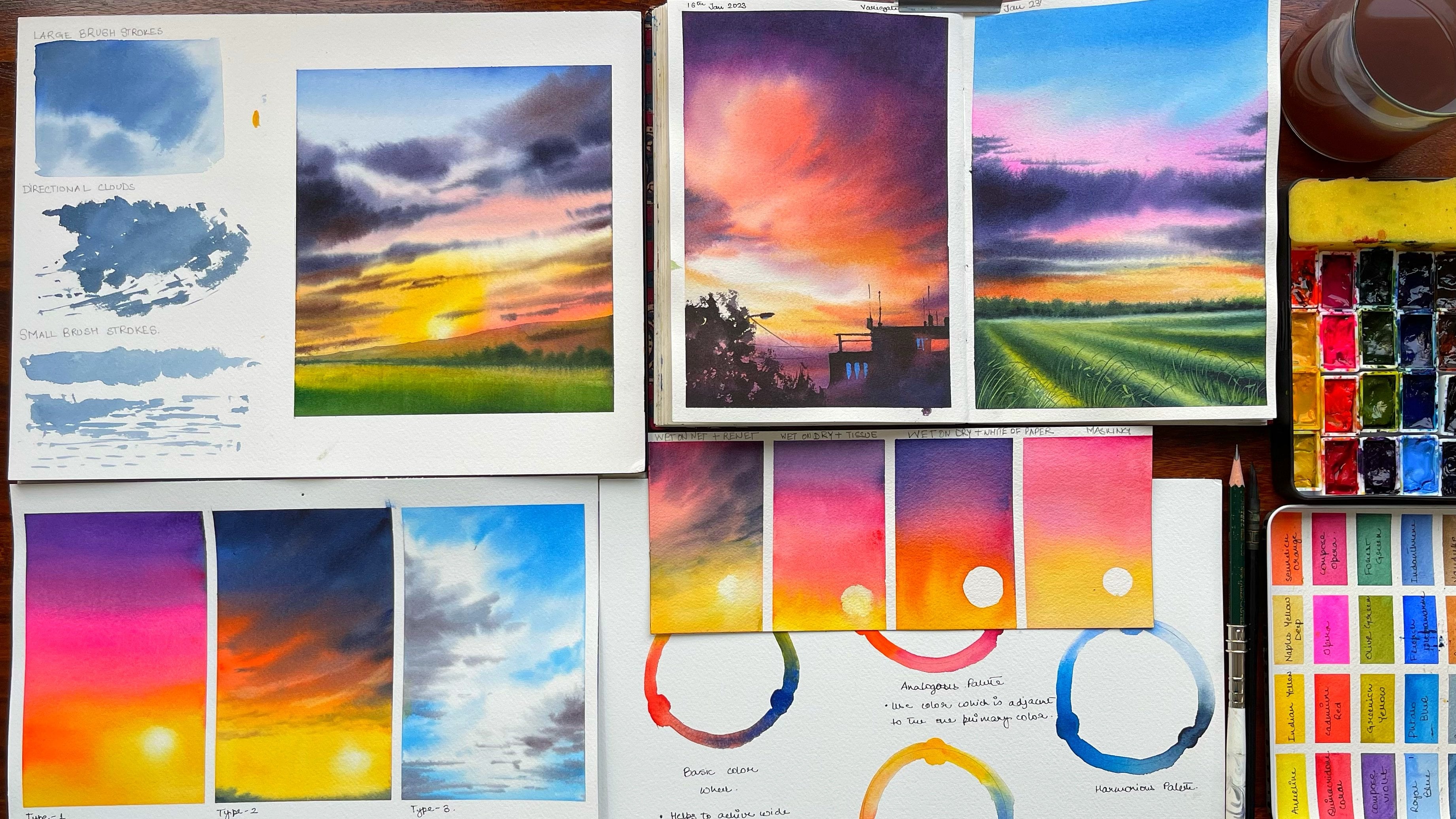
4. Techniques : Let us discuss about a few
simple techniques which we want to go ahead and understand before going into
the final class. Now, this is going
to be the base of your final
paintings with UDL, starting with a very
simple flat wash. Now there are three kinds of washers which majorly use
for all my paintings. The first is a flat wash, which is having an even coat of wash or even coat of pigment on the entire
part of the paper. I have already taught it in
many of my other classes, but I just feel that
this comes really handy when you are doing the
smaller paintings. You can create a
small pool like this of your burnt sienna
or any other shade. This is what I had on
my palette available. So I went ahead with
the same shade. I will just add some more
water to create a quick poll like this and go head on top of two columns that are applied. Now this is a 300 GSM. Again, sketchbook
from vibrant parcels which I'm using right
now for completing. I always like to do a swatch rather than doing a single one
because I just feel that helps me to
have an even coat of wash on this
paper pretty easily. Now, this is an
option that I give. This is a wet on dry
method that voted the graded wash.
Now let's just go ahead with our burnt sienna. Again. I will go with
the dry paper itself. Some more darker value of it. Once I reach around this part, I would just wash my
brush and use water. Again, wash my brush. Was water though this length. Okay, let's just
repeat this exercise. Sometimes we are not happy with what we get in the first row. So let's just repeat
this exercise. Wash the brush. Wash the brush. You'll see there's a
beautiful gradation that we get over here. Or you can also move here, people like this so
that it does even more. Even what happens is
that gravity does a swap and you can
freely get an even coat. Graded really means
that you can, again go head on top
of the first year that you already why
I say this sometimes going over on top of it for the second time really
helps you to decide that whether the graded
wash was asked for what you wanted or it's not
as per what you wanted, how it is moving, et cetera. And water does a great
job at grieving, meeting it how you want. I think I'm pretty happy with
how this has turned out. We can again just go ahead and hit our buoyancy and outflow of blood
towards the bottom. Fine. I guess. Another thing that
I need to tell you about this particular colorist, that this is from the brand
message and omission, one, which has less
flow compared to the other brands like semilunar or your
Winsor and Newton. Therefore, when you pick
and choose your colors too, what kind of pigment you want to choose which
has more flow. On this last form, landscapes where you have free flowing movement of
your brush, water, etc. I think more fluid kind of
pigments are better off. Whereas when you are doing
urban sketching, etc, we don't want colors
to move around a lot and hence these kinds
of pigments and better. Let's just go ahead with
the variegated wash. No dedicated washes,
my favorite always. But before we go ahead
with the barricade over, Let's do a graded
wash for two colors. I will take some green, just taken under darker value. Just washed my brush. So this is a variegated
wash which we did. Now let's go ahead with
their darkest value of clean water from the water. Wash the brush, and
take it to the top. You'll see how beautifully
the blending is happening. So this is basically your like two different shades which are giving you a
graded wash. And you can again extended a bit beautifully
traded with each other. The in-between it would be
a better for white-space. Not exactly why it
has some pigments, but it is not a duck. 0 k. Now, let's understand how we do a variegated
wash. Can you see it? Yeah. I guess this is Plato. Going ahead and adding a layer of water on top of the
paper before we do the variegated wash. You see how much water is
there on the paper? And that's what I was saying, that I am actually adding lots and lots of water on my paper. Once we are done with this, let's go ahead with
various colors. Just take a few colors
from our palette. First is our hello. Then we will go head to head. Opera, pink, light
green, and dark green. These other sheets which I have chosen for this part
of the painting. You can go ahead with any other shape that is
available with your always a great idea to
check out the sheets that you are going to
use for the oral robot. Know what happens in this
case is that you get to understand what color is moving, how colors are moving
between shadow. Colors are really
moving or they're not. If they're not mixing
with each other, how you can have it to mix, you can always try the
colors of the sky, which we are using
for our final Aurora in these Hello class and see this variegated
wash working there. Okay, I guess there's like
lots and lots of the quarter. That's what I said. That water will do its job and variegated wash. You can really go as you want for this
part of the painting. Let's go ahead with our things. Let's pull with greens. I guess this looks fine with me. Let's now understand few
other concepts of water. Okay? This is something that I really
want to tell you is that you are going ahead
with any kind of wash. Supposedly, I have done
a really rough wash like this square block. I will exactly tell you why
I'm doing this exercise. Now. I have taken
a brush like this. Picked up any darker
value may be my brown. Okay. To go over it. You see, I'm getting the lines but they will get
blurred over time. If you really want darker
lines, in this case, you have to wait
for awhile and see that the water moves
less in this case, or there is hardly any
water on the surface. It's kind of semi dry. Before you add those lines, you see how much
blur these lines. And now we will just wait for two to 3 min and try this out
or try this exercise again. See, now there is a lot more difference
than what we had already. We can even try across. This is an exercise which
I really want you guys to try before you go ahead
with the final painting. It really teaches you how
to control your water, how to have greater control
over your pigments. How much water
should be there when your pigments and moving, etc. Great exercise for
anyone who wants to learn motor control
for therapeutics. So this is something when
I drop in my clouds, this one, I will just
tell you how I do it. I will take my tissue with dab off all that extra pins into this and just go ahead with some movements
of clubs like this. Goes sideways. My life. These movements. Now, let's try this out on, off with sofas. Again. We will go
ahead and pick up some freshwater who had with some red to
that of the tissue. Can you stroke? Now, this has become very
light because we did not pick up very dark shade. You see how much my
strokes are visible now? I want to go ahead with
one more darker shade, but this time it's
brown so that I get that trauma into my sky. Just pick up because
these have become bloom. If you see. You might have to go ahead
with that tuple three times sometimes to
get the exact loud, like you see now here, the brushstrokes are
so much more visible compared to what we
did for our red. Finally, the last part, which is majorly to understand
how control your trees. Very, very simple exercise
which we will be doing. You will just go like V one. You'll break it. Again, you break it here. Break it moves. While you are
towards the bottom. Don't make sure that
your tree trunk or your plants are more typical. Brick it, Single, Single. This is a, this is how we
will be making our trees. So many of you have
always asked me how to make your
trees and I feel that this is one of breaking it and it's a very
free flowing tree. I have broken it up two times. One time I've broken it up. Sometimes I go from the
top towards environment. That's not a great idea. You will not see the
similar kind of strokes. You have to always pull
it from the tree trunk. Finally, we will get the effect
of strokes in that case. Okay, I guess this is it from the technique section which
I wanted you to understand. And let's move on to
the final lessons now.
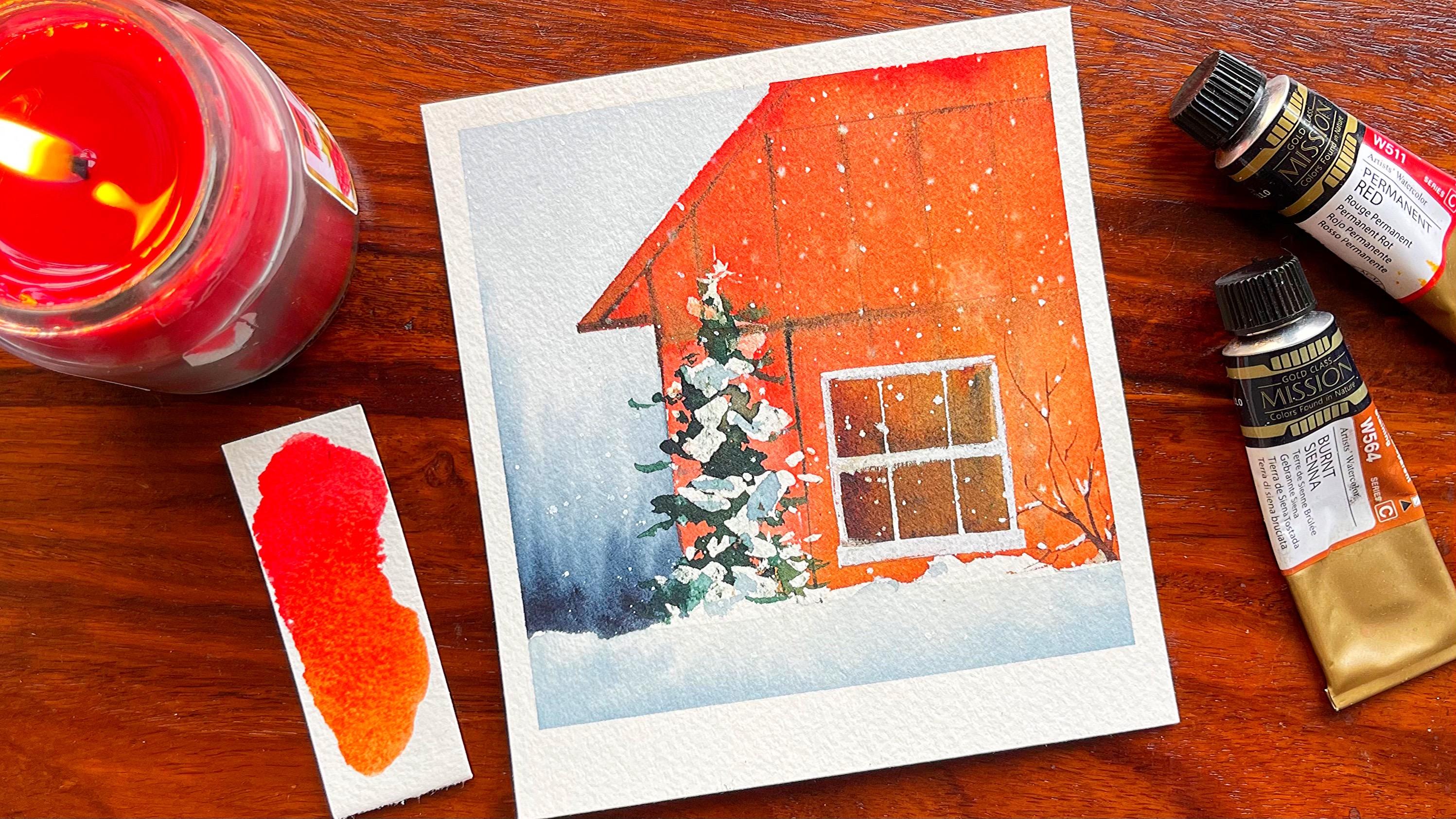
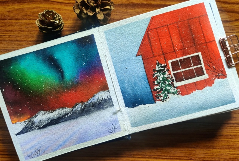
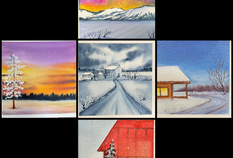
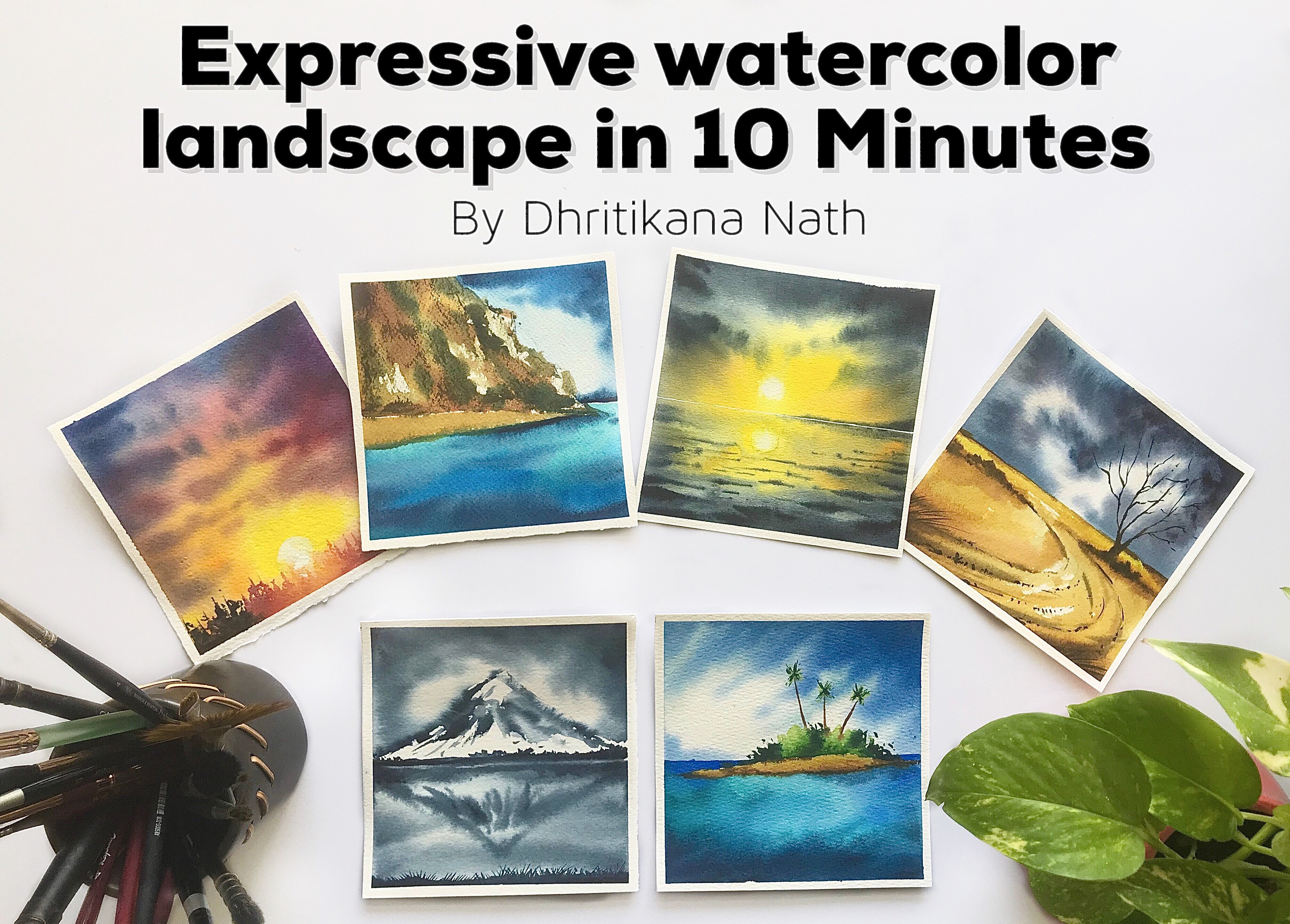
5. Project 1 A Cozy Winter Evening: Let us discuss all the colors
when it's been so blue, then as the dark blue, it can be pushing glue, oral set can be in
non-trained glue or any other darkest value
of glue that's available. But you do not try
to use indigo. Sky would be too dark. We have bright planet
a bit for the sky, burnt sienna and yellow for our small cozy winter
cabin on the left. I'm super excited
and thrilled to start off with the
first painting in this sum polaroid five for painting series that
you have over here. We ate, each of them is
really small, quick, easy. Just toss it together and let's enjoy our windows with
ease up or writes. The first main thing is all
about drawing the house. It's going to be simple if
you are not very great, but drawing lines, just go ahead and have a small-scale
buyers side. It's up to you
choice that I always give whatever seems more
simple and easy to use. You'll start for adding lines or for being more
comfortable while you paint. That is it. Let's just add some fire which keeps the people warm
inside the house. Yeah. And in the background, there will be some
of the bushes, as well as there is a small
pathway which takes you or which leads you to the house, as well as there's a dry
tree on the right hand side. I am just making
an outline though. I'm not sure how
much it would be visible once we
apply the palace. But it's going to
be simple and easy. Or just adding three
and a small house. Once this part is done, we will apply the water. I will apply water in
every part of it and start with our Winsor Blue. Windsor Blue is a amazing
glue along with it, I'm mixing end on three blue as well as some
amount of violet. Windsor blue will be
towards the bottom, whereas as we go
towards the top, it would be more darker. Since it's the evening light, as well as we have to
have more darker values. Nighttime is more dark. Hence, taco values
will be on the top where it's lighter values
will be towards the bottom. Again now, adding some more violet just
to create a graded wash. I hope you have already gone through
the technique section. We have talked through
three main washers. One is your flat wash, then is your grill graded wash. And the third one is
your butt engaged wash. This one is a major example of a graded wash that you can
use in any of your paintings. I'm using three colors
for the graded wash. Though you can go ahead and make even graded wash with
one single color. But it's a combination
that I chose to go ahead with adding some amount
of purple into my brown. This is burnt sienna, which I have taken CDC from
Magellan Mission Gold. If you have a closer look at it, adding some darker values
towards the bottom area. Now the bottom part is
majorly the bubble, which looks even amazing
once it dries off. Yeah, this bubble and burnt
sienna mixes very pretty. And the background, what
happens is it looks like that far off place or
that far of Bush's, etc. Once the whole background
is dry enough, go ahead and start adding
the colors for your house. Now, while you paint or value add the
colors on your house. Try to add first of flat wash and then in an around the area where that is logs or there is more what we will be
adding some darker values. I will be mixing some amount of my non train blue
into my burnt sienna. You can also use
purple mixed with the burnt sienna and then
add the darker values. These are the options that
you can always choose. I tried to use the colors that are
available on the palette. Rather than going ahead and picking up someone new colors. Though there are
paintings where we have chosen lot of colors too. But this one, I kept it really simple for
each one of you. I think some of our bronze
towards the bottom. Once you have added
this ground part, I think you will observe that there has to be a bit of a
purple would stick top area. Why do we add this purple
or the darker value? Because the wood is not the same or there are lots of words that has been
used to build the house. Now, if there are logs of food, there will be spaces where
it would be worn out. There would be spaces where
it is lighter textures, docket extras to show that kind of natural effect in a word
as it wears out over time, we need to do these smaller
aspects into our painting. Adding the Winsor
blue and some water, you will absorb whatever
be the sky colors. I would be using the same colors even into my bottom
part of the painting. Once I have added this blue
towards the bottom area, I would start
making the pathway, which of course I need to add for going or for
reaching this house. There have been so
many times where I really wanted to stay in a small table like this and really experienced
that snowed, chill, the goal and everything. But I guess it's still
on my bucket list. I hope I can do it
based on, though, I've seen snow and
I've played with it. I have seen the last
node of the season. These all things I have seen, but yes, staying in bed, beautiful cottage on winter, chilly day is something
that I really want to do. And being cozy and into my blanket and something
that I've looked for. I have added some amount
of palace into this area, but before adding the colors, I made sure that there
is some water control. What a control means. I have taken off any extra
alos that was dead on the paper and I've started adding the
blue with a dry brush. Now blue dry brush
means that I have taken any extra water that
was there on the brush. Only pigment pigment majorly and then I've added
it along with it, or brown and purple shade. Once that was done, when the head with a flat wash off the yellow for
the window area. Again. Once that part is also not Viva, go ahead and just add a
very light blue color for this note of the
roof of the cells. Okay. I guess This looks
very pretty nice. It's time to add some small
lot tree towards the right. Make sure that you are not getting overboard
with this tree. Just make a few branches. It's completely veered out. As the window season, every leaf falls
from the tree and it's only the dry branches
that stays at once. The spring thumbs, you will
see the change of nature. How nature like really hot or really gives
away to its own beauty. Finally, time to add some
more branches, urine. And then once we have
added those branches, I think it's time to have a
look at our painting now. Most of the part is done. It's only a few further
details of the window, et cetera, which is left and we will do that even for the roof. Yeah, we will be
doing a bit of it. I have added the darker value and then I'm blending
it with water. This is a very important
technique by which you can seriously pull the
paints towards the bottom, are towards the top or towards any direction
of your choice. And I guess you can use this particular method of pulling the paints and any of
your future paintings too. Some more detailing in other
parts of your painting. Once you have added
these smaller lines, you will get to realize that most of the detailing
of this painting is ten. It's a polaroid size
small painting which you can get to your new R&D or ones, or you can even just
keep it for you. Also degrade your walls. Whatever you want to do, please go ahead and do it. It's the wintertime
and we need to enjoy. That's one of the
reason I wanted to keep this class
and absolute fun, easy process, rather than going ahead with something
more tougher or linear. Finally, you'll see the
smaller branches going away. And these branches
and the small trees, or small small plants
which are also dried off, makes the painting look so much more organic and
so much more real. Let's have a look at it.
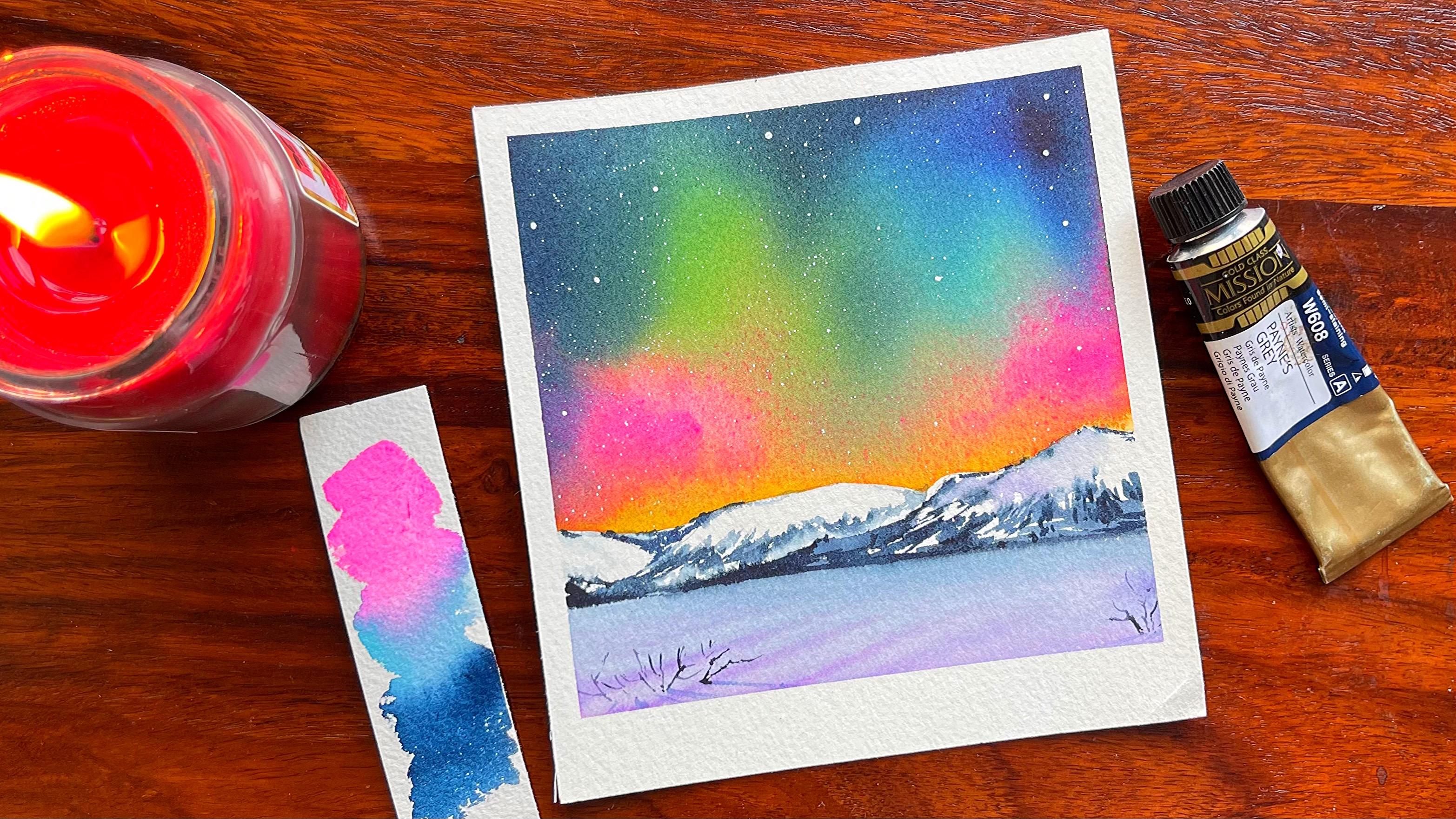
6. Project 2 Multicolored Aurora: Let us just discuss
the colors now. The fascias are
paracrine sin karma, whatever is available with you, maybe green or any
of the live paint that's there for the sky area. Blue, Nadal's blue can
be pushing through. It can be daunting, though. It can be any other
darker shade of blue. I do not want you guys to be sticking to any
particular sheet, whatever is there on your
palate, please use dark. Payne's gray or indigo for the darker sides are the toughest parts on the
right than on the left. Horizon Blue can compost. So either can be
horizon do is read, can be composed blue, orange, you can even use Quite so. These are the sheets
which I'm using for the sky as well as
for the bottom. Thanks, We are on to our
second painting and this one, let me tell you my club, the simplest stop by. I just felt that a blending
the variegated wash that we did because it was a heavy
wash is not so simple. Just go as far as what you get. So do not think about how the whole painting
is turning out. It's not exactly how I did. It's all variegated
wash it sold water, which will do its job. You can control it to
an extent we're not going to control the
largest possible extent. I started off with drawing a line on one side
of draw a line, I want to add the
mountains on top of it. I would be masking
this whole space with masking tape
from Bible puzzles. I have been using
this masking tape for awhile and they are amazing in terms of the tape
as well as the quality. They just don't rip
off your paper. And he loved very easily. Once you are done
with this part, go to the top and then
add some amount of water. Once you've added the water, the false color that
we are going to use. Once we have USDA yellow, we will go ahead with some of our Opera in case
you do not have opera, It's crimson lake or any
other kind of carmine, whatever is available
on your palette. Now how many of
you have asked me, what is the
alternative for Oprah? Oprah is all die, die now for pigment with tactically do not
have any alternative. It's something that is closer to this which I have
already suggested you. I'm going ahead with the
main green from the branch and I have been using a baseball fan and it gives
them some amazing sheets. Along with it. I'm using my Horizon
Blue from Magellan. And finally, you will see
in non-3GPP new orals, you can also go head
with royal blue, whatever is available with you. What else? Another option is to
go ahead with blue. Often not, it's not as cobalt. So cobalt blue and on three in blue as well as other kinds of pollution to whatever is
available on your palette. I am not going to
tell you exactly what you need because this is something that I
always leave up to you, whatever is the closest color, please go with that and
start adding the colors. I usually try to turn the paper from left
towards the right, and then I keep
moving on the paper. This is something that really requires a lot of patients time. You cannot lose hope
at this point in time. There might be somebody
washes in few places, so be sure wherever they are, muddy washes which
you are observing, try to go ahead and add some more followers or the darker values
and then blend it. I would be also using my Payne's gray for the darkest
of the area. But right now that's not
on my priority list. I will add on the last, depending on if it
is required or not. I keep adding all these colors pretty quickly onto my people. I do not want the
paper to dry off. The reasons. You will see me working very
quickly within each and every layer and start
adding the calories. As you observe, though, it might look like
a quick process. But I do have all the colors on my palette and it's important to take off all the colors on your palette before you
start painting this one. For every light painting where you aren't doing or body wash, it's important to tilt the
paper to get the best out. There will be some
mix and match, which might not look great. And your faculty
will do its job. So whenever you want the
colors to move down, you can always delete it. Or you see how beautifully now the colors
are blending with each other. Yes, some of the spaces
might not so interesting, but we can add some more
colors to make it interesting. I wanted the upper out
to be really dark. And that's one of the reasons I'm going ahead and advocate. Again. This might not be the
last edition at all. Believe me, when I paint
these kinds of paintings, there are so many layers are, there are so many additions sometimes that you have to do. One layer is not
enough pupil here, but the second layer to
make it more by print. For this particular
painting, we are going. One, only one single layer, and it's more blue
with water control. Now, water control is only to
an extent that you can do. It's not that you can't work to the largest possible extent
in this kind of painting. You can only move
around your paper and have an outcome which looks
pleasing to your eyes. I think that's it. I felt throughout all the
paintings that I did it. And now in Northern
or Southern Lights, those lights have various
colors coming up on. If you've ever experienced continuously change the
really Johnson this guy. And when they dance, we have to also make our paper dance to
actually capture that. Now my paper is not
as bad as it was. And I felt that though borough
was not as deep as I want, it tends to standing it attach offered in a few
areas wherever I need. Once that part is
completely dried off, we will start adding
some clean wash, add some operands, Paula's
blue onto the bottom area. Now the bottom area
that you also is practically the area
where there is not NO, is an absolute
reflection of your sky. You cannot have other colors
in snow except the white of the paper or the color of the
sky that you are observing. Now, there are a few lines
that I make on this. As I feel this is sometimes structured when
something goes over it. Hence, those structures we
always want to capture. That's one of the
reasons for adding this. You might even skip
this step altogether. I would leave that
decision up to you. It's just that I felt
this would be a bit more interesting compared to what do you always view,
the boring snow? The snow is a bit boring sometimes because it's
mostly white or blue. But you can or soft make it
more and more interesting. That's where the magic lives. Let this pod trial. Once this part is fine, then only we will start
with the mountains. The pigments that I have is from incident Newton
for the Payne's gray. As I wanted that pigment to get over altogether so that
I could buy a new view. It's almost at the
verge of endings. That's an advantage. So that's like a motivation for you to keep painting
with that tube. You will even find a
monochrome painting with this. Payne's gray. Monochrome is very,
very important for us. Snowy landscape view. And that's where I feel that we should go ahead with a
monochrome painting for sure. Okay. He painting, keep adding the darker values
towards the bottom. Once you have added the dog got two values
towards the bottom, just blend it with your brush. What happens is
sometimes our brush does have like you absorbed
right now for my brush, you don't have a choice than to blend it with the
background itself. It's absolutely fine. Never worry about these small, small API accidents which
happened. It looks good. Believe me. They look, I'm losing, you know, one than ever even get to know that that kid was
a happy accident. Okay. Going over the layer that we had initially for the
mountain and just counting 1.2 rough patch or
just small, small lines. Once we are done
with these lines, we will go half for the absolute background mountain and then have that vocal. Two goods. The right side of my mouth. Yeah, that's the right
part of the mountain, but it's addition is happening on the left
side of that mountain. Okay, let's go with the valleys and ridges for
the background mountains and keep adding darker values. Then some lines,
some more small, small additions
that we need to do. Some more detailing. These last two to 4 min is practically the
detailing the stars, et cetera, which you
add for your sky. That is not to do over here. It's just some kind of details that we keep
adding and it makes the painting look more
organic and beautiful. Yeah, I am so happy as well as amazed with how this painting is opening
up all together. For quite some time. I have not been
painting other bytes. There was just a few days back. I was making some
thank you cards. And those types of cards, I tried out the lights, these colors, as well
as Southern lights. I Trungpa, oh my god, they were so amazing. I just thought to include it as a lesson even for
my upcoming class, that's where the
whole idea came in. Going ahead with some
smaller dry flags, we will have eaten
the reflection of light in the sky and the reflection will
happen on this note. Like before the
reflection happens. You can also go ahead with
one Boolean. Value orals. Go ahead later, I would leave
that decision up to you. No need to rush into
anything right now. You can always go
head down slowly, steadily into each other. The stamps now I am
just going ahead with my mop brush. The brush. Men guess sidebar,
those fine stars. I need to add a bit
of bigger stars, starting with the
help of my brush. Again, this is the
polar brush from a SCADA and I have been
using it very often for my smaller paintings as well as larger paintings in case I
want detailing over there. It's an amazing brush. It doesn't pull a lot of water because it's a size zero brush. Still. I think whatever
requirement I want. So I'm pretty happy with that. Removing the tape at an angle, and this is a washi tape. I always tell you to use
washi tape rather than using any carpenter tape because that might just peel off your people, which we really don't want, even if you are using
handmade paper, try to use washi tape. I think that can save your
people to a great extent. Let's have a final look at our painting and be super
proud of ourselves.
7. Project 3 Red Barn: Let us just discuss
all the shades which we need for completing
the painting. It is cadmium red, permanent road or any kind of
friend that is available on your palette course green or any kind of dark green
that is available. Burnt sienna or any kind of
brown that is their vacuole, Payne's gray or in nickel. These are the basic shapes, which means how about painting a red bond which has a beautiful Christmas
tree in front of it. Let's start with
the sketching part. The sketching part
is very simple. As always, there are
just a few lines on. Once you meet a slanting as
well as a straight line, I think you are sorted. We are just going ahead
and making a few lines. Meet the bond, look more organic and exactly the way a
bunch should look like. Yeah. So that's how we will add a small window to it and then a small Christmas
tree in front of it. Again, a bit of power masking fluid is
required. In this case. I hope you guys do have
the masking fluid. Masking fluid comes in really handy in menu or
flower paintings. And I think it's a great way to start trying out
this to preserve the whitespaces for the painting also becomes sometimes
a bit tough to work on with the colors that we really want and a few spaces
and leave some white. But before I pick up
my masking fluid, I always take my wet brush into the soap or from a SCADA which I have that is basically for
cleaning the brushes. And then again, I pick up the masking fluid on top
of it, stopped using it. Once I'm done, I will
thoroughly washed my brush in water as well as
I go wash it with my soap. This is very important so that I can preserve the
tip of the brush. I hope this is simple to
actually get through. There are only few
points and small, small dots here and
there that I add. You can wait for a minute. Once I start adding
the colors to my bond, you will understand
exactly how we are adding, are exactly where we are
adding this color for your Christmas or
for your pine tree. But along with it, do make sure that
you are watching it on a bigger screen because Queen helps to actually deal with this some problems pretty easily. I have tried to keep it very
simple. All the paintings. This is, again, a
very simple painting, but with a few follows
that we are going to use. Yeah, I mean, most
of the paintings are done with very few colors. This is majorly read some
amount of brown, Payne's gray. Green is for your tree, though. I could have even done it
with the Payne's gray, but I just felt that the
green looks amazing. The pine tree that you have, rather than using the Payne's gray green
is absolutely apt. I am done a very simple process of just taking the
colors towards the top. I start from the bottom and just try to add the
colors to the top. This is lifting the colors towards the trough or displacing the colors from the place exactly where you have
all your thought. It should be adding some
more darker values. And this is towards the bottom. I add the darker values towards
the top. It is lighter. This is basically the
bushes as well as the forests that we usually
see in the background. Going ahead with
some smaller lines, I'm using my scale to draw them. You can also do
it with the hand. I would leave that
option up to you. Once we are done with this part, I will start adding
the red color. Blending this red color with
some amount of burnt sienna. The been CNL, which
I have is from the company Magellan
Mission Gold and pigments, do have some amount
of red also in it. That's one of the reasons a fan to start adding the
color of burnt sienna, you will find it a bit
reddish in nature. Going with submerge red. Red is the color of the
season and it's winters. Why not add more
and more a friend? We cannot just ignore the
red in this case, so yes, going ahead with some more red, adding the brown towards
the water media, we can mix more colors to. It's not that we cannot. It's just a weird and care of the bond that we want to show. This is one of the
reasons we are going ahead with
the colors that you write now see on the screen. Yeah. I have so smitten by the
red color most of the time. I myself love to add it
to most of my paintings. Mixing some amount
of my blue into the burnt sienna that I had that or else the Payne's
gray. You can also mix. I am using the, basically the Payne's gray, which I happens from Winsor and Newton and has got a
bit of blue in it. So it's easier to use that for this darker shade
of brown that I wanted. Okay. Adding some more lines and
the paper is still wet. Now, when do you
exactly at these lines, when your paper is wet enough, that lines do not become bloom. As well as heat is not also
the way you would like, love to see it. Like initially when
I added the line, you can see that
hardly we can see it because there was lots
of water on the paper. And now it is kind of a
situation where it is semi dry. It has a very, very light sheen
which is available. You can mostly not
see that sheen to it. Just wet enough to not absorb
the colors completely. And let it become slightly lighter in texture
or just move around a bit. So that's the kind of thing
which B14, these lines. I will go ahead and
make some more lines. I'm using my size zero is caught up All our brush for
doing this exercise. You can go ahead with any size zero brush for working this out. Okay? Adding some more lines
and few more places. I think this looks really
amazing right now. I just want to be there. Enjoy that season of Christmas, enjoy those slides, some
tree lighting, etc. Everything is so amazing. I always see so many
different movies and its ritual or in our, at least at our place that we do go out on the
Christmas night to park street in Kolkata and watch the beautiful
lights that's there. It is completely hot. I would say heart fulfilling it. Amazing Sometimes I
myself think that how can it be so beautiful
with the whole lighting, etc. It's just a season which
makes you fall in love, which makes you fallen. The beauty and v are just there. I think even though painting is almost very close
to being done, the whole paintings,
all of them that we're doing is really simple. I didn't not want
to even complicated any further divergence of u. Things that's very important
in the initial card, which was majorly
discussing the techniques. The starting was a flat wash. Then your baby's got
two kinds of washes. By the way, do not, do not forget this part. It is majorly whenever
your paper is wet, you have to splatter these white opaque
follow on top of it. It is semi I would say
when it is semi wet or I can tell you it is not exactly highly wet
and I leave it. At that time, you'd
need to spread this ad. Once you add it, though, whole of these
dots will become lighter. And lighter thing will show basically the kind of snow
that you want to see. Oh God, it is super amazing. I, I cannot tell you how happy I am usually
during this season. Going ahead and adding some more lines of the Payne's
gray towards the bottom. I always see this, that the ice doesn't have
any color of its own. It's usually the colors of
background magenta reflects. And here you will
see the background is majorly in the sky, etc. is majorly in the Payne's gray
color that we are adding. Hence, we have gone
ahead with the same. Okay, once this
part is dry enough, even add the white
art for the window. Now, this law, basically the window panes
that we have and they just make it
so nice and pretty. But for this, you know, it's very important to have
a dark shade beneath it. And that's one of
the reasons I did add a mix of brown and
Payne's gray in the window, but we are adding the white. The bottom area would be
a bit more to go compared to the area that we have
added towards the top. Once we are done with this part, we will go towards the side and start
adding the white color. Another thing that
I want to actually highlight us initially
when we started off, I just added four lines for
the window in the middle. But right now I'm going
ahead with only two lines. The middle part is a bit more thicker as
well as you can see that this is good enough
to show the bond angle, show the light that
we want to show. Everything from the
Christmas season tends some final few touches, which is majorly one or two
trees in the background. It's the snow, which is calling, that's one of the
reasons there will be some patches of white, even on the dry trees
that you absorb. The white that we did
preserve for our pine tree is majorly the snow fall and the small will settle
on those pine tree, which is one of the reasons for making it look like that. Okay. I guess I'm happy with
how this has turned out. It is based very simple. Just go ahead with a few lines on the right side
and it is done. Once this part is done, you have to remove the masking
fluid from the pine tree. Even though whitespaces and tack and take some amount
of very light wash of Payne's gray exactly
how you're observing and drop a few lines like
this, simple, right? I am not complicating
it even a bit. Let it dry off and
adding a bit of snow. As I told you, there is snow and it will settle down on the dry
branches of the trees. So we have to show that I will splatter
some more white in a few spaces as I feel
that it's not good enough just for doing the status in the
background which we did. It's important to splatter at now and we can see this node for the force of the
season veiling. Okay. Remove the tape at an angle. And how if I'm looking
at the painting, I think it would be
super happy that they also meet you in
the next lesson.
8. Project 4 The Sunset: Let's just discuss
all the colors. That is speech without a yellow. So both of them will be
needed for the spot. You can go ahead with
coral an orange, or else you can use
orange in case you do not have cool, yak, bright violet. Now iliac is also known as Leventhal in many of
the other companies. Then you have burnt
sienna and Payne's gray. These are the basic
colors which we are going to use for
completing the painting. We are on to our fourth project and this is going to be on
multicolored sky. Again. You will see that the sheets
off the Carlo algorithm, the similar kind of range, like if you're using yellow, we will use speech
along with it. The speeches from White
Nights, I would be in sync. Few more followers like
Leah from White Nights, you can even use oral from bike nights and mix
it with orange, yellow as well as open
and get our final sky. Let's just mark
the horizon line. I'm big on a straight
line for the pine tree. Once we have pound bag, I would go ahead and just
dip my brush in some birds. And then that is called
a soap that we have. Once I have done that, I will go ahead and
start adding my tree. It's practically
drawing your pine tree with the help of
your masking fluid. Something really amazing,
something you should always try out just
in a zigzag manner. If I go ahead and wet, It's not like something that you should keep in mind that you could do it this
particular way. Pine tree appears in
nature in its full form. Some of them could be moving towards the
water mania somewhat. Some will be like
towards the middle and some might be when
faced towards the top vote. And some will have scanty lids, some will have more leaves. So it all depends. It's nature are random and absolutely different
from each other. That's one of the reason
I never suggest that you should go ahead with any one
particular type of tree. Whatever you feel is good
to go head you stack, and just add this
tree for liner brush. Now, liner brush would
really help you to control the masking
fluid to a large extent. Once you have extended
this on both the sides, we would go ahead and let
the masking fluid trial. Once it dries up, then only we will
start with this guy that is taught with a peach. And we are going with
the bottom here. I will mix some yellow with it. This is kinda going
yellow or you can go head width, permanent
yellow, light. Now these are both kind
of yellow is great. Bottom and mix it with
some amount of orange. I'm using the Sennelier orange, you can go head, but whatever
oranges available with you, you can also mix yellow and red together on something
similar what you also means. Let's add some more yellow
vest is the wet on dry method. Now wet on dry is
practically when you have Paul who try people and
you apply wet paint. So it's majorly don't
get those piping sheets that I usually do not see when
I am doing wet on wet for, we might have to go ahead with Bupa three layers to get that. Finally, adding
some more of our. Now, this particular color
is known as lavender in your brand Magellan
mission called Emilia in your
brand, White Nights. So to try out the
colors and shades, etc, on a rough piece of
paper before you go ahead and finalize it
on your final painting. I always, always suggested so that there are
no muddy mixes. I'm weekend and
white having those. I will add some more
colors here and there. So just follow it. And we will then
go ahead and add a few straight line
kind of clouds. It's a very simple
and easy painting, just that it is at one point
away speed, you can go head. Speed of the PTO in case you are not happy with how it
is moving right now. Or else I'll just
go with the flow. I think there's nothing
difficult that I'm teaching. It's just blending, blending related wash that
you have faulty tongue. In the technique section, we are using the similar
learning that we had from the technique section
into our final paintings. Clouds with the
help of my brush, as well as I'm using
my mop brush to do, the more cash doesn't have
a lot of color in it, or it practically is not very, very high in terms of the
water content that it has can. This is something that
you should always, always absorbed whenever you're walking with your watercolor. That your second layer
should not be fairly heavy. Morals, brushes not
have a lot of water. Everything will spread. We have launched
this water control again in our technique section. And I did show you
how even waiting for one or 2 min can
really help you to get those lines which you
want for your paintings. Going with the top layer again
and making it a bit more. I really loved this class because there's no
thing, nothing. It's just simple. Each oral or you
can say lily act and all these colors which are
more from the pistol side, mixing up with the other
sheets that we had and making beautiful sky for us. Going ahead with
my Payne's gray, Payne's gray that I have
has a bit of blue in it. Now, you can always pick and
choose your Payne's gray. Some are more on the black side and some
are more on the blue side. I would suggest
you has an opinion to go head and try
out the blue ones. They are seriously very amazing. It's practically
shade darker than the intercourse which
we normally use. What happens over here is since we are working very quickly, my sky was back. When I applied the color
of the Payne's gray, it spread and now it looks
like pushes in the background. Water has a very high role in all of our
watercolor paintings. I have been saying it, always. Try and understand the water comfortable how
well you can do it. If you can control the water in a specific
way that you want. I think you can do
all your paintings. I'm detaching the
clouds with the help of my size one brush. So do not go ahead with the
thickest brush right now. We just want a few lines kind of cloud and hence,
tennis plush. Once done, let your people
try off, can be boop, boop head and good luck
and some amount of orange. Now the smooth that's there
is pretty light actually. It's white when it reflects, it reflects the
color of this guy. So whatever is the
color of the sky, it would fall on the
snow and you will get a similar kind of color, which you also do use the same colors that
we have used for the sky, for snow also. Note that this will become one shade lighter once it
dries off completely. Let's take some
burnt sienna and add it in the tree trunk. This is very, very important. Odd, it is majorly to show
that the pine tree has a beautiful tree trunk
and we're going to use it over the masking fluid that we have already applied. I do not want to take it away. Fight. Now. I will
only take it once. Let's just extend it till the top wherever we
do not get them out, let it be we will see how
to work it out later on, extending a bit
towards the bottom. But I did wash my brush and then go ahead
with this color. It was still remaining color that was there in
my brush water bottle. Making some dry branches, some dry dry plants, mall, etc. What's the bottom area
of the pine tree, which we usually find in any kind of landscape
like these. I'll bring up white
area which was there towards the bottom
of the bushes. With my mop brush. I might have to go
ahead and again, blend it with my flat brush will show you later
on that step. But before we go ahead with it, I think we should just let our row line for this tree
trunk dry off time, take off the masking fluid. I particularly use our
masking fluid eraser to pick out the masking fluid. But I do not suggest that everything is very
expensive in case you have any kind of other objects which can
usually take off the masking. It's good to go or you can even take it off with your hand. Finally adding a very light
wash off my Payne's gray into the white area of our tree, which is basically
you're buying. Now, they are binary is
actually full of smoke. That's one of the reason we
did mask it out with white. Rat them going ahead
with any other follow. And this is what we see. Okay? Lending, lending,
lending someone climbing. You can see very well, I use my flat brush
to do this because that really helps me to blend
it with the background. Well, there will be one open, some small lines that
I would be adding on the snow so that it looks
more organic in nature. And it really resonates to real picture which
we can visualize. Always try to visualize
what you are doing. It really helps you
to nail through any kind of painting
that you want to do. Next to him off the deep end. Have a final look
at the painting. I'm pretty sure about it. You are all v in love with it. And you can see how
beautifully it has turned out those crisp edges of
the washi tape days I always say this and I've set this up at doings of washi tape. It's one of the best practices
that you should go ahead and use for your
watercolor paintings. I mean, look, I'm
already in love with it.
9. Project 5 Winter Wonderland: You can choose any color. I'm going ahead
with Payne's gray. It can be pushing law
or any other blue, black, whatever you feel like
you've got this painting. I always become so happy
during Christmas season. And I just think
that what new that I can teach for something that
really resonates with me. And this particular painting I did two times to
get to the best. First initially when
I tried it first to a single house and then I just tried some multiple causes. This is always a kind of I would say you get it
or you don't get it, you are just in-between
that will deliver. Once you get it, you're just so
happy to be there. I have just marked
horizon line graph. Now if you see on the top
and towards the bottom, I have also marked
another light. Now, what's the top line? The top line, the horizon line, basically defines your sky
as well as the landing gear. Whereas the bottom line
is majorly defining your houses where they
are. A multiple House. Bill wrote that we
would be drawing no. Overall, this painting will remain a very simple painting. Just that you have to be there
along with me. And Pete. Window remains one of my
favorite season and unlocked. Celebrate this season
with your wall. Every year I like
to release a class where there are
white celebration. Last year we did 28
days. This year. We adjust the wing. Five simple polaroid
winter illustration. I feel a winter
is the time where you need that warm
cup of coffee, good food, good company,
and just enjoy. Okay, going ahead with the Payne's gray, as I've told you, this is a monochrome
painting and I have selected Payne's
gray as my color. All the extra things
that I have on my brush. I did pick it out
on the tissue and now I am simply adding
it onto my sky. Simple and easy process. But what you need
to understand this, that you have to be very
vigilant while you add. Two spaces need to be, right, and some of the
spaces will be gray. Payne's gray goo. But if you really
don't have this color, you can always go ahead with
any other color and light, ultramarine or you want to try it out with pollution loop. You can even have indigo
as your color for trying out all these
monochrome painting. I do have a separate class where I teach about the values, how to work around. But these paintings,
but overall, this one is not to grow
it and so much of detail. Enjoy the season. Leg, whatever works for you. Now I'm adding
some simple water. Towards the bottom. You will observe
how the AVL will become lighter and lighter once you apply only clean water. This you need to
do once your paper is quite enough for the water will not get displaced and the pigments will not
move towards ticked off. What happens is that
the water starts entering towards the top or
they move up towards the top. And the darker values
will also get pushed. I'm using my flat brush to
add the first layer of color. The whole of the painting
is done at 1.2 weeks. Now, one point to
where its speed in something that you
can visit us from the top right-hand corner or the bottom left-hand corner depending on where
you are absorbing it. As a best practice, I have always asked you guys to watch it
on a bigger screen, either be your iPad, your personal computer
or anything else. Whereas if you're watching
on a smaller screen, you might just miss
out on a few details. More of wet on wet, which means that once
we have added layer, you need to start adding the darker value or cure
Payne's gray slowly, steadily you are adding it and making it darker and darker. Basically, you're welcome back. This bottom part is something that will actually
become a road. But initially when we stop out, you don't need to go ahead
with only the darker values. If you are going with
the darker values, very simpler processes that you can't return back
and watercolors pen, it's very difficult to always lift out the
colors you have already so that when they're painting the sky towards
the right-hand corners. So always try to add the lighter values and then go ahead with one
shade darker, dark. They not only you can be more vigilant about
adding the colors, but also more
professional about how to take a step-by-step approach to your watercolor painting. This is something that I have learned over the years that to keep all clean jar of
water candy for yourself. One is for washing the brushes, and one is anytime you require any kind of colors
or any kind of clean water to apply
a fresh color or to just go head and to
wash. That is the jar. You'll need to
always look out for. Keeping two jars of water comes very handy
and we will absorb over the time that you walk around with this painting
or any other painting, any other projects that you do, going ahead with some more
beautiful lines and dots, I just try to blend the colors. I try to apply some
of my pigments. And once I've applied
pigment side, try to add simply water
by washing my brush and then just pulling
the paint to the right. This is a very easy exercise. But what happens
with this is you get various values of
one single color. I knew practically do
mock me to go dog, go with each and every
single thing that you want. Yeah, I think this is a very, very important process to learn. And once you learn, if you would be very happy
doing it and using it, Use painting would survive. I want to make it
more darker and the colors of the sky are
getting reflected onto offers. No. I always say this and each painting or in every
class that I have to, the snow doesn't have
any color of its own. It will practically
to fly the color of the sky or whatever
is in and around. Similarly, water also doesn't
have any color of it sort. It will also reflect
the color of the sky. Mountains, places,
any kind of trees, et cetera, what stagnant. I think this really
helps you to also understand that how you should develop your
subjects in and around. Once we have applied, the darker values
are low, right? And on the left, I think the rules should
become perfect mortar. Taking a chance and
having the darkest value. This darker value is
not as dark as you always also want your
palette or on your shelf. But equally, I said amygdala
that you have where you have mixed two are full of Carlos, I always say try to
go a bit slower. Stores always quoted watercolors compared to it.
If you are quick. What happens
sometimes is that we know that we are quick and
we can quickly meal it, but somehow the painting doesn't turn out
exactly how we want. Going slow is never a bad idea. Always go head slowly. I think the slow part is really helpful when you are doing
a wet on dry method. But sometimes the wet on wet method requires
fast painting. But if we ignored, it's
just more fun because it's a small base b can surely the ketones by going slow,
that's not a problem. Do keep in mind that use
hundred percent cotton paper. Being repeating this
again and again. The more you use
100% cotton paper, you will understand how
beautiful it is and how much wet it stays for
a longer period of time. Though these are
not heavy washes, but still it requires good
amount of work, wet water. There are other classes to
where I have not used 300, 700% cotton paper asked my
staff is evolving a lot. And when it's more
about banking, bullets are been sketched, etc. I always prefer
wanting you got GSM, hundred percent cotton paper, whereas when it is more about working heavy washes or leering, lots and lots of learning. Then I like to go
ahead with 300 years. And these papers are all available in the bucket
whenever you're buying it, just buy it more diligently and understand
what you're buying. Don't go ahead and just buy whatever is being told
to try to see it. Gets some pure row
samples if possible, then try to buy the best. If you have hokey, I'm going with some more
darker values on the right. As you see, I have
this size one, size zero brush that is coming. And for all my paintings, as this car small pieces and making these trees become
pretty simple that way. I use the tip of my brush for
trying these smaller lines. Anything that is far away from you is practically smaller. And anything that is
closer to you is very much whenever you
are concentrating, painting trees or
working through any kind of Coke
particular subject, do try to understand that it has to be placed somewhere
either faraway, smaller, kinda feels closer. It has to be because
you will see how applaud We will be
flowing towards the left, one side of the
road, which could be even bigger compared to what we did drop the
trees part of the lab? I guess. So this part is pretty much as I
wanted it to be. We have a few more things
that I want to cover for you called the detailing part
that we're doing right now. Major part of the
painting is already done. I always say this once you have actually applied to
the colors to add to taking me to the of
the big things that only easy and simple things
of detailing remains. Now, here's a detail of
a darker value at men. Also add Ph Martin's
white-collar for few more highlights, as well as a bit of snow to show that snow has seven
down on these glands. Here towards the
back is going into this diesel buildings and all these originate from
these buildings and move towards as well. Frankly speaking, this painting doesn't mean a lot
of explanation. Aspect is to an extent
self-explanatory. It's just these highlights and the smuggler plants which tell you which needs some explanation in terms of how to walk
around with perspective. That's a rest typing or you
can rename this painting. There's nothing that we
have done a break for. Just a few marks of the houses. One thing that I
need to tell you, I have marked the
horizon line a bit below the one-third of the
top part of the paper. Now, I hope that you guys
all know the rule of thirds. The rule of thirds. What happens is that you might have meaningful names or any kind of painting
that we want to do. But you have to decide
your focus areas. Now focusing entirely
intersection point where you have selected or
where you did select exactly. You should call stock the
drawing or the focus. And supposedly you are drawing
the lighthouse and you wanted to store
top-right corner. Now, it has to be
at the focal point where you have the rule
of thirds working. Now, if this, this particular painting doesn't explain the rule of thirds well, but if you want to learn
it in a better way, I would ask you to go ahead
and check out my bottom class where we have done about
seven days of paintings. I think it would become more easier to go there
and try the number. Once this part is done. Let's roll with our theater
and this is my best spot. Hi, always, always try to
apply it only in a few places. I don't highlight
the entire bond. This something that I
have learnt over time, not to highlight each
and every place. Just highlight where you want your spectators
to have a look at. Like I want my spectators
to have a look at the building than
some of the windows. These plants which are there towards starting off the road. And the road is a bit six sack. So whenever you are doing
this process will make sure that it originates from particular door that's
there in the background. Hands towards us. Next, peel off the tape and half will finally
look at the painting. This tape is again from
Bible fossils that really helps me to save my people. Well, I do not rip off my
paper towel at any place. Washi tapes overviews
see here incase, you plan to walk around with watercolors to try
out washi tapes.
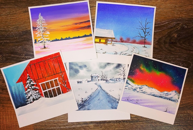
10. Conclusion: I hope you have
enjoyed these five. Alright, paintings. They are small with easy and
you can get it done in time, maybe in the morning,
coffee time, orals, and no lunch break in the evening again,
anytime you want. The second part would be
to ask you to leave me a feedback in case you like
Kanye thing about this class. It not only helps me to go ahead and prepare classes
in the similar pattern, as well as it tells
me where I have a few improvement
points which can be done in the next delegates. Upload your projects in
the project section, I'm eagerly waiting
for each one of you to upload it there so that I can
give my valuable feedback. See you very soon
with the next class.
 Dhritikana Nath, Watercolor Artist and Instructor