Transcripts
1. Intro: Patterned tiles occur in
many different cultures. They are an evergreen that grant a specially retro and
vintage feel to a space. What about to create
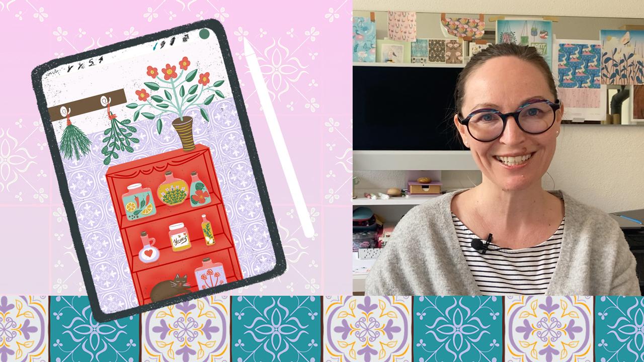
a vintage room set with me in
Procreate on the iPad? Hi, I'm Nici, a freelance
pattern designer and illustrator based in the
middle of Europe, in Austria. The idea of this class is to
illustrate some patterned tiles, inspired by
heritage ceramic tiles. Then make a patterned
brush out of this. And finally, decorate a room set scene with
the patterned tiles. In this way we achieve
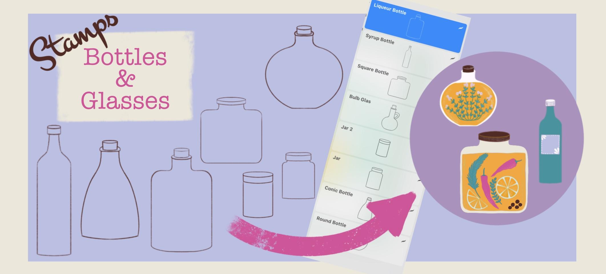
a vintage composition. In my kitchen board, there are a lot of of classes and bottles filled with
different herbs products. So, I thought it
might be a good idea to provide you with a
variation of stamps, of different glasses
and bottle shapes. You can use these
stamps as guides and draw over them to
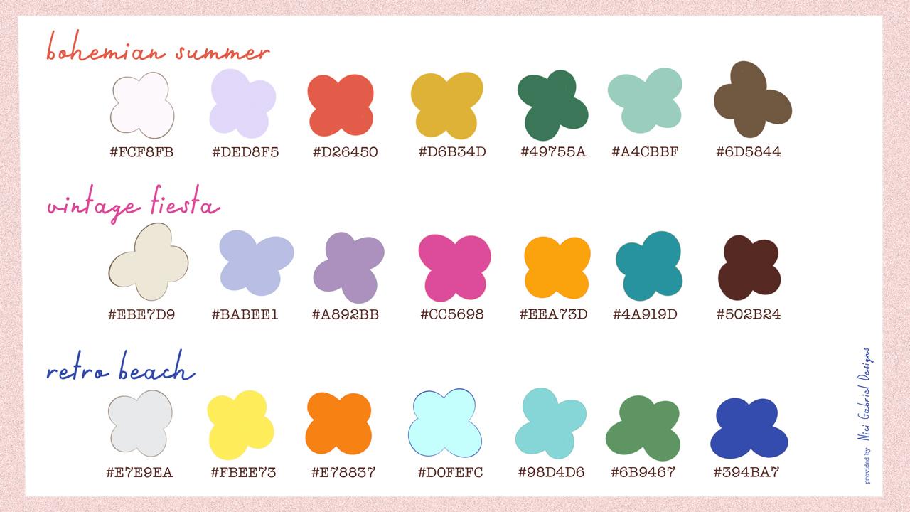
quickly fill your board. I will also provide you with three different retro
inspired color palettes. In this class, you will learn about using Assisted Drawing, creating your own stamps
and pattern brushes. Creating a room set illustration with a lot of layers,
and many more. By the end of this class, you will have a set of
stamps and brushes. And a vintage inspired
illustration that is well balanced because of the
symmetrical elements within. So, are you ready? Let's get started.
2. Your Projects: In this class we
are going to create some patterned tiles and illustrate a room set and use our patterned tiles
for decoration. Your project in this class is either the patterned tiles or the rooms set
illustration or both, of course! I'd like to encourage you to upload
your finished pieces to the projects gallery by clicking the green Create Project button in the projects
and resources tab. I'd love to see it and
give you feedback. If you have any questions, please reach out in the discussion section
and I'm here for you.
3. Downloadables: In the projects
and resources tab, you can find the downloadable for this class. As said, I'm going to
provide you with some stamp brushes and
three color palettes. You can download
it and use it for personal and also
commercial purposes. And you will also find a link to a Pinterest board
about ceramic tiles. Where we can catch some inspiration for our
illustration project. And in the next video, we are going to gather some ideas for our
own patterned tiles.
4. Inspiration: Patterned tiles occur in
many different cultures, from Moroccan to Spanish or
English to name only some. They are an Evergreen that grant a specially retro and
vintage feel to a space. I've collected a variation of all these different
heritage styles on my Pinterest board. And we can use it as an inspiration for our
own patterned tiles. Of course, we don't want
to copy any of these, but we can use it as a
good starting point. You can go through my board
or make your own research. I think I'd like to
create some patterned tiles that are not too complex. In the end, they are
the background of our final illustration and
they are not the star. I really like this one, I love this one because of its
colors and the detailed shapes. It's great. But I think for
our illustration, for our end protect, it might
be a good choice to make it not as
complex as this one. So I think I choose this
one as my inspiration. Now we can make a
split screen from our Pinterest board
and our Procreate, to always have this for our inspiration. You can click these three
little dots on the top. And choose split view. And then you can open Procreate and you'll
have it splitted. Meet me in the next video to create our own patterned tile.
5. Design a Tile: We make Pinterest
a little smaller. So the main part
is our procreate. Now we can create a new canvas by clicking
the little plus icon. Choose the
black rectangle. And I suggest the canvas
3,000 by 3,000 pixels. And the DPI should be 300
to have a good-quality. And click create.
For our patterned tiles I'd like to work with the symmetry tool.
So we can draw in one part of the canvas and have it automatically
mirrored in other parts. Go to the little wrench icon
on the top-left, to Canvas. And there you have
the Drawing Guide. And when you turn it on, you can choose Edit
Drawing Guide. And at the bottom, you have the symmetry tool. And by clicking the options, you can choose maybe quadrant to have it
in the four parts. But I'd like to try out radial. And the assisted drawing
bar should be active. Click done. I'd like to
choose under the brush, the inking, the studio pen, and choose a black color. A solid black, you can go down there. We choose the black because
later we would like to create a stamp and a
brush out of this. And it's better to work with the black from
the beginning. The radial symmetry says that
when you draw in one part, you have it automatically mirrored in the
other seven parts. I'd like to start with a petal that's from
the center to the top. But I don't want it
from the very center, but a bit away from that. And I make kind of this shape. Make it a bit
thicker on the bottom. Because I don't want to
have it too stylized. I'd like to have a kind
of hand-drawn effect. Try to make it round so you
don't see the mirror axis. That's good. Maybe here is a bit bumpy. You can draw the
bow and hold it to make it perfect. Okay. Fine. Fine. For now. I think, I
like to have a little dot in the center. You can make
a little flower too. That might be nice. Okay. Now, I think like to have a kind
of bow from here to there. Let's see how it looks. The studio pen is
a pen that depends on the pressure of the of the pencil you
take on the screen. So it's thin at the
beginning and when you press harder,
it's much thicker. So you can play around
with this effect. I think I like
to make it bigger. Start again. My hands a bit shaky today. I try to make it
not too perfect, but not bumpy at all. Make a nice tip. Nice. And I think
I like to have a kind of flower with leaves
from here to the corner. Make a straight line when you draw and told
it makes perfect. So we can overlap it so
it's a good straight line. And I make four petals. The brush is too thick,
make it smaller. Okay, fill it with the black. I think that's nice. Now we can make two bows from the straight line and make some other petals or leaves
or whatever you like to have. Nice. Of course, you can also use the color drop to
fill in your shape, but sometimes it's meditative
to draw the shapes out. So it depends on your mood. I like this. And I
think, I will leave it. I don't want to overdo this because when it's
tiled one-by-one, it might look nice to not
have to much in this. And in the next video, we are going to create
a second tile.
6. Design another Tile: Let's create a second one. I turn this off and make a second layer and turn
on the Drawing Assist. So we have the mirror effect again and choose
another inspiration. And I also love this kind of
for curves in the middle. So let me choose this
one for my inspiration. And I start with the curves. And I think to make it a bit different and
not too much to the center, only subtile, the curves. Make it thicker on top and fill it in. And make a simple curve. Here. Maybe a second one, a smaller one. You can also make it a bit thicker. Find your perfect shapes and vary in the thickness
of your objects. And bows. Fill in this little spot. Now let's go to the center. I make my brush a little bigger, I like to make some curve from the direct center to out there
and the curves that overlap. So that way, somewhat that. Nice. And I make again, this kind of V over there. It's a bit shaky, my hand is so shaky. And then make, a
three leaves flower from here. Fill in. Make it nice. I like that. Maybe a bit like this. So it comes to that shape on the bottom. And I do a bit refine work. Yeah, that's nice. And over there we can
make a kind of two leaves that turn to the flowers. And to make our
corners a bit less sparse, we can replay this kind of curvy shape from the center in a heart shape. And if you like, you can fill in the very center. So it's much like a flower. A hearted flower. Nice. Meet me in the next
video so we can make stamps out of our
two patterned tiles.
7. Make a Stamp: Alright, let's create
a stamp out of our two patterned tiles. Let's start with this one. Go to the little
wrench icon again. And under add, you'll
find copy... you'll find Copy Canvas. When you press this, all on your canvas is
copied in a flat layer. And now we can go to
our brush studio. And we can go to
the top of this, of all your brushes and there you have a little plus. When you click this, you can make your very own
collection of brushes. Let's say patterned tiles. Okay. And with this little plus
icon on the top right, we come to our brush studio. Here you can make a lot of different settings and you
can play around with this. And maybe I will create
a separate class later on with only
the brush studio. There's so much to do here. I show you now
how to create a stamp. Go to shape. And here you have the
shape of your brush. So it's a solid one. That's the basic source. When you press Edit over
there and say Import - Paste. There we have our patterned tile. With two fingers on the canvas, you can reverse it
from black to white. So later when you stamp
only the white parts create a stamp on your Canvas. It's a bit like when you
carve your own stamps. So only the white
parts here in, are our stamp later on, and the black ones are the
ones that are cut out. Okay. When you go to Stroke path, here you have the spacing. And when you turn this blue dot all the
way to 100 percent, you made a stamp
out of the brush. So when you press, every time you press
on the screen, you have one stamp.
Under Apple Pencil... At the moment we have, every time we
click on the screen, we have a variation of
opacity between the stamps. And it depends on how hard
you press on the screen. So you can leave it in this
setting if you'd like to. But I like to have my stamps
100 percent in opacity. You can make it under the Apple pencil. And here you
have to opacity. It's max. So that means the pressure
variation is on max, not the opacity, but
the pressure variation. When you go down to none. The stamp is solid. And the properties. Here you can make the
setting of the preview. Here is use stamp preview. And of course we
would like to have a preview so we can organize
our brushes better. Use Stamp preview. And at the moment, the preview size is
at 30 percent and I leave it now and let's
see what this does. So click Done. And there you have
your very first stamp. And the preview is much
too small at the moment. So we can click again and make the preview
size a little bigger. Maybe at around 65 per cent. Let's try this out. Okay, fine. So now we can see the
pattern much better. The size of the preview doesn't say anything about
the size of the brush. It's only the preview. So we can try it out now by making another
layer on the top. And let's turn off this. I turn my drawing guide off
under Canvas - drawing guide. OK. Oh, it's so small. And we can also fix
this to make it bigger. Of course you can go... You can increase the
size to hundred percent, but it's also very small. You can go back to
your brush studio. And under properties
you have Brush behavior, maximum size, and at the
moment it's at 100 percent. And we can go up with this
at 250 maybe, around. Click Done. And then you have a
much bigger stamp. And I think, it's fine now. Let's do this process
again with our second pattern. Turn this on. Say Wrench icon, Add, Copy Canvas. Go to the brush studio,
brush Library, patterned tiles, Plus, and go to Shape. Edit, Import, and paste. With the two fingers
on the screen we can shift the
black to the white. Our stamp is cut out now. OK. Click Done. Then we have the stroke path. To create the stamp, we have to go with the
spacing to the max. And to make the opacity
to 100 percent, we have to go to the
Apple pencil settings and reduce the opacity
from Max to None. And under Properties, we
have the stamp preview. Turn it on. And with the last one we had
it at 50 percent. We do this again. And we had the maximum size of the brush behavior
at 250 around. So you can click here
and type it in also. And click Done. There we have our two stamps. Let's try out the second one. On a separate layer. Turn it on. Cool. Meet me in the
next class to make a patterned brush out
of our patterned tiles.
8. Make a Brush: So now that you've learned
how to create a stamp brush, it's time to make a
pattern brush now. And for that, we go back
to our brushes library. Click the little plus icon. And this time don't
choose shape but grain. And on Edit you can also import and
paste your last element. And don't forget to
reverse the colors. Click done. And here you
have your drawing pad, and you can try
out your brush. So you can first clear your pad. And there you have your
perfect patterned brush. Under grain behavior you can choose between
the two options, moving or texturised. When you leave the moving and you have drawn
on your canvas, and later you would like to
take this pattern further, you can't do this because when you lift your pencil and
take it on again, you have another starting point and they don't match together. But when you click Texturised and reduce the scale to
about 15, clear it again. And you lift your pencil and
take it on the screen again, it continuous drawing
on the same space. So you can always lift
and come back again. Under properties, this
time we leave inactive this use stamp preview
because it's not a stamp but a brush. And I also like to turn
off the orient to screen, which means that my
brush now fits perfect to the angle of the canvas and not to
the angle of the screen. So when I turn my Canvas, my brush always orients
on where the canvas is. Then click done and try it out. So here's our preview. And I take a new layer. Turn this off. And why
not choose another color? So I take the pink. And there we have our brush. So at the moment, the stroke of the
brush is at this size. And if you like to fill
in the whole canvas, this is a lot of work to do. So in that case, you can go back to your brush studio and
go to Properties. And go up with the maximum
size at 250, about. Click Done. With three fingers
on the canvas, you can clear your layer
and try this size out. So it's much better and you are quicker with filling
in your canvas. So one thing I would like to change for this brush
is when you create, when you have patterned tiles in nature,
you always have... Let's demonstrate. I
go to my studio pen. And you always have this
little gaps between the tiles. I don t know the
technical word for that, but I would like to integrate
that border in my pattern. So for that case, I can delete our layers, go back to our
original creation. And I duplicate this. Turn off the other. And with the black make a
border around the canvas. So in that way and that
mustn't be perfect. It's cool to have
some bumpy lines. So it's more of a
hand-drawn element. And you will see this will
make much of a difference. So we can go back to the little wrench icon
and copy the canvas. Go back to our brush library
on the top. Pattern tiles. And we can go back to
this brush, grain and edit this one and paste the other one with the
line around the border. And when you click Done, you'll see we have the lines. And I think for our
illustration of the room, this is much more effective than the one without
the lines between. So I'm very happy with this one. And now let's make
the second one.
9. Sum-up: Brushes: I clear this layer, clear, duplicate this one. Turn it on, and make the border for the gaps
between the tiles. Back to black. Okay, Don't forget to choose
another brush. Studio pen. It's okay to make it bumpy. Wrench icon. Copy canvas. Go back to our brush library. On the top. Patterned tiles. Click the plus, under Grain. Edit, Import, paste. Don't forget to
switch the colors. Click Done, and make
it texturised, so you can lift your
pencil in between. And reduce the scale to,
I like it at 15 percent, but you can make this
as you'd like to do it. Now go to Properties and go up with the maximum
size of the brush behavior. And turn off the orient
to screen and click Done. And we can test it out. Take another color. Okay. I think
it's a good size. Cool. Now, let's create
in the next video our sketch for a
final illustration, where we can integrate one
of these pattern brushes.
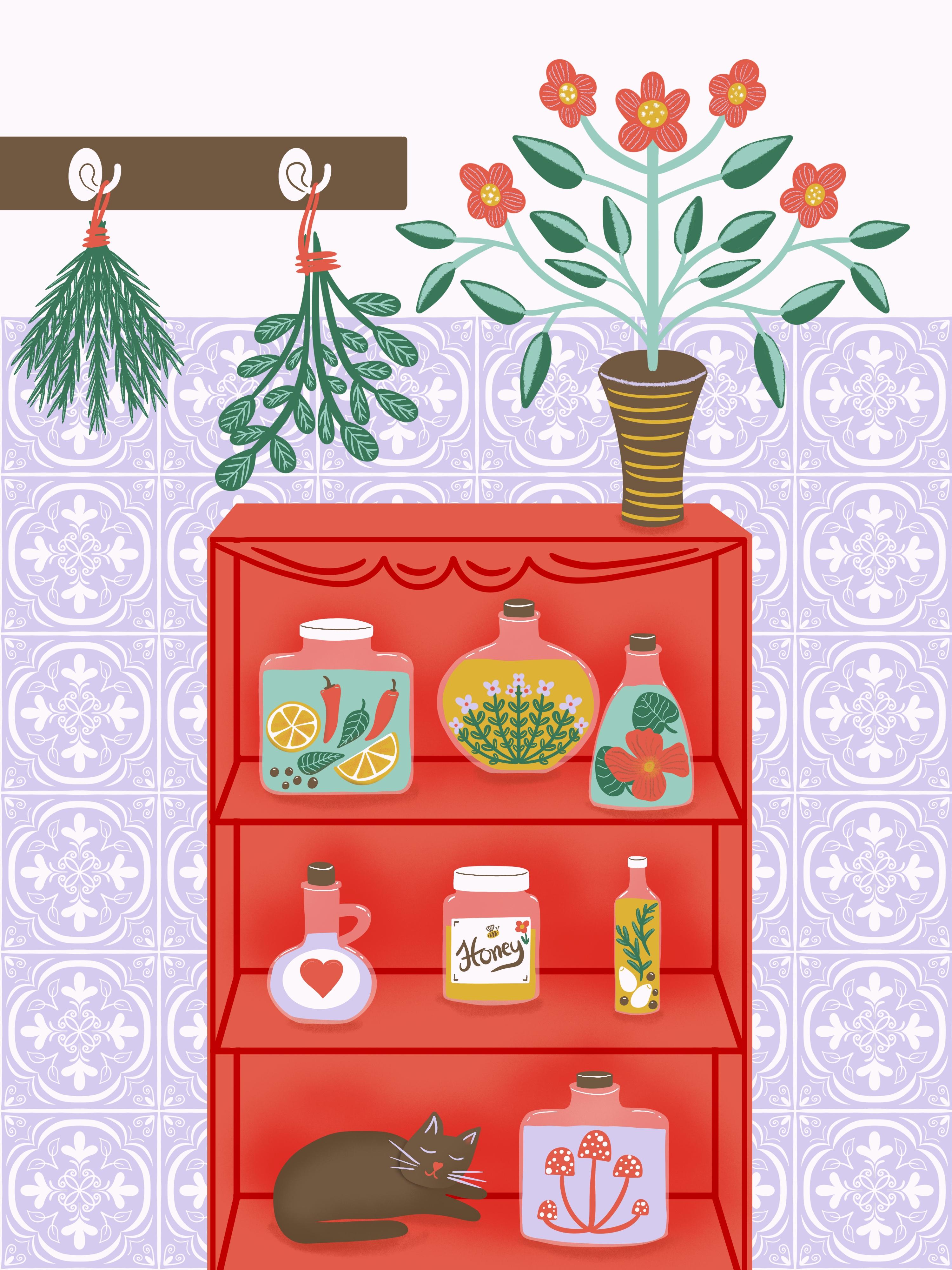
10. Illustration Idea: Fine. Let's move on to
our final illustration. For that, we create a new canvas by taking the
plus icon on top right. I like to create a
canvas that is 3,000, and 4,000 pixels in the
heath and the DPI should be 300. So this gives us a maximum
layer amount of 40. So I think that's enough. But we will make a
complex illustration. So we have to think
strategically. Let's take this Sketching
Pencil, 6B pencil. And my idea would be
to create some kind of kitchen board and fill it with some bottles
and glasses and in the background, we can make our patterned tiles. So, some like that. And on the top we can
draw some kind of bord with some hooks to hang on,
for example some herbs to dry. Let's see what
comes in our mind. This is my idea in short form. And in the next video, we're going to sketch
this out in detail.
11. Perspective Drawing: Okay, I delete it again. Clear
layer and make it nice. So, I like to have the patterned tiles to
somewhere around that. So, I make my kitchen
board somewhere here. Press the finger to make it
perfect to the border. And somewhere here. Okay. So I have a hand-drawn style and I
don't draw very stylized. So if you are a more
stylized type, feel free to turn on the perspective drawing
and the drawing guide. But I don't cover this
one in this class. But, feel free to check it out under Drawing Guide,
perspective and you have to choose
the vanishing point. So let's say somewhere here, then you have your
guidelines for the perfect perspective drawing. But I don't cover
this in my class. As said I'm more of
the hand-drawn style type. And therefore, I make it about in perfect perspective.
Cancel that. But anyway, even if we
don't draw very stylized, we have to follow some
rules for perspective drawing to make our
illustration not to weird. And for that I... Let me show you. I found this picture on
Pinterest from a shelf that's from the front view. And the vanishing point in this picture is somewhere
around here in the middle. That means that these parts, we see only the front of the shelves and all
that this under. We see a bit of the
top of this shelf. And the more you go down this, the more you see from this shelf. So here is only a small one. And here is a bigger part. And when you go from
your vanishing point up, you see the backside
of the shelves. Here, only a small one. And the more you go up, the more you see from the
underside of the shelves. Let's take these rules
and create our cupboard in the next video.
12. Sketch Illustration: So this is the front side. And I'd like to choose the vanishing point
somewhere here. So we can see a small
amount of the top from the shelf. So I go a bit down here and make it here. And the more we go down, the more we see the
top of the shelves. I like to make three
parts in this shelf. So it doesn't matter if they are same in size, or different. I turn on my Pinterest again. Okay. From the side, you see a bit
from the inner side. And this is your
corner where you can take the guide to the bottom. And here again, I
make it only slightly. This is the back and
the side. And the more we go down, the more we see from our shelf. Perfect. Well, not perfect,
but that's the point when you draw. I take this off. Now let's fill our cupboard with different
glasses and bottles. And I have provided
you with a variation of different stamps of bottles
and glasses and jars. And we can use them as a guide and quickly turn
them in our shelves. So let's choose this one. And I take it on
a separate layer. And I show you, why. Take it. And now we can
take the Move tool and move this one around without
affecting the other drawing. I think I like to have
this on the very bottom. And why not make it smaller, I choose the freeform and
make it a bit thicker. So it doesn't matter if
the strokes are blurry. So because it's only a
guideline and we draw over it in the next step. I take another layer to
make another bottle. I speed this up for you. And down on the very bottom, I'd like to go back to
my sketching pencil. 6B pencil and draw a little cat that is
sleeping in the cupboard. So it's only a sketch. We can always
refine it later on. I think it's up too fat. Now let's talk about the
top of our illustration. And I'd like to have a
vase on the top. So, somewhat around that. It's only a rough sketch, a very rough sketch. And we can always refine
it in the next step. Take a kind of flower shape over there. We can use the symmetry tool for this flower or leaf or
whatever this should be. But for now, we just make
a quick, rough sketch. And on the left, I'd like to make, maybe from
outside the border, a kind of clothes hooks. Somewhat
around that. The hooks. And here we can draw in some herbs, a bundle of herbs that are here to dry, to let them
dry for maybe some tea, or for cooking. And we'll refine it in the next step. Of course, we are going to
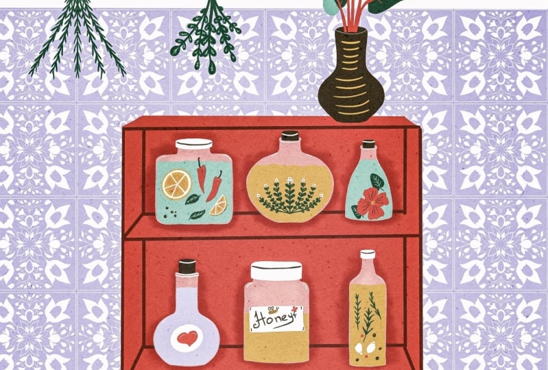
fill our bottles and jars with different products and feel free to fill them with
whatever you like to. So in this one, I make some... We can also use the
symmetry tool later on and make some thyme that are in oil, for, to make
salad dressing. Maybe. Okay. It's
enough for the sketch. And this might be a good one
for some oil with garlic and also thyme and pepper. And this one, I'd like to make a little love potion.
Make a heart on the top. This is perfect for some honey. And maybe this one for some mushrooms,
mystic mushrooms. So it might be a little
witches kitchen. Who knows? And these two on the top. Maybe here. Let's make another oil. Maybe this time with lemon and also some pepper and chili. A slice of lemon. I will delete from the cupboard these little that are overlapping. It looks nice. And here is one empty. And this one, I'd like to
fill with some Nasturtium in schnaps. That is never missing in my personal,
witches kitchen. And the leaves, they are overlapping. Okay, fine. And at the back, we have our patterned tiles
to create this vintage vibe. Fine. Let's meet in the
next class to fill this sketching with
color and refine all.
13. Ink the Room: Okay, We have done our
sketching and now we can refine our illustration
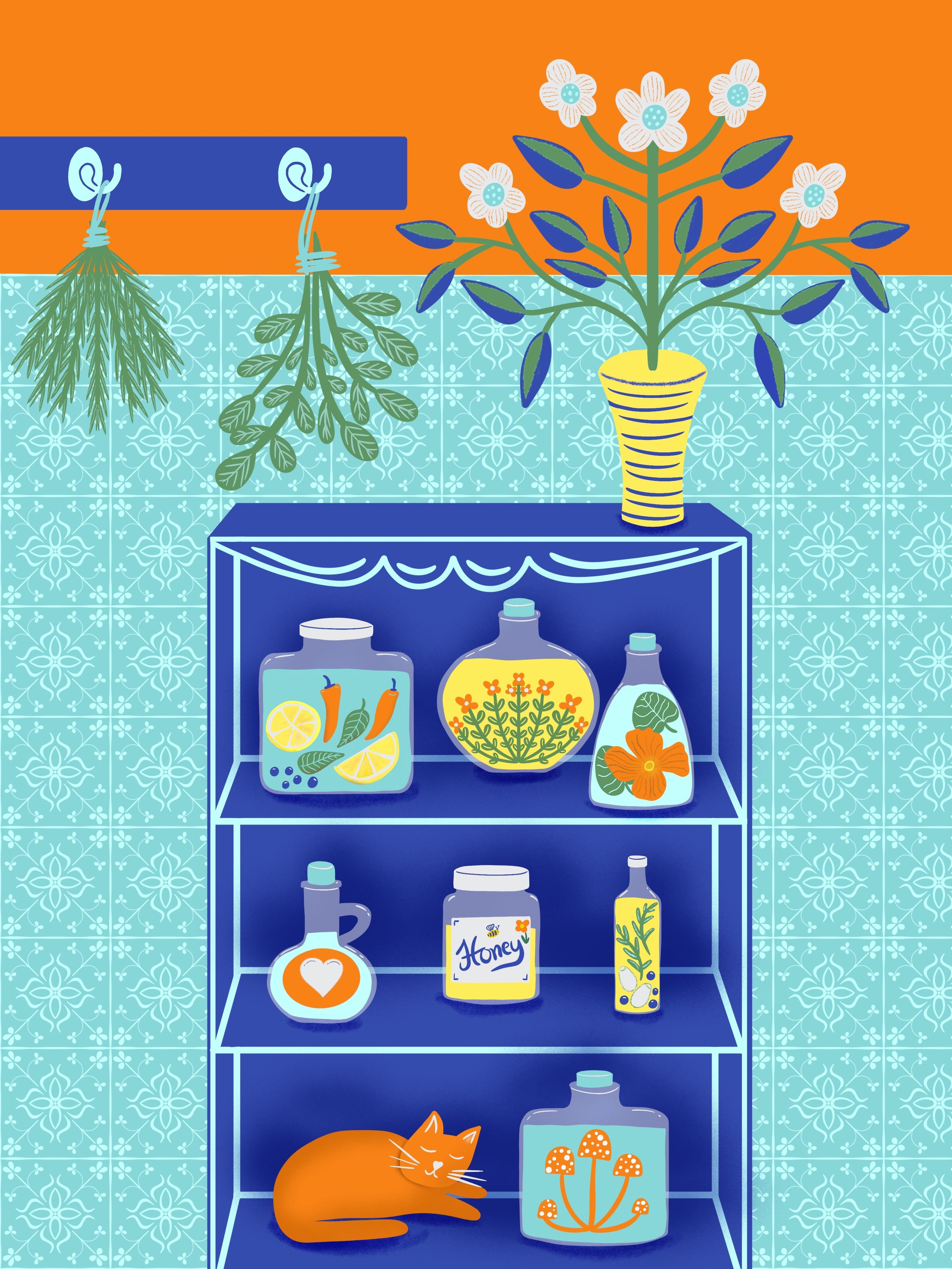
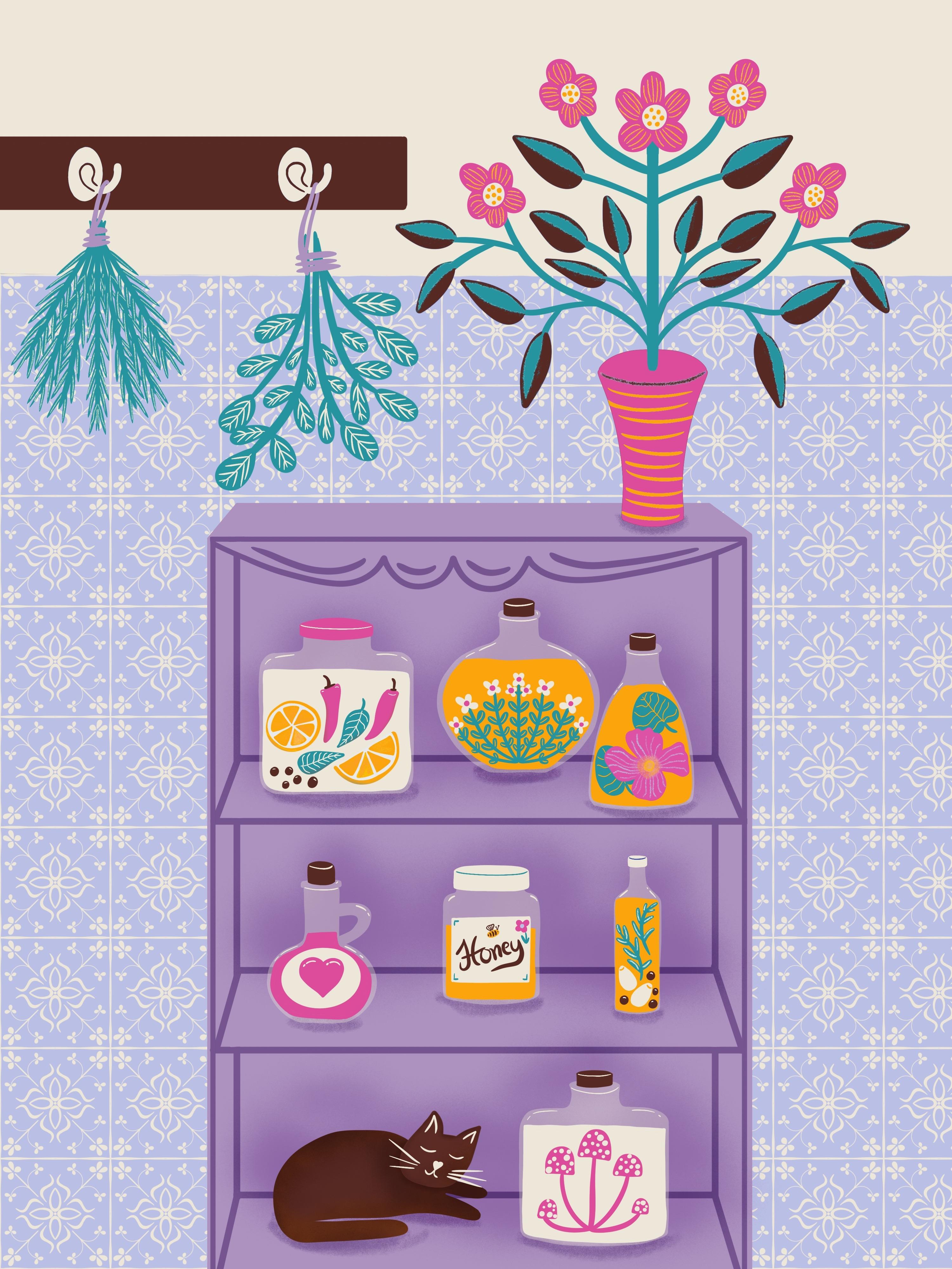
and ink the elements. I have provided you with
different color palettes. And you can choose
from one of that or take your own colors
if you like them more. First, merge our sketched
elements together on one layer and
reduce the opacity. And I'd like to lock it. And I always
leave this layer, the sketching layer on the top, so I can see all
of my sketching. I choose the bohemian
summer color palette for my illustration. And I select this light lilac
for my background color. Let's select a brush for inking. I always like to choose under calligraphy, the
monoline brush. I select this white
color from my wall. Make a perfect straight
line by tapping with the finger on the screen
and fill in the color. Create another layer that is direct above your
background layer. And there we can fill
in our patterned tiles. So let's choose one of our two brushes and draw
over the lilac rectangle. Let's turn off the sketching
layer for a moment. And I think it's quite pretty. One thing I'd like to change is make this white rectangle, the wall a little smaller. So we can see all of
the top titles row. It's much nicer now. Turn on the sketching layer again and create a new
layer for our cupboard. And I select this red color for the cupboard and create the
outer shape of the cupboard. And later we will fill in, Whoops, select the monoline brush. Start again and create the outer shape
and fill in the color. And later we will draw
in all the details. Okay, I can't see
my sketching now. So let's unlock the
sketching layer. Unlock. And then swipe with two fingers to the right
to make it alpha lock. And then we select a black
color all the way down here. And then we can fill the layer. So we have it black now and
we can see it much better. Reduce the opacity
again. And lock it. I choose this brown color
now to make all my axis and the lines of the board. So I make another layer
and clip it to the board. But first, I like to refine my board, especially
the corners. And then I'd draw
in all these lines. I speed this up for you. And then make this
back axis first. So we have a continued line. And then we can erase these parts that are
overlapping over the board. And then I'd draw
in all these lines. Let's make a kind of decorative
strip here on the top. For my further inking process, I choose the studio
pen under inking. And I'd like to make
some bows, round shapes. Erase these
overlapping parts. And decorate them with lines. Let's meet in the next video to ink all that is in the cupboard.
14. Fill the Bottles: Let's draw our bottles out
next on a separate layer. Let's choose this
white color and the studio pen and then line the bottles out. Okay, Let's reduce
the opacity of this layer to make the
bottles a bit transparent. So around 30 percent.
And on another layer, make all the caps. Okay, let's fill
the bottles now. And I make one layer
for the liquid and a separate layer for all
the fillings in one bottle. I make the liquid in
this one, light green. And on a separate layer, I fill in all the
fruits and herbs. The first one is done. Let's make the next one. And I group these two layers together and create
a separate layer for the next bottle. I make the oil,
the liquid yellow. And for the thyme we can
work with a little trick. So we can turn on the
symmetry tool for the thyme. So take this little wrench icon, Canvas, edit drawing guide. And here you can turn on the symmetry and take this axis to the
center of your bottle. So this is the mirror axis. If it's not working correct, you can check your layers menu. And if on your layer, the drawing assist is active. And now you can draw the
thyme in perfect symmetry. I'd like to add some blossoms
on the end of each sprig. The second bottle is finished. And I group these two layers together and go on
to the next bottle. I make an extra layer
for the leaves. Group three layers together and go over to the next bottle. Group the two layers. And make the honey. Make a nice label. Oops, I forgot to create
a separate layer. I'm not really good
in hand lettering, but I try my best. Okay, and we make more
details in the next video. Let's go over to the love potion. There is only one bottle left. And on the separate
layer make the mushroom. I add in little dots. In the next video, let's ink the cat and the top of our room set.
15. Ink the Rest: Let's draw the cat now. But first, let's group these two mushroom
layers together. And on a separate layer, draw the body of the cat. And on another layer, the head of the cat. And on the third layer, you can fill in the eyes and the nose and the
beard of the cat. We are done with
filling the cupboard. And now let's move to the top. And first, we can draw this little vase with
the flowery shape in it. And for that, we can also
use the symmetry tool. Go to the little wrench icon on the top edit drawing guide, and then move the mirror axis
to the center of your vase. Group the cat layers together, and then activate the drawing assist on your
layer for the vase. I choose this light
green for my plant. And make the brush
a little bigger. Whoops. Oh, what happened? This layer with the
wall is on the top of my layers and I
move it to the end. And now it works. Draw a symmetrical
plant that you like. You can add some
leaves and blossoms. Nice, I like it. Now let's go over to this hooks
board and make the inking. I select the mono line brush for this geometric
shape of the board. Let's make the hooks
in this cream color. Better on a separate layer so we can copy it later
for the second rook. Okay, let's duplicate this
layer and move it to the left. And now we can merge these two hooks
together on one layer. I match the complete board together and make
a new layer for my drying herbs.
I choose this dark green for that. I go back to my studio pen. Here on the top, I make a little ribbon
that holds the sprigs together and hooks it on the hook. Because I've merged the
hooks with the board, I have to be carefully
now with the ribbon. Okay, Done.
And for the last one, I take on my symmetry
tool, again. Activate the Drawing Assist
on the layer and go further. I think we can turn off
our sketching layer now. Turn off the Drawing Guide. Now, turn off the
Drawing Assist on this layer so we can
make the ribbon. And we have done all the inking. Let's meet in the next class for adding some details
for more interest.
16. Add Details Top: Okay, let's make the details
in this rosemary. And I choose this inkbleed
brush under inking, make it a bit smaller, more. And then I turn on
my drawing assist again and turn on the
Drawing Guide again. And then make this little veins in every part of this Rosemary. Turn off the assisted drawing
and the drawing guide. And then let's talk
about the hook. I'd like to draw in this detailed shape on
the white ellipse. So it's kind of a shadow
or the detail of the hook. I go back to my studio pen. Okay, let's make the
veins in the sage next. Okay. And for this flower, I'd like to choose this dark green and make the
layer in alpha lock. So swipe with two fingers
on the layer to the right. And then I choose the inkbleed brush under inking, make it bigger and
then draw out a vein. No, draw out half of the leaf in this to get a bit more contrast to the patterned tiles
in the background. Yeah, I think that's fine. And for the blooms, I'd like to choose this white color and make some dots in the
middle of each flower. And then I take this lilac and make
some stripes on each petal. I think that's nice. Let's decorate the vase. And in the next video, we add the details
in the cupboard.
17. Add Details Board: Let's go over to the board now. And I'd like to
start with the cat, go to the body of the cat and
make the layer alpha lock. And then choose a black color, and this medium nozzle brush, and create a subtitle
shadow under the head. You can also play around with this brush on the
full body of the cat. Cat. Check. Okay, then I go back
to my bottles layer. And refine all of
these bumpy edges. Okay, and now I go to the
caps layer and refine all my caps. And then I make a small stripe on the top of
the cap to define it better. And the same here under the bottleneck. Then imagine there is a light source on
the top of the room. So we can make some
little stripes on the top of the bottles to reflect that light
a bit and generate some more interest. And do this with all the others too. And now, let's choose this first bottle with the lemons and the layer with
the fruits in it and the chili. And now let's add some details here in. For example, you can make some lights
on the top of the pepper. And in this basil leaves, you can integrate the veins. I take the eraser for this. And here's some lights on the chili. Just simple stripes
and dots here and there. And then I alpha lock my
layer and then choose this brown and medium nozzle and create some
shadow on the chili. I make it a bit smaller. Only subtle. Here and there. Yeah, it looks nicer. And also on the leaves, add shadow. And for the lemons you can also create some
shadow on the bottom. And in the lemon, we can add some texture with
this red and then take under sketching, try out
the peppermint under sketching. Reduce the size and make some stripes here and there. Only press slightly
with your pencil. So there are only
subtle textures in it. And I think it looks nice. Okay, we are done with
the first bottle. Now let's go to the thyme and let's see
what we can do here. And I suggest erasing some little veins in the leaves. Let's go over to this
nasturtium bottle now. And here is the layer
and I take the bloom, blooms layer and I take this brown color and
create a circle, kind of circle in the
middle of the flower. I take the peppermint brush
and make some slightly veins. Some slightly stripes in
the leaves, in the petals. And in the center, I like to integrate some yellow. Try the peppermint here. Yeah, I think that's okay. Draw over it. Then go back to my brown and go further with this
little stripes. Okay, And I take
this yellow again and make this circle in the middle a bit bigger by pressing only
slightly with my pencil. Okay, let's go to the
leaves and I take my eraser again and
erase some veins. Let's go over to our garlic oil now. Let's see. We can erase a part of
the garlic on the top. Maybe some stripes.
No, I don't like. And in the Rosemarie, we can go back to our
peppermint pencil and make some stripes in
this little leaves. And on the pepper, go back to the studio pen
and make some little dots. And the next is the honey. I take this layer with the
lettering and my red color. And I like to draw a little
flower on this label. A simple flower,
only a simple shape. And the yellow in the center. Maybe this green, and make some leaves. Nice. Then I go back to my
yellow and make a simple bee. I add some stripes on
the corner of the label. That's nice. Okay,
done with the honey. And let's go over
to our love potion. And there's not so
much to do in here, but maybe erase some
stripes in the heart. So for more interest, I think that's nice. I refine the heart a bit. And we are done with
filling the cupboard, and I think it's
a nice room set. There's just one thing
left and I'd like to add some shadow in the back of the cupboard for more 3D effect. And I take the red
color and shift the color dot a little to the right and down
to make a darker version of the red. And then take my nice
medium nozzle brush. And here's the layer of
the cupboard and I create a layer that's
above and clip it. And then I make with my medium nozzle brush a kind
of shadow in the background. So around all the
bottles and glasses. And later we play around
with the blending modes. So it doesn't matter too
much how it looks like now. And then go to the layer
and this little N, you can check the blending modes. And I usually like
the linear burn or the color burn very much for
that, reduce the opacity. And I think that looks nice. Check out the color burn. And the multiply. Can play around with
these blending modes a bit till you find a
version you really like. And you can also blend
this axis layer. And I think I like that version. And now we can create a
layer that's above this axis layer and create some little
shadows under the glasses. And I take this
peppermint brush for that and draw some shadows. Congrats. You have finished your
project, you have finished your vintage room set.
18. Thank You!: You've done it. You've created your own stamps and brushes and your own
vintage room set. I'm so proud of you for
sticking with me this whole way. I hope you had fun and
that you're inspired now to create your own rooms
sets or pattern brushes. I'm so looking forward to see your creations
in the gallery. Please share them
with the class. Thank you so much for
taking this class. And hopefully I'll see
you again next time. Bye.
 Nicole Gabriel, Procreate Artist