Transcripts
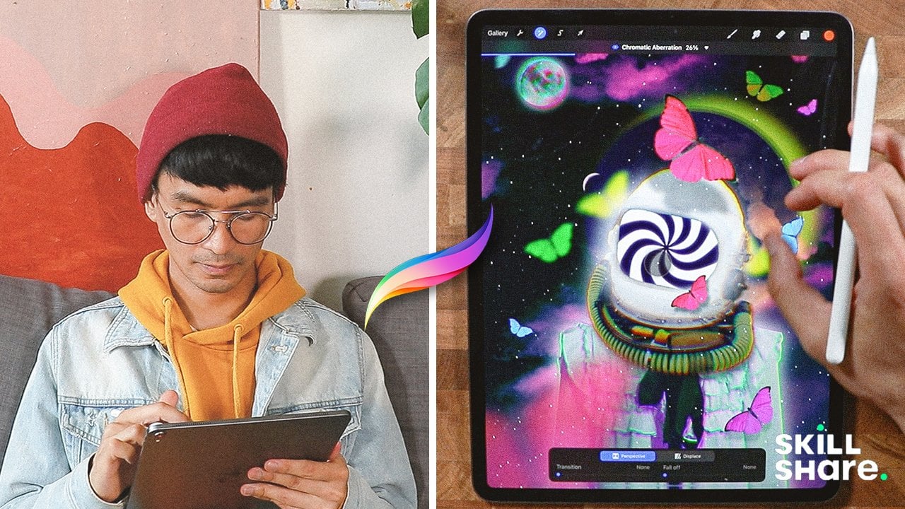
1. Hey there: Intro and Project: Procreate was a complete
game changer in my workflow with
Procreate on the iPad, I can create artwork
anytime, anywhere. We don't limit and share
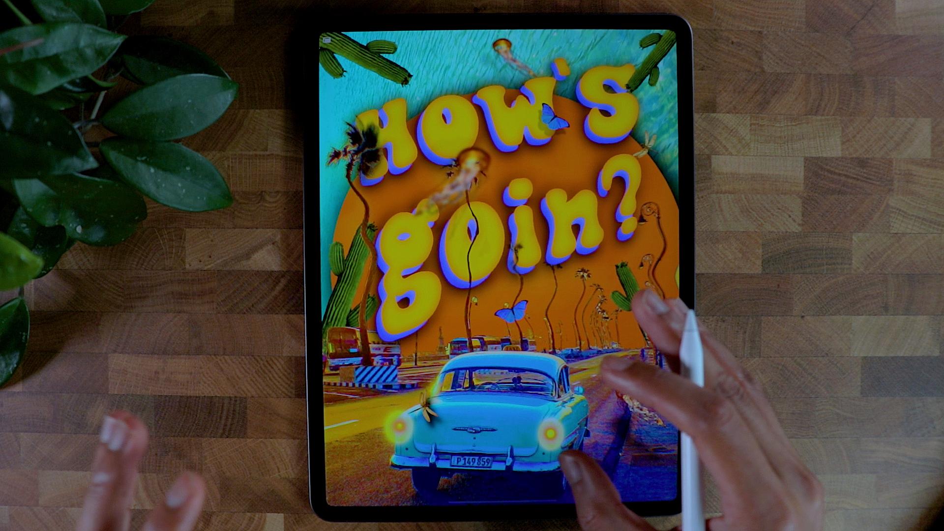
it with the world. See, in this class, we're going to create a good vibe poster using the magic of the app
and all the while, we will be learning
all the tools and techniques using Procreate. Hi, I'm Brian. I'm
a graphic designer living in one trial and I work with different
companies to solve and help them with
their visuals, branding, and social
media content to send the right message
to the audience. I also teach graphic design
on different platform, which is, I am passionate
about my art styles. Experimental, warm and happy. I90 art is subjective, but that's what I'm trying to
portray in all my artwork. This is a quick fun
project that might spark some greedy genius on you. And I liked experiment
with different techniques, media and colors to come up with your knees outcome and don't
worry about the results. It's about taking time
to create and allowing our individual process and creative instinct to take over. And all we need is our iPad Pro, or iPad, Apple Pencil and
procreate app installed. And we're good to go. This class is an
intermediate course, but if you are an
absolute beginner, you can challenge
yourself for sure. These are the breakdown of
what the class is all about. We will set up our workspace
and learn some basic player. We will play with images like masking them and
re-coloring them. We will use the tools like transform, selection
and adjustment. We will apply texture
and color grade down to match the overall look
we're looking for. And more. By the end of the class, you'll be able to create good vibe poster that
you can post. Art print. I can't wait for you to
share what you come up with. Now project gallery down below, I would love to
get your feedback. So let's get started. I'll see you on the next video. See you there.
2. Where to Get Your Fonts?: Hello guys. Thank
you for tuning in. I'm just going to show
you where I typically download my font, my typefaces. And I usually go with this
for different website. These are all free, mostly for personal use. But if you want to download
it as for your project, if you want to sell it or
monetize from your artwork, you can just go to Google font, which is pretty much the standard of all funds
besides Adobe for sure. But Google font has all the fonts catalog that
you can use for commercial, personal, any kind of usage, even our website, you
can easily embed them. But for what we're gonna
do today, for font, that is just like
a couple of words go for display text if you can, because they have
the most impact for composition that
we're gonna do today. So you can just go ahead
and go around here. And if you want to download
it, just for example, I usually, for when
you download a font, it's pretty much the
same as a little bit tricky when it's
your first time, don't downloading
fonts from your iPad. So you just have to click
which one you like. Let's say example, we want
this lab survey here. You can just download
the family if there's one or more friends
style of deck that say, let's go to a different file, which has us go for Sarah. I'm pretty sure this
has like Roboto Slab, this different style here. So you can just add those
different family right here. And once you're finished, you can download
the family and you just really gives you this
problem like a blank page. And you can just hit download at the bottom part of your iPad. And then you can open
it, open in Download. And it will automatically
go to the download folder. You can just go done or you can actually hit this
button right here. You can just open in
Procreate just like this. Sometimes it takes a while. Sometimes it doesn't even open, but I'm not sure why
it's not opening. Let's take a look as good done. And then if you go, let's say you're having
a hard time finding it. You can just go to
the recent folder on your iPad and usually
you'll find it right here. So you can find the Roboto
regular array here. I can just do that
and let's see. If you click it right here. She want to go add text. Let's change the color to black, and let's click the
icon right here. The AAA means it's for
violating your text. So let's go to Roboto. And it usually here. So you can see you
only have the only important one of
the regular one. But if you want to
import more funds, they can just click
this one right here. And then you can go
pretty much here, download couple of
fonts right here. Let's say No need to bold. And we'll just go
straight to here. So that's pretty much
how you download fonts. Seen Anita is there. And let's go back to the resources that
we're trying to cover. So there's a couple
more, you can say, you can also visit font space.com as you
can see right here. There's also a Font Squirrel. And the font, this is actually
one of my favorite one because you can filter it
as like the Google font, and they usually are
free for personal use. Can see here after
you for personal use, it's a 100% free. That means you can
use it for anything. Yeah, that's pretty
much, I just go with this different
font right here. And you already saw how
I downloaded the font, imported font from procreate. So I guess that's
covered the hand. I'll be sharing the font
that I'll be using in this project so he
can follow along. And I'll see you
on the next video.
3. Where to Get Your Images?: Hello guys and welcome. Alright, so it's gonna
be where to find your images and your
assets for free. First thing that I recommend
is actually Google. You can pretty much
find everything here. But I suggest that
you go back souls to Unsplash ENG IMG and Deviant Art first before
you get into Google, because Google is gonna
be the last resort. Take a look at clouds. These are clouds, but
sometimes they are. You're not supposed to
use them in production. So I think that you
have to be careful. You can actually go
into filter right here. You can select HD right here and see you get the
highest definition. As you can see, it's a license of all despair. You go to these free stock
photography right here. Sometimes they have
a little bit of requirements like you put
their names if you want to post it somewhere else or
if you're selling it in digital form or in
printing or Pexels, Unsplash, also Deviant
Art as well for the PNGs. These are like,
let's say example, we can look for maybe
a waves and stuff. You can search for ways that
you can have all this one. You can even select what
type of resolution to need. If you want to original one, you can select it and
go to the smallest one. Even in unsplash.com, you can have all these good
resolutions right here. You can just cut them, are blending interior
composition and you have all this planet and you can
have the original size, which is a pretty big size
for this kind of thing. And you can PNG IMG.com is sum
it says my go-to for PNGs. Let's say, let's go get a cat. All the cases already
been cut here. So if you want to do
a collage with cats, this is gonna be the best place. Sometimes they're
not good qualities, especially you can see the
resolutions right there. It's 557, so that's
not a good resolution, especially if it's
the focal point or if it's your domain subjects. So this is okay, I guess you just have to look
which one is the best one. The higher the quality or the higher the
resolution means, the higher the quality is. Just that. And Deviant Art is
actually also like a PNG. Let's say we want to, we need some trees, PNG and Deviant Art. You need to register
before you down, you can download these assets. These are PNG, so you can
just download them and then you can just cut some of these and then put it
into your artwork. Basically, these are the
only one that I consider. If you have something else
that you can recommend, please feel free to go on
discussion and post it there. But I'll see you on
the next lesson.
4. Setting up Canvas and Layout: Hey guys, thank you for tuning
in and let's get started. We're going to create a
new canvas right here. So I'm going to be clicking
this one right here, that blast icon on the right
upper part of the screen. And then if you want
to customize, it, can always get this plus icon here and you can go ahead
and put your dimensions. So I'm just going to be using the screen size right
here because I think it's gonna be okay for me and also it's good for
printing as well. So otherwise you can
create your own size depending on I'm going
to print it or not. But I'm just gonna go
screen size right here. And we have our new Canvas. Right now. We are going to just talk about a little bit of what we're going to create today. We will be creating
a retro vibe. I'll be using some of the
images that I like to use here, like a vintage car, I'll be putting
texts right here. So the plan is to get
some images right here. Has kinda image, and this is gonna be a different
image right here. So it's like a sky or something. It's gonna be like
a vintage car. And we are going to create some kind of a
focal point right here. Probably. And a little bit
of knick-knacks of different elements and
guides to eyes for sure. So you can see pretty
much something like this, but we're going to put some kind of alignment here as well. So we're not getting
loss with how we put, we put the elements together. So I'm going to divide it, probably something like this. So you have like a grid
base or baseline of where we put those elements so they'll look easier to digest. Now first things first, we're going to go to
wrench icon right here. Canvas. We're going to get a
drawing guide right here. So like the plan
that we did here, Alignment, kinda like this. So I just went to 2D grid and
then grid size right here. So I have a little bit of
baseline for put my elements. I think this is good. And I'm going to hit
Done right here. And we have a good baseline
where we put our elements.
5. Placing Photos : We're going to insert our
first photo right here. So I'm going to be inserting my favorite vintage
picture right here. I think I got it on
Google or unsplash. It's been awhile
that I have this, but feel free to go ahead
and go to Unsplash. Pexels are Google and
go for a vintage car. And I have one right here. I like the colors because
it's very complimentary, has a good contrast. So I pick this one as
my starting point. And I will just go ahead
and put it right here and then scale it just like this right here where
the transform tool, you can see the arrow one right there, that's called transform. I will just position
it just like you. I'm not concerned
about what on top because we're going to replace it anyways with a
different image. I will just do
something like this. Make sure I have a little
bit of padding right here or some kind of alignment by pink. I'm going to go
something like this. For now, that's good. And we can start removing the
background of like the sky. I'll replace it with different image that
will go with the color. I'm gonna go to
selection right here. Remember hit Automatic and I'm just going to go hit
this guy right here. As you can see, it's pretty much doing its job pretty well. And now we can zoom
into the image and then you can just go ahead
and take all these different. Okay, there we go. And this one right here, just pointing. I'm not sure if there's
a better way to isolate those background
in procreate. But I know there's a
better way in Photoshop, but we're not using
Photoshop today. I'm just doing this pretty much. I think we're pretty
good with this one. Don't worry too much
because we're gonna do some special effects so
that it looks seamless. I'm going go ahead and invert
this selection right here. And I'm gonna go to
deselect our third layer. I'm gonna go for mask. And as you can see, the
background has changed. As you can see how I could
change the background right now to orange. And as you can see,
it's been removed. There's some little
bit of problem here with this straight line. We can just remove that. We're just going to
delete your mass right here and we can
get some airbrush. So airbrushing, you
can go medium brush. You can make the brush
a little bit smaller, and I'm going to go with black. And so we can remove
this one right here. Okay, I think
that's pretty good. Okay. I think we're
good with this one. What I'm gonna do here probably, but another image right here
for the background, the sky. So I'm gonna go in
search and other photos. So I'll be using this
photo right here. I'm just gonna put
it all the way down. So you can see the
difference right here. You can even put it
just like there. Is this quite okay, but I'm not really into that. We're going to just go ahead and do something and the
color seems to be okay. I like the color. Remove the Drawing Guide for a little bit so I know
what's going on right here. Alright, So it's
pretty looking good. What I'm gonna do here, I'm going to make some
elements right here, like sway a little bit so
they look a little bit more dynamic and a little
bit more playful. So what it's gonna do that on the next video,
I'll see you there.
6. Adding Effects and Dynamics: So we're gonna start manipulating
these trees right here. I think these are palm trees. And we can, actually, we can merge them together now the layer mask
the main image, so I'm going to
rename it as car. And this one is going to be a background or just
BJ. I think it's good. So we're gonna go to the car
section or the car layer. We're gonna go to
liquefy and you can start playing with the
12 right and left. So I think I'm gonna go,
That's too much pressure. So make sure you put
test it out first. And so far they're quite okay. Just make sure you don't
modify the shape of the car because it
won't look good. So I'm going to just
go little by little. Make sure I don't
modify the car. And if you get into trouble, you can go ahead and reset
and it should go back. Okay, so I think I like that. We're going to
decrease the size. This one right here. Yeah, I kinda like this
dancing movement right here. I will just make the
brush smaller so I could modify some other
great stuff right here. But so far it looks good. I like it. And I just want to play
with branches right here. So I'm gonna go with probably
smaller version of it. And I can even push
them away or pinch it and expand if you want. I'm gonna go play around
with twirl, right? Play around with this. I think this is quite
okay and I'm loving it. So we're just gonna
leave it just like that. Add a little bit of more
elements right here. Actually, we're going to put
some effects right here. So we're going to create a
chromatic aberration and see how good take us. I'm going to just
put a little bit, just to give it a
little bit of color. And so this one looks
a little bit more. I'm going to add a little
bit of circle right here. We can even add a bloom effects, so the glowing factor is going to go grow
even more sound. Let's experiment a bloom. And so I think it's
good. I kinda like it. It's a little bit more flashy. I'm going to add a little bit
more elements right here. So I'm gonna do that on the next video and we're
going to add texts as well. So I'll see you there.
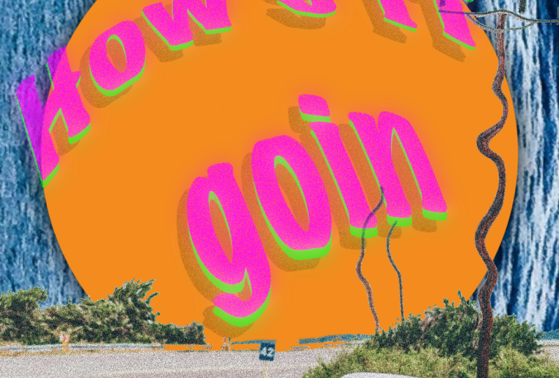
7. Adding Text and Focal Point: Alright, so let's get started with adding more elements
to our composition. So I'm gonna get a new layer. I'm just gonna put it
at the back of the car. And I'm going to use
the orange color. And I'm gonna just draw
a circle right here. And this is gonna be
one of our focal point. So it just gives it a
little bit of warm. We could probably change the
color a little bit orange, just like this, or maybe
a little bit brighter. So it gives a little bit more of a warm feeling when you
put all the elements. But for now it looks good. Position it just like this, make it a little bit
bigger, just like this. It goes with the color of
the orange right here. So I'm like the vibe so far. So let's add some shadow
on the orange circle, gives a little bit
more of depth. So I'm going to just duplicate this layer right
here. Duplicate it. I will just gonna go Hue Saturation, decrease
the brightness. And then we can go again
with the adjustment, taking a gloss
should caution blur. And then just put some motion
blur right here up to you. How much intensity you
can see the intensity. Right on this part
of the screen. You can go all the way. So we're going to start
putting other elements, going to start putting
our texts right here. So we have a little
bit of contexts. So we're going to go, I
insert text right here. So I'm going to put up
with black for now. You can choose which funds
you like to work with. But I will just kind of go with this font
right here hasn't gone. I'm going to fix some
landing issue here. So I'm actually using
mushroom by you can choose all of the others and you can also
download your own font. I will just make the size
a little bit bigger. Then since we're here, we can decrease
the learning too. So they're not that
far with each other. So I think this is
quite good color. It would kind of like
this kind of blue. And I'm just going to
put it right here, position it just like this. So it has a little bit of a Dynamics and I'm
going to put it on top of every thing in
the lead is still off. I'm not really happy
with the lettering, so I'm just gonna go ahead and make it closer to each
other, something like this. And we can do this one as well. Select all of it just like that. And then you can color it with orange color and then
we're going to upset it. You can see it's a good contrast now with
everything in here. And we can even amplified the contrasts with
duplicating any of these. And then we're gonna
go for Gaussian Blur. Gaussian Blur it. And we can also apply another effect
which is brightness. You can go ahead
and go to the dark is it goes to block
this one right here. And we can even amplify it. You can go Gaussian
blur it again. And if you're happy
with high turns, but not too much like this, probably just a subtle, we can actually
just group this one right here so we can
manipulate them. You can manipulate there
freely, just like this. We can position it
anywhere we want. We don't have to worry about it. If you're happy with it, you can actually
duplicate this group, hide it, put it here so you have a backup since we're going
to merge this together. And so you can play with it
and even and even warp it. So we have, so you go to
Transform Warp advanced work. You can just manipulate the text just like
this one right here. You can go overboard with this, but this is quite fine. You can go uniform and
you can make it smaller. If you turn on our
Canvas Drawing Guide, we're still on
margin that we set. So that's good. We can turn it off again, can add a little bit more of content print elements so
it looks more engaging. So we're gonna do that
in the next video.
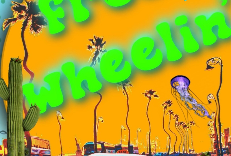
8. Adding Some Elements: Alright, looking good right here is going to
add more elements. So I'm going to
start adding images. And we're going to add
this cactus right here. I'm going to put it somewhere
just below the car layers. We can make it a little
bit bigger right here. We can duplicate it, put it on the other side. It's kinda like acts
like an anchor. Probably in this place, probably like jellyfish right
here because I think it has a good color combination with
what we're doing right now. I'm just going to put it
on top of everything. So it's kinda like overlapping. I will actually Gaussian blurry. Not too much, but it's
kinda sharp right now. So I just like to do that. I'm going to add noise as well. So it goes with
the overall look, and I think it's quite good. It's a good addition
to your composition. We can add it, we can flip it here, and we can add one more here. I'm gonna add a
shadow actually here. And I'm actually
doing it right now. Can gaussian blur the shadow? And we can decrease the
opacity thing that's good. Besides a little
bit more realistic, I can duplicate this as well. Goody right here,
maybe something here. And we get less than
the capacities. We can add a little bit more, but I think I'm going to add
a famous butterfly right here thing I'm going to
add it just about here. Probably change the color. Let's see what's, what's
gonna be grading here. I think this original
color works just fine. We can add another
one, duplicate it. We can maybe Gaussian blur it and then move
it just like this. We can apply another
shadow here. Dance, Good, duplicate
it. Duplicate it. I think I'm gonna get one. And I'll just put it right here. And I'm going to blur it. This one right here. I could go mask. And so I could review some
of the trees right here. Let's see if that works. I'm gonna go white. So we're going to
change the brush to mono line or one line brighter. We can start reviewing
some items right here. Okay, I'm gonna go back to
wait to turn this back. I'm going to go for soft brush. We can turn it back on. And same as here as well. So we're just doing
it piece by piece. Alright, so right now
it's kinda boring because the colors
are too saturated. So what I'm gonna do,
I'm going to recolor this background right
here to this orange here, a little bit more saturated. And I'm going to saturate
this one as well. So I'm gonna go to
saturation hue saturation. And I'm going to
just saturate it. So it has a little bit
more nice contrast and nice color that pops out. And I'm gonna go pretty much
the same thing with the car. I'm going to hue
saturation, color, grade them to something. Yeah, something like
this or even like this. I'm gonna go curves. I'm just going to add some
more contrast to this one. I'm just playing
with the contrasts. See what's going to be the
best color, where it is. But so far it looks
I'm looking great. I just don't want to
make it too much, but so far it looks great. Now, duplicate this
one right here. I'm going to merge it. I'm going to recolor
it to black. So I could bloom. Gaussian blur it. A little bit more controversy with what's going on right here. Something like this. But I also am going to
reduce the opacity. Overwhelmed too much, and add
more elements right here. So we fill up this phase. Okay, I'm gonna be adding
some dragonflies right here. I'm going to recolor it
to make sure that it blends pretty well
with the composition. Is when is good. We're
going to duplicate it. And then we can go turn up the brightness,
can move it around. So it's only like a fake shadow. Gaussian blur it. I've
said it quite a bit. Yeah, I think this is good. Okay. Let's try to make
this and put it back. Just to give it a little
bit of context here that just gives it a
little bit of dynamic. Duplicate another
butterfly right here. It's gonna put it here and duplicate the
dragon fly as well. Put it just above here, add some noise to
blend pretty much. Alright, so this
one looks great. Now I'm just gonna put a
little bit of lights in here.
9. Let's Post and Print it!: Alright, so for the
lights in here, we're going to just
create a new layer. And we could make
something like this, but we're going to change
the color to light pen. And let's try to kinda
do this right here. Don't worry. I know
it doesn't look real. Bow. We're going to blend
it pretty well with. I'm gonna go with screen because it's the most realistic one. And we're going to
add a new layer without any blending modes, we can just add one more, maybe a little bit
red right here. I'm going to put
it in the center. And then we can go
a Gaussian blur it. Something like this. It has this gradual light. And I'm going to do pretty much the same
thing with the other one. Here. We can make another one. This is quite good. And I'm going to just
merge them together. And I will just bloom
them a little bit. I'm going to just duplicate it. The house going. We can actually maybe
add balloon to it. So it looks a little
bit glowy thing. This is okay as
well, bill, I get, but if you don't, you can control the bloom
as well just like this. Or maybe this one. But a 100% is quite too much for me really
happy with the results. And we can print it out. And I kinda like the result. We're going to save it as a PNG. So I'm gonna go here, wrench share, gonna go PNG. We're going to save
it to our gallery. And I'm gonna go to my gallery
and see how's it going. Alright, so this is how
it looks like after I rendered it and I
think it's quite good. This is how it looks
like on Instagram. I think it's quite catchy and I can't wait to print it
out in a little bit. So I'm actually
ready to print it out so I can just bring
it just like this. You don't have to do this part, but I kinda like to print, so I'm just gonna go here. And then you can just
go ahead and print. And I do have a
printer right here. I'll just kinda go default setting on the process of printing right now this
is definitely an optional, but I'm using my
abs on Eco tank and the paper I'm using is
11 by 17 inches and glossy paper took me about five minutes to print is definitely an optional
one if you want to print, but I like to print and it's
nice to show it to people. Hope you enjoy the process
creating this poster. And I'll see you
on the next video.
10. Closing: Thank you!: Hey guys, this is actually
the end of the class. And thank you so much for taking the time to watch this class. And hopefully you're
able to create your own good light posts that you can share on
your social media, your friends, family, and, or you can print it out. You have any question
or clarification. Feel free to post on the
discussion panel down below. And I would love to
hear anything from you. Don't forget to post your goodbye poster in the project gallery down below and would
love to see them. And I'll see you
on the next one. See you there.
 Bryan C'ngan, Graphic | Web Designer