Transcripts
1. Intro: Forget the math.
Forget the headaches. Repeats are fun now. It's easier than ever to create good repeats
and photoshop. And today, I'm going
to show you how. Hi, my name is Summer. I'm a textile designer and figurative watercolorist in
Los Angeles, California. I went to school at Otis College Art Design for fashion design. And then a few years
into fashion designing. Here in LA, I switched to textile design because it met my needs
creatively much more. When I'm not designing,
you can usually find me in the flower
gardens here in LA. My other pastimes include painting and hanging
out with my cat. I love to play VR games. I'm a huge fan of
Beat Saber right now, and I am proud to
say that I am on expert mode in
almost all the maps. So that's important. I'm sure. Well avoid pattern design. They say there's too much math. You have to draw everything, or it just takes too long
to create what you want. But that's not true anymore. Now I'm going to show you
how to drop the math. Use collage and have the
most efficient workflow. And on top of that,
it's fun now. I sometimes call myself a
lazy designer because I prefer efficiency overdoing
things a long way, so I'll spend hours
trying to find something to make
my work faster. In this class, we're
going to be creating patterns from concept
to presentation. We're gonna do mood boards, then repeats, then mockups, and I'm going to show you
the most efficient workflow so that you're thinking about
the patterns you're making, the art you're creating, and not about the steps
you're taking. It's easier than ever to create a good repeat because of the
new technology available. Adobie capture will show
you kaleidoscope prints. They are fun, easy and fast. We're going to go through
photoshop pattern preview. This is where you get the
math out of the equation. Get into the flow without worrying about the
technical details. It makes pattern creation
much more intuitive. And finally, I'm going
to show you seamless. This is an amazing
extension for photoshop, and it creates
textures for use as standalone pieces or
within our main repeats. We're going to reduce the time invested in each pattern and create quality, quantity,
and consistency. Once you've done
all this creation, we're going to refine
your selection. You'll be creating so many
prints that you'll be able to select the best to create the strongest
collection possible. And then I'm going to show you how to create a presentation, make it look professional. Help your clients or art
directors see the final project, make it easy to say yes. I'm going to show you how
to create mockups that make that just easy as that. There's so many things. I just packed this
class full of, and I can't wait to show you. So let's get started. Okay.
2. Project: So what exactly are we going to be doing in this class? Let me break it down. We start with moodboards, then we're going to move to prints and then mockups. That's because we go from concept through creation and into presentation. And with this method, your creative flow is going to have a great process. We're going to be creating a moodboard. And from that moodboard, we are going to create a hero print. And we're also going to create some coordinating prints and some textures. The textures can be used on their own. Sometimes they're called nothing prints or no-print prints. And they can also be used inside your hero print to add depth. So those are a very important addition, even though they're kind of a subtle and not as recognised, print style. We're also going to be doing mockups. I have some assets that you're going to be able to use for free! And they are awesome. So you're going to be able to present your work professionally, cleanly and beautifully. You're going to be start to finish on this, concept through presentation. So one more quick note, use your skill share project. I encourage you to post as you go. Put in your works in progress as well as your final project. You'll have a much fuller project at the end. And it will be amazing to see all the different things that you've come up with and developed through this one class. And I can't wait to see everything you do. So please, post often! Come back for the next bit where we're going to talk about the lingo you need to know for pattern design.
3. Definitions and File Setup: Let's go over some quick
definitions you'll need and how to do a
file set up for a print. Just a quick note. You don't have to know all of
this right away. And you can always come
back to this lesson. These are just things
you're going to run into when you start
doing surface design, and it helps a lot
to know exactly what everybody's talking about
when they say these words. What exactly is a repeat? I'm so glad you asked. A repeat is art
that is created in a way where it has no
discernible beginning or end. It goes to infinity. This makes repeats perfect
for video game textures, website backgrounds, surface
design, and textile design. The most common
types of repeats. These names refer to how the repeat is
organized or created, by the way, are straight, half drop or brick by column, window or brick by row, T, a stripe or plaid,
and a diamond. Repeats can also be
categorized by motif, such as the floral, the Cat, the Paisley,
and the leopard. Many prints go by
multiple names and can be categorized by type of
motif or type of repeat. The kind of repeats
we'll be learning are GOs Here's some
examples of that. These can fit into several
different types or categories. Toss. Here's some
examples of that. These can be built
as a straight repeat or a half drop repeat. Texture. These are also called a non
print or nothing print. Here are some other options. These are mixed or multiple
types of prints in one, such as a toss with geopils or a diamond with
a toss on the top. You can basically combined any of the print types you
like into new ideas. Motifs are the parts and pieces
used inside of a repeat. They're also called
elements or objects. In this print, the
letter A is the motif. In this print, flowers and
butterflies are the motifs. Scale, how large
or small something is or to make something
larger or smaller. Scale can refer to
the entire print or to the individual motifs. This print is the
original scale. This print is scaled 50% larger. You can see because
the elements and the spacing are larger. You could scale
only the elements inside or you can scale
the entire print. Those are both options when
you're talking about scale. Translation, the movement of a motif or section in a repeat. Think sliding to a
new spot like this. Rotation, the turning of a
motif or section in a repeat. Think clockwise or
counterclockwise. Like this little duck. Reflection, the flipping of a motif or section in a
repeat. Think mirrors. Reflections can be horizontal, Reflections can be vertical. Offset. When a section or motif is pushed vertically or horizontally
around an artboard. This is the original motif
placement, the art board, and this is when it gets offset wrapping when the contents of an artboard
wrap to the other side. This is offsetting
with wrap selected. Okay. So you can see on the left, it wrapped from left to
right, and on the right, it wrapped into the four corners because once the motif is
pushed up into the corner, in order for it to all
stay on the artboard, it kind of pushes itself
around to the other sides. Overflow. The parts of a repeat, not fully on the artboard. They are flowing the bounds. And this is what happens if
you don't have a wrapping. So the right motif is offset,
but there is no wrapping. And so you get overflow.
Pattern breaks. The problem areas of a
pattern where there is an obvious break or
line in the repeat, a break in the flow
of the pattern. You can see here, there's two major holes in this pattern. Otherwise, it's a pretty
full pattern of paisleys. Obvious holes in the repeat. That's okay. I can fill them. Repeats are at their
most basic what's called a Swiss repeat and offset with a fill
in the center. If we think about our
offset to the corners, then we have an open
space in the middle. We just fill that and then
we have a perfect repeat. Complicated repeats are often multiple textures and objects offset and layered as needed to create a seamless
flow of art. Like this. This has several
different layers that are offset and put
on top of each other, different transparencies
to create this very full and
deep looking pattern. The steps are to use tools that allow you
to see the repeat in full. Then you're going to
place your motifs in a balanced way to
create seamless art, add texture, hand drawing or shadow layers to
create more interest. Test the repeat, fix it, tweak it, export it,
and you're done. Ta. That is the most simple way to explain how to make a repeat. Now, let's talk about
your document set up. You're going to
start like this. 24 by 24 300 PRG B white
background with no artboards. 24 " by 24 " is what you want to set
your document size to. 300 PPI is pixels per inch. SRGB is your color mode. You want a white background so you can see what's going on, and you don't want any artboards because you only want to work on one for your if you don't
understand that, that's okay. I'm going to leave
a document that is exactly this setup.
In the project area. Just remember, if you're
doing small repeats, you don't need them
to be 24 " by 24 ". And if you're doing super
huge digital repeats, you can make them
less than 300 PPI because it'll get too big for even the most
amazing computers if you make the file too big. Keep in mind when
working commercially. For screen prints,
use even numbers. 24 " is good. There is a color max. For rotary printing. 25.25 " is your repeat size or any number evenly
divisible by that, and there is a color max. For digital printing, there is no minimum or
maximum size repeat. There is no color max. It can be expensive,
but a lot of smaller brands prefer to do this because the
minimums are lower, which means you
can create without having to create so much and
not being able to sell it. Okay. These are
general guidelines. Always check with
your print house and art director for specs
before creating. These are super general for your basic screen rotary and
digital printing methods. There's a bunch of
little stuff in between there digital could mean
two different kinds. It could be sublimation,
or it could be true digital
printing on fabric. So you need to know that kind of information and the easiest
way to get that is to talk to your print hoouse or
your art director and talk to your mills directly, you have a dialogue of what
exactly specs they work best with and create around that for them and you will get the best
work possible out of them. The set of file is located in the projects and resources tab underneath the video player, and you can just download
that and use that. Make sure you tune in
for the next video where we talk about
finding inspiration. Okay.
4. Finding Inspiration: But I keep saying
concepts are easy. But where does someone
get all these good ideas? Well, let me tell you. I love clip art books.
I collect them. I have them on hand all the time and when my brain is stuck, I like to look through
and find pretty things to incorporate into my mood boards
and into my final prints. I love going to
the flower garden, florals for me are
usually based on real flowers and combined
with styles that are popular. If I'm trying to emulate a specific style from
a time or aesthetic. Inspiration also
come on pints If you don't spend hours
on pints are you even really
procrastinating Okay. That's my favorite
way to procrastinate, and I just, you know, use the work I do there work
that I do on Pinterest. Being in fashion means
I have to keep up on the latest fashion shows. And that's fine by me. I love looking at this stuff because a lot of it
feels like arts. And there are some
amazing prints on some of these
pieces of clothing, and that's really what
I need to look at most. Studying the most recent shows will not only give
you ideas for prints, but it's effective
trend analysis, gives you an idea
of what's coming in the next year into
stores near you. Being up on what types
of prints are favored by different fashion lines can really enhance your
communication skills, especially if you're working
in the fashion industry. Somebody says, I want
this print to have a Pucciesqe feel
or a Missoni feel, or I want to see something
that resembles Etro. You know exactly what
you're looking for. You can immediately go there. I need inspiration.
Well, we all do. Here's some help. Vogue.com has all of the runway
shows for free. That's right. Look at
every show, every season, every designer you can think of, and you have all the
images at your fingertips. They're really good ones, too. If you need specific direction, Etro for men has
amazing paisleys. They're just an incredible brand for prints overall,
a real powerhouse, and their men's line, especially
is one of my favorite go to for really good
print inspiration. Pucci has bright abstracts. The king of bright abstracts, really beautiful
beautiful stuff, very happy, a little
bit 60s vibe. Masoni is known for
their chevrons. Again, a 50s 60s kind of brand. This multicolor
chevron is famous. It's even called
the Masoni Chevron. Okay. Armes has scarf prints. If you ever get a
chance to go into me store and just
see the artistry. They even call out who
the designers are. This one was
designed by Elin or. I can't tell you if I'm
pronouncing that right, but the amazing artwork on these scarves are worth the trip into one of the
stores to see them in person, and it's incredible inspiration for everything you can think of. There's a lot of detail and hand drawing and
beautiful artwork involved in a lot
of these prints, so it behooves you to study them and check them out and take
inspiration from them. If you need more help, interest will always
be there for you. Make all the boards. You know this already. I hope you know this already. Instagram, use bookmarks. You have collections now. I mean, it's just so easy. And if you need more Internet, here's some places I
like to look. Be hands. Pattern bank has
actual patterns from actual pattern
designers available for you to see because
they're for sale, so you can see what other
designers are selling. Inspiration grid has
some great stuff. On splash has a lot
of great sources for textures or just
really beautiful photos. I check them almost every day to see new photos
that they have. Pattern observer, one of the
best places on the Internet for really beautiful
inspiration. If you're tired of the Internet,
you're not the only one. Here's a quick tip. Take
yourself on an artist date. Find inspiration and relax
your brain at the same time. Here's a few ideas,
flower gardens, hiking, shopping,
museums, or architecture. These are just a few of the
ideas that you can use, and I'm sure you can
come up with 20 more. Use them all. Keep
your well full. Don't let it run dry. Make sure you are
constantly filling your inspiration well with
the things around you. Enjoy, go to museums,
see art shows. Do whatever you can do to continually keep
the ideas flowing. It's when we restrict
ourselves to only creating and not also
refilling that well, that we hit blocks, that we get bored,
that we get anxiety. So let's avoid all of that and really enjoy
being the artists we are. Take ourselves on those dates, go shopping, go looking, open your eyes, and fill. Fill that thirsty, thirsty well with all the
inspiration you can handle. Now that you're all full
up with the good stuff, come back for the next
video where we make these inspirations
into a moodboard.
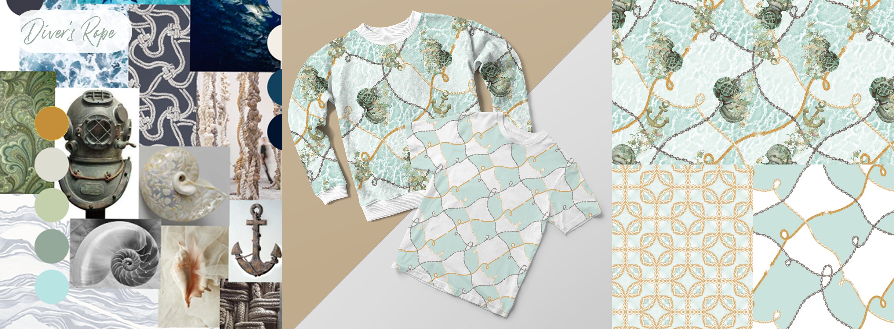
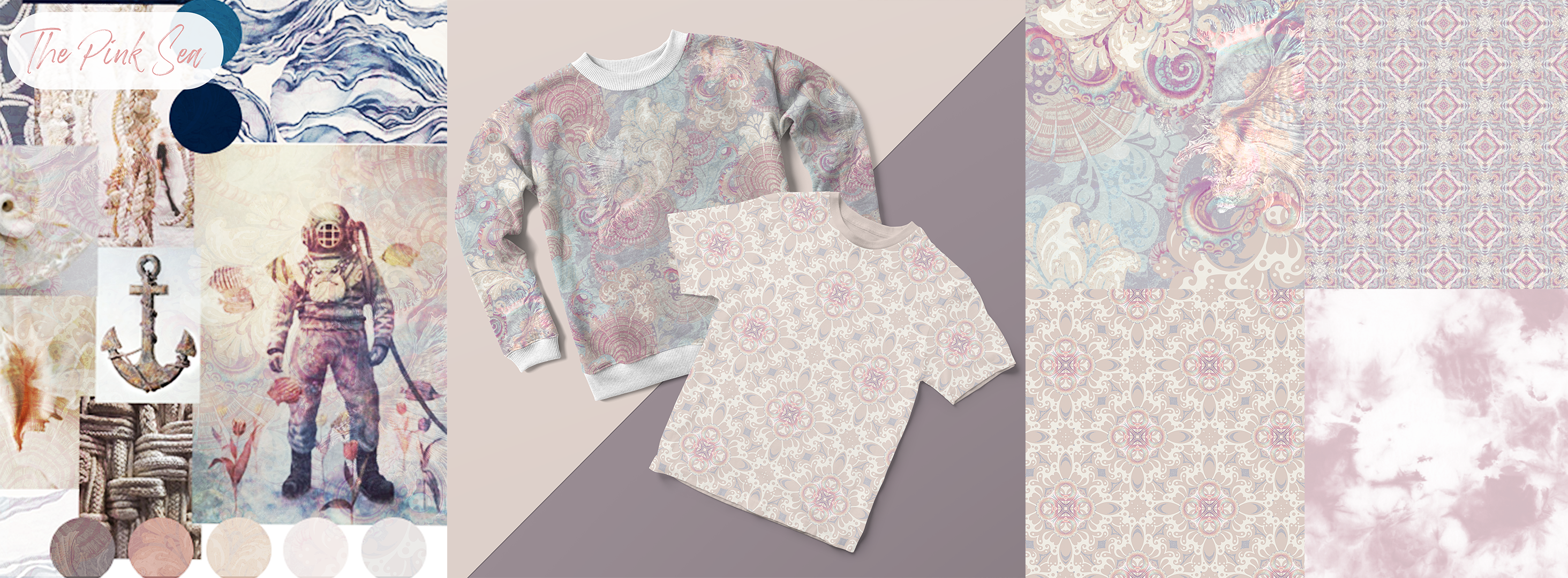
5. Moodboards: Moodboards are one of the most fun things about being a textile designer. You get to scour the Internet and call it work. You're on Tumblr and Pinterest for hours. It's basically free time that you can build for. Since you've already spent all this time collecting images and going to all these cool places and taking pictures. I suggest now is the time to put it together. I need you to concentrate on three things, specifically, theme, motifs and color. That's it. Don't over-complicate this. Moodboards should be fun. All right. Higher decided to concentrate on nautical for my theme. And I've created an entire Pinterest board and the things I like. So I've collected all my inspiration and now's the time to put it into either something as simple or as complicated as you want to make it. These are the abs I recommend for really good mood boards. I prefer Photoshop and pure red. Pure ref is very popular for artists and it can be made into a very quick and fast moodboard. Just pull your images in, sort them out, and you can even export that as a PNG. It's a popular tool because it's easy to use and it works on a Mac or PC. I prefer to use a combination of tools. I like to use pure RREF when I'm collecting. And then I export the images individually and put them together in Photoshop. I like to take my time and do something a little nice in Photoshop if it needs to be displayed or if anyone else is going to see it, select a matching font maybe. And I always try if it's for myself to put color stories. So Color Themes, stories, pallets, whatever you want to call them. Your color selection should be five colors. This is my finished moodboard. And as you can see, I've got four different colors stories on here, which is fine because you can design into any or all of them. And then really pleased with this, I think I've got some really good ideas to make into cool motifs for my prints. When you're done with your mood board, you're going to need export it so you can load it up into your project and also so you can send it in an email if you need to. This is really easy. All you're gonna do is use Quick Export to PNG. Just go to File Export and Quick Export as PNG. You'll also see under their Export Preferences and you can change where and how your quick export function works. And now I have a PNG I can upload or email to anyone. See you see me build my mood board. This is how you do yours. Just grab your images, organize them. I mean, that's really it is not difficult. Make sure you concentrate on your theme, your motifs, and your color. You only need three to five motifs if you have more than more the merrier, but three to five is plenty. And now, just post it to your Skillshare project. Be sure to join me in the next video, I'm gonna show you how to create motifs and colors, stories from this brand new mood board you just made.
6. Color and Motifs: So we have our wonderful mood board. What do we do next? Post it to your Skillshare project. Alright, your moodboard is posted to your Skillshare project. You're very proud of yourself - or you should be! Next step is to look at that moodboard and start brainstorming concepts for our prints. Now that we've got our mood board, Let's look at these ideas that we can get from it right away. I really like these paisleys, and I liked the idea of combining them with some shells. I also included a jellyfish, but I am really thinking about maybe doing an octopus. I'm also kind of obsessed with diver helmet and the anchor with ropes. I've been wanting to do something along those lines for a while. So using all of these elements, I'm probably going to create several prints. Motifs can be created. They can be bought, or they can be found. I tend to use clip art and my own drawings mostly when I'm working for a company, sometimes I'll source motifs from their previous prints that I know are popular. In this way, I ensure that the designers are going to like it from the beginning because it's already using pieces that they're already familiar with. And I can already check before I even start the print if it's something that they want to align with, do you want this Paisley to be similar to this other paisley? Do you want this floral to use some of these roses and maybe a couple of these from another couple of prints. And I can design different kinds of prints using the same motifs. This is why it's really good to start creating a motif collection. The hunt for motifs is never done. I love to draw motifs and I also use photo bashing techniques. So I'm often scrolling through the pictures, roses and flowers or whatever other motifs that I need. And I use those almost directly. Maybe I'll put a little effect on them or whatever it is. It's useful to remember that no technique is off-limits if it gives you the result that you want. That includes using Clip Art and that also means don't be afraid of buying your elements. Most companies use stock websites including Adobe Stock and Shutterstock. They're incredibly useful when you're short on time or short on brainpower. Just remember to respect copyright and use them within the limits that they are licensed. I know not everyone has the resources I do, but now you do. Here's some places to get copyright free elements and photos. Pixabay, Unsplash, one of my very favorites and Pexels. I especially love to go into clip art books. Dover has the best election in my opinion. And I love to use them for inspiration, not just sourcing elements, for good-quality elements and mock-ups that you can purchase. Creative Market, Shutterstock and Adobe stock are your best beds. These are the highest quality and the most bang for your buck. But they do cost bucks. Just remember if you're in a corporate environment, you might already have access to Shutterstock and Adobe Stock C. You might want to ask about those resources. Textures can be found at textures.com, free stock textures.com, and texture king.com. I know they all sound very similar. The other thing about these textures that you need to know is not just where to get them, but that a lot of them aren't in repeat. So what I'm going to show you about how to put textures and stuff into repeat comes into play here. So you don't want to have a beautiful pattern and then see like some weird seam just because you put a texture on it That's not in repeat. We'll fix that. Don't worry about it. Color stories. Sometimes you want to start with color first. Check out these locations for the best color stories I have found: colorhunt.co, color.adobe.com, canva.com/colors, labs.TinEye.com. This one is especially important because it lets you take colors from photographs. So if you have a photo you really like, you can find a ton of photographs that align with the colors you're looking for. And you can also find all the colors inside a photograph from this one website. coolors.co and colrd.com So these are great places to get color. Sometimes I like to look at color first and then develop ideas from that. And no way is the right way, just whichever way you enjoy the most. Go there, do that, do the things. Adobe libraries is basically like a little folder system that follows you between Adobe programs and any point you can open it up and grab pieces to work with. They're all in the cloud. So you can also share these with other people. It's an incredible libraries that, and if you're working as part of a team. You might want to all start adding two motif Libraries. If you don't know where to find your Adobe libraries, it's really easy. Just go up to Window on the top bar of Photoshop and scroll down to libraries and click. And there you go. It looks like a little bookmark in your sidebar here. And you can see I have a ton of libraries. And you can collect a lot of things inside of it. You can collect shapes, colors, some kinds of patterns, graphics, which means you can collect all your elements, including PNGs with transparent backgrounds. Make sure all your motifs are cleaned and ready to go. That means they need to be on a transparent background and cleaned up. We're not going to go over that in detail in this Skillshare, but there are plenty of Skillshare's out there showing you how to take your drawings and get them ready for a prince. Grab the elements that you decided to use. Whatever motifs, whether you found them are from your own pictures and clean them up, then put them into an Adobe library. You can use one that you already have. I'm creating a new one here for flower assets. Now let's use Adobe Capture and get these colors from the Moodboard into our libraries. This is going to be your first introduction to Adobe Capture. It's inside of Adobe Libraries at the very bottom there, just click on the plus and then hit Create from image. Make sure your moodboard is flattened and the layer is selected. Once the dialog box opens up, go to the third selection for color themes. Now it's just a matter of pulling all the dots over to the color bubbles that you've already put onto your moodboard. And you can create several of these. Just click Save to CC Libraries each time. This is a very sped up version, but you can see that I'm putting all three of my, while. I forgot I before I put all four of my color palettes directly into my CC library. And then I can access those colors at anytime. No matter what I'm working on, Adobe already puts a few mood options up at the top. You can see me clicking through and seeing what it decides was pretty inside the moodboard. And you can also use those as color palettes if you'd like. Once we're done, we just close that box and we can open up our libraries and see all of our color palettes right there. There'll be under, not grouped and you can group those later. You can also see as I scroll over each color, I can click on each color and it goes right into my swatches ready to use. So here's what to do next. Using your moodboard. Brainstorm several print concepts. Gathering, prep your motifs to develop those concepts. Save your motifs into your Adobe libraries, and save your color palettes using Adobe Capture. As an extra bonus, organize your Adobe libraries by motif type. And remember, you can do this with textures too. You can have text or libraries. This is a really great organizational tool. These libraries are a lifesaver. They have completely changed my design game. Anyway. Make sure you come back for the next video where I'm going to talk about my favorite thing in the entire course. Kaleidoscope prints.
7. Adobe Capture: This section is all
about Little GOs, otherwise known as
kaleidoscope prints. There's so much fun to create, and they're the basis for a lot of really beautiful pieces. So I wanted to show you
the cool motifs that I was able to get
for my project. This is one. It's based
on a piece of clip art. And I did some
drawing over the top. Here's another clip art
piece from one of my books. These are all very nautical. This one is weird. I don't know if I'll end up
using him, but I like him. He's neat. Here's a
really beautiful piece. I really like this one. And I'm just dragging
and dropping for you to see all the items that I got. I'm just dragging it right
from my libraries on in here. You can see with the
x that it's linked. This isn't a rasterize layer. It's linked back into the cloud. You see a little
cloud on the square? It's linked back
into the libraries. So it's a funny little
upside down octopus. I sped this part up right here because I'm
just showing you all the cool stuff
that I'm using as motifs or I have as
options for motifs. Lots of nautical things,
mostly clip art. I did draw a couple things, but you're going to see
them in just a second. And I drew an anchor and edit it and made
it look really nice. I also drew this from some of the
reference that I pulled. I thought it looks really cool. I don't think I want to use
this motif in this lesson, but I wanted to show you all the different
motifs I collected, and I'm definitely not
going to use them all, but having them all at the ready makes it a lot easier
to move forward. I want to show you how
to create a bunch of patterns from all these
motifs you collected really fast because
it's important to get the feeling of just
knocking stuff out quickly. Those little winds will help
you a lot as you go forward. And if you're in a rut or if you're having trouble
with the pattern, you can always work on something else and
come back to it. And I really like to
play with these and just create a bunch of
stuff I may never use, but they're fun to
create and fun in the creation is the goal for me. I know that I create prints
to sell and I know that I create prints for other people,
especially for clients. But the only way
that I can enjoy my work is to do these
parts that are really fun. The process is fun,
not just the ending, not just a pretty final piece, but the doing is fun. So let me show you how
this can be really fun. Now, we have all our
motifs laid out, and you can get
to your libraries without having a document
open in photoshop. You can just go up to window
and click on libraries, and it'll pop up and you can open up like an
element or whatever. But for this, it's easier
to just find a document and lay your elements onto it. And I know that I want to use a color from the color
palette for the background. So I'm actually going
to make an object, a big rectangle in the back. Let's open up our libraries, and I'm going to make
it that color, I think. Or maybe maybe that color. That is really pretty with all the elements on
top of it and stuff. These are both really pretty. This is kind of really nice. Okay, let's just go with this. That's fine. So we have
a background color. We have a bunch of
elements thrown in here. We're not going to
use all of them. But we can just play
however we want. And I just like to throw
them all on here to see kind of what
happens and what I get. And for the purpose of this, we're just going to
flatten the file. The only purpose of this entire document is to
create these little images, so we don't have to worry
about flattening it. It's not a big deal. Okay, so we have our image flattened. We've double clicked it to make sure it's the
working layer. Make sure it's
selected, hit plus. You see you have
several options. Hit create from image. And boom, a box opens up. You're going to expand this to the full size that you can, and you can see it
looks very complicated. So we're just going to
scale up so you can see what's going on.
Some weird stuff. Whatever is in the box here is where it's going to
pull the pattern from, and you can see up at the top, you have five options
for patterns. And remember, we went
to color themes before, but we're going to stay on
the first one patterns here, and you can always create things from other documents you have, or once you've
created other prints, you can create stuff from that. This is so weird looking. But to change what
you have here, just drag in this box
here on the right. You can drag it and see that
looks really interesting. So really interesting
patterns to start popping up. Anytime you see
something you like, click on Save to CC Libraries. And I'm going to do
that probably a lot. This is on the
Morale which I may or may not use in
my final piece. So I'm going to scale back
a little bit and move into some other elements that
I like a little better that I may use more readily. You can see how the elements
start to combine in here. You can also rotate this. I mean, it's like
a kaleidoscope. And I call these kaleidoscope prints for that very reason. They are just incredibly
fun to work with. Now we're in that shell and the morale combined,
which is interesting. If we scale back, we can see that in our
little box over here. And this is the time to play. Once you're through
with one or if you just want to move around and
explore a little bit, just click on the different
buttons on the top. This one is a fantastic one
for creating cool stripes. You can always take these patterns later and cut them up and use
them differently. Now, I just want you to
click through and play. I am going to play as well. I'm going to do this into
a time lapse for you. And just anytime you
see things you like, remember to click on
Save to CC Libraries, and you're going to end up
with so many cool things. It's just going to
blow your mind, I bet. If you do quilting collections, what you'll usually need is a hero print and several
supporting prints. And that hero prints,
that's right. It can serve as your base
print for a bunch of these, which can be your
supporting prints. And just, you know, move
it around, rotate it, play with it, scale it up, scale it down, see if you find anything
you like in there. And you're going to get
all kinds of weird things. So, you know, You don't
have to save all of it, and sometimes you may not get anything you
really like out of it, or maybe you'll get some
really cool stuff that doesn't actually go with your collection, and that's fine. You can save these
for other things. A quick thing to note, if you're not liking the
colors you're getting, you can always go over
down here to gray scale. And then you can
literally just work by value as opposed to
working with color. And this can give
you a better idea of what the piece might look like in any color because it's literally
just black and white. And that way, if you're
like, this is ugly, You can be neutral about
it on the color and create some really interesting
things from areas that otherwise might not
hold your interest at all. When you're done,
just hit close. And I've decided I am not
really keen on some of this, so I'm going to
rework the elements, maybe put them down in a
different order or shape. Now it's time to flatten
everything and get back to work. So I made a ton of prints. They're called capture patterns. And once you've closed out the box where you're
creating them, they'll be right here in
whatever library you had open. I had nautical skill share open, so they're right here at the bottom of the
capture patterns. And to see what they look like, I just have my pattern,
my layer selected, and I just click on it once, and it gives me a pattern
fill over the top, using that pattern, and I can scale it up to see
what it looks like. And I can do this
over and over with all the patterns
that I created to see which ones I
really want to keep. Because the key to this is
obviously to create a ton. Quantity will give you quality. You can just check them out, see which ones look good. Some of them will
not look great. That one I don't like. Okay. That's totally normal. It's
totally par for the course, so don't expect
everything to die for. This one looks really strange. I mean, you're not everyone
is going to be a winner. And sometimes you'll have
some elements that just give you killer after killer I really like that.
That's super cute. So I didn't like
this one though. So I'm just going to delete it. And I didn't like That one, it looks really weird, so
I'm just going to delete it and we can look at
some of these other ones. You can go through all of yours and see which
ones you like. Which ones have a
cool feel to them, even if it's not
something you'll use right away in this project, might be something
that's perfect for another project if
you just reclored it. Remember to keep your
simple ones too, because they can be
very, very beneficial. It doesn't have to be over complicated to be
a beautiful print. I'm just going to
show you real quick the ones that I liked
that we got out of this. There's a ton of great work here that I didn't have
to work hard to get. I mean, these are really pretty, and a lot of them
would work all by themselves, and
keep that in mind. The work that you do does not have to be difficult to be good, which is a revelation to my
younger self who thought that the only great work came with lots and lots
and lots of struggle. It's just not true. These are all fantastic, and they were really
fun to create. The hard was not in the work. So I made a ton of prints with all of the main
prints that I created, and I ended up with so many kaleidoscope
prints that I was able to pick and choose which ones
are really the prettiest. And that's a real
key to creativity is having a multitude of creations to select
only the best from. It can be difficult prints
takes so long to create, but not with this
kaleidoscope thing. It's like a shortcut. One thing I forgot to mention about these
kaleidoscope prints is their uses also extend into filling other shapes
in bigger prints. So here's an example
of where I did that. And you can see that the fish, the background, and the shell
are all different prints. Now it's your turn
to play with this. Grab your motifs, combine into a flat document and
create a ton of prints. And then, I think you
know what comes next. Post your phase into your
skill share project. Try playing with these
different things. Try making stripes. Try some color variations and try to get as
many as you can, and try some different
comboses of motifs. This can make all
the difference. Once everything's posted, make sure you join me for the
next class because I'm going to show you exactly how to use Photoshops pattern preview. Okay.
8. Pattern Preview: Let's talk about pattern
preview in photoshop. This is going to
make your patterns come together really quickly. It's the secret behind fast
pattern making and photoshop, and it helps you avoid
pattern breaks and hot spots. Let's talk really quickly about what those are so
you can learn to avoid them as you put your
patterns together. All right. So really quickly,
I'm going to show you in this image
that I have up. The left image of the sweatshirt has a very
nice poco dot pattern. It's pleasing to the eye. It just kind of rolls through
it. It feels complete. You're not finding a
lot of holes where your eye just sits and doesn't
know where to go next. As opposed to the T
shirt on the right, It has a scattered
poka dot pattern, but these holes
in it are so big, and some of the items are so much closer to each
other than others, and there's no
intentional movement. These are what I'm calling
hot spots and pattern breaks. So like, you see
the two poka dots on the bottom left
that I'm circling. Those two are too
close together. That would be kind of a hot
spot, or where you have, like a lot of these
large dots together. It's kind of a hot spot where you'd want them
more spread out. So it feels like
they're everywhere and not just in one spot
drawing all your attention. That's what it means
by a hot spot. It's drawing all your
attention to that one spot, and these are pattern breaks. So you can see the
obvious break in the pattern right
here, right here. Along the top, right through the armpits and through
the mid section down here. And you can see exactly
where the pattern hits. Like, I could draw
you a square of exactly what this
pattern is in here. And actually, you can do
the same on the left one, but it's a lot harder to pick out unless you're
a print designer, where that repeat sits. So the goal is to get rid of things like
pattern brakes and hot spots so that it feels more comfortable
and beautiful to the eye. Now I'm going to give you
a quick walk through of Pattern Preview and how to
use it with smart objects. I'm going to walk you
through pattern preview, and I'm going to talk to
you about smart objects, what they are, how they work, and why they're so important
to use in pattern preview. I have the anchor from our
elements that I created, so I'm just going to take that
and drop it into the file, and let me show you
how these work. If you take something from
your libraries and you drop it into a file and it has the x and you hit
Enter to embed it, it's still immediately linked
over almost like a symbol. So if you were to say, have a bunch of these, right, and they all have the cloud. If you change the
definition of this anchor, You put an inversion
on it, okay? And you save that? Anywhere
that that is linked, it now changes it much like
a symbol in illustrator. So let's go ahead and
take that inversion off. Okay. And resave. So now we're back to normal. And that's a really important
point to make because this is the same way
that smart objects work. Only they're not linked
into your Adobe library, they're linked into the
file where they exist. Let's take away all but the
original of this anchor. And you see how it
still has the cloud. We can unlink this really quickly to make it
more malleable for us. I prefer to unlink these from my Adobe library when
I'm creating patterns. So just link it and
convert to layers. And the other way
to do this would be to see it in
your Adobe library, right click and
hit place layers. And then you can see
it's not linked anymore. So either place it as a layer or convert it to a layer once you've placed it
in your document. Let's just delete that one.
Now we have this anchor. It's a flat layer
in our document. And I'm going to duplicate it, and I'm going to make this
copy into a smart object. And I'm going to show
you how they work. Now, let's say we're doing a
really simple pattern here. We have our two pretty things, and let's put this ocean
texture behind it. It's already in repeat and everything. See
how that's linked. All you got to do is right click and hit convert to layers. And then just hit yes on whatever the next
menu is that pops up. And I'm just going to expand
this to exactly the size of my tile and put it at
the bottom of the stack. Now we have these
two on top of it. They look a little
funny in color. We'll take this
opacity down to like. There. So we have these anchors. We just want them to be fun. The way that we used
to check patterns was you can define something as a pattern right in
here, just hit plus. And then you could
create a new file like maybe you just create an 11 by 17 file to test according to a scale
that you're familiar with. Okay, sure. Then you would
create a pattern fill on it. So you could see what
your pattern look like, and you could see that there's
a funky little pattern and you can take the
scale down or whatever. And that's how you would test your pattern
and you go, Okay, that's a funky little pattern.
That's not very pretty. So then you would go back
and create tile after tile after tile to check
and recheck your pattern. But now, all you
have to do is go to view pattern preview, and you can see the exact same
thing from the beginning. You can see what your
pattern tile looks like, which is great because you can say this is funky,
I don't like it. You can say, I want this
to be a different color. Maybe it's like gray. That'd be kind of interesting. It's just a gray anchor. Okay. And then we
have our other one. So now we know the difference. This one is our regular anchor and this one is our
smart object anchor, and you can see
that's highlighted. It's got a little corner,
this is smart object. This one is regular. And
you can turn any layer into a smart object by right clicking and going to convert
to smart object. But we already have this
one is a smart object. So let me show you
what happens in pattern preview
between regular layers and smart object layers. Adobe recommends using
smart object layers because they behave correctly
in pattern preview, and this is what I mean by that. When used with Adobe's
print preview tool, smart objects automatically
wrap around the artboard, making repeats really easy. We can then define a repeat and use it as a fill anywhere. If we bring it to the corner, we see that as it goes over
the edge of the artboard, which is defined by the blue
line, it wraps correctly. And that means that it
goes across the edge, and it looks just the
way it's supposed to. It matches. Everything
looks good. Well, that's great. We want that behavior.
Let's look at the normal anchor that
is just a pixel layer. When using raster layer and not a smart object
in print preview, any elements that overflow
across the artboard do wrap, but are essentially cut
in half at the edge. Scaling or rotating the element after this becomes a nightmare. This is not a smart object. It's a very dumb object. We have our poor little anchor, so sad, and we take it over. Wait, it's working, right? Oh, it's behaving correctly. Well, what's the real problem? Well, when we take our
smart anchor to the side, we can also scale it. Let's just scale it
larger and rotate it. Now we've rotated and we've
even put it on the corner. Yeah, cool. Well,
let's pull that back just so we can see what happens with
our poor little dumb anchor, our poor little dumb anchor, we're going to take
it to the side, and we're going to scale it. Well, that doesn't
work properly. Well, what if we don't
want it to be any bigger? We'll just not scale
it. That's fine. But we do want to tilt it because it just looks
so boring there. So if you tilt it
here on the inside, It does something weird because we've already taken
it over this side, and it breaks apart the edges of the anchor and makes
it into multiple anchors. And you can see how this
works. Just hit Enter. When you look at the
object bounding box, it just got huge. It's like, it doesn't stay
consistent. It's very strange. So let me just grab
this anchor and show you what happens
if I try and rotate it. All kinds of weird things. I mean, it kind of
looks okay if you can get it at
exactly 90 degrees. But otherwise, you're in
for just a crazy time. And let's just
pretend you're like, I don't know what I just
did, and you hit Enter. You anchor is a
little broken now. Let's just command Z or
control Z to undo and go back to our normal anchor in our normal little timeline. Hello, little anchor,
and it seems to be fine, and it rotates fine as
long as you keep it inside the bounds and never take
it outside of the bounds. But that's not what
we want to do. We want to be able to
manipulate these endlessly. So right click and
convert to smart object, and now you can treat it like
you did your other anchor. But, bah bah, you can trage it endlessly and
it looks really cool. Now we can also
see how to balance this pattern and see,
that looks cool there. I think that this is
still a funny color. Let's go ahead and change it. Maybe we'll put a
gradient map on there. Yeah, I'm just going to set it to only apply
to this layer. So now we have a
light gray anchor and a dark gray inchor and
that looks pretty cool. I like it over the
ocean. It looks neat. So I've added a couple of ropes to this just to
make it look cool. And I'm going to
show you something kind of interesting here. We have these as smart objects. But our ropes are
not smart objects. So we're going to make those
smart objects really quick. Remember, all you have
to do is click on the layer and right click
convert to smart object. So I'm going to these and group. We'll move this group
up a bit in this group. Maybe this group
is just over some and this one is
up a little here. Yeah, I just want to
them over the side so you can see what
we'll run into. So we think that we're all good because we've got smart objects, and we've got a semi balanced, very simple repeat here. This isn't anything
to write home about, but it works as a repeat. The problem lies
in see how this is crossing over here and this is crossing over left to
right, like it should. When we take off
pattern preview, The things don't cross anymore like they're supposed to.
Things just disappear. When removing the print preview, the object wrap on smart
objects disappears. This makes having a finished
layered TIF file usable in older versions of Photoshop or in other programs impossible. This is where fixing the
overflow is really important. This is also really
important when working with other people
that might need to touch the file
because they won't necessarily use the same
procedures that you do, and it still needs
to work for them. So if you're in pattern preview, all you have to do
is define this as a pattern by opening up
your pattern swatches. I have so many opening up your pattern swatches
and just hitting plus. And yes, there's your repeat. But you don't want this as just a flat file because you may want to go in and
work on it again later, or you may be passing it off to somebody who is
not going to be working with pattern preview
the way you do and they need everything to look
right and tied even when it's not in
pattern preview mode, especially if you're working
with people that are in older versions of Photoshop, this can become a real problem because you need a
layered view for them. Don't worry. There's
a solution for this, and I'm going to show you how to use seamless to make it happen. Here's what you do next. Using elements you've
already created, make a new document and
open pattern preview. Get a feel for how
things work in it. Experiment with raster and smart objects to understand
how they behave, and make a simple repeat with or without a background,
using pattern preview. Make it balanced and even. And then, of course, you know, I want you to post that in
your Skillshare project. This is a great time to play and enjoy yourself and just kind
of fuss around with it. There's nothing at stake here. You know, you don't have to post it in your
Skillshare project, and you can make
really silly stuff. I mean, nobody's checking
in on us, right? We can do whatever we want. That is the joy of
creating work on your own. So once you've created all this work and
had a lot of fun, make sure you join me for the next vid because I'm going to show you how to use the
Seamless extension, and you're going to
fall in love with it just like I did.
I know you will.
9. Seamless Extension: Let's talk about seamless. Seamless is an extension that
you can put into photoshop. It works wonderfully by
basically running scripts as you push buttons to get you effects that already
exist in photoshop, but much faster and without having to do
the math in your head. This is great because I don't
like doing math in my head. Okay. Your workflow speeds
up for obvious reasons, and I love to use seamless
to create textures. Textures are an essential
part of surface design. As I'm sure anybody who has been doing any amount of surface
design probably knows. It's very easy to create a very flat repeat
without a lot of depth, and it can be difficult
to create something that feels like it has some
personality without texture. Using texture is a
fast and easy way to give it some depth, some feeling, and some flow. So before we had
Pattern Preview, I was always on the search
for something to do, basically what it
did and help me create patterns more quickly
and more flawlessly. And I found this
amazing extension. It does a lot of things that
Pattern Preview doesn't do. As pattern preview is
kind of a one trick pony. It does one thing for you
and that thing is excellent. But there's a lot
that it doesn't do, and this is where this extension can really pick up the slack. So this extension
is called Seamless, and it is really, really, really good on its own. You can buy it with a bunch of other extensions if you find those useful
for you as well. But if you look in here, you can see it has
two use cases. You can use it to toss patterns or you can
make texture patterns, and you can see it has the ability to toss
patterns pretty well. But we're not going to go
over that one so much today. The function that we're really interested in most is texture. So the really cool thing
about this is the way it works to create a really
good repeat and texture. And I'm going to show you
exactly how that works. So you can see some use
cases that they've done here of texture and tossing elements and
that kind of thing. But we are most interested in the texture part
because we can create really great elements for
underneath our major repeats. So you can see it has the
option to merge all the layers, flat in the light,
so you don't have vignetting flat in the colors. So you don't see a lot
of that variation. It feels more like a
true texture underneath. Invert the edges,
which is an offset. It does a perfect centered
offset with one button, and it does an auto patch of the x that that
offset would create. And you can also make that
auto patch larger or smaller. You can also split the thing
into four if you need to, which I don't know what
the use for that would be, but you can do that as well. So let me show you
how I have used it, and you can decide if this
is something you want. As you can see, there's
an installation guide. It's straightforward and easy. If you have any problems, just reach out to the person
who made the extension. This is how I use this tool. I'll open up a texture
picture that I have. This is of leaves
on the ground from the last time I went
out taking pictures. And if you look at this
in pattern preview, you can see that the
repeat isn't great. So pattern preview doesn't really offer a way to fix this. So we're going to open
up our seamless panel. And it's a little circle with the waves through it on
the right hand side. We just click on that
and it opens up, and we're going to
need to offset it. And they call this
inverting the edges. So that's what we're going
to do, and we can see that the repeat isn't bad,
but it's not perfect. So all we need to do is click the button that says auto
patch and automatically, a cross shaped auto patch of 50 pixels wide in both directions
automatically fills. It does a beautiful
job at cleaning it up, and if you need a bigger size, you can change the size
of the auto patch. I usually change it to 100 if
it doesn't work at the 50. Then what we do is we just go
in and patch it up by hand, anything that's not quite working right or
that we don't like. You can always use pattern preview while you're
using this other tool. So it doesn't have to
be an either or thing. It can be a both until
it's the best type thing. So as you can see
here, I'm using the stamp tool to
kind of go over things and you want to
make sure you merge the layers before you do
this because otherwise, you're going to get
some funny effects. But you can see I'm
using the stamp tool, and it's working really well to kind of bring everything in. The only problem is we have some discoloration that kind of makes the whole thing You'll be able to see the
repeat really well, which is not what you
want with a texture. A texture should have
a very, very clean, invisible repeat to
it because you don't want it to distract from
anything that you put on top. And because it's such a
homogenous type of repeat, you can see any problems
almost instantaneously, unlike a very busy repeat
that might hide it more. So our next step here is going to be to
flatten the light. You have a lot of
colors going on here, and it can really
make it difficult to make a full
seamless repeat if these values of high and low become too prominent and your eye is drawn
to those areas. All we have to do is click on this button that
says, flatten light. And right away, you'll see layers forming in
the layers panel. You'll also have a
little pop up to let you know how flat
you want the colors. And the repeat starts
to look much cleaner, much more homogeneous,
much more like a texture. It doesn't distract your eye. Now, pay attention because this is a really important part. I'm going to check the
pattern by clicking preview. And all of a sudden, it gives me a pattern fill of exactly
what's on my screen at 30%. So I can see if the
pattern looks as good, as I think it does. From a little further back than pattern
preview would give me. So I'm just looking at this. Do I like it? Do I not like it? I can change the scale to see how it looks in different sizes. And this is what I would use before pattern
preview was a thing. And I still use this
occasionally instead because it makes it
smaller than real size. So I'm looking here to see
if flattening the light really did the work that I wanted it to do, and
you can see it did. You can see the
problematic nature of the print beforehand, the lines, the problems with
certain values drawing your eye too much before
we flattened the light. So now we can go back here and fix any problems
that we see. And I have the flattened
color layer off right here so I can really kind
of do some true touch ups. So I decided I like the repeat. I've also played
here. As you can see, there's a little folder
that says flattened light. So I tried out the
flattened light and the flattened color and decided that I liked the
flattened light version better. So now all I got to do is
make this into a repeat, and I can put this underneath any pattern I want to create, and I already have a good
base for my pattern. Here's another quick
example where I took something that
would traditionally just be a normal picture. Took the texture out of it and made that into a
repeat unto itself. This is a standalone repeat. I made it into a camo. Let's look how that's done. Basically, I'm going to
take the picture and I'm going to crop it into
the usable area. Make sure that when
you crop your image, you have the delete cropped
pixels box checked. Then you're going to just invert your edges like
we did last time. Just click on the button
that says invert edges and you'll have a perfect
offset image. Because this one has
a very different, very obvious cross
in the middle, I'm going to change my
auto patch to 100 pixels. The auto patch here
isn't fantastic. It does some of the work, but there's still a lot to be done. And I try flattening
the colors and try putting a flattened
light filter on top of it, but they're just not doing
what I want them to do. So I take them off. Or just take the
eyeball off of them, and then I start
working on making the texture look good by using the stamp tool. That's
my secret weapon. And the cool thing is you
can take the stamp tool and make it either a hard
edge or a soft edge. For the other one, I use a hard edge because the
leaves are all sharp, and if you had a
lot of soft edges, that would have stood out. But this has a lot of softness to the image in the background, and if I use soft edges, it will look better to merge. So I'm using a soft
edge brush with my stamp tool to
create a clean repeat. So I sped this part
up extensively. So you don't have to sit through all the edits that I made
because I did this for a while. A lot of using the
stamp and clone tools and just going through
and adjusting things. And I used the preview
hide preview tool a lot, and I even used the pattern
preview to th here. So you'll see some of
that pop up throughout. And it's really
important to know that I don't confine myself to
one tool or the other. I use the entire range of adobe photoshop as
I create my prints. You'll see some dodge and burn
tool in here. You'll see. I just pulled out the
entire kit of tools that I have at my disposal and
made things really work. I even changed the size and resolution of this to
make it really match a textile design because
you don't need them to be gigantic and 300 DPI, but they don't need
to be you know, 50 by 50702 DPI. That doesn't work either. So I made it an appropriate
size for a textile design. And then I went in here
and did something really, really awesome
that you can do to make your colors work better,
and this is a hot tip. My colors were too many, and my flattened colors and flatten light
weren't working, so I put a gradient map
on top. That's right. Gradient maps can help you reduce color when you're
doing textile design. Just pick two or three colors, and you can even index
into just those colors. I ended up loving the color
combination at the end, and I actually made two
other color ways of this textured print that will be cameo prints for
winter and for fall. Because I'm well aware,
you're not going to be just using pictures
you took from outside. Here's a quick walk
through of a texture that I pulled from a free website, and I made into a really wonderful
texture that gives a lot of depth underneath
a print I made. So you can see I'm using all the tools we
already went over, and I've sped this up a lot, but it's very fast to do. And it just works. It just creates a gorgeous
texture underneath. So I know in the
previous lesson, I told you I was going
to show you how to fix pattern overflow when you have things in
pattern preview, but You know that once you
take pattern preview off, those overflows are going to be evident because you won't be
able to see them anymore. So if we go to view here, we take pattern preview off, you see that the smart objects, you can see right
here that there are smart objects that
are crossing over the bounding box are
not wrapping because the wrapping only seems to work when pattern preview is on, which is fine except when we need to pass our stuff
off to somebody else. So here's what
we're going to do. We're going to take
off pattern preview. And we see right here, I have
group one and group two. Group one is the top anchor, and group two is a side anchor. And I have seamless
open right here. And before we were in the texture pattern
panel right here, and we just click this other tab that says element pattern. And we can see it says, apply to the following layers selected, top level, or all. And you can fix
overflow or remove. So fixing the
overflow will create overflow copies and removing the overflow will obviously
remove those copies. This is pretty simple. We're not going to deal with
the shuffling stuff down here or the spreads
because that is more about creating a pattern when you don't already have
one. We already have one. We've already created
one. We just need to fix the overflow in the
pieces that are here. So I want you to
select both of these. So you can see I have group
one and group two selected, and you just click fix overflow and you
let it do its thing and it does copies to either
side and up and down. It also links them.
Look at this. Group one is now linked, and the name for this is shifted bottom and
this one is shifted right, so you can see that the shifted right one is
this one over here, and this one, the
shifted bottom one is that one right there. Now, it looks right here, and to test this, you can just hit
preview in seamless and it'll show you the
little pattern preview, like I was showing you before. So if we, for instance, took off the copies, and then try preview again,
you'd see it's all broken. But once we turn our copies on and we hit preview,
it's perfect again. We hide preview. Let's look at it again in pattern preview. It still looks perfect. It's actually a little
darker in some areas because they think it's
duplicating the layer, but that's not a problem. Because you can just flatten it right here and
this is your tile as well. This is the better way to use it if you are working commercially
or with other people. If you're not doing
that, then you don't even have to know this part, because if you're just
giving people flat artwork, then they don't
need to know how to adjust it and they don't need
access to your elements. But most people that work in the industry prefer to give layered files when they're
selling their artwork, especially for color correction, having separate layers
is very helpful. So that's how to fix
the overflow problem. That's it right there. And if we hit remove, we see it takes away all
the overflow copies, which is what I was telling you. So if we fix overflow again, if we just do top level, it does actually everything, including the ocean texture, which it didn't need to do. But see, this is the
same as we had before. It just fixed everything left
to right and top to bottom. Bingo, we're done is
really that easy. This is such a one
click wonder over here. All right, let's get you
using this solution. First of all, you're going to need to download the extension. The link is in the
project resources tab below the video player. Next, check out the texture
sources provided in the Motifs lesson or
find your own textures, whatever you are more
comfortable with. Then create texture repeats
using the Seamless extension, playing with light
and color flattening. That can be a real game changer. And see if you can
make one repeat for a background and one that's good enough to be
its own pattern. And of course, you know what
I'm going to tell you now. Post it in your
skill share project. I can't wait to see
everything you're doing. I am so excited to discuss
with you how you're liking these new tools in your toolbox and if
they're helping you. So please post your stuff. And then come and join me for the next lesson where
we're going to be creating our print
our hero print.
10. Hero Repeat: Okay. Ready to take
on the big repeat. Let's go. Just a quick warning. The next time lapse videos do feature some flashing lights. Please do not watch if
you're epileptic or have problems with
visual flashing lights. Instead, I suggest you
listen in audio only mode. But you will get all the
information you need to continue your
pattern journey. All right. Welcome back. Here's where we're going to
get into the hero print. You already know the skills that you're going
to need to do this. It's just a matter of putting
them all together and making something you
really enjoy in love. To start, you're
going to pull out the elements that you like best and put them on your Canvas and then turn
them into smart objects. As you can see, I've
done that here. I've pulled in a
ton of elements, and this is going to be
in super fast forward because it took me
several hours to do this. But I put them all in here. I put a texture of an ocean
that I liked underneath it. And then I just
started building it out, moving things around, playing with color,
just whatever I wanted to do. And
this is the fun part. And you'll see a lot of,
like, flashing in the video, and that's me just
kind of doing and doing things to see if I
liked the decisions I made. And that's something I do a lot. Do I like what I just did? I don't know. With
without With without. It's like an eye doctor
appointment, A, B, whatever. And I'm just going
through and coming up with ideas on what I
want to do with it. I don't really know yet. I know I wanted to do some
pretty shells and some fish. I like the idea of
a school of fish, which was interesting to me, but I felt like they
stood out too much. So I changed up the color. And I'm just working
with making sure the repeat looks good
from far away and close. I put another texture
over the top. I like things to be very textual, and I was
like, You know what? That octopus idea.
I can't let it go. So I got the big octopus out and decided to
change the color up, so it would fit better with
what I was trying to do. I didn't want to
stand out too much. It all needs to look
cohesive and beautiful but not too disparate, you know. And then I got to this point, I'd saved it, by the way, Save your work And I decided, I'm going to change this into
a whole different print. It's just too much
it's too busy. I have a habit of making
things very busy. I like that. But I know it's easier on the eye to have a more
simplistic pattern. So I went back in and I was like shells and pretty
things in the ocean. And that's kind of where I started to develop
the second print. And you don't have to do
anything all in one shot. You can do one print, go into the second one
like I did here, go back to the first one. Change things, fix things. It's much easier, usually, to have several prints
working at once, so you can move back
and forth between them. In this way, you give your
mind time to rest and do thinking that's not conscious. You want your unconscious
to have time to work on the problems that
you're doing also. Give your whole brain
a chance at it. And the way best to do this is to work on
multiple projects. So while you're working
on this other project, In your conscious brain, you're unconscious is still
working on whether or not you liked the other project
or how you can change that. And this is where ideas like going to do the dishes
or taking a shower or just chilling for a while
is really important as an artist because it lets your
brain do the work for you. If you just sit here and plug away at it for hours and hours, you might come up
with something great. But it may also burn you out. So the chance to work on
other things and really kind of cross pollinate with other ideas is
important for my work. So I usually here, I was like, I want the octopus again, but I didn't want the octopus
like in its full glory. I just wanted little
pieces of it. This is supposed to be a much
more feminine print for me. Very pretty and kind of flowery almost with
the paisleys and stuff. And so these would almost look like little
curly cues stuck in. And that's really where I
wanted to go with this. And you'll see I'm
messing with color a lot. I could have gone in a lot
of directions with this, and I decided to kind of
go into blues with it. I really liked these kind of reddish blues
that I was getting. Okay. You've seen me take on two major repeats
now and complete them. They're saved in my
patterns palettes, we're ready for next steps. But what happens when things don't go that
quickly and smoothly? What happens when
you can't get it to come together or you keep having hot spots or color problems or it just looks too
busy or too sparse. This happens to all of us, and I'm going to show
you a quick video of me failing miserably because I don't want
you to feel alone if this happens to
you and it will. It happens to all
of us because if we did succeed at every
single thing we did, it makes for a very
boring career. I want to show you that I did fail at this the
first time I tried, and then I'm going
to show you what I came up with after I was done
with trying to record it. After I was done with doing it in front of an audience
on a live stream, and after I was
done trying to fit it into a time frame that
was suitable for camera. When I just did it on my own, noodling around and
finally figured it out. The first thing I did here was I fixed a bunch of elements. I had drawn and painted
some cool stuff. I scanned it in and
I'm cleaning it up. So you can see me
cleaning it up. I'm trying to get
everything to look right. So I doctored up everything, using a lot of warp tools, puppet tools, anything I could
do to make it look right. This is typical process for me. I'll clean up the elements and I'll spend a lot of time on it, and then I used a texture
that I already had, and I made it into
a perfect repeat using the texture fixing tools that I've
already shown you. And then I decided that I
needed this to be a brush. So I'm using a bunch of tools here to create brushes
from these ropes because I want them
to kind of loop around and do all
this cool stuff. But I don't know quite
what I want to do yet. So I didn't want to
draw it by hand. I figured doing it in
illustrator would be fine. And this took forever. So I am playing an
illustrator right now. You can see, I'm
making the brush. I'm fixing the brush.
I'm tidying the brush, and then I'm making
the brush work. And illustrator is jogging
along like it usually does, telling me that I'm asking
way too much from it. It's just a little program. Please don't expect so much. But I'm able to get some
really beautiful twirly ropes and chains, which
is what I wanted. So I go through here and I make all these cool
ropes and chains, and then I've got to figure
out how to get it back into photoshop without
being too big. So I do that. I get it
back into photoshop. I do some playing. And then I decided I wanted
the whole thing. To have vapor wave elements. I'm like, Okay, vapor
wave, I love vapor wave. Let's do the blues and the
yellows and pop it all up. It'll be really cool. You can see I changed some of these to neon brights and everything.
I didn't look great. It doesn't have a nice flow, and I'm feeling like I
can force it to work. You know how sometimes
if you just barrel through somehow it manages to get right, I
never did with this. It just continually looked bad. The I was at the end
of several hours with a very unattractive print. But that's not the
end of the story. Once I had time to settle down, think about it a little more, I came up with
this. That's right. That majorly frustrating
few hours time got translated into some
really beautiful prints. I thought about what
shapes would work for a better repeat because I
wasn't able to get a good flow. I thought about how to simplify the effects of the ropes
and making them more into long lines
instead of twirling around each other
was much easier. And I thought about making the color palette
much more calm, relaxing and sellable, and something that fit more
in with my mood board. Sometimes when you go off
on tangents like I did, you get a cool result and
sometimes you just don't. In fact, a lot of
times you just don't. There's a reason that we
put all that time into planning and you can see how
well it worked out here. Do you need a hero?
Here's what to do. Drop your elements on
a newly made document. Turn all your elements into smart objects and play
around with them. Just keep playing and keep
playing and keep playing. That's really the basis
for all print making, and that's why I
enjoy it so much. Remember to do these, balance your print.
Check as you go. Zoom out if needed, or use a seamless preview tool,
and then check again. And save your work,
please save your work. Of course, you know what I'm
going to tell you to do now. Share it with us. Post it in
your skill share project. Check out other
people's projects, too. It's amazing to see how
different similar work can look in the hands
of different people. I want to see it, please then come back and join
me because I'm going to show you how to do
mock ups where you can check your work and get it ready for a perfect
presentation.
11. Mock-ups: Mock ups can make
all the difference in your being viewed
as a professional. We're professionals,
June, are you done yet? Mock ups are really
important part of my professional flow, and they could be a
part of yours too. It can make all the
difference when presenting to a client
or an art director, and they can also help you
in your creative process. I love to use them
when I'm not quite done with things as I'm getting through the polishing part of the print because I
can put something into a mock up and immediately see holes in the pattern
I didn't see before. Scale issues. I can
see color problems. Because a lot of times I do
mock ups in twos or threes, I can see how
things sit together and maybe rework from that point before I even show
it to somebody else and make sure they sit
together and more cohesively, more complementing each other as opposed to fighting
each other or being too mundane and
looking all the same. There's a lot of
problems that can be fixed us seeing it in a garment. Adobe has a free mock up, and we're totally
going to use it. It's pretty high quality, too. Nice. So the first thing you need for a mock up
is the mockup file. And you're in luck,
Adobe stock actually has a free one that you
can download and it goes right into
your libraries. So if you can see here, I've pulled it up and I
will have that link for you on the what to do
at the end of this video. But I want you to see here, all you have to do is
click license for free. And I've already done this. So I'm going to
show you where it resides in my Adobe libraries
and how to use it now. So now we open Photoshop. And even though we don't
have a document open, we can just go up
to Window and to libraries and click on that
and we'll open our libraries. Just give it a second to load. Now, I have this loaded
up in Artwork things one. Because that's the library.
I asked it to load into. It's my default library. If I look here, I see sweirt
and T shirt mock ups, which is how it appears, and because it's a
photoshop template, I can right click on it
and go open new document. Boom, here's our thing. Here's our starter image. It's pretty easy to use has
smart objects within it, and you can play around and
change things as you need to. As you can see down here, the background element
can be changed, and then it has a T shirt
folder and a sweatshirt folder. It has a sweatshirt
image you can change, is highlighted with red so you can see what
to change here, and that has a smart object icon on the bottom right
here of that layer. I can double click
on it and open up the smart object and then
create my artwork in here. This is especially good
for placement prints. But if I'm going to put in
a different kind pattern, I can just fill it
right on top there. The problem with that is
you can't change the scale. Let's try that again. Fill
the layer with white. Then open up your
pattern swatches, pick out whichever pattern
you want to fill that with and do that. Then you can change the
scale of the pattern. Right here, it's at 100. Let's bring it down to that
might be a little small. 34. Because it's a smart
object, you have to save it. And then it will update in
your original document. As you can see, this smart
object layer is on multiply, which is why you get this
color the way it looks. If you changed it to normal, it would be on a
white background. I would look really
weird. So the multiply helps it blend in and look
like it's a real sweatshirt. But I'm not a huge fan of
the smart object layer. It doesn't let you
play with it in real time, as well as I'd like. So I can double click
on that and where I'd put a layer over the top in white, I'm going
to leave that. But I'm going to disable
this pattern fill. In fact, I'm going to delete it entirely and just hit save. Then we're going to go
back here and as we see it has no pattern, we open up our pattern menu and click on whichever
one we want. Let's try this one this time. That's way too big.
Let's bring it down. See, I can play with it right in here and see exactly
what's going on. I like it there. I'm just going to change the sweatshirt
color real quick with levels. I wanted to be more of
a white sweatshirt, keep the shadows in there. Maybe more of a
light heather gray is nice, but not that medium. This is okay. I'm not quite sure that this is
the pattern I want on top. Let's look at a
couple of other ones. You can always just
double click on that and change the
pattern fill and it will keep the same scaling
too. That's pretty cool. A lot of these
patterns that I've done actually look
pretty great on here. I played with a lot of
different kinds of patterns, and you can see that not all of these are viable patterns. I really like this one on
here. Let's leave that one. 20% looks okay, but let's
talk about scaling. Knowing the scale
of your mock up allows you to make your
print look accurate. It lets you show how it will
actually look when printed. The important thing about
scaling is that you know the size of your mock up or how big it should be and the size of
your actual repeat. And that way you can judge how many repeats should
be within that scale. And since I know I can just
measure it on myself that the top of the neck line
to the bottom of the hem of a sweatshirt that I would
want to see is around 21 ", and we're just going to say that's about the same
for the T shirt. As you can see here, this
shirt with this print, the print should be a little bit bigger than the
sweatshirt at full scale. So we know that the repeat
is bigger than 21 ". I think I have this one at 24, which makes sense that is
bigger than the sweatshirt. So that's how we would judge
it by eye inside our repeat. Now, let me show you what
that looks like in practice. To make sure it's
the correct scale. I know that this
print is 24 " high. That means that
when I pick and you can double click
on this and then move it around
inside your layer. When I pick this print, the top of let's
say the inside of this swirl and the inside of
this swirl should be 24 ". And since we know
that this is 21 ", this scale is too small. So for accurate scale, mine needs to be at a little
bigger even than that, at 35% is accurate scale. I know that with
this resolution, any print that I do at this
resolution should be at 35% scale inside of these
mock ups to be accurate. Now, look, I know I tried to tell you that there
wouldn't be any math, but if you make all your
prints the same resolution, you only have to do
the math here once, and that's almost as good
as having no math at all. Now, I'm not really looking
for it to be this big. I actually want
it to be smaller. I liked it at 25, but I liked it better
at around 30%. I think this is good. I
think any bigger than this, and you lose some of the
joy of this cool repeat. So I really like it at 30%, and it's pretty easy to gauge
what your new scale size is here because you can just pull the top of this
area to the top here. I would say it's probably 22
". And that should do it. I mean, you can always print these out and
hold them up to you to see what the scale should
be for final scale. But this is a good idea to get an accurate assessment on a general idea of what
you want the scale to be. I know that I want
my actual scale to be a little smaller. And I'm pretty
happy with how this looks inside of the piece. I don't want it on the rib because I'm not going
to do printed rib. You could do matching color rib. That's something you
can definitely do. But I like this how it is. It's a little weird and it's a little fun and I
like that a lot. So let's come over here and
do one for the T shirt. So you know how I told you we have to put that white layer in. Let me show you
what happens when you don't put the
white layer in. If you were to just put
in a random artwork, it's going to fill in the words, which is cool, but it's not
quite what we want here. It would actually be very cool, but we're going to not
do that right now. We're just going to make
a new layer and fill it with white and hit save, and this is the
smart object layer for the T shirt. You
can see right here. This is a T shirt,
we'll close the shirt. Smart object layer, the
one that's red on it, and we just put a white layer
in there. And now we can Make sure that's actually on multiply and add
whatever print we want. If I wanted to add this one,
that might be pretty rad. It's very large right now. I know this is at
the same resolution, so if I put this at 35% should be closer to accurate
scale, which it is. This is a very good example of seeing some holes in a print. This isn't a print that
I did for this project, but it's exactly
what we need to see. When you see this, all I'm seeing here are lines
of butterflies. See that line of
butterflies right there and a hole in the middle. I either need to up the scale, so we don't see
those problems with the repeat or I need
to fix the repeat. This is a really
important aspect of doing mock ups is
finding problems like this. It's just either too small
with a repeat like this. I should do a half drop with it, or I need to put more butterflies in the middle here or I need to enlarge it. Let's see what it looks
like when I make it bigger, and by doing that, you would just up the
scale to let's try 60. Then it actually looks fine. I don't feel like I need to
go in and adjust anything at 60 or even 70 is pretty nice. It gives almost a
place artwork feel. One of the things about that is if you're cutting random cut, you can pull this
around inside and make several mockups to show how it could look in
different random cuts, which could be important
to your design director, if they don't want it to
look bad, any way it's cut. If they say, actually,
I don't really like it if it were to get cut here,
it wouldn't look right. This is especially
important for bikinis and that kind of thing
because prints can land in unfortunate ways and create really bad looks for what you're
trying to do. Okay. So for this, I'm going to
change the T shirt color, and we are just going to actually pick a
color off of here. But we're going to mask it so that it only affects what
we haven't printed on. Let's change the color. That's really nice.
That looks really good. So I'm really liking what
this is doing right now. These are definitely
not the pair that I would put together
for a presentation, but you can see how
each one works in its own way to make a
really beautiful garment. I have an Adobe free
mockup available for you. The link is in the project and resources panel below
the video player. You should be able to
find it without an issue. And now, I just need you to download either that mockup or another file of your choice. There's also skill share classes available that will show you how to make
your own mock up. Whatever you want
to do. Just take that mock up and
insert your prints, making sure they're
the right scale. And then you can test
it, test the print by moving it around
inside the mock up. Then you can make your
final adjustments to scale, pattern, and color. Now, just go ahead
and post it in your scale share
project. That's right. Then come on back. Join me for the next class
because we're going to go over how to make
variations on your prints.
12. Variations: Creating multiple options and colorways is now fast and easy. There are essential for any print designer to be able to do quickly. They're going to ask for them. They wanted to see other colors. They want to see what it looks like, bigger or smaller or whatever. So let me show you how to get through that and get to a final approved file as fast as possible. There's a lot of options to create variation. So let's go over three main ones that I like to use. Scale, color, and echo. Scale is the first one we're gonna go over, is easily shown in printout and in mockup forms. You can really choose Either way to display it. Here it is, like you would see it in a printout. And here's how it would look in a mock-up. Mockup can sometimes work better if you're not working with your designer in-person. Color is the next one. You can create dozens of options is best to print it out because I can literally have 20 different color ways and there's a million ways to change color. We're not going to go over every single way to do all of these variations. I just want to tell you all the ways you can create variation and echo. This is similar to color in that I preferred to print these before doing mock-ups. It goes can create a very large or very subtle change that as interest. So like in this one, you have anchors that are playing on the bottom and on the top example, you have these white anchors that are echoed in the print. So you're literally taking some of your motifs, duplicating them in changing the transparency or the way that the layer sits on top of the other ones. In, in that way you create almost like an echo, a double shadow, whatever you wanna call it. And this can be a variation. And then you have your more simplified version underneath. And you have choices here. Motifs is a bonus way. I'm going to show you this one. Similar to color. I prefer to print these before doing mock-ups. That's because it's usually a very easy choice for the designer. Just removing a detail can change the look drastically. Look at this. The bottom one, in the top one are the same. There's just some elements removed. So if you're removing motifs are adding motifs. This is a very simple change and all you really have to do is print it out to show your designer. Now you have some ideas. So in your designer or client says, I like this, but I want to see some options. You know what to do. You can change any of these three asked them which they would like. And you look like a pro because guess what? You are. Now come to the next vid. Let's put this altogether into our final presentation.
13. Presentation: We're getting ready to present our prints. And these are the things we're going to need. In a physical presentation. I print everything out on 11 x 17 pages, on fine paper with a very good printer. So that's for a physical presentation, is pieces printed on 11 x 17. I can print out my mockups. I can print out the actual prints. I can show scale variations. And it makes it all very easy. But especially in these modern times, we're not always presenting in-person. That's when it's essential to be able to present digitally in a clean and professional manner. I usually put everything that I'm presenting into a single PDF and present it that way. That's going to include the actual artwork, the mockup, and anything else that I think might be relevant, including a mood board if my final prints match that, or if they've provided me with a mood board to start with. So this is probably the easiest part of anything we've done so far. All we need to do is first of all decide on our orientation for our presentation. And this is where our PDF remember. And you just need to decide if you're going portrait, landscape, which one of those two. And this should be letter size 8.5 by 11. If you're stateside, A4, if you're not. If you don't know, portrait, landscape, portrait is like you're drawing a portrait up and down. And landscape is like you're drawing landscapes side to side. So there you go. It's pretty easy from there. You can use almost any type of program that works for you as far as putting things in order and rearranging them to look of her presentation. For my presentation, I am doing this the easiest way I can in Photoshop. I created an 8.5 x 11 document in landscape because that's what I decided I wanted my PDF to be. And I created it with art boards. So I've already put my mood board in right here. And let's get in a little closer so you can see that. And it's actually, I created it in portrait size, so I just put another copy of it behind their enlarged it and blurred it. For the next one, I'm just going to drag my prinnts in here and make sure that they are the correct size. Have a bunch of my patterns here. I know that one. And that one are both in. I'm going to go ahead and put my mockups on at the same time so it can compare and contrast and arranging things. This is a pretty straight forward process. Now that I have this all set up and ready to go, all I have to do is go up to the top and go to File Export, Artboards to PDF. This is what pops up. We can change the destination. I do want it to be a multi-page document, a JPEG, so that's a decent quality right there. Include the ICC profile. I didn't change our board names, so no, I don't want to change that. And let me put this in here. Nautical print group. And then you just hit run and wait. And it's all done. Make sure you save this file too. So I opened my PDF in Adobe Acrobat. My pages are all messed up, so I'm just going to reorder them. All you gotta do is click the "organize pages" on the right-hand side and it lets you come into here and figure everything out. Now, I wanted this one to be group one and then just do the thing, you know, all done. And then just save it and close it. And this is how it looks. I labeled it set 1 -A, B, and then 2 - A, B. This makes it easy if the pages get separated or when somebody printed out, for them to figure out what's what. All right. Great job. This is another kind of presentation I just wanted to show you that I did with this project. I focused in on the bottom corner of my mood board and I just called it the Pink Sea. See, these are really beautiful pink looking prints that kind of all go together and have kind of a frilly yet nautical feel. It just goes to show that you can go almost anywhere with your creativity. You can pull disparate things together with a color story or with a theme. The ideas are limitless. There's just so much you can do. All right, your turn, go ahead and do your presentation loaded up to your project and come on back so I can say Thank you Before You Go!
14. Thank You!: We're at the end. And you should have an awesome project to show off. I can't wait to look through it and tell you how wonderful you've done. Because I know you're going to come up with some awesome things if you just follow the process is from the previous videos. So thank you so much for making it this far. I look forward to seeing you in the comments and project section, and in my next class. Have a great day.
 Summer Voelker, Textile Designer and Artist