Transcripts
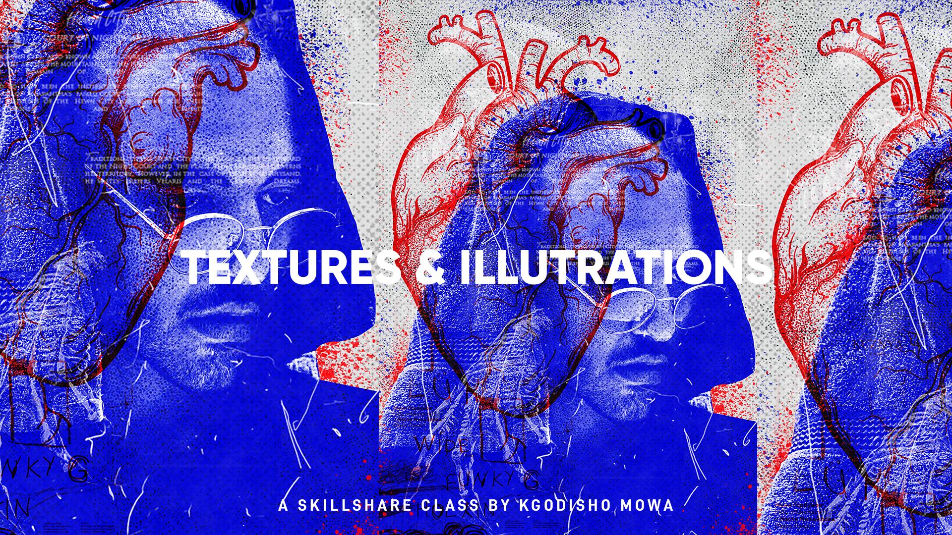
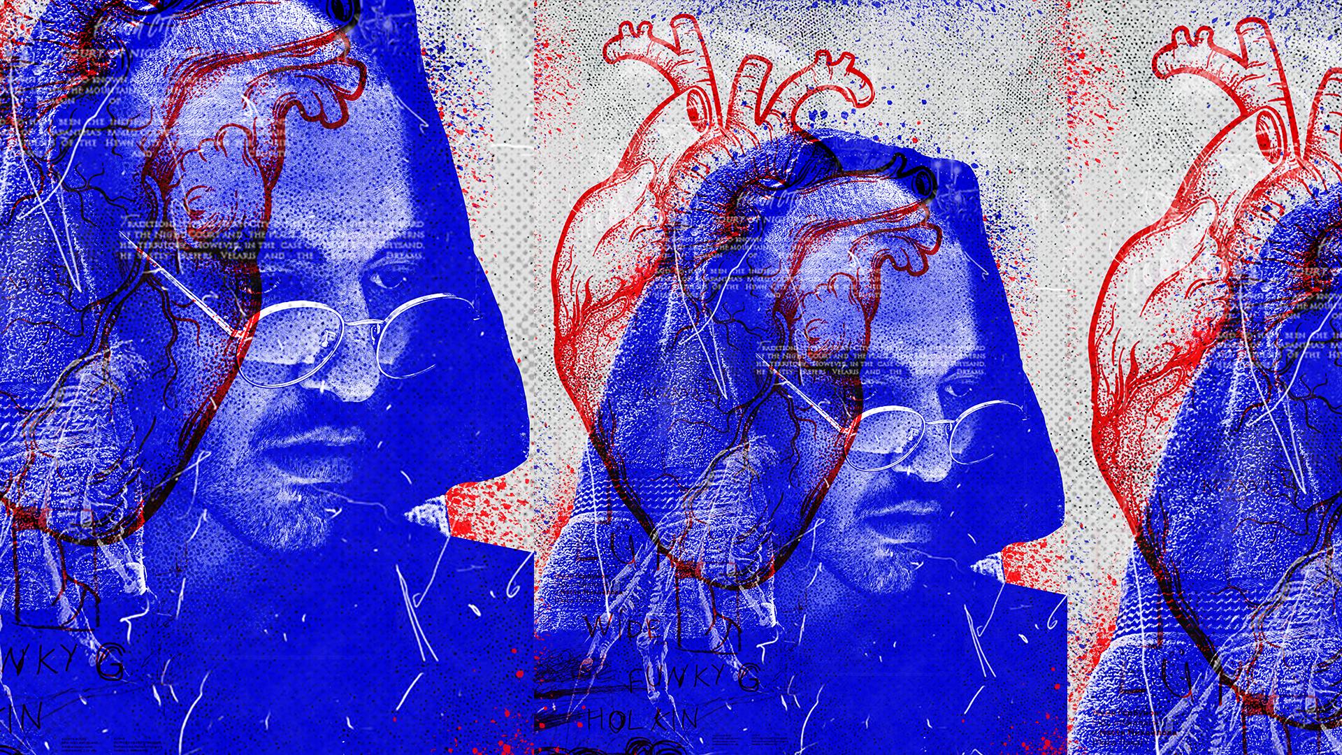
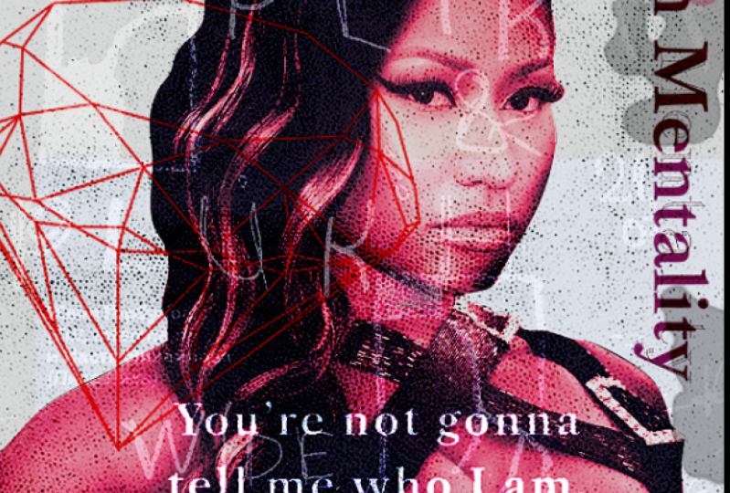
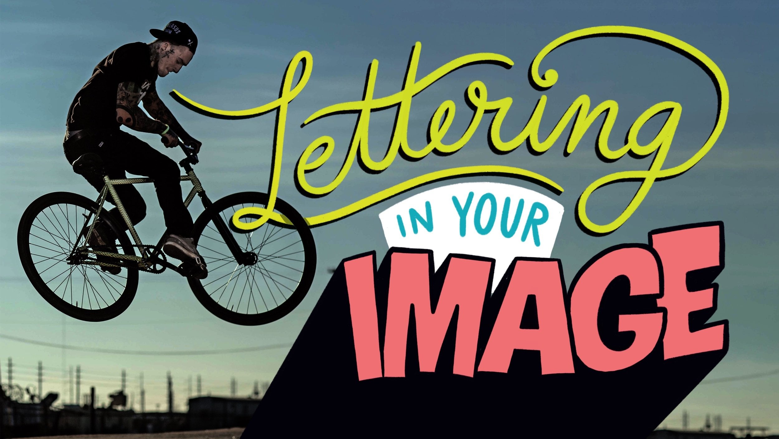
1. Introduction: Hi everyone, my name is Felicia and in this class, we're gonna teach you how to use a mixture of textures to create a cool posters is super easy to create. And we only going to be using Photoshop in this class. So let's get right into it.
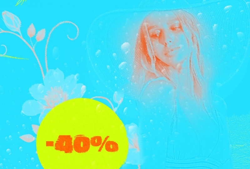
2. Image Cut Out & Adjustments: The first thing we're gonna do is cut out the image. So we're ready to open the image and already create the canvas. So I just used A4 size. Yeah, just use 84. So I'm going to go ahead and cut out the image. I'm just going to first duplicated by pressing command or control j, because I don't like working on those IN case I make a mistake, can always go back. So best thing you're gonna do is just cut out the image. So I'm just gonna go ahead and do that. I'm gonna really gonna go into detail cause all of these tiny details are gonna get lost into your textures that are, and brushes that I'm going to apply. And that berg won. So I'm not going to be __init__.py q on the edges, cause we're gonna lose them anyway. The main focus is that main image. So don't be too stressed about the edges. But if you're into that kind of person who likes details, you can bring them back, but you lose them, YOU that AT more layers. So I'm just gonna I'm just gonna go ahead and just cut them out and not, and not bring them back. The tiny details. I like the music that I'm playing in the background is called High Life is from Scania and music. I love it. So I'm just gonna go to the other side, but from the other end of the image. So just to make full-screen server Kinsey, everything. Since I'm looking for my laptop screen. Cuz I'm gonna use to it is kinda seems a bit small. So that's why I just make full screen when I do these kind of things. So I'm pressing Space to drag. So if you can see when you're pressed base, it turns into a hand. And if you click and hold, can drag saddam using. And I'm, you didn't command plus or minus to zoom in or zoom out. Thus control if you're using Windows. So I'm just gonna go ahead and meet the ends. And then like that, we have done. So I'm gonna go back to normal ISP and I'm gonna go back to, I'm gonna go to a path tab. When a whole Command or Control and click on the, on the mosque, and the path must come ensconced. Select Ibadan when a musket. And I'm just going to drag and drop it into our kind of as pilot bigger. It s, It is bigger. So I'm just gonna zoom odd and make a smaller and make it fit my canvas. Alright, cool. So we have our image. So now that we have our images are gonna come. Save it. Now that we have our image, the firstname we're going to add is Levels, Adjustment and levels and just going to clip it. So I'm not going to change the metal parts because I wanted to be duck. Right. So I'm just trying to detail into the highlands, into, into the tissue, the tower wireless or tissue from just twitches into highlights into Tower. When I'll make it black and white. Black and white layer there. So you can see the detail of the tower. So I'm just going to click the mask on the levels by Euclid the Muslim, the level is put onto ways the, the levels on the face so that we can bring back the face present you wiser than the sun soft brush. So I'm going to just do that and want to make it a little bit bigger so I can anyway, the huge part of it at the same time. There is this huge part of it the same time. We're going to make it smaller to bring back the MSc in some details. So I'm just going to fix the only share, repurchase x2y2, softer colors from black to white there. Cuz I'm gonna zoom out so that we have now we have our black and white. So to add even more contrast. And when I go to brightness and contrast and clip it, I'm going to go all the way in with the contrast. Just to make it more then I'm gonna go over in the brightness overall just to bring back some of the highlights. So now as you can see, it makes a huge difference in our image doesn't look flat anymore. Cool, so that's our image. I'm just going to group it in, say an image. It should. I'm going to ungroup it. Then. Now I'm going to add the color gradient thing go at ISI for debt. And when I go and say why didn't map? Those are Gradient Map. I'm gonna go here and just change that to blue. And will these aside so I can see my color palette. I saved it on a color pilots at us 3B it. So the hex code for it is 00064 plus 00064 plus the blue that I'm using. Just can seize already studied to look good. So I'm just going to move the blue under the, under the brightness and and well, that is affected by those affected by there. So I'm just going to move it under, under brightness like that. So I'm gonna go turn up my brightness, but no eviction, not under brightness. So it's gonna be like bear. You will this was run looks better for you. Yeah. That's okay. I'm gonna leave it, Beth. Well, we're just sort of a time when I save. Then I'm going to change the background as well to allow a gray type da, da, da, da, da, da to colleges. Feel like Wyatt. Fill like the gray kinda matches it. Alibaba is not two, but so is that. So now we have our image. And next we're going to be eight into hot. And some color.
3. Adding Illustration & Colour: Cool. So now we're going to add some elements. The first time we're going to add is the hot side. I'm just going to drag and drop it, put it on top of that and manage, make it bigger and make it theta. And I think we're going to change it to a linear ban. So we can just see we try to work. So you will prefer linear Ben. And there's kinda add a mosque command ways, those of that the bottom. When I raised them straight from the image because for some reason my mask was not Dui agent fully and I haven't figured out what that is. So I'm just going to we're just going to arrest you eyes. Left. Many ways. He raised the detail of where I got that. The HUD kinda looks good in black and white as well. But just for contrast and when I add some word on it. And this is the way that I'm using the f, f plus f, f 000 b. And then it is clip it to the hot. So because our layers not cut out is gonna show like that. But the watch can do is Sapir along with one of those, these Layer, one of these adjustment modes prefer Linear Dodge. So Hardy's infrared, it's gonna group that, say image. And I'm going to say save, save in. Maybe they can move it around a bit. And this T, where actually wanted me to see where actually you want to take at a higher and media and make it beta Who knows, to just play around with it the way you want it. So now I'm going to just five down. And a lot to us and we're just gonna say skill, share. And also make that in grad and Earth are used. And this is going to rotate that and make it bigger. You usually have a quit took ADNI. This can see there's a level TO there at the bottom and causes the watermark of we're actually look what that image I can just do laser differ one, it's not a big deal. So yeah, so just edit the text them, the group and take it out. And we're gonna say, we want to hide it from ours and not like the most important. Yeah, so now that we edit the art, the next thing we're gonna add some textures.
4. Adding Textures: We're going to add some textures. So I'm gonna touch all the textures that I used here. When he says the one that we saw step. So don't want to be no robotization for them. The first texture when I add just one that half tone fuel. So the first tab, and when I add this one, this has the half tone feel to it. And I just need to figure out what blending mode on or put it on. My thing is somewhere here. Then when I'll be running Color Dodge because I like how it appears there and how it appears on the top part. Does really cool. First that we're gonna create a group and just say textures and need Amara half-tones and lymph. Drag in and I'll have to, and by the way, I've got all these textures from interest. Yeah, I got them from Pinterest or if they are low as pieces cuz Dad, it is going to occur with that. We're going to reduce this ones. But CTCs Tibet, Chester declared and texture there. Some more texture. And throw in test one. It's almost like a form. Texture flourish thing will occur more satellite. Here I'm going to put it on screen that shows you that can even drag it up the sea. And I'm gonna leave it down here. Maybe raised the top part just a bit so that it doesn't exist. Shop, you cut the skin Sierra images trying to that into current to gain some Mars texture. I'm gonna add texture. Texture. Caught all of this texts from skill share. So forgive me never, not nor the author so that owners the artists behind them. And we're going to screen this one as well. Gamma screen it. But I'm going to apply some calves on edge just saw can lower down the highlights a bit and make their shadows pop so that some details show. I'm going to move our image now. You'd make it big and move it back down and maybe turn left. Here. Minima at some levels on one. Ok, snow difference. So an illegal cuz I'm just wanting to be a layer a bit dark, but how to make it invest too much in you that Halakhah, their hand comes out of a thing like that. Maybe you can print back our text now. See how that looks. And I don't like that where it is too harsh, so maybe let us make it new and so they kinda match with the color of the hot at that task might data. That is much, much better. Let me just copy this collab and put onto that out with a y and see how the type looks in wide, could have selected textures that are Padma, pool of action. It looks cool on both along. It looks Colon E therefore, does here on our bad don't wanna take on our texture that I got from Pinterest. Mostly. Well, it's not a textbook, but I'm going to use that extra. Thus lack words, our temp. And then we're going to screen it arose off. We would make us smarter. And I don't know either so heavy for my laptop, the slope itself. And I use that as a texture as well. But a C, You can see the edges. There's gonna be new ways, some parts over to whenever you choose to suppress it for their own lack harder type is so dominant effect or so maybe something like that. So on this scale, it has strokes as edges languages, those strokes, if you'd like to make and keep them, but I'm just gonna erase them. Bam, you can't eat them anymore. And it's going to have a mother texture that I got from. Pinterest says, guzzling cars. So abolitionists, who it belongs to. The term when I multiply. And we multiply it. They'd make it smaller. Because now it's becoming a huge destruction. Smaller Lowes, maybe picker. So I'm going to apply the same effect apart on the hot so I can use matches the articles. So I'm just going to collect. So by duplicating that, I just called, Wow, that looks cool actually as a salt and dip them drugs to duplicate. So I can see that my texture is mentioning the, I'm just going to erase some parts of this set as an cache with the hub too much. And there's a dad wanted to appear on the white bar graph. So you can just ClO rhetoric there. Maybe we can make our types. But if you're unlucky, can can, can move it as long as it's also called. Yeah, I think we're pretty much done. We need a much done. Knowing. So what I'm gonna do now is we're going to pay it didn't lead to layer. And I'm going to apply that image to image and apply the image. So plot, apply images, takes everything and measured ins one layer. And then when I use this and when I go to Filter. So we're gonna go to quick to hire plus just to bear some detail onto if it's big or not. Just to make smooth MALDI target might enrich, can crop up at two plus. Okay. And we're going to just clarify stuff. Glide, run. I can see the difference. Semana thing but makes it pop that go. So I didn't want to put a lot of things decide calls. Focus should be their face and when I would use the peasants members, focus should be the face. Alright, then maybe let's make a little bit quieter. So spillover can just play it on and see what failure life. Yeah, but I think that looks pretty cool. Receivables plus green. Nothing is completely cool. Yeah, I think we are done. So that's how you design that posted.
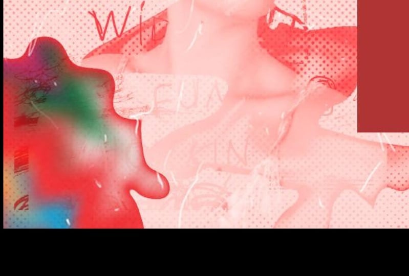
5. Adding Brushes: And I was kind of like a damped, but it is just minor things to add. I'm going to create a new layer and I'm going to apply a few brushes because we've come to empty that at the Edison. Wanna press B. And I've downloaded a few splash brushes, eludes to bad luck or some sort of fuel. And show the background there. Suit add some cool stuff in the background. We're gonna do the same thing and add another layer to top. And I'm going to have some, well now smart or this is the same. Just determine a bit and we're gonna change the color to the blue. Berry used. We do the same thing. For thing is too much. You don't have to do it. And then we're going to see manner button. We're gonna do the same thing. And now we are officially done.
6. Recap: Cool. So just to recap, we've learned how to carve out an image if he didn't know how to do that already. Learned how to use adjustments to add contrast and to, to, to add to contrast and some highlights and make some highlights Dan, Not even more using gladness and levels and, and all the stuff. We also learned how to apply textures using blending modes and how to change colors of images that already I'm not cut out using blending Modes and color applications. We also learn how to use paint brushes to pass some textures and grunge fill. And we also learned how to use filters to make our image details stand out using highpass filter, for example. So that's it for this class. I would love to see what you create a hope you enjoyed it. Please leave a review for this class to tell me if it was useful. I don't like making my classes too long because I know nowadays data's expensive and people don't have time, so I don't like Nick mattress too long unless absolutely necessary. So hope you enjoyed this class. I'll catch you on the next one. By.
 Kgodisho Mowa, Designer → UI, UX, Graphic Design