Transcripts
1. Mastering Drawing: Sketching, Perspective and Observation: Do you want to learn how
to draw amazing artworks, create realistic
textures from scratch, and become an absolute master
of perspective drawings. If so, then this is the course
you've been looking for. With extensive
high-quality content, additional drawing resources, and bonus course assignments. You'll have all the
guidance support, and skills you need to produce art works
that you're proud of. Whether you're a hobbyist
looking to impress your friends or an
aspiring professional. This course will help
develop your technique and knowledge no matter
your experience level. But before you can
create artworks like Jim Gee Kim will
guide you through our unique learning path where you will firstly
become familiar with a basic principles of drawing and develop your
overall technique. You'll then be able to transfer what you have learned and apply it to your own vision and
express your creativity.
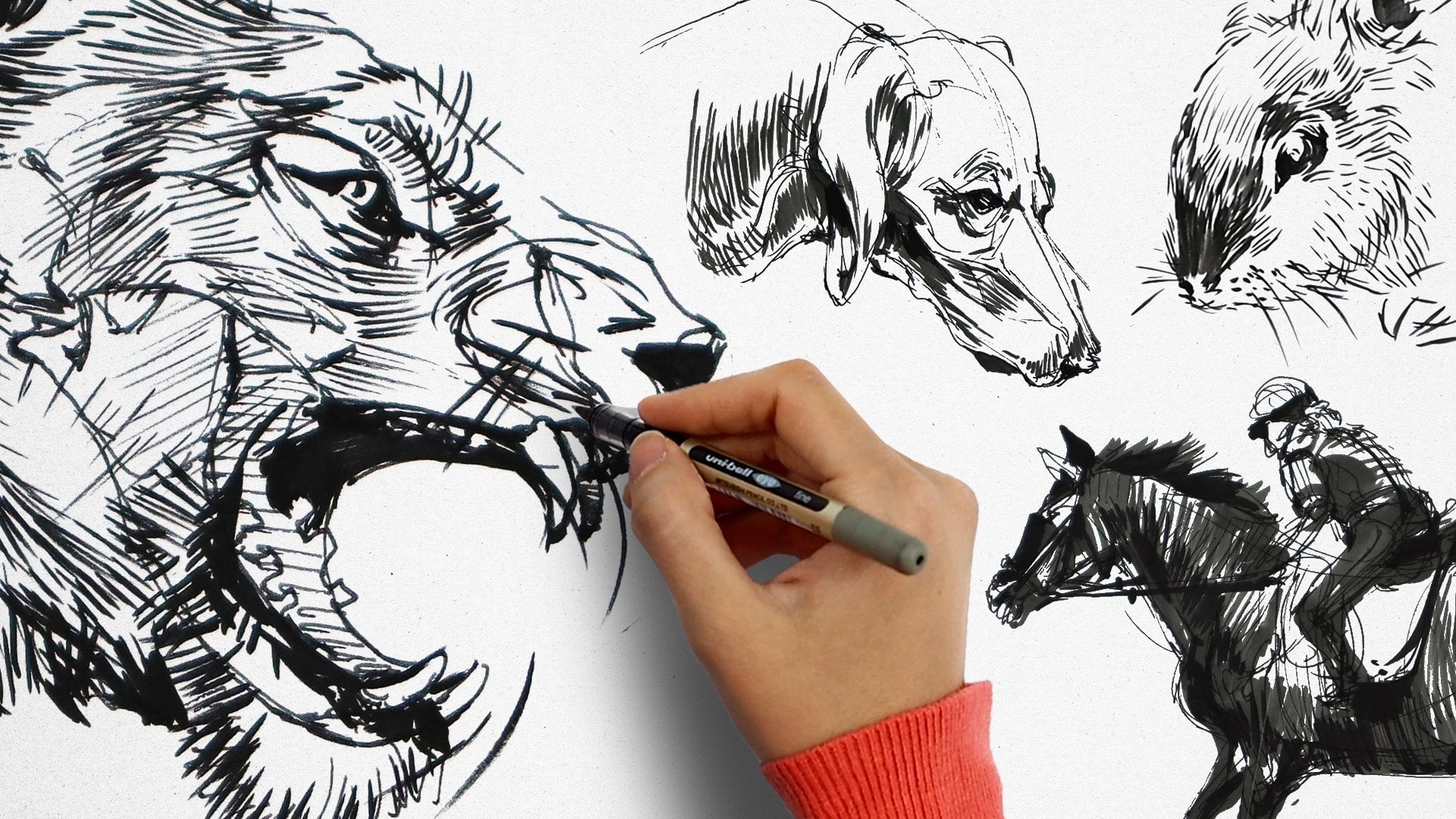
2. Introduction to Sketching: Hello everybody and welcome
to a new tutorial today, or tutorial is going to
be on sketching using a fine liner pen number 0.3 and a fine liner
pen number 0.5, and a dip pen as well. The term sketching refers to a fast drawing from a landscape, a building, or a figure to express and show a
feeling or a moment. To start, we need to learn about the lines that are going
to help us sketch. And also about the simple
tools and materials we're going to use such as
fine liner like this, which comes in different sizes, or a dip pen which
will work with ink. Fine liners like
this have their own encapsulated inside and we
don't need to refill it. Each one of these tools give us a different type of line
when applied on the paper. Thick and thin lines. And also the look and
texture of our lines differ. Now make sure you have
your materials handy. When we use dip pens, we can control the amount of
ink that goes on the paper, where in the fine liners a certain amount of ink
is applied on the paper. Now the lines that are drawn
with a fine liner have the same thickness from
the start till the end. Though we do not have
that much diversity in the lines we draw
with a fine liner, as it is one of the simplest
tools to work with. We're going to use
this for sketching. So take your time if
you need to practice on a piece of paper on the side
just to test your pens. First, we're going
to learn about the different lines
that are used in a sketch and actually
shape a good sketch. So these are the different
types of lines that we're going to draw
with a fine liner. I'm using my pigment
fine liner number 0.3. We can draw a thin line
like this on the paper. This is a 0.5 fine liner, which will give us a
slightly thicker line. We're going to use the 0.5 fine liner to draw different
types of lines. Observe. When a good sketch
we can see diverse lines. And the key point is
to learn how to use these different lines and
harmony to better help us sketch more realistically
and show what we want to show with a
deeper perception. Lines can also differ from one person to the
other as everyone has their own style and
use of pen as well. Someone might like
using outlines and have a cleaner outcome when
other persons might like more scattered lines
are more hashed lines. The idea is to
understand your tool better so we can
draw these lines freely on our paper
and let our hands move across the paper from
the beginning till the end. And this is how we hold
the pen in our hands. And our hands do not
touch the paper at all. In this way, we can add
the hatching lines freely. These are times when
we are going to use outlines for our
drawings and sketches. So we need to have
more control over our lines and draw them
carefully. Like this. Usually happens when we're
sketching a specific object. In this way, we can draw
straight lines like this that help us show the shape
of an object easily. Before going in
with the details. We can either use
these diverse lines are more specific lines that are drawn cautiously to
show the shape of an object, which is what we're working on. One of these two types
we choose to work with depends on the sketch
we're going to create. On the other hand,
if we're creating a sketch that shows a lot of lights and shadows in its
dimensions of different things. We need to use different
types of hatching techniques. So our lines can
hatch closer together or further apart in order to show the different highlights or the different tonalities of
something getting lighter. Just like this. To show a darker surface, we use a cross hatching
lines like this, but with a higher
density of lines. The closer these lines together, the darker the surface
we're going to show. We can use these hatching
lines to work on different types of gray
tonalities in our works. On the other hand, the larger the gaps
between the lines, the lighter the surface
we're working on. And the more lit up or highlighted will be the surface which we are trying to portray. Both of these gray
color tonalities are going to help
us in sketching. It's good to practice when it comes to
hatching lines and their densities to create
different tonalities. We can also apply
them like this. The lines can cross one
another in this way as well. They do not need to
necessarily be angled. We can add them as such. Feel free to pause the video and practice on a sheet of
paper on the side just to test your use of your own pens and then play
again to continue together. So whichever one of
these hatching lines which we choose and what tonalities we choose to apply with them depends
on our work as well. On some works we need to use more straight hatching
lines and others, we need to use crossing
hatching lines. For instance, if we're working
on a sketch of a building, these straight hatching lines
are going to be beneficial. Straight lines with
different densities to show a pillar or a
stone on the wall. And these hatching lines will also be used to
show the shadows. Another type of hatching lines
is adding these lines that are disrupted and
irregular lines like this to show the shading layers
on some parts of our work. These lines are
interrupted and irregular, but they follow one
another closely. One comes exactly
after the other. We can also add
the hatching lines like this horizontally, starting with a few
of them and then adding to it as we move on. The main point is to
observe our sketch, our model. Follow my lead. They can also be drawn like this and separate it like this. This is what the
distances we have applied in-between
these lines that are showing the depth and the
dimension of something. So there's a depth
of perception. The way we look at it will be
dependent on how we sketch. Holding the pen like this
enabled us to draw our lines freely in this way and be courageous enough to
add more and more of them. This is an energetic
medium, so have fun. When there are times
we need to add a completely dark
part of our work. We need to draw the lines like
this close to one another. And then by adding
this distance gap, we can show this reducing,
reducing shadow. So it goes from
the darkest lines which I have drawn horizontally. A light or lighter tonality. There are times we need to
add texture to our work. We can use dots like this. And when applied in this way, we can show the
darkness by making it denser or making the dots
denser closer to each other. So another way of working
on texture is using also curved lines and
small lines like this. For instance, when
we are working on the texture of a fabric, or we can use these small lines
with different densities. Also, when we're going to
show some small details, we're going to use simple
dots and lines like these. The idea is to mimic our model, to look at our model
and mimic the direction with which we see our
marks being made. What matters is to keep
in mind that there are different types of lines
we can use to work on. Different sketches
need different marks. And we need to become
familiar with them so that we know which lines
to use and where. Sometimes the
straight lines like this are going to help
us and sometimes we need to use several lines next to one another in this way to better show the shape and the form of what
we are working on. One several lines come
within each other like this. They can easily
show the thickness of what we're working on. Whether we're creating one line or several lines
next to each other. They need to be used
side-by-side to show the whole form and
shape of something. Different. Great
tonalities can be created with these
different types of lines. And the hatching
lines can take one or several of these shapes depending on the
form are working on. Hope this was helpful. And see you again soon
in the next tutorial.
3. Creating Buildable Textures: Hello everybody and welcome to another sketching tutorial. Hope you were able to
do some practice on the different types
of shading and hashed lines and
different lines with different pens that we went
over in less than one. Now to better show
a great tonality, as it was mentioned before, we use cross hatching
lines like this. And as we move towards
the lighter parts, the density becomes lower. Therefore, the gaps between
our lines are higher. Follow my motion. Mimic the marks that
I'm creating here. Take your time to
practice with your tool. The pen is a very simple tool, but the thickness of the tip of your pen or the different pens that allow you to
control ink or not, will give you a
better idea as to how you can use them or
manipulate them. Going on like this,
we make the gaps larger in-between the
lines and we also reduce our hand pressure and add thinner hatching lines to
create a lighter surface. Different types of
lines that we use and the line diversity we add to our work help us
show a form better. E.g. if we're working
on a building, we use hatching lines like this to show its shape and form. Our lines cross each
other in this way in order to indicate an
angle or a corner. While adding these
hatching lines, we need to be careful and
add the same gaps between the lines to better
show the shape and form of what
we are working on. So take your time to practice. Practice does make perfect. Also, practicing
will allow you to develop your own style. These lines that
cross each other and come right
after one another, help us fill the parts, the form and the shape and
complete the work entirely. And if we are moving
towards the lighter parts while working on a form
like a part of a building, we add larger gaps in-between the lines to indicate that there is more
light or less shadow. Working in this way, we
have gray color tones number one here and the
gray color tone number two on this part. And then adding
even denser lines, more lines even closer
to one another. We will have a gray
tone number three. This is just, this is
just a scale that we can try to differentiate between what's darker and what's
lighter or lightest. To create even darker parts we add to the density
of the lines. In this way. We can add
crosshatching lines. When we're working on this
level of dark color tones. We can fill in the
connections between the different directions
of the lines. Are lines can cross one another. And that way we'll
have a darker shade. As we apply more pressure. If you feel like your wrist or your hand are getting
a little bit sweaty, you can place a piece of
paper underneath away from your drawing so you don't damage the page you are sketching on. Remember, feel free to message me anytime with your questions. I'm more than happy to share some pointers and some feedback. As we're creating these
different hatched lines with different densities. Feel free to pause the
video and practice. As you can see,
we've now created the gray color tone number four. And using very simple lines
like this that are sporadic, we have created a lightest
gray color tone for this part. Notice how we've also created a texture on these parts that shows the shape and the
form of what we're drawing. However, there are times
that we will need to use curved or oblique lines. To draw these curved lines. We need to move our
hands freely like this. It's almost like a releasing
your wrist a little bit and applying your lines. And a more light
gesture, but also free. If we're going to draw the
curved line slowly like this and not moving
our hands freely. We cannot draw the two sides symmetrically as our hands do not have the range
or the movement. That's why relaxing your wrist and releasing it a little bit. We'll achieve you a
better curvature. In order to draw completely
curved line like this, which has a circular shape. For instance, when we're
working on a dome, the best choice is to move
our hands freely and add thin lines that come right
after one another in this way. So it almost marks a gesture, a guideline gesture to
create your full curve. If we add the lines like this
right next to one another, it gives us the look of
a complete line which enables us to edit
different parts if they need to be edited. The more you practice, the easier it will come to you. And as we add several thin lines on top of one another like this, we have a more symmetrical shape and a more beautiful
one as well. All the time that we are
working on these lines, we need to observe our work and see if we are moving in
the right direction. Throughout the sketches that
we're gonna be creating. We're only going to be using the lines that we went over and practiced Through the
previous lessons. Remember, practicing not only makes your application
more perfect, It's about your comfort
with this medium. The more comfortable
you are as the more confidently you'll be
applying your lines. And the more and more you
practice and create drawings, you'll develop your own style. We're using several thin lines alongside one another
to create a shape. For instance, if we're going to draw the lid of a small pot, we use the irregular
lines like this. While sketching. We
use several lines to create our full shape. And then it is from these
lines that we choose the most suitable one
and make it bolder. And that will be
our defining line, the line that defines
the shape of our object. While sketching, we must be
careful of adding too many, too many, several
lines or light lines. Some may think that adding several lines will
eventually ruin this sketch, but that is not correct at all. Instead, we need to add several lines freely while
sketching so that we do not face a problem
like the one we had while working on
this sample here. This bottom very defined line. If we insist on using this straight defined line like this that we
have drawn carefully, we need to make sure that the lines asymmetric reality is correct and does not affect the general shape or
final drawing that we are creating because the form will be translated into
the final image. As mentioned earlier, the
best way of sketching is using as many thin
lines as possible. That way we can choose
the best line amongst them and strengthen it
and make it darker. Then you can go over this better line and
complete your image. Thank you for joining
me today. See you soon.
4. Adding to your Sketchbook: Hello everybody and welcome back to another drawing and
sketching tutorial. This is the part
we're going to be sketching together today. There are also some
sugar cubes inside it, which we will also be sketching. We start sketching with drawing
lines freely in this way. We create the circular
shape of the pot lid. Now we're going to sketch the circular shape of the
lower part of the pot. That's the larger part. We try to create
the circular shape, that larger circular shape
with our free lines. We mustn't be afraid of
adding the lines in this way. We're using minimal pressure
and we're creating the lines by placing them in a dashed manner as opposed
to one big straight line. We just determined the
place of the base. We complete the details
on the pots lead, making sure that we are
adding it on the right, on the right spot. We are using free lines. Some are irregular and they
come one on top of the other. We do that to create the shape and the form
we're looking for. We create our lines as
fast and as easy as we can dress to get a grasp
of the general shape. And to decide on
which line amongst all the thin lines are
the ones that we're going to be drawing darker to
define our final form. The key point is
not to be afraid to add the lines and let our hands move freely on the paper to form the shape
we're looking for. So we are releasing our
wrist and working quickly. As usual, we emphasize on some lines to better
show the form. Those are the ones
that we're going to add more pressure to
add more definition. Now we're sketching
the sugar cubes. Pay attention to the way
we're going to add the lines, the direction with which I'm applying my lines
will imply the forum. Yes, I'm applying my lines irregularly and more and freely. But I'm still showing the
cubes and how they look in general and where
they're located. In this way. Keep observing your image. If we were to add the
lines one-by-one, it would have taken
a lot of time, and that is not what
we do when we're doing a fast sketch. Instead, we have drawn the shape and the form of the cubes with a few simple movements of our fine line on the paper. Now we're going to work
on the shading layer on this side of the circular
shape of the pot. Remember that you can
message me anytime with your questions and I'm
more than happy to share some feedback or pointers. We continue to observe our drawing and our
model and comparison. Now we're gonna be adding
hatching lines like this on the darker parts just
to show the shaded layer. Using the same fast
sketching technique with which we drew the general shape of
our pods and we gave it form and we added
some little details. We continue with the
same technique to add more detail and give definition. For instance, if it has handled, we could easily draw
them if some of the cubes have more
shadows, we add that. If the lid on top needs a bit
more shadows at the bottom, we did that already. But we observe our
image, our model, and we add those
lines accordingly. The idea is to emphasize on
some other details like this by making the lines
showing them bolder. Now we're going to work
on the same sample, but this time using
more regular lines. While we are actually carefully sketching the
lines on this sample, we may not draw the
perfect shape in one go. But it's okay because
we can still fix it by adding more thinner
lines as we move along. What we want to do is practice. And if this technique is
more attractive to you, it's the technique
you want to achieve. Better. Practice will
not only achieve more perfection towards a
certain style that you want, but it essentially builds our confidence
towards this medium. And the more confident we are, the more freely we work and the easier this
technique will come to us. Now, these are the
sugar cubes inside it. Notice that definition with
which I'm drawing them. We should not be worried
about the drawing being asymmetrical
at this point, are the shapes being
imperfect as it is with practicing that we can draw
better lines every time. Take some time to
play around with the medium and the different
pens that you have. Create different
different drawings by using different pressures
and how you can manipulate your pen and what kind of result you can get because
it's only by playing around with the medium do
you discover more about the medium and you develop
your own style eventually. What really matters is
the line values and using the appropriate lines to
show the different shapes and forms of what we see. We want to create visual
harmony among the line. So although there
might be hatching some lines on every
part of your drawing, the direction with which
you've created them. The detail you could have
given to any certain part of it will build the image with
such a depth of perception. Here we have sketched the
same sample two times. First one being a fast sketch and using irregular lines and the other one with
the lines that we have drawn carefully like this. On the other hand, we're using free lines. They hatching lines are added in two different ways
on the same sample. This sample, what
matters is to know when the work is
actually finished. We make the lines bolder
where they need to be and add the additional
details and layers. But we must be careful
about the number of lines and layers
we're adding. We don't want them
to be too much. We want to give depth of perception to our object with
our final defined lines. This comes more naturally
and instinctively to you with practice
and repetition. Now in this sample on the left, we need to use more
regular lines. And by irregular, it just
means more definitive, more intentional, as
opposed to making several lighter lines
within the same area. As the pot is made of glass. We can see the inside. So we can add these lines. Here from the inside. We can complete our image with less lines than our
sample on the right. Hope you've enjoyed
today's tutorial, makes sure to practice and
see you again next time.
5. Still Life Mug Observation and Drawing: Hello everybody and welcome back to another sketching tutorial. Today we're gonna be using
the pigment fine liner 0.3. And we're going to be
drawing a tea cup. To start off, if we want to draw a circle or a curved object, we can either use a glass
or a tea mug like this. Or we can use a glass sugar pot or a candy
pot for our reference. Now, when we want to sketch
quickly or in a fast manner, we use a freehand
drawing technique, which means drawing
lines freely without using a device or an
object to mark our edges. And what it means
to draw something freely is to release
your wrist a little bit, hold your pen a little
bit further away from the tip and make your marks. We want to draw a
free hand circle and drawing a circle
using a glass. Just to differentiate
between them. If we want to draw a circle
and a free hand style, we draw several circles with very low pressure on the paper. We're not afraid of
the mess which we could create by drawing
several circles here, but it's simply
to find our best, our best mark to make a
darker line on top of. This is one of the techniques
to start off a sketch. So don't worry that
you're using a pen. The reason why we draw
several circles free leads to form the circle
we want to show. Do it as many times as
you feel is needed. Keep in mind the empty space in the middle that is marking
the opening of the cup. In common drawings, we draw
an axis in the beginning because we want
to make sure that the proportions are right. But now we're sketching
fast and it's important to train
our eyes to see well and draw or
sketch very quickly. So take your time to
observe your model. As a result, we're not concerned with a proportion
because our eyes are trained to see and draw fast with appropriate
perspective. Because I'm looking
at my cup and then I'm making my gestures
on the paper. I'm considering how oval that circle is and
I go ahead and create my thin lines and create those
circles in thin lines. We need to practice a lot
to get to this point and to be able to do this
comfortably and confidently. And the real practice
is to draw things worth considering
their perspective. And to be able to see the
highlights and the shadows. By drawing these sketching
lines several times, we are almost defining the shadows around which our
final lines will appear. Now we're drawing the circle at the foot of the glass again. Then we complete
the form by drawing several straight lines for
the body of the glass. On the right and on the left. We draw its handle. The key to this medium is to
draw freely and confidently, even if you make mistakes
the first few times. Our freehand technique will get better the more we practice. Take your time to
observe your image, your model, and look at
what you've created. At the details necessary. As we're drawing, we pay more attention to
the negative parts, which means the
background to check if the proportions are right. Remember, feel free to send me any questions
you might have. I'm more than happy to share with you some feedback,
some pointers, and make use of your
downloadable resources which have a lot of information
on our tutorials. Next, we're going to work on the main lines of our drawing. Edit them if necessary. We are going to change the
fine liner that we're using. We're going to choose
one with a thicker tip. Just an order to
achieve a darker line. For our main lines, we want a darker,
more defined line. Now I'm using the
pigment fine liner 0.5. I'm going over the primary
lines that I've created here. And we add some more
shadow gestures here with curved lines, with light curved lines. Then we move down. We shouldn't be afraid
of drawing freely. In fact, there isn't something
such as a wrong sketch. Even a wrong sketch can be edited by adding
several lines. Now we want to go ahead and
check the perspective here. We need to make
it more circular. We need to check
the curvature of the glass on the
sides, on the bottom. The idea is to draw exactly
from your model as opposed to sometimes we make
assumptions as to how curved a certain line is. And then we look at our
model and we realize, oh, it's not very curved. Naturally, there's
more shadow under the glass and at
the bottom of it, so we show it
darker and thicker. By hatching this part more. We can create it
dressed like this, not just by adding pressure
and creating a darker line, but also adding hatching and lighter lines within it. Here. And on the side of the handle we have a shade so we darken it. It's like a shadow that's being cast by the lip of
the cup on top. The edge of the
handle is darker, so we had shared a
little bit more. And also on the
inside part where our fingers rest
to hold the cup. If you need to pause
the video and maybe practice some lines
on a separate page. That's also helpful. Then you can play again and we can continue drawing together. Here on the glass, we have a printed pattern. As we continue to observe our model or our
reference image. It's very normal to want
to make some corrections. And that's a very
common when we're using the free hand
sketching technique. Our glass might be thinner or thicker than our
reference image. And then we go in and we
make these corrections. Don't let it hold you back. Now we're going to hatch
the inside of the glass. The curves of the hatchlings
on the inside are mimicking the direction of the cup. So the curvature
is upwards here. As we move upwards
towards the rim, we hatch with more gaps
between the lines. This way we can show
the depth of the glass. We give it a depth
of perception. And we darken this edge. And we continue to observe
our shadows and see where, where we need to bring the lines together and create
a darker shadow. That doesn't mean it
has to be a very harsh, thick line, but just
darker with more lines. We start to hatch with low
pressure on the paper. And then little by little, as the shadow gets darker, we put more pressure and we add more lines
to make it darker. That's why observing your
model is very important. Now we have the body of
the glass. Like this. My lines here a bit straight, very slightly curved
at the edges. Again, we use dense lines
to show the volume. They are thin lines but
they're not very light. As you can see, we're hatching
in different directions. They're not circular,
they're varied as you see, because we want to make
it look attractive. If we showed them
in a circular form, the glass will be
monotonous and boring. So we take our time to just
look at what's needed, what looks more consistent
across our drawing. Again, we're working
on the handle. Notice how the border between the light and the shadow
here it's curved. Now we darken this part. Remember, the more you practice, the more comfortable you
become with the medium. And the more comfortable
you become with it, your confidence grows. And the freestyle technique
will come easily and instinctively in terms of
pressure and selection of pens. Now as we continue adding shadows and hatching
lines to our drawing, we don't want to make any
specific part too dark. That is meant for the end where we're about
to complete our drawing. And if you look at your model and you
look at your drawing, and you feel all there's
big differences, but still you look at
your drawing and it's a beautiful drawing and it's
coming together very well. Don't let that comparison
discourage you. The goal here is to create
a beautiful drawing, even if it's not as realistic
as you would like it to be. But with practice,
it will get there. And in the end, the purpose of our drawing
is to learn from it and test our lines and build our
confidence with this medium. Now, looking at our image here, if there's a design on the cup, we go ahead and draw
a dress like this. My wrist is very loose. My hand is lifted
off of the page. I'm holding my pen
midway and I'm making my drawing without stressing our hand or putting a lot
of pressure on the paper. Even simply create the design or the pattern on the
glass as you see it. Take your time and
if you need to pause the video, go ahead. The form of the lines
here is different from the form of the lines which
we drew for the glass. The texture for the
leaves is different from the texture of the glass itself. So I'm trying to mimic
exactly what I'm seeing. Look at this glass, the lines and dots which
form the design on it. They are a little bit different. They don't need that same hatching lines that
we created for the shadow on the
right of the cup here. Now we're going to
add some dots to make a variation in this texture. This way we make it
more attractive. Keep looking at your model or
reference image or object. It's very good practice to
keep checking our work, especially after
finishing one part that helps us translate into every next part
comfortably and more correctly. Now we want to use
these hatchlings on the whole work to
create visual harmony. So to make everything look like they visually are
sitting together very well. We had like this. We have both dots and
lines created here. Don't be overwhelmed by having different forms of hatching and drawing techniques
with the dots and the lines sitting right next
to each other in the end, when you pull your head
back and you look at your image and you can
do this right now. Just pull your head back, look at what you've
created so far. And they all sit next to
each other comfortably. And together. It's
a good practice to just look and see where might
you need more hatching? Where should you
maintain the highlight? Now we're shading
more because we want to show the form better. We want to heighten that
depth of perception. I want that curvature
to be more clear. Look at how I'm hatching, the speed with which
I am hatching. And compare to the
beginning as you see, there's more to the point here. I'm applying my lines
exactly where I want to apply them in the curvature that they
need to be if they're curving upwards or downwards, where the shadow is sitting. Now we need to hatch
the leaves on it more as we don't want
them to remain white. We had some tiny lines on the leaves with a
fine liner, 0.3. Filling in those spaces
with these lighter lines. And it's amazing how
changing your pen, you would think these details are not going to
show, but they do. They do show some lines. You want them so light that
they sit in the background. Notice the highlighted line right next to the rim that I'm keeping light because I see
that highlight on my cup. Now we can work on the
surrounding of our cup. These very thin, thin
lines, they are gestures. Just to bring
forward our drawing. Very light lines. Now we want to draw a
simple version of our cup. We want to use less
hatchlings or dots or lines. And this requires more practice and more definitive
line markings. And it takes time to get
to master this technique. To simplify drawing things in
general, using these pens, we start drawing simpler
with simple lines, less lines, more
defined, more decisive. That's what I mean by
defined that it's, you decide this is
where the line is going and you mark it. And we draw lines like this, which are thicker with
a bit more pressure. And it's no problem
if we make a mistake. In this kind of work, we can always edit by
adding more lines. But don't let that discourage
you or hold you back. The idea is to learn
and to practice. The only way is to simply
go ahead and do it. Notice that the speed
with which I'm drawing here is longer
lines, slower speed. As in comparison to the hatching where I'm going
with smaller lines, like short-term
lines and faster. There are actually
many methods and techniques for drawing things. The idea is to play
around with your medium. Use these pens to create
different kinds of marks with different
pressure, Different hatching. And hope you enjoyed
today's tutorial. Keep practicing and see
you again next time.
6. Still Life Tea Cup with Pen Drawing: Hello everybody, welcome
back to another tutorial. Hope you're all doing well. In today's tutorial,
we're going to sketch some simple shapes with fine
liner by outlining them. So if you have a teacup, a physical one in front of you, It's always better
than an image. But if that's not available, the model image is just fine. Now, don't worry too much about keeping your lines
need are clean. Because in this drawing style, a little bit of a messy line
is very, very attractive. So don't let it overwhelm you that you are using pen and
that you can't erase it. Just take your time to
observe your image, observe your object, and
start creating your drawing. As we know, sketching can
be done in different ways. It can be a quick sketch
full of lines and be free. And it can be a sketch by outlining it just like this
where it's more precise, more intentional,
and takes more time. So you can take your
time a bit more with it. These simple lines should be
flexible in our sketching. We want to, we want to show the sense of this
old cup and saucer. We're outlining our
lines delicately. And our lines don't need to
be full 11 gesture lines, you can stop in the middle, creating a very small gap and
then continuing your line. It doesn't have to be one
continuous line going across. Makes sure that
you're comfortable, your wrist is comfortable. You need to be patient. We need to be calm in order to create an
attractive sketch. So it's a challenge
of observation where you observe the object
in front of you. You look at where the outlines are and you add your
lines, your sketch. E.g. this handle here. It's not supposed to be the
same as our model exactly. We want to capture a very
good sense of it though. We're adding the pattern here. We shouldn't worry
too much about drawing lines right
next to each other. As mentioned earlier, you can create lines by dashing
them next to each other. The important thing
is to be consistent and to use the same technique
you are using on one part. With the next few creating
smaller details like this. For this texture, that's
the drawing that's on the, that's on the tea cup. Then you're using the
same kinds of lines with same distances
between them. On the next detail. If the outline of your teacup altogether like the
handle on the top and the sides is dashed where your line is not one whole line, then we maintain, we maintain
that style all around. There's a beautiful
red rose on the cup. We're creating these
flowers by outlining them. Again, we don't need to draw the flowers same as the
model in front of us. We just want to show a
gesture of them being there. Although this image can
seemingly be easy, but it's not. It needs more practice. And only with more practice and more experience, your
confidence grows. You're less worried about
applying your lines. It's natural to make mistakes. We should continue,
we should keep going. Don't let it hold you back. Now here as I'm
drawing the saucer. We might draw this line wrongly, but we can edit it
in the next sketch. If you're worried about
drawing some lines incorrectly or not the
way you want them. You can pause the video, practice or practice
before the tutorial. Then once you've, you want to start creating
your drawing, you have a better sense. But we should draw several
times in order to have a good view of our model
and understand its shapes. And the feeling that I
want to give from it, the style, the diameter,
and other parts. We don't consider these
things at first sketch. It's only by practicing that we understand better
these dimensions. And we can show the different,
the different styles. And an older looking cup or
an antique looking object. And as mentioned
in the beginning, it's always better to use the real physical
object in front of you rather than a picture of it. Just because you can see the shadows and the
highlights much, much better. Usually cups and vases, like vases, everyone says
that word very differently. They, they're very good. They're very good
models to practice. Such outlines were almost complete with
completing this drawing here with this style of line. Now we're going to create
a second cup here, but we're going to draw it more freely with various
kinds of lines. Look how quickly I created
the top of the cup. It has extra lines on this side which are
really, really light. Because I'm creating the
gesture of it before I select the one line
amongst my light lines, that will be the
definitive line. Look at the movement of my hand. Mimic the speed. Follow my lead. We can use a pencil to specify any certain area of
the cup at first, if you're a bit worried about that, That's completely fine. But look at your model, look at the form of the lines. And it's as if
you're your on your on your you have a timer on. You have a specific amount
of time to finish this. You're a bit quicker. But these here, they're a
combination of lines that show that general
gesture of our tea cup. We put our shadows and now
we're adding the rows. You want to be quick. You
want to look at your image, make decisions very quickly. Again, if you need a moment, pause the video just to observe your model a bit
more than go back in. Don't worry too much about
the lines being imperfect. There is something very
beautiful in that imperfection. You might discover more
about your own style. Just by applying this technique. We should continue practicing
more of these models. The more important
thing is to be brave with sketching and don't be afraid or concerned about
the precision of the lines. It's only by practice
that we understand the composition of
certain drawings, that we understand what it
means to have harmony in a drawing where you're applying the same style everywhere. Here I'm working
a little bit more on the edge of the tea cup. I'm adding a bit of
the inside detail. I want to, I still want the details that I want even
though I'm working quicker. You can give yourself the task, the time where you can choose the amount of time you want, like 5 min, 6 min to
create a certain drawing. And it's very fun.
It's a lot of fun. You'll learn a lot
about yourself. I mean, your technique. Here, as we've added, most of the details, were more free to decide, oh, this edge needs more definition. We want to put the outlines
exactly where we need them. We want our image to still
look very beautiful. I'm adding more shadows here. We're using these very
light horizontal lines, but are also a little
bit curved to imply the curvature of our cup. Now, in this final stage, we're just going to
strengthen our lines. So we've created all these
light lines because we've created them very quickly
and they are a tone of gray. But now we observe
our image and we want to give a definition. Look at how much more defined
the image on the right is. The rim of the cup
is more defined. The handle is more defined. Now we can see the differences
between the two cups. E.g. let's draw this pen here. The lines are more accurate and the hatchery is more regular. We can use a pencil
to create its area, then, then use a fine
liner to draw it in. But look how quickly
the more I practiced, the easier it is
to draw this pen. Very precise. Because I, my lines are intentional. I'm putting them specifically
where I want them to be. It's not easy. It looks simple, but it's not very easy. It's only practice that
will make it easier. Now, I'm drawing the same pen, but in a much quicker gesture. Look at this speed. Look at that man of little very, very light lines all around. I'm not worried about them. I'm just, I just
want to create my my pen drawing in 40 s. Less than a minute. I add my detail. Now these are complete. I hope you can see the
differences and if you enjoyed today's tutorial,
keep practicing. The more your own
style will develop. Thank you for joining me today. See you again next time.
7. Complete Modern Tree Drawing: Hello everybody. Welcome back to another sketching tutorial. I hope you are all well. Today we're going
to sketch a tree. I'm gonna be using a
mechanical pencil to draw the base. Drawing. It will act as a guideline for when we start
sketching with pens. Remember to make use of your
downloadable resources, which have all the information
for every tutorial. The sketch that we're
going to be creating here, you can print it out
and maybe practice by creating your
drawing directly onto the printout or
creating the sketch on a separate page by looking
at the model image. But right now, let's spend some time
creating this sketch. And as mentioned before, I'm using a mechanical pencil. I'm creating my
lines very lightly. Because the idea is
that we want to use the sketch as a guide and
not as the main drawing. We will be creating shadows
and lights with our pens. Use a hard eraser if you
need to erase any lines. Don't worry if you feel
like you need to go over your base sketch
more than one time, three times, four times. That's completely up to you. It takes a little bit
of practice to be able to draw your sketches comfortably and know where
your guiding points are, where you're gonna be adding your highlights
and your shadows. But for now, we're simply
creating a base drawing. Make sure you have your model in front of you comfortably so
you can look at it easily. And try to consider
the whole page, the whole composition
of the page. Now we're going to start
with a fine liner, 0.5. I'm starting off from
the middle of my tree here with very light pressure. And make it a habit, as it is very good practice to continuously
check your model. You're looking at it and
you're creating your gestures. Your taking a few
seconds to look at it again and then continue
your sketching. Observe the direction
of the shadows or the highlights as you are
making your markings. I'm creating those little, little lines as they
mimic the texture that I can see on this
part of the tree. This is a darker part on, although it is darker, I'm not applying a lot of
pressure and I'm not filling the entire space
either. With ink. You want to leave some
parts that are light. Consider the model that
you are drawing on a tree. You have curvatures, it's a curved surface and some curvatures are
upwards or downwards. So the direction of our
hatchlings and lines and dots, they will have to be in the direction that
allows for our tree to show the depth of
perspective that it has. Some of the lines
that we're gonna be using and, and drawing. In order to show the
perspective and the depth. Some of them are more
regular and some of them are more dashed or irregular. We're gonna be drawing
them patiently in order to create these
different tonalities. The model of this tree has
lots of waves and labyrinths. First we draw its
general sketch, then we're going to create
the trunk of the tree. And yes, we are creating a
general sketch using our pen. Then we create the
trunk of the tree and then we add more details. Even at the stage where you are creating a sketch with our pens. You could add some details, some shadows, some hatching that you
can see along the way. It's really a preference
how you decide to work. Sometimes we, some of us like
to draw the sketch as a, as a rough outline
everywhere and then later go back into details. But here in this tutorial, we are drawing slowly and carefully and we're paying attention to the
shades and lights. Now I'm using a fine
liner. Number 0.3. The markings of the line are different than the
fine liner 0.5. We want to keep observing our model image as we
create our hatching lines. And we create the form of the
tree with short hatcheries. Just like this. Follow the application
that I'm creating here. The application of
my lines and my ink. Use this delicate
technique as your guide. The idea is to
mimic exactly what you see from the model
in front of you. But of course, don't
be discouraged if you're drawing that
you are creating slowly. It looks different than your modal image that's
completely expected. That's not point
to hold you back. We're practicing different
lines of sketching here. And there's a lot of details on the tree which need
to be accentuated. These are the nodes
of the tree here. The form of the tree is
taken from the tree, and now we design it
in three-dimensions. Are lines should
not be far apart. The hatches must
be close together. In order to determine
the branches. We are creating texture. Depending on the
curvature of the branch. The lines are close together, but as you can see,
they are delicate. I'm using the 0.3 fine liner. And I make sure to keep an
eye out on the highlights. So the parts which
I don't want to touch that are clearly
a lot more white. We want to also keep an
eye out on which parts of the branch are lighter
so they are more gray. Notice a difference
between the under part of this branch that we're
working on and it's a little bit darker and the
lines are closer, implying a shadow
underneath whilst on top, the lines are lighter, they have a bit
more space and I'm indicating the curvature here. And we change the form of the hatcher is
because the form of the nodes are on this side
rotating differently. So it's really
about observation. Keep looking at your model. Look at the details
and the shadows. They will indicate to us How, how much pressure to
apply on our pen, how closely to have our lines, how much hatching to create
an, a certain point. We play with the
hat tours actually, and we draw the sketch
slowly and patiently. You want to keep
your application. Light. Theorist is
nice and comfortable. Your hand is light. If you feel like you're pressing too much
onto the page with The side of your hand and
yet your pressure is light. But I wanna make a note about the possibility of our hand
sweating onto the paper. In this case, you would
put another paper underneath your hand
on your wrist away from your image just
to protect your page from getting dirty or having
any sweat marks on it. Here we're creating very
short and thin lines. That's the texture that
we see on our model. We're making very small marks on different parts of this tree. Now we're creating very
short and thin lines with dots and
hatcheries as well, but dots as well. Because that's our
smallest mark and yes, we can make it
darker and bigger. But here we're using hatches and dots to create this part. Remember that you can message me anytime any questions
you might have, or even just to share any drawings or images
you might have sketched. And I'm more than
happy to respond with some feedback or
maybe guiding points. Lines are irregular in some places in the drawing
that we're creating here. There are irregular
in some other places. By regular I mean that they
are crosshatching as we know, or direct lines that we
clearly just see and apply. An irregular meaning
that they are, a hashing is in different
directions that are curving. Maybe their distances are irregular between each other
because we have some of the curvatures here and the circular points around which were creating the hatchlings. And sometimes it's both
hatchlings and dots. So we're just paying attention to the textures we
see in our model. We're paying attention to
the composition as well. Because our, our final sketch
here and the final work, it should not, it's
not completely uniform nor scattered either. It's contained
within its own sort of beautiful curvature details. We should make connections with the lines between each other. Just to create that
very slight shadow sometimes so we can
create the same line. But extensions of it can meet. And we're working on
this part here just to show the texture
a bit better. That's what I mean by if
you're small lines are intersecting with the next
row of small lines and that, it's okay to have that
that shadow show. Look at the irregularity of hatchlings here in this
part that I'm creating, I'm observing my model and creating the lines accordingly, leaving some white parts. Right there. We continue working on each part. As we move along. We add the details to
each part we come across. We just need to continue
observing our model. And we make sure that
we're not making any dark, dark marks on our drawing. We want to leave some leeway
in case we want to add lines or make something darker later
when we add the details. Here, we're creating
the veins of the tree. The different cavities. If it's possible for you take pictures of your drawing
at different stages. That way it gives us an indication of how
we've progressed. What is it that we focused on in one part and the next part? And it's quite beautiful
to see that progression. I find this drawing
very meditative. The details are quite
beautiful and delicate. They require focus and patients. There's a cavity at the
edge of this part here. We've indicated the
dark middle part, but still leaving that
highlight in the middle. Notice how I'm creating the shadows and the
details of the tree. Our highlights all along. So I create my shadows
while keeping in mind that there are lights and lines that need to remain
the white of the page. We need to go over all the details that
we're gonna be creating. But for now, we're sketching
exactly what we're seeing. Here. I'm combining
hatchlings with dots as well. Depending on the detail
that I'm trying to achieve. We're actually working
on the dark parts. The light parts, the negative
parts, the positive parts. Some parts the lines
are curving across each other and the ends
of them become dots. And some dots turn into these
lines as well together. But we're combining
both techniques. And as you're visually looking at your drawing
and you're creating it. And you're making decisions on some curvatures and how some
lines are coming together. We can use our
imagination and dress and just try to see how
they can gently cross. How does that crossing create
a little bit of a shadow? And how to add dimension? Because the more we, we study our image and we have
these lines intersect with each other at the places
where we see more shade, more shadow, more highlight. It just increases the depth
of perspective of our image. We add lines between lines in order to make them curved
and achieve that dimension. These movements of the lines
and the way we curve them according to what we see in the curvatures in the
grain of the tree. Make it so much more beautiful and we're
bringing it closer to looking more realistic
and more natural. And it helps the whole process of sketching together
here in this tutorial, it just makes it
more imaginative, more enjoyable, more
engaging as well. We use dashed lines. But the idea in
general is to not be afraid when you're
using this medium. It is meant to look free and relaxed and it's okay
to make some mistakes. There is leeway to
add more lines. So take your time, enjoy the process,
enjoy the practice. Here we have some leaves
that we're gonna be adding. I'm just studying
the direction in which these leaves need to be. There. Direction will dictate the lines that we're
creating for them. Whether they have
circular shapes or am I using a darker
line? Is it a more Empty space, more curved space. As we're sketching more and
more details of this tree. Remember that practice is not just about making
something perfect because the medium of sketching with pens is not always about perfection
and a perfect line. We, it has this style that's
a little bit flattery, a little bit delicate as well. But practice does bring not
just comfort but confidence. You'll become more
confident in making a call and
instinctively deciding, oh, more lines here, more curves, more
dots, more hashing. Let's cross hash. Or maybe we'll create lines that are dressed next to each other. Long line, short line. So all these decisions, depending on the drawing
that you are creating, will simply come naturally to
you the more you practice. Now we add some dots on
the trunk carefully. In order to achieve the
texture we see on our model. Make sure you're lifting
your wrist and your hand if you're going
across your drawing. Just to make sure not to damage the work that
we're creating. Some textures on this part of the tree are more
complex than others. But no matter what, what hashing technique or sketching technique
you decide on b, it crosshatching or single-line
hashing, or the dots. Just make sure you're mimicking model that
you're looking at your model and you're trying
to create as closely, as closely of a
sketch as possible. Consider the composition. If you feel you
need to measure how far you are from the
edge of the page, or maybe how long a branch is. Use the use the pencil
measurement technique. I'm using the lines hashing in a curve
in a curved manner. As I do see those shades
in that, in that shape. When we're completing this
circle with these lines, we don't draw the whole
trunk in one go with the long lines or ongoing lines. Because the underneath
texture is white. We want to bring
forward that texture. We want to make sure that we're observing our image really well. We're leaving some white spaces to indicate the highlights. This part here is darker, so we're trying to add
some dimension here. Hashing more lines in this part. As we know, the edge
of a convex part is white in order to
show the round shape. Pause the video if you need to. Just to maybe look at
what I've created here. Maybe just to observe a
little bit more your model. But also make it a habit to
always pull your head back. Stop sketching, look at
what you've created so far. And make note of where
the highlights are, where the outlines are, which parts might need more
hashing at this stage. But it's just good
practice to be able to stop and look at
what we've created, what we're working on. Just take a few moments. And to put it in
perspective and to visually see is everything
looking harmonious? Maybe you need some
more lines that are curved in a certain
way for a certain part. Now we're going to work
on this part here. We're going to use dashed
lines, thick and thin. Some are much closer
to each other and some are fewer and
they have more distance. We're trying to build up the
texture and the tone here. That's why you use
different types of lines. We want to bring
in that texture, that richness of the, of the texture we're creating. I'm going to remember
the more you practice, the more instinctively these
selections will come to you. Like what type of
line am I choosing to shade my crosshatching
it or not? It's a practice of
both the medium, which is the use of
the pen and sketching, but also practice of looking, really looking at
our image and seeing properly What's the darkest
part of the shadows? What's the lightest
part of the highlights? Because these are all
different gray tonalities. Just by looking at our
current sketch right now, we can already tell that
some parts are extremely light and some will have a more definitive
line going around them, but these definitive
lines come in the end as we are completing our sketch. For now, we're still, we're creating the textures. We want those textures to
come through because that's, that's the beauty of the
image that we're working on. These are the
details that we are doing this image for
to practice that. We continue to fill
this part by factoring. If we work on this delicately, it will be more attractive. You're giving it the
patients and the focus. Sometimes we might make extra hatches if we're
really speeding. And that can cause the loss of the delicate style that we're
looking to create here. So take your time. The more you practice. And I mean after some time and this is the medium that
you're comfortable with. You start to develop
your own style. Now we're working on
creating more contrast. And this part here, we're creating a balance between the contrasts and
the highlights. The contrasts are
really important. They give form and shape
to your full image and the highlights give it that depth of perception where you can see
where the light is hitting. It makes our image look more
realistic, more natural. Now as you know, creating hatching, hatcheries lot hotter
lines next to each other, the closer they are, the more you are indicating
a shadow, a darker part. In comparison to other tutorials
we have done together. This tutorial is
not a fast sketch. This is a slow sketch. We are spending more
time on the details. We have less contouring lines. Because with a fast sketch, you're creating several
really light lines. And then in the end you're
picking the one that is mimicking your model
and that it's going to create your
drawing as intended. And you make it darker. You create these darker
lines that are definitive, but you'll have this,
these contouring lines. Here, it's very different. It says slow sketch. We are more definitive with
every line all around. And these labyrinths
and waves we have on our tree,
they're more visible. And especially we
make them even more visible using convex lines. Remember, I'm more
than happy for you to send me your final drawings. Also, if you have practiced a drawing more than one or you
have done it more than once. It's nice to see at
different stages of your practice how your final image has
turned out to be. It can be a point of
learning where we get to see how we've applied our lines. How much freedom there is an confidence in
our application. Because, believe it or not, it actually shows in
your final image. Remember as you're working on different parts of the image, especially as you're creating
texture in certain parts. Because we can very easily
get taken over shade, create extra, extra
hatching, extra lines. So it's good practice to
just stop for a few moments, make sure that you
are still working on the same part that you didn't go over to the next section. Because personally
I can get taken and enjoy the hatching and the
sketching way too much. And because I find it a
little bit meditative, It's good practice to
just stop a little bit because it can make us a little bit impatient
or work a bit quicker. When you want to slow down, you want to make sure
you're not creating extra lines and places that
might have more highlights. In a slow sketch like this. It can, it's difficult to, difficult to remove
any lines, right? It's not possible to
add more lines to. It would maybe look a little bit imbalance with
the rest of the image. Now, working on
this top part here, there are leaves in this part. Try to draw the leaves in
harmony with this branch. Mimic the direction of it. The way the leaf is bending
and curving backwards. Now we increase the dark parts, increase the shading
or the shadows. So we're going back in. I'm going back in
with more confidence. I'm not worried
because I'm observing my model and I can see
this is this part. These parts need more, more shadow on them. I'm going to add some marks on this part here at the bottom. We want to specify the details. Notice how where I
applied more shadows just now it indicated
that branch, it made it stand out altogether. Year I'm going over
the curvature. Very delicately. I'm observing my highlights. And I'm moving to the leaves on the complete opposite
part of the drawing. Because sometimes you're
working on something and you notice an imbalance in another part that I come back down and I'm
working on these parts here. We're adding these darker parts. They're very important
because they bring specificity
to your drawing. They especially with a tree
like this where you can very easily maybe not differentiate
between the branches, between the different parts
of it and the leaves. So it's important to go
over these outlines. Don't hesitate. Don't let that the delicate
markings that we're trying to achieve in this
drawing to discourage you. Or if the final result is
not as you wanted or as perfect as you imagine
a perfect drawing. Just keep practicing, keep
doing it with confidence. Patients focus and
you will get there. We continue to add the details. Because as mentioned before, those, those darker parts, the shadows and the
different parts of the tree, they will really
bring it to life. You see me take moments like split moments to stop
and look at my model. Observe it carefully and apply my hashing is my lines and
my dots in the right places. Now, when there are light
hatches behind leaves, it becomes like a shadow. So we won't really need
to draw the other leaves. So we have them here merely as a gesture of leaves in the direction that
they need to be. But we don't need to
accentuate it even further. But of course, if you
want to, you can. Finishing any drawing is completely dependent
on each one of us. You are the judge, you make the call. I'm going to focus on adding more shadows on the
different tree branches. As opposed to maybe
giving more shape to my leaves just because I feel like those are the parts
that need more hashing. I'm happy with the loops. But if you feel
like you want to do more on the leaves, go ahead. Now remember, keep practicing. The more you practice, the more you are comfortable
and confident with a medium are drawing
is done now. Thank you so much
for joining me for today's tutorial
and see you soon.
8. Understanding perspective: Hello everybody. Welcome back to another
sketching tutorial. Today we're going to learn about different perspectives
in sketching. There are three kinds
of perspective. Before I go over
each one of them, I want to remind you to make use of your
downloadable resources. They will have all the
information necessary on each tutorial just in case you want to go over
them before we start. Now, the first one is a
one-point perspective. We draw horizontal
line in our frame. There's escape point
in the middle. The one-point perspective is a drawing method that shows how things appear to get smaller
as they get further away, converging towards a
single vanishing point on the horizon line, and that's our middle.it is a way of drawing objects
upon a flat piece of paper or any other
drawing surface so that they look
three-dimensional and realistic. Here. This, these lines
that I'm drawing, they end at this point from the above of my horizontal line. And the bottom. Drawing in one-point
perspective is usually used when the
subject is right in front. We are directly looking at
the face of a cube or a wall, or a building, or
directly looking at something like a road
or a railway track. It's a very important
drawing method. Especially when
drawing buildings. Everything we draw will
end at this point. We're just trying to create a little bit of
perspective here. In order to just practice a little bit the one
perspective technique. Follow my lead. You can use a ruler or a compass whilst learning to draw
a one-point perspective. But doing it freehand
is just as good. It's no different. It's simply to get a grasp of the perspective.
And what it means. We can see a
one-point perspective in the following models. So objects above
the horizon line here are drawn as if
you're looking up at them. And anything below
the horizontal line are drawn as if you're
looking down at them. The lines we have drawn, they go not only above the horizontal line but
underneath as well. So objects are neither above nor below are the ones we
are directly looking at. Mimicking the model we just saw. This is this is a
reflection of it. Now the second perspective
is a two point perspective. This perspective,
we have to escape points or two vanishing points. It means that shapes end at these points and lines
cross each other. As we create the sketches together to define
these perspectives. It will make more
and more sense. In the two-point perspective, sides are extended
along each other. So when we stand
between two streets, Let's say the
perspective is as such. We can see this perspective
in these models here. In fact, there's an, there's a vanishing point in this part. And the other vanishing point is in the rest of
this line here. It's in the incline
to the right. Now, if we want to
apply this image to our sketch here, our
two-point perspective. This is the bridge. We look more to the right
side of the bridge. Then we do to the left. Because directionally this
two-point perspective takes us down and upward
to the right side. Now, the last perspective we're going to work on a
three-point perspective. It's a view that has height. Now, the third perspective is
a three-point perspective. I'm gonna grab a
new sheet of paper. It is the most complex form
of perspectives. And drawing. A three-point perspective
uses three sets of vanishing points
to draw each object. And it's suitable to draw things from a low or high level. The low level in our
illustration creates an illusion that what we
are looking at is above. We are looking up. It naturally suggests a scale of a tall building, let's say. Naturally, a three-point
perspective is also used to draw something
from a high level. It creates the illusion
of looking down. From a high viewpoint. It's simply a reversal of the three-point perspective
from a low, low level. Take your time to create the following sketches and to
practice all three of them. It will really help us to how we perceive our drawings
and our models. Before we start our drawings. You want to be able to look at the most powerful points
of your drawing and images. And it helps us understand where the viewer's eye is
traveling on this drawing. What, what perspective is you're drawing taking here, I'm just drawing the perspective of a higher thing
and looking down. It's a perspective
from the bottom. These lines are not
straight because this is a very tall skyscraper that
I'm giving an example of. But the idea is to practice
because practicing these perspectives helps
with our drawing technique. Our understanding
of visual harmony, especially when we're
drawing buildings or architecture or high
objects or looking down. Looking downward perspective. We don't have a
sample to share for this perspective at this moment. But feel free to email
me your questions. And I'm more than happy
to respond with pointers. Here we have a
one-point perspective. The vanishing point here is because all the lines
end at this point. Since the viewing
angle is limited and the building is in this part, this perspective
seems difficult. Now in this next sample, although it is difficult
to find the perspective, it has two vanishing points. Since we are so
close to the window. And we don't have that
perspective demonstration. But look at the incline
here of the view. But we can see our
vanishing points leaning towards the left and the right. Take some time to observe different drawings and see where the vanishing points are. What's the central
part of your image? Try to differentiate between
the 12.3 point perspective. But we could see the two-point
perspective better in this model and the one-point
perspective in this one. But either way, the point is we have to know
the perspective before sketching a building
in order to draw it properly. Thank you so much for joining
me for this tutorial. I hope it was enjoyable and
see you again next time.
9. Classical Door Drawing: The foundations: Hello everybody, welcome back to another
drawing tutorial. Today we prepared
a design which is not drawn by line pen before. It was drawn with
a dip pen and ink. We're going to
learn a little bit about the differences here. The last tutorials,
we've used a gel pen, but today we're going to
draw using a line pen. So the gel pen is the gray one and the line pen is
this white one here. We're going to learn
a little bit more about the differences between them once we start
making our drawing. Mainly, especially when
we start hatching, creating hatcheries,
different lines, then you can feel the
difference as well. Independent you're using. We will use a thicker and
a thinner line pen here. First of all, we're
going to draw the sketch of our drawing. We want to use a pencil here. And we're going to make
our sketch very lightly. There is a window and a
peak of a mountain here. Take your time to
create your sketch. Remember you can make use of
your downloadable resources, which has all the
information on our tutorial, including the image which
were drawing today, the grids that are
necessary to draw it. And essentially you can practice this sketch because we
might not be adding. The shadows are where
the hatchlings are going to be in this base sketch. But we have to create
a guideline for us in order to know where
we're going to be drawing in our image. And withdrawing. As you complete your image, you have more and more lines. We're paying attention
to where the shadows are and where the
highlights are. There's a window, as
mentioned earlier, with a peak of a mountain
and it's hillside. There's a cornice on
the window and an arch. There's a column next to it. We need to analyze
our sketch and the tools that we're using
to create our drawing. Just to understand how that texture is
going to be created. Because we're creating
line drawing, right? I would take time to
practice. So e.g. we have an arch here
that is wood and that texture needs to have hatches are lines that
are closer to each other, but also darker in some parts
and lighter in some parts. And we have a double
window and we have a door which goes into which is inwards into the frame. And it's a little bit
at a diagonal angle. The perspective of
the whole image is a diagonal backwards
towards the right. We need to get
this dimension and the proportions correct
in order for us to create our drawing as
precisely as possible. So as I'm drawing
the perspective, you don't want to
add extra lines as if you're shading right away. We're basically
creating an outline and a guide for us
to go in and color. It shouldn't confuse as it
should help us this sketch. We're gonna be adding more of our lines with our pen line. Observe how many lines are
in the arch and add them. And pay attention
how the arch will be connected with other surfaces. We want to create our sketch
as simple as possible, as basic as possible. Now we're going to draw the
window with our line pen. Let's begin. This is a fine liner, a pigment fine line or 0.4. I'm starting my
drawing from the top. And the lines that I'm
creating are now more final. So although we're creating a
gesture line to begin with, but along, along
these gesture lines, we're going to pick one
line that will be more defined and all the
other lines will be supportive of this freestyle drawing drawing technique that makes it even more attractive. We started with our sphere. We did our outline. We have many details
in this drawing, so we need to be patient. We need to be also
ready to create irregular lines to
create those details. So look, I created
a circle here, but I added all those details around it in irregular lines. We need to keep
observing our model. As we create our drawing
and add our details. Mark what you see
and illustrate it. It needs practice to become more free and confident as
you use this medium. So keep practicing. Especially when there's a lot of details to tackle and add. We're drawing separated
lines here of bass relief. So take your time to
observe your model. Look at where all the
lines need to go in this section that
you're working on. And pay attention to
my hand movement and how I'm drawing the objects. I'm using minimal pressure and it's always better
to work lighter. I'm going into add my details, leaving room to
make more lines or make more shadows and
dark lines later on. For now we are creating
the base sketch. So we did a sketch with a pencil that's done, that's
really light. And now we're creating, we're using our pen to
create our primary sketch. And we can add as
many details as long along the way
as we need to. Add darkness and contrast later. Now we're just going to be
drawing the old window. I'm drawing the
arch by many lines. I'm not creating
one straight line. I'm creating it slowly as if I'm shading it in using my pen. We wouldn't be so
we wouldn't achieve this light freehand
technique without creating those lines consecutively
as if we're shading in. We don't want one straight
stroke that's unending, that is very different. It also gives you
a chance to draw both sides of the
arch symmetrically or as symmetrically as possible within the proportions
that we have. Obviously. Look, I'm moving my hands so many times
to draw both sides. And I'm making corrections. Follow my hand movement. Let it be your guide. If you need a moment to
take a look at your image, maybe practice some
lines on the side or the arch on a separate page. Go ahead and do it. Inside the arch, I've added some vertical hatches
and on the outside here, more vertical hatches that
are a little bit darker. I'm creating my drawing by adding all the
details that I see, but doing it very lightly. So you don't need
to add later on. That's when we're going to
be adding more hatcheries, more darker lines,
more outlines. But for now, we are adding the basic image that
we are drawing. And feel free to add the
details that you need to in terms of
indicating, Oh, okay. Maybe I'll put some
little hatches here to remind me that
there's more shadows. I'll add it later on. We're drawing it
fast and simple. And the more you practice, remember, the more you practice, the more your confidence
grows with this medium because you've enjoyed
using it freely. We're not too worried about
our lines and whether they are mistakes or that they
don't look as perfect. It's practiced that
will reveal to you your sense of style, your sense of comfort. And especially with buildings or architectural
shapes like this, you need to practice drawing straight lines before drawing buildings just because
it is a challenge. It's more challenging than
curved lines in a sense, because you want them to
look a certain way but also be light but
also have shadow. Remember, feel free to
share with me your images. Dressed if you, if you
need any feedback, if you have any questions, I'm here to address
your concerns. And maybe give you a few
pointers if you want. Keep practicing more and
more, draw hatching. And just relax into
it. Feel free. Don't, don't worry too much. Because the shake of our hand will affect our
drawing in general. When really, it's just a
matter of getting comfortable. We're drawing window lines here. There are many fold
lines on the window. Just because it's older
and has more creases. Here, we can draw many lines and it's not really something
to worry about. We can leave the
end of the window. If you draw straight lines, it will be smoother. Now the drawing is
started from upside from the top side and it's left to fade out or
lighter at the bottom part. It would just look
beautiful and faded at the edge because we're trying to get all that detail on the top. We draw lines more
sporadically here when emulating the leaves that are going to come
on onto the side. They're more curved,
they're more free. And it allows them to look more elegant than natural because
they're more curved. They're more to their nature. They are leaves of a tree. Yes, our lines might
be different in order to achieve the texture and
the look of the leaves, but the pressure
should be the same. It should be a lighter pressure. And with architecture we
go for straight lines and mostly vertical lines
and horizontal lines. And vertical because it
implies that the perception, the perspective of the image
and the building upwards, you have that verticality
that's happening here. With leaves or trees. They're responding to gravity
so they have the curvature. They are bending down, right? So we want to imply
all of these details, the direction in which we
create our lines matters. It will show in the end
in the final image. Now we're creating contrast
on the top part here. You want to add a dark
tonality step-by-step. You don't want to create shade or darkness or shadow quickly. You want to do it patiently. You want to observe
your model and you want to place your shadows
exactly where they need to be. We continue to add
hatcheries where we need them and
we keep it light. Notice how there's more shadow
and darkness and this part here on the left side
of the arch on the top. But then as I'm coming
down, it's lighter. I continue to add my
details as I move along. I'd like to spend some
time with my model, the physical object
or an image of it. And to simply observe everything
that I need to observe, look at where the details are, where's their more
hatches than others. Also the highlights. Which parts are the
are the lightest, which parts are so significantly
the white of the page, just to make sure that I
don't touch these parts. Now we continue adding contrast step-by-step
as we move on. And along with our drawing. You want to look at the details. We also want to use different hatcheries
depending on which part we're working on. Just to achieve it as elegantly or as
realistically as possible. Of course, it's not
going to be exactly like the real thing or
the image of which, from which we are drawing. But it's to get it as
close as possible. At the end of the day, drawing with pens has its style. And it's very light
and beautiful and simplistic but difficult
because we need to practice. We need to be intentional
with our lines. Because our direction changes depending on what we're drawing. We have some circular shapes and some shading which will be shadowed as circular shapes. So if you have some
circular shapes on the top, which are flowers or
some details up there, but then they have
shadows as well. And when you create
their shadows, they need to be circular
as well because they are a reflection of the element
casting the shadow. We're drawing in general form
exactly what we're seeing. We're not trying to create a
struggle with the details. We are looking at our subject, looking at our model and
adding the details as we see them were creating the
impression of glass here. There will be some
vertical lines here as well because it's glass. So we use different
directions in order to imply and show
the reflection here. There's a leaf
reflection as well. Just keep in mind some
parts need to remain light. They need to remain almost
the white of the page. So we want to be careful because
there is lighting on it. I find drawing Hatteras
to be really meditative. I can get taken and maybe
forget even to look at the model, which is distracting. So I make sure to keep looking at my model
because sometimes we're working on something and we're hatching and in our imagination
and we're thinking, yes, this is how it looks like because you have information
like we're informed, we know what a
window looks like, we know what a door looks like. But when you're drawing, you want to keep
looking at your model. You want to apply the lines, the hatches, the shadows, the light is exactly
as they are here. We bring our hatches
into more focus and we give a higher depth of perception
in our image by adding, by adding the dark
parts, the outlines. Right now we still have, we're working on reflections
of the, of the leaves. I'm adding a bit
more shadow up here. But I'm taking my
time to observe my image and adding the shadows. So after I've done, you do your base, your base drawing with your pen. You want to go back in and really emphasize
your outlines, your darker parts,
because they are the ones that highlight and
make the highlights pop. They make the light parts pop. And they give details and edges to certain elements
of your drawing. Because with, with drawing
and sketching like this, where you have all these
lines that are lighter and they're indicating a
depth of perception. Something in the background
or something lighter. If you need a moment, if you feel like looking at the drawing too
much as you're drawing is just fogging
your perception. Just take a moment, pause the video. Look away. Maybe have a snack, maybe dress change
of scenery and come back and then continue
working on your drawing. If you're not sure how to hatch something or a certain area, just move on from it. Maybe completing another
area will give you a better perception when
you come back to this area. Now we're working on these parts here which
are indicating like an indent and inward perception into the doors, the
interior spaces. Again, we're trying to work on some glass reflections here. There's some reflection
of the branches. The challenge with
pen drawing is to get all these details. Only with a pen. Only with one tip of a pen. You could use two
different types to create thicker line
or a darker line. But to use one pen. That's the challenge now, is that how much pressure
do you apply on this pen? What, what kind of
Hatteras can I create? How light or how dark Lee can I apply this pen on the paper. So also the choice of
paper will dictate how certain marks will
appear using this pen. But the idea is that you
need to practice a lot. Because with practicing,
you develop your own style. You're able to learn
more about yourself. Now I'm using a
thicker pen here. Just to change the
size of some lines, to bring in some of
those outline details. To accentuate my image, to bring more beauty
and contrast to it. It looks more rich. I'm using a pen
liner number 0.6. We want to be more
decisive with this pen. So we're not trying to add too many extra hot
drinks with it. It's there to emphasize
the contrast, to bring a little bit
more definitive lines. And it doesn't want to take
away from your main sketch. You don't want to get
confused with that. So keep an eye out on your highlights because
this is a darker pen. The highlights are dressed as
important as our outlines. They are both powerful. They make an image
look realistic, they make it look more
rich, more present. That's why we need to
be intentional and know exactly where we're
placing our lines. And the more you practice, the more easily it
will come to you. The, all these decisions
about pressure, where the lines go, the way you're perceiving
the lights and the shadows of your model
will come easier to you. I'm drawing my shades
here a little bit faster. I want to add the details
and go over the branches. Now our image is
almost semi done. We're gonna be working a
lot more on this image. In the next tutorial. We're going to stop as we
add our final branches here, and we'll continue our
image in the next tutorial. See you next time.
10. Classical Door Drawing: Adding layers: Hello everybody
and welcome back. Hope you're all well. In this video, we're going
to work more on this sketch. And we're going to use
a black marker for the darker parts like leaves. It helps us to do it
quickly and increase the contrast and a
short amount of time. We create some spots, then add hatches on it in
order to create tonality. We want to be careful as we apply our marks
using this marker. We should be careful
while drawing. We don't darken this
part completely. We're just adding spots, just like I'm doing here, because we make color in the
lighter parts by mistake and miss these parts
suddenly, which we can't. Correct. So we need to be
completely careful. Pause the video if
you need to in order to practice on a separate sheet. But look at your image
as you're working on it, make the decision as to where the dark
parts are gonna go, the direction with which you're
applying your marks here. It matters if it's
dots or if it's downwards like we
did with the leaves. We want to look at
the general sense. We know that the darkness
of this part is too much, but we don't darken
it completely. As mentioned earlier
on a separate sheet, practice creating hatcher lines, horizontal lines, curved
lines using this marker. It will give us a little bit more
confidence as we apply it. It has a tip which we
want to make sure to only use the tip as we apply
this dark, dark color. Here again, we have
darkness in this column. But we don't want
to add too much. We don't want to add the
entire line in dark. We draw interrupted
lines instead and go between the grooves and the convex parts and
we add stains of it. And that will be
just enough to get the right amount of
darkness necessary without overwhelming
the image and taking away from how delicate it looks. So take your time to
observe your model, look at your image so far. Pause your video at any point in time and pull your head back and look at how you've applied
your marker marks. Do it carefully, do
it intentionally. Look at where the shadows are, the darker parts are. Notice that when we
apply our marker, it dries just a little bit
lighter than the application, because when we apply
it, it's very dark. And then it comes down just
a little shade lighter. That's enough for now. Now we're going to
use our 0.5 black fine liner and create
mid tones next to the dark lines. Follow my lead. Again. If you need to practice this on a different sheet of paper, go ahead and do that. But notice the difference in
the thickness of the line. Follow my lead. Apply your lines as
I'm doing right now. This should be a
mid tone between darkness and light parts. It's like a mediator
between where the highlights are and where
the darkest parts are. And we use this
tonality to smooth this translation between our darkest and our lightest parts. Some parts, if they need to be completely white,
you leave them. You don't touch
these parts because the highlights are
just as powerful as the outlines and the dark parts
we've created to increase contrast and bring
a higher depth of perception to our image. Now, as you can see so far, we've created the addition of this dark marker
very, very quickly. So achieving this
kind of speed and comfort only comes
by practicing. The more you practice, the more comfortable and confident you get
with the medium, and the more freely your
application will become. So it'll be more visible in your drawing that you
are more relaxed, you're more confident, and it achieves you a better sense
of what your style is. Because when we're speeding
up or when we're being careful with
applying the shadow. It reveals more about
how you would do it. So if we darken this
part a lot here, e.g. we can create mid tones around in order to
fade the black color. We can use appropriate
mid tones or great tonalities in order not to Bolden the dark parts too much. So we should not concentrate on one part and make it very dark. And a quick sketch, we should see the darkness. Take a look at it in general, and note the specific
parts and add it there. We should create harmony
with the lines and the hatcheries and
our whole sketch. Don't be afraid of adding
lines and hatches. Just enjoy you're sketching, play around, play
around with the medium. That's one of the
most important things when working with a medium that you like and you want
to get better at, is to just play with a
medium, use your pens, manipulate them, see
what they can give you, what kind of lines
can they achieve you? That way? You create accidents and mistakes and you
create more practice. And with these
accidents, some of them, they will become happy accidents
because you've realized, I can create this
very beautiful line that works very well
with my technique. And you discover
more about yourself. I'm continuing to work on the leaves here and the tree
and adding those details in between in order
to really tone and show the beauty of the dark parts of
added with my marker. We're going to shade
and add hatches. Under these trees and branches. Are shades, straight lines. They're clearly
in the background because they are our mid tone. I'm adding lines at the top of my door here with
a wooden texture. I also have some contrast
here in the reflection of the tree on the window
or the glass part. You want to keep
looking at your model. And also take a moment to
look at your own drawing. Pull your head back. Look at what you've
created so far. Make a note of maybe
what needs to be a little bit darker, a little bit more contrast. Just to highlight maybe
a light part, even more. Liquids your head truss, is there harmony
between everything? Take your time. Be patient. I know that I'm working
a bit faster here, but you can take
your time as well. And the more you practice, the quicker you'll get. Now for the final level
is we should be very careful while adding
shades and darkness. We should look at our sketch
in general in order to create harmony in our sketch. We want that translation
between the different parts to look like a nice
reflection of each other. Nothing is standing
out as too dark or maybe a mark that's standing out from the
rest of the image. You want to be patient. We want to enjoy adding these
hatches and these lines. Remember, feel free to
send me your questions, or even your drawings, your final drawings
or midway drawings. And I'm more than happy
to share with you some feedback, maybe
some pointers, and maybe address any concerns or questions you might have around this tutorial or
the medium in general. The lines on this part here, as we're working
on this drawing, they are mixed together. So we draw more intentional
and clear lines in order to divide the
column from the window. This part on the right, I want to make that
differentiation. So I'm creating my line
by shading it downwards. And I want to add the sense of perspective
because this column here is in front of that door and it's also
accentuating this corner. We should edit this part
just a little bit because the two lines of the
corner collided, making this part bolder and their eyes focus
more on this part. We should edit this part because these two
lines collided. And it caused a little
bit more focus. We're going to emphasize on this part here a
little bit more. I mean, just focus on it just
to alleviate that focus. And we try to edit it. This is, this is where, this is where we're
learning how to harmonize with the
rest of the image. We're working on this part now. Just in order to extend
it a little bit. Adding a little bit
more details that match the rest of our image. Adding more darkness here. Trying to make a decision and
very precisely where to put my dark parts just to take away the attention from that
column on the right. So it needs to be so sensitive to find and
understand these parts. This is what I mean
by pulling your head back and looking at your image, what you've created, is there
a part that's standing out? E.g. these three parts
are almost equally white, so we're going to make
one of them gray. We change the direction of the line in order to
avoid this repetition because we don't want to make our image look a
little bit flat. We want it to stand out. We want that point of attention
to still look very good. It takes time to start
noticing what is not harm harmonious
and our images. It's a practice of
looking really. Don't be pressured by that. It'll come with practice. The more you create drawings, the more you'll notice it. We should be sensitive and pay attention to details like this. It is like this. In reality, as an artist, we must intervene
into the artwork because we are the ones
who created it, right? So we look at our
model and we reassess, okay, Maybe I've added
too much shadow here. This is too focused. Because as much as we are referencing our image
from the model, we still need to
look at our drawing. That's the artwork that we created and how can
we work on that? Make it better. But don't be very obsessive. It's okay. It's okay for certain
perspectives or mistakes and proportions to happen that's completely normal. It's not something to be discouraged buy
or not to expect. Now we're going to use a gray tonality in
this space in order to avoid a sudden
interruption in our work. We want to build the psych, building bridges between
different parts of our drawing. The bottom windows, e.g. look a little blacker than the, than the top ones than the
black marks on the tree here. But we want them to be the same. We want that harmony. So we go in and we
add the detail there. We shouldn't leave this part. Otherwise, we will have
a sudden interruption and the hatches are different. So we need a mid tone that
we created on the leaves on the top part of our drawing and add them at the bottom here. There's a space between
hackers and it shows that it is separating
from the dark part. The hatchery is also
lightened, these dark shadows. So we go over them using the different Hatteras
techniques that we created and we've
been practicing. I apply the line downwards
with more distance. There's a lot of
leaves in this part. We should create leaves with some spots in this part as well. Here at the bottom. We want to add a few leaves just to bring our image
closer to completion. We add some spots and
this part to form and have a good
combination of leaves. And to continue that
harmony in the image, as well as the reflection of
them in the windows, e.g. just makes our work look more professional and
more even across. We want to add all
these details. You want to have
them reflect off of each other across
the whole drawing. Look at your image. Try to notice these
details because they are the ones that will
make the work more beautiful. Increase the depth of
perception of our drawing. And it'll help us practice more. We need to practice
looking at the work. Practice are
hatcheries, our lines, the pressure, the
different pens we can use. All these techniques combined together and making decisions
and looking at our model. All of this will
start coming more easily every time you practice. Practice will bring confidence. I'm just adding more
details here as I see them. I'm keeping my
pressure a very light. We finished the work with few of these really good
simple gestures. As we know, we
leave the corner of our sketch and
composition empty, but it doesn't mean that
we forget to work on it. We have special attention
to all parts on our work. Even one lines that
can have good, very good visual impact
or imply the ground with a simple one horizontal
line on our work. So we should look carefully and choose our lines in order to
have a good final result. We don't want to obsess
over finishing the image. It's always different from
one artist to the next. Finishing an image, because
sometimes we can spend a lot of time adding
more details, more highlights, more shading, just like I'm doing
here to add a bit of a wall perspective around. But it's because I think
it's necessary and it brings a larger sense
of harmony to my image. So don't, don't forget to enjoy drawing and
adding these details, but don't let them
stress you out. You want to enjoy drawing. Take your time to
add those details. I'm focusing on where
some lines might be missing or hiding in the
background a little bit. So maybe they need to
be more accentuated. But in general, it's a
practice of looking, looking at our drawing, looking at our model, and adding those lines
in different directions. Some lines are more regular, which are more on the
architectural part, which is the door and
the glass and the arch. But some are irregular
because they're implying a different
gesture here. They're on the side. They can be sporadic and random. Finally, we're going
to add our signature. We didn't add a signature in the previous works or in
the previous tutorials. But we're gonna do it now. As I'm looking at my drawing, I feel like this top part
is very crowded here. And that maybe the
signature looks better at the bottom left. You're free to make
that decision yourself. It's completely up to you to
maybe leave more distance, but I'm going to make
my signature here. Our sketches complete. See you again next time.
11. Fast Landscape Sketching with Unorganised Lines: Hello everybody. Welcome back to
another tutorial. I hope you're all well. The last sketch we created
had regular lines, but today we're going to
sketch with various lines and do it quickly and
with a fine liner. This sketch depends
on our own style. So if you're at a stage where
you have practiced a lot and you have kind of tapped
into your own style, then this is a good test to
do it in a quick timeline. But if you're also somewhere midway or even at the beginning
of using this medium, this technique of doing
sketching in a quicker manner, might reveal to you
your own style. So either way, be relaxed, enjoy the process, and
start your sketch. As you can see, we're
going over very quickly. Do not overthink your lines, trust your perception and
your view of your model. We're creating lines
as we see them. Within a few seconds, we created the curved
lines of the dome. Moving on to the part
where the shadows on the left of the bottom layer. Remember that we're not creating a bottom sketch
with our pen here. We are going, we are creating our drawing.
This is our drawing. So as, as we see the
details, the outlines, the shadows where
the highlights are, where we need to leave them. We are applying everything as we're going along
with the drawing. This doesn't mean
that you can't add details later on,
of course you can, but this is a
challenge of speed. Comfort with your,
with your application, comfort with your medium. And it's also to help us
relax around using pens and not worry too much how many lines that I
create next to each other. So I'm creating the gestures
to show the columns, e.g. here. But I'm creating
very quick hatches on top, not worry too much. I see that there's
a shadow there. So I add, I added, as I see fit. We are keeping with our speed or creating our sketch quickly. Or adding darkness
in these parts to it very simply as
primary as it comes to you. Just a touch of your
pen to the paper. Moving along with the details. Don't let the idea that it might not look perfect or great in the end stop you or
discourage you in any way. This technique is a way
for you to discover how, how, how easily or how freely
you're drawing can look. And again, as mentioned earlier, doing a drawing or sketch at this speed might reveal to you
more about your own style. It also builds your
confidence with this medium. We shouldn't be too
concerned about, Oh, is this line exactly
where it needs to be? There's gonna be some
mistakes here and there, but they're not
technically mistakes. They're just a little bit
different than our model, but we're simply trying
to create our image. Plays are lines as we see them. So it's a practice
of perception. Technique. Speed. The more you practice, the better you'll get. Because this style
has its own charm. It's light, it's quick. It has gestural gesture
lines around our main, our main image, which makes
it look delicate, lighter. It's already looking a couple of shades lighter than
our last tutorial. The other image that
we created with our regular lines where
we took our time. Going over the details
here on the right. It's better to work from the top to the
bottom of the image. So your wrist, if you're working from
the bottom to the top, your wrist would be sitting onto your image moving upwards. So in this, in
this quick sketch, just not to risk any damage to your drawing in case the ink is
just about drawing, but you end up
picking it up with your palm or the side of your hand or your wrist and
maybe ruining other parts. So it's better to start
from the top to the bottom. These are windows here. And the outer lines of the dome. You're making quick
decisions, quick gestures. Some lines are not
related to our sketch, but they are essential
and added in order to make our sketch look better. Be small lines where you are, you're seeing some shadow, but maybe you don't
want it to be too dark. But we're looking at the
entire image as a whole. As we're working. I find this quick sketching
technique very fun. It allows me to be free
and more confident and to have fun with my image and not worry about what the
final result is. Once it's done and you decide to do it again, practice again, then you feel a bit
more challenge to see a wonder what it
will be like in the end. The final result in comparison
to the last practice. Or creating this rock
simply by free lines here. Giving them some
direction, some bending. But I'm doing it quickly. I created the outline gesture. Now I'm creating the
direction of the rock. Look how simple these lines are there indicating direction, a bit of length. I'm adding my hashes
where I need them. I'm going across my image
just to add more details. Because we are
against the clock. Keep going. We have
another five-minutes only to finish it. This is the body of the horse. We can use a pencil for the
proportions of its head. If you're feeling a
bit hesitant and you don't want to go in very
quickly with your pen. You will go, you can go
in with your pencil, but still do it very quickly. It just gives a bit more comfort because it's in benzo and you can erase it here. I mean, because the proportions
of the phases of animals, and also we have a
figure sitting on top of the top of the horse here. There are more difficult or more difficult than buildings. Generally speaking. I went over the head of
the horse very lightly. And also to achieve
some proportion. Over here, be it of human
figures or animals. More you practice, the
better you'll get at it, the more confident you'll get. Remember, feel free
to share with me your drawings and ask
me any questions. I'm more than happy
to give you feedback, maybe give you some
guiding pointers. You can send me images of different practices
that you've done. Maybe make use of your downloadable resources that will have all the
information necessary for your tutorials and
any information you need in order to
practice on your own. Because that's the best way to practice to do these tutorials together and to continue looking at our images. The more we look at
what we've created, the more we understand
how we can, how we can apply our
technique better. I'm just trying to
add details that are necessary to accentuate
the horse here. The figure sitting on
the horse looks okay. I don't need to just
add the shadows here. I think are sculpture
has good dimension. We continue building up
our illustration here is by adding the lines
that had teachers. Everywhere. We need to add them. Look at any missing details. You have a couple
of more minutes. Because this
sketching technique, the quick sketching technique, is, is testing our speed and our style and
our own technique. It's merely enough to show the gestures of the
things in the image. The more we do it, the more
we'll get better and better at simply making less lines
to create our picture. They might not be
less like in terms of number of lines
but less intentional. They are quick. Now that we have all the
dimensions that we need, we're working on the
contrast of our work. We have another minute. We're just observing our model, looking at where the
details are in terms of, in terms of outlines or
darkness or shadows. So as you can see, looking at our image here, this sense of this order or this delicate
lines everywhere. It's not messy. It's actually
quite beautiful. In this. You can see the
speed in the image. You can see how quickly
it's been created. I hope you've enjoyed
today's tutorial. Please do continue practicing and see you again next time. Thank you.
12. Landscape Sketching with Organised Lines: Hello everybody. Welcome back. Hope
you're all well. Today we're going
to draw a space of a city and an animal sculpture. We're going to start off
using a mechanical pencil to sketch the details
of our drawing. Make sure to use your
downloadable resources. They will have all
the information necessary for this tutorial. It will give you a chance
to practice the sketch on the side before starting
the tutorial together. Take your time to observe
your model image. What we're creating
right now is simply a very light sketch.
With pencil. This base image will be our guideline as to where we're gonna be
applying our pen work. If an image is more detailed, you can primarily make use of your downloadable resources
which have the outline of your image and the
grids with which you can use to
practice your sketch. The more you practice, the quicker you'll be
sketching your images. But as we are sketching
our current image, if you feel like there are a lot of details you'd
like to go over. I would spend more time now
adding those details in a very light pressure
and adding them to my sketch so that when we go
in and begin our pen work, there are no details
that will be missed. So do take your time. If you need to pause the video
and complete your sketch and then play again for us
to start with our pen work. Go ahead and do it. I'm observing my
image and just making sure that I haven't
missed any details here. Now we're going to start
with our pen work. We've created our
general sketch. I'm using a pigment
fine liner 0.3. We're going to start with what
is called a simple sketch. We're beginning here with
the animal sculpture. This is a horse. Horse and this image is in
a very charming stance, very powerful stance as well. So we're just trying to
get the gesture correct. As we've learned in
our past tutorials, not all the lines where
you're going to be creating for our
images are regular. By regular meaning that they
are straight or hashed. They can be curved
and according to the image that we
are sketching from. Take your time to
observe your model. Look at the details. We're not applying a lot
of pressure on our pen. Make sure that your
model is placed in a comfortable place for
you to see very easily. And look up towards, and then look back
at your image. We have a horse here that is in a jumping stance and a figure sitting on
top of the horse. Remember that if you want to create a higher gray
scale and a detail, you're creating lines
closer to each other. You do want to still
leave some spacing between your lines
no matter how close. Just because it gives you leeway later on in the drawing
to add more detail. As we are using pen. That's why we want
to be patient. We want to take our time, observe our model, and apply our lines
in the right space. You also want to
pay attention to the thickness of your lines. That can be controlled
by pressure. And also creating more
distances between your lines. We're keeping our hand light, our wrist relaxed, and we continue observing our
image as we continue adding more details to our drawing. The lines as you see them. If it's a curved line, then it's a curved line. If you need straight
lines and hashing, then you go ahead and do that. Although right now we are putting down the base
sketch with our pen. Later on we're going to
be adding more details. But I always say
that everybody works differently if you prefer
to add more details now, just make sure you're
doing it lightly. I'm leaving room for later for more final details to go in. The most important
part is to pay attention to the highlights. The parts which are
the white of the page, which are where the light
is hitting the different, the different elements
of our image. Just like the belly of the horse here has
some white area. I need to make sure I
don't touch that part. The head of the horse should
be a little bit smaller. If you're in doubt, you can use the pen or pencil measurement where you
look at your model, you point your pen in
your pencil sideways and you move your thumb back-and-forth
to make the distance. Now, to add more
shadows on my horse, I want to add more hashes, which is more lines that
are hashed into each other. I'm using a 0.5 pen liner and
I'm going into the shadows. So make sure you're
observing where the shadows are exactly. The more accurate we are, the more realistic our image is. We're working on
darkening this part. But you don't want to
apply a lot of pressure. It's always better to work lighter and slowly build up your your layers. There's also a shadow
underneath here. Underneath the head of
the horse, the ears. Because the tip of these
pens are quite precise, you can achieve so
much detail with it. Although we think that
the thicknesses from 0.3 to 0.5 might
not be as visible, but they really are. Your 0.3 appears as a gray
in comparison to the 0.5, which is, which appears
as a darker gray or even a block if we
apply more pressure. But it's very evident that the lines are very
different for each pen. Always take a moment to
pull your head back, look at your image. Look at what you've
created so far, just to make sure
that you're not missing any shadows
and the darker parts, but also not interfering with
where the highlights are. We want to keep those two
in mind all the time. The shadows and the outlines. But also the highlights there
both equivalent in power. And bringing a lot of depth
of perception to our image. The shaded parts
should not be stains. It should be hashes like hatched lines that
can be cross hashed. Or they can be lines that sit
right next to each other. At this point of the course, although that we have practice, these techniques and
other tutorials, practice is always a good idea to go back and do the basics. Now I'm hashing the
stone over here. The lines are drawn very
carefully and equally. Although every drawer is very different in terms of how
to create these lines, but I'm going for straight
lines and I'm pointing them in the direction that
they need to be to indicate the curvatures
of the stone. Don't hesitate to
create small lines. And if you have a
longer line like this, to create it in different parts and not
in one long stroke. But I go into create my shadings
which are really light. And these hashes, I
change the direction, I curve the direction in
the direction that I need. As I build the details. Now, use a thicker pen. We're using a 0.3 to create the, the general presence
of the stone, the direction in which
it's shadows are going. And then I'm going in
here with a thicker pen, the 0.5 to create more lines that connect with the short lines I've created. Emphasize the shape
of the stone. Add the shadows down here. The hash or the lines created in this part of
the drawing are thin. They are in multitude.
There are a lot. Notice how I changed
the direction I'm I continue to create
the lines and short, short distances, but
it changed direction. I leave out the whitespaces
and I go around them. Follow my lead. As we create drawings. We need to continuously look
at our model back-and-forth. Back-and-forth. We look at our model, we apply our lines, we look at our model. We apply more lines
to our drawing. Because it's very easy to get taken with the medium because
it can be meditative, it can be fun, exciting. But don't let it
make you anxious, be confident, just apply
your lines, go in there. They're dashed lines here
that are horizontal, but look at the dashes, how they are irregular, they're not equal to each other. I'm starting to work on the building in the
background here. We want to add our
details carefully. We continue to observe our model continuously and apply our lines exactly where they need to be. We're drawing these
regular lines here. Try to create these
lines one at a time. And the stroke and
the length necessary. Notice how the lines are not
too close to each other. My advice here is to apply the lines and the direction
that they need to be. So the building is
vertically upwards. I'm choosing to create my lines, my primary lines as vertical, which will show this movement, the sense of perspective
upwards in our drawing. Of course, we can
make some lines across which are horizontal, but they're shorter
and they are to emphasize or show a shadow. But also the curvature at
the bottom of the dome. That's definitely horizontal, but it's a little bit curved. But we want to go in and add our details according to the nature of what it
is that we're drawing. Following the direction
with which they are. Showing us their presence will add a lot more depth of
perception to our drawing. That means it'll look more
natural, more realistic. We have to take our time. We must apply our lines
in the right places. And we need to keep practicing. The lines or the
hatcheries at the edge of the curve are closer together and in the middle
there more far apart. This is to maintain the dimension of the different
elements in our drawing. To give it that
sense of curvature, the right amount of shadow underneath certain,
certain details. We're applying our lines on the top of the building
here carefully. Again, you're not creating
one straight line, it's a dashed line. And the dashes or irregular, some are longer,
some are shorter. The point is to be as true
to our model as possible. And to be precise
with our lines. To be intentional. That's what I mean, intentional
that you intend to put this line and this length
with a little pressure. Don't part is light. But we continue to go in and add wherever we see there are shadows and hatches that are
across which are horizontal. This line here is a bit darker, so I'm darkening it. I'm creating these dashed lines on this horizontal
curvature here. We're not using regular
lines for this part. We call these separated
Hatteras disjointed hatcheries. We need to create some darkness
between the columns here. Remember, the more you practice, not only will you be able to
achieve a certain drawing, better and better because you've repeated it several times. But your own
confidence increases, your own approach
with this medium, becomes more
flexible, more free. You're less worried. This is a quick sketch here, so we shouldn't be so
sensitive about the number of columns or the
measurement between them. We could control
that perception of the columns by adding shadows. The dark columns
in-between our columns. Adding these shadowed
parts helps us accentuate where the columns
are or the way they look. Adding these shadows will
bring forward the highlights. And in result, we
get a richer image. We're using the thick
roller ball pen in order to create these darker lines,
these darker marks. We're switching between
hatcheries, dashed lines. Because our building
is in those gestures. Little bit different from
our animal sculpture and the stone which has more curvatures and our
lines are more curved. We do have irregular lines here as we're drawing our building. But they are more to show the shadows and to imply the very slight curvature and the top of the building, the dome part here. We shade these parts carefully. The left side of our
dome has shadows on it. Then on the right side, we want to be more specific
as this side is lighter. Using these very small
dashes, very small lines. Even if it gets to the point
where it's almost dots, this variety of lines in order to achieve the final image, they must remain consistent
in terms of style. Because the more you practice, the more you're developing
your comfort with this medium, and the more your style
will be adjusted. Here, even though we're applying hash yours horizontally,
vertically, or diagonally curved as well, some parts are darker or
hashing the lines much closer. Some hashes are vertical
and diagonal and not always exactly
perpendicular, but all of these varieties are coming together
in a consistent way. That's the goal.
These techniques, they add so much
dimension to our work. Don't worry too much
about that lines. In certain parts. If you're hesitant, slowly, this hesitation will go away. Don't worry too much. As long as you're working
a little bit lightly. We will have some
leeway to make changes, to add more lines, to add dimension
with very simple, simple gestures with your pen. Here we're drawing these lines
delicately and carefully. We're continuously looking
at our model back and forth. We're doing this exercise. Often. It's great, great practice to be able to look
at your model, study it even before
you start your drawing. Look at it in great detail. Look at where the
highlights are located, where the dark parts are. Practice your sketch. And then as you're
creating your drawing, every time you're looking
up at your model very often because sometimes we can imagine and our minds, Oh, okay. The dome is this
way and we continue drawing without
looking at our model. So it's very good
practice to get an even more beautiful results. More accurate. The lines are more
exact, more intentional. With better observation
of our model. Again, the more we practice
on different images, different models,
the more lines, the more variety of lines
we're gonna be using, the more we get to understand
how to use our pens, how to manipulate them. Are we using the tip of our pen? Or maybe like bending it
just a little bit sideways. To achieve the
marks that we want. All of these techniques, I encourage you to
play with the medium, create different drawings of
any model in front of you. The more we play
with our medium, the more we discover about our own style, our
own technique. The medium itself depends
how to manipulate them, how to use them, how to get the best lines and gestures out of the
pens we're using. And the more likely we
will have happy accidents. So you might create lines
in a certain way that it's unexpected or you didn't anticipate to create
it in that way. So it's a happy accident. But also remember that if you consciously copy
different styles. So you have a model
of a drawing, you want to create
that same drawing. Again. We can only gain knowledge. By doing that. You get to
add to your skill set. And it will influence your
own style just a little bit. Now as we're adding
details on the right and the left of
our building here. We're adding more depth of perception by creating
simple, simple lines. Very simple. It's as if they're there to
show us the main outline of these elements of these different structures
around the building. But without too much detail. It's not like the dome or the columns or the part in the middle
underneath the dome, or the horse or the stone. They are much simpler. This doesn't mean
that they're easier. If anything, they
need more focus. Your risk needs to
be more steady. Your lines are more steady because they're very
simple, clean lines. I would say it's a little
bit more difficult. And don't be stressed by
creating 11 big line across. You can do it in a dashed motion and then connect your lines. Do not draw a line, a uniform line from the
beginning to the end. You want, you want
a dashed line. It will sit more consistently with the rest of the
style of the drawing. We want to take a
moment to pull your, pull your head back. Look at, look at what
you've created so far. Look at the lines and
observe what's missing, what can be added? Where are the details
that we can add? Because once we've
put our basic, our basic outline or drawing
or sketch with our pen. We go in and we add
details just like we did with the horse
and the stone. And then we did our
building in the background. We added more details there. Now here the lines
become more slanted. But as we create our general
sketch with the pen, the primary sketch we go in and we add lines
and high chairs. And some lines are more
wavy or simply irregular. They're completely curved
or bending in ways that are according to what
it is that we're drawing is at the
knee of the horse. Is the eyes, is it the ears? They're not simple hatcheries. Their specific to what it
is that we're drawing. We are completing more
and more details. Just observing our image. We have we missed any
details, any highlights here? Anything between the lines? We add more hatches. At this stage of our drawing, we are completing our drawing. We want to finish
it so we want to add all the details
I might be missing. I always find that
completing a drawing takes very different timeline for
each person, for each artist. Because it depends on how much you want to add or how much, how much more
details you want to, you want to put on. How much more you see. Some of us see more
of the highlights, more of the, more
of the shadows. And we go in and we continue adding more hatches, more lines. And it becomes almost
difficult to stop, right? But do observe your image if you have all the
gestures necessary, all the details and that you've learned
from it in the end, don't let the final result, if it's not up to how
you imagined it to be, don't let it hold you back. The more you practice, the better it'll get. Now our drawing is
completely done. We've practiced simple
and regular Hatteras today and some curved lines. Thank you for joining me for this tutorial and see
you again next time.
13. Urban Building landscape sketch: Hello everybody and welcome back to another sketching tutorial. Today we're gonna be using a
pencil and a fine liner pen. And we want to create
hatches, dots, and lines in order to
complete an urban landscape. First, we sketch
with simple lines. Then we're gonna go through the details and add them
with our fine liner. We use mechanical pencil
to draw the basic form very carefully because of the
buildings and the towers. So we want a good guideline, a base guideline
for us to follow. Take your time to
select your paper. Have your pencil
ready and your pen. And we can begin our drawing. It will cover the entire page. First, we draw the
horizontal line. Now we draw a tree. We give it a general
form, very, very simple. Make use of your
downloadable resources which have all information
on our tutorial. And make sure you
have your sample or reference image
comfortably in front of you. Easy to look at. Now we're creating a church
with three pinnacles. That's three separate targets. We want to keep observing our model or our
reference image. In order to put down
the right details. If you need to make
some measurements, use the pencil
measurement technique. Also from your
downloadable resources, you can print out the image and practice drawing either
directly on top of your printout or making this sketch ahead of time
on a separate paper. Some buildings which we show their perspective as
well around the church. Remember, we're only drawing
the basic forms here. We don't want our
lines to be dark. We're using minimal pressure. Now this image is a
view of St. Petersburg. I'm just making my marks
very, very lightly. We simply want to create a very light base
sketch to guide us as we create our drawing and build all the details
with our fine liner. Observe your sketch if
you're happy with it. Now we use a fine liner with
a small tip that's 0.5. As we need to draw
delicate lines. Remember you can message me anytime if you have
any questions. I'm more than happy
to share with you some pointers, some feedback. Now, let's talk about pressure. If on a scale of one to 101 being the lightest pressure and ten being the harshest pressure. Here we are using a four. I usually I usually indicate that five is like a
handwriting pressure. But here I'm using a lighter
pressure than handwriting. I'm creating the periphery
of the hatchlings. I'm making my marks but lightly, I don't want to create any very dark spots or don't want to put too
much pressure on any point. I just want to start bringing
in the details that I see. We're going for the
buildings here. First we draw the general form. And then we'll add
more detailing like shadows and focus on the
highlights later on. But for now I want to
give the shape here. This is just like a dome. As we're drawing the top
part of this building, we pay attention to the
shade and the light. Sometimes we hatch or shade as we are
drawing the outline, I'm seeing some shadows. I'm going in and
adding them as long as you're doing it
in a light pressure. You don't want to create a definitive very dark
mark at this stage. But don't be overwhelmed by the creation of the outline of the entire
building right now. Because as if you're in the beginning of your
art journey with sketching, your primary base. Now, which we are doing will be simpler or even with less
lines than what I'm applying. But the more you practice, the more easily it
will come to you. How to hatch when when
to place those lines, where to make the markings. So take your time and don't
let it discourage you. The more you practice, the more comfortable and confident we get
with the medium. Some parts need shading more
than others, but for now, we want to create most of our
drawing with simple lines. Don't forget that we're
simplifying things we see and we transfer
them onto our paper. So proportions are important, but the exact proportions are
not what we're looking for. It's okay for your
drawing to look a bit different than your model
or your reference image. The hatching we
want to create on the dome is like an onion. Generally speaking,
it has these layers, these, these little layers, lines that are next
to each other. Take your time to observe
your model and make note of what's the darkest part, What's the lightest part? And the point is that
with the lightest part, sometimes we can forget that that's where the highlight is. We can go over it with
a pen and not able to remove our pen marketing. That's why we're using
low pressure that way, even if we do make a mark
that it's very light. Now the main dome
here that is bigger, it has some diagonal lines
on it and more curvature. There's no problem. If we make a mistake
and drawing, we draw more finer lines
around it to edit. Because the idea of drawing a light lines is that later on, out of all these light lines, you pick the ones you want
and you make them darker. Keep your wrist light. If your wrist or your hand is getting a little bit sweaty, place a piece of paper underneath
it just to prevent you from maybe damaging the paper
if any sweat gets onto it. Otherwise, don't hesitate,
just go at your drawing, make the marks that
you want to make. We shouldn't be afraid. We should simply be Observant, Observant of our model. And we go in and make our
marks as we see them. We want to use our vertical
and horizontal lines to show the symmetry. We want balance, so the dome looking at
it straight ahead. You want the curved
line on the left to be symmetrical to the
curved line on the right. As I'm pointing here
towards what I'm drawing, it's simply to ease, ease my perception of my page. So as I look away and look
at my model, then look back, I come back to the detail
on which I'm working on. Without feeling like I
have to look everywhere. It just directs my attention
and my focus on my drawing. We check the basis of the dome on this pinnacle
with the other one. Just to show the perspective and to compare them
with each other. I find it very meditative
to go over those details. And we almost never create
one sharp straight line. We always created in
this dashed motion. Just to build any shape
that we need bead, curved or a rectangular. Especially if it's a long
mark where you're like this. I'm creating different
little lines to create a long shape. Usually when we want to draw
a horizontal line here, we draw it irregularly
or disconnected lines. And it's not a constant
or a connected line. It just gives you
better control over your drawing and
better precision. There's no need to create one
straight dashed line if it contradicts the actual style
of sketching altogether. With sketching, you want that little bit of light
fluttering technique and style. As I'm creating the outline
for the buildings, I also, once I have put down some
marks for the details, I just add them right
then and there. But if you're more
comfortable to do this later, then do it later and
only create the outline. Now, again, you being comfortable
is the main idea here. Being comfortable and confident to just go at your drawing, put your pen on it and create the lines
you want to create. Because the more
freely you draw, the better the result is. That free hand motion will
come across in the end. Drawing construction might be irritating as it's a little bit complicated and contains a
lot of lines and details. So we need to see them in this simpler way than what we see in front of us
in our model image. But I actually find it
quite beautiful and quite enjoyable to add
all these details. But in general, with
sketching and using our pens, the simpler the better. That's the rule of the
simpler the better. E.g. here in the
background we show the details simply like this. And we quickly shade
and hatch or use other forms of lines
to fill this part. We spend most of their, most of our time just observing our model and putting down the details in the right place. We select our lines. Are we applying our
shading horizontally? Vertically? What's
the perspective here? No problem if we work on other parts and then
again come back and add more to some parts
because we want to keep the balance here
and the harmony. See how simply with lines
we can create space in illustration like a depth of
space with irregular lines. Irregular lines
meaning that they are more free hand and they
can be a little bit messy while the regular lines are more intentional,
more defined. But the slope of
that roof over here, it has some irregular
curvature lines and it's still
just as beautiful. Pull your head back, look at your image. Don't let the irregularity
of some lines overwhelm you. They do look beautiful. So again, here we freely use different forms of simple lines. In order to create our image. We can use varied lines
to show different parts. We add and give our drawing so much more richness
when we apply these different techniques,
line techniques. Of course, variations in line doesn't mean that
we want to have a, a scattered looking work. But if the building
requires vertical lines, then you should go ahead and use the vertical lines because
they imply perspective. They will make the
building look like it's high or rising. We want to show harmony
in our image in the end. So you're applying your
lines according to each, each thing that you are drawing. If it needs a
curvature on the dome, then you put curved line. If it needs vertical
lines on the wall, then you put a vertical line. If it's horizontal
because it's on ground, then it's horizontal. So again, observe your image
and draw it as you see it. But just keep in mind, we're not meant to be scared of the technique of
drawing anything. We simplify it and
draw its basic form. Before we go in and maybe add some more details
and maybe not. If we worry too much about the proportions and sizes
and making mistakes, It prevents us from
drawing freely. Sketching is as simple, as fast as this. We shouldn't be too
stuck in one part. We just keep moving forward. If there's a part that
you're uncertain of, leave and go to the next part. You'll come back to it later. We add the details
very fast and we see that it's
showing in its form. And we need a lot of practice. So keep practicing. Practicing. We'll make all these decisions
come instinctually to you. To get the mastery, we need to practice one object several times or one
image several times. Make it a habit
to pull your head back and look at your image, occur what you've
created so far. And make either mental
notes or notes on a piece of paper next to you as to which parts you want
to work on more, where you need more shadows, where the highlights are. Just because as
mentioned earlier, we are creating the outline
of our, of our image. And as I'm going, I'm adding some details,
some shadow details. I also like to take a
picture of my drawing at different stages in the end
look at the progression. So that's also a helpful tip where sometimes viewing how we have built up a certain image will inform how we
can improve and what we could have gone over before other aspects in our drawing. Now, as you can see, we can cut lines and
by cutting lines, it means crossing,
crossing them with each other or hatching on top of
each other just slightly. And that's not an issue
that's just bringing so much richness to our
page and to our drawing. And because there are so
many details in this image, I add what I see as I'm
working on it because I have I have a little bit of fear or maybe I'll miss
this detail later on. But everybody works
very differently. I've added some more
hatchlings on the chimney. Now I'm adding some
simple lines like this. And here we need to edit this arch that we're coming
on to just a little bit. By editing it is that the curve that I have
created initially was not perfect or not perfect
according to what I see. Now I realize it has to be
a little bit to the right. So look at how it's
not a problem at all. I simply redrew my line more definitively in the
right spot that I needed. And I continued. And it's still
showing me the arch. It has not taken away from
the beauty of the work. If anything, the primary
gestures of the arch look like an extension of the one
that I just did right now. Now we work on the tree even
more easily and more freely. My wrist is a lot looser. I'm working quicker. And I'm creating the
gesture necessary to show the tree and
how it's looking. So stay confident in
your selection of lines or hashing lines. That's completely your call. Because in any drawing, yes, we practice and we do it several times and that's really great. But in the end,
there's you in this, there's you are the artist and your style and your
approach has great value. We continue observing our model. We continue adding details
with low pressure. That's a three or a four. That's less than a
handwriting pressure. Take your time. Again. Pull your head back, look at what you've
created so far. Now I'm going to
work on the dome on this corner on the left. I got taken with adding the
details on all the rest of the domes and the other
buildings and the trees. As mentioned earlier,
you can go back to any, any part of your drawing. It doesn't have to be completely finished as you're
working on it. Naturally, we could
easily forget or get taken by other parts. So it's normal. Don't be overwhelmed
by the different lines you have to create when
drawing buildings. Because buildings, like I said, you see how all
the vertical lines imply that the
building is rising, it's upwards against gravity. And the domes have curved lines and then
there are shadows underneath The Onion
looking top of the domes. And you have windows
that have more details. So all of these hashing, the tree is very
different as well. But our approach, we
just want to look at our image and think about, does it look harmonious? Now we're adding some
figures down here. I'm applying more
pressure or giving some darkness to the shoulders, the head just to give
a form to the body. Giving them some
shadows on the ground. You want to be careful
about figural proportions. I mean, if you want you can, you should practice them on the side separately,
just figures. Just to get more
comfortable doing them. They do need some
practice just to make it easier to actually show the leg and maybe a person is looking
the other way or that way. So it does need
practice for sure. I'm noticing some more
horizontal lines here so the lines are closer to the horizon like to the
foreground of our page. The lines or they have more distance as we come
into the foreground. When as we get closer
to the building, my lines are drawn
closer to each other to indicate shadows
near the building. Okay, so now that we've
sketched the church, we want to add more details
to it and work more. We want to add more
harmony to the work. We need to observe our
image really well. This is beautiful on
its own and as is, but we do want to go in
and add more details. And we're checking the
balance of everything, the asymmetric reality
of all the aspects, the details in the
windows, the perspective. I'm just making sure that my horizontal lines
are nice and balanced. My vertical lines are as logical and visually
harmonious as possible. The curves on the
roofs are the domes. All these details just spend
some time looking at them, visualizing the harmony
and the balance in your image and whether
it's sitting in a logical way visually
that you're looking into your image and that
you're able to enter the image and enjoy the details. Notice how the farther
the lines are here, the denser they are. And this way we can
show a depth to our image as are
closer to the church. And I think I mentioned
this earlier, our horizontal lines
on the ground, they are closer to each other. And as you come closer to the foreground,
they are distanced. Therefore, we give dimension
to our picture as a whole, me as a viewer, I'm looking
at it and I'm able to enter the image and then start
looking at the details. Now we work on the trees here by giving them different
tonalities, which creates light and shade. We pay attention to the
parts which must be darker and make a good contrast. You want to hatch the tree
in different directions because trees have
motion within them. They have a shape, they have this volume. We want to imply that the
form of lines that we use, the direction with which
we apply our lines matter. It will give that sense of
movement with the wind. I really want that
perspective to come through the movement
of the wind. By giving these details, we make our work not
just more delicate, but more rich, more
visually enjoyable. Because I'm able to
look everywhere and, and get the whole
perspective on this work. We want to hatch the tree
in different directions. We don't want to draw the
branches in one direction as it makes our work
look just regular. Like I'm observing the trees in my model and I'm simply
going over the hatching lines. I'm making sure
that I'm not adding too much darkness and
parts that have light. Now we add more shading to the pinnacle
and its dome here. We want to observe our
model and observed specifically the
shadows, the dark parts. Because here, because our
work has become the detailed and we have put the
primary sketch, we want to apply our dark
marks in the right places, especially when it's directly around a highlight
or a white part, that's the white of
the page, right? The style of sketching with these black pens is the
white of the page is showing through and it's absolutely essential that it's showing
through the right parts that I have shaded
correctly and I have placed the dark marks in
the right places. So even if you look at the dome, we just worked on the dark shadows around
the windows here. The dots, the lines. There's a direct white line
around it, white space. So I want to make sure that
I'm not touching that part. In this way, we continue adding more details and
shade and contrast. And the contrasting element is what brings our image to life. It really does. It gives it that dimensionality. And it gives it those details
that are really enjoyable, going from dark to really
lie to the shading. And noticing some lines are literally going
across each other, be it vertically
or horizontally. But the point is to observe
our image and darken. Place the dark parts exactly
where we intend them to be. Because we don't want to
have a monotonous tonality. So we use gray tonality
in the middle, between the darks
and the lights. And make sure that we've shaded in the areas that need shading. And we check on how
we've shaded as well. Which direction, which, which
gesture that we choose. And we go over it. Now we're going to hatch this other tree here
using lines like this freely just
to show its form. We can mimic the first tree that we've created,
but we want to, we want to make sure that we're applying our lines
in the right direction. I'm just moving my wrist
so I'm more comfortable to apply my lines in
a freestyle manner. I'm simply keeping an
eye out on my model, on my reference image. Going over the
trees accordingly. And notice how where
the trees are meeting, like where we have one, the third tree, behind the second tree in the middle where they're
meeting is a bit darker. Now we draw our lines with gaps between them
and we compare. We see if we need more, more lines in a certain place, be the arch or the walls. We continue to add more details and the process of
adding details. Sometimes I feel that it's
a personal preference. You might look at
your image right now and feel, yes,
It's beautiful, it's finished, and
that's completely valid, that's all good. But here on this tutorial, we're going on to add more
details were heightening the contrast just a little bit from the lightest to
the darkest parts. Just so in case you do
want to go that far, then we've taken you through it. Because they're
equally beautiful. It's good techniques
to practice. Now in this part here the biggest dome is
in the background, so it's a dark gray. So we start with the detail. And with a little pressure
on the, on the paper. We draw some light lines. You see by giving
a gray tonality, it automatically looks
in the background. So the two parts
in the front look more forward than
the middle dome, which is in the back, because we've given it
this gray tonality. And the two parts in the front, they have more light. We have more white of the
page showing through. I'm just adding the windows
and some more details here. We want to accentuate
these two that are, that are in the front
of the back dome. Here I can see some lines in the dome in the bag
that are darker. So I'm adding them. If you feel a certain
detail needs to be added, but in dots maybe. That's also important because dots is a different texture. It can achieve you a certain detail that is
a little bit different, but without being an
harmonious to your image. And it's no problem if
you draw lines that cross outlines that
you already have. Remember, this is the
beauty of this style. This in precision, this, these lines that are forming
a final line as well. Now pay attention if we
use dots and one part, we need to use them in
other parts because we want to create
a visual harmony, a visual balance across
your entire picture. As we add more details
and we move forward, we make more contrast, which makes our final
drawing look more complete. That's why we say take your
time to observe your image. Give it all the details
it needs or deserves. Just to make it stand out. Because with
buildings generally, yes, you have your general form. You have your highlights, you have your gray parts, and then come in
the darkest parts, which is the color of our
pen like the darkest. And we add those details, the windows and the top of the building and the lines that go across and the shadows, they just bring
life to the work. And the closer you are to
adding those darkest marks, the details, the contrast, the closer you are to
completing your image. Really giving it that beauty. I've worked on the right side of the drawing on the middle part, and I'm going towards
the left side now. We can use simple
lines and forms. Very simple lines. Just to add details
that we might have missed or need to be added, especially here at
the edge of our page. Just completing this roof here. There's a tree here
there are some trees. I remember we need to create
harmony or balance using the same darkness on either
side for these trees. And in general, it builds
a much better composition. I'm trying to make sure
that I have the details of the building and the tree. Evidently different. I don't want the tree
to cover some details that I can see in
my model image. Adding some lines
in the ground here. Now we need to remember that because in sketching we hatched differently for shading
any spherical form, we never shade the
inner surrounding. Instead we have one-third of
the dome or circular shape. Then on the edges of the
dome we draw less lines. As you can tell, the right of my domes here
is where the light is hitting and I have very
little lines are no lines. Then the left of the
dome has that shadow. I'm just checking the
symmetric reality here. Going over this detail. Notice how this delicate
line here on the edge. This one. It makes the lines and
the drawing look more delicate without being too definitive or too thick. Either. I want to be consistent as well. So I'm looking across the different buildings just
making sure that we have applied the same the same
approach in terms of sketching. Take a moment to
pull your head back, look at your drawing, look at what you've
created so far. Just take a moment also to
take a break if you need it. But mainly to observe your image and continue
adding the details. The way also here, the way we drew horizontal
lines and the gaps between them from bottom to the horizon makes
IT perspective. We can draw a similar horizon, horizontal lines in the sky, but in a reverse way to show
the depth of dimension. Just like that. Very lightly. And notice how I've created
these lines extremely delicately because I want
them to be in the background. That's pressure one. It's very, very delicate
and it's in between specific areas without going
over any of the domes. I want to indicate that depth of perception into the sky in the background and give the whole image a
better composition. Going over my trees. In this part, we're in the process of
completing our drawings. So little details come in to accentuate
the edges of roofs, the arches, the
windows, the doors. We work on, the main door here. Just giving it a little
bit more definition. Centrality point, it is at
the center of our page. Because we darken this part, it's better to darken the other part to,
to create harmony. As you see, we're
only working on the surface by hatching. Because we know
there are a lot of details on these buildings. We've drawn the general form and we accentuate this form by
going over the details. And take it as a rule, don't fully dark and
any part because it may contain a lot of detail. Like if I'm going
over this circle, I wouldn't fill the
entire circle with ink. I would leave some parts that are white just like you see. That's the reflection of light. And it keeps it
looking closer to being realistic, more natural. We add lines and details
around leaving the highlights. All right, I hope you've enjoyed creating this sketch
with me today. I know it was a lot of details, but I find it very meditative and very good
practice because we have applied most of the hatching lines and sketching techniques that
we've been going over. So it's a good image to have
used almost all of them. Do practice. And thank you so
much for joining me today. And see you again next time.
14. Complete Building with Bridge Landscape: Hello everybody. Welcome
back to another tutorial. Today we're going to sketch a cityscape with its buildings, trees, and small figures. First, we're going to draw a general sketch with
a mechanical pencil. Make sure to make use of your downloadable
resources where you have all the information
necessary on our tutorial, including the sketch that we're creating and grids for it. Take your time to practice. If you need to print out the model image and sketch
directly on top of it. Or maybe sketch a new sketch as you're referencing
from your modal image. That's good practice. Take your time to make
the sketch right now. We want to focus on
the proportions, the perspective, and be able to draw it as
accurately as possible. We're creating a base
sketch that will be our guideline towards starting
our pen line drawing. We're not adding extra
detail onto our base sketch, but we are drawing the general gesture of
where everything is, where the bridges,
the buildings, they arches under the bridge. So take your time to
create your sketch as it will be very helpful and make the process of pen line drawing
a lot easier. We are using minimal
pressure on our pencil. We're creating our base
sketch with minimal lines. If you want to add shading just to indicate
where some shadows are, you can but continue
to do them in a very light, light way. We don't want the graphite
sketch to overtake our pen line drawing in any way or affect the medium itself, the pens themselves as we're
applying them to our page. We're specifying our buildings
with these lines here. We also want to differentiate between the different towers. You can pause the video and take your time to
create your sketch, or you can fast forward
to 7 min when we start our pen line drawing
on top of our base sketch. Okay, Now that we have
our general sketch down, we're going to add lines
with a fine liner. I'm using a 6.0 fine liner. I'm going over my details
starting from the top here. Make sure you're using
medium pressure. And even if we're
adding details, we're not adding them
in a very dark manner. Even if we're adding outlines or some shading that
indicates shadow. We don't want to go
dark at this stage. We need to complete primary, a primary pen sketch
of our drawing. And along the way we can
add details, of course. And in the end is when we add darker tonalities and
shades and shadows. But focus on each part. Adding any details
you'd like to add. While keeping our
pressure light. Keep observing your model. Because we can
easily be taken with adding the details onto
our sketch and maybe not look at our model where we need to pay attention to some highlights which are
the white of the paper. We're working from the
left side of our page. Moving towards the right. Lines used on architecture or buildings are usually
more standard lines, which are vertical
or horizontal, or more straight lines that are shaded consecutively like this. We want to take our time
observing our image and making sure that we're placing our
lines in the right places. We should not be very
sensitive about the division and measurements of
every part exactly. Because the general form
is important to us. But the specificities
are something that you can adjust with
darker lines later. E.g. the exact number of floors in a building
is not very important, but we consider the proportions. We want to make sure that the buildings next to each
other in the perspective that they need to be because we have a diagonal perspective going further in on
the right of our page. It starts off closer to us
and perspective on the left, going diagonally
downwards on the right. As of the buildings are
getting further away. I like to add details
as I move along from one part to the
next of my drawing. It helps me remember
that there are details here and that
I don't miss them out. It also keeps me away
from the highlights that don't need to be added
with any ink just yet. Or maybe very little
ink but in the future, later on in the drawing. Remember that if you
have any questions, feel free to send them to me. You can share with
me your final image and I'm more than
happy to share with you some feedback and
some grinding pointers. Make sure that your wrist
is comfortable and loose. There is a tree here. Now we're going to
draw the towers. We should not start
from the left side to the right side, or vice versa. We should find the connected
dots are main parts at first and follow them and then complete the
other parts around. This is important
for considering the proportion and
controlling the measurement of our drawing and accentuating the perspective of looking
at our drawing across. Remember that practice
does make perfect. Practice makes perfect
not only because we might be repeating the
same drawing again and again, but repeating the
use of the medium. Drawing different models,
different subjects, will increase our sense of
confidence with the medium. Our comfort with
drawing in this medium. And it will improve
our technical skill. The speed with which we draw the pressure
would that we apply all these different scales and the different lines that we can draw bit irregular lines that are more curved and bendy. The multitude of them, are they right next
to each other? How to create shadow? Is it by hackers or otherwise? So all these techniques
come together. The more you practice, the easier all these
techniques will come to you. You won't be thinking too much. How much pressure am I applying? You'll be doing all these
techniques instinctively. We're creating very light
lines here, not bold ones. We continue creating
these lighter, even lighter lines down
here for the bridge. We want to create these
light lines just to, just to show where
the bridge is, to indicate the arches of it. Follow my technique of
drawing these arches. It's very light lines and
they are dashed lines. Drawing the inside
of the bridge now, to indicate that
underneath space, that part under the bridge is going to have
a lot of shadow. Remember not to be
too worried about the lines that you are creating. Try to enjoy sketching. Not let it get you
obsessive over the lines. The point of creating
a really light lines is that at some
point we're going to select the best of these lines and we're
going to darken it. And that's going to highlight and create the proper
lines that we need. The result in the end is a very beautiful,
delicate drawing. It's the kind of medium that
does have its beauty in. It's a little bit of messiness. Take your time to just
enjoy the hatchling and drawing lines and creating
shades and lights. Don't think about it too much. Don't let it
discourage you or stop you from going at the
medium with all confidence, even if the end result is
not as you had wished, because the reality is, the more you practice, the better you'll get at it. Now that I've done my bread, I'm going back up to
add more details. We want to accentuate
these details in the end, there's gonna be some
highly contrasting bits which will bring forward
even more the highlights. We want to bring some detail to the way
that the bridge looks. I'm going over the windows here. Every artist's works
very differently. Some of us focus on one
area and continue working on it until it's complete and then move on to the next one. Sometimes we work on a secondary
area and then we notice more things and
we go back and we continue to add more details. Make it a habit to
pull your head back, look at your drawing, the drawing that you've created. Of course, it's not
gonna be 100% like your model drawing, but that's not something
to hold you back. It's not meant to
look exactly like it. The point is to be able to have a reference point and then
look at your drawing and look at how to make
it harmonious and how to increase
all those details. Maybe when we look at this, we might say, wow, it
is so complicated, we should not be afraid and just enjoy it and we
can do it easily. Because copying is not the goal. The goal is to practice and
slowly get better and better. I'm adding my hatching
details here. If you feel like your wrist
is getting sweaty or you're, the side of your hand
is getting sweaty. You can place a piece of
paper underneath your hand. I'm just making sure to observe my image often as
I'm working on it. Looking at our model image or
a physical object that is, our model, is the best
practice you can do in order to notice the
highlights and the shadows. And what's the darkest part of the shadows or the lightest
part of the shadows. And the same thing
with the highlights. Figuring out those tonalities, learning more about how
to achieve them with a pen and line drawings. There are lots of windows here. I'm just trying to be
able to show them. I find line drawing to
be really meditative. I can very easily be
taken by the process. And forget to look up
at my model sometimes because we have an assumption in our mind of what
something looks like, or maybe a little
bit of a memory of looking at our model
and we register it. But the reality is we need to look up and
look at our model. Often. Let's listen to some music and continue adding our details. And I'll join you a minute, 26 as we start using
our black marker. Okay, now we're gonna be
using our black marker to add dark lines in order to
complete this part more. You want to make sure
you're adding it lightly in the direction
it's meant to be added. The black marker
helps us achieve darker shadows in
a quicker manner, but also they need
to be worked on with further hatches and lines
with our pen liner. Just to start harmonizing
their presence in the drawing. Take your time to observe
your image and decide, be very decisive where
you're applying your marker. We need to be very careful. If you need to practice on a separate sheet with the
tip of the marker as well. Sometimes even though we've
used the medium before, used a certain pen before, because we have been
using a different pen for the last 20 min or 30 min, we need a moment to read. We practice using our marker, but we want to look at our
whole image in general. Now we're adding the lines on these parts in order
to create harmony. Now with the pigment fine liner, a number 0.4, I'm going over my shadows which I
created with my marker. I'm adding those lines
because we need to harmonize. We need them to sit very well
with the rest of the image. Creating these hatcheries with a fine liner on top of a marker. Not only does it
harmonize and tone down the marks we've
made with a marker. But it also brings down
the tone of the black, just a little shade down. These hatches are mediators
between the marker and the thicker pen liner that
we used earlier, the 0.6. We want to take our time. You wanna make sure
you're applying your lines and the right place. I'm adding details
and accentuating my drawing from the
left to the right. But with this pen line or 0.4, we're essentially
adding Hatteras between the darkest parts and
the lightest parts. As mentioned earlier, it is a mediation process
between these tonalities. Now there are some
clouds in the sky, so we show them with irregular
lines, just like this. Follow my hand. Make sure you're
not shading through the buildings or the
top of the buildings. Those irregular lines
were simply in the sky. Now I'm noticing a little
bit more details here, so I'm adding them
before I move on. I continue to work on
the windows here just a little bit to give them
a bit more definition. Make it a habit to
look at your work generally and see the
shades and the lights. And take a moment to
pull your head back, look at where maybe
more shading as needed, which parts to absolutely
remember not to add any color to or to have lighter
or more highlighted. There's also a chance
sometimes that we need to edit what we've drawn. We need to edit
it in some way to divert the attention
from that part to another part of our
drawing by adding more lines or shade shading. We should take breaks in
our work and take a look at it and look at what we're
creating and come back to it. If you need a moment,
just take a break, maybe have a snack, look away, and then come
back with fresh eyes. The more we observe our model, the more details we can
catch and see an ad. It's an enjoyable process of determining where the
lines are gonna go. And if there are
some difficult lines like very straight ones, not to apply them
in one long stroke, but to apply them in a
dashed motion across. To add the hatchery isn't
the right place between the marker and the light spaces. I'm going over the middle
part of my drawing now. These towers here needs to be differentiated
just a little bit. They have a shadow on the left. We see lots of lines if
we look at it closely, but it seems beautiful
combination from a distance. All of these details come together the more we
work on our drawing. Because sometimes
we can be absorbed looking too closely
at our drawing. And then when you step back or pull your head back and
look at it and you realize, wow, that's really important. This shadow here needs to be better or this outline
needs to be more. Make sure to use all of the line techniques we've
practiced during this course. We've done lines that are
thin and close to each other or further apart to indicate distance
or less shadows. Different types of hackers. We want to always
remember the direction with which we are
applying our lines. Buildings use a lot more
straight lines then curved and a lot of
vertical lines because of them being high and
adding that perspective of upward perspective that
they are against gravity. As opposed to more, more models which are of nature, leaves and flowers and trees. These use very different
lines, different curvatures. And using these
different lines here, it means that we can
sketch more than once in order to have a good
illustration of a form. We've created darkness
on the roofs over here because it just brings
so much more definition. We want to keep
looking at our image. Now with our black marker, we're going to add
some shadows in here. These are called black stains were going
over the roof here. And again, be very careful when you're using your black marker. You don't want to apply it somewhere where it's
not supposed to be. It's impossible to
change or edit. But don't worry about
making mistakes. I mean, the more we practice, the better we get at it. But it's simply to
look at our model and determine where it is that we're applying our darkest tones. Remember that you
can take images of your drawing and different
stages of completion. And just take a look at
them in the end and see how what was the progression? How did you build it up? Which parts did
you focus on more? It's also very
interesting to see. I'm adding some
darkness and shade underneath the bridge here. We add lines and Hatteras behind these dark parts in order to
create harmony between them. You want everything to
look like it belongs to each other in this image. There's nothing that's
really standing out. Now we're going in
with our hatches and different parts
of the image. With the zero-point
for pen liner, the pigment fine liner. We are creating
those middle tones that will soften
the black marker, the shades we've created with a black marker and mediate between the lightest
parts and the darkest parts. Take your time. I
stop in the middle. After every little part that I'm creating just for a moment, just for a split second
to take a look at what what it is
that I'm shading. Is it looking the way that
I'm intending for it to look? And we keep looking
at our model and at our drawing because
our drawing is a little bit different
than our model, but looking at our drawing to harmonize and to look at
where some shading is needed. Is there a part that stands
out a little bit more than the others then needs to
be harmonized. So e.g. let's take a moment to look at the black parts underneath
the bridge right now. They look like they
look a shade darker and black than all the
other marker points that we have created. They have not been harmonized
into the image by creating hatcheries in different lines and hatching and
different techniques. We bring the darkest parts of our image to life by
toning them down. And creating a
mediation between them and the lightest parts and the gray tones that
are in the middle. Even the marker parts in the top part of our
image look a lot more harmonized and calmer and a shade lighter than the
black at the bottom. We continue adding these
details and working on the windows with very simple
lines across all the towers. The more our sketches
extended here, the more parts we work on, the closer we are to
completing it and completing each part with all the shading and the lights that it needs. This doesn't mean that we
won't add more shading or any left out
parts in the end. It just means that
we're working fully on each part as we move along. Remember to practice. If you don't want to
practice the entire image, you could practice
sections of it. Because practice
does make perfect. It gives us the confidence with our approach with this medium. Confidence with creating images, different images
with this medium. And the more we practice
with the medium, the more we are comfortable with the pens that we're
using and realizing what kind of marks can
they give us using a pen and try and get in
different directions. Playing around with your
medium is the best way to learn more about it and
learn more about yourself. As we're working on
the far parts here, they have a lot less details and the closer parts on
the left of the image. I'm adding more, more
shading here to the skies. Just want to make sure
I haven't missed any of the little details because
although the windows are our dots and the columns that are in-between
separating the windows. They are little, little lines, but all of these
lines accentuate a very beautiful
and delicate image. In the end, we want to add shading as
lightly as possible just not to take away from the highlight of some of the towers here. We work and concentrate
on the roof a lot. So we do the same
for this part too. Because we want to
create a balance across our whole image. That everything needs
to look balanced, even the darkest parts where we have harmonized with
the lighter tones. We want a balance and
consistency in our application. The more we look at our image, the more details we
realize we need to add. And the lighter we work, the more chance we have
to add more details or add more lines or add more
definition in the end. Especially if you're
at the beginning of your art journey. Working lighter and building
up those layers is a lot better than going in harshly
or with a lot of pressure? Or were there a
lot of dark marks which are not
possible to change? We'd have to start
from the beginning. We've used vertical
lines for our buildings, but the lines for our
bridge or horizontal. Since we want to have harmony between all elements
of our image, we use both horizontal and
vertical lines for this part, but in different distances. So for the building, zero vertical lines
are longer and it indicates the upward
perception of the buildings. But with the bridge or
horizontal lines are longer and more prominent while our vertical
ones are shorter. So we just want to observe our image and make
that decision. Then go in and work on it. We're adding the details
of the bridge slowly. There are small figures that
demonstrated here with dots. I want to darken some parts
up here that I'm noticing. I might have missed
out a little bit. Now I want to make sure that there's, that there's a line, there's a horizontal line going through the
all the towers. I keep going over it just
to make sure that there is a nice consistent line going a little bit downwards
diagonally in that perspective. I'm working on that shadow
across all the buildings there because I see it. Finally, we check the
composition in order to have a better perception of whether maybe there are
some edits we need to do. Remember, there are no
real mistakes here. We've created really light
lines that we can go over with a darker line to create better definition
or correct lines. So just enjoy the process. And keep drawing and
keep practicing. The more we draw, the
better we get at it. Now we're covering this
part with horizontal lines. We begin with the
horizontal lines, but then later we add
the vertical lines. You want to give
some character in the texture of the bridge. The hatches, and the direction
that we use to create the hatching is very
important with a prospective. Follow my lead. If you're doubting what
hackers to create, just follow my lead. Soon we're gonna be
adding some persons. We need to create the figures
here with some dark stains. Just want to make these
details here that differentiate the bridge
away from the buildings. I continue to add the details. The more I pull my head back, the more I noticed
that there are some lines that I
need to add are some windows or
maybe some shading. I come down on. I continued
to work on my bridge. The structure of
the bridge is very, very beautiful, so we want
to be able to convey that. Differentiate between
the bridge itself, the top part of it, the edge of it. So notice how the lines are vertical on my bridge
that I'm creating. In contrast to e.g. the horizontal lines underneath. Just make sure that you are
patient as you are drawing. We're changing our pen here
to a pigment fine liner, 0.8. That's a thicker pen. We're going over this part which is underneath the bridge. I wanted to complete this
line here, the curvature. I want to also harmonize these dark parts
here with a marker. Remember, your image
needs to look balanced. Where all the
darkest shades look similar and consistent
in terms of tonality. I'm going over with hatches on this dark part and a tone
that down a little bit it takes away from the sharpness of the black color
of the marker, bringing it closer
to the color of the hatcheries with
a different liners. I went over my tree here. I accentuated that part
of the first tower. I'm coming back in underneath the bridge to add those details. A little bit of a detail
here on the bridge. I want to complete
the curvature. Now hatching in
the water is very similar to hatching the clouds. It's really light. Light horizontal lines. We create shades with
a fine liner here. Dressed like this. We're using our
fine liner pen to go in and bring more definition to the
top part of the bridge, the horizontality of it, that line that will differentiate
it from the buildings. But also notice how right above the line
that I'm defining, There's a middle light line. It's completely
white right there. And I leave that very
light white line horizontal on top of the bridge, which helps with accentuation
of the way it looks. I continue adding the
details patiently. Observe your shadows,
differentiate between your darkest shadow on your lightest shadow so you
can use the right pen for it. We're using different
hatcheries here. Various hatcher is an
order to show the depth. We bring our image closer to looking more natural,
more realistic. And we increase the
depth of perception by using different
thicknesses of hatcheries, different techniques
of how chairs as well. That's why practicing
is very important. Observe the water. Which parts have
more light on them and which parts
have more darkness? Now we're going over
the same details on the right side of the bridge. The shadow underneath
the right side, curvature under the bridge is darker than the one on the left. But we want to add our hatch
rose onto the water here. We complete the curvature
underneath this part here. We also have lighter
hatches down here, so we use less
lines on the water. The shades of this part of
the bridge is in the water. So we're trying to
mimic that reflection and complete the curvature
here and this detail. If the hatches are so small
like almost close to dots, it means that we are
trying to create figures. I'm going over some lines here just to complete the
top part of my image. To bring my whole image
much closer to completion. I find creating hatcheries and pen drawing in general
to be really meditative. I get taken with the details
and creating more and more. When in reality we need to
stop and look at our picture. Look at the image that
we've created the drawing. Observe what is necessary. Have we missed any highlights or any shadows here and there. Maybe some details need to be a little bit more finalized. The work is almost done. Now we're completing the trees. We look at our work
generally and we do it often not to focus
on a specific part. You should always look at it. To make all these
observations and to see the progression and look out for any adjustments
that are necessary. We're looking for
consistency and harmony across our
whole drawing. Each artist is very
different when it comes to completing any art work
or drawing or painting. Sometimes it's difficult
to finish an artwork. We keep adding details and
see more things to add, maybe more highlights,
more shadows. But sometimes, if with practice, we have managed to
find out more about our own technique
and our own style. And maybe it's a lighter, lighter tonality than the
one we've created here. Maybe it's a quicker sketch. But the idea is to practice. The more we practice, the closer we get to our
comfort with a certain medium, the closer we get
to discovering more about our own style. Our own comfort with,
with these pens. We're in the process of
completing this image. I'm looking at the highlights or the shadows that
I've created to make sure that are they are they
as light as they need to be? Are they as dark as
they need to be? Are there any lines that
I've missed out? So e.g. looking at the different towers
and the buildings across, on the top part of my image, there's a highlighted line
horizontally that goes from the first tower all the way
to the end that the right. I'm looking at these
highlights as well. Are they consistent? Are they in the same line? And trying to make
my adjustments? As I go along. We can work this image on several
models, several techniques. But today we completed
this drawing with the most classical model
using our regular lines. We took time creating our
sketch because then it was a, it was a process of
going in with our pens, adding all the details
and creating our drawing. Take your time to finish your drawing and complete
the environment. It's not just about the
buildings and the bridge. And maybe the couple
of trees here because you have the skies and
you have the water. We want to add those
details there. So as we're completing
these details, we then look at the
water and the skies. We look at the edges of our drawing from the
left to the right. We complete the curvature of
our bridge here on the left. The environment lines are
in the one direction. We extend the environment
with the hatchling, the sky and the water. And these horizontal lines that reflect the
buildings onto the water, but also reflect the whole image together There's the
skies and the water. It's a complete image. We add our signature
on the bottom right here as we
have some space. And thank you so much for joining me today and hope you've enjoyed this course and this tutorial and
see you again soon.
 Ava Moradi, Art and Design Instructor