Transcripts
1. Introduction: Environments play a major role in setting the mood and tone of a story. By creating captivating scenes and backgrounds, we can communicate so much atmosphere and invite the viewer into our own little worlds, establishing a rich and immersive storytelling experience. Hi, I'm Sarah Holliday, and I'm an illustrator from Scotland. I find environments so much fun to draw as they allow you to explore your own imagination and create a scene that you can totally immerse yourself in. Illustrating environments can provide quite a technical challenge, as there are a lot of aspects we have to consider at once, such as composition, perspective, colour, and lighting, not to mention coming up with creative ideas and conveying mood and story. But don't worry because in this class, I'm going to break all these aspects down into easy-to-follow lessons and exercises so that when it comes to drawing our scenes, you can spend less time worrying about these challenges and more time conveying atmosphere and imagination. In this class, we will explore how we can achieve a sense of depth and perspective in our scenes, how to accentuate a focal point in the composition, stylising our elements using shape language, and I'll show you some handy tips on bringing your scene to life with lighting and atmospheric effects. I'll then walk you through my entire process for illustrating a scene from start to finish so that by the end of this class, you'll be fully equipped to create your own striking landscape. Whether you're still a beginner who enjoys drawing individual objects or characters but have never composed a scene before or you're an experienced illustrator just looking to improve your skills in this area, this class is packed full of tips and tricks that will be useful to all levels. I'll be using my iPad Pro with Procreate in my demonstrations, but feel free to follow along with your preferred drawing tools. If you're ready to make some gorgeous scenes, I'll see you in the class.
2. Class Overview: What exactly are we going to be learning in this class? To begin with, we'll be looking at how we can compose our scene using depth and perspective and then how to accentuate a focal point, how to stylize our elements using shape language, and then bringing the scene to life with lighting and atmospheric effects. Once we've covered these topics, we'll then be ready to apply everything we've learned in our class project. The class project is to illustrate our landscape scene. We'll start by deciding what type of location we want to illustrate and the particular mood do we want to convey. If you're stuck for ideas, I've created a prompt list, so feel free to download it from the Resources section below when it comes to that stage. Once we have our loose idea, we're going to go searching for inspiration and create a mood board to help inspire our scene, and then we'll decide what elements we want to include in the scene and draw these all out individually before sketching out several ideas for our composition. When we've chosen our favourite, we'll then refine this layout a bit more, talk about choosing colours, and creating a colour rough, and then we'll finish off the illustration by blocking out our layers and adding textures and final details to bring the scene life. In terms of materials, I'm going to be using my iPad Pro with Procreate to demonstrate these lessons so you might find it easier to follow along if you also have some form of digital drawing software, but you can still take this class using only traditional media. And while I'm going to be drawing in Procreate and sharing some tips about the app along the way, this is not a "how to use Procreate" class, so it will help if you have a decent familiarity with whatever software or medium you're going to be using. As this class is focused on drawing landscapes, we're not going to go into much detail at all about advanced perspective rules or drawing man-made structures, and we won't focus too much on exactly how to draw individual elements either. The focus is more about building up a foundation of techniques for composing immersive and atmospheric scenes. And my hope is that by the end of this class, you'll have learned loads of tips and processes that you can incorporate into your overall drawing practice and personal style in order to make the whole process of illustrating scenes a lot more satisfying and enjoyable for you. I'm really excited to see where your imagination takes you so please feel free to upload your exercises and work-in-progress sketches in the class projects section as you go along and please upload your final piece there too, because I really love seeing your work and giving my feedback. If there are any concepts or areas of the class that you're getting a little stuck on, then please feel free to ask me any questions in the Discussions section at any stage, and I'll be more than happy to help you out. If you're ready to begin, then let's get started and I'll see you in the next lesson.
3. Depth & Perspective: Let's start by looking at how to create a sense of depth and perspective in our scenes, which will allow us to shoot more believable and immersive compositions. We can convey depth using a combination of several methods such as scale, layering, tonal value, and perspective. Let's look at how we can use these techniques to create depth in our scenes. Let's start off with scale. I'm first of all going to draw a tree and just duplicate this a couple of times, and then I'll also draw a line for our ground plane. You can see that these are all the same size and it appears as though they're all in a row on the same level with not much space between them. Let's first of all make one of these trees larger and one a bit smaller. Even though these are now different sizes, we still don't have that clearer sense of depth. Another thing we can do is layer these trees. I'll bring them a bit closer together so that one overlaps the other, and I'll do the same with this smaller tree bringing it behind the others. Then we can rub out these areas where the tree behind is being overlapped by the one in front. We can start to see now that there's a hierarchy of placement with the larger tree in front and the smaller tree behind. We have some perspective starting to form here, but they do still look flat as if they're pieces of paper placed on top of one another. There's no real sense of space between them yet. Another way to enhance depth is to use tonal value, so that's how light or dark in tone they are. I'll color each of these trees in black, and then I'm going to lighten that furthermost tree quite a lot, and then I lighten the mid-range tree a little less. As things move further and further away from us, they become duller and lighter to our eyes because there are more air particles in-between our vision and the subject which obscures the colors and values, and this phenomenon is known as atmospheric perspective. You can see now with this combination of scale, layering, and atmospheric perspective, we've managed to achieve a very basic illusion of depth. Now let's move on to look at some basic perspective tools which can help us enhance depth in our environments even more. When it comes to working with landscapes and perspective in general, one of the first things we want to do is identify horizon line. The horizon line is basically the line that separates the sky from the ground. Generally, anything below the line is part of the ground and above the line is the sky. Once you've drawn your horizon line, we can identify the vanishing point and this can be placed on any part of that line. I'll just place it roughly in the middle here. Our vanishing point is the point in our image which everything recede towards. You can make little guidelines from your vanishing point coming outwards, which will help you visualize your scale here. This can just be randomized lines that come out from your vanishing point at any place. You can make them close together or far apart, it doesn't really matter. If you're using Procreate, there's a really useful tool I'm going to show you now, so you don't have to hand draw all your guidelines. I'll just get rid of those guidelines for now. Then we can go to actions, canvas, drawing guide, and turn on this little switch here. You can see this grid has appeared on the canvas. We need to tap edit drawing guide. Then you'll see this row of different types of drawing guides come up. Let's select perspective. Now you can see at the top here it says tap to create a vanishing point. I'm going to tap on our vanishing point there, and you can see this has come up with loads of little lines that all meet in the middle at that vanishing point. I'll just align that with our original placement. You can also change the color of those guidelines if you want, and you can adjust the thickness and opacity as well. Once you're happy, just click done. If you want to turn that on and off at anytime, if it's distracting you from your drawing, you can just flip that switch there. We'll keep this on for now, and we can use these lines as guides. Firstly, drawing quite a small tree close to my vanishing point. If we imagine a tree of the same size as this one brought towards us, then we can follow along those same lines and roughly draw that in further from vanishing point. You can see how those guidelines are much more spaced apart the further away from the vanishing point they are. Meaning the objects will appear much larger the further from the vanishing point they are compared to objects of the same size which are close to the vanishing point. If we draw another tree midway between these two, it further emphasizes that distance and depth. You can also use that atmospheric perspective principle to enhance the depth here. The fun thing about drawing landscapes and natural scenes is that as long as we have these main concepts in mind, we don't have to particularly worry about whether the perspective is totally correct or not, because we can get away with a lot more compared to drawing architectural or interior scenes. Don't worry too much once you have a rough sense of perspective, as long as you adhere to the basic principles, you'll probably be fine. You can show different sizes of elements and in pretty random placements, and because we have some basic perspective defined already, we can randomize our sizes and shapes of our subjects without being too precise or mathematical about it. The same thing happens with elements in the sky. Say we have a cloud that is far away from the vanishing point, it's going to be really large compared to clouds that are nearer the vanishing point. Things become much more bunched up as they reach the vanishing point because the space appears more compact. By having these elements coming towards us in the sky as well as the ground, it creates a really immersive experience of depth. If you want to draw a curving river or a path or something, you can just draw some basic guidelines that you want the path to follow, and then you can just draw this curve within those guidelines. The curve will become more and more bunched up as it moves towards the vanishing point. You can see that the gaps between these curves are quite large in the foreground, and they then become smaller and smaller until they're really bunched up towards that vanishing point. It's helpful if you roughly draw out these guidelines first and then you can draw over that with a bit more confidence, and also remember if this is a path or a river, it'll appear really thick in the foreground and then it will gradually become thinner and thinner as it nears your vanishing point. The same thing happens with hills and mountains as they become smaller and more bunched up in a distance. You get the general idea. Let's just turn these layers off for now, and I'll turn those guides off so that we can see our original horizon line. I'll just show you some different ways that you can lay out your horizon line on your image now. You can just draw simple box around that line to represent the size of our image. You can see here, our image is split in half by the horizon line, and this creates quite a balanced symmetrical scene, especially if we have the vanishing point halfway along that line. But it can also be quite boring and it's not very interesting composition. I like to either have my horizon line a little bit above or below the midline because I think it creates a bit more interest, but it's still not too extreme. But if you want to create a really extreme perspective, then you can place the horizon line really high up your image, and that'll show loads of your ground area and not very much of the sky. This gives the impression that the viewer is really high up somewhere and is looking down, and it gives them a sense of control over the scene because they've got a good vantage point. They can probably see a lot of the area and what's going on. Conversely, you can place the horizon line really low in your image, and I'll show low to the sky. You might want to show a lot of the cloud action that's going on or some birds flying or a really tall mountain looming above, and this gives the impression that the viewer is looking upwards and it makes them feel small and grounded. You can use this to create a sense of art or drama, or maybe that there's an obstacle to be overcome. Something else you can do to create an extreme point of view is to angle the horizon line, and this will make everything in your landscape tilt. Everything in your image is going to tilt along with that, and this really plays with our brain and makes us feel a bit anxious and uneasy. You can use this for the part of the story where maybe something's going wrong or there's some sense of drama, and this will add to a feeling of tension or excitement. But use this sparingly because you want it to be really impactful when you do use it, so just be aware of that. You can see that when we have a straight horizon line, we think, what a nice landscape. But then when we twist it, it changes the feeling completely and we're thinking what is going on? You can also play with the placement of your vanishing point, it doesn't have to be right in the center of your image. Just as long as it's somewhere on the horizon line and it doesn't have to even be in your image, it could be totally off the conversation altogether. Now that we've covered how to create a sense of depth and perspective in our scenes, let's move on to look at how we can accentuate a focal point within our compositions.
4. Focal Point & Composition: A focal point is the ailment or area within a scene that your eye is drawn towards and intrigued by identifying the focal point within your composition is important as it gives you seen a purpose, as well as providing visual interest. So let's take a look at a few techniques we can use to draw attention to our desired focal point. Let's start with the rule of thirds. So we can split our composition up into three equal sections with two vertical lines and then do the same horizontally so that we end up with nine evenly sized segments. The main idea is that we can place our focal point on one of these four intersections here, which will offset the balance of your composition a little and add a bit more interest to your image than if you just had your focal point slap bang in the middle. So I'll place my focal point on the left side of the image here. And I'll also draw in a secondary focal point in that top-right intersection. And another thing we can do it with the rule of thirds is use that to help us further divide up our image. So we can place our horizon line above that lower third. So that can be our ground plane. And then this guy takes up the upper two thirds. Or you could always do this the other way around with two-thirds groaned and 1 third sky. And then we can start fleshing out the scene with extra details and enhancing our main focal point. And we can also add in extra layering and depth to the scene using these stories to help roughly split up each area of interest. So you can see that this creates a nice offset dynamic that is a little bit more interesting than if everything was more centered. But that's not to say that centered compositions can't be really impactful and effective themselves. In actual fact, creating a more symmetrical image which is evenly balanced on each side and pleasing your focal point in the very center of your scene as a really simple but effective way to draw attention towards your focal point. So you can see that in this scene we are straight away drawn towards that waterfall in the middle of the composition. So this sense of symmetry can create a really nice balance, safe kind of feeling. Now let's look at leading lines so we can use lanes within our composition to help draw attention towards the focal point. We can do this by using surrounding shapes like paths, rivers, hills, clouds, and basically any elements in our image that can create a directional Lane leading towards the desired focal point. So you can even use trees, for example, pointing towards the focal point. And you can see here that all the surrounding elements in this scene are helping to direct our eye towards the focal point. And you can also use these lines to lead the eye around the image before resting on the focal point. Now lets look at framing. Reframing allows us to further focus our attention on the main seen much in the same way as a physically framed painting. So here I'm drawing some dark and trees in the foreground to create a frame around that focal point. But you can also use any other elements to create a frame effects such as foliage, rocks, clouds, and lighting effects. So for example, you can shade out everything except the area that you want to focus on. And you can also create a kind of vignette effect by darkening the edges of your image. And these framing techniques all work together to help direct the viewer towards the brighter part of your image. Negative space. So let's say we have one tree standing by itself compared with other surrounding trees that look exactly the same except that they're all bunched up together. This tree in the middle stands out much more to our eye due to all the surrounding space and succeeds in capturing our curiosity due to the S. And we can also use contrast to help this focal point stand out further. So for example, we can create a contrast between colors by making the rest of the scene and blue while this tree is orange. And then it's really clear at which element is the focal point. And we can also use contrast in value, for example, by making our other trees look either darker or lighter than the focal point. And we can also show a contrast in scale by making our focal point much smaller or much larger than the surrounding elements in the scene. So those are just a few ideas, but really any kind of contrast that helps you focal points of further standout is great characters and faces. So something that immediately draws our attention within a scene is the use of figures and faces. So here I'm drawing a character first of all, as my main focal point. And if the character is looking at something or gesturing towards something in particular, very often naturally follow their island to try and notice what they're looking at. So this can be a really good way to play with having multiple focal points in the scene with a hierarchy of importance. So here our focal point is first of all that character and then our secondary focal point as the host, which were drawn to the cart after the character. So we can try putting this whole scene together in combination with several of the techniques I've just explained. But be careful not to overwhelm your scene with too many randomly placed focal points because you don't want to have so many things going on that your viewer doesn't know what they should be looking out or focusing on. Ideally, you want to have a clear hierarchy between all of the elements in your scene. When you have lots of little elements that fit together successfully in a balanced composition, the viewer can try to create connections between all of these in their mind. And that's when you start to get a sense of story and atmosphere coming through, which in my opinion, creates a really strong image. So don't be afraid to add in lots of little details to your composition, but just be clear on what your focal point as well. The story is that you want to tell are the kind of feeling that you want to communicate. Let's quickly recap this lesson. We've looked at the rule of thirds and creating an interesting balanced by placing your focal point along one of these four intersections. As well as placing the elements of your scene and a nice balance between all of these segments. We've looked at using a centered composition, which is a really simple and effective way to draw attention towards your focal point. We've looked at using leading lines to direct the eye. We've looked at using framing and lighting. We've looked at using negative space and contrast. And we have talked about using characters and feces to draw the viewer's attention. We also looked at establishing a hierarchy of focal points together in a scene. And finally, putting the scene altogether using several of these guidelines that we talked about. So don't let yourself feel too constricted by these composition guidelines. You should just use them to help enhance the way that you think when you're sketching your layout. But once you have a grasp on the basics, then most of this will come with intuition. So don't feel like your composition has to completely follow these rules. And if you want to break any of these rules and do your own thing in terms of your composition. That's absolutely fine. It's all about what you want to communicate and the kind of feeling you want to convey. So now let's move on to the next lesson.
5. Shape Language: Something we're going to want to be aware of when it comes to creating the stylized elements in our scene is shape language. This is just one way to think about stylizing your work, and it's a really interesting and effective technique that I personally use a lot in my own practice. I'll explain a little bit about this method now and how you can apply it to your drawings and designs to not only enhance the aesthetic of your elements but also the kind of feeling that they project. Let's first of all break down our shapes into circles, squares, and triangles. Usually, we see circles as being safe, innocent and soft. There aren't any sharp edges there to hurt us. Squares are scene as sturdy, sensible, reliable, often maybe a little bit boring, and we see them more commonly in man-made structures than in nature. Triangles are seen as dangerous and exciting. They've got these pointed edges, so on a subconscious level, we're aware that they could potentially harm us. This psychological relationship that we have with these shapes on a subconscious level can be used within our designs to communicate specific feelings to the viewer. For example, let's start with stylizing a palm tree and we can use shape language to influence the perception of this subject. You can see I've used very rounded shapes here and I'll use the same rounded treatment on the trunk. We perceive this tree as being quite soft and squishy and friendly due to the use of shape language. If we give the palm tree a more square and blocky treatment, we can view this as being very sturdy and solid. To me, it looks a little bit futuristic and man-made because it's very uncommon to see these shapes in nature. If we give the palm tree a more triangular spiky treatment, it looks a bit more dangerous, but it also looks a bit more exciting and mysterious. We can do the same thing with any subject. Let's go ahead and draw several other elements now with each of these different shape language treatments and notice how each of these stylizations evoke different feelings and connotations. You can try this out with lots of different subjects and see what effect each of these treatments gives you and you can also use these different shape languages in different parts of your images and combine different shapes as well in your landscape. If you want to combine, say, I really styled a palm tree with some nice smooth, friendly rocks and some really jagged, dangerous mountains, then that will give your illustrations a different effect and add a bit of extra interesting story to your piece Or you might want to use really soft or really jagged shape language throughout your whole piece. Just play around with this exercise and see what you can come up with, and once you've had a go with that, let's move on to the next lesson.
6. Lighting & Atmospheric Effects: My personal favorite part of the process is bringing this into life with lighting and atmospheric effects because this is where so much of the mood of your scene is established. So in this lesson, I'll run through some quick tips and tricks that I commonly use in my own practice to bring my scenes to life. Let's start with atmospheric perspective. So as I mentioned in our depth and perspective lesson, you can utilize the natural phenomenon of atmospheric perspective to create effects when coloring your scene. Making sure the receding elements are lower in contrast and saturation compared to the advancing elements, which will appear more saturated and higher and contrast and value range. So something you can do here to check your values is add in a gray layer on top of your image and just set that layer blend mode to color. And then you'll be able to view your values more clearly without the distraction of those colors. So you can see we have quite strong values in the foreground tear, which become lighter and lighter as these mountains recede into the distance. So let's turn that gray layer back off for now and turn on this foreground layer. So if we have something in the scene that that's even closer to us, you can see how there's even more contrast there. So it doesn't necessarily mean that all the elements in the foreground are going to be darker. It just means that there's going to be a higher contrast between light and dark colors and values. And there are also going to be higher levels of saturation within the colors closest to us. So something else we can do, our debt between our layers is to create a kind of messed effect. So if we choose a soft brush and select a light color, we can draw a soft gradient between each layer, which creates a lovely sense of space and atmosphere. And this kind of effect can occur at varying intensity when the weather is really foggy or hazy, or there's just a lot of moisture in the air in general. So you can see how this effect has taken something that was still a tiny bit flat looking and really pushed up feeling of depth. And something else I really like to do with my skies is to create a gradient that's lighter at the bottom and darker at the top. So for example, if I create a new layer and draw in a strip of dark blue at the top of the canvas. I can then create a gradient by going to Adjustments gaussian blur and then blurring that layer so that it looks as if it seamlessly blending in with the color below. And I just think that helps to create a really nice natural looking effect. So you can see how implementing these very basic techniques can be super, super effective at creating an immersive scene full of depth and atmosphere. Reverse atmospheric perspective is when warm colors recede within the scene and cool colors advance towards us. And this usually happens when the sun is low in the sky at either sunrise or sunset. So you can see in this scene we have some really warm tones in the distance, becoming cooler as they move towards us. So let's just pick those colors and see where they lie on the color wheel. So you can see this is on the very warm side of the spectrum. And with each color coming towards us, that toward move slightly further towards the cooler end of that color wheel. So apart from the reversed color temperature and this effect, the other atmospheric perspective we'll still apply in terms of value and contrast. And we can also add in that mist effect to further enhance the atmosphere here. Now let's look at how light and shadows work. So we can think of light as moving in straight lines, lighting up subjects it interacts with and leaving a shadow behind. And we not only get a shadow on the ground plane behind the subject, but there's also a shadow left on the subject itself. And this creates a sense of form, providing more of a three-dimensional appearance to the subject. And it can also create quite a nice effect, drawing highlights on our subject and services wherever the light source is directly hitting them. So if the light sources really intense, you'll see very harsh shadows and harsh highlights and loads of contrast between your shadows and light. Whereas if, for example, it's quite a cloudy day with not much direct sunlight, you'll have very low contrast between your light and shadow. And the shadows will appear much softer without hard edges, as the light is much more diffused in these situations. And the scene overall will look less contrasting and the colors will appear more evenly. And depending on the angle of the light. For example, if it's low in the sky at sunset, the shadows will appear much longer compared to the middle of the day. When the shadows will be other shortest with a sudden high in the sky. As well as our main light source here, which is the sun. You also get less intense light bonused entities, shadowed areas, for example, here we have blue light scattered all around from the sky. And this light also gets bounced into the shadowed areas. On a lovely day when there's a really clear blue sky, you might notice that shadowed areas can appear quite intensely blue. Another thing to note is that the further away the shadow becomes from the subject, the more the spaces get filled with light bouncing from the sky and from other objects. And so that farthest away part of the shadow will often appear slightly softer and lighter than the area of shadow closer to the subject. Something else you might want to consider when creating your landscapes is just using silhouettes, which can create an incredibly striking effect. So we can do this by turning everything in the scene black except the sky, which we can make a lovely feature of by using vibrant colors. And if you make your sky quite dark, he may want to add some rim lighting around your silhouettes just to make them stand out farther in the scene. So you can imagine that your son is just below the horizon and it's just slightly illuminating the outline of your silhouettes to draw attention towards them and create more contrast and drama within your composition. Now let's look at how to create a glowing light defect. Something I really enjoy is greeting going effects around light sources within my illustrations. So I'll show you a really simple technique that I used to do this now. So we can start by duplicating the layer that you want to add a glow effect to. And then selecting the layer underneath. Then you can just go to Adjustments, gaussian blur, and create a glowing effect of varying intensities by just sliding your pencil along the canvas to increase or decrease our Blur. And if you want to increase the intensity even further, you can just duplicate that blurred layer as much as you want until you're happy with the effect. And another effect that's quite nice is if you create a clipping mask over that blurred layer, you can then fill that clipping mask layer with absolutely any color over it. And you can also try changing the blending mode until you achieve a nice effect. And this is also a good technique to use if you want to add a tiny bit more color to your scene. So then we can do the exact same thing with these stars. So if we turn those glow effects of, you can see just how much difference there is in the charm and atmosphere of this whole sky. Another thing that I quite like doing is to create a hard glow by drawing a whole circle around the area I wanted to highlight. And just change the blend mode to overlay and lower the opacity. And I might repeat that a few times to create a sort of gray dating effect. So that's another technique that I think works really, really nicely. Next, let's look at light beams. So here's a forest scene that I've created. So you can see I've added some glowing light effects to this area where the light is seeping through the trees. And I've also added some of that lightening between these foreground layers just to enhance the feeling of depth and space in the scene. And I've also studied a shadowed area along this left side which yourselves the eye to focus on this later part of the image. Now I'm going to add in some light beams. So let's imagine that there are lots of little holes in the canopy above the light is streaming through. So let's start by creating a new layer. And we're going to use the selection tool. And begin by marking or a beam shape of where we want our light to be coming from. So I'm just tapping outside of the canvas to mark out the corners of this bean shaped. So I'm going to use my rhizome texture shader brush for this. But you can use any soft brush that's going to create a gradient. So for example, you can use the soft brush from the Uber section in Procreate. So then we can just draw on this beam within that selected area. And I'm making sure to sheet and with more intensity at the top of this beam and allowing it to kind of feed off towards the bottom. And then we can draw a couple of smaller beams beside this larger one, which are following the same direction. So I'm just doing the same thing by selecting the areas that I want to draw my beam within. And then shooting in with that light color, making sure to increase the intensity of that shading towards the top of the beam. And then we can select Overlay from the Layer Mode list. And you can see how this creates a really nice effect which lights up all of the colors underneath it. And this can be really useful tool to maybe help highlight our character or a focal point within your scene. And you can also robots and sections of this beam with a soft brush just to create a more natural look. And one final touch which can add a little extra charm, is to just draw in a few small particles within these beams that are getting lit up and highlighted by that light. And we can set these to overlay as well. And Laura, the capacity. The final effect I'm going to show you as reflections in water. Adding reflections to large bodies of water can create such a pleasing effect. So there are several techniques are used to create reflections, and this all depends on how sterile or choppy you want the water to appear. To add a reflection in this scene, what we want to do is reflect everything that's above this waterline down below. So we essentially want to mirror it. So what we can do is just export this whole scene as a JPEG image. And then we want to import it and again, and we want to turn this inserted image into a clipping mask above this lake layer. And then we can flip that layer vertically. And we just want to line everything up so that it looks as if it's mirrored within the scene. And then we want to lower the opacity of this layer to create a more natural reflected look. And because we also have these rocks, we're going to want to embarrass them as well because they're going to be disrupting the reflections of the scene above. So we want to do the same thing by mirroring that layer. But because they're all on the same layer, we don't have to export it as a JPEG. So we can just flip this duplicated layer vertically instead. And you can see that because these are all sitting on different horizontal planes, we're going to have to learn each of these up individually. So you can just use the selection tool and line these all up with their reflected partner. And then we can just bring that reflected layer underneath the actual stones. And this time we actually don't want to lower the opacity because then this layer interacts with the other reflected layer and looks a bit see-through. So instead we can lighten the tone of these to distinguish them from the actual subjects. So as you can see, this reflection looks very still and clear at the moment, almost as if it's a pane of glass or a mirror. So if we want to make this water see more rough and rapidly, what we can do is go to Adjustments, motion blur. And then you can slayed the pencil vertically and you'll see this lane coming across the top. And that just indicates intensity of this motion blur. So we want a cite it downwards and a vertical line as opposed to horizontally. And I like it when it's only a little bit blurred. And then we can do the same with the rocks. So another thing we can do is use the smudge tool. And you can use that with any brush you want. And we can just create horizontal lines of various sizes and placements. And that's just smudges all the colors on your selected layer into each other to create a rippling effect. Another thing we can do is add in some highlights. And it makes quite a nice effect if you place your highlight on roughly the same vertical plane as the light source in your image. So here you can see I'm trying to place those highlights roughly underneath where the moon is. So as you can see, that creates a really nice look and we can make a lovely glowing effect in the water using that Gaussian Blur and overlay again, you can also just pet colors straight from the water and make ripples out of those. And try out different techniques and ways of stylizing. Water is something that you can be quite playful with abstracting. And you don't always have to create a mirror reflection when you're illustrating water, I'd say the best way to learn about drawing different water effects and lighting effects in general, is to make studies from photos and then see how far you can push the stylization. So those are just a few very simplified tabs because I don't want to overwhelm you by getting too technical. And if you're creating quite abstract and stylized scenes, you can be a bit more playful and bend these rules to your well a little more than if you want to create realistic looking scenes. So you can see how all these techniques together can help you to really enhance the atmosphere and mood of your whole scene. So once you're ready, let's move on to our next lesson.
7. Finding Inspiration: It's time to get started on our project now. Before we start searching for inspiration, let's first decide on an overall theme or idea for our final piece. Think of, firstly, what type of environment you want to draw, whether that's a forest, beach, desert, mountains or anything else, and also maybe an idea of the mood and atmosphere you want to set. Once we have a list, the more we'll able to search more intentionally for inspiration around this. For my piece, I've decided that I want to make a mountainous scene with a somewhat adventurous feeling. Now that I have that direction, I'm going to go and search for images that I can use as inspiration. Please feel free to gather as much photo reference as you like from different sources at this stage. This could be from image searches online, or maybe you want to go and take your own photos of a specific place. But what we want to do is gather inspiration from lots of different images so that we can pick and choose different elements, and piece together a little bit from each to create something that's unique to us. We'll focus more on drawing inspiration from photos in this class rather than from other illustrator's work, because it's easier to stylize something in a way that is unique to you when we're referencing from photos, rather than from illustrations that have already been stylized by someone else. This way, we'll avoid unintentionally copying someone else's work and our piece will be more original to us. That being said, I often find it useful to also create a Pinterest mood board with artwork and images that have succeeded in capturing the same general feeling and mood that I also want to convey. I'll just make mental notes about things that I really like about each piece, whether that's the colors, textures, shape, language, or the composition, and these are all things that I can bear in mind when I'm shaping my final illustration, while being mindful not to copy these artworks directly. The trick here is to take inspiration from lots of different sources so that you can remix those ideas to make something new and fresh, rather than just taking inspiration from one piece and directly copying it. Once you've gathered a few images or made a mood board to use as inspiration, let's make a more specific brief for ourselves. Think about what you want your focal point to be in the scene. What do you want to highlight? Is it a specific subject or maybe just a specific area? Think about what time of day it is, and the season. Finally, make a mental list of all your elements that you wish to appear in the scene. Think about the plant life, rocks, different signs of life, are their clothes, bodies of water, different weather situations and that kind of thing, and consider both your large elements and small. Once you have more of a clear idea of what to include in your scene, let's move on to the next lesson where we can begin to draw our individual elements from reference, and then decide how we might want to stylize them.
8. Drawing Individual Elements: In this lesson, we're going to draw all of our individual elements that we might want to place in the scene. This exercise will help us form a clear idea of what these are going to look like before we start putting everything together because it will ensure that when it comes to drawing our whole scene, we won't get stuck on what any individual object is going to look like and the process will be much smoother and more fun. I made a list of all my elements that I want to include in my scene. On that list is pine trees, rocks, mountains, paths, and long grasses and flowers, and then I picked out several reference photos from this list of elements that I'm going to draw from. Let's start off by drawing a line roughly down the middle of the page. On one side we're going to be making simple sketches from reference and then on the other side we'll stylize and abstract those elements using our imagination. I'm going to start off by sketching several trees. I'm just really roughly sketching out the sheep of what I see and trying to keep my drawing small and be quite quick about it. For example here I'm noticing that overall triangular shape and then the general curving of those branches within that shape. By making several studies from different reference images, I can pinpoint similarities and differences between these types of trees and their structures. It helps me to build up a bit more of a visual library that I can draw upon later on. I'm going to go ahead and do the same thing with the rest of the elements on my list. Sketching out several variants of everything and getting an idea of how to draw them all in different ways. I'm just keeping those drawings small and filling up that left side of the page with all these observational sketches. Now that we have drawn all these elements from reference, we're going to redraw them again using a bit more of our imagination this time and adding our own style onto them. At this stage, I don't want you to look at your reference if you can avoid it because you might be drawn towards more realistic shapes. This way we can create more stylized elements and bring in a little bit of unique style and personality when it comes to drawing our scenes. For example, if I take this first tree sketch here, I can roughly draw out that triangular shape to begin with and then draw along these curves to create this more defined and stylized shape. Here you can just play around with abstracting and simplifying the shapes of your previous sketches and try out different things depending on what style you like to work in and also bear in mind what shape language you want to use and what general feeling you want to come across. You can make these elements really simplified and symbolic looking, you can try playing around with what a group of these elements together is going to look like and you can also try out different levels of detail from really simplified shapes to more detailed ones. Already you can see that my sketches on the right are much more graphic looking and I think they have a stronger sense of style and personality than the more representational sketches on the left. Just let yourself have fun here, play around, experiment, and see where it takes you. By building up a visual library of stylistic elements in this way, it makes it way easier to know what we want to include in our scene and how we want to draw it when it comes to composing our piece. It's also just a good exercise to help us warm up and practice being a bit more expressive, whether illustration style and drawing skills before we move on to create our final scene. Once you're ready and you've had a good chance to practice this exercise, let's move on to sketching out our compositions.
9. Composition Thumbnails: Now we're going to begin sketching out several composition thumbnails to choose between for our final piece. Okay, So we can firstly start off by drawing our frame and we'll keep this small to start with. So I'm just creating a straight line in Procreate by drawing a rough line and keeping the pencil on the canvas for a couple of seconds. And if we hold down our other finger on the canvas, that line will snap to different angles. So this is an easy way to create a rough frame with straight lines. Now keep these thumbnails really small and try not to zoom into March. Now that we have this defined space to play with, Let's first of all distinguish where the horizon line is. So I'm going to place my horizon line quite low down in the scene so that we can see more of the sky. So I'm just simply drawing a horizontal line and the lower half of this frame. And that gives the impression that we're looking slightly upwards. I'm going to draw a mountain in the middle of the composition here. And this is going to be my focal point. So I want all my surrendering elements to complement ness and help draw attention towards it. Men thinking about that shape language here too, I want the mountain to appear kind of dangerous and exciting with this triangular treatment. I'm drawing some surrounding hills to create a more natural landscape and provide some variation and maturing. Then I'm going to draw some trees in the foreground to begin establishing a sense of depth here. So you can see I'm drawing these quite large and they're disappearing off the side of the frame, which gives the impression that they're quite close to us. And although this is quite asymmetrical composition, I still want to create some natural variation between both sides of the image when drawing my elements. So you're going to want to considerable elements you want to show in your foreground, midground, and background, and what the focal point is and how you're going to draw attention to that focal point. In this scene. I want the main focus to be on that mountain. So it's kind of framed within these trees. And we're also going to draw some more elements around that mountain and make this seem like a bit more flowing and realistic. So I'm drawing some more hells and, and creating more layers in the scene. I'm going to fill out that midground area next as it's looking a little empty. So I'm drawing a couple of curves to define some hells and then drawing a lake flowing between them and coming towards us here. So you can just keep adding stuff and editing your composition until you start to build up a sense of depth and atmosphere as well as a nice balance and flew to your scene. I'm drawing some clouds in the sky here now, and I'm deliberately making those curved downwards towards that mountain to help lead the eye towards it and add some extra flu and framing to the scene. I'm also going to draw the sun and behind that mountain because by having our light source directly above the focal point and will help to exaggerate it and draw attention towards the mountain shape when it comes to defining all the color and lighting effects. And we can create a really nice effect by showing that light radiating outwards in the sky. Okay, So I'm quite pleased with this composition now, but let's try creating a few more thumbnails here and explore some different ideas. So you don't have to stick within that same format. You can try working within really long portrait oriented canvases or very wide panoramic formats. So here I've drawn a quite a long box to represent the canvas. And again, I'm starting off by defining the placement of my horizon line and then drawing in my elements to correspond with that. So again, I'm just defining lots of layers and shapes in this landscape. And because this is a longer composition and consume more of what's going on in both the ground and the sky. So I'm really making use of the extra space. And maybe this time we'll have some sort of cliff and the foreground with a path leading towards the mountain and then maybe some flowers at the sides. And this makes a great place to put a character at the top of this path. So when we add a character into our scene, often the focal point changes and will be drawn to look at the character first of all, so just be aware of that you want to include a character in your scene. So to me, this scene looks full of adventure. There's lots of zigzags and triangular shape language. It feels quite energetic, while our previous composition feels more calm, has got more flowing lines and circular shape language. So I'm just going to continue on making different sizes of compositions until I fill this page with a few options. And then I'll see what I like best to take on as my final piece. So just have a play around with your compositions. Let yourself be messy and scribbly and give yourself some space to experiment. You can try different formats of scenes, from landscape to portrait, two squares, triangles, centered compositions. Try leering. Try having a few different focal points and see if you can create some kind of balance and hierarchy between them. Try creating a path and using leading lines, and try using diagonals to create a sense of energy. And you can try to create really dynamic and complex compositions. Or you can keep them super simple and just be aware of the kind of mood that comes across and the overall balance of your scene. One last trick that I like to do is to flip my canvas horizontally. And that allows us to view these thumbnails from a fresh perspective and help us to decide which composition we want to take on to the next stage. So I really like how this composition here turned out. I think there's a nice balance between all the elements and a good sense of atmosphere. So I'm going to take this one on to finalize in the next lessons.
10. Refining the Layout: I'm going to create a new canvas in Procreate now and I want my piece to be screen size. I'm setting my dimensions to 1,920 times 1,080P at 300 DPI. But feel free to use whatever dimensions suit you, depending on what you're going to be using your piece for and where you want to share it. I've opened up my canvas and I'm now going to paste in my chosen thumbnail. I'll tap on that "Fit to Screen" button and then lower the opacity of that thumbnail. Then I'll create a new layer and change my brush to something cleaner for drawing in my line work. I'm going to now go over these rough lines and possibly tweak a few things to define these shapes and further refine the composition. I'm just tracing over those initial marks and trying to keep my hand steady and create some smooth, clean lines so that I can define more decisive shapes at this stage. You can see there's a lot of tweaking of shapes going on here and trying to improve the sense of flow and shape language between all my different elements in the scene. If at anytime during this process you feel a bit stuck with not knowing how to represent a particular object or detail, just go and find some reference. Don't let yourself get frustrated by trying to draw everything from memory and imagination if you're not ready for that. But if you are comfortable with that, then that's great. Just do whatever feels natural depending on your skill level. Once we have quite a lot of lines done, we can turn off that rough layer and see how this line work is looking. Then we can tidy up anything that seems a bit off balance. Now that the larger shapes have mainly been defined, I'm moving on to draw some of the smaller elements in details. You don't need to draw every tiny detail, but this is just to give you an overall layout to work with and a better idea of how you want your elements to look in terms of shape and style. Your refined sketch doesn't need to be absolutely perfect as long as you are generally happy with the overall layout and your shape language and layering. Then from here we can start to mock up a rough idea of how we want to color the scene.
11. Colour Rough: Now we're going to start laying down some rough color ideas for the scene. So I'm going to get rid of a few layers that I don't need at the moment, just leaving the screen layout to work with. Now I'll create a new layer and I'm going to name the original layout layer, Rough Layout. Then name that new layer, Color Rough, and then bring that below the layout. Now we're going to really roughly lay down our initial ideas for colors. I want my scene to be set around sunset, so I'm going to choose a vibrant orange color for the sky first of all and then I can pick all of my other colors based around that. You might also have a time of day or season or mood that you want to convey that will inform your desired color scheme. So I'm just starting to roughly block in colors that I'm thinking of without being too precise. We can play around with all these and try out some lighting effects after they're blocked in. So I've chosen a minty green color for these Mitterrand hills here and I'm just blocking those out all at once. So you can see I'm trying to be really quick and not worry about staying within the lines or anything because I don't want to waste too much time here. So I want this grass in that cliff foreground to be more of a yellowy green in contrast to those hills. So I'm just blocking that out as well. I'll make that mountain in the distance a lilac color for now. Our sun is going to be a bright, light yellow and our cliff rock color is going to be a grayish brown for now. I want the lake to be a turquoise color. So I just lighten the tone so that it stands out from the hills a little more. I'm laying all these colors down on that same layer because we do want to be faffing about with too many layers at this stage. It's just about getting the really rough idea down before we polish everything up later. So if we turn that layout layer off, you can see there is no perception of depth at all between these hills. So I'm going to pick that green color and then create different tones of the same hue. So we'll have a darker version for the layers that are closest to us and then make them a bit lighter and more desaturated as they recede backwards within the scene. So if we turn that layer off again, you can see how this tonal range has made so much difference to the perception of depth here. So once we have some really basic colors blocked in, we can play around a little bit with adding some basic lighting effects and see if we want to change any of those colors once we have an idea of lighting and atmosphere. I want the sky to have a lighter gradient towards the horizon. So I'm going to create a new layer and draw on with my texture brush a bit of a lighter color and then I'll just change the hue slightly to something yellowy and then I'll set this layer to overlay. So you can see already how a really simple lighting effect can add so much atmosphere to the scene. Then I'm going to create another new layer and draw on some of that texture in a darker color to establish some shadowy areas in the places that are farther away from the sun. I'll then set this layer to multiply and play around with the hue saturation and brightness. So now I'm starting to get a very rough idea of the lighting style and how that is going to work along with my color scheme. So once you have some colors roughly blocked in, you can play around with the hue saturation and brightness of the Color Rough layer and see what different effects you can create. Remember that you don't have to stick with realistic colors at all, you make the rules here. So just try to listen to your intuition of how these different color schemes make you feel and what you think works, and what doesn't. Another thing we can do if we want to play around with just one section of the image is use the Selection tool. So here I'm selecting this foreground cliff area. Then go into hue saturation and brightness again. Now if I play with those sliders, is only changing the colors within my selected area. So I'm trying to decide here whether I want to make this cliff stand out and be quite contrasting with the rest of the image, or if I want it to blend in seamlessly and harmoniously and whether I want it to look cooler or warmer than the rest of the image. So these are all things that you might also want to consider within your color schemes. So I'm going to continue playing around with my colors and lighting effects, trying some different things and seeing why I think works best with this image. If you want to make several versions of completely different color schemes, so you can compare which one you like best, then go for it. But equally, if you land on one color scheme that you really like as it is, then you can absolutely just stick with that. There's no need to overthink it. As you can see, I did a lot of experimenting and playing with colors there and I finally have the Color Rough that I really like. I'm going to use this as a basis to inform the colors and lighting effects of my final piece. So let's move on to the next lesson where we'll be blocking out our colors in accordance with this.
12. Colour Blocking: Now we have our rough idea for colors, and I'm probably going to change some of these colors later on, but this gives us a good basis to start with. I'm just going to flatten my layers by merging everything together here because I ended up with a few extra layers while I was trying to figure out the lighting effects. I'm just merging all of those by pinching my two fingers with a bunch of layers in between until everything is on that one layer. I'm going to then export this as a JPEG image, and then I'll go to Actions, Canvas, turn on this handy little "Reference" button, and you can see that this "Reference" tab has popped up. Then I'll go to Image, Import image, and just add in that color rough there. I'll just resize it quickly so that it's not taking up too much screen space. This way, I'll be able to have all those colors to reference, and I can turn off that color rough layer on my canvas, so I'll start a new layer, and I can just pick these colors from the reference image by holding my pencil down on the desired color for a second and start to block them out on my canvas. For each area of color I'm blocking out, I'm creating a new layer to keep all those separate. I'm just going to turn the layout transparency down so that I can see the edges of my elements more clearly. Then I can follow along those guidelines with smooth strokes, firstly, creating a neat outline which I can then block in to complete the shape. The brush that I'm using here is the MaxU Toothy Inker from the comics MaxPacks set because I really like the variation in texture as well as line pressure. Obviously, you don't have to use the same brushes as me. You can just use whatever you feel most comfortable with and you can certainly achieve a similar effect with the native Procreate brushes or brushes from other makers. I like to start by outlining the shape first with a small brush size, and then going in and coloring it with a larger brush size so that I can maintain some of that grainy texture. Another brush I like to use is this RISO Texture Shader, which comes from the RISO brush set from Tip Top Brushes, and that gives a nice soft grainy texture which is great for creating gradients. We're going to use that here to create a soft gradient in the sky. There's a brush that's native to Procreate that you can use to achieve a very similar effect, which you'll find in the Sketching folder. If you go to the very bottom of that list, it's called Bonobo Chalk. That creates a very similar, nice, grainy texture. But personally, I prefer the RISO Texture Shader just because it's a bit finer. I'll set that gradient overlay and then I'll block in some cloud shapes on the horizon, and then after that, I'll tweak some colors a bit and start adding in some of the smaller elements now that we have the main colors blocked in. Now I want to add a subtle forest texture to some of these layers. I'm drawing out some basic triangular shapes, to begin with, to represent a collection of trees, and I'll add in a couple of different tree shapes just to create some extra variation. I'm just erasing some parts of those trees to create a sharper edge. Now that I have a small group of these trees, I'm going to go to Adjustments and then Clone at the bottom, and you'll see that this circle has popped up. I'm going to move that over my little grouping of trees and I'll increase my brush size. Wherever I draw on the canvas with this brush tool, I'm cloning wherever is within that circle area on the same layer. We're just going to use this technique to create a randomized pattern on this hillside. I'm just going to keep moving that circle around and drawing in different places until this area is full of all these tree shapes. This is a great way to both save time as well as create a really nice natural pattern effect. Your pattern might end up out with the area that you want, so then we can just use the Eraser tool to rub out any unwanted shapes. I quite like the trees that are sticking out from that layer silhouette because it adds a bit of extra interest. Then what I'm going to do is duplicate that tree layer and shrink it down a bit, and then move it over into these parts which are a little bit farther away. Then again, I'm just going to rub out any areas that I don't need. I'm going to then set these layers to Multiply and then lower the opacity to create a more subtle look. Now I'm going to do the same thing with the other layers, making sure to consider scale and detail level decreasing as the scene recedes into the distance. Now that we've got most of our layers blocked in with color, let's move on to adding details, lighting, and atmospheric effects.
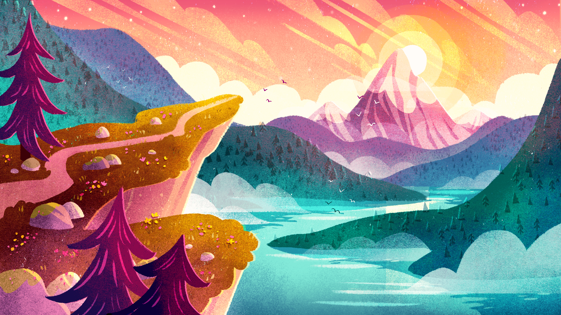
13. Details, Lighting & Atmosphere: Now it's time to push the mood of the scene further with details, lighting and atmospheric effects. So we want to create a glow effect around the sun here. And you can see that to achieve this, I'm drawing a few circles of increasing diameter behind our original sonship. And I'm applying some blending modes to those layers depending on the look I want to achieve. So I'm playing around with multiply and overlay and seeing how those colors all blend together. And know what I'll do is duplicate the original sun layer and then go to adjustments, gaussian blur, and play around with the opacity here. And you can see that's just giving off a nice soft glow. And we'll play around with the blending mode and opacity on that blurred layer as well. So now I'm just starting to block out some of these closed shapes, which is going to add extra atmosphere and interests to my scene. So I can really push the shapes and direction of these depending on the mood that I want to achieve. So if pleased these at quite a diagonal angle to add some more energy and movement into the scene. And I've also drawn some of those clouds in front of that far mountain to enhance that sense of depth. And I'm also using the eraser tool to chip away at these shapes to get them exactly how I want. So then I'll set the layer blending mode to add and play around with the opacity. And now I'm going to raise some sections of these clouds. So I'll select this rise or Texture Shader as my eraser brush. And then I'm just softly rubbing out some areas of these shapes to create a more translucent look while adding a subtle texture. So you can see this just helps to create a more soft and natural feeling. I'm now going to move to a new layer and draw in some reflections in the water. So to start with, I'm creating several horizontal lines at random placements, roughly corresponding to the area below the sun. And then I'll change the layer mode to overlay. And then I'm just going to rowboats and sections of these lanes and make them look a little bit neater. Okay, now I'm going to start a new layer just above my water layer and then pick a dark green color. And I'm drawing the reflections of these mountains in that water. So I'm just taking my time to figure out what sheep these reflections will be and making sure that everything lines up nicely. Then I'm going to go to adjustments, hue, saturation and brightness and play around with the color of these reflections, making them a bit later and bluer than the actual mountains above. And now I'm going to go into those reflections with the eraser tool and just rubber a few sections at the edges here to create a subtle rippling effect in the water. Now I'm going to add some detail to the faraway mountain. So I'm going to create a new layer above that mountain layer. And then I'll create a clipping mask by tapping on the left side of the empty layer and selecting Clipping Mask from this less that's popped up. And that will ensure that everything I draw stays within the pixels of the mountain shape below. So I'm just going to dry and rough shapes here, starting to define a sense of light and shadow on this mountain. So once more I'm just chipping away some areas with the eraser tool and redrawing parts again until I'm quite happy with the effect of these shapes. And by adding shadows here we create a sense of form so that the mountain seems more 3D looking and not completely flat. Then, because this mountainous quite far away and the distance, we don't want the shadows to be two contrasting in terms of value. So I'm lowering the opacity here, which creates a more natural look. And I'll also play about with the hue just a little. I'm going to add a bit of texture to the mountain know, so I'll create a new clipping mask layer just above that mountain and select my textured brush. And then I'm going to draw over the mountain with this texture so that blending mode to multiply and then lower the opacity. I'm also rubbing out a little of that texture at the top of the mountain with the same brush. And again, I'm playing around with the hue there. Now I'm going to add in a bit of a mess defect by creating some clouds low down by the water. So I'm just again blocking out some graphic closed shapes on separate layers. Being aware of the placement of these layers within the Canvas. And I'm also lowering the opacity of these layers to create a translucent misty effect. Next, I'm going to add some soft gradients to these other layers. So I'll begin by creating a new clipping mask layer above the subject, selecting my textured brush again, as well as a dark green color. And then drawing with that texture in the areas where I want to create a soft shadow defect. And then I'll change the blending mode to multiply. And I can quickly play around with the color there as well. Now I'm going to go ahead and do the same thing with my other layers to give them a little more form and texture. So at this point I'm going to get rid of my color rough reference because we're at that stage now where we have most of our colors defined and it's providing a bit of a distraction at the moment. So I'm just going to cross that out there. And then I'll just continue adding various gradients and lighting effects to my layers. So I'm also adding in a lighter gradient coming from below these mountains to enhance that depths and misty atmospheric look. And then I'm further enhancing the glow coming from the sun by drawing on that texture with a light yellow and setting the blend mode to overlay. And then I'm playing around with the hue saturation and brightness. I'm also just playing around with the placement of the sun here too, and seeing what different looks that against me. Okay, so at this stage now that we have a lot of the lighting defined, I'm going to add in a totally agree layer and set this mode to color so that we can check all of our values. So I think this area of the composition is working well, although we may need to create a tiny bit more contrast between those far away layers. However, in this part of our scene, you can see there's hardly any variation in value between these two layers. So we're going to need to change those so we can play around with more shadows or highlights in those areas to create some more contrast. Something else I'd like to do periodically throughout the process is flipping my canvas horizontally. And that allows me to view my composition from a fresh perspective. And I might be able to notice things that my, I had gotten used to previously. So now I can see that this forest texture is not very visible here. So I might bring the opacity of that backup a little bit. So with your own piece, you can play around and experiment with lighting effects and adding shadows and highlights and glowing effects. Maybe try adding some messed if that's the kind of atmosphere you want to go for. But it's going to be specific to the loop you want to achieve and your setting and time of day and weather situation. So just don't be afraid to experiment and try out different blending modes and see what works for you. You definitely don't have to just follow what I'm doing. So it just have fun and play with it and don't worry about getting things perfect. That's absolutely not the goal. The goal is to just use this as a tool to express ourselves and our imagination. And often your piece will turn out nothing like how you had originally pictured it. But that's all part of the fun as well because we get to explore and change path along the way and surprise ourselves with new discoveries. So I'm going to go ahead and speed through the final part of the process and you'll see me making loads of decisions and trying things out that I'm unsure of. And then trying different things and essentially just playing and experimenting and tell him finally in a position where I'm happy to leave the piece as it's, yes. This is a true story. Hi. So here we have it. I'm finally happy with how my whole scene has turned out. And I'm really pleased with the lighting and colors and overall mood. So if we turn our rough layout layer on by itself, by holding down on that visibility checkbox, we can see just how far we've come by adding in all these colors and details and effects. So once you're happy with your scene, then you can just export your piece as a JPEG or a PNG image. And don't forget to upload your project and work in progress sketches to the project gallery.
14. Thank You: Thank you so much for taking the time to learn with me in this class, and I hope you've picked up some useful tools that you can take on further in your drawing practice. I can't wait to see your gorgeous creation, so don't forget to upload your project in the project section below. I would be super grateful if you could leave me a review and let me know what you liked about this class, and that will help other people decide if this class will be helpful to them, and it also helps me to learn more about what to keep doing or improve on for future classes. If you do have any questions at all, or ideas of what you'd like to learn from me next, then you can make a post in the discussion section and I'll get back to you as soon as I can, or you can also send me a message on Instagram if you'd prefer. If you also want to share your work on social media, that would be amazing. If you do, then please tag me on Instagram @Sarahholliday so that I can like and share it there too. If you want to stay updated on my work and upcoming classes, then make sure to follow me on Instagram and also here on Skillshare. If you want to learn more from me, then I have a couple of character illustration classes that you may enjoy, and you can head to my Skillshare profile to check those out. Thank you so much again, I hope you had loads of fun and I look forward to seeing you next time.