Transcripts
1. About The Class: Hello, friends. My
name is Beam Careala. I'm a watercolor
artist and educator. I'm a skill share top teacher
and I work with brands like Silver Brush Limited,
and Schmincke Ackerl. I truly believe that
painting is for everyone. I've taught thousands of
students across the world, and it's my joy
to inspire people to discover and pursue
their creative passion. I really like drawing people because they have a
unique story to tell. Painting people is like
capturing memories and emotions in a
more intimate way. In this class, you
will learn how to paint expressive human
figures in watercolor. I'll share helpful techniques and concepts to portray figures and turn simple sketches to
creative watercolor work. We will start the class with the basic materials that
you need to get started. We'll talk about how to maximize
a limited color palette and a simplified way to mix colors for hair and skin tone. Next, I will teach
you effective ways to make sketching human
figures a lot easier, and then I will walk you
through a step by step process on how to create an expressive
watercolor painting. I have provided a bunch of helpful resources which
you can download for free, such as a reference photo, a copy of the pencil sketch which you can use for tracing, a photo of the final
painting and list of my recommended supplies and discomflts for your art needs. By the end of the
class, you'll be equipped with the necessary
skills to overcome your fear of painting
people and look at it as a fun and interesting
subject to paint. I can't wait to see what you can create, so
let's get started.
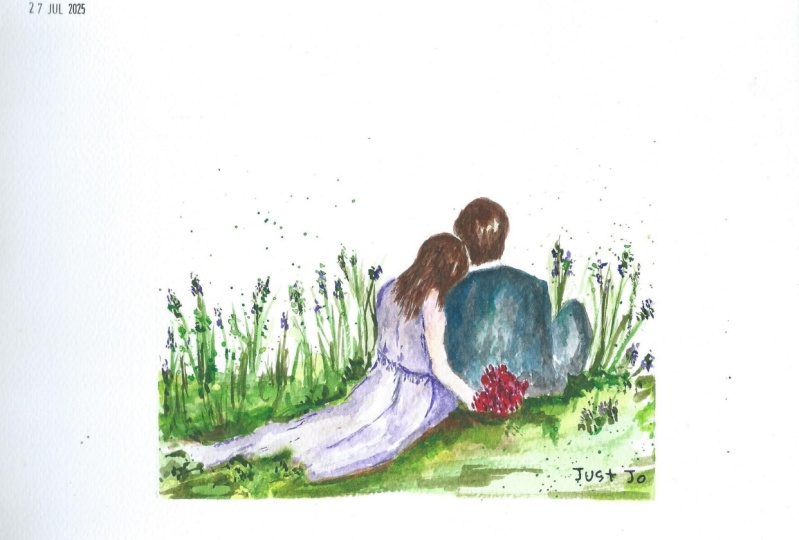
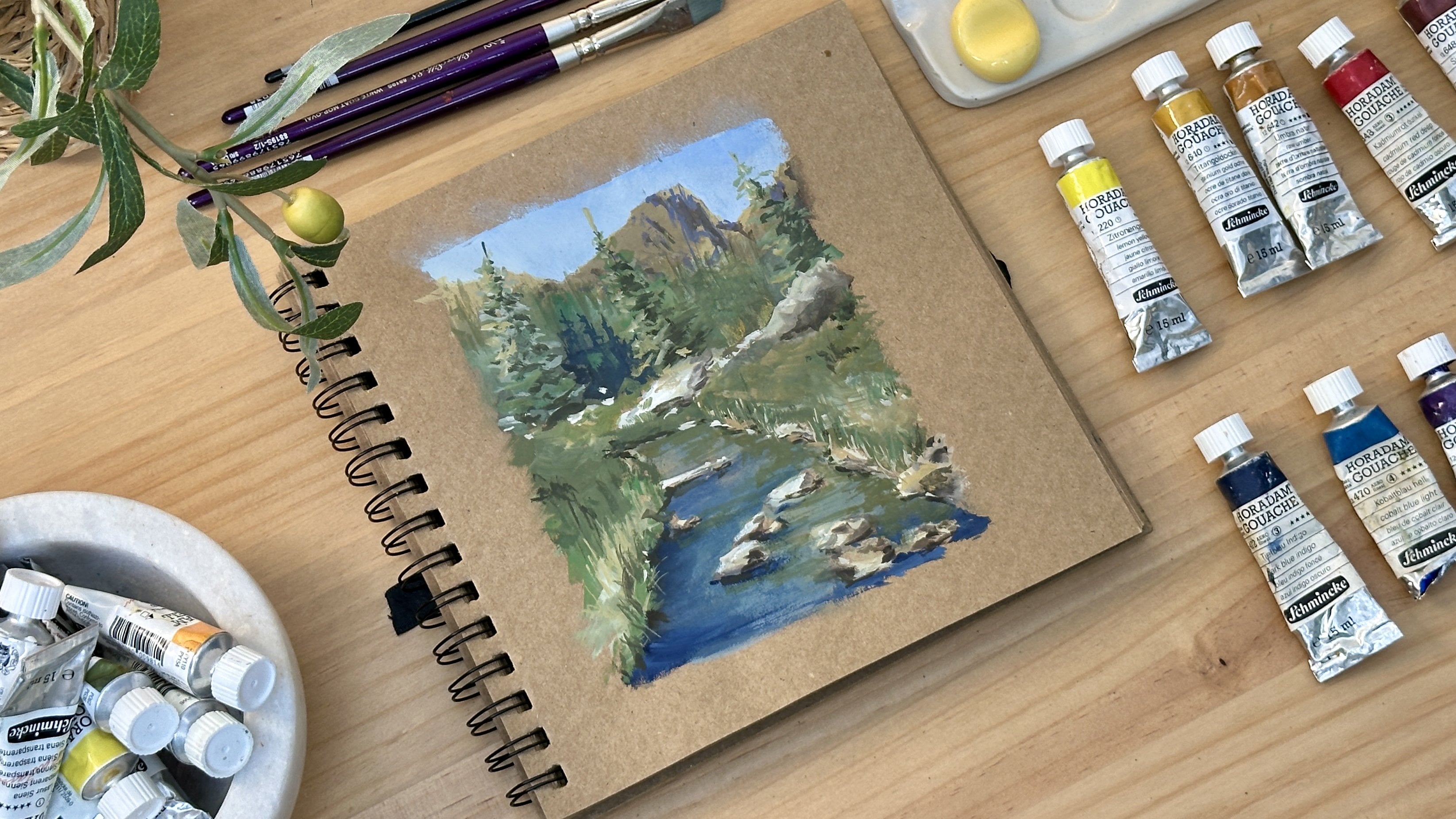
2. Materials: For our class project, you'll be painting an image of a newlywed couple in a loose and expressive
style in watercolor. These are the materials that you will be needing for the class. First is watercolor paper. I highly recommend
to use cold pressed, 100% cotton paper in 300 GSM. The one I'm using is BAOHONG Artists' Grid
Watercolor Paper, and this is 9 by 12 inches. The importance of using this particular type
of paper is that it will enable you to create good layers and
blending of color. Cotton paper absorbs water and paint well, unlike
cellulose paper. If there's one thing
you must invest in to take your painting
skills to another level, that is to use 100%
cotton watercolor paper. For the brushes, I only use two kinds of brushes for
all of my paintings. The first one is this silver brush limited
renaissance sable hair brush in size 10. It is made of pure
natural sable hair, which allows it to absorb
good amount of juicy paint. It has a good snap and
lays colors beautifully. I mainly use this for painting the base layer of
the entire painting. The other brush I'm using is this silver silk 88 ultra
round brush size 10. It is made of
synthetic bristles. It is very easy to control
and has a very sharp tip. It feels like using
a pen when painting, which makes it perfect
for painting details, adding contrast,
fine lines, etc. For the colors, I use
paints from [inaudible]. I always use a limited
color palette, and for this class, the colors I'll be using are; Naples yellow, yellow ocher, burnt sienna, a perylene violet, quinacridone magenta,
cobalt blue, cobalt turquoise, deep-sea
violet, cobalt violet, paynes gray, olive
green, indigo, ice blue. You may use lavender or opaque
white as an alternative. For the color of the hair, I mostly use yellow
ocher and burnt sienna. I add a bit of
deep sea violet or indigo if I want to
get a darker color. For this skin tone,
my base color is burnt sienna then add
a bit of yellow ocher. I adjust the skin tone by
adding perylene violet to it. Other materials you'll need
is a board and masking tape, if ever you'll paint
on a watercolor sheet. If you'll be using
a watercolor block where the sides are glued, you may disregard this. Prepare also a pencil, eraser, two cups of water, tissue paper, and
a spray bottle. I encourage you to prepare
a copy of the reference for your guide and I also provided the photo of
the pencil sketch, should you wish to
trace the image and jump ahead to the
painting process. That's it. Prepare
your materials and I'll see you in
the next lesson.
3. Sketching Fundamentals: Drawing human figures
may seem intimidating, but let me share with you a life hack that will
help you learn to draw, even without undergoing an in-depth study
of human anatomy. In sketching a person, we must observe four things. This will serve as
your checkpoint to get a good and balanced drawing. Number 1 is gesture. Number 2, proportion. Number 3, alignment, and number 4, shapes. Gesture means observing
the movement of the body, the angle of the head, shoulder, arms, or legs. For the reference photo that
we will be using today, we can see that the lady is
slightly leaning on the man. We can also see her right hand holding a
flower behind the man's back. On the other hand, the
man is comfortably seated on the grass with
his right leg bent. As we draw this, we must duplicate this
gesture in our sketch to portray the emotion
in the picture. Now let's talk about proportion. Proportion is when we use
one part of the body as a unit of measurement to draw the other parts proportionately. For example, if we take the man's head as our
unit of measurement to ensure that we can draw his body proportionate
to the size of his head, we can safely estimate
that the upper body is around two times
as big as the head. We can also use this to draw
the woman proportionately by checking the lady's
head is almost as big as the size
of the man's head. Then from her shoulder
to her lower back, the height should be equivalent
to two heads as well. Now when we say alignment, we look at it in two ways. First is using a pen. I also use this to
get the angle of the lady's back and even the
angle of the man's legs. Another way of checking
the alignment is by drawing a connecting line from the head of the
lady going down to see that her hand is
aligned with her head. Lastly, we also look at
the shapes formed by negative spaces to validate the correctness of
angles that we draw. Example of negative
space is the space between heads of the
lady and the men. Here, we formed this shape
and we must compare this to the negative space
we have in our sketch. These techniques have been very useful for me when I sketch. I encourage you to look at these four checkpoints
if you are struggling with having the right proportions
in your drawing. Once you get the hang of it, it will be a lot easier to
alter the angular position of the body parts without the risk of having wrong proportions.
4. Water-Paint Ratio: Now, let's understand the
basic watercolor mixtures. Compared to other painting medium watercolor
is transparent. You make light tones by adding more water with a
pigment and we make darker tones by having more pigment and less
water in the mix. There are four basic
mixtures in watercolor, namely tea, milk,
cream, and butter. For this exercise, I want you to choose just one color so you can better differentiate
the tonal values of this four mixtures. Let's start with
a theme mixture. To create a theme mixture, you create a mix with more water in very small
amount of pigment. You imagine the consistency
and color of a tea. Do this on your
separate mixing plate. The mixture should be very
transparent and watery. Now you see a clean
and very light wash, and this is the mixture. Let's do the milk mixture. The milk mixture is flowy and still has good
amount of water, but the pigment is a little stronger than the tea mixture. Let's move on to cream mixture. For the cream mixture, we create a creamy mix with controlled amount of water and a generous
amount of pigment. You can now see the
difference in consistency between tea, milk and cream. Seeing that the tea mixture
has the lightest tone, while the creamy mixture
has a slightly darker tone. Lastly, the butter mixture. To create this buttery mix, we need a damp brush and then get the pigment
straight from the pen. The look should be
very thick and dry. In application, we
use tea mixture in painting background and elements that we don't want to
get more attention. Milk mixture we use for middle grounds or elements
supporting our focal points. Creamy mixture is often
used for main elements, which is also our focal points. In butter mixture we use for the fine details and highlights. We will appreciate
these principles even more as we apply them
in the class project. For now, I want you to practice this so you will
learn brush control, water pigment ratio, and loose painting using
different techniques. Let's move on to
the next lesson.
5. Bonus Class: Pencil Sketch: Before we begin painting, we'll start with a
light pencil sketch to establish the
structure of our figures. This sketch doesn't
need to be detailed. It's just a guide to help us get the proportions
and placement right. I always like to
start by looking at the general shape
of the figure. In this case, I'll begin
with a man's head, using it as a unit
of measurement to establish the size and
proportion of his body. A simple trick is to
hold up my pencil at the same angle as the
arm in the reference. Next, I'll sketch the
outline of his body, not focusing on details yet, just getting the basic
shape and proportions down. I also pay close attention to the alignment of his body parts. This is important because
if one section is off, like if the torso is too thin or the shoulders
are too wide, it can make the figure
look unnatural. To ensure correct proportions, I observe that the height of his upper body from the top of his head to his waist is approximately three times
the size of his head. Using this as a guide, I lightly mark where
his waistline will be, helping me balance
his proportions before adding more details. Now as I sketch the
edge of his shirt, I observe the curves
and folds carefully. Clothes naturally follow
the shape of the body, so capturing these
subtle curves helps create a more realistic pose. Since we want our figures to look expressive yet effortless, I'm not overly
detailing the folds, just adding simple clean lines. As I draw his arm, I carefully check the angle
in the reference photo, then transfer that same
angle onto my sketch. This helps ensure that
the arm's position looks accurate and natural. I keep my strokes
loose and light so I can make
adjustments as needed. So I constantly
compare my sketch to the reference to keep the
proportions balanced. I continue refining
his right arm, again, checking the angle and
alignment in the reference. Now let's move on to
the woman's figure, focusing on her left arm first. Since the couple is
standing close together, I pay close attention to the
space between their arms, making sure I draw them as close to each other as possible. This subtle adjustment helps
emphasize their connection. I continue sketching
her head using just a few flowing lines to suggest the movement
of her hair. This keeps it looking light and dynamic rather than stiff. Next, I outline her dress using soft flowing lines to guide
the painting process later. Since the dress is
loose and flowy, I don't add heavy details, just a few gentle
suggestive marks to hint at the fabrics movement. As I draw their hands
holding together, I keep it simple and impressionistic
rather than detailed. Hands don't need to be perfect. What matters is that they convey the right gesture
and connection. Now I sketch her right arm, still following the same
method, checking the angle, alignment, and the proportion
with the reference. Finally, to finish the sketch, I add a small bouquet of
flowers in her hand using loose strokes to suggest
the shape rather than the drawing petals itself. Finally, to finish the sketch, I add a small bouquet
of flowers in her hand, using loose strokes to suggest the shape rather than drawing
individual petals or stems. This small detail
adds an extra touch of elegance and movement
to the mposition. Now that we have our
light pencil sketch, we're ready to move on to
the most exciting part, bring this couple to
life with watercolor.
6. Bonus Class: Painting the Couple: For the painting process, I'll focus on simple layering, blending, splashes, and splatter techniques to keep our painting fresh and dynamic. I'll start by painting
the reflected light on top of his head. For this, I mix Turquoise
blue and cobalt violet to create a cool, soft glow. This reflected light adds depth and realism to the figure, making it feel more
three dimensional. Using a light touch, I apply this color where I see the reflected light
in the reference, keeping the edges soft as it blends naturally into
the rest of the hair. Now I mix a rich brown
color using buchena, yellow ochre, and cobalt violet, which darkens the mix. I flatten the bristles of my
round brush to help create a broader stroke and paint the hair with down road strokes. This technique
also helps capture the texture and movement
of the hair quality. To create deeper
shadows and dimension, I darken my mix by adding more cobalt violet and a
touch of deep sea violet. The contrast between the
lighter and darker areas makes the hair appear
fuller and more dynamic. Um, for the skin tone, I use bunchena yellow
ochre and perlin red. This mix creates a warm,
natural skin tone, and I apply this
color to his neck, keeping my brush strokes
light and fluid. To soften the edges, I
use a damp brush to blend the skin tone seamlessly
into the surrounding areas. This creates a natural
transition between the skin and the shirt,
avoiding harsh lines. This is one of my favorite
parts of the process. It helps me loosen up and adds energy and movement
to the painting. A good trick is to
squint your eyes to identify the light
and dark areas. This helps simplify
the tonal values, too. For the shirt, I mix turquoise
and deep sea violet. I also load my brush with
lots of paint and water, making sure it's
fully saturated. I start with a few
controlled strokes to define the basic
shape of the shirt, and then I reload my brush with paint and create a
bold splash of color. Next, I continue painting the shirt with a
light toned wash, paying attention
to the reference. Now I slightly tilt
my board at an angle and drop in a saturated
bluish green color, while the first layer
is still moist. I allow the colors to
blend and flow freely, outlining the shape of the shirt without making it too stiff. For the simpson folds, I drop in darker tones of creamy paint letting them settle naturally into the wet wash to create soft yet
defined folds. Using a very creamy mix, I paint the jeans in
a single rich layer. Then I load my brush
with clean water and splatter it onto the
lower part of the painting. This technique adds
organic texture to the fabric and creates a
beautiful flow effect, making the jeans feel more
natural and painterly. For the arms, I mix the same
skin tone using borncena, yellow ochre, and perylene red. I start with the inner
part of his left arm, applying the color
in a single stroke, then softening the edges with a damp brush to
blend it smoothly. Again, we're aiming to achieve the correct tonal
values in one layer. Now I move on to the right arm, following the same method, laying down a stronger stroke on one side and blending it
out with a damp brush. For the elbow and palm, I dab in a slightly darker tone, adding subtle shadows
where needed. This brings out the
form and structure of the arm without making
it look overworked. Now that we've painted the man, let's move on to the woman. I'll start with
her left arm using the same skin tone as
the man's erncena, yellow ochre, and Perlin red. You apply a light wash, making sure to leave some areas untouched to create highlights. As I work on the right arm, I use the same approach, placing a stroke of
color on one side and softening it with a damp brush to create a smooth gradient. Before continuing
with the woman, I'll take a moment to
add subtle details to the man's shirt while the
paint is still slightly moist. Using a creamier version of
the same mix we used earlier, I paint creases and dominant lines I see
in the reference. We don't need to copy
everything in detail. Just a few well placed lines are enough to suggest
texture and form. Now, let's go back
to the woman and start with a reflected
light on her head. I mix turquoise and violet, applying a soft wash on the top where the light
touches her hair. This gives a subtle
glow and helps integrate the figure with
the surrounding environment. For her main hair color, I use yellow ochre, naples yellow, and a
bit of burnt chena. I start with light loose strokes focusing on building the
movement of her hair. At this stage, I'm not
painting individual strands. I'm simply suggesting the flow. Next, I load my brush with a more saturated mix
of yellow and flick it across the paper to create delicate splatters following the natural movement
of her hair. This gives the
impression of wind blown strands and makes the painting feel
more expressive. To add more depth, I introduce a darker brown mix using
Brncena and cobalt violet. Using quick r brush strokes, I made light and fast strokes, which add texture and layering without making
the hair look overwork. Uh While the hair
is still moist, I softly transition into
painting the back of her dress, allowing the colors
to blend slightly. This creates a harmonious and
loose feel to the painting. Now, I use my fingernail
to gently scratch the surface of the paper while
the paint is still damp. This lifts the
pigment and creates subtle highlights that mimic
the natural shine of hair. As I scratch, I keep in mind the direction and softness
of her hair's movement. To enhance this effect further, I go back in with a
darker brown and add a few carefully placed strokes between the highlighted areas. This contrast helps define the strands and make the
highlights pop even more. Using a synthetic brush, I refine some of
her finer details, but I make sure not
to overwork it, as I still want to maintain that loose and
effortless quality. Lastly, I take naples yellow and gently glaze
over a few areas to emphasize the soft glow of her hair and reinforce the
feeling of wind in motion. For the dress, I mix cadmium orange with a
bit of yellow ochre. I start by painting
the dress strap, making sure my brush is
controlled and precise. Then using my sable brush, I load it with a
generous amount of water and pigment to paint
the rest of the dress. The goal here is to let the paint flow
naturally on the paper, creating a soft airy effect. While the dress is still wet, I take nipples yellow and
drop it into the mix, letting the two colors
blend seamlessly. Since we want a dynamic,
expressive look, I flick my brush
towards the right, creating small
splatters of orange. These splatters
enhance the sense of movement and energy
in the painting. To create color
connection between different elements
of the painting, I add a hint of
green near her hand, where I'll later
paint the bouquet. Adding subtle hints of complimentary colors helps
unify the composition. Now I use clean water to
soften the edge of the dress, allowing the pigment to spread and create a beautiful
diffused effect. I also flick my brush again, splattering pure water
on the damp paint. This creates a special effect where the pigment
disperses unevenly, making the dress appear even
more fluid and spontaneous. To balance the composition, I extended the length of
the man's gen slightly, making sure the proportions of both figures feel harmonized. Next, I paint the
flowers in her hand. Using a rich reddish orange mix, I create loose organic
strokes to create petals. The flowers don't need
to be highly detailed. Simple dabs and dots of paints are enough to
imply the presence. Now I go back to the man shirt, and using my detailing brush, I carefully add
subtle accents and lines to enhance the
contrast and depth. I make sure to keep it minimal so that the painting
doesn't feel too rigid. I do the same for the
woman's wrest adding a few gentle lines to make
the fabric more defined. Then I'll add thin
stems with green mix, trying the bouquet together. Finally, I take my
sable brush and lightly absorb any excess water
from the splattered areas. This helps speed up the drying process and keeps
the splashes well defined. And a few small marks on the man's clothes to tie
the colors together. As a last step, I add a
few final highlights, a soft touch of naples yellow on the flowers to brighten them up. I also make minor tone
adjustments to the skin and hair, adding just a few
delicate strokes to refine the overall balance. And with that, our
painting is complete.
7. Pencil Sketch: In this video, I will show you my process of sketching and
will explain how I do it. I always start at the
general shape of the image. I try not to draw the details at first but focus instead
on the silhouette. I started with the head
of the man then the lady. Notice that I'm drawing
the outer outline first. Doing the man's
shoulder then his arm, then his right leg. Here I'm trying to focus
at the general outline of the couple trying not
to get into details yet. As I draw their
head I keep in mind the observation I
had under gesture. Like the lady
leaning on the man, the angle of the man's right
arm and even his right leg. Next, I draw the
color of the suit just to give me a guide as
to where his head ends. Now I draw the lady's right arm. I checked the alignment
of the arm to ensure I won't make her arm too
long or too short. I slightly made the bouquet bigger than in the
reference photo. I do this to make the
picture more interesting. Don't forget to make any
adjustments or alterations. Now, I will move on to
drawing the ladies back. I refrain from growing the details as it's
quite tempting. I draw the outline of her gown, it's okay if it is not as accurate as the one
in the reference. Remember, the most
important thing is proportion to avoid making
the drawing look awkward. So here I'm just finalizing some portions of
my initial sketch. Erase unnecessary strokes
to have a defined line art. I also still keep
my strokes very light so it won't show
through under the painting. Now, let's add a few lines
for details and also finalize the line art by
darkening some areas. Lastly, I draw some hay
in the background to show an impression of the field
where they are seated in. Our sketch is complete let's start painting in
the next video.
8. Painting the First Layer: My painting process for human figures is this
two layer approach. First layer is for setting
us the tonal value, building color connection, and creating watercolor effects. Then the second
layer is for adding contrast and details to
enhance the painting. Let's start painting. I always
start from top going down. I start with the
head of the man. I mix cobalt turquoise and
deep-sea violet to get this muted blue shade to paint the reflected light on the
top of the man's head. Then a thick branchena
and mix it slightly to my blue to paint the other
portion of the hair. I look at the tone of
the hair and paint the dark ones with branchena
mixed with deep sea violet. I paint the bottom area with
downward strokes and then the other parts with strokes copying the direction
of the hair. If you can note this,
my strokes are very controlled because my brush
has minimal water in it. My paint is a bit
creamy and consistency. I keep my strokes
very light as well, so I won't overdo it. Now, I'll move on to
painting the lady's hair. I'll create a mix between
yellow ocher and branchena. I test the color and see
if I like the shade. I add a bit of branchena so
it won't look too yellowish. I also add some deep-sea violet to my mix to create
a dark brown color. I vary the tone depending
on how I see it in the reference to create
the dimension of the hair. I try to keep my strokes
light and controlled. I continue the
process of building the dimension of her
hair by varying tones, but still using color mix
with the same consistency. I use the same
group of colors and just alter the
ratio of each one, depending on the color
mix that I need. I also try to keep the strokes
very light and gentle. Here, I'm doing dry strokes
to portray her long hair. I flattened my
brush and loaded it with a creamy mix of paint. I do repetitive quick
downward strokes for this. I also top some portions with dark dry stroke so
it won't look flat. Here you can see that I didn't flatten the bristle of my brush, but rather I use the
pointed tip of it to create thin wavy strokes and also
some that being of color. Now let's mix the
color for the skin. I get yellow ocher, branchena and a bit
of perylene violet. The mix is transparent
but not too watery. I slowly paint the
arm of the lady. For the elbow part,
I add a bit of perylene violet as this area
has to be quite reddish. Now I get ice blue, cobalt blue, and cobalt violet to get this lavender shade
for the gown. If you have a lavender paint, you can simply use that color. I start with the back area. I apply paint on
the left side part, then we'll add water to dilute the paint as I paint
the right side part. Here, I'm leaving some
tiny unpainted portions at the back part of
the lady to show impression of the
details of her gown. I'm softening the tone
by simply diluting the paint with a watery brush. Since we are painting
a small picture, it's important to
go steady and slow so we won't make
unnecessary marks. I also added cobalt violet
to my initial mix to create a deeper lavender shade for the shadow
parts of her dress. If I need a lighter shade, I just combine cobalt
blue and ice blue. It's all about
knowing your colors to be flexible when mixing them. I'm trying to play with
the tones by adjusting the amount of cobalt violet
or cobalt blue in my mix. This way we don't just get
a plain lavender shade. I continue unpainting
the dress with a flowy water color mix. To achieve this consistency, I load my brush
with lots of water. I try to create some
effects by flicking my brush for splashes
and splatters. Having these effects
contribute to making your painting look
loose and expressive. The more hard edges
or borders you have, the more stiff or defined
your work will be. Here, I'll just dab
some hints of paints in a milky mixture and a slightly darker tone to
create dimension and texture. I also try to lift
color with a clean, dump brush to lighten the shade of the portion of the dress. Now I'm getting branchena
and perylene violet to control the dress
and at the same time, paint the picnic mat they're on. I feel that the brush is not
fully loaded with paint, so I mix some more paint to achieve a rich color and stroke. The style here is
to make a mark, then soften it with a watery brush to
let the color bleed. Again, I kept the edges loose, but those near the dress have hard edge to define the shape. Let's add a dark of slightly darker tone on the
mat to create more contrast. Now, let's paint the
bouquet of flowers. I first pre-wet the area by
rolling a wet brush into it. Then I dab some pure
paint color and let it bleed in the wet surface to create
the flower effect. I make tiny dots of pink and try not to control the
movement of paint. I also dab bluish
paint around it. Now let's paint the man's suit. I use indigo and paints gray to get a rich dark blue color. I start here on
the upper portion, and then I desaturate
the paint with water on areas that
has lighter tones, like here in the middle part. But here where the ladies
are misplaced I made it darker and thicker because
it's a shadowed part. I carefully paint the area, being careful not to go
over the ladies arm. Since watercolor is a
very transparent medium, we won't be able to hide
or conceal a mistake. As I paint around
the flower area, I left a whitespace in-between. I also darken the color
for more contrast. I add darker color while the
base layer is still moist so they will blend nicely and
create a soft magician. Next, I paint the shoulder
portion still using dark tone with indigo
and Payne's gray. I portray the flower through
negative painting also. I carefully paint the arm
of the man and don't worry, if at this point the body
turn like a one single shape. Remember, we will
add contrast and details later on during
the second phase. The crucial part here is to keep the strokes neat and
not so jugged so we create the crisp edge and put appropriate contour
on body parts. Let's complete painting the man by painting his right leg. I darkened other part
of it for dimension. Next, the fun part, let's paint the grass. I mix olive green and the
leftover brown paint. I do some pressing and quick dabbing strokes to show the texture and
movement of the grass. I also add a bit of burnt sienna to create
a variation of color. I sprayed paint here
in the outer edge to soften the edge and
make the color bleed. Next, I get the dark green
color by adding indigo to my mix to have this dark
tone in the grass area. I shifted my brush to
the round brush so I can create fine strokes
to paint the head. Notice that I hold my
brush further back and at almost 90-degree angle
to paint fine lines. I spray some water with my water sprayer to create a
soft bleeding edge effect. Then I continue
painting the grass with vaguely and
organic strokes. Vary the brushwork by doing dabbing strokes and
thin, shaky ones. On the other hand, when
I paint land area, I press my brush
flat on the paper to create thick and
organic strokes. I add the same strokes here on the left side to complete
the home position. I also spray water on the left side bar
to soften the edge. I splatter some green paints to connect all colors together and I also dab some
green paints here below the gown to
create a contour. One important thing I
learn in painting with watercolor is to
always trust yourself. It is not the lack
of knowledge about techniques that will
make the painting fail, but lack of trust and belief. I also use some
yellow color to add some accents and color
play in the grass area. Lastly, I scratch
this blob of color in the right using my fingernail to create the impression
of grass blades. Let's wait for this
portion to dry, then we can move on to the
second phase of painting.
9. Adding Contrast and Details: Now let's proceed to enhancing the painting by adding
contrast in details. I start with the man's suit. Using my synthetic brush, I get thick and opaque mix
of indigo and paints degree. I use this dark color to
define the shape of the suit. Let's start with
defining the arms side, some spots in the pants, and the dots and
folds of the suit. I continue adding dark
dabs of paint to create texture and contrast between
the suit and the flowers. I want you to take
this step slowly. You don't need to be
in a hurry since we're painting on the dry paper. If you can notice, my
strokes are mostly dabbing strokes and finding ones
as much as possible. I just look at the dark
details and try not to outline everything so I keep the painting loose and fresh. This step is mostly
dabbing of tiny paints. It may look small, but we'll create a
nice overall effect. Now let's define the
head and hair area. I add few strokes to enhance the overall shape of the head. Since the head is
a small fragment, I do a stroke, then spread or flatten it by dabbing my finger. We don't want a too overpowering
stroke on this portion. Here, I'm just adding a
few dots on the flowers and I'm adding opaque mix
of pink to serve as accent. I get paint straight
from the pan to have an opaque rich color that
will serve as a highlight. I use the tip of my brush to make dots of pink on the flower. There's absolutely
no need to be so precise with the flower details. Now I'm mixing a thick mix of lavender to paint the
dark tones of the gown. I use ice blue, cobalt blue, cobalt violet, and indigo to create a slightly darker tone. My mix is slightly darker
than the first layer. Here we are building
the dimension of the dress by placing shadow to show the creases
are full of the dress. I add indigo to the mix for a
deeper color mix if needed. I bought some small
swift strokes on the creases and
folds of the dress. Avoid placing too much of this hard strokes to prevent
overdoing the details. I still do the same
dabbing stroke and then fade it out with a
dab of my finger. I paint that mainly
on the bottom part of the gown and a few
on the back area. Now let's darken the picnic lot. I still use perylene,
violet, and brunch. As I paint over it, I can throw the dress. As I lay the color, I blend it in the initial layer so it will have a softer look. Then here I'm just
adding some strokes of green for the grass
overlapping the cloth. I go back to my
maroon color to paint the other portions of the
cloth on the left side. Let's enhance the cloth
by making it darker. The darker it is the lighter
the dress will appear. That's the magic of
contrasting colors. I darken the spot
a little bit more for added contrasts here and to make the
dress look brighter. I usually place the
very dark tones here in the edge and have them
in small areas only. I get my green paint once
more to add some dots of dark green here in the
rife in some grass. Now, I'll be enhancing
the lady's hair by adding some hints of dark tones in
some dark strands of hair. I do it with a dry
brush so it will look defined and make
the painting pop out. The key in enhancing
the hair is to squint when you look at
the reference photo, check which area is dark and
focus on building on it. Look for the bright
tones and save it. Here, our focus is to
bring out the shape and dimension of the picture
through small strokes. I encourage you to always
check your work from afar to avoid overdoing
a certain part, observe tonal value when looking at your
reference and then paint your picture following
the appropriate tonal value. Get the yellow ocher
and paint over the lightest part of
the hair as highlight. I will do the same
on the man's hair. I start with yellow ocher
and then I will get a dark brown mix using
[inaudible] and deep-sea violet. I follow the direction
of the hair as I do the stroke to make the
hair look natural. Using dark brown mix
that is so creamy, I do quick small repetitive
strokes to portray the hair. Always follow the direction of the hair so the painting
will be visually pleasing. Now let's add a few more
light spots of ice blue in the bouquet and splatter some paints in the
entire grass area to connect the haulers. I also took Naples yellow
as additional accents, both in the bouquet
and grass fragments. I'll add a few more dots here
and there for extra accents and I'll also add
some more here on the left side to complete
the composition, and we're almost done. Feel free to be expressive in your strokes as you
paint this fragment. Keep in mind to vary
the length and make fluid strokes so they
won't look too stiff. This is our final painting.
10. Your Turn To Paint: Your class project. So don't forget to share your painting on
Instagram and tag me at Biancarayala so I can give feedback and share your
work in my stories. Under this class video, you'll see the Projects
& Resources tab. Here's how you upload
your class project. You'll see a green button on the right that says
Create Project. Tap that button then you'll have the option to upload
a cover photo, add the title, and write a little description. You can include both texts and images in the box provided, and once your
project is uploaded, it should appear in the
student project gallery and I can leave a
feedback on your work. I hope I was able to
help you overcome your fear of drawing
and painting figures. Don't be afraid to make mistakes
and keep on practicing. Under the video, you'll
also see the Review tab. This is where you can share what you love about the class. You may leave your
review once you have finished watching
the entire class, just click the "Leave
Review" green button, then you can simply click
your rating from the options. Your sweet and
thoughtful class review is a huge encouragement
to me as a teacher. If you'd like to learn
more about painting human figures in a bolder
and more expressive style, I invite you to join
my Skillshare classes. I have three classes focused on this painting style
where you learn to use watercolor splashes and splatters to create a free
flowing watercolor effect. Thank you so much again
for joining my class, and I hope to see you
on my other classes.
 Bianca Rayala, Top Teacher | Watercolor Artist