Transcripts
1. Introduction : Hey guys, welcome
back to another one. My name is Braden
and I'm an artist. So this is number seven of seven series
set where I'm taking you through and I'm showing you how you can use a
reference photo and incorporate the luminous
method and draw yourself a portrait
that is realistic, one that fits into the proper proportions that we see in the reference photo. And that is easy and
fun and something that you can sketch
out whenever you will. In this one, I'm going to be
taking you through and I'm going to be showing you how you can use that
reference photo. And you can use a compass and
draw a simple circle from there using a sketch pencil and punching in your side plane, your vertical and
horizontal axis, which allows you to
draw your hairline, your brow line, the
bottom of your nose. Once you have those
three lines drawn in, you can then easily
place your center line, which will help you identify
the bottom of your chin. You can connect your chin
to your vertical axis. Once you have the framework of the Loomis head in
place from there, it's just a simple matter of
hatching and crosshatching, which of course I will
show you that we will be explaining it,
talking about it. I'm going to show
you how you can create the illusion of
that underlying form. That third dimension, which is the trick when it comes to drawing anything
halfway realistic. We're going to be going slower. We're going to be
taking our time. I want you to really
focus on your technique. I want you to truly think about how you stack your values, how you hatch, crosshatch, or how you don't, right? And I want you to think
about your line work. We're really talking about
all of these things. I hope at the end of this class, you upload a project
and you leave a review and let us know
what you enjoyed about it. I always like to
give feedback and just check out what you
guys make from our classes. For me, that really kind of
just brings it all together. And especially with this being the last class and
this whole series, I would love to see
how far you guys have come with your technique. If you still have
questions after you've completed the series, then I highly encourage you
search semester creations on YouTube because I have a
plethora of classes on YouTube, everything from how to draw noses and eyes and Loomis heads, to how to draw a bald eagles and Marlin's and whales and
everything else in between. That is what to expect and
hope to see you in class.
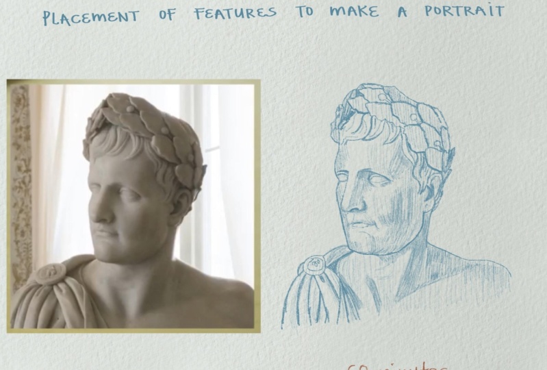
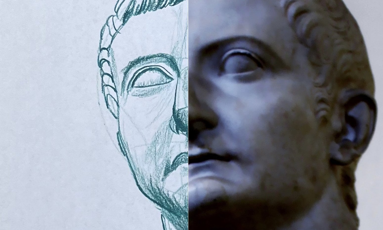
2. Step (1) Drawing out your Loomis Head: Okay, so we're going
to grab our compass, are going to set it to a two. And we're going to place
the compass right, smack dab in the
middle of the paper here. Then very lightly. I'm just going to place
our circle. Okay? Now, first things first. When we look at our
reference photo, we want to consider
the angle of the eyes, which is something
about like this. So once we understand that
we can place our oval here, which of course is our side
plane, side of the head. I'm going to draw
our vertical axis. And then we're going to
place our horizontal axis. Or horizontal axis,
should always line up with the
angle of your eyes. Okay? And then right here I like to put a little
temple plane, right? That helps elongate the circle. There were to pull
over our hair line, brow line, and then the
bottom of our nose. And then once we
have those placed, we're going to identify
our center line, which given the nature
of our reference, goes somewhere right about here. Pull this down. And
then we're going to identify the bottom of our chin, which is
right about here. Then I like to pull down from here, the beginning of the jaw. And then we connect that
to the bottom of the chin. Don't overthink this stuff. Guys were going for a
very general shape here. Very general shape, very
light pressure control. Nothing about the
luma set is finite. It's meant to be a guide, much like a blueprint
when it comes to constructing a building, right? Same type of thing. Then here we're just going
to draw out our robe. And then we have our pin
here for the subjects toga. Something like that. We don't want to get
too carried away with the details of the robes and shoulders because this is
a portrait drawing, right? Okay. Once we have those, what I
like to do is if you look, the reference photo of the
neck actually goes all the way back to the back of the head so we can
pull our line down. Then, using our reference point from the shoulder on the left, we can place our
shoulder on the right. Then we have just some
very basic muscle groups. Then from here, pull
down our cheek plate. And we have effectively
identified our hairline, our brow line at the
bottom of our nose, and then the bottom shin, splitting the face
into equal thirds. So now let's move
on to listen to.
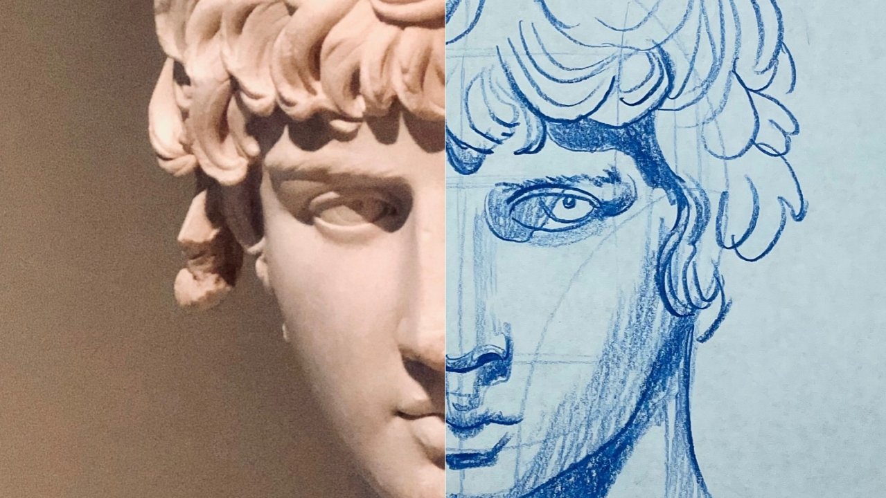
3. Step (2) Drawing your Nose and placing your Eye: Okay, so now that we have or
a luminous had established, here comes our first test. We are placing our futures. Now the way that I like
to do it is I like to draw out my nose first. Once my nose is drawn in, then I can build my
eyes off of the nose. I find that this tends to
help with questions, right? But what we're gonna
do is we're going to pull the nose down. We're going to place
our nostril right here. Notice how the nose
is placed right over the top of our nose line, right? This is the reason
why it's here. So once we have the nose
built-in like this, then what we can do
is we can start to hatch and crosshatch
where need be to lower our values
and bring out the shadows of the nose so that we can start to bring out
that third dimension, right? That illusion of that form. On this piece of paper. We're using a very, very
light pressure control here. We do not need to
push hard at all. The only time that
we will push hard in any of these drawings when
we're sketching like this, is to bring out a certain
thickness of quality to align. Or if we want to strengthen
a specific line weight. Now, remember back to some of the previous classes
in this course. Think back to line definition. Line quality is the
relative thinness or thickness of a line. And so when you vary,
aligns quality, like say from the beginning
of a line to the end of it, you can start to bring out
the illusion of 3D form. Now, line weight is similar, but it's not exactly
the same thing. Line weight is the
strength of a line or how light or dark it
appears on paper. So there tends to be
this correlation, right, between lightweight and quality. The thicker equality. Most of the time,
not all the time. That thicker equality. The darker that line way. Okay, so just keep that in mind. Most of these are going to
be implied lines, right? Hatching and crosshatching
using Sketch pencils. Implied lines are when
you continue a line after a small break, or say e.g. it's pretty much the contrast that you see between a high, mid, and low value. Now this line that I
just placed right here, this is a perfect example of a thick line quality
of a defined line. The opposite of an implied
line is a defined line. Now, define lines are used when you continue a
line without any break, just like I did for the top
of the eyeball right here. Okay. Just like this right here, that's a defined line. What I'm trying to do is
I'm trying to showcase how I is sitting inside the eye
cavity of the skull, right? Then notice this here, see how we're not using every
part of the Loomis head. It's almost like
we're bringing out the face from the luma said
right here's the cheek. And we can run this line all
the way down to the chin. Just because our
original Loomis headline is outside of that. That doesn't mean that we're sequestered to the
original line. And that's one of
the reasons why I said don't worry about getting anything
perfect when you are drawing out your luminous head. The first lesson, because it's meant to
be just a simple guide. It's not absolute and
not by any means. And then we can pull up just
like this. Nice and light. Don't press too hard or you'll end up scratching the paper. One of the biggest things to
keep in mind when it comes to sketching in features
on alumnus head, such as this is
the direction that you're pulling your pencil
across the paper, right? Because that will affect what that underlying
form looks like. A face, much like anything
that you'll draw, very much has a flow to it. Whether it's smooth or rough, it makes no difference because
the muscles underneath the skin of any subject will have certain
rules to them, right? They will be placed
in certain areas. They'll tie into each
other in certain ways. And so it's very important that when you are referring
to your reference photo, that you keep that
in the back of your mind with each and every. Pull and push your
pencil onto paper. And notice here, notice
how I'm going back in. I'm just hatching right over what I had already
hatched, right. You can cross hatch if you will, or you can continue to pull your hatching in the same
direction as you did before. It's really up to you. Both techniques will lower your value and bring out
contrast in your drawing. Then right here I'm just
going to put a defined line. I'm gonna kinda bring
out that knows a little more than here. I just want to lower this value. And this is one of the reasons
why it's so important that you use a very light
pressure control. So you can continue
to go back over spots again and again and again. And you can lower that value if you go into hot and heavy, a lot of times, you might lower the value
too much in a specific area, or you might risk scratching the paper
and that's no good. So always remember,
nice and light. Because you can
always go back over certain areas and lower values and bring out
underlying form. And this is one of
the reasons why with the last class in this course, I wanted to slow down, right? I wanted to go slower and kind of show you and talk
through a lot of this. Because in some of the classes leading
up into this point, I flew through a lot
of the hatching, crosshatching steps for
building up underlying form. Well, let's move on
to less than three. And I'll show you how
to place that mouth.
4. Step (3) Drawing your Mouth & Chin : Okay. So when it comes to using the Loomis head
to dry portrait, you can take this third
section and you go about a third of the way
down and you mark it. And that signifies roughly
the top lip, right? Then you go down
another third of the way and you mark it again, and that signifies
your bottom lip. Now you don't have to split your third section into
thirds if you do not want to. It's simply meant to
be a guide for you, a blueprint, like I
mentioned in lesson one. But the cool thing is, is if you do decide to use it, this is kinda how you use it. You can start in the
center of both of those marks and
that give or take. It's the center of your top
lip and your bottom lip. Now, be careful when
it comes to this part of the drawing because if you look at the reference photo, every single bit of form in this part of the drawing
is very much implied. And if you do put a defined line on the
bottom of the top lip, like what I just did, makes sure that you use a
light pressure control. Because you can always go back over it and thinking
it up, right? Increase that lines
quality if you will. And then from there, once you have that line placed, then you can go in
and you can start to pull up from that line. And that will give you that
form that you're looking for. You can also go into
here and we can start to darken up or lower values immediately under that knows that we can kind of
pull it down like this. Then just like this
right from the line. Just lift up. Nice and lightly. Just lift up. Notice how the light is
casting across the face. This lower lip, we will be placing a lower value underneath the lip because the nature of the shape of that lower lip is getting a lot of light on it. So we don't need to actually
take our pencil and draw. We more or less need
to highlight the lip. This fella here he's got
kind of a bold type chin. So we're gonna make sure
that we speak to that because that lip very much
kind of ties into that shin, right? Just like this. Kind of pull this up and over. And this is one of the
fascinating things about optics, is that when your viewer
looks at your drawing, and this is true for even you as the artist when you're
drawing something, you're eye wants
to see the form. That's one of the reasons
why when you draw something, especially like
this, where you go nice and light and then you can continue to build
up lower values. That form jumps out at you. Alright, let's move
on to lesson four.
5. Step (4) Drawing your Eye & Underlying Form: Okay, so now what I'm
going to show you in this one is I'm going
to show you how to place that other eye, right? We're going to use
a reference point right here about the
corner of the mouth. And this is true for most faces. The corner of the mouth you go up and then right about there, you mark the corner
of the eye, right? And then what we're gonna
do is we're going to build this second eye off of
this reference point. Okay? We're just going to
pull up, bring it over. Just like that. Okay? This is arguably one of the hardest parts of
drawing a portrait, even sketching one out. Like what we're doing is how exactly do you place
that second eye? This is one of the
reasons why online when you see a lot of AI
drawing tutorials, many artists only draw
one because they don't understand or don't want to try to draw both eyes in
tandem with one another. Then what we're gonna do is
we're going to pull this over like this, nice and light. Because again, remember
we can always go over these lines and we
can thicken them up. We can increase that
line quality and we can darken up that line way. I very much just kinda
wanna place this eye here. And then what we
can do is we can start to hatch and
cross hatch and we can start to build up underlying
form in and around the eye. Just start to give it that
form because right now it's just kinda floating in space. Which is fine for right
now, but alright, and so what I did there was I just
thickened up that quality. I'm going to bring
this down right here, x we very much, this is the beginning of
the eye socket, right? The cavity that the eye resides. And I'm just going
to pull this down. Remember that
underlying form, right? You look at the reference photo, notice how it's flowing. Even in low value areas where
there's not a lot of light, the direction that
you pull is still very crucial to getting right. Here. We just want to darken
up the side of the eye here. You don't want to darken
up the whole thing, just, just the sides, right? Because by darkening up
the side of the eye and we have effectively given that eyeball a little
bit of form, right? It looks round now. Whereas before it didn't. Then right here, it's kinda
wanna pull this, this way. Everything that
we're gonna do in this drawing is going to be a nice light
pressure control. This is where we start to get brave and this is
where we really start to sketch out
that form, right? Okay. So that's pretty good. For now. We're just going to pull up like this. Start to bring out the
beginnings of that forehead. Sunlight forehead
goes straight up. So we're going to
sketch it as such. Remember if there's anywhere where you need to
lower that value, we just go over it again
and again and again. No need to increase
your pressure. Let's go over it.
Pull down and over. Cross. Go light right
here, super, super light. And you guys are doing
this. I want you to barely see the streaks that your pencils leaf
on the paper. Okay. Then, right, Harish, right,
right from the lines pull up. We're going to want
this line here, bottom of that jaw where it ties into the neck or it
wants us to be implied. Okay, so it's gonna be a
contrast of values, right? That's the way that I like to
think about implied lines. Is there a contrast in values? Where to find line
is literally you just press hard and pull it or push it and there's a
line right there, right? And I've mentioned this before. But Leonardo da Vinci used a technique in his paintings where he never used
to find lines. What he would do
is he would take his thumb and he would
dab it into the paint. And he would just press the
Canvas. Press the canvas. He would do that over and over and over again
so that he could get a nice blend to the edges of specific
areas of his paintings. I think withdrawing,
it's a little different depending on the aesthetic that you're going for. But especially when it comes
to the monochromatic scale, say if such as black and white, charcoal, Let's say, defined lines are
very, very important. There are artists that will draw portraits without
any define lines. And that's fine. But I do
think that if you play with lines the right way and there's a balance between define
lines and implied lines, your line qualities
and your line weights. I think it can really, you're drawing an
edge and make it pop. Alright, let's move
on to less than five.
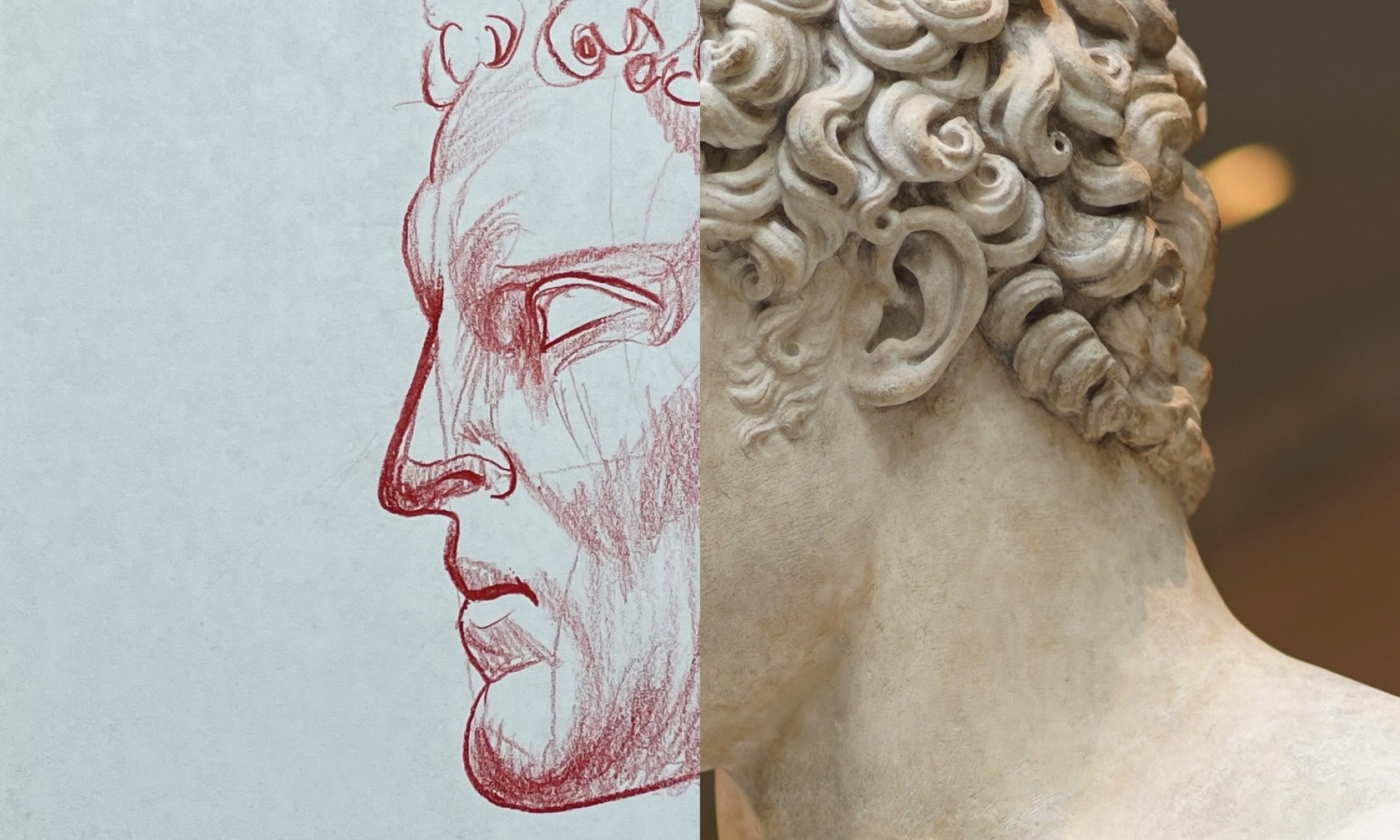
6. Step (5) Drawing the Neck, Shoulder, Hair, & Ear: Okay, So we very much have a floating head right
now. So what do you say? We give him a neck
and the shoulder and we'll even start to give him some hair will give them
an error in this one. So take your pencil just like this and you
start to pull down. Alright, let's pull down. And then notice when we look
at the reference photo, we do have the
neck muscles here. We have a couple
of different ones. And so you can start to play with the hatching and
crosshatching technique, right, like right here,
what I'm doing is I'm beginning to cross hatch. So I pulled from right to left. And now I'm going back over and I'm pulling
from top to bottom. Now you don't have to completely cross hatch a
specific area of your drawing. If you don't want to. If you just want to blend it, like maybe say your sketch and that's not what the
colored pencil, but with graphite pencil
or a charcoal pencil, then you can use smugglers or you can just use
brushes if you will. But if you are using
colored pencils like I am, then this is how I want
you to practice hatching. Because effectively
what we're trying to do is we're just
trying to give this portrait a little bit
of form as far as the subjects toga here
on their right shoulder. And then of course, giving them their neck so that they're not
a floating head. But the big thing with
the toga here is wherever the fabric folds or it's okay to go in and
place a defined line. Because from that define line, you can pull kinda like this. You can kinda tie
it into each other. Because there's different
layers to it, right? The light strikes that fabric in different ways so you
can pull up like this, see this, hatch it
straight up from the line. And then what that does is that it effectively blends that define line that you originally
placed on the bottom. And then you just leave it
alone on top if you want. And then that way you
have a really nice blend from a lower value to a
very high value on the top. And that showcases form. Alright, Well my pencil is
getting a little short. So what I'm gonna do
is I'm going to place it in my handle here. And now what we're gonna do
is we're going to start with the beginnings of objects crown. And then what I'm gonna
do is I'm going to draw out the hair as well. This is one of the reasons
why I'm starting you guys on a course where all we're
sketching out our statues. When it comes to statues, it's not so much about the detail that you can
convey in your drawing. It's more about the form
that you're able to convey. Form and proportion. Proportion is the single
hardest thing to convey. And a drawing,
especially a portrait. But if you can get
your proportions down, then you can implement
your features. And then once that is done, then you can start to
worry about detail. But with these statues, obviously there's
not a lot of detail. You're going to be
spending the majority of your time once you have drawn out your proportions and your features shading, right? It's very much a value exercise. And say e.g. the hair in this
specific reference photo, it is more form and proportion
than it is details. If this was a photo
of an actual person, there would be many, many more steps that
we would have to go over to make sure that we were able to bring out all of
the details in our subject. But here we can relax. We don't have to
worry about that. We're just going to
focus on the form. Now notice how I'm drawing this. When you're looking at
your reference photo, anywhere where there
is a low value, right? In that form of the
hair with how it lays. That is where you should be
placing your define line. Now, from right about here, the corner of our
bottom right quadrant, we can draw out the outline. The basic two-dimensional
shape of our ear. We're going to use
our reference point from the bottom of the nose. We're going to pull that over. And that is going to be the
bottom of our ear lobe. Okay. This is one of the reasons
why that side plane with your vertical and horizontal
indexes are so important. Here we are halfway through
this drawing and we still have a blueprint, right? We still have that Loomis
structure that helps us place our features in the
proper proportion, right? The eyes to the mouth, the mouth to the nose, the nose to the ear, and so on. Now from here, what I'm doing is I'm looking at
the reference photo. I'm just going in and I am shading any parts of the ear
that have that lower value. I've mentioned this
in other tutorials in other classes within
this drawing course. That if you just focus
on your low values, first, those mid and high values tend to take care of themselves. Because when you punch
in your lower values, what you're doing inadvertently
as you are bringing out the contrast of
that value scale, alright, because the
paper itself is already the highest value,
it's complete white. Then what you're doing
is you're going in and you are bringing
in a lower value. Eventually a black. And black is the
opposite contrast to white and vice versa. So let's move on to lesson six.
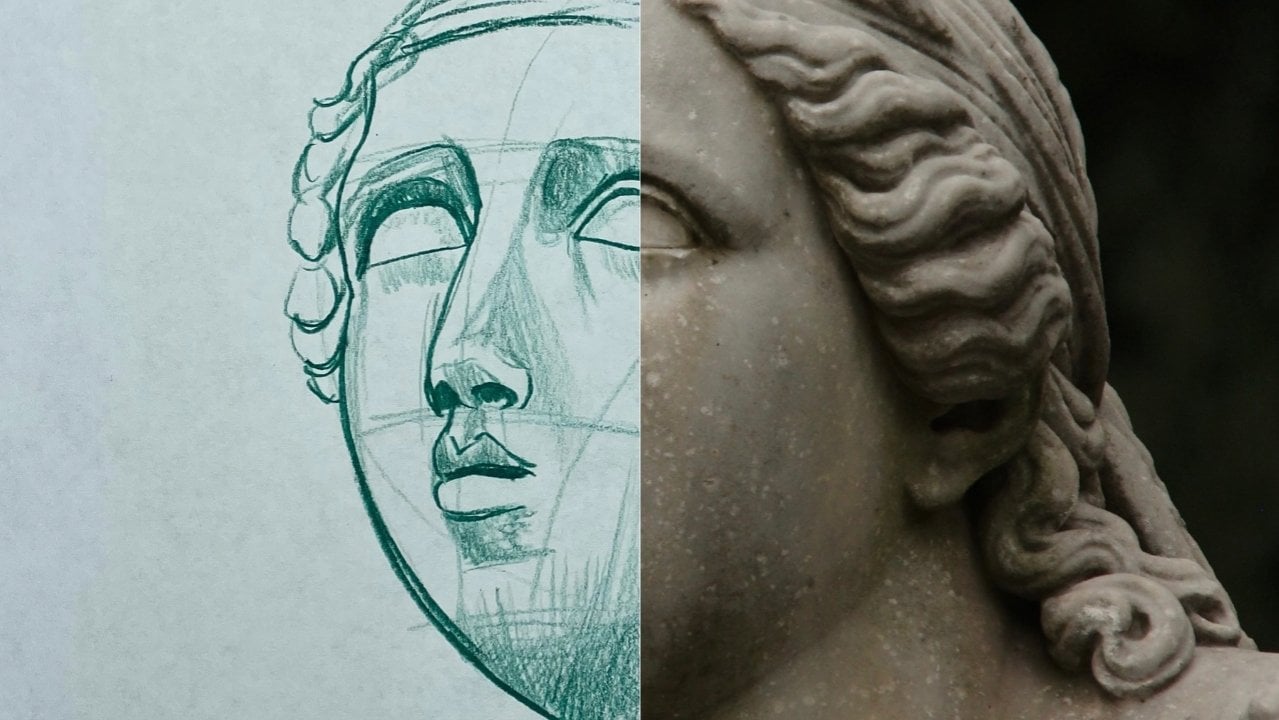
7. Step(6) Drawing the Head Gear, Layering, Linework, & 3D Form: Okay, What do you say? We get this headgear drawn out? These these leaves, these
individual leaves drawn out. And this is how I want
you to tackle this, okay? I want you to go one leaf
at a time. Nice and light. Don't overthink it. Just really, really focus on the
proportion of each leaf, the other leaf, the one
that you just drew before. Okay? Pull this up. I'm going to up and over. And notice, notice
how each one of these leaves has a
thickness to it. Almost like a potato chip. It's got a unique
thickness to it. So when we draw that first line, eventually that's going to help us draw in our second
line and really give each leaf in this head gear the right amount of form. Like a little pin here, some place that right here. And then see just like that, there's the lipid that gives our leaf really nice thickness. Okay? Alright. There was really only three portraits in this series that had any
kind of head dress at all. There was the reference
with the flowers, and then there was a couple
of others that head bands, but I wanted to do one
that was a little bit more complex so that we could build our confidence
around headgear. Most of the time when
you draw a portrait, especially for like
say, a commission. The subject in question
probably won't have any kind of
headgear whatsoever. But on the rare
occasion that they do, you'll definitely have some
experience in that regard. So within here we're
just going to pull this over just like
that. Nice and light. And then I'm going to
show you how we can add detail to this headgear. And that'll really make the
contrast come out in it. And I'll show you how
you can add detail, even with sketching, with
a simple colored pencil. But as it stands right now, we're just going one leaf at a time. Something like that. We have for a third pin. Right about like this. This head gear is also
going to be a very, very nice test to kinda show you exactly where we want
to place our lower values. And by placing our
lower values of the way that I'm going
to show you how. You'll see how we can
showcase the illusion of those leaves laying on
top of each other, right? And of course that'll
bring out that, that third dimension
that we want. But first things first
is that we want to draw out the basic shape of
the head gear in question. Just like this. Pull this down arrow here. Okay? So what we're gonna
do is for texture, we're just going to
hatch it just like this. We're going to pull one
way. Just like that. And then what I wanna do
is I want to thicken up. Some of these line quality
is not all of them. Just the lines on the inside. Let's pull up like this. Hatch this with the leaves. I want you to play
with it, right? I want you to mess around
with your line weights. Because when you look at the whole reference
photo next to the toga on the shoulder, the hair, and then the
leaves and the head dress. The head dress itself is
going to be where you have the most opportunity
to mess around with those different line
qualities, those line weights. You can play with implied lines and you can
define some of your lines. All of the things. And I probably should've
mentioned this earlier, but the lines that we just drew out before we
started hatching and thicken it up the
line quality is on this head dress or
what by definition, they call contour lines. Contour lines are pretty
much what they sound like. They are lines that
show you where an object ends. By themselves. They will only convey an object's basic
two-dimensional shape. But now what we're doing through adding detail work
and then messing around with those different line qualities in line weights
is we're starting to bring out the form of
each one of these leaves. And now with the hair, we're able to do very much
the same type of thing. This is one of the reasons
right here why I'm a very big fan of
sketching out statues. Because if you can
walk away from a series or a study where you have drawn just statue
after statue after statue. I guarantee you that
even if you don't feel completely confident in
yourself, at the end of it, you will have a much better
understanding whether it'd be consciously or subconsciously
of what it takes, what kind of technique
it is that you want to use based off of your
medium of choice, whether that's
graphite, charcoal, colored pencil, what
have you on how to convey the illusion of
three-dimensional form? Because not only do
you have to do it, what that underlying form of the muscle
structures in the face, but you have to do
it with the hair. You have to do it
with the robes, with headgear, all of
the things, right? But don't get overwhelmed
by these leaves guys. It's the exact same thing. Take your pencil, hatch it, just pull it the full
length of the leaf. And then refer to
your reference photo. And just like I'm doing
here, right here, I'm going through and I'm just looking at the reference photo and I'm lowering that value. Alright, i'm, I'm, I'm lowering that value anywhere
that I need to. Typically, with the way the light is striking
the reference photo, it's going to be where those
leaves converge, right? The pockets of where they
all kind of tie into, that's going to be where
your lowest values are. Then here on this side, I'm just gonna go
through and I'm gonna do the exact same thing that I
was doing to the other ones. Albeit it's kinda hard
on this side to see that same type of
texture in the leaves. But principally they're
the same. Just like this. Then here we're just
going to continue to bring out the hair. But like I said, when you
look at the reference photo, the way the hair kinda clumps together and that
lays on the forehead. That is where you want to
thicken up your line qualities. You don't want the
line quality be the same throughout there. You want it to vary, right? Certain sides of their, we'll have a thicker
quality while the other side has hardly
inequality whatsoever. And that is that
variation that you want. So let's move on to
the final lesson.
8. Step (7) Final Thoughts & Details : Okay, final lesson. Now, for the most part, we've laid out everything
that we would want to lay out as far as its
proportion is concerned. So this is where the approach
gets really subjective. There are lots of artists that like that soft look, right? And they liked
that implied look, much like Da Vinci. But it's important
to understand why defined lines exist and
why implied lines exist. Much like anything in life. I believe there is a balance. You can have the
best of both worlds. And I think that you are
drawing will be better for it. At the end of the day, art in and of itself is
meant to be subjective. You're never truly wrong unless there is a specific
method that you are trying to replicate it because then all
of a sudden you're prescribing to a
specific approach. But in this case, what we're doing the
way I teach is I very much like to let you
know of everything. And I like to show you
bits and pieces of things and show you how
they could work together. And then of course, what you do from there depends entirely on you and what is
satisfying to you. Because let's face it, when
it comes to aesthetics, what is pleasing to my, I might not be pleasing
to your eye, right? Even though they both might be beautiful in their own right. So what we're doing here is I'm just going
through and I'm showing you how you can continue to hatch over what you have already
hatched all the while. Keeping in mind that
underlying form. Because the whole reason why we are hatching like this is to increase the contrast that we see in the value scale
for the drawing. So there are areas of the
drawing that our pencil, it hasn't even gone over yet. And those are the areas
with the highest values. Hatching in its own right has an aesthetic that some
people deem as messy. I don't think it's messy at all. And of course, just like
most mediums in art, the more you go over it, the more you refine it, you know, the
smoother it becomes, the more put together. It seems like the shoulder here, e.g. I'm just going to hatch
it just like this. Then what I'm gonna do is
I'm going to cross hatch. It will go back over it. But the opposite way. So rather than going
top to bottom, I'm going left to right. And you can continue to hatch. If you want or not.
It's really up to you. But notice notice how I
hatched vertical up and down. And then I went
left to right, and then it went up and down again. You notice what
happens to the value. It decreased, right?
It went down. We lowered that value. And of course we have a
shadow here that kinda comes off of the toga. But all the while,
even when you're hatching and
crosshatching like this, it is important to remember that underlying form
because that is what effectively
we are trying to convey when we draw
like this, right? Okay. So what we're gonna do
is I'm going to show you how we can just
continue to hatch, right? Remember I didn't want to put
a defined line on the chin. What I wanted to do is I
wanted this to be very much and implied type of form. I want that chin to seem like it's protruding
out past the neck. I don't want it to appear to the viewer ligands
on the same level. And even when you're dealing
with portraits such as this, your viewer wants to be fooled. They want to feel like they're looking at something that they
could reach out and touch. Like something that actually
has form even though they know for a fact that it doesn't. This is one of the
reasons why the more you hatch and crosshatch and blend. Those different
hatchlings, say e.g. if this was with charcoal, you could take a brush
and you could brush over the areas that you had
hatched and cross hatch. Know what would happen
is that charcoal would effectively be blended
into the paper. You would bring out a very
nice gradation, right? You'd have a blend across
your different values and you would mess with the texture of the drawing and
make it smoother. But the way I'm teaching
with the colored pencil, I don't really have that luxury. And the only thing
that I can do to smooth out my gradations is go over them again and
again and again. Different mediums color for different techniques to
accomplish the same thing. Just knowing which one you're
using and how to get there. But notice how I put that define line along the edge of the face. You don't have to do that
if you don't want to. But I'm showing you the difference between
implied lines in certain areas of the drawing and then define
lines and others. But the cheap muscle
and the jaw muscle, it's important to
understand basic anatomy. You don't have to understand the Latin terminology
for every bone. But it is important to
have a general sense of human biology, at least when it
comes to the face. It's not until you start
getting into drawing full blown figures
of individuals, whether they be for cartoons
or live action portraits, that you have to really start to increase your
understanding of biology. The biggest thing is
just have fun with it. The more you think, the more stressed
out you'll become. Just have fun. Remember, one of the principal
pillars of how I teach. That is the perfection
doesn't exist. And even if it did exist, why would you want to
accomplish it if you ever do reach perfection
in your craft? I asked you this question. What else is there? When you peak? When you arrive? You
have nowhere else to go. Something to think about. I don't claim to be the
best artist in the world. But I do claim to have
fun while I draw. And you should too. Why
do anything in life? If it's not fun? But all we're doing here. So I'm just going through and I'm just continuing to work
on my gradations, right? And that's
what I'm doing. Notice how with every
poll and push of my pencil over my current
strokes onto the paper, I do get a smoother transition, a softer blend between my low values and my
medium to high values. And this is one of
the reasons why I wanted to slow
down a little bit. And I wanted to
have this class be doubled the length of
most of the other ones in this seventh video series
is because I wanted you to see that if you
just take your time, go a little slower. Pause the class as
you go through it, that you can really
start to play with these and you can
build your confidence. That's why I'm coming
out with these videos, is because I want you to
have confidence, right? Because when you're
confident in something, especially when it
comes to a craft, that helps you create
even more, right? I'm just going to put
some defined lines right here. Why not? I really want these eyes to pop or so artists
that won't like that, but I don't care.
It's my drawing. Always have fun.
All right, guys. Well, that was pretty
much it for this series. I hope you enjoyed it. I hope you leave a review and I can't wait to
see your projects. Stay happy, stay healthy. And remember, never
stopped drawing.
 Messer Creations, Artist | Author | YouTuber