Transcripts
1. Introduction: In this course,
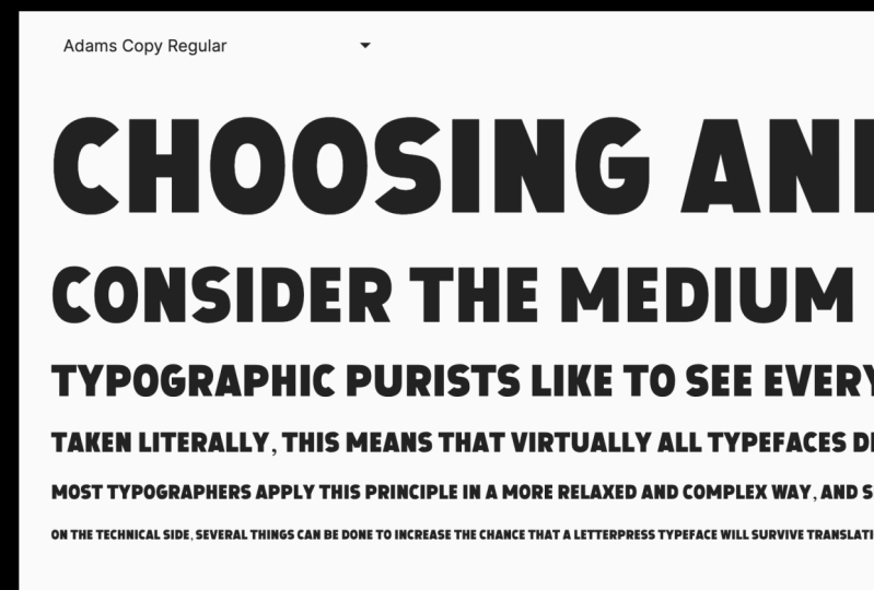
we're going to make an uppercase san-serif fonts. My name is Adam. I'm a
brand designer and I also have an independent
type foundry. Ten years ago, I
started making fonts. It was after watching the
Helvetica documentary where we saw all these
foundries and people who were type
designers talking so passionately about fonts
and how they make them, and what inspires
them to make fonts. And that triggered
something in my head. I suddenly thought I
could also make a fall. Under my foundry cold type car. I've created probably
around 20 fonts are far. And these range from geometric
sans to brush types. If you go and check out
my profile and you'll see some links to those there. If you're a graphic designer
or a lettering artist. And in font design to your skill set is a really good addition. This course is for
anyone who's new to the glyphs software
and new font design. Together. Whilst we're
building our font, we'll go through
the glyphs software and learn how to use
the basic functions. So by the end of the course, you'll have a really good
grasp of how glyphs works, but most importantly,
you'll know how to make a font pink lifts. The goal is to give you a
good intro into glyphs and to get you started on your
journey, it's a font design. So I hope you'll join me.
2. The Project: Amen project is to
make a font and we're gonna do whilst we're learning
how to use glyphs three, as we learn, we will
be building our font. Once it's built, what better
way to show it off than to make a typographic poster or maybe even a set of type
of product busters. What I'd like to see
in your posters is, how does your work, how does it look, feel, and act? We'll break this class
into easy sections. We're going to start by
sketching and planning our font. Once we've got that sorted, we will set up our glyphs file. Then we'll start making
our main character set. Moving on to numbers
and punctuation. Without full character
set in place, we'll look at spacing and
kerning and then onto testing. Once we've tested and
export, That's it. We're done. We've got
our full font in class. Follow along with each lesson. If you want to make
the exact same style of font that I'm making, or if you're feeling
a little bit more adventurous, create
something new. I'd love to see what
you come up with. Remember to download
the intro part from the resources
section below. I've added some cheat sheets and that will really help you get started with
learning shock keys. This will help you speed
up your process now and I'll try and refer to
those keys as well as we go. Don't forget to create
a class project. Show us that new font
that you've made shows the typographic posters
showing off your font. I'm really excited
to see what you've done. If you haven't already. Let's get glyphs three
installed at the moment, there's a 30 day free trial
available on the website. And let's get ready to mx dot
3. Sketching and Inspiration: Before we start
designing our form, Let's gather some inspiration that could be from
type design books, or it could be from
magazines or type specimens, or even just anywhere on the
Internet that you've seen some nice topography
and do some sketches. Knowing where you
want your font to go and how you want
your font to be used is gonna be a huge benefit when we're
actually designing in Glyphs. There's an intro pack
available for you to download through Skillshare. The intro pack, you'll
find a sketchpad template with metrics lines
already on there. You'll also find a glyphs file, which is pre-med with all the characters that
we're gonna be using. And you'll find
glyphs cheat sheet with all the shortcut
keys listed. So get sketching and
when we're ready, we'll set up our first font file
4. Setting Up Our Glyphs File: Let's start by making
our glyphs file. First, we'll choose New File
and scroll down to Latin. So an unprepared glyphs for check basic and create a file. This font will be
uppercase only, so we're going to
remove the lowercase. In the left-hand panel. You can go through
all the characters that you want to
add to your font. In the intro pack download, you'll find the
glyphs file all ready to go that's been
prepared for this lesson. If you open up
Eclipse template from the intro pack, this
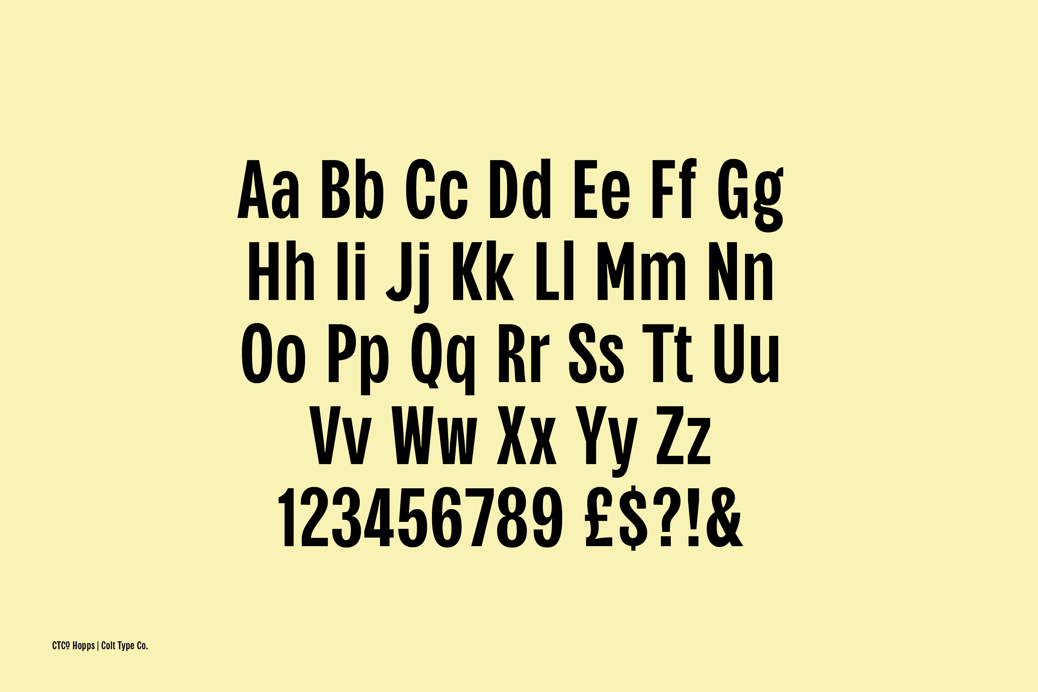
is what you'll see. Let's give off on them. The information panel. I think alcohol it Adam's sons. The units per m will keep thousand version is just as
you change the new version, make sure to add a y-axis
and update features. On the masters. We can
see our master name. Ours is regular. The way we're going
to change to 400. And you can also see
our metrics values. For this point, I'd like to use an overshoot value
of around 16 units. For each metric. They'll be a border or a margin. 16 units. For the overshoot. There are lots of
plug-ins for glyphs. And one that I can't do
is show stem thickness. So if you go to Plug-in Manager, you can scroll down or search
for sure stem thickness. And then click Install. Obviously I've already
got this installed. So once you've installed it, restart glyphs and it
will be activated. And what's your stem thickness
does is it gives you this visual of how stem is a section. For this one, you can see
that this is 146 units wide. You could use the rule at all. But this is an extra thing that you've got to turn
on and turn off. Whereas the shore stem
thickness tall is always on. And it just makes life
that little bit easier. If you can't see the Schar
stem thickness working. Just go to View and then turn on Show stem
thickness under View. Now let's set up our
file and with it saved, we're ready to go and
the fun stuff starts. So in the next lesson, we're gonna be looking at
making our square glyphs. Remember if you get
stuck at any point, I'm available in the discussion
panel on Skillshare. I'll see you in the next lesson.
5. Drawing Square Glyphs: It's good to group
glyphs by shapes. We have rectangles,
circles, and triangles. The reason we group them
is because we'll be using elements from those glyphs
to remake other glyphs. You should always try
and start with a hedge. It establishes width,
height, and stem thickness. Will find that the stem from the hedge is the
piece that we're going to be copying and pasting into new
glyphs most often. For this one, I'm going to
use a stem thickness of 160. I'll duplicate this stem to create both
sides of the hedge. Using the arrow keys and
the stem thickness tool. We can space our
stems perfectly. Now let's add the
horizontal stem. This will be slightly thinner
than the vertical stem. For optical balance. The vertical stem is one-sixth, so I'll type in 150 for
the horizontal stem. Using spacebar, we
can preview the ship. Now we've made the hedge. We can move on to making the eye and other
square characters. Let's copy this stem
from the hedge and we'll use that to make our eye. Now we'll make that E, F and L. F and L shared most of the
characteristics of the knee. So we'll start with an a.
Again, using the hedge. We'll use the hedge stem and the horizontal
bar from the hedge. We'll copy that n to the e to see if your node is perfectly in
line with the metric line. And it will show either
a circle or a diamond. A circle means that it's within the boundary of the overshoot. If it has a diamond
is perfectly in line with the e looking good. We can now use the elements from the E to quickly make
the F and the Al. So that's our hedge, E, F and L mad, all that's left is a T. T uses the exact same principles as we've made for
everything else here. So I'll leave you to
make a t on your own.
6. Drawing Round Glyphs: To make our round letters, we're obviously going to
start off with the 0. And to find the width and
thickness will use the hedge. Using the hedge as a
guide, I'll make an oval. For optical balance, it's likely that your round letters
will need some overshoot. And this is where our 16 points of overshoot comes into play. Now, I'll duplicate that shape to make the counter of the, oh, I'll resize it to make sure that all
the widths, or even selecting both parts of that. Or I'll cut the shape using command and X and paste
that back into our glyph. The curves on are at
the moment download the best fit curve really helps
to even those curves out. The idea behind
the fit curve tool is that it uses a
percentage scale to change the amount of
curve between two nodes. Using Control, Option, Command
and numbers one to eight, you can change the value
of that fit curve so it corresponds to the dots underneath the percentages
on the fit curve tool. We have a little
problem with the Earth. It's filled in,
and that's because the path directions are wrong. We can see this by the arrows
both pointing to the right. An internal should go clockwise. An external should
go counterclockwise. There's a couple of ways we
can fix the path directions. The first way is to
select the path. Right-click and reverse
selected contours. Or we can select all
paths in the glyph. Go to path. And correct path direction. I prefer to use correct
path direction. I think it's best to let glyphs determine which
path should run, which we're now onto the sea. Let's bring that
in as a component. I'll decompose the 0 and cut a section from the air
to form our C shape. Let's make the
queue. Once again, we're going to add
that as a component, but this time it will stay as a component and we
won't touch it. All that we're going to add
is the tail of the queue. Keeping the component or means that if we make any changes to our original or those changes will also be made in the queue. Will start with the
C to make our G important it as a component and decomposing it once again. We can take the
horizontal stem from a hedge and place
it into our GI, our line everything
up and just make sure that it's all nice and
neat and balanced. Using the fit curve tool to keep the consistency all those curves
7. Drawing Triangle Glyphs: In this lesson, we're gonna be looking at triangle letters. For me, that is a, V, K, M, N, and W. I like to start off with an
air for my triangle letters. I'll copy and paste the
stem from the hedge and then skew that into the
perfect diagonal shape. Using the hedge as a
reference for width. I'll move the stem
of the air into the correct position
and duplicate that, and then flip it horizontally to create the
other side of the air. When putting two lines
together like this, the top can look a little
fatter than the bottom. So we bring it in at
the top to make it look more balanced and
a bit more even. I'll use the bar from the
hedge to make the bar on the air and just put
it into position. The air looks a little thin. So I think I'll move
those outer lines further out and reduce the
width of the bar. I want to keep the
triangle section of the air as neat as possible, but I still wanted to have
some control over it. So I'll join the two
pieces together. But with this node
in the middle, I want to be able
to independently control the left
and right angles. And as you can see, by
just having one node, that's not so easy. So we can use an
open corner like this to just move one section at a time
or one line at a time. This is rarely
useful for corners where you're having to
move stuff quite often. It means that you
only move one part rather than two parts. I want this section to be
exactly the same as the V. So I'm going to make a
component from this piece. So if you select it and then go to component from selection, and then call it something that you are going to remember. And that creates a new glyph. Then if we go to
our V, we can add this new component into glyph. Then select that and
flip it horizontally. There we have our B
because it's component. If we want to change
anything for the air, is also reflected
in the way I like to have them LinkedIn that way. Just so there's consistency
between those two characters. For the W, we're going to use the same component as
our starting point. But instead of using
the component as it is, we're going to decompose it. So we've got these two
components in here now, but we can't move them
because they're taking the values from
our initial glyph from that component, Glenn. These components are set to automatically align if
we want to move them, we need to disable the
automatic alignment. If we right-click and go to
disable automatic alignment, that will give us full
control of movement. So we could just put
them together like this. But our font is quite narrow. And so this wide version of w would look odd
and out of place. So what we're gonna do
is decompose this and squish this n. So it looks more in keeping with the type
that we've already made. Next, let's work on m
and n. I'm going to use the hedge to make the
width of the end correct? Answer. Create the
diagonal section. I'll duplicate it,
one of the stems and just move over the nodes. This will want to be thinner. So I like to just move the
nodes in a little bit more. I think that looks pretty good. So I'm going to copy all
of this and use this, the majority of them. But obviously the amnesic
be a little bit wider. Not too much wider there. We've just gone
outside of the margin. So let's just put some positive margin in there just to make sure that
we can see what we're doing. I'm going to use
that middle stem, copy it, paste it, and then flip that
horizontally and place it. Just, and that's what that
check where everything is. Then I want to merge
this together. Take out those two
nodes at the bottom. Just to make our M shape and add in an open
corner there again, it's always good to add in
an open corner where there's a section like that. It's looking a bit
wide, so I'll just bring it in a touch. The cash should be
relatively easy. I'm going to start off with
the I don't need the dy. Just take the stem
and the leg of the R. And we're just going
to use that for the care. You can see that the majority
of it is already there. Just me, move this piece
up to about the center. Select all, copy, and paste it, and then just flip that
vertically or horizontally even. Pastime place. Really good-looking care. I'm pleased with that.
To finish this off, I'm just going to
merge those two pieces together and add in
that open corner. Move this in. And then we'll
move that one in as well. Just so it looks like
it's really connected. We're making really
good progress and we've only got a
few letters left.
8. Drawing Hybrid Letters: Next up is hybrid letters. This is where we
combine elements from our square glyphs
and elements from our round lifts to make
some square round glyphs, such as a, D, P, and R and B. I'm going to start with D and using
sections from i, and we'll create that D shape. I'll copy and paste
that i stem into the D. And selecting only the
right-hand nodes from the 0, copy those, and paste that
into the D glyph as well. With those in place,
I'll realign them. We don't need overshoot on a D, just need to make sure that
those are perfectly lined up. Again, using that diamond
shape as reference. Will do that for the top
and of course the bottom. Then we need to
extend this shape on the right to make it into a solid shape at the
moment, it's not connected. So we need to make sure
that it's connected. And we do this
with the pen tool. And that's using
the P shortcut key. And just make some lines
and connect that shape up. I'll do the same for the bottom. Select in the first node and then joining
everything together. And you can see that
that ship has now become a full shape. When it's filled in like that, you can see that it's
everything's connected up. That's our D shape. With just a little bit of
tweaking will make sure that everything is nice and
balanced and the correct way. From the D, we can
then make a pea shape. I'll copy and paste
the D into the p.ball. I'll select this curve and re-scale it to create
the curve of the p. I'm using the arrow keys up and down to make all
those widths, correct? This is where the shore
stem thickness plugin comes in really
handy because we can see all those thicknesses as
we're moving those nodes. We don't have to turn on
another tool in order to see that with a bit more tweaking and refining of those nodes. And we're ready to make that. Essentially the R is
just the P with a leg. So we'll add the p. And then drawing. I like, I like to use
the rectangle tool. And then just select
the bottom two nodes and drag those out. You and J, I'll make
from the hedge. Starting with you, I'll copy
this stem from the hedge. I'll copy the plus
that enter the EU. And then I use the 0 as a
guide for the width of the EU. Then we'll build the u
using these sections. The bottom of the
EU is too tall. And that's because we've
taken it from the R. What we want it to do is to resemble more the
curvature of the d. And we can do that by
bringing the nodes down a little closer to the bottom. And then using our
fit curve tool, which is Control Option Command. And I'm using seven. We can make those curves look
nice and neat. Once again. To make the j, we can use the u. Copy and paste
that into the air. And then we're just going to remove the left-hand side nodes. Chop it just there on an angle. Remove those and they
will have our J. For the y. We're going to
use our component again. We're going to flip it
and then decompose. It. Looks like these nodes and
move that into position. Using the stem from the eye. We'll copy and paste
that into our y. Center, those two objects. Then I'll tidy up these
two nodes and we have a y to make us add. Let's use a t. I'll copy and paste the top of the T and duplicate that to
the bottom for the zed. Then copy the stem of the T and use that for the
diagram part of this ad. And x can be quite
difficult to make. But for this style of font, I prefer to use the diagonal
shape that we've already made and decompose it and
then scale them down. I'll then copy this
and paste it into place and essentially
mirror that to make an X. Select everything, make sure
that it fits the cap height. A merge it together. Remember to put in those
open corners once again. I'll just move everything
in so it fits. The rest of the font. Will shuffle these
around and make a really nice looking effects
9. Drawing The S: S can be another tough letter, but let's break it
down into sections. We'll use a C. We're only
using the top part of the sea. So we'll copy and paste it and move these nodes into place. We'll fix these dodgy curves by using the fit curve method. Now let's copy and paste
our top into the bottom. Just flip it upside
down and place it in the overshoot area. Now we need to join these
two pieces together. So we're going to create a link between the
top and the bottom. When we have a basic
link in place, will group everything
emerge altogether. This point, it's a good idea
to correct path direction. These blue square nodes show
that these can be corners. So what we want to do is
double-click them and turn them into continuous lines. This helps with the
flow of the letter. Now we just need to
move our nodes and arms into place to make a
really nice-looking acts. Now we've drawn all
the uppercase letters. We have all the
knowledge we need to make the rest of our characters. So I'll leave the numbers
and the punctuation to you. And I'll see you back here
for spacing and kerning
10. Spacing and Kerning: So now we have all
our letters in place. We can now start on, spacing is good to
use spacing groups. So we'll use the
hedge and R and a V, or an heir to create
space in groups. For our straight sided glyphs, I'm going to use hedge. For hedge. Let's give
this a value of six day. We'll do this for both sides. And an easy way to replicate
both sides is using equals. And that will take
the value from the left-hand side and use that in the
right-hand side as well. Now we can apply the same value, hedge to i, m, and n. So selecting those
characters altogether, we can go down to
the bottom left and input the values of
those side bearings. We're just going
to type hedge in both the side bearings values. So we can see here that the
sideburns are equal to hedge, which is 60 points. For our round letters will
use the R. We can either put in a number value in
there and then use our as our standard for
other curved letters. Or we can use an equation. I sometimes like to use. Half of hedge. Put an end the equation
of equals h over two, which then gives us 30 points. Again, on the right-hand side, equals bar will give us a 30 point value on the
right-hand side as well. Just testing those by
pressing on hedge few times. We can see how
those spaces look. We can apply the values
to Q, C, G, zero, and sometimes an S, depending on how close it is to an 0 in terms of the curve. I'm going to use
V as our master. But we need to
remember to disable automatic alignment through
that unbarred the air. And the V. A V has lots
of negative space. So we'll give it a small
value on the side bearings. We can apply this to
the y and to the air, and also sometimes to the w, x, and t. And they let us that how straight and
curved sides we can use the value of hedge on the straight side and the 0
value on the curved side. You can of course,
just use values for any glyphs that you want. You don't have to group them. I just find that it makes
life a lot easier if we have groups on the L. I'm setting
this to its own with 16. But on the left-hand side, it has a value of hedge. Because W has slightly
less negative space than a V. But we still
want to use the V value. We can just use an
equation like V plus ten. And that will give
us the v-value with an extra ten points. When spacing regularly check
against the characters. Press Option Command F to
bring up text strings. These are really
useful for checking spacing and to see if you've
got any missing Glyphs. Similar to spacing groups, we can make kerning
groups as well. Let's sell some kerning groups. So for a, I'm going to give
this accounting group of air. This might apply to the
y or the T as well. And for v, I'll give
this a kerning value, our accounting
group of v as well. Then between the a and the v, we can make this
-20 or maybe more. It might need more
than that. If we look at the bottom
of our glyphs panel, we can change the
blurriness of text. And what this does
is it allows us to see the negative space
between each letter. So as you can see here, we've got a little bit too
much between the a and the v in comparison to
the hedge and hedge. So let's just make that minus faulty just to narrow
that gap a little more. This is a really
good technique just to see what those
negative spaces are. Now let's do the other side of the V and the air to match. And obviously this
should be a -40. If we type a and V few times, we can see that that
spacing is consistent. Now, we're gonna do the W. If we apply the
V group value to w, We can see that that pulls
it in by -40 as well. However, I think that might
be a little bit too much. So let's give this,
it's on value, and we'll make that -30. And do the same on the
right-hand side as well. Current in groups can be
applied to any letter. So let's apply the
V group to the y. You can see that
that brings through the same values as for
the V and the air. So we'll work our
way through making current in pairs and
kerning groups as we go. Cornyn and spacing protects time and it takes a lot
of testing as well. So as we go tests letters
and strings of words next to each other
and tweak and refine. It's always about
tweaking and refining. We can't expect to hit it exactly right on the first time. So we incrementally make better changes and sometimes
some changes impact others. But making kerning groups does make that a little
bit easier to manage. So next, we're gonna
do some testing, will export the font and
try out in Illustrator
11. Testing and Exporting Your New Font: We've done a lot of
current in and spacing, and now it's time to
really give it a test. So we need to go into a letter. We're going to press Option Command F to bring up the strings,
the text strings. Now this is where we rarely see how those specimens
have been affected. If we need to change anything, go through as many text
strings as you possibly can. The more combinations
of letters and words and phrases that
you can find, the better. Something I always
find is when I start using it and typing in
Illustrator or InDesign, I'll always find
something that I haven't noticed whilst actually
making the font. So you'll always
just end up going back and tweaking something until you find all
those little pieces that you've missed. Before we x-bar, let's add some extra custom
parameters into our font. We're going to add and
false compatibility check. This, just rolls out any
compatibility issues. And also let's add
the audit features. Just in case we forget to add
features before we export. This will prompt it to do that as we x-bar is a fail-safe. So before we export less
of their features anyway, just in case there's anything
that needs to be dead. We don't have any
open type features or any special characters. So there isn't anything
that needs to be updated. But just for good practice
will click up there anyway. So now with all the
features of dead and double-check on the
information panel, we can export our RTF file. Click Export, find where
you want to export that to. I like to create
an export folder. And then click Open. Be sure that it's postscript. We need to check the
RTF. If it's not RTF. If you want to export for web, you can use the WR FF's
and the W or F, F2. Before you export,
make sure that the removal overlap and
auto hint are both checked. And that's it. We've
exported our font. And here you can see the
Adam sans regular RTF. To install fonts. I really
like using font bests. It's a font client. It just means turn
in fonts on and off. Just a little bit easier. The font and the font base. Just drag it in and
search for your font. Adam's sons, and turn it
on using that little dot. The green dot will
indicate that it's active. And if we jump into Illustrator, like a text box and
search for font, there is knock up the point size and you can see just how good it is looking. Let's try some typing. Time. Adam's sons. If I can spell, then we are
proof that this fault works
12. Congratulations and Thank you!: Congratulations, you have just made your very first
font in Glyphs three. Thank you so much for
taking part in my class. I hope you enjoyed it. Don't forget to add your
project to Skillshare. And if you have any questions, use the discussion section in Skillshare and
I'll get back to you. But once again, thank
you so much for taking my class and I'll see
you in the next one.
 Adam Greasley, Logo and type designer