Transcripts
1. Introduction: [MUSIC] I thought in this
class we could be a little outside the box with
how we paint today. We're going to be
painting with the brayer. I'm Denise Love, and I'm an artist
and photographer. Today I want you to experiment
with me on creating some little abstracts using the brayer to apply your paint. We're not using paint brushes, we are simply using our brayer, applying paint in
different ways, in different layers, in different colors, and just seeing what can we
create as an abstract today. They're very minimal,
they're very contemporary, they're
very abstract. All of these words really
thrill me when I'm creating. I try to keep the supplies
down the very minimal. We're going to tape
off several pieces and work on a whole collection
at the same time. I love doing that
because some are successful and then there's always one or two that
is not as successful. If you'll do a
whole collection of 6 or 8 or 12 or however many, you can pull out the
less successful ones, and curate it down to a set that you're like,
this is amazing. The four that I loved out of the six that I painted are amazing. I want you to get that same joy. Don't just paint one, and it don't work
out, and you think, this didn't work for me, I'm a failure, I don't like painting, I'm just mad now. Paint many and then
keep the successes and then re-purpose
the ones that were just [NOISE] and then you have fun every
time you come up here. I want you to get
your brayer out. If you don't have a brayer, go get you one at the art store. It's definitely a fun tool to
have in your art supplies. Just experiment today
with me and see what little collection of cool
abstracts you can create. I can't wait to see
how yours turnout, can't wait to see the colors
that you chose to work with. Color palettes are sometimes the most challenging
part of working on art. If you don't feel like, you could just pull paints out and have the
perfect color palette, go to Pinterest or go to
one of your favorite books, or go to some known colors that we know are proven through history to be great
color combos, and pull from one of those. My favorite technique
is to look at old masters paintings and pull color palettes
that they used. However it is that you feel like I'm going to get a
better color palette, I'm going to paint
with a brayer today, however that works for you, I want you to grab those
paints and paint today, and then come back and share
those projects with me. I can't wait to see
what colors you picked. Let's get started. [MUSIC]
2. Class Project: [MUSIC] Your class
project is to do some abstract pieces with your Brayer and
come back and share what it is that you
created in class. This was super fun. I love using this time with you to experiment
with color palettes, to play with different tools, and encourage you to just have some fun while
you're creating. Then when you're all finished, revealing the pieces and
seeing what you got. I'm still working in that way. I want to play and
experiment along with you. I want to reveal the
pieces in real-time. I want you to hear my doubts and my likes and the things
that I might continue and the things that
I personally might not continue so that
you can see that this process is the process
that we all go through, even though maybe you don't
see somebody else sharing that information with you,
it's definitely normal. It's normal to doubt yourself as you're
painting your piece, thinking, no, did I make
the wrong choice there? I like to paint many pieces at the same time so that some
of them are going to be successful and some of
them are not going to be successful and I love that the successful pieces
are what makes the day and the
non-successful pieces I'm no longer so upset about because now I know I can
change that into something else by cutting it up or
re-imagining it into other art. I want you to get
some joy when you're up here in your
room painting and I want you to experiment
with some of these different supplies
that I played with, paint with the Brayer. Try and see what kind
of print you can get. I want to see the
colors that you picked. I want to know if
you would try this going forward and
incorporate into your artwork as you're going and come back and share
those projects with me, I get so excited to see what you post and what your
thoughts were. I can't wait to see those, come back and post those for me and I'll see you
in class. [MUSIC]
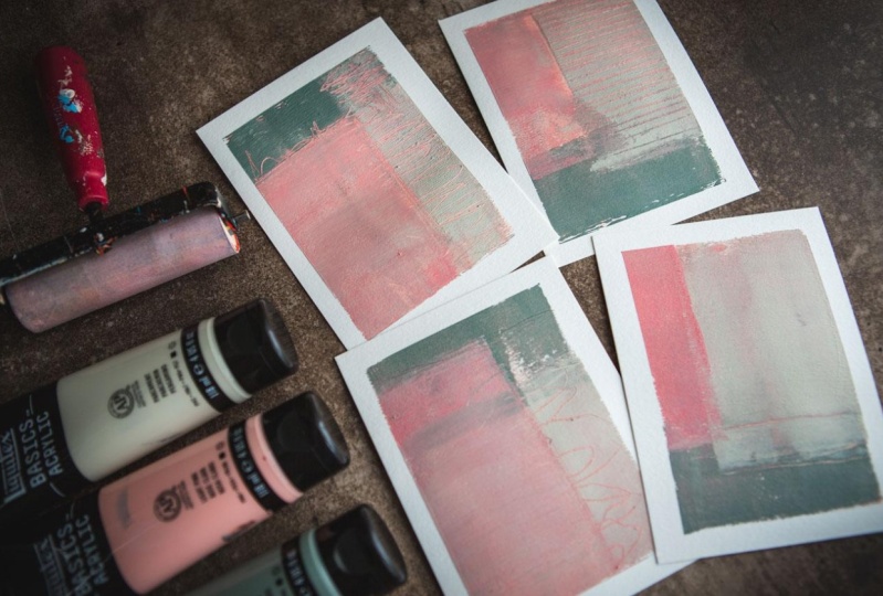
3. Supplies: [MUSIC] Let's take a
look at the supplies that I used in class today. I'm just working on my
Canson watercolor paper, 140 pound, the XL, which is just an
inexpensive paper that's fun to experiment on. I'm using that and I'm
cutting it in half, and then cutting it in half
from there to create some of this yummy 4.5 by
six-inch pieces, which is a really nice
size to experiment with. You can also cut these in
half and be working on a larger piece of paper like
I used for my junk piece, you could work on a larger
abstract by doing that. You could also do
this on a full sheet, but I like working on a size like this when
I'm experimenting with new techniques and
playing around because then I can work on
several at the same time. I can get different
compositions going, I can get different
colors going, I can get different ideas
going, and then I can say, here's what worked and
here's what didn't work, and I can take what
worked going forward. This was a fun paint
day, telling you, some of these days
when we're just experimenting and
trying new things, they are the best paint days. I've also got a pad
of palette paper, and you're really
going to want to have a disposable pad of palette paper with several
sheets available on it maybe. I, in the end, used one sheet and kept palette
paint on the one sheet, but if you want to keep your
colors clean and separate, have a couple of
sheets available because we put paints on here, and then we get the paint on our brayer before we put
the paint on our paper, so this really is an important
part of using the brayer. Then the other thing that you want to do is pick
out some colors. I randomly went into my
paint cabinet and said, here's what I'm
going to try today, and I thought they're pretty, light and a little bit airy, and more pastelli, and probably not my
favorite color palette. This is super-duper cool, but you'll see that that's not a color palette that I would probably normally be drawn to from the other things
that you've seen me done, but it's still super cool. [LAUGHTER] I think
the next time I do this project because this is definitely what I would
do over and over, I'm going to pull
color pallets from either an old masters painting
and experiment with that, or I might pull a
color palette from one of my favorite
interior books and experiment with colorways that are color palette I
know I'm going to love. I just looked at this and
thought, let's try this. I can also see these looking
really good in a natural, neutral color palette
with some brown, like an ombre, or maybe a black, maybe a Payne's gray, white. I can see this working
out exceptionally well with one of those neutral
color palettes like that. I could also see it working, really cool with
blues and oranges. How will pink and
green basically, but pastel shades with a white, and is still super cool? I'm actually in love
with this set of four, but I don't know
that I would try that color palette again, it's not my favorite
color palette, but it was super fun. I ended up using
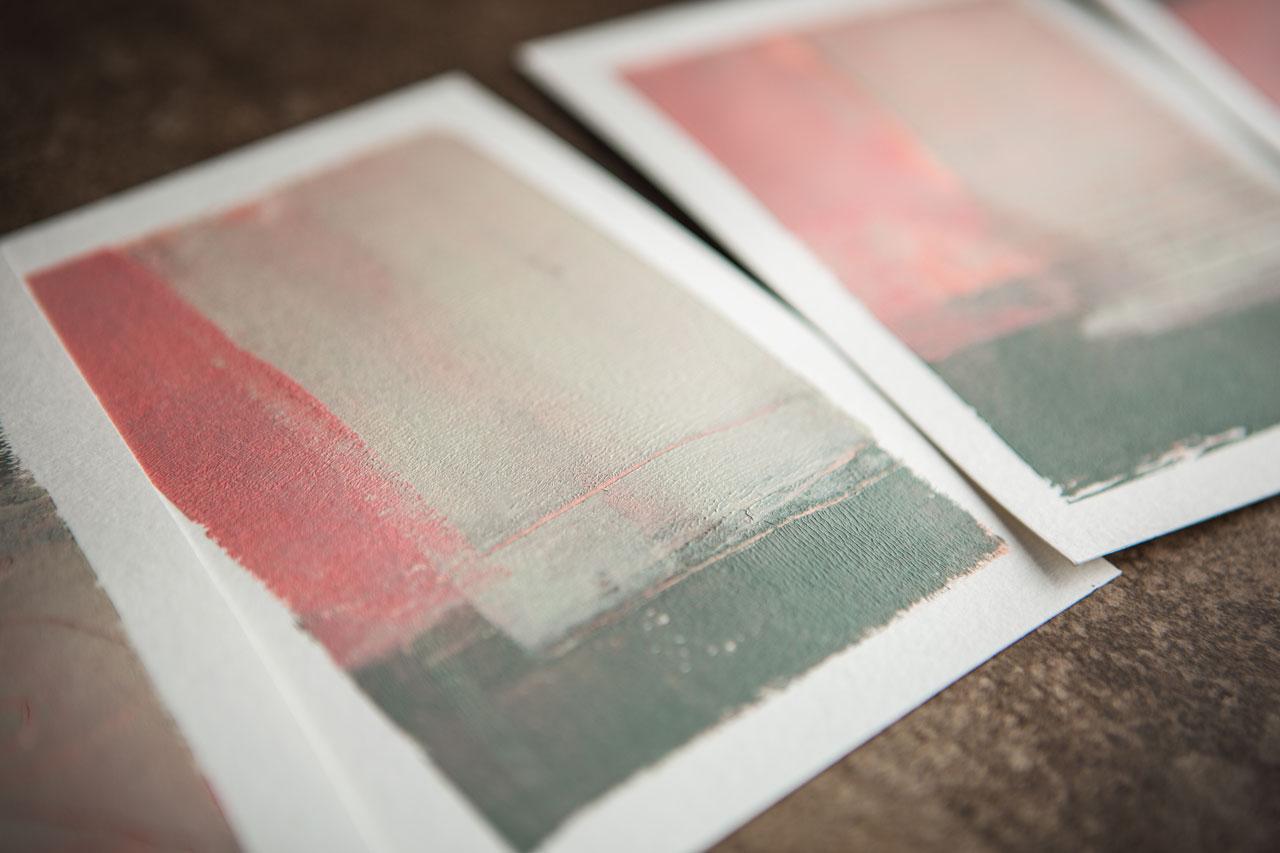
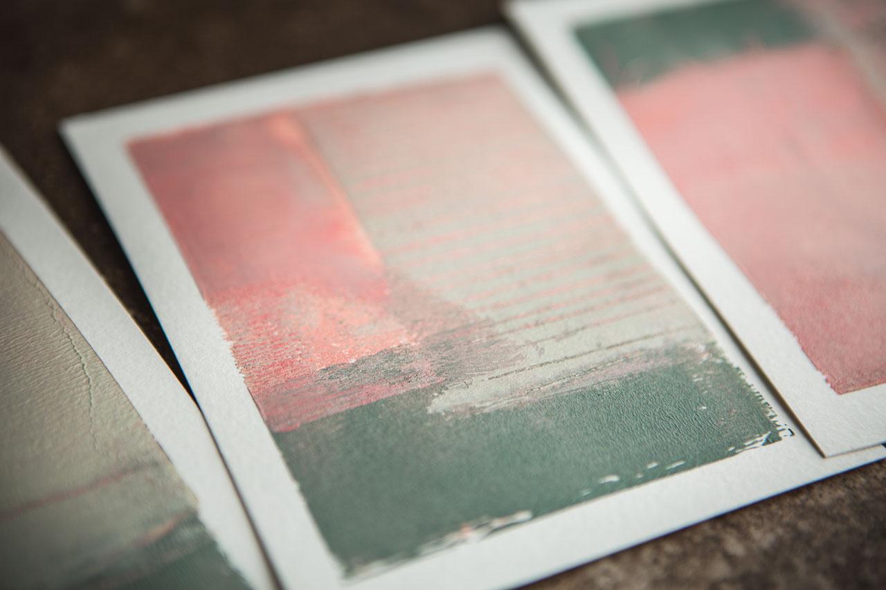
green-gray by Liquitex. This is the Amsterdam and
it is the Venetian rose, light pink by Liquitex, and parchment by the Liquitex. I liked the parchment
better than using a white or a cream because it
was a grayish white, so that's a favorite
color right there, these two I love. That's what I ended up
painting with today. If this color palette is, you're thinking amazing
and it is your jam, definitely give it a
try because look how cool these are, this
was super cool. Then I also played, at the very end, with my catalyst wedge just
to mark-make because I was trying to keep my mark-making in my extra materials
to a very minimum. Sometimes the best thing about contemporary abstract art
is the lack of business. There's big swashes of colors, there's a few marks in there, but there's not the busyness
of 15 different supplies, and sometimes that simplicity is what makes them so impactful. These pieces to me are
really impactful because I kept it very minimal in the materials that
I was working with, and I love that. Then also, the only
thing I was using to mark-make was my
mechanical pencil, and it was basically to
drag through the pain, I wasn't actually trying
to put graphite on my page, and some
painter's tape. Then that's all the supplies
that we've used today. This was a super fun project. It felt a little bit like mono-printing like we were
printing on our jelly plate, a little bit like that look, but these came out so
cool that they would be really amazing framed up, I think you're going to love playing with this technique, so let's get started. [MUSIC]
4. Painting Multiple Littles: But it would be fun today
to paint with something that really you
might not normally think to paint with
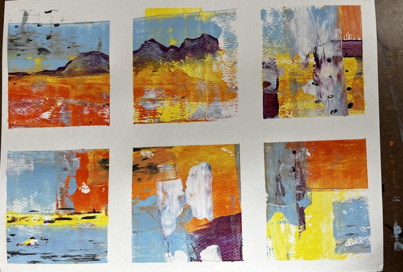
and that's the brayer. I want to make some little landscapes that are a little bit like mono
printing in the look. I want to brayer the
pink colors on and just see what can our end
piece look like. I've pulled out
several colors that I want to just possibly use. I've got a couple of
pinks in my stash. I've got a light pink
and a venetian rose. I've pulled out a white, which is like a parchment. I've pulled out a blue-gray. I've pulled out Naples yellow. These are all either Amsterdam
or the Liquitex basics. I've just pulled out
a variety of colors I thought were pretty
and a green gray. I may or may not use
all of those but I'm wanting my overall
landscape to be something pretty
in past Delhi also have several brayers in
two different sizes. That's so that I can maybe have some darker colors,
maybe some white. I've just got them
out ready to use, I may only use one of them. I also have extra
piece of paper over here so that I can
clean my brayer off after I put a color on because you don't want all that color staying on your Brayer but if it builds
up and gets real thick, you can peel it off eventually. I'm not saying that I
haven't left pane on them because I have but
they get really thick and then they
build up on the edges and then you've got to take
time peeling them off. [LAUGHTER] I think
what I'm going to try first split that over
there. I've taped off. I'm using my Canson XL pad of paper just to play
and experiment today, 140 pound watercolor
cold press paper. I have just cut that in
half and then half again so that these are about four-and-a-half
by six inches total. When I peel the tape, they're going to
look super cool. [NOISE] I'm looking forward
to seeing what we get. What I'm going to do is I've got disposable palette paper
right over here to the side. I think I'm going to just start with a little
bit of color on here. This stuff goes way
farther than you think. You may end up
with extra paints, so be prepared to maybe do more than just what you put out, what you taped down. I'm going to use
this to get started. You might consider letting
some of the layers dry a little bit in-between
painting these on, but I want it to be really
thin like a print layer. I'm going to go real thin. I'm going to start painting
this color on my page here. Doesn't have to be completely
solid because we are going to layer more
paint on this. But I just want to get started. [NOISE] Get some color laid. I'm working all the
pieces at the same time. I want this to be a cohesive little
collection when I'm done. Now I can just start layering
in some of these on. I'm calling them
landscapes because I'm going to give them
a horizon line. I'm going to give them a line at the bottom where
there is hopefully a color variation difference.
But we'll get there. [NOISE] I don't really
want there to be a weird gloopiness of
color like I just did. Make sure on your
paper over here, you're really getting that an
even layer on your brayer. Maybe a little more
of that color out. Go ahead and really
working on the brayer, mush it around, make sure
that it's not going to give you a gloppy mess
as you're going. [NOISE] This is pretty
fun layering these. I feel like it's almost
working a little bit like working on a jelly plate. This is parchment and
I'm for the moment still just working
on that same page. But if I feel like I need
a clean piece of paper, this disposable pad is perfect
because I can just flip this page up and I got a
clean paper underneath it. That's super fun. [NOISE] I'm actually
for the moment just trying to build
up some color, but there's nothing saying
that you can't come in and split your paper
up for a pattern. Just go with me here,
two-thirds of one color at top, a third of the way down, have like your other color and that's basically your landscape. But there's nothing saying
that we can't come in with, say, two-thirds of the
color at the top here, separating that top part into two-thirds and one-third or something like
that or one-third. Just to give fun
color variations [NOISE] in our landscape. Because even though it's a
landscape I'm making a may not technically be making like
a full-on just landscape, like it's going to
be an abstract. Let's do some of
this green gray. It's going to be abstract but
I'm calling it a landscape because I'm focusing on
maybe out of horizon line. [NOISE] Maybe some of
this green and see I can actually do it a
little bit like I'm working two pieces here
a little differently, just to see what are these going to look like
when we're finished? We can come up if we're like, I don't want it to go
on the other page. I can roll the other
way and work it there. See on this one you
can actually see like real differences here. This top one, maybe we're going to go a different
direction but let's just see now I'm going to keep on layering some colors on here. Maybe I'll come back with the pink maybe I'll
come back with the parchment until I get
something that I'm like, this is super cool. Let's stop here. [NOISE] I can pick some other
colors up to out of my stash or colors
if I'm thinking, I need something else, I can
pick up some more colors. [NOISE] You don't have to stick with the same
ones you pulled out. If you look at it and
think it needs this or who it needs that like, could this need something else? Possibly. [NOISE] If you really want to have
some defined lines, you can tape off sections and then make it super
duper divined. I love the layering bit of this. [NOISE] See now that one's pretty, I like what that's
doing right there. Maybe I'll come back on
another one with that. I like that too. The
further you get, the better they start looking. I do like that there. Let's put some more
parchment out. I'm just trying to put
like thin lines so that it's about the
size of the brayer. [NOISE] I actually like what that just did right there. I'm not going to fix that. I'm going to let
that do its thing. [NOISE] The more
you get on here, the better they start to look. I might go back with some of
this yummy, vibrant pink. This is now that I'm
getting it going, not really a color way that I
would have normally peaked. It's little different
than what I might have actually normally going
for and I like doing that. I like experimenting with
different color ways, things that we will look
to see what that did. That's super cool. I like experimenting with different color ways
and things that are outside my norm because
that's how we grow. Let's do this one right here. [NOISE] Super cool layer. I'm liking that one. The thicker this paint gets, the more texture we're getting. At this stage we might
actually let some of this dry a little bit before we continue on
because I am getting a weird paint texture in
here that maybe I love, maybe I don't love. We could give that a second to dry because you're getting thicker and thicker
with your pain here. These were looking pretty cool. You could even try on one
of these, some mark-making. I didn't really intend
to do that but we could come back in here and
just say on one of these, what if we started with
a mark-making something? I'm going to come back
with my mechanical pencil and just see what would this do if I did some
mark making in here? Maybe it's so cool, I decided to do it
on all of them. [NOISE] It's pretty
cool actually. The pain is so thick, it's got a weird texture. But it's a cool texture. I've got paper over here. If you're going to
set your brayer down for any amount of time, go ahead and get that brayer, get that extra paint
off the brayer, get that buildup off to
keep your brayer clean. [NOISE] That could be
the paint build-up too. I could've had too much
paint on my brayer. Let's see if I can see
it's still very textural. [NOISE] See, these are the things
that you learn if you play an experiment like this. I really like this one too. Look at that.
That's really cool. Actually, I'm feeling that. I'm liking the mark-making in the paint so we can have
a few with mark-making. We could have a couple
without the mark-making. I feel like the one that I
haven't put a whole bunch of extra stuff in is the
most landscape-y one. I could leave that as
a landscape just to see like what does that
end up looking like. But I could come right here on the horizon line and give it some movement. That's cool. We're going to let that
one be what it is. I'm really loving what that's doing and
what this is doing. This one I'm wondering, should we add in?
Let's just add in. I'm filling it.
Yeah, look at that. [NOISE] This is a weird color palette
now that I've got it going. [LAUGHTER] This good
one to maybe go back to our color palette fundamentals and maybe pull from an old
masters color palette. Or maybe we can pull from a favorite design
book, a color palette. I love these that have all
the mark-making in it. The few that don't, just to see like what
the difference is be. I think what I'm going to
do is let this dry for a bit and then we'll peel the tape and take a
look at what we got. Camp sat here studying
this for a minute. I really loved this lone line that's in this piece right here. I thought, what if we just
take like a rubber spatula, then come through
and do some lines. While the paint is wet, obviously we would have to
do this while the paint is wet. But look at this. This is the perfect time to do, if you've got wet paint
and you're wanting to pull the paint, this is the time to do
it before it is dry. To add some marks and interests. This a little bit more in the minimalist painting
category for me, because I'm not using lots of
different types of paints, are lots of different types
of mark-making materials. But I am doing
something really cool, like maybe some marks or maybe some different things in there that we didn't
already have going on. We could take this
right here and spreads and see. Look at that. But it's a little
more minimalist; I'm not pulling all my
supplies and my tools. Now I think I can come
over here and pull this one a little tighter because that texture bothers me. Pull that smooth. [NOISE] There we go. [LAUGHTER] Try to in
some of these with a minimal of supplies and a
few colors and just see like what do you get if you do
this or if you do that, let's see if this
will pull a tiny bit. Just evened it out and made a little different
there, didn't it? It's not truly wet but it did give me a little smoothness. Now I'm much happier with where my brayer was Making
a weird texture. Now I think I'm
ready to let this dry a little bit and pull
the tape and see what our little abstracts look like. We'll be back in a bit. [MUSIC]
5. Pealing Tape and Evaluating Pieces: These are mostly dry. I hit him with a heat gun. You got to be real careful hitting the paint
with a heat gun. Because if you've got
really thick layers of acrylic paint like
what I've got here. The paper tends to warp. If you let them dry naturally, you get less warpage. But if your paper does warp, just let the pieces dry
and then stack them under a nice heavy set of books for a couple of days and you'll come back and there'll
be flat again. I just don't worry about it, but I want to peel the tape
and decide is it finished, does it need anything else. You could also
make that decision right now before
you peel your tape, you can do some mark-making. You could do some
drawing on here. You could do some Posca pen. I'm looking for the
minimalism of just the paint. I'm resisting using a
bunch of other materials on here because I want the shape and the form and the composition and the few
scratches through the paint. I want those to speak for
themselves rather than it being a whole bunch of
different materials on here. But I was mostly focused on rule of thirds
with composition. You can see how I did that. Two-thirds, one-third. Then when I came the
other way, two-thirds, one-third, two-thirds, one-third, one-third,
two-thirds, one-third. You can see I tried to divide
these up very consciously, which is a break
from the way that I normally paint and do
projects with you. Normally I'm painting with abandon and we're
looking at that with, how can we cut this up later? It is a little different than I'm normally up your painting. But I got in my mind
that I wanted to play with a brayer as a paint applier and just see like what pieces
would that give us. It really reminded me of jelly plate printing and
that mono print feel, which is a very interesting different way of painting than using your paint
brushes or your fingers so like just playing
and experimenting. It might be your jam, you might be like, I
love using the brayer. Let's do a whole collection. Or you might think, okay, tried that. Not my thing. It's still about
experimenting for me. I do like the discovery process. Let's just see what
we end up with. I'm feeling pretty
good about these. Once you peel the tape, you really reveal the
finished artwork. Whereas with the tape on it, you're like, I don't know. See like look at that. This just became amazing. Look at that. That's
gorgeous. Look at this one. I love the mark-making
that we did in there. See you get that last
little bit of tape off. They start to reveal
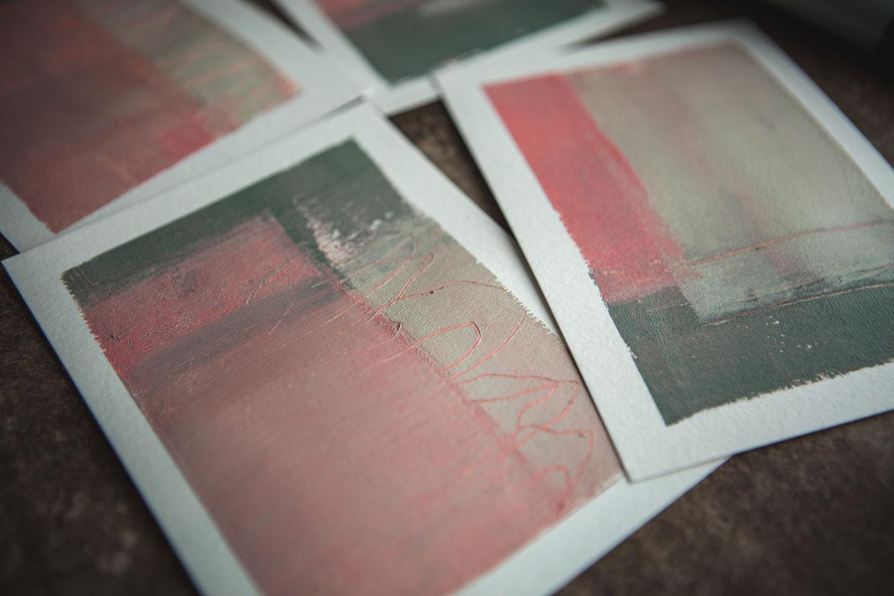
themselves and you're like, wow, look at this one. My goodness, this and
this one right here. These four look at that. Is that not a crazy
amazing modern, contemporary collection
ready to frame? Then these two, that one, weirdly enough, not my favorite. There's always going to be one or two that
aren't my favorite, which is why I like doing
a whole collection of six. Because out of the six, even though these two
are almost identical, I love this one better. I think the reason
is I had a little more of the white paint
coming over a little further. When you're talking about
your composition and why maybe I like one piece
more than the other. I feel like this one is stronger
because there's more of the stripe and less of the stripe made it
not as strong for me. These two pieces, even though
they're not my favorite, I'm not disappointed with
my whole collection because these books are amazing and I feel like I got a
whole collection of four. I want you to give this a try. This is super fun, is a fast, easy project. Try several different colorways. I want you to tape down
four or six pieces of paper and work on a whole
little set at the same time. Because then you'll have
some that you're thinking, wow, and you'll have a few
that you're like, okay, not the greatest,
but you won't be disappointed because these won't be the only two that your painted and you're not
like it didn't work. You're like totally worked. This can be scrap paper. It can be something I cut
up for a junk art collage. It can be something that
I cut up right now. I mean, I could make this a better composition
just by maybe turning it a different way
and perhaps cutting it into cards that right
there would be super cool. I could do lots of different
things with some of these, probably junk art
collage would be my favorite technique
where you cut these into some stripes and glue
the stripes back in different ways and we can
make a junk art collage of that and get something
really cool because then the cut-off stripes really
adds to the composition. These are not my favorite, but these are amazing. I have a whole contemporary
little sit ready to be framed and hung together. Those are super cool. I like how each
one is different. Neat. None of these have the exact same amount of
paint in the exact same spot. Even though these were
similar and I did pink and white and green and
pink and white and green. I love this one solid and did some stripes through there
with my little catalyst wedge, just pulling paint back out and it made it
completely different. Then these two
don't really follow the same format as
those two at all. I feel like we have an
amazing collection of completely different pieces that we could hang as a foursome. I'm just so happy with these. I'm just going to play with
these and mix them around and see like which
way was Burke's best. I'm loving this, that I want
you to paint some of these. Then come back and say what worked for you and what didn't. I want you to try to
be as minimal as you can pick a color palette
and stick to it, and pick a brayer. You only really need one Breyer. In the end I had three brayers here that I could have used, but I only needed one. Have an extra piece of
paper that you can just clean that Breyer off
on in-between stuff. Then guess what? Collage paper or
something that you can save that and make
it into something else. Don't waste even
your trash pieces. I hope you enjoy playing with
the brayer and trying out this project and just seeing what cool contemporary
abstracts you can get. I'm loving those
weird color palette now that I've got it going
and I thought I'd like it. I do like it finished off, but I want to try this and
many other color palettes. I can see this really
cool in like a Payne's gray and some pretty, even if I did ink
instead of these paints, I can see this antelope brown. So some type of earthy
brown, maybe a gray, maybe the Payne's gray, something in an earthy
palette would be super cool. I can see doing this quite a bit more because I like these
so much that I'm like, yes, I would do this again. Hope you have fun
with this project. I'll see you back in class.
6. Final Thoughts: [MUSIC] How cool is the brayer? I felt like we were making MaNo prints like we were
jelly printing because you brayer that
paint onto the Gelli plate, you squish the paper
on appeal and it gets some very flat, all the colors are
mixed in together. I feel like we get
that same look brayering the color
right on our page. We get those colors to really
mesh down into each other, so there's not as
much of a texture to the piece but there's a
lot of dynamic dimension in there with the mark-making that we pick and
the colors that we choose and the way that we
lay out that composition. In today's class, I was actually purposely trying
to lay out a composition rather than crop down
to something that I like which is my
favorite way to do, is just to paint and have fun and then crop out good stuff. Today I was intentionally laying down with the rule
of thirds and I was breaking that page
up into thirds visually and in my
mind and trying to lay colors in those blocks to see what can I create and how's this going to
work for me today. I came out with
four amazing pieces that are ready to be
a little collection. This was such a fun technique. I hope you enjoy
playing with the brayer and that this becomes a tool for your art going
forward and you start incorporating it into some of the things that you do
because it's super fun. I can't wait to see the projects and the color
palettes you worked with. Come back and share those with me and I'll see you
next time. [MUSIC]
 DENISE LOVE, Artist & Creative Educator