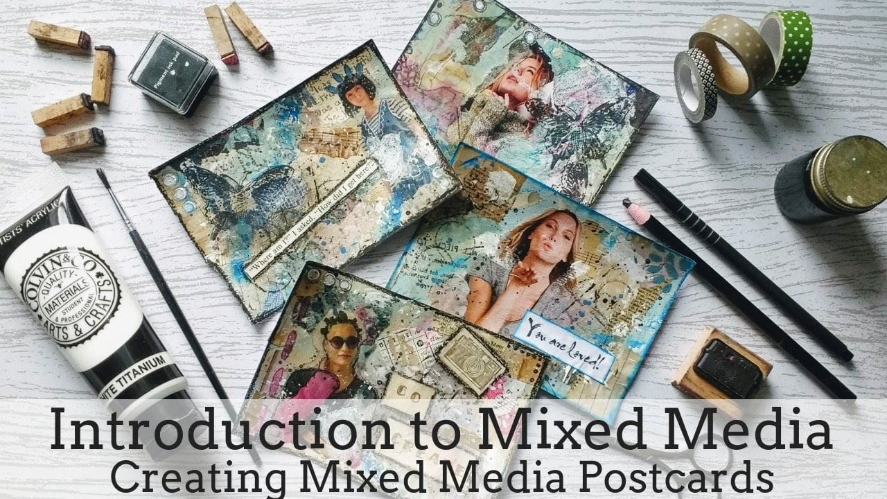
Transcripts
1. Intro: blotted line. Mono printing is a technique that combines drawing on printmaking and was frequently used by Andy Warhol in his commercial work in the 19 fifties. What is model printing? Well, we are talking about a form of printmaking that had lines or an image on can only be made once. Unlike most print making, when you can obtain multiple images, blotted line printed making always contains a wonderful element off surprise. You can't really control the outcome off your work. You get these beautiful ink blotches on. There is obviously a really important part off this technique. I mean, a I'm an artist on teacher on in this class. I'm going to teach you how to create a blotted line one or print. You are going to learn what tools on materials you're going to need, how to choose the best source image and set up your printing station. Using two different images, I'm going to show you step by step, how you can create you very own mortal prints on. Then the next step, you'll see how to very easily use or two colors to finish the monarch print and style. This class is equally suitable for beginners on more experience students on. I'm really looking forward to seeing you in my class
2. Tools & Materials: Let's have a look at the tools or materials you're going to need for this class. I've bean using just ordinary injured printed paper on. I find it works really well for the one of Prince. Then you'll be needing agitate. Sheets of acetate come in various sizes on thickness, but I find that a wealthy at it, eight of you so far works really well for the one of printing process. You're going to need some simple masking tape. Anything he could pick up in your local D I Y store is fine on. Then we'll need some acrylic ink. This is a job with think of made up myself on. I'm going to add a video showing how you can make your own acrylic ink for just buy ready made acrylic ink online or in your local craft store. You also be needing some wooden skewers or I call them my Bamboo Pence. Normally, you would dio monarch prince with a dip pen or a fountain pen, but I have found that theme bamboos. Guo's work really well. They're cheap. Easy to find on. Don't scratch the surface off your attitude. Eight. With a pair of scissors, you can adjust the tip off your bamboo pen. This is something you can do when your pen starts to get blunt. Do Toothy Inc having course there wouldn't fibers to soften? If you find that you bamboo pen hasn't got enough grip, you can use a ribbon or a thin strip of fabric to wrap it around to color in the monitor prints. I'm going to use a set of watercolor pencils on. Also, a very simple child's watercolor set, as I wanted, demonstrated that it is possible to work with cheap, easily available materials as well as really high end and high quality products. Then I'm going to use a set off Russia's for the water colors, a container with water. I usually use a jam jar for this purpose and then a damp cloth on some tissue paper to clean the acid Tate or wipe away any mistakes. Clean it up on. Don't forget to you get yourself a hot drink, maybe a biscuit while you're working next big going to have a look at suitable images for the monitor. Prince
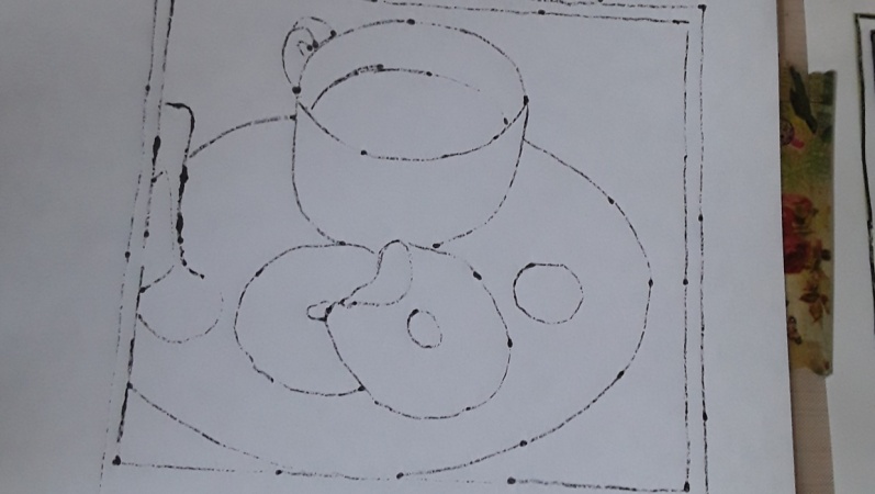
3. Choosing an Image: in this video, I'm going to talk about choosing an image for your morning. I find magazines are really good source of images on in my real life workshops. I recommend my students to start out by doing Amman a print off a flower, especially those with very clear on simple shapes. When you're looking to choose an image for a mono print, you are looking for very simple shapes. You have to remember that you have to trace the outline off the shape and questions so you don't want any blurred details. They all have to be really nice and clear. Andi also they shouldn't be too little because off the nature off the bloodline of printing , you do end up with lots of blotted lines on if you're. If you details on an image are too small, you would probably just end up with a lot of blots. Rather, a clear image. There's following Image would also work really well. I would be choosing the glass on the bottle on that has really clear lines and could make a really lovely mono prince. Then, thinking about on the oracle, you could try shoes. Always make sure that the image isn't too small, so any adverts usually work really well for those wanna print self shoes. I've also used some clothes for some really nice model prints. Then, in this image, I would probably go for a teacup. Just as the following Image has another really nice sedative cups or stacked into each other, animals tend to be a bit more difficult because most animals have, for it is quite difficult. Teoh depict the for in Amman a print. However, if you just go for the simple outlines off, for example, this cat that should work. But I would probably not start with an image off off an animal and faces work quite well again. Magazines are really good for those Shine go for on image that is quite big. Aunt has clear features, not too tiny details in this. On the left, you would probably have Teoh at some hair as you go along on the images I'm going to choose for this class are one this vast with e to flowers on for the second mono print. I'm going for the face off this girl
4. Setting up your Printing Station: before you can start with your mono printing, you will have to set up what I call your printing station. Get your chosen image on the masking tape on, then secure the image with some masking tape to your table or desk. Next, get you sheet of answer Tate and place it on top off your image on. Then get more masking tape to attach the acetate to cure Lee to your desk. So doesn't. When you're happy that your meditate on your image are securely in place, get your piece of paper on. Put it on top. Orphee Acid Tate. We are now going to create the hinge using some masking tape. As you can see, I'm going to attach a bit of masking tape to the left side off the paper. So Arc unfolded open to the left. Some people like to a catch doubt the top, so they open it up to the top. But I prefer to have the image on the monitor print next to each other so I can keep track on how I'm doing on. Also, my image wouldn't be on its head
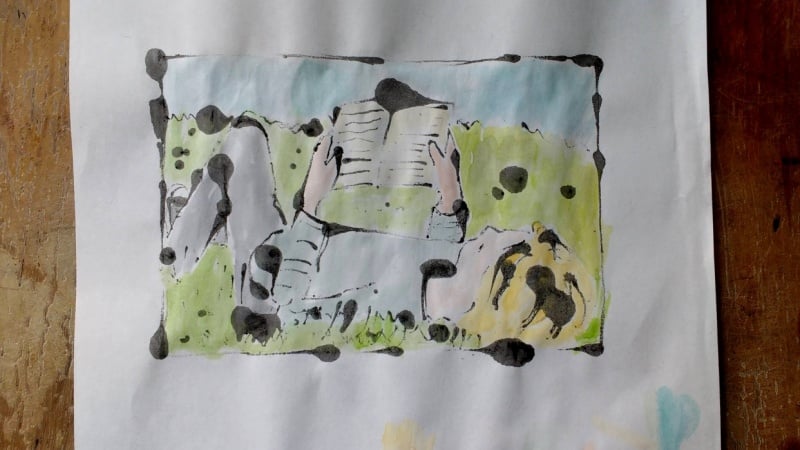
5. Monoprint One - Flowers: now, To start with the printing, I will need to get hold of my bamboo pencils on my acrylic ink. I usually give being a quick shake before I start next. I just did the tip off the wooden pen into the ink on. Then start tracing the outlines off my image. I'm going to start with leaves as I like Teoh, start drawing the most straightforward shapes first on, then work my way to the more complex. Once in this case, I'm leaving the flower heads until a little bit later, and it's almost like getting used to thean image on leaving the more delicates parts off the image until later. Acrylic ink dries really quickly, so you can only make kind of like a few lines before you need to start printing it. I just fold the paper back on toothy, meditate on a press the paper onto the ink so that the paper absorbs the ink. You also have to bear in mind that the image your printing is going to be the mirror image off the original image. So when you're trying to see if there are any lines that you need to redo our any bits off the in this case off the flower that you might have missed. You kind of have to keep in mind that it's It's the mirror image off the original one, which can in the beginning be a little bit confusing that you soon get used to it. As I've mentioned before, I won't be tracing the pattern or the image that is on the vase, but I'll just keep it really simple on, then. Just used the outline off the vase for this purpose. I'm now I'm starting on the two flower heads on. As before, I'm just outlining the general shape. Andi, I'm just kind of hinting on to the petals on. I'm just using the shadows on the image to follow. I would probably recommend just really going for the outline off a picture you've chosen. Andi. Maybe not trace it in a too detailed way because you can add lines at the end if you are not happy with your image, or you feel like you needed to add a few more lines. But I find with the mono printing it usually works really well by just using very simple lines, especially if you're planning on using water colors. Even though I said I would not trace any off the patterns on the device itself, I decided to just include that little pattern right at the bottom, off the bars, just to give it a little bit more detail. I really hope that by watching me trace the outlines off this image, you kind of get an idea off what to look for in the image you will be choosing on kind of what lines I'm going for. How long I wait until I start with the printing that I go back. Andrea, Trey. Some lines of right now I adding a little bit to align that I had missed out earlier. Or maybe the ink has dried on just to get a general feel off the process off the model printing on then at the end, I just have a quick look to see if I think I might have missed out any lines orifice, anything else I would like to add on bond. Once I am happy, I can then carefully remove the masking tape from the back off the paper on. I'm ready for coloring in my model print
6. Adding Colour - Watercolour Pencils: in this video, I'm going to show you how, by color in my model prints using watercolor pencils, I really like using watercolor pencils on. Also, if you're new to using water colors, it might be a really nice way of getting into the process off using water colors Before I get started, I've got another little tip. The monarch prince. You can see there is not the actual model prints, but it is an inject Copy. Andi. I find that sometimes, if I'm not quite sure how I'm good to color in a monitor print, or if I would like to experiment first with different shades of color, I just use a copy on. Even though that in jet printers aren't waterproof, I find that especially with my inject printer, I get really great results. But if your inject printer ink starts to dissolve with added water, you could just get some photocopies done with a labour laser copier, as you can see. First of all, I'm going to a color in the leaves, and I've just chosen along the green shades, some grey shades and some brown shades from my watercolor pencils out of all the colors that I think I might be using on. Then I just start with the lightest shade of green Andi. Follow the original image on. Take that as a starting point. Use my colors. So I'm not actually trying to get a kind of 100% copy off the original image. But just use it as a reference point to see where I would use darker shades of green or a lighter shades of green. On then was pencils. I can then just easily this layer the colors, as I said, starting from the lightest shade of green on, then going darker on art as many layers as I think I on their next I'm going to a color in the flower heads on again. I've just chosen a lot the colors I think of my abusing set. In this case, it was sort of light shades of yellow and cream, just a very, very light of creamy grey. Andi, I'm starting again with the lightest color on. Then, um, work my way up to the darker colors on again. Looking at the original picture, I see where I would be applying darker colors or adding some extra colors. Andi, I really loved the fact how easily layer the colors When you're using watercolor pencils and also because they're dry, you don't have to wait for them to dry first, as you would have to with have the water colors. I am just adding a little bit of a great too great, and it's a bit of shade. Next, I'm ready to color in the vast. I decided to just go for eight of acquired turquoise E color. So now have collected kind of the blues and greens I would like. I'm just starting with a blue, and then I'm going to layer the colors until I get the color I like. On very often I will be going back and forth with said colors. Just add more of one color or another until I'm happy with the end result. On once I finished, a coloring in my model print are just grab by Russia's handsome water, start applying some water on top off the water color pencils, and it's just really lovely to watch the colors dissolve on, create the actual water colors that you're aiming again. What I'm doing here is just start with the lightest shade of green on start applying water to those areas. And then afterwards I went for the darker shades of green. Andi, Now the flower heads. Obviously I have rinse the brush in between so I wouldn't get any green onto my flower head . And now I'm ready. Teoh, do the boss. I've chosen a wider brush just to make life easier on. You can see really well how thick the colors dissolve on, create this beautiful the and create these beautiful water colors on. Then I just went back to the smaller brush just to because it would be easier to go around the edges rather than with the big brush on. Then at the end, Ally have to do is wait for the water to dry. I'm quite happy with the entries. Old's
7. Adding Colour - Watercolours: in this video, I'm going to show you how I use water colors for my model prints. On day, I thought I'd go for a more war whole style color scheme for this one. Eso these are two off on Lee wobbles. Blotted line. Monarch Prince. This is another one, so I'll try and get inspired by the colors, and I thought I might try on. Stick to the colors you can see in this one with the cats I'm starting off with on orange, trying to roughly get the shade of the orange or used for the cat's eye on. I'm going to use this orange for the when you're just starting out with water colors. Trying Teoh imitate Warhol's approach to using water colors in his Monta prints might be quite a nice way of getting started as he was basically using just the one color or just a few colors on. As you can see, for example, in the Cat is just this one shade of purple he used for the whole cat. So it's a very simple, very achievable way of using colors. Andi. I also find that this approach works really well for the Prince So I've used the purple shade for the vast Onda. Um, what I'm going to do for the leaves. I'm trying to aim for the background behind the cat, this beige beige tones, but I'll be using a shade of green as well, so it will be Beijing gray undertones on. Then I'll be adding some green. But first of all, I'm just using a light shade of a warm gray to color. In a way, the leaves and the stems of the flowers on then afterwards are just applying a light shade of green on. I'm not really mixing it much with any other colors, but I use a pen that has bean dipped into water. So I'm getting a very watery green, which allows me to kind of just add a hint of green to gray on. Then, once I've addict green and that's me done for this image. Andi, Um, I think I'm quite happy with it.
8. Monoprint Two - Girl: for the 2nd 1 of print. I'm going to show you how I approach doing Amman. A print off face. The set up is exactly the same. I've got my printing station ready. I've got my image. I've got my sheet of acetate on. I'm just about to at the piece of paper on Create the hinge with the masking tape when you're doing a mono print off face, obviously her face itself. The delicate features off the eyes, nose and mouth are probably the most difficult in an image because you might not want to have a big Lache our next tune. I allow the mouth so I usually do the same thing I did with printing the flowers on. I just start with kind of the easier parts off the face. In this case, I'm just just in the outline off the face. You could see that I wasn't quite happy with one of the lines on Guy just used a damp cloth to wipe it away. You will also see me doing a kind of more smaller lines and going back adding more detail than I did with the flowers on. The reason is that a phase is a lot more intricate, and you just really want to get the face and the expression right. I have to say that I really love the girl's hair on. It is a lot of fun to create Amman, a print off her hair because it's a messy on a little bit wild, and I find that the ink blots look really, really great as part of her head on. Normally, the way I approach to doing hair, obviously I'm following some of the lines. But then I also add some lines of like squiggle around. Just create more value here. I'm just checking the tip off my pen unsee if I need to start using you as a tip, tends to get a bit wider due to soaking up the it is up to you how much detail you would like to add to theme the mono print, for example, with the feathers, as he could see, are the actual feathers Have this tiny little dots bet in the monitor print. I just ignore them, and I just focus on getting on imprint of feathers so that you could see that their feathers. But I don't go into more detail. He can see me do the hair squiggles, uh, which I found was a lot of fun to do. But also sometimes when I'm creating them on a print off the face, do the hair. I might make the hair a bit earlier or add some strands of hair so you could kind of play with the image you've got. I know with the girls card again, I'm really just focusing on the outlines off the collar on the actual cardigan. I'm just adding sort of a few details and a few lines so that you just get an idea of what a card again looks like on you. I'm going to add the stripes on nature, and I'm also going to add the buttons as well. You can see that I'm going back to the head for some reason. I quite like to work on one area off Amman, a print on Go go maybe to another one on, then go back, like in this case, go back to the hair. Sometimes I just feel I need to wait a little bit to see if a one to add more detail and where I want you to detail For now, I'm just very, very carefully Start with the girls. I I browse and I'm just really kind of like just trying to almost pencil in the little lines on. I find that with theatrical facial details that I tried to use only a tiny little bit of ink on work up the details. I'd rather go with, uh, having a little bit. Often I there on adding more and more than having too much on ending up with a result I really don't like when it comes to tracing than those I usually just at the nostrils on. That is usually enough. In wana print Teoh give you an idea of where the nose is because otherwise you might end up with quite strange of results. Uh, get nose eyes too big or way have a huge Inc blotch on the nose and you might not want that . As you see, I'm spending quite a lot of time on the facial features. But as I said, I quite like Teoh work my way up and add little by little so that I, in this case I feel I have a little bit more control, uh, over the results off the monarch print. However, there might be certain instances where you are making Amman a print off a face on and you just go with the wanna print and you go with a worthy blotches on, then that's kind of a completely different approach. I do the whole monitor print, and I've done those as well on Those are really great. But it's also fun to kind of play with the medium on, sometimes have a bit more control over it, wears and then fucks up with the hair where I'll just leave it as it goes. I'm just adding the buttons and checking. If I want to add any details on, then I'm done with this one.
9. Adding Colour - Watercolour Pencils: in this video, I'm going to show you how I use watercolor pencils to come in the morning. Print off the girl as I've done before, I've created if you inject printed copies off my original mono print, unamusing those Teoh color them in. I'm starting with the girl's hair and using a black earned dark brown watercolor pencil Teoh color in the head. Onda. I'm using the same colors for the girl's eyes. Next, I've decided to color in the feather, so I'm just shooting a few shades of brown on just layering or the different shades of brown until I get the color I I'm looking for. Then, for the girl's face, I'm going to collect. Allow the shades that I will be using. I'm going to start with the lightest shade, which is kind of a light, creamy pink I'm using on, uh, then I'm just going Teoh, layer up colors until I get the shade I am looking for on I'm trying. Teoh roughly match the colors for in the original image. I'm using the same colors for the eyelids, but are making sure that I get that area a little bit. Dog hurt to give it a bit more depth on here. I just realized that I've almost for gotten her left ear. You can see me going in with a darker pencil, and I'm just very likely shading the hill area of the face on, uh, for her cheeks, I'm adding a hint on Starting on her card again, I decided to go for the buttons first. I really want the buttons to be a deeper shade of green than the other green areas off the cardigan on again, I'm mixing. My greens are using a little bit, if yellow on the different shades of green, until I'm happy with the color almond for the rest of the green areas of the cardigan. I started with yellow Misko m working my way up from the lighter colors to the dark colors . I don't want it as dark as the buttons. And then when I'm happy with my colored in image, I'm just adding water on as before with the flowers. I'm using a few Russia's of different sizes on. While I'm applying water to the image on the, uh, watercolor pencils. I'm just trying to make sure that I'm blending along. The colors are put down on the paper on so that they really look like a Ziff. I had bean using watercolors and not watercolor pencils. Then I just go from one area to the next on making sure that they don't dissolve into each other. For example, with the face in life done the face. I've left lips until later because I don't want Teoh to blend theme the color off the lips with the rest of the face. I'm waiting for the face to drive first on here. You can see that after I've dissolved the, uh, pink color pencils. I still got some pink on my brush that I just went in and added that little bit of pin pink to the lip sa's well at the end. I just go back into areas where I think that I need to blend theme colors a little bit more . Andi ones. I'm happy. All I need to do really is wait for the water colors to dry on. Here is the finished result
10. Adding Colour - Watercolours: in this video, I'm going to use water colors to color in the print on again. This is another one of my inkjet printer copies of the Monarch prints I did earlier on. I've decided for this image I'll go just with a very limited color scheme. So not quite in the and the war style. Burt's definitely inspired by him. Andi, I've decided to go for red and black. First of all, I've bean painting the face, and I went for a very, very pale pink hair is going to stay black on. I'm just trying to use a kind of rather watering black Teoh on. The reason for this is simply that I want the original acrylic ink blotted lines to still be looking through and still be visible through the border colors. I'm adding on top on, As you can see, I'm going for very loose lines to just add the general messiness off hair style. You see, I've got a bit of scrap paper. Just Teoh test out the shades of red on facial that I've got the shade I want to use before I apply it to theme on a print. Now that I've decided on the shade of red I want to use for the cardigan. I'll just start coloring it in. I'm trying to use a very kind of like more. Torri Red Teoh. Fill in the areas I want to paint red. At this point, I haven't quite decided if I'm going to paint thehyperfix cardigan in red and black or if there is going to be another color. So I'm just working my way from one area to the next and then see how I like it on do to be able to make a decision off, maybe adding another color on what I'm letting the Reds pains are dry. I'm going to do the feathers on. I decide to go for red onda kind of shade of pink that would complement the red on. I mixed it, using the orginal of red on some white you can see of added a little bit. Too much water on the color started running into each other, so I just got a little bit of tissue paper to soak up the excess water. The buttons on the card again obviously had to be black on. I force added two black stripes on. Then next, Uh, I'm going to paint the lips, us the face, all the paint on the face. The watercolor on the face has dried, and I'm choosing a nice read before her nips. So in the end, I decided to have the whole cardigan in read. Apart from the few black stripes I'm just filling in the remaining areas for the eyes. I'm just using a tiny did a bit of black porter color on. Do I really have to make sure that I'm not adding too much water? And I'm really just dabbing a little bit? If paint onto the paper on, then he can see me just go very carefully around three eyes with the pink height chosen for her skin tone. It was just act tiny little areas I had left out in the first instance. Aunt, here is the finished on dried Mona print of the girl
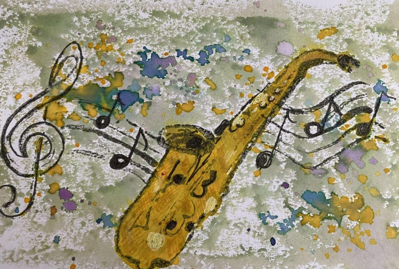
11. Some Monoprint Examples: before I'm going to talk about the class project, I thought, I'll show you a few more Monta print examples. Here's theme on a print on the orginal image I did for this class. For the next image, I'd use the watercolor pencils on a then for this one. Water colors on. There's another example of fusing different colors, but they're still water colors. Then we've got the girl on the model print I did in class off the girl on, and we've got the watercolor pencils on. The next one is the image with water colors and then just a few more examples of using different colors. But there again, watercolors. This is another mono print I have done a while ago just to show you that each model print off on Original Image will still look so slightly differently. So each Monta print is definitely unique, and here are a few more examples off original images and Monarch Prince, just to give you an idea that monitor print will look kind of slightly different from the original image. So it's always worth while just choosing an image on giving it a go, because the end product will look similar bet quite different. It's quite nice to see what and product you will get. Then I've got a few examples of one of Prince that I didn't come in. I think one is also a little black dress, and I quite like to just the way it waas and hard to go at thes cat Onda again. I quite like the fact that he wasn't colored in, so I just left it on. The 2nd 1 is when we're just did a few lines and just experimented with creating a cat with just a few lines. This is one of my favorites because aid create, I think a very sixties feel. So again you can see that how original image on the monitor prin can have a very distinct feel. How how different it looks from the original. This is another one where you can see that you can also do act smaller details on a quite like the next one. Again, I didn't either off those in, and I also find that images from the 19 twenties all fashion drawings work really well. Teoh do model prints
12. Class Project: for your class project. I would really like you to have a go at creating a modern print. But on the way, let's start your project by first taking a photograph off all your tools and your equipment . Take so to grow front, uploaded to your project their next. Have you decided on an image you're going to use for your morning prince? Oh, have you got a few? You want to try out again? Take a photograph off the image you're going to use on up noted to your project. Then perhaps you would like to show us how you have set up yours. Pretty stations again. Just set up your pretty station and show us how you're doing it for you. Free to take pictures while you're doing the mono print. When you're starting out when you're in the middle of creating your mono print and then it would be absolutely fantastic to see a photograph off your finished on a print. You might decide to just leave your wanna print as it is, and that's absolutely fine. But you might want to add some water colors or yours, Porter color pencils, and then just please upload your finished picture, so we can all have a look. I really hope you enjoyed my class. And I'm really looking forward to seeing all of your work. And please subscribe. Teoh, get all the updates of new classes.
13. Bonus - Make your own Acrylic Ink: In order to make your own acrylic ink, you'll be needing some black acrylic paint. Some water, then a container like a yogurt pot to mix the then and empty container a spoon on your bamboo pen on a scrap of paper. Add the amount off about a heap T Boone of acrylic paint into your yogurt pot or container on, Then use approximately the amount off a table spoon on behalf of, and then start mixing it really well until the paint has dissolved in the water. This might take a little while, sir. Just be patient and keep mixing. You want the mixture to have a consistency that is a little bit thicker than ordinary on. Then what I do. I just give it a go by using my bamboo pen on a bit of scrap paper to just see how I like the feel of my mixed acrylic ink. If it did, you think you could always add a little bit of water or add a little bit of pained until you're happy with your mixture. Here are mixing it again because I noticed there were still a few tiny lumps at the bottom off container. Onda I'm using an empty ink bottle to pull my mixed ink into There's tiny little jam jars You get in. Hotels also work really well on. Then you're done. You've got your acrylic ink ready.
 Nina Vangerow, Artist & creative Coach