Transcripts
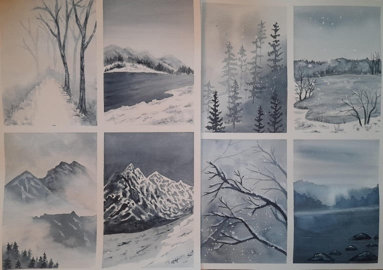
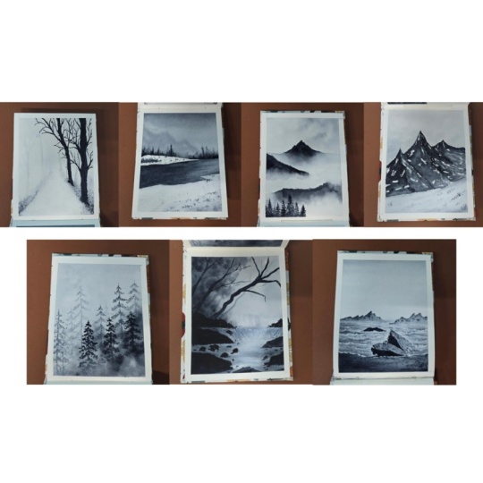
1. Welcome to the challenge + Class Overview: I'm someone who absolutely love painting colorful,
vibrant artworks. But every now and then,
I like to slow down, observe a little deeper and enjoy a more
meditative experience. That's when I switch
to monochrome. Hello, friends. My
name is aninNapil. I'm an artist, an art
instructor and an author. Welcome to the 7-Day Monochrome
Watercolor Challenge. I'm so excited to invite you all to this brand new class and empty a week dedicated to the beauty and
magic of Painscrey. In this mini challenge,
we'll explore how a single color can
create incredible depth, emotion, and atmosphere
in your artwork. We'll also explore the
materials you need and we'll dive into the
basics of tonal values. What is the true secret behind bringing monochrome
paintings to life? And here's the fun
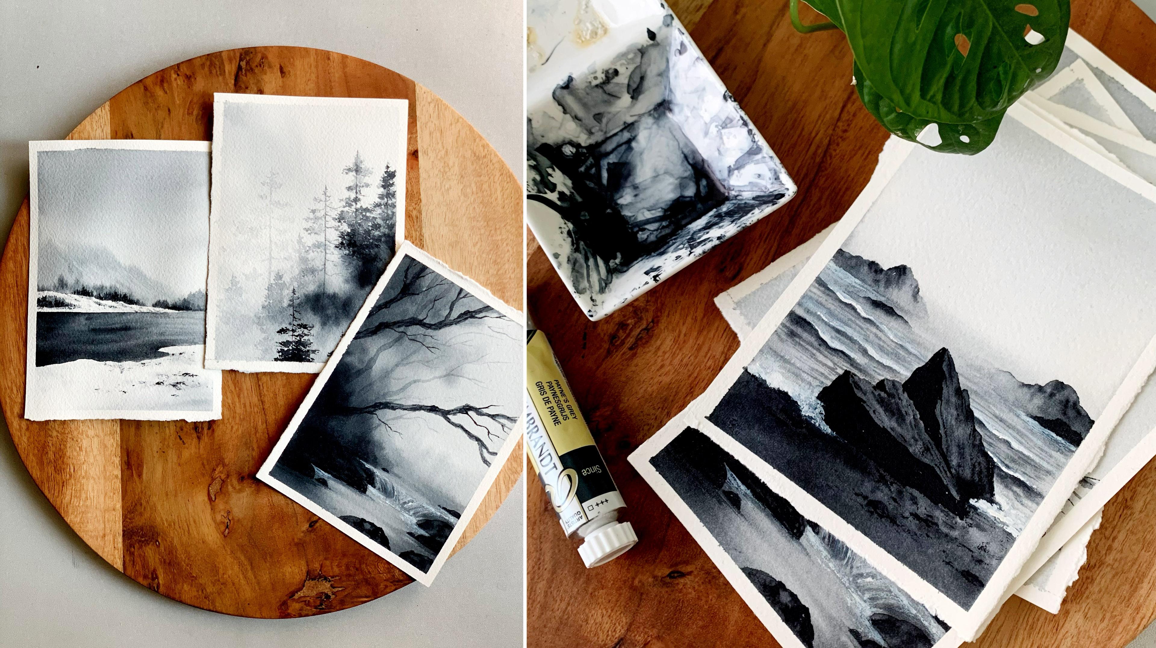
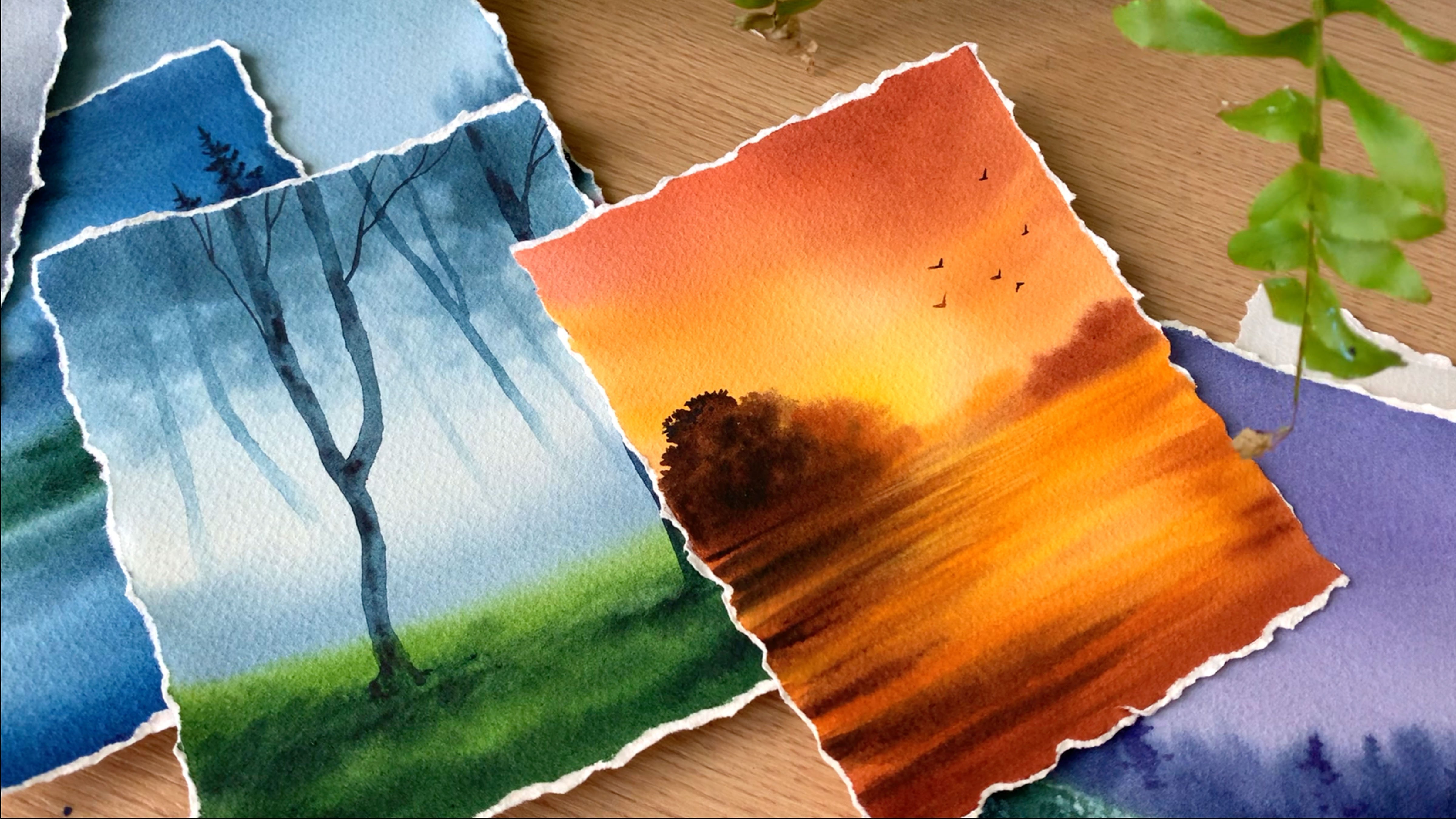
part. The painting you see here was done
in just 5 minutes. That's how powerful and
interesting a single color can be when used
in the right way. There is something beautifully coming about working
with just one color. It's simple, soothing, and
surprisingly powerful. So yeah, for the
next seven days, we are ditching the
rainbow and diving deep into the dreamy
world of Payne's Grey. By the end of this class, Pains grey will be
your new obsession. Alright, so let's start
and paint some magic.
2. Materials : Alright, so let's start
by having a look at the materials you will need
for this modo chrom series. I will start with the paper. So this one here is
Arches watercolor paper. This is one of my most
floored watercolor paper. It is cool pressed
and it is 140 B. Cool pressed watercolor papers have the right kind of textures, and it is perfect
for landscapes. And this one is 100% cotton. Now, your paper doesn't
need to be arches. If you have any freed watercolor
paper, you can use that. The only thing I want to
recommend is to try to go with a good quality
watercolor paper so that you have a best experience
in exploring watercolors. Otherwise, you may feel frustrated if you're not
getting the technique right. Because most of the
time, what happens is your paper might not be able to handle multiple layers of water. And you might end up
having a bad experience. You may be doing the
technique right, but the paper won't be good enough to handle all
those techniques. Okay, so that's all
about the paper. Try to go with a cool
press aticula paper, which is 100% cotton and a
minimum of 140 lb thick. Now let's go to the next item. Which is the key feature of this class, and
it's Payne's Grey. We'll be using one single
color for the entire series. So this one here is from
a brand called brand. Again, the brand doesn't matter. Go with any pains
grey you have got. Let me show you the pigment
number for this one. This one is not
that granulating, and that's one thing I love
about this Payne's Grey. So you can see the
pigment number here. It is PBK six and PB 15. It's a combination of
blue and black pigment. Now, along with this, you will also need some white gouache or white watercolor to add some
textures and highlights. Okay, the next thing you will
need is a mixing palette. I have this small, cute
ceramic mixing palette. It has two divisions, which is perfect when you are playing with only
one or two colors. Any kind of mixing
palette will work. Just make sure it is
clean. That's all. It can be ceramic or plastic. Now let's talk about the
brushes you will need. All these brushes here
are from silver brush. They are almost a decade old. These are my best friends. Anyway, I'll start
with the first brush. This one here is
a 1 " flat brush. I'll be using this one to apply water onto the background. Next, I have another flat brush, which is a half inch flat brush. We'll be using this one
to paint the background. Then I have three
different round brushes. The first one is
size number eight. Then I have size number
six and size number two. I'll be using them to paint, as well as to add the details. Okay, so those are the
brushes you will need. Again, the brand doesn't matter. You can go with any
brushes you have got. Next up, we have the water
for the watercolor paintings. So I always recommend working
with two jars of water. One has to stay clean, and other one is to trans of
the paint from your brush. When you're painting
monochrome paintings to make your color lighter
or to add effects, you will need clean
water in between. So please make sure you
have two jars of water. Now the next thing
you will need is a paper towel or a cotton cloth. We'll be using this
one to dab off the excess amount of water
or paint from your brush. This will be really
useful when we are creating those dry textures. The next thing you will need
is a masking tape to fix your paper onto your table
or onto a drawing board. And finally, you will need
a pencil and an eraser. We don't have a
lot of sketching, but to add things like mountain, a tree, horizon line, for those things, you
will need a pencil. All right, so those are
the things you will need for this entire
monochrome series. Keep them ready, and
let's get started.
3. Color Study: So before we start, let's
do a quick color study, and let's see what do
paints gray capable of. So I've added some water, and I'm making the color lighter. We'll first swatch
out the colors. We will start with a
lighter tonal value. Then we'll gradually
add more paint into the mix and we'll swatch
out a darker tonal value. So this is just for
us to understand the various tonal values we can achieve with a single color. Now I'm picking some water
and I'm making it lighter. So I'm going to
scratch out maybe four or five different
tonal values, but you can achieve many more. You can make it even more
lighter if you add more water. Next, I'm going to go with
one tone darker than this. So I'm adding more
paint into the mix, and I'm going to
scratch out that color. See that? So it is one ton darker than the
color we used earlier. So when you're doing
monochrome paintings, no matter the
medium, whether it's acrylic or gouache or oil. Tonal values are very important. That's the only way how you can achieve depth in your painting. The objects or the elements in the background
has to be lighter, and as you're coming
towards the full grown, you will have to slowly
make it more darker. Okay? So that's how you achieve
depth in your painting. Now you can see the
color I have used here. It's a bit more darker than
the previous tonal values. So this is how we are going to work in our paintings as well. For the background elements, we will start with
lighter tonal values. Then for the ones
in the full ground, we will use darker ones. Okay. So here you can see four different tonal
values of pains Grey. You can achieve many more. So depending on the effect
you want to create, you can choose to add more water or you can choose
to add more paint. This is the one I'll be
using. It is from Rembrand. You can go with any
pains grey you have cut. So pains Grey is a mix of blue
pigment and black pigment. And depending on the
brand you're using, the color can be a bit
bluish or grayish. And also, there are
chances some of the paints gray might
be a bit granulating. So those things
are totally fine, it is not going to affect your
painting in a drastic way. Alright. Now, I'm going
to quickly show you the magic of paint Screy before we start
with the paintings. Let's see how we can use the tonal values and
create a quick painting. I'm not going to add
a lot of details. I just want to
show you the magic one single color can achieve. Okay? So I'm going
to start by applying coda water onto this
entire section. Then I will start with a
light tone of pins grey. Then gradually, I will
add more taco tones. It's a quick, misty
pines version. That's what I'm
going to try here. Okay, so my paper is evenly wet. Now I'm going to start dropping the paint onto this
wet background. Now I'm going to
use my roundtris. This one is size number eight, and I'm starting off with a
light tone of pains gray. Adding that onto the background
in a very messy way. Now I'm adding some darker
tone at the bottom. So this one is going to
be a very quick exercise, more like a five
minute exercise. I won't be spending
a lot of time on it, and you don't need to do this. You can just give it a watch. I want to show you
the kind of effects or the kind of mood
you can create by a single color just by using different
kind of tonal values. Okay? So that's how the
background has turned out. I've added some medium
tone of pinkcreen between. Then I have left out
some space as well. Now, with a slightly
darker tone, I'm just going to add
some lines over here. These are going to
turn into pine trees. Again, I'm not going to
add a lot of details. It's going to be more like
an abstract painting. So in the background as
well, I'm adding some lines. Mystery pines is a wonderful exercise to do with watercolor, especially with better
on wet technique. I have added some lines
in the background, but it looks like
it is too watery. So I have dabbed a
brush on a paper towel. Our base layer is wet. So when you're using
a watery paint, it will spread a lot and
it won't stay as lines. So dab it on a paper towel if you feel your
paint is too watery, and then add the lines again. So it will look more like
lines or pine trees. Okay. So I'm just
adding them I can. Now, at the bottom, I will
use the same technique, but I will add bigger
lines with a darker tone. That's what I'm going
to do next. See that? So go with the
bolder tonal value and just keep on adding some
lines, some thicker lines. They might spread a little,
but just totally fine. I will add some
over here as well. If it's too watery, dab
it on a paper towel, and then add these lines. So you have a better control. Otherwise, they
will spread a lot. I'm loving the way this
part has turned out. You see those trees.
Beautiful, right. Now, I'm going to
add some more lines on the top over here, and then I will go
with a darker tone, and I will add some
trees at the bottom. Okay. So let's
pick a Darko tone, and I'm adding that over here. First, I'm simply
adding some lines. They're of different length, and I'm using a Darko tone here. You can see the
background is still wet and they're spreading, but not too much, you can
still see the shapes. Okay. So this is the point where you should be adding
the trees at the bottom, as this is in the foreground. Now, I think I will go with a smaller brush and I will add some more
trees at the bottom. So yeah, I have taken
a smaller brush, and I'm picking a darker
tone of pains gray and I'm just adding some shapes
in between. See that. So start by adding
a straight line, then onto either side, simply add some messy shapes and lines, and that's
your pine tree. That's all detail
I'm going with. You can put a little more
effort if you want to, but this one is more like
an abstract painting. We're not going too
much into the detail. Maybe I will fix the
sheep in a quick way. I'm picking some Dako tun, extending this, adding some
more shapes onto either side. Just so that it will look
a little like a pine tree. Okay. The background
is starting to dry, so the shapes we are adding
right now will stay. It won't spread
much. Alright, so that's how it has turned out. It was a quick exercise. I don't think I took
even 5 minutes for this. And this class is
all about creating such beautiful
monochrome paintings, and I really cannot
wait to get started. I'm hoping you guys are
as excited as I am. The painting has
dried completely, and I'm going to peel
out the masking tape. Then we can start with
our actual paintings. I think even this one
is a gorgeous painting, even though there is a lot
of details, a wooden frame, especially an antique will
look lovely on this painting. So maybe you can give it a try. I think a smaller
size will be much better as we don't
have a lot of details. Anyway, if you feel
like it, give it a try. All right, so that was
a quick color study, and we did a small exercise. You can see how
quickly and easily we created a sense of
distance in this painting, and that is exactly
what we are going to do in all the paintings we
will do in this class. So this was a quick exercise. I hope you guys are up
for the main adventure. So without wasting
any more time, let's start with the
workforce project.
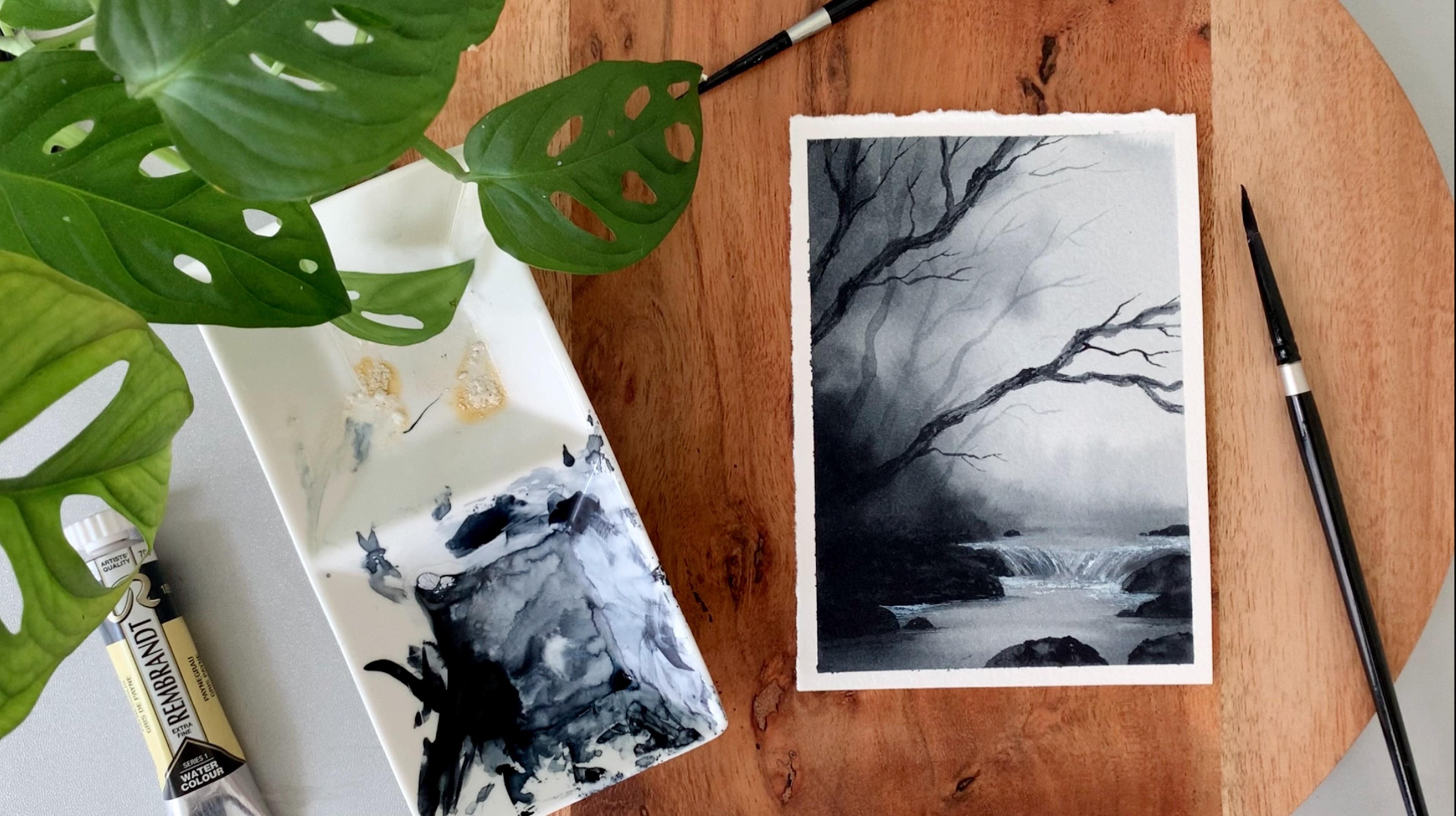
4. Day 1 - Foggy Day: Hello, lovelies. So here's the first project
we are going to do in this monochrome series. It's a foggy forest. We don't have a lot
of details here. It's actually a quick
and simple painting. We will start with
the background first, Leaving out the root, we
will paint the rest of the area in a light
tone of paints gray. This part we have to preserve. So painting the
background is the easiest and the most important
part about this painting. The background is where
that foggy magic lies, so this is very important. So once we are done
with the base layer, we will add the
background trees. You can see the light ones here. Those are the background trees. Then we will paint
the foreground trees. We have two,
foreground trees here. Okay. So that's how the
painting is gonna be. The trees in the background
won't be detailed. Only these two will
be a bit detailed. You can see all the texture and things have added
here. See that? It's a quick and
beautiful painting, and I'm sure you're going
to enjoy the process. Now, before I start, I want to remind you
all to keep a piece of facial tissue or a
cotton cloth next to you. We will dab off some paint using this facial tissue to create
that atmospheric effect. Facial tissues are much softer, so I would prefer this one for this particular technique
over the kitchen towels. But if you don't
have them, I think even a piece of cotton
cloth will work. We just need to
dab off some paint while the background
is wet. That's all. All right, so it's
time to start. Alright, so I have my paper
ready here. Now, let's start. I'm starting by adding a
quick reference sketch. This is not a very
well detailed sketch. I will add a tree here. So the major element of this
painting are some trees. I will be adding one
or two fuground trees, then some background
trees as well. So first one I might
be placing over here. We can change the shape or the location when
we're painting. So I'll be adding two trees. This will be in the fground. Then we'll have some
background trees as well. The next thing you have
to add is two lines. See that? So there are far away, we have the vanishing point. And at the bottom,
the road is wider. So yeah, that's it. We'll be adding our paint
according to these lines. So even if it does look
like a silly sketch, it's very important
to add these lines. Alright. Now I'm hoping you have the color ready
on your palette, which is just paints gray. We're going to paint the entire background
layer in one go. Okay, so I'm starting
by adding a coat of clean water onto
the anterior paper. I'm using my wider brush. This one is 1 " flat brush. Now I'm picking some
water and adding an even layer of water
onto the anterior paper. Running your brush back
and forth multiple times, just to be sure the
coat of water is even. We don't want any
pools of water. It has to be a nice,
even shiny coat. Okay. So the background
is evenly wet. Now we can start
applying the paint. And for that, I'm going
to go with a round brush. You can go with any of your
medium sized round brush. This one is size number eight. And I'm starting off with a
light tone of pinks gray, adding some water, and I'm turning that
into a lighter tone. Okay. Now, I'm going to apply this color on the top.
You can see the color. It's a really light tone. Start with a similar
tonal value. So for this painting,
I'm going to go with very soft and foggy effect. I don't want the colors to
be too bold and dramatic. That's the reason why I'm going
with a really light tone. Okay? So go with a
similar tonal value. Or if you prefer to
make it a bit dramatic, you can make the color
slightly more darker. Okay. Now, towards the bottom, only onto the right side, I will introduce a
slightly darker tone. Okay. And now I'm gonna drop in that
darker tone over here. The other side, the left
side remains the same. I won't be adding any
darker tone on that side. Only on the right, I'm adding
a slightly darker tone. I'm spreading that paint. But I'm leaving
the road as it is. You can see that here. I
haven't added any paint on it. The road is covered in snow, so it has to be mostly white. Okay. So I have
left out the road, and I have added paint
everywhere else. Now, I have a really light
tone of gray on my brush. I'm just adding
that at the bottom. I will be adding i over here closer to the
vanishing point. That can stay as white, but only at the bottom, closer to your masking tee, we can add a slightly
light tone of paints gray. Now, I'm going to keep
this brush aside, and I'm switching
to a smaller brush for the rest of the details. Now I'm going back
with paint screen. This one is more
like a medium tone, not too dark, not too light. And if it's too
watery, dab it on a paper towel before you start. Now, on either side of the road, I'm introducing some
sort of details just to show some plants or some
rocks or some sort of things. Okay, so just keep on adding some shapes and patterns
onto the background. Using a similar tonal value. Don't make it too
dark. Okay. We want to create that soft effect. So the colors are very dark, we won't be able to
create that soft effect. At the road as well,
I'm adding few marks. You can clearly see
the tonal value. Try to go the
similar tonal value. Now, similarly, I'm adding some shapes on the
other side as well. Okay. Now, if you feel
your paint is too watery, you can dab it on a paper
towel before you start. If your paint is watery,
it will spread too much, and they won't stay like shapes. Okay. Now, on this side, I'm adding similar shapes, but in a slightly bigger way, I'm adding some tots
and some small shapes. See that? Now we're doing this only on
these extreme sides. We're not adding any
towards a vanishing point. That place has to stay as white. Okay? Now, I'm adding
some more shapes, only on this side. Now on the road, few shapes
and some small marks. Okay, so try to go
with a dry brush. There shouldn't be any
watery brush on your paint. You can see the way
how I'm adding them. More like some footsteps
or some marks on the road. Now I'm picking a
slightly darker tone, and I'm adding some
similar shapes. Okay, not a lot, just
a few in between. Just to bring in some textures. Again, go with a dry paint. Don't pick that watery paint. If you feel it's watery,
you know what to do. Dab it on a paper towel
and make your brush dry, then continue adding
these patterns. Similarly, let's
add a few patterns on the other side as well. Then some on the road. Okay, so we started off with
a medium tone. Now we're adding more definite patterns with a darker tone. The background has
almost dried up. So these patterns
you're adding right now will stay as patterns. It won't spread into
the background. So you have to be careful.
Don't take a lot of paint. Okay. I'm loving it already. With a little paint, we have already created a
soft fog effect. Now I will quickly add some
more patterns on either side, then also on the road. And with that, we'll be
done with the base layer. The road is still white, and that's a beauty
of this painting. When we add the trees, you
will see that contrast. Then it will look really snowy. Anyway, with that, we are done with the base layer.
Now let this dry. Okay, so the big slur
has dried completely. Now we can start with the trees. Now for this step, we will need a facial tissue or a soft
cotton cloth will also work. Now go with any of your
smaller or medium sized brush. Now, the trees we're going to add is in a very light tune. Okay. Let me start
adding the first one. You can take a look
at the tonal value, then go with your tree. I'm not adding any
on the left side. I'm focusing on the right side. Okay. So that's how I have
composed this painting. You can tweak it the
way you like it. Okay. We're starting off with a really light
tone of pink gray. Then gradually we'll make
it darker. That's the plan. Okay. So add a few drops
of water into your paint, then make sure it
is a lighter tone. Now, I'm starting my first tree closer to the vanishing point. The brush I'm using here
is size number six. Go with a similar
size or even smaller. Okay. So let's add
the first tree. I'm adding that over here. These trees are
very simple shaped. They are not very well detailed. Okay. Go with the
similar thickness. So that's a tree trunk. Now, I'm going to grab my paper towel once I've
done added the tree trunk. Then I will dab off some paint to create that foggy effect. Okay, so the tree
trunk is ready there. At the bottom, I will
just use a paper towel. See that? So this will
easily create a fog effect. You don't need to worry
about the bottom part. It will nicely merge
into the background, creating a soft foggy effect. But you have to do this while
the paint is still wet. You should not be waiting
for a longer time. That's the only thing. Now I'm adding some branches
using my smaller brush. This one is size
number two. See that? If needed, you can dab it
again very gently and softly. Don't put a lot of pressure. Okay. Now I'm going to add another tree right next
to that in a similar way. So starting now with
a light tone of paint screen, adding
the tree trunk first. Then I'll dab off
some paint from the bottom to create
that foggy effect. Along with that, add
some branches as well. It's a simple trick.
You can easily create a foggy effect just by
doing this. See that? It got merged into the
background in a second. Okay, so that's a trick. Now you can add as many
trees as you want. As I said earlier, I'm going to focus only on the right side. But if you want
to add some trees on the left, that's
totally fine. But towards the
bottom, try to use a paper towel and then
create that fog effect. This way, you don't need to show the roots or what's
happening at the bottom. Okay? It's an easy trick, but very pretty asphll. Anyway, I'm going to continue with the next tree
in a similar way. Now for this tree, I'm
using a color which is slightly darker than the
previous color. Not too dark. It is still a lighter tone. You can see the color here. Okay, so we're just going to gradually make
the colour darker, it should not be like
a drastic change. At the bottom, I
will quickly use a paper towel before
it dries out. See that? Easy, right.
So this is a truck. Whenever you're creating
a foggy painting, you know how to make it foggy
just in a single swipe. Anyway, I'm going to add
some branches onto this one. Then with a similar tonal value, I will add one or two trees before I go with the
full crown ones. Okay, so that was a
slightly bigger tree. Now, I'm going to
add another one onto the right side with a
similar tonal value. Add your trees irregular shape to make it look more
realistic and natural. Don't add them as
a straight line. See that? So add some curves and some slight irregularities. It's the same kind of tonal
value I used earlier. If you want to make it slightly darker, that's totally fine. Okay? But don't use that really
dark tone of paints gray. We are saving that color
for the fgrowd trees. Okay. You don't need to
follow the same shape. You can add them
wherever you like. It can be more
thicker. Okay. Now I'm going to add more branches
onto this tree trunk. I'm quite happy with the shape, but we need more branches. I'll be honest, initially,
when the background dried out, I was a bit worried whether
I used really light tones, whether it could have
been a bit more darker. But now, when I add the trees, I think it is looking nice, or it is starting to look nice. And that's the thing with
atglot When the colors dry, it is always lighter. So you always have to plan. If you want a brighter result, you have to go with
one tone darker. Otherwise, they will end up looking lighter like this one. Anyways, I'm still happy with
the way it has turned out. Now, I'm going to
add the last tree. I mean, the last
background tree. I will add that over here. And then we can go with
the full grown trees. If you want to add more,
you could do that. You can add one more in between or towards the left
side, wherever you like. Okay? For me, I'm
gonna stop it here. Then after adding
the fu ground trees, if I feel there is a
lot of gap in between, maybe I will introduce
another one. For now, I think this is fine. Okay, so let's wait for this to dry before we go ahead
with the full grown layer. Alright, now it's time
to go the fugrontrees. I'm gonna start
with the first one. And for that, I'm gonna go the slightly darker
tone of pinks grey. It's not too dark. Maybe you can call
it a medium tone. Okay. So that's the
tone I'm going with. You can place your tree
wherever you feel like, and you can go with any
kind of shape you prefer. Okay. Those things are
totally your choice. Now, I'm thinking of
adding that over here. I think I will go with a
curvy or an irregular shape. Maybe I will turn it here
and then bring it down. Okay, so I'm going to
start it from here. Now, at the bottom, there is something you
have to be careful about. When you're adding
the root part, maybe you can give it a watch. I'm just adding an irregular
shape in there. See that? So just add some dots and
some irregular shapes there, and then continue with the rest. By doing this, we're
actually making it look like there is some
snow on the bottom. Like the bottom part is
all covered in the snow. Maybe at this point, it won't make any sense, but trust me, it
will look really beautiful if you add that
irregular line at the bottom. Let me finish the shape first. Then I will show you how
it's going to look like. So have an idea how you
want your tree to be. I mean, the shape of your tree. Maybe if you want to sketch
it first, you could do that. Go with a light pentel sketch
and fill in that shape, and then use a
similar tonal value. Okay. Now, I'm going to
continue this to the top. It's a long tree. Then onto this, I will add
some beautiful branches. I think it's quite thin. I
have to make it thicker. So starting from the bottom. Then I will continue
towards the top. So once I'm done with this tree, I'm thinking of adding another one towards
the right side. Okay, so the tree
trunk is ready. Now onto this, I'm going
to add some branches. You can add your
branches however you like, and wherever you like. You don't need to
fold the same shape and the same way
I'm adding them. Okay. And also, at any point, if you feel the color
is really dark, if you want to make it a bit
softer, you know what to do. Grab a piece of paper towel and gently tab of the
colors. Don't smudge it. Let me show you. So I'm going
to grab my paper towel. Then gently dab it off. See that? If you smudge it, the paint will go
here and there, and that will be messy. Be very gentle, just
like a feather touch. Now, I'm going to quickly
add some more branches. I will add some
thicker ones first, and then I will add
some thinner ones. If you add more branches, your painting will
look more beautiful. So don't skip them, add few thicker branches, then go with any of
your smaller brush and add some thinner branches. I have switched to
my smaller brush. This one is size number two. Now using this brush, I'm going to add
plenty of branches. Alright, so that's how
it has turned out. That's our first fuegrowd tree. Now, to make it look
more beautiful, I'm going to add some textures, and for that, I'm using a
dark tone of paints gray. Now, if it's too watery,
dab it on a paper towel. And I'm going to add some
lines onto the tree. See that? So simply add some lines. This will create a
tree like texture. They don't need
to be of the same length or the same size. You can simply add
them onto the surface. It is good to use
a smaller brush so that you can be well
within that shape. If you use a bigger brush, you may not have
a lot of control, so you might accidentally
add some lines outside. Now with the bottom,
I'm thinking of making some of the
lines more thicker. So I'm grabbing more
paint and adding some more lines with a much
more darker tone. See that? I'm doing this only
at the bottom. The top part can stay acetus. Now, there is one more
thing we have to do. So with the same brush, I'm adding some patterns
on the ground as well. If your paint is watery,
dab it on a paper towel. We want some dry
textures on the ground. Don't make it too cold and big. So just add a few
patterns, and that's it. Now in a very similar way, I'm going to add another tree. So this one is going to
be a bit more thicker. I'm using a medium
tone of paints gray, and I'm going to
add that over here. So first, I will quickly add the basic crepe,
just the tree trunk. Then we can add some textures and some branches onto that. Okay, now at the bottom, I'm going to introduce
those textures. So add some patterns
and textures. In a way, your
hand is shivering. See that? Add a straight line, add some patterns at the bottom. This will automatically
make it look like there is some snow cover over
there. See that? Now, once we're
done with this, we will add some teeny
tiny patterns, the same way how we did for
the other one on the ground. You can see the instant
difference it made. With very little effort, the ground is
looking super snowy. Now, I'm going to
add some tiny shapes and irregular bumps onto
the side of the tree. This will make it
more realistic. So I'm just adding some lines. And I'm also making
that line irregular. I mean, the shape of
the tree irregular. On the outer side. Maybe we can add some
tiny pumps as well. So these are the little
things that will add more realistic
touch to your tree. See that? So add some tiny
pump wherever you feel like. Don't overdo it. One or
two was all you need. Okay, now let this dry. I think I won't add any
branches onto this. I will just leave
it as a clean tree. But depending on the size and the shape you have garden with, if you want to add
some branches, it's totally up to you.
You can add some branches. Now I'm thinking of
making this tree a bit darker because I don't have any other space
to add a new one. So I'm picking a medium tone, now grabbing some water and making it lighter
towards the bottom. Now the same I'm doing towards the top making
this part lighter. Okay. So in the meantime, the other tree
will get dried up, then we can add the
textures and all that. Now, there's one more
thing I want to do, which is making this tree
a little more brighter. Again, when it dried up, it is barely visible. It's a light tone
of paints gray, and I'm just overriding
the same tree again, dabbing off some paint
from the bottom. Now I will add those branches. So if your trees are in
a perfect condition, you don't need to do this. Mine is barely visible,
so I had to do it. Now, I'll just add
those branches. And then we can add the textures onto
the foreground tree. Okay, it's looking better. Earlier, it wasn't visible. Next, we can go ahead
with the textures. So I'm going to keep
this brush aside, and I'm switching
to a smaller one. It's the same thing
we did earlier. We will go with a taco
tone of paints gray. Then we will add some
lines onto the surface of the tree in order to create
that wood bark like texture. So go with any of your smaller
brush with a pointed tip, and then simply keep
on adding some lines. There can be some
irregular line. It doesn't need to be
in the same length or the same thickness
or anything. You can simply keep on
adding some lines onto the surface using
a taco tone. Okay. Now, simply fill
that entire area. No matter how you add the lines, it is all gonna look good. So this is a very
easy PC thing to do. Simply go with your
smaller brush, pick a darker done
of paint scream, and roughly add some lines. They can be straight, they can be wavy, they can be irregular. They can be short or
long. Nothing matters. Simply add some lines and
fill up that entire tree. Alright, so that's done. We have added
enough of textures, and it is looking quite nice. Next time, adding
some dry patterns on the ground with
the same brush. If your paint is
watery, dab it on a paper towel and
make sure it is dry. Now, simply add some small
patterns on the ground. Okay. Again, don't overdo it. We only need a little
around the tree. Some torts and some small
shapes and some patterns. Try to go the dry paint. That makes a lot of difference. You will get some rock
kind of a texture. So we are trying
to show there are some rocks underneath
or some stones, and they are a
little bit visible. Okay. So that's it. That's our second tree. Now, only for this big tree, I want to introduce some
snow like textures, and for that, I'm going with some white gouache.
It is not necessary. If you're happy the way it is,
you can leave it as it is. You don't need to introduce
any white paint on it. But I thought of adding
some white lines just to create some
snow kind of texture. So I'm going to grab
my white quash. If you don't have white gouache, even a white
watercolor will work, but you have to make sure you're not adding a lot of water. If you add a lot of
water, your paint will be transparent and it won't
look like that opaque snow. Okay, so take either white
gouache or white watercolor. No matter what you're using, don't add much water.
Just one or two drops. That's all we need. Okay, so I'm picking the paint
on my smaller brush. It has got a good pointed tip. Now with this, I'm going to add some lines on the second tree, the bigger one we have here. It is the same way how we
added those black lines, but we won't be
adding that many. That is the only
difference here. So just add few broken
lines in between. We don't need a lot, just a few here and there.
That's all we need. And also try to go with
the paint that is kind of dry so that it will
lay a texture. If you're going
with a loose paint, what will happen is
they will look like prominent hard lines,
which we don't need. We want some textures here. We don't want them
to look like lines. Okay. So if your
paint is watery, dab between a paper towel
and make sure it is dry. Then add a few
patterns in between. I'm adding them at
the bottom now, now gradually going
towards the top. See that? Skip some space, then add some lines in between. Okay, now continue
this till the top. Oh. All right, so that's done. Now, just in case if you feel you have added a lot
of white patterns, what you can do is clean your brush and go back
with paints gray, and then simply introduce
those lines again. So wherever you feel
the white lines are not necessary or very prominent, you can just add a black
line and cover it up. Okay, I also want to introduce some darker lines in between.
That's why I'm doing this. This will also make that
white snow lines pop out. Okay. And that's it. That's our tree. Okay,
so at this point, we're actually done
with our painting. But before I call it down, I want to add one more tree closer to the vanishing point. I'll be adding that over here. So I'm going back with the tune. And I'm going to
add one more tree. This is completely
optional if you have enough off trees
in your background, and if you feel it
is in a good stage, don't ever add any more trees. I felt there's a lot of
white space over here. That's why I thought
of adding one more. Now I'm dabbing the bottom
part using a paper towel. Now I will add some
branches onto the top. And then I'm going to
really call it done. No more trees, no more textures. Okay. So I'm just extending
that towards the top, and I'm adding some branches. Now, in case if
you're adding them, try to go with a
similar tonal value. Be very careful about that
because when you're painting fog or snow to create
that foggy atmosphere, it is really important
to create a tpth and we can only do that by playing with different
tonal values. And in this case, it
is only pains grey. So we have to go with different tonal
values of pains grey, lighter tones in the background, and darker tones
in the foreground. That's how you create that
tipth in your painting. Okay, so this is the first
painting from the collection, and I'm hoping you
guys are enjoying the way you are progressing
with your painting. If you're here to try,
do give it a try. I'm very sure you will love
that atmospheric effect. You can create by just
using one single color. Okay, so here is the
finished painting. Now, I'm gonna peel
up the masking tea. In this painting, we
don't have a lot of elements or a lot of details. It is just some trees. We played with different
tonal values of paint screen. We used lighter tones in the background and Daco
tones in the foreground, and that's how we
created that effect. Oh, I didn't get a clean
border there. Never mind. I'll just cover that
with the white quash. Now, one more side to go. Okay, that's a clean border. So here is the
finished painting. I hope you all liked it. You can take a closer look at the details and that
foggy atmosphere. Okay, so that was our first project from
this monochrome series. I'm hoping to see you
in the next projects as follow. Thank you so much.
5. Day 2 - Snowy Lake: So first, I'm starting
with a sketch. We need to add that ground
line, then the horizon line. Okay. Just some simple sketch. It's not a complicated one. So add a nice irregular shape like this to define
the snowy ground. Okay, we'll be adding
some textures, some small rocks and
things onto the ground, which we can do as
we're painting. Okay? So for now, we just
need that irregular line. Now I'm going to add
the horizon line. I'm adding that almost at the center of my paper.
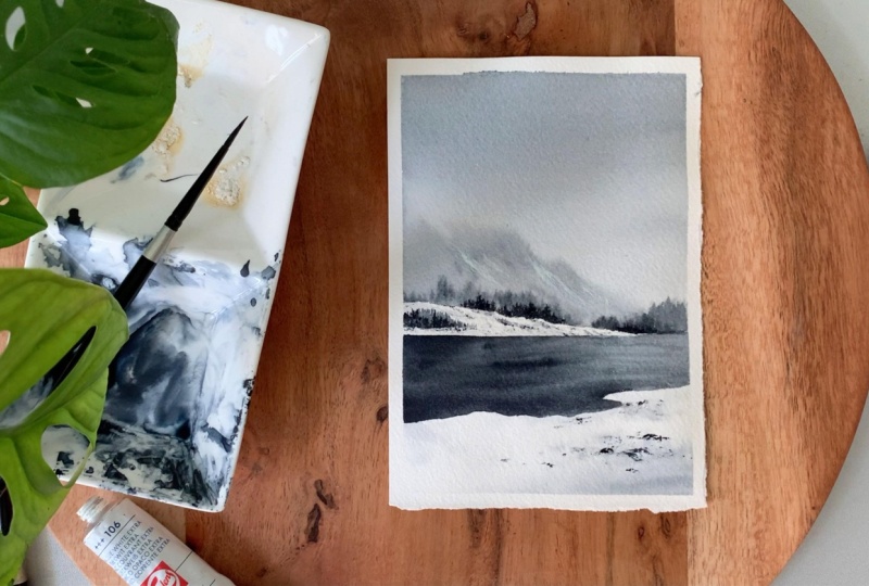
Hello, dear friends. Welcome to Day two of painting
Monochrome landscapes. This one is a
beautiful composition. We have a soft sky and
a blurry mountain. We'll be painting
this section first, the sky and the blurry mountain. Then we will go ahead
with the landscape here, these trees in the background, and then we will
paint the snowy land and also the snowy patch
in the background. For the snowy areas, we
will use the paper white, and we'll simply
add some textures. And then finally, we
will paint the lake. So yeah, as you all know,
we'll be playing with different tonal values of pain scree to achieve the
depth in this painting. We will use a lighter
tone for the background. Then for the landscape here, we will use a darker tone and
also to add the textures. We'll also be adding
a little white onto these mountains just to
create a snow hey effect. Okay? Now, let's start
with the process. Okay, so that's horizon line. Now we need to add
a small mountain like a shape on the left side. Okay. So just add a
similar shape like that. We'll be adding
some pine trees and small details on top of it, and also in the
background over here. Those things we can add
as you're painting. Okay? Now, in the background, we also need to add a mountain.
We can add that as well. So this mountain is going to
be done in ton we technique, which means the shape
won't be very definite. It will be a blurry mountain. Okay. So even if
you're adding a shape, there is no guarantee
it will stay as it is. So even if you don't add
a sketch at this point, it's totally fine. All right. Now we can start painting. We're going to
start with the sky. And for that, I'm
using my roundtrch. This one is size number eight. No adding any water
onto the sky. I'm just going to go ahead
with the paint itself. I'm using a light tone of
paint screen for the sky in case if your room is really hot or if it's pretty sunny, if you want to start
by adding a quarter of water, that's totally fine. For me, it is pretty okay
here. It is not sunny. So even if I don't add
any water onto the sky, I'm hoping it will stay wet while I'm adding
the mountain as well. That's why I'm directly
going in with the paint. Okay? So I've started
off with a light tone. Now I'm making it even more
lighter as I'm coming down. So I'm picking more water,
and I'm making it lighter. Now, you had to
stop where you have this line. Don't
bring the paint down. We want to retain the white
space on that snowy land. Okay, I'm just
thinking of making the sky a bit more
darker only on the top. I feel this one is really light because when the
background dries out, it will be even more lighter. So only on the top, I'm
adding some more paint, which is more like
a medium tone. But still, I'm making it
lighter towards the bottom. Okay. So that's how
it has turned out. Now we can start
with a mountain. So go with the medium tone, then make it lighter
towards the bottom. Now to paint the mountain, I'm going to go
with a smaller reh. This one is size number six. Now, when you're
adding the mountain, you have to be sure
about two things. One, the background
should not be too watery. The water should have settled, and also your paint should
not be too watery, as well. So if you feel your
paint is too watery, dab it on a paper towel
before you start. But I think I will just start
with these details here. You can see the way the
paint is spreading. If you go in with
the mountain at this point, it
will spread a lot. We need a blurry mountain, but if you go ahead with
the mountain right now, it will spread a lot,
and it will just spread into the sky without
leaving any kind of shape. Okay? So let's start with this and then go
with the mountain, which will be a smarter choice. Okay, so I'm just
adding some shape here. These are the trees
in the background. Okay. Now I think we
can go with a mountain. The paint is not spreading much. And also when you're starting, go with a small chip first. If you begin with a big shape, it will spread a
lot, and there won't be any room for
fixing your mistake. So just start with
the bottom line, then gently, add the rest. This way, you know whether the
paint is spreading or not, whether you need to stop there or whether you can go ahead. This way, you will
get a little time to understand what's
going to happen. See that? So start
with a small shape, then gently, make it bigger. Alright. Now I'm going
to pick some more paint. Then I'm going to add some
darker tones at the bottom. See that? We're trying to create some texture by
adding these darker tones. Now I'm going to make the shape bigger. I think this
is the right time. The paint is still
spreading, but not a lot. Along with that, you can add some medium tones
as well to bring in those texture on the
mountain. See that? So simply add some lines. You don't need to smudge it or blend it or anything,
leave it there. This will leave some beautiful
textures when it dries. Now, you can go with any
shape for your mountain. It doesn't need to
be as same as this. We just need a blurry soft
mountain in the background. That's all. The shape
is totally your choice. Alright. Next, I'm going to add some trees
in the background. And for that, I'm going with a slightly darker
tone of pink gray. I will add some trees on
the right side first. Then also a few in between. Okay. So add a nice line
at the bottom first, then on to the top,
add some lines and some small shapes to show the pine trees
in the background. On this side, the paint
has dried completely, so it is not really
blurring or spreading. But over here, it is
still wet. See that? It is nicely spreading
into the background. So I'm using a Dako tone, and I'm adding some
trees in the background. So it's just a matter of adding some lines of different height, and they will spread
into the background. It's a wonderful technique
to show the trees far away. Wet on Wet technique
is just magic, especially when you're painting
monochrome landscapes. I will add some more trees, and then we can leave
this for drying. We'll be adding another
set of trees in the foreground using a taco tom, but these ones are in the
background, which are far away. So we have to go with a wet paint and make
these blurry trees. Okay, so that's how
it has turned out. Now let's leave it for drying. All right, so that is
dried beautifully. You can see all those
textures we have got. Next, we're going to
paint the snowy areas. We have one on the top
and one at the bottom. And after that, we
can paint the lake. Okay, so for this one, I'm
going to apply a coater water. I think I will start
with the bottom part, which is a bigger section. And on the top, we won't
be adding much paint. We will just use
mostly textures. Okay, so onto this section
I have at the bottom, I'm adding a a water
using my ran brush. Okay, so I've just follow the sheep and I have
added some water. Now I'm picking a light
tone of pins gray. To get a better control, I'm switching to my size
number six armres. Now I'm picking a medium
tone of pins grey. And I'm adding that along
the bottom most area. If your paint is too watery, dab it on a paper towel
before you start. Otherwise, it will
spread too much. Okay. So I'm just adding some light tone of pins
gray at the bottom, and also some lines
onto the top. I won't be adding
much. I want to retain most of the white.
I mean, the paper white. So I will just add some
shadows and some textures. At the end, once
everything has dried up, we will be adding
some dry textures using a taco tone
of paint screen. That's when it will look
really like a snowy ground. Maybe we can add a few
more textures and shapes. So I'm picking a taco tone, and I'm simply
adding some shapes and some lines in between. Not a lot, just a
few here and there. We'll be adding our darker
tones also onto these areas. I mean, the darker textures. At this point, you might not
really feel the snow here, but when we add the textures
and when we paint the lake, there will be a contrast,
and that's when it will start to look
like snow. Okay. So that's how it has turned out. Next, we can paint the top part. If you want to drop in
some more textures, you could do that. Maybe I will just
add some darker tone only onto this corner. The rest can stay acetus.
Okay, so that is it. Now let's paint the top. And for that as
well, I'm going to use the same tonal
value of pains gray, but I won't be adding any water. I'm just going to add a few shadows and some highlights here
and there. That's all. I want to retain most
of the white here. So using a light tone of pains gray, I'm adding some lines. You can see the color.
It is really light. Go with a similar tonal value, and just add a few
lines from the top towards the bottom
in a sloping way. Next, I'm going to add
some textures as well. As we haven't added any water, it is still dry, so we can
go ahead with the textures. And for that, I'm peeing a
slightly darker tone of pinks gray and then I'm
adding some textures. This one is a dry paint.
It's not a wet paint. So if you feel like
your paint is wet, dab it on a paper towel, and just have some shapes
and textures in between. Using a taco tone
or a medium tone. Anyway, we'll be coming
back with a taco tone. Maybe you can do that along or just go with a medium tone. Okay, so these are just
some dry textures. The major part still has
to be your paper white. I mean, the color of your paper. So don't overdo and
add a lot of textures. We just need a few
here and there. Okay? If you add a lot of textures
and paint and everything, we will miss the
snowy character. So just add some dry
textures in between. We will also need to add
some trees onto this part. So we can add some
more textures, and then we can go
ahead with the trees. When I see trees, they are just going to be
some simple shapes. They're not going to
be well detailed. I'm going to add some over here. So I'm going to pick some
more paint on my brush. This time, I will go a watery
paint, not a dry paint. And I'm starting by
adding some lines here. So just keep on adding some
lines close to each other. They can be tall and short. Go with the combination
of different height. Then let's keep on
adding similar lines here and create a
cluster of trees. Now, we're trying to make it look like this part is far away. To get a sense of distance, the size really matters. Go with a similar size. Don't make it too
big. Okay. So all you have to do is add some
lines close to each other. You can see some of
them are taller, some of them are shorter. And at the bottom, I have
simply filled that area. Only on the top, you can
see the lines. See that? Now, over here, I'm adding
some smaller lines. So the color I use right now is a medium tone of pins gray. Now, towards the bottom, I
will introduce a darker tone. Maybe I'll just fix
the shape first, then I will introduce
the darker tone. So just add some lines
close to each other and fill the bottom. Okay. Now I'm going to crab a
darker tone of pinks gray, and I will add some darker
tones at the bottom. Then with a darker
tone, I'm also planning to add some
trees in the background. Okay? When we add
the darker tones, it will start to look
really beautiful. Right now, it's all medium
tones and lighter tones. Okay, so I'm going to
pick a darker tone. First I'm adding
that at the bottom. Okay, maybe you can add
some lines as well. Only a few. The rest
can be medium tone. So introduce some
lines in between. Now I'm going to add some
trees in the background. These are also going to
be very simple trees. You don't need to put
a lot of your foot. Add a line, then maybe you can
add some messy saps on it. Just run your brush onto either side in a
quick, messy way, and it can create some foliage, or you can simply go with some lines and fill
the bottom area. Add them in different height. Some of them can be shorter, some of them can be taller. Now, in a similar way,
wherever you want to add such cluster of pine
trees, you could do that. I'm using my small brush. This one has size number two, and I'm simply adding
some lines far away, and these are the pine trees. Okay, so go with a darker tone and simply add some
lines and shapes. You don't need to
put a lot of effort here because these are
the trees far away. They can be just some
simple lines and some quick messy shapes,
a combination of these. Okay, so I'm going to add
some more trees far away. And then with that,
this part will be done. And then we can paint the lake. Okay, so that part is done. You can see how it is
starting to look snowy. Next, we are going
to paint the lake. And for that, I'm
going to go back with my bigger round trush and we'll start with the
medium tone of pain screen. We'll add that onto
the entire area first. Then we will start introducing
some darker tones. Okay. So go with any of your medium sized brush and start off with a
similar tonal value. Now fill that entire area
in a similar tonal value. Then just like I said, we can gradually add the darker
tones and textures. D Okay, so I added paint onto
the entire area. Now with the same brush, I'm going to pick
some taco tone. And I'm going to add some taco tones onto the left side first. So simply add some lines from the side towards the
center. See that? I'm adding that
over here as well, just to bring in all the
shadows and taco tones. So towards the top, I'm going
to retain that medium tone. And at the bottom,
I will introduce some taco tones. That's my plan. Then we can add some
lines as well to show the water movement or the
texture of the water. I will add some onto the right side, the
bottom most area. The top, I'm planning
to leave it as it is. I want medium tones on
the top, as it is far. I'm switching to
a smaller brush, and I'm just pushing and pulling the paint
into each other. And I'm creating some
lines and texture. I haven't taken any new paint. I'm just making use of the
paint I have added already. Now, I have taken some paint. And I'm adding that
onto these areas. When we add those taco tones, we can really feel
the snow here. Okay, now, wherever you feel, you want to add some taco
tones, you could do that. I'm simply going to add some
lines into the background to show that water kind
of texture. Okay. So I'm going to
pick a little more darker tone on this brush. This one is a smaller brush, and I'm going to add some more
lines into the background. Mostly onto the left side. As I said earlier, I'm going to leave the
right side as it is. Maybe only towards the bottom,
I will add some lines. Okay. So I'm picking
some darker tone. Then I'm adding some lines just to show the shadows
and the reflections. Alright. Now, I'm going
to spread it a bit more. Looks like it is too prominent. The lines are very visible. So I'm just spreading it out
to make it a bit softer. Okay. So that's the leak. I cannot tell you how much I'm loving the way this
is turning out. That leak made the
whole difference. Now you can really
feel the snow. Now I'm going to grab a
paper towel and I'm going to dab my brush on it to remove the water
content from my brush. Now with this dry brush, I'm going to add some
textures onto the ground. You have to be really sure
your paint is not watery. We need some dry textures here. If your brush is still water, you can dab it on a paper towel again and then do this exercise. Also, if there is
no paint as well, you can pick some paint
again because mine was totally dry and the paint was not really
showing on my paper, so I had to pick more paint. You can add these dry
textures wherever you like, but be sure not to overdo it. Okay? And also try to go
with a smaller brush. This way, you will
have a better control. Those shapes will
be smaller shapes. Okay, now I'm going to
add some more patterns. Then maybe I will add a few in the background as well,
using a Taco tone. Now I'm adding some stone
like patterns here. So yeah, to make it
look more realistic, you can add some small
dots and small shapes, which will look like stones. Then you can also
introduce some textures. I think I have added enough
of patterns at the bottom. Now, I'm going to add a
few onto the background. We have a low lying snowy
mountain in the background. Onto that as well, I'm
adding similar textures, but I won't be adding a
lot as it is far away, and I'll be adding them
in a sloping manner. Okay, so onto the surface. Simply add a few textures. Don't overdo it. We only
need a little here. Even if you overdo the bottom
part, that is still fine, but don't overdo over
here as it is far away. So just add a few here and there, mostly smaller patterns. Okay, so that is it. I think
it turned out quite nice. Now I'm going to go back
with a darker tone of pinscrey I'm going to
add some more trees. If you have already added enough of trees, you can
skip this step. I want to add some here first. So I'm using a Daco tone, and I'm adding some lines and also some messy shapes on
it to show the foliage. After this, I will add few
more along the top line. All right, so those are the
trees in the background. Now, I'm going to go
with some white quash, and I'm going to add some
snow onto the mountain. This one is completely optional. If you don't want to add
this, it's totally fine. Now if you don't have quas, watercolor will also work. Just squeeze out some
white watercolor onto your palette and then add
a few drops of water. Okay. Maybe you can take
a look at the result, and if you feel like
adding it, you can add it. I'm taking some paint
directly from the tube. We only eat a little, so I'm
not going to squeeze it out. So with my smaller brush, I'm picking a little of paint, then adding a few
drops of water. We don't need that creamy
thick paint for this. We want to paint that
is kind of light. So add a few drops of water and then add some lines
onto your mountain. Because this mountain
is far away, and the snow we
are trying to show here will also look blurry. It won't be that
white, opaque color. It will also appear
blurry or a bit grayish. Okay, so add a few drops of
water into your white paint. Then add lines like this
onto your mountain. I won't be adding
a lot. I'm just adding a few in a sloping way. These are just some
irregular lines. They can be thicker or thin. They can be some dry lines or some fine lines.
Everything will work. You just need to add
some lines. That's all. But again, don't overdo
it. We only need a few. I think you can already
feel the snow on the mountain when we
add those white lines. So if you haven't added
them, take a look. If you feel like you, do it. Otherwise, it's totally fine. Even without the
snow, the mountains looking quite beautiful. So maybe you can
leave it as it is. Anyway, and is loving it. I love that white paint
on the mountains. I think it made it super snowy. So here is the
finished painting. If you want to add more trees or more textures,
you could do that. I'm very much happy
with the result. So I won't be adding any
more textures or trees. I'm very excited to peel up the masking tape and give you a closer look
at this painting. So let's go ahead and
peel up the masking tape, and I'm hoping I have
got a clean water. My favorite part
about this painting is obviously the background, the sky, the blurry mountain, and the snow on the mountain. Even though I was a bit confused whether I should
be adding snow or not, I think, at the end, it
turned out really pretty. So if you're still doubting
it, go ahead and do that. It is going to make your
painting extra snowy. Alright. I think I've got a clean
border for this painting. Alright, dear
friends. So here is our second painting from
the Monochrome series. I hope you all enjoyed the process and loved the
painting you have created. If you haven't tried it yet, do give it a try and let
me know if you liked it. Thank you so much for joining, and I'll see you soon
with the next painting.
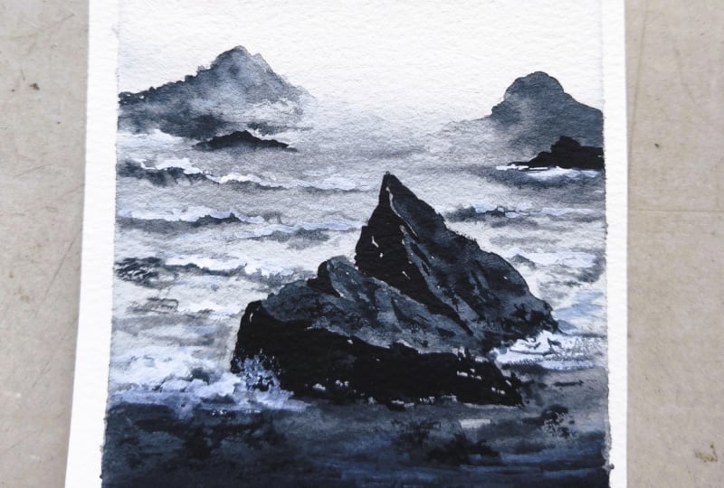
6. Day 3 - Foggy Mountains: Hello, dear friends. Welcome to day three of seven day
Monochrome Watercolor Challenge. And here is our
painting for the day. We are going to clean some
gorgeous snowy mountains. We will start by
adding a sketch. We have three layer
of mountains here. Then the first thing we
have to paint is the sky. So each layer has to dry
before we go with the next. As you could see
from the painting, the major character
here is that fog, and to create that effect, you will need a facial
tissue or a cotton cloth. We'll be lifting
off some paint with a facial tissue or a paper
towel to create that effect. So give it ready and keep it next to you before
we start painting. Now for this painting,
it is really, really important to work
with two jars of water. We will need clean water in between to make areas
like these lighter. We'll use clean water to make it lighter and create
that foggy effect. Okay, so we'll start with that mountain
in the background, then this, and then we
will go with the third. And finally, we will
add these pine trees. Okay, so those are
the steps involved. I think we are good
to go. Now without wasting any more time,
let's give it a try. Alright, my paper and the
colors are ready here. I have nicely taped it
down onto my table. Now for this painting, we are going to add a
sketch, a very simple one. We're going to add three
different set of mountains, one in the background,
then one in the middle, then another one
in the foreground. See that? So that's
the first one. Be sure to go the very
light pencil sketch. Otherwise, the sketch will be visible as we're using lighter tones for the
background mountain. Okay, so go with a shape that
is kind of similar to this. Now I'm going to add
another one here. Okay. So that's the
first two mountains, one in the background, and
another one in the center. Next, I'm going to
add another one here. If you want to change the shape, we could do that
as we're painting. Now just add a sketch
for a reference. Now at the foreground over here, we will add some pine trees. We don't need to sketch it,
add some lines for now. Okay. So that's a sketch. Now we can start painting. So as you all know,
we will only need one single color
which is paints gray. We will also need a paper
towel or a facial tissue. You can grab any of
these or a cotton cloth. Keep that next to you. We
will need this in between. Now, let's begin.
I'm starting by applying a coat of water
using my flat brush. This is a 1 " wash brush. I'm picking some clean water, adding that onto the sky and also onto the first
mountain. Okay. Don't make your
paper overly wet. We only need a shiny coat. That's all. Okay. Now, let's
start applying the paint. And for that, I'm
going to go with a size number eight round brush just to make sure it is clean. I'm starting with a light
tone of paint's gray, and I'm going to apply
that onto the sky. So I want to create a moody, cloudy sky, which
is not too dark. So I'm just adding
some paint here and there on the wet background, leaving some space in between. Okay, I think I will drop in a bit more darker
tone here and there. Right now, the color
is not very prominent. I added some paint over here. I think I'll quickly dab
it off with a paper towel. Okay, now I will pick
some more paint, a slightly darker tone, and I'm going to add
that onto the sky. Again, in a cloudy way. As I said earlier, we
want to create a moody, cloudy sky, which is
not too dramatic. So we're still using medium
tones, not too dark. Now I'm picking some water, dabbing it on a paper towel, and I'm gently smudging
it off to make it softer. Okay. If you want to
make it more dramatic, you can drop in
more darker tones, or if you want to
make it more softer, you can just go with
a gradient wash, even the clouds are
not really necessary. Alright. So that's a sky. We have
added some clouds in between. If you want to
smudge it, go with a clean brush and just smudge it off while your
background is still wet. If you're happy with your sky, you can leave it for drying. Or if you want to add
some more clouds or if you want to make it
more softer or lighter, you can do that at this point of time as the background
is still wet. So once you're happy, never
run your brush over and over. That is really,
really important. You will end up ruining that beautiful result
you have achieved. So once you're happy, that's it. Just leave it there for drying. Just because I'm
adding more paint or I'm overworking doesn't mean
you have to do the same. Okay? So that's how
it has turned out. Now, let's leave it for drying. All right, so the sky
has dried completely, and you can see the beautiful
clouds we have created. Next, we are going to go with the background mountain,
this one here. Then after that has dried,
we'll go with the second one, then the third, and
then the pine trees. And we seeing the same brush. This one is sip number eight. And I'm going with a medium
tone of paints gray. On this side, we'll
use lighter tone, and we're going to create a
fog effect on the right side. For the rest, we will
use a medium tone. Maybe you can give it a watch
before you start painting. So I'm picking a medium tone, and I'm applying that
onto the mountain. The paint is slightly watery. Go a similar texture,
but that is too dark. I'm picking more water, and
I'm making it a bit lighter. So apply that along the outline. Now, as you're coming
towards the right side, clean your brush, pick some water
and make this part lighter using some
clean water. See that? So on this side, we're trying
to create a foggy effect. So we're not going to show that entire shape
of the mountain. That's why we're using water
and we're making it lighter. Okay. Now, let's paint the rest. On this side as well, let's use water and make it lighter. So you have to be really
quick while doing this. If the paint has dried, you
won't be able to blend it. Okay. So once you have applied paint onto the
top part of the mountain, go with water and
make it lighter. Now I'll just apply
that water here, and I will just blend
that into the background. Otherwise, we will
have some hard edges. So to make it softer, just blend everything out into the
background using clean water. Now, I'm going to
grab a clean brush. It can be the same brush or
it can be a smaller one. Be sure the brush
is clean and dry. Now, simply keep on pushing and pulling that
paint inward and outward to create some
texture. Be very gentle. Don't put a lot of pressure
while you're doing this. I feel there is some
hard edge here, so I'm just going to
grab my facial tissue, and I'm going to
gently dab this part. See that? Now, it is nicely
merged into the background. You cannot see any hard inches. Let's do the same
on the other side. Now you can see that
beautiful foggy effect. Now, I'm going to pick
a little more paint, and I'm going to add some texture sun lines here
only towards the bottom. Don't touch the areas
on the left and right, where we make the color lighter to create the foggy effect. Okay, now I'm picking a
slightly darker tone, and onto these tips I have here, I'm adding them very gently to create a mountain
like texture. See that? So it's a pretty darker tone. And I'm just adding
some lines and shapes along those ridges. So wherever you have those tips, add some lines and small
shapes using a darker tone. The background is
still wet, so they will nicely spread
into the background, leaving a beautiful texture. Okay, let's not overdo this. I think I've added enough. I think it's a good time to
stop and leave it for drying. Otherwise, I might
overdo and ruin it. Okay, so let this dry, and then we can go the
second mountain here. Okay, so it's time for
you to take a break, move your body, maybe walk, have a cup of coffee,
and come back. When your background
has dried completely. That has dried
completely, and you can see the beautiful effect
we have got here. That snowy foggy effect. Next, we're going to go
with the second mountain. Now for this mountain as well, the technique is
exactly the same. We will start with
the medium tone. Then towards the right side,
we'll make it lighter. That's where we're going to
create that foggy effect. So I'm using my same
size number eight brush, and I'm starting off
with a medium tone. I will apply that
along the outline. Then towards the right side,
I will make it lighter. Then using some water,
I will blend it out. Then maybe we can
create some effects using official tissue
or a cotton cloth. Okay, so apply your
paint along the outline. Then I'm going to stop
it at that point, and I'm adding paint
on the left side. Okay. Now, let's clean it up and
pick some clean water. Then let's make it lighter. Okay. If your background is drying out, you have
to be a bit quick. Then quickly blend it out. I've taken some more water, and I'm just merging this part. I don't want to see
any outline here. I want it to be all blurred out. Okay? So that's
how it turned out. Now, what I'm gonna do is I
will grab a smaller brush, and I'm picking a
slightly darker tone of paints gray and I'm adding some textures just the same way how we did earlier. So along the top, I'm introducing some
dots and some lines. Also altering the
shape a little. Okay. So this will leave some
beautiful textures. We can leave it as
a clean background. We need to introduce
the textures. Otherwise, it will
look boring and flat. Okay, so wherever you want to introduce the textures,
you could do that. Also, tweak the shape. If you want to have
some bumby textures on the top, do that. It will make it look
more realistic. You can see the line is
quite hard at the bottom. So I'm gonna grab a clean
brush with some clean water, and I'm making this
part evened out. Okay. Now maybe we can go with official tissue and create a foggy effect. Only
if you feel like it. I think we already have
created a fog effect here. If you feel this is all you
need, you can stop it here. But I think I will just go with the facial tissue and
see what else can I do? So first, I will grab some
paint from here to create a soft effect and also from the bottom
part of the mountain, just to make that
fog more stronger. See that? So I'm just
dabbing off some paint from the mountain to create a
more stronger foggy effect. You can see those
white patches I'm creating while I'm
dabbing the paint. So be very gentle when
you're doing this. Don't put a lot of pressure. At any point, if you feel
you're happy with the result, that's where you should stop. So here just crumple
your tissue paper and dab off some paint to
create the fog effect. So that's our second mountain. Now, let's leave it for trying, and then we can go the next one. Again, it's going to be
the exact same technique we will use for this
mountain as well. But for this, we will
apply paint on the left, and we'll make the
right side lighter. That's only difference.
Okay, so let's take a break and come back when this has dried completely. Now, let's go with
the third mountain. So just like how we did earlier, we will start with a
medium tone of pinks grey. Then we'll make it lighter
towards the bottom. This one is in the foreground, so maybe we can go with a
slightly darker tone of pins grey compared to
what we used earlier. Okay. So let's start with the outline. You can see the tuna value. It's pretty dark. I'm going to make the color
lighter on the left, so I'm not applying
any paint over there. I'm leaving it as it is, and I'm adding paint onto the right. Towards the bottom as well, you can introduce some paint. I'm going to add
some paint here. And then I'm going
to pick some water, and then I will make it lighter. Okay. So pick some clean water and quickly smudge it
off into the background. You have to be really
quick while doing this because the
background might dry out. So pick enough water and
smudge it off quickly, especially the left side, where you're creating
that foggy effect. Okay. Now while you're doing
this, you can also keep on pushing and pulling
the paint into each other to create some texture. So in this monochrome painting, we have used three
layer of mountains. We have one in the background. Then in between,
we have one more. Then at the bottom,
we have another one. So if you're creating the same painting in a larger scale, maybe you can go in with
five or six layers. I wanted to keep the
painting under 30 minutes, so I thought it's good
to go with three layers. I feel like altering the shape of the mountain on
the right side, but before that, I will
just much this part. And then I will use a facial tissue to
clean off this part, and I will create that
foggy effect. Okay. So wherever you want to
pick some paint off, you can use a facial
tissue or cotton cloth. Now I'm going back with a
darker tone of paint screen, and I'm just going
to alter this part because I feel
like there's a lot of white space in
the background, so I'm just going
to cover this up. By extending the mountain. I'm also thinking whether
I should be adding some pine trees over
here along the top line. I haven't really
decided about that. Anyway, let's give it a try. So I'm done with this mountain. Now I'm going to grab my smaller brush to add the pine trees. This one is just an experiment. I'm not really sure
whether it will look good. Anyway, I'm taking a chance
and I'm giving it a try. So with my smaller brush, I'm picking some paint, and I'm going to add
some messy lines on the top to show
the pine trees. Mm. I don't think it's
going with the background. So what I'm thinking
is to smudge off that part and create
a foggy effect there, which will be better, I guess. So I'm quickly gonna grab my facial tissue and it
will pick up this paint, and it will create
a foggy effect. Maybe a little water will help. The color has almost dried up. Okay, better, right? Better
than the pine trees. So I'm just gonna
grab that paint off to create a soft edge there. Cool. This is so much
better than the pine trees. Now, if your background is
still wet and if you want to create more
stronger foggy effect, you can use your
facial tissue and dab off some more paint from the bottom or whenever
you feel like. So crumble your paper and then lift off some paint. See that? The foggy effect
will totally depend on the way how you are
lifting off the paint. I'm really, really happy with the foggy atmosphere
I have got here. Even though that top
right part was a mistake, I think it ended up
looking really nice. My layer is still a little wet, so I'm going one more time, and I'm lifting off
some more paint. Now, I want to remind you
all again just because I'm doing this multiple times doesn't mean you
have to do the same. At any point, you're
happy with your result. You can leave it for trying
because most of the time your painting is ruined
because you overwork on it. So, yeah, that's how
it has turned out. I'm really happy with
this part on the top, even though that
was an accident. Now, this part has
almost dried up. So I think I can go ahead
with the pine trees. If your background is too wet, maybe take a break
and come back and join me after it has
dried up completely. Okay, so I'm going to go
with my smaller brush. This one is size number six. And I'm going to add some shape here first, using a medium tone. Onto the top, we can introduce
some tree like shapes, but start with a very
basic shape like this. Okay. Now on to the top, I'm going to start
adding some lines first, just to show the trees
in the background where I'm not going to
put a lot of effort. It is just going
to be some lines. Over here, we are going to
use different tonal values. So the color we are using
right now is a medium tone. Once we have done
adding these lines, we will go with a taco tone. Okay, so with the same brush, I'm going to add some
lines along the top. It is nothing much.
All you have to do is just add some
lines on the top. At some places, make it higher, and at some places,
make it lower, go with a very organic shape. See that? So simply keep on
adding some lines on the top. That's a foot step. Okay, so we have the base shape ready. These are the trees
in the background. Now I'm going to pick a slightly darker tone
of pain screen, and I'm going to
add few more trees. So we'll start by adding a line. Then onto either side,
we'll simply add in some foliage in a
messy way. See that? So that's the next one.
So only on the top, we have that tree like
shape towards the bottom, it is just spreading
into the background, and that's the beauty of it. So you only have to
show the top part. The rest will nicely merge
into the background. You can add as many as you want. Okay? So the color
we're using right now is one tone darker than
the color we used previously. So in a similar way, gradually we will make the color
more and more darker. Now, over here, I'm
adding a taller one, and at the bottom, I'm just spreading that
into the background. So we only need to
show the top part. I hope it is clear. These
trees are quite simple. You don't need to
put a lot of effort. Start by adding a line, then run your brush onto
either side in a messy way, and that's it. That's
your pine tree. Next, we are going
with a darker tone, and we're going to
add the second set of trees, which is in
the foreground. Okay. So this one has
to be more darker, and the sheep has to be
a bit more prominent. I'm starting by adding a line. Then at the bottom, I'm simply dropping in
some taco tones. Then onto the top, I
will add a tree shape. So just like earlier, we're not really showing
the bottom part. We are only focusing on the top. So this part is wet. So when you drop
in the taco tone, it will spread into the background,
leaving some textures. Now only on the top, we have
to introduce the tree shape. So go with the taco toon. I'm using a small
brush right now. Okay, so I will
first add a line. You can go any height
for your tree. Okay, now onto either side, I'm adding some messy patterns. As you're coming towards the
bottom, make it more wider. Okay, so that's my first
tree using a taco tone. In a similar way, I'm
going to add a few more. Some will be tall,
some will be short. I will go with different heights to make it look more organic. I added a few small trees
which are not that detailed. Next time I'm going
to add one here. So I'm starting with a line. Then onto either side, I'm
adding some messy shapes, and towards the bottom,
I'm just adding some taco toons and I'm smudging that into
the background. So, yeah, you don't need
to show the antiotree. Just the top part
is all we need. Now I will drop in some
more paint at the bottom. This part is starting to dry. Okay. Next, I'm going to
add a few more trees. I will add a tall one here. So I'm starting with a line. Then onto either side, I'm adding some shapes. On the top, they are shorter. Then as I'm coming
towards the bottom, I'm making them more
wider and more thicker. See that? So we just need a
rough shape of a pine tree. It doesn't need to be detailed. But overall, it should have
a conical shape like this. On the top, they should
be more shorter, and then towards the
bottom, make it more wider. So you will have a long
triangular kind of shape. Now, I'm adding
another one here. Okay. So wherever you want to add trees,
you could do that. And what would be the
height you want to go with? That's also totally up to you. Now, I'm gonna quickly
add one or two trees. I will add one on the left side. Then maybe one or two
towards the right. Alright, so go ahead and add in your trees. Oh. Alright, so the trees are in. Now for the next step, I'm going to go with
some white quash. You can also go with
white watercolour. Now, we're going to add them
snow onto these mountains. That's our next step. This
one is completely optional. If you want to leave it as it
is, you can skip this step. I will be just adding a few
patterns here and there. I won't be adding a lot. So I've taken some white
paint on my brush. It's a dry paint. If
your paint is watery, dab it on a paper towel
before you do this. Now, we're going to add some
dry lines and textures. Just a few small
patterns here and there. So I'm starting from the top. Then I'm adding some
lines and small dots and shapes on the
surface of the mountain. Okay. We don't need a lot. Just keep that in mind. We only need a few patterns
here and there. That's all. Same goes for the other two
mountains as well. Okay, maybe one or
two big patches we can add only for
the first mountain, the one in the background. For the other two, I will only add few teeny tiny patterns. Okay, so just add some dots and small
shapes here and there. In between, you can add one
or two big patches like this. That's it. Don't overdo it. Okay, so
that's a first mountain. Now let's go with the next two. It will be better if we
can use a smaller brush. If you use a bigger brush,
you might accidentally add big patterns,
which we don't need. You can see the kind of
patterns I'm adding. It is more like some torts and some small shapes and lines. They're not big patterns. They are not bold
and big patterns. So add them in a similar way. Now I'm going to add such patterns onto
the other mountain. See that? So these are the kind of shapes
you should be adding. Only for the first mountain, you can add one or
two big patches. For these two, I
think it's better to go with such small patterns. Let's not overdo it. All right, so those are
our snowy mountains. You can see how beautiful
it has turned out. Now, before I call it done, I want to add one or two trees using a much more darker
tone of pins grey. So I'm just going to go
back with pins grey. And I will add a few
trees in between. The first one I'm
going to add here. So I'm starting with the line. I'm using a really dark
tone of pinks gray, which is more like black. Okay. Now onto either side, I'm adding some shapes in a messy way to
create the foliage. As I'm coming
towards the bottom, I'm making it more wider. So that overall, we
have a conical shape, and it will look like pun tree. So that's the first one. Now I'm adding that darker
tone at the bottom. And I'm just creating
some texture there. So I'll tab it on a paper towel, and I'm adding some texture, some dark or texture. That's it. Now in a similar manner, I'm going to add
one or two trays. I will add one more over here. Then maybe another
one towards the left. I'm adding some texture here
using that Tucker tone. Now I'm going to
go the last tree, which can be over here. It's a tall one. So you can place your tree
wherever you like. And if you don't want to add any more trees, that
is totally okay. So I'm just going to
go the tall tree, and I'm placing
that on the left. Now, adding the foliage. It is some small messy patterns. I'm adding that on
either side of the line. If you want to add more
trees, you could do that. Maybe you can add
another taller one on the right side or one
more on the left. So initially, when I
planned this painting, I only wanted mountains. I thought of just going
with foggy mountains. But then I thought
of introducing some pine trees at the bottom to make the composition
more beautiful. Okay, so I have added some dry, messy patterns at the bottom. And with that, we have come
to an end of this painting. Now it's time to peel
off the masking teap. I really hope you guys
enjoyed this painting. My most favorite part about this painting is the first
mountain in the background. I just love the textures and
the way it has turned out. And the foggy effect is
also quite interesting. Anyway, here is a closer
look at this painting. You can see all the
textures we have got here, the pine trees, the mountains, the foggy effect, everything. I'm really hoping
you all enjoyed it. If you haven't tried it yet, do give it a try and let me
know your thoughts about it. Thank you so much for joining. I'll be back here soon
with our next painting.
7. Day 4 - Snowy Peaks: Alright, so for this painting, we will start with the sketch. Then we will paint the sky. The sky is a simple gradient
wash. Then along with that, we will also paint the
snowy ground. Okay. Then we will go
with the mountain. The mountain is all about
creating some dry textures. It's the same technique
we'll be using throughout. So once you get the hang of it, it is going to be really easy. We'll just be leaving some
white gaps in between. Then we will fill the rest using a darker and a medium
tone off paints gray. Okay. In one of our
previous painting, this one here, we added
white using white quash. But for this painting to
create the snowy effect. We are leaving the
paper white as it is, which is the color
of your paper. We're not going to add
any extra white paint. Okay. So this is all about textures and
some messy patterns, which I'm quite sure you
guys are going to enjoy, as it is an
interesting technique. Okay, so I have my
paper ready here. Now, I'm going to
start with the sketch. We need to add a slope line at the bottom, which is the ground. Then we need to add a
mountain in the background. That's a major element
of this painting. Other than that, it's just
the sky and the ground. So focus on the mountain. Go with a good shape, which will make your painting
look more interesting. Okay, so I'm starting from here, then adding some
peaks in between. Now I'm going to add
another one over here. So that's the shape
I'm going with, but you can alter it
however you like. It doesn't need to
be exactly the same. Alright? Now, onto this, I'm simply going
to add some lines. So I'll be adding the snow patterns, following these lines. It is just a reference line. We won't be able to add
the snow exactly this way. So along these lines, I'll be leaving some white space as I'm applying gray paint
onto the background. Eventually will look like snow
patches on the snow. Okay. So I'm just adding
some lines in between, just for you to understand how I'm going to
leave the space. All right. So that's a sketch. Now we can start painting. Now for the sky, the color I'm going to go with is a
light tone of gray. I will start with the lightne. Then as I'm closer
to the mountain, I will make it slightly darker, not too dark, just
one tone darker. Now, if you want to
start by applying coda water, you could do that. But I think it's just
a small portion. So we can just go with
the watery paint as it is without making
a background wet. So add enough water
into your paints gray and turn that
into a lighter tone. You can see the color
here. So that's a tonal value I'm
using on the top, and I'm using a bigger tres. This one is size number eight. Now, as I'm getting
closer to the mountain, I will make it one tone darker, not too dark, just a bit darker than the
color I used on the top. Now carefully follow
the outline of your mountain and fill that up. Okay, so it's just a
simple gradient wash. We have a lighter
tone on the top. Then it is slightly darker,
closer to the mountain. Okay, so that's a sky. Now we can leave it for trying. In the meantime, we can
stack with the ground. Then the sky and the ground
will dry simultaneously, and then we can paint
the mountain. Okay. Now for this, I'm going to start by applying a coda water. So I'm taking my
clean white brush, picking some water, and applying an even coat of
water onto this area. Okay, don't add a lot of water. We just need a shiny coat
of water. That's all. I will run my brush
one more time, just to be sure the
coater water is even. Alright. Next, I'm switching
to my round brush, the same one I used earlier. And I'm starting more with
a light tone of pains gray. And I'm going to add some shadows onto
this wet background. If you feel your
pins too watery, dab it on a paper towel
before you start. Otherwise, it will
spread too much. Okay, so just add a few lines in between to show the
shadows and textures. This is just the first
round. At the end, we will come back
with a darker tone and we will add
some dry textures, which will make it
look more complete. Right now, it is just
about introducing some lighter tones and shadows. Okay, so we can add
them in a sloping way, just to indicate or
emphasize on that slope. Maybe we can make it a bit
darker along this line. Alright, so that is it.
That's a big layer. Now that the sky and the
ground dry completely. The background has
dried completely. Next, we are going ahead
with the mountain. Now, before I go to
the darker tones, I'm going to add some shadows
using a lighter tone. This way, we'll
have a better idea on how to add the darker tones. We'll be adding our darker tones around these shadows we're
going to add right now. This step is going
to be really quick. So maybe you can
give it a watch, and then you can add them in a similar pattern or
however you like. Okay? Even if you accidently add a lot of these
patterns is totally fine. We can cover that
with a darker tone as we go ahead with
the next step. Okay. So the color Imuson cure is a light tone of pinks gray, and I'm simply adding
some lines onto the mountain in a
very messy way. They are just some
random irregular lines. You don't need to put a
lot of effort right now, simply add them
wherever you like. Maybe you can just follow
the lines we added earlier and add your shadows
according to those lines. But it doesn't need to be like a definite shape or anything. You can add them
however you like. So just like I said earlier, even if you add extra,
that's totally fine. We can cover it up later. Okay. So I'm just going
to add some more lines on the other side. Alright, so you can
see I have added some shadows onto
the background. Now let this dry, then we
can add the final textures. So when we're adding
the Darko tones, we will add them
around these patterns. And along with that, we will
also leave some white space, which is the actual
color of your paper. Okay, so let this dry. Then we can add the textures. Alright, so that has dried. Now we can add the textures. We want to painting the
entire thing together. We will divide that
into sections, and we'll start with the
first section on the left. And for that, I think
I will switch to a smaller brush because
with a smaller brush, you have a better control, and you can leave some small
sheaps in between. Now, I'm starting off with
a medium tone of pink grey. I've taken enough of
paint on my brush. Now I'm going to start
with the left side. I'm going to apply some paint
onto this corner first. Now, this step is quite easy. You don't need to
put a lot of effort or you don't need to
pay a lot of attention. But if you are a beginner or if you haven't tried something
like this earlier, it might be a bit tricky. So maybe you can give it a watch and then proceed
with your mountain. Okay, so there are some
shapes in between. I'm leaving them and applying
my paint around that. The shapes we added
earlier were quite big. We don't need the
shapes to be that big. So wherever you feel,
you can fill it up. See that? So I'm just
applying paint around them. Then also, I'm leaving
some white spaces as well. You can see the way I
have applied the paint. So we have to proceed
in a similar way. Wherever you want to leave
some shapes or gaps, you could do that, and the rest, you can just fill in a
medium tone of paint screen. See that? So it is just
some irregular shapes. Some of them can be longer. Some of them can be
short dot like shapes, or some of them can
be even a big patch. Okay, so go the combination
of all sorts of shapes. This will make it
look more realistic. So first I only painting this
much part, that left part. Then I will paint the center part and
then the right part. Okay. If you try
them all together, you might lose the
essence of it. So let's go with
small, small sections. You can always change
the way it is looking. So in between, if you feel
there's a lot of white caps, you can cover them up with a medium tone or a darker
tone of pink gray. Or in case you feel
you haven't got enough white caps.
That is also easy. You can come back
with some white quash or white watercolor, and you can add some shapes
on top of your mountain. Okay, so you're
never going to make a mistake while doing this. Now, I have some space
on the left side. I'm filling that as well. I don't want a lot
of white space. I only need some smaller
shapes in between. Now at the bottom as well,
I'm filling some of this. I feel there's a lot
of spaces and caps, which is not looking very clean. So I'm just filling them and
only keeping a few Okay. Now, I think I can add some
darker tones in between. Right now, we have only
used a medium tone. At some places, the
paint is still wet. So where the paint is wet, it is going to spread a little. And wherever the
paint is not wet, we can add some dry patterns. So it's going to be
a combination of some paint or wet paint, and also some dried textures. I will add some wet
paint at the bottom. I think this part is
still wet. Yes, it is. Okay. Now, randomly adding
some paint in between. Then we can add some
dry patterns as well. Your mount and will look only realistic if you add
these darker patterns. We need to introduce
some textures as well. Okay. So go ahead
with a darker tone. Wherever the paint is not wet, you can introduce
some dry patterns, like the way I'm
doing it right now. Okay, so go with
the combination now some darker patterns
and try patterns. Looks like there's a lot
of paint on my brush, so I'm dabbing that
on a paper towel, and I'm introducing
some dry patterns in between the snow patches. Now over here asphal,
I'm adding them. So try to go with
a smaller brush. This way, you have
a better control. If it's a bigger
brush, you won't be able to handle
them this easily. They might go into
those now patches. So with the tip of your brush, keep smudging that paint and
introduce some dry patterns. You can see the textures
I'm getting here. So go in a similar way,
and wherever you feel, you need to add
some tri patterns and textures. Introduce them. So this is how it
has turned out. I'm quite loving the result. I think I will add some
more at the bottom. So I'm picking a darker tone. Then I'm adding some
dry dark patterns. So this mountain is all about the combination of
that medium tone, the dry textures, and the
shadows and the snow patches. I will add some more darker patterns along the bottom line. Okay. So from the bottom, I'm adding them toward the top. Don't add them
towards the bottom. You might accidently add some taco patterns
on the ground. Also, when you're
doing this, try not to cover the snow areas. Leave it as it is, if you can. And by mistake, if you cover
them, don't worry about it. We can pick some
white verticular or gouache and add them again. Okay, so that's a section. Next, I'm going to go
with the second section. I'm starting with the
same kind of tonal value. And I'm going to add
the paint while leaving some small caps and shapes in between the same way
how I did earlier. So I'm starting with this side. Over here, I'm
using a darker tone to show all the shadows
and the deeper tones. I'm following the
outline of the mountain. Now leaving some
shapes in between. So apply your paint in
small small sections. This way, you will have a better idea on how
to add the paint. Otherwise, it will be a bit overwhelming and you might
not feel like finishing it. So it's always a better idea
to go with small sections. So finish off each
and every section and then proceed with the next. Oh you can see the way how I'm
applying the paint. It is just a matter of leaving
those shapes in between. They are just some
irregular shapes. Some of them are long,
some of them are short. Some of them are just
dot like shapes. Okay. So go with different
kind of patterns. Don't leave the shape
in the same way. It will never be symmetrical
or uniform, right? So to make it look
more realistic, leave some organic shapes. I hope you guys
are able to follow the technique and you guys
are getting a hang of it. Okay. So let's
finish this section, and then we have one more
section on the right side. This section is done, but we have to add the tri patterns, like we did over here. But I think I will paint
the other small section, and then we can add
the tri patterns together onto both sections. Okay. So I'm going with
the same tonal value. Adding that along the shape of the mountain while leaving some shapes and gaps in between. I'll be very honest, when you're painting such
a huge mountain, this technique can
be a bit boring. You can clearly
see the way how I started and how I'm ending it. The first section
is very much clean, and the last section
is a bit messy. But never mind. I think when
I add the dry textures, it will be okay, I feel. Alright, so I've taken some
dry paint on my brush. So whenever you feel
your paint is watery, dab it on a paper towel, and then go ahead and add these dry patterns.
Wherever you feel like? So just like I said earlier, don't cover the snow patches. Let them be there. You
can alter the shape. That's okay. But
don't cover it all. If you cover it
all, you will have to come back with white gouache or white watercolor and
add the patches again. Now, towards the bottom,
I'm going to add some more taco tones
along this line. Try not to add any
onto the ground, add them around the snow shapes. Okay. So it is a dry textures, what makes your
mountain look more lively, more attractive. Otherwise, it won't have
that complete look. So don't miss the step. And also go the smaller brush. Don't use a bigger
brush for this step. Once you're done adding
these dry patterns, we need to add a few
on the ground as well. Right now, you can see it
doesn't look complete. We only have that
very light shadows on the ground.
That's not enough. We need to add a few
dry patterns as well. Okay. So I think this
one is in a good stage. Next, we can go with the ground. I'm tapping my brush
on a paper towel. And I'm going to add some
dry patterns on the ground. I will do that
again. There wasn't enough paint on my brush. Now, on the ground, just
add a few dry patterns. Where you feel like? Add
them in a slooping way. Okay. So we have a shadow
there, a shadow line. I'm following that line, and I'm adding the darker
tones here and there. They're not very big patterns,
they are small patterns. So some of them
can be just a dot. You can also add
some messy patterns. In between, you can add
one or two big patterns, but not a lot. You can see I have added
one big pattern there. Maybe I will add one
more in a similar way. The rest is all
going to be teeny tiny patterns which
are not too prominent. Okay. Now I will add a few
towards the corner over here. And I think with that,
I will call it done. I have already added enough. I don't want to make
it too messy and busy. Alright, so that's how our
painting has turned out. If you want to add more patterns or more snow, you could do that. I'm quite happy
with the painting, so I'm going to call it done, and I think it's a good time to peel off the masking tape. Otherwise, I will overdo these patterns, which
I don't want to do. Okay, so this is it. That's
our painting for the day. Now, let's peel off
the masking tape. Okay, so here is our gorgeous snowy
mountains for the day. We started off with the sky, then the ground and
then the mountain. So the mountain was all about
leaving those patterns in between and adding the tri
patterns and textures. Now, before I wrap it off, I'm thinking of adding some more Darko tones
only at the bottom. So this one is
completely optional, only if you want to add
some more darker tones, you could do that. I am a perfectionist, and it's very difficult
for me to get convinced. So over here along
the bottom line, I'm going to add some
darker patterns. So I have added a line. Now I'm pushing my brush towards the top and I'm creating some texture
there using a darker tone. You don't need to do this at all if you're happy
with your painting. Also, if you want to add
some more white patterns, you can go with white
gouache or watercolor and add them in
wherever you feel like. Also, if you feel the
patterns are too much, you can cover them
with Paints grasp. So all those alterations
can be done right now. If you're happy
with your painting, you don't need to
do any of these. You can just watch
what I'm doing. Alright, so here is the finished painting with
all the darker tones. I cannot tell you
how much I love the textures and the way this
painting has turned out. Give it a try if you
haven't tried it yet. It's a very
interesting technique. As I said earlier,
you might feel a bit overwhelmed if you're
painting it in one go. So divide that into sections and paint that in your own pace.
8. Day 5 - Misty Pines: Hello, dear friends. Welcome to Day five of painting
Monochrome landscapes. Today, we're going
to paint misty pins. It's a perfect
painting to explore tonal values and how
to create in depth. So we will start with
a very light tone. You can see this tree here. It is using a lighter tone. Then gradually we will go with a medium tone and
then a darker tone. It's a simple, minimal
and beautiful painting. Okay, so without wasting any
time, let's give it a try. Alright, so I have
my paper ready. Now for this painting,
you will need a facial tissue or a cotton cloth to
create the fog effect. So keep it ready
before you start applying paint onto
your background. We'll be using this to dab off some paint to create an effect. Okay. Now using my flat brush, I'm going to apply a clean got water onto the thier paper. We don't need any sketch
for this painting. We'll be applying paint
onto the background, and we'll be creating
some effects. Okay. So I have applied a nice gentle coat of water
onto the anterior paper. Now to apply the paint, I'm going to go with a entres. This one is size number eight. Now I'm starting off
with a light tone, and I'm applying that onto the wet background in
a very random way. So you can just apply paint
wherever you feel like. Leave some gaps in between. So we have a medium tone and
a lighter tone in between. Now, towards the bottom, I will make the color
a bit more darker, especially onto the right side. So that's where I'm
going to add the trees. Okay, so onto that background, I have simply added
some medium tones of gray and have created
this background. Alright. Next, I'm going to pick a slightly darker
tone of Pains gray, and I'm going to add that onto
the right side over here. So just like I said earlier, this is where I'm going
to add most of the trays. So I want the bottom
part to be more darker. Now I'm tabbing that
on a paper towel. Gently smudging the paint
to make it look softer. Okay? So smug it
with a damp brush. This will make it look
more soft and blurry. As the background is still wet, you'll be easily
able to smudge this. So don't waste any time. Be quick if you feel
it is drying out. Okay, so I'm just spreading the paint to create an effect. Now I'm going to drop in
a bit more taco tune, especially onto this area. That's where I'm going to
place most of the trees, especially the full ground
trees which are darker. Now, I think I will go
with my smaller brush, and I'm just spreading that out. Okay. I will add some more
paint a little at the bottom. So wherever you
want to place your tree at the taco tones, then just much that
into the background. When the background dries out, they will look blurry and
they will look very foggy. So wherever you are
planning to add your trees, especially the foreground trees, Add new taco toons. Now, I will use my bigger
brush to smudge it. Just get a quick smudge. And if you want to add
more dakotns or textures, you could do that at this point. As the background is still wet, I think I will add a bit more
paint to what's the left. Right now, the whole
focuses on the right side. So I'm just going to
spread it out a bit more after I'm done smudging. Okay. So we'll be adding
some dakotrees on the side, and the darker tones will
cover the bottom part. So that's the main idea behind adding these darker
tones on the right side. Okay, I will pick
some more paint, and I will add that
towards the center. Then I will smudge it again. And then we can
leave it for trying. Okay. So I'm just
adding some more. If you're happy with
your background, you don't need to add anymore. Once you have added
that, go with a clean damp brush and then smudge it quickly before
the background dries. On the left side, we will use lighter tone to add the trees. And on the right, we are focusing on the
foreground trees. So we will use a darker
tone. That's the idea. I'm spreading that a bit
more, and that's it. So that's how it has turned out. Now, let's leave
this for trying. Alright, so that is
dried completely. The colors are quite dull. Now I feel I should have gone with a much
more taker tone. Anyways, let's go ahead and see how this is
going to turn out. Now, I'm going to start
with the first tree. And for that, I'm using
my smaller brush. This one is size number two. And I'm going with a
light tone of pains grey. Now, the first step is
to add a straight line, which is the height of the tree. Okay. So go with a light tone of pains grey and add a line. This is the tonal
value I'm going with. Start with a similar
tonal value. Don't make it dark or medium. We want a light tone
for the first tree. This one is far away and
it's in the background. Now onto this, I'm going
to add some branches. Then we will add some
foliage as well. The branches are quite simple. Just add some lines
onto either side. As you're coming towards the
bottom, make it more wider. Okay, so I some gap in between and have
added the branches. Next onto this, I'm going to add some dots and some small
shapes to show the foliage. I'm starting from the top. So simply add some dots
and some scribbles. See that? On the tip, add some small patterns. Then as you're coming
down, make it more bicker and also wider. Okay, so keep on adding some
dots close to each other. That's all you have to do.
They don't need to be perfect. Okay. So that's how
it has turned out. Next, what I want to do is
I will grab my paper towel, and I'm going to gently touch those patterns
I have added. See that? You can see how easily I created
a foggy effect there. Now, they're looking
very blurry, and that is exactly what
we need a paper towel for. You can do the same thing with a cotton cloth as well,
but be very gentle. Don't put a lot of pressure
and don't scrub it. You just have to
gently dab on it. Okay? Now towards the bottom, I'm going to add more patterns. Then I will again
do the same thing to create a blurry foggy effect. So that's the first
tree. We have used a lighter tone
for this tree. Next, I'm going to add another
tree right next to that. So the technique is
exactly the same. In order to create a depth and character in your painting, you have to play with
different tonal values. That's all. The technique
is going to be the same. So right here, I
used a medium tone. Now I'm going to add
the foliage onto this. I'm adding some dots
and some scribbles. The color is a bit darker
than earlier, that's all. And also, I didn't
add much branches. I'm directly going
with the foliage. So for all the
trees you're adding go with different
shapes and sizes. This will make
your painting look more realistic and interesting. I'm leaving some cap in between
to add a realistic touch. Now crab your piper towel and gently dab off some paint
to create the foggy effect. Adding some more foliage
towards the bottom. See that? So that's how easy you can create the fog
effect using a paper towel. Now in a similar
way, I'm going to add another tree onto the left. I hope the technique is clear. So just start by adding a line. Then onto that,
introduce the foliage. Once you have added
that, go with a paper towel and dab off some paint to
create the fog effect. So this one is also going
to be with a light tone. It's another background tree. So I'm using a lightne of paint screen, and
I'm adding the tree. Once I'm done with the sheep, I will go with the
paper towel and I will dab off some paint
to create the fog effect. Okay, so that was a
simple background tree. You can see how the painting
is starting to turn out. Next, I'm going to add another
tree using a medium tone. Again, the technique
is the same. You can place your tree
wherever you like. You don't need to follow
the same pattern or the same height or the same
way, how I'm adding the tree. Just focus on the technique and the tonal values and then compose your painting
however you like. Okay. Now I'm going to add the tree over here
using a medium tone. Oh You can see the foggy effect that
I have got here. I will add some more foliage
onto the bottom part. Then I will go with
the paper towel I can to dab off some paint. Okay. So that's a technique. Wherever you want
to add the tree, you can go ahead with
your composition, and whichever tonal value
you want to go with, that's also totally up to you. You can play with lighter
tone or medium tone. We're not yet ready
to use a darker tone. Let's finish of the
background trees and then we can go with
the full ground trees. Let's not mix them together. Okay, now using a paper towel and gently dabbing off some
paint from the background. Okay, so that's our fourth tree. You can see how beautiful
it has turned out. Next, I think I will
use a darker tone. Alright, so decide on the spot where you want to add your tree, and then go with the
tonal value you prefer. It could be a medium tone
or even a lighter tone. Planning to add that over here, it's going to be a tall tree. So starting by adding a line. Then onto that, I will add some branches and
then fall each. Then I'll use a paper towel again to create
the foggy effect. So that's a tonal
value I'm going with. It's a medium tone, not
too dark, not too light. Now onto this, I'm going to add some random branches. See that? Some of them can be long.
Some of them can be short. Then onto that, add some
dots and create the foliage. It doesn't need to be perfect. Simply keep on adding
some dots close to each other without lifting your hat and create a pattern there. Then use a paper towel, then dab the paint to
create a blurry effect. Now, it would be the same thing until
you reach the bottom. In between, you can go with
a dense and thick foliage. You don't need to
leave a lot of gap. This will make your
tree look more natural. Okay? Also, you can see, I have left some gap in between to create a realistic touch. So those things
are very important when you're painting a tree or any natural element to
give it more realistic. Go with an organic
shape and arrangement, also play with
different heights. Now, as I'm coming
towards the bottom, I'm going to use a much more darker tone compared to the top. Okay. So this will
nicely go with the background as well as it will create a
beautiful effect. So on the top, it will look like foggy and towards the bottom, it will look there
isn't much fog. Okay, so go a similar pattern. You can start with
a medium tone. Then as you're
approaching the bottom, make the color slightly darker. So at any point, if you feel they are very dark
and prominent, you can go with a paper
towel and dab of some paint. Okay. Now I'm going to add
the foliage at the bottom. You can make it darker
towards the bottom, or you can use the
same tonal value. We have some darker
tone in the background. So even if you use
a darker tone, it will nicely go into the background without
looking weird. Or you can just use the
same tonal value you used a bow and continue
with the same. Okay. I will add some more foliage in between
and also at the bottom. Then I will go
with a paper towel to make it soft and foggy. And after that, I'm going
to go with the next tree, which I'm thinking to
add towards the right. On the right, there's
a lot of gap, and for this, I'm
using a taco tone. And I don't think I will need to use a paper towel for this. I will just add a tree until I have that taco
tone at the bottom. I'm adding the foliage,
using a taco tone. So it's just some
messy patterns. On the top, go with
smaller patterns, and as you're coming
towards the bottom, make it more wider. This tree is not very dense. There's a lot of gap in between. So I'm going to add
some more foliage onto the same tree to
fill up all those gaps. All right, so that's done. Next, I'm going to add
another one over here. Again, using a taco tone. So I'm starting off with a line. Then at the bottom,
I'm using a taco tone, and I'm adding the foliage. Then towards the top,
just like I did earlier, I will use a medium tone. Only at the bottom, I
want a really tac tone. Okay. So on the top, we need less foliage,
which are smaller. Then as you're coming towards the bottom, make it more wider. And wherever you feel, you want to create
that fog effect, go with a paper towel and gently dab off some paint
to create that fog effect. So the technique is
exactly the same. You can go with different
shapes and size for your tree. Then you have to play with
different tonal values. Then wherever you
want to place it, it's totally your choice. Right. I hope you guys
are able to follow the technique. So give it a try. You don't need to
focus on the screen, focus on your painting, and then go as per
your intuition, however you want to compose your painting, please do that. It is better to go
that way rather than looking at the screen and doing the same thing
what I'm doing. So it's all about
understanding the technique and how you're putting
that onto your paper. Okay? Now, let me
complete this tree. I'm going to add
the foliage until I reach that dark part we
have on the background. You can see the way I have added the foliage when I reach
that darker portion, I will add some
more foliage using a taco tone only at the bottom. So that over here, we can
create a more dense effect, and on the top, we
have a foggy effect. Okay. So wherever I have those darker tones
in the background, on the same place, I'm adding some darker
foliage as well. This way, I don't
need to put a lot of effort in showing
the bottom part. It will just merge into that background,
and that's a trick. So wherever you have taco tone, you can stop your tree there. You don't need to
show the rest of it. Okay. So that's my tree. I'm quite happy with the way
this one has turned out, especially the
different tonal values. It is looking really beautiful. Next, I'm going to go
with another tree. I'm going to add that over here using a much more taco tone. So these are the real
foreground trees. The other ones are still
in the background. Okay, so go with a taco tone of pin screen. A
really dark tone. Only if you use a darker
tone in the foreground, you will be able to see that
depth in your painting. So far, we haven't
used a Darko tone. Everything is more like
a medium tone. Okay. So I'm going to add
my next tree using a darker tone. On this spot. So first add a line, then onto this, I'm going
to add the foliage. For the next set of trees, where we're using a taco toon, you have to put a little
more attention than earlier. Focus on the foliage as these
ones are on the foreground. You still can use a paper towel, but limit that
only onto the top. For the rest, add a nice
sense dense foliage. Okay. So I've taken more
paint from my brush, and I'm going to continue adding the foliage towards the bottom, using a taco too. You
can add some branches. Then onto that, you
can add the foliage. Okay, you can see the color. It is pretty dark. So far, we haven't used a
Daco tune like this. Okay, now continue your
tree towards the bottom, make it more thicker and wider, then finish off your tree. You have to add the foliage until you reach
the masking tape. Okay. Now in a similar way, if you want to add more
trees, you could do that. Once I'm done with
this, I'm thinking of adding one more
towards the right side. Otherwise, you won't be able to really see that depth
in your painting, as we haven't used much of darker tones in the background. So this tree is where
you create the depth. Okay? So add one or two trees. If you want to add
more, that's wonderful. Now, I'm going to
add more patterns at the bottom to make it
more dense and thick. The shape is quite nice, but there's a lot of gap. So let's add more foliage
and fill this part. Okay. So that's our
full ground tree. Now, I'm going to add one
more towards the right side. But just like I said earlier, you can go with any shape and size you prefer if you
want to make it more taller or then sor thick,
that's totally up to you. Okay. Doing a quick
round off paper towel. Okay, so that's it.
That's our next tree. Now I'm going to go
with the final tree. I think I will go
with a shorter one, and I'm adding that over here. So that's the last
task in this painting. Over this, we'll be done
with this misty pine trees. So using a paper towel to create that fog effect is a very
interesting technique. The first time I explored this technique was a
couple of years back, and I was clearly surprised. So this technique is super
exclusive for Watercolor. You cannot use this technique
for any other medium. It is just limited to waker. And I think that's a
beauty, and that's why it is just perfect
for Monochrome paintings. You can see the effect
we have created here. And to create that effect, a paper towel really helped. Alright, so that's our
painting for the day. Now it's time to peel
off the masking tape. Okay, so here is the
finished painting. I'm really loving the depth and the textures here.
Beautiful, right. So, give it a try if you
haven't tried it yet, and let me know if you
liked it. Alright, lovely. So that's all for the day.
Thank you so much for joining. And I will see you soon with the next Monochrome painting. Oh.
9. Day 6 - Foggy Lake: Hello, dear friends. Welcome today's six of painting monochrome Watercolor paintings. And here is our moody
painting for the day. It is one of my favorites from the entire series for
all the good reasons. You can see the mod and
effect you have created here. It's a gorgeous painting, and I'm very sure you're
going to love the process. So we're going to start by
painting the background. We will do a quick sketch,
more like a reference sketch, and then we'll paint the entire background in one single layer. We'll paint the sky, those
blurry background elements, then the lake and
all those things. So that's going to
be the first layer. And once the dries, we will paint the
background trees using a medium tone of gray. You can see those lighter
tone trees in the background. So those are going to be
the first set of trees. Then after that, we will paint the full ground trees and
those rocks at the bottom. And then finally, we will add white highlights to
show the waterfall. So yeah, there are
multiple layers involved. We have the background trees
and the foreground trees. The painting is going to be a wonderful experience
in learning how to create depth in your
painting using a single color. So yeah, without wasting any more time,
let's get started. Okay, so let's start
with this sketch. This sketch is mostly
for a reference purpose. It is not going to
be a very clear and proper sketch, okay? So I'm starting
by adding a line. So the bottom part
is going to be the river and the
top is the sky. Okay. Now, on either side, I'm going to add some rocks. So for the spinning, we have a small
waterfall in between, and this is the waterfall line. So we have some rocks
on either side. Then a small fall in
between over here. Now on either side, I
will just add some rocks. Again, for a reference purpose, we can change the shape and
the size as we are painting. We don't really need to
follow the same shape. Okay, so all those things can be changed as
we are painting. For now, simply add some shapes. We'll be adding our darker tones according to the
reference sketch. That's the only
purpose. Alright, so I have added some big
rocks on the left side. Now adding another one there. Now, maybe we can add
one at the bottom, and also on this corner. Okay, so that's the sketch. Now, we'll also be painting
some trees in the background. That is also for
reference purpose. We can always add one tree
or maybe change the shape. Those things can be
done as we're painting. So I'll be adding
one tree over here. Then we'll also be adding
some trees at the bottom. I will only be adding the
trees on the left side. The right side is
going to be empty. Okay? So that's how the
painting is going to be. We have some rocks and
a small waterfall, then some trees in
the background. So this sketch is ready.
Now, I'm going to start applying a coater water
onto the anterior paper. As you all know, we only
need one single color, and I'm hoping you have
it ready on your palette. Once you have it ready, apply a nice even coat of water
onto the interior paper. You're going to paint the
entire background in one go. Then gradually we will
add the darker tones. Then we will add the trees and the rocks when the layer
has dried completely. Okay. I will just wipe off the excess amount of
water from the border. Otherwise, it will
float back into the painting and create some
bleeds along the border. Okay, now to apply the paint, I'm going to go with my unfreh and I'm starting off with
a dark of pink gray, and I'm adding that
onto the left. Okay. Now, gradually I will make it lighter
on the other side. It doesn't need to
be a clean blend. We just need some darker
tones on the left and a medium and lighter tone on
the right side. That's all. You can have some shapes and
texture in the background. It's not a problem. Now, I'm going to add some more darker
tones onto the left side. Okay, so let's pick
more darker tone, and we'll add that over here to show the trees and
plants in the background. So to paint the
entire background, it might take
somewhere 5-7 minutes, and we have to be really
focused on this entire time. Otherwise, we will
miss that window. We have to finish this entire thing before the
background dries. So this time frame
is really crucial. Now, I'm going to
add some patterns here as well along
the horizon line. Then I will add some more
darker tones on the left, and then we can pin the river. Okay, so just add
some shapes and some dots to show the
plants and trees far away. It will look really blurry and beautiful when the
background dries out. You can add more textures and tonal values while your
background is still white. Only when it is starting to dry, it becomes a bit tricky. Okay, now I will pick a
darker tone of paints gray, and I'm going to add some
patterns again on the left. So this time, the color is
much more darker than earlier. Okay, now simply
add some shapes on the left side to show the
trees and the foliage. I won't be adding
much on the right. I'm gonna leave it acetus. I only need a medium tone there. Now, only on the left, I
want these darker tone. Okay. Now, I'm going
to clean my brush, and with a medium tone, I'm going to fill the
entire part at the bottom. So that's our river. Now, you can see this sketch is
not really visible. That's what I said earlier.
It's more for a reference. Maybe if you really
look into that, you can see a very light sketch. So I'm just going to
follow that light sketch, and I'm going to
add my darker tone. So these are the shadows
and the reflection. On either side, you can
just add some lines. Now, in the background, we have a small waterfall and the rocks. Let's not touch that part now. Let's simply add some lines on either side from the
border towards the center. Okay. We'll be adding the rocks onto these specific areas where
we have darker tones, so it will look like reflection. Okay. Now, I have added some darker tones
again on the left. I think for now, this
is looking good. Now I'm going to
leave this here, and I'm switching to my smaller brush to add the waterfall. So this time, you
have to go with a paint that is not too wet. Okay, so take your
paint on your brush, then tab it on a paper towel
if it feels too watery. And then we're going
to add some lines. You can see the way
how I'm adding it, add them from the top in a
curvy way towards the bottom. These lines are
really important to create an illusion of
the falling water. Otherwise, you won't be able to convey the feel
of falling water. So these lines are
really important. And also don't go with
a very watery paint. Go with a paint that is kind of dry as your background
is still wet. Now I'm adding some paint along
the horizon line as well. Okay. So that's how
it has turned out. Maybe we can add some more lines to make it more prominent. So the background is not
super wet right now. It has kind of settled, and that's why these lines are
not spreading too much, and this is the right
time to add these lines. They will stay as lines. So from either side,
simply add some lines. In a curve, we way
towards the bottom. You can see the way
how it has turned out. The background is really
important for this painting. Only if you get
these lines right, you can bring in that
feel of waterfall. Otherwise, it won't
look beautiful. So these lines are
really important. Next, using a darker tone, I'm going to add
some more lines on either side to show the
reflections and the shadows. So just push and pull
the paint towards the center and introduce some
lines using a taco tone. Now, if you want to add
some more taco tones in the background over
here, you could do that. Only if you feel you
haven't got enough. If it is in a good stage, you don't need to add anymore. Now, before I leave
it for drying, I'm going to add the
shape of the rocks. For now, I will just add a rough shape. Okay? So
that's the first one. It's a huge rock. Next, I
will add another one here. So there is a little
gap in between. Don't cover up the entire
area, leave a gap. Now, over here, another
one. Also some shadows. I'm focusing on the left, this is a site where we are
going to add all the trees. So for now, I'm not going to add any rocks on the right.
We can add them later. I will just add a few more
lines onto this waterfall. We can add the rest
of the details once the base layer
has dried up. Okay? I will just
add a few lines over here to show the shadows
and the reflection. Otherwise, it will be a bit
rooki when it has dried up. If it's now, it is easy. Okay, so that is it.
That's our base layer. As you could see here, the
sketch is not at all visible. Ovs is totally okay. Anyway, that was just
a reference sketch. Now, in case if you want to add some more lines or some more taco tone,
you could do that. I think the background
turned out really beautiful. You can see those blurry
trees in the background. Then you can also see
some taker tones, and even the
waterfall is defined. So, yeah, I feel it's
in a good stage. It doesn't need any more
details at this phase. So it's time for you to
get it from your seat, move your body, grab a cup of coffee, relax, and come back. Then the background
has dried completely. Okay, so the base layer
has dried completely, and you can see all the textures and everything we have got here. Next, we're going
to add the trees. And for that, I'm going to go with a medium
tone of pink gray. So I'm not gonna play with
different tonal values. I think I will use a medium tone and I will add all the trees. Only towards the bottom, where I have the darker
tone in the background. I will make it more darker. Towards the top, I will
use a medium tone. So that's my plan. So I'm
starting with the first tree. This can be a big tree
in the background. Go with some organic shapes to make your painting
look more interesting. This is the first one. Now I
will be adding a few more. Then we also need to
add some branches. Okay, I'm making it
a bit more thicker. And towards the bottom, you
can make it slightly darker. So we have some darker
tone in the background, so it will blend
into the background. We don't need to put
a lot of effort. Okay. Next, I'm going to add the second tree
right next to that. After this, I'm thinking
of adding two more. Then we need to add
the branches as well. Okay, so go ahead
and add a new trees. You can go with any shep and you can place it
wherever you like. Towards the bottom, you
can use a darker tone, and towards the top, you can use a medium
tone. That's all. All right, so let's do this. Okay, so I have
added a few trees. Next, I'm going to go
with a smaller brush, and I'm going to
add the branches. I'm still going with a medium
tone to add the branches. This one is size number two. Go with any of
your smaller brush or a brush with a pointed tone, then add some thin branches. Wherever you like. Just remember to go with some interesting
shapes. That's all. I'm thinking of making this
part a bit darker. Okay? So introducing a
darker tone there, smudging that into
the background, and also adding a branch there. Now, I will add a
few more branches wherever I feel there's
a lot of gap in between. Maybe I will add one here, then few onto the top. So you can add branches
wherever you like, and you can add as
many as you like. The more branches, the more beautiful your
painting will be. Okay, so go with any
of your smaller brush and add in as many
branches as you want. Next, we are going
to add the rocks. And for that, I'm going to go with the Darko
tone of paints gray. And I'm going to add
the first one on the right side over here. So until now, we haven't used a Darko tone of paints gray. Now, when we add these
rocks using a Darko tone, your painting will
start to look more complete and more beautiful. Okay, so that's the
first one. Now I'm going to add the
second one here. Then I will add that bigger
one right next to that. You can add your rocks
wherever you feel like. It doesn't need to be the same way how I'm adding it here. We have added some taco tone on the water just to
show the reflection. Maybe you can
follow that pattern while you're adding the rocks. Right about that taco tone,
you can add your rocks. So this one, I'm not going
to go with a complete shape. I'm just adding the
line at the bottom. Then a very rough shape. The top part, I will just much. So for now, I'm
leaving it as it is. I will add the bottom one here. Maybe I will add one
more. Okay, maybe here. Okay, another one there. I think this is it. I
don't want to add anymore. Already, I have quite a
lot of them. So that's it. Those are the rocks.
Now, on this part, I only want a clean
shape at the bottom. The rest, I'm just merging
into the background. So with the same brush, I'm just adding some dry patterns, and creating some
texture there. Okay? Now I'm grabbing a smaller brush and I'm taking a
darkone of paints gray. Now with this, I'm going
to add some textures. So if you feel like your paint has a lot of water content, dab it on a paper towel and
make your brush kind of dry. And with that, you can add some dry patterns
onto the rocks. Okay, so just introduce some dry textures to make
it look more beautiful. For this step, go the really, really dark tone of paints
gray without much water, so that the texture
will be visible. Okay, you can see the
ones I added earlier. They're looking a bit dull
because it was a watery paint. Now, when we add these textures, it will look more realistic. Okay. So go in a similar way and add textures on all the
rocks you have added there. You can also change the shape of your rock if you feel like. I'm adding some
little grooves and pumps to make it
look more realistic. You can clearly see
the difference. These rocks are
looking more beautiful now with all those textures. So I'm going to do the
same thing on the ones in the background,
only at the bottom. I'm picking more paint, adding some dry textures
on these rocks. Okay. Now, onto the top, I will just much it because
only at the bottom, I want the darker color and
more definite patterns. Onto the top, we are creating
a foggy misty effect. So we should not be adding a
lot of patterns on the top. So just at the bottom,
add these patterns. Then just roughly smudge it off. Okay, don't add more
patterns onto the top. Only at the bottom, introduce
them in a very messy way. It doesn't need to be
clean and perfect. Okay. Now I'll pick
some more paint, and I'm adding those textures
in a very random way. See that? We already have
some taco tone on the top, so it will just merge
with the background. We don't need to put
a lot of effort. Now, I'm going to add
a few more rocks, some tiny ones, few in the background, and
also in the foreground. For that, as well, I'm
using a taco tone, and this is my size
number two Run prush. You can see the size
I'm going with. It is kind of small,
as these are far. Now, I will add another one in a similar size
on the other side. Okay, so you can
go the combination of small and super tiny. This way it will
look more beautiful. I will add one here. And then
one more on the other side. And I think that's all I need. Right now is in a good mix. We have some smaller one
and some bigger ones. If I add more, it will look too crowded and busy. So this is it. I have added all the rocks. Next, I'm going to add
the fu crown trees. So right now, we don't
have any ucrown trees. All the trees we added, we're using a lighter tone
or a medium tone. So I'm going with
a darker tone of pink gray. Not too dark. It is still a medium tone because we need to add some
textures using a darker tone. So maybe go with a medium tone. W a bit darker than the color we used for the
background trees. Okay? So I'm going to
start with the first tree. My idea is to add them
on the left side. So this is where I'm going
to add the first one. I'm going with an
irregular sheep to make it look
more interesting. See that? So add the sheep as
if your hand is shivering, so it will look more realistic. Now onto this, I will
add one or two branches. Then similarly, I will add one more, write about this one. And after that, I'm
thinking of adding another huge one towards the bottom. Okay, so
that's the first one. Now with a similar tonal value, I'm going to add one
more, write about this. I will just fix the sheep. Okay, so that's the first one. Now I'm going to
add the second one. You can go with any shape you prefer and you can add them
wherever you feel like. It doesn't need to
be the same shape and the same way
how I'm adding it. Okay, so that's a second one. Next, I'm going to add a
huge one at the bottom. O is going to start
from the left side and we'll go almost
till the right end. Okay, so that's a basic
shape of the tree. We have added them
using a medium tone. For the next step, I'm going
to go the smaller brush, and I'm picking a darker tone. And I'm going to add
dry textures and some lines and some shapes onto the tree to make it
look more realistic. Right now, they don't have
any character or any texture. So go the darker tone and simply introduce some lines and some
dry patterns onto the tree. In between, you
can add some bumps as well and some grooves or some holes or anything you like to give it more
realistic touch. Okay. That's the first one. Along with that, you can
also add some branches. So go the smaller branch for this step so that the branches
will be really crisp. Okay, I will add one
more branch here. Then I will do the same
thing onto the second tree. So just add some lines and some textures using a taco too. You can see I'm
simply scribbling. I'm not putting a lot
of focus onto it. You just have to fall inside the shape of the
tree. That's all. It can be some shapes and
dots and lines. Okay. Go with a combination
of lines and try textures and also add some
shapes like this in between. Okay. So I'm gonna
quickly finish this, and then we have one
more tree to go. Okay, so I have added
all the textures. Now, I'm going to
add some branches, and then I will go
with the next tree. D Alright, so that's a tree. I have added enough of branches. Now we have only one task left, which is adding the white
highlights on the waterfall. Maybe before that, we
can do one small thing. And for that, I'm going to go
back with this gray color. It's a medium tone, and I'm adding some lines
under these rocks. I cannot really see the
reflection or the shadows, so I'm just going to add some
lines under these rocks. Go the pin that
is a medium tone. Don't make it too dark. And then just add a few
lines, thicker ones. It doesn't need to
be too prominent. So just go with a medium tone and add a line underneath
the rocks. See that? So just go with a
similar tonal value, and you just need to
add one single line, a thicker line, that's all. So this will look like the
shadow or the reflection. We used to darker tone, but
then it's not really visible. I think when the
background layer dry, it all turned into a medium
tone. Okay, so that is it. That's all you need. Now we
can go with the last task. And for that, you will need some white gouache
or white watercolor. Met you at the white
highlights on the waterfall. It's a quick task. Let me
take out some paint first. Okay. Now I'm going to go with my smaller brush
to add the highlights. Go with any of your smaller
brush or a brush with a pointed tip so that we can
add nice lines and textures. So I'm taking some paint on my side, number
two, round brush. Okay. Now, I'm going to
add some lines, the same way how I added
those gray lines earlier. They have to be in a curvy
way from the top to bottom. And we only need few
white lines in between. We don't need a lot of them, and we can go with a mix of fine lines and textured lines. You can see the way how
I'm adding those lines. It's a very simple task. We just need to follow that
curve and add some lines. Now on the top, I'm also
going to add some textures. Okay? So on the top
and the bottom, we have to add similar lines. I'm adding some more lines here. To show that water texture, that formy water texture. Now at the bottom, as well, where the water is falling, we need to add similar texture. So first, let's
finish this part. I'm adding some lines
and some textures. Okay. Similarly, at the bottom, underneath the
rocks, we are going to introduce similar patterns. Okay, so add these curvy lines to show the movement
of the water. Now at the bottom,
we need to add some lines and textures to
show the forming water. Okay, so right
underneath the rock, add some lines and
some dry textures. And I'm only on either end. Don't add much at the center. So this is the last task left
in case if you want to add more rocks or more trees or
branches, you could do that. I cannot tell you how much
I love this painting. It is one of my favorite
from the NTIA series. The color and the mood
is really beautiful. And I think paint sky is
the perfect color to paint this kind of foggy
misty landscapes. I hope you guys are enjoying
the process as well. We are nearly done. Few more lines and
few more textures. And then we can call it done. I think over here as well,
we can add some paint. By mistake, I added
some paint on the rock. I will clean my brush, and I'm going to
go back with gray and I will fill that spot. Okay, so that's it. That's our painting for the day. Now it's time to peel
off the masking tape. I'm hoping to get a clean border because I love this painting, and I would love for it
to have a clean border. Okay, two sides
down. The third one. And never mind. Even if I
don't have a clean boter, I will come with some white
quash, and I will fill it. But, yeah, I got a clean boter. So here is our
painting for the day. I cannot tell you how much
I love this painting. It turned out really beautiful
more than what I expected. Here is a closer
look at the details. And now it's your turn. If you haven't tried it
yet, do give it a try. It's a wonderful painting. And yeah, let me
know if you like it. Thank you so much for
joining, and I'll be back soon with our last
painting of the series.
10. Day 7 - Foggy Beach: Hello, dear friends. Welcome to the final painting of 70
Monochrome vertical Challenge. And here is what we
are trying today. It's a gorgeous painting. I just love the mod and
feel of this painting, and the process is also
quite interesting. So without wasting any
time, let's give it a try. So for this painting, we'll
start with the sketch. We need to sketch this
big rock at the center. The rest we can paint on the go. Okay, so we're going to
start painting the sky. Then we'll make it darker
towards the bottom. We'll also be adding some waves onto the background
while it is wet. Then we will add these
rocks in the background. And then finally the fucron
element, which is a big rock. We'll add some textures, deeper tones and shadows. That's how we're going
to elevate our painting. Okay, then finally, we will
add those white texture. To make the waves
more interesting. So that's how the
painting is going to be. It's a
beautiful painting. I kept the best for the last. So without wasting any
more time, let's get a go. All right, so I have
my paper ready here. Now, I'm going to start by
adding the horizon line over just almost at the center
or maybe a bit about that. So add a very light line. Okay? Now, on either side, I'm going to atom rocks. These are the ones
in the background. So go with a very
light pencil sketch, as we'll be using more of
medium tones and lighter tones. If you use very hard line, this sketch will be visible. We don't want that. So go with a very light pencil sketch. Now on the other side as
well, I'm adding a rock. You can alter the shape and you can place them
wherever you like. Your composition
can be your own. It doesn't need to
be the same as mine. I'm adding a few smaller
ones here and there. And then comes the big
one at the center. For this as well, you can go with any other shape you prefer. We'll be playing with
shadows and deeper tones and textures to elevate the shape and also to make it
look more realistic. So that's the kind of
shape I'm going with. I don't know how to
explain the shape. So maybe you can sketch
it along with me. Or maybe it's easier if
you go to the end result, and then you can just follow that sheep because I might be altering the
sheep as I paint. Or you can just follow
the shep for now. We can do that together. Okay, so that's the basic sheep. Now, as I'm painting, I will
be adding some deeper tones. So for this, I'm going
to add a cut here. So the top part is more
like a flat portion. Then over here, we will add all the shadows and
the deeper tones. Same goes here. Okay? So that's the kind of shape
I'm going with. Right now, it might
not look really nice. I know it looks a bit weird, but it's okay. Just
trust the process. When we add all the
darker tones and shadows, it will look really interesting. We'll be adding a
cut here as well. And we'll introduce some Tacoton just to show that depth there. Okay. Similarly,
over here Asper, we will add similar detail. See that? So these things we
can do as we're painting. I'm just showing you how the detail is going
to be. That's all. Okay. So yeah, that's
how the sketches. Now we can finish it off by
adding a line at the bottom. Okay, so we'll have some waves and we'll have lots
and lots of details. It's going to be an
interesting painting. So now let's start by adding a coat of water onto
the entire pipa. And for that, go with any of
your clean flat brush and apply a nice gentle coat of water and make your
background evenly wet. Okay. And as you all know, we'll only need pins gray, so I'm hoping you
have it ready on your palette. We'll
start with the sky. We'll be using a lighter
tone for the sky. Then as we're coming down, we'll make it gradually a bit darker. Alright, so the
background is evenly wet. Now, I'm going to switch
to my other brush. I think I will go
with a round brush. Okay, so this one is a
medium sized round brush. It is size number eight. I'm going with a light
tone of Pins gray, and I'm going to apply that
on the top of the sky. That's the tonal
value I'm going with. Okay. Now, I'm going to
make it a bit lighter as I'm coming towards the
horizon line. See that? So only on the top, we have a medium tone
or a lighter tone, and along the horizon
line, it's lighter. I'm again going to go back
with the first color I used, the first tonal value I used. Now we will fill the rest
in the same tonal value. Okay? We have to
make it more darker, but for now, just fill that
in with the same tonal value. Next time I'm going to
pick a darker tone, adding that at the bottom,
where we have the sand. Okay. Now, gradually we
will need to add the waves. This part can be more darker. We need to make it more darker, but I'm going very slow as I don't want the paint
to spread into the sky. Okay? So if you feel like
your paint is too watery, dab it on a paper towel
and then apply the paint. Now I'm picking a darker tone, dabbing it on a paper towel. Just to be sure the
paint won't spread much. If it's too watery,
it will spread. Okay, so we have a blurry
line along the horizon. Okay. So the sky is just a gradient wash.
Then for the rest, we have used a
medium tone of gray. Now, gradually we
can add the waves. See that? So that's
a horizon line, a soft, blurry horizon line. Now we can add the waves and also we can
paint the sand part. Now, I'm going to go
with a smaller brush to add the textures
and the waves. I'm picking a medium tone. Then I'm just going to
add some lines onto the sea to introduce
the texture. This needs to be done while
the background is still wet. So go in right away and add some lines
using a medium tone. Randomly add them.
Don't very much. Okay. So we're trying to
create some texture here. It should not be
like a flat wash. To make it look like a sea, we need to have those
waves and textures. So that's what we're
trying to do right now. We can go with a slightly
darker tone and drop that at the bottom right
below that big rock. I think it can be
a bit more darker. So underneath the rock to
introduce those shadows, drop in some darker tone. I'm adding that here as well. Okay. The background
is still wet, so the paint might spread
a little, totally fine. And we will be adding
some textures and ways. Now I'm adding some lines and some tots because we need to add some textures
and deeper tones here. So go the darker tone and add some torts
and some shapes here. Okay. This way, they will look very blurry and they
won't be too prominent. So add a darker tone
underneath the rock. Then towards the bottom,
you can just add some shapes and some
lines and things. Alright, so that's
how do turned out. I'm really happy with it. Maybe I will go with
an even wash later. Before now, let's leave it here. Let's add the waves before
the background dries. So right now, the water
content is just perfect. It is not too watery, not dry. It is somewhere in
between. So when we add the waves,
they will stay there. It will still have
a blurry look, but the shape will
be still there. So just add some nice
waves in the background. You can see how I still have
those wave shapes there. It is staying. It is
not spreading too much. Now let's add some bigger
waves towards the bottom. So this is just the base layer. We have a lot more work to do. At this point, maybe it
might not look very nice. That's okay. Don't
worry about it. Let's add the waves
and the textures. And then let this dry, then we can start adding
the background rocks. By then you will really feel how the painting is
taking its shape. Okay, so let's add
all the waves. You can see the
blurry horizon line. That is exactly what we needed. The sky and the sea should
merge into each other. Okay. So that's how the
background has turned out. Now let's leave it for drying. All right, so dried completely. Next, we can pin the
rocks on the background. And for that, you will
also need a paper towel, just to create
that foggy effect. So we'll start with
the shape on the top. We will go with a nice shape. Then towards the bottom,
we will make it lighter. And we'll also use
a paper towel to dab up some paint to
create the foggy effect. So that's what
we're going to do. I'm starting with a
medium tone of pink gray, making sure it has
dried completely. Now I'm going to go ahead and
add the shape of the rock. I'll start with the left one. Okay. So just outline the shape first,
using a medium tone. Or we'll also be adding some
darker textures and shadows. So to begin with,
use a medium tone. Okay. Then add the shape. You can apply that medium
tone onto the anterior shape. We also need to add some darker tones to add some texture. So just go with the medium
tone and add the shape first. Now I'm taking some water, and I'm making the
bottom part slightly lighter to create
that foggy effect. Now, to make the foggy
effect more beautiful, we can go with the paper towel and lift up some paint
from the right side. Okay? So I have my
paper towel ready here. I'm taking off some paint from here and also
from the bottom. Okay. Now we can
add some taco tone. I'm adding that only
on the left side. The background is still wet. So gently drop in some lines and some tones onto
the background. I'm not adding much darko
tones on the right side, as it might ruin the fog effect. Okay. So I'm focusing
on the left side, and I'm adding darker
tones on the side. Now I'm picking some water, and I'm going to Smargen blend this part into the background. Okay, so I've added some paint. Now I'm picking some more water, and I'm making
this part a little lighter so that it'll go with
the background. See that? Now, in a similar
way, we have to paint another mountain
on the right side. Maybe we can drop in some more darker tones as it is still wet. Alright, so this one is done. Now let's do a similar
one on the right side. Alright, so I've added the shape and have created
that fog effect. Now I'm going to add some taco tones onto the shape
or while it is still wet. Okay? So we have a
nice fog effect. And then I'm going to drop in some taco tone to
create the texture. See that? So I'm going to
go with only two rocks. If you want to add more,
you could do that. After this, we are going to add some more rocks onto the
water using a taco tone. Okay, now I'm going
to grab some water. And I'm going to blend this
part into the background. And also the bottom. So I'm just smudging that into the background so that the bottom line is
not visible. Okay. So these two are done. Next, I'm going to grab a
darkotne of pink gray. And I'm going to add one
rock here, a small one. You can go with any shape and you can also add them
wherever you like. Now I'm picking some water, and I'm making the
bottom part lighter. So only on the top, I
have a darker tone, and towards the bottom,
I'm making it lighter. Okay, so we'll finish off the shape and then
make it lighter. Maybe I will extend that a
bit more on either side. I won't be adding
too many rocks, but if you want to add
more, you could do that. Once I'm done with this, I will also be adding one more
on the other side. Next, I'm just smudging
the bottom part. I don't want a sharp
line at the bottom. So with some water, I
have made it lighter. Okay. Next I'm going to
go with the big rock. I will use a medium tone
to paint the flat side. I mean, the bigger side.
Then for the thickness, I will use a darker tone. I wanted to add one more
rock on the right side, but then the other one
haven't dried completely. So I thought I will add the base layer for
this one first, and then I will add another
rock on the right side. Closer to the one
in the background. Okay, so let's go
with a medium tone and fill this side first. While you're pinning
the rock, if you want to change the
shape, you could do that. This is the time for
all those alterations. Next, I'm going to go
with a darker tone, and I'm adding some lines and some textures
onto the surface. Okay. Now at the
bottom, as well, I'm introducing some darker
tone in an irregular way. So we don't need any
sharp line at the bottom. I will add some
more darker tones. Then I will go with
the other one. So first, we are going to
focus on the flat surface. Then we will pin the other side, which has got all the
textures and taco tones. So this one is done. Now
let's pin the other surface. I'm following that outline, and I'm adding a
medium tone first. Then I will gradually
introduce some taco tone. So that is a shape. Now,
let's pick a Daco to, let's add some lines
and some dry textures. Okay, so that's how
it has turned out. Now before we paint the rest, we'll have to wait
for this to dry. And the meantime, we
can add the other rock, which we thought
of doing earlier. Okay. So I'm going back
with the taco toon, and I'm going to add a rock
right in front of this one. Okay. So that's a taco toon. Now I'm going to
pick some water, and I will make the
bottom part lighter. And I'll just much that into
the background as full. So we're not showing a sharp
outline at the bottom. We want to make it
blurry. This way, we are actually showing the shadows and
reflections together. So one less husk. So just like I
mentioned earlier, if you want to add more
rocks, you could do that, maybe another one
on the left or at the center. I'm just
going to go with two. Okay, next time I'm going to add some darker
tones at the bottom. I'm not really happy with
the way it has turned out, so I'm taking a darker tone and adding that at the bottom. Now I will make it lighter
towards the rocks. So you can see the
color I have used. It's pretty dark. Next
time picking some water. And I'm just going to
make this part lighter. This is clearly
better than earlier. Earlier, the textures were
a bit too much, I feel. It was looking quite messy
and busy. It wasn't clean. Now I think this is far better. Okay, I'm also adding some darker tones
underneath the rocks. I think when I painted the sand, it instantly elevated
our painting. Earlier, there was
something wrong. Anyway, that's how
it has turned out. Now let's leave this for drying. Or maybe we don't need to. We can start painting the waves. Okay, so for that, I'm going
to grab some white gouache. If you don't have white gouache, no problem, just go with
white water colour. We should only be adding
little amount of water. That's all. It should not be transparent. We need an opaque paint. Okay. So I'm going
to squeeze out some white gouache
onto my palette. Then I will use a smaller
brush to add the waves. Adding the wave
is a simple task. So first, take out some
paint onto your palette, then go with a smaller brush, add a few drops of water. Don't add too much water.
We need an opaque paint. Okay. I'm starting
with this rock here, the one which is far away, and I'm starting by adding
a line at the bottom. Then I will also add
some white textures. Okay. So first add a line,
then underneath that, add some textures,
mostly dry textures to show that foray water. Okay, don't add too much. We only need something
similar to this. So just a line and
some textures. Similarly, on the
other side as well, I'm going to do the same thing. And then we will also
introduce some waves. The colors we have in the
background, it is not too dark. It's more like a medium
tone and lighter tones. So if your white is not
opaque, it won't be visible. So be sure not to
add a lot of water. Go with an opaque paint. Okay. Now I'm going to add
a wave on the other side. Underneath the first rock
we have in the background. I'm adding it only at the left. I won't be adding much
towards the center. Okay, so I'm just
going to stop it here. Now I will add the waves. So whereof you have that
gray line in the background, we're going to add a
white line on the top. That is the pattern we're
going to follow. See that? So we're automatically adding a shadow and a wave on the top. Now you can add some textures on the top along with that line. So that's how the
wave is going to be. Now, wherever you
have this gray line, you can add a white line on the top in an irregular
way to show the wave. Then add some textures
on the top side. So on the bottom, we
have a clean line, a crisp and clean line. And on the top, we
have some textures. So follow a similar pattern and add as many
waves as you want. So focus on the
areas where you have the gray line. See that? So first, I have added
an irregular line. Then on the top, I'm
adding some dry textures. Alright, so I hope
the idea is clear. Now in a similar way, I'm
going to finish all the waves. So just be sure to go
with a paint that is opaque and which
is not too watery. Otherwise, the white won't be
visible. So let's do this. The ones on the top is done, but we have a few more to go. Then we also need to add some white texture
at the bottom, closer to the big rocks. So once we are done with this,
we can proceed with that. Looking at the
painting now I feel the background colour could
have been a bit more darker, then the waves would have
been a lot more visible, but we have produced a lot. There is nothing that
can be done right now, other than going forward. Anyway, I'm just adding some
white textures on this side, closer to the big rock. And then in a similar way, I will add some on the other
side as well. See that? So, this one is more visible
than the ones we added earlier as the color is much more darker over
here compared to the top. Now add some white textures
closer to the rock, just to show that
splashing wave. Similarly, on this side as well, I will add some white texture to show that foamy water
splashing onto the rocks. I think I will stop this here, and then I will add the rest of the texture once I'm done with the rock because we need to overlap some of the white
textures onto the rock as well. So it's a good idea
to stop this here and go with the darker tone of pains gray to finish
on the rocks. So yeah, clean your brush and go with a darker
tone of pains gray. And then we are going
to fill in this part. So first, you can
add the outline, go with a nice irregular line to make it look more realistic. And then just fill that part. So at the bottom
as well, go with an irregular line to show the
shape of the bottom rock. Now let's fill up the rest. You can see the
instant difference those darker tones made. Now the painting is starting
to look more complete. Next, I'm going to
paint this bit here. We have a small detail
there. Don't miss that. Okay. And finally, we can
paint the bottom section. We have a big band here. So first, add the outline, go with an irregular line, then add your Darko tone of pinks gray onto the
terire section. I've added a line on the top. Now I'm going to fill the rest. If you want to modify the
shape or if you want to add some extra detail, you
could do that right now. Okay, so let's fill this shape. Look at that. Beautiful. Now you can really feel the fog and
the misty atmosphere here. Next, I'm going to add a few more dry textures onto the rock. So I'm dabbing my brush
on a paper towel. And then gently, I'm adding a few dry textures
and some lines as well to give it
a realistic touch. See that? So go
with the taco toe. If your paint is
watery, dab it on a paper towel and then make sure your
paint is really dry. Then randomly add some
textures here and there. Let's add few textures on
the other rock as well. Initially, when I started
off with this painting, I wasn't really
sure whether this will be one among
the collection. I was not really happy with
the way it was progressing, but now this is my most
favorite from the tire series. I'm glad I didn't
give up in between. So yeah, sometimes you
really have to trust the process and see
where it is taking you. Next, I'm going to add some dry textures on the ground as well. I already have some
paint on my brush, dabbing it on a paper
towel, making it dry. Then I'm adding some random
textures on the sandy part. We already have some textures there from the previous layer. We can add a few
more to enhance it, adding some underneath
the wave to make it pop. You can also add some
small shapes and some dots on the ground to
show the rocks and the stones. Okay, so along
with the textures, add some small shapes
as well to make it look more realistic. See that? It can be a combination
of some random shapes and dots and lines. But
don't overdo it. We only need a few
here and there. See that? So we have some textures and
some bolder patterns. Oh. Really loving this painting. That rock has turned
out really beautiful. I think that's the
only thing which is pretty about this painting. I'm not really happy with
the waves or the background. The bottom part, the foreground
is really beautiful. I'm not very much happy
with the background. It could have been
a bit more better. But overall, I'm quite happy with the way this
one has turned out. Okay, so those are the textures. Now, in case if you want to add some more white
textures, I mean, some more white waves, you could do that,
especially around the rock. I'm going to add some white
textures on this part. The rest is quite okay. I don't want to add any extra
white paint. This is it. Early when we added
the white paint, we had not finished
painting the rock. So to create that
splashing effect, go with some opaque white paint and add some dry textures onto the rock in an overlapping way to show that crashing wave. Okay. So this is it. That's our final painting
from the series, and now it's time to peel
off the masking tape. I hope you all enjoyed the process and loved the
painting you have created. If you haven't tried it
yet, do give it a try. I'm very sure you're
going to love the result. It's a frame worthy painting. A beautiful brown wooden antique
frame will be so lovely. So yeah, with this painting, we are closing this challenge. I'm so grateful that
you all joined me, and I really hope you all
enjoyed this challenge. So thank you so much for
joining and happy painting.
 Zaneena Nabeel, Top Teacher | Artist | Author