Transcripts
1. Introduction: I am so excited for this class. How many times do we go through a project and we are
just going in circles, whether it's about picking
the right Procreate brushes or figuring out if we need to add some detail or if we need to
add some shading, I have a method that is going to take you from start to
finish much faster, and you're going to be so much more satisfied with your work, and we're going to do it with a very cute project together. Because we want something adorable to walk
away with, right? I'll introduce myself.
My name is Peggy Dean. I am an artist,
author, an educator. My favorite thing in the whole world is to be able to share these
resources with you. The passion for
creation is real. Not only will we be
going over five stages of the illustration process
that I would recommend, but I'm also giving you my own personal
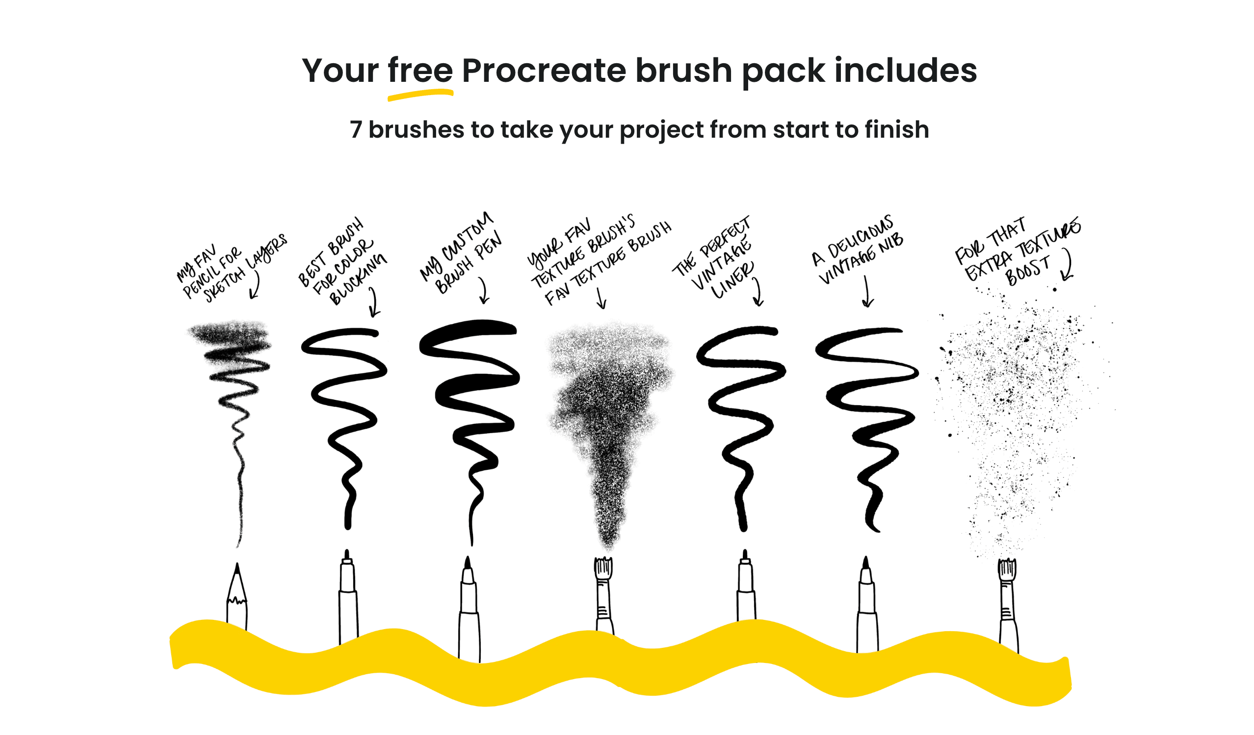
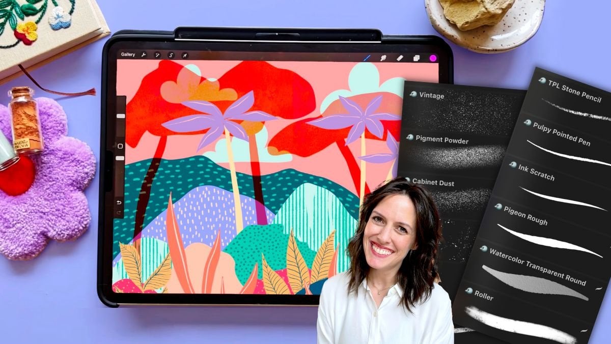
custom brush set it's going to take the brush
decision paralysis away. Let's focus on getting your artwork done and making it something
beautiful, okay? Let's jump in.
2. Set Up Your Canvas: Set up our Canvas. I want
to share this important, important fact with you. You want to make sure
you're not working in Procreate's default
color profile setting. The reason why is
because that profile is specific to Apple devices. So if you were to print your work or move it
to another device, the colors might come
up a little off. So let me just briefly
go over that real quick. So when we're creating
a new Canvas, you'll go to this plus symbol
from your gallery up at the top right and then you
will tap underneath that, there's another plus symbol. It looks like it's
inside of a folder icon. Now, here's where
you're going to set your dimensions and your color
profile here on the left. So for dimensions, we
can set this in inches, centimeters, however
you like to work. 300 DPI is what I
always work in, even if I'm working on
something that's for a digital platform because I never know if I'm going
to want to print it, and 300 DPI will make
sure that you have that sharp image so you can
print something quality. I usually work in inches. I'll go, you know,
16 by 20 at 300 DPI. Now I want to point
something out. This iPad has a larger
storage capacity. If your iPad has less of a
storage capacity than mine, you're going to see
your maximum layers go down lower than what
you're seeing on mine. So you could absolutely work in, like, an eight by ten and then look at how many layers we have. So, so many. You could
also start with square. That's a safe way,
and then you can always crop your canvas later. So a lot of times we'll work
in ten by ten at 300 DPI. That is equivalent to
3,000 pixels. Not that. 3,000 pixels by 3,000
pixels at 300 DPI. So that's a good spot to start. Now, color profile,
tap on the left here. You're by default,
Procreate has it to where it's set up at Display P
three under the RGB tab. You'll just want to go
just underneath that to the first SRGB that you see. That's all you need to know. CMYK is for
traditional printing. A lot of printers now
will use RGB color ways. No problem because they
do digital printing. And then as you work continually and when you
create new canvases, Procreate remembers
your color profile from this setting so that you don't have to keep going
in there to make sure, even if it's a different size. Cool. Alright, and then
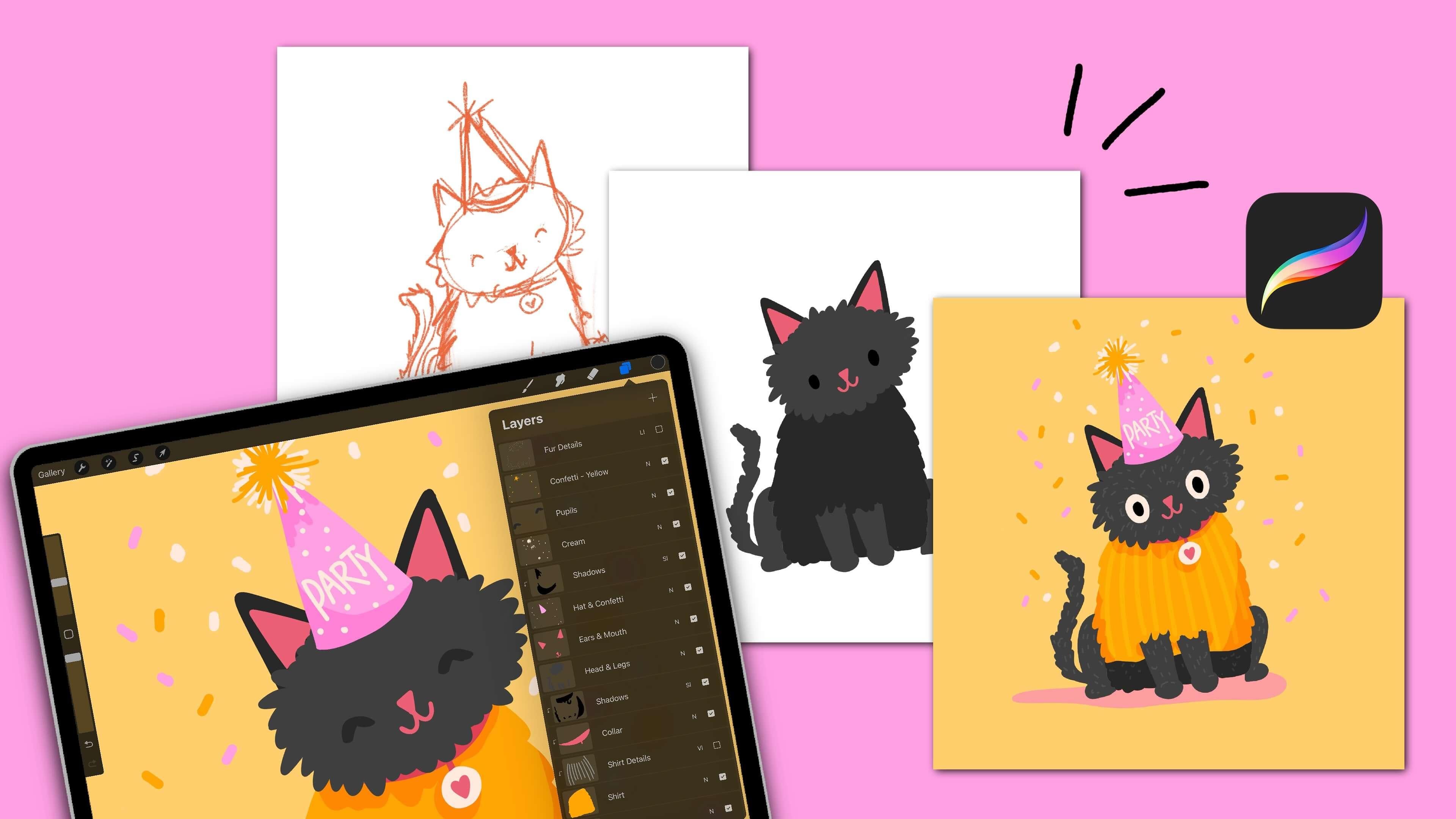
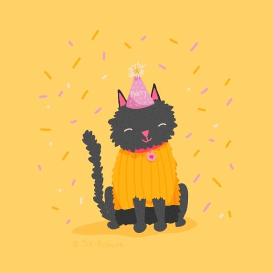
we can title our Canvas. So we can call this one cat with Peggy. And then say create. The first stage that
I go through when I create my illustrations is I
like to go ahead and sketch. Now, I have some
brushes for you, and you can use the
QR code here or the link to give
you quick access to them and then install them. When you install them, it's
going to be a brush set, and you'll see it at the very
top of your brush library. And these are the
exact brushes that I use for nearly every project, especially the stages of them. So you can work along
with those or you can work along with any
brushes of your choosing. Now that you have
your canvas set up, we can move into
our first stage.
3. Stage One: Plan Your Composition: This first stage is
something I used to skip, and now I do it for nearly
every illustration. And while our illustration
today will be very simple, I still want to take you through the process because this is so helpful for different types of scenes and different
types of objects. So I'm grabbing the
pigeon pencil here, and I'm just going to sketch out about six little I guess
we're going rectangular, but they could be square,
they could be anything. I'm just looking at
different ways that the scene that I want to
do could be isolated. And so in this case, if I am
drawing an animal, kitty. Okay, or, you know,
we can change it. But let's say I just have it centered and then
the body's down, and then it's wearing a
hat, maybe a top hat. I realize that looks
like a snowman. Let's make it look
more like a kitty. Okay, kitty. There we go. And that's one way to do it. We could also bring
this a lot smaller, and we can have more of a focus. Maybe there's some
background elements. This is all that I do. It's just basic shapes, and I can see clearly, you know, this profile. So let's say I wanted to
do an animal, let's say, a dog, it's wearing its own hat. Maybe it has an ear coming down. And then it's a profile kind
of coming from the side. And that gives a
totally different vibe to the same subject matter. Let's say we want to do
just the bottom part, and Let's say it has, like, a cowboy hat, and
that's the focus. I'm not drawing the
whole shape clearly. This is just giving us a general guide for
visual for composition. So if it's, you know, below, then we can put anything on top. Maybe there's a couple birds. You know, it's just
a weird composition. Doing this will allow us
to try different versions. So maybe I have three kitties, but the most basic shapes
are going to give us the general at a glance
vision of what we want to do. Like, let's say we
have an animal here, and then we have a
floral wreath around it. So I could have my kitty, and then I have hero flower, hero flower, another
hero flower. I have secondary flowers, and then I have my leaves. And so I just know
by looking at these, obviously an X is not a flower, but it's showing me
where my key points are going to be for
visual interest. So thumbnail sketching
is so helpful. You could see how I
could get through this even faster had I
not been talking it out. So we really have no excuse. I have no excuse.
You have no excuse. Let's do our
thumbnail sketches so that we can really figure
out what we want to do. And they don't even
have to be this detail. They could just be a blob, and then the hat could
be a block, you know? So it's just giving
us that at a glance. We're gonna go with
this one today. So let's get started on that.
4. Stage Two: Sketch: Start off with a
pencil, I'll use the pigeon pencil and it's just a nice easy pencil. This is how we're
going to sketch. What I like to do when I'm sketching is I
like to go in with a random color that I may or may not use in
the actual illustration, but it just helps me
differentiate lines, especially if I'm adding
pure black lines after this. So this is the easiest
way to get started. I will just do blobs of shapes if we're going to do a
kitty. It's so cute. So I usually work in blocks, shapes, anything like that. So when I'm drawing,
I think about things. You know, it's a three D object. We're making it two
D, but how can we do this to where we're
not overthinking it. We don't want this to look
perfect because we're drawing. We're translating
something that we know has all of these
elements to it, and we're taking our
own interpretation and making it
something different. And maybe cutesy. Here's
a general body, right? So we have head body, and your head might be really
circular. It might be tall. I just have today, I guess I'm deciding
to go a little wider. The body I'll make a
little bit shorter, so I'll have it stop
right about here. But you can see
I'm just basically blocking out this shape. And then I'll place
the little feet at the base of the body. So probably here and then on
the sides, these ones here, and then just have the arms insinuate that they're going up. I'm not sure if I'll have
them go the whole way up, and then just these little
curve blobs for the legs. How about? This is just
getting us started. And then a tail, obviously. So one of the things I'll
do is draw just a line, so I can see, Okay,
is that the way I want it to go? Do
I want it to curl? I think I want it to be
just a little swoop, so I'll go ahead and get that to be the
thickness that I want it to be. That seems good.
Little kitty ears. And then face will go in and
just have a little triangle. Maybe I usually do
my animal faces with this weird little
mouth, and it's so funny. Or maybe we want to make this
one happy so we could do a little curl underneath
on both sides, or you can also do a little smile and then a line just from the nose down
to that little smile. That's a little simple
one. And then eyes, I usually do these little
dots because I think it allows the little expression in the mouth to come through. But another eye that we can do is one of these grins
because they're so cute. It's like the eyes are closed, and we're just in pure bliss. Notice how I also kept the whole face underneath the
halfway point of the head. Now, we're not doing all the illustration
rules right now, but I do want to mention that it totally changes and transforms the way that a face will look, because if this was up
here and this was up here, see, it just is a totally
different personality. And then when it comes down,
it's like, super cutesy. As we're sketching, we have these options to make this come to life
a little bit more. So I think it would be cute. First of all, let's make
it a little bit shaggy. So I'm just going to
sketch in some, like, scribbly lines along the sides. So I know that we have
more of a fluffy kitty, and then it's not gonna be as
smooth. That's kind of fun. And then not really
on the legs so much, maybe just having some
tufts coming above the legs just to kind of
show that they're like, peekaboing from all this fluff. We don't want it so big
where it looks lioness, but we'll be able to polish that off as we get
into the next steps, but this is just our
draft, so we get to play. The next thing
that we will do we might want a little
collar that's peek aboing through here. Maybe there's a
little tag that's a heart or I think
I want a circle. It's simple. And then maybe the circle
has a little heart. We'll see. And then,
let's do a party hat. You might be like, What? But it's fun. It's fun. Okay, I'm going to
make this a little bit thicker because I want
it to be a little extra. And that looks good. Okay. Now we have a sketch,
pretty simple. Just to break this
down just to highlight some key areas that
we did together. We have a circle here. We have triangles right
here for the ears. Right here, we basically
have a rectangle, but we ended up curving
it just at the top, and then we have these
circles for feet, little circle for feet, and then we have
just lines that are slightly tapering
upward for the legs, we have these arcs that come
out and then come back in. Out and back in. Then we have
a tail that we use the line as a guide and
then we'll thicken it when we like the placement. Then we basically have a
triangle for this hat that curves down at the bottom and the rest of it
is just fill in. That's what we're looking at. When we have our draft done, we're going to turn this layer down and go into our next stage, which is color blocking to get our base shapes
put into place and the rest of it builds off
of that super easily.
5. Stage Three: Color Blocking: Get started in the next stage. What we will do is go
to our layers panel and go ahead and you'll see a
little N on this layer. We're going to turn that down. Top the N, there's
this opacity slider, we're going to turn it down
to about 20, 30 ish percent. We want to see the draft,
but we don't want it to interfere with the shapes
that we're putting in now. Go ahead and create a
new layer after this. Now, you're going to have
your draft layer still alive. It's so common to
accidentally draw on that layer when you are
doing this part or any part. But we don't want to use
this layer at all in our final piece. I do
want it as a guide. What I want to
recommend is swiping to the left and locking that layer. That way, if you're
accidentally on this layer, when you start drawing, you're
not going to be able to. It's going to say, No,
that layer is locked, sorry, which is good. It's doing you a favor. Let's go to our new layer. Now, I like to drag these layers underneath my
draft layer because that way, when I put a whole shape in
here and fill it with color, it won't cover the facial
expressions that way. I'll still be able to see them. Let's go ahead and
take that new layer and just drag it
underneath this one. Now we'll go to our next brush. I have the mono pigeon for you. It's just my version
of a monoline. And what a monoline
brush will do is, no matter how hard
you're pressing, you're not going
to have any sort of variation in the line width, and it's also fully opaque, so you're not going to
have transparent pixels. It's great as a base. It's also great to really know that your lines are exactly
what you want them to be. You can of course use
any brush that you want, but this is what
I will be doing. Monoline brush layer,
the next layer, and it's going to be
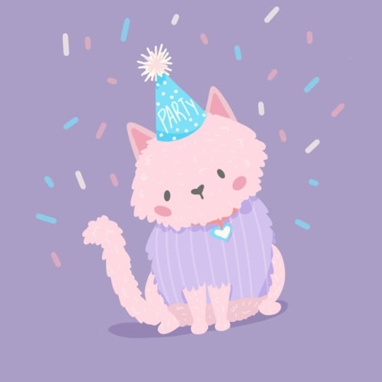
underneath the draft layer. I think I want to do a black cat and instead
of going pure black, I usually like to go
to black and just bump it up to a little charcoally. It looks black, but it's just softer on the eyes,
which I think is fun. Then for this shape, instead of doing something
that's fluffy this way, I think I want it to actually
be really illustrative. I'll create some fun fluff
just with these curves, and then I'll make them
a little smaller at the top so that it
bellows out on the sides. And I'll have them in Lngth. There we go. Let's just
see. That's really funny. I do like this. I'm going
to have a few areas here right touch up
and I'm going to show you a trick as we do this. You may not have to do it, but I still want to
show you this trick. See now, I have to fill these. This is just a really
simple example. Instead of having to color each one of those in or instead of having to drag color and
drop it every single time, this menu comes up where
it says continue filling. I'm going to undo. I'm going to fill this and then
tap continue filling. This is allowing color
drop to be continuous, so I can go in and tap and
then go over here and tap. And then go over here and tap. Then when you're done, you
tap this little check mark and then it takes
the color fill away. It comes in really handy. Then
I'll go over to the tail. What I'm doing is color
blocking separate areas. For example, I don't
want to bring this down directly from the head because I want to keep layers separated. It's okay if they
are not touching. The reason I do this is
because if I want to add any shading or anything
like that, any texture, I still want the head to
have that separation from the body and it's going
to be a lot easier to work with when these
elements are separated. It doesn't matter
for the tail or for the legs because those
are not connected. If that doesn't
quite make sense, it will shortly, but just
know to keep them separated. For example, right
here, this leg here is going to
overlap the tail. That's not the biggest deal.
We can work around that. But if you want to
be nice and clean, that would be an area that
you could also separate. Then here, I'm just going to create a connection
point right here because this fur
is going to overlap it, but I'm having the connection
point in here so that I can easily fill, and it won't spill all
over the page, the color. Because if we don't have
that connection point, if we fill something like this, it's going to go everywhere. So we have this in place. This is looking
so silly already. Now we need the layer for
the body and the ears. These would have to be
two separate layers. The reason why is
because this body, we need the legs to
be in the foreground. If I was to draw
a whole body over this and color blocking
it and put that shape in, you're going to hide the legs, it has to be behind them. However, we need this
little fluffy hair that's from the tummy
to cover the legs. To make this easy,
let's just pick any other color besides
black and that's going to allow us to actually see
what we're doing pretty well and we'll create a new layer on top
of the black layer. We'll just color block this in. Don't worry that we're
overlapping right now, we're just going to
get the color in here. I'm going to come up past the head because it's
going to tuck behind it. We need to reach all the way, then this will just have
not quite as fluffy, but still have a little bit
of texture on the sides with these little waves. Then we'll have that come all
the way down in the bottom, just a little texture, little wavy lines,
and then we'll just connect right here so
that when we color fill, it's not going to fall out. We can still see our draft. We can see where
everything is supposed to lie, which is really helpful. We're going to also
go to the ears here and go ahead
and draw those in, make sure they go underneath fully because if we
have it right here, we'll have that white space in between, we don't
want that white space. We want to completely fill
and then we'll drag color in to block those out and move
that layer underneath now. Now we'll create the
layer of yellow on top of the black layer.
Just another layer. Again, we're going to
change this color, but just for now, we want to have this overlapping and then we'll want it
to overlap on this side, so just some wavy lines. Then we will do the
same thing right here. Just some uneven lines. They're just going to have it. Assume that we have these tufts of hair just over
the little paws. Cute. Now we can
change this color. I wouldn't do the same color for this as we did the
first layer and the reason why is because we
still want to see that separation and otherwise it's just going to
all go together. If I'm not using any linework, then I want to make sure that that is still differentiated. I'll go to the main layer and this will be a way
that we can easily see. We can grab that first layer just by tapping and holding
for the eyedropper. If that's not the way you
have your eyedropper invoked, can change that
in your settings. If you go to the wrench
icon preferences and then your controls, you'll see eyedropper
right here and that's going to allow you
to set how that comes up. I have a where top and
hold and that's going to bring that black up and I just want to change
it a little bit, so I'll just bring it a little lighter and we'll
see how that looks. It'll look a little
crazy because this yellow is not covered yet, so I'll do the same
thing up here. And to these ears. Let's turn the draft layer
off and see how that looks. Color separation and it
makes a lot more sense. I was going to show
you how you could have this color on one layer. I will show you that.
Let's go to the top layer, the top layer that we made, which is just that hair
that's overlapping the legs. We will select this layer by tapping the layer
and then select. You'll see that being selected, either looks like
mine or it might it depends on if automatic
is on or freehand is on. No matter what though, it's grabbing everything that's on the layer
that you selected. When it's freehand, you'll see these diagonal lines
and when we zoom in, the diagonal lines are not on the selection
from that layer. So when we have a selection, it doesn't matter what layer
we grab the selection from. The selection is the selection. So if I selected what was on that top layer and then move to the layer underneath
that has the legs on it, it still has the same selection. So on this layer now, I can impact it based off
of my previous selection. So what we want to do is cut away the black from
this selection. So we're going to go three
fingers down and cut. That brings up the
copy face menu. You can just cut
it away. Now, when I turn off that top layer, see how the legs are
gone from those areas, that's going to allow us to then merge these
two gray layers. I can just drag that gray area underneath now and nothing
happens because we've just removed everything
that would have been overlapping and weird and
then merge these together, and now we just have simple
layers. It's a lot cleaner. That's pretty easy. I'm going to swap these
colors because I think I want the darker one
to be on bottom, and then the lighter
one to be on top. There we go. Okay, it's looking a little bit
like a fluffy dog, which I'm not mad about. I
think it's really funny. Let's turn on our draft layer again so we can see
where everything is. We need to create the
inner parts of the ears, we need to do the
face and we need to do the little collar
charm and the hat. Pretty straightforward. Let's go ahead and start
with facial features, ears and nose and mouth. How about? Let's grab
a lighter color. It could be yellow for fun. It could be pink,
it could be red. I'm going to choose a
Samini pink coral color and then I'll create
a new layer for that. Once we start getting a
lot of layers in here, We can rename them. This can be body and ears, this can be legs and
whatever else is on there. I'll know tail, and
then this will be face. We can come in here and draw this little nose and then
cutesy little mouth. Now this is another
area where we will have to cut away this excess. Which is not a problem because those colors are on
separate layers. I'll be easy, we'll just
fill this, fill this. What I did was make sure that it dropped all
the way underneath all of those little wavy lines to make this easier
instead of going in, we can just redefine
that shape a little bit. It doesn't have
to be so perfect. Now that we have this in place, let's put in the eyes and the hat, a new
layer for that one. I'll go ahead and just
say ears and mouth, and then the new
layer for the hat. And I'll make the hat the
same color as the little tag, and how about bright pink? Up down and curve and we'll
fill that with color, move it on over, and then the
tag, just a little circle. Now, if you like perfect shapes, you can do that with Procreate. All you need to do is draw
your shape and then hold it. It's going to snap to
this nice smooth line. But then if you take one
finger and tap down, see how it's a perfect circle, if you want to make more
of geometric shapes, you can do that. I like it to look super handran
so that's where we're at. Now, I want to say something. The yellow that was in here, I think was so cute, and I think it would
be really fun to put that back in here
with some texture. So I'm going to do that. I'm just planting
that idea right now because I think that it would
be really fun to tie it in. This is my process. It's very organic and it's
really easy to be able to do this in stages that allow us to think about
things like that. So knowing that, I'll go in
and finish the base shapes. I'll use a cream, create a new layer and
this will be for the eyes. And then just for fun, let's write party on the hat. So wonky lettering just to
make it even more playful. We have party. How about just some little dots to
give off that confetti vibe. Then I'll take that same color and add it to the little
burst right here. At this point, I'll
check and make sure everything on my
draft is in place. If I don't have anything
left on my draft, I will then turn that layer
off and stop using it. Now we have this to go
off of because everything now is just next steps
and part of that process. There's a few things that
we need to take care. One of them is we need
a background color. I never use background
color in Procreate. That's not a true layer, so I'll always create a new
layer and drag it to the very bottom and I'll
label that background. I'm going to do a
light yellow, I think. We'll go in, maybe
a little warmer. Now, if you guys have taken my color class, you
know about recolor. I'm going to give you
a refresher because it is one of the best tools
that you will ever use. So you do need to know how to
invoke your quick menu and it's going to be
different for everybody depending on how you set it up. Minus set up to where I can tap the little square in between the brush
sliders and it pops up. You can go to your wrench icon, go to preferences, go
to Gesture Controls. Quick menu is about
halfway down. This is how you can decide how
to invoke your quick menu. Once you know that,
well, real quick, see how it just popped up
at the top of the screen, it's going to appear wherever
your brush last was, wherever your Apple pencil was. Let's go here, I'll
tap do just in case. Then look now it's down here. Any of these flyout
menus, just tap and hold. This is all alphabetical,
grab recolor. You want to do this, I promise. Because now that it's set, when you tap recolor, there is a little cross hair and depending on where that is, it will impact the
pixels on that layer. Right now, this whole layer that it's selected is the
background layer, so everything is grabbed. But this works like a color drop does except
it's in live time. I can change and make the
tiniest tweaks and see every single hue option along
the way. It's so helpful. To put this where
I want it to go, we need to go in between the head layer and
then the body layer. Whenever we create a new layer, the layer appears on top of
whatever layer is selected. In this case, I want it in
between the head and the body, I'll go to the body, tap the new layer, and
now it's in between. I'll grab the yellow
that I want to use. Instead of doing
this real billowy, I'm just going to soften the lines a little
and follow it along. I'll go ahead and just softly bring this through right here. And then here, just soft. And then connect it. Then we need to make
sure it connects back here because right now, if I was to color fill this, it'll go everywhere and
that's because this layer, I'm going to isolate it is not closed. We need
it to be closed. What I usually do is just
go from one end and over exaggerate and bring it on over until I know it
connects to the other line. I'll isolate it one more time. That's what it looks
like underneath. Then I can fill it and it will fill everywhere
it needs to. I think that's so cute. Now, I'll have it
go a little bit darker just so it
pops a little bit more I just bring that down
to orange a little bit more. Great. I do need to put
the collar in still. I need that to be
underneath the head layer, so I'll go to this yellow
layer and just go above this. I'll just have a little
peekaboo collar. This will have to be lighter
so it shows up better with a line that connects
there we go. Let's recolor this and
get it to be lighter. That pink works.
We'll do that one. This is where we color black. If we are happy with the
way it's color blocked, yet no, it's not
finished, you're right. But this is where we are
ready for the next stage, where we add details. They are still minimal,
but it is its own stage and it's going to make it
come to life much more.
6. Stage Four: Draw the Details: Part I feel like a interchangeable when
it comes to adding details or shadows and highlights when it comes to which one we'd want to do first. I'm going to go with detail
because that way I have a really good vision on everything that I want to add
shadows to and highlights. The first thing I want to do is create some
linework in the fur, and this is going
to be everything that defies any detail that we know in principle because I want it to
be fun and playful. I'm going to do this
with a gray tone. I'm just going to go
to gray general gray. Then I'll just put
this at the very top. I'm grabbing the top layer, not the draft, but the top. In fact, let's take our
draft and go ahead and push that to the bottom
underneath everything. Top layer and just create a
new layer on top of that. You can organize this
however you want. Then I'll make the
brush a little smaller because I
just want these to be a hairline small. These lines, we could do this where they are just
little dashes, which are cute. You could also have some
be a little more billowy, which gives the it re emphasizes what the
outer texture looks like. That's what I think
I'm going to do, but I think this should
be a little darker so it doesn't detract
from the face. It's just supposed to
add a little bit of texture so it doesn't look as flat but without
adding a texture brush. Now, you can definitely add a texture brush.
That's a lot of fun. I just want this to
be pretty simple. I'm just going in and out. I like to zoom in
and out a lot so I can really see how
it's coming together, and then if something is too
spaced out, for example, I'll put some closer
together so it doesn't feel so formatted, I
guess, formulated. Sure. Then maybe a couple more
Billowy ones. That works. I'm going to go instead
of changing the color, we can just go to the layer itself and turn
the opacity down, go to the end and
turn that down and see how it's just subtle enough. That's what I'll do. Then here, I'll just add a few of
the same throughout the tail. Just some Billow. I'll tell you what. When
I first started doing these really simple
versions of detail, I felt like it was so wrong. This does not look right. But then when you
look at it from a distance, less is more. So how can we get ourselves to a place where we can just know
that it's like no, it's stop time. It's stop time. Stop before we think we're finished because then
it's going to be cuter. Whenever I overwork something, it just doesn't feel quite as I wanted to
or as I intended. I just think what a sad sad missed opportunity
that was, you know, there's a blend mode that's
going to help us too, and when we use blend modes, that will determine how it communicates with
the colors underneath. If we go to this here, you probably saw this huge menu. Scroll all the way
up to multiply, that's going to give
you a darker version. But if we go over to
lighten, let's say, Lighten is going to do
essentially what we already had because it's a lighter color. But then we can go into
other ones like overlay. Look at linear light.
That's a lot nicer. It's more subtle and
it's making it so that the marks over the darker is darker are darker than the marks over the lighter
gray, black color. So I want to do that and then we'll do something
similar to the yellow, but this time just differ
the lines slightly. A new layer for that,
I'm going to go ahead and say fur details. Then for this new layer, it'll be, is it a shirt details. You don't even have to change the colors if you want to use a blend
mode, which is nice. Let's just experiment
and see what that will do for us
using a gray still. For this one, I think
I just want to do, I'll thicken the line and I'll do just some
really simple stripes. I don't want to
have to be precious about where I'm
putting these lines. I will go to this layer, bring it down on top
of the yellow layer, and then I'm going to
clip it to that layer. What that means is
everything that I do to the layer that's clipped will only impact
the layer below it. Tap the layer clipping mask. Now there's this
little arrow here. It's only showing up on top
of these pixels below it. What that means is if I
draw off of it at all, it's not going to matter. From here, I'll go
ahead and play with the blend modes again. See, overlay is nice. It's really subtle. There's not a whole lot, but it's just enough to
give it a little umph. If this was a different
color and not gray, it would have even
more of an impact. This is what it looks
like when it's black, that's wildly different
or if it was white. The fact that it's
gray, it's so subtle. I would say when you're
using blend modes, just go through them and see if there's anything
that stands out to you because you might
end up surprising yourself. Linear burn is nice, Vivid lights a
little more subtle. Soft light and overlay
really, really subtle. I think I like vivid light, but I'll also turn the
opacity down just a little so it's not as loud. Then I want to bring that
yellow up to the hat. I'll go to the
main yellow layer, not the clipping mask, and I'll make this a little bit
smaller in my brush size. Except that the yellow is
underneath this cream layer, so I do need to put
it on top of it. I'll go to the cream layer and tap a new layer
for this one, and that way, it'll show up. I'm just going to do
some fun little bursts. Some lines will be a little bit longer, but
for the most part, it'll be smaller since
it's on top of the cream. That just creates
a little texture. Now let's add some
confetti just around the kitty and we can do
this with our brush. If we just make it larger. We can create those
sprinkles that would be on a cake with just
little pll form. How cute is that when we
just have a little confetti. Then I'll go to the pink layer just to make it easy so that everything can be edited
together should we want to and put some pink
around as well. And then some of the cream, I'll go to the cream layer. I think for this
one, I'm going to do just random blobs of color. It's like a chunky confetti
with those random shapes. They're the cut shapes. From here, this is where we go into the final stage
of final touches.
7. Stage Five: Add Depth & Shadows: Here, this is where we go into the final stage
of final touches. We're basically halfway there because the details
are being put in, but this is the time for those
little extra elements that are just going to make this pop come to life
a little bit more. We're going to use
clipping masks for this. It's going to make
things really easy. The shadows are
going to be on top of each grouping
that we've done. We don't need any
on the dark layers. It's already dark. Really, we're just going to do
this on the hat. And the little shirt here, and then underneath where
this little kitty is sitting, it looks like there's actually a floor or a
surface of some kind. Remember that when we do this, it's going to create the layer on top of
whatever layer is selected. I'll tap the plus symbol
to create that layer. Since I want to clip it to everything underneath the neck, I'll see over here, the
collar is not clipped. We can do that still
and whatever we clip we can have multiple
clipping masks to one layer. And it will impact the first
layer that isn't clipped. What I mean is if I clip this, nothing changes because it's over where it needs
to be already, but it is clipped to it now. If it were to be drawn off
of the yellow at any point, it wouldn't show up, but it's skipping the shirt details and going right to
the yellow here. We want to do that
with the shadows. I'm going to tap this layer
and tap clipping mask. We're just going to
work in pure black. It's going to make
it easy, trust me. We're going to draw some
subtle wavy lines like this, but just not as defined. And then make sure
it connects so we can fill it and then
watch the magic. We're going to use
our blend modes. You've probably
heard about people using multiply for
shadows and it works. But what I want to do is go
down to overlay and Softight because these create they bring the color
out from shadows. Instead of just
being like, Okay, I have this desaturated
shadow and it works great. Don't get me wrong.
I want you to play with going into overlay
and soft light. Soft lights a little bit
more of this subdued, but I also have the
opacity down to 50%. But see how it's just that nice vibrant it brings it out more. Now we can create a shadow underneath the little I guess this
would be a sleeve. We could create a little bit of a shadow just underneath there, so it looks like the little
paws are poking out. It's also fun to bring a shadow just to one
side of something, so it curves maybe
imperfectly. See what I mean? It just brings a little
more character in. And has that wrap of a
little bit of depth. When we're done with this one, I want to also do this ring. I don't want to go
around the whole tag. I want to just bring it down to one angle so it looks like the light is
coming from one angle, like a real shadow would even though this is
a doodle, but still. Then now we can move
on to the next area. We'll do the hat. I'm going
to go to the hat layer, create a new layer,
and then clip it. Now, it's going to be black because I don't have
a blend mode in yet. If you want to do that first, you can go and you can
go to your blend mode, go down to soft light, and then turn the opacity
down about halfway or so. I'll create some shadows here. They're just going
to be looser ones because it's coming down from this pom pom and then
maybe some just right here to give the
illusion of rounding. It just is enough to
make it have that up. Then the last one we want
to do is the bottom here. I think it would
be fun. We'll go ahead and go
underneath everything. Go to our background
layer, top the plus, and that's going to
give us a drawing. We'll be able to draw
underneath all the layers. I'm just creating a
smooth oblong shape. Let's go ahead and use those blend modes just to
see if that works. See soft light
works really well. Overlay works really
well and that's going to pull the color
from underneath that. If you don't want
to do that and you want to do a totally
different color, you can play with
the blend modes, but I would actually just
go back to normal and then use your recolor so
that you can put the cross hair over what's
going to be recolored and then you'll be able to play with exactly the color
that you want to do, which I think is
fine because I think that if I go with
a pinkish color, it just ties the
colors together well. I think we'll do that.
Then the last thing I need to do is, I think I'm just
going to do a heart because I don't want
to detract from party. Because it's funny. What a cutie. All
right. I love this. I think it is so cute. I want to show you
something you can do to totally change the vibe. I know we talked
about it initially, but when it comes to eyes, yes they say eyes are
the windows to the soul. But it's true, check it out. If you want to make
something cutesi, we can just come in
and vary the eyes. I'll just do these oblong
pupils in the center here and look how it
completely changes. The whole mood of this
little character. It's so cute. Even
pupil placement and pupil size
makes a difference. If I just shift
this over slightly, it's going to make
it even cute sier. Do you see? Look
at the difference. It's so simple, but it's
just those little things. You can play with that and see how you can bring
that to life to just totally transform
the character. Heavy lids. Probably
different color, but let's just see.
That's a whole vibe. We could even have them droop, let's do one more of these
where they're really low, and then the pupils are
This one's real sleepy. See what I mean? Then when
we toggle between them, we have this one, we have
this one, we have this one. You see where I'm
going with this. Then we can also look
at the original, which is those little
happy gleeful arcs. There is Akiti.
8. Next Steps: As a recap, our first
stage is thumbnails. We want to be able
to sketch freely, but we'd like to have a
little bit of guidance, and it just takes a
couple of seconds, and you might love
your illustration more than you even
realized you would have. Stage number two is sketching. This is where we
get to play and get imperfect and resize and tweak. And then stage three, we get
to add color blocking in, and this is going to be
our easiest way to lay all these shapes down for the
groundwork of stage four, which is adding our details, and then our final
touches in stage five, which is our shadows
and our final details should we decide
to add any Pizzaz. With that said, thank you
so much for being here. I can't wait to see you
over at the Pigeon Letters. You've got so many resources.
You are welcome there. Let's keep making art together. I will see you on the Internet.
 Peggy Dean, Top Teacher | The Pigeon Letters