Transcripts
1. Welcome to 3D Letters in Procreate: Yes, it's time for
a new perspective. Welcome to 3D letters
in Procreate. Join the class. Standing tall letters. Learn the fundamentals for a stunning horizontal effect and boost your digital
hand lettering with the amazing
whole texts illusion. Even letters with curves
won't scare you anymore. After taking this class, I will take you behind the scenes of Procreate's
Drawing Guide. With the isometric grid, we can jump right into creating a basic form for
all letter effects. Step-by-step, you will
learn the measurements and proportions and how to
create clean lines. We will step up our
game and also learn to add two different textures
with the clipping mask. This class, That's where
these simple letter form E. And as a project, you will be asked to draw the initial of your
first name in 3D. If your name is not Erica
or Elia fear naught, I will take you behind the math of curved
letters as well. This might seem tricky
at the beginning. With a fundamental
knowledge on hand, you might want to start
a whole alphabet. That's so cool and so easy. Hello, my name is Erica. I'm an artist and
illustrator from Germany for over four years, the iPad procreate and I are inseparable together with a
great network in Germany, I designed interior walls
for big companies or develop ideas for the house
runs of housing cooperators. My commissions are
also for clubs, private persons, and
local festivals. And everything is
created with procreate. I'm a true fan and I love to
teach this class is for you. If you are familiar with
the fundamentals of Procreate and want to learn
the basics of 3D lettering. I will show you three
3D letter styles and more tricks to create all
forms for your own alphabet. With this knowledge, you
can expand the way of digital hand lettering
in Procreate easily, use it in your prints, or simply enjoy it on
a sleepless night. Yes. You can do 3D
lettering in procreate. Can't wait to see you in class.
2. Your Project and Your Tools: Let's start with your project. You will be asked to draw the initial of your
first name in 3D. Upload your artwork under
Project and Resources. Let's take a look at the tools you'll
need for this class. Also on the project
and resources, you will see a phi 3D
lettering Procreate tap on the name and the PDF will
automatically download or open. It contains the two
main guide blocks, the dimensions and the
colors we will use in class. Of course, we need the iPad
and the procreate app. Once you have it, tab open and the brand new canvas
is waiting for you. Yes. Now we're ready to go. Next. We are going to set
up the drawing guide.
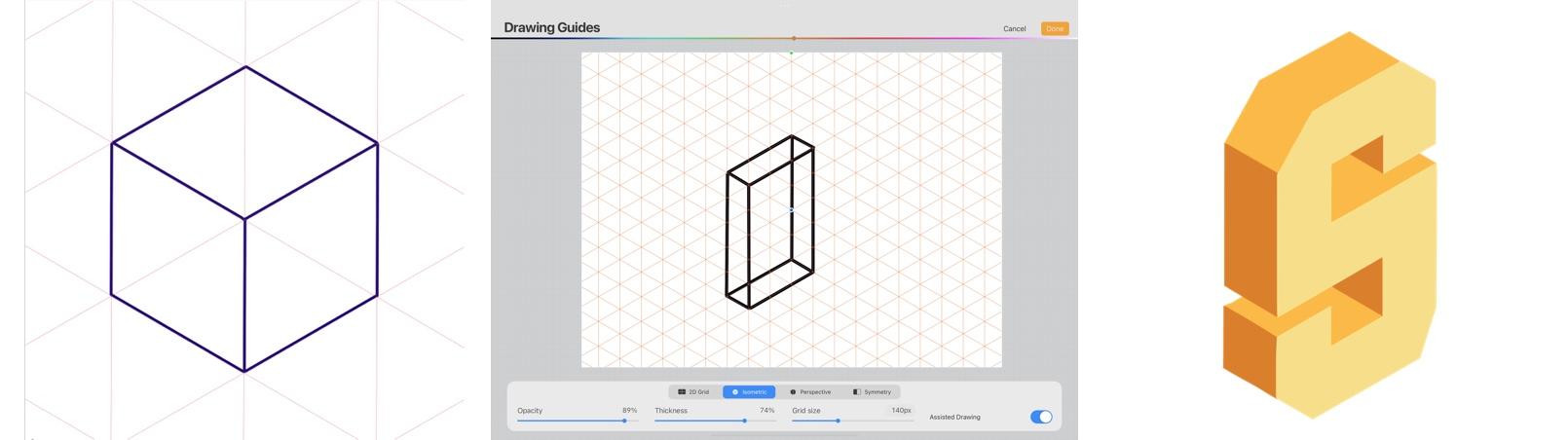
3. Set up the Drawing Guide: Let's get started
in your gallery, tap the plus and the top menu. As for the canvas size, I'll go with the screen size. Your Canvas will
open automatically. Now go to the left, tap the wrench and choose
Canvas from the Actions menu. Turn on the Drawing Guide, then tap on Edit Drawing Guide. This course is exclusively
about the isometric grid. Isometric means that this
grid consists of small cubes, were all sides have
the same dimensions. They are all equal in
height, width in length. If you want to go deeper into the basics of isometric
drawing, e.g. to create this
easy, cute pattern, and to get an introduction
to isometric lettering. I recommend my course
here on Skillshare, easy 3D in Procreate
for beginners. It is here my profile
among my German classes. Let's return to our grid. In a drawing tool editor, your canvas is
always displayed to see the entire canvas above it. The rainbow scale defines
the color of your grid. Choose a color that has a high contrast
with your artwork. Below your Canvas, you can
set the opacity of the guide, the thickness, and
the size of the grid. For this class, I would
like to have 45 pixels. Tapping on the number will open an interface for
exact dimensions. Make sure assisted
drawing is turned on. Finally, tap Done in the upper right corner to
return to your Canvas. Now that assisted
drawing is enabled, you will read assisted
under your layer name. Grab any color and a simple mono line
brush. Are you ready? Then let's create a guide element for
consistent alphabet. Our guide element
will be three cubes wide and nine cubes in length. Now that the drawing
guide is on, you will notice that
your line drawing follows the grid below exactly. There's no chance
for any wobbles. Our guide will be
15 cubes in height. You can count a little cubes. Check the numbers in
this box on the right, and take your time. Once you're ready, we're looking
through our template and also create the inner lines that define the whole body in 3D. This looks fantastic and it is the groundwork for the
following lessons. If you have any problems
with the creation, you can download
the PDF file with a two guide elements and the color palette under
Project and Resources. Next, we will create the first optical illusion
and upright standing leg.
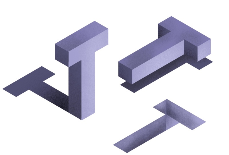
4. Upright Letters : Welcome to our
first 3D illusion. First things first, let us
switch on drawing guide. Do you remember how to
adjust the size of the grid? Right, in the drawing
guide editor, it's the third option. You can choose whatever
size you like. But to follow the class easily, I recommend you
go with 45 pixel. Once you're ready, make sure assisted drawing is
switched on, tap Done. To return to your Canvas. Let's get our red guiding blog to get the dimensions right. This is the body, or you can even think of it
as your material to sculpture your letter from create
a new layer above. Now, choose your letter
E as one of the easiest. H and I are also great, but you can jump right in and take the initial of
your first name, sketch it out, and then
create a copy of this group. This is very helpful as a reference during
your drawing process. Move it in the upper
left corner of your canvas and switch on
the original red block. Once you are ready. This letter will
actually face the light. Choose the brightest color
for the front of your letter. The first horizontal bar
off the ladder is nine cubes long and three cubes high. It should be easy for
you to look precisely on the guidelines When Assisted
Drawing is enabled. The main vertical bar is three cubes wide and 15 cubes high. With color drop, you can
quickly color your areas. The distance of the
middle bar between top and bottom is also
three cubes each. Now, if you miss a line at two finger tap is enough
to undo the drawing. One more color drop, and we are ready. Now we draw the second
part of the 3D view. For this, you need a
middle color tone. After that, create a new layer. Now we draw the part
of the letter that faces backwards into the room. The light reaches these
parts quite well, but less than the front area. That's why we have
the middle hue. Note that all these areas
are always three cubes deep. Zoom in to work precisely and to ensure that
your lines are closed. To get a really nice result, I recommend that you erase all the areas that you have
drawn beyond the guidelines. So let's create a really
messy color block. While you are drawing,
you can make use of quick shape to create
a straight stroke. Just hold your stylus
a few seconds longer on the canvas until
quick shapes naps in. You can do the same
with the eraser tool. So do not lift your pen until quick shape created a
straight erased line. The third part of the letter is drawn in the darkest shading. Here's the most intense shadow in the 3-dimensional
illustration. Create a new layer
for this purpose, the separation of the colors on different layers allows
you to experiment later with new colors for the individual areas
of the letter. So this part also reaches three cube steep and is oriented in height exactly to the height of the front with the red
Guide Blog underneath, nothing can go wrong. Now, take your time and look
closely at your drawing. Erase all the spots where
you have painted over. Looks perfect. Now, if you are satisfied it, then we should immediately
organize the layers. Switch to the Layer menu. Name all the layers
of your letter according to the area, front, upper shadow, and decide shadow. But you can also name
them by the color value. As a next step, I group all my guide layers
into one group and named MTU. Finally, I group all
three layers of the e into one group and
name it. This way. I maintain a clear overview over the elements of my canvas. Now, the big moment, switch off Drawing Guide
to enjoy the result. Bravo. In the next lesson, we will focus on the 3D effect
of the horizontal letter.
5. Horizontal Letters and Texture: Welcome back. For
this 3D version, we need the horizontal
guide blog. You can rotate the existing one or trace the one on the PDF. The lightning conditions
remain the same in that view. That's why we draw
the first part, the top of the flat letter
in the middle color. Choose your color. Check again whether
there's a portrait drawing is switched on
in the drawing guide. Perfect. Now, return
to the Canvas. Of course, we need
a separate layer for this drawing as well. Create a new layer on the top and switch
on assisted drawing. Even if the perspective
has now changed a bit, we keep exactly the
same proportions. Each of the horizontal
bars is always three cubes high and
nine cubes wide. The vertical line
is 15 cubes long. Now, take your time and try to work as
precisely as possible. Zoom helps you to make the
first touch ups right away. E.g. if a line has become
too long, brilliant. Now, fill the area
with color drops. Last but not least, we create a third
horizontal bar, last line, and one
last color drop. Now the first element
that creates death, it is the part of
the letter that points directly to
the light source. For this, we use the lightest
view on a new layer. I now start with the first color block
of the spatial view. It is identical to the other
two spatial outside shapes. To simplify the process, a copy is enough, which is then placed exactly
at the new location. Repeat this also for
the third block. Now be patient because
sometimes it can become a bit tricky to
find the right spot. To get a cleaner static, I start to erase all spots
above the guideline. This is much easier when elements of one color
sit on one layer. Check your layers menu and merge dose of one
family together. Two-side elements
are still missing, which also point to delight. Have you spotted him yet? Great. Then draw them in
the same bright color tone. And of course, try to
get a clean shape. Now color drop and
a few touch ups. Once you are happy
with the shape, it's easy to use the copy. So to complete their
death illusion, go to the Layers menu. Duplicate the layer
and move it to the final position.
Are you ready? Okay, You see I'm repeatedly
busy to clean up my shapes, but I know it will pay
off in the long run. Okay. Now let's pick the darkest color tone to draw the bottom side
edge of the letter. I start with the
longest rectangle and fill it with color drop. Okay, let's check
the Layers menu. And yes, I guess dried. It's supposed to
have its own layer. Let's delete all of these, create a new layer
and start over again. Whenever I use quick shape
to create a straight stroke, you will see a notification
in the middle of the top menu bar saying
something like line created. On a new layer, I draw the short rectangle
for the spatial view. The reason is quite simple. This way, I can duplicate
this rectangle later and use the copy as the last
missing shadow effect on the upper part of the letter. And yes, also this rectangle
needs a lot of attention. Move the copy to
the missing spot. And the third spatial
part is ready. Yes, now it's time
for the fun part. Let's organize our layers. Name them according to
the elements you drew on. Merge those layers into one that have the
same color tone. Name them as well. Now group the three
layers that build your 3D illustration after
lying letter in one container. Name the main group,
E lying down. Let's switch off Drawing
Guide to enjoy the result. Bravo. Finally, let's
give you a letter, a little bit of an extra. To add texture, create a new
layer above the top drawing. Choose any texture
you like and draw. Now switch on clipping mask in the little layer menu to
create the perfect fit. You might like an
outstanding texture, but I like the texture
to be a bit softer. To do so, I go back to
the Layers menu and reduce the opacity
down to about, let's say, 40 per cent. Now create a new layer above the darker shadow and
turn on clipping mask. I go with one texture of
Procreate's vintage set. It's called honey eater. It's somewhat resembles
an old newspaper effect and it looks just great. Have a closer look. Now, with this knowledge, we can step up our game
and create the whole text.
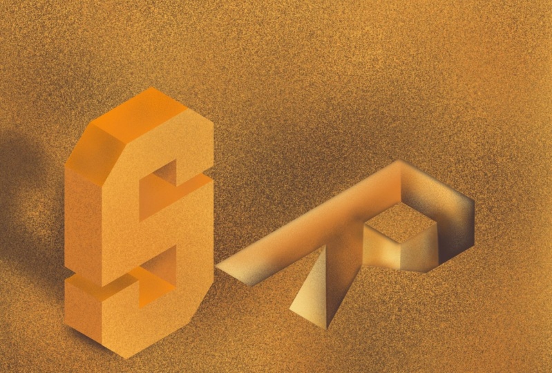
6. Hole Text Illusion and Shadow Effects : The easiest way to start with
this effect is to work with a copy of the E top shape
of the line letter. I already changed the
color to a darker shade. Now, find a spot
on the canvas and then find a good position
for the canvas itself. Once you're ready to turn
on the Drawing Guide. Now that the isometric
grid is visible, make sure the letters, it's precise on the guidelines. Great. In the Layers menu, I move the current layer over all groups to start a
new container soon. Of course, to not get confused, we should name it. Now, create a new
layer on top of it. This is our end result. To give you an easy start, imagine that the light hits this hole in the ground
from the left side. In this perspective, it
illuminates inside the E, only three inner edges
and three sides. To achieve this effect, we're going to work with the noise brush and
the clipping mask. But first, I redraw the shape for the illuminated
parts of the letter. Again, I make use
of quick shape for the straight lines and the
color drop for the filling. Let's create a new layer for the other shapes in case we
mess up something on the way. I start with the highlight edge first and follow the outer
shape of the e exactly. Once the lines of my
shapes are closed, I use the color drop. The third shape is exactly
the same as the second. You can either duplicate
it or draw it again. Finally, one last color drop. If you are happy
with your shapes, merge the layers into one. Back to the Layers menu. We create a new layer. Yes, Just one on top of that and turn on clipping mask
in the little layer menu. Now, I'm using a light
hue and noise brush, which you can find at
Procreate brushes dot work. Start on this side
where the edge meets the darkest color
and begin carefully. Work your way to the other side. You can vary the effect
by the angle and the intensity of the light that falls into your illustration. It's up to you how heavily you want to apply
the noise effect, but I recommend thinking
are fading out. Use another lighter color to highlight the
top of the edge. And that's it. Switch
off Drawing Guide. Well done. When creating shadows, make sure you keep the angle of the guide you used initially. For this example, you can choose either black or very dark
version of your main color. In this example, the light
source is right in front of the character and does not allow much length
for the shadow. Take your time and
have a closer look at those spots where you might
have messed up a bit. With the eraser tool, you can make the
finishing touch ups. The second shadow doesn't quite match the light source
we use at the beginning. But I also want to show you another angle which is quite interesting
in an illustration. The copies it to the side, maybe two cubes and
also two cubes down. Walla. That's it. It's so simple. Last but not least, the big final width,
a big challenge. We take a closer look
at letters with curves.
7. Letters with Curves: Finally, the letters
with curves and cropped edges that
define that character. For now, let's focus on letter
S. This is our end result. We use the standing
tour guide now. Plus I made a mark on every third cube for
additional support. Create a new layer. And let's start with the middle
line at the bottom of the S. And this is three cubes wide. Now create the
opposite on the top. Move on to the first
curve on the right side, which is only two
cubes down. Got it. Then connect the end
point of your line with the outline and keep
following the guidelines. While the latter is
starting to take shape. This is a first sketch, so follow the lines roughly. Once you're ready
with the upper part, start with the other
half of the bottom. So they mirror each other. Keep the dimensions the same. Here's a little math on
the side I'm working with. The inner side is to, the lower part of the letter should be six cubes
high in total. So one cube is left. That creates this space between the middle bar and the
bottom part of the letter. Make sure you stick
to the width of three cubes throughout
your character. Great. We've made it. Let's focus
on the cropped edges. I create a new layer and reduce the opacity of the
outline sketch. Now I choose a different
color to better distinguish my next marks
from the other guidelines. I decided on a
two-by-two cube cutoff, starting at the top left. Once you made a two-by-two mark, connect the points
with a straight line. My eyes would probably
misjudge the angle. So it's good to kind of
two cubes on the grid, mark the points and
connect them like this. Finally, the last
edge on the right. Let's see if we got
the shape right, switch to the brightest color
and create a new layer. Check the drawing
guide once again, if assisted drawing
is switched on. Perfect. Now we are
ready for the easy part. Follow your guidelines and redraw the outline
of your character. You can press pause and
draw at your own pace. Now. Are you ready? Awesome. Let's bring the next
dimension into our drawing. The width of our letter is best achieved with the
Guide Blog underneath. Create a new layer and start
with the middle color tone. I start to draw the
rectangle on the top. Of course, it is
three cubes wide, and I follow the
guidelines for the rest. Fill it with color drop. Now focus on the middle
part of the letter. If you stick to the
width of three cubes, you achieve easily
the right form. And also at the bottom. One last part in this color, the edge on the top left, plus a color drop,
and we are ready. Now we need a new layer
for the darkest shadow. I start at the left. Now the little marks
come quite handy to get the right
height for this shape. Ready, then color drop. I leave one cube to
define the space between the upper and the
bottom part of the character. Now you probably notice that we missed some
of the middle color. Let's fix this at the
end and continue with the inner part of the S in
the darker color value. This is more a triangle. Of course, we need also one in the upper
part of the letter. Close the lines. Color drop. And wow, this looks great already. Whenever you need
to correct areas, make sure you are on
the right layer to fix the gap in the lower
part of the dimensions, we need to switch to the layer with the
middle color tone. Here it is. Let's draw it. Fabulous. Now finally, organize
your layers. Front. This is the layer
with the darkest shadow. And finally, the layer
with the brightest Shadow. Turn off the Drawing
Guide to see the result. Fantastic. Congratulations, you made it. This was hard work. Now here you can
see the time-lapse of my drawing together
multi-dimensional. Now it's up to you. Have fun and play around
with your letter. I will see you for a little sum up and some tips for Skillshare.
8. Summing up and Tips for Your Project: Great work. Now you know how to prepare a basic 3D guide plus
three optical illusions. And upright letter,
horizontal letter, and the amazing
whole text effect. Even letters with curves
woven scare you anymore. Once you have completed the initial of your
first name in 3D, go to Project and Resources. Tab on the green
Create Project button. Now, a new interface will open, upload a cover image that we will see in the project gallery, provide a title and
tell us a little about your workflow with all
the ups and downs, please include a keyword like 3D lettering to help new
students to find the course. Hit Publish. Once you're ready. There's room for your
questions in the discussion. And if you have any
questions or requests, I'm happy to help. If you like the class, please leave a review that
helps immensely in making the course much easier to
find here on Skillshare. So thanks a lot. If you want to learn more, check out my profile to see all the classes I
teach on Procreate. Grab your favorite
artwork and create a calendar or relax with some modern Mandela
drawing on the iPad. There are also a whole bunch of beginner classes in German. I look forward to seeing you
again in the next class. Twos.
 Ulrike Text&Tulip, Digital Art in Procreate