Transcripts
1. Welcome to the class: [MUSIC] Every morning,
I wake up and I feel inspired by color or visual, and I just want
run to my studio, get my brushes and paint. But that does not
always happen because I have other commitments
during my day. But somehow I try to squeeze in some time
to paint everyday. Hi, everyone. My name
is Zaneena Nabeel. I'm a mother, an architect, an artist and a
Skillshare top teacher. If you're new here, and if
you don't know much about me, you can check out my Instagram
account, @AURORABYZ. Over there, I share my art, my wins and fails, my daily activities and everything related to
art and motherhood. I left my career as an
architect to pursue art. I'm passionate about
teaching art and helping beginners around the world gain confidence and capabilities. Over the past few years,
more than 100,000 students from all around the
world have taken my classes. Today, I would like
to invite you all to a brand new 30-day
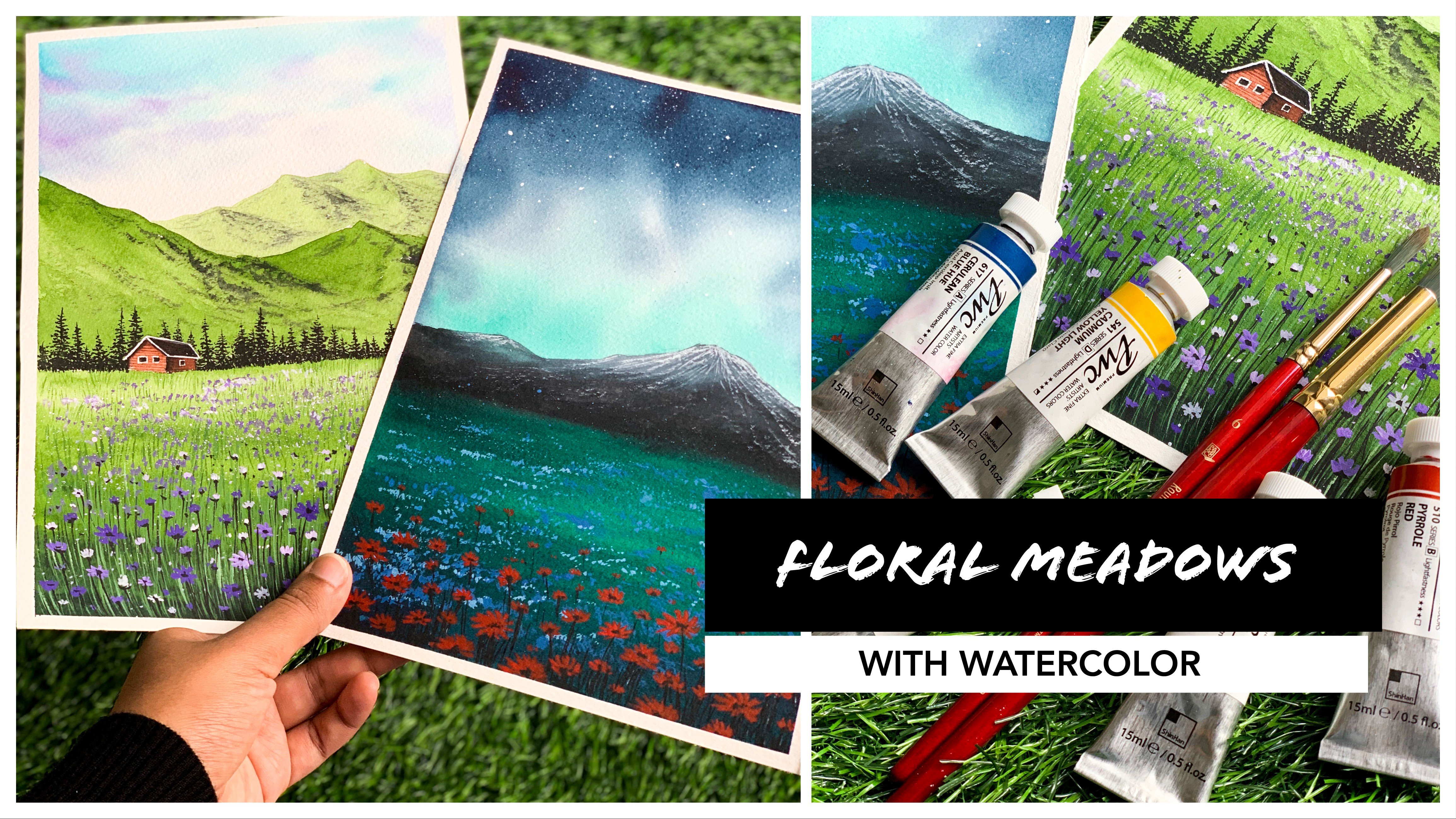
watercolor challenge, where we will, together, paint 30 dreamy
watercolor landscapes. The pictures I have chosen
are truly beautiful, and I bet you will have
an incredible time each day discovering
new techniques, color combinations,
tips, and tricks. These paintings are absolutely dreamy and I'm very sure you
guys are going to love them. [MUSIC] I'm someone who really
love daily art challenges. To me, it is more about the habits of
painting every day. Sometimes it can be just trying out some
color combination, sometimes it is just
painting a sky. It is not always a
complete painting. Not all paintings and
exercises turn out cool, but I think you have nothing to lose, it's just a painting. If I'm not happy
with the result, I just start over
and try what I can. But this daily exercise
has helped me reach my goals much faster
than I expected. Also, it gives me a sense of calm from the
chaos of the day. I want you guys to
experience the same and make art a part
of your daily life. If you're new to
watercolors, don't worry, I will walk you through all the materials you will need in detail so that you won't feel
like you are a beginner. I will also explain about
the color palette that you will need for this entire
30-day watercolor challenge, their properties
and why we're using that for a particular painting. Then we will start painting our dreamy watercolor
landscapes. Every day's project starts
with the technique and exercise section
so that you know how to approach that
painting beforehand. This will make you confident enough to handle the project. If you're still
doubtful about joining, take a look at the next section where
I'm going to show you the entire collection of 30
dreamy watercolor landscapes. I'm very sure you will have no doubts. Let's
take a look at it.
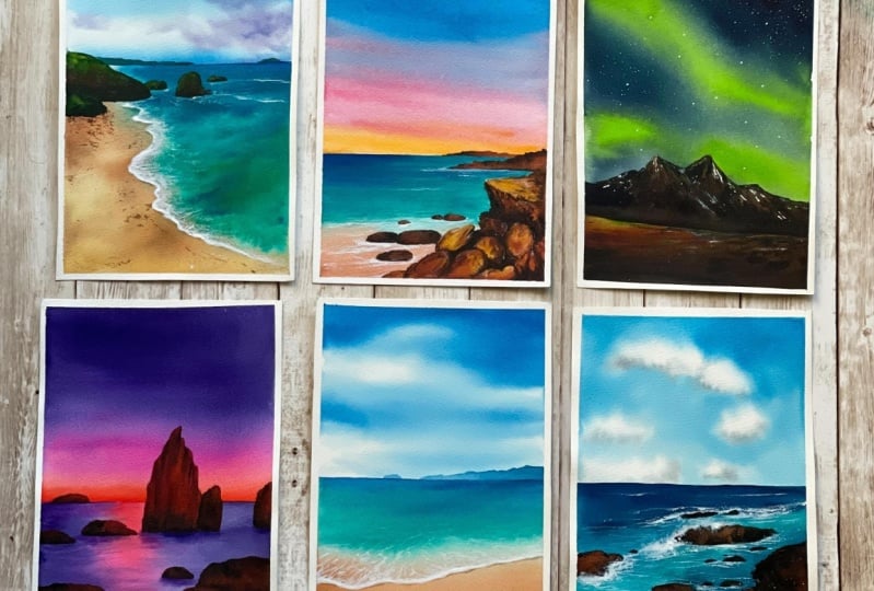
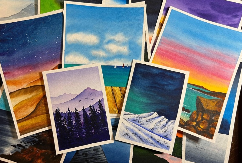
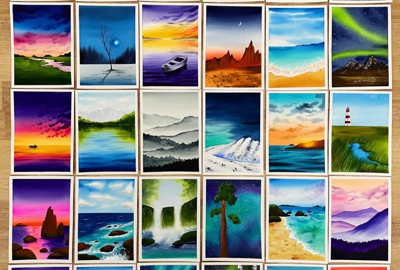
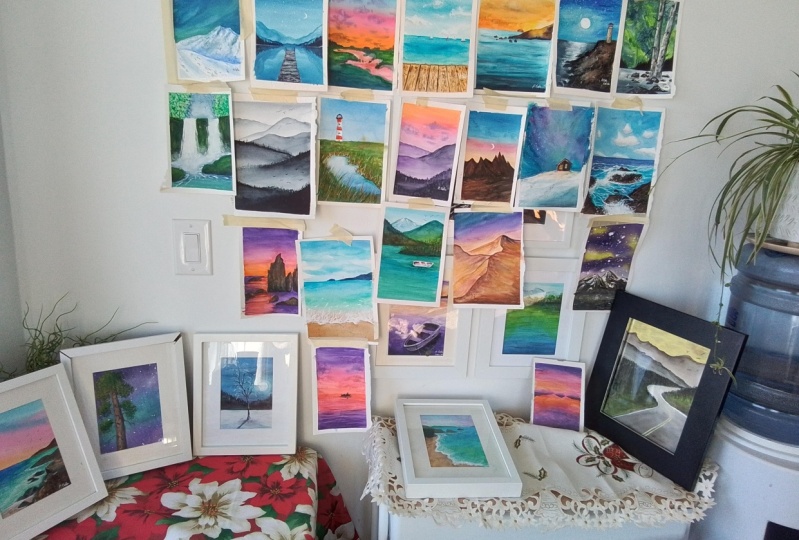
2. 30 Dreamy Landscapes: [MUSIC] Before we start,
I would like to show you the empty collection of 30 dreamy watercolor
landscapes that we're going to do
in the upcoming days so that you will have a better idea of what to
expect in the coming days. Let's take a look at it.
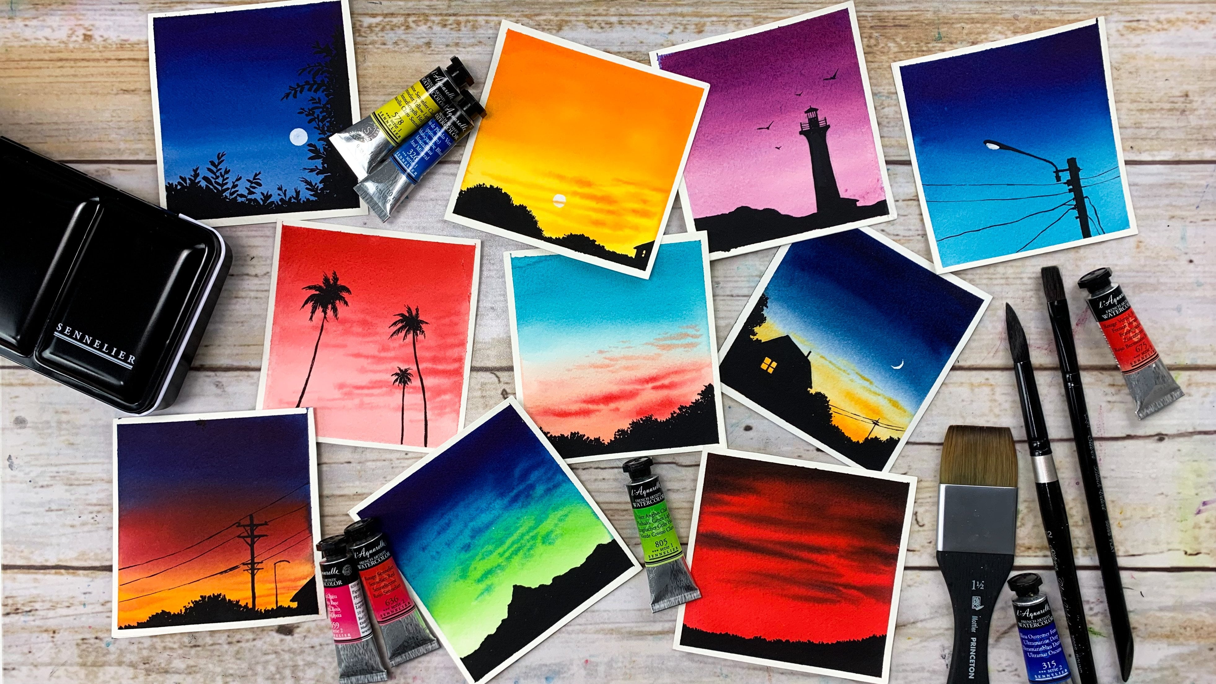
The first one is going to be a dreamy evening with
a multicolored sky. I really love that rock texture, so that's something you will
learn in this painting. The next one is a summer beach. It's an easy one and
through this painting, you will learn to create that
beautiful blue cloudy sky, which you can use in your
future paintings as well. Also, you'll learn to
create that wooden texture, which is a really exciting one. Third one is a drive
through the mountains. Compared to the
other two paintings, this one has a
different color palette and we will learn to
paint with muted colors. The next one is a
gorgeous Arabian Nights. I really love the
color combination, the sky, and how the
sand dunes turned out. It's actually an
easy one and it is so much fun to paint
that sand dunes. You will have to wait
till Day 4 to paint this. The next one is a
lighthouse by the beach. This one is another
fun and easy painting. Honestly, I was quite
surprised when I painted that Mole beach. It is really glowing and it
is so easy to create that. Day 5 is something I'm
really looking forward to and I really want to
see your class projects. Now, coming to Day 6, we're going to paint a
calm and peaceful night. The best part about
this painting is that it only
requires two colors, Prussian blue and Payne's gray. Instead of blue maybe
you could try this with white as well so that's
going to be really exciting. The next one is a
gorgeous evening. We will combine that with a green meadow to make
it even more beautiful. Because the colors have
a great contrast here and that contrast will make
it even more beautiful. Now the next one
is a winter night. For this one as
well, we'll be using a very limited
color combination, we'll only require
three colors: indigo, cerulean blue, and Payne's gray. It's a really simple
and an easy one. You can do this in
less than 30 minutes. Now, the next one is a
gorgeous purple sunset. This one is a little advanced compared to the other projects, but that doesn't mean
it is difficult. The process for this
painting is really exciting and I'm
very sure you're going to have a wonderful time. My favorite part about
this painting is the color combination
and the sky. Here is the color combination
that I'm really proud of. It's again, a limited
color palette. For the sky I have
used indigo and the second color is something
that I mixed and created. It's a beautiful peach color. I don't want to reveal
that right now. You'll have to wait till Day 10. That was Day 10. Now on Day 11, we will paint
a beautiful tropical beach. I think this painting is
going to be a good break from the bold and loud colors
that we have been using. The next one is a
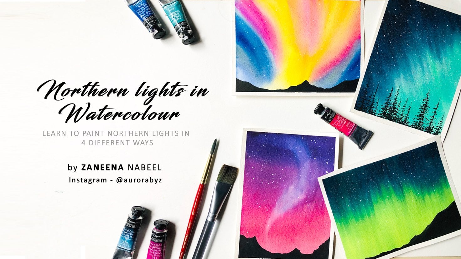
gorgeous northern light. It's a color combination that
I'm really obsessed with. Also I love the mountains. For this painting, we'll be
using some cool techniques. I'm really excited for Day 12. On Day 13, we will try
a traumatic sunset. It's another easy one, and I think the color
combination is just spectacular. The next painting is a
beautiful blue lake. There are only few paintings
that I'm using green, and this is one of them. Through this
painting, we will try an easy technique to
create reflection, which you can incorporate in your future paintings as well. Now, the next one is a
symbol gradient mountains. We'll be just using Payne's gray for this entire painting. We will talk about tonal values and how you can use
them in your paintings. On Day 16, we will
try a snowy mountain. I know many people won't try snowy mountains thinking
they are really difficult, but they are not,
they are really easy. It is just a matter of using the right colors and
right tonal values. They succeed is
exactly about that. Now on Day 17, we will
paint a glowing sunset. It's a beautiful
color combination and I don't think I have used it much and I'm very sure
you guys will love it too. Now on the next day, we're going to paint
the green meadows and a small lighthouse. The major highlight
of this painting is that little stream. I love the mood and feel
up this painting and also that lighthouse it really looked like
it is far from us. This is another one
that I really enjoyed. The next one is my most favorite from this
entire collection, I allowed the color combination and the mood and feel
of this painting. I think it is looking
really magical. The best part about
this painting is that it is really easy to paint. No, I'm not joking. You will have to wait
till the Day 19 to find out how easy and
beautiful the process is. Now, coming to Day 20, we are going to paint a
beautiful crashing waves. To paint the bottom layers for this painting is quite easy. The painting is all
about splattering white to create that
crashing waves. This one is going to be another
fun and exciting project. The next one is a
beautiful waterfall. Is a simple, calm and
beautiful project. We're not going to add a lot of details and that's the
beauty of this painting. The next one is an
aurora borealis. This painting is all about that Collier's plant for that we'll be pouring
the wet paint onto a wet paper and it will tilt and turn it around to create
that gorgeous blend. The next one is a dreamy beach. What I love about this
painting is the sand. I think that texture
is really nice and also the colors I
have used for the sea, especially towards the bottom. Next one is another
gradient mountains. But for this one we'll be
using multiple colors. This one was actually an
experimental painting. I wasn't really sure how the colors are
going to turn out, but to my surprise,
I really loved it. The sky is my favorite, and I think the
purple mountains are looking so good with
the color of the sky. Next one is a super
dreamy operandi sky. I cannot tell you how much
I love this painting. I actually wanted to add some
other elements onto this, but I was really
happy with the sky and the lake and I didn't want to kill that magical vibe of this painting by adding
another element. I thought of keeping it
simple and beautiful. The next one is a
gorgeous green lake. I absolutely loved
working on this project, especially for the
colors I have used here. Also, it is giving
me a holiday vibe. The next two paintings
are northern lights. The first one is a winter cabin. For this one, I have used
more of peaceful colors. The next one is really dramatic. I really loved the sky and those birch trees and
even the snowy ground. I think I tried this painting
at least five times. Every time I was
happy with this sky, but I wasn't really happy
with the foreground element. I think for one of
the painting I tried some pine trees and for
another one I tried a lake, but I was not happy
with any of them and finally I tried some birch
trees and I loved it. That's what you see here.
The last two paintings are my absolute favorites. This is the painting for Day 29. It's a really
beautiful sunset and I love the colors I have
used for this painting. Honestly, this painting
was an experimental one. I wasn't really sure how the
sky is going to turn out. I just wanted to give it a try. Here is the warm orange sunset that we're going to
paint on day 30. This is another favorite. There is something
about this painting that I just want to stare at it. I think it's the color and
the warmth of this painting. Every time I look
at this painting, I feel so blessed and peaceful. The process is as beautiful as painting
so I cannot really wait for Day 30 for you guys
to experience this magic. Okay, so that's the
entire collection of 30 dreamy watercolor landscapes. I'm very sure you guys have already picked your favorites. I have taken a lot of effort
to finalize the projects. So each and every project
is unique from one another. Which means you'll be
introduced to a wide variety of watercolor techniques throughout this entire 30-day
watercolor challenge. You already saw the
entire collection and you know how different and
beautiful they are. I'm very sure each and every
painting is going to be a different experience for you and you will learn a
lot along this process. There are few paintings
in this collection which are a little advanced. I think it's going to be a great learning
experience because if you try the same things
which you already know, you aren't going to learn. You have to push your limits
and you have to go beyond your comfort zone to learn
and explore new things. Otherwise, you'll be
stuck at the same place. So I think this 30-day
watercolor journey is going to be challenging
as well as exciting. I'm very sure you're going to
have a whole new experience working with watercolor
and you're going to love this medium
like never before.
3. Class Overview: [MUSIC] Now that you have
seen the entire collection, let me explain how the
class is structured so that you know how to approach each and every class project. As you all already know, this class is designed
as a daily challenge, meaning you will paint a
project with me every day, actually every alternate day. The main reason
why I have kept it like that is because
each painting will take you somewhere between 30-45 minutes or
maybe a bit more, so I want to give you enough time to finish
it without rushing. If you rush it, obviously
you won't enjoy the process and you
will miss out a lot. I want you to be completely
here and completely enjoy the process and have a
better learning experience. If we cannot make it
every alternate day, that's perfectly fine, you can paint them on the weekend or whenever
you can find some time. For me, you enjoying the process and creating a painting that you love is more important than you showing
up here everyday. So please don't
stress out yourself, if you miss a day or two,
that's completely fine. Now let me come to the class. First and foremost,
I will take you through all the materials
you will need in detail and from there we will go to a color
palette exercise, there I will talk about all
the colors we will need for this entire 30-Day
watercolor challenge. I really love this color
palette exercise because it will give you an idea about the kind of color that
we're going to use, and also, it will give
you a better idea about the colors you want
to include in your palette. Before we begin with
our class projects, we will start with
the color study. While I'm explaining
the color palette, I will also be showing
you the paintings where we're going to
use those colors, so you very well know
how we're going to incorporate those colors
in our paintings. We'll also try
creating the colors which are not too common,
like cobalt green. By the end of this section, you will have a lot more idea about the watercolor pigments, their properties, and how we can mix and create your own colors. Once we get thorough
with the color palette, we're going to start
with the first project. Everyday's painting starts with an individual color palette
and techniques section. This will help you
understand how we are going to approach the painting. In this section, I
will explain about every little detail
you need to know before you start with
that particular project, right from the color
to the techniques. I'm very sure this
exercise will make you really confident
before you start with the painting and
obviously you will be well aware of where you're
going to make any mistake. I would really recommend
not to skip this section. You can take a quick look, but don't skip it. You don't need to keep
a sketchbook like this, you can just do that on
a scrap piece of paper. We'll be doing
similar exercise for all the projects that
we're going to do on this 30-day
watercolor challenge. This is our second
day's project. We'll take a look at the sky. When you are playing
with watercolor, it is not like acrylic or
gouache or oil paints, we are playing with
water content and you have to lay your paint
before the background dries. If you know how to approach
your painting beforehand, it is going to be
really helpful. I know many students watch the entire video first and
while they are painting, they'll watch the video again. I totally understand
the struggle, especially with watercolor, because if you don't know
what you're going to do next, your background will dry up and there is no way
you can fix it, unlike gouache or
acrylic or oil. That's the reason
why I have included this section so that you
can save up some time. Before we start
with the painting, I will make sure you guys are thorough with the color palette, the techniques, and the steps. I'll also be providing you
all you need colors and mixing options if you don't have a particular color
that I'm using. That's something we will
do for every painting. With every painting, you
will learn a new element. This one is that rocks and this one you will learn to paint that beautiful sky which you can obviously include in
your future paintings and you will also learn to create that wooden texture and
also those tiny sailboats. Everyday's painting
is going to be a different experience
altogether, and that's something
I was really focusing on when I was
designing this class because I have done
quite a lot of 30-Day watercolor challenges and I wanted this one to
be one of a kind. This entire class is
filmed in real time, giving a lot of importance
to every minute detail. Just in case if you want some additional detail or
if you want some help, you can start a conversation in the discussion section,
and I'll be happy to help. Now, it's time to dive
deeper into the class. I hope you will have a wonderful time being with me on the 30 Day
watercolor journey.
4. Materials you'll need: [MUSIC] I'll quickly take you
through all the materials you'll need for this entire
watercolor challenge. I will start with the paper. I will be using an artist
grade watercolor paper from the brand Arches. This one is cold pressed
watercolor paper which is our 140 lb. I always prefer using cold
pressed watercolor paper. If you prefer a more
textured paper, you can go with rough paper. The next thing I recommend
when you're choosing your watercolor paper is
the thickness of the paper. If you go with the
paper which is less than 140 lb thick, it might not be able to handle multiple layers of
water and paint, and the paper will
start buckling. In order to enter the process as well as to get a good result, it is better to go with the
artist grade watercolor paper which is 1,200 percent cotton, and that can be cold pressed or rough according
to your choice. Also, be sure about the
thickness of the paper. Go with the paper which is
off minimum 140 lb thick. When you're trying to
buy a watercolor paper, you will find
hundreds of options. The major thing to
consider is this part, the paper has to be
100 percent cotton. This way the paper will
stay wet for a longer time, and you will be able to
handle the wet-on-wet technique in a much
more beautiful way. Keep these points in mind
when you are choosing your watercolor paper
so that you have a better experience
exploring this medium. That's all about the
watercolor paper. Now, let me explain about
the size of the paper that I'm going to use for this Aquarelle
watercolor challenge. This paper pad is an A4 size, you can see the size here, it is 21 centimeter
by 29.7 centimeter. I'll be cutting one sheet
into half and that will be the size I'm using
which means it is A5. This is the texture
of the paper. It doesn't have a
lot of texture. But if you prefer more texture, you can go with rough paper. Here's two of the paintings that we're going to do
in the coming days. You can see the size is exactly
the half of my paper pad. You can go to similar size or any other size
that you prefer, it doesn't need to be the same. You can go for a much more
bigger one or a smaller one. In case if you don't want
to use loose sheets, you can also use a sketchbook. You can create a
collection of cards as landscape in any of your
favorite sketchbook. I have compost all the 30
paintings in a portrait manner. That would be the only
thing I would recommend. You can go with either
a sketchbook or loose sheets of any size, but go with the sketchbook
or loose sheets in a portrait orientation so
as to get a similar result. That's all about the paper. Along with the paper, I'll
also be using a sketchbook. Every day, I will start by
explaining the color palette and the techniques
that we're going to use for that particular
days painting. To explain all those things, I will be using the sketchbook. This one is made
of handmade paper. It is more textured than
my Arches watercolor pad. This is optional. You
can use loose sheets or some scrap piece of
paper to try out the colors as well
as the techniques. I just wanted to put
them in an order, that's the only reason why
I'm using a sketchbook. Choose your watercolor paper. Don't forget to go for 100 percent cotton
watercolor paper which is a minimum 140 lb. You can go with cold pressed or rough according
to your choice. The next thing I want to explain is the watercolors that
we're going to use. For this entire challenge, I will be using
watercolor tubes. You can either go with watercolor
tubes, watercolor pans. I'm not sticking to
any particular brand, I love to use from
different brands. Normally, I don't buy
watercolor as a set, I always pick my
favorite colors from different brands and
create my own collection. Throughout this challenge,
you will find me using watercolors from Daniel Smith's, Rembrandt, Shin Han,
and many other brands. I have included a separate
section where I'm explaining all the colors you will need for this challenge. Don't forget to check
out the next section to get a detailed idea
about the colors, the pigment number,
and their properties. I will also be giving you
alternate color choices if you don't have the exact
same color that I'm using. You will get all the necessary information about the colors, like their brand,
their pigment number, their properties, everything
in the next section. The next thing you will
need is a mixing palette. I will be using the
ceramic mixing palette. You can either use
a ceramic palette or a plastic palette, or any other palette
that you normally use. Personally, I prefer using
ceramic mixing palette, because it doesn't stain and
it is easy to clean as well. If you're using a
plastic palette, you might have seen over the
years or over the months, or even with one or two uses, the plastic pallets
gets stained quickly and you will never get
that original color back. But, that staining thing won't happen with
ceramic palettes. You can easily wipe it off with a wet cloth or a wet wipe, and it stays as
good as a new one. I think this one is
more than two years old and it is still in
good condition. That's all about the
color and the palette. Now, let me introduce you to the brushes
that I'm going to use. You can see seven brushes here. I'm going to explain about each and every
brush I have here. First, I will start
with a bigger one. This one is a
one-inch wash brush, which I'll be using
to apply a coat of water onto the
entire background. I always prefer keeping a brush separate for making
the background wet. This one is one inch.
You can also use any of your hake brushes
which is more wider. That's our first brush. If you don't have
an additional brush you can use your bigger size round brush or flat brush to apply a coat of water
onto the background. But before you apply water
onto the background, make sure your brush is clean. I normally use this hake
brush when I'm painting an A4 size or an
A3 size painting. If the painting is an
A5 or a smaller one, I just use this one
inch wash brush. Watercolor is all about
making your background wet and letting the colors
float into each other. This brush is really important. If you can't get a
bigger size flat brush, add that into your collection. Coming to the second brush, this one is another flat brush. This one is from Silver
Black Velvet Series, it's a half inch flat brush. I'll be using this brush mainly to apply color in
the background, like painting the sky, painting the lake,
and all things. That's my second brush. The third brush
is a round brush, again from silver
black velvet series. This one is size number 12. This is to apply paint onto
the sky and larger areas. The next one is size number 8, then I have size number 6. Basically, you will need a
bigger-sized round brush, a medium-sized brush, as well as a smaller-sized
round brush. I have a size number 6 and
a size number 4 brush here. Size number 6 is quite new. I'll just dip this in water
and show you the pointed tip. The size number 4 brush, I've been using that for
maybe more than four years. With the heavy use, I
lost that pointed tip, but then my new brush has
a really nice pointed tip. Just get any of your
medium-size brush. It can be size number 5, or 4, or 6. If it has a pointed
tip, well and good, because you can
use the same brush for multiple techniques. Just don't worry
about the brand, go with any of your
medium-sized round brush. The last brush I have
here is size number 2. Even this one has a
really nice pointed tip. I'll be using this one
for delicate details like adding some thin branches and some small art to
my new details. That is the last part. We spoke about the
watercolor paper, the colors, as well as the
mixing palette and brushes. The next major thing you will
need is two jars of water. One has to stay clean. In between our painting, we might need some
clean water like making the background wet or
making the color lighter. For that purpose,
it is good to have a clean water
always next to you. Other one is to rinse up
the paint from your brush. Otherwise, you might have to get up from your seat multiple times in between your
painting to grab clean water. If you can, try to
make it a habit to always work with
two jars of water. The next thing you will need
is a pencil and an eraser. For some of the
painting, we will need to add a pencil sketch and you will need an eraser in case if you
make any mistakes. Then you will need
a masking tape to fix your paper onto a
table or onto a board. I'll be using this half
inch masking tape. For most of the paintings, I'll be fixing my
paper onto the table. For example, these paintings, they can stay flat on the table. We really don't need
to work with gravity. Whereas for paintings like this, we are going to let go of the control we have
over the medium and we are allowing the color to float and blend into each other. In that case, we are going to
fix the paper onto a board. That means you will also
need a fixing board or a trying board or any hard
surface to fix your paper. This one is actually
the backing board of one of my paper pad. My toddler have already
turned this into an art work so I just applied a coat
of wallpaper on top of it, the same one I'm
using on my table. It has a plasticky surfaces and masking tables to
contour it properly. You can use any of
your drawing board, or a piece of glass, or anything that can
fix your people onto. We'll be only doing three or four paintings
using this technique. Otherwise, all the paintings we will be fixing onto
the table directly. Because to get this
beautiful blend, you will have to turn
down the paper so that the color will float
into each other naturally. That's the next
thing you will need. Last but not the least, you will need a paper
towel or a cotton cloth. Basically, we will use a
paper towel to dab off the excess amount of water
or paint from our brush. A paper towel is also important when you're trying
a dry brush technique. For example, when we are
doing this painting, you can see those
snowy mountain. To create those
triberish patterns, you will need a paper towel. We'll be picking the
paint on our brush, and we will dapple brush on a paper towel multiple
times to remove the excess amount
of water and to get those beautiful dry
brush patterns. Don't forget to keep
a paper towel next to you when you're doing your
watercolor paintings. That summarize all the
materials you will need for this entire Aquarelle
watercolor challenge. In the next section, I'm
going to take you through the color palette.
Let's see you there.
5. Color Palette: We had a look at the
materials you will need for this emptier 30-day
watercolor challenge. But we're here to look
at the color palette, so that's what I'm going
to do it in this section. My intention is to give
you a rough idea about the colors that we're going
to use in the upcoming days. If you don't have the
exact same color, that doesn't really matter. Instead of cerulean blue,
you can go with Prussian blue or cobalt blue
or any other blue. Just try to go with
something that's similar to the colors that I'm
using here. Let's begin. I'm starting with the blue so I already have taken
them on my palette. The first blue I have
here is cerulean blue. I absolutely love this color. I use it, especially
for cloudy day skies. It's a gorgeous
blue, but it doesn't come in the normal
watercolor sets. If you don't have this color, it is absolutely okay to go with Prussian blue or bright
blue or cobalt blue or any other blue. That's our first color. The one I'm using here is
from the brand Shinhan. You can see the
condition of my tube. It is nearly done. I use it quite a lot
in my paintings. That's my first color. Now the next one I have
here is Prussian blue. This one is quite common. It comes in all the
basic watercolor sets so I'm guessing you all have it. When I started my
watercolor journey, I only use Prussian
blue on my paintings. I never knew cerulean blue
or any other blues existed. This was my favorite color
back then and even now. That is our second blue. The one I'm going to use
is from Art Philosophy. As I mentioned earlier,
you can go with any brand. Now, let's check
out the next blue. Next one is indigo. I'll be using this color
mainly to add details and also when I'm painting night skies to make the sky darker, I will be using indigo. This indigo is from Sennelier. You can see it has
a bluish tone. This one is called
as bleu indigo. You see that? The name is bleu indigo. Now, I have another
indigo from Shinhan. I will just patch up
the color for you. This is more of a
grayish indigo. It's not a bluish indigo
like the one from Sennelier. You can already see the color. The one above and the one
below are as much different. The second one I used
here is from Shinhan. This means even if the name is same on different
watercolor brands, the color can be
slightly different. It is more according
to the pigment they use in their
watercolor paints. This can happen with
other shades as well. I just wanted to
alert you in advance. The next color I have
here is cobalt green. This one is, again,
from Shinhan. It's called basal green. You will find many other colors
with a similar character. You will find cobalt teal blue, cobalt turquoise, cobalt blue, and many other similar colors. The color might be slightly different according
to the brand, but just don't worry about it. Go with any color that
has a similar character. Now, the next color I have
here is turquoise blue. It's again a gorgeous blue. I love to use this color in my seascapes as well
as my night skies. That summarize all
the blues I'll be using in this 30-day
watercolor challenge. The next set I have here is
all the yellows and oranges. Before I patch them out, I will show you some of the
paintings where we will be using these blues. Here is one. For the sky, I will be using
a medium to a cerulean blue. For the sea, I will
be using cerulean blue plus a little
of cobalt green. For this one, I'll be using
indigo and cerulean blue. Here's another one
where I will be using cerulean blue along
with rose and orange. Here's another one where we'll be painting
a very basic sky. Here's another
painting where I will use cobalt green for the lake. Here's another one
where I will be using turquoise blue
along with orange. So these are few
of the paintings where I will be using blue. Now, we can try out the
oranges and yellows. The first yellow I'm
going with Naples yellow. This one is not a common color. It is more like a pasty yellow. You can see the color
that is quite dull. It is not as bright
as [inaudible] yellow or Indian yellow
or primary yellow. This is the color. This one is from the branch in Shinhan and you can see
the pigment number here. It says PY35 and PW6. PW6 is titanium white, so that clearly means
this color has some white in it and that's how it
has got that basal tone. Now, the next I have
here is cadmium yellow. If you don't have
cadmium yellow, you can use
[inaudible] yellow or Indian yellow or primary yellow or any other yellow. You can clearly see
the difference. The second one I have added here is looking more bright
than the first one. This also means if you want
to create a Naples yellow, you will just need
to add some white into any of the yellow
that you're using. Now the next color I'm going to swatch out is perm
yellow-orange. Which isn't a common color but can be created quite easily. You will just need to
add some yellow into vermilion or any other orange and you can create
a similar color. That's our third color. The next one I have here
is brilliant orange, which is, again,
not a common color. But there is nothing to worry if you don't have
brilliant orange, you can use vermilion instead, or any other brighter orange. This one's a little more
brighter than vermilion, that's the only difference. Other than that, it looks
quite similar to vermilion. We'll be painting some really gorgeous
sunset using this color. This one is perm yellow-orange. Just like the name says,
it's a yellowish orange. This one is brilliant orange. Just like the name says, it's a very bold and
brilliant orange. Now, coming to the next one. This one is the yellow ocher. It's more like autumn yellow, which you can clearly see
from the color itself. We will be using this
color mostly for the sandy beaches and also to
create some wooden texture. The next color you will need
is brown or burnt sienna. We'll be using
brown quite a lot. We'll be painting
some wooden texture, some rocks and some trees,
and some mountains. For all of them, you will need either brown or burnt sienna. I prefer using brown
over burnt sienna, because this one is more of a reddish brown and burnt sienna is more
like a yellowish brown. That's the only difference. Depending on the brown
you have got with you, you can use one of them. It can be the brown
or burnt sienna. Those were the
yellows and oranges. Next, I'm going to show
you some red and pinks. I'm starting with pyrrole red. This one as a really
bright and brilliant red. Most of the artists
use this color to sign the artworks because it's
a very striking red. See that? We won't be
using this color a lot. I think we'll be painting a
lighthouse and a small boat. Other than that, we're not
going to use this color. If you don't have
this color, you can either use vermilion or scarlet or go with any
other kind of red. The next color I have
here is permanent rose. If you don't have
any kind of rose, you can go with
crimson or carmine. They will work perfectly. It's just that this
color is slightly brighter than crimson. Other than that, there's nothing to worry,
you can use crimson. Now the next color
I have is opera. This one is from Sennelier. I have another opera from Art Philosophy and
also from Shinhan. Those two colors are much more brighter than the
opera from Sennelier. This one is slightly lighter
compared to the other two. This clearly explains all these brands are using different pigments
for their paints. That is how they're
different from each other. You can go with any of the
opera pink you have got. The next color I
have here is violet. This one is permanent
violet from Shinhan. You can use any
violet you have got. If you don't have
a violet, you can mix and create your own violet by adding some crimson into Prussian blue or any other blue. We'll be using violet to
paint some gorgeous skies. I really love this color. You can see how beautiful it
is looking against the rose. That's violet. Now I will show you
some of the paintings where we will be
using these colors. Here is one of my most
favorite painting from the [inaudible] collection. I just love the
sky and the water. Here's another one
that I'm going to use a similar color combination. Here is one more where I'll
be applying white watercolor onto the background to add
a basal tone to the colors. Here's another one
where I'll be using Naples yellow for the sky and also some orange and some red. Now for this painting,
I'll be using yellow ocher and brown to
create that wooden texture. Also for these sand dunes, I'll be using a similar
color combination. Here's another one where I'll be using a darker tone of brown. Here's another one
where I will use yellow ocher and brown to
create that rock texture. This one is another favorite, I'll be using more of earthen
colors for this painting. For the sky, I'll be
using Naples yellow then the road is gonna be
some brown and Payne's gray. Now, we have to look at the last set of colors,
which are the greens. I have taken three greens here. The first one is leaf green, which is a light green. It's more like that
fresh and tender green. You can use any similar green, we just need a light green. I can mix a little
of sap green with lemon yellow to create
a similar color. That's all for the first green. We don't have a lot
of green landscapes. I think we only have
three or four of them. Here is one of the
painting where I'll be using leaf green for the landscape as well as for the reflection, I'll
be using leaf green. Just like I said earlier
if you don't have leaf green or any
other lighter green, just mix a little of
lemon yellow with sap green and you can
create a similar color. Now the next color is
phthalo green light. It's an absolutely
beautiful green. This one is from Sennelier. Here is the color. This green is not for
the greener landscape. I'll be using this one to
paint the Northern Lights. We'll be trying two
Northern Lights using the same
color combination. Here's the first one and
this is the second one. It's a gorgeous color to
use in Northern Lights. It's more like a neon green, that's the reason why I'm
using it for Northern Lights. The color will be really
bright and prominent. Now, just in case, you
don't have this color, you can mix a little
lemon yellow with sap green to create a
slightly similar color. The next color I have here
is obviously sap green. We'll be using sap green
to paint greenery. Finally, I have Payne's gray. We'll be painting a
monochrome painting. For that, I'll be
using Payne's gray. Also wherever I need to add the darker tones, I'll
be using Payne's gray. That's the last color
from the collection. Now I will show you
some more paintings where I'll be using green. These are two green landscapes
from the collection. I'll be using sap
green for these. To add the deeper tones, I'll be using some Payne's
gray as well as indigo. Along with all these colors, you will also need
some white watercolor. For some other paintings, we'll be applying hood
or white watercolor onto the anterior background to turn the colors
into a basal tone. You will also need
some white watercolor. Finally, to add some
opaque details, you will need some
white gouache. If you don't have
white gouache, you can just use your white watercolor. For this painting, you can see that waves for that, we can use either white
gouache or white watercolor. White gouache is more opaque, so the details you are
adding will stay prominent. But if you don't have gouache,
that's absolutely okay, you can just use your
white watercolor. That's summarized all the
colors you will need for this entire 30-day
particular challenge. As I mentioned earlier,
it is not at all necessary to have the
exact same brand. Just go with any color that you've got that is
nearly similar. Just don't worry about
the brand and the color. I will also be explaining about the color palette at the
beginning of every painting, where I will provide you
more mixing options. That's a color palette for this entire 30-day water
color challenge. I hope I didn't
miss out any color. I have added a color chart in the projection and
resources section, where you can find
the combined list with the brand name and
the pigment number. Just in case if you want to
buy any of these colors, that will be helpful. We discussed about the
entire colors that I'm going to use for this 30-day
watercolor challenge. But there are certain colors
that you might not have. Especially if you're a beginner or an intermediate artist, it is not necessary that you
have all of these colors. I didn't have all of
these when I started. I had a very basic
particular set. I never had Payne's gray or
Naples yellow or leaf cream. I think the first traditional
color that I bought was turquoise blue because
I love that color. That happened when I was
getting obsessed with painting night sky so I had to get a turquoise blue watercolor. Now I'm going to show you how we can create Naples yellow, cobalt green, leaf green, and similar colors, which are not too common. This exercise will
make you understand that you don't need to
buy all the colors, you can easily create them. I have a tube of
Naples yellow here. This one is from
the brand Shinhan. Now we're going to analyze the pigment number of this color, and from there you will get the trick on how to
create this color. Pigment number is really
important information that you can find on almost
all watercolor tubes. Mostly it is found on the
rare side of the tube. If you just turn it around, you can see the
pigment number here. Here you can see PY35 and PW6, which means there
are two pigments used to create Naples yellow. This information can be found on any watercolor tube
from any brand. This one is from Rembrandt, this one is Payne's gray. Now let's take a
look at this one. If I flip it around, you can see the pigments here. This one says PBk6 and PB15. Again, there are two pigments
in this one as well. Now let's take another one. This one is opera
rose from Sennelier. If I check the other side, you can see PV19, that's a pigment number. That means this one has got only one pigment as a
single pigment color. In a similar way, this
information can be found on every watercolor tube. It is this information
that gives you the hint on how to create this color if you don't have it. For example, if you take
a look at Naples yellow, you can see the pigments here. It says PY35 and PW6. PY is pigment yellow and
the pigment number is 35. That's some kind of yellow. PW means it is pigment white. From this itself, it is quite obvious this Naples yellow is a combination of a yellow
pigment and white. I have my cadmium yellow here, again from Shinhan.
It's the same brand. If you take a look at
the pigment number, you can understand
that Naples yellow is a combination of cadmium
yellow and some white. That means there is no
need to buy maples yellow. If you have cadmium
yellow and violet, you can just mix
these two colors together to create
a similar yellow. To make it a little more clear, I will show you white. This one is titanium white. You can see the pigment
number, it says PW6. I'll just keep
these two together. Now, take a look. Naples yellow is PY35 and PW6. If you look at cadmium yellow, that is PY35, and white as PW6. I hope you were able to
see the numbers clearly. Now, I'm going to
squeeze out some yellow and white
onto my palette, and I'm going to try to create Naples yellow by mixing
these two colors. We'll be using Naples yellow for one or two paintings,
not more than that. For those paintings as well, you can use any of
your normally yellow. It doesn't need to
be Naples yellow. But my intention is to show you that you can create the colors which you
don't have with you. It is not really
necessary to buy each and every color that's
available in the market. I have taken both
the colors here. That's cadmium yellow. First, I will add a
swatch of cadmium yellow. Now to this, I will
add some titanium white and I'm mixing that well. You can see the difference. This one is more of
a pastel yellow. That's how you create Naples
yellow if you don't have it. It doesn't need to
be cadmium yellow. You can use gamboge yellow, Indian yellow, primary yellow, or any other yellow. Just add a little white into it and create a pastel yellow. Depending on how much yellow and white you're
adding to the color, it might look
slightly different, but that's the basic idea on how you can create
Naples yellow. Similarly, on every
watercolor tube, you will find
similar information. You can mix and create
your own permanent yellow, orange, or any other color. Obviously, according
to the proportion and according to the
pigment you're using, the color will be
slightly different. This one is a combination of yellow pigment and
an orange pigment. We might not have the exact
same pigment with us, but that's absolutely okay. Just mix any kind of orange and yellow to create
a similar color. There wouldn't be a
lot of difference and it is not going to
hurt your painting. Now some colors are made
from a single pigment, for example, this
brilliant orange. It is made from a
pigment called PO16. It's an orange pigment. Many brands use the same
pigment grade vermilion, which means these colors
are nearly similar. It is just that different
brands uses different names for their colors so the only
reliable information you have is pigment number, not the name of the color. Now the next color that
you might not have from this collection might
be cobalt green. That's what I'm
going to try next. I have cobalt green from
three different brands and they all look different,
and this is the one I love. These are the pigments used in this cobalt green PY53 and PG7, which means it's a combination of a green pigment
and a yellow pigment. The only yellow I have
here is cadmium yellow. The yellow pigment used in both these colors
are not the same. I'm going to try
creating a cobalt green from the yellow and green
that I have with me. Let's see how closer we can get. If we look at the
pigment number of PG7, I don't have that color with me, it is [inaudible] green, but I have got turquoise blue where [inaudible]
green has been used. You can see the
pigment number here. This turquoise blue
is from Shinhan, and it's a combination
of three pigments: PG7, PB28, and PW6. I'm going to try
creating cobalt green from this turquoise blue. First, I will add a
swatch of this color. This turquoise blue
has some white in it. I'm not really
sure why they have this white pigment
in turquoise blue. If you look at the
other turquoise blues from different brands, you might not see white in it. I have another one
from white times, I would also add a
swatch of that so that you can really
understand the difference. This is the color,
it has a basal tone, obviously, because
they have added white. Now I have another turquoise
blue from White Nights. I'm going to add a
swatch of that as well. We can compare both the soonest, nearly over, and not really sure if you can see the pigment. We're taking a combination of a green pigment
and blue pigment. You can clearly see PG7. The other one is
Pb 15 is to one. Anyway, I'm going to add
a swatch of this color. Depending on the brand of
the color they're using, and according to the
pigment they're using it, the colors might look
slightly different. You can clearly see
the difference here. The first one which I used, Shinhan. It is completely different from
the one I'm using right now. This one is from the
brand White Nights. Now, let's come back to cobalt
green and try making it. As cobalt green
is a pixel color, I'm choosing to go
with the turquoise blue which has white in it. I'm picking this lighter
turquoise blue from Shinhan and I'm adding some
cadmium yellow with it. That's the color I have got. I think I have used
more yellow in it. I will need to add some
more turquoise blue. Anyway, let's factor this out
the color looks gorgeous. Look at that. Such
a pretty color. Let's add more yellow in it to make it look more
like a cobalt green. I think we need to add
some more turquoise blue. I'm squeezing out turquoise
blue into the same section. I'm going to add that with this color I have
created right now. Now let's see how that color is. Now it is starting to look
more like cobalt green. The earlier one was looking
more like a yellowish color. This one is more
of a bluish color. Let's add some more
turquoise blue and see what's the difference. I have created the color. Oh, my God, look at that. Yet another pretty cobalt green. You can clearly see
the difference here. The first one is looking more like a yellowish cobalt green. Now it is starting to look more bluish because we have added
more turquoise blue into it. Now we can see the
last one here. I think it is very
much similar to the cobalt green from Shinhan. I'm thinking to add some
more turquoise blue just to see the difference. Let's take out a little
more turquoise blue. I'm going to add that
with the same color. Let's mix that and
try out the color. Here is the color. I think this one is
very much similar to the cobalt green maybe yellowish more than
the previous one. This is the actual color and
this is the one we created. I'm just adding some water
and I'm making it lighter. Just to make you
understand how pretty that color is, see that. I think we did a great job. It looks so beautiful. This way you can
try to play with different proportions
and you can create your own collection of cobalt green and cobalt blues. If you want a greenish color, you can add more
yellow into the mix and if you want more
of a bluish color, add more turquoise blue. Now I have another cobalt green here from the brand Sennelier. Now I will add a swatch so that you can
see the difference between the cobalt green
from Shinhan and Sennelier. These two colors are
completely different. If you look at the
pigment number, even that is different, this one has a blue
pigment, PB36. Anyway, let me add a swatch of this color so that I
can see the difference. I have taken some paint.
That's the color. See that. It's a very
different color. I haven't used this
color much ever since I bought the cobalt
green from Shinhan. I stick to that one. Cobalt green from
Mijello Mission is also a very pretty color. It is very much similar
to the one from Shinhan. I'm just adding some white with this cobalt green just
to see the difference. I think this looks pretty. You just need to
add some white to turn that into pixel color. If you have one from Sennelier, you don't need to
buy another one. Just add some white in to it, to turn that into a pixel color. If you want more of
a greenish color, maybe you can add a
little of yellow also. That's the color. I hope you guys have the
other colors with you. If you don't have permanent red, you can use wobbling instead. If you don't have
permanent rose, just use crimson or carmine. Opera pink is another color, which is again from a single pigment so it's not really easy to
create that one. Then violet, you can easily mix and create your own violet. Then the next color
here is leaf green, which is not a common color but can be created very easily. If you look at the pigment
number of leaf green, you can see it is
a combination of a green pigment and
a yellow pigment, and also some white. The green pigment I
have here is sap green, which is PG8, the one used for
leaf green is PG7. That's very much close. I don't have PG7, so I'm going to use PG8,
but it's sap green. I'm guessing you
all have sap green. Now the next one is
a yellow pigment. The one I have here
is cadmium yellow, which is again not similar
to the one that is used in leaf green but I'm
just going with this. Let's make some sap green with yellow and see what color
that we're getting. Then to make that more
like a leaf green, I might also add some white. Let's try this. I'm picking
a little off sap green, and I'm mixing that
with cadmium yellow. We can already see a
beautiful light green. Let me take that leaf green again to show the
pigment number. This one has some white in it. That's what I'm
going to do next. I'm squeezing out a bit
of white watercolor. I'm mixing that with the
green, I have created. Adding a little of water. Oh, my God, that's
a pretty green. Let me add a scratch of this color and see
how is it looking. Look at that. Such a pretty color. I think I love this one more
than the leaf green. This is the one and
it's very much similar. I'll add on this patch here
so that I can compare it. These ones are close
to each other, so it's quite easy to compare. See that. So pretty. I think the one I made is more pretty than the
actual leaf green. Anyway, that's how you
can create this color. I hope you guys got
an idea about how you can mix and create your
own color palette. If you don't have
a specific color, there is no need to panic
and there is no need to spend some extra
money to get that color. You can easily mix and
create your own colors. It might look
slightly different. As I said, according to the brand and the pigment
they are using. It might be slightly different, but that's not going to
affect your painting. Just take a look at
the pigment number. You can find the information
about the pigments used in that color on all
watercolor tubes. Just compare that with the
colors you have with you. Even if you don't have the
exact same pigment number, you can just try that with any yellow pigment or green
pigment, or blue pigment. Don't worry if you don't
have the exact same number, That's not going to
affect your color. I think that was a fun
and exciting exercise to understand about the color and their pigment and
their properties. Just give it a try. If you don't have cobalt green, just try creating that. Even if you have it as well if you haven't explored
the pigment side of the colors, just
give it a try. It's a really fun and
exciting process. You are going to get
hooked onto this. Sometimes I enjoy color mixing more than
painting with them. It's an amazing exercise to
understand the colors you have with you and there
are endless possibilities. Now it's time to
officially start our 30-day watercolor challenge. Join me in the next section and let's start with
Wolf face painting.
6. DAY 1 - Dreamy Evening: [MUSIC] Hello, welcome to Day 1, and here's the dreamy
evening that we're painting today.
It's an easy one. I will take you through all
the stuff that is needed, and you will have a
wonderful experience painting this dreamy evening. This one is one of my favorite
from the collection, and I really love how these
rocks turned out. You can see that
gorgeous texture. That's something you will
learn from this painting. I think the sea and the
sky is pretty simple. The only thing which
might be a bit challenging as well as
exciting will be the rocks. Let's start by taking a
look at the color palette, as well as the techniques. I have my sketchbook ready here. The first color, I'm going to swatch out is cerulean blue, which is the color I'll
be using for the sky. You can see the color I
have used on the top. I had used a medium
tone for the sky, then I'll be using the same
color for the sea as well. If you don't have cerulean blue, you can use Prussian blue or
any other blue you have got. That's all for this
color. Now the next color we have here is permanent rose. Again, if you don't
have this rose, you can use crimson or carmine. That's the second color
we'll be using for the sky. It's a gorgeous color. You will see me using this
color quite a lot, and the study won't
declare a challenge. That's very similar to
crimson or carmine, but in this a little
bit more brighter. The third color is
permanent yellow, orange. If you don't have
permanent, yellow orange, you can just use
yellow acetates. Or you can mix a little
[inaudible] into yellow and create
a similar color. We'll be using these three
colors for this sky. It's a pretty simple sky, we will be just randomly
applying some blue on the top then some rose, and some yellowish orange
towards the bottom. That's all about the colors
you will need for the sky. Now to paint the sea
along with cerulean blue, I'll also be using
some cobalt green. On the top you can
see that bright blue, that's cerulean blue, and towards the bottom, to make it really interesting, I'll be using some cobalt green. That's our next color. If you don't have cobalt green, you can use turquoise blue, or you can mix and create
your own cobalt green. We try this in the
color palette section. If you want to create
your own cobalt green and if you don't have one, you can take a look
at that section. Cobalt green is a
really beautiful color. I use it quite a lot
for my night skies, as well as for seascape, especially to paint
tropical somehow beaches. That's the color. You can see how pretty it is. For the sea we will be
using a combination of cerulean blue
and cobalt green, and towards the bottom you can
see that sandy color here. For that we'll be using
a lighter tone of brown. You can see the color here. It's a light tone of brown. We'll be using brown
for the rocks as well. But along with that,
we'll also need some yellow ocher, and some Payne's gray to add
the deeper tones. Those are the next
colors you will need. For the rocks we'll be using yellow ocher as the base color. Then onto that,
we'll be adding some brown and some Payne's gray
to bring in some texture. If you don't have
brown, we can go with burnt sienna that will
work perfectly fine. Finally, to add
the deeper tones, you will need either Payne's
gray or neutral accent. If you don't have any
of those two colors, you can go with black. That's our final color. Now let me quickly add the swatches that we can
try out some techniques. Now just in case if
you want to try out a different color companies for your sky, you could do that. Maybe you can skip yellow and just go with cerulean
blue and rose. Or if you want to introduce
one more color in between, maybe like a violet, you could do that too. Feel free to do any
modifications to the painting so that it has
a personal touch to it. Anyway, that's the last
color, Payne's gray. The one I'm using here is
from the brand Rembrandt. You can use any Payne's
gray you've got. We're just going to
mix this with some brown to create a dark tone. Now, let's quickly
try out the sky, and maybe we can
try out the rocks as well so that you very well know how to approach
the painting and there are less
room for mistake. Let's give it a try. First,
I will change the water, so I have a clean jar of water. Now the first step is to apply a coat of water onto the paper. I'm picking my
one-inch wash brush, and I'm just going to create
a small section here. You can simply watch
this exercise, only if you want to try
it you could do that. Otherwise, just give it a watch. I just want you guys to
know how to approach it before we start
with the project. I have applied a
clean coat of water. Now, I'm picking my size
number eight drawing brush. This is the brush I'm going
to use to apply the paint. The first color I'm
picking is blue. It's a medium tone
of cerulean blue. I'm just going to randomly apply that onto the background. I've started off
with a bigger band, then I left some gap in between, I added another line. Now I'm picking my second
color which is Permanent rose. Again, I'm picking
a medium tone, and I'm adding that
into this gap we have here and just blend it, so you have some pink
and blue in-between. Maybe we can add some more. We can make the
color more brighter. Now towards the bottom, I'm going to repeat
the same thing. The same way I did earlier. I have left some gap, onto that gaps, I'm going to introduce some permanent
yellow, orange. Now you can just blend it. This is the way how we
will be painting our sky. Our painting is going
to be much more bigger, so you have more
space to play around. This one is a small section, so I just want you guys to
know how to approach it. That's how we're going
to paint the sky. This has dried completely, and you can see those
gorgeous colors. If you leave more gap in-between you may apply new colors, you can make it more dramatic. We'll try the same thing in a bigger and better way
in our class project. Now, I'll quickly show you
how we can paint the sea. Then we can try out the rocks. I'll just add that
onto the same sky. First, I'm picking some
cerulean blue, a medium tone. Now I'm using the same brush. Just like I said earlier, if you don't have cerulean blue, you can use bright blue or Prussian blue or any other blue. First add your cerulean blue. Now I'm picking
some cobalt green, I'm adding that right next to cerulean blue and blending them. We can add a little more. I'm not washing my brush,
I'm just picking the color directly after I
used cerulean blue. Just apply that. Maybe we can drop in some more cerulean blue to
introduce some texture. Right now it looks quite flat, so I'm going to pick a
little more cerulean blue, and I will just add some lines. I'm picking a little
more brighter tone of cerulean blue, and I'm just adding
some random lines. Now I'm dabbing my
brush on a paper towel, and I'm blending that
into the background, so that's a sea. You can see how gorgeous those colors are
looking together. We'll be using the
same method to paint the sea from main
painting as well, but towards the bottom, we'll be adding a lighter
tone of brown. That's the only difference. [NOISE] That's the
sea and the sky. Now, we can try out
the rocks as well. When you look at
the painting, it might seem a bit difficult, but it is really easy. I'm very sure you're going
to get surprised by this. I'm going to add a quick sketch. Simply add three or four
random shapes of a rock. We can modify this later, so don't worry if they're
not looking that great. You can see I have
added 1, 2, 3, 4, 5 of them. That was a cluster. Now I'm going to add one or
two individual rocks as well. We have added the sketch. Now, let's try painting them. First, I will paint
those individual rocks, then we can paint the other set. I'm using my size number
eight drawing brush. First, I'm going to pick
some brown, a medium tone. You can use burnt
sienna or brown, and apply that onto
those individual rocks. Maybe you can introduce
a little rough yellow ocher as well. This is not really necessary, just in case you want to
bring in a different shade, you can add a little
rough yellow ocher. Otherwise, you can just use
a medium tone of brown. Simply feel that up, that's our base layer. Now onto this, to
bring in some texture, we're going to drop
in some Payne's gray. See that is a simple
solid wash. Now let's add some deeper tones onto this while it is still wet, for that I'm picking some
Payne's gray and I'm mixing that with brown
to create a darker tone. I'm just going to simply drop that onto this wet background. I'm adding them
onto these corners. There is no particular order or rule that I'm following here, I just want some darker
tones here and there. I'm simply dropping
in that darker tone. Our intention is to
add some texture. Try not to add a lot. We want to see that the
background color as well, so go for a darker
tone and just add that onto the corners and
some in-between places. Now, let that dry. Meanwhile, we can start
with other cluster, [NOISE] so I'm washing
off the paint from my brush, and I'm
switching to yellow ocher. Now I'm randomly adding
yellow ocher onto the rock. You can see I'm adding
that in a messy way, I'm not really following
the shape of the rock. Now, I'm picking some brown
and I'm adding that as well. See that? At some places, we have some yellow ocher and at some places
we have some brown. At this point of time,
you don't need to really follow the
shape of the rocks, you can add them
how you want to. We will define the shape later, once we have added
all the colors. Just drop in some yellow
ocher and some brown. Once we have added this, we need to drop in some
of Payne's gray as well. I mean a darker tone
of brown as well. This is the base layer. You can see the shape of the rocks
are not really visible. That's why I I earlier, you don't need to really
worry about the shape; we can fix them later. Now, towards this corner, I'm going to introduce
some darker tone of brown. I have just mixed
some Payne's gray with brown to create
a darker tone. That's a base layer. It just looks like a mess. Now we need to start
defining the shape. I think maybe I will
add one more rock here using a darker tone. That looks fine for
the time being. Now let's start adding
more texture and deeper values, and let's
start defining the shape. Right now it all
looks like a lump, it doesn't look
like rocks at all. To make them look better, we
need to add some texture. For that, I'm using
a darker tone. You can use a
medium-size brush or a smaller size brush, it
doesn't really matter. Pick some darker tone, and
just randomly start adding some darker tones like we did earlier for those
individual rocks. While we're adding the
darker tones along with that we are also
defining the shape. You can see that. Now that's the second rock
and that's the third one. When you're adding
the deeper tones, try to go in a pattern where
you can see those shapes. It doesn't need to
be perfectly shaped because the background
is still slightly wet. Just have a rough idea in your mind how you
want the rocks to be. Whether you want smaller
ones or bigger ones. Just add a rough shape and then start adding your darker
tones according to that. You can already see
how I have defined it. I have just added
some deeper tones, but I think we can
already see the shapes. So in a similar way, try to define the shapes in a very rough way using
the deeper tones. We can make it more defined
when it dries completely. Right now, just play with
different tonal values. Don't cover up the anterior
background colors. We need to see that brown
and yellow ocher in-between. That's the first
round of details. Now, to make it
look more defined, we need to come back with a
darker tone and do the same. I'm mixing more
Payne's gray brown to make it even more darker. I'm not adding a lot of water. It is really dark. Now let's repeat the
same step, and make it more defined. See that? I'm using a much more
darker tone and I'm adding the deeper tones in a
similar way I did earlier. Now they look more defined. You can go with any
shape that you prefer. If you wanted more longer
shapes or rounder shapes, you can modify the rocks right now using your darker tones. Next, I want to add some
more texture onto this, so I'm dabbing my brush
on a paper towel and I'm just scrubbing that brush on these rocks to bring
in some texture. You can use a darker tone or a medium tone according to the color you have
in the background, so just scratch and scrub that dry brush on the rocks
to add some texture. You can play with
different tonal values to make it look
more interesting. For our main
painting, we will be playing with different
tonal values. We'll use a medium
tone and darker tone, and we'll use some
Payne's gray acetones. We can see all those deeper
values we have there. This way your rocks
will be really interesting so try to play
with different tonal values. I will just show
you the difference deeper tones can make, picking some Payne's gray. I'm going to add some deeper tone to
add some more texture. It's a really dark color compared to what I
used to earlier, and the background
has dried completely. It's going to be
a combination of some solid lines and
some trend lines. I'm following the same
lines I added earlier. This time, the background has dried and the color I'm
using is much more darker, so it will be more
defined. See that? Onto those in-between spaces, you can add some deeper
tones to define the shape. You can dab your a brush
on a paper towel and add some dry brush patterns as
well to bring in more texture. We can already see
the difference. You can see those
beautiful rocky texture. I think it was easy. Give it
a try if you've to try it. Maybe you can just
try one or two rocks just to get an idea. When you're adding these
deeper tones and texture, try to give a beautiful
shape to the rocks. Don't make all of
them look the same. Some of them can be
more longer and bigger, and some of them can be a
little irregular shape. Try to go at different shapes to make it look
more interesting. I will add some more
deeper tones, and I think we can call it done. Now I'm just adding
some texture. This is exactly the
same way how we will be painting the rocks in
our main painting as well. If we can give it a try, it will be really helpful for you when you do
the main painting. You can just take
some scrap piece of paper and give it a try. You don't need to keep
a sketchbook like this. So we're nearly done. I'm really loving those texture. In a similar way, I
will add some texture onto those individual
rocks as well. I'm using the same brush, I'm using the same color, and I'm dropping in
some dry brush patterns to add some texture and
make it look complete. That's a technique, at
any point when you feel like you have got those
textures right you can stop it, or you can keep adding more if you want to add
in more texture. That's all about
the techniques and the colors you will need
for our first painting. I really hope you you got a rough idea about how to
approach this painting. The sky and the sea is going to be a simple better on wet wash. The major element here
is obviously the rocks. That is what brings that texture and the character
to this painting. Now it was time
to give it a try, so grab your paper and keep the colors ready, and
turning the next section. [MUSIC]
7. Dreamy Evening - PART 1: I have everything ready here, I have two jars of
water, my colors, my paper, my brushes. Now, it's time to try the
painting for day one. We already spoke
about the colors, aspect asset techniques, so I'm hoping you guys are
confident to try this. First step is to apply a
piece of masking tape, you can apply that a little below the
center of the paper, so the top portion is
obviously going to be the sky and the bottom
is going to be the sea. So that's a proportion
I'm going with, now it's time to paint the sky. I already have the
colors on my palette, we are going to go with
the wet on wet sky. So we'll make the
background wet, then we will be applying
some cerulean blue, some permanent rose, and a bit of permanent yellow-orange
towards the horizon line. So I'm starting by
applying a coat of water onto the entire sky, you can either go with wet on
wet sky or wet on dry sky. The brush I'm using here
is one-inch wash brush. You can use any of your
medium to bigger size, flat brush or round brush. Now, apply a clean, even coat of water
onto the entire sky, you can run your brush
multiple times just to be sure the water has
reached everywhere. So my background is evenly wet, now, I'm going to drop in the colors onto this
wet background. We already had a
look at the colors, so I'm starting off
with cerulean blue, and the brush I'm using here is size number
eight round brush, I'm just washing it just
to be sure it is clean. Now, let's pick a medium
tone of cerulean blue, if you don't have cerulean blue, you can use Prussian
blue or any other blue, we just need some bright blue. So start out with a medium tone, don't make it too
light or too dark, go with a medium tone. If you make it too light,
the colors will look really dull when the
background dries, so that's the color
I'm going with. You can see it is pretty bright. Now, I'm just randomly dropping that color onto
the top of my sky. Now, what I'm going
to do next is I'm just going to add some
lines using the same color, leaving some gap in
between. See that? I'm just randomly leaving
some white gap, over there, I will be introducing
permanent rose, so simply leave some
gap and add some lines. Now, let's wash
all the paint from our brush, clean it properly. Let's go to the
second color, again, I'm using a medium tone and I'm dropping that onto these
in-between spaces. Obviously, when you're
mixing these two colors, you will start to get a violet in-between, that's
absolutely okay. So I'm again running
my brush back and forth in a very random way. So that's the top
part of the sky. Now, I'm going to
wash my brush and I'm going to go back with
some clean permanent rows, right now, there are some blue and some violet on my brush. So I want to apply
some clean rows, so let's clean our
brush and pick some more rows and add
that towards the bottom. Again, you can see I'm
leaving some gap in between, just the same way
how I applied blue. Now, onto the leftover area, I'm going to introduce some
permanent yellow-orange. Let's pick a medium tone of
yellowish orange and add that to the horizon line and just
blend that with the rose, if you don't have rose you
can use carmine or crimson. I'm adding a little more
yellowish orange over here just to make that horizon line a little
more brighter. So that's the sky, I'm
really happy with the blend, it looks very natural, I allowed that transition. Technically, it's
a variegated wash. A veto with variegated wash, we have used three colors, but the only difference is we didn't go for a clean blend, we randomly apply
the colors onto the background to make it
an interesting transition. So that's the sky.
Now, we'll have to wait for this to dry. If you want to speed
up the process, you can use a blow
dryer or heat tool. I'm someone who love to
take breaks in between, so I'm just going
to leave this for drying and let it
dry on its own. The sky has dried completely, I'm pretty happy with the blend. The colors have faded a little, but we cannot help that, that's something which
happens with watercolor. That's the reason why
you should be using brighter colors when you're
painting the background, in case you are looking forward for a brighter end result. Anyway, let's go
with the next step, which is adding a pencil sketch, we will need to
add some rocks and some small mountains
along the horizon line. I'm starting off with
the horizon line. I'm attaching an image here, so you can follow this
and add in your sketch. It doesn't need to
be exactly the same, you can add them
however you want to. You just need to get
that rough idea, we need some small
mountains along the horizon line and some big
rocks towards the bottom. You can add them towards the left side
or the right side, that's totally up to you. Also keep in mind, we can modify the shape of the rocks when we are painting, so it doesn't need to
be a perfect sketch and you don't need to
put a lot of effort. The only thing I would recommend is to play with
different kind of sizes and shapes and also to
get that proportion right, you should be using smaller
size in the background along the horizon line,
especially those mountains. As you're coming towards
the bottom masking tape, you can make them all bigger. So you will get that sense of
distance in your painting. I'm simply adding
some random shapes, I'm trying my best to cover different kind of
shapes and sizes. There is one more thing
you need to keep in mind when you're
adding these rocks. Don't bring them a lot
towards the left side, if you do that, you will have to reduce the amount of sea. I think those colors we
are going to use for the sea makes a lot of
difference in this painting, so try to with the similar size and shape that I'm using here. I have added the sketch, you can see it's a very messy sketch. When we are painting, we can add the darker tones and
we can fix the shape, right now, we just need to
get that outline and we just need to get a rough idea about how we're
going to add them. When we add the background color and when we add the texture. The shape might not
be really visible, so there is no point in putting a lot of
effort right now. Next, I'm going to add one
or two individual rocks, especially towards the bottom
where we have the sand, so that's the first one. I think the next one I will
make a lot more bigger. Maybe I will add that over here, so that's slightly bigger
than the first one. Right next to this one, I'm adding another smaller rock. Now we can add one or two smaller rocks in the background. I don't want to add
any more bigger rocks, we might end up filling the
sea, which I don't want to. So I will just add some
smaller ones over here. Reducing the size
of these rocks, but also bring a sense of
distance to our painting. So you can add some
more smaller rocks or you can add them
and when painting. I'm thinking to erase
the small one here. So that's our pencil sketch. Now we can start
painting the sea. Painting the sea is
also quite easy, we already tried that in
the technique section. We'll be using three
colors for the sea, we'll start out with cerulean
blue, a medium tone, then we will switch to cobalt green and towards the
bottom along the shore, we will be adding a
medium tone of brown. I won't be using a
lot of cerulean blue, I will just add a little
along the horizon line, then from here, I'll
be adding brown, so the bottom area where we have the rocks is going to be brown. Now, let's give it a try. Cobalt green is going to be the major color that
we're going to use. If you don't have cobalt green, you can take a look at the
color palette section. But I'm teaching
how you can create this color using the colors
that you might have with you. I already have cerulean blue, I have taken out
some cobalt green. The next color I
will need is brown. You can either use
brown or brown sienna. So the colors are ready. Now we can start applying the
paint onto the seam. I'm going with that
on dry technique, which means I'm not applying a coat of water onto
the background. I'm right away picking
cerulean blue. I will use a medium
to brighter tone. If you're using Prussian
blue for the sky, you can use the same
blue for the CS4. Don't stress out if you
don't have cerulean blue, you can use any
blue you have got. I'm using my size
number 8 round brush. I'm going with a
brighter tone of blue. I'm applying that along
the horizon line. You can see the way I'm
applying the paint. I'm concentrating
on the left side. I'm not adding a lot towards the right and I'm leaving
some gap in between. I'm just randomly adding the color onto that
dry background. Now, I'm washing
up the paint from my brush and I'm picking a
good amount of cobalt green. Now, apply that color
and blend the blue. You just need to
keep pushing and pulling the color
into each other. Don't worry how they're
going to look like. It will turn out great. Just trust me and
trust the process. In between, you will get
these beautiful blends. At some places, you will
have that cerulean blue, and at some places, you
will have a medium tone. Then, at some places, you
have that clean cobalt green. So all of these are going
to bring in some texture to the sea and it will make
it look more beautiful. The only thing is
not to add a lot of deeper values towards
the right side. Over there try to use cobalt
green [inaudible] and towards the left you can use cerulean blue or any other
blue that you're using. I'm already loving those colors. They are looking so pretty. Now, let's bring them a
little towards the bottom. Until there, those small
rocks are starting. So I'm just pushing and
pulling the color into each other to create some texture. So these small
rocks are my limit, until there, I will be
adding cobalt green. So we have some more space left. I'm picking a little more
cobalt green and I'm adding that until I
reach that small rocks. I'm using a really bright color. I haven't added a lot of water. That's the reason why
the colors are looking quite bright and opaque. You can go in a similar way. I'm reaching that rocks, so I'm just following
the outline and I'm adding that
beautiful cobalt green. So this is my limit. Now, what I'm going to do is I'm going to
wash all the paint from my brush and I'm
going with clean water. I'm making the color lighter. So it's a clean brush. I'm making the color
lighter from here. Just on that clean brush, that wet brush, and make it lighter starting
from this point. Now for the remaining area, we need to introduce brown. It doesn't need to be perfect. We'll be adding some waves and some texture using white
onto the background. Even if you don't
have a clean blend, that is absolutely fine, you can just leave it as it is. Now, I'm cleaning
my brush again. I'll just make it
lighter one more time. There is a strong patch here. So I'm just trying to blend
that into the background. Now, we can pick some brown, wash your brush thoroughly
and make sure it is clean. Now go with a medium tone of brown or brown sienna and
apply that at the bottom. That looks a bit darker. I'm adding some water and
I'm making it lighter. That looks nice so that's
the color I'm using. When it dries out completely, it will look much more lighter. That's the reason why I'm using a brighter tone right now. Otherwise, when I add that waves and white texture,
it won't be visible. Now, I'm picking a lighter tone and I'm just making
this area a bit better. Right now, that transition
doesn't look that great, so I'm just trying to blend
that with cobalt green. It doesn't need to
be perfect blend, just make that transition
look a little smoother. So all you need to do is use a damp brush and just
match the color into each other. So
that's a background. I think we'll need to add
some more darker tones using cerulean blue. Right now, the background
looks quite flat, so I'm picking a
little more cerulean blue and I'm adding
a little towards this corner and also
underneath these mountains. It's just a medium tone. I just want to bring
in some texture and some deeper tones
underneath these mountains. Maybe we can add a little
over here as well. We have added a small
mountain over here. Don't make it too dark, go with a medium tone. I'm still not a 100 percent
happy with the background. I want to introduce
some more deeper blue. If you're already happy with it, you can just leave it as it is. I'm planning to add
some more deeper blue towards the left side,
especially over here. Cerulean blue and cobalt
green are very easy to blend and we're not
looking for a clean blend. So I think this works. I'm starting by adding
a little of blue onto this corner as a little more deeper blue
than I used earlier. I'm adding some lines
as well underneath the mountain and also
some random lines. Now, I'm just going
to spread that. I think the color I used
right now looks really nice. Earlier it was really light. So I have introduced
enough of darker tones. Now, I'm picking
some cobalt green. Just exactly the same
way I did earlier, I'm just spreading the color. I'm just pushing and
pulling the color into each other and I'm trying
to blend them. Again, you cannot looking
for a clean blend. You can have some
darker values in between and some lighter
and medium values. It doesn't need to
be a perfect blend. So my idea is to add more
deeper values towards the left side and more lighter
values towards the right, and also to add some shadows
underneath the mountains. So that's what you see
onto the right side. Other than that, it's
all cobalt green. Now as I'm reaching
that small rocks, I'm just going to
leave the paint there. I'm not going to add more brown or I'm not
going to blend that. Because anyway,
we're going to add some waves and some
texture there. It's not going to
be that visible. My intention was to add some
deeper values over here underneath the mountain and
also towards the left corner. This was an extra task because I wasn't happy
with the background. Anyways, now I'm happy with it. Before I leave this for drying, I need to make
this area lighter. Light blue is
transitioning into brown. Let's wash all the
paint and pick some clean water and
make it lighter. I'm not going to
add any more brown. I think the color looks fine.
So that's the background. I think it looks
much better now, earlier it was quite flat. We didn't have enough
off darker values. You can see the
color of the sand even that looks pretty nice. This was what I added
right now, over here and underneath the
mountain as well. I just added some
darker tones because I wasn't really happy with the
color that I had earlier. Anyways, that's a background. Now we can leave
this for drying.
8. Dreamy Evening - PART 2: We painted the sky and the sea. Now it's time to
paint the rocks. For that, the major color, I'm going to use this yellow
ocher for the background. Then obviously to add
the deeper tones, I'll be using brown, and also some Payne's gray to
add the final details. Let's begin with
the yellow ocher. Now just in case if you don't have yellow ocher, don't worry. Just take out any yellow you
have got and add a little of brown or brown sienna into that and you will
get a similar color. So don't worry if you
don't have yellow ocher. I have all the colors
ready on my palette. I have taken yellow ocher, brown, and Payne's gray. Now to apply the paint, I'm using my medium-sized brush. Using size number 8 round brush, you can go with a medium-sized
or a bigger size brush. I'm starting off with
the yellow ocher. I will paint the mountain later. I'm starting with these
rocks at the bottom. I'm randomly applying
some yellow ocher onto the shape I
have added here. If you have tried the
techniques section, I'm very sure this is going
to be really easy for you. Just randomly apply
yellow ocher. You can leave some
gap in-between. You can make it as
messy as possible. Randomly leave some gap and add some yellow ocher onto
that entire shape. Right now, if you take
a look at those rocks, you can't see the paints
lines we have added earlier. It's not really visible.
That's the reason why I told you not to
put a lot of effort. Now I'm going to
pick some brown and I'm going to randomly add
that onto these rocks. At some places, I'm going to leave that yellow
ocher as it is, and at some places I'm
dropping in brown. There is no particular rule
or any particular order here. You can just randomly
drop your color. I'm just following the shape
and I'm adding some brown. You can see there's a
clip portion on the top. I'm leaving pattern
yellow ocher. I'm not going to add a lot
pf darker tones over there. Now I'm adding some deeper
tones at the bottom. My idea is to bring in
different tonal values of brown and yellow ocher
onto these rocks. They don't need to look perfect. It can be messy,
it can be rough. Just drop in your colors
onto the background. We'll be adding more textures
using a darker value. That's the base layer. Now we can start dropping
in multiple values. Now I'm going with large
more deeper value of brown. Again, I'm adding
some deeper value in a very random way. Now using those deeper value, I'm going to define the
shape of the rocks. It doesn't need to
be perfectly shaped. Just add a rough outline. The pencil sketch
is not visible. You can add them how
will you want to. Just try to go a different
kind of shapes and sizes. You can see the way
I'm adding them. It's a very random messy shape. That's one there. I
have another one here. Now to make it more defined, we need to go with a
much more darker value. I'm mixing a little of
Payne's gray with brown. Now this time we're not adding the deeper values
in a random way. We're using them to define
the shape of the rocks. Just go to those
in-between spaces. You can go to these kind of pockets and add
these deeper values. That way we are
adding deeper values and also get defining
the shape of the rock. Now we can see those rocks. In a similar way we're going
to add more deeper values, we are going to
retain those shapes. Onto these in-between spaces, we will add more deeper values. Let's pick some
more paint and keep adding more deeper values until you feel like you have got enough texture and you
have defined those shapes. I'm rating that cliff part and I'm adding some deeper
tones at the bottom. Some over here as well
around the rocks. Honestly, you can
add your deeper values however you want to. Start with the base layer, where we have used
yellow ocher and we used brown to add
some deeper tones. Then we start defining the shape of the rocks using
a darker value. Once you have defined the shape, you can add your deeper values onto those in-between spaces. To make it look like there are some deeper values and
shadows over there, I'm adding more deeper value. This way it will
be more defined. Right now you can see
those individual rocks starting to look more natural. Earlier without any deeper
values and any texture, it was looking quite flat. I'm quite happy with it already. Now just go around and
see whether you want to add more deeper values or you're happy with the result. Simply by using different
tonal values of brown, I created a cluster of rocks. You can see 1, 2, 3, 4, 5, 6 individual rocks here. There is some deeper
values in the background, which adds a lot
of beauty to this. [NOISE] We will need to add more texture
onto these rocks. They look nice as a whole. But if you give a closer
look, they lack texture. That's what I'm
going to do next. For that I'm picking some more brown. It's not too watery. Now using that color, I'm just randomly adding some deeper value onto the rocks as well as onto
those in-between spaces. If there is any mistake, my major focus is the rocks because I think there's
a lot of yellow. We're missing some brown. I'm just randomly adding in some dry brush patterns and some texture onto these rocks. This is that cliff, what I
was talking about earlier. You can call it cliff, or
platform, or anything. On the top, I'm
trying to retain more of the yellow and brown. I'm not going to add a lot
of deeper value over here. If I add a lot of deeper value, it won't look like a platform. You can add few patterns using brown and maybe a
darker value as well. But don't add a lot. We are trying to retain
that yellow ocher color. Onto the right side, maybe you can add some more deeper value. Let's retain that yellow
ocher onto the tip. I'll quickly add some more
deeper value onto the rocks. I have some deeper
value left on my brush. I'm randomly adding them. I'm quite happy with the way
it is looking right now. We have got enough of textures. We will need to
come back and add the final details using Payne's gray. That's the
only thing missing. I think first we can paint these mountains in
the background, and also these
rocks on the beach, [NOISE] and then we can
add the final details. To paint these mountains, I'm using brown as it is. It's a medium value of brown. I'm following the
outline of the mountain, and I'm simply filling that up. If you don't have brown,
feel free to use poinciana. You can see the color here. It's not too light.
It's a medium tone. I have another mountain
in the foreground. I'm filling that as well. Try to go with the similar
size for your mountain. Don't make it too huge. If you make it too huge, your painting will go
out of proportion. So carefully fill these
rocky mountains in brown. You can use a smaller size brush so that it is easier to fill. You can see how pretty it is looking when we added
those mountain, especially along
the horizon line. Right now, I have added brown. Now onto this, we need to add some deeper
values as well. For that I'm picking
some Payne's gray, and I'm going to randomly add some deeper value. The
background is wet. So you just need to drop in some little shapes and
some tarts onto that. You don't need to add any on
the one on the background, that is too far. Just leave it as it is. Only for those, you can
add some deeper value. That's done. Now let's bring the small
drops on the beach. For that I'm going to use brown, and to add the deeper tones, I will be using Payne's gray. We don't need to use
yellow ocher for this. We can start with a
medium tone of brown. First, I'm going to paint
these smaller ones. For this one I'm
not going to add any deeper value
because it is too tiny. Let's just use a medium to darker value of brown
and fill that out. Simply follow the
outline and fill that with a medium to
darker tone of brown. Same for this one. We don't
need to add any deeper value. For the other three, these
bigger ones at the bottom. I'm using brown as
the base color. Then I will be adding
some deeper value onto the side closer
to that bigger rock. Over here, I'm adding a
darker tone of brown. I have just mix
some Payne's gray with brown to create
a darker value. [NOISE] Now for the remaining
area, I'm using brown. I will be painting the other
two also in a similar way. Let's bring this one here. I'm starting with a darker tone. I'm just adding
that at the bottom, and also I'll let
it towards the top. For the rest I'm
just using brown, and I'm filling that up. Same goes for this one as well, I'm starting with brown. Now towards the other end, I'm using a darker value. We have painted the rocks, now let that dry. Meanwhile, we can add the final details onto these bigger rocks
in the foreground. For this I'm using a
really dark tone of brown. First I'm adding that
darker value into this in-between spaces
to define the shape. You can clearly
see the difference that darker value made them
pop out. In a similar way. I'll be adding more deeper
value using a darker tone, which is more or less
close to Payne's gray. I will randomly add
those deeper value. Along with that, I will also be adding some dry brush pattern using that darker value
to add some more texture. That's my next task. This can be really random. It doesn't need to look perfect. We're just trying to
add some deeper value and some texture in
a very random way. They don't need to have any
particular shape or size. At some places, you can add some dry brush patterns
using the same color, and at some places you
can add a solid pattern. Right now I'm adding
some dry brush patterns. I have kept one brush
for dry brush patterns and other brush for adding
those solid patterns. If you look at your
painting, we have already defined the
shape of the rocks. Right now we're simply introducing some darker
value in-between. We don't need to add a lot. Just onto some places, add in some deeper value using Payne's gray or a
darker tone of brown, and also some dry brush patterns to add some more texture. First take a look
at your painting. Sometimes you might
be already happy with the patterns and the
texture you have got. In that case, you don't
need to add more. You can just leave it as it is. Just take a look at your
painting and decide on whether you need to add more
texture and patterns. Otherwise, just wait for
me to finish. [MUSIC] This is how it has turned out. Now, I'm going to add
some texture onto this cliff as well as onto the mountains
in the background. I don't have any water
content on my brush. It's a dry brush and I'm using Payne's gray here and I'm just cramping and ramping my brush on the paper to create
some texture. I think that looks fine. Now in a similar way, I'm going to add few patterns
for the mountains as well. Yeah, Assuming this
one to be really far. Let's not add lots of details. We just need to fill patterns on the top and at the bottom. I'm really loving how
the spinning shaping up. We have a really
pretty sky and a sea. Then we have a very well
texture and detail tracks. That's main main feature
of this painting. Anyway, we are done adding the details for these
mountains in the background, as well as the rocks
in the foreground. Now, we have some on the beach, for these ones as well, we
need to add some deeper value. I already have some
Payne's gray on my brush. Using that paint,
I'm just adding some random driver's patterns. These ones are really small, so you don't need to
put a lot of effort. Simply add some dry
brush patterns using a darker tone onto the
surface of the rock. See that, we already have
the shape of the rocks. So there is nothing
to define here. You can simply add
some deeper value a little towards the left, and a little towards
the right, and maybe some on the top. We have few more rocks. There is one on the top
and two at the bottom. I'm simply adding some
dry brush patterns onto the surface of these rocks. This one is also a turn. Now I have one smaller one on the top, so that's done and that's how our painting
is looking right now. You can see it is already
looking complete. But there is one last
thing we need to do, which is adding the waves. For that, I'm going to squeeze out a bit of white watercolor. You can either use white
gouache or white watercolor. I'm choosing to use
white watercolor, but if you prefer, gouache,
you could use that. For this painting,
I'm not planning to make the waves
a lot prominent. So it is better to go with
the smallest size brush or a brush with a pointed tip. This one is a size
two round brush and this is what I'm going
to use to add waves. So first let's pick some white watercolor or white gouache, which will be the
one you're using. I'm starting off
with a mountain. Right underneath the mountain, I'm going to add
some white lines. I'm just following that
shape and I'm adding a line. It's a really thin,
delicate line. It's not too opaque and
it's not too thick. That is how I'm adding these waves because these
ones are really far from us. As we're coming
towards the bottom, we can make them more
thicker and bolder. For the ones in the background go with a similar thickness. First, we can add
some white lines underneath the shape
of the mountain. Just to make it
look like there are some waves crashing
onto these mountains. Don't use a paint
which is too watery. If you feel like your
paint is too watery, dab it on a paper towel, and then add the lines, and also try to go with the smallest size brush or
a brush with a pointed tip. I'm going to add some white
patterns onto this corner. It's a very thin and
delicate line and so accompany now we try paint
and that pain, see that? It's not too prominent. That's how you should
be adding them. You can keep adding these five drivers patterns and then if you'd like you have gotten
texture along with this. But the similar thickness
and similar opacity, you can add one or two
waves as well. We're here. I'm adding one wave and maybe
a little below this one, I will add another one. You can clearly see the color
and thickness I'm using. It is not too opaque and
they're not too prominent. [MUSIC] That looks fine for now. Next, I'm going to add some
white line to the bottom, especially where we
have those small rocks. Over here, you can go with a much more opaque paint and you can make
lines more thicker. Simply add some random
lines underneath a rock. Over here we have two
colors in the background. We have some brown as
well as some cobalt green and then you add the waves over here
at this junction. Your painting will
look really beautiful, so go with an opaque paint and add some random thick lines. It can be a combination of some wavy lines and
some zigzag lines. It doesn't need to have
any particular shape. Just keep adding some
random lines over here using white watercolor
or white gouache. When you start adding them, you will automatically
understand how you should be hiding them. You will see the whole
difference in your painting, so it's just a wavy curvy line using white watercolor
or white gouache. Now I'm going to add
some linear lines underneath this rock, See that? It's a very simple line. It doesn't have any
particular shape. You can just add them underneath the rocks you have added there, so we're trying to make
it look like there's some water underneath the
rock, some forming water. Start by adding a line underneath the rock,
following the shape. Then you can add some random
lines right next to that. You can see the paint I'm using. It's not a dry paint, It's a watery paint and I'm
simply adding some lines. The only thing you need
to keep in mind is not to cover up the
entire background. We have to see that brown
color in the background. That is what makes your
painting look more beautiful. When you're adding
these white lines, try not to cover up
the entire background, and also try to leave some
gap in between so that it makes it look like we can
see the sand in between. Now in a similar way, I'm
going to add some more lines. [MUSIC] That's how our painting
is looking right now. I'm quite happy with
the background, it looks really beautiful. Now, we need to add
one way over here, right where the cobalt green is transitioning into brown, so go with an opaque paint, it can be a dry paint and
add a wave over here, it's just some dry
patterns using white. It doesn't need to be a
properly shaped wave. You can use white paint and
just add some texture here. That's done too, so the immediate thing I focused was the
rocks on the beach. I wanted that waves to be really prominent over there,
especially at the bottom. The rest wasn't really
important to me. I didn't want them
to be too prominent, but just in case if they
are not at all visible, you can make it
slightly prominent, I like the way I'm
doing right now. Especially over here, and that crashing waves
are not visible. I'm just adding that one more
time to make it visible. Maybe it is just because
I'm using watercolor. Honestly, I couldn't
find my white gouache. I think I misplaced it, so I just had to use
white watercolor. Anyway, that's done. Now, I have some white
paint left on my brush. I haven't washed it yet. Now using this dry white paint, I'm going to add some
highlights onto these rocks. This is not necessary, just take a look
at the end result, and just in case if you feel like adding it,
you could do that. Otherwise, you can just
leave those rocks as it is. Be 100 percent sure
to use dry paint, it shouldn't be too
opaque and prominent. That's the only thing
you need to keep in mind and just randomly add some
highlights onto the rocks. They are barely visible, but it still has
some beauty to it. I don't know, maybe
you might not find it pretty in that case keep it. I'm not adding a lot, I'm just adding few
here and there. Just to give it some more
interesting feature. [MUSIC] That's it. With that, we're done with our
painting for the day. I cannot tell you how much
I love this painting. Just in case you want to make it a little
more interesting, we can add some
birds onto the sky. I'm thinking to keep it simple. I'm not going to
add any bullets, but it's totally your choice. If you want to add them,
you could do that. Now, I'm going to slowly
remove the masking tape. I hope I have got
a clean border. Yes. That's a clean border. That's a dreamy
evening for the day. I cannot tell you how much
I love this painting, especially the colors
of the sky and the sea, and most importantly
the rocks from the texture, I think
they look great. Take a look at this.
See that texture? Incredible, right? So there are only some
paintings that I do make me go, wow, and this is one of them. I hope you guys enjoyed it too. Thanks a lot for
joining this watercolor tonight and thank you all for
watching this perspective. I will be back as soon with our next drawing in landscape.
9. DAY 2 - Summer Beach: Hello, my dear
friends. Welcome to day two of our 30 day
watercolor challenge. Today we are going to paint
a beautiful summer beach. To me, the most
important part about this painting is
these tiny sailboats. I love the way how they
define the horizon line, and also the wooden
texture of the deck. I guess you all
are going to have an exciting time painting
this gorgeous summer beach. Let's begin. First, I will take you through
the color palette, as well as some techniques. I think you can already
guess the colors. For the sky, I will be
using cerulean blue, and to add the shadow
of the clouds, I'll be using a really
light tone of Payne's gray. For the sea, I will be using the same colors that I use
for previous painting, which is cerulean blue
and cobalt green. These are the two colors
I'll be using for the sea. Today we're painting a
beautiful cloudy sky. Over here, the clouds you see, that's actually the paper white. We'll be leaving
some gap in-between when you're adding the
paint onto the sky, and that's how we're going to create the cloudy sky. We can try that in some time. The first color
you will need for this painting is cerulean blue. I'll be using that color for the sky as well as for the sea. If you don't have cerulean blue, you can use Prussian blue, or ultramarine blue, or any other blue
that you've got. That's all for this color. This color is one
of my favorites. I love to use that
for the skies, especially that cloudy,
bright blue sky. Now the next color
you will need is Payne's gray or neutral tint. You can see the
shadow of the clouds. It's a really light tone. First, I will spats out a
lighter value of Payne's gray. We'll be using the
same color to add a deeper tones for
that wooden texture, so that's lighter
value of Payne's gray. To add the clouds, we'll be using a much more lighter value. Now I will turn this
into a darker tone, because we'll be using
a darker value mostly. We'll be using
Payne's gray to add the details on the wooden deck. I'll quickly turn this
into a darker value. That's our second color. These are the two colors
we'll be using for the sky. Now the third color
is cobalt green, which is the color I'll be using for the sea along
with cerulean blue. It's a gorgeous color. We have used that in the
previous painting as well. I think it is this
color which is the main attraction
of this painting. If you have used
any other color, you won't get that summer
beach kind of a wipe. This is a major color. If you don't have
it, you can check out the color palette section, and you can learn how you can create your own cobalt green. That's our third color. The next colors are the ones we'll need
for the wooden deck. The base color is going
to be yellow ocher. Then we will add the
medium tones using brown and the final details
using Payne's gray. You can see that
color the texture. It is really easy to
create this texture. You will see that in some time. Anyway, let me quickly swatch
out the next three colors. We need a yellow ocher, then we need brown, and also Payne's gray. This one is yellow ocher. Next, you will need
brown or burnt sienna. Through this painting,
you're going to learn two major things. The first one is to paint
that blue cloudy sky, which you can use in your
other paintings as well, and the second one
is that wooden deck. This painting is going
to be really helpful. You can learn a lot today. That was brown. The next color you
will need is red. This one pyrrole red. If you don't have
pyrrole red you can use any other red you have got, or you can use
scarlet or vermilion. We'll be using red for these sailboats in
the background, so we just need very little. We'll also need some white
gouache or white watercolor. That's our next color. It's a very bright and bold red. You can also use
carmine or crimson. That summarized the color
palette for today's painting. Now, let's try out
some techniques. We can start with the sky. To paint the sky, we're going to use wet on wet technique, which means you have to
apply coat of water. I'm just going to
replace the water. There I have clean water. Now using my
one-inch wash brush, I'm going to apply some water onto a small section. Make sure your brush is clean, and gently apply an
even coat of water. Now to apply the paint, I'm using my medium
sized Ron brush. Normally, I prefer using a medium size brush compared
to a bigger size brush, especially when I'm
painting the sky, because I will have
better control over the paint and the
rate of spreading. The color I'm using
here is cerulean blue. I'm going with a medium tone. Now using this brush, I'm going to apply the paint
onto this wet background, leaving some gap in between, and that is what going
to turn into clouds. You can see the color
at a medium tone. As I'm applying the paint, I'm leaving some gap in between. If your paint is too watery, that will brush on a paper towel and keep adding the paint. You can see the way the
paint is spreading. Now at the bottom,
I'm going to add a long cluster of clouds,
just the way you see here. I'm not going to
add any blue paint. I'm just going to leave that
random shape at the bottom. Now, I'm going to wash
off the paint from my brush and I'm dabbing
that on a paper towel. I'm just adding some lighter
value at the bottom, and I'm just making this smooth. I think the paint
I used was really watery and I don't have
any clouds left here, so I'm going with a clean brush and I'm just lifting
off the paint from here so that I
can retain the shape. This is something that
you need to keep in mind. Don't go with the watery paint. If the paint is really watery, they will spread
into the background and you will end up
having no clouds. Now it's time to add
the shadow. For that. I'm using a really light
tone of Payne's gray, and I'm just adding
that following the outer shape of the
clouds, only at the bottom. I'm not adding that on the top. Just over here, add a really light value of
Payne's gray on your tilt end. Now we can add some random
patterns at the bottom as well where you
have this huge cloud. It's a really light tone, that's something you
need to keep in mind. Don't make it darker. The paper that I'm
going to use for our main project is
not too textured, but this one is really textured, and that's a difference
you can see here. On the main project, the clouds are looking really soft. But over here, because of
the texture of the paper, it is looking a little grainy. Anyway, let's leave
this for drying and let's try out
the wooden texture. Just like the previous painting, we'll be starting off
with yellow ocher. Then onto that we'll add some
medium values using brown. Then we will introduce
some deeper values using a darker tone by adding
some Payne's gray to brown. First I'm going to add a sketch. These lines are
really important. This is what brings that
perspective into your painting. At the center you can
add a straight line or a nearly straight line, then onto either side you can
start adding inclined line onto opposite direction.
That's a sketch. Now, we can start
adding the paint. First time starting
off with yellow ocher. I'm going to add that
onto this entire shape. I'm using a medium size brush. Now, simply fill that
up in yellow ocher. I'm not adding a lot of water. I'm going with a medium tone. It's a beautiful color to
use for wooden texture. Now, onto this before it dries, I'm going to add some
deeper values using brown. Pick some brown, and just randomly start
adding some lines, and some dots, and
some random shapes. This needs to be done when
the background is wet. Lines we added earlier
are not visible. Maybe we can add some lines in a similar way using a
medium value of brown. They may not be perfect because the background
is wet, but that's okay. Just keep adding
some random lines and some random shapes. Once we are done
adding the patterns, we can add those lines
when the background dries. For now, you can
simply keep on adding some texture and
some random pattern. Now, I'm going to go with a much more darker
value of brown. I'm adding a little
of Payne's gray with brown to create
a darker tone. Now using that color as well, I'm just going to add some
random shapes and patterns. My background is still wet, and you can see the way
I'm adding those patterns. Along with those patterns, I'm also adding some lines in a similar way how
we added earlier, but they're not perfect. For now, this is all we need. We can fix them later. Also try not to
make it too busy. We have to see that
background color in-between. Right now I'm adding those lines using a medium tone of brown. I think it looks good
for the time being. Now we can leave
this for drying. If you look at that
wooden deck right now, it looks really messy. But that's okay, it is
part of the process. You have to trust the process. Our intention was to add
some deeper values and also some texture,
we have done that. Now, with the next step when
we add the final details, it will start to look better. Let's give it a try.
To add the details, I'm going to use a
smaller size brush, the small size number
2 round brush. Now the next step is going to be a game changer, you
have to see this. I'm picking a bit of
darker value of brown, I'm adding a little brown with Payne's gray to make
it a little darker. Now using this color, I'm going to simply
add some lines, the same lines we added
earlier using our pencil. These lines are going to make a huge difference in
that wooden deck. Right now it looks a
little messy and weird. You got to see this. I think we can add the lines using a pencil first and then come back and just follow
the lines using our brush. I'm switching to a pencil and I'm going to
add those lines. This way it is much easier. You won't make any mistake. Otherwise, there are chances the lines may go in a
different direction. Add those reference lines and
switch back to your brush. I would recommend to
go to with the brush that has a pointed tip, or any of your
smaller size brush. Now I'm going to add them in. It's a darker value of
brown that I'm using here, and I'm simply
adding some lines. On either side, I will be adding inclined line towards
the opposite direction, and at the center, I'll be adding a line which
is nearly straight. I have added three lines here. Now, I'm going to add
the one at the center. Maybe you can make
it a bit thicker. It doesn't need to
be a straight line, it can be slightly irregular. Now let's add a
line at the center. This one has to be
a straight line. It doesn't need to be
completely straight. You can see the line I have
added here compared to the other one this can be
called as a straight line. Now onto the other side, we're going to add incline line but towards
opposite direction. See that? That's how you should be adding your lines
towards the side. There are some
more space left on the right side so I think
I can add one more line. I have added all
the lines and you can clearly see the difference. Maybe you can make
some of them more thicker just so that they
have a lot more prominence. That's the first step. Now we're going to add some more
texture onto this. Actually the texture that
we added earlier when the background was wet
has a lot of importance. Even though that was
looking messy at that point you can see
the difference now. When those patterns dried and
when we added these lines, it really feels like wood. Now I'm adding a few drops of
water into the same color. I want a medium tone of
that brown I used earlier. Now using this color, I'm going to add some random
lines onto this background. Make sure the color
is not too dark. It can be a combination
of straight inclined to way we
curvy any lines. It doesn't need to have any particular
shape or thickness. The only thing to
keep in mind is the tonal value of the color. It shouldn't be too dark. Go to medium tone of brown. Now just add some random lines until you feel you
have got some texture. You might have seen
this texture on wood so that's what we're
trying to create here. Make them thin. Don't
go for bolder lines. It is better to use a
brush that is pointed tip and simply add
some lines like this. At some places you can add some circular shapes
and some oval shapes. You can see these
patterns on board. Slowly it is starting
to look more like wood and I'm loving it. Right now I'm using a
little more darker value and I'm again adding
some more lines to add some more texture. Now using a darker value, I'm just adding some dots and
some tiny lines. See that? We're trying to
create that decay and some natural
patterns on the wood. On the image here, you can
see those tiny patterns. That's what I'm trying
to create right now. You don't need to
add a lot of them, and it doesn't need to have
any particular size or shape. We can randomly add few dots and some lines wherever
you feel like. We'll be doing the same thing
for our painting as well. You can see those random
patterns using a darker value. Those things will add a lot of beauty to a wooden texture. It will start to make
it look more realistic. So that's done. Right now we've painted
a very small section. For our painting, it is
going to be a little more bigger so we'll
have more room to add those texture and those patterns and it will
automatically enjoy it more. See that? I really
love this texture. They look so gorgeous
and realistic. The sky and the
wooden texture is two major elements
in our painting. Now there's one more thing
that I want you guys to try before we move
to our main project. It is those tiny sailboats. Honestly, when I
did this painting, I was not planning to
add those sail boats, but the horizon line was
looking quite empty. Then I thought of
adding some elements there and I tried
this and I loved it. This is something
that you can add in your other paintings as well whenever you're
painting a seascape, it is too tiny and you don't
need to put a lot of effort and it doesn't
need to be perfect because it is too far from you. It is just a matter
of adding that shape and it will automatically
define your horizon line. It will bring in that sense of distance. Let's give it a try. Right now as we don't have
any color in the background, I'm going to use Payne's gray, but for our painting we'll
be using red and white. You can also use orange or yellow or any other
brighter color. I'm starting by adding a
triangular shape along point of triangle and I'm using the same brush the same as the size of the two round brush. The boat that we're going to add an old painting
won't be this huge. Right now I just want
you guys to understand the shape that's why I'm
going with the bigger shape. We can make it a
little more pointy. That's the base shape.
Now at the bottom, I'm going to add a line. Just a line it doesn't
need to be a shape of a boat or anything
because it is too far. See that? So it's
just a thick line. Now let's try another shape. This time I'm using red. I'm using pyrrole red. As I mentioned
earlier, you could use vermilion or scarlet or crimson. See that? This one is slightly different
from the first one. It's not a triangular shape. So first I added
an inclined line, then onto the right
side I'm adding curvy line and I'm simply
filling that in red. Now, just in case if
you're not getting that shape right,
that's absolutely okay. It just has to be a long
point achieved because this one is really far from us and it doesn't need
to be perfect. You don't need to
worry at all if you're not getting it right. That's my second boat. Now, I'm going to add the base for that I'm
picking a darker tone. I think it's Payne's gray. Right now it is visible
because it is quite big. But on our painting,
if you take a look, they are barely visible. That's the reason
why I told you it can be just a simple thick line. We tried two. It's a really simple one you
can decide to give it a try. For the painting, as
I mentioned earlier, we're going to use
very small shapes. Even if you don't get it right, it is absolutely okay. You can see the size, it's
just a triangular shape. I have this white and red. Maybe we can try one more. This time I will
make it a little different from the
first two shapes. First I'm starting
by an inclined line. Then at the bottom, I'm adding a small straight line then connecting those
two end points, I'm adding a curvy line and
filling that up in red. All of these shapes are a long
pointed triangular shape. You can add them in any color, but the size is
really important. Make them as small as possible so this way you
don't need to put a lot of effort in detailing if you are planning
to make them bigger, obviously you will have to
put more detail otherwise it will look weird and also, if you go for a bigger size, your painting will lose
that sense of distance. Anyway, I have added
three boats here. Now I'm going to
switch to white, and I'm going to add some
highlights onto this. Maybe for this one,
I can use Payne's gray and for the other
one I will use white. That's white gouache
and I'm just adding a line right at the center. I'm just trying to
give some highlights. Maybe for this one as well, we can add an inclined
line at the center. For our main project, I'll be using mostly white
to add the seal ports, then onto that to
add some highlights, I'll be using some red
and some Payne's gray. But I think it will be
nice if you can use some yellow or orange or
even a neon green, it will really add
a color pop into your painting. Just
give it a try. It's not really necessarily, you can either use white or red like the one
I have added here. That's all about
the color palettes and the techniques for day two. Now it's time to give it a try.
10. Summer Beach - PART 1: Now, it's time to paint this gorgeous summer beach. I already have the colors here. For the sky, you will
need cerulean blue and a bit of Payne's gray,
as I mentioned earlier. Keep the colors ready
on your palette, as we're going to try
a wet-on-wet sky. We need the colors
ready on our palette so we don't lose any time. We can lead the colors for the background and
the silhouette, and we can paint
the gorgeous sky. I have taken the colors. Now, the first step is to
apply a piece of masking tape to divide your
sky and the sea. I'm adding that a little bit on the center or maybe
at the center. The top is going to
be the sky obviously. Then at the bottom,
we will have the sea, as well as the deck. To paint the sky, I will be using a medium-sized
round brush. This one is size number eight. With the medium brush, I always feel I have
a better control. Let's begin by
applying a coat of water onto the entire sky. Then we can start
adding the paint, leaving some gap in between. Keep in mind, the way you're
applying the paint onto the paper will define
the shape of the clouds. If you want bigger clouds, try to leave a bigger gap. I'm starting by
applying a coat of water onto the entire sky. Run you brush multiple times so that the
coat of water's even. We just need a shiny coat. Don't add a lot of water. Also, before you do this step, make sure your brush is clean. Don't coat the brush. There
are some paint stains. I have applied an
even coat of water. Now, I'm taking a medium
tone of cerulean blue. You can use any of the
blue you have got, if you don't have cerulean blue. That's the color I'm using.
It is not too light. It's a medium tone. Now, I'm going to apply the
paint onto the sky. We are using wet-on-wet
technique here, which means you're
background is wet and the paint you're
using is also watery. This also means the paint will spread than float
in the background. It won't stay exactly
where you have laid them. Which also means, if you
go for smaller clouds, the paint will spread
into each other, and you will end up
having no clouds. In the beginning
itself, you have to go for a bigger size. I think this area has dried, so I'm just making it wet. Now, let me switch back to my round brush and
add the clouds. Keep a paper towel
next to you so that whenever you feel like
your paint is too watery, you can dab your brush. Now, let me go back
with the clouds. Make the first one here, you can see the shape. Now, I'm going to
add another one on the right side, a smaller one. Now, as I'm coming
towards the bottom, I'm going to add another one. It is actually a
group of clouds. Just add a random
shape over here, and leave the paper
white at the bottom. You can modify the
shape a little. I will just add some
more paint over here. That looks fine. Now, I'm going to wash
the paint from my brush. I was actually planning
to take some blue, but then this one has
some paint on it. Using that brush, I'm adding a lighter value of
blue at the bottom, just about that masking tape. Looks like I'm losing
all the clouds. Using a clean brush, I'm just trying to
limit that spread so they have a nice
shape over here. Even this one, it has almost
spread into the background. So I'm just trying to
lift off some paint. This is the main reason why I told you leave some extra gap earlier because you can see now the clouds have
become much more smaller. That happens. Keep that in mind. Next time, whenever you're
painting a white cloud, which is your paper white, remember to leave a bigger
shape than what you need. By the end, you will have
that shape that you require. Anyway, before the
background dries, let's add the shadow
of the clouds. For that, I'm going to use a really light tone
of Payne's gray. I'm adding some water, and I'm turning that into a
really light tone. See that. That's color I'm going to use. Now, I'm dabbing my
brush on a paper towel because I don't want
the color to be too watery. See that color. They're really light. Now, along that bottom
shape of the cloud, let's add some Payne's gray. That's the first one. I'm
adding for the second one. Finally, for this bigger cloud. You don't need to
take a lot of paint. You can clearly see
the way I'm adding it. I barely have some
paint on my brush. Don't make it too dark. If you have tried the
technique section, I'm very sure you have a better
idea how to handle this. Honestly, painting a
cloudy sky is quite easy, but sometimes it can
be a bit tricky, especially when the
background is really watery. On top of that, you're using
a really watery paint. Obviously, the paint
will start spreading, and you will end up
having no clouds. That's something you
need to keep in mind. Just ignore what I'm
doing right now. There is some paint
missing on this corner. I'm just trying to fix it. Anyway, what I was
saying was when you do multiple paintings
with a cloudy sky, you will automatically
get an idea of how watery your background should be and how watery your paint should be. Also, when to apply the paint. Those things will be really
clear when you try it out. It is something that you will learn with time and practice, so don't worry, if you don't get it right in the first try. Now, before I leave
this for drying, there's one particular tip
that I want to talk about. This might look very slip, but it is going to have a
huge impact on your painting. You can see what I'm doing here. I'm just wiping off
this watery paint from the masking tape. What happens is when you leave
your painting for drying, there's watery paint or
water from the masking tape that will slowly start spreading back into
your painting, and it will create a dirty
bleed along the border. We are doing this to avoid that. Every time you do a
wet-on-wet painting, if you feel like there
is some excess amount of water or paint on the border, just wipe it off before
you leave it for drying. Anyway, this is how this
guy has turned out. You can see the cloud.
They're looking much more smaller right now. I wanted a bit more
bigger clouds, but I think I didn't
leave enough of space and the background
was watery too, and I ended up getting this. Anyway, I'm still happy with the result, so no complaints. Now, I'm going to
leave this for drying. This guy has dried completely, and I'm pretty happy with it. Now, let's peel off
the masking tape. You can see the
colors are looking a lot softer right now, compared to what
when it was wet. Our next task is to paint
the sea, but before that, I'm going to add a
line just to divide the deck and the sea. It
is not at the center. I'm using a bit more bigger area for the deck than the sea. Now, we'll need to add
those inclined line. Like we tried in the
technique section, at the center, the line has
to be somewhat straight. Then onto either
side, you can add an inclined line onto
either direction. But honestly, you don't need
to add these lines right now because anyway when
we paint the background, it won't be visible. Anyway, I just added them, so let it be. Let's get this on. Now, what I'm going
to do is I'm going to apply another piece of
masking tape over here. Let me take out a
piece of masking tape. I'm going to add that right over here to divide the
deck and the sea. That's ready. Now, we
can start painting. For the sea, I will
be using two colors, which is cerulean blue
and cobalt green. We tried the same thing
for the previous painting. I'm going to use
the same colors. I'm going to paint
that in the same way. Maybe to add a varying
shade in between, you can introduce some
turquoise blue as well, but it is not necessary. You can just go with cobalt
green and cerulean blue, or cobalt green or any other
blue that you're using. I'm starting off
with cerulean blue, and I'm using my size
number 8 round brush. I'm picking a medium
to darker tone. I already have all
the colors here. First, let's begin
with cerulean blue. For this painting,
we're not going to add any details along
the horizon line. We're not going to add
any mountain or anything. We're going to leave that
as a clean straight line. That's something you need
to be careful about. First, I'm applying cerulean
blue onto the right side. You can see the color I'm using, and I'm carefully adding
that along the horizon line. Now, I'm just going to randomly add some more paint
onto the background. See that. It can be super strange and super
messy, just add them in. Now, I'm just washing out the paint from my brush. I'm picking a little
of turquoise blue, and I'm adding that
in the same way. Initially, I was
planning to only use cerulean blue
and cobalt green. Then I thought it
would be nice to add some more color
variations onto the sea. That's the reason
why I thought of using a bit of turquoise blue. Just the same way how
I added cerulean blue, I added some turquoise
blue as well. Now, let's wash out the
paint from our brush, and pick some cobalt green. This time, you need to use
a good amount of paint. Take enough of paint
on your brush. This is the color I'm using. It is cobalt green from ShinHan. If you don't have similar color, you can just use turquoise blue, or you can mix and create
your own cobalt green. Now, onto the remaining area, I'm going to add cobalt green. Just simply apply that
paint onto that background, and fill up the remaining area. Also, be sure to go with
the a clean horizon line. Over here you have to
be a little careful. You can see how beautiful
the sky is looking right now when we define
that horizon line. Now using the same color, I'm going to fill up
the remaining area. I'm just running my
brush back and forth. This way we are just
pushing and pulling that other pigments we
have in the background, which is turquoise blue
and cerulean blue. Automatically we're
creating a good texture in the background and
some color variations, which is very much
needed for a sea. That's the background.
Just in case if you want to add
some more taco values, you could do that right now. The background is still wet
so make use of the time. If you want to add some deeper
values, you could do that. I'm quite happy with it, but I'm thinking it would be nice to add some
more blue texture, so I'm taking some cerulean blue and I'm adding
that into the sea. Not a lot, just a
little here and there, to bring in some more texture. The major color has
to be cobalt green, but in-between you can introduce some deeper value like this. With that set, we are done with the sea. I think it is already
looking super terrific, that I want to go for
a summer vacation. Anyway, let's leave
this for drying. That has dried. I'm pretty happy
with the colors. They are looking really vibrant. Now, our next task is
to paint the deck. We'll have to start
painting the base layer. First, let's peel off
the masking tape. Let's go with the yellow ocher, which is the base
color, and onto that, we'll be adding some texture and some patterns using
brown and Payne's gray. The very first step is
to paint the base layer. For that, I'm going to
use some yellow ocher. If you don't have
a yellow ocher, you can just mix a
little of brown, but any of that do have got. If you don't have brown,
you can use brown sienna. I guess I hope that is sorted. Now we can paint the base layer. I already have some yellow
ocher on my palette, but I think I will
need some more brown. Let's take that out. The color is ready. Now,
let's try to paint. To paint the background, I'm using my bigger-sized
round brush. This one my size number 12. We're going to start with a
solid wash of yellow ocher, so the bigger the
brush, the better. You can apply paint onto a
larger area quite quickly. I'm going to fill up
this entire area. You can use any brush. All you need is this yellow
ocher in the background. When you're adding
paint along this line, be a little careful. Just like how we did
for the horizon line. It has to be straight. Don't add any paint
into the sea. Other than that, it's
a very simple task. Even you can go blindfolded and do this. I'm just kidding. Don't do that. Anyway,
the base layer is ready. I have applied yellow ocher
onto the entire area. Those reference lines are
still visible, so that's good. Now I'm going to keep
this brush aside and I'm switching to
a medium-sized brush. This one is my size
number eight brush, and I'm starting off
with some brown. Now, I'm going to randomly add this onto this wet background, just the same way how we tried
in the technique section. It can be some random lines
and some random shapes. As we can see those lines, I'm going to add them
along the lines as well. It can be accomplished in
different shapes and lines. You can start with
a medium tone of brown and then we can
truly make it darker. Right now, I'm
using brown acetic. It's a medium tone, and I'm adding some shapes
and some random lines. Basically, I'm following
that entire line, and along that line I'm
adding some random shapes. It can be absolutely messy. It doesn't need to be perfect. I hope you have tried
the technique section. If you have tried that, you know what I mean when
I say it can be messy. Let's add some
more patterns over here and then we can add
some darker values as well. In this painting, this
deck is really important. Other than the deck, there is no much details
in this painting. You can see we have our
simple sky and a simple sea. The major focus is going
to be on the deck, so the more the patterns and the more texture
you can bring in, it will have a huge
impact on your painting. Right now, I'm using a little
more darker value of brown. I have added a teeny bit of
Payne's gray into brown. Using that color, I'm adding
some more deeper value, especially at the bottom. You can clearly see
how messy it is. You don't need to
worry about how it is looking right now. It is going to look
okay when we add the final details so just bear with me and
trust the process. I'm going to add some more lines using this tone value of brown. Then I'm thinking to go with
a much more deeper tone. I'm just adding
some simple lines. I do already have had
enough of patterns. That's done. Now, let me
switch to a darker tone. I'm picking some
Payne's gray and adding that brown
to make a darker. Now using that darker value, I'm going to add some
random lines and some random patterns
onto the background. See that? You might have seen
these patterns on the wood. Make it super random. You can add some dots and
some scribbles as well. I'm adding them along
the inclined line and some in-between as well. If you take a look
at this image here, you can see that natural
lines on the wood. That's what we're
trying to create here. You can add them
however you want to. It doesn't need to be the
same way how I'm adding here. It can be more natural and
can be more beautiful. Go ahead and add some lines, some curly shapes,
some wavy lines, some dots, some scribbles. Anything that you want to. But be sure not to fill
up the entire background. We need to say that background
colors and tonal values as well. That's our background. We have painted the sky, the sea and the deck. Now we'll have to
wait for this to try to add the
remaining details.
11. Summer Beach - PART 2: The background has
dried out perfectly, now we need to add
the final details. First, I'm going to add
those lines on the deck. It's not completely visible, so I thought I will add
them using a pencil first, then we can follow those
lines using our brush. As I said earlier, the line at the center has to be
somewhat straight, then on either side, you
can add some inclined line. I don't think you can
see them on the screen, but I can see them here. These are just some
reference line. We know we can start adding
those lines using our brush. The brush I'm using here
is a pointed brush, this one aside from
the two round brush. You have to go with any of
your smaller size brush, or a brush with a pointed tip. I'm mixing some brown with Payne's gray to
create a darker tone. If you have burnt umber,
you can use that as it is, or we can just mix and create your own darker
value of brown. You can see that pointed tip, it's a wonderful brush. Now using this brush, I'm going to add those lines. Before you add them,
just make sure the background has
dried out completely. Otherwise, they may spread
into the background. We want these lines to be
really crisp and sharp, so just make sure your background has
tried out completely. Otherwise, just wait
for a few more minutes. I'm starting to add those lines. That's the first one. I'm simply following that pencil line. It can be slightly thicker. Now, I'm adding my second line. It's a simple step, but by the time you're finished
with this step, you will see a huge
difference in your painting. Let's go ahead and add
in all these lines. [MUSIC] I have added three lines, and I think you can already
see the difference. Now in a similar way, we need to add the remaining lines as well. See that? This one can
be slightly thicker, especially the ones
at the center. It doesn't need to
be a perfect line, it can be a slightly
irregular line. Those things are
absolutely okay. Now, I'm adding the
one at the center. The lines that
we're going to add after this has to be onto
the other direction, so let's do this quickly. [MUSIC] That's done. Now just in case if you want to make any
of the lines more thicker, you could do that right now. But I think you can already
feel the difference here, it is starting to look like wood and that texture
is really beautiful. This is the reason why
I told you earlier these lines are going to make a huge difference
in your painting, and you can see that
already. The lines are in. Now, we need to add some
more texture onto this. For that, I'm going
with the watery paint. I don't want a darker
value for that, so I'm just adding few drops of water into the same color. Using that color,
I'm going to add some random lines onto
the same background. It can be just like
you're scribbling, but make sure to go with
the smaller size brush. We don't want thick lines. Go with the medium
to lighter tone of that darker brown
you created earlier, or you can just use
burnt umber as it is, add two drops of water and turn that into a
loose consistency. Using that color, simply
add some random lines. It can be some curvy lines, some wavy lines, maybe
some straight lines. You can add all lines. They can be of different length. At some places,
you can break it, and at some places, you
can add a long line. Go with all sort of combination to make it
look really natural. See that? At some places, you can add these
spiral shapes as well. The only thing you need
to keep in mind is the thickness of the line and the color that you're using. Go with a medium to lighter tone and use a smaller size brush, go with thin lines. You can add in as many
lines as you want, there is no limit. Until you feel you
have got some texture, you can keep adding them. [MUSIC] I'm really loving the way this painting
is progressing. That wooden texture
is really beautiful, I hope you guys are
enjoying it too. Right now, I used a medium value of brown to add those lines. Next, I'm going to do the same
thing using a darker tone. This is how it has turned out. Now finally, I'm going to add some more teeny-tiny
details onto this. All these while we
were adding lines. Next, I'm going to add some small shapes
like an oval shape, or a dot, or a small line. Not big ones, just
small ones like this. You can add them very randomly, and you can follow any
shape that you want to. But don't make it too big, go with the similar size. For this one, I'm
using a darker value, which you can clearly see here, and I'm using my
smaller size brush. Let's add some over here, maybe we can make
it a bit longer. I think we can add
some more patterns very randomly, maybe some dots. Painting this wooden
texture is not like how we painted
the sky or the sea. You can add as many
patterns as you want and you can add them
however you want to, there is no particular rule or method that you
need to follow. Wherever you want to
add some deeper value or wherever you want to add some shape and patterns like
this, you could do that. You don't need to follow the
same way I'm doing it here. I'm just adding them however
it is coming to my mind. I'm not looking at any
image or anything. I'm just simply adding them. You could also do the same way. In-between your
painting process, get up from your seat and
take a look at your painting. If you feel like you have
got enough of texture and pattern there and if you're
happy with the result, you can call it time, otherwise, you can go ahead and add some more lines or
texture or pattern. Now, the last step is
to add the sailboat. For that, I'm using my
smallest size brush, then the color I'm
going to use is white. I have some white
watercolor here, so I'm just going to use that. Then I will also be using some
red and some Payne's gray. If you want to go with
a different color, you could do that,
that's absolutely okay. Use white for one or
two, then for the rest, you can use red or orange
or green or yellow. It will look really
nice if it's a bright and a prominent color. I'm starting off
with the first one. I have taken some white
watercolor on my brush. I haven't added a lot
of water, it's opaque. We have already tried these
in the Technique section. It's a very simple and
easy shape actually, but then the size
is what matters. It is just a long
pointed triangle. Concentrate on the size. You can see the way
I'm adding teal. Half of the sailboat is above the horizontal line and the rest is below
the horizontal line. Add them in a similar way. As we have clouds
in the background, that top portion is not really
visible, but that's okay. We'll be adding some highlight using red and Payne's gray. It will be a little
more visible by then. That's the first one. I'll just show you how that
highlight will look like. Right now, I'm just
going to add a line, leaving a tiny gap. Onto the right side,
I'm just adding a teeny-tiny line using the
same paint, leaving some gap. Now, we can clearly
see the difference. This is one way of doing it. The same thing can be done using a different color when everything has dried
out completely. That's what we're going to
do a red and Payne's gray. That's our first boat. Now, I'm going to
do the second one, for which I'm
planning to use red. For this one, I used
white for the base. I was actually planning to use
Payne's gray for the base, but I wanted to see how
white is going to look like, and it's not too bad. Maybe for some of
them, we can use white and maybe for the rest, we can use Payne's gray. Anyway, so now I'm going
to add the second one, for which I'm going to use red. If you don't have red,
you can use orange or you can use vermilion
or crimson. Don't add a lot of water, we want the color to
be really opaque. Also we don't need
a lot of paint, we just need a tiny bit. We can add as many
boats as you want, the only thing to keep in
mind is the size of it. Even if you're not getting
the shape perfect, that's absolutely fine, but watch out the size. If you make them big, you won't get that sense of
distance in your painting. The size is really important. You can see the deck here,
that is very well-detailed, whereas the sailboats
are not too detailed. By that, we're trying to imply we're standing
or sitting on the deck and we're watching the sea and we have some sailboats far away. Anyway, now, I'm going
to grab some Payne's gray and I'm going to add a
line for the sailboat here. I'm just retaining that white. For this one, I'm using
Payne's gray as it is. This is why I said
earlier, for some of them, you can use white for the
base and some of them, you can use Payne's
gray for the base. We can make this line a
little more prominent, same for the red one as well. It has to be a very thin line. Don't cover up
that entire shape, it's already really small. Now, using the same color, I'm adding some dry
lines right underneath the base just to give some reflection or
some shadow there. I have added two boats, now I'm going to go
with the third one. I already have some
Payne's gray on my brush, so I'm planning to start
this off with Payne's gray. This portion is going
to be in Payne's gray, then for the rest, I will pick some white. The base is also going
to be in Payne's gray. [MUSIC] That's the third boat. Now, I'm going to
add another one, for which I'm using
white as it is. I'm planning to make
this one a little more smaller. Let's give it a try. I'm just wondering
where should I add it? Maybe we can add that over
here or let it be here. First, let's add that
triangular shape. You can see it is
much more smaller. I have added the white
shape, now for the rest, I can cover a little
some Payne's gray, but before that, maybe
using the same color. Before I wash all the
paint from my brush, I think I can add a line
for this red sailboat here. It is just a white highlight. Maybe you can use a
white gel pen as well. Now, I'm washing
out the paint from my brush and I'm picking
some Payne's gray. I'm going to add the base for this one here, the smaller one. At the same brush, I'm
adding a highlight as well. We have added four boats. I think I can add one more. I'm wondering why I added
them all on the right side. Maybe I can add one
towards the center. You can just ignore the
way how I have added the sailboats and you can add
them however you want to. If you want to add just one, that's also okay, or if you want to add
two at the center, even that is perfect. Just add them
however you want to, you don't need to
replicate the same way how I have added that here. This one is the last one. I'm starting off with white. Now, I need to add the
base and the highlight, for which I'm switching
to Payne's gray. I'm planning to wrap
up the painting once I'm done with this boat, but if you want to
add more boats, like how we have on the right
side, you could do that. Maybe you can add one or two more on the left side as well. I have added that line, now I'm adding some
shadows. That's it. We're done with our
painting for the day. Now, let's peel off
the masking tape and take a closer
look at the painting. I really love how the
painting has turned out. It is a very simple painting, but it's a beauty, especially that wooden texture
and those small sailboats. When I started this painting, I was not planning to
add those sailboats, then I felt like the
horizontal line is looking quite plain and blank. It felt like there was
something missing, so I tried adding some
boats and I loved it. It's a really small
and simple element, but I think it made a huge
difference in our painting. Anyway, that's our
painting for the day, Here is those tiny sailboats
and that wooden texture. I hope you guys loved it. I feel like adding
some red color onto the last boat we added. I think there's
some red missing. We only have one red
boat. Let's do this. I'm picking some
red and I'm adding that onto the top of the
boat where we have the sky. This will make it really
prominent. This is optional. If you don't want to add it, that's absolutely fine, just leave your
painting as it is. Anyway, here it is. Does it look like a lipstick? No. right, that's our
painting for today. Maybe I will add
some more red so that it doesn't look
like a lipstick. Anyway, that's a
painting for the day. I hope you all loved
it. I loved it. I love the colors
and the vibe of this painting,
even this texture. That's it for the day. Thanks
a lot for joining me here. I'll be back as well with
our next dreamy landscape. [MUSIC]
12. DAY 3 - Into the Mountains: We're done with Day 1 and Day 2, and we painted two
gorgeous beach landscapes. I absolutely love how
these two turned out, especially the color palette
and the techniques we used. I love this wooden texture
as well as those stones. Now the painting that
we're going to do today is completely
different from these two. Whether it comes to the color
palette and techniques, it looks totally different. This is the one that
we are painting today. We are going to use more
of earthy colors for this, so the sky is all yellow and we have some orange
and brown clouds. Then we have two
set of mountains. Then we have some landscape
and a beautiful road. Compared to the other two,
this one's really simple. There is no
much-complicated techniques or we don't need to
add a lot of details. First, let's start by looking
at the color palette, and let's quickly look
at the techniques. I'll be showing you how you can add these teeny-tiny birds. It is a small element, but you can add them in your
future paintings as well, so that's going to
be really helpful. We'll start looking
at the color palette. For the sky, I'll be
using Naples yellow. This is the color. We already tried this in
the color palette section. It's a pastel yellow. This color is made
from a yellow pigment and a white pigment, and this is the color. It's an opaque color and
for the same reason, I can add that on top of values, and that's what you see here. I'm using the same color for
the road markings as well. If you don't have Naples yellow, you can just mix some white into any of the
yellow you have got. For example, I have
cadmium yellow here and I have white here. You can just mix
these two colors and create a similar color. For the sky, it is
not really necessary. If you want to use
any of your yellow, you can go for a lighter
value and add that. But for the road marking, it is really important that
you need an opaque yellow. In that case, you can just add some white and doing
with the yellow. I hope that's clear. That's our first color. We'll be applying this
color onto the entire sky. Then onto that, we'll
be adding some clouds using orange as well
as burnt umber. The orange I'm going to
use is brilliant orange. You can use vermilion or any
other orange you have got. We will be using this
color only for the clouds, so we'll just need a little bit. That's our second color. Then the third color
is burnt umber, but I wouldn't be using
burnt umber as it is. I'll be mixing and
creating burnt umber by adding a little of
Payne's gray into brown. I have brown and
Payne's gray here. If you don't have brown you
can also use burnt sienna. You can see that clouds. I've been mixing these two
colors to create that color. I'll be using a similar color
for the mountain as well. I'll swatch out
these two colors, then we can try creating
burnt umber as well. I'm someone who loves
brown over burnt sienna. This one is more
of a reddish color and burnt sienna is more
of a yellowish color, but both of the color will work. That's our third color and the fourth color
as Payne's gray. For this mountain here,
the one in the background, I'll be using burnt
umber, a medium tone. If you have burnt umber,
you can use that directly. You don't need to mix and
create your own color. Now for this mountain here, I'll be adding a little of
sap green into burnt umber. For the road as well, I'll be using brown
and Payne's gray. It's a combination
of both the colors. I'll be just dropping that
color onto a wet background. Then for the landscape here, you will be using some
indigo and sap green. Sap green and indigo is an
extra colors we will need. Let me take out some sap green and indigo onto my palette. Indigo from different brands
look slightly different, but that doesn't really matter
for this painting here. We're not using that as it is, we'll be mixing that with green
to create a darker value. You can use indigo
from any brand. This one I'm using
cure as some scenario. I have taken out all the
colors onto my palette. Now, I'm going to add a swatch of all these colors
onto my sketchbook. The first color
is Naples yellow. I had no idea such a color when I started my
watercolor journey. It is only in the recent
years I came to know about this color as a gorgeous
color to use in the sky. If you don't have this color,
it is absolutely okay, you can just mix a little
of white with yellow. Now the second color I
have here is orange. This color is called
brilliant orange. It's not a common color. Just like the name says, it's a very bright and
brilliant orange. If you don't have this
color, you can just use crimson or scarlet. You can see how bright
and pretty that color is. That is my second color. Don't take out a lot of
paint, we just need a little. You can see these clouds here. For that, we'll be using orange. Now, the next color
you will need is brown and Payne's gray. As I mentioned earlier,
if you don't have brown just go with burnt sienna, that would work perfectly. That's brown. Next is Payne's gray. Payne's gray is a
beautiful color. Even this color I never knew when I started my
watercolor journey. But then I think I came across some artist who does monochrome
watercolor paintings, and that's how I came
across this color. It's a gorgeous color to paint monochrome and even for
adding the details. As it is not a common color, I'm not really sure how
many of you have it. In case you don't have it, just go with black. The next color we have
here is sap green. That's a common color, so I'm guessing you all have it. Finally, we have indigo. The color palette
for today's painting is more earthy and neutral. It is not really bright as
the previous two paintings. Honestly, this is not
my kind of colors, but I really love working on it. I think sometimes
it is good to try a different color
palette as well. Those are the colors you will
need for today's painting. Now, let's try some
quick exercises. We'll try out the sky, then we will try mixing the
color for the mountains. We can also try out some birds. The first step is to apply some Naples yellow
onto the entire sky. I'm picking some
Naples yellow and I'm applying that onto
a small section here. We're not going to apply any
water onto the backdrop, we are directly applying yellow. You can either mix and
create your yellow or you can just use any of
the yellow you have got. You can see the
basal yellow here. It's not too bright,
it's a dull color. That's the background. Now, onto that background, I'm going to add
some clouds using orange and burnt umber. I'm not going to wash out
the paint from my brush. I'm just dabbing that
on a paper towel and I'm picking some orange. Now, the orange that you're
going to apply onto the sky, will turn into a basal tone because we have some basal
color in the background. See that? It is not too bright. Now you can add in your
clouds however you want to. I'm using a medium tone, it's not too bright. I want a very subtle sky and that's the reason why
I'm using medium tones. Now you can simply drop in your clouds however you want to. There is one thing that
I have realized when I'm using pastel colors
for the background. Instead of water, it is much more easier to add the cloud and blend them into
the background. It won't spread a lot like when you have water
in the background. You have to give it a try to understand how this
technique works. You can use some basal color for the sky and then dropping
some clouds onto that, and you will see the difference. It is not at all like you
have water in the background. I'm done adding
the orange clouds. You can see how
pretty it is looking. Now we can add the brown clouds. For that, I'm picking a bit of Payne's gray and brown
and mixing them together. That's brown. Now let's take a little of
Payne's gray and mix it. See that? That's the color
I'm going to use. Go with a medium value, don't make it too dark. Now I'm dabbing my
brush on a paper towel. Looks like the paint
is too watery. Now using that color, let's add in some clouds. I'm adding these
clouds right next to orange so we have three
different colors here. Now let's add some more. This Naples yellow, brown, and orange is a wonderful
color combination. You can create gorgeous
evenings using these colors. If you want to make
the sky more dramatic, you can use a much
more darker tone. Otherwise, just
use medium tones. You can add your clouds
however you want to. I have added the colors
onto the background. I had added some orange
clouds and some brown clouds. Now to make it a little softer, I'm dabbing my brush
on a paper towel, and with that damp brush, I'm gently just
smudging the color. We weren't using any
brighter values, so it is not really necessary
to wash all the paint. You can simply dab
it on a paper towel and smudge those colors in the background using
that damp brush. See that? The clouds are looking
a lot softer now. Earlier they were
quite prominent. That's the sky. I'm quite happy with the
way it has turned out. Give it a try and
see if you like it. If you only want to add
the orange clouds and skip the brown ones,
you can do that. Just give it a try either with a normal yellow or with
a pastel yellow. Now let's try
creating this color, which I'm going to
use for the mountain, which is a mix of
Payne's gray and brown. I'm picking a little
brown and adding a little of Payne's gray
into the same color. The color will be slightly
different according to how much brown or Payne's
gray you're adding to it, but that doesn't really matter. It can be slightly
grayish or brownish. Don't worry if
you're not getting the exact same color
that I'm using here, it can slightly vary, which is not going to
affect your painting. This looks a little brownish, so I'm adding a little
more Payne's gray to it. Let's see how that color is. This one is more grayish now. Now I'm just washing with the
paint and making it lighter. See that? That's the color I'll be
using for the mountain. Now, I'm going to add a little more Payne's gray
into the same color. I just want to show you
a different kind of color mixes you can
use for the mountain. Right now I'm adding
some more Payne's gray and the color is not
really brownish right now. See that? You can use any kind of variation of this color
for the mountain. It can be more brownish
or more grayish. That's the color we'll be
using for the mountain. Now for the second mountain, we have in the foreground, I'm going to add a little of sap green into the same color. Even this one can be
slightly different according to the amount of color
you're using in your mix, so I'm just adding a little
of Payne's gray as well. Now, let's try out this color. See that? That's a color I'll be using
for the second mountain. We just want to use some earthy, muted colors for the mountains. It can be slightly
different from this. That is totally okay. I hope that is clear. Now let's try creating
an olive green. We'll be using that olive
green for the landscape. Over here you can
see that color, especially at the bottom, which is closer to the ground, so I'll be mixing some brown and sap green to create
an earthy green. This is actually optional, you can use green acetyl. It is not really necessary
to add brown in it. I thought it would be nice to
add some brown into green, especially when we're
rating the ground, to add more earthy
feeling to it. We will be starting
with integral, and we will add this
line to the top, and just over the bottom, we will be using
this olive green. That's our next color. I think with that, we
try all the colors and the color mixes. For the ground, I'm just
going to drop in some Payne's gray and brown
onto wet background. It's not a special color, you will see that when we're
painting the main project. Over this narrow end, we will make it lighter, as we're coming
towards the bottom, we will make it darker. The next thing is these trees, you can see those
trees on the top. It's a very simple
technique which I use in my landscape
paintings quite a lot, especially when I'm adding
trees which are far away. It is just some lines which I have added close to each other. Let's quickly give it a try. I'm using my
smallest brush here. This one has a much
more pointed tip. It is ideal to go with a brush
that has a pointed tip so that you will get nice,
crisp penton lines. You can see the lines
I'm adding here. I'm simply adding them
close to each other, and when we add a lot of them, it will look like trees. See that, there
shouldn't be any gap. On the top, you can see that long and short
lines and at the bottom, it's just a solid color. It's a very easy method to
add trees in the background, which are really far from us. Remember to make some of them shorter and some of them longer, to make it look more realistic. Now I'm just filling
up the bottom, and that's a group of trees. On the top of the landscape, we'll be using similar lines
and towards the bottom, we'll be adding more of sap
green and some olive green. That's exactly
what you see here. See that? It's a very simple step, and with this, you can instantly add some trees onto
your painting. Let, lesser up here, which
are good-looking as well. Now, before we
start the painting, I think we can try
out the bird as well. It's a really small element, but we can add them on to any
of your landscape painting. I'm picking some Payne's gray, and I'm using my smallest
size brush here. You have to use any of
your smallest brush or a brush with a pointed tip because the size we're
going with is too tiny, and to get the size right, it is quite important to go
with the right size of brush. I will just show you the
size of these birds. That's the size they are going
with, they're super tiny. I'll show them in a
little more bigger size so that you can clearly
see the details and how I'm adding them. The brush I'm using here, is size number 6. This one has a really
nice pointed tip as it's a new brush. I'm starting out with
an inclined line. You can see it's a
very simple line, it can be slightly
thicker towards the bottom and can be slightly
pointed towards the top. Now, leaving a little
gap at the bottom, I'm going to add
another inclined line towards the opposite direction, so I have left a
gap at the bottom, and from there I'm adding
another inclined line. It's a very simple V-shape, but that gap is what
make all the difference, that tiny gap here. Concentrate on that. Now, let's try a few more birds. I'm using the same
color, Payne's gray, and I'm using the same brush, this is now size number 6. First, I'm starting by
adding an inclined line, then from here, I'm adding another line
towards the right, so you can clearly see
the difference here. This one is more thicker, and then I have left a little
more gap at the bottom. Here, the first-line
I added was thin, and the second one I added
is slightly thicker, especially at the bottom. Just because of that thickness, it is looking like a wing. That's our second bird, now let's try another one. This one is again a V-shape, but I'm going with a
slightly wider angle. See that? The wings are not that close. Now we can make it
slightly thicker at the center and leave a
tiny tip on either end. That's our third bird. Now, just by modifying the
thickness of the wings and changing the angle
and changing the shape, you can create plenty of birds. Well here I'm
trying, another one. I made the wing a
bit more thicker, and see, that's another bird. It's a slightly modified
version of the one on the top. I will quickly add a few more. Maybe we can go
the smaller size. It's a wider wing, but
the size is smaller. We'll be using a similar
size for our painting. Whenever you are adding
birds onto your painting, let it be any painting, try to play with different sizes and different angles
for the wings. This will make your painting
look more realistic. Now, I'm going to
try another one. That's the first line, now
I'm adding other line. It's again a V. Maybe we can make
this a little longer. That's another bird. The basic shape is a V, we are modifying the angle. For some of them, we
are making them wider, which mean the wings are wider. For some of them, like the
one I added right now, we can make them closer. You may not get it right
if you're trying it for the first time,
but keep trying. Once you get the hang of it, you'll be able to add
them quite quickly. Whenever you find some time, keep adding similar shapes
on a scrap piece of paper, and keep improving your bird. This could be a small, but a great element in
your paintings. For our painting, I think I'll be adding
five or six of them, which are going to
be really small. It's going to be
something similar to this size I'm
adding right now. You can add them as a cluster, or you can add the
masses scattered way. I have just added few on the sky and few over here
closer to the mountain. Give it a try and pick
one or two birds, which you're more
comfortable with. Maybe you might feel
comfortable adding the bird which has wider wings, or maybe the one
has closer wings. Just give it a try
and understand which one you're more
comfortable with, and you can add them
on our painting. That's all about the color
palette and the techniques, I hope I covered everything. The rest we can try
out via painting. Okay so let's give it a try.
13. Into the Mountains - PART 1: We had a quick look at the color palette and the techniques. Now, it's time to give it a try. From the previous video itself, you might have understood how easy this one is going to be. The first step is to
add a pencil sketch. We need to add a nice
curvy road at the middle. Then we need to add
the mountains as well. I'm starting
with the road. Towards the bottom, you
can make it more wider. But at the flatter end, you have to make
it really narrow. That's the left side. Now, in a similar way, I'm going to add another line
on the right side as well. Over here, I'm just
adding a line like this. You don't need to bring
it to the bottom. That's our road. You can make it really curvy. That looks nice. Now, we can start
adding the mountains. I think we can start
with the trees, so I'm extending this line. That's the trees
in the foreground. For now we just need
to add a rough shape. We can make it better
when we're painting. Now, in a similar way, I'm adding some trees on
the left side as well. Towards that narrow
end of the road, I'm making it shorter, and I'm making it taller approaching towards
the left side. This can be a
really rough shape. Don't put a lot of
effort right now. We can make it look like a
tree when we are painting. But the shape of the road
is really important. Give it a beautiful curvy shape because it is going
to be the main feature of our painting. That's the road
and the landscape. Now, we can add the
mountains in the background. We're going to have
two sets of mountain. Let's have the first
one in the background. Depending on how much sky
you want in your painting, you can bring down mountains. That's my first mountain. Now, I'm adding
another one over here. That is our pencil sketch. We have two mountains
in the background, then we have some landscape
in the foreground, and we have a beautiful road. We already discussed about the
colors and the techniques. Now, we can start
painting the sky. As I mentioned earlier, I'm going to use Naples
yellow for the sky. That will be the base color. Then I will be adding
some clouds using brilliant orange
and bone tamper. That's how the sky
is going to be. If you want to
change the color to a different color palette,
you could do that. Maybe you can just
use yellow and orange or maybe you can use
orange and brown. Those things have
to play a choice. We have already tried the sky, so exploring new
color combination, if you want to try that. My palette is really dirty. I think it's high time
I need to clean that. But there's a lot of
pain left over there, so I don't really feel
like wasting them as well. Anyway, I'll see what are
the colors I'm going to use for the next painting
and depending on that, I will decide whether I
should clean it or not. Anyways, I have the
colors ready here. Let's start by applying a cut of Naples yellow onto
the entire sky. I'm using my bigger
size time brush. You can use a medium-size
or bigger-size brush and just apply a clean
cut of Naples yellow. If you don't have Naples yellow, you all know what to do. You can just add some
white into any of the little half cut and
make the color into a pastel tone or we can just use any of the yellow you
have got, no pressure. It doesn't need to
be Naples yellow, it's just that your sky will be a bit more
brighter than this. Because the color I'm using
here is a pastel tone, it isn't that bright,
it's a dull color. That's the only difference. If you prefer a
more brighter sky, you can use Indian
yellow or gamboge yellow or any of the other
yellow you have got. Anyway, I have applied a coat of Naples yellow on
to the entire sky. Now, we need to add
some clouds onto this. For that, I'm going to
use my medium-size brush. I always prefer using a
medium-size brush to add the cloud because I have a
better control over the paint. This is my size
number 8 round brush, and I'm painting up
the tough orange. I'm randomly adding some
clouds onto this yellow sky. You see that. We didn't apply color water. We directly apply
yellow onto the sky. Then onto that, I'm randomly adding some
clouds using orange. Next, we can add some
brown clouds as well. I'm going to use a color which
is similar to bone tamper. So I'm picking a bit
of Payne's gray, and I'm adding that with brown. Now, using that color, I'm going to add
some more clouds. You see that, that's
the color I'm using. I hope you guys have tried the sky in the technique section. If you don't want
to add brown cloud, if you only want to
add orange clouds, you could do that; you can
skip adding the brown clouds. I have randomly added
some brown clouds. I want to make them
a bit more softer. I'm dabbing my brush
on a paper towel and with that brush, I'm just pushing and pulling the color to make these
clouds a bit softer. Right now, they're looking quite rough and they're
really prominent. I want them to be a
little more softer. I'm just pushing and
pulling that into the background to give
it a more softer look. That's the sky. You can choose to
add more cloud, whether it is orange or brown, it doesn't really matter. These brown clouds will make
the sky a bit more dramatic. So only if you want
a dramatic sky, you can choose to
add brown clouds, otherwise, just yellow
and orange is fine. I think the clouds
are looking softer, and I think the sky is
looking pretty nice. Now, we can leave
this for drying. That has dried, now, let's paint the mountains. Before you paint the mountain, just make sure your sky
has dried completely, otherwise, just wait
for a few more minutes. Now, for the mountains,
I'm going to use a color which is similar to bone tamper. I'm just going to make
some Payne's gray with brown for the
first mountain. For the second one, I'll be adding a little of sap
green into the same color. First, let's begin by adding
a little of Payne's gray into brown to create a color which
is similar to burnt umber. If you have bone tamper,
you can use that directly. It's just a mix of
Payne's gray and brown, more brown and
less Payne's gray. We have to add some
water as well. We're going with a medium tone. Don't make it too dark. I'll dispatch all the color
that I made right now. Here is the color. I think that is
looking quite dark. Let me add some more water. That looks fine. Go for a similar tonal value. Don't make it too
light or too dark. The color is ready. Now, following the
outline of the mountain, I'm going to add this
color onto the top. You see that color. On the top of the mountain, we're going to use this color. Carefully add that along the
outline of the mountain. Once you have added your
paint, almost like this, you can wash all the paint from your brush and then
go with clean water and make the rest of
the mountain lighter. Now, there are
chances your color might be slightly different. It will totally
depend on how much brown or Payne's gray
you're adding into the mix, but that's totally okay. Don't worry about the
difference in the color. That is not going to
affect your painting. Maybe it might turn out to
be a better color than mine. Anyway, now using a
slightly darker tone, I'm just dropping in some
darker value on the top. Just randomly onto
that wet background. Then I'm just matching that. I just want to create
some texture here. Just make sure to add those
darker value only on the top. Don't add them too
at the bottom. The background is still wet, so I'm just pushing and pulling
that paint to each other. You can see the way how I have retained that lighter
value over the bottom. I have some medium values and
darker values on the top. That's our mountain. Now, we have to wait
for this to dry before we paint
the next mountain. I'm planning to
use my blow dryer to speed up the process. I only use blow dryer
for certain paintings. I don't use it much. I think for this
one, it makes sense because we can paint the
next mountain right away. I'm just using a blow dryer. You can either choose
to wait or you can also use a blow dryer to
speed up the process. It seems like it has
dried completely. I'm quite happy with the
texture I have got here. Even though I just randomly
dropped in that darker value, I still managed to
get some texture here on the top of the mountain. It is now looking that plane. Anyway, now it's time to
paint the second mountain, for which I'm going
to add a little of sap green into the same color
that I created earlier. Into that burnt umber color
that I created earlier, I'm going to add some sap green. It is not too greenish. It is just slightly greenish, so don't add a lot of paint. A tiny bit of brown. Then a bit of Payne's gray, plus a little of sap green. Let's paint the next mountain. Now, as I said earlier, even if the color is
slightly different, there is nothing to worry. You can go with any of the
color that you have created. It doesn't need to be exactly
the same as this one. Like I did earlier. I'm going to apply that color
on the top of the mountain. Now, I'm picking some water. I'm making it lighter
towards the bottom. See that? It's the same way how we painted the
other mountain. First, you need to follow
the outline of the mountain and add that medium
tone on the top. Then pick some clean water, and make it lighter
towards the bottom. Maybe you can drop in some darker value
of like how we did earlier to add some
texture on the top. For this mountain, I use a slightly darker
value than the brown one because this one is
much more closer to us compared to the one
in the background. You can use a slightly
medium tone to darker value for this mountain. Now, I'm washing off the
paint from my brush. I'm making it lighter
towards the bottom. I'm just putting that
towards the bottom. That's our second mountain. Now, we can wait
for this to dry. Again, I'm going to
use my blow dryer. Honestly, I'm not a huge
fan of using blow dryer. I always leave my painting
to dry on its own because I always feel it
is good to take a break from what you're doing rather
than rushing to finish it. Sometimes I simply
stare at my painting and wait for that to dry. Sometimes I try
some color mixing options from the paint
that I have on my palette. I really enjoy
that little break. This is a time when I explore new color combination and
maybe some technique, so try to take some
break in-between. There is no rush. You always don't need to finish
your painting in one go. You can always take breaks. Maybe you can paint the half
today and the rest tomorrow. Anyway, the sky and the
mountains are ready. Now, we can start
painting the road. For that, I'm applying
clean cold water onto the road using my size
number 12 round brush. Just follow that outline, and add clean cold water. The background is wet. Now, onto this, I'm going to add in some
Payne's gray and some brown. I'm starting out
with Payne's gray. I'm using the same brush. I'm using a medium tone, and I'm dropping
that at the bottom. The background is wet. You simply need to
add your paint. Now, I'm picking some brown, mixing that with Payne's gray, and adding that as well. I started with Payne's gray. Towards the top, I'm making
the color more brownish. It's more like a
burnt umber color. I'm using a medium tone. Now, for the remaining
of the road, I'm using this color. See that? Right now, I'm using
a medium tone. Now, only towards the bottom, I'm planning to make
the color more darker. I want a medium to
lighter tone towards the farther end,
towards the bottom. As it is much more closer to us, I want more darker values. For now, let's fill
up that shape. You can see the color. It's a grayish brown
or burnt umber. I simply added a little of
Payne's gray with brown. Now, towards the bottom, I'm adding more deeper value. See that? Over there, we have
a lighter value. Then towards the bottom,
we have a darker value. I'm using Payne's gray as it is, and I'm just adding that
towards these corners. Just push and pull that paint
and adding deeper value. Our background is wet. The colors will nicely
spread into the background. You can keep dropping in some brown and some Payne's gray. Basically, I don't want to use a single color
throughout the road, like a gray or brown. I want some varying
colors on the road. If you use a single
color like gray, there won't be any
texture on it. It will look quite flat. That's the reason why I'm adding some brown and Payne's gray. Right now, I'm using a
darker tone of brown. It's a mix of Payne's
gray and brown. I'm simply pushing and pulling
the paint into each other. The brush I'm using
here is size number 12. It's a big brush. That's the main
reason why I'm able to push and pull the
color quite easily. If you're using a smaller brush, it might not be that easy. There are chances the brush
marks will be visible, so it is better to go with a bigger brush like
size number 10 or 12. I'm quite happy with the colors, but I feel like I can add some more darker value
before the background dries, especially onto these bottom. Also, onto these corners. I'm adding some
more Payne's gray. Now, I will add some over
here onto this right side. I think I have added enough. Now, I'm washing off the
paint from my brush. I'm dabbing that
on a paper towel. This is a damp brush. It doesn't have any paint on it, and it is not too watery. Now, using that brush, I'm just pushing and
pulling the color. I'm making it softer. You can see that
bleeding colors here. Over here, onto this curvy side, we have a medium tone. Towards the bottom, we have introduced some
brown and some Payne's gray, which is mostly darker
values compared to the top. I'm really happy
with the colors, but every time I look at it, I feel like adding some
more darker value. Because it is still wet, I will quickly add
a little more. I promise, I will call it done. There you go. I really love the
colors and the texture. It is looking so
beautiful and earthy. I think the antique
color palette is looking so beautiful, and it is so different from
the previous paintings. Now, let's leave
this for drying.
14. Into the Mountains - PART 2: The background has
dried out completely. You can see the colors here
and the beautiful texture. Our next step is to paint that trees and landscaping
the foreground, and for that, I'm going to
use indigo and sap green. I'm starting off with indigo. I will be using a
medium-sized brush. This one is size number eight. We have similar landscape
on either side. For both of them, I'll be
using the same colors. First, I'm picking some indigo. I'm going with the
really darker value. I'm using the darker value, I'm simply adding
some lines over here. It can be a combination of short and long lines. See that? By the end, it will look
like there are some trees. You simply need to add some
lines close to each other. You can use a smaller sized
brush if you prefer that. Then to fill up
the rest, you can use a medium-sized brush. Along the outer border, you have to add some lines. Then towards the bottom, we're going to introduce
some sap green. Towards the right
side over here, you can make them a bit taller, and as you're approaching
the road towards the ground, you can make them shorter. On the top, I have added indigo. Now towards the bottom, I'm going to add sap green. I'm picking a medium tone. I'm adding that right next to indigo and I'm blending them. Now, I'm going to pick some
brown and I'm going to mix up the sap green to create
an olive green color. For the leftover area, I'm going to use that color. Because towards the bottom, as we are approaching
the ground, I want to introduce some
muddy and earthy color. This is the color I'm using. It is just a mixture of
little brown and sap green. To finish off the remaining,
I'm using this color, and applying that along
the outline we have here. I have filled up this area. Now we have a smaller portion
left on the other side. Over there, we need
to add those lines. First, I will add
some green over here. Then I will switch back to indigo and I will finish this
area by adding some lines. Now, just in case
if you want to make any of the lines more taller, you could do that right now. Also you can add in that deeper value a little
towards the bottom as well. Just simply drop in
some darker value onto that wet background. Maybe have applied sap
green. It is nothing much. I'm just pushing and pulling
that color into each other. Our intention is to add varying tonal values
of green here. I think it looks good
for the time being. I will just fix the
shape at the bottom. Right over here there are
some paint missing so I'm just fixing those then I
will paint the left side. Over there we have
a lot more area compared to the right side, so you have to be a bit
careful. Let's begin. I'm starting with indigo, and I'm going to add those
lines onto this further end. Over here I'm adding
shorter lines just to make it look like
this area is really far. As I'm approaching
towards the left side, towards that masking tape, I will make them more taller. Over here, I'm not planning
to use any sap green. I will just use indigo, but towards the left as we are making the
trees more taller, we'll have to play with
different tonal values of green. At that time, I'll be adding some brown
and some sap green. You can see the size
I'm going with, go with the similar size so you can bring that perspective
in your painting. It's a very simple step, I'm simply adding some
lines close to each other. As I mentioned earlier,
some of them can be taller and some of
them can be shorter. This way it will
look more natural. The brush I'm using right
now is size number 8, I think it is better to use a smaller sized
brush so that you can add very thin
and crisp lines. I'm going to get my
smaller sized brush. The other brush doesn't
have a pointed tip, so this one is size number six. I'm going back with indigo, and I'm going to add some
teeny-tiny lines over here. To add the lines,
I'm going to use this brush and to
add the paint I will use my other brush, my
medium-sized brush. I think I can just
leave it here for now and add the
paint at the bottom. Then I can come back and
add the remaining lines. I'm mixing a bit of brown with sap green to create
that olive green color. I'm using that color, I'm just filling up this area, add it carefully along
the outline of your road. We need a nice curvy road here. That shape is really important. Fill up the bottom and some
green and some olive green. I'm simply adding a little
of brown to sap green. If you already have olive
green color with you, you can use that directly. This color will also look
slightly different according to the amount of green and brown you're using in your mix. But again, that is also okay. The color doesn't need to
look like this one here. It can be more brownish
or more greenish. Just don't worry
about those things. You can just make some
brown with sap green. It can be brown or burnt sienna, and add that along
the bottom part. I have applied the
paint at the bottom. Now, let's add the
remaining details. For that, I'm
picking some indigo and I'm simply adding some
shapes over here first. We are trying to
create that texture and gradually we can add
those lines on the top. Onto this wet
background, just keep adding some darker value
in a very random way. Once we are done with that, we need to add those lines over here to make it look like
there are some trees. It looks like I don't
have any indigo left on my palette
so I'm picking some cerulean blue and
I'm mixing that with green to create a darker value. Using that color, I'm adding
some lines over here. Right now, I'll switch to
my smaller sized brush. This will make the lines
really crisp and thin. Now, I will need
to add the lines until I made the other end. I use this technique
quite a lot. It's the easiest way to
create a group of trees, especially if it is far away and you don't need
to put a lot of effort. It is a very simple trick. You simply need to add some
lines close to each other. It can be using a
darker tone of green or indigo or even Payne's gray. We'll be using the
same technique in few of our other
paintings as well so you will know how we can use the same technique in a
slightly different way. Anyway, that's nearly done. Now using the same color, I'm going to drop in some more darker value at the bottom. Maybe we can pick some green
and just match that color. Maybe a little more
broad as well. The idea is pretty simple. On the top, we need to add
those teeny-tiny lines using a darker tone
of green or indigo. Towards the bottom we want
more of earthy green. That's the reason
why I'm mixing a little of brown with green. Then onto that, to
bring in some texture, you can drop in
some darker value, either using Payne's
gray or indigo. Now along this
curvy line as well, I'm going to add some
teeny-tiny lines. They are super tiny, not like the one above, over here we made them
a little more taller. But along this curvy line, we have to make
them really short. We are trying to
make it look like there are some plants over here, maybe using the same color you can drop in some darker value. If you are already
happy with the result, you can just leave
it as it is and simply add these tiny lines. Use a smaller size
brush and keep adding some smaller lines
along this curvy part. With this step, we will be
done with the landscape. Then we have one task left, which is adding
the road marking. I think those lines made
a lot of difference it is looking more
realistic right now. Earlier it was
missing some life. Now I think we added
that life into it. It was a very simple
step but made a lot of difference. That's
the landscape. We have painted, the sky, the mountains and the landscape. Now before you proceed
with the next details, if you want to add some
more lines over here, if you want to add
some darker value, you could do that right now. Maybe you can add some more trees in the background as well. Or if you want to make
some of them more taller, even that can be done. If you want to
modify anything in your painting, you
can use this tiny. I'm planning to modify the
shape a little over here. I'm just extending
that into the road, and I'm turning that
back into the line. That is set, I'm done
with the landscape. Now the next task is to
add the road markings. To add the road markings, you will need a
smaller size brush, this one is my size
number two round brush. It's a new brush and
for the same reason, it has a really
nice pointed tip. The color I'm using
here is Naples yellow. As you all know, Naples
yellow is a paisley yellow, which means it has
some white in it. For the same reason,
the color is opaque, it's not a normal yellow. If you don't have Naples yellow, you can use any yellow and
add some white gouache or white watercolor into it and turn your color into
a opaque color. Now using this color, I'm going to add
the road marking. First, I will add the
lines at the center. This one is going to
be a continuous line. Over here, I'm making it thin, as I'm coming
towards the bottom, I'm going to make
it more thicker. Please be sure to coat
the detailing brush or any brush with a pointed tip. Over here, the line has
to be really thin and delicate because it
is quite far from us. Now from this turning point, I'm going to make
it more thicker. Follow the same
curve of the road, and turn your curve. Cool. That came up perfect. I think it's going
to be a great day. Now over the bottom, I'm going to make it
slightly thicker. You can see that curve
just basically low here, it is really opaque. The brush is also
really helping. This brush is my new favorite, I think I will have
to use it really carefully so that I can
retain that pointed tip. Over time and over
frequent usage, obviously, you will
lose that pointed tip. But with proper care, you can extend that timeline. I'm someone who is very bad
in taking care of my brushes. Sometimes I just leave
that in the water, and sometimes I might
not have washed it properly and there might be
some paints tints on it. I need to work on that. That's something I
would really want to improve to take
care of my brushes. Anyway, that's the first line. You can see how beautiful and
how prominent that line is. Just like I mentioned earlier, the color I'm using
curious Naples yellow, the same color I used for
the sky is an opaque color. If you don't have Naples yellow, you can just mix a little of white watercolor or white
gouache into any of the yellow. I hope that is clear.
That's our first line. Now, I need to add another line which is parallel to this one. That's my next task. I'm planning to add that second
line, the parallel line, I mean, only until I
erase that curvy area. Because for the
rest of the road, we have used a really light
and medium tone and value, and the color may not
be really visible. So I'm just starting from
here along that curve. Then I'm continuing
that to the bottom. For the rest, you will
really don't need to add it because the color is really light and it is
quite far from us. Just concentrate on this part and make it thicker
towards the bottom. That's done. I think those lines added a
lot of difference. Our painting is looking
complete right now. Earlier it was
looking quite behind. Right now we added that line
at the center using yellow. Now we need to add a line
on either side as well, for which I will be using white. For this as well
you should be using a smaller size brush or a
brush with a pointed tip. The idea is the same. Over here, you have to use a very thin and delicate line. As it coming towards the bottom, you can make it more thicker. Be really careful when you're
adding your line over here. As you're approaching
the far thick in, we can make it more thicker. Same goes on this side as well. I think I will start
from this side because its easier obviously. First I'm adding
the thicker part and I'm making it thinner. As I'm approaching that curve. Where you have the plants,
you don't need to add this lines because it
will be hidden behind. Add a line over here and
also on the further end, I cannot tell you
how much I love this brash earlier when I try this, it never used to come
this crisp and clean. This brush is just wonderful, and I think the whole
credit goes to it. The left side looks nice. Similarly, I'm making it thicker towards the right end on this side as well. That's done. Now the last step is
to add some birds. This one is optional only if you feel like
adding some birds, you could do that, otherwise,
you can call it done. To add the birds, I'm
going to use Payne's gray, a really darker value
of Payne's gray. I'm going to add some
teeny tiny birds. We already tried some of them
in the technique section. Depending on how many birds
you want in your painting, you can add them accordingly. If you want to add two
or three, that's okay. Or if you want to
add five or six of them even that is also okay. You can add them
as a small group or you can add them
in a scattered way. Adding birds is really easy
if you get the hang of it. If you missed it, you can check back the technique section, but I'm showing you the
same in a larger scale. These birds might look like
a really small element, but it has a lot of
impact on the painting. It will instantly give
a life to a painting. These birds are
something you can use in almost all the landscape
paintings you're doing. Just try that out. I have
added six tiny birds. With that we are done with
our painting for day three. Here's the finished painting. I hope you all liked it. Now it's time to peel
off the masking tape. For this painting compared to the other two we did earlier. The color palette is
really different. This one is more off
thin and muted colors. We didn't use any bright
colors for this painting, but it has a
different feel to it. I really love how
the mountains and the sky turned out
and also the road. I think the color palette is different, but really beautiful. I hope you all loved it as well. Thanks a lot for
joining me today. I will be back here soon with
our next drawing landscape.
15. DAY 4 - Arabian Nights: [MUSIC] Hello dear
friends. Welcome to Day 4. Today's painting is an absolutely
stunning deserts cube. It's an easy one as well. This painting is all
about playing with the right tonal values
and you will see how easy it is to
create a desert cube. Now, let's go to the
color palette and the techniques so that we can try out this
painting right away. We will be using four
colors for the sky. You can see here on the top
I have a beautiful blue. Then I have some violet and
some rose and some orange. It's going to be
a very good wash. I'll be just applying
the water onto the sky. Then I'll be applying
these four colors. The majority of the sky
is going to be blue, which is on the top, and some
orange base at the bottom. First I will start by
spatching out these colors. Then we can see how to
paint these sand dunes, which is a very interesting part because it is really easy to do. The major thing is the sketch. Once you get the sketch right, then the rest is quite easy. It's just a matter
of playing with the right tonal values. You can see on one side, I have used lighter value, and on the other side
I have darker value. That's only thing
you need to keep in mind when you get
a sketch right, that is easy to decide as well. We will see that in some time, which is going to be the major
factor for this painting. First, I'm going to
swatch out the colors for the sky then we
can come to that. I already had the colors here. First I'm picking
crashing, blue. The one I'm going
to use here is from the brand art philosophy. You can use any
blue you have got. It can be from any brand. That's our first color, which is the one I'm going to use
for the top of my sky. Now, the second one is violet. If you have violet you
can use that as it is or you can mix and create your own violet if
you don't have one. That is my second color. The next one is permanent rose. If you don't have
permanent rose, you can use crimson or carmine. Now we have one more
color, which is orange. This one is brilliant orange, the same color I used
yesterday, this one. If you don't have any orange, you can use vermilion or
a little bit of scarlet. If you want to turn the color into something similar to this, you can just add some yellow
into vermilion or scarlet, so you will get an orange color. Otherwise, you can just
use that as it is. Those are the colors we'll
be using for the sky. Now I will show you a quick
blend of these colors, just to show you how beautiful this color combination works. I'm not adding any water, I'm just picking some blue
first and adding that. Maybe we can make it a
little darker on the top. Now, just in case if you want to blue, you could do that. Again start with
violet right away. You can then go with
pink and then orange. Now I'm washing off the paint, and picking off a
little of violet. Now, in case you want to try a different color
combination altogether, maybe you want to go for
indigo and turquoise blue, you could do that, or maybe
something more dramatic, you could do that as well. The major element here is
the sand dunes, not the sky. You can just go with any color that you prefer for the sky. I started with brushing blue, now I'm using violet. That's our second color. Now I'm picking some rose. If you don't have rose, go
with crimson or carmine. Let's add that over here. I think I used much more
darker values here. Picking some more rose. Let's apply that onto the sky. Now a little bit of orange. Now using some water,
I'm making it lighter. We'll be painting our sky
in exact some new way. If you'd like to, you
can skip one color or maybe you can add
one color as well. Depending on how much pink or how much violet you
want in your sky, you can alter the proportion. Over here I have used a
lot of blue on the top, then a little violet then
some pink and some orange. If you want more pink in
your sky and less blue, you could do it that way. If you want to reduce
the amount of orange, even that could also be done. When you're painting the sky, it doesn't need to be
a clean, smooth paint. It can have some darker values and some lighter
values in between, which will make
the sky look more dramatic and expressive. But we just need an organic
blend of these colors, it doesn't need to
be perfect and even. That's the colors I'll
be using for the sky. We have blue, then
we have violet, then we have some
rose and some orange. Now let's take a
look at the next set of colors you will need, which is the one you will
need for the sand dunes. You can see a lighter value here and some darker value here. For the lighter value, I'll be using yellow ocher
and a medium tone of brown, and for the darker values, I'll be using brown
and Payne's gray. It's a mix of those two colors, yellow ocher, brown and Payne's gray are the next
three colors you will need. The yellow ocher, I'm using [inaudible] You can use any
yellow ocher you have got. I already have some
Payne's gray there. I will need some brown as well. I have taken out the colors. Now, I'll quickly swatch
out these colors. Then we can try painting a
sand dune so that you will have a better idea on how to
approach this class project. That's yellow ocher. If you don't have yellow ocher, you can just mix a little
of brown or burnt sienna into any of the yellow you have got and can create
similar color. The next color you
will need is brown. I'll be using the
one from Shinzen. With this the color
we'll be using for the median value as well
as for the darker value. If you don't have brown, you can use burnt sienna as well. Both brown and burnt sienna will work perfect
for this painting, so don't worry, if
you don't have brown, just use burnt sienna. That's the second color you
will need for the sand dunes. The next color we will
need is Payne's gray. We won't be using
Payne's Gray as it is, we'll be mixing that with brown
to create a darker value. Even if you don't
have Payne's gray, that is absolutely okay. You can use indigo or
any of the darker blue, mix that with brown and
create a darker value. We'll be using that color to add all the shadows
and deeper tones. Those are the colors you will
need for today's painting. Now let's try out
the sand dune to understand how we're
going to add the sketch, how we're going to
add a tonal values and how you're going to
make that sloping effect. I'm just replacing the water. I have taken clean water here. I will start by adding a sketch. As I mentioned at the beginning, sketch has a lot of
importance in this painting, the sketch acts as
a reference line and it will tell you where we should be adding
our darker value and our lighter values. I will start with the
very basic mountain. I'm adding a simple shape. That's our mountain. Now from
the tip, I'm adding a line. Now in a similar way, I'm
adding another mountain, but this time I'm making the
line a little more curvy, and a little more expressive. You can clearly see
the difference here. The second one is looking a lot more realistic than
the first one, just because of the way
we added that line. The line that you're adding
in the center has to be a really nice curvy line, and it should start from
the tip of the mountain. That is one thing that
you need to keep in mind when you're
drawing your sketch. Now the second thing
is the tonal value and how you're applying the
paint onto the mountain. That is what we're
going to try next. For this one, I'm just going to use yellow ocher as it is. This is the side
that I'm considering the lighter values to be. Over here I'm applying yellow ocher for both the
mountains I have added. Now on the next
side, we'll have to apply our darker
values for that, this have to dry first. In the meantime, I will
show you another sand dune, where I'm going to
go for a much more expressive and dramatic shape. You will see the
difference instantly. For this one, I will go with
a much more bigger shape. From the center, I'm
going to add that line. It has to be a nice
curvy flowy line. That's the shape I'm going with. Just like the other
two mountains, that line divided up our
mountain into two sections. One is for the lighter value and the other one is
for the darker value. We're going to paint this
but also in a similar way. But for this one, I will use more texture and
more tonal values. This is going to make a lot of difference in your mountain. We'll be adding them in a
sloping way. You see that. We'll be adding our
lighter values as well as darker values in a
similar way.. We'll be simply adding some lines in an inclined direction to make it look like
the sloping town. We'll be doing the same for the lighter part and
the darker part. Now let's try painting this so you will have a better idea. For the lighter side, I'll
be using yellow ocher and some brown and
for the darker side, I'll be using brown and Payne's gray. Let's give it a try. To paint the sand dunes, you can use any of your
medium-sized brush. I'm using my size
number 8 round ratio, and I'm starting off
with the yellow ocher. Now I'm carefully applying
that along the line. I'm considering the site
to be the lighter value. When you're applying
a lighter value, even if you make any
mistake, that's okay. Because when you apply the
darker value, we can fix it. When you're adding
a darker value, we'll have to be really careful. There's no way you can fix it. That was a lighter
tone of yellow ocher. Now I'm picking a
medium value of brown. I'm adding that on the
top and I'm blending these colors. That's
the base layer. Now we need to add
more texture and more tonal values onto this to make it look
more realistic. For that, I'm picking a
medium tone of brown. I also have a paper towel on my hand and I'm
dabbing my brush. We don't want to
walk through paint, so dab your brush on a paper
towel or a cotton cloth, and then with a slightly
dry paint, add some lines. These are inclined line. You can add them from
the bottom towards the top and also from the
top towards the bottom. Go with the median value, don't make it too dark. That's the first step.
It's really easy. You just need to watch all
the tonal values that you're using and apply that and inclined manner. That's
all for this section. If you look at the
other two here, you can see we have
added a lighter value. But for this one, we
introduced more texture and more patterns and that
made a lot of difference. Now we will have to
wait for this to dry before we paint
the other side. I'm going to use a blow dryer
to speed up the process. Once this dries,
we have to paint the other side and that will
make a huge difference. That is dried completely. To add the deeper value, I'm mixing some Payne's
gray with brown. If you have burnt
amber, you can use that directly or you can mix and create your own
darker value of brown. It doesn't need to
be Payne's gray. You can use a little off
indigo or any other blue. Just create a darker value of brown and add that along the line we have
added at the center. That's the color
I'm going to use. It is just a mix of
Payne's gray and brown. Now, I'm going to
apply that color along this curvy line we
have added at the center. You can use the smallest
size brush if needed. This line has to be
really crisp and sharp. Just use any brush that has a pointed tip to
apply the paint. Maybe you can switch to
your medium-size brush. You can see the color I'm using. It is quite dark. Now, apply that on the top. I need to fix that. That's why I said earlier, you will have to be
really careful when you're applying a darker value. If you drop any paint
onto the lighter side, there would be no way to fix it. Be a little careful
when you're doing this. I have added the darker value. Now I'm going to wash out
the paint from my brush and I'm going to pick some
brown. It can be brown. Now, let's add that
color and just blend it. We're going to add the
remaining darker values later. First let's apply
the base layer. Again, you have to be really careful when applying
paint along this line. Try to get a clean, flowy line. This line has a lot of
importance in your painting. It is what brings out that
character of a sand dune, so try and be a bit careful. Also you have to make sure
the lighter value has dried up completely before
you add the darker value. Now we can really
see that difference. We have a lighter part and
we have a darker part. It is just a matter of playing with that light and shadow. Otherwise, it is quite easy. Now we can pick a little
more darker value, which is not too watery. Now, tap your brush on a
paper towel and you You simply add some lines
on to that background. Don't use a watery paint. If you feel like your
paint is too watery, dab it on a paper towel
and then add your lines. No matter whether you're adding short lines or long lines, they all have to be in
an inclined direction. Otherwise you won't be able to get that sloping field
for your son dune. Be really careful when
you're adding these lines. Don't mix up
different direction. Also don't add too many lines, don't make it too busy. Whenever you feel
like you have caught that sloping field,
just call it time. It doesn't matter whether
I add more lines are not. If you're happy with your
painting, that's it. I'm trying to add
some more lines. I'm mixing a little of
Payne's gray with brown again and I'm adding few
more lines over here. I think the colors have
turned out really well. Over here it is looking like the sloping town and on the other side it is
looking to other direction. Now if you want to add
more, you could do that. Only if you're back on
that and it's still wet, otherwise just leave
it for drying. I'm adding few more
lines over here. I think it is
looking quite nice. I don't want to add more. I'm
just going to call it down. You can see that
beautiful line at the center it has a lot of
importance in this painting. Now I will just fill
up these areas for the other two mountains
we have on the top. For this one, we went in
with a very random line. For the second one, we used a little more expressive line. I'm adding brown along that
curvy line we have here. Adding from this small
exercise itself, you would have got an
idea how important the shape of the line
is, See seen that? From this exercise,
you can clearly see a beautiful sand dune is a combination of
beautiful sketch and playing with the
right tonal values. First, we need a good sketch. Then the second thing is we
need to understand where we should be adding of a lighter values and the darker value. Along with that, you
should be adding some lines to make it
look like the sloping. That's all about the
color palette and the techniques needed
for today's painting. Here here, it was only
one sand dune but for our main painting we have
multiple sand dunes. You have to consider,
each of these has one section and we have to wait for each
one of them to dry, otherwise you won't be
able to get a clean line. It's going to be
the exact same way. First we will paint the
lighter sections and then that dries we can
do the darker sections. If you have a blow dryer, I would recommend using that. Otherwise, you would have to
put a lot of waiting time in between because we have to consider all the mass,
six different sections. I think we discussed
about everything. It is mostly about
the tone and value, the sketch and this
inclined line. You have to go in an order. You can start with
your lighter value then when each of them dries, you can go with your darker
value. That's it for the day. It's a simple one. I'm really excited to paint along with you. If you're excited and if
you're ready to give it a try, join me in the next
section [MUSIC]
16. Arabian Nights - PART 1: [MUSIC] We had a look at the color palette
in the exercises. Now, I'm going to start by
adding a pencil sketch. The sketch is really important for this painting because it is, according to the sketch
we're going to add in the deeper values and the
lighter values and it's only if you get that shadows and deeper values right you will get that filler for sand dune. The most important part of this painting is this
line that I'm adding right now which divides your
sand dune into two sections, which is your right
side and the left side. We will be taking this line
as a reference and we'll be adding our lighter values and darker values according
to this line. This line plays the most
vital role in your painting. Starting from the
tip of the mountain, I have added a
beautiful curvy line. Now I'm adding another
line at the bottom. The next one is going
to be from here. I'm taking that down. Here we will have
some darker value which we'll be adding in
an inclined direction. Those inclined lines will make it an impression that
this is sloping down. While we're painting as well
we'll be adding them in a similar direction.
That's the first section. Now I'm adding another
line over here. On the right I will
have deeper values and on the left I
have lighter values. Now I'm adding another
the sand dune on the top. Now, just in case you're thinking I'm getting it
right in the first try, no, that's not true. There are some
portions in between which I have cut from the video. I have tried it one
or two times in between and I had
erased off the line. Then finally I decided
to go this shape. It's pretty normal to erase your entire sketch
and start over again. Don't worry about those things, that is not going to make
you any less of an artist. I didn't want to
confuse you guys with too many lines
so that's the reason why I decided to cut those
areas off from the video. For you it is better to
look at the image I have here which shows
the clear lines. Also you won't have
a lot of confusion. That's our sketch. You can modify the shape of your sand dunes if you want to. But at the center try to
go with the flow equally shape which has a lot of
importance in this painting. Now, I'm going to take out
the colors onto my palette. For the sky you will
need brushing blue, then you will need some violet. The violet I'm using here
is from the branch in hand. I love violet color. I use it quite a
lot and I guess you can see that from the
condition of the tube itself. I have another one from the brand White nights
which is equally good, even that is really vibrant. Now, the next color you
will use permanent rose. If you don't have rose you
can either use crimson or carmine or any similar color. Finally you will need
one more color for the sky which is orange. This one is brilliant orange. This one is not a common
color so instead you can use vermilion or
any orange color. I have the colors
ready for the sky. Now, I'm going to start
by applying a coat of water onto the entire sky. For that I'm using my one-inch
wash brush and I'm picking some clean water and I'm applying that
onto the entire sky. As I'm approaching the sand
dune I'm a bit careful. I'm leaving a little gap
around the sand dune so that I won't actually
add any paint onto it. Now, to paint the sky I'm using my size number A trunk rash. I'm starting off
with Prussian blue. I'm picking a really poor
tone of Prussian blue and I'm applying that
on the top of my sky. I'm not looking forward
to a clean plant. You can simply apply your
colors onto the sky. I want a smooth transition obviously but I don't
want a clean blend. You can simply apply your
color onto that background. It doesn't need to end
like a clean line. I think I will need
some more paint. Now I'm going to drop in that
paint again onto the sky. You can see the color I'm using. It is quite dark. Now, apply this on the top. You can clearly see the way
I'm applying the paint. I'm not really worried about
getting a clean blend here. I'm just dropping
in that wet paint onto the wet background. That's the first color. Now I'm going to wash
the paint from my brush and I'm going to
switch to my second color which is violet. Again, I'm using a brighter
color and I'm applying that right next to the
blue. See that? It doesn't need to
be a clean blend. You can simply push and
pull the paint into each other to make it
a smooth transition. I think I will stop
adding violet, otherwise I won't have any
space for the next two colors. I'm going to stop adding violet too and I'm washing
off the paint from my brush and I'm going with my third color which
is permanent rose. Let's pick some rose and add
that right next to violet. Now let's blend that
with the violet. Just keep pushing and pulling
the paint into each other. Now let's go with our last
color which is orange. Add a little brighter tone, then quickly wash off the
paint from your brush. For the rest, make the color lighter using some clean water. Now you can carefully run
your brush along the outline of the sand dunes and fill
up the remaining area. We have applied all the
colors into the sky. Now, just in case if
you feel like you need to make any color
brighter or if you need to put any extra
effort in blending the color you could
do that right now. The background is still
wet so you can make use of the time and do any
modifications if necessary. To me I feel like the pink and the violet hasn't
blended into each other. I'm just picking some violet and I'm adding that over here. I think it looks better now. I don't want to bring
that toward the bottom. I'm just trying to blend
that pink with violet. Now I'm picking a little
of pain and again, doing the same thing only at the junction where these
two colors are meeting. I think it looks better now. That is the sky, I'm pretty
happy with the colors. Now, let's leave
this for drying. [MUSIC] The sky has
dried completely. I cannot tell you how
much I love those colors. They're looking very
pretty, especially the top. We have really
brighter values over there and we have some
lighter values at the bottom. I think it's a wonderful
color combination. I hope you all like it too. Now it's time to
paint the sand dunes. Before you do that, make sure your sky has dried completely. We want clean and crisp lines. If the sky is still wet wait for some more time and then
paint your sand dunes. We don't want the colors
to spread into each other. We already had a look at the color palette and
the techniques. I hope you guys have tried it. The colors that I'm going
to use are yellow ocher, brown, and Payne's gray. Yellow ocher for
the lighter values, brown for the medium values, and Payne's gray for
the darker values. Now let me take out the colors. If you don't have yellow ocher, you can just mix a little of burnt sienna into gamboge
yellow or any other yellow, and can create a similar color and if you don't have brown, you can just use burnt sienna. They both work and finally, you will need some Payne's gray. We won't be using it as it is. We will be adding
that with a little brown to create a darker value. So in case if you
have burnt umber, you can use that. Just like how we discussed
in the technique section, we had to bring the sand
dunes as different sections, and each one of them has to dry before you go
to the next one. Let's begin. The brush I'm
using here is size number 8, and I'm starting now
with the yellow ocher, add some water and turn
that into a medium tone. The first one I'm going to paint is this section
at the bottom. Along that outline, I'm adding a medium tone
of yellow ocher. So that's yellow ocher. Now, I'm going to wash
the paint from my brush [NOISE] and start
picking some brown. Again, a medium tone. Now I'm adding that onto the remaining area and I'm trying to make
it a clean blend. So the colors has to
be really soft and smooth so as to make it
look like a sand dune. Then you can add
some deeper values to add some texture
and highlights. So right now I'm going with a little more darker
value of brown, and I'm adding that
at the bottom. I'm leaving the top as it is, I won't be adding any
deeper value over there. I'm adding that
only at the bottom. Now I'm picking a teeny bit of Payne's gray and I'm mixing that with brown and adding
that color at the bottom. See that? I haven't
touched the yellow ocher. I'm retaining that as it is. I'm adding this
only at the bottom, especially along
the masking tape. [NOISE] I'm happy
with the colors, but it is not clean blend. I want the colors to
be really smooth and soft so I'm picking a
medium tone of brown, and I'm trying to
blend the colors. But again I'm not touching
the yellow ocher. I want that lighter
value from the top. I'm blending these colors
only towards the bottom. So that's all for this section. Now we have to wait
for this to dry. You can either use
a blow dryer or you can wait for your painting
to dry on its own. I'm using my blow dryer
because we'll have to wait for quite a lot of time as we have to paint
different sections. I think we have to paint four
or five different sections. So waiting for each
one of them to dry will take a lot of time. So to speed up the process, I'm using a blow dryer. I'm someone who don't
use blow dryer a lot. I feel like it makes
the colors quieter. But for the paintings like this, it is quite needed
to use a blow dryer. Otherwise, between every layer, you will have to put some 10
minutes extra for drying. So I don't have that
luxury of time. That is dried completely. Now, let's paint
our second section. I'm going to use the same brush, this one is my size
number 8 round brush. Next, I'm going to paint
this section here. For this side, we'll be
using lighter values, so I'm starting now
with yellow ocher. Over here, I'm applying some yellow ocher along the
outline of the sand dune. Now I'm going to wash
the paint from my brush, and then picking a
medium tone of brown. It's not a darker value,
it's a medium tone. That's something you
need to keep in mind. Now, apply that onto
the remaining area. The color will be slightly
dull when it dries. So you can use a
slightly brighter tone, but be sure it's
not a darker value. Now, carefully apply
that along the outline. These lines are really
important don't miss them. Apply that along the
lines. See that? So it's medium to lighter value. It is not too dark. On the other side we'll
be using darker value. So we need to get
that contrast right. So be careful to use medium
to lighter values over here. Now using a clean damp
brush and smudging the color to make
it look softer. So that's a base layer. Try to make it a smooth and soft blend to get a natural
feel of sand dunes. Now onto this, I'm going to
drop in some medium value of brown along this line here. It's not a darker value, it's a medium tone and I'm adding that in
an inclined way. Just a little. Only on the top. I'm not adding that
at the bottom. I just want to bring
in some darker values here to make it look like
there are some shadow. So that's the next section. Now I'm again using
a blow dryer, and I'm going to
make it dry quickly. So you can either wait
or use a blow dryer, as I mentioned earlier. Once we're done with this, we need to be in the third section. So that astride. Now let's
paint the next section. I think next I will paint
the one on the top, that topmost section
on the left side. So it's again going to be in
lighter and medium values. So I'm going back with the yellow ocher and a
medium tone of brown. This is the one I'm
going to paint next, and we're going to use the same colors that we used earlier. First I will add the
paint on the lower line. Then we can gradually start adding the paint
towards the top. So first I'm picking a
medium tone of yellow ocher, and I'm adding that along the bottom line and also
along this curvy line. Towards the top, I think I
will be using a lot of brown. That's a medium tone of brown. On the top I'm
going to use that. Carefully add that
along the outline. You can use a smaller
size brush if needed. Towards the bottom most area, I'm going to add some lighter
value right over here. So I'm picking a little
rough yellow ocher, and I'm adding that over
here and towards the top, I'm going to pick a
medium tone of brown, I'm adding that
along the outline. It's not a darker value,
it's a medium tone. Keep that in mind. Don't
use darker values, go with lighter to medium tones. Now simply keeps matching
the color to each other to make it
soft and smooth. Do it quickly before
the background dries. I think we have enough
time because we're painting the mass
small sections. We are not painting
them entirely together. I think we have enough of time. Now the very next step is
to add some inclined line. For that I'm picking a slightly
brighter value of brown. Along this curvy line
we have at the center, I'm adding some inclined line towards the left side. See that. I haven't used any Payne's gray. I'm just using brown. You can see we have lighter
values towards the bottom, and very little amount of
medium tones on the top. With that, we're done adding the lighter and medium values. Now the next step is to
introduce a darker value, and this step is going to
be the real game changer. Right now because we don't have any shadows and deeper tones, our sand dunes look
quite tall and flat. It doesn't have any life. With the next step,
everything is going to change and it will be
stand with the way your sand dunes are looking. Let's start adding
the deeper values. But before that, you
will have to make sure the background has
dried up completely. Otherwise, there are chances the colors may spread
into each other. We want clean and sharp lines. Just double-check
if the background has completely dried out.
17. Arabian Nights - PART 2: Mine has dried. I'm going to start applying the
darker values. I'm starting with
this section here; the one at the bottom, so along this line will be
adding over deep value. I will be adding
the paint towards the right to make it look
like the sloping tone, so I'm starting off with brown. First I'm picking up
brighter value of brown and I'm going to
add that along this line. Over here I'm slightly
modifying the shape and I'm carefully adding that along the line we
have at the center. I'm randomly adding a few lines, some inclined line
using the same color. The background isn't wet, I'm applying that paint
on a dry background. Just to add few lines like this, we're just trying to
create some texture here, it doesn't need to
be any proper line. Just go the medium to
darker value of brown and add some lines and some
paint along this line. We can switch to yellow ocher. You can see the way how
I'm adding the paint, I'm adding the
mass-inclined line. I'm adding the paint
this way because I want to make it look like they're
sloping towards the right. Towards the bottom, I'm adding some deeper value
right along this line. Go with a clean line. You can smudge that
into the background. The lines are really
important for this painting. It shouldn't be a broken line, so how will you add them in that line at that in one color. Let's quickly fill up
the remaining area. I'm just making this area wet
and then I'm picking some brown and I'm blending
that into the background. I started with a
medium value of brown, then I switched to yellow ocher, now I'm going back
with a medium tone of brown and I'm filling
up this line. Carefully add your paint
along the line you have added here and
match the color. Towards the bottom that
bottom-most corner, we need to introduce
more deeper value, so I'm mixing a little
of Payne's gray with brown and I'm adding that over here onto
this extreme corner. We can make it slightly darker and add that
only onto this corner. Don't add any deeper
value at the center, concentrate on this corner. I think we can make this
area a little more darker, so I'm picking some more Payne's gray and I'm adding
that along this line. Only at the bottom
just be sure not to add a default
value anywhere else. Over here we'll have
lots of shadows, so that's what I'm
trying to add. I'm switching back to brown and I'm just matching the color. Again, you can see the
way I'm adding it. I'm adding the
mass-inclined lines. Along this line you
can simply drag your brush towards
the bottom, see that? Add some lines like this, our background is still wet, so make use of the time and simply drag your
brush towards the bottom. You see that? You can add some teeny-tiny
patterns as well, they're like little
dots and lines. I'm trying to make
it look like there are some footsteps over here. Don't make the color too dark, you can see the color
I'm using here. I'm adding some more lines, I think that looks fine, I don't want to add a lot. I'm going to add few more
patterns at the bottom. I'm not going to
add any more lines, so we'll just add few patterns
to show that footsteps. There are two things to consider when you're painting
your sand dunes. one is the tonal value, don't make it too dark and then the second thing
is the amount of details, don't add a lot. Go with the bare
minimum details. So that's a base layer. I'm brushing off the paint from my brush and I'm
picking a little brown; a medium value, and I'm just
matching the color here. I feel like these lines
are really prominent, it doesn't have that soft feel. So I'm generally just
matching the color. My background has nearly dried, so I have to be really careful not to disturb
the base layer. I'm gently pushing and pulling the color to make
those lines softer, I think it looks better now. Earlier those lines
were really prominent, right now they look so much
soft and so much better. We will have to wait
for this to dry. We have two more sections here; one on the top and
one on the left. For those two as
well we'll using darker value and we'll be painting them in a similar way, so I'm losing my blow dryer
to speed up the process. You can either wait, or you can use a blow
dryer, or a heat too. It looks like that has dried, now we can paint
the next section. I will start with
the one on the top. As I mentioned earlier, make sure the background has dried out completely before you
go with the next step. We have two sections left here, both of them are different. Over here we have a curvy shape, and this one is more
like a triangular shape. Let's start with
the one on the top. For this one I'm planning to use a little more darker value, so I'm mixing a little
brown with Payne's gray and I'm creating
a darker value. You can either mix these two colors or you can
take [inaudible]. I'm adding that along
the line I have here. Be really careful, we have to get that
nice flowy lines. The brush I'm using
here is size number 8. You can either use a
medium-size brush or the smaller-size brush according to one you're more
comfortable with. These lines are
really important, so any brush with a
nice [inaudible]. You can see the color
I have applied, it's a darker value, and I have added the darker value
only on the top. I will need a medium tone of brown and washing up the paint from my brush and I'm picking
a medium tone of brown. Add two drops of
water and make it a medium value and apply that right next
to brown and blend it. Over here as well, you can
drag your brush towards the bottom to give
it a sloping feel. First I do a deeper value along the line we
have at the center, and from there drag
your brush towards the bottom to give
it a slopy feel. We just need some soft
and softer lines. They don't need to
be really prominent, so you can add them while
the background is wet. I think for the rest, I will
use a medium tone of brown, maybe it can be colored
of yellow ocher as well. Let's carefully
fill up the rest, so this one has a mix of
yellow ocher and brown. Be really careful to
get a clean line, don't break it in between, make it a smooth, curvy line. I'm picking some brown and
I'm finishing off the rest. When you're adding your deeper
value and medium tones, you can drag your brush and
add some lines like this. The direction of these
lines are really important, so add them in a similar way. If you're happy with the top, you can fill up the rest, you don't need to add in
any more darker value. I'm picking some brown, a medium tone, and I'm
filling up the rest. This is a slightly darker value, we're making it look
like this area is deep, so we'll call it a
similar darker value. This color is not as dark as the color
we used on the top. The color we used
earlier had more Payne's gray and less brown, but right now it
is the opposite. They're using more brown
and less Payne's gray. Using that color, I'm
simply filling up the rest. I think that is looking
really beautiful and it made a lot of
difference to our painting. We have one more section left. For that as well I'll be using mostly darker values, but
the shape is different. We don't have any line or
any other division here, it is just a one single piece. For this one, I'm planning
to make the top more darker and the
bottom more lighter. I'm starting off with a
slightly darker value of brown, but it is a
watered-down version, it is not really opaque. I'm just picking the
color I have here and I'm adding a little of Payne's gray to make it slightly darker. Along this line, I'm
adding that color,. By now you might have realized painting the sand
dunes are really easy. It is just the playoff
different tonal values of yellow ocher and brown and also you need to
look at the light and shadow. It is the light and shadow which gives it a more
three-dimensional feel, otherwise, it may
look quite flat. That's something you
need to consider. The best thing is to look at photographs so that you
won't get it wrong. Anyway, now I'm picking
a medium tone of brown and I'm adding
that right next to the darker value and
finally I'm picking some yellow ocher and
I'm filling the rest. Over here I'm making
the color lighter, I want the top to be slightly darker and the bottom
to be lighter. What I'm going to do next is I'm going to drag my brush
towards the bottom to add some inclined
line just the same way how we did for
the other sand dunes. I'm picking that color
I created earlier. I'm dragging my brush from
the top towards the bottom. You see that? The direction of the line
is really important, otherwise, you won't
get that sloping feel. No matter what will be the tonal value of the
drawing that you're using, add the lines in an
inclined manner. I think we can make it
slightly darker on the top, so I'm picking a little
of Payne's gray, I'm mixing that with brown and I'm adding some
more lines on the top. You will have to add these lines while the background is wet, so being a real quick and quickly add them before
the background dries out. The color I used to
value was invisible, this one looks nice. The lines are spreading into
the background as it is wet and that is
exactly what we need. We don't want them to
be really prominent. I'm adding some deeper value
onto this color as well. I think that made the
shape really prominent. That was the final step. With that, we are done with
our painting for day 3. I really love how the
sand dunes turned out, especially the one
on the top you can clearly see that lighter
values and darker value. I'm happy with the sky as well, the colors are
looking really nice so now it's time to peel
off the masking tape. Maybe you can add some
stars or a teeny-tiny moon; a crescent moon and that will make your painting
look even more beautiful. If you want to add it just go
ahead and add a small moon. I love it when I
get clean border, so this one looks like
it's a clean border, yes. That's a clean border and
that's our painting for today, I hope you all liked it. It was an easy one, I think the major part
here is the pencil sketch. Once you get that right, then it is easy to paint. You will just have to be a little careful
when you're adding your deeper value
and lighter value to get that light
and shadow right. That's a painting for the day. If you haven't tried it
yet, do give it a try. Thanks a lot for
joining me today, I'll be back here soon with our next [inaudible].
18. DAY 5 - Lighthouse by the Beach: Hello, welcome to Day 5. Today's meeting is
one of my favorite from the Antique Collection. We're going to paint
a glowing beads, and acute lead lighthouse. We're going to explore some
interesting techniques today, and I'm quite sure you
guys are going to love it. Without wasting any more time, let's take a look at
the color palette as Alaska techniques so that we can start
with opening right away. I will start with the sky. I'll be using two
colors for the sky, which is cerulean blue,
and turquoise blue. The color you see on the
top is cerulean blue, and towards the bottom, I'll
be using turquoise blue. These are the two
colors I'll be using. Instead of using cerulean blue, we can use any other
blue that you have got, it can be Prussian blue, ultramarine blue,
or any other blue. The second color, I'm
using this turquoise blue. Again, if you want to
go for cobalt blue, or maybe some other
blue, you could do that. Or if you want to change the
color for the sky entirely, you could do that as well, so those are the
first two colors you will need for this painting. The cerulean blue I'm using here is from the branch shin hand, so that's the first color. Now the second one
is turquoise blue, this one is from white nights. Now for the beads, I
will be using indigo, the color you see
here is indigo. The one I'm going to use a
is from brown Sennelier. You can use any
indigo you have got, so that is our third color. If you don't have indigo, just add a teeny bit of Payne's
gray into any of the blue you've got maybe Prussian
blue, or saline blue, just add a little bit, and you can create
a similar color. Now the next colors you
will need are brown, Payne's gray, and yellow ocher. The Bucephalus love yellow
ocher for the lighthouse, and then we'll need some brown, and Payne's gray for the rock. Those are the next three
colors you will need. I already had the
colors on my palette. First I will spot out
some yellow ocher. We don't need a lot
of yellow ocher, we'll just need a teeny
bit for the lighthouse. You can see they're super tiny, so don't squeeze
out a lot of paint. The next color is brown, if you don't have brown
can use brown Sennelier. Finally, to add
the deeper value, we'll be using Payne's gray, so those are the colors you will need for today's painting. Now we can quickly try out some techniques before we
start with our painting. I will quickly show you
how you can do the sky. You can see the moon here, so this is actually paper white, so I'll be leaving
some gap here, then I will fill up
the remaining area, and turquoise blue,
and cerulean blue. We can try that out, and also we can try the beach. We can see how we can create that glowing field
for the beach, it is really easy. Over here, the
white clay you see, it is actually the paper white. We are going to add
any extra color to create that white color here. We will be leaving some gap, so we'll be making
the background wet, and we'll be adding
paint from either side, and over here, we'll
be leaving some gap, so that's the color
you see here. It's not an additional color, is the color of your paper. Let's try that out. I will just change the water. Now I'm starting by
adding a coat of water onto a small section here. First, I will show you how
you can paint the sky. Now when you're doing your sky, it is better to keep a piece
of paper towel next to you so that whenever you feel like
your paint is too watery, you can tap the brush
on a paper towel, and make it less watery. We already spoke
about the colors, I'm starting with a
little of turquoise blue, and dabbing my brush
on a paper towel just to be sure the
paint is not too watery. Look likes the paint
is too watery, sometime when you
turn a paper towel. The first step is to add a
circle using that paint. Right now, I'm using a lighter
value of turquoise blue, and I'm leaving some
gap at the center. Just to add a so-called. What we added right
now is the moon. Over here we need to use
more of a lighter values. Now slowly we can start making
the color more brighter. I'm picking applied to
value of turquoise, blue, and I'm adding that
right next to this moon. We shall not to add any
paint at the center, we have the moon, which is your paper white, so that turquoise blue. Now we can make the
color more darker, so that's a much more darker
value of turquoise blue. Just around the moon, try to read in some
lighter value, and then two at the top, you can use more of
a brighter value. Now, I'm going to pick
some cerulean blue, I'm going to add
that on the top. We're going to
paint the night sky so you can make it
as dark as you want. We only want some lighter
value around the moon, the rest can be really dark. If you want to introduce
some darker tone at the top, maybe you can add some indigo, so I have added the colors. I'm using a clean damp brush, I'm simply smashing
the coloring to each other to make it
look more smooth. Now onto those, if
you want to add, you can add some clouds as well, this will make you're
sky more interesting. The major thing is
leaving that white space, they have them all, the rest you can make it more
brighter, and bolder. But around the moon
try to read in some lighter value to make
it look like it's glowing. Maybe you can meet the top
portion a bit more darker. You can add some clouds
to make it more dramatic. Depending on how dramatic
you want your sky to be, you can keep adding more clouds, and more darker value, so that's how we are
going to be in the sky. It is quite simple,
you have to start by adding a white
circle at the center, which is your moon
then around that you need to add
some lighter value, than as you're going
away from the moon, you can make the
color more darker. If you want to make
it more dramatic, you can add some
clouds onto the sky. That's all about the sky. Next, we're going to
try painting the beach. As I said earlier,
we're going to use indigo to paint the beach. It's again a combination of paper white at medium
and darker values. First, I'm going to
start by applying a coat of water onto a small section. For this as well, we're going to use
wet on wet technique, so I'm picking some water, and I'm adding that over here. I just made a small section. It's again a simple one. Once you know how
to approach it, it is going to be really easy to start by applying
a coat of water. Make sure your background
is not too watery. If you feel like
it is too watery, wait for few minutes, then
start laying the paint. We just need to shine
equal to water, so that's something you
need to keep in mind. Now, I'm picking some indigo and I'm going to start adding
this from either side. This is where we have the moon. Right below the moon, I'm going to leave
some white gap and I'm going to start adding
the paint from either side. Let's give it a try. You can start with a
medium tone of indigo, and it can start
adding some lines from either side
towards the center. These lines you are adding here can be of different lines. Simply keep adding them from either side
towards the center. Some of them can be wider and some of them can be shorter. Just keep adding them
in a random way, but be sure the background
is not too watery and also the pain
that you're using. They both shouldn't
be too watery. If you paint in background
is really watery, they will spread
into the background and it won't be easy to
read in the whitespace. See that? I'm just applying the
paint on either side, and I'm adding
some simple lines. Right now. It is looking quite messy, but don't worry about that. We can fix that as we progress. But the only thing
to keep in mind is to leave that gap the center, which is falling right
underneath the moon, so we can simply keep on adding back pain from either side, leaving some gap
at the center with a medium tone and
can slowly keep making the color more
darker on either end. That's how it has turned out. Now, I'm going to wash
the paint from my brush and I'm dabbing it
on a paper towel. Now using this clean brush, we're going to make the
background most motor. What I'm going to do is I'm just going to run my
brush back and forth. My brush doesn't have any paint, does just Tam I'm just pushing
and pulling that paint, and I'm extending those lines. I think we can add some more
darker value on either side and we can repeat the same step. I'm picking some more indigo, and I'm adding that
on either side, and once we are done
adding the paint, we can again repeat the
same add the paint. I'm extending that a little
more into the center. This time I'm using a
little more darker value. You can see the reflection
is looking more prominent than we made
the color more darker, so start with a medium tool. Then you can slowly keep making the color more darker
on either side. I have cleaned my brush. Now I'm tapping that
on a paper towel. Now using this clean damp brush, let's make the colors
more smoother. It's the same way
how we did earlier. Just keep pushing and pulling
that paint into each other. Be sure your brush is
not at all watery. We are trying to make
use of the water we have in the background. Don't introduce any
more extra water. The sea is looking much
more smoother right now and you can clearly see that
glowing area at the center, which is falling right
underneath the moon. Now to paint the rocks,
it's quite easy. We'll be just starting off
with brown and then onto that, we'll be adding some deeper
values and Payne's gray. That's not something
that is complicated. You can go with any
shape that you want. Here, I'm going
with a flat sheet. That's where we have
the lighthouse so over there you can make
it a flat surface. Then you can make it
an irregular shape. So fill that in brown. Now, to introduce
some deeper value, you can add some Payne's gray. From the bottom, just add some deeper
value towards the top. Our idea is to introduce
some texture for the rocks. You can keep adding them
without worrying about how they can look like. From the bottom, you can simply keep
adding some darker value. You can just drag your
brush towards the top. That's the first section. Now, using the same color, you can add in some teeny
tiny rocks as well. You can see on the
painting queue. In a similar way on the beach, you can add some teeny tiny
rocks using Payne's gray. At the bottom, go with an
irregular organic shape to make it look more natural. To create those
textures, you can simply play with different tone
and values of crown. Now, if you take a
look at the painting, you can see these two
different sections here. Over here, I have made
it look like this one is in the background and this
one is the foreground. To make it look like this
one is in the background, I have just added some
deeper value over here. That really made a difference. This one is looking like
this in the foreground and just because I have added some shadow and some
deeper value here, this one is looking like
it is in the background. That's something
you can quickly do in your painting by
using some deeper value and that will instantly
add a difference to your painting as well. Let me pick some Payne's gray and let me add that over here. I just want to show
you the different that deeper values can make. Once I've added a deeper value, you can tap your brush
on a paper towel and make your paint
a little dry. Then you can push and
pull that paint into the brown background to
add some texture there. That's a section
in the background. Now, we have to paint the
other one in the foreground. For that, I'm switching
back to brown. The background hasn't
dried completely, but I will quickly show
you how you can do that. Using a medium tone of brown, I'm adding another
section over here. When you're adding these rocks, try to go to the very
organic and natural shapes that you're painting will have
a more natural feel to it. Try to go with a very
irregular and organic shape. Those little details
make a lot of difference even though they are very
small and simple details. Over here, I don't
have a lot of space so I'm just leaving it as it is. I'm not making it
more interesting. That's a section
in the foreground. Now onto this, I'm going to
drop in some deeper value. Right now it is
looking quite flat. We have only used brown. We haven't added any deeper
value or any texture. That's our next task. Right now, I haven't really waited for the
background to dry. You can see the colors are
spreading into each other. These two has to be two
different sections, otherwise you won't
get that feel of foreground and background. When you're doing the painting, we'll have to wait for
one of these to dry before you proceed
with the next. I'm just going to add some
more deeper value over here to make that
separation more prominent. See that? So it's a much
more deeper value. I have divided that
into two sections. Now we can wash
all the paint from your brush and you
can pick some brown. You can smudge the color
into the background. This will leave some more
texture on your background. Now using the same
deeper value of brown, let's drop in some texture
over here as well. You just need to add them
onto that wet background. As I said earlier, they
don't need to be perfect. They don't need to have any particular
shape for anything. You can simply add that deeper value onto
the wet background. We are trying to create
some texture here. They can be really
rough and messy. That's the rock. Now onto this, we'll be
adding a lighthouse. I'm going to go with a
very simple lighthouse. You can see that on
the painting here. This is where we'll be
adding the lighthouse. You can make it super tiny, or we can go the similar size that I used for the painting. If you make it really small, it will bring a little more
depth in your painting. It will bring out a feel that the lighthouse is
really far from you. We can either go to the
smallest size like this, or we can make it
slightly bigger, like the painting
I have done here. I think even the smaller
one looks really nice so we can just
decide on the size that we want to go with. I won't be adding a lot of
details for the lighthouse. Maybe I can quickly
do a pencil sketch. I don't think it is necessary
to paint it right now. I can simply show
you a pencil sketch. It's a really simple one. If you want to add more details, we can look at some
images of lighthouse and you can add some
more details onto this. This one is really simple. You can start by adding
two inclined line. That's the first step. On the left, I'll be
using lighter value of yellow ocher and towards right, I'll be using more of
brown and Payne's gray. That's the base sheet. It has to be wider at the bottom and it has to be slightly
thinner on the top. Now over here, I'm
adding another section. That's where we have the roof. The roof is just a
small triangular shape. As I said, this one
is really small, so I'm not going to
add a lot of details. Now over here, you will
have some hand reel. It's just some vertical lines. Now we have another
section over here. We have to extend this line
a little towards outside on either end to make it look like it is enveloping the lighthouse. Now, again, you have to add some more vertical
line over here. That is another
set of hand reels. Now finally, we need
to add the opening. I'm going to add
too long opening. That's the base shape
of the lighthouse. If you want to go for a
different color combination, or if you want to add
some more details, feel free to do that. This one is really simple. I thought of keeping it simple
because we have a lot of other details on the painting. See that? Also we'll be adding
some white highlights. There will be more light
hitting on the left side, so we'll be adding some
white highlights over there and also a little
around the windows. That's all about the lighthouse. Is a simple one, maybe we can try sketching
that on a scrap piece of paper just to get that proportion and the sketch right. Then you can add that
on your main painting. That's all about
the techniques and the color palette for
today's painting. Now before I wrap this up, there's one last
thing I want to see. Now, just in case
if you couldn't get that moon right, that's
absolutely okay. You can pick some
white watercolor and add a moon at the center. When you're painting a sky, even if you couldn't
really get the moon, you might have got some
lighter value over there, so that's all what we need. We just pick that area where
we have that lighter value and then add a tiny moon using white watercolor
or white gouache. Just don't worry, if
you couldn't really retain that white moon, you can fix that with
white watercolor. I'm picking a little
white watercolor and I'm adding a moon
right at the center. For my main painting,
I got it right. But for the exercise,
you can see here, I couldn't really real
that clear white. That is why I'm using a
little white watercolor here and I also want to tell you it is okay not to get it right. As long as we have
white watercolor and white gouache,
we can fix it. The same goes with
reflection as well. If you couldn't really
get that flexion right, you still can't fix that
with white watercolor. That's all for the day. We have discussed about
the color palette and the techniques you need
to know for today's painting. Now, I think it's time
to give it a try. If you're excited and ready, join me in the next section. Let's give it a try.
19. Lighthouse by the Beach - PART 1: We had a look at the color palette
and the techniques. Now it's time to try
gorgeous painting. I hope you guys have
tried the techniques so that way it is going
to be really easy. We have a cute,
little lighthouse. Then we have these
gorgeous textures and that glowing beach. I'm very sure you guys
are going to love this painting. Let's
give it a try. I have my paper ready here. The first thing we need to do
is to add a pencil sketch. That's what I'm going
to do right now. I will start by adding
the horizon line, which I'm planning to add a little below the
center of the paper. Now over here we will have a lighthouse and then we
will have some rocks. I'm adding a rock over here, a huge one where the
lighthouse is resting. Towards the right,
you can make it flat and as you're
approaching down, you can go with some
irregular shapes like this, and also you can add some
teeny tiny rocks on the water. You don't need to put a
lot of effort right now. We can fix that when
we are painting. It is not the first
painting we did. We're not going to
show different rocks. It is going to be
one whole piece. Just add a rough
shape like this. Then you can add
some small rocks on the water in a very random way. You can add them in
different size and shape. I'm adding them closer
to this big rock. I won't be adding a lot. I think that looks nice. Maybe we can add some
super tiny rocks as well. Add them in a very
scattered random way. Now the next thing we need
to add is the lighthouse. I'm going to add that over here and that's the
size I'm going with. Start by adding that inclined
line on either side. Then over here, add
a straight line. Then add a small triangular
piece on the top. This one is a very
simple, basic lighthouse. If you want to add more
details, you could do that. Now over here, I'm
adding that roof, which is a triangular piece. You can see it's a
very basic lighthouse. In the coming days, we'll
be doing another painting. We're going to try a lot
more detailed lighthouse, where we're going to
use red and white. That's our sketch. Now there is one thing we need to do
before we start painting. We need to mask out
the lighthouse. For that, you can
either use masking fluid or you can use a
piece of masking tape. I'm going to use a
piece of masking tape. I'm going to tear off a
small piece of masking tape, and I'm going to stick
that onto the lighthouse. Now I'll trace that shape and then I will cut it
and I will stick it back. I'm using a pencil and
I'm tracing that shape. You can skip the top. You don't need to include
that in the sketch. We just need that
line on either side. Now, take out a scissor
and cut that shape. If you have masking fluid,
you could use that. For me, if the shapes are really easy to trace on a masking tape, I go with masking tape. If the shapes are very
random and irregular, which is not really
easy to trace on a masking tape and cut, in those cases, I go
with masking fluid. This case you can either use masking tape or masking fluid. It's a very straight
and regular shape. That's a piece. Now, I'm
going to stick that back. Just put it back on
the same shape and on your fingers multiple
times just to be sure it has got stuck
onto the paper. That's ready. Now
I'm going to add another piece of masking
tape on the horizon line. You can add that right
along the horizon line. Then we need to take another small piece just to cover up this
area we have here. This is not really necessary because we'll be using
darker values here. Only in case you want to do it, you could just mask it out. Otherwise, you can just
leave it as it is. I have traced out the shape. Now, I'm going to cut it. Even if the shape is different from your sketch or even if it's not perfect,
that's absolutely fine. Just cut that out
and stick it back. I have bought masking
tape of different sizes. I have two inch, one inch, then I think I have
a half-inch as well. All these masking tapes are used for different
techniques like this. If it's a bigger shape, I can use two-inch masking tape, and for smaller one, I can use a half-inch
or a one-by-four-inch. Smaller-size masking tapes are really helpful when you want to hide a fence or a tree here
or something similar to that. In that cases, I use a
smaller masking tape. Anyway, we have secured
the lighthouse. Now we can start painting. I hope you guys have
the colors ready. We're going to try
a wet-on-wet sky. The first step is to apply a clean coat of water
onto the entire sky. I have my one-inch
brush right here. I'm picking some clean water and I'm applying
that onto the sky. We can apply that on
top of the lighthouse. Nothing is going to happen. We have secured it properly. Run your brush multiple
times just to be sure the water has
reached everywhere. Now to apply the paint, you can go with any of
your medium-sized brush. I'm using a size
number 8 round brush. The first color I'm going to
go with this turquoise blue. Keep a paper towel next to
you and start with the paint, which is not too watery. Pick the paint. Dab
it on a paper towel. First, we need to add a circle, which is going to be our moon. We need to leave
the paper white. Be really careful when
you're doing this. Start with a bigger circle because when the paint starts spreading
into the background, you might not get the same size. It will be slightly smaller. Start with a slightly
bigger size. By the time the paint spread, you will still
have a moon there. Otherwise, it will be
taken over by the blue. Now, we can make the
color more brighter. I'm just pushing and pulling the paint into the background. I'm not really looking
for a clean blend here. I want a dramatic
and expressive sky. You can simply add
in your paint. The only thing is to leave that white gap at the
center, which is our moon. Around that, you can
use lighter value. Then you can slowly start
building the color. You can make it more
bolder and brighter. I think we can make the
color a little more bolder. I'm picking some
more turquoise blue, a much more darker shade. Over here, I'm reaching that lighter values
and I'm making the color more darker around it. Just keep pushing and pulling the paint and make it
a better transition. Try to retain that lighter
value around the moon. Don't add any darker
value over there. Whenever you're
approaching this area, you have to be a little careful. The key here is having the right amount of water
on your background. It shouldn't be too watery. It has to be just wet or damp. The paint should
only be spreading. It shouldn't be floating
on your background. Just be sure about that. If you feel like you're
back on this too watery, wait for few minutes
for the water to settle and let it be
absorbed by the paper. Don't add the paint if you feel like your background
is too watery. Now using a brighter
value of turquoise blue, I'm just adding some strokes at the bottom to make our sky
a little more interesting. I think the sky is
looking pretty cool. I'm quite happy with it. I have managed to retain that lighter value
around the moon, and I have added some
darker values as well. Now, on the top, I'm going
to add some cerulean blue. Again, a brighter tone. You can either use Prussian blue or ultramarine blue
or any other blue. Go with the darker value
and fill up the top. You can make it as dark as possible so your night sky
will be really beautiful. You can keep building
the colors and you can make it more
darker if you want, and also you can add
some lines in between to make your sky a lot more
expressive and dramatic. I think I'm going to make
this area a bit more darker. Otherwise, it won't
look like a night sky. I'm picking a little more
turquoise blue as well, and I'm adding that over here. If you're already
happy with your sky, you could just
leave it as it is, and if your background
is still wet and if you want to make any of the
colors more darker, you could do that but try to read that lighter
value around the moon. That is something
we need to keep in mind whether you're adding
darker values or not. That cannot be missed out. If you don't retain that
lighter value around the moon, you won't get that
glowing night theme. That's something you
need to be careful about because that's a major
identity of this painting. Now I'm picking some
more cerulean blue and I'm randomly adding some
strokes on the sky. It is still wet so I thought of making it a
bit more expressive. Again, this is also
optional only if you want it and only if
your background is wet. You could add some more lines or some more clouds or something
that you feel like. Now, I will add a few next
to the lighthouse as well. It will look like there are some clouds in the background. Where we have the lighthouse, it is secured by
the masking tape. We won't have any
paint over there. I think that looks perfect. My pattern has started
to dry so I'm not going to add any other clouds or darker value or anything. I think it's good to stop it. Otherwise, I might
end up ruining that beautiful sky so I'm
not going to touch it. But there is one thing
that I want to do before I leave this for drying. I have cleaned my brush
properly. It is clean. There is no pain stains on it. It is a slightly damp brush. It is not too watery. Now using that brush, I'm going to fix the
shape of the moon. Just be careful to check your
brush before you do this. It should be properly cleaned. There shouldn't be any
paint stains on it. With that slightly damp brush, fix the shape of your moon. That is it. That's our sky. Now we can leave
this for drying. The sky has dried completely. The colors are looking
slightly dull than earlier. Now, I feel I should have used a much more darker
value over here. The colors were really
beautiful when it was wet, but when it dried the colors
are looking quite dull, which is something that
happens with watercolor, we can't do anything, and that's one thing that I hate
about watercolor. You have to be really thoughtful when you're applying your paint, otherwise you won't
get a brighter output. Anyway, now we can
start painting the sea. I'm going to peel off
the masking tape, be really careful, don't peel off the paper. Gently peel it an angle. We have one more
piece on the top, remove that as well. Now we have the lighthouse, I hope the paint
hasn't seeped in. The lighthouse is safe, now we can start
painting the sea. There is a little of pain at the bottom which
is not a problem, we'll be adding darker
values over there. We got the top part clean, that is what matters. To paint the sea, I'm
going to use indigo. If you don't have indigo,
you can use Prussian blue, or you can mix a little
of Payne's gray to Prussian blue to create a color that is similar to indigo. I want a darker blue, so I'm going to
squeeze out a bit of indigo onto my palette. The one I'm going to use is
from the brand Sennelier, you can use from any brand. But as we discussed in the
color palette section, the color will slightly differ according to the pigment
every brand is using. You can use any of the
indigo that you have got. I have taken out the paint, now we're going to
apply a clean coat of water onto the sea. You don't need to leave
these rocks we have here, you can apply your
water on top of it. We're using darker values for these so even if there
is some paint on it, it wouldn't be visible. You don't need to put a lot of effort in skipping them and applying the water
onto the background. Now, I'm switching back
to my one-inch brush, and I'm applying
some water here. The only area you need to
be careful is at the top, they have a horizon line. Maybe you can leave a
tiny gap on the top, and don't add any
water onto the sky. Now, to paint, I'm switching back to my medium-sized brush. We are going to apply darker
value on either side, and right underneath the moon, we're going to leave
some paper white. It's good to try.
It's the same way how we tried in the
technique section, I hope you guys have tried it. That way, this is going to
be really easy for you, and I'm very sure you're going to get it right
in the first try. I'm picking a darker
value of indigo, and I'm going to apply this
onto either side of the sea. At the center, I'm trying
to read in some whitespace, which means I'm not going to
add any paint over there. I have taken some
paint on my brush, now I'm adding that over here. Looks like the paint
is too watery, so I'm dabbing my brush
on a paper towel. And from the side, I'm dragging my brush towards the center. And over here, I'm
trying to read in some whitespace which is falling right
underneath the moon. Similarly, I'm adding paint
from the other side as well. It can go slightly into the
rock which is not a problem, so don't worry if that happens. At this point when you're
applying the paint, it might not look that
great, but that's okay. This is part of the process. You can simply keep on adding
new paint from either side, leaving some white
gap at the center, and also you can
keep making it more darker towards the corners. Only at the center, we
need that lighter value. On either side, it
can be really dark. This way you can really
feel that glowing effect. If everything is light, you won't get that
feel of glowing water. The center has to be light, and on either side we
should have darker value. I've cleaned my brush,
and I'm dabbing it on a paper towel to make sure that there's no excess
amount of water on it. I'm just running my damp, clean brush back and forth to make the colors
look more smoother. Just keep pushing and pulling
the paint into each other, this way you will get a
natural transition at the center. See that? It was looking really
messy earlier, now it is starting
to look better. The step needs to be done
before the background dries. If it dries, you wouldn't be
able to blend the colors. Be a little quick, and
keep pushing and pulling the color into each other to make that transition
look smoother. When you're doing
this to step as well, you can add some
paint onto the rock, it doesn't really matter. As I mentioned earlier,
we'll be using really dark color for the rock, maybe a dark value
of Payne's gray or something similar to black. Just ignore if there are
some paint on the rock. I'm happy with the colors, but I feel it can be a
little more smoother, so I'm making my brush damp. It will be too watery, and dump it on a paper towel if you feel it is really watery. We need a damp brush, not a watery brush. We can again push and
pull the paint into each other to make it a
little more smoother. Maybe we can add some more
paint onto these corners. The darker values will make
it even more interesting. In case if your
background is still wet and if you want to add in
some more darker value, you can make use of the time and add a darker value
onto either side. Be sure not to add
any darker value at the center which is falling
right underneath the moon, we need lighter
values over there. Onto these corners, you can make the
color more darker. I think that glowing
effect is already visible. When we start painting the rock and then we add that contrast, it will be even more beautiful. Next, we're going to
paint the lighthouse. We're going to apply
the base colors. It doesn't really matter whether the sea has dried or not, it is not touching
the lighthouse, so we can start right away. To paint the lighthouse,
it is better to use the smallest-sized brush as
it has a small structure, so you won't accidentally
add anything into the sky, you can clearly be
in the boundary. The color I'm going to
use this yellow ocher. I'll be starting out
with yellow ocher, then using brown, I'll be
adding some medium value. Brush I'm using here
is size number 6. I'm adding yellow ocher
onto the right side, and onto the left, I will add a medium
tone of brown. Actually, I just realized it
should be the opposite way. On the left side,
you should be having lighter value, and on the right, you should be
having darker value as the left is more
closer to the moon. On this side, we'll
have the reflection. I'm just lifting off the paint. It didn't make much damage. Now, I'm picking some brown, and I'm going to add that
onto the right side. On this side, you will have that reflection
of moonlight so it has to be lighter compared
to the other side. On the right, you can
add more deeper values. I'm starting off
with some brown, then I might add some
darker values as well. For that, I'm using
some Payne's gray, adding the brown, and I'm adding that
onto the side. You can clearly see
the difference now. On the left, it is lighter,
and towards the right, it is more darker hence we
have more shadows on the side. Now, you can just match it, and make it more soft. Use a clean brush to
smudge the color. As it is a small structure, it will be easy to
smudge the color. That's a lighthouse. This is only the base layer, we have more details to add. We need to add the
roof and the windows, and we need to paint
the rocks as well. We'll be adding
blocks all over here. That's our the next step. But before that, we need to wait for this to dry completely.
20. Lighthouse by the Beach - PART 2: The background has
started completely. Now we can start
painting the rocks. For that, I'll be
using two colors, which is brown and Payne's gray. If you don't have brown,
you can use burnt sienna. In case if you don't
have Payne's gray, you can use black
or neutral tint. I'm going to squeeze all
these colors onto my palette. I already have some
Payne's gray over there. I will need some more brown. Maybe I can squeeze out some
Payne's gray over here. So that it's easier for me to mix brown and Payne's gray, to create a darker value. I have taken out the colors. Now I'm going to start
painting the rocks. For that, I'm using
my medium-size brush. This one is my size
number 8 round brush. First I'm going to pick
some brown, a medium value. I'm going to apply that onto the rock in a very random way. We are not looking
for a clean blend. You can apply your color
however you want to. They can be rough and messy. They don't need to
blend into each other.
21. DAY 6 - Calm Night: [MUSIC] Hello dear
friends. Welcome to Day 6. Today we are painting a
calm, and peaceful night. The best part is you will
only need three colors for today's painting or maybe be four including
white watercolor. That's the painting that
we are doing today. First, I will take you
through the color palette as well as the techniques. As you could see
here, the major color I'm going to use this blue. I'll be using Prussian blue for the sky as well as for the lake. Along with Prussian blue
for the background, I'll also be using
white watercolor. I'll be applying white onto
the anterior background. This is to make the
colors look more creamy and opaque.
I'll come to that. First I'll patch out the colors then we can try painting
the background. The first color you will
need is Prussian blue. This one is a common color, so I'm guessing you
all may have it. The one I'm going to use here is from the brand Art Philosophy. If you want to use
a different blue, that's absolutely okay. You can use Phthalo blue or bright blue or
any other blue. That's our first color.
The second color you will need is indigo, I'll be using that to apply the deeper tones. That's
our second color. That's Prussian blue and indigo. Now the third color you
will need is Payne's gray. We'll be using this
color for the deck here. We'll be using a lighter
value for the background, and using a darker value we'll
be adding the details. Those are the three
colors you would need for today's painting. As I said earlier,
along with these three, you'll also need some
white watercolor. But using white
watercolor is optional. If you don't want to use white, you can apply water
onto the background. You can just apply water onto the background like
the normal way you do, and then apply your paint. We can try both the
techniques here. If we look at the painting,
you can see the colors are looking so much
creamy and opaque. That's the reason
why I'm using white. If you want a more transparent
feel to your painting, you can just use water. Anyway before we start, we can try painting
the background using just water and also with white watercolor, and see
what's the difference. Then by looking at that, you can decide on which
one you want to go with. First I'm going to
change the water. I have taken clean water. Now just in case if you want to use a different color
for your painting, like purple or violet or brown, you can use that color
for your sky as well as for the lake, and
also for the mountains. You can just follow the steps and go with any color
that you prefer. Now, I'm going to start
by applying a coat of water onto a small section. First I will go with the
normal wet-on-wet technique. I'll apply a coat of water. Then onto that I will
apply Prussian blue. Now let me quickly apply coat water onto
the first section. This one is my
one-inch wash brush. I'm picking some clean water. Once we try both the techniques, you can pick the one
that you want to coat. I'm applying a clean coat of
water onto a small section. Now I'm switching
to my round brush. This one is a
medium-size round brush, and I'm picking
some Prussian blue. I'm starting out
with a darker value, applying that on the top. Now as I approach the center, I'm going to make
the color lighter. Then from there, I will make
the color darker again. I think I will start
from the bottom. Now I'll go towards the top. I have applied a darker value of Prussian blue on the
top and the bottom. Now I'm dabbing my
brush on a paper towel. I'm not picking any more pain. There is quite a lot of water in the background so I'm just trying to make
this area more lighter. [NOISE] The center, we have a lighter value and towards the top
and the bottom, we have made the color darker. You need to start
out with a darker value then make it lighter. Then again, you need to make it darker as you're going
towards the bottom. I think I can make it
a little more darker on the top and the bottom. I'm picking some more paint and I'm adding that over here. Also on the top. That's our first approach. It's a normal way how you do it. You apply a coat of water, then add your paint onto that. Right now you can see the
colors are quite transparent. Now we're going to try
our second approach, and you will clearly see the difference between these two. It is exactly the same way. The only difference
is instead of water, we're going to use
white watercolor and we're going to apply
that onto the background before we start adding the
paint. Let's give it a try. I have taken some
white paint already. It doesn't need to be gouache. You can just use
white watercolor. Now pick any of your
bigger size brush. It can be a round
brush or a flat brush. This one is a size
Number 2 round brush. [NOISE] Now I'm picking
some white watercolor, adding some water and turning that into watery consistency. Now I'm applying that
onto the background. I will go to similar size, just like how we
painted earlier. Instead of water, I'm
using white watercolor here, and I'm adding that
onto the background. When you're doing
your main project, just be sure to paint
has reached everywhere. It is better to use
a bigger size brush. The background is ready. Now let's start
adding the paint. I have my medium-size
brush here, and I'm picking a
darker value of Prussian blue and I'm
adding that onto the top. I think you can already
see the difference here. This one is looking
a lot creamy, and this one is
more transparent. Now I'm going to quickly finish this off so that we can
compare both of it. In a similar way
how we did earlier, we need to make the
color lighter at the center and it has to be darker on the
top and the bottom. The color is looking
quite similar throughout so I need to pick
some more darker value. I'm applying that on the top
as well as at the bottom. As we have white
in the background, the color that you're
applying will be more creamy and opaque. It will also have a
basal tone to it. My background is
starting to dry. I need to be really quick. I will wash out the paint and
with a slightly wet brush, I will quickly make
it a clean blend. See that? The color is looking
really soft and creamy. Right here I'm only
using one color. I'm only using Prussian
blue for the background. In case if you want to add more colors in your
background, you could do that. Maybe you can go with
blue and purple, or maybe blue and crimson. You can just follow
the same method and include one or two colors. We tried both the techniques. For the first one we use water, and that's looking
more transparent. For the second one, we
used white watercolor for the background and
it is looking quite creamy and opaque compared
to the first one. If you're someone who loves the transparent
feel of watercolor you can go with the first one, and if you're someone who prefer that opaque and
creamy consistency, you can go with the second one. Both the techniques
has its own beauty and its own uniqueness. You can go with the
one that you prefer. It is not at all necessary to apply white watercolor
onto the background. Right in front of you,
you have both the result. You can choose the one
that you want to go with. Now painting the
deck is really easy. It is something similar to
the one we tried on Day 2. We won't be adding
a lot of details. We'll be starting now with a lighter value of paint screen. Then onto the red background, we'll be adding some medium
tones to add some texture. Finally, we will be adding some horizontal lines using a darker value of Payne's gray. That's going to be really
easy as we already tried painting a deck which is much more detailed
than this one. That summarized the
color palette, and the techniques you need to
know for today's painting. Now it's time to give
it a try. [MUSIC]
22. Calm Night - PART 1: [MUSIC] It's a very simple painting. We already had a
look at the color palette and the techniques. Now I'm starting by
adding a sketch. The sketch is again simple. First, you need to
add the horizon line, which I'm adding a little
below the center of the paper. That is our horizon line, which will divide our
sky and the lake. Now underneath that, I'm adding another
line, a small line. Now from here, I'm adding an incline line on either side towards
opposite direction. That's going to be our deck. Try to go with a similar
angle on either side. Don't make it a lot different. Now over here, I'm adding two
lines. That's our sketch. We are painting, we'll be
adding some horizontal line. For now, you don't
need to add them. We can do that when we are
painting. That's our sketch. Now before I start, I'm going to apply a piece of
masking tape along the horizon line so that we can have a
clean horizon line. Also, we don't need
to worry about the paint getting into the lake. Over here, apply piece
of masking tape. Now we can start
painting the sky. Just like we discussed, you can either start by applying a coat of
white watercolor, or we can just start
by applying water. The color I'm going to
use is Prussian blue. You can use any other
color that you prefer. It doesn't need to
be Prussian blue. You can use [inaudible] blue or ultramarine blue or any
other blue of your choice. Along with that,
you'll also need some white watercolor if you're following the same
method that I'm using. What I made, I called the
colors onto my palette. We will need some
blue and some white. If you don't want to use blue, you can use violet or purple or any of the
color of your choice. I have taken out the
colors onto my palette. Now to apply the
paint onto your sky, you can either use a flat
brush, or a round brush. I would prefer to go with
a bigger sized brush so that you can apply the
paint quite easily. You can fill up a larger
area in less time. Also, there won't be any
brush mark because sometimes when you use a smaller brush to apply paint onto a larger area, you'd have to run
your brush multiple times and this will leave some blush marks so it is
better to use a bigger brush. Now we can start painting. I'm going to use my
half-inch flat brush. You can either start by applying coat of water onto
the background. I'm going to start with
paint on the dry paper. As I come down, I will pick
some white watercolor, I'll make the color lighter. I don't want to compromise on
the intensity of the color. That's why I'm applying the
paint on the dry paper. You can either start
by applying coat of or white watercolor just like we tried in the
technique section. I'm using a darker
value of Prussian blue. I will apply that
almost half of my sky. From there, I will pick
some white watercolor and I will make
the color lighter. You can see the color,
it is quite dark. Go with the similar
color because by the time when you add white
or when you apply water, the color will tend to
be a little lighter so it is better to go
with a darker value in the first layer itself. I think I should have
gone with a bigger brush. You can see those brush mark. That's why I said earlier, it is better to go with
a bigger brush. You can apply paint onto a
larger area quite easily. This was the wrong choice. I should have gone with
a bigger flat brush. Anyway, that's blue. Now to apply white, I'm going to use a bigger brush. This is size number 12. I'm picking a generous
amount of white, add two drops of water, and turn your white into
a watery consistency and apply that right next to the
blue and make it lighter. This might seem something
similar to gouache. I'm using white to make
the color lighter, which is not the traditional
watercolor method. Most artists I know use white watercolor as a color
to add the highlights, but not as a colorful
paint in the background, but I feel there is
nothing wrong in using it. Even the paisley colors
has some white in it. Honestly, we're using
the same method here. We are just adding that along with the color to
make it lighter. We have a darker value of
Prussian blue on the top. I have used white watercolor
to make it lighter. The blend isn't that great? That's my next task. I'm running my bigger brush on top the color I applied earlier. I'm trying to make
it a smooth blend. First step is to
apply a gradient wash of blue onto the sky. If you're using water to
make the color lighter, you will have a
transparent background. If you're using
white watercolor, you will have opaque Russell, something similar to mine. Now I'm picking some more blue and applying that on the top. I want this area to be really dark compared to the bottom. Now I'm trying to make
it a clean blend. It is actually a
very simple painting for the sky as well
as for the lake. We're going to use
the same method. Then we'll be adding some
gradient mountains as well. Technically, we are going to use the same method
throughout this painting. Only for the deck, we are going to try
something different. That's my sky. Now, I'm going to wait
for this to dry. [MUSIC] The sky has dried completely. You can see the
color. The colors are looking really vibrant. It hasn't faded much. If you're using
water, the colors might be slightly
dull, but that's okay. That's something that
happens with watercolor. We can control it. Anyway, now let's start
painting the mountains. It is good if you can keep a paper towel or a cotton
cloth next to you. We might need this
in-between to dab off the excess amount
of water or paint. Now, let's start. For the mountains as well, I'm using blue and
to paint them, I'm using a medium
sized round brush. This one is my size
number 8 round brush. Just be sure the
background has dried out completely before you start
painting your mountain. Now go with the medium value. It shouldn't be too dark and it shouldn't be too light as well. Add a few drops of water and create a medium value
of Prussian blue. Using that color,
you can start adding your mountain onto the
right and making it higher. As I'm approaching the center, I'm making it lower. Now I'm going to wash all
the paint from my brush. I'm dabbing off the
excess amount of water and using a
slightly damp brush. I'm making this area lighter. We can see the way how I
have left the mountain. I want to create a
fog effect here. Now in a similar way,
I'm going to add another mountain from
the other side as well. I will start with
a medium value, then as I'm reaching the center, I will make it lighter.
That's the same color. I'm applying that
on the left side. On the left, it is higher. Towards the center, I
have made it lower. Now using a damp brush, I'm making this area lighter. That's all for this mountain. Now, we'll have to
wait for this to dry. You can see how
pretty it is looking already at the center just because we made
the color lighter. It has a foggy, misty feel and it is making
it more beautiful. Now we can leave
this for drying. If you want to speed
up the process, you can use a blow dryer
or you can just take a break and come back when you're painting has dried. [MUSIC] Also that's dried, now it's time to paint the
second set of mountain. For that, again, I'm
using Prussian blue, but this time I'm making the
color a little more darker. The mountain is going to be much more shorter than the first one. First, I'm going to
add the outline, then we can fill that up. That's the color I'm using. At the center, I'm
leaving some gap and I'm adding the other one
towards the left side. You can see the height. Go the similar height,
don't make it too huge. The one in the background
has to be visible. At the center make
it really short. Now for this one,
I'm going to make the either end foggy toward the center so I'm
dabbing my brush on a paper towel and using
a slightly wet brush, I'm making either end lighter. At the center we have
a brighter value of blue and I'm making the ether end lighter using a damp brush That's
the right side. Now, I'm doing the same
on the left side as well. On either end, we
have a foggy feel. I think I will
disconnect the center and get rid of that small cap. I'm just adding a small shape here and I'm connecting
to the mountains. Also, I want to add some more paint towards
the right side. Over here, I feel the
color is really light so I'm going to pick
the same color and I'm making this area a
little more brighter. I think it looks better now. Earlier it wasn't
really prominent. Now the shape is really visible. Now, I'm going to wash
the paint from my brush, dabbing it on a paper towel. Using that damp brush, I'm making this area lighter. It's the same way
how we did earlier. Now for the next set, I'll be using a much
more darker value and that's going to be
in the full ground. We started out with
the medium value and for the second
set of mountain, we made the color a
little more darker. Now for the next one,
we're going to use indigo. These tonal values has a lot of importance in this painting. It is just by using
these tonal values, we're going to bring in
that depth in our painting, otherwise, our painting
is quite flat. We don't have much details. Now we have to wait
for this to dry. You can either wait or
you can use a blow dryer. This time, I'm going to use a blow dryer to speed
up the process, otherwise, I may have to wait
for quite a lot of time. We need to do another
set of mountain so I thought I could use
a blow to the have this time and save some time. Now to add the next detail, I'm going to use the
smaller size brush. This one is my size
Number 6 round brush. The color I'm going
to use is indigo. The detail that we're
going to add right now, it is in the full ground
so we have to use a darker value and also we need to make it
a bit more detailed. I'm using some indigo, a really darker value of indigo. On the right and the left, I'm going to add
some random pattern. I'm just trying to show there is a bunch of trees and
plants over here. You can just add a random shape. I'm leaving some
gap at the center. From here, I'm
starting to add them. Over here, I'm making it shorter and as I'm going
towards the right side, I'm making it more taller. Just add a very random shape and then fill that in indigo. Now in a similar
way, we need to add some random shapes on
the left side as well. If you want, you can
make it a bit more taller towards the right end, but at the center, make it
shorter. That one is done. Now in a similar
manner, let's add some trees on the
left side as well. On the left hand,
you can make them taller and as you're
approaching the center, you can make them shorter. I think we can
make it a bit more taller on the right side. Using the tip of my brush, I'm adding some more
lines over here. Just some taller lines to make it look like some
trees are really tall. This brush has a really
nice pointer tip. It's a new brush, actually, I haven't used it much so the pointed tip
is really intact. You can use any of your
medium-size brush. First start by adding
a random shape. It has to be taller towards either end and towards the center you can
make them shorter. Then in-between you can
add some lines, as well, some taller lines, just to give some more
interest to your painting. Now when you're
adding your trees, try not to cover the
background layers. Here my mountain
is really short. I'm making these trees also shorter so that the
mountain will be visible. If I go for a taller shape, I will cover up the mountain
so I don't want that. Here I'm making it really short. That's our third layer. Now, we'll have to
wait for this to dry. While we wait for this to dry, we can actually start
masking the deck. For that as well I'll be
using a masking tape. We'll be just applying
masking tape along the outer border so that we can apply paint onto
the lake quite easily. This way you don't
need to really worry about saving the
shape of the deck. That is our next task. I will just remove this first. Be very gentle. Now let's take off the masking tape and apply that along the
shape of the deck. This one is a straight
and simple shape, so masking tape rarely works. But if you prefer
using masking fluid, you could do that.
That's our first side. Now in a similar way, we need to mask the other side as well. Whenever I need to
mark something, if it's a very regular, simple shape, I've always
go with masking tape. This is a very easy
and convenient method. If it's a complicated shape or if it's not that easy to cut, I just use masking fluid. Otherwise, masking
tape is quite easy, especially for these shapes. Now, I need another piece
to apply on the top. For that, I'm cutting
a straight piece. This was a half-inch
masking tape. Now just in case if
your masking tape is one inch or two inch, you can just cut that
in half and use it for masking. Don't waste it. I have taken out a small piece and I'm applying that over here. I have applied masking tape
along the shape of this deck. That's ready. Now we can
start painting the lake. For that as well, I'll be
using Prussian blue and white. To paint I'm going to use
my bigger size round brush. This is size Number
12 round brush. First I'm picking some white and I will just apply that
onto this entire section. Be really careful when you're closer to
your horizon line. Don't add any paint
onto those trees. Well there be a little careful. Otherwise, you can
just simply fill up that remaining area
at the bottom. We have already covered the deck so there's
no worry about that. Now, I'm going to
pick some Prussian blue and I'm adding
that at the bottom. I want a lighter tone closer to the horizon line and
towards the bottom. I want the color to be darker. Over here, you can go the a lighter value and as you're coming
towards the bottom, make it more darker. This is same way how
we painted the sky, but this one has to be in
the opposite direction. Start with the lighter tone and make it darker
towards the bottom, or start with a darker tone and make it lighter as you
go towards the top. I'm picking some more Prussian blue and I'm adding
that over here. I want the bottom to be really dark and the top to
be really light. Keep adding more darker values until you're happy
with the result. Looks like I would
need some more paint. I'm not really happy with
the color as is still light. Let me take out some more
paint onto my palette. I'm going to make the bottom-most
area a bit more darker, especially the area closer
to the masking tape. I'm picking some
more Prussian blue and I'm adding that
on either side. That's the left side.
Similarly, I'm adding more darker value on
the right side as well. Now I'm going to make the color lighter as I go towards the top. I want to make
that a clean blend so I'm not picking
any more paint. I'm just using the paint
that I have on my brush. I'm trying to make that blend a little more smooth and clean. You can see how pretty
the color is looking. That is just because we
have used white watercolor. If you're using water your color will be
more transparent, it wouldn't have this
opaque feature to it. Now I'm just running
my brush back and forth and I'm trying to
make it a clean blend. I think the color is really
light along the horizon line. I want that to be a
bit more brighter. I'm picking a little more paint, a lighter value of Prussian blue and I'm adding
that over here. The right side looks fine. Now our left as well, I'm making the color
a little more darker. The color was very
much close to white. This one is looking far better. That's our lake. Now we can leave
this for drying. [MUSIC]
23. Calm Night - PART 2: That has dried completely. The next task is adding
the reflections. For that, I'm using my
medium-sized round brush. This one is actually
a repetition of the same things we did earlier which means we have
to add the mountains as well as the landscape
one more time. We have to go with
the similar tone and value that we used
for the mountains. But this time, we're going to add them in the
opposite direction. First, let's start with a medium value of Prussian blue, and let's add the first
mountain that we added earlier. Before you start,
just be sure that the background has
started completely. Once I've made sure that we can start adding the first mountain. When you add in the
reflection try to go with a similar shape that
you have added earlier, it doesn't need to
be exactly the same. Try to go with a
similar proportion. Which means that if you have
made your mountain taller, you have to make your
reflection more deeper. On the right and the left, the mountain is taller, that means that applicant has
to be a little more deeper. Here, I'm trying to replicate a similar shape that
I added earlier. You can see the color
I'm using here it is something similar to that
color we used earlier. Now, I need to add the
shape of the mountain. Over here, I'm making it deeper. Now, I'm going to
fill that up in blue. Now, let's bring that
towards the center. Here, we have made
the color lighter. For the reflection as well we can follow a similar method. For sand reflection, that shape on the left side
and the right side. Then towards the center,
you can make it lighter. You just have to go
the clean damp brush and make it lighter
at the center. Now, I'm going to continue
that with other side. I'm picking a medium value
of Prussian blue and I'm finishing up that shape.
That looks a bit darker. That looks fine, earlier
I used a darker value. You can see the way
I'm adding the sheep. I'm trying to make it
similar to the mountain. That's the first
mountain. Now we have two more sets to add. To speed up the process, I'm going to use a blow dryer. Now, let's add a
second mountain. For this one, we're
using a little more darker value of Prussian blue. I'm using the same brush, but I'm making the color
slightly darker than earlier. Now for this one as well, we have to go for
a similar shape. When you're adding a reflection, try to leave a tiny
gap in between. You can see that tiny curve, so your similar curve when
you're adding your reflection. At the center, it is shorter and towards either side,
it's a bit more taller. Go for a similar shape. Also, be careful about the
color that you're using. Don't make it too dark. First, try to replicate
a similar shape. After we are done
adding the basic shape, we can make either any lighter by going with
a clean damp brush. Just a similar way how
we painted the mountain. First, concentrate on
the basic shape of your mountain, especially
at the center. Try to get a similar
shape at the center. On either end, it
doesn't really matter because we will be adding
some landscape over there. It won't be really visible. But at the center, it will
be completely visible. Try to be a little careful when you're adding your
reflection at the center. I have added the shape. Now I'm washing off the paint. I'm using a clean damp brush. I'm making this area lighter.
That's the right side. Similarly, I'm making this
area lighter as well. Don't use a watery brush. Your brush has to
be just tamped. Now smash that color into the background and
make it lighter on either side. That's
our second layer. Now I'm again using a blow
dryer to make it a try. You can either leave
it for trying or you can use a blow dryer to
speed up the process. After we're done
with those, we have one more layer to add. With that, we'll be done
with the reflection. Then the next and the final task will be to paint the tech. That has dried. Now
for the last one, I'm going to use the
smallest size brush, and I'm going to use indigo. I have some leftover
paint over here. It's a much more darker value
compared to the other two. Before you add the reflection, make sure it has
dried completely. Now on either end, you can make it more deeper. First, add a random shape. Again, this also doesn't need to be exactly the same shape. You can just add a random shape and then fill that in indigo. The color I'm using
right now it is not as deep as the
color I used earlier. It is a little lighter. Also, remember to leave that tiny gap in-between when you're adding
the reflection. On either side, the trees are taller and towards the center, we have made them charter. That reflection also has
to be in a similar way. Let's quickly add them in. That's the left side. Now in a similar
way, we need to add reflection on the
right side as well. We don't have any
trace at the center, so leave that gap. Now starting from here, you
can add your reflection. Over here they are super small. Now as you're going towards the right side, you
can make them taller. That's done. Now the last task
is to paint a deck. For that, we'll have to
remove the masking tape, remove that at an ankle. Carefully remove it. Don't rush in to pop your paper. I have one more piece
left on the top. That's our deck, we managed
to preserve that deck. Now we can start painting. First, I'm starting off with a lighter value of Payne's gray. I'm starting from the bottom. Over here the color
can be slightly darker and as you go towards the top, you
can make it lighter. You can see the color I'm using. It is quite dark. Now, I'm going to make it
lighter as I go towards the top. Be really careful when
you're applying your paint, try to follow that outline. Maybe you can use the
smallest ex-brush or a brush with a pointed tip, especially when you're applying
paint along this outline. That's a medium value. Now, I'm going to pick some clean water to making
it lighter towards the top. Again, be really careful. Don't add any
painting to the lake. We want a clean
sheet for the deck. Now finish that off
using a lighter value. The background
doesn't need to be a clean and a smooth plant, it can have some darker
value in-between. Now onto those to
add some texture, I'm going to drop in
some darker value in a very random way. I'm adding them mostly
on to the outer corner. At the center, I'm trying to
leave that lighter value, especially on the top. Over here, try to retain
that lighter value. Now on either side, you
can just add some lines or some patches using
that darker value. Again, be careful to
follow that outline. Don't add any paint
into the lake. Our intention is to
add some texture here. It doesn't need to be
clean and perfect, you can add new deeper
value however you want to. When it dries, and then
we add the final touches, it is going to look okay. Right now, it can
be a bit messy, but please trust the process, don't worry about how it
is looking right now. Now I'm just matching the color
using a clean damp brush. Maybe you can drop in
some more darker value before the background dries, especially at the bottom. It doesn't need to have any
particular shape or size, you can just drop in
your darker value. This has to be done before
the background dries, so make use of the time and
drop in more darker value. They can be really
dark at some places. You can see the way I'm
adding it right now, that is really dark. They have different tonal values of Payne's gray in
the background. These varying tonal values will make the wooden deck
really beautiful. You don't need to add a lot on the top, add them at the bottom. You can see over
here at the bottom, I added quite lot
of darker value, and on the top, I tried to
retain that lighter value. I think we can add
some more darker value before this dries. I'm going with a really
dark tone of Payne's gray, and I'm adding some random
lines and some random shapes. This time the color
is really dark. Again, try to read in that
lighter value on the top. Over there, you don't
need to add a lot. Other than that,
you can just add some lines and some
shapes in between. So we're trying to create
that natural texture on the wood so we can add some small dots
and some lines. See that? Just add them randomly. There is no particular
rule of order, you can add them however you want to and wherever
you want to. If we take a closer look, you can see some
shapes are quite big, some of them are just dots, then I have some shorter
lines and some longer lines. It's a combination of
different shapes and lines. Now we can wait for this to dry, and after that, we can
add the final details. Now it's time to add our final
details onto the deck. The brush I'm going to use
is size number 2 Ron brush. This has a really
nice pointed tip. We'll need to add some
thin and delicate lines, so it is good to go with
the smaller size brush or a brush with the pointed tip. Now, all we have
to do is just add some horizontal
lines onto the deck, which has to be really
thin and delicate. Following that outline, we just add some
horizontal lines, good equally spaced lines. They don't need to
be continuous line. If you want to break it in
between, you could do that. That's not a problem. Now fill up that entire area
in horizontal lines. They have to be really
thin and delicate. That's only thing you
need to be careful about, otherwise, you won't get
that proportion right. Add similar lines. You can use a detailing brush or a brush with a pointed tip. Don't use a bigger brush. Don't make them bolder, make them really thin. Now keep adding them until
you reach the bottom. I have added all the lines. Now I'm making some of the
lines a little thicker, especially the ones
at the bottom. Randomly pick few lines and make them a little thicker. That's done. Now the final step is to add a vertical line. It's just a simple
vertical line, you can add them on either side. That's the size I'm going with. Now I'm adding that
over here. That's done. Now, I'm going to wash
all the paint from my brush and I'm switching
to white watercolor. Using white watercolor, I'm going to add a teeny
tiny crescent moon. You can either use white
watercolor or white gouache. I have some white
watercolor here, so I'm just going to use that. Make it super tiny, so it is better to go with
a smaller size brush. I'm adding that over here. That's the size I'm going with, it is really small. If you want to, you can
splatter some stars as well. I'm not going to add any stars, I just want a small
crescent moon. If you're adding stars, don't forget to cover up the mountains as
well as the deck, then splatter your stars. Okay. So with that, we're done with the
painting for the day. Here is our calm and
beautiful night. Now it's time to pill
off the masking tape. I really love the
color combination, especially the way the
deck has turned out. It's a pretty simple one. We have used the
gradient technique. If you haven't tried it yet, do give it a try and I'm very sure you guys
are going to love it. Here is a closer look. You can see those
gorgeous textures and the mountains and
that teeny tiny moon. That's it for the day.
Thanks a lot for joining me. I will be back here soon with our next dreamy landscape.
24. DAY 7 - Green Meadows : Hello, dear friends. Welcome to Day 7. Today we are painting an
easy busy sunset meadow. I really love the sky. We'll be using three
colors for the sky. It's going to be a really
traumatic cloudy sky. On the top, you can
see it's a blue, then I have some pink
color over here, and towards the bottom,
it's an orange. For the base layer, we'll be going for a
simple variegated wash of three colors: blue,
pink, and orange. Then onto that, we'll be adding
some cloud using purple. First, I'll swatch
all the colors, then we can quickly
try painting a sky, so that you have a better idea on how to handle the colors, especially if you're a beginner. The blue I'm going to
use is cerulean blue. If you don't have cerulean blue, you can use Prussian
blue, or Taco blue. That's major color I'll
be using for the sky. Along with that,
I'll also be using permanent rose and
brilliant orange. If you don't have
permanent rose, you can use crimson or carmine, and instead of brilliant orange, you can use vermilion or any other orange
color you have caught. Those are the colors you
will need for the sky. Now, I will quickly
swatch all these colors. I'm starting with blue. By now, you might
have understood how much I love cerulean blue. It is one of my favorite blue. I love using this color for
day sky as well as night sky. It's a gorgeous blue. It's a beautiful color
to add a new collection, especially if you're someone who love painting landscapes. That's all for this color. The next one is permanent rose. As I said earlier,
you can use crimson, or carmine, or any other
rose you have caught. If you want the sky to be a bit more bright and prominent, maybe you can use
Opera Pink Gasper That's our second color. Finally, I have
brilliant orange. This is one of my
another favorite. I really love this color. It is really bright
and prominent. I love to use this for sunsets, that fiery orange sunsets. This is not a common color, so I'm not really sure
how many of you have it. You can use any other
orange instead. Cadmium orange is a lot
similar to this color. That's our third color. We just need some orange color. It doesn't need to be the same, you can also use
vermilion instead. Those are the three colors
you will need for the sky. For the river as well, we'll be using the same colors. We won't be using blue, but we'll be using
orange and rose. Now, the last two colors
you will need are sap green and indigo. For the middle it is mostly
sap green and over here, you can see these
small bunch of greens. For that, I'll be using indigo. Those are the next two
colors you will need. I'm assuming you all have sap
green, it's a common color. It comes in almost all
the watercolor sets. But indigo, I'm not really
sure how many of you have it. It's not a common color that comes in all
the watercolor sets. If you don't have it, you can just mix a
little of Prussian blue or any other Taco
blue with green to make it a darker shade. Now, I will quickly add the swatches of
these two colors. You can see how
gorgeous that green is, it is going very well with
the color of the sky. This is actually an
experimental painting. I tried something
similar in gouache, and I wasn't really sure how that is going to
look like in watercolor. But when I tried it,
I really loved it. Now, just in case
if you want to use viridian green
instead of sap green, that will also work. Just go with any green
that you prefer. We need a medium tone as
well as a darker tone. That's our next color. Now, the final color you
will need is indigo. I have two indigos in my
watercolor collection. I have one from ShinHan, and I have another
one from Sennelier. Both of them are quite
different from each other. The one I have from
Sennelier is more bluish, and the other one from
ShinHan is more grayish. The one I'm going to use
here is from ShinHan. You can see this darker value, it is very much similar
to paints gray. It doesn't really
matter which indigo you're using and
from which brand, we're just using that as a
color to add the darker value, so any brand will work. This is the one from Sennelier, it is a blue indigo. I will first swatch out
the one from ShinHan, so that you can see
the difference. I just want to
alert you the color from different
brand can look to; which means even though we
are using the same color, your painting and my painting can look slightly different. This indigo is from ShinHan, now let's try the
one from Sennelier. This one is a lot bluish. Sometimes I prefer
using this one, especially if I am painting a snowy mountain or
a deep blue sea, even for night skies, but the other one
is more grayish, I think you can clearly
see a difference here. Those are the two
color swatches. I just want to show
you the difference between these two colors. I want alert you that the colors from different
brand can look different, even though the
name is the same. You can use any indigo
that you have got. If you don't have indigo, just use Prussian blue
or any other Taco blue, and mix that with your green
to create a darker value. Those are the colors you will
need for today's painting. Now, let's try painting the sky. It's going to be
a wet in wet sky. First, we'll be
applying coat of water. Then onto that, we'll be
applying three colors, which is blue, pink, and orange. It doesn't need to be a
perfect variegated wash. As we're adding the clouds, it doesn't really matter whether you have a perfect
background or not. First, let's start by
applying coat of water then we can lay the colors. Using my one-inch wash brush, I'm going to apply
a clean coat of water onto a small section. This one is 100 percent cotton watercolor paper,
which is handmade. I'm not really a fan of
handmade watercolor paper, I like the machine-made
watercolor paper. The main reason being
we can't really predict how the paper behaves. It really depends
on patch to patch, it is not at all predictable. Some of them usually
turn out really well, but some of them
have some errors. I always go for
Arches, or Canson, or some other artist-grade
watercolor paper, which is 100 percent cotton. I have applied a coat of water. You can see I have quite
a lot of water here, it is floating on the paper. We don't want this much
of water on the paper, we just want a shiny coat. In case if you have a similar
condition on your paper, leave it for some
time, let it settle. If you have quite a lot of
water floating on your paper, the paint will also start
floating in a similar way and it will be very
difficult to control the way it is spreading
and floating. Now, let's start
applying the paint. For that I'm using a
medium-sized drum brush, this one is size number 8. I'm picking a really
vibrant and intense tone of cerulean blue and
applying that on the top. You can see the way the paint is laying there I have applied it, it is not spreading a lot. That is because I
have the right amount of water on my paper. If there is a lot of water, your paint will start
floating, not spreading. That's something you
need to keep in mind. Whenever you feel like there's a lot of water on your paper, you can leave that
for a few minutes and let that water settle. After that, you can start
applying your paint. So, that's blue color. I think I can apply
a little more. It's a gorgeous blue. You can see how
beautiful that color is. Now, I'm going to marshal
the themes from my brush and I'm making it
slightly lighter. I'm using a clean brush and I'm making a
light over here. Now we can go to our second
color, which is rose. As I said earlier, if
you don't have rose, go with crimson or carmine or any other similar color. Again, go to medium
to try to value, if you're looking for
a brighter result, because watercolor tends
to dry when it dries, so it's better to go to a brighter color in
the first layer itself if you're looking
forward for a better result. Now, let's blend this. It doesn't need to
be a clean blend, just don't worry about that. You can just leave
your paint as it is. Now let's go to the third
color, which is orange. I'm applying that at the bottom. Our work here, I feel like there's quite a lot
of water there. You can see how it
is floating down. That's something you
should watch out. On the top I have the
right amount of water, but at the bottom I had
quite a lot of water, which means the background
layer wasn't even. When you're applying water
onto your background, keep running your
brush multiple times just to be sure coat
a water is even. Now I'm making it lighter. I'm blending that with the rose. It doesn't need to
be a perfect blend. It can be slightly
rough and messy. That's absolutely okay
because we'll be adding some clouds onto this and that will cover a
part of those mess. I have added cerulean
blue on the top. Then I have added some rose, and towards the bottom I
have used some orange. Now onto this before it dries, we need to add in the clouds. You need to be really
quick and you need to add the clouds before
the background dries. Otherwise, they won't
spread into the background. Let's quickly make some purple, which is the color I'll be
using to add the clouds. I'm picking a little
of permanent rose and I'm mixing that
with cerulean blue. In this mix, I'm using
more rose and less blue. It's not violet, it is
more like a purple. If you have a similar
color in your collection, you can use that directly. I'll dispatch out the color so that it will be
more clear for you. That's the color I'll be using. We can see permanent Rose
is the dominant color. Now using this color, we can start adding the
clouds onto the background. Just like how we spoke about the amount of water you
have in the background, the consistency of
the paint that you're going to use for the
clouds also matters. It shouldn't be too watery. I have some paint on my brush. You can see the way it is
spreading into the background, which clearly means my
paint is really watery. I need to reduce the
amount of water. I'm picking a paper towel and I'm going to
dab my brush on it. The paper towel will absorb
the excess amount of water and leave your paint in
the right consistency. I think it is still watery, but it is not
spreading like before. Let's use a paper towel again and we can try
adding the clouds. I think it is much better. It is now spreading
like earlier. It is staying where we
have applied the paint. This means our paint is
in the right consistency. Now we can keep
adding more clouds. You can add some
on the blue area, then few on the orange
and also on the pink. You can make it more
dramatic if you want to. We want to get that
little idea about the water control and also
the consistency of the paint. It is an easy task. With regular practice,
you'll be able to handle multiple colors and you
can paint complex guys. Now using a much
more darker value, I'm adding some more
clouds where I have blue. Towards the bottom, I'll be
using much lighter colors. I don't want the bottom to
be much dramatic and busy. Only where I have blue, I'm adding more clouds. Now for the pink
and orange area, I want the color to
be really published. I don't want any
blue color in that. I'm making the color
more published by adding more permanent rose. Now using that color, I'm going to add some more
clouds at the bottom, especially where I have
rose as well as orange. Over here, I don't want
the clouds to be too big. I'm dabbing my brush on a
paper towel multiple times just to be sure there is
no much water on my brush. My paper definitely
is really messy, I think I will grab a new piece. Just in case if the pain that you're using
is really watery, the colors that you're adding
will start spreading into the background and it will
get bigger and bigger. If you want small
clouds like this, you have to be
really careful about the consistency of your paint. You can easily control that by dabbing your brush
on a paper towel. That's the easiest method. Whenever you feel like
your paint is watery, just dab it on a paper towel and then add new clouds
and see the magic. You can see over here on
the top where I have blue, I have used more darker
color for the clouds and towards the bottom, I have used medium tones. You can add your clouds
too in a similar way. If you want to make
it more dramatic, you can add more clouds. I'm quite happy with the sky. Maybe I will add
some more clouds at the bottom using a
medium tone of purple. Then I think we can color them. I don't want to make it
too busy and spoil it. Right now it is
looking quite nice. There is one more thing
that I want to mention before we start
with our project. Whenever you're going
to do a wet on wet sky, whether it is for
this painting or for some other painting
that you're going to do in your future, the moment you feel like the background is
starting to dry, that's your sign, stop it there. Don't add more clouds. I have spoiled many
of my paintings just by going for
that one last cloud. Whenever you feel like your background is
starting to dry, just leave it there. Going for that one
last cloud might end up ruining your
decent looking sky. Be really careful about that. That's the sky. I'm pretty happy with the
way it has turned out. The colors are looking
really pretty. I would suggest you
to give it a try, especially if you're
new to watercolor, just to understand
the water control and the consistency
of the paint. Try adding the colors
onto a background and try adding the clouds. Now, I will just
add some green at the bottom to give it
a more finished look. It's a gorgeous
color combination and I'm really sure you
guys are going to love it. Unlike the other paintings
we have done so far, this one don't have
a lot of details, but I think it is still
looking quite pretty. I think I can make the
green a bit more brighter. I'm picking a little
more sap green and I'm making the green
area more brighter. Then maybe we can add
some indigo as well, just to add some darker tones. This area hasn't
dried completely. Never mind. I just
want to show you how this color
combination works. You can see the difference. When we added the green, the sky is looking
really pretty. Now I'm picking a bit of indigo and I'm just adding
some random lines to add some texture
and some deeper tones. That said, we had a quick look at the color palette as the last technique. Now it's time to give it a try. It's an easy-peasy
painting which would take you less than 30 minutes. I'm very sure this one will be one of your favorites
from the collection. If you're excited
to give it a try, join me in the next section.
25. Green Meadows - PART 1: Today's painting is actually a very quick and easy one. We don't have a lot
of details today. The major part is
painting the sky. The sky takes up more
than half of our paper. Once we're done with the sky, we're more than halfway through. Even though there isn't
a lot of details, I absolutely love this painting. I think it's that colors
and the green meadow. I really liked the
color over here. It's a lighter orange. It is making the
sky really pretty. I'm hoping you guys have tried the technique section
that I have explained, the color palette as
well as the techniques. If you're an absolute
beginner with watercolor, don't skip the
technique section. Just quickly try of the
sky on a scrap piece of paper to understand
the color combination, how to blend them, and
how to add the clouds, so that you will have
a lot more confidence to approach the project. Now, let's give it a try. The first step is
to paint the sky. First I'm going to apply
a piece of masking tape a little bit on
center of the paper. Three-fourth of painting
is going to be the sky, and just one-fourth is
going to be the landscape. Here, I'm applying a
piece of masking tape. Now for the sky, I'm going
to use wet on wet technique. We already tried the same
in the technique section. I'll be using three colors for the sky which is cerulean blue, permanent rose and
brilliant orange. I already have some
blue on my palette. I will squeeze out some
clean permanent rose. The other one has
some violet in it. Let that stay there. Now, let me take some orange as well. If you don't have
permanent rose, you can use crimson or carmine
or any other rose color. Then instead of
brilliant orange., you can use vermilion or any other orange
color you have got. I have the colors ready.
Now the first step is to apply a clean cold water
onto the entire sky. For that, I'm using my
one-inch wash brush. It is best to use a
bigger size flat brush. If you don't have a flat brush, you can use a round brush, but just run your brush
multiple times to be sure that there is no
pools of water in-between, meaning an even coat of water. Also don't put a lot of water. We just need a shiny coat. In case if you feel like there's a lot of
water on your paper, you can wait for a few minutes
for the water to settle. We don't want the
paint to float around. All we need is a
shiny coat of water. Don't add a lot of water
onto your background. My background is evenly wet, now we can start
adding the paint. For that I'm using a flat brush. You can either use a flat
brush or a round brush. Both of them will work. I'm going to use a
half-inch flat brush. I'm just washing it thoroughly just to be sure it is clean. Now I'm starting off with a really intense and vibrant
tone of cerulean blue. As I said earlier,
if you want to use a different blue,
you could use that. It can be Prussian blue or ultramarine blue
or any other blue. Go with an intense color, and apply that on
the top of the sky. That's the color I'm going with. You can see this pretty bright. Now let's start adding the color almost to
half of the sky. You can see the color
is not really floating. It is staying where
I have applied it. That is just because I have the right amount of
water on my paper. It's just evenly wet. It doesn't have a lot of
water on the background. If there is a lot of water, the paint will start
flowing and floating on the background and it wouldn't stay where
you've applied it. Water control is something that you learn as you progress. If you are using watercolor
for the first time, you might not get it
right, but that's okay. You will slowly get it right. But don't stop practicing just
because you're frustrated with your painting.
That is blue. Now, I'm going to wash
all the paint from my brush and I'm making
it slightly lighter. My brush is just damp. Now I'm running that
over here to make it lighter. That is blue. Now we can introduce
our second color by just permanent rose. I'm washing my brush again. Now I'm dabbing that on a paper towel and I'm
picking my second color. For this one as well got a
brighter value and apply that right next to the blue
and make it a clean blend. Where these two
colors are meeting, you might end up
creating a violet, which is absolutely okay. Now I'm making it
a better blend. Let's leave that for now. Now we can apply the
rest of the colors. My brush add some violet on it, so I'm picking some
more clean rose and I'm applying that over here. The last color we have
to apply is orange. I will be applying
that at the bottom, and I will go towards the top. I'll be using a little brighter
value at the bottom. Then I will make it lighter as I blend that with rose. Start off with a medium tone and apply that along
the horizon line. Then slowly blend
that with the rose. Over here we have
lighter values, and towards the bottom, we
have slightly brighter tone. Pick some more brighter value of orange and apply
that at the bottom. That's our base
layer. Now onto this, we need to add in our clouds. For that, I'm using
a round brush. I'm keeping my flat brush aside and I'm switching
to a round brush. I'm going to use some
medium-size brush, the smaller size, number
eight round brush. I always prefer using
a medium-size brush, because I feel this way
I have a better control. Whenever I tried creating clouds with a bigger size brush, it never came out right. It used to turn out really big, much bigger than what
I wanted it to be. I feel like if I'm using
a medium-size brush, I have a better control on
the size of the clouds. Now, I'm creating a violet, just as the same way how we tried in the technique section. I'm picking some cerulean
blue and I'm adding that with permanent rose
to create a wild color. As one like a purple color. I have more rose color. Now I'm tapping that
on a paper towel just to be sure the
paint is not too watery. Now using that color and randomly add in some
clouds onto the sky. You can decide on how much
clouds you want, in your sky. If you want to make
it really traumatic, you can add more clouds. Also it can play with
different tonal value. Right now, I'm using
a darker shade. You can see the color here. It is pretty dark. Towards the bottom, I'll
be using a medium value. I don't want the clouds to be really dark over the bottom. There I have rose and orange. Only the top, I'll be
using a darker value. For the rest, I'll be
using medium values. Now I'm adding some
clouds where I have rose color in
the background. Looks like my paint
is really watery. I'm dabbing my brush
on a paper towel and I'm adding more clouds. What happens is if your
paint is really watery, the clouds that you're applying
will start spreading into the background in a
very rigorous way. You won't end up getting
these small shapes. Also, it will be very difficult to control the way
to spread here. There will be clouds everywhere. Just be sure to
dab your brush on a paper towel the moment you feel like your
paint is watery. Over here you can see
the color I'm using, it's a lighter value. I will add some
more at the bottom, but that seems a bit darker. I don't want the color
to be that dark. That looks fine. I don't want to add a lot of clouds
where I have orange. I want to retain that
orange color at the bottom. Maybe I can add some
more clouds on the top, especially when I have the blue. Go to brighter
value of violet or purple and keep adding
your clouds on the top. You can add them
how you want to, but just be sure the
background is still wet. In case if it's starting to dry, I would suggest
to stop it there. Don't add in more clouds, that might ruin your sky. In case if you're new to watercolor and if
you're not really sure about the water control
and how to add clouds, the easiest way is
to do practice. Take out a big piece of paper, divide that into four
or six sections. The first one, apply
a coat of water and add your paint right away. The second one, apply coat of water and wait for few minutes, then apply your paint. On each and every section, apply your paint at
different times and understand what works
best on your paper. Because some papers stays
wet for a longer time, especially it is 100 percent
cotton watercolor paper. Whereas some other paper, even if it is 100 percent
cotton watercolor paper, it might not stay wet
for a longer time. It is mostly depending
on the paper and also you micro-climate. Well to do through practice
to understand your paper, you will have a little more
idea about water control and when to add the paint
and how to add the clouds. That's how the sky
has turned out. We have used three
colors for the sky. We started off with
cerulean blue, then we use some pink
and some orange. Then onto that, we added
some clouds using violet. I'm quite happy with the
blend and the clouds. As I said earlier,
if you're really serious about your
watercolor hobby, if you want to take
it to the next level. There's no other
way than putting a lot more time into practice. You can just keep half an
hour everyday for practice. Maybe you can buy
a small sketchbook and every day you can
explore a different sky. I'm pretty sure by the end, you will have explored
millions of color combination. Also you will have
a better idea about water control and how to
create beautiful skies. You can call it a
watercolor's sky tanner. Good idea. Anyway, now we'll have to
leave this for drying. That has dried. Now I'm going to peel off
the masking tape. The next step is to add an
arrow river at the center. We are trying to make it
look like it's really far. You can go with a small
shape or just narrow. To make it easier, I'm
attaching an image here. You can just follow that
shape or a similar shape. It just has to be a
small, irregular shape. Let me take out my pencil
and adding the sketch. Go with some natural curves and make it really interesting. For the lake, I
won't be using blue, I'll be just using
a lighter value of orange and also some pink. Then I'll be adding few clouds onto it to show the reflection. That's our next step. First, we can add in the sketch. I've added the top part. You can add the shape
however you want to. It doesn't need to
be exactly the same. We just want a small
narrow river over here. It can be either towards the
left or towards the right. Right now, if you
look at the painting, I have on the left side, it doesn't look like a river. It is quite flat and plane. But the moment when
we paint the middle, when we introduced the green
color onto the background, you're painting is going
to look really great. That moment you will feel like your painting is
coming into life. I have added the sketch. Now we can start
painting the river. To paint the river,
I'm going to use my size number
eight round brush. You can use any of your
medium-size round brush. I'm washing
thoroughly just to be sure there is no other
paints inside it. First I'm starting out with
a lighter value of orange, and I'm going to apply that onto the left side of the lake. You can see the
color that I'm using here it's quite light, it's something similar to the
color I used for the sky. Now simply follow the
outline you have added there and add in a
lighter value of orange. Towards the right side, I'm introducing a lighter
value of pink. I'm blending that. I've used a lighter value of orange and rose to
paint the lake. I have just follow the
outline I have added earlier. Onto the right, I
have added some rose. Towards the left I have
added some orange. Maybe we can just extend
this part just a little. Now after this, I'm going
to add some clouds. I just want to show
the reflection, so I'm picking the same color, the purple we created earlier. Towards the right side, I'm adding some clouds. It's again a medium tone. I'm not making it too dark. I don't take a lot of paint
and go to the paint which is not at all watery and add
few clouds like this. The river is already
really narrow, so don't add a lot of clouds and fill up
the background color. We want to see that orange
and rose in-between. Just add two or
three set of clouds. Not more than that.
That's a river. I want to add a lot of
details as it is quite far and also it
is really narrow. It's better not to
make it really busy. Let's keep it
minimal and simple. That's the sky and the river. Now we'll have to
wait for this to dry before we go the next step.
26. Green Meadows - PART 2: This is where we have reached. Now it's time to
paint the meadows. For that, I'm using
my medium-size brush and the color I'm
going to use is sap green and some indigo. Sap green is a major color. We'll be using indigo to
add some deeper value. If you don't have indigo,
feel free to go with Prussian blue or any
other darker blue. I'm going to squeeze out some
sap green onto my palette. Sap green is a beautiful green and is a very common
color as well, so I'm guessing you
all may have it. The next color we
will need is indigo. We'll be using that color
to add the deeper tones as well as some details
along the horizon line. I have the colors ready. Painting the meadows is
a really simple process. First, we're going to apply
medium sap green onto the entire area and then
towards the bottom, we'll be introducing
a darker value. We want the green to be
really bright and prominent, so don't add a lot of water. Go with an intense color and apply that onto
this entire area. Carefully follow the outline
you have added there. Also, be careful when applying paint along
the horizon line. It would be great if you can get a clean straight line over here. In case if you feel like
you should be using a smaller size brush
or a brush with a pointed tip in order to get these lines correct,
you could do that. Then you can switch back to your medium-size brush and
fill up the remaining area. Carefully, fill up that outline. In-between, you can add
some smaller shapes like this to make it look
more realistic. Now, let's fill up the rest. You can see the color I'm using, it is quite dark,
it is not light. When the background dries, the color will be a little dull. It is better to go
with a darker color in the first layer itself, especially because
it's an evening scene, we don't want the
color to be too light. Go with the similar
tonal value of green. Now I'm adding paint over here. I need to pick some more paint. Now you can use a
medium-size brush and simply fill
that entire area. Once you have gotten
that outline dry, then it is quite simple. You can just fill up that
entire area in green. Initially, I had planned for a different color
combination for the sky, but then it turned out
to be really dull. That's when I tried
this color combination and I really loved it, especially when I
added the green. By the time when we
finish adding the green, you will see that
magic happening. Now I'm picking some indigo and I'm adding that
at the bottom. Once you have added
your deeper value, you can pick some more
green and blend them well. We want this darker value
only at the bottom, the rest has to be green. Using my medium-size brush, I'm just blending the colors. We have applied color
onto the background, we have used sap
green and indigo. Now we need to add shadows
over here to make it look complete. That's
our next step. But before that, I think I will quickly add some more
green at the bottom. I'm not really happy
with the blend. I'm just adding some more green and I'm making
it a smoother blend. As we're not planning to add
any extra details onto this, it is better if we can
get a clean blend. Now I'm keeping this brush aside and I'm picking a
smaller size brush. I'm creating a darker
value of green by mixing a little of
indigo with sap green. Now using that clue, along these lines, I'm
adding some deeper value. You just need to add a line
using that darker green. Don't add a lot, do that for all this area. Just follow the shape
of your meadow and add some deeper value
along that outer line. You can already
see the difference here between the left
and the right side. The right side looks more
complete compared to the left. When you're adding
a deeper value, just be sure to use the
smaller size brush, don't use a bigger brush. Use a smaller size brush and go with a darker value of green. Add a line following
the outline of the meadow to show the
depth and the shadows. The step needs to be done while the background
is still wet. If you feel like your
background is starting to dry, be really quick and add these lines before
the background dries. It's a very simple line
along the outer shape, but be sure not to
use a watery paint. If it's too watery, it will
spread into the background. We don't want that
to spread a lot. Now, along with that, you can also add some teeny tiny shapes like this to make it
look more realistic. Just add two or three
small shapes like this as an extension of that
land, so that's done. Maybe I can add one
more over here, a small one. That's the meadow. Now just in case if you want to add some
more deeper value, you could do that only if
your background is still wet. Otherwise, leave
that for drying. This is how it has turned out. I really love this lighter
value we have got over here. That is looking really pretty. We have a really darker tone at the bottom as well as on
the right top corner. The small area is
really glowing. Anyway, now I'm going to
leave this for drying. That's dried completely. I'm pretty happy with the sky, but it doesn't
really feel defined. To define it in a better way, we're going to add some details
along the horizon line. We're going to add
some small bunch of trees along the horizon line. Although this is
not a detailed one, we're going to add
some basic shapes. I will just randomly add
that along the horizon line. For that, I'm going to use a
really dark tone of indigo. You can either use
indigo as it is, or you can just add a little
of green into indigo, or any other darker blue and go with a darker
value of green. We just need some darker
value over there, it can be any color. Now to add the details, I'm going to use a
smaller size brush. This one is size
number six brush, it is really nice pointed. It is easier for me
to add those shapes. I have taken paint on my brush. Now, let's add those
bunch of trees. When I say a bunch of
trees, don't be scared, it's going to be very
random, simple shapes. This one is really far from us, so we don't need to put a lot of effort in detailing them. I'm going to add the first
one on the left side. I'm adding that onto
this extreme corner. First I'm adding a random shape, then I'm going to
fill that in indigo. I'm not going to add
that continuously, I'm planning to break
that in-between, so that's the first bunch. Now I'm filling that in indigo. This is the size I'm going with, it's not too huge. If you make it too huge, your painting will go
out of proportion. In order to make it look
like it's really far, go with a smaller size. If you want to make it even
more smaller, that's great. That's the first bunch. Now I'm going to leave some gap and I'm going to add
the second bunch. The first one we added
was a longer bunch. Now for the second one, I'm making it shorter,
so I'm leaving a gap. Then I'm adding a
smaller bunch of trees. You can see the size,
it is really small. The first one was longer. When you add in your
group of trees, go in a similar manner, don't make all of them look the same. Some of them can be longer and some of them can be shorter. This will make your painting
look even more beautiful. Now, leaving a little more gap, I'm going to add
another bunch of trees. You can see how
beautiful our painting's starting to look when we
are adding these details. It's a very simple and
it's a very small detail, but it has a lot of importance in defining the horizon line. Earlier, it was looking
quite flat and empty. I feel like it was a
bit lifeless earlier, but now it is looking really gorgeous. That's the third one. Now in a similar way, I'm going to add another one over here. Again, I'm leaving a gap. Don't forget to leave
this gap in between. Don't fill up the
entire horizon line. Now, once I'm done with this, I'm planning to add one more towards the right most corner, and with that, we'll be
done with our painting. That's done. I cannot tell you how much I
love this painting, especially the sky and those details along
the horizon line. I have some paint
left on my brush, so I'm just adding some
deeper tone along this line. It's a very thin line. I'm not adding a lot
of deeper value. See that, so don't
make it a bold line. We have already added
some deeper value there, so just a thin line
is all we need. This is just to define the
shape of the meadow clearly. Now, maybe, just maybe, you can add some more
teeny tiny rocks as well. They have to be super tiny. We have already added few, only in case if you want to add some white,
you could do that. Otherwise, just ignore the step. With that, we're done with
our painting for the day. This is how it has turned out. I'm quite happy with
the color combination and entire feel
of this painting. Now we can peel off
the masking tape and admire our
gorgeous painting. Here is it. I really love how
this has turned out. It's a gorgeous
color combination. I can agree the
meadows are going so well with the color of the sky. I really enjoyed it, I hope you guys loved it too. The green is looking so good. Compared to the other
paintings we have done so far, this one is pretty
easier and quicker. This part is my favorite, I really love this color and the details against that
lighter background. I'm really loving this
color combination. I'm planning to try
the same sky again, maybe on a bigger scale. I want to try a little
more dramatic sky with the same color combination. Anyway, that's it for today. I hope you all had a
great time painting this gorgeous green
meadows and sunset sky. Thanks a lot for joining. I will back here soon with our
next dreamy landscape.
27. DAY 8 - Winter Night: [MUSIC] Hello my dear friends. Welcome to day 8. Today we are painting a
simple and easy winter night. We don't need a lot
of colors today. As you can see from
the painting itself, the major color we're
going to use is blue. For the sky I will
be using indigo. What you see on the top is indigo and towards
the bottom I will be using some cerulean blue and over here you can see
these trees in the background. For that, I'll be using
some Payne's gray. We will be adding them
on a white background to create a blurry effect. For the tree as well;
this major tree you see here with this aweful
full-grown element, for that as well I will
be using Payne's gray. Then for the snowy ground, it's a combination of
Payne's gray and indigo. Those are the colors you will
need for today's painting. I will switch up the colors
and we can try out the sky. It is a winter night sky so the colors that
you're going to use has to be really
dark and intense. The first color I
have here is indigo, the one I'm going to
use is from Sennelier. You can use any Indigo
that you have got. This is the one I'll be using. It's a bluish indigo. You can use any indigo
that you've got, whether it is a grayish or bluish it doesn't really matter. We just want a darker
value for the top. In case if you're using Prussian blue or any other darker blue, you can just use a darker
value of the same color on the top and make it
lighter as you come down. As you're trying to
paint a night sky, we want really dark
and intense colors on the top and some medium
tones at the bottom. That is all what we need, so just don't worry if you don't have the exact
same colors that I'm using here. That is
our first color. The next one is cerulean blue. Instead of this color you
can use Prussian blue, or ultramarine blue, or any other blue you have got. It doesn't need to
be cerulean blue. You-all know my love
for this color. I absolutely love this color and I use it quite a
lot in my paintings. I use it for night
skies and day skies, so that is our second color. For the sky we'll be using
wet-on-wet technique, we'll be applying a wet coat of water onto the background then we'll be applying indigo and
cerulean blue onto the sky. It doesn't need to be a
clean and perfect blend. You can use these two
colors however you want to. We just want some
darker value on the top and some medium
tones at the bottom. The next color you
will use Payne's gray which is the
color we'll be using for these background
trees as well as the main tree we
have in the foreground. If you don't have Payne's
gray, don't worry. You can use black,
or neutral tint, or any similar color.
That is Payne's gray. You can see the tree here. I'm using a really darker value
of Payne's gray for this. The last color you
will need is white. We'll be using white to add some highlights onto the tree. You can see this
thin, delicate lines, so that is white watercolor. You can either use white
watercolor or white gouache. Those are the colors you will
need for today's painting. We can quickly try the sky. At the simple better wet sky where we'll be using two colors; indigo and cerulean blue, you can make the colors more dark and intense
and make it more traumatic or if you
want to go with a different color combination
you could do that as well. The only tricky part
might be the moon, but we have tried this earlier for the lighthouse painting. We'll be leaving some gap at the center and it's so clashy. Around that we'll be
adding the colors, so we'll be leaving some space at the center to create a moon. Sometimes it's similar to
the one we tried earlier. If you remember this painting, it's going to be next
[inaudible] in the way. First we will be adding
a circular shape onto the wet background. We will try to retain
the color of the paper and then around that we will
start to add our colors. Anyway, let's quickly
give it a try so that you have a better idea. The first step is to make
your background wet. I'm using my one-inch wash
brush and I'm applying an even coat of
water onto my paper. Be sure the coat
of water is even, we don't need a lot of
water in the background. We just need a shiny coat. Just run your brush
multiple times to be sure there is no pots
of water in-between. The water shouldn't be
floating on your paper. I have made my background wet. To apply the paint,
you can either use a flat brush or a round brush. I'm going to use a round brush. This one is my size
number 8 round brush. First I'm starting off
with cerulean blue. I'm using a medium value of cerulean blue and first
I'm going to add a circle. Be sure your paint
is not too watery. You can dab it on a paper towel to remove the excess
amount of water. If your paint is too
watery when you add in the circle the
paint will start spreading into the
background and it might get really difficult
to retain the shape, so start with the
paint which is not too watery and add the circle. The circle can be slightly
bigger when you're starting out because by the time you finish painting your
sky the paint will start spreading and you might end
up having a small moon. It is better to start
with the bigger circle so that by the time
you finished your sky, you will still have your own. I'm going to apply more
darker value around this. For that I'm picking
more cerulean and I'm making it more darker. We can use any other blue. It can be Prussian
blue, ultramarine blue, or Phthalo blue,
or any other blue. That's a moon and
the color around it. We can make it more darker
especially on the top. You could actually
try the same sky with indigo and violet, that's a wonderful
color combination. It looks really nice
for the night sky. That's another combination
that you can try. You can see how the moon
is reducing it's size. Right now it is
much more smaller than how we had it earlier. This is what I said earlier. By the time you
complete your sky the paint will start spreading, and in that time span the size of the moon
will also get reduced. Start with the bigger shape and also be sure the paint
is not too watery. Don't worry if this happens, there are a few ways on
how we can fix this. We can either lift off some
paint using a clean brush or we can add a white circle using whitewater color
of white gouache. We can see that later. Before the background dries, let me apply some darker
value at the top. I'm picking some indigo and I'm going to apply that
on the top of my sky. The indigo I'm using here
it's from Sennelier. It's a bluish indigo. I think I have discussed
about this earlier. According to the brand and
the pigment they are using, the color might be slightly
different but that's okay. They're just trying
to make the sky a bit darker on the top, it can be any indigo. I'm dabbing my brush
on a paper towel and I'm just making it smoother. Along with that I'm also
adding some lines at the bottom to make my
sky a bit more dramatic. Go with medium to darker values, don't use lighter value. It is only when you
add darker value you will get that
illuminating feel. Right now you can see how
beautiful the moon is glowing. Around the moon you can read in some lighter value then the
rest can be a bit darker. I'm quite happy with the
way it has turned out, I think I liked it more
than my main painting. The moon is really
glowing because of how I used much more
darker values here. In case if you couldn't
really retain the moon, what you can do is wash all
the paint from your brush. Clean thoroughly and make sure there's no
paint stains on it. You can dab it on
a paper towel just to confirm there's no
other paint stains. Using a slightly damp brush we can lift off some
paint from the center, so my brush is clean. It was going to sit on brush. You can use any often medium
to smaller-sized brush. Using that clean damp brush I'm trying to lift off some
paint from the center, so I'm running my brush in a circular way and I'm trying
to take off the paint. Be very gentle when you're
doing this and be sure to run your brush in a circular way and also make sure
your brush is clean. You see that? I got a
nice moon over there. This can be another option. If you couldn't retain the moon, you can just lift
off some paint using a clean brush or you can use some white paint and introduce a small moon using white
water glow or white gouache. Before the background dries, I will quickly add the
trees at the bottom. For that, I'm
picking some Payne's gray and I'm just adding that paint onto
the wet background. While here I'm trying to create some blurry trees I want to
make it look like they are in the background and also I want to create a
misty foggy field. Just drop in your paint
onto the wet background, don't wait for a lot of time. If the background is not wet we won't get that blurry feel, so they have to spread into the background in order
to get that blurry look. We can already see
that effect here. It looks really foggy and misty. It is simple and easy technique which can create a beautiful
impact in your painting. You can use this technique in any of your other
paintings as well, so whenever you want
to add some trees in the background you can
use this technique. Go with a really natural shape. At some places you can make it higher and at some
places make it lower. Onto this I'm going to add some lines using a darker value, so I'm picking some
more Payne's gray; a much more deeper value
and I will simply add some lines on to this
while it is still wet. See that? It's just
some simple lines. This is to create a feel that there are some trees over there, so you can either add
them as a rough shape or you can just add
some lines like this. I'm really loving this
color combination. I think it is looking
really magical. Maybe we can add some more lines and with that we'll be done
with our technique section. You can see here my
moon is almost gone, I couldn't really save it. The anterior area
is filled in blue, the white is not really visible. There is one thing that you
can do to save your moon. Obviously, the easiest
option is adding a moon using white gouache
or white watercolor, but there is one more
thing we can do. You have to use a clean
brush, brush it thoroughly. It has to be slightly wet. This one is a size
number 8 brush. It doesn't have any paint
on it, it is just wet. I'm just making it wet again. It just slightly wet. Using this wet brush, I'm going to gently
touch right where I have the moon. See that? When I'm touching that
wet brush over here, the paint is just moving away and I'm trying to
get that paper white. This is another trick, but it can be very tricky. Just try it on a
scrap piece of paper, just apply some paint onto the
background and try it out. If it's getting
dried you can use this technique in your
future paintings, otherwise the easiest
option is just adding a white circle with either
gouache or white watercolor. Just go with the option
that you prefer. Obviously you can
go the easiest way. I'm just picking some
white watercolor and I'm adding a small
white circle here. That's [inaudible]
the color palette and the techniques you need to
know for today's painting. If you're absolutely new to
watercolor just start with sky and understand how the colors work and how
it can retain the moon. This week you know what to
expect and you will have a better confidence when you're
attempting the painting. It is not that difficult. When you try multiple times, you will get the hang of it. It's going to be a
wonderful technique especially if you are someone who love painting nights skies. Get your colors ready and time in the next section. Let's
give it a try. [MUSIC]
28. Winter Night - Part 1: [MUSIC] I hope you
guys had a look at the color palette
and the techniques. As we discussed already, I'll be using indigo and
sadolin blue for the sky. But if you want to use a
different color combination for your sky, that's
totally okay. Now let's give it a try. I have my paper and
colors ready here. First I'm going to add a line which will divide the
sky and the ground. I'm going to add that a little bit of the
center of the paper. It's going to be
somewhere over here. The top portion is going to be the sky and the bottom is
going to be the ground. Over here we'll be
adding some trees, which you can do
when we're painting. You don't need to add
that sketch right now. All you need to do is
just add a line to separate the sky and the ground. For this painting I'm going
to paint the ground first. For that I'm picking [NOISE]
my one-inch wash brush and I'm applying [NOISE] coat
of water onto the ground. It is okay if you
accidentally add some water or paint
into the sky, it is not going to
affect your painting. [NOISE] Now we can start
painting the ground. To paint the snowy ground, I'm using a medium
tone of indigo, and I'm using a
medium-sized round brush. As you can see here, I'm using
a medium tone of indigo. It's not too dark and it's not
[NOISE] too light as well. Now I'm washing all the
paint from my brush and I'm making it lighter as
I go towards the top. We need a medium to darker value of
indigo at the bottom, and it has to be lighter as
we are approaching the sky. It's a simple gradient
wash of indigo. There is nothing much
complicated here. You can simply make your
color lighter as you go up, and it doesn't need to be
a perfect and clean blend. It can have some lines
and some pauses in between those things
are absolutely fine. You can simply run your
brush back and forth until you feel like you have
got a beautiful background. That's a base layer.
Now before this dries, we need to add some
more details onto this. As we discussed in the
technique section, the main element of our
painting is a tree, which we are going to
add at the center. Right where the tree
is starting we need to add in some deeper
value and shadows. That's what we're
going to do next. To add the deeper value and shadows I'm using Payne's gray. We need a medium tone
of Payne's gray. This is where I'm
going to add a tree. Using a medium value
of Payne's gray, I'm just adding few lines
onto the wet background. Just some random lines. You can see the color,
it's not too dark. Go with a similar color.
We can add some texture using a darker value at the end when the
background dries. For now, we just
need a medium tone. This is something like how
you add clouds onto your sky. You don't want them to spread
into the background a lot. If you feel like your
paint is too watery, dab it on a paper towel, and then add the lines. We want them to stay where
we have applied them. Be sure to use the paint
that is not too watery. I have added some lines. It's just some random lines
using a medium value. You can see the way
I'm adding them. I have mainly added them at the center where I'm
going to have the tree. It doesn't have any
particular shape or any particular order. That's all the snowy ground. Now we can leave
this for drying. [MUSIC] That has dried. You can see the
color is quiet dull than earlier. Never mind. Now we can start
painting the sky. [NOISE] Again, I'm using
a wet on wet technique. First you can apply a coat of
water onto the entire sky. I'm missing a
one-inch wash brush, and I'm running my
brush multiple times just to be sure water
has reached everywhere. You don't want a lot of water. We want the coat of
water to be even. All we need is just a
shiny coat of water. If you feel like there is a
lot of water on your paper, if there is water
floating around, just wait for a couple
of minutes for that to settle and then start painting. We already spoke
about the [NOISE] colors that I'm going
to use for the sky. This is indigo and sadolin blue. I'm starting off
with a flat brush. First, I'm picking a
darker value of indigo. You're going to
paint a night sky, so the color can be as intense
and darker as possible. The indigo that I'm using
today is from Sennelier. It's a bluish indigo. If you're using indigo
from any other brand, it might look slightly
different, but that's okay. Now I'm switching
to a round brush. I'm picking a medium
tone of sadolin blue. Over here we need
to add in a moon, that's our first task, so pick a medium tone of sadolin blue or any other
blue that you're using. Looks like there is
a lot of water here. I'm just dabbing that
off with a paper towel. Now I'm adding the
moon. Add a circle. That white space is our moon. Now we can start
adding the paint. I'm running my brush
and I circle away, and I'm adding paint around the moon and I'm gradually making the
color of more darker. Now I'm blending
that with indigo. Now we can start
filling up the bottom. [NOISE] I'm just
washing up the paint. I'm picking some
more sadolin blue, and I'm adding that
around the moon. On the top I'm using indigo, and towards the bottom,
I'm using sadolin blue. We can make the
color more darker as you go away from the moon. I'm using a much more darker
value of sadolin blue here. Only around the moon I want
to retain some lighter value, but this can be
darker. See that? This is how you can create
that glowing moon effect. You have to use lighter
value around the moon. Then you can gradually make
the other areas more darker. I'm picking some
more sadolin blue, adding that at the bottom. See that? I think that
moon is already glowing. I am really loving the colors. You can see here
the colors around the moon is really
surely spreading, and I'm [NOISE] almost
losing my moon. What I'm going to do
is I'm just washing up the paint from my brush and I'm dabbing that on a paper towel and I'm trying to
lift off some paint. My brush is just damp. It is not too wet and
it's not too watery. If you feel like your
brush is too watery, dab it on a paper towel and
then lift all the paint. I'm not really sure
whether that will stay. Anyway before the
background dries, I'm going to add some
more indigo to the top. If the moon didn't work at all, I will add some white
watercolor or white gouache. I'm just going to
leave that as it is, and I'm picking more indigo and I'm adding that at the top. I feel the colors are not
too dark for a night sky. Let's add some more indigo on the top before the
background dries. I'm not looking for
a clean blend I'm just adding that indigo
in a very random way. Just to make the sky a
bit dramatic. See that? I'm just dropping that
into the wet background. I'm not really blending
that with sadolin blue. That looks fine, but the
moon has completely gone. [NOISE] I'm going to quickly
see if I can fix it. I have cleaned my
brush properly. By using a clean wet brush, I'm trying to lift off some
paint from the center. It is not really working. I'm going to try
the technique that we tried in the
technique section. I'm adding a drop of
water there. See that? We can see how the water
is pulling the paint away. You have to gently touch your
wet brush on that wet sky and that water will move away the paint and will create
a white circle there. I somehow managed
to retain the moon. Now before the background dries, we need to add some
trees over here. [NOISE] For that time
picking some Payne's gray, it has to be a
little darker value. Our background is still wet. Before that dries, just keep adding some
thick lines here. At some places it can be taller and at some places
it can be shorter. You can add them
however you want to, it can be too huge or to short. Those things are
totally up to you. The only thing is you need to add them before
the background dries, otherwise you won't
get that blurry feel. You can see the way
I'm adding them towards the center,
I'm making it shorter. I'm just randomly
adding some shapes. We are trying to
make it look like they're in the background. We want to create a
blurry effect for them. By adding these trees
on a wet background, there are two things
that we are achieving. First thing is with that
blurry feel we can make them look like they're
in the background, they are quite far away. Secondly, it can create a foggy and misty field
for our painting. Now in-between you can drop in some darker value as well
before the background dries. This can be in a
very random way. We don't need that
darker value everywhere. Just add few lines in-between. [NOISE] That's done. I think my moon is
still going away. I will try to save
it one last time. [NOISE] I'm cleaning my brush, I'm dabbing it on a paper towel. I'm making sure it is clean. Now we can gently touch on
the paper using a wet brush. I don't have a lot of water, it is a very gentle
touch. See that? I got a teeny tiny
moon over there. I wanted a little
more bigger moon, but something is
better than nothing. I'm just trying to be
happy with this one. Anyway the end is not that bad. It is tiny, but I think
it is looking nice. Anyway now we can leave the
sky for drying. [MUSIC]
29. Winter Night - Part 2: The sky has dried completely, and I somehow managed
to retain a small moon. As I said earlier I
wanted that to be a little more bigger size, but I'm quite happy with the
way it has turned out. Anyway now we can add our tree. I'm going to add the tree towards the left
side of the moon. You can add that
to the right side or maybe to the extreme left, that's totally your choice. To add the tree I'm going to
use the smallest size brush. It can be any roundish,
but go with one that's got a pointed tip because we'll need to add something,
and the little branches. If you're using a
brush that has caught a pointed tip it will
be really helpful. To add the tree I'll be using Payne's Gray, and this
is the brush I'm using, it is Size number 6. Before I start painting
I think I will quickly add a line
using a pencil. I just want to show you what
I'm going to add the tree. You can either follow
the same location or you can add that
wherever you want to. I'm planning to add my
tree somewhere over here and we'll have our
shadow towards the side. Now let's start painting. I already have some
paint on my brush. I'm using Payne's Gray, a really darker tone
of Payne's Gray. First I'm going to
add the main tree trunk then onto that, I'll be adding some branches. This brush has a really
nice pointed tip and I can add those delicate
branches quite easily. Go with an interesting
shape for your tree, and the main tree trunk
can be a bit thicker. You can see the color I'm using it is very much similar to black at such an intense and
darker tone of Payne's Gray. That's a tree trunk, I'm
making it a bit thicker. [MUSIC] Now onto this I'm going to add
some thin branches. You can add them
however you want to. I'm not planning to
add a lot of branches. I don't want to
make it too busy, but it is totally your choice. If you want to make your
tree really tense and thick you can add lots
and lots of branches. I'm going to randomly add
some interesting branches. You can add them
however you want to and wherever you want to. Try to make them really
thin and delicate, this way your tree will
look really interesting. It is better to go with the
smallest size brush, or a detailing brush when you're adding those delicate
branches.[MUSIC] This is how my painting is
looking right now. You can see those
branches I have added. I would suggest not to rush,
and add all the branches. Take a break and take a look at your painting and then decide on where you
want to add them. If needed you can add
them using a pencil first and then you can follow those
lines using your brush. Now I'm going to
add more branches. [MUSIC] This one is actually a very simple painting we're not adding
a lot of details. The major part is the sky, and then we need to
add those trees on the wet background to create a foggy and misty
field for painting. Then we need to add the tree in the foreground which is the
one I'm adding right now. As you can see it's
a very simple tree, it's not a complicated one. The only thing you
might need to be a bit careful about is this
delicate branches, don't make them too
thick and bold. Our next step is to introduce
some texture on the ground. For that we need a dry paint. I'll be using Payne's Gray, and I'm going to dab my brush
on a paper towel to remove the excess amount
of water and using a dry paint I'm going to add some random texture
on the ground. Pick some Payne's
Gray or neutral tint or pluck on your brush then dab your brush
on a paper towel to remove the excess
amount of water. Now just add some
dry patterns on the ground especially
closer to the tree. First I'm adding those patterns right where we have the tree. You can see they are
not too prominent. I'm just scrubbing and
scratching some patterns on the ground using a
dry brush and then slowly maybe you can try
adding these patterns on a scrap piece of paper and only if you feel like
you're getting it right, you can add them on
your main painting because we don't want
them to be too bold. We want them to be very subtle. If you feel like
your paint is still watery and opaque you can dab your version of
paper towel a couple more times and then try again. Majorly, you want these
patterns closer to the tree and then you can add few in the background and also
in the foreground. Whenever your paintings
snow you have to go with minimum detailing. The major portion of your
background has to be that lighter values
so always focus on retaining your paper white and
just add details like this to bring in more texture and
realistic character to it. We can see here only at the bottom I have used
a medium value of indigo and towards the top
it is just the paper white, I haven't used any
color over there. You can use the same
technique to paint the snowy ground for any of the other paintings
that you're doing. If it's a night
scene you can add some more texture and
some more deeper value. If it's a daytime go
with minimum detailing. Now I'm just adding
the final touches. I'm using a darker value and I'm adding some small patterns
in a very random way. I think I've got enough of texture I don't want
to make it too busy. Our next task is to add
the shadow of the tree, for that I'm using a
medium tone of indigo. I'm picking some water and I'm making indigo
into a medium tone. The shadow is going to bring a huge difference
in your painting, it is going to instantly
turn that into a realistic scene
so let's do it. You have to be really careful about the color
that you're using. It shouldn't be a darker value, it has to be something between a medium tone and
a lighter tone. Maybe you can try spattering
that on a scrap piece of paper and just make sure the color that you're
going to use is perfect. Now I'm going to start
adding the shadow. Right to the bottom of
the tree I'm going to add an irregular line something similar to the
shape of the tree. Maybe we can use a
pencil and just add a reference line so
that it is easier. It has to be in the
opposite direction, so add a line which is a
mirror image of the tree. As I said earlier, it
doesn't need to be the perfect shape and
the perfect size. Just try a rough
shape like this. Now I'm switching
back to my brush and I'm going to add the shadow, so add an irregular
line starting from the bottom of your tree
in a similar thickness. You can see the color
I'm using it is not too dark and it is not
too light as well, got the similar tone and value. That's only thing you
need to be careful about adding the
shadow is quite easy. That's the main tree trunk. Now after this I'm going to
add one or two branches. I'm not really looking at whether I'm adding them
at the right position. I'm just adding one basic branch over here and that's it, I'm not planning to add more. Depending on the way you have added your tree if you want to add more branches on the
shadow you could do that. For me if I'm planning to add the shadow of the
other branches it will be beyond the masking tape so there's no point
in adding them. I'm just going to leave this here and I'm going to go with the last step which is
adding the highlights. For that we can pick a
bit of white watercolor, choose any of your
smallest size brush and pick a little of white
watercolor or white gouache. We don't need a lot of
paint we are just going to add some delicate
and thin highlights, so dab your brush on a paper towel once you have
taken the paint. You can see my brush is really thin and it's really pointy. We don't need a
lot of paint just a tiny bit is all we need. Don't take out a lot of paint. Now I'm going to
add the highlights. You can see the
way I'm adding it, I'm adding them onto the
right side of my tree. Go with the dry paint. If your paint is watery
you can dab it on a paper towel and then
repeat the same step. I'm just adding some dry
patterns onto the tree. You can see the way how I'm
adding them they're not too visible, they're
very subtle. Go in a similar way. Don't use a lot of paint, if you feel like your
paint is watery, dab the brush on a paper towel before you add these patterns. I have added them
onto the tree trunk. Now I'm adding some patterns
onto these branches as well. Make it as thin as possible especially when you're adding
them onto the branches. If you're not able to get to dry it maybe you
can just skip it, you can just add them
onto the tree trunk and you don't need to add any highlights
onto the branches. You can also use a
white gel pen if you feel like that would
be more helpful. [MUSIC] I have added highlights. Now using white paint, I'm extending these branches. You can see how thin
and delicate they are. Going into snowy so use a detailing brush or any other brush that
has a pointed tip. You're learning to do this for all the branches just
add few in-between. This is just a way to feel that these branches are
covered in snow. Towards the tip of these
branches maybe you can add some thin and
delicate white lines. [MUSIC] You can see the difference now. I think earlier the tree
was looking lifeless. Now the white highlights made it really lively and also I feel the painting is starting
to look more chilly right now when we add those
white highlights. Anyway that was the last step we are done with our
painting for the day. If you want to add a moon using white paint you can
do that right now. I think mine is looking quite okay I don't need to
add any extra moon. It's time to peel off
the masking tape. Gently remove it at an angle so that you want
to pop your paper. I have got a clean product for two sides now let's
see the other ones, that's also a clean product. We have one more left. That's a clean border again. Here's the painting for the day. It's a very simple and
easy winter night. I hope you'll liked it
thanks a lot for joining me. I'll be back here soon with
our next dreamier landscape. [MUSIC]
30. DAY 9 - Purple Sunset: [MUSIC] Hello, my dear
friends. Welcome to DNI. Today, we're building
something different from the ones we
have done so far. This is the painting
that we're doing today. It's a gorgeous evening
sky with a lovely boat. It is not that complicated. Maybe when you look
at the painting, it might seem a bit
difficult, but it isn't. The only thing which
might be a bit tricky would be to add the
sketch of the board. Once you get that proportion, and the shape right, then
the rest is quite easy. Now, I'm going to
take you through the colors you will need. As you can see from here, the major color we're
going to use this violet. For the sky as well as for the lake we'll be using violet. Then you can see some
yellowish orange as well as some
brighter orange here. The violet I'm going to use
is violet from White Nights, you can use any other
violet you have got it can be from any brand. If you don't have a
violet watercolor, you can mix, and create
your own violet. Now the second color you will need is permanent yellow-orange. For the sky as well as
for the lake, first, we'll be applying a background
layer using violet, and this yellowish orange. If you don't have
permanent yellow-orange, you can use yellow. Or you can just make cellular vermilion or any other orange, and your yellow to create
a yellowish orange. Then onto that, we'll be adding some clouds
using vermilion. You can see some darker color
here, that is vermilion. We'll also be adding some
clouds using violet as well. We'll be painting the lake
also in a similar way. These are the three major
colors you will need, violet, permanent
yellow-orange, and vermilion. Then along with that, to add the deeper values, you will also need some
neutral tint or Payne's gray. If you don't have any of these
colors, you can use black. Now for today's
painting you will also need some white watercolor. We'll be applying this onto
the anterior background to turn the colors into an
opaque, and partially shade. You can see the colors here. They are looking quite
opaque and creamy. It is not that transparent. It is for the same reason I'm using white for the background. I'll be applying color
white watercolor on to the anterior background. On top of that, I'll be applying violet, and permanent
yellow-orange. But using white watercolor for the background is
completely optional. If you prefer more of a transplant field
for your painting, you can just use water like
the normal way you do. Then onto that bed
background you can apply violet, and permanent
yellow-orange. Just being the
sky, and the lake, and the normal
wet-on-wet technique. We tried a similar technique
for this painting. That's exact same technique
that I'm going to use for today's sky as
well as for the lake. You guys are already
aware of the technique, and you know how it looks. Choose your favorite technique, and you can use that
for your painting. You don't need to worry about the technique that I'm
going to use here. Now, I'm going to
swatch out the colors, I'm starting with violet. The one that I'm using here is from the brand White Nights. I love this color a lot. It is very intense, and vibrant, and it
is highly pigmented. I allow the one from
[inaudible]. You can see that intense violet. That's our first color. [NOISE] Now the next color you will need is
permanent yellow-orange, which is nothing but
a yellowish orange. As I said earlier, if you
don't have a similar color, you can just add a little orange into any of your yellow, and it can easily
create a similar color. That's our second color. Now the next one is vermilion, which is the color I'll be
using to add the clouds. Those are the three major colors you will need for
today's painting. Along with that, to
add the deeper value, you will need some Payne's
gray or neutral tint. It can be any of
those two colors. If you don't have
those two colors, you can just use some black. We'll be using Payne's Gray to majorly add details of the boat. It can be any darker shade. It doesn't need to
be Payne's gray. You can also use some
black, or you can just mix, and create a darker
value similar to black, with a leftover paint you
have on your palette. That summarize the colors you will need for today's painting. Now I'll quickly show you
how you can paint the sky. We'll be using a
similar technique for the sky as well as for the lake. Again, just paint the sky now, and we can try a
similar technique for the lake as well when
we are painting. For the sky we'll be
adding some clouds, but for the lake,
we'll be adding some ripples that's
the only difference. Let's give it a try. First, I will need to squeeze out
some white watercolor. It's high time, I need
to wash my palette. I have taken out some white. Now I will apply a coat
of water onto my sky. I will just paint
a small section. I'm applying an even coat of water onto a small
section on my paper. My paper is evenly wet. Now using a bigger size brush, I'm going to apply
some white watercolor. It doesn't need to
be white gouache, we just need whitewater color. I'm very sure you might have
kept one or two tubes of white watercolor away
because you never use them. It's time to take them out. This one is a really
interesting technique, and the result is just turning so I'm very sure by the
end of this painting, you will use this
technique quite a lot. The white watercolor that
you're applying onto the background will
act as a base, and it will make our color
look more creamy and opaque. The colors will also have
a beautiful peaceful tone. I have applied some white
watercolor onto the background. Now first, I'm going
to pick some violet. We can use a really intense, and vibrant tone at the top, and as you're coming down, you can make it lighter. I'm picking some violet, and I'm applying that
onto the top of my sky. I haven't washed off the
paint from my brush. It still have some white in
it that's absolutely okay. You can use the same brush, and you can apply your
paint onto the background. I'm starting with
an intense tone. You can already see those beautiful, peaceful
colors there. The color is not
that transparent. It is looking very
creamy and opaque. The only reason for
this is because we have used white watercolor
for the background. If you're using just water, the color might look
entirely different. So start with the
brighter value, and make it lighter
as you come down. Now, I'm going to wash all
the paint from my brush. [NOISE] The next color, I'm going to use is
permanent yellow-orange. Again, I'm going with
a brighter color. I'm starting to apply
this from the bottom, and I will go towards the top. You can see that beautiful,
peaceful, yellowish orange. You don't need to
blend these colors. You can just leave that
violet on the top, and that yellowish
orange at the bottom. These two colors are
opposite on the color wheel. If you mix them together,
you will end up creating a muddy
cream in-between. Don't mix these two
colors directly where the colors are meeting, you can leave a lighter value. The same thing goes
for the lake as well. If you mix violet,
and orange together, you will end up
creating a muddy mix which is not really
good for our sky. Where these two colors are
meeting you have to be a bit careful not to
mix them together. Here you can see, I haven't mixed these two colors together. I have some gap in between. Now I'm washing off the
paint from my brush, and I'm dabbing it
on a paper towel. Using a tan brush I'm
making this area's motto. Gently run your wet brush along this area where these
two colors are meeting. If the colors are lighter that muddy color won't
be that prominent. That's our background. Now we can start adding the clouds. Maybe we can make this top
area a bit more brighter. I'm adding some more
violet over here. That looks fine for now. Now, I'm going to switch
to a medium-sized brush. This one is the size
Number 8 tram brush. Now I'm going to add the clouds. First I'm picking a bit
of darker value violet. I don't want the paint to be too watery so I'm dabbing it on a paper towel before I
start adding the clouds. Now onto that wet background, I'm going to randomly
add in some clouds. When you have white
watercolor in the background, the colors won't spread like
when you have just water. It will stay better when
you have applied them. I think when you
use this technique, it is much more easier to control the way the
paint is spreading. On the top, I added some
clouds using a darker value. Now to add the clouds
at the center, I'm using a lighter value. I'm quite happy with the colors, and the way it is turning out. I'm really loving this area
where we have lighter violet. It is not a
complicated technique. I really want you
guys to try this out. Anyway now, I'm going to wash
the paint from my brush, and I'm going to
switch to vermilion. Just make sure your
paint is not too watery. Now using that paint, we can keep adding some clouds. On the yellowish area
I'm using vermilion, and on the top where
we have violet, I'm using a darker-value violet. I'm not really allowing
these two colors to touch each other because they
may create a muddy color. That's something you need
to be really careful about. Violet and orange are complimentary colors
on the color wheel. It's a same case with all
other complimentary colors, if you use them together, you will end up creating a
muddy brown or a muddy cream. Whenever using
complementary colors in your sky, this might happen. You have to be really careful
not to mix them together. Now, I will add some more
clouds using orange. It is already looking
quite pretty. I will add some
more clouds here. Right here for the exercise, I used permanent yellow-orange, and violet in the
same proportion. It is almost half and half. But for our main painting, I'll be using mostly violet, and I will only
be using a little of permanent yellow-orange
towards the bottom. You can go with any proportion that you like for
your main painting. It can be either half and
half or it can either go with a similar proportion
that I have used. Or if you want to use more of yellowish-orange
and less of violet, you could do that as well. That's how we're going
to paint the sky, we'll be using a similar
technique for the lake as well. It is just that additional to the clouds we'll be adding
some ripples as well. That summarizes
the color palette, and the techniques you need
to know for today's painting. It's a really simple technique. I want you guys to try it
out before you go with your main painting
so that you'll be really confident when you're
attempting your painting. Also you'll make less mistakes, and you will enjoy
the process more. Just take out a small
scrap piece of paper, and give it a try,
and understand the technique before you
go with your main project. Once you try it out,
you will understand how much water you need to add, how much white watercolor
you should be using, and when to add your clouds. If you try it out, you can have a better understanding about all those things before you
start with your project. Give it a try, and join
me in the next section, let's paint this
together. [MUSIC]
31. Purple Sunset - PART 1: [MUSIC] We had a look at the color palette
and the techniques. The first step is to
add the pencil sketch, which could be the major
theme for this painting. I will add the
horizon line first. Then I'm going to add a board. I'm adding the horizon line a little about the
center of the paper. That meant is going
to be the sky and the rest is going
to be the league. We're going to add
a border wall here. I'm going to attach an image of the finished painting here so that it can take a look and added the sketch accordingly. That's a size I'm going
with. It's a bit big. If you want to make it a bit
smaller, you could do that. Don't drive, take it slow and
carefully add your sketch. [MUSIC] That's the sketch.
Now when we are painting, we'll be adding the
refraction of the board, so that will take up some space. We'll be using a
darker value of violet and we will be adding the
reflection over here. I hope you all manage
to add the sketch, now we can start painting. We already spoke
about the colors, so vermilion violet, permanent yellow-orange,
and vermilion. For the first step, you will alternate white watercolor
along with this. We'll be applying white
onto the entire sky. Then we'll be applying violet and permanent yellow-orange. Then after that we'll be adding some clouds using vermilion. Have taken out violet. I already have some permanent
yellow-orange there. Now, I need some
vermilion asphalt. We have the colors ready. First, I'm going to apply
piece of masking tape along the horizon line to divide
the sky and the lake. We can start with the sky
and then that dries we can paint the lake.
That's ready. Now the first step is to apply a coat white watercolor onto the anterior sky. Then we'll
be applying other colors on top of it to make them
look more opaque and creamy. That's an optional step,
as we discussed earlier. If you want more of a transparent field
for your painting, you can skip using
white watercolor. I already have some light, maybe I might need some more. The colors are ready. Now I'm going to pick my size
Number 12 round brush. I'm just washing it thoroughly
just to be sure there's no other paintings on it.
This is the brush I'm using. Now, I'm adding a few
drops of water into white watercolor and turning that into a slightly
watery consistency. I'm applying that onto
the anterior sky. We can either start
by applying coat of water or you can directly
coat the white watercolor. You can make it a bit watery, so it's the same thing. We can skip adding water and go the watery
white watercolor. I have applied white watercolor
onto the entire sky. Now we can start adding violet. I'm going to keep this
pressure side and I'm going to take my medium-sized
brush to paint the sky. I'm using my size
Number 8 round brush. I'm someone who
always prefer using a medium size brush
to paint the sky. This way I feel I
have a better control on the way the
paint is spreading. I'm starting off the
brighter tone of violet. The violet I'm using here is
from the brand white nights. See that color. It is looking
so creamy and opaque. Now I'm going to add
some more violet. As I'm coming down, I'm going
to make the color lighter. Start with really intense
and vibrant violet, and as you're coming down, make the color
lighter as you have a whitewater color
in the background it might be quite easy. It doesn't need to be a
smooth, even perfect blend. We just need a darker
value on the top, and as we're coming down,
we have to make it lighter. Because the next
color we're going to use this yellowish orange, violet, and oranges opposite
on the color wheel. If you mix them
together, you will end up creating a muddy cream. We don't need a muddy
color in the sky. That's the reason why I'm making the color lighter over here. Now I'm cleaning my brush and I'm picking my second color, which is permanent
yellow-orange. Now I'm applying those from the bottom and I will go towards the top and it will make the color lighter where these two colors are meeting, so that I won't end up creating
a muddy color in the sky. As I said earlier, it doesn't need to be perfectly in blend. You can have some patches
and some lines in between. This will make your sky
look more traumatic. I'm picking some more
yellowish orange, a brighter tone, and I'm applying that
towards the bottom. Now, let's clean
the brush again. I'm picking some vermilion, dabbing my brush
on a paper towel because I don't want the
paint to be really watery. If it's really
watery, the clouds I'm applying won't
stay at one place, it will start spreading. I don't want the clouds
to spread a lot. I want them to stay
where I have applied. That's the reason
why I'm picking up paint which is
not too watery. Where I have yellowish orange, I'm adding some clouds
using vermilion. Where I have violet
I'm not adding a lot. I will just add one or
two lines and that's it. Now I'm washing my brush. Now using the damp brush, I'm just pushing and pulling
the color just to give it a smoother look as how white
vertical in the background, it will be really easy
to smoothen the colors, unlike when you have only water. All you need to
do, we'll just use a damp brush and push and pull the color and smudge them
to get a better look. Now, we can start adding
the violet clouds. I'm picking a little
more darker value of violet than the color we
used in the background. Now I'm gently
adding some clouds. You can go with any shape and size that's
totally up to you. But don't add a lot where
you have your orange. We can see I got a
muddy color here. That's the reason
why I told you, don't mix up your yellowish
orange and violet, you will end up
getting a muddy color. It is better not
to add much clouds where you have
orange and yellow. I will just quickly
here on my brush and spread the colors. It is still watery
and it is spreading. That looks better. Now we
can start adding the clouds. Let's pick some more paint. You can add on how
will you want to. The only thing you have to
be careful about is not to add any clouds onto the
yellow and orange part. Other than that, it can
be however you want to. Over here, it is better
to use a lighter value. Otherwise, you will
end up getting that muddy line your sky. On the top we can use so
much more darker value and make your sky
look more dramatic. But towards the bottom,
be really careful, especially over this area. In case if you want to add some clouds onto the
yellow and orange part, go with a lighter value so that the muddy color
won't be so prominent. I have just added
two lines here. I won't be adding much. You can see the color,
it is really light. Now, I'm going to add
some more clouds on the top using a darker
value of violet. I think this sky is already
looking quite pretty. Only if you want to make
your sky look more dramatic, you can add more clouds. Or if you want a more simple and minimal look for your sky, can just add one or two lines and you can just
leave it as it is. You don't need to
add more clouds just because I'm adding it. When you're starting
out add lots and lots of white watercolor onto your background so that it will stay wet for a longer time. To be really if it is more than the clouds using a damp brush, so have just cleaned my brush, and using a damp brush, I'm smoothening these clouds, especially where I have
this yellowish orange. I think I can add some
more clouds in the top. You can see how beautiful
the colors are looking. If you get to try, if you're
still watching the video, I would suggest you
to give it a try. I'm very sure you're
going to love this sky. Once you get the hang
of this technique am very sure you will
use it quite a lot in your future paintings because it's a simple technique
compared to when you use water in the background and the result is
just mind-blowing. If you haven't tried it yet, to give it a try, I'm
done with this sky. Now we'll have to wait for
this to dry before we go the next thing [MUSIC]. The sky has dried completely. You can see how gorgeous
those colors are looking. It hasn't faded at all, so that's one thing that I
love about this technique. I'm someone who allow
opaque and vibrant colors, which is really hard when
you're working with watercolor. But this technique
will help you retain the richness and
vibrancy in your colors. If you're still not
convinced using white watercolor in background, take out small
piece of paper and give it a try just for my sake, at least, I'll be eagerly
waiting for your comments. Anyway now, we can
go the next step. We're going to add
some small mountains along the horizon line. But before you do
that, you have to make sure your sky has
dried out completely. For this, I'm using a
medium tone of violet, as we already have some yellowish orange
to the background. The color that
you're applying will slightly turned into
a brownish color, so you can just use violet or can use bond amber
if you prefer that. Go with a medium tone, don't make it too dark. Just add some random
shapes over here. It can be a normal mountain or can be some random
shapes like this. To make it look like
there are some trees. You can do this on either side. As I'm coming
towards the center, I'm making a charter. On either end it will be a bit higher and towards the center, it will be a bit shorter.
That's the right side. You can see it's a
very basic shape, you don't need to put
a lot of effort here. The only thing to keep in
mind is the tone of value. Go the medium tone. Don't use a darker value, and just add in some
random shapes like this. Now I'm adding a similar shape
on the left side as well. You can see towards the center, I made a charter. Now we can leave this
for trying [MUSIC]. That has dried completely. Now, I'm going to peel
off this masking tape, which we applied along
the horizon line. As you all know, for
the lake castle, I'll be using the same colors. We'll be starting
off with violet, we'll start from the bottom
and we'll go towards the top. Now, there's one thing
that I want to mention before we start painting a lake. I'm not going to mask the boat. If you want to use masking fluid and mask your boat,
you could do that. It's a pretty big shapes, so I think I can manage
without masking fluid. But no pressure,
if you feel like applying masking
fluid is much better, you could do that way [NOISE]. To apply the paint
onto the background, I'm using my size
Number 12 round brush. We're starting out
with water directly then I think I will
gradually add in white. As we have an obstacle at the center, which is our board, I think it's better to
start with violet and gradually apply some white
and make it lighter. I'm picking an intense tone of violet and I'm applying
that on the dry paper. You can add in some water if you feel like your paint too dry. Start with the really intense and vibrant tone of violet, which is much more intense than the color you
use for your sky. This area needs to
be really dark. We can apply some more violet. Now it's time to introduce
some white watercolor. I don't think I have
any left on my palette, so let me squeeze out
some white watercolor. Now let's start applying
that onto the background. I think I would need
some violet as well. We will need to add
some ripples as well while the
background is still wet. Keep your colors ready before
you start with your lake. Now I'm picking some more violet and I'm adding that
at the bottom. You can see the color
that I'm using, it is really intense. Now we could introduce white watercolor and we
can make it lighter. I'm picking some white
watercolor and I'm directly applying that right next
to where I stopped violet, and I'm making it lighter. Carefully apply that along
the outline of the boat. If you accidentally
add some paint onto the boat, that's okay. But be as careful as possible and try to retain the
shape of your boat. You can see at the bottom, I have a really dark and
intense tone of violet. Now using white watercolor
and making it lighter, as I'm going towards
the horizon line. We will need to make
it a bit more lighter, so I'm picking more
white watercolor and I'm going to introduce
that onto the background. I'm going to wash the
paint from my brush and I'm going to pick some
clean white watercolor. Right now there's a lot
of violet on my brush. I'm thoroughly washing it
and I'm picking some clean white and I'm applying that
onto the leftover area. Once we're done with the violet, we need to introduce permanent
yellow-orange as well. Go with a clean white watercolor and apply that onto
the leftover area. Again, be careful when you're applying paint next to the boat. Try to carefully
rate in the shape. Fill that entire area
in white watercolor. You can see here on
the top we have white, and towards the bottom we have
a darker value of violet. But the transition
between the colors are not that smooth and soft. We need to make it a
better transition. Right now, it looks like two different patches
of white and violet. Right where the violet
is meeting white, I'm making it lighter. I'm trying to make it
a better transition. I picked a tiny bit of violet and I'm making
this area lighter. Right now it is
looking much better. Earlier it was
really looking like two different patches.
That's a base layer. Now we're going to introduce some yellowish orange onto this. [NOISE] Wash out the
paint from your brush, and pick some yellowish orange before your background dries. Now we're going
to introduce this directly onto the
white background. Over here we don't
have any obstruction. We can apply that
paint quite easily. It is not like the bottom
there we had that boat, so we had to be a bit careful. At some places you can
use yellowish orange, and at some places you
can use a lighter one. This will make your
background look more natural. I have applied
yellowish-orange and violet. [NOISE] Now I'm
cleaning my brush, dab it on a paper towel. Using a clean damp brush, I'm just smoothening the paint. I want this to be a
smooth transition. That looks nice. Now we can start
introducing vermilion. I'm just trying to create the
reflection of the clouds. We don't need to add a lot, so wherever you have
applied vermilion on your sky in a similar way, apply that onto the lake. I have mostly added
them onto the right. I don't have much on the left, so I'm just leaving
that area as it is. Now using a clean brush, I'm just smoothening this area. It is so much easier
to smudge the color as how white watercolor
in the background. The color will be so creamy. Just clean your brush. I'm using that damp brush, just push and pull the
color to each other. It doesn't need to
be exactly [NOISE] the same way how we
have painted your sky. We just need some
yellowish orange and some vermilion in between. Now we can [NOISE] start
adding the ripples. Before that, I think I can make the bottom layer a
bit more darker. I'm just adding some more darker value only at the bottom. The bottom area
has become darker. Now we can start
adding the ripples. For the ripples, I'm again
using a darker value violet. Our background is not
that watery right now. It's been a while since we have applied paint onto
the background. It is still wet but
it is not too watery. This is the perfect time
to add the ripples. It is nothing but just some
lines using a darker value. You can see the
lines I'm adding, they're not spreading a
lot into the background. Just like I said, there
are two reasons for that. One is the background
is not too watery, it is just lightly wet. Also the paint, I'm not using
a paint that is too watery. Just add some lines
onto the water. They can be thick or thin, it doesn't really matter. But what matters is
you have to leave some gap in-between when
you're adding those lines. If you take a closer
look at the painting, you can see that gap
have left in-between. In-between every line you can
see the background color. That's how you should
be adding your ripples. Now, just in case when
you're adding those ripples, if you feel like
they're spreading a lot into the background, just take a break,
maybe just wait for a minute or maybe two minutes, and then start adding the lines. You will clearly
see the difference. You can see how beautiful
it has turned out. I'm loving it already. Actually, when you have white
color in the background, the colors won't spread a lot, like when you have just water. It would be a little
more easier to add the ripples when you have
white color in the background. Just give it a try if
you had to try it. I'm very sure you
will get to try it. Right now I'm just adding some
lines using a medium tone. I don't want the
ripples to be too prominent closer to the boat, so the color I'm using
has a medium tone. Only towards the bottom, I'm using a darker value. Don't take out a lot
of paint and also watch your consistency of
the paint that you're using. It shouldn't be too watery. It has to be dark
but not too watery. If it's watery, it
says dab your brush on a paper towel and then
keep adding your lines. That's lake. Now
before this dries, there is one more
thing we have to do. We need to add the reflection of these trees or mountains
or whatever it is. We need to add that on the lake. For that, I'm using a
size number 2 round brush and I'm picking the same color. I have some violet here. I'm picking the same color. I'm just adding some lines. They have to be really subtle, so don't use a darker value. Go with the medium
tone. On either side, simply add some lines right
underneath the landscape. We're trying to make it look like this one is
really far from us, so don't use a darker value. Go with a medium to
lighter tone and just add some lines underneath these landscape mountain,
whatever it is. You don't need to exactly replicate the shape or anything. Just add some lines. You can clearly see the
way I'm adding it. Also, I forgot to mention when
you adding this reflection, try to leave a tiny gap. You can see that
white line between the mountain and the reflection. Just leave a small gap and then you can start adding
your reflection. That's a lake. Our next
step is to paint the boat. For the base layer we'll be using a lighter-value violet, and to other details, we'll
be using paint's screen. Take a short break,
let your painting dry completely, and timing
the next section. [MUSIC]
32. Purple Sunset - PART 2: The background has
dried up completely. Now we can start
painting the boat. As I said earlier, I'm going to use a lighter violet
water for the background. Then onto that, I'll be adding some details using Payne's gray. Pick out any of
your medium tool, pick a size brush and
turn your violet into watery consistency and apply
that onto the entire boat. It can be purple or violet. We just need a lighter value. I already have some violet here, so I'm just going to use that. I'll just show you the color
that I'm going to use. See that? That color I'm using. I think I accidentally added
some permanent rose into it. Never mind. I like the color. It can be purplish
color like this, or I can just use a
lighter value of violet. Now fill up that entire
boat in that color. Once we're done applying
color to the entire boat, we need to add some medium
tones using Payne's gray. Let's quickly fill this up. Carefully follow the
outline and fill up that entire boat
with a lighter value of violet or purple. The base layer is ready. Now onto those, we can start
adding the medium tones. Right now it's just
a simple flat wash. We need to start adding
more details onto this. For that, I'm picking a
medium tone of Payne's gray. It shouldn't be too dark and it shouldn't be
too light for the as well to go to medium
tone of Payne's gray. First, we can start
some shadow and some deeper value along
this corner of the boat. It might not look perfect
right now, but that's okay. Just add in some deeper
tones over here. Now we can add some
along this line as well and also along
the back side. We just need to add
some medium tones of Payne's gray onto
that violet layer. As I said earlier, it
doesn't need to be too dark. It just has to be visible. We are trying to create some
texture and some shadows here. That's the first step. Maybe we can add
some overhear as well along that
shape of the boat. You can see the color I'm
using it is not too dark. For now we just need to add some deeper tones
and some texture. I'm just picking
some more violet, a lighter value and I'm just fixing the
shape of the boat. Over here, there is
some pain missing, so I'm just cleaning
the shape. That's done. Now I'm thinking to pick
a bit more Payne's gray. I'm going to make those deeper
tones a bit more deeper. Right now I think they are
not looking at prominent, the color is looking quite dull. I'm just picking
some more paint. It's the same way how
I have added earlier. I just want that colors
to be a bit more darker. This is how it has turned out. You can see here, I have added some medium tones to define
the shape of the boat. Now, once this dries,
we have to add some deeper value and we have to make the shape
more prominent. [MUSIC] Let's leave
this for drying. That's a base layer. It
has dried completely. Now we can start
adding the details. For that I'm using a
smaller size brush. This one is a size
number 2 round brush. You can use any of your
smaller size brush or a brush with a pointed tip. Now I'm picking a
darker value of Payne's gray and I'm mixing
that with a bit of violet. This is going to be more
like a grayish violet. Just add a bit of
Payne's gray or neutral sense into violet and create a darker value, violet. Now using this color, we can
start adding the details. To make it easier, I'm
attaching an image here. We're going to add those
divisions using this color. You can see here it
is just a solid wash, does nothing much complicated. Maybe using a pencil, you can first add
those divisions. You can make that shape more visible and then you can
start adding the paint. First, I'm going to add the
one we have at the back side. This one is a bigger division. Maybe you can first add
the outline and then fill that in that
grayish violet. These divisions are
really important. It will define the shape of your boat so be really careful. The best way is to
add a sketch first, then you can fill that
shape in that darker color. This way you won't
make any mistakes. Also, it is good to use a smaller size brush or a
brush with a pointed tip, at least for that outer shape than when
you're filling it up, you can use a medium-size brush. I have mixed some
Payne's gray with violet to create a darker value. Using that color, I'm
adding those divisions. First I'm adding the one
we have at the back side. Have added the horizontal line. Now, I need to finish the ship. For some reason, I thought of making
the color lighter, but then it is not necessary. You can just fill
that entire area in a darker tone of violet. You can just ignore what I'm
doing right now and fill that entire section in a
darker tone of violet. That's a full section. Now I'm going with
the second one. First you can add the shape, then you can fill that
in that grayish violet. Now I'm adding a
horizontal line. See that? Now in a similar way, I'm adding other
line on the top. Maybe we can make it
a bit more thicker. Now I'm adding another line on the right side to
finish that shape. Now let's fill that up. Have mixed a bit of
Payne's gray with violet. This the same way
how I did earlier. I'm using that color, I'm
just filling up the shape. Go with the color with a bit more darker than a medium tone. That's the second section.
Now we have one more left. Let's add that in as well. Again, I'm using the same color. This one is a much
more smaller shape and this will define the
shape of your boat so be really careful when
you're adding the shape. As I mentioned earlier, it
is better to use a pencil, and add a shape first
then you can fill that in this darker violet. First I'm adding that
horizontal line. Now over here we
have a curvy part. Now I'm filling that up. You can already see how
beautiful our boat is looking. The shape is more
defined right now. Earlier it was quite
flat and blank. Now when we added
those deeper value and then we added those
separations in between, it is looking more complete. But it is not yet done. We have a lot more
detail to add. Now for the next detail, we need a medium to one of the same color we use right now. I just dip my brush
in some water and I turned that into
a medium consistency. Now using that color, I'm going to define the
shape of the board. We can see the
line I have added, and the color and medium tone, it is not too dark. It is just a simple line, but you can already
see the difference. It has some more three-dimensional
field right now. In a similar way,
I'm going to add more deeper value in order to define the
shape of the boat. This one as the first line. The next one goes here. Just follow the curve of
your boat and add your line. You can see the thickness, it is not too thin
and it is not too thick as well and
the color I'm using, it's a medium tone. Now, we can just add some
dry brush patterns onto the boat to add some texture. We don't need a lot and don't use a darker value
called the medium tone. Just simply scratch in
some color onto the boat. These texture that
we're adding right now, will give our boat
a more rustic feel. We don't want a clean boat. Let it be a bit rustic.
That's the first step. Now I'm picking some
more Payne's gray and I'm making this
line a bit more darker. Now in a similar way, I'm adding another
line over here. You can see how it
is looking more and more pretty by each step. Now I'm adding another
small line over here. We can define that thickness. It is just a line around
the shape of the boat. Now, we can start
adding more lines. Our intention is to
define the shape of the boat as better as we can. Now, I'm dabbing my
brush on a paper towel and I'm adding some more dry brush patterns onto the boat. All these little things
we're adding right now is to add some texture
onto the boat. This way we can make
it look a bit rustic. I'm not so happy with
that section on the top. I think I will pick some violet and make this area a bit darker. As the same thing
that I said earlier, I don't know why I
made it lighter, but I think it is not
looking that nice, so I made it darker again. I think now it looks
so much better. Anyway, let's continue with
the rest of the details. I'm picking bad grayish violet and I'm just
extending this line. See that. It's a thin line. It is not as thick as a clear. I'm just connecting that line. Now our boat is looking
really beautiful. We have defined all those lines. Now I'm picking
some Payne's gray, add a matrix and deeper value along the top part
of these sections. This is just to add some shadow. This deeper value will make it look like this area is deeper. Using a taco value of Payne's
gray, add the shadows. You can just add them and just merge that into
the background. It doesn't need to be
blended or anything. You can just leave it as it
is. That's the flip side. Now I'm adding some
darker value over here. Similarly onto the
small section as well. You can see the difference. Now it feels like
this area is deep. We have one more thing
to add onto the boat to make it look a
bit more realistic. I'm going to add
some random sheet. It's more like an
incomplete rectangle. See that? Similarly I'm going to add one on
the side as well. It is just a small letter. Maybe it can be the brand name or some signage or
name of the boat. It can be anything. I just add a small
similar shape. That is our boat. Now we can start
adding the reflection. For the reflection as well
I'm using the same color that I mixed,paints
gray and violet. First I'm going to add
a shape at the bottom. Just a thin line to define
the shape of the board. Use any of your smallest
size brush or a brush with a pointed tip and
define your line. Adding the reflection
is also quite easy as we have these darker
value for the background. Even if you couldn't
get the proper shape, it wouldn't be a problem. It is not going to
affect your painting. I'm going to start by adding a thick line right
underneath the boat. I'm attaching an image here of the finished
painting so that you can see how we are going
to add the reflection. First I'm starting
with a thicker line using a darker value. It can be Payne's gray or
a darker value violet. Add a thick line
right underneath the boat to show the shadows. These deeper values
will make it look like the boat is
floating on the water. Just add a thick line either
using Payne's gray or a dark coat on a violet following
the shape of your boat. You can see the way I
have added that here, is a thick line using a
darker value of Payne's gray. Now we can go with the next
part of the reflection. Before that I think I will just merge this color
to the background. I don't want that
to be a clean line. Now, we can switch to violet. Go the darker value of violet. You can start adding
those exact lines on either side. See that? It can be just some simple
random zigzag line. It doesn't need to look perfect. As I said earlier we have darker shades in the background, so even if the
shape is not really perfect, that's absolutely fine. Starting from the top, just add some
symbols exact line. You can use any of
your medium-size brush or a smaller sized brush. First add this exact line. As you're coming
towards the bottom you can make it move wider. Now we need to finish that shape and in to
fill that in violet. You can either go with a
more deeper reflection or it can go the
more shorter one. That's totally your choice. But towards the end add
some zigzag line like this. That's the only thing you
need to keep in mind. The rest is totally your choice. How are you going to add them if you have those
exact line at the end? It is going to look okay. Now towards the bottom
I'm making it more wider. I'm just randomly running
my brush in as exact way. I'm not really worried about whether I'm getting
it perfect or not. You can see the way
I'm running my brush. Now let's add some more violet. Just keep running your
brush in this exact way. I'm not looking at
any reference image. I'm just trying to make
hiding those lines. Just like I said, we
just need some zigzag line on the end. You
can see the rest. It is a big pile of cheap only lead the end I'm
adding this exact line. For this as well maybe you can start with a pencil sketch and then fill up that in violet if that is more
convenient for you. I'm almost done with
the reflection. I just thought of extending
some of these lines. I'm just picking few lines. I'm extending them a bit
more into the water. Also adding some more
lines at the bottom. I'm just running my
brush as exact way. As I said earlier I'm not really worried about how they're
going to look like. I'm very sure by the end it
is going to turn beautiful. If they're using lighter
values for the background, it's a different
game altogether. At that time you have to be really careful about the shape. Right now we have used mostly darker value for the background. Even if the shape is
not really accurate, it doesn't really matter. It won't affect your painting. This is where we have reached. Now I'm going to wash
off the paint from my brush and I'm going to
pick some white watercolor. I'm just going to
add some highlights. I'm using my
smallest sized brush and I'm going to add
some white highlights. We don't need a lot of paint. It does need to
be too prominent. Go with the paint which
is not too watery and just add some highlights along the outer
shape of your boat. You can see the color. It is not too prominent. Add a new line in a similar way. It doesn't need to be
a continuous line. You can break that in-between. You have to be really careful when you're adding this line. Try to follow the same
color of the boat. It is better if we can use the smaller size brush that
it will be much more easier when you're adding this line.
I've added some highlights. You can clearly see
the shape right now. Now using white I'm going to add some texture onto the
bottom part as well. This one is completely optional. I'm just adding some
highlights over here. These are some
teeny tiny details, but then it will have a lot
of impact on your painting. This symbol details will make
your boat look more rusty. But it is not really necessary only if you feel
like you could add them. Otherwise, you can
skip the step. That's done. Now we have
one last thing to add. For that we will need to
switch back to Payne's gray. Clean your brush properly and switch to Payne's gray or black. Now starting from here we're
going to add two lines. I'm just taking that
into the water. That's the first one. It has to be a thin
and delicate line. If you prefer using a
pen you could do that. Now, in a similar way
I'm adding another one. I really love this brush. You can see the line I've got that is looking
so thin and delicate. This one is actually
a new brush. I haven't used it much. That pointed tip
is really intact. Anyway, that was the last step, by that we are done with a
dreamy landscape for the day. Here is how it has turned out. Now it's time to peel
off the masking tape. I really loved how this
painting turned out especially the color
combination and even the boat. I think altogether it
is looking quite nice. I really hope you
all liked it too. Let me show you a closer look of the painting. Here it goes. You can see how beautiful
everything has turned out. The colors are looking
so vibrant and pretty. That is mainly because we have used white watercolor
in the background. Looking at the painting
I felt like it could be better if we can
extend this part. It feels like something's
missing over here. I'm just picking some violet
and I'm extending this. I think this is
looking far better. That's our painting for today. If I had to try
to give it a try, I'm very sure you're going
to love this technique. You can see that beautiful sky and the lake and
those reflections. I think it's a wonderful piece. Thanks a lot for
joining me today. I'll be back soon with our
next dreamy landscape.
33. DAY 10 - Desert Mountains: [MUSIC] Hello my dear
friends. Welcome to Day 10. Today we are going to
paint a super easy, super gorgeous rocky mountains. It's one of the
easiest painting from the antique collection and maybe the quickest one as well. You can do this painting
in less than 20 minutes. Now let's quickly take a look at the color palette
and the techniques. The sky is going to be a simple variegated wash of two colors. As you can see here, the
majority of the sky is going to be this blue
with this indigo, and towards the bottom, we're going to use
a peachy color, which is a color
that we're going to mix and create by our own. We'll try that in some time. Then for the mountains, I'll be using brown and
to add the deeper tones, I'll be using some Payne's gray. Finally, you will need
some white watercolor to add that-teeny tiny moon. Those are the colors
you will need. Now I'm going to squeeze out
the colors onto my palette. The first color you
will need is indigo. If you don't have
indigo, you can use Prussian blue or any
other darker blue. Now coming to the second color
that we need for the sky. To create this
gorgeous peachy color, I'll be mixing a little of permanent rose with
brilliant orange. That's how we're going to
create this beautiful color. If you don't have
brilliant orange, you can use vermilion, and if you don't
have permanent rose, you can use any other
rose or crimson. It's going to be a mix
of these two colors. It's a beautiful color that you can use in your sunset sky. It is a simple mix of permanent rose and
brilliant orange. It can be any rose
and any orange. To create this color,
we'll be mixing equal amount of permanent
rose and brilliant orange. The next two colors are
brown and Payne's gray, which is the color
we'll be using for the rocky mountains. If you don't have brown,
you can use burnt sienna, and if you don't
have Payne's gray, you can use neutral
tint or plaque. We'll be some Payne's gray
to add the deeper tones. Now I'm going to
swatch out the colors. I'm starting with indigo. The one I'm using here is
from the brand, Sennelier. According to the brand,
the color might be slightly different,
but that's okay. If you don't have
indigo, you can use Prussian blue or any other darker blue. That's
all for this color. Now, the next one is that
gorgeous peach color, which is a combination of permanent rose and
brilliant orange. First I will swatch
out those two colors, then we can try mixing them. First, I'm going to add a
swatch of brilliant orange. I really love this color. It's a very bright
and beautiful orange. Now the next one
is permanent rose, which is again one of my
another favorite color. You will see me using these
two colors quite a lot in this entire 30-day watercolor
challenge. All right. I have added a swatch of brilliant orange
and permanent rose. These two colors are
beautiful in their own way. Now I'm going to mix these
two colors together, and let's see what is the
color that we're getting. I'm just randomly mixing
these two colors. I'm not really looking
at whether I'm adding equal parts or not. It's a beautiful color. We'll be using the same color in few of our other
painting as well. Just mix some rose and orange, it can be any rose
and any orange, and just try the
color. See that? I'll just add some water so that you will clearly
see the difference. It's a beautiful color. [NOISE] I'll make it
a bit more lighter. See that? That's the color
we'll be using for the sky. If you add more
orange or more rose, the color might be
slightly different, so try a different
color combination. This is how that color will look like if you add them
in equal parts. It's a very bright
and beautiful color. Now I will swatch out that again in it's highest intensity. You can clearly see here, I'm mixing some rose and orange, and that's the color. Just give it a try. Whether you are
having crimson or carmine or any other rose, it doesn't really matter. Just mix that with vermilion or any other orange you have
got and try the color. If you're not really
happy with it, you can either use
orange or rose, instead of this color. But trust me, it's
a gorgeous color. Just try it out. It is going to look beautiful with
that rocky mountains. I tried three
different skies for the same painting but this color was the
one I really liked. Towards the top of the sky, we'll be using a really intense and vibrant tone of indigo, and we'll make it lighter
as you're coming down. From the bottom, we'll be
applying this color and we'll make it lighter as
we're going towards the top. The center where indigo
and this color is meeting, we'll be using lighter values. On the top and the bottom,
we have intense colors. Exactly like how I
have shown here, we'll be making
the color lighter as we're going towards the top. Those are the colors you
will need for the sky. The next color is brown. As I mentioned earlier,
if you don't have brown, you can use burnt sienna. The major element of today's painting is
those rocky mountains. Which means even if you're changing the color for your sky, you really need brown
or burnt sienna. Now the next color you
will use is Payne's gray, which is the color
we'll be using to add the deeper values
and the details. If you don't have Payne's gray, you can use neutral
tint or plaque, or if you have burnt umber or any of the taco values of brown, you can use that directly. That summarize all the colors you will need for
today's painting. Now let's try painting the sky. We already had a
look at the colors. For major part of the sky, we're going to use indigo
and only towards the bottom, closer to the mountain,
we are going to use that color we have
mixed and created. It's a simple red on red sky. I will first change
the water and we can start applying coat
of water onto the sky. For that, I'm using my
one-inch wash brush. Now I'm dipping my
brush in clean water and I'm applying that onto
a small section here. First apply a clean, even
coat of water onto your sky. Right now I'm going to
show a small section. You can either go with half
indigo and half peach color, or you can go with a similar proportion that I
have used here. My sky is evenly wet. Now to apply the paint, I'm going to use my
medium-size brush. This one is a Size
Number 8, round brush. You can either use a flat
brush or a round brush. Now, I'm starting
off with indigo. You can go with a really
intense and vibrant color. Don't add a lot of water
and make it lighter. Go with a really intense and
vibrant color. See that? I don't have a lot of
paint on my palette, so I'm just using what
I have left there. But for your main project, be sure to go with a darker tone. Now I'm washing off the
paint from my brush. Now using a clean, wet brush, I'm going to make
the color lighter. See that? Use a clean brush
and make your color lighter. Now I'm again washing
out the paint from my brush and I'm going
with my second color. Your brush has to
be really clean. Make sure it doesn't
have any indigo on it. Now, let's pick
our second color, which is a mix of
rose and orange, to have the really intense
and vibrant color. Apply that at the bottom and
then go towards the top. You can see the color here. It is really beautiful. You can try adding more
orange or more rose into the same mix and see
how the color is looking, and you can go the best one. I have added the second color. Now I'm going to wash the
paint from my brush. [NOISE] Let's make it lighter as
you're going towards the top. Using a clean wet brush,
make the color lighter. Then blend that with indigo. The center where these
two colors are meeting, we have lighter values and towards the top
and the bottom, we have brighter
and intense colors. Now, try to blend it well. If you want to add
more indigo or more peach color,
you could do that. Technically, we
want brighter and intense tone on the
top and the bottom, and the center, where these
two colors are meeting, we have to make it lighter. When you're painting
your main class project, try to go the really dark
and intense runoff indigo on the top to make it
look like a night sky. Right now I don't have a lot
of paint left on my palette. I'm just leaving it as it is. You can see how the
colors have turned out. Now, just in case if you want to make your sky look
more dramatic, you can add some clouds using
a darker value of indigo. I'm just leaving it as a variegated wash with
these two colors, I don't want to add any
clouds and make it the same. The top try to go the
really darker tone of indigo and make it
lighter as it come down. Then towards the bottom you can introduce that peach color. That's all about the sky. Now let's try the mountain. The sky has dried completely. You have to wait for that to dry before you add the mountain. Now the very interesting part of this painting is this mountain. Have to be really
careful with the sketch. You can see this very interesting
shape have used here. There are so many little peaks and there are so many
saddles as well. You have to draw your
mountain in a similar way. You have to make it as
interesting as possible. Don't go with one or
two huge mountain throughout your mountain and
so many peaks like this. This is what will add a
rocky feel to your mountain. First let's add the sketch and then we can try painting it. It is not at all difficult. It is really easy
to add the sketch. I'll take a scrap piece of paper and then I will add the
sketch on this list. Just simply add a
shape like this. At some places, you can make it higher and at some places
you can make it lower. See that it's pretty simple. That's how we're going
to add the sketch. Now onto this,
we're going to add the deeper tones
onto these areas. On all the peaks, we're going to add
some deeper value. Right now, I will show
that with a pencil. Then later we're going to do the same thing with our paint. Onto all these little
ups and downs, we are going to add
in the deeper values. You can see the painting here. We're going to use
the exact same approach when you
are painting asper, onto all these points
we'll introduce some medium values and
some deeper values. For the base as we discussed earlier, I'll be using brown. Then onto that, we'll be
introducing some deeper value. Along these areas using
a darker value of brown, I'll be mixing some
paints gray with brown to create a deeper value. You could use burnt umber or any other darker
value of brown. Now we can try painting a
mountain. It is really simple. We'll be adding this deeper value onto the wet background. You can clearly see those
deeper value I have added here. It's quite simple and we're not really looking for a clean
and a perfect blend. They can be really
rough and messy so that we have some rocky
texture on the mountain. Try adding mountain and understand that you're going
to add your deeper values. Now let's do the same thing. First, let's add a sketch and then we can try painting it. I'm going with that
irregular shape. I'm adding as many
peaks as possible. One of it is going to be higher and the rest is all medium
and shorter height. That's a sketch.
It's a simple one. You can go with any
shape that you prefer. We just need some
peaks in-between. They can be taller or shorter. Now I'm starting out with brown. I'm going with a medium tone. I'm not adding a lot of water. Now, I'm going to fill this
empty a mountain in brown. As I said earlier, if
you don't have brown, you can use burns in a asphalt. Now let's fill this out. I'm using a size
number 6 brush here, and I'm carefully adding that
along the outline to have added here, see that. You can paint a similar
mountain using green asphalt. This technique is going
to be really helpful. Right now, I'm using brown here. If you're painting
a green mountain, you can start with a
medium tone of sap green. Then onto that, you can add your deeper value using
a darker tone of green. Let me quickly fill this up and we can try adding
the deeper value. [MUSIC] I have added brown
onto the mountain. Now onto this we can start
adding the deeper value. For that, I'm mixing a
bit of Payne's gray with brown to create a darker value. If you have burnt umber or any other darker
sheets of brown, you can use that directly. What we're going to do
is we're going to add those deeper value exactly onto these areas we
have added here. Earlier, I added the
same using a pencil. Right now onto those area, I'm adding deeper
value of brown. This is exactly what we're going to do on our painting as well. See that, we are going to add the deeper value onto the wet background
in a similar way. You can use any of your
medium to smaller size brush. Along those peaks adding
your deeper value. It's a very simple step. All you need to do was add some deeper value
along these lines. While the background
is still wet, they will nicely spread
into the background. You don't need to
put a lot of effort, see that you can already see that three-dimensional figure we have got for the mountain. Add the deeper value along all
these areas you have here. Now, if the paint is not really blending to the background, you can pick another brush and maybe you can spread that
using are allowed brown. This one is my another brush. I have taken some brown on it and I'm trying to smash the
color into the background. That's the main idea. If you want to add more deeper
value, you could do that. Maybe we can add
some dry patterns as for using a much more
darker value of brown. You can add your deeper value from the bottom towards the top, or from the top
towards the bottom. Our intention is to just add some rocky texture
onto the mountain. It can be really
messy and rough, you don't need to put a lot
of effort in blending them. Now, in case if you want
to add more patterns, you can use a much more
darker value of brown. You can add some more lines. Along with this to add
some more texture. You can add some
dry brush patterns then the backroom dries. Yeah, you can keep
adding more patterns and more darker value if you feel
like you need more texture. If you feel like you
have got enough, you can stop it there. Anyways, this is how my
mountain has turned out. You can see the background
color and those deeper value. The major thing
here is the sketch. Go with a similar sketch, make it as interesting
as possible. Add in lots and lots of peaks
and go different heights. Then considering those peaks, you can add new
new deeper value. Now there's one last
thing I want to talk about before we start
with our painting. You can see here, I have
really intense colors, especially on the bottom. Right at the center,
we have made the color lighter, but
what's the bottom? I have made the color
really intense. You can see those color
right behind the mountain. The colors are really
pretty in this painting. But if you look at the
technique that I did right now, the colors are quite dull. You cannot see
that intense color off peach at the bottom. That's something you have
to be careful about. To be on the safer side, we can actually add
that intense color until the horizon line. You will still have some left
when you add the mountain. Over here, you can clearly
see those different colors. But on the technique,
that intense color is not at all visible, I just covered that with the mountain so that something you have
to be careful about. Other than that, the painting is quite simple and
straightforward. There is nothing much
to be careful about. Get your art supplies ready
and sign in the next section, let's give it a try. [MUSIC]
34. Desert Mountains: [MUSIC] We're already heading
into the color palette and the techniques we've
tried pinning a mountain. With that exercise, we realized the importance
of the sketch. If you put a little
attention on the sketch, that would have a huge
impact on your painting. I'm going to start by
adding the sketch. First I will add
the horizon line. I'm adding that a little
bit loosened up the paper. Almost three-fourths
of the painting is going to be the sky. Then over here we have
our horizon line. Now, write about this I'm
going to add the mountain. It's a rocky mountain. Painting this is really easy, we already tried that but the
major part is the sketch. You can see the
way I'm adding it. I'm adding little ups
and downs in between. I'm trying my best to make
it more interesting so that when we add
the deeper tones it will look more realistic. Go to the very interesting
shape at so many tips in-between. That's a sketch. I already have the colors on my palette as we
discussed I'll be using indigo which is the major
color I'll be using for the sky towards
the mountain. I'll be using a mix
of these two colors. I'll be just mixing some
brilliant orange with permanent rose to create
a beautiful peach color. That's the colors we'll
be using for the sky. Just in case if you want to use a different color for your
sky you could do that. Maybe you can use indigo and just rules or indigo and orange. Yeah, feel free to go with
the color of your choice. We're going to use wet on
wet technique for the sky, which means we
will have to apply a coat of water onto the sky. For that am using my
one-inch wash brush, I'm applying a coat of
water onto the entire sky. We just need a shiny
coat of water so don't put in a lot of water
onto the background. You can add water onto the mountain, that's
absolutely okay. You don't need to leave them. The background
seem a little wet. Now, to apply the
paint onto the sky, I'm using my size and
virtual round brush. You can use a flat
brush or a round brush. Now, I'm starting out with
a darker value of indigo. Really dark. I want the top of the sky to be really
dark and intense. See the color, it
is really dark. Maybe you can make it even
more darker on the top. But as you're coming down, we'll have to make
the color lighter. As I'm using a larger brush I'm able to cover up a larger area. You can see how almost
fill half of the sky. Now I'm going to wash
out the paint from my brush and we have to
make the color lighter. Thoroughly clean your brush and using a clean brush,
make the color lighter. Now, for the rest of
the area we need to add that mix of orange and rose. Clean your brush, dab
it on a paper towel, and just blend that
into the background. On the top we have a
really darker value of indigo and towards the bottom I have made the color lighter. Now let's pick the second color which is a mix of
orange and rose. For that I'm using a
medium-size brush. I'm mixing some
brilliant orange and permanent rose to create
that beachy color. Just like I said earlier, if you don't want to
mix these two colors, if you want to use them
separately you could do that. I mean, if you want
to use just orange or just rose, that's totally okay. That's the color I'm using. Over the bottom I want the
color to be pretty intense. Now, as I go towards the top, I want the color to be lighter. I'm just washing off
the pain and using a clean brush and making it lighter where these two
colors are meeting. Now let's make the bottom
medium more lighter. I'm just picking some water and I'm making the
color lighter. I'm just taking it
to the horizon line. We have a really intense
tone of integral on the top. As you were coming down we
made the color lighter. Then from the
bottom we introduce our second color which is
a mix of orange and rose. Now, if you want
to make the color more intense you could do that but make it intense only towards the bottom
by having a mountain. As you're getting closer to indigo I'm about to
make the color lighter. That's the sky. I'm pretty happy with the colors
and the blend. The colors are looking
really intense. Now we have to wait
for this to dry. It's a beautiful
color combination. When we add the mountain it
will look even more pretty. Let's take a small break and
let the sky dry completely. [MUSIC] The sky has dried. You can see the colors are
looking so pretty and vibrant. Our next step is to paint the mountain, the
rocky mountains. For that the major
color you will need is brown or bruncina. I'm going to squeeze out
some paint onto my palette. If the sketch is not visible
maybe you can take out a pencil and just
draw that again. That can be a bit helpful when you're adding the deeper tones. So have taken some
brown onto my palette. The next color you will need is Payne's gray or neutral scent. If you don't have these two
colors you can use black. We'll be using this color
to add a deeper value. Have both the colors
ready on my palate. Now I'm using my medium
sized round brush, this one is my size
number eight round brush. Pick a brighter tone
of brown and just fill up your mountain
and also the ground. Just follow the outline and add in brown onto
the entire background. Don't add a lot of water. We want a brighter tone. You can see the color
I'm using here. It is quite bright and vibrant.
Go with a similar color. We want those
mountains to be really prominent so don't
add a lot of water. Go with an intense color. Now, carefully apply that along the outline
I have added there. You can see how
beautiful the sky is turning out and we're
adding the mountain. As I mentioned in the
technique section, it is very important to go
with an interesting shape for your mountain so as to make it look more realistic
and natural. You can see it has
so many pixels. That's how you should be
adding your mountain. I have applied brown onto
the entire mountain. As we have some orange
in the background, the color is looking really prominent and I'm
quit laughing yet. Anyway, I'm picking more brown. I'm going to fill
the bottom part, go to the similar tonal
value and just fill that entire area in
brown or plancina. We already tried
painting the mountain in the technique section so you
know how to approach it. Just in case if you want
to paint the mountain and ground separately
you could do that. Right now I'm painting
them together. I think I can manage to add
in the deeper value in vanco. But just in case if you
are not really sure about that you can paint them
as two separate sections. Maybe you can paint the
mountain first and then paint the ground or maybe you can start with the ground and
then paint the mountain. Anyway, I'm starting to
add the deeper value. For that I'm mixing a
little of Payne's gray with brown to create
a darker value. It is more like burnt umber. If you want to use burnt umber as it is you could do that. I'm starting with the ground. On to the wet background
I'm just going to add some lines using that
darker value of brown. My idea is to create some
rough texture on the ground. It doesn't need to be perfect. It can be as rough and
messy as possible. Just don't put a lot of
effort in cleaning them. Let them stay as it is. You see a darker value, I simply added some lines
on to the wet background. Now, again, using the same color I'm going to add some
random shapes and some lines and some dots and all shapes onto the
background again. This will add more texture onto the background,
that is my intention. Go around and add
some random patterns onto the wet background. Do this before the
background dries. If you feel like your background is looking really messy, well that's a great job because that is exactly
what we need here. Now, let's start adding some depot value onto the mountain. For that, I'm using my
smaller size brush. This will exercise
number 6 round brush. You can use a similar size
or maybe a smaller one. Again, go back with a
darker tone of brown. Just make some paints
gray or neutral tint into brown or burnt sienna or
use burnt umber as it is. Now, on all these
lines we have here, I'm going to add
that darker value, so they have added these peaks
and the saddle portions. Onto these areas, let's
add the depot value. You can already see how
beautiful it is looking. That's why I said earlier, the more peaks and
saddles you have, your mountain will
look more beautiful. If it's quiet plain and empty, you wouldn't have lot of options
to add your depot value. It might be a bit tricky to
make it look more realistic. When you have so many peaks and saddles in your mountain, the job is much more easier. I just added some depot value onto the surface
of the mountain. Now, I'm going to add
that horizon line. Using the same taco tone, I'm adding a line over here, which will separate the
ground and the mountain. Now just keep pushing and
pulling that depot value into the mountain. See that? From the bottom I'm just
pushing that paint into the mountain to create some
taco value at the bottom. Maybe you can use another brush. Maybe a slightly bigger
brush would be better. This one's my size
number 8 round brush. I'm again, pushing and
pulling that paint. Our intention is to add
some depot value and texture onto the mountain
as well as onto the ground. You can add them how
will you want to. But add them before
the background dries so they will nicely spread into the background and to make those patterns really beautiful. If they look really prominent, it might not be that great. Just add them before
the background drives, that's only thing you
need to keep in mind. See that profile
of the mountain, it's starting to look
really beautiful. Now, you can simply add multiple values onto the
surface of the mountain. It has to be a beautiful mix of taco values and medium values. It doesn't need to have any
particular rule or anything, you can just keep on adding them until you feel like you have
got a beautiful mountain. Right now, I'm just pushing some paint from the
bottom towards the top. Now you can see it is quite
messy, but that's okay. You don't need to
worry about that. I actually tried the
same painting with a different color
combination for the sky, but then I wasn't
really happy with it. I tried violet and orange. Then I try the same with
indigo and this color. This turned out
really great as we have loosened brownish
tones for the mountain. It is going very
well with the sky. Honestly, I really liked
this painting because we could do this in
less than 15 minutes, and it is equally dreamy and gorgeous as the other
paintings created so far. Anyways, let's add
the remaining details and wrap up the painting. Right now the background
is not completely wet and it is not
completely dry as well. This is the right time to
add the remaining details. Because the depot value that we are going
to apply right now, they won't spread much into the background as it is not too wet and it will stay exactly
where we have applied them. Let's add them in and
finish off the painting. I'm picking a bit more darker
value of the same color, and using that color, I'm just randomly adding
some patterns onto the ground at is literally
some random patterns, you can add them
however you want to. They don't need to
look like lines or circular shapes or anything. Simply added some depot
value onto the background. I'm adding mostly
on the right side, I'm just assuming that all the shadows are
falling on the side. Considering the left side and making Brasilia more darker. On the left side,
I'm just adding one or two small lines and dots, I don't want this area
to be really busy. Let's add very little
patterns on the side. Our painting is already
looking quite complete. Just in case if you want
to add multiple value, you could do that better this onto the mountain
or onto the ground. You could just add
them in as you wish. Right now the background
has mostly dried. The depot value
that I'm applying will stay exactly where
I have applied them, it won't spread into
the background. Be really careful
about the amount of depot tones that you're
adding onto the background. Don't add a lot of patterns and make your background
look really busy. Right now, you can clearly see the mountain and the ground. We have defined
that horizon line. We have added some depot
value towards the left side. Now just in case if you
want to add multiple value, you could do that right now, or if you're happy
with your painting, you can just leave it as it. I'm painting some
multiple value, and I'm adding a little
more onto the mountain, along these lines we
have added earlier. This step is completely
optional only if you want to make those
patterns more prominent, you can pick a darker
value and just randomly add some lines and some patterns onto the mountain. I'm just dragging my brush and I'm adding some dry patterns. You can see here on one side
I'm using darker value, and on the other side I have
that medium tone of brown. You have to carefully play
with your dark and light, and that is exactly how we print that presumption field
to the mountain. If you don't have the right
amount of depot value, your mountain will
look quite flat, and it won't have that
realistic feel to it. Keep adding multiple value, if you feel like
it is not enough. Sometimes it is really
important to take break, get up from your seat and
have a look at your painting. Sometimes you might have
already added all the details, there is nothing much
you need to be adding. When you're closely
working on it without taking your eyes off, you feel like there's
more you need to add, but that might not be the case, so just get it from
your seat take a step back and have a look
at your painting. Only if you feel like there's
more you need to add, just add some more texture on the ground or on the mountain. Otherwise, just peel off your masking tape
and call it turn. I also took a step
back and I felt like I can add a bit more
pattern onto the clouds. I'm quite happy
with the mountains, so I'm not going to touch that. Using the same color, I'm just adding some dots and some little patterns
onto the ground. Very little, I'm
not adding a lot. I'm using a medium tone right
now, it is not too dark. There's nothing
much complicated, I'm just adding some small dots and small lines onto the ground, just to give it a feel that
there are some stones hard, some small sticks on the ground. This is an extra texture, which is not really necessarily. As I said earlier,
only if you feel like there's a need to add
more, you could add that. Otherwise, you had time. Anyway to make our
painting extra dreamy, there is one last
thing we can do using white watercolor
or white gouache. Our sky is simple
variegated wash, but I think we can add
a small moon on to this to make it extra dreamy. You can either use white
gouache or white watercolor. I'm going to add a
small crescent moon. For that, I'm using my
size number 2 round brush. You have to use a brush
that has a pointed tip or any of your detailing brush
or even a white gel pen. This brush has a really
nice pointed tip. For the same reason
I love this brush. Right at the center, I'm going to add a small
crescent moon. For some reason I always love adding crescent moon
than a full moon. Just add a small
crescent moon onto the left side or onto the
right side or onto the center. Just the way I'm
adding it right now. Look at that, as a really simple and
a little addition, but I think that made our
painting look complete. Honestly, I'm really happy with the way the this
one have turned out. It's a simple, and a
beautiful painting. You can do this in
less than 20 minutes or maybe 30 minutes
to the maximum. It is super dreamy
and super gorgeous. The colors are looking
so good together. If you haven't tried it yet, I would really recommend
you try it out. I think you could use the
same color combination because I have tried multiple color combination for the sky, and this is what I loved. Just give it a try if
you get to try it. Here's a closer look. You can see how pretty those mountains and
the sky is looking. That's a painting for the
day, I hope you all loved it. Thanks a lot for
joining me today. I'll be back soon with our
next dreamy landscape. [MUSIC]
35. DAY 11 - Tropical Beach: Hello, my dear friends. Welcome to day 11. Today we're going to paint
a simple gorgeous beach. I really love the color palette as well as the fill
of this painting. You can see there
is no much detail, so it is quite simple, and it wouldn't take
you more than 30 min. Let's quickly have a look
at the color palette and the techniques so that
we can try this out. This sky's a little bit sky, and the color I'm going to
use this cerulean blue, you might have
guessed it already. As I always say, if you
don't have cerulean blue, you can use any other
blue you have got. It could be Persian blue, cobalt blue, or any other blue. That's all for this color. Now for the beach as well, I'll using cerulean blue. Along with that, I'll also
be using some cobalt green. Along the horizon line
will be using cerulean blue and as you're coming
towards the bottom, we'll be using cobalt green. Then you could see some
brown color as well, which is actually a mix of
brown and yellow ocher. By mixing these two colors, you can really get that
beautiful sand color. If you don't have brown, you
can just use burnt sienna, mix that with a little
off yellow ocher and you can create
a similar color. Finally, to add
the wave you will either need white gouache
or white watercolor. I would recommend
going with gouache if you have it because it will be more opaque and we
will be really prominent. Those are the colors you will
need for today's painting. Now, I will quickly
swap them out. Cerulean blue is
not a common color, but as I always say, you can use Persian blue, or cobalt blue, or
any other blue. Same goes with cobalt green. That is also not a common color, but we already have tried how
you can create this color. If you missed it, just go back to the color palette section. There you will
find the necessary information on how you can create this color with the
colors you may have with you. Just check that out if you
don't have cobalt green. Now let me add these swatches. First I'm starting
over cerulean blue, which is one of my
most favorite color. Ever since I have started
using this color, I have never come back
to any other blue. I use this one for
all my disguise. If you ever want to
invest in any other blue, I would really recommend
trying this color. That's for this color. Now, the second one
is cobalt green. But just another
favorite color of mine. I use this one quite a lot for my cityscapes as well
as for night sky. I love using this
color for not a light, and also you can create
that tropical beach very easily with this color. Sometimes colors have
a lot of impact on your painting even more than
you really can think of. Sometimes even if the
technique goes wrong or even if you don't
add lots of details, some colors can make
a huge difference. This one is such a color. Now the next color
you will need is brown or burnt sienna. We'll be mixing a
bit of brown with yellow ocher to create a
beautiful sandy color. If you're using burnt sienna, you wouldn't need to mix
a lot of yellow ocher. Burnt sienna as more
of a yellowish brown, whereas brown is more
reddish. That's brown. Now, I'll swatch yellow ocher as well then we can try
mixing these two colors. That is yellow ocher. Now let's add some brown into this and see how
the colors looking. Now using the same brush, I'm picking some brown, adding a few drops of water. Now, mixing that with
the yellow ocher. That's a color. Now,
I'm going to space it out. Here's the color. It is just a simple
brown which has a slightly yellowish
tinge to it. You can see the color here. If you want to use your burnt
sienna you could do that. Or I can just add a mix of
yellow ocher into either brown or burnt sienna and
make it more yellowish. That's all about the colors. Now let's quickly try the beach. The sky is pretty simple. I will just use the water first, then we can try the beach. The sky is a very
simple, wet on wet sky. We'll be making the background
wet, then onto that, we'll be applying some cerulean blue by leaving some
gap in-between. You can see all these
gaps in-between. It is those gaps which will make our sky look more special. We'll be just applying
a shiny go to water onto the
entire background. Then onto that will be
simply dropping in some cerulean blue by leaving
some gap in-between. You can easily create
a gorgeous sky. Now coming to the beach, it is again a wet and wet wash
for the background layer. We'll be starting with cerulean blue. You can see
the color here. Then we will be adding
some cobalt cream and we make it lighter. From there we will be
introducing our brown, which is a mix of brown
and yellow ocher. Then when the background layer dries we could be
adding in our view. That's what we're going
to try it right now. Sky is pretty easy
and straightforward. You can follow that
when we are painting. Let's try the beach. First I'm going to
apply cold water. I'm using my one-inch
brush brush and I'm applying cold water
onto a small section. Just make sure your
background is evenly wet. You can run your brush multiple times so that there's no
pulse of water in-between. The background is wet. Now we can start adding the colors. To add the colors, I'm using
my medium-sized round brush. The paper is bouncing, so I'm just adding
a clip over there. I'm picking my size
number eight round brush and I'm starting
with cerulean blue. You can go to slightly
brighter value and add that along
the horizon line. Over here we don't have the sky. Just assume we have
the horizon line over here and add a little
cerulean blue. Now as we're coming down, we have to switch to cobalt
green and blend them well. Now let me pick my second color, which is cobalt green. You can add that right next
to blue and blend them well. Have added cerulean
blue and cobalt green, now I'm going to wash
all the paint from my brush and I'm going
to make it lighter. Now using seen clean wet brush, I'm making the cerulean lighter. Now I'm cleaning my brush again. Now let's switch to brown. I'm picking some brown and mixing that with
the yellow ocher. Now onto the remaining area, I'm going to add that color. I'm starting from the bottom and I'm going toward the top. That's the color I'm
using at the bottom. I think it became a bit darker. You can make it slightly
lighter than this. This one is looking really dark. Anyway, I'm going to add a little more brown
towards the top. Then we have to make it lighter. I'm picking some water and I'm adding darker
brown over here. Now as you're approaching cobalt green, we have to
make it lighter. Clean your brush properly. Using a clean brush,
just make it lighter. That's our base layer. Now we'll have to wait for this to dry. You don't need to put
a lot of effort in blending cobalt green and brown. You can just leave it as it is. We're going to add the wave right where these two
colors are meeting. That won't be visible, even if you have a clean blunt or not, it is not going to
affect your painting. That's a base layer. Now we
have to lay this for drying. Now for the next
step you will need either white gouache
or white watercolor. I would recommend going
with gouache as it is more opaque so that we will
be really prominent. To add a wave, we can either use the
smallest size brush or a brush with a pointed tip. Now, just add a few drops of water into either
white gouache or white watercolor and make it into a thick,
opaque consistency. Make sure your background
has dried completely. Our first step is to add
a irregular wavy line. We lead to add a
thick white line a little below cobalt green. You can see my painting
on the right side. The line has to be a little
bit of cobalt green. I'm going to add one
remaining patterns. Some of them has to be
on the brown background, and some of them has
to be on the blue. This is exactly where you
should be adding a line, add an irregular line like this to make it look
more interesting. Now, we can make
it more thicker. Some picking some more white
and I'm making it thicker. This line which will eventually turn into a wave has a lot of importance in our painting because we don't have
a lot of details, the major feature is this wave. Be very careful when
you're adding the line. If you want to, you can
start with the pencil sketch and then you can just follow
that line using your paint. I have added the wave. Now to make this
look like a wave, we need to keep adding more
lines onto the top area. The bottom has to
be left as it is, we need a clean
line at the bottom. You can see the painting here. Onto the top side of the line, I have added some messy lines. They don't have any
particular size or shape or any thickness. They can be really
random and messy. When you keep adding them and when you start
filling up that area, it will look like a wave. You can just keep adding
some irregular line from that where we
added towards the top. Our idea is to fill this area, keep adding more lines. You can use the
smallest size brush or a brush with a pointed tip. Right at the junction,
keep adding some lines. We need to simply
cover this area where the cobalt green
and brown is meeting. You can keep adding
more and more lines and you can make this
area more denser. We just need pick off those
colors in the background, they don't need to be
completely visible. Keep adding some
irregular lines until you feel like it is
looking like a wave. This paper is really
rough and I'm having a hard time
adding those lines. Paper has a lot of texture, adding the same on my
arts is much more easier. Anyway, just keep
adding some lines. I think it is starting to
look like a wave right now. Once you're done adding
lines at the bottom, you can add some more
to the sea as well, there you have cobalt green. But over here you can use
something and delicate lines, maybe you can add some
dry lines as well. Don't make it too
thick and opaque. We only want prominent
lines at the bottom, not on the area where
we have cobalt green. You can see over the bottom I have thick and
prominent lines, and towards the top, I have
made them very delicate. Now I will add few more lines, then we can add the shadow. You can see the lines
I'm adding right now, they are barely visible. We're just trying to
create some texture. You can add some thin
lines like this. That is more or less than, but it's still not
looking like a wave. For that, we need
to add the shadow. I'm just mixing a little of
cerulean blue with brown to create a darker tone and
have added some water. It's a medium tone.
Now using that, I'm adding some shadow. You just need to simply
follow the shape of your wave and add your
shadow and a broken wave, don't add that as
a continuous line. At some places you
can add it and you can then break it
and then add it again. Right now you can see a wave is looking a lot more
realistic than earlier. It looks more three-dimension right now when we
added the shadow. Now, just in case if
you're not really happy with those white
lines you have added, there is one last
thing you can do to make your wave look better. All of which is nothing other
than adding some dry lines. Take some paint on your brush, rub it on a paper towel and make sure your paint
is not too watery. Now, just scratch on the paper
and add some try patterns. This will make your wave
looks so much better. Adding these dry
patterns will make it look like the waters foaming. But don't add a lot. Try to add the lines first. If it's not working,
you could do this. That is for the
day. That summarize the color palette
and the techniques. It's just a matter of painting the background and adding
some irregular lines. Here's a closer look. It's a really simple
and a quick painting. I'm very sure you guys
are going to love it. If you're ready
to give it a try, tell me in the next section.
36. Tropical Beach: We already had a look at a color palette and the techniques. Now it's time to paint
this gorgeous beach. I have taped down my
paper onto my table. Now, I'm going to
apply a piece of masking tape right
at the center. This is to divide the
sky and the beach, so secure your paper and apply a piece of masking
tape right at the center. Now, let's start
painting the sky. For the sky, I'm going to use it cerulean blue as I
discussed earlier. If you don't have cerulean blue, you can use cobalt blue or
any other blue have got. It's a veteran with the sky. The first step is
to apply coat of water onto the entire sky. You can use any of
your flat brush or a round brush and apply
a clean ink of of water. Make sure your background
is evenly wet. For sky that we're trying today, it's a very simple sky. We're not really going with any purple sheep for
the cloud or anything. We are simply going to drop in some cerulean blue
onto the background. While we are applying
paint onto the background, we'll leave some gap in-between. The character of the
sky will totally depend on those gaps
you're leaving in-between. Now to apply the paint, I'm using a medium-size brush, this one on for size
number eight round brush, and I'm picking
some cerulean blue. I'm going for slightly
brighter tone because when the
background dries, the color will be slightly dull. I want the colors to be
really bright and vibrant. I'm using a brighter value
of blue for the sky. Now, onto the wet background, I'm going to randomly
apply some blue. You can see the color and also I'm leaving
some gap in-between. They don't need to be any
perfectly shaped clouds. You can see the way I'm
leaving some gap in-between. They can be some lines
and some random shapes. When you're adding that blue
color into the background, just remember to leave
some gap in-between. They can be any kind of shape. I have applied paint
onto the background. I have cleaned my brush. Now using a clean damp brush, I'm just going to make
these lines smoother. My brush is just dump it
doesn't have any paint on it. I'm just pushing and
pulling the color into each other to
make it softer. I'm trying to read
in that white gaps. Over here, I have
a bit of white. Over here, I've
got a bigger gap. That looks really nice. See that? That's the sky. It's a very simple sky. You can create a very beautiful, realistic looking sky
using this method. Now I'm just adding some
more blue on the top. A brighter value, maybe a
little towards the bottom as well because when
the background dries, it might look slightly dull. I'm adding some
more brighter blue. Now let me smoothen them again. I'm washing off the paint, dabbing my brush
on a paper towel, and using a clean damp brush, I'm just matching the colors
to give it a more softer and smoother look and
that's it, that's the sky. You can see how
beautiful it is looking. It's a very simple technique, just give it a try and I'm very sure you're
going to love it. It is just a matter of
leaving some gaps in-between. Other than that, it
is quite simple. The major thing is, you can see the different kinds of
shapes I have got here. Retaining that paper
white might be a bit tricky if you have a lot of
water on your background. Just be sure your paper
is not too watery. We just need a
shiny coat of water on the background and just dropping your paint and you can create this gorgeous clouds. If there is a lot of
water on your background, the moment you
drop in the paint, they will start spreading
into the background and you wouldn't be able to
retain those white gaps. That's something you need
to be careful about. There's a lot of
water. Take a break, wait for one or two minutes
until the water settles, then you can drop in your paint. Now it's time to leave
this for drying. The sky has dried completely. You can see those beautiful
clouds we have got here. They're looking super
soft and dreamy. This is one of the
most easiest technique you can use to paint
a gorgeous sky. As I mentioned earlier, it's
just a matter of having the right amount of water on your background
and in those gaps. Other than that, it is quite
easy. Just give it a try. Anyway, let's remove
the masking tape and start painting the beach. We already tried the beach
in the technique section. I'm very sure this is going
to be really easy for you. As we discussed,
I'm going to use cerulean blue and cobalt green. Then for the ground,
I'm going to use a mix of yellow ocher and brown. I will quickly show that
color again before we start. I'm picking some brown and I'm mixing that
to yellow ocher. You can just mix equal parts
of yellow ocher and brown. This is the color
we're going with. I hope you have
the colors ready. Now I'm going to
apply a clean coat of water onto the entire beach. Then we can start adding
the colors onto it. I'm using my one-inch wash
brush and I'm picking some clean water and I'm making the
background evenly wet. Be careful when you're
close to the horizon line. Don't add any water
into the sky. Maybe you can leave
a tiny gap along the horizon line just to
be on the safer side. My background is evenly wet. Now to apply the paint, I'm going to use a
medium-sized round brush. This one of my size
number eight round brush. I'm starting off
with cerulean blue. Just the same way how we tried
in the technique section. Go with the brighter tone and add that along
the horizon line. Try to go with the clean
straight line over here. Apply that color along
the horizon line. Go with the similar tonal value, or maybe a bit more darker, but it shouldn't be too light. I think I can make it
a bit more darker. That looks fine. Now, let's
go with our second color, which is cobalt green. I'm washing off the paint, dabbing a brush
on a paper towel. Now I'm picking
some cobalt green. Go with the vibrant color
don't add a lot of water. Add that next to cerulean blue or any other
blue you're using. Blend that with the blue. You can see how pretty
that color is looking. We can add a bit more. For the beach, we
are going to use half and half proportion. For the bottom half,
we're going to use brown, and for the top
half we're going to use cobalt green
and cerulean blue, we have reached almost half. Now I'm picking a bit more cerulean blue and I'm adding
that onto this background. Just to add a few more
texture onto the beach. I'm just adding
some cerulean blue along the horizon line. To add some texture. I'm not adding any towards the bottom. It doesn't need to be a
smooth, perfect plant. You can simply drop in that cerulean blue onto
that background. We are simply trying to
create some texture here. Now I'm going to wash all
the paint from my brush. Using a clean brush, I'm making this area lighter. Now for the bottom half, we're going to use brown. Let's create that mix of
brown and yellow ocher. Now let's add that at the bottom and let's go towards the top. Go the medium tone, don't make it too light. You can see the color
I'm using here, it is not too light and
it's not too dark as well. Go with similar tonal value. You can apply that
at the bottom, closer to the masking tape. Now as you're going
towards the top, you can make it lighter. Painting this background
layer is very simple. We started off with
cerulean blue, then used cobalt green. Now we have used a mix of
brown and yellow ocher. I think I can make the
bottom a bit more darker. I'm just adding some more paint, dabbing it on a paper towel, and I'm spreading that
into the background. That's a base layer. Now, we'll have to
leave us for drying. Alright, the background
has dried completely. The colors are looking
really gorgeous. I'm really happy with the
colors and their intensity. Now for the next
step, you will need either white watercolor
or white gouache. I'm going to use white
watercolor because I couldn't find that I
kept my white gouache. But I would recommend going with gouache as it is more opaque. Now you will need a smaller
size brush or a brush with a nice bonded to add the leaves. I'm using my size
two-round brush and I'm adding a
few drops of water into white watercolor. We want the color to
be really opaque and prominent so don't
add a lot of water. Our first step is to
add that wavy line. We should be adding that a
little bit of cobalt green. I'm adding that line over here, which is a bit
below cobalt green. You can go with an
irregular curvy line. First step is to add
that beautiful line. You can see the thickness
that is not too thin. Go to the paint that is
legally opaque and add a line. If you want, you can start off by adding a pencil sketch, and then you can
follow that line. If you prefer, that
would be better. It's not a complicated shape. Even if you make some mistake, that would be fine. Because the line is not
going to stay as a line, we're going to add more
white to create that view. Even if you make some mistake, that is totally okay. I'm making it a
bit more thicker. It is great if you can
use white gouache. I think this one might
figured when it dries. That's the first step.
Now comes the fun part. We can start adding
those messy lines. I'm using the same brush. You can use any of your
smallest-size brush or a brush with a pointed tip. Now add any kind of lines onto this area
using white paint. They can be of any shape and
any thickness and any size. It can be a combination
of all sorts of lines. See that. Some of
them can be dry, some of them can
be really opaque. Go with all sorts of lines. Now in a similar way, I'm going to fill this anterior line. Right now you can see there's
lots of gaps in between. It is not too dense. But we can make it
denser as we progress. Right now, and just fill it up. Slowly we can introduce more lines and make
it more denser. Right now, you can see it
doesn't look like a wave. It is looking quite empty. But as you progress, as we add more lines
and we get denser, it will start to look more
realistic. Don't give up. Keep adding more lines
using white paint. As I said, it can be the white gouache or
white watercolor. It can be any kind of lines. Some of them can be thick and
some of them can be thin. They can be wavy or cool. Or any sort of shapes. Just don't give up because it
is looking messy right now. It is going to look fine by
the time we add more lines. The only thing you have
to keep in mind is not to add any lines towards
the bottom side. We have to have
that line clean at the bottom towards the top you can add as many
lines as you want. I think now we're starting
to look more like a wave because we
added more lines. But that's not enough.
We need to add more. I'm just dragging my brush on the paper and I'm
adding some dry lines. Along those lines, you can also keep dragging your brush on the background to create
some dry textures. This will make your
wave look more for me. Keep adding some try
patterns as well as some lines and I'm very sure by now you might have started
to like your painting. It might be looking
more like a beach earlier than this started off with a lot of gaps in between. It wasn't like this. But right now when we are
adding more and more lines, those gaps are filling up and it is getting more
denser and denser, and starting to look
more like a wave. Now we can keep adding
more lines and then maybe you can add someone
to the sea as well. At the bottom, we can add them. How will you want to but when you're adding them onto the sea, go with some delicate lines. Don't make them too bold and take over here. It's
absolutely okay. Because you can create
that for me water here. But when you're adding them
onto the blue background, go with something
and delicate lines. Don't make them too and thick. I think I can make the
wave a bit more thicker. The line we have at the bottom. I'm picking some
more white paint and making it a bit thicker. Also, I'm adding some
lines onto the background. If you want to add
more line, you could do that right now. Also if you want to make
it thicker at the bottom, you could do that as well. Just have a look at
your painting and understand what you
need to add more. Whether you want to make that
bottom line more thicker, or whether you want to add
more line, turn to the water. It is totally according
to your painting. If you want to add more,
you could do that. Or if you feel like you have
got enough of texture there, and if it's looking like a
wave, you can call it done. This is where I have raised. I think it is
looking quite nice. I can really feel the peach. The waves is looking
pretty nice. We'll also need to
add some shadow so that it will have a more
three-dimensional figure. Before that I think I
will add some more lines. I'm just adding few thin and
delicate lines onto the sea. I think at the bottom I have enough just to make that
transition look more beautiful. I'm adding some lines, very thin and delicate
ones onto the water. You can see the color I'm
using it is barely this blue. I'm just adding
some random lines. They don't have any
particular shape or any particular size. It is mostly using dry paint. I just want to create
some more try patterns onto the water to
bring some texture. Maybe we can add some more and acting, we can call it done. You can see the
lines are matching. The heart name server.
In a similar way when you're adding them
onto the blue background. Now, I'm going to
wash the paint from my brush and I'm going
with a brown shade. We want a darker tone of brown, which is not too opaque. Just add some Payne's
gray or some blue into your brown to
create a darker value. Or you can use burnt umber,
go with a lighter tone. Now using that color, we can add the
shadow of the way. We try the same in the
technique section. In a similar way,
add your shadow. It doesn't need to be
a continuous line. You can break your line
in-between. See that. I broke a little section. Now I'm adding that again. If you break it, it will have
a more realistic for you. If you add that as
a continuous line, it might look a bit weird. Just break your line and just add them in between
as more lines. You can see the color.
It is not too dark. Go with the similar tonal value. You can see how beautiful
that wave is looking. When we introduce the shadow. It looks like it is lifted up and it is looking more
three-dimensional right now. Earlier it was
looking quite flat. Right now you can really
feel it is elevated. That's the difference
the shadow can make. It might be a really simple step but then it has got a huge
impact on your painting. Now, I'm going to
wash the paint from my brush and I'm
switching to blue. I'm going with a medium
tone cerulean blue. Now using that
medium tone of blue, I'm going to add a mountain
around the horizon line. It's not a huge one. You can see the size
I'm going with and that's the color it
is not too dark. Go with the low-lying mountain. Initially, I thought of leaving the horizon line as it
is without any detail. Then later I thought
we can add a mountain. This can bring a more
depth in our painting. It will look like the
smartest really far. I think we can bring
a better sense of depth in our painting. But it is completely optional. If you want to leave
your horizon line as a clean line, you could do that. You don't need to
add in any detail. Now, I'm going to add
another small mountain. Leave a small gap and add a
small mountain over here. The first one was a longer one. The one I added right now
is a smaller mountain. With that we've completed
several painting. We'll finish this painting in less than 20 minutes and our painting is looking
really gorgeous. I hope you all liked it. Now, I'm going to peel
off the masking tape. Looks like I have
got a clean bottle. I'm really happy with the sky. It's a soft, simple, and beautiful sky
and even the beach. We did a simple background layer and then onto that
we added the wave. I hope that was easy. You can try the same technique
with gouache as well. Here's a closer look
of our painting. I hope you all loved it. Thanks a lot for
joining me today. I'll be back soon with our
next training landscape.
37. DAY 12 - Northern Lights: Hello my dear friends. Welcome to Day 12. Today we're going to paint a very beautiful Northern light. It's a wonderful
color combination. My favorite part about this
painting is the mountains. It is really easy to
paint this mountain. Let's try that out. But before that, let's try the color palette. For the sky, as you
could see here, it's a combination
of green and blue, and these are the two
colors I'll be using. Yellow, green light
from Sennelier, and indigo again from Sennelier. You can use any green you
have got, any brighter green. If you don't have
any green like this, you can add a little of sap
green into lemon yellow. It might not look
exactly similar to this, but then we can use that one. This the pigment
number PG7 and PY153. That's our first color. Then along with that, I'll
also be using indigo. Now, to add the
stars onto the sky, you will either need white
watercolor or white gouache. Then finally, you will need
brown and Payne's gray, which are the two colors
we'll be using for the crown, as well as for the mountain. It's a very beautiful mountain which is really easy to paint, we'll try that in some time. First I'm going to swatch out all the colors I
have taken here, and then we can try the
sky as well as a mountain. First, I'm going to
spurt out green. This one is a really
pretty vibrant green. It's more like a neon green. That's my first color. Now, the second one is indigo. If you don't have indigo,
you can use Prussian blue or any other darker blue. The one I'm using here
is from Sennelier, it's more like a bluish indigo. Now, just in case
if you want to try a different color
combination for your sky you could do that. We just need a brighter
color and a darker color, which will be a contrast
to the first one. Those are the two colors
I'll be using for the sky. Now, the next one is
brown and Payne's gray. If you don't have brown,
you can use burnt sienna. If you don't have Payne's gray, you can use neutral
tint or black. We'll be using
Payne's gray to add the deeper tones
onto the mountain. It's going to be a color that we're going
to add into brown or burnt sienna to
make it darker. Even if you don't
have Payne's gray, this absolutely okay
you can just use black or any similar color. Or even an indigo, you
can just mix that with brown to create a darker value. That is our last color. It's a very simple color palette and the painting is
really gorgeous, and it is easy to
create as well. That's the color palette. Now, let's try the sky. We're going to use wet on
wet technique for the sky. Onto the wet background, we are going to drop
in some wet paint and we're going to
tilt turn all around the paper to create a
courageous and beautiful blend. The sky will turn out and
totally you depending on how much water
you're background is. You need a little more than a shiny coated water on
your background today, it is not like how
I usually say. If the background is not watery, the colors won't
spread into each other and you won't get
a natural blend. I'm starting by
applying a coat of water onto my background. Right now, I'm adding
this on my sketchbook, so I'm not fixing
that onto a board. But when we're
doing all painting, it is really important to fix your paper onto a drawing board or any backing board so
that again tilt turn, turn around your paper. Don't fix your paper
onto the table. I'm applying a generous
amount of water onto the background so that the
colors can float around. Looks like that is better now. Now, I'm going to switch to my medium-sized strong brush, and I'm going to start applying the paint onto this
wet background. First I'm picking green. The one I'm using here
is pale green light, and I'm adding to curvy lines
onto the bed background. You can see how
beautiful that color is, and maybe we can add some more. I've added my first color. Now, I'm going to wash
the paint from my brush and I'm picking my second
color, which is indigo. I'm cleaning my brush,
picking some indigo. I'm dropping that onto the top and also do that
in-between space. Just dropping your color, don't worry about
mixing it right now. You can see the
beautiful contrast here. Whenever you're painting,
Northern light you have to go with colors that will
complement each other. Don't go with colors have
similar tonal value. Right now you can see the
first color is really bright, and the second color
is really dark, and there is a beautiful
contrast here. Now, I'm cleaning my brush, and I'm just tilting
my sketchbook. You can see how the
paint is floating down. Now, using a clean brush, I'm just helping them so that we have a
better blade here. You can either tilt, turn, turn around your paper, or you can use a clean brush and just help out in blending. You can see how the
colors are bleeding down. You can tilt your paper in
the opposite direction, and make it bleed into each other so that it will
have a natural blend. Or you can use a clean brush, and have them in blending. This paper is highly textured. The paint is not really
floating into each other, but it is great for the mountain as it has got a lot of texture. Anyway, now I'm going to
pick some more indigo, and I'm going to drop that
onto the top to bring in a little more contrast and
maybe some over here as well. That's how we're going
to be in the sky. You can either go the
same color combination, or a different color
combination of your choice. I'm pretty happy with the blend, the colors are
looking really nice. You can simply drop in your wet paint onto
the bed background, how well you want to. Then you can keep tilting and turning around your paper in multiple directions so that the colors will spread and
float into each other, creating a natural blend. Anyway, we'll try that in a better way in
our main painting. Right now, I just wanted to show you the
color combination. Anyway, our next task
is to try the mountain, which is what I'm
really excited for. We already spoke
about the colors. I'll be using brown
and Payne's gray. I want to color with
just a bit darker. I'll be mixing Payne's
gray and brown together to create a collaborative
similar to bone tamper. Now, I'm going to start
by adding a sketch. You can go with a simple shape, or an interesting shape
for your mountain, like the one I have here. The interesting part
about this mountain is the snow we have
on the mountain. It is actually the paper white, I haven't added
any white onto it. All these white gaps you see here it is actually
the paper white. That's something we're
going to try right now. It's a very interesting
technique which you can use in your
future paintings as well. Let me pick my pencil and
add a simple sketch first. You can go with any kind of
shape for your mountain. I'm adding two mountains here. That's a sketch. Now onto those we're
going to simply adding a darker tone of brown, and in-between we are going
to leave some paper white, which is going to be the snow. I'm picking some brown mixing bad with Payne's gray to
create a darker tone. I want the color to
be slightly darker. As I said, something
similar to bone tamper. We are using wet on
dry technique here. I haven't applied any
water onto the background. I'm using the wet paint. I'm going to add that
onto the dry paper. As I'm adding the paint, I'm leaving some
gaps in-between. They can be of a linear shape, so just add some
random shapes in between like this when
you're adding your paint. Right now, it might not look
that great, but trust me, as we are done turn adding
the paint onto the mountain, it will start to look
like a snowy mountain. I think you can see
that right now. I have left some
gaps in between, but I'm adding the paint. I'm going to do the same thing onto the other
mountain we have here. While I'm adding the paint, I'm leaving some gap, which is the paper white, and that is turning
into the snow. See that? How easy and how pretty it is. You can use the same
technique to paint a Blue Mountain as well
of very snowy mountain. You have to use a medium
to lighter tone of indigo, and use the same technique to paint a beautiful
snowy mountain. Now, I'm picking some more
darker value of brown, and I'm adding that
towards the bottom just to give it
some more texture. Use a darker tone
that's really dark. Let me pick some more brown. That looks better. Now, we can simply drop
that darker values in between to make your mountain
look more interesting. Maybe we can add some
at the bottom as well and we can finish
up the mountain. You can see how easily we
created a snowy mountain, which is really beautiful. I really want you
guys to try this out before we go with our painting. Now, just in case
if you couldn't leave enough white
gaps in between, and that is absolutely okay. You don't need to
worry about that. We can come back and
add some white patterns using white gouache
or white watercolor. In case if you couldn't leave as many patterns as you wanted, that's absolutely okay. That's our mountain. Now, just in case if you want
to add in more deeper value, you you do that right now. I think the colors are
looking really pretty and it's going very
well with the sky. Just give it a try to
understand how easy it is. I'm very sure you guys are
going to love this technique, and you can use this in your
future paintings as well. You can see those different
tonal values of brown and those white snow, I think it has come
out really nice. In case you want to, you can drop in
more deeper value to add some more texture
onto the mountain. That summarize the
color palette and the techniques you need to
know for today's painting. Today's painting is going
to be a really quick and easy one I cannot wait
to paint this with you. Join me in the next section and let's give it a try.
38. Northern Lights - PART 1: [MUSIC] I have my
paper ready here. We already spoke
about the colors. They are also ready
on my palette. I have fixed my
paper onto a board. You can use a hardboard or a triangled board or
any hard surface. It can be even a magazine, we just want to fix our
paper onto a hard surface. Now, I'm going to start
by adding the sketch. We just need to add
some mountains. You can go with any
shape that you prefer. It doesn't need
to be exactly the same way how I'm adding it here. [MUSIC] That's a sketch, before you start applying
water onto the sky, keep your colors ready. I have the colors
ready on my palette, so I'm picking my
varnish wash brush, and I'm going to apply
a generous amount of water onto the entire sky. It is okay if you
accidentally add some paint or water
onto the mountain. As we're going to use some
darker tones for the mountain, it doesn't really matter. This is my varnish wash brush, I'm applying a
generous amount of water onto the entire sky. As I mentioned in the
technique section, we want a good amount of
water on the background so that colors can spread
and float into each other. Keep adding more
and more water onto the entire background until you feel like there's a
good amount of water. I have applied water onto
the entire background. Looks like it is evenly wet and have a good
amount of water there. Now to apply the paint, I'm switching to my
medium-sized trim brush, this one as my size
number trim brush, and I'm starting off with green. First, I will add the paint
right about the mountain. If we don't have
a similar green, you can mix a little of
lemon yellow puts up green. The color might not
be as bright as this, but I think it will be okay. I'm using a good
amount of green, I'm adding that onto
the wet background. That's the first section, now I'm going to add
another one on the top, which is going to
be in a curvy way. Starting from this corner, I'm going to add a swirly line. You can add your paint
how you will want to, it can be a curvy line
or a swirly line. Just add that in any
order and any shape. You can make it more vivid or
like a more dancing lights. Those things are
totally your choice, we will just need a wet
background and we need to keep on dropping the paint
onto the wet background. [NOISE] Now I'm washing
up the paint from my brush and I'm
going with indigo. I want to rarely
top enough indigo. Otherwise, we won't get enough of contrast on this
northern lights. Got a really dark and
intense tone of indigo. First time, starting
with the topmost corner, you can see the color, it
is really dark and intense. Now, I'm adding that onto this in-between
space we have here. Right now don't bother
about blending them, just keep dropping your paint
onto the wet background. Now I'm adding some paint
right up on the mountain. I'm using indigo here, it is not as dark as
the color I used above. You can already
see how the paint is starting to float
into each other. Our first task is to apply paint onto the anterior
background then we can start to turn around our paper to blend
them into each other. Right now you can see the
background is really messy. But there is nothing
to worry here, we are going to turn
that into a magical sky. The major key here is having a background wet and also
using a watery paint. Otherwise, it might be a
bit difficult to blend the colors into each other because we're not
going to use a brush, we are going to tilt and
turn around the paper so that the colors will spread into each other by its own, creating a beautiful
and natural plant. Before I start
blending the colors, I will quickly add some paint onto this bottom-most corner. Over here, the color
is looking quite real. I will quickly add
some paint onto this corner to retain the
shape of the mountain. I'm not really happy with
the shape of the mountain, but I think we can fix
that when we are painting, as we're going to use
the really taco value of prompt for the mountain. I think I can cover this mess, so let it be this way. Now we can start tilting
and turning around the paper before the
background dries. We have to be really quick, keep tilting and turning your
paper in every direction. You can also use your brush to push the paint into each other, but the major role, has to be done by tilting
and turning the paper. Otherwise, the blend board
look very natural and smooth. [NOISE] I'm just
cleaning my brush and I'm just picking
some paint from here. I'm trying to retain a
continuous green line here. Maybe we can drop
in some more paint to make it a bit more intense. I have added some
more green paint, I have tried to retain
that line here. I have made it a
continuous line. Now I'm again tilting my paper. You can see the way the color
is moving into each other, creating a gorgeous blend. The blended by tilting and
turning the paper around is always so much better than
when you use your brush. This will be a lot
more smooth and soft. Now, just in case you want to drop in some more taco paint, you could do that right now. Do this only if your
background is still wet, otherwise, just ignore it, maybe you can just
add some on to the corner and try
to tilting it again. If your background
is starting to dry, don't drop in any more paint, just leave it the way it is. Now making tilting my paper. This one is a really
messy method. Maybe you can put a plastic
sheet or something so that it won't stain your table. I'm quite happy with the blend, the colors are looking
really gorgeous. I'm just wiping
off these corners so that I can reduce the amount of mess it is going to make. You can keep tilting
your paper in every direction until you feel like you have got
a beautiful blend. I'm happy with the way
it has turned out, so I'm going to call it done, and I'm going to leave
this for drying. [MUSIC] This is how color turned out. The colors are not looking
that bright as earlier. When it dried, it is
looking quite dull. Also, I couldn't really retain that green line we have at the bottom, but no complaints. I'm still happy with the blend. Now our next task was to
add this task onto the sky. For that, you can either use white watercolor
or white gouache. I'm going to use some
white watercolor. I'm going to squeeze out
some paint onto my palette. In having white gouache, I would recommend
using white gouache as that is more opaque, and white watercolor can
be more transparent. It's always better to
use white gouache. I somehow misplaced my gouache
I couldn't really find it. That's the reason why I'm
using white watercolor here. Now we need to supply to the
stars onto the background. I'm using smaller size brush. I'm adding a few
drops of water into watercolor to turn that into a slightly
thicker consistency. If I add a lot of water, it will be really transparent. That [inaudible]
won't really show up. You have to go with the
consistency that is between thin and thick. One thing I always recommend is dabbing your brush
on a paper towel, once you have taken the
paint on your brush so that you can be really sure
about the consistency. Now using another brush, I'm going to tap on
my smaller brush to create some stars. Looks like my paint
is really thick, nothing is falling
onto the paper. Now, I'm going to try again. [NOISE] That looks better. [NOISE] Now I'm going to tap and create as many
stars as possible. [NOISE] I will concentrate
more onto the darker areas. On the green side, it won't be really visible. Let's focus on the top where
we have this taco indigo. [NOISE] You can add in as many as you want,
there's no limit. That looks nice. Now
using the same brush, I'm going to add some
bigger stars as well. I'm going to randomly
add some bigger dots, which are the bigger stars. For this step, you can
also use a white gel pen. You can simply add some bigger stars
whatever you want to. [MUSIC] I have added the stars. I think the sky is
looking much more beautiful than only
open the add stars. Now the next step is
to paint the ground, after that, we can
paint the mountain.
39. Northern Lights - PART 2: Now over here, I'm going to start with
the greenish color. I just want to make it
look like the light from the sky is reflecting
on the ground. I'm starting with the color, which is slightly greenish, and that color is a mix
of pale green light, and a bit of brown. Let's give that a try. It's more like an olive green. So I'm cleaning my brush and
I'm picking a bit of green and I'm mixing that with brown and this is the color
I'm going with. It is more like an olive green so you can mix any of the
green that you were using with a bit of brown
or burnt sienna and create a similar color and you can apply that
along the horizon line. We're using this
color only over here, for the rest we are
going to use brown and Payne's green, we want some darker
tones at the bottom. Now I'm picking more brown and I'm adding that
at the bottom. It's only on the top I'm
using that greenish color, for the rest I'm using
brown and Payne's gray. I want darker tones
at the bottom and a bit of lighter value on the top to make it look like the color of the sky is
reflecting on the ground. Now I'm picking a much
more darker value of brown and I'm adding that
at the bottom. Right now we can clearly see
that lighter green on the top and then brown and more of
Payne's gray at the bottom. It doesn't need to
be a clean blend, just add in your color
how way you want to. We want some greenish
color on the top and some darker
brown at the bottom. That is all what we need, you can add them
however you want to. We can see that
lighter green on top, the rest is all brown
and Payne's gray. To solving it, I think earlier
we had a lot of green, right now we just have a
small line of green there. This is looking much better. Now onto this background, I'm going to add
some deeper value to create some rough textures. I'm picking some darker tone and I'm adding some lines and some dots onto
this wet background. It's a night sky and the
surrounding is pretty dark. You don't need to put
a lot of effort in detailing the details
on the ground. As I said, you can
simply drop in some lines and some dots, or maybe some random
patterns onto the ground. Just pick a darker tone and add that mostly
towards the bottom. Try to read in that little
of green we have at the top, don't add lots of darker
tones over there. So you can see how
I'm adding it. I'm just randomly adding
some messy patterns onto that background to
add some texture. That's all we need. Right now it might
not make any sense, it might not look that great, but once we start
painting the mountain, you will see how gradually our
painting is getting alive. Just don't worry, if your painting is looking
directly at the moment. Now we can start
painting the mountain. We're going to paint the
mountain exactly the same way how we discussed
in the technique section. I'm using a darker tone of brown which is just similar
to bond tamper so I'm mixing some
Payne's gray with the brown to create a darker tone. If you have burnt
umber, you can use that Tacitus and maybe just
to add some deeper tone, you can use Payne's gray
or neutral tint or black. I mix some Payne's
gray with brown. I'll just match out the color on this scrap piece of paper. That's the color
I'm going to use, it's pretty dark, but it is still has some
brownish undertone. Now using that color, I'm going to start adding
paint onto the mountain. I hope you guys have tried
the technique section. We're going to use wet
on dry technique here, which means we are not applying any water onto the background and we are applying
that wet paint directly on the dry background. As you're painting, I'm
leaving some cap in-between, mostly in linear shapes
in an inclined way. Just keep adding paint
onto your mountain and don't forget to leave
some caps in between. It's going to be some white cap which will eventually
look like snow. Keep adding paint
onto your mountain, leaving some cap in between. It can be super thin, it doesn't need to
be big patches. Just keep going and
keep adding paint onto your background leaving
some caps in between. It's a very easy technique, I want you guys to try the
techniques section first and maybe you can try this
on a scrap piece of paper and then come back to
your main painting. Now in a similar
way, I'm going to continue to add the paint
towards the bottom, you can use some darker
value in-between. Maybe you can add some
more Payne's gray into the same mix and use a darker value to add some more realistic character
into your mountain. Right now, I'm using a little more darker value of brown, but I'm using the
same technique. As I'm applying paint
onto the mountain, I'm leaving some cap in-between. Keep going, keep
leaving some cap. We don't need a lot of cap, we just need some,
especially on the top. Towards the bottom, you can simply fill
your mountain in darker brown or burnt ampere. If you're using a paper
that has a lot of texture, this technique will
look really beautiful. In case you have some leftover
textured paper at home, a rough paper or
a handmade paper, just give it a try, I'm very sure you will
love those mountains. Now, I'm going to add
in some more paint, leaving some cap in-between. You can see how
small those patterns are only bigger patterns. The smaller the better. Now I'm going to pick a
much more darker tool and I'm going to
fill the bottom. Over the bottom, I'm not
going to leave any cap, I think I will
just fill this up. I have a false snow patterns on the top and I'm
quite happy with that. I'm just going to fill the rest using a darker value of brown, have mixed some more
Payne's green to it and can clearly see the colors much more darker than earlier. When you use multiple
tonal values of brown in your mountain, it will automatically
add a lot of texture and more realistic value
into your painting. Just don't use the
same tonal value, keep using some darker
value in-between and maybe some medium
to untestable. This way your mountain will
look really beautiful, so let's fill this out. I have added paint onto
the entire mountain, now I'm just matching
the color on the top to make it a bit better. Just use a dry brush and keep matching the
color into each other until you feel like you have
got a beautiful result. Looking at the painting,
I feel like I can make the bottom area
a little more darker. I'm not really happy with
the color I have here so I'm just overriding
that with a darker tone. I'm just adding a line and I'm just filling that
up using a darker tone. I think this color
looks much better. Earlier it was quiet light. That's a mountain. You can see how beautiful
it has turned out. Now, just in case,
if you want to add some more texture
onto the mountain, you can use some dry
paint and keep adding some dry patterns to
add some more texture. If you're already happy with it, just leave it the way it is. That's a mountain. Now we're going with
the final steps, with just some final touches. First, we're going to add some dry patterns
onto the ground. For that I'm picking
some Payne's gray. I'm dabbing my brush
on a paper towel, I want a really dry paint. Now I'm simply adding some
dry patterns on the ground. This is just to create
some extra texture and pattern on the ground. If you already have enough, you don't need to do this. That is set, that's about
painting for the day. Now we can peel off
the masking tape. Usually when I'm trying
wet on wet technique, when I'm using the
pouring method, when I'm dropping wet paint
onto the wet background, I never used to get
a clean border, but this time, for my surprise, it's a clean border. Looking at the painting, I'm planning to add
some more details. Anyway let me peel off the masking tape and
let's try that out. Honestly, I'm happy
with the painting, but I feel like we can add some green highlights onto the mountain as well
as onto the ground. Maybe some white
texture as well, especially on to the ground
to make it look more snowy. I'm switching back to green and I'm going to add some
highlights onto the mountain. I have some green paint here, I'm not adding a lot of water. I'm using a dry paint and I'm adding some
green highlights onto the ground as well as
onto the mountain. The step is completely optional, I'm just trying to make
it look like the colors of the sky is reflecting
on the ground. Use a dry paint but
just not at all watery. Once you have taken the paint, you can dab a bit
on a paper towel just to be sure it is dry and just add some green
highlights onto the ground. I think it is looking pretty. If you're adding
these green lines, just be sure to go
with the dry paint. Don't use a watery paint and we just need them
only along the top line. These are some extra details to make a painting more dreamy, but it is completely optional. Now using the same color, I'm going to add some patterns
onto the mountain as well just the same way how we
added those white lines. It doesn't need to
be big patches, just add some simple lines just exactly the same way how
we added white earlier. Just add some highlights
onto the mountain as well, this will make your painting
look more beautiful. That's green. Now I'm going to switch to white and I'm going to add some
highlights onto the ground as well as a little
onto the mountain. Again, remember to go
with the dry paint, don't make it too watery. Once you have taken the paint, you can dab it on a paper
towel to make it dry. Now we can add some
lines onto the mountain. We already have left
enough of white caps when we're painting
the mountain, you don't need to do this. But in case if you couldn't really add a lot of white lines, you can fix that with white
watercolor or white gouache. Just add some white
highlights onto the mountain to make it
a little more snowy. I already have enough white
lines on the mountain, so I'm not going to add a lot. I just wanted to show
you this is one way you can add some snow
onto your mountain if you couldn't leave
those white caps earlier. Just add in some snow
onto the mountain if you want to add more. Now finally, in a similar way, I'm going to add some snow
onto the ground as well. The mountain is
looking really pretty. I think those green highlights
are looking really nice. Let's add some snow onto
the ground and with that, we can call it done. That's it for the day. Here are several dreamy
northern lights. I hope you all loved it. I cannot tell you how
much I love this mountain and those green
light on the ground. It has come out really nice, I hope you guys enjoyed it too. Thanks a lot for
joining me today, I'll be back soon with our
next dreamy landscape.
40. DAY 13 - Dreamy Sunset: Hello, my dear friends. Welcome to Day 13. Today we are going
to try a really beautiful, really dreamy sunset. You can see that boat and
that tiny person riding it. That's something we are going
to try in today's painting. I think the sky and the lake might be quite simple for you. We have tried similar ones in a different
color competition. Anyway, I'm going to start
with the color palette. For the sky I'm going
to use three colors, for the sky as well
as for the lake. They are violet, permanent rose, and
brilliant orange. I'm starting with violet. The violet I'm going to
use is from White Nights. You can use any
violet you have got. If you don't have one, you can mix and create
your own violet. That's the first color. Now the second color
is permanent rose. If you don't have
permanent rose, you can use carmine or crimson or any kind of rose
or pink color. If you want to make your sky
look a bit more dramatic, you can use Opera rose as well. That's our second color. The third color we
have is orange. This one is brilliant orange. If you don't have
any kind of orange, you can use formalin. That's otherwise the
colors you will need for the sky as well
as for the lake. To add the clouds
we'll be using violet and maybe something
like a purple color. We'll be just mixing
some permanent rose with violet to make that into
more of a purple color. Now, along with this, there is one more color
that you will need, which is Payne's gray or
neutral tint or black. We'll be using this color to add the boat as well
as its reflection. That's the last color. That summarize the color
palette for today's painting. Now let's quickly try
painting the sky. Also we can try painting a
boat and its reflection. That will be really helpful
when you're painting the main class project. Let's give it a try. The sky is pretty simple. We'll start with the
variegated wash of three colors is going
to be a wet-on-wet sky. First I'm applying a coat of
water onto a small section. We have already tried
multiple skies. We're going to use the same
technique here as well. It is just that the colors
are different today. Apply clean water
onto your paper. Now we'll be applying three
colors onto this background. You can go with two colors
or maybe four colors, that's totally your choice. Now, to apply the
colors, you can either use a flat brush
or a round brush. I'm using a flat brush plus
a half inch flat brush. I'm starting with
a really vibrant and intense tone of violet. With the flat brush, it
will be a little easier to apply the paint and also
to get a clean blend. I would prefer going
with a flat brush, but if you don't
have a flat brush, you can use a round
brush as well. Anyway, you start with an
intense tone of violet and apply that till
almost half of your sky. You can see the color. It is rarely vibrant. I want the colors to be really vibrant even after it dries. That's the reason why I'm
using intense colors here. In case if you are from
the opposite team, if you'd like more
of lighter tone and a transparent result, you can make your
colors lighter, or maybe a medium tone. Now I'm picking my second color, which is permanent rose. I'm adding that next to violet and I'm trying to blend them. There is some violet
floating down. It looks like there's a
lot of water on my paper. Never mind. Let's add some more rules and
make it a bit more vibrant. Now we need to use the third
color, which is orange. I'm washing of the paint
from my brush, again, cleaning up properly and
switching to brilliant orange. Now I'm adding that after rose and I'm again trying
to make it a clean blend. That's our base layer. Now onto those we need
to add the clouds. For the clouds, as I
mentioned at the beginning, I'm going to use violet and
also, some pinkish violet. You can see the color here. It is more of a purple
and pinky shade. That will be the
color I'll be using when I'm closer to
orange and rose. To add the clouds, I'm
using my round brush. I'm mixing some rose with violet to make it more
like a purple color. Now using that color, I'm
going to add the clouds. Vary wildly you can
use violet acetals and very closer to roles and
orange go the purple tone, or maybe rose acetals. Pick your paint if your
paint is too watery, tap it on a paper towel and
keep adding the clouds. You can see the color it
is more of a purple color. It is not violet. Now I'm picking more violet and I'm adding clouds onto
area where I have violet. But for the orange area, it is really important
to go with the color which is more of a
purple or more pinkish. Because violet and orange
are complimentary colors and they might end up creating
a muddy grain in your sky so you don't need that. That's the reason
why I told you to go with a purple color
or rose acetals when you're adding your clouds where we have orange
color in the background. Now I'm switching to rose, a medium to another rose. I'm going to use that
color to add the clouds where I have orange. Now as you can see here, I'm not using violet, I'm using rose acetals. You can add your clouds
however you want to if you want to make your
sky look more dramatic, you can add more clouds. Or if you want a more
soft and simple sky, you can just add some
clouds at the bottom. You'll need to add any
on the violet area. Just decide on how you
want the sky to be. You want it more
dramatic or more simple. According to that
add in your clouds, just remember to vary
the tonal values. Use a darker tone of violet when you're adding
them onto the area where you have violet
in the background. Then you have orange and rose go with more of a purple color or your crimson acetals. That's the sky. This is the exact same method we'll be using for our painting. Now the next task is
to try the board. This might be a bit tricky, anyway, let's give it a try. I will show that
on a bigger scale, so it'll be very clear
about the details. Now you can either use
your pen or a brush. I'm using my smallest brush because I want those details to be really crisp and clear. The brush I'm using here
is my Size 2 round brush. First, I'm starting
by adding a line. That's the length of the board. I'm using Payne's gray here. You can either use
Payne's gray or neutral into our black, any darker tone. Now, let's turn
that into a boat. On either end, we need
to make it a bit cozy. I'm adding a line,
an inclined line. We need a slightly pointy
tip on either end. It can be an inclined line
or a slightly curvy line. See that? Now in a similar way, I'm going to add another
line on the right side and that will give us the
basic shape of the board. Then onto this, we need to
add that tiny human being. That might be a bit tricky, but then it is not impossible. You just have to give it a try. I'm very sure you
will get it right, maybe in the second
or third try. This is something
that I use in many of my paintings that I have
tried a couple of times. When I try now, it
never goes wrong. I know where I should
be focusing on. I really know the places
where I will make a mistake. But this wasn't
the case earlier, I have ruined many
of my paintings by going with a
weird shaped board. It will get easier by practice
so just give it a try. Anyway, that's the basic
shape of the boat. Now to complete the shape, we need to add a
line on the top. It has to be a thin line. Start from this point and take that line until
you meet the other end. Please use a brush that
has a pointed tip, or you can use a pen that is
more comfortable for you. That completes the basic
shape of the board. Now onto those we need to add that tiny human being and also a few other details to make it look more realistic. Let's give it a try. First I'm adding a curvy line. That's the body of the person. Start from this point
and add a curvy line. Now from here, add another
line and bring it down. Now let's fill that in black or neutral zone
to our Payne's gray. Just finish up the shape. Now onto this, I'm
going to add the head. What is an irregular circle? It doesn't need to be a
perfectly shaped circle. See that? It's more like a
circle or an oval, something in-between, maybe. Now we need to add the legs. This will make him look like
he is sitting on the boat. Now we need to add the hand. From here, I'm
adding a small line. From that I'm adding
another inclined line just to show the ore. From there add an inclined line. That completes the human being. We'll be going with
the smallest scale. It won't be asked to just this. Even if it is not completely
right, that's okay. Now I'm adding a
small shape here. This can be a bundle
or the fishnet or some other belongings
of this person. Maybe we can add a small bundle on the other side as well. All right, so that
completes the boat and have a friend
who's riding the boat. Let me show you a closer
look of the board. You can see how beautiful
it has turned out, it is not that difficult I really want you
guys to try it out. We'll be going with
the smallest key of the same for our painting. This is a great element
that you can use in your future
paintings as well. You just need to
paint a gorgeous guy and a lake and then add
a small boat like this, and that will complete
your painting. Next, I'm going to show you
how to add the reflection. You can see here I have not
really gone into the details. I have added a very basic shape and I have added that
reflection using some lines. That's one way on
how you can do it. The next one is going
with a solid shape. To add the reflection,
we'll be using a medium to lighter
tone of Payne's gray, which will be the color that
we're using for the boat. Right now I'm planning to
do that with a pencil. I'll just follow the
same shape of the boat and I will show you
the reflection. Just add the basic shape first, the basic shape of the boat. It has to be a mirror image. You can do the same thing with
your brush or with a pen, no, pen doesn't work because
we need a lighter tone. That's the basic
shape of the boat. Now we need to add
the reflection of that human being and
also that bundle. As you can see here,
the size of the boat is really small for
the main painting. You don't need to put a lot of effort in making them perfect. You don't need to follow
each and every detail. You just need to look
at the overall picture and go with the shape which looks like a
boat and a person. It shouldn't be looking
like a mountain or a coconut tree
or something else. It just have to look
like boat that's all. Don't break your hair to
make it look perfect. Well, we just need
to add a basic shape that looks like a reflection. All right, so that's
how we're going to add our boat and reflection. This is the size
will be going with. I would really recommend
to try it out. You can either go with
some lines like this, but you can clearly
see it is very busy. I don't really
follow every detail. Just give it a try and
be confident at it and tag me in the next section, let's together paint
this dreamy sunset.
41. Dreamy Sunset: We had a look at
the color palette and the techniques now it's
time to give it a try. First I'm going to
apply a piece of masking tape a little below
the center of the paper so the top portion is obviously the sky and the bottom
is going to be the lake. As we discussed already, first we're going to
apply a variegated wash or three colors then we'll be applying some
clouds onto that. I already had the
colors on my palette. We'll be going with violet, rose and orange
towards the bottom. Then onto that we'll be adding
some clouds using violet or maybe a color that
is a little purplish. First I'm going to pick
my one-inch wash brush. I'm going to apply a clean
coat of water onto entire sky. It's a wet on wet sky so apply a nice even coat of water
onto the entail paper, run your brush
multiple times just to be sure that water has
raised everywhere, we need a shiny coat of water. I have made the background wet. Now to apply the paint, I'm using my flat brush. You can use a flat
brush or a round brush. Now, let's start with violet, good and intense total violet
and apply that on the top. You can see how
colleges that color is. Almost for half of the sky
we are going to use violet and on the top we
need an intense tone. We can make it a bit more
darker so I'm picking some more violet
and I'm going to make it really bright
and intense on the top. You can see the color
that is quiet dark and intense so it's just
a flat wash of violet. I have almost reached
half of the sky now it's time to switch
to the second color. Till here, I'll be applying rose and for the rest I'll
be using orange. Okay, so that's violet. Now I'm going to wash
out the paint from my brush and let's switch two rose or carmine or crimson
or any other rose color. Clean your brush properly. Now pick your second color. The one I'm using here is
permanent rose from ShinHan. It is a brighter
version of crimson so let's pick some rose and apply that right
next to violet and let's blend them well. Don't use the
smaller size brush. It will be really difficult
to blend the colors, we're using smaller size brush. Now I'm washing up the paint and I'm picking some
more clean rose and adding that to the bottom. Now for the leftover space, I'm going to pick some orange. I'm going to add that. Now, I'm going to wash
the paint on my brush and I'm going to make
the color lighter towards the horizon line so we have a really bright
on violet on the top. We added violet, almost half of the sky and for
the leftover area, we used a rose and orange. I've cleaned my brush properly. I'm picking some more orange, some fresh orange and I'm
adding that at the bottom. Maybe I will add some more rose. I want the colors to
be a bit more brighter so if it already happy
with your background, you can just leave it as it is. I want the colors to be a bit
more bolder and brighter. Now on the top, I think I
will add some more violet, especially along
the masking tape. There is a bleed on the top so I'm just covering
that with some violet. The background layer looks
really bright and pretty. Now we can start
adding the clouds. To add the clouds, we need a round brush so if you're using a
flat brush earlier, wash it thoroughly
and keep it aside. If you were using a round brush, you can use the same
to add the clouds. I'm using a medium
sized round brush. This one is Size number 8. Now to add the clouds, I'm creating a purple tone so I'm taking some
violet mixing that with rose to create
a proper tone. Now, I'm going to add
that onto the background. I think that looks really dark and it's a bit watery as well so I'm dabbing my
brush on a paper towel and I'm starting
to add the clouds. You can see here they're
not spreading too much, that is because my
paint is not too watery and also the background so if you're using a
paint that is too watery tap your brush on a paper towel and then add your clouds. This way you will
have a better control on the way both
clouds are spreading. Keep adding your clouds
how will you want to, towards the bottom where
we have rose and orange, you can use more of
a purplish color. Don't use violet as it is. You can see the color right now, I have added some more rose and it's not looking
like violet, it's more of a purple color. Now I'm breaking
some rose as it is and I'm going to add
some clouds onto area where I have orange. Pick colors in a similar manner when you're adding the clouds, when you're adding them
onto the violet area, you can use violet as it is and when you're adding them onto rose you can go with the purple
tone then one to orange, it can be more pinkish or you
can just use your crimson or carmine or rose as it is. Painting sky is one of the most important aspect
of any watercolor painting. If you're someone who allowed painting watercolor landscapes, there is no escape from skies. You can use the same technique and go for a different
color combination and that will give
you under sky. Over here of using bright
and vibrant colors. We started off with a variegated
wash of three colors. Maybe you can try the
same thing with blue. Go with any kind of blue, like crushing blue or cobalt
blue or cerulean blue. Go for a gradient wash, then you can add clouds onto
that using a lighter tone of Payne's gray so that will
give you a different sky, but it's the same technique. This one might be a
bit more challenging as we using multiple
colors but as I said, the technique is the same. If we can do one, we
can do all of them. Here we have added some clouds. Now I think I'll
switch to violet and I will add some
more on the top. Now, in case if you don't want your sky to be too traumatic, you can skip adding
clouds on the top. You can just add some
clouds over the bottom where you have that
junction of violet, rose and orange and again, just leave this area as it is
without adding any clouds. Only we are having a really dark and intense frontal violet here so it doesn't really matter
if you add them or not. You can lead them just as it is. They're not really visible so maybe if you
don't want to add any clouds over here,
that's totally okay. I'm thinking off adding
some more clouds where we have rose and orange. I'm not going to
add any on the top because it is not really visible and there is no point
in adding them. Here, I'm adding
some more clouds and maybe a bit onto the
orange area as well, so this is completely optional in case if you are already
happy with your painting, you can just keep
adding clouds and also, if you feel like you're
back is starting to dry, just leave it as it is, don't add any more clouds, it might ruin your painting. Just because I'm adding some more cloud doesn't mean
you need to do the same. If you're happy
with your painting, you can just call it turn
and leave it for drying. I think that's a bit dark. I'm going to dab my
brush on a paper towel and using a medium tone, I will add some more clouds onto the orange area. It's fine. I think I don't
need to add more. I might end up spoiling it
so let's call it a down, maybe a little bit
of violet over here but some paint missing
on the top so this happens when the water
from the masking tape flows back into your painting so it's good to wipe
off your board of, whenever you feel like there's some excess water on it so that it doesn't float
back into your painting and create those kind of bleeds. Anyway, that's the sky. Now, we can leave
this for drying. I'm quite happy with it. The colors are looking
so bright and pretty. It is a really dramatic sky. The sky has dried completely. The colors are still
looking quite pretty. Now, I'm going to peel
up the masking tape and we can start
painting the lake. We can use the same colors
for the lake as well. We'll be using violet,
rose and orange, but in the opposite direction. I'm not going to
apply any water, I'm just cleaning my brush and I'm starting
off with orange. Maybe I might need
some more rose. I have the colors ready. Now, I'm using my flat brush
and I'm picking some orange. Now I'm adding that right
underneath the horizon line. Try to go for a clean
line over here. You need a straight
line at the horizon so maybe you can use a
color that is slightly brighter than the color
you use for the sky. We have made the color
lighter over here so the color that
I'm using right now, it's more of a medium tone. Now I'm picking some rose and I'm adding that right
underneath the orange. Finally, we need to
pick some violet, wash off the paint, maybe I will add two more
rows and then go with violet. I'm just adding
another line here. Now for the rest, I'm
going to add violet. Again, I'm using a bright
intense tonal violet. It is not too light, you can see the color here. Now I'm trying to blend
that with the rows. It doesn't need to
be a clean blend, we're going to add some
ripples onto this. Even if it's not a clean blend, it doesn't really matter. Don't push your wallet
a lot into the orange, they might create a multi-color, so try to limit it. There you have rows. Let's clean my brush and I'll add some more
violet on the bottom. You can see here, it's
not a clean blend, it is not looking that
great but that's okay, we just need to apply these
colors onto the background. For the rest, we need to
switch to our round brush. I'm just keeping
this brush aside and I'm picking my
medium-sized round brush. This one is Size number 6. You can go for a medium-sized
or a smaller size fresh. First, we need to
fix the background, then we need to add
some ripples onto it. I'm picking a medium
tone of rows, it can be crimson or carmine, go the medium tone and just add some lines
onto the background. Just run your brush back and
forth and add some lines, this will add some ripples
onto your background, as well as it will blend the colors in a
more natural way. You can see how instantly
we made it look better, now we need to add more
ripples using a darker tone. First, pick some rows and keep adding some lines
on to that red background. It can be medium tone. Only towards the bottom
we are going to introduce a darker tone the rest is all going to be
in a medium tone. I'm picking more violet, a really intense violet, and I'm going to add some
lines onto the wet background. It's a very simple step, the only thing is your
background has to be still wet. I'll go with the
darker tone or violet and just keep adding some
lines onto the wet background. They can be slightly thick. That's a very simple step. With the lines I
added right now, they are not completely visible so what I'm going to do is I'm going to pick
some Payne's gray and I'm mixing that with violet to make it even more darker. Using that color, I'm going
to add some more lines. Now, with a small visible, and you can see that
gap in-between. Whenever you're
adding these lines, try to leave some
gap in between, don't add them too
close to each other and as you are going away from the bottom make it
slightly thinner. I always follow a
basic control when I'm painting waves or ripples. It's really simple, it is nothing much complicated. The lines that I'm adding
closer to the masking tape, the one at the bottom, I made those lines
more thicker and polar and can clearly see that
from the painting here. The lines I added towards
the bottom masking tape are more thicker and more polar and the one that I'm
adding away from the masking tape
are more thinner and they're more lighter. That's exactly what
I'm doing right now. You can see the colors here
and along the horizon line, I have barely added any. At the bottom, you can make them more deeper and
thicker and darker and as you're approaching the horizon line make
them thinner and lighter. You can see how pretty
our lake is looking and you can really
feel the depth here. It is my very busy temporal that helped me achieve the
depth in this painting. Closer to the masking tape, I used a darker tone or violet and I added some thick lines. Also, you need to leave
those gap in-between which is really important. Towards the horizon line, I made the color lighter, and I used a medium tone. Those lines are
not very prominent like the ones we
have at the bottom and that is exactly how
I achieved the tape. It's a very simple trick. You can use this in
any of your painting and it will always work. Now, we'll have to
leave this for drying and then we can add a our boat. Meanwhile we wait, I want to show you one
other painting that I did. This is something I did earlier
with the same technique, but the colors weren't
that great, it was dull. I did another one too, let me show you that. This one I was really happy
with the color combination, I wanted to rework on the sky. Just ignore these boats, they are out of scale, I
was just practicing them. I actually wanted to
try this one more time, but for some reason I decided to change the color combination
and I went with this one. If you're going to
try the same painting with any other
color combination, just go ahead and do that. You can just go
the same subject, you can add a boat at the center and go with any
color combination for the sky and the lake. Maybe you can go with
a monochromatic theme, or maybe a night sky, even that will look great. Anyway, our background
has dried completely, now we can start
adding the boat. We already tried
a bigger version of the same boat in
the technique section. You can either start by
adding a pencil sketch or you can directly
use your brush. The brush I'm using
here are Size number 2. I want the boat to
be really tiny. Go to any of your
smaller size brush or a brush that
has a pointed tip, if you're not really confident, just like I said earlier, start with the pencils sketch, that might be a bit more easier. I'm planning to add the
boat at the center, you can add it towards
the right or the left, that's totally your choice. Before you go ahead, just make sure your background
has dried completely. Let's begin. This might be a bit tricky if you haven't tried
the technique section. If you haven't tried it, I would recommend to go
back and just try it out. Because over there you
will find a bigger version of the same boat. Anyway, I have added a line a little below the horizon line. It shouldn't be too low, maybe half a centimeter, or maybe even more less. Now let's turn that into a boat. It's a long boat. Depending on the size
you want to follow, make your line more
longer or shorter. Now, I'm going to turn
that into a boat. It's a very simple boat, but then the scale
is quite small, that's the main
tricky thing here. Other than that
is really simple. That's why I told you to
try it on a bigger scale and understand the details first then you can try the
same on a ratio scale. That will be a
little more easier and also will give you
some more confidence. I have added the basic
shape of the boat, now, I'm going to
add a thin line on the other side to
finish the boat. It is really thin. I would really recommend
to use a miniature brush or a brush with a
pointed tip otherwise, it won't be that easy to
add a small boat like this. I have added the basic
shape of the boat. Now onto this, we need to
add that tiny human being. We have to start with the head, so little above
the horizon line, I'm adding a tiny oval maybe
a irregular oval shape. That's a head or I would say it's an irregular
circle and now, we need to add the body. First, I'm adding a
slightly curvy line on the right side, I'm taking it to the boat. Now, on the other side as
well and I'm feeling that up. That's our tiny human being. I think it is
looking pretty nice. Now, I'm going to add a tiny
hand or maybe before that, I think I will add
a small shape here to make it look like you're
sitting on the boat. Now, maybe some fishnet or some other
belongings so just add our rough shape here
to make it look like there are some things which
he have kept on the boat. Now we need to add a tiny hand and arm so it's just a line. That's a human
being and the boat, I think it came out really nice. Now to finish off the painting, we need to add a reflection
so that's the next task. To add the reflection as well, I'm going to use Payne's gray, but in a lighter tone. The reflection doesn't need
to be as dark as this one. I'm adding a few drops of water and I'm turning Payne's
gray into a medium tone. For the reflection, we
need to add a shape which is slightly similar
to the shape of the boat. It has to be in the
opposite direction as the middle image. You can see the color at a
medium tone of Payne's gray. Just like I've been trying
in the techniques section, it can be a solid shape using
a medium to lighter tone or you can just add some lines and a similar shape of the boat. Here's the finished painting. By lines, I mean something
similar to this, you can see the way how I
have added those lines. If you take an overall
look at the painting, it is looking a bit
similar to the boat, but it is not exactly the same. That's okay. You can either go
with this method or you can just add
a solid shape like the one we tried in
the technique section. I think that will be
a lot more easier. Anyway, we just need to get a rough shape of the
boat on the lake. It doesn't need
to be exactly the same so you can either go with some small lines like this or it can go a solid shape. The only thing that you need to keep in mind is the tonal value, go with a medium to
lighter tonal value, don't make it too dark. Just go with the method
that you're more comfortable with and
add in the reflection. Just remember, it doesn't
need to be exactly the same, we just need to shape with
this similar to the boat and that person
sitting on the boat. Just don't break your head
to make it look perfect, just add it however you can. Anyway with that, we're done with our
painting for the day. I'm really happy
with the painting. The colors are looking
really vibrant and even that boat
turn out pretty nice. Now, I'm going to peel
off the masking tape. Just in case if you want to
add some birds onto the sky, you could do that, that
would be a great addition. Maybe you can add two
or three big birds, or maybe a small group
of five or six birds or you can just leave it after if you don't need to add any. Or you can just leave as it is, you don't need to add any birds. I'm not planning
to add any birds, I think it is looking quite
pretty the way it is. I'm just going to leave it as a simple yet a dreamy sunset. That's our painting. I really enjoyed
creating this painting, I hope you all lauded too. I want to try the same thing in a monochrome format like
the one I showed earlier. Anyway, here's a closer
look of the painting. I'm really happy with the boat
and that tiny human pain. It came out really great. Now, just in case if you're wondering how I got it so good, the answer is, this is not the first time I'm painting a boat
and a human being. It's an element that I
use in my sunset painting mostly so I have tried
it multiple times, maybe more than 10 or 20 times. So now, I get to try it
every time I try it. It is just pure
practice, nothing else. Thanks a lot for joining me. I hope you all love
this painting, I'll be back is one with
the next to the landscape.
42. DAY 14 - Blue Lake: Hello my dear friends,
welcome to Day 14. Today we're going to paint
a beautiful blue lake. With this painting,
we'll try a couple of new techniques
on how to paint an easy snowy mountain and also how you can create those
reflections quite easily. That's something you will
learn in today's painting. Also, it's a bit
different color palletes from the ones you
have tried so far. We haven't tried much
of green landscapes. Here is one that
we tried earlier. We'll also be trying
another green landscape in the coming days. Today paintings for everyone
who missed using sap green. Let's start by looking
at the color palette. For the sky, I will be
using cerulean blue, which might be an easy guess because you all know my
love for this color. I'll be using the same
color for the lake as well. But along with that,
I'll also be using some indigo to add
the deeper value. You can see that taco value at the bottom, that is indigo. For the mountains as well, I'll be using a lighter
value of indigo. Then for the
landscape, you can see that taco tone at the bottom. That is also indigo. That's the second color. The next two colors are
leaf green and sap green. I'm guessing you
all have sap green, but leaf green might
not be a common color. It's actually a light green. You can see the color here. If you don't have this color,
that's absolutely okay. You can just mix a little of
sap green with lemon yellow, and you can create
a similar color. I really love this color. If you have watched my
spring watercolor challenge, you might know how much
I love this color. It is nearly over and I think I need to get
a new tube really soon. This is the color. It's a beautiful fresh green. If there's someone who
loves painting landscapes, especially green landscapes, this color might be
a great addition. Now, I'm going to
start on the colors. I'm starting with cerulean blue. Just like I always say, if you don't have cerulean blue, you can use Prussian blue or any other blue of your choice. The sky is pretty simple. We will be making
the background wet. Then onto that wet background, we'll be randomly applying blue, leaving some gap in between. That's it. That is how we will
be painting the sky. Now the second color is indigo, which is the color
we'll be using to add the deeper value. If you don't have indigo, you
can just use any taco blue. Or we can just mix a
little of Payne's gray into Prussian blue
or cerulean blue, and create a similar color. That's our second color. Now the next one is sap green, which is a really common color. It comes in almost all the
basic watercolor sets. I'm very sure you
all have sap green. Finally, we have leaf green, which is not a common color, but you can create
a similar color by adding a bit of sap
green into lemon yellow. That's a color palette
for today's painting. Now let's try out
some techniques. I think we can try the mountain
as well as the lake so that you will have a better idea on how to paint
those reflections. The sky and the landscape
is quite simple, which you can follow
while we're painting. First I will add the mountain. To paint the base layer, I'll be using a medium to
lighter tone of indigo. First I will add a shape, then we'll have to
wait for that to try. After that, we can add the
snow using white watercolor. It can be white watercolor
or white gouache. Go to the medium to lighter
tone of integral or any other darker blue and add in a shape
and fill that an indigo. It shouldn't be too dark and shouldn't be
too light as well. If it's too light, those white
won't be really visible. It has to be a color, something similar to this. It can be a solid gouache. Just add a mountain and fill that in a medium
to lighter tone of indigo. Now let this dry and
in the meantime, we can try painting the lake. To pain the lake, we'll be
using wet on wet technique. We'll be adding those
green reflections first then we'll paint the
rest of the lake. Keep your colors ready. We'll need cerulean blue or any other blue
that you're using. Then we'll need indigo, sap green, and leaf green. Now, I'm starting
by applying a coat of water onto a small section. I have my one-inch wash brush here and also I
have my flat brush. To paint the lake, we'll
be using a flat brush. Pick some water and
start applying that onto your paper. We need an even coat of water. Don't add a lot of water. We just need a shiny coat. Just keep running
your brush multiple times just to be sure the
coat of water is even. I have made my background wet. Now we can start
applying the paint. For now, we're just assuming we have some plants
and trees over here. First, we will start
with a reflection of those trees and plants, which means we'll be starting with leaf green and sap green. Then we will slowly introduce
cerulean blue and indigo. Let's give it a try,
to apply the paint, I'm using a flat brush. I have my half-inch
flat brush here. I'm starting with leaf green. I'm going to apply this color
along the horizon line. From the top, I'm just dragging my
brush towards the bottom, and I'm adding lines
of different lengths. Just keep dragging
your brush down. They can be of any length. They don't need to have any
particular shape or size. That's leaf green. Now, I'm going to
pick some sap green and I'm going to
do the same thing. We'll have a combination of different tonal
values of green here. Just like I did earlier, I am drying my brush
from top to bottom and I'm creating
some thick lines. After the background is wet, they are slightly spreading
into the background. Maybe we can introduce
a bit more darker tone, especially on the top. I'm picking some indigo and I'm mixing that
with sap green. I'm adding that
color on the top. Right now we're not adding
those landscape on the top. When you paint them, it will look even
more beautiful. For now, just add
some deeper value on the top in a similar
way how we did earlier. Now, I'm going to wash
the paint from my brush. Now I'm going with indigo. I'm picking a darker tone and I'm adding that
at the bottom. You can see the
color is quite dark. Now as we go towards the top, we can use cerulean blue. Pick some cerulean
blue or any other blue that you're using and apply
that onto the leftover area. Keep adding that. It doesn't need to
be a clean blend. At the bottom, we
need a darker tone. For the rest, we need
a brighter blue. It can be Prussian blue or
bright blue or any other blue. Now you can see here we
are approaching the green. You can simply add your paint
around those landscapes. Don't worry about how it
is looking right now. It can be a bit messy,
but that's okay. Just add your paint
around those landscapes. This is how your base
layer should look like. Maybe you can make the
blue more brighter. That's our base layer. Now for the next step I'm going to switch
to a round brush, so I'm just keeping
this brush side and I'm switching
to a round brush. It can be a medium-sized
round brush or a smaller size round brush. Any brush will work. The one I'm using
is Size number 8, it can be Size number 6
or 4 or any other brush. Now just keep running your
brush back and forth. See that. You just need to
keep pushing and pulling the colors
into each other. Don't be scared, you're not
going to ruin your painting. Your background has to be still wet while you're doing this, so be a little quick
and consistent. I think you can already
see that the difference, earlier it was
looking really messy. Now it is starting to
look like reflection. Just keep dragging your brush. At some places you can push
the green into the blue, and at some places you
can push blue into green. Do this until you feel like you have got a beautiful reflection. It's an easy technique, it isn't that complicated. But the only tricky part will be making your background
wet for a longer time. If you're using 100 percent
cotton watercolor paper, it will be a lot
more easier compared to [inaudible] gray
watercolor paper. That's a reflection. Now, to make it a bit
more interesting, I'm switching to a darker tone. I'm using indigo and I'm adding
that along the top line. I think it's better if
I can use a flat brush. Let me switch to a flat brush. Now, using a flat brush, I'm just dragging
the paint down. I have already added
some deeper tone here, so I'm just pushing that paint down to create the reflection. That looks nice. This is how it has turned out. Now, we need to add the ripples. For that, pick any of your smaller size brush
or a medium size brush. This one has Size number 4. Now, let's go with the indigo. We need a darker value and we're going to add some
lines onto the background. This is the exact same technique we tried in the
previous painting, but with the bottom,
you can go with thicker and bolder lines. As you're going toward the top, you have to make them thinner and you can go to medium tones. At the bottom I
used a darker value and the lines are
much more thicker. Now, I'm making them more thinner and the color
is not that dark. I think we can make it a bit
more darker at the bottom. The lines I added earlier
just got spread into the background and it's
not really visible. I'm going to pick a little
more darker value of indigo and I'm going to add some
more lines at the bottom. When you're adding
these lines don't add them too close
to each other, try to leave a gap in-between. Just add some lines onto that wet background
using a darker tone. Don't use the paint
if it is too watery. If it's too watery, dab it on a paper towel
and then add your lines. What happens is, if the
paint is really watery, they will start spreading into the background the
moment you have applied them and it
won't stay like lines. In order to make them
appear as lines, you have to make sure the
paint is not too watery. That's a lake and
the reflection. I think it came out really nice. Now when we're painting,
we'll be adding more deeper value along
the horizon line. We'll have those
trees and landscapes, so it will look even
more beautiful. Right now we haven't added any trees or landscape, so it looks quite incomplete. For now I think it's okay, we can try that when we're
doing the main painting. Next, we're going to try how we can add snow onto the mountain. For that you can either use white gouache or
white watercolor. I'm going to use
white watercolor. It doesn't need to be too
opaque and too prominent, so white watercolor would work. I'm using titanium white and I'm squeezing out
a bit onto my palette. We don't need a lot of paint, just a tiny bit of
white is all we need. We're not going to
make them too opaque. I have taken out the paint, wash your brush thoroughly
and make sure it is clean. I'm using a smaller size brush and I'm picking some paint. Although it is not too
watery and it's dry. Now using that paint, I'm going to add some
lines onto the mountain. We have these sloping
faces of mountain, we're going to add the white
paint along those areas. Starting from the
tip of the mountain, we can start adding
some white lines. As I said, it doesn't
need to be too opaque, so we can add few
drops of water. Now keep adding some lines. I have multiple
sloping lines here. Onto all these areas, I'm going to wet and
dry white paint. You can see the way
how I'm adding it, it is not too prominent. It's a dry paint and I'm
adding that in a sloping way. I guess you can already
see the difference here, you can compare the left
side and the right side. We can really feel the
snow on the right side. In a similar way,
I'm going to add some lines onto the
left side as well. Just go around and pick all the sloping area
in your mountain. Over there add some dry
lines using white paint. It can be the white gouache
or white watercolor, but don't make it too prominent. We want them to be
really soft and subtle as the mountain
is really far. If you make it too prominent, you won't get that
depth in your painting. Go with the dry paint and add very little
lines or patterns. It's a really easy method. Using this method you can create a gorgeous snowy
mountain quite easily. This method can be used
whenever you want to paint a snowy mountain that
is really far away. Start off with a medium
to lighter tone of indigo or any other blue, then once that dries, you can add those white patterns
using a dry white paint. It can be either white
gouache or white watercolor. That's our snowy mountain. We're going to use the
exact same technique in our main project as well. It's a very simple technique
that can not go wrong. That summarized the
color palette and the techniques you need to
know for today's painting. I would really recommend trying out the leak and
the reflections, especially if you're
new to watercolor. If you try it out, you'll
have a better idea on how to handle those colors
and how to blend them, how to add those lines and how to make it
look beautiful. Just give it a try. The same method can be used in your other projects as well whenever you're painting a lake and whenever you're
adding a reflection. That's going to
be really helpful in your future projects. Now it's time to give it a try, so grab your color,
try the techniques and join me in the next section.
43. Blue Lake: [MUSIC] We had to look at essential techniques
and the color palette. Now it's time to give it a try. I already have my
paper ready here. First, I'm going
to add the sketch. We need to add the horizon line, and also we need
to add a mountain. Just adding a simple mountain, this one is really far. We'll be using a lighter
value of integral photos. So add a new mountain. Now, right above
the horizon line, we need to add some
plants and trees. Just some very basic shapes. Honestly, this one is
not really necessary. You can add that when
you're painting. But then this will act as a guideline when you're
adding a reflection, you will know how deep you
want your reflections to be. Just add it off shape
along the horizon line. I have added those trees
on the right side. You can see on the right
end, it is a bit higher. Towards the center, I
have made it shorter. Same on the left side as well. Just add a rough sketch,
we can modify this later. It doesn't need to be
perfectly shaped right now. That's the sketch, now
we can start painting. As we discussed already, I'll be using serene
blue for the sky, it's going to be a
simple wet on wet sky. First step is to
apply a clean coat of water on to the entire sky. You can apply water onto
the mountain as well, it doesn't really matter. To apply the paint, I'm using
my size six round brush. We are going with a medium tone. You can use Prussian
blue or cobalt blue, or any other blue. Pick a medium tone of any
blue that you are using. And just add some lines
on to that background, leaving some gap in-between. So you can see the color. It's a medium tone. And I'm leaving enough of
gap in-between. So it's a combination
of whitespace and blue. So that's our sky, I know it's a very simple sky. The sky obvious doesn't
need to be too dramatic. If you want to go for a
gradient wash of blue, that also would be nice. You can start with a
medium tone of blue, then make it lighter
as you're coming down. Anyway, this guy is done. Now we'll have to
wait for this to dry before we cover
the next step [MUSIC]. So this guy has dried,
you can see it's a very simple yet a beautiful sky. The next step is to
paint a mountain. For that, I'm using my
medium-sized round brush, and I'm picking a
medium tone of indigo. Just like how we have tried
in the technique section. First, we have to
apply a solid wash of indigo onto the
entire mountain. Then we have to leave
that for drying. So-called a medium
tone of indigo, and fill that entire mountain. Wash all the color you're using, don't make it too dark, and also don't make
it too light as well. Go with a medium tone and apply that carefully around
outline of the mountain. Because we have the
landscape at the bottom, I think it is better
to make it lighter. So I'm picking some clean water and I'm making it lighter
towards the bottom. So it doesn't really
affect the landscape. That's a mountain. Now we'll have to leave these for drying. Meanwhile we can
start with the lake. We'll be adding some landscape
above the horizon line. But for that as well, we'll have to wait for this to dry. So let's start with the lake. First, I'm going
to apply a coat of water onto the
entire background. So I'm using my
one-inch flat brush and making the entire
background wet. Just make sure it's clean,
even coat of water. Don't add a lot of water. We just need to shine
equal to water. So my background is evenly wet. Now we can start
dropping the colors. And it is exactly the same we have tried in the
technique section. So first I'm using a flat brush and picking from
light green first. Be sure your brush is clean. Let's pick this light green. This one is leaf green, it's a beautiful color.
It's from the branching. I'm very sure there
are many other colors similar to this. I don't want similar colors, with this main green
from White Nights, that also looks something
similar to this. So I have taken some paint. Now from the horizon line, I'm simply dragging my
brush towards the bottom. I'm adding the paint. So you can see at some places, the line is more deeper, and at some places the
lines are shorter. So I'm just trying
to match it roughly like the sketch we
have added about. You can see on the right side, we have a taller landscape. Then towards the center, we have made it shorter. So I'm just trying to
create the same here. So first drop in your green. Now using the same brush, I'm going to pick
some sap green. I'm not washing off the
paint from my brush, so I'm just picking
some sap green next. And I'm adding that
on top of this. I'm dragging my brush
from top to bottom, and I'm adding some thick lines. I'm just randomly
adding that sap green in-between the lighter green
we have added earlier. You can see it doesn't
have a proper shape, but don't worry, it's
going to be okay. I need a darker tone of green. So I'm mixing some
indigo with sap green. And I'm doing the same thing
using that color as well. So start with a light green, then go with sap green
and a darker tone. Then just add some lines
from top to bottom. You just need to drag
your brush towards the bottom and add a line. Now, let's clean the brush. And let's quickly add
the remaining colors before the background dries. So I'm picking some cerulean blue and I'm adding that
onto the background. I'm just adding the blue paint around the reflections
we added earlier. If you have tried the
technique section, I'm very sure you might
be really confident. Otherwise you might
be worried a bit, because it is really messy
right now, but that's okay. Trust the process, it
is going to look okay. We'll fix that reflection. So just keep adding your paint before the background dries. You can see here, as I'm coming down making the
blue more darker. Now towards the
bottom most area, I'm going to
introduce some indigo to make it even more darker. I'm picking more paint and
I'm making it a clean blend. So we have a medium tone
of blue on the top, and darker tone one the bottom. I feel like the colors
really light along the top. Because when the
background dries, the color might look
even more dull. So let's make this area
a bit more brighter. So I'm picking more
cerulean blue. And I'm adding that again
around that flexion. During this stage,
your painting might look hopeless, but that's okay. Trust me, trust the process. We're going to make
it look the best. So just don't worry. I think I will make the bottom
area a little more darker. Just over here. So
that's a base layer. Now for the remaining tasks,
we need a round brush. So I'm just washing
off the paint and I'm keeping this one aside, and I'm picking a round brush. This one is a size
number six round brush. You can use any of
your medium tool, smallest sized brush. Now we're going to run our clean damp brush back and forth. And we're going to make this
look more like a reflection. So pick any of your smaller
to medium-sized round brush, and gently push and pull
the paint into each other. So we're just dragging the
colors into each other. You can already
see the difference between the right side
and the left side. The right side is looking
more like a reflection. Now let's repeat the same thing. See that? So pretty right? And we easily created
this reflection. The major thing here
is this has to be done while the
background is still wet. So you shouldn't be
waiting for a lot of time. Just go ahead once you have applied the paint
onto the background, and just keep dragging
your brush back and forth until you feel like
you have caudal reflection. If you are using a
good-quality watercolor paper, the background will stay wet for a longer time and this exercise
might be a bit more easy. Now I'm picking some blue and
I'm adding some more lines. I won't be adding a lot
of lines over here, I want to retain the green
colors in the background. So I'll just be adding one
or two lines and that's it. We'll be adding some
ripples at the bottom. That's our next task. But before that, I think I will add some deeper
tones on the top, just to define the horizon line. But it's not really
necessary because anyway we'll be adding
those landscape on the top. So this area will be covered. But anyway, let's add
some deeper value here to define the horizon line. So that looks nice. Let's leave this
for the time being, and let's quickly add ripples before the
background dries. So pick a darker tone of indigo or any other blue
that you are using. It has to be really dark. Now onto the wet background, I'm going to add some lines. See that? Those are thick lines. When you're adding them,
try to leave a gap in between so that we can
see the background color. It's exactly the same way how we tried in the
technique section. So I'm really hoping
you guys were able to follow
what I did so far. I'm quite happy with the
way it has turned out. I thin I have added
enough lines. If you want to,
you can add more, maybe some multicore and
bolder lines at the bottom. Don't add a lot of lines
along the reflection. Let's leave it simple and nice. So for me, I'm happy with
the way it has turned out, so I'm just going to call it done and I'm going to
leave this for drying. Just in case if you
want to add more lines, if your background is
still wet, go ahead. If you're background's
starting to dry, I wouldn't recommend
adding more lines. In that case, I would say take a break and leave your
painting for drying. [MUSIC] The background has
dried completely. Our next task is to
paint the landscape. For that, we'll be
using leaf green, sap green, and also indigo
to add the deeper tones. For this, we can use any of
your medium-sized tone brush. I'm going to use my size
number six tone brush. Need to keep switching
from color to color. So maybe if you want to
use two or more brushes, that is also okay. First I'm starting with indigo. Another technique
that we're going to use here is really simple. First, we'll add some
deeper value at the bottom. The next to that we'll
add some medium green. Right right I have added indigo. Next I'm going to
introduce some sap green. Let's take some sap green and apply that right
next to to indigo. You just need to add
them in a very randomly. It doesn't need to be a
clean blend or anything. Simply keep on adding your
colors next to each other. Now, I'm going to
pick some leaf green, and I'm adding that
on the top. See that? So we have a darker
tone at the bottom, a medium tone in-between, and on the top we
have a lighter green. Now, towards the top we can
add some leafy pattern. Just some small
irregular pattern to make it look like there's
some plants or trees. It's a bunch of trees actually. Just keep pushing and pulling
that paint into each other. It doesn't need to
have any proper look. We just need that darker
tone at the bottom, some medium tone in-between, and some lighter tone
of green on the top. That's all what we
are looking for. It can be rough and messy. But overall, if you look at it, it will really look like a
group of plants or trees. Just keep repeating
the same step until you reach the other end. I already have some
green on my brush. I'm adding that. Next, I'm picking some sap green, applying that next to it. Now towards the bottom, I'm adding some indigo. You can see how beautiful
it has turned out. I think it looks really natural. Now, we need to
do the same thing until we reach the other end. So it's just a matter of switching from one
color to another. There is no particular shape or order that you
need to follow. It doesn't need to
be a clean blend. It's a messy but easy way. Just add with a darker tone. Add that at the bottom,
then use a medium tone of green next to that and keep
adding some leafy pattern. Then on the top, we can go with a lighter green
and finish it off. So try to go with a
similar shape that we have added for the
reflection, the height. So over here on the left side, towards the left end, I have made the trees
a bit more higher. Same as how we have
in the reflection. Now in a similar way, I'm
going to continue this. This is a step that you can
do in a very careless way. It is just a matter
of looking at those different tonal
values of green. You have to have
a darker tone at the bottom and a lighter
tone on the top. That's the only thing you
need to keep in mind. The rest is really simple, so keep adding your colors and finish up that
anterior line. [MUSIC] So this is where
we have reached. We have a little more
left on the right side. Over here, we have made it a bit more higher compared
to the left. First I'm going to add that
leaf green on the top. Then I will pick
some sap green and I will add that track
next to leaf green. I'm just rubbing my brush
and I'm blending them. It doesn't need to be a clean
blend, as I said earlier. I hope you guys like
this technique. Actually I've tried a
couple of techniques on how to paint landscapes
and group of trees. Something similar to this one. But every time it
wasn't looking that realistic and effort
was much more. But this one is a technique
that can be done by anyone. It can be done by an
absolute beginner as well. It is just a matter of adding the colors next to each other. We don't need a
clean blend or we're not looking for any
particular result here. We're just adding the paint
right next to each other. The only thing you need
to keep in mind is to switch from one
color to another. We need to use a darker
tone at the bottom. Then for the rest, you can
use sap green and leaf green. You can use them
in any proportion. I have some more area
left at the bottom. I'm going to fill that as well. Over there, I'm going to
use a bit more darker tone. I have used light green
and sap green on the top. You can see the way
I'm running my brush. I'm just adding that
paint onto the dry paper. I'm not trying to blend
them or I'm not trying to create any
particular effect here. I'm just adding that paint
directly onto the dry paper. I'm just leaving it as it is. I'm not putting any extra
effort in blending them. We have some more area
left at the bottom. Over there, we need
to use a darker tone, so I'm using indigo and
I'm finishing that off. On the top we have enough of
sap green and leaf green. Now, what is missing
in some darker tone. I'm adding that right
away and with that, we'll be done with
the landscape. Then the next step is to add
the snow onto the mountain, which also we have tried
in the technique section. That is also quite simple. So basically, all the
techniques that we're using today can be used in your
future projects as well. Whether it is the mountain or the landscape
or the reflection. The same can be used in
different color combination. Maybe we can try a scene
painting in autumn theme. For the landscape,
you can use more of orange and yellow and brown. You can paint the lake
also in a similar way. You can use cerulean blue
and indigo for the bottom. For the top where you
have a reflection, you can use your brown
and orange colors. That's a lake and the landscape. Now our last step is to add
snow onto the mountain. For that, you will either need white gouache or
white watercolor. Now to add that snow, I'm using my size
two round brush. Just make sure it is clean. Pick some white paint. I already have some
on my palette. It doesn't need to be
100 percent opaque, so even white
watercolor will block. Now along the sloppy areas, add some dry white lines. Don't make it too loose. Go with a slightly dry paint. If it's not too dry, maybe
you can tap your brush on a paper towel and
then add these lines. Along this slope area, keep adding some
dry white lines. See that? I think it is
already looking snowy. You can compare to other
side and this side. It's a very simple step, which can also be used in
your future paintings. Whenever you're painting a
mountain which is really far, just apply a medium tone of
indigo onto the background, then add some white
when it dries. It is as simple as that. In a similar way,
I'm going to add snow onto the other
side as well. It doesn't need to
be too prominent. You can go with
white watercolor. It does need to be gouache. Along those sloping line, you can add some dry white
lines and that's it. We tried the exact same thing
in the technique section, so I'm hoping it is
very clear for you. Now, let me quickly
finish the other side. [MUSIC] Again, see how beautiful
it is looking. I'm really loving the way the reflection and the
mountain is looking. Beautiful, right? The colors
are going so well together. I think the colors
are looking so well together and I'm pretty happy with the landscape
and the reflection. We already tried a couple of interesting techniques today. We learned to paint that
beautiful mountain, then be learned
to paint a simple yet realistic landscapes, and also a beautiful reflection. Give it a try if
you were to try it. I'm very sure you're going
to enjoy this painting. Here is our painting
for the day. I hope you all enjoyed painting this beautiful green lake. Thanks a lot for
joining me today. I will be back here soon with
our next dreamy landscape. [MUSIC]
44. DAY 15 - Gradient Mountains: Hello, my dear friends. Welcome to Day 15. Today we're doing a
monochrome painting. We're going to paint a
beautiful gradient mountains. We're going to explore
one single color today. We will explore what
are tonal values and how you can use them in your
paintings to create depth. The color that I'm
going to use for this painting is Payne's gray. You can go with any other
color of your choice. You can go with purple or any green or any brown or any color. This is the color I'll be using. This one is from the
brand Rembrandt. You can use Payne's
gray from any brand. I'll just show you the
pigment number for this one. It is PBk5 and PB15. That's the color I'll be using. The next color you
can use is indigo. Even that will be a great
color or maybe even violet. I've taken out some
paint onto my palette. Now, I will swatch out this color in different
tonal values. First, I will add some water and I will turn that
into a lighter tone, then we can gradually
make it darker by adding more
paint into the mix. Now, I'm going to add
few drops of water into the paint I
have taken here. Let's make it lighter. The more water you
add into your paint, it will get lighter. First we're starting off
with a lighter value, which means right here we have
more water and less paint. Now I'm going to sparse
that out on my paper. That's the color. It's a lighter tonal
value of Payne's gray. You can make it even more
lighter by adding more water. That's the first tonal
value I have added. Now, into the same mix, I'm going to add some more paint and I'm going to make
it a bit more darker. You can see the color here. It's slightly darker than
the color I have used above. If the tonal value of
the color is lighter, that means the color
is more transparent, and if it is more dark, it means the color
is more opaque. Right now you can see these
two are really transparent. You can clearly see the
texture of the paper because I have added a
lot of water in these. Now, to the same mixture, let's add some more paint and
make it a bit more darker. That's our next tonal value. In a similar way,
I'm going to keep making the color
darker and darker, and that is exactly
what we're going to try into this
painting as well. For each and every mountain, we'll use different
tonal value of Payne's gray and we gradually make it darker the same way how we are adding
the swatches here. The same exercise can be done using any other color
of your choice. It can be indigo, Prussian blue, violet,
or any other color. You can start with the
lightest tonal value by adding quite a lot of water
into the color and then, gradually, you can
make it darker by reducing the amount of water
and adding more pigment. Here I have added five different swatches
of Payne's gray. To be honest, this
is just a few. By modifying the amount
of paint and water, you can create even more. Understanding the tonal
value is the first step, which we tried already. I hope you are clear with
what is tonal value. Now, I'll just add a swatch because I'm starting
with the darkest stone. Now I'm cleaning my brush,
picking some water, and I'm going to make it lighter as I'm approaching
towards the other end. Picking more water,
making it lighter again. In general, Payne's gray
has a granulating property. For the same reason, I'm not a great fan
of Payne's gray. Instead of Payne's gray, I
use mostly neutral tint, but I'm nearly done
with my paint. That's the reason why I'm
using Payne's gray today. I mostly use Payne's gray to mix and make the color darker. I don't normally use
it as a single color. Anyway, that's a swatch. You can see, I have
used a darker tone on the left end and have made it lighter towards the right
side by adding more water. In-between you can see there are plenty of different
tonal values here, maybe more than the swatches we have added on the left side. Depending on how many
different swatches you need in your painting, you can keep altering
the amount of paint and water and you can create
plenty of swatches. That's the basic idea. We're going to use the same method to
paint our mountains. We'll start with
a lighter value. You can see here, for the sky, I have used a really light
tone of Payne's gray, which could be something
similar to the first swatch. Then as I'm coming down
for the mountains, I have started making the
color a bit more darker. Towards the bottom-most
end for this one here, I have used a really, really dark tone of Payne's gray which is so much close to black. That's the basic idea. Maybe before we go
with our painting, we can quickly try those
gradient mountains. First I'm picking some paint, adding some water, and I'm
making it really light. Using that color, I'm
going to add a mountain. It is not really necessary
to add a sketch first, but if you prefer that way, you can add a sketch
and then fill that mountain in a
lighter gray color. That's the first one. Now I'm taking some water
and I'm making it lighter. For this one, as
you could see here, it's a really light
tone of gray. That's a first tonal
value I have used. I'm not showing the sky here. For the sky, we'll be using
a lot more lighter value so that you can clearly see the difference in
the tonal values. Now the major part for this
painting is you'll have to wait for multiple times in-between for each and
every layer to dry. There are six
different layers here, which means you have to wait for six different times for
each of them to dry. Even though it's a simple
and easily doable painting, we'll have to wait
full multiple times in between before we add
each of these layers. You can either use
a blow dryer or a heat tool or you can just
wait for your layers to dry. To speed up the process,
I'm going to use a blow dryer and I'm going
to make it dry quickly. I really love doing
these paintings where it has different layers, where I play with
different tonal values, but the only thing I hate
is using a blow dryer. Honestly, I'm not a fan
of using a blow dryer. To me, I feel like it
makes the colors dull. I'm not really sure if it's
just a feeling or it is real. Anyway, that has dried. Now let's go the second layer. For the next layer, as
we discussed already, we need to go with a
slightly more darker tone, so I'm picking more paint, mixing that with a
color I have created earlier to make it darker. Now let's add the mountain. First, I will add an outline. Looks like this area
hasn't really dried. I'm using my blow dryer again just on that
section to make it dry. This is why I said
earlier, you have to make sure your
background has dried completely every time you
go with your next layer, otherwise you won't
get a clean line. Now, let's add the
second mountain. I'm picking some water. I'm making it lighter. You can keep modifying
your shape how you prefer, or you can start by
adding a pen sketch if that is more
comfortable for you. Whichever the tonal value you're using for your mountain, we're making it lighter
as we're coming down to create a
foggy, misty feel. I'm picking some water and I'm making it lighter
as I'm coming down. That's the second layer. Now I'm going to pick my blow
dryer again to make it dry. You can see over here, it is looking a bit messy. That is because I
added my mountain before the previous layer dried. That's why I said earlier, it is really important for
your layers to dry completely before you proceed with
the next mountain. Give it enough of time or you can use a blow dryer
to speed up the process. Now, I'm picking a little more darker value of Payne's gray and I'm adding the third layer. You can see here how I'm making the color more darker
as I'm coming down. For the first one we
use lighter value, and for the second one, the color is a bit more darker. Now for the third one, it is even more darker. In a similar way, we'll keep modifying the color. We'll make it darker. You can use any color
of your choice, whether it is indigo or
green or purple or brown. The idea is the same; start with the
lighter tonal value, then make it darker
as it come down. Now I'm making it dry. We have added three layers. Now I'm going to
add the last one, which is a really, really
dark tone of Payne's gray. I think I will need
some more paint. That's not enough so I'm
going to squeeze out some more paint onto my palette. This time I'm using
a really dark tone. For this, I'm going to add
some trees on the top. Just some basic shapes that
is not that well detailed. Add some basic shapes
like these along the top. You can see the color. It is so much darker than
the colors we used earlier. This is how we're going to
make the color more darker. It is just that in this mixture we have more pigment
and less water. Earlier we used more
water and less pigment. That's the only difference. For our main class
project as well, you're going to use the
exact same approach. It is just that over here we
have only used four layers, which means only four
different tonal values. But for our main project, we'll be going
with seven layers, which means that it will be
seven different tonal values. Also the shape of the mountains will be a little more detailed. I really hope the idea is clear. As I said earlier, you can
pick any color of your choice. It doesn't need to
be Payne's gray. Burnt umber would be a great
color, or maybe indigo. Choose the color of your choice and make some empty
space on your palette because we are using
just one single color and we don't want
that to mix with any other colors
on your palette. That's all about
the color palette and the techniques you
need for today's painting. Technically, we have
done the painting here. It is just that we'll
be adding more layers and we'll also be going with a better shape for
the mountains. That's the only difference. Now let's give it a try.
45. Gradient Mountains: We already had a look at the color palette
and the techniques. The color palette
is just one color which is Payne's gray, I hope you guys have
chosen your color. As I said, it can be any color it doesn't need to
be Payne's gray. Now I'm going to take out
some color onto my palette and I'm going to
start with the sky. I also have a scrap
piece of paper here just to try the tonal
values that I'm going with. You can just keep a sketchbook or an old paper just something that you can try your color on. Now I'm going to use
my one-inch wash brush and I'm going to apply
a clean coat of water onto the entire paper. Just apply a gentle even coat. So my paper is evenly wet, now we can start
painting the sky. To paint the sky,
I'm going to use my Size number 12 round brush. This way I can apply paint onto a larger area
quite quickly. Now I'm adding a
few drops of water and I'm making the
color lighter. For the sky we have to go the really light
tone of Payne's gray or which will be the
color that you're using. Add enough of water and make
that into a lighter tone. I will add a swatch of
this color on the paper I have taken here
so that you can see which is the tonal
value I'm going with. That's a color. I think it's a bit
dark, but that's okay. I'll just apply this on the top. We already have water
on the background. So the color will be slightly
lighter when it dries, and also am making it
lighter as I'm coming down. So apply that medium
tone on the top and make it lighter as you're coming down
to the gradient sky. Now I'm washing off
the paint on my brush. Now, I will quickly
make it a clean blend and I will leave it for drying. The sky is a very
simple gradient wash. Start with a medium
tone of Payne's gray or any of the color
that you're using and make it lighter as
you're coming down. That's the sky. Now, before I leave
this for drying, I'm going to take out a
piece of paper towel, and I'm going to wipe off the excess amount of water
from the masking tape. Just wipe it off. Otherwise, the water can
float back into painting and it might ugly
bleeds on the border. So this is something I do whenever there is an excess
amount of water on the border. So that's the sky. Now, I'm going to
grab a blow dryer, and I'm going to
quickly make this dry so that we can go with the
first layer of mountain. That's a sky, and it's
a beautiful blend. Just touch your sky and see
if that's dried completely. Just double confirm it. Now to paint a mountain, I'm going to use a
medium-size brush. I have my Size
number 8 brush here. I'll be using this one, and then I have my other brush, which is Size number 12. Using this bigger brush, I will pick some clean water, and I will make it lighter. You can use the same brush. You don't really
need two brushes. So let's begin. For the first mountain, I'm going use a tonal value with something similar to the
one I used for the sky, the color you see on the top. So let's add a mountain, this one is a very
small mountain. So I will add outline first. You can either go with
the similar profile for your mountain or we can go with a
totally different one. You can see the tonal value. It is quite light, and I'm adding a mountain
towards the left side. You can add that to its right or it can go the
different shapes. I have added the basic shape. Now I'm going to switch
to my bigger brush, and I'm picking some clean water and I'm making it lighter. Just extend it towards
the other end, and just blend that into the background using
some clean water. I think I will add some more
paint onto the left side. I'm just dropping in
a little more paint. Just onto this side, I'm going to leave the
right-side as it is because over there
I'm planning to add my second layer,
overlapping that one. Now, I will make it lighter
again using my pickle brush. So that's the first layer. Now you can either
leave this for drying, or you can use a blow dryer
to speed up the process. The first layer is in, now we can go the second one. For that, we are using a little more darker tonal
value of paint gray. I'm adding more paint
into the same mix. That's the color I'm going with. It is a bit darker than the
first tonal value we used. So I'm adding a bit more paint, and using that color, I'm going to add the
second mountain. If you're planning
to add a mountain in a similar shape to mine, maybe you can wait for
me to add a shape first, then you can actually
follow the same shape and fill up your painting. I have added the mountain, now I'm picking some clean water and I'm making it lighter. When you use a bigger brush, it is actually a bit
more easier to make it lighter rather than
with a smaller brush. That's the reason why I'm using a bigger brush for this step. You can see the different
tonal values here. The first mountain is
in the background, and for that we have used
a lighter tonal value. For this one we have used a little more
darker tonal value. It isn't that dark, but
compared to the first one, it is a bit darker. So that's how we're
going to create the depth in our painting. There is no much details. It is just a tonal value
that we are playing with. If you want to modify the
shape of the mountain, you can do that right now
while it's still wet. I actually don't want
to complicate it, I want some simple shapes. That's our second layer. Now I'm going to
grab my blow dryer and I'm going to
quickly make it dry. Two layers are in, now it's time to go
the third layer, which means the color has
to be slightly darker. So I'm picking more paint and
that's the color I'm using. It is slightly darker than
the previous tonal value. Now using that color, I'm going to add
our third mountain. Don't go with similar shapes
for all the mountain. Try to make them a bit
different from each other. That is what makes your
painting look more beautiful, as we didn't have a lot of
details or a lot of colors, we're just playing
with one single color. So we only have two things
that we're playing with. One is the tonal value and the next thing that the
shape of the mountains. So I'm adding my third one here. It's more of a flat shape, and the shape is very much different from the
other two mountains. Now, we can pick some
water and make it lighter. That's our third mountain. Maybe we can drop in some
more paint on the top, it doesn't look even. I'm picking some more paint,
adding that over here, and I'm making it even. Now using my other brush, I'm just making it lighter. That's the third mountain. Now, we can leave
this for drying. It is actually a
very simple painting which you can do in less
than 15 or 20 minutes. It is the drying time
in-between which adds up and make it too lengthy process. Other than that, it's a
very simple painting. You just need to watch
how the tonal value, and go with an interesting
shape for your mountain. I'm just making this
side a little higher. I think that looks better. Now it's the drying time. So you can either
use a blow dryer or a heat tool to
speed up the process, or it can take a break and you can leave your painting to dry completely on its own. So we have added
three mountains, now it's time to go
with the fourth one. For that, we need a slightly darker tonal value
of Payne's gray. I'm adding more paint and I'm reducing the
amount of water. That's the color I'm going with. This time I'm going to add
some teeny tiny shapes on the top to make it look like there are some
trees over there. I'm just wondering what
shape I should go with. Maybe we can start from here, overlapping the other mountain. Let's make it
slightly overlapping, and you can see those teeny
tiny shapes on the top. I'm just pressing
the tip of my brush and I'm creating
those tiny shapes. It's just a very basic shape. It doesn't need to
be well detailed. Using the next tonal
value add a mountain, this time the tree is
relatively visible. Now I'm picking my bigger brush, and I'm picking some water,
and I'm making it lighter. Picking more water, adding that right over
here to make it lighter. Maybe we can drop in some
more paint to make it even. We can see here
towards the left, it's a bit higher and
towards the right, I have made it lower. I did it this way
because I want to start the next mountain
from the right side. Now we can see those teeny
tiny shapes on the top. It's a very simple detail but then it will make you
mountain look more natural. Now I'm picking some more water and I'm making it lighter
towards the bottom. On the top we have
a darker tone, and towards the bottom
I have made it lighter. So that's our fourth layer. Now it's time to make it dry. I'm going to grab my blow
dryer to speed up the process. If you have enough
of tough time, maybe you can take a break and wait for your layers
to dry in-between. The fourth one lesson. Now let's go the next one, which means the color
should be a bit more darker and the background
has to be completely dried. Here's the color. It is much more darker
than the previous color. Now using this color, I'm going to add
my next mountain. As I said earlier, I'm
going to start that from the right side, from here. Over this side, we
have a lower-end. Right from here, I'm starting my next
layer in a similar way how we did earlier. I'm adding those
teeny tiny shapes from the top to make
it look more natural. For this mountain, I'm planning
to make the left end more lighter to create a
misty-foggy feel. I'm adding more paint
only on the right side. You can see I haven't added
any paint on the left. Over there, I will use a lighter value to finish the mountain. Let me add some more
shapes over here. Then I will grab my bigger
brush to make it lighter. Honestly, it's a
very simple painting when you get the idea right, it is just a matter
of playing with different tonal
values of any color and also using some interesting
shape for your mountain. I have added the basic shape. Now, I'm going to
grab my bigger brush, and using some clean water, I'm going to make it lighter. Now, using the same tonal value, I need to finish the rest of the mountain towards the left. I haven't added any
trace over here. First let me blend this
into the background. You can clearly see
on the right side I have a darker value
and towards the left, I have made it lighter. I'm continuing the same shape. I will use my medium-sized brush and I will add those teeny
tiny trees on the top. I just wanted to make our
painting more interesting. That's the reason
why I did this. If you want to continue
the same tonal value, you could do that. Now, using my bigger brush, I'm just blending that
into the background. We're nearly done
with this layer. Depending on how much
space you have left, you can go for one more
layer or maybe two if you have more space. I'm just picking
some more paint. I'm making both
shapes a little more prominent especially
on the right side. You can keep modifying
the shape of those trees or mountains while the
background is too wet. Make use of the time. If you want to make it
look more interesting, or if you want to
add some more trees, or if you want to
modify the shape, just make yourself the time
and do that right now. Once you're done
adding those shapes and then adding the paint, pick a bigger brush or
any of your clean brush and smudge the paint
into the background to make it look even. That's our fourth layer. I'm pretty happy with it. I really love the different tonal values we have used here. On the right it is really
dark and on the left, we have made it lighter
to create a foggy feel. Now, it's time for this to dry. This time I think I will
skip using my blow dryer and I will come back when the painting has
dried completely. Those are their we have reached. I'm really happy with the
way it is looking right now. I think we can really
feel the depth here. The tonal values
have come out great and also the shapes
of the mountain. Now, I'm planning to add two
more layer of mountains. Depending on the space you
have left at the bottom, you can go with one
layer or two layers. Now, for the next
one, it is obviously a little more darker
tone of Payne's gray. Let's pick a darker
tone of Payne's gray and start adding the mountain. I'm adding that
somewhere over here. I want that to be a little away from the previous mountain so that those lighter
tones will be visible. You can see the color,
it is pretty dark, but I will make it slightly
lighter by using some water. Anyway, on the top, I'm adding those
teeny tiny lines to make it look like
there are some trees. For the next layer, I'm
in the final layer, I'll be using a very intense
tone of Payne's gray, which is nearly close to black. For this one, it will be a
little more lighter than that. Now, for this one, I have
made the left side more higher and I'm making
the right side lower. In a similar way,
you can slightly modify the shape of the mountain to make them look different. It doesn't need to be
a complicated shape. We just need these
little tweaks. Just make sure to go
with different shape for your mountain to make your painting look more interesting. I have added the basic shape. You can see those tiny
lines I've added on the top to make it look like
they are trees. Now, I'm going to
pick some clean water and I'm going to
make it lighter. For this, I'm using
a bigger brush and I'm blending that
back into the background. That was my sixth layer. As I said earlier, I'll
be adding one more layer, which is going to be a much more intense value of Payne's gray. Let me quickly finish this and then we can go
with the final layer. Now, in case if you don't have
space for the next layer, that's absolutely okay. You can go for a darker
value for this one, and you can enter
your painting here. I'm just making it even. Towards the right side is a bit lighter compared to the left. I'll just quickly run my brush
and maybe I will drop in some more paint to
make it look even. I'm really loving
those tonal values. Payne's gray is a
beautiful color to paint these paintings. Even indigo that is
also a gorgeous color to try monochrome paintings. When I started taking
watercolor seriously, this was the first
painting I did. It is still one of
my favorite subject to paint in watercolor. I love playing with
different tonal values and creating that
depth in our painting. It's a very simple technique
which anyone can master, and also it makes a simple
and elegant wall decor. You can paint a series
of gradient mountains, maybe three or two. You can try painting the same
on a larger scale paper, and you can frame it and
use it as a wall decor. Anyway, now it's time
to dry this layer so that we can go
with the final one. That's our painting. You can see those
gorgeous mountains. Now, we're going to go
with the final layer. That will be done
with our painting. For that, as I
mentioned earlier, I'm going to go with a
darker tone of Payne's gray, which is nearly close to black. I'm starting that
from the right side and I'm making it lower
towards the left, which is actually the opposite
of the previous layer. I'm again, adding those
tiny shapes on the top. Now, I'm going to fill this up. For this one, I'm
using a solid color. I'm not making it lighter. First have an idea about how you want to add
your last mountain. If you don't have
enough of space, you can modify the
shape a little according to the space
available on your painting, and you can decide on the
height of it and add that in. I have made the
right side higher and I'm going to
make the left lower. In a similar way, I'm
going to finish the shape and I'm going to fill
that in Payne's gray. We have added the last
layer of mountain. Now before I wrap it up, I'm thinking to add some birds. This is just optional. If you want to
leave it as it is, you don't need to add birds. Now, to add the birds, I'm using my
smaller-sized brush. This one has Size 2 round brush. It has a really
nice pointed tip, which is perfect to add
those teeny tiny birds. I'm planning to add
them over here. You can see the size,
they are pretty small. If you're adding them,
go the similar size. If you don't want to add them,
that is absolutely fine. I think I will add
five or six birds. If you want to add more,
you could do that. Or if you want to just
have two or three, that is also okay. Or maybe you can add
one or two huge birds. That way your whole focus
will be on those birds, which means the birds
are quite closer to you and the entire
landscape is far away. If you want to change the entire language
of your painting, that can be done. The major element or the foreground element
will be the birds and the background will
be your mountains. Those are my birds. I think I have added
more than six. I have added all of them
towards the right side. Maybe I will add
one or two birds on the left side as well. With that I will call it done. Maybe the last one. Just one is all we need. That's our painting for the day. I really love
monochrome paintings because they are simple
yet so beautiful. You can create a
wonderful depth in your painting just
by using one color. Now, let me remove
the masking tape and show you the
finished painting. I have tried similar
gradient mountains using Prussian blue
and burnt umber. Burnt umber is a gorgeous color. If you haven't tried it yet, I would suggest you
to give it a try. It's a wonderful color to
try monochrome painting. Anyway, here's our
finished painting. You can see those
gorgeous tonal values and the depth we
have created here. I hope you all had a lovely time being with a simple and
beautiful painting. Thanks a lot for
joining me today. I'll be back here soon with
our next doing the landscape.
46. DAY 16 - Snowy Mountains : [MUSIC] Hello.
Welcome to day 16. The previous painting was a
monochrome gradient mountains. We used different
tomnal values of a single color, and we
created this painting. We didn't add much details
onto the mountain. It was quite flat and plain,
but today we're going to try a snowy mountain but
it's really easy to paint. This is the painting for today. We learned to create this
beautiful snowy mountain in today's class project. I'm very sure the techniques
that we're trying today will be really helpful
in your future projects. Without wasting any more time, let's take a quick look
at the color palette and the techniques so that we can try this gorgeous class project. For the sky, I will be using cobalt green and
Prussian blue, and also a bit of indigo to
add some deeper tones. Let's first patch
all those colors. If you want to go with a
different color combination, that is totally okay. We're not really focusing
on the sky today, the more focus is on
the snowy mountain. Go with any color
combination that you prefer for your sky. These are the colors
I'm going to use cobalt green and Prussian blue. Then also a little
half indigo to make the sky a bit more dipper, so
that's all for this color. Instead of cobalt green, you can also use turquoise [NOISE] blue. Now the next color
is Prussian blue. First I thought of using
violet and blue for the sky then somehow I
settled at cobalt green. Anyway, these are the
two colors I'll be using majorly for the sky. As I said, you can go with any other color combination
of your choice. It doesn't need to
be the same colors. If you want to try basal sky
even that would be great. It doesn't need to
be a night sky. That's my second color. The next color we
have is indigo. This one is really optional. When I try the sky using cobalt
green and Prussian blue, I was really happy
with the darkness. I want the color to
be really dark and intense so that's when I
introduce a bit of indigo. Indigo is just optional. You can go with cobalt
green and Prussian blue and paint a beautiful sky. You can see on my
painting there is some deeper tones on the
top, and also in-between. That is indigo but it
isn't really necessary. These are the three colors
I'll be using for the sky. Next, we need ultramarine blue, which is the major color you
will need for the mountain. Now, just in case
any of you want to know the brand of
the colors I'm using, these are the colors. Cobalt green is from ShinHan. Prussian blue is
from Art Philosophy, and indigo is from Sennelier. Those are the three colors
I'll be using for the sky. Now, coming back to
the snowy mountain. To paint the base layer
of the snowy mountain, you will need ultramarine blue. If you don't have
ultramarine blue, just use Prussian blue. For some reason, I
feel ultramarine blue will make your
snowy mountain look a bit more realistic compared to the other blues. You
can see the color here. It has a more icy feel to it but if you don't
have ultramarine blue, that's absolutely okay. Just use Prussian blue or
any other blue you have got. Now to add the details, you will either
need Payne's gray or neutral tint or black. It can be any of
these three colors. We'll be adding some
dry patterns onto the background to make
it look more realistic. Now, I will quickly spatter these two colors then
we can try a mountain. This one is from Art Philosophy. It can be from any plant. I already have some Payne's
gray on my palette. Honestly, I'm not a great
fan of ultramarine blue. Ultramarine blue is slightly granulating and for
the same reason, I'm not a fan of it. I honestly don't like
granulating colors match. I feel it doesn't
go with my style. I mostly use thalo blue
instead of ultramarine blue. But thalo blue's
not a common color. That's why I'm using
ultramarine blue today. [NOISE] Anyway, our last
color is Payne's gray. We'll be using this color to add some dry patterns
onto the mountain. If you don't have Payne's gray, just go with black or neutral
tint or any similar color. That summarized the color
palette for today's painting. Now, before we
started the project, I think we can try
the mountain so that we'll be very clear about
how to approach it. We will be painting a
mountain as two steps. First, we will paint
the background using ultramarine blue, and then we
will leave that for drying. Once the background layer
has dried completely, we'll be adding some
dry patterns onto the mountain to make it
look more realistic. That's how we're going
to paint the mountain. Now, first I'm going
to add a sketch. It's a very simple sketch. You can add a basic mountain. I'm going to go with
a tall mountain, adding a line at the
center, an irregular line. It's along these
lines we'll be adding those medium tones
of ultramarine blue. Then under the same area, we'll be adding
our deeper tones. Now, I'm going to
bring that down, hiding under small
mountain, the background. Now, I'm adding a
line at the bottom, an inclined line to
define the ground, something similar
to the painting. Now, maybe we can
add a small piece on the left side,
just over here. That's the sketch. It's
a very simple sketch. There is nothing much
complicated here. You can add a very
basic mountain. However, we can turn that into a beautiful snowy mountain. If you have ultramarine blue, I would suggest you to go
with ultramarine blue. Only if you haven't, you can use Prussian
blue or cobalt blue or any other
blue you have got. Now, let's start
painting the mountain. First, let's paint the ground then we can go
with the mountain. I'm picking my flat
brush, and I'm adding a coat of water
onto the ground. Just a clean even coat. Don't add a lot of water. Now, using my medium size brush, I'm going to apply
a medium tone of ultramarine blue
onto the ground. That color I'm going to use, it shouldn't be too light and it shouldn't be too dark as well. Onto this wet area, I'm adding some lines, leaving a gap in-between. When your painting
a snowy mountain, the majority of your background has to be your paper white. Don't add a lot of paint. Looks like there's a lot
of water on my background, so I'm just dabbing my brush on a paper towel, and I'm
cleaning that a bit. When we are doing
our main project, I'll be painting the ground,
and the mountain separately. Otherwise, the colors may
spread into each other and we won't get clean
lines but over here, I'm not really looking
for perfection. I'm going to paint the
mountain right away. That's a ground path. We're going to be
in the mountain. Also in a similar way, will be applying coat of water. Then we'll be adding
some medium tone using ultramarine blue. Here between the ground
and the mountain, I'm going leave a tiny gap. I'm going to apply coat of
water onto the mountain. So I'm picking my round brush. This one is size
number 8 round brush. I'm applying coat of water
onto the entire mountain. Carefully add that
along this line. When you're doing your project we'll be doing this separately. We'll wait for the bottom to dry then we'll
paint the mountain. There is a little
water over here. I'm just cleaning it. The background is wet. Now, we can start applying
ultramarine blue. Just like I did earlier, I'm going to pick a medium
tone of ultramarine blue. I'm going to add that along
these areas we have added. It doesn't need to
be perfect line. Our background is wet so we just dropping that paint
onto the wet background. They can slightly spread into the background that
is totally okay. See that? Just add
some lines using ultramarine blue onto
the wet background. When I'm adding the
paint over here, I'm leaving a tiny gap so that the paint doesn't
spread into the ground. You can see the
way how I'm adding the paint in an inclined way. Whether you're adding a
paint from the top to bottom or bottom
towards the top, go in a similar pattern. This way, it will look like
the mountain sloping down. Now maybe we can add some
more paint onto this area. You can see the color I'm using. It's a medium tone.
Don't make it too dark. If you feel like your
paint is too watery, you can tap your brush
on a paper towel and keep repeating
the same step. So that's the base layer. At this point, your painting
might not look that great. It might be looking a bit weird. But that's okay. It is
just part of the process. When we add those deeper tones, I mean the final details, your painting will start
to look more realistic. [NOISE] It is just
part of the process. Wait for some time until we
add those final details. Now, I'm going to
grab my pillow dryer, and I'm going to
quickly dry this up so that we can add
the final details. You can see it is looking
quite weird right now. It doesn't look like a
snowy mountain at all. But that's okay. You're going to see the magic in some time. That has dried. Now, to add the final details, I'm going to pick my
smaller size brush. I'm going with Payne's gray. We're going to simply
add some dry patterns onto the mountain in
a very random way. First, we will add some along those medium tones
we have applied, then we'll add some
randomly as well. That's going to
do all the magic. You can either use Payne's
gray or black or neutral tint. We're going with the darker
tone and we're using a dry paint so you
need a paper towel. I'll just show you
a closer look of those patterns. See that? It is just some random patterns. It doesn't have any proper shape or any particular pattern. We're just going with
a dry paint, and we're going to add some dry
pattern onto the mountain. I'm picking some Payne's gray. I'm tapping my brush
on a paper towel to remove the excess amount of
water and make the paint dry. Keep tapping until you feel like your paint is really dry. Go with the darker tone. Now let's start adding
those dry patterns. First, I'm going to
apply those along the area where we have
applied medium tones. Here it is on the left side. Onto that area, just keep
adding some dry patterns using Payne's gray or
neutral tint or black. Whenever you feel like
your paint is not too dry, dab it on a paper towel
and repeat the same step. When you keep adding
these patterns, you will slowly see how beautiful your mountain
is turning out. Yeah, that messy stage
in-between is part of the process. Just keep going. Don't give up in
between. See that? I think it's already
looking quite pretty. Let's keep adding more patterns and make it more beautiful. Your paint has to be really dry, otherwise, you won't
get these dry patterns. First, we're going
to add them on to the areas where we have
applied medium tones. After that, we can add some more to the
other side as well. Let's focus on this area first. Let's keep adding
more dry patterns. The brush I'm using
here is size number 6. You can use any of
your smallest brush. Don't use a bigger brush. Now, I'm going to use a
much more darker tone. You can see those
varying tones here. I think this side is
looking really beautiful right now when we
added those patterns. Now let's add some more to
the other side as well. But over here, I'm
not adding a lot. I'm adding more on the area
where I have medium tones. That's where we have shadows. On this side you
only need to add a little in a very random way. Keep adding your dry
patterns until you feel like you have got a
beautiful snowy feel there. It is not that difficult
once you get the hang of it. It's going to be a really easy. Maybe you can try adding these dry patterns
on a rough paper, then add that onto
your main painting. Trust me, it is not difficult. When you tried one or two times, you're going to
get a hang of it. It is just a matter of having that dried paint on your brush. If you feel like your
paint is watery, dab it on a paper towel, and then give it a try. Snowy mountains can be a great element in your
watercolor paintings. If you're not getting it
right, don't give up. Give it another go. I'm very sure you will get it
right in one or two tries. You can already
see how beautiful our snowy mountain
is turning out. I'm going to add few more
patterns along the bottom. Then maybe we can add some
on the ground as well. Honestly, I'm just rubbing
my brush on the paper. This paper already
has some texture. It's a rough watercolor paper. The paper that I'm using for the class projects
is cold-pressed. It doesn't have a
lot of texture. Even if I'm taking a wet paint, the texture is coming
out quite great. Anyway, let's add
some patterns on the bottom as well to
define the ground. Right now you can see it
is looking quite flat. Also over here, you can see
those deeper tones of blue, which I didn't really add on the technique section
because clearly, I had no patience to wait
for the background to dry. But that's something
which will focus on when we're doing our
main class project. For now, let's
learn the technique rather than looking
into the perfection. Now, I'm going to quickly add some patterns onto
the ground as well. In a similar way, how we
painted the mountain, let's add them first
along the medium tones. Over here, let's add
the medium tones first. I'm following that
same inclination. We have added an
inclined line here. I'm adding the dry
patterns also in a similar way to
replicate the slope. I hope you guys are able
to follow the technique. It is not that complicated, it is really simple. You just have to give it a try. Especially if you are trying snowy mountain for
the first time. First, you have to add
the new medium tones. Then onto that, we just have
to add those dry patterns. The only tricky part might be getting that dry
paint on your brush. But don't worry,
just keep a piece of paper towel and keep dabbing your brush on a
paper towel until you feel like you
have got a dry paint. Trust me, you can do it. Don't give up in-between. When I first tried watercolor, I was new and brave to try this technique for the
first two years I think. If you're a beginner and
if you're trying it out, I would say that is really great because you're one step
closer to getting it right. I think I will quickly add some more patterns onto
the mountain as well. Then we can quickly
paint the sky as well. That will really enhance the snow because
of that contrast. Right now the sky, the mountain, everything
is quite white and flat. When we introduce the
color of the sky, you will see how beautiful
it is going to look. It will really elevate the snow and it will bring a
contrast in our painting. There is one more thing
that I want to mention before we start
with our protect. The moment you feel
like you have got enough of pattern and it is looking like a snowy mountain.
We can call it done. You don't need to
keep adding more just because I'm adding more, your painting has
to be a right mix of those medium tones, dry patterns, and paper wide. Don't fill up the entire paper. Honestly, you don't even need
to add these many patterns. If you're happy in between, you can just call it done. It's just a matter of
your satisfaction. You can just ignore all those extra patterns that I'm adding. If you look at my painting
and the technique here. On the painting, I have
added quite a lot of patterns and it is
looking quite busy. But it's still
looking beautiful. On the other hand, if
you look at this one, I haven't had a lot of patterns. It is quite simple
compared to the painting, but it still has its own beauty. That is exactly what
I'm trying to say. If you feel like your painting
is looking beautiful, you can just ignore
what I'm doing here. Again, just watch
the rest without adding any more details
onto your painting. Now before I paint the sky, I'm planning to add
some deeper tones at the bottom using
ultramarine blue. I'll just give it a try. The background is already dry. I'm not really sure whether
it will work or not. But just to define the ground
and the snowy mountain, I'm going to add a level
of paint over here. Now, I'm just merging that into the background to make
it look a bit soft. I'm just trying this. You
can just ignore what I'm doing here because
it's not necessary. We're going to do
this in our painting. I just don't feel like
living in the space. That's why I'm adding
some blue over here. Anyway, that looks better. That's exactly what we're
going to try in our painting. Now, I'm going to quickly paint the sky using cobalt
green and Prussian blue. [NOISE] This is going to
really enhance the mountain. Let's see. I'm using cobalt
green and I'm adding that right along the
outline of the mountain. Be really careful. Don't add any paint
onto the mountain. You don't need to use
the same colors for the sky as I mentioned earlier, if you want to go for a different color combination,
you could do that. Maybe you can go for
a blue cloudy sky or any other color
combination of your choice. Maybe you can go for
a paintless sky. That's totally up to you. I'm just focusing on
the mountain here. The sky is totally yours. Now I'm adding some Prussian blue and I'm
just blending that. I'm not really focusing on
blending them perfectly. I just want to show you how the sky can enhance
your mountain. That's a little of cobalt
green and Prussian blue. Maybe I will add some
more paint onto the top. A darker tone of Prussian blue. We can already see how pretty that mountain is looking when we added the color onto the sky. It instantly brought a beautiful contrast in our painting. That snowy mountain is
looking a lot more prominent. That's why I said earlier, the moment you start
painting your sky, the entire painting is going
to look even more beautiful. That is exactly what
you're seeing right now. Look at that so pretty. I have some indigo left
here, just a teeny bit. I'm going to apply
that also onto the sky to make the top
area a little more darker. I think the sky is also
looking quite nice. Maybe I liked it better than the one I painted for
the class project. You can just go for a
gradient wash of indigo, Prussian blue, and cobalt green. It doesn't need to be a dramatic
sky like the other one. [NOISE] That's summarize
the color palette and the techniques
for today's painting. We are on Day 16, which means we are
starting off with the second half of the
watercolor challenge. That also means there are more dreamy watercolor
landscapes coming in. I cannot wait to see you in
the next section where we're going to paint this
gorgeous snowy mountains. Pick your colors and
try the mountain, especially if you're
new to watercolor. Don't forget your paper towel, who's going to be
your best friend throughout this project. That summarized everything you need to know for
today's painting. Now, let's give it a try. I'll see you in
the next section. [MUSIC]
47. Snowy Mountains - PART 1: We already had a look at the color palette and all the necessary techniques. Now, I'm going to start by
adding a pencil sketch. It's a very basic mountain. You can add a mountain
how you want to. I'm going to add a ground at the bottom and a
mountain on the top. Similar to something we'll be trying the technique section. If you don't want
to add the ground, that's totally okay, you
can just add a mountain. That the shape I'm going with. Now, I'm adding some lines where I'll be adding
the medium tones. Onto this area, we'll be
adding a medium tones. Onto all these pockets I
will add medium tones. You can add these lines right
now because that's going to be really helpful when you're
adding these medium tones. Now over here as well, I'll be adding medium
tones. I'm adding a line. That's my mountain. Maybe I will add
another pocket here to add medium tones. Onto all these lines
I've added right now, I'll be adding medium tones. Now, I'm adding the ground. On the left side, I'm planning
back to be a higher point. Maybe we can add
a small bit here. It's a sloping ground.
On the left it is higher and on the
right it's lower. Now onto this asphalt, I'm adding one or two
lines where I'll be adding the medium tones.
That's the first line. Now, I will add another line on the top and also at the bottom. That's my second line. Now, another one on the top. Onto all these areas, I'll be adding my medium tones. That's my first step. Then later when
everything dries, we'll be adding
our deeper tones, which is those dry
brush patterns. As we already discussed, I'll be using ultramarine blue. If you don't have
ultramarine blue, you can use [inaudible] blue or any other blue that you've got. Now first, I'm going to apply clean cold water onto
the entire ground. I'm using my size
number 12 brush. You can use any of your
flat brush or round brush, it doesn't really matter. Just apply a clean coat of
water onto the entire ground. Apply that folded line
we have on the top. Now, I'm keeping this brush aside and I'm making
my medium-size brush. This is in a size number eight. I start applying paint
onto the snowy ground. You will need a medium
tone of ultramarine blue. Just add two drops of water and turn that into the
right tonal value. It shouldn't be too light
and it shouldn't be too dark [inaudible] . Also keep a
paper towel next to you. Dab it on a paper towel just to be sure your paint
is not too watery. Now, let's keep adding them along these lines
we have added here. There is some water
missing on the top. That is evenly wet. Now, along these lines, I'm going to add
some medium tones. Just add that along the
lines you have added. If your paint is watery,
dab it on a paper towel. You can see the tonal value. It's a medium tone. It is not too light
and it's not too dark. Similarly, let's
add another line. Is an inclined line, this will make it look like
the mountain is sloping down. I'm adding one more line over here and maybe a little
onto the corner. You can clearly see
those gap in-between. I haven't completely
filled the entire area. There are some cap in between that I have added these lines. That is really important. It should be a perfect
combination of your paper white as well as that
ultramarine blue. Be really sure about the
water content in your paint. If you paint is too watery, it will start spreading
into the background and you won't be able to
retain those gap in-between. If you feel like your
paint is really watering, dab it on a paper towel. Now I'm cleaning my brush. I'm tapping that
on a paper towel. Using a clean brush, I'm just softening this. I'm just running my brush. There is nothing much here. I just want to make it look
a little more smoother. That's the first step. Now, we'll have to wait
for this to dry and after that we can start painting the mountain. I mean
the base layer. That has dried. Now let's paint the mountain. I'm going to go with
the same method. First, I'm going to
apply a clean coat of water onto the mountain. Then onto the wet background, I'm going to add
ultramarine blue. First time picking mine
because [inaudible] and I'm applying a coat of water along the outline of the mountain. Carefully, apply that
following the outline. That is wet. Now I'm switching to my
medium-sized round brush. I'm starting to
add the paint from the bottom and I will
go towards the top. In order to
differentiate between the mountain and the crowd, we have to add a medium
tone at the bottom. I'm adding that over here. Also, will add some deeper tones along the lines we
have added on the top. You can see the color. It's a little darker than the
color I used earlier. Apply that along the bottom. Now, from there you
can track your brush towards the top in
an inclined way. Just push that paint
into the background and keep adding your medium
tones onto rest of the area. We have already
added some lines, we just need to
follow those lines and add your medium tones. This is just the base
layer so even if you make any mistake,
that's totally okay. It doesn't need to be perfect. But just be sure to leave
enough white gap in between. Don't fill up the
entire background. Now I have one more space here. Over there as well. I'm
adding some medium tones. Have some medium
tone at the bottom. Then also I have some lines. Now, a little onto
the side as well. How about a paint onto
the necessary areas? Now I'm cleaning
my brush and I'm tapping that on a paper towel. Using a clean damp brush, I'm just matching those colors to make them look smoother. First, I will fix
the bottom line. I think the line is
not proper here. Right now, you're
back from the spread. If you want to add
some more color or if you want to
modify the shape, you can do that right now. I'm adding some more
paint onto this corner. Just to add those shadows. I think the modern already
has a snowy field. It's a beautiful
combination of people, white and ultramarine blue. You have to add your
paint in a similar way. There should be enough
for white gap in between. Don't fill up the entire
background in blue. Retaining those with white is the key to get a
beautiful snowy mountain. Leave enough of gap in-between that something has to
be really careful. Now I'm cleaning
my brush and I'm just matching those
colors to give it a more smoother look. I was supposed to do the cilia, but then I got distracted. I thought of adding
some more deeper tones. Anyway, now I'm
going to quickly fix the background and then we
can leave this for drying. Right now I'm just merging the color to make
it look smoother. I'm using a clean dry brush, I don't have any
paint on my brush. Using that brush I'm
simply smudging the color. We already tried a similar mountain in the
technique section. I'm hoping you guys are much more confident with
the technique. That's how it is
looking right now, I'm quite happy with it. Actually, we attended the
background but I want to add some more blue
onto these corners. I thought of making these
areas a bit more prominent, I mean the shadows. I'm just dropping in
a little more blue, only on to these
corners on the top the rest I'm going to
leave it as it is. The background is
already dried so the color I'm applying wouldn't spread into
the background, it will stay where
I have applied it. That's the background,
I'm really happy with it. Now, let's leave
this for drying. If you're already happy
with your result, you don't need to
apply any more blue. You can just call it
done just because I'm adding some more blue it doesn't mean you
have to do the same. Let's take a quick break and come back when this
has dried completely. That is dry. You can see how beautiful
it is looking right now. I think it only
looking super snowy. Before we add the
rest of the details, I'm going to paint the sky. For the sky, as I
mentioned earlier, I'll be using cobalt
green and Prussian blue. Then to add the deeper tones, I'll also be using
a bit of indigo. You can go with any of the
colors of your choice, it doesn't need to
be the same colors. You can go with purple, or
pink, or any color combination. This paint has become really dry it's been here for awhile now. I have made it to let loose. Now, we have to start by applying coat of
water onto the sky. For that I'm using my one-inch wash brush
and I'm applying clean coat of water
onto the entire sky. When you're closer to the
mountain be a little careful, don't add any water
onto the mountain. Maybe you can leave
a tiny gap, so that you won't accidentally add
any water onto the mountain, or you can go with
wet on dry technique if you prefer that. Leave a tiny cap, we
don't want to touch the mountain, so my
background is evenly wet. Now to apply the paint, I'm using my medium size brush. You can use a flat
brush or a round brush. I'm starting off
with Prussian blue, a really dark and intense storm, and I'm adding that
onto the top of my sky. As I'm coming down, I'll
be adding cobalt green. I want a major color of my
sky to be Prussian blue, and only towards the bottom I'll be adding a little
of cobalt cream. More than three-forth of my sky, I'm going to apply
Prussian blue. You can see the color, it is quite dark and intense this will enhance the mountain. I'm picking some more blue, adding that onto the right side. I'm thinking to add cobalt
green only towards the left. You can see that area I left. Over there I'll be
adding cobalt green, I'm carefully adding some paint
right above the mountain. I'm adding that
outline first, then I will fill this area
in Prussian blue. We can clearly see, I only have a little area left
on the left side. Over there I'll be adding cobalt green so I'm going to wash all the
paint from my brush. Let's switch to cobalt green. I only have very little
paint on my palette, I think that would be enough. I don't want to
squeeze in more paint. I'm carefully applying
that onto the side. Take your paint along the
outline of your mountain. Don't add any paint
onto the mountain. Now let's blend that
with Prussian blue. I'm not really looking for
a clean, smooth blend, I want a little dramatic sky, so I'm just pushing and pulling the color into each other, and let the colors
create its own blend. I'm not really worried about how it's going to look like, I want a dramatic sky. Without no order, I'm just randomly running my
brush back and forth This is how it is
looking right now. I'm not really happy
with the colors, I want the color to be
a little more intense. For the same reason,
I thought of introducing a little of indigo. As I explained the
technique section, this is completely optional. Only if you're not really
happy with the colors of your sky you can
introduce some indigo, otherwise you can just go with Prussian blue and cobalt green. I'm just going to drop in some indigo in a very random way, maybe some lines, or some
clouds, or just something onto the background to make it look a
little more intense. For some reason, I wasn't really happy with
the Prussian blue. It is now looking as
intense as I imagined. I want the colors to be really intense to make it
look like a night sky. On the top and also
towards the right side, I'm introducing some indigo. I'm keeping this
cobalt green as it is, I don't want to get rid of that. Onto this side, I'm
introducing some indigo. You can see the colors quite dark right now
compared to earlier. I'm not really sure
what happened because usually I used to be really
happy with Prussian blue, but this time for some
reason I wasn't really happy with Prussian blue, I'm picking some
more cobalt green to make the bottom area
a little more smoother. Again, I'm pushing
that paint into indigo to make it
a better blend. I think that looks better now. You can actually go with cobalt green and indigo
if you prefer that, or you can go with a variegated
wash of cobalt green, Prussian blue, and
indigo on the top. You can add your painter
where you want to? It doesn't need to be
the way I'm doing it. I don't know what
I'm doing here, I'm just making the
sky a lot more darker. That's all I have in my mind. Using a clean brush
I will first fix this area where we
have cobalt green, then just maybe I will
add some more indigo. Now, I'm going to
pick some more indigo and I'm going to add some
final round of details. Just dropping in
some multiple value onto the sky in a
very random way. You can see, I'm focusing
more on the right side, I'm retaining the
cobalt green as it is. Just onto the right I'm adding
some cloud using indigo. Now I feel like I should
have just gone for a variegated wash of the
indigo and cobalt green. I did a lot of extra work
to make it look darker. Maybe I will add
some more indigo on this side and I
will call it done. It was a lot of extra work, but I was really happy
with the mountains, so I didn't want to
start it all over again. Also I'm quite surprised with the quality of my
watercolor paper. The one I'm using
here is from Arches, it is 100 percent cotton
watercolor paper, which is 140 lb. It is still wet surprisingly, and that's the reason why I
can add more and more paint. But I did quite a lot of extra work which was
not at all necessary, I should have just
gone with cobalt green and indigo as I said earlier. Anyway that's our sky, now we can leave
this for drying, and then we can add the final
details onto the mountain, and with that we'll be done. Let's take another break
and come back when the sky have dried completely.
48. Snowy Mountains - PART 2: After all that
unnecessary work I did, here is how my sky has
turned out, not that bad. Anyway, now it's time to add the final details
onto the mountain. For that, I have my size
number 6 round brush here. You can use any of your
medium-size strong brush, and we need Payne's gray, clerk, or neutral tint. You will also need a paper towel to dab off the excess amount of water from your brush and
to make your paint dry. So I'm picking some paint, a really dark and intense
runoff pink-gray. I'm dabbing my brush
on a paper towel. You can see the paint
is quite dry right now. Now, using that dry paint, I'm going to add some
patterns onto the mountain. First, I will focus
on the area where I have added those
meeting tones. This is something
similar to what we tried in the
technique section. So pick your paint, dab
it on a paper towel. Let's start adding
those dry patterns. So first time focusing
on those areas, where we added meeting tools. I'm not touching the
white area right now. First, let's add them
onto the blue area. Then we can slowly add some
onto light area as well. So does just some
random patterns, it doesn't have any
particular shape or size. Just go with dry paint and
keep adding those patterns. This might take a while to
cause homogeneous, quite huge. We have a lot of area to cover. So we can see the
shape I have created. I added that along
the medium tones. Now, in a similar way,
let's go the next section. What is this one here?
Let's pick some more paint. Let's keep adding
those stripe patterns. Onto the white area, I'm
not adding any right now. Let's focus on the blue part. Please don't rush, take it slow. I know it might
take a bit of time, but you have to be
really patient. Keep adding your patterns
in a very slow pace. Because we don't want to add lots and lots of pattern
and make it too busy. We want a simple snowy mountain. Let's not add a lot of pattern and make
it look traumatic. I said earlier, our major focus is on the area
where we have blue. Onto the other area
where we have white, we are not going to
add a lot of patterns. We want to retain most
of the people white. So only add fewer
patterns over here, where we have white
in the background. So in a similar way, let's keep going and keep adding
more patterns. So those are there
I have raised, you can see how
pretty it is looking. I think it is looking
super realistic. I really hope you guys are
able to follow the technique. Now, in as similar way,
we have to keep adding more patterns and we need
to fill up this area. So the simple technique,
once you get the hang of it, you can do it quite easily. You don't need to look
at what I'm doing here. Just focus on the area by
applying medium tones first. Add your deeper
tones over there. Then you can add few onto
the background as well. So let's keep going.
Let's keep adding more try patterns
using Payne's gray. If you're still not sure about
how to get these patterns, maybe we can try it on a
scrap piece of paper first, then add them onto
your mountain. It is not that complicated. It is just that you have to
have dry paint on your brush. It shouldn't be watery. So whenever you put new
paint from your palette, just a moment to dab
that on a paper towel. Make sure your
paint is really dry before you add these patterns. Once you get the hang of it, it is a really easy technique.
Just give it a try. I won't see you will
get it right in the first try or maybe in the second or third try for sure. But don't be afraid
to give it a try. So let's keep adding
more patterns and let's fill up the mountain. Then we need to add onto
the ground as well. If we take a look
at my painting, you can see how I'm roughly
following an incline, but I'm adding those patterns. So the test that I'm adding them along the medium
tones have applied. That is my first focus. Then along with that, I'm adding some random
patterns as well. Now, we have one more
small section here, onto that as well, I'm adding some deeper tones. So with this area, we'll be
done with the whole mountain, then we have to add some pattern tile to
the Crown Castle. With that, we're done
with the mountain. You can see how
pretty it is looking. It's a really easy
and simple technique, and you can create a
car just my mountain. When you look at the
finished painting, it might look a bit difficult, but that's not the case. When you try it, you will
understand how easy it is. So if you're still
having tried, I would really recommend
you to try it out. Now, let's add the
final details onto the ground so that we can
finish off our painting. Last first time following
the medium tones, I will add those deeper value along the area
where we have blue. Then onto the background,
I will add that too. The technique is
exactly the same. Onto the area we have white. We just need to add
very little patterns. Onto the area where we have
shadow, which is our blue. We can add more patterns. So this exactly how
we tried earlier. It is just a matter of having
try paint on your brush, you can add them along
these medium tones, then onto the white
area as well. So every time if you're
confused about the consistency, you can dab your brush on a
paper towel and keep adding similar patterns onto the
ground as well. See that. It doesn't have any
particular shape or size. Honestly, I'm just
rubbing my brush on the paper and I'm creating
some dry patterns. The only thing too
concerned about here is to have that dry
paint on your brush. The moment you feel like
your paint is not too dry, dab it on a paper towel, and I'm very sure you will
get those try patterns. That's it. With that, we're done with our
painting for the day. I'm really happy
with the painting. I love those three mountains. I hope you guys loved it too. Now, let's remove
the masking tape and have a closer
look at the painting. So honestly, we just used one single technique
throughout this painting. It is just a matter of adding
that dry brush patterns, and you're going to get a
beautiful snowy mountain. But yeah, it would
take a bit of a time, even though it's just
a single technique. You can use the
same snowy mountain near future paintings as well. Maybe you can reduce the amount of snow and then you can reduce the amount of people white
and give it a different look. It can also increase
the amount of patterns, so that will be less snowing. If you want more snowing,
you can reduce the amount of blue and make it more whitish. Anyway, here is the
finished painting. You can see those really
gorgeous patterns. I think it has come
out really nice. So feel to try,
do give it a try. Make sure that you're going
to love this technique. That's all for the day.
Thanks a lot for joining me. I'll be back soon with
one extremely large.
49. DAY 17 - Glowing Evening: [MUSIC] Hello my
dearest friends. Welcome to Day 17. Today, we're going to
try a glowing evening. It's a beautiful
color combination, I'm very sure you guys
are going to love this. You can see that sky and
just glowing mountain. I actually tried the same
painting quite a few times, this was the first try. I really loved the
sky and the mountain, but then I wasn't really
happy with the beach then I try the same thing
with another subject. Every time I did I was
pretty happy with the sky, but then I wasn't really
happy with the rest of the details and that's how I decided to make
it quite simple. That's how I landed
on this painting. Anyway, let's have a look
at the color palette. First, I will start
with the sky. Over here you can see
that glowing color, that is permanent yellow orange. We'll just need a little. We are trying to
create the sun here, so just over there we'll be using a little of
permanent yellow orange. The rest is brilliant orange. If you don't have
brilliant orange, you can use any other
orange you have got. For the rest of
the sky, we'll be using orange and turquoise blue, that color you see on the top. The one I'm using is
from white lines. Basically, you will
need three colors for the sky: turquoise blue, brilliant orange, and
permanent yellow orange. Then to add the clouds, I will be using indigo. If you don't want
to add any cloud that is also totally okay. You can see the color
here, that is indigo, but towards the
bottom, I'll be using mostly orange and brown
to add the clouds. Those are the colors you
will need for the sky. We can quickly try that
out so that you have a better idea about how
to handle those colors, so first-time swatching mark
permanent yellow orange. This one here is a
yellowish orange. You can also use
yellow as it is. That's our first
color, the next one is brilliant orange. Again, if you don't
have this color you can use any other
orange you have got. You can also use vermilion. This one is more bright. If
you want a similar color, you can add a little of
yellow into vermilion. You can create orange
similar to this. That's our second color. The next one is turquoise blue which I'm guessing you-all have. If you don't have it, you can go with any other blue
of your choice. That's turquoise blue. These are the three
colors we'll be using for the base layer. Turquoise blue and orange
are complimentary colors. You can already see the
color of the water here, it has turned into
a green color. That is because these two
are complimentary colors and when mixed together
they'll create a green. For the same reason that these two colors are meeting we'll be making them lighter. You can see that over here right where these two
colors are meeting, I have made the orange as well
as turquoise blue lighter. If you mix them in their
highest intensity, they will create a green in your sky which we don't
want for our sky. That's something
you have to keep in mind when you're trying out these color
combination especially if they are
complimentary colors. The next color you
will need is indigo. We'll be using this color to add the clouds and also
for the water. You can see those
lines on the water. To add those deeper tones, I'll be using indigo. Finally, you will
need some brown. I will be using brown
to add some clouds onto the sky and also
for the mountain. If you don't have
brown just like I always mentioned you can
go with burnt sienna. That would also work
perfectly for this painting. The last color you
will need is Payne's gray which we'll be using to add the deeper
tones for the mountain. If you don't have Payne's
gray you can use black, or neutral tint, or
any similar color. That summarize the color palette you will need for
today's painting. Let's try the sky and maybe
we can try the lake as well. This water has
become super dirty. First, I will change this. Let me get some clean water. It is always good to have two
jars of water next to you. One is to rinse all the
paint from your brush, which can stay dirty and the
other one has to stay clean. Sometimes in-between your painting, you
will need clean water. Maybe to make one of
the color lighter or to apply for the water
onto the background. When working with watercolor, it is good to have two
jars of water next to you. Let's try the sky. First, I'm going to apply a clean coat of water onto a small section
using my one-inch wash brush. I'll paint a small section now. We can try the same on a much more elaborate manner when we try our class project. I have applied a coat of
water onto a small section. We can start adding the paint
onto this wet background. The first color I'm going to use is
permanent yellow orange. We don't need a lot
of yellowish orange, we'll be adding
that only next to the mountain right over here
to create a glowing field. I'm picking a little of
yellowish orange just a little and I'm
adding that over here. Right now, I don't
have any sketcher, I don't have any horizon line. I'm just adding that over here. That's just a little,
we don't need a lot. We're imagining the center
is somewhere over here. That's where we've seen
a lighter tone here. Let's pick orange. This one is a bright orange, you can use any orange
or even vermilion. Apply that right next
to a yellowish orange. It doesn't need to be a
clean and perfect blend. We'll be adding clouds on
top of this so it doesn't really matter whether you
have a clean paint or not. That is yellow and orange. Right now, we don't
have the horizon line and we don't have the mountain, so I'm not really sure
whether it is making sense. We just need some
lighter tone of yellowish orange where we
are planning to add the sun, and then right next to that you can introduce some orange. I think we can make it
a little more brighter, so I'm picking some more orange and I'm making this a
little more brighter. I'm not going to change
the yellowish orange, I'm just keeping it as it is. I'm just making the orange
a little more brighter. I'm making that lighter so that we can go with
our second color. Towards the bottom we can have
an intense tone of orange, but as you're approaching
the top you have to make it lighter and we need some yellowish orange where we are planning to add the sun. That's the first step.
I'm going to pick my third color which
is turquoise blue, and I'm going to start adding this from
the top to bottom. On the top we can
have a brighter tone, but as you're coming
down you have to make it lighter right when you're
about to meet the orange, otherwise they will create
a green color in-between. Wash out the paint
from your brush, clean it thoroughly, then you can tap
out on paper towel. Using a clean damp brush, make this area lighter. There is something wrong
with my paper. Never mind. Anyway, that's the
background layer. Onto this wet background, we need to start
adding the clouds. I'm going to use the same
brush to add the clouds; this one is a medium-size brush, and I'm picking some indigo. On the top that we have turquoise blue you can use
a darker tone of indigo, but as you're coming down
you have to make it lighter. Here you can use a
brighter tone of indigo. You can add your clouds
however you want to. If you want a really
dramatic sky, you can add more clouds
or you can just add few. While the background
is still wet, keep adding your clouds. Don't add a lot onto the
orange using indigo. If you're adding,
you can go with the medium tone so that it
won't create a muddy color. Now over here, I'm going to add some more clouds that has
a lighter tone of orange. I'm picking some more integral. That looks really dark. I'm just quickly marching
that into the background. That color looks fine. You have to use a similar
color when you're adding clouds onto
the orange part. Onto the turquoise city, you can use a brighter value. I'm adding some more
clouds over here, then I will switch to brown. Depending on how dramatic
you want your sky to be, you can keep on adding
more and more clouds. On the top, you can go with a darker tone so that
it'll be really prominent, but towards the bottom go with medium tones and
also you subpoena, which is not too watery. If it's really watery, it will start spreading
into the background and it won't get
that cloudy shapes. Now I'm cleaning
my brush and I'm going with some orange
and some brown. I'm just mixing these two colors together and using that color, I'm going to add some clouds
onto the orange area. If you use indigo to
other clouds over here, you won't be able to
get that glowing feel. To reach in that glowing feel, you have to use orange or a brownish orange to add
the clouds over here. I'm picking some more brown.
I'm using that color. I'm adding some more clouds. The color I used earlier
was really light. It does not at all visible. I added a little more brown. Maybe over here we can use
a lot of orange asphalt. The idea is when you're
getting closer to the sun, you have to make your
color more orange, sharp, brownish to retain that
glowing feel and on the top, where you have turquoise blue, you can use indigo or any taco tone of blue
to add the clouds. Now using a clean brush, I'm just matching the color into the background to make
it a little smoother. All right, so that the sky, I'm not really happy with it because the paper is quite bad but never mind, that's how they're going
to be in the sky. I hope you guys got the idea. Now let's leave that for drying. [MUSIC] Okay, so that's
how it has turned out. The colors are
looking a little dull compared to earlier
when it was wet. The colors on my
paintings took a much more brighter than this. I think I have used more
brighter colors there. Anyway, you know the idea so
if you want brighter cell, you can use more
brighter colors. For this painting. We are using two colors for the clouds. We're using indigo where
we have turquoise blue, and we're using brown and orange where we have
orange the background. That's something you have
to be careful about. Now, I'm going to apply a coat
of water onto the bottom. Let's pin the
league and maybe we can add small mountain asphalt. I applied cold water. Now I'm picking some
turquoise blue, really bright and intense tone. Now I'm going to add this
onto the wet background. I'm starting from the bottom. Over here, I'm using a really bright and intense tone and as I go towards the top, I'm going to make the
color slightly lighter. Now too light, it is
still a bright tone. Towards the bottom-most data, you can use the color and
its highest intensity and as you go towards
the horizon line, you can make it a
little lighter. That's about background.
Now onto those, we're going to add
those lines onto the water to make it
look more realistic. For that, I'm going
to use indigo. You can see my papers
in horrible condition. There is something coming
off from my paper. Anyway, let's add those lines using a
darker tone of indigo. I'm using my same brush. My background is still
wet and onto this, I'm going to add those lines. When you're adding these lines, try to leave a gap in-between
so you can see that gap. I have our two lines and
there's a small gap in-between. This has to be rated how much
of a line you're adding, try to leave a gap in-between and also if your
paint is too watery, tap it on a paper towel and keep adding your
remaining lines. The paint is watery, it
will start spreading into the background and it won't end up having
no gap in between. Also, you can see here at the bottom I have
our ethical lines using a taco tone and as I
go towards the horizon line, I have made them lighter and also the lines are
much more thinner. That's a basic tempo that I always follow
whenever I'm painting a lake or river or a
sea towards the bottom. Onto the area which
is closer to us, I always use taco values and I go with boulder
and thicker lines. The lines that are closer
to the horizon line, I used to make them
thinner and lighter. That way we can create a
depth in our painting. I will add few more lines using a darker tone
at the bottom. Be sure not to use
the watery paint. If you paint is watery and
tap the toe on a paper towel. Now, I will fix
the horizon line. I'm just making the street
and also onto the right side, I will add some more deeper tones because on the right side I'm going to add a mountain. By doing this, we can skip
adding the reflection. I'm picking a darker tone and I'm adding that onto the corner. Just some lines onto the water. That's a lake. It's a
very simple technique. I think we have used the same in our other paintings as well. This time the color
is different, the technique is all the same. Now we can leave
this for drying. [MUSIC] Okay, so that's the sky
and the league. We're going to do
the same thing a little more detailed way in our main painting. You can see that on
our painting itself. If you're new to watercolor, I would suggest you to give
it a try so that you can be really confident and you are
trying our class project. Now, I'm going to
add a small mountain onto the right side. Now we can quickly try how you can create that glowing effect. Over here, I'm going to add a
lighter tone right there we have applied yellow in the
background and for the rest, I'll be using mostly
brown and Payne's gray. You can see the same
thing on our painting. I'm assuming the sun is
behind the mountain. To create the glow, highest
orange and brown on the top and for the rest are
how I used to darker tone. In a similar way, I'm picking a bit
of yellowish orange and I'm adding that over here. Assuming the sun is
sometime next to this area, so I have added a
lighter tone there. Now for the rest and
picking up brighter orange. You can use vermilion
or any other orange. Now add that right next
to that yellowish orange. Now for the rest,
I'm going to pick brown and Payne's gray. We want a rest to
be more darker. Now let's add onto
the remaining area so that I think in already
see that glowing field here. For the rest, I'm adding brown. You can also use burnt sienna
if you don't have brown. Now I'll simply fill
the rest of the area. Now, I'm picking
a bit of Payne's gray and I'm adding that
onto these corners, onto the extreme corners. I want this area
to be more darker. Maybe we can add a
small detour here as well using that darker tone. You can see the
instant glow here. It is already looking
quite tricky. Now I'm just fixing the
shape at the bottom. I'm making this area steroid. Technique is quite simple, there it is closer to the sun, you have to introduce
lighter tones. You can use more of
a yellowish orange or maybe some orange. Then for the rest you can use brighter tones of
brown and burnt umber. Okay, so that's a
technique that is really easy to create
a glowing mountain. It just a matter of using
a lighter tone here. That has to solve brown
and Payne's gray. Give it a try, especially if
you're new to watercolor. This is also going to be really helpful in your future projects. [NOISE] You can use
the same technique whenever you're
painting a sunset. That's summarize the
color palette and the techniques you need to
know for today's painting. It's a beautiful
color combination and it's easy painting as well. We will learn to paint
a beautiful sky. You can see those
gorgeous clouds and the gorgeous colors. Then we will learn to paint a
beautiful mountain as well. Altogether, it's going to be a really wonderful painting. It is literally
glowing over here. If you're ready
to give it a try, grab all your colors and try the techniques and chime
in the next section. [MUSIC]
50. Glowing Evening: [MUSIC] We tried all the
necessary techniques that we need for
today's painting. Now let's start with
the pencil sketch. First, I will add
the horizon line, then I will add the mountain. That's what you need to add. It is an easy sketch,
so add a line, a little bit of the
center of your paper. Then towards the right side, I'm going to add a mountain. You can add your
mountain how want to. This is the shape
I'm going with. Now over here I'm adding my horizon line.
That's this kit. Now I'm going to apply
a piece of masking tape along the horizon line to divide the sky and the lake so that we can get
a clean line over here. Just apply piece of masking
tape along the horizon line. We already had a look at
the colors you will need. I'll be using brilliant orange and turquoise blue for the sky majorly and a little of yellowish orange
towards the mountain. Then to add the clouds, I'll be using some indigo
and a bit of brown. The first step is
to apply a coat of water onto the entire sky. For that, I'm using my one-inch wet brush
and I'm applying a clean even coat of water
onto the entire sky. In case if you don't have
permanent yellow-orange that is absolutely fine. You can just use a little
of yellow over here. It doesn't need to
be yellowish-orange. I have applied a clean coat
of water onto the entire sky. Now we can start
applying the paint. For that, I'm using
medium-sized round brush. This one is my size
Number 8 round brush. I'm cleaning it properly. This is the brush I'm using, it's a size Number
8 round brush. Now let's pick a little of permanent yellow-orange and add that right about the mountain. See that? I'm just adding
that onto the background. Now I'm cleaning my brush and I'm dabbing that
on a paper towel. I'm making this area lighter, which is just about
the mountain. For the rest, I'm retaining
that brighter tone. I have made the color lighter
right about the mountain, then I'm using a brighter tone
for the rest of the area. I'm just assuming that the
sun is somewhere over here. That's the reason why I have
made this area lighter. If you couldn't really
make this area lighter, there is nothing to worry. You can pick a clean
brush and start lifting some paint and make
that area lighter. Just clean your brush and dab it on a paper towel and
using a damp brush, lift off some paint from
the area. That is it. Now let's start adding
our second color, which is brilliant orange. You can use any orange
of your choice. At the bottom, I made the
color really intense. Now I'm just running
my brush back and forth to make
it a better blend. Try to retain that
yellowish orange over here. Don't add any intense tone. Now I will make the color lighter as I'm going
towards the top. Only at the bottom, I have
made the color really intense. Now towards the top, I'm making the color lighter. It is really important to retain that yellowish
orange over here, which is right
about the mountain. We are trying to create
a glowing fill here. Now, let's clean the brush and switch to turquoise blue. I'm going with a bright tonal
value of turquoise blue. I'm going to add
that on the top. As I'm coming down,
I'll make the color lighter when I'm
about to meet orange. On the top you can have an intense tone and as
you're approaching orange, we'll have to make it lighter. These two colors are enemies, so don't make them
meet each other. Now using a clean brush, I'm just making this area lighter so that they won't
blend into each other. That's our base layer. It's not a perfect blend.
That's absolutely okay. Because we're going to add
some clouds into this. It doesn't really matter whether we have a clean blend or not. Now, before the
background dries, we need to start
adding the clouds. Let's go with indigo. Let's quickly start
adding the clouds. That is really dark. I'm dabbing my brush
on a paper towel and continuing with
the same color. I'm not going to
pick any new paint. I will just use that same
paint and I will just push and pull that into the
sky creating more clouds. That's the color I'm using. This color looks perfect. Earlier it was really dark. Now, let's add in
some more clouds. As we discussed in
the technique section on the turquoise blue area, I'm going to use indigo. As I'm coming down, as I'm approaching
the orange part, I'll be using mostly
brown and orange. I will add some
more clouds using indigo then I will
switch to brown. This time using a little
more lighter tone of indigo. That's again much more darker. I'm just making it lighter. I'm using that color. I'm adding some clouds, right where these two
colors are meeting. Just a little to
make that transition look more beautiful. Right at the junction, I'm adding some clouds using
a lighter tone of indigo. See that? That's a
tonal value I'm using. It is really light.
It's not too dark. You can clearly see,
I'm adding that color, right where these two
colors are meeting. Just to make that transition
look more beautiful. Otherwise, it will look like two different bands of
orange and turquoise blue. Let's add some more onto the orange area using
a lighter tone. Let's switch to brown.
If your paint is watery, dab it on a paper towel. You can use brown as it is, that's brown or you
can add a little of orange into the same color to make it a little
more brighter. That is the color
with orange in it. You can go with any color of your choice and keep adding more clouds onto
the wet background. Now I'm dabbing my
brush on a paper towel and using a slightly damp brush. I'm smudging those clouds
to get a better shape. The color I'm using right
now is really light. Maybe we can add some more
over here towards the bottom. There we have brighter orange in the background and a
little over here as well. Over here, the
background has already started to dry. Don't mind. Let's add some
clouds using brown. Towards the bottom, it is really important to go with
the color which is more orange-ish otherwise you won't be able to create
that glowing effect. For the rest, you can use
brown or orange as it is. Now I'm picking some more orange and I'm adding some
clouds over here. You can see the difference. They are closer to
the sun right now, so the color has to be more
orange-ish and more lighter. We're done with
the sky. I'm quite happy with the way
it has turned out. If you want to add more clouds, you could do that only if
your background is still wet. Mine is almost dried, so there's no time for me. If your background
is starting to dry, just leave it the way it is. Don't add any more clouds. They won't blend
into the background and you might draw in your sky. That's how our sky
has turned out. It is already glowing and that glowing effect
will be more prominent. Then we add the mountain. Now, we'll have to
wait for this to dry before we go with the lake. [MUSIC] This sky has
dried completely. Now, we can start
painting the lake. You can see those
lighter tones over here. Then around that we have
an intense run of orange, then some turquoise
blue on the top. It's a beautiful
color combination. Anyway, let's peel
off the masking tape and start painting the lake. For the base layer we'll
be using turquoise blue. Then to add the deeper tones
we'll be using indigo. First, I'm going
to apply a coat of water onto the entire lake. Be careful when you're
closer to the sky. You can leave a tiny gap
right under the sky, so that you won't actually
add any water to the sky. Our lake is evenly wet. Now we can start
applying the paint. For that, I'm using my
size Number 8 round brush and I'm starting now,
the turquoise blue. It's a beautiful
color. See that? First, let's add that over here. Carefully run your brush along the horizon line and
make it a straight line. You can add some paint onto
the mountain. That is okay. First, add a medium tone
onto the entire lake. Now, towards the bottom, we can make the color darker. It doesn't need to
be a clean blend. Any really we're
going to add some lines onto this so it doesn't really matter whether we
have a clean blend or not. Now, I'm picking some Indigo and I'm adding some line
to the bottom. See that? Right now the background
is really wet, we have just applied the paint, so it is totally wet. The lines I'm adding they're not staying where I
have applied them. Maybe we have to
wait for a minute or maybe a little more depending on how watery your
background is. Anyway, I'm taking out some more turquoise
blue onto my palette. First, I will try adding
some lines using this color. I'm using a really dark tone of turquoise blue and I'm
adding some lines. I think this color is
also looking nice. We really don't need indigo. Maybe to make them a
little more prominent, we can use indigo. Just add new lines
onto the background, leaving some gap in between. The background is still watery. You can see those lines are spreading into the background. Maybe we will have to
wait for another minute. Otherwise, the lines you're
adding will spread into the background and they
won't look like lines. Also when you're
adding these lines, don't forget to leave
a gap in between. That is what makes your
water look more realistic. It is quite important. Now I'm going to leave my
painting for a minute or maybe 30 seconds so that
the paint will settle and we can
add the final lines. This waiting time will
totally depend on the amount of water you
have in your background. If it is starting to dry, you can go right away
with those lines, otherwise, you can wait for 30 seconds or maybe a minute. The weather is pretty good here, it has become cooler, and I also have the AC running, maybe that's the reason why my background is
not getting dried. The water has settled. Now, I'm going to pick
my smallest size brush, this one is size number 6. I'm going with really dark
and intense runoff indigo. Using this color, I'm going to add the final lines
onto the water. Now let's keep
adding those lines. You can see the way
they are turning out. They are very prominent. Early way back and
was totally bad. Now, just the right
amount of wetness. Your paint also should
be not too watery. If it's watery, rub it on a paper towel before
you add those lines. Now the conditions
are in my favor. I can keep adding
those lines. See that. My background is still wet
and the paint I'm using, it is not too watery. I'm adding those lines
onto the wet background. They're not spreading too much. At the bottom, I have used thicker lines and towards
the horizon line, I have made them
thinner and lighter. When you add the
line to the bottom, give some pressure and use the same brush to
add thicker lines. When you're adding them
closer to the horizon line, use the tip of your brush
and add thinner lines. You don't really need to change the brush or change the paint. It's just a matter
of that pressure you apply on the brush. You can see how beautiful
it has turned out. Don't forget to leave the
gap in between these lines. That is really important. You can see that gap between every line I have added here, so that background color
has to be visible. I'm thinking of
making those lines a bit more prominent. Let's see. I'm picking some more indigo and I'm making the
lines a little more darker just onto the same
media I have applied earlier. I'm not adding any new lines. That's our lake. I think it has come
out really nice. I can really feel
the depth here. Also, you can see the effect of those thicker lines
at the bottom. It made the water
look realistic. I'm really happy with it. Now let's dry and tie. You can either use a blow dryer to speed up the process or you can take a small
break and come back when your painting
has dried completely. [MUSIC] That has dried completely. Look at that in
water. So beautiful. I think [inaudible] blows a
beautiful color combination. The sky is looking quite pretty. Now it's time to
paint the mountain. If you're using the same
brush to paint your mountain, wash it properly, there might
be some blue color on it. We'll be starting off
with a lighter tone of permanent yellow-orange. There's some blue. It might create some green
on your mountain. Wash it thoroughly until you're sure there's no
blue paint on it. I have cleaned my brush now I'm picking some permanent
yellow-orange. I'm adding that right over
here where we have the sun. If you don't have yellow-orange, you can use yellow
[inaudible] Along the outline of your mountain, add your lighter tone. It can be yellowish,
orange, or just yellow. Now, let's pick a
more [inaudible] of orange and add that right
next to this color. Then we will keep on
building the color. The orange I'm using here
is brilliant orange. You can use vermilion or
any other orange have got. Now we need some brown and
also some Payne's gray. If you don't have brown, you
can use [inaudible] Now, we're going to start
building the colors. We're going to make them more
darker towards either end. That is brown. You can see
the color I'm using here. They are not too light,
they are quite intense. Now I'm going to finish
out the shape using brown. Then I will add some
Payne's gray as well. We're not going to touch the
yellowish part on the top. Onto the remaining area, we'll be adding more
brown and Payne's gray. Now towards the bottom, I think we can make
the color more darker, so mixing some Payne's
gray with brown. I think that was indigo. I don't have Payne's
gray on my palette. I'm going to squeeze out
of the top painting. Now. I'm mixing that with brown and I'm going
to create a color with a similar [inaudible]
Using that color, I'm going to finish
up the mountain. It's just a matter
of playing with the right tone and values. Closer to the sun, we
need a lighter tone, which can be more
yellowish or orange-ish. Then for the rest of the area, you can use more of
brown and burnt ampere. These different tonal values and contrast with the color is really important to
create that glowy feel. If you use the same
kind of tonal value, you won't be able to create that glowy feel
for your mountain. Right there you have your sun
go with orange or yellow. Then for the rest, we can
use brown and Payne's gray. I hope the idea is clear. I know I kept repeating
so many times. I just want to make
sure you guys are on track because this mountain is the key feature
of this painting. It is what brings
everything together. Without this mountain, everything's going
to look quite plain. This mountain has a lot of
importance in our painting. Now we need to make those
color look more smarter. I'm washing up the paint,
dabbing it on a paper towel, and picking a little of paint. I'm pushing and
pulling the color to each other and I'm
just merging them. Maybe we can pick a
little love orange. Or maybe I just damp brush. Just merge the colors and
give it a better look. Try to retain most of this orange color
we have over here. Don't add any taco values. For the rest, if you
want to make the colors more dark and intense,
you can do that. Maybe onto the corners, you can make it more darker. But don't touch the center
where we have lighter tones. We have to retain them. Otherwise, you won't
get that glowy feel. Using a clean damp brush, I'm merging those
colors a little more. That aside. We're almost done. But before we wrap it up, I'm planning to add
a tiny mountain in the background using a
darker tone of brown, and maybe some rocks onto the water to make it a
little more interesting. I'm just being a
darker tone of brown, more like burnt amber. Using that color,
I'm going to add a tiny mountain along
the horizon line. Right now, I'm using brown. It's a darker tone of brown. First, I will add the sheet, then I will put a darker tone. I'll just add some Payne's
gray into the same color. Using that darker color, I will just add some highlights. So I'm adding that
towards the left side. Because on the right
we have the sun. That area has to be lighter. Just a little darker tones. You don't need to add a lot. Also, you can see the size. Go with a similar size. Don't make it too huge. If you want to add one more, maybe two at the left side,
you could do that too. Next, I'm going to add
some teeny tiny rocks onto the water using
the same color. I'm planning to add
three or four of them. I don't add a lot. If I want to add more,
you could do that. Maybe you can add some more
to the right side as well. I'm just adding them towards the left side,
somewhere over here. If you want to add more, you can add them in a scattered way. These little details will make our painting look
more interesting. But if you don't want to add
them, that's totally okay. You can skip adding them. I have added three. Maybe I will add one more over here and maybe a tiny
one towards the left. A super tiny one. Those are the rocks. Now we
need to add the reflection. I just dipped my brush in water. Now I'm making the
color slightly lighter, the same color I used. Now using that medium tone, just add some lines
underneath these rocks. We don't want them
to be too prominent, so-called the medium tone. You can see the color
is quite light, it is not too dark. Simply add some lines
underneath these shapes. The color I used
was Payne's gray. I used to darker tone of
that to add the rocks. Now, I'm using a medium
tone to add the reflection. It is just a matter of adding some lines underneath a rock. They don't need to
be too prominent. That's our painting for the day. As I said earlier,
if you want to add some more darks onto the right
side, you could do that. Now, I'm going to remove
the masking tape. Let's have a look at
the finished painting. It's a beautiful
color combination. I'm very sure you're
going to love this. That glowing mountain has
come out really nice. The colors are going
so good together. I hope you all loved it too. Here's the finished painting. It is really glowing. See that? It's just a matter of choosing the right colors. You just have to start
with a lighter tone of yellow or orange. Then you can keep building the colors and make
it more darker. It's a simple technique
which you can use in any of your sunset painting to create a glowing mountain
or a glowing tree, or a glowing landscape. The same approach can
be used on any subject. That's all for the day. Thank
you so much for joining. I'll be back here soon with
our next dreamy landscape.
51. DAY 18 - Lighthouse on the Meadow: Hello, welcome to Day 18. Today we're going to
paint a beautiful grassy meadow and a lighthouse. Here is the painting
that we're doing today. I really love the color palette and also how the
painting has turned out. We have a little stream and
that gorgeous grassy pattern. I think everything
is looking so good together and that lighthouse. While I'm painting, I'll be applying a
piece of masking tape to preserve the white space where we have the lighthouse. I'll be just taking a
piece of masking tape and I will cut that in
the shape of lighthouse, then I will stick it back onto the paper to preserve the white. You can also use masking
fluid if you prefer that. We just need to preserve
the paper white over there to create that white
space in the lighthouse. I'll quickly take you
through the color palette as well as some basic techniques so that we can confidently
paint our class project. I will start with my favorite
color, cerulean blue. I'll be using this color for the stream as well
as for the sky. You can use any other
blue we have got. It doesn't need to
be cerulean blue. First I will spread
out that color. The sky, as well as the stream, is just a gradient wash. For the sky, we'll be starting
off with a medium tone. Then as I'm coming down, I will be making it lighter and for the stream,
it's opposite. Towards the bottom, I'm using a medium tone and towards the top, I
have made it lighter. That's all for this color. If you don't have cerulean
blue, that's totally okay. You can go with Phthalo blue or Prussian blue or any other blue. Coming to the grassy meadow, it's a combination of
some brownish tones and some greenish tones. I'll show you the colors
I'm going to use. I'll be using two greens, one is leaf green and the
other one is sap green. These are the two colors. Sap green is going to
be the major color, as you can see from
the painting itself. Leaf green is light green, which has an opaque properties
and for the same reason, I'll be using that to
add the grassy pattern. That leaf green, it's
a beautiful color. It's not a common color, if you don't have it,
that is totally okay. You can just add a
little of sap green with lemon yellow and create
a similar color. The next one is sap green, which I'm assuming you all
have, that's a common color. It comes in all the
basic watercolor set. Those are the two
greens we'll be using. Along with that,
you'll also need some burnt sienna or brown. You can see that brownish
tone on the grassy meadow. To add in that, I'll be
using the log brown. But it's not really necessary. If you want to go with just
green, you could do that. That's our next color. For some reason,
when I was painting, I thought of adding
some brownish tones. But when I look at
the painting now, I feel that it wasn't
really necessary. So you can just use
brown or burnt sienna. You can mix brown with
either leaf green or sap green to create
a olive green color. See that? That's the color I'm going
to use in the background, just a little bit along the horizon line to give
it some earthy tones. If you add more green, the color will be
slightly different. If you want to use
a similar color in your background,
you could do that. Otherwise, you can just go
with the green and sap green. See that? Those are the brownish
tones on the background. Now, coming to the next color, we need to add some
darker tones onto the grassy meadow to make
it look more interesting. You can see the deeper
tones at the bottom. For that, I'll be
adding a little indigo with green to create
a darker tone. Indigo is our next color. If you don't have indigo,
that's totally fine, we can just mix some
blue with green to create a darker tone. That's our next color. We'll also need
some Payne's gray, again, for some deeper tones. I'll be using this for
the lighthouse mostly. If you don't have Payne's gray, you can use black
or neutral scent. Indigo and Payne's gray is mostly to add some deeper tone. You can see those
deeper tones along the bottom and also
on the lighthouse. You can either use
Payne's gray or indigo or any other darker tone. The last color is red, you can see down the lighthouse, the one I'm going to
use is Pyrrole red. If you don't have Pyrrole red, you can use any other red, or even crimson or carmine. Even though the
lighthouse is really far, I want to make it
really prominent and a strong feature
for painting. That's the reason why
I'm using this red, if you don't want to make it
too strong and prominent, you can go with a lighter tone. That is our last color. Now before we start with
the whole painting, I want to give you a rough idea about how we're going
to paint the meadow. First, we need to add a sketch, with just a simple
natural curvy line to define the shape
of the stream. There is quite a lot
of green space here so we're going to paint the
grassy meadow as two parts. I'll add a quick sketch and I will show you
how we can do that. That's my horizon line. Now, I'm going to add a
nice curvy line here, which is my stream. That's a top part. At the bottom we'll have
some nice grassy area here. I'm just adding a rough sheet. We'll be adding lots and
lots of grassy pattern here and what we have at
the center is the stream. We're going to
paint this material as one section and
the remaining, we're going to paint
as a second section, including the stream as well as the grassy pattern
at the bottom. The first section is
to paint the top area. As I said you can either
go those brownish tones or you can just use
green and light green. Only I mixed some
brown and sap green. I'm going to mix a little
of orange with sap green and you will see the
color, see that? This one is a more
pleasant olive green. You can either start
with this color or we can just covertly green. I'm going to use this color. For some reason I
feel like using some earthy tones on the meadow so I'm going to apply
this color on the top and as I'm coming down, I will be using
more of sap green then I will make it darker
towards the bottom. That's the color I'm using. It's more like olive green. Towards the bottom, I'm
going to add some sap green, a really intense
tone of sap green. I want the colors
to be really bright and prominent to
create that contrast. I'm going to fill that
entire area in sap green. Then gradually, I will
start introducing more deeper tones along the
outline, the bottom outline. You can either start by some
earthy green like this, by adding a little orange
or brown into sap green, or you can just start
with light green as it is then towards the bottom you can introduce more deeper value. Right now we're missing a
color with a slightly darker. I have added little of
indigo into sap green, and I'm adding that color
along the bottom outline. I'm just adding that along
the shape we have added here. I think I will switch to
my smaller size brush. That will be much more easier as I need to add some
grassy pattern as well. I'm using my smallest brush here and I'm using the same color, it's a mix of indigo
and sap green. Using that color, I'm adding some deeper tone
along the bottom line. Add a deeper tone. Now we can start adding some grassy lines onto
this wet background. First I will add
some grassy pattern using the same color
I used earlier, a mix of indigo and sap green. I'm using a small
size brush here and I'm trying simply adding some grassy lines at the bottom. My background is
still a little wet. It hasn't completely dried. We can add some grassy pattern on the wet background
to create some texture and with the background
completely dry, we can add one more round so
that will be more prominent. The ones we are adding right now may not be really
prominent, but that's okay. We're just trying to
create some texture here. Next, I'm going to
use a lighter tone. This is my leaf green, the same color we
discussed earlier. Now using this color, I'm going to add
some grassy pattern. This one is slightly opaque. I will just squeeze
out some paint and I will show you how
the grass will look like when we add with this color. I have taken out some paint. I'm using the same brush. I have just added a
few drops of water. I'm not going with
the watery paint. Now I'm adding
some grassy lines. You can see they're
quite prominent. It's a beautiful color and because of that slight
opaque character, we can add them on top of
darker colors as well. There are many similar colors
available in the market. There is may green
from white night, which is another gorgeous color. I'm adding this grassy
line only at the bottom. I'm not adding them on the top. On the top, I used
lighter tones. It may not be really visible. You don't need to really waste any time adding grassy
pattern on the top. I will show you the
pigment number of this color to make
it more clear. If you look at the
pigment number, you can see it's a combination
of two pigments and white. PW6 is white and it is the
amount of PW6 make it opaque. I will show you a
white watercolor tube to make it more clear. This one is a white watercolor and you can see the
pigment number it is PW6. So the green is a combination
of some green pigment and also white and
that is the reason why it has simple
peak quality to it. If you don't have this
color, you can just create a lighter green by
adding some sap green into lemon yellow
then add a little of white watercolor into
it to make it opaque. I hope that is clear. Now, I'm going to quickly dry
this up using a blow dryer. That all for section now we have to paint
the bottom part. For the bottom part, we
also have the stream. We will start with the stream, then we will add paint
onto the meadow, the remaining part of the
meadow at the bottom. Let's do it. For the second section, we're
going to start with blue. I'm using cerulean blue, and I'm going to paint
that on the stream. On the top, I'm planning to go with a slightly lighter tone. I'm applying a brighter
tone at the bottom, and as we go towards the top, we can make it a little lighter. Start with a brighter
tone of blue, which will be the
blue you're using, it can be Prussian blue, cobalt blue, ultramarine
blue, or any other blue. Start with a brighter
tone at the bottom then you can pick some clean
water and make it lighter. Carefully add the paint
along the outline. Don't go with the watery paint
and don't smash the green. Gently apply that along
the outline you have here. We're going to use
the same approach for our class project as well. If you want to try
it that would be really great, otherwise, just give it a watch
before you go with your class project
so that you have a better idea about the
steps you need to follow. Just add on your paint
following the outline. We have applied blue, now I'm washing off the
paint from my brush. Let's go with green, I'm using sap green here. I'm missing a
brighter tone here, you can see the color
it is not that light, that's very intense. Now, we need to
combine this with the other section on the top so I'm adding some paint here
to make it look less weird. I'm tapping my brush
on a paper towel and I'm just matching the
color into the background. We'll be adding some classic
pattern on top of this when everything dries so even if it is looking
weird right now, that is totally okay. I have applied blue and green. On the top, we can see that clean
outline but at the bottom, we'll be covering this
area in grassy pattern. We wouldn't have a clean
border like the top. Now, just like how we have added some deeper
tone down here, I'm going to add some deeper
tone at the bottom as well then onto that I'll be
adding some grassy pattern. I'm picking a little of indigo and I'm dropping
that at the bottom, just onto the corner. If you have a darker background, the grassy pattern
that you're going to apply will be really prominent. That's the main reason why
I'm making this area darker. Onto the corners, I have
added some darker tones. Now, I'm switching to
my smallest size brush. I'm picking some darker
green and using that color, I'm going to add some
random lines at the bottom. Our background is still
wet but that's okay. Just be sure not to
go the watery paint, go with the slightly
dry paint and keep adding some grassy line. The paint I used earlier
was quite light, now I'm using a darker tone and I'm again adding
some grassy line. We just want to get rid
of that strong transition between blue and green. Keep adding these grassy
line onto the wet background until you feel there is no strong separation
between these two colors. Right now we can see it is
gradually covering up that blue and it is really looking
like a grassy meadow. Just keep adding them. Right now the background
is wet but that's okay. We can just keep on adding
them once it dries, we can go with a much more
opaque version of green and add some more grassy line. For now, this is all we need. Now, we will have to wait for one or two minutes for
that water to settle. Right now the background
is really wet, we cannot add the rest of the
grassy pattern right now. It will just fade
into the background. It won't be prominent. You can either wait
for a few minutes or you can use a blow dryer
and quickly make it dry. I used a blow dryer to
speed up the process. You can just leave it for
maybe two or three minutes just for that water to settle. My background is
still a little wet, it is not completely dry. You can either go with a
slightly wet background or you can go with a
completely dry background, that is totally okay. It is just that the lines
we're adding right now, I'm in the grassy lines, they should be prominent. It shouldn't be spreading into
the background completely. Right now you can see they
are looking like lines. It does not spreading a lot. Now, just like how
we did earlier, we're going to add
those nice grassy line along this entire area, cover that entire area. Right now we're
missing a darker tone. Once you have added some grassy
line using a darker tone, you can switch to
a lighter tone. It can be either leaf green
or any other light green. As I said earlier,
you can just add a little of sap green with lemon yellow and a bit of white into it to create a lighter
green like this. Now using that color, you can keep on adding
some more grassy line onto the same background. Go with a beautiful curvy line. It can be just a freehand line. Some of them can be longer and some of them can be shorter and just add them like this. For this step, it is good to use a smaller size brush or a
brush with a pointer tip. This one is a Size
number 2 round brush. It has a wonderful pointed tip and I love to add grassy
lines with this brush. Keep adding them. You can add some
on the top as well because it's completely
dried right now and if you add the grassy
pattern right now, it will be really prominent. Keep adding them until you're
happy with the result. The idea is pretty simple. You can keep jumping from
lighter tones to darker tones. Right now I'm using
a darker tone. I was adding some
darker lines as well. The beauty of the
grassy meadow is the different tonal
values of green. At some places, you can use a darker tone and
at some places, you can use a lighter tone and add beautiful
freehand lines. That's the meadow. We're going to follow
the exact same method when we're doing our
class project as well. We do this as two
separate parts, we'll first be in
the top section then we'll be in
the second section. There we have the stream
as well as the meadow. Next, I will show you how we
can paint the lighthouse, it is again quite simple. It's a very simple shape. It's not a complicated
lighthouse. You just need to add
two inclined line. I will show you you
in a bigger scale so that you will be very
clear about the details. Now, on the top, we
need to add a line and also a small structure. It is just some handrails and a small triangle on the
top to represent the roof. Maybe we can do that
in their painting. That's the sketch. It is just a matter of
adding two inclined line and a horizontal
line on the top. When we are doing
our class project, we'll be applying
a piece of masking tape onto this to
preserve the white. Right now as I'm not
painting the sky, I'm just going to
directly apply the paint. The first color you have
to use is a lighter tone of indigo or any other blue. It's not too light maybe I
would say it's a medium tone. Applying that towards
the left side. Now, I'm going to wash all
the paint from my brush and with some clean water, I'm making the rest lighter. On the left, we have some
medium tone and to its right, we are making it lighter by
adding some clean water. That's a base layer. Now, this has to dry before
we go with the next step. We'll be adding some
divisions on top of this and we will be
adding red onto it. Just in case if you want to
drop in some more paint, you could do that right
now as it is wet. You can see those divisions, adding those divisions
is what makes our lighthouse look
more beautiful. I'll quickly use a blow dryer
and I will dry this out so that we can add the
remaining details. The color I'm going to
use is Pyrrole red. You can use crimson or carmine
or any other red color or a different color
of your choice. I made it dry. Now you can either
start by adding some lines using your pencil or you can directly
go with your brush. This is the color I'm using. It's a bright and beautiful red. I'm picking some red. I'm using my smallest
size brush here. Make sure the background
is completely dry. Now, we can add those divisions. I'm planning to go with
three red division and three white, so at the bottom I have white then I have added two lines, now the second section, now the third one on the top. Try to go the similar
division if you can, it shouldn't be too
different from each other. Now, onto these areas, I'm going to apply red. It is good if you can use
the smallest size brush, carefully apply that
onto these sections. You can see how
beautiful that color is. I wanted to bring in a
contrast onto this lighthouse, that the reason why I
thought of using red. Initially, when I started, I thought of using a darker gray then I thought a bright red would make it
really interesting. It will bring a
beautiful contrast because we have a
bright blue and green already in our painting and that's how I decided
to go with Pyrrole Red. But if you don't want
to make it too strong, you can go with a lighter red or a different color
of your choice. I have added three
sections of red and three sections of white. Now, onto the red, I need to drop in some
deeper tones as well. Let's quickly fix the shape. Now, I'm picking a darker tone. I might even love
indigo with red and I'm creating a darker tone, just a teeny bit of indigo. I'll just show you the color. That's a mix of indigo
and Pyrrole Red. See that, it's a simple
darker tone of red, you can either make some
Payne's gray or some indigo. Now let's add a
little of that color onto the left side
of the lighthouse, only where we have red. Now, just clean your brush and smudge that into the background
to make it look smoother. I think you can already see
how beautiful it is looking. That deeper tone made
a lot of impact. It is looking more like a
three-dimensional feature now. Anyway, to add the
remaining detail, I'm picking the same darker
tone, I'm using that color. I'm adding some
small opening here. Now, the only thing remaining is to add that roof structure, so first I will add a
horizontal line here then I will add another
line on the top. There's just two parallel lines. Now, connecting these two, I'm going to add some
simple vertical lines to make it look like
those are handrails. You have to use the smallest
size brush for this. Now, I'm adding another
vertical line on either side then on the top, I'm adding a small triangle,
which is the roof. It's a very simple lighthouse
which anyone can paint. There is no much-complicated
details on this. It's a simple yet a
beautiful lighthouse which you can use in your
other paintings as well. I think this lighthouse will really look good with a beach, maybe a rocky beach and some water splashing
onto the rocks. I think that would be an
interesting topic to paint. Anyway, that summarizes
the color palette and the techniques you need
to know for today's painting. It's a simple color palette, as we discussed, we'll be painting these
last two sections. We'll first paint
the top section then we'll paint
the bottom section, which includes the stream
as well as the meadow. We're going to follow
the exact same method. You can see those two
sections here as well. We will first paint
the top section and then we'll paint
the bottom section. Grab all the colors if you can, try out the techniques and
join me in the next section.
52. Lighthouse on the Meadow - PART 1: [MUSIC] We already had a look at the color palette and then
it's three techniques. Now, it's time to give it a try. First step is to add
the pencil sketch. First, I will add a horizon line which I'm planning to
add somewhere over here. Add a straight line. The top section is your sky and the bottom is going
to be the meadow. Now we need to add a light
house and also a small stream. I'm starting with a lighthouse. First, I'm adding
two inclined lines. That's the size I'm going with. Now, I'm adding a
horizontal line on the top and then I'm adding a
triangle which is the roof. We can add the divisions
when we are painting. Right now I'm just
adding a line. That's the lighthouse. Now, we need to add the stream. On the top side you
have to go with the natural curvy shape,
which is the right side. I'm adding a line, a
curvy irregular line. Now, over here we'll be
adding lots and lots of grass and so many
other patterns. You just need to concentrate
on the top part. Over here we'll just add these random pattern
when we are painting. On the top add that shape and over the bottom
you can just add some grassy lines like this
just to indicate the area. This line is quite important. That is what defines
the shape of the stream so go with a nice irregular curvy
shape like this. That's our sketch. Before we start
painting there is one more thing that
we need to do, which is masking the lighthouse. For that you can either use a masking fluid or you can
take a piece of masking tape. You can use any method
that you prefer. If you want to use masking
fluid, that is totally okay. Applying a piece of masking
tape on top of this and I will trace the
shape and I will cut it and paste it back. Whenever it is a not
too complicated shape, I use masking tape. This is the most easiest method. But in case if you want to use masking fluid, there
is no problem. They work the same way. You just need to add
that basic shape. You can just ignore
the top part. Now, I will remove the
masking tape and I will cut that shape using a scissors
then I will paste it back. We just want to retain the
paper white over there because we're going
to use a combination of red and white. The white is going to
be the paper white. That's the reason
why we're applying a masking tape and we're
going to mask out that area. This way we can paint the
sky confidently without worrying about whether the paint will get into the lighthouse. Either apply a piece of masking tape or you can go
with masking fluid. This one is a very basic shape. We can cut it quite easily. Now, I'm going to paste it back. Our intention is just to
retain the paper white, right there we
have a lighthouse. That's the shape I have cut. Now I'm going to put this back and I'm going to secure
the paper white. It's a simple method. Now we can paint the sky quite easily without worrying
about the lighthouse. I have applied that back. Now, let's start
painting the sky. For the sky I'm going
to use cerulean blue. You can use any other
blue of your choice, it doesn't need to
be cerulean blue. I'm going with a
simple gradient wash, it's not a complicated sky. For the stream as well I'll
be using the same color. It can be any kind
of bright blue. You can use cobalt blue or
ultramarine blue or Prussian blue or any other blue.
Take out your blue. Now, apply a coat of water onto the entire sky and start
adding your paint. I have my one-inch
wash brush here. I'm picking some clean water and I'm applying
that onto the sky. You can see I'm running
my brush on top of the masking tape.
That is totally okay. Gently run your brush in adequate water onto
the entire sky. Now you can use your flat
brush or round brush. I'm using a flat brush.
Any brush will work. Clean it properly and pick a medium tone
of cerulean blue or any other blue and
start applying that from the top and as you're coming down you
can make it lighter. It's a medium tone,
it is not too light. To make your sky a
little interesting, you can leave some gap
in-between when you're applying your paint or you can go with
the simple gradient wash. Which will be the sky you want? You can go with that. I'm making the color a little
more brighter on the top. That's the sky. Now, I want to make
this area a little more smoother, just at the bottom. I'm cleaning my brush
and dabbing that on a paper towel and I'm just
making this area smoother. That's our sky. It's a really simple sky but
this color is beautiful. You can see how
beautiful that blue was. I think this explains my
love for cerulean blue. Before I leave this for drying, I'm going to pick
a little of water and I'm going to make
this area smoother. I'm just picking a little water and I'm just [inaudible]
that into the background. That looks fine. Now we
can leave this for drying. [MUSIC] The sky has dried completely. Now I'm going to remove
the masking tape. Gently remove it only if your background
has dried completely. You can see that
clean white space. That's another use
of masking tape. In these cases, when the
shape is really simple, you can easily cut out
a piece of masking tape and apply that to preserve
your paper white. You really don't need
to use a masking fluid. Now, let's go with
the next step. We're going to paint
the grassy meadow and for that I'm using a
bigger size round brush. This one is size number 12. Now, I'm starting out with
the olive green color. Along the horizon line I'm
going to use that color. First, I'm picking a
little of sap green, mixing that with a
little of orange. Depending on the color you
want you can either use brown or orange. We
just need a little. I'll just patch out the
color that I'm going to use. Here is the color. It's
a beautiful olive green. If you're using brown, the color will be a little more darker. You can either use
brown or orange. I'm starting to apply
that over here right along the horizon line.
That's the first color. It's a mix of sap green
and a little of orange. Now, let's start introducing
more vibrant colors. I'm going to pick
more sap green and I'm going to add that
right next to this color. Go with a vibrant color and
add that right over here. Now, as I'm coming
towards the bottom, I'm going to make the color
more and more darker. You can add that
along the outline. Carefully add that. Now let's introduce
more brighter green. That is sap green alone, I haven't added
any color into it. You can see it is quite bright. Go with some tone and value. Make it as bright and
dark as possible. Put on your brush
carefully along that outline and fill
up that entire area. Now we need to introduce more darker tones towards the bottom. Before that, you can
just clean it up. I'm just running my
brush and I'm adding some deeper tones along the top as well just to give
it some texture. Now adding a little over here. I will back on this [inaudible]. You just need to add some
lines onto my background and they will spread
into the background leaving some coarse texture. I'm going to concentrate only
on this much area for now. The rest, we can paint when
we're painting the stream. There is quite a lot
of green area in our painting so let's paint
them as two sections. Here's the first part. Now we'll pay the second part
once we are done with this. Now we need to introduce
more darker tones. For that, I'm picking
on a lot of indigo and I'm mixing that with green
to create a darker tone. Using that color, I'm
just going to add some darker tones along the
outline then bottom edge. Just dropping that deeper tone, our background is still wet, they will spread
into the background. It doesn't need to have any
proper plant or anything. We're just trying to
create some texture here. On top of those, we'll be
adding some grassy pattern. However it is going to turn out, that's okay, it doesn't need to be a beautiful,
perfect blend. All those grassy
lines we are going to add will cover
up the background. Just dropping your
deeper value along the bottom line without
worrying a lot. Right now, our idea is to create some texture
in the background. We don't want to
leave that plain. That's the reason why I'm adding these darker tone to the bottom. We can add a little
on the top as well closer to the lighthouse, but let's concentrate
most on the bottom. This is where we need
those darker tones. Let's add a little
over here as well. Right at this area, let's add in some medium tones and maybe a little
towards a lighthouse. I'm just adding
some random lines onto that wet background. I'm using a medium
tone of green, the same green I used earlier. The colors are
looking quite nice, but just in case if you want to add some more deeper tone, you could do that right now because the background
is really wet. I will just add some
paint onto this corner. I'll just add a darker
green for now so that we can pick the same green later when we are
painting this area. I'm just picking some dark green and I'm adding
that over here. Is going to get rid of that
lighter tone because we'll be continuing with medium and darker greens
towards the bottom. We can add that right now. It will be really easy later. I'm just planning to add some more deeper value on the top, which isn't really necessary. I think the background is
looking quite pretty already, but I will try making it
a little more darker. This is completely optional. If you're already happy
with your background, you can just leave it there and you can skip what
I'm doing right now. I'm just adding some deeper
tone onto the side as well. Is the same way how we did
earlier on the other side. I'm not really liking
these lighter tones, but if you're happy
with the background, you can just ignore
what I'm doing here. I'm just trying to add some
more medium tones over here. Sometimes I have the
habit of overworking, even though I'm happy
with the result. That is exactly what
you're seeing here. Over here, I'm thinking to add
a little more deeper tone. I'm mixing some sap green, and light green, and
maybe a little of brown. I'm just adding that color
on top of this area. It is slightly darker than
the color I used earlier. I'm again telling you
this is not necessary. I just want to make
it a bit more deeper. Now, maybe I'm planning
to add a lot of brown. Not that bad. That's
how it has turned out. Anyway, I think it's
time to stop it now, otherwise the
background will dry up and I wouldn't be able to
add the remaining details. This is me just overworking and complicating the painting. Anyway, let's start adding the deeper tones and
the remaining details. For that, I'm picking
a darker tone. I'm going to add some
integral with sap green, and I'm going to add that
right along this line. For now, we have a
medium tone here, but we need to make
it even more darker. That's our next step. We are not going to add any
deeper tone along the top, we're just adding
them along this line. You can use any brush. This one has a
bigger-sized brush. It can be a medium-sized brush
or a smaller-sized brush. I think it's better to go with the smaller size brush.
That was too big. Anyway, I need to add some
grassy lines as well. Let's go with the
smaller-sized brush. This one is a
[inaudible] round brush. Now, let's go with
the darker tone of green and let's keep adding some grassy lines
on the wet background. Right along this line, just keep adding some
lines like this, just some curvy random lines. Our background hasn't
dried completely. You can add that right now. They don't need
to look prominent and they don't need to
have any proper shape. Right now, we're just
creating the texture. We'll be adding more grassy
patterns once the background dries so that time we
can make it better. For now, just keep adding
them using a darker tone of green and try to create some
texture in the background. We try the same thing
with technique section. Add them only at the bottom, the rest you can
leave it as it is. Just keep adding those
grassy lines until you feel you have got a dense
and thick area there. [MUSIC] That's how it has turned out. We just need to add them
along the bottom part. There you have those
medium and darker green. You don't need to add
these patterns on the top. You can just leave the
background color as it is. You can also see this
area looking quite weird. That's okay. We'll be adding paint at the bottom and we
can cover that area. For now we're just
concentrating on this part. Let's keep adding
more grassy pattern. Now, I'm using a
lighter tone of green. The color I'm using
here is leaf green. It is slightly opaque. I'm using that color.
I'm going to add some grassy lines on the same
way that I added earlier. I want to create a dense
and thick area here, and I want to use
different tonal values to make it look more realistic. If you don't light green,
that's totally okay, you can just create
your own light green by adding a little of
white into sap green. Using that color, you can keep on adding some
grassy pattern here. We try the same thing in
the technique section. It's not that complicated. You just need to
paint the background first then keep adding
some grassy lines. We're going to use the same technique on
the bottom as well, but along with that, we'll also need to paint the stream. For now, concentrate
on this area and you can keep on adding as many
grassy lines as you want. The more, the merrier. Keep adding them until
you feel you have got a really dense and
thick grassy meadow. Anyway for now, I'm
happy with the result. Now, let's leave this for
drying so that we can start painting the stream and also
the remaining grassy area. We'll be adding a final
round of grassy line at the end when the background
has completely dried. For now, this is all we need. Now let's take a small break and leave this for
drying completely. If you want to speed
up the process, you can use a blow dryer or a heat tool and make your
painting dry quickly. Otherwise, you can
take a small break, enjoy a cup of coffee or some cookies and
come back recharged. [MUSIC]
53. Lighthouse on the Meadow - PART 2: That has dried completely. Now, I'm going to start
painting the stream. I'm using a medium-size
tone brush, and I'm going with
cerulean blue. We can use any other
blue of a choice. This is the brush I'm using. It is size number eight. Now, I'm picking a medium
tone of cerulean blue, a little brighter than the
color I used for the sky. See that? It's a bright color. You can use Prussian blue or cobalt blue or any other blue. Now, I'm applying
that along this edge. Towards the right bottom corner, I want the color to
be really intense. Now as I'm going
towards the top, I'm making the color lighter
by picking more water. At the bottom, try to go
the intense tonal value. As you're going towards the top, pick some water and make it
lighter. It's a pretty blue. You can see how
gorgeous it is looking. This is the reason why I
love this color so much. Carefully run your brush along the outline and apply your blue. The bottom can clearly see
the color is really intense. Towards the top, I have
made it a bit lighter. Now, again I'm adding that
brighter color over here onto this corner because there will be lots of shadows
and reflection over here, so let's add a darker tone
right underneath the edge. That's the basic
shape of the stream. Now, I'm going to wash all
the paint from my brush. Using clean water, I'm spreading this into
the background. Just spread it out randomly, it doesn't need to be clean and smooth. That's our next step. Now, clean all the edges and apply blue if you
missed any area. If you want to
make the blue more brighter towards the bottom, you can do that right now. We're not going to
add any reflection or any other details
onto the water. We're going to concentrate
on the grass from here. Just in case if you want to add some more paint onto
the background, you can do that right now. That's a stream. Now, let's start painting
the remaining area. For that, I'm using
the same brush, and I'm using green. First I'll add sap green
onto the entire area. I'm using the intense
runoff sap green. Simply apply that onto
this entire area. It can spread into the
blue, that's totally okay. You can see the way how
I'm adding the paint. I don't need a
clean border here. That blue paint is still wet, and this is the exact time when you need to paint your green. Keep adding your paint onto that area, enveloping
the stream. I have applied green
onto the entire area. You can see on the top
we have a clean border, and towards the
bottom, we're going to cover this area in grass. Now, I'm going to
clean my brush, and I'm dabbing that
on a paper towel. Now, using a clean damp brush, I'm smudging this area. If you remember,
this is the area where we stopped earlier. Now, to make it look
like one single piece, you need to smash the color. Otherwise, it will look like two different pieces of grass. Now, we need to start
adding multiple values. Right now we have
used just sap green. It needs to be more darker. I'm going to pick some indigo, and I'm going to mix
that with green, and I will make the
bottom part more darker. Add the darker value
onto these corners, and just push and pull
that into the background. It doesn't need to be
a clean, small plant. Maybe you can introduce
some terminals in-between to make
it look interesting. If you don't want to add
brown, that's totally okay. I just felt like
adding a little bit nicer tone in my palette, but this is completely optional. Just make the color
darker at the bottom, that's all we need. If you want to, you can
make it even more darker. I'm just going to
leave this here, and I'm switching to a
smaller size brush. You can see it is quite messy. Now, we're going to fix it. I'm going to pick a
darker tone of green. This one is a size
number two round brush. Now, using this brush,
I'm going to keep on adding some classic
pattern at the bottom, and that will fix
the background. Keep adding them until
you cover that blue area. Keep on adding them
throughout that entire area. Go with longer lines
and let it touch the blue background. See that? From the green, I'm adding them, they're longer lines and I'm
taking them till the blue. This way you can cover
that entire area and you can make it
look more natural. You can already
see the difference between the top and the bottom. There we have added these lines, it is looking more
realistic and natural. On the area where we haven't
add any grass on the top, it looks really weird. Let's keep adding
these grassy lines and fill up this entire area, adding nice long curvy lines. Just keep adding them,
there is nothing to worry. Add them into the stream
and cover that entire area. See that? That's our first step. Now, we have covered
that entire area. But we need to make them
look more prominent. We can use indigo
as it is and we can add some more grassy lines
using a darker tone. We'll also need to add some grassy lines
using leaf green. Let me add few using
this darker tone, then I will switch
to leaf green. Right on the background
hasn't dried completely, it is still a little wet. You don't need to
worry about that. Just keep adding those lines. Only thing to keep in mind is not to use the watery paint, go with the paint that
is not too watery. You can still see those lines. Even though they are spreading a little into the background, they're still
looking like lines. I think we have added enough
of darker value for now. Next I'm going to
switch to leaf green, and using that color as well I'm going to add
some grassy line. Don't add a lot of water
causes slightly opaque paint. If it's too watery, tap it on a paper towel and keep
adding some grassy lines. Just randomly add them in. There is literally
nothing to worry here. You can add them in
a careless manner. Just keep adding some
lines using lighter green. If you don't have leaf green, you can create your own
lighter green and add them in. Go for nice curvy
lines like this, and keep adding them. As I said earlier, we'll be adding more round of grassy line when everything
has completely dried. Right away just
creating the texture, and it doesn't need
to look perfect. Right now our idea is to
cover that blue area. We don't want to see the
edge of that blue color. They just randomly
adding some grassy line until you feel like you have got a nice grassy effect here. I think in all of
these right here. To me it feels like there's
nice breeze here and the grassy lines are
leaning on to the stream. Keep adding them until you feel like you're happy
with the result. I think it is coming
out really nice. I just want to show
you the color again. This is the one I use,
it is leaf green. It's a beautiful color. If you followed my
watercolor challenge, you will know how much
I love this color. It's a gorgeous color to paint green landscapes. See that? It is not an opaque paint, but it still has some
opaque quality to it, and that is what makes
this color more beautiful. I have added enough
of grassy lines here, and it's looking quite
tense and thick. I think I'm really loving
the way this is turning out, even though I overworked
a little earlier. Let's keep adding some
more grassy lines and make it look
even more better. You can add some
grassy line onto this area if there is
a separation visible. Over here it is not
really visible, I think I can just
ignore that part, and I'm going to add some more grassy line
leaning into the stream. It is just a
freehand curvy line. Some of them can be really long. We can just lean
it next to water. I have added quite a lot of
grassy line to the bottom, and I think that's
looking quite beautiful. It is coming out really nice, and I'm really loving this area. We have a lighter
value of blue here and the darker value
towards the bottom. I think that difference
in tonal value is making it even
more beautiful, and also that
beautiful contrast, the blue and green is
going so good together. Anyway, I'm quite happy with it. I cannot wait to
paint the lighthouse, that is my other favorite
part of this painting. Now, we need to add similar grassy lines on the
top part as well. That's my next task. We already have added quite a lot of them
in the background, so we don't need a lot. Using that lighter value, just go with a lot
of grassy line. Use the smallest size
brush or a brush with the pointed tip so that you can add nice crisp thin lines. Go for a nice curvy line. Some of them can be really long, some of them can be short. Go ahead and add them in and make your painting
look more beautiful. That's how my painting
has turned out. I have added quite a
lot of grassy pattern. I think we've added enough. I was using a lighter tone of green to add the grassy pattern. Now we need to add few using
a darker tone as well. I'm washing off the
paint from my brush and I'm switching
to a darker tone. I have the tough indigo here. Now using this, I will
add some grassy line over here, along that outline. I'm adding very little. We already have quite a lot
of grassy pattern there. Just to make it a little
more interesting, I'm adding some
using a darker tone. Be sure to go with a
smaller size brush or a brush with a pointed tip. We need some thin
and delicate lines, so keep adding them
along that outline. You don't need to add them
throughout that entire line, just add few in between. That is how it has turned out. Now in a similar way, I'm going to add few at the
bottom as well. I'm picking indigo and I'm randomly adding
few grassy lines. When you add grassy
patterns with different tonal values of green, it will look more realistic. That's the only reason
why I'm doing this. Pick some paint on your
smaller size brush and add few random
lines in between. You can see that
different tonal values. Let's add some on
the top as well. We don't need a lot,
we already have quite a lot of pattern there. You can add few in-between to
bring in some deeper tone. I'm really happy with the
way it has turned out, so I'm not going
to add any more. If you want to make
it more denser, you can add more grassy line. Otherwise, we're
in a good shape. Now there's one last
thing I want to do before we go to
the lighthouse. I'm planning to add
some reflection along the top outline
of the meadow. I think it is looking
a bit incomplete. I'm washing out paint from my brush and I'm picking
a medium tone of green. It's a medium tone, you don't need to mix in any
other color with it. Just go with a medium
tone of sap green. Now just keep adding
some lines along the bottom line of
that grassy meadow. Just follow the same shape
and keep adding simple lines. You can see the color
I'm using here. It's a medium tone. Don't
go with a darker tone. It doesn't need to
be too prominent. Keep adding some simple lines using a medium tone of green. We want them only on the side. You don't need to add any
reflection on the other side. There's just a matter of adding some simple lines along the
bottom part of the meadow. Picking a bit more paint, and I think I will
just add a line here, a little thick line. Then I will just keep
on adding some lines. I'm just extending
that into the water. Initially, I was planning not to add any detail
onto the water, but then it was looking
a little incomplete, and that's the reason why I
decided to add some lines. You can see it is
not too prominent. I'm using a medium tone here. It is not too dark. I think it looks better
and complete now. That's all with the grassy
meadow and the stream. Now, our final step is
to paint the lighthouse. Before that, we'll have
to wait for everything to dry so that we don't
accidentally smudge any color. The entire background
has dried completely. Our next task was to
paint the lighthouse. For that, I'm going
to use some pyrrole red and a bit of indigo. We need to add a
light to value of indigo onto the entire
lighthouse first. Then once that dries, we can start introducing red. I'm picking a medium
tone of indigo and I'm adding that onto the left
side of the lighthouse. It shouldn't be too dark. Go with a medium tone and add that only
onto the left side. You can see the color, it's a medium tone,
it is not too dark. Apply that onto the left side. I think that is really light, we can make it a
little more darker. I'm adding a bit more
indigo onto the left side. That color looks fine. It's a medium tone, and I'm adding that
on the left side. Now towards the right, I'm making it lighter. I'm not going to add any
paint onto the right side. I want that paper
white over there. That's the first step. Now we'll have to
wait for this to dry before we go to
the next details. Next, we're going to
add those divisions. For that, you can use
either any red or crimson. I'm going to use pyrrole red. We just need a
little bit of color. If you don't have red,
there is no problem. You can go with crimson or carmine or any other
similar color. Now using my
smallest size brush, I'm going to add
those divisions, then I will fill that in red. I'm planning to go
three divisions, three bands of red and
three bands of white. Just make sure your
background has dried completely before you
add into those bands. First I will add a
line at the bottom. Now adding another
parallel line on the top. That's the first
division. Similarly, I'm going to add the
second division. That is the second
one. Now adding another line on the top, and that make the
third division. We have three set of red
and three set of white. Now, I'm going to
fill that in red. If you want, you can start with the pencil sketch and just
add those lines first, then you can fill that in red if that will be
more easy for you. You can see how
bright that red is. It's a really bold red. Now, in a similar way, I'm going to fill the
other two bands as well. I'm trying to create
a contrast here. That's the reason why I'm
using a really bold color. If you want to go with just
white you can't do that, or instead of red if you want to go with a different color, that is also totally okay. Maybe you can go for a more
bluish or grayish color. It doesn't need to be this
intense. Just use your color. It doesn't need to be red
or crimson, or orange. Now, I'm going to fill the
other two sections as well. Try to use a smaller size brush or a brush with a pointed tip, and carefully follow the
outline and fill that up. We have three divisions of red and three divisions
of white here. Now before the red dries, I'm going to add some deeper
value onto the left side. Just the same way how we added those deeper tone of indigo. I'll just mix a little of
Payne's gray with red. Using that color, I'm going to add some deeper
tone on the left side. Just on the left side. You don't need to add any on the right. Add that for all the divisions. Once we add those deeper value, it will have a more
three-dimensional feel. Just add a little of deeper
value on the left side, and then you can smudge
that into the background. That's a base layer
of our lighthouse. Now we need to add
the final details. We need to add that roof and
also the window openings. That's going to
be the last step, and with that, we'll be
done with our painting. Let's go ahead with that. We try the lighthouse in
the technique section. I'm going to follow
the same thing. First I'm adding a line here. Then I'm adding another line. Then I will add some vertical
lines connecting those two just to show some handrails. I'll just make the top
line a bit more thicker. That is not really visible.
That's the first step. Now we need to add
two vertical lines, first one and the second one. Now on the top, we need
to add a small triangle, which is the roof
of the lighthouse, so just add a small triangle on the top connecting
those two lines. It has to be a small triangle
just to watch the size. It shouldn't go
out of proportion. See that? That's the
size I'm going with. Now, to finish on
the lighthouse, we need to add those opening. That's our last step. I will just fix the shape. I will also add some
deeper tone over here just to show the shadows. Just a little underneath
those handrails. That is it. Now we can add the opening, which is the last step, and with that, we'll be done with our painting for the day. As the lighthouse is
quite far from us, the opening has to
be really small. I'm just going to
add a thick line, it's just a small simple
line. That's the opening. Now in a similar way,
I'm going to add that on to the second
white section. We have one more at the bottom. Add one onto that as well. With that, we're done with
our painting for the day. You can see how gorgeous
it has turned out. I'm loving the color palette. Everything has come
out really beautiful. I overworked a little
on the grassy meadow. If I just ignore that,
I'm happy with the rest. Anyway now it's time to peel off the masking tape and have a look at the
finished painting. Gently remove your
masking tape at an angle so that you
won't rip off your paper. I'm really loving
that lighthouse. As we have gone with
a smaller size, it really looks like
it is quite far. That's our painting for the day. Here is a closer look. I'm really happy with the
way it has turned out. So beautiful. That's
it for the day. I hope you all enjoyed
today's painting. If you like to try
do give it a try. Thanks a lot for
joining me today. I'll be back as soon with
our next dreamy landscape.
54. DAY 19 - Dreamy Sunset: Hello, my dear friends. Welcome to Day 19. Today we're going to paint a
simple yet a dreamy sunset. I really love this painting. I think it's the
color combination, especially the area over here where the pink is
meeting the orange. I absolutely love this
color combination. But it is actually a simple variegated
wash of three colors, violet, pink, and orange. We're going to use the same
colors for the lake asphalt. At the center, you can see I've used that pink
and orange color. On either side, I
have used violet. It's a simple painting actually. There is no much complicated techniques for this painting. Anyway, I will take you through
the color palette first. The violet I'm going
to use is this one. This is from White Nights. It is really intense
and vibrant. You can use any
violet you have got or you can mix and
create your own violet. That's a major color. You can see I'll be using that for the sky as well
as for the lake. Now the next color
is opera pink. Opera pink is a bright pink, which is not a common color. If you don't have it,
you can use crimson or any other rose
shade you have got. This one is from Sennelier. That's our second color. I'm not a huge fan
of this color, it is really bright, but sometimes to create a striking contrast
I use this color. I think people who are more into floral paintings will
love this color. Anyway, our next color
is brilliant orange. This one is, again,
bright orange, just like the name says. But if you don't
have this color, you can use vermilion
or any other orange. Those are the three
colors you will need for the sky as well as for the lake. Now, I'm going to
swatch out these colors then we can try some
mixing options as well. I'm starting with violet, which is the major color
I'll be using for the sky. Almost half of the sky
is going to be violet. You can see the color
here it is quite intense. As I mentioned, the
one I'm using here is from the brand White Nights. You can go with any
violet of your choice or you can mix and
create your own violet. The second color is opera pink. All the three colors I'm
going to use for the sky and the lake is quite intense. If you want to use more of lighter or softer tones,
you could do that. It doesn't need to
be this intense. You can make them lighter. That's our second color. Right after violet we'll
be using opera pink and we'll be mixing
them together, and towards the bottom
we'll be using orange. That's our third color. You can either use
these colors as it is. You can just start with violet then go with pink
and then orange. I'll be mixing lilac orange with rose to create a
beautiful peach color. This is the mix of
these two colors. I'll show you how that looks like so you can decide on whether you want to go
with the same colors or you want to mix and
create that peach color. That's a lilac orange. Now I'm picking some opera rose and mixing
that with orange. Now, let me swatch out
this color for you. It's a bright orange
with a pink undertone. It's a gorgeous color. You can use it in
your sunset skies. Is really vibrant and
it is really intense. Now, I will add some more
rose into the same color. Now let's see the difference. I have squeezed out a
bit more of opera rose. Now, I'm going to mix
that with the same color. Right now, I'm adding
more rose into orange. That's the color. It's a little more
intense right now because we have added
more opera rose. Towards the bottom of the sky, along the horizon line, I'll be using a similar color. You can see that over here
it's an intense color. Now, I'm going to add
two drops of water and I'm going to turn the same
color into a medium tone. I will show you the swatch. It's again, a beautiful color. I'm adding some water and
making the color less intense. If you dilute that color, you will get a
beautiful peach color. See that? It's such
a pretty color. Now, maybe I will
add some more water. Let's see how the
color is looking like. This is a much more diluted
version of the same color. You see that? Such a pretty peach color. It's a combination of opera
pink and bright orange. You can go with a
brighter tone or a lighter tone according
to what you wish. I'll be using a lighter
tone on the water here, but towards the horizon line, I'll be using a brighter tone. You can just decide on which
color you want to go with. According to the amount of pink and orange you have in your mix, the color will be different, and also according to the
colors that you're using. See that. Such a pretty color. That's the color I'm
going to use for the sky, especially along
the horizon line. I want to tell you
it is not really necessary to mix your colors. I just thought of giving
it a different field, that's the reason why I have decided to mix these
two colors together. I didn't want the usual
colors in my painting. But if you want to
use them as it is, that's totally okay. You can start with violet, then go with opera rose, and a bit of orange
towards the bottom. It's not at all necessary
to mix these two colors, just keep that in mind, but I would still recommend
you to try this out. Try mixing these
two colors together and I'm very sure you will end up having a new favorite color, even if you're not planning
to use that in your painting. Anyway, let's go
with the next color, which is brown or burnt sienna. You can either use
brown or burnt sienna. Both of them will work. We'll be applying brown onto
all these rocky structures, then to add the deeper
tones we'll be using Payne's gray. That's brown. Now the last color you
will need is Payne's gray, which is the one we're going to use to add the deeper tones. If you don't have
Payne's gray you can use black or neutral tint
or any similar color. That's more of the color palette you need for today's painting. Now, we can try painting
a rocky structure. It's an easy one, but
still we can try it out. Painting these rocky
structures are really easy, it is just a matter of
adding those deeper tones. You can see those lines I have
added using Payne's gray. That is what makes your rocky
structure more realistic. First, you need to add
an interesting sketch. I just have one major rocky
structure at the center, the rest of them are
normal rocky shapes. Maybe I will try that shape. First, add in your sketch. Just a random irregular sketch, which is a tapering shape. Only for the one at the center, you can go with the long
tapering shape like this, for the rest you can go
with some normal shape. Now, we can start painting this. The first step is to apply burnt sienna or brown onto
the entire structure. You can use any
brown you have got. You can go with a medium
tone or a darker tone, that's totally your choice. I'm using my
medium-sized round brush and I'm picking some brown. I'm applying that onto
this entire structure, so carefully follow the
outline and fill that up. I'm a huge fan of brown color. I don't really like
burnt sienna much because of that yellowish color. This one is a more reddish
brown and I love this color. I love to use brown color
in my sunset skies as well, especially when I'm
painting that golden hour. It really goes well with
permanent yellow-orange. Anyway, just carefully
follow the outline and fill that entire structure in
brown or burnt sienna. Go with the medium tone. Don't make it too light. That's a base layer. Now we need to start adding the deeper tones
onto the wet background. That will make it
more interesting. Right now it is just
a flat, solid wash. Now onto the structure, I'm going to drop
in my deeper tone. For that, I'm picking
some Payne's gray. You can either use that
directly or you can mix that with a lilac brown and
use a darker tone. Don't go with the watery paint. Dab it on a paper towel
if it's too watery. Now, along this
line you have here, just drop in your deeper tone. You can see the color I'm
using, it is quite dark. Keep adding them
along those lines. I have added them on the top. Now in a similar way, I'm
going to add them from the bottom and I will drag
my brush towards the top. There is a brush hair stuck
here. I'm now getting it. Never mind, let it be there. I will pick it up when the
background dries completely. Anyway, let's keep
adding the deeper tones. I'm adding them at the bottom. I'm just pushing that
paint towards the top. The bottom has to
be really dark. Now keep adding some lines from the bottom towards the top. On the top and the bottom, we have some deeper tone and we have added
them in a linear way. You can already see how
beautiful it is looking. It is just a matter of
adding those deeper tones. Of course, you can add
a flat wash of brown or burnt sienna onto the
entire rocky structure, then onto that you can drop in your deeper tone
in a linear way. That's the basic idea. If you want to drop
in more deeper tones, you can do that. That's totally okay. I
hope the idea is clear. It's a very simple technique. It is just a matter of adding those deeper tones and
creating those textures. For the other rocky
shapes as well, we'll be using a similar method. We will first add brown
onto the entire structure, then we'll add some deeper
tones using Payne's gray. Now let's try a small
blending exercise of the colors we're going
to use for the sky. I'm starting off with violet, a really bright and
intense violet. For almost half of the sky, we're going to use violet. You can see how
gorgeous that color is. I'm someone who allow using
bold and vibrant colors. If you want to use more
of a medium tones, you can reduce the
intensity of the color and go for medium tones. You can use the same color,
but reduce the intensity. That is violet. The second color we're
going to use for the sky is opera rose. As I said, if you
don't have opera rose you can use crimson or any rose. I need to make the color
slightly lighter over here, so I'm picking some water and I'm making it
a little lighter. For our class project, we'll be using wet
on wet technique, so it will be a little more
easier to blend the colors. The next color I'm going
to use is opera rose. I need to squeeze out
some clean paint. Now, let me switch to opera rose and apply that next to violet. Again, I'm using a bright shade. As I said, if you want to go for medium tones or lighter
tones you could do that, just add a little water and dilute the color and
use that for your sky. That's our second color. Next, I'm going to use that mix of opera
rose and orange. I already have some
paint on my palette, the one I mixed earlier, so I'm using that color. I'm adding that at the bottom. You can see how
beautiful that color is. I'm making it a little lighter. For the sky, I'm planning to use a brighter tone
only at the bottom. You can see that bright band of orange towards the horizon line. Over here, I'm going to add
a little of brighter tone. I'm picking some bright orange and I'm adding that over here. It really makes a
difference in your sky. Don't use the same intensity throughout towards the
bottom, make it lighter, and just along the horizon line make it really intense again. Right now it doesn't really
show any difference here, but you can see here
on my painting. Over there I have really
followed those technique. Over here, I actually
forgot to make it lighter, but it really makes a difference
if you make it lighter. You can make it intense again
towards the horizon line. It's a really simple step but will make a huge
impact on your painting, so just remember to make it
intense only at the bottom. That summarize the
color palette and the techniques you need
for today's painting. This one is actually one of my most favorite paintings
from the antique collection. I think it's a color combination that made me fall in
love with this painting. I'm really excited to try
this painting with you all, so without wasting
any more time, let's get started.
55. Dreamy Sunset - PART 1: We had a thorough look
at the color palette and some necessary techniques. Now it's time to start painting. I already have the
colors on my palette but I'm squeezing out a bit more so that I won't run out
of them in between. It is not necessary to
code the same colors. If you want to try and explore new color combination,
you could do that. I have taken out
violet, opera rose, and some green orange. Now I'm going to apply a
piece of masking tape along the horizon line to divide
the sky and the lake. Carefully apply piece of masking tape along the horizon line. Run your fingers
multiple times just to be sure it is fixed properly. Now we're going
with the wet-on-wet technique so the first
step is to apply a clean coat of water onto
the entire background. Use any of your wider
brush and apply a clean even coat of water
onto the entire sky. You don't need to leave that rocky structure
at the center, you can apply water
onto that as well. Looks like I have
applied a lot of water. I'm just wiping out
that extra water from the border so that it won't
float back into the painting. Now, we can start adding the
paint onto the background. For that, I'm going
to use a flat brush. You can use a flat
brush or a round brush. This one is half-inch
flat brush. We are starting off with violet. That's the brush I'm using. This one is a
half-inch flat brush. If you want to go for
a three by four-inch, that's totally okay. Now let's start
going with violet and apply that on
the top of the sky. You can see the color I'm using. It is quite intense. Now I'm going to apply this almost through half of my sky. On the top, I want a really
intense tonal violet. The white I'm using here
is from White Nights. You can use violet
from any brand or you can mix and
create your own violet. It's just a solid wash. Now I'm making this area a
little lighter, just a little. Now let's clean our
brush properly. Let's go with our second
color which is opera rose. Again, go with the
brighter and intense tone and apply that right next to
violet and blend them well. I think we can make the
color a little more intense. There's a lot of violet, so I'm just washing it off and I'm picking some
more clean rose and I'm adding that over here. You can see the color, it's a bright rose. If you don't have
opera rose you can use crimson or any other rose color. Now, let's go with
our third color which is a mix of
rose and orange. I'm picking both the colors
and I'm mixing them well. You see that? That's the color I'm using. Now I'm adding that at
the bottom and I'm mixing that well with opera rose. That's the base layer. Now, just in case if
you want to make any of the colors more brighter
you could do that. I want to make the pink
a lot more brighter. After I do that I will apply a bright tone of orange
along the horizon line, just along that line. I'm cleaning my brush and I'm picking some
more opera rose. I'm adding that on the top of the paint that I added earlier. I just want to make this
area a little more intense. If you're already happy
with your background, you don't need to do this. Now I'm just blending
that with violet. The sky is a simple
variegated wash of violet, rose, and orange. You can either use
orange as it is or you can mix a little of
opera rose or any other rose with that to create
a peachy color. Now I'm going to clean my brush. We are done with our base layer. Now before I wrap this up, I'm going to add an intense
tone of orange at the bottom. Just along here I'm adding a really intense tone of orange. You can see how intense it is. Now I'm just blending
that into the background. I just want that intense tone only along the horizon line. The rest I want to
be in a medium tone. That's the sky. I'm pretty happy with the
colors and the intensity. Right here, I have used
more violet for the sky. Just in case if you want to go for a different proportion, if you want to use more orange or more rose, that's
totally okay. You can modify your sky
however you want to. That is totally in your control. Anyways that's the sky. Now we can leave
this for drying. That's how the sky
has turned out. The colors are really
intense and vibrant. I'm very much happy with
the colors and the blend. It is actually a very
simple painting. There is no much complicated
techniques here. But I think there's
a color combination that makes it really special; the violet, the pink and orange and the blend of those colors. I think it's a gorgeous
color combination. Anyways, now it's time to
start painting the lake. For the lake as well, we'll
be using the same colors. It's going to be
a combination of violet, orange and rose. We're going to use
wet-on-wet technique. The first step is to apply a clean coat of water
onto the entire lake. I'm going to pick my
one-inch flat brush and I'm going to
apply a coat of water onto the entire lake. Be sure not to add any
water into the sky. You can leave a
tiny gap over there so that you won't accidentally
add any water to the sky. Make your background evenly wet. Now to apply the paint, I'm going to use my flat brush, the same brush I used earlier. It's a half-inch flat brush. I'm starting now with rose. This one is opera rose. I'm adding that
color at the center. Background is wet. Now onto the red
background we're adding some opera
rose at the center. You can add the
paint onto the rock, that is totally okay. We'll be adding a
darker tone of brown and Payne's gray onto the rock. Even if you add some paint
on it, that's totally okay. That is opera rose. Now onto the top, I'm going to add a
little of orange. I'm not cleaning my brush
with the same brush. I'm picking a little
of orange and I'm adding that right over here. This area is closer
to the horizon line. I want some orangish
tone over here. That's that. I've added quite a
good amount of rose but I'm adding orange
only at the center. Now let's switch to violet. I'm going to wash the
paint from my brush. I'm picking some violet. Now, I'm going to start
adding them from either side. It's a pretty intense tone. Now I'm just dragging my brush from either side
towards the center. I'm carefully applying
my paint along the horizon line and I'm adding them
around the rocks as well. You can see how the paint
is spreading a little into the rock which
is totally okay. As I said earlier, you don't need to
struggle to retain them. Now in a similar
way, I'm going to add paint on the
other side as well. Go with the flat
brush, pick some paint and drag your brush from either
side towards the center. You can see it is
quite messy right now but that's absolutely okay. We're going to fix it, just add in your paint. I have added enough of
violet on either side, and I have added that rose
and orange at the center. Now, I'm going to
keep this brush aside and I'm going to switch
to a round brush. I'm picking my Size
number 6 round brush. Make sure your brush is clean. There shouldn't be any
other paint on your brush. We need a clean damp brush. You can dab your brush
on a paper towel just to be sure the
brush is clean. Now using that clean damp brush, just keep running
it back and forth. We are trying to create a
smooth transition here. Right now the violet
and pink at the center looks like two separate sections so we want to make that
transition look better. Keep dragging your
brush back and forth until you feel like you have
got a beautiful transition. To make it easier maybe you
can pick some paint as well. I have picked a
little of opera rose, and using that color, I'm adding some
lines at the bottom. This step needs to be done while the background
is still wet. That's the only thing you
need to be careful about. If you've been picking a lot of paint be sure to dab
it on a paper towel or clean it if it's
a lot of paint. There is a lot of
violet on my brush so I'm going to clean it. I'm picking some more rose and I'm dragging
my brush back and forth to give it a
more smoother finish. My background is still wet so
I can do this quite easily. If your background is starting
to dry, be really quick. I'm really loving the
color we have got here. It's a beautiful mix of
opera rose and orange. I'm quite happy with the blend but I think I will add a little
more rose at the bottom. I'm picking some
more opera rose, a slightly brighter tone, and I'm adding that
at the bottom. The rest of it is
looking quite nice so have no plans to touch it, especially this area, I'm loving that color
we have got here. Anyway, our next step is to add some deeper value
under the rocks. This also needs to be done
before the background dries, so let's do it quick. It's already starting to dry. We're just going to add
some deeper tone underneath this rocky structure to show
the shadow and reflection. We're not going to add
any other details. Let's pick a darker
tone of violet and add a little of that underneath all these
rocky structures. It has to be a darker
tone and you can just add that darker tone underneath
these rocky structures. You have to use a color that is slightly darker
than the color you have used on the background otherwise it won't be visible. The pencil sketch might not be really visible right
now but that's okay. We can add them in
approximate way. Just have an idea where
you're going to add your rocky structures and add a deeper tone
underneath those area. I have added some
on the right side. Now in a similar way, I need to add them
on the left as well. Don't add a lot of
darker tones onto the center where we have
that rose and orange. That is something you
have to be careful. Over here I'm trying
to smudge it. I don't want lots of
darker tones over here, especially on that rose. Focus on the area
that you have violet and adding new deeper
tones over there. Now in case if you have added
any rocks at the center, I mean the area that
we have rose and orange go with a violet
which is more pinkish. Into the same violet,
you can add some opera rose and turn that into
more like a purple shade. Using that color, you can
add in your reflection. I have two rocks
here at the center which is coming on the
area that I have rose. Over here, I'm adding a pinkish
color for the reflection, it is not completely
that dark violet. My background has almost dried. I'm not really able to blend
them into the background but never mind. I'm almost done. Now over here as well, I'm adding some deeper tone. I have some rocky
structure here, now on this right
corner as well. At this point, your
background might not be looking that great
which is totally okay. You can see mine. It is looking a bit weird
but that's okay. It's part of the process. Once you add those
rocky structures using a darker tone of brown. Once the rocks are in,
everything's going to look fine. This is just part
of the process. You don't need to
worry about it. I have added some deeper
violet on this right corner but there is no way I
can spread that into the background because
it is completely dried. I've added some violet here. Now I'm going to pick a pencil and I will add a
rock at the bottom so that I can cover this area. We have some target
on the background and we have a rock
in the fulcrum. We can fix this
area quite easily. That's our background. We are done with
the lake as well. It's a base layer. Now once we add the
rocky structures, everything's going to
look so much better. Now it's time for a short break. Let's come back
when the painting has dried completely
56. Dreamy Sunset - PART 2: The background has dried, now we can start painting
those rocky structures. In the same way how we tried
in the technique section, we're going to use brown
and to add a deeper tone, we're going to use Payne's gray. When we start
painting those rocks, we will have a
beautiful contrast in this painting and it will
instantly get better. On the lake, you can see
those taco tone of our light. We're going to add rocky
structures right about that. Once you start filling up
those rocky structures, you will instantly see a
difference in your painting. As we discussed earlier, I'm going to use brown
and Payne's gray. If you don't have brown, go with burnt sienna,
that's totally okay. I have taken out some brown. Now, I will need
some Payne's gray as well to add a deeper tone. Only step left is to paint
those rocky structures. For all of them we're going
to use the same method. We only have a huge structure, the rest of them
are quite small. To paint that, I'm going to use my size Number 8 round brush, you can use any of your
medium-sized round brush. Now, I'm going to
start with brown. We have that major
feature at the center, carefully follow the outline and fill that entire structure in the medium tone of brown. You can see the color
I'm using here, it is not that light, it is quite intense. Now I'm just filling
up that entire shape. The base layer is a solid wash
of brown or burnt sienna. Now, onto this we'll be adding some deeper tones
using Payne's gray. That is when the whole
difference comes, right now it is
just a flat wash. Now, at the bottom, add that paint right
about the violet line. Once you fill this up,
everything will make sense. We have a small area
left at the bottom, I think for that we
can use a darker tone. I have some Payne's
gray on my palette so I'm picking that
with the same brush, and I'm adding that
at the bottom. Now, we can just push
that onto the top and create some texture
on this rocky structure. We're just trying to
create some texture and some patterns on the rock to make it look more natural so you can keep
adding some lines. We have these little pockets
on the rocky structure. Along those lines, you
can add some darker tone, the same we have been
trying in the technique section and also, you can add some random
line as well using a darker tone to add
some more texture. You can already see
the difference. First, I started off with
a darker tone of brown then onto that I introduce
some Payne's gray. At the bottom, I have added
more to show the shadows. It's just a matter of adding the deeper tone onto the background. Now, we can add some more
along these pockets. It's a very simple step, it is just a matter of
adding that deeper tone while the background
is still wet. Use a darker tone of brown on burnt sienna for
the background. Then onto that, keep
adding some lines using Payne's gray
or burnt umber. If you want, you can keep adding more darker tones and more
texture onto the same. I'm adding some more darker
tone onto these pockets. Now, in case you feel like those patterns are
really prominent, you can pick some brown. Again smudge those patterns to make it look less prominent. This will give it a
more smoother look. Depending on how you
want your rocks to be, you can go with any method. If you want more of a darker
tone and more texture, you can introduce
more darker tones. Or if you want a
more softer look, you can add them all
to the wet background and spread them into
the background. Now in a similar way, I'm going to paint
the rest of them. I'm going to start with
this one on the corner. First I'm picking
some Payne's gray and I'm adding that
onto the outer shape. Then I will pick some brown
and I will smudge that. For the structure at the center we have used a prominent shape, that's a key feature
of our painting. For the rest, I'm going with a very simple and basic shape. At the bottom as well
as onto the left side, I have added some deeper tone. Now I'm picking some brown and I'm adding that onto
the remaining area. You just follow the outline and fill up the remaining
area in brown or burnt sienna and you can only see
those textures there. It's just a matter of adding
that deeper tone onto brown and creating some texture
on that rocky structure. It's a very simple step. You can see how gorgeous
it has turned out, even though we have simply added some darker
tone at the bottom, and we simply fill
the rest in brown. Now in a similar way, I'm going to paint
this small piece here, I'm starting all with
the Payne's gray, I will add that
onto the left side and also at the bottom, then I will fill up
the remaining in brown just the same way
how we did earlier. That's the next one. You can see how easily
be painted that. Our paint is starting
to look more complete. Only the one at the center, this one here had
a prominent shape, the rest is all
very basic shapes so you don't need to put
a lot of effort just add some deeper value
at the bottom and also on the surface to
create some texture. Now, in a similar way let's paint the remaining structures. I'm starting with
Payne's gray again, and I'm adding that
at the bottom. Add a slightly decline
using Payne's gray or black or which will be
the color you have with you. Just add that at the bottom. For the rest, you can use brown. I'm using another brush and I'm filling up
the shape in brown. The technique is
exactly the same. At the bottom we need
some deeper tones and at the top you
can add some texture using a darker tone as well. Then for the remaining, you can use brown
or burnt sienna. Now, I'm going to pick
some more Payne's gray and I'm adding some
random shapes on the top to give it some texture. That's the next one, now let's paint the
remaining rocks. We have couple of rocks
on the right side, on this corner here
and also on the left. I'm planning to add one
more rock on the top, closer to the one
we added right now. Honestly, I'm not really
happy with the color here, so I thought I can hide a
little by adding a rock. Anyway, we have some darker
while at in the background so we can easily
add a rock here. I'm starting out
with Payne's gray, now I'm picking some brown
and I'm filling up the rest. The darker area already
is so you don't need to put a lot of effort
in detailing it, you can simply add some
Payne's gray at the bottom and some brown on the
top and that's it. Honestly, it is just
a matter of adding those deeper tones
and some brown. It's a very simple technique. You can add deeper tones
however you want to. We need some darker tone and some medium
tone on that rock, the rest is totally up to you. Now, I'm quite happy
with this area. Now, it's time to
paint the right side. We have quite a
lot of rocks here. I'm starting off with brown. First, I will add the shape. Then I will drop in some
deeper tones at the bottom and also onto the surface. This is totally random. First, you need to
define the shape, then you can keep adding some deeper tone wherever
you want to. If you haven't noticed,
I'm not washing my brush in-between because
there is no point. Anyway, we're going to
add some deeper tone. You can keep switching
from brown to Payne's gray and adding your deeper
tone and medium tone with the same brush. Now, I'm adding some
deeper tone over here. We have another rock over here. For that, we can
use medium tones. Keep on dropping your darker
tones onto this rock in a very random way and
at the bottom as well. Define that line,
so that's done. You can see how simple it is. It is a matter of adding those deeper tones
as I said earlier. Now, in a similar way, I'm going to paint the rest. I have 1, 2, 3, 4, four of them. I really hope the idea is clear. You can either start with
Payne's gray or brown. You need to add some
deeper tone at the bottom and also onto the surface. Right now, I'm using brown, and I'm filling the small
rock entirely in brown first. Then onto that, I'll drop in some deeper tone
using Payne's gray. It can be either
way, you can either start with brown or
with Payne's gray. As this is an evening scene and as we are using
darker tones, it is not really necessary
to add a lot of details. You can simply add a deeper
tone to create some texture. That is done. It is that simple, you
have to give it a try. In a similar way, I'm going to quickly paint the
rest of the rocks. I have two of them
on the right side, and one or two on
the left as well. The right side is done. I'm pretty happy with it. Now, we have two more
rocks in the left as well. Let's paint them
in a similar way. I'm starting with brown, and I'm first
defining the shape. Once we have the shape ready, we can add the deeper
tones using Payne's gray. I have added the shape. Now, I'm switching
to Payne's gray, and I'm randomly adding
some deeper tones. If you want to modify the
shape, you could do that. This one doesn't
have any shadow. It is right along
the masking tape. If you want to make it more
bigger, you could do that. Now, I have one
more on the corner, let's paint that, and
with that, we'll be done. Again, I'm starting
off with brown, and I'm filling that shape. I'm planning to make
this one a little bigger than my sketch, so that's the size
I'm going well. It's pretty huge. Now, I'm filling that
entire shape in brown. Now, let's pick some Payne's
gray and add a deeper tone, so that's a huge rock. Keep adding your deeper tone in a very random way,
add some texture. You can add your paint
in a very careless way. The messier the better because there will
be more texture if you add them in a messy way. That's our last rock, if you want to add one or two, you could do that, maybe some smaller one
in the background, but I'm quite happy with it. I have no plans to add more. I'm going to stop it here. I'm quite happy with
the entire painting. The sky, the lake,
and the rocks, and everything literally, it's a gorgeous
color combination. I know it's a very
simple painting, but then it has my heart. I love those colors. When I try this
color combination, I was really blown away. First, I tried the
same thing with permanent rose instead
of opera rose. That was okay, I wasn't really happy with it. But when I tried the same
thing with opera rose, it was really glowing, and I couldn't really
believe my eyes. The colors were so pretty. I really want you
guys to try this out. If you can and if you have them, try to use the same colors. It's really gorgeous and
magical color combination. Now, before I wrap this up, I'm planning to add a
small mountain along the horizon line to
define it better. It's going to be
somewhere over here. I'm picking some
brown a medium tone, and I'm adding a small mountain. This is completely optional. I thought of adding
something here to define the
horizon line better. I have added that
shape using brown. Now, I'm picking a
little of Payne's gray, and I'm adding that
at the bottom. Just a little. It's not a darker
tone of Payne's gray, it is a medium tone. That looks fine. I think we can call
it done, otherwise, I will end up adding
more details, and I will spoil that smooth and glowing feel
of this painting. Now, it's time to peel
off the masking tape and add our gorgeous painting. I hope I have got a
clean border for this because I'm really
happy with it, and a clean border can
make me even more happy. So far, I have got
a clean border, and even the last one. Here is our super dreamy
painting of the day. I cannot tell you how much I
love this color combination. I think I said that enough, but I'm really loving
this color here. It's a beautiful
color with some mix of opera rose and
brilliant orange. It depends according to the
color that you're using. The colors might be slightly different if you're
using vermilion, or crimson, or any other colors. But anyway, I'm very sure
your painting will turn out really dreamy and
really beautiful. Look at that tip then glue. I hope you liked it. If we get to try,
do give it a try, I'm really sure you're going
to love this painting. Thanks a lot for
joining me today. I'll be back here soon with
our next dreamy landscape.
57. DAY 20 - Crashing Waves: Hello, welcome to Day 20, which means we are
just 10 days away from finishing our
watercolor challenge. Here's what we're
painting today. It's an easy PCC sky
which anyone can paint. The only tricky part
might be the sky. I will quickly show you how
you can paint a cloudy sky so just in case if you're
able to follow that, you can go with
the gradient sky. You don't need to
add those clouds so just go with a
medium tone on the top and make it lighter
as you come down. The rest is quite easy. We'll be just adding
some tonal values of blue onto the background. Then we'll be adding
some white texture onto that to create those waves. That is really simple, which
you will see in some time. Now, I'll quickly
walk you through the color palette then we can have a look at
the sky as well. The first color you
will need is blue. Obviously, you can
guess the color I'm going to use it
is cerulean blue. I'll be using cerulean
blue for the sky. You can use any blue
of your choice. It doesn't need to
be cerulean blue. You can go with cobalt blue or Prussian blue or any other blue. It's going to be a cloudy
sky so along with blue, you will also need Payne's gray or a bit of neutral
tint of black to add the shadow of the clouds. Anyway, I'm going to spat
out cerulean blue first. It's a gorgeous blue. If you love painting blue skies, it's a gorgeous color to
add a new color palette. Ever since I have started using cerulean blue for the sky, I haven't used any other color. It's such a pretty color. That is cerulean blue. First I will swash
out all the blues, then we can have a look
at the remaining colors. Now the next color you
will need is indigo. I won't be using
indigo as it is, I'll be mixing
indigo with cerulean blue to create our deep blue. Indigo seems really dark to me so I'll be mixing a little
of cerulean blue with this. I will show you
that color as well. That is indigo. Initially I thought of
using indigo as it is then I tried mixing a little
of indigo with cerulean blue and I got this
gorgeous color. This one is more of
bluish, a deep blue. I didn't want the blue
to be really dark so that's when I
thought of mixing these two colors together. That's the color I'll be using. You can either use
indigo as it is or you can just mix that with some blue to create a
different version of blue. We'll be starting up this color. It's a mix of cerulean
blue and indigo. You can just mix any of
the blue that you're using with indigo to
create a similar blue. Now the next color you will
need is turquoise blue. Right after I have applied
that darker blue on the top, I'll be using turquoise blue for the remaining area and
towards the bottom, I'll be using some cobalt green. Then again, I will go back with turquoise blue
towards the bottom. I'll swatch out turquoise
blue and then cobalt green. The one I'm using here
is from White Nights. I really love this color. I don't like the one
from ShinHan Matt so this is the one
I always go for. That is turquoise blue. Now the last one you will
need is cobalt green, which is a really bright
and vibrant pastel green. Maybe I should say
pastel bluish green because it is not
entirely green. I'll be mixing these
two colors together. You can see the color here, it is not as similar
as cobalt green. It's actually a mix of turquoise
blue and cobalt green. That's what I'm going
to show you next. Actually, when you're painting, you don't need to mix
these two colors. You will already have some
turquoise blue on your brush, and the same brush
you just need to pick cobalt green and there
you have that color. Now, according to the brand
of the colors you're using and the pigment they have
used in their paint, the colors will be
slightly different, but that's totally okay. I'm only aiming to create
different tonal values of blue onto the background so
we need darker tone, a medium tone, and
a lighter tone. You can see the color I
have used at the center. That is the mix of turquoise
blue and cobalt green. That's all about the colors
you would need for the sea. Now to paint those rocks, I'll be using brown
and Payne's gray, which is the next two
colors you will need. If you don't have brown,
you can use burnt sienna. That's our next color. Now the final color
is Payne's gray. We'll be using Payne's
gray for the sky as well. We'll be using a
really light tone to add the shadow of the clouds. For the rocks, we'll be using a deeper tone to
add those texture. That's our last color. Technically we need
a darker blue. It can be just indigo, you don't need to mix
that with cerulean blue or any other blue. Then we will need turquoise
blue and cobalt green. If you don't have cobalt green, just keep that, you can
just use turquoise blue. That's summarized
the color palette you will need for
today's painting. Now the only thing I'm
planning to show is the sky. The rocks are quite simple. We already tried a similar
one in the previous painting. Today's is a much
more simpler one. We're just going to drop
in some deeper tone onto a blank background. It is really easy to paint this. It is just a matter of
adding those texture using a darker tone onto
a brown background. I'm not planning to show that, but I think we can try the sky, which might be a bit
complicated for the beginners. Just try it along with me. If you're not getting it
right, that's totally okay. Just go with a gradient
wash of blue for your sky. You don't need to
add those clouds. Even that will
look really great. Let's give it a try. First I'm going to
add a clean coat of water onto my paper. I will just do it. I will just show
a small section. I have my one-inch
wash brush here and using this brush,
I'm picking some water. The water is not that clean. Don't mind. As a step like that onto
a small section here. Make sure the coat
of water is even. There shouldn't be
a lot of water. We just need a shiny coat. If there's a lot of water the moment you are applying that paint onto the background, it will spread a lot and it won't be able to
retain the paper white, which is your clouds so you just need to have the right amount of water
on your background. You can just keep running
your brush multiple times just to make sure it is even. I have applied a clean coat
of water onto the background. Now to add the paint, I'm using my medium size brush. This one is a Size
number 8 round brush and I'm starting off with a
medium tone of cerulean blue. I want the color to
be slightly bright. I don't want to
make it too light. If you want to go for a lighter
tone, you could do that. I'm using a medium tone. Now let's keep applying
that onto the background and leaving some gap in between. That's the first one. See that. I have left some gap in
between, which is my cloud. Now over here I'm leaving another one which
is a smaller cloud. Maybe we can add one or
two more at the bottom. We're creating the clouds by
leaving some paper white. We're just adding the blue
by leaving those white gaps, which will eventually
turn into clouds. Depending on how you
want your clouds to be, you can leave those gaps. You can see we have
three clouds here. You can modify the shape. They're not spreading too much. It is because I had the right amount of water
on my background. Now I'm just dabbing my
brush on a paper towel and I'm adding a little
of lighter tone at the bottom to
finish off the sky. Now onto this before it dries, we need to keep
adding the shadow. I'm not 100 percent happy
with the shape of the clouds, but that will totally
depend on the way how we have added your paint. If you want better
looking clouds, try to leave a better shape. There's a lot of
blue on the top. I'm just making it even. Now before it dries, I need to add in the shadow. For that, I'm picking a
lighter tone of Payne's gray, a really light tone. Add in some water and turn
that into a lighter tone. It shouldn't be too watery. If you feel like
it is too watery, you can tap your brush
on a paper towel and just keep adding that onto the bottom
part of your cloud. We don't need to add
them on the top, only at the bottom so go
the medium to lighter tone and add that along the
bottom line of your cloud. You need to do this for
all the clouds here and this has to be done
before your background dries. Be really sure about
the color you're using. It shouldn't be too dark. Go the similar tonal value. Now I'm cleaning my brush
and I'm dabbing that on a paper towel so it's
a clean, damp brush. Now using that brush, I'm
just matching this gray to make it look more smooth. That's it. That's our cloudy sky. You can see how easily we have created a color,
just cloudy sky. It is just a matter of leaving that white gap when you
are applying your paint. If you're new to watercolor,
just try it out on a scrap piece of paper
and keep repeating it. This could be a
cautious technique that you can use in your
future paintings. As you progress, you can keep exploring the same sky
using multiple colors. Maybe you can introduce one
more color onto the cloud, a yellowish or a
more published tone. It is just a matter of getting that water control right
then with some practice, you'll be able to handle
it much more easily. I'm really happy with
this cloud on the top because we have brighter tones around it and I
think it is looking more three-dimensional
compared to the others. Anyway, that's how we're
going to paint the sky. If you're not getting
it right, don't worry, just go with the
gradient wash for now then maybe you can try it later. The sea part of the painting
is absolutely easy, which you will see in some time. We'll be applying
different tonal values of blue as the base layer, then we will paint
the rocks and finally we will add those white
plateaus and waves. That's all for the day. We try the necessary techniques
and the color palette. Before we start,
I will just show you a closer look
of the painting. You can see those plateaus. The background is
a simple layer of different tonal values
of blue, then onto that, we'll be adding these plateaus and some waves for
which you can use either white gouache
or white watercolor. I would recommend going with white gouache if you have it, which would be more opaque and it will make your
waves look more prominent. If you don't have gouache,
that's totally okay. You can go with
white watercolor. That's all for the day. Now it's time to give it a try.
58. Crashing Waves - PART 1: We had a look at
the color palette and essential techniques. Now, I'm going to start
by applying a piece of masking tape right
at the center. The top part is
going to be the sky and the bottom is
going to be the sea. Just apply piece of masking
tape right at the center. Now we can start
painting the sky. It's a cloudy sky, we're going to use
wet-on-wet technique, which we tried already. I'm going to use the
same technique here. First, I'll need to
apply coat of water onto the entire sky. For that, I'm using my
one-inch wash brush and apply a clean even coat
of water onto the entire sky. Run your brush multiple
times just to be sure there is no pools of
water in between. We need a clean even coat, so my background is evenly wet. Now to apply the paint, I'm using my medium-sized
round brush, size number eight round brush, and I'm picking
some cerulean blue. As I mentioned earlier, you can go with any
blue of your choice. You can use Prussian blue, cobalt blue, or any other blue. Go with a medium tone. Now, let's drop that
onto the wet paper. You can see the color,
it is quite bright, go a similar tonal value. Also you can see the shape here, that's the shape I
want for my cloud. Depending on the kind
of shape you want for your cloud and
also the size, leave your paper white. Now I'm adding that
paint at the bottom, I'm defining the
shape of the cloud. That's my first cloud. It is just paper white. Now I'm adding the second one, maybe a smaller one. Now maybe one more
on the left side. I have three clouds here. I have cleaned my brush and also you can see how
I have left the paint. I want a bigger
cloud at the bottom that's why I haven't been
any paint over there. Now using a clean brush, I'm just merging that cloud
to make it look smoother. That's the first step. Now before we add the shadow, if you want us merge any color, if you want to make
it any better, you could do that right now. I have a lot of paint over
here so I'm just pushing that into the background
to make it look even. My background is
still really wet so I think I have some more
time to add the shadow. I'm just reducing the size
of the cloud at the bottom and I'm turning that into
two different clouds rather than a single one. Now let's clean the brush and let's start
adding the shadow. For that, I'm using a lighter
tone of Payne's gray. Clean your brush properly, and pick a really light
tone of Payne's gray. It shouldn't be too dark, it has to be a lighter tone, so add few drops of water and turn that into
a lighter tone and then tap the brush
on a paper towel. Because we don't
need a watery paint, our background is
already watery. If you go with the watery paint, it will start spreading
to the background, which is not really recommended. Go with the paint which
is not too watery. If it's too watery, you can
tap it on a paper towel. That's the right color and
the right consistency. Now using this paint, I'm just adding a shadow along the bottom
part of the cloud. Now similarly, we
need to add shadow for the rest of the
clouds as well, so go with a medium to
lighter tone of Payne's gray, which is not too watery and keep adding that medium tone or lighter tone along the
bottom part of the cloud. Now I can tap a brush
on a paper towel, and using a Damp Brush, you can smudge the color into the background to make
it look smoother. We're retaining that paper
white to create the clouds. You can already see how
pretty this cloud is looking. If you want to alter the shape, you could do that right now only if your background
is still wet. Otherwise, just
leave it as it is. Now using a Damp Brush, I'm fixing the other
clouds as well. I'm using 100 percent
cotton watercolor paper here that's the reason why
my paper is still wet. If you're using a
cellulose paper or a low-quality watercolor
paper, it might have dried. Using a good-quality
watercolor paper has its own benefits, even though it is expensive. Anyway, that's our sky. I have added five clouds here. A bigger one on the top and some smaller
ones on the bottom. I think I can add some
more paint over here, I'm picking a little
of Payne's gray, very little, and I'm adding that over here to define
the shape better. My background is
starting to dry, so it is better if I
don't add any more paint. If I keep going, I might
end up ruining my sky. I don't want to take a chance, so that's my sky. That's the sky. Now, I'm going to
leave this for trying. This guy has dried completely. You can see those
beautiful fluffy clouds. It has become much more
softer than earlier. When it was wet it was
looking a little prominent, now everything is looking
really soft and fluffy. Now, before we start
painting the sea, we need to add a pencil sketch. The sketch is quite simple. We just need to add some
rocks on the water. Towards the left and
the right corner, I'm going to add bigger ones, and then I will add some
smaller ones as well. Anyway, if you want to add
rocks in a similar pattern, you can follow the image
here and add them in. Otherwise, you can add
them the way you want to. The sketch is almost ready. It's a very basic shape, you're going to put
a lot of effort. We can fix the shape later. Now, I'm going to
add a line here. On this area, I'll be using a darker tone and for the rest, I'll be using medium
and lighter tones. That's how the
painting is composed. By using different tonal values. I'm trying to create
a depth here. Now, let's start
adding the paint. Onto the top, the
area I said earlier, I'm going to use indigo
and towards the bottom, I'll be using more of turquoise
blue and cobalt green. I've taken out some indigo, I will need some
turquoise blue as well. I already have some cobalt green so the only color mixing
is turquoise blue. I have all the colors ready. We'll be using indigo
for the deeper tone, then turquoise blue
for the medium tones, and cobalt green
for lighter tones. Now to apply the paint, I'm going to use my
medium-sized brush. This indigo is really dark, so I'm mixing a little blue with it to make it more bluish, and that's the color I'm using. It's the same thing we tried
in the technique section. It's a mix of cerulean
blue and a bit of indigo. I just want to turn this indigo into a little more bluish color. Now let's start adding that. That looks really dark so
I'm adding a little water. That looks fine. That's the color I'm using, it is a mix of Prussian
blue and indigo. Now onto this horizon line, I'm going to add that color. Go for a clean and
straight horizon line. Be really careful when
you're adding a paint. Try to get a straight
line over there. Now I have added a line. I'm adding that paint until
the line I have added. See that? Remember I have
added a line here. So I'm just following the line. I'm adding the color. Now, I'm going to go
with turquoise blue, and I'm going to add that next. Right next to the
blue I added earlier, I'm going to apply
turquoise blue. Again, the color
look really dark. So I'm adding some water and I'm making it a little lighter. That looks really
nice, beautiful color. Now, I'm going to pick
some cobalt green. I haven't washed off the
paint from my brush. So it had some turquoise blue. Using the same brush I'm
picking some cobalt green, and I'm filling up the rest. This color is a gorgeous
mix-up turquoise blue, and green, that's why the
color is not so light. Now maybe we can pick some
water and make it lighter. Now as I'm coming
towards the bottom, again making the color
slightly darker. So let's pick some darker blue, the one I created earlier. Let's add that over here. I think we can also add some turquoise blue to make
it a little more interesting. So I'm picking some
turquoise blue and adding that over here. I have almost fill
up the entire area. I will pick some cobalt green, and I will just add
that over here. So you can see here in
the background we have a varying tonal value of blue, and that is what makes our
sea look more gorgeous. We started out with
a darker tone, then we use some turquoise
blue and some cobalt green. Then towards the
bottom, we again use some turquoise blue
and darker blue. So that's all background. It doesn't need to be
a clean even blend. It can be really
messy and rough. Anyway, we're going
to add some waves and splatter white onto
this background. So it doesn't really matter whether we have got a
clean blend or not. You'll see it look
more realistic if you have different
tonal values of blue. That's the only thing you
need to be concerned about. The rest is totally okay, you can add new paint
however you want to. Start with a darker tone. Then you can use a medium tone, then towards the bottom,
again, go with a darker tone. I know right now the
background is quite messy, but that's okay. We're going to fix it by adding
the waves and splatters. So before we go the next step, the background has
to dry completely. So let's take a short break and come back when the
background is ready. So that has dried. Now we can start
painting those rocks. I'm just going to add some brown and some Payne's gray
onto these rocks. I'm not going to detail them. Because anyway, as
I said earlier, we're going to add
some splatters or white and some
things onto this. So we're going to put
a lot of effort in detailing them it
wouldn't really show up. So let's simply add some brown and some Payne's gray
onto these rocks. First, I'm starting
with this one here. I'm using Payne's gray and I'm just adding
that onto the rock. Simply follow the
outline you have added and drop in some
Payne's gray and some brown. Now, I'm going to pick some
brown using the same brush. Now let's add that
onto remaining area. We're just trying to create some random texture on the rock. It doesn't need to be detailed. You don't need to put a
lot of effort on these. Maybe we can paint
the bottom one in a little more detailed way
because they are quite huge and they are more closer to us. For these ones, you simply
need to add your deeper tones. So carefully fill
that, until shape. and some brown and
some Payne's gray. Now in a similar way, I'm going to paint the
ones on the top as well. We have some small
rocks on the top. Maybe you can modify the
shape if you want to. So that's the first one. You can see how simply
filled up that shape and some brown and Payne's gray. I'm going to do the same thing
on the other ones as well. Maybe we can go with this. I'm adding a darker
tone not brown. If you have burnt
umber, you can use that directly or you can mix a
little of black or Payne's gray or indigo with brown to
create a darker tone. Now for the bottom, I'm going to add Payne's gray. I'm just filling up that shape. So carefully add your
paint along the outline. As we're using a
really darker tone, if you want to modify the
shape, you could do that. Also if you want to
add some more rocks, that is also totally okay. I'm adding a small one here. I will just add some more
deeper tones onto this. There is some gap in-between. I will just fill them up and add some deeper tone
at the bottom as well. Now using the same color, I'm going to fill those
small rocks on the top. For these ones, I'm
not using any brown. I'm just filling that
in Payne's gray. Again, if you want to add more, you could do that or if you want to
modify the shape also, that's totally okay because
we're using a darker tone. So it is quite easy to do that. I know at this point
you're painting might be looking a little lifeless,
but that's okay. When we add those white
waves and plateau, everything's going to
look a lot better. Now, I'm going to be
in this rock here. This one is a huge one. First I'm starting off with
brown as a darker tone, and I'm adding that
along the outline. We have one more on the top. So first let's paint
the first one. Now for the rest of the area, I'm going to go with the darker
tone, some Payne's gray. I'm adding that onto
the right side. You can also add
some little marks on that ground area just
to create some texture. So that is my first rock. Now in a similar way, I'm going to be in the
other one on the top. As I said earlier, it's
a very simple step. We just need some brown and
Payne's gray on the rock just to create some texture. There is no particular rule or method that you
need to follow here. Again, I'm adding
brown onto this one, following that shape, if you
want to modify the shape, you could do that as well. Now, onto this, I'm
going to drop in some Payne's gray to
create some texture. I'm just randomly adding that. There is nothing
particular here. So it is just a matter of adding that brown onto the background. Then adding some darker tone using Payne's gray
or one damper. Now in a similar way, I'm going to paint
the remaining rocks we have on the left side. We have a huge one on the bottom and a smaller one on the top. I'm done with this. Now I'm picking some brown and I'm adding that
onto this one. Maybe I will start
with the darker tone because I already
have that paint. I'm adding that darker
tone at the bottom. Now, I'm cleaning my brush
and I'm picking some brown and I'm going to fill
up the remaining area. So I have darker
tone at the bottom and a medium tone of
brown on the top. That's it. Now I have a last
one on the bottom. First I'm filling
up that in brown. Now let's drop in
some darker tone. This absolutely, you see there's no particular method at all
that you need to follow. You can simply
drop in some brown and some paints gray
onto all the rocks. So we're done with that. Now we'll have to wait for
this to dry completely before we go the next step.
59. Crashing Waves - PART 2: Everything has dried completely. Now comes the best part, we are going to add lots of waves and splatters
onto this painting. For that, we can
either use white watercolor or white gouache. I would recommend going
with white gouache because that is more opaque than watercolor and it will
really stay prominent. I'm going to use white watercolor
just because I couldn't really find my
white gouache too, but if you have gouache, go with that, that
is the best option. To apply the paint, I'm going to use my Size 2 round brush. You can use any of those
smaller to medium-sized brush. I'm starting off with
white watercolor,. A thick and opaque
version of white, I'm not adding a lot of water. I also have a paper
towel next to me so just in case I want
to make the paint dry, I can dab my brush on a
paper towel and make it dry. Now, along this line, I'm adding a thick white
line to create a wave. Remember, we have created our line here when
we added the sketch. Right along that area, I'm adding a thick line. It doesn't need to
be a perfect line, it can be an
irregular rough line. See that? We're going
to add a wave here. This is the main reason why
we added darker tone on the top and medium to lighter
tones over the bottom. Add a thick line. You can use a dry paint. It can be either gouache or
watercolor as I said earlier. Go with that opaque paint, don't add a lot of water. Now, let's add some
dry patterns as well. Above that line, I'm adding some dry patterns to
make it look better. You paint has to
be really opaque, that is a major factor here, otherwise, they
won't be prominent. When it dries, it
will just fade away. Don't add a lot of water,
just few drop is all we need just so that it
can pick the paint. Start at the thick white line right above those
rocks you have added. This end of section
is all about adding white splatters and waves onto your painting to
make it look better. Now, I'm adding a small
wave on the top as well. It's a dry paint
and I'm adding a small irregular, wavy line. Now, I'm dabbing my brush on a paper towel to make it dry again and I'm
continuing that line. Also I'm adding some
texture on the background. See that? The paint
is really dry, that's the reason why I'm
getting that dry line. Now, let's add some more
paint around the rock. I want to create that there are some waves splashing
onto these rocks. I'm adding some paint
around the rocks as well. I want this for you to be a
really rough and strong one, so I'm adding more
white paint over here. You can see it is quite messy
right now but that's okay. You can just keep adding
some white paint randomly. It's going to look okay by the time we add the second wave. We'll be adding another wave splashing on the
rock below this one. By the time we add those white patterns, that
is going to look okay. For the background, we
simply apply the colors. We didn't really put
a lot of effort, it was just a matter of using that different tone
and values of blue. Now, when we keep adding
these white patterns, your painting is going to look a lot realistic
and a lot better. Trust the process
and keep going. Over here I have added
some lines as well. Now, I'm going to pick some
more thick paint and I'm adding the second wave
right about this rock. We can see the paint I'm using, it is really thick and opaque. Go with the similar
thickness and add some paint around the rock and I'm also adding a line here. Now, I'm going to
dab my brush on a paper towel to
make the paint dry. I'm using that dry paint, I'm just matching the color. I'm just trying to make
it look like there's a wave crashing onto the rock. Keep adding some dry patterns
to make it look better. First, you can start with
a thick opaque line. Then using the same brush, you
can add some dry patterns. Now, we're going to
envelope this rock in some white paint to make that they will
look much better. I'm adding some more
paint on the top. It's a combination of
thick paint and dry paint. All you need to do is take
some paint on your brush, dab it on a paper
towel to make it dry, then just keep
rubbing your brush on the paper to create some
dry patterns like this. Right now, I'm adding
that patterns above the rock to create a feel that the wave was
crashing onto this rock. Along that entire shape, you need to create
similar pattern. It is just some dry paint, there's nothing
complicated here. We just need to keep on
adding that dry paint until you feel like you have got a splashy water effect there. Along that entire shape, keep adding that white patterns. I think I can already
see a difference here, earlier painting was looking
quite plain and flat. We haven't added any
details onto the water, now those white patterns are
making a real difference. Let's keep going and keep
doing the same thing. You can see over here, it is looking really gorgeous. I'm adding some dry patterns
on the top as well. This is something that you
can just decide on as you go. If you want to add more patterns,
you could just do that. It doesn't need to be totally dependent on what
I'm doing here, you can keep adding your white
patterns how you want to. Just to have an idea
in mind that you want your crashing waves to be,
and according to that, keep adding your paint. I'm adding one wave here, which is my prominent wave. You can see that area, how beautiful it is looking. Next to this one, we
have our new rock toward the left side. I'm just going to
extend this wave. First, I'm going to add
some thick white paint under this rock here. I'm following that shape and adding some
thick white paint. You can see this quite opaque, I haven't add a lot of water. Go to similar consistency, it
has to be really prominent. Now, I'm dabbing my brush on a paper towel and I'm
going to keep adding those dry patterns
onto the surface of the rock to make it look
like they're splashing. It's a very simple method. Once you get the idea right, it is really easy to do and you don't need to put
a lot of effort here. You can just do that in
a very careless way. You can have some music playing on or some
movie playing, even then you are not
going to lose the track. It's just a matter of having
an idea on where you want your waves to be and just
adding those dry patterns. This is the brush I'm using, it has a really
nice pointed tip. Now, using this brush, I'm going to add some line
onto the background as well. I've added a few extra drops of water so it is not too dry. Now using this pointed brush, I'm going to add some lines onto the background, mostly
along this area. I'm adding some thin lines
in a very random way. There are some
wavy, curvy lines. It doesn't have any
particular shape or a size, it can be a broken line
or a continuous line. Keep adding some lines, they can be however you want to. The paint I'm using
here is a medium tone, it is not 100 percent opaque. I don't want them to be too prominent like those
crashing waves, I just want to create some
texture on the scene, that's the reason why
I'm adding these lines. Go with the paint which
is not 100 percent opaque and keep adding
something delicate lines. Don't make it too opaque and
too thick so you have to use a smaller sized brush or a
brush with a pointed tip. I think have added
enough of lines, now I'm connecting this area. I have to make this area more
prominent so I'll be adding more paint and it will make
that a more thicker wave. The top area is
looking quite nice. We have to continue the scene and finish the entire painting. I'm picking more paint and we'll add some more
splashing water here. It's a dry paint now and it is more opaque than earlier and I'm simply rubbing my brush on the paper to create
some dry patterns. You can literally see, I'm rubbing and
scratching my brush on the paper to create
those dry patterns. I don't know if there's
another word for this, but that is what I'm doing. If you feel like your
paint is watery, dab it on a paper towel, and keep repeating the same
step to create more texture. I'm going to continue
in a similar way and I'm going to add more paint on this corner and also
underneath the other rock. In case if you want
to add your waves in a different way, you
can do that too. It doesn't need to be exactly the same way how
I'm doing it here. You can go with your imagination and adding your wave
however you want to. Now as I planned,
I'm going to add some paint over here as well. Along with that, just like we did earlier,
I will add some lines. Honestly, I don't
have any reference in nature or anything
in front of me. I'm just adding those
paint however I feel like in that
particular moment. I'm trying to add some lines and also some texture
onto the water here. Then towards the bottom, I think I will add
a splashy wave. I'm just adding some
random lines onto the water to create a
little more texture. Then I think I will
add some thick paints underneath this area to give it a little more
prominence because it is right at the center and I want this area to be the
main feature of my painting. I'm just adding some
random lines now. Once I'm done with that, I will add some thick paint and also some dry patterns to make
it look more interesting. I'm going to keep
adding some lines onto this area at the bottom. Using a thin brush, the lines has to be really thin. That's one thing you
have to keep in mind. Other than that, there's
no particular rule or method that you
need to follow, you can keep adding
some random lines. They don't need to have any
particular shape or size. If you can make it wavy, that's going to be really nice. It can be a long line
or a small line. This area I'm talking about, you can see we have quite
a lot of space here. Under this area you can keep adding some
thin, delicate lines. Let's do this. I got
you an image here. If you have any doubts, you can just add them
in a similar way or you can just go in your own way and add them in. [MUSIC] This is how I have progressed. Just keep in mind, they don't need to be 100 percent opaque. You can go with a medium tone of white and keep
adding those lines. I hope it is not that difficult. Now, I'm going to
add some more lines. Then towards the bottom, I
need to add a bigger wave. Well, let's keep going and
just keep adding more lines. Right now I'm focusing on
the area around this rock. First, I'm adding a thick
line using an opaque paint. Now around this,
I'm going to add some lines as well
using a medium tone. I just dip my brush
in little water. Now I'm adding some
paint around this rock. Once I'm done with this, I'll be adding a bigger
wave at the bottom. Then along with that, I'll also be adding
some splatters. Let me quickly finish this up. [MUSIC] I have added enough of lines. You can see how pretty
it's turning out. But it looks a little
weird at the bottom, so we're going to fix that. Over here, right where
I'm adding these lines, I'm going to add a bigger wave. For that, I'm
picking more paint. Let's first add a big shape
here, then around that, we can keep adding
some dry patterns and make it look like
they're splashing. Pick a lot of white paint
and add a huge shape here. It can overlap on the rock to
make it look more natural. You can see it
looks really weird. It looks like a patch right
now, but that's okay. First add in your
paint in a patchy way. Go with an opaque paint. Don't add a lot of
water and add a shape. First, add that patch of white. It can be a big patch. I'm going to continue this
to the other side as well. I'm picking more paint and I'm making it to more prominent. Once we are done
with that patch, we can keep adding more dry patterns to make it
look more like a wave. At the beginning, it
might look a bit weird, which is actually
part of the process. Don't worry about that. Keep adding more white paint
onto this bottom area. You can also add some
small shapes and small dots using white paint. Or maybe not, we will be adding
some splatters here. This can be fixed when
we are splattering. As I said, I'm just
adding them as I go. I don't have any reference to meet or anything in front of me. Literally, I'm
taking the process naturally as it is coming to me. Anyway, the idea is to add a big crashing wave at the bottom. First, we need to
start with the shape. You can go with a
white opaque paint. Don't add a lot of water, add a big patch, then using dry paint, just match that
into the background to make it look more natural. Continue this until you're happy with the
shape of your wave. Right now, I'm just rubbing my brush and I'm creating
some dry patterns. You can see how
beautiful it is looking. It's really looking
like a wave right now, earlier it was just a patch. Keep adding that dry patterns. That is what makes it
look more natural. You can add more onto
the rock as well. So add those dry
patterns onto the rock. It has to be dry,
that's the main thing. It shouldn't be an
opaque watery paint, it has to be opaque dry paint. Once you have taken the paint, you can dab it on a paper towel. Now I'm adding some lines
on the background as well. I think this area is
looking quite clean. I'm going to add one
or two waves here. A small wave, which
is not too thick, and it is not too
prominent as well. That's the first one. Maybe we can add
another one here. That looks fine. I don't want to ruin it by
adding a lot of details. Now I'm coming back
to the crashing wave, picking more paint and
adding that at the bottom. I should have been gone with white gouache into
that watercolor, that would have been
more prominent. Never mind, I will
need to keep adding some more paint to make
it look more prominent. That is how it just
turned right now. Next, I'm going to
splatter some white onto the background to make
it look more realistic. It will really look like
the water splashing. This tip is going to
be a game changer. I have taken paint on one brush. Now I have another brush. Maybe I'll go with a bigger one. [NOISE] Now I'm tapping on my smaller brush to
create some splatter. I want most splatters
at the bottom, but we have this big wave. I'm focusing on this area and I'm adding more
splatters here. Just tap on a brush and
create some white splatters. Now, along with that, you can also add
some big white dots. Just add some dots and
little shapes using white paint to give it
more interesting features. That's that. I think it is looking
really interesting with those splatters and
lots of white texture. Let's add some
over here as well. Now, maybe onto this rock,
and this one as well. This is a matter of adding
that white patterns. You know how boring our
painting was looking at earlier when we just had those rocks
and that blue background, but right now it looks
really different. These white patterns made a lot of difference
in our painting. It instantly made our painting
look a lot realistic. If you want to add more,
keep going and keep adding those white patterns and maybe some more textures
if you would want to. I will add some more
white dots on the top. I don't want a lot
towards the horizon line. Maybe I will just
add some patterns, and I think I can call it done. The painting is looking
quite interesting to me and I'm really
happy with it. I'll just add some more paint to make it look more prominent. Because I have used
white watercolor, I'm not really happy
with the opacity. As I said, I should have
looked for my white gouache. Anyway, no complaints. I'm quite happy with the
entire fill up this painting. [NOISE] Now there's one
last thing I want to do. For that, I'm picking
some Payne's gray. I'm just adding some
patterns onto the rock. It's a dry paint and I'm
creating some texture. This is just optional. Only
if you feel like there are some texture lacking,
you can do this. Otherwise, I think
we're in a good place. We already have some texture. Only in case if you want to add some more prominent
textures, you could do that. Otherwise, you can
just call it done. I will quickly add
some more texture. Onto this rock, I'm adding
some darker patterns. It is just Payne's gray and it's a dry paint, and I'm
just adding some texture to make it more interesting I just modify the
shape a little. That looks nice. Now, I'm planning to add some tiny rocks using
the same paint. This step is also
completely optional. Only if you want to do that, you can follow the step. Otherwise, you can call it done. You can see they are quite tiny. I'm using Payne's gray here. Go with a similar size, don't make it too huge. Be really careful not
to make it too huge. Go with similar size. If you're applying
to make it bigger, you will have to use brown first and then add some texture
using Payne's gray. That's last one. I'm
quite happy with it, but I'm not really
sure whether that was a great idea or not. I think I will need
to add some white patterns underneath this, otherwise, it will
look quite weird. I will just make this
one a little bigger. They both are the same size, so I'm just making
it slightly bigger. Now, I'm going to
clean my brush. [NOISE] I'm picking
some white paint. I'm adding that to
the bottom just to let a lot of dry paint underneath all these
rocks I have added now. That's it. We're done with
our painting for the day. I'm really happy with
what it just turned out, especially those textures
and those crashing wave. I'm not really
happy with the sky. For some reason, I didn't
really like the clouds. But I think the [inaudible] of the painting is really nice. Anyway, now it's
time to peel off the masking tape and take a
closer look at our painting. [MUSIC] Here's our painting for the day. Look at that waves
and those texture. I think it has come
out really nice. I hope you all loved it. If you haven't tried it
yet, do give it a try. I'm very sure you're going
to love this painting. That's all for the day.
Thanks a lot for joining me. I'll be back soon with our
next dreamy landscape. [MUSIC]
60. DAY 21 - Scenic Waterfall: Hello, my dear friends. Welcome to Day 21. Opening for the day is
simply a gorgeous waterfall. We'll be using wet-on-wet
technique to create that misty field
for the waterfall. We'll start with
the basic sketch, then we'll paint the waterfall
area and after that dries, we will paint the sky part. The waterfalls you see here, it is actually the paper white. We're not going to use
any paint for that. Altogether, I feel it's
a gorgeous painting to explore wet-on-wet technique. Now without wasting any time, let's have a look at
the color palette and the basic techniques. I will start with my favorite
blue, the cerulean blue. You can see the lighter
tone of blue here. That acetylene blue. You can use any other
blue of your choice. We just need a little
of that for the sky. That a medium to lighter tone. That is cerulean blue. The next color you
will need a sap green. We'll be using a
lighter to medium to knock sap green
for the background. You can see those trees and
landscape in the background. These ones. That's a medium tone. Then for these rocks as well,
I'll be using sap green. That's our second color. The next color you
will need is indigo. We'll be using indigo
mainly for the leaf. You can see those deeper
tones that is indigo. Talking about the deeper tones, you will also need Payne's
gray you can see that darker tones on the rock,
that is Payne's gray. That's our next color. If you don't have Payne's gray, just use black or neutral
tint or any similar color. The one I'm using here is
from the brand Rembrandt. Now, along with this will
also need one more color, which is mainly for the lake. You can see that
gorgeous blue here, that is cobalt green. Along with indigo, you will
also be using this color. If you don't have cobalt green, you can use turquoise blue. Now there's one more
color that you will need, which is leaf green. We spoke about this
color earlier as well. It's not a common color. You can see those
dry patterns here. To create these dry patterns,
I have used leaf green. You can see those patterns on the rock as well as
on the waterfall. This color is
slightly opaque just because they have used
the white pigment. You can see PW6 that
is actually white and that is what makes this
color slightly opaque. But if you don't have this
color that is totally fine. Either you can just
add a little white into sap green to create a lighter green which is opaque or if you want a color which
is nearly similar to this, you can add a little of
sap green to lemon yellow, add a little of white to
create a similar color, so that's our last color. That summarize the colors you will need for today's painting. Along with those you'll
also need a little or white watercolor, which is for the final
details and some highlights. Now before we start
to get a better idea, I'm going to quickly show you how you can paint
your waterfalls. First, I will start
with a pencil sketch. It's a really simple sketch, depending on how you want
your waterfall to be, you can add in your sketch. We're just trying to
indicate the location. I'm adding irregular line that I'm adding
to vertical line, then I'm making
continuing that line, adding another vertical line and then again continuing that. Those vertical part
is your waterfall. You can see the section
here and also this one, so those two are the waterfall, which is where we are going
to retain the paper white, will add very little paint
over there and we will need a maximum paper white to
create that waterfall feel. Now I'm going to grab
my one-inch wash brush, and I'm going to
apply a coat of water onto the entire
rock and waterfall. For now, we're not
going to paint the sky, we'll paint that after we're
done with the waterfall. Get a clean coat of water onto
the entire waterfall area. You just need to follow
the outline on the top. For the rest, we can
simply fill that up. But on the top, be sure
to follow that outline. Don't add any water
onto the sky. That is evenly wet, now we can start dropping the paint onto this
wet background. For that, I'm going to use
a medium sized round brush. You have to make sure
your brush's clean. There shouldn't be
any paint stain on it and also keep a paper
towel next to you because we are going
to work with the paint which is not too watery. There will be chances
when you have to dab your brush on a paper towel. Clean your brush thoroughly, make sure that it's clean. There's no paint stains on it. Now, we're going
to start off with a lighter tone of indigo. I already have some
indigo on my palette. I'm adding a few drops of water and I'm turning that
into a lighter tone. Now, pick that paint, dab your brush on a paper towel to remove the excess
amount of water. Now, using that paint, that looks really dark. I'm dabbing my brush again
and I'm making it lighter. Go the medium to lighter tone. Dab it on a paper towel, if you feel like your
paint is watery. Then keep adding
some random lines onto the area that you
have your waterfall. You just need to add few lines. The method of the area
should be your paper white. Similarly, do the same thing on the other section as well. You can see the color I'm
using and you can also see how I have written
those paper white. Now I'm going to switch
to Payne's gray. I'm using a really dark tone and I'm adding them onto these
rocks we have in-between. You can see the color I'm using. It is quite dark. Start
with that on the top. As you're coming down,
you can make it lighter. Because at the bottom you will have towards water splashing. The color will be
slightly lighter. Also don't use the watery paint. It feel like your
paint is too watery, dab it on a paper towel. If it's still watery, it
will start spreading into the background and you wouldn't be able to control
the way it's spreading. Go to pain which
is not too watery. You can see here on the top
I have used a darker tone and as I'm coming down,
I have made it lighter. Now I'm dabbing that on a paper towel and
using the same paint, I'm adding some lines on
the waterfall to make that transient look
much more smoother. The I'm simply
smoothening this area to give it a better transition and you can see that
lighter tones at the bottom and darker tones on the top. Now, I'll do the
same background. I'm going to drop
in some sap green. We're just trying
to create a texture here so pick a bold and vibrant, don't off sap green and apply
that onto the same here where you have
applied paints gray and create some texture. Now let's do the same thing on the other sections as well. See that by doing this, it will have a more
natural feel to it. Now when you're
adding green as well, you have to make sure not
use much deeper tones and darker tones
towards the bottom. You have to make the
bottom part lighter. Clean your brush and make it lighter as you go
towards the bottom, we need to create a
splashy water feel there. Dab your brush on a paper
towel and using a clean, damp brush, just match the
color when you're over here. That's how it has turned out. I think I can make the
topic more darker. I'm dropping in some more
Payne's gray on this area. Only on the top. It doesn't need to be
a clean, smooth blend. It can be rough and messy because we are trying to
create some texture here, some rocky texture, so it
can be absolutely messy. There's no problem in that. That's a rock and
the waterfall part. Now we can paint the lake, which is again
wet-on-wet technique. I think that area has dried. First, I'm going to
pick some clean water and I'm applying
that at the bottom. If the bottom is too wet, you don't need to do this. Only if it has dried
you can apply, could have water again. Now, I'm starting
out with indigo. A medium tone. Start with
a medium or lighter tone, then we can make it
darker as you progress. Now the only thing you need
to keep in mind is not to add any paint closer
to the waterfall, which is really,
really important. If you use darker values here, you wouldn't be
able to create that misty field for the waterfall, so be really careful when you're applying paint over this area. It has to be really light. Go with the similar tonal value. Now, I'm going to
pick a little more darker value of indigo, and I'm going to apply
that onto either side. But I'm not adding any
paint at the center where I have the waterfall. I want to retain
that lighter tones. Over here I don't
have any space left. Actually, I wanted to add
some cobalt green as well, but never mind, I
think I will just add some water to
the same background. But the main point is
making this area lighter. Once you have added
your paint in, you can just match that
area using a wet brush. Once you have added your paint clean your brush thoroughly, and dab it on a paper towel. Then using that
clean damp brush, just match the paint to
make it look smoother. When you have a larger
area to play around, it'll be really easy. Right now, I don't have
a lot of space here. Also my background
is not too wet. Anyway, I'm going to
pick some cobalt green and I'm going to add
that over the bottom, still a little here. You can see my painting here on that against the quadrant of
integral and cobalt green. Right now, I don't have
a lot of space here. Considering the
space I have here, I'm adding a little
bit of cobalt green at the bottom just to show you how gorgeous that
colors are looking. Now using a clean, damp brush, I'm going to match this area
to make it look softer. Right here, I'm not
going to add any rocks or anything on to the
lake but on the painting we will be adding
some huge rocks, so that will make it
even more better. All the weirdness can
be covered with that. Right now when you're
doing this exercise, the only thing we
need to keep in mind is the rating that people want. Now you have your waterfall and also where the waterfall
is hitting the lake. That's a major thing you
need to keep in mind before we start
with our project. Now using a clean brush, I'm just matching this area. You can see the
difference here already. But right now, I'm
not going to add in a rock as I said earlier. When we add those elements, it will look even more better. For now, this is all we need. You can see those varying
tones and also those rocks. Those are the things
going to make your painting look more better. Now the background
layer has dried. Now on to this to make
it look more realistic and more natural, we need to add
some more texture. Right now it looks quiet
place and quite lifeless. Now, to change that,
we're going to add some dry patterns onto
those rocky structure. To add those textures, we'll be using dry paint. Pick some paint on your brush. Right now I have leaf
green on my brush and dab that on a paper towel. I'm just adding some dry
patterns onto these structures. It doesn't need to have any
particular size or shape. Simply, scratch
your dry brush on that background to
create some texture. Now, I'm adding the same
using Payne's gray. You can use Payne's
gray, sap green and leaf green to
add those textures. Anyway, we just need some
texture on the background. It doesn't need to be
any particular way. The only thing to keep in
mind is to go with dry paint. Once you have taken
paint on your brush, remember to dab that on a paper towel and just keep on adding some dry patterns to give
it more life and character. Now using the same, I'm
adding some dry patterns on the waterfall as well just
to create that continuation. You can see those lines
are badly [inaudible]. They don't need to
be too prominent and be sure to use a dry paint. That is where we have reached. We'll be using the
same method to paint our class project as well. But again, see that rocks
are a huge element. The rocks on the leak. That's something which
will add a lot of quality and character to a painting. They are quite easy to add. We can try them and we are
painting our class project. I'm not going to
show them right now. For the rest, we are going
to use the same technique. We'll first add the sketch. Then we will be painting
the paper white where we had the waterfall. Over there we will just add some lines using a
lighter tone of indigo. Then for the rest of the area
for that rocky structure, we'll use darker tone of
Payne's gray and asphalt green, and as we're coming down,
we'll make the color lighter to create that misty
field for the waterfall. For the lake's film, where it is closer
to the waterfall, we'll add lighter tones over
there towards the bottom. We'll make the color more
intense and vibrant. I hope the idea is clear. Now, I will go paint
in the sky asphalt. For that I'm using a lighter
tone of cerulean blue. Am simply applying that
paint onto the entire sky. You can try with a medium tone and as you're coming down,
you can make it lighter. You don't need to
apply any water. You can simply apply your paint directly onto the background. I'm making this area lighter, again to create that misty view. On the top we have
a medium tone and towards the bottom, I
have made it lighter. Now, I'm picking some sap green. I'm going to add that
onto either side. You can see the tonal
value I'm using here. It is a medium tone. Don't go to a darker tone. Simply drop in that
paint onto either side. You don't need to
wash your brush when you're switching
from blue to green, you can use your brush directly. I want to create a blurry
field for this landscape here because I want to make it
look like they're quite far. That's the reason
why I'm dropping that green on the
wet background. Now to make it some
more interesting, you can add some darker
tones on either side. By darker tone I mean
the color has to be slightly darker than the
color we used earlier. It shouldn't be too intense. You can see the tonal
values I'm using here go to similar tonal value. That the sky and the
trees in the background. That's some lighter
color palette and the necessary techniques you
need for today's painting. We're going to use the
exact same technique for our class project as well. As I mentioned earlier, we will be adding some
extra rocks on the water. That's only difference. I would love to be adding
some deeper tones. You can see those rocks and
those texture on the water. That is something which we
will add on our class project. Other than that, it's going to be the
exact same technique. Try the technique and understand how you can retain
those paper white and how you can control the
way the paint is spreading. Join me the next section. Let's give it a try.
61. Scenic Waterfall - PART 1: Here we are. We
already had a look at the color palette and
necessity techniques. Now we can start right away. First I'm going to
add a pencil sketch which is a simple sketch, you just need to add
those basic lines defining the shape and the
size of the waterfall. I'm making the site higher. Now from here, I'm just adding some random vertical
lines just to indicate the waterfall.
That's the first one. Now I'm going to continue this line and I'm going to
add a second waterfall. This side is a little
lower than the other side. Now I'm continuing that line. It's a really simple,
basic sketch. I'm just indicating the
location of the waterfall. Now I'm going to add a
few rocks in the water. Maybe we can extend this line. Then this is where
the water is falling. I'll just roughly
indicate those area. Now I'm going to
add a few rocks. I'm planning to add two rocks on the right side and
maybe one on the left. I'm going to add the
first one over here. This one is pretty huge. Now a smaller one
right right to that. Now I'm going to add another
one on the left side. You can go with any size and any shape and if you want to add more rocks you
could do that too. That's my next rock. On the left side, I'm
planning to add only one. I have gone with
different sizes. That's our sketch. It's
a very simple sketch. There is nothing much
complicated here. We already had a deeper look at the color palette
and the techniques. I think now we can start
painting right away. First step is to apply
clean cooler water onto the entire
rocks and waterfall. For that, I'm using my one-inch brush-ish and I'm picking some clean water and I'm applying that along
the outline here. I'm not adding any
water onto the sky. Just the same way have you
tried the technique section, I will first paint the
waterfall and the lake. Then we can start
painting the sky. Apply an even coat of water onto the entire
rock and waterfall. You can apply that on top
of the rocks as well. We show the coat water is even, we don't need any
pools of water. Keep running your
brush multiple times. Now, I'm going to switch to my size Number 8 round brush. Make sure your brush is clean. Now I'm starting off with
a lighter tone of indigo, a really light tone. My palette is really messy. I'm not really sure
which one is indigo. I've noticed the color I
picked was Prussian blue. Anyway, now I located indigo. It has some green on it. You will go with a
lighter tone of indigo. That's the color I'm using.
It's a lighter tone. Now, tap your brush
on a paper towel before you start adding
paint onto your paper, your paint shouldn't be watery. Pick your paint, dab it on a paper towel so that you have
a dry paint on your brush. It is not too watery. Now, just a way how we
added those pencil lines, we can keep adding some lines using a lighter tone of indigo, to some random lines. Use some gap in between so that we have some purple white. Similarly, we have to add some lines on the
other side as well. Leave enough of paper
white in-between. Don't fill up the entire area. Just add some random
vertical lines using a lighter tone of indigo, leaving some gap in between. Now using the same brush, I'm going to pick
some Payne's gray and I'm adding that
onto the rocks here. Your background is watery. Just add that onto
the background. Again, don't go to
the watery paint. Go with a slightly dry paint. If your paint is too watery, it will start spreading
into the background in a very vigorous way. It will be really difficult to control the
rate of spreading. Go to paint which
is not too watery and apply that onto
the background. See that? Now towards the bottom you have to
make it slightly lighter. On the top, you can
use a darker tone. Maybe using the same color, you can add some lines onto
the waterfall as well. Always remember to dab your
brush on a paper towel if you feel like it is watery and
if it's spreading a lot. Now keep adding more
lines and more pain. The only thing we
need to keep in mind is to have a darker tone on the top and a lighter tone at the top where we are
approaching the lake. Now I'm cleaning my brush and using a clean brush I'm just
making this area lighter. That's the first step.
Now onto the same media. I'm going to drop
in some sap green. In a similar way how we tried in the technique section.
That's ready. Now I'm going to pick some sap green and I'm going to apply that on top of this to
create some greenish tones. This way it will look
more natural and earthy. By adding green, you're
trying to indicate there are some plants or some
moss on that rocks. But if you want that rocky feel, if you just want to
use Payne's gray, that is totally okay. Now I'm adding some
darker tone on the top. You can see here as I'm
coming towards the bottom, I'm not adding a lot of paint. We want to create an
effect of water splashing. Now I'm pressing my brush and I'm dabbing that
to our paper towel. I'm just adding some more lines to make that transition
more smoother. See that? Simply add some
lines using a damp brush. You just need to pick the
paint on the background. You don't need to
pick any new paint. If you feel like there is a
lot of paint on your brush, dab it on a paper towel and
keep repeating the same step. I'm happy with the way
it is progressing. I think I will just
add some paint over here onto the bottom area. I'm bringing a little
off-indigo, a lighter tone. I'm adding that over here
onto this bottom part. You can see it's a lighter tone. It's not too dark.
That's the first step. Now we can start
painting the lake. My background has dried, so I think we'll need to
apply a coat of water. For that and switching back
to my one-inch brush and I'm applying a coat of water
only onto the lake part. We just need a gentle
coat of water. Don't add a lot of water. That is evenly wet. Now, I'm going to start applying paint onto the background. Just like we discussed
we'll be using indigo as well as cobalt
green for the background. You can use any of your
medium-sized round brush. I'm using a size
Number 8 round brush. I'm starting off with indigo. The only thing you need to
keep in mind is try to leave some paper white where
you have the waterfall. For the rest of the
area, you can go with medium to darker tones. I'm starting by applying
the paint underneath these rocks and
also around them. But I'm not adding
any paint where the waterfall as
hitting the lake. You can see they haven't
applied any paint over there. Now I'm cleaning my brush, I'm just merge that
into the background. Try not to add much paint
where you have the waterfall. That is something you
need to keep in mind. Make your background wet, apply indigo
underneath the rocks, then clean your
brush properly and smudge the paint right where
you have the waterfall. We want lighter tones here or maybe the paper white as it is. That area is done, you can see how I'm
smudging the color. I want bare minimum
paint over here, I want that paper
white to be visible. Now for the rest of the area, I'm going to apply indigo. Towards the bottom, I'm going
to switch to cobalt green. Let's add some more indigo. Now for the rest, I'm picking some cobalt green. If you don't have cobalt green
just use turquoise blue. Look at that. Just apply that and
blend it with indigo. It doesn't need to
be clean blend, you can just apply your paint and let that spread
into each other. You can see how it
has turned out here. We have a lighter tone
around that waterfall and for the rest we have used
a medium to darker tones. Now, I'm dabbing my
brush on a paper towel and I'm just running
that back and forth to make it a better blend. Also, we can drop in some darker tones
underneath the rocks. Maybe the pencil sketch
might not be really simple but I think you can
assume that it is going to be. Just add some deeper tone where the rocks are going to be. Using a clean brush just merge
that into the background. In case if you want to
add more deeper tones, you could do that too. In case you feel like
there's a lot of cobalt green in your background. Just add that into the
background to even it out. I think we can pick a
little more darker value of indigo and add that
underneath the rocks. Right now those darker tones
are not really visible. I'm squeezing out
some more paint. I'm using indigo from Sennelier, it's a gorgeous blueish indigo. I've taken out some
paint, now I'm using a darker tone and I'm adding that right underneath the rocks. I think this color is better, so I'm just adding a little
around the rocks as well. The bottom part is still wet but the background has dried, so I'm not adding any
paint over there. I will just add them at the
bottom where it is still wet. The rest of it I think we can fix when we're
painting the rock. For now, I'm just adding some deeper tone
underneath a rock. I will add some paint onto
these corners as well, there are some
paint missing here. If your background is still
wet you can keep adding more paint onto the corner,
you can make them darker. But the idea is to leave some whiter space where
you have the waterfall, don't add any paint over there. That area needs to be lighter. For the rest you can
add the medium tones to a deeper tones
according to your choice. I think this looks fine for now, the rest of it we can fix
when we are adding the rock. We can add an extra
rock or we can make it bigger to hide
out the weird areas. Anyway, I'll just
add some more lines on the lake and leave
this for drying. I'm pretty happy with it. The only thing I want
to fix is this area, there's a strong line here. Using a clean brush, I'm
just merging the color here. That is set. I'm really
happy with this area. We have lots of lighter
tones here and we have some medium tones and
deeper tones at the bottom. Before this dries I think I've let some more
lines using darker to enough indigo
underneath the rocks to make it look more prominent, so that we don't need to
add any deflections later. Only on either side, I'm just adding some more lines using a darker tone of indigo. I think that looks good for now, I'm pretty happy with it. Now we can do this for drying. The background has
dried completely, now we can paint the sky and we can finish
out the base layer. For that, I'm using my
biggest [inaudible] brush and I'm picking a lighter
tone off sadolin blue. It's a really light tone and I'm going to add that
onto the entire sky. Towards the bottom, I'm
making it a little lighter. We just picked some water and make it lighter as you're
approaching the waterfall. Be sure not to use
the watery paint and don't add any paint
onto the waterfall. We don't want this to smudge so Be really careful
when you're applying paint closer to the waterfall. Now onto either side, I'm going to drop in some green
onto the same background. I'm picking some sap green. I'm just adding that
onto the wet background. I just want to create some
green color into background. I'm trying to make it look
like this one is really far. I'm not going to put
a lot of effort here, I'm simply dropping in
that medium tone of green onto the wet
blue background. Now I'm picking some more blue, mixing that with green and I'm adding that onto either
corner. Just a little. Now I think I'll switch
back to sap green. I'll clean my brush, dab it on a paper towel. Now I'm picking some sap
green again, a medium tone, and I'm adding some random
patterns on either side to make it look like
there are some trees or plants or some leaves here. I'm not adding them
at the center, I'm adding them only
on either side. Keep adding those teeny-tiny patterns onto the
wet background. If you feel like your
paint is too watery, dab it on a paper towel
and keep adding them. We want a blurry field here, they don't need to
be too prominent. Don't use a darker paint, go with the medium
to lighter tone. We just want to create
there some trees or some plants in
the background. It doesn't need to be too
prominent until we tilt. There are some
paint missing here. Carefully adding
some paint along the outline and a little on the side as well.
That's the background. Now, just in case if you want to add some more deeper tones, you can add that only
onto the corners, don't add them closer
to the waterfall. I'm pretty happy
with the tone and values and effect
I have got here. Over here, I've used
a lighter tone, and only onto the corners
I have used a medium tone. I think I really can
feel adept here. That's the sky and the
landscape in the background. If you want to add some more
details, you could do that. Maybe you can add some
branches and some leaves. I'm happy with this and I have no plans to add more details. I'm going to leave
this for drying.
62. Scenic Waterfall - PART 2: The background has
dried completely. Now we can start
painting the rocks. For that, I'm using my size
number six round brush. You can use any of your
smaller to medium-sized brush. For the base layer,
I'll be using mostly darker tones
so I'm mixing a little of sap
green with Payne's gray to create a darker green. That's a color I'm going to
use for the rock mostly. It's a darker tone. It's a mix of Payne's gray and sap green. That's the color. It is
quite dark. You see that? If you use lighter
and medium tones for the background later when
we add the final details, it won't be visible so you
can go with a darker tone. This is the mix of Payne's
gray and sap green. You can either use Payne's
gray and sap green or you can just mix some
indigo into sap green. Now I'm giving it a proper
shape and similarly, I'm going to paint the
other two rocks as well. We have one more
here, a smaller one. Then on the other side
we have a bigger one. We can give it the proportion when we add the final details, or we can simply
apply the darker tone onto the entire rock. The right side is done. We have one more on the left side. I'm going to paint that
too in a similar way. I already have some
darker tone on my brush. I'm adding that at the bottom. Now towards the top, maybe I will use some sap green to make it
a little lighter. In a similar way, apply paint onto all the rocks you
have in your painting. The base layer is ready. I'm just planning to change the shape of this one, I'm making it a more
rounded shape. That's done. Now, our next task is to add more lighter tones on to this, to give some highlights. For that, I'm going
to use leaf green, as I mentioned in the
technique section. I'm squeezing some
paint onto my palette. I'm not going to
add a lot of water. I will just add one or two drop just so that I can
pick the paint. Now, I'm going to add that
around the top portion of all the rocks here. See that? Just add that along
the outer shape to give it some highlights, we'll be adding some
dry pattern to the end. For now, this is all
we need so keep adding some lighter green along the outer sheet and then some mustache
into the background. Now I'm going to
go the second one, leaf green is not
a common color. If you don't have it,
there's nothing to worry. You can just create
lighter green similar to this by adding some sap
green into lemon yellow. Then to make it opaque, you can add some
white watercolor. Now using that color, you can keep adding your highlights. Add that paint around
the outer shape, then smudge that into the
background so that it won't be too prominent.
The side is done. Now, I'm going to do the same thing on the
other rock as well. That's done too, you can see how it
has turned out. It is looking really beautiful. I think when we added
those lighter tones it has a multidimensional
field to it. It doesn't look flat. Now let that dry. Meanwhile, we can
add some texture onto the waterfall area, that is also looking quite flat. To make it look more realistic
and more interesting, we need to add some try patterns onto those rocky
structures as well. That's our next task. I will start with this one. First, I'm picking
some sap green. Now I'm damping my brush
on a paper towel to make the paint dry and
using that dry paint, I'm adding some
texture. See that? Simply add some dry textures
onto that rocky structure. You can use sap
green, leaf green, and also pain green to
add more deeper tones. That was sap green.
Now I'm going to pick some Payne's gray and
I'm going to do the same. You can see the
difference already. This one is looking a lot more realistic than the other two. In a similar way, you can
keep adding dry patterns using different tonal values
of green and Payne's gray. If you add more textures
and more patterns, it will look a lot
more realistic. Keep going and keep adding more patterns using a dry paint. Remember to dry your brush on a paper towel every
time you pick paint, otherwise you will end up
adding more prominent patterns. You just want some dry patterns here to make it look more
like a rocky structure. Now I'm picking some leaf green and using that color as well, I'm going to add some dry
patterns. You see that? You can see how beautiful
it has turned with all those different tonal values of greens and Payne's gray. Now as you add those, you
can add some dry lines on to waterfall as well just to make that transition
look more beautiful. You don't need to add a lot, right next to that
rocky structure, you can add some dry lines. For this technique,
there is no limit. You can keep adding
more patterns until you're happy
with your result. I'm picking some more sap green. I'm adding that over here. Keep adding those textures until you feel like you have got enough of patterns there and you're happy
with the result. That's a full side. Now, I have two more to go. In a similar way,
I'm going to add patterns onto the other
two sections as well. This one is also nearly done. Now using the same brush
and the dry paint, I'm going to add some
lines to the waterfall as well just to create
that continuation. Now we have one more left. I'm picking some leaf green and I'm adding some dry
patterns onto it. Similarly, you can add some patterns to Payne's
gray and sap green as well depending on how intense you want
your patterns to be. These patterns are
really easy to add. It is just that your paint
shouldn't have a lot of water. If you feel like
there's a lot of water, dab it on a paper towel, and then keep adding
your patterns. The best part is you
can keep adding them, there is no particular size
or particular shape for it. You can just keep on adding those dry patterns.
That is done. Now, we're going to
add the final details onto these rocks as well. Again, we're going to
add some dry patterns and picking a really dark
tone of Payne's gray, and first I'm adding
that around this rock. It's just some
simple dry patterns. We just need to add them onto
the surface of these rocks. So pick your paint, dab it on a paper towel. If you feel like
your paint is watery and using some dry paint, keep adding some patterns. See that, it is looking a
lot better than earlier. Similarly, we need to add patterns onto the other
two rocks as well. We don't need a lot of patterns, just add a few here and there. I'm already happy
with the result. You can see how beautiful
it has turned out. So that task is also done. Now I'm going to clean my brush and I'm going to
switch to white watercolor. You can either use white
watercolor or white gouache. Now we're going to add some
final details onto the water, as well as for the waterfall. Squeeze out some
white watercolor or white gouache
onto your palette. Now to add these details I'm going to use the
smaller-sized brush. This is the brush I'm using, this is a size number
two round brush. I would recommend going
with the brush that has a pointed tip because
we're going to add some delicate
lines onto the water. Now add few drops of water just so that it
can pick the paint, don't make it too watery. Now using this paint, I'm going to add some lines onto the lake underneath the rocks. They have to be really
thin and delicate. It is good to go with
the brush that has a pointed tip or any of
your smaller-sized brush. Don't use your bigger brush. We don't want them to
be too bold and thick. I think for start we'll
add those white patterns on the rocky structure as
well as in the waterfall. Then I will come to the lake so that I will actually
smudge the color. Now, just in case if you couldn't do it in
a lot of white, if you feel like there's a lot of lines on your waterfall, you can hide them all
using white paint. So that is the first
thing you can do using white watercolor
or white gouache. Then along with that, you
can also add some lines onto the green and
Payne's gray area. I mean, this rocky
area. See that? By adding these lines
were trying to show there are some small streaks
of waterfall there. You just need to add
one or two lines like this using a dry paint. See that? Add them
in a similar way. These are some very
simple details, but they will add a lot of
quality to your painting, so never skip them. You can see the
difference between the right side and
the left side. The right side is looking
a lot better than the left just because
of that white lines. In a similar way, let's add some dry broken line onto
the other side as well. It doesn't need to be
a continuous line and doesn't need to be a
prominent thick line. Just add a simple
broken line using a dry paint like this. You can add one or two, that is totally up to
you, or maybe more. Now similarly, I'm going to add one or two onto the
other side as well. But that will be done
with the waterfall part. I think those white lines
made a lot of difference. Everything's looking
so good right now. The waterfall part is done. Now we need to add some final details onto
the lake as well. Now following the
shape of these rocks, I'm going to add some
random lines. See that? They have to be really
thin and delicate. So go the brush that has a pointed tip or any of
your detailing brush, don't make them too
thick and bold. Just add some random
wavy curvy lines on the water around these
strokes. See that? So simply run your brush in a curvy way and add
some random lines. We're going to add
these white lines only where we have these rocks. Start with the
shape of the rock. Add some curvy line around them. Then along with that, you can
also add some simple lines. Simply extend them into
the water in a curvy way. You can see the
thickness of the line. They are quite thin,
go in a similar way, don't make them too prominent. Now let's add some
over here as well. We're just trying to create
some more extra movement in the water by
adding these lines. How you want to add them,
you could add them. There is no particular way. The major thing is to add
them underneath these rocks. Then you can add some in
the background as well. So keep adding them. The only thing is there
has to be really delicate. Don't make them too
prominent and bold. So go with the brush
that has a pointed tip or any of your
smaller-sized brush, so that you will get
them in the right size. I think now you can really see that movement of the water, although it is quite flat. I think we can add
some more lines, maybe few in the background
and also in the foreground. Keep adding them until you feel like you've got a
beautiful result. They're just some random
curvy, wavy lines. There is no particular shape or size that you need to follow. You can simply keep
on adding them. Now I'm thinking to
add a little around this rock just to create
some splashy water there. Around that rock I'm making
it a little more prominent. Just over here. I'm quite
happy with the rest. I just want to create
a feel that there is some water hitting
on these rocks. I'll just add some
white paint here to make it a little
more prominent. Maybe I will add some more
lines into the background. So just add them in until you feel like you're happy
with the result. That is done, that is all white patterns. Now, before I call it done, there's one last
thing I want to do. I'm just washing out the
paint from my brush. I'm picking some leaf green. I'm adding some highlights
onto the rocks. First, I'll fix this. There's some white
paint on this rock, so I'll fix that shape first. Using the same paint, I'm adding some dry
patterns onto the rock. This time it is
much more prominent because the background
has dried completely. Early when I added, it was not dry, so that wasn't really prominent. Now we can really
see the difference. That is it, we are done with
our painting for the day. Now, I'm going to peel off the masking tape and I will show you a closer
look of the painting. That's our painting for the day. It is actually an
easy waterfall. Once you get an idea on
how to retain that people white and how to
handle your paint, you will be easily
able to create this. In case if you don't get
it right in the first try, there is nothing to worry. Give it another go. It is just a matter of getting
that water contour right, and that comes to you with practice. That's all for today. I hope you all enjoyed
today's waterfall. Thanks a lot for joining me. I'll be back here soon with
our next dreamy landscape.
63. DAY 22 Aurora Borealis: Hello my dear friends,
welcome to Day 22. Our painting for the day is a beautiful Aurora Borealis
with the Sequoia tree. I really love the tree
more than the sky, especially the tree trunk. Now let's take a look at
the colors you will need. It is actually a very
simple painting. We'll be pouring the
paint onto wet paper and we'll be just
tilting and turning it around to create that
beautiful blend, which means you
shouldn't be fixing your paper onto
your table today, but you should be fixing that
onto a new drawing board. This one is actually a backing
board of my Arches paper and I have applied a piece
of wallpaper onto it. That is the board I'm using. It the same thing that
you see on my table. I'll be fixing my paper
onto this small board so that you can tilt and turn it around to
create a coleus blend. This drawing board
or any kind of backing board is one of the major thing you need
for today's painting. The colors you can go with
any colors of your choice, but you will really need this to create that gorgeous
natural blend. Now I think we can take
a look at the colors. For the sky I will be
using four colors, I will need a lighter tone, a medium tone, and
a darker tone. The color you see here
that is cobalt green, that is the first color, then right next to that, the color you see here
is turquoise blue. You can see that on the
top and the bottom. Finally, you will need some
violet and some indigo. I'm going to start
with cobalt green. The one I'm going to use is from the brand, Mijello Mission. I have some paint leftover here. That's the color. It's
a gorgeous color to use for Aurora Borealis
and northern lights. This is the one. I love this color. Now the next one
is turquoise blue. This one is from White Nights, again, another favorite
color of mine. That's our next color. For today's painting, you will need some extra paint because we are going
to pour in wet paint onto a wet background. We'll be applying a
generous amount of water onto the
anterior background first then we will add
in the watery paint. That is turquoise blue. If you want to go with a
different color combination, that is totally okay. You don't need to
follow the same colors. You can go with a different
color of your choice. The next one is violet. This one is also
from White Nights. I love using these three colors together in my northern lights. Now to make it a little
deeper on the top, I'll be using some indigo. This is optional,
only if you want to make that top area a
little more darker. Those are the four colors
I'll be using for the sky. You can skip one or
you can add one, that's totally your choice. Now along with these colors, you will also need some
white watercolor or gouache to add the
stars onto the sky. I'll be using white watercolor, but it can be either white
gouache or white watercolor. The next color you will need
is brown and Payne's gray, which is the color I'll be
using for the tree trunk. If you don't have brown,
you can use brown sienna. That is our next color. I already have some
brown on my palette. For the tree we will be applying a medium tone towards
the left side, and towards the right side we'll be applying a darker tone. For this we will be
mixing some Payne's gray and brown to create
that darker tone. If you have burnt umber, you can use that directly,
you don't need to mix and create a darker brown. Our next color is Payne's gray. The next set of colors you
will need are the greens. You can see the
foliage of the tree. I'll be using a sap green, leaf green, and
some Payne's gray. You can see the lighter tone
here that is leaf green. Then the medium
tone is sap green and the darker tone
is Payne's gray. I'm going to swatch out
those colors as well. I will start with
the leaf green, which is not a
really common color. In case if you don't
have this color, you can just mix
some sap green into lemon yellow to create
a lighter green. This one has a slightly
opaque quality, which we already discussed
in the previous painting. If you want to turn your
color into a little opaque, you can add some
white watercolor or white gouache into it, or you can simply use that
light green as it is. Our next color, sap green, which is a common color, and I'm guessing
you all have it. For the foliage we'll be
using leaf green, sap green, and also some Payne's gray. You can see those deeper
tones, that is Payne's gray. Here's a closer
look on the foliage and you can see those different
tonal values of cream. That summarizes the colors you will need for
today's painting. Now there are two things I want to talk about
before we start. One is applying your
paper onto a board, which is really,
really important. The next thing is
we will need to preserve the area where
you have the tree. For that, I'll be
using a masking tape. I'll be applying
masking tape onto the paper and I'll
place the paper wide. You can either use
a masking tape or you can use masking fluid, which will be the
one that you prefer. First we will add the sketch, then onto that we'll be
applying the masking tape. It's a very simple shape, it's not a complicated shape. Masking tape will really work, but if you want to
use masking fluid and that is what you're
more comfortable with, you can go with that. We will have to preserve
the paper white over here. We'll first paint the sky, then once that dries, we will peel off the masking
tape and paint the tree. That's all about the technique
and the color palette. We really don't need to try out any techniques for
today's painting. It is really, really simple. It's just a matter of
adding that wet paint onto the wet background and
tilting and turning your paper around to
create a gorgeous blend. Then the tree is really simple, which you will see in some time. Now it's time to give it a try.
64. Aurora Borealis - PART 1: All right, so I'm going to
start by adding the sketch, which is just two lines, and that is your sequoia tree. It's going to be a huge
screen. That's the first line. Honestly, I think I don't
really need to add this case. I can just take a masking tape and add the sketch on top of it, then cut it and paste it back. I'm going to grab
my masking tape. I'm going to apply
that onto my people. I think this is the easiest way rather than adding the sketch. That's my masking tape. I'm applying that onto my paper right where I
need the sequoia tree. Then I will add my
sketch on top of this. Don't put a lot of pressure
right now just place it. Now add a line on the
top, an inclined line. I'm not going to continue
that till the bottom. I want the tree to be wider on the top compared to the top. I have to start with a
line only on one side, and I have added my masking
tape in an inclined way. Now I'm going to pull
off the masking tape. Be very gentle. Now, I'm going to
cut this piece. It is just a small piece
that I need to cut off. You see that? I'm just going to cut that with my scissors and I will
place it back on my paper. This is an easy method. It is not that complicated. It is a steady need to cut that off and you need
to place it back. But in case if you prefer using masking fluid, you
could do that. There is no problem just
adding a line and apply masking fluid on top of that entire shape and
preserve that paper white. Or whenever the
area that I need to preserve a regular shape, then it is not that complicated, I always use masking
tape. That's the shape. Now, I'm going to
stick that back. I have only cut one side. The other side is
still a straight line. On the top, I want
the shape to be little tapering,
and at the bottom, I want it to be slightly wider so that's our sequoia tree. Now, we can put some pressure on the paper just to be sure
there's no gaps in-between. Just run your fingers
or a ruler on top of it to secure it properly. Now, I'm going to squeeze out
the colors onto my palette. I'm starting with indigo. As I mentioned earlier, I'll be using four colors for the sky. The first one is indigo
then you will need violet, then some turquoise
blue and cobalt green. I'm going to quickly squeeze
them out onto my palette. The indigo I'm using
here is from Sennelier. Now the next color is violet, this one is from White Nights. You can use any
violet have caught. That's our second color. Now you will need
turquoise blue, which is again
from White Nights, and finally, you'll
need cobalt green. This one is from
Mijello mission, and I love this color. There is this color
which will add that illuminating and glowing
feel for our sky. The rest of the colors
we're going to use are quite bright and vibrant. It's only this color which
has that glowing feel. The colors are ready and we
have our whole ready as well. I'm assuming you guys have fixed your paper onto a board
and not your table. Because we need to
tilt and turn around our paper to create a
beautiful natural plant. This is really important
for today's painting. Now, I'm going to
start by applying a generous amount of water
onto the entail background. I'm dropping in some water. It is not like the other
paintings we have done. You can have some extra
water on your background. Keep adding a generous amount of water onto your
entire background. I'm applying my water
above that tree as well because we have secured
it with a masking tape, and once we are done
with the background, when we peel that off, you will have the all paper white. If you are masking fluid,
you will have to wait for some time for that to dry. Maybe an hour or two. Apply your clean cold water
onto the anterior background. You have to make
sure that what it has reached everywhere. Now we can start painting. The first color I'm going to add onto the background
is cobalt green, and for that, I'm using a
medium sized round brush. I'm cleaning it properly and I'm adding a
few drops of water, and I'm turning this color
into a watery consistency. So you can go in any order you can apply a paint
how you want to. I'm thinking of adding
this paint at the center. Then right next to that, I'm thinking of adding
turquoise blue, and then violet, then
some indigo on the top. That is what I have planned. I'm adding an intense
turn off cobalt green at the center in a curvy way. Now I'm going to switch
to my second color, which is turquoise blue. Clean your brush properly.
Go with your second color. Just like I did earlier, I'm adding few drops
of water and I'm turning this into a
watery consistency, and I'm adding that right
next to cobalt green. You can see the paint
is little watery. This one is turquoise
blue from White Nights. See that. It's a bit watery. I'm adding that to
the bottom as well. You can add in how
much paint you want and it can make it
as intense as you want. Now I'm again washing off the painting and I'm going
with my third color, which is violet,
and I'm adding that on the top as well as on the bottom right next
to turquoise blue. Again, you can go with
an intense tone or a medium tone according
to what you prefer. Now, you don't need to put a lot of effort in blending them, which we can do by tilting
and turning the paper. First before the
background dries. You focus has to be on applying the paint
onto the background. Now I'm picking some indigo and I'm applying
that on the top. Let's add paint onto the
entire background first. Now we can start tilting
and turning the paper. Because we have applied paint
onto the entire background. You can tilt and turn
around in any direction. See that you can see the
paint floating down. Keep doing this until
you feel like you have got a beautiful natural blend. I'm planning to add some more
violet onto the background. I'm picking my brush and I'm
picking some more violet. Now I'm adding that
onto the background. That's on the top. Maybe I will add some at them
at the bottom as well. Now I'm going to
again tilt and turn my paper to make
it a better blend. Only if you want to make
the colors more intense, you can drop in more paint. Otherwise, you can
just tilt your paper and blend the colors which you already have on your background. You don't need to make
them more intense. I'm tilting that
upside down right now. You can do that in every
direction to get the best blend. I'm thinking to add some
more turquoise blue. What I'm doing right now
is completely optional. If you're already
happy with the colors, you don't need to
drop an extra paint. You can just ignore
all the extra steps that I'm doing right now. Because I want the colors
to be a little brighter. That's the reason why
I'm adding more paint. I'm not going to add any
extra paint at the center, I want to retain most
of that cobalt green because that is what gives that glowing fluid for our sky. You can see those
paints floating around so keep
tilting and turning around your paper until you feel like you have
got a beautiful effect. This one is a really messy
process so be sure to keep a paper towel or a
cotton cloth next to you, and wipe off all the paint from your table before
it gets stained. I'm really happy with the blend. There are some more
paint on the top. I will just keep tilting
that for a few more minutes, and also I'm just dabbing off
the paint from the bottom. It will float back
into my painting and might create some
blade on the corners. See that. That cobalt
green is looking so good. In-between, if you
want to drop in some more paint, you
could do that too. Only if your background
is still wet. If it's starting to dry,
just leave it as it is. Don't add more paint. That is how it just turned out. I think it's pretty good. The colors are
looking really good. They're very vibrant
and intense. It depend on the way how you have applied
paint onto your paper. The major thing here is to
use a paint that is slightly watery so that they can float around and spread
into each other. Okay. There is some
paint at the bottom. I'm just trying to push down. Okay. I think that is
looking pretty nice. Now before I leave
this for drying, there is one major thing
I want to mention. Right now there is still some watery paint on my paper. But as I'm happy with the blend, I'm just going to leave
it as flat on the table, and I'm going to leave it
for drying on its own. I'm not going to
use a blow dryer. What happens is when you have watery paint on your background, you can see there is some
watery paint at the center. When you push that
air onto the paper, it will just push away
your paint and might create some ugly
bleeds on the paper. In case if your
background is too watery, never use a blow dryer. Leave it for drying, let it take its own time and let
it dry automatically. Now, in case if your
paint has settled, it is not at all watery, then you can use a blow dryer. That won't be that risky. But if you have
that watery paint, when you blow that
air onto your paper, it will just push
away the paint and create some bleeds
on your paper. That's the reason why
I told you not to use a blow dryer if the
paint is watery. Alright, so that's my sky. Now, I'm going to
leave this for drying. Okay, so that's the sky. I'm really happy with the
blend and the colors. Now before we start painting the tree I think we
can add the stars. For that, you can either use white watercolor
or white gouache. I'm using white watercolor. Now. I'm going to squeeze out
some paint onto my palette. We want the stars to be
really prominent and bright so we shouldn't be adding a
lot of water into your paint. Just few drops is all we need. Take out the paint
on your palette, then add few drops of water. I know many people allow the two brush technique,
to add stars. If you're someone who love
the two brush technique, you could go with that method. Right here, I'm
adding a few drops of water into my white watercolor. I'm turning that into
a thicker consistency. Now other dab that
on a paper towel just to be sure it
does not too watery. Now I'm picking another brush and I'm going to tap
on my smaller brush, and that's how I
create my stars. It looks like the
paint is really dry. Maybe I will need to
pick some more paint. See that. This way you will
get small, tiny stars. You can add more
stars on the top and the bottom they have
that darker tools. Now let's repeat the same step and keep adding more stars. I'm really happy
with the blend here. It looks so good. I think it's a gorgeous
color combination. I hope you guys are
loving your sky as well. Let me quickly add
some more stars, then we can paint the tree. The tree is also
quite interesting. I think I have got
enough of stars, I'll add some more
at the bottom. Then maybe we can
add some bigger ones as well using the brush. They're so many stars, right? I think that's enough. Now using my brush, I'm going to add
some bigger stars as well in a very random way. It is just some
bigger white dots. Go with any of your
smallest size brush or a brush with a pointed tip, and keep adding some
bigger dots in between. Okay, so let me
quickly add the stars, then we can leave
this for drying. That's done. That's a
little gorgeous sky. My hands are in a
really messy situation. I need to go wash them. I think it's a good time
to take a break and come back when the background
has dried completely.
65. Aurora Borealis - PART 2: The sky has dried completely and now we can start
painting the sequoia tree. For that, first we need to
peel off the masking tape. I'm not really sure the
paint has seeped in through, anyway let's give it a try. I'm gently peeling it off, so that's a clean white paper. Other than a little
area at the bottom, the rest of the
tree really worked. Never mind. At the
bottom anyway, I'm going to use a darker tone so that wouldn't be a problem. Now, we can start
painting the tree. As I mentioned earlier, the first color I'm
going to use is brown. Then along with that,
you'll also need some Payne's gray to
add the deeper tones. You will also need some Payne's gray or any other darker tone to add the deeper values so let me squeeze
out that as well. I have the colors
ready, I have taken out brown and Payne's gray. Now, to paint the tree, I'm going to use the
smallest size brush. I think I will use my size
six round brush so here is the brush that I'm going
to use at a size number six. Now, I'm going to clean it properly and I'm
starting with brown. If you don't have brown,
just go with burnt sienna. Now, using a medium tone, I'm going to apply
that on the left side. Towards the right,
I will make it darker by adding
some Payne's gray, so start with the medium tone. Looks that is really dry, so that's the color I'm using. Now we can start applying that almost two, three-fourth
of your tree. Towards the right side, we
can introduce a deeper tone, so keep applying that color. Now towards the bottom
you can make it slightly darker
compared to the top. I'm picking more paint and I'm
adding that at the bottom. You can see that on the
values on the top we have medium tone and towards the
bottom we have a darker tone. Now onto the remaining area, I'm going to use the
darker tone so I'm picking some brown and I'm adding
some Payne's gray to that. I have created a darker tone. This one is very
similar to burnt umber, so you can use that as well. Now, apply that
onto the left side. If you want to make it a little wider at the bottom,
you could do that. Now let's continue
that till the top. I have applied a darker tone of brown
onto the right side. If you want to make
it more wider, you could do that
when you're applying your darker brown. You
can fix the shape. We started out with
the medium tone and towards the bottom,
we made it darker. Then onto the right side we applied a darker tone of brown. Now, I'm just going
to dab my brush on a paper towel and I'm picking some brown and I'm making
this area small though. Right now that transition
look really strong, so let's make it a better blend. I think it turned
out really nice, I really can feel the
light on the left side. That is what I tried to create and I really feel it worked. As we had used medium
tones on the left side, it really feel there's
some light hitting on it. Just by playing
with tonal values, we have created a
gorgeous effect here. Now let this dry and after that we can add
the remaining details. Now we can add the
remaining details. For that you will need
a smaller size brush or a brush with a pointed tip. We're going to add some
lines onto the tree. You can use a medium to
darker tone of brown. Now using that color, simply add some
lines onto the tree. They're literally
some random lines, they have to be really
thin and delicate. That's the only thing
we need to keep in mind , so keep adding them. They can be longer or shorter. We can see the way
how I'm adding it. Onto the surface of the tree, I'm simply adding some lines. I'm using a medium
tone on the top. As I'm coming down, this
color might not be visible, so I'll be using a darker
tone as I'm coming down. Just keep on adding
some random lines onto the surface of your tree, it will create a
gorgeous texture. It looks really realistic. That is done. You can see the difference
those lines made. Now our tree has a
beautiful texture. Now I'm going to pick a
little more darker value. I think I will add few lines in between to make it a
little more prominent. I have already added enough. Just in-between, I'll use
a darker tone, see that? Now, let's add few on the top as well using a darker tone. That looks perfect. Here's a closer
look of the tree. I'm really happy
with the texture. Now, our next task was
to add the branches. Now there's one last
thing we need to do before we start
adding the branches, for that I'm picking
a darker tone. It's a really dark
tone of brown. I have added more Payne's
gray into the mix. Now using this color,
I'm going to add some smaller marks on the tree, just some small random marks. We'll be adding our
branches onto these marks. There where you're planning
to add your branches, you can add these marks
using a darker tone. They don't need to have any
particular size or shape, you can simply add
some random marks. Now I'm adding few on
the top, see that? I'll be adding my branches
onto these marks. You can decide on how many
branches you want to add. I'm not going to add a lot, I think I will just add
four or five of them. I will add some branches onto
the surface of the tree, the face, and also
onto the side. I know the top part of
the tree is looking quite weird, but that's okay. Just ignore that for now. We'll be adding leaves
and foliage over there, and we'll be covering that up. Anyway, I'm going to start
with my first branch. When you're adding
your branches, be sure to go the
smallest size brush or a brush with a pointed tip. That's my first branch. You can go to the darker tone of brown and maybe
towards this area, you can make it slightly thicker and towards the end, you
can make it thinner. Similarly, you can
add your branches wherever you want to. Onto some of them we'll
be adding foliage and we will leave some of them
empty without any foliage. Now I'm adding my second branch, now adding my third
one onto this patch. You can extend it
however you want to. I'm planning to add
more branches on the top and less at the bottom. You can see the way
how I'm adding, I'm adding some of them
onto the surface of the tree and some of
them onto the side. In a similar way, you can add as many branches as you want. Now I'm adding another
one at the bottom, I think that looks fine. Maybe we can leave it
for now and if we need, we can add more branches later. I think it's a good
time to start hiding the foliage so that that
weirdness will go away. Right now our tree is
looking really weird, so let's add in the foliage. For that, I'm going to use
sapling and leaf green. Then also I'll be
using a little of Payne's gray to add
the deeper tones. As we discussed in the
previous paintings, leaf green has a slight
opaque quality to it. If you don't have that color, you can add some white into
any of your light green. You can create a light
green by adding some sap green into lemon yellow and then just add a little
white water color into that to make it slightly opaque. That's a color I'll be using. It is one of my favorite color, I think you can guess that by
the condition of the tube. Anyway, I have taken out
the colors onto my palette. Now we can start
adding the foliage. First I'm starting
with sap green. I'm picking a really intense and vibrant one-off sap green. I'm not adding a lot of water. Now, using that color,
I'm going to add a random shape to
create that foliage. The shape of the foliage
is a little peculiar. It's not like the
normal tree cover so I'm just adding an image here so that you can have a look and add in your foliage
in a similar way. You shouldn't be
spreading your foliage a lot like the normal trees. Take a look at the image and
add in that basic shape. Then onto this we'll be adding some deeper tones and
also some lighter tones. First you need to get
that shape right. For now, I'm just
using sap green. Slowly we can start introducing more deeper tones
and lighter tones. Add that basic shape. If you want to, you can add
a pencil sketch and you can simply follow that outline
when you're adding your paint. Anyway, now I'm picking
some darker tone. It is just some Payne's
gray and using that color, I'm going to add some
foliage onto the right side. I'm planning to add
more lighter tones on the left side and darker
tones on the right. Just in a similar way, how
we painted the tree trunk. For the tree trunk as
well as you can see here, we used medium and
lighter tones on the left side and darker
tones on the right side. We're trying to create a feel that there's sunlight hitting on the left side and that is why that tide is
comparatively lighter. It's a simple trick, we're just controlling the tonal
values that we're using. We're using darker tones on the right and lighter
tones on the left side. That is that, it is very simple, but you can create a beautiful
effect in your painting. Right now, I'm using
Payne's gray as it is. It's not a darker tone of green, it is just some plain
Payne's gray and I'm adding some random small patterns to
create a filler of leaves. I'm adding that on
the right side, and you can see I have some
medium tones at the center. Now, towards the left,
I'll be using more of lighter tones
versus leaf green. We'll be following a
similar approach when we are adding foliage onto
the branches as well. It's just that on
the top of the tree, the shape has to be slightly bigger and thicker and denser. When we're adding them
onto the branches, we'll be using a smaller shape. Now I'm cleaning my brush and I'm switching
to leaf green. As I mentioned earlier, if
you don't have leaf green, there's nothing to worry. You can just mix a little
of sap green into lemon yellow or any other yellow
to create a lighter green. If you want to make
that color more opaque, you can add some
white watercolor or a bit of white gouache. Now using that color, I'm going to add my
foliage on the left side. You can already see
that lighter tone. We have three
different tonal values of green on the tree. I'm simply pressing the tip of my brush to create
these random patterns. It is not a
complicated technique. You can use any of your brush. It can be a medium-sized
or smaller-sized brush and keep adding these
little patterns. When you add a lot of
them close to each other, it will create a
beautiful effect. Keep adding those little
patterns onto the left side. You just need to simply press
the tip of your brush on the paper and create these
random small patterns. As I said, it doesn't
have any particular rule or any particular pattern. You can simply add
them onto your tree. You can see how I'm adding them. Along with those,
you can also add few onto the darker
area as well. This is just to give it
a more natural feel. We don't want that to look like three different
sections of cream. To make it look more
natural and more realistic, we can add a few onto
the darker area as well. Just a few patterns.
You see that? Simply add a few patterns on top of the darker
tones you have added earlier to create a better
feel and a better transition. They don't need to be
100 percent opaque and they don't need
to be too prominent. These need to be
a little visible. Keep going and add
in your foliage on the top of the tree
however you want to. You can either follow
the same way how I'm adding it here or you can
go with a different shape. That is totally up to you. The technique is the same. You have to use lighter tones on the left side and darker
tones on the right. Let us quickly finish this, then we can start adding
foliage onto those branches. This is where we have reached, we have added the
foliage on the top. Now in a similar way,
I'm going to add foliage onto these
branches as well. The same method, you just need to keep on
pressing the tip of your brush and create
some leafy pattern there. Right now, I'm using sap green. Now onto this, I'll be adding some leaf-green as well to
create those highlights. I won't be adding foliage
onto all the branches. I think I will add them
onto the ones on the top. Anyway, now I'm picking
some leaf green. Just like I did earlier, I'm adding them
onto the left side. Maybe we can add some
darker tones as well. We can add them at the bottom. Let's pick some Payne's
gray and add them at the bottom to create some
shadows and some deeper tones. The basic idea is the same; lighter tones on the left, darker tones on the right
as well as at the bottom. That's the first one. I feel
this branch is really thin. I think it's good to make
it a little thicker. I'm switching back to brown and I'm making it
slightly to go. To me, it looks like
it is too thin to carry the weight
of that foliage, so I'm just making it a
little thicker. That's done. Now we can go back
with the foliage. I'm planning to add
on the right side. I'm starting off
with Payne's gray. Again, I'm adding that teeny tiny shapes using
the tip of my brush. Then I will slowly
start picking more sap green and maybe a
little love leaf green. I'm picking some sap green, adding the rest of the
shape, which is on the top. The bottom, I'm
using a darker tone to show that shadows
and deeper tones. On the top, I'm using
that medium green. That is second one. You can add in your foliage on to whichever branch
you feel like. It doesn't need
to be in the same order and the same shape. If you want to make it more
thicker and more denser, you could do that. Maybe you can make the
shape much more bigger. Those things are
totally in your hands and totally with
your imagination. You can add them
however you want to. Now, I'm going to add
some foliage over here. Maybe I will add a small branch first. Picking some brown. I feel like there's a lot of
space over here and it will look really nice
when we add foliage onto that cobalt green area. Because for the rest, we
have more of deeper tones. I'm picking some sap green and
I'm adding a foliage here. It is the exact same
way how we did earlier. Start with sap green, add in your Payne's gray. So adding your medium tones, your darker tones at the bottom, and a lighter tone on the
top. Let's add that in. That is done. Now just in case
if you want to add more foliage or more
branches, you could do that. I'm planning to make this
one slightly bigger, so I'm extending that
foliage onto this branch. I'm using Payne's gray here, and I'm adding that deeper
tones at the bottom. In a similar way,
if you want to add more branches or more foliage, you could do that right now. There is no limit. If you want to make your tree look more dense and more dramatic, you could do that right now. I'm really happy
with the painting. The only thing I regret is
that foliage on the top. I feel like I should have
pushed this area a little more down because we have darker
tones in the background. This area is not really visible. Anyway, I'm just adding
some more leaves over here using a darker tone just to
make it a little more bigger. You can keep modifying
the shape if you prefer. I'm planning to make this
one a little more wider. I'm adding some more leaves on this side using a darker tone. Looking at your painting,
you will automatically understand what
needs to be done. It might not be
the same as mine. Only if you feel like you
need to add more leaves using a darker tone or a lighter
tone, you could do that. If you're 100 percent
happy with your painting, you don't need to put
this extra leafy pattern. You can call it
done and peel off your masking tape and
add all your car, just aurora borealis I'm
just going to add in some more leafy pattern using a darker tone onto this side, as well as onto
the bottom part of those foliage we have
added on the branches. These are the areas
I'm talking about. I'm simply adding some
leafy patterns here using a darker tone to
create some shadow. I think it is
looking better now, but it is not 100
percent necessary. Now in a similar way, I'm going to add some darker
tones onto this one as well. That looks fine. I'm
really happy with it. But now I feel like adding
some leaf green as well. Maybe I could do that also. I'm picking some leaf
green and I'm adding some more patterns
onto the left side. This is again optional.
You don't need to add it. If you're already happy
with your painting, you can just ignore
what I'm doing here. Otherwise, you can just
pick some fresh leaf green or any lighter
green and add some foliage onto the left side to create that glowing
feel more prominent. With this, I'm going
to call it done. I promise I'm not going
to do any extra work. I will add few more leafy
pattern using this light green. Then I'm all set to peel
off the masking tape. These are the things
which doesn't have any particular size or shape or any
particular order or role. Those are the things I enjoy, just like adding this task. I keep going until I feel like
I'm happy with the result. Anyway, that's it for the day. I'm happy with it. Before I peel off
the masking tape, let me show you a closer look at this beautiful aurora
borealis and my sequoia tree. You can see that beautiful textures on the tree trunk and
also that foliage. I think the backdrop is
making it extra beautiful. Anyway, now it's time to
peel off the masking tape. There was a lot of wet
paint on the masking tape. It hasn't dried completely. You can see that wet paint
on my board as well. There's a lot of
paint on my hands. Anyway, here is our
painting for the day. I cannot tell you
how much I love the sky and my sequoia tree. To me, it's a
beautiful painting. I really enjoyed it. I hope you guys enjoyed it too. If you had to try,
do give it a try, and let me know if you liked it. Thanks a lot for
joining me today. I'll be back soon with
an extremely landscape.
66. DAY 23 - A Day at the Beach: Hello, my dear friends. Welcome to Day 23. Today we're going to
paint another seascape. It's a gorgeous painting. You can see those
textures on the sand, as well as on the sea. It's a beautiful
color combination. You see that? I think it turned
out really well. It's not that difficult, it is just a matter of creating those textures on the sea
as well as on the sand, which is quite doable. Let's start with looking
at the color palette. These are the colors we used
for the previous painting. There are only few colors
you need extra today. I think I'll start with
these colors itself. I'm not going to
stress them out again. I will start with the sky. For the sky, you can see I have used blue as well as violet. It's going to be
a brown red sky. We will start with a medium
tone of cerulean blue. Then we will make it
lighter as we coming down. Then towards the
horizon line as well, we'll be using a medium too. Then at the center,
using violet, we'll be adding some clouds. Those are the two colors
you will need for the sky. Cerulean blue as well as violet. As I always say,
if you don't have cerulean blue, there
is nothing to worry. You can use any other
blue you have got. It could be brushing blue, cobalt blue, or any other blue. Now, coming to the sea, you can see there
is quite a lot of different tone of values
of blues and greens here. That is the beauty
of this painting. To create the different tone of values will be using
cerulean blue, then some turquoise blue, some cobalt green, and
a bit of sap green. We'll be making
the background wet and we'll be applying
all those colors onto the background to
create those textures. We're going to paint the
sand also in a similar way. We'll be applying yellow
ocher fist then on to that, we'll be adding some brown and some burnt umber to
create those texture. Finally, we will drop
in some tripod tones of brown onto the sand to
create that final details. Same onto the beach as well, we'll be adding some
trip patterns of white to create those
wave-sand final details. Now for the rocks, it is something similar to
the one we tried earlier. Remember all these ones. We're going to paint these
rocks also in a similar way. But it is just that we'll
also be adding some brown to create a little
more of the field. That's all about
the color palette. I think I will just
add the colors which are missing on these, which is yellow ocher. I'll just run
through them again. For the sky, I will use
cerulean blue and violet, which can be any
blue and any violet. Then for the sea
I'll be using some cerulean blue along
the horizon line. Then I will be using some
turquoise blue, cobalt green. To create that beautiful
texture at the bottom, I will also be using
some sap green. Then for the sand, the base color is yellow ocher
and that the background, I'll be dropping some brown, a medium tone of brown
and a darker tone. For the medium tone, I'll
be using brown as it is. For the darker tone, I'll be mixing a little of
Payne's gray with brown. That is the color I'll
be using over here and also at the bottom. Those are the colors
you will need for the sea as well as
for the sand part. Now for the rocks, we'll
be using some sap green, brown, and some Payne's gray
to have a deeper tones. Finally, to add those textures
and those highlights, I'll be using some leaf green. That's in my, the color palette you need for today's painting. Painting the sky
is really simple. You all can do it quite easily, but I think we can try the sea and the sand so that you
have a better idea on how to handle those colors, as well as how to
create those textures. Let's give it a try. The major feature
here is the wave. You can see how gorgeous it is. That is what makes our
painting look complete. You can either start by
adding a wavy line like this. You can just use your
pencil and add a line. Then add in your paint. Onto the side you will be using more of yellow
ocher and brown. Onto the top, it is more of
a bluish and greenish tones. You can either start
by adding a line or you can just add them
while you're painting. Maybe I will also
start with the sketch. I'm adding a wavy
line, which is a wave. Now I'm adding a
line on the top, which is my horizon line. This is just a reference line. You can modify the shape later. That is totally okay. This is just for us to understand
the limit of the colors. Now I'm going to start by
applying a coat of water onto this entire
area at the bottom. Follow that horizon line to
make the bottom area wet. Apply a clean even
coat of water. I'm just extending this so
that it just evenly right. Now, we can start
adding the paint. To add the paint,
I'm going to use some medium-sized round brush. This one is a Size
number 8 round brush. Now I'm going to start by a
medium tone of cerulean blue. I'm picking a medium tone and I'm applying that
along the horizon line. You can use any other
blue that you have got. It doesn't need to
be cerulean blue. Next I'm going to add some
turquoise blue and I'm going to wash out the
paint with the same brush. I'm picking some turquoise
blue and I'm adding that right next to cerulean
blue and I'm blending them. We are not at all looking
for a clean, smooth, even-planned, so it can
be rough and messy. We'll be adding more textures and more patterns
onto this background. Even if you put a lot of effort and if you create a clean blend, that's not going to be visible. Next, I'm going to pick
some cobalt green, and I'm going to add that
onto the remaining area. You can just follow the
outline you have added there and fill that entire
area in cobalt green. Got any intense stone,
don't add a lot of water. The color has to be
really prominent. Simply fill that entire area. I love cobalt green, it is
one of my favorite color. I love to use it for night skies as well as for tropical beaches. It's a beautiful color. I have added paint
onto that entire area. Now we can start
creating more texture. First I'm picking
some cerulean blue, and I'm adding that onto the wet background in
a very random way. Next I'm picking
some turquoise blue and I'm doing the same thing. This step can be really random and it can be a bit
messy and rough. You don't need to make
it a clean blend, simply dropping
that different tone of values of blue
alter that background. Now I'm going to pick
some sap green next. Again, go with a medium tone. Don't add a lot of water. Now, apply that onto the area where you have cobalt green. When you mix these
two colors together, it will create a
beautiful color, which is perfect for
tropical beaches. Now maybe you can add some
turquoise blue as well. Our task was to keep on adding different tone of values
of blue and green onto this wet background and creating a beautiful
texture for the sea. I think I have caught a
beautiful texture here. You can already see
different tone of values of blues and greens. I think we can just
leave it for trying and can start painting the sand. I'm cleaning my brush, dabbing it on a paper towel. I'm going to pick yellow ocher and I'm going to apply that
onto the entire bottom part. My paper has dried completely. The sketchbook is really old. It is nearly four years old. I have never used it. For some reason, whenever I
apply paint onto the paper, it just dries off very quickly. On the other hand, the paper that I'm going to use
for the class project, this one is from arches. It stays wet for a
much more longer time, even though it is not as
thick as the other one. Our next task was
to paint the sand, but it is okay even if
your background has dried, there is nothing
to worry about it. You can just keep filling this entire area
in yellow ocher. Anyway, where these
two colors are meeting, we're going
to add a wave. There is no need to worry
if the background has dried when you are
done painting the sea. Now let's keep applying yellow ocher onto
this entire area. Now onto this wet background, I'm going to drop in some brown, a medium tone of brown, and also a slightly darker tone. It is going to be
exactly the same way how we create a
texture in the sea. But this time the
colors are different, that's the only difference. We have applied yellow
ocher onto the background. Now I'm going to pick some brown and I'm going to add that
onto the wet background. Just drop that in. If your paint is too watery, you can dab it on a paper towel and then keep adding more paint. We're just trying to create some texture in the background. It doesn't need to look perfect and it doesn't need
to be evenly blended. That is brown. Now, I'm going to
create a darker tone by adding a little of
Payne's green into brown. You can use burnt umber acids, or you can just mix and
create your own darker brown. Now using that color, I'm going to add some
texture on the background. I think that looks fine. Now I'm going to
wash the paint from my brush and I'm dabbing
that on a paper towel. and using a clean, damp brush. I'm just matching these colors
to make it look smarter. I don't want them to
be too prominent. That is done, that
will be base layer. Now when this dries, we
need to add those textures. We need to add those by dry
patterns onto the scene and onto the sand, we need to create some
brown patterns as well so that is the next task. That is dry. I use a blow dryer to
speed up the process. We can start with a wave, and after we're done with that, we can paint the sand. I made a mess here. It hasn't dried completely
anyway I have fixed it. Now to add the way I'm going
to use white watercolor, you can either use white
watercolor or white gouache. If you have white gouache, I would recommend going
with white gouache. When I was doing
this class project, I couldn't really find
my white gouache too. I used white watercolor. I'm going to use the same
for the technique as well. I have taken out some
paint onto my palette. Now using the
smallest size brush, first I'm going to
define the wave. It's something similar
to the one we did here. Remember those white
patterns we created? But this time it is going to
be a little more prominent. This one was a little
soft tan septum. But today we want to make
the wave really prominent. Anyway, I'm going to use my smallest brush to add a wave. This one is a fixed
number two round brush. and first I'm going
to add a wave. If your pencil
sketch is visible, you can follow that line or you can add an inner glow
VV line like this. That is the first task. It doesn't need to
be perfect lines simply add that in at
the top, putting a lot. We have added the line. Now, I'm going to dab my
brush on a paper towel. and I'm going to create some random try patterns onto this wave we
have added here. This has to be
onto the top side. The bottom area has
to be a clean line. In case if you accidentally add any pain towards the bottom
side, that's totally okay. You can just modify the shape of your wave and include pattern. Keep adding some
drive-by patterns. Keep in mind not to add a
lot of water to your paint. If your paint is too watery, you won't get that
prominent white patterns. You have to go with a slightly
opaque and thick paint. Pick that paint on your brush. If you feel like it is watery, dab it on a paper towel
or a cotton cloth, and keep adding these
patterns onto that entail. We have added that view. Now using some white water flow, I'm going to add
one or two waves in the background as well. This one doesn't need
to be too prominent. You can simply add
a dry white line. That's the first way. I will add one more. Maybe right underneath that, I will add my second one. These two waves are really far, so you don't need to
put a lot of effort. Simply add a dry line. Now let's come back to me to
wave the one at the bottom. I'm missing some
more white paint and I'm adding some lines as
well onto the same area. Just some random lines. See that it doesn't need to have any particular size or thickness or she simply excellent that into the sea to bring
in more texture. Just add them in. This is very much similar to the beach painting
we did earlier. Once you have added
those dry patterns, added some lines as well. Now once you're done with that, There's one more thing
to do on the wave. We are going to give a
better definition to the wave so pick some
opaque white paint. Go with an opaque paint, don't add a lot of water. Now add a thick line
along the wave. I mean in the bottom
part of the wave. The simple step is going to make a huge difference
in your painting. Once you have added
those dry patterns, you skeptical paint, I mean an opaque paint
and defined that wave by adding a thicker line. See that? It is looking a lot better now, it feels three-dimensional. It will be a lot more defined
when we add the shadow, but before that, we need to add some texture onto the sand. You can see those dry patterns. This is again, some dry patterns using a medium tone of brown. I'm going to pick some brown. and I'm going to ask them dry patterns onto this anterior. Pick your paint, dab
it on paper towel to remove the excess
amount of water. Using that dry brush, keep adding some patterns. This is just to
make it look like there are some human
movement there and there are some footsteps and some texture on the sand. This will make it
look more realistic. We don't need a lot of pattern, just a few here and
there is all we need. Simply keep on adding
some small patterns. It can be just some
thoughts and some lines or anything but don't
make it too prominent. The moment if we like
your paint is watery, tablet or paper towel. and then there'll
be the same step. You see that? Remember not to add a lot. We just need a few
patterns here and there. Don't make it too busy. I think that looks fine. Now I'm going to go
to the last step, which is adding the shadow
of the wave for that, I will need a lighter
tone of the same color. I'm just adding a
few drops of water and I'm turning that
into a lighter tone. Now using that color, I'm going to add the shadow. Just be sure not to go
with the darker tone. That's the terminal value. Now I'm going to add a broken
line underneath the wave. Again, just add that
line at some places. It doesn't need to be
a continuous line. First, I'm adding
that over here. Now let's leave that tone
and add it over here. Again, leaving the tone and
adding on the flat side. In a similar way, finish
up that ending line. Just be sure not to go
with a continuous line. You can add your shadow
in a broken play. You can see how defined
it is looking right now. It is looking on lard
culture San Antonio. and also it looks very
three-dimensional. I'm really happy with the
textual and the wave. It's a really easy technique and it can create
a car, just be to, but this technique, anyway, that's a more active
color palette and the techniques for Day 23. Now it's time to give it a try.
67. A Day at the Beach - PART 1: My colors and my paper
is already here. Now I'm going to start by applying a piece
of masking tape, a little above the
center of the paper, just to define the
sky and the sea. I'm just applying that. Obviously, the top portion
is going to be the sky and the bottom is
going to be the sea. For the sky, I will
be using two colors, which is cerulean
blue and violet. If you don't have cerulean blue you can use any other blue. I'll be applying this
color onto the background. Then using violet, I'll be adding some clouds. The sense of it on wet sky. I'm starting by applying a coat of water onto
the entire sky. Don't add a lot of water, we just need a shiny coat. That is evenly wet. Now to apply the paint, I'm using my round brush. This one is a Size
number 8 round brush, and I'm picking a medium
tone of cerulean blue. You can go with any blue, it doesn't need to
be cerulean blue. You can see it's a medium tone. I have applied that almost
to the center of the sky, and I'm leaving that there. Now I'm again applying
that from the bottom. On the top and the bottom, I have applied a medium tone, and at the center, I
have made it lighter. I'm going to apply the
clouds right at the center. Now I'm washing out the
paint from my brush. Using a clean brush, I'm just making that
blend a little smoother. Clean your brush, dab
it on a paper towel, and just run that damp
brush at the center to make it a smoother blend. That's a base layer, now I'm going to start applying the clouds for which I'm going
to use a little of violet. I'm using the same brush
that I was using earlier. This one is a Size
number 8 round brush. Now I have taken a
medium tone of violet. The paint is not too watery. Using that color, I'm
applying some clouds at the center where I had
that lighter tone. You can add in your clouds
however you want to. Just be sure to go
with the paint, which is not too watery. Now I'm adding
some at the bottom and maybe few on the top. Right now I'm using
a medium tone. If you want to make your
sky look more dramatic, you can pick a darker tone, and add some more
clouds on the top. I have used similar
tonal value throughout. Maybe we can use a darker tone, and add few more clouds. First, I'm going
to clean this up, then we can think of
adding some more clouds. Right now I'm running
my damp brush on top of the clouds to make
them look more smoother. It's a simple sky. If you want
to make it more dramatic, you can add more clouds
using a darker tone. Maybe you can introduce
some indigo as well. Anyway, I'm picking some paint, a slightly darker
tone of violet. First I'm just fixing this area, along the horizon line. Now using the same color, I'm going to add
few more clouds. Just a few onto the same
media using a darker tone, to add a little drama. I think that looks fine. I don't want to add a lot
and make it too busy. That's my sky. Now we can leave
this for drying. The sky has dried completely. Now I'm going to peel
off the masking tape. Our next task is
to add the sketch. I didn't add the sketch earlier. I'll just wipe out this
paint from the bottom so that it doesn't flow
back into our painting. Now, let's add the sketch. The sketch is really simple, we just need to add some
rocks onto the background. I'm starting from the left side. Over here, I'm planning
to add a bigger one. That's the size and
that's the shape. Now next to this, I'm
adding another one. Now behind this one, I'm going to add a smaller rock. I have gone with
different sizes. Now I'm adding another
one on the sea. You can see all of them are different shapes
and different sizes. Their varying size
and shape will add a lot of realistic
character to your painting. Don't add them in a
similar size and shape. Along the horizon line as well, we'll be adding a
small mountain, of which we don't need to add right now we can do that
when we're painting. The sketch is ready, now let's start applying
paint onto the sea. Now we're going to paint the
sandy area and sea together, which means you will have
to be a little quick and consistent when
you're applying paint onto the background, so that it won't dry off. We already had a
look at the colors, so keep them ready
before you start. First, I'm going to
apply a coat of water onto the entire bottom area. I'm going to pick my
one-inch wash brush, and I'm applying a clean even coat of water
onto this entire area. Be careful when you're applying water closer to
the horizon line, don't add any water
onto the sky. Maybe you can leave a tiny cap, so that you won't
accidentally add any water. I have applied an even coat of water onto the
entire background. Now to apply the paint, I'm switching to my round brush. I'm going to use a medium
sized round brush. This one is a Size
number 8 round brush. First I'm picking
some cerulean blue, add some medium tone. I'm applying that on the top, closer to the horizon line. I'm starting off
with this color. Next I will pick
some turquoise blue. Try to go for a clean
straight line at the horizon. Now, let's add our second color, which is turquoise blue. You don't need to
clean your brush, you can pick your color with the same brush without washing. This is the one
I'm going to use. I have all the other
colors on my palette, I missed turquoise blue. Now let's pick some
turquoise blue, a medium tone, and apply that right next
to cerulean blue. That is really dark. Let's add some water and
make it slightly lighter. It is okay if you add any
paint onto those rocks, you will be using a
darker value for them, so that's totally fine. That is cerulean blue
and turquoise blue. Now I'm going to clean my brush, and I'm switching
to cobalt green. Now we can apply this right
next to turquoise blue. Go with an intense tone. Don't add a lot of water. Now let's create that shoreline. That's the way how
I'm adding the shore. Now I'm going to fill this
entire area in cobalt green. You can see how I have left
some area at the bottom. We try the same thing in
the technique section. It doesn't need to be
a clean triple line. Just leave it as it is. Now we're going to
drop in more paint onto the sea to
create more textures. Right now, it is
just a flat wash. It doesn't have any texture. Let's keep adding that. We only try this in
the technique section. Now in a similar way,
I'm going to drop in some sap green,
some cerulean blue, and some turquoise blue
onto this background before it dries to
create some texture. I'm starting with sap green. I'm picking some sap green. I'm adding that onto
this wet background, in a very random way. Now I'm picking
some cobalt green, and I'm adding that
as well. See that? You simply need to keep
on dropping your paint onto that background,
to create more texture. It can be in any order, you don't need to follow
any particular pattern. First you can drop
in some sap green, then you can pick
some cobalt green, and maybe some turquoise
blue and some cerulean blue. Just keep on dropping them, until you feel like you have
got a beautiful texture. I want a wide variety of
greens and blues in the sea. Now I'm picking some
turquoise blue, and I'm adding that as well. Now maybe some cerulean blue. There is no real order, or there is no real
rule for this. You can keep on adding your
paint however you want to. On the top, as we have
used more of darker tones. I think it's a good idea to
use darker tones on the top, and towards the bottom we
can use more of sap green. When you add sap green
on top of cobalt green, it looks really nice. It turns into a beautiful color. That's how it has turned out. I think I have dropped in enough of medium tones
and deeper tones. But you can see
here those patterns are looking a little messy, we need to make them smoother. I'm wiping off the
paint on a paper towel. Now I'm going to
run that brush on these patterns to make
them look smoother. My brush is dry right now, so I'm just using that
paint in the background. I'm just pushing and pulling
that into each other, to make it look softer. I'm not picking any new paint. That's the background. I'm happy with it. We have carved
enough of textures and different tone of values. Next, let's paint
the sandy part. First, I'm going to apply yellow ocher onto
the entire area. See that? Go with a medium tone. Now, apply that onto this
entire area you have here. You can make it a
little lighter, so pick some water and make it lighter as you're
approaching the sea. Now onto this background, you'll be adding in
more deeper tones, just the same way how
we painted the sea. Right now we have only
used yellow ocher. Now after this, I'm going
to drop in some brown. Just in a random way, keep dropping in some brown. At some places you can
use a medium tone, and at some places it
can be slightly darker. Don't worry about how it
is looking right now. Simply drop in your paint. We are trying to create
some texture here, just the same way how
we created that sea. Where these two
colors are meeting, you might end up
creating a muddy green. That's totally fine. We'll be adding a wave, so that area will be
covered in the wave. Keep dropping in your paint. But right now I'm painting a
slightly darker tone brown. I'm adding that also onto
this wet background. I'm just adding some dark
and some random patches. This is how it has turned out, we can see it is
absolutely messy, so our next task is to
make it look better. For that, I'm dabbing my
brush on a paper towel. With that slightly dry brush, I'm just matching
this color to each other to make it look softer, exactly the same way
how we painted the sea. Looks better. Now in case you want to
drop in more deeper tones, you could do that right now. I think I can add
some more darker tone and some medium tone of brown. It is actually a
very simple step. First you can add a new
deeper tone and medium tone. Then clean your brush, dab it on a paper towel, and simply run that
dry brush on top of these patterns to
make it smoother. That is it. That's our sea and the sand. Now we can leave
this for drying. That has dried completely. You can see how beautiful
the colors have turned out. I'm really happy with
those tonal values and those texture of the sea. Now our next task is to add a mountain along
the horizon line. Once we're done with that, we can start painting
the rest of the rocks. For this one, I'm
going to use a color which is more of a bluish green, which is nothing but a mix of sap green and cerulean blue. To paint a mountain,
I'm going to use my Size number 6 round brush. Now let me make some sap green and cerulean blue together, to create a bluish green. Make sure your
background has dried completely before you
add a new mountain. Just add a little of blue. It can be any blue or sap green, to create a bluish green
or a greenish blue. Now using that color, let's add a small mountain
along the horizon line. I'm adding this only
on the left side. Go with a similar size so that we can create a
depth in our painting. Don't make it too huge. That is the mountain. Now we'll have to
wait for this to dry. After that, we can start
adding the rest of the rocks.
68. A Day at the Beach - PART 2: That has dried completely. Our next task was to
bring the rocks then we need to add the waves
and the final textures. Let's start with the rock. For that, I'm using sap green, brown, and a bit
of Payne's gray. I'm using sap green first. I'm using a pretty intense tone. I haven't added a lot of water. Now I'm applying
that on the top. As I'm coming down, I will be taking up the
tough brown as well to create a more earthy feel. This is completely optional. If you want to go with
just green and paints gray, that is totally okay. All we need is some
green tones and some brown tones on the rock. Now, towards the bottom, I will make it more darker. Maybe I will add some
more brownish tones here then I would
switch to Payne's gray. Now I will add that
towards the bottom. Toward the bottom, we
need a darker tone, and on the top we need
more of medium tones. We're going to paint all
the rocks in a similar way. Start with a medium
tone of green or yellow-brown then
two at the bottom, make it more darker by adding
some Payne's gray into it. The base layer has to
be slightly darker. We'll be adding some highlights using a light green on to this. That is when these
rocks will turn to look more realistic and
more beautiful. Right now it will look
like a huge mass. That's okay. Just trust the process
and keep adding your paint onto all the
rocks you have added. Now, I'm going to go
with the second one. You don't need to
wait for this to dry. You can directly apply
paint onto the second one. You can see the paint I'm using. It is not too watery and it is a really
bright on a sap green. I'm applying that on the top. Now towards the bottom, I'm adding some Payne's
gray to make it darker. For this, I'm not using brown. I will just use some sap
green and Payne's gray. So that's the second one. Now in a similar way, let's paint the rest of them. There is nothing much
complicated here. You can simply apply your
colors onto those rocks. The only thing to keep in mind is to have darker
tone to the bottom and more of medium
tones on the top. Now let's bring the
other two as well. We have one over here, right next to this one and another one
right at the center. I have added some brown. Now I'm picking some sap green and I'm finishing
off that shape. In a similar way, I will
paint the other one as well. This sketch is not
really visible. I'm going to add that here. You can either go
the similar size and shape that I'm adding here or we can go to the different
shape of your choice. Add that in. I'm adding a tiny one as well just to make it a
little more interesting. Those are the rocks. Now, I'm going to wash all
the paint from my brush. I'm switching to
white watercolor. Our next task is
to add the waves and the texture on the sea. By the time we add
the white textures, these rocks will dry and we can add the final
details onto this one as well. We can either use
white watercolor or white gouache just has to be discussing the
technique section. I'm going to use some
white watercolor. Let me squeeze out some
paint onto my palette. Now you will need any of your smaller-size brush
or a medium-sized brush. The brush, I'm going to
use a Size number 2. Just add a few drops
of water into your white watercolor
or white gouache. Don't add a lot of water. We want the color to be
slightly opaque and thick. Otherwise, the patterns
won't be prominent. Now let's add a zigzag VV line right where these two
colors are meeting. If you're not too confident in adding this line with
your brush directly, you can use a pencil
and you can add that in then you can follow the
same line with your brush. That is a line I have added. It is just a
freehand curvy line. Don't put a lot of pressure. You'll be able to do it. It's not that complicated. As I said earlier, you can
start with the pencil sketch and then follow that
outline with your brush. Now, I'm going to add some white patterns
underneath the rocks as well. I will just fix this line. It is looking too delicate here. I'm picking some more paint and I'm making it
more prominent. Now that that's straight here, we can add the remaining
details onto the background then we can come back to this. Because I had the habitats matching the color
with my hands, so it is always better to start from the top towards the bottom. Anyway, I'm going to add some dry patterns of light
underneath these rocks. They don't need to
be too prominent. Now I'm adding a wave. Now, another wave on the top. Next, I'm going to add
some white patterns underneath this rock here. First, let's add
that opaque paint. It does need to be
a continuous line going in a broken way. Just create some white textures and patterns on the water. Now, I'm going to add some
more to this corner here. So once you have done that, we can start adding some
dry brush patterns, which means you have to
grab a piece of paper towel and then dab your brush to remove the excess
amount of water. Now using that dry brush, you can keep adding
some patterns. Be sure to go the dry paint, make sure it is not
a watery paint, and keep adding these dry
patterns onto these areas where we have added the waves. We're just trying to create
some texture in the sea, otherwise it will look
quite blank and flat. These textures are really important to make it
look more realistic. Adding that wave
then keep adding some dry brush patterns
onto the top side. Adding this looks fine. These are quite far from us, so you don't need to
make it too prominent. Now in a similar way, I'm going to add some dry
patterns after the wave as well. Pick some paint on
your brush then dab it on a paper towel to
make sure it is dry, and keep adding those dry
patterns along the entire line. This might take some
time because we have quite a lot of area to
add those white patterns, but it isn't that difficult. It's exactly the same way how we tried in the
technique section. Keep going and keep adding little stripe patterns
along this entire line. You just need to
follow that line and keep adding
that dry patterns. It might look a bit
weird when you're starting out, but that's okay. By the end, when you finish that entire line and
when we add the shadow, it is going to look
really beautiful. Trust the process
and keep going. Keep adding those dry patterns. You can see the way
how I'm progressing. In a similar way, let's
finish the entire line. It doesn't need to look perfect. It can be rough and messy. That is totally okay. We are trying to create
some texture here. Literally there is no perfection
needed for this step. You can simply keep on
adding that dry patterns. Along with that, you can
also keep adding some lines, just extend them into the water. See that? Similarly, keep adding
some dry patterns as well as some lines using
a smaller brush. We have some more area
left at the bottom. Let me quickly
finish that as well. This is where I have raised I think it is looking
quite pretty already. I have some more area
left at the bottom. I'm picking some
more white paint and I'm extending this line. We have only tried two or
three seascape paintings, and it is exactly
the same technique we used there as well
to create a whale. You just need to have some
dry paint on your brush and you can simply
keep on dropping and scratching that
brush on your paper to create these white texture. It is very simple. You just have to give it a try. If you're new to watercolor, you can try that on a
scrap piece of paper, and then you can add that
onto your main painting. Now, I'm going to add
some lines as well, along with these dry patterns to make it look more beautiful. Simply add some lines. Again it doesn't need to have any particular size or
thickness or shape. Just keep on adding them
right next to the wave. Dry brush technique is one of my most favorite
technique in watercolor. I allow this technique. I use it in mountains
to create that snow, and also on sea to create a beautiful
effect for the wave. It's a wonderful
technique which you can use in your future
paintings as well. Anyway, bad task is done. Next, I want to make
the wave a little more prominent for that I'm
picking more paint, a much more opaque paint
and I'm clearing the shape. Just run your brush and give
it a proper shape at the end, see that. Go with a really opaque paint
and make it more prominent. This is then you clean
the shape of your wave. You can modify that
how well you want to, but be sure to go
to an opaque paint. Don't add a lot of water and also use the
smaller size brush and keep running your
brush along the outline and make it really prominent. Once we are done with this, we'll also be adding some shadow underneath a wave to make
it look more realistic. That shadow will add a more three-dimensional feeling to it and it will make a
real difference. We tried this in the
technique section, so I'm very sure you
guys are aware of it. That is done, but I still have some paint left on my brush. I don't want to waste it. I'm just adding some more
dry patterns onto the water. A little over here and
also next to the stroke. That seems fine. I don't want to ruin it. I have a habit of
going overboard with the details and spoiling
this and looking paintings. I don't want to do
that to this painting so I'm going to call it done. Anyway, I think it is
looking quite decent. Now we have two more
areas to add the texture. First is the rocks and the
second one is the sand. I think I will
start with the rock for that I'm picking
some leaf green. It can be any lighter green. I have only added
few drops of water. Now using that dry paint, I'm adding some
patterns onto the rock. Be sure to go with the paint
with this kind of dry, don't add a lot of water. Now just add some
random dry patterns onto the rocks to
create a texture. At the similar way how
we painted those waves. These are also dry patterns, but using a different color. We don't need to have
any particular order or size or shape. You can simply add them. If you don't have leaf
green you can mix a little sap green to lemon yellow and also a little of white to make it look opaque. Using that color, you can
simply add your dry patterns or simply use any other
lighter green have got. There are many light greens
available in the market that has made green
from White Nights then there is Caribbean green. I'm very sure there are many
more which I'm not aware of. Here just use any light green and keep adding
these dry patterns. You can see how
gorgeous it is looking. Earlier it was looking
like a huge mass but now with those textures, it is looking really gorgeous. I'm really happy with it. Just go around and add in all those patterns to make
it super interesting. This is a very simple technique, but you can use in
your future painting. I think there is no
other easier technique to create realistic
rocks like this. I really hope you guys
like this technique. Anyway, that part is done. Now the final task is to add
some texture onto the sand. Now that is also about
adding some dry patterns. But for the sand, we don't
need these many textures. We just need some minimum
texture to add that as well. I'm using my
smallest size brush. I think we can add the shadow first before we
add the patterns. I'm picking a little
of Payne's gray. Now, mixing that with brown to create a burnt umber color. You can see it is quite light. It does not at all dark. Now using that color, I'm going to add a tiny shadow. You can see the tonal value. It is quite light. Go with the similar tonal
value don't make it too dark, add if there is a broken line, don't add if there is
a continuous line. You can already see
the difference. Looks like I missed
the top part. Let me add some of the
lines over here as well. That is done. The immediate thing to keep in mind is
the tonal value. Go with a similar tonal value, don't make it too dark. Anyway, this is how
it has turned out. Now the last task is to add
the details onto the sand. Again, we're going to
add some try patterns. For that I'm using a medium
tone of brown first, then I will pick a darker tone. You can see all the other beautiful textures
we have created. Let's do the same for
the sand as well. Let's make that also
more beautiful. So I'm picking some brown. Again, I'm using my
smaller size brush and I'm dabbing my
brush on a paper towel to make the paint dry. Now let's start adding the
patterns using that dry paint. For the sand, we don't need
too many textures like we did for the sea
as for last rocks. First I'm going to start
from that topmost corner. Over here, maybe we
can add some more. But towards the bottom,
I'm not going to add a lot so just pick some
dried paint on your brush. It can be a medium tone of brown as well as a darker tone. Make sure to go the
dry paint and keep adding some smaller dry
patterns wherever you want to. See that. In a similar way,
keep adding them. We are trying to
create some footsteps and some marks on the sand, so be sure to put a smaller
brush and also a dry paint. Maybe we can add
few delicate lines. Again, using a dry paint, it shouldn't be too
prominent and too bold. Keep adding them until
you feel like you have gotten texture on the sand. I think can already
see a difference here. Don't get carried away and add a lot try not to
add a lot of them. Less is more. It is not like the scene. We don't need a lot of
patterns on the sand. I hope it is clear. I think I will add some
more at the bottom. Then I'm going to call it done. I'm quite happy with
the texture already, and I don't want to make it too busy and also am
a little afraid, if I go overboard with the
details and doing my painting because I'm completely
happy with the outcome. I think it's good to call it
done before I draw in it. Anyway, there's one
last thing I want to do for that I'm picking on
medium tone of cerulean blue and I'm adding a tiny mountain here right about
that deeper tone. I just felt like the right
side is looking quite lonely. so I added a small mountain. Anyway that our
painting for the day. Now it's time to peel
off the masking tape an adorable, gorgeous painting. Honestly, I'm so happy with
the texture of the scene. I really love the
bottom area that have cobalt green and sap green. That it is my favorite. Anyway, let's peel
off the masking tape and have a closer
look at our painting. I'm hoping you guys
had a wonderful time painting this gorgeous beach. I really hope you guys
enjoy the techniques too. Here's our painting for the day. I had a great time painting
this beautiful beach. I hope you guys enjoyed it too. Anyway thanks a lot
for joining me today. I'll be back soon with our
next dreamy landscape.
69. DAY 24 - Purple Mountains : Hello, my dear friends. Welcome to Day 24. Our painting for the day is a simple yet gorgeous
purple mountains. It's an easy painting. We have tried a similar
painting earlier, but for that, we have only used
one single color, which was Payne's gray. Let me show you that painting
so that you'll be more clear about the approach and the techniques that
we're going to use. Here is it and you can
see they are similar. It is just that
for the first one, we have only used
Payne's gray and we used different tonal values
of Payne's gray to create those depth. For the second one,
we're going to take the same approach and
the same technique, but we're going to put some
extra colors onto that, that's the only difference. If you remember, the
only difficult task was the drying time in between as we have multiple
layers of mountain. You have to wait
for each of them to dry before you
go the next layer. For this painting, we had
seven different layers. That was a lot of drying time. Similarly, for the painting that we're going to do today, also has 1, 2, 3, 4,
5 different layers, but that is something
which we cannot avoid so keep in mind
about the drying time. If you want to use a blow
dryer, that's totally okay. Blow dryer or a heat
tool can really speed up the process and
you'll be able to finish your painting
much faster. Anyway now, I'm going to take you through the color palette. You can see here, it's a combination of
purple and violet. We'll be using different
tonal values of purple and violet
for the mountains. Now, I'm going to show
you how you can create those really tones of
violet and purple. First, I will
quickly squeeze out all the colors onto my palette. I have cleaned my palette, it was in a horrible condition That is brilliant orange. We'll be using that
color for the sky, we'll be starting
with that color. The second color
is permanent rose. That's what we're going to
use at the center of the sky. Now, towards the bottom, I'll be using a purple tone
so to create the purple, I'll be mixing some
permanent rose with violet. We can see that in some time. Those are the three colors
I'll be using for the sky. For these clouds as well, I'll be using a purple tone, which is a mix of violet
and permanent rose. These are the colors you
will need for the sky. Now, there are other colors
available in the market. These ones are from Shannon. I have other two violets. One is called bright violet and the other one
is mineral violet. If you have similar
colors like this, you can use them directly, you don't need to mix and
create your own purple. I just wanted to
show you there are multiple options available
in the market if you're not aware of it but we can easily create them by mixing the
colors that we have with us. These are the colors you
will need for the sky. To change our violet
into a bluish violet, I'll be mixing a little of blue. I'm squeezing out some
cerulean blue as well. This is completely optional, you don't need to
mix some blue into your violet you can
use it as it is. When I was doing the painting, I just felt like modifying
the color a little, which to be honest, it is not that necessary. Anyway, let's try out
some color-mixing recipes and see which looks the best. First, I'm starting
with brilliant orange. I'll be using a medium
tone for the sky, it's not a darker tone. That's the first color
I'll be using for the sky. I'll be starting with orange. If you don't have
brilliant orange, you can use vermilion
or any other orange. Secondly, I'll be adding some permanent rose right
next to orange. We'll apply color water
onto the sky then you will start with the medium tone
of orange then some rose. If you don't have
permanent rose, just go with crimson or carmine, or quinacridone rose, or any other rose. Now, the third color is violet. Assuming most of
you have violet, in case if you don't have it, there is nothing to worry. You can mix and create your
own violet quite easily. For all these mountains, I'm going to use different
tones of violet. For this one here, I'll be adding a little of
blue to violet, that's the reason why I have
some blue on my palette. Anyway, first, I will
create the purple. I'm just adding some
permanent rose to violet to create a purple shade. In case if you're mixing and
creating your own violet, add more rose into
your mix than blue. This one is more or less
similar to this bright violet. That's the reason
why I said earlier, there is no need to buy
every color available, you can easily mix
and create them. For the sky, we'll be using a little more pinkish
version of the same color. I'm adding a little more
permanent rose into the same. That's the color
I'll be using for the sky, I mean,
towards the bottom. For the sky, we'll
start with orange, then some permanent rose, and a bit of pinkish purple. Depending on the brand of
the watercolor that you're using and the way you're
mixing them, your orange, your rose, and your
purple will look slightly different from mine but
that is totally okay. Mix them in your
own way and just remember to use medium
tones for the sky. That's the only thing
we're concerned about. Same goes for the
mountain as well. If you're mixing
and creating your own purple or violet, according to the amount
of paint you're adding, your color will be
a little different. I have quite lot of violet in my collection and most of them look different
from each other. Some of them are on
the pinkish side and some of them are
on the blueish side. Those things are totally okay, just go with the color
that are with you have with you and paint confidently. Those things are not going
to change your painting. Maybe you will end up having the most beautiful
tones of violet and purple in your painting so it's all a
learning experience, it's all a discovery. Anyway, for the color
that I created right now, I added a little of
cerulean blue into violet. That's the color you see there. The violet I'm using is from White Nights and cerulean
blue is from Shinhan. That summarize the color palette you need for today's painting. It's simple color palette. We only need three colors
for this entire painting. Just by mixing violet
and permanent rose, we created a wide variety of
purples and violets here. They all are unique and
they all are beautiful. Depending on the amount of paint you're adding in your mix, and depending on the
brand, the colors will look slightly
different but as I said, that is completely okay. There is nothing
to worry about it. For the last layer
here, this darker one, initially I thought
of using some Payne's gray, but
when I started, it was looking too dark then I thought of going
with the purple tone. The color you see there
is a dark purple, it's a mix of violet and rose. You can either use
Payne's gray as it is like we did for the
other mountain painting, or you can just create a
darker tone of violet or purple and use that
for your final layer. They're just trying to bring
a contrast here so we start with the medium tone and
as we're coming down, we'll make it more
darker and darker. That's all about
the color palette You guys already know how to do this painting so we don't need to try the techniques section. Now, I think we can straightaway start
with our painting.
70. Purple Mountains: We had a quick look
at the color palette and the techniques. Our very first task is to
add the pencil sketch. It's a single sketch,
we just need to add those different
layer of mountain. I think it will be easier
for you to look at the finished painting
and add the sketch. When you're adding this sketch, just be sure not to
add darker lines, go with light pencil sketch. We're looking at the image
you add in your sketch. We have the sketch ready, and I hope you guys have
the colors ready as well. If you don't have
them, keep them ready. As we discussed earlier, I'll we be using orange, then rose, and purple
tone for the sky. That's going to be
the base colors. Then onto that, I'll
be adding some clouds. We are just about to
start, but before that, I want to mention when you're
applying water onto the sky, try to leave the
mountain as it is, don't add any water
onto the mountain. When you're applying water
onto your background and when you're getting
closer to the mountain, be a little careful. I'm going to start
by applying coat of water onto the anterior sky. I'm using a one-inch
brush and I'm picking some clean water and I'm
applying a gentle even coat. Don't add a lot of water, we just need a shiny coat. That is evenly wet. Now to apply the paint, I'm using my
medium-sized tone brush. I'm just making
sure it is clean. That's the brush I'm using. First time starting with orange. For this guy, I'm going to use mostly medium and lighter tones. I don't want to use two
prominent colors for the sky, so I'm picking some orange. I'm starting with
a lighter tone, and as I'm coming down, I will make it
slightly brighter, but it is still a medium tone, it is not too bright. Now I'm going to switch
to my second color. I'm going to wash out the paint. I'm going with some
permanent rose, again, a medium tone. Now I'm going to add
that try next to orange. That looks too bright, I don't want the color
to be that bright. We don't need a
clean blend here, you can simply drop in your
colors onto red background. Now, I'm going to wash the
paint from my brush again and I'm going with my third
color, which is purple. Now, to create the purple, I'm going to mix a little of
permanent rose with violet. You can either create
your purple this way or you can use a mix of
blue and crimson or rose. In your mix, you should
be having more rose and less blue if you're
using blue and rose. I have mixed and
created the color. Now I'm applying
that at the bottom. Now I'm running my brush along
the outline of the mountain and I'm filling up
that entire area. Carefully run your brush, don't add any paint
onto the mountain. That's our base layer. Now out of those, to make
it look more interesting, we need to start
adding the clouds. I'm really happy
with the colors. For the change, I
thought I'm using medium and lighter tones today, usually I love using
brighter colors. Anyway, let's start
adding the clouds. For that, I'm again
using a purple tone. The same way how I did earlier, I'm mixing some
permanent rose with violet to create a purple tone, the standard color slightly
darker than earlier. I have taken out
paint on my brush. I'm going to add some clouds where I have permanent
rose and purple. This is the area
I'm focusing on, I won't be adding a lot
of clouds on the top where I have orange. Use a slightly brighter
tone of purple and keep adding your clouds. It shouldn't be too bright, it just needs to be a bit
brighter than the color you have used in the background just
so that it will be visible. Don't use a watery paint. If you feel like your
paint is watery, dab it on a paper towel and
keep repeating the same step. I think that looks fine. I'm not really sure if I want
to add more clouds or not, because I want a very peaceful and calm feel for this painting, I don't want to
make it too busy. Maybe we can add
some smaller ones. In case if you want to
make it more dramatic, you can add more clouds. I'm not planning to add more, maybe a little more on the side. Adding that looks fine,
about color done. I didn't really plan this, but actually I got
some lighter value here and I'm loving it. I think it is adding a
lot of beauty to the sky and it is making the
sky look more natural. Anyway that's the sky. Now, I'm going to
leave this for drying. This guy has dried completely, now we can start painting
the first mountain. For the first one,
I'm going to use a medium tone of violet. I already have some
violet on my palette. It's a medium tone, it
shouldn't be too dark and it shouldn't be
too light as well. I'm taking the
paint on my brush. I will just show a
swatch of that color. That's the color I'm going to
use for the first mountain. See that? It's a medium tone. Now let's start applying
that onto the mountain. Use any of your
medium-sized brush and apply the paint along the
outline you have added there. Carefully, apply that. Now as you're coming down, it can make the color
slightly lighter. First, carefully apply that paint along the
shape of the mountain. You can see the color I'm using, it is not too light. If needed, you can
make it lighter, that's totally okay, but don't make it darker. I have some more area
left on the right side. I'm carefully applying
paint over there as well. Now, I will pick
some clean water and it will make it lighter. We just apply some water and make it lighter as
you're progressing down. Now, I'm going to
pick some more water. I'm just cleaning up
the paint on my brush and I'm picking some more water and I'm making this
area entirely lighter. I think this is the better way because when we add
the next mountain, this will have a
better transition. Let's follow that outline and
then let's bring it down. Pick some clean water
and take it down. Actually, when I started, I thought of applying
paint along the outline and just leaving it there, but that might not
be a good idea, this is the better way. You can just bring
that paint down by adding some water
and making it lighter. That's our first layer. Now we'll have to
wait for this to dry. You can either use a blow dryer to speed up the process or you can take a break and come back when this has
dried completely. The only problem with
these mountains, they have different layer
is the drying time between. Other than that,
it's really easy. We're just playing
with different tonal values and different layers. In a way that is an
unavoidable step, so we have to leave
it for drying or we can speed up the process
by using a blow dryer. The first layer has
dried out beautifully, now we can go with
the second one. For this one as well, I'm using a similar
tonal value violet. This one is a small mountain, they only have a little
area seen on the left side. Before you go to the next layer, make sure your background
has dried completely, that is really,
really important. Just give it a touch and see
it has dried completely. Now I'm going to add
the second mountain. We already have
the outline there, just follow the outline
and adding a paint. It's a similar tonal value
that we used earlier. Apply that along the outline. We have this mountain
only till here, which means I have to wash
out the paint from my brush. Using clean water, I need to
fill up the remaining area. I'm picking some clean water
and I'm making it lighter. Now I'm going to
continue that on to the other mountain we
have on the right side. We have added a huge
mountain on the right. I'm applying that lighter
tone along this outline so this way we'll have
a better transition. Otherwise, when you apply
paint onto the next layer, you might see some patches or some shapes in
the background. That's the reason why I'm adding this lighter tone onto
that entire sheet. Just don't stop at
that particular sheet, pick some clean water
and bring it down. I have added that till here. We can just spread this out. Because we used a
lighter tone above, you can see the difference, you can see those
different shapes here. I'm just applying some more
paint here to make it even. I think it is
looking quite good. This is the area I
was talking about. You can see that lighter value is right behind this mountain, which is making that
shape really prominent. This needs to be done
for all the layers, start with a medium
tone or a lighter tone, and as you're coming down, pick some clean water
and make it lighter. Now we can leave
this for drying. That was our second layer and
that has dried completely. Now we can go with
our next layer. For this layer, I want the color to be a
little different, so I'm adding a little off
solid blue into violet. That's the color I'm going
to use for the next one. This one is a bigger mountain. Just a little bit
of cerulean blue and I'm adding that into
violet to turn that into a more bluish violet. That's the color. It's a beautiful color. Now I'm making it a medium tone. I don't want that
to be too dark. Once you have made
sure your background has completely dried, you can apply the paint
along the outline. Carefully apply the paint along the outline
you have added. I'm not going to
continue this mountain till the other end. I'm just going to stop at here. I'll apply some more paint. For the rest, I will
pick some clean water and I will make it lighter. I'm giving it a proper shape. Maybe we can apply some
more paint onto the side. That looks fine. Now I'm going to pick
some clean water using my bigger brush. Because this one
has a bigger area and I think a bigger brush
will be more helpful. I have my size
in-between ground ratio. Using that brush, I'm
going to pick some water and I'm making this
entire area lighter. You can see how beautiful
the painting is turning out. We'll just apply some paint and make it lighter as
you're coming down. This time I used more
of a bluish violet. I simply added some
cerulean blue into violet. That's the color I'm using here. Now, I'm going to
pick some more water and I'm making this entire
area lighter again. I'm taking that until
the end of my paper. That's our third layer. I'm really happy with the colors and those different
tonal values. Now it's time to leave
this for drying. That is how it has turned out. I'm really happy with the
colors, especially the sky. Now we have other layer here. I'm just making sure
that that one has dried otherwise I will end up
spoiling my painting. I will just use a blow dryer. I can see here it is
still little wet. I don't want to take a chance. Honestly. I'm not a huge fan
of using blow dryer. For some reason,
I feel like they make my colors look a bit dull. I don't know if
that's true or not. That's what I felt. If it's not necessary, I always try to avoid
using a blow dryer. For the next layer, I'm
going to use a color with a slightly darker than
the color I used earlier. It's a mix of violet and a
bit of cerulean improvable. That's the color. It is quite dark. Now using this color, I'm going to add my next layer. This time the mountain doesn't
have a clean flowy shape. We're going to add
some teeny-tiny shapes on the top to make it look like there are some
trees over there. Because the last two layers
will be much more closer to us and the details
will be visible. So in order to
create that depth, we need to add more details
onto the last two layers. Using the tip of my brush, I'm going to add some
teeny-tiny shapes. These are not too detailed. It's a very simple detailing. So keep adding some
teeny-tiny shapes on the top using the tip of your brush. We already have
an outline there, so just follow that. Keep adding those teeny-tiny
shapes on the top. Then you can fill up the
remaining eight at the bottom. The color I'm using it is quiet
dark, it is not too light. You can go with a
similar tonal value and finish up that entire line. This time and are planning
to make the color lighter. I'm just applying that solid
color onto the entire area. Such a beautiful color. Now, I'm going to continue
that towards the right side. I'm just wondering, should I
make this higher or lower? Maybe we can make it a
little higher on the side, adding hats and purple on
that corner of my palette. This looks more like a purple. Anyway, I'm pretty
happy with the blend. Anyway, I need some more paint. I'm just taking the paint
that is left on my palette. I'm going to finish
off this entire layer. I don't have any violet
left on my palette, but I have some rose here. I'm just mixing that with blue
to create a similar color. I'm thinking of making
this area higher. For some reason. I feel there's a lot of whiter
space in the background. I'm just modifying the shape. Luckily the background
hasn't dried here. Now I'm going to finish
up this entire area. I have some more area
left at the bottom. I'm picking more paint and
I'm finishing up the shape. I'm planning to add
one more layer, which is going to be a
much more darker tone. Maybe I will use
Payne's gray for that. Anyway, this is done. We can leave this for drying and come back when this
has dried completely and go with the final layer. That has dried too. Now we can go the final layer. As I said earlier, I'm getting
so much more darker tone. Right now we have
different tonal values of purple and violet. But for the next one, I'm thinking to go
with Payne's gray. It's going to be
in a similar way, how we added the previous layer. We're going to add those
teeny-tiny sheets on the top. Then we're going to fill
that in a solid color. I'm picking some Payne's gray and I'm going to add
the shape first. Using the tip of your brush keep adding those
teeny-tiny patterns. I think Payne's gray
is looking too loud. I want to taste the color. I'm just mixing some
cerulean blue with that leftover permanent rose
to create a darker purple. I'm going to continue
with the remaining shape and that color. It is really dark purple. It can either go the purple
tone or a violet tone. I don't have any
valid on my palette. I don't want to squeeze
out any new paint. That's the reason why
I'm using purple. But as we have
purple and violet, both the colors in
the background, you can use any of those colors. That's one I'm using. It's just a mix of cerulean blue and a lot of permanent rose. Now using that color, I'm going to continue
the remaining shape. When I started this painting, when I added the sketch, I was planning to stop the painting with
the previous layer. But then I felt there is a
lot of space at the bottom. Also I felt it would be
great to bring a contrast to this painting by introducing
a really dark tone. So depending on the space
you have left at the bottom, you can reduce the
size of this layer. It can be much more lower. It doesn't need to be this big. Or maybe you can stop
that at the center. You don't need to take
it across the paper. So I have some more
area left here. I'm going to quickly
finish that That is done. I really love those
different tonal values and whose layers. It turned out really beautiful. It's a really simple painting. It is just a matter of using that different tonal values and adding those
different layers. But the only
difficult thing would be that drying time in-between. But that is unavoidable. We can't do anything about it. Maybe you can use a blow dryer or it can take multiple
breaks in-between. Anyway, that's our
painting for the day. Previously we tried a similar painting with a single color. But today we tried
different tonal values of purple and violet. That's how it has turned out. Now, I'm going to pill
over the masking tape. I'll show you a closer
look at this painting. That's all painting for the day. I'm quite happy with the
way that turned out. It's a simple process
as a simple technique. But you can see that depth and those gorgeous
colors we have got here. I really hope you
guys enjoyed it too. Thanks a lot for
joining me today. I will be back here soon with
our next creamy landscape.
71. DAY 25 - Dreamy Opera Sky : [MUSIC] Hello, hello.
Welcome to day 25. Our painting for
the day is a really dreamy, really gorgeous sunset. Yesterday we tried
these purple mountains. The color palette
for today's painting is exactly the same, but the colors are
looking entirely opposite in this painting, they are looking very
intense and vibrant. In today's painting, we'll
see how you can create such an intense and vibrant
result using watercolor. The major trick for
today's painting is that we'll be applying coat of white watercolor
onto the entire background. Don't use gouache, we will just need some
white watercolor. We'll be turning that
into watery consistency, and just like how you
make your background wet using plain water, we'll be applying
some white watercolor onto the indigo sky. Then we will add other
colors onto the sky. We can try a sample sky before we go with
our class project. We have tried a
similar technique when we tried this painting. Remember, we have
applied a coat of white watercolor onto
the sky and lake and then we added
the colors on top of it to turn them into
our pastel tones. That's exactly what
we're going to try in today's painting as well, but the colors are different. That is the only difference, but the technique is the same. Currently in the
market, there are so many pastel colors
readily available. You will find so many
colors like these ones. These are all pastel colors, which means they're made out of a pigment plus white watercolor. I will just show you the pigment
number for one of these. We can see PW6 over there,
inside the pigments. PW6 is the pigment
number of white, which means the gray is made of a black pigment and
a white pigment. Same goes for all the
colors I have here. They all have some white
pigment in it and that is exactly what makes
those colors pastel. For this one as well, you
can see the pigment number. Along with that there's
PW6 which is again white. Instead of using these
ready-made pastel colors, I'm going to apply coat
of white watercolor, onto the entire background
and I'm going to turn the colors which I have
with me into pastel color. That's what we're going to
try in today's painting. Anyway, first, I'm going to
quickly take you through the color palette then we
can try out that technique. The first color you
will need is violet. This one is from White Nights, you can use any
violet you have got, or you can mix and
create your own violet. Now the second color
is opera pink, which is not a common color, you can see that
bright pink here, that is opera pink. I have opera pink
from various brands. You can see here the first
one is from Sennelier, second one is Art Philosophy. Then I have ShinHan
and Daniel Smith. All of them look slightly
different from each other. All of them are bright pink, but the most brightest
one is the one from ShinHan and that is what I'm going to use
for today's painting. You can use opera
pink from any brand. If you don't have it,
that is totally okay, you can skip using that color. That is our second color. I'm not a huge fan
of this color, it is really bright
and prominent. But sometimes it
is nice to use to add a striking contrast
in our painting. That is the color, you can see how bright and
vibrant it is. Now, I'm going to
sparse that out. As I said earlier,
if you don't have opera pink there is
nothing to worry. Only if you like this color, you can buy one and add
to your collection. Otherwise, you can just keep this and use the rest
of the colors for the sky. That's
our second color. I will be using two more
colors for the sky. The next one is permanent rose. If you don't have
permanent rose, you can use crimson or carmine.
That's our third color. For the sky, I will
start with violet, then I will add some opera rose, then some permanent rose
and towards the bottom, I'll be using some orange. The orange I'm going to
use is brilliant orange. You can use any
orange or vermillion. These are the four colors
I'll be using for the sky, as well as for the lake. For the mountains, I'll be
mixing and creating a purple, by adding some permanent
rose into violet. Those are the colors you will
need for today's painting. Now let's quickly try the
background before we go with our class project
so that you have a better idea on how to
approach the painting. First, I'm going to
squeeze out a bit or white watercolor onto my pallet. Don't use gouache, we just
need white watercolor. Squeeze out some white
watercolor onto your palette and add some water to turn that
into a watery consistency. Now, to apply that paint
onto the background, I'm using my size
number 2 brush. Using this brush,
I'm going to apply white watercolor onto
the entire background. This is just like how you
apply water onto your paper, while you're using
wet on wet technique. Just add some water
into white watercolor, turn that into watery
consistency and apply a generous amount
of white watercolor onto the entire background. You can use a bigger brush so that the paint will
reach everywhere. Once you have applied a
coat of white watercolor, we can start applying the
paint onto the background. Now first time
starting with violet, just like how you can
see on the picture here, I'm not cleaning my brush. Using the same
brush, I'm picking some violet and I'm going to apply that onto
the top of my sky. I'm not really trying to
replicate the same sky that I have painted for
the class project, I'm just trying to
apply the color onto the background in
a similar order. Then let's see how
that is turning out. You can see that
pastel violet already. Now I'm cleaning my brush and I'm going with
my second color. Maybe I can use a
medium-size brush, the other one is too big. I'm applying some opera
rose onto the sky. Next, I'm going to pick some permanent rose and I'm going to add
that onto the sky, right next to opera rose. I'm picking a vibrant
tone and I'm adding that. The next color is orange. Right next to opera pink, I'm going to add some orange. Pick a vibrant and
intense tone of orange and add
that onto the sky. When I tried this painting, I didn't have any
reference image. The only thing I
was sure about is the colors I want to use and I simply applied those colors onto the background and it turned
out really beautiful. Just have an idea about the
colors that you want to use and you can apply that onto your background
how you want to. Now I'm adding some permanent
rose at the bottom. I have added all the
colors onto the sky. Now we can start applying more darker tones to make
it look more dramatic. I'm going with the same order. First, I'm picking some violet, a more darker tone. I'm going to apply that
onto the top of my sky. Add that onto the top
and add some clouds. When you have applied white watercolor onto
your background, your background will stay
wet for a longer time, compared to when you
have just applied water. Also the colors will be
more creamy and smoother. It is much more
easy to blend and smudge the colors when you
have white watercolor. [NOISE] I have added some clouds using violet onto
the area where I have pink. Now I'm picking that
opera pink and I'm adding some clouds and
some streaks onto the sky using opera pink. As I said earlier,
I'm not trying to replicate the same sky
that I painted earlier. Even if I try, it
won't look the same, so I'm just adding the colors
however I'm feeling like. Next, I'm picking some permanent rose and I'm
again adding some clouds. Once you have added the
colors onto your background, dab that on a paper towel to remove the excess
amount of paint. Using that slightly
dry brush keep smudging the color to
make it look more softer. Now I'm adding some more
clouds at the bottom. Keep repeating the
same step until you feel like you have
got a beautiful sky. The only thing to keep in mind is the order of the colors. Don't use violet next to orange, those two colors when mixed together will create
a muddy color. That is the only thing
you need to keep in mind. Other than that there is nothing to be really concerned about. You can add in your paint
however you want to. Once you applied your
colors onto the background, you can keep adding some clouds to make it look more dramatic. Now I'm picking some of violet. I want this area
to be really dark. I'm adding some more
clouds on the top. You can already see how gorgeous
the colors are looking. Now when you add white
watercolor onto the background, the property of the
colors change a lot. It is not like watercolor, it will act more
like oil colors. You can see how I'm
spreading the color. It is so much easier. You just have to try it out to understand what
I'm talking about. Just try it out if you have never ever tried this technique. It is so good and you
will love this technique. Now I'm picking some more rose and I'm adding more clouds. I'm adding some at the
bottom, also on the top. The basic idea is
to keep on adding more and more colors
onto the background and if you just need to build that intensity and
make it more dramatic. I'm adding some more
clouds using violet. I feel like there's a
lot of pink on the sky. Just to compensate that, I'm adding some
clouds over here. Now I'm planning to
add some violet at the bottom so that I can
finish the lake hassle, then maybe we can try
adding those mountains. I'm picking some violet. This area is still wet. I'm adding that over here. I'm just blending that
with the rose I have here. You could add some
violet at the bottom. I'm just trying to
add the lake to give it a more complete look. Now I'm dabbing my
brush and I'm just trying to blend
that into the rose. Using the same color, I will simply add some lines as well, to give it a better
transition. That is it. I'm not planning to add
more details onto it. Considering it as a practice, I think it looks quite good. That is sky and the lake. When the colors dry, it will
turn a bit more darker. There is one thing I have
noticed when I have used white watercolor in the
background, it won't get dull. In fact, it will get more
brighter when it dries. I used a blow dryer and this
is how it has turned out, you can see the colors
are looking much more prominent and
brighter right now. That is why I said earlier, when it dries the
colors will turn more prominent and more bright. That is something which is
very rare with watercolor. Usually when watercolor dries, it will tend to fade a little. But when you use white
watercolor in the background, it is quite the opposite. Anyway, let's quickly add
the mountain and wrap up this session so that we can start with our
main class project. I have taken out some
rose and violet. Now I'm mixing them together
to create a darker purple. You can either use
Payne's gray as it is, or you can create
a darker purple by the colors you have with you. Just add equal amount
of crimson and blue, or violet and crimson, or any similar colors. That's the color
I'm going to use. It's a really darker
shade of purple. We just need some darker tone. It can be a darker purple or a darker violet,
or Payne's gray. Now using that color, I'm
going to add the mountain. I'm just assuming my
horizon line is here. I just wanted to
show you how we can add the mountain
and the reflection. First, add a small mountain. This one is quite far from us, so go with a small mountain, don't make it too huge. Right now we have painted the
entire background together. That's why this is
still a little wet, but when we're painting
our main class project, we'll be first painting the sky. Then when that has dried, we will paint the lake. I have added the
mountain. Now I'm washing out the
paint from my brush. Now pick a little of paint, very little and
using that color, just smudge the bottom line. Only on the top I want a
prominent line for the mountain. At the bottom I want that
to have a blurry feel. Either using a damp brush, or you can pick a
little of paint, just smudge the color at
the bottom and make it a blurry line. That is done. This is exactly
what we're going to try in our class
project as well. You can see the mountain
and at the bottom we have a blurry line that makes
it really beautiful. That summarizes the
color palette and the techniques you need to
know for today's painting. Before we start with
our painting I just want to tell you just
keep the colors ready, have an idea about
how to use them. You don't need to follow
the exact same pattern, or an exact same stroke. Add them however you want to and paint it in your own way. Keep the colors ready and
join me in the next video, let's give it a try. [MUSIC]
72. Dreamy Opera Sky: We already had a
thorough look at the color palette as
well as the techniques. Now, I'm going to start by applying a piece
of masking tape, a little below the
center of the paper. Three fourths of our painting
is going to be the sky, and one fourth is
going to be the lake. Okay. Just use a piece of masking tape and apply that somewhere to
three fourth of your paper. Okay. Now we can start
painting the sky. As we discussed in the
technique section, I'm going to apply code
of white watercolor onto the entire sky, then I'll be applying
my colors on top of it to make them look more
like a pastel colors. You can either
follow that method or you can simply
apply for the water and apply your colors
onto that wet background. I'm guessing you
guys have chosen the method that you
want to go with. Now, which will be the method
you're going to go with? You can use the same colors and follow the same technique. It is just that your result
will be slightly different if you choose to go
with just water. I know if you're a traditional
watercolor artist, you might not prefer using white water color
for the background. But there are these colors
available in the market, basic colors, which is actually made from a pigment
plus white watercolor. We discussed about this
in the technique section. There is nothing bad in using white vertical in
the background. You can see the
pigment number here. All of it has some
white watercolor in it. That is exactly what we're
going to do here as well. But instead of adding whites
into separate colors, we're going to apply that
onto the background. There is nothing bad in that. I'm just trying my
best to convince you. Anyway, there is nothing
bad in using just water. Just decide on which method
you want to go with. I'm going to squeeze
out some white watercolor onto my palette, and I'm going to start applying
that my to entire sky. I'm using a bigger brush
so that I can apply paint onto a large
area quite quickly. This one is the Size
number 12 round brush, and I'm applying a
generous amount of white watercolor
onto the entire sky. Just add some water
into white watercolor, turn that into
watery consistency, and apply that onto
the entire sky. Just like how we
apply plain water. You will have milky background. Now onto this will be
applying our colors just like how we tried in the
technique section. I'm guessing you all have the colors ready on your palate. Once we have applied white
onto the entire background, we're going to apply paint
onto that straightaway. Alright, so I have applied white water color onto
the anterior background, now using the same brush, I'm going to start
adding the paint. I'm not going to wash out
the paint from my brush, so I have some white
watercolor on my brush. I will squeeze out the colors. I think I have
opera rose missing. The rest of the colors I
can see on my palette. Violet, permanent rose, opera, and some
brilliant orange. I'm starting off with some
violet with the same brush, I'm picking some violet. First we're going to
apply all the colors onto the background. I'm starting off with violet and I'm applying that
onto the top of my sky. The color already turned
into a paste with violet, so that is because we have whitewater color
in the background. I have simply applied
some violet onto my sky in a very random way. Now I'm going to clean my brush and I'm going with
my second color. I'm dabbing my brush
on a paper towel. There's a lot of water. Now I'm picking
some permanent rose and I'm adding that onto my sky. Right now, I'm not
really worried about how my sky is going to look. I'm just dropping the paint onto that wet white background. Later we can clean them up. That is permanent rose. Now I'm picking some opera pink, and I'm adding that
as well onto the sky. As I'm coming
towards the bottom, I'm going to pick some orange. I'm adding some more orange
that is not really visible. Now along the horizon line, I want the color to be
a bit more intense, so I'm picking some
permanent rose, a really vibrant tone and I'm adding that
along the horizon line. I have applied colors onto
the entire background. Now we can start making
this more interesting. I want the sky to be super
dreamy and super traumatic. I'm going to drop in
different colors onto this anterior background
using a medium size fresh. First I'm picking
some brilliant orange and I'm making the color
a little more brighter. I don't have any reference image or I don't have any
inmates in my mind. I'm just adding the paint
however, I'm feeling like. I just know which colors I
want to use for the sky. That's only thing
I'm sure about. Now I'm picking some
opera rose and I'm adding that onto the sky to
make it more vibrant. Now maybe we can pick some permanent rose and
make it brighter again. Here you can keep applying
colors however you want to. I just love this light
area, the center. Now I'm picking some rose and I'm adding some
clouds over here. I was telling you can
apply your colors however you want to. Just keep in mind the order. Start with violet and maybe
you can go in the same order, but you can apply your
paint however you want to. You can go the different shape and you can add different cloud. Those things are
totally her choice. Over here I'm just
pushing and pulling violet and rose into each other. I think we can add
some more clouds. Don't add orange next to violet. They will end up
creating a muddy color. It is better to use
white on the top. Now I'm picking some violet and I'm adding some
clouds on the top. I want the top area to
be a little more darker. I'm just adding some darker
clouds here using violet. I'm not planning to add
much clouds at the bottom. I'm already happy with
the blend and the colors. I'll just add some
clouds on the top, and also there I have
permanent roles. As we have applied white
vertical in the background. The background will stay wet for a longer time compared to when you have just
applied water. The colors will be more
creamy and smoother. It's a wonderful experience to work with watercolor this way. It doesn't feel like you're
working with watercolors. It feels like they are oil. Anyway now I'm going to wash off my paint and I'm
cleaning my brush. Now with a clean, damp brush, I'm just pushing and
pulling the color to each other to make
it look smoother. Go in this direction,
crisscross lines. Just gently push and pull
them until you feel like the clouds have become smoother. Be very gentle. Don't put a lot of pressure. Using the tip of your brush just keep gliding that
paint into each other. The top part is looking
so soft already. In a similar way, I'm going to do the
other clouds as well. I'm currently running my
brush on top of the color that I have added until
they have become smoother. You really don't need to follow the exact same color pattern
or the exact same strokes. You can add new paint
however you want to, so just understand
the color palette, and have an idea in mind how you want to
apply your colors. Then just keep
applying the colors onto the background
inside the process. I'm quite happy with the
way that's turned out. Now, I want to add some
rose clouds as well. I'm picking this permanent rose. Maybe we should be using a
much more brighter tone. This one is not visible. Picking some more paint. I'm adding some more
intense clouds, onto these in-between area. If you're back on
the starting to dry, you don't need to add this ones. You can just stop it there. Only if you're back
on the silhouette, you can add more clouds, otherwise you can
just call it done. I can add some more. My background is still wet. It's a unique and
gorgeous technique, so far I haven't seen any other artist
trying this technique so I should call it
my own invention. While I'm adding the next
set of clouds using rules, I will tell a story of how
this discovery happened. Sometime back I found
a beautiful reference image of a pixel sky and
I wanted to try that, but I didn't have
enough of colors. I had few pastel colors, but then I didn't have
that real colors, from the reference image. I thought of mixing and
creating my own colors, then that was a huge task, I had to add white
color into each and every color that I'm using. Then I thought, why
not just add in some white vertical onto
the anterior background, so the colors I'm adding
onto the background will instantly turn
into pastel color, I had no idea how that
is going to turn out, but I thought I'd
just give it a try and see what is going to happen. I tried it and I was blown
away with the result. Ever since this is my
favorite technique to paint baseless sky. I really love that
creamy and thick paint. It doesn't look like
vertical at all. Anyway, that's how my
sky has turned out. I'm pretty happy
with the colors, and the blend and
the wars intensity. Maybe I can add some
clouds over here. I have some paint on my brush. I think it's a purple atom. I'm picking some
rules of opera rose and I'm making this
a little softer. I don't want any prominent
clouds at the bottom, I'm pretty happy with the color. I don't want to spoil it. If you want to add more
clouds, you can do that, but only if your
background is still wet if it's starting to dry, don't add any clouds. I'm really happy with
that pair of pink, orange, and add darker
rose at the bottom. Yeah, that's a sky, now, I'm going to leave
this for drying. The sky has dried
and the colors are looking really
vibrant and intense. Now we can start
painting the lake. First let's peel off
the masking tape, gently remove that at an angle. Now for the lake as well, I'm going to start by applying
coat of white watercolor. I don't have any paint
left on my palette. First I'm going to take out some white watercolor
onto my palette. Now for the lake as well, I'll be using the same colors. I will start with rose,
then some orange, then some rose again and some
violet towards the bottom. First let me take out
some white watercolor and it may apply that
onto the background. The lake doesn't need to be as smooth and soft as the sky. We can have some lines and
some waves on the water. First I'll be applying
coat of white watercolor. When you're applying
white watercolor along the horizon line, just be sure the sky
has dried completely, don't make them smudge
into each other. Go to slightly watery
consistency of white watercolor and apply that onto
the entire lake. I'm not going to clean my
brush using the same brush, I'm going to put my first color. I think I will
start with orange. First I'm picking some orange and leaving some gap
along the horizon line. I'm adding orange. Towards the top, we need to add some
permanent rose. That is orange. Now I'm going to pick some rose and I'm adding
that onto the top. Be careful when you're
applying paint over here. Try to go with a straight line. Just fill up that
area carefully. Now we can keep applying more
paint towards the bottom. For the lake I'm applying to
use more of rose and violet. I just want to retain a little
of orange at the center, so I'm picking more rose and I'm adding that from either
side towards the center. This way we're adding
some lines on the water that will automatically make
it look more realistic. Now as I'm coming down, I'm going to pick much more
intense value of rose, and I'm going to add that
onto the background. I'm switching to a
medium-size brush for a better control. Now I'm picking a much
more intense tone of rose and I'm applying
that at the bottom. Now towards the
bottom most area, I'm going to add some violet. We have some rose, orange on the lake. Now the last color
we need is violet. Let's pick some violet with the same brush and let's apply
that towards the bottom. Now let's fill this area. We have added all the
colors onto the background. Now using the same brush, I'm going to add some lines onto the water to make it
look more realistic. Right now we have
just apply the paint. It doesn't look like a lake. I'm going to pick
some more violet. First, I will make
the bottom-most area a little more brighter. Then using the same brush, I'm adding just some random
lines onto the water. When you're adding these lines, try to leave a gap in between. Don't add them too
close to each other. Over here, you can see that beautiful rose in
the background. That is why I said leave
some gap in-between when you're adding the lines. Now, I think we
can switch to rose and add some lines
towards the top. We have a good amount
of line to the bottom. Using the same brush, I'm picking some rose, and I'm adding some
lines on either side. Because I didn't clean my brush, that color is looking
a little darker. I'm picking some clean rose and I'm adding some more lines. I'm just adding them from
either side towards the center. You can see this
background color. Don't add a lot of lines, we want that background
color to be visible. Now I'm dabbing my
brush on a paper towel and I'm adding some more
softer lines towards the top. You can see the way
how I'm adding them. They're not too prominent. I'm just picking the paint
from the background itself. I'm not taking any new paint. That's the bottom part. Maybe we can add few
lines on the top as well. First, I will clean my brush because there is some
violet on my brush. Let me clean it. Now I'm picking up a
little bit of rose. I'm adding that on either side, maybe a little
towards horizon line. I'm going to add a
mountain over here. I want my painting
to be dramatic as well as dreamy and
soft at the same time. That is why I'm using really
soft and subtle colors. If you want the colors to be
really strong and intense, that is totally okay. You can go in that way and
add more deeper tones. I'm just going to
add some more lines. I think with that, we're
done with the lake. It is so easy to blend
and match this colors because we have white
watercolor in the background. It makes our life
so much easier. Anyway, back to lake. Now there's one last
thing I want to do before I wrap up the painting. We're deciding those
teeny tiny mountains along the horizon line. Right now our painting
looks really incomplete, so let's define
the horizon line. For that, I'm using a
smaller size brush, this one is a Size
number 6 round brush. I'm picking some rose
and I'm mixing that with violet to create a
darker value of purple. The sky has dried completely, but the lake is still wet and this is the right time
to add your mountain, so pick a darker tone of purple or any other color
that you prefer. It could be Payne's
gray as well. Now adding a small mountain. You can add them
however you want to. I'm planning to add two longer
mountains on either side and a shorter one at the center. That's the first one. You can add them in any
shape that you prefer, it doesn't need to
be the similar way. As the lake is still wet
when you're adding them, they may smudge into
the lake a little bit. That is completely fine, we're going to smudge
them into the lake later. First let's add these mountains. I have added them. Now I'm going to clean my brush and I'm dabbing that
on a paper towel. It's a clean damp brush. Now I'm being a little of the same color that
I used earlier. Using that I'm smudging
the bottom area. I want to create that
infinity field here. I don't want that bottom
line to be visible. See that, don't pick
a lot of paint, just a tiny bit is all we need. You can see the
difference between this one and the
other two mountains. This one is looking
really beautiful. Now in a similar way, I'm going to smudge
this one as well. On the top, we have a
clear and clean outline. At the bottom we
are smudging it. That's the second one. Now we have one more
on the right side. We need to smudge that one
as well in a similar way. For these mountains, I'm not planning to show
any prominent reflection. I'm just smudging the
paint at the bottom and I'm making the end softer. That is all I'm going to do. That is set. With that, we are done with
our painting for the day. Here's how it has turned out. I'm really happy with the blend and the intensity of the colors. I hope you guys enjoyed it too. Now it's time to peel
up the masking tape. As we have used white
watercolor in the background, there are chances the background might be still a little wet. Give it enough time to dry so that it won't
rip off your paper while peeling off
the masking tape. Once you are sure the background
has dried completely, peel off your masking
tape at an angle. Be very gentle. Carefully peel it off. I have one more side left. Looks like I have
got a clean border. For some reason whenever I
get a clean border like this, it makes me so happy. Anyways, here's our super
dreamy sunset for the day. I hope you all loved it. If you are yet to try,
do give it a try. I'm very sure you're
going to love this color combination
and the technique. I cannot tell you how
much I love these colors. They are looking so
vibrant and beautiful. Give it a try and let
me know your thoughts. Thanks a lot for
joining me today. I'll be back here soon with
our next dreamy landscape.
73. DAY 26 - Green Lake: Hello, my dear friends. Welcome to Day 26. Our painting for the day
is a gorgeous green lake. This one is actually
one of my favorite from the entire collection. I really love the mood
of this painting. This painting makes
me feel like going for a vacation right now. Anyway, that is not possible. Let's start by looking
at the color palette. I will start with the color that I'm going to
use for the sky, which most of you
might have guessed already and that
is cerulean blue, my favorite color
to use for sky. For the sky, we're going
with a simple gradient wash. I'll be starting
with a medium tone. Then as I'm coming down, I will make it lighter. That's the first color we need. I say obviously you can go with any other color of your choice. It doesn't need to
be cerulean blue. That is our first color. The next color you
will need is indigo. You can see we have different
layer of mountains here. For the first one, the
one in the background, it's a blue shade. That is a mixer of
cerulean blue and indigo. You can either use
your indigo acetals or we can use Prussian blue. You just need a
medium tone of that. Again, it's going to
be a gradient wash, we'll start with a medium tone. Then we will make that
lighter as we're coming down. First we will, spat out indigo. The indigo I'm using
here is from Sennelier. Then I will mix a little of
indigo with cerulean blue. I will show you how that
color is going to look like. Now, I'm going to mix
cerulean blue and indigo. It is not a lot different. In case if you want to
use indigo acetals, you could use that. But you can see the color here. It is more of a cooler blue. It is not that dark. I'm just picking some indigo and mixing that
with cerulean blue. That is the color. This one falls
somewhere in-between indigo and cerulean blue. That's the color, and this falls right
in-between these two colors. It is not as dark as indigo and as bright as cerulean blue. I'll be using the same color
for both the mountains. For the first one, I'll
be using a lighter tone. For this one, it's
a medium tone. Then towards the
bottom you can see the color I have used,
that is sap green. For the other mountain we
have on the left side, there also you can
see sap green. That is our next color. Allow sap green for
this mountain here, I will also be using some brown
to create an earthy tone. That is my next color. It is not really important. If you don't want to use
brown, you can skip that. You can simply use
the remaining colors. That's the next color. If you don't have brown, you can use burnt sienna. I just wanted to create some earthy tones towards the bottom. That's the reason why I
have used some brown. These are the colors
you will need for the mountains
in the background. Now we have another layer
of landscape here for which I'm using more of
darker and brighter tones. For this group of trees I'll be using using
three colors, for the medium tone I'll
be using sap green. Then for the darker tone, I'll be using some Payne's gray and for the lighter tone,
I'll be using light green. You can see that deeper
tone and the shadows towards the bottom,
that is Payne's gray. Then towards the center, I'll be using some sap green, and on top of it to
add some highlights, I'll also be using
some leaf green. Our next color is leaf green, you can see that lighter
green on the top. Leaf green is not
a common color. If you don't have this
color, that's totally okay. You can use any of the
light green you have got or you can just create
a light green by adding some sap green
into lemon yellow. Just don't worry if you
don't have this color, we'll be just using that
to add some highlights. That is our next color. That summarize the
color you will need for the background mountains, as well as the landscape. Now, coming to the lake, the major color is missing, which is turquoise
blue and cobalt green. Underneath the landscape, as well as underneath the board, to create that deeper
tones and shadows, I'll be using some
cerulean blue. Then right next to that to
create a more beautiful shade, I'll be using some
turquoise blue. Then the major color
is cobalt green which you can see clearly
from the painting. That is a beauty
of this painting. If you don't have cobalt green, just add some white
into turquoise blue and turn that into
a pixel color. You can use that for your lake. Now there's another color mixing that we'll be doing
for this painting, which is a simple mixture of turquoise blue and sap green. You can see that color here
to create that reflection and some texture on the water. I'll be using that color. It's a beautiful greenish blue. Pick some sap green, mix that with turquoise blue. That's the color, it's a beautiful color that
you can use for lakes, especially these fresh
green water lakes. That's the color. I think in this one,
I used more of green. It is just a mixture of
turquoise blue and sap green. I think I will add
some more turquoise blue into the same color. I will show you the difference. There is nothing to worry about the proportion of the color. You can either go
with equal parts of turquoise blue and sap green, or you can increase
turquoise blue a little bit and make it more bluish. Either ways you're going to end up having a beautiful color, which is perfect
for the green lake. That's a color we'll
be using to add those textures and reflection. Now the last color you'll need for this painting
is pyrrole red. It can be any red, even crimson. Actually, I wanted to bring
a contrast in this painting. Initially, I thought of
using plaque or maybe Payne's gray for the boat
for that inside part, but then I thought
it is nice to bring a different color to add a beautiful contrast
to this painting. That is when I decided
to go with red. That's our final color. But yeah, pyrrole red
is not a common color, it is a very bright
and brilliant red. If you don't have this,
that is totally okay. You can go with any
similar options. There are quinacridone red, there is permanent red, there are so many
other red options. Or I can go with
vermilion or crimson. If you don't have
any kind of red, you can see the color here. It is a really intense red. I have seen many artist
using this color to sign their paintings because
it is too striking and too intense. Anyway, that summarize the colors you will need
for today's painting. Now there's one more
thing that I want to mention before we start. For the board we need to
preserve the paper white. I'll be applying a
piece of masking tape just like the
way I do normally. But if you don't want
to use masking tape, you can apply masking fluid. Add new sketch,
apply masking fluid, then leave it for a few
hours so that it will dry. Then you can start painting. You can go with any method
that you normally follow. I think we're good to go. We don't have much of
complicated techniques today, everything is really simple. Basically, we will be doing
some gradient washes, some flat washes, and we'll
be adding some textures. I know I'm making it
sound really simple, but that's the reality. It is really simple. The only thing I
would suggest you to focus on is the
shape of the board. Try to get the proportion right, don't make it too big. You can go to similar size. That's the only thing I would suggest you to put
some attention. If you're ready
to give it a try, join me in the next section.
74. Green Lake - PART 2: For the boat, we're
going to try a white and red color combination. Red for the inside part and
white for the outer shape. The white color is
like a lighter indigo, which is extremely light. Add a few drops
of water not few, quite lot of water, and turn your indigo
into a lighter tone. It can be indigo or
either Payne's gray. It has to be an
extremely lighter shade. That's what I'm concerned about. Now, along the top line of
the boat I'm just adding some dry lines using a
lighter tone of indigo. Similarly, I'm adding them
from the side as well. Now, I'm again picking
some lighter tone. I'm adding that onto
this shape here. It's a trapezoid shape. This one is a little darker than the color I used earlier. I'm trying to create
some shadows here so go to similar tonal
value and fill the shape. That's the first step. You can add few more
lines if you want to. But try to rate in most
of the paper white, because that is what gives
that white color to the boat. Now, using the same color, I'm going to add
these planks here. Again, just some simple
lines onto them. We have two planks. On to that, just add few lines. Now, maybe we can add
a darker line here, not too dark it's a medium
tone so that's the base shape. Now, we'll have to
wait for this to dry. Then we can paint
the inside part, which is going to be in red. All right, so that is done. Now, to paint the boat, the inside part,
as I said earlier, I'm going to do pyrrole red. If you don't have
pyrrole red you can go with any red or
crimson or vermilion. This is the color I'm using. It's a bright red from ShinHan. We don't need a lot of paint just a teeny bit is all we need. I'm the taking all the
paint onto my palette. You can see it's a tiny bit. Now, using my
smaller-sized brush, this one is size to round brush. You can go to any similar
size or a medium size brush. I'm picking a
bright tone of red. I'm going to carefully apply that onto the first
section here. You can leave a tiny
gap on the top. Leave a teeny-tiny gap and then apply red onto
the remaining area. If you couldn't leave
that white space, that's totally okay. You can go with the
white gouache paint or even a white gel pen. You can add that
outline at the end. If you couldn't do that,
there is nothing to worry. That's totally okay. Now, I'm going to fill this
entire shape in that bright red. It's a small shape,
so be really careful. If you want to try out a
different color for your boat, that is totally okay. You can go with the darker
tone of Payne's gray or maybe you can go with
a blue or a green shade. It can be a bright orange
or even a bright yellow. Just go with any
color of your choice. Anyway, I have applied red
onto that entire section. Now, I'm going to
pick a darker tone. It's a darker brown. I'm just mixing some
brown with Payne's gray. Using that color, I'm adding some deeper
tones on the top line. I'm just trying to
create some shadow here. Just onto the top, onto that background drop
in some deeper tone. The background is still wet, so the color you are applying will slightly spread
into the background. So don't go with
the watery paint. Go with the paint which
is not too watery, so that the spread
can be limited. We need that deeper
tone only on the top. The rest has to be that brighter red or which will be the
color that you're using. This is why I said to go
with the smaller size brush so that you can carefully
apply that darker tone. Now I'm just tapping my brush on a paper towel and
with my dry paint, I'm just adding some
lines onto the boat. This one has dried it right now. We can add some dry lines to
make it look more natural. Right now it doesn't
have any texture so that is what we're
adding right now. We just need to fill
patterns here and there. The major portion has
to be your paper white so that white has to
be really visible. Don't add a lot of patterns. Now, in a similar way, I'm going to paint the
other two sections. You can either start
with a darker tone, then apply red onto
the remaining area. Or you can apply red onto the entire section then add
some deeper tone on the top. Just like we did earlier, you
need to leave a tiny gap on the top to show that
outline of the boat. I hope you guys got the idea. Now, let's quickly fill
these two sections. All right this is how
the dust turned out. Now, using that dry paint, I'm adding one or two
lines onto the boat. Again, it's a dry line. I'm not making it too prominent. I'm just trying to give
it some more texture. Now, I'm going back
with that darker tone. It can be Payne's Gray acetals. Or it can go with burnt amber. Or you can mix and
create a darker brown by mixing some Payne's Gray
to brown or burnt sienna. First I'm going to
add a small shape here using that color. This is to cut out. It is more a rectangular shape, so using a darker tone just add a small rectangular piece
onto this section here. You can add that at the center. Go with the similar size, don't make it too huge. This is trying to
create a cutout here. Now, using the same paint, I'm just going to define
the shape a little more. So first I have added a dry
line at this section here. Now, on the top as well, I'm adding on the dry line. Just be sure the lines
I'm adding right now, they are not too prominent. I'm going with dry paint. I'm just adding a simple line. It doesn't need to be too thick and it doesn't
need to be pooled. Go the very center line. You can use any of your
smallest size brush or a brush with a
pointed tip and add a very subtle and delicate line along the outline of your boat. We're just trying to
define the shape. You can see how delicate it is. Go in a similar way,
don't make it to hold. I'm continuing
that till the end. That's done. Now, I'm switching back to
a medium tone of indigo. I feel like there is something
missing on the board. I'm just trying to
show some shadows here using a medium tone of indigo. Only on to the right, I'm just adding some paint. It's a dry paint, it
is not too prominent. That is done. Now, the next task is to add
the reflection of the boat. We need to add some reflection
underneath the boat, as well as underneath
the landscape. I'm going to use the same
color that we used earlier. If you remember, that was a mix of turquoise blue and sap green. I'm using more turquoise
blue in the mix. That is turquoise blue. Now I'm picking some sap green. That's a bluish-green. It's a slightly darker tone. I'm using a smaller size brush. I'm starting to add
the reflection. There is nothing much, I'm just adding some
lines underneath the board and just
some basis exact line. See that? I'm adding similar ones on
the other side as well. Right underneath the boat add similar way,
these exact lines. Some of them we can
spread out a little bit. I think the color can be
a little more darker. I'm just adding a little bit
of indigo into the same color. Right now, it is
not too prominent. Now using that darker tone, I'm again adding some zigzag
line underneath the boat. There are some
simple zigzag line. You can see them. It doesn't have any
particular shape or any particular pattern. All we need is some darker
tone underneath the boat. You can add them
however you want to. See that? You can see how
beautiful the boat is turning out when we
added those reflection. We created a contrast and that reflection made
the boat more prominent and I think to also give it a
more three-dimensional feel. Pick some darker value
of that bluish green and use a smaller size brush and simply keep
adding some lines. As I said, you can
extend some of them to make it
look more natural. I think that looks fine. I don't want to add a lot. I don't want to make it too busy by adding a lot of reflection. I want a calm and
peaceful sleek. Now in a similar way,
I'm going to add some reflection underneath
the landscape as well. I think this one looks
pretty good the way it is. Let's leave that for now and let's add some reflection
underneath the landscape. Over here, I'm just
adding some lines. This one doesn't
need to be curvy or it doesn't need
to be a zigzag line. Just add some random lines of different length
underneath the landscape. They don't need to be too thick. You can go the
similar thickness. Simply keep on adding some lines to give some
texture onto the lake. We have already added
some deeper value here, so we don't need to
add a lot of lines. Just few lines are all we need. Now I'm going to deep my
same brush in some water and I'm making this
color lighter, the same color I use right now. I'm using that color, I'm adding some more lines
onto this corner here. For this side, we
have used lighter tones in the background. Don't use deeper value
for the reflection. Go with medium to lighter tone and again, add some
lines, and that's it. I think it looks pretty nice. Onto the bottom, I'm not
going to add any more lines. I'm pretty happy
with those textures and that background color. That's it. We'll be done with the
lake and the boat. Now the very last step is to add the details
onto the mountain. Right now, all of
them are looking quiet, plane and empty. We need to add some
texture onto that. That is our final task. First, I'm starting
with a mountain in the background, the blue one. I'm going to add some
snow on to that, for which I want some
white watercolor. It can be the white
watercolor or white gouache. We're just going to
add some dry patterns onto the mountain to
make it look snowy. Squeeze a little bit
of white watercolor or white gouache
onto your palette. You also need a paper towel to make your paint dry
or a cotton cloth. Pick some paint using any
of your smallest size brush and then tap that on a paper
towel to make the paint dry. We are going to add some dry
patterns onto the mountain. When you look at your mountain, you will find these sloppy
areas on your mountain. I have quite a few small
ridges on my mountain. Now, onto all these areas, I'm going to add some dry
white paint in a sloping way. I'm going to be pick
all those areas and I'm just going to add
some dry white paint. I think I did the same in
one of our other painting. I think the blue lake, if I remember right. That was something
similar to this. Along these areas, I'm just
adding some white dry paint. It is just some sloping line
using some dry white paint. It doesn't need to
be too prominent. We're just trying to
make it look like there's some snow
in that background. This one is really far from us, so let's not add
too much detail. Even though they are very
small and simple details, I think can see the difference
between these two sides. When a similar way, I'm going to add some lines
onto the other side as well. Maybe we can extend some of
the lines a little more. That looks nice. You can extend some
other lines like this to make it a little
more prominent. In a similar way,
I'm going to add some lines onto the
other side as well. Onto all those small ridges
you have in your mountain, you can add these
dry white lines just to give it a
snowy character. I think that looks
really pretty. This a very simple
technique that I use to paint snowy mountains
in the background. I think this is a technique
that will never go wrong. You just need to use a medium to a lighter tone for
your mountain. Then add some snow
patterns onto this, white patterns onto this, which will eventually
look like snow. I'm already happy with it, but I still feel like
adding some more lines. Let me add few more. I'm hoping I won't go overboard. That looks a bit weird. Let me smudge that. This always happens with me. I always add lot of details, even if I'm feeling
happy with the result. That is an extremely bad habit, especially when you're
working with watercolor. The thing is, when you
work with watercolor if you make a mistake,
you can't go back. But with gouache
or acrylic or oil, you always apply another layer
on top of it and fix it. But with watercolor, that
is really impossible. Anyways, now let's add texture onto the
other two mountains. Again, I'm going to
add some dry patterns, but this time I'm using
a medium tone of indigo. I'm adding two drops of water and I'm turning that
into a medium tone. Now I'm dabbing that
on a paper towel, and using that paint,
I'm going to add some dry patterns
onto the mountain. Again in a similar way. For this mountain as well,
I have the sloping area. Under those areas, I'm just
adding some dry lines. The standard color is different. That's the only thing. The rest is all the same. You can add in your
patterns how you want to. You can see the color I'm using, it is barely visible. Go with the similar tonal value, don't make it too dark
and too prominent. That seems a bit prominent. I'm just matching that
to make it look softer. Be sure to go the
similar tonal value and they don't need a lot. You can just add
some sloping lines, dry lines, and just
create some texture. I'm randomly adding
some dry lines onto the mountain, mostly
sloping lines. I'm really happy with
this section here. Maybe I can add few
more onto the top. That seems a bit darker. I'm just merging that to
make it a lighter shade. I think that seems fine. Now we have one more mountain
on the left side for which I'm going to use a
little more darker tone. Because for the background we have used a much
more darker tone. We need to add deeper tone
for the texture as well, otherwise it won't be visible. Right now I have
picked some indigo and much more darker tone. Now using that, I'm adding some dry patterns
onto the mountain, especially onto the top. Even though these textures
are barely visible, they are really important. Otherwise, your
mountain will look quiet, clean and empty. Your mountain will look
lifeless if you don't add them. They give it a more natural
and realistic feel. It is really important
to add these patterns. Now there's one last
thing I want to do, for wash and switching
back to white. It is nothing. I'm just adding some white
lines onto the lake. Go with the smallest size brush or a brush with a pointed tip. Or I can use a white gel pen. Now chose to add some
simple lines onto the water using
some white paint. They don't need to
be too prominent. Just add few delicate lines. Also we don't need a lot, just few here and there. You can clearly see the way
how I have added those lines. They are barely visible
and I'm not adding a lot, they are too thick as well. That is something
to keep in mind when you're adding these lines. Add them in a similar way. Don't make your lake too busy. That is it. With that, we're done with
our whole for the day. Here is how it has turned out. I'm really, really
happy with it. I hope you guys enjoyed it too. Now, I'm going to peel
off the masking tape. I'm really happy with the lake. I think it is looking really
soft, peaceful and calm. Maybe it's the
beauty of the color and also the mountains. Those different tonal values and the texture have
come out really nice. You can really feel the depth
here, underneath the boat. I think it's overall
a great painting. Anyway, here is a closer look. See those texture. Lovely, right? Even the book. Anyways, that is our
painting for today. I hope you all had a lovely
time painting with me. Thanks a lot for
joining me today. I'll be back soon with our
next dreamy landscape.
75. Green Lake - PART 1: We had a look at
the color palette and unnecessary techniques. Now, I'm going to start by
adding the pencil sketch. First, I will add
the horizontal line, but just a little above
the center of the paper. Now, we need to add a
mountain in the background and another one in
the foreground. So this one is going to
be a snowy mountain. Now I have another one
in the foreground. This one is going to
be a green fountain. Now, in a similar way, I'm going to add another
one on the left side. So starting from this corner, I'm taking the line down. So all these details are going
to be in the background. Now, I'm going to
add another layer, which is going to be
in the foreground. So that's a small
layer of landscape. The mountains in the
background are going to be more of a medium tone,
and lighter tone. But this one that
I added right now, it is going to be in a
much more intense cream. Next, I'm going to add a
boat somewhere over here. I'm adding a finished
painting here. I think it will be
much more easier if you look at the
painting and add this kit. Let's quickly add in the boat. That's the sketch. Now, we need to preserve
the paper white over here. For that amazing my
normal technique, I'm going to use a small
piece of masking tape, and I'm going to trace out
the shape of the port, then I will cut it
and paste it back. We can either use masking fluid or we can use the same method. If you feel like using masking fluid is much better,
that's totally okay. So you can use any method. I just want you guys to press
the paper white over there. That's the only thing
I'm concerned about. I'll trace the shape and have
taken out the masking tape. Now, using a scissors, I'm
going to cut this shape and I will paste that back. That is ready. Now, I'm going to
paste that back, fix it properly, and
secure that area. We show there is no
gaps in between. If there is gaps, the
paint can sip in through and it wouldn't get that
plain white all there. So just run your fingers
multiple times just to be sure there is no gap in
between the masking tape. Now we are ready
to start painting. So for this sky, I'm going
to use civilian blue. It is a very simple sky. I'm just going with
the gradient wash. On the top, I will
use a medium tone. Then as I'm coming down, I will make the color lighter. It's going to be a
better one for sky. So first, I'm going to apply a clean cold water
onto the entire sky. You can actually go with
wet on dry technique. It's a simple sky and we
don't have a lot of space. So even better on dry
it will work perfectly. I'm applying a clean
even coat of water. Now, for the next, we can either use your flat
brush or a round brush. I'm using a round brush, just making sure it is clean. This one is a Size
number 8 brush. Now I'm picking a medium
tone off suddenly in blue. It's not too dark, it is just a medium tone. Now I'm applying that
on the top of my sky. See that? That's the color I'm using. Now as I'm coming down, I'm going to pick some water
and I'm making it lighter. So keep making it lighter until you reach
the horizon line. This sky and this cleaning
that a little bit. So the sky is done. Now let that dry. Meanwhile, we can
start with the lake. As we discussed already, I will be using
some cerulean blue, some turquoise blues
and cobalt green, and a bit of sap
green for the lake. I already have the colors here. I think I need to take out some turquoise blue
as well as sap green. I don't have those two
colors on my palette. So first time I'm going to
take out some turquoise blue. This one is from white nights. Now I need some
sap green as well, which is mostly to
add the reflection. So that is my sap
green from ShinHan. It's a gorgeous color. I just love the sap green. Honestly, I have
never seen any of the sap green just as
beautiful as this one. In a way, I had
the colors ready. Now the first step is
to apply a coat of water onto the entire lake. You can apply that
on top of the boat. We have applied the masking tape and we have secured that area. So we can simply apply
water on top of it. There is nothing to worry. So that background
is entirely wet. Now we can start adding
the colors onto this. Be sure not to add
a lot of water. We just need a shiny
coat of water. Now we can start adding
all the colors onto this. For that, I'm using my
medium-sized brush. I'm starting off
with cerulean blue, a slightly brighter tone. It's a bit darker
than a medium tone. I'm starting to apply that from this area right below the
landscape we have here. Now, I'm going to apply a little underneath
the boat as well. Just some random lines. Now I'm cleaning my brush, and I'm picking a little
bit of turquoise blue, and I'm adding that asphalt
mostly on the top area. Now, let's pick
some cobalt green and add that onto this corner. So onto this top most corner, I'm adding cobalt green. I want taco blue over here. Now for the rest of the area, I'm going to apply cobalt green. I'm just going to
fill that up simply. Then onto this, we
can add some sap green to create more reflection and more details onto
this corner here, remember to use cobalt green. Don't use turquoise blue
or serene blue over there. That is something you
have to be careful about. Now I'm picking
more cobalt green and I'm filling
this entire area. Go to brighter tone, don't add a lot of water. This color is the main
feature of this painting. Let that cobalt green
be really visible. So I have just applied that
paint onto the background. Now I'm picking some sap green and I'm mixing that
with a little luck turquoise blue to create
a beautiful bluish green. I'm adding that onto this area, just like how we did earlier. Right underneath the landscape, as well as at the boat, you can add some lines
using that color. That's just a simple mix of
sap green and turquoise blue. You can see how
beautiful that color is. This color I'm using to
add this reflection. We're adding new deeper
tones and medium tones, only at that landscape, as well as the boat. They're not going to add these deeper tones
anywhere else. For the rest, we're
going to concentrate on that cobalt green. Just add some over here, right underneath the boat. Also underneath the
landscape we have here. First, simply add some lines
using that color you have created with nothing to
very simply add them. I'm going to add few more lines. I'm still retaining that
cobalt green on the top and just adding some underneath the boat as far less
underneath the landscape. Now at being some cobalt
green using another brush. With that paint, I'm smudging these lines to make it look
more software and smarter. So the first step is just
simply add some lines onto that wet background using
that bluish green color. Then you can make it
smoother by running a brush where you have cobalt green. That is our desktop right now. Now, we need to
add few more lines towards the bottom to give
it some more texture. Using the same paint, I'm adding some random
lines towards the bottom. I'm not picking a lot of paint. These are not two prominent. You can see the color. Just add some simple lines. Just to give it some texture. I'm still using that bluish
green that I created. It's a gorgeous color,
too useful, clean lakes. I'm not happy with the texture. I think I can add
some more lines. I'm picking that greenish blue and I'm adding few more
lines onto the background. Now, I'm going to pick
some cobalt green. First I'm filling this area. There are some paint missing. Now you think about
cobalt green. I'm just matching these colors to make them look smoother. I don't want these lines
to be too prominent. I want a subtle texture. I think that looks fine. Now I'm going to pick a slightly darker tone
of the same color and using that color
I'm going to make this a little more prominent. Underneath the boat, as well as underneath
the landscape, and adding some deeper tones. This is just to give some
emphasis to that reflection. Underneath the boat you can
just add a thicker line. But under the landscape, you can add some small
shapes and small patches. Just some random shapes. We're going to make
it look better. For now, just add them
using that darker tone. Now I'm picking my other brush
that I have, cobalt green. Using that brush, I'm just making them
smudge into each other. I'm simply running my
brush back and forth to give it a more smoother
and cleaner look. At a lot of water with
some opaque paint and simply keep running
your brush back and forth. You can see how
beautiful it is looking. Now using the same brush, I'm going to add some lines in the background right
onto this corner. By receptor lines I'm not
making that two prominent. That looks nice and
pretty happy with it. Until you're happy
with your result, you can keep doing
the same thing. You can keep adding more lines than using some cobalt green. You can smudge that
into the background. That is done, that is our lake. Now, we have to wait
for this to dry. Actually, we don't need to wait, we can start with
our first mountain. The sky has dried completely, so let's not waste any time, we can start with the
first snowy mountain, which is the one
in the background. Now, in case if you're
worried you will touch the background and you
will smudge the paint, in that case you can
leave this for drying. Otherwise, you can start
with the first mountain. Now, before you start, just make sure your sky
has dried completely. You can only add your mountain once it has dried completely, otherwise you will have to
wait for some more time. Now, to paint the mountain,
I want a bluish color, so I'm picking a little
of cerulean blue and I'm mixing that with
a little of indigo. I want the color to be somewhere between cerulean
blue and indigo. I don't want that to be
too dark and too light. Now using that color, I'm going to add the
outline of the mountain. You can see the color here, it's a beautiful blue. Maybe you can use
your indigo as it is, it is not really needed
to mix these colors. Now I'm picking some water and I'm making it lighter
as I'm coming down. On the top, I want
a medium tone. Then towards the bottom, I want it to be really lighter, just the same way how
we painted the sky. Now just spread that
into the background. You don't really need to add
that to the horizon line. On the top, start
with a medium tone, then pick some water and make it lighter as
you're coming down. Now we have to wait
for this to dry before we go to the
next mountains. Everything has dried completely and I'm really happy
with the colors. The lake is looking
so beautiful. It's a beauty of cobalt green. Now we can start painting the
second layer of mountain. But before that, I'm too curious to remove the masking
tape just to see whether I have got it
clean right over there, so let's do that. I'm gently peeling off
that masking tape. I'm hoping I have got
clean paper right there. Yes, that's a clean paper white. This masking tape did
a great job, see that? It pastel all the paper white. Now I can happily
paint the mountain. First, I'm going to paint
the one on the right side, this one, then after that
we have two more layers, so let's start with this one. I'm picking the same color
that I created earlier. It's a mix of cerulean
blue and indigo, but this time I'm adding
more indigo into the mix, so it is going to be a
slightly darker color than the one I used earlier. Now using that color, I'm
going to add the mountain, just the outline on the top. Maybe we can make
it slightly darker, otherwise this one and the one in the background
will look the same. You can see the color here. For the sun as well, it is not really necessary
to mix the color. You can use indigo as it is. Next, I'm picking some sap green and I'm adding that
onto the mountain. You can use a medium tone and add that right
next to the blue. Now I'm picking some clean water and I'm making it lighter
towards the bottom. We started out with
a darker blue, it could be indigo as it is, then pick some medium
tone of sap green and towards the bottom,
make it lighter. You can clean the shape and you can add more
paint if you want to. I'm just making the shape clean. Then I will drop in
some darker indigo onto the same background, to give it some texture. Right now it is just
a plain background. We can slowly introduce
some texture onto this. For that, I'm painting a
slightly darker tone of indigo. We can drop in that onto
the same background. It's a simple step, there
is nothing to worry. First, add in your
background color, it can be a medium
tone of indigo on the top and a medium tone
of sap green at the bottom. Then make it lighter as you're approaching the horizon line. Then onto that bed background, simply dropping some
darker tone of indigo. There is no particular pattern or shape that you
need to follow. Pick a darker tone, slightly darker than the
color we used earlier and dropping that onto
the wet background, they will start spreading into the background a little bit, creating a beautiful texture. That is how it has turned out. We have one mountain
in the background and another one in
the foreground. Now let those dry. After that, we have
one more on the left and then we have a major
landscape in the foreground. Let's take a small
break and come back when this has
dried completely. That has dried. Now I feel like I
should have gone with a slightly darker tone, because the colors are looking
so dull when it dried. Never mind. Let's compensate that
with the other mountain. For that, we can use
a brighter tone. We're assuming that
this mountain is a little more closer to us
compared to the other one, which means we have to
go for a brighter tone. I want this one to have a
little more of the character, so I'm starting off
with some brown. I'm picking a medium
to lighter tone of brown and I'm adding
that at the bottom. For this one, I'm
starting from the bottom and I will go towards the top, so carefully apply that
along the bottom line. It doesn't need to be too dark, go with a similar tonal value. It can be lighter or medium, but don't make it darker. Next, I'm picking
some sap green, again a medium tone and I'm applying that right above brown. At the bottom, I want
a little of muddy, earthy color, then
towards the top, I'm making it more greener. Now, towards the top, I'm adding some indigo. First, I will use a medium tone, then I will make it
slightly darker. Only at the bottom I'm using
that medium tone of brown. Now I'm picking a little
more darker tone of indigo and I'm adding
that onto the top. At the bottom, I'm using mostly lighter tones
and medium tones. I'm making the color
slightly darker on the top. This is just the base layer. Now, onto those we need to
drop in some deeper tones and we need to
create some texture. First, let's add that shape. Now, once you have the shape, you can pick some
brown and some indigo and you can keep adding some
texture onto this background. First, let's start with brown. I'm using a medium
tone right now. I'm just adding some
random patterns and some texture onto
the wet background. I'm gently dropping that color, there is nothing
complicated here, it is exactly the same
way how we did earlier. This time, the colors are a
little darker than earlier, that's the only difference. Now I'm adding some
brown onto this, so picking a medium tone. I'm just adding some dots
and some small shapes. They will spread
into the background and will create a
beautiful texture. Now I'm picking some indigo and I'm doing the
same on the top, so just dropping some medium to darker tones onto
that background, let is spread into
the background and it creates some texture. That's how it has turned out, we have added three different
layer of mountains. We kept on increasing
the amount of detail as we're coming closer
to the foreground. Also, you can see here we kept increasing the tonal value. For the one in the background,
we used a lighter tone. Then for the next mountain
we used medium tone and for the one we
painted right now, it is more of medium
and darker tones. Now, we have to leave
this for drying. That one has dried. Now it's time to
paint this one here, for which we are going
to use sap green, light green and also some Payne's gray to add
the deeper tones. I already have the
colors on my palette. First, I'm starting
off with some indigo, it can be the indigo
or Payne's gray, we just need some darker
tones at the bottom. Pick any of your smaller
to medium-sized brush and carefully apply that
along the bottom line. Just add that over here. We just need a clean
line at the bottom. Onto the top, you can add in
your paint how you want to. Just add some paint in a
very random way like this. Now I'm going to
switch to sap green. Don't add a lot of water, go with the dark and
intense tone of sap green and apply that right next to that darker
tone you had applied and just keep spreading them. We're trying to create
some texture here, it does need to be clean blend. Just keep rubbing your
brush and add some texture. See that? Just keep applying the paint, don't add a lot of water, you need an intense tone. Once we're done
applying sap green, in a similar way I will apply
some leaf green on the top, to create some highlights. Right now it is very
dark and intense, so just to add some lighter tone and some highlights onto this, we'll add some lighter
green as well, so I'm picking some leaf green and I'm adding
that onto the top. I'm just using the
tip of my brush and I'm just adding
some teeny-tiny dots and some random shapes. This is just to make it look
like it's a bunch of trees, so we can go in any order, we just need some darker tone at the bottom and lighter
tone on the top. Now I'm picking from sap green again to add some more
leafy pattern here. See that? I have applied
paint onto this area. In a similar way
I'm going to apply paint onto the
other side as well, then I will slowly start adding more deeper tones onto this. First, apply that paint onto that entire area
you have added there. As I said, it doesn't
need to be a clean blend, you can go in any order. We just need some darker
tones at the bottom and some medium tones and some lighter
tones on the top. It's a very simple method. It doesn't need to be perfect, we're not looking
for perfection. You can see how
gorgeous it is looking when we added those
deeper tones in-between. In a similar way, you can keep dropping in some deeper tones and lighter tones to
create some texture. Now, I'm picking some
Payne's gray, a darker tone and I'm just adding that
onto this background. See that? Using the tip of your brush, simply keep on adding
some teeny-tiny patterns, just to create some texture. This one's really far from us, so you don't need to put a lot
of important detail in it. We just need some brand and
textures and patterns here. You can see how it is coming up, it is looking really nice. The only thing to
keep in mind is not to add a lot of
water into your paint. Go with the darker tone. Now, I'm picking
some more sap green and I'm just merging that paint to make it look a little better, I think I have a lot
different patterns here. Maybe we can drop in
some leaf green as well. I'm just pressing
the tip of my brush, I'm not really looking at
where I'm applying them. Because we need different
tonal values of green here, it can be any way, there is no particular order or method that you
need to follow. Just keep on adding them until
you feel like you have got a very dense and thick
forest kind of a feel there. I'm quite happy with the
way it is turning out. I can really feel
that density here. Maybe we can drop in some more patterns using light green. That aside, we started
out with a lighter tone, then we kept on building
the tonal values and the intensity and this
is where we have reached. Now, the major task left
is to paint the boat, so let's do that.
76. DAY 27 - Winter Cabin: [MUSIC] Hello, my dear
friends. Welcome to Day 27. Our painting for the day is a winter cabin and
beautiful Northern Lights. There isn't a lot of details, we just have a small cabin. The rest is just the sky
and [inaudible] ground. Here is a closer look. You can see that
little cabin and those textures on the ground
and then the gorgeous sky. The process involved in
this painting is really beautiful and I'm very sure you guys are going to enjoy it. Anyway now, I'm going to take
you to the color palette. The first color you will need
is indigo for the ground as well as for the sky,
we'll be using indigo. You can see that medium tones in the ground and the
darker tones on the sky. That is indigo. That
is our first color. The indigo I'm going to use here is from the
brand [inaudible] . You can use any
indigo you've got. This one is a bluish indigo. That's our first color.
This is the one I'm using. Now, the second color you
will need is turquoise blue. I'm trying to use three
colors for the sky, a darker tone, a medium tone, and a lighter tone. The darker tone is indigo and the medium tone is
turquoise blue, and the lighter tone
is cobalt green. That is our second color. The third color is cobalt green. The turquoise blue
that I'm going to use this from the
brand White Matte. You can use any
turquoise blue you have got and this one
is cobalt green. It is from a Korean
brand called ShinHan. Those are the three
colors I'm going to use for the Northern Lights. As a beautiful color
combination as I said, I have lighter tone, a medium
tone, and a darker tone. Never use similar colors
for your Northern Lights, always try to use a lighter
tone and a darker tone, because that will create
a contrast and will make your Northern Lights
look more beautiful. Now, coming to the
next set of colors, for the ground,
along with indigo, you will also need some
yellowish orange or yellow. You can see that color here. We'll be using that
color to create the reflection of the light. The one I'm going to
use for this painting is permanent yellow-orange. You can use any yellowish
orange or yellow as it is. That's the color I'm using. It is permanent yellow-orange
again from ShinHan. The next colors you will need
is brown and Payne's gray. If you don't have brown,
you can use burnt sienna. We'll be using this
color for the cabin, which you can already see there. Now, to add in the deeper tones we'll be using
some Payne's gray. For the cabin, you will
need three colors, a yellowish orange or
yellow or a lighter orange, then brown or burnt
sienna, and Payne's gray. I will show you the cabin again. Here is a closer look. You can see that orange color at the center where we
have the windows. Then around that, I'll
be using some brown. Then again to add
the deeper tones, I'll be adding
some Payne's gray. For the ground as well, you can see those
dry patterns here. That is also using Payne's gray. We'll just add some
dry patterns onto the ground to add some texture. That summarized the colors you will need for today's painting. Now I will quickly
show you a blend of the colors we're going
to use for the sky. It's a very pretty color palette which goes really well together. First I'm starting off
with cobalt green. Right now I'm just
blocking them. But for the sky, we'll
be adding them in a swirly curly way to make it
look like northern lights. Now I'm picking
some turquoise blue and I'm adding that right
next to cobalt green. Now on the top, I'm going to go with indigo
which is our darkest tone. This is a very easy and very
convenient color palette for Northern Lights. It will never go wrong. It won't create a muddy
color combination. These colors can be
applied in any order. There is nothing to worry
about this color palette. It's a very safe and
easy color palette. Right now I have just
applied a block of colors. I'm just blending them.
But your sky will totally depend on the way
you're applying the paint. You can see on the
painting here, I have applied that
colors in a swirly way. To make the sky really unique
and really interesting, apply your colors in
a swirly curly way. This will make
your sky look more dramatic and interesting. That's the colors
we're going to use. I just wanted to show you how
gorgeous these colors work. Now we're about to
start our project so we can try out the sky in a
much more interesting way. The major idea is to create that contrast so you can
see that swirly line. On that, I have introduced some darker tones to
create a contrast. Quickly grab all the
colors and keep them ready and join me in
the next section. Let's give it a try. [MUSIC]
77. Winter Cabin - PART 1: Let's begin. First, I'm going to
add a pencil sketch. First, we need to
add a sloping line, which is the snowy ground. Then onto that, lead need
to add a small cabin. First, add an inclined
line like this. It can be sloping
towards one side. Now towards the right, I'm going to add a small cabin. To make it easier for you all, I'm attaching the
finished painting here so that you can take a look
and add it in your sketch. This one is a really small
and assembled cabin. If you want to go
for a bigger one or a different shape,
you could do that. It doesn't need to be the same. That's as high, so I'm going
with it is pretty small. Now we need to add the
roof and something does. Well, let's add the sketch. The sketch is ready. Now we can start painting. I hope you guys have the
colors ready on your pallet. It's an auto light and we're going to drop in the
paint onto the wet background. But before that, we
need to do something, which is masking the cabin. You can either use a masking
tape or masking fluid. We need to pre-seal
that paper over there. You can either use a
piece of masking tape. This one is a very
irregular shape. A masking tape will work. Otherwise, you can
use masking fluid, just apply that onto
the entire shape. It's a small and simple shape. You can easily cut that masking tape or you can apply
your masking fluid. You wouldn't need a hut because
the size is quite small. Now I'm tracing that
shape or the masking tape and it will cut that using scissors and I will
paste it back. I have applied masking tape
and have secured my cabin. Now we can start painting
the sky without any worries. First, I'm starting
with the ground. I have my one-inch
brush over here. I'm picking some clean water and I'm applying that
onto the entire ground. Be sure not to add any
water onto the sky. Carefully follow that line and
with the bottom media wet. We just need a shiny
coat of water, don't add a lot of water. My background is wet. Now after this,
I'm going to drop in a medium tone of indigo. Also before you begin, take cartilage love
yellowish orange or yellow. We need to add that yellow
light on the snowy ground, which has to be done along
while we are adding indigo. Keep the colors ready. I think the background
might have been dried, so I'm just applying
coat of water again. Now I can start
applying the paint. For that, I'm picking a
medium-sized round brush and I'm going with a
medium tone of indigo. Before you start, just make
sure your brush is clean. Otherwise, you
will end up adding other colors onto
the background. I'm going to start with
a medium to of indigo, which is not too watery. Once you have taken the paint, you can dab it on a paper towel. Then using that brush,
you can simply keep on adding some lines
onto the wet background, leaving some gap in between. The moment if you like
your paint is too watery, dab it on a paper towel. Now I'm adding a few more lines on the top using a lighter tone. See that? It is really important
leave that wide cabin in between don't fill
up the entire area. Now we can drop in a bit more darker tone only at the bottom. I'm picking some more
indigo, a little bit. Now I'm adding some lines
onto the bottom most column. I'll also fill in between, again, make sure your
paint is not too watery. Maybe we can add some
more to either corners. Right at the center
where we have the cabin, we're going to add
some yellowish orange. Don't add any paint over there, just leave that area as it is. Other than that, you can
keep on building the colors. It's a night scene. The ground will be
a little darker. In between, you can introduce some darker tones like this. Again, make sure to leave
some wide gap in between. Don't fill up the
entire background. If there is a lot
of gap in between, you can add some more lines. I have applied indigo
onto the background. Now I'm cleaning my brush and I'm dabbing that
on a paper towel. I'm using a clean damp brush, I'm just spreading the color to make it look a
little smoother. I'm adding a little more
indigo onto this corner here. That looks fine. Now I'm going to keep this brush away and I'm going to pick my smallest size brush and I'm picking some
yellowish orange. I'm using a medium tone and I'm adding that right
underneath the cabin. When I applied indigo, I didn't add any
paint over here, that looks really dark. I'm picking some water and I'm smashing that
into the background. We need a lighter
to medium turn-off yellowish orange or yellow. We're just trying to create the reflection of the
light on the ground so go with the
similar tonal value. Don't make it too deep. Now simply add few
lines using that color. Don't make it so
much with indigo, they may create a muddy cream. Be really careful when
you're adding a paint. Don't go with the paint
which is too watery. Just add your lines like this using a yellowish orange
or yellow as it is. I'm adding a few more. That is our base layer. Now we can leave this for drying The ground has dried. Now it's time to paint the sky. For that, am applying
a clean coat of water onto the entire sky first. We're using a wet-on-wet
technique here. Gently apply a coat of water. Be careful when you apply
water closer to the ground. Try your best not to add
any water onto the ground. You can apply water
on top of the cabin. We have secured that
using masking tape. That's not a problem. Maybe you can leave a tiny
gap closer to the ground. Now to apply the paint, I'm going to use my
medium size brush. This one is a Size
number 8 round brush. See that? That's the one. Now I'm starting all
with cobalt green. I'm going with an intense
tone of cobalt green. I'm not adding a lot of water. Such a gorgeous color. I love to use this color
for northern lights. Now using this color, I'm going to add a
simple curvy line. See that? It's irregular line. You can add your line
how well you want to. Just add that onto
the wet background. I'm picking some more paint
making it more intense. Depending on how you
want the sky to be, you can keep adding more paint. If you want more cobalt
green in your sky, you can add more
of cobalt green. If you'd like to use more
indigo or more turquoise blue, you can apply your
colors in that way. Now using the same brush, I'm picking some turquoise blue, which is my medium tone. I'm applying that right
next to cobalt green. We can add some
in-between as well. Right now don't worry
about blending them. Just apply the wet paint onto the wet background before
the background dries. Now I'm adding that onto
the other side as well. Let's add that in a curvy way. I'm just filling this area. Similarly, I will fill
the other areas as well. You can see right now, I'm not at all worried about getting a clean blend
or making them perfect. I'm just dropping
in that wet paint onto the wet background. First I need to apply paint
onto the entire background. Then we can make
them a clean blend. Also when you're
applying turquoise blue or which will be the
color that you're using, don't cover the
entire cobalt green. We need that lighter
tones in the background. Try to read in some of them. I have two fully lines here. Now, I'm adding some more
intense turquoise blue onto these areas just
to create a contrast. A little over the
bottom as well. Right now we have applied cobalt green
and turquoise blue. Now it's time to introduce
our third color, which is indigo, and
that is our darker tone. Now adding that
onto these corners. See that? Now onto this side as well. A little towards the bottom. You can see how
this guy instantly got a glow when we
added turquoise blue. That is because
of that contrast. Earlier we didn't
have the contrast because the colors that we're using were lighter
tones and medium tones. Now I'm going to wash all
the paint from my brush. Before the background dries, we need to make
it a clean blend. Not a clean blend, we just need to give
it a better look. Right now what we have is some different patches of paint. We have to make it look better. We have to make it look
like northern light. Before I start making the
colors look more softer, I'm going to pick a little
more turquoise blue. I'm just adding few more lines. Actually, I'm just
pushing the paint down to make those lines
a little more longer. Anyway, that's done. Now I'm going to keep this brush aside and I'm switching
to my flat brush. I'm going to use a
half-inch flat brush. First, I'm making
sure it is clean. Dab it on the paper towel and make sure there's
no paint strains on it. My brush is clean. Now I'm picking
some cobalt green. I'm not adding a lot of water. It is pretty intense. Pick some paint and just
run your brush in a curvy, swirly way to make
it look better. Onto all these areas where
we have cobalt green, just run your brush
in a curvy way. This will make your
sky look more softer. Keep doing that until you feel you have got
a better blend. If your background is still wet, this can be done quite
easily using a flat brush. You can see how easily I made them look more
softer and smoother. Now I'm picking some more
paint, cobalt green, and I'm adding that
onto these areas to make it a bit more intense. Similarly, if you
want to drop in more indigo or turquoise blue, you could do that as well. Maybe I think we can make
the indigo line more deeper to add a
little more contrast. Let me finish this and I'm
going to switch to indigo. Onto these areas where
we had applied earlier. I'm going to add some
more to make it more intense to make that
contrast more prominent. First you need to
apply the colors onto your background
how well you wish to. You can add them in a curvy way, or a swirly way. That's totally your choice. First, apply paint onto
the entire background. Then while it is still wet, pick your flat
brush and run them in a curly way to make
it look smoother. The key here is to make your background stay
wet for a longer time. If you're using a good-quality
watercolor paper, which is 100 percent
cotton, that is quite easy. If you're using a
cellulose paper or any paper that is
not 100 percent cotton, it might start to dry. In that case, you will
have to be really quick and consistent when you're
applying the paint. Add all your paint
and blend them before the background tries. Anyway with that,
the sky is done. Now we'll have to
leave this for drying. After that, we can start
splattering the stars. That's done. The sky has dried completely. It is still looking
really pretty. It hasn't faded much. Anyway, now we can
start splattering the stars for which
I'm going to use some white watercolor. You can either use white
watercolor or white gouache. I'm using one of my old
brush to splatter the stars. Now I'm adding a
few drops of water and I'm turning that
into right consistency. It shouldn't be too watery and it shouldn't be
too thick as well. If you are not too
sure about the consistency dab your
brush on a paper towel and try splattering on
scrap piece of paper. Once you are sure the size is correct you can add them
onto your main painting. I took paint on one brush now using another brush
and tapping on it and I'm creating these stars. I'm concentrating mostly on
the area where I have indigo. On the lighter area, it
won't be that visible. Let's add more tabs on the area where we have darker
and medium tones. You can see the size. They are quite small. Go with the similar size. If your paint is too watery, you will end up
creating big splatters. It wouldn't be this tiny. If you're not too sure
about the consultancy maybe can dab your
brush on a paper towel and then you can start
adding the stars. You can clearly see the
stars on this area. They are more visible. The others are not
that invisible. Anyway, that's my sky. I have added plenty of stars. I'm quite happy with
the sky and the stars. Now, we have to leave
this for drying.
78. Winter Cabin - PART 2: Those colors has
dried completely. Now, I'm going to gently
peel off that masking tape. I'm too curious to know whether I prefer this paper white. Yes. I have got a clean
whitespace there. Wait for your bathroom
to dry completely before you peel off
your masking tape. Otherwise you might
end up adding some paint stain onto the cabin. Anyway, first I'm picking
some permanent yellow-orange, and I'm adding that right
there I have these windows. Pick a brighter tone and
add that onto the windows. The cabin is quite small
so I would recommend to go with the smallest-sized brush
or a medium-sized brush. First add that onto the window. Now around that I'm going
to introduce some brown. It can be brown or burnt sienna. Now around the window
keep adding that. Be sure to follow that outline. Don't make the cabin too big. Carefully apply the paint
following the outline. Simply fill that up. Begin by adding some yellow or yellowish orange
at the center, and I have the windows then
around that introduce some brown or burnt sienna and
fill that entire area. Once we're done with that
using a clean damp brush we can smudge the paint
to make it look better. I have a plain brown. Now, I'm going to clean my brush and I'm going to
pick a little lavish yellowish orange, very little. Anything that paint
I'm just matching this to make it a little softer. Just one step being
at the center. Now before this dries there's one more
thing we have to do. We need to introduce
some more darker tones around the outline. For that I'm picking a
darker tone of brown. I'm picking a little of
Payne's gray mixing that with brown to make
it a darker tone, and I'm adding that
onto these corners. We can add a little
onto the top line and also onto the right
side of this wall. It is trying to
create the shadows, so just add some deeper tones onto the top as well as
onto the right side. That's the first wall, we have one more wall on the other side. We need to paint that as well, which is also going to
be in a similar way. On that wall also we
have a small window. Right there we have the window, we will apply a little
of yellowish orange. Then around that we will start introducing brown
and deeper tones. Before you start
painting the second wall you have to make sure the other
one has dried completely. Only if that has dried you
can paint the second wall, in a similar way I'm going
to paint the second wall. I'm starting with the
yellowish orange, just the same way
how we did earlier. Then around that
we can introduce some brown and
some Payne's gray. On this side the window
is not at the center. It is somewhere
towards the left side, so I'm making the right
side more darker. On this side I'm trying
to show there are more deeper tones and shadows. Until half of the wall, I'm adding a deeper tone. On the other side
they're trying to make it look like the
light is hitting on that wall and this side
is on a darker side and we have more shadows on it. Now I'm just matching this area. So that's our second wall. I think it turned
out pretty nice. You can really see that
light and shadow here. We need to add some
more details onto the cabin to make it
look more complete. Right now we have just
painted the base layer, but before that we'll have
to wait for that to dry. Meanwhile we can start adding the remaining details
onto the ground. We need to add
some dry patterns. That's our next task. We got a piece of paper
towel or a cotton cloth, and you're going to
use Payne's gray to add the deeper tones. Pick the paint, dab
it on a paper towel, and make sure your paint is dry. Now using that dry paint keep adding some patterns
one to the ground. Don't make it too prominent. Simply add them in
a very random way. There is no particular
order or pattern, you can simply add
them onto the ground. These patterns will give
it a more finished feel, so don't keep adding them. If you're not too sure about the consistency of the paint, you can try creating
these dry patterns on a scrap piece of paper. Then once you're sure you can add them onto
your main painting. You can see the way
how I'm adding them, I'm just randomly adding
them onto the background. But the patterns are
not too prominent. That's the main thing you
have to keep in mind. If you're still not sure
about adding these patterns, if you're scared of adding them, the best way is to go
with a medium tone, add two drops of water, and turn your painting
to a medium tone. Then dab it on a paper towel. You have that dry version of
medium tone of Payne's gray. This way they will
never be prominent. Even if you add a lot
of patterns by mistake, they will never be
prominent because using a medium tone
not a darker tone, then maybe in-between
you can add some darker patterns as well. I'm nearly done with
the right side. In a similar way I need to add a few patterns with the bottom, as well as onto the left side. I'm just simply
tracking my brush. I have some dry paint. The paint is not at all watery, so there is nothing to worry. You can simply keep on
adding some patterns. The only thing to keep in
mind is to use a dry paint, don't make it too watery. Once you have taken
the paint you can dab it on a paper towel. Just to confirm it is
really dry and keep adding them until you
feel like you have got enough of patterns
on the ground. So the ground is done, I have added enough of patterns. Now, I'm going to go
back at the cabin. We need to add the
remaining details. We need to paint the
roof and also we need to add some details onto the walls. Right now we only have
the base layer painted. That is our final task, with that we'll be done with
our painting for the day. Now for the roof as
well I'm going to start with a yellowish orange. I will be adding that
towards the bottom side. Then towards the outer side
I will add some darker tone. Pick some Pomonella orange or any other yellowish
orange or yellow, or even some lighter orange. Add that towards the bottom. You see that? Now let's pick some brown and
add that towards the top. We're doing this
also in a similar way how we painted the wall. We are trying to create that reflection of
light on the roof as well by adding that
yellowish orange. Only at the bottom you can
add a yellowish orange. Then towards the
outer side you can introduce more deeper tones. First I'm going to fill the
remaining area in brown, then I'll also be adding
some Payne's gray just to show the shadows. First let's start
with a lighter tone which can be yellowish
orange or yellow. Then around that
introduce some brown. I have filled up
that entire shape. Now I'm going to pick
some Payne's gray and I'm adding that
to this corner. Maybe we can retain
the lighter tones on the other side just like
how we did for the wall and only towards this corner we can introduce
that deeper tones. That is done. can see how we're rating the lighter tone on the side and deeper tone on
the other side. Now, we'd have to
wait for this to dry before we go the
remaining details. To add the remaining details, I'm going to use the
smallest size brush. This one is a size of
a two-round brush. We need to add some
delicate lines onto the walls to make it look
like there's a wooden cabin. Go with any of your
smallest-sized brush or a brush with a pointed tip. First time starting
off with the roof, just be sure it has
dried completely. Now I'm picking a darker tone of brown and I'm done
making the roof line. Using that darker tone, I'm just adding a
thick line on the top. By thick line I
mean not too thick. You have to go with
the similar thickness. You see that? This is the thickness you
should be adding for your roof, don't make it too bold, our cabin is a tiny cabin, so you have to keep in
mind the proportion and add a similar
line for your roof. Continue that to the other end. We're just trying
to define the roof. You see that? That's all for this task. Now we need to add the remaining
details onto the wall. First I will add an
outline for the wall as well as for the window. They have to be really
thin and delicate. Don't go with a thicker line. The brush I'm using here has a really nice pointed tip and I can add very
delicate lines. Go to any of your brush
that has a pointed tip or any of your detailing brush. Add a delicate line like
this for the windows. That's the first one. We have another one
on the right side. Similar to this I'm going to add an outline for the
other window as well. Once we're done with this we need to add some
horizontal lines onto the wall to make it look
like a wooden cabin. That is our last task. That is done. Now using the same brush, I'm going to add some
horizontal lines onto both the walls. It can be either
horizontal or vertical. For this you can use a
medium tone of brown, don't go with Payne's gray. Again, add some delicate lines. As I said earlier, our
cabin is super tiny so you have to keep in mind
the proportion and the size. If we go for bolder
and thick lines, your cabin will go
out of proportion. So you have to go for
a similar thickness when you're adding those lines. I'm done with the first wall, I have one more on
the other side. In a similar way I'm going to add lines on the
other wall as well. With that, we're done with our
painting for the day. I'm pretty happy with it. It's a simple painting, there is no much details. If you want to make
it more interesting, maybe you can add
some pine trees. But I'm quite happy with it. Sometimes less is more. I'm just going to keep this way. Anyway now I'm going to
peel off the masking tape that I can show you a closer
look of the painting. Here's our window cabin. You can see those details. I'm really happy with
the way that turned out. I hope you all enjoyed it too. Thanks a lot for joining me, I'll be back as soon with
our next dreamy landscape.
79. DAY 28 - Birch Trees: [MUSIC] Hello. Welcome to Day 28. Our painting for the
day is a [inaudible] northern lights with
some birch trees. You can see those
gorgeous textures and the stunning colors they
have used for the sky. It's an easy painting. You will learn to create
all these textures and those stunning details. We have tried a similar
color combination earlier.
80. Birch Trees - PART 1: All right, so I have
my paper ready here. As I mentioned in the
technique section, you will have to fix
your paper onto a board. This was the backing
board of my paper pad and my toddler has
done a beautiful artwork on the other side. I have applied a piece
of wallpaper onto this, and that's the board
I'm going to use. It can be any kind of board. It is just that
we need to secure our paper onto the board. We will need to turn it around for the colors to
blend into each other. If you fix your
paper onto a table, you wont it to be
able to tilt it. So that's the main
reason why you should be fixing your paper onto a board, just to get a better
and naturally blend. Now I'm going to apply
a piece of masking tape almost three-fourths
of my paper. The top portion is
going to be the sky, and the bottom part is going
to be our snowy ground. Before we start, there's one more thing
that we will need to do, which is adding the
sketch of the trees. After that, we will
need to mask them either using masking
fluid or masking tape. It's going to be a huge tree. I'm planning to add two trees. Actually, we don't need
to add the sketch. We can directly apply
the masking tape and add the sketch
on top of that. I think that's a better plan. So let me grab my masking tape and I'm going to apply
that onto my paper. Then I will add my sketch
on top of the masking tape. This way we can
reduce a little time. We don't need to add the sketch and then add that onto
the masking tape, we can do that together. Now, I'm going to add
another piece of masking tape towards the right side. You can add a new tree
however you want to. You don't need to follow
the exact same location. It can be either
towards the left or maybe towards the right. And also, if you want
to add three trees, that is also totally okay. I'm planning to add two. I have added my first tree. Now I'm adding the second one in a little different direction. This one is little straight and the other one is a bit inclined. I have added the masking tape, now I'm adding the
sketch on top of this. What I'm doing is I'm reducing
the thickness on the top. At the bottom, I want that
base to be really thick, and on the top I want this
to be a little thinner. Just add an irregular line depending on the thickness
you want for your tree. If you want to go with that
thickness of the masking tape, that is totally okay. You don't need to add any
sketch and cut that out, you can directly cover the thickness of your
masking tape for the tree. I have added a line
only on one side. Now using a scissors, I'm
going to cut that off. Then I will paste this
back onto my paper. Similarly, I will do
the other one as well. As I mentioned earlier,
I'm going with two trees. If you want to add three or if want to go
with just one single tree that is totally okay. Depending on the thickness
you want for your tree, cut out your masking tape, or you can use masking fluid and fill that entire
shape in masking fluid. We want to preserve
the paper white. These are birch trees and will be retaining
most of the paper white. We'll be just adding some
lighter tones of Payne's gray and also some stripe patterns. That's the reason why we have to preserve the paper white. There was something
underneath that tape. Now it is fixed. Similarly, I need to cut
the other one as well. I have applied masking tape and I have secure
the people white, where we have the trees. You can run your
fingers multiple times just to be sure
there's no gaps in-between. The masking tape I used here
is a half-inch masking tape. Initially, I had plans to apply the masking tape
as it is, I mean, the half-inch masking tape, then when I apply it, it
seems a bit thicker for me. That's when I decided
to cut a little bit off from that half-inch
masking tape. This is the size I'm going with. But if you want to go
with your half-inch masking tape, that
is totally okay. Or if you have a
different washy tape or some other tape which is
similar to this thickness, you can use that directly. Anyway, now let's start
applying paint onto the sky, which is the most interesting
part of this painting. We already discussed
about the colors, so I hope you have them ready. I don't have the colors. First I'm starting
off with this green. It's a beautiful green. It is Phthalo Green
Light from Sennelier, which is the major
color for our sky. I'm squeezing out a
bit of that color. Now the next color is a combination of Payne's
gray and indigo. Now let's squeeze some more. For today's sky, we're
playing with two colors; a brighter tone
and a darker tone. The brighter tone is green and the darker tone
is a combination of Payne's gray and indigo. I have the colors
ready on my palette. Now the first step is to apply a clean coat of water
onto the entire sky. For that I'm picking
my one-inch wash brush and I'm applying an even coat of water onto the entire sky. Today you can be a bit generous
with the amount of water. We need quite a lot of
water on the background so that the colors can float
and spread into each other. Apply a generous amount of
water onto the entire sky. You can run your brush on
top of the masking tape, as well, where you
have the trees. We have secured them properly. It is good to keep a
paper towel next to you, because this one is a really
interesting technique, but a messy technique as well. Just keep a paper
towel next to you, just in case if there
is some accidents. Anyways, now we can start
applying the paint. For that, I'm using my
medium-sized round brush. This one is the Size
number 8 round brush, and I'm starting off with green; a really intense tone. I'm adding a few drops of water and I'm turning that into a
thicker watery consistency. It is not too loose. It is really thick and
it is really vibrant. See that? Now I'm going to drop
in that wet paint onto the wet background. You can see that
card just green. Now I'm going to apply
that onto my paper. First I'm adding some simple
lines using this green. That's the first one. Now I'm adding another
one over here. It can be slightly
curvy and wavy. Now a little on the bottom. I have three sections of green. Now onto these
in-between spaces, I will be dropping
in my second color, which is the darker tone mix
of Payne's gray and indigo. That's our next task. Let's wash all the
paint from this brush. Let's make some indigo
and Payne's gray. If you want to,
you can either use Indigo as it is or Payne's gray. If you mix these
colors together, you will get a
bluish-green, a darker one. I feel these colors
really gorgeous and it goes well
with this green. Anyway, now, I'm
going to apply that onto these in-between spaces. Go with a darker tone and
just fill those pieces. That's how I have
applied the paint. Looks really weird. Try it. No mind. I'm going to keep my brush away and I'm going to lift this board and I'm going to start
tilting and turning it around and I'm making them
blend into each other. You can see the way
the paint is floating. As I said, it's a messy process so if you want to keep something over here from your table, that would be really great. Especially if you're
working on a white table or an antique table it would be really creatively
some plastic sheet so that the paint
won't stain it. Just be extra cautious to keep away all your
expensive belongings. Now, I'm going to
tilt it around. We can see how beautifully the colors are floating
into each other. As you can see here
is a messy technique, but it is a beautiful technique
to paint Northern Lights. The natural blend etiquette
that is unmatchable. You won't get the
same with your brush. You can see that
paint floating down. I'm just going to wipe off the excess amount of
paint from the bottom. This is why I said to
keep a paper towel next to you when you are
doing this painting. Now, let's keep
tilting the paper, let the colors float
into each other, and create a beautiful
and natural blend. Your sky will totally depend
on the way you have applied your colors and the way
you're tilting your paper. Don't control the
way this floating. Let it be really natural. Once we have done floating, we'll be doing some
tweaks with our brush. For now, let's spread
and flow in its own way. So this is how the sky
is looking right now. I'm trying to add
some more deeper tones onto this corner. I'm adding that
darker color again. Onto this corner as well, maybe a little
towards the bottom. If you want to drop
in more paint, you could do that right now by loopback on the silhouette. If you want to extend that line, you could do that as well. Now, I'm picking another brush. It's a clean brush. First, I'm picking the paint
from this corner here. There's some blue floating down. I'm just helping
these a little bit. I'm just spreading that
into the background. All right, now I think I
can start tilting it again. The colors are looking
quite good right now. There is a lot of wet
paint on my paper. See that? It is still floating down. Now, just the same
we have did earlier, keep tilting your paper until you have got
a beautiful blend. In between, you can use a brush and held that a bit if the
paint is stuck at one place. So the major factor here is making your background
stay wet for a longer time and also using a paint
which is a little watery. Once you have the
perfect combination of these two factors, your colors will start
spreading into each other in a very natural and beautiful way and you will be able to create the perfect Northern lines. Now I'm just cleaning my brush. There's a lot of blue
stuck at the center. I want some green over there. Maybe I will just apply some
green at this area here. I don't want any blue here. I want that green to
continue to the bottom. There's a lot of
blue floating down. I think it is just taking
on here on my green. I want that neon green. I'm just pushing
away some paint from here and I'm tapping
that on a paper towel. I'm going to
introduce some green again onto this area
as well as over here. I just want that
green to continue. I want a swirly line of green. I think it looks so
much better now. Anyway, I'm going to tilt it
around for one more time. There are still some
wet paint on my paper. Let it all settle. Keep tilting and turning around your paper in every
direction to get the most perfect blend and if you feel like you
need to drop in more paint, you could do that only if
your background is still wet. Otherwise, don't trouble it. Just leave it the way it is. Anyway, that's my sky and I'm pretty happy with
the colors and the blend. I don't want to tilt it again. I don't want the
colors to spread more. I'm going to leave my
painting flat on my table and also before I
leave this for drying, I'm going to wipe off this
paint from the bottom. They might float back
into my painting and will create those
dirty blades on the corner which I'm not a fan of. I'm just wiping off the
excess paint from the bottom. Looks like there's a lot of paint inside the masking tape. I can really feel them when
I'm wiping off the paint. So obviously, I'm not going to get a clean border
for this painting. I'm pretty happy with the sky. That is all what matters. Now, just in case
if you feel like your paint is still wet
but it's not floating, you can help that
with a clean brush. Pick any of your
brush, a clean brush, and just help the
paint to spread only in case your background is still wet otherwise, don't touch it. Leave it the way it is
and leave it for drying. Over here I can see some
paint with a stack. Using a clean brush
I'm just pulling that, so just pushing through
that to get a better blend. Maybe you can drop in
some more paint as well only if your
background is still wet. So I'm just adding
some darker paint onto these corners to create
a better contrast. Anyway, that is how the
sky has turned out. Now, I'm going to
clean my brushes and I'm going to keep them away. Now, we'll have to wait
for the sky to dry completely as we have added
heavy layers of paint, it might take some time for
that to dry completely. You can use a blow dryer only the paint has settled
and is not too watery. In case if your background
is still watery, that hot and strong
air will push away the paint and will create
some ugly paths in your sky. So use a blow dryer only
if the paint has settled and if it's not too watery. Otherwise, the whole
effort that you have taken till now, will go wasted. This has happened to
me multiple times, that's the reason
why I alerted you. I don't want that to
happen to your painting. So if you can leave your
painting to dry naturally, that's what I would recommend. If you can, if there is no rush, give it enough time and
let it dry on its own, and let it dry completely. Here we are. This is how our sky
has turned out. Our next task is to
splatter the stars for which you can either use white gouache or
white watercolor. White gouache is what
I would recommend because it is more opaque
compared to white watercolor. Now, we're going to
splatter them onto the sky, especially onto the area
where we have darker tones. I'm really happy with
this neon green here. But if you add the stars on it, it won't be really visible, so we're going to
concentrate on the area where we have darker tones, and we're adding the stars. Let's start. Now, just in case if you
don't have white gouache, just go with white watercolor. That is completely okay, but be sure not to
add a lot of water. We want a thicker and
opaque consistency. Now, using a small brush, I'm picking some paint. I'm not adding a lot of water. I'm only adding few drops just so that I can
pick the paint. I have taken the paint on
the smallest size brush, and I'm dabbing that
on a paper towel just to be sure the
paint is not too watery. Now I'm using another
brush, a bigger one. Now I'm tapping on this, and I'm creating the stars. This is the method
I normally follow. It never went wrong with me. I always used to get that
small and tiny stars. So far it has never gone wrong. But if you're a fan of
toothbrush technique, you can use that technique
to add the stars, or which will be the normal
technique that you use. We just need some
stars on the sky, that is all what matters. You can go with any
technique that you prefer. I'm adding some more stars, especially on to this corner. This is also a messy technique, so if you want to keep
something away from the table, do that right away. Especially if you're
wearing a watch, or if you have your mobile phone or something nearby,
keep them away. Otherwise, everything
will look starry, so let's just keep them away. Now, using the same brush, I'm going to add
some bigger stars, the smaller ones are
looking quite fine. I'm just picking
some random places, and using the same brush,
I'm adding few bigger stars. Just add them in a
very random way. You can add them
wherever you want to. Maybe you can add them on to the darker area to make
it look more prominent. We just add them in
wherever you want to, and with that step, we'll
be done with our sky. The next step is to paint the tree as well as the ground, so let's finish this. The sky is done. Now, I'm going to peel
off the masking tape. I'm hoping I was able to
pursue the paper right. This one looks fine. There is a little paint on the right side,
but is still okay. That is where I'm planning
to add the deeper tones. Now, let's take the second one. That also seems fine, but there's a lot of paint
under the masking tape. There's a lot of
green paint here, and some blue on the top. I'm very sure there's a lot of paint under the masking tape. Lets remove this one as well and see whether it has worked. That seems fine. There is no paint on
the ground luckily, which is what I
was worried about. Before I start
painting the ground, I'm just wiping away all
the paint from the border. I don't want the green
to get into my ground, because for the snowy ground, we're going to write in
most of the paper white. We don't want any other
colors on the ground. Carefully wipe off the paint from the border if there is any. Actually, I'm wondering if it's a good idea to
peel off the masking tape, the one I have applied
along the border, and put new one. Actually, I should
do that because I can see those paint
along the border. Let me quickly peel this off and apply a new masking tape. Otherwise, I might
accidentally smudge the colors into the
ground or into the sky, under my drawing, my painting. Let me do this. I have removed the masking tape, but there's a lot of
paint on my board. I'm just cleaning that, and I'm going to apply new masking tape to
secure the paper. If yours is clean,
there's nothing to worry, you can just watch me
do this extra task. I'm the queen, I'm
doing extra task. But see on the top, I didn't get a clean border. So far, for most
of the painting, I have got a clean boarder, but this one is the
total opposite. Never mind. I'm pretty happy with the
sky, so no complaints. Maybe I can apply some white
gouache and hide them. Let's see when we
finish the painting, if that is necessary,
we can do that. I have secured my paper again. Now we can start painting
the snowy ground. There's a little of
green on the ground, which I will hide later
using some stones. For now, this is okay. But before I begin,
I'm just extending the train a little
into the ground. This is where we will
have our stones. That's ready. Now, for the snowy ground, I'm going to use indigo. I'm using a medium
tone of indigo, and I'm going to apply
that onto the ground. Where I have the trees, I'm going to use a lighter tone, and onto to outer areas, I'm going to go
with a medium tone. First let's make it wet, apply a clean, even cold water. To apply the water, I'm using
my half-inch flat brush. Carefully apply that
to enter your ground. Instead of indigo, I'm actually
planning to use a color that we created
earlier for the sky, which was a mix of
Payne's gray and indigo. That seems fine. It's perfect for a night sky. We can either use this color, or I can go with
indigo as it is. As I said, towards the
bottom most corner, I'm going to use some
medium to darker tone, but towards the tree
I'm making it lighter. Just dropping that paint
onto the wet background. Be sure not to add any
paint onto the sky. You can see the way how
I have retained that vital space next to the tree, and have used more of
medium tones around it. Adding your paint
in a similar way. Try not to add much of
paint onto the tree. If you can paint in the
white, that is great. I think that looks pretty fine. The color is looking
really nice. There are some paint
missing over here, I'm just feeling that up. That seems perfect. That's a base layer. You can see how we're rating
the whiter space here, and we have medium
tones around it. Maybe we can drop in a little more onto the outer corners. I'm actually very
happy with this color. I think it looks really nice. Especially when we are
painting a night sky, we don't need to use
indigo as it is. This darker indigo will make
it more like a night sky. Anyway, that's the background. Now, we have to wait
for this to dry before we add the next details.
81. Birch Trees - PART 2: All right, so that
has dried completely, now we can start
painting the trees. For the trees, first we need to apply clean coat of water. For that, I'm using my
size Number 8 round brush. You can use any of
your smaller size or medium-size brush. Now I'm picking
some clean water, and I'm applying
that onto the tree, so onto white space
we have here, apply clean coat of water. Don't add a lot. We just
need a shiny coat of water. So gently apply that following
the shape of your tree. Don't add any water
onto the sky. Just cover it with
very little water. Now let's pick a medium
tone of Payne's gray. Not too light, not too dark. Now, I'm going to assume that we have the light hitting
on the left side, so I'm going to apply
that medium tone on the right side. You
can see the color. It is not too light and
it's not too dark as well. Apply that onto the right side. Now dab it with a charn of paper towel and just merge that into the background.
Just make it lighter. We just need to get rid
of that strong areas so give it a smoother look. You can clean that
outline as well. Using that clean brush, just spread that
into the background, giving it a more smoother
and softer feel. It doesn't lead to
a perfect blend. This is just the base layer, and we will be
adding some texture onto this when it dries, so don't put a lot of effort
in making it a clean blend. We just need some lighter
value on the left, and some medium
value on the right. That is all what we need. I think we can make
the side a bit more prominent that the borders
are not so visible. So I'm adding some more paint, following the
outline of the tree. Then, I'm dabbing my brush
and making it smoother. Just spread back
into the background to give it a more softer and smoother feel but it doesn't
need to be a clean blend. I hope the idea is clear. Now, in a similar way, we have to paint the
other one as well. First, I'm picking
some clean water, and I'm adding that
onto the tree. Then, in a similar way, I will apply a medium tone. Then I will smudge that
into the background. [MUSIC] So that one is also done. Now, I'm going to pick a bit more darker tone
of Payne's gray, and I'm going to add
few more darker patches and patterns onto the tree. You can see the
colors a bit more darker than the one
we used earlier. Now, simply add some patches and some patterns onto the tree. We're just trying to
create some texture here. They don't need to have
any particular shape or particular size. Don't make it too huge. That's the only thing you
need to keep in mind. Now we just randomly add some patterns using
a medium tone as well as the darker tone. You can see the way
how I'm adding it. They are literally some
random ugly patches. This one is done.
In a similar way, I'm going to add some patterns onto the other one as well. So this can be done either
on a wet background or you can do that on a
dried background as well. However, we're just
adding some patterns. We need to create
some texture on the tree to make it
look more realistic. We'll just drop in
some patterns using a medium tone, as well
as some darker tone. Leave some gap in-between. Don't add a lot of them.
We don't need a lot. The majority of the area has
to be that whitish color. Just add a few in between. So the base layer is done. Now we'll have to
wait for this to dry before we add the
remaining details. We do have some dry patterns, to make it look more realistic, as well as some branches. So let's leave that for drying. [MUSIC] So that has dried but I did a blunder. I added a shadow for the tree, which I'm not at all happy with so I'm planning to hide
that with some stones. We can see how that goes. Don't add those shadows. It was a blunder from my side. I will be covering
that entire area by adding some stones. So you can just ignore
the shadow here, and you can follow the
stones when I'm adding them. Anyway, right now, I'm going to add more texture on the tree. For that, I'm going to
use a smaller size brush. This one is a Size
number 6 round brush, and I'm picking a darker
tone of Payne's gray. So we're going to add
some dry patterns. Go with the darker tone, and
if your paint is too watery, dab it on a paper towel. Now, keep adding some
teeny tiny patterns onto the tree using a dried paint. So dab it on a paper towel, and gently add few patterns onto the tree using
a darker tone. We already have medium
tone on the tree, so right now, it's time
to add darker tones. Again, don't add a lot. Leave enough of gap in-between. Just add few like this. So the major area has to
be that whitish color. Don't add a lot and fill
up the entire tree. It is just that we don't
want to make it too busy. Keep adding some
random patterns like this using a dry paint. You can see the
patterns I'm adding, it doesn't have any
particular shape or size. I'm just scrubbing
my dry brush on the paper to create
some random patterns. I'm adding some
more at the bottom. At some places, you can
just add a tiny dot or maybe a little line.
I'm nearly done. I just have a little
area left at the bottom. In a similar way, I'm adding some dry patterns onto
the bottom of my tree. I know the bottom
part looks a bit weird, but that's okay. We can cover that area by
adding some stones later, so just ignore that for now. We can make it better. Anyway, that's my first dream. Now, in a similar
way, I'm going to add some dry patterns onto
the second one as well. Just remember not to add a lot. We don't want to
make it too busy. Using some dry paint, keep adding some
random patterns. At some places, it can be
a small line or a dot, and at some places, you can
just add some dry patterns. You can see how
gorgeous our tree is looking, when we added
those darker patterns. It looks more complete now. Earlier, it felt like there
was something missing. Now we're just starting
to look more complete. So you can add them
mostly onto the sides, and you can add some
at the center as well. I mean onto the
face of the tree. This one is almost done. I have some area
left on the top. So we're done with
both the trees. The next step is to
add the branches. For that as well,
you need to use the smallest size brush or
a brush with a pointed tip. Now, starting from the sides, I'm adding some branches using a really dark
tone of Payne's gray. So you can pick any of
these patterns you have applied and start adding
your branches from there, or you will have to add a small pattern
using a darker tone, and then start your
branch from there. Right now, I'm picking
this spot here, and I'm adding my branches from
that spot I added earlier. Now, from the side. This is a very little detail, but it will make your
tree look more realistic. So you can add your branch from any of these patterns
you have added. You can see the way
how I'm adding it. Now I'm going to add
one on the other side from this pattern here,
so from that pattern, adding a branch,
however you'll want to. It can be either
dropping down or it can be either going
towards the top. It can be however you
want to. See that? Again, adding that
onto that batch. At the bottom, I added a small dot using
that darker tone. So that's how our
tree has turned out. It is looking pretty nice. Now, I'm again picking a darker
tone off the same color. What I'm using is Payne's gray, and I'm going to add some
trees in the background. First-time starting
off with the shape. Then onto that, I'll add some teeny tiny lines using
my tip of my brush. See that? Keep pressing the
tip of your brush, and keep adding some lines on the top to make it look
like they are trees. I'm making them shorter towards the center, and I'm making them
higher towards either end. In a similar way,
I'm going to add more lines and I'm going to
fill this empty horizon line. This one is a very simple
technique and you can create a gorgeous trees
in the background using this simple technique. All you need to do is just keep adding some lines close to each other, and fill
that entire area. It is great if we can use the smallest size brush
or a medium-sized brush, or any brush that has got a pointed tip, and keep
adding some long lines. We just need to see
that lines on the top. The bottom can be a solid color. Now I'm going to fill
this entire area. You can see towards the center,
I have made them shorter. It is not exactly at the center. It is slightly towards
the left side. You can either follow the same way or you can make
it exactly at the center. That is totally your choice. The right side is
looking pretty nice. Now, in a similar way, I'm adding some lines
on the left side as well, but on this side, I'm not adding a lot. I will leave some
gap at the center. So I'm just adding a little
on the side. [MUSIC] So that is done. You can
see the horizon line. It is looking more
defined right now. Earlier, it was
looking quite planned. The anti pending starting
to look more complete, it is getting alive. I figured it was quite flat. In a way, our next task is
to make the crown better. I know right now
what is in my hands. My idea is to add some stones on the ground as well as
some type patterns. But before that,
maybe we can add some patterns onto
the tree using brown. This step is
completely optional. I just felt like adding
some brown patterns onto the tree, so I'm picking a medium tone of brown, and I'm dabbing my
brush on a paper towel. I'm going to add
some dry patterns. Maybe I might need
some more brown. If you don't have brown,
you can use burnt sienna. Now, go the medium tone, add two drops of water, and then dab your
brush on a paper towel to make it a dry. Now, I'm going to add
some patterns onto the right side, where we
have the medium tones. Nevada randomly, I'm adding pure dry patterns using
a medium tone of brown. I'm adding them only
onto the right side. The tree is looking
pretty nice already, so if you don't want
to add this pattern, that is totally okay. I just felt like adding some brown patterns to make
it look more realistic. so let me quickly add this
and finish up the trees, then we can start
with the snowy crowd. [MUSIC] So that is done. I feel like it made the
tree look more realistic. I'm happy with it. Anyway, I'm going to add some more patterns
towards the bottom, I mean the area closer to the ground as well
as to the roots. I'm just adding
some more patterns using a medium tone of brown. I think that looks really nice. Now, if you want to, you can add some patterns closer to
the branches asphalt, driveway they're starting. That looks fine. Now we can start with
the snowy ground. As I said earlier, my major intention is to
hide that shadow so I'm going to add plenty
of tone stripe, where I have added the shadow. So I'm starting off with
the dark tone of brown. It's a mix of Payne's
gray and brown, more like burnt umber. First, I'm going to add
some shape of stones using that dark tone of pound. So my idea is to hide the
roots as well as that shadow. First, I will just
add the shapes, then I can fill them up. I have added three. Now I'm dabbing my
brush on a paper towel. I'm using a dry paint, I'm filling that shape, links some tiny gap in between to make it look like
there's some snow on it. So don't just fill
that entirely, leave some gap in between
with the color of your paper. You can add as many
rocks as you want. There is no limit. In my case, my idea is to fill
that anterior shadow, so I'll be adding
more onto that area. So I have added few right now. Obviously, to cover
that anterior shadow, I will need to add more. So first, I'm going to add
them in the background. Then I will come
to the foreground. I will add more bigger
ones in the foreground. Keep adding your shape,
leaving some gap in-between. It's an easy technique,
just give it a try. All in you to do is,
first, add in the sheet, then fill that up
using a dry paint. While you're filling that up,
leave some gap in between, which will eventually
look like a snowy rock. I'm adding the next rock
right underneath this tree to cover that root part,
and in a similar way, I'm going to add few more. So you can either use
Payne's gray acidosis or it can go to
darker tone of brown. Now I'm adding some teeny
tiny ones using Payne's gray just to give it
a more natural feel. Different sizes and
different shapes, the suite will
look more natural. Don't add them in a similar way. You guys haven't added
the shadow so you can add your rocks however you want to and the variable you want to. You don't need to
follow the exact same locations that
I'm adding them. You don't need to add these
mini if you don't want to. Because you don't need
to hide your shadow. Only I have that task. I'm just making this one a bit bigger to hide that bottom part. I still have a lot to add. The shadow is still there. But for now, I'm just
dabbing my brush on a paper towel, and
using the same brush, I'm adding some dry patterns. Aren't I need all the rocks
that have added here. I'm quite confident that
I can make this better. I'm not going into
panic mode and continuing to add more
rocks and more shadows. So I have added
some dry patterns onto all the rocks
I have added here, and also some onto the ground. So right now, I'm using
a darker tone of brown. It's a mix of pink,
gray, and brown, and I'm randomly adding
some dry patterns, underneath the rock, as
well as on the ground, just to give it some texture. Right now, it is quite
plain and empty. We need to create
some texture here, to make it look more realistic, so we just add some dry
patterns onto the ground, either using Payne's gray or using a darker tone of brown, like the one I'm using here. So this looks pretty
nice, but we still have the shadow, which means I will have to add
some bigger rocks. I will need to add more shadows. First, I'm going to add some
patterns in the background. This area is looking
quite empty. Using a medium tone of brown, I'm adding some patterns, just some lines
using a dry paint. Now, I'm starting to
add those bigger rocks. I'm adding the first
one onto this corner. You can see the way
I'm adding the paint. I'm using some dry paint, and
while I'm adding the paint, I'm leaving some gap
in-between. See that? So in-between that darker tone
of brown and paint screen, you can see some lighter
tone of indigo in-between. So that is what makes it
look like it is snowy. Now, in a similar way, I'm
adding on the rock here, leaving some gap in-between. I think it is starting
to look more beautiful. Now, for the rock I'm
adding right now, I'm not leaving any gap. I just wanted to show you it is okay if you couldn't
leave any gap in-between, you can still make it snowy. I will show you that later. Let me add the remaining rocks. So I'm adding one
onto this corner. For you, guys, you
don't have the shadow, so you don't need
to add this many. But it is nice to add
some extra rocks. I think it is really making the painting look more
beautiful and more realistic. So if you want to,
you can add them in, otherwise, you can just
add few wherever you want to and finish
off your painting. So right now, using
the same color, I'm adding some dry
patterns on the ground. Just some random ones. I'm really happy with
how it is turning out. I think those rocks are
looking really beautiful. Actually, I had no plans
of adding these rocks, I was just planning to add the shadow and finish
off the painting. But for some reason, I was not at all happy
with the shadow. It was looking quite weird,
and that's when I decided to fix the painting by adding these rocks, and I think
that was a good decision. Good that I didn't give up. Anyways, now I'm taking a
darker tone of Payne's gray, and I'm altering the shapes
a little, and also adding some darker tones onto these
rocks I have added here. Now, using Payne's
gray, you can add some super tiny rocks as well. Some teeny tiny ones. This will make it
look more realistic. That looks fine. I'm
really happy with it. Maybe we can bond
on the background. One on the side as well. I really like adding
these tiny rocks, so I'm adding few more. Maybe one on the side, asphalt. A teeny tiny one. So that looks nice. I just cannot talk. I'm keeping on adding
more and more. I don't know whether I will
fill this entire area in these tiny rocks, or maybe
it's time to call it done, maybe one here as well. The last one. Now, there's one last thing I want to do before I wrap it up. So I'm cleaning my
brush thoroughly. We'll have to switch
to either white gouache or white watercolor. Remember, when we
added these rocks, I told you we can
add the snow later. So that is what I'm
going to do right now. I have some white
paint on my palette. It has dried up, but I'm
adding a few drops of water. I am trying to
reactivate that paint. Now, I'm dabbing my brush
on a paper towel to make it dry, and
using that paint, I'm adding some dry patterns
onto rocks. See that? We can see the difference
between the right and the left. They both are looking same. So I'm not using a paint
that is 100 percent opaque, it is a medium value, but I'm using a dry paint. So you can add few
drops of water. You can add few extra chops and turn that into
a medium tone. Then pick that paint
on your brush, dab it on a paper towel, and then add these patterns. So it doesn't need
to be too prominent. That's the key here. So that's
our painting for the day. I'm 200 percent happy
with this painting. Honestly, I was
actually about to discard this painting,
and start everything all over again, then
I added that shadow. But then, I felt like
giving it affects hand. It worked wonderfully. I'm really happy
with the painting. So I think that mistake
was a blessing. That's a major reason why this painting turned
out this beautiful. But I'm sad that hadn't
got a clean border. Never mind, It's a
gorgeous painting. So I just have to
ignore the fact that I didn't get
a clean border. You can see those
rocks, so pretty. I'm really happy with
this snowy texture. You can either leave
your paper white or you can just
add some patterns. I know the tree is looking so gorgeous and also
the color combination. So altogether, it's a
wonderful painting. I hope you all enjoyed it. Thanks a lot for
joining me today, I'll be back here soon with
our next dreamy landscape. [MUSIC]
82. DAY 29 - Sunset by the Beach: Hello, welcome to Day 29. Our project for the day is a
dreamy sunset by the beach. It is one of my most favorite
from the entire collection. I love this color combination and the end here if you
love this painting. Here's a closer look
of the painting. You can see those
gorgeous textures and that beautiful
color combination. Let's quickly have a look
at that color palette and we can start with
the painting right away. The first color you will
need is turquoise blue. The one I'm going to use here is from the brand white nights. That's the blue
I'm going to use. For the sky. as well as for the sea
will be using this color. This is the one. I absolutely love this color. I think we can get that by
looking at the tube itself. Anyway, that's hopeless color. You can use any other two
guys, blue have caught. Now the second color I have
here is brilliant orange. First-time, going to
scratch out orange and permanent rows separately but for the sky, we're going to use a
mix of orange entrails. That one is orange. Now, I'm going to scratch
at a permanent rose. If you don't have
a permanent rose, you can also use
crimson or carmine or any other similar rules. I have added a swatch of
these two colors separately. Now, I'm going to mix equal
parts of these colors and I will show you the color. These are the two colors
I'm going to use. One is brilliant orange and the other one
is permanent rose and you can see that color here. It is more like a peach color. If you don't want to create
a mix of these two colors, you can either use
orange acetone or permanent rose acetone, along with turquoise blue. Now, I will take a
bit of permanent rose and I'm mixing that with orange and I will show you the color. That's a glow I'm going
to use for the sky, along with turquoise blue. But this is not
really necessary. I just wanted a unique
color for the sky. That's the reason why I decided
to mix these two colors. Now, I will mix this color again by adding more
rules than orange. Let's see how the colors
are looking like. This one is more of
a reddish color. The other one was
more peachy shade. Depending on the
amount of colors you have used in your mix, the color will be
slightly different. Now coming to the color you
will need for the clouds, it is actually a
mix up turquoise, blue, and permanent rose. I'm going to use a purplish
color for the clouds. I already have some
turquoise blue here. I'm mixing some rules for that. That's a clue I'll be
using for the clouds. We can make this color
in any other way. We just need a purple
color for the clouds. It'll be using a brighter
tone for the top and a lighter tone
for the bottom. That is 1x color. Now coming to the sea. Along with that beach
color and turquoise blue, we will also need some integral
to add the deeper tones, especially towards the bottom and also underneath the rocks. Closer to the
horizon line will be applying that mix
of orange and rose. As we're coming
towards the bottom, we'll use some turquoise blue and for the bottom-most
area will be adding some integral to introduce
the deeper tones. That is our next color. The indigo, our missing
key is from Sennelier. This one has a more
of a bluish integral. Now finally, you will
need two more colors, which is brown and Payne's gray. We'll be using those
colors for the rocks. It's actually a combination
of three colors. We'll be using some
orange on the top. Then towards the bottom, we'll be adding some
brown and onto that, we'll be introducing
some texture and some deeper tones
using Payne's gray. If you don't have brown
we can use burnt sienna. Now coming to the last color
but just Payne's gray. If you don't have Payne's
gray, you can use black or any similar color. That summarizes
the color palette you will need for
today's painting. Now, as I said earlier, you can either use a
mix of orange and rose. The orange can be vermillion
or any other orange. If you don't have
permanent rose, you can use crimson or carmine. Decide on whether you want to go for a mix of these two colors or you want to use them separately so that's
sunrise, the color palette. The paint is quite simple. You guys already know how to handle that on wet technique, how to do a variegated wash, and how to add clouds. Those are the techniques
we'll be using for the sky. It is just that the
colors will be different from the ones we
were using earlier. Now coming to the sea, it is again the same technique. We are just using the colors
in the opposite direction, which we use for the sky. Then to finish off the painting, we'll be adding some color, just rocks, but some
brilliant textures. Then we will add some leaves
and some white texture onto the see to make it
look even more beautiful. It's a beautiful painting with
some beautiful detailing. Now I think it's time
to give it a try.
83. Sunset by the Beach - PART 1: I'm going to start by
adding the pencil sketch. First, I'm adding
the horizon line, which is a little above
the center of the paper. Next, I'm going
to add the rocks. I'm going to add some
smaller ones closer to the horizon line and some bigger rocks
towards the bottom. I'm attaching an image here
of the finished painting, and you can either
follow the same way or you can add them
however you want to. You can modify the shape
later when we are painting. But for now, just
indicate the location. The sketch is ready. If you want to add more rocks, you could do that, and you can add them
wherever you want to. Now we can start painting. Before I start, I'm going
to apply a piece of masking tape along
the horizon line. I want a clean horizon line. I'm not planning to add any details along the horizon line. I'm just taking out a
piece of masking tape and I'm applying that along
the line I have added here. I want a straight and
clean horizon line. That is ready. Now for the sky, I'll be using a combination
of turquoise blue and a mix of permanent
rose and brilliant orange. You can either go with a
mix of these two colors or you can use orange as it is. I have the colors
ready on my palette. Now, I'm going to
start by applying a clean coat of water
onto the entire sky. We just need a shiny
coat of water. Don't add a lot. The sky is evenly wet. Now to apply the
paint onto the sky, I'm going use my Size
number 8 round brush. You can go with any of
your medium-size brush and start with the darker
tone of turquoise blue. We're going to use
an intense tone of turquoise blue along the
top part of the sky. And as we're coming down, we'll make the color lighter. You can see the color I'm using, it is quite bright and intense. Now I'm going to wash out
the paint from my brush. And I'm switching
to my second color, which is a mixture
of role and orange. First, I will make
this area lighter. That seems fine. We can make it lighter again. That's the first color. Now I'm washing off the
paint from my brush again, making sure that it's clean. Now, let's make some
permanent rose with brilliant orange to create a
color just pinkish orange. You can either use
orange as it is or you can use permanent
rose as it is, or we can go with the
mixture of these two colors. I'm adding that at
the horizon line. Now I'm picking some clean water and I'm making it lighter as I'm getting closer
to turquoise blue. That's the base layer. To make it even
more interesting, I'm going to pick
an intense tone of the same color I
created earlier, and I'm adding that
along the horizon line. I want this area to be
really bright and intense. That's the base layer. I think I can add
some orange as well, so I'm picking some orange and I'm adding
that onto the sky. Now I'm blending that
into the background. I just want the sky
to be really intense. Now using a clean brush, I'm just making
this area smoother, where these two
colors are meeting. Now we can start
adding the clouds. For that, I'm picking
some turquoise blue and I'm mixing that
with a little of permanent rose to
create a purple tone. It doesn't need to
be a darker purple. Go with a medium tone. I'm mixing turquoise blue
with permanent rose. Now using that color,
I'm going to add some clouds onto the sky
while it is still wet. First, I'm starting
with this area where I have these
two colors meeting. This one is more of
a turquoise color. It is not that purplish. This one is more of a bluish. Anyway, not that bad. I thought this color
will create a muddy mix, but it didn't. It's fine. Now I'm adding some clouds
onto the left side as well. Maybe we can pick some more permanent
rose and mix that with this color to make
it more purplish. This looks nice. Now using this color, I'm going to add
some more clouds, especially onto the
area that I have orange and that pinkish color. The color that you're
using for the clouds can be more of purplish
or maybe a violet color. Adding both of them will work. Anyway, I have added
enough of clouds. Now, I'm going to dab my
brush on a paper towel. Using a dry brush, I'm smudging the color to
make it look smoother. Just dab it on a paper towel and make sure that
it's not watery. Just push and pull the color to make that clouds look
more softer and smoother. Don't put a lot of pressure. Be very gentle. In case you want to, you can add more clouds as well, if your background is still wet. I'm quite happy with
the bottom area. Maybe I can add few
clouds onto the top. I'm mixing some more
turquoise blue with permanent rose to
create a darker purple. Now using that color, I'm going to add some
clouds on the top. On the top, we can use a
brighter and intense tone like this when you're
adding the clouds. But towards the bottom, be sure to go with medium
and lighter tones. That's the sky. I'm quite happy with the color
combination and the clouds. If you want to make your
sky look more dramatic, you can add more clouds, especially onto the top. I'm happy with the
blend and the colors. I don't want to add more clouds. That's my sky. Now, I'm going to
leave this for drying. The sky has dried completely. Now we can start
painting the sea, for which I'm going to
use the same colors. I'll be using the same
colors as a mirror image. I'll be starting off
with this color here, and as I'm coming down, I'll be using some
turquoise blue. Towards the bottom-most area, I will introduce some indigo to add some darker
tones and shadows. I already have all the
colors ready on my palette, so first I'm going to peel
off this masking tape. I got a clean horizon line. I was really looking
forward to this. Anyways, now let's start
painting the scene. For this one as well, I'm
using wet on wet technique, which means you will
have to apply a clean coat of water onto the
end of the bottom area. You don't need to
skip that rocks, you can apply water on
top of that as well. Pick any of your wider brush and apply a clean coat of water onto the anterior background. When you're getting
closer to the horizon line, we'll do careful. Don't add any water to
the sky accidentally. As you're applying water
towards the bottom, if you can try to lead
the shape of the rocks, it doesn't need to
be in a perfect way, just leave a rough shape because we'll be using darker tones
of blue towards the bottom. If you can roughly leave
the shape of the rock when you're applying water. My back on this evenly wet. Now using my medium-sized brush, I'm going to apply paint
onto the background. It's a mix of permanent
rose and orange. I'm starting off
with a medium tone. I'm applying that carefully
along the horizon line. Maybe we can make it
a bit more brighter. Over here, I'm not really
worried about the rocks because it's a lighter
to medium tone. When we're adding the rocks, it will be still visible so
there's nothing to worry. I think we can make
the color a bit more intense towards
the horizon line. I'm picking from orange, mixing that with permanent rose. I'm creating an intense
torsion and the same color. I'm adding that along
the horizon line. I'm adding this only closer
to the horizon line. The rest is still going
to be in a medium tone. Dropping that intense
tone on the top. This will make sky
really beautiful. Now I'm cleaning my brush
and using some clean water, I'm making this area lighter. Now for the rest, we can go with turquoise blue. I'm cleaning my brush again and I'm picking a
medium tone first, adding that over here, right next to that lighter tone, a little onto the right as well. Go to medium tone
of turquoise blue. Add that only towards
the right side. Now, let's keep making
it more intense as we're coming
towards the bottom. You can also see here the
way I'm leaving that rocks, I'm just roughly
leaving the sheep. It doesn't need to
be exactly the same. Leave your rocks
in a similar way. Now as you're coming
towards the bottom, make your turquoise blue more
and more dark and intense. I absolutely loved working
with this color combination. I think it is looking
really magical and dreamy, especially the area closer
to the horizon line because we haven't used
that intense color. It is making it really dreamy. Anyway, I'm going to
fill this anterior area in a taco to sky blue. You can see that
track in between. It is not in a proper
shape, but that's okay. Just leave a rough
shape like this. We have applied paint onto the anterior background but it is not looking
that soft and smooth. That's on the next task. I will just apply some paint
onto this corner here. Now I'm cleaning my brush and I'm dabbing my
brush on a paper towel. There is still a
lot of paint on it. Now using a clean brush, I'm going to make
this area smoother. Just run your clean damp brush. Maybe you can pick a little
off paint, a lighter tone, and just push and pull that
paint into each other. Along with that you can
also add some lines on to the background using a
lighter or medium-tone. Don't make it too dark. Gently add some lines onto the wet background
before it dries. It doesn't need to
be too prominent. They're just trying to
create some texture and some waves here that
looks really light. I think I can pick a
medium tone of integral. I'm dabbing my brush
on a paper towel just so that the paint
is not too watery. Now using that color,
I'm going to add few more lines onto
the wet background, especially onto the area
closer to the horizon line. I'm not adding much
on the orange part. I'm adding them where I have
these two colors together. At some places, I'm making
the color a bit bolder. Not allowed one or
two or three places. This is where I'm going
to add the rocks later. The sketch I added earlier, it is not at all possible. I will add them
onto these areas. Now I'm adding some more
lines towards the bottom. Next, we need to introduce the deeper tones
towards the bottom, especially on the
area where we have the rocks but before that, I'm just washing all
the paint from my brush and I'm dabbing my brush when a paper towel and
using a clean brush, I'm just dragging these lines to make it look
softer and smoother. I don't want them to
be too prominent. I think that looks fine for now. It will look much more
softer when it dries. For now, let's
leave it like that. Next, I'm going to pick a
taco tone off turquoise blue. I'm adding that at the bottom. We haven't added a
darker tone yet. I'm missing a taco tone
off turquoise blue and I'm adding that
towards the bottom as well as underneath the rocks. Maybe a little
over here as well, there's a lot of orange here. Let's add few lines using a medium to enough
turquoise blue. Maybe we can add a little
onto the right side as well. That looks fine. Now it's time to add more
deeper values at the bottom. First, I'm going to add two more turquoise blue at the bottom, a taco tone and onto
these columns has full. Now we can go with integral. I'm picking a darker tone and I'm adding that onto
the bottom-most area. I want this area to be
really dark compared to the other areas to create a beautiful transition
and contrast. Just add them
underneath the drugs as well as at the bottom. You just need to add up decline. They will spread into the
background automatically and they'll create
a beautiful blend. You don't need to
put a lot of effort. Just add that taco tone. Maybe we can add some
order this area as well. I'm adding three lines here. This is exactly where I'm
going to add rocks to. Just add two or three lines according to the number of rocks you want to add
onto your painting. On the top, the color
is not that bad. The line to adding wouldn't
put a lot into the background. That's the background. I think we have got enough
off deeper tones at the bottom as well as
underneath the rocks. I'm really happy
with the colors. I cannot tell you how much I
love this color combination. I hope you guys are happy
with your painting too. Now when this dries, we
need to paint the rocks and after that we need to add some texture on
the water asphalt. I'm really happy with that
area along the horizon line, I feel this has really flowing and that colors
really going well, that's turquoise,
blue and indigo. Now let this dry
completely and after that, we can pin the rocks.
84. Sunset by the Beach - PART 2: The entire background
has dried completely, and you can see how soft
and smooth it has become. When it was wet it was looking
a bit intense and strong, but right now the colors
are very soft and smooth. Our next task was to
paint the rocks for which you will need three
colors: a intense tone, a medium tone, and
a darker tone. For the intense and the lighter
tone, I'm using orange. I have some brilliant
orange left here. I'm going to use
that same paint. You can use any
orange or vermilion then you will need some brown and also some Payne's gray to add the deeper tones. I already have orange and
Payne's gray on my palette, I will need some more brown because we have plenty
of rocks to paint. To paint the rocks,
I'm going to use my Size number 6 round brush. You can use any of your medium
or a smaller size brush. First, I'm picking some brown Maybe we can add a little
of Payne's gray to it to make it a darker tone. First, I'm going to
paint the ones closer to the horizon line for which I'm not going to
add a lot of details. Using a darker tone of brown, I'm going to simply
add in these rocks. You can add three, or
four, or five of them, so just add them right about that darker tone
you added earlier. That's the first one. I'm going to add a second
one towards the right side. This one has to be really small. It was really far
from us and we're not going to add any
details onto it, so simply add them
using a darker tone of brown and don't
make them too big. Go with this in less size. Over here I'm adding
a super tiny rock, and next to that I'm
adding another one. I already have the shadow, so right about that
I'm adding a rock. That is done. If you want to add
more you could do that especially on the area where you have shadow. That part is done. Before I start painting
the ones at the bottom, I'm going to add one
closer to the horizon line so that I'm picking a
medium tone of brown and I'm adding one over
here onto this corner. Accidentally I have added
some blue lines over here, so I thought of adding a
rock right about that. This is optional only if you want to add a rock
onto the horizon line, you can add that or you can leave a
clean horizon line. That is done. We can go with a bigger
rocks at the bottom. The ones at the bottom is
much more closer to us, those are the
foreground details. We need to play with
different tonal values and we need to add some more details
and texture onto this. I have two brushes with me, but the first one I'm
picking some brown and I'm adding that onto the rocks especially onto the bottom. Towards the top, I'm
going to use some orange. I will start with this one here. I'm just adding some brown, a bright, and intense
tone at the bottom. I have another brush with me. Using that, I'm going
to pick some orange. You can use any orange
or even vermilion. Apply that onto a top
part of your rock and fill up that entire shape. That's the first one and
similarly I'm filling this one. We have a brighter tone
of orange on the top and a darker tone of
brown at the bottom, but we need to add some
more deeper tones, some textures using a
much more darker tone. For that I'm mixing some
brown with Payne's gray, and I'm creating a
much more darker tone. Using that color onto
the wet background, I'm just adding some lines and some patterns just to
give it some texture. You can add some at the bottom and also onto the
surface of the rock. Similarly, I'm going to add some darker tones onto
the other one as well, so first I'm adding some
deeper tone at the bottom. I'm now adding a few
lines onto the surface. Those are our first two rocks. In a similar way we can't
paint the rest of them, so technically we
need some medium and brighter tones on the top
by just trying to make it look like the sunlight
is hitting on the rocks, and towards the bottom we need
to add more deeper tones. That's the basic idea. We can start painting the rest. These patterns that
we are applying doesn't need to have
any particular shape, or size, or any order. You just need to
add those deeper tones to create some texture. They can be added
however you want to. I'm picking more brown and
I'm going with this one here. First, I'm adding some
brown onto the surface. Onto the top I need
to add some orange, but before that I'm going to
add in some Payne's gray at the bottom part to introduce those shadows
on the bottoms. Towards the bottom most area, I'm adding some deeper
tones right away. I'm going to pick some orange and I'm adding that onto the top and I'm finishing off the shape. Similarly, let's
paint the other ones then we can slowly
start introducing more texture using
a darker tone. Onto the top area I'm
adding some orange, same onto the other one as well. Actually, you can paint
all of them in one go. It is not complicated. We just need to drop in
that background color, then onto that you can
drop in some deeper tones. They can be just
some random texture. It doesn't need to look perfect, we're just trying to create
some texture here so it can be absolutely
rough and messy. I'm picking some Payne's gray and I'm adding that
towards the bottom part. I already have some
brown on my brush, so the color is looking
more like a burnt amber. Before I paint the other one I will just wait for
this one to dry, otherwise the colors mix
merge into each other and I won't get a clean shape. I'll just wait for
this one to dry. I'm just introducing
some more Payne's gray onto this corner to
make it more darker and we can drop in some
lines onto this one as well. You can add as many textures as you want until you feel like you're happy with the result. Let's paint this one here. I'm starting out with
Payne's gray at the bottom. Now, I'm picking some brown. Using brown, I'm going to finish up the rest of the shape. This one is a small rock. I'm going to go back with
the barn I left earlier, so I'm picking more brown and I'm going to fill that
shape then towards the bottom and also towards the corners I will introduce
some Payne's gray. I think the rocks are adding a lot of beauty to the painting. The entire thing looks
super gorgeous altogether. I hope you guys are
enjoying the process. I'm filling a darker
tone of brown and I'm filling up the
shape at the bottom. I will try to regain most of that lighter tone
I have on the top, that orange and brownish tones. Only at the bottom I will
introduce some darker tone. I'm just adding that shape
along the outline of the rock and I'm filling that area, then to make it
look better we can introduce some texture
using the same color. I'm just adding some lines
using the same brush. I'm just pushing and
pulling the color to each other to give it a
better transition. The basic idea is to have some orange and
medium tone of brown on the top; the top surface, then towards the bottom
we can introduce some darker tones
and finally you can add some texture also using a darker tone and that's it. By the time you do
one or two rocks, you will get the hang of it and the technique will
come to you really easy. Once you have got the idea, you really don't need to look
at the screen every minute. You can just paint that. First I'm adding that
deeper tone onto all the rocks I have left
here towards the bottom then I will add some brown and then I will add some
orange on to the top. Let's do this. So that's the last one. Now I'm picking some orange, and I'm finishing off the shade. What we're done right
now with the base layer. Now under this, we need to
introduce some more texture using a darker tone to
make it look complete. This one has an easy step, you can add all that
extra in one cool. I'm starting off by
picking some paint green, the paint is not too watery. Now, using bad paint, I'm just adding some lines and some random texture
onto the rock. So we're just trying to
create some texture here. You can add them
how you want to. It doesn't need to be perfect. It doesn't need to be
smooth and flowing, it is just some random texture. Add some at the bottom and also onto the surface of a rock. This tip needs to be done only if you feel like there
is no texture on a rock. If you already have added enough of the patterns at the bottom, you can completely
skip this step. For me, most of the rocks
already have some texture. I'm actually concentrating
only on the bigger ones here. I think the rest are
looking quite fine. So onto this one,
I'm just adding some lines and some texture. I'm just grabbing my brush to create some dry
texture there. Similarly, I will
add some texture on the one at the
bottom as full. I think the rest
are looking fine, I'm not going to touch them. With that, we're
done with the rocks, I'm really happy with
the way this turned out, especially the color combination and the anterior fill
up this painting. Now we can leave
those for trying This is where we have reached. Now our last step is to add some white texture
onto the scene, and for that, I'm going to
use some white gouache. If you have white gouache, I would recommend using that, otherwise, you can
use white watercolor. Squeeze out some paint
onto your palette. We're going to add some
waves and some texture onto the water to make
it look more realistic. Now, just in case you
don't want to add those white textures,
that is totally okay. You can just use some
darker tone of indigo and add some lines on the
water to add some texture. So you can either
choose to do that or I can add some white texture, like the way I'm going to do. To add a white texture, I'm going to use my
smallest size brush, this massive size
two round brush. Now I'm going to pick
some white gouache. My idea is to add some
lines and some texture onto the water right underneath the rock to create some texture. I'm starting with this area. For this step, it is better
to use a smaller brush or a brush with the pointer tip, the line has to be really
thin and delicate. Now keep adding some
wavy lines on the water, right underneath these rocks. You can just follow the
shape of the rocks, have added and add your
lines and similarly, it doesn't need to
be exactly the same. Just keep running
your brush underneath a rock and add some wavy lines. Let's keep adding these
lines until we get a perfect texture of the
paint I'm using right now, but it's quite dry. The lines are not all visible. So I'm adding a few
more drops of water, this looks fine. Now, using this color, I'm going to continue adding
more lines onto the water. First, you can start from
the bottom part of the rock and add some wavy curvy
lines underneath the rock. Be sure about the thickness, they have to be really
thin and delicate, don't add bolder lines. Now, in a similar way, I'm adding some lines
underneath this one. You can see the lines I'm
adding, they're quite thin. So go for a thinner brush or
a brush with a pointed tip, keep adding this kind of wavy and Colby lines on the water. I have added a few lines and this is how it is
looking right now. You can see the thickness of the line that is
really important. Don't add bold and thick lines
to make them too prominent. Let's keep adding them. We need to add some water at the bottom and also fill
onto the right corner First, you can add some lines underneath the rock
following the shape. Then next to that you can
add some dry line as well, to create some more texture. Now I'm adding a few lines
underneath this one here. You can see the
lines I'm adding, they're not totally prominent. So you can stop at
any point when you feel like you have got enough
texture on your water, you don't need to continue
just because I'm doing it. Actually, I'm already
happy with the result, I want to add a lot of
patterns and make it too busy. Right now it is
looking pretty nice. So if you want to add more, you could do that, otherwise, you can just stop there. I'm planning to add a few
more underneath this rock, and also towards the bottom. I'm adding some try
white patterns, underneath this rock here, especially onto this corner. I'm just dragging my brush, and I'm adding some
dry white patterns. As I mentioned earlier, don't add a lot and
make it too busy. The background color
has to be visible, just add a few more patterns
to create some texture, and that part is done. Now I'm adding a few more
lines at the bottom, especially onto this
bottom left corner. First I will add some
lines underneath a rock and also onto
this corner here. Maybe we can add
a few more lines just to show some
waves on the water. So all this needs to be
done using dry paint. Don't make them too prominent. Now, I'm going to quickly
add a few more lines, and I'm going to call it done. When you look at your
painting, you will feel whether you need to
add more over there. You need to stop it there. So get up from your seat, take a step back and have
a look at your painting. Only if you feel like
there's a need to add some more texture and some
more waves onto your water. You can do that. Otherwise, you don't need
to add them unnecessarily. So I'm nearly done
with my painting, I feel like I have
added enough lines and texture onto the sea. I don't want to overwork,
kind of done doing it. I think it is best
to call it done. Here we are, that's our
painting for the day. Now, I'm going to peel
off the masking tape. Always be your masking tape when your painting
has dried completely, and gently pull that
off at an angle. Here's have a dreamy
censored for the day. I'm really happy with
the color combination in the rock from the texture. I think it has come
out really nice, it's a beautiful
color combination. If we had to try
to give it a try, I'm very sure you're
going to love it. All right, thanks a lot
for joining me today. I'll be back soon with our
next dreamy landscape.
85. DAY 30 - Warm Evening: Hello my dearest friends,
welcome to Day 30. Here is the warm
and gorgeous sunset that we're painting today. It's a beautiful sunset and I absolutely love the
way this one has turned out. First, let's take a look
at the color palette. You can see that yellow here
along the horizon line, that is Naples yellow. Naples yellow is not
a common yellow, this one is a pale
and dull yellow. The reason why it
has a pastel feel is because it has some
white pigment in it, so that's the reason
why it is looking more like a dull and pastel yellow. If you don't have this
color, there is no problem, you can use any
yellow you have got or you can add some white
into any of the yellow that you're using to turn
that into pastel yellow. That's our first color. Now the second color is orange. The one I'm using here
is brilliant orange. You can use any orange
of your choice. You can also use vermilion, that's the color you see here. Then onto the top,
the red you see, it's not red, it's
actually permanent rose. I have mixed that
with a bit of orange to create that gorgeous red. Those are the three colors I'll be using for the
sky for the base layer. Instead of rose, you
can use red as it is to add that red
color on the top. The reason why I'm using rose is because I need a purple
tone for the lake, as well as to add the
clouds onto the sky. So for that, I'll be
mixing some rose with violet to create
that purple tone. That's the reason why I
thought of using rose so that I can skip
using one color. Also when you mix rose
with a bit of orange, you will get a beautiful red. Maybe you can skip using
red and just go with rose or crimson or you can use
red as it is for the sky, especially on the top, to create that bolder shade. Then you can create
a purple tone in any way that you normally do. It can be either using
blue and crimson or maybe you can make
some rose and violet, like the way I'm doing here. That's a color I'll be
using towards the bottom, and also for the clouds. Those are the colors
you will need for the sky as well as for the lake. Now, you will also
need some brown and some Payne's gray
to add the wooden deck and also to paint the landscape
along the horizon line. If you don't have brown,
you can use burnt sienna. We'll be using this color
mostly for the deck. We'll be using a medium
tone for the base layer. Then onto that, we'll be adding some deeper tones
using Payne's gray. If you don't have Payne's gray, just go with black or
maybe you can use indigo. Those are the colors you'll
need for today's painting. It's a pretty simple
color palette, and you will end up
creating a gorgeous sunset. We don't need to try out
any techniques in prior. You already know how to
handle wet on wet technique. It's a wet on wet technique
that we'll be using for the sky as well
as for the lake. We'll be adding some
clouds using purple once we have added all the
colors onto the background. Then coming to the deck, we already have tried two
paintings with the deck. If you guys remember
these two paintings here, we already tried a gorgeous
deck for these two. This one was more detailed, we added a lot of
beautiful texture. We have another one here
using Payne's gray. For this one, we're not
adding a lot of details, but if you want to, you can add some more
texture and details onto the deck to make it look more
beautiful and realistic. We'll be adding a base color, then on to that we'll be
simply adding some lines. It's going to be pretty simple. There is no much complicated
techniques involved today. The only thing is to make your background stay
wet for a longer time. If you're using a good-quality
watercolor paper, that part is quite easy. Without wasting any more time, let's paint the last
one from the series.
86. Warm Evening - PART 1: I have my paper ready here. Now before we start, we need
to add the pencil sketch. I'm adding the horizon line, a little about the
center of the paper. That's my horizon line. Now I need to add a deck. It is simple deck. The sketch is not
that complicated. To make it easier, I'm attaching the
finished painting here, so that it can have a look, can add in your sketch. The sketch is ready. Now I'm adding a line here and another horizontal line just to show the thickness
of the deck. Maybe we can reduce the
height of this wooden post, so that it doesn't overlap
with the thickness. The sketch is ready. Now, once your painting we
will be added some texture and some lines onto
the wooden deck. Just some horizontal lines onto the entire deck to make it look more realistic and natural. That can be done when
you're painting, you don't need to
add them right now. Now, before we start, there's one more thing
that we need to do. We need to apply a masking tape along the edges of the deck so that we can
frizzle the edges. My plan is to apply masking
tape along the entire sheet, only along the
outline of the deck so then we can paint the sky and the lake quite easily without worrying about the deck. Otherwise, we might
accidentally add some paint onto the deck when
we're painting the lake. To preserve the clean edges, I'm going to apply
a masking tape along the entire
outline of the deck. I'm nearly done. I just have one side left here. Now, I'm going to
take out the scissors and I'm going to
cut these edges. I will preserve the
entire outline. Now I'm going to apply
another piece of masking tape along
the horizon line. The top portion is
going to be the sky and the bottom part is the lake. Now we can start
painting the sky. We already discussed about
the colors you will need. The major color you will
need is Naples yellow. If you don't have Naples yellow, you can use any other
yellow you have got, or you can just add a
little of white watercolor to any of the yellow
you're using, to give it a more
pale and pastel look. I have taken out all the
colors on my palette. I have Naples yellow,
permanent rose, brilliant orange, violet,
brown, and Payne's gray. Now using my one-inch
brush [inaudible] , I'm going to apply
clean coat of water onto the entire sky. Don't add a lot of water. We just need a shiny coat. This sky is evenly wet. Now we can start
applying the paint. For that, I'm going to use
my medium-sized round brush. This one is my size
number 8 round brush. I'm just making sure it's clean and I'm starting out with a
bright tone of Naples yellow. I'm going to apply
yellow towards the horizon line then
towards the top, I will introduce more
of orange and red. That's Naples yellow. You can see it's a
pastel and pale yellow. If you're using
any other yellow, your sky will be a bit more
brighter, but that's okay. This is the color, you can see there's
some white in that. In the pigment number, you can see there
are two pigments. It is the white
pigment that gives Naples yellow a pale
and pastel look. Anyway, now, I'm picking my
second color which is orange. This one is brilliant orange. Now I'm going to apply that right next to Naples yellow. I think to make the color
a bit more interesting, we can add some
Naples yellow into it to give it a more pastel look. That looks nice. Now, I'm going to
apply that color right next to Naples yellow. Right now I'm not really
worried about blending them. I will apply all the
colors onto the sky. Next I'm picking some rose, I'm mixing that with orange, to give it a more reddish feel. See that? Now, let's try mixing this
color with a bit of Naples yellow and see how that's
going to look like. That's a courageous
pestle orange. Now I'm applying that
onto the top left corner. We have applied paint onto the entire background right now. We have some yellow and
orange at the bottom and some brighter tone of
orange and red towards the top. Now I'm picking some more yellow and I'm just making
this area softer by adding some clouds. That's how this sky
has turned out. This is just the base layer. We'll be adding some clouds and some deeper tones onto this to make it more interesting. I just wanted to bring in
some pastel fell to the sky. That's reason why
I'm mixing Naples yellow with orange and rose, but that isn't necessary. You can add in your
paint how you want to. We just need some
yellow at the bottom, a mid tone of orange
at the center, add a brighter tone on the top. Now before the background dries, I'm going to drop
in some deeper tone of rose onto the top. I'm mixing that with orange again to make it look
more like a red color and I'm adding that onto
the top right corner, maybe a little
towards the center, add in some clouds
using the same color. You can add as many
clouds as you want, especially on the top where
you have orange and red. The only thing I would
recommend is not to disturb the area that
you have yellow. Let's not make the
yellow part too busy. Now to add the remaining clouds, I'm going to create
a purple by mixing a bit of permanent
rose with violet. In the mix, you should
be using more rose and less violet to
create a reddish purple. Now I'm tapping my
[inaudible] paper towel to make it less watery. Using that color, I'm
going to add some clouds onto the sky before it dries. I'm adding some onto the
area where I have orange and I will add few on the top. Just quickly drop that in
before the background dries. I'm adding few at the bottom. Towards the bottom, I don't want the clouds
to be too prominent. I want them to be a
bit soft and septum. Here when I'm adding the clouds, I'll be using a lighter
to medium tone. I'm not using a darker tone. Now, I'm going to clean my brush and I'm dabbing
my brush on a paper towel. Using a clean, damp brush, I'm just merging the color to make it look
softer and smoother. Maybe we can add some
more clouds over here. Depending on the way you have
applied paint onto the sky, you can add new clouds
how you want to. The only thing is
use more of darker and indent tones on the top. Now you have that red and orange and towards the bottom use more of lighter
and medium tones. That's the only thing you
need to keep in mind. Other than that, there's
nothing to be concerned here. Keep adding your clouds until you're happy
with the result. Now, I'm using a
clean damp brush. I'm running that on top of
the clouds I have added here to give it a more
softer and smoother feel. This is something
that I do normally when I'm done adding the clouds, I used to run a clean
damp brush on top of them to give it a more softer
and smoother look. You need to do this while
the background is still wet and it can prevent the
paint from spreading a lot. Also be sure not to
put a lot of pressure and distort the
background layer. Be very gentle when
you're doing this. This one is nearly done. Now before I rub it off, I'm thinking to add some
more clouds on the top using a much more brighter tone. Looks like the background
has almost dry, so I'm canceling the plan
of adding more clouds and I'm just going
to go with this one. Anyway, I'm pretty
happy with the sky, the colors, and the clouds. No complaints. Now, I'm going to
leave this for drying. The sky has dried completely and this is how it is
looking right now. The colors are as
pretty as before. Now, we need to add some
details along the horizon line. After that, we can peel
off the masking tape, for that I'm picking some brown, I'll be using a
medium tone on brown and also a darker tone. First I'm picking some brown and I'm adding some
teeny tiny lines and some shapes along
the horizon line, just to give it a feel
that there are some plants and some bunch of
trees over here. Just add a tiny shape like this. Now slowly we can start adding
multiple tones onto this, especially onto the top. Using the same brush, I'm picking a little
of Payne's gray, and I'm adding that onto the top of the shape
I have added here, just some teeny tiny patterns. On the top, we need to
have a darker tone, and towards the bottom we need
a medium to lighter tone. Similarly, I'm going to add some little trees and plants
onto the horizon line. At some places, you can
make it higher to give it a more natural
and realistic feel. Don't add them in the same way. This one is a very
simple detail. We just need some
darker tone on the top and a medium tone at the bottom. Just follow that masking
tape you have applied there and add your paint
until your masking tape. Also be sure to go
with the similar size. Don't make it too huge. That is the first set. Now similarly, I'm going to
add another set at the center. As for layers onto the left, I'm making this one
a bit higher than the other one to create some
interest in the painting. But the technique is the same. Darker tone on the top, medium tone at the bottom. Let's do this. All right, so that is done. Now before we go
to the next step, we have to wait for this to dry. That is dried. Now before I start painting, I'm going to apply a
piece of masking tape onto this wooden post here. Earlier I missed this one. I'm going to ignore the other two we have in the background because over there we'll be
using more of lighter values, we will be using some
yellow and some orange. But towards the bottom, we'll be making the
color more darker. Later, if we don't preserve
the paper white over here, we won't be able to get
a clean color here. That's the reason why
I'm preserving this one. That is done. Now, we can start
applying the paint. For this, I'm going to use
the wet-on-wet technique. First, I will peel
off the masking tape. The background is ready. Now I'm going to
apply a clean coat of water onto the entire lake. Then onto the wet background, I'm going to drop
in the same colors that I use for the sky. I will start with yellow, then as I'm coming down, I will use more orange
and red and purple. So I applied masking tape on these two wooden posts
just because over here we'll be using more
of darker tones and on the top it
will be more of lighter and medium tones. So I hope that is clear. Now, I'm going to use
my one-inch round brush and I'm picking some clean water and I'm applying that
onto the background. So apply a gentle even coat. Don't add a lot of water
close to the horizon line. Be a little careful when
you're adding water over here. Looks like the background
is evenly wet. Now we can start
adding the paint. To apply the paint, I'm going to use my
medium-sized round brush. First, I'm just cleaning it and I'm picking
some Naples yellow, the same yellow that
I used for the sky, it's a pale and dull yellow, and I'm adding that closer
to the horizon line. This time the colors
have to be in a mirror image of what
we use for the sky. So we have to start with
the yellow at the bottom. Then as we're coming down, we'll need to use more of
orange and red and purple. Using the same brush, I'm picking some orange so that the color will be
able to pale and bristle. Now using the same brush, I'm picking some rose. Adding that right
next to orange. Now picking rose as it is to make it more
dark and intense. Let's add that color next. Now, towards the bottom, I want a purple tone. So I'm picking more
rose and adding that with violet to
create a purple tone. A similar color that we
used to add the clouds. Now for the remaining area, I'm going to add that color. So that's a base layer. Now, I'm going to add
some clouds onto the, now I'm picking that
orange color again and I'm running my
brush back and forth to give it a more clean blend. That's a base layer. Now, onto this, we need to start adding the reflection
of the clouds. That is what makes it more
realistic and natural. Right now it is quite
plain and empty. So clean your brush and pick
a medium tone of purple. Let's add some clouds onto
the orange and yellow part. We're trying to
make it look like it is a reflection of the sky. So add your clouds
at a similar place where you have them in your sky. Right about this, I have
some clouds in the sky and I'm trying to create similar ones on
the water as well. Now let's add few randomly. I think that looks fine. In case you want to add
more, you could do that. But don't add a lot to
make your lake look busy. Also when you're adding them, try to replicate similar places where you have them in your sky. I'm adding some more over here because if you look at the sky, I have lots and lots
of clouds here. I'm just trying to
replicate that. Now, we can add a little
towards the right as well. I think it really looks
like a reflection. I got them at the same places. I'm pretty happy
with the top part. Now, I need to introduce
some deeper tones over here. But I don't have new
rose on my palette. I used most of it to
create that purple. So I'm squeezing
out a bit of rose. This one is a permanent rose and I'm adding that with
a bit of orange. I'm adding few deeper tones over here and blending
that with purple. I think it's just a
color compensation. That purple is going very well with the yellow
and orange color. Anyways, that's a lake. Now before we leave
this for drying, we need another reflection
of the landscape. For that, I'm picking a
medium tone of brown. First I will start with brown, then maybe we can introduce
some darker tone. Using that color, I'm
adding the reflection here. While I'm adding the reflection, I'm leaving a tiny
gap in-between. Go with similar shape and
similar size and add them in. The background is
still slightly wet, so make use of the time so that it will
have a blurry feel, and it will really feel
like a reflection. Okay, start with a
medium tone of brown and add that into your shape. Then towards that outer side, maybe you can introduce
a slightly darker tone. When you're adding this, be sure to go with similar size and shape of the landscape
you have added above. Don't make it
entirely different. Now I'm picking a darker tone and I'm adding that
onto this corner. Similarly, I will introduce
a bit more darker tone onto the bottom side
of the reflection just to make it a bit
more interesting. All right, that is done. It is looking really beautiful. I'm quite happy with the
landscape and the reflection. Now the next task
is to introduce some deeper tones
underneath the deck. But before that, I'm just
washing up the paint from my brush and I'm
running a clean, damp brush on top of
these patterns here, just to give it a smoother look. It's the same step
that I did for my sky. So this is a clean, damp brush. It is not at all watery. When you run your brush gently
on top of these patterns, it will give it a more
softer and smoother feel. That is done. Now we need to introduce some darker tone
underneath the deck. For that, I'm picking a
darker tone of purple. I'm just adding a thicker
line underneath the deck. The background has
almost started to try. So I have to be really careful and I have to be really fast. Otherwise, it won't
look like a reflection. So I'm using a darker
tone of purple and I'm adding that underneath the deck just to introduce some deeper value
and all shadows. I think this looks fine. Now I need to add a thicker line underneath
the post as well, that wooden post, to
show the reflection. If your purple is
not dark enough, you can add a little
of Payne's gray and add some lines
underneath the deck. It doesn't need to
have any proper shape or in a proper pattern. Now let's add the reflection
of the wooden post. So using the same paint, I'm adding a thicker
line, a gentle line. The color I'm using
here is not too dark and the background is
still a little watery. Just add a thick line right underneath that wooden post using a medium tone of purple. Don't make it too dark
and too prominent. I'm very much happy with
the color combination and the reflection and
everything about this painting. It is coming out exactly the
way I imagined it to be. I'm just extending this one
a bit more and that's it. We're done with the lake
and the reflection. Know we can leave it to dry and after that we
can paint the deck..
87. Warm Evening - PART 2: That has dried completely. I'm very much happy
with the colors. They are still looking
very vibrant and pretty. Now, our next task
was to peel off the masking tape so that we
can start painting the deck. Gently peel off the masking tape only if you feel
like the background has dried completely. Otherwise, wait for
few more minutes and let it dry completely. Be very gentle when you're
peeling off the masking tape. If the background is still wet, there are chances it
might above your paper. Wait for few more minutes
if it is still wet. I have managed to preserve
all the paper right here. It's looking very clean. Now we can start painting the base layer for which I'm going to use
a medium tone of brown. I'm going to apply that onto
the entire background layer. Then gradually onto
wet-wet layer, we can start introducing
more texture. I'm going with a
medium tone of brown. It can be brown or burnt sienna. Go with a medium tone and apply that onto
the entire shape. Don't rush, carefully
follow that shape and apply a medium tone of brown or burnt sienna onto
that entire deck. That's a base layer. Now onto those we
need to introduce some deeper tones and some texture to make
it look like wood, right now it's quite
plane and blank. It doesn't look like wood, so we need to introduce
some texture for that. First I'm going to pick a little more darker value of brown and I'm going to introduce
that onto this wet background. Gradually, I will pick
a more darker value, I'll be mixing some
brown with Payne's gray to make it look
like burnt umber color. Using that color as well, I'll be adding more deeper
tones onto that background. You just need to add
some small dots and small lines onto
the wet background. Let it spread into
the background and create some texture. Don't add a lot, just
add few here and there. You can see the color I'm using. It is not too dark. It is still a medium tone. Don't make it too prominent. Add them in a similar way. These patterns that you're
adding doesn't need to have any particular shape
or size or order. You can add them
however you want to. The only thing is
you need to add them while the
background is too wet. Otherwise they'll be
really prominent. Apply the base layer then
onto that wet background, keep adding some
deeper tones using burnt umber or a similar color. Right now, I'm adding some thick and bold lines onto
the wet background using a darker brown. It's a medium tone. Now I'm going to pick
some Payne's gray and I'm adding some lines and some dots to introduce
some more texture. Again, don't add a lot, add them in a very random way. Don't make your
background look too busy. We just need a few
here and there. Keep adding more patterns and texture until you're
happy with the result. I will just merge these
patterns I have applied here and I will wait
this for drying. I feel like I have got
enough texture here. I don't want to add more. That's a base layer. Now, we can leave
this for drying. This is how it has turned out. The background layer
has dried completely and you can see those
texture and those patterns. Our next task is to add some horizontal lines
onto the background. We need to add those
horizontal lines onto the entire deck. For that, I'm going to use my
Size number 2 round brush. You have to go with any of
your smaller size brush or a brush with a pointed tip. But before I do that, there's one thing I want to do. I'm taking out a
piece of masking tape and I'm going to apply that
onto this wooden post here so that we don't need to
break the line in-between, then we're adding
those horizontal line. We just apply a piece
of masking tape onto that wooden post and secure it. That is done. Now, I'm going to switch back
to my smaller size brush. I'm mixing some brown with Payne's gray to
create a darker tone. Using that color, I'm
going to simply add some horizontal lines
onto the entire deck. I'm starting from the top. These lines has to be
really thin and delicate. Don't make it too bold. Be sure to go with the
smaller size brush or any of your brush
with the pointed tip. Now let's simply add
some horizontal lines. Try to add the lines
in similar way, make them equal spacing. You can see the
color I'm using here it's a mix of Payne's
gray and brown. Now I'm going to
add my second line. You can see the thickness. They are quite thin. I'm running my brush on
top of the masking tape. This way you don't need to
cut your line in-between. If you're not applying
a masking tape, you will need to break
your line in-between when you're reaching
the wooden post. This way, you can add
them continuously. You don't need to worry
about breaking them. Now in a similar way, I'm going to add lines
onto the entire deck. They are just some
simple horizontal line. Just be careful
about the spacing. Try to go for a similar spacing. Other than that, there's
nothing to be concerned here. Go ahead and add them in. The top part is done, now I have the
bottom section left. You can see the
lines I'm adding. They are very simple,
delicate lines, and they are not
totally straight. That's okay. We can just add them in. Just be careful
about the thickness. Now I have space
for two more lines. The third, I'm done
with the deck, now we have the
wooden posts left. That's our final task. We can paint them right away. First, I'm going to peel
off the masking tape. We can start with the
ones in the background. First, I'm going to wash
off the paint on my brush and I'm starting off with
a medium tone of brown. Go with the pretty
intense color. Now let's add that
onto these ones here. Just carefully apply
that along the outline. There's just a medium
tone of brown. Now onto the right side, I'm going to introduce
some darker tone. I've one more here. I will add paint onto that also. Then we can start introducing
the darker tone together. That's just a medium
tone of brown. Now, using the same brush, I'm going to pick
some darker tone. I already have some
darker tone here. It's a mix of Payne's
gray and brown. Now I'm just adding some
lines onto the right side. On the left, I'm
reaching that brown. Only on to the right, I'm
just adding some lines. Similarly, I'm adding a few
lines under this one as well. Start with a medium
tone of brown. Apply that onto
the entire shape. Then onto the left or right, start introducing
your darker tone. Now let's go the next one. I have cleaned my brush and I'm starting with a
medium tone of brown again. I'm going to fill that onto this entire shape we have here. Carefully follow the outline and fill up that entire shape. Now, just the same
way we did earlier, we'll be introducing some deeper tone onto the right side. First, let's carefully
fill that shape. We have two more left, we'll be using the same
method for those one as well. That's the base layer. Now using the same brush and
picking some Payne's gray. I'm randomly adding some
lines onto the right side to introduce the deeper
tones and shadows. There are just
some simple lines. Add them onto the
wet background. That's the base layer. Now in a similar way, I'm going to paint the
other two post as well. We have painted two wooden posts now we have one more
left at the bottom. Before I paint the last one, I'm going to paint that
thickness of the deck. For that, I'm picking
a darker tone. I already have some darker
tone of brown here. Into that, I'm adding a
little more Payne's gray to make it a little more darker. Now onto this thickness, I'm adding that color. Just to add a solid wash
off that darker tone. Just trying to show the
thickness of the deck. Simply fill that entire
shape, be careful. Don't make it too bold. Go with the smallest size brush or a brush with a pointed tip. Carefully for that entire
rectangular shape, which is the thickness, you can see how beautiful the painting is
starting to look. Now, I'm going to
finish this off. After that in a similar way, how we painted the
other wooden post, I will paint the
last one as well. Let's start off with a
medium tone of brown. Then onto that, I will
introduce some darker tone. I will just add some lines
to sink that darker tone. Let me quickly finish this. I have added brown
onto the entire shape. Now I'm adding some lines using a darker tone onto
the right side. That's really simple step. You just need to start
with a medium tone then add a new deeper value
of either one of the side. That is done. Now we'll have to
wait for this to dry so that we can add
the final details. Now we're going to add
the final details. Once the base layer has dried, you can go with a little
more darker tone of brown or you can use
Payne's gray as it is. Just add some thin lines onto this wooden post to
introduce some more texture. They're just some random lines, go with a darker tone so
that they'll be visible. Now simply add some lines onto
all of these wooden post. That's our last task. With that, we are done with
our painting for the day. I'm absolutely happy with the way this painting
has turned out. The color combination and the end do you fill up this painting was really dreamy. Now it's time to peel
off the masking tape. Peel it off at an angle. Be very gentle and carefully peel off your masking tape so that it won't
revoke your paper. Here's our painting for the day. We can see how beautifully
it has turned out. I absolutely enjoyed
painting this warm sunset. I hope you-all had
a great time too. Thanks a lot for joining
and happy painting.
 Zaneena Nabeel, Top Teacher | Artist | Author