Transcripts
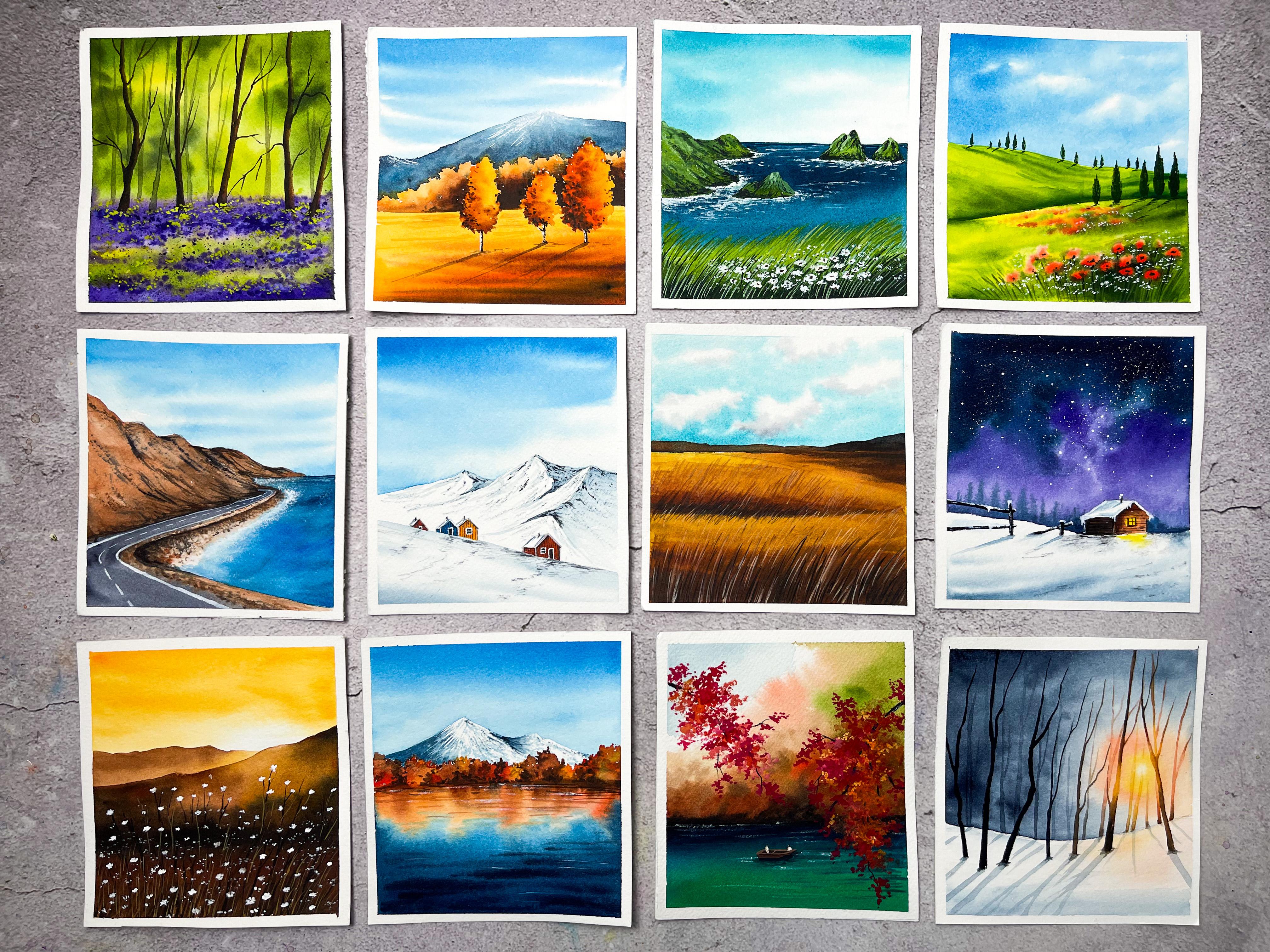
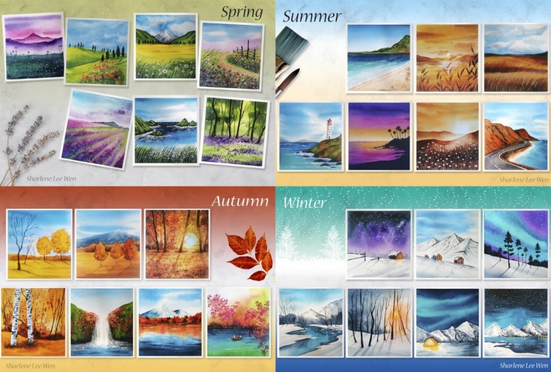
1. Hello & Welcome back! : This past year, we have all discovered different ways to stay indoors and somewhere. We have lost the connection with nature. A year passed, four seasons passed. Nature changed its color palette, and we could only watch it through our windows. As we're celebrating World Watercolor Month, I thought it's a great idea to travel around the World to witness all the seasons with Watercolors. Hello everyone. My name is Zaneena Nabeel. I'm a mother, an artist an architect, and an art instructor. July is celebrated as World Watercolor Month annually. To celebrate this special month, I have come up with a 30-day watercolor challenge. Watercolor is a beautiful medium, which is known for its transparency and unpredictability. I have been using watercolors since my childhood and every time I start a new painting, I feel so excited, just like I'm using it for the first time. This course is designed as a daily challenge which will run for 30 days starting from today. So every week we'll explore one season. We'll start off with spring, and in the following weeks we will explore Summer, Autumn and Winter. This course is absolutely beginner friendly. I'll be explaining about each and every material you will need in detail. we will be hand picking colors for different seasons. and we will be creating our own color palette. This course is power-packed with wonderful techniques and beautiful exercises. Throughout this month, we'll be creating 30 beautiful watercolor paintings. And along with that, I also want to spread awareness about the importance of art and creativity in your daily life. I'm someone who considers myself to be a beginner. Everyday, I used to invest some time in learning a new technique or trying out something which I haven't done earlier. And I think it is because of the same reason. I love to make beginners confident with the skills. And this class is specially designed for everyone who want to improve their skills and strengthen their confidence. In this course, you are not just learning to create 30 beautiful paintings. You will be learning so many techniques which can be used in your future projects. If you take a look at this project here, you will learn to paint a snowy mountain and a green mountain. And in this project, you will learn how to bring in that sense of depth in your painting. Here is one from Summer collection. You will learn to paint this blue fluffy cloudy sky. And with this one, you will learn how to paint snowy mountains. This is another one from the Winter, and you will learn to paint this gorgeous night sky. This painting is from the Autumn week and it is power-packed with wonderful techniques and tricks. Here's another one from the Autumn week where you will learn to paint realistic reflections. Likewise, with every painting, you're going to learn quite a lot of tips, tricks, and techniques. It is going to be a wonderful experience exploring the seasons using watercolors. I'm super thrilled to invite you all to this very unique and very exciting 30 Day Watercolor Challenge, Join me, let's learn and celebrate the World Watercolor Month together.
2. About World Watercolor Month: World watercolor month is annually celebrated during the month of July, started by Charlie or Shields, who is the creator of the formula blog Durbin wash. It's a mind to inspire people to paint with watercolor while raising awareness for the importance of art and creativity in the world. Watercolor is a beautiful medium that has been loved by almost all artists in the world. There is something magical about watercolors. You can use it in so many different ways. So with this 30-day, what they're going to change my intention as to share my knowledge and help beginners to improve your watercolor skills. Along with that, I also want to spread awareness about the importance of art and creativity in your everyday life. You don't need to be an expert in watercolors to try and the scores, Let's all join together to celebrate the world watercolor month. And that's come at, we'll make progress.
3. Materials you'll need: Before we dive into the class, let's have a quick look at the materials you will need throughout this particular challenge. It is not at all necessary to have the exact same color, are the exact same brand that I'm using. Q. You can go with something which is similar. Okay, I'll start with the watercolor paper. For this course. I'll be using my Canson cold press watercolor paper. This one is 140 LV. It is a 100 percent cotton. To get the best recent, it is very important to use a paper a bit soft minimum 140, and that should be a 100 percent cotton. The paper I'm using here is cold pressed. I prefer group recipe book for landscape paintings. The size of the painting that I'm going to do today as Turlington, the metal by 12 centimeter, I have just got the people pad into six equal pieces and that incites you see here. You can go with any size that you prefer. This one is almost as quiet. You can go with the Landscape Manual or appropriate manner. That's totally your choice. And because the paper is 100 percent cotton, it has got a nice texture. And you can see that this adds a lot of beauty to our watercolor landscapes. It is a very subtle texture. If you're going with the hot pressed paper, there wouldn't be any textual ad for going with a rough paper. It will have more texture. So grab your favorite watercolor paper and cut that into two equal pieces. It can be any size and initiate, that's totally your choice. Now, I'll be fixing my people onto a cardboard. I won't be fixing bad onto a table. This is just a piece of cardboard and have strcopy for onto it. This is what I'll be using as my backing board for my people. So I was fixing my paper onto this using a masking tape so that it is very easy for me to turn without the people when I'm adding the details to fix your before you will need a masking tape. When you fix your paper using a masking team, you will get this clean bottle. But it's obviously it's nice to see and all of that. It will also proven to your paper from buckling. So there are two good reasons to use some ascii t. Okay, so that is all about the watercolor paper. Now let's have a look at the colors. For this course. I'll be using my shin hand watercolor tubes. These have their premium range watercolor tubes. It's a Korean brand. I'd really loud AS colors for their vibrancy and they're quite economical as compared to the other are discrete watercolor tubes. I have a huge collection of champagne watercolor and I think I almost called the colors from their collection. At the beginning of every season, I have included a color palette section separately. There you will get to know each and every color I'll be using throughout that week. So to get through about the collosum detail, you can refer to that section. This is how Washington watercolor tubes looks like. It is a 15 and 1 watercolor tube. You will have all the necessary details on the tube, the pigment number, the certification, the information about the transparency and light phosphorus. You'll find all those informations on the tube. Now to mixing your colors, you will need a mixing palette. I'll be using the ceramic plate as my mixing palette. That is quite big and that is a lot of splits for mixing the colors. You can use. Any of the normal mixing palette that you use. It can be plastic or ceramic and doesn't matter. Okay, now let's have a look at the watercolor brushes you will need. Throughout this watercolor challenge, I'll be using four brushes. Let's take a look at each of them. The first branch is this 1.5 inch wash brush, this one restaurant Princeton. I'll be using this when to apply a clean coat of water onto the anterior people. And it's absolutely okay not to have a wash brush. You can use any off your bigger sized flat brush to apply a coat of water onto your paper. Now the second draft as the size number eight round brush. This one is from silver black velvet brush. You can go with any of your medium to bigger sized round brush. We'll be using those spent to apply all the major washes. The next one has a flat brush. This one is a half inch flat brush from silver black velvet brush. This is also for the background washes. Okay, Now the last verse, you will need a smaller size from creche to apply all the small details. This one is size number 2, round brush from Princeton. Size number 2, size number 4 are wonderful sizes. Those I sup of a tour, all kinds of detailing. Okay, so those are the four brushes you will need throughout this challenge. Now there are certain kind of big deals which are quite difficult to add using a brush. For that, I'll be using a white children and black pen. These are optional. If you are confident to add those little details using our brush, you could do that. So the black pen here is from the brand arc line. At a point for drawing pen, you can use any black pen. And the whites have been or have here as from cholesterol. It's an Indian local brand. Next you will need two jars of water. One has to stay clean and the other one, a student's up the paint from your brush. But keeping the clean water aside and whenever I'm in need of clean water, I'll be crabbing water from this and the other one I will keep next to me. And I'll be printing of the paint from my brush using disorder. For some of the paintings, you will need to add a painter's kit. For that, you will need a pencil and an eraser. And last but not least, you will need a paper towel to dab off the excess amount of paint from your brush. Alright, so those are the materials you will need for this 30-day watercolor challenge. All right, so quickly grab all the materials and time. The next section.
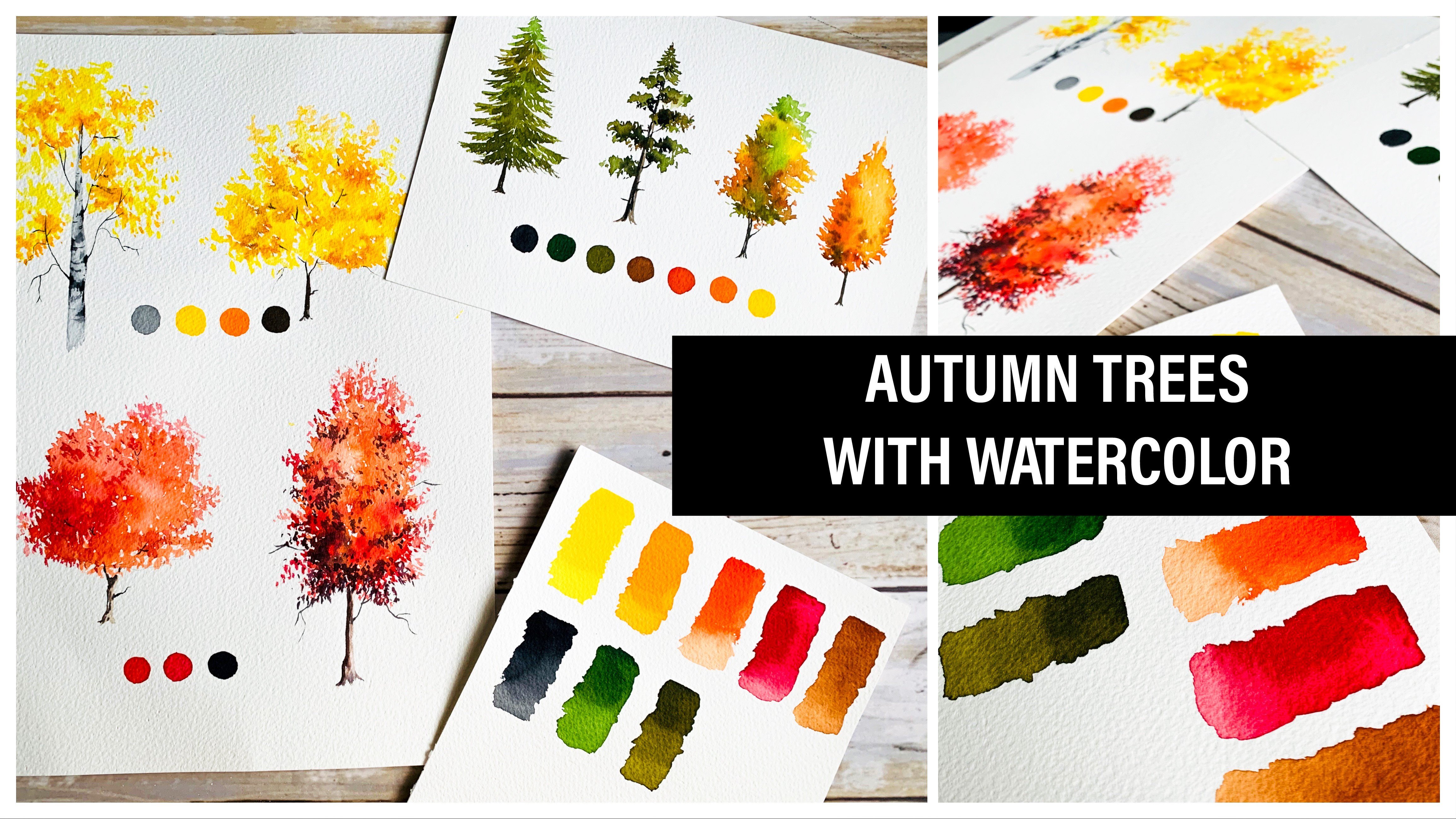
4. Week 1 - SPRING : We are starting off with our first season. We just spring. Before we dive into the class, I'm going to quickly show you the project cycle between throughout this week so that you will have an idea of what to expect in the coming days. All right, Here you go. Take a look. Okay, so you had a look at the predicts. You can see all of them are absolutely unique and different from each other. Each of them looks so fresh, placenta and beautiful. And we'll be exploring different color palette for each of them. So along with the painting, you'll also be learning a lot of techniques which you can use in your future projects. So it is going to be a wonderful experience painting bees, colleges, floral landscapes. All right, so in the next section, I'm going to introduce you to my spring color palette. And those will be the colors we'll be using throughout this week.
5. Spring Color Palette: In this video, I'm going to introduce you to my spring color palette. You already saw the painting step you're going to do in this week. You really don't need to space out the colors with me. You can simply watch this video. Okay, so for this course, I'll be using watercolor tubes. I'll be using my watercolor tubes from the branch in hand. And it's a Korean brand. These are their premium extra fine artists, watercolor tubes. Let's start picking the colors. So where you can come out spring the images that comes to your mind. To me whenever I think about spring, it is that lush greenery, which comes to my mind. Nature looks like it has got a brand new cream carpet. And there are flowers, every berry will hear birds singing. It is such a happy and pleasant season. Now keeping that in mind, let's start picking the colors. Springiness all about greenery. So the first color that comes to your mind, that's obviously green. I'm being sap green first. Was one of the sap green. It's a beautiful color. I'll keep this aside for now and we'll pick the next color. The next one is leaf green, which is another gorgeous green. This one here. If you don't have leaf green, that is absolutely okay. You can mix a little of sap green to your lemon yellow and you'll get a similar color. So you really do need to have a leaf cream. The next one is cadmium yellow. You can use any other yellow have caught. It doesn't need to be cadmium yellow. You can use primary yellow or Campbell Cielo, which will be the one you have with you. The next one is better it in green. We'll be using this for one of our painting to paint a metal. If you don't have it in green, you can mix any of your blood to sap green and you'll get a similar color. And you will need indigo. This is to add in the deeper tones will be mixing a little of indigo at SAP, clean and clean to get a darker tone of Queen. So with this color, we are done with the greenery part. Now let's have a look at the colors for this high. For the sky, there are two colons. Are we mainly using? The first one is two guys blue. And the next, and certainly in blue. These are the two colors I'll be using mainly for the sky. If you don't have pseudonym blue or turquoise blue, you can use any other blueberry opcode. It doesn't really matter. You can use cobalt blue persian low, or any other blue. Okay, so that is the greenery and the sky. Now let's have a look at the colors that we'll be using to paint the flowers. Flowers are a major identity of the spring season. So for every painting are using different techniques and I'll be adding some flowers. You can either go with the same color are we can go with any of your favorite color. I'll just be called the colors I'll be using. So I have permanent violet, permanent rose, and permanent yellow, orange hill along with us at about so be using woman. I cannot find 4 million here. There you go. Okay, So those are the four colors I'll be using mainly for the florist. Permanent rose, permanent violet, permanent yellow, orange, and warmer lean. Now, along with these colors, you will also need y toward her or white quash. This is to make our color look more oblique because we will be adding the floss onto a darker background. So to make it look visible, to make it look prominent, you will need to add either white gouache or white watercolor into this close. Otherwise they won't be really visible. Because watercolor is a transparent medium and you cannot really add lighter colors over darker colors. So just to bring in some opaque qualities to the paint, I'll be adding some white toward deeper into these colors and I'll be adding the troubles you've seen goes close. Finally, to add in the details, I'll be using neutral tint. You can either use black or Payne's gray. The system you'll notice. It looks quite similar to brings group. So you can use paints gray, interrupt this color. All right, so those are the colors you will need for this week. Now let's fetch them out. My indigenous that this session is only to give you an idea about the colors I'll be using. It is absolutely okay to go with the colors that you have God with you. It doesn't really need to be the same colors. Okay, so I'm going to swatch out the colors for you. I have a jar of clean water here. I'm going to squeeze out the colors onto my palette first, then other swatch one by one. That is leaf green, sap green, viridian green, and integral. Leaf green is a beautiful color which can be used for that tender and fresh greenery. But if you don't have this color, just like I said earlier, you can use your lemon yellow and mix that with Sap green. More yellow and less green, and you will get a similar color. So don't worry if you don't have the same color. Now, let's fetch out sap green. I think this is a very common color. Most of you may have. Sap green comes in almost all the basic watercolor sets. So I'm guessing you all have. So we have leaf green and sap green shoe. I'm going to wash her clean from my approach and I'm going to put it in green. Viridian green is also quite common, but if you don't have to get maximum loss crushing blow or any other blue with your SAP clean and make a similar column. Okay, So that is viridian green. Now again, I'm going to wash all the paint from my brush and I'm switching to Indigo. I'll be using integral mainly for adding the deeper tones. I'll be mixing this with sap green and viridian green wherever I need to add some chocolate tones. Okay? So we have leaf green, sap green, viridian green, and integral. Now we are going but the next sheet, which is neutral tint. I'll be using this column mainly for detailing variable. We need to add those deep and dark tones. I'll be using utility. You can use Payne's gray or black interrupters color. Okay, Now I'm going to wash out the paint from my brush and I'm switching to the colors for my sky. I already told you I'll be using to Christ blue, unsettling blue for the sky mostly. I'll squeeze out both the colors onto my palette. Then I'll show you the swatches. That's turquoise blue. And this is certainly in blue. I really love using two calls, blue for the sky in the coming seasons as well. You will see me using turquoise blue for the sky quite lot to guys, blue is one of my favorite color. I use it quite a lot. By the COVID. The summer week will be from the same color to paint the beaches. It's a gorgeous color, debris in the water and the sky. Okay. Now the next one is settled in blue. This is another favorite color of mine. Certainly in blue is the perfect color to paint the sky. Especially those cloudy sky. It's a beautiful color. Okay, So those are the two colors I'll be using for the sky, the two blues. Now, along with this, for one of the painting, I'll also be using permanent violet and permanent rose for the sky to give it a different feel. And I'll be using the same colors for Flavel successful. So I thought I'll combine Pat with the flower section. Let's start with permanent violet. Next is permanent roles installed, the woman rules, you can use carmine or crimson. Next we have as warm and Lynn. And the next one as permanent yellow, orange. If you don't have harmony in orange, you can mix yellow, add formalin, more yellow and less formally. This is a very simple yellowish orange which can be easily created. And the last color as cadmium yellow. As I said at the beginning, you can use primary yellow or Cambodia or any other yellow instead of cadmium yellow. Okay. So those are the colors I'll be using for the flowers. So all the folders I have to sum hero as according to the paintings will be J. You can either use the same colors or tweak them according to your choice. As I said earlier, you can change the color of the flowers or maybe the sky. If you don't have a widened watercolor to feel free to mix and create your own violet. Next I'm going to swatch out permanent rose. This is not a very common color. If you have Cloud mine on chromosome, you can use that instructors color or any other rows. The next one is wobbling. This one is a common color, and I'm guessing you all have it. Now the last two colors are permanent yellow, orange, and cadmium yellow. Having this color is not really necessary. You can mix formally and cadmium yellow, you will get a similar color quite easily. And finally, I have cadmium yellow. All right, so here, silver spring color palette. You can see all the colors we have heal. All of them are looking with bright lessons and beautiful. This will be the colors we'll be using throughout this week. You are free to change the color according to orders available with you or about, we would look nice on your painting. Maybe there are certain shades which you use in your painting according to your style. So it is absolutely okay to go with your own color palette. You can just follow the process and the techniques and do the same class projects using your favorite clothes. All right, so without wasting any more time, and let's start with the first class project.
6. Day 1 - Purple Flower Field : Hello everyone. The starting with double first class project, Let's quickly have a look at the colors before we begin. The already explored this spring color palette. Here is the painting that we're going to do today. Now let's take a look at the colors we have chosen already and pick the colors that you'll need for today's painting. For this guy, I'll be using permanent violet and permanent rules. I'll be going with a medium tone of these too close for the mountain task will I'll be using the same clothes for the first mountain. I'll be going with a purple shade. I'll be mixing up pinch-off, permanent rose to violet to get this color. For the one in the foreground, I'll be using permanent violet directly. If you don't have a widened watercolor tube, that is absolutely okay. You can mix and create your wireless. Now for the meadow, I'll be using viridian green, the green you see here as ferritin clean. And to add in those deeper tones, I'll be using indigo. So these are the two colors you will need to create that background. If you don't have red and green, you can mix a little of indigo or any other blue to your sap green to get a similar color. So don't worry if you don't have routine crane, we just need a bluish green. You can literally makes any kind of blue with your queen to get a similar color. Now to add on those branches, I'll be using sap green, and I'll be using neutrons and fast food. We'll have to add some brand is using a lighter tone. So I will mix in a little white with sap green to get that light Duetto. And finally to add in the flowers are using permanent violet. I'll begin with a lighter tone of this one. To give that opaque and light violet, I'll be adding white to permanent violet. Alright, so those are the colors you will need for today's painting. Okay, I have fixed my people onto the board already. Now let's add the pencil sketch. The pencil sketch isn't really necessary. You can add them. You pinned. It was just two mountains, so we'll have one in the background. This is going to be no poker sheet. And then I have another one in the foreground, right in front of that. So this one, I'm taking it from the left to the right. And from here, we'll have a palmetto. Whenever you're adding your pencil sketch, make sure it is not very strong and bold, go with a very light tone. Now this other two colors I'll be using for this guy, permanent rose and permanent violet. You can mix and create your own violet. You don't really need to have a tube or violet paint. I use it quite a lot in my paintings, especially in my night sky. So I always prefer having a light sheet and my palate. Now the next color is permanent roles. Instead of those, you can use carmine or crimson or any other pink tone. Now I'm going to apply a coat of water onto the sky. I'm going with my 1.5 inch wash brush and I'm at Blender clean coat of water. You don't need to follow the outline of the mountain. You get ticket fare little down. That's absolutely okay. All right. I have applied a coat of water onto the sky. You need to run your brush multiple times to make sure there's no puddles of water. The CO2 water has to be even. Now, I'm going with my size number eight round brush and I'm going with a medium tone of violet. And I'm applying that onto the top of my people. Starting a little of that. Now add in some lines leaving some white gaps in between. Now I'm switching to permanent rose, again going with a medium tone. Adding that or what he'll do some lines. You can see I'm not really blending those colors into each other. I'm just adding some lines onto the vector background. Now I'm going with a little more deeper tone of rules and adding one or two lines onto this guy. Just to make it a little more interesting, make sure your paint is not too watery. If it's too watery, it is W Bush, 10 people too. I will then add a new line. So I have cleaned my brush properly. My brushes she has done it is not too wet. Now I'm running my brush along those lines to make it a little more small toe. Okay, so that is our sky. Now let's wait for that to dry. Okay, there you go. Our sky has completely dried against you that Carl Rogers Wireless and pink sky. Now it's time to bring the mountains. For the mountain in the background, I'm going with the more awful purple sheet. So I'm mixing some violet and permanent rules to create our purple tone. Now, if it gives you a using blue and crimson or carmine to create your wireless, adding more crimson or carmine to the mx and reduce the amount of blue so that you will get a proper sheet for the mountain in the foreground will be going with a violet tone. Okay? So I mixed a lot of permanent rose for the permanent violet. You can see the color here. Just add that along the outline of the mountain just onto the top media. Now wash or the paint from your brush with clean water. You just blend that into the background. We just need to see the top of the mountain. This is quite far from you, so we are just making the bottom looks like it has foggy. So what will be the shape of your mountain? Adam, that proper dawn on to that top outline. Then wash the paint from your brush and go with clean water. Then blend that into the background. Okay? So that is it will first mountain. You can see how beautiful those streaks of pink are looking. Then we added the mountain. Okay, now we'll have to wait for this to dry. And after that bill being the mountain in the foreground, it is still a little bit. Maybe we can prepare the color for the next steps. So I'm going to squeeze out some indigo and some validity in green. This is for the middle. This one is more like an evening sky. So will you use sap green for your metal? It wouldn't be that nice. It is better to go with a green Beach has a blue undertone and that is a recent why I'm using viridian green. Okay, Now let's go with the second mountain. I'm going with violet are made internal wireless. Now just like we did the previous one, I will add violet along the outline of the mountain. Either job's on my brush along the outline we added there and add the paint onto the top. If you are mixing and creating your own violet, you will have to add more blue to your mix and reduce the amount of red so that you will get a bluish violet. What will be the shape you have added for your mountain? Just run your brush along that line. You'll have to make sure you're backroom on and has completely dried before you add in your second one. Washer the paint from your brush. And with clean water, blend that into the background. So you have a darker shade on the top. And as you come down, it is for AGI. So this will make it look like it is really far from you. It will give you that sense of distance in your painting. I want that violet to be alert and more intense. I'm calling with a pride to tune. Adding that onto the top. Well with clean water. I'm blending that into the background. If you want to go with a bluish mountain, you could do that as f2. Maybe you can go with a lighter blue for your background mountain. And again, use integral for the mountain in the foreground to handle the same strap. Just adding a darker tone onto the top. And then using clean water, just blend that into the background. Okay. So those are all mountains now it's time to paint the metal. Now, as I mentioned earlier, I'm going to use viridian green for the metal to add the darker dawns. I'll be using indigo. If we don't have it in green, you can add a little of blue into your sap green to create a bluish green. You can add in any blue, Prussian blue, cobalt blue, ultramarine blue, or any other blue. The color will be slightly different, but that is absolutely okay. We just need any kind of bluish green. Okay? So I'm gonna start with validity and clean. Adding a bunch of integral into two. Now I'm going to add that onto horizon line. That divided modern hasn't dried completely. It is still a little wet, but not too wet. You can see the green I'm adding cure at a slightly going into the wireless, but it is not spreading too much. I want a little blurry transition here. I don't want a clean violet line and green line. And that is a recent why I'm applying the paint while the mountain as told wet. You can see how beautiful that horizon line is looking. It wouldn't look nice if you have a strong separation between your violet and green. So Andrea, color while the mountain is still a little wet. Now fill up that entire boredom. Adr and viridian green or any other green dots are using. For now, we can just add a solid color. We'll be adding more darker tones onto that. Now against here, the color I use for the horizon line, it isn't to t, That is a medium tone. For the remaining area. I'm going in with a darker tone of green. I'm not mixing indigo right now a little bit, adding a proton Susan integral once we have applied green onto this anterior area. So once you have added green, you can switch to integrate and add that onto the bottom. Right you have your masking tape. Just add that. Over here we need a Docker tool. Along with that, you can add some darker lines onto the top Aspen, but make sure not to add a lot of darker tones along the horizon line. We want that area to be like two and the bottom to be darker. To get that sense of distance. I'm really loving the colors that good in green and indigo as looking so create together. It is a wonderful color to use in a metal. You can easily create the dark and denser look using these two colors. All right, bad. We are done with the base layer. You can see these lighter greens in between, which is actually adding a lot of beauty tool Maital. These negative spaces will add a lot of life to your painting. No matter whether you're painting your sky or some metal or some grass.
7. Day 2 - Green Valley with Red Poppies: Hello everyone, Welcome back to the R&D two of our spring week. We are painting a beautiful green and thresh Valley, but some red poppy flowers. Before we start, let me quickly show you the colors you will need today. I think from the painting itself, you can guess monks to the colors. Even by looking at it, you can see the blue, the green, and all those colors. So for this guy, I'm using Sertraline blue, certainly in blue and green goes very well together. And it is one of my most favorite combination to paint or bright and beautiful day. To paint the valley, I'll be using leaf green and add in the medium tones. I'll be using sap green. So these are the two colors I'll be using for the valley. On to that, to add the deeper tones. And also for those pine trees, I'll be mixing sap green and indigo. If you don't have indigo, you can use Prussian blue. We just need to get a darker tone of sap green. So it doesn't really need to be integral. And I'll be using the same color to add in those graphs over the bottom, and also for the shadow and for the pine trees. And finally for the flowers, I'll be using vermilion. You can use scarlet or a 1 million or any other orange shape you like for this painting, I would recommend to using any other color for the flowers. These colors are what makes this composition more beautiful. So please try to use similar color. Okay, we are good to go. So I have fixed my paper already. Now. I'm going to add independent sketch and is going to be a very simple pencil sketch. All you need to add us to curvy lines, which is going to be our valley. So I'm adding the topmost line. Now, a little below that, I'm going to add, another line. Will be adding some trees on the right type, right? You don't need to sketch them. We can add them by the pinned. So here's the pencil sketch. Now let's prepare the colonial half of my pallidus already used, but the other half is clean. So I'll just use that other clean house. Okay, Now let me squeeze out the colors onto my palette. First time going with this at Olin blue, this is the one I'll be using for this guy. You can use any blue that you prefer. It doesn't really need to be certainly in blue. And Alpha Valley. I'll be using the light green and sap green. The light green that I'm using a leaf green, That's a beautiful yellowish green. I'm going to squeeze out. You can add a little of sap green to lemon yellow, and you can create a similar color. So don't worry if you don't have leaf green. The next color other need a sap green. So that sap green. Now to add in the deeper tones, you will need indigo. If you don't have indigo, you can use any of your taco blue will be just mixing that into the green to get a deeper tone. So it doesn't really matter whether you use integral or any other darker blue, you can use Prussian blue. Finally, to add in the stars, I'll be using warmly. Okay, so those are the colors. Now I'm going to apply a clean coat of water onto the sky using my 1.5 inch wash brush. Progression of clean water. And gently apply a clean coat of water onto the entire sky. Run your brush multiple times to make sure the water has three starve the bearer. Okay. So my sky is red. Now I'm going to switch to my size number eight round brush. And I'm going with a medium tone of steadily and glue. As I said, you can go with any other gluteal card if you don't have certainly in blue, that it's absolutely okay to use in employee. While I'm adding the paint onto the sky, I'd be deliberately leaving some gaps in between, like some white patches, which is going to be the clouds. So to create the clouds, I'll be leading some people white in-between. I'm going with some smaller size clouds. You can go with whatever kind of shape that you prefer. To leave some caps of white in between. I'm going with a medium tone up suddenly and blue. It's a really gorgeous color to paint the sky. Okay, I have left some space in between. Now, I'm going to run my brush along that outline and I'm going to fill up the sky. Okay. Now we'll have to wait for this to dry. There is a sky, it has beautifully dried. You can see those white clouds in between. Now it's time to paint the valley. I'm playing with leaf cream. So as I mentioned earlier, if you don't have leaf green, you can miss a little offset printer lemon yellow. The color will look almost similar to this. So don't worry, if you don't have leaf green, That's a beautiful green. It will instantly make your painting look so fresh and calm. Now, I'm going to apply this along the top line and I'll be applying the color almost two threefold of the shape. So you can see here, I only love to level off over the bottom. For the rest of it, I applied leaf green. Now I'm going to switch to sap green over the medium to know sap green. Applied that onto the leftover area over the bottom. You just need to follow that second line. And at Sap Green along that area. Now, again, simply blend that with the light green you have the top. Just wash of paint from an approach. And with clean water to blend those two colors. Okay. So you have a lighter green over the top and as you come down, you have sacrum. Now we need to add some multipotent along the top line. So chose to add in some lines using sap green, which would be from the top to bottom to strike your brush and add in some lines writers, your bedroom is to read. So when you're adding these lines, they will look very soft and smooth. Now we need a color but just a bit more darker. So I'm adding a pinch of civilian blue to my green to get a taco tone. Now using that color, I'm going to add in some tuple tombs along this bottom line and also along the top, just to make it look more interesting. Otherwise it will look too plain. Don't add a lot of Docker tombs. Most of the Ada should be in that light green, just a little along that bottom line. And q line to the top is all you need. I really love this leaf green against a bright blue sky. That's a beautiful combination that will freshen up your mind. I switched back to sap green and I'm adding another line or worksheet. Now, I'm just dabbing my brush on a paper towel. And I'm running my brush along these lines to make it look a little more smarter. After this, we'll have to wait for this to dry. Once this dries, we'll be painting the other half, and that is where we'll be adding those flowers. So for yesterday's predict, we added white into wireless to get a lighter tone of wireless, and the added them on a darker background. Today we are going to add the flowers on a lighter background will be adding leaf green first, and then onto that we'll be adding some woman in clouds. They're not going to use white today. We'll be adding with levels directly onto the background. We'll see hadn't some time. Let's wait for this to dry first. Okay. So I'm keeping it aside and let it dry. All right, I will back contrast. Now I'm switching back to my 1.5 inch wash brush and I'm applying a clean coat of water over the bottom. Make sure not to add a lot of water along that top line. It might fall your green color in the background. So be very careful when you're along that line. Now, I'm switching to my size eight round brush. And I'm again going with leaf green. First, I will add a medium tone of leaf green along the top. To work here. Take it a little more down. Be very careful the New York along that top line. Okay. Now to add any flowers you will need a smaller size brush. I'm using my size number 2 round brush. I'm going with a lighter tone of formalin. My paint is not too watery because your backyard is already wet and if you're adding a lot of watery paint onto it, it will start spreading into the background in a very vigorous Mano. I wanted to be very difficult to control the way to spreading. So if you're not sure about the consistency, if you feel like it's too watery, you get dab your brush on a paper towel and make sure it is not two or three. Now using your smallest size brush, keep on adding some target pattern like this onto that Tibet background. You can see the color I'm going with it. It's not too dark and my paint is not too watery. Using the tip of my brush, I'm simply adding some dots close to each other. These are going to be the floss in the background. So you don't need to make it too dark. It can be in a similar tool. You can add them as much as you want. I'm not going to add a lot of flaws. I just started with this. If you want to get added along the anterior top line. And Washington danger from my brush and I'm switching to sap green. Go with a medium tone of sap green and add in some deeper tones of green from the top. I'm using my smallest size brush because I don't want these lines to be too thick. Now I'm taking them along this pocket. I'm adding them between these flowers. Just to live loved that you can go in Antarctic mano, just like copywriter, those clubs now add in a bunch of integral into your Sap green. And it'll be the same step we did using sap green. We're going to add some deeper tones onto the valley. You can add some lines and also asymptotic battle around those orange flowers. This will make the flowers look more prominent. Make sure to go with the smallest size brush, otherwise the battle and you'll be adding movie too quick. And you will end up covering all those flowers. Okay, So this is where we have read. Now, I'm going to switch back to my 1.5 inch wash brush. And I'm going to apply water onto that left are what? We are painting this bottom valley as two parts. We painted the top part. Now they're painting the bottom. But if you tried to paint everything together, your pattern may end up trying by the time you reach the bottom. So it is better to go as two pots. This way you can be very much relaxed. You can't be in the top and then come back to the bottom. I'm going to use the same brush, my size number 2 round brush. And I'm going with a much more deeper tone, a woman. And I'm going to add the flow goes first. If your paint is too watery, make sure to W Bush on a paper towel. Now, add some rough long sheets. It doesn't really need to be a perfect sheep. Again, see the way I am adding them. Along with that, you can drop some deeper tones onto the top. It is still wet. Just few dots here and there. We don't need to add a lot of them. So you have that lighter orange and some brighter orange. This will make your troubles look more protein. Now, come back to the bottom part and add in some more orange flowers. I'm adding them onto the bed background. So obviously it will start spreading into the background a bit, but that's okay. Don't worry about that. We can clean the sheep later while we are adding the darker tones. For now, simply add some shapes like this. You can add in as many as you want. Some of them can be smaller, and some of them can be beco. This will make your painting look more realistic. And add them in a very random manner. Don't add them in a particular bottle or in a particular line, make it as random as possible. Now, I'm going to wash the paint on my brush. And I'm switching to that light cream. And I'm going to add that around the shapes I added here. You really don't need to touch those orange shapes. You can take your brush along that outline, leaving a teeny tiny cap. So the green you're adding are not really touching the orange. So you can prevent them from spreading into each other. Just to add those slight green along the caps you have here. It may not be that easy to add the same using a bigger brush. So it is better to call it the oppress recess appointed to a smaller brush like this. Okay. So I have added green along those shapes. Now I will switch to my size eight push and I will fill up the remaining area. Simply fill up that leftover either you have all of them. Now, switching to SAP, create a medium tone. And just like how we did on the top, I'm going to add some medium tones of sap green onto this vector background. Now, adding a little of that around these orange shapes, you can see I'm leaving a teeny tiny cap, just like we did earlier, so that the colors won't straight into each other. Now maybe you can add in few lines or words. All right. Now it's time to switch to a deeper tone. I'm switching to my smaller size Pro. And I'm mixing a little of indigo with sap green to get a darker tone of green. And in a similar way how we did on the top, I'm going to add some deeper tones onto this background. It is very important to use any of your smaller size brush. I didn't update your integral and create a deeper tone of green. Now start adding them around this orange shapes. We are going to define the shape of the flowers. You will slowly see how those flowers are getting a live when you're adding these top ketones, add them along the outdoor sheep. Also my flowers doesn't have any particular shape. It is a rough ground or in the world. So if we were to go with a more defined shape, you could do that while you're adding your darker tones. Just to get tolerable, you want to and find a better sheet. I'm going to give this painting are more loosened abstract for you. So I'm not focusing on the shape of the flowers. You can see how beautiful dose levels are looking. When we added those two platoons, I'm going to add the deeper tones only on to the ADL Bambi, how those flowers, for the rest, I'll be switching back to sap green. I'll be going with a medium tool. Wonderful rest of the ADR to be very light and fresh. Switching back to sap green. And I'm smudging this entity background. It is just to make this level of sort of more prominent, I added a deeper tone. Otherwise those levels will not look prominent. It will look very blurry and unfinished. So to give it a more finished look, we added the deeper tones. I'm really happy with the way this one is progressing, especially the color competition. That leaf green, the blue sky, and orange flowers. They all are cleaned very well together. It is really looking so fresh and beautiful and it has that spring vibes. I hope you're enjoying it too. Okay, so we have added those deeper tones and medium tones around the shape of the flowers. Now I'm calling with a darker tone of green. I'm going to mix more integral into the crane. And using that color, I'm going to add some grass over the bottom. This will make our landscape look more realistic. I'm using the same brush. Your background might be slightly wet, but that's okay. We just want some deeper tones and some crazy pattern or watching some lines like this. I think the left and the right area of retry, just the middle will be little wet. Now, along with that, you can also add a teeny tiny dot onto the center of these shapes. This will give more life to all flowers. When you're done with this, you can switch back to adding graphs and add some more onto the left side that ADRs looking little plane. So they added graphs using a darker tone of green. Now we need to add some using a lighter tone as well. For that, I'm mixing a little off white with my leaf crane. And I'm calling with a lighter tone. You can use white gouache or white watercolor. Now, just add in some grass seed shape, especially onto the area that you have those darker tones. And that's done. Now the next step is to add the trees in the background. They're going to add some pine trees. I'm going with a deeper tone of green. I just mix some integral into my sap green. And I'm adding some rough shapes of pine trees or what show host. I will add some taller trees along the bottom line. And after that I will be adding some teeny tiny trees along the top line, go with a darker tone of green and also your smallest size brush. It is a very simple shape, something like a long leaves. So it has a pointed tip and a rounded bottom. It should look like it is tapering. So once you have that mainly fishy, add some lines along the outer shape and make it look more shopping. Otherwise, it wouldn't look like a tree. Now in a similar way, I'm going to add some teeny tiny ones in the background. You can add in as many as you want, but just keep in mind the ones we'll be back on has to be shocked. Oh, and the ones before gone has to be tall and big are the virus. You will lose the sense of depth in your painting. So that is my third tree. Maybe I will add one more. So first, decide on the height of the tree. You can call it taller ones for the foreground. So I have added a line or whatever. Now I'm just adding some broken lines and I'm creating that out OCI I want a very irregular and organic she wanted to have God that she just fill up that until your tree in a taco to not clean. Okay. It's a very easy tree as it is in the background. We're not going to add a lot of details to this. But still it looks like a nice pine tree. Now you see the lighter tones of the same color. I'm going to add in some shadow for all the trees here. Just add an inclined line starting from the bottom of the tree and take it a little into that landscape. Okay, So the foreground is done. Now aliquot, into actual teeny-tiny place in the background. Now just like carving out of the shadow for this taller trees, we need to add shadows to these ones as food. So go with a lighter tone of the same clean and add a tiny inclined line. Don't make it too bold and go with a lighter tone. You can see the size of my lines. They are really small. Goal with the similar size. If you would like to, you can add more similar trees on the left side as well. I'm just going to stop material. I'm not going to add more trees. Now. I'm going with that darker tone of green. And I'm adding the last round of crafts using this taco tone. When we added those darker tone, the backer was fed. So all of them are looking a little blurry right now. Just add in a few, especially for those flows. Start from the bottom of that flower and adding the line using a taco tool. It will look like the stem of that flower. Okay. You don't need to add a log just to fuel us all you need. That's what this area but you have that deeper tone of gray. Okay. I'm nearly done. We just have one last step left and washing of the paint from my brush. And I'm switching to white. I have a tiny bit of white leftover that is all I need. So I'm not going to squeeze out, camping out onto my palette. So the last step is to add some teeny tiny dots around these orange flowers. You don't need to add a lot, just a bunch of white dots here and there. To make up a few levels look more beautiful to do with the stuff. You can also use a white gel pen if that is more comfortable for you. You can see the way I'm hiding things. Just some random quick white tones. I'm adding them in bunches. So without lifting my hand, I'm keeping on pressing the tip of my brush on the paper. I'm creating these bunch of white flowers. You've got them into background as well. But go in a very minimalist Mano, don't add a lot of them. And that we are done with the whole painting for day 2. Looking at the painting, I feel like the junction off these two valleys. This video needs to be our lateral more smoke. And just looking at it, I feel strongly that she had come moment. So I'm just adding some leaf green hill and then pulling that sap green into the background. That separation between the top Valley and the bottom gravity wasn't that smooth. It was looking a little rough and that it's a recent why I'm doing this. If you're happy with your values, you can leave it as letters. You don't need to do this. I wasn't really happy with this part of the painting. And that is a reason why I'm doing this. So I'm going with a medium tone of sap green and I'm dragging that paint towards the top. So you have a medium tone of sap green over the bottom and the lighter tone of green over the top. And now that is looking a lot better than earlier. I haven't dusted top. I just added those cream top over the bottom. Okay. We lead time lookup or painting. Let's remove the masking tape and have a look at the finished painting. I'm really happy with the color combination and overall look of the painting. I hope you guys enjoyed it too. Thanks a lot for joining me today. I'll be back tomorrow with another beautiful spring landscape.
8. Day 3 - Escape into Nature: Hello, hello, Welcome to Day 3 of what they're doing watercolor challenge. Here's the painting that we'll be doing today, is the third painting from the spring season. Let's take a look at the colors before we begin. For this guy, I'll be using to cries blue. The blue you see here, it is turquoise blue to create the Cloud. While I'm adding my blue, I believe some people wide, but to adding those shadows, I'll be using neutral tint. You'll need a light tone of paint gray or neutral tint. If you don't have neutral tint Debian screen or you can use a light, you don't have black. Then for the snowy mountain, I'll be using in the PICU and footers Green Mountain, I'll be using sap green. Now to paint the middle, I'll be using cadmium yellow and sap green. We'll be adding yellow to almost half of the middle. And from there we'll be switching to subquery. Then to add into deeper dorms, I'll be using indigo. Then to add the flowers, I'll be using white watercolor and permanent yellow, orange. And finally to add in the details, I'll be using neutral scent. All right, so those are the colors you will need for today. It's a beautiful painting. You will learn how to paint the sky, the snowy mountain, the Green Mountain, which you can use in your future paintings. All right, let's begin. Have fixed my thing. Now let's prepare the colors for the sky. I'll be using two guys, blue. You can go with Amy Bloom of your choice. It doesn't really need to be turquoise blue. We're repainting a cloudy sky. So to add in the shadow of the clouds, you will need neutral tint or Payne's gray. Now for the mountain, you will need indigo and sap green. Finally, to bring the middle along the top cream, you will need a yellow. I'm using cadmium yellow light too. You can either use lemon yellow or any other yellow you have caught. Okay, Now let's add independent sketch. You will need to add some mountains in the background. So I'm adding the horizon line flows and little about the center of the people. So the top, you will have your mountains and in the sky and older bottom you will have your metal. So this is my mountain in the foreground, which is going to be increased. And this one in the background is going to be a snowy mountain. Okay, So that is the sketch. Now let's talk painting. First. I'm going to add a quarter of water onto the sky and even coat of water. Okay, now I'm switching to my size 8 brush and I'm going with a medium tone of turquoise blue. Load your brush with a medium to dark turquoise blue and start adding the paint from the top of your paper. Now when you're going, they don't get skies. Make sure your paint is not too watery. Especially if you're trying to leave some white gaps in between because your background is already wet and if you use too watery paint, it will start spreading into the background and embedding of the first 10. And you won't be able to read the indoors whitespaces. So here to create some clouds, we are trying to read in the paper white. You can't see, I have left some gaps in between. Those are our clouds. You can decide on the size and the shape of your Cloud and link those white gaps accordingly. Now again, washer the paint from your brush and tapetum of paper towel. With that slightly damp flourish. Have those patches to have a small-town look. Okay, so the next step is to add shadows for these clouds. For that, I'm calling that neutral tint. I'm going with a lighter tone off neutral tint. You can also use Payne's gray or you can use integral. Go with a very light tone. And twos drop that color along that. Boredom off your clouds. Water will be the shape you have left them. Just follow that bottom line of the shape. I'm dropping some Payne's gray on your total. Make sure to go with a lighter tone. It shouldn't be too dark. Okay. Now again, again, washer the paint from your brush and tap your portion of people towards Mel job's done your damp brush along those color you have applied over there and make it look a little more smarter. So here is the sky. Now let's wait for that to try. Our sky has beautifully dried and this how it is looking at the moment. Now it's time to paint the mountains. The one that the background is going to be a snowy mountain and the one on the full crown is going to be a Green Mountain. I'm switching to my size two, brush and chemically with the lighter tone of integral. Make sure the colonial queen with us really lightened tone. It shouldn't be a dark integral. It has to be really light. Now using that color, the light in-degree have created. Simply add some lines on top of your mountain. Just take them down. Those whitespaces where you have your people wide. That is going to be the snow. Now along the bottom, I'm going a bit more taco to enough Interco nor too dark and light at that over the bottom. Now drag it towards the top. So that transition will look a lot more plateau. It wouldn't have a strong transition. Simply keep dragging back towards the top. Okay. So this is the base layer of your snowy mountain. Onto those will be adding more darker tones and some dry brush patterns to make it look more realistic. For now, we can leave it till that is a snowy mountain. Now we'll have to wait for that to try to add in the remaining TTL. Meanwhile, let's switch to sap green and being the other mountain in the foreground. I'm switching to my size number eight round brush, and I'm going with a medium Tonle Sap green. Now following the outline of the mountain, I'm going to apply a medium to know sap green. Just fill up that entire Martin sap green color. I really loved the composition vendors, snowy mountain and a clean mountain. For some reason. Every time I look at this fresh colors at fills me with so much of positive energy. I think all the paintings we'll be doing throughout the spring season has that positive energy in it because of the colors we are using. They all are fresh, bold, and vibrant. It is actually a very wonderful feeling when you play with vibrant colors. Okay, so I have done adding green color onto the entire mountain. I used sap green here. Now onto this, I'm going to add in some darker tones for that. I'm mixing a little bit of indigo with sap green to get a deeper tone. If you don't have indigo, you can use any other blue dot I have got you can use Prussian blue or any other blue. Just mix that with your sap green to get a deeper tone. Now, adding some lines from the top to bottom in an intelligent way just to make it look like it's our valley and the sloping down. You can see how instantly our modern Carter realistic look. Then we add up those lines. You can just compare the mountain on the left and the right. And you can clearly see the difference here. Okay, So in a similar way, we can add some lines onto the mountain on the left side has four. As the green is still wet when adding these lines, it will look very small time sub2, it wouldn't stay prominent. And that will add a log of beauty to your mountain. So you will have to add in your lines before you mount and dries. You can see the way I'm adding it here. And you can also see how the lines are spreading into the background. As I said at the beginning, no matter what your painting, whether it's a mountain meadow or a sky, whenever you are trying the wet in wet technique, you will have to be a little careful about the water content in your paint. If you're adding details onto the wet background, your paint shouldn't be too watery. That's the dump rule. I follow. Okay. So just keep that in mind whenever you are using wet-in-wet technique in your paintings. Okay, now I'm switching to my size number 2 round brush and I'm going with a taco turn-off integral. I'm going with that. Try ping. Now I'm adding some dry brush patterns onto the stony mountains to add more textures onto it so that it will look more realistic. Just go with the drive ocean of indigo and added some dry brush batons. If you're not sure about the consistency, W Bush on a paper towel and make sure your paint is not at all have watery. You can add more drivers patterns over the bottom, barrier, mountainous closer to the green one. Onto the top, limit your amount of drivers patterns. We don't need a lot of what. We want to retain those people white. That white space we have left here is the snow. We want to retain that as much as possible. Otherwise, I have a mountain, the low-status noir character. Okay, So until you feel satisfied with the amount and you can add as much as try push buttons as you want, but make sure not to add a lot over what the top that you have. Those white battled. Dry brush technique is one of my most favorite technique to paint mountain. I use it in multiple ways. Sometimes I add the drivers patents first, then I add the color on top of it so that those drivers patterns will look very sub2. In the coming days. I will show you how I do that. It's a wonderful and simple technique to paint a realistic mountains. You can see how beautiful our mountainous looking all ready. Okay, so we're done with this snowy mountain. Now dosing integral. I'm going to add some. Docker dorms onto the Green Mountain asphalt, just onto the top, adding few more lines. I drink. It hasn't dried completely, so I'm just making use of that time and adding some more deeper tones. Okay, I'm quite impressed with my mountains. I'm going to stop it there and I'm going to stop at the middle. For that, I'm going with a medium tone of cadmium yellow. You can use lemon yellow or Cambodia Kimball. Add that in and starting from the green. Many have reached almost half of your people. More shadow paint from your brush and switch to Sap green. Whether yellow and green is melting, you can add some lines to make that transition to look more realistic. Now you can fill up the rest and sap green chose fill that up. I'm really loving the colors are just looking so fresh and beautiful. Now it's time to add more deeper tones for that, I'm mixing some integral with sap green. Just like we did on the mountains. Go with a taco to my cream and add some darker tones just onto the bottom. You will have to leave the yellow part acids don't add any darker tones over there. We want to read in that fresh and clean yellow. You shouldn't be adding the depot dawns very high, that's great. Especially on the bottom where you have your Maschine deep, concentrate on that ADR and add more deeper tones over there. Now I'm switching to my size number too long, flourish and Devin add few lines using a medium to enough sap green. Onto this yellow video. You can see my lines out that Eaton down just adding a suitable I'm not filling up the entire idea. I want that to yellow to be seen. Okay. That just now and let it dry. Okay, If that has dried, our next task was to add some pine trees at on that screen mountain. It is just like how we added yesterday. But today's fine, just not going to be really small. These trees are quite far from you, so you really don't need to focus a lot on the details. You can simply add a rough sheep. Comparing today's trees, the ones we added yesterday, but are quite huge. You can see the size I'm calling with. They are really small. And all you're adding a tree. Some of them can be a bit taller and some of them can be short-term. Don't add them in the same size. In-between again, add them as groups, group of two or three trees together. So Adam in a very random manner, as I said earlier, some of them can be taller and some of them can be shorter. Okay. I hope that is clear. Now, I'm going to quickly fill up this entire line in some trees. I'm nearly done. So I used her darker tone of green. I'm mixing those left integral to my sap green, and that is the color I'm using q. Now I'm adding some taller trees. Again, see it's a very basic shape. It is not at all detailed. It's like a long leash. This is the kind of size you should be using for your trees. It shouldn't be too quick. If it's too big, you're painting the loss at scale and proportion. So COVID the similar size. And that's done. Now, I'm going to add a shadow for all these trees. I'm going with a light to turn off the same dark green I used. And I'm simply adding a line, an inclined line right underneath all these trees. It's a very light to make sure to go with a similar tone. It shouldn't be dark. Just add a simple line like this in an inclined way. All of them should be in the same direction. And that is also done. Our next task was to add the grass to make up a medal look more realistic. The bonds we are done with the grass will be adding flows onto it. And the dad will be done the total painting. So to add a grass, I'm going to squeeze out some white watercolor. That's him right there. Now I'll mix that white with your sap green and create light green shade like this. By using this color, we're going to add crass onto the bottom media. Your background is dark, so if you're going with the darker tone, each METAR be really visible. So to make the grass very prominent, we are using online tool that is a recent why we added white or dagger into sap green. As you all know what the color is not an opaque medium. It is transparent so you cannot really add lighter colors over darker colors. So do make it possible we added some white and to our sap green. You can do the same thing with white quash asphalt. Instead of white watercolor, you can use white quash assets of watercolor month. I don't want to bring in any crash into this course and that is a recent why I'm using white watercolor. But the choice is yours. If you want to make it more opaque, you can use white gouache or white watercolor. Now when you're adding those graphs, we will have to go to the brush which has a pointed tip. It shouldn't be too pooled and thick. You can see the lines I'm adding TO. They're quite thin and delicate and it has just a freehand line. You can add them in different length. How will they have to fill up this entire area in these kind of grassy lines. So I added a lovely, a lot of the same color to make it a more of a fresh cream. You can see the color here. The only one to looking little data. So you can add a little yellow to your sap green and then add right into it. And add as many lines as you enter your time-consuming task. But it is going to have a huge impact on your metal. Once we are done adding these lines using a lighter tone of paint, could be switching to our taco truck and repeating the same exercise. You can see how beautiful our metal was looking already. Now I'm going to switch to our talk. Good to know. I'm mixing a little of integral that sap green. And I'm going to repeat the same exercise. I'm going to add in some more grass onto the same background. This will make a medal look more tense and thick and it will automatically make it look more realistic. You really do worry about whether you will override the cross lines you added using a lighter tone. You can just go over them. That's absolutely okay. Without having any pressure or stress, simply add these kind of lines. You can see how pretty it is looking when we added those darker lines. In a similar way will have to add some on the left side as well. Hi. And that's done. The next step is to add the flowers. For that I'm using white watercolor. You can either use white watercolor or white quash. Now, call it your smaller size brush and add in some clouds. For the last two paintings, we didn't really focus on the shape of the flower. The first day we added very rough shape using a light photon of violet. And for yesterday asked him, it was a very abstract sheep. But today I'm focusing more on the shape of the flower. And I'm adding beautiful white flower with all the petals. This one is quite big. For the next one, I will go with a smaller size. I wouldn't be adding a lot, maybe eight or nine or 10 of them, but in different sizes. I'm going with the second one. You can see it's a very simple flower. Now in a similar way, I'm going to add in few more. As I said earlier, I'll be going with different sizes. All of them will be the same size. Okay, you can see how I played it a different title. I add it to the class, then I add it to medium ones and some smaller ones. Now, I'm going to add another big one on the left side. It's totally your choice which color you want to use for your flower. I thought it would look nice because of the green and the spleen MTTR. I really didn't want to bring in a new color, but it's totally your choice. You can use pink or yellow or orange or violet or any other color dye to prefer. Juice yellow and just add on Lafite into it to make the color look more opaque. And adding your flowers that which will be the color you have to sort. Now we'll have to add that center part of the flower. It's called the stigma heart-stopping. I don't remember the actual you learned in school. Now to add in that center part, I have taken on a dark orange here. This one is permanent yellow, orange. And I'm adding some dots and some pattern turn to the center of the flower. Like an oval shape. Not a perfectly shaped or Woo, I'm just adding some thoughts. I'm gonna do this for all the floors here. You can see how lively above level silicon right now. And we added that orange dot onto the center. It was using to Darwin and unfinished all your district. And so pretty soon I'm done adding that orange charge onto these flowers. Now I'm switching to just washed the paint from my approach. I'm going with some new total. Now onto the center of all this glass. I'm just adding few more towards one or two or three in that set. Okay, and that's done too. Now I'm adding a stem for all these flowers. Going with a darker turn off neutral tint. Just a simple straight line, like the grass taking it from the bottom of the flower and bringing it down. Okay. We have some more glass on the left side. I'll do the same for all of these. So this is how we, we shouldn't be adding the flowers. Now if you want to add more, you can go ahead and add asked me for processing. Well, I'm going to quickly add some new floss onto a website. If you wanted to add more and more floss and make it look more, $0.10, the code, you can add as many as you want. I'll be adding like three or four onto the left side and the data returned with double painting for today, just like we did earlier, I start with the shape or the flower. Then I will add that orange dot onto the center. And finally, I will be switching to notice. Then I will add few talks on the same time. Then I will add this Tim, but that should be done. Alright, so go ahead and add an ask many floss as you want and fill up your metal ion. Do you feel happy? Hi. Okay, My dear friend Sam, that we are done with about painting for gate three. Cognition have chosen for this painting. That blue sky, the stony mountains, the queen Martin album title. Everything was looking so good together. Now let's quickly peel off the masking tape and have a look at the finished painting. All right, There you go. I hope you are and try painting those beautiful spring landscape. Thanks a lot for joining me today. I'll be back here tomorrow. Another color just for landscapes.
9. Day 4 - A Walk through the Flowers: Hello, hello, Welcome back. Welcome to D4. I hope you guys are enjoying, so far. Shares the spring landscape we're going to do today. And let's have a quick look at the colors you will need for the sky, as you can see here. I'm using two guys, blue and violet. I will click with the light to turn off both these clothes. If you would like to use only blue or Schwann a change while it into pink or yellow or orange, that is totally up to you. So go with your favorite color for the sky. Now to paint the middle, I'll be using leaf green and sap green. Along with that to Adam, the taco tunes, I'll be using integral. So you would need leaf green sack and integral to bring defense to add in some details, you will need neutral tones are being screened or black. You will just need any taco tone for this. And finally, to add the flowers, you will need 4 million and white. Okay, So those are the colors you would need for today. Feel free to change them according toward you have caught with you. Okay, let's talk. I have fixed my paper. For today's painting. There is no real pencil sketch. All we need to add as a pathway and the metal are very narrow curvy part. Okay, So that is all you need to add. So it will spot that we have divided our landscape into two pieces. We have a smaller piece on the top and we have a longer piece on the bottom. You don't need to clearly define them. We can do all of that while we pinned. And the fence also will be adding directly with our brush. You don't need to sketch them. Okay, now let's close out the colors. I already have some violet and sap green on my palette. I'll squeeze out some turquoise blue. This is for the sky. We just need a bunch of turquoise blue. We need this only for the sky, so don't squeeze out a lot. Just a teeny tiny bit of turquoise blue is all the meat. Okay. We'll be painting the sky and the metal to Cato so you can apply water onto the anterior people. Take out the wash brush or any other flat brush you have God. And apply a clean even coat of water onto the anterior people. Random brush multiple times to make sure the water has reached everywhere. Let the people absorb the water, let it settle in. When while we can set the other colors, I'm going to squeeze out some more sap green. And along with that elevated a little off integral asphalt to add them, the taco tombs. The next column you will need for the middle of the leaf green. I already have a lower here. So I'm not going to squeeze our glyph cream. I'll just use the leftover paint. Now, I'm starting with a medium tone of two cards blue. And I'm adding that onto the top of my people. Don't cover the entire sky into class blue. We'll also need to add some wild in between. So you can add some lines, some thicker lines like this, leaving some cap in between. Now wash all the paint from your brush and switch to permanent violet. Again, go with a medium tone, just like COVID added to quiesce blue, add in a live love wireless password. So you have two coins, blue on the top and some violet over the bottom. You don't need to blend them into each other. You can leave some white gaps in between. When it dries, it will beautifully blend into each other. Just leave it like this. You don't need to put any extra effort and blending them are making them smooth. Now, I'm not going to need for this guy to dry. I'm going to do delete, apply the colors for the middle. Now, I'm going with the leaf green. If you don't have leaf green, you can go with pneumonia. Or again, mix a little bit of lemon yellow but sap green and get a similar color. Now add that link, that pathway in the middle and add a new leaf green on either side. For the pathway, I'll be adding a lighter tone of brown. So we're going to paint the enter your background layer in one single goal. We apply the coat of water onto the entire paper and the paint, the sky first. Then they started off with the middle. Now I'm going to squeeze out the Luftwaffe brown and I'm going to paint the pathway. Then for the rest of the area, I'll be switching to sap green. So on the top when you're closer to your scar, you have a light to 20 to the bottom. We will have some taco tombs. Know I was quizzing all the bonds and tangling with the lighter tone. Adding that onto the spot where we have added here. You can see the way I'm adding when proud. I'm not really worried about the Brown getting mixed with the crane. We don't need a definite outline for bees, the colors can spread into each other. That is absolutely okay. Now it's time to switch to sap green. I'm going with a medium tone and I'm adding that right next to this leaf cream. You can see the way they are blending into each auto. Again, you don't need a perfect blend here. I just added the colors however you want to. It doesn't need to be perfect. And all we need to make the colors more dark and intense, especially on to the portal. So I'm going with a darker tone of sap green. For the rest of the area, I'm going to mix a large loss, indigo to my sap green to get a more intense tone of green. First Phillip, the anterior area in green. Simply fill that up. Now, add in a pinch off into go to your subquery. Drop that into your green background. Just add in some thicker lines. Now, do the same thing on to that top portion ASCO. Just to live global hero. Guan to have add those darker tones, you can add some lines using the same approach. To some grassy patch on your background is still slightly wet, so these lines won't state both fit. That's okay. It didn't look a little blurry when it dries. You can do the same thing onto the bottom portion as well. This is just to give it a more natural and realistic queen. When it dries, we'll be coming back and we'll be adding more grass onto this. So for now, we'll just add some simple lines onto your back-to-back Chrome using that same brush. You can see the way I'm adding them. They're already Ross. I'm not really worried about making them look profit. I'm simply adding some grassy patch onto the vector background. Okay? Now let's wait for this to dry. All right, so everything has completely dried and this is how I'm just looking. Amg really happy with the colors, especially that horizon line. It looks so perfect that violet and green as blending into each other. There is no real, you really don't see that separation between these two colors. And this is exactly what I needed. So this is the background wash, repeated everything in one single CPU between it, this chi, the middle everything together. The next step is to add more details onto those to make it look more realistic. For that, I'm going to squeeze out a little love whitewater glow onto my palette. As I said, you can use white watercolor or white gouache. It is totally your choice. So that is why to, what a cool. Maybe I might need a little bit more. Okay. Now I'm switching to my smallest size brush. This one a size number 2, round brush. And I'm mixing a little of sap green with white. This will give me a beautiful light cream which will be opaque because I added white to do it. It shouldn't be too watery, cool with a thicker consistency, otherwise, those lines won't be visible. Now our task was to add an ask many grassy pattern as we can simply add some lines like this and cover up the entire landscape area we have there. It is a simple freehand line. Start from the bottom and drag your brush three and add them. These kind of lines. You shouldn't be going with the brush recess appointed, took article. You'll seal detail brush. This line has to be ready to kind of entelechy, make sure they're not too blurred. Now go ahead and cover up this anterior area and these kind of grassy lines out of five log on the bottom. Now in a similar way, I'm going to add some grass on the top basketball. We can see the way I'm adding them. I'm not lifting my hand. I'm keeping on adding these kinda flying saccule, have paint on my brush. Then I'm loading my brush with this light green and again adding more lines. This is a time consuming process, but it is very simple and a feet and it is going to make a huge difference in your painting. So don't skip this step. Add in as many graphs as you can and cover up those green ADR. Week 2. I have added quite a lot of them. Now over here, I'm going to make them more yellow. And I'm just taking them into the sky. I'm taking all of them to the right side just to give it a feel that those who wind blowing. Okay, so this is how our paintings looking at the moment those lines already made a huge difference to that middle. Now I'm going with a much more taco ton of Queen. I'm not adding white. I'm going with a medium tone of sap green. In a similar way how we did earlier. I'm going to add more grass onto this. Hi. Okay, so we added graphs using a lighter tone of cream. Then we switch to a medium tone of sap green now will lead to a much more taco tone. For that, I'm mixing more integral intercepting to create a darker tone, Something like that color be used over the bottom. Now in a similar way how we did earlier using that taco donor cream. I didn't mowed grass. All this will make your model look more thick contents. And that is a reason why we are adding this class using multiple domes of green. For us, we added using a lighter tone, then we used a medium tone of sap green. Now what we are going with a very dark tone. There is no limit your hand, there is no rule. You can add in as many as you want. Your patients is what matters. All right, so this is how our paint the festival and out you can see that God used metal we have there. Now onto those will be adding flowers. Before the flowers, we can add a simple fence. This is just to bring in a little more visual interest in our painting. Otherwise it will be just grass and flowers. So I'm going to add in the face. I'm using neutral tint. You can use Payne's gray or black. Go with the brush which has a pointed tip. Little one, a thick friends. First I will add those wooden post. I'm going with a very irregular shape to make it look more realistic and natural. Status. First one. To give it a more natural feel, I'm adding some tiny branches onto that. Okay. So that is the first one. I think we can make it a bit more taller. I'll just extend this part now making it a little more thicker. Okay, so that's the first one. I'll be adding two or three at different times on different height. Some of them will be straight and some of them will be in an irregular shaped like this. When you're adding your wouldn't boast, make sure all of them decimal cosine. Make all of them slightly different from each other. This will bring in a lot of visual interest to your painting. Now, I'm going to the second one I've alluded to or show maybe this one, I will make a little more shadow than the first one. Okay. That if a second time. Now, I'm going to add one or was she going with a slightly inclined line? Now, another one over here that is going to be much more shadow under teeny tiny one. Okay? So those are the word and foremost. Just take a look at your painting. And depending on how we want them to be, you can make them thicker or taller or shorter. You can add some more prime juice to make them look more realistic. So those things I totally up to you. Tweak them. Acids CO2, okay. Now we need to add the metal strings onto this. For that, I'm going with my pen. This one is an English sketching fan from outline. I think it's a common pen. You can go with any black them that you are caught. If you're confident you have, you can do the same thing with your brush itself. To be honest after aren't bad, confident. Most of the time, I used to end up spiraling and otherwise good-looking painting. But the bold lines. So I'm not picking on risk iatrogenic. Click my pen. But it is very easy and you can add these lines quite easily. You can see how thin and good they are looking. I don't think you will get the same reflectivity or brush. If you're using a size number 0 or any other digital brush, maybe you can, but it is much easier a pen. So it is your choice. If you want to do this with your brush, that's totally up to you. Okay. The next task was to add in the flowers for that. I'm using womanly and white. That's why now I'm squishing are some warmly. You can use scarlet, red, or any other red or orange. Okay? So those are the two colors we'll be using for the flowers. Now you all know watercolor is a transparent medium. So you really cannot add like two tones on top of Docker tombs. As it is transparent, it will be really simple. Do we make them look opaque and to make them look prominent and visible, I'm going to add a little of bite into formalin so that we get a nice big volume. Now using this color I created, I'm going to add some rough shapes onto the green area we created here. It is a very rough shape. Maybe you can say a rough circle or an oval. It doesn't have any definite shape. You can go with a similar shape. You can see how beautiful bright colors looking and they're looking really prominent. Now some of you floss can be bigger and some of them can be smaller. Now, our task is to simply fill up this entire green ADOS and orange flowers. Some of them can be bigger and some of them can be swallow. Also again, play with different tonal values of orange to the same mix. Maybe you can add more rumbling and make it more reddish. And also you can add more white and make it more lighter. So play with different tonal values of woman Lynn and I had an aspirin floss as you want. I'm really loving that bright orange against the sap green background. And it is looking so cartoons and is really giving bad spraying wipes. You can see I'm playing with different tonal values of orange. Some of them are lighter and some of them are very dark and intense. This will add a lot of beautiful painting. Also again, seeing some of them are small yellow and some of the mark White Lake. And also I'm not following any definition. It is a very rough shape. Okay. Now I'm going to quickly add more flowers and I'm going to fill up the entire green area. Now as I'm going towards the sky, as I'm approaching the horizon line and making the size of the flask much follow. You can't see the ones I'm adding right now. I'm simply adding some dots using that orange glow. I'm not really adding the flowers like I did earlier. Here also again flavored different tonal values of orange. Some of them can be brighter, and tomato them can be lighter. Maybe in between again, add some bigger flowers as well. But most of them can be smaller in size. You can add few onto the left side as well. I'm just pressing the tip of my brush against the paper and I'm creating some rough shapes. Maybe like a bigger dot. I'm adding a bunch of them. Now in a similar way, I'm going to add some class from to the left side as CFO. But I'm closer to the sky. Okay. So that is now I'm switching to why. I'm going with some clean, fresh y. Now, I'm going to add some teeny tiny dots using white around these orange flowers. They has to be super tiny. So if you want it and use your white children, maybe that is much more easier for you. I'll just show you that with the children first. Then I would switch your brush and do the same using brush. So here is my y term. Now I'm going to simply add some dots onto this green background. I'm keeping on adding some teeny tiny white dots. I'm just adding too many white dot close to each other to make it look like a bunch of sulfite Klaus. See that you just need to keep on pressing and create some teeny tiny white dots. You can see the difference when I added those phyto. Just compare the left side and the right side. You can clearly see the difference here. Okay, now I'm going to switch to my brush and I'm going to do the same using my brush because Titus move faster. Those dots are looking a little orangeish, so I'm going to squeeze out some fresh and clean white. Now, I'm going to repeat the same step. Alright, and that you can see how pretty the colors are looking so good to calico. I'm really loving the sky, goes friends and orange flowers. Now it's time to code the very last term. For that. I'm switching to neutral tint. You can use Payne's gray or black. If you don't have neutral tint, just load your brush with Payne's gray or black or neutral tint or any other taco tool. So our last two books to add a simple dot onto the center of this orange gloves. When we are adding these black dots, they have more finished look. You can compare the left side and the right side. That little dot is making a lot of difference to those flowers. So go around and add in a black dark like this onto all these orange flowers. We have some more flowers left on the bottom left corner. Rather quickly add black dots onto these fantastical. But that will be done the double painting. You can do the same thing with other colors as well. Instead of a woman named flower, maybe can call what global pink or yellow. And do the exact same thing. You can randomly add few black dots here and there, especially on that top UDL. We haven't added bigger floss over there. Okay, so here is the finished painting and let me quickly remove the masking tape. Okay, so here's the finished painting. I'm really happy with the way it does finance John cout. I hope you guys enjoyed it too. Thanks a lot for joining me today. I'll be back here tomorrow with our next spring black kids.
10. Day 5 - Lavender Fields: Hello, hello, Welcome to the file. Today I'm going to paint this beautiful land of field. Let's quickly have a look at the colors before we start. For the sky. I will be using cerulean, blue, and violet. You can use any blue half god for that mountain in the background, I'll be using integral. And finally for the lavender fields, I'll be using permanent rules, permanent violet and iodine, those partway in the middle, I'll be using sap green and add some finishing touches. I'll be mixing white with environment. You can see that light color over there. So for that, I'll be using violent and white. Okay. So loose other colors you will need for today. I have fixed my people. Now. I'm going to add dependence get. First, I'm adding the horizon line a little about the center of the people. I'm going to come to my vanishing point to be somewhere over here. I'm adding my lines connecting to that point. These are just some reference lines for us to understand the books bacteria and also to understand that we have to put the clothes. So I have added some lines considering my vanishing point to be on the right side. Now, I'm going to squeeze out the colors onto my palette. As I mentioned earlier, for the sky, I'll be using certainly in blue and some wireless. Then for the lavender field along with violet, you will also need permanent rules. You can either use carmine or crimson if you don't have permanent rules. Next to relate SAP, cream and neutral tint. Okay, so we have the colors ready. Now, I'm going to apply a clean coat of water onto the sky using my 1.5 inch wash brush. A clean, even colder water chest onto the sky. Now I'm switching to my size number eight brush and I'm going with a medium tone of circled in blue. Just like how we did yesterday. I'm going to apply this onto the top of my people. Now as I come down, I'm going to switch to permanent twilight. Again going with a medium tone. Adding that closer to the horizon line. We don't need a clean blend of these two colors. You can add them however you want do, which is 1, some blue on the top bands on while the top or the bottom in between, you can add some violet lines just like I did on the right side to make the whole sky look more interesting. Now, onto this guy, I'm going to add some clouds using our deeper tone of grided, a little deeper than the column we have in the background, not duty. Now, I'm just dropping that or show and creating some clouds. Our background is still wet. So the clouds we're adding right now will look really soft. And just adding a few onto the right side. If you want to add more onto the top or the left, you could do that, but that's totally your choice. Okay. That is my sky. Now let it dry. So here's our sky. Everything has beautifully try it. You can see how soft and beautiful others clients looking. Now let's go with the lavender field. First, I will make the background red. I'll apply a clean, colder water onto this entire bottom part. It shouldn't be too watery, sued our new brush multiple times and make sure the colder waters even. Now, I'm switching back to my site and what a trunk growth and employment permanent rules. I'm going with a medium tone. It's not to lie. It's a beautiful color. If you don't have permanent rose, you can use carmine or crimson. I hope you guys may have caused minute Clemson. It's a very common color. And inclusion comes in all the basic watercolor set. You can use Chrome, so no problem. Now following that lines we have drawn adding your color. As you can see here, I'm leaving a little gap in between. Although I'm not adding a lot of pain too and I'm closer to the horizon line. I'm just dragging them are living in three. So I have a lighter tone over there. Now, I'm washing of the paint from my approach and I'm switching to sap green. First, I will go with a medium tone, our sap green. And I will add that onto these gap or have left here. Don't go into what repeat because your background is already watery. If your paint is too watery, you wouldn't get lines like this. Your brain will start spreading into the rules and everything will spread into each other. And we'll look messy. So go at the beta which is not too watery. I simply drag the colors from the left corner towards the vanishing point. And you can see overkill, the colors are lighter because I simply drag the colors towards that point. I didn't add any pride to color or whatever. Now it's time to switch to deeper tones. I'm mixing a little love permanent roles and permanent violet to get that pinkish purple. And I'm dropping that onto the Brinckerhoff. So on and all of these being divisions, I'm adding some deeper tones, especially onto that bottom line. This is where you will have your chocolate tones. So concentrate on this area and add in more deeper tones over here. For this tube, also watch over the water content in your pain during COVID too watery paint. Now keep on adding some simple dots and some scribbles on to that draws background. You can add more deeper tones onto the bottom of the shapes. Don't add log when you are closer to your vanishing point, left that area lighting tone. This is a messy phase. You may not be happy with illegal painting as percussing, but trust me, trust the process. You can see how beautiful our lavender field is looking. All buddy. Now I'm washing of the paint on my brush and I'm dabbing my brush on a people told me, now my brush is not too wet. It is still slightly damp. Now, I'm going to run this brush on top of these patterns we applied here to make them look more sub2. See my brushes not to read, it is just damp. And we could have run this pressure on top of these battle. Just keep on pressing good to procure approach. This is to add more texture onto your lavender fleet. Okay, now it's time to add more deeper tones onto those properly we have or whatever. So I'm going with a deeper tone, Africa green. I'm mixing a bit tough, neutral tint, but sap green. And just like how we added those deeper tones of wireless, I'm adding some deeper tones right underneath that bottom line. As I said, this is where you will have ALU, shadows are deeper tones. So focus on this line and add in some deeper tombs along all the green lines we have heal. You just need to add this deeper dorms along this bottom corner. Don't add a lot when you are closer to the vanishing point. Leave that area to be lighter compared to the rest of the painting. So that you can bring in that sense of distance in your painting. Okay, you can see the way I added the deeper tones. I added them only on to this bottom corner. Now, I'm washing off the paint from my brush. And just like how we did earlier with the damp brush. I'm just spreading this color into the background to make them look more septum. Okay. So finish that off. I'm going to wait for this to dry. All right, your friends. So our bedroom has dried. This is how it is looking at the moment. Now, I'm coming back with my worn and half inch wash brush. And just onto that lavender field, I'm going to apply a coat of water. We have to make this ETF minute. We're going to add in more deeper tones onto this. Right now. We're just looking very doubts or we'll have to add more and more deeper tones to make it look more interesting. Now I'm going to follow the same steps we did earlier. I'm switching to my smallest size dialog going with a very dark and Indian strong off purple. I'm mixing why the timed permanent rose together to get that in dense tool. Now again, in a similar way, I'm dropping that deeper tone onto this bottom part. Your main focus should be on these bottom corners. As I said earlier, when you are approaching your horizon line, you don't need to add a lot of darker tones. We just want this area to be dark. You can make it as dark and as intense as you want. That's absolutely okay. But make sure to make the area closer to the vanishing point lighter. But concentrate more on the bottom-most end. So the Ada, which is closer to you, will have a darker tone and eta, which is away from you, will be lighter in tone. That is no particular shape or size that you need to follow while you're doing this as your background is already wet. No matter what shape you're going with, they won't appear acids. They will spread into the background. So you don't need to worry about whether the size is okay or the shape of sulci. Don't let those things stress you out. You just need to add in some darker tones, especially onto the bottom corners. And also along that bottom line. You can see here I'm just adding some dots and some bigger patent on that to that background. Now, along this bottom-most line of these divisions, you can ask them coli lines collectors, only along this bottom line. So they're adding more Taco Johns on the bottom side. The top side, I'm leaving it as is. I'm not adding any taco to until it there. I want that data to be lighter. So yeah, that is a tumbler. Audio darker tone should be on the bottom side and also on the bottom corner. The top line of these notions and the fatherland has to be lighter and cheaper compared to the rest. You can see how bright and bold our colors are looking when we went into the second round. I'm really happy with the intensity of the colors. Now I'm switching to my size number eight brush. My brush is just damp. It does not do away. If your brush is too wet, just dab it on a paper towel or a cotton cloth. Drawn your jam or dry brush on top of these buttons have applied here and make it look more subdued. So this is the reason why I told you what will be the shape you're going with. It doesn't really matter. We just need some darker tones over here, or whether there's some lines, some dots or some other patterns, those things won't affect ALL painting. All right, I'm quite happy with the colors now, I'm going to look towards trying. If you're not convinced with the colors or if you want to make it more intense and dark, you can make use of that time and added more and more deeper tones of a next task was to add a margin on the horizon line. It looks like my backbone has tried. Now. I'm adding the mountain for that. Mixing a little bit of indigo, what wildland, dangling with a lighter tone. First I will add the shape of the mountain. I'm not adding the mountain from left to right and Turley, I'll just add it on the right side. Please make sure to go with a lighter tone. It shouldn't be too dark because this is too far from you. To get that depth in your painting, you will have to select your dorm for your mountain. So go with the low line mountain and cope with the lighter tone and adding the shape. Now after this, I'm going to add some deeper tones. So I'm going with a medium tone off into CO2 and the deeper tones, a collaborator slightly darker than the color upto not too dark. Now you can art integral onto the mountain at some random places, a little on the top and along the bottom. This is just to add in a little more visual interest over mountain. Make sure it does not alter darker tone. So that is a mountain. Alright, now while the last task is to add more life and more character to the lavender field will need to add more details. Will be applying a coat of water onto this lavender field one more time. And we'll be adding some deeper tones. And along with that, we'll also be adding some lighter tones. Okay, so I will add a call to water and we'll start with the deeper tones. I will just keep this dirty water aside and I'll go with my clean water. I will squeeze out some violet first, then I left like water, water. That's permanent whitening. Now we can apply a coat of water onto this enter your lavender field. When you're adding water on an already painted sofas, make sure not to put a lot of pressure. B as in the last possible, just like a feather touch. And also when you're doing this step, make sure to use the biggest flat variety of God so that you can apply water on a large EDL in a single swipe. All right, so I have applied a coat of water onto this anterior lavender flower, and now I'm going with a much more intense and darker tonal violet or purple. And I'm going to add more and more darker tones along the bottom corner. And also along that bottom line, just like we did earlier. The colors will fit a wave and I just tried, so don't be afraid to call it a torque and it can store. Now drop that along the bottom corners and also along the bottom line. Okay, so I have added the depot dawns now to make it look more interesting, I'm going to splatter some violet and pop it onto this. So take out a magazine or a piece of paper and cover up your sky. Load your brush with a darker tone of purple. A very dark and Indian store. And plateaus that onto this background. Our background is still wet, so the Colosseum splattering will spread into the background. So make sure not to go too watery paint. Ok, now, keep one's platform that onto your background. This is the kind of science you should be getting values plateau. It shouldn't be too quick. If it's too watery, will end up getting some blobs on your painting. A lot, just a little on the bottom corners. I'm really happy with the colors. I think I would like to have some rows as well. According with some rules. Again, an Indian stone. And I'm dropping some of that onto this bottom corner. Knows. This is just to make it look more colorful. If you don't want those pinkish tones in your lab. And to free that, you can skip this step and just stick to a couple and wireless. If you have so many different tonal values are unvaried colors like pink and purple. Lavender field will look more and more people. And that is a recent why I'm going with multiple rounds of pink, purple, and violet. You can see how beautiful our lavender field was turning out. Especially this bottom corners. They are looking so bright and beautiful. And we haven't added much darker tones when you are closer to the horizon line and also to that vanishing point. So you have that beautiful depth in your painting. I let some more target on to occur, then I will switch to white. That looks nice. Now I'm going to squeeze out some white onto my palette. This is why to color. You can use white watercolor or white quash. Now, I'm mixing that with wireless. I don't want the color to be white, so I'm mixing a little of violet and I'm mixing our lavender kind of ashamed. And I'm adding some tops or into the spec background. Just some random dots and some little scribbles. Your background might be still wet, so make use of the time and add in a fourth taco to lighter tones are to that lavender field and make it as interesting as possible. There are many artists who don't like vibrant colors and a lot of beekeepers in the painting. And the right opposite, I like vibrant and happy colors in my painting. And that's the reason why you see whatever subject I'm exploring. Everything was looking so pride and happy and bold. That is my style. So whatever I do, even if it is some old painting, it will look happy and bright. So what I'm trying to say is depending on your style and depending on the kind of colors you like, you can tweak all the buildings accordingly. If you don't want this much of brighter colors in your painting, you can bring down the intensity of the colors cyan. You can use lighter colors if that's what you prefer. Okay, So this is how our painting has to opt out. I'm really happy with the way it is looking right now, but there is one more task left. I'm using the same lavender shade. We created two, adding those details. This is actually an optional step. If you're happy with your painting, you can leave it till. If you're following along, you will have to do this via a background has completely dried. Okay, so I'm going with the same lavender sheet and I'm going to add some grassy lines along the bottom line of all these lavender patches we have here. You'll have to go with the brush which has a pointed tip and add in some lines like this. They're like a curvy grassy line which is envelope in that lab and to patch. You can see I'm just adding them onto that bottom line. We don't need a lot of just a few over the bottom where you have those taco tombs. Okay, I hope the idea is clear. Let me quickly adding more grassy lines using a lavender color. The term doula still the same. We just need them on the bottom corners and also on the bottom line. We don't need them on that top side of the slab into patches and also linear closer to your vanishing point. Those places can stay acidosis. Ok, So quickly I didn't those grassy lines until you feel happy with your painting. I think I will add little more water bottle. But let me tell this just because I'm adding a lot of grassy lines, you don't need to repeat the same. You can decide on the venue, on a stopband, what you want to do on your painting. So at any point during the process, if you feel you're happy with your painting and if you feel like, I don't want to add in more details, I'm happy with this. You can stop your painting where I'm going with the last round of grassy lines. You can see how beautiful they are looking at, guiding them on to that darker background. Lavender fields are one of the most favorite subject to a watercolor artist. I think there are so many different styles aren't as followed to paint a lavender field. I've seen more of a loose on an abstract style then bought a glow artists paint lavender field. I'll be very honest with you. Whenever I tried that loose and extract style, it doesn't work for me. I always end up adding a lot of details and I never get that abstract and lows telling my painting. On the other hand, if you have noticed acrylic and oil artist, they have a more detailed approach when they paint their lavender freedom. So what I've tried here is to combine that watercolors Thailand, eclipse style together. It's more like a combination of extra hacked and detailing. It. Just skip this step. If you look back there, we didn't add these lines. It had more of a loose on an abstract style. Now when I'm adding these details at us looking so different. So you can decide on what kind of style you want for your painting, whether you want to leave it at that abstract phrase or you want to add these details onto it. All right, I'm done adding those lines now using the same nitrogen or wireless and adding some random dots onto the lab window field. And the dad, I'll be done. You can also do the same, but the white children with the lighter wallet or white and asymptotes. We just need to keep on pressing the tip of your brush to add in some cluster of dots like this, especially onto these bottom end. So they are targetable painting for the file. I hope you guys enjoyed painting this lavender field in my style. I'm going to remove the masking tape. So whenever you are moving your masking tape, all these molecules and ankle. First thing first before you do this, you will have to make sure your paint has dried completely. Otherwise that people can drop off with your masking TDE and that can supply your painting. So wait for your painting to dry completely AM, and you're moving it. Remember, test an ankle or so. Here is the finished painting. I'm really happy with the weakest one has turned out. It looks so fresh and beautiful. I hope you guys enjoyed it too. Thanks a lot for joining me today, alpaca tomorrow that that was six spring landscape.
11. Day 6 - Flowers by the Ocean: Hello everyone, Welcome back. Welcome to. Today's painting is one of the most simplest but the most bloodiest from the spring season. Let's take a look at the colors you will need for today's painting. This is one of my favorites from the spring collection. I really loved the colors and the overall mood of this painting. For this guy, I'll be using two colors, blue and for the mountains oven be using sap green. To add in the taco tunes are using new total. Then for the ocean, I'll be using indigo and turquoise pool those deeper tones you see there as integral and the lighter tones, turquoise, blue. And to paint the landscape park over the bottom, I'll be using sap green and leafy green. Finally to add in those waves. And those flowers are using white watercolor. All right, so those are the colors you will need for today's painting. This one is really easy to do. It may look a little complicated, but trust me, it is very easy. Okay, So without wasting any more time, let's start with a project. I have fixed my paper already. I'm going to add a pencil sketch first. It is a very simple pencil sketch. We just need to add those mountains in the background. You can go with any kind of composition that you prefer. If you want just one or two mountain on the left side, you could do that. Or if you want to add a bigger moment on the right, that is also up to you. But be careful about the size. We are trying to make it look like these ones are very far from you. So keep a check on the size. For now. You just need to decide on the location and how many mountains you want. We can alter the shape later. You can see the kind of size m coin with. They are quite small. Okay, and now I'm adding a line over the bottom just to separate my ocean and the landscape. Maybe I will add one more small mountain. The beauty of this painting lives in those white waves, and that is a recent why I added another mountain here so that I can add more waves and make it look more beautiful. Okay, so here's the pencil sketch. Now let me squeeze out the colors onto my palette. We already discussed the colors, so I'm going to quickly excuse them. Turquoise, blue for the sky and the water. Indigo to add in the deeper tones. Sap green for the mountain. I have some leftover latrine on my palette, so we're all set to go. Now the first task was to apply a clean coat of water onto the sky. For that, using my 1.5 inch brush brush. And I'm dipping my brush in clean water. And I'm applying a quarter worker just onto the sky. Just an even Warsh. Now I'm going to switch to my size number eight round brush. And I'm going with a medium tone of turquoise blue. And I'm dropping that onto the bed sky. I will add some paint on the top of my sky. Then as I come down, I'll be leaving some gaps in between Just some random caps. So there's no particular sheet, Twitter. Okay. This paper white will add a lot of BW DTO painting. So whenever you're painting your sky to make it look more beautiful and more realistic, you can leave some white gaps in between. Now I'm going a little more brighter tone of turquoise blue, dropping that in between. To make up a sky look a bit more interesting. Turtle here and there. Okay, now let's wait for that to try. Sure. So I was car, you can see how beautifully it has dried. Next we are going to start with the ocean. For that. I'm mixing indigo and took corresponds to get that deep ocean blue. That's a beautiful color. Now I'm going to apply this under those mountains. And also along the horizon line. I'll make the color lighter as I come down. I want a darker tone along the horizon line, especially the ADRs closer to the mountain. If the colors lighter by new Adam doors waves, it wouldn't have any impact. So the color has to be darker to get a real sense of ocean. And those white crashing waves now bring this color, almost half of the ocean. Having moraine blue, you can use that color directly. It looks almost similar to this. Moraine. Blue is a beautiful color. It is one of my favorite. Okay, So I have applied that deeper tone, almost half of the ocher. Now, I'm going to wash all the paint from my brush and I'm switching to turquoise blue. Now, add that color is blue, right where you start your darker tones. And as you come down, make it even more lighter. Just washoe the gain on your brush and go with clean water. And apply that over here to make the color lighter. Okay, now it's time to switch to clean. I'm going to wash all the greens from my brush. And I'm switching to sap green. Go with a medium tone and upload that onto the remaining area. Over the bottom. We'll be adding more people to want onto this. Otherwise the placebos and the crust will be adding wouldn't be the support. So once we are done with this layer, are they switching back to our taco to an offer sap green. And I will add that over the partner. Just over here. Are the lead more deeper term. So I'm adding a little of indigo. I'm adding that also over here right at the bottom. Okay. So we have a lighter tone of green atom taco tones over the bottom. Now let's wait for this to dry. All right. I will painting has dried, but I'm not really happy with the clean I have do I think I'll need to make it more darker. So I am applying a medium to know sap green onto that entire area just to make it red. And I'm going to add more deeper tones right at the bottom. So going back to integrate that with sap, green with a much more taco to a now because I wasn't happy with the 2.5 their writing better. You can see I'm calling that the much more taco tone, and that's how we'll let that dry. Meanwhile, we can paint the mountains for that. I'm going to use my size number, total outrage. And I'm going to apply a medium to knock sap green onto all these mountains I have Hill. Simply fill them up. We'll be adding more details and more texture on this for now. We'll just need to add an even coat off, sap green onto all these mountains. Go with a medium tone. You can see the color I'm adding. This one is looking like frog. Never mind, I will fix it like tails. Now I'm going with a second mountain. Adding in even more shelf sap green. In a similar way, I'm going to fill up all the other mountains I have here to begin with. Right now about paintings looking quite flat and ugly. But don't worry, this is just a phase. You will need to trust the process to see the magic. So I have had a green onto all the mountains here. Now let's wait for this to dry. Completely dry. Now I'm switching back to my size number 2 round brush. Now I'm going to squeeze out and whitewater color onto my palette. I'll be mixing this with green, and I'll be adding more texture and details onto the mountain. So fixing the mountain is our next task. Especially attached rocky Mountain makes your y toward the color or whitewash with green and create an OH, peak light version of sap green. Now I'm going to add some broken line 10, some small scribbles on to the mountain. See that? So all you need to do worse, mix your sap green with whitewater color or white goulash and create an opaque version of your sap green onto your mountain, especially onto the top. Keep on adding these kind of lines in-between. Again, go with that taco tone of green asphalt. Maybe we can finish the lighter to untwist and we'll come back with the darker cream. Okay, so I have taken that light green on my brush and I'm adding some broken line towards the top of my mountain. I'm adding them in an intelligent manner. You can see the way I'm adding them. They'll very rough shapes. Our indigenous to add more textures and more details onto the mountain. The shape doesn't matter. You can add some simple scribbles and some broken lines like this. Now I'm going with the second one. Now onto the left side. Here because the margin is quite big, you can go with the bigger lines. You can see our mountain is looking a lot better now. Earlier it was just an even wash of sap green and it was looking so plane. Now they're adding textures onto it. We have one more piece of mountain left to, I think I will fix the shape of that and make it a bit more interesting. Okay, so I have added this lighter tone onto all the mountains hill. Now I'm going to wash all the paint from my brush and I'm going with that taco Tuesday and mixing sack like we did earlier to create the darker cream. Now in the same way how the attitudes lighter tool. I'm going to add some lines using this taco truck, green asphalt. When you're adding these lines using a Docker tool, make sure you an odd coupling of the anterior light to turn to have a word there. You can add few lines on the top and few over the bottom. You can clearly see the difference when we added those totals are mountains are looking so pretty. I'm going to repeat the same exercise for all of the mountains I have here. So first we added an even Varsha of sap green and we went in with a medium tone. Then onto that, we added some lines using a lighter tone of green. We make sap green and why to create that light to 20. Now, we are repeating the same step using a darker tone. We are doing all this to add more and more texture onto the mountain. This will give it more life. You can see along with the lines, I'm adding some diapers pads on textbooks. So there will be different kind of texture on your mountain. You can keep the breeding the same exercise until you're happy with your mountain. Now, our next task is to add more details onto the water. Before that, I will quickly fix that horizon line. I think it is not straight, so I will fix this line. I'm going to the same color we used earlier. We mixed two cars, blue and indigo. And I'm making the horizon line straight. Jacket looks fine. Now I'm going to squeeze out some clean white watercolor onto my palette. You can use white watercolor or white quash. I'm gonna go with my size number two, brush. Go with some thick and opaque white. Don't add in a lot of water. Now we are going to create that we've angles forming water. So aren't all these pockets are in some opaque white. The waves would be hitting all these pockets and there will be that for me, water or here. And that is what we are trying to create here. So once you have added the opaque white, you can add some dry brush back to Antoine to the water. So first add your white watercolor or gouache along that outline of the mountain, the border outline. Then from there you can just spread that by two to the water using dry brush batons. White has to be the cam. Try that shouldn't be in water. If it is watery, you wouldn't get this impact because it won't be obeyed if it does watery. And also you wouldn't be able to create a dry brush strokes if your paint is watery, so good that dry and thick motion of your white watercolor wash. So yeah, adding white line along the bottom line of your mountain. Then Smart Stack divide kilo outward times for data into Bordeaux. Alright, so go ahead and add them onto all the amounts that you have on your painting that you have three or four or just one. How much will you have? Just add the white color on the bottom line and spread that into the background. You can see how beautiful our painting, I'm speaking right now and the aggregate divide wave side probably walk up again trial the same thing. What other color palette answered off a Green Mountain. You can go with a brown and a grayish one and make it look like more ox clocks do the same thing. You can retain the same color for the ocean and maybe remove that landscape part and do the same thing. It would look great. Maybe in the summer week we can try something similar to that. Okay, So we have that divide color along the bottom line of the mountain and we simply spread that into the water. Now I'm adding some messy broken lines on the water to make it look more realistic. We don't need launch just few lines here and there. You don't need to worry about the shape or the size. You can see the way I'm writing them. I'm simply running my pressure by adding some white patch on talking about water. Now, I'm going to do the same thing for these ones here. Okay, so the water is done. Now, it's time to paint that landscape park over the bottom. For that, I'm mixing some white with sap green and I'm creating a lighter tone of green, the same one we used for the mountains. And using that color, I'm going to add some grass over the bottom. And the same way how we did in the previous paintings. We need to cover up that Antonio Ada in grassy lines. So for those you will need a brush which has a pointed tip. If your brush doesn't have a pointer to switch to a detailing brush, we want these lines to be very thin and delicate. Now I add in these kind of freehand line. You can add as many lines as you want. There is no limit to have tribal same thing and the other paintings. So you all know it's a time-consuming task, but it is going to have a huge impact on your paintings. So please don't skip this step. Take it slow. Maybe you can take a break and come back and finish the rest. You can see how gorgeous those cross lines are looking, but I added them all the taco background. Now I'm going to do the same thing onto the left side as well. And I'm going to finish this trip. The first round of grasses turn. Now I'm going with a medium tone of sap green. And I'm adding some more crossing lines, especially on the top that we have that lighter tone over the bottom. If you add using this color, it won't be visible because we have a taco tone. So concentrate on the top and add them to your lines along that top line. You don't need a lot like the light green just to look in on the top was already need. After those will be doing the same steps using a darker tone going to be coined with that intense tone of the algorithm. It's an integral and sap green to cargo. And I've been repeating the same step one more time. I promise that is going to be the last round. It is actually pretty easy even though it was time consuming. But trust me, these efforts are really watered. Your painting will have a huge difference if you add them, it will look more realistic and not true. Okay, so I'm done adding these lines using a medium tone. Now I'm switching to that darker tone of green. I'm mixing indigo and sap green forget though. And I'm going to really attack cream color. I'm adding the final. And that's done. Now. I'm going to add the flowers. I don't have any clean by tone my palette, so I'm squeezing out. I'm missing watercolor. You can use watercolor wash. Go with the creamy thick white. For this painting. I'm going with a very rough shape for the flower. I'm not going to add them in additive manner. The choice is yours. If you want to call it the very validity of change, you could do that. Or again, simply add a rough, oval or circular shape like this. I'm just pressing the tip of my brush on the paper and creating some dots close to each other to make it look like these are some bunches of laws. You can decide on the shape of your flower and also the color. Maybe you can add a pink flower, a violet flower, or a blue flower, stalk layer choice. Mine is a very rough shape. You can see that hill. I'm not a dog focusing on the shape of the flower. I'm simply pressing the tip of my brush on the paper and creating a very rough shape. You can either go with a similar way or you can add a more detailed shapes for your flower. I'm adding some dark task bot just to make it look like the rest of smaller by just asked for, if you want, you can change the color of your flowers. Maybe can put pink or white flowers. Okay. Now I'm going to add few more lines to the background. Just feel simple, thin line to closer to the horizon line. Don't make them too thick. It is looking a little empty or hue. And that is the reason why I'm adding these lines. You can see the way I'm adding them. They are very thin and delicate. I'm not adding a loved Where are we all feeling like it is empty. You can add such lines. Maybe I will add few over here as well. Okay. That said, I'm done with the water. The Amelie done. That is something I'm still thinking about whether I should do it or not. It feels like this area over the bottom that is quite dark and light. So I'm thinking to Colbert relief cream and I'm going to add in some line towards you, those cross the lines to make it a little more appealing and interesting. For me, it is looking really dull. And maybe you can take a look at what I'm doing. If you feel like it is necessary on your painting, you can go ahead with the step. Otherwise you can totally skip this trip. I wanted some fresh and light green over here. Is why I'm doing this. Even while I'm doing this, I'm not really sure whether I should be to the sun odd. So maybe you can fast-forward to be two to the end and see how it looks so that you can decide on whether you want that on your painting or not. Okay? So I'm going to quickly do this to the other end. I want that freshman like grass or worksheet. So I'm going to leave Crane. I'm externally long white with that to make it look really liked and applique. And I'm adding some grassy lines on to this area. Okay. I'm nearly done adding that light cream and I think it is looking better than before, maybe just for my satisfaction marital, just consider it that way. But now that landscape around us are looking like two different patches. The light green patch on the top and darker green patch over the bottom. So do make it look better. I'm going backwards and I'm going to add some flowers or whatever where those two colors on routine. So that transition will look smooth and it wouldn't look like two different patches. You can add some bigger White Claws. And along with that you can add some dots as food, just like we did earlier. Some big O bunch and some smaller bunch. I think that light green mirror, lot of difference. Our paintings looking a lot more fresh right now. Let's add in some more flowers answers to solve. Now, I'm going to add some dots. Are what you wear, the likeliness meeting the dark green. Okay, now we have just one task left. We'll need to add a dark brown dot onto the center of this class. I don't have brown on my Padlet. I don't want to squeeze out any new paint. So I'm just mixing other fluff neutral tint with woman. So by mixing those two colors, I created a dark brown. Now I'm using that color. And I'm item that tiny two out onto the center of all these white flowers. This is the last tip. By adding this dog, I will flag those will have a more finished look. And with this, we're going to finish shopping day for day 6. I'm really happy with the way this one last time about and much more happy with the colors to use for this painting. It really has that spring holiday pipes, right? I really enjoyed painting this. I hope you guys enjoyed it. Thanks a lot for joining me today, are to talk to you tomorrow with our last print landscape. Okay.
12. Day 7 - Bluebell Forest : Hello. Hello. Welcome to Day 7. Today we are on the last day of spring season and she is the painting we're going to do today. It's a beautiful global forest. Let's quickly have a look to the colors sense charged with double painting right away. We don't need a lot of colors today. It is going to be a very limited color palette. As you can see here, the major colors you will need as leaf green and sap green for this forest area and add them. Those Depot dawns. I'll be mixing integral but saplings. So those are the three colors you will include that background for the Bluebell guidance are using the same colors. Along with that, I will also be using violet. And finally, to add those greens, you will need crown or bonds Siena. And along with that to add him to do bourdon tube will also need neutral tent or Payne's gray. I missed to add brown in our spring color palette. Okay, so that is all about the colors you will need for today. So without wasting any more time, let's start with the laughter. The best painting from spring season. Are you ready? Okay, I have fixed my paper already now. I'm going to quickly add the colors onto my palette as we don't really need any pencil sketch, I'm going to start right away. Well, we just need to consider an imaginary horizon line in our minds. I'm better than I do. You don't really need to add a sketch, okay. So I'm going to apply a coat of water onto the anterior people. I don't want the paper to be too bad. So by the time we prepare the clothes, the people without absorbed the water, and it will be 100. Okay, So I have applied water. Now, let's prepare the pain. We don't need a lot of colors today, and we already discussed about the clothes. You will need leaf clean, then you will need Sap Green. Man two, I lead to pain that global garden. These are the three main colors you will need for this painting. So I'm gonna start with the leaf green, the rest of the colors we can add later. I'm simply adding that onto the top of my people. Going in a very messy Mano. Ok, now onto this, I'm going to introduce some sap green going with a medium tone first. I'm going to simply drop that onto this leaf green background. The process of this painting might look a little messy, but you'll have to address the process, that messy phase as part of the process. But trust me, at the annual be surprised to see the rosette. Okay, So firstly added some leaf green, then onto that I randomly added some sap green. And here's how our background is looking at the moment. I'll just add a little of paint onto that horizon line. This is where I'm imagining microgrids in my debate. Now from here over to the bottom, I'll be switching to permanent to highlight. Before we switch to violet, I think we can add some deeper tones at the backend goes to right. I squeezed out some integral. Now are the mixing sap green to get a deeper tone. Now, just like I added the medium tone of sap green, I'm dropping this color aspirin. Again grooming a battery of Anthropocene manner. There is no particular order or anything that I'm following. We just need a background with some different tonal values of queen. We have some lighter tones and medium tones and some people tools. Now we can add more deeper tones. So I'm adding some more integral into sap green. And I'm going with a much more darker shade. Making, adding that onto the wet background. You can see the color I'm going inward. It is really talking today. So I'll add some darker tones onto the top line, also closer to the horizon line. I added some on the horizontal line. Now I will add some on the top and spoke. I think that that will be done with the base layer. Afterwards, we can start with the global codon. Adding some darker tones over here. You can see how messy it is looking, but don't worry. Now I'm switching to wireless, going with a medium tone. Died in battle here. Looks like the queen on my brush as a swash of the paint from my brush. Now going with some clean environment, adding back onto the horizon line. Now to get down. Now when I'm adding the violet, I'm deliberately leaving some gaps in between. Under these gaps, I will be adding green. I'm adding the maximum linear patterns. Now adding a bit over the border. So again, see how I have left those gaps in between. Now I'm going to wash all the paint from my brush onto these gaps. I'm going to add some green. I'm going with leaf green. Writing that onto these pockets. That is all we need. Now I'm switching to sap green. Adding that onto these. Kits, you're back on my list and a little bit so the colors will spread into each other. And that's absolutely okay. Don't worry about that. There are what you have left those caps in-between, add to my queen and sap green. So our idea is to add different tonal values of green and violet onto this background variable we have green, we'll be adding more deeper tones are clean. And wherever we have while it will be adding more deeper tones or violet. So that will have a very interesting blog. And Carlton, I've level is MOOC green, then I will switch to violet. The best part about this painting style, you don't need to read for anything to dry. We'll be going from one step to another, but talking of eating, put it. Now I'm going with a taco tonal Y-linked. And I'm dropping some darker tones onto the medium 21, we have Hill. I'm just pressing the tip of my brush onto this wet background. There is no particular shape or size that you need to follow. Keep on pressing the tip of your brush like this. Some of them may look like dots and some of them may look like smaller batches. All those things are absolutely okay. Keep on pressing the tip of your brush and keep on adding these kind of buttons. Okay, So that is a darker tone of violet. Now, I'm going to repeat the same stock using a lighter tone. For that. I'm going to squeeze out a lot of white on my palette, and I'll mix that with Twilio. There's so much lighter shade. I'll go to pay the same exercise. Mixing your white quash or mitotic law but to violet and create that lavender shade. Now just like we get value added most Dr. Battle onto this wireless radios. Okay, I'm really happy with the way it was fun as turning out. Now I'm going to put on my palette scattering some order this by just keeps flattering. You don't need to worry about whether they will fall under. That is all more over the country. Now if it gets, if you want to add in some more deeper tones, you could do that. Now, I think of a lag through over here. I'm going to be few over the bottom. I'm really happy with the way this one is turning out. This violet and green is looking so good together, right? And really loving it. Our next task is to add the trees for that. I'm squeezing out some brown. I wonder depot. So I'm mixing a little off neutral tend to book brown. You can either use burnt umber or you can mix a little of Payne's gray or black or nutrients into the proud to get a deeper tone. Now using this color, I'm going to add the tree trunk. So you're seeing this deeper tone of brown. We'll be adding some trees in the foreground to the background, will be adding some trees using a lighter tone. So I'm going to add my first tree. I will only be adding three or four in the foreground. The rest I will be adding the background, but you can decide on how many trees you want. If you want more, you can add more R. If you want less, you can reduce the number of trees. Maybe you can go with two or three. Okay, so here's the first one. I used a really deeper dorm for this line, something which is more close to black. Now I'm going to drown. And I'm adding that onto the right side of this line. So we have a taco dawn on the left and a lighter drawn on the right. You can see how beautiful that tree trunk is looking on today. I'll be adding all the brown trees in a similar way. Now onto those you can add as many branches as you want. When you're adding a tree is make sure not to go with a straight line. Go with a more organic shape like this where your tree will look more realistic and natural. Also those branches has to be very thin and delicate. So you'll have to go with a brush which has a pointy tip or against which to any of your detailing brush, if it's too thick, it will go out of proportion. So this is how we will be adding the trees in the foreground will be avalanche and more branch onto this. Then I will go with the trees in the background, and we'll finish that off and we can come back to the foreground trees. Okay, So for the trisomy background, I'm going to mix green and brown. And again with the only green side of the color. I don't want brown than either one queen. I want to accomplish crane sort of come up. I'm going to then only green color because I will enter your background is all in green. So green would go by 2 with this. Okay, so I'm mixing some brown and green and yellow. I love neutral tint. Once you have made that color, are in some water and produce a tonal value. We should be calling with a lighter tone of the color we have created. We don't want any darker dawns on the background. You can see the color I'm using cure. It is very light in tone. So if it's too dark, adding some water and bring down the tonal value to a lighter one. Now using this color, you can add more trees. For the trees in the background as well. You'd have to go with the no branches and tickled tree trunk. You can add in as many as you want. You can see how beautiful our background is looking like, green background. It was looking at the heinous, even this topic at all. This is why I told you to trust the process. So we applied leaf green onto that background first, then out that we applied a medium tone of green and also some deeper tone. We use sap, green and indigo. Then we simply added some patterns onto that green back now. And that is how we created this. Now, I'm going to add my adultery or what? Q. It is easy for me to flip the paper upside down and add the tree. This is a recently I always tell my students to fix their paper on a board or a magazine or something that you can turn around. It is much more easier to work this way. You can turn it around, you can bring it closer to you. You can walk around with it. So it does so much easier when you fix your people on our board. So you can see how I added those trees using a lighter tone of olive green. I left in the fluff coupling between maybe add one more, and that's it. And after that, I will switch to my palm trees. For some of them we can go with a topical cream and for some of them you can go with the lighter green. This will bring in that sense of depth in your painting. It will really look like that are. So if you're adding six trees, movie three of them can be in a lighter tone. I have three of them can be in a medium tone. Now other night, another one here. Writing some branches. I'm not going to add any leaves onto the strings. I would just leave it like this. You can see here most of the trees, I'm taking the tree trunk from the bottom to the top. And because of that darker tones in the background, it is okay to leave them like this. We don't really need to add leaves. So those are the trees in the background. Now let's go with the trisomy for crowd. I'm switching back to Brown. And I'm going to add my next tree or CIO. Just like we did earlier. I'm starting off with a really dark tone. Once I have added that she I will go with a medium tone of brown and I will add that onto the right side of this line. I'm actually trying to cover up that splatters or how about the green background? And that is a recent, but I'm going with such an inclination. Maybe I will add my branches onto those cutters. I will cover that up. You can decide on the location of your trees. You can also decide on how many worn and what shape you want. You don't really need to follow the same inclination of the same kind of brand design riding. He'll go as per your wish. Somehow managed to cover up those splatters. Now I'm going to call it my next tree. I haven't been to a global for rest, even a lavender field. One day, I would really love to visit such a place and maybe I will paint it lie. I'm pretty sure some of you may have been to a global forest. Maybe again, share some pictures in the discussion section so that we all could see. Ok, now I'm going to quickly add few more trees. And after that, we'll need to add some more details onto the Global Carbon. Okay, First things first, let me add a few more trees. I missed to mention one thing. Whenever you're adding your crease, make sure to add them on a darker area so that you don't need to put any extra effort and hiding that tree trunk, the bottom, we'll just March for tall background. So you can see here the three trees I added on the right, they're just seamlessly going with the background because I added them on that darker area that I have, that darker violet. I'll show that over here. I'm going to pick another area where I have that taco to an off violet. Maybe I will add it over here. So I have added my line. Let's make it thicker. As you can see over the bottom we have a taco, don't know, violet. So wherever your tree is touching that Bluebell codon, it automatically goes with the background because you have a taco tone over there. Now if in case your colors are lighter, there is no Docker ADR in your global garden. You can switch back to wireless and add in some dots onto that bottom part. Or you can simply Smart Start colors into the background. I will show that right now. Let me add in the problem first. So onto the darker line, onto the right side, I'm adding some brown and tan making that's nine more Tico. Now adding some branches using ProM. Few more branches. You can see my practice of editing entelechy. This is how you should be adding them. You'll have to switch to our detailing brush to get a similar line. If you want to get an item more and more branches, more branches will make your tree more beautiful. So go to the essays, three set of branches for each tree. Trees that are branches is what I follow. For all the trees are adding for a 100 painting, I call with three set of branches that has a minimum height for loop. Now I'm all hill. Again, see the way I just print that in the background. Just push and pull that paint into the background and make that boredom ADR less prominent. So this is how you should be doing them if we're adding a trace on lighter area. Now, I'm going to find next crave. Okay. And you're done with the trees now we have just one task left for that. I'm going to squeeze out some white watercolor onto my palette. And I'm going to mix that with leaf green. I want to create that opaque Washington screen. Now using this color, I'm going to add some leaves onto the Bluebell garden. As I said earlier, I won't be adding any leaves onto the trees. I will just talk for you over the bottom. There I have this darker violet, so this light green leaves will be really visible. And it will make your painting look more and more beautiful. Peters, I'm really loving the way this one is progressing, and I'm absolutely in love with the colors and the depth we have achieved here. I think this is the most atheist painting from the string. The process was really easy and compared to the other ones, I took lesser time. Another surprising fact about this painting as bad, we didn't take a break. There was 0 heating time. We painted the entire thing in one cool, to be honest, I don't really like that waiting time. So most of the time I use a blow dryer and I speed up the process because my enthusiasm level keeps changing and I don't feel the same enthusiasm all the time. And there is one more important factor. I have a baby, so I don't have the same break. Let and for that reason, I'll have to make yourself my brakes to the maximum. So blow dryer is a good friend of mine who helped me get more time. Obviously, you can see here I'm focusing on that important part of tree trunk and I'm adding these leaves over there. You just need to keep on pressing the tip of your brush on your paper. Loaded brush with that light green, that opaque green. You can use white watercolor or white gouache mix started to lift cream Osaka and create a lighter tone of queen. Then keep on pressing the tip of your brush on people. And are there some dots? This I hurry. You can see how pretty our global carbon that's looking when the leaves. I will add few more on the left. And that will be done with the last painting for spring safer. All right. And with that, we're done with our last failing for spring season. I cannot tell you how much I love this painting. The colors that everything has come out so cool. It was a wonderful process. I hope you guys enjoyed it too. Let me remove the masking tape and show you a closer look up the painting. Whenever you're removing the masking tape, make sure to demo it, an article. And also you will have to wait for your painting to dry completely before you kill off your masking tape. Otherwise, your people may repost along with a masking tape. Alright, there you go. Here are some occlusal forest. Everything has come out, so I'm doing it wasn't happy with this painting. Thanks a lot for Chinese and tell you.
13. Week 2 - SUMMER: Hello, hello, Welcome back. Today we are starting off with the new season, which is Tumblr first, let me quickly show you the paintings will be doing this week. We'll be starting at a minimalist, simple yet a pretty beach. Then we're looping this car just sunset. From there we will go to this one. It is a little more detail. Then we will paint this lighthouse by the beach. This one is also quite simple. Then comes a guard your sunset. We'll be exploring a different color palette for this fun. And then Google painters called just evening sky with those white flowers. And finally, we will end the summer season. But this one, this is my most favorite from the summer season. Okay, so those are the paintings we'll be doing throughout this week. Now let's have a look at our summer color palette.
14. Summer Color Palette: So we had a look at the paintings we'll be doing throughout this week. Now, just like how we created our sprinkler panel, let's create our own salmon color palette. If we think of some of the colors that come to mind, are all of these that warm, yellow and brown fluoresce automatically. These are the colors that simple license somewhere. So of course they are in our color palette. So here you how brown, yellow ocher and permanent yellow, orange. Now, and I'm going to add in the deeper tones, have lots of using bond amber and neutral tint. Instead of neutral tint, you can also use Payne's gray or black. So these are the full set of colors bond on both. Permanent yellow, orange, brown, yellow ocher, neutral tint. I'll squeeze this onto my palette and I will keep it aside. And after that, we'll have a look at the columns you will need for this guy, solely the yellow ocher bones in our brown, permanent yellow, orange, burnt umber, nutrients and doping tree, even black would work. So those are the first set of colors you will need. Now the teller look at the colors you would need for the sky and the water. We will be building three sandwiches for that. You will need cobalt green. Two guys blue, suddenly in blue or any other blue for the sky. And to add the deeper tones you will need integral. Next you will need sap green. This is for the mountains. We have these two paintings. For these, you will need sap green for those mountain, for the spinning cure for that lighthouse relieved a little off rate. I'll be using permanent rose. You can also use crimson or carmine or any other rate. And for the spinning asked for the sunset. I'll be using permanent roles. This one is a totally different color palette from the rest. So for that you will need permanent violet and permanent roles. All right, So those other colors, how considered for somehow I have all of them on my palette. Now let's fetch one by one. I'm starting with the yellow ocher. That's yellow ocher. This one is a very warm yellow, which is perfect for someone. I'm washing off the paint from my brush and tangling with the next, next one is permanent yellow orange. This one is a beautiful yellowish orange. If you don't have permanent yellow orange, you can mix a large, large woman. There are any other orange to your gambled shadow now and you'll be able to create a similar orange. So that's a second color. Now let's go with the third one. The third one I have here as Brown. The shin hand watercolor brand has a sheet called Brown. I don't know if the rest of the brand tablet, you can either use brown or bonds Siena. This one has a more of a reddish tone rather than a yellowish one. Burns in a has more of a yellowish tone. So that's the third one. Now I'm going with the fourth one which is bond amber. This wasn't really necessary. You can just create a similar color by mixing a little of Payne's gray or black, vertical brown. This is just a deeper tone of brown. You can easily create a deeper tone of brown. So don't worry if you don't have bond amber. Okay. Now I'm calling with the next one which is neutral to interrupt the scholarly can also use Payne's gray or black. This is just for that deeper tones. At some places will be readily using neutral tint. And at some places will be mixing that, but bonds in our, our sap green to create a darker tone. Okay, Now let's go with the colors for the sky and the water. As standard cobalt green. We'll be doing three sandwiches and temp using cobalt green for the water to get that tropical beach color. This one is a beautiful color to use for your water. Okay. The next one as turquoise blue. I'll be using two guys being for the sky and also for the water. You all know how much analytic guys blue. Even in our summer week, I used it quite a lot for these guys. So that's the second color. The next one is certainly in blue. This one also I'll be using for the sky and the water. You can use any other blue you have got. You can use Prussian blue or ultramarine blue. This is my, another favorite color for the sky, especially that pride. This guy, I used to never spring because foo, okay, So that is the third blue, the next one as integral. I'll be using indigo mainly for the deeper tones, especially for the water. If you don't have integral, you can use any of your Adobe. This is just to add the deeper tones will be mixing turquoise blue to get a deeper tone of blue. So any blue would work. But indigo is a great color to have in your watercolor palette. It's a beautiful blue for that far-off mountains and for the water. So if you're adding an indigo shade to your palate would be a great addition. The next one is sap green. As I said earlier, I'll be using this one for the mountains. Will be using this for 20 paintings. And the last two colors are permanent violet and permanent rules. I'll be using these two colors for that purpose sensor. So that's permanent violet. If you don't have permanent by that you can mix and create your own violet. Okay, going with the last one, which is permanent rules. You can use groups and all carmine and sort of permanent rules. So that is the last color in our summer color palette. You don't need to worry if you don't have the exact same color, you can go with any color which is kind of similar. So quickly go grab the colors and join me in the next section. Let's start with our first demo painting.
15. Day 8 - Summer Beach: Hello, my duress people. Welcome back. And welcome to the first day of summer. Yes, starting of the new season with the CDC and beautiful summer beach. Let's have a quick look at the colors before we begin. It is a very simple and minimalist painting. I think also the colors you can guess already. For the sky, as you can guess, I'll be using turquoise blue. I'll begin with the gradient wash. Now for the mountains are using neutral tint. And along with that, I'll also be using sap, green and brown. So those are the three colors you will need for this mountain. Then for the C, I'll be using indigo two guys, blue and cobalt green. And finally for the shore, I'll be using a lighter tone of brown. And to add in some patterns onto that, I'll be using neutral tint. Finally, to add in the waves, you will need either white gouache or white watercolor. Okay, So those other colors you will need for today. Now with our module, Let's start with our first project. I have fixed my people. Now. I'm going to add the pencil sketch, will need to add horizon line. Then I'm going to add a mountain onto the right side. So I'm continuing my shoes to be on the right bottom corner. If you want to shoot to be on the left side, you can flip the whole thing and add a mountain on the left side. So that is the mountain. Now, I will add a short line. Ask for the shoreline is just for us to understand the layer we should be adding the glocal of the swing and from where b should be making the color lighter. So it is just like a reference line. Okay, so that is the pencil sketch. I already gave you a quick idea about the colors that I'm going to use for this guy, as I mentioned, I'll be using took eyes blue. So I'm squeezing out a bit of turquoise print onto my palette. You can use any other blue. It doesn't really need to be turquoise. Blue will be using the same color for the water Asphalt. Okay. That's Duke guy is blue. Now for the water along we took our eyes blue. You will need cobalt green. Green for adding the deeper tones you will need in Tico. If we don't have indigo, you can use any other taco blue. It could be pressure in blue, there is no problem. This is just to add in the deeper tones. Now for that mountain, you will need neutral ten, burnt sienna, and sap green. We'll be using brown for the shore as well. Okay, so those are the colors. Now I'm going to keep one jar aside, one jar of clean water. And I will switch back to it whenever I'm in need of clean water. All right, let's start with our first summer painting. I'm not going to make the sky wet. I'm going to directly apply a lighter tone of turquoise blue onto sky. I'll be going with the gradient Bosch. So maybe for the top we can start with a medium tone. And as we come down, we can make the color lighter. I'm using my size number eight round brush and I'm calling with a medium tone of turquoise blue. Loading my brush with that color. Now, applying this onto the top of my people. Just onto the top. Now as I come down, I will make the color lighter. Use clean water and make the color lighter as you come down. Wash or the paint from your brush. At is just a simple gradient wash where you have a medium to another top, add a lighter tone. They are closer to the mountain. You can go with any glue. It's okay. That color touches the mountain. It is a very light tone of turquoise blue. So when we paint a mountain, all those things will be covered. I will make that color a little more bright, two on the top and other dry my brush in a horizontal way from top to bottom and have it make that gradient smarter. Two guys, blue is a beautiful color to use for your sky, especially in fact, some more tropical beaches. It's one of my favorite color. I use it quite a lot. It is a color I allowed to use in my night skies and MIT sky. You can see how beautiful that sky is looking. So well, we have a medium tone on the top and closer to the horizon line, we have a lighter tone. It is a symbol gradient wash of turquoise blue. Now, let's wait for that to dry. So that has dried perfectly. Now it's time to paint a mountain. For that, I'm going to switch to my smaller size brush. The first step is to add some dry brush patterns or to the mountain. And onto that we'll be adding some sap, green and brown. So Google, Taco turn off neutral tint or Payne's gray or black. And taboo brush 10 people told her just to be sure that there is no water content on your brush. Linear some dried paint on our brush to get that perfect drivers patterns. So loaded brush with DOPS and then Tab your brush on a paper towel until you feel like that extra water content has gone. Now onto this entity, a mountain range, add some tribe Frisch patterns. There is no particular order or there is no particular pattern that you need to follow. You can simply add some drivers patterns using black or neutral term Darwin's green. 2s fill up that entire mountain, but similar pattern. The only thing you need to keep in mind is that. Shouldn't be any water content on your brush. You should be using dry pinned. So if you're not sure about whether your paint is dry or not, you can adapt. The paternal people are terrible. And the paper towel will absorb all the water content and make your bean try. Okay, now I'll select this, enter your mountain and similar tribe rush patterns. At some places you can have some Docker batons. And along with that, you can also have some lighter atoms as well. It may look really messy, but don't worry, this is part of the process. And that's done. Now, aren't dub off this dry brush patterns. I'm going to apply green and brown, which is sap green and bond Sina. I'm going with a medium, Donald bought the clothes. Maybe I'll start with the green. I don't want the colors to be too dense. I'm going with a medium tone. Applying that following the line of the mountain. Just a little bit here and there. Now I'm going to wash out the paint from my brush. And I'm switching to bond Sina, again going with a medium tone. Now onto those leftover area, I'm going to apply bond Sina. Now, applying your bonds at some places, it will get mixed with the sap green, and it will create a holocrine in between. It's a beautiful color to use for your mountain, which are accidentally creating on the CPU. We can see here, I created a viewer who only green on this end. Okay, so that is a mountain. So you have some green tones and brown tones and some olive green tones in between. Now let's wait for this to dry. And after that little pin, the beach, you can see how beautiful those textures are looking. Everything is looking so subtotal. This is why we added though patents first and we added the paint on top of it. Okay, Now let's meet for this to dry. The next task is to clean the water and that shoot for the ADR closer to the mountain. I'm going with that very dark and intense tone of blue. For that, I'm going to mix integral and took chorus blue to get that ocean blue. Looks like the mountain has completely dried. So what safe to be in the ocean and mixing a little of turquoise blue with indigo. Now, add that right underneath the mountain. Over here we are going to taco tones. And as we come down, we will be making the color lighter. This is the color I caught by mixing indigo and turquoise blue. If you add more indigo color will be more deeper. We want a color similar to this. It shouldn't be too dark. So you will have to use more turquoise blue and less indigo in your legs. So once you have added that blue are mostly here. You can wash all the paint from your brush. And you can go with green and add that in. Blended with the darker blue have applied over dinner. Stop adding the paint when you're approaching that short lines. Again, washer the paint from your brush. Now go with clean water and make it as light as possible and blend down to the background. So as I said earlier on the shoreline, we added a alleles will act as your guideline. This is just for us to understand. We should be adding the blue. Okay, so you can see here I made the color as light as possible along that short line. Now I'm going with a lighter tone of brown, a very light tone. And I'm going to fill up that leftover EDR over the border in a lighter brown. It is a very light tone. I'm starting from the bottom. And as I grew up, I'll make the color lighter. And then I'm allowing that reference line we have added there. I'll make the color even more lighter by calling with clean water. So you have a whitish tone or what they're now I'm going with a bit more a taco tone of brown, and I'm just dropping in some random patterns onto this lighter brown background so that it will look like there are some footsteps and some textures on the sand. There is no particular shape or size for this battle. Just simply add some random patterns. You don't need a lot, just a few here and there. Now we can go to really, really like to enough gains great one neutral tint and lifts that with love Brown. And using that color also, you can drop in some random buttons, just few little lines and dots. Keep in mind, we don't need a lot, just three or four patterns here and there. That is all we need. Now let's add more deeper tones on the sea, especially on the horizon line. I'm going with indigo directly. And I'm adding some taco terms of working right underneath the mountain. Your background might have applied, but that's absolutely okay. Once we are done, adding this deeper tones will be switching to turquoise blue. And we will try to blend this color into the background. Even if we aren't able to blend the color properly, that's absolutely okay. That will leave a love, love, love textual semi or C, which is also fine. Then we add the waves, everything is going to look okay. Now I'm calling with two guys, blue, and I'm trying to blend these colors into the background. I'm not really trying to get a smooth blend TO I don't want that dark blue line to look too prominent and that is a recent BI. I'm putting it too quiet blue, and I'm trying to blend this in with the background. Peak, a little bit of turquoise blue. And add guy door here. And blend this into the background. I'm running my brush and on this darker blue lines and making them less prominent. And I'm bringing it down. You can see here, I'm not really going with the Cleveland. I'm simply adding some lines of turquoise blue. Okay. Now, let's wait for this to dry. All right, I'll painting has completely dried. Now our next task is to add the waves. For that, I'm going to squeeze out some white watercolor onto my palette. As I said at the beginning, we can either use white gouache or white watercolor. Both of them will walk. I missing white watercolor. This is from the same branch in here. So no matter whether you are using white watercolor or white quash, you'd have to cope with a thicker consistency. If you go with the looser consistency, the waves wouldn't look big and it will look prominent. To add the leaves, I'm using my smallest size brush, this one, a size number two. Now I'm going to load my brush with white watercolor. I'm going with a thicker consistency. So load your brush with either white gouache or white watercolor and add in your way. You can add this where the cobalt green and the light brown is maintained. First agnostic white line, then we'll be adding some tribal SHE patterns as well. I wonder more soft and subdue, look for the speed and that is a recent why I've ended up lighter tones over here. If you are used to move Brighton in dense tools, your waves will be more prominent. I, Hollywood's really light tone toward Hill and that is a recent by my leaves are in that possible. So depending on the color you have used, your wheels might be looking to prominent or something like this. Once you have added that white kilo, you can simply smarter color into the sea. Just drag your brush towards the sea and add some dry brush pattern towards you. This will make it look like the waves are really for me. It will give that impression of the forming water hitting the shore. So simply smarter add white color into the feed and create a forming by pattern towards you. You can see how beautiful that waves are looking. Now it is really having that some more bleach wipes. I will add a little more white towards your and then I will cover the second wheel. Okay, let's go with the second view. I'm using the same whitewater color and I'm going to add up, didn't leave under the eyebrow this fun. Just to make it look like it as far away. If it's too thick, it will look like it is closer to you. And if you'd make it really tough, it will bring in that depth in your painting. So go to Norway, you, at some places you align can be a little thicker, and at some places it can be tunnel. You can see how prominent this one is looking at us because we have a Taco John and Washoe. It isn't backlight. And that's the reason why the white is looking to prominent. Now just like we did earlier, you can simply smashed that white color into the sea. Just a little, not like the previous one because that one was hitting the shore and there will be lot of forming water over there. But this one is really far from you. Now in a similar way, I'm going to add another one drive behind this fun. What is going to be much more thin and delicate than this one? You can see the line I'm adding TO, it is really 10. Now against much sewage into the scene. Just a little and add some dry brush pattern to what they are. I'm really loving the way this one is progressing, especially the colors of the three. It is looking very simple yet so beautiful. Okay, so those are the waves. Now, our next task was to add shadow. For the first week, we're just hitting the land. To add that shadow. I'm missing that last neutral tent with the problem. Just a little will have to go with a very light tone. It shouldn't be too dark. You can't see the color I'm using q at is really light. So add this along your bottom holes wheel. You can take it as broken line, leave some gaps in between. Now I'm going to wash all the paint from my brush and I'm going with clean water. Now we'll have the smarts, this color into the background and make it look more lighter. We don't want them to be too prominent. They shouldn't stay as lines. We just need a light to dark underneath these waves to make it look like shadow. Right now it is looking like some lines. It is not looking like shadow. So we'd have to split this out into the background to make them look less prominent and to make them look like shadow. So once you have added that line, marshaled the paint from your brush and go with clean water. Then using clean water, spread this out into the background to make it look lighter and less prominent. Now to start with this bottom most gone off. The left corner are going to add some more chocolate tones. And feeding like the CD estrogen and out your empty. Going with the same color we used for the shadow. Dropping a little uptight or hemo. This is just a Philip data emptiness. I want to add some more texture or send some toggled on solar here. Okay, that then with that, we're done with our first painting for some off-season. I'm really happy with the way this when asked on doubt, it was a quick one dry. Most of the sun will be endings are going to be much more quick and easy competitive spring one, there isn't a lot of details like the flavors and the grass and altos, additional details we didn't spring or early summer paintings are going to be quite quick and easy. All right, thanks a lot for joining me today. Take a trip to this college of San Antonio de I said tomorrow.
16. Day 9 - Summer Sunset: Hello, hello, Welcome back. Welcome to Day 9, which is the second day of summer season. And this is the painting that we're going to do today. It's a really easy and simple sunset. Now let's have a look at the colors you will, you will just need three colors for this painting, which is permanent yellow, orange. Then you bleed brown to add in those deeper tones. Then we will need a darker tone to add those plants in the fulcrum. For that, you can either use burnt umber or you can mix a little of neutral center pins created your brown to get that t proton. Okay, so those are the three colors you will need. Permanent yellow, orange, brown or bonds Siena and neutral tint or pain screen. All right, Let's start. So I have fixed my paper already. Now let me squeeze out the colors went to my palette. Will lead permanent yellow, orange. Are any other orange. Then the building at Brown or burnt sienna. And finally, for the deeper tones, you will need either pins gray, neutral tint or black. All right, so those are the colors you will need for this painting. We don't need a pencil sketch for this painting. So I'm going to really apply a coat of water onto the anterior people. Keep running your brush multiple times just to make sure that what has raised gravity rare and there's no particles of water in-between. Okay. I have applied and even coat of water on the entire people. Now I'm switching to my size number eight, brush. The bass voice will be off permanent yellow, orange. So if you don't have permanent yellow, orange, you can mix yellow and orange and create a similar color. This is just a yellowish orange. So in your mix you will have to use more yellow and less orange. Okay? It's a very easy color to make my brush out and blow in it. And I created a muddy green over there. Never mind. Let's go the medium tone of permanent yellow, orange. Now, I'm going to apply this onto the entire people. Over the middle, I need a lighter tone and we begin with Dakota on top of the top and the bottom, where you have your sky and the water. So for now simply apply a medium tone of permanent yellow, orange onto the anterior people. You can leave some gaps in between are we can go with the plain wash. That's totally your choice. Just make sure over the middle you have a lighter tone. You can be asked A3s possible, simply add the color onto your wet background. So over the top and boredom, I'm going with the Tucker and Indians turn off permanent yellow, orange and who are the myrtle. I went in with a lighter tone. You can make the top and bottom more intense by going with a much more prior to an ACE orange. Now, I'm adding that onto the top and the bottom. When you're adding this darker lines over the bottom, it will automatically turn into ripples. And when you're adding those onto the sky, they will turn into clouds. Him Ban Gu will be 10. But grad lot of things. It's a beautiful color, right? I'm really loving the different tonal values we have got here. Now, I'm going with brown. You can also use bonds Siena. And I'm going to drop in some deeper down to under the top and the bottom, just like how we did that, the orange. The only thing you need to keep in mind is that over the middle you should be having a lighter tone to the top and bottom. You can add as much as Taco Johns as you want. I'm going to more of a soft skies or I won't be adding a lot of darker tones. Now when you're adding this darker tones, make sure your paint is not too watery. If it's too watery, it will start spreading into the background. And they won't stay as lines, meaning this darker tones to stay as lines. So to get a similar result, you will have to use a paint which is not too watery. Okay. I don't want my sky to look too busy, so I'm just adding few who didn't align to what you are seeing goes with water. I'll be switching to a darker tone and I will be adding some more Taco Johns just onto that bottom part there. I have to sort of just over here going with a darker tone of brown. So you can see how over the middle I have a lighter tone. I didn't add a lot of darker tones over there. Just onto the bottom and onto the top, I added some taco tones. I'm adding few more over here so that our water will look more beautiful. If you want to make it more dark and intense, you can go with a much more takud tool. I'm kinda happy with the way it is looking right now. As I said, I wanted a more softer look for my sky and the water, rather than doing that bright and intense tool. So I'm going to stop it here. I'm just washing off the paint from my brush and I leave it for trying. All right. Everything has completely dried and this is how it has turned out. The colors are looking so good. Now it's time to define the horizon line. For that, I'm going to add a mountain. Right now as you could see, the sky and the water has like monitoring to each other. We haven't defined the horizon line for the mountain. I'm going with a medium tone of brown, which is not too intense. I'm not too light. I'm going to add it over here. I'll start from the left. I'll go with a darker tone over here. And as we come towards the middle, I'll make it lighter. You can see the color, I'm going, but that is not too dark. It's a medium tone of brown. I'm adding the shape of the mountain. As I'm approaching the center, I'll wash out the paint from my brush and I will switch to orange. I'm calling with permanent yellow, orange, going with a lighter tone. Now adding that oval here, right where I stopped the brown, merging them together, again, washing of the paint from my brush, now going to clean water, making the color mood lighter. So you could see over the left end, you have a taco tool and as we are approaching the middle, we have a nitrogen. Now I'm going back with Taco Tuesday. So I used a medium tone of orange over here. And for the rest of it I'm going with brown. So on either end you have a darker tone and as you're coming towards the center, we are making the colors lighter. Okay, So that is the basic idea over the middle in new talent, I do Dawn and onto the either end you should have a darker tone. Now maybe you can go with a little more darker brown and add that onto either side, just under these either end. It shouldn't be too dark. Just go with a darker tone of brown and add that onto either end. I'm not really happy with the shape of my mountains while since fixed or she. You can really see that beautiful glow we have got here just because we used a lighter tone over the middle. And Telco dawns on either end. And this is how we create colleges sunsets. Now, I'm going to add the reflection for these mountains. So I'm going to go with a lighter tone of brown and I'm going to add some lines right below these mountains. You're just going to add some simple lines, a dozen that fur coat. So golden light to turn on ground, you'll have to make sure it is very lightened tool. It should be at least a one tone lighter than the color of your mountain. Now are these kind of zigzag lines on the water. So the reflection is a mirror image, right? So depending on the height of your model, you can run those lines down. Wherever you are having a taller mountain, you can bring those lines much more down. And variable the height of the mountain is less, especially over the metal. You can reduce the spread of those lines. Now I'm going with a lighter tone of orange. And using that color, I'm going to add some blind to the middle. So over here, the height of the mountains are much less compared to the left and the right end. So follow the height of your mountain and add new lines over here. You don't need to take it down. You can simply add some lines right underneath the mountain. But the lighter tone of orange. Now in a similar way, I'm going to add reflections on the other side as well. I'm calling with a lighter tone of brown. You just need to add some zigzag lines. Some of the lines can be a little longer and tomato them can be shorter. The only thing you need to keep in mind the style you should be clean with a lighter tone. It shouldn't be too bold. Go with the color which is lighter than the color of the mountain. Okay. I'm trying to make the background look more soft and sub2, we don't want this EDA to the prominent, we want the foreground to be more prominent. That is a recent why I'm asking you to go with lighter tools. Now. I'm going to slightly darker tone and I'm adding some lines on the left and the right-hand. Only a war hero. I won't be adding them over the hurdle. That area has to be really light compared to the left and the right end. We'll begin with a very dark and indents drawn for the foreground subject. So automobile the background and foreground to be too dark and the scene that is a recent BI, I'm going with very lighter tones for the background so that the focus will be on the foreground. I would add some more lines. Then I will be done with reflection. I'm still thinking whether I should add a sun and its reflection on the walker. Anyway, let's finish this and we can cloud. Okay, I decided that I want to add a sine, so I'm squeezing out to bite on to my palette. The step is really optional. If you don't want to add a sun, you could skip this tip and you can join back when I'm adding the fulcrum subject. Now, I'm loading my size number 2 round brush with some whitewater color. And first, I will add that reflection over here. I'm using white water color hue. You can use white watercolor or right graph. We just need to add some white lines to show the reflection of the sun. Now write about those right about that mountain. Are we adding a teeny tiny sun? You can either use white paint onto your brush or you can use a white joke been, we just need to add some white lines here. You can bring it down. Some of the lines can be wider and some of them can be shorter. Now I'm going to add a son, Christian white, what? I actually did, my orange and that is why you see that? Orange stains on my whitewater color. Just add a white circle. My reflection is looking at it. She was going with one more round. Okay, we have the sun and the reflection. Now it's time to paint the foreground. For the foreground, I'm going to add some pompous grass. You might have seen that bushy tail and a glass. So that is what I'm going to add a heel. First MLR, all the leaves. Then at the end I will add that feathery part. To get the best result. You will have to use the smallest size brush, otherwise your lives will be too thick and bold. We want them to be thin and long. So please make sure to go with the smallest size brush. I'm using my size number 2, pressure and tangling with a medium tone of promises. The leaves I'm adding here article over the bottom. And they are pointy at the top. There are certain point D long leaves. You can see the way I'm writing it here. So wherever you want that the Copart press your brush and then release your brush. So you will have a thinner and point D top and optical bottom. So this is how you should be adding your leaves. You can add in as many as you want. You can see here, I'm going with brown. Now onto those I'm going to drop in some neutral tint just to add some finishing touches to it. So I'm calling with a Luftwaffe neutral tint. You can also use Payne's gray or black just to pinch off neutral tint. And I'm adding back over the bottom of all of these leaves. Now I'm going with my second plant. I'm going to make this one taller than the first one. Okay, So that is a high. Now let's add the leaf. The leaf has to be long and pointy over the bottom to get that thickness plus your brush and towards the top, release it and make it point dV over the top. In a similar way, add in as many new sassy born. Some of the leaves can be a little twist to, and some of them can be a little long. So good all kind of natural shapes. You can see the one I'm adding kill. I've ended with the curly profile for that leaf. Now in a similar way, add an asthma leads on as many plants as you want. I'm adding another leaf here and making it look like it is bending down. So this is how you should be playing with different sizes and shapes. The second leaders will add a lot of realistic character to your painting. We have pleased the sun at the murder. So when I'm adding the plant over there, I'll be going with lighter tones just to make it look like the sunlight is hitting on those plans. Okay, so let me quickly add one more plant hill with this another taller one. Then we will add the sun kissed plant. Okay. So let me quickly finish this off. Hi. All right. So loose other plants on the right side you can see I went into the darker tone. Now I'm going to add the plants or what made him for that I should be calling with a lighter tone. So I'll start with a lighter tone of brown. And I'm approaching the middle, I will switch to lighter tone of orange. Adding more water and make your paint lighter. It is the same process and in the same way we added the other plans at it's just that now will be a queen with a lighter tone. Now I'm switching to a lighter tone of orange, and I'm adding the rest of the leaves using a lighter tone of orange. I think the orange looks better than the brown. So instead of brown, you can use a lighter tone of orange. So this would make it look like the sunlight is hitting on these plants. They have some darker tones on the right. And I do too. And to what our middle, I'll be adding one or two plants in a similar she'd right next to this one. You can see how I added more of light to drones over the top. And over to the bottom I have a little more deeper dawn of brown to make them sound gives effect more prominent took anatomy to put dorms over the bottom. You can clearly see that some kissed effect TO onto the right-hand and o to the bottom we use Docker tombs and for the top we use lighter tones. We used to live to, to enough orange to bring in that sun kissed effect. Now to more focus on to the plant or the middle where the sunlight is hitting, you can go back with a darker tone of brown and add in some more plants onto the left. So the whole focus will be on the plan which I bet lighter tool where the sunlight is hitting. Okay, and that's done. Now the last step is to add that, which is what is actually called as the Pampas grass. This is mainly used for decoration. Now, I'm going to add that on to all of these plans. Here's a closer look, and this is how you should be adding them. So what do we, the community have used for your leaf? You can go with the same color for your Pampas grass. So over here, I have used a darker tone for the leaves and that was a recent why I'm using a taco to and from the grass. Now, I'm calling with a lighter tone of orange. And I'm going to add the next burn using this color. Okay, So that is the second one. Now I'm calling with a third one which is going to be much more lighter than this. I'm going with a much more lighter tone of orange. And I'm adding onto that plant where the sunlight is hitting. Adding the lines. Now onto either side of this line, I'm going to add some teeny-tiny lines close to each other. It is really easy to draw them. You just need to add a line. Then onto either side of that line, you will need to add some lines close to each other. Over to the top. You will have to reaching that point, the tip. Okay, so the basic shape is still the same of that leave. But instead of going with the clean shape, you're adding some lines. Okay, so that is the next one. Maybe I will add Barnard two more, and the data will be done with the whole painting. Here's the finished painting. I hope you are and chart Baden bus AC Center. Thanks for joining me today. I repack it tomorrow, but the next summer painting.
17. Day 10 - Summer Fields : Hello, hello, Welcome to data, which is the third day of our summer season. And here's the painting that we're going to do today. It is a really try and somebody painting. Okay, let's quickly have a look at the colors you will need for this painting. For the sky, I'll be using my FUV, turquoise, blue and add in the shadow of those clouds. I'll be using the automaton. A very lighter tone of neutron isn't. So those are the two colors you will need for the sky is blue and neutral tint. Then for this dry summary field, you will need yellow ocher and add in the deeper tones, you will need brown and neutral tones. We'll also be adding some graphs using the line tool, as you can see on the painting. For that, I'll be using white. I'll be mixing white with the local curve to get that color. Okay? So those are the colors you will need for today. Okay, I have my paper ready here. Now. I'm going to add up and his case, it was just some symbol reference lines. So I'll start with the horizon line. I'm adding a line a little about the center of the paper. There are several horizon line. We are going to paint a drive field trip. So I'm going to divide this bottom part into three different sections. So this is one. Now I'm adding another line over here. So we have one Bush and over the bottom. Then we have one on the right corner and one on the left. Okay, so those are our three directions. Now, I'm going to squeeze out the paint onto my palette. Today we are going to paint a beautiful day sky with some white fluffy clouds. For that, I'm using two guys blue annual Tilton. As I mentioned earlier, it doesn't really need to be two guys blue. You can use any other glue. You can use, certainly in blue, cobalt blue, yellow, Prussian blue, or any other blue. So that's turquoise blue. Now to add in the shadow of the clouds, will need either Payne's gray or neutral tint or a lighter shade of black will be going with a very light tone for that shadow. So it doesn't really matter if you use black or green screen. Okay, so those are the two colors I'll be using for this guy. If you're someone who allows been doing a lot of landscapes being screened, our neutral tint will be a great addition to your color palette. Now, I'm switching to my 1.5 and you wash brush and I'm going to apply a clean coat of water onto the sky. She's tender sky. So follow that horizon line and in a clean coat of water onto the sky. All right, now I'm switching to my size number eight round brush. And I'm going with a medium tone of turquoise blue. Now to create a cloud, I'm going to leave some cap and between bile and adding the turquoise blue. So keep in mind we are applying the wet paint onto the wet background so your paint shouldn't be too wet. It shouldn't be too watery. Go with the pain but it's not too watery. You can see here might be it is not spreading along. It is just because my paint is not too watery. Now, I'm going to leave some white to random shapes in between. We just my people, right? That will turn into the Cloud. So you can see that shape. The shape and size of the clouds will totally depend on the way you are living your whitespaces. So if you want smaller clouds, you can also add R1, R2 bigger clouds may be just on the top or the bottom. So those choices are totally yours. So how will you want your clouds to be? Lead those caps accordingly if you want smaller ones lives mono caps and if you want bigger ones, leave because caps in between. Okay? So that is the base Walsh. Now we'll have to add a shadow for all these clouds. Those shadows award mix up our clouds more realistic. So I'm going to wash the paint on my brush and I'm switching to a lighter tone off neutral tint. It should be really light and also your paint shouldn't be watery. So good with a very light tone of Payne's gray or neutral tint. Now, add that along the bottom line of your clouds. Water would be the shape you have over there. You can follow that she just go with the pain but it's not too watery. And add that along the bottom part of your clouds. You can see the way I'm adding it might be not too watery and that is a recent why it is not spreading too much. And I'm using a really light tune off neutral to have to walk out to left onto those as well. I'll do the same thing. Adding a light to turn off No turnitin along the bottom shape. Now onto the last one. Okay, So that is my sky. Now let's wait for this to dry. It is a beautiful sky which you can use in your other landscapes as well. Skies are an important part of your landscape paintings. So learning to paint a beautiful sky is going to be a great asset. Okay? My sky has completely dried and you can see how beautiful it is looking. The colors are looking so soft and sub2. Our next task was to bring the free end with just a fader task. For that, the main colors you will need this yellow, ocher and brown and add in the deeper tones. I'll be using neutral tint. Mostly neutral tint with trauma to get a deeper tone of brown. So all I can squeeze out of these two colors onto my palette. That yellow ocher color. Next is brown. You can also use bonds Sina. These are the two main colors we'll be using to paint the field. I will first step is to apply an even wash of yellow ocher onto the entail field. So I'm switching to my size number eight, Shawn. And I'm loading my brush with the yellow ocher. I'll go with a medium tone. Now, I'm simply applying and even wash of yellow ocher onto this entail area. In fact, you can use the same technique to paint a Greenfield asphalt. Instead of yellow ocher, maybe you can go with the lighter tone of green or yellow. And instead of brown, you can go with a deeper tone of sap green and add the multiple tones using green. So focused on the steps more. You can use the same steps in your future paintings. You just need to tweak the colors and make it a green free learner, yellow freedom, Doro, Brownfield. So I've applied and even wash of yellow ocher onto that entire area. Now I'm calling with brown. First, we will go with a medium tone of brown and we will define those sections. At the beginning I had mentioned we will be painting in the field and pass through different sections. One over here. Then we have a second piece on the left over here. Then we have another one over the bottom. So to define the sections where we're going to do is we'll be playing with different tonal values of brown. I'm adding a line or hill so that we can clearly defined that pushing over the bottom. Okay, so we have roughly define those three divisions. Now, I'm going with more darker tone of brown. We'll start with the small piece on the right. I'm adding multiple tones over here. Now let's add some deeper tones along the bottom. For sterile, add some overshoot. Now simply added some declines on that yellow ocher background. You simply need to drag your brush and create some thicker lines over here. There is no particular order of wood for this. We just need some toggled on. So what you will be adding grassy pattern on top of this. So however you add your lines, doesn't really matter. It will all be hidden by your crass. We just want some people to until to work here. Now I'm switching to a much more darker tone of brown. I'm mixing a little off neutral tint with my brown. If you have burnt umber, you can really use your bond amber. Or you can create your own darker brown by mixing ego Payne's gray or neutral tint to your brown or bonds. And now, we'll start with this piece over the top, adding more deeper tones over here. In a similar way, how we added that medium tone of brown. Just drag your brush towards inside and add some lines like this. It doesn't need to be a clearly defined line. We just need some terracotta until here. Next I'm going to add some darker tones along this line. And this is our second division just added along this line. So our indigenous to create a background task, different tonal values of yellow and brown. And we'll be adding some grassy pattern onto it. So there's different tonal values of yellow and brown. We'll add a lot of realistic character to your freedom. And that is a recent by the agreeing with multiple grounds. Now in a similar way, I have an add to minus over the bottom mass f2. So against that we have some golden yellow ocher and then some medium tones of brown. Now we're going with a much more deeper tones that are different tonal values of ground level background. As I said earlier, the same way you can't be in the green field password. Instead of yellow ocher, you can either go with green and lemon yellow and add in some medium to himself sapien first, then add indigo or any other gluteal sacrum and call it this darker tones. You can use the same sky, it will look really pretty. So the solid you should make use of the techniques you learned in this course and your future paintings. No matter whether it's my course or some other instructors goals, all these trials, experimental same techniques in your own way. This will have a huge impact on your artistic skills and you may end up discovering new techniques. So whenever you find some free time or whenever you're going through an art block, always use that time for exploring new techniques. Now it's time to go with much more people don't have brown for that. I'm mixing neutral tent with Jiang more neutral 10 this time. And again adding some deeper dorms over the bottom. I will also be adding a little onto the other two divisions. So this is going to get a tone of brown for us. We used to have meeting tool. Then we went in with the taco tool. Now if you're dealing with a much more intense and taco tone of brown. So in a similar way how we added the other doctor brown, add in your teeth, withdrawn. Without covering the entire background layers. We want all the leaves to be seen at least a little. So when you're adding your deeper tones, make sure not to cover up the enter your background and close. Now, adding a little onto this section. You can see I have reduced the length of the line so that I won't cover up the entire background windows. I'm just adding fuel onto this right end. Okay, now, our next task was to add that crazy pattern. I'm quite sure all of you are comfortable with the grassy pattern because he did it quite large in our spring season. As the same way how we are going to add them. It is just that this time we are not going with green. It is brown. Okay. Let's add them in. I'm focusing more on the bottom division and also on the upper one. But the more worldly on this bottom division. So let's start from here. I'm adding so many cross the pattern with a darker tone of brown. You can see the lines and adding cure. They are not very sharp and cruise the algebra blurry. This is because my back from the student's likelihood, but that's okay. This one would have a blurry look, which will add more beauty to our dry field, will be coming back with a dark and indents door and we'll be adding some crisp lines, then the background has completely dried. Now I'm adding some grass along this line as food. Just along the bottom. This is very good habit to put on some shadow, so focused on the speed. Now. Now I'm going to squeeze out some white watercolor onto my palette. And I'm going to go with a lighter tone. I'll be mixing white water color and some yellow ocher to get the opaque version of yellow. And I'm switching to my size number 2 rank. And using this color, I'm good to add in some more grass, just like how we did in the spring season. Your lines has to be thin and delicate. So Coke the brief which has a pointed tip. You can add in as many as you want. There's no limit here. Your patients is your limit. So adding as many as you can. I clear feel bored. In a fall class are those bark texture. Now I'm going to just top section are the same. I'll be focusing more on this bottom area where I have those deeper tones onto the top, I won't be adding much. So just concentrate on this area. And also we don't need a lot of white lines who work here. You can go with a medium tone of brown or war hero and very less white lines. We will move the white lines over the bottom. And the other small beause you have on the top right corner, you can leave it Tacitus, you don't need to add any grass onto that. So I will quickly add some white line tool here. Then I will switch to a medium tone, are proud and have a lot more graphs using a medium tone of town. Okay, That part is done. I think I would like to add some more white cross over the bottom. Just a little more. I'm going to quickly add few more over here. Just from my satisfaction. If you're happy with yourself, you can leave it as it goes. You don't need to add another round of like nines. After this, I'll be switching to a darker tone of brown. I'll be adding more neutral tint my prom and the adding a final dawn of graphs using a deeper tone opening. Looks like that is enough. Now I'm going to switch to a deeper tone. I'm mixing more neutral tint with Brown. And I'm creating a very TPP Tool. And I'm going with the last round of grass. The very last round, I promise. I have added in a forward the bottom. Now, I'm adding a little over here, aspen. Over here. I'm going to shut our lines. My grass or not as long as the ones I added over the bottom. And after those will be adding a mountain on the horizon line. And that would be the last tip. But that will be done with a toward some more painting. I hope you guys are enjoying it so far. The sonata's bright and beautiful as the spring season. That is looking a little dry and porting. Trust me, there are a lot of techniques that you've learned throughout the summer season which can be used in your future paintings and the meanings that we are doing throughout the sunglasses and our quick ones. It wouldn't take more than 20 minutes. Okay, so that's done. Now the last step is to add a mountain for Dad. I'm going with a darker tone of brown. And using my size number 2 round brush, I'm going to add a line of mountains on the horizon line. If you would like to leave the horizon line empty, you can skip this too. You don't need to add a mountain. I'm going to quickly add a low-lying mountain throughout this horizon line. And that is going to be the last tip. All right, and we have finished painting Florentine trade off some art. To be honest, this unorthodox and colors, I've always loved to work, but frightened with colors. But I'm really happy with the way this has turned out, especially this guy. And I hope you guys enjoyed it. Thanks for joining me today. I repack it immoral, the double fault somehow painting.
18. Day 11 - Lighthouse by the Beach: Hello, hello, Welcome to day 11. And today we are thinking of afford some more painting as a really quick and easy one will be painting a lighthouse by the beach. Okay, let's quickly have a look at the colors for the sky. I'll be using two colors, blue. And so the water as well, I'll be using two colors, blue. And along with that, I'll also be using some cabal queen. Just all here. I'm using compile clean. Now for the lighthouse, I'll be using a lighter tone of neutral tint. You can also use Payne's gray or black. And for that top part, I'll be using permanent rose, distracting you see here. And finally, for this island, I'm using brown, sap, green, and nutrition. So these are the three colors I'll be using for that island. Finally, two out of those waves you will need rightward glue or white quash. So these are the colors you will need for today's painting. Okay, Let's talk. I have might be pretty sure. Now let's add the pencil sketch. Today we are painting a lighthouse way to beat. So unlike the other days, they lead to add a little sketch today. First I will add the horizon line, which is a little below the center of the paper. Now, onto the right, we'll need to add a piece of land. A little mountain, not really a mountain, maybe like an island. You can go with any kind of shape that you prefer if you want to make it more because you could do that. I would lighthouse would be sitting on this piece of land onto that topmost portion. I'm going to add a very simple Lighthouse with some basic details. If you want to go into more detail lighthouse beam, you can look at some pictures and try to draw that. So first you will need to add two slanting lines on either side. You can see here it's a very basic Lighthouse with no much details. As I said earlier, if you want to go into more detail around, you could do that. I have added the roof and that is the basic shape of the lighthouse. Now I'm going to add a door or hue, adding to the machine, adding doors on the dose dilutions as well. Okay, That is a sketch. Now let me squeeze out the colors onto my palette. So I'll be using two colors, blue for the sky. You can use any other blue. It doesn't really mean to be two cars blue. I'm gonna squeezed out onto my palette. Just a bench. Next is cobalt green. If you don't have cobalt green, that's absolutely okay. You can use a light to turn off turquoise blue over to the bottom. So don't worry about that. Then for that island, I will need neutral. Then sacrum. Finally, avenue to pinch of permanent rose for the roof part of the lighthouse. You can also use carmine or concern or any other red ball rules. We just need a little just onto the roof portion. Okay. So we have the colors ready. I will first step is to add a coat of water onto the sky. So I'm going with my 1.5 inch brush brush and applying a clean, even colder water onto the sky. It is okay if you add water onto the lighthouse. Over here, we'll be dealing with a lighter tone, so it doesn't really affect the lighthouse. Now let's start painting the sky. I'm going with my size number eight round brush. And I'm going with a medium tone us to Christ blue. Adding that onto the top of my people. When I'm adding the paint, I'll be linked some gaps in between to make our sky look more interesting. Chimps, some people white here and there. I'm leaving them in a linear manner. Now when I'm closer to the lighthouse, I'm carefully adding some shorter lines without making the color texture lighthouse. So you give me more vital will heal and also be a little careful value or Ida Lupino. Okay, so that is a sky. Now I'm going to wash the paint from my brush and I'm going in with a clean, damp brush. And I'm just running my brush along these lines have applied here to make it look a little more smoker. Just a quick run. I'm not putting a lot of pressure. I'm gently running my approach to make these lines look most motto. Okay, So here suppose Cai, now let's be told us to dry. Okay, that is something we can do while this guy tries. Let's add any texture for this island. For that, I'm able to attend. I'm using my size number 2 round brush and I'm good with a very dark tone of no treatment. As I said at the beginning, you can also use Payne's gray or black. If you don't have Payne's gray, I would recommend using Payne's gray if you don't have neutral term, It's almost a similar color only if you don't have been screened called black. So once you have taken paint on your brush, dab, the operational people told them to remotely voter condemned from your paint so that it will get those and try and push buttons. Now simply add an asthma just dry brush vacuum towards you. One with a darker tone of Payne's gray. Remember whenever you're loading your brush with paint, dab it on a paper towel. To get these kind of dry brush tightens. The student might look a little messy, but that's absolutely okay. You will have to trust the process. Once this dries, we'll be adding more colors onto this will be green with sap, green and brown, and everything will fall in place. So right now, all you had to do was add an asthma deaths try push buttons as you want. Go with the taco. Turn off either Payne's gray or neutral tint or plaque. W Bush want people to learn and go with that, try and create some rough texture. Okay, I think I can call it time. I have added quite a lot of Turkish patterns. Okay, Now, let's leave this for drying. The sprite has completely dried. To begin, start with the C. First, I will go with a darker tone of turquoise blue, and I will add that along the horizon line. I'm switching back to my size number eight on British going with an Indian strewn off to price blue. Now, adding that along the horizon line, bring it down and add it almost threefold of your beach. You get big that paint along the outline of your island. Okay, now I'm going to wash all the paint from my brush and I'm going to switch to provide clean. As I said earlier, if you don't have carbon chain, go with clean water and make your eyes glow lighter than you are closer to the bottom. So don't worry if you don't have compiled code. You can use any other piece or blue or green. That's also okay. Blend the two colors, blue and combine clean. And as you come down, dip your brush in clean water and make it even more lighter. Now you can run your brush from top to bottom or from bottom to top, and to make all the colors blend into each other. So you have a darker tone of turquoise blue on the top and a beautiful place to grow over the bottom. So this is really looking like a tropical beach. In order to be in that island, you'll have to read for the bees to dry. Otherwise that our chances the cosmic float into each other. And all the green and the brown will spread into your beach and it may look a little messy. So we'll have to wait for that to dry. But meanwhile, we can paint the lighthouse. We'll start with the bottom structure. For that. I'll go for the light to turn off neutral tint. I'm trying to make it look like this white. So you will have to go with a very light tone off either neutral tint or being screened or integral. A really light tone. First, I will add a line using that light doctrine of neutral term. Then I will dip my brush in clean water. And I'm going to blend this color into the background and make it more likely. It was a very simple step. You need to add a new line, then the clean water, you'll have to make it more lighter. So the left side of defined. Now I'm going to repeat the same step onto the right Tesco, I will add in the line. Please make sure the colonial green industrially light. Now define those divisions. Okay, for now this is all you need. Let's wait for that to dry. We'll be coming back to this and we'll be adding multiple terms. For now. Let's switch to permanent goals and add color onto that DOM structure. To again use crimson are carmine, or if you want you can go with 4 million aswell. Suppose to have a live paint onto the roof. The strangler bees who are hill to fill up that shape and permanent rules or carbonic or concerns. I'm going with a medium tone again to the color here. It's not too light. Next is the viewing deck. For this one. I'm not really adding paint onto it. I'm just adding some lines. So I'll start with a thicker line on the left. Now, I'm going to add some tiny lines close to this, leaving a little gap in between. See that? So you'll have to use a brush which has a pointed tip and simply add some lines close to each other. Okay? Now I'm going to add paint onto that platform. First I will add, you get simply fill up that base piece. This one here. Now on the top you have your hand tree. For that also, you would have to simply add some lines close to each other, leaving some cap in between so that it will look like it has handling. You shouldn't be feeling that entail tin, atom, teeny-tiny lines later. Didn't and delicate ones. Okay. So that is the base layer of our lighthouse. Now I'm going to add the rest of the details. So I'm going with a darker tone of neutrality. So first we can finish the lighthouse, then we can go with the island. I'm just going with a darker tone off neutrality. And I'm going to add some final touches. We just need some gender Duchess. So go with a brief recess appointed to your lines and or DDoS or adding shouldn't be talking gold. I'm adding some darker tones over here just on this part. So that base portion will be visible. Now, adding another line show. So again, see how the lines are adding the broken lines. They're not very thick and bold lines. This is how you should be adding them. They shouldn't be too prominent. Now let's go the bottom structure. Again, I'm adding a line here. It's a very thin and delicate line, adding another broken line. Now adding another broken line onto the right hand as well. Now defining this division and finally adding the doors, one queue and the next one hill. And finally going to the last door opening on the ground floor. The door on the ground floor is a bigger one. This is the door which you enter into a lighthouse. So this has to be a little prominent and arrest. So go with a bigger opening. So that is the lighthouse. Now let's go with the island. Switching to my size number eight, brush and I'm going to drop in some made them drawn off Sakhalin on to this. This is the same way how we painted the mountain on the first day of summer. Go with a medium tone of sap green. Add that onto your island. On top of that pattern to be applied their lives, some gap in-between onto those gaps will be adding bonds xenon or brown. It is the same stuff that we are following for this island. It is just that the first derivative we ended a mountain. Today we're painting an island. I have added in a footprint. Next, ongoing with brown. Again going with a medium tone. I do that I think is caps. Okay, that is the base layer. I'm not really happy with the colors. Look into towel. So I'm going to go with another layer on top of this with some medium tones of green and brown. If you have already gone with a medium tone and if you're happy with the colors, we can leave it there. I'm not really happy with the colors. It is looking really down. And then it dries, it will look even more dull. So I think it's a great idea to go with a medium tone. So when you're adding a paint onto that dry brush patterns, it may spread a bit, but that's absolutely okay. That is part of the process. You don't need to worry about that. So when I'm done adding the brighter tone to brown and green, I'll be going with a more deeper tones. I'll be mixing neutral to interpret sap green and brown. And we'll have to add some deeper tones in between to make our island look more beautiful and realistic. So let me quickly finish this. You can see I'm calling with a much more brighter and I'm simply margin the colors into each other. Some brown riding that in-between. Okay. This is the color I should hope him gone with the first layer. No mind. Let's add that you put onto onto the bottom end over here and some in-between. For that, I'm mixing some neutral tent with brown to get a deeper tone. And I'm adding that at some random places. We shouldn't be covering up the entire background. Leo's bringing it that made him to not clean and proud to be seen. So you can add some along the bottom line of your island and also alter the surface, but make sure not to cover that entire background layer. You can see how beautiful it is looking right now. Then we added those two tools. It is looking so realistic. I'm really loving the way it has turned out. Okay, that's done. Our next task was to add some rocks on the water. For that I'm going with neutral to indirectly may be overlapped and so some more darker tones and the bottom. Now let's add the rocks. You can add as many as you want. When you're adding them, make sure to cover different shapes and sizes. Don't make all look the same. Some of them can be mobile cure and some of them can be smaller. And maybe some of them can be more than a linear shape. So good. All kind of shapes. Hi. Okay, I have added in a fault rocks. Now it's time to add the waves and the splashing water. For that, I'm going to squeeze out on the love whitewater color onto my palette. You can either use watercolor or whitewash. And you would have to go with your smallest size brush. So I'm using my size and withdrawal Von Crush and I'm going with white. What the Cologne? If you're using watercolor, you'll have to call the thicker consistency to make them look OH, peak. If you added a lot of water, the waves form, look big. So make sure to cope with a thicker consistency. You don't add a lot of water. First, add in some white along this bottom line. I don't want us Island and also along the bottom line after rocks added as a thick line. You can call it some doctor faculty. So that didn't look like the water splashing. Now do this for all of our transform. Loosed whitewater color here. And I haven't added a lot of water. And that is a recent invited. My white is looking really hoping, even though it does not crash at some places to make it look more dramatic, you can add more white. Do we get looks like the waters strongly splashing onto that box. So over here, I will add some more white just to make it a little more dramatic. Okay, that's done. Our next task was too smart to use white color into the scene to make it look more sub2. Right now they're looking like a strong patch. This is not what we need. So they go to paper towel, W Bush on a paper towel and go to really try pain. And just like how we added that dry brush patterns onto the island at the very beginning. And a similar way, spread this white color into your scene and make it look more sub2. It's an easy-peasy step. Simply go to your dry brush and Marissa white color into the background. Our intention is to get rid of that strong bright patches. We want them to look more sub2, it shouldn't look too prominent. It should go seamlessly with the background. Ok, So quickly run your brush along that white patches, you apply it and massage into the background and make all of them look more sub2. So this is how it is looking at the moment. To make it look more realistic, I'm going back with white. And I'm going to add some more lines on the water to some random lines using a dry white bread or something you will have to keep in mind. You should be using striping. Just drag your brush on the water and add some dry brush patterns like this to some random lines here until. So the bottom part is done. Now let's add someone to the background gospel closer to the horizontal line. This ADR, certain literal empty. Over here. I'm adding some waves. I'm taking them in a linear manner. And adding one or two leaves will work. Okay, So just targeting one or two lines like this, just to show that our BFS and the background. This will add a lot of beauty. 20 beach. If you don't add these lines to where he'll I will be two in the quiet empty only the bottom bark will look like It's a pH of the background will look like this just to blue curtain. So these lines are quite important. You shouldn't be going with a thin line. You can see the thickness of the line I'm adding kill. And also just do lines or maximum three is all you need. Don't add a lot. I'm allowed one more show. Okay. That S we are done with the water. Now we're going with our last term, which is adding a mountain and all the horizon line. So I'm going with a very light tone off. No. So you can either use a lighter tone of Payne's gray or indigo. Go with a really light to something like what we use for that lighthouse. Now, adding a simple mountain along the horizon line. This is the last tip. So this will be done with double painting for day 4 of someone. I'm just starting some lines on the top, leaving some gap in-between so that it will look like this, a snowy mountain. This is some really necessary. So auditing to do was just extend some Mayans doors at top and leave some cap in between. So it will automatically look like it's a snowy mountain. That's a very simple step, but not really necessary. Alright, and that's done. Here's the finished painting. I'm really happy with the way this one has turned out. I hope you guys enjoyed it. Asks for. All right, thanks a lot for joining me today. I'll be packet to moral it up with next. I'm okay and then take a dependence beta. Enjoy your day.
19. Day 12 - Purple Sunset: Hello, My dearest friends. Welcome to D2L. Today we are going to paint this beautiful summertime set at is quite different from the color palette be used so far. And I'm really excited about it because I was really getting both of those, yellow and brown. Okay, so let's have a look at the colors will need for this painting. You will leave just three colors for the sky and the water, which is permanent violet, permanent roles and vermilion or any other orange. It can be shown in yellow, orange as well. We just need some kind of orange. I'll be using vermilion and it's not there, a 100 palette, apologies for that. And instead of permanent rose, you can either use carmine or crimson. We'll be using the same colors for the water as food. Finally, you will learn new tools and Payne's gray or black to add in the palm trees and that, sure. Okay. So those are the colors you will need. If you want to go with a different color palettes, something and red and orange, orange, orange and yellow, you could do that. So I have fixed my paper already and there is no pencil sketch required. But I'm going to apply a masking tape right at the center of the people, which will divide the sky and the water. So we'll be painting the sky fullest and once that dries, we'll be painting the water. So first I will squeeze out the colors onto my palette. The first one is permanent, violet. Next is permanent rules. Next, as Berlin, you can use any orange you have got it. Can this Kotler woman here are brilliant orange or any other orange? Okay, so those are the colors you will need for the sky and the water. Now, I'm going to apply another piece of masking tape, a little bit of the center of the people to divide the sky and the water. As I said earlier, we will be painting the sky first and when it dries, we will be painting the water. Okay. Now to paint the sky, I'm using my flat brush today. I'm not using my round brush. We want a variegated wash of three colors, which is permanent violet, permanent rules, and formalin. So first I will add an even wash of water under the entire sky using my 1.5 inch wash, Krish, go with the clean even quote, make sure there is no pulse of water in between. You can run your brush multiple times to make sure the colder waters, even. Now, let's start adding the beans. I'm going with a very intense trauma, permanent violet. And I'm going to apply this onto the top of my people. So I'll be starting with violet. Then as I come down, I'll be switching to permanent rules. Then over to the bottom, I'll be going to probably go to very strong because the vertical level feed once the painting has dried. So it is best to go with an indium drawn and the fourth layer so that you will have a very bright and vibrant to even after the painting has dried. So that's violet. Now, I'm going to wash the paint from my brush. And I'm going to switch to permanent rose. As I said at the beginning, you can either use car, might have chromosome. Again, go with a very intense, strong I'll add that tried to use dropped the violent and blend those colors were. So whenever you're adding gradient varchar going to be a wing dedicated rush. It is best to use a flat brush because it is much easier to blend the colors with a flat brush. Tell Iran brush, especially if you're working on a bigger size of paper. This one doesn't really matter because the paper size is quite small. It isn't that big. So you can manage with a because as John crush S f2, Okay, we have a flight, the first two colors. Now, I'm cool with warmer limb. Unquote a medium tone because I want the border media to be lighter. I'm adding Daten, blending that with the permanent rules. Now I've washed the paint from my brush and I will make the color lighter over the bottom. Then I'm closer to the horizon line. I want a very light tone over here. Okay, so we have applied all the colors onto the sky. Now, I'm going to turn it on my people and make it upside down. And I'm going to dry my brush from bottom to top in the opposite direction to blend the colors. Okay, let's start from the masking deep. Go with a lighter tool. We want the Sadia to be lightened tool. If you want, you can go with a much more intense droughts orange, and add that over here right next to your permanent rules. Now let's blend the colors. I'm running my brush from bottom to top. The reason why I'm doing this is because if I come from top to bottom, my brush would have all those colors and I wouldn't be able to break in that light to turn over the horizon line. So if I go in the opposite direction, I'll be able to retain that lighter drawn along the horizon line. And none of the darker dawns like violet or being Gordon come over there. It will be clean and neat. So that is a sky. Now let's wait for this to dry it as just a simple variegated wash of three colors. We use permanent, Permanent Rose and warmer Lynn, I hope it was easy. So our sky has beautifully dried and this is how it is looking at the moment. And now it's time to remove the masking tape and paint the water. Which way your background to dry completely before you move your masking tape, you should be painting the water only after your sky has completely dried. So keep that in mind. So for the water, we are going to add them in the opposite order will be starting with orange. So go with a lighter tone of orange and add that along the horizontal line. Be really careful when you're adding up being too well here. Just to get those clean lines, we added the masking tape. So you shouldn't just rush and supply that green line. We have whate'er that shares to London, so I just dip my brush in water. Okay, So this is the color we want. It should be something similar to the color of the sky. Okay, So that is the color along the horizon line. Now we can go with a little more indentured of orange and add that below the lighter tone. Now I'm washing of the paint from my approach and I'm switching to permanent roles. Adding that tried next to the orange behalf applied here. I will add this onto these corners as food. Because I wanted to read in that orange over the middle onto either end, I want some pinkish tones. I will bring this a little more down, then I will be switching to violet. I think it'll be nice to add some brighter tones of pink. Okay, It looks nice. Now for the rest of the area, I'm going to apply permanent violet. Just blend those colors bot. If you don't have a clean blend, that's absolutely okay. It is just that it shouldn't look too rough and patchy. Now with the same violet, I'm adding some lines from either side. I'm just dragging my brush towards insight and adding some tint over here. So we just want a violet shade on either end. All you need to do is just drag your brush from that masking d towards the center and adding some violet tones. Now you'll have to make sure that you read in the orange we have overkill when you're adding your wireless lines, make sure you're adding them only onto either end. Don't add a lot of them onto the center. We want to read in that orange shade over there. And some more lines. Okay? So when you're adding these lines, it will automatically turn into the waves. Will be going to the very simple approach for this painting. We won't be adding a lot of weeds. So this really comes. So don't worry about perfection, just add some lines using violet on either side. Trust me, add the hint, everything will fall in place. Then we add sellout. Okay, so we're done with the sky and the water. Now let's wait for everything to dry completely. Okay, here you go. You can see our Bureau of those clean water. For the next step, you will need either Payne's gray or neutral tent or brown, some taco tone. You can also use a darker brown if that is what you prefer. If you don't like using black or any other Docker tool, you could do that. You can either directly go with burnt umber or again, mix Payne's gray and brown and create our darker brown. Okay, I'm squeezing out a little wider Tesco. I will need this color for adding the deflection. So let's start with this loud. We are going to add a sellout of islands with some palm trees on it. It's already symbol and EC, fun for the step. I'm using my size two brush. Now I'm loading my brush with neutral tint. This is just like James Grey. It's already dark and intense tune. Now footstep and add the shape of the island. Then onto that, I will add my palm trees. So I'm adding two hill. Then over the bottom will be adding oval. Sure, we can do that after we add the island, I'm adding it a little below the horizon line. So the baseline of this island, and it's not on the horizon line, you can't see it. It's just like a one centimeter below that horizon line. You can either go with the same composition or if you're on your island to be on the other side, you could do it at all if you want that to be on the horizontal plane, that is also up to you. So decide on the shape and decide on the height and add in the basic shape of your island. Then fill that up an ego, Payne's gray or black or no turtle. Now onto the bottom on the water, I'm going to add some drugs just like we did yesterday. When you're adding them go with different shapes and sizes, make some of them swallow and somewhat and more bulky. And you can also add some Linnaeus tunes. So good, more organic shape to make it look more natural and realistic. Don't add them in the same way. By adding these rocks, we are trying to create some pockets. We won't be adding any waves like yesterday using light. They will be simply adding some deflection. Using wireless. You can go with any kind of shape that you prefer. If you want to be good island, you can make the size more bigger. But I would recommend a goddess and less size to get that sense of distance in your painting. And the palm trees that we're going to add are too small and then our building. And so if you're making the size, because that will mean this ion is much more closer to you. And you will have to put a lot more effort on the palm trees. Okay, So that is the island, bart. Now, let's add the shore. This one is a very simple painting and it has this little drops and this little pockets we are creating WHO, which will add a lot of beauty to your painting. So ASM, decent amount of it oxonium. Don't just add one or two and also go over different shapes and sizes. Once this dries, we'll be adding the reflection using a lighter tone of wireless. Also when you're adding new island, don't go that clean baby sheep. You can add some little ups and downs litres so that it will look more realistic given look like there are some plants and trees over there. If you want to extend your island more into the scene, you could do that. And also if you want to add more drops on the water, and that is also up to you. Okay. Now I'm going to add the shore. First. We will add that wavy line. And it will simply fill that up and neutral tint. So start from here and take it to the other end. That's just a simple wavy line. Now you can fill up the bottom and neutral tint or Payne's gray or black, which will be the color you're using week to week. Okay? Our next task was to add the palm trees. This island is quite far from you. So what the palm trees are going to be really small. We don't need to add a lot of details as it is far from you. When you add your treasonous smaller size, it will automatically make it look like they are far from you. In a similar way, if you are going with bigger trees, that will make it look like they are close to you. So you will have to add in more details. First, I will add the tree trunk. You can see how small it is. This is the size. I'm going backwards, so I don't need to add in a lot of details. Now, adding the palm leaves is also quite simple. It is just like you're adding a flower onto this tree trunk. Let me show you how to do that. I'm literally adding a flower kind of a shape or will see that if you write, I created my palm tree in less than five seconds. So this is how I will be adding all the trees. I'll be going with a similar height. First, add the tree trunk. You can go with any height that you prefer. I will make this one a little more taller than the first one. Now onto that, I'm simply adding some lines. I'm taking them outward enough, level kind of shape. So start from 1, then keep adding lines. Start from that center and drag a line towards the outside. And then I'm going to so colored part and add in lines until you reach the same point where you started at? I don't know how I'm explaining it. It is quite easy. Maybe you can try it on a scrap piece of paper. Now, I'm going to the third one, starting the tree trunk. And I'm adding those lines on the top. So I'm simply dragging my brush from that center point towards outside until I finished at Antonio. So color pod, I hope you guys are getting it right. If you're still not sure about how to do it, maybe tried on a scrap piece of paper first and in your tree trunk. Then simply adding some lines like to start from 1 and add in some messy lines until you reach the same point. C. That easy right? Now, I'm going to add few more trees or HIO. Adding the tree trunk. Now adding some messy line. So overall you should have a so-called ROC or rough so color shape when you consider all those leaves. So that is why I told you start from 1, then add in some messy lines until you reach the same point. So overall you have a rough so color shape there. I will add another one over here may be going with a smaller one. It's really easy. Trust me. Just give it a try without any fear of it is going to come out really good. I'm going to add another tree over here in between these two, a bit more taller one. So that's a tree trunk. Now, adding the palm leaves, watch it closely. I'm just adding some messy lines until I finish your imaginary so color part. These are really far from you, so this is all what you need to do. Okay, so I have added 1234567 boundaries there. Maybe I will add one more. In between these two, there is some Capitol Hill. I will go to shorter one, writing the lines. Okay? And with that, we're done with the palm trees. The next task is to add the reflection. So I'm going to wash all the paint from my brush. And I'm switching back to why that I'll be using a very light tone of violent. It shouldn't be too dark. So adding some water to your paint and go with a lighter tone. Adding the deflection is also quite simple. Go with a lighter tone, violent, and add some lines underneath the rocks you have here. You can add them on to all these pockets. Added underneath the island, the rocks, and everywhere. It is just some simple lines using a light photon of violet. There is nothing tricky here. So follow the bottom line of the rocks and the island and add in some lines. Go the medium to light to turn a while and don't make it too dark. You can see the dawn of wild I'm using here. It is really light. It's easy, right? You just need to add some white lines underneath all the rocks. We have some little ones left over here. I would like to white if lines underneath this one, task one. So this one is one of my most vivid electron those homeless season. Yes, because of the vibrant colors, I know at least some of you may be thinking off because the other ones are quiet. Try and truly summary. They are not at all my colors, but I need a respite for season. I need to respect the color palette of the neater. So I have no choice other than going with those yellow ocher and brown kind of colors. But I'm glad I chose a different color palette food today. Okay, now we need to add some light appliance or harassment onto the other end. We don't have any rocks or in Ireland or simply add some violet line. Please make sure you go in with a lighter tone and we don't need a lot of lines, just few lines here. Undo. That is all we need. All right, That is, so we are done with the whole painting for the 12, which is the fifth painting for summer season. I'm reasonably happy with the way the sonar stoned out. If you want, you can add some little island onto the other side as well. Or you can just follow the same composition I have done here. Thanks a lot for joining me today. I hope you all enjoyed this beautiful sunset. I repack it tomorrow. But another somehow painting.
20. Day 13 - The Summer Glow: Hello, hello, Welcome to Day 13. Today we are painting our fifth summer landscape, and this is the one we'll be doing today. It's a car, just sunset. It's a beautiful color combination. Let's have a look at the colors you will need. For this guy, I will be using permanent yellow, orange. You can go with any other orange you have God, you will lead a lighter tone, or else you can create your own permanent yellow, orange by mixing Campbell Cielo and a bit of warmly. Now for the landscape over the bottom and the mountains, I'll be using brown and burnt umber. And for the depot using neutral tint. If you don't have burnt umber, that's absolutely okay. You can just mix your bond Sina or brown but up in charge, neutral tint or plaque or Payne's gray and can create a deeper brown. So that is all we need. We just need a deeper tone. Then for the flowers, I'll be using white watercolor. Then to add in some grassy line towards the bottom. I'll be mixing alert last yellow ocher with white. Okay, So those other colors you will need for today and the ratio you're going to enjoy today's painting. So without any module, Let's get started. I have my paper ready here. Now let me prepare the colors. This one here as permanent yellow, orange, then you will need yellow, ocher, brown or burnt sienna, burnt umber. And finally, to add the deeper tones, you will leave neutral tint Payne's gray or black. Okay, so those are the colors you will need for this painting. We will be adding two layers of mountain, but you don't really need to add a pencil sketch. We can add them as we paint because we'll be adding them in a very light tone. So I don't want the pencils gets to be seen. It's a very simple one. We can easily add that with our brush itself. Okay? Now I'm going to apply an even coat of water onto the sky. We haven't defined the sky. I'll be applying it onto the top, pushing your brush in clean water and apply a coat of water. You can apply it almost half of the people. Now, I'm going with my sizable e-tron fresh template with the lighter to involve permanent yellow, orange. Today we're going to go with the orange sky. This is the only color we'll be using for this guy. Apply a medium to light to turn off this orange onto the top of older people. As you come down, you can make the color lighter. So we'll add in a medium tone of orange oval here. Now, as you come down, make your color lighter, especially on to the right corner over here. Because that is where we have our imaginary sun over here. Don't add a lot of deeper tones be one, this area to be lighter. Okay. So keep that ADR enlightened tune. I believe washed the paint from my brush and I will make this area more lighter. I'll just go up clean water. And that will make this area more by two. Now if you aren't going to go into much more brighter tone and adding some streets of that brighter orange onto the sky. So they're using only one single color for this guy. If you want to bring in more dramatic effect to your sky, you can play the different tonal values of the same color. Maybe you can go with much more intense tone of orange on the top, or again added some streaks of inventories, lectures. Choose one or two random streaks are all we need. Don't add a lot, especially the lower portion of your sky. We want that area to be lightened tall, come back to the top. Okay. So that is the sky. Now, let's wait for this to dry. All right, so here's the whole sky. Everything has completely dried. You can see over here we have a lighter tool and onto the top we have some taco tone of orange. Before we go the next step, you will have to make sure your opinion has completely dried. If you want again, use a blow dryer to speed up the process, but make sure you're painting has completely dried. Okay, so the next step is to add the mountain. For that, I'm going with the bond on both. A lighter tone of burnt umber. You can also use bonds in our problem. I'm starting from the left side, I have a lighter, medium tone of brown onto this end and also onto the other end. And over to the middle, I'll be making the color lighter. So I'm bringing a shape almost to here. So once you have that shape, washer the paint from your brush and go with a lighter tone of orange. The same orange because for the sky. Now item that will heal, blend that with the brown. Again, washer the paint from your brush. Go with clean water and just make the color lighter or here. So this is where we plant, we have our imaginary sun and we made the sky lighter or here. So you will have to follow the same principle for the mountains. You're adding asphalt or what you will have to go with a lighter tone, make it as light as possible. So you can see I went in with a very light tone of orange all here. Now I'm switching back to Brown and Adam dies on to the other end. So for either side you can go to medium to enough brown and orange. And as you come towards the center, You have your son, you would have to make your colors more and more lighter. Now I will just blend that color into the background by going with clean water. Just making it lighter washes. I think they also need to fix the shape on the left end to civil, going backward prone to making this line more clean. So onto either end you can have a medium tone, but o to the metal. As you're coming closer to that whitish area, you will have to make your colors more lighter. That is a principle here. Okay, I hope the idea is clear. Now I'm going to wash the paint from my brush and blending that into the background. Now, we'll have to wait for this to dry to cope with the second layer of mountain. Alright, the painting has completely dried. So this is how it is looking at the moment. Now it's time to go the thickened layer of the mountain, which isn't the full crown for that began go with a much more darker tone of brown. So let's go with the color which is more deeper than the Columbia Houston, the background. And using burnt umber, going with a darker tone. And I'm starting from the right. It is quite dark, but I will begin with a start codon only onto the left-hand and the right-hand. As we did for the other mountain, we're coming towards the center will have to go with a lighter tone. So I have washed out the paint from my brush. Now, I'm switching to orange, just like we did earlier. And over here where we have that light to turn on the sky. I'll be going with orange and I will make the color more lighter. Student love orange. And our data was just like how we did earlier. We have to make this India asked later as possible. So good clean water and make it lighter. As you are. Well hill. Now, extend your mountain. Now as you're going away from the sun, you can make it darker, just like how we did earlier. You'll have to be little careful when you're adding your colors. We need to get a lighter tone overview. Otherwise it wouldn't look like the sunlight is hitting on the mountain. And to the left and the right end to again go with the taco tool, as I said earlier. But be careful when you're over the middle where you have your sunlight. Okay, now, I'm switching back to a taco tone of brown and I'm going to fill up the rest of the mountain. You can go with any kind of shape that you prefer for your mountain. The only thing you need to keep in mind is that you will have to use lighter tones for the mountain. They have that lighter tones and the sky. So that is the only thing we will have to keep in mind. The rest is all up to you. You can go with any kind of shape and size that you prefer for your mountain. Now, I'm going to drop in some more taco tones of brown and mixing a little of that neutral tint with and adding that on to the either end. You can add more darker tones on the left side as it is quite far from your son, but add very little on the right side as it is quiet closer to the sun. Okay, so that is the second mountain. For the next step, we don't need to wait for this to dry. We can under Lilly covert neutral tint or Payne's gray. You can mix that with a little bit of brown and create a darker wash and brown, more neutral and less brown. Now add that along this horizon line. The Marvelous just slightly wet so the paint you're applying wouldn't really spread a lot into the mountain. So don't worry about that. And also make sure the paint you're going but it's not too watery. You can see the way they are beautifully spreading into that mountain, giving us a blurry effect over here. And this is what we need. It shouldn't be too watery. If it's too watery, it will start spreading into the mountain and a very vigorous mano. And you will end up getting some bigger patterns. It wouldn't stay like this. So just make sure the paint is not too watery. In-between, again, dropping some random data as well, losing a taco tone. Now onto the remaining area, you can simply apply brown, our bonds, Siena. Simply for that up and brown. We'll be adding grass on top of this. So for now we will just need a brown background. So while I was doing this painting, I taught me the other goal with half brown. And for the rest of the EDR or the bottom, I thought I will use yellow ocher, but that didn't really turn out good. I had applied to yellow ocher onto the rest of the area, but it is looking really dull. And it was really sad about what I did and I was thinking of starting it all over again. But I was really, really happy with the rest of the painting. So how do you want to start it all over again? So I thought of applying brown on top of the yellow ocher and that is why you see are muddy brown over here. Okay. So just ignore that might be Jaclyn Brown. You also be looking much more fresh and clean them, right? Never mind. I will be adding those grass and plants and flowers and everything is going to look okay. Attend. But I wanted to make it clear that is what happened here and that's the reason why you see had different color here. Okay, now I'm going to wash up the paint from my brush and I'm switching to a darker tone of brown. I'm using my Size and go to lunch right now using that Taco Tuesday, I'm going to add some grassy lines over the bottom. Your background may haven't dried completely, might be slightly wet, but that's absolutely okay. Just make sure the paint you're going but it's not too watery. The taco brand that you're using, it shouldn't be too watery. All can read for you Babylon to try. Either way you can do this because we're adding these lines just to bring in some realistic character to a painting. They are, the main foreground element will be adding other plans. So you get either add them on your background. All we can add them on your drive background, auto them with work. But if you're adding them one of its background, don't add it right away once you have applied the paint, later amendment. And also the paint you're going which wouldn't be too watery. I mean, the taco prompt shouldn't be too watery. Okay. So those are the two things you will need to keep in mind if you're applying this class reliance on a batch background. Okay, now let me quickly add some more lines and finish to solve. After those will have to wait for this to dry. Then we will be adding our final amount of plans. Then we'll be adding flows onto it. And that will be done with tabular sixth summer painting. Okay, that has dried completely. Now I'm going to squeeze out to invite watercolor onto my palette. You'll get either use white watercolor, wash. So first we would have to add the rest of the plans for that's I'm switching back to my taco term of power. Then we will be adding travels onto that. Go with any of your brush which has a pointed tip for you on these lines should be ready, thin and delicate. Now, I didn't those branches, some of them can be taller and some of them can be short-term. Goal, a very organic shape. Don't add them as a straight line. You can add as many as you want. There's no limit. The motor branches the modal class and are more prone to your painting. But so if you have patients add as many branches as you can. And that's done. Now the next task is to add the floss. For that, I'm going with white watercolor. I'm using the same brush I have cleaned properly. I'm going get some clean, fresh white or color. And I'm just adding a Y Temesi dot onto these branches. It doesn't really a circle. It doesn't really have any particular shape. I'm just adding a rough shape using white watercolor. You can add some leaf levels on to all the branches who have added there. All took and add some in between and doesn't really need to be on the branch. So I'm stressing it to poke my brush. I'm creating a very rough shape. Now go ahead and add, asked many philosophia warm, it does not limit your patients. All right, I have added some flowers and you can see how beautiful they are looking. Now in-between am contracted teeny tiny dots like this, just to make it look like that our flag was far away. You can do this with a white gel pen Haskell. I'm really happy with the way the Spanish troll the same, except for the fact that high-dose yellow ocher over the bottom. And I go to Marty Brown or they're never mind, I'm still happy with the result. I think the colors are going so well together, especially that orange sky and the problem mountains. Also, I really love the way the sunlight is hitting the mountain that has come out. Nice tool. I will quickly add few more flowers. Then I will be switching to yellow ocher. I'll be mixing a little bite with it to get an opaque version of yellow ocher. And that will be adding some grassy lines and also some branches. And that will make it even more prettier. Let's do that. I'm mixing some yellow ocher bitwise. I already have white on my brush. So just mixing that with a yellow ocher. Now onto the NTU landscape pushing, I'm going to add some grassy lines and also some random branches. Use a brush which has a pointed tip. Otherwise your lines will be to Poland tick. It will look more better and proportional if you go with thin and delicate lines like this. Now take your brush in a very random manner and add in few crossing lines here and there. Along with that, adding some branches asphalt. See that? We don't need a large, just a few here and there. I'm adding another branch here. You can clearly see the different seal, that area where we have those yellow lines that Ada us looking more finished than the UDL part. So now our task is to add some crappy lion tents on Brian just on the other side. Onto the left. We haven't added any over there. So when I'm done, I will switch back to y and I will add some flowers. Okay? I think will lead to add some more practice using that taco tone on the left side. So I'm switching back to neutral tones. And I'm going to add a few more branches. It just turned to the left side. On the right we have enough. So you can add some total ones and some shorter ones. If you have added in a folder, you can skip this term. Okay, that's it. Now let's wash out the paint from the brush and let's switch back to white. Now we're going the last tip, we are going to add some more flash on the left side. Just the same way how we did it on the right. First, add some bigger flowers onto all the branches you have there. You can see here I'm randomly adding the flowers. Some of them are on the tip of that branch and some of them are in between. I'm not really focusing on adding them. It doesn't really need to be sitting on the branch. You can add them on to the tip and you can add some in-between us. Well, it doesn't really need to be on the brand itself. The left side is quite empty and the need to add flowers over there as well. So let me quickly do that. Okay, I'm done adding to be quite floors. Now, I'm going to randomly item teeny tiny dot, just the same way how we did earlier. To make it look like there are flowers far away. This is the last step. You can add in as many as you want. The more than 30. So if again, add a lot of them, that would be really create. They are super tiny white dots. Just listed tip of your brush on the paper and add a cluster of white dots, letters, Adam variable you want to, you can add them along the horizon line that you had that taco tones. You can add them over the border mass vote. Notice no rule that is moon, the material. You get added as many as you want. And m columns. I'm really happy with the way this one has turned out. I know I say this full orchestra of the painting, but then I really mean it, this has come out so good. I never thought I would allow those brown and orange color combination. It has come out so cool. Especially this area where the light is hitting the mountain. I'm really happy with it. I hope you guys enjoyed it too. Now, I'm going to peel off the masking tape and I will show you a closer look of the painting. Here you go. Here's a closer look of our painting. Guess come out. So I'm really happy with the colors I have chosen for this. Thanks a lot for joining me today are repackaged moral, but that won't last. And while painting.
21. Day 14 - Summer Road Trip: Hello my dear friends. Welcome to the last day of summer. Today we are painting this car just some are seeing I have named it as some model trip. It really looks like one right? Now let's have a look at the colors he will lead. I'm really loving that view. So for this guy, I will be using cerulean blue. You can go with any other blue you have caught. And I will be using the same color for the water asphalt, along with that, to add in the deeper tones, I will use an integral. So those are the two colors I'll be using for the sky and the water. Now for the mountain, I'll be using brown. That is the base color you see here. Then to add the deeper tones and all those textures, I will be using your total for the Lord as well. I'll be using neutral tint. I'll be using a lighter tone, which looks something like crazy. Okay. Then for the water to add in all those waves and to add the road markings. I'm using white. So those are the colors you will need for today. I have my people already here. It's all set. I have taped it down properly and I have my clean palette and a jar of water. Now for this one, we'll need to add a pencil sketch. I'll start with the line of what hue, which is the line separating the water and the sky. Now we need to add a set of mountain on the left side and the need to add a rule. I won't say it is a very easy sketch has I say every day, but it is not that difficult as flow. The major thing you need to focus is to get the perspective right. The sketch is actually symbol. But then to get that perspective right, you need to be a little careful about the lines. I have added my mountain. Now from here, I'm taking my line, Nicole really. So what that is the road. I'm adding the next line. So we have a curvy road. Maybe you can add it all up first, then add the mountains of data is more convenient for you. Now I'm adding some lines, so this is like sloping down. Now I'm going to add another long-term or will heal. So the road is going in between these two mountains. Now you can't erase off that line on the top. We'll add a line over here. Instead. Just erase off that part. Next you will need to add another piece Huo ad an inclined line, then bring that towards the bottom. So this will make it look like the road is eluted at a sitting on a much higher ADR. Then to see that then you have a piece of wall here which is sloping down. Then you have your beach on the right side. So that is a pencil sketch. I hope you were able to follow. You can change the profile of a mountain however you want to. You can make it more taller or shorter. Okay, I have already squeezed out some colors onto my palette. This one here is brown, which is the color we'll be using for the mountain. The first one here, certainly in blue and indigo and neutral tent and drop. Okay. Now I'm going to apply a clean coat of water onto the sky. Apply a clean coat of water. If you can't take it along the outline of your mountain. But don't worry if a little water get into the mountain, that's absolutely okay. Now I'm switching to my size nimble H on Krish. I'm going with a medium to an offset blue. As I said earlier, you can either use cobalt blue or Prussian blue or ultramarine blue. You can use any blue, go with a medium tone and start adding that on the top of the people. As you come down, make it into lines. You can see the way I'm adding TO. I'm leaving some people white in between and endemically with some lines. Now when you're adding these lines, you can stop them and you're closer to the mountain. Okay, So just starting lines from the right and take it towards the left. And when you're closer to the mountain, you can just stop her lines. I'm just filling this bit over here. The restaurant, the sky looks okay. So how washed off the paint from my brush now, I'm running my clean brush to make these lines look most Moto. And also I will fix this ADR closer to the mountain. You could also go the simple gradient sky. You can have a medium tone of blue on the top. And as you come down, you can make it lighter when it is closer to the mountain and create a beautiful gradient sky of blue. So it's totally your choice. What kind of scar you want to go with it. Also, if you want to go with the cloudy sky, you already know how to do that. So that is two layer, two eyes. Because the sky is done when, when this dries, we can add texture onto the mountain. So I'm switching to my size number two around crush, and I'm going with new Turnitin. You can go with a medium to darker tone us new Tilton. We're going to add some Dr. Trish patterns or you will have to take a paper towel. Once you have taken the paint on your brush, dab the brush on a paper towel, and remove the excess amount of water. Then keep on adding some drivers Python selectors. I'm adding them in an inclined manner. So this would make up a mountain look like the sloping down. The stuff might look really messy, but don't worry, as I always say, trust the process. But this process, we are adding some texture on the mountain. On top of those will be adding power. I know you all trust pain. So go ahead and add an as much as patents as you want. Actually, the more the patterns you add, the more texture you will have only a mountain. And the more pre-deal you're monitoring the look and it will look more realistic hospital. So even if you are feeling like I have added a lot, that's not something we need to worry about. You can tell yourself that my mountain is going to look more pretty dense Meninas. Ok, so go ahead and add an asthma desk by jumps as you want. At some places you can go with a buddy talk and indents torn off neutral tint, dark Payne's gray or black. And at some places you can go with a lighter tone. The more massive the whole beautiful your mountain will be. Now you can add some over to this, be successful again and the sloping manner. And that's John. Now I'm going to wash out the paint from my brush and I'm switching to Brown, a medium Donald Brown. And I'm adding a liner worksheet. That little box next to you at all that people can drop off and enjoy the beach. First adding a medium tone of brown and define that line. Now onto this, I'm going to add in some more pride to turn off and travel. I will add some random dots and some patterns onto this just to make it look like there are some storms and drops on the site of the spot after those will be painting the road. And I like to turn off no Charlton. See that. I'm just adding some dots and some unscrupulous or would you just to give it more textual and more realistic look? It is just some random dots and Patton. We'd be coming back to this later. Now, I'm going to switch to my size brush and I'm going with a medium tone off neutral tint. You can also use Payne's gray. We just need to create one for the road. Now simply fill up your GD and this color. Even if you've just said ground that's absolutely key, will be adding more and more texture over there. We began blend them together for now. It doesn't need to be a smooth blend. It can stay drove. That's absolutely okay. Now, I'm going to fill up the restaurant or rude in a medium tone of cri because when it dries, it will have upgraded look. So I'm going with a medium tone. If I Googled a really light tone of green, when it dries, it will look even more like two. And that is the reason why I'm going with a medium tone so that when it dries, it will look more criteria. It would inflate away back much. If you're familiar with watercolor. If you're using watercolor for a long time, you might have noticed bend the bending of sweat, it looks move Brighton for d. And then it dries, it goes to a one doom lighter. And that is why I said go with a medium tone so that when it dries, it will still be bright. So just fill up that road and appreciate you can either use Payne's gray or black, go with a medium to enough gray or black and fill that up. Our next task was to define that pot and just into the road. So I'm switching back to my size and which would on crush. And I'm going with a darker tone of brown. I'm just mixing some neutral tint with Brown. And I'm simply adding some little dogs and some scribbles or show the sort of make it look like there are some students who are here. It is just to bring in some textual, send some journalistic character to it. With the tip of your brush. Simply add some dotted pattern. You can see I'm simply touching the tip of my brush on this wet paper and I'm getting some patterns over here. Now you can go with the taco dawn problem as CFO and do the same. Okay, Now let's wait for that to dry. The next task was to paint a mountain. I'll be going with a medium tone of brown and that'll be simply applying that onto the mountain. Right about that dry brush patterns we have had flight, just go with a medium tone of brown, our bonds. So you know, and apply that on top of the mountain. Just follow the outline and simply fill that up. As you're coming down when you're closer to the rod, you can go with a tablet or Nussbaum. Okay? So go ahead and fill up your margin in power. Same goes for the worn in the background as well. Just follow the outline and fill that in brown. You can see how easily the card, those textures on the mountain that is looking so pretty. I hope you are happy with the amount that I will quickly fill this up. After those willing to do the same for that UDL patch expo, that cliff we have next to the road for the clarified with the torpedo taco. And as I'm going towards the sea, as I'm coming down, I'll make it lighter. So I just dip my brush in your Bordeaux and tell me the color lighter or hill. You'll get external data put into the sea. So when we're adding the sea, the scan B0, sure. You can actually try out the same painting and a Green Mountain asked for and will be for the three, you can use a much of a cooler blue, like cobalt green or any other pastry blue. For this one, we are going with more of a dark and tipo tools. Okay. Now I'm calling with a deeper tone of brown and I'm simply adding some teeny tiny patterns or CIO. Just the same way how we did on the road. Load your brush with darker tone of brown. Then simply prescriptive off your brush on the paper and adding some texture. So what show, especially onto that outline layer Clifford stock and you can add some line sloping down and also some, also some small dots. That is also done. The next step is to paint the sea. For that, I'm switching to my size number a trunk, and then applying the water onto the scene with the same brush. Just a quote of water. The water can test the Brown who had applied there. That's not a problem. Now, I'm calling with integral, mixing that with certainty and blue to create a deeper tone of blue. Now adding that along the horizon line. So towards the right side, I'll be going with deeper tones. And as I'm coming towards the cliff and I'm sure I'll be making the color more lighter. Which means when I'm closer to the shore, I'll be going with citrulline glue directly. I wouldn't be adding inadequate to it. Okay. So onto the right I have deeper tones and onto the left there I'm closer to the shore. I have lighter tones. So when you're adding a pain to make sure to leave a little of cab towards that. Sure. This is very important. We will be making the color more lighter over here. So will be washing up the paint from my brush and clean water would make this area more lighter. So I just wash all the penny. Now I'm going with clean water and I'm making this ADM more and more lighter. If you want to again, go with the more too crazy color for your beach, maybe you can call it integral and turquoise blue. It's totally your choice which color you want to go with. Or again, go to the cobalt green, or any other booth with blue if you want more of a tropical beach. Okay? So those things are totally your choice. Now I'm going to simply run my brush from top to bottom, and I'm just blending the colors and each other. Now we'll have to wait for that to try. So our model is looking a little dull. Maybe we can add in some more try bridge pattern, so integral it and make it look more vibrant. I feel like it is lacking some live. So maybe over here we can add some dry brush B2 on choosing a darker tone of brown. So I'm going with the taco to just mixing some neutral tint and brown together. The same way how we added a dry brush batons at the beginning. I'm going to add some more traffic patterns onto the mountain. I'll be taking my lines and an endline Mano to make it look like the mountain sloping down. It does the same way. You can add it as much as you want. Just make sure all the lines are sloping down. Start with the wind in the background, adding some dry brush patterns. Wanted this. Now, going with the foreground mountain, going with more taco tool, adding some sloping line. It was just some dry brush lines. As we do this, we can define the shape of the mountain as foo. We can go with the taco tool and add that along the road. Over here that will be more shadows and more textures. So just go with a darker tone. Now, item those deeper don't along the shape of the road. Simply drag your brush towards the top. You should be doing this until you reach the other end. Once we're done with the mountain will be doing the same for the clothespin. We'll be adding some more type Frisch button to think and talk with rough proud to bring in more life to it. So let's quickly finish the mountain first. Go with the taco tone of brown. You can tap the oppression of people travel to make sure the paint is not the watering. Then simply drag your brush towards the top and adding some dry brush by drones along this line, you can do the same from the opposite direction as full. Drag your brush down and add some dry brush strokes from the top to bottom asphalt. The lines may look a little messy, but the overall research is going to be as turning. You can really see the way I'm adding them show then are to meet. My intention is to add more texture to the mountain. When you're adding these lines, the only thing you need to keep in mind is that you should be adding them on a sloping manner so that the mountain that looks like it's sloping down, that is the only thing you would need to keep in mind. You can play with different tones of brown. At some places you can go with a medium tone. And at some places you can add more neutral tint or more Payne's gray and go with some deeper tone. So add the Min until you feel like you're happy with your mountain. And that's the mountain. Now, I'm going to do the same for the first, I will follow the outline of the road and add motif patterns along this top line. Then I will drag that towards suboxone and add in some sloping line. Now that you can add multiple tones. Now I'm going to add some tiny taught and pattern along the bottom line of the cliff. Just pressing my brush. They're too tiny. This is just to make it look like some stone tool we're here. Now. I'm going to do the same aren't. That way they have added there. I will add some more strong over there. I'm really loving the way the spinous broker saying. I feel like I will add more darker tones along this tongue just to work here. So I'm calling with a taco ton of trauma and adding some more texture over q o only onto the stone. That's done. Now I'm going to squeeze out some white watercolor onto my patent. This is to add the waves and we'll also be adding the board mocking using white. You can either use white watercolor or gouache. Okay, before the waves on the road marking, that is one thing I wanted to choose. Begin a little white and mixing that with neutral tend to create a query. And I'm going to fix my road here. It doesn't have a proper shape. So I'm dealing with a similar color of the roof and fixing that. Now it looks clean. I think now we can go with the waves that's fixed. You can do the same too. If you wrote has lost its shape. And just mix some white with Payne's gray or neutral tint or black and create a cream. Then fix the shape of your road, especially on to that corner. You need to have a very narrow door over there to get that Prospect 2. Now, I'm going in with some clean white. You can use white gouache or white watercolor. Go with a thicker consistency and add that along the shore. We had done the same exercise for our first painting, the first central painting, very painted that beach. At the same strip. Go with optical white and add that along the shore. We are trying to create a wave here. So once you have added doc right along the shoreline, we need to take out a paper towel and dab your brush on a paper towel. Now simply smashed that paint into the sea and create some dry brush pattern. So we're here to make it look like the waves are crashing onto the shore. It's a very simple strap. Go with the dry paint and some place much data into the sea. To get that effect you should be calling with a very dry paint. Don't add a lot of water. Just keep on smoking that into the scene. Now, I'm adding some white patterns onto the bottom line of the other modules as well, the one in the background and also a lateral along the horizon line. I'm just adding one leaves. If you want, you can add more and more. We're fooling the first wave, the first painting with it. You can follow a similar Qu and adding one more. We'll that's your choice. I'm just adding one. Okay. So the waves I've done, now the last step is to add the road marking. For this step, it is very important to have a brief recess appointed to. You can use any of your detailing brush or any other brush which has a pointed tip. Go with some fresh, clean white gouache or watercolor, go with a thicker consistency. So I'm going to add in the solid line on either end and towards the center. I'll be going with a dotted line. I really don't want to talk when I'm doing this step, so I'll put some music for you guys. So just go with the brush which has a pointed tip or a gel pen, and adding a solid white line on either side. And I'm almost done. I was a bit scared, but it came on crate. So again, C over here when I'm finishing the line and making it a little thicker, because this end is much more closer to you and other industrially far away. And that is a recent why I went in with a thinner line onto the other end and ethical line that I'm closer to the bottom masking tape. Now follow the same Qu and adding a dotted line along the center. Go with the buret and mentally get 9. We're going to move carefully and go with the similar spacing between all the lines. And I did it guys without messing it up. Because most of the time when I'm adding this road marking, I used to message her. I used to go with the second layer of gray hand cover the math. And then I used to again, attempted road marking. This used to happen with me. So if that happens to you, don't worry, it happens with everyone. Now, I'm going to peel off the masking tape and I will show you a closer look at the finished painting. I'm really, really happy with the way the semester and out, and I'm glad that I chose to enter some more. The only thing bothering me is that I should have gone with a brighter tone of brown for the mountain. But no mind, I'm quite happy with the way this one I started out. Maybe if I'm doing it the next time, I will go with more intention of brown and make it look more vibrant. And here you go. Here's the finished painting. I just loved what was some module trip. Thanks a lot for joining me today. I'd be packet tomorrow revealing our autumn collection.
22. Week 3 - AUTUMN : Hello, hello, Welcome back. Today we are starting off with the new season. This week we are exploring the season, autumn with watercolors. And I'm really excited because we are creating a bunch of beautiful paintings this week. Let's have a look at the paintings. We start off with this simple painting. We learned to bring this gorgeous yellow maple trees. For the next year. From yellow, we will jump to orange, and meaning this one. And the third day we'll be painting a beautiful autumn morning. I cannot tell you how much I love this painting. I really wanted to tear right now. Okay, now for the full day, It's a very simple birch forest. And then we have this gorgeous waterfall and this beautiful lake with some realistic reflections. It's going to be a wonderful project. And finally, we have this gorgeous Green Lake, which is my favorite from the autumn collection. Okay, so those are the things we'll be doing throughout this week. Now let's have a look at the color palette.
23. Autumn Color Palette: We had a quick look at the paintings we'll be doing throughout this week. Now let's have a look at the color palette. Now just I called it gets some of the colors for spring and summer. For automatically you can get some of the colors like you need some orange, red, brown. It's the fall season and the trees will be shedding of their leaves. So there are certain colors comes to your mind when you think about order. So we'll start with them. For the yellow, I'm using cadmium yellow light. You can use any other yellow you have got. For the orange tones, I will be using permanent yellow, orange and we'll Mullin. You can use any door and you have got, if you don't have formulae look orange, you can mix watermelon and in yellow and create a similar condo. And for this painting here, for the leaves, I'll be using permanent tools. If you don't have permanent rules, you can use carmine or crimson. Now, obviously you will need drown, so that is next. If you don't have brown, you can use bonds Siena, this one is brown from Shanghai. And adding the deeper tones you will need neutral tint or Payne's gray or black. Around with these colors, you will also need sap green, which we'll be using along with brown to create an olive green. But just another important color of gold color palette. So these are the major colors you will need in your fall color palette. Now, along with this, as we are painting landscapes, we will also need certain colors for the sky, for the water, and for the other elements. Now let's have a look at them. For the sky, I will be using civilian blue. You can use Prussian blue or cobalt blue or ultramarine blue. It doesn't really matter. Any blue dioxide will really work. Next is integral. This is to add any deeper tones of the water and also to bring the snowy mountain. Then for this waterfall painting, to bring the sky, and for the water, I'll be using turquoise, blue, or too loose other colors you will need in your autumn color palette. Now, I will quickly take you to the swatches so that you can have a better understanding of what the color. So that's cadmium yellow light. This one as permanent yellow, orange. And then we have formalin, and we have permanent rules that it's brown, neutral 10. Then we have sap, green. Now comes the colors for the sky and the water you would need, certainly in blue or any other blue. Then for the depot dunes and for the snowy mountain, you will need integral. And finally, you would need two guys, blue for the water and also for the sky. Alright, so those are the colors I have chosen for our fall color palette. It is absolutely okay if you don't have the exact same color, just try to use any of the colors which are similar to those from the ones you have got. Okay, I think we are good to go. We can start with our first autumn landscape. I'm really excited for this week. You're going to allow our whole the class critics.
24. Day 15 - The Golden Yellow Maple : Hello, hello, welcome back. Let them today 15, we're starting off with autumn, and here is the painting that we are going to do today. This is the first painting from the autumn season. Now let's take a look at the colors you will need. For the sky. I will be using cerulean blue. You can use any other blue have caught. Then for the tree, I will be using cadmium yellow light. You can use any yellow. It can be primary yellow, engineer, low-power Campbell jello in a yellow wood work. And to add more textures onto which I'll be using permanent yellow, orange. I'll be using the same colors for the landscape, password, for the tree and the landscape, you will need the same clothes. And finally, to create that Depot, don't, I'll be using neutral tint. Alright, so those are the colors you will need for today, is a very simple and elegant painting. And you will learn to paint this beautiful maple tree. All right, let's give it a try. How might people ready here? Now let's add the pencil sketch. First, we will add the horizon line. I'm going to add that a little bit of the center of the people. So almost three-fourths of the paper as a sky. And just 1 fourth meadow for this painting will be adding to yellow maple trees onto the right side. One is going to be a little taller than the other one. So you just need to add the shape of the tree overall cheap. Just for us to understand where we should be adding the colors. Because for this guy will be green with blue and the trees are in yellow. So if the blue and the yellow touch each other, it will create a green, but we don't need at all. And that is the first dream. Now, I'm going to add a second one right next to this. Okay, we have added the trees. Make sure to go the very light pencil sketch. Now let's prepare the colors for the sky I will be using settled in blue. You can use any blue have caught. Then for the trees, I'll be using cadmium yellow. Yellow is one of the major colloquial need for this painting. Now to add in more textures and leaves, I'll be using permanent yellow, orange. Then for the deeper tones you will need Brown. Okay, Let's talk. First. I'm going to apply a clean coat of water onto the entire sky. I'm missing my 1.5 inch brush brush and I'm dipping my brush in clean water and applying an even coat of water onto the entire sky, including the trees. The sky is a little tricky, so I would suggest you to watch and then paint which value less than former streak. Now to paint the sky, I'm going to use my flat brush. I'm just cleaning my brush. I'm not really sure whether it has any prints chain from the previous painting. Now, I'm going with a medium tone of scholarly and blue. You can either use a flat brush around grayish, go with a medium tone of certainly in blue and medium to darker tone. It shouldn't be too light. Go with that Depot, don't have blue on the top. And as you come down, you will have to make the color lighter. But you should be ignoring the shape of the freeze. You shouldn't be adding paint or whatever. Now I'm ignoring the shape of the tree. You can see I'm not touching that shape. I'm adding some line. Your brush shooting be touching those shapes. So you can start with a blank dipping into when you're closer to that shape. Now the Aboriginal people trouble. Now using that damp brush. Just dig that blueprint around the shape. Make sure you're not adding any blue paint onto the shape of the tree. You can simply run your brush around that. After every step, W Bush, 10 people toggle and mixture. Let us know too much water on your brush. If your britches too watery, it may spread into the trees. And that is why I'm seeing two W Bush, 10 people to vote. Okay? Now you can see I have left the shape of the trees as such. I haven't added any paint onto them. For the rest of the area. I have added glue onto the top we have a brighter tone of blue and o to the bottom, we have a lighter tone. Now, if in case if there is some blue on your trees, just arbitrarily using a paper towel will quickly, while the background is still wet, that can list off all the paint. It's a great drug. If your bathroom distinct wet, you can simply touch your paper towel on the shape of the tree. And let's drop the paint. Okay. Now I'm going to leave this for drying. Alright, here is the painting. You can see how beautifully this guy has dried. We have the shape of the tree is empty. We haven't added any Blueprint over there. This is exactly what we need. So depending on the shape of your tree, it will have to leave a white gap over there and add in your blueprint. Living those areas. It is little tricky, but it is not difficult. You just need to be extra careful and you can easily do this. Now, I'm switching to my size number eight brush. And I'm going with a very bright tone of cadmium yellow. As I said at the beginning, you're going to use primary alone. In the near law, gamboge yellow or any other yellow. Go to very bright sheet. I'll upload that onto the shape of your tree. You might have noticed I was cleaning my brush multiple times just to be sure that there is no other paint on my brush. If there is some blue or some other sheet, we won't get this clean yellow. So make sure to go with a very clean brush, wash it multiple times. I'm dab it on a paper towel and make sure there's no other pins gene on your brush. Okay, so I have a plenty yellow onto the shape of my tree. The first task is to apply a solid yellow color. Now we'll have to add more leaves and more textural onto the tree. For that, I'm going with permanent yellow, orange. If you don't have permanent yellow orange, you can use formalin and mix that with an, a lovely low and create a light orange. And I'll simply keep on pressing the tip of your brush and add in some textures like this. These are going to be the leaves. You can add them along the outer shape and also at some random media, focus more on the outer shape and keep on adding these patterns so that it will look like there are some leaves or what they're. So at the beginning we had simply applied a solid yellow color onto that cheap, and it was looking more like a yellow lollipop. Now, as you can see, why we are adding those orange dots, it is looking more like a tree. Keep on adding them until it looks like a tree, especially onto the outer shape. Keep on pressing the tip of your brush and add these kind of batons. Now let's do the same on to the other tree as well. After this, I'll be going with brown and I will be adding some tipo tunes. When we add these patterns using DOM, look like there are some dry leaves as well. Now let me add some orange tones to the other tree. Now, they're looking like trace. I'm pretty happy with it. Okay, so we have added enough of orange storage now let's switch to Brown and do the same using brown aspen. You don't need a very deep tone. A medium tone of brown us all we need. Just like how we added those orange dots. Do the same that the problem. Add some random dots here and there. You can add someone to the outer shape ASCO, make it as random man natural as possible. You can see how that evolutionary past transformed into a beautiful yellow maple. And it is looking so beautiful with that blue sky. Actually that blue skies and most tricky, get the best part of this painting. Because with this yellow trees, the blue sky will look the best. So I don't want to compromise on that. The only thing you will have to be little careful about. The rest is quite straightforward and easy. Okay, for now, I'm living industries hazardous. I'll be coming back at the end and I will be adding multiple dawns when I'm adding the tree trunk and the branches. Now using a medium tone of brown, I'm adding a cluster of trees along the horizon line. So first, add in your horizon line. Added to the other end when you're closer to the tree, reduce the height. I didn't mind and what they're not when you're across the other end. You can, again make it taller. Now washed it off and go with the permanent yellow, orange. A very light tone and add that and on the top line, just a bushy pattern. You don't really need to focus on the shape of the tree. Simply add that on top of the brown. Now I'm switching back to Brown and I'm fixing that shape. How to make it, I'll just make it a clean line. Now, I'm going with a bit more darker tone of brown and I'm just dropping in some pattern. So under the split background, just like we did for the tree, adding some teeny tiny batons gets fed into the background would then create a nice texture with their focus on the bottom line and added more with their onto the top where we have that lighter orange. You don't need to add a lot. I would like to add some more taco tool and so I'm squeezing out some neutral tint anti, remixing back to that brown to get a deeper tone. Then along that horizon line, I will be adding some multiple domes. We just need to add a literal to define that horizon line. Otherwise, it will look very dull. You can see the way I'm writing a teal. I'm not adding a lot. I'm just adding fuel here and there. I'm not really completing the enter your line. Go in a similar way. Okay, Now we'd have to wait for this to dry. And after that, we'll be painting the yellow landscape that has dried. Our next task was to simply fill up the entire bottom part and the yellow. I'm using cadmium yellow here. You can go with any yellow data opcode. It can be primary yellow, Indian yellow, gamboge, yellow, or any other yellow. We'll go with the vibrant tool. And for that entail ADR, just like call me to draw tree. Now we're good to go with the same process we use for the tree. Over there, we use some topical pattern. This one we are going with some lines. First we will add some lines to sink orange. Then onto that we'll be adding some line to some brown for the medium tones. And finally, we'll come back with a deeper tone within Excel that love neutral tent with brown. And we'll be adding some deeper line Tesco. So I'm starting off with permanent yellow, orange, adding some random lines. They're very take. As your background is still wet, it will look really nice. It will be very smoked. Now, I'm using brown adding some lines using brown asphalt. When you're adding these lines, make sure to leave some gaps in between so that the yellow will be still visible. You shouldn't be covering of the Enter your background, your local law. That is the main focal point of this painting. So we still need to see that yellow. Now I'm mixing a little off neutral tint withdrawal and adding some tuple to test for. And along the same lines we have added earlier. Don't add them directly on the yellow. So just on top of the brown line to have added, you can add in some deeper tones. So just drag your brush and add in some deeper translators. Okay, So that is the background. Now we'll wait for this to dry. All right, that has dried. Now it's time to add the final details on top painting. I'm going with my size number 2 round brush. And I'm going with a very deep tone of brown. So let's let's finish up this tree. Yes, I'm adding the tree trunk. Just a simple straight line. Maybe you can add one or two branches. Seeing goes to the other one. Adding a branch or will heal. You can add some thin and delicate branches onto the foliage as f2 mono to in-between. So I'm adding one here. Now using the same brush and the same sheet, I'm adding some tongs onto the tree using that Depot tone of brown. This will give our tree a more finished look. Simply add some dots in a very random manner. You can add some over the bottom. Then you're closer to your tree trunk. Then some in-between. Maybe again, focus on the idea that you have that orange sheet and the balance sheet and add more over there. Just a little is all we need. And the light one more branch over here. I think with that, we can call it time. I'm really happy with the way the tree sap Don't out. I'm really happy with the soft and bright colors. If you want to go darker, look for your tree, you can add more people don't like orange and brown. Interrupt living most of the part in yellow. Okay. Now it's time to add the next DRI, which is a tree with no foliage. We're just going to add some bare branches. I'm using the same brown. You can mix your proud of our bonds senile but Payne's gray or neutral center plaque and agreed that tipo to null adding your tree. When you're adding a tree go the very organic and natural. She adds some twists, 10 co ban bumps in between. You can see the way I'm adding the branches. I'm digging the lines in a very organic manner to make it as natural as possible. Also, my lines are very fundamentally kid. So you will have to use the brush which has a pointed tip to get a similar lines. Onto the bottom of your tree trunk can be Tico and all the branches has to be ready Peninsula kicked. Loose thin branches are what makes your tree more realistic and natural. So please go the brush which has a pointed tip, you can use your size number 0 or any other detailing brush. You will get liner brushes or we need two brushes, which works best for such intricate detailing. So it is a good investment. Maybe you can get to one or two brushes, which is really going to help you in your watercolor practice. Okay, now let me quickly add in some more punchy big which and so on. All right, So that is the main tree. Now, I'm going to add two more in the background. Smaller ones, not as big as this one. I'm starting with the tree trunk. Now adding some delicate branches. I'm really loving the way this painting is focusing, especially the color combination, that blue and yellow color combinations looking great. I hope you guys are enjoying the first autumn landscape. Now, I'm going to add another tree. Add them only if you have space, a do loop and two on the way you have taken the spread of your yellow trees. If they have a bigger tree cover, you can just add one onto a tree. You don't need to add the third one. And it's just because I have some space over there between that yellow tree and the tree, I'm adding this one. But that isn't really necessary. Added only if you have some space. Okay, and that's done. Now we're going with the last step, which is adding shadow for all the trees. So I'm mixing a little of brown and neutral 10. We need a lighter tone, so I added some drops of water. We need a lighter wash off a deep compound. The same Don we use for the tree, add more water to it and make it more lighter. Now simply add a line. I'm not really adding the shadow of the four leaves. I'll just leave it like a line. Now onto the last one. All of them should be the same angle. You can pick a light brown and add data will show so that your trade us and look like it is floating in the air. Make sure to go with a lighter tool. Don't make it to keep. If you go the very deep, don't. And if you add in your shadows using a tuple, it will look really prominent and all the focus, we'll go onto those lines. So make sure to go with a lighter tone. You can add some drops of water and make it as light as possible. And just add a line on the bottom of your tree. You can see, I haven't added the shadow of the foliage. This is all we need. We can keep it simple. If we add the shadow of the foliage, it will look too busy. I don't want this file, that yellow middle, it is looking so pretty, but some minimum line. If you add in the shadow of the foliage and if you added more textures, it will look the same and the painting will lose its minimalist approach. Okay, now I'm going to remove the masking tape and I will show you the finished painting. And here, so first autumn landscape. I'm loving the minimalists look up this painting. I hope you all enjoyed it. Thanks for joining me today. I repack it tomorrow with our second automatically.
25. Day 16 - Orange trees and Snowy mountain : We are on the second day of autumn today, I'm sure as abandon that we'll be doing today at something similar to the yesterday's painting. Today we are exploring a different color palette. Most of the techniques are going to be the same. Instead of yellow, we'll be using polynomial orange, that is the main difference, hill. So for the base wash we're using prominent in the orange and to add any deeper tones will be using globulin and Trump for the trees in the background, as well as for that landscape. We're using the same colors. Okay, so along with permanent yellow, orange, vermilion and prone to add any deeper tones, you will also need neutral tent, all Payne's gray or black. And finally, for the sky, you will need to read and blue and for the mountain, you will need integral. Okay, So those are the colors you will need today. I'm going to quickly add a pencil sketch and we'll start rightfully. So you just need to add in your horizon line. We're not going to add the pencil sketch off the tree. We can add that as we paint. It. Isn't that difficult. You might have seen that yesterday. That was just a very basic sheep. So over here we'll have a mountain, then any full crown or well, here we will have three trees. Okay. I think we are good to go. I already have the colors ready here. So have suddenly in blue, yellow, orange, vermillion, brown, and neutral tones. That's the colors you see here from bottom to top. Okay? So as usual, the first step is to apply a clean coat of water onto the sky. I'm using my 1.5 inch wash brush, dipping that and clean water and adding an even colder water onto the sky. Alright, next is time to paint the sky. So I'm switching to my size number eight round brush. And I'm going with a medium tone off suddenly in blue. You can go with any mood have caught. It doesn't really need to be certainly in blue. Now, I'm going to apply this onto the top of my sky. It's a very simple sky and we simply adding the paint in a linear manner. And I will be leaving some gaps in between. So onto the wet background, add some lines of blue, leaving some white gaps in between. That dissent simplified. This is an easy and a wonderful technique to paint a beautiful sky. If you are someone who don't know how to paint clouds, this is a wonderful technique to applying a blue color. Make sure to leave some cap over the bottom. Don't add a lot of blue or heal. We'll be adding our trees and plants over here so we want that unit to be clean. Next, I'm going to pin that piece of land over the bottom. And I'm starting with polynomial orange, I'll go to very bright tone. Looks like there was still some blue on my brush. Going backward. Permanent yellow, orange. Your sky might be still wet. So legally loved cap when you're adding more orange so that it doesn't smash into your sky. Start adding the orange a little below the horizon line. Started doesn't spread into each other. Now bring it down and fill up half of that Ada and permanent yellow, orange. Now for the rest of the area, I'm going with an even more pride to turn off permanent yellow, orange and I'll fill that area in. That deeper tone will be applying the depot dawn talks and the same wash. So on the top you have a lighter tone of orange, like a medium tone, not really a light tone. Over to the bottom, you have a brighter tone of orange. Now, I'm Clint 1 million and I'm adding few lines onto this orange background, just like how we did yesterday. Now going with brown, adding that also in. So keep the top area lighter. You can add it what you put on too long the bottom. Simply add some lines using 1 million and drown. You can see how pretty this painting is looking all Trudy. I'm really loving the blow against that orange. Now you can mix a little off neutral tint with brown and add in some more to put on too long the bottom. Not a lot, just along your masking tape. So onto a solid orange background and kept on adding layers and we created a beautiful landscape. Now let's wait for that to dry. The baby has completely dried. Now it's time to add the Trieste. I'm going with a very applied to an art form and yellow, orange. And I'm going to add the base shape of the tree first. So for this painting, I will be adding three trees. On the right, I will have a taller tree, and I will have another one on the left. And in-between these two, I don't have a shorter tree. You can go with any kind of composition you prefer if you just want one tree or if you want four or five trees, that's totally your choice. Add in as many as you want. First, we will add the base shape of the tree. For yesterday, we had added a pencil sketch for today, we are doing that with a brush without a pencil sketch. It's already simple one. I will start with the first tree. If you still want to add a sketch, you can do that. There is no problem. You can decide on how tall you want your tree to be. And also you can decide on the spread off to recover. And according to that, you can argue the sketch engaged. If you're adding a pencil sketch, make sure to go into very thin and lighter lines. It shouldn't be too bold and strong because it's orange is not too big and the Pentel line will be the support. So use very light lines for your pencil sketch. You can see here, I have added the basic shape of the tree. I simply used a very frightening dense one of permanent yellow, orange and added the basic shape. Now onto those, we're going to add multiple doors using 1 million and brown. That is the next tip. Okay, so here we have the basic shape. So through the next steps will be adding more foliage onto this and we'll make it look like a tree. Okay, I'm switching to 1 million and I'm going to add some teeny tiny patents on this orange background. Just dropping that and try and stumbling. And it's exactly the same step we used yesterday to paint the yellow maple. For that we added a base 2 of yellow and then we added deeper down to some following yellow, orange, and brown. For today. For the base wash, we use pomonella oral, and we are adding the deeper tones using woman and woman. That's all the different. The rest is all the same. So fool's gold, well Mullin and add some teeny tiny dots are to the vet to Chrome. You need to simply press it to pass your brush and add in some random patterns. It doesn't have any particular sheep. It can be as random as possible. Now, I'm going with the darker tone, mixing some nutrients and withdrawn and doing the same, especially onto the bottom. These are the dried leaves. You can see how our tree is taking a tree from a very plain orange background. It is looking like a dream. Now, when your item is dotted patterns, make sure to add them along the outer shape of your tree so that it will look more realistic. It shouldn't be like a clean, cheap. You can add an asthma does darker tones as you want. If you want a bright orange for your tree, limit the amount of dark blue tones. Or if you want to go, don't feel tree. I add more and more talking towards. So those choices to upload yours, depending on the way you want your tree to look. You can add in more deeper tones or more lighter tools. Now in a similar way, I'm going to add to or trees. I hope that was easy. I'm alive an external drive next to those. So I'm starting with the permanent yellow, orange. Going with a brighter tone first, start with the basic shape. We can see the color is quite dry. The secondary is going to be much more shorter and smaller than the first one. Now, I'm going to dip my brush in water and make the color lighter onto the right side. Just marching back. And finishing of the base shape of the tree. Make sure you run your brush in inductive miner along the outer shape of your tree to make it look more realistic. Simply add some patterns and some scribbles along the outer shape just to make it look like leaves over there. Now go with the vermilion and brown and add more people to answer to the tree. So just dropping that taco tunes as you backgrounds to read, it will nicely spread into the background, making your tree look more beautiful. That's the second tree. Now in a similar way, I'm going to add my toe tree. So I'm washing off the paint from my brush. I'm going with orange, brighter tone, and repeat the same steps. In addition to, listen to. Okay, We have added three trees, do taller trees on either side and a shadow one over the middle. You can see how beautiful they are looking. For the first-order one, we went in with more brighter tones. And for the one we added at the end, it was more of a lighter tone. So again, play with different tonal values of orange, brown and woman in and make it different from each other. Now let's link this for drying. It has to completely dry. And after that we'll be adding the plants in the background. Okay. Everything has completely dried. Now I'm going with a taco tool and I will be adding a line of trees in the background. I'm missing proud and neutral tones. To create a deeper tone of brown. Interrupt neutral 10. You can either use Payne's gray or black. Created the proportion of brown. Maybe frozen again, see what I'm doing. Then you can paint along. First, I'm adding the color on the horizon line, and I'm adding them in-between the tree. When you're adding a deeper dorms when you're closer to the tree tickets in a dot of 90. By doing this, we're going to define the shape of the tree more. You can see the way I'm adding material. I didn't add it in a clean, cheap. I kept running my brush and a daughter of Mano so that it will look like the leaves. This will automatically define the shape of your orange trees. You can see how those traits are popping. Now run it along the outer shape of those trees. So that this way you would define the shape of your training and also you're making them more prominent. So even if you didn't have a proper sheets for your tree at the beginning, this is time you can correct them. Now wash of that talk, rubbish. And we're going to switch to 1 million. Go to medium tone of brown and add that right about the shape you have added there. Okay, blend them bell. So we'll have a darker tone along the horizon line and also right behind the trees. Now I'm going with a medium tone, our permanent molars. And adding that onto a top. Simply add button. These are the trees which are really far away from you, so you don't need to put a lot of effort in defining the sheep. Simply add those colors over there. Over here, I'm taking them in a low height. I didn't add much deeper tones over here because I don't have any tree to define the shape. So it's okay to leave it in a medium tone of orange. Now, I'm going to wash my brush. And now I'm going with a very light tone of permanent yellow, orange. And I'm adding that onto the top. Simply add button. So you have a taco don't along the bottom and made him to an older middle and onto at the top you have a light to tone. This is what we need. The shape of that doesn't really matter because we'll be adding a snowy mountain. And while we do that, we can define the sheet pareto, just like how we define the shape of the trees. So for now, simply make the top idiom or lighter. Again, take your brush in a dark red mono. But other than gleam in a clean, cheap. Okay. Next I'm going with the taco tool. I'm using neutral tint. I'm dropping some taco to 12 in between as your pocket and it's too wet when you add them, it will beautifully spread into the background. Links some darker tones. Just add some dots. I'm focusing more on the outer shape of the trees. Doing the same over here, rascal perspective of your brush and add some dots. Okay? And I will have to wait for this to dry. And after that, we will be adding the snowy mountain. Meanwhile, we can add the tree trunk. I'm using the same taco drum of crown and i'm, I do a straight line. This is the tree trunk. You can add them for all the three trees. If you want, you can either mono two branches as well. Okay, That is it. Now let's add the shadow for these trees the same way how we did yesterday. I wouldn't be adding the shadow of the foliage. I will simply add a line. I'm switching to my smaller size, strong push, this one, the size number 2 round brush. And I'm going with a lighter version of that, deep brown. So drop in some water and make it lighter. Now from the bottom of your tree trunk, adding an inclined line either to the right or the left. If you're choosing the right side, you have to do the same for all the trees. And if you are choosing the left, it has to be the same for all the trees. Okay. It can take depending on the thickness of the tree trunk. Okay. Now, along the bottom of your trees, you can add some darker battle just to make it look like this. But ordering to the crown, it is not floating in the air. Just some random patterns. We don't want them to look too prominent. You can simply add them dotted patterns and some broken lines where it thin and delicate ones. Okay, so that's the tree and the shadow. Now to add the final touches, I'm going to add in some more leaves onto the tree isn't bad taco tool. I'm using the same brush and I'm dealing with a very deep tone of brown. Now randomly add in some tours onto the tree. It was just a finishing touch. You can concentrate on the IDA, but you have those darker tones and add them along there. Okay. If you want to more up and looking tree, as I said earlier, you can add more tackle patterns. Or the phonon retain more of the lighter tones. Just added a few here and there are some symbol darker buttons, nothing else. There is no particular shape for. Just keep on pressing the tip of your brush and adding those random patterns. When you're adding them, some of them may turn into little lines and some of them may look rounder and some of them will be off sheet. That's absolutely okay. No one is going to look into those details. We just want those leaves and foliage on the tree. The shape of them doesn't really matter. I feel like that back and redo us looking quite playing an empty. So maybe I have a call with the medium, turn off formula and avalanche through lines over there. I don't want them to look to chromium, so I'm dipping my brush in water. And I'm simply as much in that background. I think now it is looking better. It was lean really MD over here. And that is why I'm adding these lines. You can either go with the light to do our formula or a light to turn off permanent yellow, orange, depending on the shape you have or what their efforts to light use permanent yellow, orange. And if it's too bright, you can use vomiting. Okay, so that's done. Okay, Now the last step is to add the snowy mountain. So I'm going to squeeze out some indigo onto my palate. So the approach we're using here to paint the mountain is quite different from what we used to do earlier. When we are adding the mountain, we're also define the shape of the trees, just like how we did that background trees. We define the shape of the foreground trees when we're adding them. The same goes with the mountain Nashville. Okay, let them do the talking. So I'm mixing a bit of indigo with citrulline flu. I don't want to directly use integral. I wonder British mountain. So I'm just mixing these two colors together to get that beautiful mountain blue. I didn't more blue and less integral. Instead of saline blue, you can use any other blue by using for your sky. It could be cobalt blue or crushing blue or ultramarine blue. And it doesn't really matter, or it can directly COVID integral. Now, I'm going to add that right behind these trends we have healed. You can see while I'm adding the paint, I'm defining the shape of those trees. Maybe it's better to call it the smallest size brush so that we can define it plateaus. So simply keep learning your brush and daughter of mono and define the shape of your packet on trees. We'll be making it more taco along the bottom. So this is the time where you can play with the shape of your trees. If you want to create some gaps in between, are thrown a change the shape of your tree. You could do that wherever you want to alter the shape of your trees, you can cover that in blue, the same rule we are using Q. For now. I'm using the light to dark, but I will be coming back with the taco tool. Once you have defined the sheep. I have a little more left on the right side. So I have added that blue along the entire shape of the trees we have in the background. Now I'm switching back to my bigger brush and I'm pulling with a very deep enough that taco blue. I mixed certainly in blue and indigo because I didn't want to do it or clinical with integral, I wanted a more awful bluish tone for my mountain. Now what should have been from your brush and go with clean water? Now, I'm going to complete the shape of my mountain by dragging the paint towards the top. You can go with any kind of shape that you prefer flee a mountain. If you want to go with Tableau mountain, you can't do that. I'm going to add one single huge modern heel. So you can see the way I'm finishing of the shape. So towards the top it will need a light to 20. And when you're closer to those trees, you should have a taco to one. Okay. That is the base portion of the mountain. Now just along the outer shape of your tree, you can drop in some darker tones. I'm switching back to a tuple, Don't Ask. And I'm dropping that onto the vector background. You really don't need to follow the exact same shape of your trees. You just need to simply drop in bed taco tombs, the background layer off your Mountains, tibet. So just by dropping them, they will spread into the background. You can see the way I'm adding material. Okay. So we have added in a far deeper tones. Now, I'm going to wash the paint from my brush and I will make it look more small. Talk W Bush, 10 people to vote and go with that clean dry brush. Now simply pull those lines towards the top. Take them in an anchor la mano, and pull them towards a topography mountain. Okay, so that is a technique. If you want to make it more taco over the bottom, you can do your brush in the paint. And again, truck back towards the tip of your mountain so that the top area looks more lighter and the bottom looks more taco. And it will look like to snowy mountain. Alright. So that is a mountain will have to wait for that to dry and then it dries. We'll be coming back with white watercolor. And we'll be adding in the flood story entrepreneur top. It's a beautiful technique that you can use in your future projects. We were able to define the shape of the trees better job and we added that mountain. You can see how pretty the MTO painting is looking. Now there's one thing you'll have to do while we wait for the mountain to cry for that. I'm using my white children. We can also use your white watercolor or whitewashing can do the same thing with your brush. Okay, so either use your white children or your branch. Now, add a broken white line onto the left side of your tree trunk. This will make your tree look more beautiful. Here is a closer look and you can see how pretty the trials looking at looks more realistic. Now, that's a very simple step. As I said, you can either use a white children or your brush. If you're doing this with the brush, you will have to use a brush which has a pointed tip. Now, I'm going to squeeze out some white watercolor onto my palette. The moment it has completely dried. So we can add in the wild-type respect to Antoine to it to make it look like a snowy mountain. I'm using my size number 2 round brush and I'm dipping my brush in right. Now, tapping my brush on a paper towel will. Now using that dry beans, I add in some textures or Washoe just onto the top of your mountain. You can either add the mess lines all just merge them into the background, just like I'm doing. Q. It can be either way. If you people has a good textual, your tribe push buttons, we'll look more beautiful because that paint will get trapped into those textual sign. It will look more prominent. So this is the last step, but this will be done with a double a second art of painting. We explored some beautiful techniques today. We learned to paint a beautiful orange CRE. And we also learned how we can play with Taco dorms and define the shape of your trees. So there are quite a lot of techniques we exclude today. You can use the same in your future projects. Just by changing the color of your tree. You can use it in the spring painting are any off your normal landscape? We use the same technique I'm used to yellow and that became a maple tree yesterday. Today we use the same technique and we printed that an orange. If you change the color into a red ordered rules, you can create a red maple tree. So that's how you make use of the lessons you learned in the course in your future projects. Tweak them according to the mode of your painting. Okay, so I have added in a far off white patterns onto the mountain. I added them just onto the tip off my mountain so that it looks like a snow-capped mountain. Okay. With that, we're done with double painting for day 16. At the second painting, affable autumn season. I hope you all had a great time painting this beautiful autumn landscape. Thanks a lot for joining me today. I'll be packet tomorrow with our third lot of landscapes.
26. Day 17 - Autumn Morning: Hello, Hello, welcome back. Welcome to the 17th. I'm really excited today because we are painting a gorgeous autumn morning today. Here on this, the painting. So today, right, I really want to turn into that place and enjoyed that colleges morning. Anyway, what we can do right now is to painters. So let's have a look at the colors evenly. So you will just need permanent yellow, orange, well merlin found and your toes, and those are the four colors you will need for this painting. We will be using the same colors for the forest as well as the crown as a limited color palette. So those are the only four colors you will lead. You can use any of the orange you have caught. And if you don't have neutrons and you can also use Payne's gray or black. Alright, so let's give it a try. Let's start. I have my paper ready here. Now let's prepare the colognes. We already had a look at the columns, so you will link permanent yellow, orange, then you will need 1 million brown or bond Sina neutral tent. I think by now you all know I'm using neutral tend instead of paint screen. If you don't have neutral tint, you can either use paints gray or black. So we have the colors ready. Now for this painting, we're going to do the same approach as we did for the global forests. Remember that? Violet flowers we did the last drink painting. If you don't have to remember, I'm talking about this painting we did. It was almost a similar approach we'll be using to paint this autumn forest will be painting the background first, will be applying an even quicker water onto the anterior paper. Then we will paint the enter your background. Then it will start adding more layers into it. And finally, we will add the trees. Okay, Let's give it a try. First I'm going to apply an even colder water onto the enter your paper using my 1.5 inch wash brush. Down your brush multiple times to make sure that what has restrict do better and there is no puddles of water in between. It has to be an even coat. Now I'm switching to my size number eight round brush. And I'm starting with permanent yellow, orange. Over here. I will be making the color lighter. I'm trying to create an imaginary sun over here. So I will be leaving a little white space over there. And I'm going to be adding permanent orange around tat. Just run your business. So kilohm mano leaving some white cap and side c that, so that right, capturing be too small, go into bigger. So cool. If you go to tiny, so good as your background respect, the pain will start spreading. And by the time your paper dries, you will end up with a yellow background without a son. So I don't know, bigger circle at the beginning itself. You can already see here the size of that white circle has introduced a lot compared to the space I had left at the beginning. It was a bigger whitespace. Now it has produced a lot. And this is the same reason why you should believe in a bigger white circle. Otherwise, it is going to be difficult to retain that whitespace. So at the beginning itself lever because by Turku. All right, Now it's time to add more layers onto this background. I'm starting with 1 million. Now keep on dropping that onto the yellow background. In the yellowish orange background. I just wash the paint from my brush. There is a lot of orange juice or Q, I want this area to be more lighter. So I'm lifting up the paint around the so-called to make it look more lighter. I think now how it looks better, because I want this area to be as light as possible. Now, I'm going back with woman Lynn and I'm going to add in more deeper tones onto this background. So I'm simply dropping some orange dorms onto the background. There is no particular order that you need to follow. Just make sure onto that lighter area we have left at the middle. But you have your son. Don't add a lot of depot dorms, otherwise there is no particular articles that you need to follow. You can add it in variable you want to. Maybe you can add more onto the top area will just ADR closer to your masking tape. Maybe you can make that area more taco. So keep on playing with different tonal values of 1 million. And some of the patterns can be bigger and some of them can be teeny-tiny dot gov would all sort of battle. You can see the ones I'm adding right now. They're tiny dots. Now I'm calling with Brown and I'm repeating the same. Dropping a medium tone of brown. Buttons are quite big. You can see I'm reading that whitespace and I'm simply dropping that brown onto pet background. I've left some over Hugh. More brown. Okay, so this is how we will be keeping on building different layers on your background. As I mentioned earlier, the only thing you need to keep in mind the side over here, you shouldn't be adding any deeper dorms. The rest is all your choice. You can add as much as you want. Now I'm mixing a lot of nutrients and with brown and I'm going with a very deeper tone. I'm adding some pattern to synthetic photo onto the bottom and also onto the top. I don't want a lot of deeper tones on my background, just a little here and there. I added that very dark tone to show the dried leaves. If you want a more darker look for your painting, you can add more. I don't want my painting to look too dark and intense, so I'm limiting the amount of Taco tunes, okay, now I'm going with a very light tone of orange and mixing a screenshot of 1 million with permanent yellow orange. And I'm going to add few dots around the sun. Make sure to go the really light tone when you're closer to the sun. Don't add a lot of darker tones over here. I'm washing off the paint and going with a really light tone, adding a few dots over here. So that is the logic you will have to follow when you're painting your background. Now if you want, you can either more taco tones, you can go with the brown are 1 million or that deeper tones. And you can add more and more taco tombs. I will just have some deeper tones over here and also a lower shear Asphalt. Okay, now let that dry. Meanwhile, we can paint the remaining half. So just like how we added those deeper tones on the top part, we're gonna do the same on the bottom part, Task2. I'm starting with brown. Now, adding some brown tones over here to define the top and the bottom. It shouldn't be sharp line, so washer the paint from your brush and simply blend that into the background, making it look more soft and smooth. So the bottom media has slightly tried. We'll have to make it bread before we apply the deeper tones. So I'm going to animate him to not permanent yellow, orange. And adding that over here so that it is better and we can add them, those patterns just like how we teach Kapow. Now going with a woman leader and dropping that in a linear manner. So I'm just adding some lines for the top, we added a dark pattern. It was more like leaves for this one. You can go with just some lines. Now when you're adding these deeper tones, focus on the area or the bottom, which is closer to the masking tape. I'm going to Brown and adding some more deeper tones over here. We want to talk about it to be lighter. So once you have added enough lines there and once you have got a deeper tone over the bottom, you can add some patterns like this, just like an adult dose leaves over the top. The principle is the same. You can add more takud on towards the bottom. And when you're closer to the sun, go with lighter tones. Don't be scared. There is no particular shape or pattern that you need to follow. Simply keep on pressing the tip of your brush on that wet background. Just focus on one single thing. Go with lighter tones along the top and taco don't tell on the bottom. Okay, so that's the only thing we have to keep in mind. You can simply keep on adding the protons along the bottom. First, I will go with the tape proton off proud. How this works in the bottom Australia. And I will ask them to put on top of here. After this, I will go with a little more deprotonate. I'll be adding neutrals tend to tell him Look at the same exercise. Okay, So this is how it has turned out. Now I'm going to wash the paint from my brush and let's wait for this to dry. So we have the background really. Our next task is to add the trace of a star with the trees in the background. And I'm switching to my size number 2, round brush. The ground is too wet but the top has dried so we can add the train strike now. Okay. To add a fluorescent background, I'm going with a very light tone off. You just need to simply add some shapes of trees in the background. We don't need to add any leaves. It is the same way how we did that string painting. Just item the shape of the tree. First, add the tree trunk and Arjun symptom tranches. So that's my first tree. I'm going to add few more. Go with different shapes and sizes. Some of them can be thick and bulky tree and some of them can be very lean. So good. All kinds of trees for now don't add any tree is fair. You had that light to talk. Look at that ADR passage. You can add them onto either side where you have backward dawns. Looks like the Syria still uncovered. Never mind. I'll just quickly abdomen. When we have a loved one more tree right next to that or working. Okay, that looks fine. Now let's add the trees in the foreground. I'm calling with a boiler tone of brown. You can either use brown, our bonds Sina, go with a very bold and try to ground. And I'm going to add my tree over here. I'm starting from the bottom. Add a small piece first and are all here, we need to switch to a lighter tone as we have that tongue right over here. So what should the paint from your brush and go with the light to turn off permanent yellow, orange or any other orange we're using. Now, from that point they start to brown, add the orange, and just finish the rest of the tree. Now I'm calling with dropping that onto the top. So it will nicely spread into that orange you have applied, they're leaving a beautiful glow or the middle, you have your son. Now you can add some branches. So very, very high, used brown for your tree. You can add prom punches, and therefore you have used orange. I mean, that lighter tone or the middle. If you're adding inner branches will be there. You will have to use the same color. Okay, So this is how our tree has turned out. You can already see that Claude there. Now I'm taking a little off neutral tint and adding that towards the bottom. Just all here. Okay, so that is the full screen. Now I'm going to add my second tree in a similar way. I'm starting with drown, the Brighton Paul tone of brown and adding a small piece at the bottom. Now I'm washing off the paint from my brush. And I'm switching to permanent yellow, orange. And I'm taking that line towards the top. Actually grading that sunlight glows very easy. You just need to focus on the tonal values variable you have that lighted on to the background and cubits, my two tools that are well, you have to have ketones, which is the EDR away from the sun. You will have to use a darker tone. And that is a trick. It is very easy. We have added to build her trees. I will add few more branches onto these, and then I will add another tree on the right side and a similar way. Okay, So let me quickly finish that. So we have added to your bill for trees glowing in the morning. Now, I'm going to wash of paint on my brush. And I'm switching to a lighter tone, our continental orange. And I'm going to add some fine just for Washoe where we have the sun, the single lighter tone. This way it will really look like the sunlight as hitting on the train. As I said, variable, you have lighter tone. You will have to go with a lighter tone. Towards the top and the bottom, we use darker tones because that area's quite far from the sun, but over here, it is directly hitting the sunlight. So you will have to use my tutorials to bring in that morning glow. Now, I'm going to add a few more trees on the left side using a darker tone of brown. This eta is quite far from the sun, so you don't need to change the color in between. You can do a clicker with the target. One of problem, simply add a new trees. You can add as many as you want. I think I'm allowed to vote tree, not more than that. Hi. I'm really loving the way the soonest progressing. It has really caught that cloak. Let's wait for that to dry. After that, we'll be adding the leaves for now. We can add the shadow for these trees, will go with the lighter version of that deep brown eyed and some worker and go with a lighter tone. Now simply add a line at Tech line right below the tree in an inclined way. Now let's add for the second one. We'll go with a thick line which is similar to the thickness of the tree. So that's the second one. Now, I'm going to add the shadow for the third one. For this one, you will have to change the inclination as it is towards the center. Now for the rest of you will have to take it towards the other side. So for these to take them towards the other direction. Okay. So those are the shadows. All right. Now we are heading towards the last round of detailing, will have to add some foliage for these trees. I'll also will have to add some texture on the crown to make it look like there are some client leaves on the ground. So first, let's start with these leaves. I'm using my size number 20, john crush. And first I will go with woman Lynn. And under some of the branches, I will simply add some leaves. You just have to keep on pressing the tip of your brush and create a cluster of darker patterns, which will eventually look like leaves. So the same principle variable, you have light tutorials, you will have to use lighter tones when you're adding or leaves unbearably hard taco tones, you can use a darker tone. Okay, so I'm adding some womanly and leaves here. I will add few onto the other side as well. Other than that glowing media you can add woman didn't leaves variable you want to. Okay. So go ahead and add in as many things as you want. You'll just need to simply keep on pressing the tip of your brush and create some messy patterns close to each other, which will automatically turn into leaves. So that's where Merlin. Now, I'm going to switch to permanent yellow, orange, going with a lighter tone and adding more leaves, especially on to the ADRs, better have lighter tones. Now, but I'm closer to that sunlight Ada, either make the color even more lighter. So to retain that clue, what will be the steps you're doing, whether it's leaves or trace our branches, you'll have to focus on that different tonal values. Variable. You have taco tools, you'll have to call it the darker tone and variable. You have lighter tones, you must have to focus on light to tools. Don't forget about this. This is what brings and that clue. Even if you just forget to do that at a single area, it will mess up the painting. So be really careful while you're doing this, especially with the lighter tones. You can see how I'm playing. The different tonal values are what Hume, I'm going to very light tone. I'm adding the leaves according to the colors I have in the background. Okay? Finally, I'm going to go into brown and I'm going to add some loops using a taco tone, but those will be done with the forest part. After this, we can focus on the ground. So go with a medium tone, are proud and add some leaves. After that go with a darker tone of brown. You can simply make some Payne's gray or neutral tint to your prom. And in between you can add some leaves using a taco to know from ASCO, especially onto the left area by you have those deeper tones and the background. Along with those, you can also drop in some patterns along the bottom part of your tree so that it doesn't look like it is floating in the air. Just some teeny tiny dots will be adding more and more textures on the ground. So it will be okay. Decency. And the first part is done. Now let's focus on the ground. First, I will go with a medium to dark brown. And I will simply add some lines on the crowd. Just some random lines, especially on the idea of Abyei have the trace, Guba, the lighter tone, and use the smallest size brush. We don't want these patrons to be too prominent. Okay, so onto the ADR where we have these trees, we added line to similar tone of brown. Now I'm going to switch to a light to turn off Palmer and yellow, orange. And I'm going to do with the same W Bush 10 people TO and simply scratch your brush. You can see the patterns I'm adding cure again not to go with a really light tone. And just keep on dragging your brush on the paper. It may look a little messy, but this is what we need. Leaders want some texture on the crowd. Keep on adding them. We don't want that plain background. We want some texture over there. Okay, now I'm switching to brown. I'll go with a medium tone. And I'm going to add some random dots and some little line to the crowd just to make it look like there are leaves fallen on the ground. Those dried leaves, you can take it away. I'm adding them. Simply keep pressing the tip of your brush. It doesn't have any particular shape. It has to be two tiny, some of them can be little broken line trends, some random patterns. Adam closer to the tree, especially onto the bottom part of your tree, so that it will look like it is rooted into the ground. It doesn't look like this floating in the air. Okay. Now we can add few of them onto the bottom aspirin. You might have noticed I'm adding a lot of texture on the ground and pulling the dry brush battle on. So I'm adding some lines and adding some dark patterns and broken minds. I'm doing too many things, right? So this is to create that texture, to make it look like there are leaves on the ground, those dried leaves. These textures will bring in that real autumn feel in your painting. If you leave it empty, it wouldn't have that forest effect. You can take out the painting we did yesterday for that didn't add any texture, is simply added some lines that is looking like a plane medal. Today we are painting a forest. So the forest obviously have lots of trees and obviously we'll have lot of leaves on the ground. So we have to create these textures. Otherwise you won't be able to bring that character of a forest. So it would be great if you can add in these textures, simply add some dry brush patterns and some dots on the ground. It will automatically add in those Texas. Now I'm going to splatter some brown and orange S f2, and that will be done. Take out a paper towel or a notebook or a magazine or anything, and just cover up the top portion. Load your brush with a deeper tone of brown. Now pick out another brush and keep tapping on the brush. I have taken the paint and adding some problems, plateaus. I'll be repeating the same thing using warmly and ASCO. There is no limit for the step. You can add them until you feel like you're satisfied with your research. Now calling that woman Lynn, happen again. All right, I have added enough ofs plateaus using brown and woman in your soda. So you can see that call just axial. We have God on the ground and is really looking like there are a lot of dried leaves on the ground. This is exactly what we need and that is a recent why we added to any textures. Now I'm going to pull up the masking tape. And then you have your largest autumn morning. I can really see that sunlight coming through and I can really feel it. I really enjoyed painting this beautiful autumn morning. Hope you guys enjoyed it too. So you just need to focus on those different tonal values. Wherever you have my two tunes, you will have to go with lighter tools. And wherever you had those toggle to homeschool and the taco tones to read in that glue. It's quite easy. Give it a try. If you haven't tried it yet. Conoco joining me today, I would pack it tomorrow with all forth automatically.
27. Day 18 - Birch Forest: Hello my dear friends. Welcome to the 18. Today we are painting with simply at a beautiful birch forest with a limited color palette. You will just think three colors to paint this beautiful birch forest. And they are permanent yellow, orange, brown, neutral scent. I think this is the most simple been from the autumn collection. You will learn to paint this beautiful bush tree. So quickly grab the colors. Let's give it a try. I have my people to the hero, have a good case. Clues are the colors onto my palette. You will need permanent yellow, orange, or any other orange you have got. Then you will need to town or bond Siena. And finally, you will need being screened or neutral center plaque. So those are the three colors you will need for today's painting. Now there is one beautiful trick I'll be using for this painting. Will repayment the Bush race at the end. So we'll have to mask them out. You can either use a masking fluid or you can take out a piece of masking tape. So I'm going to do some masking tape. You can see how I'm gonna do it. So how a piece of masking tape, almost similar length of my people. Now, I'm going to cut this into two pieces. Take older sister and credited the center. One piece can be a little thicker than the other. There is no problem. These are our tree trunk. I'm someone who don't like using masking fluid. The major reason being I don't plan on pinned. You'll have to read for quite a lot of time for the masking fluid to dry completely. So for a person like me who instantly plan and who instantly want to paint, that's not a comfortable way. So I mostly avoid using masking tape. Okay. So I have got my masking tape into two pieces, so so 43. Now I'm going to fix that onto my people. Run your finger multiple times and make sure it is formally fixed onto your paper. You can do the same thing that your masking fluid as flu. You can draw a shape first, then fill that in masking fluid. Now I'm going to do the second tree. You might have noticed I applied this masking tapes and the little angle. I didn't apply them in a straight tweak this a little endless loop water trees. This is to make them look more realistic and natural. You can also do the same. Don't add them by straight lines. Add the mathematical. Okay? Now I'm gonna take off my pencil and I'm going to add though crown over the bottom. That's the only scheduling to add. We just need to separate the crown down. The forest will be adding some taco dawns right underneath the tree. Okay, so let's start painting. I'm gonna go with my size number eight round brush. And I'm going to the medium, don't have permanent yellow, orange. You can go with any of your medium sized round brush or because highest, it doesn't really matter. Now I'll go with a medium tone and simply fill up that enter your boredom ADR and this color will be adding would talk with dawns to this. Just fill that up, pulling the outline you have there. You can see I'm going to cry tone of orange. This one is permanent yellow, orange. If you don't have governing the orange, you can mix a little of orange with any of the yellow you have caught and create a similar color. Now let's go to medium tone of brown and add that onto this orange background. Focus on the idea that you had in trees. And also you can add one or two lines over the bottom just to bring in some brown tones on your ground. Now, I'm going to go with a deeper tone. I'm just mixing a little off neutral 10 to a clown to get that T4 ton of ground. Again, adding that right underneath the tree. Okay. The major color of your crown has to be orange. We just need a little luck. Darker tones here under. Now, I'm going to wash you to paint from my brush. And I'm switching back to Brown. And I'm choose matching that darker tones into the background. They're looking to prominent. I don't want them to look too prominent. So choose munching them. Okay. Now, let's wait for this to dry. All right, that is built blew dried. Now I'm going to switch to my 1.5 inch wash brush. And I'm going to apply a coat of water onto the forest. Just fill up that entire area and a quarter water. Keep turning your brush multiple times to make sure the water has really struggling there. Okay. Now, I'm going to switch back to my face number a chalk brush, and I'm pulling with permanent yellow orange. Again. I'm going to the light to turn first and I'm going to fill up that entail ADR on the top. Simply from data. You can run your brush on top of the marketing team. It won't do any damage, so don't worry about that. So I will first step is to apply a lighter tone of orange onto the anterior part crown. Then we will be adding different tones of orange and Zhang onto this to build more layers. Okay, So simply fill that up in a lighter tone of orange foods. So when we are painting a forest, adding more tonal values and adding more layers is a key. This is where a little drinks and that tipped in your forest. So I have a lighter tone of orange there. Now, I'm going with a medium tone, randomly dropping that on the sweater background. I'm not really worried about having a clean or a smooth blend here. Now I'm going with the brown. I'll drop that onto into this red background and a very random manner. All these vitamins will end up looking like the leaves at the end. We're not going to define them like yesterday. Now, along that bottom line, you can add more deeper tones of brown. Along this line. First ever started with a medium tone of brown. Then slowly, I will be adding more taco to until here. Okay, So that is a postrenal ground. Now I'm going to more deeper tone and I'm adding them or him or I want this area to look more intense. Now taking them into the sky, you can simply add them daughter patterns here. These are going to be the foliage. As I said, we're not going to add them at the end. We'll just have these blurry leaves in the background. Okay? Now I'm gonna go with a much more deeper tone of brown. I'm going to mix a net loss neutral centered crown. And I will make this area more intense. I wouldn't be adding them towards the top. It's just a war hero. You can add some darker buttons like coffee doodle. You're also take them along that line, that separation. Now before the battle and dries, I'm going to quickly add some splatters, classroom and women, the same tuple, Donald crown. Now, tapping on my brush to create those plateaus, focus on the bottom media more. On the top we have lighter tones and over the bottom we have those taco tools. I think to be a great idea to cover the ground because I don't want any sliders over here. Now repeat the same step. Add an asthma Chest your lawn, especially onto the bottom, but you have those deeper tones. You can go with a medium tones and you can go with a deeper tone. Play with different tonal values and add an asthma Jessie want okay, that's dry. I'm quite happy with the way the semester doubt. I think we can go with a final round of people to add some final touches on what your just adding some dots and scribbles. Only along the bottom line. I won't be adding them towards the top, just to live law here. Now spreading that into the background. And this logo here as well. That's it. Now let's wait for that to dry. If you want to make it more dark and indents, you can go with more tacos. You can see I used more of medium tones here. I haven't used much of darker tones. So this word I prefer, it's wanna go with more deeper tones. Add more brown, add more neutrons, and our Payne's gray along the bottom. Okay, So our background has completely dried. Next we are going to be in the birch trees. Let's remove the masking tape, make sure the painting has dried completely. If it does dry, you can draw your masking tape. Otherwise, wait for it to dry completely. Okay, so we have two white lines over there. To paint this. I'm going to use neutral tend. We wanted a grayish drawn, a light gray. So the first step is to add a coat of water onto these two lines. Make sure your brush is clean. There shouldn't be any yellow or brown dwarfs on your brush. Cleaner thoroughly and use clean water. There are still some brown skin on my birth when Washington again. So I have a jar of clean water aside. I'm dipping my brush in that water. Now, I'm applying a coat of water onto these two lines. And gender code. Okay. Now I'm switching to my size two round brush. Go with any of your smallest size, crash. That tissue also has to be thoroughly cleaned. There shouldn't be any pinching on this brush. Now go with the light to turn off neutral tender Payne's gray or black. We want a light gray. Now, I'm going to add that on the right side of both these trace, you can choose left or right. Add an, a light tone of gray. Simply add that onto one of the side, either left or right. Okay. So once you have a private gray color, you can brush with the paint from your brush and blend that into the background. So on the right you have a great tool and onto the left you have a wife, Joan. This is how your base layer should look like. Now, I'm gonna do the same to the other tree aswell. I've already a pedicle to water in it. Now I'm going to do it the same strip. So that is a base layer. Now to add more details, we have to wait for this to dry. Meanwhile, we can add some branches and get background. I'm going with neutral, and I'm using my size 10 Virtual WAN Krish, you will have to use a brush which has a pointed tip. We're going to add some thin and delicate prime does so well Hill, we'd also be adding fuel trays, but just some good background. So first I will add few branches US and North Central Hill. Just a few little be adding branches onto the birch tree successful. So don't add a lot at the moment. Just add one or two branches on the right side, as we have quite a lot of space will heal. Now, I'm going to go with the next set. You can see how beautiful those grants are looking there, but it tends to be good. This is how you should be adding them don't go with declines. I'm making the secondary more tolerant. I think I will make this a proper tree, so I'm going to switch to Brown and I'm adding more thickness to it. Just making it more taco. I added more brown to the mix. And I'm looking into proper tree. So making these scientists multicore. You can see the way I'm adding those branches. They are very nice and cogwheel. I'm not adding them in a straight line, going in a very organic shape. Now in a similar way, I'm adding another tree or Wallkill, going with the brown. Adding more branches. Maybe I have a bad been more here. I'll just make the stream or Tico going with the Crown and making it more pico. So I have added two trees over here and then some branches. Okay, now with a similar tone of brown, I will add one more tree on the left side. And after that, I will make the color lighter. And I will add few more trees in the background with a very light tone of brown. So let me quickly finish that. All right, and with that, we are done with the background. Now it's time to paint the trees. We are going to add more details or do it. For that. I'm going to go the very tip, turn off neutral tint. You can either use Payne's gray or neutral central black. Girl with a very intense storm. The paint shouldn't be too watery. If it's too watery, W Bush on a paper towel and remove the excess amount of water. Now I'm going to ask some random patterns onto the tree using the stucco. Don't often know Tilton. Just some broken lines and some scruples. You can see the way I'm writing them. At some places I'm adding some dry brush lines and at some places I'm adding a dog. I will keep on adding these random patterns until I reached the end of the tree. When you first add in these patterns onto the top of the tree, if men aren't making any sense. But by the time we finished the tree, by the time you finish adding these random pattern turn to the tree using Payne's gray or annual total. You will be surprised to see the way that pipeline has transformed into a beautiful bus tree. So even if it is looking messy at the moment, keep going. Don't stop. You can see at some places I'm adding a dog and at some places I'm adding a line. And also I'm playing with different tonal values of neutrality. For some of the battles, you can use the light to turn off neutrons and dark Payne's gray or black. For some other, you can use a taco tone. Also, you will need to leave enough of a gap in-between these patterns. The major color of the tree has to be bad, light gray. Don't add too many patterns and covered up that lighter tone you have in the background. We can see now I'm simply scratching my brush and creating some dry brush patterns. So it's literally adding some messy patterns onto your tree. You can add some dry brush plateau and some scribbles and lines, some dots, some broken lines. Anything that you want to. Now, I'm going to do the same thing onto the adult tree as well. All right, we have out of the first layer of details onto these two trees and you can see how gritty they are looking, altering. Now I'm going to go with a more taco to on off your total. And I'm going to pick some random area and I'm going to make these areas darker, especially on that outer line of the tree. So go to Taco, turn off paint, grip on your total dagger brush on a paper towel. Well, the paint has to be little dry. It shouldn't be too watery. Now, keep on adding these patterns on the auto end of the tree at some random places. So you're greater than black patches on the tree. You can see I'm leaving enough of a gap in between them. Some of them are on the left side and some of them are on the right side. Now when we begin few of these patches and we'll be adding more branches onto these. You can add in as many patents as you want. Just the process somewhere in between, you will start to see how we are doing is transforming. So whenever you feel like you're happy with the way it has transformed, you can leave it there. You don't need to add more and more patterns. So I'm really happy with the patterns that I'm calling it today. You should have that confidence to make that call whenever you feel you're happy, leave it there and don't add more petals, you may end up spoiling your tree. So whenever you feel like you are happy and satisfied, that just don't add more. Now let's add in the branches, dipping my brush into the water and making the calamity rules. Now we can start adding the branches. I'm adding the brand is onto that fat is we have created. Now I didn't the next branch on to dispatch. You will have to use a brush which has a pointed tip. Otherwise, your practice will be to tick. We want such thin and delicate branches. Now riding out of the 10 here. So there is no limit. You can add as many branches as you want, then make it too crowded. Now I'm adding another 10 will heal. This one can be a little longer branch. Okay, So that is how you should be adding your branches. Now in a similar way, I'm going to add few more branches onto the other tree as well. Okay. Okay, so I have added enough of branches. Now there's one last thing to do, but that will be done with the forest proud. After that, we'll have to add some crazy pattern along the ground. That is the last thing we'll have to do. Okay. So I'm gonna go with a darker tone of brown. And I'm dabbing my brush on a paper towel. Now I'm adding some dry brush patterns over here right underneath these trees so that it doesn't look like it is floating in the air. It will look like there are some leaves and plants over here. And those trees when seamlessly call with the background. Otherwise, it may look a little wheel. Okay? So simply atom drivers patterns along the bottom of these trees. You can see the difference now. Those trees have nicely blended with the background. Okay, that's done. Now the last step is to add some grass along the ground, especially on the AD MFA, you have those trees because right now they're looking quite big. So you need to cut up that bottom part with so many crossing lines. This would mean bad boredom part of the tree hidden. And it will seamlessly code the background, just like we added those dry brush by two and so on to the trees in the background. Because you have a sharp line along the bottom. Those rates are looking like they are just floating in the air. It isn't really looking like it is rooted there. So to make it look more realistic and more natural, you will have to add some crossing lines along the bottom part so that that area will be hidden. You can go with a medium to darker tone of brown and add as many grassy lines as you want until you feel like that weirdness is gone. I just wanted to warn you guys in advance. I had gone a little overboard and to have added too much crazy lines over here, you don't need to add that many. I was looking a little disappointed at the end because I had a bunch of grasslands or Huo. So Beadle, decision-maker, right then you feel like that bitterness has gone. And when you feel like the trees are green velvet background, you can start with there. Don't add too many as I do. So that's a general warning for all of you not to copy what I'm doing here. All right. Now along with that grassy lines, I'm also adding some dry brush patents over here to make that crown look more realistic. Okay, so I have added some drivers patterns also along with that grassy lines. So this is where you should be technically stopping your painting. The next steps that I'm doing here as really aren't necessary. So feel free to stop your painting here. Or if you want to add more classy lines like I'm doing here, you're free to do that for watching. Whenever you feel like you have added enough, you can stop it Darrow. Okay, so let me quickly finish that last form of kras and again telling you to the start for our facility, the goal, we have finished all colorful birch forest. I'm really happy with the way this finance town about. I'm going to remove the masking tape. And let's have a look at the finished painting. Those groceries are looking so could see those messy data. It is really messy, right? But look at the overall picture. It has turned out so good. So this is why I told you, trust the process. Add those messy pattern. It can be some scribbles and lines. I'm tall, hot and some random patterns. At the end, everything is going to make sense. So trust the process and give it a try. And if you haven't tried it yet, thanks a lot for joining me today. I repack it tomorrow with another beautiful autumn landscape.
28. Day 19 - Waterfall: Hello my dear friends. Welcome back. Welcome to D9. Today we're painting this beautiful autumn waterfall. I know many of you are waiting for this one. You can see those gorgeous textures we have caught him. It's a wonderful project and it is really easy to do. Now let's have a look at the colors you will need, and let's click lift hermetic protect. So for this guy and the auto, I'll be using two guys blue, along with two colors blue to add in those darker tones. I will also be using integral for the water. For the waterfall, you'll be just reading the paper white and maybe adding some textures using neutral tint. Now for the mountain, you will need vomer Lynn Brown, our bonds Sina, then sap green and neutral tint to add some texture on the mountain. I will also be using some cadmium yellow, just a bit of effort. And finally, to add those white text tools, you will need white watercolor or white quash. Alright, so those are the colors you will need to paint those colleges waterfall. Now let's give it a try. Today's meeting was one of the most interesting painting from the autumn season. You'll be quite surprised to know how easy it is to paint a waterfall. Okay, so let's start. I'm going to add a pencil sketch first. Just some simple guidelines for us to understand where we should be adding the colors. So I'm just adding a mountain on the right and left. So it is sloping down towards the center. Now I'm adding a formula, kind of a sheep or here, too inclined line, which is our waterfall. Okay? So go very light pencil, sketch, don't add too strong and dark lines. I think after my last been doing, I didn't wash my brush properly, so I'm quickly watching that. Now let's go with a medium tone of turquoise blue. I'm not going to add water onto the sky. I'm going with a medium tone of turquoise blue directly. I'm missing my psi symbol, neutron ratio. We want a clean and fresh blue for the sky. So make sure to cope with the clean trash. I allow using two class blue for the sky, but you can use any other book of your choice for your sky. It doesn't really need to eat acquires blue. So I have already taken paint on my brush. Now. I'm applying the spine to the top of my people. So over the top you will have a medium tone has become down. As we come closer to that waterfall, we'll make the color mode lighter. That looks too light. I think I want to call it a bit more medium tone. Okay, that color looks nice. So I'm going with a medium tone for the top of my sky. Now I'm to the inhibition of clean water. And I'm making the color more lighter when I'm closer to the waterfall. Okay, So that is the sky. Let's wait for that to dry. Meanwhile, we can add some texture on the mountain behalf on either side. I'll be adding the textures using neutral tint. I'm using my size number 2, Ron Krish Adamson, neutral tint here. You can either use Payne's gray or black. Now, keep on adding some dry brush line onto the mountain on either side. See that it's a really messy pattern that, that's absolutely okay. Be adding colors on top of this. We'll be adding sap green drawn from a lean, and we'll be adding more taco dawns on to that. So these patterns wouldn't be prominent. It would just be there in the background as some textural of the mountain. So keep adding them. Even fluid is looking messy. I lateral over here. Okay. You can see over the middle there I have the waterfall. I have left that area acidosis. I haven't added any pattern or where they're at. It's just clean paper white. That is the only thing you will need to keep in mind when you're adding these triplet patterns. Okay, So soon as you can see how my feet adobe does looking, but trust the process as I always see, it is going to look fine. Now I'm going to switch to my size, nimble, atrium, crush and tap, good. Sap green first, we weren't as the waterfall area. Other than that, we'll be adding colors onto either side. So let's start with the sap green, and I'm adding those onto either side. So that's a right side. Similar way. I'm going to add a little on the left side as well. Okay. Now, I'm going to wash the paint from my throat. And I'm going with families that are here. So there is no particular order that you need to follow. You can decide on the color palette that you want to follow. If you don't want to use screened at CR trials, you can Google it. Loma Linda Brown and neutral tint and skip green completely. Or if you want to go with more of a greenish tones, you can do that as well. So first decide on the colors that you want in your painting, and according to that, add them on that background. So what will be the Colosseum going good. Don't add any paint onto the waterfall. That area acidosis. Just add colors on either side. Now, I'm going to now I'm adding some brown. I will add them to the other side as well. So as I said earlier, there is no particular order that you need to follow. If you want to use brown on the top and green over the bottom, you could do that. Or if you want to go with green on the top and bottom over the bottom, that is also up to you. So it's totally your choice however you want to add the colors, please add those colors. Then I just squeezed out some more brown. Now I'm calling it the more taco tone of brown. And adding that orbital gotten. Just adding a little love darker brown on either side. Now I'm washing off the beam from my brush and I'm switching back to sap green. So keeps getting from one color to another. Atom woman and in-between then go with green and gold crown. We need to have all those colors on the mountain. It has those different tonal values and those different colors we'll print the autumn wipe. So keep adding different colors. Okay, now I'm going to wash out the paint from my brush and I'm switching gears and have an ad that along the bottom. I want this area to be more tackle which is closer to the water. So are the more darker tones over here. So right where that water is falling will have to create that for me. Water effect. If you go with lighter tones over the bottom, the waterfall wouldn't look prominent. We want to create that contrast between the people y tan to those taco tones to bring in that effect of a waterfall. So over the boredom, go with Taco tones. Okay, Now let's start with the waterfall. I'm going to wash old paint from my brush and I'm dabbing my brush on of people were told, Well, you shouldn't be using a really light tone of paint gray on your total. Debits 10 people TO don't forget to do that. Now simply add some tribe rich patents. Malika, W. Bush. This is a very important step. You just need to add few lines, don't add a lot. The major area has to be the people White, W Bush multiple times 10 people toggle and make sure there is no water content on your brush. Otherwise you won't get these dry brush patterns. Okay? So just drag your brush from top to bottom and create these kind of drivers patterns using a very light tone of Payne's gray or new total. Okay. Now I'm switching back to that taco don't often. And I'm going to define this piece, adding more taco turnover hue so that the shape of the border formulas more defined. I know at this point it doesn't look natural, Andrea, but that's okay. Once you have added the taco, don't want either side, wash out the paint from your brush, then Tab Aboriginal people to well, you know, keeps merging that color you have applied over here and make these edges little bury. You have to do the same on the other side has full. So the thing is we need to oxygens on either side right next to the waterfall to bring in that contrast. But it shouldn't look like a strong separation. That's a little bit of green over there. No mind. I will fix it by adding the white. So even if you make any mistakes like that, if you add in more gray onto your waterfall, that's absolutely okay. Just mean we can fix all these things. I think I will add some more great onto, onto the waterfall and the tide I will start with for the time being. Okay, Let's leave it like that for now. The next task was to add more taco. Don't talk to them are drawn either side. We haven't got that real contrast over here. So let's make the color more intense. Let's quickly go with one more round. I'm starting with the neutral tint. Adding that onto the bottom. The step is just to make the colors look more intense. As we haven't got that real contrast hill, the colors are looking really towel. So that's no toughened. Now I'm calling that sap green, glowing with the medium tone. Adding that on either side. Now, again, adding a little on the top. We have it written on the other side, has full on that left corner. Now let's call what Brown at that. Okay. So in a similar way, finished calcium Mountain. Go with a medium to darker tone and make it more bright and intense. I think now we're just looking more protein or load was looking really DO. Now onto that left tail area, I'm going to add in and tried to turn a 1 million. I think the colors are looking more pretty right now. That is much more intense than the first layer. I'll write that as the mountain. Now let's wait for this to dry. You can see how pretty it is looking already. I'm really happy with the colors we have use til meanwhile, the mountain drives, we can start painting the reward. The first step is to make this ADL read. So go with clean water and added unquote order or show. Okay, so that area is wet. Now I'm going to go with integral. And I'm going to add a darker tone of indigo on either side. I won't be touching the middle area over there. We need to read in the white space to create that strong forming water. So just drag the paint from either side towards the center. Now I'm going to wash of the paint from my brush and I'm switching to two cars. Boom. Don't touch that area right underneath the waterfall. Onto the rest of data. You can add a medium to love to Beispiel. So add that dried next to the in-degree who had applied. Be careful not to touch that area where the water is falling. Okay. So you can see here, I haven't touched that ADR or the meridian. I haven't added anything to whether it is left untouched. But if you look closely that transition from the waterfall to the league and as looking really odd. So what do you need to do is add some short lines using turquoise blue where the water is falling. Just a few. Don't cover up that anterior white screen. Now what should bring from your brush and W Bush on people to a one? Now simply smart type color into the background to make those lines looks molto. So it will really look like the water is falling from the top and it is creating a foamy water over there. Material dry British keep on merging that into the background. I think I accidentally dropped some water on the right side. I'm going backwards integral and I'm fixing this area. Integral on the right side. That is fixed now, I'm going to wash all the paint from my gosh. I'm switching back to to cause flu. I feel like there isn't enough of blue over here. So I'm adding few more lines. You can see the way how our paintings transforming. Make sure not to add any paint over here. That's the only thing you will need to keep in mind. I think before the background drugs I will add some will talk with tons of integral on either side. Isn't looking dark, dark. I want a darker tone on either side. So make use of the time your background distribute distinct red. So if you want to make some of the colors more darker, this is the time display. I can skip the step of adding the flexion for the mountain. And that is a main reason why I'm adding darker dawns on either side. Because right underneath the mountain you will have lot of reflections. So if you make this area more taco, you can completely skip that step. A smart way, right? Okay. So Adam enough of darker tones on either side where you have your mountain. So it will automatically add a lot of contrast to your waterfall. And that is another reason why you should be doing this. Okay, now let's portion of the paint from my brush. So the base layer of our paintings really you can already see a beautiful waterfall and beautiful mountain there. Our painting has completely dried. That's the reason why the colors are looking a little diatribe. Now, the next step is to add in more details onto the waterfall and also to the mountain. Will need to add more textures to make it look more realistic. So I'm going with neutrophils and I'm adding some texture on the mountain. I'm just adding some more dry brush battle. Especially onto the bottom ADR where you have those darker tones. So keep on adding some dry brush patterns, especially onto the bottom. You can clearly see the difference between the left-hand write. Those patterns are making the mountain look more realistic. And an asthma Jesse won't especially or to the bottom area. So we already have some blurry patterns in the background. That's not enough. We need to add as much as Texas as possible to make up a mountain look more realistic. Because this is the only foreground element we have. It is very important to make it look more pretty. So either go with neutral 10 dark Payne's gray or black. Once you have taken the paint on your brush, make sure to W Bush on a paper towel and apply some dry brush patterns onto the mountain. At an asthma. Jessie, want that instrument limit? Your satisfaction is the limit. We're going with multiple layers and multiple rounds of adding textures and colors. Just because this is a major element in your painting, we have combusted the painting asymptotes is very close to you, so it is very important to add a lot of textures and patterns onto this mountain. Okay, I think we have guard in a false batons. I'm quite happy with the way it has turned out. Now it's time to add in the foliage onto these mountain just to make it more interesting. So I'm going to squeeze out on love, whitewater color onto my palette. You can either go to whitewater color or white quash will be mixing, right? To get orange and yellow to create an opaque version. And we'll be adding some fully each on the mountain using those colors. Okay, so let's add those leaves and fully turn to the mountain. I mix a little off white with formalin and I'm dealing with an opaque portion. Just a pinch of why dissolving. Now, I'm going to focus majorly on the idea of that or have that flag mammalian on the mountain. Ridges on the top over here and also on the other side. So keep on pressing the tip of your brush and create some leaves. We have used this technique quite a lot of times and the other gaming scooted, it is the same step. Keep on pressing the tip of your brush and adding some dark pattern. I'll just add fuel leaves using woman Lynn. Then I will switch to yellow on the topic and add some leaves. Ask them they are looking into the water to make it look more real estate on the line a little more leaves using orange, then either switch to yellow, you can add as many as he warned to move patterns and more texture, the more beautiful you're monitoring movie. I'm just concentrating on the AD of it. I have orange. I'm not going to add a lot onto the other areas. All right. So that's the woman in leaves. Now, I'm going to switch together. I'm going to make the lead law white with the yellow. And I'm going to repeat the same step. So I've created an opaque version of yellow by mixing a little whiteboard. Now I'm again adding some target battle Adam variable you want to, and how much will you want to. You can add someone to the green and somewhat to the brown. That has no particular order that you need to follow. All these patterns will make your margin look more realistic. That's the only reason why they are adding these leaves using yellow and orange. Now I'll just like car we did using back neutral tint. I'm adding some dry brush patterns using the endovascular. The mode of texture, the more beautiful Your mom and little b. You can see how good it is looking all Rudy, those textures I've come up with really good. I'm really happy with the way this one is progressing. Okay, so that's orange leaves and yellow leaves. Now in-between to make it look more beautiful, Let's add some dried leaves as for going with a medium tone of brown, maybe we can add up pinch-off neutrality to make it look more darker. Now we can't drop them some darker leaves in between. And just a few here undo. And let this stuff will be done with the mountain. Randomly add some darker leaves and some battles. Sure, So closer look, this is how our painting has turned out. You can see those beautiful textures we have here. It is working so real estate, right? Okay, so the final touches on the margin is done. Now it's time to go with the finer details on the water. For that, I'm going to call it the white watercolor. You can either use 54 to color our white quash. I'm using my size unimodal John Parish, it is better to go with the smallest size brush. Now load your brush with that creamy white paint. Don't add a lot of water. First, I'm going to fix this area where I had applied that deeper. Don't have neutrons tin accidentally. So in case if you have accidentally editing the taco tones along that waterfall, go with a white paint and add some dry brush pattern on tucked up the darker tones. It is really easy to fix it. Just add some dry brush patterns on top of it. And that will automatically look fine. Now, along with that, to make it look more natural, Andrea, you can add some dry brush patterns on top of the mountain on either side. Okay. This is just to make that transition look more smarter and trial, if you don't do this, WB, a sharp separation between the waterfall and the mountain. And it will look a little uglier. So it is better to add 10 to Dr. Trish patterns using white on top of the mountain, right where you have your waterfall. You can see the way I have added that all HIO. It will look more like the water splashing water Martin, and it will make it look more realistic. Now go back with white watercolor or white quash and add some pattern to be here, right where that water's falling onto the lake. This is to create that splashing water. So good, thick, creamy and opaque white and add that over here. Once you have added enough, you just need to simply as much fat into the water. So I have added in a four here. Now I'm simply scratching and smudging that into the water because I don't want these patterns to be too good subcu I want to look like that splashing water. It shouldn't be seen as a separate patch. It should look more natural. So taboo brush on a paper towel and remove the excess water from your peers. Then simply keep on smarting that white paint into the water and make it look more smooth. So right now, I added these white patches on either side of the waterfall closer to the mountain to make it look like the water splashing onto the mountain. Now you will need to do this a little into the war transpose over here. This is to show that velocity and force of water. This force is what makes you waterfall look more realistic. So adding some white paint over here. And just like what we did earlier, Smart Start into the background and make it less prominent. Okay, so that's done. You can see how beautiful our waterfall is looking. Okay, now to complete the painting, you will need to add some white line to what you're asking right underneath the mountain on either side. Otherwise, these two areas will look like as a separate piece. So to give it a more seamless look, you will need to add some white lines on either side. Just a few declines, coats and delicate lines. And we are done with the whole painting for Dana. Now let me quickly peel off the masking tape. So here is our waterfall. I'm really happy with the way the soonest turned out. I hope you guys enjoyed it too. Thanks a lot for joining me today. Are the packet tomorrow with our next autumn landscape.
29. Day 20 - Autumn trees on Lake: Hello, My dearest friends. Hope you guys are enjoying the autumn system so far. So here is the painting that we're going to do today. It's a beautiful painting there you will learn how to create this gorgeous reflection. Now let's have a look at the colors you will need. For the sky. I will be using cerulean blue. You can use any other book of your choice. Now for these strips here you will need any yellow. It can be yellow ocher primary yellow, Campbell yellow, or any other yellow along the daddy would need while Merlin and brown. Then to add in the deeper tones, you will need Payne's gray, neutral scent or black. And finally for the snowy mountain and the water, along with serene blue, I will also be using indigo. You can use any of the blue that you're using for the sky instead ofs that are in blue. And if you don't have indigo, you can mix a little of Payne's gray to your civilian blue or any other blue area. So basically you just need some yellow, orange, and brown tones for the trees and some blue tones for the sky, mountain and the water. So grab any of the colors you haven't got without worrying too much. All right, let's start with the sixth autumn landscape. I have my paper ready here. Now I'm adding the horizon line almost at the center of my people. Know, we'll need to add a mountain. This one is going to be a snowy mountain. To get that snowy character will be written in the paper white. So go with a very light pencil sketch. Otherwise the pencil lines will be seen. Actually it does the same thing with any other painting. You do. Always go with light pencil sketches. Okay, so that is the mountain we have the pencils gets ready. Now let's prepare the colors for the sky I will be using certainly in blue, you can use any other blue for the water also, I'll be using the same color. Next is indigo. This is for the mountain and also to have the deeper tones on the water. And for the trees in the background, you will need yellow ocher, permanent yellow, orange, brown, our bond sooner. And finally you believe neutrals and Payne's gray or plan to adding the final details. Alright, so those are the colors you would need for today. So as you all know, the first step is to apply a coat of water onto the sky. So I'm going to get my 1.5 and George Crumb and I'm going to apply a coat of water onto the sky. Try not to add any water onto the mountain. Ticket along the outline. If you want, you can switch to a smaller size pressure that is more comfortable for you. It doesn't really need to be a bit brush. Now, I'm switching to my size number eight round brush. And I'm going with a medium tone of serotonin blue. So I'm just going with a simple gradient sky. You can go with any kind of sky that you prefer. If you want to add some clouds, you could do that. So I'm going to very simple sky. On the top, I will have a medium tone of serene blue and o to the bottom. Alu, making the color lighter. As I'm closer to the mountain. When I started this painting, I had plans to leave some white gaps in between. You can see that hill. But then I thought it would be better if I go to very simple sky, but no clouds. So I changed my mind and between 10, I thought I'll go with a very simple sky as simple gradient. I think I'll make the top area a bit more brighter. So to make it brighter, I'm going to pick a little more pride to blue. This is certainly in blue, as I said at the beginning, you can go with any blue have caught. Now adding a brighter tone on the top. Washington of the paint from my brush. Now making the color lighter as I'm closer to the mountain. Now all here, I'm going to take my brush along the outline of the mountain. I was really careful while I was adding water onto the sky, so I haven't added any water onto the mountain. And that is why the paint is not spreading into the mountain. You can see how clean the liners. I'm just running my brush along the outline of the mountain and I'm filling the color over there. So on the top you have a brighter tone of blue. And over the bottom, when you're closer to the mountain, we have a lighter tone. Okay. And that's this guy. Now we'll wait for that to dry. If you want to make your sky look more dramatic, you can add some streets using a darker tone of blue, or you can add some clouds. Those things are totally your choice. Okay, this guy has dried completely. Now let's bring the snowy mountain. Now for the snowy mountain, I'm going to add a pinch of integral with certainty and blue. Just a teeny bit of integral. So that I have a nice dark blue. I don't want to use indigo directly or saline blue directly. I just added a bunch of integral to get a nice darker blue. Now go with the lighter tone and few drops of water and make the color lighter. Ones. Have loaded the paint on your brush, dagger brush on a paper towel, and remove the excess amount of water from your paper. Now, keep on adding some triplet patterns on top of the mountain. Most of the ADA has to be o people wide, which is the snow. You just need to add few patterns like this. Make sure to use a lighter tone. You can see the color I'm using q. It is really light tone of blue. Okay, so as you can see here, I've ended up with a very light on a few and I added fuel, dry brush. Clapton's on top of the mountain. Most of the Ada is left and paper white. I added few here and there. Now I'm going to go with a bit more taco tone of blue, and I'm going to add the patterns close to each other. So are the top you have a lighter tool and told at the bottom you have a bit more chocolate. This will make your model look more snowy. Okay? So this is all what you need to do for now, maybe coming back and we'll be adding more details onto this later. Now I'm washing over the paint from my brush. Let's paint the trees. So first I will go with formalin. So for the tree is I'm going with more of orange, brown and yellow tones. If you want to use modals, greenish tones. So you could do that. You can simply replace the colors with some green and channel had any other color fetus, basically. Okay, so I'm starting off with woman Lynn. You can use any of the orange you have got. I'm going with a very bright on a woman. Then adding that along the horizon line, you simply need to create some rough shape of trees. It doesn't really need to be properly defined. So you can see here, I listened gap in between and again, adding some shapes using worldline. Under this gap, I will be introducing other colors like brown and yellow. I'm going to drown adding that tried next to this woman in trees. Again, I will leave some Kaplan between over there, I will be introducing yellow. So this is how you should be finishing up this line. You can go in any order. It doesn't have to be the same way I'm doing it here. Maybe I'll use a little off permanently in the orange. Adding that over here. Again, leaving some Catherine between. Now I will add some yellow. So in a similar way, how will you want to add in the colors and finish off this line? You can go with orange and the adult individual kind of order that you want to for loop. I'm going with the brighter tone of brown. Now adding battle here. I will add a lot to this site as f2. So when you're adding your trees go the very natural key. You can add some leafy patterns from the top to make them look more natural. Also at some places you can take them a bit taller. Some places you can make it shorter. This will automatically add a lot of realistic character to your painting. Now I'm switching back to permanent yellow, orange, and I will add that onto the rest of the area. That is looking really done. Maybe we can go with a bit of warmly and add that onto a top to make it look more brighter. Okay, so that is a base layer of the trees. Now I'm going to go with the taco tone of brown and other dropping some taco don't in between. And I will define the shape of the trees. Okay, I'm switching to my size number 2, round brush. And I'm going to deeper Donald Brown. I'm mixing neutral sentiment, brown background layers to let, we are going to readily apply the takud onto, onto this. You would just need to add some teeny tiny thoughts and patterns. So keep on pressing the tip of your brush and add some dotted pattern in between. You can define some shapes like this. So you can see here, I left a shape of a tree. Now I'm adding some darker tones right next to that. So it clearly defines a tree over there will be a bunch of tree, not really one single tree. Now over here also, I did the same. That is 13 over there and another one over here. Now in a similar way, I'm going to add in darker tones in between. I'll simply add some darker pattern. And also at some places, I will define a shape of a tree to make it look more beautiful. Okay, So this is how we should be doing it. Now repeat this step until you reach the other end. Now, along with this, if you feel like the shape of the tree, so I'm not looking that great. You can go with the lighter tones and add some dr. Patton on top of the tree. Just under this top line atom daughter baton to work here to make it look more realistic. Now, coat back with your taco tone and finish out that tweaks. Okay, you can see how pretty they are looking at is a very simple strip are in your base layer. Then go with the taco tool and add some darker pattern in between. And also at some places you can create a imaginary shape of a tree and envelope that using this darker tones and define them more. Okay, That is it. Now at a spring, the water for the water you will need a flat brush. This is mainly to apply the reflections of those trees. It will be easier with the flat brush. So I would recommend using a flat brush instead of around crash. Okay, so the first step is to apply a coat of water onto that anterior part of the video. Go to your bigger sized flood threshold on growth and dip your brush in clean water and apply an even coat of water over here. When you're closer to the trees, be a little careful when you can live a little capital here so that the water doesn't touch those trees and you can reduce the risk of that orange floating into the water. Okay. So we have a blood and even coat of water on the enter your bottom area. Now, I'm going with my flat brush and I'm starting with woman Lynn. Now using the tip of your brush, just drag those colors down into the water. Now calling with some permanent yellow orange, again, dragging them down. So wherever you have common yellow orange, you can add that color over there. And unbearable, you have taco tunes. You can add that. Okay, so you just need to simply drop the color from top to down. I'm adding some Taco Johns and between when you're doing stuff, make sure your paint is not too watery. Your background is already wet and if you go with the two watery paint, it will start spreading into the background. So call it the brain, which is not to portray. Now I'm switching to a taco and I'm dropping some tacos on to in-between. So wherever I have those darker trees, I'm adding this darker tone. Now, adding some lines in between. Just a few using that tackled runoff problem. All right, that looks fine. Now, I'm going to wash the paint from my brush and I'm switching to blue. I'm missing certainly in blue, you can use the blue which you use for the sky. Go with a medium tone. I'm starting from the bottom. That will heal linear closer to those reflection. We are careful. Don't take it to their normal switch to a clean, damp brush. Make sure there's no streams of orange or brown on your brush. Clean it thoroughly. Now dip your brush in blue color and add that along these pockets you have here. It may look a little messy, but that's okay. Add them onto these pockets. Okay. Now we need a clean brush. It can either be your St. John brush or you can use your flat brush. I'm using my flat brush because this is much easier to go to people. And taboo version of people told, well, make sure your brush is dry. Now simply keep pulling and pushing that blue lines BB region to pull it in and out. You can see how beautiful our waters looking artery. Just a minute to perhaps our water was looking through a messy. Now when I started pulling and pushing these paint into each other, and when I created these lines, it is looking a lot better. Now it's time to add more deeper tones. I'm going with integrals, and I'm adding that over the water. The civilian blue over here is still wet. So simply drop that onto the bottom where it is closer to the masking tape only all show. Make this area as dark as possible. When you're adding this darker tones, make sure not to cover up that enter you suddenly in blue. We need to see that in between. So be really careful. Azure Docker dorms only over the bottom. We need that glue to be seen in between. This will add a lot of beauty to well water. Okay, So I have added the taco domains now let's wait for a minute. Our next step is to add the repos using a darker tone of integral o. Back on the stupid. So if you add a ripple lines, at this moment, it will start spreading in a very fast manner. And it would be too difficult for us to control the way it is spreading. So it is better to wait for at least a minute or 30 seconds depending on how warm you'd woman's. Okay. So I have waited for a minute, damn few seconds. And here is my painting. You can see the background is too wet, but not too wet. This is exactly what we need. Now, I'm going with my size number 2 round brush and I'm going at the very top to an off indigo. And I'm adding some lines, especially onto the bottom. You can see the way those lines are appearing. They're not spreading too much. This is just because my background is not too wet. Okay. So this is how you should be adding them. To the bottom you can go with the dark lines, especially on the aliens, but you have added integral. And when you're going towards the top, you have to make your column or lighter and also go at 10 lines. We need those declines only over the bottom. Okay? Okay, We're nearly done with the blue part. Now we need to add some more lines on the orange area is looking to flat. So I'll be adding some lines you're seeing proud and vomiting. That is the mix tip, the top part of the water, the area where you have those orange and brown, that data has completely dried. So we're going to add the lines on our dried background. As your background is completely dry, the lines you're applying, those state as a prominent lines. So make sure to go with a medium tone. Don't go with two dark tones. I mix it a little bit warmer. Linen town, you can either go with a woman in her crown. It doesn't really matter. What matters is you should be cleaned with a medium tone. Now simply add some lines, especially on to the ADR, closer to the horizon line. Just randomly add some lines using a medium to an odd power, not long-range. Go with very thin and delicate lines. Make sure not to use a darker tone and that is the main thing you need to keep in mind. Okay. So that's a medium tone of brown. Now I'm calling with a bit more taco tone. And I'm adding a few lines closer to the horizon line. I'm adding them only along the horizon line. I'm now taking them down. Okay. So we are done with the water. You can see how beautiful our reflections has turned out. I'm really happy with it. Our next task is to add some multipotent onto the mountain, especially where you have those trees. It is exactly the same way we did on the second-order painting. I'm going to talk with all of blue, a little darker than the color we have over there. Not too dark. Now, I'm adding that over here right behind those traits. So drag it towards the top. I started off with a medium tone of blue over here. Now I have a smart system to the background. After that, I will come back with a darker tone and I will be adding few more darker tones or Washoe. Go with the dry paper. Simply drag that towards the top so that those biases we're going to look too strong and prominent. Okay. Maybe I will add tomorrow. Once you have added that beyond just brush over the paint from your brush. And W Bush 10 people to work. Then simply make this area more by two because we don't know and those lines to be too prominent, it shouldn't stand out. It should seamlessly cool with that mountain. Okay. So whenever you feel like some lines or look into strong and sharp, just good dry paint and it's much thought into the background. Now let's add some darker tones over here as well. Let's create a pocket here. This would make up a mountain look more beautiful. Now giving me the more blurry look and much that into the background using some dry brush battleships. So dry brush patterns is one of the most conscious technique. You can create beautiful mountains using this technique. So the basic principle is adding new platoons and then go with Dr. Rich patents and smudge that to the background to make them look less prominent. Now I'm going with the more darker tone and adding some lines in between. Just feel broken lines here and there to make up a mountain look more tricky. Those final touches. Maybe over here we can add more darker tones. Now dragging them towards the top to make them less prominent. Okay, So this is how our margin is looking right now. If you want to add in more taco tones, you could do that. Maybe you can add some triggers patterns using a darker tone. I'm just going to add some more over here. And I think that will be done with the mountain. This is like a never ending process to me. I love adding these darker tones and the striped patterns. Sometimes I do go overboard. So be your own decision-maker and beard on critique and stop it whenever you feel like you have got enough of patents over there. Okay, so I'm calling it done. Now the last step is to go with white watercolor or quash. You can also use a white children. So decide on what you're using. Now switch to your smaller size, strong, fresh. Take out that paint on your brush. Now we're going to add some random lines using white on the water. Just few lines here and there. When I'm going to add a lot. Just some simple subject lines. It shouldn't be too bold and tick. Make it as clean as possible. Don't add them too close to each other at them with a decent spacing. You can add few lines in the blue part has four. Okay, so go ahead and add in as many lines as you want, but make sure not to add them too close to each other. And also don't go with thick and bold lines. We are done with double painting for day 20, the autumn landscape. And I'm really happy with the way it has two on top, the colors and the reflection has come out. So could you can tell the same thing with any other color combination that you prefer. You can do a spring landscape and the same way as for you can go with some lush green trees and make it a string landscape quite easily. All right, so here's the finished painting. I hope you guys enjoyed it. Thanks a lot for joining me today. I repack it tomorrow. But the last autumn landscape.
30. Day 21 - The Green Lake : Hello, hello, Welcome to Day 20, 123. We are wrapping up the autumn season. I had kept the best for the last and here's the car just painting that we're gonna do today. Okay. Let's quickly have a look at the colors. In fact, other than saline blue, I'll be using all of the other colors for this painting. The major element of this painting as this colorful foliage. And for that I'll be using almost how the colors in the first rule. The major color will be well, Mullin, pomonella, Orange had permanent rose. Now to paint that background, I've abusing Proud Whopper Mullin, sacrum and neutral tint. And finally to paint this gorgeous lake, I will be using indigo, which is going to be the deeper tone. Along with daddy will also need to cries blue, sap green, and a bit of white. All right, so those are the colors you would need for today. Now without wasting any more time, Let's give it a try. Okay, So I'm gonna start with the pencil sketch. You just need to add a line, a little bit of the center of the people. That's good. There is nothing else you should be adding. Now let's prepare the colors. I already have some neutral tint or my palate. Now I'm conscript well some brown. Next I will lead will Molina and Chapter 3. Okay, so the first step is to apply a coat of water onto a top half. I'm going to use my 1.5 uncharged brush and I'm dipping my brush in clean water and I'm applying an even colder water onto the top half. Our new brush multiple times to make sure the colder water ski when OK. To apply the paint, I'm going to use my size number eight, Ron Fresh. I'm starting with brown. Applying that along this line. I'm going with a medium tone. It isn't that light. You can see the colloquial. It's a bright version of brown. Okay, so that is brown. Now I'm going to go with vermilion and I'm adding that tried to mix with a brown. Again, I'm going to brighten tool. Now let's go with sap green. And I think that over here. So when you make sap green and woman Lynn or a sap green and brown, you will get a muddy grain, which is more like an olive green, and that is a color you see here. But just absolutely okay. Because I only bring as a fall color and you don't need to worry about having data in between. Okay? So this is how my pack numbers looking at the moment. Now I'm going to wash off the paint from my brush. And I'm going to put some claim sap green. Adding that over here. Now towards the top, I'm going with a slightly lighter color, combative what or how over the bottom. Now I'll go in with a lighter tone of orange and adding data worksheet. Okay. So data's the background. As you can see you over the bottom, I have more private dorms and 0 to the top, I have made the color lighter. Now I'm going to add some neutral tint, mixing that with tongue to create a deeper brown. Now I'm adding that along the bottom line. I want this area to being more taco. Okay. I'll just washed the paint from my brush with some brown and have a smart city, Dhaka, 20 ohms into the background. So people don't along this bottom line and made him dorms over the middle. Lighter tones along the top. You can add these colors however you want to. If you want to add more green, you could do that. Or if you want to completely skip green and keep it as orange and drown, that is also totally your choice. So I have cleaned my brush and I'm dabbing my brush on a paper towel. Now, I'm simply pushing and pulling the colors into each other to make it a little most motto. Now adding some thoughts here, using that tool. Okay. Now let's wait for that to dry. All right, so that is dry. Now let's start painting the water. For that you will need indigo. So random squeezed out onto my palette. So that's indigo does is to add those deeper tones, then you will need to Christ blue. Now, along with that for the water will also be using sap green. We'll be mixing two colors, blue and sap green to get that. Greenish blue. Okay, so those are the colors you will need for the water. First, I'm gonna start with indigo. I'm going with a very deep and pulled off integral. Now I'm applying that just underneath this line over here. You need that taco tones. Okay. Now I'm going to wash the paint from my brush and I'm going to switch to turquoise blue. Go too bright and bold. Turn off turquoise blue. Now, add that right where you stop to your integral and blend those colors together. Okay, now onto the remaining media, we're going to introduce that greenish shade. As I said at the beginning, I'm going to mix a pinch of Sakhalin, but took eyes blue to create that total green. Just a little bit of sap green. Mix that with turquoise blue. Now, apply that over here. You can see how beautiful that close looking. Now just blend that with turquoise blue. Okay, so that's a base layer of the lake. Now onto those will be adding more deeper tones. We can add them right away on those white background. Okay, so too are the depot dorms. I'm going to switch to my size number 2 down fresh. I'm just washing out the paint from my approach and making sure it is clean. So this is the brush I'm going to use now. I'm going to taco to enough integral. And I'm just adding some lines. You can see they are very thin and I'm randomly adding some lines on the right side. This is where I have those huge trees, so I'm just adding the reflection overkill. Okay, so just go with indigo or any other darker blue which you are using and trying to really add some lines on the wet background. They don't need to be too prominent. You can see the way I'm adding them. Some of the lines are long ago and some of the marsh auto add them in a very random manner. Okay, now we'll have to wait for this to dry. Meanwhile, we can paint the sky. As you can see. I have leftover love cap over the top. Over there. I'm going to add an allied to enough integral. First I'm going to apply a codeword over there, just under that little area. We have a wall here. Now I'm going with a very light tone of integral. And adding that onto this top corner. You just need to add the paint only onto this Kano. Don't fill up that Antonio's basin into Cu okay. So just added to heal. Now washer the paint from your brush. And W Bush, 10 people told, well, now spread that color into the background. So this way you're not really making the Indigo and orange touch each other though. We only added that into core onto this top corner. Then the rest, we simply smudge that into the background using clean water. So we have a color for the sky and the orange testing intact. Now let's take a break and let everything dry completely. Okay, So here you go. Our entire background has dried completely. Now it's time to add a fully. Let's repair colors first. That's permanent roles. Instead of permanent rose, you can either use carmine or crimson. Next, we will need permanent yellow, orange or any other yellowish orange. And finally, you will need a low white. It can be either white gouache or white watercolor. I'm using white watercolor here. Okay, so we have the colors ready here. First, I'm going to add that tiny boat on the lake. For that. I'm going to mix a little laugh, proud with white. To create light, opic Bushnell proud. Maybe we can add a bunch of loneliness. Well, first I will add the base shape. I'm starting with a line. Now adding an inclined line over here. And from there I'm adding another straight line. Now I'm making these two lines meet with an arc. That's a big sheep. Now let's fill that in using a yellowish tone. I had tried to sprinting earlier and I wasn't really happy with it. And this is my second try. So I have almost all the colors on my palette. Now Phillip, actually with a really light tone of brown, I have mixed a lot of white into brown and that's the color you see CIO, simply fill that shape. Okay, So that is a base shape. Now this one is really optional step if you don't want to add the board, you can skip this step. Only if you're feeling confident are Data1. Otherwise you can completely skip it. It's absolutely okay. So we have the base shape here. Now, I'm going to go with that taco tone of brown. Now using that darker tone of brown, I'm adding a thickness over the bottom. Just follow that shape of your port and I loved it. Alright, now let's wait for that to dry. I know right now the board is looking little ofyour, but don't worry, once it dries, we'll be adding more details onto it and we'll make it the most beautiful boat error will be adding those divisions inside and we'll also be adding the reflection. Okay? So when that dries, we can start adding the foliage. I'm starting with pulmonary yellow, orange, and I'm just adding some darker baton close to each other. I'll be keeping on switching from polynomial orange to red to vermilion and maybe some yellow in-between. So good, all those vibrant oranges and reds and add some dotted patterns like this. Go to worry, dark and bold tone. These leaves are the main focus of your paintings, so there has to be really prominent. You can see the Colorado secure and is very bright and bold. Now I'm calling with a loss yellow. Now adding data in between. So whenever you're using the lighter tones like orange and yellow, you can add a bunch of white to it to make them look opaque. I think by now you guys know that technique we have in turning our paint into an upper portion by adding white. So that's the same thing I'm doing SEO. For the brightened bold tones like woman Lynn and permanent rules, you don't need to add white. You can add them directly for the colors like yellow and orange, which are very light. And then you add them directly. They may not be really visible. So for the colors like that, you can add up the job right into it and adding foliage. So keeps switching from yellow to orange and from orange to red and adding these kind of leaves. Now, I'm going with permanent rules. You can see it's a very pride tune. I haven't added any white and now I've uncovered some new law, which was the one on the other side of my brush. I'm not going to waste my paint, so I'm just adding some dark using that leftover paint on my brush. Now maybe mechanical with some more orange and adding some more hill. So there is no particular order that you need to follow. So if you want more off Brighton ghrelin colors, you can go with the permanent rose or chromosomes. Along with that, you can also use warmly and go with very bright and intense drawn off leaves. Or if you prefer more off light tones like orange and yellow, you can add a bunch of white to your yellow and orange and add more leaves using those colors. So it's totally your choice, which will be the colors you want to call would choose ten and add a new foliage. So you can see I'm adding them in a way they are dropped them from the top. So once I have done adding these leaves, I'll be adding a branch in between. Okay? So I'm switching to permanent rose and I'm adding more leaves using a taco tone. Let me quickly finish this. So as I said earlier, the color system glia choice, if you want more of pride to Tools go to private tombs, or if you prefer more off lighter tones, go with them. I'm nearly done. You can see how frightened photos, colors, alkene. So on this side, if you notice I event in the morass by two tools, the main reason as fat, we applied them on a background. We had some deeper tones in the background. So if unquote a very lighter tone, it doesn't look prominent. If we use more of the yellow and orange, it will look really dull. And that is the main reason why I used more off formally an Android. Okay, now I'm going to do the same thing onto the other side. But all here we have more of light, two tones. We have our sky and those lighter tone of orange. So it is okay if you want to go with lighter tones for your leaves. I'm starting with permanent in orange, now going with permanent rules. Now in a similar way how we did on the right side, I'm going to add some foliage or here. Whenever you adding these leaves, keep switching from one color to another. I don't use the same colors throughout. And some places you can use a lighter orange and at some things you can use a brighter orange. Maybe you can use carmine or crimson in between are maybe some yellow. So those things are totally your choice at them however you want to. On this side as well, I'm adding them in a way as if they are hanging from the top to down. So once I'm done adding these leaves, I'll be adding branches on either side. So go ahead and finish your fully age. You just need to keep on adding some darker tones close to each other, which is the leaves. We need to keep switching from one color to another and don't use the same color throughout. Those are the things you need to keep in mind. Okay, So this is how our painting has torn out against you that your fall foliage on either side. Now I'm playing the piano Triton. Again, those Ethiopians create all clack are any taco proud? Now I'm going to add the branch. I'll start from the right side. Start with a thicker line, then take it down. Then you're taking down, break it in between. Don't add it as a complete line. At a desk broken line so that it will look like the leaves are covering that prime and it will make it look more natural. Along with that, you can add some hanging brand distressful, like there has to be ready to mentally. So switch to a detailing brush or any other brush which has a pointed tip. I'm gonna do see him onto the other side, asphalt. Okay. So this is where we have reached our paintings looking so pretty already. I'm loving the colors here. Now let's add the remaining details of the board. I'm going with a darker tone of brown, mixing a little off neutral tent with brown, hiding a line here. Now adding those divisions, first division and the second division. Now the board is looking so much better. Now I'm going to add two tiny human beings. This is really optional because it is a little tricky step. The most tricky part is getting them in a very small size. If you go the bigger size, it will go out of proportion. So only if you're confident and go with this tip. Otherwise you can simply add the reflection, maybe water down first, and then decide whether you want to add it to or not. Okay, So that's the first human being. I'm using white and I'm adding a drop shape of a man sitting. Now adding another 10 hill. It's very tiny. If you're not confident this tip, I don't want you to spoil and otherwise decent looking painting. So only if you're confident and cool with this tip. Okay. So that is a base shape of a human being now at the head. For the head, and you just need to add a dot using the same color. They have to be in a similar size. If you add them in a bigger size, your enter, your painting will go out of proportion. Now, I'm using a little of neutral tones and adding a little of data and two head. When I'm adding neutral tint, I'm leaving a little gap. So it will look like you have your face and the hair. I don't know if you're able to make it out. Okay. So decide on whether you want to add it to or not. Now, I'm going to go with a bit of indigo, a darker tone. And I'm adding that right underneath to port. This is to add in the reflection at optical line of worship. Now or should the paint from your brush and smudge that into the background using clean water. Don't take a lot of water on your brush. Your brush has to be just wet. Now some place much thought into the background. There you go. That's your reflection. Now, our last step is to add some white lines of water. So washer the polynomial British, and let's go with some clean white. We're going to add some simple lines on the water. So simply add some dry brush line using whitewater color or white quash. Don't make them too prominent. Focus mainly on the idea that you have those deeper tones over the bottom. We don't need a lot. Just one or two line. Alright, maybe we can add few more Hill. All right, data. So with that, we're done with Taboola, last art of painting. Let me show you a closer look. I'm really happy with the way this has turned out, especially that board and the people on it. Okay. Technically we are done with the painting just in case if you want to add some more leaves using a taco to them or a lighter tone, you could do that. So I would like to add some more leaves using a very frightened bolt-on of rules. The one I'm using here as permanent rose. Now, I'm going to randomly add some more leaves using those bright and bold colors. Let me tell you this is absolutely optional. Only if in case, if you want to add some more entitled tones onto your painting, you could do this. Otherwise, you can call it down. The color I'm using here is permanent rose. You can either use chromosomal Carmine, go with the very frightened Bolton, and add in some more leaves litres that it will really look frightened, beautiful. Okay, So let me quickly add some leaves you think doesn't frighten color. To me, you can see the difference now. It is looking so much pride and trachea. I asked them lightly onto these crunches and I rented my really, really talk and try to have permanent rose. I cannot tell you how much I love this painting, especially the color combination. It is really making me want to go for. It would be such a magical experience to draw a port on the screen lake surrounded by these red and orange leaves. I would really love to experience the same higher alive hope it happens. Now finally, I'm going to go with a better permanent yellow, orange. And I'm going to mix that with a local file. And I'm going to add a final round of leaves, and that's permanent yellow, orange. Now adding ludus love, why? Mixing them together to get a light to turn off. Now randomly adding some dots, we don't need a lot of orange leaves, just a few or get on, that is all you need. Okay, so let's quickly add that in at some random places. But they are really tiny like painting. There's no more coming from. And finally, we are done with our last autumn painting. It is such a car just color palette. If you're ready to try this painting, don't give it a try and let me know your thoughts about this painting. Here is the finished painting. Look at those causes detail. I really hope you guys enjoyed this last and the best painting from our autumn season. Thanks a lot for joining me today. I would tack it tomorrow starting with a new season.
31. Week 4 - WINTER: Hello my dear friends. We have wrapped up three seasons, and now we are on the last season versus being taught. Before we officially start with the window season. Let's have a look at the paintings we'll be doing throughout this week. All right, So those other paintings we'll be doing throughout this week compared to the other seasons, we have much more interesting paintings and winter, we'll be doing more of night sky. Here is the first one. We'll be painting a beautiful Milky Way is cut. Then here's the second painting, variable learned to paint this beautiful snowy mountains. And this is the code for an adult beautiful natural light. And the foot painting is very calm and serene. And here's the first one. We'll be painting a beautiful winter morning. And the final two paintings are called Just nice curves. Okay, so those are the paintings will be doing. Now let's have a look at the color palette.
32. Winter Color Palette: We already had a look at the paintings we'll be doing throughout this week. Now let's have a look at the colors you will need. Now, unlike the other season, winter doesn't have any particular color palette to create us know, you just need to use a lighter tone off, either beans CRE or neutral tint or indigo or any other blue. That is the way how we create snow and watercolor paintings. For the buildings I have chosen for winter as more rough night skies. So I will start with the colors that I'm going to use for this guys. So the first color you will need as integral, I'll be using this one for this guy and also to bring this norm. For most of the paintings to create the snow, I'll be using a lighter tone of integral. So that was the first color. Next one is permanent violet. I'll be using valid for the sky for two paintings. This one here as permanent violet. If you don't have violet, you can mix and create your own. The next color is turquoise blue. I'll be using the sun for the sky and also for the water. Then I have suddenly in blue. If you don't have suddenly in blue, you can use Prussian blue. And next I have cobalt green. This one is to paint the northern lights will give. So those are the colors you will need for this guy. Now, along with this to add in some details, you will need paints gray or neutral tint for one of the painting, I'll be using this color for the sky as well. This one is neutral scent. If you don't have neutrophils and you can use paint clear are we can use black asphalt only if you don't have Payne's gray. I would prefer using Payne's gray. But if you don't have it, go with black. Now there are certain colors you will need for some of the paintings. If you take a look at these paintings here. For this one, you will need 1 million for the sky. Along with that, you also need a yellow there. You need to pin that sun. Now for this house, you will need brown and yellow. And for this 10 tasks, while you will need yellow and brown. And for this one to paint those cabins, you will need orange. And finally, for this painting also, you will need some yellow to create those slides. So those are the next set of colors you will need. Let me quickly sketch them. Okay, So you will need bomb Berlin, permanent yellow, orange, cadmium yellow, light brown. Alright, so those are the colors you will need for this week. Go Crap. The colors you have got. If you don't have the similar colors, don't worry. Just try and get or do you have with just some lead to the colors I'm using? Q. Okay. So without anymore waiting, Let's start with the first major painting.
33. Day 22 - Snowy night: Hello, my dear friends. Welcome to Day 22. We have starting off with mandatory. And here is the painting that we are doing today. It's a gorgeous night sky. Now let's quickly have a look at the colors. For the sky. You will need indigo and permanent toilet. I'll be going with a darker tone of these two colors to paint the snow aswell, I'll be using indigo, I'll be using a lighter tone. Now for the fans sand to add the deeper tones I'll be using neutral button. You can also use Payne's gray. For that house. You will need brown, yellow, woman Lynn. And to add the deeper tones, you will also need neutral gender paint scree. Finally, to add the snow, you will need white watercolor or white quash. Okay, so those are the colors you will need today. I'll have my people already here. Now let's add the pencil sketch. So first we'll start by adding a line, a sloping line, which is higher on the left side and lower on the right side. Now, onto this, I'm going to add a very simple house, a tiny one. You can go with any kind of cabin or if you want to add attend, those things are totally your choice. I'm adding a very simple house here. Okay, so that's a pencil sketch. Now for the sky, these are the two colors I'll be using, indigo and permanent violet. I already have those colors on my palette. We'll be using the wet on wet technique for the sky. So first let's apply a clean for the water onto the entire sky. I'm using my 1.5 inch brush. When you're adding the water onto the sky, please make sure not to add any of them onto the bottom area. So I have applied and even coat of water. And now I'm switching to my size number e-tron fresh. Go with the really dark and intense runoff integral and add that onto the top. We're going to try a simple Milky Way night skies so we don't need a clean blend TO YOU CAN add a darker tone of integral onto the top and bring that color down. Just drag it down. You can see the way I'm adding the paint. While I'm dragging the paint down, I'm creating some white pockets in between onto these Helios. I'll be introducing permanent violet. Now I'm going to wash with brain trauma. And I'm going with a very dark and intense tone of permanent violet. You can mix and create your own violet if you don't have any instance violet. Now at that along these pockets pair created here. So as I said earlier, not keen on getting a clean blend, you can simply keep on adding the color next to each other. They don't need to have a clean blend. Just keep on pulling and pushing the color into each other. Okay. Now I'm going to wash and paint from my brush because there will be some indigo on my brush. Now let's go with a medium drawn violet and fill up the remaining 80 over the bottom to simply fill that up. So over here we need a lighter tone compared to the top. Simply for vectors, don't add any paint onto the bottom area. That is the snow. So to paint us know, we'd have to retain most of the people wide. So it is better to lead them acidosis without writing any paint onto it. I messed it up a little here. No mind. We can fix that. It's invite word. Good. Now take your brush along the outline of your house and fill that in this lighter tone, a wireless indigo and violet, just one of my most favorite color combination to paint the night sky. You can really create that 10, 70 night sky using these two colors. Okay? Now keep pulling and pushing the bleed into each other. If you feel like it needs a little edges spin. Your background is fully wet, so you can make use of the time and you can edit them however you want to. But be very gentle that the oppression moment don't put a lot of pressure. It may disturb the base layer, so be as gentle as possible. Okay, now what should the paint from your brush? For the next step we need a clean brush. So onto this guy, we're going to add a simple Milky Way. We are lifting of the pane to create that murky regions. So it is very important to have a clean brush. We are just going to lift up the paint. So keep running your clean, fresh and lift-off some violet and blue from the background. In-between, keep dabbing your brush on people toward it can be in a random sheep. Your background is too wet, so it is quite easy to lift up the paint. Just make sure to DAPI opportunity to travel after every lifting. Now this has to be done by your apocrine disturb that if you're battling has tried, skip this step. Don't worry, your sky little bit tricky. So don't, in this step, if your background is starting to dry or if your task completely dried. You may not be able to lift off the paint with the background has dried. Okay. That is the Milky Way. Now let's wait for that to dry. Now I'm switching to my size number two brush. There's one more step we need to do by the end of the story, but I'm going with a medium tone of integral. And I'm adding some trees here. These are going to be some blurry trees in the background. I'm adding them onto the wet background. So keep adding some triangular kind of mushy. So these are the pine trees in the background adding a long conical kind of a shame. Okay. Now, keep doing this until you reach the other hand. You can do the same on the other side as well. You have to be a little quick so that you can add them before your background dries. If you're using a 100 percent cotton watercolor paper, your background might be still wet. If you're using a cellulose paper or a 50 percent cotton people, there are chances your background might have already tried. In that case, you can skip this step. Don't add these trees in the background. You're painting will still be pretty without these trees. So don't worry about that. Now, good. Gu Dong and add a bit of data along those lines. Just keep on dropping that taco to have integral along this line. It doesn't need to be like the sheep we added earlier. You can simply drop that in. You just need a darker tone over here. Once this guy does, we'll be adding some stuff onto it. So let's wait for that to dry. Meanwhile, we can paint this newly crowned. The first step is to apply a clean coat of water onto that anterior. So I'm going with my 1.52 washcloth and I'm applying Clean Water. Watch. This guy hasn't dried completely, so a little careful when you're adding water along this line. We began leave it at Le Cap and then add the water. Okay, So we have a predicate of water over there. Now, I'm going to squeeze out a little of cadmium yellow. You can use any of the little tab called, which isn't a pinch of yellow. This is to either yellow light is reflecting on the crown, so we just need a little, okay, so I'm starting off with indigo. I'm going with a medium tone. I'm using my size stumble a Tron Russia. And I've added some lines on the ground, just few lines with a gap in between, make sure your paint is not too watery. Again, three back to white gap, I have left in between. This is how you should be adding them. Now, 0 to the top, you don't need a lot of darker tones, just don't do about them. You can go with a medium to darker tone of integral 0 to the top. Go with lighter tools and don't add a lot over there. Okay, So this is how it is looking right now. Maybe we can add a lot blow over here, RESTful data set. Next we will have to go with yellow. For that, I'm going to switch to my size number 2 round brush. And I'm good with a very little of yellow. Now we're going to add that right over here. Just to make it look like the light from the house is reflecting on the crown. We just need a letter. You can see the way I'm writing it here. When you're adding yellow, make sure not to go with the watery paint. Maybe you can go with a dry version of yellow paint because we don't want the yellow to touch the Indigo and create a green over there. That is a recent why I asked you to go with OPA individuals not to poetry. Our next task was to paint that house. So along with the yellow, either also need 1 million and then to add in the depot don't so you will need either neutral tint, black or paint scree. Okay, we have the colors ready. Now, I'm going to start with yellow. I'm using my size number 2 round brush because the size of the house is quite small. I'll go with any of your smallest size, brush. Go to bright tone of integral. Now add that onto the window. I'm going to do a million. Now, add that around the yellow window. Okay, so we have applied yellow onset Vento. Now I know that we are applying Berlin and I'm smudging that with a yellow to have a small tube land over here. I don't want them to look as a separate colors. Now I'm going to round. Now, I'm drowned right where you stop the orange and blend them together Over the medulla, you have yellow around that you have orange. Now, I don't want that you having brown. Now you can go with a taco tone of brown and add that onto it. I should the area. So you can clearly see here how easily achieve that yellowish glow around the window. Now, I'm going with the darker tone of brown and filling the rest of the area. Okay. So this face of the house is done. Now. I'm dealing with a much more deeper tone of brown. And mixing. Neutrals tend to Brown. And I'm creating a very deep tone. Just to alert love neutral tint. Mixing that with Crown. And I'm applying that right underneath the roof over here to create those shadows. So once you have added that shadow using a tuple Donald from switch back to a medium tone and manage those darker tones into the background. Shift, add some line two will heal. And it's much that you've seen clean water. Okay. So you have a nicely glowing window there and some deeper tones around that. Now onto the other side, the other piece of wall, I'm going to apply a darker tone of brown. Under this end. You can go with a medium tone. And as you're approaching the other end, you can make the color more darker by adding either neutral tent or Payne's gray or black. Now and you're meeting the other wall, leave a tiny cap, just like a thin white line. Okay. Now with the same color, you can add some more shadow right underneath the roof and also along this line. So this is how our buildings looking at the moment. Let's wait for that to dry. The entire painting has dried completely. Now, I'm going to squeeze out some white watercolor onto my palette. Now we're going to splatter the stars. You can either use white watercolor or white gouache. Both of them will work. You will have to cover the bottom EDI using our piece of paper or a book or something. Squeeze out some white gouache or watercolor. We're going to go with the ticker, washing of white. So adding a few drops of water, just one or two drops and go with the consistency with this in-between. They can't lose. It shouldn't be too thick. If it's too thick, when you supply to this task, nothing will fall off. And if you feel like you're being too watery, you can dab it on a paper done well before you splattered stars. Okay. So I think the consistency is right now, I'm going to tap on my brush using another brush. And I'm going to focus mainly on the top. You have those darker tones. Okay. Now quickly, I didn't ask many as you want. Okay. I have added enough stars. Now. I'm going to add some because Dawson between. So you again see all our sky, there will be some white patches like this. Some ADL where you have some vital tool, the dose Ada and adding your because toss over there. It will make it look like goes towards our shining. Just take a look at your sky. I'm pretty sure you will find at least three or four spaces like this. Adding a bigger dog or whatever. It is, a really nice trick to make your stars looked like they are shining. Add in as many as you want. And with that, we're done with our sky. You can see those beautiful shining stars. And between, the next task was to add the remaining videos onto the house. Let's start with the rule. Was go with a lighter tone of indigo and add a tint of integral over hill. Now what should the brain from your brush? And it's much thought into the background using clean water. We just need a light tone of indigo onto one of the corner. Or we can add a line or what's your asphalt along the bottom row flying. So when you're painting small, the major than this region, your people, right? And you have to go with a really light tones of blue or Payne's gray. Reading the paper white as the major key when you are doing snowy landscapes using watercolor. This area of my roofers letter, the Stockton. So I'm going with white and I'm claiming that shape and making it straight over here. So that's fixed. Now, I'm going with neutral accent. And I'm going to add the remaining details onto this house. I'm adding multiple tombs onto this wall. Adding some darker tones underneath the rules. Now adding some horizontal lines, very thin and delicate lines. They are not really the CBO. Make it asks up to last possible. You can barely see those lines. This is how you should be adding them. In a similar way. I'm going to meet him to not round and adding some lines onto the other side has food. You can see the kind of lines I'm adding cure. They are very thin and delicate and does not do prominent. Now we need to add an outline for that queen to go with a medium tone of brown. And add a super thin outline for the spring tool. You can either use a detailing brush or any other brush recess appointed to make them as delicate as possible. All right, so data's the house. Next. I'm going to add a chimney using neutral tint. Just a straight line. It is just a simple straight line. Now we'd have to add a shadow for this, for that time switching to an integral, going with a lighter tone, adding an inclined line, and that's non-zero. Now the last step is to make the house most newly. For that I'm going to go with white, clean up the paint from your brush and go with some fresh white. Now we're going to add some snow onto the rules. Especially along this bottom line. Never gonna make it look like that or some snow dripping off from the roof. The swimming pool being being emotionally taxing teeny-tiny lines. Just like some pipelines hanging down from the blue. Some of them can be literal logo, and some of them can be shorter. Now adding white onto the total flying. In between, I'm adding some drifting snow. You can see how gorgeous that little houses looking. Then we added the snow. It made a lot of different. Okay, So this is how our opinion has turned out. I'm really happy with this guy and that snow you house. Now finally, we are going to add a fence, a broken fence. I'm going to use my size number 20, john French, and I'm dealing with neutral tint. You can either go with Payne's gray or black or a darker tone of brown. So load your brush with that dark and intense door, either darker brown or nutrients, endorphins gray. I'm adding the first wooden pole over here. Okay. That is the first one. If you want, you can make it a bit multicore or taller. That's totally up to you. Next, I'm going to add a horizontal line. I'm again going with neutrality. Now, Adam, that too well here, I'm taking it to the masking tape. Once you have added that line, make it a little more tick. Now I'm adding another line on the top, which is island more inclined. Now I'm making it more tickle. Okay, So that is the first part of that friends. Now I'm going to add another tiny pool. And that can be a little away from the first fall. Maybe we can add that closer to the house. This one is shorter than the fullest. Now adding another inclined line. So I'm going to make this one looks like it has gone into the snow at is broken and the half of it is inside the small. Okay, so that is defense. Now to make it look more realistic, we need to add the shadow. And also we'll have to add the snow onto these. Okay? So to add a shadow, I'm going with a lighter tone of indigo. A very light tone of indigo, something like we used over the border. Now add in a line, an inclined line of work here. Go with a really light one of integral. Don't go with the doctor. Now add some indigo drawn towards your RESTful. Finally, adding a shadow for this one. Okay. In our WBS Shona people to work and go with clean water and make this area look a little softer. Just extend that line using clean water. Now it is looking much more smarter over here at all. To make it look a little more smarter. It shouldn't be too prominent. Alright, that is, the next task is to add the snow. For that, I'm going to go with white. Go to thick white bead, which is really A-B-C. Don't add a lot of water. Now, add snow onto these pools and also onto these lines. Don't add it as a straight line. At some places you can add a bigger number and our templates, you can add our daughter, some grouping snow for this wooden bowl and adding a snow cap. As we have sky in the background, while the AED know well here, it will be really visible and it will make your painting look more beautiful. Now you can add some drifting snow over here, adding a long patch. Okay. So this is looking like that's know as dripping off from that fence. Now let's add some onto the bottom line as well. When you add snow on the bottom line, it won't be really visible because we have light to draw onto the background. Even though then we can add some dry brush line on that fantastical. Now, along with this, if you want to add more snow onto the house, you could do with that. All right, that's done. Now the last task is to add some dry brush titans on the snowy ground to add some more texture to make it look more beautiful, entry elastic. So I'm going with neutral tent and I'm dabbing my brush on a paper towel roll. I'm using my size two round brush here. We don't need a lot of fattened, just a few. All we need, especially next to the house. Just Adams lower here. Make sure to W Bush 10 people generally, we don't need those lines to be too prominent. Just give on scratching your brush and create these kinds of battles. Okay, So that is what we end up painting. I hope you guys enjoyed painting this beautiful night so I can call me to add all the flops No onto catching me. Going backwards littler, why? Adding a tiny bit of snow onto this chimney? That now let me quickly peel off the masking tape. If you want, you can add we're not too huge binary successful. I'm going to keep it really simple. And that's the reason why I didn't add any pine trees. Maybe you again add one or two on the right side or the left side to make your painting look more interesting. Alright, so here you go. Here is it will first winter painting. Thanks a lot for joining me today. I will talk to you tomorrow with a second winter landscape.
34. Day 23 - Snowy Mountains: Hello, hello, Welcome to Day 23. Today we are painting a super gorgeous snowy mountains. Here is the painting that we're gonna do today. Now let's quickly have a look at the colors you will need. For the sky. I'll be using civilian blue. You can use any other blue have caught. For the snowy mountains. I'll be using indigo and neutral tint. I'll be using the same colors for the crown Vasco. Now for these now for these cabins, I will be using permanent yellow, orange suddenly and blue, proud. And normally, you can use any other color for the cabin. You can even paint them in the same color or mechanical but different colors like this. Okay, So this other colors you will need. Now let's start with the whole painting. For this painting, you will need to add a series of mountain. So that's my first mountain. Now I'm adding another one. Now, taking a line down. So onto this side will be applying more of dark ketones where you have two shadows. Now adding another line over here. Now I'm going to do the same thing for the other mountain asphalt. Adding a line over here, and I'm creating a pocket over here also will be adding the deeper tones. So to create a new E field for majority of the mountain will be leaving the people white acidosis. And onto these kind of pockets we'll be adding a taco 20. That's how we'll be painting the snowy mountain. Okay. Now I'm going to add another line over here. This is your ground. Alright, that is the pencil sketch. Now for this painting, the main colors you will need as any blue and neutral central plains Cree. So for the sky, as I said earlier, I'm going to use cerulean blue. And for the mountain, I'll be using indigo. First. I'm going to apply a clean, colder water on the sky using my 1.5 inch wash brush. I'm being very careful when I'm closer to the mountain. I'm taking my brush according to the outline of the mountain. I'm not adding any water on it. Now. I'm switching to my size number eight round brush and I'm going to integrate into an offset blue. You can use any other color for your sky. You can use Prussian blue, cobalt blue, or any other blue. Now, I'm going to add a meeting to an absolute in blue on the top of my sky. I'm leaving some gap in-between just some white streaks. I'm going with a very simple sky. If you want to go with the cloudy sky or if you want to go with a more dramatic sky, you could do that. You can add more clouds using a tablet or you can leave some white gaps in between and we turn them into clouds. Okay. So does I don't work in the sky. You need I have or show the paint from my brush and I'm dabbing webshop equal to, well, now I'm just running my clean brush and I'm making these lines motto, I don't have any paint on my brush. Just run your clean brush along those lines you have left there and make them look most motto. Now, I'm going backwards, cerulean blue and adding a medium tone of blue along the outline of the mountain. I want this area to have some bluish tones. The Ada, which is right behind the mountain, because we are painting a snowy mountain and you'll be retaining most of the people white. So in order for the mountain to stand out, you'll need to have a brighter tone right behind the mountain. Otherwise, the entire sky and the mountain every day looks so weiter and towel. And that is a recent why I'm adding some blue over hill. You can go with an even more brighter blue for the sky. It's totally your choice. Okay, So that is the sky. Now let's wait for that to dry. The sky has completely dried. Now let's paint the mountain. I'll go with the lighter tone of integral. If you don't have indigo, you can use any other blue are using for your sky. I will first task was to apply a lighter tone of integral onto these pockets. We have created hill with a very light tone. You can go with any other blue if you don't have integral, don't worry about that. Now, apply a lighter tone up the color you're using onto these pockets. Just run your brush along those outlines and add paint onto those pockets. If you're a beginner, adding these kind of pockets will really help you. It will make the process a lot easier. So always are these kind of pockets and add it in a lighter to enough indigo or any other blue over there. You can already see how instantly we created a snowy look to that mountain. We simply added a light to turn off Interco onto this pocket. Okay. Now in a similar way, I'm going to add a light to turn off integral onto the other side as well. For this one, we haven't clearly define the shape. So as you come down when you closer to the bottom, you can make the color lighter by dipping your brush and some clean water. You can see how pretty it is looking already. Be simply added a lighter tone off into core onto these pockets we created. Now, I'm going to go with the last one shield. This is a teeny-tiny be adding a light to turn off into onto this one Asphalt. Okay. So that was the first step. Already looking like a snowy mountain, but we'll need to add more details onto it. Now, I'm going with a bit more darker tone of integral, not as light as the previous one. And then adding that meeting thrown off into pour onto these broader most cardinals. Just adding some multiple drones over here. Now, I will do the same on to the other two pi successful glutamate into enough integral and add them onto these corners. These corners will have more taco shadows compared to the top. And that is where we are trying to do here. Now just munching that into the background. That's done. We'll be coming back to this and we'll be adding more textures and mortar ketones. For now I'm switching to my size two round brush and I'm going backward into goo. Go to lie to tune. Now added two lines on the other side to symptoms random lines. Make sure to go to a really light tone of integral or any other blue that you're using. Now randomly add some lines using that lighter tool. The most of the area has to be people wide. We're going to read in most often. We just need some lines here and there. Don't be afraid. This is a very simple step. You just need to take your line along that shape of your mountain. Like they are sloping down. So follow the same profile of a mountain and add the lines in a similar way. Just keep in mind you have to go with a lighter tool and don't fill up that anterior people, right? We have to read in most of the people right here, which is going to be the small. Okay? So that is the two things, but you need to keep in mind. You can see how predictable margins looking already it is looking super snowy. So the moderns can be used in the background. It can be used as a background element. But in this painting, this Mountains are one of the major element. So we'll have two more details to make it look more realistic. And also it is much more closer to you, so we cannot leave it like that. So to add in shoes, I'm going with the taco don't off indigo. I'm using the same size number 2 round brush. Loading my brush with a darker tone of integral. Now, dabbing my brush on a paper towel will keep on dabbing your brush until you feel like the water content is gone. Now using that Taco Tuesday, we're going to add some dry brush patterns onto this side. We'll be adding to the other side aspects. First, we can focus on the lighter side. You can see how gently I'm adding them. I'm not adding a lot. We just need a few patterns over here, but we'll be adding more on the other side. So for this tip, the key is making your paint dry. You will have to dab your brush on a paper towel multiple times to remove the excess amount of water, otherwise you won't get these kind of dry brush patterns. Now I'm adding some dry brush patterns under these Indigo patches. This is where we have more shadows so we have to add more texture, so will heal. Dabbing my brush. Now when you're adding these lines, you can add them in sloping manner. Just drag them down. At a wonderful technique to paint a story mountain. We just need to put on minimum efforts and you're gonna get a beautiful mountain. Okay? Now for the next step, I'm going to squeeze out of love neutrons than done to my palette. We're going to add more textures using a darker tone. You can either use neutrals and dark green screen or black if you don't have both of them. So this one I'm using curators neutral tint. You just need to lead to love your children. Dark green screen. Now go with the darker tone. Now, I'm not writing dry brush patterns. I'm simply adding some broken lines, some dots and some random patterns, smaller ones. First we can add them on to the right side of the mountains. There we have those shadows. You can see they are simple broken lines. At some places I'm adding a dot and assembly assembling the line at some very random patterns. You just need to add very few often, don't add a lot. Just go with a darker tone of paint gray on your Toyota and add in some random dots and some lines. Go with the smallest size fresh. This pattern shouldn't be too cold and it has to be very thin and delicate. If you go the bigger brush, it will be too prominent. So does best to go with the brush potassium, find it so that you can get these teeny tiny patents. You can see how beautiful our margin is located when we added those darker textures. Now again, add a few onto the other side asphalt that you have these light tutorials. Again, go with some teeny-tiny lines. Don't make them too thick and bold. A template that they can be lines and at some places it can be just some dots. I hope it is clear. I know I'm repeating it quite a lot of time. I want you guys to get confident that painting a snowy mountain. They are one of the most beautiful elements. You can add new landscapes, and that is a recent high AMP repeating this liking, liking. Anyway, now let's progress to the ground for a stem, adding a little water here. Now, I'm going to go with indigo. I'm medium tone. And I'm going to add some lines onto this FET background. Just some random lines. Don't fill up that Antonio people biting the background hadn't one or two lines and a line on the top password. Okay. Now let's wait for that to dry. The entire painting has dried completely. The next step is to add some colorful cabins along that sloping line. It's a very simple pencil sketch. Started with a triangular shape. Then from both the end, add in straight lines and make it made that bottom line. So that's the first one. Now I'm going to the second one. So on the top and your cabin has to be smaller and as you come down, you can make them more bigger. So this would bring in that sense of distance in your painting. For the last one, as you can see, I simply added a triangular shape. The rest of it is covered in snow. That's the base shape. Now let's add rule for these shapes and make it complete. After this, I'll be adding another one which is going to be a little more down. And for that we can go with the proper shape. It will be much more visible, dandy. Okay, so we have our pencil sketch ready. Now, it's time to add paint onto these. As the rest of the painting is quiet light handle. I'm going to go with brighter colors for these cabin to bring in more visual interest. You can decide on the colors you want to use. If you want to go with a similar color, maybe gray or blue or green, you could do that. I'm going to use different colors for all of these. First, I will go what permanent yellow, orange. Go to try to turn off per millennial orange if you're falling the same color. Now choose one of the cabin. I'm going to add orange onto this one. You can choose the one you like. You don't need to follow the same order. Also, if you want to add more cabins, you could do that. Or if you want to omit one, that is also up to you. Okay? So that is forming any of the orange, just follow that cheap and add orange onto this will work. Now, I'm gonna go with the next one. Maybe I think I will paint the bigger one. Meanwhile, this orange will dry, and after that we can paint the one next to it. I have some more milling cure and mixing that with brown to get more of a brick red color. You can either use brown directly or a woman indirectly. It doesn't really matter. You can mix your brown and woman to get a similar color. Now I'm adding that onto this Beagle cabin here. Adding that onto the first row. Simply fill that up. Follow the outline. And carefully for letter. It is a really small cabin, so it is better to go with the brush which has appointed to go with any of your smallest size brush. Okay. Now let's add the same color onto the other side. After this Avalon, the same color onto that tiny cabin on Fatah hint. Okay, so let me quickly do this. So three down we have one more left for that. I'm going to go with blue. You can go with any color of your choice. If you want to use modals, red and orange tones, you could do the same. Maybe you can go into much more. People will have brown and add that onto this one. I'm going to go with blue to bring invalid more visual interest. It is too tiny, so be a little careful while you're adding paint onto these shapes. And also this one is touching the orange cabin, so make sure that has dried before you add green to under this one. That little pops of colors added a lot of life to our painting. I'm glad that I chose to add these cabins. Now let's wait for this to dry. After that, we'll be adding more videos on diverse, and that's going to be the last tip. Loose Gavin has completely dried. Now I'm going to go with a lighter tone of indigo. And I'm going to add few lines along the rules. So just full of little flying and I didn't a thin line using a lighter tone offering Di Qu onto this one, little carefull, which is one line is all we need along that rule. We still need to see that people white. Okay, That's roof. Now I'm going with neutral tones and I'm adding a teeny tiny chimney for all of these as just a single line. Respect the size of your cabin and adding the lines accordingly. It shouldn't be to the cam to pick it up. Very thin, delicate line. Okay. That's the first one. Now, Adam and similar line onto the other cabins. Go with the brush which has a pointed tip, or use your black pen if that's more comfortable for you. Now with the same brush and theme color, I'm going to add a shadow for these unions. It's a sloping line. It has to be very tiny. Next, adding a darker tone underneath the flu and also along the walls. Do this for all of these cabins. For the rest of the details, I'll be using a black pen. You can either use your pen or your brush, which will be the one which is more comfortable for you. Because we need the line should be ready to Nantucket. Doing them with a brush as little tricky. So it's better to go with a brush. Otherwise you should be using a detailing brush, which is good for miniature details. Okay, So I'm going to switch to my pen. This one is strong, alkaline, it's an ink pen. It is a bandwidth is useful drawing and sketching. You can use a ball pen or children or any other pin. Okay. Now I'm going to add a window and a door for all these cabins. That's a really tiny door and window. And that is a reason why it is better to use a pen. Okay, now I'm going to add an outline using a white shell. But soon has a very normal white children. For this step also, if you want to use your brush, you could do with that, but make sure to call it a fresh data point it to simply add a white outline for the door and the window. They are super tiny so it can be a little tricky. So decide on whether you want to call it the pressure on a pen and add them accordingly. The next step is to add some vertical lines onto the wall to make them look more interesting. So I'm going to go back to my black pen and I'm going to add some vertical lines on both the walls. Leave that door and window and continue your lines. You can see these lines are very 10. This is how you should be adding them. Now in a similar way, let's finish the rest of the cabins first, I will start with the vertical lines. Then onto those, I will be adding those windows and doors using black pen. And after that, we need to add a white outline. Okay, so let's do this. For the orange Gavin. I only added a window. Then for the blue, I added a door. And for that teeny tiny one, I added half the door, the rescue soil down in the snow. Now we need to add a white outline for those tools and Windows. So this time I'm using my size number 2 round brush to add these outlines. I just want to show you that it is possible, but the pressure Expo, you just need to use a brush which has a pointed tip. Okay? So simply add in a white outline. Now I'm adding another one to divide that into. Now in a similar way, I'm writing an outline for this door. If you're going with white paint, go with a thicker consistency and use a brush which has a pointed tip. Finally, I'm adding an outline for that little piece of dough here. Okay, that's done. Finally, I'm adding a white line or what shell and also for this blue cabin. Okay, so that's done. Now the last step is to add some dry brush patterns on the ground. Just to give it some more textures, I'm going to use new Towson. I'm using my size number 2 round brush. Now, I'm tapping my pressure people tomorrow. And I'm simply adding some dry brush pattern to what you just like how we created yesterday on that snowy ground. We just need a few around the cabin. And also I'm adding a pathway leading to that cabin. So I'm just adding some drivers patterns close to each other and I'm creating an abstract part. Okay? You don't need to clearly define that pathway. Add it as a broken line. In a similar way, let's add a pathway for the other cabin task. For these ones, I'm not going to take it to the other end only for the first cabin, which is closer to us. I made that elegant, more prominent for the ones in the background, we can go to very rough approach. You don't need to clearly define that part. We simply add some Trivers buttons over here. Just keep in mind these patterns shouldn't be too prominent. So quota, very typing it and go with a lighter tone. Also use the smallest size so that your patrons will be smaller. If you go with a bigger brush, it will be very difficult to control the shape and size glucose patterns. But the smaller brush, it is much easier. Okay, so we're done with our second window painting. Now let me quickly peel off the masking tape. And supercar just knowing. I hope you all had a great time being the snow eight hunch. Thanks a lot for joining me today. I repack it immoral that about third, when the landscape.
35. Day 24 - Northern lights: Hello, my dear friends. Welcome to Day 20. For today, we're doing our third window landscape, and we're doing a beautiful not on light 2D. This is the painting we're gonna do today. Now let's quickly have a look at the colors will need for the sky. I'll be using three colors, which is permanent violet. Two guys, blue and cobalt green. If we would like to go with a different color combination, you could do that. Just follow the technique, can go with any of your favorite colors. Now to paint it snowy ground, I will be using indigo. You can use any other blue you have caught if you don't have integral. And along with that, to add in the deeper dormant and became, I'll also be using neutral tint. Okay? And for the triphosphate, I'll be using neutral tint. So these are the colors you will need today. It's a beautiful, not unlike sky, which is quite easy to do. Now let's give it a try. I have my paper ready here, but I haven't cleaned my palette. Usually after every painting, I clean my palette and I keep it ready for the next painting. But this time I had quite a lot of leftover paint and I didn't want to waste it. So I'll just make use of the little space I have over here. In real. Let's start out independent sketch. You just need to add in a line which separates your sky and the ground. That is, I have added that in a sloping manner. It is sloping down towards the right. So we have the pencil yesterday. Okay, so that's only sketch you will need to add. Now let me prepare close. You will need two guys, blue, the next shape as cobalt green. And finally, you will need wildland, the one I'm using here as permanent violet, okay? So those are the three colors you will need for this guy. This one is going to be a wet on wet cake. So the first step is to apply and even coat of water onto the entire sky. I'm using my 1.5 and gouache brush here. You can use any of your beaker size crash. Now run your brush along that line. The bottom line you have there. Don't add any water onto the crowd. Okay. So I have a friendly when CO2 water to paint the sky, I'm using my flat brush. This one is a half inch flat brush. The first color I'm going with this cobalt green. Goes to try to turn off screen. And I'm going to add two Swartz on clear sky. So that's the first one, a long swirl. Now I'm adding another one right below this phone, leaving a little gap. You can add them in any kind of shape that you prefer. Okay, So that is the first step. Now let's walk through the paint from my brush. Now, I'm going to use blue. So they will be applying turquoise blue right next to cobalt green. Go with a brighter tone. Go to medium to dark turquoise blue. Now, add that right next to these folds we have here. When you're adding two coins, blue, add them also in swirly manner. Okay. Now I'm going to get a brighter tone. And to making this area but more intense. Let's add a little of Indian storm over here. Now on to the bottom. I'm leaving some gap at the bottom over there, I will be adding permanent violet. Now you can blend the colors. You can simply run your brush and a swirly manner and keep pulling and pushing the color into each other. Okay. Now it's time to switch to the third color, which is permanent violet. So I'm going to wash out the paint from my brush. And I'm going to do permanent to Ireland. If you don't have woman writer, you can mix and create your own violet. First, I will add that onto this corner. Now I will add it over here onto this bottom area. Gently run your brush along that line. Make sure not to add any paint onto the crowd over there having to retain most of the people, right? So be a little careful by adding paint along this line. Alright, so we have added three colors onto the sky. We have our cobalt green, turquoise, blue, and violet. Now at templates again see the colors have blended into each other. Now our task is to make them blend and make it look like a flawless chi. So first I will marshal the paint from my brush. Now, I'm going to go with cobalt green. Just to lift law for this is to blend the colors. The junction of these colors simply take either cabal clean autoclave is blue and a nutritionist rolling manner and blend the colors into each other. Okay. In between again, W Bush, 10 people TO, well, if you feel like there's a lot of paint on your brush. So keep running your brush in a swale Mano. Now I'm adding a bit of white over here because there is quite a lot of cobalt green and two coils over them. I do. We need to introduce some permanent duality here to make it was kind of more interesting. So I won't waste guy to have more of cobalt, turquoise, blue and only gone to the top and the bottom corner, I'm adding some pilot. It's time to look more beautiful if it has that play off lighter tones and darker tools. So try to read in some lighter spaces in between. Over here you can see how I'm reaching that cobalt green over the middle. I'm not adding much of paint over hill and bleeding that area and I'm adding darker tones around it. So automatically that area but look more beautiful. So just keep that in mind when you're adding your taco tunes, reaching the lighter area. Also when you're blending the colors, run your version of swirly manner so that you're automatically adding some Danton lines along while you're blending colors. Okay, so this is how our sky is looking at the moment. First we added some swirly line to think about Queen. The next to that we introduce some swirly line to sink, took our eyes blue. Then we added permanent to island. Then we kept running of oppression as for Lee manner. And you try to blend the colors into each other to get a flawless Chi. Okay, now I'm going to go with a bit more darker tone of wireless. And I'm going to add bad or CIO, maybe have a ladder little on the bottom MOSFET. This will mean that cobalt green or the middle look like as if it is illuminating. So whenever you're painting the northern lights, all these cool, What wise choice for your colors go with a light to do. And until I talk with tone, you will need to envelope that lighter to darker tones to make that area look more interesting. Now I'm adding some taco to know violet over here. Just to let her. Now I've washed the paint from my brush and I'm dabbing my brush on a paper towel and only my clean try to make it a small turbulent. And that is we are done with the whole sky. You can see how pretty those colors are looking. We add a darker, don't turn around that covered cream and we made it look more private entity. It is really looking like that Central Asia as illuminating. You can see that hill reading that lighter area and we introduce more of medium and dark Goldwater out. Then with this guy. Now let's wait for this to dry. Okay, this guy has dried completely. You can see that car just colors we have caught hill. The next task was to splatter some stars on the sky. For that, I'm going to use some white watercolor. You can either use white watercolor or whitewash. First leg and squeeze out some paint. I'm using white watercolor. Now I'm switching to my size and budget on thrush. And I'm adding few drops of water. Make sure to go with a thicker consistency. Now using another brush, tap on your smaller brush. If you're not too sure about the consistency, try it on a scrap piece of paper first and make sure that the sizes are perfect. If it's too watery, you will end up getting some because lattice, if it's too thick, you won't get any styles. Because of the paintings to pick, nothing will fall out when you tap on your brush. So you should have a consistency which is not to kick and not too loose. I'd asked many asks you bond, you can add more onto the Docker videos. I'm adding some more. If you feel like your fingers to loose, you can taboo version of paper towel and roll the excess amount of water, then splatter some has. If you're not too sure, do try it on a scrap piece of paper. Mapping some more. Right? Now, I'm going to add fuel because to us using the same brush, just adding some dots here and there. Especially on to the wider tdo. Because of the cobalt green media, it won't be a subunit. So focused on the docket EDR, bear those stars. Belief is about hope you have added in a fraudster. Our next task was to bring the bottom ground. First, I'm going to add a clean coat of water over here. You'll see my size number eight round brush, just radically in cold water on the entire idea. Make sure your sky has completely dried. Now go with a medium tone of indigo or any other blue. And simply add some lines onto the wet background. Just one or two or three. Not more than that. We need to retain some paper white in-between onto the bottom-most corner, you can go with a bit of a darker tone. You can see the color I have here. And onto the top we can go with a lighter tone compared to the proton. Alright. Now let's wait for that to try. Okay, this knowing chrome has dried. Now I'm going with neutral tenant. A medium tone of neutrality. And I'm using my size number two brush. Now I'm going to add some plan to what here. First I will fix tech shape. I'm adding a line using neutral. Often you can either use Payne's gray or black. Go to medium tone. Now what I'm doing this, I'm just adding some lines close to each other. Sometime and delicate lines. Some of them are taller and tomato much shorter. And this will automatically make it look like there are lots of plants and trees all here. All you need to do is just keep on adding some lines close to each other. Make some of them taller and some of them shorter. To make it look more natural. It's very easy. You can see the way I'm doing it here. Using a smaller sized crash or any other brush which has a pointed tip. And keep adding these kind of lines. Now, I'm going to do the same on the other side I spoke. Rite Aid is done. Now. I'm going to go to the left side. I'm using only didn't turn off neutral for stem defining the line. I'm just running my brush along that line we have there. Now keep on adding some lines close to each other. As I said, the allele, some of the lines can be taller and some of them can be shorter. Okay. So let me add them onto the site as well. I'm not making it the handle bunch of glands. I'm just going to stop it over here. I'm just adding some teeny-tiny lines in between. Okay, we have added the plant in the background. I'm feeling like making some of them a bit more trauma. So I'm just running my brush one more time and adding some more tolerant lines. Okay, So type assert. Our next task is to add some pine trees. Pine trees are one of the most catalysts. Painful meaning of the beginner does, but then the ones I'm going to add in this painting is quite easy. So I started with a tree trunk. These are going to be tall trees. Maybe you can watch it once to get an idea how I'm going to do it. Then come back and follow along with the next tree. Okay, So I have added a tree trunk. I'm starting from the tip of this tree trunk and I'm simply adding some dotted pattern. Just keeping on pressing the tip of my brush. So the overall shape has to be like a triangle shape. I wouldn't be adding these to the bottom. Maybe like on little 1 fourth of the height of the tree. The color I'm using here as neutral tint. This one here. You can either use Payne's gray or black. Now keep on pressing the tip of your brush and add some messy patterns. What might assume is that overall triangular shape. Don't worry about the rest. Keep on adding some messy lines and patterns and try and get a similar shape for the tip. I will add one more set of leaves and I will take a bit more down. In the underworld Hill. You can see the way I'm pressing the tip of my brush. Now after living on cab and mining the next set of leaves, I will add some leaves onto the other side has four. Okay? Now adding few branches, some teeny tiny branches. Now do or not these I will again atom leaves. So again, so you onto the top of the tree, I have some foliage which has overall triangular shape. Then I have left some gap in-between. I added some branches. Now I'm picking some random ranges and I'm adding leaves onto it. And this is the tree. It is very easy. If you're not confident, just try it on a scrap piece of paper. I'm pretty sure you're going to love it. It is really easy to do. Maybe you'll have to try it one or two times. In a similar way, you can add as many trees as you want. For some of the trees you can go the very dense at DEC pattern. And for some of them you can add some bare and empty branches, but less foliage. So keep on trying different kind of companies don't add all of them at the same height. I'm in the same pattern. So that's my first tree. Now I'm gonna go with the next one. I will make this one shorter than the first one. You can compose your painting the way you want to. You can go with a taller tree or a shorter tree. It's totally your choice. So that's the height of my second tree. Now I'm adding some branches, just adding some teeny-tiny lines. Now I'm adding the foliage just onto the top of the tree and pressing the tip of my brush and I'm grading these foliage. The only thing you need to keep in mind, the side, the overall shape has to be like overdraft triangle. Now you can keep on adding some leaves onto some of the branches. Okay? So that's my second tree. Now, I'm going to add two or three more. Next I have a lot of really sharp tree. It is the same technique. It is just that this one is a bit shorter. So in a similar way, you can play with different heights and different density. For some of the trees, you can go with a very densely packed foliage and few others. You can go with some empty branches. Okay? So go ahead and add in as many trees as they want. Some of them can be shadow and some of them can be taller. You can add some shorter wanted the background as f2 to bring in that sense of distance in your painting. Okay, so let me quickly add them to begin with. If you wish. Okay, so loose other trees if you want even added more. The next step is to add shadow for these dreams. So let's wash the paint from my brush. Let's go with a lighter tone of integral. If you don't have integral, you can go with any other blue. If you have been screaming, but you can add a little of being screened to your blue dot on it, more like integral. So good with the lighter tone. And simply add an inclined line right at the bottom. Do this for all the trees, depending on the height they have. If it's too tall and thick, you can take it to the masking tape, otherwise make the lines shorter, but go in a similar ankle. All of them should have similar ankle. Now we have one more left over here. Okay, we have added the shadows now to make it a little more realistic, you can simply add some teeny-tiny lines. Right at the bottom of these trees are again, some lists much that bottom part. Okay. Now I'm going to wash the paint from my brush. And I'm going to switch to a neutral tent. Once you have a neutral tint on your brush W version of people to work. And it's randomly add some dry brush patterns onto the ground. We don't need a lot and just a few right at the bottom of these trees. If you don't like those drivers patterns, you can skip the step. It isn't that necessary. Because I know some people doesn't like these typers patterns. I'm adding just a few, most of the mass and broken lines and some dots. I'm not adding a lot. Okay. I think I can call it turns out kinda add more. So here are some oh, painting has turned out. I'm going to build up the masking tape, but I'm still thinking whether I should add some snow onto the trace or not. Maybe we can add some to make up a painting look more snowy in a real museum or the masking tape. Okay, So I have to hold the masking tape. And here is the painting. I'm really happy with the sky. Now I'm switching back to whitewater color and I'm adding some white onto the street. Just adding some white patches, or do these really huge. This is an optional step. If you don't want to add this, you can completely skip this step. I'm still not sure whether I should be having it to not am I doing this just to make a painting other emotionally, but this absolutely optional. If you don't want to add this, just call it a ton and wrap up your painting. So in case if you're adding snow onto your training score that thicker white paint, which isn't that lose, it has to be a little weak and simply add some patches of white onto these leaves. We have to make it look like there are some snow trapped onto these trees. So simply add some white patches. At some places it can be some symbol dot. Okay, you don't need to call up the anterior tree. Just add fuel here, Andrew. All right. I think I have added enough oxygen or let's call it done. And here is the finished painting. I'm really happy with the sky. I'm not sure whether I highlight those snow or not. Anyway, the overall painting as quiet and placebo, I'm happy with the way it has turned out. I hope you guys enjoyed it too. Thanks a lot for joining me today. I repack it tomorrow, but our next winter landscape.
36. Day 25 - Snowy day at the Lake: Hello, my dear friends. Welcome to Day 25. Today we are doing over four to winter landscape. And here is what we are painting today. It's a very calm and peaceful painting. Look at those reflection. So today we'll explore how to do them. So first let's take a look at the colors for the sky. I'll be using turquoise blue and for the water, along with turquoise blue, I'll also be in Dakota so that two colors you will need for the water. There. You see those Depot dawns. I'll be using integral for the snowy mountain ASCO. I'll be using indigo now to add in some final details. And also for those trees, I'll be using neutral tint. You can either use neutral tint, Payne's gray or black. And finally to add those new patches on the water are using white watercolor. You can either use white watercolor or white quash. Alright, so those are the four colors you will need for today's painting. So I have fixed my people onto the board. Now let's add the pencil sketch. The sketch is really simple. You need to add a lake in the middle. Go with the curly and baby. She just like you're adding her road. Now Addison, no wavy line on the other side. So over the middle you have no lake. When you're adding a pencil sketch, make sure to add some little pockets in between will be adding a darker tone onto these area, and that will make your painting look more beautiful. Next, we'll need to add a mountain. I will add a small mountain right at the center where we have the sleek. Now onto the right side, I will add a taller mountain. Okay? So that is the pencil sketch. As we are building a story landscape will be retaining most of the people white. So it is better to go with a light pencil sketch. I'm not really sure whether you guys are able to see this gets properly. So here's the finished painting. So dy dt again, follow the sketch if it's not clear from my pencil sketch. So you just need to add a lake and margin and the background, that is Apple pencil sketch. And now the first step is to apply a coat of water onto the screen. I'm using my 1.5 inch wash brush and I'm applying a quota water. I'm running my brush on top of the mountain as foo. It doesn't really matter. Now let me squeeze out the colors onto my palette. As you know, we'll be using two colors, mainly, which is indigo and turquoise blue. So that's indigo. The one I'm using curators from Sennelier. I couldn't find my other two. I don't know. I think I misplaced. Now you need to car is blue. Okay. So we have the colors ready? Let's start with the sky. I'm using my size number eight brush, and I'm going with a medium tone of turquoise blue. Adding that onto the top. Now I say come down, I'll be making the color lighter. So we just need a medium to high enough to cause blue on the top. And as you come closer towards the mountain, make it lighter, maybe you can add a little more taco tone on the top. Because when you're painting dries, it will look a lot lighter than this. So it is better to add a little more of a medium tone on the top. Okay, So that is the sky. Now let's wait for that to dry. As you can see, I haven't added much of bringing to an M closer to the mountain. I had left that area acids. Alright, let's wait for that to dry. The sky has dried completely. Now I'm going with a medium to another integral. Next we are painting the mountain. So just like how we did on the other days, we are going to create that shadow area first. So I'm going to take the right side. You can either go with the right or left. Go with a medium tone. So you need to add an irregular line over the middle starting from the tip of your mountain. Then simply fill up that right side in the medium turn off indigo. Now I'm going to do the same on to this one. Here. We don't have that anterior shape of the mountain visible. So just add a medium turn off into core onto the top. So animate into nitrogen of integral almost to half of that cheap. Now I've washed the paint from your brush. And let's make that ADR lighter by calling with clean water. Make the color lighter and simply blend that with the background. Okay. I'll just fix the shape going with that anymore, integral and adding that over here. Okay, that's done. Now I'm dipping my brush in some water. And I'm adding a layer where there's a level of indigo and my Pradesh, but that doesn't really matter. Just add a coat of water here. You don't need to take it to the sky. We just need this left area Alpha, right? So now we have that bottom line of the mountain Rex. We have to go with a medium to darker tone of integral, something which is darker than the color you have for the mountain. Now, add that or what hero. You can see the way that color was spreading into the background. It is to get this effect, we added a quarter water here. This will make the background look for AKI and it will add a lot of beauty tools, noisy landscape. Maybe you might have added water onto very little area. You might haven't taken this higher. So depending on the way you have added your coat of water, adding the darker tone of integral accordingly. If the background is not wet, you wouldn't get this effect. They're so agile integral only where you had that, that background. So first you should apply liquid water, then you have to go with the taco, turn off into code and apply some random shapes to make it look like that actually it's in the background. Okay. I'm really happy with the left side, but then the right side, the colors don't spread into the background much. No mine, we can fix that later. Now go with a darker tone of integral. And before that background drives drop that over the bottom. Just add some random patterns and little dots using I talked to turn off integral and let that spread into that cheap automatically. Okay, So we are done with the background elements. Next, we are going to be in the snowy ground. We need to apply a coat of water onto it first. So I'll just wash the paint from my brush. And I'm going to apply a coat of water along that she'd, we have added here. Those trees in the background might be stillbirths, will be a little careful when you're adding water over there. You can leave a little of cap and don't make your brush touch those trees. Okay, So I have added a coat of water. Now, I'm calling with a light to turn off integral. And I'm adding some lines onto the spec background, just some random lines. Now, if in case if you feel like those lines are looking to sharp and strong, you can wash the paint from your brush and tablet, which 10 people total, and run a clean brush along those lines to make them look more smarter. So that is it. Now let's wait for that to dry. Okay, everything has dried completely. Now it's time to paint the water. Just like we added a coat of water onto that snowy crowd. I'm going to adequate the water onto lake ASCO. Gently run your brush along that outline and adequate water. Now, I'm going with a medium tone us to Christ blue. Now simply drop that onto the vector background. Go to brighter tone after Christ blue don't make it too light. So I added two guys blew over the middle. Now I'm switching to integral, going with a deeper tone. And I'm adding that along the outline we have here. We already have a coat of water in the background. So the color here at applying will nicely spread into the background. Run your brush along that outline and simply add those deeper tones along these lines. You can see how beautiful our lake is looking pretty. Now with the same brush, I'm going to add some more deflections right there we have the stack ketones use the same brush and you start Depot turn-off integral and dry gouache brush down. Be careful not to fill up that entire turquoise blue. Gently drag them down. Now, I'm doing the same on the left side. On the left, those trees are quite far so we don't need to add a lot of reflection here. I have cleaned, dammed up my brush on a paper towel. Now I'm simply running my brush in a horizontal manner. This will make those reflections look colorless, molto, a height would make it look better. But don't put a lot of pressure. Be very gentle compression moments. Now I'm adding some darker tones over here on this photo in the data set. Over here, there is something missing. So I'm just pulling and pushing the paint into each other and adding some paint to whatever. Now maybe we can define this line, adding some Nicole Hill and taking that into the turquoise blue. All right. Now I'm gonna go with the taco. Don't have integral. I'm going to really talk to one of integral and I'm adding some pockets in between. So with a darker tone of inequalities, split your snow high ground and add to buckets like this. These little pockets will make your snowy crown look a lot better. You would need to add a lot of them. Just feel here and there. I'm going to split this bottom piece of snow asphalt, adding a little pocket there. Now adding some darker tone of integral, the fertile that so the base layer of water is done. We'll be coming back and we'll be adding some snow patches. For now. Let's wait for that to dry. Meanwhile, we can add the remaining details onto the snowy mountains. So I already have a taco, don't have integral on my brush. Now I'm dabbing my brush on a paper towel and I'm going to add some dry brush patterns onto either side. First, I will start with the side maybe how those shadows on the other side where we have left this paper white. We don't need to add a lot. We can go with a lighter tone and add some dry brush pattern to sing a lighter tone of integral. Overall, you don't need to add a lot of patterns. It is not like the other mountain tweeted. For this mountain, we're going with very minimum patterns. And now I'm going with a very light tone of integral, and I'm adding some buttons on the left side. Now in a similar way to the other monitor, NASPA. Onto the top, I've led some taco tombs and over the bottom, I will call it some lighter tones. So I'm adding some darker tones on the top. Now over the bottom, I'm going with very little patterns using a lighter tone. I'm not adding a lot of Dhaka to until the CIO. I don't want these mountains to be too prominent. I want them to go flawlessly with the background. That is a recent why I didn't add a lot of patterns here. Now to add the final touches, I'm going with neutral scent. And I'm just adding some teeny tiny dots and lines onto the Dakpo ADL. Just don't add a lot. You can see the way I'm adding them. I'm adding some teeny tiny to automate some little lines. Okay, data set. We're done with those snowy mountain. So this is how our painting with looking at the moment. Now the next task was to add some trees. For that I'm using neutral tint. You can either use Payne's gray or black. If you don't have neutral tint, the stress has to be ready to mentally kids. So it is very important to use a brush which has a pointed tip. You can either use your detailing brush or any other smallest size brush which has a pointed tip. I'm using my size number 2 round brush and I'm dealing with a very bold on off neutral tenant, which is smaller or less close to black. It's already simple tree with some empty branches. I'm starting with the first one. I'll be adding few on the right side and also on the left side. You can decide on how many trees you want in your painting. If you just want one huge tree, you could do that. Or if you want just some trees on the right side, that is also up to you. So I didn't ask when you through sassi want just keep in mind these branches has to be ready to Nantucket the rest to solve your choice. So first I will add the main branches using my brush, and then I will switch to my pen to add in those delicate branches. So I have added a tree trunk and some major practice using a brush. Now I'm switching to my pen. This one is a drawing pin. It is so much easier to add these branches using a pen, kind of brush. When you're using a pen, you can be quite confident that you wouldn't mess it up. If you're using a brush, you'll have to be really careful that after a stroke. So I would recommend using a black pen. It can be either a ball pen, orange open. Okay, so decide on how many trees you want on the right side, and then add the tree trunk and major branches you'll see now brush, then spits your pen and add to ask when you're trying to assess you want. Now at the bottom of these trees, right where you have the roots. I'm adding some dots and little scribble. If you're using your brush, add some drivers. Patton's. Be careful not to add a lot. You'll just need very little of them. Now at the center, I'm going to add some tiny trees. These are not going to be as huge as the ones we have on the right side. So I'll just use my pen. I'm not using my brush. I'm adding something mentally keep track. Now. I'm going to go with the trace on the left side. Okay, so go ahead and add as many trees as you want, just like coffee did on the right side. All right, I'm done adding the tree as you can see how pretty they are looking. Now right at the root of the tree is you will need to add some dry brush pattern. I'm too lazy to switch to my brush. So I'm just using my Pentateuch and I'm adding some lines and some dots here. Well, we just need bad minimum patterns. Don't add a lot. If you're using your paint on your brush, go with the smallest size brush and make sure to adapt the ambition of people DO multiple times to make sure that there's no much paint on your brush and the classroom to applying the discipline try. Okay, so that is it. Now the last step is to add all snow patches on the water. To add that I'm squeezing out some whitewater color onto my palette. You can either use white watercolor or white gouache. Now, I'm going with my smallest size brush that's going to size them with tool. And I'm adding some random snow patches onto the water. This might look like a very simple step, but then it is going to have a huge impact on your water. You get already see the difference. I'll Walter's looking so realistic. I've allowed few more. You can concentrate on the idea that you have taco tune so that those white patches will be so much prominent. Also got smaller patches, don't add huge lumps. You can see the way I'm adding them. Now, uh, depending on variable, you have those Taco Johns add in the ER snow patches. Okay, so we have added those snow patches on the water. Now the last step is to add some white lines on the water. Just to make better prediction more tricky. I already have white paint on my brush. Now I'm adding some drawn, some lines. Go with very thin and delicate lines. It doesn't need to be too prominent. You can see my lines, the act Tilton. This is how you should be adding them. Go in a very random manner and adding a few lines here and there. Just make sure you're aligned to are not too thick and bold or try. Okay, so that was the last time. With that we're done with the whole painting for D 25. I really loved the color composition will be a good trial. The same thing with any other color combination that you prefer. You could use blue and violet or while a time crimson. And here is the finished painting. I hope you guys enjoyed painting this beautiful snowy landscape. Thanks a lot for joining me today as we pack it tomorrow with our next winter landscape.
37. Day 26 - Winter morning: Hello my lovely friends. Welcome to Day 26. And here's something to landscape we are doing today. It's a gorgeous winter morning. Now let's have a look at the colors you will need. You will just need four colors to paint this beautiful winter landscape. And they are permanent yellow, orange, warmly brown, and integral. To paint the background, I'll be using formalin, permanent yellow, orange and integral. Instead of forming a yellow orange, you can also use yellow. We just need a little off yellow and orange to add that color around the sun. For the trees closer to the sun, I'm using brown. And to add in the depot dorms I'll be using in decode. Syllables are the four colors you will need for this painting. Okay, So a 100 people really heal. Now I'm going to squeeze out the colors onto my palette. Now, I'm going to squeeze out the colors onto my palette over the permanent yellow, orange. Then I will need bomb Berlin. Then you will need frown or buoyancy now. And for the deeper doors, the trees and the shadows, you will need integral. Okay, So these are the four colors you would need for today's painting. Now, I'm going to add a pencil, sketch it as just a line to separate the sky and the ground. I'm starting from here, bringing it down and again taking it up. Okay, so that is the sketch. Now let's start building. The first step is to apply it even colder water onto the entire sky. I'm loosing my 1.5 inch wash brush and applying a glee, you encode the water. I'm running my brush along that line we have over the bottom and I'm being very careful not to have any water onto the ground and just give one job aside. Okay. So I'm starting with permanent yellow, orange, I'm going with a medium tone. I'm using my size number e-tron crush. So once I've taken the paint on my brush, I'm dabbing my brush on a people Tolbert just to make sure the paint is not too watery because I will backward is already wet. And if you add in too watery paint, the paint will spread into the background and a very fast mono. So we are trying to control the way the paint is spreading. So it is very important to cope with the pain which is not too watery. We're going to create a sudden here. So I'm drawing a circle using my brush. You can see my paint is still watery and you can see the way to spreading. So I again dabbing my brush on a paper towel. Now I'm adding the circuit again. Now you can see the difference that being does not spreading polio. Okay, So lever the load wide gap at the center which is your son. And around that, I didn't laugh permanent yellow, orange or any other lighter tone of orange. Now, I don't want this. I'm going to introduce, well Molina, I'll just add a little more of pomonella orange. Okay, now I'm switching to a woman Lynn, going with a medium tone. We just need to know at that in a silk loudly and try to blend that with the permanent yellow, orange you have in the background. Okay? So again, see we have a white capital with the middle, that is your son. And around that we added a yellowish orange. Now around that we have introduced woman Lin. Alright, so Titus, how it is looking right now, I didn't go well here it needs a little more plenty. That looks cool. Now what should have been from your brush? Let's go with integral. We'll start with the lighter tone, and we'll add that around that orange circle. You can see the colorRamp going with it is really light. Go with the similar color and try to blend that with the orange you have there. I mean, the woman when you have there. So this is the kind of color you should be adding right next to this 1 million. Now, as you come towards the left, you can read the columnar portico. Okay? Now I'm going with a darker tone and I'm adding that onto the left corner. Okay. So onto this side you can have a Docker, don't, but when you're closer to the monoline, make the color lighter. Onto the side, you can add more darker tones. You can add it along the line you have added there. Okay. Now I'm going to wash the paint from my brush and tangling with some clean water. And I'm trying to make the color lighter over here, then I'm closer to Oberlin. Okay? So the key is to have light to turn around the orange, otherwise it will create a muddy brown over there. We're trying to prove an Well Merlin and indigo from mixing into each other and creating a muddy color in the sky. And that is a recent why I'm doing the lighter tone when I'm closer to a woman in okay. So just be careful about that. And it does not really necessary to have a clean blend. You can see my pack on does not looking that smooth. Okay, now I'm going to add more taco dorms onto the background, especially on the top corners. But be careful not to add a lot of darker tones around the sun. We have to read in those lighter tone to around the sun. Okay, so leaving this area and under sound you can add darker tones are on the outer corners. This is how the background is looking right now. You can see, I don't have a clean blend here at ASU that I have convert a lighter tone around the sun. It is not at all clean and smooth, but that's okay. We don't need a clean blend. Now, I'm going with some darker tones and I'm adding that onto the left side. I won't be adding darker tones on the right side, I'll be focusing on the left side. I'll add few along the bottom line. And also along the top. Your background might be still wet, so you can add some random patterns using a darker tone of integral will be adding some tracer will heal, and these patterns will look like the fully edge. So I didn't as much as you want, especially on the left side. Don't add a lot around the Sun. We need to keep that area light into it. Okay. So that is the background at is still wet. It hasn't dried completely. And it's only the left side which is still wet. The right side has dried. So I'm going to make use of the time. And I'm going to add an orange tone on the ground. If your right side is still wet, you'll have to wait for it to dry completely. We're going to add that reflection of sunlight on the ground. So we'll be adding on that love orange onto the snowy ground. You don't need to rush if your background is still, but please wait for it to dry completely. Okay, So I'm gonna multiply to two and a woman, and I'm going to add our try to watch 30. That looks a bit dark. We need a lighter tone, so I'm dipping my brush in clean water and I'm making the color lighter. And I'm adding that along the line. Okay, we just need that much. Now, I'm blending the color to the background. Again, going with clean water. Now I'm taking bit of permanent yellow, orange and adding that over here. Looks like the Dublin was too light. I'm taking a bit more of vermilion and adding that around permanent yellow, orange. Now blending them together. Okay, so right underneath the sun on the ground, adenylyl of pomonella orange and alert log of 1 million. Now we wait for that to dry. Okay, So everything has dried completely. Now I'm going to go with the level of integral, a lighter tone. And I'm going to add that along the bottom. We haven't added any integral onto the ground. So I'm just adding one or two streaks and the clean water, I'll simply blend that into the background. So I have added a line at the bottom. Now I'm adding a little off integral onto a Tabasco. Now I'm calling with clean water and blending those colors into the background. Okay? This is all we need. We don't need to add a lot of intercom underground. All right, Now let's meet will die too dry. Meanwhile, we can start adding the trees in the background to under trees. I'm switching to my size number 2, round brush for the trees, aspirin, I'm using indigo. I'm using my smallest size brush and going with a medium turn-off integral. And I'm adding some simple trees in the background. I won't be adding any leaves. I'll simply add the tree trunk and branches. So you can see I'm going with a medium tone off integral. You can play with different tonal values of indigo. Some of them can be a lighter tone and some of them can be more taco. Now I'm going with a much more lighter tone of the integral. I'll keep on playing the different tonal values of integral when I'm adding the truth in the background. Okay? So I didn't ask the nutrients as you want. As we go towards the sun will be changing the color of the trees. We'll be adding some brown and 2. This will covert or brownish tone. Okay, so I have added three trees using a medium tone of integral. Now I'm going with a darker tone and adding adultery or will heal. Your painting will look more beautiful if you play with different tonal values. Don't add all of them and the same color. Cool, the different tonal values. It will make it look like that our trees far away. And it will automatically create that sense of depth in your painting. So global, different tonal values, some of them can be DACA and told them can be lighter. So I have added door Greece using a light to turn off integral. We are so close to the center, so it's time to switch to Brown. I'm adding a little dark brown with integral. And I'm creating a target one-off promo. It's like a light version of bond amber. So if you have burnt umber, you can produce bondable, but go with a light 22. Now using that color had no next tree. It's a very simple tree. We're just adding the main tree trunk and branches. For the next one, I'm going to bomb Berlin. We are going closer to the sun so you have to make your color more orangeish, yellowish to bring in that sunlight glue. Okay, so we have added a rough shape using woman. Now I'm going to Brown and adding that on the top and the bottom so that the sunlight is hitting the tree directly. You will have to go with lighter tones. So you will have to read in those lighter tone over the middle of Medicine light is hitting the tree and you can add more Taco down to under the top and the bottom. Okay, so we can already feel that glow here. Now I'm going to go into light to dark brown. And I'm going to add in some more branches onto this tree. Something mentally get tranches. Just make sure when you're closer to the sun, go with lighter tones, especially like orange, yellowish tones. Don't add a lot of brown and deeper down toward the middle. Now I'm going backwards woman in and I'm adding the next tree. This is also closer to the sun. So, you know, over the murder of you will have to watch the paint off from your pressure and go with a lighter tone. I'm picking a little formula orange now leaving a little gap and extending the line towards the top. Now going with clean water and then filling up this line. Okay. So we have a light to turn over hill. I simply used to clean water. Okay. So cytosol, you should be adding your trees variable use sunlight is hitting the tree. You have to go with a lighter tone. You can add more branches. If you're adding a brand is over the bottom, we'll go with the lighter tone. And if you're adding them on the top, are if you're adding them away from the sun, you can go to Montauk ketones. Now I'm going with the next tree going into the cleave it formally. Now going to the ground. I hadn't lived loc dot over the top and the bottom and will seem onto the other tree we have added here. So that's the main principle you have to keep in mind. Nutrients are closer to the sun. We will have to go with a light 22, preferably some orangeish yellowish tombs. And if you're away from the sound, you can go more deeper towards, okay. So these are the trees in the background. The snowy ground has dried so we can go with double main trees, the foreground trees. I'm going with a darker tone off integral, a really dark tone. I'm starting with my Flows tree. So the scholar I'm using here is a dark dawn of integral, which is really close to black. You can either use Payne's gray or black instructors. It's a very simple tree for this one as well. I'm not going to add any leaves. I'm simply adding the tree trunk and branches. For the tree trunk, you can go that they can go line, but for the branches, go with them thin and delicate lines. So as I say, obviously, you'd have to go with the press recess appointed to those thin and delicate branches will make your painting look a lot better. So this is really important. Okay? So that is my main tree trunk. Now I'm going to add some branches. You can add in as many trees as you want. But make sure to go with different kinds of shapes for your trees. Don't add them as a straight line. Go with a very organic and natural shape. We'll go with an irregular shape. I'm adding some curves in between. This would make your trees look more pretty. Okay, so that's my story. Now in a similarly, I'm going to add few more trees on the left side. Hi. How adequate ways you can see the shape have gone with a very irregular shape. This is how you should be adding them. Don't add them as a straight line. Now I'm adding another 10 shell. This one is going to be much more thinner than the other trees. Okay? For the next one, I'm going to go with brown because it is closer to the sun. So we'd have to start introducing Brown and to the trees. We cannot go with integral directly. Okay, So I'm going to mix brown and indigo for the next tree to get a darker tone of brown. If you want, you can use burned down moderately. You don't need to make some create a darker brown. Ok, now I'm going to add the next tree over here. In the same way go the very simple tree with some empty branches. For this tree, we used a darker tone of brown. Now for the next one, as it is more closer to the sun, we'll be going with a medium tone of brown. We won't be adding indigo into it to abusing ground directly. Okay, now let's have the next tree. As I said, I'm going to the ground directly. I'm going with a medium tone. Now I'm adding my next tree. If I go to work, you would just saw much close to the sun. So I did a piece like this and the partial the paint from milk wrench and go with O&M, yellow, orange or any other yellowish orange. Now continue that line. This area is really close to the sun, so you have to go with a lighter tone. Now you can go back with brown and continue the rest of the line. Blend that orange and power. Now finish up the tree onto the top and the bottom, you can introduce more taco to mix a Lovelock. James create our integral or black with your brown and add that onto the top and the bottom of your tree. I'm just making the street and multichannel over the bottom. So I have to fix that EDR closer to the sun. I'm going to wash the paint from my brush. And I'm going with the brown fixing this book. Now, again, washing of the paint from my brush and clean but pomonella orange and adding that shadow. Now we can add some branches. You can really feel that sunlight TO. It's a very easy technique. Just be careful when you're playing that the tonal values of orange and Chang, the area which is closer to the sun should have more light tutorials. And Ada, which is away from the sun, can't have more taco tombs. That's the only thing we need to keep in mind. Okay. Now in a similar way, I'm going to add one more tree on the right side. Starting with brown, a medium tone of brown. I'm adding the tree or Washoe. So I'm starting from the bottom and I'm dropping the line when I'm closer to the sun and motion of the page. And I'm going to become an annual orange. Follow the same steps we did earlier. When the tree is closer to the sun god. Lighter tones for the areas which are away from your sign, you can google Taco tones. I hope the idea is clear. Now I'm going to add another branch on this tree. For that I'm going with permanent yellow, orange because this branch is directly facing the sun. So you have to go with the lighter tones, going with clean water and making them even more lighter. Now going with brown and finishing off the branch. Okay, So this is how our paintings looking right now. I'm really happy with the way it is progressing. That's the light blue has come off nicely. I feel like adding few more trees in the background using orange door. So I am going with permanent yellow, orange, adding a line. Now playing with clean water. And I'm extending the line. So over here I'm making the color lighter as it is closer to the sun. Now I'm going to another tree. So I'm just using permanent yellow, orange, yellow. I'm not going to add any other color. Just under the boardroom. I will be adding a little off and brown. So whenever you're closer to your son, meet your fellow as light as possible. This ones are directly facing the sun. So we're here right where the tree is crossing the sun. It is very important to go with a really light tone. Now I might even look brown over the portrait, adding one more tree. So this step is really optional. We have added enough druze already. Does just to make up a painting. A bit more interesting. I'm adding these trees. I simply went in the Permian yellow, orange. And I made the color lighter than those strings are crossing the sun. Now adding a little of brown over the bottom. That's it. So we are done adding the trees. If you want, you can add more trees in the background or to the fulcrum. Those things are totally your choice. Maybe you can go the more dense composition. I haven't added a lot of great CEO. I added three or four of them using that taco turn-off integral. Then I added few trees right in front of the sound to create that sunlight clue. Now we're going to go the last term.
38. Day 27 - Camping Under the Northern Lights : Hello, My dearest friends. Welcome to day 27. Today we are building of a sixth winter landscape. And here's the call, just not unbiased. We are painting today. Not the lights are one of my most favorite subject to print and I'm really excited. Let's quickly have a look at the colors. To paint the sky. I will be using Prussian blue and Coval queen. You can use any other colors of your choice. If you don't have cobalt green, you can use any other leaves or blue or green. Or again use to acquire as blue. If you don't have any of them. Then for the stony mountains, I'll be using indigo. That is for the base wash and what the depot dorms are using neutral tint. You can either use Payne's gray or black if you don't have no choices. The same colors goes for the ground as four. Then to pain, pretend you will need any yellow and drop. I'll be using cadmium yellow. You can go with any yellow, doesn't really matter. Okay? So those are the colors you will need for today's painting. How without wasting any more time, let's start with our call, just not sunlight. I have my paper ready here. Now, I'm going to squeeze out the colors onto my Padlet, that Prussian blue. Now you will need cobalt green. Are any other pastry blue or green? You can use cobalt green horizon blue. There are many pixel colors. So if you don't have any of them, you can use turquoise blue. So don't worry if you don't have cobalt green. Okay, so we have the colors ready. Now, it's time to add the pencil sketch. We need to add a small camping. Then behind that, we need to add some mountains. For this painting more than three photo fewer people will be sky. We're going to paint a beautiful not on light sky. And only just less than 1 fourth is the ground. So I'm adding the 10. Now behind us, I will add the mountains. These are going to be snowy mountain. You can go with any kind of composition for your mountains. If you just want one huge mountain, you could do that. Okay, so feel free to add them out and tolerable you want to. Now, we need to add that irregular line over the middle. So start from the top of a mountain and added know, it'll glow line. It is a very simple, irregular line, but this is going to be really helpful when we are adding the taco tombs will be following this line and we'll be adding the darker tones onto the right side. So don't forget to add them. Okay, we have the colors ready and we have the sketch ready. We are all set to start painting. First article to water onto the sky. I'm missing my 1.52 entrepreneur. And applying and even wash of water. Gently run it along the outline of your mountain. If you want to guess which were smallest size brush when you're adding water along the mountain. That a Senate. Now I'm going to switch to my size nimble e-tron crush. You can either use a flat brush or a long trash. It doesn't really matter. And I'm going with a very strong of cabal cream. Now I'm adding a wavy line using this intense tone of cobalt green, adding underlying alittle about the top, leading some gap in between. Now let's add another line or what the bottom. Okay, so that's the first step. Now I'm going to push the paint from my brush and I'm going to switch to Prussian blue. First began to go with a medium tone of Prussian blue and add that along the gap in between. So just run your brush along these gaps. For us, we can start from the top. Now, I'm adding that into this pocket. In a similar way. I'm going to add Prussian blue over the bottom mass for filling up all those white caps. At this point, don't worry about blending them, simply adding the paint onto those gaps. Once we have applied paint onto the entire sky will be blending them. So for now, focus on adding paint onto the background. Now I'm following the outline of the mountain and I'm going to fill up that top, ADR and Prussian blue. So if you want to go with the more dramatics wall, you could do that. You can go the more curvy antibodies for this one is more like a line. You can still use the same colors and go with a different pattern for your sky. Maybe you can look at some images of northern lights and you will see plenty of inspiration photograph. And we can try one of those patterns. This one is a very simple batten. I have just added some lines off cobalt green. And onto those gaps, I'm adding Prussian blue. Now, I'm gonna go with a darker tone of Prussian blue are really dense tome. And I'm starting from the top and I'm traveling that in dense drawn onto the Prussian blue. We have already applied Washington to paint from my brush. W1 brush on a paper towel. Clean your brush thoroughly and make sure there was no taco tones of blue on your brush. Now, I'm going with cobalt green. Now wherever we have cobalt green and Prussian blue together, you just need to simply draw on your brush and put that into the sky and try to blend them together. So I have different cobalt green on my brush and I'm simply putting the color into the sky. Okay. Don't put a lot of pressure going like a feather touch and simply produce colors. Going back with cabal cream. And I'm trying to blend this area. So when you have paint on your brush, it is much easier to blend the colors. And I've then going with clean brush. So this is a trick I use to pay not on nights. Whenever I'm painting on Autolite, I go with a lighter tone which I have used for this guy to blend the colors. It works much better than calling with clean brush. Try it out. So in case if you have been in the northern lights using purple and pink, linear blending the colors code pink and do all the same. And also concentrate only on those videos. They've used two colors on meeting. Don't touch the rest of the EDI. Just run your brush very gently along the area where these two colors are meeting. Now, I will go with a darker tone. I just want to add a little darker tone tone to that top. My impact on them is still wet so I'm making use of that time. And there is a little off paint missing or we'll hit. Okay. So that is this guy. The bottom part of my sky has dried, so I think I will start with the base layer of the mountain. But if you sky is still wet, don't rush. Make sure to wait for them to try to paint the mountain. I'm using a light to turn off indigo. And I'm using my smallest size brush. Go with a really light to enough integral. If you don't have indigo, you can use any other blue. Don't worry about that. So once you have different paint on your brush, simply run your brush along the line you have added there. And Philip, that trioxide in the light to turn off integral as we're coming down, will be making the color more taco bot onto the top. You should be using a lighter tone of integral. Okay, so over here you can go with a taco tool. Now blend them well. Okay, So this is how we would be adding those darker dawns on the right side. And a similar way, I'm going to add takud two and so on to all the mountains. We have q following the line we have added. Now, I'm going to make these two mountains meet an overview. I'll go with a lighter tone. I just dip my brush in clean water and doesn't make the color lighter. Okay, for now, this is all you need to do, maybe coming back and going to be adding more details onto this. So it doesn't really matter if, if it isn't looking that great, we'd be B can't drop some more taco to answer watch. Just to let Oh, okay. I'm going to add Depot dawns on to the rest of the mountains. So these loadings we have here are quite small compared to the size of the ones we haven't the right side. So I have left that integral as a patch. I haven't really blended that into the background. Now, onto the left side of all these mountains fairly have left to people white. We can add some lines using a lighter tone of integral. Just adding a few lines, falling the slope of your mountain. Just a few. You don't need a lot. This is the base layer. We'll be adding more deeper tones onto this. I think I will add some more paint onto this mode and he'll otherwise identical look to dialogue if you have lighter tones over here. So if we add darker tones over here, the yellow tent will look more prominent. Finally, I'm going to go with a medium tone of integral, and I'm going to define that bottom line. Just adding a meeting tool along the line. And I'm going to blend that with clean water. It was just to define that line. Okay, The right side looks fine, willing to do the same on the left side, adding a medium tone us into Washoe. Now dipping my brush in clean water and blending that into the background. Okay, Now let's wait for that to dry. Next, I'm going to pin the camping tent. I'm going with cadmium yellow. You can use any of them have caught. When you're adding paint on this side of the tent, leave some wide gap in the middle and add a new painful in the outline onto the other piece on the right, that smaller piece, you can fill that in the table. Again, see the way I have left some white cap at the center. Now watch while the paint from your brush and blend that with clean water. So you have a vital space at the center and yellow around it. Now, go with the problem. At that along the outline. We have to read in that by 2 space over the middle. Now blend the Brown with the yellow. You can see how it is growing all to be just because we left that little whitespace at the middle. Now I will go with the bitumen prior to tone of brown. And I'm adding that along the outline. Know washington the paint from my approach and calling back with yellow. Because I feel like it is looking to dollar. We want to tend to look too bright and intense. So once you have added paint, just like coffee today, polio routine that whitespace over the minimum and try to blend the rest of it. So that's a base layer of the tent. Now I will have to wait for that to dry. Meanwhile, we can start painting the snowy ground. I'm switching to my because I'm strong push and I'm applying a clique with the water onto the bottom. Media. Be a little careful when you're adding paint next to the tint. It right? Mystery, right? Okay. Now let's go with yellow and add a block. We are low right next to though. Tend go with an intense storm and add a little more shadow. Okay, now I'm switching to my because as pressure and I'm going with indigo. This one, the size nibble eight, you can go with Amy off your medium two because there are strong push. Now go to medium to one-off integral. It shouldn't be too light because you're building a night scene. Now add in some lines on the red background. When you're closer to the 10, be a little careful. Don't add any bean to closer to the yellow. Go with the pain of it is not too watery. If it's too watery, it will automatically spread into the yellow. You may not be able to control the way the paint is spreading. So please make sure to go with the pain of it is not too watery. Blue and indigo spread into each other. It will create a Mardi queen. We don't want that. So be a little careful. Now go to Taco tool and add that on survived side closer to the 10, you can keep those Slido tools. You don't need a lot of chocolate on color theory. Now I've washed the paint from your brush and tabular shown up people to know what our new clean dry brush along those lines and make them look small to be careful not to mix into equal with yellow. When you use a clean dry brush, to an extent you can prevent the colors from spreading into each other. Okay, so we're done with the enter your base layer. We have to end up this guy and the mountains that tend and this movie crowd. Now that's we took everything to dry completely. Okay, so here we are. The anti-obesity has dried completely. Now it's time to start adding the details. We'll start with the snowy mountain. I'm using my size number two, brush and I'm going with neutral tint. You can either use neutrons and dark Payne's gray or black. Go with that taco tone. They're going to add some dry brush patterns. So you have to have people to vote. Once you have taken the paint on your brush, W Bush, 10 people to vote and remove the excess amount of water from your brush. We'll start with the right side. So randomly add some dry brush bathrooms. There is no rule or auto heal. You simply need to apply some type of strategy. So load your brush with paint, dagger brush on a paper towel, and keep on adding some dry brush by atoms onto the top, I'm adding lead in, it's a batons, but as I'm coming down, I'm going to make the bottom median mode taco. So closer to the ground, I'll be adding more and more patterns to make it look dark. You can see how prevail Amontons cooking or gritty. In-between, you can add some teeny-tiny dots and some little lines. But don't add a lot. We need to see that in decoding the background. So simply keep on adding asthma does dry brush by drones as you want or to the bottom, added more. Okay, so that is the right side. Now I'm going to add few patterns onto the left side. They have, they have that to white. I'm going with the light to turn off neutral 10. And I have dab my brush on a paper towel, gently adding few patterns on the side. You can take it along this loop. We don't need a lot on the side. We need to read in that people white. So just add a little. So that is a little close mountain. This is that we have, we'll be adding taco dawns on to the other mountains as well. So the principle is variable. You have applied that integral. You can go with chocolate tones. You can add more patents over there. And variable you have left your paper white. You will need to add very little patterns. You need to read in most of the paper white. So that's the basic idea. As I said earlier, there is no particular order or rule. Okay, so just keep that in mind and apply darker tones. It does actually a very simple technique. You'll be able to bring beautiful snowy mountains. You have to get those dry brush pattern. So make sure to dabigatran of paper towel. If you feel like you're being too watery, otherwise you won't get these kind of battle. Now you can add some lines on the three dots on the darker side. These little details will make your model look more realistic. But make sure to go with small dots and lined. It shouldn't be to pull that tick. You can add few onto the white decide as you can see the lines I'm writing here. They are very fundamentally kit and I might invite him, true optimum. You can add few onto the other side as food. Just add some broken lines and some little dots. That's it. I hope to scale now in a similar way and let me finish the other mountains. So essentially once I'm done now we have one mole on the left side. For this one, I'm going to add more Taco Johns, especially around the tent. We have to make that ADR and I'm the 10th more darker to make it look more prominent. So go ahead and I didn't little darker tones around the tent. And that is done. Finally, I'm going with a buddy talk to enough neutrons 10, and I'm going to add some more darker patches. And the bottom line, I want this bottom ADR off the mountains to look a little more darker. So I'm just adding fuel will try prescribe homes. Only onto this bottom line. I've done with the mountains, you can see they are very well defined. Now we have to add some final touches on the crown and also on the tenant may go the 10 first. So I'm going to browse and I'm defining the shape of the data. Just run your brush along the outline. Make sure to go with very fundamental getline. So I have added a basic outline. Now we need to add the remaining lines. You can either follow the lines I'm adding cure. Again, we'll get some reference photograph and add them accordingly. Now I'm adding the opening. So again, see the kind of lines I'm adding here, debit it and then dedicate. This is how you align to be looking like. So go the detailing brush or any other brush which has a pointed tip. Okay, So that's it. Now let's add the remaining details onto the crowd. For that, I'm going back with neutral tint. We need to act on, try brush battle. Dabbing my brush on a paper towel, and adding some trends and patterns on the ground. And focusing more on the right side that we have the stock returns. The area closer to the tenant will be lightened bright. So you can add more on the right side. When it is dark. You might have noticed items planned to any stars on the sky. It would like to add stars mean, you can cover up the bottom, discover your mountains using my notebook or a paper towel and plateaus, stars, if you would like to know, I'm going to add a RAF pathway. So I'm adding those dry brush patterns as if my hand is shivering so that they will be broken and I wouldn't get that bottle with her so that it doesn't need to be a clearly defined pathway. It is not really a properly, it is the mark of those foods chips. Okay. Now again, randomly add few more trappers patterns around the tent, but go with very little. And that's a set we are done with double winter painting for today. Now all we have just one more to go tomorrow via cannot cope with APA last Quinto painting. Kinda really excited because that harness the best. Now let's focus on today's painting. Let me remove the masking tape. And here you go. We have all finished being taste. I'm really happy with it. I was waiting for him to paint on top than light, and I'm glad it came out good. I hope you guys enjoyed painting this beautiful snowy mountain, Sandra's scarf, just not online. Thanks a lot for joining me today. I'll be packet tomorrow with our last finger, lands landscape.
39. Day 28 - Polar Night: Hello, hello, Welcome back. Welcome to Day 28, which is officially the last day of winter. And heuristic meaning that we're going to do today. It's a gorgeous be into landscape. Now let's take a quick look at the colors you will need for the sky. I'll be using indigo and two guys, blue. I'll be using the same colors for the water asphalt, so it's indigo and turquoise blue. Then for the mountain, I'll be using indigo and neutral tint. Same goes for the snowy land. And finally to add in those lights, I will be using permanent yellow, orange, yellow, and a bit of white. Okay. So those are the colors you will need for today. It's a beautiful winter landscape. I have kept the best for last. I'm really excited to paint this with you all. Okay, let's get started. Okay, I have my paper really heal and I already have the colors on my palette. Now, I'm going to add the pencil sketch. I'll start with the horizon line, which is a little below the center of the people know, I'm going to add a line of mountains. You can add your mountains Hubble, you want to, I'm going to add four of them are taller, one on the right-hand side. So if you're gonna compulsive painting in some other way, you could do that if you want to go with just one single mountain or two, that's totally up to you. Next time I'm going to add that piece of land over the bottom, the snowy ground, and that space in between the mountain and the crown, a seal leak. Okay. We have the Benton's gets ready. It's producing both sketch. I think for all this guys we did so far, we've bent in the debate on wet technique, but for this one, I'm going to go with wet on dry. I'm not going to add a coda water on the sky onto the clip going in but upright tone of turquoise blue. And I'm starting from the bottom. I'm using a flat brush. You can either use a flat brush around Trish, It doesn't really matter. Now go to Pride tone of turquoise blue and add that along the outline of a mountain. I was too lazy to clean my palette. So I'm just making so the space I have here, we don't need a lot of colors for this painting. It is a very limited color palette. So I thought it took you to make use of the space I have here. And also there is quite a lot of leftover paint on my palette. So I don't want to waste it off. Anyway. Go with a brighter tone of turquoise blue and add that along the outline of your mountain. As you could see here. I'm starting from the bottom and I'm going towards the top. And I haven't added any water on the sky. I'm directly applying the paint. If you want, you can use a round brush and carefully run your brush along the outline of the mountain and added new York to Christ, to half of the sky. This precious, like my best buddy, I'm very comfortable with this fresh. I've been using it for years. It is much easier to do this using a round brush so fluid reduce around crash. Okay, now I'm switching to indigo. Again going to dark and bright tone. And I'm starting from the top. Now I'm coming down at it until you reach your turquoise blue. And then you keep the dog class blue, blend them well. You can either go with the simple gradient wash of these two colors, indigo and turquoise blue. I'm thinking of adding one or two streets off indigo onto guys blue to make the sky look a bit more interesting. So you can decide on how we want this guy to be. So I'm adding some streets over here, but just some lines using indigo. Okay? That looks fine. If you want to make the colors more intense, especially integral, you can go with a Docker tool and add that on the top of your sky. I want to stop most ADR to be really dark and intense. So when we splatter the stars, it will look really nice. That is this guy. I think the line we add them, the sky is looking at a shark. So I'm going with a nitrogen off to Christ. And I've been blend that into the background. Just making it a little small talk. Okay, it looks fine. Effector. Now over here there is something missing. I'll just add some integral. We're there. And we are done with the whole sky. Now let's wait for this guy to dry. Meanwhile, we can start painting the water. So by the time we finished, mainly the water or the sky will dry and we can go with the mountain. So this is how our sky is looking right now. It is looking so pretty. I'm really loving the color company should. So I have cleaned my brush thoroughly and I'm going to go back with turquoise blue. I'm still using my flat brush. You can either use your blood pressure, your time, Krish. Just like how we've been to this guy, go to a brighter tone and start adding that along the horizon line. We won't be using a lot of glucose blue for the water. Most of it will be an integral. So just harder to do along this line. And then we can switch to integral. That is it. Now I'm going to switch to integral with a really dark and in texture and adding button. Now I'm going to fill up the rest of the integral. Okay, So again, see I have added integral onto breast of the IDA. Now I'm going to wash the paint from my brush. And I'm simply spreading the color into each other using my clean brush. Just run your brush in a horizontal way and keep pulling and pushing the color into each other. We don't need a clean blend here. So all we need is some integral turns on the top and a dark photon of integral over the bottom menu adding integral, make sure not to cover up that. And Toyota Cross Blue, we have added only a little over q. We need to retain that. Okay. So that is the water. Now let's wait for that to dry. Okay, So all of it has dried. Now let's go with the mountain. I'm switching to my round brush and I'm good with that very light to enough integral. And just like how we did yesterday, we need to attract irregular line over the middle. And we need to feel that right side in a lighter tone us integral. As you can see, I haven't added that line today. I'm simply running my brush in that era globally. And I'm adding that lighter tone over the right side. If you are not too confident, you can add in that line using our pencil first and then adding your pain. If you're adding a pencil sketch, make sure to go the really light pencil sketch. Otherwise those pencil lines will be visible even after you have added paint. So make sure to call that my total. So onto the right side of all these mountains, I have added a light to turn off integral. Now I'm adding some order left side as food, especially onto the bottom end. So just drag galloping towards the top and adding some lighter to enough integral over those bedroom layer doesn't need to look. So you can see that I have edited. It is looking really messy, but that's okay. If you want again, simply blend that into the background, but that isn't really necessary. We'll be adding lots and lots of darker dawns on top of this. So the background layer wouldn't be really visible. But if you're a perfectionist, you can blend that color simply background using clean water. Okay, So that is it. That's a base layer of our mountain. Now let's wait for that to dry. Meanwhile, we can paint the snowy land. I'm going to dip my brush in clean water and I'm adding a coat of water here. This is just like cognitive yesterday. Now I'm going with a medium, turn off the integral, and I'm adding some lines on the bit of background. Just to add in some random lines. Make sure to read in some other people, right? Don't fill up that entire ER and indigo. I, this bottom corner, you can add in some taco tunes. So that is also done. Now let's wait for that to dry. Meanwhile, we can start adding the taco tones on the mountain. So the moments are going to be the exact same be how we'd been really a city. We're going to add some dry brush patterns. You've seen neutral tint for seven, squeeze out some paint. You can either use neutral tint, green-screen or black. Okay, now I'm switching to my smallest size, strong trench, precise number to go with any of your smallest size, brush. Go the really dark tone. And W Bush, 10 people to vote. Now just like how we did yesterday, keep on adding so many patterns on the right side that we have added that integral on the right, you can keep it minimum. You shouldn't be using a dry version of paint. So all if an auto shop, but the consistency, WHO people to work multiple times and make sure your paint is not too watery. So keep on adding those drivers patterns on the right side. At some places you can add some teeny-tiny lines and some dots. And at some places you can simply scratched your brush and create some pattern. Now as I'm coming towards the bottom, as I'm closer to the water, I'll be making this area more darker because all there will be adding light. If we add those lights on a lighter and lighter bottom, they won't be visible. So we have to have that darker dawns along the bottom to make them look illuminating. Okay, now I'm going to add more and more darker patterns over the bottom. As a country hill. Over the top, I have twins. And as I'm coming down and making it more dense. So you can access log buttons in a very scattered manner on the top and the bottom, you can go with pico bathrooms and add up close to each other so that it looks very dark and dense over the bottom. Now I'm going to add some pattern to the other side as food, but I'll be adding very little lower here. Now for this side as well as I come down on the idea of there I have applied Indigo. I'll be making the color more taco. I'll be adding more and more patents over here. So the key here is having very little patterns on the top, especially when you have left of people white. Don't add a lot of pattern tool there. And as you're coming down, you can make the patterns more Big-O and you can add them close to each other to make that area look dark. I hope by now you guys are confident material typers patterns. If you're using a watercolor paper, which is a 100 percent cotton, that people will have some texture. So on such a people which has some text to, it is very easy to add tribe rich patterns and it didn't look more colleges to, okay, so I'm dabbing my brush on the paper to win and I'm simply smashing that taco tones towards the top so that the transition will look most moto. It wouldn't look like two different pieces. So once you have added that tackle Pattern 2 for the bottom, you can simply smash them towards the top and make that transition look most motto. Okay, so we're done with the first mountain. I'm really happy with it. Now. I'm going to add some dry brush patterns on the right side, we have a little piece left over there. After I'm done with that in a similar way, I'll be adding Trivers patterns onto the other two mountains, which we haven't left side. Painting these models are the most time-consuming part of this painting, but that is the most important products for them. So there is no way you can skip this tip. It is a time-consuming task, but it isn't that difficult because there is no particular shape or pattern that you need to achieve. You who just need to simply keep on adding those dry brush batons. Okay, so we're done with the right side now in a similar way, I'm gonna do the other two mountains. Okay, so I have added the pattern to the top. Now, I'm adding more patterns. We'll look at bottom to make it look dark. You can see how beautiful our margins are looking already there, looking so realistic, especially when they added those taco batons. Learning to paint a realistic snowy mountain is going to be a crate acidemia or watercolor journey. You can use it in different ways and bringing different character to your painting. We have actually tried so many different varieties of snowy mountains. Once we finish the painting, take a look at all of them and understand how we can make use of them in your future paintings. If you reduce the amount of detailing, you can use it as a background element. You don't need to add these black patterns. If it is a major part of your painting and if it is a foreground element, then only you need to add these taco patterns. Otherwise you don't need to add them. Okay. So I'm nearly done with my snowy mountain. I'm just adding some more Python to work here. And that's it. Next, using the same brush, I'm going to add some dry brush patrons of the crown Task2. Over here. We don't need a lot. Just simply run your brush and a horizontal mano and add in some dry brush batons. These little details will instantly make your painting look a lot better. So nevertheless, give these steps. We don't need large. It is just to liver, but it is going to make a significant difference in your painting. So that is also done. For the next step, I would need some white. I'm using white watercolor. You can either use white watercolor or white quash. We're going to add some snow patches on the water. And along with that, we'll also add some reflection. I'll just squeeze out Orange Book. This is permanent yellow, orange. Along with this, I'll also be using literally a loop which is there on my palette already. Okay, so now let's go with white. Let's add some snow patches. Just add some random white patches. Go with different shapes and sizes. If the user were to grow mixture to call it a thicker consistency, don't add a lot of water. We want those patches, you look really peak. Okay, so go ahead and add in some white patches and a very random manner. Go with different shapes and sizes. Some of them can be a little long ago and some of them can be shorter. Make it as natural as possible. All right, Next we'll have to add some white lines. I'm missing, I'm trying. And I'm simply adding some white line to the router. Again, I'm not adding a lot and just a few here and do especially on the area we have these darker tones. I'm adding some tried broken lines. I don't want them to look too prominent. Choose to live in here and let's add in a little more of what the bottom, maybe have these taco Jones. You can see the lines I'm adding here. They're not very important thick. They are very subtle lines. This is the way how you should be adding them. Don't go with thick white line. That is set. Next we are going with the most interesting part of this painting, which is adding those slides. So to grade those lights that are two steps. First, you will need to add a base sheep. So I'm using what I love community low orange. I already have some white on my brush, so I'm mixing them together to get a light opaque version of orange. And I'm adding a teeny tiny dot. Now I'm dipping my brush in water and I'm running my brush along that data have added there to make it look a little blurrier. Okay, So that is the first step. Add an adult, then go with clean water and run your brush on top of that dogs have added and give it a more blurry look. Okay. It doesn't really need to have that clear, so color, shape. This is too far from you, so we just need to see your orange daughter were there for the next abuse. How to mix a little off yellow with white. And using that color, add in a tiny dot onto the center of the star to have added Hill. So we have an orange dark, but it's a little bit ago. Now, onto the center of those dots, we are adding another teeny tiny dark using a yellow. You can see how it is glowing already. This is how you should be adding them. Go to orange because dot and onto the center of that ad in a teeny tiny dot using yellow, you will have to use an opaque version of your local Adelaide Law right into your yellow. So that assert, the next step is to add reflections for these. So I'm going back with that orange we used earlier. Now starting from Hill, add a line to drag your brush towards don't see that variable. You have those slides. Just drag your brush down and create a line. So just like how we added those slides, this is the base layer. Now onto this, I'm going back with that yellow and mixing color wheel over to guide to get pride and opaque version of yellow. And I'm adding another line on top of this. Now this length has to be smaller than the other one. It doesn't need to be as long as the first one. You can see the way it is glowing. So pretty right? Imagine if you're adding the same light on a lighter background, it wouldn't look this tricky. It wouldn't look like it is illuminating. And that is a main reason why I made this ADR taco. So wherever you are adding these lights and reflection, the mountain and also the water, they have to have darker tones or whether you otherwise, it wouldn't look pretty. So this is how we test on doubt. I'm really happy with it. I hope you guys are happy with it was ready symbol, tiny addition to our painting. But you can see the difference they made overall painting. Now in a similar way, if you want, you can add more. But over here we have a lighter tool. Maybe I may make that area more darker so that we can add one or two more lines to make up a painting look a little more interesting. So I'm just adding more darker tones over here. I mean, while we wait for that to dry, maybe we can splatter some stars. Actually, I was not planning to add a new stars on the sky, but I feel like it would look better if there are some styles. I was the need to leave it like yesterday without any stars. But now I feel like I should be adding some stats on it. So meanwhile, we wait for this darker dawns to dry. We can splatter some stars. This is really optional only if you feel like adding some staff's comfort it. Otherwise you can leave your sky acidosis. Cover the bottom using a paper towel or a piece of paper. You can either use white watercolor or white quash. If you're using white watercolor, don't add a lot of water. Just one or two drops us all we need. We don't make your paint to water. They're not too sure about the consistency. You can try splattering on a scrap piece of paper. And then you feel like you're consistently applied, you can flat on your painting. I didn't ask many SaaS us along. Okay, so I have added plenty of stars. Now let's go back with orange and add in some more lights. So I'm mixing some white with permanent yellow orange to create an opaque version of orange. Now I'm adding the base layer, which is just an orange dot. Now, again, running my brush on top of it in a circular manner to make it look a little blurry. Finally, cooling with yellow and oblique motion of yellow. To get an a big version of your low, you will have to add up into a white into it. Now using that color, add in a tiny tablet onto the center of these orange circles. That's a last tip. Now let's add a reflection. To add the reflection, you just need to drag your brush down and add a yellow line on the water. Now do it for the other set of lights. Just drag your brush town and add a yellow line later. So the ones we have added right now, they are what degree lines? Now in-between you can add some teeny tiny horizontal line test just to make the reflection look more interesting. And that they are done with our last winter landscape. I'm really, really happy with it. I really hope you guys enjoyed it too. Those yellow glowing lights, candles, reflection middle out of the friends. Now let me quickly build up the masking tape. So here you go. Here's the finished painting. Editing looks so pretty perfect. The best one to end of industries and right, thanks a lot for joining me today. I repack it. And moreover, the wrap-up session.
40. Day 29 - More Ideas: Hello, my dear friends. We are on day 29 and we have officially wrapped up all the faith. So today we'll have a look at all the paintings we have done so far below to have a look at some reference images. I have stacked all the paintings here according to the season. And I'm really proud and happy with all these paintings we have done in this last 28 days. And I really hope you guys are happy with the tool. Now there might be some paintings which didn't turn out well even after multiple attempts, but that's absolutely normal. Okay, let me show you all of my failed paintings. So the hat, you will get an understanding. It does not just do, this will happen with everyone and it is absolutely normal failing as part of the process. And you should take it as a learning opportunity. Okay, so here is the collection of my field paintings. Some of them, I wasn't really happy with that color combination, and some of them really didn't turn out well. There are different kinds of field paintings in the stack. Your mindset is what is important. Never consider it like you're wasting your attempt lies failing as part of the process. This is how you alone. So this one, I wasn't really happy with the color combination, so I changed it to that purple and turquoise and this lavender fields. I was happy about that, but I think I overbooked on it and I had to change it. Then this one, this guy failed miserably. And this is that global cotton. It wasn't ruling well. So why use to test practice piece, also little more fields paintings on the other side of my paper. So you can multiply this by two. This is another one I did for autumn. Then I change it to this one, but then that also failed. I think I attempted twice. Then the third one worked. And here is another one which was supposed to be part of the spring collection, but then I wasn't really convinced with that. So I changed it. And the painting we didn't spring, I think I attempted to ice and another one from somewhere. So it is very obvious that I have quite a lot of field paintings. All I wanted to say is failing is very normal. This painting, I was really happy with it, but then I changed the way we added the flowers. And this one here. I don't know why he changed it. It looks behind and the summer beach and that field. These two turned out really done. So I changed it. And this was my practice piece for that autumn painting. So obviously there are quite a lot of Freedoms paintings. I don't think there was even one autism, this whole wall who haven't failed. So failing is absolutely normal. It is time to normalize failing. So when you try something, and then so when you try something and it doesn't turn out the way you want it to be. You had to try it again and again until you succeed. You shouldn't give up with your first try. If you do that, that is what I call as failure. Maybe take a break or come back with a fresh mind after a week or after few days and two were taking. But don't give up. Keep trying. Even if you don't get to try it, you know, second time, I'm pretty sure it will make a good progress. Okay, So that is a quick rants about my field paintings. Now let's have a look at the collection. One by one will go in the same order. We'll start with spring. We'll have a quick look at the paintings we have done. Then we'll take a look at some reference photographs. So we started off every season by looking at a color palette. These colors here are chosen according to the paintings I have selected for the challenge. It may change a little according to the colors you have chosen for the floss and for this guy. But in general, for spring, you should be going with that happy, vibrant, and bold colors. Now let's take a look at the spring paintings we have done. We started off with this violet flaws. We added y two twilight water glove to make them to call peak. And for the second day we tried a different technique for the flowers. For the first day, we added them directly on the background after everything has dried. But for the second day we added the flowers first and around that we added green and the envelope those flowers. And that's how we created the second painting. I think all of you have done a great job with this painting. It was a beautiful color combination, asphalt strayed from that Windows wallpaper. You can use the same technique and try out the flowers in a different color competition. Okay, now for the third one, we bent in that the more busier composition, we added quite a lot of levels. And for the next two years, we use the same technique, but we added very little flowers. Then we did a gorgeous lavender field. I must say you guys have done a great job with the lavender free to, to be honest, I was expecting some hiccups with this painting, but then you have done it amazingly. Then we painted this beautiful ocean. This is one of my other favorite from spring, the temp trying to recreate in Gosh, I really love the color combination. Then comes this beautiful global forest. We just another hit. I got quite a lot of messages from all of you seeing how much you loved this painting. It was a beautiful technique and I got quite artiste message saying, you guys were unhappy with the way it was focusing, but when you finished it, you love it. That is a magical process. Every always say You have to trust the process and you will see the magic by the end. I guess a loose with the paintings we didn't spring season. Now let's take a look at some reference images. All the means I'm going to share here is from the website Unsplash, but just actually free to use. So here's the first one. You can try out this painting with that technique we use for the global forest instead of y, that you can go straight and trial the scene. And here's another one where the flowers are quite big and they are the major element of the painting. So you can actually draw the flows and add masking fluid, that being the background. And at the end you can pin the flows are you can go with white gouache or white watercolor as we did in our total footprinting and approach that we know for this one as well, you can either use masking fluid or it can come back and adding the flowers using an opaque version of orange by adding white gouache or watercolor into 1 million OS carpet. And to paint that beautiful forest, you can use the same technique we used in the blue, but forest. Just go with Payne's gray and darker tone of green. And being the forest first, then add in the flowers. And here's another one. For this one as well, you can use the same global forest technique to paint those pink flowers. Insert a while it, you just have to use pink. And here is another beautiful photograph which you guys can easily do for the background, go with different tonal values of green, make it darker as you come to our support them. Then add in some yellow flowers onto it. For this one as well, you can use masking fluid and Moscow, that logo then painted at the end. Or you can use white watercolor or white gouache as we did in the class. Here's another gorgeous photograph for this one. And once you have painted the entire background, you can either go with pyro read or scarlet and add in those red flags. Same goes with this photograph, aspen, along with those red flowers, adding some blue flowers, aspirin, you can add a little white gouache or white watercolor with serene blue or ultramarine blue. And create an opaque version of blue and address class. And you all know how to pin that beautiful sky, just reading the people white and add in blue. You can also add some Payne's gray on YouTube button to add the shadow of the clouds. Okay, So here's the last photograph. I really love this photograph and I'm planning to try this for this one as well. You can use the same Bluebell garden technique to paint the background instrument while it, you can use yellow and green are again simply applied to some yellow onto the screen background. It will turn out really good. Green and yellow is a safe color companies. So do try it out. Okay, so that was spring. Now let's take a look at the summer collection. We started with a quick and easy Beach, which is actually one of the most loved painting from summer. For summer as well. We had a quick look at the color palette. According to the paintings I have chosen. For the summer color palette be mostly focused on yellow, ocher, brown, while million and orange. Then the rest of the colors where for the sky and for the additional elements. So first one was the speech, then we did a gorgeous sunset. Then we did this really try and somebody field. But this one we learned to paint a beautiful cloudy sky asphalt, which can be used in your future paintings. Then we did this lighthouse. This was my third attempt. I tried to do ice before. Let me show you. Here you go. So the first one I did was this green landscape. But I thought it would be created five tries, Hatton brown, and then I tried it again. But the yellow ocher and brown color composition, but I didn't like it and I thought of going back with cream. So what are the lessons learned in these two paintings? I tried it for the third time and that came out, well, that's a painting you see here. Maybe you can try the same thing with the yellow and brown combination instead of cream. Okay, then event that the entirely different color palette, we tried a proper censored, which came out really well, and that was pretty easy too. You can try the same thing with other color combination. You could go with an orange and red sunset, or you can go with blue and orange. And this is the next painting with it, but just another pretty sunset. I'm not a fan of brown and yellow color combination, but then this has to my heart, and then comes the PSM mode or truck. But this might another favorite Trump. Somehow, I'm planning to attend this and gosh, maybe you will see that on my Instagram feeds and few weeks. Okay, so that was the summer collection. Now let's have a look at some reference photographs. I will start with this comment predict beach, which can be done in the same way how we did above for some, ah, painting. This one doesn't have a mountain, but instead of that you can add some palm leaves behind from the top to down. Here is another easy censored you can do. You already know how to create that glowing effect in your painting. So just play with different tonal values of orange and brown. And you can easily create this one. And here's another, some obese which can also be done in the same way we did the first painting. And this one you guys can easily try. We will again use the same cell out of the Popper sunset and just use the colors to this one. It will look really cautious. So if you're interested to try it out. And here's another sunset you can try. And it has one more purple sunset. I really love this photograph. Maybe you can try this out. And finally we have another popular sunset. You can create a purple amping background and add those grass like we did on the second centered painting. Okay, so that is somewhat collection. Now let's take a look at the art of being excreted. We explored the autumn color palette and we start off with this beautiful yellow maple trees. We learn how we can confidently use yellow and blue without making a crane. In between. Then we painted some gorgeous orange maple trees with a snowy mountain, and then be painted a gorgeous autumn morning. This is one of my favorite from autumn. I really loved that morning glowing here, the colors and those textures. Everything has come out. So then we painted this aspen, our birch forest, which I wasn't really expecting to turn out this good. Then we did an easy waterfall. This is my favorite. Then comes this conscious reflection. The technique of painting reflections will really help you in your future projects. So tried multiple times and get confident at it. And now comes the last and the best from the autumn. I really love this green lake. That is my most favorite part of this painting. All right, So that is the autumn collection. Now, let's take a look at some reference photograph. So this one here you can use the same technique as we used in the autumn morning and try that to now, different color combination. Same goes for this one. You can use yellow and orange and green dye blue or the medal. And around that you can play with Payne's gray or indigo and create the rest of the forest. Then add those trees. You can add some trees in the background using a lighter tone. Then using docker, don't add the foreground trees. So it looks like a really exciting project if you're interested to try. And there are few more images here that you can try. The same tortoise technique, go over different tonal values of orange. Okay, now here's another Aspen forest. This one has lots and lots of Greece, not unlike the one we did. So you can either use masking fluid or you can add multiple lines of masking tape. Okay, so that was the autumn collection. Now let's have a look at the winter collection. Window is my field it from the all four seasons we try it just because I got a chance to try night skies. We've talked about them in female, give us Kai. We created that Milky Way by lifting off the pain to single vector approach. Then we painted a call just snowy mountain. These models can be used in your future paintings. This one was a day sky. We also tried hung campaigns knowing mountains, lender does a night sky. We present a dual call, just not the lives. We also painted under EC nought on light. Then we painted a gorgeous movie League. I really loved this painting, especially those reflections. Then we painted a winter morning. This was a beautiful exercise. Just by adding those shadows, we created a huge impact on this painting. And finally, we painted too beautiful night skies, which makes window my voice favorite season. So we only have tried quite a lot of techniques which you can use in your future paintings. We tried different variety of snowy mountains, which can be used in your desk guy and in your night skies. Okay, so that is a winter collection. Now, let's take a look at some reference photographs. Here's a beautiful monochrome photograph that you can try it that foggy and blurry effect in the background. And this is one way you can try those snowy mountains. If you can take a look at the mountains in the background, you can see they are exactly like how we painted. It has an irregular line in the middle and on one side it has a lighter tone of blue and over there that has some black dry brush patterns that, and just exactly how we painted. So keeping those techniques in mind, you can try this out. You will find many more varieties of snowy mountain. So give them a try. Here's another one, very good. Explore those reflections from the lessons we learned from the autumn and winter to cancel. And finally, I'm adding some drool worthy in afterlives. Photographs were just so beautiful, the sterile. Okay, so that was a quick recap of all the things we have done so far. I'll repack it tomorrow, giving you some more insights about how you can use reference images and the Smart Delete without really copying them. And also I'll be talking a little bit boson they asked, Could you are so far, which might be interesting to at least feel Feel. Okay. So thank you for your time. Thank you for your patience. Thank you for joining. Thank you for appreciating. Thank you for supporting. I cannot wait to be back in tomorrow and I'll see you tomorrow.
41. Day 30 - You can be a career artist!: With some passion, patients courage and commitment. Anyone can post your career and not with the fast growth of Internet, social media platforms like Instagram, YouTube, Facebook, all of this, I'll become a part of our everyday life. And if you smartly use all these platforms, it is much easier to make your arteries to a wider audience. So technically without having a formal education, art, and without having any investment, anyone can change their hobby into a career. The resources are already at your fingertips. You just have to use them in a smarter way. As we are wrapping up the 30-day watercolor challenge, I wanted to give you a quick insight into my art curios. As just being two years since I quit my full-time architecture job to pursue a career in art. Before that, I was balancing our time, my nine to five job. I used to wait for weekends, public holidays, to flex and paint. I hated my job. In fact, I love architecture. I still do private projects and competition so that I'm updating. And also I don't forget the software that I have learned. It is my interest in art made me choose a career in architecture. I love designing buildings. I allow making the sidewalk. It just might allow for buildings made me move to two pi. Just like how I like to stare at night skies. I have the same enthusiasm to control things. We used to have multiple deadline too weak. And some days I used to work to do a elementary AM. There were days I used to come home early in the morning, then rushed back to work, but two or three hours of sleep during the early years, I usually used to enjoy those late night work, but I deployed. It started affecting my health and I thought I need a break and I decided to take a month break. I was actually planning to go back home and spend a month with my parents. But then there was a change of plan and I decided to strip back. I had a whole list of movies toward challenge, lots of things to do. I had created a long to-do list. Odd was also part of the plan, but at some point I don't know how it changed completely to art. I ignored the rest of the things on my to-do list and focused completely on art. And I must say it was magic. I started creating art every day and I started exploring water. I can't do with my art. Earlier asked when I was doing collaborations, online classes and commissions. But that was just a side gig. It was more like a hobby to me. In that one month, I tried plenty of things. I did online and offline workshops. I designed a calendar. I do feel commissions or my after some licensing companies. And literally I explored a highfalutin I could do with my art. Actually, this was to understand the real potential I have inside me and to understand how I can take my odd tuning forward. In that barn month, I made a huge revenue which was almost equal to my quarterly. So I didn't really have to think too much when I was quitting my job. It was an easy decision. And I will tell you what made me confident enough to take those brave step, even though the decision was made instantly, there was a journey behind it. It was a two-year long journey. I have titled my Instagram During 2017 and dove 2013. When I decided to do an exhibition. Back then, my interest was an acrylic painting. I think I never do toward the color fact. I used to fill canvases and I had a huge collection at home. I don't have to planed. We would not having enough space to store them. So I decided to do when exhibition, it wasn't a huge exhibition, it was just a pop-up store at designed have been Dubai was hosting a pop-up exhibitions and they had put up an open call. So anyone who had something to exhibit where invite you to submit a portfolio. And luckily I got selected on the exhibition. Lee, I went in with the pile of artworks which had no connection with each other. I didn't had any particular style or theme. I heard exhibited everything I have painted. When I looked around and had a chat with other artists, most of them are creating art for their living. It will just feel this. Before my exhibition, I opened an Instagram account and I had hardly 500 Fuller was. But the people who came for the exemption doesn't even care whether I had an Instagram or not. The exemption was a huge success for me. I managed to sell most of the artworks I have exhibited, but my prices back to Lou. I was still new to pricing. I never had an idea how to price my artworks. So if I come to the revenue part, I cannot call it a successful exhibition. But if I counter the experience and the learning opportunity I caught, I can call it a 100 percent successful exhibition. If given a lot of confidence and it was incredible to know people really liked my work. So this is how I started and this is how by gain that confidence to showcase my outlook on Instagram. But then my account was named as advisee. Then slowly when I caught him do more off north on lights on lights guys, I changed into Aurora by z. So that's how my art journey started doing the Anthony 2017, I started sharing my artwork on a consistent manner. At the beginning it was all galaxy and lights guys. Then slowly, I started doing more of landscapes. In between, I hosted a watercolor workshop here in Dubai as well as in India. Those were a few of my acrylic paintings. So yeah, that was how everything started. Slowly. I started connecting with other artists. I took part in watercolor challenge. And my followers started growing because a very slow and steady growth over the last four years. So if you have choose to open your Instagram account, be patient, falls to good quality art content on a regular basis, be consistent. And it will slowly started growing. In order to discuss about a few things you need to keep in mind before you start your app. Curio art color is so beautiful for its uniqueness. Something which might look to select two others might find in a huge revenue to you. There is no right way or wrong. We don't spend your good NLG finding the way to success. Just get started with what you know and keep improving as hukou. So you'll have to trust your abilities and explore what you can do with what you know. When I started my art studio, I didn't knew that secret equation to success. I just kept on exploring every opportunity that came my way. Some of them work, some of them didn't work. So when you're starving, you don't need to know everything about art and its opportunities. I don't think I still know about everything I'll tell. You just need to know you are capable and the rest you will learn on the go. To give up his comparison, you need to understand your art career as a unique journey. And it is unique to yourself AT is not arrays. Don't compare a complete. This will kill the joy of creating your career or life is not a race. No one is competing with you. You shouldn't consider the other artist as a competition. You are unique, your ability and the way you think and what you can create as absolutely unique from other artists, the opportunities which are meant for you will come away. So just focus on you and your group. So when I was talking to I could heal you will also have to be a marketer. Explore all possibilities about self-marketing. You don't need to be shy to talk about you. This is really, really important. You might have created 100 beautiful paintings, but they won't help you if you do market them well. So we'll start using social media and advice. We talk about your achievements, your passion, your thoughts, and everything that can help you get more exposure and humbling. Remember, newborn else is going to do this for you. You will have to do it for yourself on a daily basis. I get so many messages asking for support. I don't even know those people who ask for support. That's a healthy way. I don't think anyone is going to offer you help just like that. So the smarter way is to start networking. You will interact with so many incredible people from all around the world throughout your journey. Make real and genuine connection. Everyone needs a try for support and this is going to have a huge impact on your art career. So just like you guys supporting me, your community will come to support you at times you are in need, support your tribe in the army to always remember, you grew by lifting others. You might have heard this a million times, work hard and be patient. But it is really true. A successful art career doesn't happen overnight. If anyone tells you with this ISI, they are just like if you want to be good and confident about your skills, you need to keep practicing. There is no shortcut to success. Comes through it as a long advantages road where there are so many ups and downs and excitement and struggle. And it's a beautiful path to a train career. So embrace it with passion and patients, you need to understand the raw, successful artists who don't even have an Instagram account. So don't give you a prime focus on instagram. Let it happen organically. I have seen many people waiting for their Instagram account to grow to start their art Korea. Instead, learn about how you can keep your audience attracted to the content you share, value them, and keep them engaged, will conduct quality of the content and understand how you can effectively use of the small or the big following you have. It took me four years to gain 150 thousand followers, but I didn't read for my Instagram to grow, to start my art career. I started my career and I let my Instagram grew organically. So let the prime focus be on your group, not only on Instagram. When you start your IDE Codio, lot of opportunities will come your way, but not all of them will bring the revenue. Be willing to accept failures, pick yourself up and keep going forward. So all of these don't expect kind and encouraging words from others. Sometimes people can be really rude with their criticism. You know, your what, don't take them too seriously. Also learn to say no to opportunities which are not water. Some of them may not fit your schedule, so be kind to yourself. Finally, you will have to treat yourself as a business owner, your artist's, your personas, creating art as a hobby and creating art for building a sustainable art curio is entirely different. Understand the business side of your art and develop a business strategy. Keeping a golden mind, you will need to put a good effort to define your unique identity. Don't stay stagnant. Keep exploring new possibilities. Learn about pricing, marketing, selling outwards and everything you need to know at the earliest stage of your art Korea to make your journey EC.
 Zaneena Nabeel, Top Teacher | Artist | Author