Transcripts
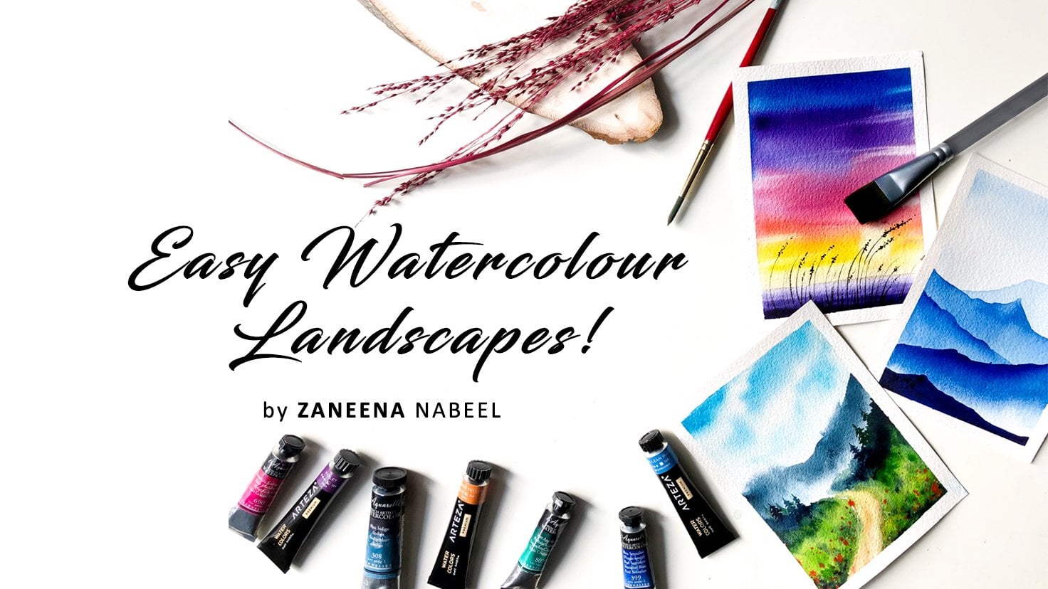
1. Welcome to 30 Day Watercolor Challenge: When was the last time you took a little time for yourself? Art can be a
beautiful avenue for self care that you
might not have considered on a daily basis. I find inspiration in the
millions of things and all those inspiring
things motivates me to invest some time in
art practice every day. This routine has
remarkably advanced my skills and brings
me a tranquil sense of peace at the end of the
day. Hello friends. My name is Danina Anabel. I'm an artist, an art
instructor, and an author. My first encounter with watercolor happened when
I was at the age of five, and I vividly remember those circular shaped
watercolor cakes. The joy of that
discovery has been the driving force behind my enduring love
for this Meteum. Watercolor, without any doubt, is a truly remarkable
metium offering pure joy. As you wet the paper and witness the mesmerizing blends
and effects that unfold, join me on a
creative journey for 30 days and discover the joy
of painting with watercolor. In this class,
we'll together try 30 beautiful winter landscapes. Each painting is a
world of its own, giving you plenty
of opportunities to master new color
combinations and techniques from of monochrome to the breathtaking beauty
of northern lights. We'll be exploring a broad range of paintings in this class. This class is more than
just the final outcome. It's about investing
time in yourself, relishing a creative journey, and establishing
a creative habit. Before we start, I will explain about the verticlar
supplies in detail. At the beginning
of every painting, I will talk about the
colors you will need. Then we'll also try some
alternate color options if you don't have the
same color I'm using. Each painting in
this challenge will take you only 20 to 25 minutes, allowing you to easily incorporate them in
your busy routine. If you're ready for a
journey into creativity, join me on this 30 day
verticlar challenge and let's create together.
2. Class Overview: Thanks Emelin for joining me. Welcome to a delightful 30 day journey of
water color painting. Before we get started,
I would like to provide you an idea
about the class and how it is organized so you are well aware of what to
expect in the days ahead. As you all already
know, this class is designed as a
daily challenge. Meaning you will paint a
project with me every day. Each painting will take you
somewhere 20-25 minutes, or maybe a little more, but
not more than 30 minutes. If you can't make it every
day, that's totally fine. You can paint them
on the weekends or whenever you find some time. For me, it is more
about you all enjoying the process and having a
wonderful painting experience. So it's totally fine if
you miss a day or two, pace yourself and
enjoy the process. Now coming to the class, I'll start by explaining
all the materials you will need from the brushes to
the paper to the paint. I'll talk about everything. And straight from there, we
will go with one's painting. I don't want to show
the empty collection, I want to keep that
as a surprise. But I'll show you
some of my favorites. Here's one, I just love
this color palette. It is very bright and pleasant. I love painting
sunny winter days. Now there is another one
with the same color palette. There is one more
which also goes in a similar kind
of color palette. This one here, you can see here, it's the same kind
of color compinion, but then the composition
is entirely different. So one of the major things
you will explore in this class is how to make
your own compositions. Here is one of my
other favorites. I love the sunset and
those beautiful colors. So this one is a bright
and stunning sunset. Now on the other
hand, we'll also try some simple soft sunsets
like this one here. That's not it. We have
more stunning sunsets. Here is another one. This one
is one among my top five. I love those colors.
Just sunsets. We will also try some
stunning northern lights. I love painting northern lights. And we'll try three
or four of them. Here's another one. It's a
different color composition. You can see how unique
and beautiful they are. Now there is another one, which is another
favorite of mine. I love that textured
green background and the stunning snowy ground. We also have some
very simple paintings like this one painting, those mountains are real fun and I'm very excited for that. Now there is another one which is more like a
monochrome painting. We have more beautiful
snowy mountains. Here's another 21 against a
beautiful northern lights. And another one with
a cute red cabin. I will just show you one more. This one is my other favorite. You can do this painting
in less than 20 minutes. I love those gorgeous colors
and the softness of the sky. Now, before we start
with every painting, I will introduce
you to the colors. We will try them out
and I will also tell you alternate options if you don't have the same
color I'm using here. So yeah, that is what
the class is all about. You can expect to
paint this stunning winter landscape every day. As each day unfold, your confidence in your
articular journey will flourish. And I can't really
to join you in the joy of painting
for the next 30 days.
3. Materials you'll need: Before we start with
first days painting, let's have a look at the
materials you will need. I will start with the paper. Here's the one I'm
going to use for this NPR challenge.
It is from Canson. Canson is a very popular brand, and they have a lot of
varieties of paper. This one is from their
heritage series, and it is a co pressed
aticlar paper. You can see the details here. It is 140 LB and it is pressed, and it is also 100% cotton, which is very important
when you're doing aticular projects
because watercolor is mostly about water control and making a background
steve it for a longer time using a good quality artist
grade aticular paper, which is specifically
designed for aticlor is really important. If the paper is not good enough, you might not really enjoy the process and it can
become a little frustrating. Please be sure to go with the
good quality aticlar paper so that you have a
wonderful painting time. Now here's the size
I'm going with. This one is 12 centimeter
by 15 centimeter. I have composed all of my
paintings in this format. You can make it a bit
bigger or a bit smaller. That's totally
fine. Okay, that's all about the aticlar paper. The next thing I'm going to talk about is the water colors. I will be using verticlar tubes. You can use tubes or
pants. It's totally fine. At the beginning
of every painting, I will talk about the colors
you will need in detail. I will show you swatches and I will also talk about
alternate color options. If you don't have the
same color I'm using, I just want to tell
you, don't stress out. If you don't have the
exact same color, just go with any color
that is nearly similar. Okay, now the next thing you will need is a mixing palette. Obviously to mix your colors. This one is a ceramic
mixing palette. You can go with any
palette of your toys. Now, coming to the brushes, I'll be using six
different brushes for this tier challenge. Let's have a look
at each of them. The first one is
a 1 " wash brush. I'll be using this brush to
apply a coat of water onto the background whenever we are trying a wet
on wet technique. The second one is a
size number 12 brush. This one is to
paint bigger areas. It could be a sky
or any background. That's the second brush
you will need now. The next one is a
half inch flat brush. This one is to apply
paint onto the sky, mostly whenever we
need a clean plant. Now we have three more brushes, which are 300 bushes. The first one is
size number eight, then I have size number six
and also size number two. Size number 8.6. Is to add
paint onto the background. Size number two is to add
all those minute details. All right, so those are
the brushes I'll be using. All of these brushes are
from the brand silver brush. Don't worry about the
brand or the size. Go with any brush you have got which is nearly similar in size, it doesn't need to
be exactly the same. The next material you will
need is two chars of water. One has to stay clean and the other one is to resolve
the paint from your brush. Then you will need a
masking tape to fix your paper onto your table
or onto a drawing board. This is the one I'll be using. It's a very normal masking tape. I got it from a
stationary store. You can use a washi
tape or any other tape. Now, for almost
all the paintings, I'll fix my paper onto
my table directly, but only for a few of them. Especially when we're
trying Northern Lights. We our paper on spine board. It can be any board where
you can fix your paper onto. We'll have to lift it and
we'll have to turn it around so that the colors will blend into each other naturally. It can even be a magazine. The idea is you'll have to
lift it and turn it around. Finally, you will
need a pencil eraser. We'll have to add
some light sketches for that. You will
need a pencil. Then you'll also need
a paper towel or a cotton cloth to dab off the excess amount of
water from your brush. Okay, that summarize
all the materials you will need for this
entire challenge. Keep them ready and join
me for the first painting.
4. Day 1 - Snowy Day: Hello dear friends.
Welcome to day one of 30 day
verticlor challenge. Here's the painting that
we're going to try today. It's a very simple,
pretty snowy landscape. First, I will start by
introducing you to the colors. I will start with
the color which I have used to be in the snow, the color I have used for the snow and the sky is different. The color you see
here at the bottom, this one is ultramarine blue and the one I have used for
the sky is cerulean blue. The one I'm going to
use here is from scene, you can go with any
ultramarine blue you have got. That's a first color paints know the best color is
always ultramarine blue. But if you don't have
ultramarine blue, just go with any
other blue hub cart, it could be plu blue, prussian blue, cobalt
blue, or any other blue. Okay, so that's a first color. The second color I have
here is Serulin blue. You can see the use for the
sky that is Serulin blue. It's a beautiful blue. It is absolutely okay to use the same color for
the sky and the snow. You can use ultramarine blue or any other blue which
you're using for the snow. For the sky as well,
that's totally fine. Here's the color
I'm going to use. It's a beautiful blue. I love to use this color for my day skies. Okay, that's a second color. Now coming to the next one, it is a mix of sap,
crine, and vermin. You can see the use for those landscape in
the background. It's a mix of sap,
creen and vermin. That's a color, it's more
like a olive green color. If you have olive
green with you, you can use it directly. You don't need to mix
and create this color. We need a green that
is not too fresh. That's the reason why I'm mixing some vermin with sap green. These are the two
colors I'll be using. Vermin is from Shinhan and sap green is
from white nights. Okay, That's a third color. Now the next color you
will need is paint screen. We'll be using this color to
add the deep pertoones for that cabin as well as to add some deepertones along the
bottom part of the landscape. I'll be using paint screen. Okay. That's our fourth color. Now you will need
which is white. We'll use a mix of vermin and
white to add these trees. Also, you can use white to
fix the shape of the roof. Okay, now I missed a swatch or vermion which is the color
I'll be using for the cabin. It's a mix of vermin and
a bit of paints gray. And that's why it is
looking more like a brown. You can use brown or burn
cena or even crimson. I'll just use a mix of vermin
and a bit of paints gray. Okay, that will give
you a nice brown. We just need some
brownish or reddish tone. It can be brown or burna
crimson or any kind of red. Okay. Color you see here is a mix of vermaline and
a bit of paints gray. All right, so that summarize all the colors you will
need for this painting. Here is a closed look. We have ultramarine blue, cerulean blue, olive green
paints gray and vermin. Now, just in case we have
olive green with you, you can use it directly. This one is from Vancok. This one is very similar to
the color we created here. So if we have a similar
color with you, there is no need to mix
and create that again. Okay, so we had a
look at the colors. Now it's time to
begin this journey. All right, so I have
my paper ready here. Now, I'm going to start
by adding the sketch. The first thing you have
to add is a straight line. I'm adding that a bit below
the center of the paper, so the top part is the sky and the bottom is going to
be the snowy ground. Next, we need to
add a tiny cabin. It's a very simple shape. I'm not going to go
with a lot of details. It's more like a tiny up. All right. So that's it.
That's how we catch. Now as you're painting, we'll add some landscape
in the background. For now, this is all we need. Now before you start,
make sure you have all the colors ready
on your palette. The first color you will
need is ultramarine blue. Keep it ready on your palette. Once it is ready, you can apply coat of water onto the ground. Okay? Just a shiny
coat of water. Don't add a lot
that is evenly wet. Now to apply the paint, I'm using a smaller brush. This one size number six n rush. You can go with any of
your medium sized to brush and I'm adding some water. I want a medium tone. It should not be too
dark or too light. Okay? Now, if you feel like
your paint is too watery, dab it on a paper
towel before you start because our
background is wet. And if you apply the paint, it will start spreading a lot. To control the way
it is spreading, always make sure to dab your
brush on the paper towel now onto the bottomost corner
adding some paint. Then I'm just randomly
adding some lines, some thick lines,
onto the background. You can see here, I'm
leaving some cap in between, which is really, really important when you're
painting snow. When you're painting snow, you have to retain some
of the paper white. The snow, is that paper white? Right now, I'm
adding the shadows. Okay, now I'm going
to clean my brush. And I'm diving that
on a paper towel now with a clean brush, I'm just merging those patterns to give it a softer
and smoother look. Maybe we can add some more
paint onto this corner. And also a little here. Okay, that's a background. If you want to add some more
lines, you could do that. But try to retain some
of the paper white, which is actually what
depicts the snow. Okay. That is it. That's a snowy ground. Now, we can leave it for drying. Whenever I'm painting snow, I always use a blow dryer. I don't leave it for drying because I feel when I
leave it for trying, I end up losing
those paper white. By the time it dries, it will
start spreading a bit more. I will end up having
very little paper wide. I mostly use a blue dryer, especially when
I'm painting snow. Okay. Otherwise I don't use it. Anyway, it has dried and
that's how it has turned out. You can see how soft and
smooth it is looking. Now the next task is
to paint the sky. Before you start,
you'll have to make sure you have all
the colors ready, so you will need cerulean blue, then some sap green and vermin. We're going to mix these
two colors together to create a color that is
more like olive green. You will also need some paints gray to add the deeper tones. Which means you
will have to have four colors ready
on your palette, which is cerulean blue, sap, green, vermin. And paints gray. We're going to paint the sky and add the background
elements together. You have to have
your colors ready. Now, I'm going to
start by applying code of water onto the sky. I'm going to leave
out the cabin. I'm not going to add
any water onto that, but if you accidentally add any water, that's totally fine. Anyway, we can fix the roof by going with some white paint. Okay. My background
is evenly wet. Be sure not to add
a lot of water. We don't need any pools. We just need a shiny coat of
water. That's all we need. Okay. Next I'm going to go
with my medium sized Nh. This one is size number
eight. Make sure it's clean. Okay. Now I'm going with a
medium tone of cerulian plume. You can see the color.
It's not too light. I want a very bright
and beautiful sky. Now when I'm applying the paint, I will use a medium
tone on the top. As I'm coming down,
I will just add some lines leaving
some gap in between. Okay, so that's a color I'm using with any blue
of your choice. And start with a
similar tonal value. Okay, so that's a top part. Now I'm picking some water
with a slightly lighter tone. I'm just adding some lines onto that wet background so you can see the way
how I'm adding it. Just the same way how I
painted the snowy ground. I'm leaving some paper
white in between. Looks like there's a lot
of water on my brush. I'm dabbing that
on a paper towel. The slightly dry brush, I'm just munching it. I don't want them
to spread a lot. I will end up having
no white in between. Okay. So that's how
it has turned out. If you want to add a few more
lines, you could do that. I think maybe I can
pick some more paint and add one or two lines which
are a bit more prominent. The ones I added earlier
are not really prominent. Okay, Anyway, that's a sky. Now let's clean the brush and quickly start hiding
the landscape. Otherwise, it will dry up
and it won't look blurry. Okay, go the mix of sap, green, and a bit of vermalion. The color can be different.
That is totally fine. Now go the paint which
is not too watery. You can see the
weight is spreading. That's the color I'm using now, just add some random shapes. Here go the similar
size or even smaller. Don't make it too big because
they will start spreading and it will end up becoming much more picker
than what you need. Okay, go the mix of sap, cream, and vermin, and just keep on adding some shapes here
towards the cabin. I'm making them shorter
towards the left. I'm making it a bit more higher. Okay. Now let me
finish up that shape. It is nothing complicated. It is a very simple step, but there are two things
you have to keep in mind. The first thing is
you have to add them while your
background is still wet. The next thing is you
should go with the paint, which is not too watery. Also, try to use different
shades of green. You can see at some places
it is looking more brownish. At some places it
is more greenish. This will add a lot of realistic character
to your painting. One more thing. At some places
you can make it higher. All those things will add more realistic character
to your painting. Okay, that's a left side. Now, in a similar
way, I'm going to add paint on the
right side as well, but it looks like it has dry. I'm just going to
pick some water. Obviously on another brush, and I'm just adding a shiny
layer only at the bottom. Okay. That's enough. Now, we can start applying the paint. If your background is still wet, you don't need to do this. Mine has dried up, so I just applied a coat of water
only at that bottom line. Okay. When you're painting
the sky and the landscape, you have to be real quick. Otherwise it will end up drying. If it dries up, you won't
be able to get that blurry look for your landscape,
especially on the top. That is really important. Okay, now I'm just going to randomly add some
more taco tone onto the background
before it completely dries up with that same Calmix. I'm randomly
dropping in a bit of darker tone onto the background. See that? My idea is to create some texture
in the background. Next we can go the
slightly darker tone and add them along the bottom. We can see they're
very random shapes. I'm not putting a lot of effort here so just keep adding them. You can define the shape Asp. I mean that line if it's not per we can add that again
using that taco tone. Now just drop in your taco
tone along the bottom. Similarly on the
other side, Asp. Don't add a lot of darker tones. We need them only
along the bottom. Towards the top, we need
those medium tones. Okay. Only at the bottom. Introduce some tact. Then
you can smartch it into the background if you feel
it is too much. Okay? Or you can just drag your
brush towards a top like this to give it a softer look.
Okay. So that's it. That's a sky and the landscape. Now, we'll have to
leave this for drying. I'm really happy with
this painting except for one thing which is
this bleed here also. I have some in a way
I cannot fix it, so I'm just going to ignore it and I'm going to
leave it for drying. All right. So the background has tried and this is how it
is looking right now. You can take a closer look and see those landscape
we have added. I'm loving those. Check shoes and different sheets of green. Anyway, the next task
is to paint the cabin. For that, I'm squeezing
out some vermalion. We're going to paint
the side first. Instead of vermalion, you
can use brown or burn sina. I didn't want to introduce
a new color to the palette, so I'm just going to go with vermion to turn that
into a brown color. I will add some
paint screen to it. Okay, that's how I'm
going to create brown. You want a brownish color? We're not using vermion acids. Okay, Now I'm going to apply that color
onto this section. Cure. Go with any of
your smaller brush with the pointed tip and add that paint onto that
entire section. Now towards the bottom, go for an irregular line. Don't add a straight line. This will make it look like
there is some snow there. Add an irregular line
and then fill it up. Okay, That's a first section. You can see that irregular
line at the bottom. It's a simple detail, but it will make it look like
there is some snow there. Now, with the same H, I'm
picking some paints, gray. I'm adding some shadow
along this roof line. Okay. That's it. We are done with this section. I'm not going to wait
for this to dry. I'm going to paint the other section with a similar color. It's a mix of paint screen and vermillion. It's a daco tone. I'm going to fill up
the other section. If you want to wait for that
to dry, that's totally fine. You can come back
and add that later, but I don't think it
is really necessary. It is too far and you don't really need
to show those lines. Just go over that right away and add a Daco tune onto
the other section. Okay, that's a cabin. I'm really loving the colors
and the way it is looking. Now we have one more task for which I'm going to take
out some white paint. We need to define the roof and also we need to add
some final details. You just need white to waticlor. It doesn't need to be guage. Squeeze out some white
aticlor onto your palette. Now let's apply
that onto the roof. I'm not adding much water. I need a paint that is opaque. Carefully follow the outline and fill that roof
in white color. There's already some
paper white there, but I feel that outline
is not very clear. I'm just adding some more paint to define the shape better. Okay. That's a roof. If yours is fine, you don't need to add extra white paint. You can just leave the
paper white there. Okay. Now, I'm going to add a roof line
on the other side, just a thin white line. Okay? That's a snowy roof. Now, with the same paint, I'm going to add some trees, but I think for that I
will need a smaller brush. The trees we're going
to add are really far. It's good to go with
the smaller brush. Now I'm mixing some vermalion
and white with that, I'm just adding some
thin lines here, some thin, irregular
lines to make it look like those are
the tree trunks. Okay? Go with any of your
smaller brush or a pointed tip. These lines has to be
really thin and delicate. Okay. Now let's keep
on adding them. You can see how fine
and delicate they are. This brush is size number two. It has got a really
nice pointed tip and it works perfect
for these details. I'm just randomly adding them. I'm not putting a lot of effort. Just add a few onto either side with the tip of your
brush and fill it up. Okay, So the color I'm
using here as a mix of vermin and white. The vermin is looking
more like brown because I have added some
pants crean into it earlier. You can just go
with vermin acetus, or you can add white
with brown or burn sina. Either way we just need
a lighter tone here. The brown or vermin is
not really prominent. The major color is still white. Okay, I will add a few more with that will be
done with this exercise. All right. So I have
added the trees. If you want to add more,
you could do that. Maybe you can add a few more. Okay, now I'm going to clean my brush and I'm going
back with pain scra. We haven't added the door
opening with pain scra. I'm going to introduce
the door on this side. It's a tiny rectangle. Okay, that's a door. Now I'm going to add a white
outline for that. I'm leaving my brush, I can, I'm switching to white now
with the tip of my brush. I'm adding a tiny, delicate line on the top and
also on the left side. Okay, that's a cabin. Now there's one final task
which is completely optional. For that, I'm picking
some ultramarine blue, a really light tone. I'm adding some blue onto the
roof to show the shadows. This one is completely optional. You can either leave it as white or you can add some
shadow onto the roof. All right, so with that, we're done with our
painting for the day. Now it's time to peel
off the masking tape. Always peel off your
masking tape at an ankle. And before you do that, make sure your painting
has tried completely. So here's our first
snowy landscape. I really love the way
it has turned out. It's a very simple, yet
a beautiful painting. If you're able to try it, do you to try and let me
know if you liked it.
5. Day 2 - Walk in the Woods: Hello, dear friends.
Welcome back and welcome to date two. Today's painting is one of my most favorite from
the Tia collection. It's a very refreshing and
a beautiful color palette, and I think the details have
come out really nice way. Let's start by looking
at the colors. It's a very simple and
Abc color palette. I think you can guess it by looking at the painting itself. The very first color
you will need, ultramarine blue, which is the color I'll be
using for the snowy ground. This one is from Sineliar. Go with any ultramarine
blue you have got or Cabal blue or
any similar blue. We'll be using a lighter tone to add the snowy texture
on the ground. Okay. The next color you
will need is sap crane. You can see those trees and
foliage in the background. Sap green is one
of the major color you will need for this painting, that spree, it is from Shinhan. Now, along with sap green, you will also need some Vermlin. We will mix Vermelin
and Sap green together to create a
different shade of green. When you mix these
two colors together, you will end up getting
a beautiful green, more like a earthy green. If we have olive green with you, you can use that directly. Or you can mix some
sap green with vermlin and create
a similar color. We're trying to introduce
different shades of green in the background to
make it look more natural. Okay, so that's a third color. The next burn is pinscreen. We'll be using paint screen
to add some pertoons. I won't be using it assets. I'll mix that with green for the background, for the trees. I will mix that with brown. Okay, if you don't
have paint, scray, coor neutral tent or any similar color,
that's the fourth color. Now the next two colors you
will need vermin and brown. We already use vermin
along with green, but we'll also need that
color as it is for the trees. On one side of the tree, we
are going to use some orange. It can be vermin
or any orange you have caught on this side. Then along with that,
we will also use brown. I'll be using permanent brown. You can use permanent
brown or bernina, any brown you have
caught Along with that, we will also use some paint scray to add the deeper tones. So here's the color
I'm going to use. It's permanent brown
from art philosophy, it's a beautiful reddish brown. But even burn scena will work. Okay? So go with any
of those two colors, brown or burn sena. Alright, so that summarize all the colors you will
need for today's painting. Now let's give it a try. Okay, so my paper is ready. I have fixed it
down onto my table. Now I'm going to start by adding the sketch first I'm going to add a line sloping
towards the right side. Okay, so on the left
it is a bit higher, and towards the right
it is sloping down. You can go with
any kind of slope, It can be much more
higher or lower. Next, I'm going to add a few
trees onto the background. You can add them
wherever you want to. I will add the first
one on the left side. I'm adding that over here. I'm not showing the entire tree. I will only show the half of it. Okay. So that's the first tree. Now, I'm going to add the
second one right next to that. It's going to be a
huge thick tree. That's the thickness
I'm going with. Okay. That's my second tree. Now, I'm going to add one more. You can place it
wherever you like. Maybe you can add
that trek next to this or towards the right side. I'm going to add that over here. It's going to be a thinner tree as thick as the previous one. I'm placing that on the edge. Okay, That's the
thickness I'm going with. Okay, that's a sketch. If you want to go with two
trees, that's totally fine. You can skip the third one. Or if you want to add one
more, when that is fine. Okay, the sketch is ready. Now I'm going to start
applying the paint. The very first color you will
need is ultramarine blue. We'll use a medium tone of ultramarine blue to
paint the snowy ground. Keep that color ready on your
palette before you start. Once it is ready, you can start
applying a coat of water. On to the entire ground. All right. So I've applied
an even layer of water. Now to apply the paint, I'm using my size
number six arm brush. Go with any of your
medium sized arm brush. I'm starting with
a medium tone now. I will apply this. On
the bottomost corner, I'm in the right corner. And from there I will drag
my brush towards a tree. See that on this corner
I want a medium blue. Then on the rest of the area, I'm just going to add
some random lines. Okay, right next to the tree. I'm not going to
add a lot of paint. I want to read in most
of the paper white. You can just add few thoughts
or some small shapes. Okay, so that's the bottom part. Now I'm picking some more paint and I will make the corner
a bit more brighter. Because when the paint dries, it will look even more lighter. So it's a good idea to
go with a brighter tone. Okay, I have applied paint on the corner and I have applied some lines and some shapes
onto the background. Now, I will add a little over here and also a few lines
close to the other tree, they are not too prominent. Okay. Next I'm going
to dap my pressure on a paper towel and
with a dry brush, it leamudging those lines
to get a softer look. Don't put a lot of pressure. Be very gentle when
you're doing this step. Okay, That's it. I'm pretty happy with the way
it has turned out. Now let's leave it for trying. When it dries, it will
look really soft and smooth just in
case if you're not entirely happy with the
result. It's not a problem. When it dries, it will look
a lot more better, Okay? So that's how it has turned out. You can see how soft and beautiful the
colors are looking. Now, before we go
to the next step, I'm going to go back with ultramarine blue, a
really light tone. With that, I'm going to
add a few more lines. You can see the tonal value, it is really light. First I will add a line there. Then I will add a few lines next to the tree
in the background. I had added some lines
but they're not visible. You can see the tonal
value, It's really light. If you're adding them, go
with a similar tonal value. Okay, that part is done. Next we're going to
paint the greenery. And I will start
by Eplencota water onto the in between areas. The first color you
will need is blue. It can be any blue. The one I have here
is cerlan blue. I will apply that onto
the entire background. Then I will go with the grains. Before you start, you should
have all the colors ready. You will need any blue, then sap, cream, vermalin,
and some paints. Great to add the deeper tones. Once you have all the
colors ready, start by, apply cot of water
onto the background. Apply an even coat of
water. Don't add a lot. Okay, The background
is evenly wet. Now let's apply a coat of blue onto the entire background. The one I'm using
here is Lian blue. Go with a lighter tune, you can use any blue
of your choice. It can even be that ulta marine blue that
you used earlier. But go with a lighter,
don't make it too dark using any of
your bigger brush. Apply that onto the
entire background. It doesn't need to an
event simply apply that, don't worry a lot about it. You don't need to put
a lot of effort here. Simply fill that up
onto this wet layer. We will introduce all the greens while we're applying the paint. We will leave some
spaces in between. Those spaces will
look like the sky. Okay, that's a plan. Now I'm going to keep
this pressure side. I'm switching to my
size number eight rush. I will start with
the color that's a mix of green and Vermalin. The color we tried earlier, I'm dropping that onto
the wet background. It's a medium tone. I will just randomly add that
onto the background. Gradually I will introduce
more taker tones. Now let's start with
the medium tone. I'm applying that along
the bottom first. Okay? First you can apply
that along the bottom line. Then you can take
that towards the top. Okay. Now, just in case you
have olive green with you, you can use it directly.
You don't need to mix. Create that again.
Okay. Simply drop that color onto the
wet background. I will first fill this section, then I will add them
towards the top. Okay, Now with the same H, I'm going to pick some
more paint again. Mix of sap, crane, and
vermion that's darker than the color I used earlier and I'm adding that
onto the background. Go with different tonal values
and different shades of green and simply introduce
that onto your wet background. Don't add any paint
onto the tree. Try to leave the acts. See that you're trying to
create a texture here. It doesn't need to be perfect. Go with a lighter tone and
a darker tone hand in hand, and add them all onto the wet
background towards the top. When you're applying the paint, leave some spaces in between. Don't fill in the
entire blue part. Just some smaller
spaces are fine. You can see here I have left some random shapes in between. I'm going to retain them and I will add more green
onto the remaining area. Okay, now I'm going to pick
a little more darker tone. Right now, I have medium
and lighter tones, so I'm going to go
with a darker tone. I'm adding that towards the bottom and also on the
top in a very random way. Honestly, there
is no order here. You can add your paint
however you want. We just need different
tonal values of green in the background
at some places, it can be darker at some places. Retain your lighter tones. You just have to drop that
paint onto the wet background. It will create a natural
texture by its own. I have taken out
some more paint now. I will add that onto
the background. It's a much more darker tone. There is a tiny shape here. I'm going to retain that. I will add the paint around that. Also on the top, I
have some space here as well. See that? Just keep on adding your paint while retaining
those blue spaces. As I mentioned earlier, at
some places it can be darker, at some places it
can be lighter. All these will create a beautiful texture
in the background. Okay, so that's how
it has turned out. Now I'm going to pick
some paint screen. I will mix that with
green with that sheet. Aspli'm going to add some
texture in the background. This color is much more darker than the color
we used earlier. I'm again dropping them on the wet background in
a very random way. See that? Let's add a
few towards the bottom. Aspl, I think it is
going really well. I'm loving the textures
we have got here. Maybe we can add
a few on the top. Okay, that's how
it has turned out. If you want to add more texture, add that in before
your background dries. And if you're happy
with the results, you don't need to
add any more paint, you can just leave
the way it is. Okay. I will add a few
more on this side, then I will call it done. You can see the
greens we have in the background and that is
the beauty of this painting. Try your best to use
different tonal values and also varying
shades of green. That's the reason why I
mix some vermalin with sap green so that I have a different shade of
green in the background. Now I'm going to go with a
little more darker tone. I will add in some more paint, mostly at the bottom.
It is still wet. I'm just making use of the time and I'm adding in
some more taco tone. Take a step back from your seat and have a look
at your painting. Analyze your painting
and understand which color is lacking
in your background. If you feel like you need to introduce some more taco tones, go ahead and add them in. Before your background dries. It is at a good shape. You don't need to
introduce any more paint, just leave it for trying. Just because I'm
adding more taco tone doesn't mean you
need to do the same. If you're happy with your
painting, just color it down. That's how it has turned out. I'm very happy with the result. You can see these spaces in
between. That's the sky. I wish I could have
left some more spaces. Anyway, that's done, so
there's no going back. So yeah, let's leave
it for trying. All right, so that
is right completely. And I love the way
it has turned out. The colors are still looking
very nice and vibrant. Anyway, the next task
is to paint the trees. For that, you will
need three colors. The first color is vermin. We will add that on
the lighter side. Then we will use
permanent brown, also some pinscrey to
add the deepertunes. Keep the colors ready on your
palette before you start. As I mentioned, we
need three colors. It could be brown or burn cena. Both the colors will work. Then for the deeper tones, you will either need
pinscrey on your teltant or even black if you don't have
any of the other two colors. Now I'm starting with Vermlin'm, picking a medium tune. I'm going to add that on the right side of
the first Sree. Okay? Pick some
Vermeline on your brush. And add that tone
to any of the side. It can be left or right. We don't have any sun or any other light source
in the painting. You can choose any
side you prefer. Okay. Add that vermin. Next, I'm going to
pick some brown. It's not a lighter tone, it's a taco tone. I'm adding that next to vermin. Okay, You can see I'm not adding much paint towards
the bottom over there. We need to add a detail. Now, I'm going with a taco tone. I have taken some paints, gray. I'm adding that
towards the bottom. Okay. So it's a
darker tone of brown. I already have some
brown on my brush, and with the same brush,
I pick some paints gray. Now using that color, I'm going to add an irregular
line at the bottom. See that? It's a very
basic irregular line. Now I'm going to
fill the top part. It's a very simple step, but it will have a lot of
impact on your painting. Just add any irregular
line at the bottom, then fill up the top part. Let me quickly fill
this up and you will see thematic at the bottom, I have used a darker tone. And what's a right? I
have used a medium tone. You can see that irregular
line at the bottom. The shape can be different. You don't need to
follow the same shape. Now towards the end, I'm adding a small detail. All right, so that's
how it has turned out. It really looks like some snow has covered the bottom
part of the tree. It's a very simple detail. Give it a try. Just add an irregular line
and fill up the top. Now in a similar manner, we are going to paint
the other tree as well. First, I will start
with a vermllion. I will add that
on the left side. Then I will gradually make
it tackle towards the right. Okay, pick some
vermalion on your brush. Go with a medium tone and add
that along the left side. Maybe the color can be
a bit more brighter. Yes, this looks perfect. Add that along the left side. I'm not adding much paint
towards the bottom. We'll have to add
that snowy detail. Be careful when you're applying
paint towards the bottom. Next I'm picking some brown. It can be brown or burn sina. Apply your paint next to Vermalion and blend
them together. The colors I'm using here is dark, they are not too light. I want them to stand out. Go the similar tonal value, you can see that beautiful
orange we have on the left side and towards the right will
make it more darker. Okay, that is vermaline
and permanent brown. Now towards the right side, I will introduce a Dakotne. It's going to be a mix of
pain, scray and brown. Okay, first I will fill this up. Then I will introduce
the Daco tone. The colors are looking
really beautiful already. With the Akot, it will be
more three dimensional. I'm picking some paint, scray over the same brush and
I'm mixing that with brown. I'm adding that towards the right side as you're
applying the paint, Fix the shape, Asphal. Okay. Now some place, much that into the background. It doesn't need to
be a clean blend. We'll add some lines and
some texture on the tree. Okay, now let's start applying
paint towards the bottom. I'm starting by adding an irregular line
using the taker tone. This time the shape
is a bit different. You can add that
however you want. That's the shape I'm going with. Now. I'm going to
fill up the top. Okay, maybe in between Asphal you can leave
out some shapes, just some irregular shapes. It can be of any
shape and any size. See that these shapes will look like the snow that
has been stuck on the tree. You can leave out one or
two spaces like this, or we can add them later
using some white paint. If you can leave out
some spaces like this, they can be super random. They can be of any
size and any shape. Okay, now I'm going to fill
up the remaining area. I will slightly modify the
shape here at the end. Once we're done
painting the tree, I will come back with
some white articular. I'll be adding some texture on the tree to introduce more snow. So if you could not
leave any spaces like this, that's totally fine. There is nothing to worry about. We can surely add them later. Okay, now I'm quickly
filling up this part. So this one is our major
tree. We have two more. The one on the left
is hardly visible. And the other one
we have placed a little far and also it is tiny. So this one is our major tree, which means we'll have to add a lot more details onto this, and that's our next task. And for that I'm using
a taco tone of brown. I'm simply going to add
some lines onto the tree, see that they don't
need to be too thick, you can simply add them in. They can be of any length. The background is
still slightly wet. This is the best
time. This way they won't be too prominent while your background
is still wet. Adding a few lines using
a taco tone of brown. You don't need a lot. Just
add a few here and there. They can be of any length
and any thickness. No, I'm adding a few on
the other one as well. Now, in a similar
way, I'm going to add few more lines
using a taco tone. Okay, I'm picking
some more paints, gray with the same brush. And I will add them
on the right side. Go with a taco tone and
adding some more lines, only on the right side. See that I'm keeping
those medium tone A acts. I'm not adding any
lines towards the left, I'm just adding a few
on the right side. Okay, that's it. That's a
tree. This one is done. Now we have one more tree left. I'll paint that also
in a similar way. The next tree is thinner
compared to the other one. We don't need to add
a lot of details. Okay, I'm starting
worth million. I will add that
on the left side, then towards the right
I will make it darker. Okay. Follow the outline and
add million on the left. Next, with the same,
I'm picking some brown. I will add that in.
Right after this, I will go with paints gray. The technique is
exactly the same. The only difference here
is the size of the tree. The other two trees were
quite thick and bulky. This one is thin, so
you don't need to put a lot of effort or you don't need to add a lot of details. Simply add a few lines
onto the surface and also add an irregular line at the bottom and fill it up. Okay? All right, so this one is done, but it looks a bit weird. On the top, it looks
like a piece is missing. We'll have to extend
the tree towards a top. And that's what I'm
going to do next. If you don't have any space
in the middle like this, you can just leave it as it is. For me, there is some
sky and it clearly looks like there is a piece missing. I have to add that in. Okay, maybe I will start
by adding a sketch. I will extend that
towards the top. I'm following the same
thickness I used earlier. Now I'm going to add that in. I'm starting with vermillion, then I will go with brown
and then paint screen. It's going to be
the same technique. I'm just extending
the tree towards the top and a similar thickness. Honestly, I didn't
realize this earlier, but when I look at
the painting now, it looks like there
is something missing. I will have to add this piece, but I'm really sad that I had to compromise on the sky I
had in the background, I only had a little
Now that is also gone. Anyway, this needs to be done, otherwise the painting
will look quite weird. Okay. So that's a shape. Now I'm going to
pick a taco too, and I will add that
on the right side, I'm picking some paints, Cray, and I'm going to add
that on the right. Okay. Now, with the same dish, I'm going to add some
lines onto the tree. And with that will be done. All right. So that's
how it has turned out. Even though it was an error. I think it turned
out pretty well. Now we have two more tasks left. One is adding some branches, and the final one is to add some more snow
onto the trees. Okay, so let's start
with the branches. And for that as well, I'm
using a taco tone of brown. It's a mix of paints,
gray and brown. Go with any of
your smaller brush or a bridge with
the pointed tip. Use a Taco tune. I don't have enough of
brown on my palette. I'm just mixing some
vermilyin with paint screen. Now I'm going to add a few
branches here and there. You can add as many as you want. The brush I'm using here
is size number six. It has got a really
nice pointed tip. I'm starting with
this tree here. Go with a similar thickness, don't make it too thick. It's better to go with a
smaller brush or a bridge. With the pointed tip, you can add as many
branches as you want. But don't make it too crowded. And add them in
different direction, This will make your painting
look more realistic. Some of them can
be hanging town, some of them can be
towards the top. Add them in varying direction. I'm not adding a lot of
branches onto this tree. I will add two more,
maybe one more on the top and another
one towards the left. On the other one,
I'm not adding any, but if you want to add
more, that's totally fine. Add them as you like. You can add it wherever you want to. Maybe can be from the top or
towards the left or right. Those things are totally fine. Okay, go ahead and add
as many as you want. Okay, so that task is done. Now we have one final task. And for that you will need
some white water color. So clean your brush properly and take out some white paint. We're going to add some
more snow onto these trays. Just white water color
is all you need. It doesn't need to be quash. But if you want to go with Kash, that is totally fine too. Take out some dry white paint on your brush and add
some random shapes. They don't need to have any
particular shape or size. You can add them
however you like. They can be bigger or smaller. Try to go with an opaque paint, That's something you have
to be careful about. Don't add a lot of water. Now, I'm going to add some
snow along the shape of the tree as well. See that? Pick some paint. It can
start by adding a line, then you can turn that into an irregular shape
towards the inner side. Okay, It's a dry paint. I haven't added any water. Now, with the same,
I'm going to add a few more patterns
onto the tree. Now, let's go with the next one. It's a very simple step. Go with some white paint and add some shapes onto the
tree wherever you like. See that you don't need to add a lot and
make it too busy. Just add a few here and there. Now I'm going to add another
tiny shape over here. That's it. Maybe we can
add a few towards the top. This tip is something
that makes your painting look complete. Don't skip it. Go with some dry white paint, it can be watercolor or add in a few random
patterns here and there. Don't add a lot, we only need a letter mostly
towards the bottom. See that? That's it. We can add a few over here. Okay, so that's a final result. I think it turned out
really beautiful. Now, before we peel
off the masking tape, there is one thing that we could do which is adding some
shadow for the snow. Clean your brush and go. The really light tone of ultramarine blue.
It's super light. And just add a few lines next to the tree where
I have the snow. That's it. This step
is totally optional. But if you're adding them go
the real light tone anyways. But that we're done with
our painting for D two. I'm absolutely in love
with this painting. It is surely one of my absolute favorite from
the tier collection. I hope you all had a fun time painting this winter landscape. If you haven't tried it
yet, do give it a try. It's a wonderful painting and I'm very sure you will
love the process. So here's a closer look. You can see the beautiful
green textures and the snow. I just love that contrast. So give it a try if I get to try it and let me
know if you liked it.
6. Day 3 - Snowy Mountains: Hello, dear friends,
welcome to day three. Today we're going to
paint a beautiful snowy mountain and a blue lake. It's a very simple, yet
a beautiful painting. I'll start by explaining
the colors you will need. You actually only
need three colors. There isn't a lot of
colors for this painting. It's a very limited
color palette. The first color you will
need is obviously indico, which is the color I'll
be using for the sky and the snowy ground,
for the mountains. I will use paints gray. Those are the two
major colors you will need instead of indico. If you want to try
ultramarine blue or any other blue,
that's totally fine. I will swatch out in Tico. This one is from art philosophy. We'll use a lighter tone for the sky and a medium
tone for the ground. Okay, that's my Tico. Now the second color you
will need is pain screen. The one I'm using here is from Rembrandt for the mountain
in the background, we will use a lighter tone. For the one on the fok ground, we will use a darker tone. That's a second color you can see for this
mountains, a lighter tune. Then we have some darker tone here and also some textures. So that's our second color. Now there's one more color
which is turquoise blue. We'll use turquoise
blue to paint the lake. And we'll also use some
Intico to add the platoons. All right, so that summarize the colors you will
need for this painting. If you want to go
for Bal Green or any other color for the
lake, that's totally fine. Here's a closer look. We have Intico paint
screen and turquoise blue. So keep all the colors ready
and let's give it a try. Let's start by
adding the sketch. The major element of this
painting is some mountains. We have a background mountain
and aground mountain. First I will add
the horizon line which is almost at the
center of my paper. Now I'm going to add a mountain, the one of the fue ground. It's a huge mountain. Okay? Now on the other side, I will add a shorter mountain. Now toward the
center, I'm adding the background
mountain over there. Okay? So those are
the mountains. We have one in the background and two other ones
in the foreground. Next I'm going to add
an irregular line over here to show the ground. Now the space in
between will be a lake. Okay, that's a sketch. Add that in, then keep all the colors ready
on your palette. We will need indico
and paint scray. Those are the two major colors you will need for this painting. The first thing I'm going to paint is the mountain
in the background. For the ulta in the background, we're going to go with the
lighter tone of paint scray. For the one in the ground, we will use more taco tones. Okay, I have paints gray
already on my palette. Now I'm going to go
with the lighter tone, go the really light
tone of paints gray. And start applying a paint from the bottom and go
towards the top. As you're reaching the
tip of the mountain, leave some gaps in between. See that there can be some irregular shapes or some lines where you're
applying the paint. Leave some gaps in between
which will look like the snow. Okay, now onto this, I'm going to introduce
some more taco tone, mostly at the bottom. The same brush, I'm picking some more paint and I'm adding that at the bottom
onto that wet background. This is mainly to
create some texture. Okay, so only at the
bottom introduce some taco tone and smudge it
a little if it's too much. I still have those lighter tones as well as the white spaces. I'm not covering them up,
They are still there. Okay, that's a background. Maybe we can add
some more paint, a taco tone towards the bottom. The rest is looking quite nice. Yeah, we have a lighter tone on the top and a medium
tone towards the bottom. In between, we have left some space which is
the paper white. Okay. That's a background
mountain. Now, let that dry. In the meantime, we can
start with a snowy ground. To paint the ground, I'm going to go with a medium
tone off in Tico. First, you will have to start
by applying coat of water. Go with any of your
clean brush and apply a coat of water
to the entire ground. The brush I'm using here
is size number eight. You can go with any brush. It can be a flat brush
or an arm brush. Apply an even coat of water. Okay, now I'm going to
go with my other brush, this one size number six. Now I'm picking a
medium tone of indico. I'm going to add some paint onto that bed background
in a very random way. I usually add some medium
tones at the bottom. Then I will gradually make
it lighter towards the top. That's a normal
rule that I follow. And here it's the same. I started with a medium tone and I have applied
that at the bottom. Now I'm picking
some lighter tone and I'm adding that
to the background in a very random way. Okay. That's a
background painting. A snowy ground is
a very easy thing. You just have to leave some caps in between which is
your paper white, and it will end up
looking really beautiful. All right. Now let's leave
it for drying. All right. Next task is to paint the sky. And for that asphalt, I'm going to use Indico. I'm not applying
a coat of water. I will go with my
bridge directly. It's a simple gradient
wash. Start with the medium tone and make it slightly lighter
towards a mountain. Don't make it too light go the similar tonal value,
especially on the top. Then you can make it slightly
lighter towards a mountain. You can apply some paint
onto the bigger ones, that's totally fine, but don't add any paint onto the
background mountain. You have to carefully follow the outline and
fill up your paint. That's the main
reason why I didn't apply any water to
the background. Also, it's a very
simple gradient wash. There is no clouds or any
other complicated details. We can simply apply the
paint onto the dry paper. There is no real need
to apply any water. Okay, so that's how the
sky has turned out. It's a simple gradient wash. I have used a medium
turn on the top, then have made it slightly
lighter towards a mountain. All right, Now we'll have
to wait for that to try, and after that we can paint
the full ground mountains. That is a major element
in this painting. Okay, so let's
take a short break and come back when this
has tried completely, okay, my dear friend. So
the background has tried completely and the colors are looking really smooth and soft. Now let's start with the
Folk round mountain. For that as well, I'm
going to use paints gray. For the background mountain,
we use lighter tones. Now for this, we will use a
darker tone of paint, Scra. Okay, go with any of your
medium sized round brush. It can be six, or seven, or eight, or any similar number. That is something I want to
show you before we start applying the paint
towards the bottom, we will have to leave some
cap, it's a paper white. As you're approaching
the bottom, you will have to leave
an irregular shape. It doesn't need to be in a very specific shape or anything, we just have to leave some
paper white along the bottom. Make it look like
there is some snow accumulated over here. Okay, When you're applying
the paint, keep that in mind. I'm starting with a
medium tone and I'm applying that onto the
mountain from the top. Now as I'm going
towards the bottom, I'm picking some water and
I'm making it lighter. Now let's add them along the bottom in an
irregular shape. See that? Simply leave
some gap at the bottom. It doesn't need to look
perfect. That's totally fine. Leave it the way however you can go with a
similar tonal value. Okay, now let's add more
paint towards the left side. I'm picking more water
and I'm fixing this area. Okay, that looks fine. Now let's add more per
tune with the same dish. I'm going to pick a
much more taco tune and I will apply
that onto the top. We will introduce more
textures and details later. Don't worry a lot about
perfection right now, It will turn out
really beautiful. Okay, I will add some
more paint on the top, then I will start
with the Taco tune. The major element here is that paper white
along the bottom. That is really important
to create a character. Okay, that's the only thing
you have to keep in mind. The rest can be total mess. Or we'll add more texture and deeper tones and we can
make it look better. That's a base layer. Now I'm going to keep this
pressure aside. I will co with my size
number six round press, I will pick a really
taco tone of pin screen. Now I'm going to drop
that into the background. From the top towards the bottom. Okay, the background
is still wet. You can gently apply that into the background in
a sloping manner. This will create an impression
that the motin is sloping down only along the top. Introduce those taco tones. It seems like my background
is not really wet, it is starting to dry
with the same rish. I'm going to pick some water. I will gently smudge those rough lines to
give it a better look. If your background is still wet, they will spread nicely. Min isn't minus starting to dry. I have to put some extra
effort in smudging it, but you can see it is not very clean and nice.
That's totally okay. It is actually good to
be this way because it will add some texture
into the background. Okay. Now let's add a bit
more taco tone on the top. And after that I will
this for trying, then we can start with
the other mountain. Just on the top,
I'm just starting some more taco toon
in a sloping manner. On the top we have
a really taco tone. Then it is turning
into a medium tone and then into a lighter tone. Then along the bottom we
have some clean white, which is the paper white. I really like the textures
here it is looking silked. Now, once we add
the final details, it will look complete. Now let's go to the
next mountain here. For this, I'm going to
start with the taco tone, then I will make it lighter
towards the bottom. I'm not going to leave any
wide caps before you start. Please be sure the other
mountain has dried completely. Okay. I've just added some taco tone on the top
in a very random way. Next I'm going to clean my
brush with some clean water. I'm making the rest lighter. Okay. The brush I'm using
here, size number six, Go with a medium size brush and make it lighter
towards the bottom. Okay, that's a base layer. Maybe we could add
some lines onto this. You're sing a taco tone just
to create some texture. With the same brush, I'm
picking a darker tone of paint. Scream. And I will add
some sloping lines, just a few from the top,
towards the bottom. Okay, so that's our
second mountain. Now we'll have to
lay this for drying, the base layer has
dried completely. Next we're going to add some
textures onto this mountain. So we'll just add some dry
patterns onto either mountain. You sing a smaller brush, we need a darkuton
of paint screen. So pick the paint on your brush, then tap it on a
paper towel multiple times just to be sure
the paint is dry. Now you see that tri paint, just keep on adding some
textures onto the mountain. You can add them from the
top towards the bottom. See that it is not a
difficult technique. You just have to call tri paint. Once you have taken the paint, dab it on a paper towel or a cotton cloth just to be sure
there's no water content. Then with that tripaint, keep on adding some textures. Add them from the top towards the bottom in a sloping manner. We need more patterns on the top compared to the
bottom where you have that medium tones and
darker tones added more patterns towards the
bottom only add a few. The major element
of this painting is these folk crown mountains. These models we have
on either side, the task that we are doing
right now, it is very simple. It is just a matter of
adding those patterns. They don't need to be perfect. But then it can be a
little time consuming. Take your time.
There is no rush. Also, if you're not really sure about the dryness of the paint, you can try these patterns
on a scrappiece of paper and then you can try
them on your main painting. This way you'll be a lot more
comfortable in adding them. Okay? Try it on a scrap piece of paper if you're
not really sure. And then add them
onto your mountains. You can see those
beautiful textures. And adding them from the top
to bottom in a sloping way, Just run your brush
in such a direction when you're adding
these patterns. Honestly, if you take a closer
look at those patterns, it might look a little messy, but that's totally fine. That is part of the process. There's one more detail which we will add onto these mountains. And with that, and
also with the lake, it will look a lot
more beautiful. Just ignore that
messy station in between and go ahead with
adding your patterns. This one is all done and I'm
loving those text shows. Let me show you a closer
look. Here it is. You just have to
get a hang of it. Once you know how to
add these patterns, I'm very sure it will be a
technique that you will love. You will use this
technique every time you're painting
a snowy mountain. Okay, Right now the background
color is paints gray. You can also use Tico or ultramarine blue
for your mountains. And then add these patterns
using paints gray. We'll be trying a much more
majestic snowy mountain in the coming days where we
will use the same technique. In a way the second
mountain is almost done. I'm really loving
those patterns. Now there's one
more thing to do. If you want to add
more, you could do that, that's not a problem. Maybe you can add some
more dagger tones on the top or some more
along the bottom. Next, I'm going to
add some patterns onto the mountain
in the background. I have dipped my brush in some water and I'm dabbing
that on a paper towel. Okay. Now with that medium tone, I'm adding some dry textures. So early we used a color
which is really dark. Right now we're repeating
the same step with a medium tone for this mountain, we don't need such
darker patterns win. Some patterns which
are medium tone say that it's exactly
the same technique. The color is different, it's a medium tone and I'm not adding any patterns
onto the top. We want to retain
those paper white, which is the snow
on the mountain. Try to retain most of the paper white and you can add those patterns
towards the bottom. Okay. This one is nearly done. I don't want to make it too busy as it is in the background. I will only add a few. All right. That's a
mountain in the background. You can see the weight
has turned out. We have added some patterns
to introduce texture, but they are not too prominent. And that's exactly
how we need that. We are trying to create the
depth using tonal values. We use lighter tones for the background and darker
tones for the foreground. Next we're going to add
some patterns along the bottom where we
have the paper wide. I'm picking some
more paint screen. Then I'm dabbing my
brush on a paper towel. I'm making sure it is dry. Now, let's add some patterns. I won't be adding a lot. I want to retain most of the
paper wide, which is a snow. Actually only add a few here and there don't make
it too crowded. Also, go with the smaller brush. We don't want those
patterns to be too big. I'm carefully adding some
patterns along the bottom. See that you can still see
most of the paper white. I have only added a
few smaller patterns. Okay, so that task is done. Now there's one
more thing to do. Who put just adding some
trees onto these mountains? When I say trees, they are not going to be detailed trees. It is just going to be some
small lines for that as well. I'm using the same brush. Try to go with the smaller brush or a brush with a pointed tip. Now, just give it a watch. See that the trees are just
some thin, delicate lines. You can add them close to
each other along that slope. See that go the smaller brush or a brush with the pointed tip. Otherwise those lines will
look too thick and prominent. You can add them in
a very random way. At some places it can be a
much more thicker cluster. In some places it can
be just one or two. Now add them along the slope. The size is really
important here. Please make sure to go
the smaller brush or a detailing brush and add
them in a similar way. Also, try to follow that sloop. That is also important will emphasize the
slope of the mountain. You can see the
way how I'm adding it using the tip of my brush. I'm just adding some tiny
lines close to each other. They are not too long. At some places I'm
making it shorter. Add them along the slope and try to go with
different clusters. Some of them can be thicker and some of them can be just a few. Let's add a few onto the top. It's a very simple technique. It will add a beautiful texture and a finished look
to your mountain. These are the trees far away. They don't need to be detailed. You only need to add a
thin, delicate line. You can see the way how the
mountain has transformed. I think it looks much
more complete right now. Earlier it was looking like
there is something lacking, but now it looks a
lot more better. Let's add a few
onto this corner, then we can add a few onto
the other one over here. See that it's a
very simple task. You can add it very quickly. You don't need to think a
lot or put a lot of effort. That's how it has turned out. Now the next major task we
have is to paint the lake. For that, I'm going to
use some Cherquoise blue. If you want, you
can use Cobalgreen Aspho to paint the base layer. I will use my silmush. I will apply a medium tone of chircoise blue onto
the entire area first. Then gradually I will
introduce some taco tone. Okay, let's apply chirqoise
blue onto the entire area. As I mentioned earlier,
you can go with cobalcreen Aspho if you want
to go for a Patel green. Now let's apply the color. See that carefully. Apply that along the horizon, we have some paper white along the bottom.
Don't cover that up. That's a snow. Okay,
so that's a horizon. Now we can fill up
the entire area. So far for this painting, we have only used Tico
and paint screen. Both the colors are not
really pleasant and vibrant. We're going to create that contrast using
this color here. It's good to go with
turquoise blue or cabal green or any similar color to bring in that contrast. Okay, that is turquoise blue. Now, with the same brush,
I'm picking some indico. I will add that
along the bottom. On the top I'm retaining
turquoise blue. But along the bottom I
will introduce some Intc. I'm carefully running my
brush along the snowy ground. Then I'm just merging that
paint into the background. First, apply turquoise blue or cabal green or any other
color of a choice. Then go the darker
blue preferably in Tico and add that
along the bottom. I'm going to add
some more inticu, I think the sera can
be a little more dark. See that? Don't
make it too dark. Go the similar tonal value. Add that along the bottom. If you want to change
the shape of your crown, you could do that while you're
applying the Dako tone. Now simply smug that
into the background. I feel like the turquoise blue can be a little more brighter. I'm cleaning my brush and
I'm switching back to turquoise blue and I'm adding
that into the background. Okay, I think it looks
much better now. Next I'm going to go
with my smaller brush. I will keep this one aside. I will need to add
some more lines onto the background the brush. I'm going with a
size number two. Go with any of
your smaller brush and pick some in
Tico on your brush. Let's add some more lines
onto the background. Add those lines while your
background is still wet. This way they won't
be too prominent. Also, try to go with
a smaller brush so that the lines
will be thinner. We won't be adding any extra
details onto the lake. This is it in case you want
to add some more paint, or if you want to
add some more lines, this is the time, just in
case if you want to make turquoise blue move brighter or if you want to add some
more lines using Indico. This is your time. Go
ahead and add them in. I'm happy with the result, so I'm going to
leave it for trying. Okay, now we have one
final task which is adding some tri patterns onto the
ground for that as well. I'm going to use the same brush and I'm going with paint screen. I've taken some paint and I'm dabbing it on a paper towel. With that dry
paint, I'm going to add some textures
onto the ground. It's actually the same technique we tried for the mountain, but here we don't need
to follow any pattern. You can add them
just randomly onto the ground wherever
you feel like. Try to go with smaller patterns and don't make it too crowded. Using a smaller brush
will really help. You will end up getting smaller patterns with a smaller brush. Okay, now let's quickly add in some more patterns you can see they don't have any
particular shape or size. Just pick some paint
on your brush, then dab it on a paper towel. Once you feel like it is dry, go ahead and add these patterns. At some places they can
be a bit more bigger, maybe you can go
for a darker tone. Let me show you. See
that this would make it look like there are some stones or something on the ground. Only at some places go
the darker tone and add in some prominent patterns
which are not too big. The size is really important. Okay, I'm nearly done, and I'm really loving
the way it is looking, especially the color palette. Here's the final result. I cannot tell you how much
I love this painting. I think that turquoise blue
color made a difference. It made everything
look so pleasant. Otherwise, it was a
dull painting in a way. The final result is really nice. I hope you all
enjoyed the process. Now, there is one
thing you can do. If in case, if you feel like there's no snow on the mountain, you can go with some white paint and add them in with
your smaller brush. It can be a white guache
or white articular. This is only if you feel
there is no enough snow. If you feel that's enough, you can just leave
it. The waits. Okay. Now, let's peel
off the masking tape and here's a gorgeous
window landscape for the day. I just lah. Those mountains and a
lake and the entry, you feel of this painting, give it a try for
here to try it. I'm very sure you're
going to love the process and
the final result. Thank you so much for joining. I will see you soon
for the next painting.
7. Day 4 - Northern Lights: Hello, dear friends.
Welcome to day four. Today we're going to try a fun, easy, and a simple
Northern lights. It's a quick one. You can do this in less than 15 minutes. I have used violet, turquoise,
blue, and cobalcreen. Then for the snowy mountain, I have used two colors in
Tico and paint screen. Okay. Anyway, I'll quickly
splash out the colors for you, then we can start
with the painting. I already spoke
about the colors. If you want to change
the colors or if you want to add one more,
that's totally fine. You can make your Northern
lights more beautiful. I'm starting with the first
color which is violet. This one is from Shinhan. It is permanent violet. You can go with any
violet of your choice, or you can mix and
create your own violet. The next color I have
here is Chirquoise blue. This one is from white lights. If you don't have
Chirquoise Blue, replace that with any
other blue of your choice. It could be Prussian
blue, Cabal blue, ultramarine blue, or any blue. Okay, that's my second color. Now there is one more color, which is my most
fubrate cabal cream. I love this color combination. It will create a
beautiful contrast. That's the beauty
of Northern lights. So whenever you're choosing colors to paint Northern lights, always choose one darker color and lighter color to
create a contrast. Then you can add one
or two extra colors. Now the next color
I have here is Ing for the base layer
of the Snowy Mountain. I'll use a medium tune. Then onto that, when it dries, I will add some texture
using paint screen, that's a last color. Along with these colors,
I'll also be using some white articular to add
some stars onto the sky. It can be white gach
or white articular. Both will work. Okay.
So that summarize all the colors you will need for this gorgeous Northern lights. Now it's time for you to try. Now for this painting. I have fixed my
paper onto a board, not onto my table. It can be any board
or even a magazine. We'll have to take it and
we'll have to turn it around so that the colors will mix into each
other by its own. Okay, fix your paper onto a board or any surface
that you can lift. We won't be blending the
colors with a brush. Once we have put the
colors onto the paper, we will turn it
around and we will let the colors spread into
each other by its own, creating a very natural blend. Okay, fix your paper
onto a board or onto a magazine or anything
that you can turn around. Now, we can start with a sketch. We just need to add a mountain. That's all it can go with, any shape at the center. I'm making it a put
higher towards the left. It is a bit sloping down. Okay, that's a sketch. As we're painting, we can add all the shadows and
all the deeper tones. Now we can start painting. Keep all the colors ready. Before you start, we
will need violet, turquoise, blue, and bal green. Once you have the colors ready, go with a clean brush and start applying coat of water
onto the entire sky. We just need an
even coat of water. Don't add a lot. Run a
brush back and forth multiple times just to be sure
the coat of water is even. Don't add any water onto
the mountain. Let actus. All right. My sky is evenly wet and I have the colors
ready on my palette. Now to apply the colors, I'm going to go
with a round brush. You can go with the round
brush or a flat brush. Any brush will work. This is
the brush I'm going with. First, I'm making
sure it is clean. Now, I'm starting
off with the violet. This one is permanent violet. I'm adding that onto
the top right corner. That's a color, it's intense. This is the darker
color we're using. Go with a similar tonal value and apply that on
the wet background. You can decide on the way how
we want to apply the paint. You don't need to follow the
same shape and all that. Okay, that is violet. Now I'm going to clean my brush. I'm going with the second
color, over turquoise blue. I'm adding that right
next to violet. I'm not really
blending the colors. I'm just applying that wet
paint onto the wet background. Even turquoise blue, you can
add it however you like. It doesn't need to be
in the same shape. I'm going to add a bit more. I'm pushing that paint down. Okay. Now onto the
remaining area, I'm going to go with
my third color, which is Coval Green. I'm going to simply apply that
color onto the background. I'm following the outline
of the mountain and I'm gently adding that
beautiful color onto the sky. You can push and
pull the color into each other and turn
it however you like. See that that's a background. We have applied violet turquoise
blue, and coval green. Now I'm going to
turn around my pod. You can see the way
the paint is floating. This will create a
very natural blend. We're not going to
add any extra paint, we're just going to make use of the paint in the background. Maybe we can fix
the bottom part A t. There isn't
enough paint here. It is not floating. I'm just
adding some more paint. Or you can just push and pull the color you have in
the background already. Okay, The background
looks clean. We have applied all the colors. Now you can turn around
and tilt your paper in all direction so that the paint will float
into each other. If needed, you can
push your paint at some places like this
to create a contrast. It would make your sky
look even more beautiful. Now, again, tilt it. You can tilt it
in any direction, will create a very
beautiful blend. You can already see the way
the colors are looking. We have a darker
tone on the top, a medium tone at the center, and a really bright
tone at the bottom. Okay, I really love
the color combination. It's one of my favorite color
to paint, Northern Lights. You can see that very
smooth and soft blend here. Keep tilting and turning around your paper until you're
happy with the rest. If you're happy with the blend, you can just leave it
actus and let it dry. Okay. That's how
it has turned out. I'm pretty happy with the
blend and the colors, but there is a bit of paint
missing on this corner. I will just add that back in, then we can leave it for trying. It took only less than
five to 6 minutes to paint this entire sky. And you can see the
weight has turned out, it's a beautiful sky. If you're ready to
try it, give it a try and make sure you're
going to love the results. Okay? Now let's
leave it for trying. All right, so the sky
has dried completely. Now, the next task is to
paint the Snowy mountain. For that, you will
need two colors. Paint Screy and Tico. For the base layer, you
will only need in Tico, apply some shadows
to a wet background. When that is dry, we can introduce some tri textures
using paints gray. Okay, I'm starting by applying a coat of water
onto the mountain. For that I'm using a size
number eight round rush. Carefully apply water along that outline and
make it evenly wet. Be careful not to add
any water into the sky. Okay, we have applied
a coat of water onto the tire mountain
now with the same rush, I'm going to pick a
little of Indico, more like a medium tone. I'm going to apply that
onto the right side of the mountain from the tip. I'm going to drag my brush down. Say that if it's too wet, dap it on a paper towel. Otherwise the paint will
start spreading a lot. It won't stay at one place. Go to the paint that is not too watery because our
background is wet. Now apply that pain from top towards the bottom
in a sloping manner. We can add a bit more
towards the left side. I'm not going to add much. I'm going to add more
towards the right. You can add that however you want when you're adding them, try to leave a cap in between. We don't need to fill
that entire area. Okay, so right now the color is a bit more darker than the color
I used earlier. You can go with
different tonal values to make it look more beautiful. Now using a clean brush, I'm just merging it to make
it look a bit more softer. Okay, so I'm pretty happy
with the right side. Now with the same
brush, I'm going to add a few more lines
towards the left. Not a lot, just a few
using a lighter tone. Okay, we can add one or
two lines onto the side. They don't have any
particular size or thickness. I'm just randomly adding
them on the wet background. I feel like adding some
more paint at the center, mostly towards the right.
I'm just adding that in. You can see the way how I'm
adding it, it's super random. Okay, that looks fine. Now, take a look
at your painting. If you want to add some
more lines or if you want to introduce some more
shadows, you could do that. The basic idea here is to
add more medium tones on the right side and retain most of the paper
white on the left. Okay, maybe we can add
a few more lines here. I don't want to overdo it, so I'm going to call it T. Okay, so that's a big layer now. Let's leave it for trying. After that, we can
introduce the tri texts. The base layer has
tried completely. I'm pretty happy
with the result. We have some medium tones on the right and lighter
tones on the left. Now, before we start adding the final details
onto the mountain, I think we can drop
in some stars. And for that I'm going to
use some white aticlar. It can be white aticlar
or white quash. Both will work.
You'll have to go with a thick consistency
without adding a lot of water. No matter whether you're using white quash or white aticlark, I'm just picking some
paint on my brush. I'm using a size
number six brush. Co with a medium size brush. Don't use a bigger one. Now, before I start,
I'm going to cover the mountain using
a paper towel. Okay? Just place
anything on top of the mountain so that we won't splatter any stars
onto the mountain. Now, using other brush, I'm just going to tap on my
brush to create the stars. Pick in paint on your brush. If it's too watery, dab
it on a paper towel, otherwise the size
will be too big. Now tap on your brush
and create the stars. I'm adding more on the
top part where I have violet over here
towards the bottom, it might not be really visible. Let's focus on the top part, where we have darker
and medium tones. You can add in as
many as you want. Now with the same rush, I'm going to add some bigger stars, which means some picker tarts. You can also use a
white schepen for this. Just keep on adding some
stars wherever you like. Again, I'm adding mostly on the top because
towards the bottom it won't be visible as the color is quite light
compared to the top. Okay, just adding a
few here and there. If you wish to add more stars, if you want to splatter
more, go ahead and do that. It's totally up to you. For me, I don't have a
lot of darker tones. Mostly it is medium
tone and lighter tone. That's why I'm adding
only on the top. Now, I will add a few
towards the bottom. That's it, That's my
beautiful sturry, not lights. Next we can add the final
textures onto the mountain. For that, I'm cleaning my brush. I'm going with paint screen. Pick enough of paint
on your brush, I'm using a Taco tone, then tab it on a
paper towel multiple times just to be sure
the paint is dry. Now, with that dry paint, I'm just adding
some dry textures. I'm just scratching
my pressure on the paper to create
some tri texture. See that? I'm adding them mostly on the right side where
we have the medium tones. Just focus on the area where
you have applied indico. On top of it, you can
add your T texture, maybe you can try
adding those textures on a scrap piece of paper. Once you're sure about
the consistency, you can apply them
on your painting. It's just a matter of dabbing your brush on a
paper towel multiple times until that water
content is gone. Then with that tri paint, keep adding some random
textures onto the mountain. It's a very easy technique, you just have to
get a hang off it. Once you get a hang off it, you're going to use it a lot. It's a beautiful and
simple technique to create a snowy mountain. You can clearly see
those tri textures, They don't have any
particular shape or size or order randomly. Adding them go in a similar way. There is nothing
much to think about. Go ahead and add them in. You just have to
have tri paint on your brush. That's
the only thing. Okay, So that's the right side. I'm pretty happy with it. Now, to make your snowy
mountain more captivating, you can add some more
thicker patterns at some places. See that? Only at some places you can
go for a thicker pattern. Okay. But don't make it
too busy and crowded, you only need these
patterns in between. Now, in a solar way,
I'm going to add a few patterns on the left side, but on the left I'm not
going to add a lot. I will just add a
few here and there. Once you've taken the paint, p it on a paper towel, then add in some dry textures. See that? Compare
to the right side, I'm adding only a few here. We don't have much shadows. It is mostly snow. I'm not showing
any rocky texture. Okay, it is all covered in snow. Let's add a few more
towards the bottom. You can try experimenting the same technique
in multiple ways. If you want a very
rocky mountain, you can add more textures and leave out only
a little white. If you want a super
snowy mountain without much rocky texture, you can only add a
few here and there. You don't need to go for
any thicker pattern. Okay, try experimenting the
same in different ways. This will really help you
in your future paintings. I, the weight has turned out. I will add a few more
towards the left side. With that, it will be done. Take a step back and
look at your painting. If you feel like you need to add more, go ahead and do that. If you're happy with the
result, you can call it done. There is no need to add more patterns because I'm doing it. Okay. I will just add a few more because I really don't want to make it too
busy and crowded. I love the weight has
turned out. Okay. That's it. That's car, snowy mountain and
Northern lights. Now it's time to peel off the masking tape and have a
closer look at our painting. Here you can see the beautiful
textures we have created. You just have to start
with the lighter tone of indico and add the
shadows first. Then onto that you can
introduce your tri textures. It's a very simple trick. Give it a try if
I get to try it. It's a technique that I use very often to paint snowy mountains. Once you give it a try, you
will understand how easy it is and you will surely use
that in your future paintings. Okay, here is our
painting for the day. I cannot tell you how much
I love this painting. It took us less than 15 minutes and you can see the result. It's a gorgeous painting. Give it a try either with the same color combination or a different color
combination of your choice, and let me know if you liked it.
8. Day 5- Winter Evening: Hello, dear friends.
Welcome to day five. Today's painting is a simple, a gorgeous winter evening. First, I will introduce you to the colors by looking
at the painting itself. I think you can guess
most of the colors. The major color I have used
for this painting is violet. You can see that for the
sky and the snowy ground. Then we have a yellowish
orange and then some clouds, I have used yellowish
orange for the ground, Asp. This is the violet
I'll be using. It is permanent violet. And this one is the
yellowish orange. It's camm, yellow orange. Okay. Now, for the sky along
with those two colors, I will also be using some red. I will just add a few
clouds towards the bottom. The first color you
will need is violet. You can go with any kind
of violet you have caught. If you don't have any, you
can mix and create your own. The second color is
yellowish orange. This one is camm,
yellow, orange. You can go with any
yellowish orange or you can use yellow
or orange as it is. The third color you
will need is red. This one is pyal red. You can go with crimson, or scarlet, or vermalion. If you don't have pyal red, we'll use a little
to add the clouds. Okay, Those are the colors
you will need for the sky. We'll start with violet, then towards the horizon, we will introduce
yellowish orange. Then onto that, we will
add some clouds using red. Now the next color you
will need is brown. It can be brown or Bernina for the tree as well
as for the landscape. In the background, I'll be using brown and also some paints gray. This one here is permanent
brown from art philosophy. You can go with
burn, sina or brown. Now the last colour,
you will need a paint scree for the tree. For us to add some
deeper toons and some final texture on the
ground will use paint scree. Alright, so that summarize all the colors you will
need for today's painting. You can either go the
same color combination or a different color
combination of your choice. Okay, now let's give it a try. I already have my
paper ready here. First, I'm going to start
by adding the sketch. We'll need to add
the horizon line is a bit below the
center of the paper. Next, I'm going to add the tree. For now, I'm simply
adding a rough shape. All the branches and the
details we can add as you paint for now, just located. You can add it
wherever you want. It doesn't need to
be the same spot. Okay, that's a sketch. It's a pretty simple sketch. Now, before you start, keep all the colors
ready on your palette. We're going to start with
the ground for that. I'm going to use yellowish
orange and violet first. I'm starting by applying a
coat of water onto the ground. The first color I'm going to go with is cadmium yellow orange. Before you pick the color,
make sure your brush is clean. Now let's go with
the lighter tone of cadmium yellow orange. It can be any yellowish
orange or it can be yellow or orange acts
with a lighter tone. Okay, that's the color
I'm going with now. I'm going to simply
add some lines onto the wet background. Using this color, you can see the color I'm
using, It's a medium tone. Now simply add some lines onto the background leaving
some cap in between. Don't fill up the entire area. Okay, now I'm going to quickly dry this layer
using a blue trier. It is not necessary to use a blue trier just
speeding up the process. You can either
leave it for drying or if you have a blue
dryer or a heat tool, you can use it to
speed up the process. Okay, That's a base
layer now onto this, going to apply another layer of water and then I
will go with violet. Okay? So it looks like
that has tried completely. Now, before you go
with the next step, you will have to make sure your background has
tried completely. Once you're sure it
has dried completely, you can apply a cod of water. Be very gentle. Don't
put a lot of pressure. Okay, Now I'm picking a
medium tone of violet. I'm using a size
number six brush here. Go with any of your
medium size brush. And I'm dabbing that
on a paper towel just to be sure the
paint is not too watery. Okay, Now akin, I'm going to
add some lines using violet. It can be super random. There's no particular order
or anything you need to follow adding some lines
onto the wet background. Now, when you're
adding violet lines, don't cover up that yellow
color in the background. Leave that at some places. Okay. You can add them on top of
it, that's not a problem. But don't cover
up that entirely. Okay. That's how
it has turned out. Now I'm going to pick
a bit more Pritt on a violet and I will add
in a few more lines. I feel the lines
I added earlier, they were very dull. I'm just adding a few more to the same places I have cleaned my brush
with a clean brush. I'm just smudging them to
give it a softer look. Okay. That's a background in case if you want to
add some more lines, you could do that. Maybe next to the
tree or anywhere, you can introduce
some more lines, maybe we can add a few more. I feel like I should have added some more yellowish orange
into the background. It is not really visible
anyway, never mind. That's how the background
has turned out. Now, we can lay this for drying if you want to speed
up the process. You can use a blow
dryer or you can just leave it aside for some time
and let it dry naturally. Okay. So that's a snowy ground. The only thing I regret is not adding more yellowish orange. Anyway, that's done. Now let's go with the sky. Can use the same colors, violet, yellowish
orange, and red. Keep all the colors ready on your palette before you start. And once you have them ready, apply a code of water
onto the entire sky. We'll go with violet and
yellowish orange first. Then onto that background, we will add some clouds
using red. That's a plan. Okay, so the background
is evenly wet. Now to apply the paint, I'm going to use my flat brush. But before that I
will have to take out two more colors which is
brown and paints gray. We'll have to add
those landscape while the sky is still wet. We'll need these
two colors as well. Okay? Keep all the colors
ready before you start. You will lean violet, yellowish orange, then red. And along with that you'll also need some brown or burn sena. Then some paints gray as well. Okay, now I'm applying the
paint. Using my flat brush. I'm starting with a
medium tonal violet. You can use a flat brush or a rum brush. It
doesn't matter. Now, let's apply that color
on the top of the sky. Okay? Go with a
similar tonal value. Don't make it too light. We want the sky to
be really intense. Okay, That is violet. Now, I'm going to
clean my brush. I will make it lighter towards the bottom. Slightly lighter. Okay. That's a half of the sky. Now, for the remaining, I'm going to introduce
yellowish orange. I'm going to add some
more violet on the top, then I will switch
to my second color. Okay, that seems fine. Now I'm cleaning my brush. I'm going with my second color, which is yellowish orange. I will start from the bottom, then I will go towards the top. This one is more like a yellow. You can use yellow acetus
or it can go for orange. Okay. Now, as you're
reaching violet, make sure to make
the color lighter. Because these two
are complementary colors on the color wheel, they might create a muddy mix. Okay, so that's a base layer. Now to add the clouds, I'm going to go with my
medium sized drawn brush. Now go with some red or vermilion or scarlet,
any color you prefer. If your paint is too watery, dab it on a paper towel
before you start. Now I'm going to simply
add some lines onto the bottom part
using the red color. It is just some random lines. I'm not going to make
the sky too dramatic, I just need some red clouds
mostly towards the bottom. Okay, that's it. That's a sky. If you want to add more
clouds, you could do that. Maybe you can go with a
much more brighter color. I'm using a medium tone here. I don't want to make
it too intense. Okay. Now I'm going to quickly
clean my brush and I will dab that on a paper towel
with that clean brush. I'm just merging the paint
to give a softer look. Okay, that's a sky. I think it's a very lovely
color combination. Now we have to quickly
switch to brown. It can be brown or bird
sin and got the taco tone. Okay, pick that
color on your brush. Now simply add some
shapes along the horizon. We are dropping the paint
on a wet background, go the paint that
is not too watery. Otherwise they will spread a, it will be very difficult to control the way
they are spreading. Once I've taken the
paint on your brush, dab it on a paper towel just to make sure it
is not super watery. Okay. Now, simply
add in a shape. At some places it can be higher, at some places you can
make it a bit lower. Okay? You can add them
however you want. There is nothing to worry here. The only thing is
you will have to add them while the
background is still wet. You have to be a bit quick in case if your
paper is drying out. Okay, that's how
it has turned out. Now the same brush, I'm going
to pick some taco tone. Let's go with paint scray and let's add that
towards the bottom. Okay, On the top we
have a medium tone of brown and towards the bottom
we are making it Taco. Add it quickly before
your background dries. Okay, You simply have to
add that at the bottom, it will start spreading
into the background, leaving a beautiful texture. These are the trees and
plants which are far away. As we're applying them
on a wet background, it will have a blurry look. And that's exactly what we need. Now in case, if you want
to make it a bit more higher at some places,
you could do that. For me, my background
is still wet. I'm thinking of modifying the
shape a little on the left. I'm just making those plants
and trees a bit more higher. Maybe on the right
I will do the same. But if you're happy
with your result or if your background
is drying out, don't add any more paint. Leave it the way it is. If it doesn't spread into
the background, it won't have that blurry look. It won't look that nice. Just leave it the way it is if your background has
almost dried up. With this step,
we're actually done with a major part
of our painting. Now the only remaining
task is to add the tree and also some
texture on the ground. Okay, let's leave
this for drying so that we can add
the final details. All right, so that is right, now it's time to add the tree and for that I'm going to
go with the darker brown. I already have some brown
and paints gray here. So I'm just going to mix them together and I will add my tree. The brush I'm using
here, a size number six. Go with any of your smaller
brush or a medium size brush. With a smaller brush
or a detailing brush, you'll be able to add those
lines very crisp and thin. Okay. Go with any of
your smaller brush. When you're adding the smaller
branches for this tip, I think you can use a medium
brush, that's not a problem. Okay. You can go with any
shape that you prefer. You can see the way
how I'm adding it. That's a major tree
trunk, it is quite thick. I'm adding that in
an irregular way to make it look more realistic. Okay. So that's a basic shape. Now onto that I will
add more branches, but before that I will fix
the other one as well. It's more like an irregular. That's a basic shape. Now either with the same
brush or a pointed brush, you can add the
remaining branches. Add in as many
branches as you want, and add them in all direction. Go in an organic way. Don't make them
all look the same. You can add some onto the
right, some onto the left. Add them in different thickness and different shapes and sizes. Okay, so that's my tree. Here's a closer look
in case if you want to add more branches or if you want to modify the shape,
you could do that. Maybe you can add one more tree. Okay, so that's my tree. Now let's lay this for trying. In the meantime, we can add
some texture on the ground. I have some paint on my brush and dabbing that
on a paper towel. For the next step, I
need some dry texture. I'm using that leftover paint. Okay. Now that dry brush, I'm going to add some texture on the ground right
next to the tree. Okay, so we need a darker brown. Once you have taken the paint, dab it on a paper towel, and we have to introduce some
dry textures on the ground. Once you have that dry
paint on your brush, you can just randomly
add them on the ground. You don't need to put
a lot of effort here. They can be super random, abandoning them mostly
next to the tree. I won't be adding much
towards the bottom, but you can add them
however you want. It is just that you
have to go with dry paint and to strap them
randomly on the ground. Okay, so let's add
in a few more. So towards the bottom,
I'm not adding much. My major focus is the
area next to the tree. And you can see that
textures have achieved here. Add them in a similar manner, focus on the area
which is closer to the tree, onto the
remaining area. I just add in a few
here and there. Okay, that's how
it has turned out. Now we have one more task left for which I'm going to
go with some white articular. I'm cleaning my brush now. The task is to introduce
some white texture onto the tree to give
it a snowy character. I will squeeze out some white
articular onto my palette. It could be white
articular or white quash. We only need a little. Okay. I have taken
out some paint. I need to try an opaque paint. I'm not adding much water. I'm picking up the
paint directly. If it's water, you can tap it on a paper towel before you start. It is actually the
same technique that we use for the ground, but here we have a
definite shape to follow. Previously it was the ground. You can just add them
on a random way. But here we need to follow
the shape of the tree. Okay. That's only different? Yeah, the color
results are different. Okay. Just follow the shape of the tree and add some white
texture onto the shape. It doesn't need to be
a continuous line. You can add that in
a very random way. You can skip some places and add some textures or some line
onto some of the areas. Okay, for the branches, I'm just adding a broken
line onto one of the side, onto the major tree trunk. I will add some more. Okay. It doesn't need to be too prominent and you don't
need to put a lot of effort. Simply add a dry
texture onto the tree. On the top where we have a light to tone in
the background, it won't be really visible. That's okay. Leave it as it is. There is no need to
fix it or clean it. We just need some
white text shows here and there. That's all. Or if you feel it is
not really necessary, you can skip this
step completely. Okay. That's how
it has turned out. I'm pretty happy with it. I like that snowy character. Okay. With that, we are
done with our painting. Maybe if you want to,
you can add some birds. You can add a group of
three or four birds flying off to their nest. Also, if you want to, you can add some more branches
onto the tree. I only have added a few, so in case you feel like adding some branches, go
ahead and do that. Okay. Now I'm going to
peer up the masking tape. It was a really simple and a quick painting and I think
it turned out pretty decent. I hope you all had
a wonderful time painting this finire evening. Give it a try for you to try it, and let me know if you liked it.
9. Day 6 - Dreamy Sunset: Hello dear friends.
Welcome to day six. Today we're going to
try a very simple, yet a beautiful winter evening. You can see that car, just sky. First. Let me introduce
you to the colors, then we can give it a try. Okay? I will be using
three colors for the sky. The first colors, royal blue. You can go with any
blue of your choice. It doesn't need
to be royal blue. Go with Prussian blue, ultramarine blue,
or any other blue. I have used this color
also for the snowy crowd. For the sky and the snowy crowd, the color have used
as royal blue. And that's fus color, so we just need a bold blue. It can be Prussian blue, ultramarine blue, Plo blue, or any blue of a toys. Okay, now the next color you will need is a pastel
pink and a pastel orange. I already have a Patel pink with me, but
for this painting, I'm choosing to
create pastel pink by mixing some red
and white together. Same goes with orange as well. I will just use this color and along with that I
will also add some white. The color you see here
is Camm, yellow, orange. I'm mixing that with some white to create a pastel orange. Pastel colors are very
common these days. You get almost all the
colors in a pastel version, but you can easily create them by adding some
white water color. Now the color you see here
is spiral, red and white. I think I will need
some more white. This one looks really dark. Depending on the amount of white you're adding into your color, it can be a little
darker or lighter. I'm picking some white from my palette and I'm
mixing that with red. That's a color I have created the simple mix of red and white. I have a very similar
color with me, which is called brilliant pink. This one is very similar
to the color we created. If you look at the
pigment number, it says it's a combination of a red pigment and
a white pigment. That is exactly
what we did here. If you don't have pastel pink, it just mix them white with crimson or carmine, or any red. Those are the three colors
we'll use for the sky. Now, the next color you
will need is in Tico. We'll use Indico
for the mountain. We will need two more colors, which is pins, gray and brown. We'll use pinscrey to add the deeper tones
for those trees. You'll see on the right
side, the tree is far away. These ones here. Okay. So for that I will be using
brown and paints gray. All right, So that summarize all the colors you will
need for today's painting. You will need blue. It can be any blue
of your choice. Then we will need a pitel
orange and a pitel pink. And then you will also need
Indico paint spray and brown. If you don't have brown,
just go with burn Sena. All right. So I have
my paper ready here. Now I'm going to start
with the sketch. The sketch is really simple. All you have to add
is a straight line, which is the horizon. Now you will need to
add a simple mountain. It's a very basic shape. Now on the right, we
will add some trees. As to paint, that's a
sketch simple right? Now, before you start, make sure you have all
the colors ready. I already have royal blue, Camm, yellow orange,
and pyal red. But along with these,
I will also need some white to turn that
into a Basel color. Before I start, I'm going to squeeze out some
white water color. I will add a little here now for red and also a bit for blue. Okay, These are the
colors you will need before you start
with the sky blue, yellowish, orange, and red. If you have Basel
colors with you, you can use them directly. For example, if you
have a Basel Pink, you can use it directly
or a pastel orange. Okay. In that case, you don't need to mix and
create that. I can. Now I'm going to
start by applying a coat of water onto
the entire sky. I will leave out
the mountain and I will add water
only onto the sky. Okay, so my sky is even wet. We only need a shiny coat
of water, fits a lot. Run your brush I can. And
make sure it is an even coat. Now I'm keeping this brush aside and I'm switching
to my round brush. I'm starting with pastel orange and I will add that
towards the right side. Go with any yellowish
orange and mix that with a bit of white. Okay. That's a color I'm
going with now. I will add that towards
the right side. That's a color, it's more like a pastel yellow than orange. Now, right after this, I'm going to go
with a pastel pink. Okay, let's clean our brush. The same way how I created
the paint earlier, I'm going to make
some red and white together to create
a pastel pink. Now let's add that onto the sky right next
to Patel yellow. The brush I'm using here
is size number six. It's not a bigger brush. With a smaller brush,
I have better control. Okay, now I'm going to
clean my brush again. Before we go the next color, let's fix this area
with a clean brush. I'm just mudging the paint. Maybe we can add a much more brighter orange here to make our sky
look more interesting. Always make sure your
paint is not too watery. If it's too watery,
it will spread a lot. So just dab your brush on a paper towel if you feel like
your brush is too watery. Okay. So that is yellowish,
orange and pink. The color I started
with was really light. I made the color a
bit more brighter. Okay. Now, next we have to clean our brush and we'll
have to go with blue. I'm also going with
a bigger brush. I'm keeping my size
number six aside, and I'm using size number eight. Now let's start with
the darker blue. And you can see the color here. I'm applying that on the top. Now as you're about
to reach pink, add some white with
blue and create a Bacl blue over
here. Use that color. We have a dark blue on the top. We have made it lighter
using some white. You can see here,
I haven't blended the colors with the same brush. I'm going to add some
streaks onto the sky. Dab it on a paper towel if you feel there's a lot of
paint on your brush. Now, let's try to
gently blend it. Along with that, I will also
be adding some streaks. Okay, Just a few streaks. One or two. Not more than that. I don't want to
cover up the empty or pink and orange
we have in the sky. Just add one on the right and
one on the left and that's it looks like the top
part is really watery. So I'm just going to
run my brush one last time to settle the paint. Okay. Now, with the same brush, I'm going to add one
or two streaks onto the sky. We haven't added them. I will add one here, maybe another one on the right. Just one is fine. That blue line is really
crucial for your sky. Otherwise, our sky will
be quite plain and empty. It is just a blend of
yellow, orange, and blue. Don't keep adding that line. Add that where you have pink, it will look like a
beautiful soft cloud. Okay, That's how the
sky has turned out. Now let's leave it for trying. All right, that's a sky. I'm really, really
happy with the result. The colors are very
soft and beautiful. Next we're going to
paint the snowy crowd. For the snowy crowd,
you can either go with Intico or the same
blue you used earlier. I still cannot believe how easily we painted
a gorgeous sky. That blue cloud made
a lot of difference. Anyway, let's start
with a snowy crowd. I have some indico on my palette and also
some royal blue. I'll go the mix of both. Anyways, I'm starting
by applying a coat of water onto the entire crowd. We only need a shiny
coat of water. Don't add a lot. Now
to apply the paint, I'm going to go with my
medium sized drum brush. This one is size number six and I'm starting
off with Indico. I will apply that at the bottom. Towards the top, I will
use mostly royal blue. Again, make sure your
paint is not too watery. Now, I will apply that
along the bottom, towards the horizon line. I'm not going to add much paint. I'm adding some lines
only at the bottom. They're quite thick.
While I'm adding them, I'm leaving some cap in between. That is really important
when you're painting snow. I feel indico is really dull. I should have started
with royal blue itself. Anyway, for the
rest of the lines, I'm using dry blue. You can use Indico
if you prefer that, or ultramarine blue, or pressing blue or any
other blue of your toys. Anyways, I have
added some lines. Now I'm cleaning my
brush and I'm dabbing that on a paper towel
with a clean brush. I'm just merging those lines
to give it a softer look. Otherwise, the paint
will spread a lot. You can see how it is
spreading already. When you run your
clean, dry brush, you're actually controlling
the weight of spreading. Okay. That's how
it has turned out. Maybe I can add a few
more lines, not a lot. And I'm adding them
only at the bottom. On the top, I need
that paper white. When your paintings
know, it is really important to leave
paper white in between. And you can clearly
see the way how I have added some lines in between, there is some paper white. Okay, That's how
it has turned out. Now let's leave it for trying. It has dried beautifully and I'm just loving the colors here. Anyways, the next step is to
paint the snowy mountain. For that, you will
need two colors, which is Indico and paints gray. I'm starting with Indico with my size number
six ton brush. I'm picking a taco
ton of Intico. I will add that
along the top part of the mountain with this color. I'm going to define the shape. That's a color I'm going
with, it is pretty dark. Add the shape of
your mountain using a Taco ton of Inticoka. I'm just adding
few lines as well. Now I'm going to wash out
the paint with a wet brush. I'm just making it lighter
towards the bottom. Start with the darker tone, you can add the sheep and just some lines onto
the background. Then go with the wet brush and make the color lighter
towards the bottom. Now I'm adding a street
line along the horizon, then I will fill up the rest. Okay, that's a footstep, we can add some more
taco tone on the top. I'm adding them as
some sloping lines. All right. That's a base layer. We have only used Indico so far. It's a taco tone on the top and a lighter tone
towards the bottom. Next, with the same brush, I'm going to pick some paints
gray using this color. I'm going to introduce
some more taco tones onto the top just to create more
texture in the mountain. Right now it doesn't
look that attractive. Let's introduce
some more taco tone and make it more carceous. Okay, I'm picking some
more paint screen. I'm just adding some lines from the top towards the
bottom using a taco tone. I'm adding them in
a sloping manner just to create an impression that the mountain sloping tone
add them only on the top. And don't add a lot, we
only add a few lines. We want to retain those medium
tones and lighter tones. Okay, now I'm going
to clean my brush. The clean brush,
I'm just merging the paint again to
give it a softer look. If your brush is to
water, you dap it on a paper towel
before you start. Okay? Now just push and pull the color into each other
to give it a softer look. Also, you can fix
the horizon line if it's not straight, okay? I'm just simply pushing and
pulling the color into each other to create a
cargous texture. Here's the result
we have achieved. It isn't a complex task. First, you have to
introduce some in Tico and make it lighter
towards the bottom. Then while your
background is still wet, introduce some paints gray
to add more textures. Okay, that's how
it has turned out. The next step is to paint
those trees on the right side. For that, I'm going to go with brown and also
some paint screen. You can use brown or burn sena. Both the colors will work. I've taken out some
paint on my palette. Now these trees are really far. You don't need to
put a lot of effort. I'm not going to define
each and every tree. I will just introduce
a big random shape. Let me show you using
the tip of my brush, I'm just going to add some
lines close to each other. The color I'm going
with is brown. I'm simply adding some lines, some thick and thin lines. Some of them can be taller and some of them can be shorter. Just add them in a
very random way. Okay, now towards the bottom, you can introduce a darker tone. It's a very simple shape. All you have to do is add
some lines close to each other using brown and towards the bottom
introduce paints, gray and fill up that shape. The brush I'm using
here is size number six and it has got a
really nice pointed tip. It would be a good idea to go with any of your
smaller brush, especially when you're
adding that lines. When you're filling
up the bottom, you can go with any
brush, it doesn't matter. But for those lines
you're adding on the top to make them look like
trees, it has to be thin. Okay. Maybe we can add some more lines using
the tip of my brush. I'm just adding some
more lines only onto the top. See that? It's a very simple step. These trees are really far. You don't need to
define them, really. You just need to
add a basic shape. This brush is one of
my most favorite. It's very versatile. I use it for different detailing and it has got a pointed
to pass in a way. That part is done now
with the same brush, I'm going to add some
trees onto the mountain. In a similar way, it is just going to be some lines
close to each other. I'm picking some paints gray and I'm going to continue those
trees towards the left. Making them shorter. I'm
not going to continue in. The same size on the
right, they are tall. As we're taking them towards the left, I'm making it shorter. I hope you guys are able
to see the size now. Just keep on adding those
lines on the right. They are very tall. The ones I'm adding right now
are quite short. Okay. Just add some tiny
lines close to each other. They will look like the
pine trees far away. I will add a few more. After that I will add similar
trees on the mountain. Okay? Go through any of
your smaller brush or a brush of the pointed tip so
that you can add some thin, delicate lines. All right? So those are the trees
along the horizon. Now I'm going to add some teeny tiny lines onto the mountain. I will just make these
trees taller so we have a hierarchy. Okay, That's done. Now let's add the trees on the mountain with
the tip of my brush. I'm just adding some
teeny tiny lines onto the mountain in
a sloping manner. We have tried a similar
detail on our third painting. It is exactly the same detail. Add the trees in a sloping line, This will make it look like
the mountain a sloping down. The major thing
here is the size. You have to go with a smaller
brush or a brush with a pointed tip, should
not be too thick. You can see the size,
They are super tiny. Go in a similar way,
don't make it too prominent. Okay, that's done. If you want to add some more
trees, you could do that. Or if you want to
continue that trees till the left end, even that is fine. I'm going to stop it here. I'm pretty happy with it
now with the same brush, I'm going to add some dry
textures onto the ground. I'm just grabbing
my paper towel, I'm dabbing my besh on it just to be sure the
paint is really dry. Now, with that dry paint, I'm just adding some
texture on the ground, mostly on the top right
below those trees. I'm adding some dry texture. They don't need to
be that prominent, go the pain that is really dry. You can see the
way how they have turned out go in a similar way. Maybe you can try adding
them on a scrap piece of paper and then add
them on your painting. This way you can be really sure how the patterns are
going to turn out. My major focus is the top part, where we have the lighter tone. I mean, the area which
is falling right underneath the tree
over the bottom. I'm not adding a lot.
I will just add a few. See those patterns. My pressure is super dry, there is no water
content on that. That's the reason
why I'm getting those dry textures before you go ahead bush on a paper towel multiple times until you're
sure it is really dry. Okay, I'm nearly done
adding those patterns. Maybe we can add a few
more towards the top, or maybe we can stop to take
a look at your painting. If you feel like you
have added enough of patterns, just stop it there. Or if you feel like you
want to add some more, go ahead and hand them in. Okay, that's it. I think
I have added enough. I don't want to overdo it. I'm going to call it done. Okay, that's how
it has turned out. I'm really happy with the
result, especially the sky. Now, there's one
more task for that. I'm going to go with
a smaller brush. This one is size number two. I'm going with a Taco Brown. I'm mixing some brown
and paint screen. Okay, for this step, you will need a brush
with a pointed tip. We're going to add some
grassy pattern on the ground. This step is
completely optional. Maybe you can have a look and decide whether you
want to add them or not. If you're adding
them, go with any of your smaller brush or
a detailing brush. We need some thin
grassy pattern. It will look nice if they
are too thick and prominent. Go in a similar way and add them onto those area where you have
intego in the background. I'm adding that here and
also a little on the top. If you have a line up brush,
you can use that as well. I think with the
line up brush also, you will get really
nice pointed lines. I have a lot, a few more to me. I feel like those grassy lines made our painting look complete. Earlier, it was a little empty. We don't have any other
details on the ground. The grassy pattern added
a nice finishing touch. Okay, with that, we are
done with our painting. If you want, you can add
some birds on the sky, a group of three or four birds. You can add that over here. Anyway, that's a
painting for the day. I really like the way
the sky has turned out. It's a really simple,
yet a beautiful sky. Now let's peel off
the masking tape and add the gorgeous painting
we have created. Be very gentle when you're
peeling off the masking tape. Always peel it. All right? So here's our gorgeous window. Sunset. Look at those
colors and all the details. Beautiful, right? I
hope you enjoyed it. If you're ready to
try it, give it a try. Let me know
if you liked it.
10. Day 7 - Snowy Tree: Hello, dear friends.
Welcome back and welcome to day seven. Here's the painting that
we're going to try. It's a beautiful,
sunny winter day. It's really pleasant
painting anyways, let's start by looking at
the colors you will need. The first color you
will need is a blue. The one I'm using here for
the sky is cerulean blue. Go with any pleasant blue. It can be ultramarine blue, copal blue, Persian blue, or any other blue
of your choice. Here's the color, I'm going to use cerulean blue from Shinhan. Go with any blue of your choice. If you don't have cerulean blue, there is nothing to worry you
just pick the one you have. Okay. That's a color I'll
be using for the sky. Now, coming to the next color which is a mix of
green and vermin. This one is sap,
green and vermin. I'll be using a mix
of these two colors. For those plants
in the background, I think I will need
some more sab creen. There isn't enough
paint on my palette. Okay, It's more like
a olive green color. We have used a similar color
in our previous painting. It's a mix of vermlin and sap creen And that's a color I'll be using for those
plants in the background. We will paint the sky and
those landscape together. It's going to be better
on wet technique. First we'll apply blue, and while the background
is still wet, we will add in
those green shapes. Okay, so those are the first
two colors you will need. The next color you will
need is ultramarine blue. I'll be using ultramarine blue
to paint the snowy ground. Ultramarine blue is perfect
to paint snowy ground. It has got that icy blue color. That's a color I will be
using to paint the ground. We'll be using a medium
tone and we will simply add some lines
onto a wet background. Okay. Now the next
color you will need is in Tico to paint the lake. I will be using Intico. Okay. You can use Intico
for the ground as well. I just wanted to use
a pleasant blue, that's why I chose to go
with ultramarine blue. But even Intico will work. Okay, that's our fourth color. Now the next color you
will need is brown. We will use a mix of brown
and paint scray for the tree. You can see the Taco brown, more like a burnt umber color. This one is brown, permanent
brown from at Philosophy. The final color you will
need is paint scray. Okay, so those other colors you will need for
today's painting. If you don't have
brown, go burn sina. And if you don't
have pins, gray, co, neutral tint or
any similar color. If you don't have pins, gray or neutral
tint, go with black. Alright, so those other
colors you will need. Keep them ready and
let's give it a try. Let's start by
adding the sketch. It's a very simple sketch. The major element
here is a tree. First, I'm adding an irregular
line to show the ground. Now over here I'm
going to add my tree. It's a very thick, bulky tree. I'm adding that towards a Right. That's the thickness
I'm going with. We can't say it quite thick. Right where we have the tree. I'm adding another
irregular line. Go with very light
pencil sketch. If it's too dark, erase that off and make it really light. It is more like a
reference line. We'll be leaving out
some of the paper wide. If your sketch is really dark, those pencil lines
will be visible. Next, I'm adding a line in the background now that in
between space is the leak. Okay. Next we can
add another line. We are showing some snowy area
in the background as well. That is that line, you don't need to show those
plants in the background. We can add them as
we're painting. Okay. Next if you want to, you can add some branches or you can add them
while you're painting. Maybe you can simply locate them where you want to add them or how many you
want to add them. You can locate those areas and you can modify the
shape as you're painting. For now, I'm just adding two. Or maybe we can add
one more over there. You can add in as many
branches as you want. I'm adding one more here. The rest I will fix
Aspire painting. We will also add few more
elements on the ground, just some grassy lines. Okay, that's a sketch. Add the sketch. Fix your paper onto a board or onto
your drawing table. Then also keep the colors ready. We will need cerulian blue or any other blue
of your choice. Then we will need sap cream and vermalin for the first step. Before we start, there is
one more thing we have to do over applying a piece of
masking tape on the tree. You can also use masking
fluid if you prefer that This one is a
very simple shape, a masking tape really works. I'm applying a piece
on top of the tree. Now I'm going to
trace out the shape. I'm just going to go
with a straight shape. It is easier to cut. Okay, that's a shape, now I'm taking it out
then using a scissor, I will cut the shape and
I will paste it back. This one is a method
that I normally follow if the shape is
simple and straight. If it's a complicated shape
or if it's an irregular one, you will have to go
with masking fluid. But right here, it's
a straight shape, there isn't any difficult
details or complex lines. You can simply take
out a piece of masking tape and cut
that and paste it back. The masking tape I'm
using here is a 1 " tape. If yours is thinner, maybe
you can go with two tape. If it's a half inch
or less than that, use one piece on one side, then you can use another one on the other side and overlap them. Okay, now I'm going
to paste it back. And I'm running my finger to make sure there is
no caps in between. I have masked out the tree. Now we can start
painting the sky. Now until this line, I'm going to apply
a coat of water. I'm hoping you guys
have the colors ready. Now I'm applying coat of water, A nice shiny coat.
We don't need a lot. Run your brush along that line and make
your sky evenly wet. You will need any
blue of your choice. Sap, green, and vermaline. All right. My sky is evenly wet. Now to apply the paint, I'm going to go
with a flat brush. Before you start,
make sure it's clean. Now let's pick some erlian blue. Go with the medium tone,
don't make it too light. This one is a very
beautiful blue. Whenever I'm painting
a sky or a cloudy sky, this is the color I always
go with, see that beautiful. Right now, I'm applying
that on the top of the sky. As I'm coming down, I
will make it lighter. Okay, That's a medium tone. Now, I'm going to clean my
brush with a clean brush. I'm going to make
the color lighter. On the top, we need a medium
tone towards the horizon. We need the color to
be a bit lighter. Just run your brush
back and forth in a horizontal direction
to get the best blend. We have a medium tone on the top and a lighter
tone towards the bottom. Maybe we can make the blow a bit more brighter on the top. When it dries, it will
look one tone lighter. It's good to go with
a brighter tone. Okay, so that task is done. Next, I'm going to go
with a round rush. This one is size number six. And I'm mixing some sap
green and vermaline together to create a color which is more like
an olive green. Just mix some sap green with
any orange or vermaline. Let's apply that color
along the horizon. If it's too watery, dab
it on a paper towel. Now let's apply that color
onto the bed background. You can see the way
it is spreading. If it's spreading a lot, your paint might be too wet. In that case, Dabit
on a paper towel again before you
go with this step, because our background
is really watery. If your paint is
also super watery, it will spread a lot and you won't be able to control
the way the spreading. I have applied a very
simple shape there. Now maybe at some
places you can make it a bit more bigger to make
it look more realistic. It doesn't need to be of
the same size throughout. I'm going to pick
some more paint, then I will add that in between. You can also play with
different shades of green. The color I'm going with right
now has more orange in it, that's why it is
looking more brownish. Then I'm going with the color
which is more greenish. Go with different sorts green, This will make it
look more realistic. The landscape is not
always just green. There will be a variation
of green on it. Okay, Next I'm picking
a darker green. I'm taking a little of green and I'm mixing that
with paint screen. I'm introducing
that at the bottom. Only along the bottom. Just add some dots and
some small shapes along the bottom line to
introduce the darker tones. Don't add a lot of deeper
tones, we only need a letter. Okay. So, that's
how it has turned out Now let's leave
it for trying. All right. So, let's
try it completely. Next we're going to
paint the snowy areas. We have some on the top and a
bigger patch at the bottom. So, first I will make
sure my brush is clean. Before I start, I will
peel off the masking tape, be very gentle, and
peel it at an ankle. Okay. So that's how
it has turned out, there is a little blue. I think we can fix it
while we're painting. I'll be seeing the darker
tones on the side, so that is quite
manageable. All right. Now let's start with
painting the snowy. As for that, I'm going to use ultramarine blue.
Here's the color. Keep your color ready
before you start. Now, for the background, I'm not going to add any water. It's a small area we can
directly go in with the paint. This is the area
I'm talking about. We have a small
patch of land there. Make sure your brush is
clean before you start. Now, the brush, I'm going
to use the size number six. I'm picking a lighter
tone of ultramarine blue. Now with that, I'm going to add some lines onto the ground. This one is quite far, it doesn't need to be too detailed. We have to retain
most of the paper. White. Go with the lighter tone of ultramarine blue or indico, or any blue that you're using. Now, just add a few lines, mostly at the bottom and you can see the color
I'm going with, it is really light. The tonal value is
really important. That part is done. Next, I'm going to apply a code
of water at the bottom. Go with a flat brush
or a round brush and apply a general cot of water
on to the entire bottom. For this area as well, we'll
be using ultramarine blue, but the color can be a bit more brighter with the same brush. This one is size number six. I'm picking more
ultramarine plue, it's more of a medium tone. Now I'm going to add some
thick lines onto the ground. First, I will start from the
area closer to the tree. We have added a line over there. I'm adding a few lines
using ultra marine blue. Now towards the bottom, I will introduce more blue. You have to leave some
gap in between That is really important when
you're painting snow. Don't cover up the entire area. The white color of your
paper is the snow, The rest is just some shadows. Now I'm picking more blue
maybe on the corner, the color can be a
bit more brighter. Okay. So I'm just randomly adding some blue on
the wet background. Now I'm cleaning my brush and tapping it on a paper
towel and with a clean, dry brush, I'm just smudging those lines to give
it a softer look. My brush is clean and it is dry. There's no paint or water on it. Okay. So that's how
it has turned out. Now, before I leave
it for drying, I'm just adding some
lines behind the tree. We haven't added any lines here. Pick very little paint and add a few lines behind the tree. Okay. Now, before I
leave it for drying, I could I introduce some more prata blue onto the background? Minus little wet. Go with this step only if your
background is still wet. Otherwise don't add
any more paint. Okay, With the same press, I'm picking a brighter tone of ultramarine blue and I'm
adding that onto the corners. Just a few here and there. Now I will dab my pressure
on a paper towel, then I will smudge it to give it a softer look, gently smudge it. That's it, That's
a snowy ground. I really like the way
it has turned out. The blue is really
prominent now. Now when it dries, it will
look really beautiful. Okay, now let's
leave it for trying. Now, the next task is to paint the lake in
the background. And for that I will use Indico. The Indico I'm going to use
is from art philosophy. Indigos can be different
from brand to brand. This one is a nice
bluish indico. If yours is dark or grayish, you can add a bit
of Prussian blue or any other blue into it. Okay. Now, towards the top, I'm going to start
with the taco tone, and as I'm coming down,
I will make it lighter. It's not really dark tone, it's more like a medium tone. That's a color I'm going with. Start with a similar tonal
value as you're coming down. Make it lighter by
adding more water. Okay, Now carefully follow
the outline you have added there and then
fill up the bottom. We have two sides.
Fill both the sides with the same tonal value. Okay, now with water, I'm making it lighter. The first step is to simply fill that entire area on the top. We need a medium tone, and towards the bottom we
have to make it lighter. Once we are done applying
paint onto those sections, we will introduce some texture. So first fill it up, carefully follow the
outline of the snowy crowd. While you're applying the paint, you're also defining
the shape of the crowd. Okay, now let's add paint
onto the other section. This one is a
really nice indico. I love it, it's more
of a bluish indico. I have another indico from Shinhan which is more
of a darker indigo. It doesn't have a
lot of blue in it. It is more like a
grayish indigo. Depending on the manufacture and the pigment they are using, the color can be
a bit different. Now, I'm going to go
with a smaller brush, this one is size number six. I'm picking a taco
tone of in Tico, slightly darker, not a lot. With that, I'm going to add some lines onto
the background. Just few random lines to
introduce some texture. Otherwise it will
look flat and plain. Also, you can modify the shape
of your crown. See that? Introduce some cut in between that will also make
it look more beautiful. Now with the same brush, I'm going to add some
more taco tone. The lines I added earlier
are not really visible. They just spread
into the background with a slightly taco tone. I'm adding those lines again, now they are visible. They don't need to
be too prominent, we just need a light texture. Add some darker tone along the
bottom line of the ground. Along with that, add
a few lines as well. That's it, that's a lake. It's just the base layer. We will add more details later. For now, let's leave
it for drying. In the meantime that dries, we could actually add some
texture on the ground. We have a piece of ground on the top and also at the bottom, I'm picking some paints, gray. I'm dabbing my pressure on
a paper towel just to be sure the paint is not
watery. We need a dry paint. Now, with that dry paint, I'm just adding some texture. You can add a few along the
top in a very random way, then you can add few
along the bottom line. Okay, just go with some tri paint and add some
texture on the ground. Now I'm adding some texture
along the bottom shape. Okay? This one is really far, it doesn't need to
be too prominent. The top part is done
now in a similar way. I'm going to add some
texture at the bottom as well, next to the tree. Pick the paint on your brush, dab it on a paper towel, and then add those tri textures. Maybe if you're not
really confident, you can try them on
a scrap piece of paper and then you can add
them on your painting. This way you can be really
sure about those textures. We don't want them
to be too prominent. Okay, now I'm adding a few
around the tree first, then I will add a
few here and there. We already have enough
shadows on the ground. We only need a few textures. Don't add a lot and
make it too busy. Okay, so those are the textures. The next task is
to paint the tree. Before you start with the tree, make sure that lake
has dried completely. Otherwise the paint will
spread into each other. Hand will make a mess. Okay, now to paint the tree, you will need two colors, which is brown and paint screen. You can also use burn scena. First, I'm going to mix
these two colors and I'm going to create a color which is more like burn timber. Maybe I will just wipe off the screen so that I can
mix the colors properly. Okay, now let's mix the colors. First I'm picking
some paint screen, then into that I
will add some brown. This one is permanent brown. Go with brown or burn sina. Both will work or you can
use burn timber acids, that's a darker brown. Now I'm going to apply that taco tone along the left side. I will cover up
that blue as well. Go with any of your
medium size brush. The one I'm using here
as size number six, I'm following the outline. I'm adding that taco
tone onto the left side. Now towards the right,
I will make the color lighter by adding some water. Just drop in some
paint randomly onto the tree and then wash it off. And pick some water
and make it lighter. This way we can have some
beautiful textures on the tree. It doesn't need to be
a clean puffect plant, it can have some
rough patches and textures that it will
look more natural. O, on the left side I
have a darker tone, then I have made it a little
lighter towards a right. Now I'm filling up that shape. If you have noticed,
I haven't added any paint at the
bottom over there. We're going to introduce
that snowy detail. Let's add some more paint. It's the same detail we have
used for the third painting, I think walk in the parts. We have left some paper to
create that snowy texture. That's the same
technique we're going to use for this
painting as well. When you're almost
reaching the bottom, go with the Taco tone. When you're applying the paint, leave out some shapes. Let's do that first. I will add an
irregular line along the bottom where I
have the ground. Then I will leave out some
random shapes to make it look like there
is some snow stuck onto the tree. See that? I'm not adding a lot, I'm just adding a few little
shapes at the bottom. Maybe if needed,
we can introduce snow with white watercolor
or white guash. Now this is all we need. Okay, that's how
it has turned out. Now while the background
is still wet, I'm going to add some
random lines onto the tree to create some texture. Go the Dako brown
again and simply add some random lines onto the
tree to create some texture. We will be adding more
lines when it has dried completely. For
now, this is good. Next I'm going to
add the branches. I'm creating a Dako tuna
brown using that color. I'm going to add
in the branches. We already have a sketch here. We are still visible, I'm just following
the same line. I'm adding some branches
using a taco tone. It's a mix of pain
scray and brown. If you don't have brown,
go with burn sena, Mix that with pain scray nu tel ton to create a daco tone. Just add in the branches. You can add as many as you
want. I'm adding one here. I will just follow the same line and have a adder
branch right here. I'm adding an
irregular line to make it look more beautiful
and natural. Okay, now onto this, I'm going to add some
thinner branches. Go to the bridge that has got
a really nice pointed tip. We don't want those
branches to be too thick, go with a similar thickness. I will add a few more
thinner branches onto this. See that this brush
is size number six, but it has got a really
nice pointed tip. I use it for
different detailing. It's a very bustle brush. Okay, that's a second branch. Now, you can add more branches
wherever you want to. They don't have any limit. Add as many as you want. But try to go with the
smaller brush so that it can add them in a very
thin and delicate manner. The more branches you add, your tree will look
more interesting. Go ahead and add them
wherever you want to. I'm adding another one over here and then I will add
some thinner branches. Okay. So that's a tree and the branches now
with the same brush, I'm going to add some
grassy lines at the bottom. I already have
pencils get there, so this one is more
like a tried up plant. I'm going to add that over here. These lines also need to be really thin, so be sure to go. The smaller brush or a detailing brush now
simply add a few lines. They can be of different
length and different shape. Okay, now similarly, I will
add a few on the other side. Asphal, you don't need to
add them all together. Add them in a scattered way. This will make it
look more realistic. You can add a few
towards the bottom. Asphal, it's totally up to you, but go the smaller brush. Otherwise those
lines will be really thick and it will go
out of proportion. Okay. That's nearly
done. Okay. That's it. If you want to add few
more, you could do that. Maybe a taller one here or another 12 at the left or maybe some two at the bottom way. That part is done. Next, I'm going to add the remaining
texture onto the tree. We have only added
a piece layer, we need to introduce
all the textures. Maybe before that we
can go to the leak. Even on the leak, we
need to add textos. Let's do that first, and then we can come back onto the tree. Now to add the texts, I'm going to pick a
medium turnoff into. And with that medium tone, I'm just going to add
some lines onto the lake. First, I will add a darker tone along the bottom
in a broken way. It's not a continuous line. I'm just adding that
here and there. Now with the same
brush, I'm adding some thin lines onto the lake. Not a, just a few
here and there. I don't want to make
it too prominent, I'm just adding a few
lines using a medium tone. These are very light lines, they are not too prominent. Add them in a similar way. Okay, that is done now
with the same brush. I'm going to add
two thicker lines. This one has a
purpose. We will add a snowy patch on top of
it once it has dried. I'm just going to add one here, see that it's a taco
tone of indico. Now I'm adding the second line, we will add some white
watercolor on top of it, and this will end up
looking like a shadow. With that, the texture
on the lake is done. Now we need to add the
texture on the tree. For that, I'm going to go
back with a tacon of brown. Have you seen the same brush? It has got a pointed tip. Go back any of your smaller
brush or a detailing brush, or any brush with a pointed tip. Now we're going to add some
thin lines onto the tree. We're going to add
plenty of them. First, I'm mixing and creating the color mixing paints
gray and brown together. Now let's start adding them
with that pointed tip. I'm simply going to add some irregular lines
onto the tree. A lot of them, I'm
starting from the left. I'm simply adding some
irregular lines onto the tree. See that it's more like a wave
line or more like a snake. Just keep on adding them onto
the tree and fill it up. We're trying to create the
texture of the tree park. I've seen these trees
keep on adding them. The more you add, the more
texture you tree will have. It will look a lot more
realistic. Here's a better view. Now I'm keeping on
adding those lines. See that I'm not
putting a lot of effort and I'm not
being really careful. You can just keep on adding them until you feel like you
have got a nice texture. You can overlap some of them. They don't need to have
any particular length or size or thickness, just add them in and you'll see a beautiful tree coming into
life right in front of you. Okay, that's nearly done. I'm really happy with it. It's just a matter of adding some irregular lines
onto the tree. That's the texture we have
created. Beautiful, right? You can use the same technique in your future
paintings as well. It's a very easy method and it can create a
very realistic tree. Now, coming onto the
last task for that, I'm going to take
out some white water color for this class. As I want to keep
100% watercolor, I'm not using any guash. But if you want to go for
guache, that's totally fine. Anyways, I'm picking
some white watercolor. It's an opaque paint. I haven't added much water. Now. First I'm going to
add a snowy patch here. A small snowy patch. Say that. Now, in a similar way, I'm going to add
onto the other line. Remember we have added those
lines now just on top of it, I'm adding a white patch. Okay. So we just to
add these details. We added those lines
earlier. Beautiful, right? It's a very simple detail. If you want to add one
or two more patches, you could do that. Now, there's one more thing
to do over the sing brush. I'm going to add some
snow onto the tree. Pick some white paint
without any water, and add some dry patterns
onto the surface of the tree. You can add as much as you want. I'm adding a few onto a top. Not a lot, just
some dry patterns. Now, another one there. You can add them
however you want and as much as you want. Next, I'm going to add a
little onto these branches. I'm just trying to make
it look like there is some snow accumulated
onto these branches. Now, in a similar way, let's add them onto
the other ones. We have two more branches, this one is completely optional. Maybe you can just
add some dry texture onto the tree and
skip the branches. I want to make it look
like really snowy. I'm just adding them
onto these branches, onto these pockets. Okay. So that's a first one. Now we have two branches
on the other side. Let's add a little onto these
ones, that's the next one. Now we have one more, a little there as well. Okay. So that's a snowy tree. If you want to add more,
go ahead and do that. Make your tree super snowy. Okay. That part is also done. I will add a little
more over here. This was a very
satisfying process. Once you get the hang of it, you will feel like
adding more and more. Just stop it then you feel
like it is getting too much. Okay, that's how
it has turned out. I'm really happy with the colors and the way the
painting has turned out. Now I'm going to peel
up the masking tape. Peel it at an ankle. There is a little miss here on my painting and
also on my table. We'll peel up the masking
tape and then we can fix it. Here's the painting, There is some paint on the
top left corner. I have some white
paint on my palette. Maybe I will fix it, but before that, I need
to clean my table. I will just wipe it off
over the wet towel. All right. The first
mess is cleared. Now we have one more over, just fixing the painting. I'm someone who's totally
obsessed with clean border. Whenever these things
happen I don't let Tcl, I go back with white Cl or
white quash and I just fix it. Anyways, I have some
leftover paint on my palette making use of it. I mostly go with gach
as it is more opaque. If this is not working, I will surely go back
with Gach and fill it up. That is our window
painting for the day. I hope you all enjoy the
process and love your painting. If you are here to
try it, give it a try and let me
know if you like it.
11. Day 8 - Pastel Evening: Hello my lovely
friends. Welcome today. Eight. Here's the gorgeous winter painting that we're
going to try today. We will try a Patel sky and some gorgeous mountains and
two cute little cabins. Okay, let's start by looking
at the colors you will need. The first color you will
need is a Patel blue. You can see the color
I use for the sky. It is a mix of Tico and white. If you have a similar blue with you already, you can
use it directly. I mean, if you have
any Paesel blue or you can just mix
some white with inco, I have some pasil pink but
I don't have a Basel Blue. I will just mix and created
the color you see here. It is a mix of Indico. This is the Indico
I'll be using. It is from art philosophy. Then I will mix some
white along with that. That's the first
color you will need. We'll use the same color for the background mountain
and also for the clouds. The second color is basil pink. This one is brilliant pink. Again, if you don't
have a Pasl pink, you can mix and create it. Just add some white
water color with crimson or carmine
or any red color. This is the one I'll be using. You can see the
pigment number here. It's a combination
of a white pigment and a red pigment act. This one is made
from R209 and P six, which is the pigment number for a red pigment and
a white pigment. I have Quinacridone, red, crimson, permanent
rose, spiral red. You can just mix
white with any of these colors to
create a basal pink. It can be any red pigment. Okay, I hope that is clear. Now, the next color you
will need is orange. This one is actually optional. We will only add a little of orange towards the
bottom part of the sky. I'm not really sure if we can
see that on the painting. This is just to
create a contrast, we will only introduce
some orange into the sky. This is the one I'll be using. It is Senelar orange over here. Some orange lines
here. Okay. For that you will need any orange. Again, this one is not really
necessary. You can skip it. You can just ignore
orange and use basil pink and basil
blue for the sky. Okay. Those are the three
colors I will use for the sky. I will use the same
basil blue for the snowy mountain as
well as for the clouds. For the for mountain, I will use inticoacetous. Also, I will use some
pinscrete, the deeper tones. Those are the next two colors, inco and paint scray. For the Foc Mountain, we will start with the
medium tone of Tico. We'll apply that onto
the To Mountain. Then to create the textos, we will use some inco, a darker tone and also
some paint scray. If you don't have
paint screen covert, neutral tint or even black, we only need a little to
add the deeper tones, you can see them on the top. Finally, there is one more color you will need, which is brown. I will use brown for the cabin, this is the one I'll be using. It is permanent brown
from art philosophy. You can go with any color
of a choice for the cabin. It can be brown or burn
cena or crimson or scarlet. Go with any color, We just need a red or a
brown, which is darker. Okay, that summarize
all the colors you will need for
today's painting. We are going to try.
A beautiful sky and some beautiful mountains. Keep all the colors ready
and let's give it a try. I'm starting by
adding the sketch. First, you will need to
add the horizon line, which is just a straight line. Next, I need to add the
mountains in the background. We will need to add
two sets of mountains, one in the background and
other one of the found. The one I'm adding right
now is the fro mountain. Now right behind this, I'm
adding another mountain. Okay. You can modify the
shape as you prefer. It doesn't need to
be the same way. You can make it more
higher or lower, or you can even go
with a different shape if you prefer that. Okay. Those are the mountains. Next I'm going to add two
tiny cabins far away. That's the first one.
Now next to that, I'm going to add another one. It's a very simple one. I'm not going to go
for a lot of detail. These ones are really far, you don't need to show the windows or the
dose or anything, Just add a tiny cabin. Okay. That's a sketch. We have two cabins and
two set of mountain. Now, you have to keep all the colors ready before you start. We need Indico, then some pastel pink and
also some orange. So we're going to turn
all the colors into Pasel shades next to Indico. Have some white water color. As I paint, I will mix them together to create a Patel blue. Okay, before you start,
keep all the colors ready. Once you have them
ready, start by applying coat of water onto
the entire sky. Go the clean brush and
apply a coat of water. Don't add any water
onto the mountains. Carefully apply that along the outline and make
your sky evenly wet. Whenever you're trying
around with technique, always make sure
there isn't a lot of water on your background. We only need a shiny coat. Once you've applied the water, run your brush multiple
times back and forth just to be sure the coat of water
is even. All right. So I have applied water
onto the entire background. Now let's start
applying the paint. To paint the base layer,
I will use a flatbrush. This one is a half
inch flat brush. You can go the flat
brush or a round brush, it doesn't matter but go
the medium size brush. Okay, now I'm picking
some Indico and I will add some white along with that to turn that
into a Basel color. Okay, so that's the kind of color I'll be using for the sky. Now I'm applying that. On the
top, you can see the color. It's a beautiful Basel Blue. I've just added some white
at color with Indico. Maybe we can add a bit more. I want the color to be
a bit more lighter. Okay, that looks nice. I have applied blue
only on the top. Next, I'm going to clean my
brush for the remaining area, I'm going to go
with bright pink. This one is a Basel pink,
it is from Shinhan. Go with any similar
color you have caught or you can create
your own piecel pink. It can be a new red
pigment or a rose pigment. You can just add some white
watericlor along with that and create a piecel
pink quite easily. Okay, right now we have created a blend of pink and plain. Now I'm cleaning my brush and
I'm picking some more pink. Earlier I had some blue paint on my brush when I blended them. I have just cleaned my brush. Now I'm picking some
clean, fresh pink. I'm applying that
along the bottom. Carefully apply the
paint following the outline of your mountain
and just fill it up. If you want to go for a round
brush, it's totally fine. Switch to any brush
you're comfortable with and apply the paint
onto your background. We have the background ready. Now I'm keeping
this precious side. The next step is to add some
clouds onto this background, or we need to add them while
the background is still wet. But before I go with the clouds, I want to introduce
some orange along the bottom right
above the mountain. For that, I'm going to
go with my round brush. This one is size number eight. Now I'm taking some orange. I'm going to add that onto the same background
where we have pink. Okay, just along the bottom,
introduce some orange. When we add orange, the
sky will look a lot more vibrant and it will look
a lot more beautiful. Go with any kind of orange
or vermalion and add that on top of the pink
background. Okay, that's it. Now I'm going to clean my brush and then I will go with blue. So we're going to use blue
to add the remaining clouds. Clean your brush and then go back with a mix
of indico and white. This time we're not adding
a lot of white color. Has to be a bit more darker than the color we have
used on the top. Go with indico and white, mix them together in your mix. Add more indico than
white before you start brush on a paper towel and make sure it
is not too watery. Now I'm just going to
add some lines onto the wet background,
which is a bit thick. If you paint is watery,
tap it on a paper towel. I can, If the color is too dark, add more white, then
add the clouds. The clouds I'm adding here
have a molinear shape. If you want to go for some
rounded fluffy clouds, you could do that. Go with any shape
that you prefer. It doesn't need to
be in the same way. Also, you can add them
wherever you want to just focus on the
color combination. I won't be adding
a lot of clouds. I will just add one or
two towards the bottom. Then I will focus on the top. Especially where we have that transition from pink to blue. That is the area
where I'm focusing. I wouldn't be adding any
towards orange part. Okay. So adding as many clouds as
you want, there is no limit. If you want to make
your sky look more dramatic, go ahead and do that. Now, I'm adding a
few on the top. I think it is looking
pretty decent. I don't want to make it to C.
I'm going to call it done. Okay. That's a sky. I'm pretty happy with it.
Now, let that dry. In the meantime, we can
start with the snowy ground. To paint the ground, I
will use pink and in Tico. First, let's start by
applying a coat of water. Go with any of your arm
brush or a flatbrush. Apply a coat of water
onto the entire ground. Make sure your brush is
clean before you start. Okay, I have made
the background wet, now I'm switching
to a round brush. I will keep this one aside. I will start with pink. Go the medium tone of pink and apply that
closer to the cabin. Just add one or two lines. Thicker ones don't add a lot. Now I'm dabbing it on
a paper towel and with the Drh and smudging those colors to give
it a softer look. Okay, I've only
added a bit of pink. Next I'm going to
go with Indico. It's again a mix of
Indico and white. The same color I
used for the Cs. Make sure the paint
is not too watery. Before you start now, I'm going to simply
add some lines onto the wet background using that indico color
from the bottom. I'm adding some lines
towards the top. Say that don't
cover up that pink. We have to retain some
of that In between, you can add some
blue lines as well. Also, we need to lay some space, Don't cover the
entire background. It has to be a mixer of some
white and a bit of blue. These are the shadows and the reflection of the
color of the sky. Don't add a lot. We want
some paper white in between. Okay, so that's a background. We started with pink, then to that wet background we added
some lines using Indico. If you want to add some more
lines or if you want to make some of the areas more
taco, you could do that. I'm just adding a few more along the top, just a line here. I think it is looking
pretty decent. I don't want to overdo.
Yeah, that's it. Now, let's leave it for trying. Okay, so that is
right. Completely. Start with this mountain.
I'm cleaning my brush. The color I'm going
to go with is the same blue mix of
indico and white. We need a slightly thicker
version of the same blue. Don't add a lot of water. Okay, that's a mix
of indico and white. Now I'm going to apply that
color to the A mountain, the one we have in
the background. I think the color is a bit dark. I will add some more
white that looks better. Go the similar tonal value
and fill up the mountain. Carefully follow the
outline and fill it up. If you use a lighter tone, you will end up
having an outline for the mountain because we have used a pastel color
for the background. That's the reason why I'm using a pastel color for
the mountain asphalt. Otherwise, that outline
will be really visible, which won't look that nice. Okay, now with some clean water, I'm just making it lighter. You don't need to worry
about the other mountain. For that mountain, we will use
more of Daco tunes paints, gray and a darker tone of Tico. You don't need to worry a lot. We can cover up all
these colors to create a sense of distance
and depth in our painting. It is really important to
work with tonal values. That's the reason
why we have used a lighter tone for the
background mountain. Now for the one of the fuground, we will use really taco tones. Okay, so that's how
it has turned out. Now with the same
brush, I'm going to add a much more taco
tone of indico. Just a little. I'm going to add some shadows
onto this mountain. Onto the left side from
the tip of the mountain, I'm adding some lines
towards the bottom. I'm adding a few
on the other side. Asp, we don't need a lot. Just add a few lines onto the background and then
if needed, smudge it. Okay. That's a mountain
in the background. Now, let that dry. After that, we can start with one
on the foreground. I'm not sure if you guys
noticed the color of this mountain is a lot more darker than the color we
have applied earlier. You all know when
watercolor dries, they have a faded look. It will be one tone lighter than the color we have applied. But with Basel colors, it is the right opposite. They tend to look one or two tones darker than the
color we have applied. And that is exactly
what happened here. That is something you
have to keep in mind if you're working with
basal watercolors. If you want a very
light and soft result, add some water and make it lighter in the
first layer itself. Anyways, let's start
with the mountain. Using my size number
eight arm brush. I'm picking some int cou first, you will also need
some paint screen to weather deeper tones. Keep these two colors
ready on your palette before you start indico
and paint screen. Now with any of your
medium sized to trash, start applying a medium tone of Indico onto the T mountain. You can use your Indico Actus. You don't need to add white. Okay, so that's the tonal
value I'm going with. Now, apply that color
onto the mountain. Maybe towards the bottom, you can make it a
little lighter. Not a lot, it still has
to be a medium tone. Okay. On the top, the color is a lot more taco. Towards the bottom, you can
make it slightly lighter. Also, if you want to modify
the shape of your mountain, you could do that right now. I modify it a little
on the right side. Okay. Now I'm going to pick some water and I'm going to make the rest
of the area lighter. Simply fill it up. Try
to leave out the cabin. Don't add any paint onto that. If you accidentally
add any paint, that's nothing to worry. We can come back with
some white, articular, or white quash and fix
the roof for the walls. We are anyway using a taco
tone, that's not a problem. Okay. I'm nearly done
adding the paint. There's only some
area left here. Okay, that's a big layer. I just noticed this area
needs a little fix. I'm just adding some more paint
here and I'm smudging it. Okay. It looks so much better. Now, earlier it was looking
like two different sections. Okay, that's a background. Now with the smaller brush, I'm picking some taco
tone from the tip. I'm adding them towards the bottom in a very
irregular, messy way. We'll have to do this while
the background is still wet. That is the most
important thing here. Keep adding them while your
background is still wet. You can go for
some random shapes and some messy patterns. Add them from the tip towards the bottom in an angular manner. Okay, so just keep on
adding some taker tones. You can see they are
spreading into the background slightly and they're
leaving a nice texture. And that is exactly
what we need here. If your background
is starting to dry, be really quick and add them in quickly before it dries up. Next, I'm going to pick a little of paint screen just a little. I'm adding that only
onto the top part. See that? I'm just
focusing on this side of the mountain and I'm adding
them only on the top part. You can see how beautiful
it has turned out. If you want to add more,
you could do that. But try to leave those
medium tones and lighter tones in the background
cover that entirely. We need those different shades and tones of blue
in the background. That's what makes our
mountain look more realistic. At any point when you're
happy with your mountain, you don't need to
look at the screen. Stop it right there.
Just because I'm adding more takertoons doesn't mean you have to do the same. Take the call and do what
is right for your painting. I have the habit of overdoing things and ruining
my decent paintings. I'm hoping I won't
do the same here. I'll just add some
more Tacotoones, then I will call it done. Okay. I think it is
looking pretty decent. I'm really loving those textures and those different
tonal values. It's a good time to call it ton. Here is a closer look and you can see those
beautiful textures. So it's just a matter of adding all those deeper tones onto the background
while it is still wet. Don't go for perfection. Let them look messy and rough. Anyways, the mountain is done. Next, we have to
paint the cabin. We have two tiny cabins here. We haven't applied
any paint onto them. Now, to paint the walls, I'm going to go brown. I'm using permanent brown. You can go brown or burn sena, or when scarlet or vermaline or crimson. Any color will work. Keep the color ready
on your palette and go with any of
your smaller brush. The cabins are super tiny. It's a good idea to go
to the smaller brush while you're applying
paint onto these walls. The color I'm using is permanent brown from
art philosophy. This one is a reddish brown
but even burn sena will work. Go to any color of your choice. I have taken some
paint on my palette. Now go the medium tune or
a slightly darker tune. Don't add a lot of water. We need a color which
is slightly dark. Okay, so that's the
color I'm going with and I'm applying that on
this side of the cabin. Simply fill that up. It's more
like a rectangular shape. Go with any of your smaller
brush and fill it up. Okay. Now, in a similar way, I'm going to paint the
other cabin Asphal. In the meantime, this will dry and we can come back and
paint the other side. Okay. With the same paint
I'm going to fill this side. This one is super tiny
and it is far away, so you don't need to
add a lot of details. Simply fill that brown onto one side for the other side Asp, we'll use a similar tonal value, but then we will add some taco
tones underneath the roof. Okay, I've done applying
paint under the side, asphoow, I'm picking more paint, I'm filling the other side. We can actually
fill both of them. Then we can add
the deeper tones. Okay, go with any of
your smaller brush and carefully apply paint
along the outline. This one is done. Similarly, I'm filling paint on the
other one, Asphal. This one is also done
now with the same brush. I'm going to pick some paints
gray, just a tiny bit. I'm adding that along the
roof line just a little now onto the side also over
here underneath the roof. And that's it. Initially,
I thought of using a taco tone on one side and using medium tone
on the other side. But then it is super tiny, it is not really visible. I realized it is okay to use the same tonal value
for both sides. We just need to add some
shadows along the roof. Okay, that is done. Next task is to add some snow onto the
background mountain. For that you will lay
some white waticular. I won't be adding any snow
onto the **** mountain. I will just add a few onto
the one on the background. Go some white waticular
or white quash. I have some paint here. I'm picking some paint with my size number six round brush. Next, I'm dabbing it
on a paper towel. I want a paint that is dry. I don't want a watery paint. It looks like that
is still watery. Okay. Now it is dry, Dab it on a paper towel until you're sure
the paint is dry. Now, with that dry paint, add some textures on to
the tip of the mountain. You can add them
from the tip towards the bottom in an angular way. Okay, don't add a lot,
we only need a little. Only on the top, you can leave
the rest of the area acts. You can see the textures
are created here, they are not too prominent. I'm only adding a
little on the top. Add the patterns
in a similar way, don't make it too prominent. This mountain is
in the background and we have used a pastel blue. When you add those
white textures, it will look really nice, it will look really snowy. Now, with the same
brush, I'm going to add some white paint onto the roof. The shape is not really proper. I'm just picking
some white paint and I'm fixing the
outline of the roof. Okay. That's the first one. Similarly, I will fix
the other one, Asper. I'm also adding a line
on the other side. Similarly over here, then I will fix the
shape of the roof. That's it. So those
are our cabins. This is why I told you earlier. Even if you accidentally add some paint onto the
roof, it's totally fine. We can fix it with some white
verticlar or white quash. Okay. This is how
it has turned out. We have some beautiful mountains and two cute little cabins. Now I'm going to clean my brush and I'm going back with Indico. Now I'm going to add a
pathway leading to the cabin. Initially, I had
no plans for this, but now I feel like adding
a nice pathway for that. I'm going to go with
some dry paint. I'm picking some paint
and I'm dabbing it on a paper towel to make
sure the paint is dry. Now from here, I'm going to
add a nice curvy pathway. You can add it however you want. If you don't want to add it,
even that is totally fine. Okay, go the dry paint and
add a pathway like this. Similarly, I will add for
the other one as well. It doesn't need to
be too prominent. Go the lighter tone
or a medium tone. Make sure your paint is dry. Simply add a texture here, line like that if needed. Along with that, you can also add few patterns in between. Okay. That's a pathway. Go with a curvy shape, this will make it
look more beautiful. Now, I'm adding a
few more patterns, only a little
towards the bottom. Okay. That's it. That's how
our painting has turned out. I'm really happy
with the color of the sky and those tiny cabin
and even the mountains. It's a beautiful
painting. I hope you guys are happy
with the result too. Here, the size of
the cabin is really important to create a
depth in your painting. If it's big, you won't be able to create that
sense of distance. Now, the cabins
are super tiny and we have some majestic
mountains in the background, and you can really feel
that distance here. And I also allow those textures we have created
for the mountain. To me, I feel it's a
very beautiful painting to be done in less
than 30 minutes. I hope you all enjoy the process
and you love the result. If you're ready to
try, give it a try. Now I'm going to peel
off the masking tape. Okay, so here's the
painting for the day. You can see all those details, the mountain and those cabin. I really like the color palette and the end of feel
of this painting. Give it a try if I get to try it and let me
know if you liked it.
12. Day 9- Purple Evening: Hello, dear friends.
Welcome today. Eight. And here's the gorgeous window painting that we're going to do today. It's a very beautiful window. Sunset. Let's have a look at
the colors you will need. Now for the sky, I will
be using four colors. The first color is yellow. You can go with any
yellow of your choice. This one is cadmium yellow. You can go with primary Yellow, Gmbo yellow, or any yellow. This one is from sh, it
is cadmium yellow light. Okay? So that's the first color. The second color
is a Patel pink. The name of this color
is brilliant pink. If you have pastel pink, you can use it directly or just make some white worth
red or crimson, and it can easily
create a similar color. Now the next color you
will ing, it is an orange. I'm just going to
make some pastel pink worth yellow to
create that orange. Okay, that's the third color
I'll be using for the sky. Now, along with this,
there is one more color. On the top, over is a purple. Again, I will mix some hilet and pink together
to create that color. Okay. These are
the two colors I'm going to mix, honestly. This was a trial. I had some leftover paint
on my palette. I just mix that with violet. And I really like
the color card. I thought of using that
color for the sky. You can see it's more
like a purple color. Just mix some basil pink
with any violet you have card and create a similar color. It can be a bit different. That's totally fine.
Okay. Those are the colors I'll be
using for the sky. The last two colors,
orange and violet, they are more like
a Basel color. It is because I have
added basil pink into it. Okay. That's the colors
I'll be using for the sky. You can modify them as you like. It's not a problem. The next color you
will need is brown. You can use brown or burn
sina, both will work. This one is permanent
brown from art philosophy. Now along with that,
you will also need some vermline just a
little bit for the door. Okay, Now there's one
more color you will need, which is paints gray to
add all the deeper tones. And that's our last color. Okay? That's rice. All the colors you will
need for this painting. The major color you will
need is a pastel pink. Then we will mix that with
yellow and also violet, and that's how we're going to create the other two colors. Okay? So keep all the colors
ready before we start. Okay, now the very first
step is to add the sketch. We will need to add a cabin and also an irregular
line to show the ground. That's a line I'm adding, it is slightly sloping down. Now over here I'm
going to add a cabin. You can add that
however you want. You can place it towards
the left or the right. That's totally your choice. That's a basic shape. It is pretty, it's
not that small. If you want to,
you can make it a bit more smaller,
That's totally fine. We don't have any other
elements in this painting. We don't have any trees or
anything in the foreground. We're only going to add some
trees in the background. And that's the reason why I
have added a bigger cabin. While we're painting, we will
add some lines like this. Okay. For now, you just
need to add a basic shape. Now, before you start,
keep all the colors ready. We need violet,
yellow, and pink. We're going to mix pink
and yellow and pink and violet to paint the sky. We will need all these
colors, so keep them ready. We will also need
some paint screy to add landscape at the bottom. Okay, so we need violet, yellow, pink and paint
screen starting by applying a coat of water
onto the entire sky. Be careful not to add any
water onto the cabin. If you want to masket with some masking tape or masking
fluid, that's totally fine. Or you just need to be a little careful when you're
applying water. Okay, My sky is evenly wet. Now we can start applying
the colors for that. I'm going to go with
my run rush first, I'm making sure it is clean. This one is size number eight and I'm going to
start with yellow. We will add yellow onto the right side
somewhere over here. Be sure your brush is clean. Now, pick some
yellow and drop that right above the cabin. Okay. Just add some lines. Now I'm cleaning my brush
with the same brush. I'm picking some pink. I really love this color. It's a beautiful pink. If you don't have this color,
there's nothing to worry. You can easily create
a pastel pink by adding some white water color with any kind of red pigment. It can be red or crimson
or car mine. Okay. Now I'm adding pink onto the bottom area
around the cabin. I'm carefully
following the outline. I'm filling that area in pink. Okay. Now let's add a
little more over here. And also on the top you can see the way how
I'm retaining yellow. I'm not adding much pain there, now I'm adding a
little on the top. Then I will clean my brush. I've cleaned my brush properly and I'm dabbing that
on a paper towel. Next, I'm going to create
an orangish color, and I'm going to
add that over here. We have a lot of yellow in the sky on the top
and the bottom. I'm just adding some
orange at the center. I'm retaining those yellows. I have some vermion
on my palette. I'm not using that
because I don't want the orange to
be too prominent. I want a very soft
and subtle orange. See that? That's the kind
of color I want to go with. And that's why I'm
not using vermionow. I will clean my brush and I will smug those
colors a letto, then we can add
purple on the top. I think it is pretty nice. I'm not putting a lot of effort. Now let's prepare the purple. I'm taking some pink and I'm
mixing that with violet. See that? Now let's
add that on the top. It's more like a pinkish purple. I'm blending that with pink. Maybe we can make it
a bit more brighter. Mary, move violet
into the same mix. Let's add that again,
only on the top. If you don't make it
darker on the top, the pink and purple will
look mostly the same. Okay, now we have to blend it. I love the way it
has turned out. Okay, now to blend the color, I'm going to clean my brush and I'm going to pick some pink. Again, with pink, I'm
going to blend this area. The sky is almost done. Maybe we can add a bit more pink and then we can
start with the landscape. I'm adding some more pink
here. I'm blending it. Be very gentle. When you're
blending the colors, don't put a lot of pressure. If you put a lot of pressure, you will end up having
those brush marks in your sky. Be very gentle. Use only the tip of your
brush to blend them. Okay, that's a background. Now with the same brush, I'm
going to pick that purple. I will add some
landscape at the bottom. It is just a random shape. Just add them onto your wet
background on either side. Pick that same purple on your brush and keep on
adding some thick lines. Some of the lines can be taller and some of them can be shorter. This will make it
look more realistic. Now in a similar way, let's add trees on the other side as well. They have to have a blurry look. That's why we're adding
them on a wet background. You have to be real quick
when you're adding them. Don't weed for a longer time. Add them while your
background is still wet. Now, on the left, I'm
going to make it a bit more higher on this side. Okay. That's how it has turned out. I'm
pretty happy with it. Now, I'm going to keep
this pressure aside. I'm going with a smaller brush. The one I used earlier
was size number eight. This one is size number six. Now I'm picking
some paints gray. Right now for the landscape, we have only used purple
and it looks quite plain. We have to introduce
some deeper tones. But that pain spray, I'm
just adding some lines and some random shapes to
bring in some texture. It's a medium tone
of paints gray. I'm just adding that onto the wet background in
a really random way. At some places I'm
adding a line. At some places it is just some very weird
messy shapes idea is to add some texture here. So don't worry a lot,
just add some lines and some shapes onto
that bed background to give it a blurry look. It is really important to add them while your
background is still bed. That is what matters.
Okay. Now I'm going to add a few more
lines towards the left side. I think it is
looking really nice. I love those purple
and gray tones in a way we are not done yet. There is one more
task left for that. With the same brush, I'm picking a taco tone
of paints gray. The color I used earlier
was more of a medium tune, but now I'm going to
go with a Taco tune. Let's pick a Taco tune. I'm adding that
only at the bottom. See that these are
again some lines, but I'm adding them
only at the bottom. I'm not picking them towards
the top. On the top I won't. Those medium tones. Okay, go ahead and add them
at the bottom. If you don't add
those darker tones, your background will
look quite plain. You need to have that
contrast for that. It is really important
to add these takes. Once you add them,
it will look a lot more beautiful and it
will look complete. Just add some lines along the
bottom using a taco tone. I'm nearly done with the side. The other side is
looking pretty good, but if you want to add
more, you could do that. Okay. My background
is nearly drying, so I have to stop
doing this now. In case if you feel like those patterns are
really prominent, what you have to do is
go with a clean brush. There is no paint on it,
it's a clean, dry brush. Gently smug those
patterns be very gentle, don't put a lot of pressure. This will make those trees
look softer and better. Okay, with that, we are
done with the background. There's a little
area missing here. I will just add
some paint there, then I will leave it for trying. Actually, the
interesting part about this sky is that yellow
color we have here. Even though it is very little, it made a beautiful
effect in our sky. Okay. Now let's leave it
for drying. All right? So that has dried completely. The colors are still
looking really pretty. Now the next step is to
paint the snowy ground. I'm starting by adding a coat of water with my 1 " flood brush. We'll be using that same
purple we created earlier. Start by applying
a coat of water. You just need to add
that along the bottom. You can leave the top part. You don't need to add any
water along the top line. So be very careful. Don't add any water
onto the background. Okay. I have applied
a quart of water. Now I'm going to go with my
size and the six ton brush. When you switch
between the colors, always make sure your
brush is clean. Okay. Now I'm picking some purple and I'm adding that
at the bottom. At the bottom, I
want a medium tone and I'm going to make the
color lighter towards a cabin. Don't use indigo or ultra
marine blue for the ground. The color has to be similar to the one you have
used for the sky. Okay, on the top, I have made the color lighter. Along the bottom, I
have a medium tone. Now, we need to add some
deeper tones as well. For that, I'm
picking some violet. I'm adding a few lines and some random shapes
onto the background. Mostly at the bottom
near the cabin, I won't those lighter
tunes towards the bottom. I'm just adding some lines and shapes using a medium
tone of violet. Maybe we can add a bit of
pain sky with this color. Right now, the color
is not really visible. Okay, this looks fine. Just add a tiny
bit of pain scray into violet or that purple. And simply add a few lines
onto the background. You can see I'm adding
them only at the bottom. On the top, I still
have that lighter tune. We won't be adding any extra
details onto the ground. If you want to add some
more deeper tones or any other texture,
this is the time. Okay, maybe we can add a little more Taco tune just the same way
how we did earlier. We can add them
only at the bottom. If you feel like you
have enough patterns there already, you don't
need to add again. I just feel like it's
nice to add a few more. Only at the bottom, it's a mix of paint
screen and violet. And I'm adding some random
lines at the bottom. This will leave out a beautiful texture
in the background. I think I have added enough. Maybe we can add a few more. And that's it now, let's leave it for trying. Okay, so here's the result. I think those darker patterns
really made a difference. Now the next task is
to paint the cabin. To paint the cabin I
will use three colors. Owe is vermalin brown
and paints gray. Already have vermilion
and paint screen. The next color I
will need is brown. You can also use burn sena. Both the colors will work.
Okay, That is brown. I have all the colors ready. Now let's paint the cabin. First, I'm starting with brown. I will go with a medium tone. And I will apply that along
the bottom side of the roof. Okay. Go with any of
your smaller brush or a medium size brush. Now, carefully apply brown along the underside of the roof. To begin with,
simply add a line, just a thick line using brown. Okay, that's a line. Now with the same
brush, I'm going to add some paint on either corners. A little here and also
on the other side. All right. That's brown. I have simply added some paint. Now I'm going to clean my brush and I'm going
with vermealine. Then I'm adding Vermaline onto the remaining area
right below the roof. We have a darker tone to show all those shadows
and deeper values for the remaining
we are applying vermin to make the color
a bit more lighter. Okay. Now simply fill that remaining area
along the bottom where you have the ground go with an irregular line and
fill up the top part. Okay, that's a side. Now for the other side, we're going to go with the Taco tone. We'll use vermaline
for the door asphll, but let this drive then we can come back
and paint the door. Okay, This side is done
next with the same brush. I'm picking some paint screen. Let's add a bit more underneath the roof and also onto
this side of the door. Okay, now let's go
the other side. For that, I'm mixing paint, scra and brown together. I'm going to simply fill that
entire area in that color. You have to carefully follow the outline and then fill it up. It's a very small cabin, so go the smaller brush
or any brush with a pointed tip so that you won't add any
paint onto the roof. We have to retain the
white on the roof. That's how we're going
to show the snow. Okay. Now let's fill this entire area in a
darker don of brown. Okay, so that's a base
layer of the cabin. You can see the way, how it is standing out for the background. We have blurry and medium
tones for the cabin. We have used to
really bright colors and you can really
feel a depth here. It looks like the cabin
is much more closer. Those landscape are far away. Okay, now the next task
is to paint the roof. The very first step is to
fix the shape of the roof. For that, I'm going
to go with white. At some places the
shape is not perfect. Let's pick some white waticular. It can be white aticlar
or white guage. Let's fix all those
edges and corners. If you have a clean,
perfect border, you don't need to do this
min isn't that perfect? I'm just going with
some white articular. I'm fixing the outline now. I'm going to add some
paint on the top, then also onto that top corner, then I'm adding a line
on the right side. Okay, that looks fine. I have fixed all the edges. Now I'm going to clean my brush. I'm going with a really
light of purple, The same color I
use for the ground. With that, I'm going to
add a shadow for the roof. A very light shadow that seems a bit dark,
really light tune. Now simply add a thick
line along the roof line. You can add that over here. After that, another line
towards the bottom. That's it. Now, in a similar manner, let's add a tiny line
onto the smaller side. We don't need to add
a lot of details, we just need to show that
shadow and that's it. Okay, we show to go
the lighter tone. Don't make it too dark.
That's the only thing you have to be careful about. There's a tiny cap along the
bottom with the wet brush. I'm just merging the paint
to cover up that white line. Same on this side. Okay, that is done next. We can paint the door and also we need to add some
texture on the cabin. Let's do that first. I will pick some vermaline and I will add that
onto the entire door. For now, just add burmllion
onto the entire door. We can add some texture
onto that later. Okay, go with any of your
smaller brush and fill it up. Now the next thing is to add some trees onto
the background. For that, I'm going to go with my smaller brush and I'm
picking some white Watclor. You can also use a white
chelpen if you prefer that. Now let's add some thin, delicate trees in the background
using the smaller brush. This one is a size
number two round brush and the tip is great. Now let's add some trees. These ones are really far, they have to be super thin, they don't need to
be too detailed. Go with any of your smaller
brush or a detailing brush, simply add some trees into the background. We
don't need a lot. We can add three
or four of them, or five or six, not
more than that. Now, I'm adding a few on
the other side, one there. Now another one there, maybe a few more
next to the cabin. It's a wonderful brush. You can also go with
the liner brush. If you have one or a wide
chen that will work. Okay, so those are the
trees in the background. They don't need to
be that detailed, you just need some delicate
lines. That's all. Next I'm going to pick
some paints, gray. I'm adding some brown with
it to create a darker brown. With that, I'm going
to add some lines onto the cabin, onto this side. The other side is
already a darker tune, it won't show up on this side. I'm just adding some
horizontal lines. That's it. Now let's add an
outline for the door. Just a simple outline now, one on the top and also
on the other side. Next, if you feel that
orange is really prominent, you can just add some texture
or some lines onto that. The same brush, I'm just adding some lines and I'm trying to make that
orange a little dull. I think the color earlier
was really bright. Okay, That's how
it has turned out. Now there's one more task
which is completely optional, and that is adding some
birds onto the sky. I can go with a smaller brush or a detailing brush
for this step. Now I'm going to add
some birds over here. I will just add three or
four, not more than that. They're very thin, I don't
want to make them too prominent. That's
my second bird. Now, I will add another
one over there. Okay, Maybe more. Whenever I'm painting
an evening sky, I feel like adding some birds. I think those little birds
make the sky extra beautiful. I'm just going to add one
more and with that I'm going to call it N. Okay,
that's a last bird. With that, we're done with
our painting for the day. Now it's time to peel
up the masking tape and here's our gorgeous
painting for the day. I hope you all liked it. I just love the way the
sky has turned out, The colors are
looking so beautiful. So give it a try if
I get to try it, and let me know if you liked it.
13. Day 10 - Winter Lake: Hello dear friends. Welcome
back and welcome to day ten. Today we're going to try a very simple and minimalist
wind landscape. It looks like a monochrome
painting, but it is not. The major color I have
used here is Indico. Then land will also
need some paint, Scra, as well as a
riddle of white. This is the Indico
I will be using. It is from art philosophy. Go with any indico you
have caught for the sky, we will use a
lighter, then a act. Here for the lake Caspo, we will use a Daco tune. It's a painting
where we're going to explore tonal values. Now according to brand, indigo can look a
little different. This one is a bluish indigo. I have another indigo from Shinhan that is a
bit more grayish. Just go with any indigo
you have caught. That slight color difference
is not a problem. Now the second color you
will need is pinscrey. This one is from Rembrandt. Also, you will need a bit of white to add those trees
in the background. Those are the next two
colors you will need. You can try the same painting
with Pinscrey as well. Even that will be really nice. The second color is pain screen. We will only need a little. We will use pain screen
to add some texture. So just a little
is all you need. Okay, so those are the colors you will need for this painting. Indico and pain screen then a bit of white
as well. All right. Now let's give it a try. The first step is
obviously to add a sketch. I'm starting by adding a line right at the center
of the paper. Next we need to add
the snowy land. I'm going to add that to right. You can compose your
painting however you want. From here, I'm adding
a nice irregular line. Now I'm going to take it down. You can break that in between and add some shapes like this. Okay? It's a very basic shape. You can add that
however you want. It doesn't need to be
in the exact same way. Okay, that's a basic sketch. Along with that, I'm also
adding some small shapes, more like some snow
covered rocks. That's the first one. Now
I will add two or three, maybe we can add them
towards the bottom. You can add them as
many as you want and you can go with any
shape that you prefer. They can be a bit more bigger or smaller, that's
not a problem. Just add them however you
want. I'm adding two here. Now when we're
painting, we will add some plants in the
background over here. We'll add them on
a wet background. You don't need to
add the sketch. We will also add the reflection. Okay, that's a sketch. Now, keep your colors
ready. No colors. There is only one
color which is indigo. Keep it ready on your
palette before you start. Now I'm starting by applying a coat of water onto
the entire sky. We only need a nice,
shiny coat of water. Don't add a lot of water. Okay, before you add the water, make sure your brush is clean. Now, generally add
a coat of water. Okay, My sky is evenly wet. Now to apply the
paint onto the sky, I'm going to go
with a flat brush. Make sure it is clean.
You can go with a flat brush or a round
brush. It doesn't matter. This one is a half
inch flat brush. Now, I'm starting off with
a medium turn off to, I will apply that onto
the top of the sky. As I'm coming down. I will make the color a
bit more darker. That's a color, I'm going
red, It's a medium tone. Now, run your brush only in a
horizontal direction to get a clean blend as to
your coming down. Keep making the
color more darker. Not too dark. Maybe
one tone darker. Okay, that's a top part. Now with the same brush,
I'm picking more Intco. I will add that
along the horizon. See that that's a color. I'm going we now let's
make it a clean blend. First, you can add a
straight horizon line. Then you can go
for a clean plant. I'm running my brush only in a horizontal direction.
That's a background. Okay. That's a foot step. Now, before I go
with the next step, I will fix this a little. I feel like it is not straight. I hope it is straight right now. Anyway, that's a background. Now onto this, we will need
to introduce some shapes at the bottom while they're
still wet for that. I'm going to go with
a smaller brush, a smaller um brush. I'm just keeping this one aside. I'm picking my size
number six brush. The color I'm going to go
with is a Dacotone of Indico. Now onto this wet background, we're going to add
some small shapes that if you feel like
the paint is really wet, you can dab it on a paper towel so that you can control
the way the spreading. Now let's add more shapes. It can be a bit higher
towards the right side. See that? Simply add a shape
onto that bed background. We need a blurry, foggy look for these plants and that's why we're adding them on
a wet background. It's a beautiful
technique and you can do this only
with water color. When you drop that wet
paint on a wet background, it will create a nice
mysterious effect. See that? Now, maybe
at some places, you can make the
shape a bit more bicker to make it look
more interesting. First, I will fix the shape. I'm not really sure
if it's straight, I'm keeping on fixing it. Anyway, I'm going
to pick more paint. I will add some more shapes
first I will start from here, then in between, I will
make it more higher. Okay, that's how
it has turned out. It will look really
nice when it dries. Now with the same,
I'm going to pick some more taker tone and I will add that
along the bottom. It's a much more darker tone. I'm adding some lines
along the bottom. Okay. I'm not adding any
new shapes on the top. I want to retain
those tonal values, but at the bottom, I want the color to be
a bit more darker. Simply adding some more shapes, only at the bottom,
using a darker tone. Okay, that's how
it has turned out. Now let it dry completely. Okay, here's the result. You can see how beautiful
those trees have turned out. They have a nice foggy effect. We'll be using a similar tonal value for the lake asphalt, but before that we have to
paint the ground. Okay? And for that we will use
a lighter tone of Indico. First, using my round brush, I'm going to apply a coat
of water before you start, make sure your brush is clean. Now, pick some clean
water and apply that onto the entire ground,
this precious size. Number eight, go with any of your medium size brush and
apply a clean coat of water. Don't add much water on the top where you
have those trees. Be very careful.
Don't smug the paint. Okay, I have added a nice
shiny coat of water. Now I'm switching back
to my other brush. I'm going with a really
light tone of Indico. First, I will add some paint along the bottom
line of the ground, go the similar tonal value. The color I used earlier
was really dark. That's not the color you want. See that go the
similar tonal value and simply add some random
shapes onto the ground. You have to leave the
paper white in between. That is really important. Don't add a lot of paint now, I'm adding that over here. I'm just adding a shadow along
that outline. That's all. I'm not adding much. I feel like the tonal value
is really light. I'm just going to go
back with Indico. It's more like a medium tone or just one tone darker than
the color I used earlier. I'm adding that along the outline and also a
little towards the bottom. Okay, Maybe a little here. Now, I'm going to clean my
brush with a clean brush. I'm just smudging those paint
to give it a softer look. Smudge it very gently, don't put a lot of pressure. Okay. That's how
it has turned out. Maybe we can add a bit
over here as well. I'm just following that
outline and I'm adding some more indico along
that bottom line. Okay. I think this is looking
so much better now. Earlier it was not visible. Now we can see all
those shadows. I'm just going to clean my
brush with a wet brush. I'm just merging this area. The rest is looking okay. Only this area needs to fix. Okay. That is done now
with the same brush. I'm going to add some
paint onto those rocks. I'm using a light
tone of indico. I'm adding them along
the bottom line. I will paint three
of them together. It's not a big deal once
you have applied the paint. Just much it. Okay. Now maybe along the bottom, we can add in some more paint, more like a medium tune. Okay. That's it. It looks
quite messy. I know. But then, trust
me, it is going to look really beautiful
once we paint the lake. For now, this is fine. Not just fine, It is perfect. Okay. So that is
right. Completely. It still looks messy. I know that. But the
magic is about to happen. First, you'll have
to apply cot of water onto the entire lake. For that, I'm going to use a round brush size number eight. Don't use a bigger brush. We need a brush that can
reach all the corners. A medium sized brush
will be perfect. Okay. Carefully apply water
onto the entire lake. Try not to add any water
onto the snowy ground. All right? You can skip
all the tiny corners. We can fix it as we're painting, for example, I have left some
space around those rocks. I didn't want to risk it anyway, that is even wet. Now, with the same brush, I'm picking some indico. I will start with
the medium tone and I'm applying
that on the top. Carefully follow the outline and fill up a medium Turn off Intico onto the
entire area first. Then gradually we can
introduce darker tones. I think that will
be the best way. So go with any of your
medium size brush and apply a medium turn off
Intico onto the entire area. Okay, so the base layer is now with the same brush
I'm picking a much more to and I will add
that along the bottom. Carefully follow the outline. Don't add any paint onto those rocks and also
onto the ground. Apply paint around that. Now, slowly take it towards the top and we'll
have to blend it. Okay. At the bottom we
need a darker tone, and along the top we
need a medium tone. If you accidentally
add any paint onto those rocks,
don't worry about it. We can fix it with some white
quash or white water color. For now, just enjoy the process
without worrying a lot. Okay, that's a darker
tone of Intico. Now, I'm just
spreading that into the background to make
it a better blend. I will need to clean my
brush before I go ahead. There's a lot of
paint on my brush, otherwise everything
will end up in the same tonal value.
Let me clean my brush. Now, I'm smudging
the paint again with a clean brush, only over here. The rest is looking fine.
Let's quickly blend it. We'll need to add the reflection asphalt onto this
wet background. We don't have much time. We'll have to do that before the background dries
up. All right. That's a background, you can
see we have started off with a medium tone towards the
bottom. We have made it darker. Now I'm keeping this brush aside and I'm switching
to a smaller brush. This one is size number six. Now I'm picking a
daco tone off into you had to introduce some
shapes onto the wet background. The technique is exactly the same what we
use for the sky. Right now, the shape
is just inverted. That is the only
difference that add a similar shape that
you have added for the sky in an inverted manner. And that's going to
be the reflection, okay, onto that wet background. Go with a darker tone and
introduce some shapes. We're using better on
wet technique here. The shape cannot be exactly the same, that's totally fine. But try to go with a
shape that is similar. By similar, I mean the size you can see here towards the
left, I have made it smaller. Now onto the right, I'm
making it much more bigger. That's how we have those
landscape on the top. Okay. Now I'm adding
that onto this corner. All right. That's it. Maybe we can go with
a bit more taco tone and add them on the top. You have to be real quick. We need to do this while the
background is still wet. Otherwise they won't spread
into the background. It will look very
prominent and rough. To give it a softer look, it is really important to add them while the
background is still wet. I'm done adding the shapes now I'm going to
dab my pressure on a paper towel just to make sure there is no
much paint on my brush. With that brush, I'm just
smudging the paint in and out to add some lines. See that I'm not adding a lot. Just a few lines at the bottom. Just remember, we don't
need a lot of lines. I'm just pushing and
pulling the same paint into the background to create two or three lines
in the background. That's all. Not more
than that. Okay. That's how it has turned out Now let's leave it for trying. All right, so the background
has dried completely. Now, if you want to modify the shape of your snowy ground, you could do that right now. Go with the same
tonal value of Tico, you can break that shape or modify the shape
however you like. I'm doing some minor
modifications. It isn't a lot. Okay,
so that is done. I'm pretty happy with it. Next with the same brush, I'm going to add a shadow
underneath these rocks. Just add a thick line.
Now for the next one, we have one more on the top. Just go the darker
tone and simply add a thick line along the bottom. This will give a more
three dimensional feel. Don't skip the step.
Okay, that's done. I just noticed I have accidentally add some
paint at the bottom. I think there was some
paint on my hand. Anyway, I will try to fix it. For now, let's start adding
some texture onto the ground. First, we need to add some
shadow here, there isn't any. Let's go with indico. A lighter tone or a medium tone. Go with any of your
smaller brush. Now with that, I'm
just adding a line. There isn't any shadow here.
I'm just adding that in. Simply add a line
along the bottom. It can be slightly thick. Now, maybe we can continue
that line here over here. Okay, it is just a
matter of adding a thick line using a medium
tune or a lighter tune. Now let's add them for
the rocks as well. If you go to the
really light tune, it may not be visible
once it has dried. So that is what happened here. I had added a line
there earlier, but it is barely visible. Go the medium tune and introduce that shadow
again if it's not visible. Now let's add some texture
using the same color. Right now I have a dry
indico on my brush. I'm simply adding some
texture here and there and also trying to fix
that here at the bottom. Maybe I will go
with the bed brush and I will try to
make it lighter. So I'm just adding some water there now with the paper towel. I'm trying to take it off. Okay, Let's try that again. I'm picking some more water. Adding that again,
I'm scrubbing it now. I'm picking a paper towel, I'm dabbing that off. Okay, this is looking better. The textures are
not so prominent. The textures we have added right now is using a light tone of to. Now I'm going to repeat the
same step using a taco. I'm picking a taco tone of to, I'm dabbing the brush
on a paper towel. Okay. Now with that dry brush, I'm adding some textures from
the bottom towards the top. I'm adding those
textures mostly along the thickness of the snow that from the bottom
I'm just dragging my brush towards the top and I'm creating those dry textures. Along with that, you can also add some texture
onto the surface. We only need a few textures. Just go in a very
random way and add few textures here and there
don't make it too crowded. You can see the way
how I'm adding it, it is very little, they're
not too prominent. Right now, we are using Tico. We will add some more textures
using paints gray here. For now, this looks fine. Okay. Next, going to go with
some white watericlor. I'm going to add some
details onto this painting. We need to add some
lines on the lake. Also, we need to add some
trace in the background. To add those details, I'm going to go with
a smaller brush and I'm picking some
white water color. I have some paint here, you can go with white water
color or white quash. Now with that thin brush, I'm going to add a few
lines onto the lake. These lines needs
to be really thin. You can see the way
how I'm adding it. Now I'm going to
add a few more in a similar way. Don't
make it too thick. Go with a smaller brush or a detailing brush or
even a white he pen. Now add a few lines
onto the background, see that they are
barely visible. Don't make it too
thick and prominent. We don't need a lot of lines. I will just add one more
on the top over here. Okay, that's it. We are done adding the lines. Now with the same
brush, I'm going to add some trays in
the background. Pick some white
paint on your brush. Now simply add some random
traces in the background. You've seen that white paint. These are just
some simple trees. We have added similar trees
in the previous painting. Sasphal, they have
to be really thin. Go with the detailing brush. If you make them really
thick and prominent, your painting will go
out of proportion. To bring in that
Tpth and proportion, it is really important to go
with a similar thickness. Okay, that's the first tree. Now I'm going to add a few more. You can add in as many as you want and you can add
more branch Sasphal, that's totally your choice. But then go the detailing
brush or a smaller brush. The thickness is
really important here. Other than that, there's
nothing to be hurried about. You can add as many as you want. Okay. This tray is
quite big and thick. Now, the other ones I'm going
to add towards the left. I will make them more
thinner and less prominent. See that? Now, I
will add one here. I will add a few more
towards the left side. Shorter ones. These
ones are quite tall. Now on to the left, I will
make it much more shorter. I'm only adding a few, but if you want to add
more, you could do that. But be really mindful
about the thickness, that is the only
thing you have to be careful about the rest. You can add them
however you want. Okay, so those are the trees. I'm thinking of adding one
more towards the right side. It is going to be a bigger tree, and I'm adding that over here now onto one
side of these trees. We will also add
some paint screen just to make it look
more interesting. For now, let it try. Okay, so those are the trees. Now I'm picking some water on my brush just to make
that white a bit watery. Earlier we used an opaque color. We haven't added much water. It was thick and opaque. Now, into the same paint, I'm adding a P of water. With that slightly light paint, I'm adding a shadow
for these trays. Wherever you have a tree, add a line upside down. That's a first one. Now let's introduce similar reflections
for the other ones. For these, I'm not bringing
them towards the bottom, I will just add them here. Now we have these smaller trays. Just add a thin line using a slightly lighter
tone of white. It doesn't need to
be an opaque white. Okay, that's done. Now we're going to
go the final task. For that, I will need some
paints. Just a tiny bit. You run, need a lot of paint. We will need to add some
texture on the ground, also some texture
onto those trees, onto those two bigger trees. Go with your smaller
brush and pick some paint screen first
we can go with the trees. Now what I'm doing
is I'm just adding a black line onto
some of the areas. It's more like a broken
line onto the left. I'm simply adding a black line similarly onto the other one. The rest of the trees are
quite small and thin. We don't really need to add
a line onto the other ones. Focus on the bigger trees. It is literally a black broken
line that's done haspel. Now there is one more task to do which is adding some
texture on the ground. There is some leftover
paint on my brush. With that, I'm adding
some texture here, adding them mostly along the
thickness of the ground. It's the same texture
as we read earlier, but this time the
color is different. It is a much more taco tone. Simply add some right textures along the thickness of the snow. Okay, you can see the weight is turning out beautiful, right? It's just a matter of adding those shadows and then
some right textures. Now I'm adding a few
onto these rocks here, I'm adding them along
the bottom line. That one is done now, similarly for the
next one as well. You can see I didn't add a lot. I have only added a few
patterns here and there. Take a look at your painting if you want to add
more patterns. So if you want to
add one more tree or another snowy rock,
you can add them in. Those things are
totally your choice. Take full control of your painting and modify
it however you like. Okay. That's it, that we're done with our
painting for the de, now it's time to take
off the masking tape. And here's our gorgeous
window painting for the day. I love the way it
has turned out. You can see those
reflection and those trees. Everything is looking
really magical. I hope you all liked it. If you're here to try
it, give it a try, I'm very sure you're
going to love it.
14. Day 11 - Peaceful Evening: Hello, dear friends.
Welcome to Day 11. Our painting for the day is a very minimalist
winter evening. It is one of those paintings where the process
is very simple, yet you can manage to create
a beautiful result as usual. Let's start by looking at
the colors you will need. The first color you will
need for this painting is it's a pastel violet. If you take a look at
the pigment number, you can see it has
a blue pigment, a violet pigment,
and a white pigment. Just go with any violet or blue. It can be violet
or even in Tico, you can simply add
some white water color to it and create
a similar color. It can be a Patel
violet, a Patel blue, or a Patel purple,
that is, lavin. It's a beautiful color to paint those frosty details that just go with any
color of your choice. As I said earlier,
it could be blue, violet or purple, and then add a white watercolor into that
and create a basil color. Okay. Now the second color
you will need is basil pink. We had tried creating this color earlier by using some red
pigment and white pigment. That's our second color. We
spoke about Laveno and pink. Now you can see some
orange and yellow. Here I'll be using yellow. This one is Naples yellow. Naples yellow is a
soft pacel yellow. If you don't have
a similar color, just add some white
water color with any of the yellow that
you're using and you can easily create a piece yellow, that's a third color. Now when I'm applying
paint onto the background, obviously it will get mixed with P. That's how I have
created that orange. It is not a separate color. Now there's one more color you will need, which is the red. We'll be applying
that to show the sun. This one is spiral red. You can go with scarlet red
or any other you have caught. We only need a little
to show the sun. Okay. So those are the colors
you will need for the sky. I really like the sun.
It is just a red dot. Then onto the center, we will
add a tiny white art again. Now the last color you
will need is paints gray. We will use this
to add the tree in the background and also
some final texture. All right. Go with paints
Gray or Neutelson. If you don't have any
of those two colors, you can go with black. Okay. That summarize
all the colors you will need for
today's painting. Here is a closer look. We have lavender, basil, pink, basil, yellow, red,
and paints gray. Okay. So keep all the colors
ready before you start. If you are making
your own Pasl colors, maybe you can do that
in advance and keep it ready so that you don't need to waste any
time in between. Okay. Now let's give it a try. I'm starting by
adding the sketch. It is just a horizon
line and a tree. I'm adding a line a little
below the center of the paper. Next I'm going to add two lines just to indicate
where I want to add the trees. Add the sun in between
these trees. Okay? That's all you need to add. It is more like a
reference for us to understand where
to put the colors. Okay. Now I'm hoping you
have all the colors ready. As I said earlier,
the major color, I'm going to use this Laveno. I will use this color for the ground as well
as for the sky. Prepare a color in advance. It can be a basil blue
or a Basel violet. Now, once you have a tree, start by applying coat of
water onto the ground. For that, I'm going
to use my flat brush. I'm applying clean coat of
water onto the entire ground. We only need a shiny
layer of water. Don't add a lot now to apply the paint to go with any of your medium sized strong rush. Now I'm starting by
picking some Lavenor. I will apply that along
the bottom. Okay. Also I will add some lines
onto the background. Go with a Basel Blue
or a Basel Violet. And simply add some lines
onto the background. Be sure to leave
some gap in between. Don't fill up the entire
background. Okay. There is a Lavenor on a wet background picking
some more paint, and I'm adding that right
where we have the trees. Okay. If you feel like your
paint is really watery, dab it on a paper towel. Otherwise, it will spread a lot. Now, let's add a little
towards the bottom Asp, some more thicker lines
using a medium tone. Okay, Now I'm just spreading
it to give it a softer look. And that's it. So
it's just a matter of adding some shadows
onto the ground. The major portion has
to be your paper white. We'll just need to add some
lines using a medium tone. Now let that try completely. All right, so that
is tried completely. Next we can start
painting the sky. We will need lavender. Then we will need a Patel pink pastel yellow, and
a little of red. Also some paint screen to introduce some landscape
at the bottom. Keep all the colors
ready before you start. Once you have the colors ready, start by applying a coat of
water onto the entire sky. Using any of your clean brush, we only need a shiny
coat of water. Don't add a lot. Okay. My sky is evenly wet. Now, to apply the paint, I'm going to go with a un rush. I'm starting with lavender. I will apply that on the top. Okay, I'm starting
with lavender. Next I will go with pink. Then some paste,
yellow and pink. Again, that's order
I'm going to follow. Let's add some more
paint a little more. Okay, now let's clean the brush. Let's go with pink. If you're mixing and
creating your colors, the colors can be
a bit different from mine. It's totally fine. Your sky is still going
to look very pretty, so don't worry about that. Looks like I will need to add some more lavender on the top. That lavender is
not really visible. I think I will need to add
more, especially on the top. I'm adding that in. Okay,
That is lavender and pink. Next, I'm going to
clean my brush. I will go with some more
pink, some clean pink. I will add that here. Okay. Next we have
to squish a yellow, clean your brush and add that right where you have
stopped pink and planthon. For this painting, we are
using soft Basel colors. It is different from the other paintings
we have done so far. This one is soft
and minimalized. Now I will add a
bit more yellow. Then I will go back with pink and I will fill
up the remaining area. Okay, let's pick some pink and
add that along the bottom. Go the straight line and
fill that entire area. Then chin blend
that with yellow. Once we're done painting
the background, we will add some landscape at the bottom while the
background is still wet. Let's quickly finish
off the background. I'm actually done
with the background, but I feel like
the colors can be a bit more bright to me, feel like it is really dull, especially the lavender
and the pink on the top. I'm just going to pick some more pink and I will add
that over here. Also, I will add some
more lavender on the top. This one is completely optional. If you're happy with
your background colors, you don't need to
add more paint. Or if you want to make it
more brighter like mine, go with one more layer and
make it more brighter. I add some more yellow to create a brighter
orange over here. Okay, that's a background. I'm really happy
with it right now. Earlier I felt like
it was really dull. But now it looks really
beautiful. Just follow the order. Lavender, pink, yellow,
and then pink again. You can make it more brighter or lighter in a way
that's a background. Now I'm going to go
with my smaller brush, this one is size number two. And I'm going to pick a
little of red just a little. Now with this tiny brush, I'm going to add a tiny
red circle over here, in between these two trees. Go with the paint, which
is not too watery. We don't want that red
circle to spread a lot. Okay, that's a sun. Go with the similar size and
also use a medium tone. We need that red to be
prominent and visible. Okay, now with the same brush, I'm going to add some
landscape along the bottom. For that, I'm picking
some lavender. I will also add some
paint scray along with that to make the color
slightly darker. It's a mix of lavender
and paint scray. Now you've seen that
color. I'm just adding some random shapes along the horizon to show those plants and trees
in the background. Simply add them in while
your background is still wet along the horizon.
We need a straight line. Then on the top, you can
add any shapes you prefer. Add it quickly as you're
reaching the sun. Break it, then continue that Again, don't cover up the sun. See that we need the
sun to be visible. Now, let's pick more paint and fill up the remaining area. The brush I'm using here
is size number two. I very intentionally went with a smaller brush because I don't want that
paint to spread a lot. If you're using a bigger brush, obviously you will end
up dropping more paint. It will spread a lot than this. Maybe you will end
up covering the sun. Okay, Go to any of your smaller brush when
you're doing this step. Okay, that's how
it has turned out. I think we can add
in some more paint and make some of the
areas a bit more higher. I'm starting by adding
some paint onto the left, just dragging them
towards the top to make those plants
a bit more higher, then we can add a
little over here. Okay, if the background
is still wet, modify the height
however you like, but don't cover up the sun. That is something you
have to be really careful about when you're
approaching the sun. Don't add a lot of paint. Let that red color stay. I'm nearly done. I will just add a few more taco tone
along the bottom. The background is really
soft and beautiful. I don't want to overdo Andrew
in it. Yeah, that's it. That's how the background
has turned out. Now I'm going to
grab a paper towel and I'm just dabbing
my brush on it. Okay. To make the
paint really dry. Now with that brush,
I'm just going to add some dry textures over
here where we have the trees that just add a few lines onto the ground and also
some dry textures. We are only adding them
where we have the tree. I'm not adding any darker
tones towards the bottom. So the same color I use
for that landscape. You might have some leftover
paint on your brush. Just use it. We don't
need any extra paint. I cannot tell you
how much I allow, the sky and that red sun. It's a very simple technique. You just have to go the paint
that is not too watery, then just add a tiny red tot, and there you have
your beautiful sun. We have used the most
beautiful colors for the sky, then that soft landscape. And the sun is making it
extra beautiful in a way. Now, let's leave it for drying, okay, so the sky has
dried completely. Now for the next step, I'm going to go with
some white water color. Now using white water color,
we're going to add the sun. We only need a very
little amount of white or can just go with a
white Chalpenorright. Now we have only added the
glowy part of the sun. We haven't added the sun yet. For that you will just need some white water
color or white quash. Anything that you prefer.
Now go with any of your smaller brush and
pick some clean white. Simply add a tiny white
circle towards the center. Don't make it too big, we
want that red to be visible. Just add a tiny white
sun towards the center, retaining most of the red color. Okay, we have added the sun. Be really careful
about the size, that red color has
to be visible. Don't cover that
up. Okay, that's the sky and the background. Now we need to add the
full ground trees. For that, I'm going to go with a mix of paints,
gray and lavender. I'm not really using paints. Gray acts, I want a color
that is a little frosty. If you use paints, gray acts, the colors will be really
bright and prominent. So if you look at the landscape around you during winter season, you can see all the trees, the leaves, everything
will have a frosty look. To get that, I'm going to add some laveno with paint scray. Just mix any of the pisel
blue you have used earlier with paint screen and go with that color
to add your tree. We don't want that tree
to be too prominent. I have added the tree trunk. Now onto this, I'm going
to add some tiny branches. Add in as many
branches as you want. The more branches, your tree
will look more beautiful. Now here's the color
that I'm using. It's a mix of paint
screen and lavender. And you can see the color.
It's more like a gray. Now let's add more branches. These branches needs
to be really thin. Go with any of your
detailing brush, or a liner brush, or any brush that you're
comfortable with. For me, for some reason, I cannot really work
with liner brush. I never get them like this. But I have seen many artists using liner brushes
so beautifully. This brush is size number two. And for me, this works just perfect. I just stick with it. Which brush you're more
comfortable with, Stick with it, and add in your tree and the
branches using that brush, no matter whether it's a liner brush or a detailing
brush or any other brush. Okay, now I'm going to
go with the second tree. I'm starting from the bottom and I'm using that pistol color. Now I'm going to continue
the tree towards the top. My idea is to add only two trees on either side of the sun. If you want to add one more, you could do that,
that's not a problem. You can add one more towards
the right. Towards the left. You can compose your
painting however you want. Just follow the
techniques I'm showing here and maybe the same
color combination. And then you can compose and alter your painting
however you want. I just love it when my students
explore and experiment. That's how you learn
to come out of your Caperton and
try out new things. If you simply follow
the tutorial, you will get a beautiful result, but those techniques
might not stay with you. If you need them
to stay with you, you will have to try
them in your own way. That's how those techniques will get imprinted in your mind. Anyways, coming back
to the painting, I have added my second tray. Now I will need to
add more branches. So I'm just going
with the same color, it's a mix of lavender
and paint screen. Using my smaller brush, I'm going to add more branches. Okay, so I have added
both the trees. Now, in case if you want to add more branches, add them in. As I said earlier,
the more branches your tree will look
more realistic. Add them in all direction
and make it super crowded. I'm just adding more
and more branches onto the outer side. See that now maybe we can add a few more
onto the other tree. Allow this color combination and the way the painting
has turned out. It's a very simple painting. I think the beauty is the
colors we have used here. There isn't any
complicated techniques or any major element. It is just two simple trees and that glowing sun
in the background. If you want to modify your
trees, go ahead and do that. We are almost completing
our painting. I'm just making the tree
trunk a bit more thicker. The rest of the branches
can stay actus, only the tree trunk I'm
making slightly thicker. That's it. That's
a gorgeous race. And the glowing sun. Now,
with the same brush, I'm going to add some dry
texture on the ground. Then maybe we can
add some birds. Those are the remaining tasks. Let's start by
adding some texture onto the ground
using paint screen. Go the dry paints and simply add a few
textures here and there. We already have
some darker tones on the ground
closer to the tree. You can follow the same areas and simply add a few textures. And a little towards
the bottom, not a lot. Our major focus is the
area around the tree. All right, that's how
it has turned out. Now, with the same rush, I'm going to add some birds. I think I said this earlier. Whenever I'm painting
an evening sky, I automatically tend to add
some birds onto the sky. I'm just adding them over here, a group of five or six birds. They are super tiny. If you're adding them go a similar size, I'm using the same color. It's a mix of lavender
and paint scray. I don't want them to be too
prominent. It's a dull color. Okay, my lovely friends. That's our lovely
evening for the day, it is soft, minimalist, and yet so beautiful. I hope you all light it. Now, let's peel up the
masking tape and have a look at our
beautiful A landscape. Here we are. I'm really loving
those soft details. We have tried quite a
lot of paintings so far, but then I think this
one is my most favorite, The soft colors, and
those minimalist details is something that
I love the most. I hope you all enjoy it as well. Give it a try if I get to try it and let me
know she liked it.
15. Day 12 - Dancing Lights: Hello my dear friends.
Welcome to day 12. Our painting for the day is
a beautiful Northern lights. It is a simple and an easy one. And the best part is you can do this painting in less
than 20 minutes in a way. Let's start by having
a look at the colors. The first color I'm
going to use is blue. This one is royal blue, the color you see on the top. We just need a dark blue. It can be thilo blue, Prussian blue, or any
other blue of your choice. Okay, so that's the first
color I'll be using. This one is royal blue. It's a very beautiful,
bright blue. See that? That's a first color. Here's the one. This
one is from Shinhan. Now the second color you
will need is Tirquoise blue. The Tiquoise blue is from white knives. It's
a beautiful color. I use it mostly for scapes. See that? Such a
pretty color, right? Let me show you a closer look. Here's the first two colors, Royal blue and tirquise blue. It's totally okay if you
don't have the same colors, go with any color you have
which is nearly similar. Okay. Now the next color you
will need is cobalcreen. Cobalgreen is one of my
most favorite colors. I use it quite a lot, especially when I'm painting tropical beaches and
northern lights. Now there's one more color
you will need for that. Dancing lights. It is a mix of lemon yellow
and cobalcreen. Just add a tiny bit of lemon
yellow with cobalcreen, it can create a very gorgeous
neon green color. See that? Okay, that's a color we will use for those dancing lights. It is very important to go for a bright and vibrant color. Otherwise, we won't be able to create a contrast in the sky. Contrast is really important when you're painting
Northern lights. Now there's one
more color you will need, which is indico. We will use this color along the bottom to create
a darker tone, also for the snowy ground. Finally, to atom textures
and those pine trees, you will need some paints, gray. You can use paints gray or
neutricent or even black. Okay, so that summarize
all the colors you will need for
today's dancing lights. It's a beautiful color palette. If you don't have the
same colors, don't worry. Go with any colors that
is nearly similar. It's a really
beautiful painting, which won't take you
more than 15 minutes. Let me show you the painting
again. So here it is. I just love those
dancing lights. Now it's time to give it a try. I'm starting by adding a line to separate the sky
and the ground. It can be a straight
line or a sloping line. You can add it however you like. I'm just going to go with
a very gradual slope. Actually, that's the only sketch you will need for this painting. We'll be adding some pine
trees towards the right side. We can add them as
we're painting. You don't need to add all
those things right now, We just need this line. Okay. I will add the pine
tree somewhere over here. We can decide on the height and all those details.
Asphere painting. Okay. For now, just add a
simple line separating your sky and the ground and then keep all the colors
ready on your palette. We are starting with
a snowy ground. The very first color,
you will need a Tico. I hope you all have the
color ready. I have it here. Okay, I'm starting by
applying a coat of water to the entire ground. We only have a little area here. Apply a gentle coat of water. Not a lot. We only
need a shiny coat. Next I'm going to go with my
site number six round brush. Make sure it's clean
before you start. Now go with a medium tone and apply that along the bottom. Then as you go towards the top, make it lighter. Okay. So that's the color
I'm going with. Maybe it can be a bit more
darker towards the bottom. Now I'm picking some clean water and I will make it
lighter towards the top. Okay, that's a ground, We have a medium tone at the bottom and a lighter
tone towards the top. Now, let's leave it for drying. Next, we're going
to go with the sky. Before you start, make sure you have all the colors ready. We will use on technique and
we will need a darker blue, chirquoise blue, cabal,
creen, lemon yellow. Along with that, we will
also need some Intco. Keep all the colors ready
on your palette before you start really,
really important. Once you have them
ready, start by applying coat of water onto
the entire sky. Run your brush multiple times just to be sure the
coat of water is even. We don't need a lot of water. We only need a nice shiny coat. My sky is evenly wet. Now to apply the paint, I'm going to go
with my flatbrush. You can use a flatbush or a
arm brush. Both will work. Now the first color I'm going to start with, Tiki, is blue. Go with the medium tone and apply that
towards the center. You can see the way how
I'm adding the paint. I'm leaving some
cap at the center. I'm not filling it entirely. Now I'm picking more paint and I'm adding that
at the bottom. I love some space on the
top and also at the center. On the top, I will
introduce some royal blue. And towards the center I
will introduce cobal cream. Leave that space has itus. Now I'm cleaning my brush and
I'm going with royal blue. Royal blue is not a
very common color. You can use Prussian blue or any other attacker blue instead. Now fill up the top part. Okay, we have a really dark
tone of blue on the top. Then we have some quiz. Blue at the center and
also at the bottom. Next, clean your brush quickly
and go with cobal cream. You can use the same
brush or a smaller brush. Now, apply cobalcreene
at the center. Again, I'm leaving some cap, see that it's just a tiny line. Now onto that area, I'm going to add a mix of
cobalcreen and lemon yellow. That's the most interesting
part of this painting. I'm cleaning my brush,
There's a lot of cobalcreen. I don't
need that much. Now, I'm picking some yellow
and I'm mixing that with Cobalcreame to create a
neon green of a color. See that it's a bright green. Now I'm going to
apply that color onto this little
area I have here. Add your line in a swirly, wavy manner, See that? Let's add one more over here. Okay, there is one thing you
have to be careful about. When you're adding
this green line, make sure your paint
is not too watery. Coat the paint that is thick. If it's too loose and watery, they will start spreading a lot. We don't want them to spread, we want them to stay at. I have added three green lines, a shorter one on the top. Then to way we want towards the bottom now we'll have to
introduce more taco tones, especially towards the bottom. For that, I will
use a round brush, A medium sized round brush, the sooner size number six. But before that, I'm just going
to quickly fix this area. The blue doesn't look that nice. I'm just adding some
more. Okay, that's it now it is looking
so much better. Let's quickly add some deeper
tones using a hon brush. First, I'm picking
some chirquoise blue. I'm adding that right
next to the green lines, give it more contrast. I'm hoping your
background is still wet. Just pick a little of
chirquoise blue on your brush. Add that right next
to the green lines. This tip is completely optional. I wanted to bring in
some more contrast, and that's why I'm
adding that paint again. If you feel your colors
are decent enough, you don't need to
add them again, I will add some Chirquoise
blue at the bottom as well. When you're painting
northern lights, it is really important to
bring in that contrast, especially around
those dancing lights. If the entire background is
in a similar tonal value, it won't have that effect. Okay, that's how
it has turned out. You can see those
beautiful dancing lights. The only interesting part
is those green lights. Now I'm cleaning my brush
with a clean, dry brush. I'm just smudging this a little. This is to prevent further
spreading of the paint. I want them to stay as lines. Okay, now there's one more task we need to do before we
lay this for trying, which is adding
some landscape at the bottom using Intico. Quickly, go ahead with
a taco tone of Intc. Start adding some landscape. These are some
very rough shapes. Have to add them while the
background is still wet. Otherwise they won't
have that blurry look. Okay, Go the Daco ton of into and just add some shapes
onto that bed background, let it spread and
create a natural look. You can see the difference
those trees made earlier. The sky was looking quite plain. Now it looks a lot
more realistic. Okay. Now to make it
even more better, you can make some of those
trees a little more higher. I'm picking more paint.
I'm making it more taller. See that at some places
make your trees higher. At some places make it shorter. This will make your painting
look more interesting. And also I'm thinking of
getting rid of that slope. I'm not sure if this is
going to be a good idea, but I feel like making
it a straight line. If you're happy with the slope, just keep it the
way it is to me. For some reason I feel like
making it a straight line. So I'm just going
with my instinct and I'm making that
a straight line. On the left it is fine, but on the right
I'm just extending the same line and I'm
making that straight. You don't need to
make it straight just because I'm doing it. You can't keep the slope. Retain it if you like it. I'm adding some more
trees on the left, then I'm making it
straight again. Okay. So that's how
it has turned out. I'm very happy with the sky and those trees, those blurry trees. My background is still wet. Maybe I can add some more trees. Okay, that's our sky now. We'll have to wait
for this to dry. The next task is to
splatter some stars. Then after that, we
need to introduce some pine trees and also
some texture on the ground. Okay, so let's
take a quick break and come back when this
has dried completely. Okay, that's a background. I'm very happy with the colors and the
weight has turned out. Our next task is
to add some stars. For that, you will either need some white verticlar
or white quash. I'm using white verticlar, but you can go with white
quash that is more opaque. Okay, take out some
paint onto your palette. Now, with one of your brush, pick some paint which is thick. Don't add a lot of water before I start using a scrap
piece of paper, I'm covering the bottom part that I won't accidentally
had any stars. Now, with my smaller
brush size number six, I'm picking some white
paint which is thick. If it's too watery, dab it on a paper towel
before you start. Otherwise, you
will end up having big splatters if the
paint is watery. Now, using another brush, I'm going to tap on it, see that they are very tiny. If your paint is watery,
you won't get this size, they will end up
becoming too big. You can keep adding
as much as you like. I'm focusing on the top part, that's where I need more stars. Keep on tapping on your brush and adding as many
stars as you want. As we have darker
tones on the top, it will be more
visible over there. That's why I'm
focusing on this part. Make sure not to go the watery paint if you feel your paint is watery damage on a paper
towel before you start. Okay. I will add a few more,
especially on the top. See that you can see
how tiny they are. Go a similar size. I think I have added enough
now with the same brush. I'm going to add
some bigger stars, asphalt. I'm picking more paint. I will add some bigger
dots in a very random way. You can also use a wide
He pen for this trip. Pick some random areas and
add a white spot. All right. That's how the sky
has turned out. You can see how magical it is. The colors are really cautious, especially that dancing lights. Okay. Now the next
step is to add some texture on the ground
and also the pine trees. Honestly, the pine trees
are not really necessary. I'm contemplating whether
we need to add them or not. Maybe we can add just
one or two anyways. I'm cleaning my brush. Let's go with pines, gray. Okay. I decided to add the pine trees with my
size number eight brush. I'm picking some paint
screen, a darker tone. The pine trees I'm adding are going to be
very simple ones. Before you start, make sure your background has
dried up completely. Okay. Now I'm starting by adding a straight line
towards the bottom. We have a really darker tone, so we only need to add
the follet on the top. Okay, now with the same brush, I'm going to add some random
patterns onto either side. I'm just running my brush onto either side and I'm creating some messy rough patterns
only on the top. In between, I'm leaving
some gap as well. It is not a very
dense and thick tree. Here's a closer look. You can see those
messy patterns quick. And a simple pine tree, you just need to run your brush onto either side and create
some messy patterns. Okay? They don't
need to be perfect. Just give it a try
on a scrap piece of paper and then you can add
them on your painting. See that? Just run
your brush onto either side as if your
hand is shivering. I will add a few more then
the rest is quite dark. I don't need to add any. You can see I haven't filled
the entire tree. There are some gaps in between. Now, in a similar way, I'm
going to add my second tree, which is a bit more shorter. First, add the line, then create some messy patterns
onto either side. See that it's an easy technique, but maybe if you're trying
it for the first time, you might find it
a little tricky. Just try one, a scrap
piece of paper, and then add them
on your painting. You can take a closer look and see how messy those
patterns are, but if you look
at it as a whole, it looks like a pine tree. Now, let's add one
more, a little away. Okay, That's a third pine tree. If you want to add
more, you could do that, that's not a problem. Maybe you can add a taller one towards the right or the left. With the same
brush, I'm going to add some dry patterns
on the ground. There is some leftover
paint on my brush. I'm just going to
grab a paper towel and I'm dabbing the brush. Okay. Now with that dry paint, I'm simply adding
some textures on the ground, mostly on the top. See that? Simply add
some right patterns. You don't need to add a lot, just add a few on the
top and that's it. The sky is looking
really beautiful. And even those landscape, it is just about
15 minutes and you can see the gorgeous
painting we have created. The most interesting thing here is obviously the
color combination. I hope you all loved it. If you're yet to
try, give it a try. Now let's split off
the masking tape. Be sure to pale it at an ankle so that it won't
rip off your paper. Be very gentle. Don't rush. So far, I have got
a clean border. Okay, That's a clean
border. I just love it. When I get a clean border, it makes me extra happy.
That's a painting. Okay, So that's our
winter landscape for the. Give it a try, if
I get to try it. And let me know if you liked it.
16. Day 13 - Snowy Forest: Hello, dear friends,
welcome to day 13. Today we're going to try a very beautiful, moody winter forest. This one is actually one of my favorite from the
tier collection. I love that moody color palette and the tier look
of this painting. Okay, so let's
start by looking at the colors for the sky. I have used three
colors, One is Indico, then I have some maple
yellow over here. Then I have used some
brown to add the clouds. Then for the landscape asphalt, I have used brown
and paints gray. Okay. The first color
you will need is Indico. I'll use the same color for
the snowy crowned asphal. We'll go with a lighter tone. The next one is Naples yellow. Which one is more
like a Patel yellow. See that? That's a
color I'll be using. You can go with any
yellow you prefer. It doesn't need to
be naples yellow. This one is a mix of yellow
pigment and a white pigment. If you want to go
for a similar color, you can just add some
white water color with any of the yellow you have. Okay. You can see it is
more like a pastel yellow. Now, the next color you will
need is brown or burn scena. Both the colors will work. I will use this color to add the clouds along with the sky. We will also need to paint the landscape, these ones here. For that asphalt, I will
use brown and paint screen. Okay. The next color you
will need is paint screen. Again, If you don't have brown, go with burn scena, Both
the colors will work. Those are the four colors
I will use for the sky. When I'm painting the sky, you will need all of them. We will paint the entire
background in one go. So you will need
all these colors while you're painting your sky. Okay, This is the
brown I will be using. It is permanent brown
from art philosophy. We'll use a darker
tone of brown to add those patches on the ground
and also for the trees. Okay. So that summarize all the colors you will
need for this painting. You will just need indico, naples yellow or yellow, then brown or burn
sina and paints gray. Okay. Now let's give it a try. First, I'm going to
add a pencil sketch or we'll need to add a line to separate the sky and the ground. I'm adding that a little below
the center of the paper. Okay. Next I'm going to add another line from
here towards a right. With this line, we are actually dividing the ground
into two sections. We have one section on the
top, a little below that. Okay? Just add a
simple line like that. Now, the next thing we
need to add some trees. This one is not
really necessary. You can add them as you paint. Or if you want to add them
right now, that is fine. That's the first tree. You
can add them how you want. It can be leaning towards the right or the left
or it can be straight. Okay. I think I will add the
rest as I paint for now. I'm just adding
three of them there. Okay. That's a sketch.
Now, make sure you have all the colors ready before
you start. We need indigo. Yellow. We will use
indigo on the top, then yellow and then
brown and pin screen. Okay, keep all the colors
ready before you start. Once you have them
ready, start by applying a coat of water onto
the entire sky. Don't add a lot of water, as I always say, we just
need a shiny coat of water. All right, so the
sky is evenly wet. Now, in case if there is
some water along the border, wipe it off with a paper
towel or a cotton cloth. Otherwise this might
float back into your painting and might create some bleeds
along the border. Now let's start
applying the paint. I'm using my size number eight tron brush and I'm starting with a medium
tone of indigo. That's a color. I will
apply that on the top. Okay, Now I'm going to clean my brush and I will make it lighter
towards the bottom. Clean your brush thoroughly. Go with some clean water
and make it lighter. Okay. Next, I'm going to pick
some naples yellow. I haven't cleaned my brush. The color is more like a green. Now, I have washed it, I'm adding yellow onto
the wet background. Okay. Blue and yellow are complimentary colors
on the color wheel. If you mix them together, you will end up having a
green, yellow sky. Try to make the color lighter where the yellow is
going to meet blue. Okay, we have some blue on the top and some
yellow at the bottom. I'm not really blending them, I'm just leaving it acts
now with a smaller brush, this one is size number six. I'm going to add some clouds
on to this background. For that I'm picking some brown. You can go with brown or
burn sin, or burn temper. If the paint is watery,
dap it on a paper towel. Now with that
color, I'm going to add few clouds onto
the background. They are mostly
linear shaped clouds. You can go with any
shape that you prefer. I'm adding them mostly where we have that yellow
and blue junction, maybe one or two
towards the bottom. I have added enough clouds, maybe we can add a few
onto the top over here. That's how it has turned out. Now I'm going to clean my brush, then I'm going to dab
it on a paper towel. Then with a clean, dry brush, I'm just merging those clouds
to give it a softer look. I always does this. I'm not really sure how
many of you do it. I feel this step gives those clouds a very soft
and a beautiful look. It won't look too rough. Okay. That's how the
sky has turned out. Now we need to add
the landscape before the background
dries up for that, I'm mixing some brown
with pain scray. I want a color which is
more like burnt umper. If you have burnt umper, you
can use it directly or mix some burn scena or brown with
pain scray or neuteltonow. Let's apply that color
along this line here. Simply add a line first. The background is still wet, so they will nicely spread
into the background, leaving a beautiful shape. Okay, at some places
you can make it higher, at some places you
can make it shorter, go the very organic shape. The only thing here is to add them while your
background is still wet. You can go with any shape
and size you prefer. That's not a problem right now. The color I'm using, it is much more honestly, this
was a mistake. I picked up a darker
tone by mistake, but I think it is looking nice. Maybe want to, you can go with a darker tone and introduce different tonal
values in your background. Okay, so I'm just
adding some more taco tone along the top. Then maybe we can
add some taco tone along the bottom as full. Let's go with a much
more taco tone. There is some brown paint
spreading into the sky. I'm just wiping it off. Okay. What I was saying
is that we could add some taco tones
along the bottom. I'm going to make
this area a bit more higher to cover
up those brown. Okay, Now let's go
with the taco tone. You can either go
paints gray acetus or you can go the taco brown. Simply drop that along the bottom while your
background is still wet. Don't wait for a longer time. Drop that in before your
background dries up. Once you have added
your darker tones, you can just drag your brush
towards the top to give it a more natural feel or
you can just much it. Okay, We have a
nice brownish color on the top and we have a darker tone along the
bottom. That's our background. I feel like making those
trees a little more higher. This one is completely optional. If you're happy with the result, you don't need to touch it,
just leave it for trying. For me, I have the
habit of going back again and modifying
things over and over. Sometimes it used to
end up really good, but sometimes I used to
completely ruin my painting. This is how it has turned out. Luckily, I didn't ruin it. It is looking pretty decent. Maybe I will add some
more taco tones. Then I will leave it for trying. Only at the bottom, I will
add a little more taco tones. Okay, So that's a background. Finally I'm done with it now I'm going to
leave it for trying. The background has
tried completely. Next we're going to
paint the snowy ground. For that, I will use indigo. I have some paint on my palette. I'll be using a medium
tone of indigo. First, I will apply coat of water when I'm applying water
next to that landscape. Be careful, leave a tiny cap. Don't let the water
meet those landscape. Okay, so the background
is evenly wet. Now to apply the paint, I'm going to go with my size
number six round brush. And I'm picking some paint
and I'm dabbing that on a paper towel I don't want to paint
that is too watery, that's why I'm dabbing
that on a paper towel. Now, I'm adding that medium
tone onto the background. First, I will add that on the
bottom section over here. It is just some random shapes. The color is Indico. Simply add them in
onto your background. Try to leave some gap
in between the paper. White is the snow, the
rest is just the shadows. Okay, so don't fill
up the entire area, leave some caps in between. Now, with the same tuna value, I'm adding some shadows
in the top section. Just add a few lines over
here. I'm not adding a lot. I'm adding more towards the bottom and less
towards the top. Okay. Just a few
lines are all we need and we need to retain
some of the paper white. Okay. I will add a few more lines using
a slightly darker tune. At the bottom, I'm just adding some random shapes to make
it look more interesting. Just adding a few shapes, they can be super random. They don't need to
have any particular size or shape, or thickness. Once you have added
them, clean your brush. Now, with that clean, dry brush, smudge it very lightly. When you're smudging,
don't put a lot of pressure. Be very gentle. See that? They're looking
much more softer right now. Earlier they were quite rough. Okay. That's a snowy ground. If you want to add more deeper
tones, you could do that. Maybe a few at the corner
or where are you feel like. Okay. So that's a snowy ground. Whenever I feel
like the clouds or the patterns I have added
is quite rough and messy. I always go with a clean
brush and I smirch it. It is actually a
very light touch. I'm not putting a
lot of pressure. Okay. So that's how
it has turned out. Now let's leave it for trying. Okay, my lovely friend. So that is dried, it is
looking so beautiful. I'm happy with the colors and the weight is
looking right now. Now our next task is to add some dry patterns on the ground. After that, we can
add the trees. For both steps, I will
be using a Taco Brown, which is a mix of paint
screen and brown. You can use burned timber or you can just
create a daco brown. Okay, I've taken some
paint on my brush, now I'm dabbing it
on a paper towel. I want to dry paint. Now, with that dry paint, I'm going to add some textures. If you guys remember earlier, we have added a line
here, an inclined line. I'm folding that line while
I'm adding these patterns. Okay. So go with any of your medium size brush and pick some taco brown
on your brush, then dab it on a paper
towel just to be sure the paint is not
watery and it is dry. And then just keep on adding some dry patterns along
that inclined line. Okay. After we're
done with this, we will need to add the trees. If you don't have brown,
just go with burn sina, mix that with paints
gray or neu tel tan. Or you can go with
burn timber as it is, and then create these dry
patterns on the ground. Right now I'm focusing
on that inclined line. I will add these dry
patterns mostly on the top, and I will add only a
little at the bottom. Okay. So this is
the area where I'm focusing on those patterns. Doesn't need to have
any particular shape or thickness, or anything. You can add them very randomly. See that? Just make
sure your paint is dry. That's the only thing. Add
them however you want. Okay, Now I'm picking more
paint that looks really bold. I will need to dab
it on a paper towel. Okay, this looks better. Just keep on adding them until you're happy
with the result. Have a rough idea in your mind, where are you want to
add those trees and focus on those areas when you're adding your dry patterns. Right here, I'll be
adding one tree. Then behind that asphalt I
will have another tree. Okay. So keep adding
your dry patterns, keeping that in your mind. Now, I will add a few here, then at the bottom,
At the bottom, I'm adding only a few, mostly onto the
right bottom corner. Okay, just add a few, they don't need to
be too prominent like the other patterns. Here's a closer look. You can clearly see they
are very random patterns, they don't look that perfect. But that's totally fine. We are trying to create
some texture here, It doesn't need to be perfect. In between, maybe you can use pinscsper to add the patterns. We have different tunel values. We have some darker brown
and also some paints gray. Okay, so that's how
it has turned out. I'm pretty happy
with the patterns even though it look quite messy. Once we add the trees, it
will look a lot more better. Okay, so those are the dry patterns and the
textures on the ground. Next, we can start adding the
trees with the same brush. I'm going to add the trees. I will go with the
daco tone of brown. Again, I'm mixing paint screen and brown to create a daco tone. Now with that, I'm
going to add the trees. I'll start with this one here. First I will just
add the tree trunk. You can add your trees
wherever you want to, and you can go with
any kind of shape. It can be straight or leading
towards the left or right. Okay. So that's the first one. Now I'm making it a bit thicker. For now, let's add
all the tree trunks, then we can add the
branches later. For now, go with a
thicker tree trunk, you can add them
wherever you want to. Next, I'm going
with this one here, you can see the color,
It's a darker tone. I have mixed paints, gray and brown together to
create this color. Now I'm making it thicker, go the similar thickness, or it can be a bit more
thicker than this, that's really fine, but
don't make it too thick. Okay, that's a
second tree trunk. I think on the top I need
to make it more thicker. It looks very thin on the top. Go with any shape that
you prefer for the tree. And you can add them
wherever you want to. It doesn't matter. You don't need to follow
the same locations and the same way I'm adding it. Add them however you want to. Okay, that's the second tree. Now I'm going to add
another one over here. That's a basic shape. Now I will make it
thicker in a similar way. I'm going to add maybe
five or six more trees. Try to go with different height and different orientations. Some of them can be
straight and some of them can be slanting
towards one side. Okay, that's my third one. Now I'm going to add
a few more trees towards the root, leave
it as an irregular shape. You don't need to put
a lot of effort there. As we have a snowy ground, it will look like there is
some snow along the roots. So Yeah, just don't worry
about those things. Add trees however you want to. Okay. So I'm done adding
all the bigger trees. I have six of them here. Next I'm going to add
some shorter ones. I will add one here. Okay? It is thinner and
shorter. Another one there. Now, we can add one
more over here. You can add as many as you want. There is no limit. You can add more taller trees
or shorter trees. Okay. I'm adding another
one here. All right. So that's done next. We'll have to add the
thinner branches. And for that I'm going to go with my size number two brush. And I'm going to add plenty
of branches onto these. Okay? So go with any of your smaller brush or a
push the pointed tip, a liner brush, or a rigor brush. Go with any brush that
you're comfortable with with the same color. It's a mix of paint,
screy, and brown. I'm going to add plenty of
branches onto all these trees. Just like the trees, you can add them
wherever you want to. You can add them
in any direction. I want you guys to add
plenty of branches. It will actually make
your painting look very dense, like a forest. It will make your
painting extra beautiful. Okay. Add in as many
branches as you can. If you're bored, take a break and come back
and add them later. Okay, I'm starting
with this tree here. I have added quite
a few branches. Next I will add for
the shot or tree, the thickness is
really important. You can see how thin
and delicate they are, go the similar thickness. It's really important to go
with the smaller brush or a detailing brush while
you're adding these branches. Otherwise, they
may appear really thick and it won't look nice. Yeah, this is the
only task left. Keep on adding more
and more branches and fill up all those trees. When you keep adding
them, you will notice how beautiful the
painting is turning out. This tip is something
that you can overdo. There is no need
to worry. You can add an aspen as you want, then adding branches onto these shorter trees
in the background. Now I'm going to go
with the bigger ones. You can add the branches
wherever you want to. Just take a look at
your painting and understand where you have a lot of space in your background. For example, I'm
adding one here. Now on the other side as well, I have quite a lot of space. Okay, so I'm filling
up all those spaces by adding these
branches in between. You can add a few
like this as well. Okay, keep adding them. This is the only task left. Try to go the similar thickness,
don't make it too thick. Okay, so let's go ahead and
add in all the branches. The brush I'm using here
is size number two. It has got a really
nice pointed tip. You can also use a liner
brush if you prefer that, or any kind of brush of your is. Okay. Now keep on adding
more and more branches. I'm done with the right
side, now on the left, I'm adding more. Look at that. It turned out really
beautiful, right? I'm very happy with the result. Now just take one more look, one final look at your painting, and if you feel there is
some more spaces in between, add in a few more branches
to fill up all those gaps. Okay, so I'm just
extending those branches. Now there's one more
task we need to do, which is adding some more
texture on the ground. So I'm dabbing my brush on a paper towel and I'm
adding a few more patterns. And next to the trees
here, I haven't added any. We added those trees
later onto these places, added a few texture. Now there's one more thing
that I'm going to do, which is adding some grassy
lines with the same brush. Simply add some tiny, thin, delicate lines
next to the trees. They have to be really thin. That is something you
have to be careful about. Go with any of your detailing
brush or a smaller brush. Now I'm adding a few
towards the bottom. I don't want to overdo,
so I will only add a few. I think this looks pretty fine. Okay. So that's how
it has turned out. Now if you want to add more
grassy lines or more trees, you could do that.
That's not a problem. It will definitely make your painting look
more beautiful. Now, there's one more
thing which you can do if you remember this painting we have done earlier
for this trace, we have added some snowy
pattern on the trees. Maybe in a similar way, you
can add some snow textures onto the tree or you can
just leave it as it is. Okay, that's a painting for the D. Now I'm going to peel
off the masking tape and here is a gorgeous
winter forest. I cannot tell you how much
I love this painting, those tech shows and
that moody look. Everything is looking so good. If you haven't tried it yet, be sure to give it a try. I'm very sure you will
love this result. Okay, so thank you
so much for joining. I'll be back here soon with
our next Winter landscape.
17. Day 14 - Frosty Mountain: Hello dear friends.
Welcome to D 14. So here's our super snow, super dramatic mountain that
we're going to paint today. The process is really interesting
and even the painting, and I'm sure the techniques
you will explore in this painting will help you
in your future projects. Now let's take a look
at the colors you will need for this painting. You will only need three colors. It can be two if you
skip turquoise blue, which is the color I'll
be using for the sky. Okay. This one is actually
azure blue from white night. It is very similar
to turquoise blue. I could not find
my turquoise blue. I have misplaced it. This
is the color I'll be using. You can use turquoise
blue instead. Okay, that's a color if you want to go for a
different color for your sky. It could be presume ultramarine
blue or even purple. You could go with that. It
doesn't need to be blue. Now, the second color you
will need is in Tico, which is the color
I'll be using to add the shadows on the
snowy mountain. It's for a base layer, maybe you can use the same color
for the sky as well. Now, the last color
you will need is paints gray on your Treltond. If you don't have
these two colors, you can go with plaque. We'll be using a taco value of this color to
add the textures. Okay, so that summarize all the colors you will
need for this painting. It's a limited color palette and the painting is
also quite simple. Okay, so without wasting any more time, let's
give it a try. All right, so let's
start with the sketch. The one and only element of this painting is
a huge mountain, and that's the only
sketch you need to add. The sketch is really important, especially that
line at the center, on the left side
of the mountain, we will use more
of darker tones, and on the right we
will use lighter tones. This line at the center
is really important. Okay, so go with a
very nice flowy line. Maybe I can change
it a little bit. Okay, That's a line
as we're painting, we will add all the shadows and the details following that line. You don't need to
add these lines. I'm just showing you
how to add them. Okay, so we'll add
some on this side, and similarly, we'll also be adding a few on the
other side as well. Okay, so that is
Sketch, keep it ready. And also the first color
you will need is Indico. That's the only
color you will need for the first stage
of this painting. Okay, keep it ready
on your palette. Now I'm starting by
applying a coat of water onto the left side. That's where I'm starting with. Go with any of your mbrush or flatbrush or any brush
that you prefer. Apply a coat of water following the outline
you have there. Don't add any water
onto the other side. This is really important. Okay, I'm using my size
number eight brush here and I'm applying
a clean coat of water, carefully following the outline. It's good to go with
a smaller brush or a medium size brush
so that it won't accidentally add any water
onto the other side. Okay, I made it evenly wet. Now using my other brush, this one is size number six. I'm going to add
all the shadows. To begin with, we will need
a medium tone of Indico. Add a few drops of water and turn your paint
into a medium tone. Okay, now we need to add that medium tone
onto the wet background. First, I will add that
along the outline we have here along the bottom. Carefully follow that
outline and add a new paint. You can see how it
is spreading into the background because
the background is wet. Now, just add some lines from that cove line towards the
bottom in an inclined way. While you're adding those lines, try to leave some
gap in between. We need to see those
white spaces as well. Don't forget the entire area. Just keep on adding some lines while leaving some white space. Okay, it might look a bit messy at this point,
but that's totally fine. We're going to add some
textures onto this later. Now, I'm going to clean my brush with a clean right brush. I'm just merging it a little
to give it a softer look. Okay, so that's a foosttep. Now, in case if you want
to modify the shape at the center or if you
want to add more paint, you could do that right now. Okay, I'm really happy
with the colors now. We'll have to wait
for this to dry. After that, we can go
the second section, which is on the right side. For that, I will use
more of lighter tones and also I'll be only adding
a few lines, not this much. Okay, that's it now, let's
leave it for drying. Okay, my dear friend,
that is right completely. Now we can go to
the second section. Just on the right. Now for
the other section, Asphal, we're going to go
with better on wet technique which means you'll have to apply a coat of water
onto that entire section. But this time you
have to be extra careful as we have
painted the other side. Okay, So carefully apply
water following that outline. Don't add any water
onto the other side. Only apply a gentle coat. Don't add a lot of
water. Okay, that's it. I have made it evenly wet. Next, I'm going back
with my size number six on brush and I'm
picking some paint. It's indigo. Again, if
you paint this to water, you dab it on a paper
towel before you start. Now from the bottom corner, I'm adding some paint
towards the top. See that? I'm creating those shadows.
We don't need a lot. We're going to reach in
most of the paper wide, only add a few lines from the bottom corner
towards the top. If you have noticed,
I didn't add much paint along
that coval line. Now over there, I'm
just munching it. I don't want to disturb
the other side. I'm being very careful. Okay, that's done with that. We're done painting
the base layer of our majestic mountain. Now we'll have to
wait for this to try, Okay, that is completely dried. Now our next step is
to paint the sky. For that, I'm going to
use a bigger brush. The color you're going to
use, the turquoise blue. I'm not applying water. I'm going with the
paint directly. I will start with
the medium tone, then I will make it lighter as I'm approaching the mountain. Now if you want to go
for a different color for your sky, that's
totally fine. You can go with pink, or purple, or any other kind. Blue, That is
totally your choice. I'm using turquoise, blue. It's a medium tone.
With my bigger brush, I'm applying that on the top. Now, I have picked
up some clean water and I'm making it
lighter at the bottom. Try to go the round
brush so that you can apply it along the
outline of your mountain. If it's a flat brush, it
might be a bit difficult. But just go with any
brush you're comfortable with and apply the
paint onto the sky. I have made it lighter and also have switched
to a smaller brush. I'm filling up
these areas around the mountain with
the other brush I was not really sure if
I'll be able to do it, have switched to a smaller
brush to make it easier. Okay. So I'm picking more paint. I'm adding that on
the other side. Yeah. It's a very
simple gradient wash. I'm using turquoise blue here. You can go with
indigo or Prussian blue or any other
blue of you chose. We just need a medium tone on the top and lighter tone
towards the bottom. The only tricky part here would be applying the paint
around the mountain. Be a little careful
and apply it slowly. Okay, so the sky is done. It's a beautiful color.
I love R is blue. And I think it is
going very well with our majestic snowy mountain.
Actually, I'm done. But then I'm thinking of
adding summer paint only onto the top to make it a
bit more brighter. Okay, looks perfect. So that's our sky now, I'm going to leave
it for trying. Okay, everything has
dried completely. Now we are coming to the
most interesting part of this painting is adding
some dried textures. That's only task alert. We're going to add a lot of textures to make it
look more realistic. Right now it is quite flat. Okay, that's the next task
and the only task for that, the color I'm going to
use is paint screen. We will start with the left
side and I'm going to add them to the areas where I've
added those medium tones. We will add them
in a sloping way. Okay, let's give it a try
with my smaller brush. This one is size number two. I'm picking some
paint screen now. I will take my paper towel and
I will tap the pressure on a paper towel multiple times just to be sure the paint
is really, really dry. Keep dabbing it on
a paper towel or a cotton cloth until you're
sure the paint is dry. Now, from that irregular line, I'm going to simply
add some dry patterns towards the bottom in
an inclined manner. Okay? The major part here
is to go with a dry paint. Make sure your paint is dry. You can try it on
a scrap piece of paper and then keep adding
them in a sloping way. You can see the
kind of patterns. They don't need to have
any particular size or shape, or anything. You just need to
keep adding them in an inclined manner to
emphasize on the slope. The paint has to be dry. That's the most important thing. Now the brush I'm using
here is size number two. Go to the smaller brush. It
could be size number three, or four, or even five. The thing is, if you
use a smaller brush, those patterns will
be really small. It will make it look
more realistic. If the patterns are really big, you won't get that sense of
distance in your painting. It's very important to
go to the smaller brush. First, I'm adding those texts along that irregular line
we have at the center. Then gradually I will
move towards the bottom. Okay, once you get
the hang of it, it's a very easy technique. If you're not really sure about the consistency of your paint, try it on a scrap
piece of paper. Once you're really sure
about the consistency, try it on your main painting. Okay. There's no way you're
going to make a mistake. If you have a dry
paint on your brush, you can add them
however you want. There is no particular
rule or anything here. Yeah, it is just about adding
some messy dry textures onto that background.
Don't rush. Take it slow. We don't
want to make it too busy. Okay, just keep on adding them. Maybe you can go with
the areas where you have applied your medium
tones in the background, then you can add a
few in between Aspho, that's a top part
of the mountain, and you can see the difference
those textures made. It is looking so
beautiful already. In a similar way, we have
to add a lot more patterns. Dry brush technique is a
very interesting technique when you're painting
snowy mountains. It is simple, it is messy, but then the impact
it will bring onto your mountain
is so amazing. So don't be scared if
you're a total beginner, give it a try, trust
me on that. Okay. Now I'm going to add more
patterns onto a lower area. We have added enough
onto the top. Now we have this lower area
left. In a similar way. I will add some patterns
over there Asper. So these texture that
we're adding right now is the rock which is
underneath the snow. Okay. So if you want to give
it a more rocky texture, you can add more patterns. Or if you want to
make it super snowy, you can reduce the
amount of patterns and leave your background
color actus. Okay? So those things are
totally your choice the way you want
your mountain to be. Right now, the only element in our painting is this
gigantic mountain. But just in case you're painting a mountain in the background, you don't need to add
these many patterns. You can even go for a
lighter tone of paint scray and add only
a few patterns. Okay, now I'm
picking more paint. Every time you have taken
paint on your brush, make sure to dab it
on a paper tower. We only need dry paint. The paint should not
be watery or loose. Dab it on a paper tower before
you add those patterns. Not go ahead and add
enough of patterns. At some places it
can be a thicker and a bigger pattern like the
ones I'm adding right now. But other than that,
keep them simple. Don't make it too crowded. See in between. It can be similar
patterns which is a bit more prominent
and bigger, and darker. Other than that, the rest
can be small, simple shapes. Okay, this area is nearly done. There's a small section along
the lower side over here. I'm not planning
to add much there. I think it is
looking pretty nice. Let it be that way. Next, I'm going to go with the right side. On this side, I'm not
planning to add much. I will add a few on the top, maybe towards the bottom, especially towards the
bottom right corner, I will add bigger patterns. The rest is going
to be very simple. I don't want to make it
too crowded and busy. Let's make this slope more
prominent on this side. Okay, let's add in the patterns. I'm adding them only in between. It's the same way, I'm
adding them in a slope. Okay, now let's add a
little onto this side. We have a bump here.
Let's add a few there. That's it. The top part
is looking really nice. I have only added a few patterns throughout this entire side. I'm adding similar patterns which are not too
loud and prominent, but only towards the
bottom right corner. I might add some more
bigger and bolder patterns. I'm hoping you guys are
clear with the idea. If you're still not sure,
try it on a scrap piece of paper and once you
get that hang off it, try adding them on
your main painting. Trust me, it is not a
complicated technique. It is only the matter of
getting that consistency right. The rest is quite easy. Now, I'm going to quickly add few more patterns,
some small patterns. Then onto the bottom
right corner, I will introduce some
bigger patterns. This is the area
I'm talking about. This corner, you can see
the patterns I'm adding, They are a bit more
prominent and loud. I'm adding similar patterns
only on this corner. This is not really necessary. Only if you want to make some of those patterns more
prominent, you could do that. Otherwise, go with that
simple soft patterns, you can see how easily we created a beautiful
snowy mountain. It's only the matter of adding those shadows and then
introducing the textures. Right now, it's only
one single mountain, but you can create a cluster
and use the same technique. Go for a landscape paper
and then try a bigger one. And let's see how that
is going to turn out. Just use the same technique and when that has dried,
introduce your textures. Okay, I'm nearly done
with this bottom corner. I have added plenty
of pattern there, but the left side
is pretty empty, so I'm going to add a few
more patterns onto the left. And I think with that we
can call it done here. I'm adding some small
simple patterns. They are not very allowed. Okay. I will add a few more. Let me tell you, if you look at those patterns very closely,
they are super messy. They don't have any meaning or any kind of
shape or anything. But when you look at your
painting as a whole, it really has a meaning. It tells a beautiful story. I think this is a
good point to stop your painting if you're
happy with the result, but if you want to add more, you could do that.
That's not a problem. You can make it more
dramatic and interesting. I'm going to add a few more. I'm not really sure if
I will ruin it anyway. I'm just going with my instinct and I'm going to add
a few more patterns. It's going to be mostly some
bigger prominent patterns on this bottom right corner. Okay, so this is how
it has turned out. I feel like adding
some more darker patterns on the left side. I won't add much,
only onto the tip. I will add a little more. But then if you're happy
with your results, you don't need to
add them again. I have taken some extra paint on my brush and I'm
adding some bigger, thicker Dako
patterns in between. Not a lot, only
onto the top part. We are nearly done, so we had
to try it. Give it a try. It's a fantastic technique
to paint snowy mountains. You can add more patterns
or less patterns, just with the amount of
patterns you choose to add. You can bring in different kind of characters in your mountain. It can be more rocky
or more snowy. If you want a very dramatic and interesting
looking mountain, add in more and more pattern
and make it so expressive. Yeah, that's a gorgeous
snowy mountain. The magic element here is a paper towel or a cotton cloth. Once you have taken
paint on your brush, dab it on a paper towel
or a cotton cloth, and make sure it
is completely dry. And then go ahead with
adding those patterns. You can see how dramatic and expressly those patterns have turned out in a way
that's our metas sticks. Noi Mountain for the D.
Now I'm going to pick off the masking tape so that we can take a closer look
at those patterns. I want you guys
to give it a try. If I had to try it
at the beginning, it might look a bit complex, but when you start adding them, it will start to look
really beautiful. Okay? So give it a try
if you had to try it. And let me know if you like it.
18. Day 15 - Winter Day: Hello, dear friends.
Welcome to day 15, which means we are halfway
through this winter challenge. Today, we're going to
try a very pleasant and peaceful winter
landscape as usual. Let's start by looking at
the colors we will need. The first color you will need is obviously ultramarine blue. I'll be using ultramarine blue
to paint the snowy ground. That's the first
color you will need. Then for the sky, you can
use any blue of your choice. I have used a cerulean
blue here for the sky. Okay. This one is
ultramarine blue. Siiliar can use ultramarine blue for the sky Asper,
that's not a problem. We will use a medium tone of ultramarine blue to
paint the snowy ground. Next, as I mentioned earlier, the color you will
need for the sky, which is erulian blue, go with any blue of your choice, preferably a pleasant
bright blue, even turquoise blue will work. Okay, that's a second color. I allow to use cerulean
blue for skies. It really is a magical color. Now, the next color
you will need is a mix of sap,
green, and vermin. We have tried a similar
pattern for of painting. I hope you guys remember that. So I'm just mixing some
sap green with vermeline. It's a color which is
more like olive green. Okay, that's a color I've using for that landscape
in the background. We'll add them on
a wet background. Now the final color you
will need is a Daco Brown. You can see the color
I use for the tree, it is actually a mix of
Vermlin and Paintcray. We need a Daco Brown. You can go with
brown or burn sina just because we had some
vermalin already on the palette. I thought of just
mixing that with paint scree and
creating a daco brown. I will also be using
paint scra acids for adding some branches
and some details. Okay, that summarize
all the colors you will need for
today's painting. Now it's time to give it a try. Here's a closer
look of the colors. You will eat ultramarine
blue, cerullin blue, then olive green,
a darker brown, and also some paints gray. Okay. So keep all the colors ready and let's give it a try. Okay, my lovely friends, I have fixed my paper and
also have the colors ready. Now the first thing I'm going to do is adding this sketch. First we can add
the horizon line, which can be a bit below
the center of the paper. It is just a straight line. Okay, now I'm going to convert the ground
into two sections. For that, I'm
adding a line here, just an irregular
line. Ping down. Just add a line
like this for now, we can do the rest as we paint. Next, I'm going
to add the trees. This is not really necessary. You can just add some
reference line for now. You can modify it however you
want As you paint for now, I'm just adding two lines just to indicate where
I want to add them. Okay, that's a sketch. It is pretty simple. I will only be adding two trees. If you want to go for three
or four, that's totally fine. All right, so we have
the sketch ready. Now, let's start by
painting the snowy ground. We will use ultra marine blue. That is the only color we
will need for the first step. Okay, So I will apply coat of water onto the entire ground. I'm adding the water
as two sections. First I will add it
at the bottom along that line we have added. Okay. So once you're done applying water onto that bottom section, you can apply onto
the top section, leaving a tiny gap in between, especially onto the
top corner over here. See that towards the right,
you can just fill it up. It is not really
necessary to leave any cap only on the left. Try to leave a tiny
gap, very tiny. Don't add a lot of gap. Okay, So that is evenly wet. So this is where I have
the cap, a tiny one. Okay? Now I'm going to keep this pressure side and I'm
switching to my smaller brush. This one is size number six. I will make sure it's clean. Now let's go with a medium
tone of ultramarine blue. Whenever I'm painting
a bright snowy day, I always use ultramarine blue. If it's a sunset or a dull le, I'll go with Indico. That's a color palette
I normally follow. This one is a very
bright sunny winter day and we can use ultramarine
blue for the ground. Okay, the background
is evenly wet. Now I'm going to start applying the paint from the
bottom corner. If it's too wet, dab it on a paper towel before you start. Otherwise, it will
spread a lot and it will be very difficult to
control the way of spreading. Now I'm adding paint onto this bottom right corner
first, closer to the tree. I won't be adding
a lot of paint. I'm adding these shadows
only at the bottom. And you can see in between,
I'm leaving some gaps. That is very important when you're adding paint
onto your ground. Now, next to the tree, I'm just adding one or two
lines, and that's it. Now if needed, you can go the brighter tone of
ultramarine blue. And you can just add
a few more lines at the bottom, only
onto the bottom. Okay, that's the bottom part. Now, with the same brush, I'm going to paint the top section. First, I will add
paint behind the tree, right over here
following that line. Okay, I have added some paint. Now I'm cleaning my brush. And then I'm just going
to spread it like this. Okay? So we need a lighter
tone next to the tree, right where the trees are
standing behind that. We need a medium tone just to make it look like these
are two separate sections. This one is nearly done, but there is one more
thing that I want to do. I'm cleaning my brush, and with a clean, dry brush, I'm just taking out
some paint along this line to separate
those sections. Okay. So that's how it
has turned out now. We could leave it for trying. Okay, so let us write completely Next we can paint
the background, which is the sky
and the landscape. For that, you will need
some ceriliin blue, sap, green and vermalion. Before you start,
make sure you have all the colors ready
on your palette. Okay, once you have it ready, you can start by
applying coat of water onto the entire sky. Gently apply it. We only
need an even coat of water. Don't add a lot. Okay,
the sky is even wet. Now we can start applying the paint onto this
wet background. First, we will
paint the blue sky. For that, I'm going to
use my flat brush First, I will make sure it is clean. Okay. This one is a
half inch flat brush. The color I'm using
here, a seruliin, blue. Go with any blue of your choice. Apply that onto the top of
your sky as you come down. Make it slightly lighter.
It's a simple sky. We'll simply apply grade and wash. Then we will
introduce the landscape. Okay, let's begin. I have a medium tone of
cerulin blue on my brush. I'm going to apply
that to the top. That's a tonal value. Go the similar tonal value. Don't make it too light. We want a bright blue for the sky. Okay, I have reached
almost the center now. I will clean my brush and I
will make the rest a lighter. Clean your brush. No matter
which blue you're using, make it a little lighter
towards horizon. I'm using a clean
brush and I'm running my brush left and right in
a horizontal direction. It is good to go
with the flatbrush. Preferably a bigger one half
inch or 34 inch will work. Okay. Start with a medium tone, then make it a little
lighter towards horizon. I'm not really happy
with the blend. I'm just going to run
my brush one more time to make it a clean blend. Okay, so that's a background. I'm really happy with the blend. Initially, I wasn't now
onto this wet background. We need to add the landscape, so I'm keeping
this pressure side and I'm switching
to my round brush. The color we're going to use is a mix of sap, crane, and verme. We need a color which is
similar to olive green. If you have olive
green with you, you can use it directly.
You're going to mix. Okay, I'm just mixing
some sacre with vermeion. I'm creating a color which
is similar to olive green. Okay, now I'm going to apply that color onto the
wet background. That's a color I have created. It's a beautiful green. Now simply add a shape
onto your wet background. It can be higher at some places
and lower at some places. You can go with any
shape that you prefer. Okay, now simply add a
shape onto that Te horizon. I'm planning to make
it a bit higher on the left as I go
to at the right, I'm going to make a little lower. That's what
I'm going to do. You can compose your
painting however you want. It can be the same
height throughout or maybe it can be
all lower. Okay. So just add these shapes
however you like. Adding them on a
wet background is what matters over here. I have made it really high on the left and towards the right. I have added that as
a shorter cluster. Now I'll just add
some more taco tones before it tries up. I'm picking more paint with the same brush and I will add some taco
tone at the bottom. Maybe we can modify the shape as those things are
totally your choice. You can add or modify
however you like. I'm just adding some more
shapes on the top. Okay. Now maybe we can add some
more taco tones using paints. Gray only at the bottom. It is actually looking
quite decent holiday, so if you want to
call it done at this point, that's totally fine. I just felt like adding some more tipo tone
only at the bottom, mostly towards the left side where we have that
Picker cluster. I'm picking a little of paints gray and I'm mixing
that with sap, cream with that color. I'm just adding some
random shapes here. It looks like my background
has almost dried. This wasn't a good choice. Anyway I'm adding it, I'm just adding a few patterns, very rough random patterns. Now what I'm going to do
is I will clean my brush. Then with a clean brush, I will gently such it, if your background is still wet, you don't need to smuch it would have nicely spread
into the background, leaving a beautiful texture. Okay, I'm done adding
the daco tones, now I'm cleaning my brush
with a clean, dry brush. I'm just sing it very gently. If I put a lot of pressure it
will leave some brush mark. Be very gentle.
If you're smuing, use only the tip of your brush. Okay, That's a background, I think it is looking quite okay now let's leave
it for trying. Okay, that is right, completely. Next we're going
to add some rocks and some textures
onto the background. For that you will
need a daco brown. I'm picking some vermin. Then I will mix that
with paints create. To create a daco brown, you
can use burn sina or brown. I don't want to take out a new
color By mixing these two, you can easily create a
daco brown. I thought why. Anyway, we need a dry paint
to add those textures, grab a paper towel and tap your brush on a paper
towel before you start. Now with that dry paint, I'm going to simply add some tiny shapes
onto the background. So I'm just going to
leave the bottom part as it is. I won't be touching that. I will add these tiny
shapes only onto the background area which
is right below those trees. Okay? It can be
some tiny dot and some small shapes go
the similar size, don't make it too huge. We're adding them
only on the left. Keep that also in mind. At the beginning, it
might not look very nice, but you have to
keep adding them. And you need to
add a lot of rocks there and then it will
look really nice. Let's keep adding them. You can see the size I'm going
with go the similar size. Just have some
random shapes there. It can be a small
shape or a dot. See that with any of your smaller brush
or a medium size brush, just keep on adding
similar shapes. Don't add too many
close to each other. We need to see that
white color also in the background,
which is the snow. Now you can see the weight is turning out, it looks better. Now, earlier we have only added a little and it was
looking quite weird. But now when we
added a lot of them, it is looking really beautiful. I think it really looks
like those rocks far away. Let's keep on adding
maybe a few more. I'm just making some of
them a bit more bicker. Okay. That's how
it has turned out. I think it is
looking really nice. I hope you are enjoying
the process too. Maybe we can add a few
more, some tiny ones. All right. So those are the
rocks in the background. I have added enough. I don't want to overdo and mess it up. I think right now it's
looking really nice. Okay. Now I'm going
to clean my brush. There is one thing
that I want to do before I go the next step, I have cleaned my
brush properly. Now I'm going to go back
with some ultramarine blue. Take only a little paint
and also a lighter tune. Now with that paint,
I'm going to add a line here to separate the top
and the bottom section. Now I'm cleaning my brush
with a slightly damp brush. I'm just smudging that, I'm not disturbing those rocks earlier. The color was not
really visible. It doesn't look like
two separate sections. Just to separate
those two sections, I'm adding some more paint here and I'm being very careful. I'm not touching the rocks. I don't want to mess it up. Okay. That's how
it has turned out. We have some nice blurry trees and also some rocks
in the background. Now, after this has dried, we will add some trees
in the foreground. Okay, so let's leave
it for drying. Okay, now let's add the trees
and for that I'm going with a dark brown again but is a mix of Verman
and paint scray. You can go with burn
temper or it can create a darker tone of brown by mixing some paint scray with
brown or burn cena. It doesn't need to be vermean. Okay, now let's add
the first tree. The brush I'm using here
is size number six. The trees that we're going to
add are very simple trees. I'm starting with the first one. I'm adding that over here. Okay. So, go with a darker
brown and add the tree trunk. Then on to that we will
add some branches. I would add one more
tree right next to that. You can place it
wherever you want to. And if you want to
add three or four of them, that's totally fine. But go the similar thickness, we are not going to
add a lot of details, don't go for a big bulky tree. That's the kind of
thickness I'm going with. Okay? Now, as you're
reaching the bottom, closer to the roots, leave
it with an irregular shape. Okay? Just add an
irregular shape and fill it up.
That's all you need. It will look like there
is some snow over there. That's our first tree. Now let's go the second one. We can add the tree trunk, then we can start
adding the branches. Okay. So that's my second tree. I'm making a bit more thicker. You can add three or four. It doesn't need to be two, and it doesn't need to
be in the same shape and at the same spot you can compose your painting.
How would you want to? Okay, now onto these two, I'm going to add
plenty of branches. That's how we make it
look more beautiful. Right now, it looks quite
weird without those branches. Let's go with the smaller brush. This one is size number two. Go with any of
your smaller brush or a brush with a pointed tip, and add in plenty of branches
onto these two trees. We need some thin,
delicate branches. It's better to go
with a smaller brush, or a detailing brush,
or a liner brush, any brush that you're
comfortable with. I'm starting by
adding a branch here. Okay, that's the first one. You can see the thickness, It is very thin and delicate. Go in a similar way. Now let's add another
one over here. Adding plenty of branches, it will make your tree
look more interesting. Honestly, you don't need
to look at the screen. You can add the branches
however you want. It doesn't need to
be in the same way. You can add them on the
top or at the bottom, or towards the left or right. Those things are
totally your choice. So go ahead and add in
plenty of branches. I'm going to add one more
in between these two just to make it look
more denser. A tiny one. Okay, let's add
another one here. This tree is looking
quite fine now. We need to add more on the other one, which is on the left. We haven't added
much onto this one. Let's finish off that quickly. After that, we will need to add some texture onto the
tree using white paint, which is the only task left. Okay, so let's quickly add in some more branches and make
our trees more pretty. Okay, the trees are
done and I'm really happy with it. Now,
the same rush. I'm going to add
some grassy lens here or some small plants. You can call it whatever
we want to call from here. I'm adding some thin lines like this. That's the first one. It's not a grass, it's more
like a plant, a dried one. Now, another one here, maybe you can add a few more. Okay, that's it, that's
how it has turned out. Now, as I said
earlier, we need to add some textures onto the tree, but before that we'll have
to wait for this to dry. We'll be adding those
new textos only onto the tree trunk and also
to the thicker branches. I'm guessing in the meantime, I can add some more branches to make my tree more
and more beautiful. I'm just extending these and I'm adding some
more branches. If you're happy
with the results, you don't need to add
any more extra branches, just leave it the weights. I just thought of
adding a few more. Maybe one more here. Another
one there. That's it. That's how it has turned out, the tree trunk and the major thicker branches have dried up. I'm cleaning my brush and I'm
switching to white paint. It doesn't need to be white.
Gui, just go with white. Articular, that's fine. Or if you want to go with quash, even that is totally okay. Either way, just take out some white paint
onto your palette. Just a little is fine. Okay, so the paint is ready
and my brush is clean. Now, I'm picking some paint. I haven't added any
water. It's a dry paint. If you want, you can dab it on a paper towel before you start. Now we're going
to add some right textures onto the tree trunk. Mostly onto the tree trunk. And if you need to you can add some onto the branches sat well. Okay, so just add
some random patterns onto the tree to show the snow. This one is completely optional. If you don't want
to add them, it's totally fine, you
don't need to add it. But by adding the textos, your tree will look
a little more snowy. That's the main
reason we're adding it onto one side of your tree. Add some random
textos like this. We still have to see the brown
color in the background. Don't cover it up. Add only
a little here and there. Now I'm adding a
few onto the top. It can be just a random shape or it can be a thick
line or a broken line. You can add it however you want. In between, maybe you can
add some shapes as well. That's the first tree.
Now in a similar way, I'm going to add some
textures onto the other tree. You can see the difference here. I think the one with the snow
is looking more beautiful. The other one looks
quite plain and empty. It doesn't have any
furnished look. It looks quite lifeless. That's what I feel. If you want to add them, you
could add them in. Otherwise, you can just
leave it as brown trees. Even that is totally fine. Okay. I'm just adding a few onto the branch of Sasha,
onto the thicker ones. We have one here. Okay, that's it. This
tree is completely done. Now, let's go with
the other one. Okay, we're done adding the textures and this
how it has turned out. Now over here I feel
it is a bit empty. What I'm going to do is I
will co pack with a bit of ultramarine blue, a light tone. Take only very little
paint on your brush. Okay, now with that, I'm going to add a few lines. To me, it looks like
it is very empty. The lines we have added earlier, it is not at all visible. Let's go with some lighter
tone of ultramarine blue. We could add some lines, see that they're
not too prominent. Go with a similar
tonal value and adding a few lines in between to
create some texture here. Don't add a lot, we only need a few lines here and
there, and that's it. Now in case if you already
have some lines there, you don't need to add them
again in my painting, as you can see here,
there isn't any lines. It looks quite plain and empty. That's why I added them again. Anyways, with that, we are
done with our painting. I think it turned out
really beautiful. I just love those
pleasant colors. I hope you guys are happy
with your painting too. Now let's peel off
the masking tape. All right, my dear friend. So here is the painting. I cannot tell you how much
I love this color palette. It's a beautiful, pleasant
and peaceful winter day. Thank you so much for joining. I'll be back here soon with
our next winter landscape.
19. Day 16 - Aurora Borealis: Hello, my dear friends. Welcome
back and welcome today. 16. Today we're going to paint another easy and
simple Northern Lights. You can do this painting
in less than 15 minutes and even the process
is really exciting. Let's start by looking
at the colors you will need for this car.
Just Northern lights. The colors I'm going to use for the sky is a green and blue. These are the colors to
green light and into. I'm sure you all have into, but this green might
not be really common. You can go with any bright
green you have called, can just mix some lemon
yellow with viridian green or sap green and
create a bright green. Okay, those are the two colors
I'll be using for the sky. I will spatch it out. It's
a really bright noni green. That's a color, when you use
it alongside a darker tone, it will look really beautiful
because of that contrast. Okay, the second color
you will need is into, I don't have much paint here. I think I will need to
squeeze out a little. Thetic uses from art
philosophy. The green is from. Senese are the two colors
I'll use for the sky. Here is a closer look. We need a lighter color and a darker color to create the contrast in the
northern lights. Now the next color you will need is brown and paint screen. These are the two colors
I used for the mountain. This one is paint screen. Now finally, you will need some brown asphalt or burnsena. Both the colors will work. We just need a darker
tone for the mountain. All right. That summarize all the colors you will
need for this painting. Along with this, you will also need some white watercolor or white gas to add the
stars on the sky. All right, so keep the colors ready and let's give it a try. Now for this painting,
you will have to fix your paper onto a board. We'll have to tilt
ten. Turn around our paper for a beautiful blend. Okay? Don't fix your
paper onto your table. Fix it onto any surface which you can lift
and turn around. Okay, now I'm starting
by adding the sketch. We just need to add a mountain. That's the kind of
shape I'm going with. You can add it however you want. All right, the sketch is ready. I already have the
colors on my palette. Here's a closer look. We just need a simple
mountain, nothing complicated. Have grain and indico. Those are the two colors
you will need for the sky. Once you have them
ready, you can apply a coat of water onto
the entire sky. See any of your white brush? It can be a round brush or a flat brush. It doesn't matter. We just need an
even coat of water and try not to add any
water onto the mountain. Okay. Now gently apply an even coat of water
onto the entire sky. I'm hoping you guys
have your colors ready. We will need a green and indico, or you can go for a different color
combination of your choice. It doesn't matter but
keep the colors ready. Okay. Now to apply the paint, I'm going to go with
my round brush. This one is size number eight. You can go with similar brush. It could be six, or eight, or seven, or any other number. Okay, I'm starting with green. I will add some random cov, shapes with green,
swirly shapes. Then I will go with into, pick some green on your brush. That's the color I'm using,
it's a brighter tone. Now I will add some
swirly lines using this color on this
wet background. See that go in a similar shape, make your Northern
lights look more beautiful. That is
the first line. I'm making it a
bit more thicker. Now I'm adding another
one right about that. Now, another one here. A little below to the first one. Okay, That is green. You can see the way the paint is spreading on that
wet background. Now I'm going to clean my brush, and I'm switching to Indigo. We need to introduce
indigo onto all these in between spaces with
a darker tone. Only if you use a darker tone, you can create a contrast here. Okay, now let's add that color onto these
spaces we have here. I'm starting from
the top corner, I'm filling the space, now. I'm going to add that in
between these green lines. Now in a similar way, we have to add that over here as well. Pick more paint and add
them onto these spaces. We have here addio paint quickly before the
background dries up. We have some more space at the bottom behind this mountain. I'm filling those
spaces as well. Okay, I have applied paint onto the entire background.
Now you can tilt ten. Turn around your paper so that the paint can
float into each other, creating a natural blend. If you feel like you need to add in some more paint,
you could do that. Right now, I have
taken some green on my brush and I'm pushing the paint in a swirly way to create a beautiful
blend there. Let's do that again over here. See that I just cleaned up all those edges and I made
those lines more flowy. Now we can tilt, turn around our paper to give it
a very natural blend. There is some paint
missing over there. I will need to add
that in over here. Okay, the rest is
looking quite nice. Now, in case if you want
to add in more paint, you can do that right now before your background dries up. If you want to add some
more green or some more integral that can be done, but only if your
background is still wet. If it is starting to dry, it's a good idea
to leave it as it is without disturbing
that again. Okay. I've just added some
more paint at the bottom. Now over here, I think
there is a hard edge. I'm just pushing
and pulling that to the green paint to give it a
softer look also over here. Okay, That's how
it has turned out. I think it is pretty good. Now, before we leave
it for drying, there is one more thing
which we can do to give it a more softer
and smoother look. For that, you will
need a clean brush. Clean your brush, and
dab it on a paper towel. That clean brush very softly smudge the paint
along those lines. Be very gentle, don't
put a lot of pressure. This will make those
lines look very smooth. Also, we can prevent the colors
from spreading too much. Okay, now over here, very gently smudging the paint. I'm cleaning up that
shape. See that? You can see the way
how I'm doing it. It's only the tip of my brush and I'm not putting
a lot of pressure. If you put a lot of pressure, the brush marks will be visible. So be very gentle when
you're doing this step. And if you feel like your
blend is clean and perfect, you don't need to do this step. Anyways, that's a result. That's our beautiful sky. Now let's leave it for drying. All right, so the sky has dried. And here's the result. The colors are a bit tell
than earlier, but never mind. That's how t color is. I'm happy with the way
it has turned out. These solly lines are
looking really beautiful. Now the next task is to splatter some stars for which you can use some white
gage or white aticlar. I'm going to go with
white aticular, but if you prefer
using white gage, that's totally fine, Just squeeze out some paint
onto your palette. Okay. Now, once your
color is ready, maybe you can cover
up the mountain that we won't accidentally splatter any stars
onto the mountain. Now to add the stars, I'm going to go with my
size number six trash. First, I will make
sure it is clean. Then I will pick
some white paint. If it's too watery, dap
it on a paper towel. We don't want the white
paint to be too watery. If it's too watery, you will end up getting big splatters. It won't look like stars
once you've taken the paint. If you're not really sure
about the consistency, tap it on a paper towel, then you can start
splattering the stars. Now before you
start, I'm going to cover the mountain
using a paper towel. Okay, now using another brush. I'm going to tap on
this point to create some teeny tiny stars.
Keep splattering. And keep adding more
and more stars. I'm adding them mostly
on the top part. Over here I have a taco to, the stars will be really
visible on the green areas, it might not really show up. Okay, so focus on
the darker areas. I added more stars. I think I have added enough and they are looking
really nice. Next, with the same brush, I'm going to add some
bigger stars as well. I'm picking some more paint. I'm just going to add some
dots in a very random way. I've added one here, now
another one over here. Just adding a bigger dots very randomly to make your sky
look more attractive. There is a bigger plata over
here, which I will fix. Let me quickly add these stars. Okay, I think it is
looking really nice. I have added enough of stars. Now I'm going to clean my brush. Then I'm going to
pick some indico. I'm going to cover this up. Okay, that is done.
That's our sky. Now the next task is
to paint the mountain. We already spoke
about the colors. You will need some brown
bancina and some paint screy. Okay? Keep the colors ready on your palette
before you start. I already have some paints,
clay on my palette. The next color I
will need is brown. This one is permanent
brown. From art philosophy. I will take out some paint, then I will start
painting the mountain. Okay, I have the colors reading. The color we need
is a Daco brown. Maybe you can use burn timber or you can just mike some burn
sina brown with paint. Scrayow, I'm going to mix these two colors together
to create a daco brown. Okay, the color is ready. First, I will apply this
paint at the bottom. Over here, it's a Daco tom. I have just mix some paint, scray with brown
towards the bottom. You can simply apply
that taco tone, it's more like black. Next, I'm adding some
brown into the same color. Now I'm using that
brownish color on the top. As I'm applying the paint. I will lay some caps in between. Just give it a watch. Some teeny tiny shapes and some lines. When you're applying
your paint itself. Some caps like this, it
will look like the snow. See that they don't need to have any particular shape
or size or anything. You can simply leave
some spaces in between. Like this, it's more like a line and also some
tiny dots. See that? We only need a few on
the top. Don't overdo. Okay, that's a bigger mountain. Now we have one move
right behind this, we'll have to paint that
also in a similar way. Go the brownish
color on the top. And you say taco
towards the bottom. Now, I'm just going
to fill it up. All right, so that's
a first mountain. I'm really happy with the
way it has turned out. Now maybe we can make this
part a bit more taco. The color on the tip of
the mountain is more brownish and towards the
bottom it is more blackish. Okay. Now we'll have
to leave this for trying and then we can start
with the other section. Okay, So let's right
completely now, we can paint the
second mountain. For this, I will
start with the tip, then I will fill up
the bottom part. Okay, First I will mike some brown with paint scray to create that brownish color. And I will use that color
on the tip of the mountain. Then towards the bottom, I will make it more darker. Keep in mind when you're
applying the paint, you need to leave
some gaps in between. That is really important to create that snowy
field for the mountain. Okay, we'll start
applying the paint. This one is a very simple, a beautiful technique to
create a snowy mountain. And it goes very well
with a night sky. All you have to do is just leave some caps when you're
applying the paint. It can be some linear shapes
and some small torts. Okay? Add them in a sloping manner to make
it look more realistic. Okay, high left some spaces. Now I will fill the
other section also in a similar way then we can
simply fill up the bottom. All right, that part is done. Now I'm going to quickly
pick up some taco tone. I will fill up the
remaining area, picking some paint screen. I'm just filling it up. Okay. It's a beautiful technique. You can see how easily
and quickly we created a snowy mountain give
to try, get to try it. I'm very sure you're going
to low this technique and maybe you can use this in your future
paintings as well. I have a small section here that will be done
with our mountain. Okay. That is said, that's a gorgeous Northern
lights and Snowy Mountain. Now, just in case you were not able to leave those
caps in between, there is nothing to worry. We can just go with
some white paint. Let me show you. Okay. I've taken some white
paint on my brush now I'm just going to add
some lines onto the mountain. Wherever you want to
introduce some snow, you can just add a line or a dot or any kind of shape
using some white paint. It could be white
aticlor or white quash. See that. But don't overdo. Only add a few here and there. Okay. I'm going to
add one line here. All right. So that's our ECPC Northern
Lights for the day. Here is a closer look. You can see how beautiful
those mountains are looking and even the sky give it
a drive here to try it. Maybe with the same
color combination or a different color
combination of your toys. Now I'm going to peel
up the masking tape. Okay, so here's the
painting for the day. I hope you all
enjoy the process. If you get to try it, give it a try and let me
know if you like it. Okay, so that's all for the day. Thank you so much for joining. I'll be back here soon with
our next painter, landscape.
20. Day 17 - Winter Cabin: Hello, my lovely friends. Welcome to day 17. Today we are going to paint
a gorgeous winder cabin, which is surrounded by
some stunning mountains. This painting is easily one of my favorite from the tier
collection in a way. As usual, let's start by
looking at the colors. One of the major color
you will need for this painting is
obviously paints gray. You can see the color I use for the mountains and also
for the snowy crowd. Okay? So that's the first
color you will need. The beauty of this painting
is the color composition. The color of the sky and
the lake and the mountain. Everything is quite neutral. And then we have
a beautiful cabin with this in red color. If you can't try to go with
the similar color combination to get the real beauty
of this painting. Okay, that is paints gray. That's the first and
one of the major color. The next color you will
need is Tirquoise blue. And in Tico, which
are the two colors I use for the sky as
well as for the lake. For the base layer we
will use turquoise blue. Then on to that we will add
some clouds using in Tico. Okay. This one is indico
from art philosophy. Go with any indico
you have caught. The same goes with the lake. We will start with
turquoise blue, which is going to
be the base layer. Then to add those lines
and those deeper tones, we will use in Deco. Okay, that is to require blue. Now there's one more color that you will need which is red. You can see the color use for the cabin that is spiral red. You can go with
red, or vermalin, or scarlet or brown. But try to go with the color
which is quite bright. It can also be yellow or orange. We need to create
a contrast here. The color you're using for the
cabin is really important. Go with any brighter
color of your choice. Here's a red I'll be
using. It is spiral red. From Shinhan you can go with any red or any other
color of your choice. Now, along with us,
you'll also need some white watercolor
to add some textures. Okay, so that's summaries
all the colors you will need for our
gorgeous winder cabin. Now it's time to give a try. Okay, so let's start
by adding the sketch. First, I'm going to an irregular
line to show the ground. I'm adding that from here. Now I'm adding a slope. Okay, that's a ground line. Now, slightly above that, I'm adding a straight line,
which is the horizon. Okay? The space in
between is a lake. If you want to modify the shape of your ground line,
you could do that. Okay. Next we need
to add a cabin, and also we need to add some
mountains in the background. Let's start with the cabin. I'm going to add that
over here, a simple one. Start with two lines
to vertical lines. If you want to make it
smaller, you could do that. Now, add the roof. Okay,
That's a basic shape. Now we can add a
window or a door. Maybe just a window here. Okay, that's our cabin. Next we need to add the
mountains in the background. You can either follow
the same shape or a different shape of your
choice. It doesn't matter. Okay? It's a huge mountain. That's a basic shape. Okay. Now from the tip, I'm adding an irregular line. This one is really important. Depending on this line, we'll
be adding the shadows on the lighter tones go with a nice irregular
line like this. Now, add another one there. Okay, that's the basic
shape of the mountain. Now as you're painting,
we'll be adding some shadows following this lines. All right. Add in your sketch
and keep it ready. My major idea is to add
the darker tones on the left side and the lighter
tones on the right side. That's what I'm
planning. All right, so I hope you guys
have the sketch ready, as well as the colors
on your palette. Now, the very first color you
will need is paints gray. I'm going to start
being the snowy areas. Okay? Take out some paints
gray onto your palette. Once you have the color ready, start by applying coat of water onto the right
section of the mountain. The top part. I'm not applying any water onto
the bottom section. Okay, now with another brush, I'm going with a lighter
tone of paint, screy. I'm just adding that
onto this side. We just need some lighter tones on the mountain here and there. It doesn't need to be perfect. Make your background bet. Then add some lines onto
that wet background. Okay, that is that section. We just need some
shadows on the mountain. It doesn't need to be perfect. We will add some textures later. Okay, so this is just
the base layer now. After this drives, we can paint the second
section at the bottom. Okay, now let that dry. In the meantime, we can
start with the ground again. I'm starting by applying
a coat of water. Go with any of your
clean brush and just apply a general coat of water
onto the entire ground. Okay, so that is evenly wet. Now I'm going back
with my other brush, picking paints gray again. Now if you paint this two water, dab it on a paper towel. Now let's start applying the
paint onto the background. I'm adding that from the corner and I'm dragging my
breast towards the top. I'm just adding some
lines on the ground. I want mostly darker tones along the bottom
and the corners. I want some lighter tones
closer to the cabin, so keep that in mind and make the bottom part more darker
compared to the top. Simply add some lines
on the wet background. That's all you need.
At some places the color can be a
bit more darker. At some places it
can be lighter. Okay, Simply add some lines
onto that wet background, creating some nice
shadows and textures. Don't fill up the entire area, we need some gaps in between. Which is your paper
wide, That is the snow. All the colors we're adding
right now is the shadows. So remember to leave some gap in between when you're
applying the paint. Okay, that's a background. Now I'm just
smudging those lines to give it a softer look. Maybe we can add in some
more paint just in between, maybe with a taco tone
onto these corners. I'm just adding some
shapes using a taco tone. Just a few here and
there, Not a lot now. You can smudge It can if you feel they are too
rough and prominent. Okay. So, that's a snowy ground. You can see it isn't that great. It looks quite messy,
but that's okay. Once we introduce the
rest of the colors, it will look really beautiful. Okay, Now let's go to
the next section here. As usual, we'll have to
start by applying cot of water onto that section. Apply cota water. Now go with the lighter
tone of paints. Simply add some lines
onto that wet background. Okay, we don't need a lot, we need some hit
to space asphalt. Maybe at the bottom, we can add a line and then drag
them towards the top. Okay. Now we can add some
shadows on the top section. It has dried already. Again, I'm going with a
medium to then from the tip, I'm adding some shadows onto
the right side like this. Now washing my press
and I'm just smudging it along with that, maybe I will just add
a few more lines, just a few to show some shadows. Okay, so with the same brush, I'm just adding a few lines here to introduce some shadows. And that's it, that's a
base layer of the mountain. Now we have one more
section to paint. I think we can do that after
we're done with the sky. Okay, let us right, completely. Next, I'm going
to paint the sky. For the base layer, I
will use turquoise blue. Then onto that I will
add some clouds using into I'm starting
with turquoise blue. I'm applying that
onto the entire sky. I'm not applying any water. I'm directly adding
turquoise blue, a medium tone, on
to the entire sky. Carefully follow the outline
of your mountain and fill the tier sky in a medium tone of turquoise blue or any
other blue of your choice, preferably a pleasant blue. We'll be using the
same combination for the lake, Asphalt. We'll start with turquoise blue. Then to add the deeper
tones, we will use Intc. Okay. I'm carefully following the outline of the mountain. I'm filling that tier
section in turquoise blue. We have some more left here. Okay, that's a base layer. I have applied paint
onto the tier sky now, while it's still wet, we have to go with Tico. When you introduce some clouds
to this wet background, you can add them
however you want. I'm just adding that
from this corner. Then I will add a few more. While you're adding the clouds, try to leave some
cap in between. In those gaps you can see turquoise blue and that's
the beauty of the sky. Also, use a medium tone, don't use a really
taco tone of Tico. You can see the color
I'm using here. It's more like a rain cloud. Okay, let's add in a few more. It's a beautiful
color combination. If you haven't tried it, you have to try it for
your paintings. As we have used Terquise
blue in the background. It is not entirely moody, more like a pleasant, moody sky. Anyway, that's a
color combination. I have added enough of clouds. Maybe a little more over here. Okay, that's a sky and that's
how it has turned out. Maybe I can add some darker
clouds onto this corner. Just a few only on the top. All right, now I'm really
done with the sky. I don't want to add
any more clouds now. Next task is to paint the lake. For that as well, I'm going to use the same color copination. Clean your brush and
start with Terquise Blue. Go the medium tone, just the same way
how you painted the sky and apply that
onto the entire lake. Be careful not to add any
paint onto the ground, onto the cabin or
on the mountain. Be really careful when
you're adding the paint. Simply fill up that
entire section using a medium tone
of turquoise blue. Okay, so that's a B layer. Now I'm going to keep
this pressure aside. I will go with my size
number six, undresh. I'm picking some indico. I will add that on the top. Okay. Just introduce
some Daco tones on the top then smog that
into the background. Just simply add some lines. That's it now on the other side as I'm introducing some
lines, give it some textures. Otherwise it will look
quite flat and empty. Okay, if you want to introduce some more dakotone,
you could do that. That's not a problem. You
can see how beautiful that color combination is
looking, just like the sky. Okay, I think we can
add some more lines. I'm picking some more Tico, I'm adding a few more
lines onto the background. Don't add a lot and cover
up the turquoise blue. We want to see both the
colors in the background, turquoise blue at the bottom, and some dacotones on the top don't cover up
that te, blue color. Okay. That's how
it has turned out. I'm really happy with the
way it is looking right now. Our next task is to paint the darker side of the mountain,
which is the left side. But before that, we'll have
to wait for this to dry. All right, So that's dry completely and you
can see the colors. Next, we are going to
paint this side of the mountain for that as well. I'm using paints gray, but this time the color is
a much more darker tone. Okay, so we'll start
with the medium tone, then gradually
towards the bottom. We'll have to make the
color more darker. I think there's a lot
of indico on my brush. I haven't washed it properly. Okay. So start with
the medium tone and apply that onto the top
part of your mountain. We have a line at the
center, that irregular line. Be really careful when
you're applying the paint. Carefully follow that line
while you're adding the paint. Okay, Go with the medium tone of paint screen or neutral tent. Apply that paint. On the
left side of the mountain, you can see we have
lighter tones on the right and hacer
tones on the left. I have added paint
along that outline. Now I need to start
filling it up. The brush I'm using here
is size number eight. Go with any of your
medium size brush, Don't go the bigger brush. It might be difficult
to add the paint along that line. Okay. Now let's keep adding more paint onto that
entire section. All right. That area is done. Next, I'm going to pick a
darker tone of paint screen. I will add that
towards the bottom. You can see the color
is, it is not too light. Now, towards the bottom, we can apply this color and
fill up the remaining area. Now I'm adding that
around the cabin, also along this bottom line. Okay. Now, let's quickly fill it up and smudge it
before it dries up. All right. I have applied the paint now with
a clean brush. I'm just smuching it. It
doesn't need to be perfect. We are, in a way, going to
add some textures onto this. We just need to
roughly smudge it. It doesn't need to be perfect. Now we can clearly see those darker tones on the left and the lighter
tones on the right. It has a beautiful contrast and the colors are
looking really good. I just love the color we have used for the sky and the leak. Now I'm thinking to modify the shape of the
mountain a little. This one is completely optional. You guys know me. I have the
habit of overdoing things. I'm just modifying the
shape a little here. If you're happy with your
mountain, don't touch it. Just leave it the way it is now. With a clean brush,
I'm just mulching it. I don't know if this
was a good idea or not. Anyway, that's a base
layer, now let that dry. In the meantime, we
can start adding some textures on the other side. We're going to add
some dry textures using a darkton of pain screen. And this is the
brush I'll be using. Pick some paint screen, then
dab it on a paper towel. If you feel the paint is
battery, we need a dry paint. Okay, dab it multiple times until you're sure
the paint is dry. Now, with that dry paint, I'm going to add some
textures onto the right side. We don't need a lot of patterns, just add a few here and there and be sure the paint
you're using is dry. Now let's add a little
onto this side. See that in a similar way, keep adding dry patterns onto the right side
of your mountain. It doesn't need to have
any particular shape, or size, or thickness. They are super random. When
you start adding them, you'll really see how beautiful your mountain is turning out. Okay, now I'm adding
on the bottom section, go with some dry paint spray. If you're not really sure
about the consistency, just try creating those patterns on a scrap piece of paper. And when you're
confident about it, you can add them on
your main painting. But trust me, it isn't that complicated. They're
super messy. Random patterns, they
don't need to be perfect. Just try adding them once
you get the hang of it. It's a really
simplest thing to do. Okay, now I'm adding some
patterns onto the side. Maybe over here we can
add some more patterns. Okay, so that's how
it has turned out. Now take a look at your
mountain and if you feel you want to add some more
patterns, go ahead and do that. If you're 100% happy
with your painting, you don't need to add more. Okay, so just take a look at your painting and only if you feel like there's a need to add more patterns, go
ahead and do that. Otherwise, just leave
it the way it is. Okay. I have added a few more
and how it has turned out. Next we need to add similar
patterns on the other side. It's the same technique, the
darker tone of paint screen. And add enough of dry patterns. I have taken some paint, dab it on a paper towel. If you feel it's watery, then just keep on adding more patterns on this side
compared to the other. We need to add more
and more patterns. It's a darker side, they
don't need to look perfect. We are simply creating some
texture in the mountain. Okay, go the darker tone. It has to be a dry paint. Dab it on a paper towel. If you feel your
paint is watery, then keep on adding these dry, messy patterns
onto the mountain. We have added a line at the center. You have
to follow that. That is really important. We have some taco tone on the left and lighter
tone on the right. You need to follow that pattern. Okay? Now let's keep on
adding these patterns. See that they can
be super messy. It doesn't matter, we are only trying to create
some texture here. When you add a lot of them, it will look really beautiful. Go ahead and keep on adding
them without worrying a lot. Honestly, adding the patterns on this side is a bit more easier
compared to the other one, because here we have medium
tacotoons in the background. The dry patterns or
the textures you're adding right now
won't show up much. But on the other side, it is
mostly white and light gray. It would be really prominent. Okay, I have a
small section left. With that, I will be
done with the mountain. Go ahead and add
enough of patterns. You will see how
beautiful it is turning out when you start
adding those patterns. As I said earlier, there is no particular rule
or any method, or any order that you
need to follow here. Just keep on adding the textures until you're happy
with the result. Okay, I'm just scrubbing
and scratching my brush on the paper to
create those textures. It's a simple technique. If you haven't tried
it yet, give it a try. All right, that's how
it has turned out. Now I'm cleaning my brush now
with that clean, wet brush. I'm going to smug
some of the areas on the right side, give it a watch. Okay? At some places you can smudge those patterns and
make it a bit blurry. Not a lot. Only a few
places do that. Okay. That's it, that's how the
mountain has turned out. Especially where you want
to add some more shadows, you could do this technique, or if you're happy
with the result, you don't need to
do this at all. Now, the next major task
left is to paint the cabin. But before that, I will add some dry patterns
on the ground Asp. I'm picking some paint screen, I'm dabbing it on a paper towel. Now with that dry paint, I'm going to add some textures
and a very random way. Add a little towards the
bottom and towards the top, but go with small patterns,
don't make it too big. And also make sure
your paint is dry. If you're not really
sure, maybe you can try adding those patterns on
a scrap piece of paper. And then add the tier painting that it won't make any
mistakes. See that? Let's add a few more closer to the cabin when you have the
dry paint on your brush. This technique is very simple. It's only the matter of getting
that consistency right. The next task is to
paint the cabin. For that, I'm going
to use spiral red. You can go with any red, or brown, or any other
color of your choice. Orange and yellow will
look really nice. We just want to create
a contrast here. Go with the color that is
not there in the picture. Okay? First I'm starting
with piral red. And I'm going to apply
that onto the entire face, leaving out that
small window there. Okay? Go with any red, or orange, or brown, or any other color of you is apply that onto that
entire surface. If you can try to
leave a tiny cap along the roof or if you cannot,
that's totally fine. We can come back with
some white guash or white watercolor
and add that again. Okay. Along the roof. If you can leave a
cap in that case, you don't need to come
back with white again. Okay. Now let's fill it up. Okay, So I've filled
up the entire area. Next I'm going to pick a little of paint scray with
the same rush, just a little, and I'm also
adding some red to it. This mix will give
me a Cod. Okay. Now with that, I'm going to add some shadows from the
top towards the bottom. It's more like some
messy lines. See that? Don't add a lot,
just add a few from the top towards the bottom
and also under the roof, just create some texture. All right? Be sure
about the color. Don't make it too dark, it just has to be a darker red. Okay, those are the shadows
and all those textures. I think it has turned
out really nice. If you want to add a few more, you could do that, but
don't overdo it now. Maybe we can add a little around the window asphalt,
which we haven't done. I'll add a little underneath
as well as on the left side. Okay. So that's it. That's a foot tip.
Now, let that dry. Once it has dried,
we will need to add some vertical divisions
onto the cabin. But in the meantime, we
can paint the window. And for that I'm
going to go back with paint screen. Okay. So go with any of
your smaller brush or a brush with a pointed tip, you can leave a tiny cap outside which will
look like an outline. Or you can just come back
with some white, articular, or white quash and
add that again. There is nothing
to worry. If you couldn't leave that outline, we can easily fix it. You can also use
a white che pin. Okay. That's a window. It is nearly done. Okay. Now the cabin also has, which means we can go in and add those
vertical divisions. Okay? Go with paint
screen or a Daco, right? And also try to use
a smaller brush or a brush with a pointed tip. This brush is size number six, but it has got a really
nice pointed tip. Just using this, you can go two or zero or any other
brush that you prefer. Okay, Now simply
add some vertical divisions on to the surface. We need some thin, delicate lines, don't make it too thick. That's why I told you to go with a smaller brush or any of your detailing
brush or miniature brush. Okay. Simply add
some vertical lines and fill up that entire cabin. Okay. That part is also done. Next, we have to go with some white paint
and fix the roof. But maybe before that I will add some more
textures on the ground. To me, it looks like there
isn't enough pattern here. I have some leftover
paint as well, so let's add a few more
closer to the cabin. If you have enough,
you don't need to add them again to me. I just felt like
adding a little more. After I'm done adding
these patterns, I will go with
some white atclor. Then I will need to give a
clean shape to the roof. And also we can add some white patterns
onto the mountain. Okay, so let's go
ahead and do that. You can use white aticlor or
white guage. Both will work. I'm going to go with
white watercolor. Squeeze out a bit of
paint onto your palette. We don't need a lot. Now go with the smaller brush and pick some white paint on your brush. I'm using size number two and I'm picking
some white paint. First, we can add those
patterns onto the mountain. Go the paint which is
dry, don't add any water. Just add a few lines and some
textures onto the mountain. You don't need to
add a lot, just add a few little patterns
in between, see that? Add them in a sloping way, they don't have any
particular shape or size, just add them as you like. It can be a dot or a line, or any random shape. Don't make it too big. That
is something you have to keep in mind. Don't add a lot. Just add a few here and there. That's all we need. Okay, I
have added a few on the top. Now maybe I will add one or
two line towards the bottom. Maybe we can add one
over here as well. Over here, we have a lot of Dako tune To break
that bigger mass, we can add a line there. Okay, now let's add a
few towards the bottom. See that go. The
similar shape and size, don't make it too big
and too prominent. Now let's add a few
more over here. And also on to the right, you can see how beautiful
it is turning out. It's a huge rocky mountain and those white patches of snow is making it even
more beautiful. I'm going to add a few
more tiny patterns onto this corner and that
I will be done. Then we have one more task left which is fixing the
roof of the cabin. Okay, so let's
quickly finish this. All right, so that we're
done with the mountain. I think it turned out
really great and I hope you guys are happy
with your mountain too. Next we are going
to paint the roof. I'm taking some of white
paint with the same brush. I'm just fixing that roof line. We just need to add a line on either side inclined
line to show the roof. Right now it is not
very prominent. Go the white paint,
it could be either. You can also use a wide, simply add a clean line to make the cabin more attractive. Okay, I'm nearly done with
this part. All right. So that's a roof. Now,
with the same brush, I'm going to add a
division for the window, a horizontal division
Also, just like the roof, if you feel the outline of
your window is not proper, you can go with white
paint and fix it. Okay? That's a
division I'm adding. It can be a vertical division
or a horizontal division. Anyway, that's how
it has turned out. I think it is looking
really beautiful. Now it's time to peel
off the masking tape, and here's our super snowy, super beautiful winter cabin. I hope you all liked it. I think it is one of my favorite from the
antique collection. It is definitely the
color combination. I just love that tread cabin. So yeah, if you get to try it, give it a try and let me
know if you liked it. Thank you so much for joining. I'll be back here soon with
our next winter landscape.
21. Day 18 - Winter Sun: Hello my lovely friends. Welcome to day 18. Today we're going to try a
beautiful winter sunset. I'm very sure you
all are going to enjoy the process as usual. Let's start by looking at
the colors for the sky. I have majorly used two colors, which is Naples yellow and Nico. Over here, the yellow you
see it is naples yellow. Then around that to have
used a lighter tone of Tico maple Yellow
is a pal yellow. It's a combination of white
and a yellow pigment. Just in case if you
don't have maple yellow, you can add some
white with any of the yellow you have got and
create a similar color. See that? So it's more like a Pacel yellow and because
it is a Patel yellow, it doesn't create a muddy green when you mix that with
Indico that easily. If you're using a bright yellow, the moment you mix
that with Indico, you will get a muddy
green in your sky. Okay. So those are
the first two colors, yellow and indico. I have used a bit of paints, gray to add this landscape, then for the road, and
also for the trees. Now, the next two colors
you will need is brown. You can see the color I
have used for the tree. It could be brown or burn cena. For the darker
areas of the tree, we will use brown and
also paints gray. For the lighter areas, where we need to show the low, we'll need to go with
a lighter orange and a brighter orange. The brighter orange
is vermeline. To make it lighter, I will simply add some yellow with it. Okay. That summarize
all the colors you will need for
today's painting. Here we have naples
yellow indico paint, scray brown, and some vermin. Okay, so keep all the colors
ready. Let's give it a try. Okay, let's start by
adding the sketch. I will add the horizon line first O which is a bit below
the center of the paper. Okay, next I'm adding an inclined line from
here to the other side. The bottom part is
going to be a road and the top is going
to be a snowy ground. Okay. Next we are going
to add two trees. For now, we'll just
add a basic shape, then we can add the
branches as we paint. That's a first tree.
It's a huge tree. You can go with
any shape that you prefer and you can add
them wherever you want to. Okay, that's a first tree. Now, next to that,
I'm going to add another one in a
different shape. Okay, that's a second tree. Now we can add a few branches. The rest we can add
as we are painting. That's a sketch. We have it. We're going to place the sun in between these two
trees over here. Okay, that is a major
element of this painting. Now let's keep all
the colors ready. I have naples yellow, then I have some in Tico. I will also need some paint scray before I
start with the sky, let me squeeze out some
paint scray onto my palette. Okay, before you start, make sure you have all
the colors ready. We need naples yellow, then we need some
into also paint scray Once you have them ready
to start by applying a coat of water onto
the entire sky. Just a nice general
coat of water. Don't add a lot running brush
multiple times back and forth just to be sure the
coat of water is even okay. My sky is evenly wet. Now, I'm going to go with my round brush and I'm
starting with naples yellow. I will go with a medium
tone and I'm going to add a circle between these
trees, which is the sun. Okay? Where we have the sun. I'm going to leave
some paper white. Simply add a circle. Then
add some paint around that. Okay, So we have the sun
and some yellow around it. Now, simply apply the
paint onto the sky. Okay, Next I'm washing my
brush with the clean brush. I'm just making the
color a little lighter. Okay, now I'm again cleaning it and then I will
co with Indico. Okay. So pick a
little of Indico, preferably a lighter
tone. See that? That's the tonal value I'm
coing with and I'm going to apply that onto the entire
area surrounding yellow. Yellow and blue
are complimentary colors on the color wheel. If you go with darker
tones or brighter tones, you will end up getting
a muddy green in your sky, which we don't need. Go with a lighter tone,
as you can see here. If you want, you can add
some medium tones onto the corners which is not
in contact with yellow. Okay, that's a base layer. Next I'm going to
go with a mix of Indico and a bit of pain scray. I want a darker
and a moody blue. Okay, just add a bit of
pain scray with Tico, preferably a medium
tone with that color. Let's add some
landscape over here. See that we need to add this landscape while the
background is still wet. Don't wait for a longer time. Once you have paint to the sky, go ahead and add
in this landscape. I don't want the blue
to be too pleasant, that's why I added some
paints, gray to it. But then if you want to go with Indico Acts, it's totally fine. I'm not 100% happy with the sky, but I think it is
not too bad anyway, let's see how that's
going to turn out. Now I'm going to pick a
slightly darker tone, and I'm dropping that
at the bottom to introduce some more darker tones and texture in the background. Okay, simply add that
in only on the bottom. To put the top, you
have that medium tone and along the bottom
introduce some taco tones. Okay? With that,
the sky is done. The major element
here is the sun. Right now, it doesn't
look very attractive, but once you paint the trees, it's going to turn
out really beautiful. Anyways, now let's
leave it for drying. Okay. So that is dry completely. I wish I would have made the
colors a bit more brighter. Anyways, let's start
with the snowy ground. For that as well, I'm
going to use indico. We will need a meteum tone. So first we can start
by applying a coat of water onto the top section. Then I will paint the road, which is at the bottom, with
my size number eight brush. I'm applying a coat of
water onto the top section. Okay, Next I'm going to go with my size
number six arm brush. I've taken a medium tone
of intigo on my brush. Now I'm just adding
some lines over here. From the bottom towards the top, we have an inclined
line at the bottom. Follow that line. Simply
add some medium tones. We're trying to
create a thickness until you reach the other end. Keep adding similar lines as you're getting closer
to the vanishing point. Make those shapes smaller. Also, keep in mind not
to fill it up entirely, leave some gaps in between. Okay, so that's a bottom line. Now with the same
brush, I'm going to add some lines
closer to the tree. Just a few. I want to
retain most of the white. So we'll just add a few lines. Okay. Now, with a clean
brush, I will just much it. I don't want those lines
to be too prominent. Clean your brush, dab
it on a paper towel, and with a clean brush,
simply smudge it. Okay. So that's a
base layer now, we'll have to wait for this to dry before we go
with the next step. Okay, now the next task
is to paint the road. For that, I'm going to use
Indico and pain screen. I'll start by at
living coat of Indico, a medium tone as a base
layer instead of water. Okay, go the similar tonal value and apply that onto
the tier area. Okay, now I'm going to switch to paint Scra
with the same brush. I'm picking some pain
Scra a darker tone. I'm just randomly dropping
that onto the wet background. In between we can say some
indico, a lighter tone. Now we are adding the color of the road
using paint scray. Okay, this will look like there is some
snow on the ground. Now over here, you can add some taco tones underneath
that snowy ground. The rest can stay as
it is only over here. You can introduce
some taco tones. Simply spread that
into the background. Okay? Don't fill it up entirely. Leave some gaps in between where you can say that
lighter tone of Tico. Okay, that's the road. If you want to change the
shape, you could do that. I'm not really happy
with the shape. I'm thinking of going with some more pain screen and I'm going to fix
the shape a little. This one is completely optional. If you're happy with it,
just leave it the way it is. Okay. I'm just
altering the shape a little by adding some
more paint screen. I'm still not happy. Okay. One more time. All right. That looks fine. Otherwise, I will just end up filling up all the snowy ground. All right? I'm going to call it done. That's a snowy ground. And the road now
I'm going to clean my brush and then we can
start with the trees. You can either wait for
this to dry and then go the trees or I can start
with that right away. The ground and the sky
has already dried up. And we're going to add the trees over here. The area is dry. To paint the tree will
some brown or burn Cena, this is the one I'll be using. It is permanent brown
from art philosophy. Now, along with that, you
will also need some vermlin or any orange to paint the tree. You will need four
colors, which is yellow. I already have some maple
yellow on my palette. I'll mix that with Vermlin
to create a lighter orange. Then you will need
a brighter orange. I have Vermelin here. Then you need brown
or burn sina, and also some paints gray
for the darker areas. Okay, I have all
the colors ready. Now I'm starting with a
lighter tone of orange. And I'm creating that by
mixing some maples yellow with a vermelion.
That is vermelion. Now with the same bridge, I'm
picking some naples yellow. So it is a light orange
or a yellowish orange. That's a color I'm
starting with. Let's add a few more
drops of water. We need a lighter tone. Okay. Now, onto the
area closer to the sun. I'm applying this color
so we have the sun here. Onto those areas, go with a lighter tone of a yellowish
orange or a lighter yellow. Okay. Next we can
pick some vermelion. Add that next to the yellow, onto the branches
closer to the sun. Only use a lighter yellow
or a lighter orange. Don't use brighter colors. Next I'm picking brown and I'm applying that
towards the bottom. This area is quite
far from the sun. Okay, we can add brown
onto the remaining area. The trick is onto the areas
which are closer to the sun. You have to cover the yellow and lighter orange, those colors. Then for the areas which is
a little away from the sun, you can use brown
and taco tones. Okay, that's a first step. Now at the bottom, I'm
just adding some brown in an irregular way to make it look like there is
some snow over there. Next I'm picking
some paint scree. I'm adding that at the bottom, and we can add them
on the top as well, because these two areas
are far from the sun. You can already
see the glow here. Now I'm going to
clean my brush and then I'm picking a bit of
orange to fix this area. It doesn't have a clean shape. Okay, now we can start adding the remaining
branches using brown towards the outer corners. We can introduce some
taco tones over here. Okay, I hope the idea is clear only into the area
which is closer to the sun. You have to use lighter tones when you're painting
those areas. You have to be a bit careful. The rest is just simple. You can go with brown
and paints gray. I'm just making the stray
a little more thicker. Okay, so that's our first tree and you can see the
weight has turned out. It is not tricky,
it is very simple. You just have to play with
different tonal values of yellow, orange, and brown. Now let's continue
with this branch. We haven't finished
it, so I'm going with brown and I'm
filling up the rest. Okay, now I'm going to add a
few more branches over here, and I'm using a darker
brown for that. It is coming out really nice. So this is the only area you
have to be careful about. The branches which are closer to the sun have to
be lighter tones. It could be a lighter
yellow or a lighter orange, or a yellowish orange. The rest can all be
brown and darker tones. Okay, so I'm going back with that yellowish color and
I'm adding a branch here. This one is so close to the sun. Okay, go the similar
tonal value. Now I'm cleaning my brush
and I'm making it lighter. That branch is crossing the sun. Now, I'm continuing that. At the center, you
can see I have made the color
really, really light. It's not a medium tone. Now, with orange, I'm
extending those branches. See that? That's a trick.
It is pretty simple. You have to give it
a try and you can use the same technique on
your future painting Sable. Whenever you're painting
a tree or a mountain, go with lighter tones
where the sun is closer for the area which
is away from the sun, you can use darker tones
like brown or paint screen. Okay. Now with that
same yellowish orange, I'm painting this branch. Then for the area
away from the sun, I'm going to use brown. Only when you add
those darker tones, you will get a real feel of it. When I'm adding brown, you will start to feel that
glowy effect here. When it's only orange and yellow, you won't really get it. Okay. The color I'm
using here is brown. Now I'm adding, that's a bottom. I'm retaining all those orange and yellow
closer to the sun. Next, I'm picking
some paints gray. And I'm adding that
to what's a bottom, then adding an irregular line. Okay, so that's a tree. You can see the
basic shape here. Now I'm cleaning my brush and I'm dabbing that
on a paper towel. Now I'm going to
pick some orange. And I'm fixing these areas. It doesn't look very smooth. Okay, that's how
it has turned out. You can really see the low here. Now let's continue with
the remaining branches. I'm picking some brown and
I'm extending this one here. Okay. So once you're done with the areas which are
closer to the sun, you can go around and add in your branches
however you want. This is the only area you
have to be careful about. Okay, so I hope the
approach is clear. Now, I'm going to quickly finish all these major branches
here using Brown. Then I will go with the
smaller brush and I will add a few more now. I will add one here.
Then after that, I need to fix this one here. This one is only half
done with Brown. I'm just continuing that line. Okay, now I'm smudging it. Now I'm going to go
with my smaller brush. This one is size number two. And I'm going to add plenty of branches using the
smaller brush. Now there is nothing to worry. You can either go with
brown A or you can mix some paints gray with it and add the branches
wherever you want to. Okay, I'm going to
go the Taco Brown, and I'm adding the next one here in between
these two branches. Then along with that, I'll also add in a few more
here and there. Okay, let's do this. I have added so many branches. Now I'm going to
add one more here. Okay? So that's how
it has turned out. Next I'm going to clean my
brush and I'm going to show you that glowing
branch one more time. Okay? So I'm going
back with orange. With that, I'm going to
add one branch here. See that? I just want to
make sure you guys are thorough with the
technique just in case if you want to use it
for your future projects. Okay, right now, the
color I'm using, it's a mix of orange and yellow. I'm adding some
branches closer to the sun. Let's add one here. Okay. Maybe one more there
now, we can add one here. I'm washing my brush and try
to where I have the sun, I'm making it even more lighter. Okay, That's how it has turned out. It is
beautiful, right? Just by playing with
different tonal values, you can create a beautiful
glow in your painting. If you want to add more
branches, you could do that. I'm adding one more here. As I said earlier,
the more the branches your painting will
look more interesting. I will add one more here
with the same color. It's a mix of brown
and paints gray. I've add a few more
towards the top. If you don't want to add any, that's totally fine, you can
skip adding more branches. I will add one here. The
brush size number two, go with a liner brush or a
brush with a pointed tip. We need some thin and
delicate branches. We don't need those
thick branches. Okay, so that's how
it has turned out. I've added so many branches. I'm just going to
call it turn next. I'm cleaning my brush
and I'm going to add some text shows on the
ground using Indico. So with the same brush,
I'm picking a medium tone. Okay. Now I'm dabbing
it on a paper towel. I want to dry paint. Pick up a medium to then
dab it on a paper towel, make sure the paint is dry. Now, I'm going to add some
textos over here to show the thickness onto
the thickness. Just to add some
random dry patterns, it doesn't need to
have any proper shape or thickness, or size. Just randomly add a
few messy patterns to make the thickness
more prominent. Okay, I'm done with
the right side, now I'm adding a little more
towards a vanishing point. You can see the difference
those patterns made, that thickness is
more prominent now. Now with the same brush,
I'm adding a few patterns closer to the tree.
I don't need a lot. Just a few here and
there. That's all I need. All right, so that's
our painting. Now there's one more task. Voice is completely optional, which is adding
some snowy textures on the road using white paint. Our painting is decent holiday, so if you don't want to
add it, it's totally fine. Anyways, let me take
out some white verticl. It can be white
verticlar or gage, we only need a letter, just a tiny bit of white paint. Now, with any of your
smaller clean brush, pick some white paint, Then
tab it on a paper towel. We want to dry paint. Okay. Now with that dry paint, we're going to add
some textures on the road to make it look
like there are some snow. I'll add a little here, see that it's just some
random white textures. I'm adding them only onto
this, the bottom corner. I'm not adding much
towards the top. If you want to add
a few patterns like this, go ahead and do that. Those are some patterns
along with that. You can also add some
thicker patterns in between one or two. All right. That's how it
has turned out to me. I feel like those patterns
made it look complete, but it is totally her choice. If you don't want to add
it, it's totally fine. The most interesting part about this painting is the
sun. It's said glow. And the colors we have used. If that turn and those
colors are not there, it will look like a
very normal painting without any interesting feature. Okay, now it's time to peel off the masking tape and have a
look at our glowing sunset. All right, so here it
is, our glowing sunset. I hope you all enjoyed it. I'm very happy with the result. I love the colors and
the way it has turned out and also that snowy ground. If you haven't tried
it yet, give it a try, and let me know if you liked it.
22. Day 19 - Pastel Evening: Hello my dear friends.
Welcome to day 19. Today we're going to
try a gorgeous win the sunset as usual. We'll start by looking
at the colors. The very first color you
will need is pain scree. We will use a lighter
tone for the sky, then we'll use a taco tone for the trees and the landscape. Okay, so we will need pin scree. Now coming to the next color
which is brilliant pink. You will need any
kind of Patel pink for the sky as well
as for the lake, which is one of the major
color for this painting. Okay, this one is brilliant
pink from Shinhan. If you don't have any
kind of Basel Pink, you can create a
similar one by adding some white verticlor into any of the red
pigments you have got. It could be permanent
red or pyro red, or crimson or carmine. Okay. The next color you
will need is Vermline, which is another
color we'll use for the sky as well as for the lake. The color you see over here, it's a mix of Vermalin and pink. Okay. Those are the
three major colors you will need for this painting. The next color you will
need is brown or burn sena. I'll be just adding
some Vermalin with paint gray to
create a darker brown. We don't need brown
or burn scena acts, we just need a Daco brown to add some textures
and some details. Okay, so you can either
go with burn temper or you can just make some burn scena or brown with paints. Gray. Alright, so that summarize all the colors you will need for today's painting. Keep them ready and
let's give it a try. Okay, I have my
paper ready here. I'm starting by
adding the sketch. First we need to add a
line which is horizon. I'm adding that
right at the center. Next, we need to add another
line right below this. See that we have a small
section of land over there. Okay, Next I will add
another irregular line. Now the space you see
in between is the leak, and we have a ground
at the bottom. Okay? We just need a
simple irregular line. You can add it however you want. It doesn't need to
be the same way. I think I will alter the over here. I'm just erasing that. I'm adding that again
over here also. I will change a little. All right, Next we
need to add two trees. You can add it
wherever you want to. I'm going to add the
first tree over here. For now, I'm simply
adding a rough sheep. We can change it
later as we like. I'm not adding the
second one right now. We can do that as
we're painting. Okay, that's a sketch. It is just some rough lines. Now, before you start, make sure you have all
the colors ready. We need paint screen.
Brilliant pink and vermalion. Those are the first
three colors you will need once you had them ready. Start by appling coat of
water onto the entire sky. Okay. A nice general coat
of water. Don't add a lot. Okay. My sky is evenly wet. Now to apply the paint, I'm going to go with the brush. This one is size
number eight on brush. First I'm making
sure it is clean. Now the first color I'm
going with is paint screen. I'll use a lighter tone and I'm applying that
on the top of the sky. See that go the similar tonal
value. It is quite light. Okay, now I'm going to clean my brush and I'm going with the second color
which is brilliant pink. Go with any picl pink, You can use a redmde or
you can make your own. Now let's apply
that onto the sky. Okay, now I applying that
onto the entire area. Then on top of it I will
introduce some vermeion. We have a lighter
tone of paints, gray on the top, then
some pink at the bottom. Okay, that's a pace layer. If you want to introduce more
paint, you could do that. Actually, you can replace gray with any other
color of your choice. It could be indigo or
even a lighter purple. Anyway, that is gray and pink. Now, with the same brush,
I'm picking some vermon. You don't need to clean your
brush with the same brush. Pick some vermin or any kind of orange and apply that
along the bottom. Okay, so we're applying
the paint on top of pink. As you could see
here, I'm adding orange mostly on the left side. If you want, you can add it on either side. It's not a problem. Okay, now I'm cleaning my brush, then I will pick
some pink again. I'm not really happy
with the pink. I feel like there isn't enough. I'm adding some
more pink over here and I'm blending it now. I will clean it again, then
I will go with a little more gray a little bit and I
will add that on the top. Okay, that is the base layer. I wasn't really happy
with the colors. That's why I have
added them again. We have some gray on the top, then some pink and
also some orange. Now I'm going to keep
this precious side and then I'm going to go with my size number six
round brush, this one here. With that, I'm going to add some landscape along the
bottom using paints gray. But this time the color I'm using it is a bit more darker. Once you've taken the paint, dab it on a paper towel just to be sure it
is not too watery. Now, with that paint,
I'm going to simply add some shapes onto
that wet background. See that? That's the kind
of shape I'm going with. I don't make it
too big and cover up that pink and orange
color in the sky. Go a similar size now as I'm approaching
towards the left, I'm going to make it shorter. I want that bigger shape
only on the right. Okay, I'm making it shorter. It is just a simple
irregular shape, but you have to add it before
your background dries up, otherwise it won't
have that blurry look. Okay. It is very important to add it while your
background is still wet. Now, I'm adding some
more paint over here. On the left, they are shorter and towards the right
it is much more higher, go with a similar
proportion that we won't cover up that entire
orange color. Okay. Maybe we can add a few more. I mean, we can make
it a bit more high. Okay. We have added
the basic sheep. I'm not going to
change the sheep. Next, I'm going to go with a much more tacon
of pain screen. I will add that
along the bottom. At the bottom, I
want to introduce some more taco tones to make
it look more interesting. Quickly, add some taco tones at the bottom before the
background dries up. Okay, it doesn't need to
have any particular sheep or size simply add that in
onto the wet background. See that? I'm just dragging my brush from the
bottom towards the top. I'm adding in some deeper tones. I've added enough of darker
tones on the right side. Now I will add a little
towards the left. Over here we have
some shorter plants, but still we need to add some darker tones
along the bottom. Okay, that's how
it has turned out. Now, I'm just going to
alter the shape a little. I just felt like doing it, but don't touch yours. If your background
is starting to dry, mine is still a little wet. I just thought of taking a risk and altering that a little. All right. That's
that we are done with the sky and the
landscape in the background. Now, I'm going to clean my brush and I'm starting with
the snowy ground. In the meantime,
the sky will dry. Okay, Let's start by
applying a coat of water. Go with any of your clean brush. Gently apply a coat of water
following the outline. Okay, the background
is evenly wet. Now I'm going back with
my size number six brush. Now the colors I'm going
to use is a dark brown. This one is a mix of
brown and paints gray. It's more like burn tumber. Along with that, I will also
use some paint, Scrayka. Take that Dako brown on your
brush and simply keep on dropping that paint onto that background in
a very random way. When you're applying the paint, try to leave some
gaps in between. Don't cover up the entire area. I wanted to create a muddy
look for the snowy ground. If you don't want to
use brownish tones, you can use paints.
Gray Acts, okay. This color is more
like burned timber. It is a mix of brown
and paints gray. Okay, now I'm going to pick some paints gray and I
will add that in between. You can add the paint
however you want. We just need to add that on a bit background but be sure to leave some gaps in between
which is the paper white. Don't cover it up entirely. Okay, so first I'm adding
over here, folling that line. Now I'm adding a little next to the tree and also in between. Okay, now onto this corner, I will add some brown,
also onto the same corner, and also some in between. There is no particular order or role when you're
painting snow. The only thing to
keep in mind is to add them while your
background is still wet. The ground roller is never
fill up the T of wide, you have to lay some
paper white in between. Okay, so that's a base layer. Now I'm going to clean my
brush with a clean, dry brush. I'm going to smudge them a little to give it a softer look. Okay, so gently smug it so that the patterns won't
be too rough and prominent. Okay, now I'm going to add a few more patterns using a taco tone before I
leave it for trying. In between, I'm adding
some taco tones, just a few random shapes. Now I will clean my pressure
can, then I will smart it. Okay, now we can
leave it for drying. All right, so let us try completely Next we can
start painting the lake. Again, we'll have to
apply a cot of water. We have a small section
of land on the top. Try to leave it acts, don't add any water onto that. Okay. Now, carefully apply a
cot of water onto the lake. Okay, So that is event. Now we can start
applying the paint. The first color, I'm going
go with the same pasal pink. Have use for the sky and apply
that onto the tier lake. First we have some ground on the top as well
as at the bottom. Try to follow the outline very carefully and fill up the
anterior area in pink. All right, so I have applied
pink onto the entire area. Now with the same
brush, I'm picking some vermalion like how
we painted the sky. Now I'm going to apply that onto the left side first. See that? Onto the same pinker, adding some M. I'm trying to replicate
the same colors I have used for the sky and I have added vermin only
on the left side. In a similar way, I'm adding
vermin only over here. As we have pink in
the background. The orange you're adding right now will nicely spread
into the background. Okay, so that is
pink and vermin. Now I'm going to clean my brush and I'm switching to pins gray. I have changed my brush as well, the sooner size, number six. Okay, now I'm picking a
medium tone of paints gray and I'm going to add the
reflection of these trees. The step is really important, we need to add it while the
background is still wet. Don't wait for a longer time. Go right away and add
in the reflection. Okay, I'm starting
from the left. Over here, we have
shorter trays. I'm adding the reflection
in a similar way. Now as I'm approaching
the right, I will make it much more bicker. Okay, Quickly go with
your medium size brush. It could be sized number
six or seven or eight. And pick a medium
toe of pain screen. And keep adding that
random shape on the wet background to
introduce the reflection. Okay, now I'm reaching the right side and I'm making those shapes
much more bicker. Okay? So simply add that shape first While doing this step, you have to be really quick. Okay, once you have
added that shape, you have to clean your brush, clean it, and add
between a paper towel. Now, with that clean, dry brush, I'm going to smudge the
paint a little over here. I'm being very gentle, I'm not putting a
lot of pressure. Maybe if you want to
add some more paint, you could do that. Okay. Now I'm going to go the
taco tone of paints grey. I will add that on the top, underneath that snowy ground. It is the same way how we
paint those landscape. Add some taco tone. I'm adding them on the top, then I'm dragging my brush down. Okay. Now, while you're
adding the paint, you can also define the
shape of the snowy ground. If you want to modify the shape or anything, you could do that. Right now, that's how
it has turned out. I was just dragging my brush from the top towards the bottom. Now I'm going to
clean my brush again. This is the same way how I did earlier and I'm dabbing
that on a paper towel. Now with that clean, dry brush, I'm just smudging
this area a little. Okay. So gently spread it
out and add some lines. Now I'm going to add some
darker tones over here. Okay? So just add a bit to define that space now in
case if you wanted to, you can add some more
taker toons over here. Otherwise it is
looking quite decent. If you want to leave it
here, that's totally fine, especially if your
background is drying out. Okay, mine has almost dried, but I'm still going to add
some more taker tones. I feel that taco tone
is not really visible, so just a few lines and some tacotones underneath that
snowy ground, and that's all. Okay. So I'm picking
some more paint. I'm adding that over here. It's a taco toon of paints, gray just a little. And that's it. So
that's of it has turned out now I'm going
to leave it for trying. Okay. So that is right. Next I'm going to paint that
snowy ground on the top. We have a small section. First I will apply
a coat of water. I'm adding the water
only at the center. I'm patching the top line
and the bottom line. This is something you
have to be careful about because we have
some paint on the top. At the bottom. Okay. So just add some water at the center. Now, I'm going back with that darker brown color
we used at the beginning. And I'm going to add a few
lines along the bottom. Okay? So just follow that
outline along the bottom and add few medium tones
and taco tones on the top. Leave that white color assets, which is the color of the paper. And only add some taco
tones at the bottom. Okay? Simply add some paint
onto that wet background. Don't add thicker
and bolder lines. Go with a similar tonal value. Okay, that's a foot step Now, maybe we can make it a bit more darker along the bottom line. Also be very careful when
you're adding the paint. Don't disturb the other layers. I mean, the lake and the sky. So I'm picking some more paint and I'm adding that
along the bottom. Just introducing some more
taker tones. That's all. On the top, you can
see that white color. I haven't added any
paint over there. Only at the bottom, I'm
adding some more taco tone. Okay. So go to any of
your smaller brush. Don't use a bigger brush. I'm picking some paint screen and I'm adding that over here, the bottomstera to
show the thickness. All right. So that's how it has turned out now
we'll have to wait for that to dry. All right. So that is dry.
Next I'm going to add some textures and some
details onto the snowy ground. For that, I will
need a Dako brown. So, I'm just mixing some
permean with paints. Gray. You can go
with burn temper, or you can simply
add some paints gray with burn cena or brown. I don't want to take
out any new paint, so I'm just going to mix these two to create a daco brown. Okay. Now I'm going to add some small grassy lines onto the ground using my
size number two brush. These lines have to be
very thin and delicate. Go with any of your
smaller brush, we don't need a lot of patterns. Just add a few grassy
lines here and there. Maybe you can focus on the area where you have those
medium tones in the background and add a few similar lines
onto those areas. I don't want to add a lot, There are some simple lines, I'm just adding them in between. You can go with different
shapes and different groups. They don't need
to look the same. Some of them can be longer and some of them can be shorter. Okay, that's how
it has turned out. Now I'm dabbing that
brush on a paper towel, and with that dry paint, I'm going to add some
textures on the ground, especially on to the areas where I have added these grassy lines. Okay, just add a few
patterns in between, don't make it too busy. And also go with
a smaller brush. Otherwise those patterns
will end up looking to pick. Okay, Go with a dark
brown or paint screen, a brush on a paper towel, and make sure your
paint is really dry. And then keep on
adding some patterns onto the ground to
introduce some textures. You can add some dots
and some tiny patterns. They can be of any shape
that doesn't matter, but be a little careful about the size. Don't
make it too pick. All right, so the
bottom part is done. Now, I'm going to
add a few patterns over here with the same brush. I'm adding that along the
thickness, pick some paint, dap it on a paper towel, then add some dry patterns
along that thickness. Again, I'm not adding
much on to the top. I want to retain
that white color. I'm just adding them
along the bottom. That's all. I don't
want to add much. We already have some
textures there. You can see the difference
those textures made. Earlier, it was looking
very plain and empty. Now with those dry textures, it is looking a lot
more realistic. Okay, that's how
it has turned out. Next I'm going to add the trees. I'm going to add
one on the left. For that, I'm using
paints gray acts. I'm starting with
the tree trunk. I'm adding that from the side. I'm taking that towards the top. That's the thickness
I'm going with. If you want to make it more
thicker, that's totally fine. And you can add them
wherever you want to and you can go with any
shape that you prefer. Okay. So that is the
basic tree trunk. Now I will have to make
it a bit more thicker, then I need to add more branches onto it to make it
look more attractive. Okay. The brush I'm using
here is size number two. You can go with any brush, preferably a smaller brush, so you can add those thin
and delicate branches. All right, so that's
a basic shape, now we can start
adding the branches. When you're adding the branches, you don't really need
to look at the screen. You can add them
wherever you want to, just add them in
all directions and make it as interesting
as possible. Also, if we can try to go with a smaller brush, or
a detailing brush, or a liner brush, or
any brush that you prefer so that you can add
thin and delicate branches. Okay, so let's do this. Okay, so that is my first three. I'm really loving the
way this is looking. Going to add one more. You can add it wherever you want to. Maybe right next to this
one or a little away. I'm just deciding
where I should add it. Maybe we can add it
over here. All right. I have decided the location. I'm going to add that over here, just the same way earlier. Start with the tree trunk, a thicker tree trunk, then on to that, add some
branches however you like. Towards the bottom where
we have the roots, you can just leave
an irregular shape to make it look like
there is some snow. We have been using
the same trick for all the other trees
we have painted so far. There is nothing new here. Okay, go ahead and
add a new tree. You can add two or three,
it doesn't matter. Or even just one is fine. All right. So. Well, let's
quickly add that in. All right. So I have
added two trees. They are looking
really beautiful. Now, to make it snowy, we need to add some snowy
textures using white Waclor. That's our next task. If you prefer using Guache, there is no problem.
Go with Guache. We only need a little
amount of paint and we're going to add some dry
textures onto these trees. Okay, so take a little of
paint onto your palette. Wal or Gua, both will work. Now go with any of
your clean brush, preferably a smaller brush, the one I'm using
here, size number two. Now I'm picking some paint, then I'm tapping that
on a paper towel I want to paint that is dry. Okay. Now we can start adding some
textures onto the trees, but maybe before that we can
add some lines on the water. I mean, the lake. Okay.
Just a few lines. Using that smaller brush. Again, it's a dry paint. That's the first line.
Second one, maybe one more. Okay. Just add a few lines on the lake like this to
introduce some more details. Now we can start introducing the snowy textures
onto the trees. We have used the same technique
for many other paintings. It is just some
tri textures using white paint to introduce
a snowy character. Okay, onto the left, I have added a thick line. Now I'm just merging the paint. See that you can go with little pattern or
too much pattern like this. That's all up to you. Okay, I'm going to quickly add some more white textures
onto the entire tree. Towards the bottom
where you have that medium tones in the sky, it will be really visible. But towards the top, the colors are very much lighter
compared to the bottom. So those snowy patterns
won't be very much visible. Okay. So focus on the
bottom part where the snow is really visible
and towards the top, you don't need to add much. Even if you add it, it
won't really show up. Okay. So I'm just focusing on the thicker branches and I'm
just adding a few patterns. The first tree is done. Now we have one more tree. I'm going to add some
patterns onto that as well. Adding these new textos
is a very simple, easy task, but it has a lot
of impact on your painting. You can already see
the difference. See that go white paint, white paint and a smaller brush. And simply add some
textos onto the tree. Really loving the way is
looking with those textures. Earlier the trees were looking
very plain and lifeless. Now it looks really beautiful. I only have a few
more branches left. Quickly, I'm going to add some white textures onto
those ones as well. This brush is size number two. It has got a really
nice pointed tip. I can add white texture onto these smaller
branches quite easily. If it's a bigger brush, it's
going to be a big task. Go with any of your
smaller brush or a detailing brush when
you're doing this tip. Okay, there's one
more branch here. I think there is one
more at the bottom. I missed this one. Okay, so carefully I'm adding some white textures and
that's it over here, there's some white missing. It is looking very prominent. Okay, now it is looking better. Now there is one last task
which is completely optional, which is adding some thin, delicate tree lines
in the background. Over here, I'm using the same brush and I'm adding
some lines like a tree, just a few, not a lot. Just in between. Add a
few lines like this. This one is completely optional. Only if you want to add
it, you could do that. Otherwise, just ignore it. Okay? Okay. Those
are the white trees. Now, if needed, you can clean your brush and go with
some pain screen. And add a few more trees. Again, clean your brush and
go back with pain screen. Now in between, you
can add a few lines maybe are to the same ones
to show some highlight. Okay, so I'm just adding a few highlights
onto the same tree. And also if needed, you
can add some more trees in between these highlights and details I'm adding right now
are completely optional. If you feel they
are not necessary, just keep it. Not a problem. Any ways that is a gorgeous
window painting for the tree. Now I'm going to peel
off the masking tape. Okay, so here's our
standing winter lake. We all liked it to me. The most interesting part about this painting is the
color combination, that soft colors and the
contrast is really beautiful. I hope you all enjoyed it. If I get to try it, give it a try, let me know
if you liked it. Okay, so that's all for the day. Thank you so much for joining. I'll be back here soon with
our next winter landscape.
23. Day 20 - Pink Sunset: Hello dear friends.
Welcome to day 20. Our painting for the day is a quick mountain and
a beautiful sunset. Do this painting in
less than 15 minutes. That's the most
interesting part. Anyway, as usual, let's start by looking at the
colors you will need. The very first color
you will need is pink, which is the color I'm
going to use for the sky. Along with pink, I will
also be using some violet. The sky is a color combination
of pink and violet. This one is a Basel pink. It's called brilliant
pink. It is from Shinhan. I've been using this color for a few other
paintings as well. If you don't have Basel
Pink, you know what to do. You just have to
make some white at color with any of the red
pigment you have got. It could be pyal red or crimson
or any other red pigment. Okay, just create a Basel. That is one color we will need before you
start with the sky, make sure you have it
ready on your palette. Now, the second color is violet. This one is permanent
violet again from Shinhan. Go with any violet of your
choice or you can mix and create your own
even that is okay. It's a beautiful
color combination. But if you want to try a
different color combination, that is totally fine. Maybe you can use
chircoise blue or even indigo along with
pink instead of violet. This is a pink. I'll be
using brilliant pink. It's a beautiful color to
have in your collection. Even this permanent
violet, I love this color. It is a very prin and intense. Now the next two colors you will need is in Tico
and paint screen, which are the two colors we
will use for the mountain. For the base layer of the
mountain we will use in Tico. Then to add some textures
and some deeper tones, we will use paint screen. The final color you will
need is paint screen. For this painting,
you will only need four colors and
it's a quick one. As I said earlier, you
can do this painting in less than 15 minutes
or maybe a bit more. Not more than that. All right. That summarize all the colors you will need for
today's painting. Keep them ready on your
palette before you start. Okay, now it's time
to give it a try. Okay, so let's start
with the sketch. The only thing you will need to add for this painting
is a mountain. I'm going to add that
towards the bottom. Then the rest is
going to be the sky. You can add a mountain
however you want. We just need a simple
mountain, nothing complicated. So that's the size
I'm going with. Maybe I will change the
shape a little over here. Okay, that's what I need to add. The rest of the details,
we can add Aspha painting. For now, we just
need a simple shape. Okay, so the sketch
is ready Now, we can start with the mountain. For the mountain,
the only color you will need is Intico for now. Then later we can add some
textures using paint screen. Okay, have some inco
ready on your palette. I'm not applying any water. I'm directly going
with a medium tone of into or maybe a lighter tone. Okay, let's start
with a lighter tone. That's better. Okay, And the brush I'm using here
is size number six. Now I'm leaving some
gap on the top. And then I'm adding some
simple lines like this. Okay? So all the gaps in
between, it's a snow. Okay. Now keep
adding more paint. As you come towards the
bottom, only on the top, you need those white spaces
which is your paper white. Okay. Now I'm going to pick more paint and I'm going
to fill up the bottom part. See that it's a medium tone
that I'm using right now. I started with a lighter tone and I apply that on the top. Now towards the bottom, I'm introducing a medium tone. This paper is weird. It's not the normal
paper that I use. I'm not really able to
get a hang of it anyway. I'm picking some water and I'm smudging this area quickly
before it dries up. Now the base layer doesn't
need to be perfect. You can see mine is
rough and messy. And that's totally okay. Don't worry a lot about it. Only on the top, we need some white spaces
and a lighter tone. Now towards the bottom,
I'm going to add more and more Tucker
tones, only at the bottom. On the top, I want
to retain most of that lighter tones
from the bottom. I'm just dragging
my brush towards the top and I'm adding
some Tucker tones. Okay, we still have those
lighter tones on the top. Now I'm picking more darker tune and I'm adding that onto the corners and
towards the bottom. At this point, your
background layer might look really messy. That is totally fine. Now
I'm cleaning my brush. The paint hasn't
gone completely. Okay. Now, with a clean brush, I'm just smudging this to
give it a softer look. Not really soft, but
then cleaner look, maybe that is the right word. Okay, so we still have some darker tunes at the bottom and lighter tune on the top. That's how it is
looking right now. Maybe we can drop in some more taco tone onto this corner. Okay, just randomly
add in some taco tone, leaving those lighter
tones on the top. That is very important here. We need those lito values. Okay, I will go with my clean
brush one more time to smug those colors so that they don't look too
prominent and rough. If you're happy with the result, you don't need to
add in any paint. I feel like adding some more
paint only to at the bottom. I'm quite happy with the top. I'm just going to pick
a bit more taco tone and I will add that
onto the bottom. So this one is
completely optional. If you're happy with the
base layer, just leave it. Actus. Just because I'm adding more paint doesn't
mean you have to do the same. Okay? I really like those different
tonal values we have achieved Here On the top, we have some lighter tones, and towards the bottom we have some rough, messy tucker tones. And I'm loving it, I don't
want to smudge it a lot. Those patterns let them stay. Okay. So that's a
base layer now. I'm going to leave
it for trying. All right, so that
is right completely. Next we are going
to paint the sky. That you will need some
pasel, pink and violet. Those are the only two
colors we'll be using. Once you have them ready,
start by applying a coat of water and make your sky event. Now when you're adding water, be sure not to add much onto the area where
you have the mountain. Be really careful.
Maybe you can leave a tiny cap around
the mountain. Okay. Now, with any of
your clean brush, simply add a coat of water onto the entire sky around the
mountain. Leave a tiny cap. I hope you guys have the
colors ready on your palette. We need pasel, pink and violet, or can go the different
color combination? It could be violet and blue
or even pink and blue. Okay, now the pressure, I'm going to use the
size number eight over that I will pick
some violet first, a medium tone, and I will apply that on
the top of the sky. Then as I'm reaching
almost the center, I will switch to pink and I
will fill the entire sky. Okay, So that is violet. Now I'm going to pick some pink. Now I'm going to add that
onto the tier remaining area. It's a beautiful
color combination. I love to use pink
and violet to cather. This one is brilliant
pink from shin. Hm. It is a gorgeous
base of pink. Okay. Now I'm adding paint
around the mountain. Carefully run your brush along that outline and
fill that space. Okay? So we have some pink at the bottom and some
violet on the top. I'm really happy with
the intensity of violet. I think it is pretty light. Maybe I will add
some more paint. Okay, I'm just going to my brush and I will
add some more violet. Before I go in with the clouds, I'm adding that on the top, then I will plant
that with pink. Okay, this looks better. The color I used to,
E was really light, and by the time it dries up, it will be barely visible. Okay. So that is
violet and pink. Next I'm going to keep
this precious side and I will go the smaller one. This one is size number six. Now first I'm picking some violet and I'm
adding some pink with it. You can see the
color I've created. It's a Patel violet, more like a pinkish violet. Okay, now with that paint, I'm going to add some
clouds onto the sky. So that's a color, if you want to use violet acts,
that's truly fine. You don't need to
add pink with it. Okay, so that's a
first set of clouds. I'll add a few on the top first. Then I will go
towards the bottom. You can add the clouds
however you want, there is no rule for it. But then you have to add it while your background
is still wet. Also, don't go the pain
which is totally watery. Go the pain that
is controllable. If it's too watery, you won't
be able to control the way is spreading and they
won't stay as clouds. Now I'm adding a few
clouds above the mountain. I'm going to add that
throughout the shape. Okay? First I will carefully
add that outline. Then I'm going to
add some clouds onto that wet background. When you add clouds around the mountain, there
are two uses. The first thing is, obviously it will make your painting
look more beautiful. The second thing is it
will make that white more prominent because
of the contrast. Earlier the color was
pink. It was a light pink. It was not really able
to create a contrast. Now it looks really
different. See that? I'm really happy with the
way it has turned out. Now I'll add a few more
clouds onto the top. I made the color a bit more
darker by adding more violet. Lovely color combination, right? It turned out more
beautiful than I imagined. I'm very happy with it. So I'm just going
to call it done. I'm not going to add
any more clouds, but if you want to add
some more darker clouds and if you want to make
it more traumatic, you could do that. Okay. So I'm going to
leave it for drying. Oh my god, such a
beautiful color palette. I'm loving the
weight as looking. It looks so soft and pretty. Now we are going
with a last task which is adding some
textures onto the mountain. For now, we have only
painted a base layer. There isn't enough
textures there. Okay, and to add the textures, the color I'm going
with is paints gray. Pick some paints,
gray on your brush, preferably a smaller brush. Then dab it on a
paper towel multiple times just to make
the paint dry. Okay, so weigh some dry
paint now with that paint, we're going to add
some textures onto the mountain on the top of where we have that white
and lighter tones, we're only going
to add a little, but towards the bottom we
will need to add more. Okay, so go the similar size and keep adding some teeny tiny textures onto the mountain. If you use the bigger brush, those patterns will end
up looking to peck. It's good to go with
the smaller brush. The one I'm using here
is size number six. You can go with six, or
seven, or five, or four. Okay, now I'm marrying
the pattern in a sloping manner from the
tip towards the bottom. See that? That's how
it has turned out. Now towards the
bottom, we can make it more bigger and bolder, but on the top go with
minimal patterns. Also, every time
you pick new paint, make it happen to a
brush on a paper towel. The beauty of this mountain
lies in those textures. To give it a realistic feel, it is very important
to go the tri paint. If you compare the
left and right, I think you can already
see the difference. The left side is looking
very plain and empty, whereas the right side is
looking a lot more realistic. It is the magic of
those textures. It is just a matter
of adding some dry, messy, rough textures. They don't need to have
any particular thickness or shape or anything, you can simply add that in. But keep in mind
to add a little on the top and more
towards the bottom. As you're approaching
the bottom, you can make them more
bolder and bigger. But on the top where you have
white and lighter tones, add only a few patterns. This is how it has turned out. The left side is
looking quite empty. I'm going to add more
patterns over here. Then towards the bottom, I want to introduce
more taco tones. Let's start with
the top. Let's add them in an inclined way. See that we still can see those lighter
tones and wider space, which is the beauty
of this painting. Don't get rid of them,
leave them as it is. Then in between, you
can add your patterns. Now towards the bottom, I'm going to add more
picker patterns. See that it is literally
messy patterns. There is no rule
or anything here, you just need to
get a hang off it once you know how to go
with that tri consistency. It is a very simple trick and you will allow
this technique. You can use it in
your future projects as well. All right? So that's how our
mountain has turned out. I'm very happy with the
result. Lovely, right? If you look at those
patterns very closely, you can see they are
very rough and messy. But then when you add
them onto your mountain, and if you look at
it from a distance, it looks really brutal. Okay. So it's time to
peel up the masking tape. Here is our painting
for the day. You can see that lovely sky
and the stunning mountain. It's a quick painting. We did this in less than 15 minutes. It to try it? Give
it a try either with the same color compination or a different color
combination of your Yes.
24. Day 21 - Moody Day: Hello, dear friends.
Welcome to day 21. Here's the Moody Cabin
we're going to try today. It's a simple, get a
beautiful painting and it also has a
mysterious touch. Anyway, let's start by looking at the colors
you will need. It's a simple color palette. You'll need a lot of colors. The first color you will
need is paint scray. We'll be using paint scraye
for the snowy ground. As for as for the background, we will use a medium tone
of paint scrap for the sky. Then we will add those plants in the background
with a taco tone. Then for the other
branches in the foucround, we will use a taco tone paint. Scraye is one of the major color you will need for this painting. Then for the cabin, I'm going to use a Daco
tone of brown. It's again a mix of
paint, scray and brown. You can either go
with burn timber or you can just mix some paint, scrape with brown or burn sina to create a daco
brown of your choice. Okay, so that's the second
color you will need. Now if you want, you can go with a different color of a
choice for the cabin. Maybe it can be gray, it doesn't need to be brown, or it can be red or
any other color. But then we have
a window there to create that contrast and the glowing effect
more prominent. It is good to go with
any of the darker color. It can be a darker gray, or a darker blue,
or a darker red. So just make sure you
go with a darker tone. Okay. The next two
colors you will need is vermeion and yellow, which is the colors I'll be
using for this window here. See that? We will
start with vermion. We will add that first.
It's a tiny window so you don't need
a lot of paint. Just take her a little. The
first color is Vermlin. The next color you will need is yellow. It can be any yellow. The one I'm going to use here
is cadmium yellow light. You can go cabo yellow, primary yellow, Indian yellow, or any yellow you have caught, preferably a warm yellow. Okay, that summarizes
all the colors you will need for
today's painting. You will need paints
gray brown or burn sina, or burn temper, and
some vermin and yellow. Okay, keep all the colors
ready and let's give it a try. Okay, so let's start. I have my paper ready here, and the very first color you
will need is paints gray. So keep it ready
on your palette. Okay, so let's start
with the sketch first. I'm going to add
a line over here, an irregular line to separate
the sky and the ground. Now right below
that, I'm going to add another line,
only at the center. Okay, so we have a line on the
top and a line below that. Next, I'm going
to add the cabin. You can add any kind
of cabin you want. This one is a very simple one. First, I have added
two vertical lines. Now I'm adding the roof. Okay. So that's a
roof and one side. Now I will connect the roof. Next, I'm going to add another
line towards the side. Now from there,
again another line. Now a vertical line. Okay, that's a basic shape. You can go the different
shape if you prefer. It doesn't need to be the same. I will erase off all the
unnecessary lines we have here. All right, that's a cabin. Now as we're
painting, we will be adding some vertical
lines onto this. We'll go with a darko brown, more like a burn temper. Then we will simply add
some vertical lines onto the cabin to
bring in some details. Okay, now the next thing
you need to add is a window somewhere
over here. That's all. Now, other than the cabin, there is one more element in this painting which
is some branches. You can either choose to
add that sketch right now or you can add
them as your painting. Maybe I will just show
you one or two branches. They're going to be big
and bulky over here. I'm adding the first
branch, the main one. This one is going to be thick. Then onto that we can add some smaller branches,
thinner ones. Okay. These ones, you can
add it however you like. You can add them from the
top towards the bottom, like they're hanging down
or can go in a similar way. Or it can also be from the
right towards the left. Okay, so this one is
not really necessary. You can add them
as your painting. You don't need to add
this sketch right now. But if you want that
guidelines you could add them. All right, so let's start
with the painting process. As I mentioned earlier,
the first color you will need is paint scray. Keep it ready on your palette. Once it is ready, start by applying a coat of
water onto the ground. Just a nice shiny coat of
water. Don't add a lot. Okay, now with my other brush, this one is size number six. I'm going to add
some medium tones of paint scray onto the ground. It's a medium tone
of paint scray. I'm adding that along
the bottom line of that cabin over here. Okay. Now simply add some random shapes and
lines onto the background, onto that wet background and let it dry. It's a simple step. We have been doing
the same thing for almost all the window
paintings we have done so far. For some of the paintings
we used in Tiku, some of them we used
ultramarine blue. Now it is paints gray. That's only difference.
Okay, I've simply added some lines and shapes
onto the background. You will need to leave
some gaps in between. Which is your paper white,
The color of your paper? That is what makes it
look like, the snow. Okay. So that's how
it has turned out. It is pretty messy,
but that's okay. That's all we need now. Let's leave it for drying. All right? So that
is right completely. Next we're going to paint the
Sky part for that as well. I'm going to use paint scray. I'm not applying any water. I'm starting with a medium
tone of pain scray. I'll simply apply that
onto the entire sky. Then I will start
adding some details. Okay, either you can go
with a coat of water and then apply pain
scray directly. Go with a bigger brush and apply a medium front of pain
scray onto the entire sky. I'm not really pleased with
this paper. It's a new one. The other one which
I've been using so far from Canson Heritage
series it has finished. This one is a new paper. I'm not really
liking the texture. They are very evident. I think you can see
that on the screen. Those textures are very much visible when I'm using
colors like paint scray because it is slightly
granulating in a way there is nothing
I can change about it. I'm just going to focus
on my painting and I'm going to apply
paint around the cabin. Be very careful when you're applying paint around the cabin. Go with any of your
medium size brush or any brush you're
comfortable Earth, simply apply paint
onto that entire area. I have some more area left here. It's a medium tone of paint. Scray is not too light. I want to create a moody and mysterious look
for this painting. If it's too light, you won't
be able to create that mode. Okay, Go with the
similar tonal value when you're painting
the background. I'm almost done applying paint
scray onto the background. That's how it has turned out. Now with the same
brush, I'm picking a darker tone and I'm
just going to apply that randomly around the cabin to introduce those plants
in the background. Okay. Simply add some random
shapes around the cabin. Again, be careful. Don't add
any paint onto the cabin. You have to do this while
the background is still wet. Don't wait for a longer time, especially if your
background is drying out. Go in quickly and add these plants or trees
in your background. First, I will fill this area, then I will introduce some
more shapes on the top. Now I have simply
apply the paint. Maybe we can just add
some lines like this, some thicker ones so that they will look like some pine
trees in the background. At some places you can make them taller and at some
places make it shorter. This will add a realistic
touch to your painting. Okay. That's how the
background has turned out. I'm pretty happy with it. I don't want to overdo. Also, my background
is starting to dry. I'm going to quickly
add a few more trees, maybe another taller one over here if your background
is still wet. And if you want to add more
trees, you could do that. If it is starting to dry, it would be a good
idea to stop it there. Okay. So that's how
it has turned out. Now we'll have to leave
this food drying. Okay. So that is
right completely. Next, we are going to
start with the cabin. First we can paint that
tiny window we have there. For that you will
need two colors, which is vermelin and yellow. You just need a
tiny bit of paint, so don't squeeze out a lot. I'm starting with vermeline. I'm going to apply that
along that outline, leaving some cap at the center. Towards the center, I
want to add some yellow. Okay, so just add
a simple outline. Clean your brush
and go with yellow. This one is carry yellow. Go with any yellow
off your choice and add that at the center. We have some yellow
at the center and a nice orange
glow around it. Maybe we can add a bit
more VermalionI'm. Picking some more
paint. I'm adding that around the
shape I have here. Okay, that part is done. Now, I'm going to clean my brush and I'm going to switch
back to paint spray. Let this dry. In the meantime, we can start with the roof. The color I'm using here is a really light one of paint spray. Now I simply add some lines onto the roof just a
little, add a lot. Now, clean your brush and smudge it to give it a softer look. We just need some
tones on the roof. The major portion
has to be white. Okay, that is also done. Now let that dry.
In the meantime, we can start adding some
textures on the ground. Okay, we don't need
to take any break. We can go indirectly
with those patterns. We need a dry paint, so once you have
taken the paint, dab it on a paper towel
and make sure it is dry. Now let's simply add some
dry patterns on the ground. I'm adding them mostly
around the cabin, then a few towards the bottom. We don't need a lot of patterns, we only need a little try to go with any of
your smaller brush, otherwise the patterns
will look to pick. Okay, I'm picking more paint. I'm dabbing that
on a paper towel to make sure the paint is dry. Now, I'm simply going to add
some patterns on the ground. They don't need to have
any particular size or shape, or anything. You can add them
however you want. But as I said
earlier, I'm focusing on the area which is
closer to the cabin. I will add more here, then I will add a few more random
patterns towards the bottom. Okay, So let's do this. Okay, so that is done. I'm very happy with the result. Next we are going to
paint the cabin for that, I'm going to go
with a Dako brown, which is more like burn timber. I already have some brown here, so I'm just going to
mix that with paints gray to create a Dako brown. You can either go
with Brown or Burna. Both the colors will work or you can just use
burn timber acts, picking some paint, Sra, and I'm adding that with
brown to create a dacolor. Okay, now let's apply
that onto the cabin. Go with the similar tonal value because we have
that window there. If it's too light, it
won't have a contrast. So try to go the
dark tone of brown. Okay, now let's apply that
onto this entire area. If you can try to leave
a gap along the roof, just a tiny line, or we can come back with some white paint and add that again, which
is not a problem. Okay, maybe that's a good idea. We can come back with some white paint and add the roof again. Now let's not worry a lot, let's simply apply the paint. Okay. So let's just
fill up the cabin. Now you can see the result. The light inside the
cabin is glowing, that's why I told you to
go with a darker brown. If you use a lighter tone, you won't get that glow. Now let's fill the other
side with the color which is slightly into the same mix. I'm going to add some
more paint scray to make it slightly a. Take a tiny bit of paint
scra add that with brown. Now let's fill this area. If you have burned temper, it is totally okay to
go with burned temper. You don't need to make
sense, Create a new color. Okay. So that is
done. The next task we have is to add the branches. If you want to bed for this to dry first, that's totally fine. You can add the branches once the background
has dried completely. Otherwise you can go
in a careful manner. Okay, so the color I'm
using here is paints gray. I will start with a medium tone. I thought of going with
a medium tune first, then I think I will add some
textures onto that later. But if you want to go
with a darker tune in the beginning itself,
that's totally fine. Okay, the branch I'm using here, a size number six, the color is a medium tone
of paint screen. Also, the sketch I added
earlier is visible, so I'm just going to
follow that same outline. But you can add in your
branches how you want. It doesn't need to
be in the same way. Also, if you want just
one single branch, that is totally fine. I'll be adding plenty of them. I think. Now you can
see the tonal value. It's a medium tone. I'm adding the bicker branch
with that medium tone. Okay, now let's add the
one on the top over here, again with a medium tone. When it dries, it will be
a little more lighter. Then we will add
some textures onto that branch using a Daco
tone of paints gray. Then at the end,
we will introduce some snowy textures
onto these branches. Okay, let's first
add the basic shape. See, it's a huge branch. You can go with any shape and
any size that you prefer. It doesn't need to be
in the same way you can compose your painting
however you like. Now I'm going to add
one more on the top, another branch, again
in a similar thickness. Then once I'm turned
adding the basic shape, I will add more tiny
branches on to that. This step might take a while according to the number of
branches you're adding. But trust me, the more
branches you add, the more beautiful
your painting will be. Don't skip this step. Keep adding more
and more branches. Now, I'm adding the
next one on the top, over here, again
with a medium tone. It's a thicker one. You can
go with any shape you prefer. It doesn't need to
be in the same way. The brush I'm using right now is size number six and
it's a medium tone. I will just add one more branch, then I think I will switch to my smaller brush to add
the remaining details. Okay. I'm just going to
keep this brush aside. I'm going with my size
number two brush. This one has a
better pointed tip. I have taken some darker
tone of paint screen on my brush now. Just add some teeny
tiny lines and some dry textures
onto these branches. Okay. They don't need to have any particular
shape, or size, or length, or anything, Simply keep on adding them using any of your smaller brush. You can see the way how I'm
adding it, it is messy. I'm not really looking at the size or the
shape or anything, I'm just adding them onto
those branches. That's all. Okay, so the bottom
part is done. Now we have another
branch on the top. It is good to go with any of your smaller brush so that it
is easier to add the paint. If it's a bigger one, you will accidentally add
some paint outside. Okay, for this step, you don't need to put
a lot of attention. You can simply keep on adding those lines while we're trying
to create a, some texture. Now on top of this, we
will add the snow later. Perfection is not
at all needed here. You can just add some
shapes onto those trays. Okay, so that's the first one
now with the same bridge. I'm going to add more branches
onto the tray, something. Once again, you can add
them wherever you want to. It doesn't need to
be in the same way, you can add a few towards the
bottom and towards the top, wherever you feel there's a
lot of space in your sky. I'm adding one here. Then
I will add one over here. There is some space between
these two branches. You can add as many
branches as you want. There is no limit here. The more branches, the more
beautiful your tree will be. Okay, so just go ahead and add as many
branches as you can. I'm adding another one here. Now we have one more
branch on the top. I will start adding some
textures onto this one. Then I will go ahead with the remaining branches just the same way how I did earlier. I'm adding some teeny
tiny lines onto this branch to
create some texture. Okay, this step is
completely optional. If you want to go
with a darker tone of paints gray, you
could just do that. You don't need to go
with a medium tone and adding these textures. I just thought of
making it a little more natural by introducing
those textures. But yes, it is an extra step, which means you will need
to put in some extra time. Okay, now with the same brush, I'm going to add
some more branches. I'm just extending this one. I'm adding a branch there. Similarly on the top Asp. Okay, the task we have right
now is to add the branches. You can add them
wherever you want to. After we are done
adding the branches, we have to go with white paint and add in some snowy texture. Okay. So go ahead and add in as many
branches as you want. Wherever you want to. There
is no limit and there is no role here compose your
painting however you like. Okay. So that's how
it has turned out. Now, with the same
brush, I'm going to add the remaining
details onto the cabin. I have some paint screening on my brush, this precious size. Number two, go with
a smaller brush. First, I will add
a thick line along the bottom side of the
roof to show the shadows. Okay. So that's a first step. Next with the same brush, I'm going to add
some vertical lines onto the entire cabin. Okay. So for this step,
it is good to go with any of your smaller brush
or a detailing brush. Simply add some vertical
lines onto the entire cabin. See that go the
similar thickness. They have to be very
thin and delicate. Don't make them too
thick and prominent. Okay. It doesn't need
to be super perfect, so don't very rd. Add them however you can. Mine isn't that perfect. You can see some of
them are straight, some of them are
slightly irregular. Those things are totally
fine. Don't worry about it. All right. So that
task is also done. Next I'm going to add some grassy line on the
ground with the same rush. I'm taking some
more paints, gray. Now, I'm simply
adding some lines on the simple grassy
lines here and there, not a lot, in a very scattered
way. I'm adding a few. Okay. Maybe we can add
a few more closer to the cabin on the left
side. That's all. Okay, that's how
it has turned out. Now the only task we have is
to add the white textures. For that, I'm using
white aticlor, you can use white aticlor or
white gas. Both will work. We will need to add some
snowy textures onto the tree, and also we need
to fix the roof. Go with any of your
smaller brush. Looks like there is some
paint screen on it. I'm cleaning it now
picking white again. Okay, it's a dry paint. I haven't added any water. Now, let's add some textures onto all the branches
we have here. I'm starting with this
one here, the major one. And I'm simply adding
some white textures onto the top side. I'm trying to make
it look like there's some snow accumulated
over there. At some places the snow
can be more thicker and at some places it can be just
a dry line. See that? It doesn't need to
be a continuous line when you make it
same throughout. I mean, if you add it
like a similar line with a similar thickness
and a similar style, it won't look realistic. But some places it
can be thicker, added more white paint to make it look like there
is more snow over there. At some places it
can be a thin line. At some places you
don't even need to add. Okay, over here I have
added some more snow. Go in a similar way. Don't make it look the same throughout. At some places go
with a thicker snow. At some places just
add a dry line. Okay, this top also
might take a bit of time according to the number of branches
you have added. I have a lot of branches, so I'm going to go in very quickly and I will add
these snow patches. It is not a complicated step and you don't need to put
a lot of attention at all. And also it doesn't
need to be perfect. So let's go ahead and
finish this step. I have a few more
branches over here, and with that I'll be done. I don't know about
you guys, but to me, this painting is looking a
little creepy and mysterious. I think it is a moody
color palette and also these branches.
No complaints. I like the way it has turned
out, but at the same time, it looks a bit creepy and
mysterious to me. Never mind. I'm almost adding the snow
now, before I call it. I'm going to pick some more
white paint and I'm going to make some of the snow patches
more thicker and prominent. Okay. Pick more white
paint at some places. Just add some thicker snow. I just noticed we have
in fixed the roof. That's our next task.
And the final task, go with some white paint
and carefully add a line. You can also use a
white gelpen for this step if you feel
that is more comfortable. Okay, I'm just fixing
the shape here also. Now, maybe here I'm
making that sharp. Okay, that is our
painting for the day. I think it turned
out pretty lovely. I hope you are happy
with your painting too. Now it's time to peel
up the masking tape. Okay, so here's a
finished piece. It is moody, it's so beautiful. I hope you all loved it. If I get to try it, give it a try and let me know
if you liked it.
25. Day 22 - Yellow Sunset: Hello, dear friends.
Welcome to 822. Today we're going to paint a
simple pasty, yellow sunset. It's a quick one and there
isn't a lot of details. So it won't take you
more than 15 minutes anyway, as usual. Let's start by looking at
the colors you will need. The very first color you
will need is Naples yellow, which is the major color
I will use for the sky. Naples yellow is a Basel yellow. The one I have here
is from Shinhan. You can go with any brand card. If you don't have naples yellow, just add some white watercolor. With any of the
yellow have card, it could be caring yellow, camboo yellow, primary
yellow, or any yellow. All you have to add is
some white watercolor. Okay, that's the first
color you will need. Now, let me swatch it out. As I said, it is a basel yellow. It is not very bright. And that's a color, it's a mix of white pigment
and a yellow pigment. Now, the next two
colors you will need is vermelion and crimson. I won't be using these colors. Aacetus, I'll mix that
with a bit of maple yellow to give these
colors a pacel touch. Okay? The second
color you will need is vermelion or any
kind of orange. All these colors
are from Shinhan. You can go with any brandy
Hou court. It doesn't matter. Okay. So that's our
second color now. The third one is crimson. It's a beautiful color. It is very bright and prominent. Okay. So those are
the three colors I'll be using for the sky. The next two colors you
will need is brown or burn. I'll be using burn. Then along with that you will also
need some pinscrey to add the per tones
and the textures. Okay? The final
color is pinsray. Okay, so that summarize all the colors you will
need for this painting. You can go the Patel yellow
or any yellow of your choice. Honestly doesn't need
to be Patel yellow. You can use any of
your bright yellow. Your sky will be a bit more brighter than mine. That's all. Alright, so we had a
look at the colors. Now it's time to give it a try. Okay, I have all the colors
and my paper ready here. The first thing you need
to add is a horizon line. You can place it
wherever you want to. I'm adding that a bit below
the center of the paper. That's a sketch. That's all. There's nothing else
you need to add. Now, I'm going to start by
painting the ground for that. You will need two colors, which is burn sina,
and paints gray. Once you have the colors ready, start by applying a coat of
water and make it evenly. We don't add a lot of water, we only need a shiny coat. Okay, that's evenly wet. Now to apply the paint, I'm going to go with my size
number six, round rush. The color I'm using
here is a mix of paint screen and a
little of brown. Okay, just mix these two
colors together. I'm sorry. The color I'm using here
is burn sina brown. But both the colors will work. You can either go with
brown or burn scena. Now I'm going to add
some random lines onto the wet background and I'm
creating some texture. I'm also leaving
some gap in between. I'm not filling the entire area. Okay. Now I'm cleaning my brush, dabbing it on a paper towel. With that clean, dry brush,
I'm just munching it. Painting the snowy ground is a very quick and easy process. You can go with any
color of your choice. It could be indico or ultramarine blue,
or any other color. Depending on the
kind of sky you're painting over here.
It's a brownish color. It's a mix of burn sina
and a bit of paintsray. But the technique is
exactly the same. Now I'm adding a few
more patterns using a taco tone too dark. It is still a medium tone, but compared to the
color I used to call it is a little more taker. That's all. Okay, now I'm going
to go with a clean brush. Now with that clean brush, I'm just merging the paint again to give it a softer look. Okay, so that's how the
background has turned out. I have simply added some brownish tone onto
the background. It's more like a burnt umper. Okay. Now we'll have to
wait for this to try, and after that we can
start with the sky. Okay? So that is
right completely now, we can start with the
sky, Paint the sky. You will need three colors, which is naples yellow, over million and crimson. Keep all the colors ready on your palette before you start. When you have them ready,
you know what to do. Apply a coat of water onto the entire sky and
make it even wet. We only need a shiny coat
of water. Don't add a lot. Run your brush multiple
times back and forth to be sure
it's an even coat. Okay. Now, to start with, I'm going to go
with a flat brush and I'm picking
some naples yellow. And I'm going to apply that
onto the entire background. You can see the color.
It is a piece yellow. But as I mentioned earlier, you can go with any
yellow of your choice. It can be a bright,
prominent yellow. Your sky will be a
bit more prominent. That's all. That's
only difference. But you can go with any
yellow of your choice. If you want to go
for a piece yellow, you can add some
white watercolor with any yellow and you'll
get a similar color. Okay? Just apply yellow onto the entire background
using any of your brush. The base layer is ready. Now, I'm going to
keep this pressure aside to apply the clouds. I will go with the brush. This one is size number six. Go with any of your
medium size brush. Now what I'm going to do next is I will pick some vermalion. I will mix that with naples yellow to turn that
into a pastel orange. If you want a really
intense pastel orange, only add a little of yellow. If you want a really
soft and subtle color, you can add more yellow. Now using that color, I'm
simply adding some clouds onto that wet yellow background
in a very random way. I'm leaving some
yellow spaces on the left and I'm adding some
clouds on the right side. Now I'm cleaning my brush
and I'm going with crimson. Just the same way
how I did earlier. I will mix crimson with
some naples yellow. See that color? It's
a beautiful color. Now, I'm adding that on the top to make the sky
more interesting. Along with that,
you can also add some more clouds
wherever you want to. Okay, so just leave
some yellow in between and wherever
you want to, you can add some orange
or some red clouds. You can make it more
darker or lighter. That's totally your choice. Now, I'm bona paper towel. And with that dry brush, I'm just munching the paint. As you could see here, I'm just pushing and
pulling the paint into each other to
give it a softer look. Okay, that's the sky. Now, just in case if you want
to introduce more paint, I mean, some more orange or some more red,
you could do that. Right now I'm picking some more crimson and I'm adding
that on the top. I feel like the color can
be a bit more prominent. Okay, now maybe we can add a few more clouds
using the same color. You guys don't need to follow the same way how I'm
adding the clouds. You can add them
wherever you want to. Maybe if you want to add
some more orange clouds, you could do that. You just need to follow
the color combination. The rest can be done
in your own way. Okay, I'm adding some more paint on the top and that's it. I'm happy with the sky. The colors are looking
really beautiful. I love that orange and
yellow we have in between. Okay, So that's my sky. I don't want to overdo it, so I'm just going to
call it turn now. Let's leave it for drying. The sky has dried
completely and you can see how beautiful those
colors are looking. Now the next task is to add some landscape
in the background. For that, I'm going to
start with the burn sina. I'm using my size
number six round rush. Okay, now with that burn scena, I'm going to add a simple
shape along the horizon. Then gradually I will add
some taco tone at the bottom. Okay, go with brown
or burn scena. Simply add a shape
along the horizon. It can be shorter at one side, it could be higher
on the other side. I'm starting that
from the center, then as I go towards a right, I'm making it a bit more higher. No, I'm going to
pick some taco tone. It's a mix of burn
scena and pinscreen. For the remaining area, I'm
going to use that taco tone. Okay. Now, finish
off that shape. It's a very simple shape. It is not complicated. If you want to add that onto the entire horizon,
you could do that. These are the plants
and trees far away. You can add them
however you want. My idea is to add a
bigger stretch here, then another shorter
one towards other side. Okay, now I'm going
to add some more taco to it is just some pointy lines I'm adding and they will
eventually look like trees. They are far away, so I'm not going to put
a lot of effort. Okay, towards the center, I have used burn scena. Towards the right side, I have used some paint screen. It's a mix of pain
screy and burn scena. Okay, that's how
it has turned out. I'm happy with the results, but I'm thinking of extending
that a little more. I'm picking more
Burna just over here. I'm extending that a and I'm adding some teeny
tiny plants over here. Okay. Next, I'm picking
some paint screen. I'm adding that
toward the bottom. On the top, we have
some burn scena towards the bottom, we
have a darker tone. That's it. So that
is the first set of plans we have
in the background. Next if we want to, you can add another set right next to this, or you can just
leave it as it is. Okay? You can leave
the other half empty. I'm going to add
another smaller set. I'm going back with
burn scena over here. I'm going to add
another set of plants. Okay, you can modify the
shape however you want. If you want to continue
that to the other end, even that is totally fine. Okay, so that's the kind of
shape I'm going with now. We could add some taco tone
at the bottom. That's it. So those are the
plants far away. Now, with the same
brush, I'm going to add some textures
on the background. For that, I'm going to dab
my brush on a paper towel. There's already some
taco tones on my brush. Just dab it on a paper towel. Maybe we can pick some paint. There isn't enough
paint. All right. Now, with that take, I'm going to add some
textures onto the background. These are just some
simple dry patterns. You can add them
however you want to. But don't go overboard. Go with a smaller brush and keep adding some textures
on the background. Okay, don't use a bigger brush. If you use a bigger brush, those patterns
will look too big. And also make sure your paint is dry before you start
with the step. You can dab it on a
paper towel just to be sure you might have
noticed I'm adding these patterns on the areas where I have those
medium tunes in the background go in a similar way because it will make it look
more beautiful. Now onto the same areas we
will add some grassy pattern. Okay, I'm going to add a
few more in the background. With that, I'm going to call it, it is looking very beautiful. Those textos made a
lot of difference. Okay. So that's how
it has turned out. Next, I'm going to go
with a smaller brush. This one is size number two. I'm picking a mix of pins, gray and burn Sa, I need a Dako brown. You can use burn timber
if you have one, or can simply make
some pain scray with burn scena or brown to
create a Dako tone. Now with that color, I'm going to add some tiny
rocks on the ground. They're super tiny. See
that go in a similar size. And add a few shapes in between. They all can be of
different size and shape. We don't need a lot, we only need a little here and there. That's all okay, go the similar size,
Don't make it too big. It can be even more
smaller, that's fine. But don't make it too big. At some places you
will just need to add a A see that I'm just creating
a small cluster of rocks. I don't want to
make it too busy, so I'm just adding a few
here and there. That's all. Okay, that's how
it has turned out. Now with the same brush, I'm going to add
some grassy pattern. That's our next task. Maybe
we can add a tiny one here. The left side is empty, so we can add a few
tiny rocks in between. Okay, that's it. Now,
with the same brush, I'm going to pick
some more paint. The same mix of paints, gray and persina, but this
time it's not a dry paint. Okay, so that's a mixer of burn scena and a
bit of paint screen. Now I'm going to add
some grassy pattern. I'm going to add the first
set over here. See that? It's just a matter of
adding some grassy pattern. The brush I'm using
here, a size number two. Go with any of
your smaller brush or a brush with a pointed tip. It could be a detailing
brush or a liner brush. Next, I'm picking a daco. I'm adding a few more
lines using a daco tone. Okay, so onto the same section, I'm adding a few more lines
using a daco tone of brown. See that? Let's add a
few onto the other side. As for, okay, that's
a first set of grass. Now in a similar way,
I'm going to add a few more set maybe. Let's go with the left to get
that crisp and clean lines. The brush is really important. Go with any of your
detailing brush or a smaller brush which has got
a really nice pointed tip. Okay, I'm adding the next
set of grass over here. You can see how
pointy and crispy those lines are go
in a similar way. Some of them can be taller and some of them can be shorter. Make it look as
realistic as possible. Don't add all of them
in the same way. My brush is size number two and you can see
that pointed tip. I'm able to draw those
crispy and thin lines quite easily with this brush. I have been using this
for quite a few years now and I'm very
comfortable with it. Okay. Now I'm going to add a few more grassy
patterns here and there. And that's a last step that will be done with this painting. Maybe you could add some
birds in the sky or a tree. To me, I feel like I don't
want to add any more details. I'm just going to
leave it this way. We have been adding a
lot of elements and details onto the other
painting for a change. Maybe we can go with simple one. I have added one
more set of grass. Now, maybe another
one over here. If you want to add few
more, that's tally, fine. Maybe you can add a plant, a dried plant or something to make it look more interesting
or maybe a bigger rock. Okay. But don't add
a lot of details. Let it be minimal and beautiful. Okay. Now using a darker tone, I'm adding a few more lines. I think with that I
will call it done. Maybe we can add some more textures on
the ground if needed. I think I can add a
few at the bottom. Or maybe we can add
some more grassy line onto this corner here. Just take a look
at your painting if you feel like adding
some more details. It could be a grassy
line or some birds or a tree or anything.
Go ahead with that. Okay, that's how
it has turned out. I'm quite happy with it now. I'm just going to add
a few more textures on the ground closer to
these grassy pattern. That's the last thing
I'm going to do. Those grassy lines and textures
made a lot of difference. Otherwise it looks
quite plain and empty. Now if you want to, you can
add some birds on the sky. It will be a great element. Okay, that hour
painting for the day. Now it's time to peel
off the masking tape. Oops, the paper came
off for many reasons, I'm having a really bad
time with this paper. In a way, it's fine. We can fix it with a glue stick. I have a glue stick here and
I'm going to add some glue. I will stick it. It's
just a quick fix. Luckily, I didn't tear it off. Okay, that looks fine. The masking tape I'm using here, it's a very normal masking tape. And usually it used to work with almost all kinds of paper, but for some reason for
this, it is not working. It's a third time I'm tearing
off my painting anyway, it was a quick fix. And here's our painting. I hope you all liked it to me, It's a gorgeous painting. I absolutely loved the
way it has turned out. It is simple yet so beautiful. Now let me show you the paper
that I was talking about. This is the one, I'm not
sure if it's 100% cotton, it's not mentioned anywhere. But it is my first time with
this paper and I'm having a really bad time anyways.
That's all for the day. I hope you all enjoyed
today's painting. If I had to try it, give it a try and let me know
if you liked it. Thank you so much
for joining today. I'll be back here soon with
our next winter landscape.
26. Day 23 - Far Away Cabin: Hello, dear friends.
Welcome to day 23. Today we're painting a very beautiful and soft
winter evening. It's a very lovely painting and I'm sure you all are
going to love it. So let's start by having
a look at the colors. I will start with the sky. I have used Basel
colors for the sky. You can see it's a Basel
Blue and Basel Orange. To create these colors, I have added some
white water clor, with cadmium yellow orange. That is the orange you
see at the bottom. The color you see on
the top is indigo. Okay. It's a mix of indigo and white water Cl and that's how I have
created that basil blue. It can be any other
blue of your choice. If you want a bright blue, you can change blue
into pression blue or any other clue and just add some white
water clor with it. Same goes with orange. You can use vermilion or
any other orange you have caught according to
the color you want. You can add more
white or less white. Okay, so those are the two colors you
will need for the sky. As I just said, you can
go with vermilion or scarlet or even a
different color will work, like pink or purple
or any other color. Okay, that summarize the colors you will
need for the sky. The next major color you will need is paints gray. You
can see the mountain. I have used a lighter tone on the top and a taco tune
towards the bottom. Also, for those pine trees, you will need paints gray. That is our next major color. Okay. Now we will need one more color which is brown or burn scena
or any similar color. I will use that for the cabin. We have two tiny
cabins far away. For that you will need a tiny
bit of brown or burn sina. Okay. So that is the last
color you will need. You will only need four colors
for this entire painting. And also some white watercolor. It doesn't need to be gua,
water color is enough. Okay. So those are the colors you will need for
today's painting. For the snowy crowned
asphalt, we will use Tico. It's going to be a medium tone, we won't be adding any white. Okay. That summarize
all the colors you will need for
today's painting. Keep them ready and
let's give it a try. Okay, So my paper is ready. Now, I'm starting by
adding the sketch. You will need to add
the horizon line, then a mountain far away, and also to tiny cabin. Okay. Start by adding a
line, an irregular line. Now we need to add a
mountain right behind that. It's a simple mountain. I'm going to start that from
here on our at the center. It can be a bit more higher then I'm again
taking that down. Okay, that's a sketch. Now we will need
to add a pathway which you don't need
to add right now. We can add them
as your painting. It will be over here. Maybe you can just add a reference sketch. Okay, Next we need to add two tiny cabin far
away over here. It's a very simple shape, but then be mindful
about the size, Go the similar size to create that sense of distance
in your painting. If it's too big, you
won't get that depth. Okay, so that's the size you have to go with If it's smaller? Well and good. Okay,
that's a sketch. We have two tiny cabin, a mountain in the background
and also a snowy ground. As we're painting, we'll be adding some pine
trees on either side. There's some simple shapes. We'll be adding them over here like that and then also
on the other side. Okay, that's a sketch. I hope you guys have all the colors ready on your palette. The very first color you
will need is Intigo. We'll be using that
for the snowy crown. Then right after that, we
will start with the sky. We'll use indigo on the top
and orange at the bottom. Okay? Keep all the colors
ready on your palette. And once you have them ready, start by applying cot of water. A nice shiny cot of water. Don't add a lot. Okay?
So that is evenly wet. Now to apply the paint, I'm going to go with
my size number six. On rush, I'm picking a
medium tone of indigo. Now let's apply that color onto the background in
a very random way. Okay? If you paint
is too watery, dab it on a paper towel
before you start. Now, simply add some lines and some shapes onto
the background, leaving some space in between. Don't fill up the entire area. I'm not adding a lot
towards the top. I want to retain most of
the paper white over there. I'm adding some lines
only at the bottom. Okay. That's a ground next. We are going to
paint that pathway, so I'm picking some
more indico with the same brush. See that? Now I'm adding a curvy
line, an irregular one. It is not perfectly shaped, at the bottom it is more wider, and towards the top
it is very narrow. Okay. And go in a
similar curvy way and add your paint onto
the wet background. It doesn't need to be perfectly shaped just adding the
paint however you can, and create a very rough
pathway like this. Okay? Don't use a
very dark tone. Go with a similar tonal value. I will add some more
shapes in between with that same tonal value. Okay? So we just start a few
shapes and random lines in between then Smart. Okay. There is a snowy
ground and the pathway. Next we are going to
go ahead with the sky. In the meantime, this will try. Okay? Now for the sky, you will need a pistol
indico and a pistol orange, which means you
will need to have some white articular along
with these two colors. I'm taking out a bit of white
aticular here with orange. I think I have some. We'll apply indico on the top and
orange at the bottom. It's going to be a simple blend. I'm starting by applying
a coat of water. I'm not adding any water
onto the mountain. I'm carefully running my
brush around that shape. Okay. So the sky is evenly wet. Now, go with any brush
that you prefer. It could be a flat brush or a round brush to apply
the paint onto the sky. I'm going to go with a size
number eight round brush. Okay, now I'm starting by
mixing some white at color with Indico to create a pastel
blue according to the Intico. Also, according to the amount
of white you're adding, the color can be a bit different and that
is totally fine. That's my color. It is a mix of Indico. Add a bit of white. The Indico I'm using here
is from art philosophy. Next I'm picking some Y
and I'm making it lighter. Okay, that's a first step. Go with a pastel indico
or a pastel blue, any color of your choice. Add that onto your sky. Okay, now I'm going
to wash my brush again and I will go
with some clean white. I will add that over here. Next, I'm mixing and
creating a pastel orange. I will add that
along the mountain. I will blend that with the blue. Carefully apply the paint around the mountain
following that outline. For this step, a round
brush would be better. I don't know if a flat
brush will work okay. That is Basel orange
and Patel blue. Now I'm cleaning my brush again. Then with a clean brush, I'm just blending
these two colors. I don't want them to get
mixed into each other a lot. Okay. I'm being very gentle. I'm not putting a
lot of pressure. I'm not rushing, I'm
being very careful. Okay. That's how
it has turned out. I'm very happy with the
colors and the blend. Now, maybe we can add
some more orange at the bottom,
especially over here. I feel there isn't enough orange and I'm carefully
blending them again. Okay, that's how
it has turned out. I'm very happy with the
blend and the colors. Now I'm going to
leave it for trying. Okay, so let us try
completely next. We can start with the mountain. For that, the only color you
will need is paint scray. Squeeze out some paint
scray onto your palette. And go with any of your
medium size brush. The one I'm going to use
here, a size number six. Okay, I'm just adding
a few drops of water. I'm starting with a medium tone. We have done a similar
mountain earlier. When I'm applying the
paint on the top, I'm going to leave some gaps in between which will end up
looking like the snow. Just some linear shapes
and some random shapes. It doesn't need to
have any particular length or shape, or size. Okay, Start with a medium tone. As you're applying the paint, leave some caps in between. See that at the beginning, it might look quite
messy, but that's okay. We can fix it as we progress. Now on this side, I'm leaving
some caps in between. See that? Towards the bottom,
we can just fill it up. Only on the top. We
need these caps. Now over here I'm leaving some random shapes
and lines in between. Okay, now we can fill up the rest with the
same tonal value. Now just in case if
you couldn't leave enough Captain between
there is nothing to worry. We can come back with some white particular and add
them I can at the end. Okay. For now there
is nothing to worry. You can fill up
the remaining area and the same tonal value. You can see it is quite messy. Right now, it doesn't
look that beautiful. But trust me, this is
just part of the process. We'll add more darker tones
and some textures onto this. It will start to look
more and more realistic. Now I'm adding the
paint around the cabin. Be very careful, don't
add any paint onto them, especially onto the roof. Okay. So that is the base layer. You can see it is quite messy. Now, what I'm going
to do is I will dab my brush on a paper towel. Okay? Now, with that
clean, dry brush, I'm just mudging the
paint a little to give it a softer look so that we can get rid of those rough patches. Just push and pull
the paint into each other and give it a
slightly softer look. See that on the top, we still have those
white patches, I mean the white caps. And then towards the bottom, we have a medium tone
of paint screen. Now I'm going to pick
some more paint, a slightly taco tone with the same brush and I'm going to introduce there
at the bottom most area. Simply drop that in onto
that wet background. Then again, we will smudge, We need these taco tones
only at the bottom, so don't add any on the top. Try to retain that medium tone. And those white spaces only at the bottom
introduce some taco tone. Okay, that's what
has turned out. Next I'm going to dap my
brush on a paper towel again and then I will
smudge the paint. Okay, grab a paper towel, dap it quite a few times. Now, smug the paint. Be very gentle when
you're smudging it. Don't put a lot of pressure, Just keep pushing and
pulling the paint up and down and get rid of
those strong patches. Okay. You can see
the difference. Earlier it wasn't
looking that cut, but now with those darker tones, it is looking a lot
more beautiful. But we still haven't done, we need to introduce
some more tucker tones, some dried textures. We'll be adding the textures
once this has dried, let's add some more medium
tones at the bottom, especially onto the
right and the left. Okay, the side looks fine. I need to add some more paint
on the other side as well, just to give it a proper shape. Okay, that has turned out now. We'll have to wait
for this to try. In the meantime, we can add some dry patterns on the ground. Co pack with some paint screen, a slightly darker tone. Then dab, you brush
on a paper towel and make sure the paint is dry. Now simply add some
textures on that pathway. See that? Don't add a lot, we only need a few
two at the bottom. You can leave the top area at
because that area is quite far from us and you don't need to add any
details over there. Now, when you're
adding these patterns, try to go with a smaller brush. If it's a bigger brush, they will end up becoming too big. Okay, that's the
patterns we need. Don't add a lot, we only
need a few at the bottom. Okay. The mountain
hasn't dried yet, so let's take a short break and come back when it has
dried completely. Okay, here we are. Everything has dried completely. Next, we're going to add some more textures onto the mountain. For that, we'll have to
go back with paints gray, we will need a dry paint. Once they've taken the paint
a it on a paper towel, we can just add some dry
textures onto the mountain, mostly at the bottom On the top, You don't need to add
more because we need to retain those lighter tones
and the white spaces, which is really
important to create that snowy character
just towards the bottom. Adding textures
using paints, gray. Just be sure to
dab your brush on a paper towel every time
you have taken the paint. Okay, now simply add some
right textures over here. These textures
we're adding right now will make our mountain
look more realistic. It will add an extra dimension even if you're adding
just a little, don't skip this step. Go some try pane, just add some messy rough
textures onto the mountain. You can add a few on the top, but focus mostly at the bottom where you
have that medium tones. Okay, this side is nearly done in a similar way we have to patterns
on the other side. Asp, I think it is clear. You can see the difference
between these two sides. The left side is looking
quite plain and empty. It doesn't have that finished. Look, let's quickly add
some more tri patterns on this side then we can
go with the cabin. Okay, so just got
some dry paint on your brush and simply add some textures on
to the mountain. Okay, so that task is done. Next we're going to
paint the cabin, and for that you will
need a brownish color. I'm going to go with
permanent brown. You can go with
brown, or crimson, or scarlet, or even burn
sena. Any color will work. So I'm just going to
squeeze out a bit of permanent brown
onto my palette, just a teeny tiny bit. This cabin is super tiny, so if you want to go
with a smaller brush, that would be perfect. Okay, so that is brown. I'm using a taco tone
and I'm going to add that on the first
side, the triangular side. Then onto the other side, I will use a slightly taco tone. Okay, Onto this side, I'm introducing some
brown. It could be brown. Or burn sina, Both the colors will walk or any other
color you prefer. Now, onto the other side, I'm adding the same color. Okay. Carefully
follow the outline. We're not going to
add any textures or any details onto the roof. We're going to lay
them plain and empty. If the shape is not proper, you can go back with some white, articular, or quash
and fix the shape. Okay. Next I'm
picking a tiny bit of paint screen and I'm adding that with brown
to create a darker tone. I'm adding that on the
other side over here, Asp. It's a teeny tiny cabin so there is no need to
add a lot of details. This is all we need Next. I'm picking some
more paint screen. I'm starting to add
some pine trees. Okay. So go with the taco tone and let tat some pine trees
on either side of the cabin. I'm starting with
the right side. These are going to
be very simple ones. I'm not going to add
a lot of detail, I'm adding some lines
close to each other. If you want to go with
a little more detail, you can add some shapes
of pine trees in between, some very rough
shapes like this. Add the tree trunk, then add some zigzag lines
onto either side. Okay? These are very far so there is no need
to put a lot of effort. You can just add
some simple shapes. Okay? So that is the right side. I have added a few
trees over here. You can see how they
have turned out. They are very far. Even if you add some simple
shapes far away, they will eventually
look like pine trees. Okay. So that is the right side. Now on the other side, I'm planning to add
some bigger trees. Let me quickly finish this side. Okay? So that is the right side. Now let's add some bigger
trees on the left. That's the same pressure.
I'm using size number six. You can go the smaller one if that is more
comfortable with you. Now first I'm adding a line, which is the tree trunk. Now onto that I'm going to add some teeny tiny
lines onto either side. Just some messy lines. They are not very well
detailed, are perfectly shaped. See that? That's our
first pine tree. It is just a matter of adding some messy lines onto either
side of that tree trunk. Let's try another one. Start by adding a
line, a straight line. Next, I'm going to add some
messy lines onto either side. See that? Just run your
brush back and forth and add some irregular messy
lines as you're coming down. Make them a little wider. See that that's a second tree. It's a very simple technique. Just try it out maybe on a
scrap piece of paper first, then you can add them
on your main painting. I'm going to add another one, tree trunk and then
some messy lines. That's it. See simple, right? You can use this technique
to paint the trees far away. If it's a closer one, obviously you'll have to put
a lot more effort. For the ones that are far away, this is more than enough. Now, I'm adding a few more
trees towards a cabin. I'm making them shorter. Next I will add another
cluster here over here. I'm just adding some very basic shapes and then I'm thinking to add some more bigger trees on the right side, towards the end. Okay, well let's add few
similar trees over here. Start by adding a line, then onto either side, just keep running your brush and add some messy rough lines. That's all I'm adding. One more. You can add these trees
in less than like 10 seconds or maybe a bit more. Not more than that.
It's a quick step for the trees far away. This technique is the best. That's how our painting
has turned out. I'm very happy with it. The color combination is
absolutely beautiful. Also allow the depth
we have created. Here it is, because we have gone in with a very small
size for the cabin. Now there is one task
which you can do, which is adding some
more white lines. If you feel there isn't enough, just go with some white
verticlar or white quash. I'm picking some paint
directly with my brush. Okay. Now, just in case
if you feel like there isn't in a white line on a
mountain, just add them again. That's all. See that
I'm extending one of the line to make it
look more snowy. The line over here, this
step is completely optional. Only if you feel
like there isn't enough snow on your mountain, you can add some more lines. Otherwise, I think it
is in a good shape. You don't need to
add any extra line. Okay, that's our
painting for the day. I hope you all are happy with the result. I'm really happy. I love the colors and the
depth we have created here. Next I'm going to peel
off the masking tape. I will show you a closer
look of this painting. Okay, so here we are. Here is our gorgeous
winter landscape for the team. Beautiful, right? I love those details
and the mountain. I hope you all enjoy it too. Thank you so much
for joining me. I'll be back here soon with
our next winter landscape.
27. Day 24 - Winter Night: Hello dear friends,
welcome to 824. Today we're going to
paint a very simple, yet a beautiful winter night. You can see the painting, it's a pretty simple one with a
very limited color palette. You know the drill. So let's start by looking at the
colors you will need. Looking at the painting itself, I think you can guess
most of the colors. You will need a blue
paint, Sra, and into. The blue I'm going to
use here as royal blue, you can go with any
blue of your choice, preferably a bright blue. This one is a very
beautiful blue. You can see that from
the painting itself. You can use Theo Blue, red, or ultramarine blue,
or Prussian blue, or any blue of your choice. This one is my other
favorite blue. It's again a bright blue. But this one has tried up. I accidentally left it open. Now I need to find a
way to reactivate it. Anyway, choose a
blue of your choice, or purple or any other
color you want to go. Okay, now I will
spatch out royal blue. I will only be using
this color for the tier sky on the top. I have used a taco tone. Then toward the center,
I have made it lighter. Okay. So you will just need
one single color for the sky. If you want to make it even
more darker on the top, you can introduce some indico
or any other Taco blue. Okay. So that's the first color. The second one you
will need is indico, which is the one I'll be
using for the snowy ground. Okay, so onto the wet
background, as user, we will simply add
some medium tones of indico in a very random way, leaving some white
caps in between, and that's a snowy ground. Okay, the second
color is indigo. Now we need one more color
which is paints gray. There isn't enough paint here, but there is paints gray. We will use the tacoton of
paints gray for the trees, then those plants
in the background, and also to add some trite
patterns on the ground. Okay. That summarize
all the colors you will need for this painting. Along with this,
you will also need some white verticlor to add the moon and also to
add some details. Okay? That summarize
all the colors you will need for
today's painting. Now it's time to get a try. Okay, so I have my paper as well as the
colors ready here. Now I'm going to add the sketch, which is nothing
but a simple line. We just need an irregular line. On the right side,
I'm making it a bit higher then towards the
left, it is sloping down. Then I'm adding another
line over here. Okay, that's the only
sketch you need to add. Then as we're painting,
we'll be adding some trees over here. It could be one, or two, or three, or four. That's totally your choice. Okay, that's a sketch. Now we can start
applying the paint. Now the first color you
will need is indigo. We're going to start
with the snowy ground, squeeze out some indigo
onto your palette. And once you have it ready, start by applying
a coat of water. Leave out that small
section on the top and apply water only onto
the bottom section. Okay, we can paint
the section first, then we can paint the
smaller section on the top. Carefully apply a pot of water
onto the bottom section. Then let's go with the
medium tone of indico. Go with any of your
smaller brush, the one I'm using here, a size number six, and also keep a paper
towel next to you. If you feel the
paint is to water, you can dap it on a paper towel. Okay, now let's start applying the paint onto
this wet background. I'm starting from the
top and I'm simply adding some random lines
towards the bottom. We are painting on
night sky today. The tonal value of
Indico can be a bit more accurate than the color we normally use for a sky. Okay, now I'm adding some
paint at the bottom as well. I'm adding them in
a super random way and I'm adding some shapes and some lines in
between and you can still see some white space
which is the paper white. Okay, that's how
it has turned out. Maybe we can add some more
paint a little on the top, in between, and also
towards the bottom. I'm adding the
paint from the top, towards the bottom to make it
look like the sloping down. Now with the dry brush,
I'm just merging those patterns to give
it a softer look. Okay, I'm being very gentle. I'm not putting a
lot of pressure. That's how it has turned out. You can add in a few more
patterns if you feel like. You can see the
tonal value here. It is not super light, okay? Go the similar tonal value. Otherwise, when it dries, it will be even more lighter. Okay, I think it looks fine. Now, we can paint the other
section in the background. I'm going with a medium tone and I'm going to apply
that onto this section. I'm leaving a tiny cap in between so that the
paint won't smug into each other if you don't want to take a risk and if you want
to be on the safer side, maybe you can lay
this for trying and then paint the
background section, or it can be a little careful
while applying the paint. You just need to leave
a tiny cap in between, then it will be good. Just apply that paint
in the background and fill this section. See that? That's tonal
value I'm going with. Now with the same brush, you can pick a
slightly darker tone, not too dark, just
one tune darker. Then you can just add some
lines onto that section. Okay, so let's pick a
tiny bit of paint again, then add a few lines and some sheeps see that
it's not too dark, go a similar tonal value. Don't make it too prominent. Okay, that's snow a ground. I'm just adding one more
line here and that's it. It is starting to dry, so
I'm not taking a risk. Now, we need to leave
this for trying. And after that, we
can start with a sky. Okay, so that is right. Next we can start with the sky, and the only color
you will need is royal blue or any other
blue of your choice. I hope you guys have the
color ready on your palette. Now we're going to add a
moon somewhere over here. Just keep in mind
this spot over here. We have to go with
a lighter tone. Okay, I'm starting by
applying coat of water onto the entire sky using
my 1 " flood rush. Apply a nice shiny coat of
water and make it evenly wet. Okay, so that is evenly wet. Now to apply the paint, I'm going to go with my
size number eight Trish. I'm starting off
with the taco tone. Oops, that's okay. In who? I'm going to apply blue onto the entire area, so
that's not a problem. Now I'm going to apply
that taco tone on the top. Okay. Now where I have the moon, I'm not applying much paint. I'm just leaving that
white space over there. Now I'm filling the
remaining area. Okay. So just fill up that
entire area in bloom. I'm thinking of making
this line a bit lower. Only on the left side. Okay. So that the other side
will look a lot more higher. Okay. If you want to go for a straight line,
that's totally fine. I mean, a straight horizon or it can alter the
shape a little. Okay. Now I'm filling
the remaining area, we have a nice daco
blue on the top. Then we have left out
some space at the center, which is where we're
going to place the moon. Okay, now from either side, I'm just pushing and pulling the paint towards the center, but I'm not really
applying a lot of paint over there. See that? Now I'm picking more
paint, a much more taco. I will apply that on the top. Then as I'm coming
towards the Cento, I will just add the paint from either side
towards the center. I won't fill up that lighter
space we have at the center. Okay, so just keep that in mind. It's not a complicated task. The only major thing here is making your background
stab it for a longer time. If you're seeing
a good quality of Aticlor paper that
will be sorted, then just keep applying the paint from either
side towards the center. Just keep dragging your
brush from the right towards the center and also from the left
toward the center. See that you can try the same technique with
any color of your choice. It could be even paints gray, you can create a very
interesting sky. Just keep running your brush
from either side towards the center. See that. You can see how beautiful
it has turned out. Now I'm cleaning my brush
and I'm dabbing that on a paper towel so there
is no paint on my brush. And it is dry, it is not watery. Now, with that damp brush, I'm just pushing and pulling the paint only at the center. I'm not introducing any
new paint over here. Okay. Don't put a
lot of pressure. Be very gentle when
you're doing this step. You can see how beautiful
it has turned out. I'm loving it. I'm only
using the tip of my brush. If I put a lot of pressure, there will be some brush marks, be very gentle, don't
disturb the base layer. Okay, we have some lighter
tune at the center. Now, if you want to add
some more Taco tune, you could do that. I feel like I could add some
more paint only on the top. The rest I'm really happy with, to create that contrast, I'm thinking of adding some
more Taco tune at the center. If you're happy with the result, you don't need to
add any extra paint. Also, if your background
is starting to dry, that is another reason not
to add any more paint. Okay, I'm just adding some
taco tone on the top then. I'm just spreading that into
the background. See that? That's my sky. I'm very, very happy with the
way it has turned out. Now, let's leave it for drying. It's a very interesting sky and the best part is that we
have used only one color, such a wonderful sky, right? I'm extremely happy
with the result. Next I'm going to add the moon. I already have some white
watercolor on my palette. I'm picking a bit of
paint and opaque paint. With that, I'm going to add a tiny circle right to the center where we
have that lighter tone. You can go watercolor or gage. Both will work, but don't
add a lot of water. Got an opaque paint now in case if you don't want to add the moon, that
is totally fine. You can just leave that area actus without adding the moon. Okay. So the brush
I'm using here is size number six and I'm
using white articular. I'm simply adding
a white circle. You can go the similar size,
Don't make it too big. Okay, that's the moonlets sky. Now I'm going to clean my brush and I'm switching
to paint scray. I think we can start adding
the landscape far away. We don't need to
wait, go the tacon of pain scray and use any of your smaller brush or
a medium sized brush. Now I'm going to add a very simple shape along the horizon. I'm starting from here, I'm adding some lines using
the tip of my brush. Then I will fill
the bottom part. Okay, on the top, you just need some lines
close to each other. They can be of any height. On the left, I have made
them a bit higher than, as I'm coming towards the center and making them a bit shorter. Okay, I will stop at the center. I'm not going to continue
that till the other end. Adding your trace
however you want to. It can be a bit more
higher or shorter. That's totally your choice. You can go for a
straight horizon line or you can go for a
similar profile as mine. Okay? Those things are
totally your choice. Add the trace
however you want to. These are really far, you don't need to put
a lot of effort. You can simply add a rough
shape there, that's all. Okay, so I have reached the
center, that's my limit. I'm not going to take them
towards the other end. Now, maybe I will make some
of these a bit more higher, they're not really visible. Okay, so that's how
it has turned out. Now with the same brush, I'm going to add some dry
patterns on the ground. So I'm going to grab
my paper towel. There's already some
paints Carey on my brush. So you can just dab your
brush on a paper towel and make your paint dry
with that dry paint. Let's keep adding some
texture on the ground. Adding them from the top towards the bottom in a sloping manner. Okay, To emphasize
on that sloping, simply go with some dry paint on your brush and add some dry
patterns on the ground. They don't need to
have any particular size or shape or anything, just go with some dry paint
and keep adding them. If you feel like your
paint is not dry, dab a brush on a paper towel. I can repeat the same step. Okay. Be sure to go
with the dry paint. We don't want these patterns
to be too prominent. I'm adding them from
the top towards the bottom to
replicate the slope. Now I'm adding a few in
the background as well. Just a few straight
patterns, that's all. Now let's continue with
the other section. Just add them as if
they are sloping. Follow that profile. I think you can already see
that difference here. It looks like the
sloping down, yeah. Just add the patterns
in a similar way to make your painting
look more interesting. Follow that sloping profile. Don't add those patterns
in a straight line. You can see here, I'm
adding them mostly on the top where we're
going to add the trays. Towards the left where we have that whiter space,
I'm not adding much. Okay. Now let's quickly
add a few more patterns. After that we can
start with the trays. Okay, So that's how
it has turned out. Earlier it was
looking quite plain. Now with those textos,
it looks complete. Okay, Now the next task we have is adding the
trees with the same. I'm going to pick more paint and I will add the trees
towards the right side. Okay, let's pick more
paint which is not dry. Now, I'm going to start
with the first tree. The trees are going to
be very simple ones. I'm not putting a lot of effort, they are just straight.
That's my first tree. I will make it a bit more
thicker towards the bottom. You can just leave
an irregular shape. It will simply looks like
they are covered in the snow. As I mentioned, I'm going to add the trees in a straight way. But if you want to make
it more interesting, you can go for an
irregular shape. It could be slanting towards
the right or the left. Okay. Those things are totally your choice. That's
my first tree. I will make it a
bit more thicker, then I will add two more. Okay. I'm just making
it a bit more thicker. Once I'm done with
the tree trunks, I will add all the
branches for now. I'm just focusing on
the tree trunk now. I'm adding the second one right next to this
one over here. Okay, perfect. That's
in a similar thickness. Again, now we can add one more that could be
to what's left. All right, so I have
added the tree trunks. Now with this press, I will add one or two major branches. Then I'll go with a smaller one to add the remaining branches. Just like I said
about the trees, you can add the branches
however you want to. You really don't need to look
at the screen right now. Also, the more branches, the more beautiful
your trees will be. Just add them
wherever you want to. And however you want to, you don't need to replicate the
same way how I'm adding them. Now I'm adding one on the top, another one over here. Okay. Now I'm going to go with my smaller brush to add the remaining branches. This one is size number two. With this, I can add some
thin, delicate branches. Okay? So switch to any
of your smaller brush or a detailing brush and add in as many
branches as you want. Look at that. So
beautiful, right? Those trees and the branches
made a lot of difference. If you want to add in
move branches, go ahead. You can add them wherever
you want to go with any of your smaller brush and added
more and move branches. I will add one more on the top, then maybe another
one over there. Just look at your painting and add them wherever
you feel like. Try to add them in a very
thin, delicate manner. Don't make them too bold. The press I'm using right
now is size number two. It's a wonderful brush and it has got a really
nice pointed tip. It is good to have
a nice brush in your collection with which you can add all those thin
and delicate line work. Okay, that's how
it has turned out. Now I'm going to clean my brush. I'm going back with
some white atclor. This pain has dried up. I'm just adding a drop of water. Okay. Now I'm going to add some highlights
onto these trees. It's not the snow, it is the moon light reflecting
onto these trees. I'm just adding that
on one side. See that? You just need to add
a thin, delicate line onto the left
side of the trees. It doesn't need to be a
continuous straight line. It can be a broken line. Here is a closer
look and you can see that broken line
in a similar way. It doesn't need to be
a continuous line. Now let's add a little
towards the bottom, then we can go with
the second tree. For this step, you
have to go with any of your smaller brush or
a detailing brush. Even a white gel pen will work. Don't make it too
thick and bold. We just need a broken line. Now onto the last one, see that? Add them onto the side
which is closer to the moon and it doesn't need to continue till the top
or till the bottom. Just add it at the center. I'm not adding much
onto the branches. I'll just pick one
or two. That's it. Okay. So that's how our
painting has turned out. I hope you all enjoyed it. It's a quick one with a
limited color palette, so we had to try
to give it a try. I'm very sure you're
going to love this also. If you don't want to
use blue for the sky, try purple or paint screen. My daughter gave
this start to me. I didn't realize it was there. Anyway, that's how our
painting has turned out. Now it's time to peel
up the masking tape, and here we are. Here is our gorgeous winter
night, 40 24. It's a quick one and
even a simple one. We don't have a lot of details or any complicated techniques, so yeah, that's all for the tea. Thank you so much for joining. I will be back here soon with
our next winter landscape.
28. Day 25 - Snowy Bridge: Hello my lovely friends. Welcome to day 25. Here's the painting that
we're going to try today. It's a simple winter evening. The major feature of this
painting is a bridge. Okay. As usual, let's start by looking at the colors you
will need for the sky. I will be using three colors, which is violet, permanent
rose, and orange. The color you see
here is violet. It is permanent
violet from Shinhan. That's a color I'll
be using on the top. The second one is
permanent rose. If you don't have
permanent rose, you can go with crimson or even opera pink.
This is the one. Okay. So that's the second
color I will use for the sky. We're going to go for a
blend of three colors. Violet on the top,
rose at the center, then orange towards the bottom. Okay? The third color is orange. This one is brilliant orange. You can go with any
orange you have caught or even vermin will work. Those are the three colors
you will need for the sky. You can change the
colors as you wish. It doesn't need to be
the same colors, Okay? Now, the next color you will need is brown. And paints gray. Which are the two colors I
will use for the fence and for those landscape in the
background. This one is brown. Go with Burn Sena if
you don't have brown. Finally, you will also
need some paints, gray, to add the deeper tones. Okay. That summarize
all the colors you will need for
tours painting. Obviously, you will also need some white water color to
add all the snowy textures. Okay, keep all the colors
ready. Let's give it a try. Okay, so let's start
with the sketch. I have the colors on
my paper ready here. The major element
in this painting is a small wooden bridge. I'm going to place that
right at the center. First I will add
the horizon line, which is a bit below the
center of the paper. We have some
landscape element in the background which you
don't need to add right now. We can add them as
we're painting. Now let's start with the bridge. I will start with
the wooden post. We need some vertical and
some horizontal divisions to create that bridge. That's a first wooden post. Next I will add the platform. You can modify the
shape however you want. This one is a very
simple bridge. I'm not adding much
details onto it. Okay, so that's the first
post and the platform. Now I'm going to add
another one over here. Similarly, we need to add wooden post on the
other side as well. Add them in a similar height. That's the next
one. We need to add one more right next to
that in a similar height. Okay, so we have added
all the verticals. Now we need to add the
horizontal sections. I'm going to add that over here. First, we just need a
thick horizontal line. It doesn't need to
be perfectly shaped. No matter how the sketches, when we add the snow, it
will look really beautiful. Now I'm adding another
vertical section there. And also at the end. Okay, so the right side is done. Now let's add the vertical and the horizontal sections
on the other side. Okay, that's a sketch. I know it's a very rough sketch, but that's all you
need When we add all the brown paint and the textures and
the snowy patches, it will look all better. For now. This is all we need. Maybe you can make it a bit more thicker, these horizontal ones. Okay, that's it. That's our sketch, I think. Now we can start with the sky. As I mentioned earlier, we will need three
colors for the sky. Violet, rose and orange
for the base layer, we will go for a blend
of these three colors. Then we will add some
clouds using violet. Okay, that's a plan. Now let's start by applying a coat of water onto
the entire sky. Make sure your brush is
clean before you start. Now, apply a nice even coat
of water onto the entire sky. Run your brush back and forth multiple times just to be sure the coat of water is even okay, so that is evenly wet. Now to apply the paint, I'm going to go with
my size number E, Tron brush, stylish. Make sure it is clean. Now
let's go with the violet. I'm using a medium tone and I'm going to apply this
on the top of the sky. I think it can be a
bit more brighter. Otherwise, when it dries, it will be even more lighter. Okay. So I'm adding
some more paint. Now, I'm cleaning my brush. I'm going with Rose. If you don't have
Rose, go with crimson. This one is a bit more
brighter than crimson. That's only difference.
I'm cleaning my brush. I can, I'm adding some
more pink at the bottom. Now, let's clean it again
and go with orange. Okay. Now let's apply that
color on the remaining area. Let's blend that with Rose. I'm going with a
brighter tone of orange to create that
contrast in the sky. It is not a lighter tone. Maybe we can drop in some more orange almost all the time. When I'm painting, since skies, I use brighter tones at the bottom to create a
beautiful contrast in the sky. That's how the base
layer has turned out. Now I'm going to keep
this pressure aside. I'm going with my smaller brush. This one is size number six. I'm going back with violet. That's the color we're going
to use to add the clouds. I have taken some violet. If it's too watery, dab
it on a paper towel, then simply apply
some clouds onto that bed background,
mostly on the top. I'm not going to add
much towards the bottom. My focus is on the top part where we have
violet in the background. Just go with the color
which is a bit more darker than the color we have
used for the background. Then simply add the
clouds however you want to go with the
medium size fresh, preferably five, or six, or even four, so that you have better control on
the size of the clouds. I'm adding a few clouds
where I have rose Asphal, but that's my limit. I won't be adding any more
clouds towards the bottom. Okay, maybe we can add a few
more using a brighter tune. I'm picking some more
paint and I'm adding some more darker clouds on the top to make our sky
look more interesting. Okay, I think it is
looking pretty nice. I'm very happy with the colors and the blend and the clouds. So let's call it done and
let's leave it for drying. Okay, So that is
right completely. Next we can paint
the snowy ground. We'll paint that section first, and then we will
come to the bridge. I'm starting by applying
a coat of water. We'll use some orange as well as violet to paint
the snowy ground. Okay. Simply apply coat of
water onto this entire area. First you can leave that platform and apply water
onto the remaining area. Okay. So that is even we now, I'm going to go with my
size number six B. I'm starting with a bit of
orange first. Okay. If it's too watery.
Abt on a paper towel. Now, with that medium
tone of orange, I'm going to add some lines
along the horizon over here. Simply add a few lines. They don't need to be
perfectly shaped or anything, just apply them randomly
onto the wet background. Okay, next I'm cleaning my brush and I'm
going with violet. Again, a medium tone. If it's watery, abit
on a paper towel. Now, simply add some lines onto that wet background
using violet. Okay, I'm adding a few
towards the bottom as full. You can add them
however you want to. There can be some lines or some shapes, it doesn't matter. Simply add some shapes
onto the background. Also leave some gaps in between. Don't fill up the entire area. When it dry served,
it will leave a soft texture and
that is what we need. Okay, The right side
is almost done. Now, I need to add
similar patterns on the left side as well. Okay. I'm picking more
violet and I'm adding a few random patterns
onto this corner. Okay. So that's how
it has turned out. Maybe one or two
Tucker patterns. Okay. So that is a snowy ground. It is just a matter
of adding some orange and to violet lines onto
the bed background. Now let's leave it for
drying for the next steps, you will need some
brown and paint screen. I will take out both the
colors onto my palette. If you don't have brown,
go with burn scena, both the colors will work. This one is permanent
brown from art philosophy. Next, I need some paint screen. Okay, we have both
the colors ready. First, I will paint those
landscape in the background. Then we can go with the bridge. Okay, go with brown or burn. Let's add a random shape
along the background. For now, I'm only using brown. I'm using a taco tone. Then later I will go with paint screen and I will
add some taco tones. Okay, if you feel like your brown or burn
cina is too light, add a bit of paints, gray. For me this color is quite dark. I'm just using it.
Actus. Just add a simple shape like
this on the top. You can add some
lines close to each other along the bottom. You can simply fill it up. I'm taking them around
those wooden post, see that it doesn't need
to be perfectly shaped. We'll be adding some paint on it and also some snow patches simply leave out a shape
however you can. Okay. I'm just adding some tiny, tiny lines first using
the tip of my brush. That's how I have got
those patterns on the top. Then I'm just applying the
paint and I'm filling it up. Okay. Now, let's continue
that till the other end. At some places those
landscape can be taller, at some places it
can be shorter. This will make your painting
look more realistic. Over here, I have
made it shorter. And on the left hand
it's a bit more higher. Now I'm going to continue
the same till the other end. Okay, so I've added a basic sheep now
with the same brush, I'm picking some pain screen and I'm missing that with brown. And I will add that
along the bottom part, just a little along the bottom. I don't want to add a lot
of taco toes. See that? Now let's continue in a similar
manner on the other side. Just pick some pain screen on your brush and add that along the bottom to introduce some taco tones on the top
that brown can stay at. See that I really wish if I have some more
bright tetons for the sky, especially over
here, the pink side. It is looking very
dull right now, but never mind that
how it has turned out. I cannot do anything right now. Anyways, Next we're going to add some dry patterns
onto the ground. You can go with that mix of brown and paints
gray the same color once you have taken
the paint dabit on a paper towel to remove the
excess amount of water. Now with that dry paint, just add some textures
on the ground. Okay, so just be sure
the paint is really dry, otherwise the patterns
would be really prominent. We just need some
dry patterns now add them in a random
way onto the ground. There is no particular order
or rule, or anything here. You can simply add
some patterns on the top as well
as at the bottom. I have taken some more paint, then I'm dabbing that
on a paper towel. Now, I'm repeating
the same step. Okay. I'm adding them on
the top and you can see they are quite
messy and rough. It doesn't have any
particular shape or size. I'm just adding them onto the background in a random way to introduce some text shoes. Now I'm adding a bit
towards the bottom. Similarly, I need to add some textoes on the
other side as well. Then we can go the bridge. Okay, simply add some patterns using the paint
wherever you want to. Don't go overboard at any point. If you feel like there
is enough patterns in your background,
you can just stop it. You don't need to add anymore. Okay. So that's how
it has turned out. I think I have added enough. I don't need to add anymore. Okay, so let's call it down and let's proceed
with the bridge. For the bridge, I'm going
to start with Brown. You can go with
Brown or burn Sena. First, apply that color
onto that platform. Go the similar tonal value, it doesn't need to be too light. Okay, now I'm simply filling up that entire area
in this color. This one is permanent
brown from art philosophy. It's a beautiful color. Burn sina will look a bit different from this, but
that's totally fine. You can go with either burn
sina or brown or burn timber. Okay, I'm filling up
that entire area. Okay, so the base layer is
done now with the same brush. I'm going to pick
some paint scray. I'm going to add
some random shapes and textures onto
this wet background. See that it could be some line or some
shapes or anything. We are trying to create
a wooden texture here. Okay. Simply add some lines or
anything onto that background. See that that's a platform. Now we can start with
the wooden post, just like I did earlier. I'm starting with brown. I'm going to apply that
onto the T vertical post. Then gradually, I will introduce some
textures using paints. Gray. Pick the first one. You can start from
the left or right. I'm starting with this one here, I'm adding that towards
the bottom part. It's the same tonal value, you can simply fill that up, then we can introduce
some textures later. Okay, if you're using
brown or burn scena, go with a similar tuna value. Don't make it too light. Go with a medium tone to darker tone. Because we're painting
an evening scene, the colors will be a little
more compared to a day scene. Okay, I hope it is clear. Now, let's fill it up. That's the first one. Now
we have three more to go. Okay. So I have applied brown
onto those vertical post. Now with the same brush, I'm picking some paint, Scra. Okay. And I'm going to add some lines onto
those wooden posts, just like I did
for the platform. You can just add
some simple lines onto that wooden posts. That's all. It doesn't
need to be properly shaped or anything, say that. Simply add some lines
and create some texture. Okay, that's done too. Now we have a few more verticals and two horizontal sections. Let's paint them
quickly and then we can start introducing
the snowy texture. I will just add a few more
lines here, and that's it. Now I'm picking more brown paint and I'm going to fill up
those horizontal sections. This one is actually
a simple step, There is nothing
complicated here. You can simply apply
the paint onto all those platform and
the wooden sections. Then at the end, once we
add those noi textures, it will look a lot more
beautiful right now. You don't need to put a lot of effort simply fill up
all those sections. Right now I'm using a
Taco toon of Crown. It's a mix of paints,
Carey and Brown. Now I'm going to clean my
brush for the remaining area. I'm going to go with
a lighter tune. I'm just adding some
orange with brown. The leftover paint from the sky. I'm adding that
towards the bottom. See that on the top
we have a Taco tune, and towards the bottom, I
have made it a bit lighter. Similarly, I'm
applying a taco tone on the top, on the other side. Now let's clean the brush. Let's go with a mix
of orange and brown. We can apply that
along the bottom. Okay, so that's how
it has turned out. Now we have a few more
vertical sections. Let's apply a Tacoton of Brown
onto those ones as well. Oh, okay. I have applied a
Daco Toon of Brown onto those small
vertical sections, and that's how it
has turned out. Next we're going
to add the final details onto the bridge. And I'm starting with picking some paint screen
with that color. I'm going to add some lines. It is just some divisions
onto the platform. See that? Just add some horizontal
lines if we can try to go for a similar spacing and simply
add them on the background. Okay, so that part is done. Now it's time to go
with the final task, which is adding some snow using white waterclar or white quash. Squeeze out some paint
onto your palette. It could be guache or Acl. We need an opaque paint, so
don't add a lot of water. Go with any of your
medium size brush or a smaller brush
before you start, make sure your brush is clean. I'm using a size number two brush and I'm picking
some white paint. I'm just adding one or two
drops of water, Not a lot. I need an opaque paint. Okay. Now I'm starting by adding the
snow onto the wooden post. I mean, the vertical sections. We have four vertical
sections here on top of it. I'm going to add a snow cover. Pick some white paint
on any of your brush, just add a snow cap. See that it can be an
irregular shaped one. It doesn't need to
be properly shaped. Obviously, when the
snow is accumulated, it wouldn't have a proper shape to make it look more realistic. Go with an irregular shape. Okay, so over here I have made it look like the
snow is dripping down. Now for the other
one, I'm just adding a simple cape that just go the white verticlar
or white quash and simply add a snow cap onto
these vertical sections. They all can be
differently shaped. See that? Maybe we can
add few more drops here. Okay, so that's the first part. Now we need to add snow onto
the horizontal sections, as well as onto the bridge,
I mean, the platform. Okay, now let's go with
the horizontal sections. Pick more white paint on your
brush and start by adding a horizontal line and irregularly
shaped one. See that. You can see how
beautiful it is looking. That's why I said earlier, even if the fence and
the bridge is not really proper,
it's totally fine. Once you add the snow, it
will look really beautiful. You can see we simply added some taco brown to the anti brush. We added some lines using paint. That's all we have done. Now when we have added the snow, it is looking a lot more better. Okay, now I'm adding some
snow onto this side. I'm starting by adding
an irregular line. And I'm just adding some
more white paint on the top to make it look
like it is quite thick. Okay, Just add an
irregular line first and simply fill the
top part. See that? That's how it has turned out. Now we have the platform left. But maybe before that we could add some right
textures as well. I'm picking my paper towel, I'm dabbing my brush
on a paper towel, then I'm adding some dry
textures onto the surface. This is completely optional. Only if you want to add
some more textures, you could do that. I think it is looking
quite decent, otherwise feel free to skip this step if you
feel it's not necessary. Now, I'm adding a few patterns
on the other side as well. In a similar way
with a dry paint, I'm adding some lines
and some random shapes. That's it, those
are the verticals. Now we can go with the
platform for that. Again, I'm adding some
dry textures in between. I will add some
thicker patches, Asp. Okay, we just need some
snow on the platform. You can add them
however you want to. You can go for very
little pattern or you can add a lot of snow. This is the most interesting
part about this painting, otherwise it is quite boring. Adding the snow can make your
painting look a lot better. Let's add some thicker snow. I have taken more paint and
I'm adding a bigger shape here and few dots and some
lines Asp, see that go. The combination of dry patterns
and some bigger patches, this will make it look more
beautiful and realistic. See that over here, I have added some bigger shapes. Now maybe we can add
a few onto the top. We have only added
those dry textures. Okay, that's how
it has turned out. In a similar way, we could add some patterns towards the bottom assphle that we'll be done
with our painting for the day. If you want to make
it super snowy, maybe you can splatter
some white paint *******. Just take another
brush and tap on it and create some white
plateaus in a very random way. Just like how you add the stars and it will make your
painting look extra snowy. I'm not planning to splatter, but with the same rush, I will add some dots here and there. See that? Just add some dots and
some random shapes, smaller ones in between. Like this. We could add them onto the vertical
sections as well. Pick some white paint and add some onto the
horizontal sections, as well as onto the
vertical sections. Now before I call it done, I want to add some
birds onto the sky. I'm picking some paints
gray with the same brush, I'm going to add some
teeny tiny birds. Okay? Again, this one
is completely optional. Only if you want to add
birds, you could do that. Otherwise you can just
leave the way it is. I'm really happy
with the painting, but then the only thing I'm not really happy with is the sky. I feel like it could have
been a bit more intense. The colors are looking
quite dull right now. When it tried earlier,
it was really nice. That's something
have to be careful about when you're
using water colors. If you're looking for
a brighter result, always use brighter colors
in the first layer itself because the colors
will considerably get faded when it dries up. Okay, that's something have
to be careful about in a way. That's our painting for the now it's time to peel
off the masking tape. All right, so here you go. Here is our snowy
bridge for the day. I hope you all enjoyed it. It was a quick painting if you are to try
to give it a try. Okay. So, thank you
so much for joining. I'll be back here soon with
our next snowy landscape.
29. Day 26 - Snowy Road: Hello my dear friends. Welcome to day 26. Today we're going to try
a simple pink sunset with some beautiful pine trees. It's a quick one and you
can finish this painting in less than 20
minutes. All right? So let's start by looking at
the colors you will need. The very first color you
will need is a Patel pink. The one I'm going to use
here is brilliant pink. If you have a Patel pink with, you can use it directly or you can simply add some
white water color. With any of the red
pink man you have caught it can be
quinacrodon red, or crimson or pyal
red, any red pigment. Simply add some
white water color and you'll get a
beautiful pasil pink. Okay, you can easily create one, don't worry if you don't
have a Patel pink. Now let me swatch it out. Here is the color.
It's a beautiful pink. See that is brilliant pink. This one is from Shinhan. Now the next color you will
need is ultramarine blue. I'll be mixing that with pink to create
that violet color. You see there the color I
have used for the pine trees. Okay, Now I will mix these
two colors together. I will show you the beautiful
color you can create. See that it's a mix of pastel
pink and ultramarine blue. And that's a result. Okay?
If you add more blue, the color will look more violet. See that? That's the
kind of color I'll be using for the pine
trees, these ones here. Okay? So those are
the first two colors, pastel pink and
ultramarine blue. The next color you will
need is paints gray. We will use that for the road and also to add some details. Okay, so that is paint screen. So those are the colors you will need for today's painting. You will need a pastel pink, ultramarine blue,
and pinscrey. Okay. So keep them ready.
Let's give it a try. My paper is ready here. First I'm going to add a sketch. We will need to add
some very simple, basic lines to show
the snowy ground and the road starting from here, and that's the left side. Now I'm going to add the road, which means I need to add another coval line from
this point to the bottom. I'm making it nice and cov, give it a beautiful
shape, Make it cov. Okay. That is the basic sketch. Now as your painting, we'll
be adding some pine trees. You don't need to
add them right now. Okay. That's a sketch. The very first color you will
need is ultramarine blue. Take out some paint
onto your palette. We are starting with
the snowy ground. Now I'm applying a
coat of water along the bottom part. Okay. Now I'm going to go
with a smaller brush, this one size number six, I'm picking a little of
ultramarine blue, a medium tone. Okay. Go with any of your
medium size brush and pick some ultramarine
blue on your brush. If it's too watery, dab
it on a paper towel. Now let's simply add some lines and some shapes onto
the wet background, onto the snowy part. We're going to leave the
road as it is over there. We will introduce some paint. Scyterow're only concentrating
on the snowy part. You can see the way how
I'm adding the paint. I'm adding that
along the bottom. At the top, I'm just
pushing that paint and I'm creating some lines. Okay. Now, in a similar
way, I'm going to add some lines on the
other side as well. First, I'm running my brush
along that covey line. I'm introducing some blue there. Next, I will pick
some more paint. Then I will simply add some
lines and some shapes. Okay. If it's too watery, always remember to dab a bric on a paper towel and that's
it. That's a snoowy ground. It is just a matter of adding some blue paint onto
that red background, leave some gaps in between, don't cover up the entire area. It looks like there's
a lot of paint here. I'm just matching it.
Okay. That's a base layer. Now, I'm going to
leave this for trying. Okay, so let us right completely next we are going
to paint the sky. For that, you will
need some Patel pink. Along with that, we also
need some ultramarine blue. I have both the colors
ready on my palette. You will also need a
little of paint scrape to add some deeper tones
along the bottom. You will need palultramarine blue and paint scree
for the next step. If you're mixing and creating your own Picel pink,
keep it ready. Okay, now I'm
starting by applying a coat of water onto
the entire sky. Apply a nice shiny
coat of water. Don't add a lot. Run your brush back and forth multiple times and make sure
it's an even coat. Okay, My sky is evenly wet. Now to apply the paint, I'm going to go
with a flat brush. I'm keeping this one aside, I'm switching to my flat brush. This one is a half
inch flat brush. You can also go with a round
brush, it doesn't matter. And I'm starting with pink. I'm picking a really
bright one of pink. Now I'm applying that
on the top of the sky. Okay, so that's my pink. It's a beautiful color to
use for your pistol skies. I will apply a
little more towards the bottom then I will
gradually switch to violet. It's a mix of pink and blue. Okay, so it just mix
these two colors together and create a
violet of your choice. And apply that on
the remaining area. And then just blend it. Your color might be a bit
different according to the mix. That's totally fine. That little difference
doesn't matter. Don't worry about
those things a lot. Go with any purple or violet and apply that
along the bottom. And then just blend
them together. Maybe we can apply
a bit on the top. Asphal. Okay, Next I'm going to pick some
more ultramarine blue, and I'm adding that
at the bottom. I want this area
to be a bit more. I think it looks better. Now we have a nice pink on the top, then some brighter,
wild at the bottom. Now I'm cleaning my brush and I'm going to blend
the colors a bit more. My brush is clean,
I'm running that in a horizontal direction to
make it a better plant. Okay, that's a base layer. Now I'm going to keep
this brush aside. I'm going to go with
a smaller brush to add the pine trees. This one is size number six. Now I'm picking that mix of
ultramarine blue and pink, the same color we
use for the sky, but this time I'm using a
much more brighter tune. Okay, now with that, I'm adding some sheeps
along the bottom. This one has more blue in it. It can be more bluish
or more pinkish. That's tally Your choice. First, simply atom shapes
and pull that into the sky. See that? Now let's
pick that color again. This mix has more blue
and less pink net. You can modify the
color however you like. Now, with the same color, I'm going to add some
taller pine trees. Earlier we had simply added
some shapes at the bottom. Now we're going to
add some pine tree shapes onto the top. It doesn't need to
be perfectly shaped. The background is still wet. They won't stay the
way you apply it. See that it will slightly spread into
the background, which is totally fine. Now I'm going to
add another one. Pick that mix of pink
and blue on your brush. Now randomly add some pine
trees onto the background. See that only on the
top we need that shape. Towards the bottom, we
can simply fill it up. I'm making this one
a bit more taller. Start by adding a line, which is the tree trunk,
then onto either side. Keep adding some random
shapes to show the foliage. I've added two
trees. I'm dropping in some more paint
towards the bottom. Now, maybe we can add a few more trees to
what's the left. Some shorter ones. I'm adding
the next one over here. It's a very simple shape. Just give it a try, you're
going to get it right. This one is not
very well detailed. You just need to keep on adding some shapes onto either
side of the tree trunk. Okay, that's how
it has turned out. Now, before it dries up, we need to introduce
some taco tones. I'm picking some paint screen, I'm mixing that with blue. I'm going to add that color
towards the bottom part, right over here, Drop
in that taco tone. See that? Now, Simply
spread it and smudge it. It doesn't need to be perfect, we only need some deeper tone
at the bottom. See that? Just randomly smudge it
into the background. You can add some shapes and lines or anything
with that color. Now you can add it onto
the tree as. See that? Don't add a lot, add them
at a regular interval. See that I'm adding
them onto the foliage, mostly onto the bottom side. That is giving it a nice shape. Okay, similarly, we can
add a little onto the top. See that onto the bottom side, I'm adding some taco to. This will define the
shape of the pine tree. See that? It's a simple
trick. Give it a try. The only tricky part
is that you will need to do this while the
background is still wet. Maybe you will have
to act faster. You can see the way how I'm adding those shapes
and tuckertones. It doesn't need to
be so much detailed. It is just a matter of adding those deepertones while the
background is still wet. Now I'm adding some shapes here. I think that looks quite fine. Before I call it done, I will drop in some more. Tuckertonsi'm. Picking a little
more paint screen and I'm adding that
at the bottom. Only over here. I'm not going to add any
onto the other side. Okay. So to make it look
more ten san thick, I have added some
more taco tones. I'm very happy with the
way it has turned out. It really looks like
those pine trees in the background with
those taco tones. Okay, now let's
leave it for trying. All right, so let us
write completely next, we can start painting
the road for that, I'm going to use pain scree. First, I will apply a medium
tone onto the entire area. Then I will start dropping
in some taco tone. Okay, let's apply a medium tone of pain scree onto
the entire area. Use any of your medium sized and carefully apply that
paint onto the road. When you're writing paint
over here, be careful. We want this area to be narrow, give it a nice shape. Okay, the base layer is
ready now with the same sh, I'm picking a taco tone of paint screen and
I'm going to drop that onto this background
in a very random way. At some places we
have a taco tune, at some places we
have a lighter tone. This will make it look more natural when you're
applying the taco. Deliberately leave
some caps in between. See that this will make it
look like those road textures. Now I'm adding
some taco tunes in the background
just a little bit. Okay, so that's how
it has turned out. If you want to add in
some more Ta cartoons or if you want to modify the
sheep, you could do that. Right now, I'm just fixing
the sheep a little over here. And that's it, that's my road. I'm very happy with.
The weight has turned out now we could lay
this for trying. Okay, that is right.
Completely Now, the only task left is to
add some final details. I'm going to start by adding some textures onto
the snowy ground. The color I'm going
to go with as Tico, I actually don't have
any Intico here. I'm just mixing some blue with paints created to
create a taco blue. Okay, that's the
color I'm using. If you have indigo on your palette or if you want
to squeeze out a little, you could do that. Now. First I'm going to add
a thicker line along the snowy ground just
to show the thickness, go the similar tonal value. Now let's add that over here. It's just a simple decline. That's it, that's a footstep. Now I'm going to dab my brush on a paper towel and I'm
going to add some try patterns onto the snowy
ground. It's a medium tone. The color is similar to Intico. It's a mix of ultramarine blue
and a bit of paints gray. I don't want to take
out a new color, so I thought of mixing
and creating this color. We just need a darko blue. That's all you can choose, to squeeze out some Intco or you can mix and create
a similar color like this. Okay? Adding the tri patterns
mostly at the bottom, then you can add a
few onto the top. Aspho, actually you can add these patterns
wherever you want to. But keep in mind not to
make it look too busy. Also, be careful about
the tunel value, the color I'm using here. It's a medium tone,
it's not too dark. Okay, that's how I have
added the tri patterns. Next I'm going to pick
some white waclar. This brush is size number two. Go with any of
your smaller brush and pick some white
waclar or white quash. Okay. Now with this brush, I'm going to add
some tree trunk, that's going to be
some thin lines. See that that's the
thickness I'm going with. I'm adding that
as a broken line. I'm trying to make
it look like at some places the foliage is
covering those tree trunk. Okay. Add that as a broken line or a continuous line
if you prefer that. But try to go the smaller brush or a brush with a pointed tip, go with a similar thickness, don't make it too thick. Okay, now I'm adding
a few more lines, shorter ones, to make it
look more interesting. Now onto these, let's add
some branches as well. This brush I'm using here has
a really nice pointed tip. These lines are
very easy with it. You can also use a white gel pen if you don't have
a smaller brush. Okay, I've added some
random branches, that's how it has turned out. Don't add a lot. And also try to go with
a similar thickness, don't make it too prominent. Okay. Now with the same brush, I'm going to fix this line here, so I'm just extending
that snowy ground. See that quick fix? Right? If you feel that
shape is not proper, you can go with some white verticlar or white
quash and fix it, and you can give it
a nice cov shape. Okay, that's how
it has turned out. Next I'm going to clean my brush and I'm going to switch
to some paints, gray. Pick some paint on your brush. I'm going to add some
highlights onto these lines, the same ones I added earlier. It doesn't need to
be a continuous line added as broken line. Just the same way how you
added that white line. Okay? You don't need them everywhere. You can skip some branches or some part of the tree trunk. This is just a high light. Okay? You can see the
difference it made compared to the other ones. It looks a bit more realistic. Just add a simple high
light as a super thin line. Don't make it too prominent. Okay, that's nearly done. We have a few more
shorter ones here. Now there's one more left. All right, so that's it. That's how it has turned out. Now there is one last task for which I'm going to dab my
brush on a paper towel. There's already some
paint scray on it now. But that dry paint, I'm adding some more texture in
a very random way. I'm not going to add a lot, we already have
some texture there, so I'm just going to
add some in between. See that it is still
not too prominent. Go in a similar way, you can tap a brush on a paper
towel multiple times until you're sure
the paint is really dry. Okay, now let's add a few
on the other side as full. Okay, so that is it. I'm
done adding the textures. That was the last task. With that, we are done
with our pink sunset. Okay, now it's time to
remove the masking tape. Here's our beautiful
pink sunset for the day. I loved the color palette. And those pine trees, I think it turned out
really beautiful. We added them on
a wet background and you can see how
beautiful they are looking. Give it a try for
here to try it, and let me know if you liked it. Oh.
30. Day 27 - Red Cabin: Hello, my Lovelies,
welcome to 827. Today we're going to paint a bright red cabin in the woods. It's a simple yet an
interesting painting. I'm sure you guys are
going to love it as usual. Let's start by looking at
the colors you will need. The major color you will need for this painting
is paints gray. We'll use a lighter tone
for the snowy ground. Then for the background aspher, we'll use a taco tone. You can see for the sky,
it's a lighter tone. And towards the bottom, I have made it a bit to. The second color you
will need is red. This one is spiral red. Just the color I will
be using for the cabin. I did a trial for
this painting and for that I used turquoise
blue for the cabin. So feel free to go with
any color of your choice. For the cabin, it could
be orange or yellow, or brown or blue or any color. Okay, so the very first color you will need is paints gray. This one is paint
screen from Rembrand. Okay, so that's the first color. Now secondly, as I
mentioned earlier, you will need any red or any
other color of your choice. This one is Syal Red. If you don't have
red, you can go with crimson or carmine
or any other color. Even scarlet will work next. You will also need some
white water color. We will need to add some details and we need to
spply to some snow. Okay. That summarize all
the colors you will need. You will need paint,
scra, red and white. Okay. Now let's give it a try. Let's start by
adding the sketch. First, you will
need to add a line, an irregular line to separate
the sky and the ground. Okay, now we need
to add the cabin. All right, at the center. First you have to start
with the triangular shape. A simple triangle. Go with
any size that you prefer. It could be a bit more smaller. Okay, that's the
size I'm going with. Next, I'm going to add the roof. Now from here, add a
line and incline to one. Okay. That's a basic shape. Now we can add another line to show the thickness
of the roof. I'm adding the first line here. Similarly on the
other side, Asper. Okay, Next we need to add
the windows and the doors. I'm adding a reference
line from the center. Okay, Next I'm going
to add a window here, a rectangular shape. Now right below that,
somewhere over here, I'm going to add a door
and a similar window. See that? Let's add a similar
window at the center. Now to the left, I'm adding
a door to the right. I will add a smaller
window over here. Okay, that's our cabin. We can add the window
divisions at the center. Okay, that's the sketch. Maybe for the door as well. You can add a line over there. All right, so the
sketch is ready. Now we can start painting. We also have some trees in the background which you
don't need to add right now. I'll be adding one
tree over here, then a few more in
the background. I'm just showing you how
the painting is composed. You don't need to add
the sketch right now. We can do that. As you paint, it's going
to be some simple trees. You can add them
wherever you want to. Okay, the sketch is now
we can start painting. Now the very first color you
will need is paint screen. We will start with
the snowy ground. Okay, take out some paint
screen onto your palette. Then apply a code of
water on the ground. Just a nice general
coat of water. Don't add a lot. Okay,
So that is evenly wet. Now to apply the paint, I'm going to go with
my smaller brush. This one is size number six. Now I'm picking a medium
tone of paints, gray. If it's too water,
you can tap it on a paper towel
before you start. Okay. Now with that paint, I'm going to add some
lines at the bottom, towards the top,
just some simple random lines from the bottom. I'm just dragging my brush
toward the top and you can see over the bottom I have some medium tunes
and towards the top, I haven't added much paint. If you want to add more paint, you could do that
only at the bottom. Towards the top, Try to leave
your paper white as it is. I'm nearly done with
the snowy ground. Maybe I will add one or
two lines over here. It feels empty. Okay. That's done now. Let's leave it for drying. All right, so let us try now. Our next task is to bring the
background for that asphle. I'm going to use
pin screen first, I will start by
applying coat of water. Don't add any water
onto the cabin. When you're closer to the cabin, be a little careful, apply
water along that outline. Okay. The background
is evenly wet. Now, you can go with your
flat brush or brush, any brush that you prefer. I'm going to use a flat brush. I'm starting off with a
medium tone of paints, gray towards the bottom. I will make the
color a bit darker. That's a tonal value
I'm going with. Now as I come
towards the bottom, I'm going to add
more paint and I will make it a bit
darker. See that? Keep on making your
color a bit more darker compared to the color
you have used on the top. I'm picking more paint, adding that towards
the left side. Okay. Now let's carefully apply
that along the roof line. Don't add any paint
onto the roof. Okay, so the color is darker than the color
we have used on the top. Similarly, we need to fill
up the other side asper. It doesn't need to be
a perfect clean blend. That's totally fine. Just add
the paint however you can. You can also use a round brush if that
is what you prefer. Okay, now I'm filling
the other side asper, I'm picking more paint, a darker tone, and I'm adding that onto
the remaining area. Okay. So carefully fill
that in. All right. So that's a background, we have a lighter tone on the top, and we have made the color a bit more darker
towards the bottom. Now I have made
it a clean blend. Okay, now I'm going to keep this brush aside and
I'm switching to a smaller one around this
on a size number six, I'm picking a much more
darker tone of pain screen then I'm just adding some
shapes next to the cabin. This is to show there
are some plants or trees in the background,
some blurry ones. Right. When your
background is still wet, just keep adding some sheeps, Some of them can be
a bit more taller just to make it look like
those trees are taller. Okay? They can be just
some random shapes. It doesn't need to
be perfectly shaped. See that? At some
places make them shorter and at some
places make them higher to give it a
more realistic touch. Right now, the trees
we're painting, they are the ones
in the background. We'll be adding another
set of trees in the foreground when
everything has dried up. For now, you just need to
add some blurry trees. I'm just extending some of them to give it a more
interesting look. Okay, that's it, that's
the background trees. Now we'll have to
wait for this to dry. Okay. So that is
right, completely. Next we are going
to paint the cabin. And for that I'm going
to use some Pyal red. As I mentioned earlier, you can go with any color
of your choice. You can go with cabal
green or Churquoise, blue or orange, any other
color of your choice. Okay, I'm going to go with red. I'm using an intense
stone of red. I'm going to apply that
onto the entire cabin. I will leave out the doors and windows onto the remaining area. I'm going to apply this red. You can also use brown, or vermlion, or scarlet,
or even crimson. Okay. First, apply that color, Whichever color you have
chosen onto the entire wall. Leave out the doors and windows. Carefully apply the paint
onto that entire section. The brush I'm using here
is size number six. Go with any of your
medium size brush and apply the paint carefully. Don't add any paint
onto the windows. It's a really bright
and intense of red. I wanted to create a contrast because for the rest
of the painting, we are only using paints
to create that contrast. I thought it's good to go with
a brighter tone like red. Even orange will be really nice. I will quickly finish adding
paint onto this entire wall, then using a Taco tone. I'm going to add
some deeper tones to give it a more
realistic feel. Right now, it is
just a solid wash. Okay. At the bottom, I have added an irregular line
and I'm filling that area. The site is done now. We have a small section left. On the left side, I'm
filling that asphalt. Okay. That's a base layer. Now onto this background. While it is a little wet, we need to introduce the
deeper tones for that. I'm taking a little
of paint screen and I'm mixing that with red
to create a darker tone. I'm going to add that
along this line, which is the area right
underneath the roof over here. There will be some
shadows and deeper tones. Okay. Just add a little of paint along that roof line now. You can smudge that a
little from the top. I'm smudging it
towards the bottom. I'm just pushing it down. Okay. This is to create
some texture on the wall. It can be a bit rough and messy. It doesn't need to be perfect. Simply keep on adding some paint from the top towards the bottom. I'm making it a bit more
taco along the roof line, then I'm again spreading
that towards the bottom, which would be the color
you're using for the wall. You have to go with
a Dako tone of that color to add these texture. Suppose if it's blue, you have to go with a Dako blue. If it's orange or brown, you have to go with the Taco
orange and a Dako brown. Okay, I'm going to
add some more lines. I'm adding a little
around the window. I don't want it
to be too bright. I'm just adding a
few lines to create that texture and also to
give it a realistic touch. Okay, that's how
it has turned out. Now I'm going to pick
a little more paint, the same paint, a
darker tone of red. I will add that along the
roof line a bit more. Also along the
windows and doors. Let me add a few more lines. Now, I'm adding that around the window on the left side
and also at the bottom. Same goes for this one. Now the tiny one
here, we have a door. Add a thick line on the left
and also along the bottom. And that's it now. Meanwhile this dries. We can actually start
with the windows, we're going to leave an
outline and we're going to fill the inner side
and a grey color. Clean your brush and go with a medium tone
of paints, gray. It's more like a grey color.
Don't make it too dark. Okay, Now let's apply that
color onto the windows, leaving a tiny outline. Okay, I'm leaving an outline and then I'm adding a small
rectangle or a square. That's the first one now, again leaving a cap, and I'm adding the
second square. Okay, Now in a similar way, I'm going to add windows
for the bottom naspo. Use a smaller brush
or any brush with a pointed tip so that he can
leave that outline properly. Okay, now I have one more here. Then we have a small window on the right side and also
the door on the left. Okay. I have added a medium tone of gray onto those windows. Now with the same
brush, I'm picking a slightly darker tone and I'm adding that tiny
drop on the top side. See that we have a gray color on the entire background and a tiny bit of darker
tone on the top side. Now with the same color, I'm filling the other window. This one is super tiny. Now we have the door
left for the door. I'm adding only on the top. I'm going to leave
the bottom part. Act is now again leave an
outline and fill up the center. The color I have right
now is a darker tone. I'm adding the outline
with that color. Now I'll clean my brush with
a slightly watery brush. I'm just making the inner
side lighter. Okay. You can either start with gray and then add some taco
tone on the top lito. Or you can just start by adding an outline using a taco tone. Then go the water brush and
make the color lito inside. Okay, that's how
it has turned out. Next I'm going to start
adding the trees. For that, I'm going to go with the taco tone of paint gray. You can add as many
trees as you want. You can add them
wherever you want to. I'm adding the first one on
the right side over here. Okay, that's a thickness. Now I'm going to
add the tree trunk. You can add your tree
however you want to. It can be a straight tree or it can be leaning towards
the right or left. And then you can add the
branches also, however you want. Okay. So that's my first tree. Now I'm going to make
it a bit more thicker, it isn't thick on the top. Okay. That's a tree trunk. Now, I'm going to add
some branches onto this. In a similar way, I will
add a few more trees, maybe one more on the right. And I'm the one on the left. Go with any size and
any shape you prefer. By shape, I mean it can be
leaning or it can be straight. Okay, that's a thickness. Now, I'm going to
add the branches. The more branches you're adding, the more beautiful
your painting will be. It will also be more
time consuming. Decide on how many trees you want and add them
wherever you want to. I'm adding the first
branch over here. Then maybe later I will switch to a smaller brush and I will
add the remaining branches. For now, I will concentrate on the tree trunk and
the major branches. Once we're done adding
the trees onto these, we will also add some snow. It is again, going to be a
bit more time consuming, but as I said, Elio, the trees will make your
painting extra beautiful. Don't skip it. Anyways, I'm going to add a few more
trees using this brush. Then later I will switch to a smaller brush to add
the remaining branches. All right, so all
the trees are in place now I'm going to
go the smaller brush. To add the remaining branches, we need to add
plenty of branches and that's how you make
it more beautiful. Go with any of your
smaller brush. The one I'm using here
is size number two. It has got a really
nice pointed tip. I can add those cris
pan thin lines. Okay, let's go ahead
and add those branches. These steps, you can add
them in your own way. I mean, adding the trees
and adding the branches, they can be done purely
according to your instinct. You don't need to
follow every branch. You can add them
however you want to. You can add more or add less. That's totally up
to you. Okay, so let's quickly add in as
many branches as we can. Just keep in mind
more the branches. Your painting is going to
look more interesting. Oh, oh, I'm done with the right side. It is looking really beautiful. Now, in a similar way, I need to add more branches on
the other side as well. On the left we
have shorter rays. It isn't as big as
the right side. This can be done quickly. I'm randomly adding
some more branches. You see my smaller brush, you can see they are
very thin and delicate. Add them in a similar way. Don't make it too prominent. Go with any of your
smaller brush, or a detailing brush,
or a miniature brush, or any brush that you're
comfortable with, and add in those
teeny tiny branches. I have added plenty of branches, and that's how it has turned
out, really beautiful. Right next, with the same brush, I'm going to add some snow
onto these trees and branches. Clean your brush and squeeze out some white verticlar or white
guache onto your palette. I'm going to use
white verticlar, but you can go
with guache If you prefer a little
more opaque result. For this tpassiple, you will
have to use a smaller brush. This one is size number two. Or you can go with a white
chelpen even that will work. Now our task is to add a thin, high light onto all
these branches. It is really important to
go with a smaller brush. You can see the thickness,
it is too thin. Add them in a similar way, it doesn't need to be too
bold and prominent. Okay. So go with any of
your smaller brush or a white chelpen and add some highlights
onto these branches. It doesn't need to be
a continuous line. At some places you
can break that, that white texture will be mostly visible
towards the bottom. On the top, we have
a lighter tone, it won't be that prominent,
but still add it. Add it anyway. Okay,
that's a first tree. I have added that line
onto all the branches. Now let's go with the other one. The bigger one, the soon
is actually a simple task. It is not complicated, it is very straightforward. But then according to the number of trees
and branches you have, it might take a bit of time. That's the only thing here. Okay, so that's the first
branch of the tree. Now I'm going to go ahead
with the remaining branches. There is a lot here. Maybe we can add some
textures onto the tree trunk. This one has a
thicker tree trunk compared to the other trees. I'm adding a white line on the
left side in a broken way. It is not a continuous line, it's more like a dry line. In a similar way, I'm
adding a dry line over here and also
onto the branches. Okay. Don't make the
snow too prominent. Go the dry paint and add
the line in a broken way. Also be sure the thickness. It has to be really thin. Don't make it too bold.
It's a quick task. But then, as I said earlier, if you have a lot of branches, it might take a while. But if you want to take a break, go ahead. There is no problem. Come back and finish it off. Whenever you feel like
the side is almost done. Now I need to add snow
onto the other side. We have two trees on the left. Let's go ahead with that. Oh, okay. So that's done. We have
the snowy trees in place. Next I'm going to
fix the door and also the roof because I have some white paint on my brush. We can finish this off and then we can go with
the final details. Okay, so I'm going to take some more white paint and I'm going to clean up the shape, wherever it is, a
little off on the top. I need to fix the shape.
I'm just fixing that. Okay, Now this side looks fine, but I'm still adding the paint, now I'm going to fix the
other side over here. The shape is not perfect. Okay, so the roof is fixed. We have given it a proper shape. Now I'm going to add some
details like the snow is dropping from the roof to make
it look more interesting. All you have to
do is in between, you can add just some
random shapes like this. Okay? At some places it can be a linear shape
which is dripping down. Let's add something
like that over here. See that in between, you can add such shapes. You don't need to add a lot. Just one or two or three.
Don't add a lot of it. Okay, maybe we can add one more. This detail is not
really necessary, but then it will make your
painting look extra snowy. If you want to go for
that extra snow look, you can add this detail, otherwise you can totally
skip this. Okay, that's done. Now we need to paint the
other side of the roof. For that, we will need to go with a medium tone
of paint scray. I'm cleaning my brush, I'm picking some paint,
medium to lighter tone. First, I'm going to apply
a lighter tone of paints, gray almost onto the tir area. Then I will go
with a medium tone and I will add some lines. Okay. That's the tonal
value I'm going with. Don't make it too dark. Okay. Now I'm picking some water and I'm making
the remaining area lighter. I just want to
create some shadows and some tones on the roof. I don't want to leave it empty. Okay. That's a base layer. Now, with the same brush,
I'm picking some more paint, a slightly darker
tune, not too dark. Now with that paint,
I'm just adding some thicker lines onto
the roof. See that? Just add one or
two thicker lines to introduce the shadows. Don't use a really lighter tune because when it dries it
won't be visible at all. Go with a slightly
take darker, I mean, just one tune darker
than the color you have used in the background too dark. Okay. Now I'm going to add
one more line over here. It's a very thick line or
you can call it a shape. It's not really a line. Okay? That's how
it has turned out. If you feel like it's too much, go with the red
brush and smudge it. I feel like we could have added some more trees to make it look really tense and
thick, but no worries. I'm happy with the way
it is turning out. That is a roof. We are done with the cabin and the
entire background. Now we only have one task left. What is splattering
some white snow on to the entire painting? This one is also
completely optional. Only if you want to
add some more snow, you could do that. I'm picking some white
paint on my brush, then using another brush, I'm going to tap on this
brush to create some plateau. Pick paint on one brush, preferably a smaller one, then tap on it
with another brush and create these plates. You can splatter as
much snow as you want. It's totally up to
you. If you don't want to add the step even that
is fine, you can skip it. Okay. So here we are. With that, we're done
with our painting for the D. Now it's time to peel
off the masking tape. Always peel off the
masking tape at an ankle and be sure your painting has tried completely before
you peel it off. Okay. That's our red
cabin in the woods. I hope you all liked it. It's a simple painting, but
because of those details, it might take a bit of a time, but give it a try
if I get to try it, either worth red or a
different color for the cabin.
31. Day 28 - Moody Day: Hello my lovely friends. Welcome today, 28. Today we're going to try a
quick, moody winter landscape. The process is very
simple and satisfying, and also it is a
really quick one. Okay, so let's start by
looking at the colors you will need for this painting. You will only need two colors, which is Indico and Pain Scra. This is the indico I'm using. It is from art philosophy.
Here's the paint screen. This one is from a
brand called Remprant. Okay? So those are
the only two colors you will need for
this entire painting. Go with any indico and
pinscreen, have cat, it doesn't need to be
from the same brand, this indigo, from
art philosophy. It's more like a bluish indico. Depending on the
brand, the color can be slightly different
and that's totally fine. Just ignore that
slight difference. Okay, that is indico. We will be using
indico mostly for the background and for
the rest of the elements, the tree and those rocks. We'll be using paints gray. Okay. That is our next color. Now just in case, if you want to go for a monochrome painting, you can skip using Indico
for the background Asphal. You can use paint Scraykay. There is one thing
you can do if you want to turn that into
a monocrome painting. Okay, That summarize the colors you will need for
today's painting. Indico and paint scray. Okay, so keep the
colors ready on your palette and
let's give it a try. All right, so I have my paper
and the colors ready here. You will need indico
and paints gray. Okay, so keep them ready on your palette
before you start. Now the very first
step is to add a line. This is just a reference
line for us to understand where
the sky is ending. Go with a very light
pencil sketch. Okay, so that's
our horizon line. Now I'm going to
start by applying a coat of water onto
the entire top part. Apply a general coat of
water onto the entire sky. Don't add a lot, we only
need a shiny coat of water. Okay, the sky is evenly wet. Now, I'm going to go
with my smaller brush. You can go the flat brush or a round brush to apply
the paint onto the sky. It doesn't matter. We're going to go for a gradient
wash on the top. It will be lighter
towards the horizon. We're going to make the
color a bit darker. Okay. So go with any of your medium size brush
or any brush you prefer, then go with a medium tone of Intc starting from the bottom, then I will go towards the top. Okay. So that's the
color I'm using. It looks like my paper has
almost dried up anyway, let me apply the paint
quickly. It's a medium tone. Now, as we go towards the top, we can make the color a bit
more lighter if you prefer. Starting from the top,
that's totally fine. Start with a lighter tone, then make it darker
as you come down. Okay. Initially I thought of adding
some clouds like this, leaving some space in between. Then I decided just
to fill it up. Okay. On the top, we need a lighter tone, and then towards the bottom, we have to make the
color a bit more darker. Now, I'm taking some clean water and I'm making it
lighter towards the top. Okay, that's a base layer. Now let's make it a clean blend. All right, that's a base layer. Now if you want to add some
more paint, you can do that. Maybe some lines or something to make it
more interesting. All right, so that's a sky. Now we need to quickly add the landscape while the
base layer is still wet. Okay, for that, I'm
using the same brush and I'm going to go with a mix of Indico and a bit of pain screen. I want the color to be a
bit more dark and rich. Let's take out some Indico. Let's mix that with a
bit of pain screen. Okay, now with this color, I'm going to add a number of
shapes along the horizon. You can see the color.
If you want to go for a darker tone of indico
itself, you could do that. You don't need to
add pain screen. I want the color to be a bit more darker compared to the sky. That's why I'm
going with a mix of Indico and Pinscreen. Okay. So while the background
is still wet, add in some random
shapes like this along the horizon using the
tip of your brush, you can add in some tree shapes. See that? Simply add in some pop ups in between to make it look
like there are some trees. Now, I'm going to go with
one of my clean brush. Okay? This one is
size number eight. Now with that clean water, I'm making the cereal lighter, so I want to create a blurry
line along the horizon. If there's a lot of
water on your brush, dab it on a paper towel, and make this line blurry. See that? You have to be very quick. You need to do this before
the background dries up. Okay. On the top we
have some tree like shapes and towards the bottom
we have made it blurry. Repeat this step until you're
happy with the result. Also go the brush
which is not watery. Dab it on a paper towel. I'm thinking of adding
some more trees. I'm switching back to my
size number six brush, the one I used earlier. I'm mixing some paint
screen and Tic together. I'm adding some more
shapes only on the top. I'm not going to
touch the bottom, only along the top part. I'm adding some tree like
shapes only over here. This one is completely optional if your background
is starting to dry or if you have already added enough of trees there,
you don't need to do this. You can skip this step and
you can leave it for drying. Okay, let us try completely. Next, we have to go with a
real light tone of Indico. We need to add a water body
in between more like puddles, not a big river or
a lake or anything. Go with a lighter
tone of Indico, A really lighter tone. First I'm going to add
a shape over here. See that go the
similar tonal value, or you can make it
a bit more lighter. I'm going to modify
the shape a little. I'm just spreading
that out. We want these shapes to be more linear. Okay? Now, the same tonal value. I'm going to add another
one right behind this, which is much more narrow. Okay? So those are
the two puddles. Now, I'm going to add some
more water to the same paint. With that lighter tone, I
will add some more lines towards the bottom to make
it look like a snowy ground. Okay. Go the really
light toe off indico and add in a few more lines like this onto that dry background. Okay? So just a few random
lines are all we need. This is mainly to show the
texture on the ground. Just adding a few lines here and there using a lighter tone. If you want to modify the
shape of your puddle, you could do that
right now. Okay. So as I said earlier, we
want more of a linear shape. That is what makes
it more beautiful. Okay. So that's where
we have reached now. Again, I'm going to add
in some more water. Okay, That's a really
light tone of Intico. I'm going to add that
towards the bottom again in a very
random way. See that? Only towards the bottom part. I'm adding a lighter
tone of Intco just to make it
look like there's some snowy texture and shadows. Okay. If you want to add some more lines,
you could do that. This is just the best layer. We'll be adding more text
shows and details at the end or when this
layer has tried. For now we just need some
texts and some puddles. That's all go with a similar tonal value.
Don't make it too dark. I'm adding a few
more lines here. With that, I'm calling it done. All right. Now let's
leave it for drying, let us write completely. Now our next step is to
add some texture for that. I'm picking a bit
of paints gray. And then by bush
on a paper towel, we need some try paint. Okay, pick some
paints, gray or black. If you don't have paints gray. Now add some simple
textures on the ground. They don't need to
be too prominent. You can see the way
how I'm adding them. They're super tiny and I'm adding them in
a scattered way. Okay, go in a similar manner and add a few patterns
here and there. Be sure not to make
it too prominent. Once you've taken the
paint on your brush and dab it on a paper towel
before you start, simply add some dry textures
onto the background. The color I'm using
right now to add those textures is more
like a medium tone. It's not a very dark
tone of paints, gray. You can actually go the
similar tonal value so that the patterns
won't be too prominent. You can see those patterns, they are not too prominent. Add them in a similar
way, maybe in between. You can use a taco tone
and add few more patterns. Okay, I'm picking
some more paint. This one is a much more taco tone and I'm adding some tiny, tiny patterns in between. Okay. There is no particular
order or anything for this. You can add them
wherever you want to, but don't add a lot and make
your painting look too busy. Add a little here and
there. That's all we need. I think I have added enough. I really love the
weight is progressing. That moody feel is
very prominent. Okay, that's how
it has turned out. Now the next task
is to add a tree. I'm going to add the tree
onto the right side, and I'm starting off with the
medium tone of paint scray. Again, I will add the tree
trunk using a metiume. Then to add the
remaining details and branches, I will
go with the taker. Okay. I'm going to
add that over here. It's going to be a thicker tree. You can place it wherever
you want to if you prefer adding that onto the
left, that is totally fine. I'm not showing the entire tree, I'm only showing this much. You can go with any shape
you prefer and it can add it wherever you want to go
with the thicker tree. Okay, that's a basic shape. Now I'm going to
add a branch using the same tonal value as
I mentioned earlier. You can compose your painting
however you want to. You can add one or two tree, and you can add as many
branches as you want. I'm going to add that over here. This one is a thicker branch. Later I'll be adding some
tiny branches, thin branches. Okay. That's a major tree
trunk and a big branch. Now we'll have to
wait for this to dry before we add
the final details. Okay, so that is right Now, let's start adding some
texture onto the tree. For that, I'm going to go with a smaller brush and I'm
picking paints. Great. Again, the brush is
really important here. Go with any of
your smaller brush or a brush with a pointed tip. This one is size
number two, okay? Now using this brush, I'm going to add some
lines onto the tree. The lines are
simple, messy lines. You can give it a watch. See that? Simply add lines. They can be irregular line, they don't need to have any
particular shape or size. Okay? Try to make them
as thin as possible and just keep on adding some
irregular line onto the tree. Some of them can be long, some of them can be short. It doesn't matter.
Just keep on adding some random lines onto the
tree and fill the entire tree. This will create a nice texture, see that you can see the way, how it is looking on the top. I'm almost done with the top and you can see the way
it has turned out. Now similarly, let's add some random lines towards
the bottom as well. See that they are super
random, messy lines. Keep adding them and
fill up the entire tree. Okay, that's how
it has turned out. Now in between, I'm
going to make some of the lines more
thicker. See that? Just add some more
thicker lines in between. Just a few. Okay, this will
leave a beautiful texture. I'm adding a few on the
top, asphle. All right. So that's a tree trunk. Now we have the branch
onto that asphalt. I'm just adding a few lines, just some random lines
to give it some texture. Okay, that's our tree. Now we need to start
adding the branches. You can add as many
branches as you want. Try to go the smaller brush, don't make it too
big and prominent. With the same
brush, I'm going to add plenty of branches
onto the tree. You can add them
wherever you want to. You don't need to
follow the same way and the same location. Just go with your intuition and add them however
you want to. If you only want to
add one or two branch. And that is fine. If you want to
make it two tense, you can add so many branches. Okay? The more the branches, your painting will look more beautiful and more interesting. I would recommend adding
lots of branches. Because the painting is empty, we don't have a lot of elements. The major element is a tree. The more branches, the more beautiful your painting will be. Okay? On the right, I don't have a lot of space, so I'm switching to the left and I'm going to add some
branches on the side. You can add them
wherever you want to and however you want to. Okay. So that's the first one. Now onto that I'm going to
add some tiny branches. Then I will add a few more. Okay, so let's do this. The right side is well composed, you can see all those branches. Similarly, we need to add more and more branches
onto the left as go the smaller brush to get that delicate
and thin lines. The one I'm using here
is size number two. You can go the liner brush or a smaller brush or
any detailing brush. Okay, now onto that branch, I'm going to add some
teeny tiny branches to make it look
more interesting. Okay. So that's what it is
looking right now. I have added a lot of
branches and you can see how beautiful the tree has turned out with all
those branches. If you want to add it
more, you could do that. Okay. I feel like I
have added enough. Maybe I will add few tiny
branches in between. I'm not going to add
any beco branches. I will just add those
thin and delicate ones. Actually, our painting is empty. We don't have a lot of elements. We only have one full ground
element which is the tree. Okay, adding more branches will make it look
more interesting. Even though it takes some time. Wherever you feel
there is a lot of gaps in between onto those spaces, you can add some tiny branches. I'm adding a few in between. I will add one or
two onto the top. I think with that I
will call it done. It's in a good shape. I don't
want to make it too busy. All right, so that's
how it has turned out. Now there's one more task we have to do before we wrap it up. We're just adding some rocks on the ground for that asphalt. I'm using paint
screen, a taco tone. I'm starting by adding
some rough shapes. Give it a watch before you try. See that what I added right now is the bottom
part of the rock. Now to at the top, I'm just
adding some right texture. While I'm adding them, I'm
leaving some gaps in between. See that? I'm not
covering that entirely. There's some teeny tiny caps in between that will look like
the snow on the rocks. Let's try the high. Can I'm adding the next one over here? I'm starting from the
bottom, then onto the top, I'm adding some dry textures that ones a little more smaller. Let's try another one.
Here go, the dry paint. Don't add a lot of water
while you're adding the rock, leave some gaps in between. See that. It's a quick task. If you want to try it on
a scrap piece of paper, give it a try and then add
that on your painting. When you're adding the rocks, try to add them in
different shapes and sizes. Don't make them all look
the same over here. I'm adding a smaller one. I'm not leaving any caps
for the smaller one. You can't simply add a shape, you don't need to leave any cap. It is super tiny. Okay.
Go to the combination of bigger rocks and smaller rocks that will make your
painting look more natural. I'm adding another one
over here. See that? Yeah. Go with all shapes and sizes and add them
wherever you want to. I'm adding a smaller
one right now. Okay. Does that combination which makes your painting
look more interesting, don't add them in a similar way. Now I'm going to add some teeny tiny rocks or maybe just tones. See the size just with
the tip of your brush. Add some tiny shapes
onto the ground, okay? Add them in a scattered way. The fokground elements in this painting is these
rocks and the tree. That's the reason
why we have used a darker tune for
those two elements. For the rest, we have used lighter and medium tunes and that's how we have created
that depth in this painting. Okay, I will add a few more rocks and with
that I'm calling it ten. Okay? So that's our moody
landscape for the day. Now, it's time to peel
out the masking tape. Okay, so with that,
we're done for the day. Here's our moody
winter landscape. I hope you all enjoy the
process. It was a quick on. The background is a
blurry background. Then we have added some elements to that to make it
look more interesting. So we're here to try to give
it a try and let me know if you liked it. Oh.
32. Day 29 - Dreamy Evening: Hello, loves. Welcome to Day 29, which means we are
just one day away from wrapping up this
winter articular challenge. Here's the painting that
we're going to do today. It's a beautiful
sunset as usual. Let's start by looking
at the colors we will need for the sky. I'm going to use four colors. You can see some
blue on the top. That is into, it's a
lighter tone of indico. Then we will need some pink. Then towards the bottom, I'll also be using some
red and yellow. Okay. So those are the four colors
you will need for the sky. Instead of indico, you
can use any other blue. It doesn't need to be indico, we just need a
lighter tone of blue. It could be Prussian
blue or any other blue. Then the pink is brilliant
pink, it's a Patel pink. If you don't have a Patel pink, you can and create your
own by adding some white at color worth any of
the red color you have got. Okay. The very first
color is Indico. The Indico I'm using here
is from art philosophy. Now the second color
is a Patel pink. This one is brilliant
pink from Shinhan. Go with any kind of pinkibct or you can even use a lighter
tool of crimson or carmine. That's the second color.
The next two colors I'm going to use is spiral
red and cadmium yellow. Go with any red and
yellow instead of red, you can also use
vermalion or scarlet. Okay, so the third color is red. This one is very bright and
bold red. I love this color. It's a good color for sunsets. You can see how bold it is. Now, the last color is yellow. This one is cadmium yellow. Go with any yellow
you have card, it doesn't matter, we
only need a little. Those are the four
colors you will need for the sky indico, pink, red and yellow. Now there's one
more color you will need for this painting,
which is paint screen. We'll be using paint
Screye for the road, also for the trees, also
for some other details. Now there's one more
color you will need, which I will mix and
create for these houses. I will mix the red
with paint screye. To create a brown, you don't need to mix
and create brown. You can just use it directly. Okay, That summarize
all the colors you will need for
today's painting. Keep them ready on your palette
and let's give it a try. Okay, so let's start
with the sketch. The very first thing you have to add is an inclined line to show the road and also
to separate the ground. Okay, Add a similar line. Then we need to add
another horizontal line. The top part is
going to be the sky. Then the next section is
going to be the snowy ground. Over the bottom
we have the road. Now over here I'm going
to add two tiny houses, go the similar size. If it's too big, it will
go out of proportion. Also, if you make it smaller, it will create a sense of
distance in your painting. Okay, That's the size you have to go with.
They're super tiny. If you want to add few more
houses, it's totally fine. You can add them onto the
left or wherever you want to. Okay, so that's a sketch. Now, Asp Painting, we'll
be adding some trees. We will just place
them randomly. One can be over here, then another can be here. Okay? Maybe one more here. These ones you don't need to add right now, we can add them. Asp Painting. I'm hoping you
guys have the colors ready. We need some indigo, then some pink, red, and yellow. Okay, so keep all the colors
ready before you start. And once you have them ready, start by applying a coat
of water onto the sky. Try to leave out the cabin. Don't add any water onto that. Okay? So go with any of
your clean white brush and apply a gentle coat of
water onto the entire sky. Okay, so my sky is evenly wet. Now we can start
applying the paint. To apply the paint onto the sky, I'm going to go with my
size number eight brush. Go with any of your brush, a medium size one, I'm starting off with a
medium tone of Tic. I will apply this on
the top of the sky, then gradually I
will switch to pink. Okay, go the medium
tone or a lighter tone, don't make it too dark and apply that on the
top part of the sky. That's the tonal
value I'm using. It is a bit light. Now I'm cleaning my brush and
I'm going with pink. Now I will apply that Basel pink and I will blend
that with blue. Okay, I'm going to pick some more pink
after cleaning my brush, and then I will add a little
more towards the bottom. There is still some
blue on my brush. Okay, let's pick a little more. All right, so that
is blue and pink. Now, with the same brush, I'm
going to pick some yellow. I'm going to add that over here, right next to those houses. Just add some simple lines
onto the wet background. Now with the same brush,
pick some red and it can add a tiny bit of yellow with it to turn that into
an orangish color. Okay, now let's add that onto the remaining area while
retaining some of the yellow. Don't fill up the entire yellow. If there's a lot of
paint on your brush, dab it on a paper towel. Okay. You can see how beautiful that blend
is looking right now. Now we have some more
space at the bottom, over there as well, we need
to introduce that orange. The reason why I'm using red is because the color will
be a bit more brighter. It will get mixed with
yellow and also the pink. And it will create a different
tonal values in the sky, leaving some beautiful colors. Okay, Now I'm applying
the paint around the houses. I'm almost done. Okay. Now I'm going
to clean my brush. With a clean brush, I
will just smudge it. Maybe we can add a bit of yellow to make the
process more easier. Okay. Gently smudge the colors, don't get rid of the yellow. That's something you have
to be careful about. It is what makes our sky
look more beautiful. If you want to add in some
more, you could do that. I'm picking a bit more yellow. I'm adding that
again onto the sky. Okay. So that's how the
sky has turned out. I'm very pleased with it. It is that yellow which made
our sky look more beautiful. Otherwise, it's a
very normal sky. It's a normal blend of
blue, pink, and red. Okay. I'm just fixing
these areas. That's it. That's our beautiful sky. Now we can leave it for trying. All right, so that's
done. Next our task is to paint the snowy ground. But before I start painting, I feel like changing
this line a little bit. Just changing the ankle. Okay.
I think this looks better. All right. Now, the color I'm going to use here as pain scray, I will use a light
total of pain scray. And I will add some shadows and some shapes onto that top part. Okay, pick up a clean brush and apply coat of
water over here. Be careful when you're
closer to the sky. You can leave a gap in between. Don't let the brush
test the sky. Okay, so that section
is entirely wet. Now I'm going to go with
my size number six. Rush to apply the paint. Okay. Now I'm picking a
medium tone of paint screen. If the paint is too watery, dab it on a paper towel
before you start. Okay. Now, onto the
wet background. Simply add some lines. I'm adding them where I'm
supposed to add those trees. Okay. Now, with a clean brush, I'm just smudging those lines. Okay? Just add some lines and some shapes onto
the wet background. Now, along that bottom line, I'm adding some shadows
again over here. Okay, from the bottom, towards the top, add
some random shapes. What we're adding right now
is only the base layer. We'll be adding some more
textures when this has dried, I mean, some dried textures. For now, you just need to
add some textures using a lighter tone or a medium
tone of paint screen. All right, so that is done now, let's leave it for drying. Next, we're going
to paint the houses and also the landscape
in the background. And then we can
come to the road. Okay, Now the color
I'm going to use is a mix of red and a
bit of paint screen. By mixing these two colors, I'm going to create
a brown on my own. I didn't want to take
out a new color, so that's why I'm mixing
these two colors. Anyway, I have them
on my palette. If you have brown or burns already on your palette,
use it directly. You're going to x
create a new color. Okay, with my size
number six fresh. I'm going to pick a
little of paint screen. I will mix that with red. Okay, you can easily
create a brown this way. Just a bit of paints
gray and red. Okay, now let's add that
color onto the walls. I'm starting from this side, that small rectangular section. I'm filling that carefully. Similarly, let's
fill the other one. This one here. Okay, we just need a brownish
color for this tip. You can use it directly or you can mix some paint
scray with red. All right, so that's
a first side. Now into the same color, I'm going to add a
bit more paint scray to make it a bit more darker, a little bit onto
the other side. I'm adding that darker tone. You don't need to wait for
the other side to dry. It's a small house and we're not going to
add a lot of detail. It doesn't really matter. But if you want to wait
for the other side to dry, you could do that. Okay. So that's the first house. In a similar way, I'm adding darker tune onto the other
section, Aspher over here. We won't be adding
any doors or windows. It's far away, so I think we don't need to
go into that detail. We'll be adding a
lighter tone of paints, gray onto the roof. That's all. Okay. So finish off the walls, then we can start
with the landscape. The landscape is nothing but a simple shape and I'm using the same brush
and the same color. Okay. Go with any of your smaller presh
or a medium size brush. Now, simply add some
shapes along the horizon. It can be a darker tone of
brown or you can use pains, grey, Actus. See that? Just keep on adding
some rough shapes onto those in between
spaces first. Then we can add it
on the other side. Okay. I have added them
onto these pockets now. I'm going to continue the
same till the other end. It's just a matter of adding
some teeny tiny lines on the top, using your brush. Using the tip of your brush, and then towards the bottom, you can simply fill it up. Okay, That's a high time going with maybe towards the left end, I will make it a
bit more higher. Okay, let's continue
this and finish it off just using the
tip of your brush. First, you can add some lines which will look like those
are some trees or plants. Then towards the
bottom, you can just fill it up. It's a simple task. Just like those
houses, this landscape is also quite far from us. You don't need to
put a lot of effort. You can simply add a shape. See that? I'm just adding
some lines on the top. Now towards the bottom, I will simply fill
up that paint. Okay, so that's how it is
now, let's quickly finish it. All right? So we
have the landscape and the house is in place. Now I'm going to
dab the brush on a paper towel to remove the
excess amount of paint. Just dab it on a paper towel. With that dry brush, I'm going to add some
patterns on the ground. Just some simple
patterns here and there. Okay. Don't make
it too prominent. And also be sure your
paint is really dry. Dab it on a paper towel multiple times before you do this step. Okay. Now, simply add some dry patterns
wherever you want to. Don't overdo it, We only need
a little here and there. That's all you can see. The difference to those patterns made even though they
are very little. I think those patterns gave
a finished look earlier. It was empty. Okay. That's
how it has turned out. Now I'm going to clean my brush, then we can go the road. Now I'm picking a medium
tone of in Tico on my brush and I'm going to apply that onto the
entire bottom part. Okay, just fill it up
onto this background. We are going to introduce
some paint scray. Simply add a layer of Intc, medium tone or lighter tone. Anything you prefer. Okay,
that's a base layer. Now with the same
brush, I'm going to pick some paints
a darker tone. Now simply drop in that paint
onto this bed background. There is nothing to
be worried about. You can simply
drop in the paint. As you have that indico
in the background, it will leave a nice texture. See that? Now when you're
applying the paint, try to leave some
gaps in between. On those gaps we can see Indico, a medium turn off
into that will add a beautiful texture to the road and it will make
it look more realistic. Okay, I started off with indigo. I applied that to, to
the entire background. Now I'm randomly dropping
in some pain scree, a darker tone of pain scree
onto that indigo background. And that's how it has
turned out. See that? Beautiful right now. We'll have to wait
for this to try and then we can go
the final details. But in the meantime, there is actually one thing we can do. There is already
some paint scray on my brush. I'm
picking some water. I'm turning that
into a medium tone. Now that medium tone, I'm just adding some lines
and some shapes onto the roof is one or
two thick lines. That's all we need and go
the similar tonal value. Okay, that's a roof now
I'm going to leave it for drying and then we
can go the final details. All right, so that is dry. Our next task is
to add the trees. This is one step that will
elevate our painting. Also, it can be a bit time consuming as we need
to add plenty of them. I'm planning to add
four or five trees. You can add more if you want to. The more the trees your painting will look more interesting. Anyway, start, I'm going
to use paints gray for the trees and I'm using
my size numeric unh. Now I'm going to
place the trees where I have these dry
patterns on the ground. I'm starting from here, This
one can be a bit huge. Okay? So from the bottom I'm going to continue that line
till the top of my paper. That's the thickness
I'm going with, or maybe it can be
a bit more thicker. Anyway, let me add
the shape first. Let me tell you, you
can add your trees however you want to and
wherever you want to. It doesn't need to
be in the same way. I'm adding one here,
but it doesn't mean you have to add them at the same spot or
the same location. Change it according
to your preference. Okay. First I will add
all the tree trunks. Then I will go the smaller brush and I will add the
remaining branches. All right, that's
the first tree. Maybe it can be a
bit more thicker. I'm picking some more paint. I'm making it slightly thicker. Okay, This one is done. Now, I'm going to add the
second one, right next to that. Over here. Over here. I don't have any dry
patterns on the ground. It is empty. That is why it is looking weird.
It looks like acid. The tree is floating
but never mind. We can add in those
patterns at the end. Okay. So that's my second tree. This one is a different height. It is much more shorter. All right, now let's add the
next one I said earlier. For now, I'm just
adding the tree trunk. I will just place them. Then I will add the
remaining branches onto that to make it
look more interesting. Okay, just add them
however you want to go at different heights
and interesting shapes. It can be leaning on
to the right or left, or it can be a
straight tree. Okay. Now I'm going to add a few more, then I will start
with the branches. Oh, all right. So all the trees are in place. I think I have added plenty. I like the way I have placed it. Anyway, now I'm going to keep this precious side and I'm
switching to a smaller one. Let's begin. The fun, the brush I'm using here, a
size number two. Go with any of
your smaller brush to add in these branches, and I'm not really
sure how many of you consider this fun.
To me, it's really fun. I love adding these branches. Obviously, after a point, if I'm adding a lot,
I will get bored. I'm not denying
that, but I like it. Especially if you're
comfortable with your brush. I've been using this brush
for quite a long time. I love to add these lines
and details with this brush. It is size number two
and it has got a real, really nice pointed tip. Yeah, if you have a brush
you're comfortable with, certain things can
be really fun. You can also use a rigger
brush or a liner brush, or any other brush you
prefer for this step. Actually, any brush with which you can create thin,
delicate lines. Okay? Now our task is to add
as many branches as we can, preferably thin and
delicate ones. Okay? This step can be a
bit time consuming, but then it is really
important for our painting. We have quite a lot of area for the sky and if you add these
trees and these branches, it will elevate the
beauty of our painting. It will give it a
more finished look. Okay, Don't skip this step. If you're feeling bored, take a break and come back
and add them again later. You don't need to
do that in one go. Okay, so let's quickly do this. Okay, so that's the
way it has turned out. I have added plenty of branches, but there is room for more. Just take a look at your
painting and if you feel like there is some
more caps in between. If you want to add
more just for fun, you can add them again. I'm just extending some of the branches to make it
look a bit more tense. Okay? Actually, if you want to, you can add in more trees and make it more and more
dense and beautiful. We have quite a lot of space
in between and we have a beautiful sky and a beautiful composition,
but no pressure. If you're up for it, you can
add one or two in between. I'm not planning to
add extra trees, but I'm surely planning
to add more branches. There is a lot more
gaps in between. But I'm already bored. Maybe I might go ahead and add a lot more or I
will stop with a few. All right, for the time being, I'm going to stop
adding these branches. What I'm going to do is I'm
going to add this brush on a paper towel or we'll have to add some more
try patterns on the ground. That's the last task over here. We don't have any pattern right where this
tree is standing. Just take a look
at your painting. If I've added any trees where there is no pattern, add a few. Now there's one more thing
that I want to do for that. I'm going with a medium
turn off paints gray. I'm again, dabbing my
brush on the paper towel. Now over here, along that
thickness of the snowy ground, I'm adding some patterns from
the bottom towards the top. Okay. Just create
some patterns over there to make that
thickness more prominent. Right now, it is
not really visible. Go with the medium
tone of paint screen. Pick it up on your brush,
tap it on a paper towel. Just go with that dry paint
and add in some patterns over here along that sloping
line to show the thickness. Okay, just a few is all we need. Don't make it too prominent. Don't add a lot and overdo it. If you don't want to add it, you can totally skip this step. It will look like a flat land. This way we are giving
it a thickness. You're actually done
with our painting. Now, just in case, if
you want to add in some extra branches or some more lines like
this, you could add that. Okay. Other than that, we
are done with our painting. I really like the
weight is compost the color combination and the
TF feel of this painting. It has come out really nice. I hope you guys
enjoy it as well. Now I'm going to peel
up the masking tape. Look at that. And here's
our painting for the day. It's a beautiful sunset. I hope you all enjoy it. Thank you so much for
joining me today. I'll be back here soon with
our next winter landscape.
33. Day 30 - Northern lights: Hello my lovely friends. Welcome to day 30 of our
winter watercolor challenge, which means with the
gorgeous northern lights, we're going to rack up
this challenge as usual. Let's start by looking at
the colors we will need. Before we start, let's
have a quick look at the colors for the sky. I'm going to go for a
combination of three colors. The first one is Cabal Creen, Prussian Blue, and Indico. Okay, these are the three
colors are used for the sky. I have chosen a lighter tune, a medium tune, and
a darker tune. And that's how I'm
going to create a contrast in the
northern lights. Okay, now I will swatch these. Cobal green is a very
beautiful color, especially to use in northern
lights and also for skates. See that? That's a first color. The second one is Pressian blue, which I'm hoping you all have. Okay, so we need a lighter blue. It can be cobalt blue
or any other blue, you have caught
any similar kind. Then you need a medium blue,
which is Prussian blue. Now, to add the deeper tones, we will also need some indigo. Okay? So that's a darker blue. I'm going to use, I'll use indigo also with
the snowy crown. Okay. So those are the three colors
we will need for the sky. Now, along with
these, you will also need some brown and paints gray. We will use brown
for the cabin and we'll use paint screen
to add those details. And the pine trees, okay, this one is permanent brown. You can go with burn sena
if you don't have brown. Now, the final
color is paintsrey. Okay? So those are
the colors you will need for today's painting. Along with these,
you'll also need some white watercolor or white
gouache to add the stars. Okay? So keep all the colors
ready on your palette. You will need some copal
green, Prussian blue, Indico brown, or burn sina
and some paints grey. Now it's time for you to try. Over here I have fixed
my paper onto a board. You can fix your paper onto any hard surface which you
can lift and turn around. This will make the entire
process a lot more easier than fixing
onto the table. Okay, that's a first step. Before you start now let's
begin with the sketch First, I'm going to add a
line, an irregular one, to separate the sky
and the ground. Okay? It is sloping
towards a right now, right at the center, I'm going
to add a teeny tiny cabin. I'm starting with this side. Okay. Now we can
add a tiny do here. Okay. So that's the first side. Now let's add the roof
and finish off the shape. It's a very simple one. That's the size I'm going with. Okay. So that's our cabin now, right at the bottom, I'm
going to add another line. See that? Just to make it look like it is
immersed in the snow. Okay. This will make our painting
look more interesting. All right, so that's a sketch. We just need to add an
irregular line and a cabin. Now as I'm painting, I'll
be adding a few trees, Maybe one or two on the
right and the left. You don't need to add
those lines right now. Maybe for a reference you can, but it is not necessary. I might add one here and
another one next to that, or I might change the
plan as I'm painting. This is just a reference. Okay, maybe I will
add them towards the left asphle or
only the right. I haven't decided on that. Anyway, that's how the composition
is going to look like. Now, there's one
more thing we have to do before we start painting, which is masking the cabin. You can use a masking
tape or a masking fluid. Apply that onto
the entire cabin. I'm going to use a
masking tape here, which is a lot more easier. I will take out a small piece, then I will trace out the shape, cut it, and paste it back. Okay, so let's take a small
piece of masking tape. Now I'm going to trace the
shape, only the outline. It's a simple shape so you really don't need
to go for masking. Float a masking tape
will work perfectly. Okay, so I'm just
tracing the outline. Then I will grab a scissor
and then I will cut it out, then I will paste it back. I have cut out the sheep, now I'm gonna stick it back. Okay. Only the top outline. Okay. So that is fixed. Your fingers a few times to make sure there's
no caps in between. All right. So I have secured the cabin now we
can start painting. I'm hoping you all
have the colors ready to paint. The sky. You will need Prussian
blue, cabal, green, indigo, and also a
bit of pain scray. We'll need to add some
landscape along the bottom. For that, you will
need pinscray as well. Keep those four colors ready on your palette
before you start. When you have them ready,
start by applying a cot of water onto the entire sky
and make it evenly wet. We have applied masking
tape on the cabin, so you can just
run your brush on top of it. There is
nothing to worry. Okay. So the sky is evenly wet. Now, before you start,
if you feel like there's a lot of water
along the border, wipe it off with a clean towel. Otherwise, they will
float back into the painting and they
might create some bleeds. Okay, that is evenly wet. Now we can start
applying the paint. For the initial layer, I'm
going to use a flat brush. This one is a half inch flatbush I'm starting with cobalcream, a very bright one
of cobal cream. Okay, now I'm going to add
some swirly lines to the sky. You can go with
any kind of shape. That's the first one, you can
see the shape I have at it. Now, I will add one
more line next to that, again in a swirly wavy way. I have left some cap in between. Now I'm adding the second line. Maybe we could add one more, a shorter one towards the left, as there is a lot of
space over there. Ok, okay, a small swirly line. All right, so
that's Cabal Green. Now I'm going to clean my brush. I'm switching to Prussian Blue. I'll go to the
medium tone and I'm going to apply that onto
these in between spaces. I'm adding that
in a swirly line. See that? Just fill in those spaces with a medium
tone of Prussian Blue. Now let's go with the right
side and fill in that cap. For now, there is
nothing much to worry, you just need to fill
in all those caps. Start with bal cream or
any color you have got. It could also be turquoise blue if you don't
have Cobalcream. Okay, now we have some
more space on the left. I'm going to add paint
over here as well. Simply adding your paint for now before the background dries up and then we can start cleaning it and
make it a better blend. For now, simply concentrate on adding paint onto the
entail background. Okay, we have three
swirly lines, cabal crine lines, and we have added Prussian blue
onto the other spaces. If you want, you can
add in some more paint. I, Prussian Blue. Then we're going to go with Intco to add the deeper tones. Okay, that is Prussian
blue and Balin. Now it's time to go with
in Tico over the same H. I'm picking a bit of inc, I will add that onto
the top corners. Okay, I'll add a bit over here, then over here, and also
onto the left side. This is to introduce
the deeper tones. Only if we have enough deeper
tones in the background, we can create that contrast. Deeper tones are really
important. See that? Now I'm going to go with
one of my other brush. This one is size
number eight, rush. It's clean. I'm
picking a little of cabal cream with that
brush is not too watery. Now I'm going to clean these swiry lines to make it
look more softer. See that? Just run your brush
in a swolly way and get rid of those hard edges. Be very gentle. Don't
put a lot of pressure. Carefully run your brush
again in a swolly way. Now let's do the same thing
for the other lines as well. Be very gentle, that's something you have
to be careful about. If you put a lot of pressure, you can see a lot
of brush marks and it won't have that
soft and smooth feel. If there's a lot of
paint on your brush, wipe it off on a paper towel. Before you go with
the next line, see that I'm gently running my brush along that swirly
line to make it look softer. Okay, so that's how the
background has turned out. You can keep repeating
the same step until you're happy
with the result. But remember to be very gentle. Don't put a lot of pressure and do this before your
background dries up. If it is starting to dry, you can just leave
it the way it is. Okay. That's my beautiful
northern light sky. Now I'm going to
keep this pressure aside and I'm switching
to a smaller one. This one is size number six. I'm going to add some landscape in the background using pain. Scrayi'm picking a
lot of pain scra, darker tone onto
this wet background. I'm going to add some shapes, just some simple random
shapes along the horizon. See that we have to do this while the background is still wet so that they
have a blurry look. You can go with any kind
of shape that you prefer. It can be a little more
bigger or smaller. That's totally your choice. Okay. Now I'm going to continue
that till the other end. At some places maybe you
can make it a bit more higho to give it a natural feel. Okay. That's the sky and
the landscape. The paper I'm using here is 100% cotton compared
to a silloose paper. It will stay wet
for a longer time. When you're painting
Northern lights, making your background stay
wet for a longer time is really important to get
that soft and smooth blend. Anyway that ser has turned out, you can see the car us color and the contrast we
have created here. I'm very happy with the result. Now, before we go the next step, we'll have to wait
for this to try. Okay, so that's how
the sky has dried up. The colors are still
looking really beautiful. Now our next task is to
splatter some stars. I will cover the cabin and
the ground using a paper. Just use something to
cover it up so that we won't accidentally splatter
any stars over there. I'm going to use
some white verticl. Can use white verticl or gas. Both will work, okay. So take out a bit
of white quash of white verticl onto your palette and add a few drops of water. Not a lot. We need a
thicker consistency. If you feel like your
paint is too watery, dap it on a paper towel
before you start splattering. Now, using another brush, I'm going to tap on
the smaller brush to create the splatters. I'm going to focus
on the top part where I have these darker tones. See that you can see the
size. They're super tiny. If you paint is too watery, you will end up
getting big splatters. Dab your brush on a paper
towel if you feel it's too watery. See that. You can see how beautiful those stars are looking.
They're super tiny. If you want to splatter
more, you could do that. I'm happy with the results, so I'm just going
to stop it there. Now with the same brush, I'm going to add few
bigger stars in between. Add them wherever you want to. You can also use a wide
El pen for this step. Okay? Just adding
a few bigger dots to give it a more
realistic feel. Okay. My lovely. So that's how the
sky has turned out. Next we can peer up
the masking tape. Honestly, I'm a bit nervous. I'm hoping there is
no any accidents. Okay. Let me take it off. Looks like it's clean. Yeah. That's how it has
turned out it worked. See that? There's
only a little paint here which is totally fine. We can fix it. Other
than that, it's perfect. Okay, now the next task is
to paint the snowy ground. I'll start by applying
a coat of water. Then I will go with into, I'll use a medium tune and I
will simply add some lines onto that wet background to create some
shadows and texture. Okay, so using my size
number eight tunrush, I'm going to apply
a coat of water. You have to make sure
your brush is clean. Now as you're approaching
that cabin and also the landscape, be careful. Don't add too much
water over there. The colors might smug. All right. That's evenly wet. Now I'm going to switch
to my size number six. Ron Rush I'm going to go
with a medium tune of Tico. For almost all of the
paintings we did so far, we have painted a snowy ground. It's the same technique. You have to go
with a medium tune or a lighter tune of Tico, just to add that onto the wet background while
leaving some caps in between. I'm starting from the bottom, I'm applying that medium
tune at the bottom. Then I will add some
lines in between. Okay, as you're
painting a night sky, the color can be a bit darker. For all the other paintings, we have used a lighter tone, But here I'm using
a medium tone. Okay. Now, closer to the cabin, I'm adding a few lines. Okay. We could add a few
here as well. All right. Now I'm going to clean my brush, and I'm damping that
on a paper towel just to be sure it
is not too watery. Okay. Now, with that
amp, clean brush, I'm smudging these lines to
give it a softer look, okay? Gently smudge all those lines so that they won't appear
too prominent and rough. Okay. If you want to add some more shadows and
texture on the ground, maybe you can add few more
lines using the same color. I think I will add a few more. Mostly towards the right side. I'm picking some more
paint and I'm adding a few lines onto that fed
background using a medium tone. Okay, now let's mud
it with a clean tush. Be very gentle when you're
smudging the paint. Don't put a lot of pressure. All right. So that's
a snowy ground now. We'll have to wait
for this to dry. I just realized we could have painted the roof along
with the snowy ground. Never mind. Let's go back with
a lighter tone of in Tico. I'm picking a little of
paint now onto the roof. I'm just adding some lines in different thickness
and shape. See that? Just adding a few
lines here and there. Now, clean your
brush. And then just mere we just need some shadows
and texture on the roof. It doesn't need to
be too prominent or very well detailed. That's all we need. Okay, That's a snowy roof and
the snowy ground. Now for the next step, we will need some brown or per sina. I'm going to use some brown. We're going to paint
the rest of the cabin. Squeeze out some brown or
per sina onto your palette. We only need a little. Now, I'm starting
off with the taco, I'm going to apply that
onto the left side. The brush I'm using here
is size number six. Go with any of
your smaller brush so that I can apply
them properly. Over here, I'm applying
a taco tone of brown. And I'm leaving that
door as I'm painting. I'm not applying any
paint over there. Okay. Just leave out that space and fill up the
entire area in a darker brown. I haven't added any paints, gray or any other color to
turn that into a darker tone. I'm just using a darker
tone of the paint itself. If you feel like your
color is not dark enough, maybe you can add a tiny
bit of paints. Gray. Okay, that's a side. Now let's paint the other side. Now for that, I will
go with a medium tone. I'm adding a few drops of water. I'm filling the other
section in a medium tone. Okay. Simply fill
that entire area. Then gradually we can start
adding some more textures. By texture, I mean
just some lines. We'll be adding some
horizontal lines at the end when the base
layer has tried. For now, you just need
to apply a solid wash. Okay, on the first side, we applied a darker tone. Now we're using a medium
tone. Now, let this dry. In the meantime, I think we can start with the pine trees. We're going to add some
trees next to the cabin. Okay, Let's go with that. I'm cleaning my brush and I'm going to use some pain screen to add the pine trees. Okay. Go with the darker
tone of pain screen. If you don't have pain screen, just go with black.
It's totally fine. Also, try to go the brush
which has got a pointed tip. The trees we're going
to add are quite tiny, they're not big and
very well detailed. Try to go the smaller
brush. All right. Now I'm starting by
adding the tree trunk, that's the height
of the tree, maybe we can make it a
bit more thicker. I won't be adding
a lot of trees. I'm just going to add two
or three. That's all. But you can compose your
painting however you want to. You can add the trees
wherever you want to. You can add four or
five or six of them. It's totally up to
you. Okay. Next I'm adding the second tree trunk. That can be slightly shorter. Okay. We have placed two trees, now we can start
adding the foliage. Let's start with
the bigger one now, using the tip of my brush, I'm just adding some teeny tiny patterns onto either
side of the tree trunk. On the tip of the
tree, there are two tiny, you can see the size. Now as I'm coming down, I will make those patterns
a bit more wider. Okay. So it's just a matter
of adding some teeny tiny patterns using
the tip of your brush. Add them close to each other. Let's try another one. See that it's not that
complicated. Give it a try. Maybe we can try it
on a scrap piece of paper and then add
that on your painting. Also, I'm not going to go for a very thick and dense
tree in between, I'm leaving some caps. This will make our tree
look more beautiful. Every artist paint pine
trees in a different way. If there is any particular
way you're comfortable with, you can just go with
that technique. You don't need to
follow my pine tree for this is quite easy, this is the way I
normally follow and that's why I'm able
to do it quite quickly. But if you want to go for a different technique,
it's totally fine. We just need to add two
or three pine trees here. That's all. The technique
doesn't really matter. Now, in a very similar way, I'm adding foliage
onto this one Asp. You can see I'm leaving
some gaps in between again. But maybe towards the bottom I will make it a
bit more thicker. I'm not going to leave a
lot of gaps at the bottom. Okay, that's my second tree. Maybe we can add
some empty branches or trees next to that. Just add in a few empty
branches like this. Using a smaller brush, I will add one more next to
the other tree over here. Maybe it's a good idea to
switch to a smaller brush. This one is making the
lines really thick. I'm just going to
keep this one aside. I will pick my size
number two brush. These empty branches are
not really necessary. Only if you want to add
them, you could do it. Otherwise, just ignore the step. Okay. Now, similarly,
I think I will add few empty branches on the other
side as some empty trees. Also, if you want
to add more trees, I mean more pine trees,
you could do that. You can add one or two
onto the left side ash. It's totally your choice. Compose your painting
however you want to. Okay. So I'm going to add
another empty tree over here. Just adding some thin
lines, some irregular line. I will add one over here. You can see the
lines I'm adding. Try your best to go with a
similar kind of thickness, don't make it too
thick and prominent. Okay. Maybe we can add one
more tree right next to that. I'm adding that over here. I think that is fine. Okay. So those are
the pine trees. Now, we need to add the remaining
details onto the cabin. We need to add the door
and also we need to add some lines onto the walls.
That's our next task. I'm picking some more paint. This one is paint
screen inside the door. I'm going to add two divisions. Just two rectangular
divisions, vertical ones. Okay, I'm leaving
a gap in between. If you couldn't leave a
gap, that's totally fine. Just go back with white quash or White water club and just
add a line in between. Okay, so that's a door. Now we have one more task
left with just adding some horizontal
divisions onto the wall to make it look like
it is a wooden cabin. I'm picking a
little of brown and I'm mixing that with paints gray to create a darker brown. Okay. Now first I'm going to add a thicker line here to
introduce a shadow. And also over here, the wall with the door is pretty small. I think I can just
leave it actus. I'm not going to add any
horizontal divisions, but over here we can add them. Just add a few horizontal
lines which is equally placed. See that? Or let's add that
on the other side as well, that tackle tone, I'm just
adding a few more lines. It is slightly visible. To finish off the cabin, we
have one small task left. For that, I will need
to clean my brush. Then I will need to pick
some white watercolor. It could be white
watercolor or guash. Pick a little of paint. Okay. Now we need to add
the roof line over here. Just add a line in a similar thickness and
show the roof line. Okay. With that, we are
done with the cabin. Now in case if you want to
fix the shape of the door, I mean that outline or the shape of the
roof, you could do that. Go with some white paint and fix whatever details
you want to fix. Okay. That's a cabin now. I'm going to clean my brush
and I'm going to go back with into I'm picking
very little paint and I'm dabbing that
on a paper towel. Now, right where we
have these trees, I'm going to add a
very light shadow. See that it doesn't need
to be too prominent. Just add a thick line
using that medium tone. Okay, That's it. With that, we are done with our
painting for the day. Here's a closer look. I hope you all like this
painting. It's a quick one. Give it a try,
failure to try it, either with the same
color combination or a different color
combination of your choice. Try to go with a lighter tone, a medium tone, and
then a darker tone. Okay, give it a try and let
me know if you liked it. All right, so here's a final
painting from the series. Thank you so much for
joining and happy painting.
 Zaneena Nabeel, Top Teacher | Artist | Author