Transcripts
1. Welcome to Class: Hello, Skillshare. Let's create three different types of
patchwork patterns together. It's time to create even
more patterns together. Today we are going to be
tackling patchwork patterns. Well, that's what I'm going
to be calling them anyways. In this class, I will
be taking you through my full process of creating a traditional Patrick pattern, an icon Patrick pattern, and a super fun all over
Moore's Moor Patrick pattern. If you love pattern
making as much as I do, this class is for you. In this class, I'm going
to be going through my entire process as I
gather inspiration, sketch, and draw pattern motifs, and procreate and
then bring everything into Photoshop to finish
as repeatable patterns. The pattern styles are more
on the intermediate side, so I suggest that only students
with prior knowledge of procreate pattern making and
photoshops should join in. But of course, any
student is welcome. Just jump right in to the wonderful world
of pattern making. You're gonna love it
here. Hi, everyone. I'm Christina Hilkranz an illustrator and
surface designer from Maria Fred Sweden. Welcome to my CheeryPink Studio. I have been working as a full
time illustrator since 2010 and with art licensing agent Pink Light
Studio since 2019, I've had the pleasure of working with huge companies
like Hobby Lobby, Joanne, Paint Bar
Studio Fabrics, Orange Circle Studio
to name a few. And I am so excited to share another pattern making way
with you in this class. Previously, I have,
about 37 classes here on Skillshare that
you can check out. So we have created lots of
different patterns together, but we've never created these
Patrick patterns together, and I think you're
gonna really like them. So, let's get started.
2. Supplies and Class Project: To follow along in
the class as I do, I will be using the iPad with Apple Pencil in the program Procreate to create
all of my motifs, and then I'll be finishing all
the patterns in Procreate. You can, of course, if you have another program that
you prefer to use, then go with that, of course, but just saying what
I'm going to be using. Also, at one note, I finished all of my patterns in Photoshop because
Procreate still, even though it's an
incredible program, I still has a few things that aren't professional
enough for me, such as it cuts off the edges. And when you increase the size, the quality goes down, and I also have trouble
with this CMYK setting. So that's why I
personally use Photoshop. But if you are
still learning and you're just getting
into pattern design, please don't let that stop you. You can finish the
patterns in in Procreate, especially if you're
just creating patterns for yourself or your own shop or
on spoon flower. But I highly suggest
if you're going to be working with
clients in the future, that you should invest
in Photoshop too. The class project
will of course be to at least create one pattern, but you could create
a mini collection of three patchwork patterns
that I'm going to be showing you how to create in this class. Like usual, it's
totally okay to base your collection off of what
I am drawing, but I highly, highly suggest that
you make it your own and create original artwork and motifs because I potentially will be
selling my artwork, and that would be
copyright infringement. So please make sure that you're
choosing your own colors, using your own brushes
that you like, creating artwork
that is personal to you and unique and you're
not copying another artist. It's really important. Okay, enough about that stuff. Let's talk all about Patrick patterns in
the next section.
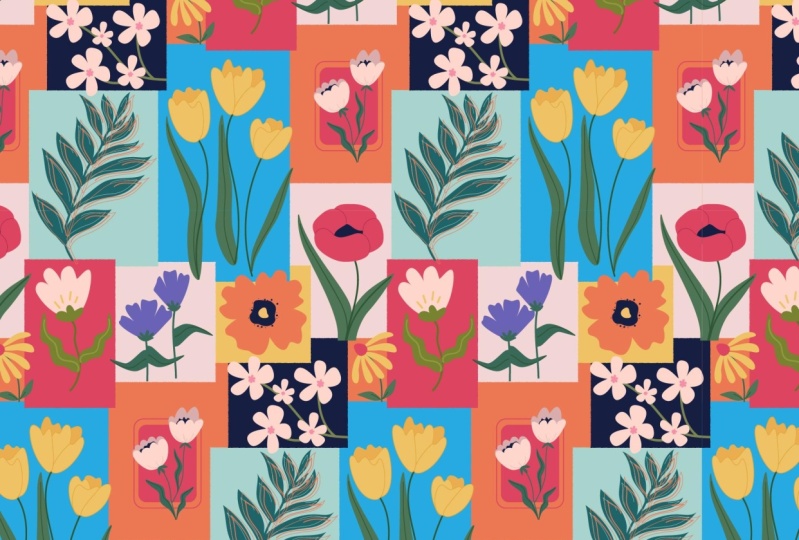
3. Intro to Patchwork Patterns: Alright, so patchwork patterns
are kind of new to me. It's a kind of pattern
that I have gotten into. What can I say that
I have discovered or seen has been kind of trendy
in the last year or two, and I have started to add
them into my portfolio. It's always fun to find a new different type of pattern to add into
your collections because sometimes
you get stuck doing the same tossed pattern
or the same kind of, like, tree of life or the
same, checker box pattern. We need to always, like, come up with new things
for our portfolio. So we're going to jump
into my computer, and I'm going to show
you some examples from my portfolio as well
as we're going to look at some inspiration on
Pinta so that you can have 500 million ideas
of where to get started with these
beautiful Patrick patterns. And what are they even? Okay. Hello, friends. We
are in Paintris now, and I want to share with
you tons of inspiration for these three different
types of patchwork patterns. And we will start off with the original kind of
traditional patchwork, which I'm thinking if you've
ever patched up clothes, is just what it sounds like, tons of different patches
on top of each other. Like this gorgeous
little bunny rabbit kind of thing. Like,
how cute is that? You can even I love
the idea of having little stitch marks to
stitch everything together, so it's been stitched together.
You can do it like that. So it's almost like a quilt
with different pieces of fabric, you can say. Or I have this example
from my my portfolio, I just created different
pieces of fabric, like digital pieces of fabric, so they're not like all the pieces are a
little bit wonky. They're all different sizes. And then I design different
fabrics or, you know, patterns within the pattern, and I put them all together in this wild pattern
patrick pattern. So there's like with everything, there's different ways to
create patchwork patterns, and that's what the
whole class is about. So yeah, you can make it a
little bit more haphazard like I have or this example on Pintrist where maybe
you could even kind of make it look like
you've sewed it together. And there's, again, tons
of examples of this. Go back to my Pinterest board. Here I have put
everything together. Here's another example of
the different layers as if you had different fabrics and you're putting
them together, you just have to draw different random sized boxes and rectangles and shapes and
then we'll put it together. And Photoshop later, and
that's how you're going to get our first
Patrick pattern. But it's just fun
how it's so it can be it's a pretty wild. It can be, at least. If you have tons of
different colors, if your color palette
is quite bright. But again, I just want to show you this little
with the bunnies. Like, it's soft and it
can be really precious, too, and it doesn't have to be, like, wild and all
over the place. Here's a very similar
too, or if it's in, like, the same fabric, but
a different section, like with a little
cloud. How cute. I like the little stitch
marks around these. So that's an idea that you can bring to your little mini
collection of patterns. Let's see if there's
any other examples of the traditional patchwork. I guess we could
say this is, again, this is with stamps, where it's a similar
effect, but just, like, layering up patches of artwork or little patterns
to make a pattern. It's really fun. So
that's the first one. And then I'm going to move on to an icon pattern,
an icon patchwork. So it's a little bit different. It's a little bit more
structured than the first one. The first one, you can just
seriously just like this one, lots of patches of
different fabric and then just move
that around until it looks good in when we
create the final artwork. So here's an example from
my portfolio with floral, so it's really bold color
palette, looks really modern. I just really like how it
looks and it repeats really easily because I created just a rectangle that's
repeated in a grid. But you just have to
make sure that you have lots of different icons and make sure that the colors
bounce together nicely. But this is a really
fun pattern as well, and I'll show you course. Later on in the next
sections, how to do this. I also have a second version. I did this one with a happy
birthday with little doggies, it's the same concept, but just with a different theme. You can see this doesn't
always have to be florals. You can incorporate
patchwork patterns into your birthday collections, or this could be turned into Christmas or Easter
or sky Salimi. Let's look at some examples of patchwork of the icon patchwork. So here's with squares
and rectangles, but with rounded edges. I guess we could
even put diamonds into this if we wanted
to. Oh, pretty. Anyways, um, what else? We have this. Like, this is
just with the same size. I prefer with different sizes. I think it looks a little
bit more dynamic like this. But you do what
stands out to you. Uh let's see. Here, this
is even more like a quilt. You could incorporate
quilt elements. Like I don't know what these quilt stars and
these shapes are called, but I know that they are
classic quilt shapes. So just look that up. Or if you have quilt knowledge,
like use that. And that would be an
incredible way of creating a quilt icon kind of
patchwork pattern. That would be
beautiful. I love how it's incorporating illustrations
as well into this one. It's not just random
shapes or not random. Geometric shapes,
lots of triangles and different patterns
meshed together. Here's with illustrations, too, and that's really cute way of incorporating illustration
more into your work. I would also like to add in for this with
the icon patterns, you could do like
a tile pattern. I feel like that's almost
like a different thing, too, but feel free to do a
tile pattern like this, which is lots of squares. You could do at least nine, I
think you would have to do. So it would be interesting.
Nine different patterns. And then just keep
repeating that. I would look stunning. Like this, if you repeated
this over and over again into a repeat
pattern, stunning. Let's see. What else did I find? Going to make sure I link
to this paintressbard, of course, for you
so that you have lots of inspiration
that you can go for. Like, this is what these are the bright colors and things
that really stand out to me. So just like, you can use this theme to do whatever
theme you want to do. Here, for example,
is with, like, letter writing with
olds and like, dip pens and flowers
and some text, as well. Like turn that. This
maybe as, like, a standalone illustration, but it could easily be repeated. Um, This one, as well. Again, like, just fall on. I just really like the more is more feeling of this
kind of collection. Like, imagine having a
whole dress that's just, like, all of these icons
and patches and patchworks. Like, how cool would that be? Like, can we find one more
example of this icon pattern? Here's a little I can show
you something that's a little bit more calm and simple. You can still do the same thing. It doesn't have
to be so full on. Your color palette doesn't
have to be bold and crazy. So here's another
example of this. So use softer colors or just a very limited
color palette. You could even do two tone, like in this in this example, so like two tones of blue, it's a lot more
calming and beautiful. But, yeah, I just want
you to know, like, it doesn't have to be as
bold as what I'm drawn to. Like, that's what I want to do. I want to do, like,
a fol on more, more collection with
these patchworks. I haven't quite figured out what kind of theme I want to do. I'm really drawn,
like, to these that I that I pinned with lots of fruits and tropical plants and palm trees and
things like that. So maybe I'm gonna go that route just because I'm
seeing so much of it. But I haven't quite decided. Moving on to the last
one is my all over. More is more patchwork. And this is with,
like, kind of, like, a hybrid of the two
or like a patchwork, traditional one that's
just been, like, um, amplified to the max. So here's my example. I have, like, a
traditional kind of, like, pattern going
on in the background, but then I'm just layering
on lots of icons, and it just becomes this wild. Yeah, M is more kind
of fun pattern. And examples of that
in here is this one. Like, you can see
there's some pattern making going on in the back
or some kind of structure. But then on top of it,
there's oranges and this heart with an eye on it and flowers and fish
and things like that. Or here, again, with lots of different fruits on top
of a background with different sections of patterns that just kind of
melt into each other. So it's just like
random pieces of tile or fabric or
different patterns in the background layered
with icons on top, like lemons and flowers and
fruits or here it's almost like a like a vintage
Japanese postcard. Oh, what? And then it's
layered with, like, the third eye and fruits
and things like that. Here's an example
more, which is, like, drinks and fruits
and things like that. That is really neat. Let's see if we can get
an example that doesn't have fruits and stuff like that. Here's kind of like a pottery or tilees
with lemons on top. That's really beautiful to think of doing that,
something like that. Hmm. But this kind of pattern, you can really just go
wild with it like this. Like, it's almost like
a scrapbook, almost. Like, if you took lots of
clippings from a magazine, then you just put it together
and somehow turned it into a repeated pattern, like, what would
that turn out as? Like, you could even,
like, this one, you could paint a little scene, and then you could do,
like, a little poster, and then you could
do some tiles, and then you could do some, like, fake fabric pieces
that you're going to put. And then on top of that,
you're going to have some icons that are
floating on top of everything like a
lipstick or a flip flop or even here's a figure or
a drink or a picnic table, like this is such a fun pattern. I feel like as long as you
draw lots of elements that some things are a
little bit abstract, like some kind of
pattern and then mix it with more bold icons that are
really easy to see, like, a lemon or a fish or
a glass of something. Here's something a little
bit more structured. Here, even with text,
that could be really fun. But we're gonna get
into this and how it's all gonna come together
in the following section. So don't be afraid. But, yeah, I just hope that
I have opened your eyes to a whole new way of making patterns or something that you haven't even thought of before. Or maybe you haven't
you wondered, like, how do they make
this kind of pattern? I hope that I can share or, like, open that up for you in
this class. I'm sure I can. Here, this looks interesting. Yeah, here's like with
sculptures mixed with, like, clouds in the background, and then stars and
moons on the top of it. So I think this is so fun, and this just feels
like a kind of pattern that just feels wild
and exciting to create. Here's, again, another kind of version with suns and moons. There's not that much
in the background, so this one, I think, would look even better for this patchwork class or
this style if you had, like, a tile in the background or some kind of pattern that's going on as well. Okay, so that's my introduction to this wonderful world
of patchwork patterns, and I hope that you
are really inspired and you can take a
look at this board. You get like ideas for how to structure yours
or different ideas of, like, do you want to do
something a little bit calmer, or do you just want to go wild? Do you want to do something
a little bit more structured or like, here, this one's really
interesting that each tile also has
a border around it. So so many ideas, so much that you can do so many different
color palettes and themes and things to make it your own and really
unique to you. So I'm really
excited to continue. And, again, yeah,
I need to, like, go through my ideas now and
figure out what I want to do. Alright. See you then.
4. 3 Patterns Planning: All right, now that we
have figured out what patchwork patterns are and the three different
types of styles that we're going to
be working on in this mini collection
patchwork class thing, then it's time to get started. Okay, so in the following video, I'm going to be sharing
with you how I sketch out my collection of three patchwork patterns
and you can follow along. And then after that,
you can follow along my full process as I bring all
of these patterns to life. In the following sections, this is the project part
of the class and you can follow along and learn with me or draw with
me at the same time. Why not? All right. My friends, now it's
time to sketch out my little mini collection of three different
patchwork patterns. I'm just going to use This is just a screen size paper
canvas in my Procreate app, and I'm just going to draw out three rectangles to represent my three
different patterns. And the first one, I'm just going to do my
traditional pattern. That's a patchwork. So I'm going to just sketch that out that's
going to be like a messy, just overlapping kind of
random kind of pattern. And then my icon pattern, I like the ones that I've done previously where it's
kind of structured. But it's also, you know, like it looks slightly random, but it's going to repeat nicely. So that kind of thing with
different shape boxes, and some are longer, and some are empty. I don't know, depending
on the background. I don't know if I
can I move in, like, rounder shapes in there, too, just to switch that up? We'll see. But anyways, you need quite a few to make it repeat interestingly
and not just have, like, this little section
here or something. Like, you need,
like, a full quite a few to make it look
exciting and interesting. Also, you have to
think about when you're going to
create this later. This is just a sketch, but
when you go to do the final, you have to think
about, like, this box is going to repeat to this side. So don't have a square over
there that's the same size. That would be boring.
Same thing on the bottom. Like if this gonna
repeat to this side, so maybe have, like,
smaller squares. So up here, it's going to
repeat like that, and so on. So just think about that when you're creating your
sketch if you want to or when you're creating
your final later. So something like that. So
it's going to be structured, and I'm going to fill it
with different icons, and we'll get to
that in a second. And then the last one,
I really like how I did my other one that
I showed you before. I'm going to have some kind of structured pattern
in some sections. So maybe I'll do, like,
a checkerboard pattern. Or like, I really
like gingham, too. So maybe, like, gingham
in certain areas. And I can try to figure out
how to maybe make the edges a little bit less not
like a perfect square. Mm. What else? And then I can have
other little patches of pattern, maybe, like, a floral little, like, sections of floral. Like little flowers or
something like that. And then on top of
that, I'm going to do my icons, and I still, I'm trying to get started on this and think about what
I want my collection. And I think I am
really pulled to, like, the tropical
vibes, I guess. Yeah, it's hardly
spring here in Sweden, but we need to zoom
into summertime. So yeah, so maybe I
could do some nice palm. They always look so nice, like they go across
the pattern so nicely, and then we can do some
kind of tropical flowers, and then some kind of
fruit like don't know, like a mango or something
or coconut could do coconut or other
types of palms. So that's just that.
So it's just gonna be maybe some kind of citrus 'cause they have
nice bright colors. Mm. And then going into
the icon pattern, like, here I want some of them to
just be patterns like we saw, so like some kind of floral. And then one could be like a stripe or a plaid or
something like that. And then one can
since it's summer, we can do a sun and
we can do, yeah, a palm tree and lots
of different fruits, like, to mimic what's going on, I'm not gonna completely
copy any of the motifs cause it's really
important that you draw new things
in every pattern, but you can, like, yeah. Draw something again
in a different angle. Like, if I draw mango over here, I can draw a mango
differently over here or coconut or something or
the same type of flour. Just don't repeat
the actual drawing. You just have to draw
it again a second way. Uh more abstracted
kinds of designs, maybe just, like, with shapes and colors
and blobs of color. I could do some with a border, maybe to make that looked really fun to add lots of
details in some places. Now, what else? Just more. Just like the idea of mixing pattern with icons of
different things in my them. And then the last pattern, as well, I like, again, to have the idea of mixing some illustrations
with patterns, maybe I don't know. If I can make it not look super dorky, maybe
I could do, like, a beach with palm trees
as some of it to make, like, that really,
like, tropical destination kind of thing. But I'm going to try and make it if we give it
maybe a vintage look, it's not going to look
so postcardi and then mix it with florals,
really bold florals, and then I'm going to bring in my different stripes
and patterns and the abstract things
that I was talking about. I don't know what that's
going to look like, but abstract blobs
of color mixed with stripes and things and
then have one just again, with a palm, and a leaf, and then others with
different patterns, and then this is going to be repeated and placed
on top of each other. So yeah. And some of the
patterns are simple, so maybe we could
even have just like a simple poker.in some areas, and then some are going
to be darker to remember, some are going to be darker
and lighter. Alright. So that those are my
really scratchy ideas, but just to give you an idea of how I'm thinking about mine, and they always change
when I get to the final, but this is so far. Now to think about
the color palette. I'm going to just start
choosing some colors. I'm really drawn to the super summary bright color palette. I really want to use a super golden
yellow I really want that super cobalt or
ultramarine blue. I want that hot pink. So that's like my type
of primary colors. Like, instead of
red, I have pink, and then the blue is, it's like a prime, I don't know. The yellow's a little
bit orangier than a regular primary yellow. I think this kind
of turquoise color is great for, like,
summertime vibes. We need to do a pink
to go with that pink. A lighter blue to go
with that blue because I like to have some
variations of my colors. And instead of the yellow, we need like we need, like, a nice creamy creamy white, like off white, that's good for backgrounds to make it
not so crisp white. So that's, like, the main
color palette I'm thinking. I also need something dark, so I want to bring
a dark blue in here to get some contrast, otherwise, they're
all kind of the same. And then maybe this
turquoise color, I get, like, a darker version of that, as well to have
something dark for that. Also, I drew in the purple. I really like purple, too, so maybe that
could be something. To mix in there? What else? Mmm. I really want to try
to keep it quite limited. Maybe I can throw in that
really nice red, too. It kind of It looks
really fun with pink. Pink and red like
that. I like that. So I got the red in there, too. Hmm. I think that's good, or do I want something
like a weird green, too? That feels really modern. So I'll take that
and then, like, a lighter version, too. Alright, this feels
really playful and modern to me it
feels really summery. I feel like I have
enough to draw some fruits, like, yeah, orange. I have orange and yellow for
lemons or, like, the leaves, I have both turquoise
and that limey green, and I also can use blue. And I have dark send lights. So I feel really happy about
this collection if I Yeah, we just have to, like, jump in and get started
and see what happens. And yeah, this is gonna be fun because you can't
really mess these kinds of patterns up because
they are so messy. Maybe only the icon pattern, you have to really think about
how it's going to repeat. But the other ones, like, you're gonna just figure it
out as you go and create the repeat later rather than while you're
designing. So it's nice. You just create the patches, and then we're going to fit it together until it looks good. But, yeah, I'm super
excited about this, and I'm loving this
color palette. Ooh. Alright, so
that's mine decided. Now I hope that you also
have gotten some sketches of your little mini
pattern collection with these patchwork patterns, and a color palettes done. Now we can get going on the actual motif drawing,
which is really fun.
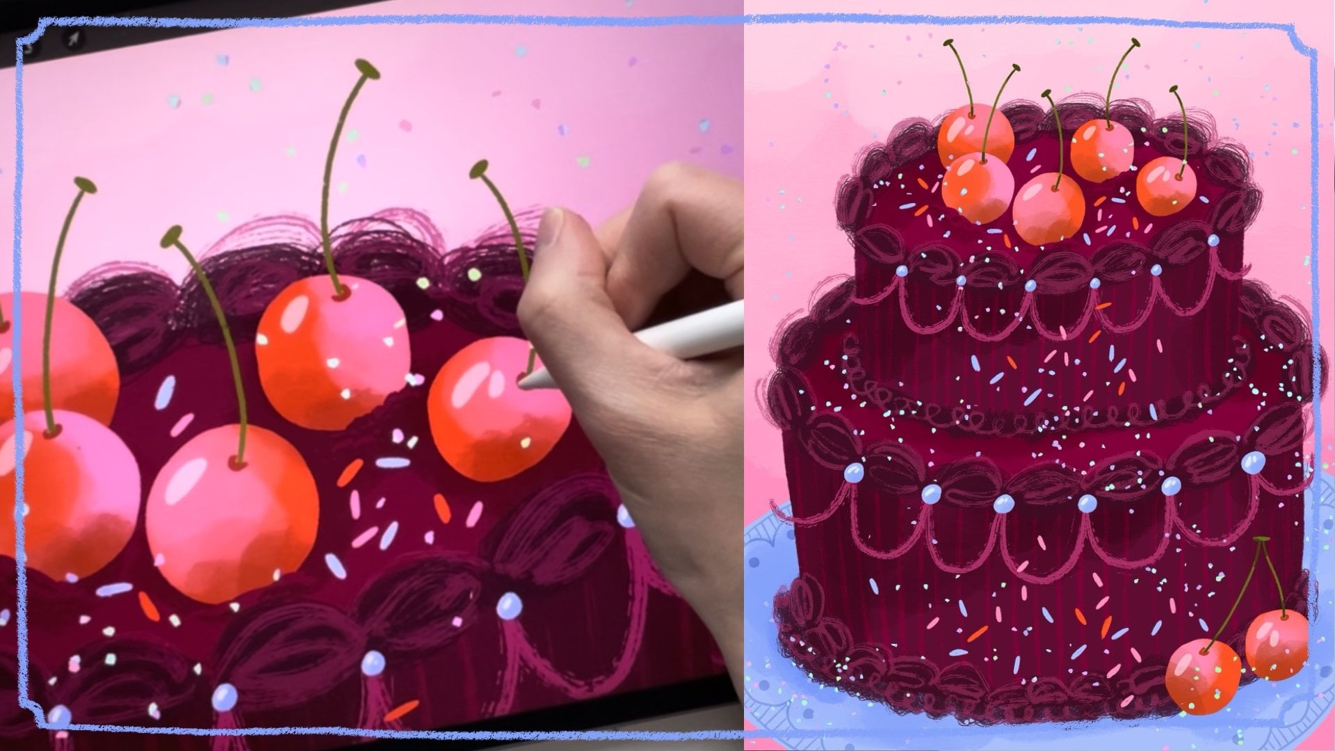
5. Traditional Pattern Motifs in Procreate Part 1: Alright, now that we have
sketched out our ideas, it's time to jump into
the final version. So in this section, I'm going to be
drawing out the motifs for my traditional
patchwork pattern. Okay, my friends, now it
is time to get started on our final motifs
in Procreate. So I'm going to
show you my process of how I go about doing this. So I have my sketches, and I didn't color them this
time, but that's alright. And I have my color palette, so I'm going to make sure that I press copy here on the layer, copy that, and then I'm
going to also share JPEG and save it
just to my iPad. Then when I go and create
here my final artwork. I'm going to use a
canvas that is 11 by 14 " that is RGB color palette. I guess we have to do it
again since I'm a teacher. Okay, dimensions,
inches, 11 by 14. And I want 300 DPI. With my iPad that I have, I get 71 layers.
The color palette. I prefer the RGB. Whatever this one is,
that's what I usually use, and that's worked good for me. There is a CMYK color palette, but it, I don't know why, but it somehow sometimes when I bring things
over to Photoshop, it has there's been a bug, which is really annoying, so that I obviously do not want. So, yeah, that's it. The dimension. So create. This is my standard. I think 11 by 14 " is a great size because
it is a generous size. It's big enough so
that it could be, like, a small poster. But it's also like
if you work on this, it would be a great size
that can be reduced to, like, to a gift bag or even
down to a greeting card. And you are able to blow it up to make it larger
poster, for example, I usually also use
this size when I'm creating patterns because, again, the repeat is a
nice, generous size. Repeat patterns don't
have to be on a square. That is not a rule. I don't know why most
people do squares. I usually do a rectangle. I think that it repeats nicer and you don't
see that square. So this is the size
I use for patterns, and that's what I'm going
to be doing in this class. Okay, so then I'm going to paste in actions and then add paste, and there's my color palette. And then I'm just going
to go back to my gallery, and I'm going to swipe it to
the left and pres duplicate. And I will get my three I
forgot to add my Oh, my gosh. I forgot to add my
image, as well. So add insert a photo, and I'm going to add that in. There we go. So I have
my sketches here, too, if that would
be helpful to us. But here's mainly
just chicken scratch, so I'm not really
gonna use that. But I will close
that out, and I will close the color out
palette out now, and I will just create a new
layer. We need to start. For this pattern, it's my
traditional patchwork pattern, so it doesn't
matter what pencil. I'm going to use just
a pencil to sketch out this and it doesn't matter what color either we're using. I'm just going to make
some random boxes. So I'm going to
make some that are long and some that are squares. And then I can look
at my sketch, did I? I wanted everything
to be square. This was the one that I
wanted to try some circles. Okay, so I'll close that out and make them different, like, wits and some maybe, like, skinnier and longer. This is I want to say there's
no thought process to this, but of course, it's like a
nice randomness. There we go. And then I also on some of the examples
that we looked at, I love those stitch marks, so I'm just going
to create, like, a to remember to do some
stitches that I can use later. So that's it. So then
I have to come up with all the different patterns
that are going to be within my pattern on these
different patchworks. And again, we can look
at your inspiration. You can look at the board
that I shared with you or you can look at the board or your own board if
you created something. But I want to do a mix of things that are
a little bit more bold and some that are
a little bit simpler. Again, we can look at my
sketch if I had an idea. So like I had some stripes and some dots and then
some palm and, like, even, like, a little
picture of a scene. So we'll do that. Let's do we'll start
with some simple ones. Like this one can be an interesting diagonal
stripe pattern. And this one I
want to be more of the like a palm tree, maybe. Or, which one would
be a good palm tree? Maybe this little one. Just like a nice though. So there maybe some coconuts,
if that seems good. So there's a palm. I want to do a palm, um a leaf. Let's see what does
that look like? Maybe, like I want to kind
of, like, simplify it. You think like those
monstera leaves, kind of. Something like that, maybe. Mm. Hmm. Maybe a son. Could be interesting. Let me look at my sketches again. Something with dots. Like, random, like,
bubbles, almost. Maybe that could be on
one of these little ones. And then I want a little scene. I thought that was kind
of cute, so, like, a little beachy
scene with, like, some palm trees and, like, sun in the background. Or maybe, and then the
water could be here. Kind of cute, or I hope so. And what else can we do? I want to do something
a little bit more, um, like, geometric, so maybe just some
little diamonds here, and then I can do some
just decorative elements. Maybe a little circle between, so that one's a little
bit more decorative. I think I want something
another one that's a little bit more geometric again. So this one maybe we could do, like, something that kind
of looks like waves. What does that look like?
Ooh, that look weird. We'll make it look
better in the final. Whoops. I hope.
Something like that. And then we have one left, and this one's quite big, so maybe, what should that be? For this sun one,
I feel like I want the rays to go off the edge, 'cause I think that
would look better. It would be easier to draw, too. I think for this one,
I'm gonna do some kind of citrus fruit fruit, a citrus fruit, some leaves just to get
something more organic in here. So there's an orange. I think it will be orange cause that would be a nice color. And then should we place that onto a background
that's quite patterned? We can almost make it
like a scene, too. So what if I make an
interesting tablecloth here? Now I made it difficult
for myself with like, let's do it a little bit
more straight on so I don't have to think about perspective. And let's do a regular
stripe here, maybe. Is that too stripy? I kind of like the
dots from that one, so maybe we'll do, like, like, a random something like that. And then kind of with
all the roundness. And then in here, we'll
do, like, a little, like, flower type form. Okay, so that is all
of my little pieces. I kind of feel like
they're not enough, so I'll do a second page later, but let's finish these for
right now because otherwise, we'll be here all day. So I'm just going to reduce the opacity. So I just see them. And then I'm going to
create a new layer and I'm going to open up
my color palette, too, and I'm going to make
sure to bring that to the top. That's that. Okay. Layer four is what
I'm going to be on, and I'm going to
use the studio pen, so it's really just clean
clean lines for this. Now I have to
figure out that I'm going to do the
background boxes first. For my little beach scene, I'll do this white
little bit bigger. And again, I don't want my
lines to be super perfect. So if they're a little wonky, that's good for me. Let's do yellow. We can always mix these
around later. Like that. For the sun, maybe I
wanted pink background. Um, we need another
light, I think, so maybe this stripe could
be that, like, creamy color. That creamy color. This one I want quite
let's do that one bold so that one can
be that super blue. Uh, I'm gonna have
lots of green. So what looks good
with the green? Another blue, I guess. Blue looks good with green. And we can, of course,
repeat colors. So I want to I need a
really bold little patch. I'll do that super orange
coral for this little one. And I'll use this, like, icy turquoise blue for that one. And then I think I want to
make this one the yellow, too. So now I'm going to create a new layer
on top of this one, and this one's going
to be a clipping mask so I can create all the
artwork on top of this. Uh let's see. Let me move the color palette for right now while I work
on these ones on the top. And for the stripe, maybe I should just do
lots of different whoops. This one I have to be
on the right layer. So this is the clipping mask
on top of my new squares. Much better. And
I'm just going to do a stripe with all
the different colors. I'm gonna mainly stick
I'm gonna stick to the dark color so that it
really stands out on this one. See. Um, do I have all of them? I
don't have the yellow. Okay, so there's my
little stripy one. We can go in later and add a little texture because this becomes a little bit
too flat for me. Like, I don't like
quite how flat that is. So okay, next up, I want to do my little suns. I'm going to do all
the the rays first. A because I want that sun to be on a different layer in case
I want to recolor things. This is Okay, I
need to step back. This is how I like
to color things. I don't do one color per
layer. I just do in layers. Like this is the first layer
with details that I'm doing. And then the next time I want to do another
layer with items, then I create another
well, another layer. So when I'm done with this layer with these items
and these colors, then I will create a new layer
so that I can create more. So another clipping mask, and here's where I
would put the sun. And then if I was gonna draw a little like a face on the sun, then I would do a second clipping mask so
that I always have the ability to go
back in and and, uh, I'm doing two things
at the same time. So difficult to draw and
talk at the same time. But what am I trying to say? If I want to go
back in and create a little face or
details like that, then I have them on
different layers. Pretty cute little mouse. Kind of like it wonky like that. Alright, and then we
can always turn off the sketch to see
what it looks like. And here I can see that circle's a little too wonky over here. What? Okay. I kind of feel like they
need little eyebrows. And then here that's
wonky too. Like, come on. A little wonky is good, but a little sometimes you
do a little bit too much. Okay, some pink little eyebrows,
I think would be nice. Okay, so that's my little face. Since that one's only
on its own layer, I'm gonna move that around. So that's a cute little face. I'm not sure if I'll keep
that I don't know what the I haven't quite figured
out the vibe of this. Is it gonna have, like,
a little face like that, or is that gonna be
completely out of place? I'm not sure. Alright,
we'll just continue, and then we'll figure
that out later. So I'm going to go back to
my first layer of color, and I'm going to
add in the Palm, which one do I want to do? Maybe the teal I want
to do for this one. And then I'm just gonna Fill that in. Whoops. I forgot
the whole. Whoops. And again, if I want to
do some veining on that, which I do, I think
I'll do that with pink. Then I will do that on that other layer. Okay. Now we can move on to this
one and the the blue. I really like the
pink with the blue. We'll try that. But yellow
also looks good with blue. I think I'll do these try
the diamonds in the yellow. I think I want to reduce
the size of my brush. It's a little bit too blobby. Is this better? Yeah.
What was that on? Now it's on size 13. And I'll do the pink
for the circles. And I want to use that super. So far, I haven't
used that hot pink, so maybe I won't use that at all in any of the
collections. We'll see. I'm loving how poppy
these colors are. Kind of feel like, um, I'm not sure if I'm
gonna use white white, but I like this light yellow. I want to kind of add. Do I
want to add in something, 'cause they're all gonna
be meshed together. There's not gonna be so
many, like, highlights. So let's see what does it
look like if I do something like this. Maybe we like it. I have to remind myself
that this is, like, a very mores more
kind of collection. I think I like that. Mm, like, do I want a whoops
that wasn't there? Like a highlight on the
sun. Does that make sense? Hmm, I'm not sure. I'm
not sure if I like that, but we'll keep it. And, uh, moving on. We just now moving on. We just keep going to
all the different um, sections of this piece. So what colors do we
want to use here? So maybe for the trunk of the Let's see
which one are we on? Let's go down to the bottom. I'll use this one for the
trunk of the palm tree. And then moving
up another layer, I will do those shapes. Okay. And then if I want some veining or details in that, what
would I want to do? Maybe I'll try the orange. And again, I would want to move that on a different layer. So if I want to change
that, I can easily do that. Does this look crazy? I don't like it. Should I do
the coconuts in that color? I think that makes more
sense and it looks cleaner. And then I want to do some lines in the trunk of the palm tree. So, like that. So that's
that simple one done. If I do these with the green, do I like that better? I think I like that. Now for this next one,
I want to bring, again, back that light color so
we have some lightness. I'm going to do some
dots with those first. And remembering to go off the edge so it looks like
you've kind of cut out a piece of fabric
so it doesn't look so they're not all
like pieces like that that are within the lines. Okay. Well, now I'm up
there. That's stupid. Oh, see, this is
the problem with multiple layers and having
a human brain. Okay. But anyways, start again. So you have to constantly
look and make sure that you're on the
correct layer, 'cause that's very helpful. Otherwise, your whole plan with all the different
layers and making it easy to be able to
make changes that, um, doesn't work, then. Okay. That was my idea for that, and then I want to
go to the next level and layer and I want to bring
in some different colors, and I kind of want
to, like, add those in also kind of randomly. So almost the white is
the is like a shadow, maybe. We could say. So I'm gonna use some of these. And I'm trying to make
it as random as I can. How many other What other
color would look good? Maybe this turquoise to? Maybe I'll keep it like that. Let me just turn off the
sketch. That looks fun. Okay, for these waves, I'm going to see what
it looks like with this darker turquoise and try to make this
one kind of simple. How do I make waves
that look kind of okay? Does that look okay? Okay, that one's pretty simple. So it's nice to have that mix of things like a
stripe and that. I think I'm going to go back and get rid of
those white lines. I kind of really
don't like them. So then we remember which
where they on this one. So then I can go in
and just erase that. I think it will be fine. I can use this white color
for the stitching. So that could be something
that could bring in those little highlights. Okay. That feels better. I want it to be a
little bit cleaner. Okay, now we're gonna go to
my little beach scene here. So how do we do Make
that look good? Let's go to the bottom.
We're on the bottom layer. And then the sand, I guess I will make that
one the yellow color. And my sun can be orange. And then my water,
should I do the blue? Because we haven't
used much of the blue, really. I like that. And at the edge, the shoreline, I want to do a little bit of
the lighter blue. Like that. And then I guess I thought those palm
trees look pretty good, but just to make it a
little bit different, I'll do I'll do teal palm
trees instead for this one. These are on the same
layer again, yes. So I want to do those
on a different layer. Gosh. Okay. I work
I try to work fast, but sometimes, yeah, you need to think about
what you're doing. Okay, again, we want another
layer for the Whoops. My little simple
palm trees here. I like that it's overlapping the sun there a little
bit in the mix. That looks nice. And then these ones are
a little bit bigger, so I'll make sure to get
those off the page a little bit to make my scene look a
little bit more interesting. Okay. Maybe I'll use
this. Let's see. What does it look like
with a couple little? Do I like that? A little
dots of sand or something. And this one, if I do
details with this green, and the trunks are
on the bottom layer, so I can use this one. If I do this, does that give it some little interest Makes it look a little bit less flat. I think we'll skip
coconuts on that one since there's already
so much going on, and then we have the last
little piece down here. So we have to move
the color palette. Mm, we also have all
these stitch marks, and I think I'm gonna do
those on its own layer, so I can do that first. So I definitely want those
to be many of them white. So I want a selection
of white stitch marks. But then it could be interesting to have different colors. So maybe some stitch marks that are orange and maybe
the blue would be fun. Or the light turquoise. I don't really know
how many I want, or I didn't use the dark blue. I'll skip that. Pink
is always good. So we'll do a couple of those stitch marks
over there and see which one we end
up using or if we use, like, a mix of all of them. Okay, back to our
little scene down here. So this one I want I think I want to use that really blue,
so I'll do that. And then on top of that, I need to do my
little pattern here, and I think, well, let's
do this nice blue, or do I have a lighter blue? Yeah, I'll use the
lighter blue. Oh, yeah. 'cause it's a t I will
cut that off later. Fill those in. Okay, I just need to erase the tops
of those so that it looks like it's on the like the tablecloth or whatever
this is mimicking. Okay. Good. And then we need to make a pattern in those.
And let's see. First, I also need the orange. The orange is gonna
be that color, so maybe I should
do pink, obviously. Again, I just want to erase those so that they
get cut off. Okay. Now we need to do another layer because now we've already
used up all those layers, but this one's a little
bit more complicated. So I'm gonna do
another clipping mask, and then I'm going to choose my beautiful bright orangy red and turn that into my orange. And on top of that, I guess we need to do
another clipping mask, and we'll do the dark
green for the stem. And then I can use
the yellow, I guess, for my and the light one, too, the light white. Does that look good?
Maybe. I don't think so. I prefer it plain, and then
another layer on top of that. I'm gonna do my my little
leaves for my oranges. And then I was gonna
do a background color there, and I think I should, because otherwise it
becomes a very big block of just plain yellow,
I think, right? What should I do?
Maybe more of those, just the cream color for the light. Okay. Now, we're just
going to take away my sketch and the color palette
and take a look at this, and I think it looks very sweet. But it's very flat. But, I mean, sometimes when
you create flat artwork, it's going to be printed on
something that has texture. Like this is going
to be a pattern, so maybe it would
end up on fabric. So fabric has all
that variation with the threads and so it
could look really nice. But I think I just want to add
a little bit of variation. And texture in here just
so something's happening. So on top of this
layer, the top layer, I'm going to do
another clipping mask, and I love to do I've
shown this in many classt. I love to do a what are these
called Adjustment layer. So from normal, here you
press the N to normal, and I switch it to soft light. This seems scary, but it's not. And then I don't
take black black, but, like, a dark charcoal gray. And then we have to choose a
brush that has nice texture, maybe use something
that's in pro grade. So this artist crayon, I believe is one of the regular. Let's see how that looks. And then you can just go in
and give a little bit of texture to some places so
something else is going on. So it doesn't look so flat. Just makes it look a little
bit more, I don't know, lived in, something's
happening. There we go. I'm a lot more
pleased with that. So those are my little icons, and I believe that this
would be really great. But I want to show you how I can also make this pattern
a lot more interesting. And that is to
duplicate all these and recolor them so that we have a lot of variation
to choose from.
6. Traditional Pattern Motifs in Procreate Part 2: You don't have to
recolor everything, but for the most part. So I'm going to take
all of these layers. You just swipe to the
right to highlight them. I'm going to group them. And once it's in a group, I can swipe it to the
left and duplicate it. So now I'm going to close
out this original group, so I have that, and now I'm going to start working on
recoloring these ones. So this is what's going to be great about
having all of this on different layers so I can easily go in and change stuff. So for that sun, I think I'm going to keep
the sun yellow, but let's do blues for that. So I'll use that light blue to change the background from pink, and then I'll use the dark blue to go into the other
layer and make the red. They weren't connected, so I
have to recolor all of them. So, so that one's done. For this leaf, we could change let me get my
color palette back up. Let's change the leaf
color to that green. So I'll do that. And then
the background color maybe this intense orange. So we'll just do that. Maybe the vining needs to be
different color, too. There, too blue. See how quick this goes when you have everything on
different layers. I'm using a very
non textured brush. If you are using a
very textured brush and you need to get
into certain areas, you can also instead of
pulling the color I can show you for example, let's see. I don't know if you wanted to recolor one of these stripes, so we go into the
stripes and you can put this on Alpha lock, and then you can
choose a different color that you want to change, and you just paint over instead. Which I'm still on the artist's cray and
that's why it's weird. So yeah, you just paint over this section that you
wanted to do instead. I don't want to do that, though. I hope that made sense.
I'll bring this back. It doesn't need
to be apa locked. I think for that one,
let's just try what happens if we just change
the background color. What color haven't we? We haven't used this, like,
turquoise color that much. So that one I did
need to recolor, and maybe I will use the cream. Let's see if I can
find there the stripe. And I think I want to do
another stripe like that. That looks nice.
Then we'll move on. I think I'll keep my
little scene here the same or another way to make these
feel like there's something new is to flip the entire group so that it's going to be
the opposite way. So when you're
highlighting the group, and you can go to
this arrow symbol and then you can
flip horizontal. So now everything's flipped. So then it also
becomes like you've made huge variants of all these. So now we're just going to keep going with the recoloring. So I've done those, and maybe
for this tangerine one, we can just simply
recolor the tangerine. Like this. The yellow instead. And then the
background we can do. Wait, I need to make
sure I'm, pink. And then just make
this blue, that color. That changed that one, which is interesting. But that's cool. We can make all the other
waves this greeny color. That look nice. Okay,
so those are done. Uh, maybe also I could make that blue instead. That
looks kind of fun. Alright. Let's we need to make this bubble pattern down
here, different color scheme. Mm again, should I
do that turquoise? And then I'm gonna use I haven't used
that purple very much. I used it for one stripe, so I feel like that
needs to be in here. So that was the white dots. So make all the
pink, the purple. And all the turquoise, I'll do yellow. That looks nice. Definitely need to
change this one. So shall we do that purple, too, so we use that color? Purple. And then I like
the yellow in there. I think we need to get
this green in there. So which one has all
of the Again, like, I want to show you that if I alpha lock and I have my pen, I could paint in this if you
prefer to do that, as well. Sometimes it feels like it takes forever to pull like this, but goes almost quicker
to paint them in. Maybe the pink dot should be blue just to make
that different. Or should these be blue? Yeah, I make it a little
bit more different. And then the yellow
can be the circle. Okay, now we've done those. I feel like we do need to
switch these up a little bit, but let's just change
the palms here. We'll just change
those to this green. I feel like that's good enough. Should we make the sun pink? There, that looks
different enough. Let's change this one. Again. Let's do we'll make the
palm the turquoise color. I need to bring those
back, my color palette. So the trunk of the palm
tree? Are we there? Yes. That one and then the
top L's, like like this. And then the background, should we do a white
background for this one? Okay. And the coconuts
can be pink. Let's see. And then these little details here definitely need to be
I like the green in there, but here, maybe the
yellow would be fun. So we have to look where were those tick marks? Are they here? Yeah. Right? Yes. So I'll flock that and then
just paint those in. Okay. Have you done
all of them now? I think so. So again,
I'll hide that. So I hide so I hid
the color palette, so now we have a variation of all of these
different pieces in a second color palette
also flip so they kind of feel like you redrew everything, even
though you did not. So I'm really happy
with that. So now I can show you here if I
turn off this group, here's the second version. And here's the first
version we created. So we have two different ones. So those are our first motifs for our first pattern
created in Procreate, we're going to
upload this all of these layered files
as a PSD file. And to do that, you
press share here and you press PSD and you upload it to whatever however you do
that to your computer, if you AirDrop or if you
do Dropbox like I do, and we'll open that up in
Photoshop in a later section, but now it's time to
move on to the motifs in our next Patrick pattern
which is our icon pattern.
7. Icon Pattern Motifs in Procreate: Alright, time for the next one. This is going to be
our fun icon pattern, so let's get started
drawing that one. All right, so we're going to
open up our second document. And this time, we're going to be doing our icon patchwork. So I'm also going to bring in insert a photo and bring
in this sketch so we can remember what our ideas were and the setup, et cetera. So for this one, because I
do like how the setup is, I'm going to turn off
my sketch not sketch. Turn off the swatches, and I'm gonna blow
up this sketch. And so it takes up the
entire screen. Music. I need to. And I quickly covered and when we were
doing the sketches, I quickly covered
how this repeats. So how I'm going to do is
just like a simple grid. So whatever is over here is
going to repeat over here, so I don't want the same
kind of shape next to that. So there's a big square
here, so here's, like, a rectangle and the
same thing down here. Like here's a big square
and here's small. And over here, the same
thing, that's different. And on the top, here's that. So I set it up so that it's there's nothing that I can see
that's repeating the same. Like, here's going to be a box, but maybe there'll
be different sizes. So I'm just going to use
this as my template, which will make my life
easier, of course. Since I already did
all that brainwork, I might as well use it. And for this kind of pattern, we can do a background color. And so in between the lines, that could be a certain color. I think maybe to keep this
clean because it's so bright that I do
want that, like, um, this creamy yellow color, just because I think if
I have a bright color, too, that's it's gonna
go a little crazy. So I make sure that's selected, and then I press background, and it's here in history then. So that's my
background color set. Now I just I'm going to
turn off the swatches, and I'm going to make a a layer
on top of my sketch here, and I'm gonna go in
with that studio pen again and just add
in all my boxes. Actually, I want to
bring my swatches to the top so I
can choose colors. But I will move it
down Blow there. I'll move it down to the bottom
while I work on the top. So I don't know. Just start. And again, I'm making it random. And I want I don't
want it to be perfect. If you're somebody who
likes it to be perfect, you can open up the grid and
work with a grid instead, and that works, of course, too. And then, um, I haven't really decided what's
going in these squares, but I like having the squares
already colored that, to me, feels easier. I go to remember
to use that purple because I used it a little bit. As you can see, I got
pretty close to that edge, and that's fine because I have a lot of space
on that side. So I think that that's
going to work out. I'll have to remember at the bottom that I have quite
a lot of space up here, so maybe make my shapes down here go quite close to the edge. Maybe not these ones,
but the other ones. Right, and then just
got to keep going. I also like the idea of
leaving spaces open, so maybe I'll leave that space open and a space
over there, as well. So I won't do that one or
maybe in the middle there. So I'll keep that one empty. I'm going to move my swatches. Oh, I'm working on
the swatches again. To so that I don't
have to start over. I'm going to select what I'll do the select tool like this
and then copy paste. These watches come on their
own level again, layer again. And then here I'm just
going to simply erase them. Okay, that was typical. So, yep. Now I need to open that up and I can
move that to the top. With some of the
really bold colors, you have to really remember to move them around the scene. So the yellow is definitely
something that's gonna pop out in this
pattern, also this orange, so I have to make
sure to use that several times so it's
not just one square, like, or the circle. Like, if that was the
only yellow thing, you're gonna really it's gonna really stand out in the pattern. So I want that to be
repeated at least once, but I think three looks really nice 'cause then it bounces, like in a nice triangle. So I'm going to do that
with the orange color. I'm gonna remember
to repeat that. And then also have
to remember, again, if I have yellow here, I
don't want one of these to be yellow because then it
would be too close. So I think let's see with
this orange, Maybe this one. And I'll do a small square two. And then the blue
is also quite bold, so I'll do that one, too. I'll do this corner. So now that's been repeated
three times nicely, and it will be here and it
will be repeated there, one, two, three.
That looks good. The pink we need to repeat. Maybe this one over here. And this light one, I
like this circle shape. Which one should we keep empty? We'll keep that one
in between empty, so maybe we'll do this one
as this light color, too. It Could be nice. Purple. We can do that as the circle over here. What other color do we
want to repeat again? We haven't used this
teal very much. But of course, we can remember that we're gonna be using them within the pattern or
in the shapes as well, but I just wanted to
remember to use that. So Uh, but I think I'll
go for that green. Okay, so I'm happy with that and they're bouncing around
nicely with the colors, and I think that here, the yellow repeat over here, and these colors
will repeat here. And I feel that I haven't
messed up anything, but we'll see once we get to the next when we bring it into Photoshop and
see how it all works. So I'm going to Did I do
that again? Look at me. I I'm I am useless at this, so, okay, now I'll
do that again. Alright. Then I will
merge those two. Okay, I'm gonna bring my sketch to the top so I
can remember any of these, but they're all like
chicken scratch. There's nothing here that
I need to really remember. Like, the palm tree
and the yellow one, maybe that's cute. So
we can start with that. So let's create. Like we did for the
previous section, I want to create a clipping
mask on top of these squares, and we're gonna draw
on top of them. And here I have my colors. So again, like I did last time, I'll make a nice,
simple palm tree. And then I need to make
another layer when I'm doing the palm they called
ferns, Palm froms? Oh, that doesn't sound right. And then another layer. We'll do pink coconuts. And maybe this red
for this color. Look kind of bold and cool. Alright. So that was, like, our only idea for icons. But like we did last time, I want to do some
that have some that have an icon and some
that have just patterns, so it's a mix of
different things. But this is the part
that takes forever. So, I mean, since I walked you through
the entire process last time, I think that this time, I
will just create this as a time lapse and you can watch
as this is being created. And Okay, so I'm done with all
my little icons. I think they turned
out pretty cute. Some of, you know, as a group, I think
it looks good, but some of them maybe
aren't my favorite, like this one or this one, but it does matter when
they're all together. And for this pattern, I don't think that you need
to do a second version. You could if you wanted to, but I think it's great just to repeat this over and over again. It's gonna be great.
So before I do that, I'm just going to do my layer
of the what's it called? To give my adjustment layer, to give some texture and shadow. So again, I'm going to
use that charcoal color. I do that clipping mask. I make your adjustment
layer down to soft light. And then I was using
the artist crayon. I have two different ones. So this is for the separate the little icons that are on the white background. So I'm
going to do those first. Like that. It was
just those three. And then on top of
all the other ones, I'll do another soft light
adjustment layer that's also on a clipping mask to
clip to all the other ones. So then I can just
go in and give a subtle texture to everything. So just something
else is happening. I love how that's just
so simple and it just makes everything come a
little bit more to life. It has something
that's happening, and you can make some of them have more texture than others, and others a little
bit more simple. So that's that. That is
this pattern complete, and I will show you
how to put it into repeat in a following section. So again, just make sure to export this by pressing
Share and then PSD, so you get all these beautiful
layers and you bring that into Photoshop
via AirDrop or through Dropbox or
Google Drive or whatever you use to come to transfer your procreate files to your
Photoshop or your computer.
8. Maxi Pattern Motifs in Procreate: A and then we, of course, have our Moors Moe all over Pat orkPatternT is going to
be even more fun because it's gonna be exciting
to show you how all these random
things are going to be able to pull together
into a really cool pattern. Alright, friends, now we are on the third and
final pattern type, and this one is our to the Max
icon, patchwork, all over. What did I even call it?
Like, it's just to the Max. And I'm gonna show you how I'm going to go
about doing that. So here's my little
sketch and I kind of get the gist of what I was
doing here, but not really. So I'm not gonna
use that as like I did in the previous section. I'm just going to try to
remember that I did some checks, and we're going to start off
with doing the background, like, patterns that
I'm going to have. So I'm going to turn off
that and I'm going to go in. And this one, I'm not
going to sketch it out. I'm just going to go for
it. So in the background, I'm going to do some blobs. Rather than squares, this time I'm going to do
some blobs of color. So I'm gonna make sure that I am choosing this is the
wrong brush. Okay. So I'm just gonna do some
random blobs and fill those. Do one more random, like, blob. Okay. And then on top of these, I'm going to make
another clipping mask, and I'm going to do
patterns within these. So I'm going to move my, there we go move that down here, so it's not in the way really and make sure that I'm
on that proper layer. And I think for this top one, I'm going to do a gangam
cause that could be fun. So I'm just going to do
some like stripes here. And I'm making it
try to make it a little wonky so it
looks hand drawn, which it is, but I'm I'm trying to make it look not
super straight. Okay. And then to make
that look like gingham, all you have to do is make where the lines cross,
make that darker. So I'm going to Alpha
lock that layer, and I'm going to
choose my darker teal, and I'm just going
to fill that in. Centers here. And again, I don't mind
that it's a little wonky. That was a little bit too much, so I can go back like
that and clean it up. So I'm just going
to quickly do this. Okay, this is gonna
take forever. So I'm going to think about what I'm gonna do
for the next one and then you can watch
the um, time lapse. So I liked what I had going
on for one of the tablecloths in one of the first
patterns that we did, and I did, like, okay, where am I? This is Alpha lock, so I
have to unalphaock it, so I'm gonna re
bring those circles. And one thing that I've
talked about many times in my classes is that you
shouldn't repeat motifs. Like, if I have drawn say, one of the clementines or the oranges that I did
in the first piece, I can't just, like, copy, paste that into another pattern, but I can draw another orange
and reuse that like I did. Does that make sense?
I don't think so. It's really important
that you're drawing new things
in each pattern. So every single pattern, every illustration is unique. Even if you re use the
same kinds of motifs, like I can show you
as my examples. In my first ones, I used, like Monstera leaves
and palm trees, and I did the same
thing over here, but I didn't copy paste the exact same thing
and move it in here. I redrew it. I made the leaves look a
little bit different. I used different colors. I re did it. So it's not like the
exact same thing, but it's very similar. So that's what I can
I want you to know how important it is
so that each pattern. Each artwork is unique. If you're re using the same
items that you're using in an illustration and
then bringing that into a pattern, then it's not unique. Then it's considered
the same thing in an A and a B version, like a pattern version of that artwork or the illustration
version of that artwork. It's not something unique. But if you draw something
similar, but you like, change the angle of the orange or change the colors
a little bit, then you can all
of a sudden sell those as two separate
pieces and make more money. So that just makes more sense
to me. Okay, back to this. And I'm going to make
that monochromatic, so I'm going to do Oh, yeah. And then this one,
I should have made that a second layer. So if I wanted to recolor that, this is just not
going very well, but anyway, it's alright. So I have my blue there, and I'm just going to make my little, like, flower shapes. Maybe these ones
we can stay like, just outlines. Kind of sketchy. And then I can do another layer, and I just want, like,
a little yellow dot. Okay, to fix this one, I'm going to go back in here
and Ooh, that's not right. Alpha lock it and then do that. Okay. Then I'm gonna unalpaock it and then fix some of these sloppy
things that I did there. And for that one, I'll
go on another layer, and I'll use that
darker version, and I will do my best
to fill those in. And now I can more easily
fill them like this, and that's going to be easier. Okay, so I can continue
with this one. I don't know if I need, like,
more of a pattern there. I can continue doing
this while I'm thinking, what should the last one? Maybe the last one, I just want a simple stripe or something. These are just these
are especially just going to be layered
in the background, so you might just see just
a small glimpse of them. They're not going to be the
main focus of the pattern. I also didn't want them to
be square because I wanted this kind of to stand out from the other pieces
that are very square. The other patterns
that we've created. All the other shapes
there are quite square. So this is somewhere in between. And then all the items
that we're gonna draw on top are gonna get
more and more detailed. We can have patches as well
to mimic the other pattern, maybe to give, like,
a nod to that. This is a patrick
collection, too. So that's something we could do. Okay, this gingham, my homemade kind of
sloppy gingham is done, but again, it's in
the background, and I kind of like that it
looks sloppy like that. Okay, for the last one, I
think I just want to do simple stripes with pink. I'll do pretty thick
stripes, I think. If you make sure
to fill the edges, then you can easily
drag and drop. And if I like that, that's good. But maybe I think I want
to do yellow instead. So I'll just do that. That looks bright and sunshiny. So those are my
bottom layers so far. And, again, I have no idea how this pattern
is gonna turn out. I haven't really
planned it in a way. This is kind of a pattern
that I feel like is very difficult to plan out
because it's so random, and that's kind of why I really like it because
it's just going to, like, come alive as it
happens is not much planning. So that's my first group, and I think I'm going
to group these, so it's gonna be easier to understand and I
can turn them off. So those have been grouped
those is like my first layer. So now I'm going to
do another group. And maybe I like
the idea of having that patchwork since we
had from the other one. So I'm going to do one pink one, and I'll do another, like,
bigger Turquois one. And then, again, we need to
do another clipping mask, and what should we put in here? So it's like we need to figure out all the time
what's gonna go in there. From the previous
one, I really like my semicircles that I started working on, so
maybe I'll do that. This time, they can go off
the page and not connect. So again, like, I'm using the same kind
of shape and idea, but then I'm doing
something else. And then this Alpha
lock, I'm going to do. Like that. No, that didn't work. No. I guess the
threshold's too high, but I'll just color it in. That's fine. Okay. And then I think I want to do that
bright orange 'cause it's I really like how
that looks with the pink. I really like from the first pattern that we
did a little scene, so I thought that could
be interesting to do. So let's do another
little beach scene here so I can maybe this whoops. Let's take off the alpha lock, and I will do here's some
here I'll do like a horizon. And then I do another layer. Alpha lock clipping mask. I need to make a
little island here. I'll make a little island
in the middle of this little and on there, we need to make another layer. Let's see. We'll do the blue for the palm and another layer. We'll do the light blue. Doesn't show up, really. We'll do that light. This one? There we go. Well, that looked quite a lot more abstract, which I like. So that's fun. So we have those. Again, I remember it I forgot for the other
ones to add my texture, so this we need to do now, too. So I'm going to do another
clipping mask and choose, like, a dark charcoal, and then I'm going to move
the adjustment layer to soft light and then go
to Artist crayon and just add that in so
everything so we keep that also as something that keeps all the
collections together. Okay? So this is another
grouping complete. I could do more
stuff in here, too, since there's room,
but no, I won't. I'm going to go into
this other group, open that up and do my
shadow clipping mask, soft light, and then do
some shadow in here. Here, maybe I could
do quite a lot, since it's going to be
the bottom most layer. So maybe here I could do a
little bit more than usual. Okay, I love how that
just brings it to life, so it's not so flat. Okay, so those are both done. So now we can we have to
go back to our studio pen, make a new layer, and then we have to figure out
what we're drawing. Now, so now that we
have some, like, shapes and things like that, I want to do some random shapes. I really like that
in another pattern that I showed you
that I just had, like, big blobs of shapes. So I did stripes before, and I thought that
that was good. Um let's see what color. Really like this lime green, so I'm going to do a blobby stripe with some of
these to use as filler. Maybe three would be good. Whoops, not the background. I can also do other shapes like maybe I could do a grouping of circles that are just
gonna I don't know. Who knows how you can use these? Right now, they feel
kind of random. But that's, like, the puzzle part of making
patterns, which is really fun. I haven't used the
purple in a while, so I'll make sure to do that. Maybe some more even chunkier, random Random shapes like this. Uh, I don't like how that
turned out. Like that. What else could we do? We
did have, like, the sun. Kind of shape or like the stars in the other pattern I did, like seven I don't know,
random star shapes. So maybe one pink one and one in the turquoise, just for fun. That's quite funky, but it
looks good on this side. So I'll keep that. So again, maybe here's some random shapes that we have that we can use. Again, I will create a
clipping mask on that, and I will go in and add
my texture soft light. I love this soft light because then I don't have to change
the color when I'm shading, and if I change the
background colors to here, I can show you, if I decide I want to make the
background of this yellow, I don't have to go in and
recolor the shading, too. It just automatically changes. I have a whole other
class on Skillshare called what is it called? Shading and Light in Procreate that you can check out if you want to
learn more about that. Okay, so that's my next
little random group, so I'm going to group
that and close that out. So now I have some random
shapes and patterns and things. Now I want those, like, icons that we saw on those
other patterns. Like, I want to have some
citrus and I want the palms, and maybe that's it. So on this layer,
I'm going to start drawing in my palm leaves. So maybe I'll do. And whoops, again, I
have to switch my pen. Maybe I'll do the Monsteragin. Or maybe, maybe I won't because I've done
that so many times. Again, it's difficult to know which color to use because
you don't know what's going to be repeated or what's gonna or you don't know what's
gonna be on top of what. So you just have to hope
it's gonna work out. Um, let's see. Those are some fun
shapes on top of that, the clipping mask,
and then I'm going to do the vinees that you
can have in leaves. So I'm gonna do that. With pink. And should the blue
one have yellow? Maybe it doesn't need lines. Maybe I could do circles. Looks okay. For this one, it might be interesting to duplicate this so that we have
different color versions. So again, if you want to
remember how to do that, so I'm going to group
this into a new group, and once it's in a group,
I can duplicate that. I'm just going to
close out one of them. And then now I can go in and
make that a different color. Maybe this palm
leaf can be yellow. And then here on the top, I'm going to alpha lock this, so I don't have to do those. Let's see. I'll make
those orange instead. So then I can just paint over them instead to
change the color. I didn't do the shadowing, but that's kind of nice so
that I can do the shadow. Without duplicating.
So then, again, it will look slightly
different just because I'm gonna do the shadows. Soft light on top there. So then add the shadow. And also, remember, we can flip this so that
we can have that. We can flip all
this in Photoshop, too, but it's just kind of
fun to have it done here. Now, I have to have
it on the group. Sorry. Group, and then
flip Whoops. Flip. So then we have that. And
then I'm going to go back in here and I'm going to
add the shadows here. See, this is what it looks
like with the black. It looks crazy. But then when you move it
from normal to soft light, then it just softens and it chooses a darker version of the color that
you have underneath. So there's that, so we
have more of those, so we can kind of
open also each of the different things
that we have going on. To tell what's going on here. Um, we're definitely going
to be sizing things down. I want some things like the
citrus fruits and a flour, I think we're gonna
end with, and I think that that could be good. So I'm gonna close out all of these so it
don't distract us. And we're gonna make
some citrus fruits, so I'll make, like, a lemon. We haven't done lemons. Whoops. Like studio pen, so I'll do, like, a lemon shape. Usually, like,
something like that. And then I'll do
this Clementine. But should I do, like, a little group of
clementines this time? Because in the
previous patterns, I've done a single
one for both of them. I think I'll do, like,
a grouping this time. So I want to move this. Procreate, you can
move stuff around, but don't resize anything
'cause it does not. The quality gets worse and
it doesn't look. Here we go. So I have a little grouping
there in that one. Now I'm going to do another I doesn't need to be
a clipping mask now. I will do for the
oranges down here, I'll do the Teo color. And then for the lemon, I can do the regular green. I don't know. Should the
stem be from the edge there? Just seems weird. Okay, and then another
layer on top of that. So I'm gonna do the
leaves here and make them kind of good shape. I hope. That looks nice. And then for these
ones down here, I can also I'll make one I like when I
cross over a little bit. And when a little bit smaller. Like this. Whoops. Okay. And then I need to do some
details within there, so it doesn't really matter
which I'll take this one. I will take the orange to make some circles to give like
that the lemon rind texture, and then they'll use the
yellow on these ones. So it gives the look of
some kind of citrus fruit. I want to go and give
these vines, veins. Veins, sorry. Clipping
mask to those. Before I do that, wait a second. With these 'cause they're
not on, like, a ground, it's gonna be difficult
to Oh, never mind. It'll be fine. I
was thinking that I'm gonna have to put
shadows on everything, but I can just skip
the little ones. They don't need to be shadows. Alright, again,
getting back to this. I want to put some vine
veins into the leaves. So let's see what
color would look good. Maybe the yellow in these ones. Maybe a simple line like that. And up here should we do the
pink. Okay, I like that. All right. Now what I was starting to talk about here I am 'cause they're not I'm
going to have to do the shading on several
of the layers. So clipping mask, change
it to soft light, move to the charcoal black, and then the artist crayon, so I can go in and give these leaves some shadow
and then the pink one, clipping mask, soft light. Okay. And then the last one with
the lemon and the orange, clipping mask, soft light,
and then I'm going to do. This is nice that they're
on different layers, then I can do the
shadows behind that. That looks good. Okay. So that is all of the little
icons I was thinking about. Maybe I'll just do one more. I'll do a flower, too, and I can continue on
with these layers. So I'll just studio pen, and I think I'm going to
use this light yellow, and we can't really see it
so well here on the screen, but it should be fine. I'm going to do a big one, and I'll do a smaller one. Maybe I'll do two smaller, so I have different choices. Okay. And then inside of those, I will do some just
colors, I guess. Some dots. Yellow? Do I
like the I like the yellow. It's so happy. So I think I'll do
that simple interior of that flower. Okay. And then I'm going to just
put some shadow here. So I have that shadow layer. I just go in and
grab a charcoal and then go in and give
a little variation. On these light colors, you can't really see that much, but I think that's just
going to give, like, some brightness to this
pattern that's so full on. Again, we can I'm going to group group these So then, yeah, we can get
a little idea for this pattern and the craziness
that it's gonna happen. But so far, that looks
pretty fun to me, and we're gonna
have a lot of fun. In the next section, we're gonna be bringing all of
these into Photoshop, and I'm gonna show you how you finish all of these three
patchwork patterns. So this is really fun that
I've been able to share my process with you of
how to create these, and I hope that you will enjoy learning how to put
them all together, too.
9. Final Repeats in Photoshop Part 1: Alright, so now we have all of our motifs drawn in procreate. It's time to export them
as layered PSD files into Photoshop so that
we can get them all repeatable and see how
everything turned out. This is, like, the
really fun bit when you get to see how
everything turned out. See you in Photoshop.
Alright, friends, welcome to Photoshop. So instead of going in
order like we drew them, I'm going to actually go from
easiest to most difficult. So here we have the
icon pattern first, and we'll work on
that one because let me show you how easy it is
to turn this into a pattern. So you just go to View and
press pattern preview, and now we have a pattern. And we can zoom
out to see how it repeats kind of fun and wonky, and it's I really like it. And so that's it. So then you're just going
to do edit, define pattern. You can name it if you want to. And then you turn off
the pattern preview. This is our swatch. I'm going
to create a new file new. I'll just do a
regular A four. Size. I'm actually actually maybe I
want it to the side or not, whatever I can't decide. Okay, I'm going to
do some shapes here. So here will be my main print. And then I'm going to do
some smaller ones down here. This could be like a se sheet if you wanted to
put this together, so we'll do for this one, which one are we? This one. I'm going to go down here to the whatever that one's
called and press pattern. And I'm going to go down
to my latest pattern. I need to change
the scale quite a lot so maybe down
to I'm guessing, 34, we'll try that. We need to do a clipping mask. So here, in between
these two layers, I'm going you see this
finger that's pointing. If you press option,
it becomes like the clipping mask symbol
and you can put it there, and then you can just move
the pattern around until you see a section of it
that you like the most. So something like that,
that could be fun. Maybe I want to show
that it repeats. Okay, so there's our
first pattern done. That was very easy. You, of course, want to save all this. Now we are moving on to our traditional traditional
patchwork pattern, and this one's going to be
a little bit more fiddly. So we have some preparations
to do first, of course. I didn't show you that
in the first one, but in here, we have to go
in and clean up the file. Like, you should throw
away your sketches and the color swatch and anything
that you're not using, Ren name this and everything. Okay. So in here, again, we're going to throw
away the swatch and the sketches. What is it? Those are my little stitch
marks, if I want those. And then I have my two groups, and then this was the sketch, I think, so I'll
get rid of that. Now I want to I'm
going to du Whoops. I'm going to duplicate
both of these groups. I'm gonna copy them by pulling
them to this plus sign. So it makes a copy of those. So I'm going to have
these as, like, originals that if I need to go back and change
anything that I can, so I have those, but
I'm just going to close those out because
we don't need those now. And now I'm going to work
on one of these at a time. So I will turn off
the first one, and I'll just work
on this first group. And I am going to flatten
all of these images so that they're way easier
to work with and smaller. And that's just how
I like to work. I know I know that there's
something called Smart Object, and I still haven't
figured that out, or I haven't taken the time to make that a priority,
so this is what I do. Um, I'm also gonna turn off these tick little stitch marks, 'cause I'm still not sure
if I'm gonna use those. So I'm going to make those all
a I combine them together, which Command E. Or you
can go to, let's see. Here, merge visible. Go to their merge
visible by doing Command Shift E or merge layers, Command E. So that's
what I did to do those, and now I'm going to make them into separate little icons. So I'm going to use the
Lasso tool, which is L, and I'm going to go around
every single one of these painstakingly and make them their own little layers. So once I have it
highlighted with the Lasso, I press Command J to put
that on a new layer. And then I go back to this, and I just keep doing this. So I will get back to
you when I've done this for both of our layers. Alright, so now I have all of my different icons or patches
in on each their own layer. So it's going to be
really easy for me to move them around and make
this pattern look good. Right now, they're quite big. So I'm going to highlight all of these and make them a little bit smaller so I can
fit them on my page. You could also create
a bigger canvas if you want the
pattern to be bigger. But I think I'm just
going to reduce the size of all of these, so Command T to transform all of them
once they're highlighted, and I'm just going to reduce
the size a little bit here. Just doing everything
with my intuition. Okay, so now I'm just
going to open up that view pattern preview. Before I do that, I'm going
to make sure to save this because I don't want to I'll
just call it icon. Patrick. Okay. So that's saved just
so all that work. So now, it's just
a matter of just moving all of these
little pieces around, and then you can
also figure out, like, if you want them
behind or forward. And that's just a matter of
moving the layer in front of something else until
it looks good to you. And you can take as
long or as little time. Make sure to place the
ones that are similar, not right next to each other. Something that's bold like this, d one. I feel like that one. It's gonna repeat a lot, so we need to find good
spaces for everything. But the whole point
of this pattern, like here, that one
is too close, I feel. So that one I want to
put over here, maybe. The point of this pattern
is to be a lot and that it's repeating
kind of randomly, and that's why it's fun. Just keep moving things around. I don't know how I feel
about the white space. Like, do I want this one to have a little white
space in there, or do I want
everything covered up? So that's something that I need to think about and figure out. So here's another palm tree, so I don't want them
completely next to each other. So over there. What else? This one, nice little pop of that red color. Okay. Zoom out a little bit. Like,
this is a crazy pattern. And then you can
duplicate stuff. You can press the icon
and press option at the same time and pull
that and make a duplicate. If you want to flip it, you can command T, so
you get transform. Right click, and then you
can flip horizontally, so then you have a
different look there. Just keep moving stuff
around. I really like this. I want In Photoshop because
it's a lot better software. You can increase the size of
your pizzas somewhat, like, not double, but a little bit, and it's not gonna the
quality is gonna stay nice. Not like in procreate
the quality. It doesn't look it doesn't hold or doesn't
look good. I don't know. I can't speak English. What could we put here? And then remember
you can also flip things to the side and repeat. Let's see. I repeat
that one here. Maybe I will flip it, so it's this way instead. And I want those poka dots
again over here, maybe. I need something for this space. Maybe this one. Hmm. This one I want in
the back because I don't want it to be
covering up all of that, so I'm gonna pull
that down, see. Like that. Mm, maybe I can duplicate that over here just
to get rid of that section. And now we just have this
little awkward section. So what are we gonna put there? Maybe we'll put the
palm trees again. Could we do that?
Some more palms. I'll increase Whoops. Sometimes they get
weird in this tool. So it's just something
to keep in mind. When you're resizing things, they have to be in this square or this rectangle,
the swatch rectangle. Otherwise, they go wonky. Maybe I want to do this
stripe, but on the side. I'll make it a little
bit bigger so we can cover up that
last little piece. And that one I also want to bring all the
way to the back. Oh. Is it in the back now? Yeah. Okay, now we just have these two little spots that
we need to figure out. I kind of want more of this red, so I'm gonna do the
poka dot over here. And then we have a tiny
little section there. And again, what can
we do for that? We can do a little
section of stripes. And for this one, we can do those waves again, I guess. There we go. See? That wasn't that hard. It looks really complicated, but it just didn't take
us very long at all. It looks wild and
interesting and fun, and people are gonna be
like, How did you make that? But it was fun and simple. So that's our other patchwork. I'm gonna see now
what I think about the little stitch marks.
So I have those here. So what does that look
like if I put those in? Is this just, like, whoops. Do I like it? I can't tell. I think it's just
gonna get messy if I put the stitches
in there, too. Like there's I could put some there or does that look good? It does kind of look good. But I just let's see. I really just like the
white ones, actually. The colored ones get
definitely melted in. So I'm going to just where am I? I need to work on them
inside the frame. Where is it? Where's Must
watch? It's up there. Okay, here's where I
have to work with them. Okay, so I'm gonna last those and then command J
to make those a thing. Turn those other ones off. So here I have my little
stitch marks now, and then I can option
and pull those up here. And then I can flip them. Command T, OSN, right click. That horizontal. Here, this rotate
clockwise. There we go. So then I have that, and I
think I'll put those here. So I have some
Patricks on that one, and then I'm going to zoom
out and see where we want some of these little stitch
marks somewhere else. Option, maybe here
or the on this one. And then we want some
vertical ones somewhere, so let's pull them somewhere. Like over here. Maybe somewhere here to fill this
gap that we have. And there's too
many on that layer, so I can just go in
with the eraser tool and just erase those,
the extra ones. Let's see. Maybe some here 'cause this little
sections slightly awkward. Or I could try just
moving this one down. There we go. Less awkward. Okay, maybe some stitches
here. We're over here. This is the part we're like, Oh, am I gonna overdo it? Maybe. Maybe it's okay. It's kind of another
fun little detail that they're all
stitched together. I think I'll do one more. I think over here. Over here? They there. Okay,
so I like that. It was a fun little
detail to add something. You could do this a
lot more structured. Remember, when we
were looking at the different inspiration
from Pintres, there were certain artists that had created
patterns like this that were a lot more structured
with, like, a grid. So it's something that you
could think about, too. But I really like how
this turned out how fun. And it's wild and crazy. Okay, so again, I'm going
to once this is done, go to edit Define
Pattern. Preso. I'm going to save it. So it's saved, and then
I'm going to go out of this pattern preview. So here we have my swatch. This is the final swatch.
That looks so fun. Okay, and then I'm going to
go into this file over here, and I'll do this one. I will do this pattern on top. And again, we have to go
to my latest pattern here. And what did I do last
time? Like 30 something? 34. Maybe this one could be bigger. That
one's quite small. Like 40 something.
Let's see, pull it. Ah, 56. We'll try that. And here, in between, remember, you do option, click. So that gives a nice,
like, Paris in there. That looks so cute.
You can tell. Like, remember when I was
talking about repeating motifs, and here's the
Clementine like this, and then we have it
repeated over here, but it's drawn in
a different way. So it's not the
exact same thing, but it's like an ode to the same kind of thing.
That makes sense, right?
10. Final Repeats in Photoshop Part 2: Okay, so then we have
the final pattern. And this is our wild and crazy
pattern. Everything goes. So the same thing I'm going to do here is I need to
clean everything up. So I'm going to get
rid of this swatch. I'm going to Get
rid of this sketch. I'm going to create
copies of all of those, and I'm going to since
there's so many, I'm going to group them
into and call them original motifs in layers. So and then with
these other ones, I can just go Command
E and flatten them. So they're really quick
and easy to work with. I do this because
it's quick and easy. And if ever somebody needs
me to redo something, it's just, like,
that's a timesaver tween's most of the time
people don't need changes, but if they do,
like, I would rather spend my time going
back and maybe it takes longer to change
things rather than spending 1 million years
creating patterns. Okay, so now I have to go, um, create all the
different or which way should I go? I'll
start from the bottom. And turn that off, okay? So for these, I'm going
to lasso these again, so I will get back to you
when these are all lassoed. Alright, friends, now I've
gotten everything into their own individual
little layers so I can move everything around, and we're going to see
how this all goes. With this pattern, I am
just I'm gonna kind of, like, work from the bottom
up and see how that goes. So I'm going to turn all
of my little icons off. With a little eyeball
there and go to view, pattern preview, and then I'm going to
start at the bottom. So I'm going to turn on my
little gingham and these ones, and they right now are not
overlapping or anything. So maybe I'll just
try to overlap them a little bit so that something
interesting is happening. And then I'll turn
on another swatch and try to get that to
fit in here somewhere. And this one maybe is okay
if I have some white space. We can always change
the background color, too, to something else. Okay, so we have that. And then we don't have to use everything, and we also don't have to
um, Why don't you have to? Yeah, we don't have to feel like we have to use everything. I'm just gonna as
I open things up, I'm just gonna add them in. I kind of liked it there. These ones are pretty intense. Maybe I'm gonna move
those to the background, but to fill up that space there. Like that, maybe? Okay. This blue palm is also
really intensely large, so maybe it would look better. Whoops I'm on the wrong layer. If I make it smaller, I might also just not use it, but for right now,
I'll place it here. And then this one, again, I think it's just too big. On the wrong layer again. And then you can
always twist them. As long as you're working
inside of the swatch, then it's gonna be okay. Okay, now we're gonna
turn on this one. Maybe I don't want that
one, so I'll leave that one off right now. Same
with this one. I don't really know
if I want that one. Definitely want my
lemon somewhere, so let's find a really
important spot for that one. I feel bad that that is getting covered up. Something like that. Maybe. And then I
want my oranges. They can go front
and center here. And then I can move this
red star somewhere else. And then we have my flowers.
So here's the big one. Maybe that one could be here. And then a smaller one. Put that, like there,
and then another one. Where could that go?
Something like that. I feel like it's
getting lost here, so maybe I want
something going on here underneath so that that will so I can test
out the purple. No, a little bit. And you can always zoom out to get an idea what things
are looking like. I'm kind of really
not liking this blue. It's really intense. But if I had two of them, maybe it would make more sense. So I'm kind of liking it
better when it's there, 'cause I like how
the flour pops more. There's more contrast there, so then let's see what we can do. If we bring back the other
palm and place it over here, not have to be on
the right layer. Place it. Maybe I also flip it vertically and horizontally. Yeah, I like that. Do more like this. Does that look okay? I like that patchwork, so I'm gonna pull that
forward the pink and red one. Where are you? This?
No. Hmm. This one? Yeah, so what if I
move that on top a little bit more? Yeah. And I'm kind of feeling like these flowers feel
so out of place. I really don't like
how that's looking. Maybe that's what's distracting, so I'm gonna go
down here and turn that off and see what
we can do instead. Did we have something else that we didn't
use that we can try? We did the yellow leaf. We could put that down in the background or at least a little bit further
underneath some stuff? Okay. Move that a little bit. Here's just a matter. We just got to wiggle
things around until it looks good or good enough. I like that there, so we
get the contrast. Hmm. A. And I like that you see the lemon if
you're really looking for it. This is just so blue. I think I need to repeat it once more for it to make
sense somewhere. We'll flip it vertically there, and then yeah, hide it, kind of. But I just need to have
it somewhere like that. That's interesting. I
don't like the stem, so I think I'll just erase it. I need to go zoom in,
see what I'm doing. There we go. That
makes more sense. Let's see if I can get those. In there. Okay, so then
there's more blue. What else can we repeat
so it makes more sense? Or is this good? It's
again, like, really wild. When we zoom out like this, we can see that this palm is
kind of repeating awkwardly. So maybe we should rethink that one. It looks
like a pickle. It looks better when
we take it away. So what can we put
there instead? Or if we can just move
stuff around so it looks we can just
move these instead. Move this flour
down into contrast. Then we just need something
there. Maybe the purple, I could repeat and just flip it. Where are you purple? Yeah, just another stripe like that. Look. It looks pretty good. Um, when we could do
one more flower there? Hmm. Or this the pink
like the pink star. But I can flip it
horizontally. There we go. This blue palm is
still repeating very noticeably with these
the oranges or whatever. So that's kind of
irritating to me, but I still find this
pattern interesting and it's different and
challenging, but it is a lot. Like, there's a lot going on. So I'm going to test out making the background that dark teal
to see what happens there. Also, to make, like, gaps
into that dark teal. So you just have to find
it here, like that color. And then I'm going to go down to the background cancel background and G. That makes it a lot more put
together, I feel. I still, like, this
palm is annoying me. But it's maybe not that bad now. This leaf kind of
looks like a banana. If I put something else on top of it, maybe it would be better. Like if I do this red star
again here, put that on top. What am I doing now? I need to flip that That kind of bounces around nicely. I don't know. I'm gonna
say that this is done. The whole point of
this pattern is it's supposed to be crazy and
wild and all over the place, but I like that you can
distinguish some different parts like that you see some flowers and then
lemon if you keep looking, and then you see some here's a palm tree on an island
in the background. So I think I'm going
to go with this. Once you start looking at
a pattern for too long, I think you start going
like, cross eyed almost. So I think we're
gonna go with this, and this would look
really neat on, like, a pattern shirt or a dress or skirt or
something like that. So again, I'm going to
edit define pattern. Okay. And I'm gonna I
never saved this one, so save as, I'll call
it Maxi pattern. And then I'm going to turn off the pattern preview to look at my swatch, and there it is. Los all nice and clean. And then let's see. I'll go into this final
sheet here so we can take a look at the final
little collection of three. And I'm going to add a
pattern to that one. Here we go. The last pattern. And then we need to
reduce this one. We'll try 56, maybe. There. And then I'll just
move this so you can see, yeah, the flowers and this. So that's pretty cool. Maybe it's a little too small. Let me double click over here, and then I will reduce it
a little bit down 34445. That'll be good. So then you
can see that it repeats. Just a matter of finding the section that
you like the best. Maybe this one I should have repeated more items,
but I think it's fun. Alright. That is
definitely good enough. I always like to stop when I
think things are good enough because you can never achieve perfection
it doesn't exist, and just always gonna learn something when you
move on to the next pattern, and I learned a lot
from creating these. So when I create another kind of pattern like
this in the future, it will get better and better. So I just work on that just
knowing that for right now, this is perfect, and maybe it's going to appeal to somebody. I'm sure it will be
because it's really fun. I cannot wait to see what you come up with with
your collections. And I hope that you have a
lot of fun while making them, too, because that's
just as important. So yeah, these were the three different types of patterns. We did the traditional
Patrick pattern. I even added some stitching. And then we did an
icon pattern that give us a little bit of
more air to breathe. Otherwise, these are
very full on patterns. And then the final, I would call this the hero pattern
of this kind of little collection is that full on pattern with tons
of bold colors, lots of bold shapes and
icons on top of patterns, and it's just to the max. Maximalism. Me is Me,
that kind of pattern. And it's really fun. And again, you don't know
what's up and down. How did you create this pattern? It's just wild, but it's all over the place,
and it's really fun. So yeah, please be brave
and post your collections or just one if you manage one into the project gallery.
Can't wait to see them.
11. Next Steps: All right. Now that we
have learned all about Patrick patterns and created
something new together, I hope that you feel really confident in creating
these types of patterns and you're going to really
enjoy adding them to your portfolio for your
surface design work. I always love to give you some next step so you feel
like you know what to do next. And first step, I would love for you to think
about how you can take what you've
learned in this class and apply a new theme to a three set of
Patrick patterns or how you can add new Patrick patterns into current collections
that you're working on or collections that you've
made previously that maybe need to be given
something new and fresh. You could change out
the color palette, add a fun Patrick
pattern, and then, like, pitch it as
something new in fresh. When jumping into
collection making, it's really fun to think about what kinds of different
patterns you can mix and match with illustration
so that you have a really versatile and
interesting collection. Again, I have
several classes here on Skillshare about creating many collections
for art licensing, and I can link those in the
class description for you. Or just check out my bio where everything's linked in
different sections.
12. Where Else Can You Hang Out with Me: Okay, that's it. Thanks so much for taking
this class with me. I really can't wait to
see what you come up with with your three different
types of patchwork patterns. I hope that you can be
brave and post them to the project gallery
because I love to see them. If you would like any
feedback, just let me know. Otherwise, I'll just give you some encouragement and like your work and say, like, go you. Which we all need.
That's always so fun. But otherwise, if you'd like to hang out with me
outside of Skillshare, please find me on my website
at Christina hotkrauns.com. I'm on Instagram at
Christina Hood kuns. And if you really want to
hang out with me monthly, I have a patroon group for surface designers
called Collection Club, and we work on collections
every single month. Together on a specific
popular theme, and there's feedback sessions. So you get personal feedback. It's a group of
really supportive other fellow surface designers, and it's really nice to
have a community where other surface
designers can comment and love your work
and chat together. And I also share as
much as I know about the industry as I
can so that you feel confident jumping
into this amazing world of pattern making and
illustration for all kinds of different products like
greeting cards and eye patches and rugs and
dress fabric, et cetera. So, yeah, I hope that
you'll check that out. There's a free version,
too for you to check out. Alright, that's
enough self promo. I'll see you in my
next Skillshare class. Make sure you're to
follow me here so you get notified of that until then. Fine. Whoops, sorry.
 Kristina Hultkrantz, Illustrator & Surface Pattern Designer