Transcripts
1. Welcome to Class: Hello, Skillshare. Let's
illustrate fancy cakes together. In this class, I will take
you along my full process of illustrating very
fancy cakes in Procreate. Fancy cakes are great for your portfolio and are great
for so many occasions, such as birthday and wedding, but also any other occasion
as well, Mother's Day, graduations, international
chocolate cake Day, obviously. In this class, I will
be covering everything you need to know to
illustrate a fancy cake. From where to get inspiration, what sorts of themes
you could test out to my full process of bringing illustration to
life in Procreate. I'll share how I gather
inspiration, sketch, add flat color, and then finally all the
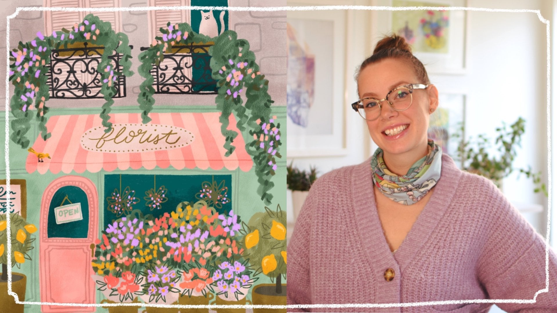
last little details. Hello, everyone. I'm
Kristina Hultkrantz an illustrator and
surface designer from Maria Fred Sweden. Welcome to my CheeryPink studio. I've been working as a full
time illustrator since 2010, and I've also been represented
by Pink Light Studio an art licensing
agency since 2019. So I've had the pleasure
of working with many large companies,
which is really cool. Like Hobby Lobby or American Greetings or Orange Circle Studios,
just to name a few. So, Illustrating
in Procreate makes art making so much fun
and it's easy too. I really love
focusing on creating fun things from my
portfolio because it can get boring to do the same old florals
over and over again, even though I love florals, too. I really hope that you're
going to enjoy this class, whether you're
thinking about adding fancy cakes to your
professional portfolio, or you just want to
make one for fun. Let's get started.
2. Supplies and Class Project: To follow along in the class
exactly as I am doing, I will be using the iPad Pro with an Apple Pencil in
the program Procreate, but I'm sure that you can follow along in a similar program. You will also be needing
digital brushes. You can use the ones within Procreate or any
of your favorites. The class project will of course be to illustrate a
fancy cake of your own.
3. Intro to Fancy Cakes: Before we get started on
sketching out our fancy cakes, I really love sharing some
inspiration with you, all the different themes
and variations so that you can really make
these fancy cakes your own. I want to share some stuff from my own portfolio so that you can get an idea of what I have played with
with this theme. So I did this sketchy birthday. I mean, like,
birthday, I think is the first thing we
think about with cake, so it's not very, like, out there, but that's classic, and it always sells and everybody has birthday,
and they come every year. So it is a good thing to
have in your portfolio. This one I tested out doing something a little
bit more sketchy. I just drawn it really quickly, even though this
took surprisingly much longer than
you would think. Yeah. I in this class am
sharing with you just a straight placement illustration,
but you could of course, turn it into a mini collection or a full on collection with patterns and complimentary
patterns and stuff like that. That's an option for you.
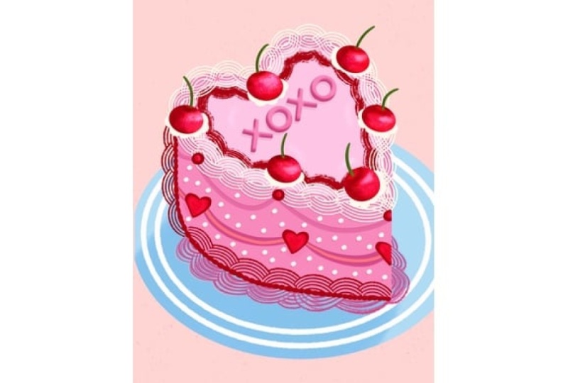
Where's my cursor? There we go. Then here's another
collection that I created. Here we can. Why, I actually called
it fancy cakes. And here I did a little
bit of a mix between birthday and Valentine's
Day and any occasion cakes, really, I guess, but
mainly happy birthday. And then I love you
and I did hearts, so those kind of more in the
Valentine's Day category. I really enjoyed
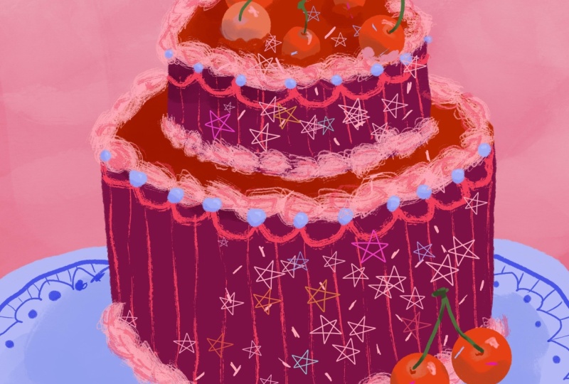
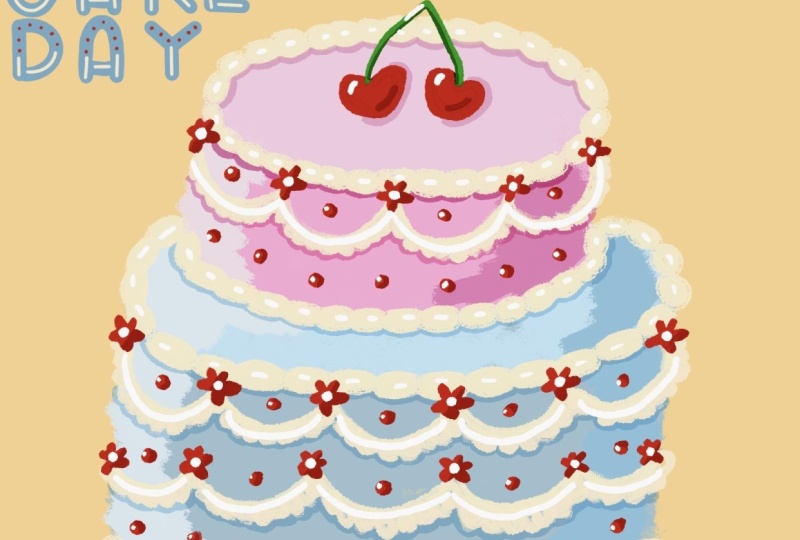
creating some of these. I recolored some of these. Like, this one to be
more birthday friendly, like this a little bit
more commercial birthday for anybody when you use colors like the primary colors.
I really like this one. I think it just
looks so crisp and lovely with the lettering and all the pinks and the softness and the frosting and
the details and, like, the plate, you could draw the plates like super detailed. You can do the backgrounds
like a beautiful tablecloth. You can really, like, make this scene so much more and
unique in your own thing. You could have a hand
coming in to, like, take a scoop with
a spoon or a fork. Another example I
changed the colors. Not so excited about this cake. I almost feel like it doesn't
look like a cake anymore. But I mean, there's
a balance there. All right. That's some examples
from my portfolio, but we need to look
at Pinterest because Pintrest gives us all the ideas. Now, I just wrote in
elaborate cakes and we can of course take inspiration
from actual cakes, from beautiful amazing
talented bakers. Because this is their
artwork and their property, don't just take a photo from the Internet and
completely copy it. Take different elements that
you like from one thing and then mix and match and add your own thing
and do different colors. And just like I usually say
in all my other classes, it's so important that you bring your own thing to things. But you can take inspiration. There's in just these images, I love the idea of having a very like the texture of the
cake is quite simple, but then have a whole
pile of fruit on the top, or the same thing with this one. It's all just one
monotone color, and then the cherries on top, stunning but then what's also good with pinchers is when you get one image,
like, you love this. But then there's tons of other images with blue
cakes with cherries. You can get examples of
how you can do variations. I love this one
with the cherries on the bottom down here, so it's not so perfect. This one with lots of cookies and sprinkles and
things like that. Just don't do any
cookies that are super recognizable or candies that
are super recognizable. There are certain things
that are super trademarked. So that's important
to take note of. Look at this cake
that looks like a like the forest floor
with moss and things. How incredible is that? I mean, like, sometimes
it goes towards, how can you make it still look like a cake in your drawing? And that is usually
with candles, is a good way to make it
still look like a cake? Or other sentiments. Like, if it is for a
birthday collection, then it's like happy birthday
or if it's for a wedding. Talking about that. Like,
congratulations or, um, yeah, good luck. You got to come up with the
occasion that you can do. But any of the occasions
like Mother's Day, Father's Day, um, graduation. Those were some of the
things that I put in, like, St. Patrick's Day, Valentine's Day, and Easter, you could do cakes
for Easter with lots of eggs and
little bunny rabbits. How cute would that be? I mean, there's so many
different variations on frostings and things. Like, this is super romantic. You're with
strawberries, and, like, it looks so this could be
beautiful for wedding. It could be beautiful
for Valentine's Day. Um, look at this with,
like, illustrated, like, thinking we can actually
illustrate a cake, and you don't even
have to use frosting. Like, you can just
illustrate it. And the different forms, like the cake as
itself like this or tiered or a piece of cake
is also interesting. This is beautiful with
the moon and the sun. Like, think about
different shapes. Like, I showed in my portfolio, I did a hart, but, I mean, there's plenty of other shapes. Like here, a moon
would be beautiful. A flower. Um, a possum cake. I don't know about
that, but okay. That's weird. These
hedgehogs, very sweet. Now we're getting into, like, really weird territory,
which is excellent. Um, yeah, I hope that
you get the picture. Fancy cakes. But mainly, I just want you to go
full on in with all the, like, the ornate, frilly things. How can you draw
that in Procreate? How can you get the
different textures? How can you just make this so elaborate and yummy and it's just going to
be so much fun. And I think that you
can develop this to so many different
things in your portfolio. Because this is just ridiculous. Now, it's very popular
with possum cakes. This is very strange, but
I'm happy to see it. Okay. I also wanted to just quickly
look at other artists work. I looked up cake art, and this is what showed up. Again, I just want to show you how many different styles of art there are
and people come up with different ways of
showing a cake from really painterly to more
stylized things like this. This is really simple, but it still reads as a cake. Even more simple, lots of
details in the background. I mean, the sky's the
limit is so much fun. Hm. My gosh. This class, I think is going to make
us all want to have cake. So yeah, that's my
little introduction and some inspiration for you. Just go into Pintris, look at fancy cakes, elaborate cakes,
over the top cakes. Check out one of
those baking shows where they do crazy cakes. I'm sure that you can
come up with something. Do you want the safe themes like birthday or wedding or
something like that, or just draw a cake for
the fun of it and it can be used for somebody else can figure out what
it's going to be used for.
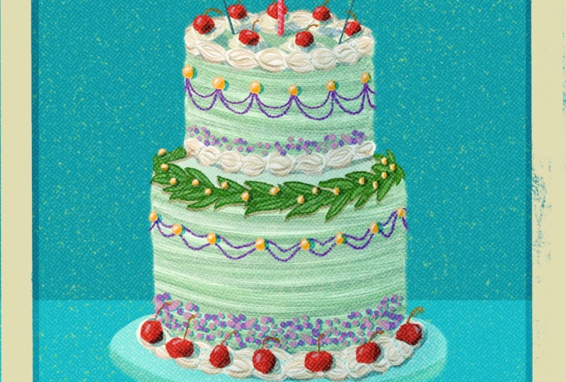
4. Project: Sketch: Now we're going to get straight
into the class project, which is illustrating
a fancy cake. Then following sections, I'm
going to be sharing with you my full process of bringing
a fancy cake to life. Here we are in Procreate. We're going to start by
creating a new canvas. I like using a 11 inch by 14 inch canvas in
300 DPI in RGB. Those are the specs that I like. It is a big enough size. If you prefer to use
standard European sizes, definitely go for an A three. I think they usually are
a little bit too long, but I mean, they can
always be cropped. But yeah, just choose a big size when you're
a big enough size, not too crazy, but bigger than a letter because you never know what
this might end up on. And since Procreate
is a raster program, it's nice to have as
good quality as you can. That's what I'm going
to be doing and again, we can go into the
Canvas information here. So the dimensions are
11 " by 14 ", 300 DPI. These are the pixels, if
that's important to you. Layers for my
machine that I have that's starting to get a
little bit old. I don't know. Really, when I got it, actually, 71 layers I can have
the color profile. I prefer RGB in Procreate. I just find it works better. The CMYK, when I bring
things into Procreate, there's bugs, so
I never use that. So that's that so
there's my canvas, and I prefer for a cake. I think portrait is great. So now I'm just going
to start sketching. So I'm just gonna use a
regular pencil and I can use, like, a darkish color so you can hopefully see
what I'm doing. But yeah, so as much as I like the idea of
creating a possum cake, I think I'm going to
go for something a little bit more
generic and boring, and I think I'm just
going to go for regular tiered round cake. So, yeah, just drawing
my cylinders here. It would be interesting to
do something a little bit more different, so I don't know. Maybe can I get my plate, at least, is, like,
off the sides here. And this I can try to make
quite a lot more elaborate and have lots of details
on the plate, as well. And here's gonna
be, like, shadow. I really did enjoy drawing
all of those cherries, and I don't feel like doing lettering in this
class, actually. So I think I'm gonna do some
cherries on this one, too. So cherry on top of the cake. So let's see, we need this one
that way. Maybe like this. Is three a good number? And then maybe one
down here as well, like the two stuck together. Because I quite like that, how that makes the composition a
little bit more interesting. And then it's just
about decorating. So just thinking about those, like, I love those, like, blobs. Unfortunately, I'm not a baker, so I don't know the technical
terms for all of these. I'm sure there's
technical terms, right, for all of these, like, frostiny
things. Like pipe. I know that's piping, but the different I don't know, the different nozzles
on the piping bags. I like when they have,
texture on them. This is something I
can try to draw in. So I really like that texture. There we go. And
then, of course, like, sprinkles is fun
and different colors, and that kind of brings life, and that is not if everything's
so symmetric here, then I think sprinkles is
something that's really fun to get it a little
bit more wonky. I can do round sprinkles and the shape as well. Just for fun. Can even be some
sprinkles on the plate, 'cause, you know, like,
that's inevitable. They always fall
off, get everywhere. Okay. And what else? I'm not sure about my
my cherries up there. It's kind of annoying.
It looks like there's two with antenna. So I kind of feel like
I need more cherries so that there's more going on, and more, like, overlap. Yeah, I think that
would be better. Two, three, four, five instead. Then it's a little
bit more going on. Alright. But then, like,
we need even more. Like, definitely need some
of this kind of swirly. I can even be kind of
doodly like doodles. And then we need some kind of frosting here at
the bottom, too. Maybe two layers.
I've seen that, like, a big layer of blue gloopy, frosting, and then, like, the smaller around it. Then there could always be sprinkles, there's
pearl sprinkles. You could put pearls on here. That could be something we could put on and that would
be fun to draw. I think, sometimes just what
do I actually want it here? Again, I put the
small edging here. Maybe some stripes would be
interesting. I don't know. Now, when we're just drawing, it looks not as crazy, but when you start
putting in color, my little sticks here. Okay. So there's my sketch, and we'll see how it
develops as we continue to work on our final artwork.
5. Project: Flat Color: Now it's time to start bringing this
illustration to life. I'm going to make this layer
a little bit less opacity. I just want to make sure
that we can still see it. We need to figure
out what kind of colors we want for this cake. Now, I of course loved all
those blue variations, but I thought that that
was done and I don't want it to be too
much like what I saw. I had to figure out
something for myself. I'm just going to think about different colors that
I've been using. When I'm thinking
about cherries, definitely we could
use some of those red, super red cherries could
be really interesting. And then we need
some pink too, like, as the because I love
pink and red together, more like a little
highlight on the cherry, so I'm taking something
that's a little bit more peachy, so I have that. But then I was thinking maybe it would be really stunning on that dark burgundy
kind of reddish color. So I have this one in here
that would be interesting. It's quite red, red burgundy. That would be really interesting to make it very luscious. And I want to kind of try
a little more purple. Purple's really difficult on
screens, so that's annoying. We could try something
like that one, but even darker, like, really dark almost
towards black. So I try something like that. I think I'll keep it in
this realm with these, like, burgundy colors and make sure that it
doesn't go too dark. So some of those just to get some contrast in there
would be nice for that, like, ice blue purply kind of periwinkle color because I think that looks
stunning in there. And maybe the stems of those cherries can
be like this lime green just to also break it
up a little bit different. So how about we play with that? And then the background color, I'm not sure yet, but let's just get
started with this. So I'm just going to block in the colors of my cake.
I like doing that. I'm going to use the dry ink
brush from within Procreate. I have manipulated it
somehow and to my liking, but I still like the
original as well. I have the original
here, too, I think. I'll use that one then
just 'cause Alright, so then make sure that
you have a new layer. I'm going to put that
underneath the sketch, and I'm going to, yeah, use the dry ink brush that's
within Procreate, and I'm going to just
block in the colors. So I'm thinking maybe the super rich burgundy
can be, it's pretty thin. Can be the cake and to make these layers
easier to create. Or to make your illustration easier to create lovely
to work in layers. That's the main reason why working digitally
is so amazing. Also, the back button and undo
button is also excellent. You could, of course, fill
this in just by pulling in. But I kind of like how the brush has some speckles and things. So I do like just
filling in by myself. Here we go. So that's nice
and dark and luscious. And then I'll do the
even I'm not sure. No. I will do the next
layer underneath. And then also in the
same burgundy color. And I will pull that in. I'm bringing up the
threshold there. Okay. Just go around the edge 'cause sometimes that
gets messed up. Alright. To give some variation here, we could do like shadow. So I'm going to do a
clipping mask on the top one and maybe use this
really dark one and no, maybe the lighter version. So the tops of the cakes
are lighter than the edges. So you get some of that
three D look going. I'll do the same thing.
I'm going to grade a new layer clipping mask. And draw that so we have now
it's starting to look three D. And now we're gonna
start decorating. So again, I need a new layer. And here, I'm gonna use that really dark burgundy
and see how that looks. And then I'm also gonna look for another brush. Let's see. I have 5 million, so it's difficult to
remember which ones are which M D I have one
called textures? Yeah. Is any here that I like
that are can you search? Imported custom
sketching, drawing. Copperhead looks
kind of frostingy. What does this look like?
It looks kind of frosting. Okay, so let's go with
that for right now. I was also nice that
it was a little, not as opaque, so
that will be good. So let's see. Hmm. I will do the frosting on
the top of the cake. Two. And then these
little bottom ones, I want more like just a smaller Just making sure I'm not
making it too perfect. Let's see. I want
to go underneath. So I'm on the other layer, so I'm making sure I'm
underneath that top part, so I can do those sections. And these ones I can
maybe make a little bit bigger because it's
on the bigger section. And then here I was talking about doing
a little bit bigger and then smaller details
underneath that. So I'll do, like,
messy. There we go. So we have some so we have some frosting
going on here. Now we're going to add in
some more details, of course. I'm going to go to the
top and add on the top. Let's see if we add in some
more lighter versions. Let's see if we can find
another brush that we like. The sticks look like. That's good. It looks more
painterly. That's fine. Okay, so I'm going to
do some of these lines. Look like smeared paint. Smeared frosting. Making sure it goes off the edge because I think that
looks a little fun. I want to shall we test out some stripes,
see what that looks like? So I'm going to choose that medium burgundy
that we had on the cake, so then I can go in and make another clipping mask there and see what
that looks like. We do some subtle stripes. I think that looks kind of fun. It's quite subtle. I'm
using my pen quite lightly. I'm holding it quite lightly so that it doesn't
come off too much. I mean, this is supposed to be incredibly ornate and
elaborate and crazy, so it's not like you
can add too much. Then I'm thinking
because I'm using very monochrone colors that's
also going to be okay. Alright. Now, to get an overall feel
of what the piece looks like, I kind of feel like we need
to start thinking about the background because now
it looks very contrasty, but if we have it on,
like, a softer background, then that's gonna look nice. But before we do
that, I want to get some other colors in so I
know what's going on here, so I'm going to go on
top of that layer, go to put in these cherries. And that one I want to
use my um where are you? Drawing charcoal, painting,
sketching. Where's My dry ink one. I just saw you. Here you are. Okay,
so I want my red. Are kind of two in
line with each other, so I want to bring this
one down a little bit. It can be a little
bit smaller, too. That one's overlapping, so I want to do that
one separately. But I just so I'll do that
one a little bit separate. I'll make that one pink
just so it sticks out more. There we go. And then the stem,
so another layer, and I'm going to
take the green color and do a little simple stem. I might want to
make them thicker. We also have the red
cherries down here, so I'm going to go down here
as well and add those in. Try to make them a
little bit round. And the stem layer There we go. A bit more interesting. And
the plate in the background. So that one needs to be
underneath everything. What color should that be? I also need to figure
out the background. I have this blue color, and I think that
would look beautiful, but I think it also
could take over. So I kind of want should we test the background
with the pink? But then I can do, like
I did in my other one a little bit more ombre look. So if I do that and
then in this section, I'll leave a layer
for the plate, and then or 16 can be the plate. And here, underneath,
I want to do, like, a really light pink, and we need some kind
of watery brush. So what can we do for
that? Or charcoal? No. Let's see. L. What does gouache
look like? Like a work. I'm going to make it quite big. I'm just going to lightly paint over the sky and
make sure that there's no super harsh sections there and then make
another layer up top, so it's even lighter up there. So it's like an Embree look. You could do even lighter for another little
section at the top. Yeah. But this brush was
quite light and airy, so that looks nice. I'm going to go back to
my inking dry ink there, and I'm going to
work on that plate. So I have that empty layer. If I bring in that
blue, what happens? Does it take over? Or does it look nice
with something going on? I think that looks nice. That has, like, a
contrasted color. So it's not all monotone. W a chromatic Okay.
So that's fun. And we can go in and work on the plate a little bit and then kind
of work our way up. So here I'm just going to
create a clipping mask, and I'm going to just choose a slightly darker
blue to add some of those details that I
wanted to create so I can make an edge around the plate. I want to I like
this scallop detail. And then some dots. I'll fill those in. You can turn off
the sketch so you can see if it's
looking good. Okay. So I think that's
enough details. I could go and add some
stripes, too. Should I do that? Just so it kind of
mimic the cake. That kind of looks
fun. I'll do that. All right. So that's
starting to come to life. Let's add some of those
sprinkles and things. So we talked about I
think I'm going to use this blue to bring that up
into the cake, as well. So we talked about
those, like, pearls. Now, I can't see much of
my sketch anymore, really, so I'm just going to turn it
off and you can just turn it on to get reminded of what
you were thinking about. So I'm going to do on top
of those quickly scallops, I'm going to put in
some bigger pearls. Let's do on all of them. Okay. And then we have these ones, and I think I'll make those
a little bit smaller. Okay. Alright, so I'm just
going to close out my colors here and look at
this a little bit more. I quite like how my mb is
a little bit messy there. It's a little bit maybe it's
a little bit too cloudy, but I think it brings
some interest there. So I'm gonna leave it. So now I have added all the
different blocks of color. Now we just need to make this a little bit more come to life. So I want to add in
my sprinkles first. I do actually have
a sprinkles brush, which would be the easy way out. And that one's by, let's see. That's by Lisa Glanz, and that one is in
her Mm Let's see. It's in her texture, one of her texture one
Texture brushes, sprinkles. It's 100 hundreds and thousands. And then you choose the
color you want it to be based off of. Let's show. So here is really small. And it usually goes
different colors. I'll make it even bigger. Let's see. That's fun. Even in the air a little bit. Just sprinkles everywhere. So that's really fun.
I can highly suggest that brush in that pack. Again, I can link it below. It's the but from Lisa Glanz. She's a teacher here
on Skillshare as well. So that's fun. But I want
to bring in some of those. Um bigger sprinkles, too, just so that we can draw
something, as well. Mm, where are we again? I honestly need to
inking, dry ink. I'll do some maybe red
sprinkles. Would that be good. I want to take another. So a couple of red sprinkles. Trying to make those
quite random in placement and making sure to put them a little
bit here and there. I want some pink
sprinkles, obviously. So I'm going to bring
that in as my next color, making sure that they're
in different areas. And overlapping things cause that seems like they're
not unless it's, like, one of those cake
masters who use, like, tweezers to put on every
single sprinkle on a cake, I think that they're
usually quite random. Okay. Starting to look fun. What other color
bring that blue. Also. So we try to keep this
pretty small color palette. I think small color palettes, limited color
palettes look really sophisticated and
well thought out. Even if you're just kind of
figuring it out as you go. Like, like I am. Sometimes it's hard to
pin down exactly what it is that you are doing or
until you see it finished. Okay, that looks fun. Kind of want like a rogue
sprinkle over there. Mm hmm. It's kind of empty over here, but I'm going to
manipulate the frosting. So okay, so there's
all the flat color that I've added to
the illustration. It's already coming to
life so wonderfully. So yeah, now it's all about really bringing it to
life in the next section.
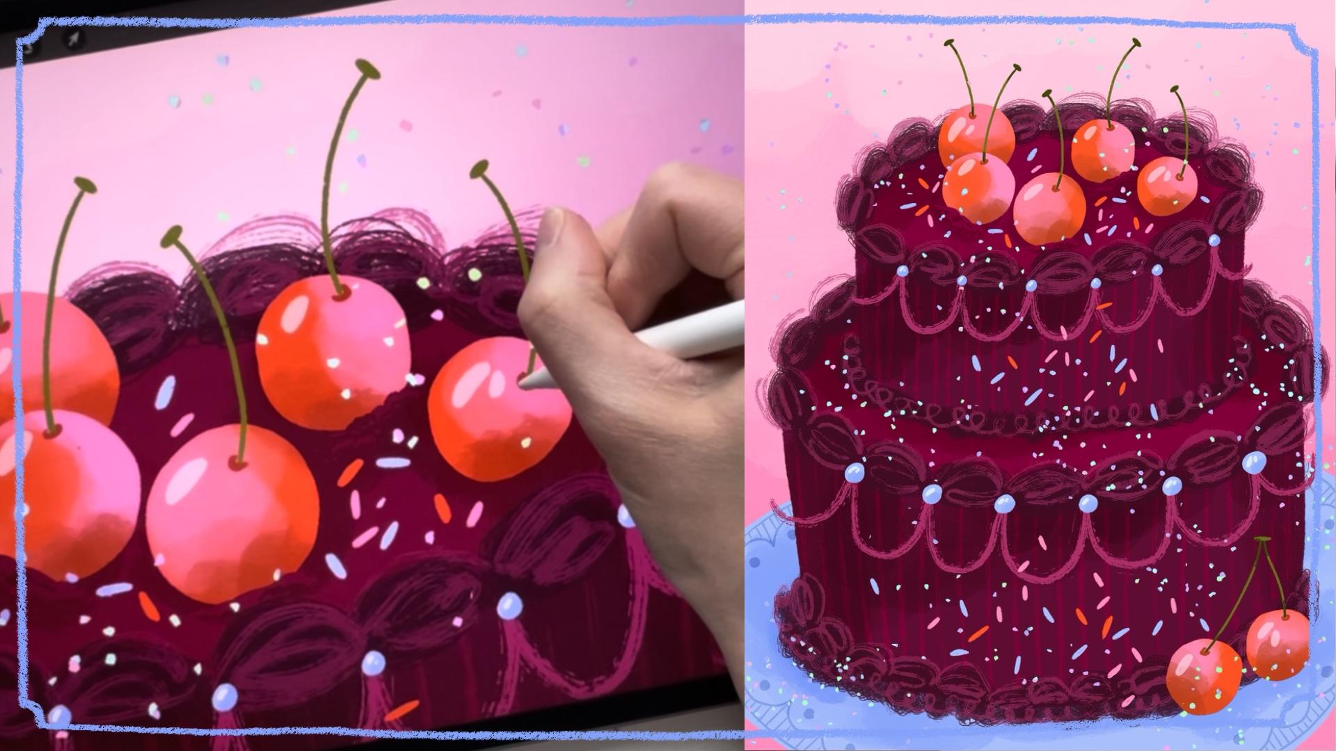
6. Project: Final Details: All right. Now it's time to really bring this
illustration to life with lots of
shadows and details. So first, I was thinking, Well, I like to just start
from the bottom and just go up so that
I don't miss anything. So I'm going to start
with this plate, and on top of the details, I'm going to create
another clipping mask. And now I'm going
to do something called an adjustment layer. So I'm going to take this N, and I'm going to pull that
normal to soft light. This is my favorite
adjustment layer because I can create different shadows, but if I change the colors, it will change the color
of the shadow to match, so I don't have to change that. I can give you an example. So I choose a charcoal color, and I'm going to go for
that Where are you? Here, painting with
a gouache brush, and I'm going to
paint in the shadows. And I loved how this
brush was quite subtle, so you can kind of,
I can get more a little bit around the cherries. And then if you go to black, you get a darker,
more intense shadow. If you want highlights,
you can go to white, so you can highlight
things if you want. So that's why it's
so nice with this. I can show you what
it looks like if we wanted to change the
color of the plate, we just change the color, but then the shadows match. That's why I really like this.
Just going to undo that. Now we've done the plate, now we're going to go onto the cake. I'll do the same thing. Go to the top of those all the layers, add a new clipping mask. I'm going to make
sure I'm on that charcoal because I
think it's nice, happy medium, like gouache, and I'm going to start painting. Whoops, I have to change it to adjustment layer, soft light. Otherwise, it turns black. So here I'm just going to give some nice shadows to the top. So it looks more rounded to the sides again to
make that more three D look and just add some
shadow and depth in there. That's that first cake section. Then we go to the
next cake section, which is on top of these ones, clipping mask, remember to do soft light and
do the same thing. So here I'm going
to give some shadow under the cherries
and I'm going to underneath those swirls and a little on this
side just to make it a little bit more three
D. Those really quickly, but it just says so
much more impact. And next, if we want to bring
life to all of these uh, let's do the pearls. So those ones, we're going
to do a clipping mask. And again, with this to
give it some shadow. Gonna zoom in on those, and the brush is too big, so I'm gonna bring
it down a little. Give those some shadows
underneath from one side. Okay. And then I think
because it's a pearl, we need to give some highlight. So I'm going to do
a clipping mask, and I'm going to choose
a light blue color, and I want to do the dry ink and just draw
those highlights in. So I'm going to draw
in some highlights of different sizes. You can do two or
one little blobs of color to make
those look shiny. Bigger, smaller, making
it look a little random. It doesn't have to be
perfectly planned out, like, scientifically
accurate. There we go. So there's some shiny
pearls on there, so that's really fun.
What do we have next? We have all the frosting, and right now it's
really flat because it's quite almost black. So on top of these sections, and I quite like that brush,
so I had to figure out that. So I'm going to
choose that color. And then that brush,
was that a painting? The drawing? Yeah, sticks. Okay, so I want to add
some details onto these. But now it's a
little bit too much. So maybe I'll just reduce
the opacity on those. 56. That's good. Okay. So then they get more
defined and they feel like just adding
some texture there. These really painterly
brushes, I think, really show the look of
frosting well, I think. I like when it goes
off so you can see the texture there.
That's really fun. And here, just do some simple squiggles here
also defining on the bottom. This is so fun. Okay. And you can go back
in and add more or less. That's why digital art is so much fun that
you can go back and, like, you can turn off a
layer, try something else. You go to give some
details up here. I love the back button, also. I mean, undo is the best thing ever. There we go. So that's all gotten
some attention. The sprinkles, I
mean, we could go in if we wanted to
and add highlights, but I think that
would be overkill. Quite they're so small. I think they're fine being quite flat. I am wondering if I should put sprinkles on top
of the cherries, because now it just seems unlikely that the sprinkles
wouldn't be on them. So I'm going to take that brush that I did and put those on top of the top of everything, so there can be fun
sprinkles everywhere so that they're more, like in bedded. I also was playing
around with adding some frosting to
the cherries there. So I did before. I forgot to put press play
or record, I mean, but here, I put in using the dry ink, just putting in some
frosting to make the cherries look like they're
actually sitting there. But now we have to
make the cherries look like they're not
just round balls. We need to make them
look a little bit more three D and yeah. Not like they're super
realistic here, but kind of. So again, a clipping mask on
top of the first cherries, and I want to add
some of this pink, and I want to do
the gouache brush, make it a little bit bigger. And I'm going to
add that pink in areas because I
think it looks cute. And so we don't have
to do another shadow. Plus, also the shadow, the soft light doesn't work very well on red for
whatever reason. So I'm going to choose a red and a darker version and do
the shadows now with that. Okay. And then we're going
to do the pink one by itself, as well. Clipping mask. I'll do
that shadow in there. And then the red see it
looks a little bit more fun. I forgot the ones down here, so we have to do that, as well, so take that pink
and go back down to those and highlight
those as well. Remember my darker red color. And then I want to give
them some fun highlights. So I'll do a light pink, and I will use that dry ink. And again, I'm not trying to do something super realistic. If that's something you like
to do, I'm like, go for it. But here, I like to just
just so look a little bit more shiny. That's fun. And they do look a little
bit too stark white, so I could, again,
bring the opacity down a little bit so that
they melt in a little bit. Yeah, I think that looks better. It looks fun. The stems, I think I'll just keep them quite flat because
they're so thin, not very important,
but I think I want to use this
darker red color. I'm still on the dry ink, and I need to kind of make that stem look like it's
going into something, like the top of the fruit
just so perfectly flat. So there's a little like where the stem
goes into the fruit. Alright. So I think
I think we're done. I think they look so much fun. Ah, now I'm kind of
thinking that the stems, no, wait a second
while I'm thinking. Let's add some shadow
to the stems, as well. So clipping mask,
some dark there. We'll go to soft light, and I'll make the tops a little bit darker
and at the bottoms. Yes, so something's going
on with them as well. Just to match everything else. Okay, that looks better. Okay. Do we need more sprinkles? I think it's fine.
Okay. Look at that. All right. So that's
our fancy cakes. I hope that you enjoyed
creating a cake with me. I hope that you maybe learned a few techniques or
discovered a new brush, like the sprinkle brush. I really enjoy that one. And remember that there's so
many different occasions and color palettes and shapes and decorations that you could
test putting on these on. Check out one of your
old collections. So can you add a
fancy cake to it? Just draw fancy cakes for
fun. I mean, I love this. This is so much fun. Thanks so much for taking
this class with me. Let's I can zoom
in so you can get some little detail shots here, my beautiful sprinkles and my my cherries and the shadows, and it looks painterly but
not too crazy, and it's Hm. It's just really fun.
7. Next Steps: Alright. That's it. I really hope that you enjoy
taking this class with me. I love setting you up with a few next steps so that you
know how you can go forward. So I'd love to say
that fancy cakes, as I mentioned in this class, can be used for
so much more than a birthday card or
a wedding card. They can be for any occasion, and they're just so
much fun to draw, either just to draw for your best friend if you're
just printing it out by yourself or to put in your professional portfolio and maybe it will end up
on a hallmark card. That would be amazing. So yeah, just keep
thinking about fancy cakes and add them to your portfolio when you're
doing a different occasion. Maybe you're doing
a St. Patrick's Day theme or you're doing a um now I can't
think of anything, but, you know, just
keep have, like, fancy cake in the
background when you're doing a
Valentine's Day card. Like, it doesn't always
have to be little candies. It can be a full cut cake. Excuse you. Yeah, have fun with
your portfolio. I mean, even though it's a professional business and it's commercial and you have to think about things
that have to sell, a lot of things
that sell are like, when you share your joy or you share something
that really, like you worked on this
and you had so much fun. I think that people can see
that in the final image. You chose fun colors
and fun details, and you really worked on that
frosting texture, you know?
8. Where Else Can You Learn with Me: Okay, that's brilliant. Thanks so much for taking
this class with me. And if you enjoyed learning about
Illustration in Procreate, I have many other classes
here on Skillshare. Please check out
my profile page. I've done 40 plus classes, and you can find many about pattern design,
Illustration and Procreate. So I'm sure there's something
for you there to discover. If you'd like to share your final illustration with
me, that would be so great. Please upload it to the
class project area. I can't wait to see all
of your fancy cakes and see what kind of occasions you decided to draw them for. If you want to hang out with
me outside of Skillshare, you can find me on Instagram
at Kristina Hultkrantz. My website is also
Kristina hultkrantz.com. I have a beautiful patron membership community that
you could check out. I have something called
Collection Club, where we work on
surface design themes together every single month
with a feedback session, and you have accountability
to get that momentum going with building
your portfolio with really curated,
beautiful collections. So I would love to see you there if that
sounds interesting. But until my next class, make sure that you're
following me here on Skillshare so that you'll be
notified of my next class. And I'll see you
there. Bye, everyone.
 Kristina Hultkrantz, Illustrator & Surface Pattern Designer