Transcripts
1. Introduction: welcome to my first art Minis class, exploring earth tones with watercolor. We're going to make three fabulous projects, starting with an abstract, then working on some rain bows and then moving on to florals I'm creating. This series, of course, is called Art Minis, because I know people are super busy, but also with love to be creative. Class consists of short lessons to help you incorporate thes projects into your existing daily creative practice or to help you begin an ongoing creative practice. The projects are perfect for your sketchbook or for making finished pieces. I really believe that everyone is creative and everyone has the ability to be artistic. So I really hope this class will help you tap into your creative and artistic side. My name is Portia, and I'm an artist, illustrator and designer, and I'm really looking forward to sharing these projects with you. Please give me any feedback you have because I'm always looking to improve my classes and please take advantage of one of the most amazing things about skill share, which is the ability to make art within a community. We'd all love to see what you make
2. Materials: I'm going to review all of the materials that I'm using. But please feel free to use whatever you have on hand. Any type of water based paint and any type of paper that will hold water color will work for this project. We're gonna need an array of paints, a palette to put your pain sign and to mix colors on a container of water. Now I'm using one large container of water. Another option. This is two containers of water, one for cool colors, one for warm colors. No one. I'm using these smaller containers I do used to. But since my new container is so big, I'm just going to use one. You also need three brushes and I'm recommending around number 10 a flat number 12. And then I believe this is called a mop brush and doesn't really seem to have a number on it in the same way. But you can get the idea. We're gonna use this for painting kind of a big, messy background. And so it's just easier if you have a large brush. If you don't, don't worry about it. You can get by with these two. That'll be fine. And then you also want to have, um, a paper towel or three. Um, you'll be using this when your paintbrush has too much water on it to dab it. Um, I also recommend having a sketchbook so that you can do like if you want to do tests of color before you put it on your final piece. And also, sometimes we're gonna do exercises and those you may as well do in a sketchbook. You're actually welcome to do the whole course of a sketchbook. It just depends if you want your final piece to be on thicker paper. So I am recommending the cancer in mixed media sketchbook because they're not too expensive . Um, and they can hold water media pretty well. You can see some pages get a little roughly if you put, you know, a lot of water on, but for the most part, holds up pretty well. Okay. And then, as faras paper goes, it's up to you. What size do you want to use? Um, I do really like these fluid cold press paths because, as you can see, they're glued, um, actually conceived here. They're glued on the side. Um, and so will stay flat. Even if you flood it with water, it's not gonna curl up. It will stay flat. And I have a few sizes. I have a by age, the six by eight and the six by six. So just depends if you want to work in a square format or rectangular and then they also have. If you prefer smooth finish, they do come in hot press, and so this is gonna be a lot smoother, whereas this actually has texture to it, which I prefer I like. I like the texture a little bit better. It's helpful. Toe have a tool to separate watercolor paper from the pad, and I like to use this item that's called a bone folder. It's traditionally used, I think, for like creasing paper, so, like little if you're folding paper, then you can use it like that. Decrease it. I don't use up for that as much as I use it to release these pieces so you can see because this top piece got wet. It's already separating a little bit on its own, but then you can just stick this in here, slide it over, and that way you don't rip the paper because it's very easy to rip it with your hands. Um, if you don't have something like this or you don't want to buy something like this, you can also use a ruler so you could stick this under. I think it's a little more difficult. Um, I probably would just use the ruler to get it started then and then I would very carefully peel away like that. So I guess I really do. You recommend investing in something like this if you're going to be doing a lot of water color because it's much simpler there you go.
3. Paint Colors and Prep: I am providing a written list for you, but I'll just go over the different colors of water color that I'm recommending. Since this is Earth tones, we don't need every single color. Um, I'm just sticking with the ones that will be using in these exercises or projects. So these are all Winter Newton watercolors, and this one is opera Rose. I'm actually almost out of it, but my local art store is not replenished it yet. Scarlet lake is the red, and then a dark orange is called Windsor Orange Red Shade, but it it is orange. Then I'm recommending a very lemony yellow wins or lemon all of green pearling green, which has blue in it. And if you don't want to get to greens, you could actually just get a blue. And then, when you need a bluer shade of green, you'll mix it. You mix your blue with the olive in potentially a little bit of the lemon. Um, and the brown colors. We have yellow okra and brown Oakar, so this is kind of a light brown, and this is our darker brown, so I don't know if I'll be able to get enough opera arose out of my tube. So I need to have a backup, and I'm gonna use Rose matter. Um, there really is no exact backup because you can see how vibrant that is. Um, and the sons much darker. But I just want to have some options. If you don't have, you know, access to all of the exact colors, that's really no problem. Just feel free to improvise. And here is Scarlet Lake, and then we're gonna put down the winds are orange red shade. Now, the best thing to do with this is once you put out your colors, it's actually helpful to let them sit overnight because they'll harden up and they won't be as gloppy because you actually only need a very small amount of pigment, and then you'll mix it with water. So this is a yellow ogre, and I know it got a mixing orange with the yellow color and the brown Oakar, so I'm gonna put those right next to each other. This is the brown darker brown. Now we've got the lemon yellow, which is very break it. Oh, and one of my favorites, that all of green they use this a lot on the pearly in green. I don't know if I'm saying about the right way or not, and it's dark, but it has. Basically, it's just a green with more blue and quite a bit darker than the olive.
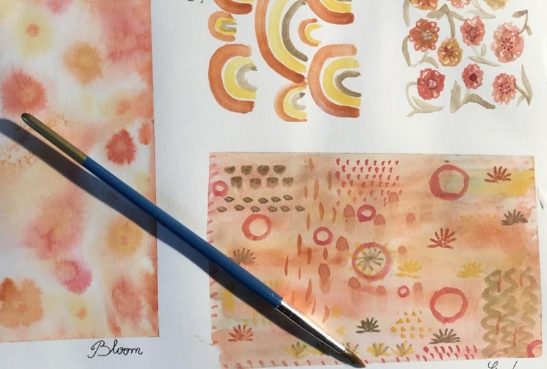
4. Exercise 1: Brush Marks: So for this first exercise, I'm going to use my notebook because this first exercise is all about getting familiar with the brushes and also the paint. I'm going to start with a flat brush and I'm gonna mix up some orange and yellow over. See, I think I wanted a little darker, so put a little bit of the brown over in Gonna get like a really nice earthy brown. Almost like a terra cotta. Okay, that looks pretty good. Um, and now I'm just gonna see what kind of marks I can make with this brush so I can use it in a flat way. Going vertical going this way. Now you can see it had a lot of water on my brush, which is causing this to pedal. That's alright. We'll just pick some of it up. Now, if I just use the tip Now, this is gonna be hard to see, but I'm gonna point straight down and see what kind of really thin marks I can make. Just using the tip kind of like stripes a little bit. All right, now, I'm curious to see what happens if I spin the brush just on its tip. Ptolemy's my other hand tip. Been a little more. Here we go. I don't have so much control with my left hand, but I wouldn't do to be able to see what I was doing. All right. Now try skirmishing the bristles of down. This may not be the best thing for the brush, but I didn't buy super expensive brushes, so I'm not gonna worry too much about that. See, mixing up a little more Hagemann's Who? It's quite a bit darker, just fine. Alright, let's try spinning again. Look at that now. If you don't want so much excess water on your breasts, you simply dab it on the paper towel. That is really what that is there for. UM, let's see a thin line all the way across. Let's see what happens if we just kind of let the brush spin a little bit in her hands while we're pulling it across the page. Yeah, you can get lots of interesting Merck's who knows what these could be useful for. So if we use the brush kind of like a stamp, you can get some cool marks, and especially if you have extra water and then you see the dark pigment, and then it kind of fades into the light pigment, which I think is a really neat affect. And then as it dries, you can see what the brush looks like. It's not quite yet. Stamp a little more. Just getting the tip. Another way to stand. Just stamped the tip safer there, yet still pretty wet. There we go. There's one to see you, that kind of effect, or show you the kind of effect you can get when the brush is almost dry can get kind of a nice texture going. I really like that. It's like seeing the the paintbrush markings. So just have fun. Just, uh, take your brush. Play around with it. Let's see what happens if you go on the side of the pressure. That's kind of cool. Another nice texture. I kind of feel to it to make little stars all sorts. That's kind of amazing what you can do. Just using one brush. Let's see ifwe get really thin lines. If you press down a little more, you get obviously, uh, line the tapers on either end, which is kind of pretty. All right, so let's move on to the round brush and you can see I'm just rinsing this out so it's ready to go. Okay. Okay. So use the round brush. And now I'm gonna dio also kind of a brown color. But this time I'm gonna put a little bit of red there. Who that's looking pretty. All right, let's go with that. So now I will do the same thing. Will just look at what kind of marks in this brush make would almost looks like ketchup. I really like using the brush is a stamp. I just think it's fun. It's a little bit unpredictable to how everything will settle in. All right, try spinning hope that was a little bit dry split around. So what happens if you get the very You can make some really tiny, tiny dots with this brush if you want. And let's see, it's good also for making pedley shapes so you can do it in this way. You can also do it in this way, a little flowery looking thing. We can try spinning this and here we're getting a little bit of that dry brush effect, too. See, and again, if you start lately and then press down and then pull up. You can get a tapered look, so it's good to play around with their brushes, just so you know what they're capable of, it doesn't necessarily mean that you'll use them, you know, in that way. But it's just good to understand what's possible here again. You can make some more Merck's, so if we use the brush on its side, kind of a texture, it's kind of nice. And one thing I forgot to show you on the flat brush is I see just using the edge and kind of making a little stamp this way, and that's kind of a nice little shape that you could use. All right, so break out your pains, break out your brushes and have some fun.
5. Exercise 2: Blooms: So now we're gonna experiment and make some water color blooms, blooms, air fun to play with. And we'll be using them in our floral project. I think I'm going to start with yellow. No, I didn't do what I said to do, which is let my pain strikes other a little bit wet. Um, and I'm meeting to water them down a little bit because there's just more pigment that I want, so, OK, hair is now we do want some water, or the bloom can't happen. So figuring out the right amount of water for anything in watercolors kind of a trial and error sort of thing. Um, so, you know, I'm gonna That was the lemon yellow. Now I'm gonna put a dot of the pipe. Let's see, Per lean green in the middle. We'll see if it blooms much. It looks like we got something going. All right, So now let's try the light Oakar. And I see you want to get a little more pigment. All right? Now let's put in Ah, do a little bit of this gente color. What about the water? I kind of tap it a little bit. Just, uh, add more pigment and to kind of get it going sometimes that it needs a little nudge. All right, let's move on. They will put down it's, um, orange. Make a little earthy not to earth, even just a little bit less straight out of the tube. Crazy, vibrant. And I'm just sort of letting a little bit of the excess water, um, bleed off under the paper just because for the bull you might do you want it to be a little bit What, in fact, a little more You don't put too much water in because then I will puddle. But if you don't have an ask, the Bloom doesn't have anything to grab onto our tow mash with, um Right. So let's go with this dirt green again. See what happens. All right, We'll see. I may have blown it with the water situation, but we'll give it a try. Okay? No, I'm gonna put down some of us gente e Yeah, you can see this pulled a little bit, and then well, of the to be fair, this probably works better, actually, on real watercolor paper. But I just want you to get the idea of what can happen now It's starting orange, all right, I think I got the right amount of water. Yeah. And also, um, it's not just about the water. It's that some react in a blooming way, and some colors don't. That's just like part of the property of watercolor. So that's why it's kind of get to do the experiment first. So you have an idea of if you're gonna do a finish put piece where you want tohave blooms, it's good to know which colors are actually going to react. I think this dark kind of bluish green is really pretty. All right, colors we put in there thinking yellow. Oh, yeah, Here we go. I actually think I want to try the ogre orange with the green, the dark green again because I want to see if I messed up or if it will bloom, given the right amount of water. All right, let's give this another shot, see what happens. Cool. So it doesn't really move much. That seems to be, you know, doesn't move anywhere near a smudge, just like the yellow and the orange in those you know, color combinations. Like I said, Saul, very specific to the colors, which I think is really interesting. I've no idea what causes that. It's a very bright red hair. Maybe I'll add a little bit brown, a darker brown. All right, this is gonna be very saturated. Who? All right. Yeah, And you can see where there was kind of a warp in the page that's moving over there, but it is getting a little, little tiny blooms. Okay, so for this one, thinking to go, Yeah, but he always seems to be a pretty active one, but they can see that it's pulling a little bit there, so I'm gonna. But the diet here heads too much. We just cleaned that up a little bit. All right, We'll try this again. All right. We'll see what happens by maybe so light that although cool the way that one really showed up, and then you see kind of green and then blew over here, um, you know what? I'm not happy with that. So I wanna see if I could do this again. But the red this time I'm gonna go with magenta. So this might be another one of those where it just the color itself doesn't move as much. We could see that the yellow really blooms. The orange will really bloom. Um, at least in those colors. The slim somewhere. But it doesn't sort of have that fast moving effect, and neither does this one.
6. Project 1: Earth Tone Abstract Part One: So now let's do what I'm calling the messy background project, and this is a lot of fun. So I've got my six by eight fluid watercolor hot press. So it's got the texture and this is my pad. So it's glued together, and I'm just gonna set this up. And for this, I'm going to use the round brush the small round brush to mix the colors. But then, to put the water on in the pigment, I'll use the bigger mop brush and you'll see why in a minute. So I'm gonna use some of the earthy colors we've used in the example exercises and then also some greens. So when I do these, I like to start with the lighter colors first. So I'll start putting down some yellow mix that with a little bit of Oakar. Looks like I'm getting some orange in there, too. That's all right. Okay, So actually think that I'm gonna dio is just put a little bit of water on this page to start with because I want the watercolor to move. I don't want it to just sort of sit in one place. Okay? Say now. Oops. Forgot my paper towel, which is very important, Especially when you're using all of this water. Okay, Got some orange next of But I also think I want a little more yellow. Okay, as you can see how you know, when there's not much water, it doesn't bleed much. I kind of wanted to be I don't know how to say it a little bit blobby, um, not necessarily highlighting the brush strokes. Um, And I want the colors to bleed into each other just so that there's kind of a feeling of I guess I caught floaty movement around the page. Okay, more orange. Now you can see where there's enough water. It really again. It's always a fine dance between enough water and too much water. Because if you get too much water than as you saw in some of the exercises, things will petal. But if you don't get enough, then the pigment doesn't move around. All right, so now I think I'm gonna turn it so that this stuff all kind of slides down a little bit. I love the kind of drippy look too. You can see what I call us. Call this the messy background. Okay, Now, go go for a little bit of kind of pink and red mixed. They're very vibrant. And I do want to keep this more of, Ah, a background. A tiny mid of my precious, uh, pink, uh, they recover and great. I love opera pink. Our upper rose. I guess it's called. You can see here where? Because I had to kind of crack this out of the two, but it was dried up and getting these little flecks, but that's a Kale just started. Work those in. All right, - all right. Now I want to get a little bit green, and I know we're working on Earth tones, and I think of Let the yellow get a little out of control here. Doesn't feel very earthy at all. That's all right. We can this layer. That's the wonderful thing about having this on a pad, because it, um you can kind of put a lot of water on it. The paper will still be very little splattering, - all right. Trying to bring the earth tone aspect into this hair with the green. And I think I'm gonna also go back over some of these really vibrant areas with the over. Yes. We'll see how well the what the paper holds up. All right, this is starting to look a little more earthy, earthy, with berate spots of pink. Here, there. Kind of like that, actually. So if you want you still look a little more earthy without having to do all of this layering just but more ogre or more like the light brown mixed that in with their yellow from the beginning. And then you won't. If Earth is what you're going for, you won't have to go back over this. I think I gave my secret away, which is that I don't usually work in earthy tones, but I really love. Hm. So I wanted to give this a shot. Okay, So if you are dividing this project into two days, have I think now is the perfect time to just let this be until tomorrow? If you want to come back to this, I think in an hour to it should be fine. Um, but again, I'm definitely trying to make these classes for people who I don't have a ton of time but wanna work in a little creative project into their busy schedules and maybe just have 15 minutes here, there. All right. Thank you. And I'll see you next time
7. Project 1: Earth Tone Abstract Part Two: So we're back with our messy background, and now we're gonna add some marks. And if you want a reminder, um, as to the types of marks that you can add easily don't hesitate to flip back to where we practiced with the brush is making a bunch of different marks of just kind of to remind yourself that there are many ways to use the brush, and I'm gonna keep my test pad out here for colors. So again, I'm going to use earth tones. And this time I think I'm going to start with some darker colors. I'm going to start with kind of an all of green. You can see that my pains are actually dryer now, which is making it easier to just get a little bit. So I just I really want this to be fun and have some movement. I'm not gonna worry too much about the composition. I'm just gonna do it intuitively, and I'll make some marks and then I'll sort of look at it and then figure out what to do next. But I'm really not planning it ahead of time, so that's maybe a little lighter, a little too much water there. Want a little more pigment? Here we go. And we've got the green on my brash off look around and see if there's some other areas, Maybe in some other different types of marks that I want to make. And I got a little bit of, um, spray, which I don't mind and in fact, might do some little splattering myself. Just kind of knocking the brush. Just give that, you know, a little more movement. Now, I think I'm gonna make more of a terra cotta orange color, and I'm switching to the flat brush so I can get some different types of marks. Clean up this splatter. I mean, the nice thing about watercolors, it could be removed easily, although not from your clothes. Imagine you can't see this, but I'm wearing a white vests. If I need to be careful, we have a lot of vertical movements. And now I'm making something that, um, has a little more horizontal movement. - I'm gonna go for making a bigger murkier. Oops. Gotta be careful not to put my hand right where? Just pad. - So when I'm making these marks, I'm thinking about balance, and I'm sort of looking alright ahead. Something dark here, Um, darkish here and then over here. And I'm just sort of as I'm going, I'm trying to create something that's interesting and the eye moves around but then also feels balanced. And I'm also trained a layer up so that, like this kind of squiggly, feels like it's behind this. And so there's kind of this play in space and really, the way you do that is by using lighter colors and darker colors. So when you have contrast than you're going to get that sense that something's air coming forward and some things are receding to the background and it kind of creates a dialogue back and forth, which is something I really enjoy. So when I'm feeling a little bit unsure of something, it will just test it on here. I know I want something really translate said, That's just gonna kind of sit in the background. Um, yeah, I wanna when I had to kind of check that out first. I feel like I've kind of got this all over pattern going, But this space is feeling a little empty to me. So you didn't big what I want. Try and there. No, I'm remembering some of the marks that I made during our experiment, so I'm just going to see That'll go. Yeah, I kind of like that. Has a little bit of that. Somehow A Southwestern field to me. Shoot. I guess that was still a little bit wet. Just try that. That's part of it. Interesting. All right, well, sometimes happy little accidents happen. That's kind of fun, because that makes it look like the square is actually in front of it. This is a pretty strong element now, and I'm feeling like if I just leave that and maybe don't put in another one somewhere, then that I will get stuck. So that's what the I to move around. Maybe there was one that goes off the page over here. Did tying a little hint of one down here so you can see how much fun it is just to be free and build up the design and the layers. And sometimes you might feel like you've gone too far and you can try to correct it, or you could just use it as OK. I know where my level of businesses that I like and on your next one. Do it differently because, as you can tell, this goes like, really quickly. It's super fun. I mean, I have to say, I'm loving this right now. Um, this might be drawn the eye away a little bit so I could think about doing something darker and here we're here. Or it could think about putting a little bit of water here and sort of dialing it back, which is what I think it might dio to see how that goes. You may end up ruining the peace, but hopefully not. But like I said, you know these air so fast and easy that it doesn't really matter, and we'll just see how that how that works out. So I'm just putting a little water, so yeah, I can Looks like they can bring it back pretty pretty easily. And then it kind of gives it a more of a worn look. Yeah, I'm liking that a lot better. I was just a little too dominant, so I'm really pleased. I like this kind of all over composition. That's, um, more of a pattern, and I just think it's really fun and beautiful, so I want to show you something else. This is not an earth tones, but this is something I just did in my sketchbook for fun. So it's really the same process. I did a messy watercolor background. Then I did a lot of marks, like I just showed you maybe not quite as many. But then I came back with pen and I was sort of working with I would say it kind of mid century modern type, funky shapes. Um, and I used a pasta penne. So in another, um, I don't know how to say episode or another Siris of these art minis. I am going to show you how to do something more like this, where we do the watercolor background and then we bring out the pasta pens. It's just that I really wanted to start with watercolor only because I want you to see how much you can do with just one medium. And I don't want people to feel like they have to go out and buy tons of supplies just to make an art project. So all right, thank you for watching, and I will see you in the next lesson.
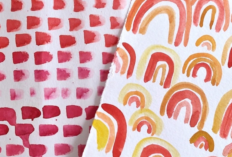
8. Project 2: Earth Tone Rainbows: So now we're gonna work on our Earth Tone Rainbows Project, and we're just gonna make a sweet little pattern. Uhm, I'm going to use my six by six cold press watercolor paper and you're welcome to use a bigger piece if you like. Now I recommend keeping a scrap piece of paper or your sketchbook handy so that when you're mixing color, you could do like a little test strip. Because with these rain bows, the colors are very close but different. And if you want to have enough contrast, you might just want to have something toe tested on before you put it on your actual piece of paper. So and of course, a paper towel is always helpful. Move these around. So for these, I'm just gonna be using the warm colors. I'm not gonna introduce any green, but of course, you're welcome to do so. If you would like. Basically, I want a yellow and orange and then a more red color and mixing a little brown into all of these colors because I definitely like that earthy, um, kind of terra cotta feel. And I'm just eyeballing this. I don't I don't really have that much of a plan except to just sort of space amount. If you're uncomfortable working in this way, then you could always sketch it out and pencil either on. Well, actually wouldn't recommend doing it on a separate piece of paper, because I have found that if I sketch it on the watercolor paper, I could never really get it off, quite to the level that I want to. The always be like a trace of pencil, and I don't like that. But again, it's personal preference and you can see my mind's are wonky. But I actually like it that way, - and I'm gonna turn my paper. I've stayed down that you don't smear what I've already done, - and it's totally up to you how dense you want your pattern to be. I tend to like to fill mine in, but you could also have a lot more space if you prefer. I hope you enjoyed this lesson and I'll see you and Earth tone florals
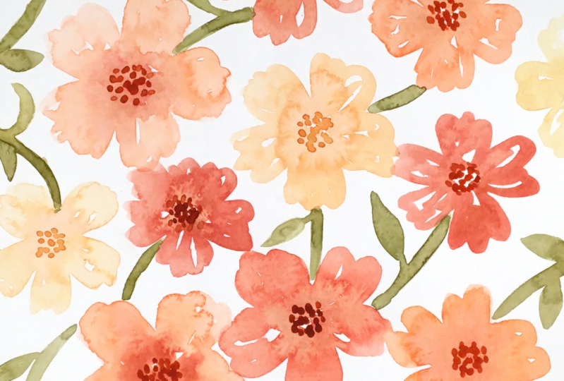
9. Project 3: Earth Tone Floral Part One: So now we're gonna work on creating some water color florals, and I am gonna use, um, a bigger piece of paper this time. Eight by age. I really like florals, and I find, especially with this size brush that it will be easier to have a paper that's big enough that I can, you know, make the florals not too tiny. Yeah, I'm gonna prepare a lighter orange and then a darker color with some red in it. Now, when I'm looking at these on my palette, I definitely want to see a difference. All right. And since I'm going to start with the lighter Peller, I want to be sure all of this darker color I just cleaned from my brush. - And now we're gonna use what we learned in the bloom exercise and there. - So I'm making this color a little bit brighter and a little bit center. For one thing, I want some variation, but also I want to see this bloom a little more dramatically. And if the colors are too similar, that's not gonna happen. You can actually do the same thing where you just paint with water and then watch the bloom happen which is pretty cool. This fire is looking a little funky, right? I got kind of a weird angle up here, all right. But you know what? We're just gonna let that go as hard as that can be, because we're just here to have fun. There we go. Who Some nice, nice blending there. All right. - The nice thing about flowers is they are very forgiving. So even if it's not quite right, it's all kind of organic and fine. Now I'm doing this because I feel like I like these littler flowers in combination, and here is like a big group of larger flowers. So I wanna put something smaller up here for the sake of the composition. - No . Maybe I'll make Sen. What about a yellow? Get something a little bit later. - Turn the paper to make this easier for myself And this reds a little overpowering. So gonna make this a little Murthy. Okay, so now we have fun all over pattern of earth toned flowers. If you would like to stop working on this for today and come back tomorrow, this is a great time to stop
10. Project 3: Earth Tone Floral Part Two: So now that I've let this dry a bit, we're gonna come back in and add some details. We're going to start with adding some centres to the flowers, so we'll do that loss of darker colors. I'm creating little dots to add some definition to the centers of the flowers and for the different colors. All vary the shades a little bit for the yellow flowers, a light in the color, a little bit. - It's a lot of this is about adding visual interest that doesn't need to be perfect. It's just giving us a little bit more information to look at when we look at her meaning. All right, so that's looking pretty good to me. I think now we're gonna go in and add some stems and leaves, so I'm gonna prepare Olive Green and I'm just adding a little bit of brown to the green. That's already pretty, all of to compare together, and I'm gonna have the stems coming from all different directions so that there's a feeling of movement and which is what I what. - And so I think we'll stop here. I'm feeling happy with a composition. It has a lot of movement and energy, and it feels balanced to me.
11. Thank You!: Thank you so much for taking my first art minis class. I really hope you enjoyed it. And please, poster projects have loved to see what you made.
 Portia Monberg, Illustrator