Transcripts
1. Intro: Hi everybody. My name is Philip. Today I'm going to be teaching you some basic and intermediate techniques for motion graphics in After Effects. But first, a little backstory. I've been using After Effects for about three years now, and I learned, mostly, using techniques I found on Skillshare. I didn't go to school for anything media-related, but today I use After Effects every single day in the mission of making the best possible visuals for my YouTube videos. When I'm not making YouTube videos, which isn't all that often, my interests include working on motorcycles and photography; two things I'm also learning from YouTube tutorials. I live in Philly, and as a creator, I love being part of such an honest and genuine city. It's a great place to make stuff. Anyway, if you haven't seen my videos before, VoxCast is dedicated to analyzing music, talking about production, album covers, industry topics, basically, everything to do with pop, hip hop, and alternative sounds. One of the trademarks of my channel is the 2D and 3D animated visuals. Today we'll be getting into the techniques I've developed over the years, putting them to work, and making a unique scene, just like I would for a VoxCast video. Basically, this class will be useful for anyone interested in media, video editing, animation, motion graphics, because you can really apply the techniques to a wide variety of applications. I think it'll be easy to follow along with even if you're more of a Premiere user, or if you're new to Adobe, entirely. Let's get right into the class.
2. Setup: Hey, everybody. Welcome to my first course. In this course, we're going to be using After Effects to really make something pop and entertain the viewer; adding a lot of visual interest to something that would otherwise just be pretty plain. This class could be useful for a new After Effects user or someone who's only done one or two tutorials already. Maybe if you don't know how to use the app at all, this might be a little harder for you, but I think you could probably still follow along, but it could also be useful for intermediate users, I think. Without further ado, let's get into it and make our first composition. Here we have a folder with all of the assets we'll be using in this class. These assets will be available on the Skillshare class page. If you're new to this type of animation in After Effects, it might be best to use these assets because it'll help you learn what to look for in the future, but if you also have an idea of a look you want to go for, that's totally cool too. What we're going to do is we're just going to select these assets and we are going to drag them from this window into our project window in After Effects. Now we have them imported; it only took a second. I'm going to close this window. What we're going to do first is create our composition, then import these assets to that composition. If you know a little bit more about After Effects, you've already done this before, but if not, you're going to click in the ''Timeline'' and then hit ''Ctrl'' or ''Command N'' if you're on Windows or Mac. Then we're going to name this scene 1. Make sure we're on 1080p, 1920 by 1080, lock it to 16 by 9. There are a lot of different aspect ratios to use, but this is the standard one. Make sure that pixel aspect ratio is square pixels, not any of these other ones. They will warp the video. We're going to use a frame rate of 24 by 30 and sometimes 60 are also popular, a duration of one minute, and then we're good to go. Our next task is just to import the main footage. It's just a video of some different animals eating lunch, but I like it. It is pretty boring, but it's the point, that we're going to make boring footage more interesting. We are going to scroll through to the clip I want, which is a clip of some chickens eating dinner. Here we've got some footage of some chickens eating dinner, very interesting, very fascinating wildlife. Anyway, in the next lesson, you'll learn how to make a 2D Room in After Effects using just two layers. So get ready for that.
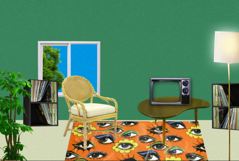
3. Designing The Room + Animated Textures: We have to do is we need to make two layers to create a room around this footage. Hit "Control Y" to make a solid and we're going to go into the color selector and go for something darker green I think. Like one of the clips I played earlier, I want to go for a darker green theme here. I think like a more neutral green like that and then we're going to click "Okay". We have to go to the timeline and drag it below the main footage because it's supposed to be the background. Then hit "Shift" and then drag it a little bit further up to about here. Now that we have this green layer here, we're going to make one more. Hit "Control Y" again, click the color. Then we're going to make it a little lighter because I want the floor to be lighter than the accent wall here. I think I want it to be a little less green, maybe a little more creamy like a yellow. We've got that and click "Okay". Then we drag this on top of the background, but below the footage. We're going to rename both of these. We're going to rename this one Top Wall, and then we're going to rename this one Two Floor. Now that we have the floor and the wall, we're going to go to the Preview window. We're going to go next to the Magnification settings, the button directly to the right right that, and click "Proportional Grid". We have this guide that tells us the basic proportions of the window and we can move the floor based on that. We're going to click on the floor in the window here, make sure it's selected and we're going to drag down while pressing "Shift". Shift will lock it to the side just to make sure that I don't lose it and have to move it manually. I think the floor should be taking up about one and a half boxes here. I think that would look good. It looks pretty natural if it takes up one and a half boxes. We don't need the guide anymore. We're going to click that button again, get rid of it. I think that this is a pretty good proportion. This is the floor, this is the wall. The next step before we go into our next lesson and add all sorts of visual interest to the scene, we're going to animate the background. We have a file here called Texture Loop. This will be available in the class description for download. What we're going to do is we're going to drag this into the timeline and put it below the floor, but on top of the top wall so between those two. Obviously, it doesn't have transparency built-in. What we need to do is we need to go into the Blending Modes in After Effects here. We're going to click from "Normal" and go to Screen. It becomes transparent and you can only see the lighter colors and not the darker colors with the screen selection. If we hit the Space bar and we preview this animation, you can now see that the background is animated and it's not just a blank wall. It's pretty subtle but you can double it up if you want by clicking the "Texture Loop" and hitting "Control D" or "Command D" so it becomes more vivid. But for now, we're just going to leave it with one. In the next lesson, we're going to be isolating the footage of the chickens really emphasizing that and making sure that it pops to the viewer.
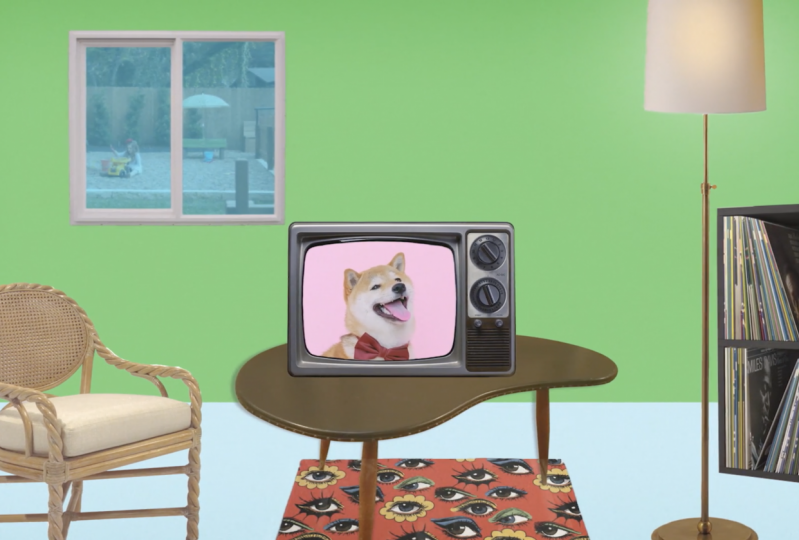
4. Making a TV + Shadows: In this lesson, we are going to use masks to isolate the footage and make it stand out better to the viewer. I have a file, it's a picture of a TV and the center where the picture would go, it's transparent. We're going to have the chickens show through like they're on the TV. But this footage of the chickens is wider than the vintage TV would be, because old TVs had square pictures. What we're going do is we're going to select our main footage. We're going to go to the pen tool or hit G, and we're going to mask around, pretty simple. We're just going to create a square box where the TV is, and now we have the chickens isolated behind the TV. You can tell, or if you've ever seen a vintage TV like this, the glass bose forward. I want to make that look more realistic as well. What we're going to do is we select the main footage, go to our effects and presets, and search for an effect called Lens. The one we want is CC Lens. We're going to drag that to our main footage and the effect controls will show up right here where the project was, Effect Controls are in the same window. Now, what we have to do to make it look the way it should look, we have to use the size and convergence sliders. After messing around for a second, I figured out that the best way to make this look like an old TV will be to make the size 250 and the convergence negative 200. Now, it's not quite big enough, so what we're going to do is we're going to click on the main footage in the timeline, hit S, and increase the scale to around 48. We could get away with 47, maybe 46, no, not that. Let's do 48. We're then just going to move this right here. Then we're just going to move this right here. It has now a distorted look that it didn't before. It matches the distortion of the television a little bit better as well. We can see the difference before and after by clicking CC Lens and the effect controls and then hitting this button right here, the fx button. Now, it's more distorted to show the edges better, just like an older TV would. Overall, we have this TV sitting on the floor and a background. Now, what we want to do next is we want to click the TV and the main footage. Shift-click TV, main footage. Now, we're going to right-click pre-compose TV with Footage. Some of the benefits of pre-composing are that I can now move two layers as one. If I wanted to make it smaller, I can make them both smaller at the same time, like I do, and bring it down to 80 percent and I don't have to make them both smaller and than remove them and realign them. Now, we're just going to go to the Align section over here on the right, click, Align Horizontal and Align Vertical. It's now back in the middle like it was before. The next step in finishing this TV scene will be to go to effects and presets and type in shadow. Go to the drop shadow under perspective and drag it over TV with Footage. We're just going to change the distance and the softness. We could make this 35, we can make this 125, maybe 155, and bring the opacity down to 40. Now that we've changed the TV to look how we want it to look, we've got a shadow, we've got animation, distortion, we've got the walls, the floor, everything like that, in the next lesson, we're going to look at adding a lot more visual interest to the composition. Hang on, I'll be right back.
5. Populating the Scene: Our first step is going to be to go to the TV with Footage Composition, hit "S," scale it down to around 45. Now we're going to click and drag, put it over here, and we're going to import the table, every TV needs to sit somewhere. We've got a table here. What I'm going to do is I'm going to scale this down as well, hit "S," and bring it to about 30 or 38 or 40, and make sure that all the legs touch the floor and none are up here on the wall, just to maintain that perspective. Then we're going to make it a 3D layer. All these different settings will show up. You want to hit the "X Rotation" and just slightly bring it this way. Now this isn't going to be too realistic because this isn't a 3D model, but we can slightly change the perspective to be about negative 10 or 15. Then we're going to go to the TV with footage and we're going to bring it right down to sit here, I think maybe even scaling it down to a 35 percent would make it look a little better. You've got this TV on this table. I think I'm actually going to go and get rid of the drop shadow as well. Go to the Effect Controls from the project and delete the drop shadow, cut that out. We've got the TV just sitting on the table, we need a little more than that. Next up, we are going to go back to the Project and add in a Rug. We're going to take the rug and drag it onto the timeline below the table on top of the floor. This rug is a '60s style rug, and I'm going to bring it right up here to the top and go to my Pen tool and just make a super messy, not at all official mask right around there, so we've got that. Then drag this around and we're going to put it right underneath the table again. I want it to take up more space. What I'm going to do is I'm going to hit "S" on the rug and then maybe scale it up to 175. It's a low res file and it looks pretty crappy, so what we're going to do is we're going to animate this with a texture. I'm going to take paper texture from the project file and I'm going to drag it on top of the rug, that's overpowering. We're going to scale it down, hitting "S" again and dragging it to scale it down, and then we're going to change the blending mode to screen. We've got this texture on top of the rug and we're going to animate it. We go to Effects and Presets and type in offset, drag offset onto the paper texture, go to the Effects Controls, and we're going to Alt-click Shift Center 2. Now we've got this paper texture on top of the rug and we're going to animate it. Go to Effects and Presets and type in offset. Now we drag this to the paper texture and then we're going to Shift-Click, Shift Center 2. It opens up the scripting window. We're going to type in posterize time, (4), we hit "Enter" and type in wiggle (30, 3,000); I'll include that in the description somewhere, but if you want, you can just type it in as well. We click in the timeline now and it's just animating this texture. It's changing the position a few times a second. There are a few hard lines in here, but it's just hard to tell. What we're going to do is we're going to duplicate the rug, drag this duplication on top of the paper texture, and on the paper texture, there's a track matte section, go from none to Alpha Matte. Now this paper texture is just only showing where the rug is because it's mapping the location of this second rug on top, which is invisible, and it's animating right in there like that. It like hides the low-quality nature of this rug since we did scale it up almost double. Next up, in our quest to add visual interest, we're going to add a chair. You take the chair file from the project, drag it into the timeline, and obviously we need to scale this down. I'm going to bring it down to 35, maybe a bit bigger than that, 50, that's not bad. We're going to just manipulate the chair, put it in here. I I what I'm going to do is I'm going to make the table a little bit more this way and then put the chair right here and we're going to scale it down a bit, maybe to 45 percent. Next step, we're going to add a lamp and hopefully, we will also be able to make the lamp glow. We're going to drag the lamp in, but this lamp isn't transparent. What we're going to do is we're just going to mask roughly around the lamp here, so we're going to hit "G" to select our Pen tool and then just start masking. It does not have to be exact, it doesn't have to be super clean because it's the aesthetic we're going for here, a little bit patchwork, and we're just going to thread that NEO right there, hit "Control Z," and then zoom in and press "H" to move around. Basically, we've now got this lamp and there's this one section that's super thin, so we're going to have to mask that out as well. We're going to select the "Lamp" in the timeline, hit "G," and then just mask that out. But it thinks we're actually masking it in, so we're going to select the "Lamp" and hit "N". Then for the Mask 2, we go from add to subtract, and then select the "Lamp" again and mask out this section as well by hitting "G" and just going in here, mask out that little white section. Again, Mask 3, go from add to subtract. Now we have a pretty clean-cut lamp. Now I want to put it right around here, a little bit further away. Imagine that the lamp is closer to the screen than the TV and the chair. I've got that and that looks pretty decent. It looks a little wacky right here. Maybe I'll just put that there. I have an idea to make the lamp glow and I think I know how to do that. What we're going to do is we're going to go to the Pen tool and have no layer selected. The Pen tool will create a shape if you don't have a layer selected rather than masking, so we're just going to create a shape right here. We're going to drag that right below the lamp and change its color from black to maybe just white. Then we're going to go to our Effects and Presets and look for the glow effect, Glow Intensity. We're going to make it much higher maybe, I think we can do that. What I've done just now is I've created a shape layer that was white and I made it in the same shape as the lampshade. I applied the effect deep glow, which is a paid effect, so you don't have to use this at all, but if you have access to deep glow, I apply that to this shape and then I will drag it behind the lamp to just make it look like the lamp is turned on in a goofy little way. We've got our lamp, we've got our TV, our table, our chair, and the TV is playing our main footage here, let's not forget about that. We've got our animated rug. What do we add next? I think what I want to add next is I want to add a plant. We've got our plant here in the project file, and we're going to drag it to the timeline, so we got this right here, it's just a PNG I downloaded from a royalty free PNG site. I'm going to put this on here on the left. I'm just going to scale it down maybe to 65 percent. We're going to put it here. The next step is going to be to add some shelves. I have this image of some vinyl records shelves here, and I'm going to drag this into the timeline and we're going to mask it out so that we don't have this gray background here. We're just going to go to our Pen tool up here and make sure that the shelves are selected in the timeline, and we are going to mask this out. We're just going to remove the background and add there and there. There you go. We have our vinyl bookshelf and I want to put it right here. We're going to scale it down, so we're going to select it, hit "S," bring it down to maybe 85 percent size. It doesn't have to be that big or that small. Then we're going to duplicate it. We're going to click it, we're going to select the "Shelves," hit "Control" or "Command D" on Windows or Mac, then we're going to rename it to Shelves 2. What we're going to do with Shelves 2 is we're going to hit "S," bring up the scale controls, we're going to unlink the scale so it's no longer bound to scale linearly, it can scale in any crazy direction, whatever you want. What I'm going to do is I'm going to invert what it was before, so we're going to make it negative 85. We've just flipped the position here, it looks like the opposite of the other one. We're going to move it over here, two shelves opposing each other across the room. Now we're going to select both of them and bring them behind everything else, so on top of the rug and between the table. There you go. There's light casting on here, they're behind everything else, and I think the other thing I want to do is I'm going to select both of them again and just bringing them a little bit further up. I want to bring this one over here just to create more room and then this one over here, so they're off the rug but still in the room. The next thing we're going to do is we're going to add a window. I have this window here in my project files and I'm going to drag it to the timeline. It's a little too big, hit "S," scale it down to around 35 percent. After we've scaled down the window, we're going to bring it up over here. We're going to drag it down right above the paper texture, and then we're going to de-select all of the layers, go to the shape layer, make sure it's a nice, decent blue color, and make a shape by clicking and dragging behind the window. Then we're going to drag this behind the window layer, click both of them and pre-compose it, window plus sky. Now we have a window, we've got TV, we've got the chairs, we've got all the furniture, everything. This has been a pretty long lesson, but we're about to get into the next one. In the next lesson, we're going to talk about how to do contrast, how to do brightness, how to give everything a cohesive look.
6. Color Grading: In this lesson, we're going to be using adjustment layers to really clean up the look of the project. Right now you can tell that this is just a bunch of different images put together, but I want to make it look more organic and flow a little bit better. Our first step will be clicking layer, then new, then adjustment layer. An adjustment layer will apply any effect you put on it to all the layers below it as well. We're going to go to Effects & Presets and type in Brightness & Contrast. We can go drag that to the adjustment layer and we can play with the brightness and the contrast just a little bit. After increasing the contrast to about 20, we can go add another effect. I'm going to type in hue and add in Hue & Saturation. I'll drag this to the adjustment layer and just change the hue ever so slightly. Our next step for creating a more cohesive look will be going to our Effects & Presets and typing in noise. We'll add the noise to the adjustment layer and we'll increase it to about 15 percent. You can tell it's got this filmic look to it now that just gives it a more cohesive appearance. It's slight, but it helps a lot. Next up, we're going to go to Hue & Saturation, drag this to the adjustment layer as well. We're just going to increase the saturation by about 15 points. It's a slight change, but again, it does help give the project a more cohesive look. One more thing we're going to do is we are going to take Hue & Saturation and apply that to the rug as well. If we reduce the saturation by about negative 15, maybe a little bit more, maybe negative 25, that'll help make the rug look a little bit less distracting and overpowering compared to the rest of the scene. Now, there's one more thing we can do. If we go up to the top adjustment layer and select that and then type in posterize to the Effects & Presets, we can apply that to the top adjustment layer. Now, at this low level, it looks a little bit jarring, but if we take the level and change it to about 15. Now, we have this general setup. We've got the TV and the birds, we've got the room decorations, we've got the wall, the window, the animated textures, everything like that. We've added a lot of visual interest to the scene, but in the next lesson, we're going to use an optional 3D plug-in called HandyCam to add some more depth and movement to our composition.
7. 3D Camera Movements: In this lesson, we're going to be adding depth and movement using HandyCam a third-party plugin that you can buy for about $30 online. If you don't have it or if you don't want to buy it, that's completely fine, there are definitely ways to do this in After Effects natively, but this is the method I use so that's what I'll be teaching you right now. Our first step will be going to Layer, New, then creating a null object. Then we're going to go into Effects and Presets, and search for HandyCam. Apply HandyCam to the null layer, then click "Setup." Now we have HandyCam Controller and HandyCam Camera. Our next step is to press "Control A" on the keyboard, and click "3D Layer" for every single one of our layers, except the adjustment layer which we will deselect afterwards. Now we're going to go to the lamp and the shape layer, Shift click them, and right-click, pre-compose. Then do lamp plus glow. Make this 3D as well. Now press "P." Bring it forward by going to the third position coordinate, and typing in about negative 150. Then we're going to move it right back to where it was. Now we're going to go to the plant, press "P" and bring it in again to about negative 200 in the third position coordinate, then move it back over here. Up next, we're going to the chair, bring that forward to about negative 50, bring the TV and the table, also to about negative 50 on the third position coordinate. Now we're going to select the TV, bring it to negative 50, and then we're going to bring the table to negative 50 as well. Leave everything else, basically as it is. Now we're going to go to HandyCam Controller. We're going to go to Lens, Depth of Field, check Enable, focus layer TV plus footage. Then we're just going to play with these values a little bit. We're going to do aperture to about 250, blur to about 500 percent, maybe a little less. After playing with these values for a little bit, I've changed the aperture to about 250 and then blurred to about 350 or 450. It creates this depth effect like a camera would where the chair, the table, the TV, those are all in-focus. The plant, the lamp, the bookshelves in the back, the window, the wall, those are blurred. They would be in a real 3D animation. Although, it's a little bit rougher, I think it looks pretty decent. We're just going to go make the rug up in the same level as the chair and TV as well. I'm just putting that into focus a little bit. Now what we're going to do is we're going to create some camera movement. We're going to go to Dolly, Pedestal, and Truck, and X, Y, and Z, and we're going to key frame those. Then we're going to click on the HandyCam Controller and press "U." Now we can see these keyframes in the timeline, and we're going to go to about 10 seconds, maybe 20. We're going to change these values. Dolly brings it in and out, Pedestal brings it down, and Truck brings it left to right. Although, we don't need that right now. These controls will change the angle of the camera. Though, we don't exactly need to change them too much or it might get a little wacky because again, this is not real 3D. Although I will bring the Y to about six degrees and the Z to about three. Although I do think the animation would look a little better in reverse, so we wanted to maybe start zoomed in all the way so we'll bring this key frame section to the 42nd mark, and then we'll just select both and bring it back to the beginning, like that. Now, it zooms out as the composition goes along. Think what I'm going to do is I'm actually going to bring this lamp out a bit further to negative 250, it even has a little more blur here, and then we're going to bring the plant to negative 225. This is the animation we have right now. However, I have another idea for some camera cuts, like some cinematic intro type camera cuts. What we're going to do is we're going to go to the Project File, and we're going to go to Scene 1, which is the composition we're using right now, and we're going to hit "Control D," and go to Scene 2. This is a complete duplicate of the composition. I can change things in this composition and it won't change what's going on in Scene 1. That being said, if we open Scene 2, and go to the HandyCam Controller, hit "U," go to Effect Controls, we can now do completely different camera movements. I'm going to delete every keyframe in the HandyCam Controller and restore all of these values to zero, just baseline standard setup. Now our task will be to re-keyframe the Pedestal, Truck, Dolly in the X, Y, and Z, and I have an idea for a side-to-side palm. We're going to dolly in a little bit here, it's like a close-up here, and then we're going to pedestal down to make the TV smack in the middle, and then we're going to truck right here. Now that we have that, it's going to do go to maybe six seconds. Then we're just going to truck to the side. Not that far to the side. There we go. If I go and go back to Scene 1, there we go. Now what we're going to do is we're going to make a new composition. What we're going to do now is make a new composition. Press "Control N" and do Master Composition. Now go to the Project File, and go to Scene 1 to select both of those and drag them into the Master Composition. Now we have these other compositions we made earlier inside of the one we just made. We're going to drag Scene 1 to the side about six seconds in because that's where the keyframes are in Scene 2, and we have it looking like this. Check this out. What we're going to do next is we're going to make one more scene. We're going to go to our Project File, go to Scene 2, and hit "Control D". Duplicating it again. Now, we're going to go to HandyCam Controller, press "U" and delete all of the keyframes that are present at the moment. We're going to go to Effect Controls, restore these values to zero, Truck, Pedestal, and Dolly, all to zero. Going back to the default screen. Now we're going to go back to our Project File, and go to the door frame. We're going to drag that into the composition, we are going to make it 3D, and we're going to scale it up to about a 150 percent. Now, we're going to go to the Shape Layer Tool. We're going to click "Fill," and we're going to drop the color to about there, we're going to click "Okay," and I'm going to drag all across the screen. We've got a big green screen now. We're going to select this layer, name it outer wall, then press "S" to scale it up to about a 150 percent. Now we're going to make it 3D as well. Drag it below the door frame. Now we're going to go to the Pen Tool, we're going to click "Mask" make sure the outer wall is selected, and mask out where the door frame is. Now hit M on outer wall, and change Mask 1 to subtract. Now we have this window into our scene. Now what we want to do is go to HandyCam Controller. Go to Effect Controls for the controller and Dolly out. Dolly in just a little bit. Maybe to negative 550, maybe to negative 450. That's better. Go to outer wall and door frame, select them both. Right-click and pre-compose. Outer wall with door frame. Now make this layer 3D. Scale up to about 150 percent. Maybe 145, 140 is a good middle. Now what we're going to do is hit P for position. Go to the third number, and bring that number to negative 150. Bring this down here just by clicking and dragging, and go back to the HandyCam Controller. Keyframe the Dolly, Pedestal, and Truck. Hit "U," but six seconds in. Bring the Dolly in. At the same time as you're bringing the Dolly in, we're going to scale up the outer wall with door frame. Hit "S," keyframe the scale, bring this to about maybe 250, maybe 275. That's pretty good. Go back here, click the keyframe again, and bring the scale to 140. This is pretty good, but there's obviously some empty space up there. I think we need to make a few basic changes. With the outer wall and door frame selected, hit P. Bring it down just a little bit. Now, it looks a lot better. One more change, we need to take it from negative 250 to negative 350. I think if you could just use a bit more blur. Back into Master Composition, I've added Scene 3 and I've moved the other two forward just a little bit. That about wraps it up for our 3D camera section. I know this section wasn't for everybody, so I didn't want to make it take too long out of the class. In the next lesson, we're just going to go over some final retouching, some final color grading, and after that, we'll look at everything we've learned and wrap it up.
8. Assignment: Now it's time for an assignment. You're going to take some of the techniques I talked about today and put them to work for your own project. You'll need to find a video, any piece of footage really, and frame images/files around it to make a scene of room, a field, a space station, a desert, basically anything you can find assets for. You can use different adjustment layers and effects like noise to create a lo-fi/vintage feel for the perfect aesthetic. Last but not least, don't forget to render out your scene and upload it to the Skillshare class project's page or tweet it at me at VolkSkies_ and I'll give it a like and a retweet. Of course, thank you for following along with my class. I hope you learned something new about After Effects.
9. Final Touches: In this lesson, we're just going to start by making another adjustment layer. Layer, New, Adjustment Layer. In the Effects and Presets, we're going to search for brightness and contrast. In the Brightness and Contrast, we're just going to bring the contrast down a little bit and the brightness up about five points. After that, we're going to go to scene 3 and we're going to go to the adjustment layer here with the noise, the brightness, and contrast and we're going to bring it above the outer wall with door frame just to make that look like the rest of the composition. That gives it a much more cohesive look here. After that, we're going to go to hue and saturation as well. We're going to drag hue and saturation to the adjustment layer in the master composition. We're going to bring the saturation down by about 10 points and then after that we'll bring the lightness up by about two. We're also going to go to our project files and add in texture loop 4. We're going to go to Blending Modes and set it to screen once again. To compensate for that, I will actually bring the contrast up once more to about 15. Overall, I think this has a pretty good look. Maybe there's one more change we can make though. What we're going to do to just retouch the whole composition is go to Layer, New and make another adjustment layer. After that, we're going to go to brightness and contrast. We're going to change the brightness to five and the contrast to about 15. Then we're going to go to the project files and we're going to add in texture loop 4 once again. We'll change the blending mode to screen. Then we're going to go back here to the adjustment layer and just compensate for that a little bit by increasing the contrast to 20. We're going to put the hue and saturation on again as well and change the saturation to about five.
10. Outro: So there you have it. This is the final animation of what we were working on in After Effects. If you're new to After Effects and you followed along with this class, I really hope that it helped you in some meaningful way to learn more about the inner workings of Adobe After Effects. After Effects is an extremely powerful tool and it can be used for so many different applications. There's just a lot to explore and learn and it never stops. I've been learning After Effects for four years now and I still feel like I'm barely halfway there to really understanding how to make anything I can imagine. But in the same way that I watched endless amounts of tutorials when I was first getting into After Effects, I hope that this class can be a useful step in your journey to really learning how to express herself through After Effects. Thank you for watching and I'll see you next time.
 Philip Damico, Motion designer & YouTuber