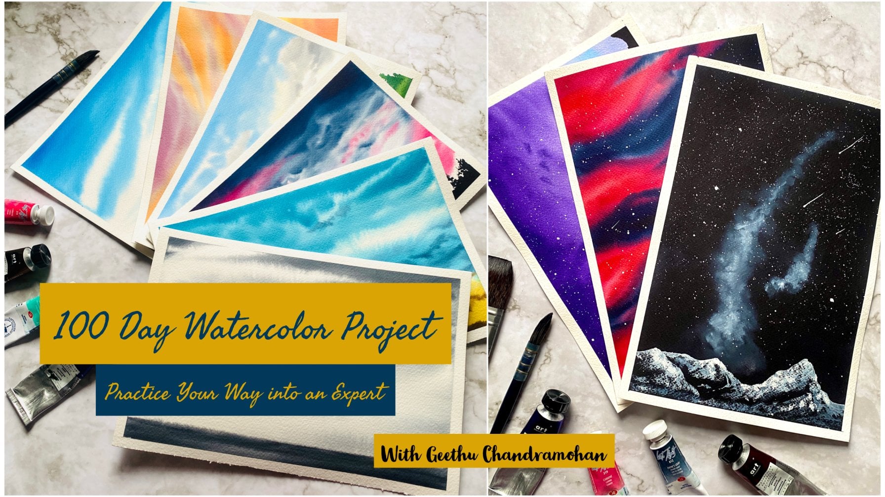
Transcripts
1. Welcome to the Class: Christmas is a season
of being together, a season of giving and receiving love and kindness
from each other. It is also a time to
share joy and warmth, especially in tough
times like these. I love spreading joy and
happiness around me through art, through my watercolor paintings. I adore the medium
of watercolors and the way it keeps me
wanting to learn more. Every time I pick up my brush. Hello everyone. I'm Geethu, a watercolor artist and
instructor who fell in love with watercolors
ever since I can remember. You might have guessed by now what this class is all about. Of course, it is
about Christmas. It is said that it takes 21
days for a hobby to become a habit and what
if we could make painting a wonderful habit
that we can't give up. Today on December the 1st, it's 24 days to Christmas. We're going to begin
our journey painting a Christmas themed
winter painting every day until Christmas. We will paint 24 different small and quick Christmas and
winter themed paintings everyday from today 24. Because I don't want
to overwhelm you with the painting process
on Christmas day. That is the day for us to enjoy the lovely Christmas day with our families and be a
part of the festivities. But there will be a surprise
for you on Christmas Day so join me in this quick
painting challenge to build that habit in you. If you are someone who came
across this class after December 1st and there are only a few days
left to Christmas, then you can still join me, choose your favorite
painting among the projects, and join me in this
count down to Christmas. Each painting will be less than 30 minutes because
I want you to be able to fit this into your daily schedule and get
in the mood for Christmas. First, I will take you through
the art materials we need. Before we start each painting, I will take you through the
colors that we need for that day so that you can be prepared with your
watercolor palette. Are you a person who
is just beginning your watercolor
journey? Don't worry. All of these paintings
are going to be quick and will give you a deeper idea
about different techniques, as well as fill your hearts with everything related to Christmas. In December, your favorite
month of the year. It is mine. Join me in this class and let us welcome Santa with our
wonderful paintings.
2. Materials You Need: Let us have a look at all the art supplies that you
will need for this class. It's absolutely all
right if you don't have the exact same materials
that I'm using, you can join me with the most
basic watercolor paints, paper and brushes that you have. First let us have a look at the paper that I'm
going to be using. This paper it is Arche's
300 TSM, 100% cotton paper. I would really recommend 10% cotton paper for
landscape paintings because it really makes
a huge difference in the way the watercolor
paint flows on the paper. But I knew that the paper
can be really pricey. Join me with whatever
watercolor paper that you have. For this class we
will be painting on a paper that is 5 by 7 " wide. That is the A4 size like this. Here I have 20-25 sheets of A5 size watercolor paper
which is arches obviously. These are the papers that
we will be painting. It would be better if
you can find paper of all the same sizes so that at the end of 25 days we will have 25 beautiful paintings
on similar sized paper. The smaller size paper will also help us in
completing each of our paintings in
less than 30 minutes so get your watercolor
paper ready. The next thing we need and second most important thing
obviously is watercolors. As you can see here I will be using
watercolor paints from the brand Art Philosophy
as well as White Nights. Art Philosophy is
an American brand and White Nights is
a Russian brand. But you don't need to have the exact same brand
that I'm using. You can join me with
the most basic set of watercolors that
you own because for this series of paintings
we are not going to need any fancy colors but
rather very basic sheets. We will discuss all the
colors we will need for the different class
projects as you start each class project. This will also help you to
get those colors ready on your palette as you start
a specific project. Then of course we need
watercolor brushes. We don't need any
fancy brushes here all you need is a
larger size brush, typically a size 10 or a size 12 and a medium-sized brush
which could around size 8 or a size 6 and lastly a smaller size
brush for the details. Either a size 2
size 1 or a size 0 and if you have then a
synthetic brush which will also hold very less water as opposed
to a natural hair brush so that we can work on the lifting technique and several of the
wet-on-wet techniques. Additionally you can
use a flat brush to apply water onto a
larger surface area of your paper which will ease the painting process but it's absolutely all right if you don't have you
can simply use your larger size brush for this. For the sketching
process we need a pencil and an
eraser you can use a normal pencil like
this one or you can use a mechanical pencil
like the one I'm using. I mainly use mechanical pencils because I don't
have to worry about sharpening it and have to
change the lead occasionally, I'm using a 0.5 millimeter
stick for this pencil. Next we need watercolor palette. You can use any palette
for mixing your paints. You can either use
a plastic one, a ceramic one, or
even a metallic one. Here I will be using this
dinner plate which is my most absolute
favorite for mixing paints because it's so easy to mix paints on a ceramic palette. The next thing you
need is a board or some surface to tape your
paper onto so I will be using this wooden
board so it's made of plywood and you can use
whatever surface you have, your tabletop, a magazine, a book or any surface
to tape your paper on. It is better if you have some
surface that you can lift because sometimes you may need an angle for working
with the paper. That is, it is better
if you can lift your board at certain
angles like this one here. Then obviously we need
masking tape to tape our paper onto the board so you don't need any
fancy masking tape. This is just a
normal masking tape that I bought off Amazon. I will also be using
this masking tape to place under my board when
I want to get an angle on my board and
work with gravity on the paper that is
my water will flow down with the force of gravity so that is another use
for my masking tape. As I said this masking is not much fancy
masking tape just a normal one that you can get in hardware stores and off Amazon. There will be a lot of snow
in our paintings as well as white surfaces so we will need white watercolors or
whitewash for the same. I will be using this whitewash which is permanent white from [inaudible] as well as this whitewash which is
titanium white from Sennelier. You can use either of the wash or white
watercolors that you own. Don't worry that you
need wash itself you can also use watercolors
It's absolutely fine. Then we need some tissue or a cloth where you can wipe
your brush as well as paper. You can use any normal tissue or a cotton cloth anything is fine and lastly we
will need some salt. This is just a
normal table salt, the salt that we
use for cooking. This will give us a nice texture and beauty to our paintings. Without any further ado, let's jump into the
Christmas projects.
3. Day 01 - 24 Days to Christmas: Welcome to our
first-class project. It's 24 days to Christmas, and this painting here is what
we will start with today. Let us first see all the
colors that we will need. Indian yellow, a dark green, indigo, burnt umber, and a red. We will also need white
watercolors or gouache. Let us first start with
our pencil sketch. It's going to be very
easy and simple. We're just going to make the outline of our
Christmas tree. We will quickly sketch
the outline of a tree starting from the top left
to the bottom middle. Just the shape of the pine tree, and then we will add some small circles inside the tree for the
Christmas ornaments. As you can see, just place them
randomly on the tree, just like you would hang
them on a Christmas tree. That is all our sketch would be. We will first start
with watering our paper because we're going to be doing the
wet-on-wet technique. If you want to work with
an angle on your paper, you can place something below the board that you have
fixed your paper on, and then apply the
water on your paper but just make sure to
apply the water to the areas outside the pencil
sketch that you have made. First, we're painting
the background, and we will do the tree later. As you can see, just outside of the pencil sketch on the whole
of the paper with water, I'm starting with
my size 8 brush. We will be starting
with burnt umber. What we're going to be using is a very lighter tone
of burnt umber. Remember, this is
the background, and we want our tree to
be brighter on the paper. We're just lightly
applying the burnt umber. Then we will take some indigo, and we will add it on the top. You can see it's just randomly, there is no specific rule. I'm just trying to
apply some color onto the background because
I just don't want it to be left white while my tree is there
in the foreground. This is the reason
I'm applying a mix of the burnt umber and indigo. As you can see, it's
just totally random. Just outside of the tree, apply both of these colors
together at random places. Even if you apply a
very darker tone, it would turn lighter in the end once your
paper has dried, and that is, the
water has dried. But let's not make it that dark. You can see now, that's all for the background. I have switched to
my size 10 brush, and I'm going to add some
blooms on the paper. I'm just dropping some water
that is splattering water, then we will add some
salt on top of it. This is just going to be
the basic table salt. We can see, just
splatter some salt here. You can see in this angle here, just at random places, this would make the background
look more interesting, and give it the
appearance of snow. Before proceeding with
the rest of the painting, we will have to wait for
the background to dry. Here, my background has
now completely dried, and you can see the beautiful effect and
texture that salt has created. Now, let us paint the tree. I have switched to
my size 10 brush, so you can use any larger or medium-sized
brush that you own. First, we will start by
applying water on the tree. Just water the whole
area of the tree. Again, it's all right
if you're going to paint on top of the background because here
the background is lighter. We will start with
a smaller brush. As you can see, I've
taken my size 2 brush, and we will start
with Indian yellow. You can use any
yellow that you have, transparent yellow,
Orillion, or Gamboge. Here, I'm painting the
Christmas ornaments. This is not the
original color that it's going to be
on the ornaments, I'm just marking the
spot where they are. Otherwise, after painting
the whole thing, we will forget where those ornaments
were, so that's why. I'm just moving ahead with
yellow on top of it now. Just as a placeholder for
those Christmas ornaments, so just mark them. As you know, your paper's wet, so it's going to flow,
but that's all right. As I said, it's just as a
placeholder for all of them. Once you have added all of that, now, I've switched
to my size 4 brush. Again, switch to a
medium-sized brush, and we will mix a sap green. The green I'm using here
is a very darker green. That's why I'm mixing it with yellow to get a sap-green color. If you have sap green, you can go ahead and
directly use sap green. Onto my wet paper, I'm applying the sap green. Remember, we had applied water onto our tree so my
paper is still wet, and I'm applying sap
green all over onto my paper onto the areas
where the tree is. Onto the Christmas tree, just randomly as you can
see, just some strokes. This is the lightest tone that is going to be
there on the tree. As you can see, I'm just using my brush to
create some random strokes, and it needn't have any
definition right now, we will define the shape
of the tree later. Right now just follow the pencil sketch
that you have made. Just drop the sap green
at random places, but make sure to skip the Christmas ornaments
that we did with yellow. This is going to be the
base tone on the tree. Then we will add a darker tone of the
green onto the tree now, on top of the sap green. This is a very beautiful
green from white knights. But don't worry if you
don't have this green, because if you have sap
green or any other green, you can mix a bit
of blue or indigo to that green to get a
darker shade of green. Just apply the
darker green again. Here you can see I'm applying
them at random places. My paper is still wet from the previous stroke of the
sap green that I applied. Again, on top of the wet paper, I'm just applying the
strokes totally randomly. Once this part is complete, wait for the tree
to completely dry. You can use a hairdryer
if you want to try it. I did use a hairdryer. Then I will take
my size 4 brush, and we're going to add some
slight details onto our tree. Again, as you can see, I'm going to take a very
darker mix of green this time. I mixed my dark green with a bit of indigo
and burnt umber. You can see it's almost similar
to black, but not black. It has a greenish touch to it because we added
more of green. Using this green,
I'm just going to make the shape of
the tree right now, so you can see my strokes. Use the smallest size
brush if you want, because we're just
going to add tiny lines onto our tree here. See, just some small
random strokes. It's completely random
and very simple. They're just going to
be like small lines on our Christmas tree. If you ask me to recreate
these exact steps, it will be impossible for me because it's completely random. Just have fun and enjoy. Then towards the left side, we don't want a lot of details, so just blend them. To blend them, just use a bit of water and apply on the paper. You can see that I've
applied water onto the paper and that
area just blended. All of these details
and tiny lines would be towards the
outside of the tree, that is towards the right side. A major part of our painting process is
going to be this tree here. Just sit back and
enjoy this process. It's just going to be
applying this darker tone of the screen and making the
shape of the pine tree, so just add some random strokes. You can see I'm adding more of the details
towards the right, so that's just towards
the outside of the tree. Towards the left side, I'm using water to blend
my color onto the tree. But be careful about
the Christmas ornament. We don't want to
form a dark edge around it that is a
hard line around it, so we'll just use
water and we still can see some yellow
paint through it. We will be adding the
Christmas ornaments later with a more diverse color. First, let us finish this tree. Just very carefully
and very slowly, we will add this Christmas tree. You can see my strokes
as how they are. They're just very
quick and random, nothing special about it. I will be using the
same darker mix throughout for adding
the darker tones. This is the darker
shade on the tree and that is a mix of dark green from White
Nights indigo from Art Philosophy and burnt
umber from Art Philosophy. Very little of the burnt umber, more of the sap green or
the green and the indigo. Just mixing all of
these three colors, you will get a nice
darker green shade. Towards the left, just blend them with water. Towards the right is what we will add the details,
as you can see. I just read water onto the
bottom part of my tree, but skipping the right side, because on the right side I want these tiny leaves of the trees. These are, obviously, the Christmas tree
is a pine tree, so it's going to be
a gorgeous pine tree adorned with Christmas ornaments standing outside probably in a winter day from the background with the
amazing salt texture. That's why we added salt
for the background. It makes it look beautiful with watercolors
because somehow, the salt absorbs the water and
gives a beautiful texture. As you can see, we're still
painting the foreground tree. Using a smaller size
brush would be the best for getting the best
effects on the tree. This is because the
tip of the brush will give a nice pine tree effect, will give the lines that is
needed for the pine tree. Because if you use
a larger brush, chances are that your
strokes might be larger and you might mess it up. But don't worry, because trees can be
of different types, different shapes,
different sizes. It all depends on how
you put your strokes, and they just need to be
totally random, as you can see. No specifics, just randomly. Some lines all towards
the outside of the tree. This is going to be the darker
shade on top of the tree. If you want, you can add a more darker tone by
mixing a bit more indigo, which would give a
nearly darker green, nearly as dark as black, very randomly you can see. Now we will add
snow onto our tree. Here, I'm using
white gouache paint. Gouache is an opaque watercolor. That is, it's very thick and
gives a very nice white. But don't worry
if you don't have white gouache
because you can also use your white watercolors. It doesn't really matter. Both are exactly
going to be the same. Just using your white
paint, whichever you have, go ahead and we
will start adding some random strokes again
on top of our tree, imitate the snow on the tree. As I said, this is
a Christmas tree standing somewhere
outside on a windy day and probably it has snowed on that day and there's
no snow on our tree. Use a medium-sized
brush and just add some small drops of white
paint on your tree. This is how the snow is
going to be on your tree. Just randomly small
strokes here and there. There is no specifics. Make sure that when we're
adding snow onto the leaves, that is towards the
outside of the tree, that is on the right side. Just make sure that
you apply them on the top because obviously, the snow is falling from the top and it's going to rest
on top of the leaves. We don't want to
accidentally paint it in the areas
below the leaves. But it's going to be intertwined
in the pine tree leaves. Actually, it's just going to be all right however you paint it. All we need to do
is now to just add white watercolors
at random places. It's just simple strokes
with your brush. Remember to use a
very dark consistency of white watercolor. When I say dark, obviously how dark
can a white paint be? But what I mean is, to make it very thick so that you get a good
nice white color on top of your tree because chances are that if you
don't use a thick paint, it will turn lighter. As you can see already, the shades of white that I applied on the top
areas of the tree, it's turning lighter, so that is why I said to use
a thicker consistency of the white paint and to add it on top of
your tree randomly. This will be the snow
on top of the tree. We already added the
snow kind of background onto our painting using
the salt technique. Now, we just need the
snow on our tree. As you can see, I'm applying
a second stroke on top of my snow because they seem
to have gone lighter. Do the same if you feel that your watercolor
has done lighter, that is the white paint. It will turn done because
of the darker background, so you might need to reapply the strokes multiple times
to get the color correctly, that is to get it white. Professional watercolor
artists usually use the white of the paper to get the effect of snow
and other white objects. But here, we're
just going to use our white watercolors
because we don't want to leave the
paper white and paint around the snow for
such a huge tree. Lastly, we will add
some splatters. They're not going to
be really visible on the lighter background. But of course, we just want the
snow to be there. Just splatter some white paint, so hold your brush
and just tap it. This will drop the
paint onto the paper. If you want, you can add some
larger circles to depict larger snow crystals
at certain places, and totally randomly, just some small circles. Now, we need to add the
Christmas ornament. For that, I'm going to mix my white watercolors and
going to create a nice color. So mixing white, a bit of Indian yellow and
the red, the transparent red. You can also use cadmium red
or whatever red you have. Mix it with a bit of
the white watercolor. We're mixing it with white
because this will give it a nice effect of that snow as well as will appear
on top of our green if you accidentally painted
over the Christmas ornament. All of those places where we marked the place for
the Christmas ornament, now we're going to paint them
with red, as you can see. Just some small circles. If you want to make
it more diverse, you can leave some of
them as yellow as well, because then that means it
will have multicolored lights. That is all for our
painting. It's complete. Our half magical
looking Christmas tree is standing out in the snow. Isn't it beautiful? There you go, guys. Isn't it beautiful? I hope you all love
your Christmas tree. See you all in the
next class project.
4. Day 02 - 23 Days to Christmas: Welcome to our second
class project. It's 23 days to Christmas. Today, we will be painting this Christmas ornament hanging on the branches of
a Christmas tree. The colors we need,
are Indian yellow, permanent red, rose madder, permanent brown, burnt
umber, and green. If you don't have
permanent brown, don't worry because you can mix permanent red and burnt umber and you will get the
exact same shade. To get a darker green like this, you can either mix
a sap green with indigo and you will get
such a beautiful green. Let us start our
pencil sketch first. What we need is to make the
Christmas ornament first. It's going to be in
the shape of a heart. We will simply draw
the shape of a heart, but all we need to
be careful about this one is that we don't
want any hard edges. As in when you draw the heart, just make sure
that you join them without any hard edges
but rather curved lines. Then we add that small
dark part of the heart, and then a line which
shows that it's hanging from the branch
somewhere on the top. This branch is not going
to be seen in the picture, but rather is just going
to appear from the top, but we need to show
some parts of the tree. We will have some other
parts of the pine tree. Just small branches, just
add them, few lines. That is all our pencil
sketch would be. Then we will start with
our painting process and we will start with
applying water onto our paper. I'm using my flat
brush to apply water. Note here I'm applying water, but I'm avoiding the
Christmas ornament. We need to apply water
all around the ornament. Just make sure that not to
apply water on top of it. We're going to be using the
wet on wet technique here. That's why we're applying the water so carefully
around the edges. You can actually use
another pointed brush to cover the edges of
the Christmas ornament. Like here, I switch to my medium-sized brush just to get the edges of the Christmas
ornaments correctly. That is when applying
water because it's very hard to obtain that
with a flat brush. Once you have finished
applying the water, we will start with
the background. I'm taking Indian
yellow and I will just apply randomly to the left side. This is where the branch was. As you always know, I
need an angle on my paper because I love the
water to flow down. Whenever I'm working with
a wet on wet technique and I want gravity
to act on my paper, I put an angle for my board. That's why I keep
the tape underneath. But it's totally up to you
whether you want it or not. Then the next color
obviously is the dark green. As I said, if you don't
have this dark green, you can mix a sap green
or any green that you have with indigo
or a darker blue, such as Prussian blue, and you will get a
darker green shade. Just apply the green
at random places. Remember our paper is
wet and we're just applying at random places to get the wet on wet technique. Then mix the dark green
with a bit of burnt umber, and this is what we're applying at the bottom part
of the painting. This whole thing
that we're painting right now is the background. That's why it's still
wet on wet technique because it will be
lighter after it dries. So whenever we apply the wet on wet
technique on our paper, once it dries up, it's usually around one shade lighter than the shade
that we applied. You can see here, I'm not
applying it very darker tones, just a medium tone
of the colors. It's the same dark green but mixed with a bit of burnt umber. Also the whole of
the green just at random places because I just want it to be like
the background. I will also add some red
shade at random places. This is just to create a star contrasting effect
in the background. Just take all your colors, apply it at random places. That's exactly what I did. There's no specific rule. This painting was really from my head, no reference picture. What I was just doing was
I was just trying to get a nice background with a
different mix of colors. I went with the basic
Christmas colors, obviously, these four colors. Then I just applied it
randomly on to the background. We want to do exactly
the same thing. But also make sure to
leave tiny gaps of white in-between because that will give a nice
little contrast. You can see now my background
has completely dried. After you finish with
your background, we have to wait for it to dry. Then we will move
with the foreground. I'm mixing permanent
brown and burnt umber. As I said, if you don't
have permanent brown, you can mix a red with a brown and you will get
a nice brown shade, or you can also
use burnt sienna. We will just draw some
branches of the pine tree. Remember we marked our branches with our pencil, just the lines. So that is what
we're going to add now with our brown shade. It's a mixture of permanent
brown and burnt umber. Or you can use a mixture of brown and red for
this because I just want it to be a
lighter shade for now because we will add the
darker tones later on. That is why I went
with a reddish brown, so you can also use burnt
sienna instead as I said. Once you've finished with
adding the background stems, we will add a darker
tone on top of it, so this time it's
burnt amber which is a shade darker than
the permanent brown. Next, let us paint the
foreground pine tree branches. For that I'm mixing green here, sap green because I'm not using sap green but
all I'm using is the Indian yellow and the dark green that I have
which is from White Nights. But we need sap green to get our branches
of the pine tree, the leaves on our pine trees, so that is why I mixed a bit of yellow into the dark green
to get a sap green color, and then we will apply it on the tree in the shape of
small pine tree branches, so you can see it's just totally
random small hole sheets protruding out from the branch
outwards from the ranch. Then to get a darker contrast we will also use the dark green, so this is why using a
mix of colors is useful. If I had used sap green
here I would also need a darker green to get that darker shade on
the top of my tree. That is why I'm using green here and then
I created sap green. If you're using sap green then create your darker green to get that nice contrasting
shadow effect on your tree. There would be lighter leaves, there would be darker
leaves, so that is why? The darker leaves are because some of the leaves
would be under the shade as in the shade from the other leaves on
the same branch. That is why we need a
mix of those greens. You can use even
more mix of greens if you have like a different
shade of green as well, it would give a nice
beautiful contrast. In the painting always what's
important is you're getting different contrasting
colors that would give it a nice effect. If you have viridian
or emerald green, you can also add
that to this and it would increase the
contrast in your painting. You can see I'm using a size 2 brush which is
like a smaller brush, or you can use a medium brush
and use the pointed tip. Just randomly paint the
leaves on a pine tree, so this is really close up
picture of the pine tree which is why we need the leaves
to be in a closer look. Usually when we drove
pine trees they are as a whole tree and it's very easy to draw
the branches right. In this case a pine tree is really close and
we're looking at its single branches
as in there are three branches here and
that's what we're looking at. That's why it looks
like tones on a tree, so just add randomly. There is no specific rule. I'm just using my
brush and using swift, downward and upward
and different kinds of brushstrokes in all directions
simultaneously to get that pine tree
leaves on the paper. You can see there is
no rocket science, it's just simple strokes, and in all the
directions that would give the perfect
tree that we need. Just different shades
of green as you can see I apply both the sap green and the green
together at random places, and this adds the nice contrast
to our tree as I said. There you go. Almost added
it to all the branches. Just quickly at certain places. Now, we need an even
more darker shade. Remember I said that
the more contrast there is the more beautiful it looks, so mix a bit of burnt umber to your dark green that would give an even more darker shade. Use that and just apply it at random places but I'm
very careful here. I'm not applying it to
almost all the places, just do very little
places just here and there and as small tweaks. This can be even
the small branches or the small surfaces
on a pine tree, just very randomly and simple strokes at random places, totally random places. Once you're done with that, so that's all with
our pine tree. Now we have to paint the most important part of all which is the
Christmas ornament, which is the beauty
of this picture. We will first paint with wet on wet on the Christmas
ornament before we add in all the shadows to make it look like a
three dimensional look. That is why I'm
wetting the ornament, so apply water onto the whole of the heart,
the heart shape. We will start with
Indian yellow. Using medium-sized
brush and take Indian yellow and apply it
almost to the left side, but I'm trying to
leave a gap there, a white gap for the highlights. These are the two
surfaces on the heart, so you know on the left
side and the right side as in the left heart and
the right heart part. That's why a bit of yellow on the right and then we
take the permanent red, you can also use cadmium
red or vermilion.
5. Day 03 - 22 Days to Christmas: Welcome to the third
class project. It's 22 days to Christmas and today we're going to be painting
this beautiful painting. The colors we're going to need
are Indian yellow, green, burnt umber, indigo, permanent red, and Payne's gray. Let us first start
our pencil sketch. We're going to be making
the Christmas ornament, so we need to make the circle. As you can see, I'm
using a candle here. You can either use a compass
or use whatever object you have in your house to
get a nice circle. I couldn't find my compass, I just used whatever I could find right in front of me
and it was this candle. What we need is, we need three circles. Two small circles,
one at the top, one at the bottom, and half of a circle
towards the right. Then we need to add the top portion of the Christmas balls, the
Christmas ornaments. It's going to be like a cylindrical shape
with a hook on the top. This is where the thread or the hanging part
will attach to. Then we just add few branches. It's going to be yesterday's painting where
we added few branches. But we don't need to
be exactly the same. Just random branches and some line to the
top for the thread. Next, we will start
the painting process. Again, first we will paint the background and it's going
to be a wet-on-wet method. The background is always
a wet-on-wet for me. Here, the circle on the top, that is the ornament on the top is what is going to
be the attraction of this painting which is
going to be the main subject. That one we will paint later. The rest of the areas are
going to be background. Let us apply water, and it's okay to
apply water on top of the other ornaments as well because they're not going
to be that detailed, neither are they
going to be blurry. We will add the details
later on, don't worry. But for now, apply water and use a medium-size brush
to apply water around the Christmas ornament. We will start to
add Indian yellow. As you can see, I'm making
small circles on my paper. This is how we are going to get the bokeh effect
on our painting. Bokeh effect is like an effect
when you take photographs, you see those small
circles on the photograph, that's what is called
as a bokeh effect and we're trying to get
that on our painting. First, Indian yellow, and some sell goods
using the Indian yellow. Then let us make sap green. You can use sap green directly
if you want, if you have. I'm mixing dark green
and Indian yellow to get a sap green. We will make a circle outside of the first
circle that we made. Remember that this is the
wet-on-wet technique. Onto the wet paper,
we're doing this. Around the circular
painting part that we made with
the Indian yellow, around that we will
add the sap green. Since the paper is wet, it's just going to spread
a lot, but don't worry. Just remember when you apply the water you need
it to be even, otherwise it will spread a lot. Then we will also take some permanent red or
scarlet or vermilion. You can use whatever
red you have, transparent read, anything, and we'll also add
some circles and some few drops of red
at certain places. Around the red also, we will add the sap green. Then we will add a
darker green around in the other areas where there
is not the bokeh effect. The whole of the
background is going to be now with a darker
shade of green. Since we're painting
the background, we will also add in the other Christmas ornaments to give it the blurry effect. Paint the rightmost
Christmas ornament with Indian yellow and the bottom one with
transparent red. Let's paint the whole of
the ornament with red, one with red and
one with yellow. Again, because there's water on our paper is going
to spread outside, but that's all right. We will just add the rest of
the background with green. Around the ornament,
we will add green. When you apply green
you can see that the red color that we
applied on the ornament stays in place because there's already a green at
the outer edges and now it cannot flow all the way outside
of the ornament. Then taking more of
the darker green. This is the same dark green
that I used yesterday. It's from White Nights. If you don't have a
darker green like this, you can mix a sap
green or hookers green with indigo or a dark blue
such as Prussian blue, which will give a
nice darker green, or you can also try
mixing a green with a little amount of black
to get a darker green. Now you can see I've covered the whole area of my
paper with green. Because I'm working on
the wet-on-wet technique, I'm going to reapply all of
the colors that I just did. This will give me the nice
vibrancy and will also keep my paper wet because
I'm reapplying the strokes. My wet brush will make sure
that my paper stays wet. This is how we can
do wet-on-wet, that is to reapply your strokes
quickly before they dry. Then here I'm going to make a very darker version of green. I mixed indigo to my green
and I get a darker green. This is why I said that if
you want a darker green, mix indigo with green, and if you need a
more darker green, mix more of the indigos, you'll get a very
nice dark green. As you can see, I've made
very nice mix of dark green by adding a little bit of indigo onto my dark green. We want to give a
nice dark background. This will give a nice
dark contrast and make our Christmas ornaments pop out in the painting, so that is why. At the bottom areas, it's going to be really dark
and the rest of the places, it's going to be a dark green. It's just basically a blend
of all of these colors. I know that this painting
can be quite tough because it's very hard to work on the
wet-on-wet technique. But don't worry, the
most important thing is that even if your
colors don't blend, when we add the Christmas
ornaments on the top, it's still going
to look beautiful. The key thing to get
a perfect blend on the paper is to make sure that your paper doesn't get
dry while painting. That is the main reason why
I reapplied my yellow paint. Onto the areas where you
want to apply the paint, make sure that you
don't add more water. As you can see, I'm not dipping my
brush in water, but rather just
picking up more of the paint and applying
onto my paper. Darker green on all the corners and certain places
in the middle, and the rest of the areas, it's going to be the same color, green and yellow
and a bit of red. This is why I recommend
using 100% cotton paper, but don't worry if
you don't have that. Just be careful to not
let the paper dry. If indeed your paper has dried, reapply water on the whole of the paper after it has dried. Here you can see the
trick that I'm doing. My yellow portions and the
green areas were getting dry. I reapplied paint on top of it quickly so that
I'm re-wetting it. That is all for the background. Once the whole
background has dried, we will start to
add in the details. Let us paint the yellow
ornamental right now. I'm taking more of Indian
yellow and adding on the top. Notice here that
I'm not going to be painting all round to the edges, just the middle areas. I reapplied Indian yellow, and now we will add a darker
shadow using burnt umber. Using burnt umber, apply a stroke like this
towards the right, somehow a hook shape. This is the shadow on the ball on the
Christmas ornaments. Remember when we painted the Christmas
ornament yesterday, we added in the highlights
and the shadows, and it made the ball look
really original and real, and gave it a
three-dimensional look. That is exactly what we're
doing again here today. We're adding in the darker tone, darker shadow, and we will do the same with the red
ornament at the bottom. Reapply water. I'm applying water, but again, leave some red space towards the outside because we
don't want a hard edge. Then I'm reapplying
permanent red or transparent red just towards the inside, so you can see there
is that slight gap towards the outside of
that ball that I've left. We're not painting that area. The darker tone here would
be to add burnt umber. Mix a bit of red into
your burnt umber, which will give a darker tone
of the red that we need. This is what we will add
for the darker shadows. Add it on the top. I had reapplied the red color on the top so that area
of the paper is wet, and onto this wet paper, I'm adding the mixture
of red and brown. This makes it give the nice
wet-on-wet technique again. You can see I just made some
random shape onto the ball. This is how the
light is on that, and you can add a further
darker tone to it by adding a bit of
Payne's gray to the same mixture
of red and brown. Here, the darker tones are going to be towards
the right side. The same way as we did
with the yellow ball, you can see that
the darker tones were towards the right side. Here also it will be
towards the right side, so that is why the darkest
tone mixed with Payne's gray, burnt umber, and red will
be towards the right side. Now let us get to our main
focus in this painting, which is going to be this
Christmas ornament at the top. Wet-on-wet, again, let us
apply water to the whole of that Christmas ornament
very carefully along the edges because
here we have to touch the edges because we left
it white in the beginning. The whole of the Christmas
ornament, apply the paint. We will be applying
transplant red. Carefully, apply the red
tone along the edges here. As I said, we have
to be careful along the edges because we don't
want to ruin the background. Add in the transparent
red or the permanent red. It's both the same. Or scarlet, or vermilion, or whichever red shade you have. Very carefully, use
a smaller size brush or the tip of your brush when you're painting along the edges. This exercise will also
help you in gaining that better brush control to draw along the edges,
along the curves. so this would be really
helpful for you. Now, let us add
the darker tones. What we're going to
be adding is the same as with the other red ball. We're going to be
adding a mixture of red and brown first
for the darker tones. Just at certain places. You can see where I'm
applying the straw because of the light reflecting on my paper because
the paper is wet. The wet surface is actually
reflecting the light. Apply the paint a little on
the top left of that ball, and then towards the
right bottom part. That is the right side is mostly where
there is the light, so that's what we're applying. You can see that there is that yellow bouquet that we painted right
beneath that ball. That yellow brightness
is going to brighten up on our
ornament as well. That is why I left a slight gap of red at the bottom
without a shadow. You can see right there. This is because that area
is going to be bright. It's not going to be in shadow. The rest of the areas
is what is going to be in the shadow
as I'm painting. Leave that little bit
of red at the bottom. Then keep adding
the darker tones. You can add an even
darker tone by applying Payne's gray
to the same mixture, just like we did with the previous ball,
previous ornament. Very carefully, and very careful along
the edges, of course. Add in the shadows. But as you can see, the other areas are starting to dry so we need to
blend that onto the red surface
otherwise it will form dark edges or hard edges, as you can call it. You can either use water or you can use your
brush to blend it. At the bottom there where we left a slight gap
without a shadow, you can see that I added a
bit of Indian yellow to it. Now, let us paint the dark
part of the ornaments. I'm painting with a mix of Indian yellow and a bit of red, so it's like a very
lighter tone of orange, or you can just use Indian
yellow or a queen gold shade. We will paint all of the
ornaments with the same shade and you can mix a bit of the burnt umber on top of it because this one will
also have the shadows. The shadows for
the Indian yellow would be with the burnt umber. Just a bit on the top such that the Indian yellow is
also seen through it. Not on the whole, just some
few lines on top of it. You can see mostly towards the right side because as you
can see from our picture, all of our shadows are
to the right side. Now we will paint
the pine trees. For that, I'm going to
take my dark green. Again, this green is
from White Nights. You can use a mix of sap, green, and indigo, or any green for
that matter with indigo, you'll get a nice dark green. I'm just going to
add some pine trees, some random leaves for
my Christmas tree. Very randomly, just some lines. They're not going to
be very detailed, but a very few
branches of the trees. So just draw some lines outward from the
main center line. This is how it is going to be. We don't need a lot of branches. We're just going to show
a very few of them, two or three of them. That's it. Small lines protruding
outward from the center line. That is how it will be. It's almost like how you
would paint a palm tree. This part, because
we're looking at it at a closer angle
of the pine tree, it looks like palm leaves. Just quickly add in some leaves. If you want a darker green, you can also mix dark green or any green with a bit
of black as well, and you'll get a nice
darker shade of green. Once you have done adding that, that will be all
for the pine tree. We don't want it to
be much detailed. Next, we will take our white
watercolor or white gouache. It doesn't really matter
which you're using. Both will be fine. What we're going to do
here is we're going to add the line on the
top of the ornaments. This is going to
be the thread or the hanging part
of our ornament. Very lightly, because these
need not be clearly visible. The one on the top, all the way to the top, and the one for the bottom, just somewhere
disappearing in-between the leaves and the other one, disappearing somewhere in
between the edge of the paper. Now let us create our bouquet effect a
bit more contrasting. Let us add some white
circles in the center. You can see I've added a
white circle to all of the bouquet circles that
we did with Indian yellow. But now it looks kind of odd. What we need to do now is
we need to blend the edges. So dip your brush in water, remove any excess water, then just slide across
the edges of that circle. Our paper is completely dry, and when you slide
across the edge, it will soften that
edge and remove any hard edge that we did by painting that
white watercolor. Now you can see that that
white looks as if it has blended in with the yellow and the bouquet effect
looks really beautiful. That is what we're doing. Just blend it. This is known as the
soft dunning technique. Softening the edges of course. That is all. Now let us add some few dots
here and there, some highlights on our
Christmas ornaments. That will be the final
details just to add few circles randomly
here and there. You can see I'm just
adding few circles, few lines on my
Christmas ornaments. It's like there are some
lights on the Christmas tree and that is being reflected
on our Christmas ornaments. The same way on all
the three of them. Just a few highlights. Even if you added a very
thicker consistency of white, it's going to turn
lighter once it dries, so it will become
completely fine. That will be the final
details in our painting. Adding the white to random
places and that will be all. Let us remove the tape and
look at our final painting. This one, as you can see, is with a darker background as opposed to the lighter
ones that we did. I hope you like it and
thank you for joining me.
6. Day 04 - 21 Days to Christmas: Welcome to Day 4. It's 21 days to Christmas. Today, we will be
painting this painting. Let us have a look at
the colors that we need. We're going to need
Indian yellow, green, transparent red, burnt umber, indigo, and cobalt blue. You can use any other blue. We also need whitewash
or watercolors. This is actually the
reference picture that I used for this painting. I changed it a lot. But this is the picture. I took this picture from
my own Christmas tree. This Christmas ornament
that you actually see here, I made it myself and I painted them using wash on wooden
blocks like these. So wooden ornaments. I got it off Amazon and
I made these letters. The G is for me, my name, and the S is for
my husband's name. There are a few others to. You can see this
one is a snowflake. This picture is what
we will paint today. Let us first sketch out the
ornament hanging on the tree. Just make a basic
circular shape. It needn't be perfect circle. It actually is
hanging at an angle. So it can be slightly distorted. Then because it's
hanging at an angle, we will need the right side. The part of the wooden ornament. I will upload the picture
to the references, that is the resources
section here, so that you can refer that. I will also upload this picture, so that you can also refer that. Then we will add the twine or the threat that the
ornament is hanging on. Just twist it. As you can see in the picture, it's slightly twisted in
the photo that I took. This is not there
in the picture, but I thought that it
would be better if we add something
else in it as well. As for the letters, I made these for all the different
letters of the alphabet, so that you don't have to
paint a G. Choose your letter, maybe whatever letter you want. It might be the
letter of your name, of your child's name, of your husband's
name or whatever. Choose from this and paint it. I will upload this to the
resources section as well. As you can see, G is
missing from these letters. This is because I
will be sketching out G and you can
follow this process here if your name starts with G or if it is the letter
that you want to sketch. This is the fun part
in this painting because you're going to do
something for yourself. Maybe you can give this to someone with
their letter on as a Christmas card or make a postcard for someone,
anything you want. That is why we're
doing this today. Add some background
for the pine tree. Now, we'll start painting
the whole background first. I'm just going to wet
my paper because here we're going to do the
wet on wet technique. Wet the whole of the paper. I'm using my size 10 brush. Use the larger size brush or even a flat brush and apply
the whole of the paper. Just only the two
Christmas ornaments, we wouldn't apply water on that. We will paint later on. Along the edge of
the wooden ornament, we have to be careful because we don't want
water to go inside it. Then I'm going to start
with Indian yellow. Apply the Indian yellow to some places where you
want it to be lighter. This is just totally random. I'm just adding a
blurry background. If you look at the picture, you can actually see
everything in detail. But that's not how we
would do in a painting. In a painting, you'd choose the subject matter
that you want to focus. Here, I've chosen the two ornaments that
I want to focus on. That is why the rest of
the other things are going to be blurred with
very minute details. Just areas where it
is likely lighter, I'm adding the Indian yellow
and to the other areas, I'm adding sap green. I made sap green by mixing
my darker green with Indian yellow because that
would give a nice sap green. If you have sap green, you
can directly use sap green. If you want to get that
darker shade of green, mix any green you have, such as a sap green or Hooker's green with
indigo or Russian blue, you would get a nice dark green. You can also see that to some of the areas with my
larger brush itself, I'm applying the strokes
onto the wet paper, such as the leaves
of a pine tree. If you look at the top portions, I applied them as the
leaves of a pine tree. Just make the strokes similar to drawing the shapes of the
leaves of the pine tree. It's going to spread around and even truly mix the whole thing. But that's all right. We just want it to be blurred. You can see those white gaps at the top area because I made
the shape of the pine tree, but it's already gone,
or blend together. You can see that, but there's still that whitespace remaining. Then to increase the focus
on our Christmas ornament, we need to make it
with a nice contrast. I'm adding a darker
shade of green onto the areas next to the ornament that is
right below the ornament. To get that darker green, I'm mixing indigo with green. As I said, you can get a darker green by mixing
indigo and green. If you need an even
more darker shade, mix more of the indigo
with the green. Or you can also mix black
and green together, so you will get a
nice dark green. If you have a lot of shades, then you can also use perylene
green if you have one. Apply it at random places
where you see the darkness. These are the shadow
areas that is the space between the
leaves of the pine tree, but deeply nested inside. You can see I'm
adding some shapes, some lines to form
the pine leaves. Here I have switched to my smaller size brush
because I think that if you use a smaller size brush and use the wet
on wet technique, we might get a bit more
shapes for our pine trees, I mean the leaves
of the pine tree. Observe here, I'm adding the strokes and onto
the wet paper itself, I'm adding the leaves
of the pine tree. The whole thing is going
to be the background. It's going to be blurred. Whatever you do with
the background, that's fine, because this is not the main
focus of our painting. Don't worry about it. Keep adding some
shapes, some leaves. It's just basically how you
would draw a palm tree. How would you draw
the palm leaves? There's going to be
a single center stem and then some other lines
coming out of the center stem. The same way, add the leaves. Use a mix of different
versions of green, and for these leaves, use the darker green. When you applied
sap green at first, now you're applying the
darker green on the top. That would make these
shapes more visible. They're just going to mix. I know because the paper is
wet, but that's all right. Now let us add two tiny drops
of red shade onto our tree. This was part of my pine tree. So it was already there. It's the holly plant. This is the fruit
of the holly plant. You might have seen it, some
small red berry shaped. That's what we're adding. I also thought of adding a
distant Christmas ornament, some red balls
hanging in the tree. As you can see, I added
it on top of the green. So it's mixed with
the green to give me a brown shade also, which contributes to the nice
shadow that it should have. Add the line of the holly fruit
as well with burnt umber. All of this is just
wet on wet and use the same burnt umber to draw some lines here and there. This would be the branches
of the pine tree. Branches means the branches
within the leaves. Just very lightly, that's all, and from this same branch, this would be the center stem. As I said, the same branch. You can add more leaves
coming out of it. That would be all
for the background. Once the background has dried, we can paint the
Christmas ornaments. Here, I'm using a
medium-size brush, and I'm going to mix cobalt blue with a bit of white
watercolor or whitewash. This would give a nice
lighter shade of blue. We want the blue
to be very light. We just want to imitate
the gouache paint. That is why we are
adding white to it, so that we get a very nice
white tone. Do that blue. This is why I said
you can use any blue. Here what we're going
to do is we're going to paint all around our
letter and Christmas hat, Santa's hat on our letter. All around, but
remember to leave that space for the
wooden ornament. So the sides of it, the inside part is the only part where
we're going to paint. The outside part, we need to paint
the wood ornament. Apply the blue color all around the letter that you
are going to paint. This painting is going
to be very simple and this Christmas
ornament is going to be even simpler than
the background. It's just very easy. All around, just
apply the blue tone. If you want to change the
color of that ornament, you can also do that. You need not painted
with blue itself. It's totally up to you to
choose the color that you want. Now, let us paint
the Santa's hat and also the Christmas ornament
at the bottom part. The Christmas ornament at the bottom is the
one that I showed, the one with the snowflake. I thought that we'll place
it right here at the bottom. Paint the whole of that
ornament with red. Then we need to mix a bit of burnt umber because I think
that red is too bright, so mix a bit of burnt umber and add it to the whole
of that ornament. Next we will paint the hat
on the letter that we added. The whole of the hat just paint
with the transparent red. You can also use scarlet, vermilion or whatever
red you have. It doesn't really matter.The
whole of Santa said we have to be very
careful with the shape here because we don't want to destroy the shape of the hat and go on top of the
blue that we applied. For this Santa's hat the
other areas of the hat. We're just going to leave
it white here because there is obviously no need to paint
that because it's white. There needn't be any
shadows because this is actually like a
Christmas ornament that you painted and it
needn't have any shadows. Then on to the letter
added with burnt umber. Just trace out with your brush the letter that you are
adding onto your ornament. The letters that you
need to trace out, I've added it into the
resources section. You can check that out. You can download it and copy out your letter
that you want to do. For the wooden part, I'm going to mix a bit of Indian yellow and burnt
umber and a bit of red. This gives me a
lighter brown shade. I'm just trying to limit the number of colors that
I use in this painting. This is the reason why I'm
mixing all of these paints. What I mixed right
now was the yellow, red, and brown together. I got a lighter shade of brown and using this
lighter shade of brown, I'm going to trace all
around that wooden part. This is the wooden area of
my ornament that's visible. If you have a lighter brown, you can also use that
lighter brown directly. You need not mix these paints. But I really think that mixing paints adds a
beauty to our paintings. Then we will take burnt
umber or a darker brown. You can also use Van **** brown and we will paint the edge
of the wooden ornament. As I said, this wooden ornament
is hanging at an angle. There's that edge of
that wooden ornament. That is what we're
adding right now. When you add this
to your painting, that is what gives it the
three-dimensional look. Rather than appearing flat, it now looks like
a real ornament. Add that with burnt umber. Now, we need to add
the same shade of lighter brown to the other
wooden ornament as well. Don't forget that. But before that, let us add
the twine that is the thread. I'm using the same brown
shade for the thread here. The lighter brown that
I mixed using yellow, red, and the burnt umber. You can see I'm mixing
that same shade again and I'm adding it on top
of the other ornament, the wooden area of
the other ornament. Now let us also add the
thread for the other one. This one is going to disappear
out of our painting, just a line towards
the outside and now let us add a bit of those leaves in the
foreground as well, because we don't
want the whole thing to be in the background. There should be some things that are visible
in the foreground. That is why take a
darker green shade and apply in the shape of
the leaves of the pine tree. Just random and add two of
those that would be all. Here mix a darker
shade of the red by mixing red and burnt umber together and add the shadows
for the Santa's hat. But I feel that here the Santa's hat is a very lighter tone of red
and I want it to be vibrant. I'm just adding a bit
more red on top of it. But if your hat is
already vibrant, you can skip this
step. Don't worry. Now, we're going to paint with white watercolors and add
some snow on that ornament. Just make tiny circles with your white
watercolor or whitewash. I'm going to switch to a smaller size brush and I'm going to make a snowflake on the left
side of my letter. The snowflake would
be like a star, star shape, but then the
edges would have some lines. That's how it would be. But it's going to be very tiny here, so it doesn't matter. Then add the other
small circles, the snowflakes, small ones. Once you have done that, we will add the largest know
flake onto our red ornament. This is going to be
again the same shade. Make it like a cross, it's like a star. It's going to have those four lines and half of it is towards the
outside of the paper, so you don't need to
paint the whole thing. We will make cute shape of our snowflake only to the areas that are
visible and then we'll add some snow droplets as well. This is just something fun. You can add something
else onto it if you want, maybe another letter
in the corner, it's all up to you, whatever you want to do. Then finally, we'll add some details onto
our wooden block, just the sides of it because
it's not going to be flat. It's a wooden ornaments. There are some tiny
wooden details on it. That's why I'm adding with
a dark shade of brown, burnt umber and we also need to add some details onto the thread or the twine. With burnt umber and
using a very small brush, typically a size zero or size 1, just add some few lines
on top of the thread. It's just that thread, like you see in the picture. It has some lines
on it, that's it. Once you've done
that, our painting is complete and we can
remove the masking tape. Here it is and thank y'all
for joining me today.
7. Day 05 - 20 Days to Christmas: Welcome to Day 5. It's 20 days to Christmas, and today we're going to be painting this
beautiful painting. The colors we're going to
need are transparent red, burnt umber, green, Indian
yellow, and indigo. So let us start with our
pencil sketch first. So there's going to be a
door in the top-left corner, and that's what
we're going to be adding with the help of a ruler. Just make some vertical and
horizontal lines so it's just only the part of the door that's
going to be visible. So we will make those
lines with our ruler, and then towards the
front of the door, there's going to be the steps. It looks like it's the entrance
of a house or something, and there's a pot on the step in which there's
a Christmas tree. So it's a small Christmas tree
sitting on top of the pot. So let us add that just the base of the pot
and then just the outline of the tree and some Christmas
ornaments on the tree. So just a few small circles. The exciting part of this
picture is the boots that is on the front
porch of that house. So it's just basic simple shape. So we're going to add the curved boots on to
the front of that door. This is the only part of
the sketching process that might be a bit tough,
but don't worry. What I'll do is I'll
upload this painting to the Resources
section so that you can refer to the image and make
the sketch of the boots. So a pair of boots
on the front step. There's two oval-shaped
circles at the top, that is the top part of the boots and then obviously
the sole, the base part. Then these are going
to be covered in snow. Even if you don't get
the shape correctly, it's going to be
fine because we'll just add some snow on top of it. So that's also another
thing that you can do. If you don't get the
shape correctly, just add snow on top of it. This simple sketch is what is going to be
our sketch for today. Let us start painting. Here here we're
going to go directly with the wet-on-dry technique, no wetting the paper. So we just take transparent red or any red basically
because it doesn't matter, it's just the door, so the color is not much of
importance which red to use. So transparent red you can even use pink shade if you want, but I just think
that it will just match the whole picture if
you're using a red shade. So apply transparent
red on top of the door. One thing is that towards the
bottom surface of the door, we want to add some snow, so it is better if we can
leave that space right in the beginning itself so that we don't have to
add it later on. But if you find it
difficult to do that, we can add the
snow later on with white watercolors
or white gouache. So you can see that tiny
curve that I have made. So these are the surfaces on the door in which they
snow can settle on. So that's why that
area would be white. So you can see how
it is after I've painted the whole of that
door in just a moment. So you see on the
top part there, there's that slight, small triangle and
few white spots. So that would be the
settled snow on our door. So that is why I said, if you can leave white at the beginning itself,
it would be great. Otherwise it's not a problem at all because we
can add it later on.
8. Day 06 - 19 Days to Christmas: Welcome to Day 6. It's just 19 days
to Christmas as of today and we will be
making this painting. The colors we will need are a violet or purple,
a dark green, Indian yellow, burnt
amber, rose madder, permanent red, cobalt
blue, indigo and orange. These are some of
the color mixes that we will be doing
for this painting. Don't worry, I will
explain as we need them, so let us get sketching first, so this is going to be a cute
snowman and the snow woman. Usually most paintings
just contain a snowman, so I wanted to add some more extra element to
it that is an extra subject, so here is a very cute
little snow woman. Maybe their husband and wife. Doesn't it look
really cute together? All we need are, we will sketch out their shapes, try to make them as
balls joined together. You can see each of their body
is like three balls joined together and then below the first circle we will need to add the scarf of the snowman, so it's going to be
in-between the joint of the two that is the
head and the body, so this is very
simple pencil sketch. As you can see, there is nothing to
worry about and add a few buttons to the
body of the snowman, and we will do exactly the same for the snow woman as well. Let us have the scarves in different directions so as
if it's waving in the wind. For the snowman, the other side of the
scarf is not visible, maybe because it's on
the other side or it's going out of the picture
and for the snow woman, so there's two hanging parts, one towards the right side
and one flowing in the wind. Then we will add the hat
on top of the snowman. Remember this is not
going to be like sitting on top of the circle, so we have to add the hat in a around one-quarter top part of the circle and then
just earrings off the top most part of the
circle and obviously too small eyes and a carrot and then the mouth which
will be some stick, so that's how usually
snowmen are made. We will do exactly the same
for the snow woman as well, so there's going to be two twigs as hands
for both of them. One hand of the snowman is actually going behind
the snow woman, so it seems they're
out in the snow hugging each other that's
why this is so cute, I really love this one. Then let's add a beanie
hat on top of the head of the snow woman and two small eyes and the carrot
nose and the twig mouth. That would be all for the
pencil sketch for this. Let us start painting, so I'm taking my size 10 brush and I'm going
to wet the background. Here the background
is just going to be something totally random, so let us apply water. We are going to skip the
snowman and the snow woman and also remember to
skip their scarves, so apply water to
all the other areas. We are applying water
because we're going to work on the
wet-on-wet technique, so when applying water, just make sure that you apply water evenly to all the places. If your paper is not
100% cotton paper, you might have to apply water multiple times to make it
stay wet for a longer time, then I'm switching to my size 8 brush and here we're
going to use purple. I'm using ultramarine purple, so it's a very nice
granulating purple color, but don't worry you can use any purple that you have and
if you don't have purple, you can just mix red and blue together to get a nice
purple shade as well. Here we're just going
to mix several of the colors together and get
a very nice background. First I added
purple and then now I'm adding green and
then burnt umber, so this is just totally
random and I just applied the colors all the way whatever came into my mind
at the time of painting, so there is no rule just apply all of
the colors together. We're just trying to create
a different blend of colors something
soothing to the eye. If you ask me to recreate
the exact same thing, it would be difficult for me even because the
next time I do it, I would be applying the
colors differently. All of these shades that is a purple shade a
green, a yellow, a bit of red, a bit
of burnt umber, I applied all of these
to the background, but when you reach
towards the bottom, we have to stop somewhere
there and start adding blue because this is the
snow at the bottom part, so the top side that was all the background
somewhere in the distance, some colors, but at the
bottom we need to add snow, so here I'm adding cobalt blue. If you feel that your
color is getting lighter, you can add more colors
because once this dries up, this is going to get even lighter than what
it is right now, so that is why try to add
more colors if you want, and to make the background interesting I added a bit
of splatters as well, so you can see first I added a splatter that is
just water and then we will also add some
interesting splatter that is green and yellow as well but we don't want any splatters on our
snow woman and snowman, so cover it up with a tissue, then next I'm going to take
them indigo or Payne's gray and we're going to add it right below the areas of the
snowman and the snow woman. This is their shadow on the snow and also the other
shadow areas of the snow, so that would be all
for the background and now let us
paint the snowman. We will paint their
bodies first and here again we're going to do
the wet-on-wet technique, so remember we're painting this after the whole
background has dried, otherwise your paint
and everything will flow because your
paper is still wet, so wait for it to dry
before you start. Then after applying
the water on the body, we will start with cobalt blue. I know the snowman is white, but we can just leave it
white we need to show some shadows on it so
that it appears real, so add some cobalt blue
and then using water, just blend it to
the bottom part. The bottom part is
the background, but it is the snow area, so just blend it towards the bottom part and here you can see I'm
applying cobalt blue, but I'm leaving white
gaps and mostly I'm applying at the areas of
the pencil sketch mostly in the corners and towards the center also we
need to apply more paint. Apply indigo or Payne's
gray both are fine. All the areas where there is a split between their bodies, we need to add the shadows, so again at the top part, you can see I applied a line and I'm blending
it with the body. This is mainly because the
shadow from the scarf, so the shadow is on the
body of the snowman, so it casts a
shadow on the body, so that is why there is that slight dark line which is the shadow of
the scarf of course. Next we will paint
the snow woman again, wet-on-wet technique so apply water and here as soon
as you apply water, the paint from the
snowman is going to spread onto her body as well. That's fine we will paint shadows later on and
adjust everything, so here blend it again with the background that is the
bottom part at the ground. Take cobalt blue and apply on the body of
the snow woman as well at random places and mostly around
the pencil sketch. Also at the joint
between the two, snowman and the snowwoman. At the joint, there needs to
be a darker shadow because it's like a joint
area in-between, so that area would
be under shadow. Apply darker tone there. Here you can see for
the darker tone, I'm using Payne's gray. You can also use indigo. The lighter tone of the
snow would be cobalt blue and a darker tone of the snow would be
Payne's gray or indigo. Make sure to apply
paint on the areas joining the different parts
of the body of these two. The shadow areas
need to be darker. The joined area, add more of the Payne's gray, but right now it's all blending
on top of the snowman. But don't worry, we will
add it properly later. Then we will paint
their faces as well. Again, we'll have
shadow from the hat. We need to add the shadow areas, apply water because
we still have to work on the
wet-on-wet technique. Use a smaller sized brush
because their faces are small. I'm using a size 4 brush here. Leave some white spaces and mostly the shadow areas would
be right below the hat, the same way for the
snowwoman as well. Instead of cobalt blue, you can also use any
other blue such as ultramarine blue or royal blue. Once you have added
the lighter shadows, we will add the darker shadows with indigo or Payne's gray. I'm using Payne's gray here. Now, let us paint the
hat of the snowman. I'm going to take Payne's gray. Here, I'm going to take a very darker tone
of Payne's gray. I'm using Payne's gray because the darkest tone of Payne's
gray looks like black. If you don't have
Payne's gray or if your gray is not
as dark as this, then you can use black. But remember to use
a medium tone of black because don't
make it literally black because we need to
add some shadow and some light and
darkness into this hat. That is the reason why
I'm using Payne's gray. Apply the Payne's gray
onto the hat area. Here you can see I'm using
the wet-on-dry technique. I did not apply water at first. Next, we'll paint the beanie hat on top
of the snowwoman, so that would be using red. You can use any red, scarlet, permanent red, transparent red, it really doesn't matter. This is mainly because,
as you can see, these are just made out of snow. This hat, it can be any color, so it has no significance. If you want to change
the color of the hat to a different color,
that's also fine. Then the scarf, that is
also going to be with red, but to make it a bit
more interesting, what I did is I added
a bit of rose madder. Rose madder is PR83, which is nice rose shade. If you don't have rose madder, you can add any other
pink or rose to your red. More of red. That rose I added, is just to make that paint a
bit more interesting and to make the color
slightly different from the color on
the beanie hat. Apply the same color to
both of their scarfs. It is all wet-on-dry technique. I'm simply applying the
color to the whole area. Now you can see the
whole thing looks flat, but obviously what makes it interesting is when
you add shadows. We will add that later on. First, let us draw
the other parts. Taking orange, add a little nose to our
snowman and snowwoman. I'm not adding the
shadows right now because those areas are still wet and we have to wait
for it to dry. While that dries, we're
painting the other things, which is the things
on their faces. I applied orange but we
cannot leave it to be orange. There's going to be a shadow
on that nose as well, so that is what we
added with burnt umber. Then the buttons on their body. That would be with burnt umber. You can also use Van **** brown, transparent brown, or any
dark brown that you have. Use the same brown for their eyes and their
mouth as well. The mouth, draw it like
the shape of a twig, add some branches if you
want, small, tiny branch. We will do the same for
the snowwoman as well. The twig mouth and
the button eyes. Here the snowwoman's eyes, you can see I made them
a bit less circular and semicircular which makes it a bit cute and looking
at the snowman. Add the red part of the snowman's hat
with transparent red, permanent red, or scarlet. Now here what we will add the shadow for
the hat, as I said. Here, now we have to take a very darker tone
of Payne's gray. If you had used black, now is the time to
use the darker tone of black and add it to the top. Just to the top area, that is the top semicircle, and then towards the right side. It seems as the light is from the left side and so the
right side is under shadow. We add that darker
shadow to the right. All of the right
areas of the hat, add a darker tone of Payne's gray or black if you
have used black, but don't just leave
it on like that, blend it with the underlying
layer using water. The right side would
then be really darker. Next, we will take
some red again. Now, we're going to add
the shadow for the scarf. We need to get a
darker version of red. For that, I'm mixing red
and burnt umber together, that is, mix your red
and brown together. This will give the
nice darker shade for the red, for the shadows. This is what we will apply
on top of the scarf. Once you apply these
darker tones on top of the scarf and add
in these shadows, you will see that the scarf now appears to start
looking like real. Coming to the most
important point in a painting, light and shadow. Depicting light and shadow in a painting is the
most essential part. This is why I always
talk about shadows. Adding those darker
lines on the scarf. You can already see there
is depth in that painting. It now really looks like
that scarf as there, popping out of the body of the snowman and it
doesn't look flat. That is the same thing, what we want to achieve on the
snowwoman's scarf as well. Adding those lines, so it will seem like
the folds on the scarf, it is the fold on the cloth. Add those lines and some
of those lines blended to the background by using water or using the underlying
color which is red. So you can see how the scarf now really looks real and
it has got a depth. Adding shadows is
all about adding a darker tone of the
color that we used. So here that is the reason why I'm mixing burnt
umber with red. But that is also another
way you can do it, you can also mix the
complimentary color with it, but let's all get to that. Let's just mix burnt umber to get that darker
shade for the shadow. I'm also adding
some red lines to the end of the scarf because
if you've seen scarves, they obviously have those
hanging threads at the end, so that's what you can
add with burnt umber. Now we need to create
a black shade. So for that, I mixed burnt
umber and Payne's gray, which will give us
a nice dark shade, and either using that or
either using Payne's gray, we will add some lines
on the beanie hat, so it's like a woolen hat, woolen beanie hat on
top of the snow woman. Just some texture on it to
show the woolen texture. So you can either use black, you can use Payne's gray, or you can mix a gray using
burnt umber and Payne's gray. Here I am also adding
shadows to the buttons. So as I said, the light
is from the left side, so all the shadows towards
the right right side. So observe I just made a
small semicircular shape at the bottom right corner
of each of the buttons, which gives a nice shadow. So let us add a bit more dark shadows to
the face of the snow woman. You can see I'm
applying Payne's gray, but then I'm also blending
it with the background. If you just apply the
tone all over it, it's going to appear weird, so we need to blend it with
the background that will soften the edge, and remember, I said that the gap between the snowman and the snowwoman
should be a bit more darker because that's
where they stand and the light is blocked
by their bodies, so we need to get
that dark as well. So apply Payne's gray and then use water to blend
it to the background. You can still apply the water and just blend
it to the background. Now you can distinctly see the difference between
their different bodies, that is the body of the snowman and the body
of the snowwoman as well. You can distinctly see that, so that's why that
shadow is important. Like here, what happened
in minus after blending, I lost some of the cobalt blue color
that I applied earlier. So I'm reapplying the
cobalt blue color. When I painted the background, I missed out this
area between the hat and the side of the paper, so let's just add some color there and also towards
the right side. If you applied
paint here earlier, then there is no
need to do it again. Obviously, I did not do it, so that's why I'm adding paint. You can see next to the
background there it's green, so that's why I'm
reapplying green. You can add some water droplets
to get your Bloom effect. Just use the same
colors that you used for the background at first, any areas that you have skipped while painting
the background. Always, even if we have
missed out something, we can always re-add them, provided that you just use water to blend it
to the area nearby. Now let us add the hands for the snowman
and the snowwoman. The hands are going to be
shaped like a gouache because mostly snowmen are made of snow and any materials
that you can get, such as twigs and branches. So add a twig for their hands. You can see I'm adding
the small branch as well because it
needs to look real, and add the other hand as well, and observe here that while
I painted the background, I did not leave a space for the twig or the branch
and just painted over it. The reason for this
was I knew that I was going to be painting
it with burnt umber, that is a darker shade. Now let us add some snow on their hands and
on their bodies. We're going to use white
watercolors or white gouache. I'm using white
gouache paint here. You can also use
white watercolors, it doesn't really matter, as I always say. We will add snow
to certain places, just some places they're
already made of snow. So this is accumulated on their bodies from
the snow falling, some on top of their
hats, on their scarves, that is any areas where
the snow can settle on. Obviously the snow will settle
on their bodies as well, but that's already snow, that's already white, so that doesn't matter. But the other areas which we
added to make their bodies, that is the scarf, the buttons, all those places, that's where the snow will accumulate on. So that's what we're adding with whitewash or
white watercolors. It looks like it's
just started snowing, that's why otherwise they would have been covered in snow. Lastly, add some splatters onto their bodies and
the whole of the paper. I use splatters like this. That is, by dipping my brush in the paint and then tapping
it with one finger. The main reason
why I do like this is because when I
use just one finger, I get splatters
in waiting sizes. If I were to use two brushes, my splatters would
be really small, so that is all. Once you're done with
this lattice, that's all, we can remove the tape to
see our final painting, and here it is, isn't it really cute, the snowman and the
snowwoman together? Thank you guys for
joining me today.
9. Day 07 - 18 Days to Christmas: Welcome to Day 7. It's 18 days to
Christmas from today. It's exciting, isn't it? Today we will paint this Christmas tree
through the window. Let us have a look
at the colors. We will need transparent red, Indian yellow, green, burnt umber, and indigo. Starting with the pencil sketch, we're first going to make
the outline of the window. I will upload this painting to the resources section so you can download it for the
reference picture. This project is going to be slightly longer than 30 minutes. I hope it's all right, but we're going to have
real fun painting this one. This is also one
of my favorites. It's really amazing to see that Christmas tree
through the window after you've painted it, trust me, you will love it. First we need to make the
outline of the window. It's just going to be basic
lines using your ruler and pencil and the window
divider in the middle. Just make sure that you'll
get the exact number of lines as they are
in the reference, which I have added to
the resources section. In order to download the image, you would have to login to
Skillshare from a browser or a PC and go into the Projects tab where you will find this picture to download. Once you have the reference
image in your hand, it's going to be pretty easy
to make the sketch because it's nothing other than
simple shapes and lines. Just a rectangular box for the windows and some
additional lines for the window seals. Then there's going to be
a tree in front of it, and in front of the
window at the bottom bar, it's going to be
covered in snow. It looks like it's still snowing and the snow has settled
down at the bottom part covering all the bushes and shrubs in front
of the window. That's what we will be painting. Through the window we're
seeing a Christmas tree. Just make the rough outline
of the Christmas tree. If you have been
painting with me on the other class projects in this Skillshare class
then I'm sure that now you can make the
Christmas tree very easily. Inside the Christmas tree, we will just add
few small circles for the Christmas ornaments
hanging on that tree. I'm really sure that
you're a pro at this now. Then we need to add
the window bars. Again, just use your
ruler and make the lines. Or you can also use just your pencil and
do the rough sketch. That will be all for
the pencil sketch. Now let us start painting. I'm going to take
Indian yellow and I'm going to paint the
Christmas ornaments first. This is just going
to be wet on dry. We will be painting
a mixture of red and yellow for these
Christmas ornaments. Some of them you
can leave yellow, some Some them make it a
mix of red and yellow. Just add it to the other side of where you
have applied the yellow. That is half of the
ornament apply yellow, half of the ornament apply red. It's not going to
be clearly visible. Because it's just
a very small one. Some of them can be read and some of them can
be fully yellow. It's just, we're
trying to mix up these two colors for the
ornaments on that tree. It's just very
basic, very simple. Because it's going to
be not clearly visible, we don't need to add
too much details, but I always prefer to add
a bit of shadow to it. This dark shadow is going to be obviously with the red
and brown mixture, red and burnt umber. That's it. Then we will start
painting our tree. Here again, I'm using a
darker green that I have. I'm mixing sap green by mixing a bit of yellow
with the green. If you have sap
green or Hooker's green or any other
green for that matter, you can use it directly. It doesn't really matter at all. Here I'm using the wet on dry method to get
the Christmas tree. We're just going to
do small strokes in the shape of the leaves. It's better to use a
smaller size brush, ideally a Size 2 or
even a Size four. Size one would also be fine. What we will be doing
is we will skip the areas of the window, just that center bar. The other bars on top of it are fine because that would
be with a darker color. Since that is going
to be a darker color, we can always paint
on top of it. That's fine. But leave
the center bar area. The rest of the areas just
make small leaves in the shape of the tree that we had
made the rough sketch of. Just quickly you can add
different versions of green to your tree because that would make
it look more interesting. This is the primary
reason why I'm trying to mix a green by using
my yellow and green. When I mix yellow, it would be lighter and
when I don't mix yellow, it would be a darker green. If you want to get a
slightly lighter green then what you already have, just mix a bit of
yellow into it. This is why I said this video is slightly longer than half
an hour, but not much. I have sped up the video
here at this point just by 1.5 times because the
process is just similar. On top of the sap green, we're adding a darker green, so some darker leaves on the tree that would
make the tree look more interesting with the
different color contrast between all the greens. That is why I said, now make a dark green. But if you don't have dark green and your green
is very light, you can mix a bit of indigo to it and you'll get
a darker green. I've already applied
the green that I have. Now I want to add an even
more darker shade of green. I've mixed it with indigo and I'm adding it randomly
onto my tree again. You can see it's totally
random at certain places. This makes it look more real with the different
color tones on my tree. It's just totally
random so you don't have to worry about anything. Just remember to leave that space in the middle
for the window bar. That's the only thing. Then after painting the tree, we will paint the
inside of that window. That would be some corner
of the house visible, the wall of the house. It needn't be much detailed. This is why we're going
to use the wet on wet method to apply water
to that area first. But remember not to touch
the tree area because your paint might be
wet and it might flow. Just skipping the areas of
the tree, apply the water. Then you can apply Indian
yellow and mix a bit of burnt umber to it
so that you get some what's like a
lighter brown shade. It can't be said as
lighter brown shade. It's like a yellowish
brown shade. This is the color of the
wall probably of the house. That's what we're adding. Using this yellow brown shade, apply water first and then add this yellow brown
shade onto the wall. You can see I've just
applied in the corners and the areas next to the
tree is almost as white. It needn't be that detailed and we need not go to
the areas near the tree. That's completely all right. You can see I'm not
touching the tree part, but just blending
my yellowish brown to the inside of that
window. That's it. Remember to not make any
dark edge with the color. Just blend it using water. Then once everything has dried. My window has now
completely dried. We need it to be dry
because we're going to paint right next to it. Here I've mixed yellow
and brown together, this time more brown. That is why the
color is different. This is like a
brownish, yellow now. It's just a tiny bit of
yellow into the burnt umber. We will be working with
different browns here. I'm only using burnt
umber and yellow, and I will be making
different browns. This one is a tiny bit of
yellow into the brown. We will paint that gap
between the windows. This is like the outside
part of the window. You can see there's a gap in
that area where I've left. That gap over there, we'll paint it with
a different brown. Just follow me along in
this process. Don't worry. Towards the right side, I'm applying a medium tone
of burnt umber right now. Use a medium tone of the brown. It's not a darker tone, just a medium tone of brown. But you can see clearly that
this brown is different from the other area where I applied the brown mixed with
a tiny bit of Indian yellow. Then now we can slightly
make our brown, a bit more darker. This darker brown is what will go into the center
of the window seal. Just be careful that we
paint the window so very carefully because these are
like structure of a window, so it has to get the
shade correctly. Just follow along
the pencil sketch. If you've made
this pencil sketch very nicely with the ruler, then it's not going
to be difficult. It's just getting
nice brush control. I'm sure that this part of the painting process will
also help you in getting that brush control in following a pencil sketch over a line, like in a straight line. This would be a really
helpful exercise for that. Then we will use the
same medium tone as in slightly darker medium tone of the burnt umber or the brown, and we will apply it to the
gap where I left at first. This window is
shaped in such a way that the person is looking
at it from the right side. The wall part of the window, we see it only on the left side. That is why there
are more lines on the window on the left
than on the right. That means the
person is standing slightly towards the right
and looking at the window. That's why we see more
lines on the left. The same burnt umber, we will also apply to
the top area as well. When you apply that burnt
umber to the top area, that part of the
window is complete. You can see that forms
a whole section that rectangle with the
bar in the middle. So that's the window
complete for that part. Then there's going to be some slight part
visible at the bottom. Just follow me along here. The rest of it is going
to be covered in snow. Just paint a very tiny bit of that burnt umber at
the bottom. That's it. At the top part of our window, we will start
applying brown again. Let us just start applying
our burnt umber or brown. The only thing left to
paint on the window is now the top part and on the left, and also a slight
line on the right. Here I want a darker
mix of burnt umber. I'm mixing Payne's gray
with my burnt umber. A little bit of Payne's gray. You can also mix a
little bit of black. This would give a darker
tone of the brown. Darker tone isn't like a sepia. If you have sepia, you
can also use sepia. I do have sepia, but I wanted to
limit the number of colors I'm using for
these paintings, which is why I did not
use so many colors. I also thought
that this would be a very nice color-mixing
exercise for you all, that is you don't
want to work on a limited number of colors. Mix Indian yellow and
burnt umber together, you'll get that
brownish-yellow color again, and then add a bit of
red to it as well. Now it becomes like a
burnt sienna color, and I'm switching to my medium-sized brush or
my larger size brush. Now we're going to paint
the wall on the right side. You can see the color
that I've made. It's like a burnt sienna. If you have burnt sienna, you can use that as well. But I wanted to mix a
burnt sienna color. What I did was mixing
Indian yellow, brown, and red together to get that darker shade and this is what we will apply to
the wall area on the right. Remember to leave the gap
at the bottom for the snow. It's like the snow has settled at the bottom part of the house. As I said, burnt umber, red and yellow together for getting the
nice brown shade, and we will apply the same color to the left side as well, so the left wall of the
house the same color. You can see here, I have left the gap on the
right side of the window as a slight gap is white
because we need to add a different brown there that is also
part of the window. But for this one
on the left side, we have already painted all
the parts of the window. Just follow along the line of the pencil sketch all
the way to the window. Trust me, had a
real difficult time painting this window
following along the pencil sketch because
to get a structure like this because usually when I'm painting
something like this, I have my head bent over close to the painting
and looking at it. It was really difficult for me with the camera on the top and I had to sit without my
head coming onto the paper. Just to get a nice
touch to that wall, just add a bit of
burnt umber on the top as well onto the wet paper. Now, we need to mix that
darker brown shade. You can also use sepia. But if you don't have sepia, you can mix this by mixing
burnt umber and being scraped. Or I'm mixing a bit of
black into burnt umber, you'll get a very
darker shade of brown. You can also use Van **** brown and brown is a really
nice dark brown. Again, very carefully, we will apply to that
part of the window, so follow along
the pencil sketch. We first already painted
this with a lighter brown which is going to add a darker brown on
the top of it now. A medium-sized brush or a smaller size brush
would be ideal to paint along the line
in such a short area, so also that small gap that we left between the ball and the
right side of the window, that one also we will paint with this darker
shade of brown. You can see now our window is already coming
into shape, isn't it? But it's still missing
the window bars, so that's what we need to add. These window bars, we will be adding it with
the same darker tone, so this is what I said
when we were painting the tree that okay to paint over the pencil sketch of the window bars
because obviously, we're using a darker tone. Use this darker tone of burnt umber and Payne's
gray mixed together. It will be almost
similar to black, but not black because
it's got brown in it. Using that made the window bars, so the lines on the windows, so don't worry that
you need to have the exact same number of
windows bars as I do, no, it's totally up to you, and it's alright,
but just make sure to make it evenly spaced. Then, the lines in
the middle as well, for both the sides of a window. Again, this part was really
difficult for me to paint without having my head
leaning on top of the paper. But I think it's a really
good exercise that when we're trying to paint
it at different angles, we get more brush
control in our hands. Next, we're going to paint
that bottom part where we see a slight part of the
wall below the window. For that, I made a
transparent brown color. This is, I'm mixing
red and brown together so you get a
nice reddish brown shade, and using that, what we will paint is the bottom
part of that window. Next, we need to mix that
darker shade of brown again to paint that tree branch
in front of the window. I'm mixing a dark
brown shade again. As I said, you can
either use sepia, Van **** brown, or mix burnt umber and black together or burnt
umber and Payne's gray together and only
very slight part of the tree is going to be
visible and few branches. Use a medium-size brush or a smaller sized
brush and we will add few branches here in
front of that window. You know how tree branches are, they're supposed to be
thin towards the outside. When you go nearer to the
main trunk, they get thicker. So this is why. Just make
sure that all your thicker branches or the thicker side of that branch is towards the
center part of the tree, that is the trunk, and as you go outside of that center branch, it should be thinner. But they're needed to
be straight lines, you know how tree
branches are just random. Add some small branches
here and there. That's it. I'm going to add another
branch to the left as well. You can add many branches
as well here and there and adding that
branch on the left. This is from the
top to the bottom. This seems like one
of the branches at the top part of the tree is hanging towards the bottom side, so that's why we see it
on top of the window, hanging in the front
of the window. You can add mini
branches here and there. Once you have done that, that would be all for the tree. Next, we will paint
the bottom part. At the bottom part, there's going to be just small, tiny parts that are
visible through the snow. At the left part, add a little
shape with brown again. It's just something that's
visible through the snow, something that's there in
the front of the house. We don't know what it
is, it's just unclear. Then mix a darker shade of green by mixing
green and indigo. We need the green to be
a really dark shade. Then just make some small leaves shapes in the snow
at random places. This is some bushes and shrubs that is there
in front of the house, but it's covered in snow, and only the top part of those bushes and shrubs
are seen through the snow. That's why we just painted
the green at random places. Then again, on the right, there is something that is
visible through the snow. We'll just add a shape with burnt umber, some random shape. It could be probably, the fence of the house. We don't know what it
is, it's just random. Once we have added that, we need to paint the snow. I know the snow is white, but we need to add the shadows. Apply water to the snow area. Just remember to not touch
the leaves, otherwise, your green will blend into the whole snow area.
We don't want that. Just apply water to all
of the snowy places. We just need to add the shadow. For the shadow, we
are going to be adding a lighter tone
of Payne's gray. Just apply Payne's
gray at random places. This is just the snow
that has settled in front of the house all
the way up to the window. It looks like it has snowed
for many days or many hours, and it's got three feet of snow, which is why all those things in front of the
house are covered. Just using a very lighter
tone of Payne's gray, apply it random places and also to that area of snow right
in front of the window. When you use wet
on wet for snow, it makes it look real, and some places are left white, and those Payne's gray areas
are the darker shadows. Now we need to blend that burnt umber portion that we painted at the
bottom to the snow. Just use water and just try to blend that into
the snow areas. You can also use a bit of the lighter tone
of Payne's gray and add it so that you don't
form any dark edge there. You can see how that it is. It's not very clear there. The burnt umber and the
Payne's gray has just mixed on to that snowy area. It's just going to be
very blurred part. We will also do the same with the bottom part of the tree. Because it need to
look as if it's blended into the snow that
is coming out of the snow. Add brown or Payne's gray to that area where
the tree is emerging. Then, finally, we need to paint the snow in
the other areas. Here again, I'm going to use my white gouache or
white watercolor; whichever you have,
you can use it. Now we'll add the snow that's settled on top of the trees. Just the same way as we have painted in the
other projects, if you have been
following along, just add the snow onto the tree, on the top of the
branches, of course, because that's where the
snow is likely to settle on. Not on all the areas, but just at random
places on to the tree. So on horizontal surfaces where the snow has a
place to settle on. The next thing is
those window bars. Each of those bars
will have snow silt. Make it like a slightly
small triangular shape to the left side. The left side of each of the window bars will
have slightly more snow, and the horizontal
surface will have lesser. You can see how
I'm painting a bit more on the left side
towards that center bar, and then lesser
towards the right. Each of those snow
part, as I said, more on the left side of it and then a bit flatly
onto the right side. We will do the same for
all of the window bars. Remember to use a
thicker consistency of the white paint; otherwise, it will blend with
the underlying colors and we may not get it as white. I really love adding
this new part. That's my favorite
part in a painting. It is just really a
fun process, isn't it? Of course, my another
favorite part is adding the snow
falling of course, that is adding the
splatters in a painting. We will do just that here. But first, let us add the snow
properly in other places. Here comes the splatters. So the snow is still
falling guys so that's why we need to
add the splatters. Use your brush and then using your one finger or you
can use two brushes. I use one finger for
adding the snow. This is because when you use one finger and
tap onto the paper, you get the white splatters
in different sizes. If you use two brushes, all of those platters will
be tiny and very small. But here it's snow, so I want them to be in
different sizes, that's why. Once you've added the snow, our painting is complete. Let us remove the tape to
see our final painting. I really love each of
these Christmas paintings. I hope you do as well and thank
you for joining me today.
10. Day 08 - 17 Days to Christmas: Welcome to Day 8, it's just 17 days to Christmas. Today we will be painting
this gorgeous painting. The colors we will need
are Indian yellow, Payne's gray, burnt
umber, viridian green, transplant red,
indigo, cobalt blue, and a dark green, and also white
watercolors or gouache. Let us start with
our pencil sketch. This is like a snow
globe ornament. It's not going to be a globe, but rather in a different shape. I've seen everyone paint
the globe all around, and I wanted to
have the shape of this one slightly different. That is why first,
draw the base. For the base part is just going to be like an
elliptical shape. We will have the top part by having a curve
and then two lines, parallel lines joining
the bottom base part. That's how the pencil
sketch would be. Is just going to be very
simple and basic, don't worry. Inside that globe, we will have a tree, a Christmas tree,
and a small house. Just make the outline of a
small, tiny little house. Maybe it's a house or a barn
standing out in the snow. Then some trees at
the back as well. The pencil sketch is
ready basic and simple. Towards the front
of this ornament, just to make it interesting, let's add some leaves. It's maybe some part
of a Christmas tree. Then now we will
paint the background. Here the background,
we're going to be painting using the
wet-on-wet method. Let us apply water. We're going to wet the
whole part of our paper, but just not that ornament. It's a snow globe. Let us call it snow globe. Apply water all around
the snow globe. I'm using a larger size brush
to cover a larger area. You can also use a flat brush, but just make sure
that you follow along the lines of the pencil
sketch of the snow globe. This is for painting the
background, of course. Very carefully along the lines. Then we will start
applying the paint. First we will start
with Payne's gray. This is just totally random. I'm just adding a very
vague background, something, whatever
came into my mind. Just apply the Payne's gray
all over at certain places. You can see I applied a
bit on the right side, then I'm applying on
the left side as well. Just here and there. Now we will fill the rest of it with other colors as well. The Payne's gray applied nicely. It's all right even if you apply a darker tone because
this is wet-on-wet, it will get lighter
after it dries. Always remember that. The next color is burnt
umber that I'm adding. Add any darker brown. Just remember this. Whenever you apply a darker
tone onto a wet paper, it will get lighter
after it dries. You have to keep that in mind when painting the
wet-on-wet technique. Add the burnt umber. Just remember that towards the bottom side we need it to be burnt umber itself because let's have the base with
the burnt umber. It seems like it's resting on some surface, burnt
umber surface. I wanted it to be a little
bit of different brown. I added a little bit of
Indian yellow to my brown. I got a brownish yellow shade. This is what I will be
adding to the base area. Then towards the
extreme bottom part, we will add burnt umber. It's just a total mix
of all these colors. You can see I just added the brownish yellow
onto my paper. Then I'm also
adding burnt umber. It's just trying to get a blend of these
colors on the paper. Then we will take Indian yellow, and fill in the
other areas where we have left a tiny bit
of white on the top. You can see that the
Payne's gray that we applied is already
gone very lighter. This is why I'm re-adding the Payne's gray
on the top of it. Remember my paper is still wet, which is why I'm adding. If your paper has dried, don't apply the shade. Wait for it to completely dry, and then you can
reapply water and then add shade on top of it if
you want it to be darker. Otherwise, don't work
on it if it has dried. Then switching to my
medium-size brush, I'm going to add
some water blooms. You might have understood
by now that I really love these textures and techniques for depicting
different backgrounds. I'm just dropping water
onto my painting. This created blooms on my paper. You can see after it has dried, it's created these
nice little blooms. Once after everything has dried, now we will paint the
rest of the painting. I've taken my size 2 brush. It's a very smaller brush
because we're going to paint that [inaudible] tree
inside that snow globe. Let us take viridian green. You can also use emeralds green. This is a green that's available in almost all of the
pallets out there. But if you don't have
this green don't worry, you can use any
green that you have. The Christmas tree
necessarily doesn't have to be in emerald green or
viridian green itself. Add that pine tree in front of that house with the emerald
green or the viridian green. You can see I've applied
smaller strokes and smaller leaves and I've left a lot of white gaps in-between. This would contribute to
the snow on the pine tree. Just quick, smaller shapes
of leaves of the pine tree, that's it. Pine leaves simple. Also remember the tree at
the back of the house. Don't paint all the way to the bottom because we need
to add that house later on. Adding that pine tree, then let us paint the house. I'm taking transparent red. You can also use scarlet, vermilion, or any red. It doesn't really matter. This is just the
house or the barn, and it's just in a red shade. That's it. Add the red to
the areas of the house. You can see I've left that tiny space for
the door of the house. Here on this side, we will also leave a tiny
space for the windows. You can see that towards the
base of that barn house, I have not added a flat line, but rather some
quick random shades because it's snow in that area, and it's not going to be
in an exact flatline. That's what we have to remember. Then next using Payne's gray, let's add some shadow to the
snow on top of the house, so I've added using Payne's gray and then I'm just going to
blend it with water, so you can see just
really totally randomly. Just blended it onto
that white area. Now that whole thing looks
as if it's real, doesn't it? The next color is burnt umber, and we'll mix a bit
of Payne's gray to it to create a
darker shade of brown, you can also use sepia. Using these, we will paint the door and the windows,
so just remember, don't paint the whole thing, leave certain white gaps, so this will contribute
to the snow. Now, let us paint the rest of the snowy areas in
front of the house. First, wet that whole area at the bottom part of the
inside of the snow globe. For adding the
shadows on the snow, always use the
wet-on-wet technique, then add cobalt blue. Very lighter tone
of cobalt blue, and just apply random places, and observe here, I'm using
a smaller size brush. If you want to add a
bit of darker shadows, add indigo on top of it, so you can see I've added a darker shadow to the
areas at the bottom, so this is like the closer
end of the snow globe. I'm also just going to blend the snow on top of
the house again. Now, let us paint the inside
part of the snow globe. The snow globe inside
part, it's empty, but then we can leave it white because this
is standing on a surface in which there is a background of yellow, brown, and the Payne's gray
that we applied, so all of these are going to be reflected inside it, that is, the background has to
be seen through it, so that is why I'm
applying water because we need to work on
the wet-on-wet technique. We'll start with the
Indian yellow and do the wet paper we'll apply
Indian yellow at random places. Remember, this is the
reflection of the background, so the reflection,
or you can say it, what is seen through
that snow globe, so that snow globe is
transparent, that is, if you've seen a snow globe, the outside of the snow globe
is a transparent material, but if you place
it on a surface, you can see what's behind it, so that is why we're adding the Payne's gray
and yellow to it. You can skip the burnt umber, but if you want, you can
also add burnt umber to it, and just blend all
of it together, and observe here I've used a lighter tone of the Payne's gray and
the Indian yellow, so it's not going to be as
dark as the background. Now let us paint the base, and for painting the base, I'm going to work on the
wet-on-wet technique again, and I'm starting
with Indian yellow. Again, the base, some parts, we'll have that
yellow reflected, so that is why I first
applied Indian yellow. I always keep telling this in watercolor paintings
it's all about light, shadow, reflection, colors, so you can see
that on the top of our painting directly
about that yellow color, so it can be from some
light source there, some shiny lights on the top, that's why there's that yellow. That yellow light needs to be reflected on our other
subjects as well, so that is why I added yellow and then painted
the rest with burnt umber. Next, to paint the base
of that snow globe, we will make strands but
in red and brown together, so it's transparent
red and burnt umber together we'll get a nice
permanent brown shade. Add a little bit
of Indian yellow or any yellow that you're
using to it as well, and we'll get a nice
burnt sienna shade, or you can also use burnt
sienna directly if you want, and this mix is what we will add onto our bottom bass
part of the snow globe. I really love mixing my paints because it gives an
interesting shape to that color because all
of these colors would somehow separate out after it dries and it looks
really beautiful, so that is why you can use
a different color mix, or you can use direct pain
such as burnt sienna. You can see on top of the mix of the brown
that I created, I'm adding a darker
shadow with burnt umber, so here I'm adding darker brown on top of it towards
the right side, then I'm mixing a dark brown by mixing burnt umber and
Payne's gray together, and this is what we will
use to paint the shadow. Here the shadow is going to
be towards the right side, so the bottom-right side, and using this darker shade, we will make a curved, somewhat circular shape for the shadow of this snow globe. Remember, it is the mix of burnt umber and Payne's gray, you can also use [inaudible]
Appiah or Van **** brown. Then once you have
added the shadows, you can see the edge of the
shadow is really sharp, so we're going to soften
it by using water. Dip your brush in water, and then just soften that
edge by softening technique, so it's just using water, you will see that the
edge gets softened, so that's what we're doing. Now we need to paint the
rest of the snow globe, so the edge of the
snow globe to give that transparency of the glass, so we need to add some lines, and this I'm adding
with Payne's gray. This is not the outer line but the inner line of
the snow globe, so you might not have made
this with the pencil, but just follow along
the first outer line and leave a tiny space and make this inner line along
the snow globe. Then we will also
mark the outer line, so here remember to use a
very nice little small brush, so we need the tip to be pointed and the line
needs to be thinner, so make sure to use a size one or a size zero
brush for this, or if you don't have try
to make the thinnest of the lines possible with the smallest of the
brushes that you have. Follow along the line
of the pencil sketch. Now you can already see that
the snow globe appears to be having a transparent
surface and like a glass, so that is what we were
trying to achieve. Then we will take Payne's
gray again and we're going to add a curved line
towards the inside. This curved line
would again act as a reflection and would give the appearance of that
transparent snow globe. Now let us mix that darker brown shade again by mixing burnt umber
and Payne's gray, and add some lines to the
base of that snow globe. The base, as of now, it looks really flat. We want to make it interesting. Have some texture. It looks
like it's a wooden base. Just add some texture
depicting wood. Just few random lines onto it. Then another thing is, the snow globe needs to have
a shadow on the top as well. Just right below the
transparent part just add it with this
darker brown shade, and then soften the edges. The same way as we did
with the other shadow, we'll do the same. You can see now, this looks
more interesting and real. Next, let us take more viridian. Now take a darker tone
of viridian and I want to apply a bit of darker
tone on top of my trees. I always love to add
different colors to my trees. Apply at random places,
this darker green. Next, we need to add some
snow inside the snow globe, but this snow is going to be a bit different
than the background. That is why I've covered
the rest of the background with tissue and whatever
paper I could find, and we're going to add
tiny splatters into it. You can see, I've
added tiny splatters. For adding the tiny splatters, you can see I'm
using two brushes. If you use splatters and
make them with one hand, the splatters would
be larger in size. For tiny splatters
use two brushes. Now we have got the nice splatters inside and let us add the
things in the front. I cover this snow
globe because I wanted those splatters to look as if they are inside
the snow globe. We will be adding snow and splatters later onto
the background, but they will be different. But for now, let
us add some things into the front part
of our painting. I'm just going to add
some pine leaves. These are just simple shapes. Make them with sap green, hookers green or with
whatever green you have, just add them onto
the front part. It appears there's
some Christmas tree or Christmas branches
lying there right next to it on the surface that this snow globe
is resting on. We needn't it to be detailed. Just very rough sketch. Use different kinds of green
and just add these lines. I'm only adding these to
make it interesting because just the snow globe in
this painting looks odd with nothing in front of it. If you add the branches to it, we might make it
more interesting. That is why I'm adding. First I added with sap green, and then the next color we will add is with a darker green. You can see now how it looks. It looks interesting. Let us add another one
to the bottom as well. For adding these leaves, use a smaller size brush and just some lines in the shape of a leaf, you can see that. It's similar to how you
would draw a palm tree. Every time you use a
lighter shade of green, don't forget to use a
darker shade on top of it. Next, with permanent
red or scarlet, let's add some small
Christmas fruits. That is the fruits of the holy. Just make these small berry
shapes with your brush. You can see, I've just made small circles and we will
add it to both the sides. Any number that you want. I added three on the left, and I'm going to add
four towards the right. Let us join them
together with a branch. I'm going to use
burnt umber for that. My berries are still wet. When I'm adding the burnt
umber on top of it, they will blend a little
with that transparent red and they would
create the shadow that I always add
with a darker brown. You needn't add any shadow here. Then, using sap green again, just make some random
leaf shapes at the bottom part of
the berries and let's add some
interesting texture here. I'm going to make some
splatters with sap green. Take sap green with your brush. I'm using a larger size brush and I'm going to
add some splatters. You can see towards the
bottom and I've covered up my snow globe because we don't want any splatters on the top. Add some splatters
with sap green and I've also added
some with burnt umber. Then this is something
interesting I found out recently. After adding splatters,
blend them with a brush, just at random
places and also use some shade that you
used for the splatters. Here we used burnt umber. Just blend them and
only at certain places. It looks the splatters are there but mixed and also
some places are blank. This gives a very nice, interesting texture
to our painting. This is something
I recently used in one of my paintings
and I really loved it. Then on to the top, add some splatters again. Here because the paper is wet, it would create a
very beautiful mix of wet on wet and wet
on dry splatters. Then once everything is dried, we will add the background
snow splatters. Here we don't want splatters
inside our snow globe because these splatters
are going to be large because I'm using a larger
size brush to get splatters. Using your white gouache
or white watercolors, splatter paint all around. Then we will also add some
interesting splatters here. I'm going to splatter
with Indian yellow. With whatever yellow
that you've been using, add some splatters. This makes this painting
more interesting because those yellow splatters might be tiny bits of lights
in the background. That's what makes it
more interesting. Then, once you're done
with the splatters, remove the covering on your snow globe and
your painting is done. You just have to remove the tape to see the final
beautiful painting. I hope you like this
painting as well as the new technique that
I shared with you. Here's the final painting, and thank you for joining me.
11. Day 09 - 16 Days to Christmas: Welcome to Day 9. It's just 16 days to Christmas. It's getting exciting. Today we will be painting
this lantern in the snow. The colors we will need are
Indian yellow, Indian gold, permanent red, Payne's gray, cobalt blue, burnt
umber, and green. Let us first start with
our pencil sketch. We will sketch the
lantern in the snow. Don't worry, I will upload this image into the
resources section. You can download the image
in a PC or browser from Skillshare and use that as a reference to
make the lantern. It's just going to be
a simple picture and very easy to sketch the
lantern using a ruler. The left side would be slightly slanted because of the direction in which it is
laying on the snow. Then on the top of the lantern, we will add few
Christmassy things. That is a few mistletoe or holly leaves and few pine cones. Just to make it interesting and give it the Christmas
feels and wipes. Even by adding just a small part of these Christmas things, we can make one painting totally
into the Christmas mood. That's what this is all about. It's just a lantern and
standing out in the snow. But then adding these little
things to the side of it makes it completely
into a Christmas painting. Once you have done
with the lantern, that would be all for
the pencil sketch. just the top part of the lantern and then a
small hook on the top. I'm adding the hook in the
shape of a question mark. Then we can have some
things inside the lantern, as in the lines on the lantern. To get it correctly, we need to add diamond
shape in the center. What I did to make that a is to draw a grid
line in the center, that is across in the center so that you can
get the measurements right. We'll do the same for
the left side as well. But note this, the left side, it is going to be thinner
because of the perspective that is the angle at which that lantern is
lying on the snow. That is all for
the pencil sketch. Then we will use a
flat brush to apply water on the whole area
on top of the snow part. The bottom part is
going to be the snow, and the top part is going to be the lantern and its lights. Use a medium-size brush and we will start
with Indian yellow. We will start by
applying in the center, but remember to leave that
slight gap of white there. This is going to be the
light inside the lantern. Right in the middle
of the lantern, leave that whitespace, then start with Indian
yellow all around. Then we will also add some
bokeh effect to this painting. You might have
understood by now that I really love the bokeh
effect in paintings. It just adds, beauty
to our paintings, and this one has lantern in it, and it will just make
it really beautiful. For that, use your brush to make these small circles and lead that whitespace
in the center. Next, we will take
Indian gold and we will apply it to the
side of the yellow, that is towards the
outside of the lantern. Don't worry if you don't
have this Indian gold color, you can always mix this
Indian gold color. To get this beautiful
Indian gold color, all you have to
do is try and mix a bit of brown and orange, and the yellow together and you'll get this
nice golden shade. The brown and yellow would make a lighter brown,
yellowish-brown shade. Adding orange to it will
slightly turn it into golden. that's how you can mix Indian gold shade if
you don't have it. Using this Indian gold, we will cover up the
rest of the bokeh. Because our paper is wet, we have completely lost
the white in the center. But don't worry, we
can add it later on. Using the Indian gold or the Indian gold mix that
you did with your brown, yellow, and orange, keep applying onto the
sides of the yellow. Just make sure to leave that gap of white. Don't cover it up. Then let us take some permanent
red and mix it with a bit of yellow so that we get a
light reddish-orange color. This is what we will paint towards the outside
of our painting. All around the bokeh and the outside areas
of the lantern, so the other areas where
the lantern is not there, so it needs to have
some darker tones. That's what we're
adding with this red. You can observe how
my strokes are. I'm covering the
whole of the bokeh as well with this red shade. Leaving that round yellowish
color in the middle. Keep doing that, and the rest of the places, we will cover it up with
this reddish-orange color. Remember my paper is still wet and we're working on the
wet on wet technique. You can add more
color to the top of our existing paint
to get a darker shade. But remember to do this only
if your paper is still wet. The key thing to get this
wet on wet technique going on is to keep
working on that paper. If there are some areas
that are starting to dry, you can paint over it. But make sure that you're not adding any more water
onto your paper. Here you can observe, I'm only picking up paint, I'm not mixing it
with a lot of water. I have added a little
bit of burnt umber onto the top area as well
to get that darkness. The colors we have used for the background here
are Indian yellow, Indian gold, permanent
red, and burnt umber. The yellow colors
towards the bottom, near the lantern and further
away from the lantern, would be the darker shades, which are permanent
red and burnt umber. The yellow part is because that's how the
lantern is glowing. The yellow shows the glowing
parts of the lantern, that is the light
from the lantern. As you go further away from it, you have the darker tones. Then we have to wait for the
whole background to dry. Once it has completely dried, we will paint the snow. We have to wait for it
to dry because otherwise when you apply water
onto the snow part, your yellow or red
shade that you applied right next to that line would bleed
into the water. In order to avoid that, we have to wait for
the background to dry. Then we will take some Indian gold or the mix of Indian gold
that you have made, and we will add
it to the bottom. On the snow, it's the reflection of the
light on the lantern. But remember to leave
that gap of white to show the middle glow and the rest of the areas will cover up
with cobalt blue first, and the darker tones on the
shadow with Payne's gray. On the snow, first, blue, that is cobalt blue, or any other blue
that you're using. Then Payne's gray for
the darker shadows. Apply Payne's gray
at the bottom areas. Now, once you have done that, we can paint the
Christmas things. Starting with permanent red, you can also use transparent
red, vermilion or scarlett. We will paint those little
berries on the lantern. These are actually the
berries on the holly plant, so we might have seen
Christmas holly plant. Those berries just
make them using a very small brush because
they are very small. Using red, just cover it up. Next, we're going to mix
a lighter brown shade. I'm going to use burnt
umber and a little bit of Indian gold plus yellow to
make this lighter brown shade. This will be the base
layer for the pine cones. The simple shape that you
made for the pine cones, add the whole of it with
this lighter brown shade. If you already have a
lighter brown shade, such as raw siena, then you can directly use that. I'm using these
three colors to make this lighter shade,
as you can see. Then next, we will
use sap green. My dark green is very dark. I'm mixing a bit of Indian yellow to it
to create sap green. Using the sap green, I'm going to make the
leaves of the holly plant. If you've seen the
Christmas leaves, that is these holly leaves, then you'll know
the shape of it. Otherwise, you can follow
exactly as I'm doing here. You can see closely
in this angle. It's got this weird shape. It's like a thorn kind of shape. It's quite easy once you get it. Using a small brush, try to make these small
holly leaves onto that area. Few of them, and cover the whole of it
with the sap green. You can use any of the
green that you have. You necessarily don't
need to use sap green. You can also use hookers
green or any other green. If it is too difficult, you can also add other leaves. Then any gap or space between those berries
of the holly, you can cover it up
with green as well. Remember to use the
smallest size brush. Then we will also add some few small leaves
of pine tree kind. If you've been
following along in all the other exercises, then you will know
how these are done. Just simple strokes
towards the outside, similar to those leaves
of the pine tree. We will add it all around this so that it resembles the
Christmas pine cone bunch. Just using a very small brush, and then you can also add details onto your
holly leaves if you want with that tiny brush and a darker shade of green, so I've just added a
line in the center. All the other places in
between those berries, you can fill it up
with the green. Then next thing is using a
darker shade of brown that is burnt umber [inaudible] brown or sepia or whatever
darker brown. Use that to add few dots
on to the pine cone. This is what will make
the pine cone look real. Ideally, it should not be
done like this pine cones. It's got a very nice shape. But to do it quickly, and also because this
bunch is really small, this would be enough
adding few dots randomly. Then we will take this
burnt umber again, and we will paint
the lantern itself. The whole of that outer
covering of the lantern, we will paint with burnt umber. Use a small brush
because this is again, we have to make sure that
we follow along the lines. Using the smallest
brush that you own, just along the lines
of your pencil sketch inside the whole
of that lantern. So no, actually not the
whole of the lantern. Just follow me along
the whole left side. Yes. But towards the center, we need to show the light. The light acting on that lantern would be having a glow on
that lantern itself, and we will add that
with a different color. For now follow me along in this. This is burnt umber. Use any darker brown that
you have, it doesn't matter. You can see this
process is very simple. It would be a straight
line at the top, but the bottom side of it
would not be a straight line. This is because it's
lying there in the snow, so we need to have that
surface of the snow , so little angled. This is what I was
talking about, about the light of
the lantern being reflected on the
outside cage of it. The center diamond shape, we will add it with Indian gold. Remember, you just have
to mix this Indian gold. You can use burnt umber, yellow, and red or any orange to
mix this Indian gold shade. To the outside of it, we will add burnt umber. Once you have added
this burnt umber, just blend it to the
Indian gold sheet. For blending it, just use a damp brush and
swipe it across, so the two colors
will mix together. It will seem like the
light is shining in the center and it's
being reflected in that cage part
of the lantern. You can see how I've blended it. Then let us add a candle
shape inside the lantern. This is what is
actually there glowing inside the lantern,
a small candle. We add that with Indian yellow. We can also add some yellow to the outside of
that white region, but then you need to
blend it so that it doesn't form a dark edge. Once we have added that candle, you can see I'm adding
a bit of yellow to the outside of that white. But just make sure that
you retain that white. For now the lantern
itself is ready, but we need to add some more darker tones
to the inside of it to give contrast to that light
and to give it a nice effect, apply some mortar to
the yellow areas inside the lantern and then just apply
Indian gold on top of it. You will just see what's
happening when you do this. We will also do it
to the right side. That is; in the four boxes. Not exactly a box, but in those four
corners apply water. We're applying water so
that it will blend evenly. Then to the corners of
it, apply Indian gold. You can see what's happening. I'm only applying Indian gold to the corner and then blending
it towards the middle. When we do this to
all the four corners, you will see that the white
of that light in the center will glow a bit more because of the contrasting darker
tone on the outside of it. That's why we need to make
it a bit more darker so that there's a large contrast between the center region
and the outside region. This is how we can make
light to show in a painting. That is by adding contrast between the light and
its darkest part. I'm adding Indian gold
here and blending it towards the inside,
towards the center. So that diamond shape in
the middle is actually helping us to blend
that towards that area. There, now it looks good. Let us now paint the top part, the head of the lantern. We're going to paint
it with burnt umber. We'll just cover up the
whole area with burnt umber. But if you can leave some gap on the right
side for the snow, it would be easy for us later on when we're adding the snow. Because we were working on
the wet on wet technique, the permanent red
that we applied in that area did flow on
to that lantern head. But if you leave that and not paint burnt
umber all over it, it would be easier
later on when you add white because it's easier to add white on top of a lighter red than on
dark burnt umber. The hook and the
question mark kind of hook on the top
all with burnt umber. You can see that gap
that I've left on the right side of the
head of the lantern. This is where we will
add lantern later on. Now we will add the snow. We're going to add it with white gouache or
white watercolors. As I always say, it doesn't matter which
one you're using. You can use either white
gouache, white watercolors. It doesn't really matter at all. Now on the right side, we will paint with white. This is what I said, that leaving it without bending is much more
helpful for applying that paint because it's
easier to apply the white onto a lighter red shade than
onto a darker brown shade. It's a lighter red shade
because we used wet on wet technique and it went
lighter after it dried. But if we had applied
a darker burnt umber, you would have to
apply the white paint multiple times to get it to a darker white sheet, darker, as in when you apply on
top of the burnt umber, it would just mix with
the brown and create a lighter brown shade
and it would fade. To get that white of the snow, you would have to
apply multiple times. This way, we're just
saving our time. We'll add the snow onto all the places
where it can settle. That is the top part
of the question mark, some on top of that hook, and then of course, on the edges of the lantern. Wherever places the
snow can sit alone, that's where we will add. On all the horizontal
surfaces of the lantern, we will add the snow. Use a very small size brush for this and it will be quite easy. Snow has a tendency to stick to whatever horizontal surface and if there's a vertical
surface next to it, it forms a small
triangle next to it. That is what we can see in both the sides,
what I have done. Then let us make that
light in the center more white so that it
appears as if it is glowing. But if you applied white, we need to soften the edges. Use a damp brush and
soften the edges that is blended into the background so that the white
does not stick out, and the same we need
to add to the bouquet. We add the white in the center. But if you remember the
first bouquet we did, we need to soften the edges so that they blend
into the yellow. When you soften the edges, it does not have a dark
edge or a harsh edge and it looks as though it's
been there all the time. There, now our bouquet
effect looks real. You can add more bouquet
effect if you want. Then we will also add
some more snow to the top of the
lantern and we also need to add it to the small holly plant
and the pine cones. Just apply some dots here
and there and also try to paint a half of the holly
leaf with the white. This is just the snow that had
settled on the holly leaf. On the top, just randomly at certain places, add those white. Then once you have done this, I will show you
another technique where we can add some splatters. We're going to use
this toothbrush. It's an old toothbrush. Don't throw away
your old toothbrush. You can use them in paintings. Just dip your
toothbrush in wet paint and then using your finger
splatter onto the paper. This will also give some
concentrated splatters and it really helps because
it gives tiny splatters. That's what we will add to that Christmas part
of the lantern. Then of course, the
whole painting, we'll just add snow. Here I will use two brushes. First, I'm adding snow with a smaller brush and
creating the splatters. This creates smaller splatters. Then, switching to a
medium-size brush, I will add most splatters. My splatters now would be larger because I've switched
to a larger size brush. These are little things
that we can learn. That is, the size of the splatters vary with
the size of the brush. Then once you have
added the splatters, that is, oh, this was a very
quick one and easy one. Let us remove the masking tape. I hope you all really
enjoyed this one. You can see my hands, it's all covered in splatters. Thank you all for joining me.
12. Day 10 - 15 Days to Christmas: Welcome to day 10. It's just 15 days to Christmas and today we will be painting
this Christmas cake. So what is Christmas
without a cake. The colors we need are
Indian yellow, burnt umber, transparent red, Payne's gray, green, and an orange. So let us start with
the pencil sketch, so I'm going to make a circle first on my paper for the cake. Use whatever you have, so I just used my masking
tape as you can see. Then along the edges
of that circle, we need to make it
curved because this is how the shape of
the cake is going to be and we need to duplicate
that in the inside as well. Just follow along, so this painting is going to be a bit longer than 30 minutes. As you can see, the speed of the video is 1.5, which is why it's a bit faster. But you can always
slow it down and also pause and draw with me. The next thing is let us add some few biscuits or
cookies on top of the cake. So for adding the cookies, I'm making these lines first
because they will act as the reference lines
for me to draw the cookie so you can see
how I'm drawing the cookie. Shouldn't have any sharp lines, but rather curved
and smooth edges. That is why we add
the reference lines first so that you can draw the shapes without having any sharp edges or you can
make it totally curved. So add a few star-shaped
cookies in there. If the star shape is
difficult for you, you can add any other shape. You know it's just a cookie and you can make the
cookies in any shape. That's going to be really easy. Then remove the lines
inside, of course. For a few of the cookies
add a cream on top, so that means another layer
of line inside following along the outer sketch so this will be for the
cream on the top. Then we can add some few other
things on top of the cake, such as maybe slice of orange, few berries, and maybe
few Christmas leaves. Anything that is
totally Christmassy, so that's what we'll
add on top of our cake. You can see some few
leaves, some berries. Once you have done that, we will add few other
elements onto our paper. Because if you look right now, the paper looks blank
in the other places. Add a few Christmas
things in there, like a few berries, maybe few Christmas pine leaves, and another plate of
cookies in the corner. Here are the cookies
are just going to be simple round shape
because I didn't want to add much of tough things into
this painting anymore. Then maybe a few Christmas
leaves here and there, that would be all for
the pencil sketch. First we will start with
painting the background. All the outer area of the cake, and also not the area of the biscuit so the
whole background. For painting the
background we will be working on wet technique. Apply water onto the whole area. Here, even though you have painted some berries
or anything, that's fine because we can
add that later on the top. Just apply water to the
whole of the background. You don't need to skip on top of the berries or the leaves
or whatever you have added, just the cake and the plate of cookies that's
all you need to avoid. Whole of the paper. Then once
you have applied the water, we will go with a
yellowish brown shade. We need to create this
yellowish brown shade. We're mixing burnt
umber and Indian yellow together and also Indian gold. When you mix all
these three colors, you'll get a nice
yellowish brown shade. I know many of you may not
have Indian gold color, but not to worry if you
don't have Indian gold. For this mixture,
you can also use just any orange and it will give you this Golden shade itself, nice shining orange-ish
golden shade. You can either mix burnt
umber Indian yellow and orange or Indian gold, Indian yellow, and burnt umber, so apply this to the
whole of the background. You can see it's a nice
yellowish brown shade. When you paint the other
things on top of it, it's going to appear
nicely because it's not a very nice dark color. That's why I said,
it's alright to paint on the whole
of the background. We just apply the paint onto
the whole of the background. Just keeping the cake
area and the cookies, the blade of cookies. Careful along the
edge of the cake because we need to
preserve the cake. But even if you slightly
go on top of it, it's going to be fine because the outer color of that cake is going
to be a darker tone. Next, we will mix another color, a reddish brown shade. For that mix a
little bit of red, burnt umber and a little bit of Indian yellow and
apply it on the top. Here what we're trying
to achieve is to get a nice wooden touch
to the background. It seems that the cake is sitting on a wooden
surface so that is why we first made a yellowish
brown and now we're just adding a few details on
the top with other colors. The next thing, take burnt umber and using a
very smaller size brush, draw a few lines on it. Your paper is still wet
from the background wash and it's alright because we
want these lines to spread. This is still the
background that we're painting with
wet on wet technique. Just make these lines
but remember to use a smaller brush so that
you get thinner lines. If you use a larger brush, the whole painting is
just going to mess up because of the large
lines and the spreading. That is all for the background. While the background dries, we can actually paint the
other inner parts of the cake. Now we're going to
paint the cookies in the cake because that's not touching any part
of the background. I'm showing you the
entire mixing process, I'm trying to create a nice
burnt sienna kind of color. I'm trying to limit the number
of shapes that I'm using. The mix I created is
with burnt umber, a bit of red, a bit if Indian
gold and a bit of yellow. Don't worry, you don't have
to use all of these colors. You can use burnt sienna directly or you can
mix these colors. The mix I have made
is with a bit of red, burnt umber, Indian
gold and yellow. If you don't have Indian gold, you can use a bit of orange, you will still
somehow end up with the same shade or you can use burnt sienna
directly as I said. This is what we're going to
use to paint the cookies. I just wanted to create a
different kind of brown. Either burnt sienna, or if
you have a different brown, you can also use that. But we need it to be a lighter
brown not a darker brown. On the cookies, the member, not the center part
for those cookies in which you made
the inner sketch. This will be the icing on the top and for the
cookie without the icing, you can add a whole of that
cookie with this color. Use a smaller brush to get
inside the details correctly. Otherwise, you can also use the tip of a
medium-sized brush. Then we will also
paint the cookies in the plate of cookies as well so I'm just going to go
with the same color so all the cookies
with this color. I will say the mix again so it's burnt umber, Indian yellow, Indian gold, and a bit of red. That creates a very
nice golden color kind of brown so
that's what we used. Next, we will paint the
berries on top of the cake. The berries is going to
be with a nice red shade. You can use scarlet or permanent
red or transparent red and paint the whole of the
berries with this red shade. Little circles on top of
the cake at random places. I've tried to center all of
these cake decorations to one side because that looks attractive rather than
scattered on top all over. But if you find that adding on top of the cake at all over random places is what you like, then you can go ahead and do it. Remember to use a
smaller size brush because these are
tiny little circles. You can see there's a lot of
berries on top of this cake. Then once you have
finished with the berries, we will paint the
inside of the cake. For this, you have to wait
for the berries to dry. I painted as soon as
it finished because the berries had dried
while I was painting it. But if it has not dried, what you can do is don't apply water right next
to the berries so that the red paint won't
flow into the water. Then the whole of the cake, we're going to paint
with Indian yellow. It's going to be a
nice yellow shade. When you apply the paint
right next to the berries, just look at the paper
to make sure that the red color that you applied
for the various had dried. Because we don't want this red shade to be spreading
on top of the yellow. Just make sure that it
has dried. That's all. Then paint the whole
area of the cake. But remember to leave that
outer layer of icing, the curved layer that we added, because that's going to be
with a different color. This is yellow because
I think this is a lemon cake maybe. Or maybe it's just
yellow icing corners. Add Indian yellow on
the whole of the cake. Alternative colors for
Indian yellow that you can use are
transparent yellow, Aurelion yellow league, or in fact, any other
yellow that you have. Any yellow you use is not
going to affect this painting. On the whole of the cake
surrounding the berries, the biscuits, and everywhere. You can see that I waited for a bit to paint
that little bit of white space between
those two berries because the batteries
were still wet. I was painting the rest of
the area while the battery is dried and then I moved on top of it. That
looks better now. Now, we need to add a bit
of shadows to the cake, the shadow from
the icing outside. We're going to paint
this using Indian gold. But don't worry if you
don't have Indian gold. As I said, you can
mix Indian gold by mixing a bit of burnt umber, orange, and yellow, you'll get
a nice golden brown shade. That's what we want. Just along the top right
corner around that cake, add a bit of this color onto the wet paper so that it
flows down, that is spreads. We will also add the same to add the shadows on the other
things on the cake. For all the berries,
all the biscuits, the cookies, just add
towards the bottom part. Here we're adding towards the bottom part
because this means that the light is
somewhere from the top, that's why all of that shadow is going to
be towards the bottom. Once you have done that, let us add the berries
in the background. Again, we're going
to be adding with the transplant and read
or the permanent red. Then next we're going to add some Christmas
leaves on top of it. Again, going back to my
favorite color, sap green, I'm mixing a bit of
Indian yellow with my darker green to create
that sap green. Using the same
exact strokes that we have done until now
for all the projects. If you've been following
along in this class, you will know how it is. Just adding few Christmas spine
leaves on the table so it looks like there's
few decorative items right next to the cake. Whoever photographed
this, tried to add few decorations on the
table, so that's why. A bit of pine tree
leaf on the table. Remember, add a
lighter green first, so sap green, and then a darker green on the
top of it for some shadows. That gives a mix of two greens, which will make the pine
leaf more interesting. In order to get a darker green, you can mix a dark green or any green that you have with indigo, which will make the
green more darker. To make a green lighter, you can mix it with yellow. That's how we can get
different kinds of green. Towards the top, we'll just add few parts of a pine tree, not a whole, just a few lines and the same
towards the left as well. Remember to use a
smallest size brush Then, using the orange, we will add that slice of
orange on the cake. I've just made it a shape
of the orange around it, that's it, we'll add more
details to it later on. Right now I'm taking sap
green again and we're going to add that Christmas
pine leaf on the cake. There's going to be that
leaf on the cake as well. Use a very tiny
small brush because this pine leaf is going
to be very small, smaller than the
one that we made on the outside of the
cake on the table. So just quickly,
very small strokes, and then the darker tone
of green on the top. So always add darker shadows. It's just because any
leaf or any plant, it's not going to
be a single color. So that's why we keep adding shadow and a lighter
tone to it so that it gives more real
like look to that painting. So there you go. It
looks better now. So now we're going to make
some shadow for our berries. So I'm mixing a
darker red shade. To mix that darker red shade, what we did is mixing a bit
of brown and red together, which gives a darker red
shade and this is what we will apply to certain
sides of the berries. So just at some corners. So here as I said, the light is going
to be at the bottom, so apply at the
bottom part mostly, and then just blend
it with a brush. So blend it with the damp brush. So we're just using
water to blend it to the red on the top. So that gives a nice
effect of shadow. Then next, we will need to add parts of the icing because we
just can't leave it white. We need to add shadows to it. So I'm using a very lighter
tone of Payne's gray. Lighter, as in
literally lighter. That's 90% water and 10 percentage of the
paints. That's all. So use that and apply it on top of the icing because we
just can't leave it white. So apply more
towards the bottom, that is bottom till the corner, but leave a white space towards the top because that's
where the light is from. Next, we'll paint the
outer part of the cake. So this seems like
chocolate icing on it. So let us add some
chocolate icing to our cake with burnt umber. So any darker brown
that you have, like van **** brown, sepia, transparent brown, any
darker brown, just add it. So remember, again, use a smaller size brush or the tip of a
medium size brush. So this is why I said that, even if your Indian yellow
or the background color, even if it had gone on top
of this part of the cake, it's fine because
you can correct it because when
adding a darker tone. So that is quite
simple, isn't it? So let's paint the
chocolate part of our cake. We can already see the
cake coming together. So very carefully
along the edges. We need to get the shape right. Remember not to ruin the
round shape of the cake. That's very important. That's icing added. Then the other plate of
cookies, the plate itself. So it seems like a
dark wooden plate, so we will add that
with burnt umber. So again, a darker brown shade. Remember to apply a
darker brown shade so that the cookies that we did with the lighter brown
shows a contrast there. So using Indian yellow, again, we need to add some shadows
to the bottom part as well. So apply to the corner of that burnt umber and then just blend it with
water to the yellow. So apply Indian gold
to the corners, that is along the edges
of the chocolate icing, and then just blend it
towards the inside. So that's what we're doing. Or you can do it the
other way around, which is to apply water first on top of
the Indian yellow, just right next to the
chocolate icing and then apply Indian gold to that corner so that the water will blend it. So once we've done that, next thing is we will add the details on the wooden table that the cake is sitting on. So using burnt umber
again, very randomly. So we don't want perfect lines because no wood has
perfect shapes. Just few lines on the wooden background
and try to make these spirals at certain places. So you can see here spirals and then some lines
leading to it. So this will add the nice
wooden shape to our background. It's not perfect, but this is something that we can
just add for fun. So you can see how it has
turned out, very nice. So next thing again, we need to add few
shadows to our cookies. So apply a darker tone of
brown to the bottom side. As I said, light is from the top and every shadow
is at the bottom. Then, using white watercolors, we need to complete the orange. Because of the
yellow background, the orange is now on a
whole yellowish shade. So we're going to cover that
up with white on the top. Don't worry. It's not going
to be whole as white. Because of the
yellow underneath, it will turn lighter, so just apply one shade. Then let us add some
few dots on top of our other cookie
so it seems like somebody has added
dot icing on the top. That's a starfish. [LAUGHTER] Then for
some of the berries, with dark brown, add
few dots on the top. So this will seem
as if the berry is cut into half and
placed on the cake. So not the whole berry, a half a berry on the top. So here I'm adding the shadows I missed earlier for the
icing on the cookies. Next is, let us add some
icing sugar on our cake. So when I say icing sugar, you know those tiny splatters
of icing on our cake? So we need that. So cover up the rest of
the area with some paper, or tissue, or whatever you have, and then use an old toothbrush. Dip the toothbrush
in the white paint, gouache, acrylic, or whatever, and add these
splatters on top of these berries and the cookies. So this will give the nice, beautiful shade that is, the icing splatters that you
must have seen on cakes. So that's what it'll add. Then let's add
this to some parts of the wood as well because just to show that somebody has added some splatters
here and there. So you can also add
to other places. So it's not going to be snow, but it's just the
icing splattered on the cake and
the wooden table. You can also add splatters
with a small brush. Remember, small brush and add it closer to the cake so that it doesn't
spread to the table. So now you can see
my orange slice, the color has turned lighter
and now it looks better. Lastly, you can also
add white dots onto your berries to make them
have that light on it. So the next thing is we need to add a shadow for our cake. So I forgot to add this when I peeled off the masking tape, but then while editing, I moved this video to
the front so that you can paint it before
removing the tape itself. So it's just simply, apply some burnt umber to the edge of the bottom half of the cake and then just blend it to
the wooden area with water. The same for the plate
of cookies as well. So you can see here my tape has already been
removed and I have to paint very carefully so that my lines don't go outside. That's why I moved this to this part so that you can paint before removing
the masking tape. So it's just simple, applying the burnt umber and
then spreading it. Once that is done, the painting is complete. So you can see here
those shadows are missing because I
didn't have it. Here's the final painting. Thank you for joining me today.
13. Day 11 - 14 Days to Christmas: Hello. Welcome to day 11. It's just 14 days
to Christmas and today we will be painting
this simple painting. It's going to be
really simple because yesterday's was a quiet long. The colors we need are,
cobalt blue, indigo, Payne's gray, red, burnt umber, Indian
yellow, and Indian gold. First, we will start
with the ornaments. It's going to have some
ornaments lying in the snow and I'm going to use this small circle maker to make some few
circles on the snow. You can use a compass or
whatever you have at hand. Towards the bottom
of those circles, we are going to make
the line of the snow so it seems as if it's
resting on the snow. Add another circle
to the bottom as well and add a bit of
extra snow at the bottom. Then we need to add
the hooks on the top, so the hooks of these
Christmas ornaments. If you've taken
the other classes, you know already how it's
done, it's quite easy. Just a few cylindrical shapes on the top and the hook and
once you've done that, that would be all for
the pencil sketch. That was very simple. Let us first start with our painting. This one, it is better
to have your papers stuck onto a board because you really need the angle
to work on this background. Apply water to the top region of those Christmas
ornaments and make sure to go around the edges of the Christmas ornament so you can use a medium-size
brush for that. Around the edges, very nicely, apply water evenly on the paper because we will be working
with the wet on wet technique. Once you have applied water, we need something to
keep under our board. But here we're
going to keep it at the bottom because we need
the angle towards the top. Gravity should be such that your paint is
flowing to the top. That's why more angle
at the bottom side lifted and all the water and paint will flow
towards the top. We'll start with cobalt blue. You can also use any other
blues such as ultramarine blue or a lighter blue that you have. Ultramarine blue will separate and form granulation
on the paper, so if you don't want that, you can avoid ultramarine
blue and use cobalt blue. But I think the
granulation would just add a nice effect to this
background so you can just go ahead and use
ultramarine blue, it's going to be fine. On the whole of the background, skipping the regions of the
ornaments very carefully. We didn't apply water, so it's not going to go there, but when we apply we
just have to be careful. Apply the cobalt
blue to the top. Here, our background is going to be from the
bottom to the top, all our strokes from
the bottom to the top. Apply the paint in
larger consistency as well as in a lot of water. All your paint will just flow in the water
that we applied. You can see because
of the angle, it's all flowing towards the top and let it flow,
that's the key thing. Then now towards the top, we will paint with
a darker tone. The darker tone that we're
going to apply is indigo. At the top part, apply indigo. Here, remember that my
angle of the paper is such that all the paint and the water is going to
flow towards the top. I've placed something under my board at the bottom so here, I'm letting gravity
do the part of blending it with the
blue and the indigo. At the top part, we need a darker shade and this darker shade is
going to be with indigo. It's going to be like in
around the edges of the paper, it would be the darker shade. Apply a darker
consistency of indigo. Try to make it as
dark as possible, but because there's water, it's just going to turn
lighter eventually. We'll keep adding the Indigo
and make sure to apply more darker tones towards the edges of the
paper because that is the place that needs
to be really dark. Then once you have
applied the indigo, you can add a bit more
of the cobalt blue to blend it so that
they don't seem odd, split away, so we
need to blend that, so add cobalt blue again. Now you can see that they have blend together very nicely. Just a mix of these two colors that is what we will
use for the background. Very nicely mix evenly. There, now our background
is mixed nicely. Now I'm going to add some blooms to give
it a nice effect. It's just a medium-sized brush, dip it in water,
and splatter it. Here is another thing we'll
add to make it interesting. Take some white paint and
splatter that as well. Our paper is wet and we
added wet on wet splatters. That's all for the background. Then we will move
on to the rest of the painting after the
top background has dried, we have to make sure
it's dry because otherwise it's going to
spread onto the snow. We don't want that,
so that's why. After it has dried, let us paint the snow. Here we only need to add
the shadows on the snow. Because the snow is white, so only the shadows. The shadows we will paint with
the wet on wet technique, so apply water to the
whole area of the snow. Remember to not paint
on that ornament. The snow we'll be adding
with Payne's gray. Take a bit of Payne's
gray and lighter tone, not a very darker tone, just a lighter tone
of Payne's gray, and add it to certain places. Remember to add it towards
the bottom of that ornament, which is at the bottom as well and to all the other
areas as well, just randomly at certain places. I will also add darker
tones towards the bottom. More darker towards the bottom because that's what
we see clearly, because the bottom part is
what is closest to the viewer. This was a very lighter
tone of Payne's gray and just blend it
with the background. But we need to take a bit of medium tone of Payne's gray and apply it right next
to that ornament, but towards the top side. This is what will make
the ornament look like as if it is
resting on the snow. Then once it has dried, we will paint the
ornament itself. Let us first paint
the one on the left. We're going to paint that
with transparent red. Apply the transparent
red on the ornament. You can see that white
gap that I've left. This is because I want
that area to be lighter. Don't paint over that area, but just try to use water to
blend paint onto that area, so this will make
that area lighter. Then the rest of the
areas of obviously just add the whole
of the red paint. Remember to use a
medium-sized brush to maintain the shape
of the ornament, the round shape, we need
to get that correctly. You can see on the
left side there's that lighter area and the darker areas
towards the right side. We need to add the shadows now. The shadow we will add it
with the darker tone of red, which is made by mixing TranSpin and red and
burnt umber together. This darker part applied with the darker tone of red
towards the right side. Obviously, the lighter
side was towards the left and the darker
side towards the right. To make it even more darker, just apply burnt umber
itself on top of the red. This gives a nice darker touch and darker shadow
for our ornament. Then if it doesn't
appear to be blended, just use red again and blend it. I have lost that light
highlight so I'm adding that with a bit of white on the top and I'll just
blend it to the red. Now you can see I have
retained that white highlight. Now we'll paint the other
red ornament as well. This one is to the right, only half of it is visible. Again, I apply the
red tone and then I try to blend it with water. This one has got shiny
lights on the right side. That is the shining
part on the right side. Then add the shadows
with the darker tone of red by mixing burnt
umber and red together. Blend it with the red
as well and water. Then we'll paint the next
ornament with yellow. There's three more
ornaments to paint. We'll start with the next one, and it's going to
be using yellow. Here again, do the
left side of it, we'll blend it with water
and try to make it lighter. But don't worry if it doesn't
turn lighter because we can add it with white later on. Here we will paint the
shadows with a darker tone, which is made by
mixing a bit of red, yellow, and Indian gold. Don't worry if you
don't have Indian gold. To make this mix, what you
can do is mix a bit of orange with yellow and use that
on top of the yellow. This would give roughly the
same shadows as I'm applying. Remember, just a mix
of orange, yellow, and red would give that
nice golden shade. The same we'll do for one
of the other ornaments. This is still bigger than
the one that's next to it. Applying yellow first and then the shadows using the
mix of Indian gold and red. Then just blend the
highlight with water. You can see I'm just blending and trying to use the
lifting technique to remove that paint from the white area that
I want to leave. But if you're not able
to get it, don't worry, you can use white paint itself to get that
white highlight. Now we'll paint that
smaller ornament right next to the yellow. But remember when
you're painting this, you have to make sure that
the yellow one is dry. Otherwise, our whole
thing would just blend together with
the red so that's why. Here I'm applying a darker red. I mix a bit of burnt umber
to my red to get that darker red and the shadow of this one is going
to be even darker. That means I'm going to
apply a bit of burnt umber. This one is a bit darker than the other two ornaments I just wanted to color to
be a bit different. That's why and the
shadow with burnt umber. You can add the white highlights with white paint
towards the left. Now, we'll paint the
hooks of our ornaments. This I'm painting
with Indian gold. Remember, if you don't
have Indian gold, you can mix it with a
bit of orange, brown, and yellow, which will give you a nice
golden brown shade. This is what I'm using to paint the
hooks of my ornaments. If you are painting gold
you can use that directly. Then add a few bits of shadow with burnt umber on
top of this Indian gold. We will also add the
hook on the top. It's not the hook,
it's that loop on the top with burnt umber. Just add loop on all of them. There, that's it. That looks really
interesting and beautiful. Now let us make this
more interesting. We're going to add a few
details onto our ornaments. Some snowflakes, some
designed onto the ornaments. That's what makes
this interesting. Because now the
ornaments look planned and we want to make it
interesting so that's why. Add these tiny
shapes in the form of snowflakes on to
these ornaments. The one on the right,
only few parts of it is going to be visible. It is made by making
this star shape. It's that X and then across. Then on top of each
of those lines, add few smaller lines. That's how the
snowflake is created. Let us add to the
bigger one first. Here I'll add a
different snowflake. First, add a hexagon. You know the shape of a hexagon. Add a hexagon, then few
lines away from it. Here, you can see
I made a mistake, but I just applied
water and then lead a tissue absorb it
and cleared the mistake. It is all right to make
mistakes, everyone does it. But just knowing how to clear that is the
most important part. If you have just
applied the paint, apply some water on top of it, and quickly absorb
it with the tissue. That's how you can correct it. Coming back to the design,
the hexagon shape, and then lines from
each of the corners, and then adding these tiny
small lines on the top. That's how this shape is. We'll make another one as well. Remember to use a very
smaller size brush because these lines need to
be really thin and detailed. I'm using a Size 1 brush. After adding that
ornament design on it, it looks more
interesting and more beautiful now,
rather than before. That is why we added these. You can also add just
part of the design. Here at the top, I'm adding another one, but only few part of that
snowflake is visible. Then let us add to
the yellow as well. For the yellow, I'm just
going to make it simple. I'm just adding few star
shapes on top of it. Small star shapes because all of them are not
going to be similar. You can also leave them
without painting as well, so it's totally up to you. Now lastly, we just need to add the snow in this painting. Use a medium-size
brush and dip it into white paint and pick a nice consistency of it
and tap it with your hand. This would create larger as
well smaller amounts of snow. You can see on my paper, I've got larger, smaller, and different sizes
of those splatters, and that's what we want. Once you've done that, the painting is
complete and you can take off your masking tape. This is really beautiful
and quick, isn't it? Thank you guys for joining me.
14. Day 12 - 13 Days to Christmas: Welcome to Day 12. I can't believe we have reached day 12. It's just 13 days left to Christmas. So today we will paint this beautiful village Christmas tree. And the colors we need are indigo, Payne's gray, green, Indian yellow, burnt umber, transparent, and Indian gold. So starting with our pencil sketch, let us first make that pine tree. So it might look difficult, but not to worry, it's not that difficult. First, all you need to do is outline the shape of the pine tree. We know the shape of and pine tree, right? So all we're going to do is just to outline the left and the right side of the pine tree. Then this pine tree is going to be covered in snow. And snow usually forms like a bubble or a curved shape attached to the leaves of the pine tree. So this is what I'm adding. So I will add this reference picture into the resources section and you can download it by going to a mobile browser and logging into skillshare or by logging into Skillshare using a PC. So you will be able to see where these snow areas are on the pine tree. And you will be able to make them. It's just going to be very simple shapes, just curved lines here and there. And the rest of the areas are going to be the leaves of the pine tree. So just sketch them roughly with your pencil and the rest of the things we'll be doing with our paintbrush. So this is how we would always do pine trees for winter illustrations. So this is the best way to do it. If you have a pine tree. That is, we are viewing at a very close angle. Then towards the right of it lets have few branches of some kind of plant, or the leaves have died out because it's winter. And let's add two houses in the distance. So this is what the village is. At the distance we're seeing parts of some houses covered in snow. And we'll also add the horizon line here. And behind the horizon we will add another house. So just part of a house, and then we'll have some pine trees there as well. So this would be our main pencil sketch. Now, let us start painting. So we will first paint the sky region. So this is going to be the wet on wet technique. So this is the reason we will apply the water. So now the sky and the snow part of this painting are going to be almost similar. So if you've seen a winter sky, it's just like a gray tone. You're not going to see much of blue skies during the winter. So that is why. So we'll apply paint all over the paper except for the areas of the pine tree. So leaving the outline of the pine tree, the rest of the areas we will apply water. This is why a pointed brush would be really nice option to apply water in such cramped areas. Then once we have applied the water will use Payne's gray to paint the sky. So look at the tone that I'm using. It's a very lighter tone when we don't want a darker gray color for the sky. Just a lighter tone. So apply this lighter tone to the sky. And we will also be using this same tone to paint the shadows of our snow. So snow is white. But in order to depict that white snow there is going to be some shadow areas. And this is what we will use - Payne's grey. So right below the pine tree, we will have some shadows because of the tree itself. So that is why we apply Payne's gray there. And then let us also add some lighter tone of this Payne's grey, next to the houses near the horizon, so that we show the shadow on the snow at those places. So if you're sky has turned lighter, you can apply another coat of Payne's grey. But remember, I am applying the paint mainly because my sky is still wet. That is, my paper is still wet so I can continue working on the wet on wet technique. But if your paper has dried, don't apply more paint because otherwise you'll get dark edges. So apply some Payne's grey to some other ideas as well because we will add some small plants there in the distance. So that would be really helpful. Then, using a tissue dab off the water from the areas below the horizon. So below the horizon, you will see why in just a moment. Because we're going to paint the pine trees above that horizon line. So we don't want the paint to flow down in that water so that is why we dabbed off all those extra water right below the horizon line. So now you paint wouldn't flow down. So the sky region is still wet. So we will use indigo. And using indigo, we will make those smaller tiny pine trees. So remember, your paper is still wet and we are working on the wet on wet technique. These trees are kind of like far away behind the horizon. So we don't want it too much detailed. But just the outlines of the tree. So draw the pine tree in the usual shape that you do. And you can see that your paint is spreading. But here, one thing to remember is that make sure that your paper is not too wet. Otherwise it would just flow a lot and spread a lot. So it just needs to be damp. So damp paper means look at your paper and if you see water on top of it. So that means that is really wet. But we don't want that. So when you look at your paper, if you can not see water, but then it still kind of gold. That means that it is just damp. So this is the moment that we need to apply this paint. This means that it's still the wet on wet technique because it's still somewhat damp, but not a lot of wet, so it will not flow a lot. So you can see the consistency of my paint here. I'm using a medium to tone of indigo and applying. And it's not spreading a lot. This is because my paper is just damp and not wet. Then do the same damp paper where we applied the Indigo in the shape of the pine trees. We will add some white watercolors on the top for the snow. So again, this is going to spread, but that's fine. This is how we can depict pine trees that are very far away. So this is how professional artist and everyone would depict something that is far away using the blurriness in the picture. So that's what we need to achieve here. So you can see the tiny lines that I'm adding with white. After that, we can paint the houses. So to the bottom of that house, I'm going to be adding a bit of Indian Gold. And then to the top I will add burnt umber. So don't worry if you don't have Indian gold, you can make it yourself. All you need is an orange, a Brown and a bit of yellow. Mix these together and you'll get Indian gold color. Next towards the right of the house. We will add Burnt sienna So I'm making my Burnt Sienna kind of color and I'm mixing brown, red, and Indian gold together to make my Burnt Sienna. So I will apply my burnt sienna towards the right side of the house, The roof of the house. We will leave right for now because it's going to be covered in snow itself. Then we will do the same for the other house as well. But before that, let's add the shadows. So using burnt umber just outline along the bottom part of the roof of the house on both the sides. This is the shadow because of the roof of the house, on the walls of the house itself. So this is exactly what we'll do with the other house. So first we will apply burnt sienna. Or you can mix your burnt sienna like I said, using burnt umber red and yellow together and you'll get a nice beautiful burnt sienna. Or you can use burnt sienna directly. And once you have painted that, we'll add a little bit of burnt umber or any other dark brown to the top part. So this will be the shadow. Now our houses are complete and we will move on to the pine tree. So we will start with Sap Green First. I mixed a bit of Indian yellow to my dark green, to get Sap Green. If you have Sap Green or hookers green, you can use them directly. So what we will do here is that we will paint just the outer areas of the snow. So remember those areas that pencil sketched for the snow, those curved areas. So excluding that part the rest of the areas, we will add small pine tree leaves. So it's just going to be small lines. Use a very small brush, a pointed round brush. A typically a size 2, size 1 or a size 0 would be ideal. And using the tip of the brush triy to make these small lines. So all of these lines, if they are facing outward from the tree, that would be nice. And all the other areas that are in the center. You can fill them up with paint so you can observe those large blobs and parts of Green that I have applied. So this is going to be like the centre portion of the tree in which we don't have to make the shape of the pine tree itself. But towards the left side and the right side, where actually you can see the leaves there you'd have to make these small lines with your brush, which would form the outer leaves of the pine tree. If you find it too difficult to make the shape, tried to first make it on another paper. I don't mean the whole pine tree, but tried to make these small shapes on a piece of paper and see if you can get that correctly. And once you do, you can start applying on your pine tree. So we need to add different shapes to our tree to make it look more real. So first I am starting with Sap Green, and we will add a darker color later on. So just follow along with me and this will be quite simple. You can clearly see all the white spaces that I have left behind for this pine tree. So it's just really simple once you crack this part. And as you can see clearly, are we working on the wet on dry technique This is after the whole paper has tried when we painted the background. And also we did not apply water to this region here. So it's fine. So working on the wet on dry technique here, slowly, just try and make all those small leaves of the pine tree. Then once you're done with the first part of applying the Sap Green, we will add the darker green on top. So here I'm using a darker green from White nights. It's a really nice dark green. But don't worry if you don't have dark green, you can make such a nice dark green by mixing your Sap Green or any other green that you have with indigo or any other darker blue. So mixing with Prussian blue would also make it dark. Or another option is to mix it with Payne's grey, which will give a nice dark green. And if you're using a very basic palette and you don't have payne's grey either than you can mix it with black. So this dark green, as you can see, we will apply at certain places. And most importantly, where we apply is right next to the snow region. So right below all the curves of the snow, that's where we add those dark paint. So the main reason why I apply here is because this is the shadow on the tree. So the snow on that tree is going to cast the shadow itself on the leaves of that tree. So we need to depict that and also some other areas of the tree. So these are going to be like the leaves in the depth of the tree. Apply to random places, as well as the areas right below the snow region that we have left white. So that is all we have to take care about when we're doing these shadow regions on the pine tree. So you can clearly see that this painting is very simple. If you get those tiny leaves of the pine tree correct, there is nothing much to do with this painting. I actually wanted to give out that feeling of the Christmas vibes in a winter. So that is why I chose this painting. And once you have done with the pine tree, we can add that little branch on the right. So that is going to be with a dark brown. And to get a dark brown, You can mix burnt umber with gray, Payne's gray, or burnt umber with black or go with Sepia. So using a darker tone of the darkest brown that do have make these small branches. And remember to use the tip of a smallest brush. And using a darker green. And we will also add that small plant in the distance where we added the shadow with Payne's grey earlier. So just a few small lines, that's all. Now the next thing is we need to add shadow to all our other parts of the snow that we didn't do for the background. Like for example, the first part would be the roof of the house. And then we have the snow on the pine tree as well. So for the roof of the house, apply water first and then just apply a bit of payne's grey and let it spread. So this would add the nice shadow that we want for this snow. Let us add some more shadows to the ideas right below the bottom house. So apply water. Remember, when we are applying the shadow, it's best to use the wet on wet technique. So this is why I apply water first and then I just apply the paint, to blend it so the water will do its work and blend the paint. So we need to add the shadow to the snow on our pine tree. So again, we will be working with the wet on wet technique. Use a small brush and carefully apply water onto the snow regions. So remember when you're applying this water, your dark green paint and the sap green paint should not mix with the water. So very carefully we have to apply water onto those snow region. And then we will add payne's grey. So remember to add payne's grey, to the top part of the snow always. So this is what where the shadow will be formed. So all of the top regions of this blob of snow apply payne's grey. So again, this process is going to be fairly similar and very simple. Apply the water first and then apply payne's grey to the top region and then blended towards the bottom part. And we will be doing the same for all the snow region on this pine tree. I have a class on winter pines, in fact. And for that class, I actually used masking fluid to cover all the areas of the snow. And this is why for this class, I specifically wanted to avoid using masking fluid. Because masking fluid is something that many artists may not have. And so I wanted this to be something that everyone can follow. So that is why I thought of this method where you can paint around the areas of the snow and then adding the shadows to the snow later on. Remember, we just have to be careful when applying the water because we don't want our green paints to mix with the water and blend onto the snow region. So take your time in doing this. It's just really simple. All we have to do is pay a little attention to where our brush is going. And towards the top, the regions are really tiny, so it wouldn't even matter if you didn't add the shadow. Once we're done with the shadows our pine tree is complete. So if you feel that your background has too much of white space, then you can add a bit of water again, like I'm doing right now and add more shadows. Then next thing is we need to add some shadow to those branches as well. So if it's snow, it's bound to settle long those branches. So what we will do is apply a bit of Payne's gray or you can even apply water first and then apply payne's grey to it. Or the other way that you can do is apply Payne's gray, to the branches. That is right along the branch. And then right after you apply it, use water to blend it so that you soften the edges. So when you're softening the edges, the payne;s gray would just spread and form like a bubble of snow. Now, we need to make this tree look Christmassy, right? So it's a winter Christmas tree. So let us add few Christmas ornaments. So now we're going to add this on the top. So using a dark red or any red in fact, just add few small circular shapes. And this is what is going to be the Christmas ornament on that tree. So you can use different shades as well. It just doesn't have to be read. But since the tree is green, the colours that would be mostly visible on that tree would be red and yellow. So this is why I'm using these two colors. And I'm making tiny ornaments. But if you feel that you want to make bigger ornaments, you can do that as well. So make sure to add some ornament that are covered in snow. So what you would do is just paint like a small semicircle on top of the snow, which shows that the rest of it is covered in snow. So some circles here and there. And that would be the Christmas ornaments on the tree. Now, let us add a star on top of the tree. So we'll just make a tiny star on top of the tree. And lastly, let us add some snow to our painting. So you know how much I love adding snow. So all we're going to do is dip our brush in white paint and splatter this on to the paper. So it's not going to be much visible because we already have our whole painting which is almost white. But then it will be seen on top of the tree. And that's what we want, and also in the areas of the house. So just splatter these paints. And you can either use the two brush method or the single hand method to add these splatters, it doesn't really matter. But once you've added the splatters, that is all for this painting. So let us remove our tape to reveal our beautiful painting. So today's was quite simple, right? I love this pine tree. So here it is. and Thank you for joining me.
15. Day 13 - 12 Days to Christmas: Welcome to day 13. It's just 12 days to Christmas. Today we will be sending out
our Christmas letters with this painting and the colors
we need are cobalt blue, green, Payne's gray, red, Indian yellow, burnt
umber, and indigo. Starting with our pencil sketch, we are going to do some
basic pencil sketching here. We don't need to do entirely
all the background images. Just the post box and the wooden log that
it is attached to. They wouldn't post that this
post box is attached to. You can see the shape
of the post box. It's going to be somewhat
slanted towards the right side. Then it will have these
extra lines inside. Don't worry, take the
reference image from the resources and you can easily make the pencil sketch by
refereeing to that image. I hope it is not really
too late for us to send out our Christmas letters
to family and friends. Let us make these today. You can see I've added the post box and the wooden
post that it is attached to. We need to add the
attachment that is the curved line on
that wooden post. It's attached using
two metal parts. That is what it is.
For the background, we will be having a pine tree. But we don't need to add the whole details like
we did yesterday. It's just going
to be very basic, just the outline
of the pine tree. Then let's at the top
part of the post box. You can see now it's empty. We need to add the
head portion of it. This head portion will be covered in snow. We
will add that later. Towards the bottom, we will have some shrubs and a few branches. Let us add that as well
because we will have some different fruit
towards the bottom today. It's not going to be the holly
that we added until now. These circles are
going to be different. Just add few of them. I just wanted to make it
different and diverse in a way because we've been doing so many similar things
for all these days. That is why just simple circles and their branches. That's all. Once you've done that, your
pencil sketch is complete. We will again start
with the background. Here the background is going to be using the
wet-on-wet technique. We will apply water. When we're applying
water, obviously, we have to avoid the areas of the post box and the wooden
part that it is attached to, and the rest of the areas
we will apply water. Carefully apply water to all the other areas except this wooden part
and the post box. Both on the left side
and the right side, as well as the top and that little portion
below the post box. Then we will start
with the sky region. We will apply cobalt blue. You can also use
any other blues, such as ultimately in
blue, or bright blue. But cobalt blue is
a very nice blue for showing the winter sky. Apply this evenly. Using a larger size
brush would be really helpful for
applying this. Then next thing is we will switch to a smaller size brush. Here, I'm using a
synthetic brush. By synthetic, I mean, the hairs are synthetic. Most brushes that you buy from local stores are
in fact synthetic. It wouldn't be a matter. What we need is we're going to mix a darker shade of green. I have mixed my green
with a bit of indigo. We're going to make the shape of a pine tree onto the wet paper. This is the background and
we want the paint to spread, but not a lot. That is why we are using
a synthetic brush. Here I want to show
you the importance of using a synthetic
brush when applying the wet paint onto the wet paper because if you're
using a synthetic brush, it holds very less water as compared to a
natural hair brush. You are not introducing a lot of water back onto the paper, which will not allow the
paint to flow out a lot. That is one use of synthetic brushes when painting with wet on wet technique. Here on the wet paper, you can clearly see, I'm taking this darker
version of green, that is the green
mixed with indigo, and applying it just in
the shape of a pine tree. It's not spreading a
lot onto my paper. This is because I'm not adding any more water into the paper. If I had used a
natural hair brush, those brushes hold a lot
of water as well as paint. Your paint is likely to
be a bit more diluted. This might introduce
a lot of water onto the existing water that's
already there on the paper. We don't want that, which is why we used
a synthetic brush. Towards the bottom of that tree, we will add sap green. The pine tree is there, but then we just want to show
some of the other plants, shrubs, and bushes
that are in front of that pine tree at the bottom
part of the post box. Then again towards
the background, we will add some
more pine trees. Here, these pine trees and
I'm adding with indigo. Remember again, my paper is
wet and onto my wet paper, I'm adding these shapes. It's still the
wet-on-wet technique. Don't worry if your paper has started to dry, that's fine. We just need to
make this shape of the pine trees very nicely and it will act as
the background. One important tip that
I want to tell you is that if you're not using
100% cotton paper, your paper is likely to get dry by the time you
reach this step. It's fine. It's
okay if it dries, we just have to
draw the shape of the normal pine tree
as we would do it. If your paper has dried, try to apply this indigo
in a lighter tone. These are different ways that
we can show the background. Either we can have a
blurred background like the one I'm working on, or you can have a
lighter background. These are two
options that you can do for getting a
nice background. If your paper is dry, go for the lighter background. That means you would apply
a lighter tone of indigo. If your paper is still wet, then go for the
blurred background. It's just using indigo making
the shape of a pine tree. You can see how I've got that blurred version
on my background. Then next, we're going to paint the snow area at the bottom. This one, we're going to be
painting the snow itself. Remember, it's going
to have the shadows. That would be with cobalt
blue or Payne's gray. Add a bit of both
of these colors at random places to depict the snow on that
area. That's it. Certain darker tones here and there onto the wet paper itself. Then, now you can see my
whole background has dried. This is when we will paint
the post box itself. We have to wait for
the background to dry. Otherwise, when we
apply the red tone, it's going to spread
over into the wet area. This is after the holding
is dried, take red. You can either use Scarlett transparent red
or permanent red. First, we will apply this to the whole area of the post box. But observe here
on the left side, right next to that, wooden post. I have left few
spaces right next to where that bar of
the boost box is, which is holding onto
the wooden block. This is where the
snow is going to be. We can obviously add
the snow later on with the white
paint but I'm just trying to leave
some space so that it's easier for me to add
the white paint later on. Because if we add white
paint onto a red shade, it would need at least
two or three times of applying the same paint over and again to get a nice white don't. That is why I left
that white space. You can either not leave that white space and
add the snow later on, or you can leave that white space and it would be easier for
us to add the snow. Also observe in the center, that small square part
where I have lifted white. This one we will add it with
a different tone later on. Also, there's going to be that another rectangle at the bottom part of the post box. This would be where the information on that
post box is written. If you've seen post boxes like these they usually has
something written on them. It's about the timings that the post is usually
taken by the postman. It's a paper that's
inside a glass. That's why that
needs to be white. Now we have applied our
red all over the postbox. Then switch to a medium-sized
or a smaller size brush, and we will add the shadows now. For the shadows, you already know what the shadows of
the target tone of red is going to be
we're going to mix a bit of red with burnt umber. A darker tone of red, with a bit of burnt umber, and we will add this
for the shadows. It's going to be right where this postbox is attached
to the wooden part. It would have some shadow
because that area is having the shadow from the wooden
part and also towards the top. This is the shadow from
the snow on the top and then other lines
of this postbox, we will add it with this
darker tone as well. Make this darker tone of red
nicely by mixing it with burnt umber and add the shadows
next to the wooden post, as I said, and try to blend it with red again
because we don't want to form any harsh edge
there for the shadow. Once we apply the shadow, and if your paper
has dried and you're seeing a harsh edge
or a dark edge, then take some more red and just blend it onto
the background. Then we'll paint that middle bar that is attaching
it to the woods. Remember to use a smaller
size brush because this line is very small
and smaller size brush would be really useful. Next, we will take some more
of this darker version of red and we will be in the
other areas of the postbox. All of those lines
on the postbox, we will be adding it
with this darker tone. Just few lines in the
center then there is another shape, somewhat like rectangular and
a curve in the left side. Then there's the area where
you add the post itself. That box is going to be with
this darker tone again. Here, my paper is still wet. You can see that the darker tone that I
applied is spreading. You can stop the
spreading by using your brush and sweeping over it, then switching to a
medium-size brush. Now we will paint the
wooden part itself. This is the wooden log
that this is attached to. This we're going to be
painting with burnt umber. Use a nice dark brown that you have for painting
this darker tone. Towards the bottom remember that we need to add some plants, so we're not going to paint
the whole up to the bottom, but once you apply
the burnt umber, then take a bit of sap green
and just blend it along with the brown and add those
shapes towards the bottom. This forms the shrubs or the bushes that's there at the bottom part
of this painting. The area that's
below the postbox, we might have some plants. That's what we're adding. Since we already started adding those plants
at the bottom, let's just finish
the rest of it. Just add some few
smaller random shapes with your brush in the
shape of small plants. It's just going to
be totally random. No specifics. Just
paint some small, tiny plants any
way that you want. You can see my brush movement. It's quite clear. It's not anything specific,
it's just random. I'm making simple strokes and making them as plants
in front of it. Once you have done that, we can get back to painting
the rest of the wooden part. Again, with burnt umber. Burnt umber is a really nice brown that is used
in many paintings. You might have seen if
you've followed until today, we have used it a lot
in our paintings. But don't worry, you can
use other brands as well. Here, while applying
the burnt umber, just note I have left
that gap for the snow. I'm just leaving those gaps
because I don't want to paint later on by adding
white on top of it. It's better to leave it white. But if you would rather
add white later on, and for now, you just want
to paint the whole thing, you can do that as well. It's totally up to you. You can see how I'm applying it. Using a medium-size brush, just apply the whole
part of the wooden log and you can see that
when I'm applying, I'm making sure that the
strokes that I'm applying is like continuous and onto
the previous stroke. That doesn't give me any hard edge in-between
those strokes. There now we have added
that very nicely. Now we'll paint those fruits
that I was talking about. It's some winter
berry that's there and this one is going to be
in a mix of yellow and red. First we will apply some yellow. This is Indian yellow
that I'm using here and we'll paint all of those with Indian yellow
first and then take some red and apply it
to certain corners. Not to the whole of it, but just certain corners
and try to blend it. This forms like a red
shade on one side, then a little orange to where it has blended
with the yellow, and then a bit of yellow. That looks like a very
interesting fruit. Then, let us add
some wholly plant itself to make this thing
whole Christmas feel. That's going to be with red. Few winter berries with red. Add it just here and
there small dots of red. Then let us take
Payne's gray and apply it to that small
square that we left. Now, we will take the sap green again and
we're going to add the base to those fruits
or winter berries. Just few lines and they're
going to be in the form of some shrubs that is
growing on the snow. Just add few branches
and run the bottom. We're going to add
some grass type of plants at the bottom. You can see it's
upward strokes from the bottom of the
paper, just upward. Try to use the tip of a smaller brush and use
these upward strokes. This would help in
getting those tiny shapes of the grass and the
plant at the bottom. It's just totally random. I'm just making
these upward strokes slowly and they're
totally random. Try to make them in
different sizes. Some of them longer, some of them shorter, some of them medium height. This would give that originality to those plants at the bottom. Then next thing is, let us add a bit of very lighter tone of
Payne's gray to the paper. We just don't want that paper area to be
as wide as the snow. So that is why we added a very lighter tone
of the Payne's gray. Once you have done that, we will add the box that is the postbox part
of the postbox. This is where the
letter goes in. I know we painted this earlier, but we need this
to be very darker. Now we'll apply a second
coat on top of it. This time, it's going
to be with burnt umber. That is the nice brown. With any brown
that you're using, add that darker box and all the other lines on
your postbox. Make them. The lines are going
to be very thin. Try to make them as
thin as possible. Getting them as thin is
the most trickiest part. Hence, that is why I
would recommend using the smallest brush and make
it as small as possible. Just the outer lines and the
other lines on the postbox. Here, I'm using a size 1 brush. Now, we're looking at
this postbox at an angle. The right side of it will
have a bit more of shadows in the inner line so that we need to add with a darker
tone of the red, that is the mixture of
red and burnt umber. Towards the left, this line would be thinner. You can see the line that I drew on the right
side is thicker, and so is at the bottom and towards the left is
going to be thinner. This is because of the angle that we're looking
at the postbox. We need to show
that perspective. Then, let us add
the timings that the postman will take
the post from this box. Using a very medium tone of Payne's gray
and a thin brush, write something on the postbox. It's just going to be tiny. We're just going to make small
tiny dots and lines on it. Then next thing is, let us use a darker tone of green that is a
nice dark green, and let us add
some holly leaves. Remember we added some holly
berries on the grass area. Just add a few darker
tones as well. If you can try to make them in the shape of
the holly leaves. But if not, just apply few
darker shades on the top. This is just because
we don't want the whole tone of that
grass to be in one shade. Now, my red tone that
I had applied for the berries had mixed a
lot and formed orange. I'm just going to
apply a bit more red on the top and blend it. This gives a nice blend
that I was talking about. Now, next thing is
obviously adding the snow. Here I'm going to show
you a different technique to show the snow
in the background. Yesterday what we did was wet-on-wet painting and
added this new one to it. Here already our paper is dry so we can go with the
wet-on-wet technique. We apply this new onto our tree. Then what we will
do is try to remove any dark edge by using a brush and blending
it with the background. But obviously the whole
thing can turn into a mess. This step is not necessary. But I'm only going to do it at the top part because I don't want a lot of dark edge at the top part of
that tree then. Now comes the most
important part. We're going to use a
tissue and we're going to dab off all the white
paint that we apply. Even if we dab off that paint, it's still going to
leave some residue, that is, it's going to
leave some white paint. Now you can see we got a very lighter tone of that
white paint on the tree. This shows that it's
in the background. Did you see what I did? I applied the nice
darker tone of the white and then I'm dabbing
it off with a tissue. This leaves just a
very little residue of the white paint. This shows that the tree
is in the background. Next, we will take
white again and add it to the rest
of this new areas. At the top of the postbox and towards the bottom part of the snow on the
top of that postbox, we just need to add
a very lighter tone of Payne's gray
and just blend it. This is going to be the shadows. You can see as soon as I
added that Payne's gray, that snow on the top of
the postbox looks real. We will take white again and add it to the rest of the
areas for the snow. This is where you
would add the white if you hadn't left white when we were painting the
red postbox and the wooden log with burnt umber. Then we also need to add
some other areas with snow. These are the areas
on the postbox itself that the snow
can settle onto. The postbox because
of its shape has so many surfaces that
the snow can settle on. Like we've been doing for
all of these projects, if you've been following along, it's going to form in corners and any
horizontal surfaces. With regards to corners, you know how they're
going to be forming like small triangle but in
the curves of a snow. All of those places, add tiny bits of snow. Here you can use white
watercolors or white gouache. I keep telling it doesn't
matter whatever you're using. Then we will also add some
snow onto the top part of the wooden log and maybe
some dripping snow as well. You might see that your watercolor or your
gouache, whatever you're using, turns lighter after sometime so you can add another coat of white on top of it to get
that nice white of the snow. The last thing we need
to add before we add the snowfall is to add the
details on that wooden log. This wooden part, it doesn't look like
the wood right now. We need to add few lines. I'm going to mix a
darker tone of brown by mixing a bit of brown
and Payne's gray together. You can also mix brown and black together if you don't
have Payne's gray. We're just going to make
few lines on our wood. Just few lines. It need not be in
the same thickness. Varying thickness
here and there. Adding these lines itself now makes the woods
look more real. Once it's done, let's add
snowfall to our painting. It's snowing there. Add some white splatters. Dip your brush in white
paint and splatter them on the whole of the paper. But we're not done yet. There is some other place that we still need to
add the snow onto. Remember the bushes that
we added at the bottom. If they are plants, then they're bound to have some snow settled
on top of them. We will use the white paint
to add to the bottom part of this painting
just random shapes because they just have
some snow settled on them. At random places here and there, just add few drops of snow. It's totally random. I'm just using my brush and making few strokes
here and there. This is because the
snow gets attached to the plants itself, that is why. Once you have finished that, your painting is complete. I really love this one. Isn't it beautiful? Thank you for joining me today.
16. Day 14 - 11 Days to Christmas: Welcome to Day 14. It's just 11 days to Christmas and what is Christmas without a reath lying on our front door. We will do this painting today. The colors we need are
transparent red, burnt umber, green, Payne's gray, indigo, Indian yellow, and Indian gold. To make Indian gold, you can use burnt umber, orange and yellow together. That is, if you mix these
three colors together, you can actually make
Indian gold yourself. Let us start with our sketch. Here I am going to make a
circle for the reath itself. I'm just using my
masking tape and it is perfect because I can use
both the outer circle and the inner circle to
get my reath correctly and then I'm going to add few
holly berries on the top. Just few circles
here and there and we will also add some pine
cones onto our reath. At random, at several
places on the reath, just add these small circles and as well as few shapes
of the pine cones. This picture is attached
in the resources section, so you can refer
to that as well. At the top of the reath, we will have a nice bow in which the reath
is actually hanging. It's like a nice
ribbon shape and it will have two hangings
going towards the top and then the part of
the ribbon at the bottom. It is going to be pretty simple. Only the reath and the door that is what this
painting is going to be. Just outside of the reath we will add the part of the door that is the
markings on the door. Just two rectangles, one
larger and one inside it. Here you can see I'm
not using a ruler. If you want you can use a
ruler, it doesn't matter. But we will be painting it as
the background and I didn't want any sharp lines so that is why I'm
not using a ruler. But you can go ahead and use a ruler if you want it
doesn't really matter. Two large rectangles on
either side of the reaths. Then part of another
rectangle towards the bottom. This is like a close-up view of a door and we're viewing
the reath itself. Then let us start painting. We will start with transparent red and we will first
paint the berries. It's going to be really simple. Just paint all those
berries that we made, the pencil sketch of
the smallest circles. Paint, all of them
with the red paint. In fact, you can even add more of those circles
with your brush itself so if there are areas
that you would like to add these berries and you
haven't made the pencil sketch, so you can add them
with your brush itself. Use a smaller size brush, such as a Size 1 or Size 0. You can also see that I'm adding few smaller
berries as well. All shapes, very small, tiny dots at random places. It doesn't really matter
which read you're using. You can either use scarlet transparent red,
or permanent red. If you're using vermilion, then maybe mix a bit
of burnt umber to vermilion so that you'll get a nice spreadsheet like scarlet. Now, we will paint
the pine cones. For the pine cones, I'm going to paint
with burnt umber. You can see I've painted the pine cone by
slightly following the shape of the pine cone along the outside and then
inside the pine cone, I just paint the whole of it. You can see how I've done that. Just outside the pine cone, small lines so that they
form the shape of it. The whole of it, paint inside. We will be adding the details
on the pine cone later. For now, this is the base
layer of the pine cone. Don't make this a very
darker tone of brown, it should be a medium
tone of brown, otherwise we won't be able
to add the details later on. Next, we will mix
some sap green. If you already have sap green, you can use that. My green is really dark, so I mixed Indian yellow
with it to get a sap green. We're going to add few
holly leaves so you already know how holly leaves are by now if you've been
following along in this class. It's just basically
this thorn shape for the leaves and you can make that with
your brush itself. If you find it difficult
to make this with a brush, then at this point here, since we haven't painted much, you can switch to your
pencil and make these shapes first and then paint inside
it with your paintbrush. For me, I don't mind painting it with
the paintbrush itself. Just these small leaves next to those berries that we added
that's what we're doing. Some of them can
have three leaves, some of them can have four. Try not to make it uniform,
but totally random. Next to the smaller berries, maybe we can add
a different leaf, smaller one in fact. This one is going to be one
of the simplest paintings, because painting the
reath is really simple and we're not going to do
much on the background, because I wanted to give the attention to the reath
itself in this painting. You can clearly see, I'm adding the tiny
leaves at random places. Now, the next thing
that we will do is we will use darker
green so I'm going to go with the darker
green shade that I have with me and I add very little bit of red
to it so this will give a nice brown tone to my green, but it's just a very
little amount of red like around 5% red, 95% of dark green. The green that I'm
using here is from White Nights and it's a
really nice dark green. But if you don't have
this dark green, you can mix your sap green or whatever green
that you're using with indigo or a nice dark blue and you'd
get a darker green. So using this darker green, we're going to make
these small strokes and cover the entire lead with it so this is the
point that we have to be really careful in using a smallest size brush and
use the pointed tip of it. It's absolutely necessary. Otherwise, our read
would become really fat and it wouldn't
look nice so we want to mimic the shape of the leaves on the
leaves itself so see this image here so this
is the reed I have on my door outside my house so you can
see how the leaves are. It is quite staggered and what we're painting right now so the berries and
the pine cones on my Christmas reed is different. But we're painting a
different one right now. But if you want to use this specific one as the
reference for your reed, I will add this also in
the resources section. So what we will be doing
is using the darker green. We're just adding few smaller
lines all the way outside. That is, it's all
forming such that they are towards the
outside of the reed. On the inside, it would be towards the
inside and the outer ring, it would be such that
all forming towards the outside and in the center, they can be random shapes
and you can also observe that there are some whitespaces that I'm leaving in-between
all of those small, staggered lines
that I'm applying. Don't worry, we will be
adding darker shadows later on so first now, let us complete the whole circle of the reed with this
tone of the green. By now, you must have understood that whenever we're painting something such as a pine
leaves or binary or whatever, we just don't have to leave it with a single tone of green. If we do it with
different tones of green or different
versions of green. That becomes more
attractive because that shows the highlights
and the shadows in the painting so that is
the most important part in a watercolor painting
that is giving the highlights so for now, let us complete this
whole reed with these darker tones of the green. Now we have completed that. Now the next thing is we need an even more darker tone
of green than the one we already applied so it should
be nearly as dark as black, but not black green. So what I did is my
green was already dark, so I've mixed it with indigo. But evil green was not dark and used indigo to
get a darker green. Now at this point, you can mix a bit more
of black with it, so you'll get a more darker
green and this darker green, we'll apply it in the gap between those other
strokes that we applied. Those white spaces that I said, is there because where
we will add the shadows. Now those white strokes, the whitespaces fill it
up with the darker green. You can already see
the reed coming alive. It's looking really beautiful so this process is fairly
simple and repetitive. Just fill all of those
white areas with the darkest version of green so either if you're
green is already dark, mix it with indigo, or mix a bit of black as well
to get this darker green. This reed exercise is also a really good brush
control exercise for us because we will
learn how to make those small tiny lines
with our brushes. So I think that once you
complete the whole reed, you must have achieved those tiny lines so if you started with a thicker line
and by the time you finish, your stroke should be thinner. So this rate is somewhere
where you can practice getting those thinner lines and then once you complete the whole read with
your darker green, we need to add the shadows
for our berries so again, it's going to be with
a darker tone of red that is with red and burnt umber mixed together and apply that certain
random places. Just random here and
there. That's it. Then you can take
more of red and add few berries here and
there at random places. Just to add a bit more
volume to our reed. Then with burnt umber, we will add few lines for
the berries that we added, so they should be
attached to reed in some way so these are
the branches that it, which is attached with. Next, we need to finish
our pine cones so now we will take a darker tone
of burnt umber and we're going to paint
just few lines on our pine cones so the
lines should be such that try making it like the scales
on a fish so if you draw some curved shapes on
the top of the pine cone, it would seem as if the layers of the
pine cone are forming so just these small lines on top of your pine cone,
that would be all. Then you can add few
lines here and there to cover up any whitespace
that you have left behind. Now finally, we will
paint ribbon so that is going to be with the red itself so on the
whole of the ribbon, paint with red so just a hole of the ribbon,
cover it up with red. We need to add shadows later on, but first let us paint
the ribbon itself with red so just follow along the pencil sketch and whole of the ribbon
will paint with red. Use a smaller brush
if you ribbon is small because we don't want the red to be mixing with the green and forming
other colors. Observe the shape of the
ribbon at the bottom we need that slight shape at the bottom part where
it's got like a V-shape. There. Now we have
added the ribbon, but now we need to add
the darker shadows. While your ribbon is still wet, that is the red paint that
you applied is still wet, take the darker tone of the red, that is red plus burnt umber, and add that in-between
the center portion. There's that center portion
of the ring and from there towards the bold
parts of the ribbon, just apply this darker
paint in the center, and then you can
blend it with red so that they don't form any harsh edge but rather
looks like the shadow. You can see I applied a darker tone and then I
used a red to blend it. The hanging part
of my ribbon had dried and I wanted to
apply wet paint on it, so I'm reapplying the red. Then our take burnt umber
again and apply it on the top. This is what you can do, if your paint has dried, you can reapply
water at this point. Either you can apply water or you can apply the same color itself and then apply this
darker tone of red on the top. You can clearly see what happens when I'm adding
the darker tone, is just blending
into the background and creating these
darker shades. These are two ways
that you can do it. You can either apply the
paint first and then blend it or you can apply the water or the first color first and then apply it on the top
with wet on wet technique. That is it, that is
all for our wreath. Next thing what we will do is we will paint the background. In this painting, the background is going
to be fairly simple. Ideally, we should have painted the background
first because it's going to be almost white and we could have added
the wreath on top of it. But I was so excited to paint the wreath that I
started it at first. But then I realized
later that this is another good way to
explain how we can work on the background after we have painted
the foreground. Here we're applying
water to paint the background and we already
have a foreground object. This is the point where we
have to be careful and paint around the shapes
of the wreath and not disturb any of
those green paint. Because if you touch
it with water, it is likely that it will spread and the whole
green area can spread. This is a really nice exercise and a good way to
get brush control. Once you have applied
water all around, we will take a nice medium tone of Payne's gray and
using a smaller brush. Remember to use a
very small brush to get these thinner lines. Using that smaller brush, we're going to go around
the lines of the door. I just want this to
be really simple and the wreath on a white door seems more attractive than in the
other colors because that would make the wreaths pop out
in the painting stand out. Otherwise, other colors
that you can add are, you can make good, maybe
lighter blue in color. But any other color for a door, the wreath wouldn't stand out, so I wanted the focus
of this painting to be the wreath itself, which is why I thought I'll
make the door as wide itself. But obviously, those
rectangles on the door, so they need to be
depicted with shadow, so that's why we
using Payne's gray. Don't worry, it will get
lighter as it dries, although now it looks very dark. We will do the same with the inside part of
the wreath as well. Remember to apply
water carefully and avoiding the edges
of the wreath itself, so don't disturb
the green paint. Then using the smallest size
brush and a medium tone of Payne's gray along the lines of the pencil sketch just apply. They're going to
spread and look like the background and that's
exactly what we want, so let it spread. You can see the bottom one, it had lost fits
a straight line, so it has to reapplied
on top of it. This is because my
paper was still wet. If your paper is not wet
and it has started to dry, do not reapply the
paint at this point. Now, there is another
thing that we need to do. The door is white, but then obviously there
will be some dirt on it or some discoloring on the door. For that, use a
very lighter tone of burnt umber,
very lighter tone, so it's just to show that dust or the disk
coloring on the door. You can see it's not
even clearly visible, but I'm applying that
very lighter tone of burnt umber to show that
discoloration on the door, so it's just a
very lighter tone. Then I have switched
to a medium-size brush and we're going to mix the
shadow for our wreath now. We shouldn't forget that. The shadow of the
wreath on the door. Here's one tip when we're
mixing paint for shadows. What we need to do is, what does the color
of the wreath? The color of the
wreath is green, so when mixing shadows, it would be better if
you can mix it with the color that is opposite
to it in the color wheel. The complementary
color of green is red. For making the shadows, what I did is I mixed a red
and Payne's gray together and I got a nice
grayish maroon shade, and this is what we will
use for adding the shadows. Using this mixture, that is the red plus Payne's
gray mixture, what we will do is, we will add these shapes right to the bottom
of our wreath. The shadow of the
wreath on the door is going to be all
towards the bottom. Everywhere that the shadow
is cast onto the door, we would have to do those parts. Here I've chosen
the bottom part, which means that the
light is from the top. You can see that small, tiny lines that I have applied. This one, when I'm going
to leave any white spaces, it's just whole of the
shadow area with this paint. Mix that paint nicely. That is the red and
being scraped together. You can also add a bit of
burnt umber if you want. But then the areas
that we apply, the shadow is what
is most important. As I said, our light
is from the top and all the shadows
would be at the bottom. Everywhere there is parts of the wreath towards the
bottom side of it, we will paint the shadows. For the end of those ribbon, you can see along the bottom
part and just a bit towards the side and then the top part of the wreath
towards the bottom. The right side and the left side of the wreath will
not have any shadows. Now, lastly, let us add a
small handlebar for our door. It's not totally visible
just a little, that's all. We will add that. Then let us now take
our white paint. This is not for the snow, so this is for something else. What I'm doing is,
with your white paint, mix a bit of yellow in it, or Indian gold, so I mixed Indian
gold with white so that I get a
nice golden shade. At this point, we are trying to make the ribbon
more interesting, so just along the
lines of the ribbon, that is the corners
of the ribbon, we're trying to add
this golden paint, but Indian yellow would not
appear on top of the red, so that is why I mixed it with white so that it will be
visible on top of the red. Here's one thing,
I used this paint because I did not want
to use a golden shade. Golden as in glitter paint. But if you have glitter
paint of all colors, you can use this golden
shade on top of it, and this would make your
ribbon more interesting. I thought that many people may not have these
golden pearl colors, so that is why I did
not want to use mine, and I really wanted to limit the number of shades
that I'm using here, so that is why I tried to mix a bit of white and
Indian gold together. For those people who
don't have Indian gold, you can mix orange, yellow, and brown together and you'll
get a nice golden shade. Once you have applied along
the borders of the ribbon, it looks more beautiful. Then the painting is complete. Take off your masking tape
and enjoy the beauty. Thank you for joining me.
17. Day 15 - 10 Days to Christmas: Welcome to Day 15. Can you believe it's just
10 days to Christmas? Today we will have a bottle
of red wine by the fireplace. The colors we need are Indian
yellow, Indian gold, red, burnt sienna,
green, burnt umber, indigo, Payne's
gray, and sap green. Starting with our pencil sketch, so first we will add the fireplace which
would be the background. Again for this reference image, I'll be adding it to the
Resources section and you can download the image and make
the sketch exactly like this. Inside the fireplace, there's going to be the railing behind which will be the fire. Just few simple lines
and then towards the front of the
fireplace is where we will have our bottle of wine. It's going to be a simple
shape for the bottle, and you can use your ruler wherever necessary to
get the correct lines. Both the sides of this bottle
needs to be symmetric. You can actually use symmetric
lines and as well as take measurements if you want to have it correctly
to both the sides. Then there would be the label
on the top of the bottle. Then let's add a wine
glass next to the bottle. This is going to
be our red wine. I have a class on food illustrations and
in that class actually, I'm teaching specifically how to draw these types of classes, so it's basically just simple, all you have to do is draw some cross lines and make
sure that each part of the glass towards the left
and the right is just symmetric about that line so then you'd get the
glass perfectly. Then once you have
added the glass, let us just add some more things to make this painting
interesting. It's a fireplace in a house and let's add some
lines for the bricks on the fireplace and the
walls around it and as well let's add a few bits of Christmas decorations
to the house. It's going to have maybe
some Garland right on top of the fireplace where we will have a ribbon and a bit of
the Garland scene. Once you're done with
the pencil sketch we will start painting. We're going to paint the
background fireplace now. I'm using my size 10 brush
and we have to apply water. This is very exciting because we're going
to be painting fire. Apply water to the area
inside the fireplace. Just make sure to not apply the water to your glass
or the wine bottle. Very carefully just
inside those areas and along the edges of the
glass and the bottle. Using the tip of
your brush to sweep across the edges would
be really helpful. If you want you can use
a smaller brush as well. The first color we will be starting is with Indian yellow. We will just see how we can
make fire in a painting. It's going to be
really exciting to see how that fire turn out. Once you have applied the
water I've switched to a medium-size brush
because we're going to paint very
delicate areas. It's just a small area
on this A5 paper. We're starting with
Indian yellow, and we will start
to apply the paint. But towards the bottom
area of that fireplace, we need to leave
certain areas white. You can see the shape
that I'm making. With the Indian yellow, I'm trying to mimic
the shape of the fire. We can see those pointy
edges that I've made with the yellow towards the
center it's left white. This is going to
be the highlight or the whitest
parts of the fire. Then, the next color
is Indian gold. This is going to be the
next step towards adding the fire and the
background to it. I'm adding Indian
gold to the top of the areas where I had
applied the Indian yellow. Don't worry if you don't have Indian gold I always tell
you how to mix that. It's going to be, using an orange, a
brown, and a yellow. If you mix these
together you can create a nice golden shade and
that's what you can use. To the left and
the right corners of the fireplace apply
this Indian yellow. Everywhere where
the yellow was and the boundaries of that yellow we'll apply
the Indian gold. But remember to keep that
white space as it is. We don't want to lose
our white highlight. Then after that on the top, we'll be adding our next
color which is burnt sienna. You can see that my burnt
sienna looks almost like orange or a darker
version of Indian gold. This burnt sienna
is from Mijello. But don't worry you just need to apply a nice dark brown there. Not exactly dark brown
but some kind of color that is looking
like burnt sienna. If you don't have burn
sienna and if you also mixed Indian gold using the three shades
that is yellow, orange, and brown add
a bit more brown to that exact same mix and you'll get this
darker burnt sienna. That's how you can mix
this darker shade. This is what you will apply to the top of the fireplace and all the other areas
where I've painted the darker shade
you can see that is around the edges of the fire. Towards the center you
can see that the fire is glowing because of the
white in the center, then the yellow for
the line of the fire followed by the Indian
gold and the burnt sienna. This is how we can very
nicely depict the fire. If your color has appeared
to be not blended, you can apply more of the Indian yellow
and Indian gold and blend all these three colors together because we don't
want any harsh edges or separation between
these three colors. Also try to remove any dark edges along
the white area as well. Just use water and blend
it onto the white area but also making sure that you do not lose any of the white area. We'll just use a brush, water and blend it. Also remember to
tap off your brush on a tissue otherwise
you'll be lifting off paint and applying this to the white area
which we do not want. Then towards the bottom
of the fireplace, we will apply Indian gold. Just make sure to leave the areas of the bottle
and the wine glass, and towards the rest of the areas we'll
apply Indian good. Remember, all the way
towards the bottom it's Indian gold and towards
the top it's burnt sienna. Now we will paint the table on which the bottle and
the wine is resting. Apply water onto the
whole area of the table. Again remember to leave the space for the wine
bottle and the wine glass. Applying the water
onto the whole area because we're going to work on the wet-on-wet technique again. We will start with Indian
gold towards the top. We're applying Indian
gold to the top because this area is going to have some deflection of
the fireplace behind. The table although it
is a dark brown color, it would be illuminated
by the fireplace behind. That is why we'll start with
Indian gold towards the top. Then next color would be burnt
sienna towards the middle. We're just trying to achieve that gradient between
the three colors. The first obviously Indian
gold then burnt sienna, and third color that we
will use is burnt umber. These three colors
when you apply and try to have a gradient
towards the bottom. You can see I'm trying to blend that Indian gold and
burnt sienna together. Then the third color, burnt umber towards the bottom. This burnt umber
that we're applying is actually the
color of the table. But the top part is
eliminated by the fireplace. We just want to mix it nicely and create an even
blend on that table. This is going to be very
tricky to get that even blend because of that bottle
and that wine glass. We just have to blend it in that little area that we have. Then we're going to mix
a darker brown shade by mixing a bit of burnt umber
and Payne's gray together. If you have sepia, you can also use that. That's a very dark brown. This brown, we're going
to use it for the shadow of the bottle and
the wine glass. The shadow is going to be exactly in the
opposite direction, that is towards the bottom. Can you imagine why the
shadow is like that? Obviously because the
fireplace is right behind it, that's the light source. The shadow is going to be in the exact opposite direction. Now, let us paint the walls behind that bottle that
is next to the fireplace. We're going to work on the
wet-on-wet technique again, this is because we don't want to give so much of
color to our wall, just some basic shades. We will apply water. Remember to skip the
areas of the ribbon and the garland on top of it. Actually, if you do Payne on top of it, it doesn't matter. What we're going to use
is we're going to use a bit of Payne's gray, so you can use a
lighter tone of Payne's gray and apply it
to the wall area. You can see it's very light, it's almost not visible. But we're applying this shade because we just don't want
to leave the walls as white. It's just going to be
an off-white color, and that's why we're applying this lighter tone
of Payne's gray. We will also add some
tones to our ball. What I'm doing is I'm taking
a bit of the burnt sienna, but a very lighter tone and
just apply to random places. Now this makes it looks more like an off-white
color, that's why. So very lighter
tone of the brown, of the burnt sienna, just to get the feeling
that there's a wall there. That's what we're
doing. Because we applied water first and
then when we applied the lighter tone on top of it, we get the lighter shade itself because the
water blends it. Then on the top at
certain places, you can add few lines
here and there. This is just to show
the originality of the wall and the dirt on the wall, probably
the discoloration. That's what we want to show. Then next thing is we'll
paint the floor area. This floor area, let us
imagine there's probably some gray surface or
maybe it's a gray carpet. Let us just apply Payne's
gray to that area. Just loosely apply Payne's gray. Then there's that area between the floor and the fireplace. For that, apply burnt umber. You can use wet on dry method to apply these colors because it's just a very small area and you do not need
to apply water. Because of the smaller area, it would just blend evenly. This is burnt umber
that we are applying. We're now almost done with the whole of the outline
of our painting, that is a background. Now we need to make the other
things in the painting. Mix a bit of sap green. My green is dark, so I'm mixing a bit of Indian yellow with it
to make sap green. You can also use sap green
directly if you have it. We're going to paint
the garland now. I think you're already
a pro at this. If you have taken yesterday's lesson on
painting the rete. It's quite easy now, isn't it? It's just going to be
fairly, very simple. All we have to do is draw some simple small lines to mimic the shape
of the garland. Obviously, if you've
added a lighter tone, we need a darker
tone on top of it. I'm going with my darker green. As you already know, if you don't have
a darker green, you can mix your light
green with indigo or Prussian blue and you'll
get a nice dark green, so apply it on top of
the sap green that you first applied filling any white gaps that you've made. Then we will proceed
with the ribbon. That's going to be with red. Just paint the whole
of the ribbon. This is again the
wet on dry method. You can clearly see that I'm
using a smaller size brush. This is a size two brush
that I'm using for this ribbon because it's just a very small
and delicate area. Since my paint that I just
applied is still wet, I'm just going to
add few shadows on top of it before it dries. Shadows for this is going to be with a mix of burnt
umber and red. You can see how I'm applying just few lines on top of it such that it
blends with the red. Then onto the garland, let's just add few red
dots here and there. Now we will start with the
most interesting part, that is painting a
wine bottle itself. First, we're going to paint the label on the wine bottle. In order to make the
wine bottle look real, we need to have some
highlights on it. By highlights, I mean certain
white lines on the bottle which will be because of some light being
reflected on it. The label, as you can see, I've added a split in-between. I'm using red here,
permanent red. It is supposed to be in
a straight, curved line, but I've left that slight
split of white in the middle, not middle but towards the
left side as you can see. This is because of the white highlight
that we want to add. Actually, you can add
this later on with white, but I feel that it is
easier to leave it right now than adding white
on top of red later on, because red is a darker shade
and you might need to add the white multiple times
to get that white nicely. Then below that, the next color I'm
applying is Indian gold. Here you can see that I just
applied the whole of it. This is because Indian
gold is a lighter color and applying white on the top
is just going to be easy. But if you want, you can leave that split in
this Indian gold as well. There's going to be some label towards the top
of the bottle as well, and that's going to be with red. I'm using transparent red here. You can use any red that you
have, it doesn't matter. Then towards the left
side and the right side, we need to add some shadows. I'm using burnt umber and
applying it on top of the red. This same color is what we will use for the wine in our glass. Make a curved line
inside the white glass, and we will add
our wine with red. It's a gorgeous red wine. We will apply this red to the area inside the
glass where the wine is. We will also apply
it to a little towards the bottom and blend
it to the area on the glass. This red here at the
bottom is because of the wine being reflected
on that glass itself. After that, the next thing
we will paint is the bottom. This is going to be
with a darker green. You can see my green, this is the original shade
of green that I'm using. This one is from White Nights. To get this darker green, what you can do is you can
mix your sap green or your lighter green with indigo and you'll get a
nice dark green. I'm applying this green to
the whole of my bottle. The bottle itself is green, but it's red wine in it, so it's just the
color of the bottle. You can see that I've left a little bit of gap
right below that red at the top and as
well as at the bottom, that is towards the
top of the red there. This is because
there's supposed to be a part of the label there also. This is going to be
with Indian gold I forgot to add that
while we were painting. It's alright, I've
just left the gap so that we can add that
Indian gold later on. Now I'm going to
mix a darker shade of green for the shadow areas. This is going to
be darker, hence, I mixed it with a bit of indigo, my green mixed with indigo. If you were making
this dark green by mixing indigo, at this point, you can mix a bit of Payne's gray or black with
it so that you get an even more darker shade and this is what we want
for the shadows. Here you can see that
I've left that split. This split is again for the highlights and since
green is a darker color, applying it with white later on would be
a very bad idea, so that is why I've left
that split right in the exact same direction
that is right below the line where I applied
the first split, so just remember that. Then at the top, make that curved line
with this darker green itself and try to blend it
with the green on the top. This line here is
where the wine is, that much wine is
there in the bottle. We don't want it to
be a darker line because it's something
that's inside the bottle, so that's why we blend it
with the green at the top. Then at the top area as well, we will apply green. Now, we will apply the
missing Indian yellow, so using Indian yellow does
the two parts of the labels, and that would be all. Now the next thing is, let us add some shadows to our wine in the glass to
make it look more real, so we will add
another curved line towards the bottom of it so
you can see how I started. Now the top part looks
like an ellipse. Then towards the bottom
of that second curve, we will add brown shades and then take our red
again and mix it, so now it looks like shadow. That is what we're trying to do that is trying to make
it look more real. Apply the burnt umber
towards the left and a little bit towards the right and some
towards the bottom. The rest of the areas are
going to be with red itself. Now we'll paint the glass, so take a very lighter
tone of Payne's gray and we will apply
it to the bottom as well as the leg of that glass. Then towards the
top of the glass, we need to have the fire, which is seen through the glass. When you see through the glass, it would be lighter in color than the fire that is
actually behind it, so what we'll do is we'll apply a very lighter tone of Indian yellow there
inside the glass. But you can see that I've left some gaps towards the left and right
side for the glass. After that, you can
take Indian gold and we will paint the railing
inside the fireplace. This is just going to be a
simple wet on dry strokes and since the area of the fire place and
the fire has dried, we can just apply it. We need darker tones as
well where the fire is not glowing so that darker tone
apply with burnt sienna. You can see I apply that burnt sienna in
the middle area and then I'm using Indian gold to
blend it to the other side. The area where it is white, we will be adding Indian gold, towards the area where
the fire is not white. That area we will
add burnt sienna. Then once we're
finished with that, we need to add some lines
inside the fireplace, so this is going to be like the brick wall inside
the fireplace, that is going to be
again with burnt sienna. Use a very small brush
and just few lines. Add horizontal line first. Then we'll add some
vertical lines, to depict the
brick, so add them, like in a brick manner
that is staggered lines, and we don't need to do it all the way
towards the bottom, just at the top. You can see I've
got three layers and then towards the right, we will make those brick
lines follow at an angle. This is how the
fireplace is structured. Now, the next thing that
we need to do is we need to add the same
thing to the wall, so the bricks on the wall, not exactly the wall this is still the part of the fireplace, that is how it is built. We will add bricks to
that part as well. That is the outside
part of the fireplace, and we will add the
lines for the bricks. Then, once we have added that, we need to show some
more originality to the look of that fireplace
and the other areas. What I'm doing is I'm picking
up a bit of burnt umber. I'm just adding a few
lines on top of it. We will also add it to
the top of the Garland. Picking up burnt umber and just adding few lines
here and there, so this would make
the five layers look more real and not just blank, because we need to show the
look of the brick itself. It's not going to
be perfect that's why we need to add these lines. Next, I'm going to pick
up dark green again, and we need to add a small line below the
cap of our bottle. Then the last thing obviously
is to add the highlights. Taking white, we will add just few lines on our glasses
towards the right side. That is where we apply the Indian yellow inside the glass to show
the reflection. Just apply a few lines on it and also towards the
leg of the glass, where we applied some
Payne's gray, remember. Then there is that
other highlight on the bottle that I
was talking about where we left the
gap, the split. That is what we need to add. You can see applying on top
of the Indian yellow is easy. It would have been difficult
to apply this white on top of the green or the red. Then the last thing
that you need to do is take a small brush and try to blend this white
onto the background. We don't want a harsh
edge for this white and it being there on top, so that is why we just blend it. Once you have done that, the painting is complete and we can have a
look at our wine. Isn't it beautiful? Thank you for joining me.
18. Day 16 - 9 Days to Christmas: Welcome to Day 16. It's only nine days left to
Christmas a single digit. Today we will paint
Santa's car carrying a pine tree and the
colors we need are red, burnt umber, green, indigo, and Payne's gray. You can see these are
just basic sheets. Starting with our pencil sketch, this is going to
be really simple. We just need to sketch the
car first so it can be quiet, difficult looking to
make this sketch. But once you have a reference
image in front of you, it's going to be really easy. This is the reason
why I have uploaded this reference image for you
in the resources section. All you need to do is login to Skillshare from a PC or browser if you're using in your phones
or a tablet, of course, then you can go
into projects tab, and there you'll find the resources and this
image and you can download them straight
to your devices and then you can reference
that to paint this picture. The curves of the car are
going to be really simple. It's not that bad. Just simple pencil
sketch is what we will add and obviously
towards the front of the car there's going to
be a small read so painting the reed is also not
going to be difficult for us because we've done
that multiple times now. Then the top portion of the car. Once we get the shape
of it correctly, everything will just
fall into place. Adding in the windows and
the dark portion of the car, which is going to
be covered in snow and so this car is probably
like a pickup one. We're just seeing the
front of it at the back it's a place where you
can hold so many things. This car or bigger van in fact, is carrying a pine tree. I wonder where Santa
Claus is taking this one Maybe he wants to
decorate his house. This is Santa Claus' car. We'll just write Santa Claus
there in the number plate, but we'd have to write that again later on with
white anyways. Ideally in this picture, there's only supposed
to be this car, but I wanted the background
to be a bit more interesting so I'm adding
a little fence here. You can see how I'm
adding the fence. It's again going to be few
horizontal and vertical lines. Very simple, so
that would be all. If you want to make
this more exciting, you can add more pine trees or some trees in the
far away background. But obviously they wouldn't be half an hour so that's
why I didn't go for it. We'll paint the background
first, of course. For that, let's apply water. Because we will be
working on the wet-on-wet technique so you can actually paint on the whole of the fence as well as the
whole of the background. But just make sure to not
paint over the area of the car so except for the
areas of the van or the car, the rest of the areas
will apply water. I'm using my size 10 brush here and using that brush,
I'm applying water. Then once you have
applied water, we're going to start
with Payne's gray. I'm going to apply
a mix of Payne's gray as well as indigo
to my background. I just want to have a mix of these two colors to just
make it more interesting. A bit of indigo at some places, a bit of Payne's gray at some places, just
totally random. The background
should be lighter, not a dark tone. Remember, we are only
applying a lighter tone. Then towards the bottom, it's going to be the snow so we'll take Payne's gray and just apply some few random
strokes here and there. You can see I'm applying
just random strokes here and there so this will be
the shadows on the snow. For now we need to add
the shadows later on, so this is just the
basic shadows first. Then we have to wait
for the paper to dry and then once the
background has dried, we will start with our van. We're going to need
that nice red shade so I'm using
transparent red here. You can use transparent red,
permanent red, scarlet, or any nice red that you have so even the red from the most basic palette
will be sufficient. It's just Santa's car. We just need red
shade, that's all. All the areas of the
car is going to be with a red shade so we will add
some shadows later on. But for now the first task is to cover the whole
thing with red. I think Christmas is all about
this red shade, isn't it? Everywhere you look, you have
these red shade somewhere. Even though Holly plant or the other flowers, the berries, the winter berries, even
the Christmas ornaments, Santa's car, lots of
red here and there. Paint around the lights. The light needs to
be really bright, the light of the car. Then also the air
vents in the front, so that also we need
to paint later on. Remember to leave those areas. The rest of the areas is what
we are applying with red. You can clearly see the
top portion where I applied the red has
already turned lighter. I'm just going to go
over it and paint with red again to make it
a bit more vibrant. This is what we have to
do if it turns light, apply more paint over it
and it will turn vibrant so you might have to apply multiple coats to get
something vibrant. Now, we'll add the shadows. For the shadows, I'm
going with a mix of red and burnt amber. If you've been following me
for all of these lessons, you already know what the
shadow is going to be with. We'll just apply shadow to that corner near the
light of the car, few lines on top
of the air vent. Then towards the bonnet
part of the van, we need to add some
darker shades. This darker shade
that we're applying, this is what will make
the car look more real and give it that
appearance of depth. What makes a painting
look more real and three-dimensional is when you
add highlights and depths, that is, shadows
in your painting. Otherwise, you're painting
is just going to appear flat and look like an illustration, not illustration exactly, I don't know the correct word for a painting that doesn't
have shadows or highlights. Anyways, coming back to where
I'm painting right now, we're just adding
the shadows with a mix of red and burnt amber, which is the darker shade
that we're using to get the shadow on red color. When you apply
this darker shade, remember to blend it with red. Then we're now going
to paint that wreath on top of the car in front
of the bonnet, obviously. We know how to
paint read by now, so we're going to
use sap green first and make those tiny
lines on our wreath. It's fairly simple. First, lighter tone of green. Lighter tone, I mean a
lighter version of green. Then we apply a darker
version of green on top and fill up all the whites, and our wreath is complete. That's exactly what
I'm doing right now, I'm applying sap green, which I made by mixing my
dark-green with Indian yellow. As I always say, if you have sap green, you can go and use
that directly. Now, finishing with
the sap green, I've started with my
darker shade of green. I've added a bit more
indigo to it that I get an even more darker shade. Now, this is what
I'm using to fill up all the areas in between. In fact, this darker green is what we're going to use to cover up that dark edge of the
red on the top side. When we paint the red first, there's that dark edge that is the separation between
the wreath and the car. You can cover that up with this darker green so that this dark edge of
the red is not seen. Then on the wreath, add few berries with red, just to make the wreath
more interesting. Then there's that ribbon
on the wreath at the top. This is, again going
to be with red. We've painted this
ribbon so many times now if you've taken all
the lessons until now. Then we need to add
some darker shadows on the ribbon while the
paper is still wet. As in, while that red shade
that I applied is still wet, I'm adding that darker shadow with burnt amber on top of it. Now we'll paint the
air vent of the car. I'm going with a darker
tone of Payne's gray. My Payne's gray, the darkest tone of it is
almost as dark as black, which is why I'm using it. If your gray is a lighter
gray that you're using, then use black here because
we want to get that dark, black here for the air vents. This is the air vents in
front of the van or the car, and we're going to paint
that with a dark color. Making sure to get
your lines correctly next to the wreath and as
well as inside the wreath, we'll paint all of the air vents with this
darker tone of Payne's gray. Now, we'll take red again and we need to
paint the rest of the car inside the wreath, but obviously leaving that
white for the air vent part. When you're applying
the red here now, you can see that you
can't distinguish between the ribbon and
the car as of now. Don't worry, we'll
clear this up later. Now the car and the ribbon
and wreath is ready, so we'll move on to
the rest of the parts. Next, the bumper of the car. First I applied water
because I want to get a lighter tone of
Payne's gray on top of it. You can see, I'm blending this lighter tone
of Payne's gray. The bumper of the car, it should ideally be silver, but we can't use any glitter veins because
that would be too glittery, but what we ideally
need is silver, so we're applying a lighter
tone of Payne's gray. Then on the white areas of the air vent that we left white, we will also paint that with this same lighter
tone of Payne's gray. This is, again, because it
needs to be silver in color and lighter tone of Payne's gray is the best to
get that silver color. All of the areas
that we left white, we will paint with this
Payne's gray lighter tone so that it is almost as
similar to silver shade. Then there's the
mirror of the car, so it's just a small circle
and a line joining it. We will also add
this lighter tone of Payne's gray to the lights because we just don't
want to leave it white. But remember, it should
be very lighter tone. Now the next thing is to paint inside the window of the car. What would be inside the
window? Any guesses? Anyway, it's going to be
a green shade and this is because through the
window of this van or car, we're seeing the backside of it, the backside of the pickup van, which is carrying
this pine tree. We're going to see the
backside of it, that is, we're seeing through the glass, we're seeing part
of the pine tree, so that is why this
is green in color. I applied sap green first on the wet on wet technique
and then on top of it, I'm adding my dark green, just a few strokes
here and there so that it looks as though I'm
seeing part of the tree. We'll add the tree later on
so you'll understand it. Now the number plate. The number plate,
first we will add it with a darker tone
of Payne's gray. As I said, you can use
black if you want. I know we wrote Santa Claus, but we need to add that
with white later on. Now, we'll paint the fence. I'm using burnt amber here. Using burnt amber,
we'll paint the fence. I'm adding the vertical
ones right now. Also with regards to
the vertical ones, I'm painting the ones
that are facing us rather than the ones towards the side where the horizontal
bars are attached, then paint the horizontal ones. You can see that the left side of the
vertical fence regions, I haven't painted it yet. The horizontal bars
we've painted now. We want that fence region to dry before we paint the
other parts of the fence. Now we're going to paint
the pine tree first, so let that fence region dry. While it dries, we'll
draw the pine tree. I've mixed a nice dark green, so I'm going with my
dark green itself. You can mix your
sap green or which ever green you're using with indigo to get a darker green. We're going to make
smaller strokes like this to get the shape
of the pine tree. At the back of the van, we're seeing this pine
tree attached to it. It's not attached, so
this car is carrying this pine tree in its trunk or probably the area
in a pickup van. That's what we're adding. This part of the pine
tree is what we're actually seeing
through the glass as well, through the back. You can see small lines. Use a very smaller size brush. I'm using my size 2 brush here.
19. Day 17 - 8 Days to Christmas: Welcome to Day 17. It is just literally
eight days to Christmas. Today we will do this cute illustration
of Christmas bells. The colors we need
are Indian yellow, Indian gold, burnt sienna, burnt umber, green, sap green, red, rose, and cobalt blue. You can mix yellow, brown, and orange together to
get a nice jangled shade. Now we will start with
our pencil sketch. We're going to be
sketching the bells first. Those two bells, they're
at an angle on the paper. We start with an ellipse, a base of the bells, that's what's easy to make
first because from there, you can create the rest of the bells that is their shapes. It's almost like a
cylindrical shape, but you can see it tapers
while it goes to the top. Once you get the shape right, it's not that difficult. Then at the top of these bells we would
have some snow on it, so just make the
shape of the snow. Then the rest of the paintings, what we're going to do is
we're going to cover it up with holy plant, so the holy leaves and berries. We will also add some
part of the bell, that is the ring
inside the bell, the ringing part, then there's going to be a
ribbon in our painting. This is more like
an illustration rather than a
landscape painting. But this is just going
to be really cute. This is one of my favorites now, just because of the colors
that I used in this one, so you'll just see how it is. We're just going to add that ribbon and make sure that ribbon is flowing in the air and
twisted at different angles. After you've done that, we can add some holy leaves. You know how the shape
of the holy leaf is, like a thorn shape. We just make a star-ish
shape for the leaves. That's how we can
get the holy leaves. We will add these at random places and also
in different directions. The more you add the merrier. Just here and there,
and some of them may be only parts of it visible, and it's better to add them
in different directions. This image will also be there
in the resources section so if you want you can download the reference
and look at it. You can also add few
circles at random places, so this is going to be the
berries of the holy plant. Randomly at certain places. Then we need to add the
rest of the ribbon. I'm just adding it
towards the bottom. I think it looks like
a snake at the bottom. Anyway, just make the
shape of the ribbon. That would be all for the pencil sketch and we can
start with our painting. We will start by painting
the bell itself, and we will start with our
first shade, Indian yellow. This is going to be the
highlight part of the belt. Applying Indian yellow or
whichever yellow you're using, apply on the whole of the bell. Then the next color that we will apply on the
top is Indian gold. You can make Indian
gold by mixing more of yellow and orange and a little bit of brown which will give a nice golden shade. You can see that this
is what we're going to use for the medium shadows. On the bell, there are
going to be three colors, which will give the
different tones for the highlights
and the shadow areas. First we painted
with Indian yellow, then we add Indian gold. After that, on the top we
will add burnt sienna. My burnt sienna is from
Mijello Watercolors and it is a really nice golden
brown burnt sienna. It's a very beautiful color. But if you have burnt sienna, you can use that
directly as well. But if you don't
have burnt sienna, what you can do is
mix brown, yellow, and orange together, and this time add more brown, so you'll get a nice
burnt sienna color. It will be more like the same mixture that
you use for the golden, but if you add more brown to it, you'll get nice burnt sienna. Then, once we have added
it on top of our yellow, we can add further darker
tones with burnt umber, so this is a darker brown, and using that, you can add
a further darker shade. You can see that all of the darker shades that
I applied are towards the left side of that bell and we will be doing the same thing with the
other bell as well. The first thing that
we'll do is we'll apply Indian yellow to the
whole of the bell. Then on the top we
apply Indian gold. Using Indian gold
we'll first apply on the right side and
also on the left side, but on the left side, almost until the middle of it. There is just going
to be only very few yellow part visible, the rest of it is
with Indian gold, you can see that. Then we'll add the burnt
sienna on the top. The burnt sienna is mostly going to be
towards the left side. This is what the darkest parts of our bell is going to be. As I've been saying, in any watercolor painting
for any subject, whenever you add
shadows and highlights, it becomes more beautiful, so that is what we're
trying to do here. We applied on top of it, and when we're applying
these darkest tones, our paper is still wet and all of my tones are blending
with each other, creating a seamless blend. You can see that there is no
clear distinction between the yellow or the Indian
gold or the brown itself. We need to be doing
the same thing with the other parts of the bell. I left that slight gap there because it's going
to have some snow on it, so we can leave that white. The rest of the
areas of the bell, we have to do the same procedure of applying Indian yellow first, then Indian gold, burnt sienna, followed by burnt umber. You can clearly see the burnt umber on top
of the burnt sienna. That's the darkest brown, which is the darkest shadow
that I have applied. Both the bells are going
to be exactly the same. You can see how the bell looks after adding these
highlights and shadows. The highlights, what I'm saying, is the lightest color, which is Indian yellow, and the darkest
part is the shadow. But we need that transition from the highlight
to the shadow. That is what we're
using Indian gold for. That gives that
perfect mix between the Indian yellow
and the burnt umber, which is the darkest part. That is why we're using
these two medium tones, which are Indian gold
and burnt sienna. Remember to apply
the shadow areas exactly as you've done in the other areas of the bell because the shadow is going
to be exactly the same, it's not in a different way. Then, the bottom ellipse part, we want to be covering it
with Indian yellow again, and we will add darker shades on the top exactly as we did. But remember to leave
that inner circle, which is the hearing
part of the bell. It is called clapper of a bell, so that part is actually
called a clapper. Leave that part and the rest of the areas apply Indian gold
and burnt sienna on the top. This part here is
actually the inside of the bell that we're seeing because we're looking at
the bell at an angle. We want to add in more shadows. Taking burnt umber and
add it to the top. Add it over the burnt
sienna that you have applied and make
sure to make it dark, so this will give
the nice distinction between the outside of the
bell and inside of the bell. But make sure to
blend it nicely. In order to blend
it, you can take more burnt sienna and
Indian gold and blend it. This same thing we'll do
with the other bell as well. You can see it's almost similar. It's just that that these two bells are
at different angles, that's the only difference, but the rest of
the things that we paint on the bell it's
exactly the same. Adding Indian yellow first, then Indian gold,
then on the top, burnt sienna, and finally
with burnt umber. The reason why I didn't paint the other
part of the bell, that is the outside of the bell, and this one together, although they are
the same colors, is if I had painted
them together, we will not get
that distinct line between the inside
and the outside. Here we actually need
that distinct line, that is that harsh edge. We don't want the
paint to be spreading to the outside of the bell. That is why we're
painting them separately. I painted the first
bell outside first, then the outside of
the second bell. Then when I come back to the first bell to
paint the inside part, the other parts
have already dried and so my paint will not spread. Now it looks like the
inside of a bell. That has a clear distinction. That's how we can achieve
that by just using shadows. Now, the next thing
is we're going to mix green and we're going to
paint our holly leaves. Here, I have mixed my green
with a bit of Indian yellow. I'm going to use this
mixture to paint my leaves. Even though I've added yellow into my green and I'm
making sap green, I'm going to be using
a different tone of green for every stroke
that I'm applying. In the same leaf, I would have mixture of
sap green and dark green. Look at that first
leaf that I painted. You can clearly
see that there is a variation in the
green that I applied. This is because, I don't want the leaves to be
in a single color. Painting them in a single color would not make it interesting. We want to make it interesting. What we can do is with whatever
green that you're using, add a bit of yellow to it, and then use that mixture
to paint your leaf. Then the next time you go
to pick up your green, pick up a dark green or
pick up a different green, then apply that to the previous
stroke and just blend it. Just like the leaf that
I'm doing right now, you can already see two
different shades of green on it. Adding these variety of shades onto your leaf makes
it more interesting. Then the next leaf
that I'm painting, which is right next to it, I started off with
a darker green, which makes it
contrasting enough with the other leaf
that's right next to it. It's clearly
distinguishable between those two leaves because of the darker shade that I applied. This is what we're trying to do. All you need is a green and yellow and you can do this step. Whichever green you have, a bit of yellow to it would
make it lighter and use that, then the same green, use that next to it so then
you get a darker shade. You can also add a bit
of indigo if you want, and get a further darker
shade with your green. The three colors you can do for this step is yellow,
green, and indigo. We will do the
same procedure for all of the holly leaves. You can see how our
leaves are coming alive. Then the leaf on the top
is below the ribbon, so it's like intertwined
in-between the ribbons. Only part of it is
going to be visible. Then switch to a smaller
brush and take darker green and add some lines
on top of the leaf. This is going to be like the
central vein of the leaf. This can be either on
wet-on-dry or wet-on-wet. It doesn't matter. Both the petal would
look really amazing. Just remember to switch to a
smaller size brush and also to use a darker green than the one that you've
already used before. You can mix your green with
indigo to get a darker green. The next thing is the berries. We will add it with red. I'm using transparent red here. You can also use
permanent red or scarlet. When we paint the berries, one thing to remember
is that try to leave a small speck of white. This is going to be the
highlight on our berries. Somewhere on the berry, just a little dot of
white, leave that gap. This would help us a lot
and we wouldn't have to add that white dot later on
with white watercolors. All of the berries, that is the red circles, fill them up with red
paint by just leaving a tiny dot of white. That's it. All of these processes, it's pretty simple,
as you can see. I think that the contrast between that yellow
golden shade on the bells and the green and the red color is what makes
this painting so attractive. I mean, these are
different colors, but like very much farther
away in the color spectrum, and it makes it look
really beautiful. Any combination of yellow and green is
obviously my favorite because green is my favorite
color and so is yellow. Now we're painting the
inside part of the bell, that is the ringing part
known as the clapper. We're painting that with
burnt sienna and Indian gold. We first applied Indian gold
and then we're going to add some darker shadows on
top of it with burnt sienna, but make sure to apply
the burnt sienna, but don't make it too dark, otherwise, it would not be distinguishable between the
inside part of the bell. We just want it to be having a bit of the shadows
and highlights, but only add as much as it makes to clearly
distinguish between the inside part
and this clapper. Then the next thing is
we'll paint the snow. When we say we paint the snow, it means painting the
shadows on the snow. There's a whole bunch of
snow on top of the bell. There we need to add a shadow. We first apply water to
the area on top of that. Then we'll take a lighter
tone of Payne's gray and apply this paint.
Very lighter tone. This is just like the shadow. You already knew how
shadow of a snow is. We'll just blend it with water. The next thing is,
we'll paint the ribbon. The ribbon, I'm
going to be painting it with a rose shade. This is ultramarine rose
that I'm using here. This is from Daniel Smith, but don't worry, all you need is a new rose that you have. Let's add it on to the ribbon. I'm sorry, I didn't
realize that the camera was not focused at
the ribbon here, but it's pretty much the
same wet-on-dry stroke. Ultramarine rose or whichever
rose you are using, just use that for the
whole of the ribbon. Also see if you can apply a darker tone to one
side of the ribbon. If you look at that left ribbon on the bottom
that I have applied, you can see that
to the left side, I have applied a darker tone. This gives also the highlight and the shadow for the ribbon. Also for that loop. First I've applied a
rose shade on top of it. Then the next thing
that I'll do is, to one side of it, I'll apply a darker tone
of this same shade. It would blend normally just because the shade that
I applied is still wet. Here, I'm going to apply that darker tone
to just one side. Then you can just blend it. This makes that ribbon look real and look like a 3-dimensional
rolled out form. Everything in a painting is
about highlight and shadows. That's the most important part. Without highlight and shadows, our painting would just
be two-dimensional and literally flat on a paper.
We don't want that. To any of the side, just apply a darker tone
on the top of it itself. Then once the ribbon has dried, we will add some colors
to the background. This is just an
illustration so we don't want to focus
much on the background. It's just going to be
literally something to not leave it white. What I'm doing is I'm going
to wet the whole area of the background wherever
there are white spaces, and we're going to add some
random colors on top of it. Apply water. Be careful not to disturb any of the
colors that we have applied, for example, the green, the red, the rose of the ribbon. We don't want to disturb
any of those colors. Use a medium-sized or a smaller size brush
to apply the water. Then what are we going to do is, I'm going to take
the same rose shade and I'm going to apply
it at certain places. Here I'm using a medium
tone of the rose, not the darker tone that
I applied for the ribbon. I will also use cobalt blue. These two shades is what I'm going to add
to the background. It's totally random. At certain places I
will apply the rose, at certain places I
will apply the blue, and at certain places you can
also mix the rose and blue together and you'll get
a nice violet shade. You can use this
violet shade as well. Or you can totally go
for a violet shade. What you can do is you can
mix your rose and blue together and you'll get
a nice violet shade, which also you can
add as a background. If you prefer, you can also use any other color
as background. In addition to those rose
and blue that I'm adding, if you want to add
some other color as background and you want to make yours look different
and interesting, you can also do that. You can see I'm applying water to the
rest of the areas now. I didn't apply to the
whole of it because this painting clearly has
so many areas and gaps, we don't have to apply water to the whole background
in a single go. Being very careful
around the edges of the subjects that
we have painted, which includes the
leaves, the berries, the ribbon, the
bells, of course. Then what I've done here
is next to the leaves, I paint almost like a rose. Where there is the ribbon, I tried to add more blue. This is because the ribbon
is already rose so if I add more rose next to it, that wouldn't bring
the contrast. In order to add that contrast, wherever there is the ribbon, I tried to add blue
or the violet, mix of those two shades, and the other areas, I'm trying to add rose. It is just basic wet
on wet technique. Applying water first and then applying the
paint on the top. For the whole of the
background in this painting, we will be doing this and you can also
clearly see that I'm only applying these paints or these colors closer
to my subjects, that is, towards the corners of the paper I'm not
applying the colors. I wanted this painting
to be somewhat like an illustration and
focused on my subjects, which is the bells, the holly leaves,
and the ribbon. I didn't want to
paint the whole of my painting within
the masking tape, of course, so only in certain places and
closer to my subjects, I'm adding these colors. As you can see, for example, the top left and the
bottom left corners, there's no paint pain
all, and that's fine. But if you want to have
it as a whole painting, you can just apply the background color of
your preference there. Then once your background
has completely dried, we will take burnt
umber and we will add some lines and branches
to join the berries. All of the berries, add some branches and also add some branches
sticking away from them. It adds beauty to it. You can see some lines, so you use a very thin brush, smaller size brush and use the tip of it to
draw the branches. Also add some branches for the holly leaves so that
they don't stand out, as if standing in the air. Then the next thing
is we need to add shadows for our
berries of course. Never forget the shadows
and the highlights. Taking a darker tone of red, which is a mixture of
red and burnt umber, we will apply on top of each of the berries and then just
mix it to the background. For mixing it to the background, either use water or use the red shade that
we applied first. Here I'm just using water and I'm blending it with my
brush to the background. Now it's time for snow. We already painted the shadow
of the snow on the bells, but there are other places that needs to be having the snow. The top portion where we applied the shadow we'll apply the
white watercolors again. The bottom part of
it is where we added the shadow using Payne's gray. Now the bottom part of the bell, again, we'll add the snow. These are again, the surfaces where the
snow can settle on. I think that this bell is somewhere outside and
it's been snowing. It's going to be still snowing because I'm going
to add splatters. We will add these snow
areas to our painting. Here these areas are
going to be thin. Remember to use a
smaller size brush to get those
snowflakes correctly. Not snowflakes, snow. Just curved lines. They're not going to be in a
straight line as you know. All the surfaces of the bell
where the snow can settle, that's what we're trying to paint with the
white watercolors. Here I'm using white gouache, but you can also use
white watercolors, as I always say. We will also add some snow to some of the
leaves on the top. Then the next thing what we're going to do is we're going to cover up the inside
part of our bells, so the snow can't be inside. This photograph is as if we've
taken it so close to it. There is not going to be a
snow inside part of the bell. That is why I've covered it
up with two small pieces of paper and I'm applying
the splatters. You can see in the painting, the inside part is empty and the rest of
the place is snow. Take off your masking tape and look at the
beautiful picture. Thank you for joining me.
20. Day 18 - 7 Days to Christmas: Welcome to day 18, it is just seven
days to Christmas. Oh my God, I cannot
believe this. Today we're going to paint Santa's Christmas bag
full of gifts for us. These are the main colors
that we will need, which are green, indigo, red, and burnt umber and the bottom ones are the other
colors that we will need. These are for the gifts itself, you can use different
shades that you want. You don't have to
necessarily use the exact shapes
that I have used. First, we will sketch the bag, so Santa is bringing
us a lot of gifts today and that's
what's in this bag. It's just basic shape for
a bag with some bends in the middle so it's just
resting on the snow. The pencil sketch of this
one is very simple and it's got two strings that is lying to the bottom of the snow so
lying on the left side, just hanging there and on the
top we can see some gifts. It's just few rectangle boxes and maybe other shapes as
well that we will add, this image is also uploaded as a reference picture in
the resources section. In case you want to trace out these gifts exactly as this, that reference picture
will be helpful for you. You can see the top portion
of each of those gifts, I'm trying to make the
rectangular bit bigger. This is like the box
covering of that box itself and then maybe add a ribbon on the
top for some of them. You can add as many
boxes as you want, there's never an end to it. A small ribbon on the
top of some of them, it's going to be a very
simple pencil sketch and you can already see
that it's almost done, it's just a bag and
the gifts, that's it. Here a pencil sketch
is done and I'm going to use my size 10 brush
to paint the background. Here, the whole of
the background, we will be working with
the wet on wet technique, we're going to apply water. The only thing we have to be careful about when we're
applying the water is to skip the areas of the bag and not to apply
water on top of it. Apply the water
surrounding the bag carefully not to touch any of the boxes or the bag area and the snow at the bottom where
the bag is resting on. To apply water evenly
along the edges carefully and then once we have applied water, we will start with
the first color, which is going to be green. It's going to be a mixture
of green and indigo here, we will make the background
more interesting. Mix your green with
indigo so that you get a nice darker
shade of green. You can see the green
that I'm getting. Because I'm mixing
with a lot of indigo, I'm getting a bluish
dark green so this is what we will apply to the background and we need
to make it really dark. Keep using a darker
tone of this green, it developed on lighter so
we will apply more layers on the top and what we're
going to be doing is, we want to make this
background more interesting. Instead of using that single
mix of green and indigo, at some places, use
the green as well. I mean, just the green
without the indigo so just blend it using
these two colors. Some places will be a
mix of indigo and green, and some places
would be the green, closer to the gift boxes
very carefully and the rest of the places we
can just apply freely. You can clearly see I'm
applying a darker tone, we want the background
to be really dark. This would give a
nice stark contrast between our subject, which is the bag of course
and the background. Because of my light
onto my painting, you can actually see how much
water there is on my paper. It's not a lot of water, it's not flowing, it's just enough to keep my paper wet and I'm applying
more paint on top of it. I'm trying to get that
darker contrast background then we will go with my favorite technique
again, water blooms. We're going to dip the brush in water and we're going
to splatter this water, which will create blooms. See, it's already
creating those blooms, this is what we will
do for the background. Next, we're going to pick up that color again
because there is another area of the background that we still haven't painted, this is right next to the
strings in between the bag and the string so that area
is also the background. Taking care not to
touch the string area, we will apply this darker
version of green again to that place and also
in-between the two strings. There is two strings of
the bag going all the way towards the bottom
on the snow area. Both of these lasers, we will apply this darker green, which is the same color we
applied for the background, green and indigo and here also, we can add water blooms. It doesn't matter if
your paper has dried in the other part and
waterfalls on top of it, it's not a problem. Then once the background
has completely dried, we will paint the bag now. Here for painting the bag, we're going to mix a bit
of red with burnt umber. It is still red itself
that we're using, it's just 95 percent red and
five percent burnt umber, that means a little bit
of burnt umber to red. This is just because I
don't want that bad to be really vibrant red, but I want to be slightly
brownish but don't make it too brownish because we wouldn't be able to add
the shadows later on. First thing we will do is
the whole of Santa's bag, we will paint with our red tone. I'm just going to
call it red itself, even though I've that little bit of burnt umber mixed in it. You can see I'm applying
twice over the same area, this is because it gets lighter and I'm trying to
make it vibrant. Use a nice dark consistency of your red paint and apply it
to the whole of Santa's bag. Imagining really if we were
to get all of these gifts, I think I would go mad. I wish it was all
paint supplies, that will be great. All of these boxes
filled with paints, that would be a
great Christmas gift for all of this,
isn't that right? Keep painting the whole of Santa's bag or maybe we should
call it Santa's rock sac. Anyways whole of the bag, we will apply with red mixed with a little
bit of burnt umber. I have applied the
whole of my bag with burnt umber and red mixed together more of red,
don't forget that. I've been using the same palette for all of these paintings now. I already have all of these
colors on my palette. I just keep adding
as I need them. Next thing is we need
to add the shadows. We will add burnt umber on
the top for the shadows. Using burnt umber, we will add the shadows towards
the right side first. My paper was still wet. I'm adding these lines. It's just blending with my red. But don't worry
if your paper has dried and it's not
blending with the red. Pick up some more red and just blend it with the red itself. As in, pick up more of
the red and just blend it with the brown areas
that you have applied. You will see that it
will blend nicely. We have added a shadow
to the right side now. Next is, we will add
it to the left side. To the left side, again, using burnt umber to
just add it on the top. I just applied a
stroke of red there. My paper is still wet and hence the burnt umber
is mixing nicely. But as I said, if
it doesn't mix, pick up some more red and
just blend it together. Now, I'm switching to
a smaller size brush. I'm going to add those
lines on our bag. The smaller size brush will
make the lines thinner. That is why I switched to it. My paper is still wet from
my red and brown strokes. Onto my wet paper itself, I'm adding these lines. Just the curved lines
depicting the fold on the bag. The bag is sitting on the snow and it's folded
at certain places. This fold here is
what we're trying to show with this
darker brown shade. Here, it is a really
nice dark brown shade. If your brown that
you applied for the shadows earlier is too brown and you can't get a nice darker brown on top of it,
use black then. All we need is just to get a darker shade than the shadow that we
previously applied. The fold here is going to
be with a darker shade. My darker shade is the darker
version of burnt umber. If your shadows are too dark, then use black here. You can see how the
folds look now. You can use a bit of water
or the red shade itself to blend it so that they
don't have any hard edge. Avoiding hard edges
for shadows is the best thing that we
can make it to look real. You can see, I'm
taking more of red and trying to blend it
with the background. Once you have done that, the bag is complete. We can move on to
the Christmas gifts. This is what I said. These Christmas gifts, I'm just painting them randomly with different
colors that I have. You can even use all the
colors in the rainbow and make them like a
rainbow set of gifts. Use whatever colors you want. Here, first I have
applied Indian gold. Then I'm going to take a
bit of the burnt sienna, and I'm going to
apply to the tip of that dark part of the box. This is going to be
the shadow on my box. Before I paint the top part, because my bottom
part is still wet, I'll paint some other box. Another of the boxes I'm
painting with orange. Use any color that you want. All you need is a lighter tone to add the shadow a darker tone. Since I painted with orange, I'm taking red and I'm adding
it as a line on the top next to the covering
of it to add a shadow. Then another of the boxes, I'll paint with yellow. It is clearly evident, I'm just using different
shades that I have. You can use other shades
that I have not used here. You can use palette. You can use any shade, rose, pink, whatever you have, and
just add different boxes. The shadow for my Indian
yellow would be Indian gold. Then one of the boxes, I'm going to paint with green. I'm going to add sap green
to one of the boxes. Then obviously,
the shadow for red would be darker green. I'm going to mix
darker green next and apply on top of it
for the shadow. My yellow was still wet, so the green actually flowed
onto that yellow part. But that's all right. We can always correct
our mistakes. I've added a darker
green on top now for the shadow of my green area. Then another of the boxes, I'm going to add with blue, so towards the right. I chose these colors because
I wanted it to be in a nice contrasting effect with the existing red and
green background. Santa's rock sac is
already red in color and we've already used
red and brown there. The background, we
have painted it with a dark green and indigo. If we made the gifts
in different colors, that would give a nice contrast. All of those sheets that's not actually used in the other
areas of the painting, we can use them for the gift. I have not used
violet here or rose, so you can use that as well. I'm just using the existing
shades in my palette because I didn't want to
actually squeeze out any more different colors
than there is already in it, which is why I'm using
my Indian yellow, Indian gold, cobalt blue, and all of these colors. But if you have already the other shades that you want
to use, you can use them. To the top area, I have applied Indian gold and then to the extreme
top part of that box, which would be the top
surface of that box, I've added the darker tone with burnt umber or burnt sienna. You can use either of them. I paint the bottom part of a box and the top part of a
box at different times. It's because, do
you see that split between the top part
and the bottom part? I want to show some shadow
between that split, and I add a shadow
with a darker tone. With the yellow, I
added with Indian gold. But if I had applied Indian yellow to the
whole of that box, then it would have been
harder for me to get that single line of
Indian gold shadow. That is why I applied
them separately. To do this gift at the bottom, I've added it with indigo, and then for the lighter parts, I've added Cobalt blue and then added more indigo for
the shadow areas. Now, while the parts
of the boxes dry, we will paint the strings. For the strings, all
we need to do is just add a few lines. It will appear as if it's
staggered lines like a Christmas lollipop string. Just a few lines all the
way to both of the strings. I'm using red here. If you want to make
this more interesting, you can add other shades. But I think Santa's red sac
is pretty much like this, so it is better to just take two red and white combo here. There now we have added all the lines and it's
looking beautiful. Let us finish off
with our gifts. The ribbons, I'm going
to paint them with red. Here I'm using red itself without mixing it
with burnt umber. You can see the difference
in the red now. This red that I've
used here does not have burnt
umber mixed in it, and it's looking
so different from the red at the
bottom of the bag. We waited to paint
the red because the paint that we applied
on the boxes were wet, and if we applied the
red at the same time, it would have just mixed
up and made a whole mess. That is the reason why we
waited for the boxes to dry and painted something
else during that time. Then one of the ribbons I'm going to paint
it with emerald. It is again different
from the green that we have applied
for the background. You can use that to use any colors that is different from the background
and the bag itself. Now, this looks
really interesting. The painting is actually complete in itself
at this point. But we have to make
this painting more interesting. I'm going to do it. What we're trying to do
is those gift packages, their gift wrappers, so we need to add some lines or dots or
decorations on top of it, so that it really looks
like a gift wrapping. Which gift wrapping is otherwise just blank in a single color. You can add whatever
designs on top of it. I'm just going to go with some lines and dots, that's it. I didn't want to waste
a lot of time on this. But if you want to
add small trees, small heads, small round, whatever Christmas
Eve things that you want to add to the wrappings, you can go ahead and add them. Then, the next thing is adding some shadow to the bag itself. That looks now totally white. Let us add some shadows. I'm adding a lighter tone of
Payne's gray in the middle, just the middle portion
so that it doesn't look as though it's not real. Then also the shadow
of the two rings. Do the left side, just with a lighter tone of
Payne's gray, that's it. Now, the last thing is adding
the snow at the bottom, so it's left white we just
need to add a few shadows, so it's going to be with a
medium tone of Payne's gray. Then, I'm taking my white paint. The painting would have been
complete at this point, and it already looks beautiful, but we're going to do one more step ahead to make
our painting stand out. This is what it is. Santa's
red sac at the top part, that white area is
actually like a fur. Let us get that
into our painting. You know leaving it just
like this is also beautiful, but if we were to
add these small, tiny lines to our painting, that makes our painting so different and takes
it to a whole new level. Just using white paint, a very tiny brush, and the tip of that tiny brush make these small
lines protruding outwards from the white part of the bag onto
everywhere, all around. All around we'll add
these small lines. These small lines is what
is going to make our bag, the white part to have somewhat resembling
to differ on the bag. The fur on the bag, if you've seen bags like these. It's actually also
similar to Santa's hat. The bottom part actually
has a flowery texture. That is what we're
trying to add here. All around just
these small lines, it's very tiny in details, you can see that. But even after adding this, this painting still doesn't
take more than 30 minutes. That's the most
interesting part. This painting is really easy. You can see that. Very tiny lines. If your white is
not that dominant, maybe you'd have to apply the white twice just to
get it correctly, to get it on top of the red and the other shapes
that we have applied. But that's all right. At certain places, I'm
also applying twice. Now our painting is complete. I wanted to add snow, but I thought you guys will run away seeing snow every day. Anyways, jokes apart. Here's our beautiful painting, and thank you for joining me.
21. Day 19 - 6 Days to Christmas: Hello. We are on Day 19, which means that there's only
six days left to Christmas. Let us go and make
a poinsettia today. The colors we will need are
red, burnt umber, green, Indian yellow,
indigo, Payne's gray, burnt sienna, and Indian gold. We will quickly make our
sketch of the poinsettia. What is Christmas
without the poinsettia? We need to have a poinsettia
painting for Christmas. The sketch is going to be really simple although the leaves and all the flower setup might
look tough or difficult, but don't worry about
that because first, obviously we need to sketch
the pot or the base, and then we need to
add in the leaves. All we have to look at is to add these leaves
in various shapes. Most of it is just
a basic shape. Try to add them as
petals of a flower, so from the center outward
in all the directions. In the center part, the leaves would be smaller, then add some leaves
underneath it. You can clearly see
on the right side how I have added those leaves. First, I have smaller leaves and underneath that I
have larger leaves. We just have to repeat this same process to the
other bunches as well. In total, I'm just going
to have very few branches, probably three or four because our paper is
also small paper. I'm using an A5 size here
and you can clearly see. I've decided to go with
three bunches right now. Once you've added the main part, then just add few more
same shape as leaves, which would be in fact
the leaves itself. Just in different corners, add them and any
gaps that you see, fill them with leaves. This is the simple
pencil sketch. Don't worry, I will attach
this image as well. Here, now we have completed
the pencil sketch. The first thing that
we're going to do is we're going to
paint the background. When I say the background, I mean the area behind
the poinsettia plant. We are going to be
using the wet on wet technique for background. The wet on wet technique
is the most perfect way that is why so we will apply water to the
background area. Here, I'm using my
size 10 brush to apply the water and
you can see that I'm using the pointed tip of my brush to avoid the
areas of the plant itself. Around the whole plant, wherever there is
the background, we have to apply the water. Only in the outward
area, remember that. One thing I want to say is
that this was the simplest of all the paintings
that I've done till today for the
Christmas series. It was just really so simple. Only the sketch looks tough, but once the sketch is
done, it's very simple. For the background and starting with darker green that I have, this dark green that I'm
using is from White Nights. If you don't have a dark green, there are two ways
to get darker green. One way is to mix your lighter green or sap green with indigo. Another way is to mix indigo with yellow so you'll
get a darker green. This darker green, we will start with the background
on the left side. Now we just applied water to the whole area and
it's still wet. But towards the right side, I'm not going to add green but rather I'm going to
add Payne's gray. I'm trying to get that
mix of these two colors. On the left side, a dark green and
towards the right side, I want Payne's gray
and green mixed together so somewhat like
a greenish black shade, but not very dark, it's going to be the background. What this depicts is that
there is a light source on the left side somewhere and this is on to our subject
and our painting. That is why, since the light
source is on the left, the left side is lighter and towards the right side we
are having a darker shade. Avoiding the areas of the
plant very carefully, we'll apply the Payne's gray
and the green on our paper. You can use the same
shade to create an even blend and because it is water and we're painting with
the wet on wet technique, the two colors will just blend and give us
a nice background. There is that area again below
that left bunch as well. I'm going to apply water and then this darker
green on top of it. I'm also mixing a bit of my green with indigo to get
an even more darker shade. That is why I said, try and mix indigo
with your sap green, which will also give
a nice darker green. If you are a person looking
to invest in some paints, I would suggest this color, green from White Nights. It's a very amazing pigment. If you're looking to invest, you can buy this color. It's really amazing. It's one of my favorite
colors from White Nights. That area towards
the right side, below the plant, again, we will be adding that
with Payne's gray. Since it was a smaller area, I did not apply water but I'm going for the
wet-on-dry method. It's just the same. It's not going to affect much, so here, Here
background is complete. Once the background
has completely dried, we will go with our foreground with the poinsettia
plant itself. We're going to start
with sap green. I added the center portion
of the bunch on the right. Then we're going to
take transparent red. You can also use
permanent red or scarlet or whichever
red that you're using. Then the main thing that we have to do here
is we're going to paint all our poinsettia plant leaves
or the flower part of it. I don't know actually if it's the leave or if it's the flower. But since it is red and we
have some green leaves, I assume this is the
flower part of it. I am not at all a plant person, so that is why I don't
know much about this. But anyways, the key thing is that here we're
going to paint all our petals of the
flower with this red shade. The only thing
that I'm trying to be careful about is
that when I'm painting, I don't want all of the
paints to mix together. That is why if there's a petal that is
close to each other, I wait for the
previous petal to dry. For example, the petal
that I painted on the top. The petal that was
adjacent to it, I waited to paint that one
until the first one had dried. Another key thing is
that for certain petals, just paint half of it. We will add shadows to
the other half later on. This would depict
as if that petal is twisted or in the perspective
that we're looking at it, it is done in an angle. This would really help. You can see in that right bunch, one of the petals, I've left a slight gap. This gap is specifically
for that reason. That will make that petal have a shadow later on when we will add and it will appear
as if it is twisted. This is the reason
why I said that this is one of the simplest because right now all we're doing is we're coloring our
pencil sketch. The real part of the
painting comes later on when we're actually
adding in the shadows. This process is really simple. Just adding red shade to
all of the flower petals. It's very simple. This is why I said,
we have to wait before we can paint
the adjacent petals. You see this bigger petal has another small petal
right next to it. What I did to distinguish it for now is I added a concentrated red to that part and to the smaller one I had applied
a lighter tone of red. This is how you can achieve the different variety
on the petals itself. That is to apply different
diluted versions of the red. In some of them you can apply concentrated version
and some of them you can use diluted version. When I say concentrated
and diluted, I mean, you can use a lighter
tone and a darker tone. Here now I have applied a darker red to the area
that I had left white. You can see how that darker area is
being seen on the paper. It looks as if that
petal is turned a bit. Then we'll take sap green
and cover the rest of the other bunches in the center and we'll also
paint the leaves with it. Try to use a nice sap green
that is quite different from the background and
which can also be seen very nicely on
top of the background. Because if you use the same dark green that we
applied on the background, then these leaves
would not stand out. But if we want the
leaves to stand out, remember to use a nice sap green or a lighter green than the one that you
applied for the background. But in case you don't have a lighter green and
use the darker shade, what you can do is
you can mix yellow with your green and your
green will turn lighter. At this stage, what we
have to do is if you've not added any leaves and there are too much
gap in the center, then also you can go and
add more of these leaves. Here what I'm doing
is I take more red. I might add some petal or leaf that wasn't there before when I
made the pencil sketch. All I'm trying to do is, I'm trying to cover maximum
of the white space in the center with my
red and my green. Red for the petals and
green for the leaves. Moving on to add the shadows. If you've been following
all the lessons, you know, it's going to be with burnt
umber and red mixed together. You can see, I've taken a nice concentrated version
of the shadow color, which is red and burnt umber. I applied it to that leaf
right below the red, smaller one and then I'm
blending it with red. I took more red and I applied right next to
it and I'm blending it. You can see how that
leaf has turned out. It's looking very
beautiful, isn't it? This is what we're now going
to do with all our petals. When I say all, I
mean, most of them, we don't want to add
shadow on all of them and make them
look exactly the same. We're going to use
this darker mixture and we're going to
apply to some of those poinsettia flower petals
and blend them with red. This gives that
variety in the shade. Also, one thing that we have to look at when
we're doing this method is try to apply this darker shade to all those petals
that are underneath. You know, as I said, all the smaller petals
are on the top, and towards the outside we
have the larger petals. Make the shadows towards the bottom ones and try to
keep the top ones lighter. Seriously I'm
telling you there is no specific rule as such. All of these petals, all I'm trying to do is to achieve different
colors on all of them. When I say different color, I mean different versions of red and different
versions of the shadow. That's all. This is why I said that this is the most easiest painting. Just follow along with
me and if you're having a tough time deciding
which leaf to paint dark or which
leaf to paint light, follow along with me and every leaf that I'm adding
do the same onto that leaf. I'm sure that your
painting is going to turn very beautiful. To some of the leaves, I'm adding a red shade, as in I'm adding a nice transparent concentrated
red shade on top again. Then I'll blend it with water. For some of them, I'll use the red and burnt umber
mixture for the shadows. As I said, the only key
thing to remember is that, don't paint any adjacent
petals together, otherwise, the colors will just
flow right next to each other and blend. We don't want that. Once we're
finished with the petals, we will add darker
shadows for the leaves. Here, try to use a nice dark green on top of the sap
green that we applied, and then blend the rest
of the area either with water or the sap green itself. But again, at this point, when we're applying
the darker green, just make sure to not
apply darker green on the whole of that leaf and make it look exactly
like the background. Because if we do that, then we can not distinguish between the leaf
and the background. Like here, I have applied only
the half of those leaves, and then I'm blending
it with water. This makes those
leaves have shadow where it is joining
the flower itself. Now what I'm doing is, I'm trying to fill up
more of those whitespaces with some petals because there's just too much
whitespace in the center. You can either add
more petals or you can add more sap green
for the leaves. If there are any
more white gaps, we will fill them up later. For now, we will paint the
pot of the poinsettia. That is going to be
with burnt umber. I'm taking my burnt umber and I'm applying using the
wet on dry method. But again, wet on dry method, but using continuous
strokes, that is, before my previous stroke dries, I'm applying the next stroke. I'm making sure that the
whole thing stays wet. I've not applied water. This is the wet on
dry method itself, but I'm just making
sure that it stays wet. I'm reapplying my paint again on top of it so that it
stays wet because now I want to add Payne's
gray on top of it. Here, right below the petals and the leaves I'm adding
shadow with Payne's gray. This, I added with the wet on wet method because
my brown was still wet. We will also add some shadows
towards the right side. As I said, the light
sources from the left side. This is why the shadow
is on the right side. The right side of the
pot should be darker. Now the next thing
we need to do is, all those whitespaces
that we have left behind where we couldn't add
any more petals or leaves, fill them up with Payne's gray. We are filling them up with
Payne's gray because it is the background that is
seen through the bunch, that is seen through
the gap there, or it could be some
darker shadows as well. Any areas that are remaining, just fill it up with
Payne's gray or the color that you used
for the background. There. Now our poinsettia is
looking more interesting. I'm just adding a
bit of shadow to that petal which was missing. Now we'll paint the bottom part. This is just going
to be really simple. I'm taking Indian gold
and I'm adding it to the whole of the background
using the wet on dry method, but using continuous
strokes so that my paper stays wet
after the stroke. Then on the top, we'll add burnt sienna towards the right side and a
bit to the left side. This burnt sienna
is going to be like the medium shadow
towards the right, the shadow on the table on
which this pot is resting. Not on the whole, just towards the right side would be the main
medium shadows. Then the next thing
we need to do is, we need to add the shadow
for our pot itself. This, we're going to be
doing using burnt umber. Add in the burnt umber at
an angle to the right. Remember I said that the light source is
on the left side. That is why our painting is going to have a shadow
towards the right. That is our subject. The shadow would be
towards the right. Add the shadow for some of
the hanging leaves as well. Then we will add some lines
with the burnt umber. I'm sorry, I forgot to click the record button
at this point here, but it's just two lines, horizontal and vertical
at an angle there. That's all. I have switched
to a smaller size brush. The next thing that
we need to do is, we need to add the
veins in the petals. This plant, the petals have veins and this is the reason why I said that I'm not sure
if it's a flower or not. With the darker tone of burnt
umber and red mix together, we're going to add these veins. Use a smaller size brush and adding these lines on
top of each of the petals. We also need to be careful that these lines are very thin. This is why we try to use
a smallest size brush. First a center line, and then some other veins
coming out of the center line. That's what we're
doing for the veins and we'll add it to all
the leaves in fact. Here, you can see a
disclosure angle, what I'm trying to do. My lines are really loose
and it's not detailed, just really loose lines
that what I'm trying to do. Keep adding those veins
to most of the petals. You can also add to
all of it, in fact. Now, we'll add the veins
to our leaves as well. Use a darker green. This time maybe you can use the green that you used
for the background, which is really dark. Since we're using it
only for the veins, it's going to be fine. The same way as we
did for the petals, we will add that for
the leaves as well. Towards the center of each of the branches, we need green. Make sure that if there is
any whitespace remaining, try to add green on top of it. Now I'm going to add a bit more of the shadow onto my
pot and the bottom part, because ideally, when
we're painting the shadow, there shouldn't be a separation between these objects
and its shadow. We will take that Payne's gray and apply it to the bottom. Then towards the top we will
blend it with burnt umber. Then towards the bottom also, we will blend it with water. We'll apply some
water and we'll add this darker Payne's
gray onto it. We're just trying to make
sure that we don't have that distinguishable
split between the background and
the foreground. When I say background here, I mean the background
at the bottom, which is the shadow
and the foreground is, of course, our main subject, which is the poinsettia. You can see what I've done. Both of it looks more of
like a single element now. Then the last thing that
we're going to do is, we're going to take
this white paint and do some of the veins. We're going to add this
white paint on top of it. This is just because actually, if you add these white lines, it would just bring out the
highlights in our painting. That is why I
always keep telling highlights and the shadows are the most important
part in the painting. To bring out some of
those highlights, that's why I'm adding this
white paint on the top, just for the veins. That's it. Then you can
peel off your masking tape. I hope you enjoyed
making this poinsettia. Thank you for joining me today.
22. Day 20 - 5 Days to Christmas: Welcome back everyone. Remember we used to say it's
only 20 days to Christmas? Well, today's date 20, and we're going
to make ourselves a chocolate shake with
some marshmallows. Let us have a look
at the colors, which are Indian yellow, Indian gold, burnt
umber, burnt sienna. You can see that we need
three different browns here, which are Indian
gold, burnt umber, and burnt sienna, and we also need
three types of blues, Indigo, Payne's gray and
cobalt blue and red. Let us get on with
our pencil sketch. We're going to make ourselves a nice little Christmas drink with some cinnamon sticks and few decorations
here and there. Let us just sketch
out the mug first, and it's going to have that cinnamon stick
in the corner, and the decoration
is going to be with, again, further cinnamon sticks, and the star anise, and a bit of few
marshmallows here and there. This is going to be
kept on a wooden block, so just trace out
everything for now. The decorations, obviously,
we'll add marshmallows, and to make this whole
thing interesting, there is something that
we're going to do. We obviously will have marshmallows on the
top of our drink. What is in that mug? I'm not going to
say because let us just leave that to yourselves, so fill whatever you want
with it because on the top, only the marshmallows
are going to be seen. Then the handle of our mug. Here is the interesting part. In order to make this
painting attractive, I thought that we will
have it as a visual where the marshmallows
are falling into our cup as if it's falling
from somewhere on the top. Maybe your hand is on the top, dropping the marshmallows
into our hot chocolate. Add these rounded corner
rectangles for the marshmallows. Then towards the bottom
of the wooden block, let us add a small star. This is going to
be the star anise, and there our
sketch is complete. We're going to start with the wet-on-wet technique
for the background. We are going to apply
the water first. I'm using my Size 10 brush here, and the only thing that
we have to be careful is that we're going to avoid
everything in the foreground, that is, all of those tiny marshmallows
falling from the top, our cup, our wooden
board, everything. All the area which is not these elements, are
our background. For all the rest of the area, we will apply the water. This is why the pointed tip of your brush is going to
come handy because you can use that to go into corners where our flat brush cannot go. Around all of the marshmallows, we will apply the water. You might have to
reapply the water at certain places
where it has dried. You applied on the
left side first, and while you were
doing the right side, your water might dry
on the left side. Just rewet it, and every time try to make sure that the water
that you're applying is even across the whole area of the background that you
are applying the water. There now, I've
applied the water, and for the background, we're going to go with
a nice halo blue, or you can go for cobalt
blue, or bright blue. I think that if you use a
darker version of cobalt blue, is also going to work fine, or the best would be to
go for a nice dark blue, so a bright blue or ultramarine
blue would granulate. If you don't want
granulation effect for your background, don't
use ultramarine. Any blue that is
nice and vibrant, would come in handy. I'm using cobalt blue here and this cobalt blue is
from Art Philosophy Co, and it's really vibrant. You can see that I
accidentally painted on my marshmallow even though
there was no water on it. I just took it off
with a tissue, so this is how you can correct your
mistakes in watercolor. Always it's so easy to
correct our mistakes, even if you do any mistake, the key thing is just to take it off immediately before it dries. My paper was still wet, so I just used a
tissue to dab off that little excess paint that I accidentally applied
over the marshmallow. Here onto that wet paper, you can see that I have applied the cobalt blue all
over to the background. It doesn't have to be even, so this is one background where your colors doesn't need to
be in an even way all around. What I'm talking about is, you can see that
towards the edges, I'm trying to make
it more vibrant, but towards the center, it's okay that if it's lighter. This is just because
these marshmallows are falling on to our
chocolate shake, and I want that area where it is flowing to be slightly lighter. That is why both on the left
side and the right side, I have applied vibrant, darker tone of the blue. Now, I've switched to
my medium-sized brush, and we're going to do
my favorite thing, which is adding blooms. Dip your brush in water, and just splatter those water
blooms onto your paper. Here we're going to do
something else as well. We're going to add
wet on wet splatters. Take the Indigo paint and we're going to splatter
this to the background. But you can see I'm
using a scrap paper to cover up my marshmallows because they need
to be left white. For adding those splatters
towards the center, just use the tip of your
brush and adding a few drops. Since the background is wet, you can see that it has spread. I'm just going to use my pencil to add a few
chocolate drippings. I forgot to add this with my pencil earlier when
I was doing the sketch. It's all right. We still
haven't been the cup, so it's okay to make
the sketch now. Then there's that background inside the handle of the cup. Switching to my
medium-sized brush, again, we're going to
paint the cup now. We will start with
Indian yellow. Remember this one we have to apply when the background
is completely dried. Otherwise, when you're painting along the edges of the cup, your paint will flow
into the background. First, apply some Indian
yellow in the center, and then we'll use red to
join with the Indian yellow. This is just going to create some uneven blends,
but that's all right. It's just what we want to show on the highlights
or the cup. Leaving the gap for the chocolate
drippings from the cup, we will paint some of the
areas with Indian yellow, and then the rest of the areas
will fill it up with red. Or you can also apply the
whole of the cup with Indian yellow fast and then
adding red on the top. You can see that's what
I did on the left side; I applied Indian yellow
to most of the places, and then I'm adding
red to the top. This is just my
version of a cup, but I want to show a design with yellow
and red on my cup. There is no specific rule. If you want to change
the design of your cup, you're okay to do that also. Then we will have to do the
same thing with the handle. I added a bit of
Indian yellow and then I'm using red on top of it, leaving a slide, Indian yellow visible, and the whole of the handle
I'm painting with red. But you can see that
in that pencil sketch, there is a split. This is because this is the
inner part of that handle, just to give it that
three-dimensional look there. Now we have painted the cup. But what is it that
we need to do? We need to add in the shadows. Red plus burnt umber. We're going to add
that to the left side, and then I'm going to blend
that onto my cup with water. I am having to blend it because while I was painting
the handle of the cup, this paint had dried. But if it had not dried, I could have applied the
darker tone on top of it and it would have just
blended in perfectly. Onto the left side. If this darker tone, that is the shadows is going
to be on the left side, so you can assume where the
light is from, isn't it? It's somewhere from
the right side, which is why we have the
shadows on the left side. Then the next thing,
we're going to paint our cinnamon sticks. So here, I'm using my burnt sienna and we're just going to paint the whole of
that stick with burnt sienna. If you don't have burnt sienna, you can mix that with
Indian yellow, orange, and brown together; more of yellow and orange
and a bit of brown and you'll get this beautiful
burnt sienna color. For all of the cinnamon sticks, we're going to just paint that
with burnt sienna for now. We'll add in the details later. For now, just make the whole shape of the
cinnamon stick with this burnt sienna there. Also for the star anise, just the shape of the whole star at that with burnt sienna. I reapplied my burnt sienna
because I want to wet it, and I'm going to add
in the shadows now. The shadow is going to
be with burnt umber. You can see I've applied the
shadows to the top side, right right to the cup because that's where the
shadow is going to be, and here to the left
side, the shadow, because the light source
is from the right. Now, with the same
burnt sienna shade, we're going to paint our
chocolate drippings. While painting the
chocolate drippings, try if you can leave
some white spaces. If you look at my painting, you can see that I've left
a very tiny spot of white. This is because I want the highlight to be shown
for my chocolate droppings. We're going to add the shadow on top of it with burnt umber. Paint the whole thing with burnt sienna while leaving
slight gaps on the top, like this one I'm doing now. I'm adding the burnt sienna and I'm just leaving
certain places white, and while that is still wet. You've just applied the
paint, so it's still wet. Onto the wet, we will add the burnt umber so that it
will act like the shadows. Just on the top, add them. Now, the next thing is we're going to paint the wooden block. This one you would paint after all the cinnamon
and the star has dried because we don't want our burnt sienna to be
mixing with the burnt umber. We will take burnt
umber and this time, notice I'm taking a medium
tone of burnt umber. That means it is not a
concentrated paint but rather 50 percent pain
and 50 percent water. This is what we are
applying to our wooden log. This is because if you apply
a darker tone on top of it, we should be able to see that. There, right below the cup, I'm adding the shadows with a
darker tone of burnt umber. If you had applied a
darker tone first, we wouldn't be able to add this second darker
tone on the top. That is why we first applied a medium tone and then
towards the left side, we're going to add
in the shadows with a darker tone
of burnt umber. But we need to make
this more dark, so we're going to
mix a bit of sepia. To make sepia, I'm just adding in Payne's gray
onto the top of it. Or you can also add
black on the top of it. You can see that
the left side is almost as dark as black
on the left side. Then the bottom part of
the wooden log also, we will paint that with the medium tone of
the burnt umber. Careful around the shapes
of the marshmallows. I've added a marshmallow
there at the bottom. I had to paint around it. Also around the
shape of our star. Then towards the left, we'll add in these darker
shadows with burnt umber again. We'll also add our
darkest shadow by adding Payne's
gray on the top. Towards the left side. We'll also add some
Payne's gray to the part where the
star is touching the wooden block because it's going to cast a shadow
on the wooden block. That's why. Now we're done with the wooden coaster. The next thing is we'll add some things to the
top of our cup. Just picking a little of blue, I applied it at random places. Then I'm also going to
add a bit of burnt umber, but here I'm using
a lighter tone. You can see here in
this angle closely that I applied just lighter
tone and here and there, most of it is just white. We also have to leave
out the marshmallows. Don't forget that. Now, we
will add in the shadows. I have mixed step beer that
has a darker tone of brown, by mixing burnt umber and
Payne's gray together. This is what we
will use for making the cinnamon sticks look
like the cinnamon and stick. You can see what I've done to that cinnamon at the bottom, I added a telephone
shape onto it, which made it look as though the two ends are folded inside. Then towards the end of the other cinnamon
sticks as well, just add few circles. To the star, we're
just going to make these petal shapes inside. It would seem as if
the star is also folded if you've seen
this star and ease. Then with this same darker tone, we're just going to add few
lines on our wooden block. Just few lines to
make it look like the wood and some
twisted spirals. Then the rings on
the wooden coaster. Once you've added the rings, that would be all for that part. You can add further darker tones to your chocolate toppings just to make it look more real. Towards the left side, we need the shadows. Now I'm mixing a darker tone of red and burnt
umber mixed together, and I'm applying it
to the cup towards the left side of our chocolate drippings because the leftmost part had read. Now the next chocolate dripping, that is the second
one in the middle, has yellow next to it. I want to add in a shadow. I'm going to use
Indian gold here, and I'm going to apply it to
the left of those drippings. When you apply this to the
left of your drippings, it would look as if you're
dripping as real and not flat because it is actually chocolate
that is dripping out. It needs to look
three-dimensional. That is why we are
adding the shadow there. Now, we'll paint all
our marshmallows. We're just going to take a
lighter tone of Payne's gray. What we're going to do is
to all of the marshmallows. On one side, we'll add a cylindrical shape
that is, draw a circle. Here. Draw a circle. Then towards the
other side we'll paint half of it and
blend it with water. This is a same
process that we're going to do for all
of the marshmallows. That is, draw a circle or
elliptical shape to one side. Apply this lighter tone
of Payne's gray to the other side and then
blend it with water. This is the process of
adding in the highlight and the shadow to each of the marshmallows so
that it looks real. If you leave it just white, it wouldn't look real. But adding this
elliptical shape and the shadow on the top would really make it stand
out in the painting. This is what we're
trying to achieve here. To all of the marshmallows, this is what we'll do. Apply the medium or the lighter tone only
to one side of it, and then blend it with water. When you're blending it
with water, remember, one half of it will be white and mostly the bottom half
would be slightly darker, giving it the shadows. You can clearly see how all
the marshmallows are looking. Also because you've
added the shadows, you can distinguish
the marshmallows. Now, we'll get on
to our last part, which is going to be
adding these splatters. I know you would have
guessed already, so there's nothing else
other than splatters. I'm just going to cover up
my marshmallows fast and add these large splatters
and quick ones. Towards the center, maybe
you can add just little. But if you're not sure of these controlled
splattering method, that is by using a
single hand and tapping, then make sure to cover
your marshmallows. I also added few splatters onto my wooden coaster and
the rest of the painting, but not a lot in the center, and also not a lot
in the cup area. This painting, another exciting thing
that I'm going to do is I'm going to add few
splatters with indigo as well. Remember we added wet on
wet splatters with indigo. Well, we're going
to do some wet on dry splatters as
well with indigo. For this, when you're heading
this wet on dry splatters, make sure to cover the
cup and the marshmallows because we actually don't want this indigo paint
on our marshmallows. There I've added this lattice and the painting is complete. Slowly remove of the
tape and prepare to drink our chocolate [LAUGHTER]. I hope you enjoyed
today's lesson. Thank you all for joining me. See you tomorrow.
23. Day 21 - 4 Days to Christmas: Hello all, welcome to Day 21. With only four
days to Christmas, since we already sent out
letters a few days ago, we're going to get
our letters today. This simple mailbox painting and the colors we need are
Indian yellow, Indian gold, red, orange, green, burnt umber, indigo, Payne's
gray, and sap green. Starting with our pencil sketch, this is going to be a
really simple pencil sketch because we're going to sketch out the mailbox
with a few letters in it. Then to make our
painting interesting, we'll just add a few other
subjects in our painting, such as the fence that
disposed box is attached to and a blurred house
in the background. The whole background is going
to be blurred in this one, and that is the main
focus of this painting. I'm going to teach
you how we can get a nice blurred background even when it has subjects
in the background. Sketching out the mailbox
and a letters in it. Then we'll also add some Christmas decoration
to the mailbox, just so that this painting is Christmas Eve because that's what the series is all about. I'm just going to add some
holly plant around my mailbox. Just make the shape
of the holly leaves. I know you're all familiar
with the holly leaves. If you've taken all
the lessons until now. Then we just add the fence. Just a quick sketch
of the fence, the vertical and the horizontal
bars joining the fence. To make this more interesting, let's add a small garland on the fence with a
light on the garland. It's going to have a small light attached to each of the garland. This is how the house has
decorated their fence. It's just so much that you can imagine and can
add and then painting. Adding to the background here, a small part of the house. There's a house in the
background and we're just going to see half of it. That's what we'll add very
lightly with our pencil. There's going to be distant
trees in the background, which I'm not going
to be visible at all. First, we're going to
paint the background. Our subject in this
painting is the mailbox. I've taken my size 10 brush and I'm going to apply water on my paper for the background because we are going to be
working on wet technique. I think my brush is having a tint of blue from the
previous painting that I did. It's just picking up water and depositing that
blue on my paper. But I think it's all right. I just forgot to clean
my brush with a soap. That's why I'm getting
this tint of blue. Apply water to the whole
of the background. The only thing that
we have to skip is the mailbox and the blonde area, which is the holly plant. The rest of the
areas you can apply the water even though the
fence is not the background, it is not a problem because
defends is going to be later on with a darker color and we can do that on the top. For now to get an even blend, it is better to apply
water to the whole area. Then I'm going to take
my medium-sized brush. First I'm going to draw some
branches in the background. I'm going to use burnt sienna
and onto my wet paper, I'm going to add branches. Just a tree in the background. As I said, the whole
background is going to be blurred so that is why I'm working on the
wet on wet technique. Just using the tip of my brush, I'm adding a tree in the
background and a few branches. Then we're going to
pick up some indigo and we're going to add
some background trees. These are the trees that
is next to the house, but in the background
and really far away. Maybe it's like a bush and so much of forest
area near the house. That is what first we add some integral and then we will
add some darker green. My green is really dark. If you don't have this green, mix your sap green or
any other green with a lot of indigo so you'll
get a nice dark green. I'm making my green
even more darker by mixing it with indigo and
adding it to the background. You can see I'm just
adding volume to the bushes that I have made with the indigo
and the green. Just adding on top of them and mixing it around so
that there's no whitespace. towards the bottom, I'm
adding a bit of sap green just to make it visible
as though they are trees. The bottom part is
what is closest to us and that is why I
applied some green there. But on the top will
apply more of dark green and bring out the
volume of the bushes. Just one thing to note
is my paper is wet and I'm working on the wet on wet technique the whole time. To the same washy
background will add few branches with burnt umber. Then taking red will apply
paint on top of the house. Again here, my paper
is wet and you can see that my paint that I applied for the
house is going to spread. That's all right. Just try to make some shapes
with your brushes that is liftoff any pain that
is spreading too much. But it's okay to spread. This is supposed to spread. Leaving that slight gap, you can add the chimney
and a door shaped hole in the house. You can already see that blurred background
for the house. It's supposed to be blurred and that's what we're
trying to achieve here. Keep adding any volume that
you need to the bushes. If you want, you can add
more of dark green, indigo, and burnt umber on to those
bushes and try to flatten out the bottom part so that your pain does not flow a
lot towards the bottom. Then we will paint the snow. Take a lighter tone
of Payne's gray and add it to the snow
and spread it around. This is just going to be
the shadow of the snow. Just at random places, apply it. You can see that
towards the bottom, I have applied very little and I have really spread it out. This is why I said that applying water on top of the fences fine. I'm adding more trees to the background that
is behind the house, just to make it totally bushy and forests like area
behind the house. So adding the chimney
of the house now, and you can see that gap on top of the house
where I have left. This is for the roof
on top of the house. So that is why it
is left as white. Next, we will take some
Indian yellow and we will add it to the light that we made on the garland
on the fence. After that, we will take
burnt umber again and we're going to make that tree
come forward a little. When I say forward, it now looks too much
in the background. So we just want that tree to
be somewhere in the front, but like in the middle ground. So we'll take burnt
umber and we're going to intensify the
lines that we made, but not too dark, just a medium tone. So now you can see that it looks as though
it's in the middle ground, so the house is far
away, even the bushes. Then there's the tree in the middle ground and then
when we add the front, that is the foreground, everything will fall into place. So after that, we wait for the background and my background has completely dried now. So I'm taking permanent
red or transparent in red and we will apply
this to our mailbox. So applying it on our mailbox, but make sure to leave
some small gaps for the bush around it or the
decoration on top of it. So even though you have
made the holly plant, we're going to leave some
extra space as well to the outside of those
holy land leaves, and while your red paint that you just applied
is still wet, we're going to add some
sap green adjacent to it, so as I said, while you read, paint is still wet, blend your green along with it. But don't blend it
too much otherwise, you will create a brown shade. So taking more of sap
green pigment and adding it right next to the red would make
them blend together, and we're going to
add this on top of even the holly leaves
that you have sketched out. So this is going to
be the background of the bush for now. After that, you can finish off the rest of the mailbox
with the red color. We have got some letters, so we'll just keep painting
on top of the letters and just the cover of the
mailbox with permanent red and then sketch along the line, joining the mailbox to its outside cover and next
we'll paint our ribbon. So our ribbon is again
going to be with red. So onto the whole of our ribbon, we'll just add red paint. We need to be adding shadows to our ribbon so that we
will add later on. I'm using my small size
brush here because this ribbon and everything is so delicate and
it's really small. So we'll add it with a smaller size brush so that we can make
those tiny lines. So I'm using my hairdryer here each time to dry everything because I'm going to be painting around my ribbon now and
I wanted it to be dry. So for making it quick, I'm using my hairdryer. You can either wait or
you can use a hairdryer. So we're going to add some more Christmas
decoration background bushes on to our mailbox. But I want that
background to be on a wet on wet and a
bit spread around. So apply water around our ribbon around
somewhere outside, up to the fence area, and then add sap green. So while adding this sap green, makes sure that your sap
green paint that you're applying does not
touch the water edge. So until wherever
you apply the water, the sap green should not
go to the water edge. So if you don't have water, you can apply more water towards the outside
so that you also have green spreads and looks
like a blurred part. So that's what we want. Then mixing the darker
shade of red with burnt umber and red
for the shadow. We'll add it to the ribbons
as well as the mailbox. So towards the left
side of the mailbox, we will just add
this darker shade and then blend it
with the background. And the same thing
we will do for the ribbons and blend
it with the background. So here, add a few lines in the center of the
ribbon for the shadows. And then blend it
with the background. So here the shadow of the mailbox is towards
the left side, which means that there is a light source on
the right side. That's why we have
more shadow there. So that's what
we're adding here. And you can make it more
darker by adding burnt umber. Then the inside of the mailbox will add it with the same color that we used for the shadows. So this inside part of the
mailbox is going to be darker. And when you paint it
with a darker tone, this would give the appearance of meaning that it's
the inside part. So use the brown and red
mixture to apply to the inside. I'm switching to my smallest
size brush now and I'm going to add my
holly plant leaves. So the leaves shades like a torn the ones that
we had sketched on, we are going to paint
that right now. So using a smaller size
brush, just add them, and one thing is
the background of sap green that we had applied
there and made blurry, that should have dried when
you're doing this process. Otherwise, your
holly plant leaves are just going to spread. So make sure it dries. You can use a
hairdryer like I did. So add so many holly leaves and it would be great if you can use different
shades of green. So I'm mixing both of sap green as well as
the darker green to just get different shades
of green on that area. So I know that this whole thing doesn't
stand out at the moment. But when we've finished
this painting, this is this going to
look really gorgeous. Also add maybe
small berries with the red and blue lines joining
them with burnt umber. The letters. You can paint them with
any color that you want. I'm going with Indian yellow, burnt Sienna, or orange,
and Payne's gray. I'm just adding different
shades to each of the letters just to
make them stand out as different ones because we don't want them
to form a cluster. The next thing is, I'm
going to paint the garland. This is just our usual process. If you've been
following me along. First, lighter color, and then we'll add a
darker color on the top. In the shape of the garland, we'll just add these small, tiny lines, which looks
like binary lease. I've added it to a
tap green first, and now I'm going with a
darker shade of green. You can even go
with a darker shade if you can mix more indigo
or black with your green. The second time
when you are going along on top of the sap
green that are applied. This time you're trying to
fill in all the white gaps. After that, we will paint
the fence. The fence. We start with burnt umber
and towards the light, we need to make the fence glue because from the
glue of the light. I've added burnt sienna or
you can add an orange there. Then closer to the light, we will apply Indian
gold and Indian yellow. You can see that
transition on my fence, the yellow to the brown. That's what we want
to try to achieve. When you do this, it
would appear as if the fence is glowing
because of that light. We'll do the same thing for
all the area of the fences. Wherever there is light, we'll apply yellow and make
a transition to brown. The extreme bottom part, we want the fence to be dark. You can actually
use sepia or a bit of Payne's gray mixed with
your brown to make it darker, then make it brown. That's the next shade. Then add burnt sienna or orange. Then the next thing
would be Indian gold. You can make Indian
gold by mixing yellow, orange, and brown, more
of yellow and orange. Towards the light
apply yellow again. This will give the perfect
transition between the colors from yellow to brown. We've finished with
the vertical bars. We will do the same for
the horizontal bars. You can either start from the yellow or you can
start from the brown. I'm starting from the yellow
and around the yellow, I'm applying the Indian gold. Then I'll apply burnt sienna. Or you can use orange. Towards the edges where it is
joining the vertical edges, I'm using burnt umber. Blend all these three nicely, which will give
that perfect blend and transition
between these colors, giving the glow
effect on our fence. This is one way that we can get a nice glowing effect
on any object. Now it looks perfect. It looks as though
our fences glowing, but we're still not
done with our fence. We have the left area where
the horizontal bar is joining the vertical bar of
the fence to paint that one, I'm going with a
darker shade of brown. To get this darker shade, I have mixed my brown
with Payne's gray. You can also use sepia. The main reason why I'm doing this is because
the light source, as I said, is from
the right side. The part of the fence
that is towards the left side would be really darker because there
is no light on it. This is the reason why we
have to make that far dark. Also doing this will make the fence look
three-dimensional. You can already
see the dimension of the fence because we have added those extra bar on the
left with a darker tone. Next, we're going to
take more of sap green, and we're going to
add just few lines on the background decoration
bar that we added. This would make
it look more real and have that binary effect. Let us add an address
to our letters. With a very lighter
tone of Payne's gray, just something
owned the letters. Now we've reached the most interesting
part of our painting, which is adding the snow. I'm taking my white watercolors, and all the horizontal surfaces we're going to add,
knowing our painting. This painting is going
to be really snowy. The whole thing is going
to be really snowy. Onto all the top
surfaces we're going to add snow with white. Use a small brush and do
the top of the fence, on top of the ribbon, the Garland, and even
on top of our mailbox. Everywhere we're going to add
the snow in our painting. On top of the mailbox. You might have to applied
multiple times because it's actually a very darker shade
of red that we have there. To apply more, you might have to wait for the first
layer of white to dry, then reapply on the top again. Of course the last
part, adding splatters. Add a lot of splatters
in this painting. Splatters of varying sizes
because it's a very snowy day. I think it's like a very
storm snowy day, lot of snow. Really had fun
painting this one. The most fun part was
adding this splatters. As you may know, by now, how much I loved doing that. Keep adding as many
splatters as you can and do make them smaller. You can actually use two brushes and to
get larger splatters, you can use the
single hand method. A lot of splatters onto
the background as well. You can clearly see how we have achieved that blurred
background in this painting. That was the highlight that I wanted to show in this painting. That house in the background. It really seems as though it's blurred and in the background. That was my aim
with this painting. After adding the splatters, you can take off the tape. I'll see you guys tomorrow. Thank you all for taking
this lesson today.
24. Day 22 - 3 Days to Christmas: Hello, all. Welcome back. It's Day 22, which means it's just three
days to Christmas, so we're going to be painting this Christmas sleigh today. The colors we need are red, burnt umber, burnt sienna, Indian gold, a dark brown such as sepia, green, and indigo. We're going to do our
pencil sketch first. For this one, it is the Christmas sleigh that is
the focus of this painting, but I thought that adding a few elements into our
painting would be interesting, so I just added this
barrel at the back. It's just a barrel that
is lying on the snow and maybe another pot that's
also lying in front of it. It's just so that our
picture would be having few more elements than
just the Christmas sleigh. All of these things are
going to be covered in snow. It's my favorite thing
to add; that is snow. We will add the
shape of the sleigh. It's just going to be few lines. You can see how I'm sketching
it, it's very easy. It's not that difficult. We will add that sleigh
in front of the barrel, and the bottom part
of the sleigh, all the legs are going
to be covered in snow. That is, the horizontal part are going to be covered in snow. At the bottom part, we need
not make two parallel lines, but rather just some
curved lines for the snow. We will also add a
string attached to it. We need to make some more
details on the barrel. It's going to be
a wooden barrel. We will add more detailing
with our painting. Towards the back of the barrel, let's have a bush or something. It's going to be
the holly plant. Obviously, it's Christmas, so it's holly plant everywhere. That is what we will
add and we'll also have a rope attached to the barrel. You can make the rope shape
by doing this S shape on the rope there. Now, that looks interesting. This is going to be how
our pencil sketch is. Once you have added that, we can start painting. I'm going to be using
my Size 10 brush, and we will do the
background first. For the background, we're
going to be working with the wet-on-wet technique as always. For the background
in a painting, wet-on-wet is the best
technique to use. That is why I
always go for that. I'm applying water on my paper. You can apply water to the
whole of your painting, even on top of your sleigh even though the sleigh
is in the foreground. This is because the sleigh is going to be with
a darker color and all the areas inside of the sleigh
there needs to be snow, which is like the background, so we can apply
water all over it. Whereas for the barrel it needs to be in a dark brown
color, the whole thing, so we cannot apply
water over it because we're going to also apply paint
right next to the barrel. That is why skipping the
areas of the barrel, apply water to the
rest of the areas. We're going to be starting
with a sap green color. I have switched to my
medium-sized brush. Using this medium-sized
brush on the wet paper, I'm just going to make
a bush in the back. It's just random strokes. I'm applying my paint
totally randomly, just putting it onto the paper. Then before we continue, let's make some red dots. This is going to be the
berries of the holly plant. Pick up red shade and add
few drops here and there. Since your paper is wet, this is going to spread,
and that's fine. It's just the background. Then once you have added those
red dots at random places, we will get back to painting
with our green shade. I'm picking up more of my
sap green and adding it to the background just
in random places around the red shade
that we have added; the red random strokes. You can clearly see
it's just random and I'm trying to get
the shape of a bush. Then on the top, we'll add a darker green. My green is already dark
and I'm using that. As I always say, if
your green is not dark, just mix it with a bit of
indigo or Prussian blue. Towards the bottom side, you can see that I have
not applied sap green, but I'm adding the
dark green directly. This is because
that bottom side is very close to the
foreground objects, so we want it to be
a bit more darker. Then we'll add darker
tone on top of the sap green in the other
areas that we just added. All this time, we're working
on the wet-on-wet technique. This is why these strokes
are totally random and we need to work quickly
before our paper dries. Our paper is drying slowly and we need to work quickly while
adding these darker tones. I have made my green further darker by
adding it with indigo. If you mixed your first dark
green by mixing with indigo, then at this point, you can even add black to your green to make
it even more darker. Add it at random places, and now you can see that your bush is almost
as dark as you need. We will go on to
painting the snow. I've taken a lighter
tone of Payne's gray and I'm applying
it to the bottom part. I've applied it to the
bottom part below the sleigh as well as my pot
that's lying there. On the top, we'll add a bit
of cobalt blue as well. This is just totally random, just to show the
shadows on the snow. To both the leg part of the
sleigh, we'll add that. I'm going to be using my
hairdryer to dry the background. Once it is completely dry, we're going to add a few
detailing on the bushes. This is because even though
the bush is far away, there might be a little
bit of details that is visible in the camera when whoever took
the picture took it. This is not any picture. I painted this from my head. I'm imagining it
that in the bush, you can see some detailing. That's what I'm trying to do. I've added few dots here
and there with red. This is the berries that
are visible in detail. Then using my
smaller-sized brush, I'm going to add
few holly leaves. You know how holly
leaves are by now. We're just going to
make that thorn kind of leaves and just make the shape of it with
your brush itself. There is no need
of pencil sketch. You can also make other
leaves if you want, but it's Christmas, and holly leaves match the
picture a lot so that is why. I'm just going to add few of
them at different angles and different directions
surrounding the berries that I have detailed. You don't need to do this
for the whole of the bush, but just at some random places. This is just to depict some
of the detailing that is visible when the viewer is
looking at this subject, which is the barrel and the
sleigh in the front of it. Not all, just few. That's it. You can even blend some of your holly leaves
onto the background. That is, you might add
a nice holly leave, but then without having dark edges as well,
you can do that. That is you can soften the
edges of your holly leaves. Then I'm going to add few at
the bottom there as well. Maybe four or five, that's all, and adding few berries to
go with it. That is all. Then I've switched
to my medium-sized brush and we're going
to paint the barrel. We're going to take burnt sienna and we're going to
paint our barrel. In that barrel, you
can see that there's a line in the middle, which is like some kind of wooden thing that is
covering the barrel. Below that, we'll paint first. I've added burnt sienna first, and then I'm going to
add burnt umber here. This is a medium tone of
burnt umber that I'm using. This burnt umber is from
White Nights and it's light. After that, I'm going to pick up a darker shade of
brown burnt umber. This second burnt umber that I'm using is from Art Philosophy. It is quite darker as opposed to the one
from White Nights, which is why I'm using this. But let me tell you
a simple trick. Add a bit of black or
Payne's gray to your brown to make it a little darker and use this
for the bottom part. We'll do the same to the other side of the
rope on the barrels. I've left the rope part
of the barrel as white, which we will paint later on. Here I'm adding on the
top with burnt sienna, then medium tone of burnt
umber in the middle, and then a darker tone of burnt
umber at the bottom part. You can clearly see towards
the bottom part I have added a darker tone
of burnt umber. We just need to blend
these together, that is the burnt sienna and the darker tone of burnt
umber that we're using. We're not going to paint to the bottom of the sleigh
because I want to depict that much of the
barrel is covered in snow, and then the sleigh is in
front of that snow part, so it's not in the lump of
snow in front of the barrel, but it's even in front of that. That's why we're not going to paint the bottom
part of the barrel. But there is a space in between the sleigh
and the ground. We're not going to paint that because I want
to leave it as white and snow to be there. On the top as well, we will apply the same. I'm going to apply burnt
sienna here because that's the color that we
applied on the top. Apply burnt sienna
and then you can maybe add a few dark
spots with burnt umber. Apply the whole thing
with burnt sienna, just leave that
horizontal ring that we will paint later on as well
as the rope on the barrel. There now I have applied
my burnt sienna. I'm going to add few lines
with my burnt umber there. Now the barrel
background is complete. So this is still the first
layer on the barrel. We need to add more detailing. But first, let us paint the pot that's in front of the barrel, also in front of the sleigh. Actually adjacent to the sleigh, it's lying next to it. We will start with burnt sienna and then towards the bottom, let us apply burnt sienna again. The whole of the pot is going
to be with burnt sienna, but we will add more
detailing later on. Make the round shape, the elliptical shape of the
mouth of the pot as well. Inside of it, we're going
to apply burnt umber. When you apply a
darker tone inside, that would make it
look as though it is the inside part of the
pot because you can see the burnt sienna on the other side and
the burnt sienna at the side closest to us and that makes it
look inside part. Then towards the inside
of the barrel also, we're going to first apply a
darker tone of burnt umber. But then on the other side, this actually depicts the
other wall of the barrel. So we're going to use
burnt sienna again. But you can see that I've left a slight gap at the top there. This is because the top of our barrel surface is going
to be covered in snow, so I'm just leaving
it white so that it's easy for us to add
know later on. Then let's take burnt
umber and we're going to paint the horizontal
surface on the barrel. When I say horizontal, I mean, it's like a ring kind of
structure on the barrel. It is probably like a belt that's holding the
barrel together. This we will add with a
darker tone of burnt umber. You can add some variety into
it by mixing it with a bit of burnt sienna inside like
I have done in the middle. Towards the edges, we will add burnt umber itself. There. Now that
looks interesting. Next thing is, I'm going to take a mix of burnt umber
and burnt sienna now. I know many of you may not
have both of these brown, so if you don't
have burnt sienna, you can mix orange, yellow, and brown together, more of brown and orange, and you'll get this nice
burnt sienna color. Then using Indian gold, we're going to paint the rope. Indian gold is again another beautiful color that
I'm using from White Nights. If you don't have
Indian gold then you can mix yellow, orange, and brown together, more
of yellow and orange and a little bit of brown and you will get this
beautiful shade. The wooden part of the barrel, that also we'll paint
with burnt sienna, and to the right side of
it you can see that I have applied a darker tone,
which is burnt umber. There. Now our barrel
is almost complete. We're going to just add a
shadow with burnt umber. This is the shadow of the
rope on the barrel itself. It shows that how the rope
is lying on the side of it. Then we need to add darker shadows towards
the right side. We're adding darker
shadows to the right side. This means that our light
source is from the left, which is why we have a
shadow on the right. So that's what we're
doing right now. Add more burnt umber
towards the right on top of the paint that we have already applied and then use
water to blend it. Next, I've switched to
my smaller size brush because our sleigh is really small and I'm going to
paint our sleigh now. I'm using a darker
tone of burnt umber. When I say a darker tone, I mean a concentrated version of dark brown or burnt umber, as you can call it. This is what we will add. You can see towards
the bottom of that sleigh how I
have painted it. I've not painted the whole of
its leg part, bottom part. This is because it needs
to be covered in snow, as in some part of it is
submerged in the snow. Just slowly and take
your time to do this, just apply the paint
onto the sleigh. Use the tip of
your smallest size brush to get the
detailing correct. That is the lines correct. You don't need to rush any
part of this painting process. You can do it in your own pace. Again, towards the other
leg part of the sleigh, you can see that I'm painting only some parts of
the bottom part because I want it to
be covered in snow. Then we'll add the thread or the rope part of
the sleigh as well. There. Now that
looks interesting. The next thing is,
I'm going to switch to my even smaller size brush. This is a size one
brush that I'm using and we're going to add some
details onto our barrel. Our barrel is made of wood and we need to show that
it is made of wood. We're just going to add
few lines on top of it. I'm adding it with burnt umber. A darker tone of burnt umber on the top and just add few
lines on it. Very random. You can see I'm
almost scribbling, but making sure to use the
pointed tip of my brush. We'll just scribble some
lines on top of it. But if you're not
that confident, take your time to draw
those small thin lines. Your lines need to
be really thin. Don't make them
tick so carefully, just add those thin
lines onto the barrel. You can see that some of
my lines became thicker. But then what I will do is
I'm going to take water and blend that part into
the background there. That would make
it look original. Then we need to
add more lines on the barrel inside as well. But before that, let's
add shadows to our pot. I've added shadow to the line below the top area and then
towards the right side. The right side, because
our light source is from the left and we also added the shadow for our
barrel on the right. The whole thing, the shadow is going to be towards
the right side. Add burnt umber and then
blend it with water. The boat we painted with
burnt sienna and shadow, we're adding it
with burnt umber. Then let us make the
rope look like the rope. I'm adding burnt
sienna on the top. This is Indian gold
that we applied to the rope and on the
top those lines, we will add it
with burnt sienna. You can also use any of the
dark brown that you have. But Indian gold and burnt sienna would go
very well together. Now getting back on to adding
those lines on our barrel. You can see the inside bar that is the other
side of the barrel, we'll add that again with
dark brown or burnt amber. Our painting part is
almost complete and we're back to the exciting process
which is adding the snow. We're going to use our white watercolors or white gouache. I'm using white gouache. The shade that I'm using
is titanium white. We're going to add this to all of the horizontal surfaces. The first horizontal
surfaces are obviously the top of the barrel. The barrel in fact has
gotten some thickness on the top so that this place
would be covered in snow. Adding that on the top of the barrel as well as
on top of the pot. Few areas in the bushes. We will also add it to
the top of the sleigh. When you add snow to the
top of the pot area, that would bring
out the contrast and also the mouth of the pot. You might need to add multiple layers on
the top with white, because if your barrel
is a really dark brown, then you might need to
add it multiple times. Then another place
where the snow can settle on is actually in that ring around the barrel that we painted
with burnt umber. That seems like another
horizontal surface where the snow will be there. Then of course, on
top of the sleigh. Don't cover the whole thing just a bit on the
top. That's all. You can add some
vertical strokes that is downward strokes to
show the dripping snow. Now the splatters and that's
the most interesting part. We're going to add
a lot of splatters, just like in yesterday's
mailbox painting. It's like getting really snowy when it's close
to Christmas, I think. Add as many splatters
as you want. Literally a lot of splatters. Once you have added the
splatters painting is complete. I think this was another
really easy one. I really love adding
the splatters. Taking off the masking tape. Here's our simple painting for today, the Christmas sleigh. Thank you for joining me.
25. Day 23 - 2 Days to Christmas: Welcome to Day 23, with only two days
left to Christmas, we're going to start lighting
our Christmas candles. Here's the painting for today and the colors we need are; red, burnt umber, green, indigo, Payne's gray, Indian yellow, Indian
gold, and burnt sienna. Let us start with
our pencil sketch. We're going to have a window in the background with a
curtain on one side. The curtain is like folded
towards the right side. Then on the bottom surface, maybe there's a table on which
these candles are resting. First we will have a
candle in a bottle. I don't know if
you've seen these, but it's really beautiful. We'll have a candle that's lit. We just make the shape
of the candlelight, that is the fire around. Let's add a little ribbon
to the mouth of the bottle. Then towards the bottom, we're going to add a
lot of holly plant. A lot of berries and
holly plant leaves. This is what is going to be towards the bottom
of our painting. We just want to
cover the rest of the bottom part with the
whole of these holly plants. Then we're going to have
three candlesticks. It's like a candle holder. Maybe it is attached
together at the bottom. But since the bottom
part is going to be covered in holly
plants, we don't know. Just make the shape like
an arc towards the door, and then a stand holding that. At the bottom part, just make the shape of the holly leaves and add as many
leaves as you want. Because we'll also be
adding more with our brush. Don't forget to add the berries. Finish off the pencil
sketch by adding the candles and the
light on top of them. It's just very simple sketch, as you can see, there. Isn't that very simple? For one of the candles, maybe we can add a ribbon. Lastly, we just need to add the window frame
in the background. Just a frame of the
window because this is like inside the house and right next to a window, there. That's our pencil sketch. I'm going to start with my size 10 brush as usual
for the background. We're going to be painting
the background part that is behind the candles, what we are seeing
through the window. We don't want that to be clear, which is why it is
the background. It's going to be blurred. Maybe it's night, maybe it's
a snowy day. We don't know. All we're going to do
is we're going to apply water to that area. The main focus here is to avoid the shape of
the candlelight. Because the candlelight is
going to be in a bright color, we need that space to be white. Carefully avoiding the
candle and the candlelight, the rest of the areas
we will apply water. Use the tip of your brush, which will help you in lying along the edge
of the shape of the pencil sketch
that we have made and towards the bottom where
there is the holly plant, even though you apply water
on top of it, it is fine. We're going to
start with indigo. Start with a lighter
tone of indigo first. We don't want it to
get too much darker. We just want to bring
in a nice background without letting the
viewer know that it's going to be either
a snowy day or night. We just leave that decision to the viewer of the painting. That is why we're just
going to make it like a neutral tone of the indigo. Apply the indigo, almost a medium tone, medium to lighter
tone of indigo. Make sure to apply this
in downward directions. I also have a slight
angle for my board, and I have kept the masking
tape at the top of my board. All of the paint that
I'm applying at the top, much of it is flowing down. Even if I apply a nice
medium tone to the top, it will flow down
and it is going to create an even
blend on my paper. You can see that for
this whole thing, I'm doing downward strokes. All of the downward strokes will blend evenly on my paper. You can take more of
the medium tone of indigo and apply on the top. Just make sure that
when you're doing this, you do not mess up the candle
part or paint over it. Also the candlelight. Keep adding more
indigo from the top. The top part can
be a bit darker, but towards the bottom, it should definitely be lighter. We have to be really
careful about that. This is the background
that we're painting. After painting the background, we will continue
with the rest of the painting after it
has completely dried. The next thing that we
will paint is the curtain. I'm going to go with a
wet on dry stroke here. If your paper tends to dry faster then you can
do a wet-on-wet wash, the whole thing is just
going to be with red. I am using Archie 300
GSM Cold Pressed paper and my paper stays wet for
a longer duration of time. You can see that all of those red strokes
that I have applied, the water glaze is still
there on top of it. This will help me to add
the shadows on the top. If your paper dries quickly, then use a wet-on-wet
technique for this so that you can have enough time to add
more shadows onto it. You can see I've added read
to the whole of the curtain. Then switching to a
medium-size brush, I'm going to add a darker
tone for the shadows. When I say shadows here, it means the fold
on the curtain. The curtain is not
just straight, it's like folded into a crease
towards the right side. These folds is what
we're painting and we're going to
paint that with a mixture of red
and burnt umber. We just draw a few lines. Here, we're going
to do something. We're going to add highlights. We'll take a bit of
white and add it to the top of those creases
that we have made. Just few lines. This will act as highlights and right next to it
will be the shadow. Then the next thing that we will paint is our candle bottle. The candle in the bottle. The candle color inside
that bottle is red. We're going to paint
that with red shade. Just take your red shade and
apply it onto the bottom. But you can see that
I have made the shape of an arc to show what's
inside the candle bottle. I've also left a space of the ribbon white and
towards the bottom, I'm trying to make the shape
of the holly plant leaves. Once these are done, just paint the whole inside of the candle with
the red color. There. Now that's done. The next thing that
we will do is we will paint the holy plant
at the bottom. This is going to be really
simple for you, isn't it? We've done a lot of
holly plants until today and if you have been following
me through this class, I'm pretty sure that holly plant is really
easy for you now. What I'm going to do is, I have applied water to the whole of that
area where I have holly plant around the edges and I'm starting with
a lighter green, sap green, which I
have made by mixing my dark green with yellow, and then I'm also adding
yellow to some places. This part of the painting, that is this holly plant here, I want to bring in a lot of variety of greens
on my painting. What I'm doing is, I'm going to add
sap green to it, I'm going to add yellow to it, and then we will also add
darker tones later on. That is, we will add darker
green and even darker green. Bringing the different shades of green onto this holly plant, which will give the depth
and the highlights, making it look real
in this painting. You can see on the paper, it looks like a mixture
of yellow and sap green. Then, switching to my smallest size brush now I'm going to make
the holly leaves. The paper is still wet because of the sap green
and yellow that I applied and I'm still going to make those
holly leaves on the top, which means that
my paper is still wet so the paint will spread. It's okay for the
paint to spread at this point because we
will add more leaves later on with a darker tone
after the paint has dried. For now, this is still
the wet-on-wet technique. But if your paint has dried, as in your paper has dried, then it's okay even if
it is wet on dry stroke and your paint is not
spreading so you can see that mine is average. The paint is not
spreading a lot, but it's also not
having any hard edge. This is because
my paper was wet. The next thing
we're going to take is we're going to do the fire, that is the candlelight itself. We're going to
take Indian yellow and we're going to
paint around the light. The center part of the light, we're going to leave that white. This is because this is the most glowing part of the
fire and the center part, you will leave it white and if you accidentally
paint on top of it, obviously you can use
the lifting technique to remove any extra paint
that you have applied. All of the candles just
make the shape around using Indian yellow and
then we will add some darker tones towards the outside by
using Indian gold, not on the whole, just at a few places,
towards the outside. Next, I will take Indian yellow and this is
what we're going to use to paint the ribbon of the
candle that's in the bottle. Paint the whole of the
ribbon with this color. We don't want the ribbon
to be red in this case because our candle bottle is already red so if
we add red here, it's just going to make a lot of mix and it will be
really confusing. In order to avoid that, we're painting that
with Indian gold. Then, we're going to
paint the next candles and this part is the most
interesting part because what I did is I mixed Indian gold
with white and created an ivory shade so this
ivory or off-white shade. This is what we're going
to apply to our candles. Apply to your candles and
then take Indian yellow and use it to draw the lines and the
shadow on our candles. Indian yellow, a mix of yellow, orange, and brown, more
of yellow and orange. You'll get this nice
beautiful Indian yellow, and then this mixture, you can mix with white to get this beautiful
off-white ivory color. Apply to the whole of the
candle, all of the three, but remember the middle
one has a ribbon around it so avoid that area. You can see I'm using
my smallest size brush because this is such a
delicate area and really the smallest space within the painting so we
just have to be really careful when
painting with our brushes. Adding the shadows
with Indian gold, just a line around
the top, like an arc, and some shadows
towards the bottom, and remember to blend in
the shadows with the color. Now we're going to paint that bottle and complete
the rest of it slowly. First I've taken Indian
yellow and I've applied it to the base and then we will apply some also towards the rim of that bottle and
also some red. There is no specifics
as I'm doing it. This is just a small painting, so we're not going into
much detailing of this. That is why we're
doing it like this. Otherwise, if it was
a huge painting, we would have to go into
much detailing of this. The next thing is, we'll take
Payne's gray and we will draw lines on the outer edges of our candle bottle
using this so just make few lines at following the pencil sketch and filling any extra lines and gaps and also towards the outside
of the candle bottom. This is just to make it simple. If we were to make
this look more real, we would have to work a lot more on this single-candle
bottle itself, which is why we're not
doing that at the moment. Then the next thing is, we will take burnt sienna and we will paint
the candlestick, that is the candle holder. Just apply burnt sienna onto the whole of the candle holder. Again, remember to use a smaller size brush because it's such a
delegate and smaller area. You can see clearly how very
carefully I'm painting that. It's like a cup shape at the top and then tables
towards the bottom with a large stake or
long stand at the bottom, and then it disappears
into our holly plants. Do the same for all the
three candle holders. There. Then we'll take red and we will finish off the
ribbon on our middle candle. Here, the ribbon part
can be with red. Indian gold wouldn't suit
here because, as you know, we've painted that with a mixture of Indian
gold and white. After that, take you red again and add few berries on the top. So at random places, and if you have any whitespaces, fill them up with red. That is red berries at random
places, totally random. Some of them can be
clustered together, some of them can be far
off, just at random. Then we will take
burnt umber and we're going to draw a small line for this is the candle thread, just a very tiny line joining
the candle and the fire. For the bottom part, make it very light because it's not going to
be clearly visible. Then towards the top
of the burnt umber, add a bit of Indian gold. Taking burnt umber again, add few stems for some
of the holly berries. Only some of them,
not all of them, because it's not
going to be visible within that holly bush. So the next thing we're
going to do is we're going to paint our window frame. So this is going to
be with burnt umber. This is somebody's house and their window frame from
the inside as seen, this is what we're painting. So it looks like a wooden frame and it's painted with burnt
umber as you can see. So just add the
frame again using a smaller size brush
for the tiny lines, slowly and carefully. Both the horizontal and
vertical lines of the window. This is the frame or the
window bars, as you can see. Our picture is already
coming into shape, isn't it? Then the next thing is, we're going to add volume
to our holly plant. So I'm taking dark green again, and this time using
a wet on dry stroke, I'm going to add
more holly leaves. For some of them, I'm going to blend the bottom part of the
holly leaf with water. So I've taken another brush in my hand and only
for some of them, I'll just blend the bottom part, and some of them, I'll
leave it as such. So you can see I just
blended it with the brush. So you can add these leaves again with different
shades of green. The more shades of green you
add to your holly plant, it will give more volume to it. So you can see, I'm painting some of
them with sap green and then just adding green
to certain parts of it. So this makes it have
more volume and depth. So add a lot of holly plant
leaves in various directions. They shouldn't all
be pointed upwards, so have them in
different directions, as many directions as possible. They need not be
perfect as well, so just draw them with
your brush and try to make them very small, some of them large, some
of them really small. So it's all up to
you, totally random. So you can see that
there is still a lot of gaps within
our holly plant, we'll cover them up later. But for now, let us add the highlights to
our candlestick. So take white watercolor
again and paint around the candle bottle and
also add some highlight, that is a line with the white, and also some towards
the right side. So this seems like it's a reflection from some source
of light on the bottle. It's a glass bottle, which is why you see
those white reflections. Then add few lines
as well towards the rim of the bottle where
you have added Payne's gray. But we're not yet done
with this bottle, we need to add shadows as well. It's now a single shade of red, we need to add shadows. So add a line with burnt umber and then
blend it with red. So add red to the outer edges of the burnt umber that
you have applied, but careful not to step over the white that we just painted. Then towards the bottom, right next to the holly plant, we need to add a darker shade. So this darker shade is because of the shadow
of the holly plant. This candle is sitting right
next to the holly plants and these plant leaves
are going to cast a shadow onto our bottle. So that's why that part
needs to be darker. So add burnt umber to that area and remember to blend
it with the red. For blending it, just use your brush and pick up some
more red and blend it, or you can use
water to blend it. So taking Indian yellow again, painting over the
rim of my bottle. So we don't want a lot of whitespace is along the
rim, and as you can see, there's still a lot of whitespaces and
we're trying to get rid of those whitespaces
by painting with red, burnt umber, and indigo. I'm also filling up
my holly plant with more berries because there
were some whitespaces. You can see the last detailing that I'm
adding to the painting. So the ribbon on the candle
adding shadow to it with burnt umber and then
I'm going to take white to add few white
spots onto my berries. Usually when I paint berries, I leave a little white spot. But then this was too tiny, so what I'm doing is I'm adding a tiny spot on all of
their berries with white. So these are two
ways in which you can add whitespace
to your berries. Then I'm also strengthening the white on my bottle because it went dark because of
the red underneath it. So just using my
white to paint along any pencil sketch and to
remove those pencil sketches. The next thing we're going
to do is we're going to paint some snow on
the window bars. Here, what we have
to remember is that this is the snow as seen from
the inside of the house. So it is not going to
cover part of the window. It's just going to be exactly
horizontally on the top. So don't cover any part
of the window bar, but only on the top. So painting just only
on the top is what will make it distinguishable as
seeing from inside the house. Also careful not to apply multiple strokes
with white because we want it to be very light and seen through
the glass in fact. Then, as you can see, I'm taking more of
the dark green. So this is the darkest
green that I have, and I'm applying it on the top again and adding
more of holly plant leaves. So adding more volume. As I said, the more versions of green that you can add
into your holly plant, the more beautiful
it will become. So I'm adding the darkest
shades now at random places. To get this dark green, you can mix any darkest
green that you have, maybe if it's sap
green and hookers green or whatever green
is there with you, mix it with indigo. Then the last thing that
we're going to do is, we're going to paint that
corner of the candle holder. That is the bend, which makes it
three-dimensional. Don't paint on top of the
candle, just the outside. This painting will not have snow because it's an inside view. So take off your masking tape, and thank you for
joining me today.
26. Day 24 - Christmas Eve: Hello all, tomorrow
is Christmas. We have reached the last day of our countdown series to
Christmas and I thought the best way to end
the series is with a Christmas tree somewhere
under the northern lights. The colors, I'm going
to mix a blue and green together to get a
turquoise blue color for the northern lights. Then we will use yellow, red, and orange for the
ornaments on the tree, then a green and
indigo for the tree, and then Payne's
gray for the ground, so there you go. These are the shades. We will start with
our pencil sketch. We just have to sketch
the outline of our tree. Almost like a triangular shape, but with the pine leaves end. It is totally random and this is like a picture
somewhere from my head. There's no reference pictures
so I just tried it and it turned out perfect and now I want to share
it with you all. We will just add few
circles in our tree for the ornaments and there, so that's all our
pencil sketch is. Then I'm going to
use a flat brush and I'm going to apply
water onto my paper. We're going to be painting
the northern lights first, so apply water to the
whole of the background, even on top of the tree. Because I'm going to
use a tissue to just dab off some parts of the water from the middle
areas of the tree. Along the outside, it is fine. Just only on top of the ornaments try to
remove the excess water. For the northern lights ideally, we should be using cobalt green, that is a rare pigment and
it's very tough to get. I thought many of
you may not have this cobalt green color so I thought I'll show you a
way to mix this color. You can use cobalt blue or
thalo blue or bright blue, a nice blue and mix it
with a bit of sap green. More of the blue and
very little green to it, you'll get a nice
turquoise blue shade and this is what we're going to
use for the northern lights. Paint it in the form
of northern lights, just few lines in the sky. You can see how I
applied the stroke. You can see that
I'm going on mixing the same shade so it's a blue and a green
with more of blue. You can use cobalt
green if you have it. Then the rest of the sky, we're going to be
painting with indigo. I have learned that
the key thing to get real-looking northern lights is not to blend those shades
that you're applying. I'm just applying indigo
to the rest of the sky. You can see that I'm
skipping the areas of my tree and towards the top, we need more of indigo. But the key thing here is
that let water do the job. Don't blend it with your brush. You can blend it
slightly, but not more. Don't try to evenly blend it because then it
would look unreal. Lift your board slightly
and give it that angle so that the paint
would flow down and the paint would automatically
blend together. Let the water do the job and do not touch a lot
with your brush. Towards the top,
I'm trying to add more darker tones and
towards the bottom, let the paint flow. You can see towards the bottom, I have applied very
little of indigo and it is also best to leave some
white space at the bottom. I'm using my
medium-size brush to lift off some white space
on my northern lights. Lifting off this white space
will eventually give me that nice white highlight and the light part of
the northern lights. Towards the bottom I'm not
applying any more indigo, but I'm just blending the
already existing color. To the right side of my
painting I want it to be bright so I have lifted off
much of the white space. Then we will paint the ground. Apply water to the
ground if it has dried and then we're going
to use the same tones that we used for the sky because there's going to be
shadow on the ground and this shadow is going to be a mixture of all of
the lights in our sky. Apply a bit of this cobalt green or turquoise
blue that you have mixed, and also apply a bit of indigo. You can see I'm mixing
more of my cobalt blue. It's just a mixture of
sap green and bright blue so both of these colors
are from White Nights. We will apply it to the ground, but not in all the places, just at random places and
we also need to blend this. I'm taking indigo as well. Here in the ground we have
to blend it and we do not need it to be as vibrant as the sky because this is
just the shadow part. Then we will take Payne's gray and we're going to apply it to the bottom part of the tree. The next thing is, we need to add some shadows
from the ornaments. I've taken a bit of Indian
yellow and I'm going to apply it to my ground
just at random places. Just make sure that
they don't mix together and form any green, so if you apply it
and leave it there, then it wouldn't mix. Also add a bit of a
red at random places. Just a drop of red onto the ground right below the tree and that's it
for the background. Then once it has dried, we will start painting the
ornaments on the tree. Switch to a smaller size brush. We will first take
Indian yellow. We will paint around
the circle that we made so the smaller circle around it, we will make another circle. Then we will use water to just
extend that paint outside. That is to remove the hard edge. We will repeat the same
process with red shade. Some of the circles will be with yellow and some of
the circles with red. Apply red around the
small circle for the ornament that the
center will be white. Then use water to just blend the outside part or softening
the hard edge of it. That's what we will be doing. You can see I'm just wrapping my brush around the
edge and that's it. We can also add few more
ornaments with different colors. I'm going with orange. You can add other
shades if you want. But in this picture, adding the colors that we're not using for the sky or the tree will make it more
visible on that tree. That is why I went for the
yellow, orange, and red. The next thing is, I'm going to use my dark
green to start with the tree. Here we're not going to
start with sap green, but we're going to start
with a darker green. My green is from White Nights. You can mix your green with
indigo to get a darker shade. Just slowly we will add
the snow on the tree. For this one, we will
add it later on. For now, just try adding
these small pine tree leaves. Use the smallest
size brush that you have and just add small lines. The process is really simple. All you have to focus on is
try to use the pointed tip of your brush and make sure that the strokes
that you're adding, that is these thin lines that you're adding are
not actually thick. They need to be thin, like the pine tree leaves. Here I'm going to be
using two brushes. I have another small brush
in my hand and I'm going to pick a darker
shade that is indigo. I used green first and
then for the darker shade, I'm going to use indigo. On top of the green area
that I already painted, I will be painting it with
indigo on the top for shadows. Here I'm doing it while
the green is still wet. It can be both wet-on-wet
as well as wet-on-dry. Some of the areas
would have dried and some of the areas
would still be wet. The areas where
the paint is wet, when I apply indigo on the top, it would blend together
to form nice shadow. Where the areas that have dried, when I apply indigo on the top, it will form separate
small, tiny leaves. Adding it this way will
make it more beautiful. Apply green to some places like for example
maybe one inch of the tree and then pick up indigo again and apply on the top. I'm using two brushes here because I don't want to
waste my green paint. That is, I already
have green paint on my brush and if I don't
use another brush, I would be dipping my
green paint in water, washing it off,
picking up indigo. That would be a lot of
waste for my green paint, which is why I'm
using two brushes. But if you want, you can just stop
with your green, then go over the
top with indigo, and then pick up green again and then go over the
top with indigo. You can keep doing that. The whole of the tree we're going to be painting like that, so towards the
center of the tree, you can see that most of
it I'm just painting, but they're some
slight white spaces that is there because of the
strokes that I'm applying, so that is fine. That will just aid us in
adding the snow later on. The whole of the tree
just repeat this process. For the ornaments, just
make sure that you don't cover the whole of the
ornament around the ornament. That's what we will be doing. Also try to make sure that your tree is shaped like a cone. That's how the pine tree is. This is a Christmas pine tree somewhere under the
northern lights. Maybe this is Norway way
Finland, I don't know. It's just out of my head. Add in the darker
shadows with indigo. I will be adding more shadows
to the bottom area because the tree appears to be thicker towards the bottom and also because there
are more leaves, there is going to be more
shadow at the bottom area. There, so now we're almost
done with our tree. I'm just adding a
bit of shadow to areas where I feel that
there is too less shadow. When I say shadow, I
mean the darker leaves. These darker leaves is what
is going to make our tree look interesting because if we just painted with one one, it wouldn't look original. Then the next thing we're
going to do is we're going to soften the edges of the
leaves around our ornaments. Pick up the yellow, red, and orange shade again and go around the outer circle
on the top again. This time it is going to slightly mix with the
green that is there, but not a lot. But this would make
the ornaments pop out. Because if you don't do this, it seems as though the ornaments are like inside the tree. That is, the tree
leaves had come forward because we
added that later on. But when we do this process, the ornaments would come out of the tree and would pop
out in our painting. You can already see the
difference on my tree. The ornaments they have appeared to be now like
hanging on the tree. That's what we're doing. Just applying that shade again and trying
to bring it out. Then we're going to do
something interesting, so cover all of the
paper except for the tree and here we're
going to add some splatters. But for that, I'm going to
mix my yellow with white. I'm mixing it with white
because white is almost opaque, because if you just
splatter yellow, it won't be seen on the tree. If you mix it with white, you'll be able to see it. This can be like some of the
decorations on the tree, smaller lights and you can do
the same with red as well, mix it with white, and add these splatters
onto the tree. This should be only on the tree, which is why we
covered the rest of the area with paper
or whatever you have, you can use tissues as well. I felt that my background
is still missing something so I'm
just going to add few more things into
the background. This whole painting I was just improvising how to
make it more beautiful. Because it's the background, I've applied water and
I'm going to apply more of Payne's gray
to the bottom area. It is the background
so make sure that when you're
applying the paint, blend it with water and
mix it onto the ground. We don't want any hard edges, so make sure you blend it. Even if you apply water to the top of the
northern lights, it is not going to effect
it because it has dried, it will not come out. I'm applying water to the right side of my paper slightly on top
of the northern lights. I'm going to use my
smaller size brush to add some small pine
trees in the background. Yes, ideally, we should have
done this while we were painting the background
itself but as I said, this painting was totally
out of my head and the only thing I had in my head was actually the Christmas tree. But after painting this much, I felt that it is looking empty and I wanted to add
something in the background. That's how we're adding
indigo right now. We will add a little bit
towards the left side as well. You can see into the background, I've blended and added a bit of indigo in the
form of pine trees. There are wet on wet, so it's just spread. It's like far off trees. We won't be able
to see it clearly. It's fine if they just blend
and form a great mass. Now we need to add more
shadows to the bottom part. Apply water again and add
more of Payne's gray. But whenever you're
applying these tones make sure not to disturb
these light yellow, red lights reflection that you
had added onto the ground. Also to the underside
of the tree, we need it to be darker. This is because this is
the shadow of our tree, so you need to make that darker. Apply water here first and
then keep adding Payne's gray. A medium to dark tone of Payne's gray right
below the tree. That's what we want to apply. You can see, so this will give the nice shadow of the
tree onto the ground. Now let us use our
white watercolors or white gouache to add in
the snow on our trees. I'm using my medium-sized brush or the smallest size brush. We're going to use this
white paint on top of our tree and add in
little bits of snow. I'm going to tell
you a tip right now for adding the snow. When you're adding the snow, try to add the snow onto the areas on top of
the darker paint. You remember the darker indigo that we applied on
top of our green, so apply the white paint. Try it on top, when I say top, I mean the area on the top, not on the paper top. The green should be visible
and so is the indigo paint. But on the top areas
of the indigo, if you add white, it would seem that
the indigo is like the shadow of the
snow on the tree. That is white. Add all the white on the top of the sap
green adjacent to the indigo. I know this sounds confusing, so let me say it once again. We're going to apply the white
on top of the green paint, but on the area on top of the indigo,so
that's what I mean. That is the indigo
paint should be towards the bottom of our white paint, which will make
it look as though the indigo is the shadow
of the snow on the tree. Keep adding those white
and towards the bottom, try and blend it to the snow on the ground so that
it looks even. Now we've reached the most interesting
part of our painting, that is the last part, which is adding splatters. Go ahead and add as many
splatters as you want. Use a smaller size brush and add tiny splatters to the
whole of the painting. It's a very snowy day and it's a beautiful
northern lights picture. We're ready for
Christmas tomorrow. Let us have fun adding
those splatters. I really hope that all of you enjoyed this session
and the series. But let's leave all
the last talk for tomorrow because there is still something coming up
tomorrow, isn't it? Let us remove the tape and here is the final
beautiful picture. Thank you for joining me today.
27. All of our paintings: We have completed our
count-down series and here are the 24 paintings from
Day 1 to Day 24. If you are posting
this on social media, then you can either take a video of all of your
paintings like this, or you can take a photograph of all your paintings together and upload it to social media. I think that would be itself an achievement for
Christmas Day.
28. Merry Christmas!: Merry Christmas, everyone. We are on the Day 25 of
our Calm Down series. That means it's Christmas. Merry Christmas to each
and every one of you, and congratulations
to all of you who have completed
all the 24 projects. Thanks to all of you who have joined me in this
class until today, coming to the surprise that I told you that
I'll share today, which is the 25th. It is about taking photographs
of your paintings. I'm going to share with
you my entire process of taking a photograph
and what do I do with it? That is, how do I edit it to upload to any social
media channel? Let us have a look at that. I'm here in my studio
and you can see that I have a window
right next to my table. This is where the sunlight
comes in directly. Every day while I'm
taking pictures, I take my time to place
them on my table. Then using my phone, I take the picture mostly from above or it may be at an angle. But always what I try to do is I try to get
the frame correct. I might take multiple pictures, I might move my paintings around or the prompts
on the table around. It is just what seems
pleasing to my eyes. I just keep trying and then
I just click the picture. I try to take all my pictures in sunlight but if it's not there, then I have two
lights on my table, one on either side, which gives me nice
daylight effect, but it's still not
perfect as sunlight. Here I have taken the picture
that I need right now, and this is what we
will be editing today. I have transferred the photos that we just took to my iPad. We actually don't
need an iPad to edit. It's just that I'm taking video using the phone
that I usually edit. That is why I'm going to
show you using this iPad. Here's the picture that
we have just taken. Due to the lighting
conditions in my studio, you can see that there is a
blue tint on this picture. We need to change
that blue tint. If the lighting conditions
are correct in your studio, then you need not change this. Let us see how I do that. In iPhone or iPad, I mean, in the iOS, you have the
option of changing these. But if you don't
have these options, I'll tell you another
app where you can make all these changes. For me, I usually do it
using my iPhone itself. I come to the exposure and
I increase the exposure. This is just what we are trying to do here is we're trying to make the photograph as we see
in the original painting. My painting is not this bluish tint and
it's also more vibrant, but the camera does not
capture it correctly. We're just trying to
make that correct. I changed the exposure
and I add it to about 15. Then there's the brilliance. Again, I put it to
around 15 highlights. The highlights is the
whiteness of all the colors. I decrease that to
around minus 15. Then the shadows. The shadows are usually
keep it to about plus 5-10 between that and the
contrast as well, between 5-10. Increase the black point,
again, around 10-15. I don't do anything
to the saturation. Increasing the
saturation means that you're increasing the
colors of your painting, which is actually not there, so I don't do that. I don't touch the
saturation at all. Then the next thing
I do is vibrance. My painting is dull
and I want to make it vibrant because this is not
how actually it is in real. I increase the vibrance to
around between 15-20 or 10-20. Now, the bluish
tint is still there because we haven't done anything
to the bluish tint yet. For the bluish tint, that is what is
called as the warmth. The warmth of a painting
is the coolness and the warm part that
you want to change. This is really cool now, that's why it is having that bluish tint in
order to change that, if you increase the
warmth, do you see that? Do you see the bluish
tint vanishing? There, if I decrease it, you get that more blue on it. When I increase the warmth, my bluish tint is decreasing. There I put the
warmth to around 40. This one there is no
usual amount that I do it just depending on the lighting conditions
in my studio. If I'm having too much blue, then I might go up to 70 or 80. If there is lesser, it
might be up to 10 or 15. It just depends on if you have any blue tone on your
painting at all. If you don't have, then you'd need not
even change the want. For this case, I'm keeping
it to about 40, 45. This is the main change
that I do with my iOS app. But if you don't
have this iOS app, the next thing you can do is using this app
called Snapseed. This app is called Snapseed, and it is free to download
in almost all mobile iOS. Once you have downloaded, you can open from device your photograph that
you want to edit. Here's the picture
that we want to edit. Once I bring my
picture into this app, it will automatically have
all the changes that I have done in my iOS editing feature. But if you haven't edited there, you can edit it here itself. Coming to tools, you have
all of these options, a lot of options. You can do all the
color correction here. If you go to tune image, you can see the adjust and
here you will get warmth, saturation, brightness contrast. Don't do anything to saturation, just do the warmth, highlights, brightness,
shadows, and everything. Then you click on
the tick option that would apply
to your picture. But what I do in Snapseed after the iOS
editing feature is, I come here and then I choose the Brush option and I
click on the exposure. Here we have already increased the exposure in my
iOS editing part, but I want to increase the exposure of the rest
of the surroundings. What I do is I choose
exposure and it said 0.7 here and
it is the brush. You can brush and increase the exposure at
areas where you want. At this point, every day
after taking a photograph, what I do is I rub only the outside areas because I want to
widen that part. That's what I do. Do not touch
my painting at this point, every day, just
the outside of it. This would remove any shadows. You can see this ball
had a shadow underneath. If I go over it, that shadow is gone. Here the whole painting is untouched and just
the outside is touched. After adding all the brush
detailing on to the outside, so I can see that there
is a bit of darkness here because maybe it's a shadow from some object that
was there on my table. I increase the
exposure to one here. I'll sweep my brush
over just that part and it's become a bit
lighter as you can see. If there is any
other shadow areas, you can do the same and then use the thick option and this
would apply to your painting. Then the next thing
I do is export. Here at this point, as I said, you have all of these
options in Snapseed. This app is completely
free and you can experiment and see with
all of these options. What are the things that
you want to change? Don't change the
painting as such because that would not be the real
painting that you did. Then export. I usually use this export to create a copy with
permanent changes. That's what I do, so there. Now it's exported to my gallery. There is the painting
that I made the change. Then the last thing I do before uploading to social media is I use this app called
InShot, so there. The InShot front
page is like this. You can edit the video as
well as photo in this app. I go to the photo and I choose the photo output that I
had edited using Snapseed. There's this problem
with InShot, as soon as you load the photo, it zooms it to minus 22 and
it creates this border. But you can do is go to the
Canvas and remove that zoom. There the picture
is back to normal. What I do using this app is
to add my signature to it. For adding the signature, I go to the sticker option. I have actually created a
sticker for my signature, both in black and white. I don't know if you
can see, so this is the black one and this
is the white one. I created using iPad
itself in procreate. But don't worry if you
don't have this for using and adding your signature
or your watermark, you can go to the type
option text and then type, for example I'm typing G2 and
you can change the color, you can change the font,
whatever you want. What I do is I just take the sticker and I look
at the background. This painting, I think a
black one would be better. Depending on that,
then I can resize it. I resize my sticker and I
place it in the picture. Then tick, so there, my signature is here,
and then export. This is the only thing
that I do with InShot. Here in my gallery is
the final picture with my signature that I usually
upload to social media. This is my entire process. Every day I do this
after taking a picture. First, I edit it in the iOS, then I take it to Snapseed
to edit the background, that is my table. For example, if I
have a picture, so this picture, again, it's got a blue tint. I'll change the whole blue
tint and change the warmth. Then my table, I'll widen
my table, not my painting. Then I'll take it to InShot
to add my signature. This is my entire process. I hope you all
liked the surprise. Now you know how I edit my pictures and post
to social media. This was one of the questions
that I get asked very frequently and I thought that I'd share this with
you all today. I really want to thank each and every one of
you who has joined this class and joined me in
this countdown to Christmas. I wish you and your
family a Merry Christmas.
 Geethu Chandramohan, Colourfulmystique - Top Teacher, Artist